Accessible CSS - Honouring Dark Mode!

A presentation at WordCamp Europe in June 2020 in by Kirsty Burgoine

Slide 1

Slide 1

Honouring Dark Mode Accessible CSS

Hello! Thank you for having me! Today I’m going to do a quick intro into using CSS to support dark mode in your themes. This is something I saw demonstrated at a frontend conference in Amsterdam last September, and I was so blown away by it I’m still talking about it now! I hope you all find it as fascinating.

Slide 2

Slide 2

So, Dark Mode, for those of you that don’t know, is a setting in your computers operating system that allows you to switch between a light or a dark theme on your desktop and many of the desktop apps you use. For example, your browser will change its theme to match your settings, and apps like Slack also have that option as well. Which is super nice. For many people this is a purely aesthetic choice, some people prefer a dark theme, while others prefer a light theme. But it is a tool that helps towards creating a more inclusive digital experience..

Slide 3

Slide 3

Slide 4

Slide 4

Microsoft released a resource called the Inclusive Design Toolkit, which I think is definitely worth a read. It talks a lot about designing diverse ways for everyone to interact with digital products and I consider Dark Mode to be an excellent example of this methodology. Dark Mode isn’t created to solve one specific accessibility issue, it is designed to help improve the overall digital experience for a diverse range of users, whether they have permanent, temporary or situational disabilities, or maybe they just prefer a dark theme.

Slide 5

Slide 5

For example, switching to a dark theme could help people who suffer from digital eye strain, maybe they have cataracts or are colour blind. It could help with situational disabilities as well, someone may have lost their contact lenses or they are trying to use their computer in low lighting. Or maybe, they like hanging out on rooftop ledges at dusk like this. Who knows. But having the option to change the theme of the operating system can massively help improve the digital experience for everyone. And if our desktop applications support these changes then, how awesome would it be if our websites did as well??

Slide 6

Slide 6

CSS YAY Luckily for us, this is entirely possible, and we can achieve this purely with CSS! Yay! And we can do it with a new media query that has been introduced into the CSS3 Specification.

Slide 7

Slide 7

The prefers-color-scheme media query. This media query has, pretty much, the same syntax as any other media query. Except instead of looking for a screen width or orientation (or any others), it looks to see whether a preferred colour scheme has been set.

Slide 8

Slide 8

It will accept one of three values: no-preference, light or dark. So, if we want to make some changes to our themes colour scheme that would only take effect if the operating system is using dark mode we would pass the dark value to it and add any CSS required only for dark mode inside of it.

Slide 9

Slide 9

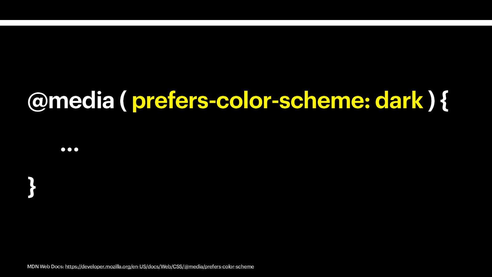
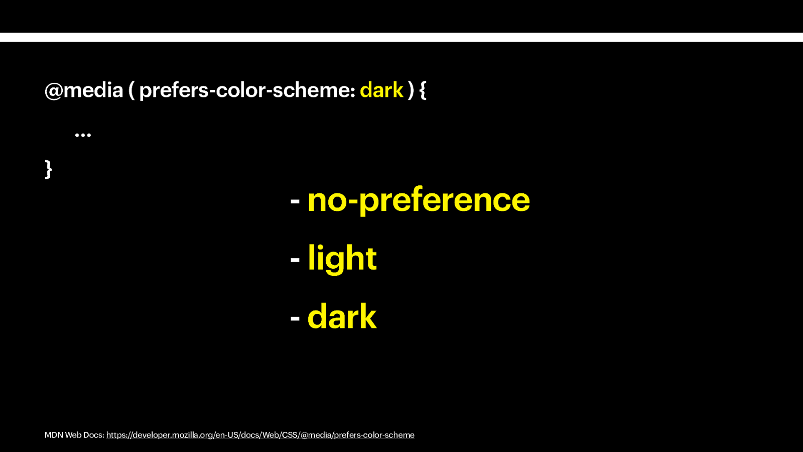
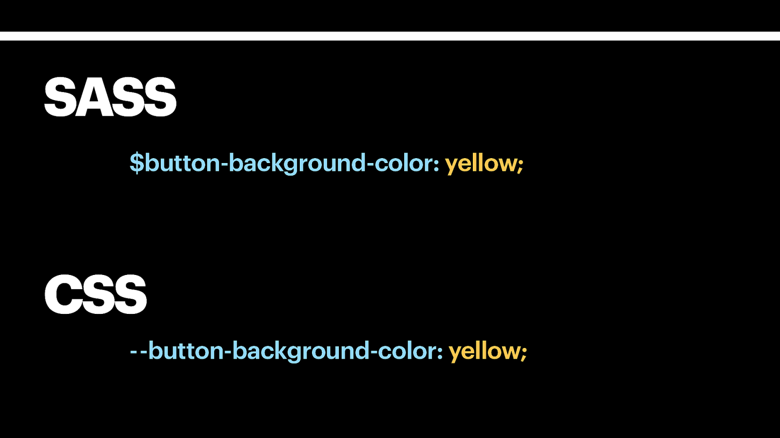
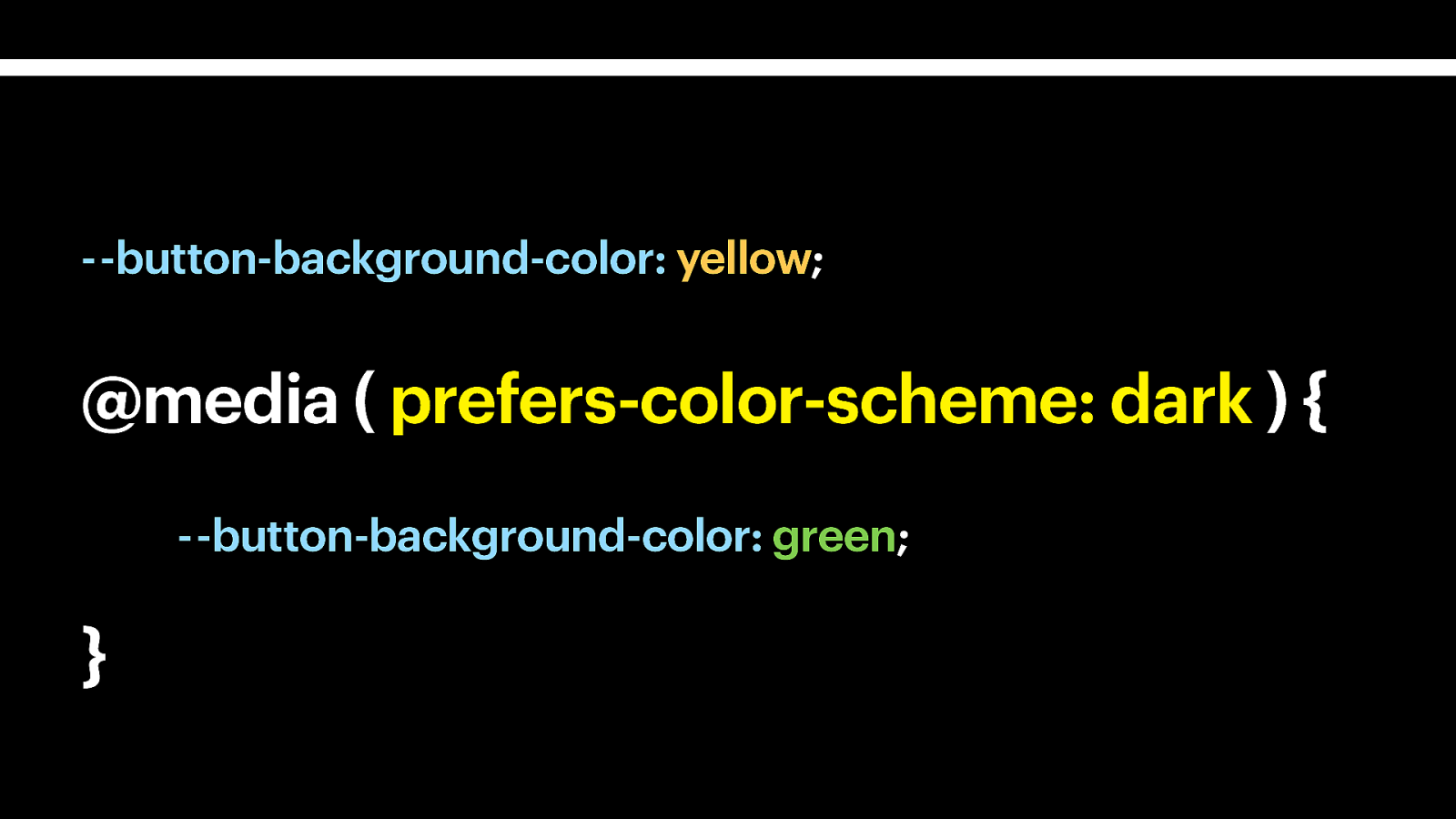
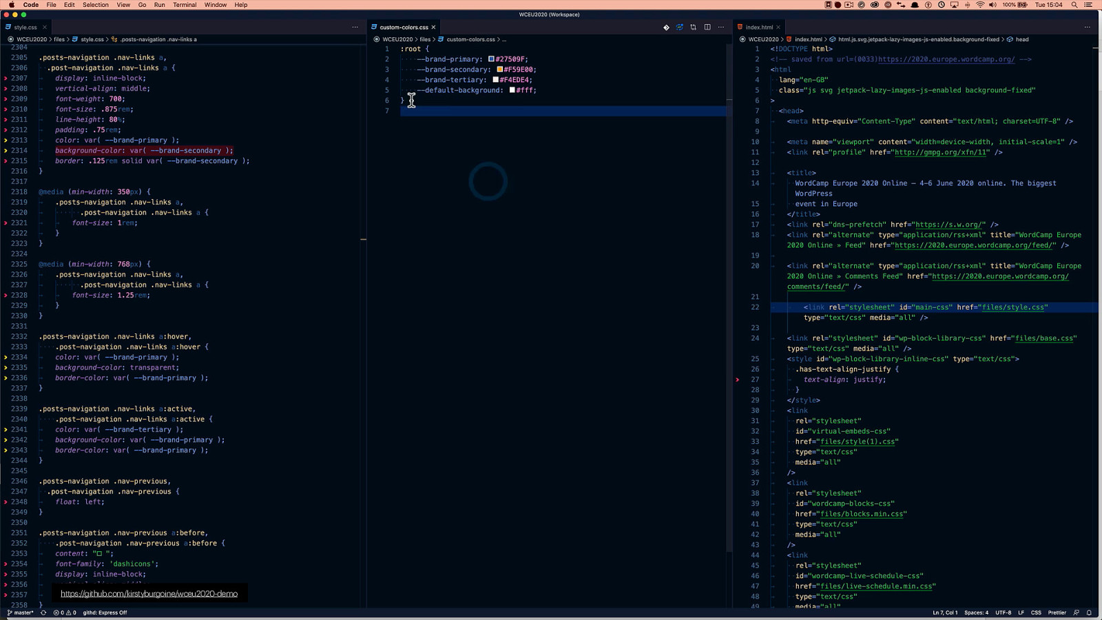
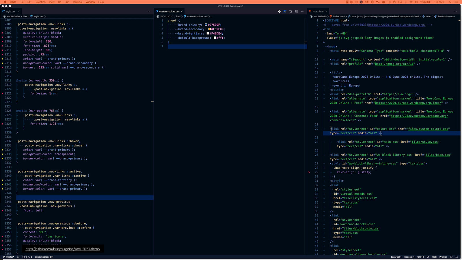
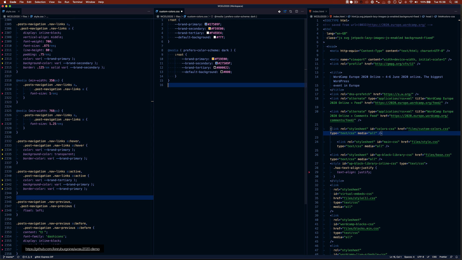
Now, In order to be able to change theme colours dynamically using this media query, we would use CSS Custom Properties. If you are unfamiliar with CSS Custom Properties, then, in brief, they differ from Sass or Less variables because they are dynamic. SASS and Less variables store a value, that, once the CSS is compiled, is static and won’t change. So if I set the variable $button-background-color to be yello, once compiled it will always have a yellow background. CSS Custom Properties, however, are dynamic, therefore the value can change based on certain conditions. For example, if the screen’s orientation is portrait, by using a dynamic custom property we could change the background color to red, but if it is landscape it would still be yellow.

Slide 10

Slide 10

It’s this combination of dynamic custom properties and media queries, that allow us to switch color modes without using lots of javascript. So let’s take a look at it in action.

Slide 11

Slide 11

For this demo I wanted to experiment with what the WCEU2020 site could look like with dark mode applied. To do that I’ve downloaded a copy of the site so I could work on it locally. You may notice this is a little out of date as I did this when the speakers were being announced. I’m using only the HTML and CSS files for this demo as both Custom Properties and prefers colour scheme media query are native CSS properties, so we can use them out of the box and don’t need to compile them using webpack to postCSS or any other build tool

Slide 12

Slide 12

Here, hopefully you can see that I’ve created a new CSS file and defined the four main colours used on the homepage as custom properties, and then in the main stylesheet I swapped out all of the hex values for those colours and replaced them with the newly defined CSS Custom Properties. This gives us a decent starting to point so that we can have some fun and start playing with changing colours. I should add a small caveat, all of the code I’m using here is available from going to File > Save Page As… in Chrome and as such, it is the compiled, minified production version of the site, which I have prettified again, and tweaked to be able to use locally.

Slide 13

Slide 13

From here we can add our new media query and assign some different colours to the properties. At the moment all we are doing is swapping the blue and orange colours around and changing the light colours to dark alternatives.

Slide 14

Slide 14

Now, if we go back to our page we shouldn’t see any changes yet, however, when we change our preferences to use dark mode… So far we can see that the site has essentially been inverted, all uses of orange have changed to blue, and blur to orange. The only areas that have not really been updated are, the main body background because it didn’t have a colour applied to it and is still white, and the hero area which has an inline style applied, presumably because a background colour has been set manually on a Gutenberg block.

Slide 15

Slide 15

We can update these with a couple of extra lines of CSS to get a complete dark version of the site. So I’m adding a background colour to the body tag and one to the home header, also another caveat, the use of !importants here is purely for the demo so that I don’t have to try to be more specific than the original stylesheet. You wouldn’t do this normally.

Slide 16

Slide 16

When we refresh again, we get a version where all of the main colours have changed Hopefully, even though this example is super orange, you agree that this really is very cool. With only a few extra lines of code we have completely changed the colours on the website. If you were to plan both a light and dark colour palette before building your theme and have a solid strategy for using custom properties while building, you would end up with a site that looks fantastic in both colour options.

Slide 17

Slide 17

So admittedly, this isn’t the nicest looking colour scheme, so I’ve added a few more tweaks, to make it look a little more attractive.

Slide 18

Slide 18

And now, when we refresh we get this instead. Which is looking better.

Slide 19

Slide 19

If we go back to my new stylesheet, we can see that I’ve had to add quite a few more lines of code to get our dark mode version to look a bit nicer. However, not including the comments I’ve added, it is still only around 82 lines of CSS and had this been the development version of the CSS rather than the production ready, compiled and minified version, this would probably be a lot less. So it is already showing you how easy it is to create a dark mode version. As I said in the beginning this is only a very quick look at supporting dark mode using CSS, there is a lot more we could do still, but there isn’t time in this talk, however please do tweet me, grab me in the WordPress Slack channel, I’m more than happy to keep talking about this. But before I wrap up I do have one more thing to cover quickly…

Slide 20

Slide 20

Whenever we talk about new CSS features, the same question always get’s asked. Will it work in IE11. Well the answer is no, but the beauty of this particularly feature is, it doesn’t have to. IE11 will ignore any lines of CSS it doesn’t understand, so will ignore the media query completely and serve the original light mode version, what is extra nice though is normally, in these situations we would end up adding a polyfill or some crazy hacks to get the feature working in IE, but in this case, Allowing the option to switch between light and dark modes is only available in newer operating systems. Therefore any computer running IE11 will not have the option to swap modes anyway so we don’t need to do anything at all. YAY!

Slide 21

Slide 21

And with that last piece of awesome news, I will finish. I hope you’ve enjoyed the demo, and that maybe you now think more about available CSS features when making your websites accessible and inclusive. Thank you for listening!