Kirst y’s Excellent Adventure in CSS Grid

A presentation at Frontend Connect in November 2019 in Warsaw, Poland by Kirsty Burgoine

Kirst y’s Excellent Adventure in CSS Grid
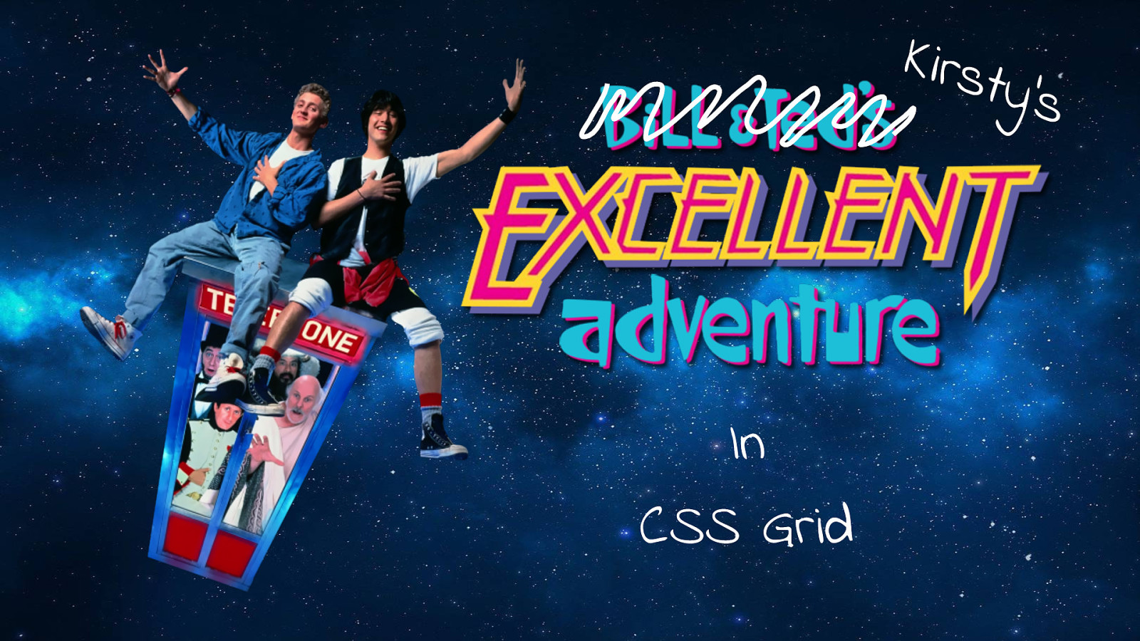
Hi, today I want to take you on an excellent adventure through CSS Grid. I’m going to show you some of the cool things you can do and also hopefully help you to avoid some of the pitfalls that could make it a bogus journey. But first, a really quick intro…
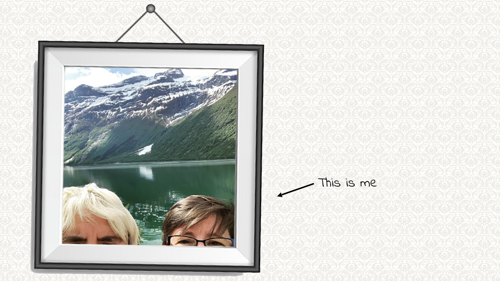
This is me - As you can tell, my special talent is taking selfies (not). I also like to choose moderately hideous wallpapers to use in my presentations!
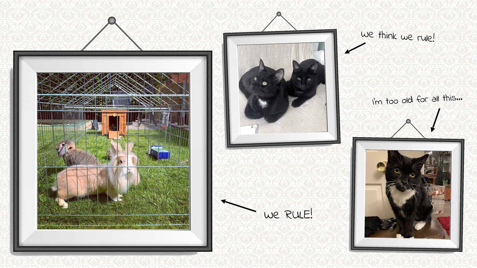
I am owned by this lot.
Rabbits: We RULE! Kittens: We think we rule! Cat: I’m too old for all this…

As you can see they all get on perfectly well.
Video of rabbit and cat playing on the window sill
I live in Shropshire in the UK. I work at Human Made (www.humanmade.com) officially as a WordPress developer but I mostly specialise in frontend development. You can find me hiding in plain sight as @kirstyburgoine on all the things so please say hello!

I love layout! I love CSS but layout it was excites me most. and naff 80’s films like Bill and Ted’s Excellent Adventure. When I started to write this talk, I quickly realised that although this is an awesome naff 80’s film, my main reason for choosing it as a theme was so that I could use

these “excellent” gifs. And that actually there really isn’t a lot of ways to compare CSS to this film. Before we really get into it, I should say that there is a lot of code in these slides, I’m not brave enough to live code as it would probably end up in a session of you all watching me Google the answers, so instead I’ve created a CodePen collection where all of these examples live if you want to have a poke around afterwards. My slides will also be available later too.

But before we get to the code, I’m going to start by taking you back in time to a place before CSS GRID… It was a horrible place, where layout went to die. In the beginning we had table layouts…
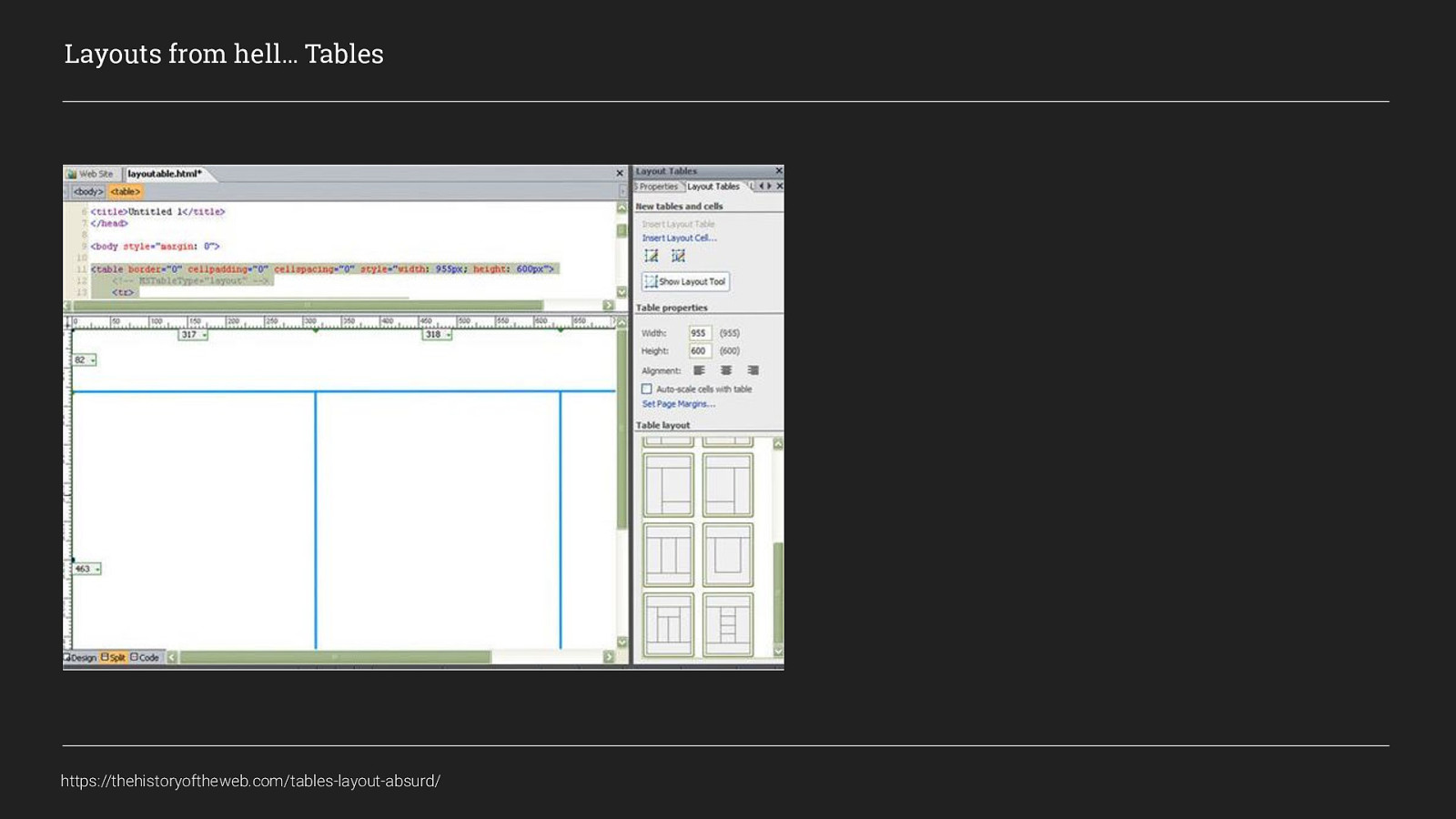
so much html and spacer gifs
Layouts from hell… Tables https://thehistoryoftheweb.com/tables-layout-absurd/
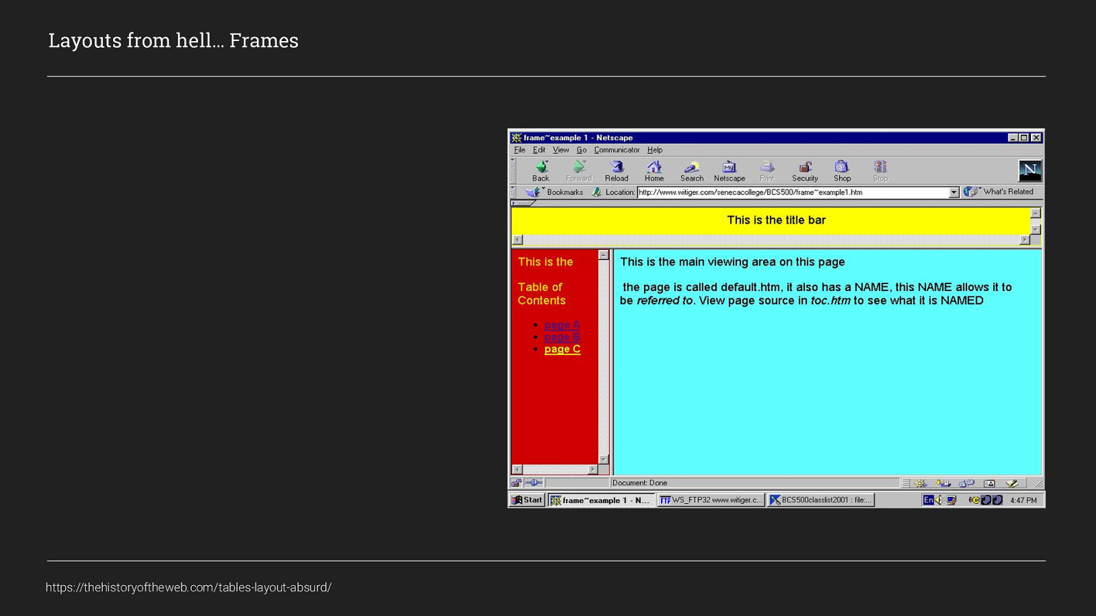
Then we made it worse by using frames, but there was a light at the end of the tunnel. And it was CSS. For me, this enlightenment came from reading Dan Cederholm’s book
Layouts from hell… Frames https://thehistoryoftheweb.com/tables-layout-absurd/
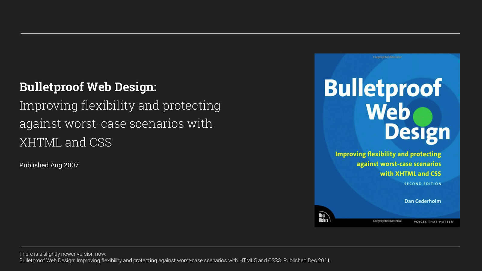
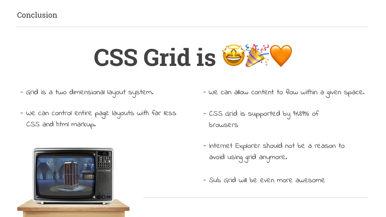
Bulletproof Web Design: Improving flexibility and protecting against worst-case scenarios with XHTML and CSS Published Aug 2007 from this book I learnt about CSS, using floats and display properties I could create much more semantic, accessible and SEO friendly layouts with far less code. And it was a game-changer…
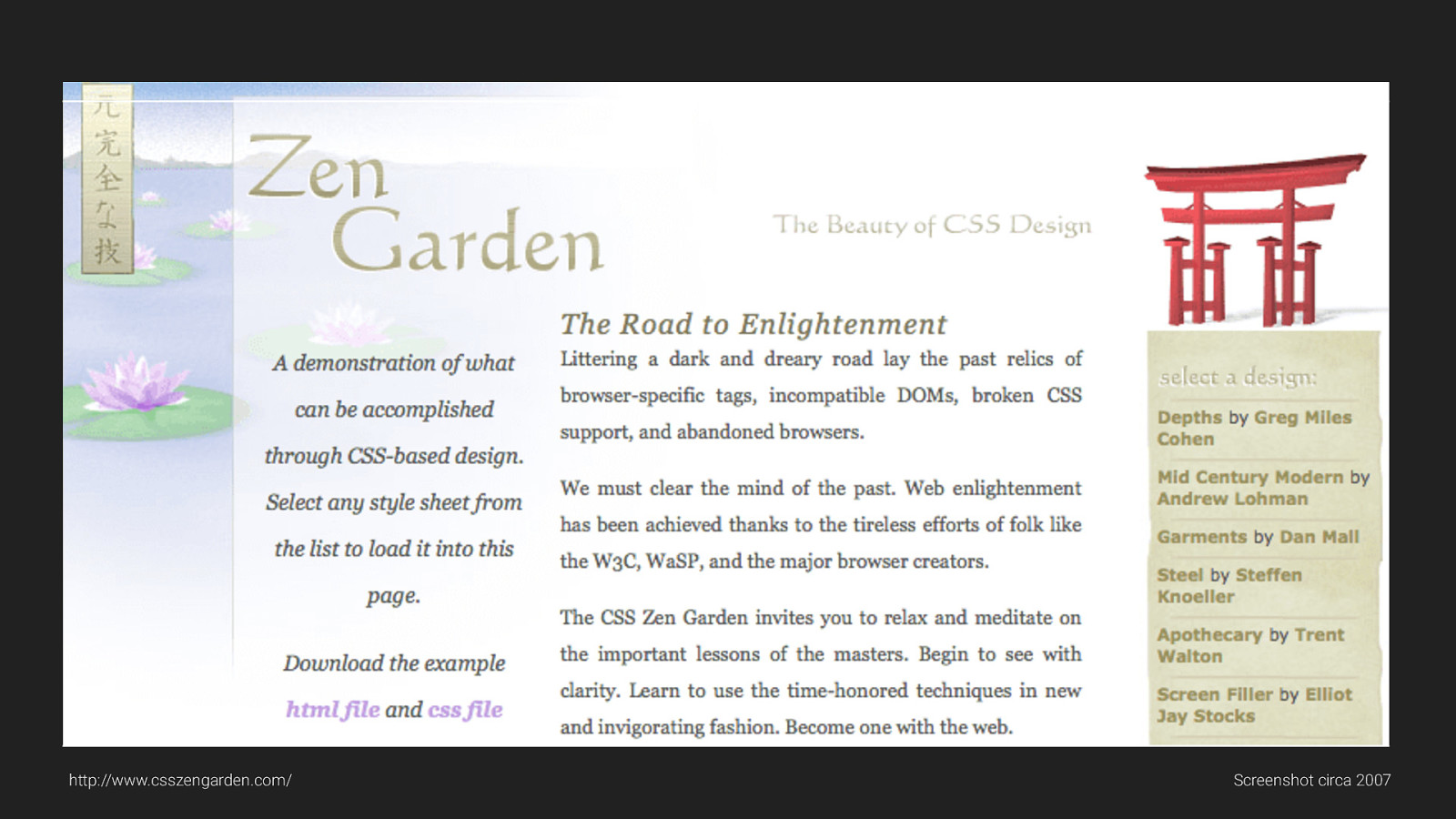
From there I started looking at things like CSS Zen Garden and really learning how you can style things without needing to always change the markup. Since then more and more features have been added to CSS: - browsers moved on and eventually, - Support for IE6 ended as well.
http://www.csszengarden.com/ Screenshot circa 2007
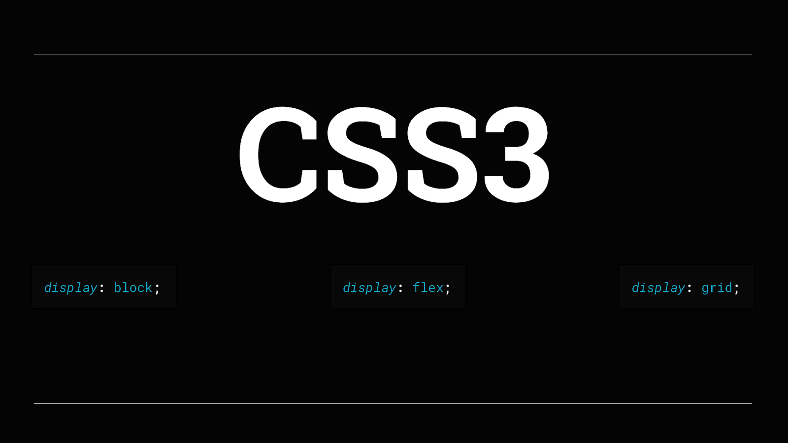
Today, we have CSS3. And CSS3 gives a lot of layout options. We now have Display: block, Display: flex display: grid and a few others
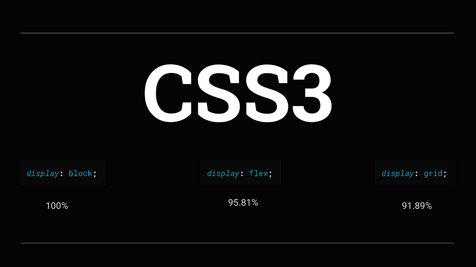
Each of these has pretty good support, Display: block has been around for a long time so understandably has 100% support in browsers Display: flex has 95.81% support in browsers and Display: grid with 91.89% support in browsers now. Which means that if we take the approach of progressive enhancement we can create flexible and scalable layouts for all browsers and devices.
So lets start talking about what CSS Grid is all about Grid is the future! Every time I say that I want to actually say
Grid is the word, But its the wrong film reference and the wrong decade! I’ve done this talk a few times to practice it, and the last time I did it someone suggested I should have used
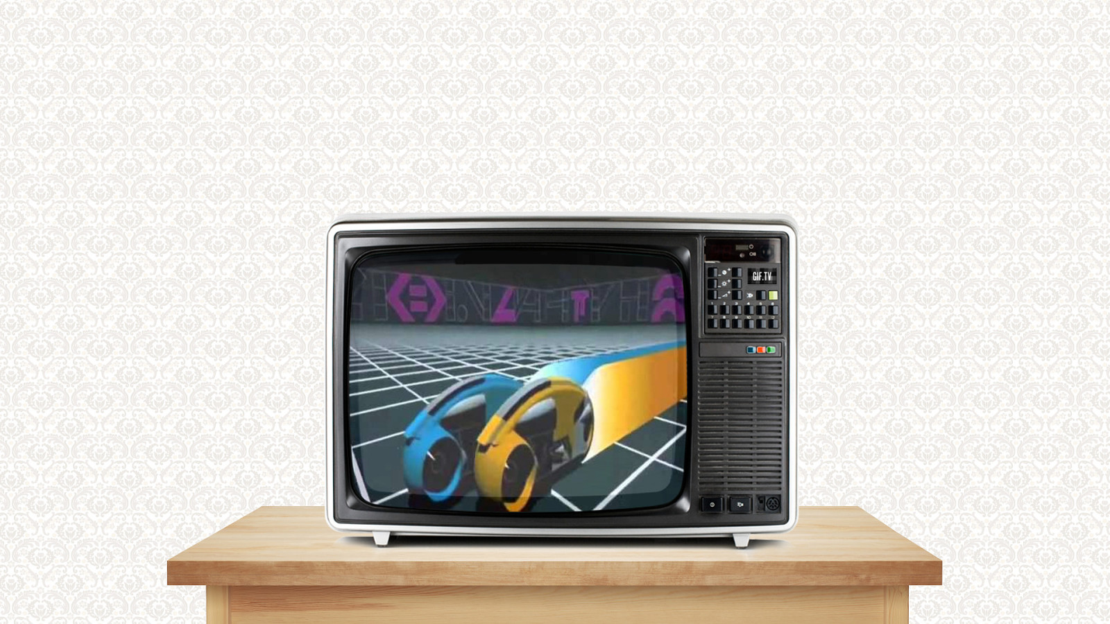
Tron as the film reference as that would have tied in brilliantly, but oh well, too late now…

Anyway, back to talking about CSS Grid. MDN web docs define it as…
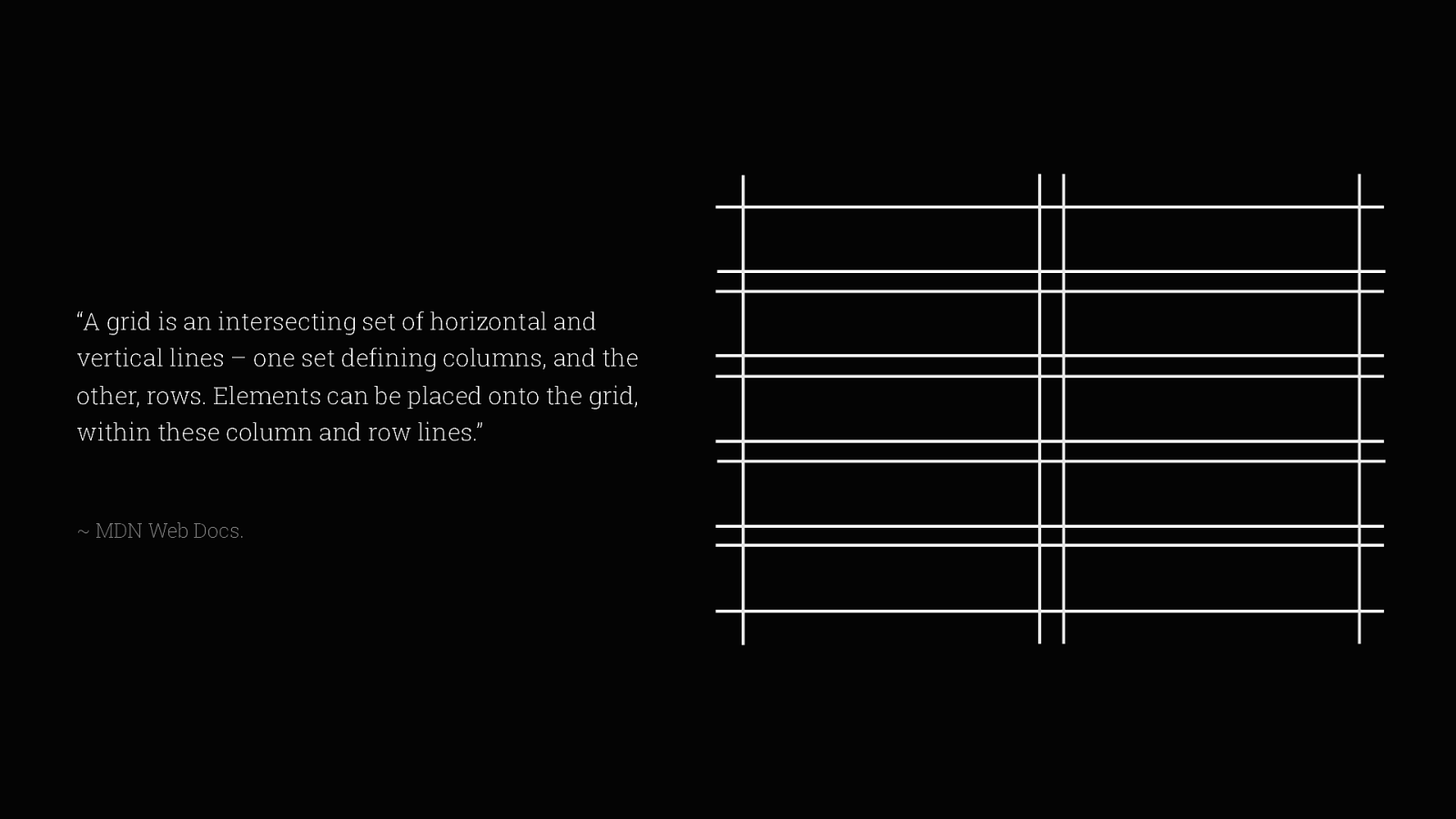
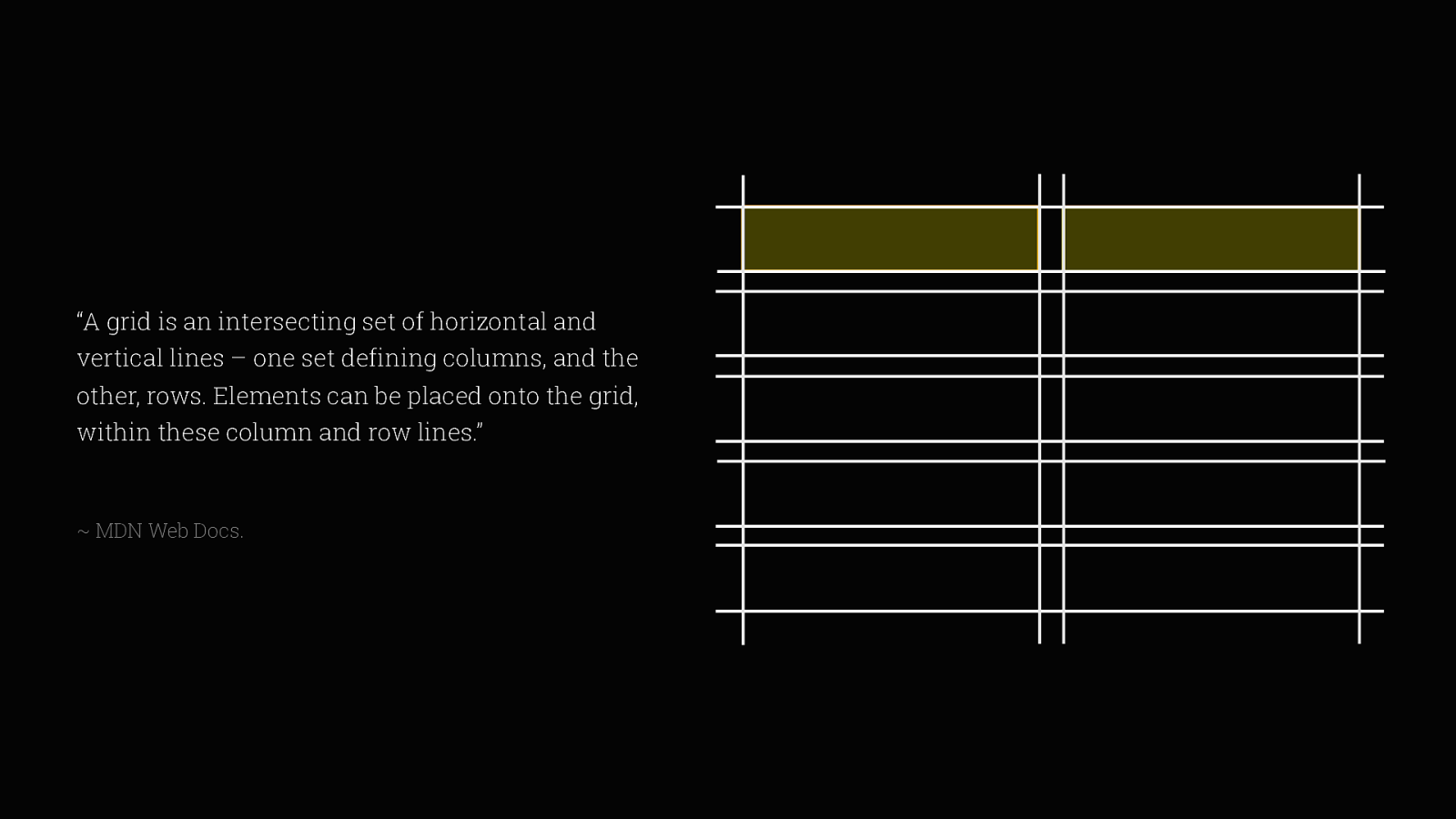
“A grid is an intersecting set of horizontal and vertical lines – one set defining columns, and the other, rows.
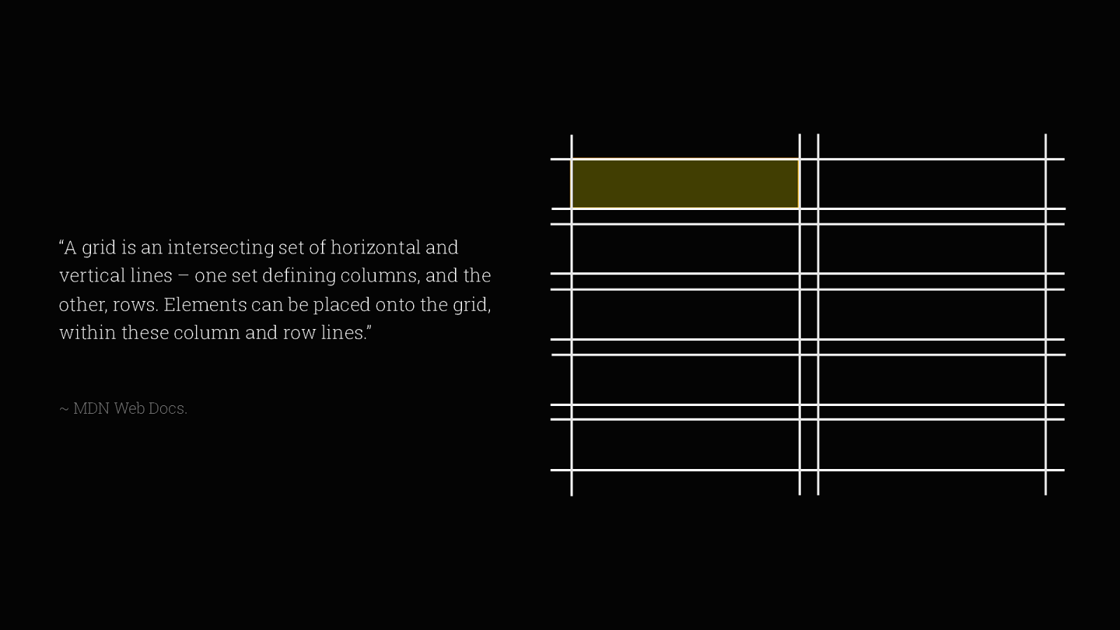
Elements can be placed onto the grid,
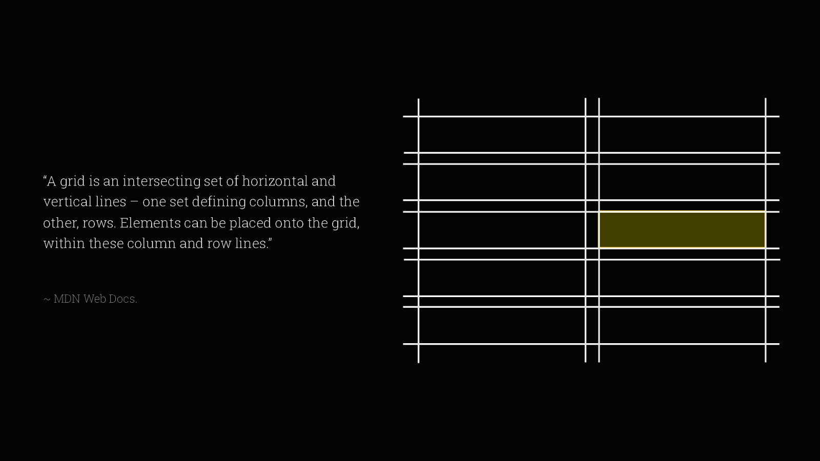
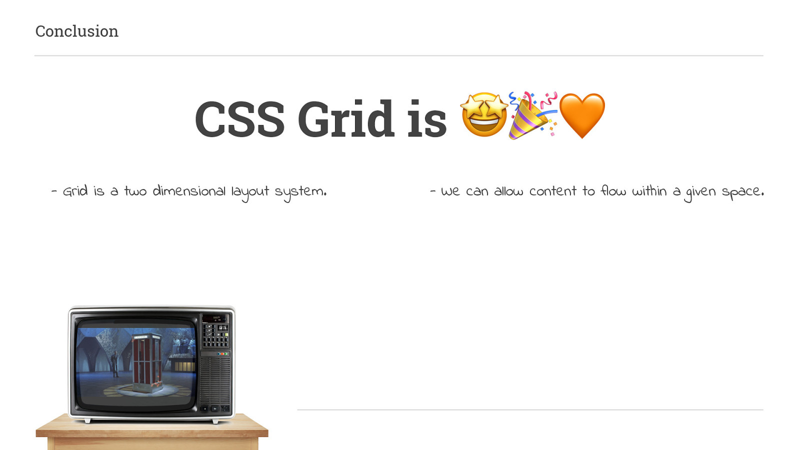
within these column and row lines” This rather neatly sums it up, these intersecting lines create a two-dimensional grid system, making it the first TRUE layout method to be introduced to CSS.
It differs from other “fake” layout methods they are all one-dimensional. Grid gives us the ability to control both row and column properties together and the flexibility to present content across devices in a way that we’ve never had before.
So let’s start by creating an implicit grid.
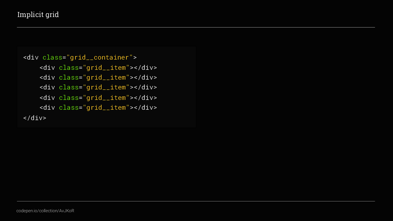
Take this container with 5 items inside of it…
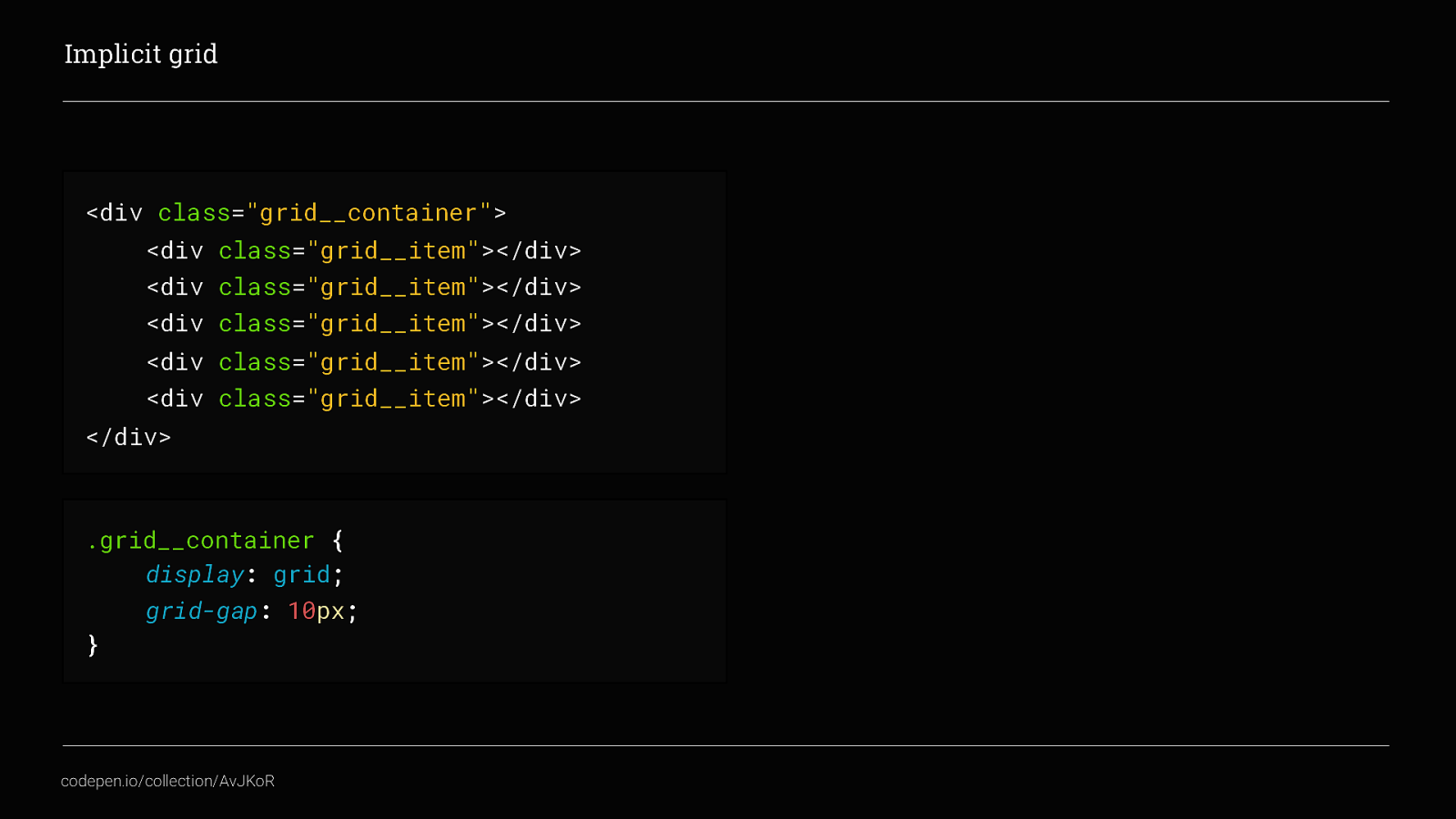
Apply display: grid; to it and in this case a grid-gap of 10px
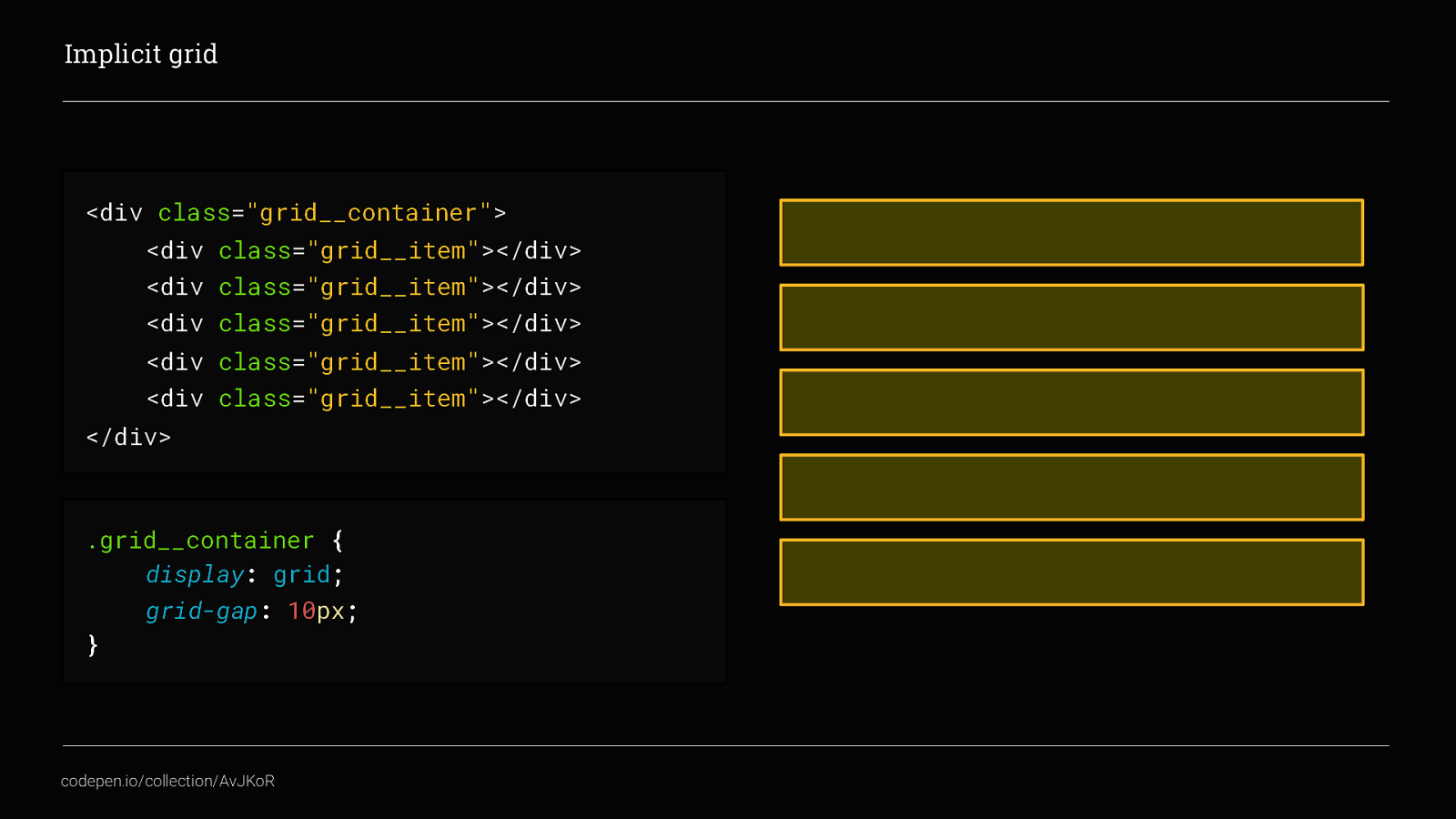
and you will automatically get a grid. Neat! This is what we call an implicit grid. We haven’t defined any columns or rows yet, so the content defines them automatically for us.
in this example I have 5 grid__items so the grid is created and by default flows the content vertically, down the page and creating 1 column and 5 rows. This is unlike flexbox, where the default is to flow content horizontally across the screen
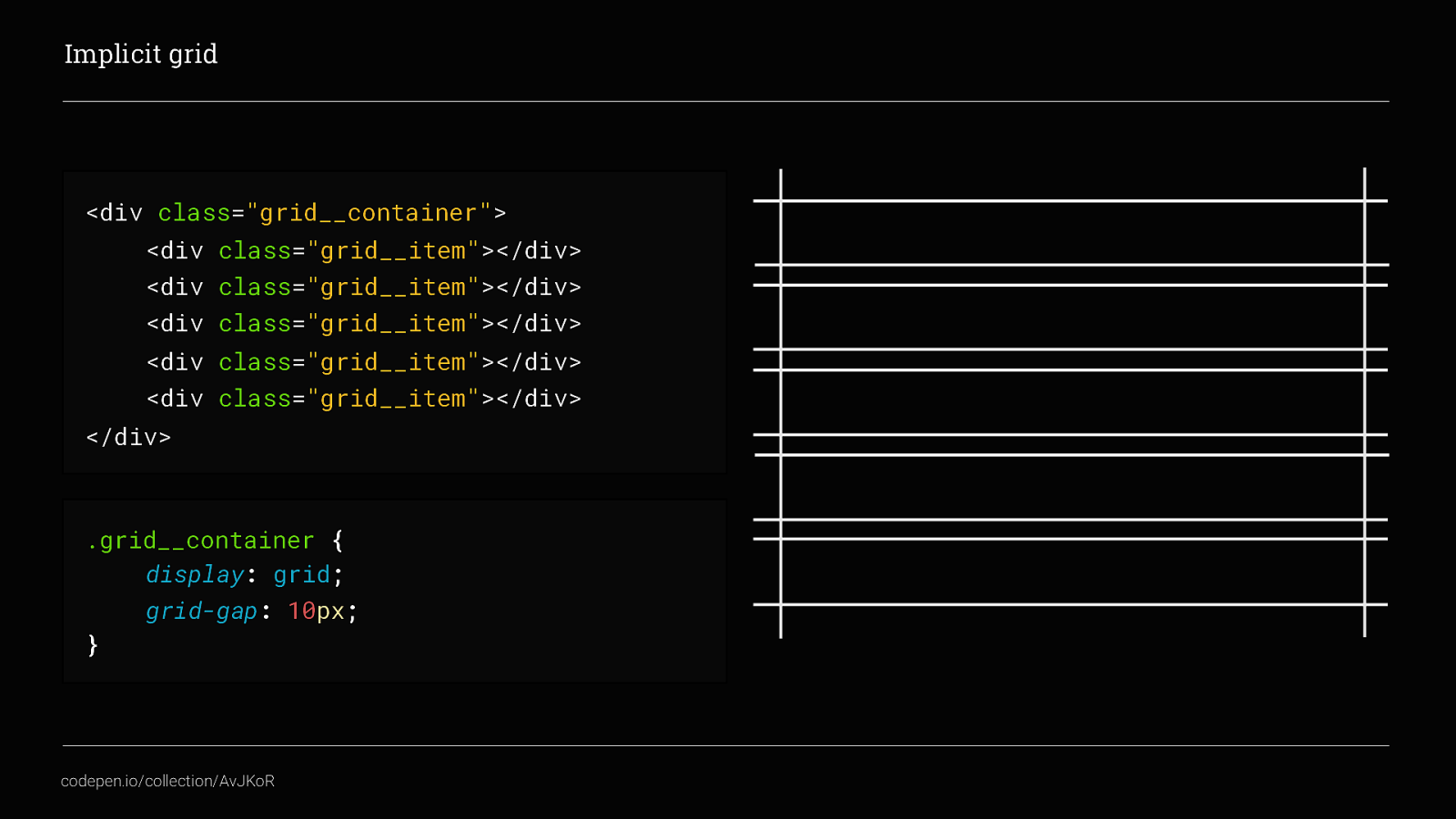
If we look at the grid tracks created we can see the horizontal and vertical track lines that intersect to create the grid. And that’s an implicit grid. Done!

this would be a really boring talk if that’s all we were going to do with Grid. Although pretty cool, implicit grids don’t really give us that much control over the layout. In most scenario’s we are going to need to define a set number of columns, and sometimes a number of rows too.
This is what is called an Explicit Grid. If we go back to our original grid container
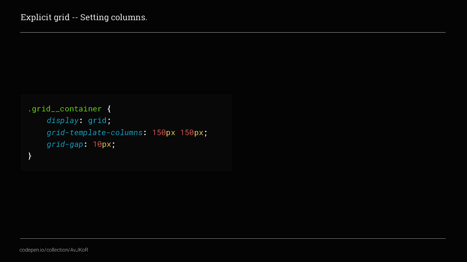
but define a number of columns by adding grid-template-columns to the CSS, we get 2 columns that are 150px wide each.
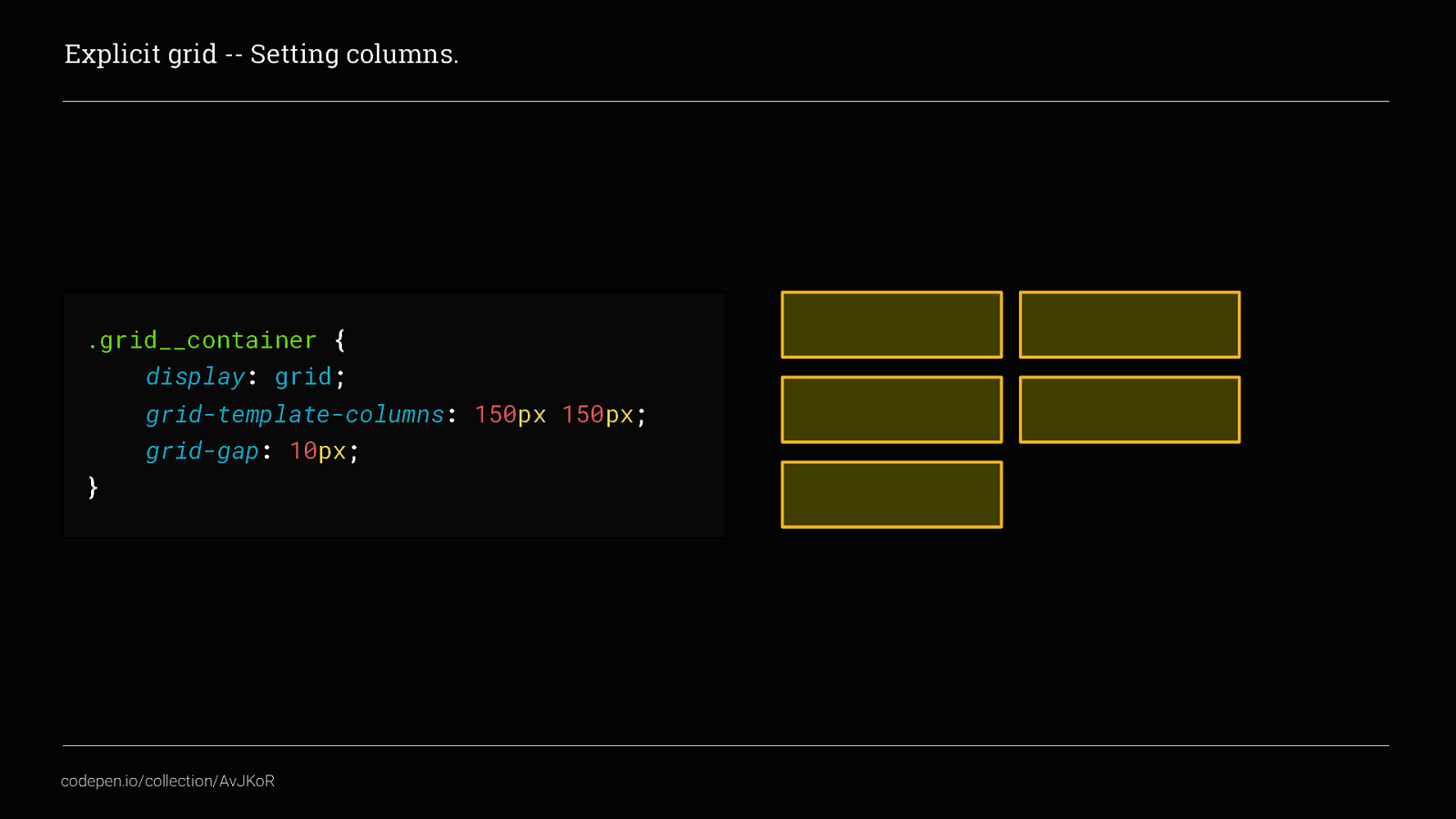
Both grid-template-columns & grid-template-rows essentially tell the container what the grid should look like. Each column and row can be given an explicit value In this example we have given grid-template-columns two values of 150px, haven’t defined grid-template-rows yet, they are auto placed
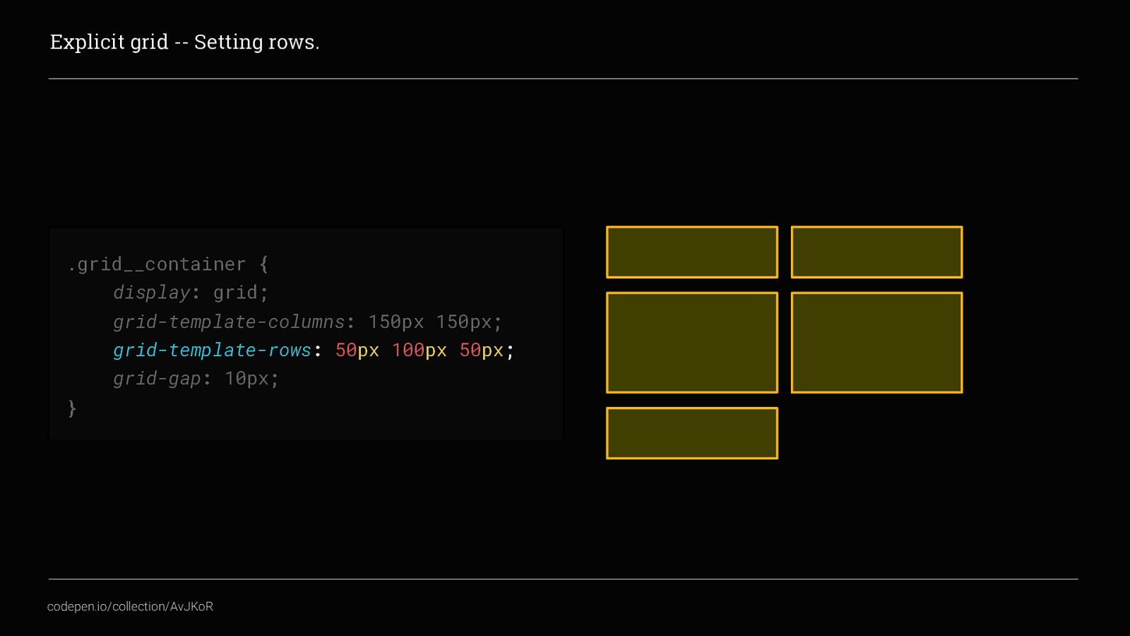
We can also set grid-template-rows like this. In this example we’ve set the middle row to be 100px tall this becomes really very useful when using grid to control the layout of individual components
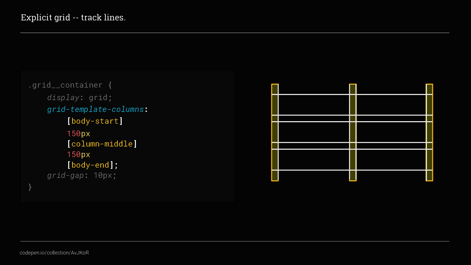
we can also name the track lines. track lines are the horizontal and vertical lines that intersect to create the grid, they are NOT the columns or rows themselves.
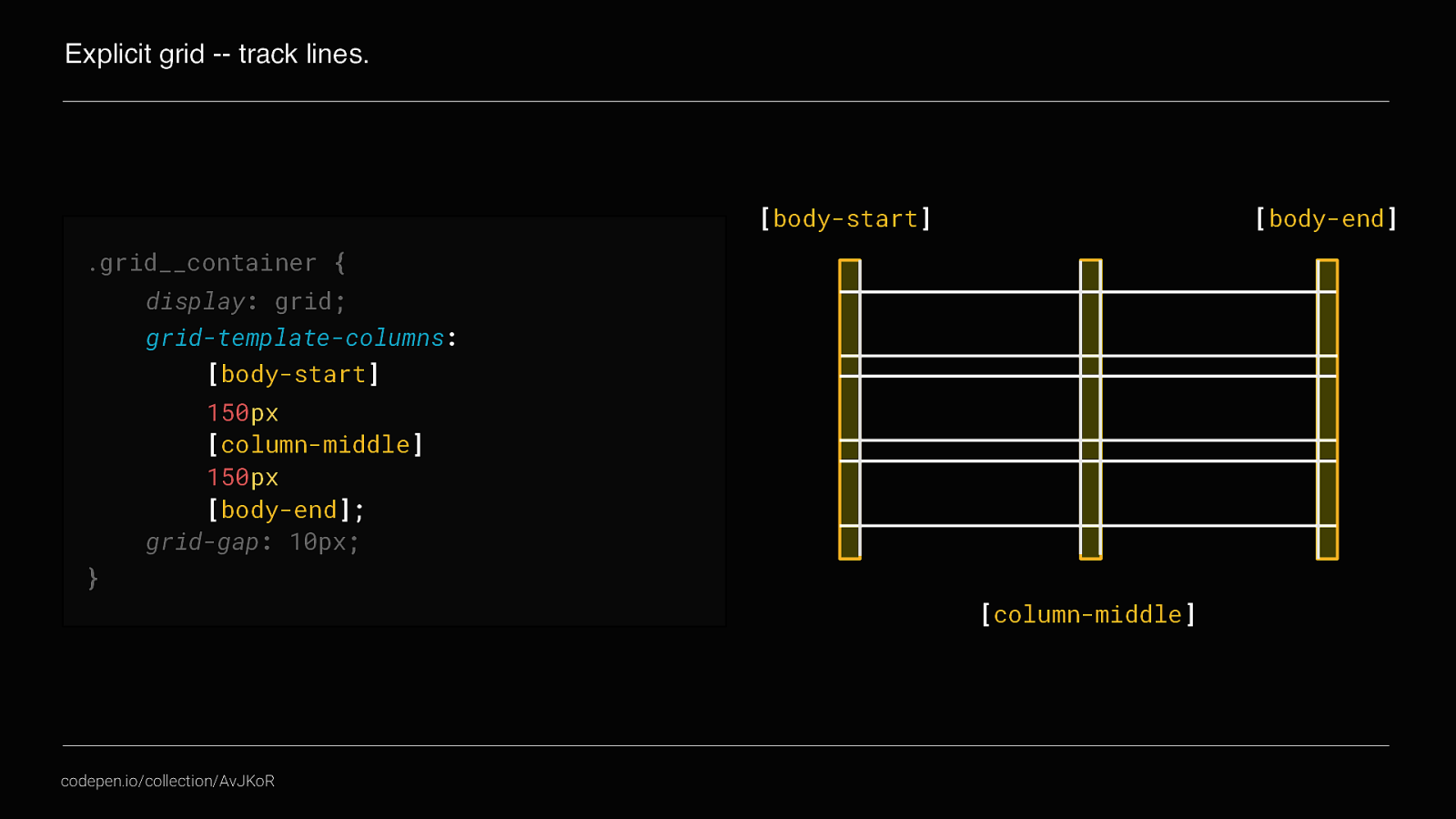
For example this two column grid actually has 3 vertical track lines Track lines can be extremely useful when positioning content explicitly within the grid. For example
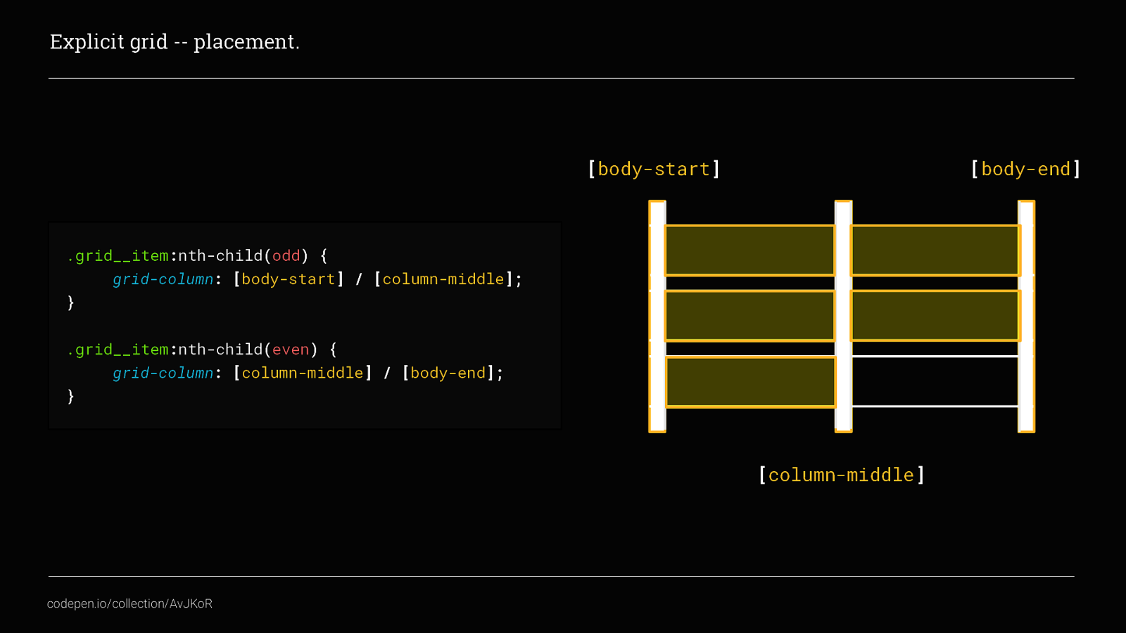
By using the trackline names we can easily set all odd columns to start at [body-start] and end at [column-middle] by using the short hand of grid-column-start and grid-column-end, and set all even columns to start at [column-middle] and end at [body-end].
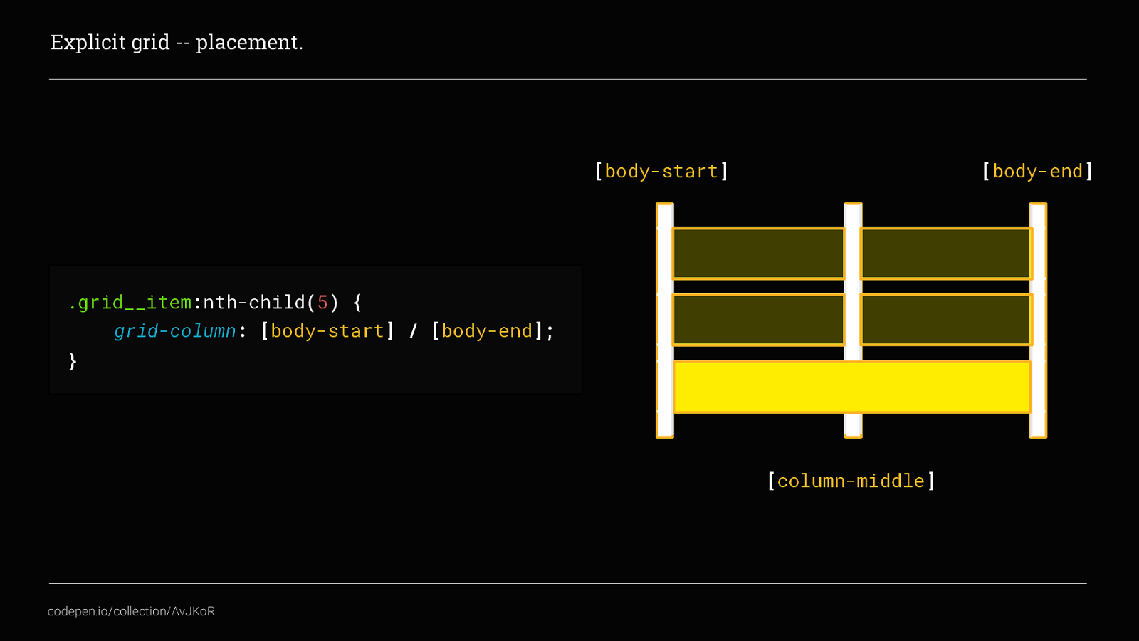
We can also use this to span multiple columns. Here we’ve set the fifth item to start at [body-start] and end at [body-end], spanning both columns. Naming tracklines makes your CSS much more readable…
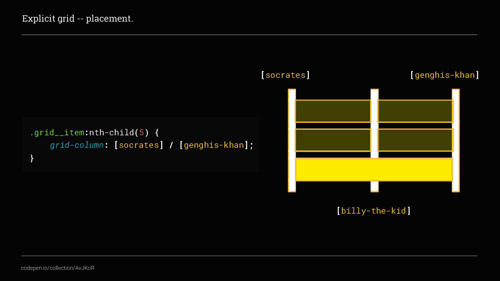
… and you can of course give your tracklines any name you want. Although, you probably want more meaningful names than this…
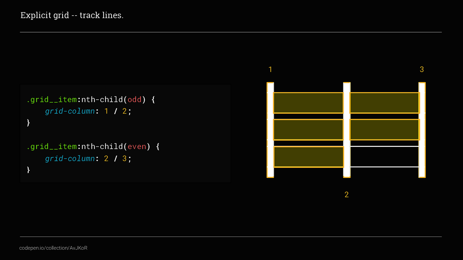
But you don’t have to give your tracklines names, we can place content by using the trackline numbers as well. This is especially useful if you are working with large grids where it is unnecessarily time-consuming to name all of your tracklines.
You can of course also apply the same positioning to rows using grid-row, and you could even take it a whole step further and combine the two by using grid-area, although I’m not going to go into that today as it is not needed for this talk.
The CSS Grid Specification also added some new units and CSS functions as well
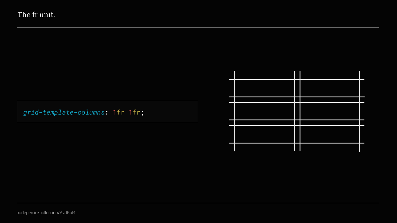
The fr unit, which basically stands for fraction, allows you to size your grid columns or rows according to a proportion of the available space in the grid container. This is SUPER useful!
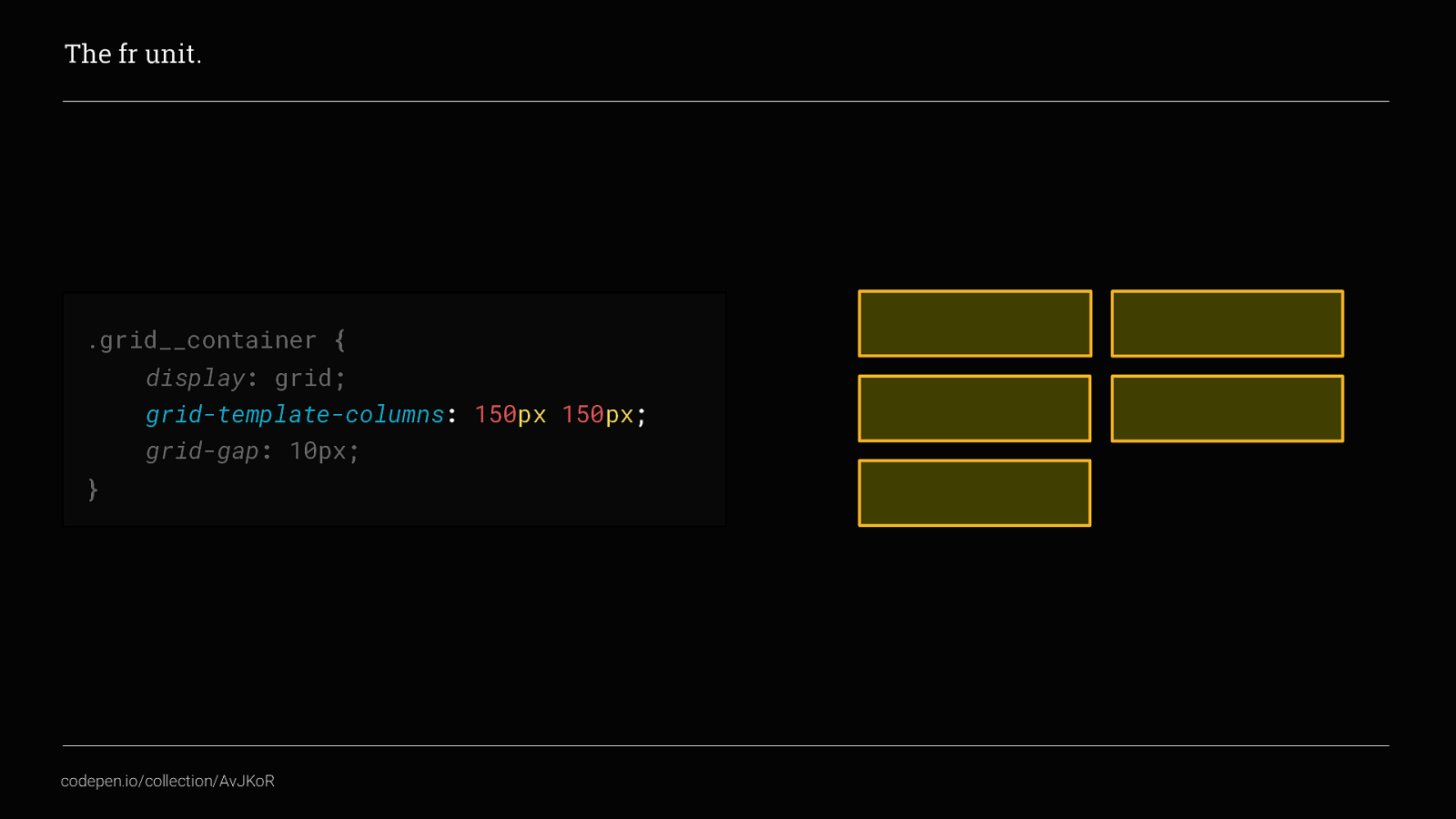
Go back to the example earlier where we set two columns at 150px each, If we were expecting this grid to be a maximum of 300px wide,
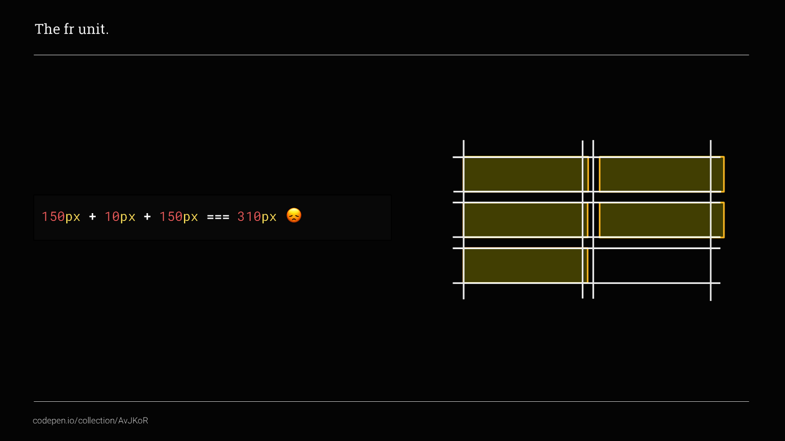
This would actually be too wide, this is because of the grid-gap. By adding that, the available space for the columns is actually 145px
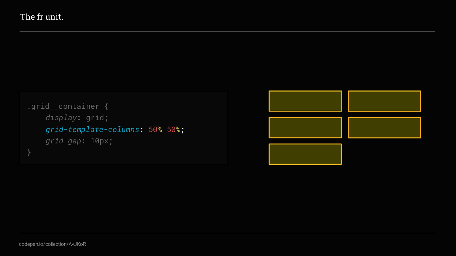
Changing the width of the columns to 50% each wouldn’t help either.
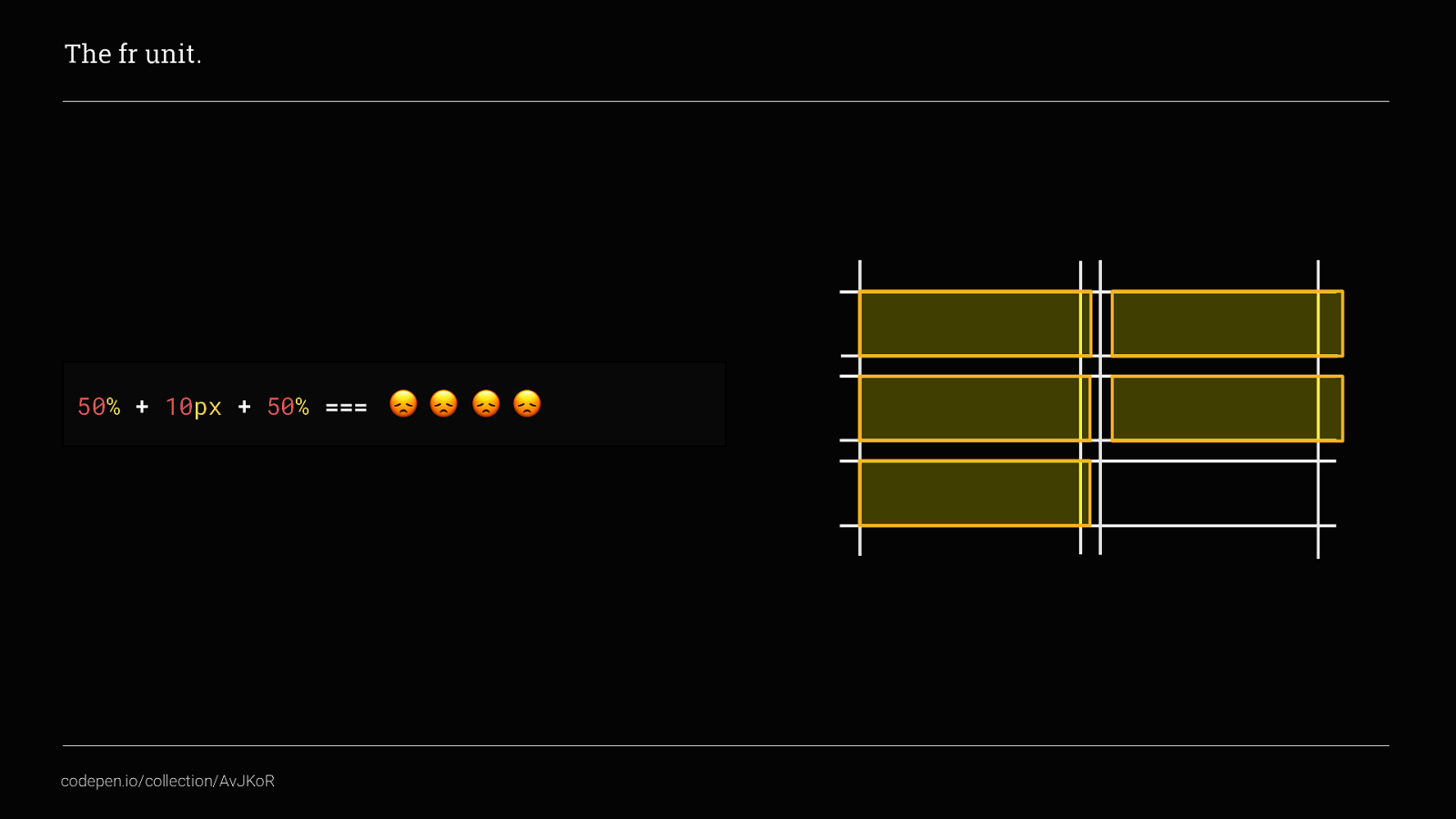
Again, that pesky grid-gap is getting in the way. We could get around this by doing some crazy `calculations to subtract the grid-gap amount from each column Or we can use the new fr unit instead.
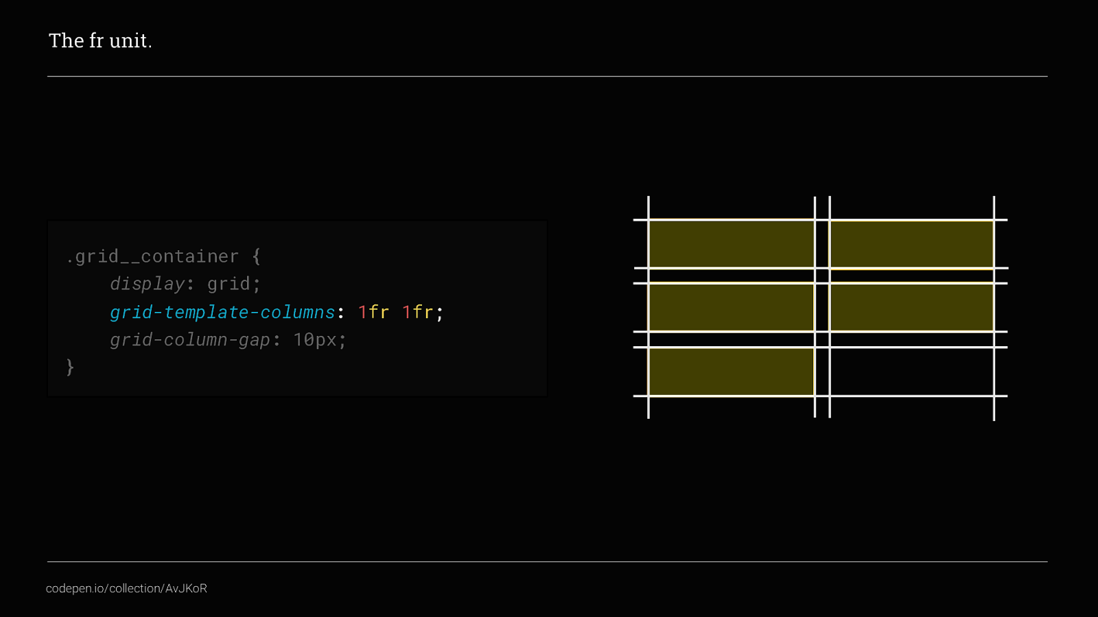
Now, our grid columns take up an equal space each but now there won’t be any horizontal scroll bars. This is because the fr unit takes into account the grid-gaps applied and subtracts the correct amount from the overall space available. Excellent!
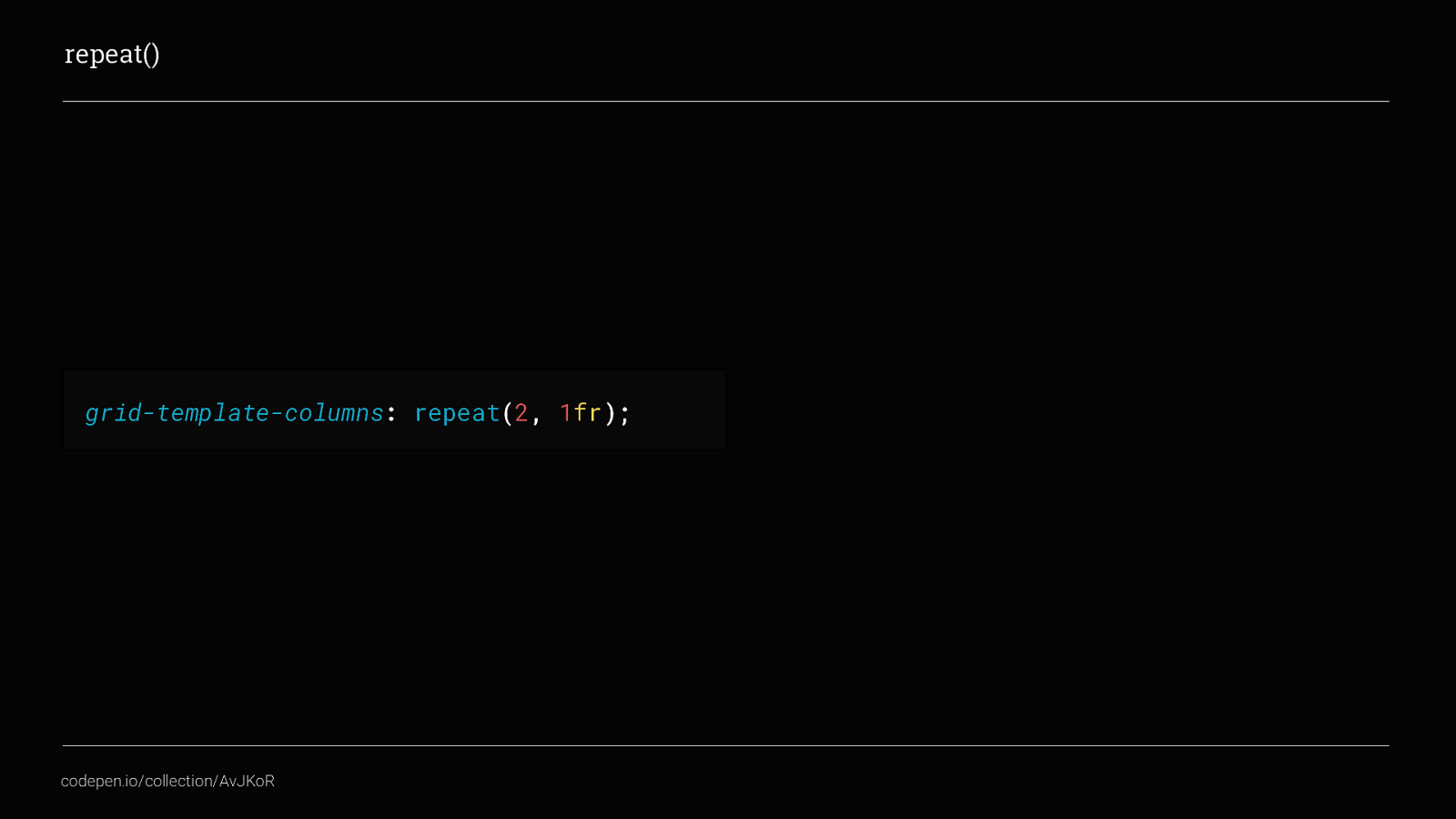
Repeat is a small but super handy CSS function.
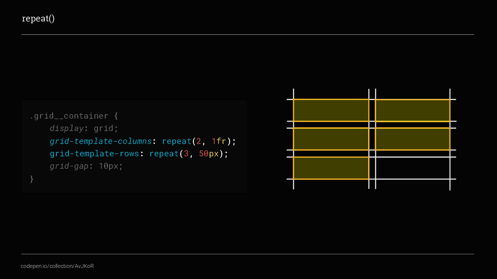
Back to our example, we’ve used repeat 2 times instead of writing 1fr twice and just for kicks I’ve added in grid-template-rows as well.
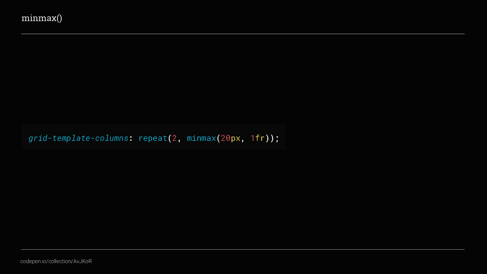
Minmax(), is what allows us to create really dynamic, flexible layouts but still have just the right amount of control over them. In a nut shell
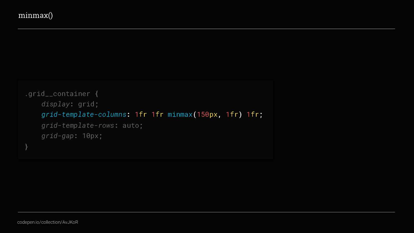
In this example, we can see that there should be 4 columns in total. 3 are set to 1fr so will use the available space equally, column 3 set to have a minimum value of 150px and a maximum value of 1fr,
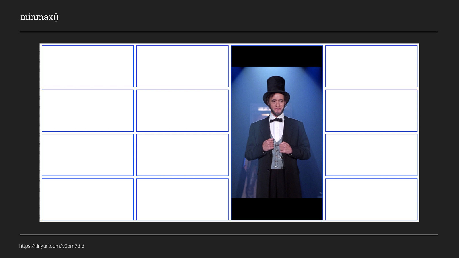
We can see now that while all of the columns are wider than 150px they all fill the same amount of space equally. As column 3 has a minimum width set when the browser window gets smaller and the columns reduce in width, column 3 stops reducing when it gets to 150px wide, but the other 3 columns continue to get narrower until they collapse in on themselves.

So that’s some of the more common concepts, there is a load more a could show but for this talk, this is probably all you need Lets take a look at putting some of this into practice.
In this section of the talk I’m going to show you 2 different ways you could use CSS Grid in your next project. Each has its place and may not be perfect for every scenario, but also each shows the potential of what can be done and will hopefully inspire you all to go off and create some amazing layouts.
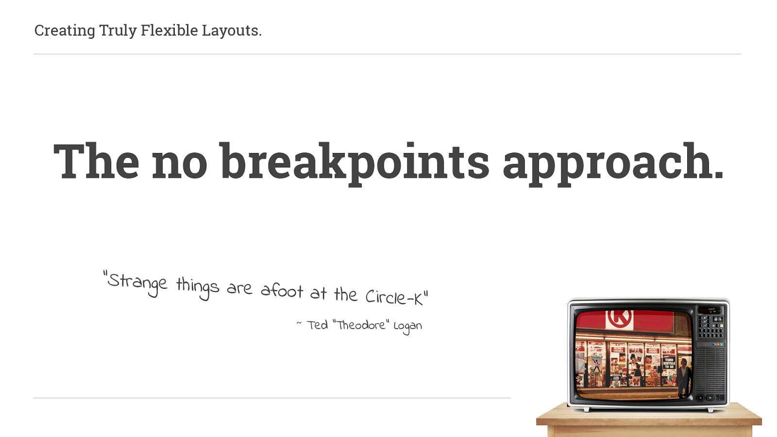
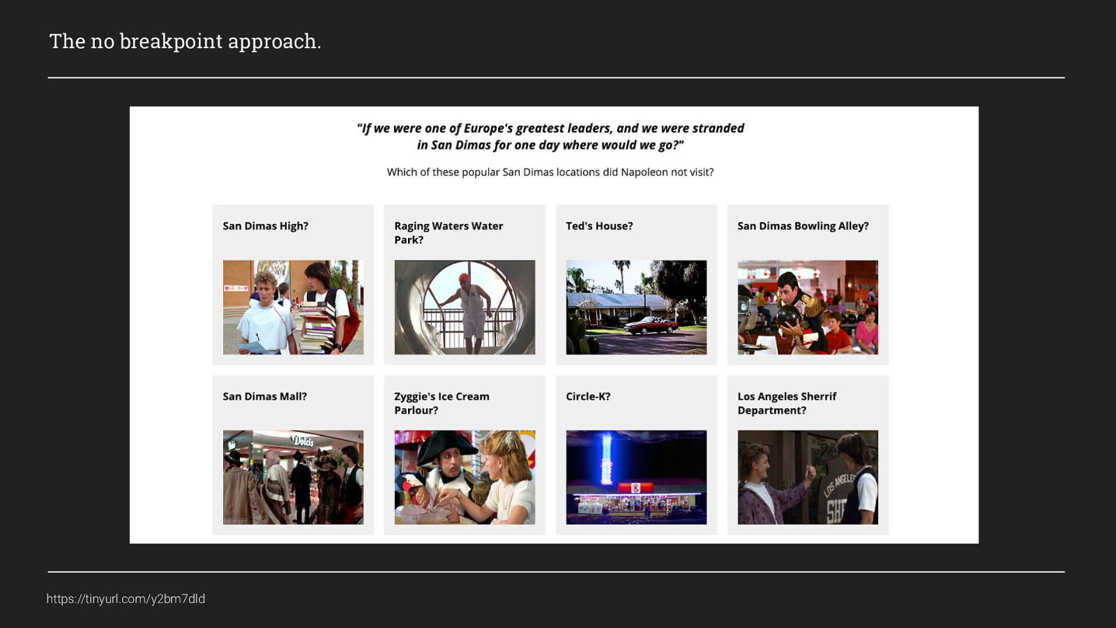
This first example is the no breakpoints approach. I work almost exclusively on WordPress websites at the moment and even when they are not blogs, they nearly always have a “recommended reading”, “latest posts”, “products for you” or something similar, section somewhere on the site and they often look something like this:
Before grid, this is something I would have used flexbox to create the layout for, and before that, I would have used display: block and floats. Either way I would control the number per row using breakpoints. But what if we don’t need breakpoints to achieve this? What if we had a way for our content to flow to best fit the space it has available? Well with Grid we can do this and it’s actually really simple.
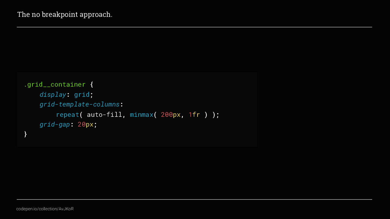
This is all you need. Here, we’ve set it to display: grid, and then made it an explicit grid by defining grid-template-columns. And this is where the magic happens… We’ve combined the repeat() and minmax() CSS functions, but this time made use of the auto-fill value to repeat and auto-fill the columns instead. Making it so that the row will display as many columns as it can that are a minimum width of 200px and maximum width of whatever the space available is.
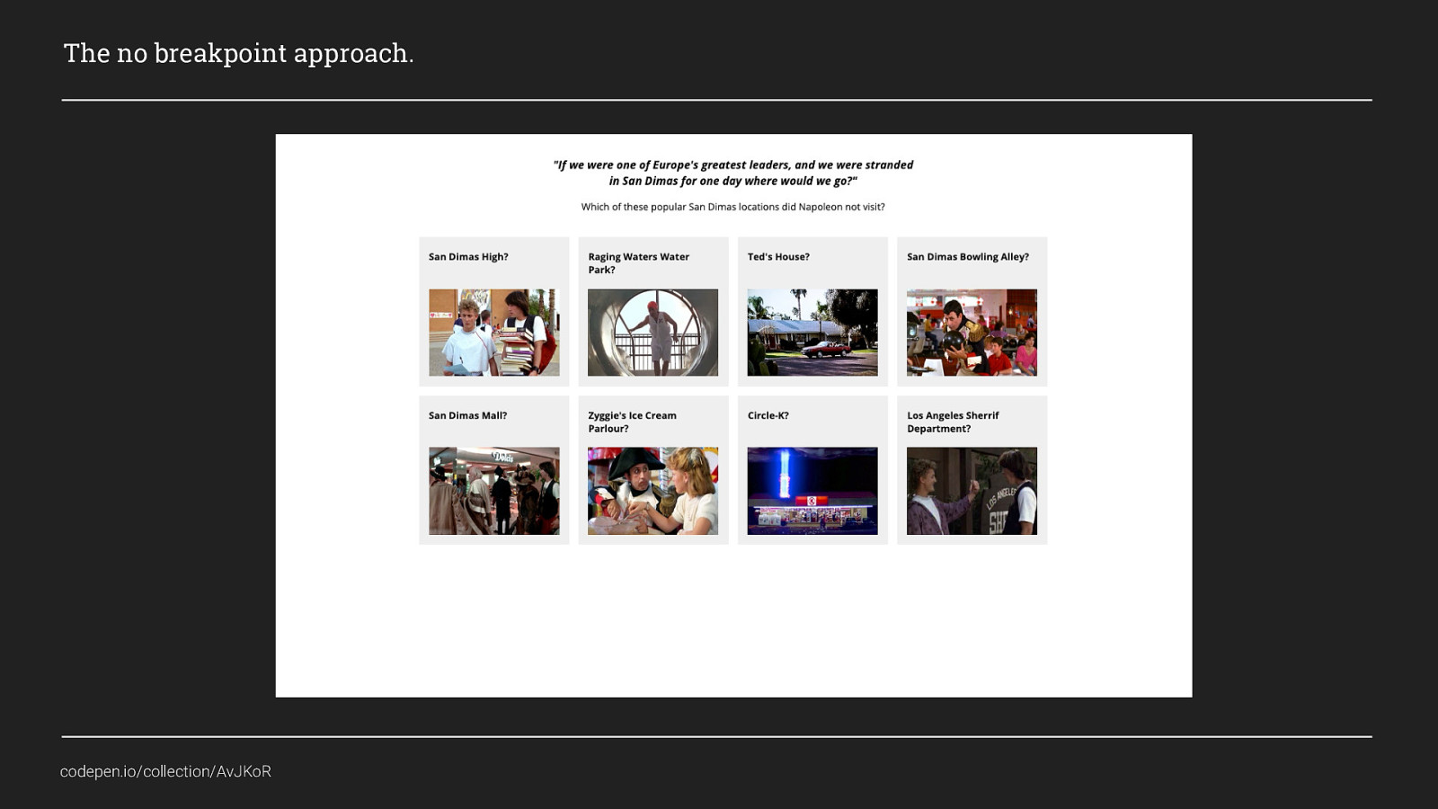
As the row expands, if there isn’t enough room for it to add an additional column, the columns will fill the available space equally and when enough room is created for a 200px width column it will add that column to the row. What’s also nice about this example is, when thinking about progressive enhancement we can create a default approach to this with only a few extra lines of code, and add the cool fancy CSS grid stuff will only apply in those browsers that support it.
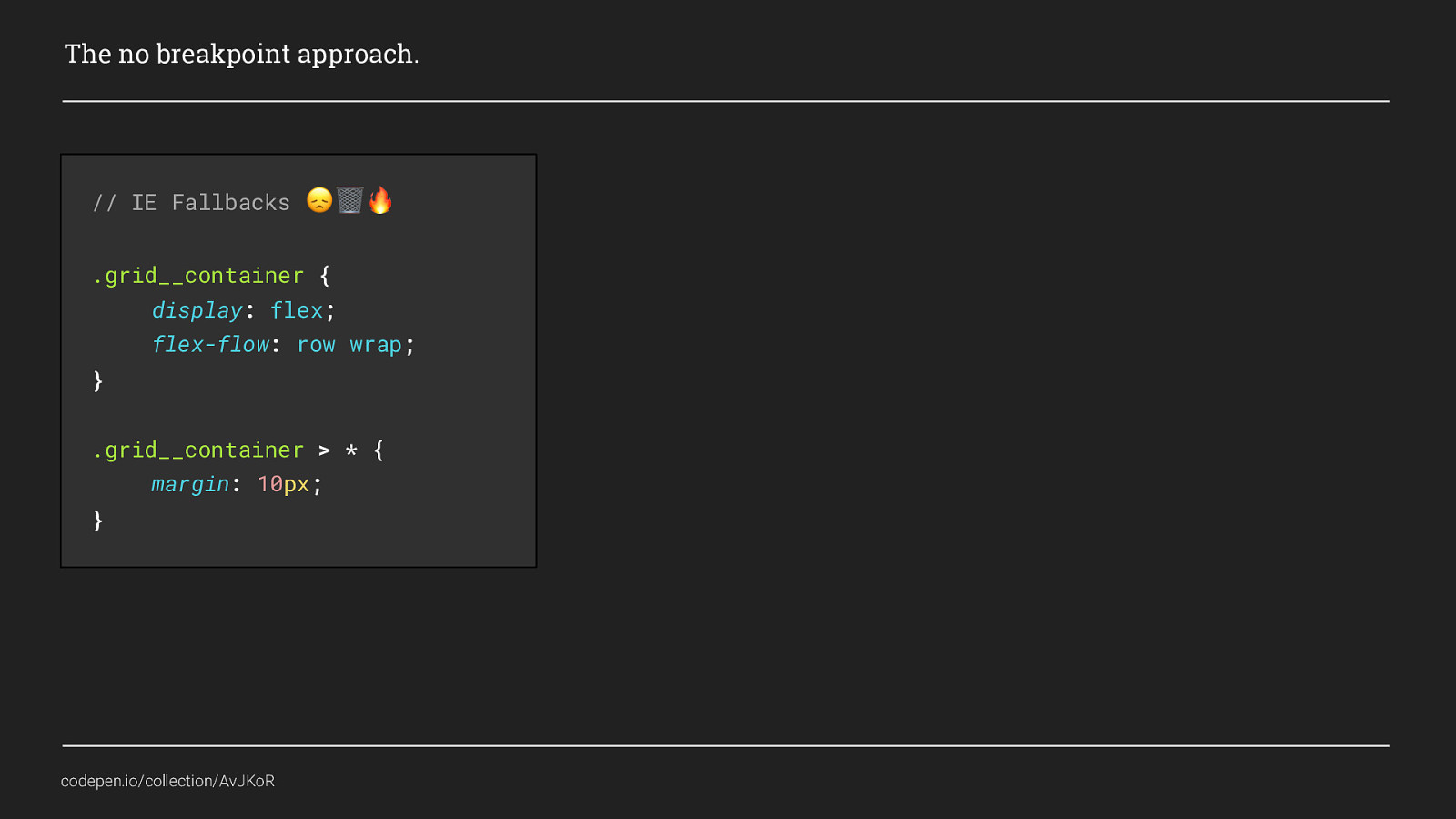
For this approach I think a minimum viable experience would be to use Flexbox as the default layout because it is supported in IE11 (although there are still some flexbugs), so I’ll set that first and give all items within a margin of 10px to create an equivalent of the grid-gap because sadly that is not supported in IE11 P.S. IE Fallbacks only work when you include sad face, trashcan, fire!

I’ve then added my grid stuff but wrapped it in @supports so that if a browser supports grid it will use this code instead. @supports is a neat little feature that, although not part of the CSS grid specification allows us to do cool things based on whether the browser would support it or not. Here, Flexbox doesn’t provide exactly the same experience, for example the grid items wouldn’t flow to auto fit the space available, but it is close enough to provide a nice enough experience in older browsers.

I hope you agree this is pretty excellent. Even with the defaults for flex box you have far less code than if you had used breakpoints to control how many items displayed on each row.
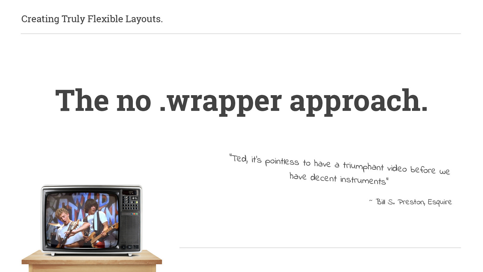
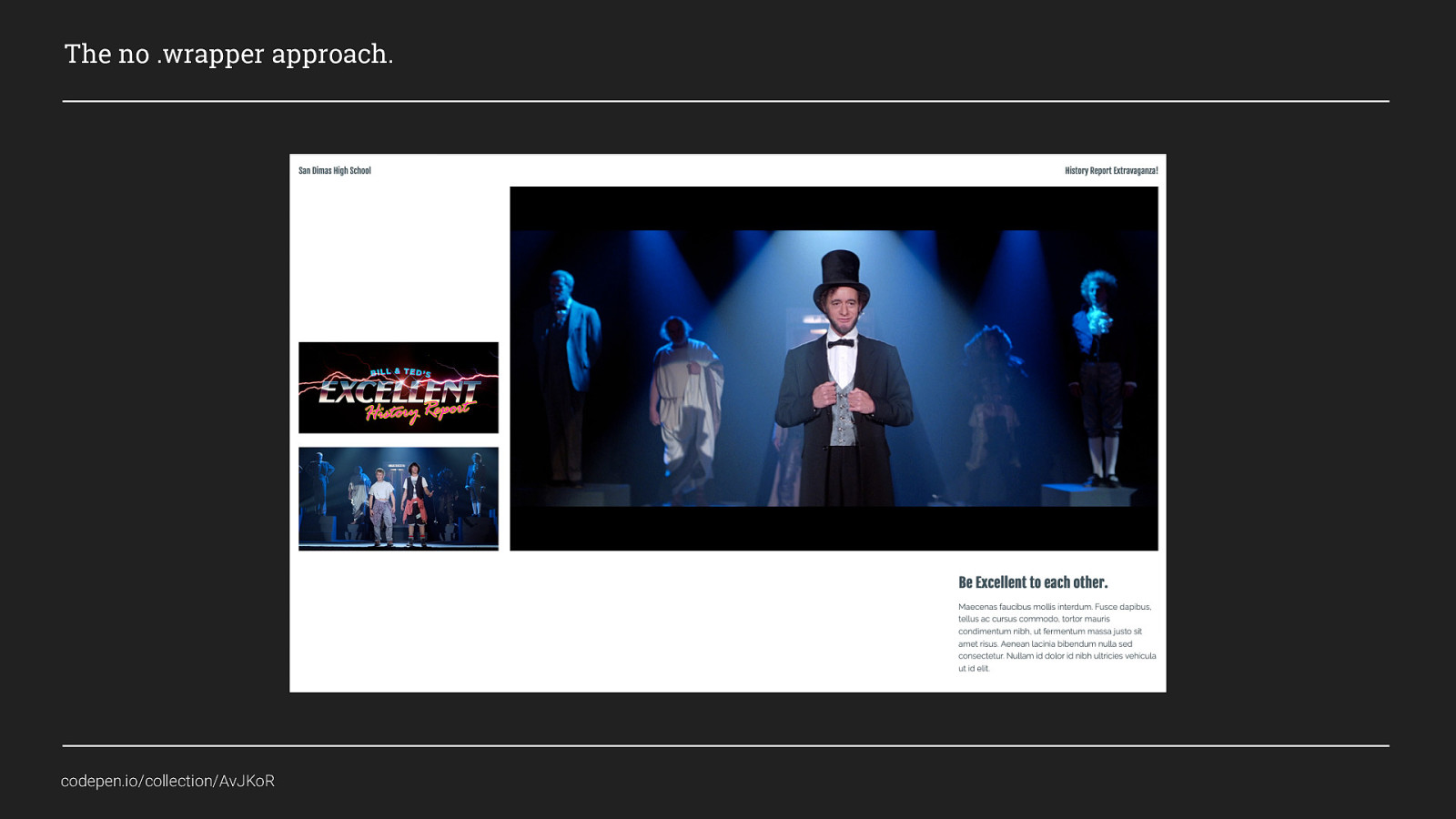
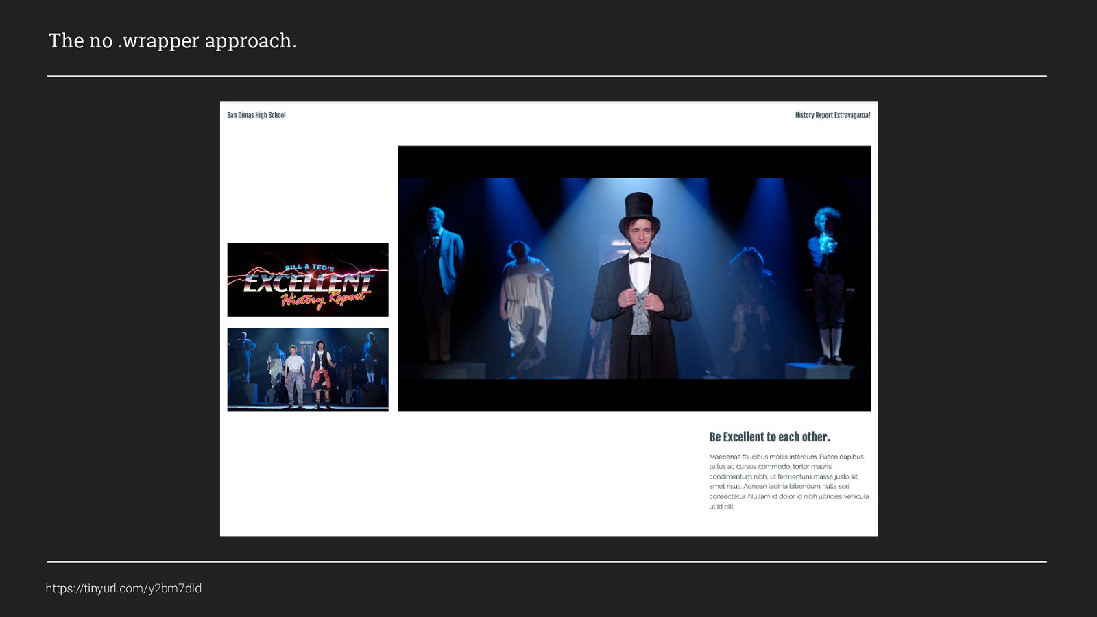
The next example is what I call,
Often when we want to control the width of a grid area we will do something like this:
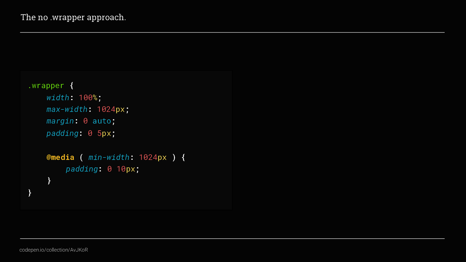
Which is great, and does what we need. This is still a perfectly valid technique, in fact I will come back to using this later But let’s have some fun and use grid to control the entirety of the pages layout
There looks like there is a lot going on in this example. But we haven’t done anything here that we haven’t already covered.
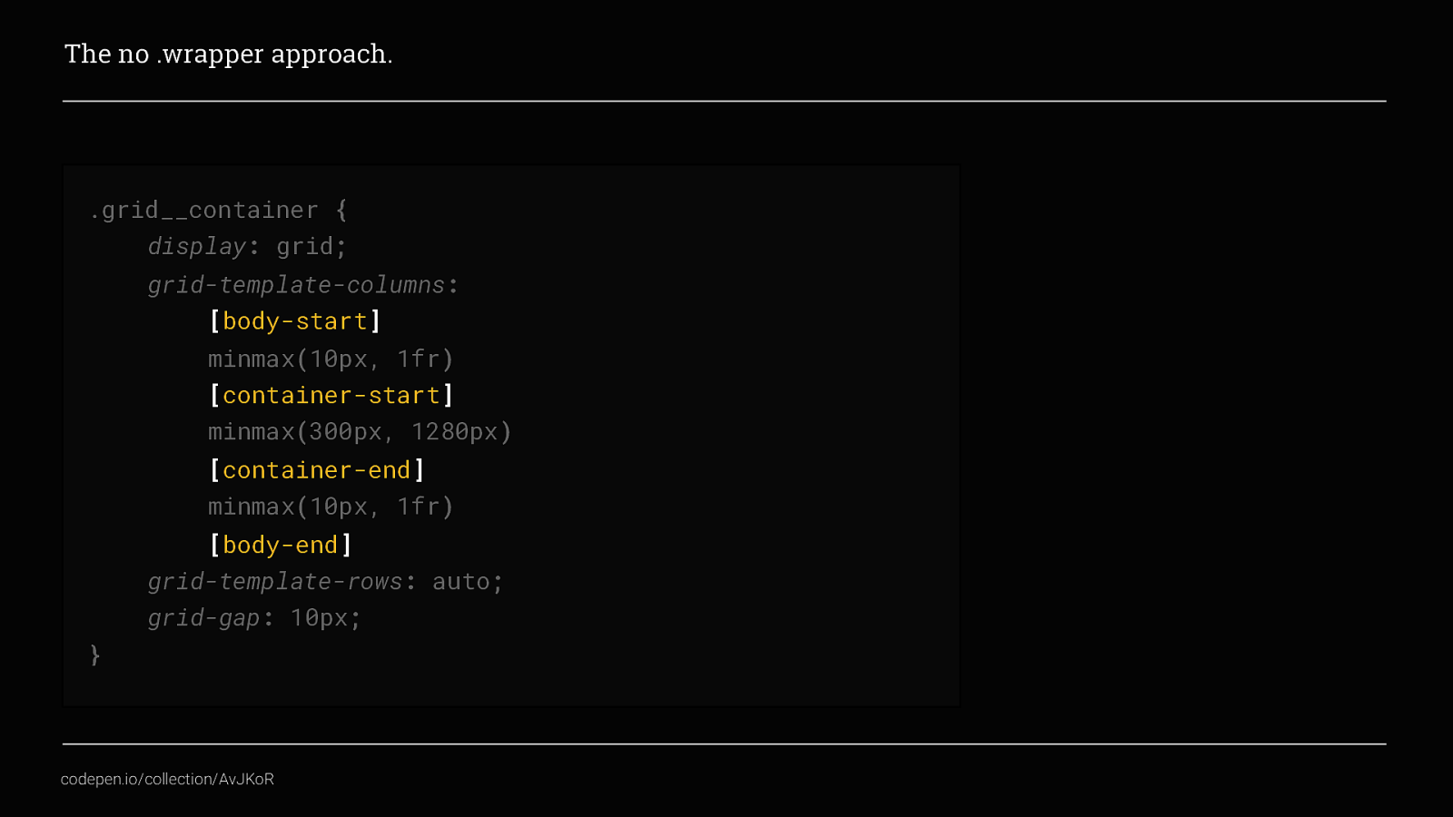
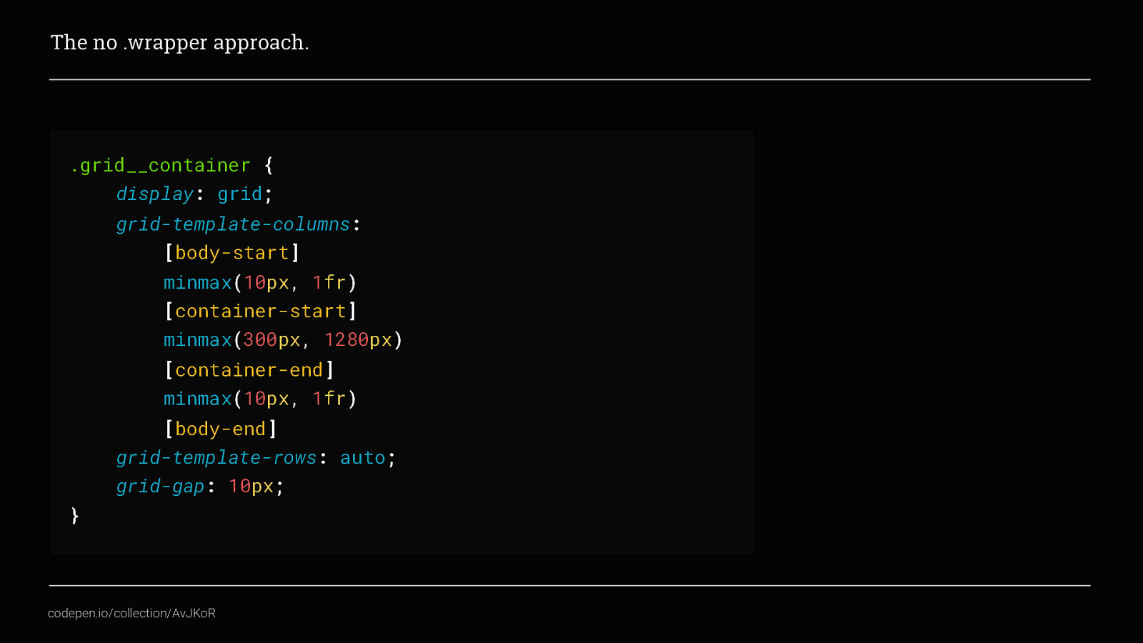
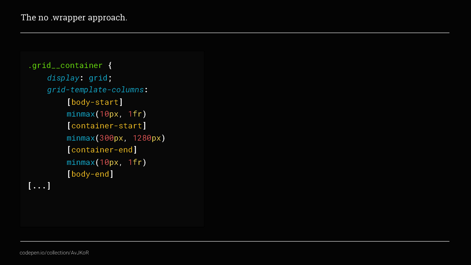
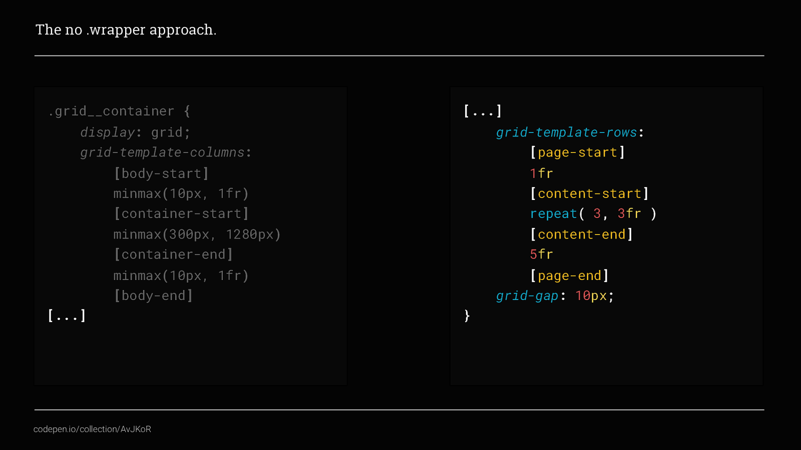
What you can see is, I’ve named specific grid tracks to define the start and end points for the 3 key template areas of my page. A main content area and another column on each side to create the site gutters. Visually it would look something like this.
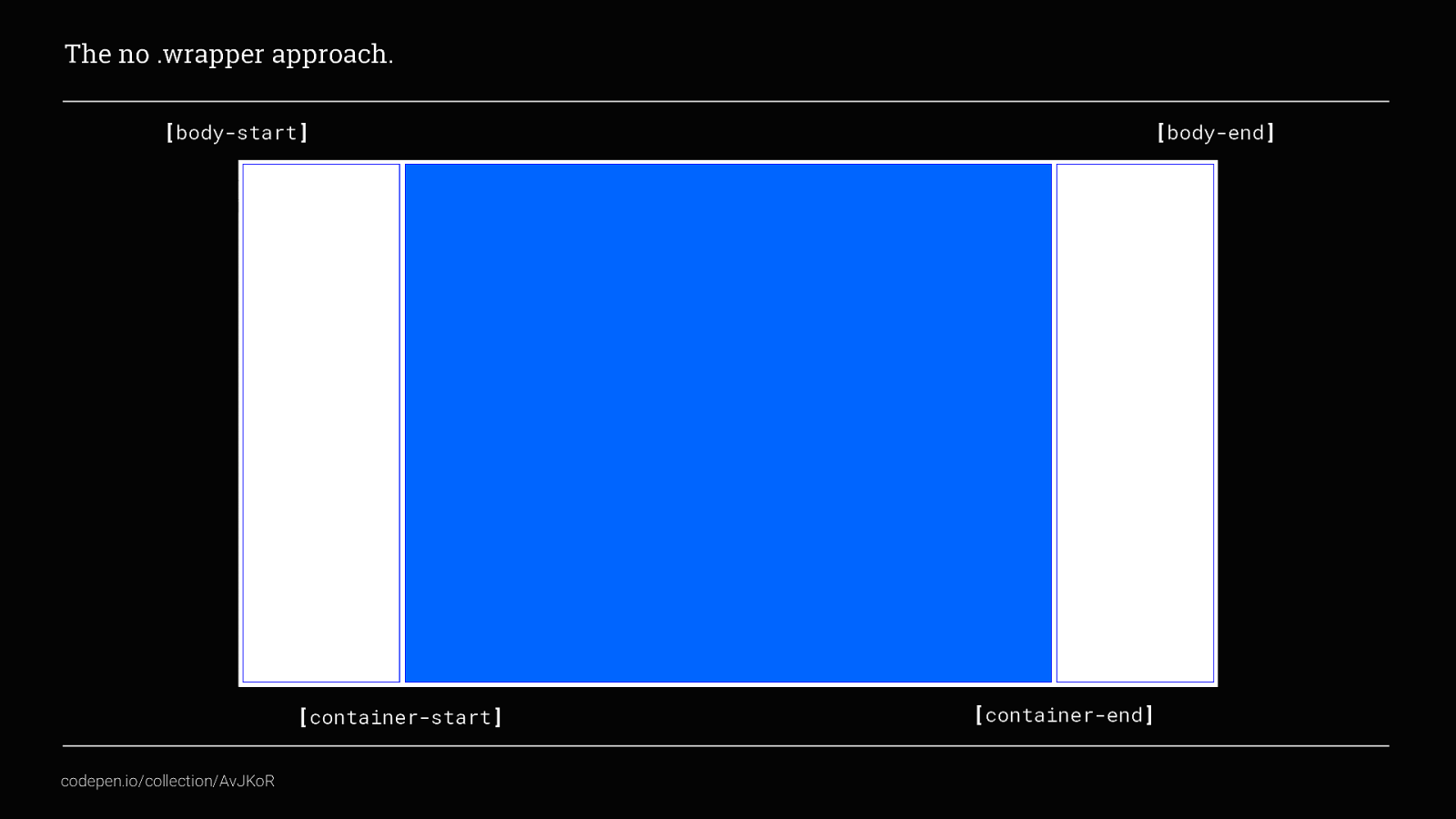
Here you can see how body-start and container-start define the left gutter area, container-start and container-end define the content container and then container-end / body-end define our right gutter area Then using the minmax() function, we also used earlier, as the browser window changes size we have a content area that will never be narrower than 300px and never wider than 1280px, and page gutter fill the available space but never get narrower than 10px, which looks like this
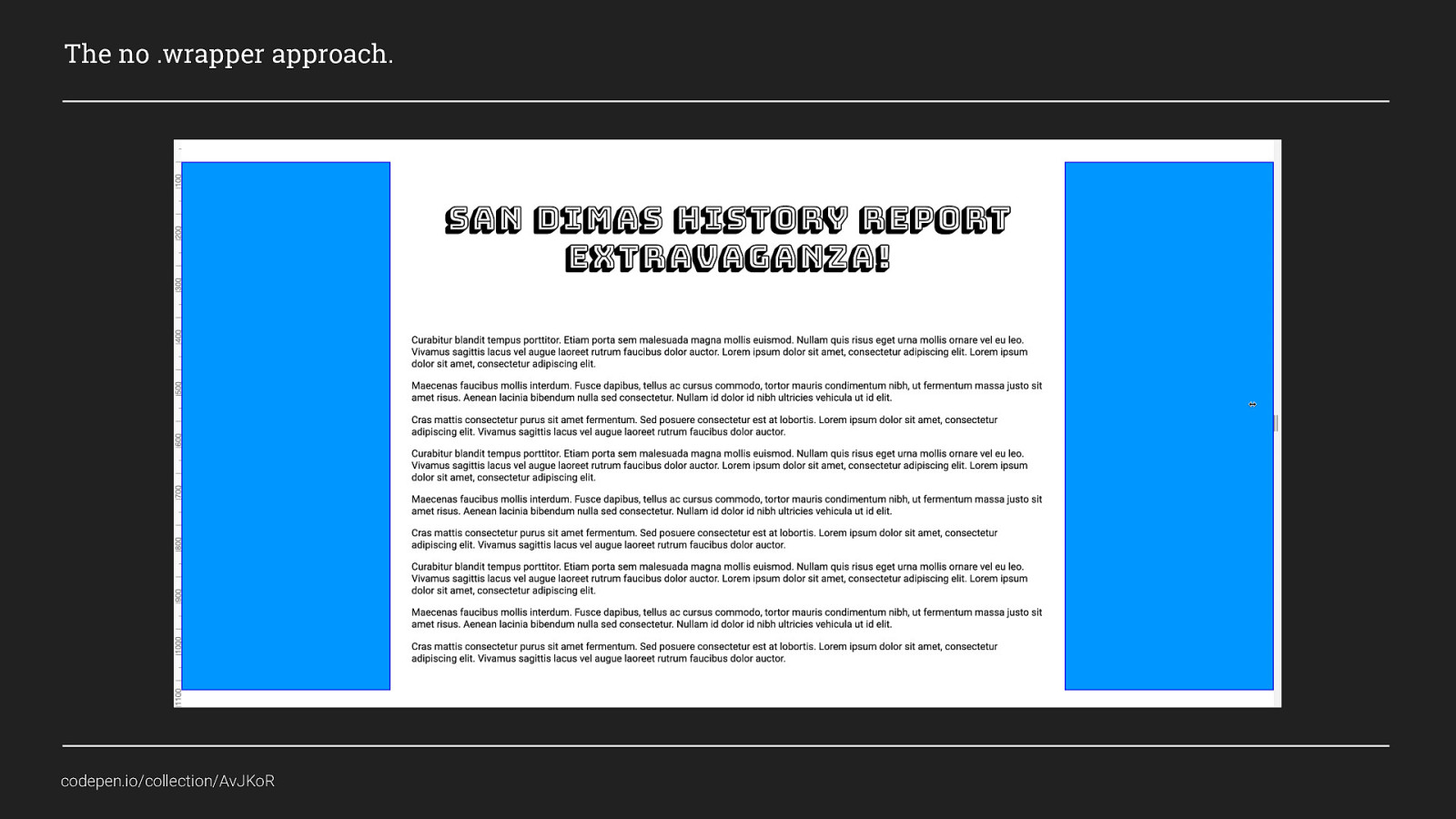
In this example, the blue areas show the gutters collapsing This is a pretty simple example so far, it gives us a content area and gutters without needing to use a wrapper div. But why is this useful? Well there are a lot of ways you could use this:
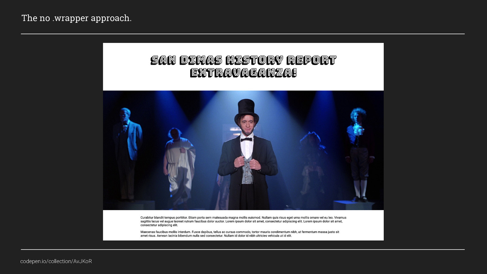
I mentioned earlier that I work mostly with WordPress, and with the new Gutenburg editor we now need to ensure we allow fullwidth content to be added anywhere within the page so that content editors can create layouts like this. And I’m sure you will all agree, this is pretty common layout pattern nowadays. There is a title, a general text area and also a hero image or banner that fills the width of the screen. In the old days to achieve this we would have needed to use:
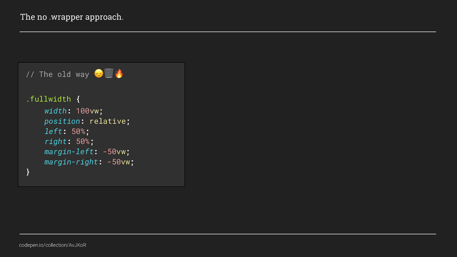
Some clever trickery with negative margins and the VW unit to break out of the container or wrapper and create fullwidth content. But by applying a grid to the entire page
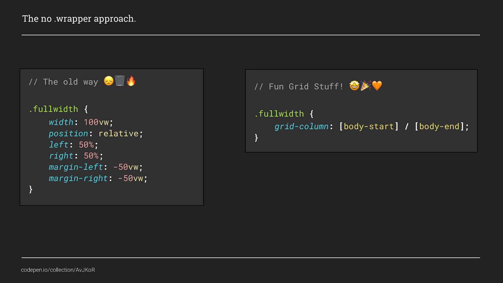
We can instead use grid-placement to place the content using the first and last track lines that we named body-start and body-end. Using Grid here gives us more than just flexible gutters, it allows us to place content anywhere on the page, at any width. Neat! We could also create more editorial style layouts, like this:
This isn’t a particularly complex magazine-style layout but I hope it gives you an idea of what can be done. If we revisit the grid layout we originally created

You should be able to see how this content was placed into such a simple grid layout to create something visually appealing
There are a couple of small things I changed for this (which if you are really interested you can check out the codepen), but the only real difference between this and my original grid is that I also defined some template rows as well.
So the code for the grid template started as this
But now also has this added to define the rows. By now, hopefully you will recognise this. Again we have defined 3 main content areas, but this time they consist of a total of 5 rows and all have a different fr value. What’s happening here is, if you remember, an fr unit is a fraction. So if you think of the page being divided into the total number of fr unit’s used. This page would then have a total of 15 equal parts. The first content area would take one part, the 3 rows of 3fr would take up 9 parts of the page, and the last content area would take up 5 equal parts.

Which if we view the layout again using Firefox’s grid inspector we can see how the content has been distributed across those rows and columns.

Hopefully that now gives you some idea of what you can do with even the simplest of grids. The idea here is not to advocate that wrapper div’s or breakpoints are bad, only that Grid gives us ways to control our content across devices and browsers without us always having to rely on breakpoints or extra markup. This makes our code more lightweight and easier to maintain as well.
Now, I said before I was going to show you two examples of techniques you can use in production, This last example I want to show, can’t be used in production yet. It does combine both of the previous examples, AND it also uses both breakpoints and container divs, and I’m pretty sure you will agree that it is excellent! And that is
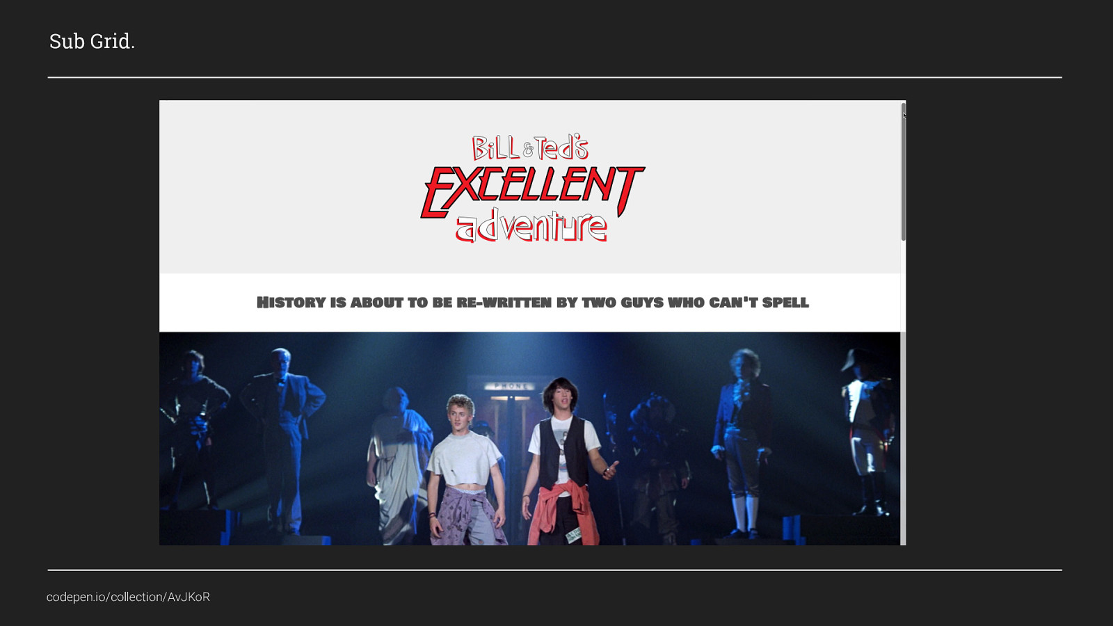
Sub Grid. As I said this isn’t something you can use in production yet, but when you can, it’s going to change all of the rules all over again!
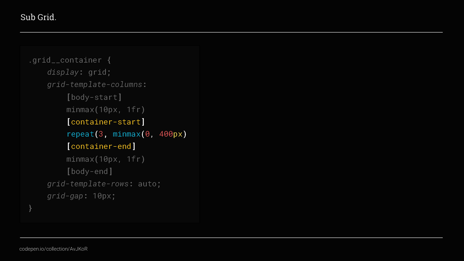
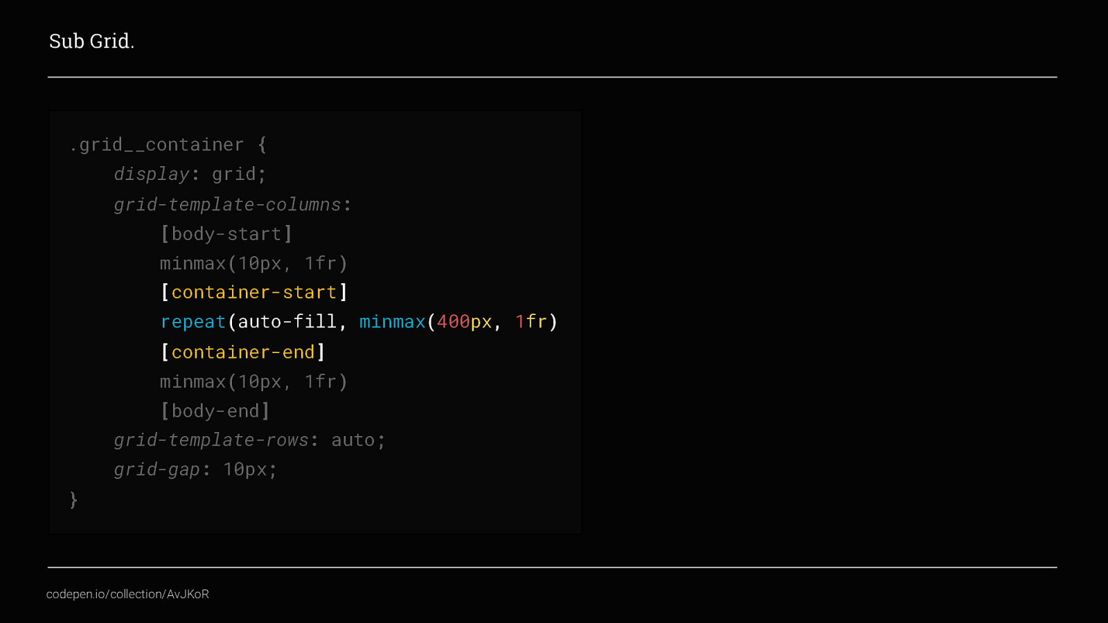
Let’s go back to our original no wrapper approach, but this time instead of only having one column in the main container area, we will combine the repeat() function with the minmax function to give us 3 columns that each have no minimum width but a maximum width of 400px. Combined with the grid-gap value it gives us a container area that is 1220px wide on desktop Our grid layout would now look something like this instead
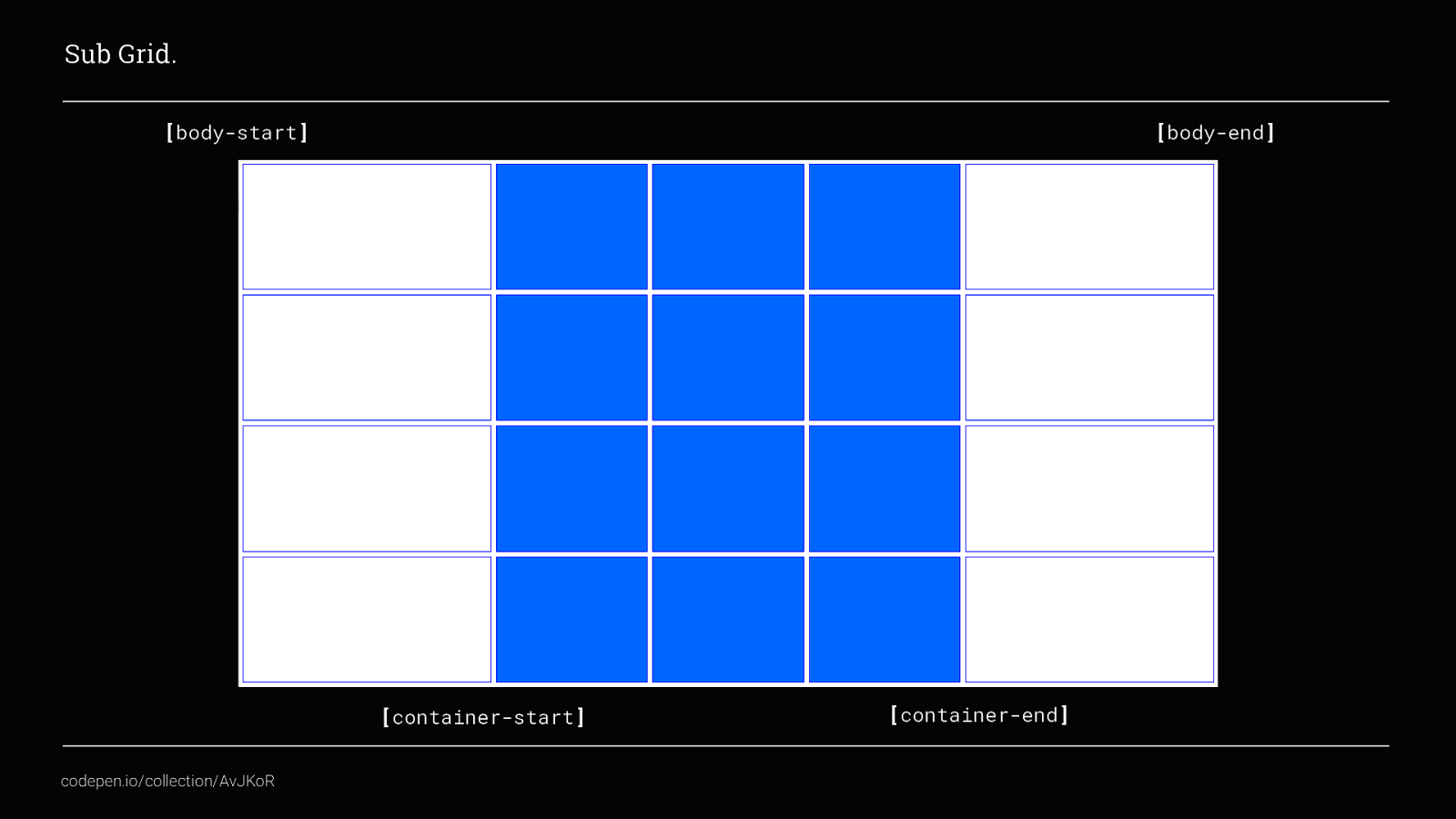
We still have our outer columns that create our gutter and collapse down to a minimum size of 10px. We also now have 3 columns within our container area that you can place content into as well. At the moment though, in order to place content items only in the 3 columns within our container area we would have to do something like this
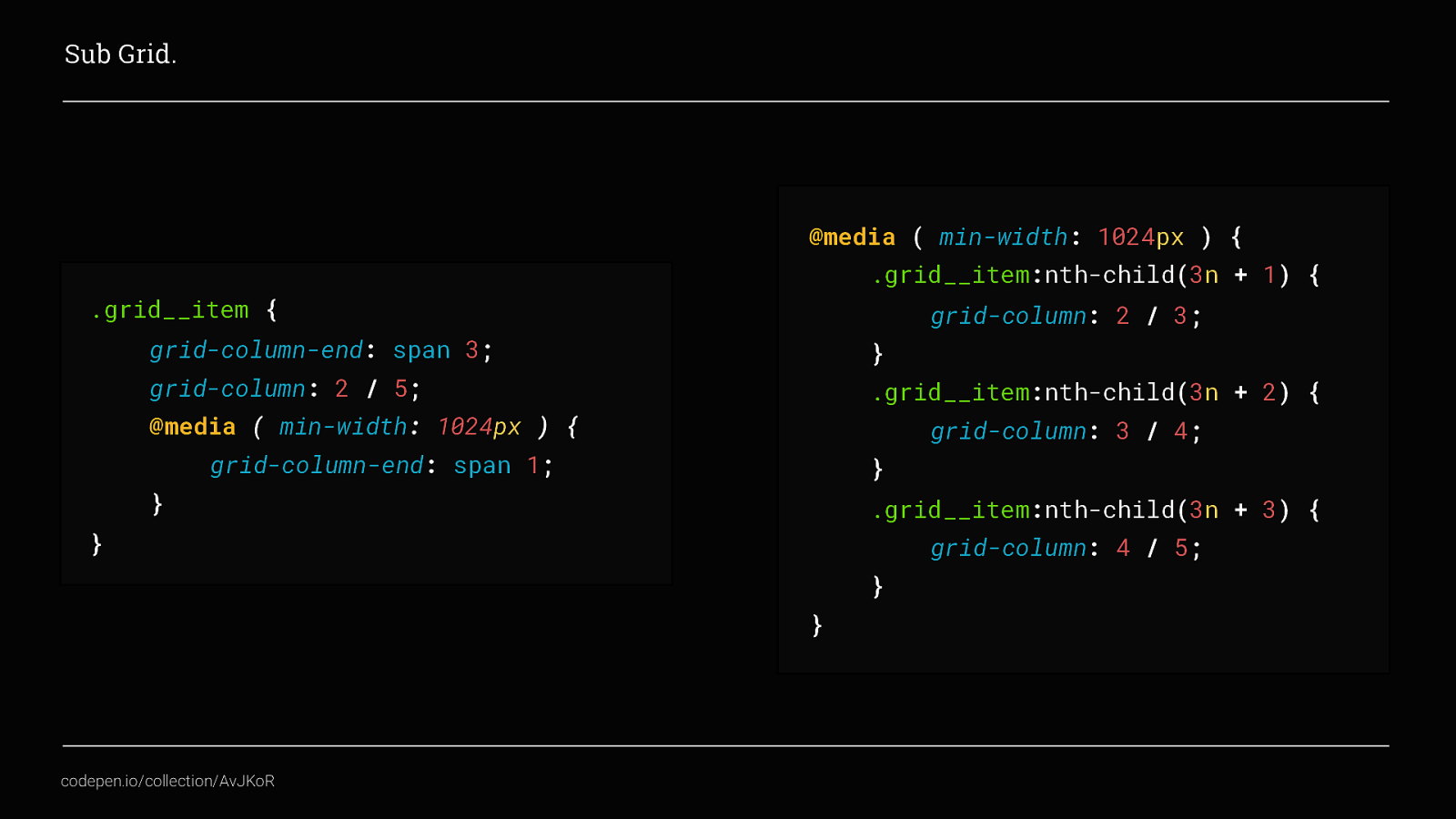
Here we’re using the trackline numbers rather than tracknames to target the tracklines within our container area and then media queries to explicitly place the content in different positions at different breakpoints. On mobile we are setting all grid items to span all 3 of the central columns so there is one per row, and then on desktop they span one column each to display 3 grid__items per row. This is fine and works well, but, if we think back to the first example I showed.
We don’t want to select all of the grid items and explicitly place them, and then change that placing at different breakpoints, we want the content to flow to fit the space available. Sub grid solves this for us
Firstly we need to change our outer grid so that the columns in the container area are repeated with an auto-fill value, and combine that with our minmax() function.
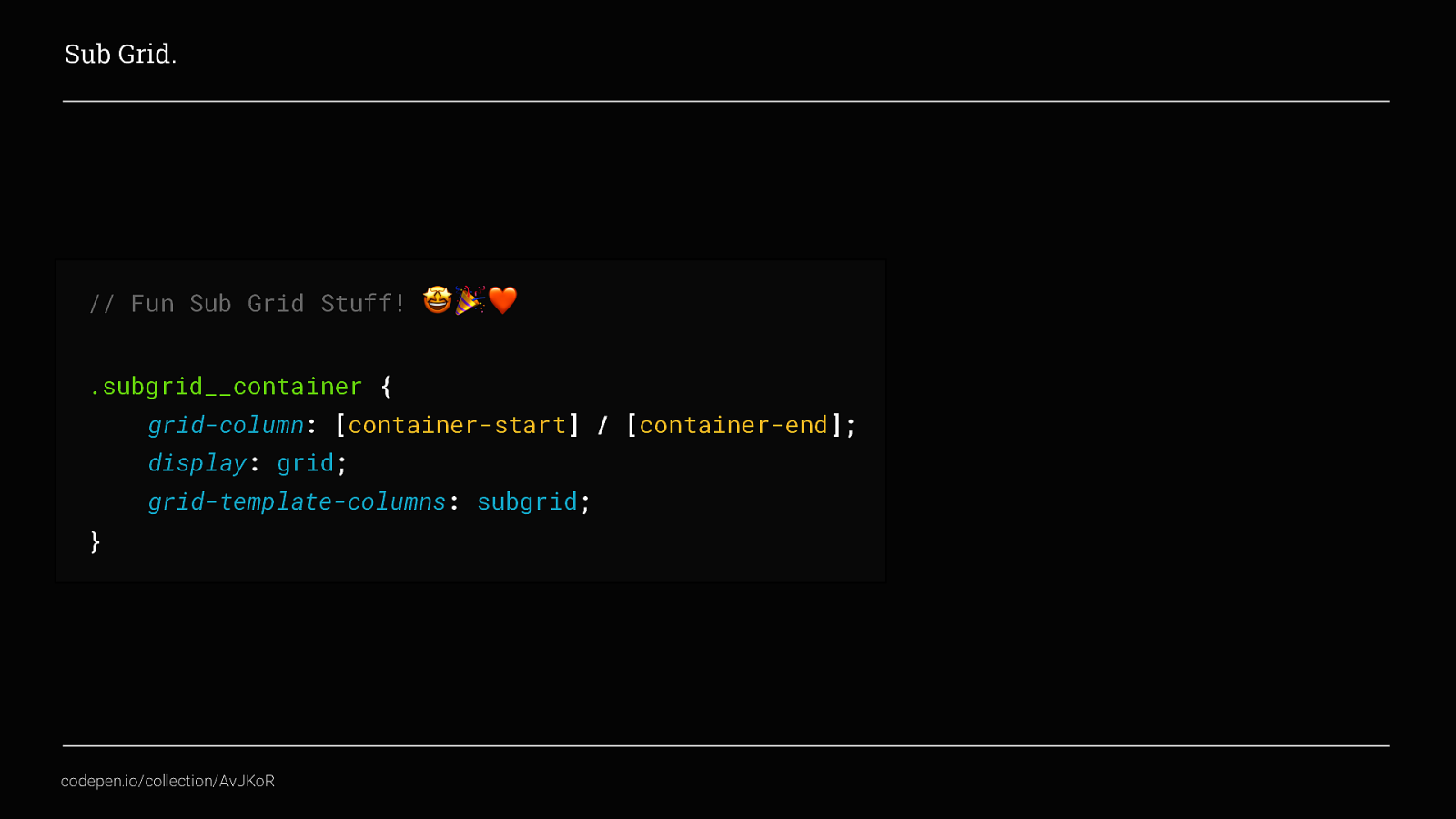
Now, we add a new container to the page for our grid items, place it so that it starts at container-start and ends at container-end, as we did before, and then apply display: Grid and for the grid-template-columns property apply sub-grid. This will then take the column settings from the parent grid, instead of having to define a parent grid and then define a child grid as well Neat!
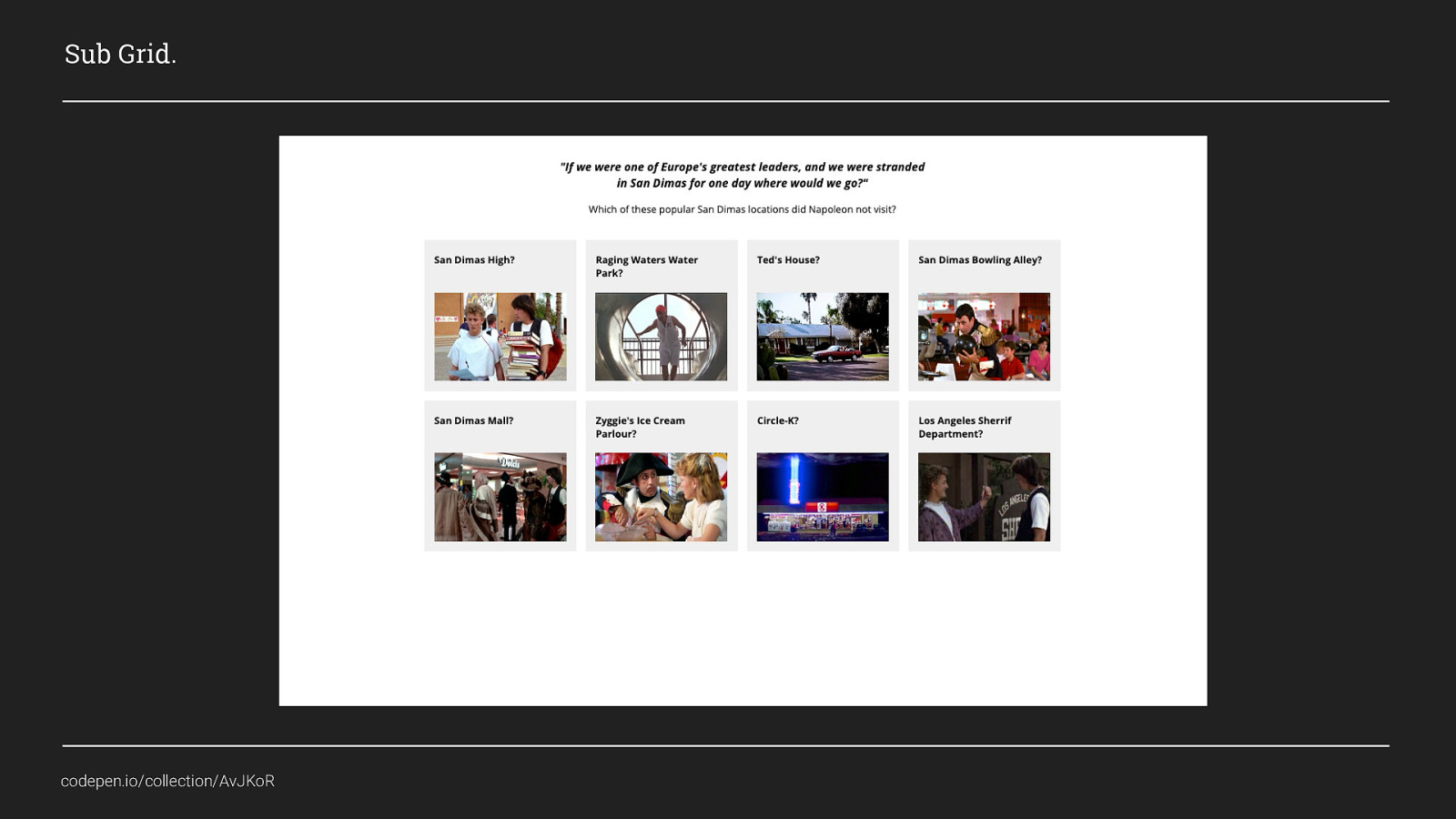
Now we’ve added the sub-grid stuff we can create layouts that look like this, as we scroll down we can see we have content that is full width and also standard content that fits within a container area and a list of posts that will outflow based on the size of the screen. I haven’t shown you all of the code used to create this page i.e. the fullwidth class would be placed specifically, but I’m sure you can all agree that using this (slide 83) and this (slide 84) creates far less code than having wrapper divs and breakpoints to control this layout.

This is only one example of using Sub Grid, and as of right now, you can only experiment with sub grid by using Firefox Nightly. But, I think it shows how powerful it will be when it ships

Hopefully this has been a pretty excellent adventure so far, but Grid isn’t perfect and there are a few gotcha’s that you need to be aware to help avoid it becoming a bogus journey.
The first thing to be aware of is ordering content.
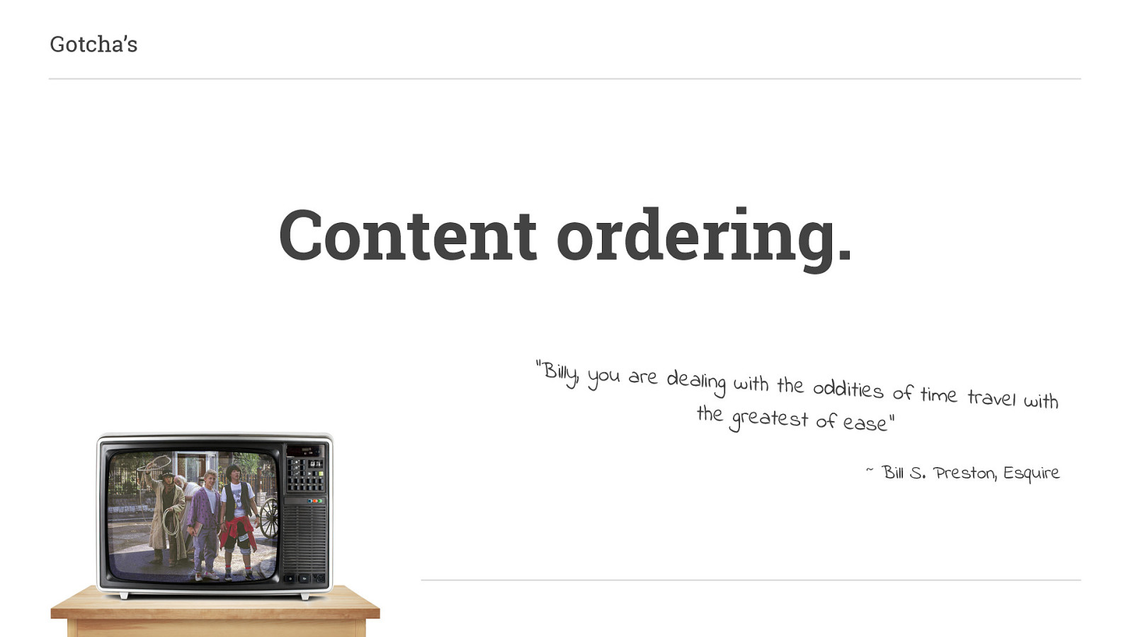
Content ordering isn’t a new concept, it was first introduced by Flexbox. It can be extremely handy but it should be used with caution.
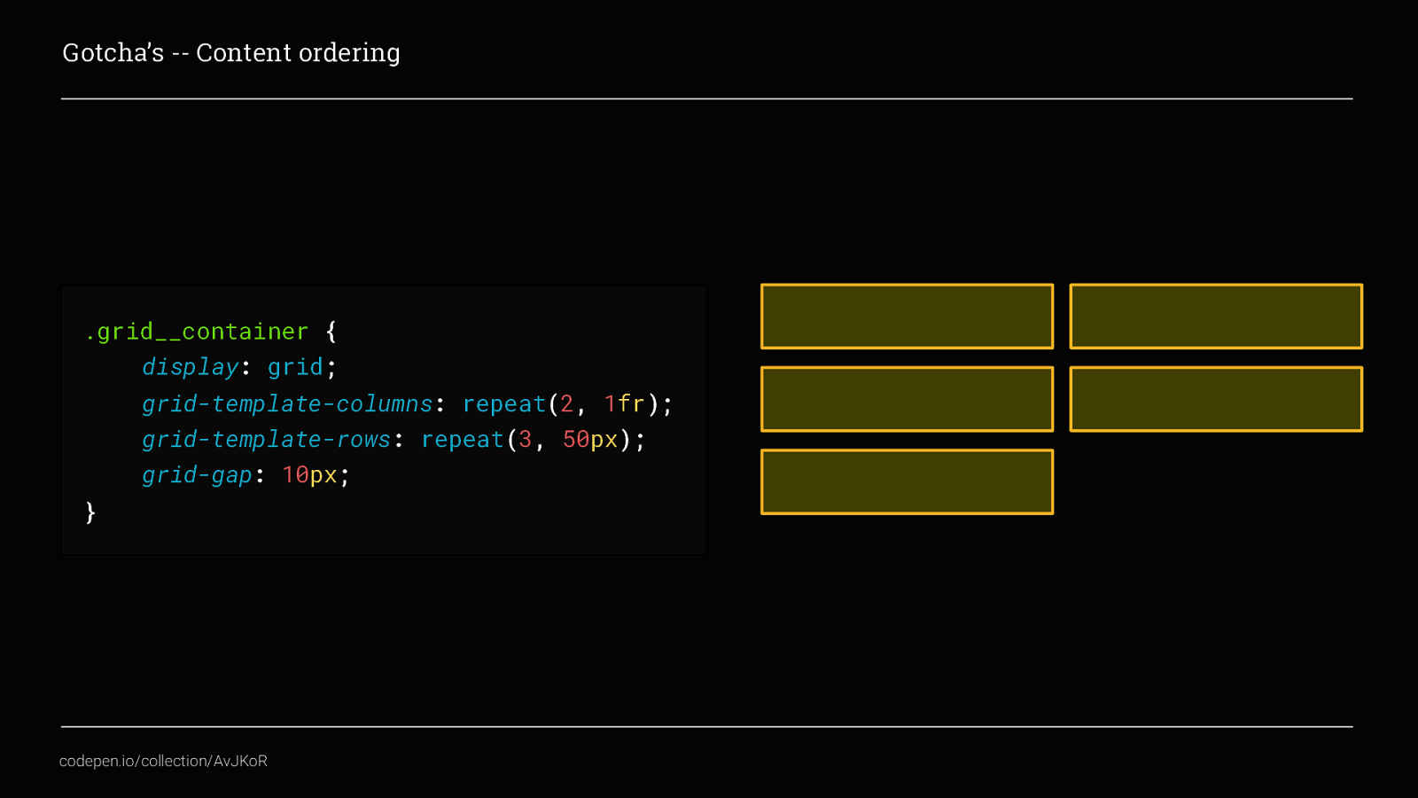
Going back to our earliest example of a grid, which looked like this, what we could do here is, rearrange the visual order of the grid items. We would do that by targeting the individual grid items
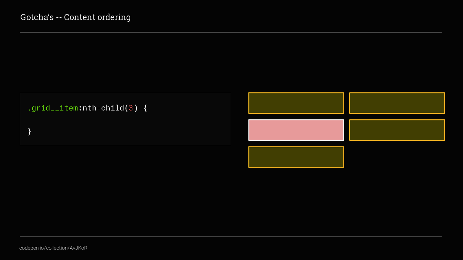
Here, I’ve used nth-child to select the 3rd grid item, then by applying an order…
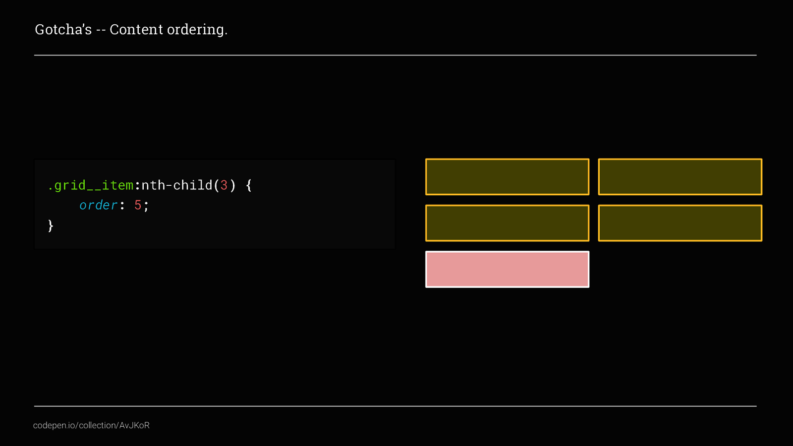
… we can move it so that it displays as the fifth item instead. We can also achieve this by using placement, again going back to one of the early examples
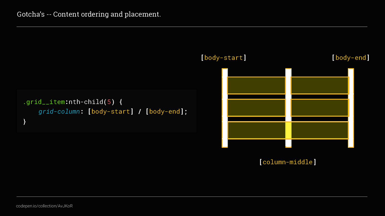
Here we used placement to set the fifth item to start at [body-start] and end at [body-end], spanning both columns. But what if we wanted that fifth element to actually display as the first? We would do that by making use of both grid-column and grid-row and explicitly placing the item in the grid like this
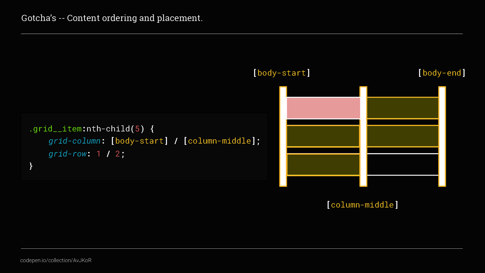
Here you can see I’ve used the track names to place the content in the first column and then used the track numbers to also make sure the fifth item actually displays in the first row. This then forces all of the other grid__items to auto-flow from the second position onwards. So what’s bad about that these examples? Well, although visually the order has changed, the source order has not. This can be very bad for your website’s accessibility and will affect those people navigating using keyboard or screen readers. In this example, people using keyboard tabbing to navigate the grid items would start at the second grid item, tab down to the fourth and then jump back to the beginning for the fifth item, this isn’t what they would be expecting and would create a jarring experience for the user.

Which would indeed be bogus
The next gotcha is always the elephant in the room when talking about CSS Grid and that’s
Internet Explorer! This is the one thing that seems to put most people off experimenting with Grid. But there is some support and for the part of the spec that is not supported at all, there are other ways to create a minimum viable experience for older browsers.
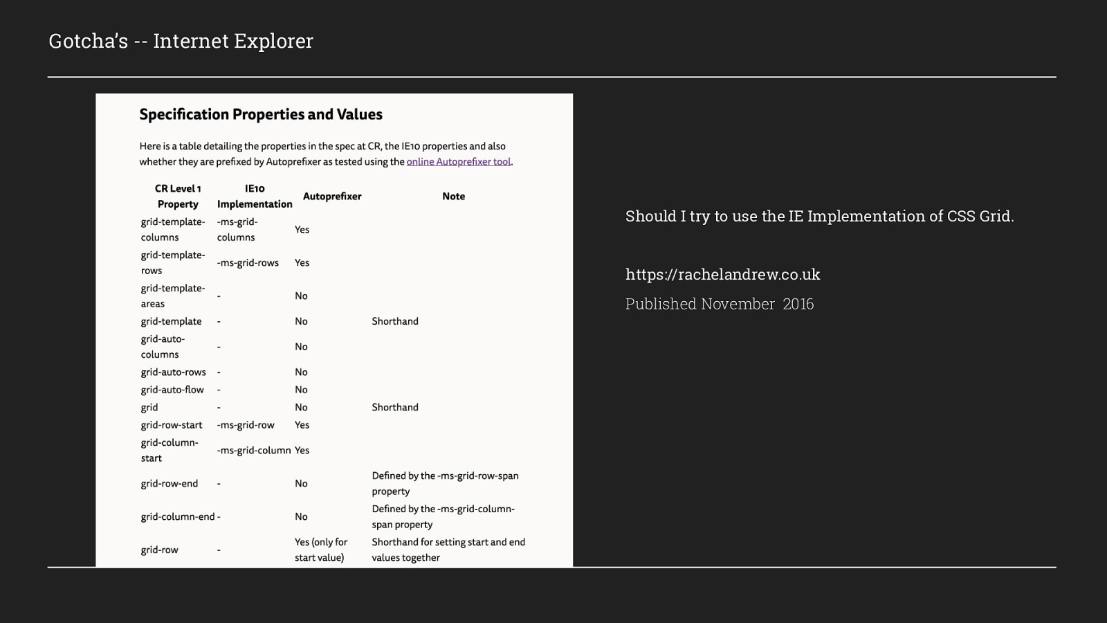
Rachel Andrew wrote a really excellent article back in 2016, outlining what parts of the specification is supported, what can be fixed automatically with autoprefixer and what can’t. I highly recommend you go and have a read of this as it is still very relevant today. However, there are a few things that I come across time and again, that I will cover now.
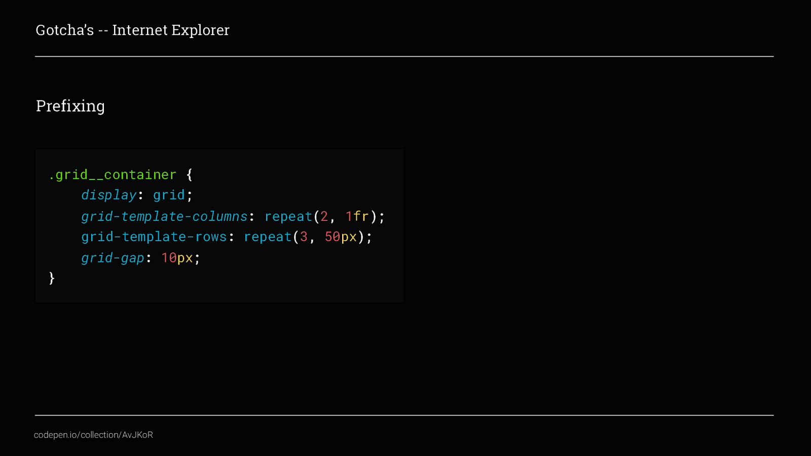
Probably the most common issues are around prefixing. Autoprefixer is an awesome tool but it can’t automatically prefix all the things for CSS Grid. Looking at this code, we have created a simple grid containing 2 columns and 3 rows, in order for this to work in IE as well we would need to add 3 new lines. These are:
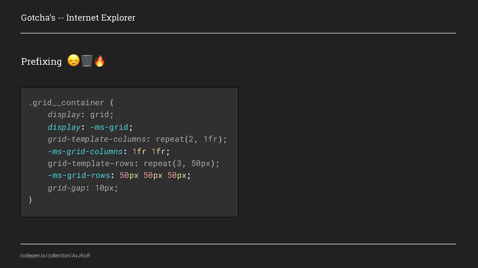
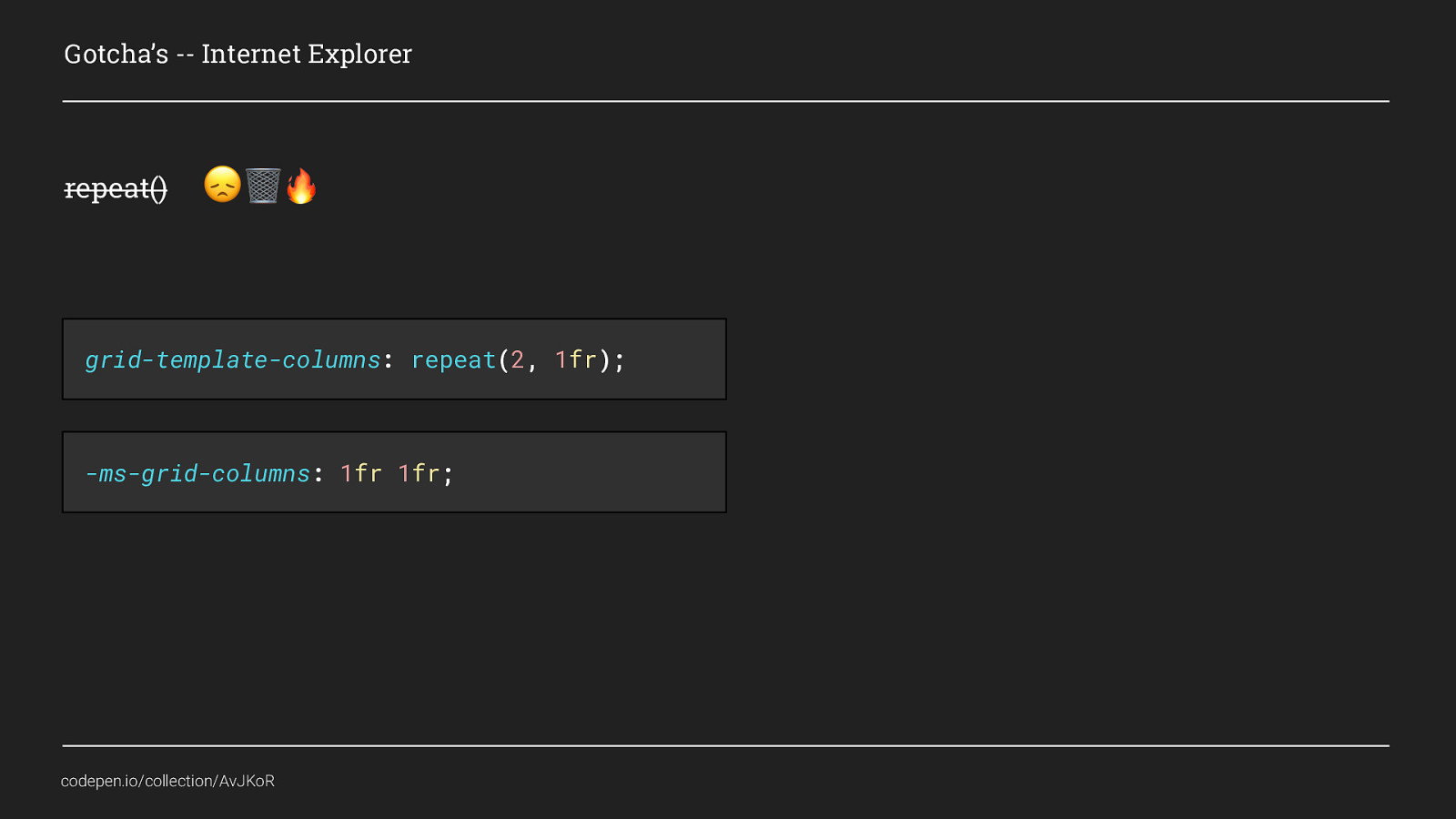
That is because, although repeat() is a super useful little function, it is sadly not supported at all Instead this would need to be written manually. And this is an area where using autoprefixer would catch us out, while it can automatically replace grid-template-columns with -ms-grid-columns, it can’t update the usage of the repeat() function as well. Therefore if there were 16 grid columns, we would still have to write 1fr 16 times.
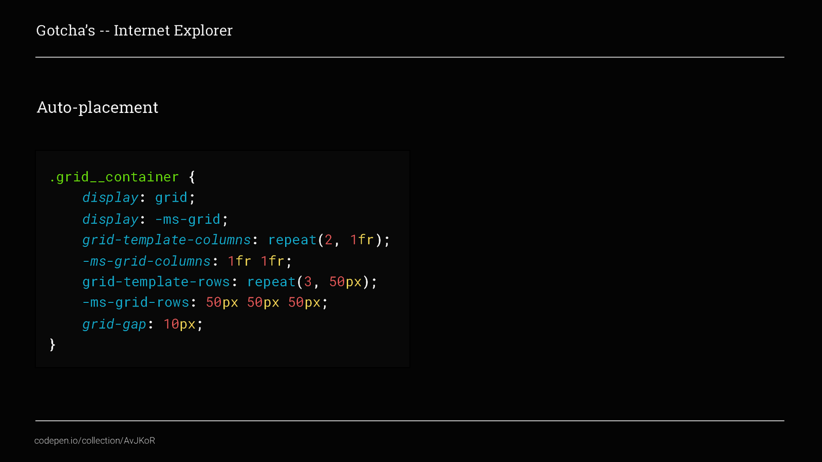
With these ms specific additions, we are part of the way towards getting our grid working in IE. Sadly htough, there is another key feature that is not supported and that’s is Auto-placement. This means that even though we have added these fallbacks to define the grid template, we still have to manually place all of the grid__items within. If we don’t then every grid item will display in column one and row one.
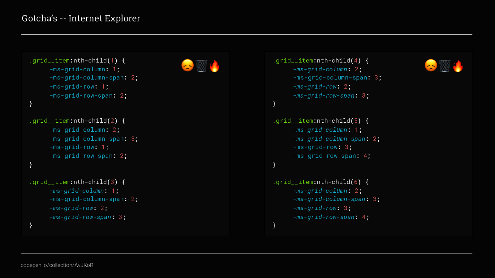
I will admit this does look hideous, but it shouldn’t seem too unfamiliar because we’ve already covered placing content in some detail. The difference here is that there is no shortcut to specify both the start and end, instead -ms-grid-column replaces grid-column-start and -ms-grid-column-span replaces grid-column-end.
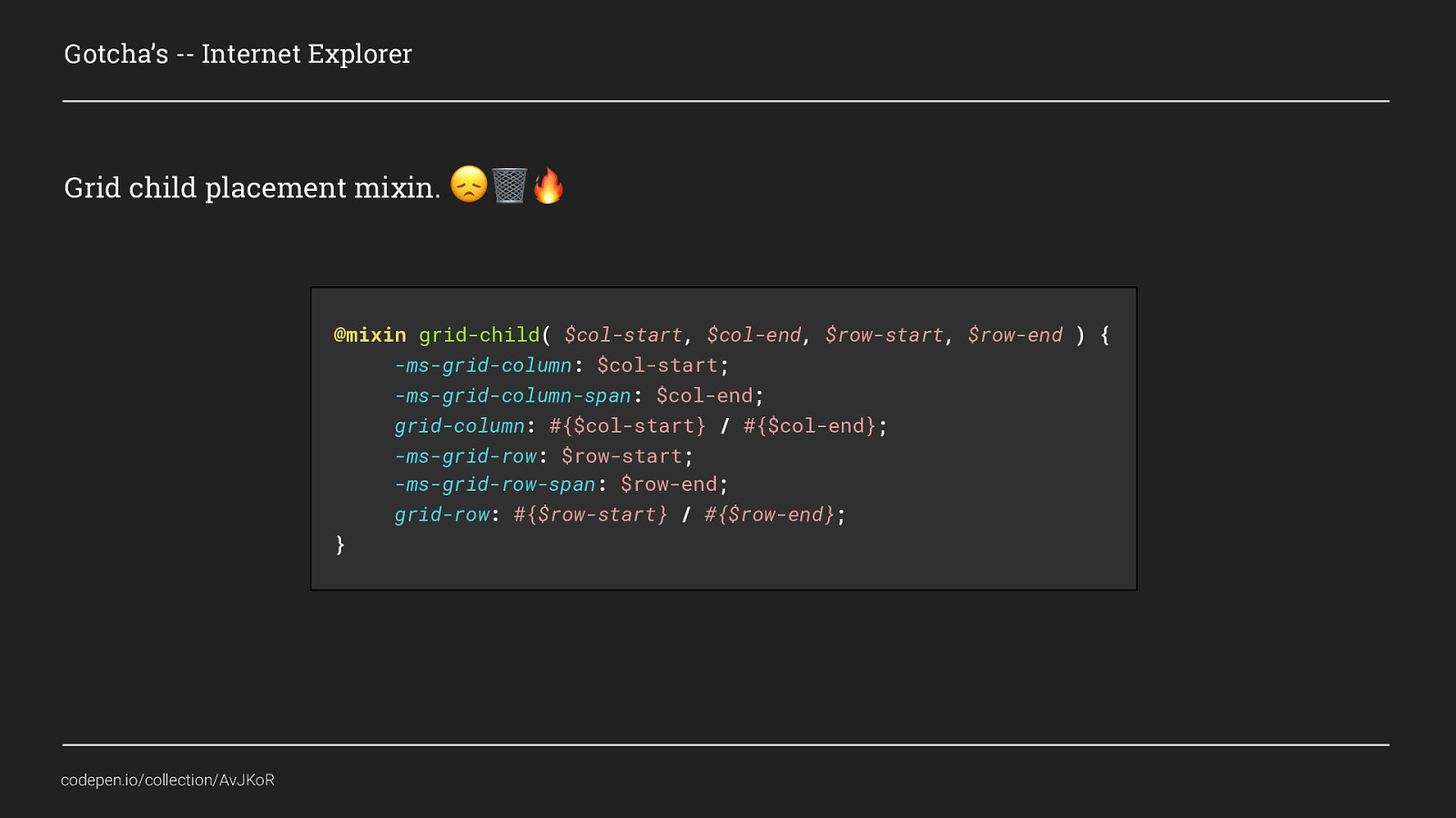
This is a lot of code, but it if you use sass or less it can be tidied up using a mixin. All this mixin is doing is asking for values for - grid-column-start, - grid-column-end, - grid-row-start, - grid-row-end and applying them to both the standard Grid properties and also the IE fallbacks in one nice, repeatable bit of code.
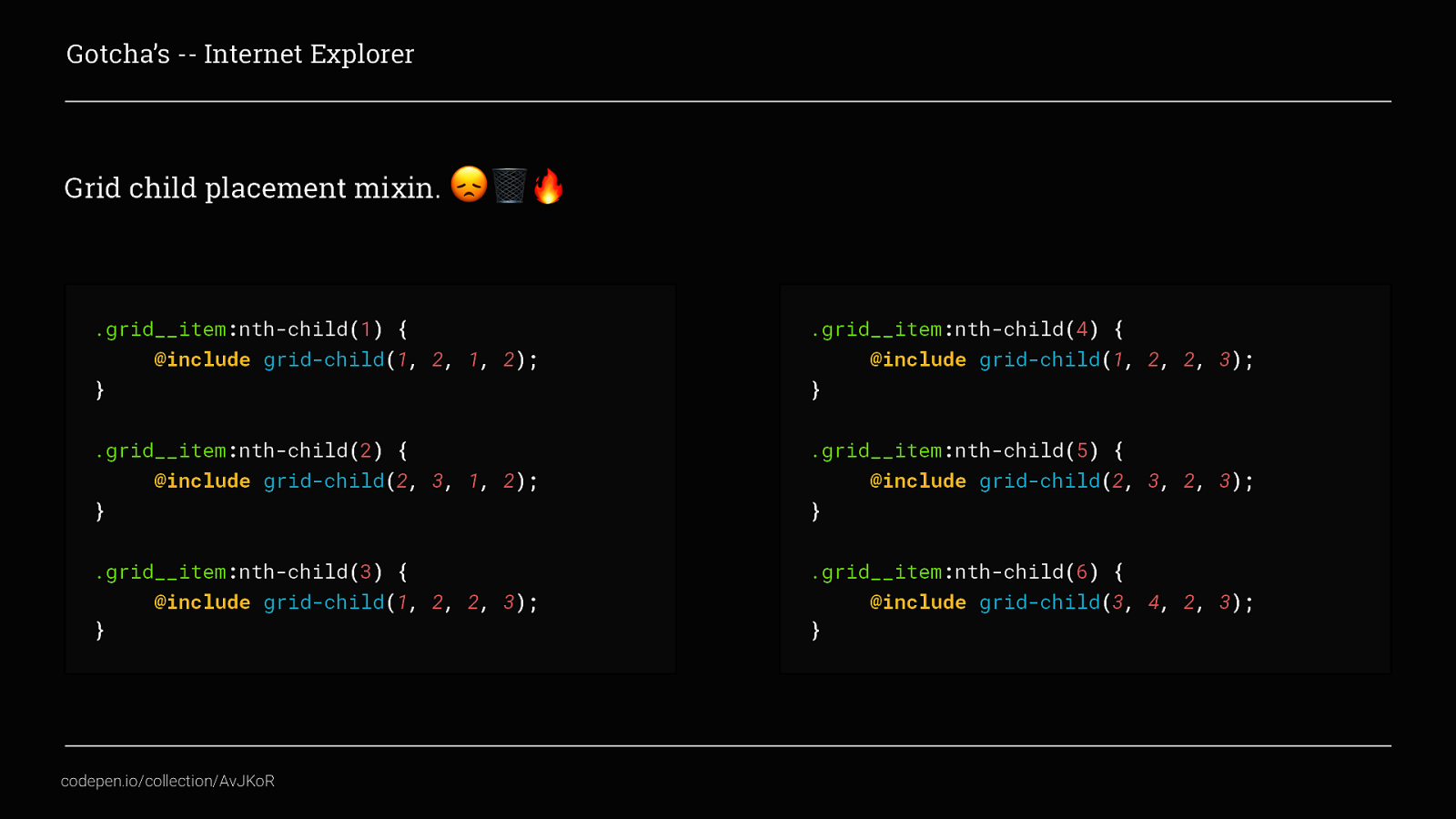
Which when applied would look like this. I’m sure you agree is much nicer when you see it like this. This is just one mixin example to beat the volume of code needed to support IE and speed up your development time. There are loads of ways you could do this.
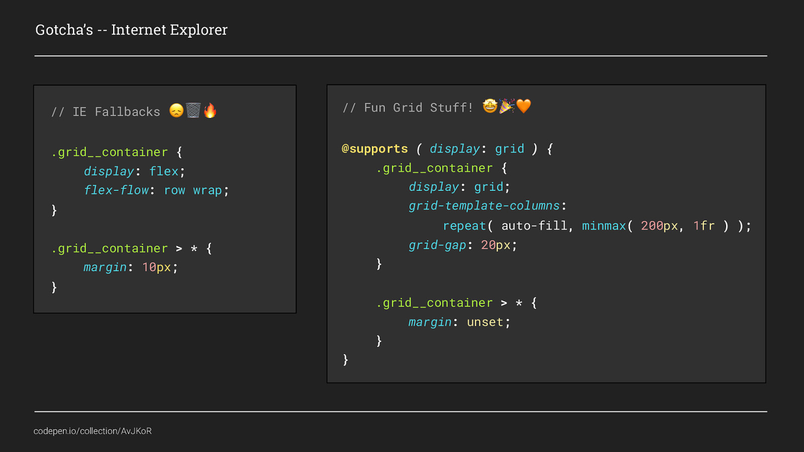
And of course, if that still doesn’t work for you, you could use @supports as I showed earlier and use a different layout method as a default and only use grid where it has proper support. Because, when supporting older browsers, the aim is not to provide exactly the same experience across all browsers and devices, but instead to allow the layouts to degrade nicely and ensure you provide a minimum viable experience.

Supporting IE is bogus but it’s not as hideous as everyone thinks
So, wrapping up..
Grid is Awesome!


-CSS Grid is supported by 91.89% of browsers


Hopefully, I have inspired you to go off and create some amazing layouts of your own, The CSS Grid Specification really does make it easier to change the way we think about flexible design and layouts.
We are no longer constrained to specific, pixel-perfect requirements. Our content can flow based on the amount of space available. And this type of flexibility is really, for me, what responsive layouts are all about.
Thank you for listening. CodePen Collection: codepen.io/collection/AvJKoR/