Disruptive Design: Harmful Patterns and Bad Practice
Laura Kalbag ind.ielaurakalbag.com@laurakalbag
A presentation at From Business To Buttons 2019 in May 2019 in Stockholm, Sweden by Laura Kalbag
Laura Kalbag ind.ielaurakalbag.com@laurakalbag

I found this terrifying image in an image search. It’s part of a person’s presentation. I couldn’t find the rest of the presentation, but I can imagine the person presenting it might’ve looked a bit different from little old me.
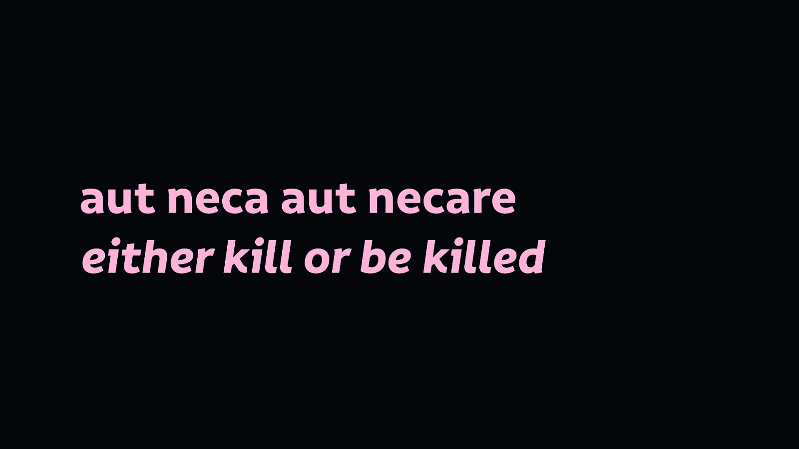
It’s deliberately invoking the latin phrase “aut neca aut necare”, “either kill or be killed.” Honestly, I feel like this is a common attitude in technology today.

A very early example of disruptive technology was the printing press, making access to knowledge and education more widely available than ever before. It disrupted the control over knowledge that was held by book scribes and wealthy people.

The web and the increasing availability of the internet has brought another disruptive wave of democratisation. Making the acquisition of knowledge and services less limited by geographic proximity or access to schools and libraries.
I got into the web industry over a decade and a half ago not just because I loved the idea of the web, but because I could learn everything I needed to participate with the web.
But let’s face it, these aren’t the disruptions we’re usually talking about when we talk about disruption.

In technology today, disruption often means destruction, taking technology into other industries and taking over. airbnb makes it harder for people to rent housing in cities. Uber is discouraging people from using public transport and putting more cars on the road.

We should take care to examine the words we use, the goals they represent and the effects they have on the work we do. It’s too easy to dress up what we’re doing with jargon and euphemistic terms.
Like you can’t read a piece on Medium without tripping over the term “engagement.” But what does it mean? What are we trying to achieve with engagement? Views? Clicks? Interactions? Prolonged use?
Engagement that doesn’t serve a user’s agenda is addiction. Their addiction makes us money.
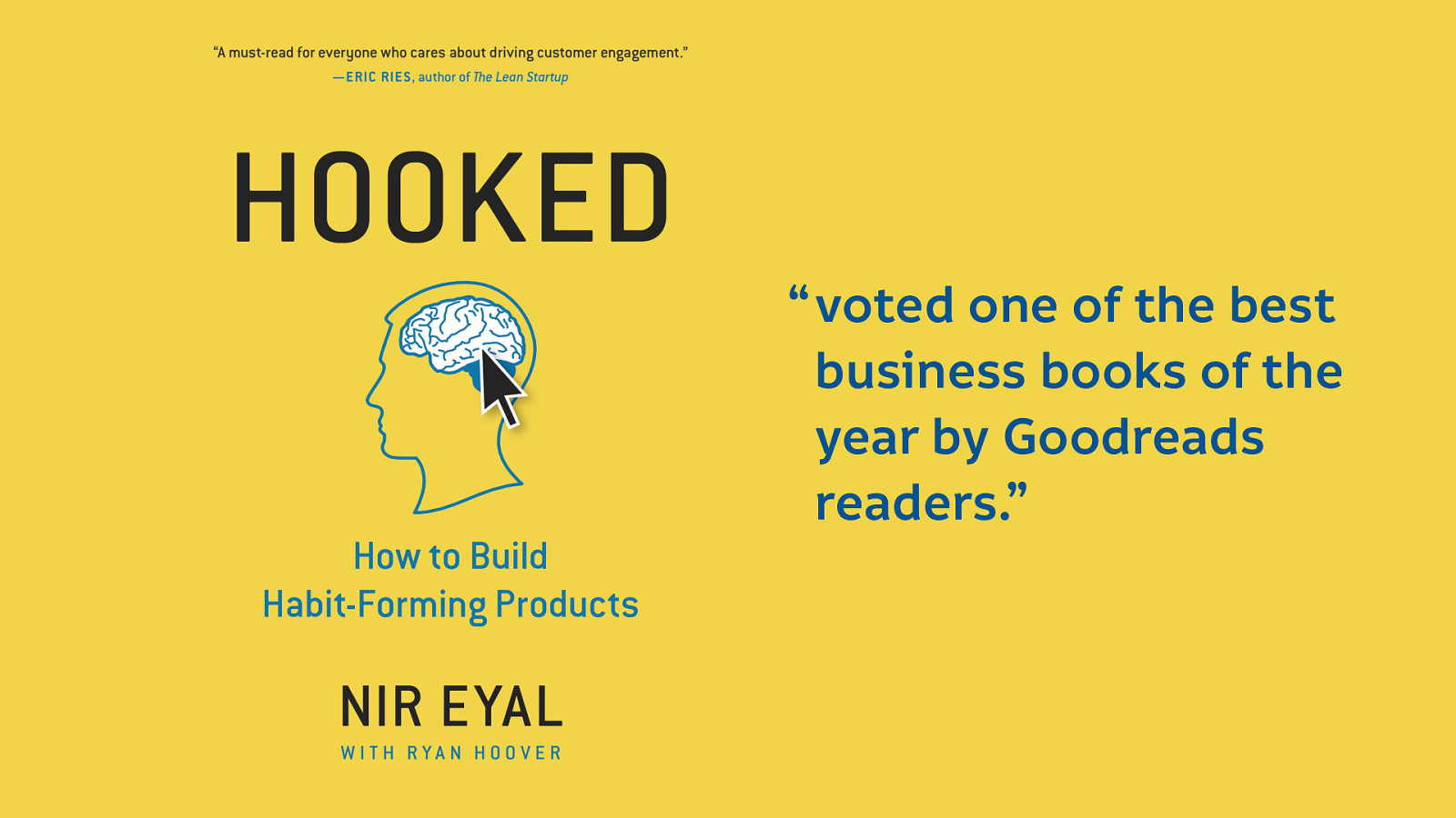
I’m not exaggerating. We live in a world where this book exists and was “voted one of the best business books of the year by Goodreads readers.”
They say admitting you have a problem is the first step to recovery. And Dear Tech industry, we have problems.

The title of this presentation says I’ll talk about patterns, and so I best get into it. I’ve not got long, so I want to share with you a few patterns representative of some of the problems we have in this industry. The kinds of patterns, that like the words we use, we use so frequently we may not even stop to consider why.
As the author of a book about accessibility, it makes sense that I start with some patterns that affect accessibility. In case you don’t know what I mean by accessibility in technology: Accessibility is the degree to which technology is usable by as many people as possible, especially disabled people who are too easily excluded from what we build.
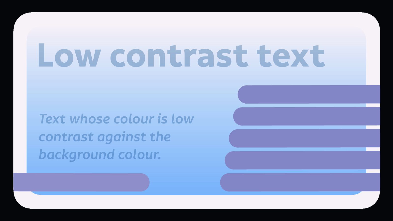
Low contrast text is text whose colour is low contrast against the background colour. (Like this slide)
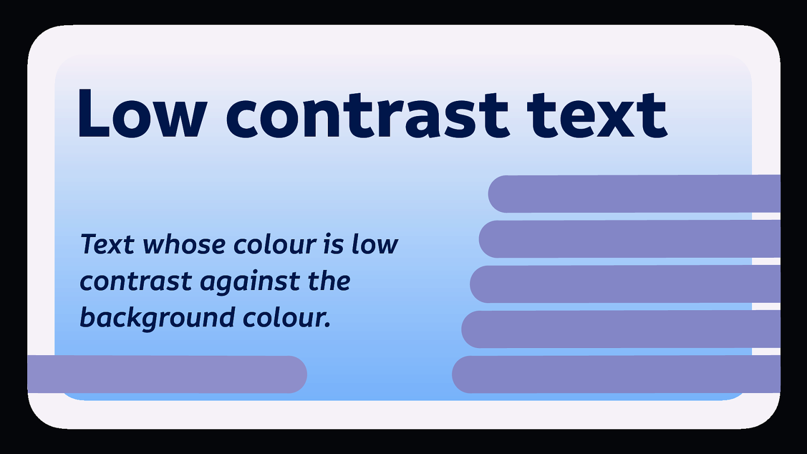
That’s a more readable contrast now…
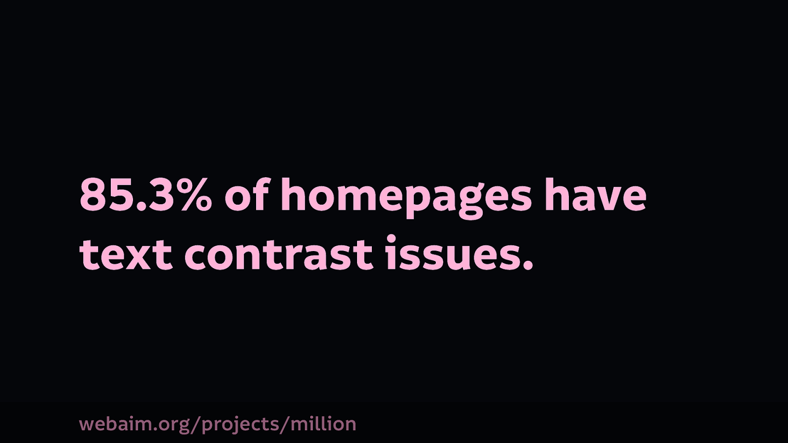
A few months ago, WebAim, a web accessibility organisation, analysed the top 1 million websites for accessibility. Of all the issues they found on these 1 million sites, low contrast text was the most prevalent. WebAim’s 1 million project
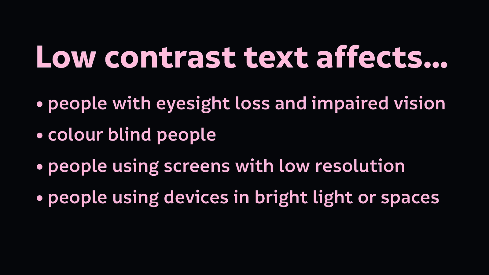
Low contrast text has a perhaps surprisingly big impact. It affects:
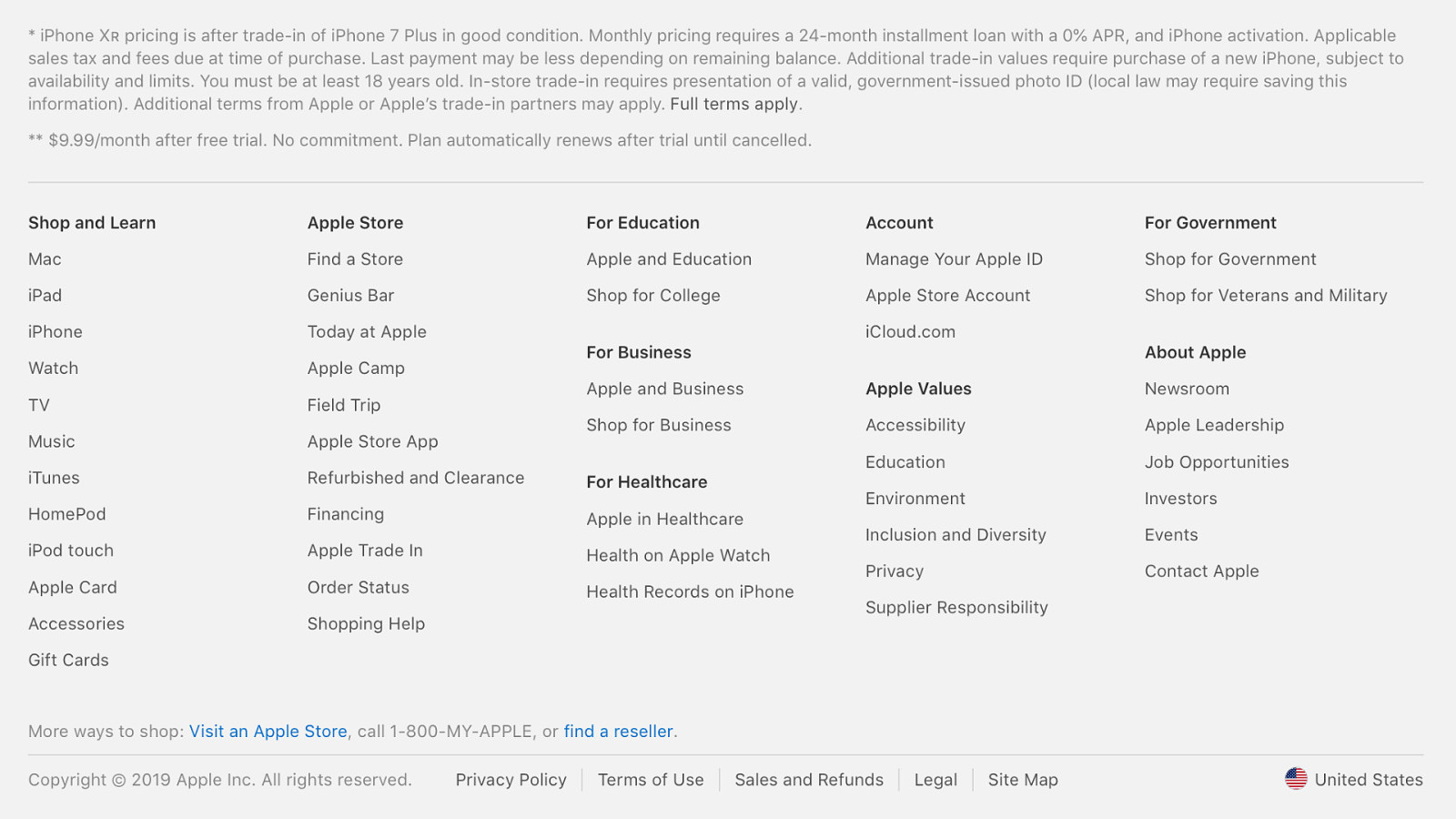
Most often, low contrast text is found in places like footers, for secondary information or legal text. (Specifically in this screenshot, the terms and conditions, and the non-link text at the bottom of this screenshot is too low contrast…)
We use colour contrast to add information hierarchy. As designers, it’s a common choice to lighten text which we consider less important, to help people focus on the text we consider important.
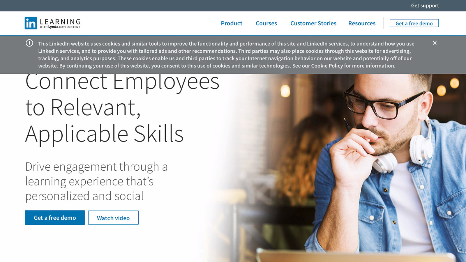
But if you make your text so low contrast that people find it difficult to read, your decision about what content is important has an even greater impact…
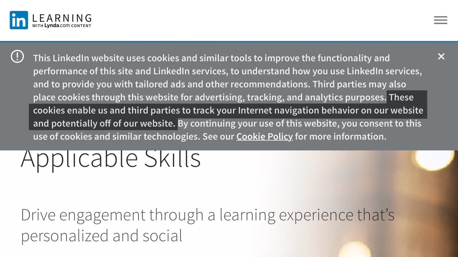
What if you’re making important information about how LinkedIn Learning’s cookies operate harder for people to read? “These cookies enable us and third parties to track your internet navigation behaviour on our website and potentially off our website…”
I’m cynical, but not so cynical that I believe the designer did this intentionally. They probably thought “people won’t read this anyway, let’s make it easy to dismiss…”
We have to question these assumptions, and the agenda behind them.
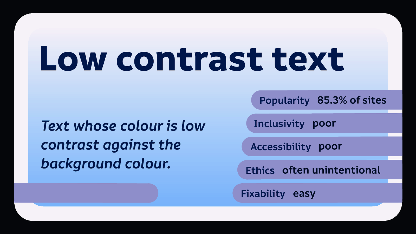
So summing up, low contrast text is: popular, is bad for inclusivity, and accessibility, but isn’t usually done maliciously.
Lucky for us all, it’s easy to fix.
We can still use contrast and colour to distinguish hierarchy, we just need to do so within a spectrum of readable text contrast.

Stéphanie Walter has a great article with guidelines and tools on her blog.
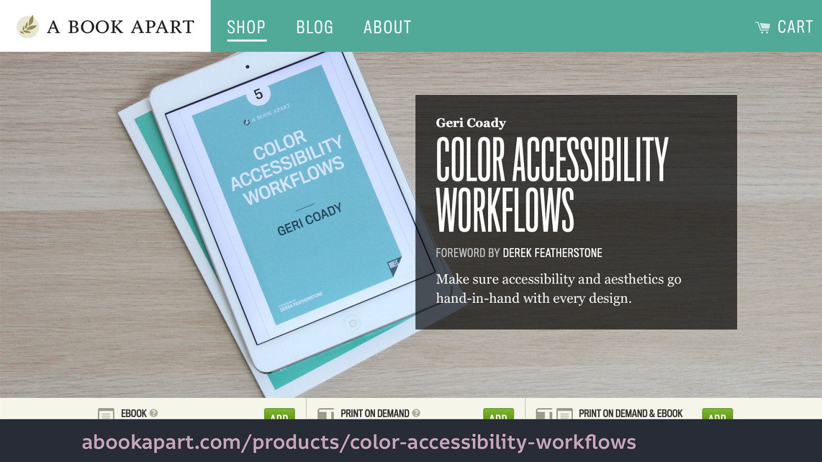
[Geri Coady’s Color Accessibility Workflows](https://abookapart.com/ products/color-accessibility-workflows) also covers the use and accessibility of colour and contrast in depth, which will help you create more inclusive technology.
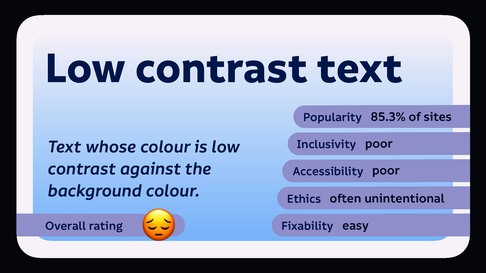
So I’m rating all these patterns, and the overall rating I’m giving low contrast text: 😔(sad pensive face.)
At this point, it’s probably good to note the difference between inclusivity and accessibility. Just in case you’re not sure which means what…

Accessibility is like adding an ugly ramp as an afterthought to the back of your newly-built shop building.

Inclusive design is like building your shop building with a ramp and stairs from the very beginning, trying to accommodate as many needs as possible. It’s remembering to add railings for people who need support, and bright lines on the steps so people who find it difficult to see them can use the steps safely.

And of course, inclusion is not exclusive to disabled people and people with impairments. When we talk about inclusivity in technology, we are usually talking about how to better include people from a variety of marginalised groups, who are not the users usually centred in technology.
Which means you can have accessibility without inclusivity. But it’s short-term and somewhat superficial. We need inclusivity to make better technology.

Most of the people who create most of today’s technology create it to suit their own needs. I’m talking about people who aren’t mostly white, usually men, relatively wealthy, heterosexual, cisgendered, college-educated, English-speaking, and able-bodied.
CAPTCHA is a challenge–response test used in computing to determine whether or not the user is human.
It’s an acronym for “Completely Automated Public Turing test to tell Computers and Humans Apart.” CAPTCHA forms are used to prevent bots from accessing a website, primarily so they cannot index a site or access its features repeatedly for free.
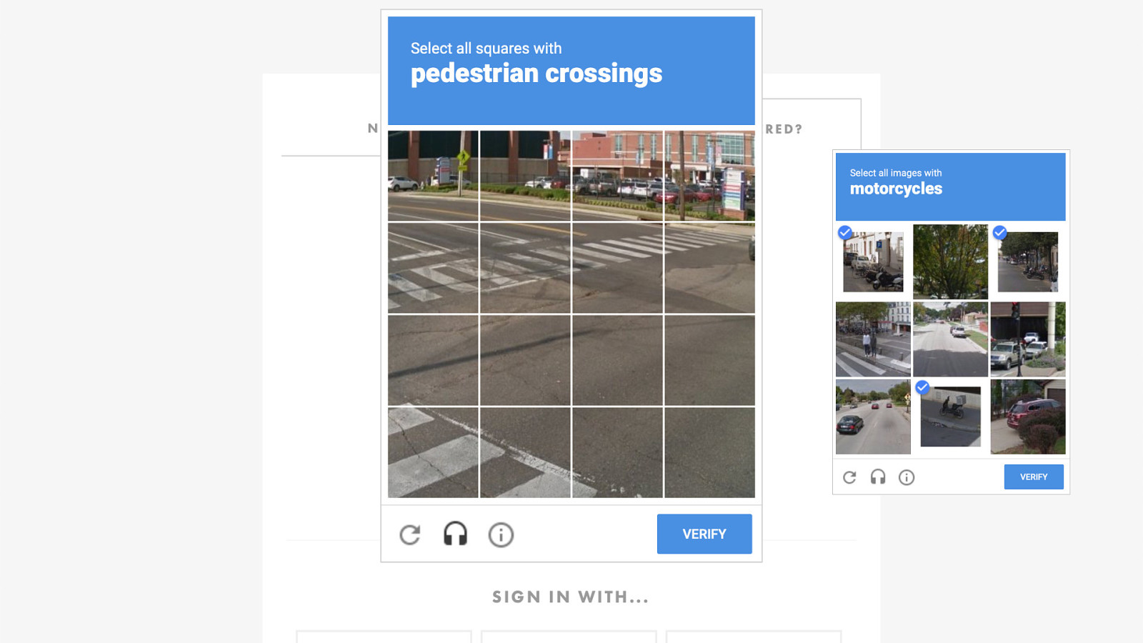
We used to have other types of CAPTCHAs, but nowadays CAPTCHAs are most likely to ask you to identify pedestrian crossings, traffic lights, and other geographic features that can assist with mapping. Detecting whether you’re human is mostly about the time delay and movement in your interactions…
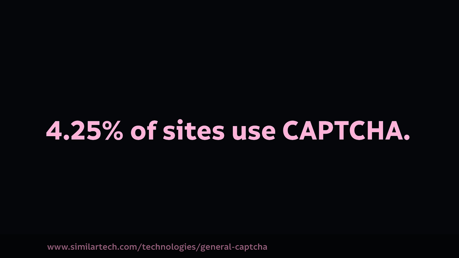
According to SimilarTech, 4.25% of sites use CAPTCHA.
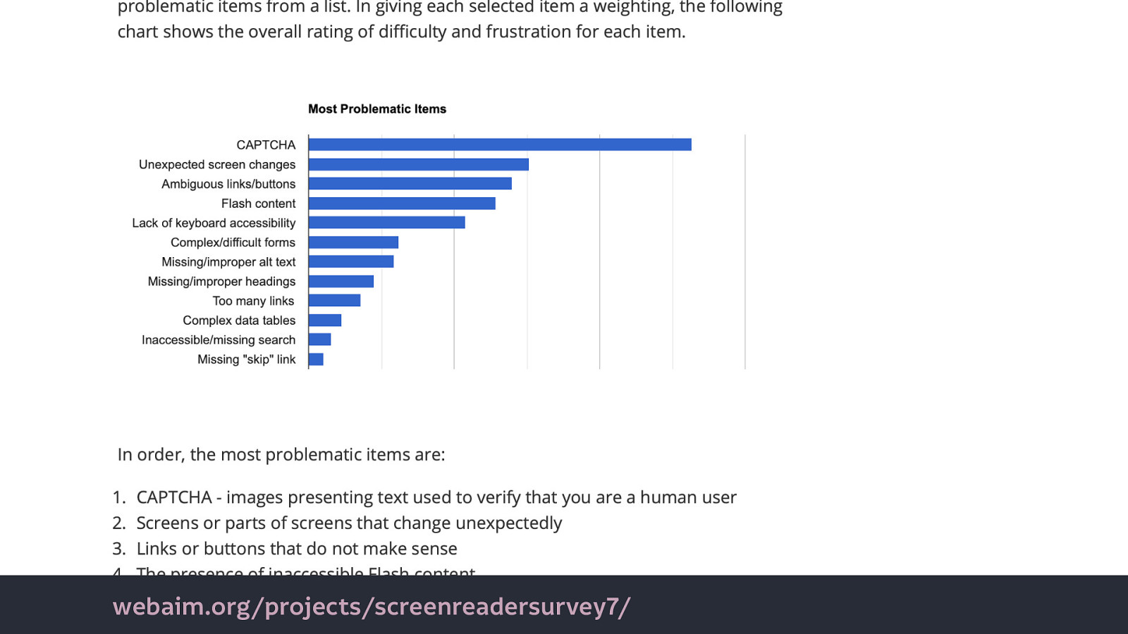
The popularity of CAPTCHAs is a major issue for people who use screenreaders (assistive technology which reads the content of the screen as audio or braille). In 2017, a WebAim survey of screen reader users reported CAPTCHA as significantly the most problematic feature when trying to access the web.
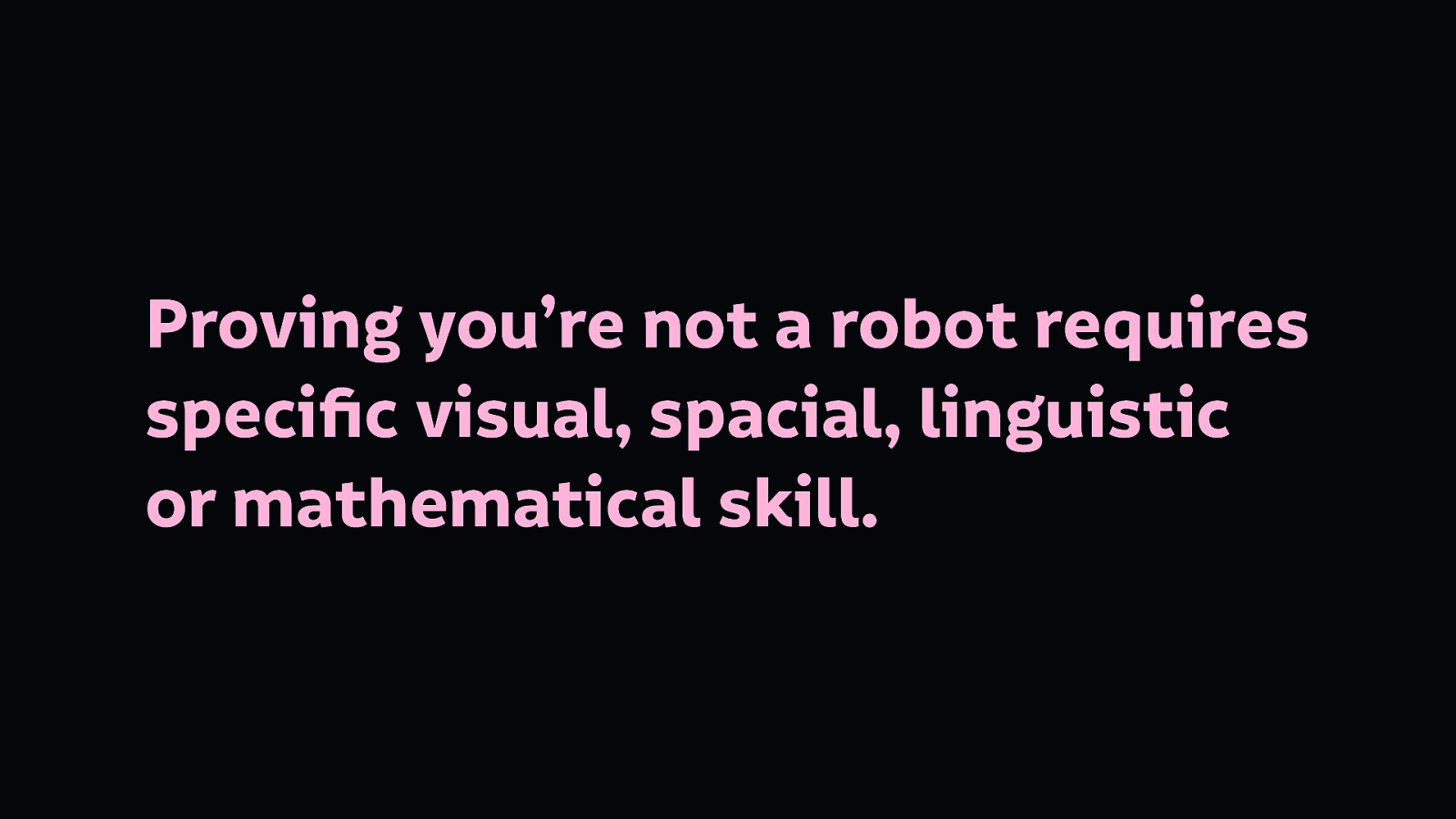
CAPTCHA dictates that proving you’re not a robot requires specific visual, spacial, linguistic or mathematical skill.
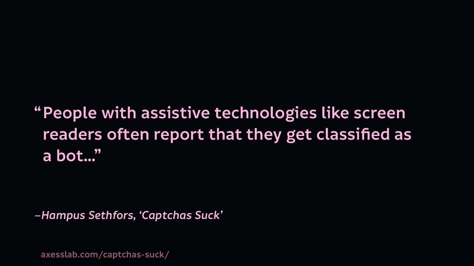
To the point where “People with assistive technologies like screen readers often report that they get classified as a bot…”–Hampus Sethfors, ‘Captchas Suck’
But CAPTCHA is evolving.
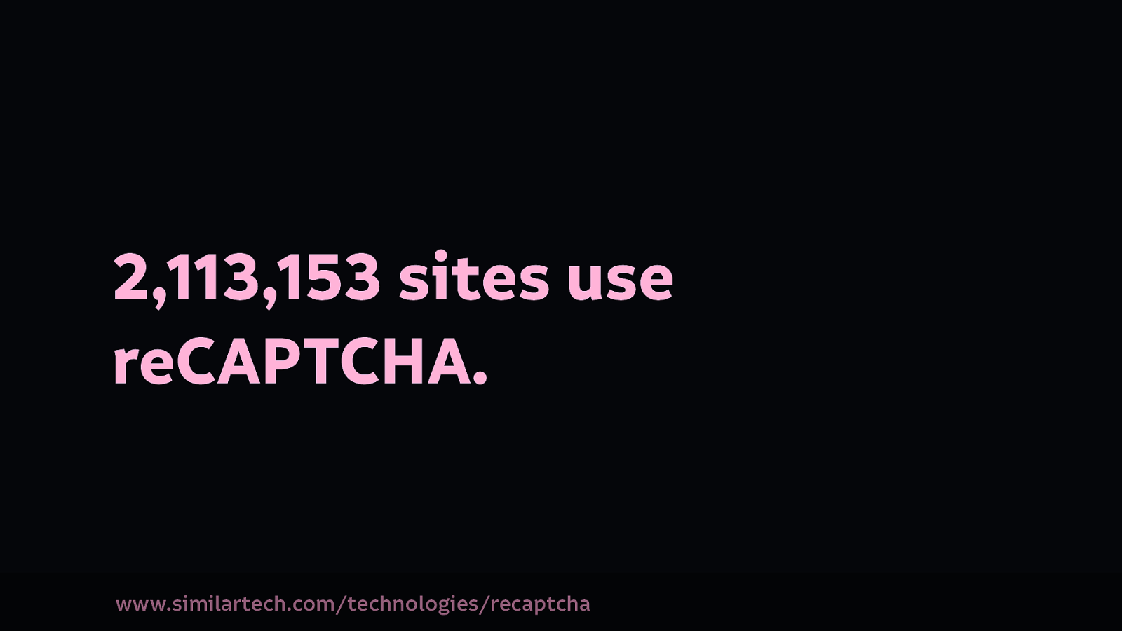
We understand why tech might choose to misguidedly use CAPTCHA, but why is it so prevalent? Over 2 million sites use reCAPTCHA, Google’s free captcha service. What’s in it for Google offering this service for free? Why do they tell us we need it? Source
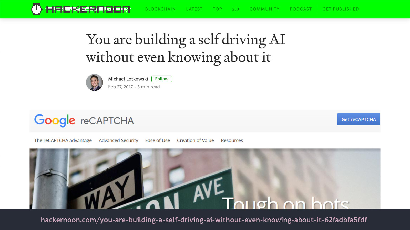
Right now, we’re helping Google digitise books, recognise images, and stop self-driving cars from running red lights. ‘[You are building a self driving AI without even knowing about it](https:// hackernoon.com/you-are-building-a-self-driving-ai-without-even-knowing-about-it-62fadbfa5fdf)’
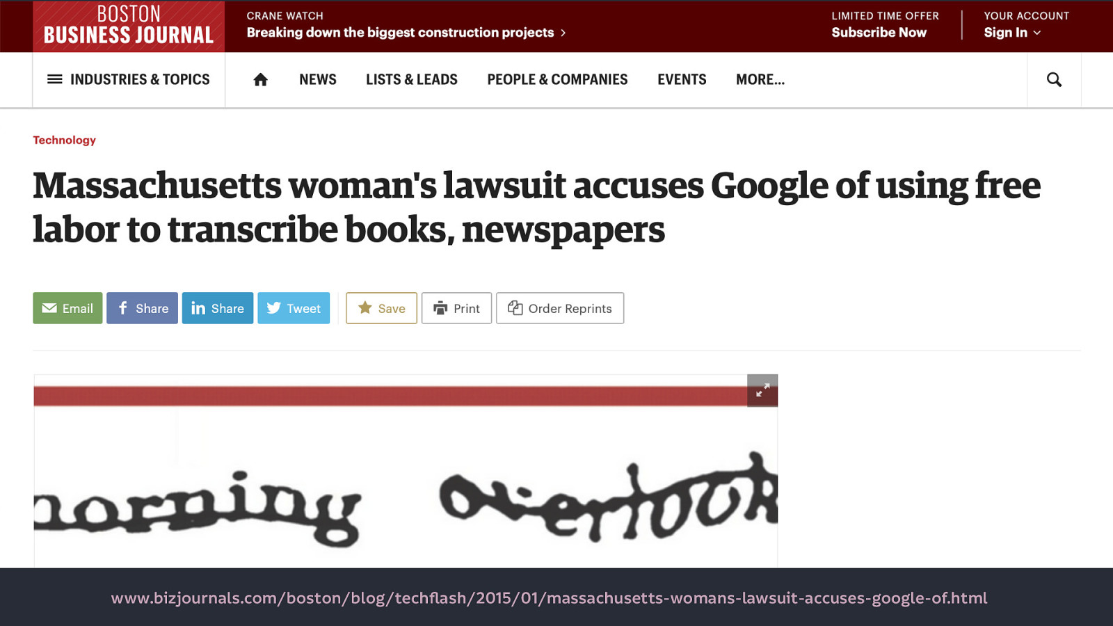
A [woman in the US even sued Google, saying they were unfairly using free labour](https://www.bizjournals.com/boston/blog/ techflash/2015/01/massachusetts-womans-lawsuit-accuses-google-of.html).
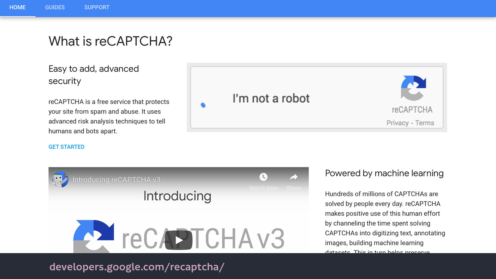
But now Google has introduced reCAPTCHA 3…
“reCAPTCHA v3 returns a score for each request without user friction.” That user friction is people even knowing that the captcha is there, it operates invisibly on the site. So is that better for accessibility? Maybe. If it doesn’t continue to classify people using assistive technology as bots.
But “reCAPTCHA works best when it has the most context about interactions with your site, which comes from seeing both legitimate and abusive behavior. For this reason, we recommend including reCAPTCHA verification on forms or actions as well as in the background of pages for analytics.”
To work, reCAPTCHA needs to be deeply embedded within a site, with access to all interaction conducted on the site.
If you’re thinking Google’s unprecedented access to our interactions on websites is no problem, I have some reading material for you…
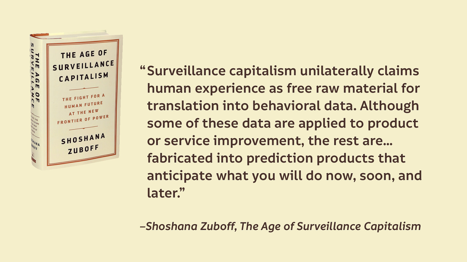
What is surveillance capitalism? “Surveillance capitalism unilaterally claims human experience as free raw material for translation into behavioral data. Although some of these data are applied to product or service improvement, the rest are…fabricated into prediction products that anticipate what you will do now, soon, and later.”—Shoshana Zuboff, The Age of Surveillance Capitalism
Surveillance capitalism is defined by surveilling our behaviour, and monetising it.
If it sounds familiar, it’s because it forms the dominant business model of technology today.
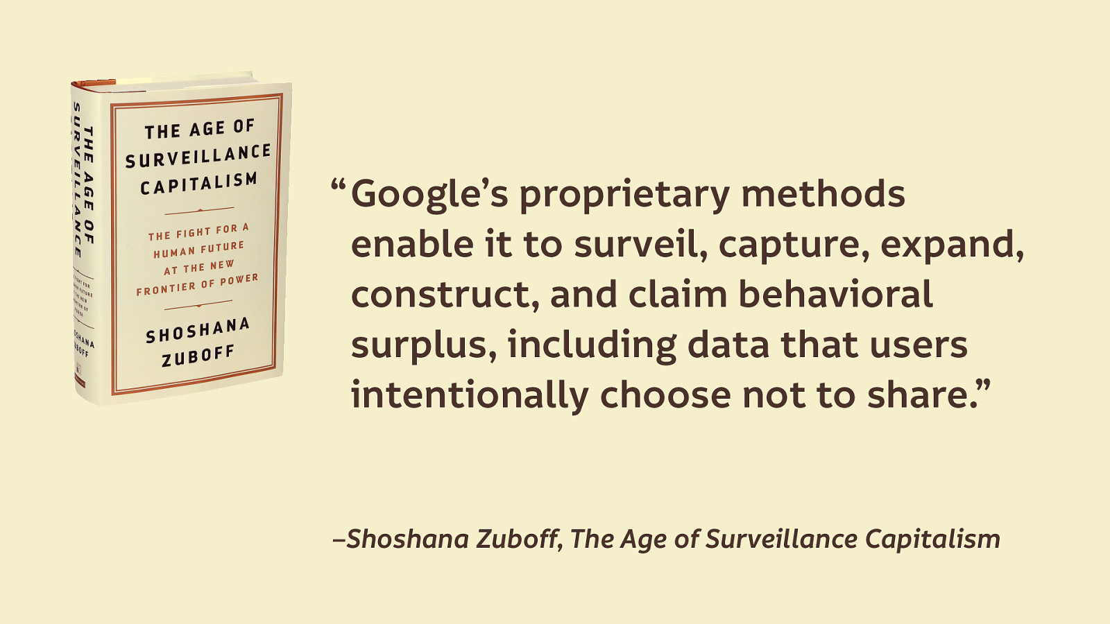
“Google’s proprietary methods enable it to surveil, capture, expand, construct, and claim behavioral surplus, including data that users intentionally choose not to share. —Shoshana Zuboff, The Age of Surveillance Capitalism
reCAPTCHA operating silently in the background is the perfect surveillance tool.

I know, we’re starting to wade into deep waters here. Not the kinds of topics you’d always feel comfortable discussing with your co-workers, boss or clients.
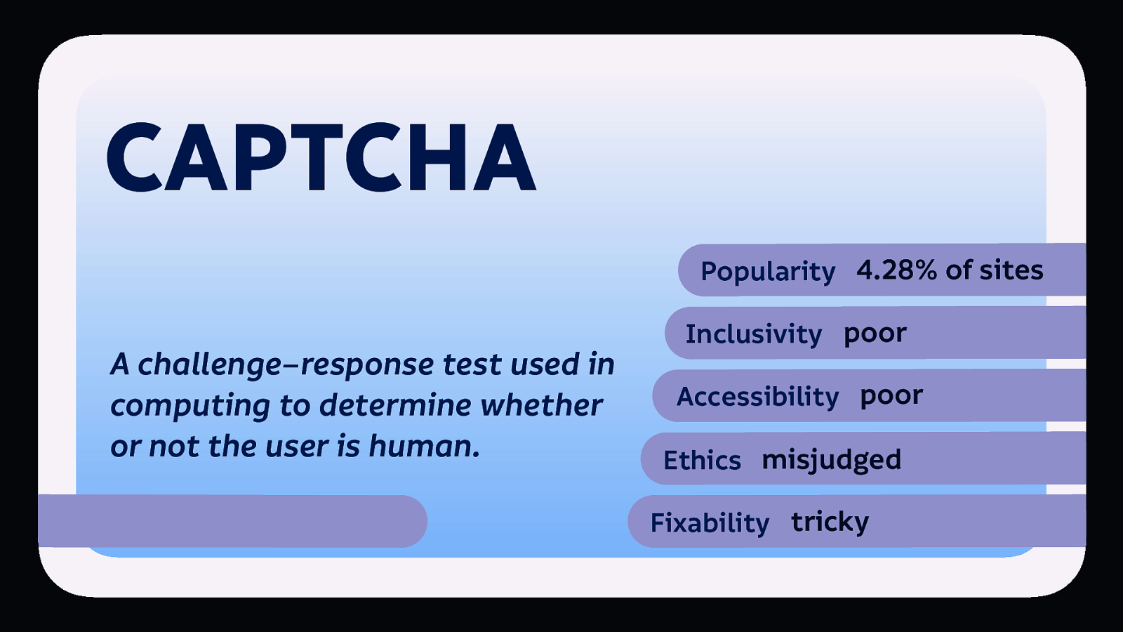
So CAPTCHA, it’s popular, it’s poor for inclusivity and accessibility, and the ethics are misjudged. As we get into features that are tangled with our business models and business goals, “fixability” becomes trickier.

If we are genuinely trying to prove a person is human, privacy-respecting alternatives are in the works. But we have to be willing to find and try alternatives, and not just use what everybody else is using. I’ll come back to this point later…
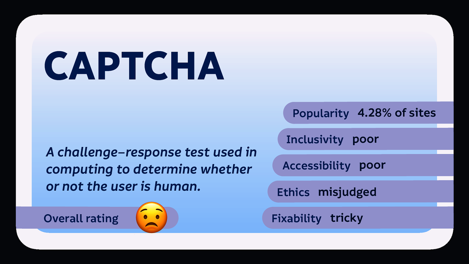
CAPTCHA’s overall rating: 😟 it’s a worried face from me.
Profiling is the process of construction and application of user profiles generated by computerised data analysis.
It’s a popular pattern… profiling props up the majority of today’s “Big Tech.” Here’s examples from some of the most popular sites. You definitely use at least one of these sites on a regular basis…

(Most popular homepage in the world.) Search results are not just based on relevancy to the term but are personalised based on Google’s determination of user interests (profiles).

(2nd most popular site in the world.) Recommends videos based on newness and popularity, but also based on user interests and viewing history.

(3rd most popular site in the world.) Facebook’s news feed shows posts in an order based on what Facebook determines to be most interesting and relevant to the user.

(9th most popular in the world.) Yahoo’s search results are personalised based on user’s search history, and a home page feed of news and other content is recommended based on popularity and the user’s predicted interests.

(10th most popular site in the world.) Products and product categories are recommended on the home page, including ‘featured’ recommendations, based on user purchases and views.

(14th most popular site in the world.) Posts displayed in an order Instagram determines to be most interesting and relevant to the user.
All of these sites use the profiles they’ve gathered to target users with advertising and content.
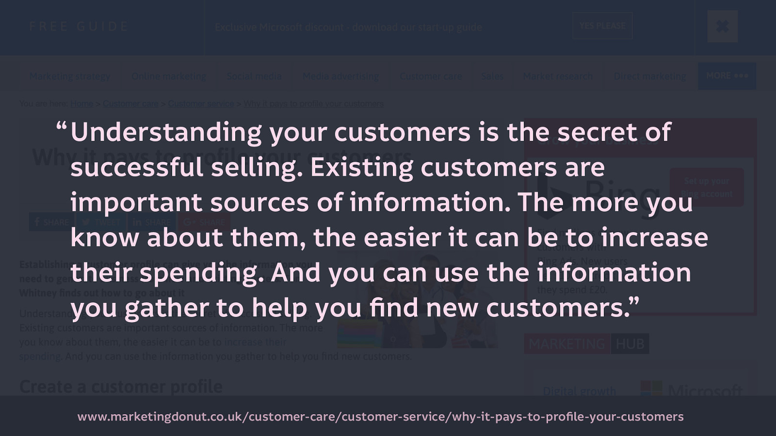
As a business, being able to customise your output based on a user’s interests makes sense. This is a quote from a marketing blog: “Understanding your customers is the secret of successful selling. Existing customers are important sources of information. The more you know about them, the easier it can be to increase their spending. And you can use the information you gather to help you find new customers.” Source
As customers or consumers, you might say “I like seeing advertising that is relevant to me, rather than irrelevant junk I don’t care for.” But are all the ads that you see really relevant to you?
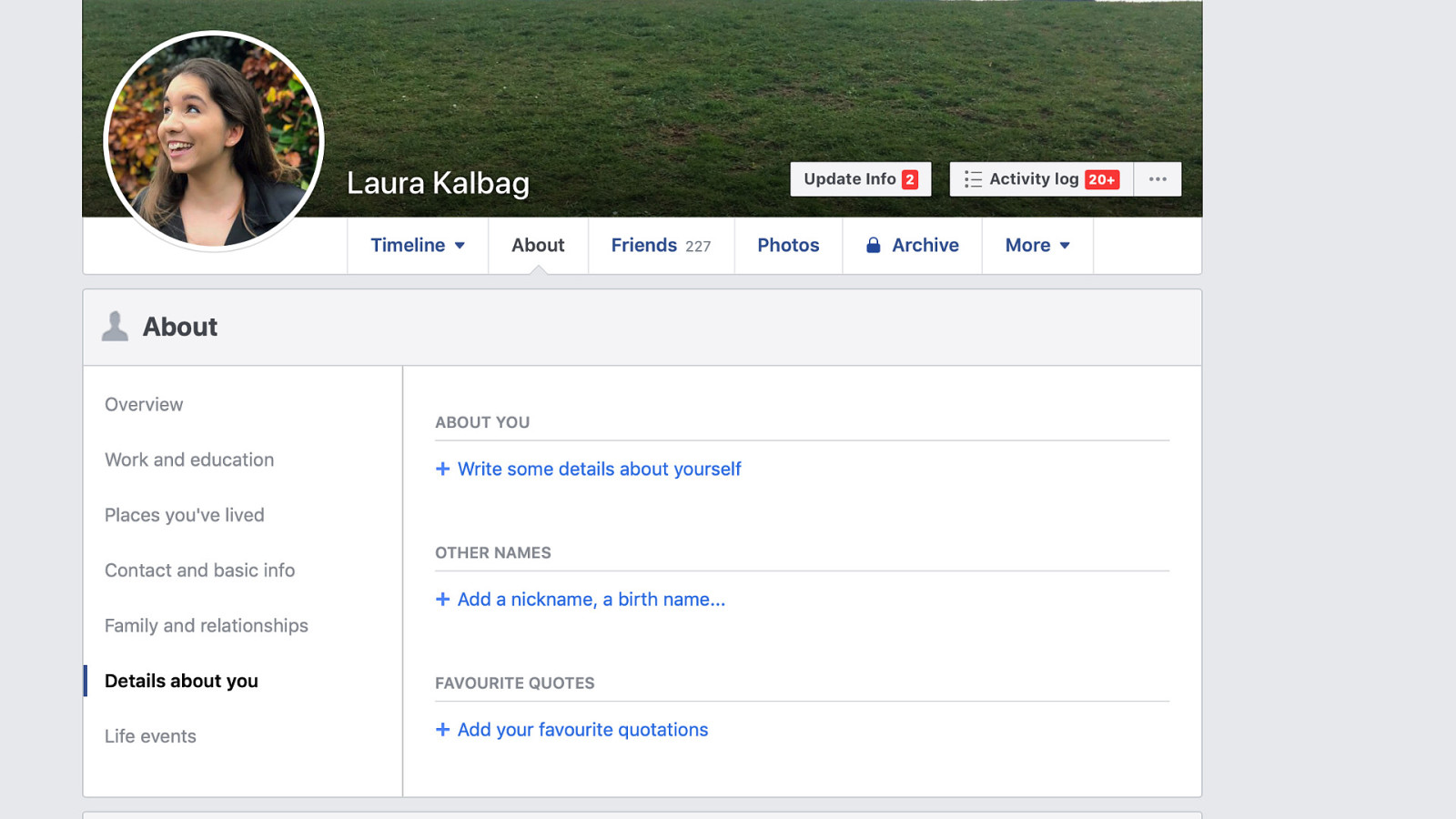
I don’t give Facebook much information, my public profile is barely filled out, I rarely Like or Share anything.
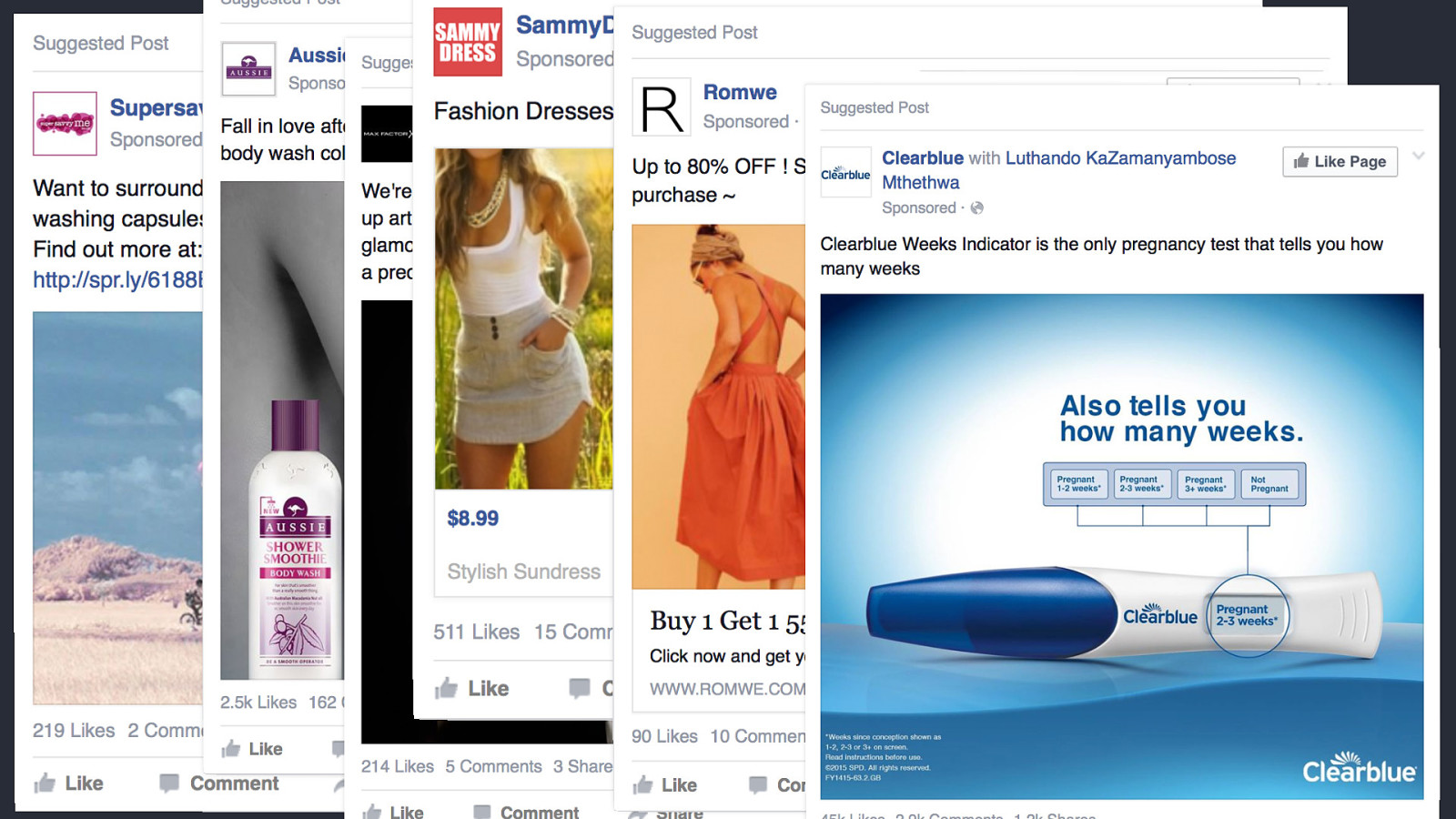
So I get ads aimed at a stereotypical woman in her early thirties. (Laundry capsules, shampoo, makeup, dresses, pregnancy tests…)
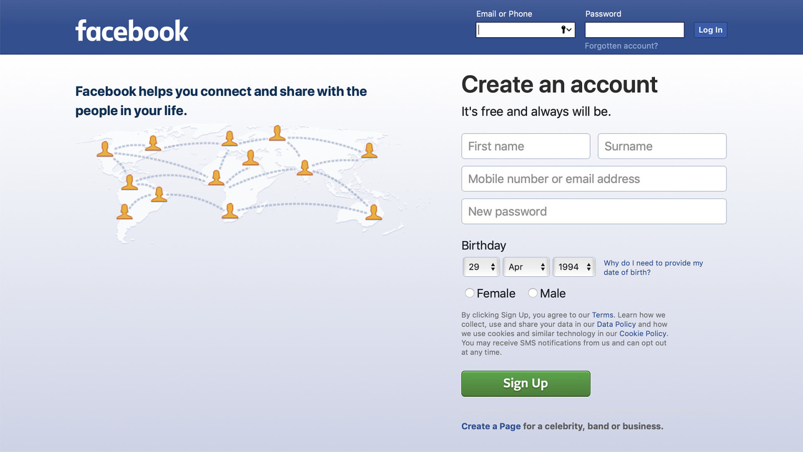
This is why facebook.com will only let you sign up as Male or Female, not non-binary or the self-declared option you get after you’ve signed up. It makes it easier to put you in a box.
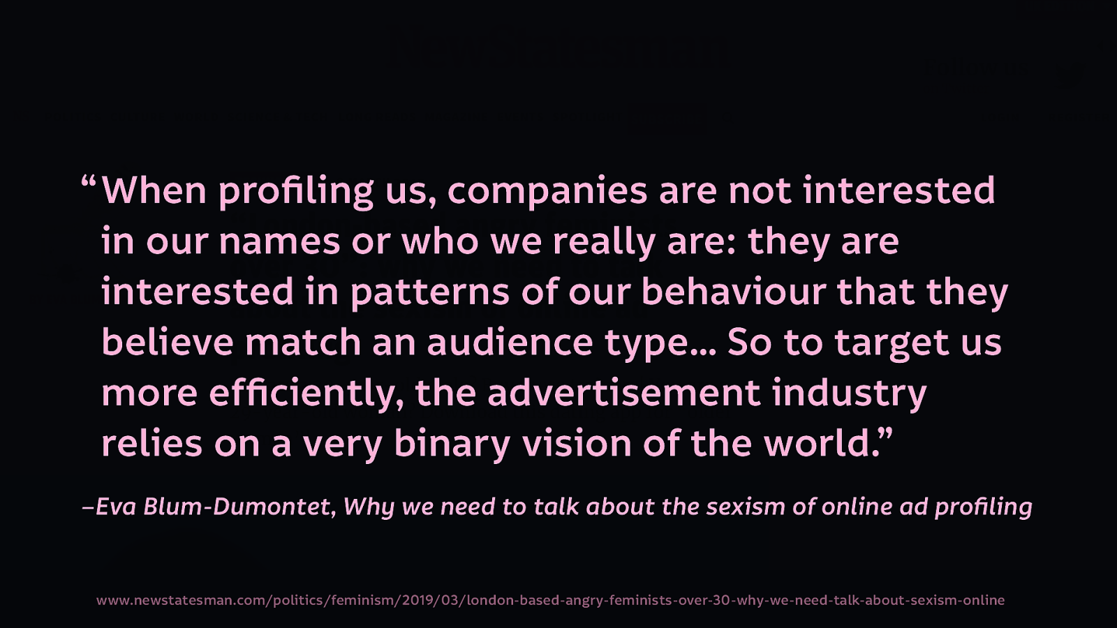
As Eva Blum-Dumontet wrote in the New Statesman, “When profiling us, companies are not interested in our names or who we really are: they are interested in patterns of our behaviour that they believe match an audience type… So to target us more efficiently, the advertisement industry relies on a very binary vision of the world.”—’Why we need to talk about the sexism of online ad profiling’
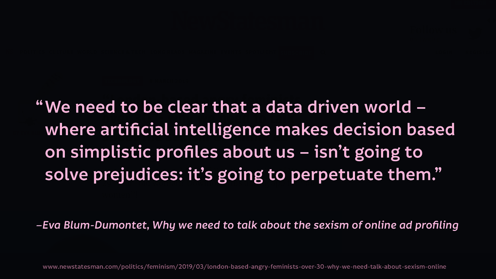
And through this, advertising continues to perpetuates stereotypes and existing prejudices: “We need to be clear that a data driven world – where artificial intelligence makes decision based on simplistic profiles about us – isn’t going to solve prejudices: it’s going to perpetuate them.” –Eva Blum-Dumontet, ’Why we need to talk about the sexism of online ad profiling’
This isn’t just about ads that tell women they should be focused on domestic tasks, looking pretty and getting pregnant…
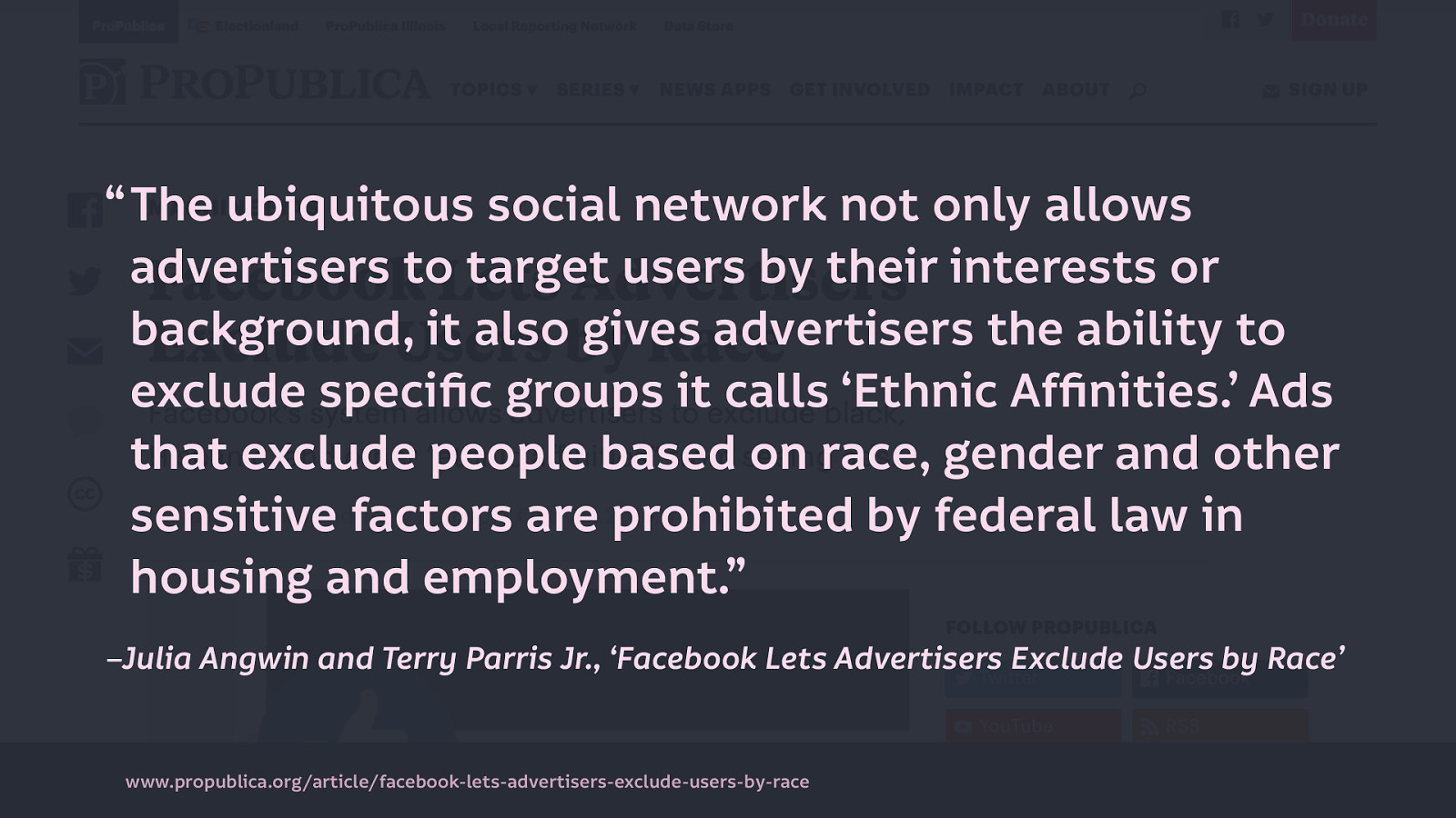
And through this, advertising continues to perpetuates stereotypes and existing prejudices: In 2016, Pro Publica discovered that Facebook was allowing advertisers to exclude users by race in ads for housing: “The ubiquitous social network not only allows advertisers to target users by their interests or background, it also gives advertisers the ability to exclude specific groups it calls ‘Ethnic Affinities.’ Ads that exclude people based on race, gender and other sensitive factors are prohibited by federal law in housing and employment.” –Julia Angwin and Terry Parris Jr., ‘Facebook Lets Advertisers Exclude Users by Race’
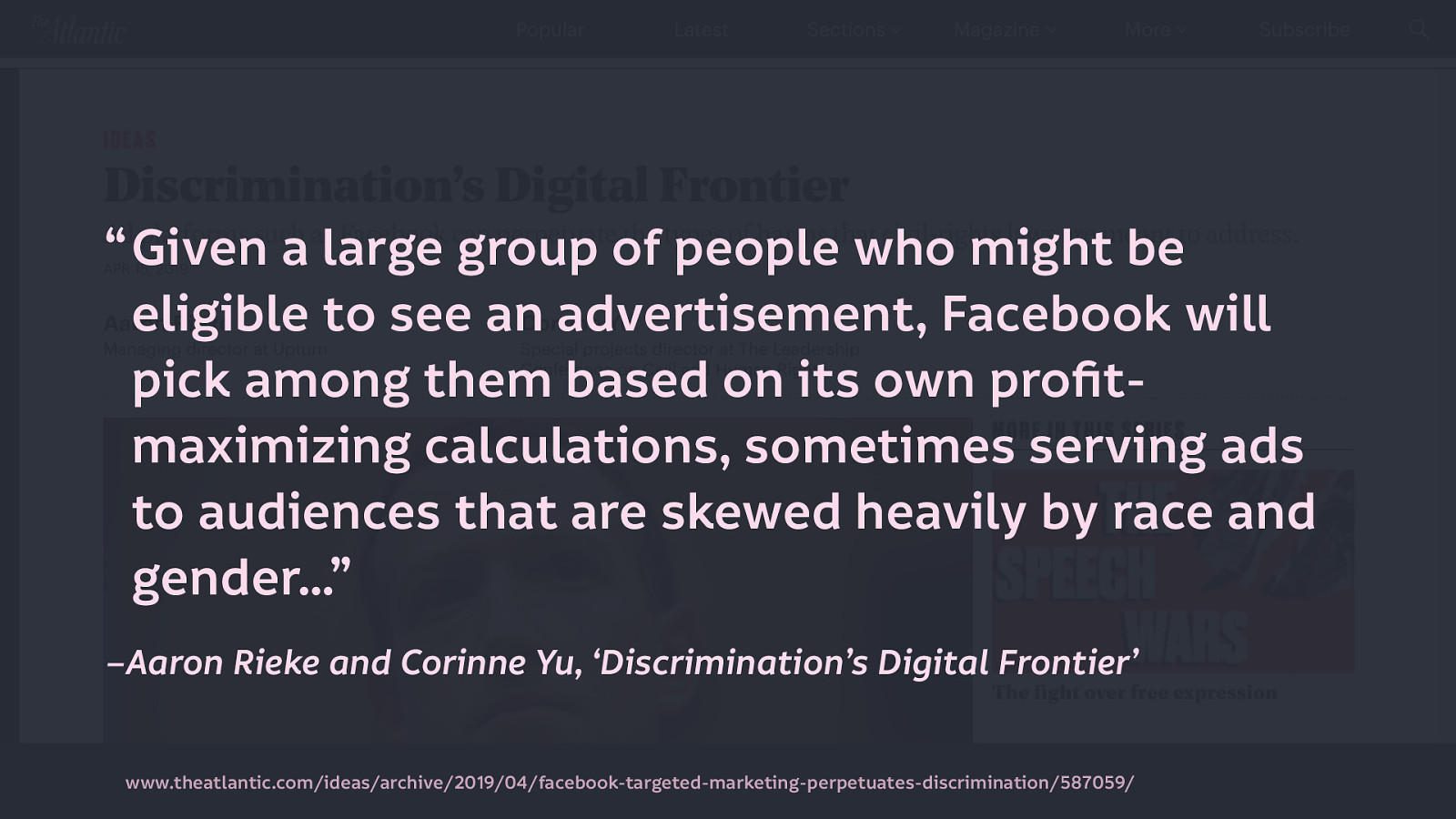
And even after Facebook argued it was not liable for advertisers’ discrimination (but still settled these cases), Facebook still perpetuates inequality in its profiling. A study into who Facebook picked to show ads to from very broad categories showed “given a large group of people who might be eligible to see an advertisement, Facebook will pick among them based on its own profit-maximizing calculations, sometimes serving ads to audiences that are skewed heavily by race and gender.” –Aaron Rieke and Corinne Yu, ‘Discrimination’s Digital Frontier’
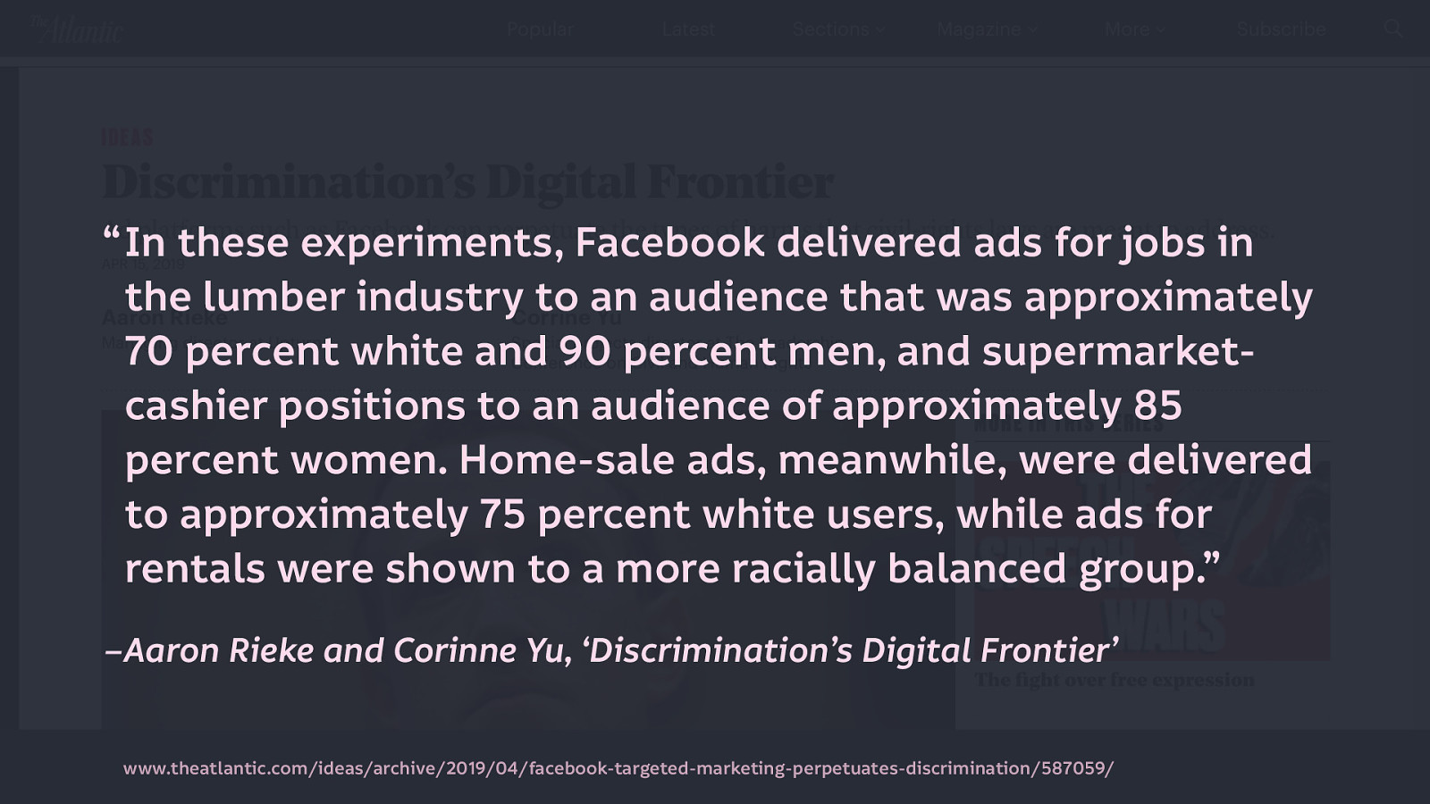
“In these experiments, Facebook delivered ads for jobs in the lumber industry to an audience that was approximately 70 percent white and 90 percent men, and supermarket-cashier positions to an audience of approximately 85 percent women. Home-sale ads, meanwhile, were delivered to approximately 75 percent white users, while ads for rentals were shown to a more racially balanced group.”–Aaron Rieke and Corinne Yu, ‘Discrimination’s Digital Frontier’
Concluding: “An ad system that is designed to maximize clicks, and to maximize profits for Facebook, will naturally reinforce these social inequities and so serve as a barrier to equal opportunity.”–Aaron Rieke and Corinne Yu, ‘Discrimination’s Digital Frontier’
We have to ask “When maximising clicks to maximise profit reinforces social inequities, what does mean for tech’s dominant funding models?”
Trackers are becoming more ubiquitous…
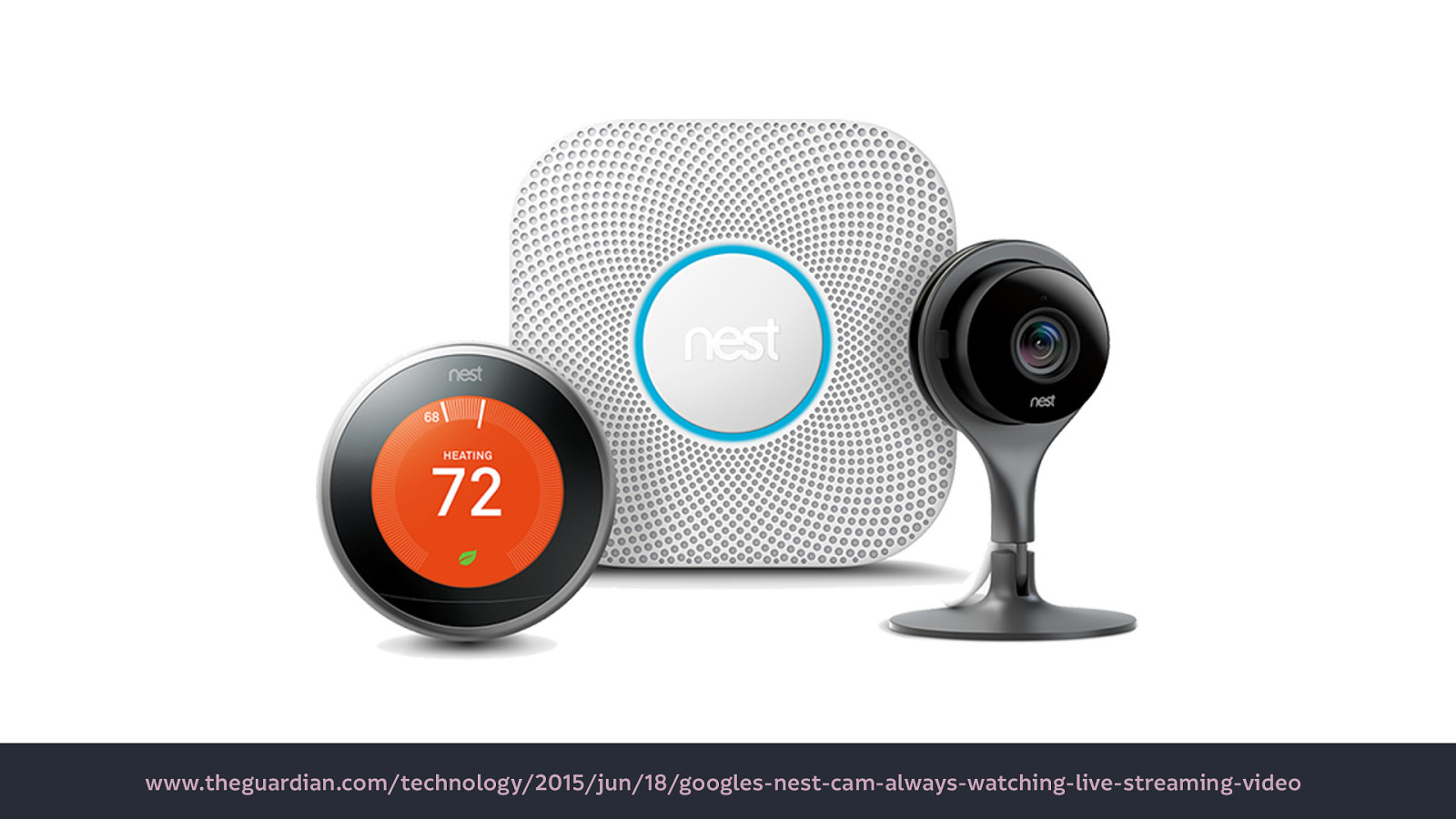
Google Nest, having a good look around your home (And the now-ubiquitous smart speakers!) Source
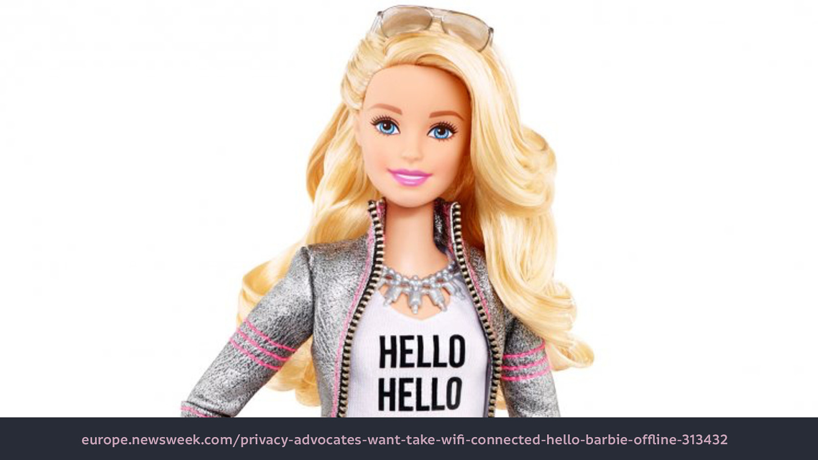
Hello Barbie which your kids can talk to, with all that information recorded and sent to a multinational corporation… Source

Smart pacifier. Put a chip in your baby. Source

Looncup - smart menstrual cup! One of many smart things that women can put inside themselves. (Most of the internet of things companies in this genre are run by men…) Source
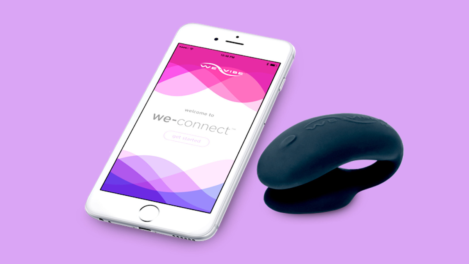
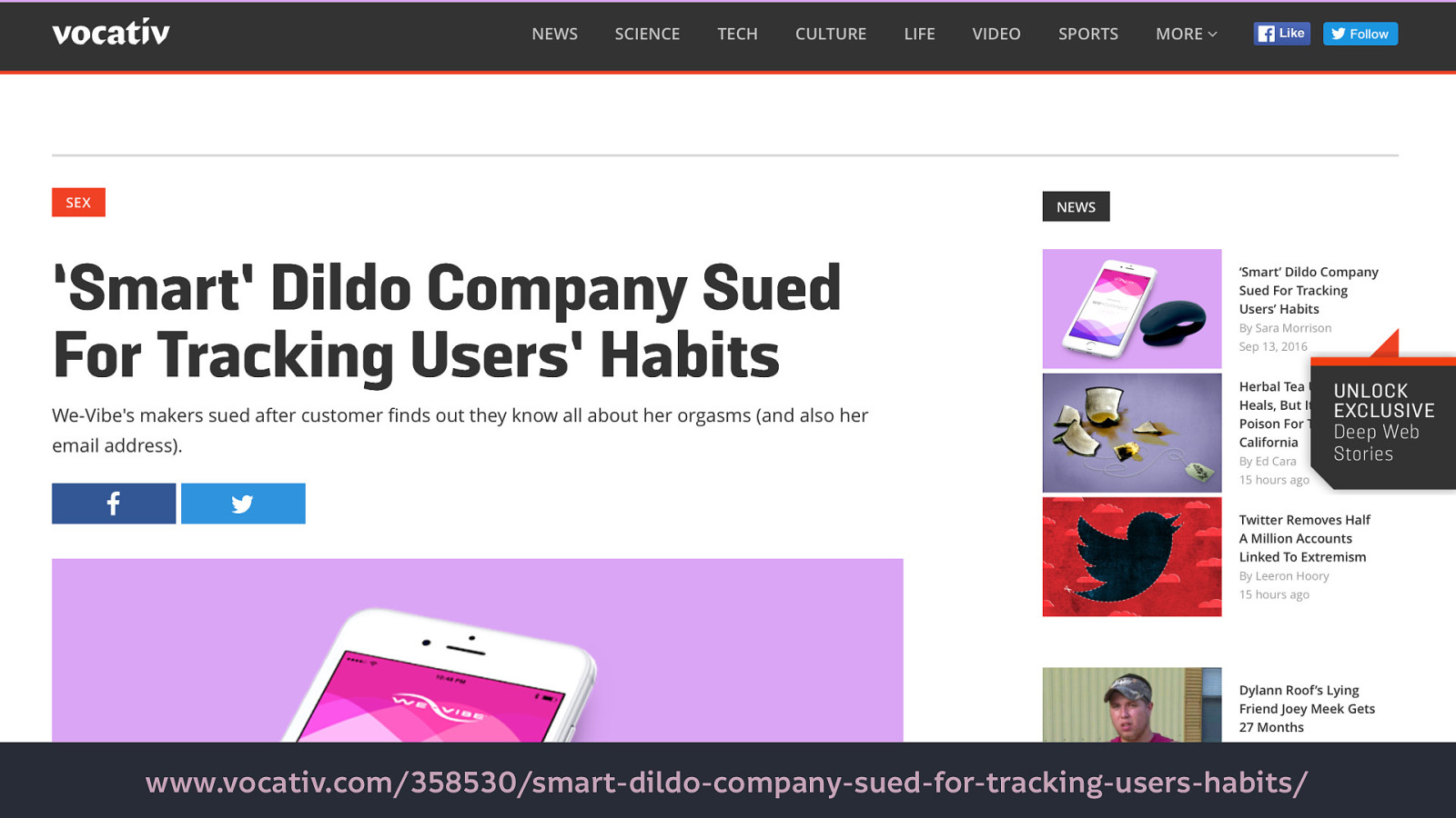
We Connect (the smart dildo makers) were even sued for tracking users’ habits. (Though many companies will get away with tracking like this as they’ll hide it in the terms and conditions…)
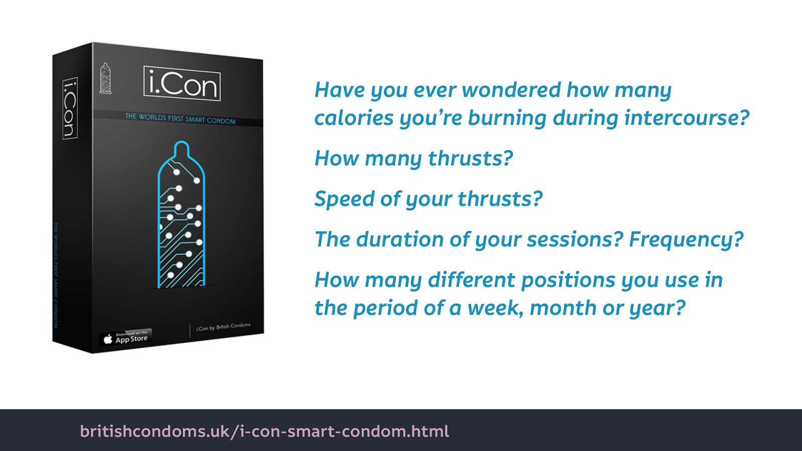
Have you ever wondered how many calories you’re burning during intercourse? How many thrusts? Speed of your thrusts? The duration of your sessions? Frequency? How many different positions you use in the period of a week, month or year? You want the iCondom.
And have you ever wanted to share all that information with advertisers, insurers, your government, and who knows else?
I’m not saying you shouldn’t want to use any of those products as a concept. But the cost of using those products should not be our personal data, our privacy, our power, control, or agency.
This is an inclusivity issue because we have to pay greater attention to who benefits and who loses out when targeting is involved.
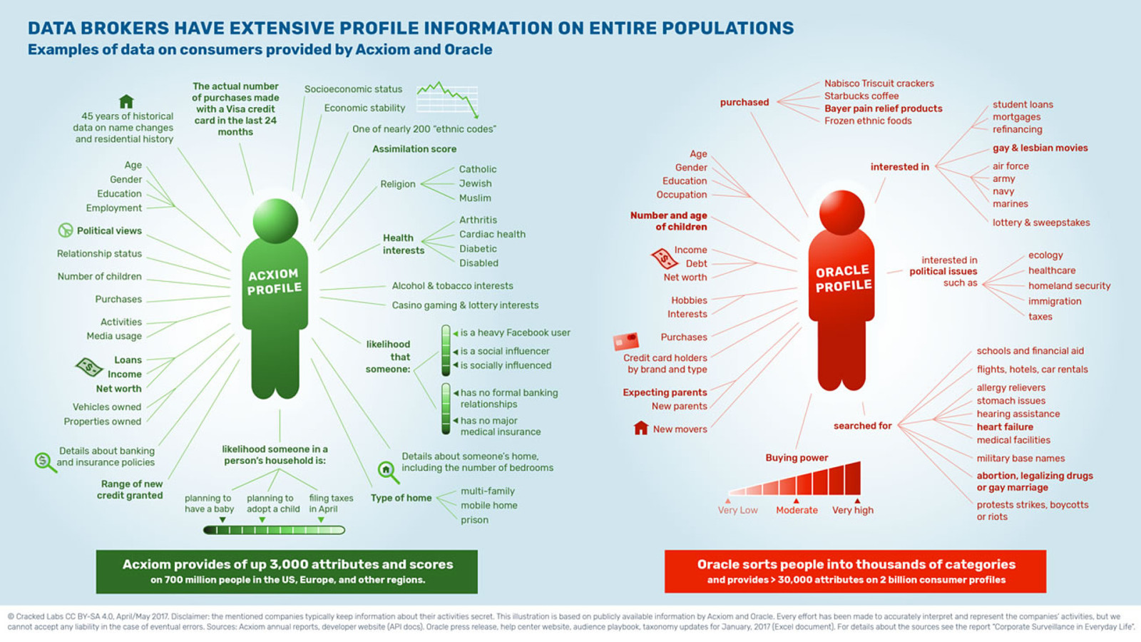
This isn’t an exaggeration… health insurance is a major customer for data obtained through profiling. Cracked Labs did a report looking at profile information data brokers have obtained. See under health interests: they guess whether a person disabled, and the likelihood whether someone has no major health insurance. Potential employers could use this information to exclude people with disabilities from their targeted job ads.
Next time we say privacy is a low cost for convenience, we must remember the people whose data will be used against them. And what happens if the inferences about us are wrong?
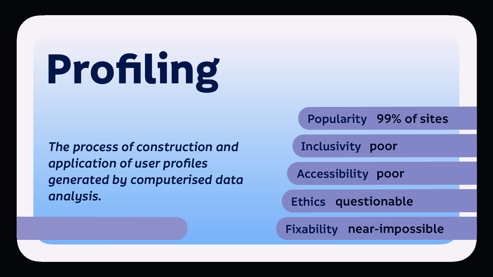
So profiling is immensely popular. Massively and negatively impacts inclusivity, and accessibility. The ethics are something we need to be concerned about. And here’s the kicker, unlike some of the other patterns, it’s not easy to fix.
Big tech will not be reformed because it doesn’t want to be reformed, it sees no problem with what it’s doing wrong, it just thinks it has a public relations problem.

These guys? They’re six of the twelve richest people in the world. Their platforms are bigger than countries. They have more lobbying power and influence than anybody else in the world. They don’t have a problem.
This means we will not be able to reform the massive corporation we’re working for from the inside. People may have the best will in the world to do so, but we have to find our power elsewhere.
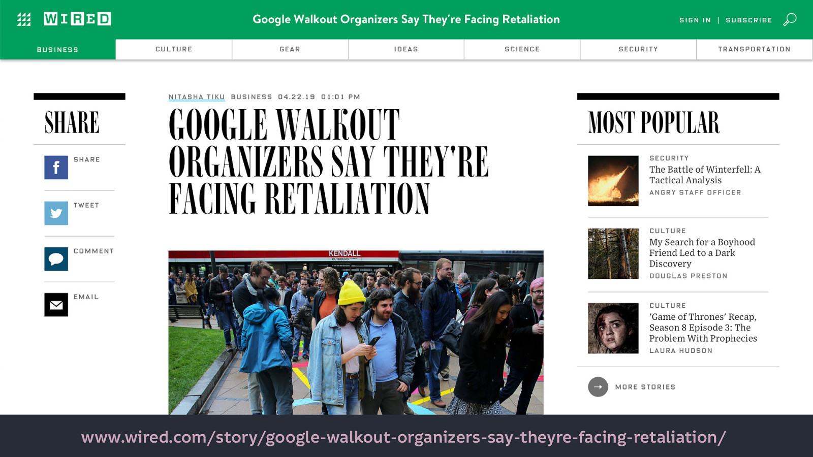
This is what happens to people who try to change Big Tech from the inside: they can’t be fired so they get demoted and lose responsibility, lose the little power they already have.
We need new models. Not just new role models, but new funding models. New ways to fund technology where access to technology and civil rights are not pitted against each other.

As designers we need to question the success criteria for our design work. Are we facilitating growth at others’ expense? Why are we adding the features we’re adding? Who benefits from them? Who loses?
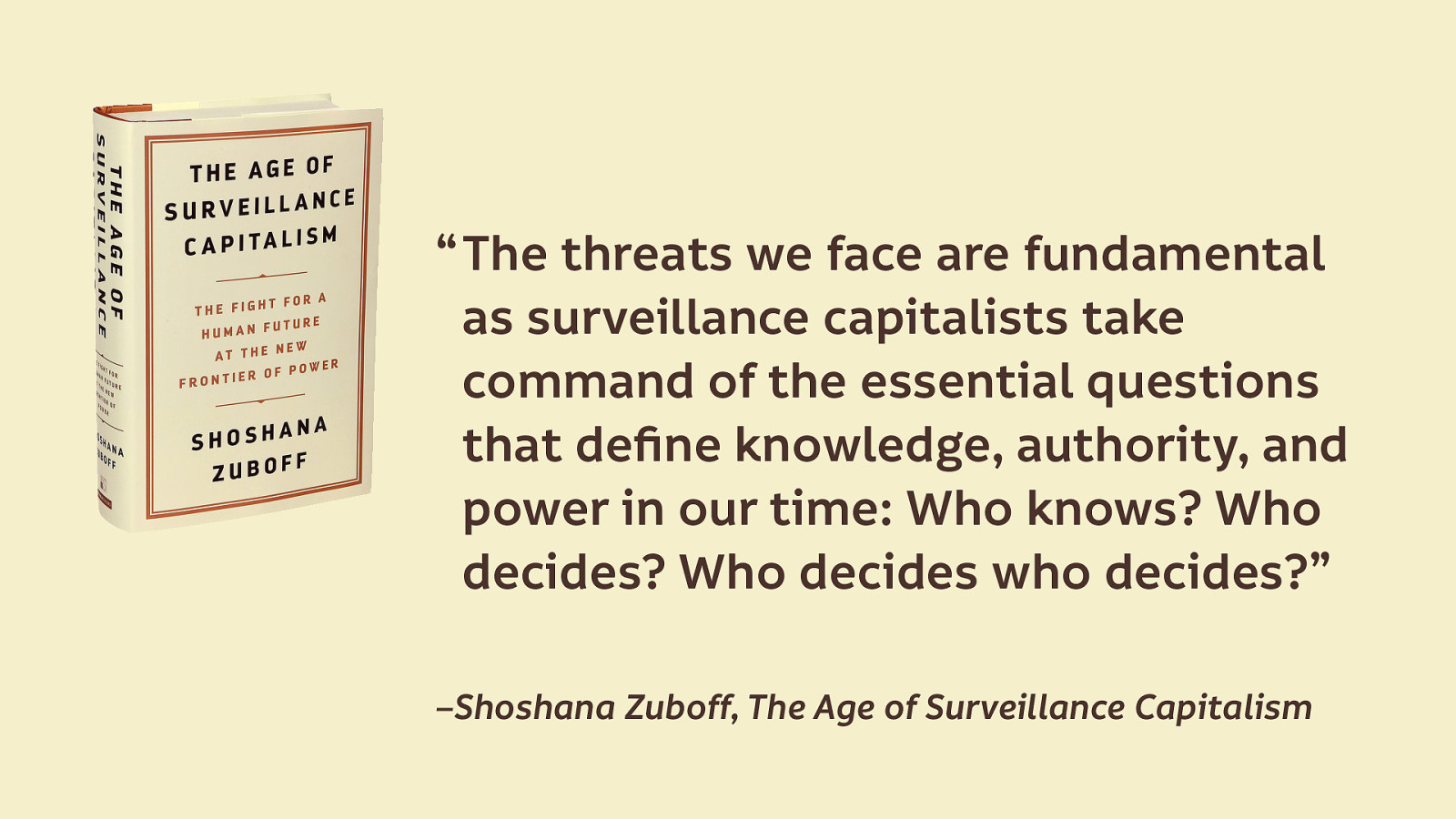
As Shoshana Zuboff says, “The threats we face are fundamental as surveillance capitalists take command of the essential questions that define knowledge, authority, and power in our time: Who knows? Who decides? Who decides who decides?” –Shoshana Zuboff, The Age of Surveillance Capitalism
We can make sites more usable, less hostile to the people using them. We can make sites inclusive and more accessible. But if we’re doing all that with a bad business model, all we’re doing is leading more people into exploitation.
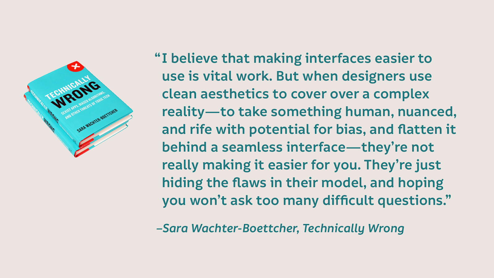
As Sara Wachter-Boettcher says in her book, Technically Wrong: “I believe that making interfaces easier to use is vital work. But when designers use clean aesthetics to cover over a complex reality—to take something human, nuanced, and rife with potential for bias, and flatten it behind a seamless interface—they’re not really making it easier for you. They’re just hiding the flaws in their model, and hoping you won’t ask too many difficult questions.”
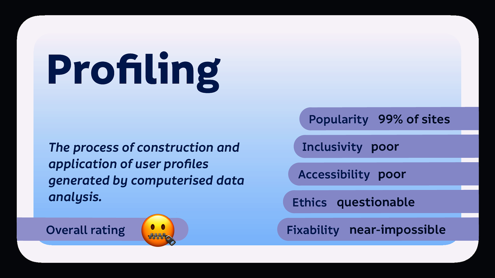
It’s hard to put a rating on this one. 🤐 Maybe it’s just face with a zip mouth.
Many of these patterns have become industry standards. We don’t question their use like we should, because everybody else uses them.
I speak about things like this at events like this because I know you are the people who can make change. I’ve been speaking on these issues for 7 years, and while I’ve seen awareness increase, change has been too slow. It’s a constant battle, but it’s a battle worth fighting.
We’ve got to be comfortable being different. Be the person who creates alternatives. Be a better designer, find ways to create (and fund) these useful and fun experiences for people without them losing power and agency over their own data.
Be the advisor. Do the research on inclusive, ethical technology, make recommendations to others. Make it harder for them to make excuses.
Be the advocate. Marginalised folks shouldn’t have to risk themselves to make change. Advocate for others. Advocate for the underrepresented.
Question the norms. Try asking a business how do you make your money? Come ask me later how I make money! Ask why are we building this in this way?
Be the gatekeeper. When the advocacy isn’t getting you far enough, use your expertise to prevent unethical design from happening on your watch.
Be difficult. Be the person who is known for always bringing up the issue. Embrace the awkwardness that comes with your power. Call out questionable behaviour.
Don’t let anybody tell you that standing up for the needs of yourself, and others, is unprofessional. Don’t let people tell you to be quiet. Or that you’ll get things done if you’re a bit nicer.
Be the supporter. If you are not comfortable speaking up for yourself, at least be there for those that do. Remember silence is complicity.
Nothing is inevitable. Big tech will tell us that this is the only way to build technology. It isn’t.
Go forth and disrupt the disrupters.
Laura Kalbag ind.ielaurakalbag.com@laurakalbag