Accessibility For Everyone
Laura Kalbag ind.ielaurakalbag.com@laurakalbag
A presentation at Loupe 2019 in August 2019 in Amsterdam, Netherlands by Laura Kalbag
Laura Kalbag ind.ielaurakalbag.com@laurakalbag

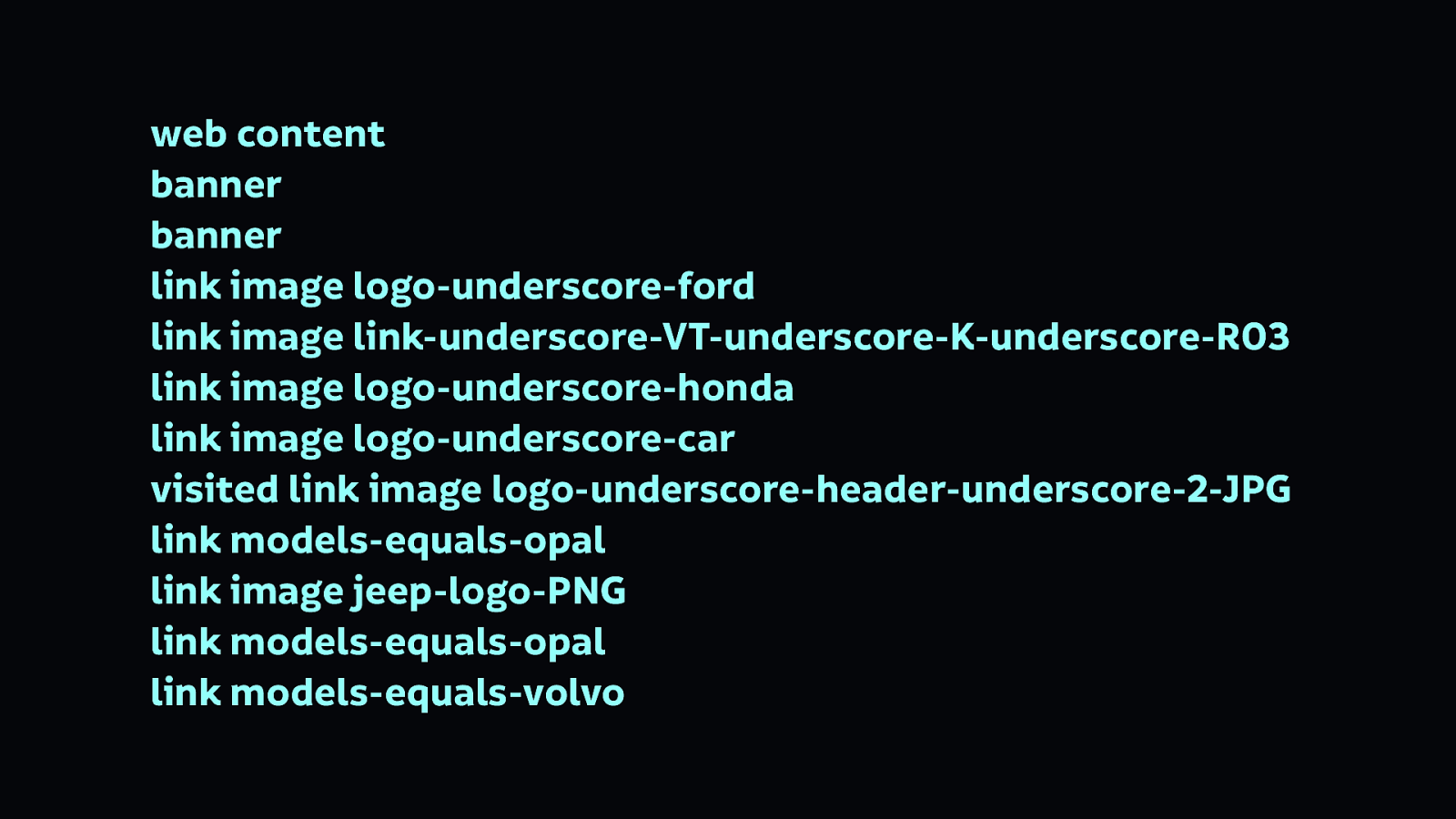
I go to visit the website of a car dealership and I can’t see it. The website loaded just fine. But I use a screen reader (a type of assistive technology that reads the content of the screen aloud) to help me access the site. This is what I hear…
web content banner banner link image logo-underscore-ford link image link-underscore-VT-underscore-K-underscore-R03 link image logo-underscore-honda link image logo-underscore-car visited link image logo-underscore-header-underscore-2-JPG link models-equals-opal link image jeep-logo-PNG link models-equals-opal link models-equals-volvo
That’s the navigation.
You might not be used to screen readers reading content to you, but even if you were, that’s still not easy to understand. It’s mostly reading the file names from a list of images that make up the site’s navigation…
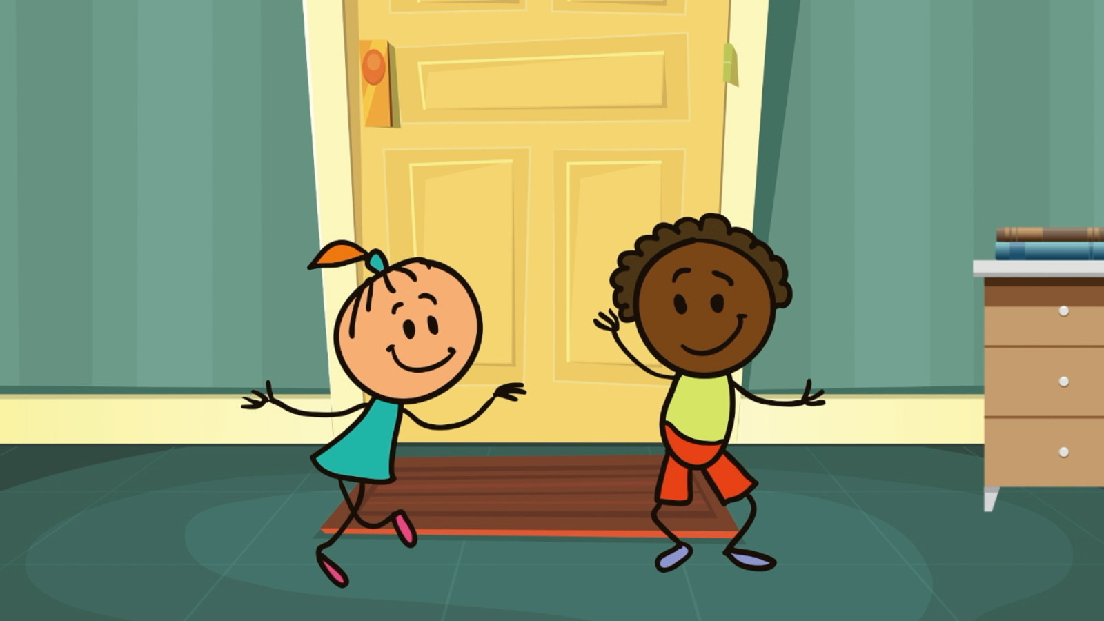
Maybe you can see the page, but you can’t hear it. This is a video playing without audio. Can you tell what’s going on? No… for this video, it’s pretty much impossible to understand.
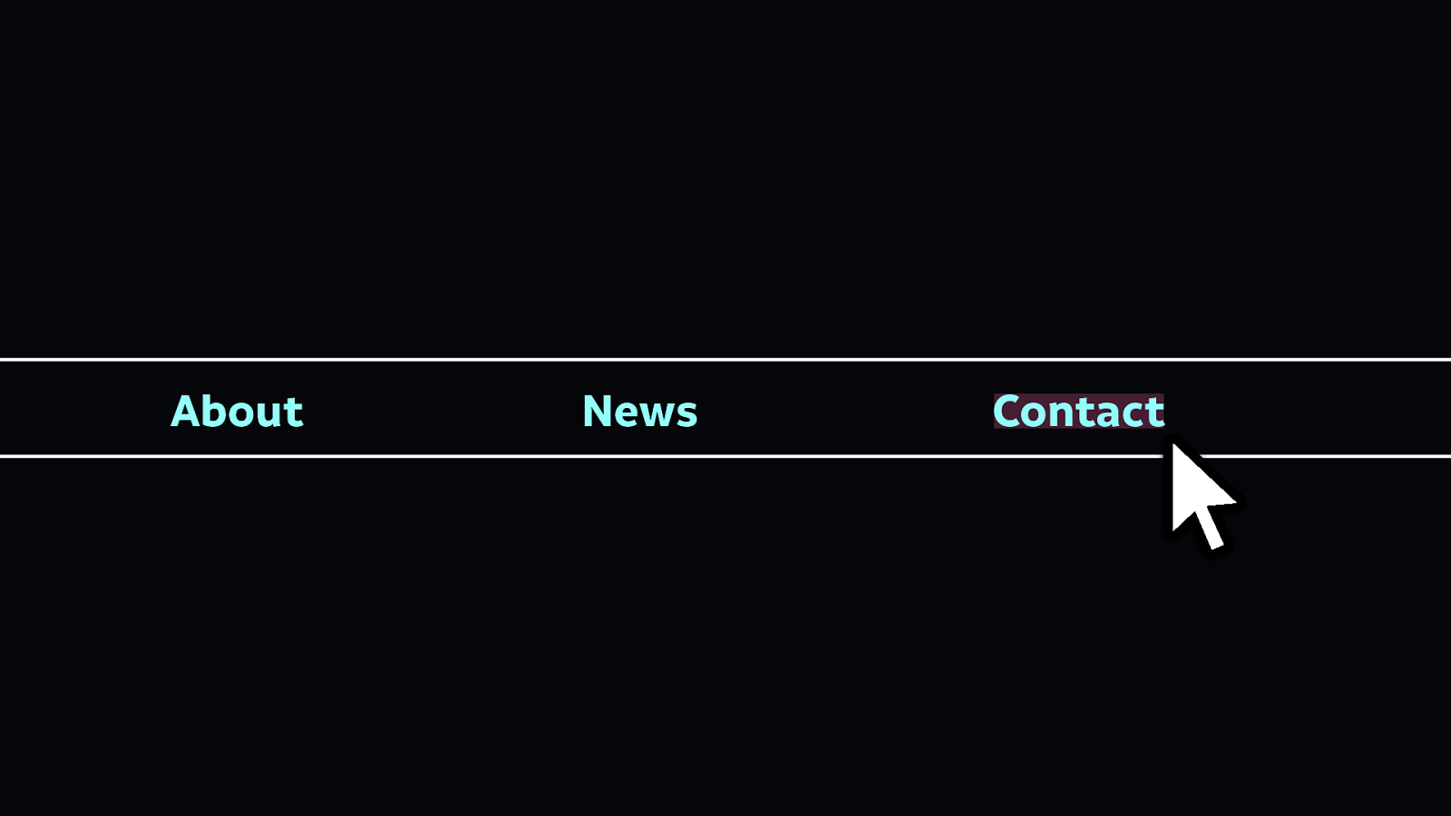
Now you’re reading a page, and you’ve decided you want to contact the people who run the website. So you go to click on the contact link in the navigation… but the button area is so small that it’s really difficult to click the link. Maybe you find using a mouse or touchscreen with accuracy pretty difficult, so it’s even harder to click or tap such a tiny link area.
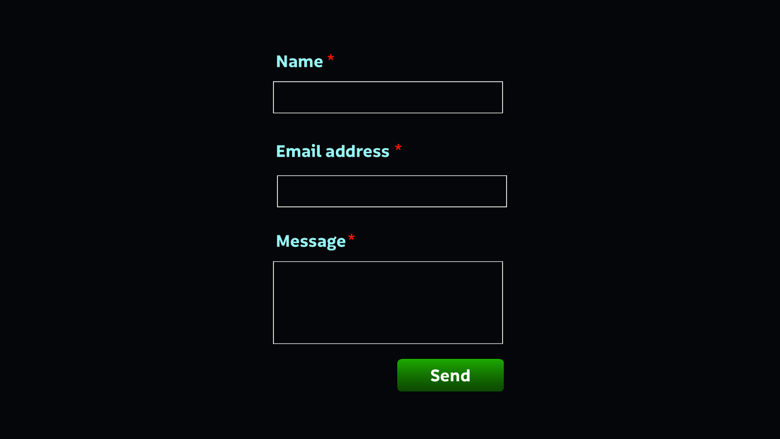
You get to the contact page, and there’s a form with three fields. You’ve filled out forms on paper before, but this is your first time with a form online Next to each form field is this little asterisk symbol, but what does it mean? Is it some kind of magical sign? Without an explanation, it’s hard to understand what the asterisk means.
First we couldn’t see the page, then we couldn’t hear it, then we found the page hard to interact with, and then we found it hard to understand. These are all ways in which technology can be inaccessible to people.
Accessibility is making technology available to everyone, regardless of their needs.
As people making technology, we are building the new everyday things. We build the things people use to find information, the things they use to socialise, and the things they use to shop.
But we have a problem because our industry isn’t so diverse. Our industry lacks diverse races, genders, ages, backgrounds, educational and financial statuses, and abilities.
Which means we’re bad at inclusion.
When we talk about inclusivity in technology, we are usually talking about how to better include people from a variety of marginalised groups, the people who are not the users usually centred in technology.
Because we don’t all have the same needs. And when we build technology, we end up creating products for people just like us—whoever we are and whatever our needs are—forgetting that other people may have requirements that differ from our own, or even conflict with our own.
To create more useful, usable products, we need to understand and care about those differing needs.
Spending meaningful time with people whose experiences differ from our own can help us develop a greater understanding of each other’s needs. That’s why we benefit from diverse teams: the greater capacity a team has for understanding their audience, the more likely they are to solve that audience’s problems.
At this point it’s good to look at the differences between inclusivity and accessibility
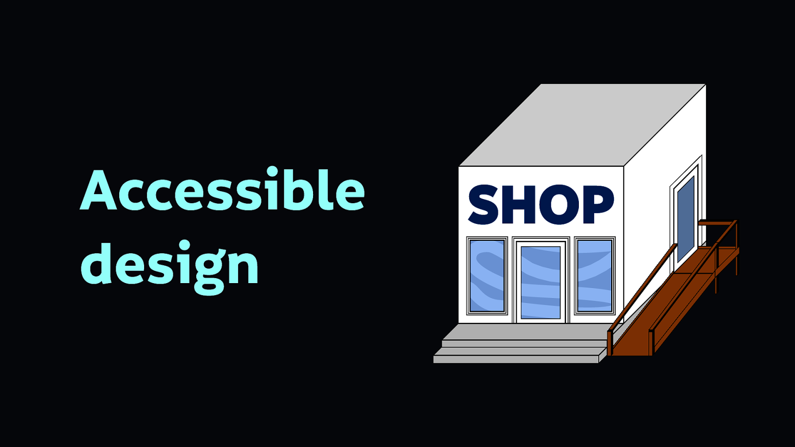
Accessibility is like adding an ugly ramp as an afterthought to the back of your newly-built shop building.
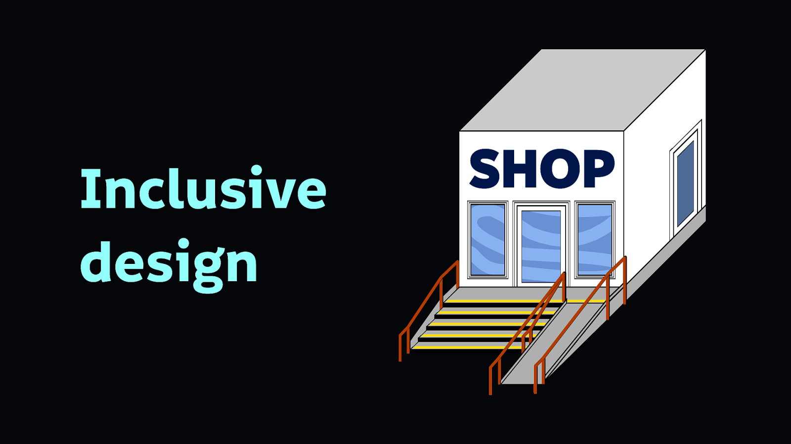
Inclusive design is like building your shop building with a ramp and stairs from the very beginning, trying to accommodate as many needs as possible. It’s remembering to add railings for people who need support, and bright lines on the steps so people who find it difficult to see them can use the steps safely.
Which means you can have accessibility without inclusivity. But it’s short-term and somewhat superficial. We need inclusivity to make better technology.
We need to build meaningful products that serve people’s needs and value their time.
We must also be cautious in assuming we know what’s best for others just because we’re designers…
If we believe what’s best for others despite our differing needs, it can result in a patronising and incorrect solution. This can be referred to as “colonial design.”
So what makes for more inclusive design?
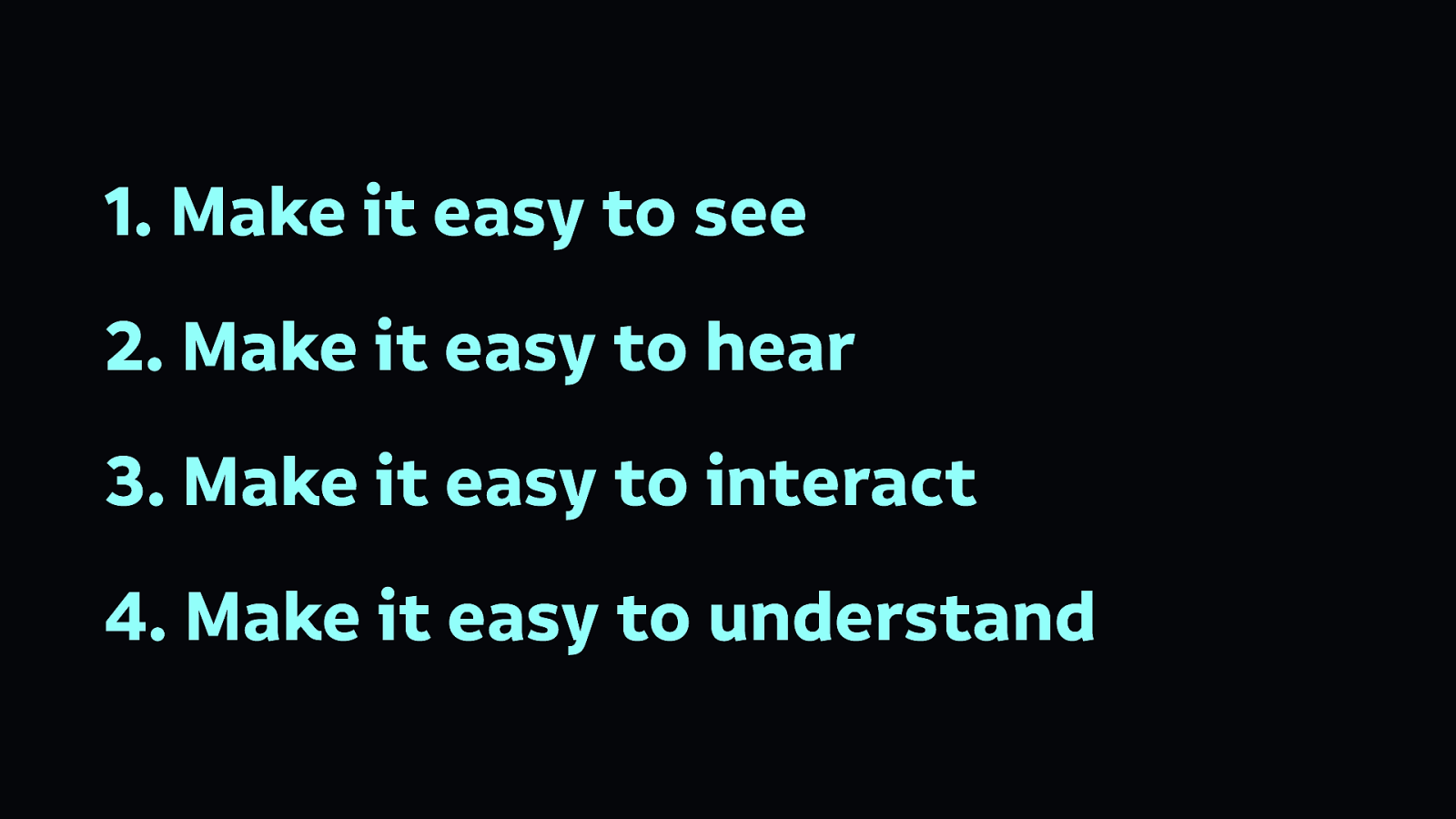
There are four broad parameters we must consider when making our technology accessible:
Usually accessible design starts with content itself. Unless the content itself is accessible, nothing is accessible.
When creating inclusive content, the aim is to make all of our content accessible to as many people as possible. Sometimes this is not possible with one format of content because people have specific needs that mean they cannot access that particular format. Providing alternatives is the easiest way to be flexible to your user’s needs.
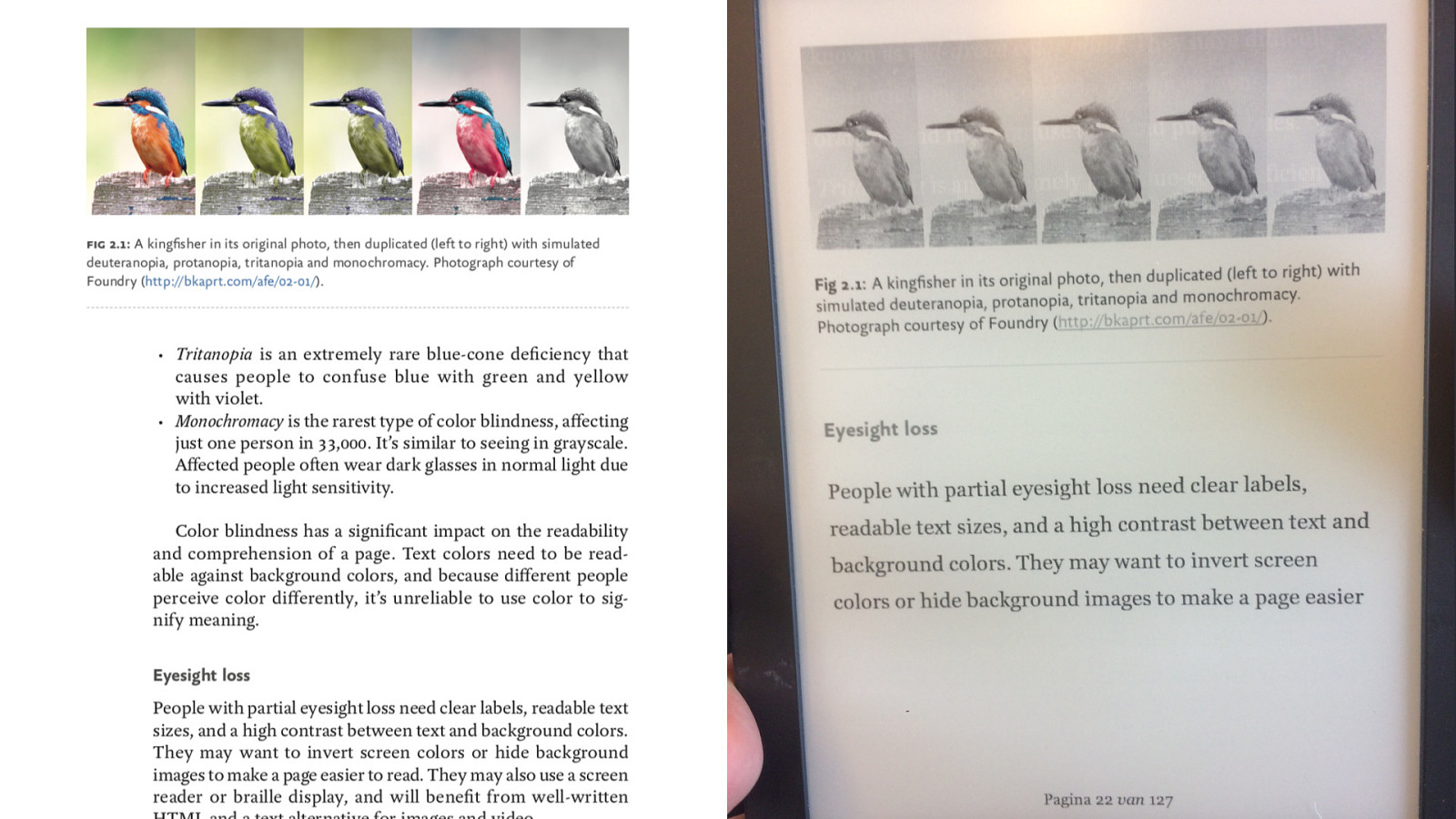
Here’s an example from my book. At the top of this page, there’s a five images showing how a photo of a kingfisher might be perceived by people with different types of colour blindness. It looks great in colour on the page, but I didn’t take ebook readers into consideration. In an ebook that displays in greyscale, the images look identical! And there’s no descriptive text to help the reader understand what the images represent.
You may already be planning, writing, and creating inclusive content, because many of the considerations you use to make your content readable and usable benefit inclusivity. Still, here’s some some starting points to start thinking about content in a more inclusive way:
Plain language benefits everybody from people with dyslexia to non-native speakers.
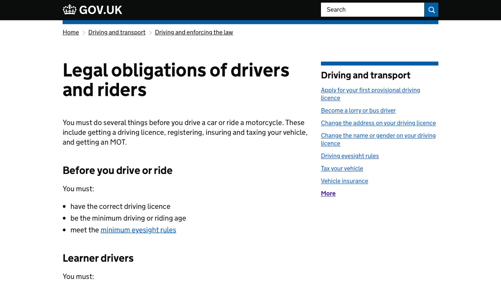
Here’s an example from gov.uk, where the language is plain and easy to read. Writing sentences that are short and easy to read makes text less intimidating and easier to skim. Avoiding jargon and complex metaphors will make content more welcoming to people, especially those who might be new to an area or industry.
One of the simplest ways to meet a range of accessibility needs is to provide a text alternative to image, video, and audio content.
A good place to hone your craft of alternative text, while also making your tweets more accessible, is on Twitter.
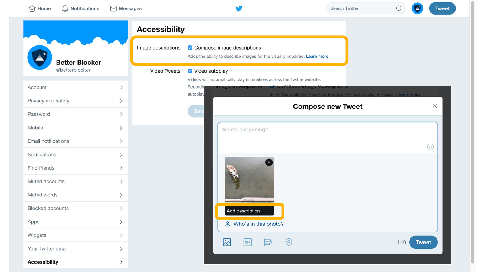
In your Twitter account’s Accessibility settings, you can turn on the ‘Compose image descriptions’ option. Once enabled, every time you upload an image, you will be given the option to compose a description which will be used as alternative text for people who can’t see the image.
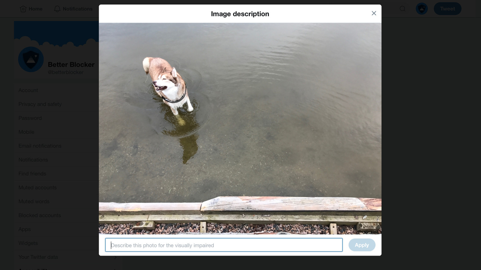
Twitter also enables you to see the image while describing it.
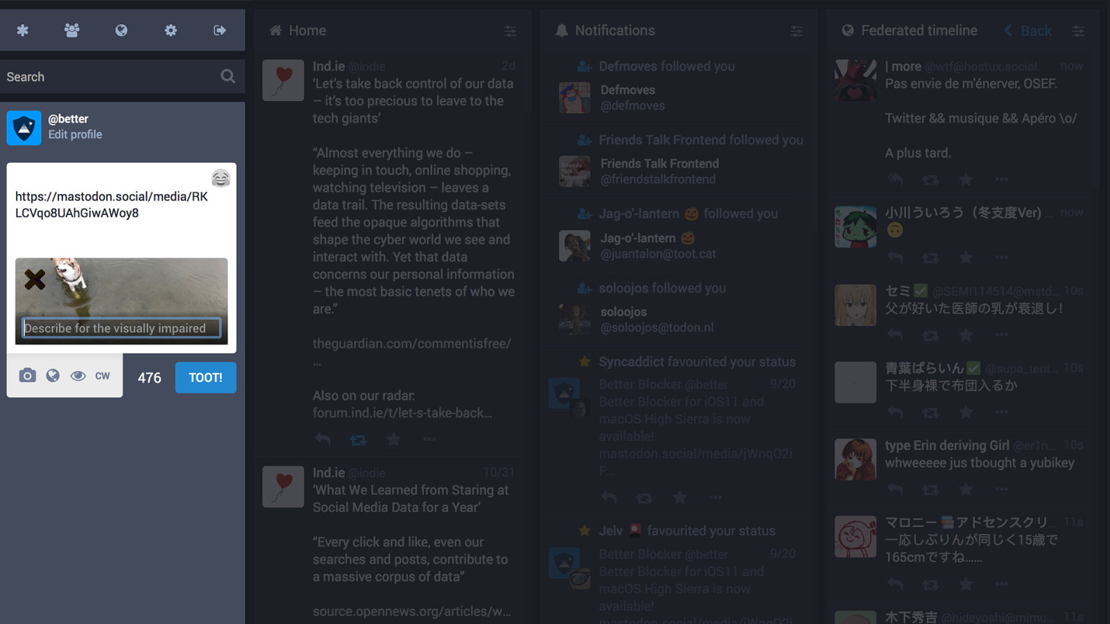
Mastodon, the friendly Twitter alternative, includes the option to compose an image description by default. You don’t need to switch anything on.
Writing meaningful alternative text is important. Just because not everybody will read it, it doesn’t mean you shouldn’t pay attention to this microcopy. As a bonus, alternative text is also beneficial for search engine indexing, as search engines are far better at understanding text than they are images.
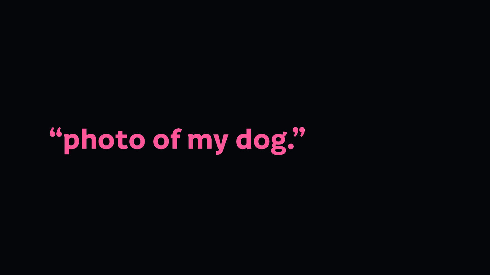
Here’s an example of alternative text:
If all you could see is “photo of my dog”, there may not be much point to the image—you don’t know what makes that photo of my dog notable.
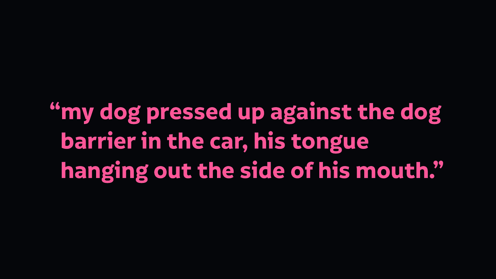
But if you saw the text “my dog pressed up against the dog barrier in the car, his tongue hanging out the side of his mouth.” then you’d understand why that image might be worth sharing.

Because he looks daft…
Transcripts are long-form text representations of video and audio content.
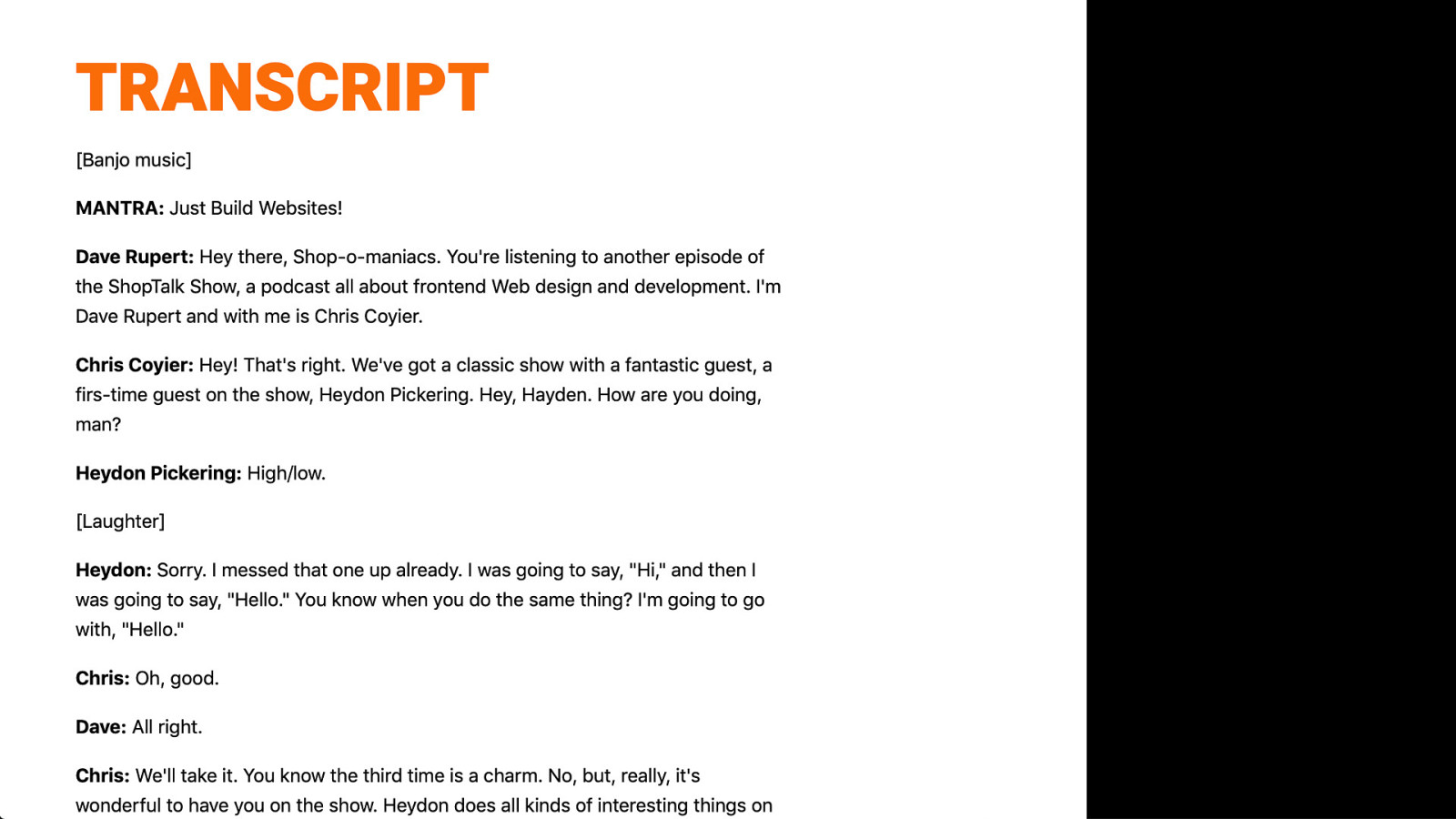
Here’s an example of a transcript from the great Shoptalk Show podcast. Their transcript provides additional value over audio too, as it includes the names of speakers (handy if your speakers sound similar too!) Transcripts can also include links, so you can reference context for the discussions, or even help with marketing. And again, like alternative text for images, transcripts are much easier for search engines to index compared with audio.
Use captions or subtitles for video content
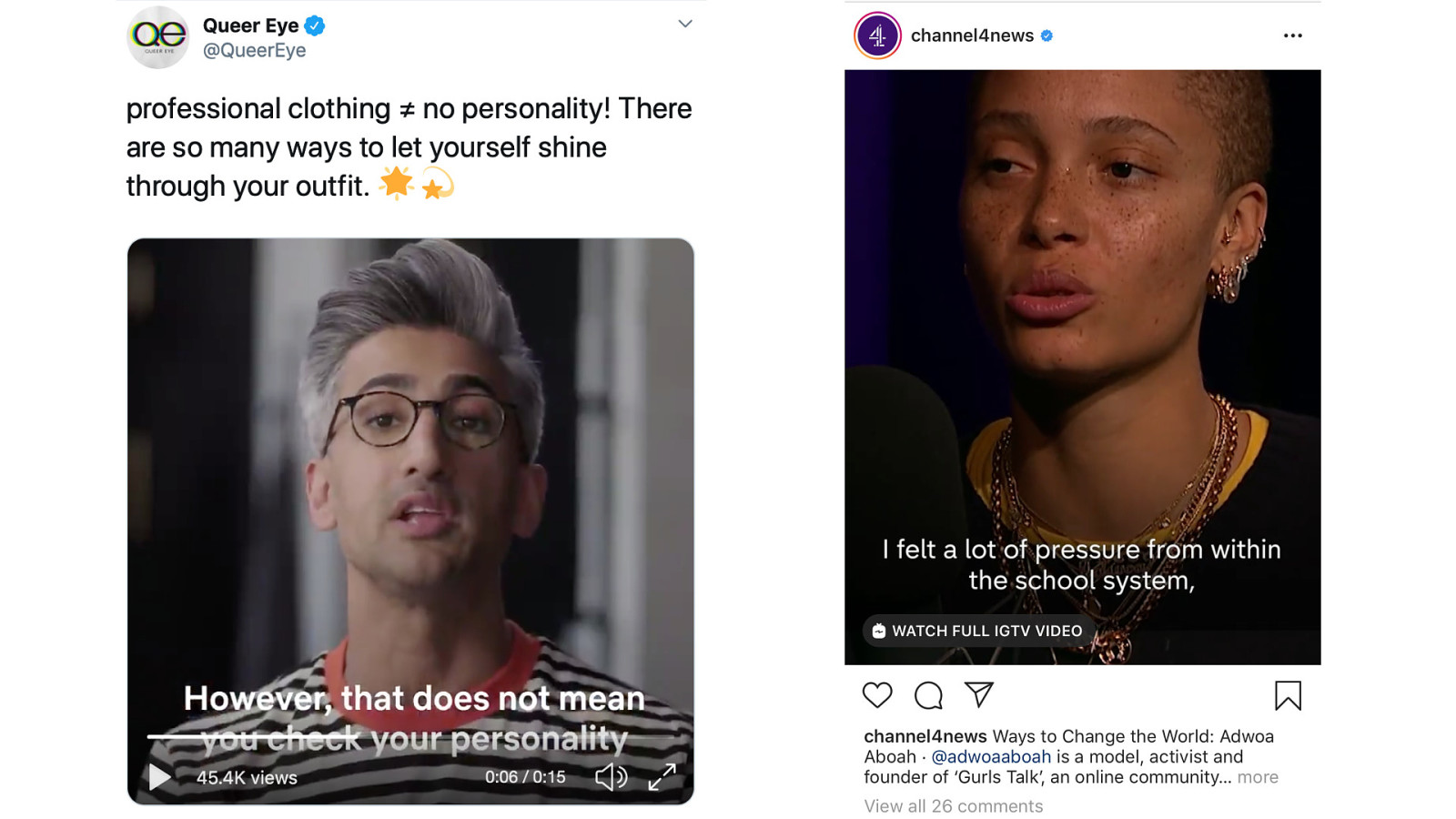
Captions not only help people who cannot hear the audio… even on a muted video, captions can intrigue a viewer and give them an idea of what the video is about without needing to enable the sound. (Whether it’s Queer Eye previews or News interviews!)
So I hope I’m convincing you that good accessibility is good usability
When we look at accessible design today, we are often faced with the myth of “accessible technology cannot be beautiful.” People cite examples of accessible websites that look dated or are ugly.
The thing is, aesthetics are part of usability.
And by this, I mean aesthetics as design. Not aesthetics as decoration, stuck on to distract people.
We must remember we are not making art with our interfaces, we don’t need to make things quirky for the sake of being different.
What is your definition of beauty? Are our interfaces supposed to be works of art? Or does the beauty come from simplicity and thoughtful aesthetic decisions that help our interfaces do the job they’re designed to do?
So let’s look at some aesthetic principles from the perspective of creating accessible and functional interfaces that also look good.
People with cognitive differences will particularly benefit from careful aesthetic decisions focused around making your interfaces easy to understand and use. Functional aesthetics are also valuable to people who are newer to technology and its conventions, who haven’t much experience with our existing shared visual languages.
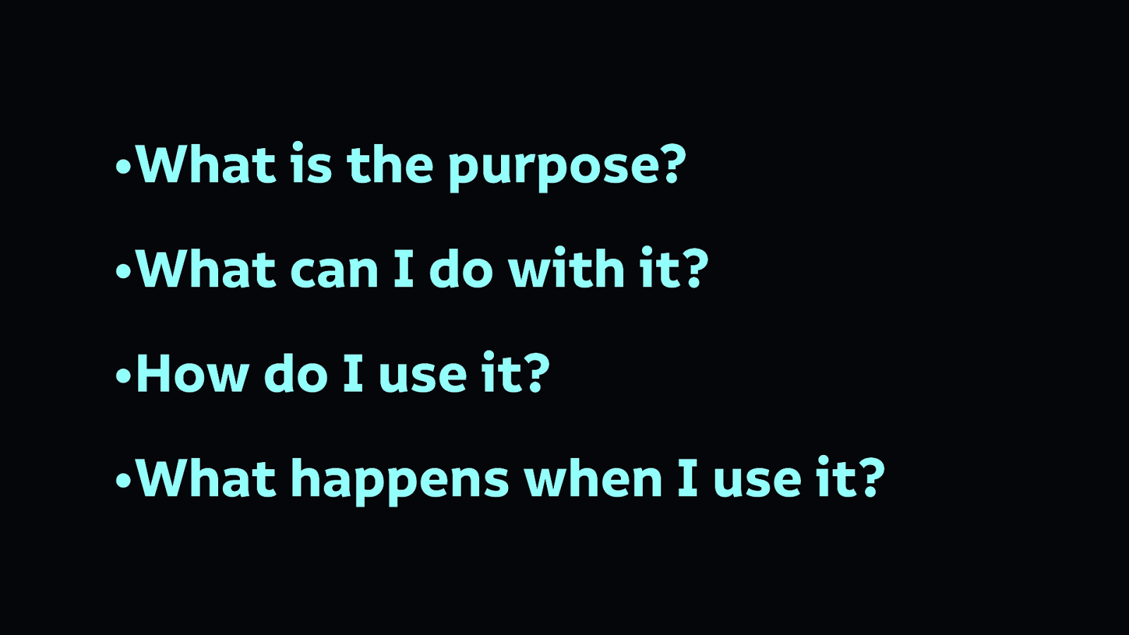
We need interfaces where you can understand:
We need to use affordances to convey this information. (Affordances are those visual cues that help you understand how something is supposed to be used.)

Here are some examples of things we know we can press on pages. Some items have underlines, some have borders, some have rounded edges, some are in bold text. How do we know which of these are items we can interact with, and what do we expect to happen when we press them?
Surprising interfaces are particularly difficult to use for people with cognitive difficulties, or who even people who just think differently from you. Interfaces should be predictable, and explain what’s going to happen next.
Conventions in design are there for a reason, they’re easy to understand and thus easy to use. It is unlikely you are going to invent the next convention in your interface, so stick with those that already exist.
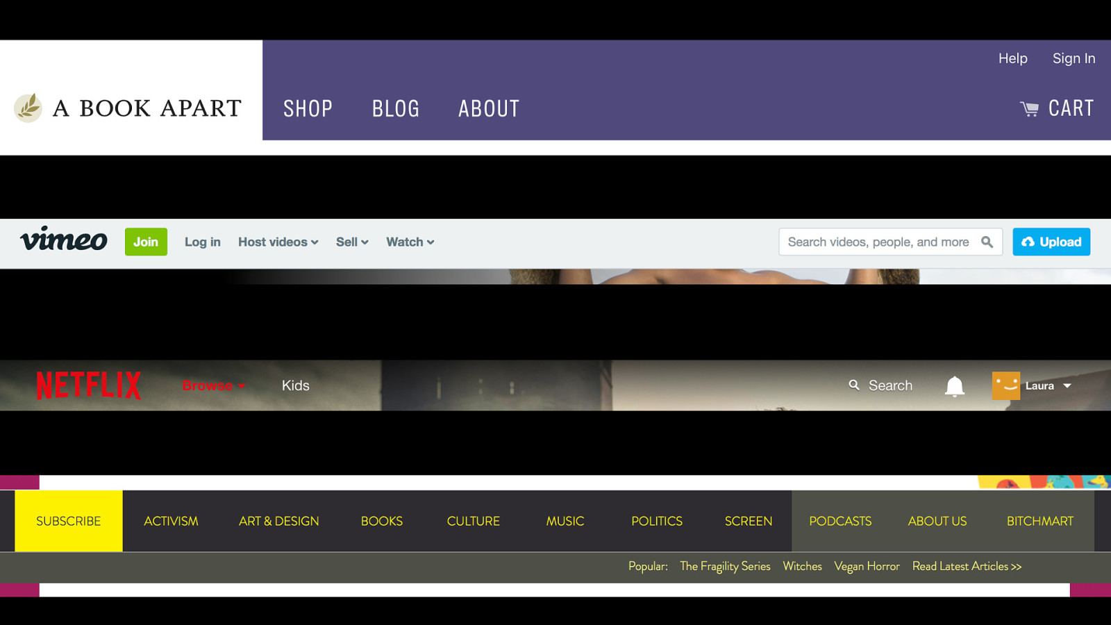
For example, navigation along the top of a web page is a convention. You don’t need to reinvent navigation!
Design to suit your audience’s needs. Leave your ego and show-off-edness behind.
But also don’t do it just because everybody else does it. That example I showed earlier with the asterisk? Loads of people use that to signify a required field. But why? Just because everybody does it, doesn’t mean it’s a good idea.
Relationships are key to explaining context in aesthetics design.
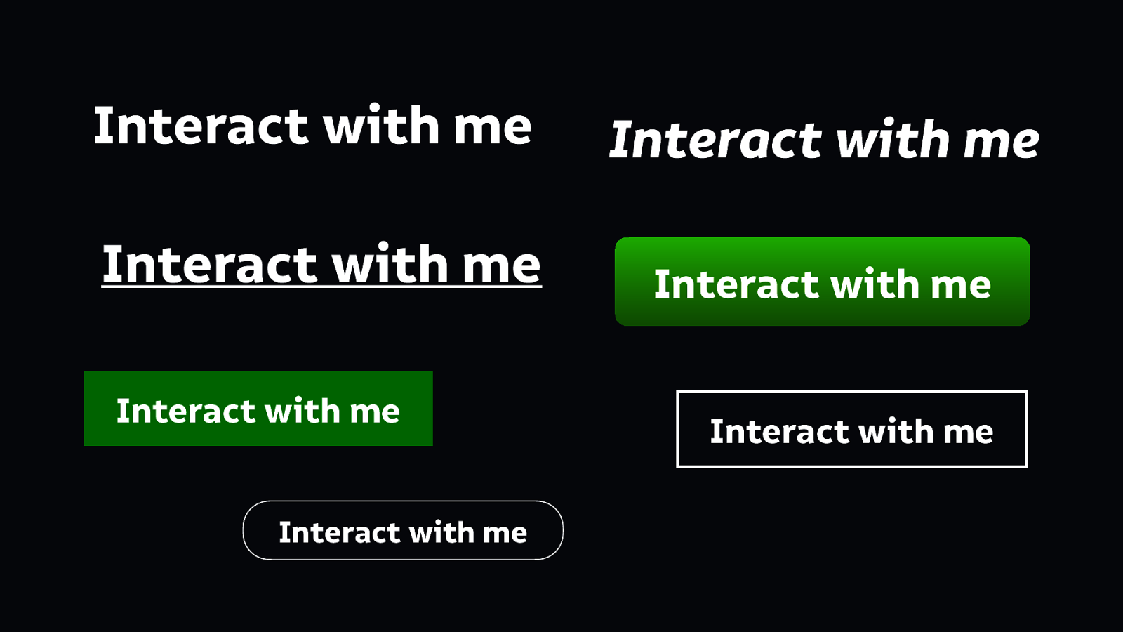
Going back to my earlier example of interactive elements… How we know we can press one item is often because of the difference in its appearance from another item. The similarity and contrast in the relationship provides information. We need to consider every element in a design as it stands alone, but also as it appears alongside the others.
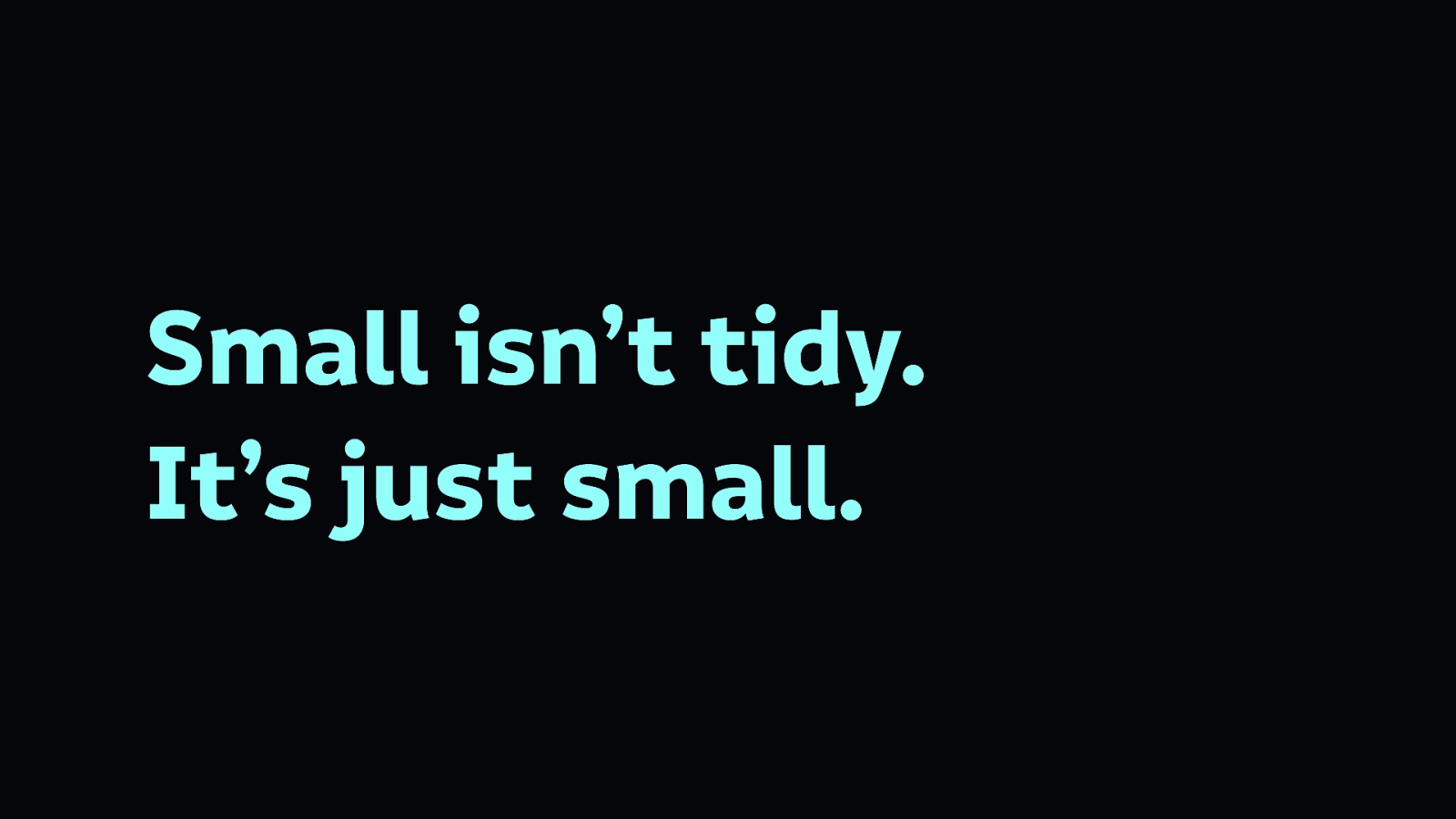
Font sizes are everything. Designers are often tempted to use tiny text because it looks neat and tidy in their layout.
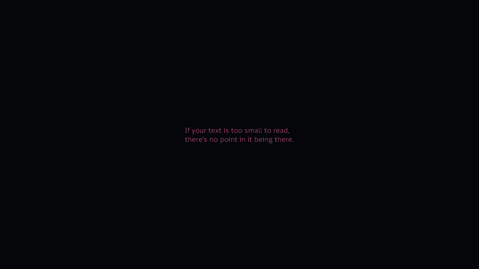
But layouts aren’t there to be neat and tidy, they’re there to be used. If your text is too small to read, there’s no point in it being there.

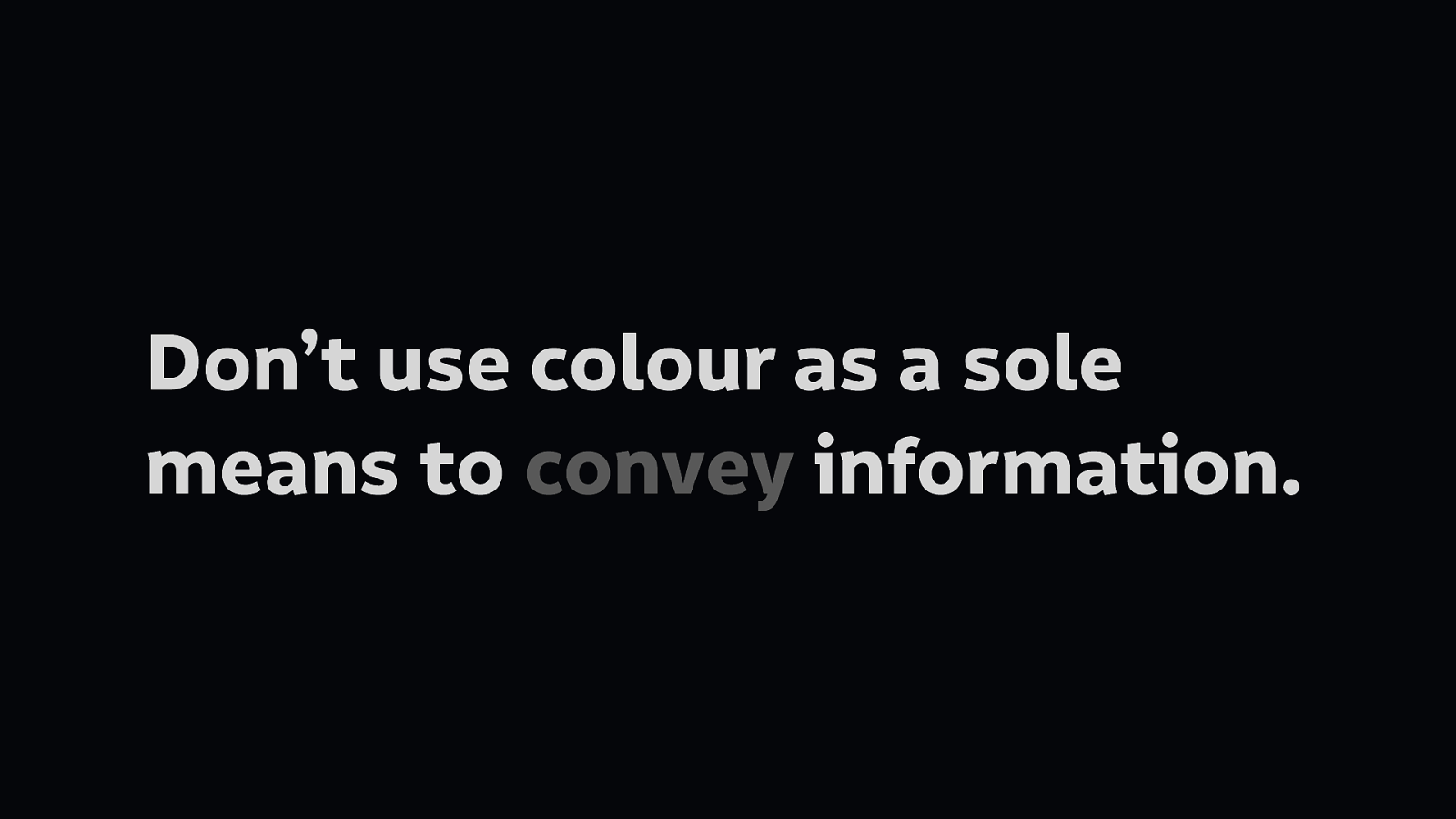
Colour is valuable but should only be used in a supporting role.
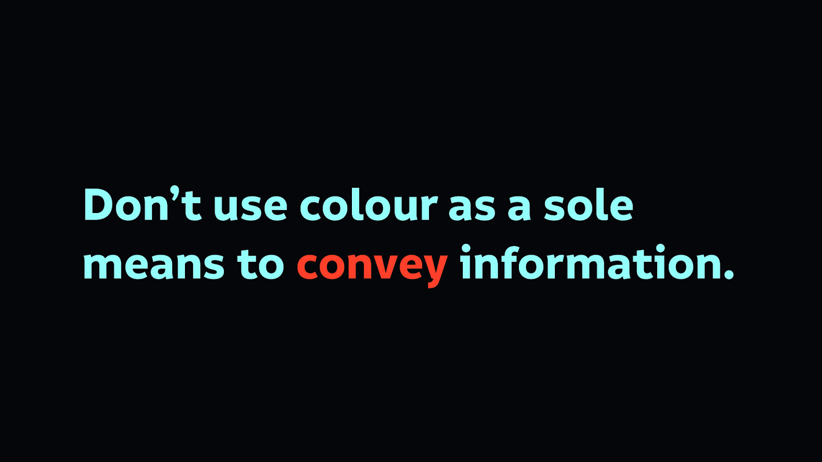
People with different vision, particularly colour blind people, could miss your design cues.
This slide shows how the previous slide looks in greyscale, the colour highlighting doesn’t work nearly as well. You can’t see what that the text is red, and so may convey an error.

You can recognise this text style without colour. Why? Because there’s a dashed line, which is most commonly used to convey a spelling error. This is different from a solid line, which usually conveys a link. Both work regardless of the colour of the text.
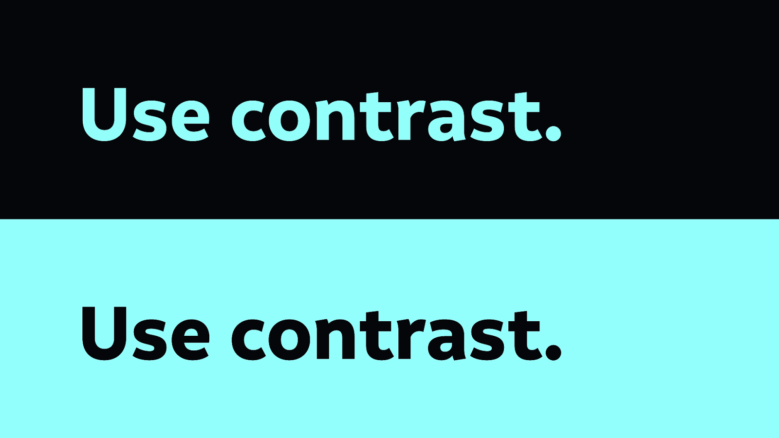
Use high contrast colour differences between background and foreground text. This ensures it is readable by people with differing visual needs. Whether you are colour blind, have a lack of clarity in your vision, are long sighted or short sighted, high contrast text will make it easier to read.
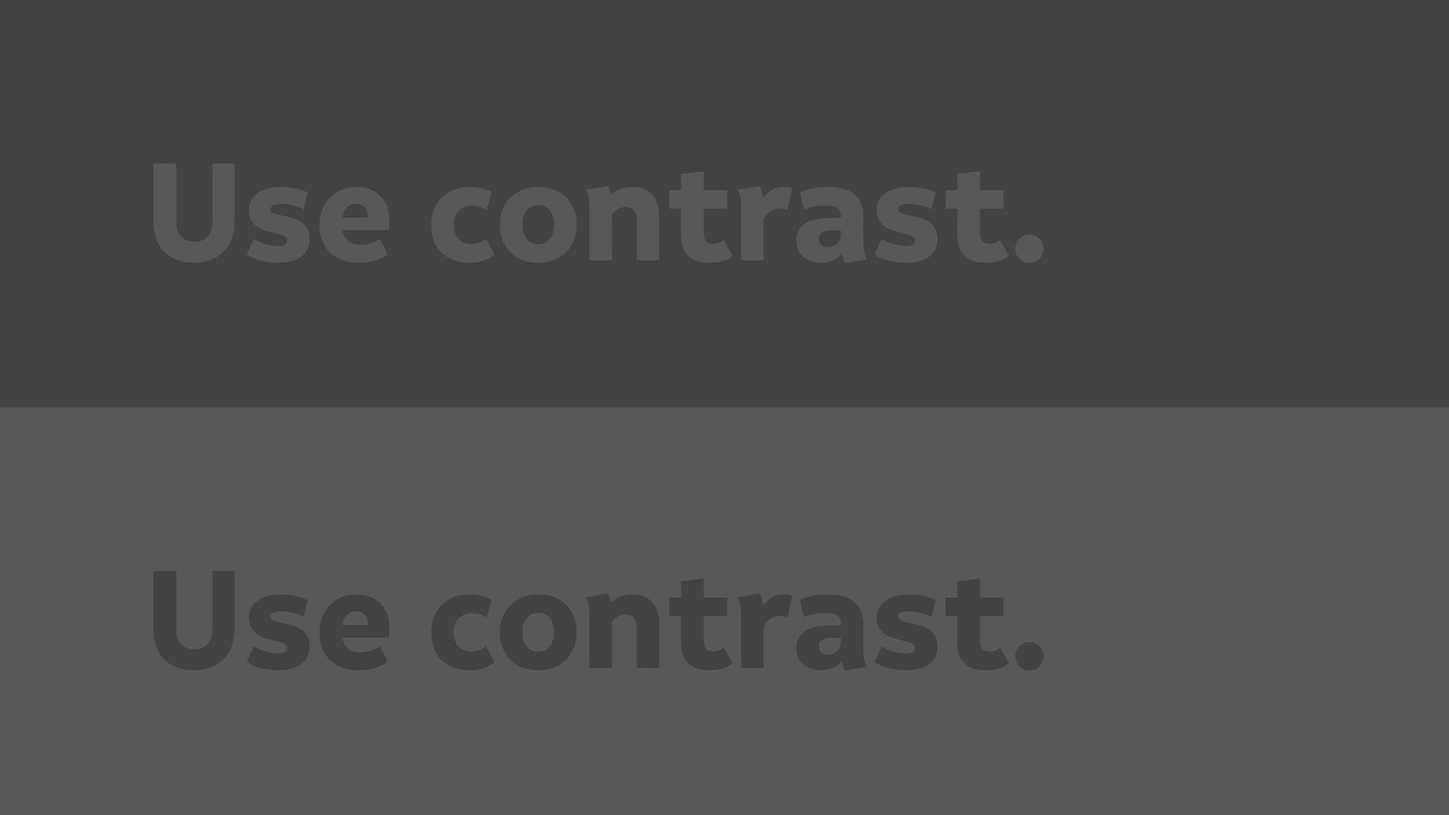
Contrast also has an impact depending on the screen you have, and the environment you’re using it in. For example on a bright computer screen, this may be more readable than on a mobile device in the brilliant sunshine.
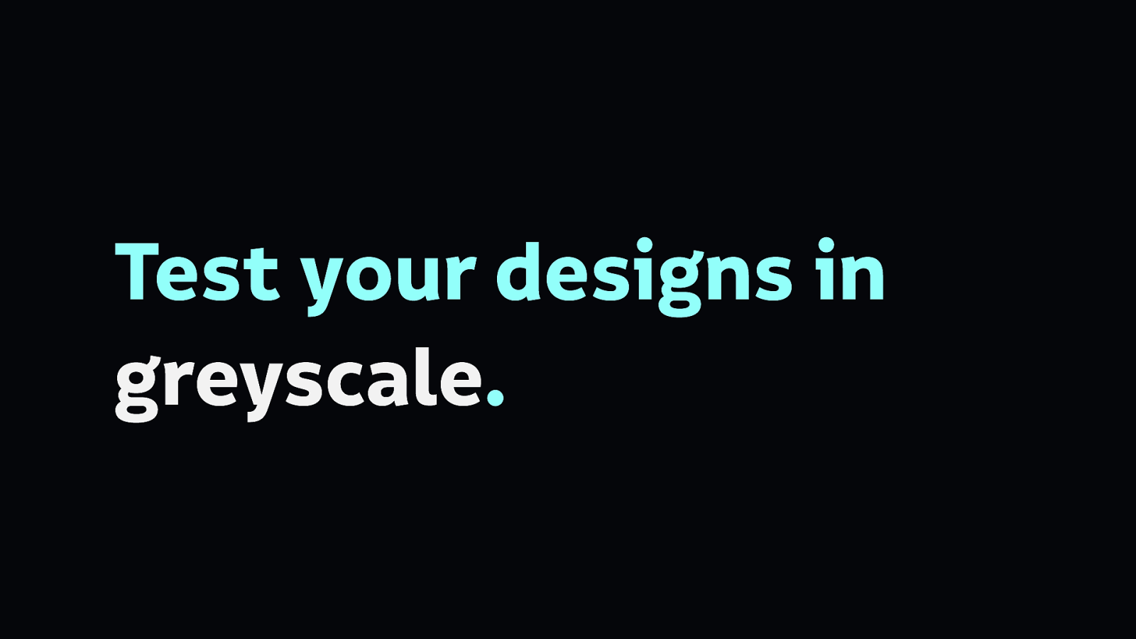
Test your designs in greyscale to find the weaknesses in your reliance on colour. This is a top tip I picked up from Geri Coady, author of Color Accessibility Workflows.
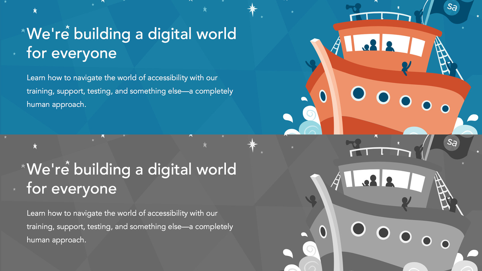
Here’s an example of a beautiful website that works equally well in greyscale as it does in colour. It’s the Simply Accessible website, designed by Geri and the team at Simply Accessible.
Much like with colour, don’t rely on icons to convey meaning. You know what an icon might mean, but you can’t expect others to share your understanding.

Three horizontal lines arranged vertically might mean something to you…
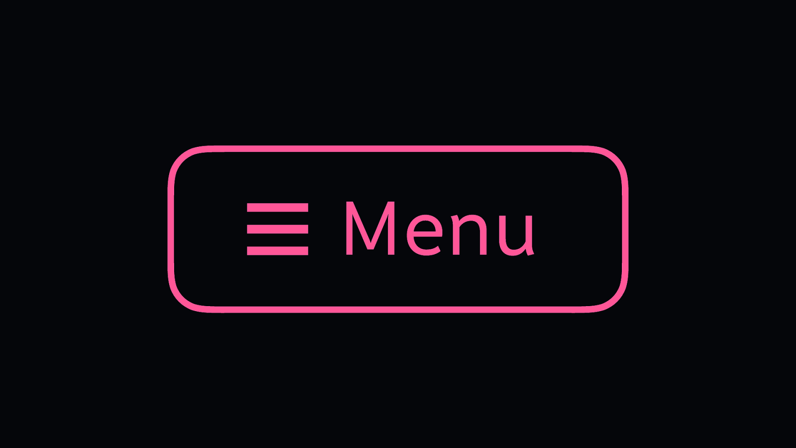
But to be sure, give it a label. It’s a Menu icon. The icon can be quickly identified, but the label supplements its meaning. Make that meaning clear.
These are simple principles that give you space for a lot of creativity
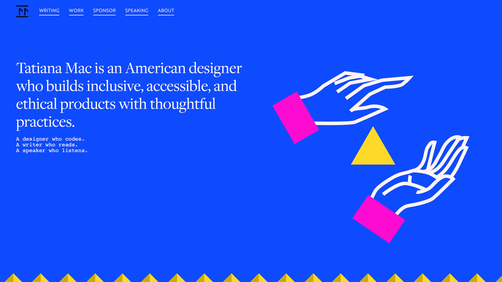
You can still build beautiful interfaces that are accessible. This is Tatiana Mac’s website, which is fresh, colourful and creative. And takes care in being accessible.
We are entering an era where we can distinguish our products, our services, and ourselves based on the fact that we care about each other.
It can be a little intimidating learning how our work can let people down, when many of us joined the industry because of its potential.
We wanted new shiny technologies to play with, the democratisation of information and technology, we wanted to reach a huge number of people across the internet.
We didn’t necessarily sign up to be the people who build everyday things. But we are those people.
And so ethics are necessary.
So at Ind.ie, we’ve been thinking a lot about how to build ethical technologies. We decided we need an ethical design manifesto for the things we use every day…

If we start off thinking of the products we build as an apple…
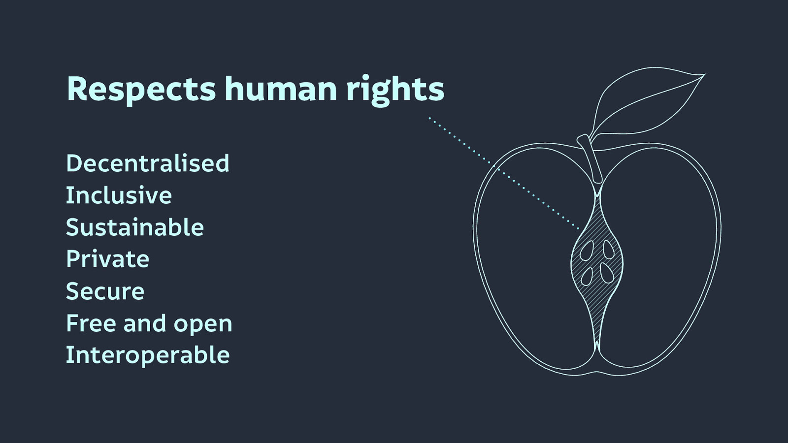
At its core, we need to respects human rights, by making products that are:

Once we’re respecting human rights, then we can move on to the flesh of our product, the substance that makes people want to use it.
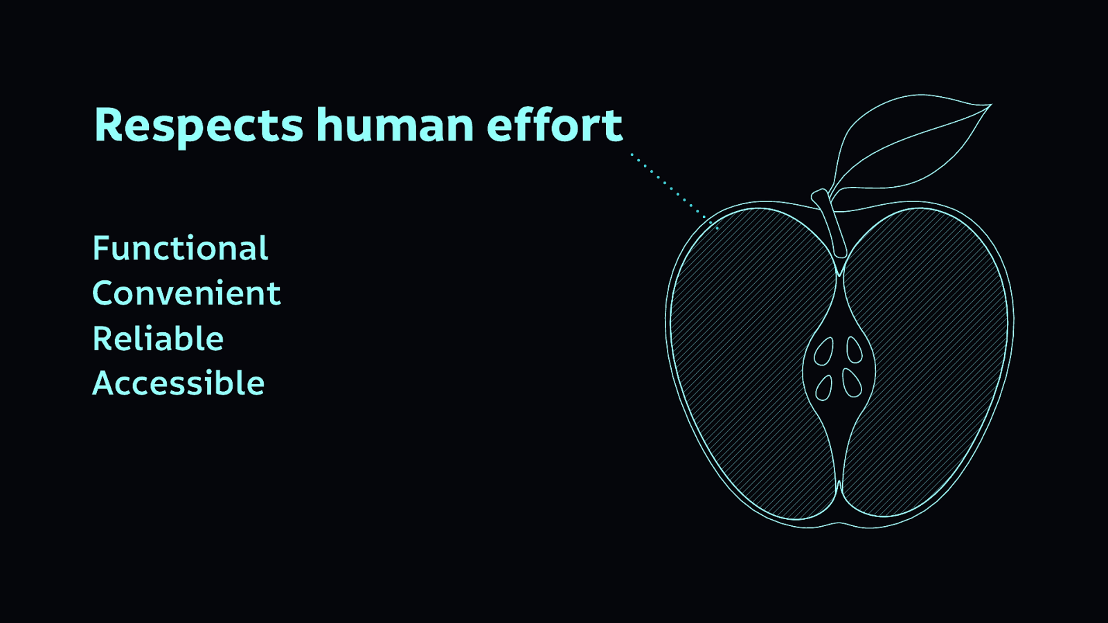
Building products that are…
…respects human effort.

And then we can focus on the shiny exterior…
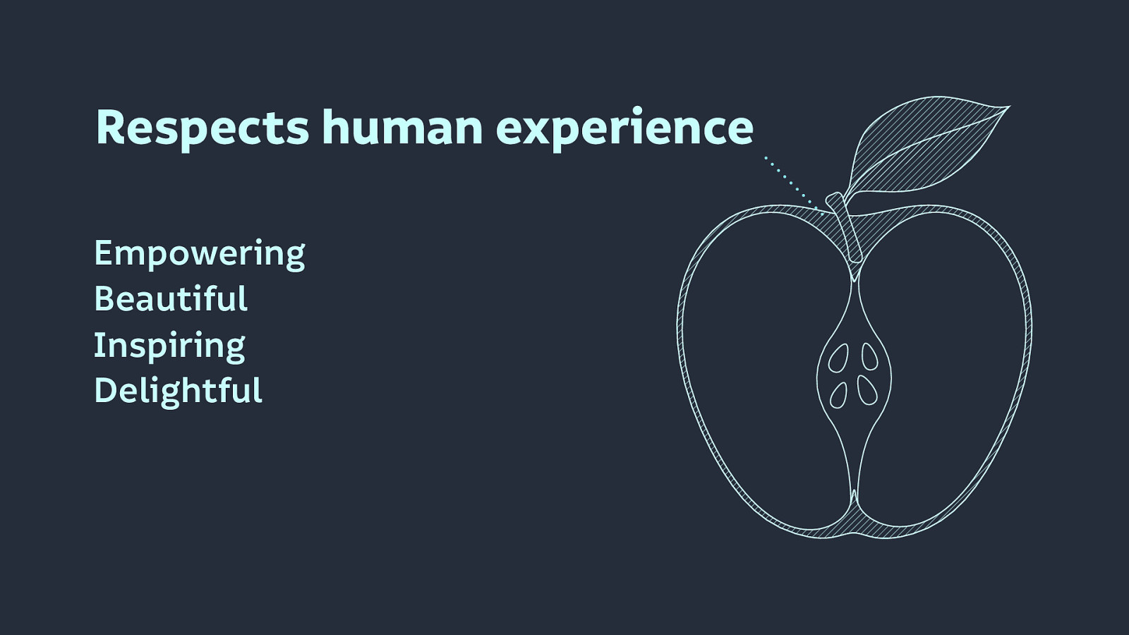
Building products that are…
These are the fun parts that respect human experience.
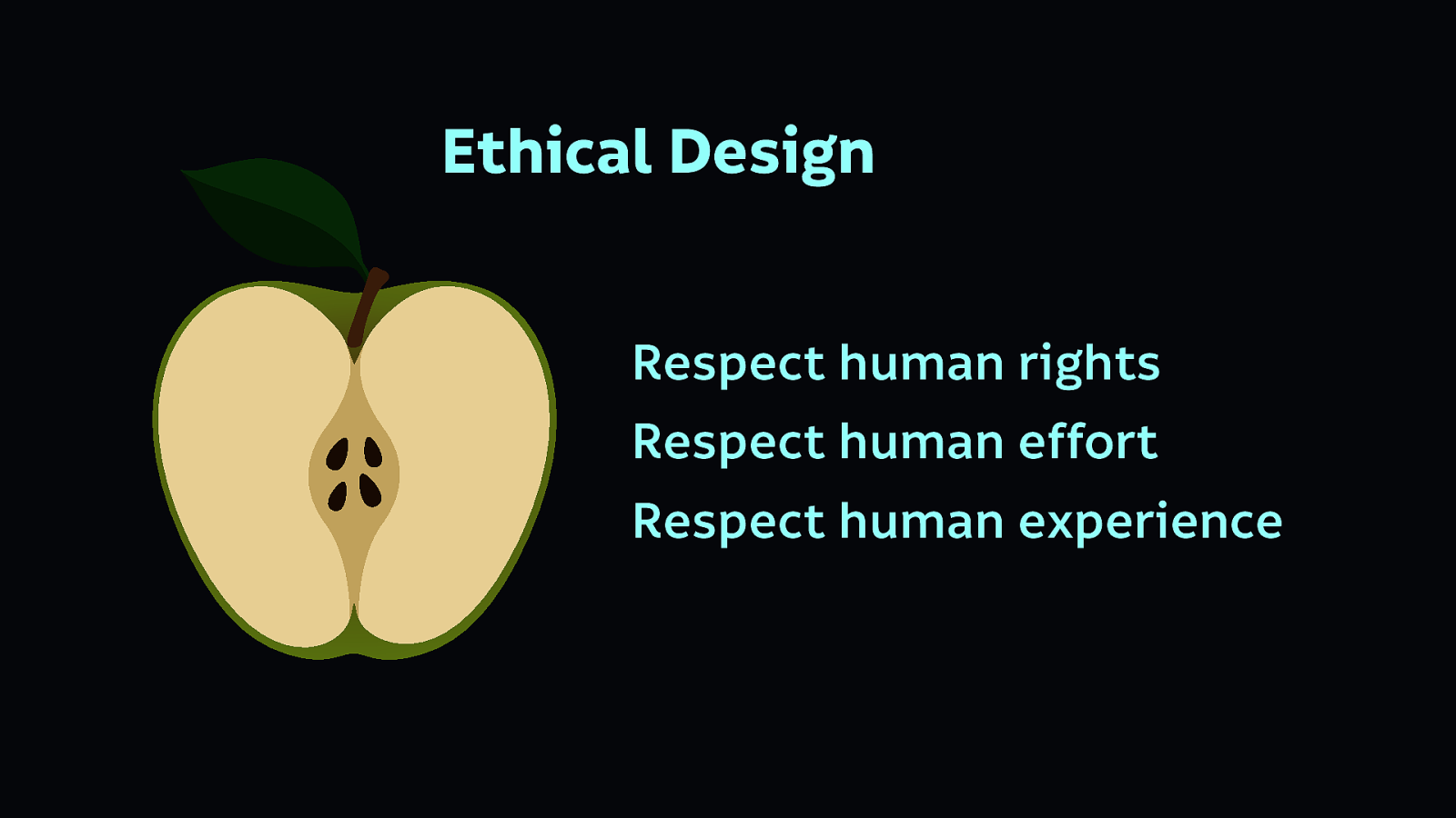
Once we have achieved all of these goals, only then can we have truly ethical design.
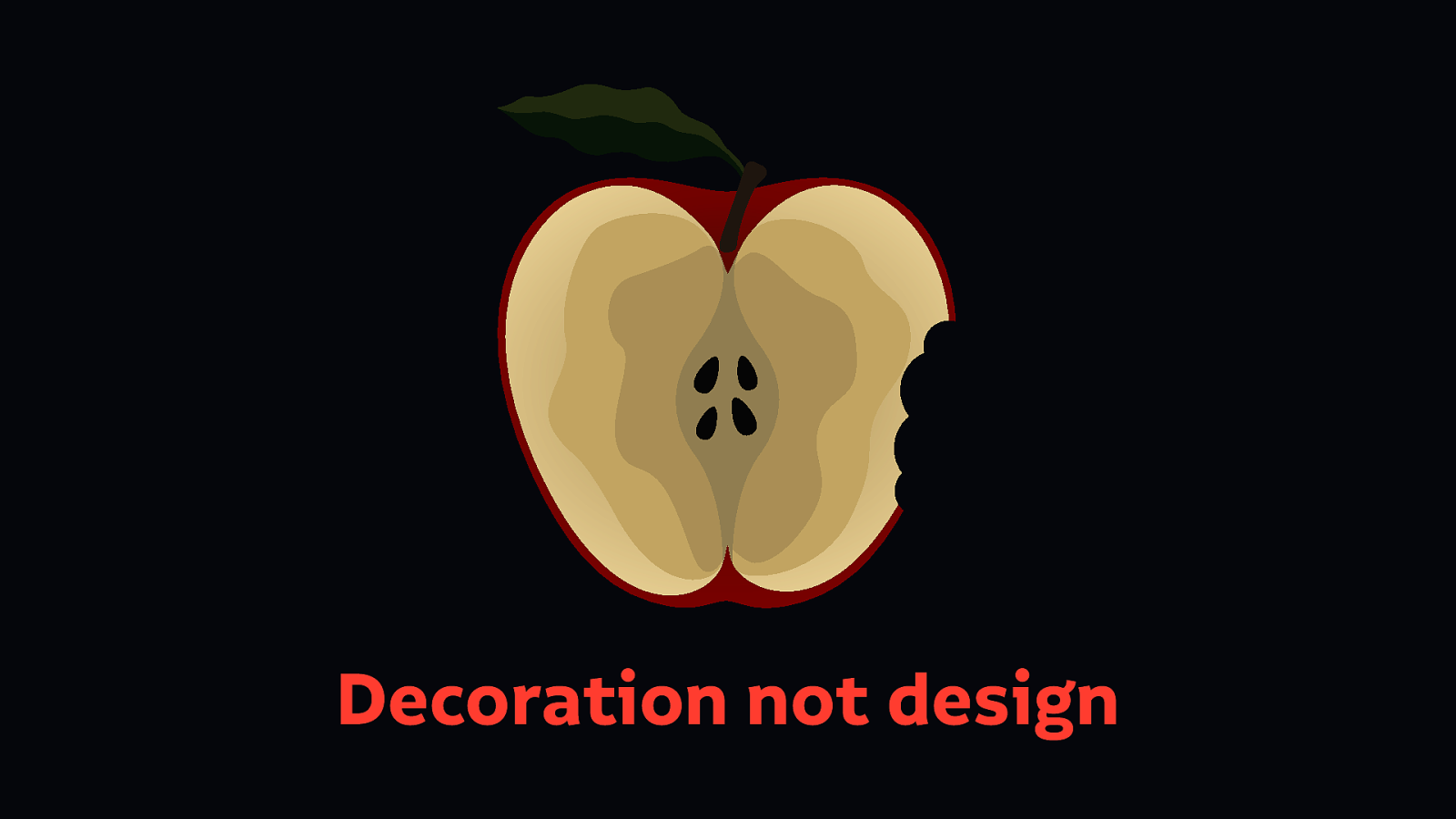
When we don’t respect human rights, and build an unethical core, we are building superficial products. A rotten core is a sign of a misleading product. You might make it fun and attractive, but that’s decoration not design. It’s hiding the products’ unethical purpose.
The point of the products we build is important. We need to build these ethical products for our future—for us as individuals, and to benefit society as a whole.
It’s not necessarily illegal to build unethical technology. It’s not illegal, or considered discriminatory to build inaccessible products in many parts of the world. That doesn’t mean we should build unethical products.
We are still in the early days of building internet technologies. There’s a little regulation, but not many laws and precedents dictating how you should not build technology. Even less dictating how we should build technology.
We need to build technology well for our own sake. Build it for your future self who may have different needs, build it for your friends, your family, your children.
So let’s get going, and let’s make a better technology.
Laura Kalbag ind.ielaurakalbag.com@laurakalbag Slides at https://noti.st/laurakalbag