A presentation at State Of The Browser in September 2019 in London, UK by Laura Kalbag
I’m going to start with some basics so that we’re all feeling like we’re we know what I’m going on about. First off: what is accessibility?
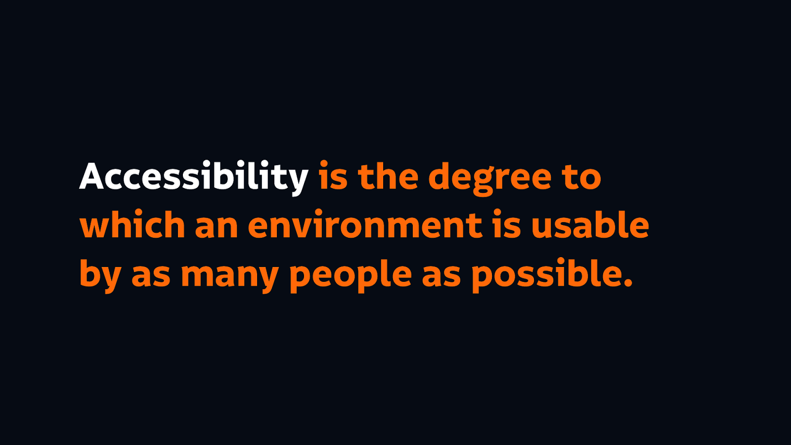
Accessibility is the degree to which an environment is usable by as many people as possible.
Which therefore means the web accessibility is the degree to which a website is usable by as many people as possible.
And I don’t want to ignore people’s needs by being vague about it (because I worry that we sometimes do this when we’re trying to sell accessibility) and we start talking about the benefits of overall inclusivity, we actually end up leaving people out by accident…
Honestly, specifically, when we are talking about web accessibility we are talking about making a website usable by many disabled people as possible.
So while being inclusive will allow all the people access to using our sites, many disabled people won’t be able to use them at all if we don’t do the work to include them. And by disabled people I mean people whose impairments can affect their use of the web.
So now we have kind of some vague idea of what I mean by accessibility, I’m going to do a kind of a hand-wavey exercise…
First of all raise your hand, or gesture, or smile, or give me a knowing wink, if you feel like you’re an expert in accessibility.
Now do the same if you feel that you have an intermediate level in accessibility. Any full stackers here? I believe in full stack as much as I believe in unicorns. (Or the ability to change Facebook and Google from the inside.)
How many of you feel like you know what you consider to be the basics of accessibility?
And how many people here are beginners, newbies? There’s no shame in it…! And have I told you about a book I’ve written…? 😉
A lot of people keep telling me that they know the basics about accessibility. I get a lot of people coming to me asking “can you give me some more intermediate knowledge about accessibility to take away? I know the basics, I know it all already!”
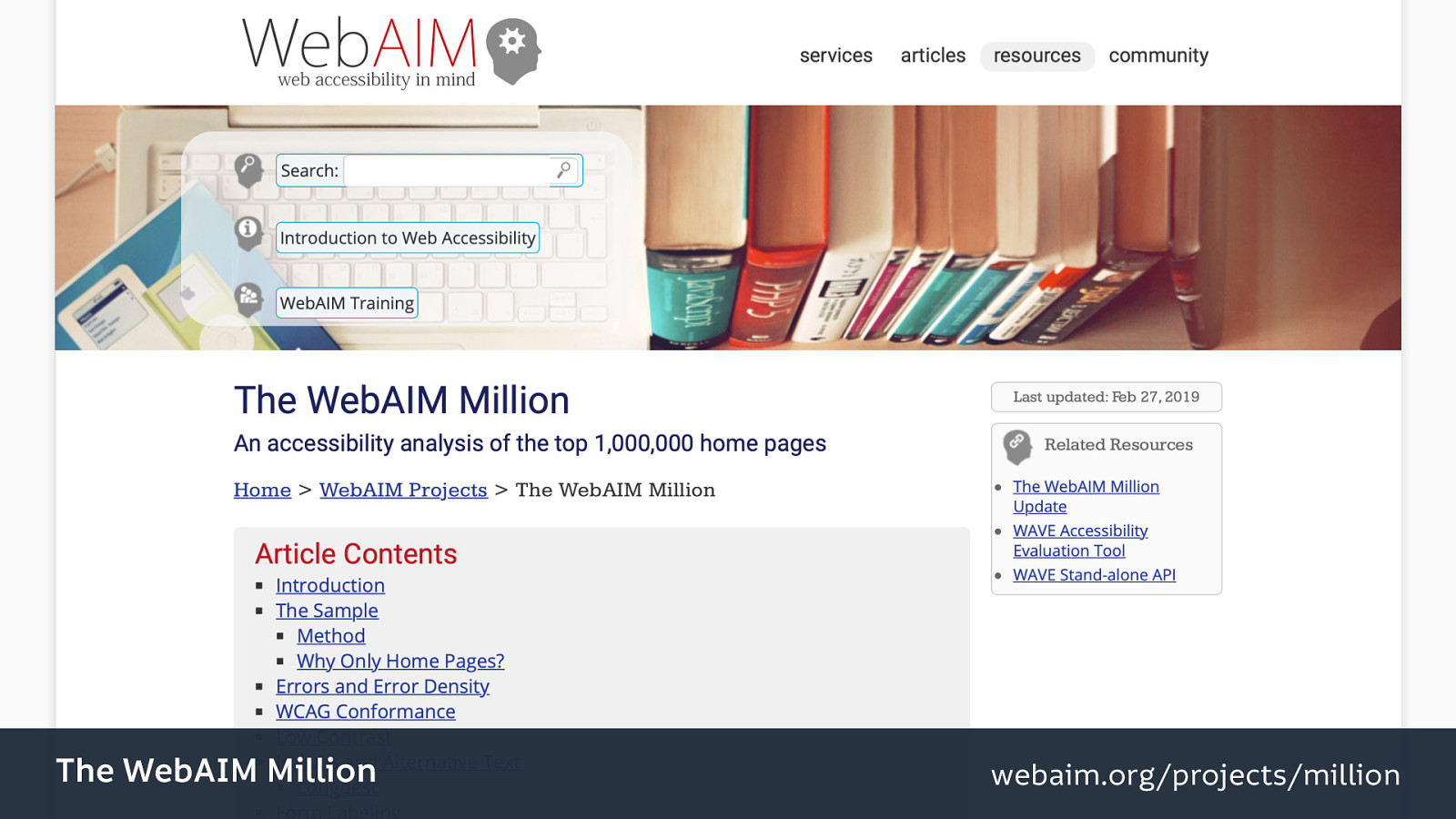
And as we know from Bruce’s talk this morning, WebAIM did an automated accessibility analysis of the top 1 million home pages, and it showed that 97% of the top home pages have basic web content accessibility guidelines (WCAG) errors. Errors that, in my opinion, have fairly straightforward fixes.
Source: The WebAim Million.

“The WCAG 2 failure rate based on automatically detectable errors was 98.0%.”
Source: The WebAim Million.
I’ll return to these errors later…
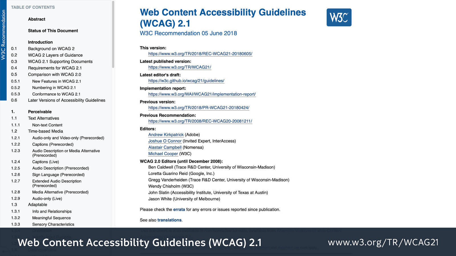
A quick deviation to anyone who doesn’t know about the Web Content Accessibility Guidelines. They’re a standards recommendation, and they help developers and browser makers with guidelines on how to make websites more accessible to disabled people. And they’re a really good starting point for learning more about accessibility, and how to make sites work for particular needs. Also you can run automated tests against these specific guidelines… (however they are not a replacement for testing by real humans who have different ways of using the web that we cannot anticipate with some guidelines.)
We have a problem in this industry… We have many problems in this industry, but one that I want to talk about today is that we always want to be able to say that we’re the best. And let’s face it this country (the UK) may be sick of experts but the tech industry is absolutely full of them…
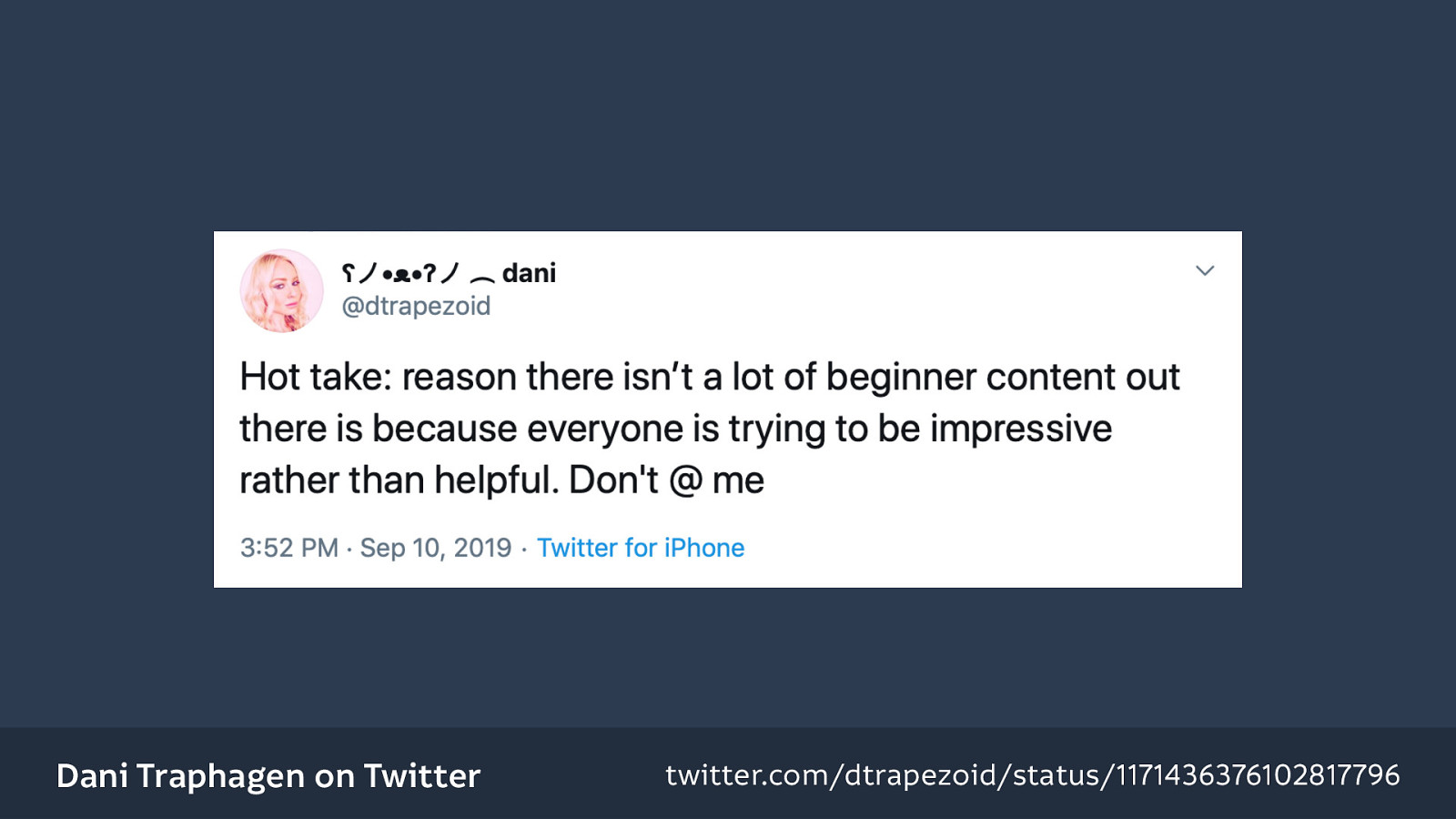
It reminds me of this tweet that I saw this week that’s just, I think it sums up the point really well, “there’s a reason there isn’t a lot of beginner content out there because everyone is trying to be impressive rather than helpful.”
And the thing is, the desire to be seen as the best is kind of incompatible with improving, because we can’t learn from our mistakes if we believe that we’re the best at everything already.
Source: Dani Traphagen on Twitter
And the thing is, the desire to be seen as the best is kind of incompatible with improving, because we can’t learn from our mistakes if we believe that we’re the best at everything already.
And there’s no shortcut to being an expert. You can do a Bootcamp, you can be the first to define a particular term, but you only really know your stuff when you’ve put the work in, when you do it day-in and day-out, when you find workable solutions to your particular problems. Because we all have unique problems with the projects that we’re working on, or with the companies that we’re working for, or with our bosses and their arbitrary demands.
And we’re getting really used to just grabbing a framework that will make everything quicker to build, or even just finding the Stack Overflow article that tells you exactly how to do this one particular thing, and as Andy mentioned earlier we centre ourselves in the development process (as designers and developers).
The problem is, when we centre ourselves, we sacrifice others.
We end up having quite shallow skillsets too… And why bother prioritizing being seen to know something when we could actually do the work and actually know about it?!
We need to get over ourselves to be able to better serve other people. (And I very much include myself in that! The ego is a difficult thing…)
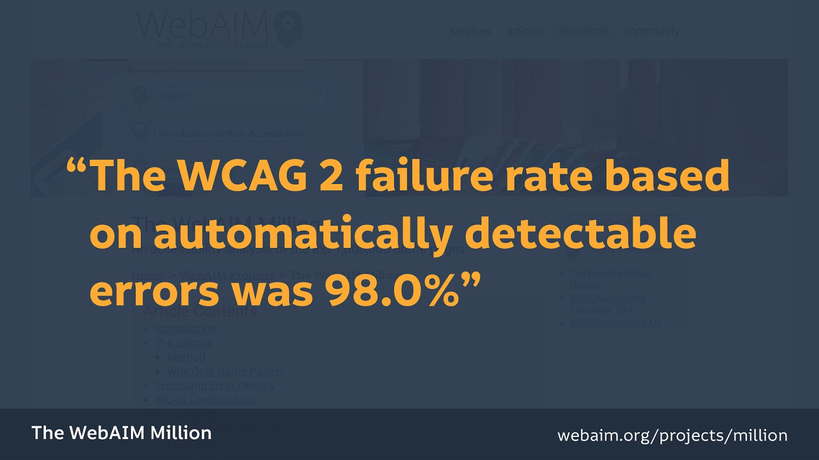
Working my way back to the WebAIM 1 million pages… The failure rate is based on automatically detectable errors, 98% is the most recent analysis that they’ve run (this August)…
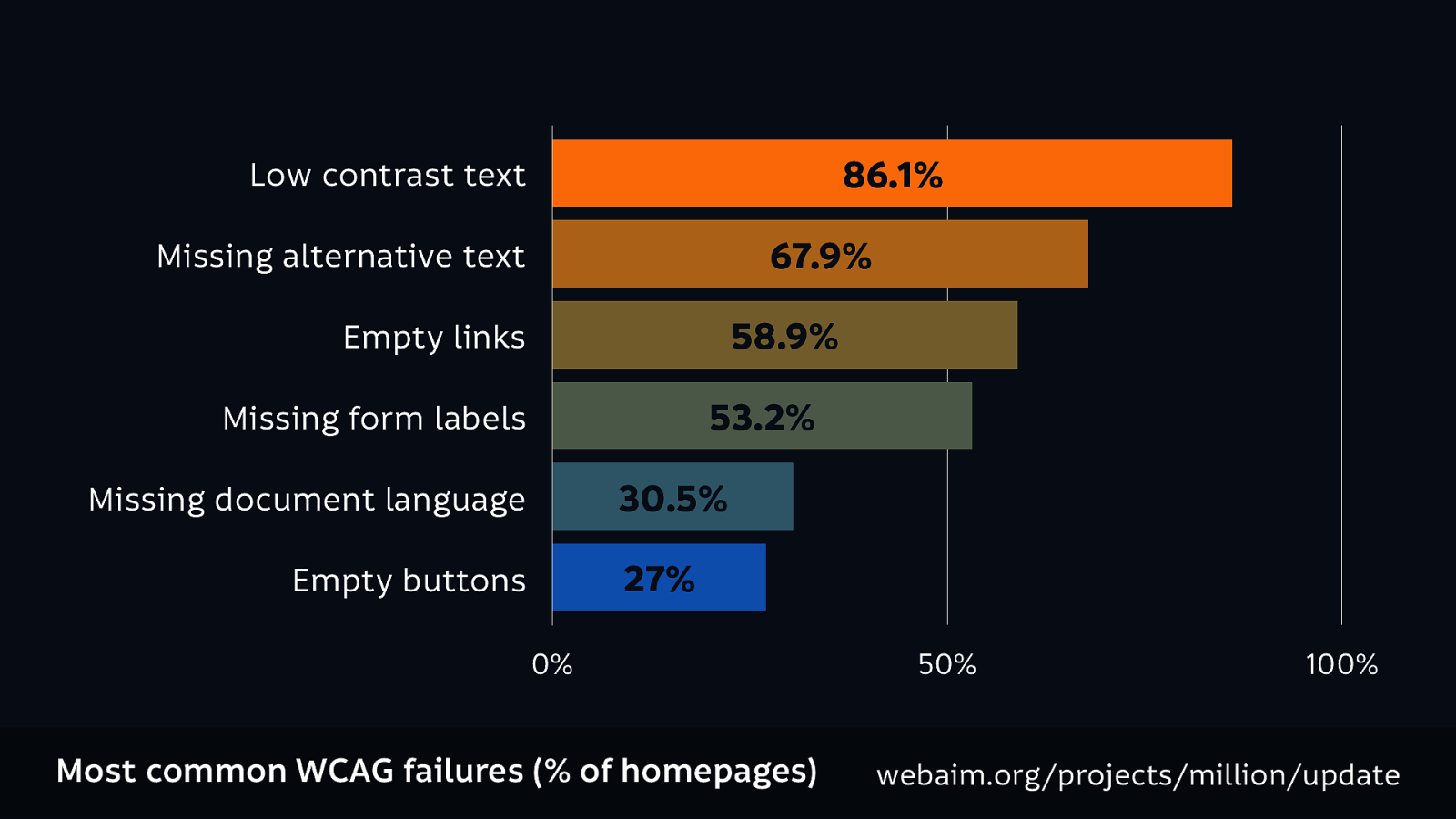
And this is the graph that Bruce showed you earlier, just with different colours. The top accessibility errors found were:

Now if all of this seems unfamiliar to you, I’ve got you. I’m going to go into the fixes now. What are the “straight forward/easy” (as I’m so cockily saying) fixes for these big problems? (I think a lot of you do know the basics, so I’m going to run through this reasonably quickly.)
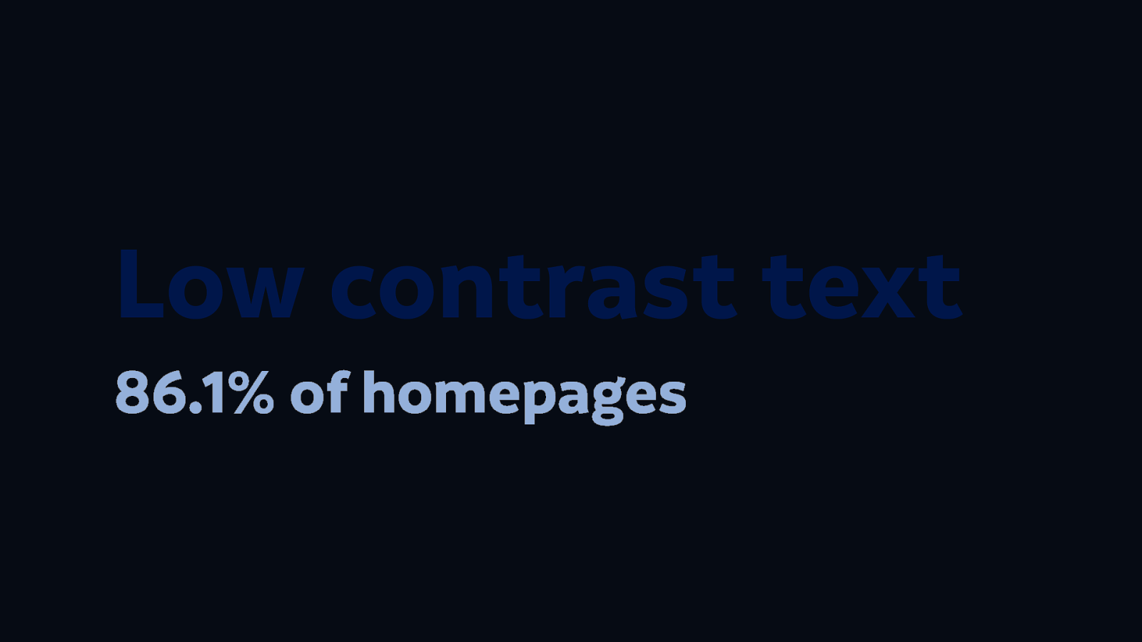
This is low contrast text. It’s text that has a low contrast against its background colour, which makes it hard to read, especially by people who have sight loss, or difficulty reading, or are colour blind. It’s also harder to read for people that are using older devices that have darker screens, or that have turned the brightness down on their screen to conserve battery (which is something that I do all the time!)
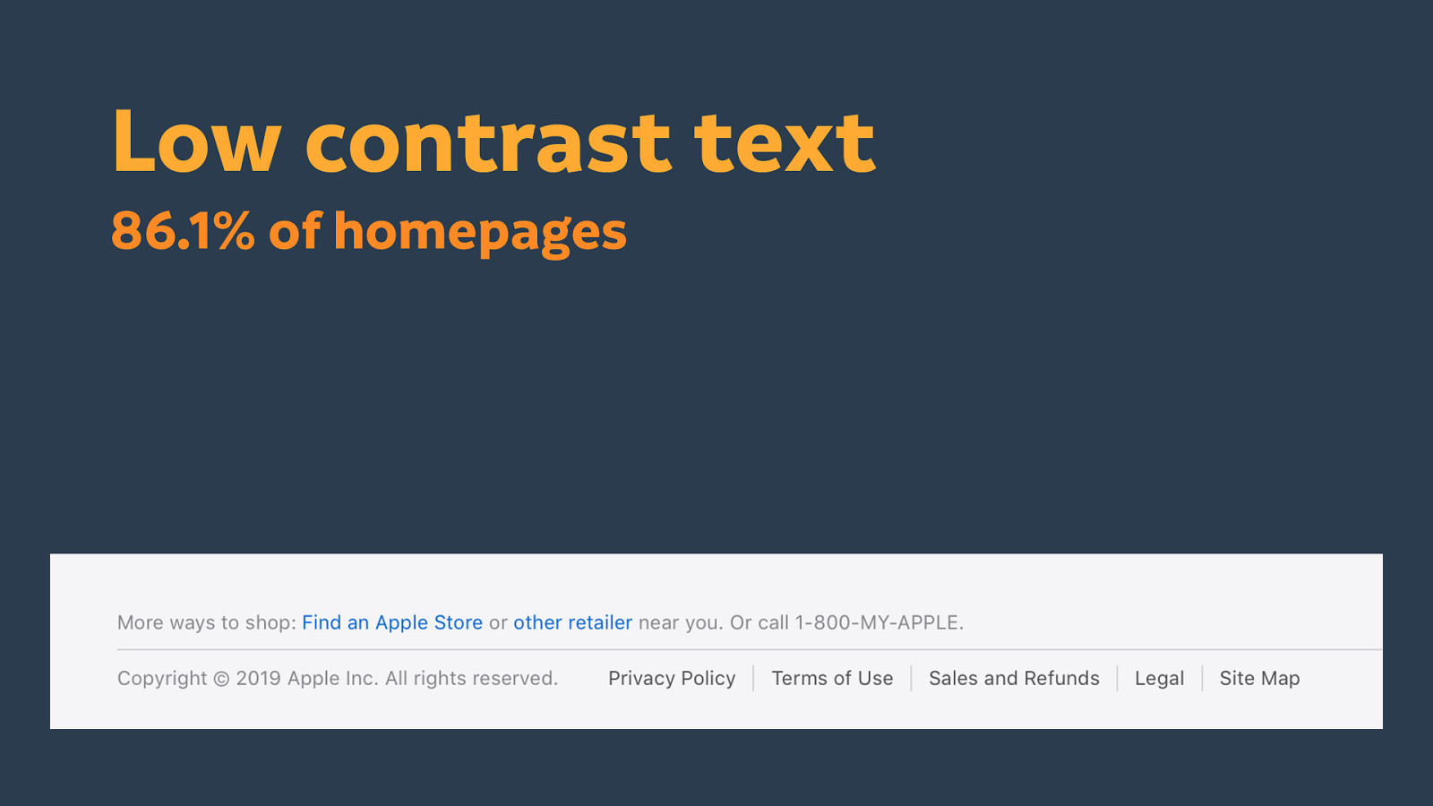
This the like the tiny grey text that Bruce mentioned earlier. Which I think is a habit we have as designers, of trying to make things small, neat and tidy. Making our layouts minimal. Here is the Apple site, and every single time I do a talk, I can go back to Apple’s footer and know that I will always find tiny grey text. Thing is, you act like this isn’t important information… See the privacy policy link though… I think a privacy policy (particularly in this day and age!) is very important information. We shouldn’t be hiding that behind tiny grey text.
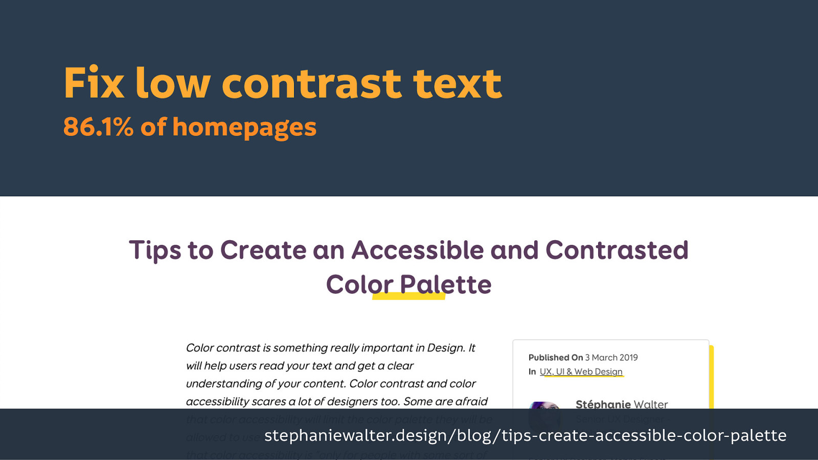
I think one of the biggest issues with contrast is most people don’t know about it. I think that is genuinely one issue where a lot of designers and developers don’t know about it, and aren’t sure how to fix it, but it is one of the easiest things we can fix. And we can do it by starting out with accessible colour palettes. There’s a really great article by Stéphanie Walter where she’s given tips, tricks and tools that you can use to make text with much higher contrast. (But having good taste in your colour picking is down to you!)
I think this is the first thing that most people learn in accessibility…
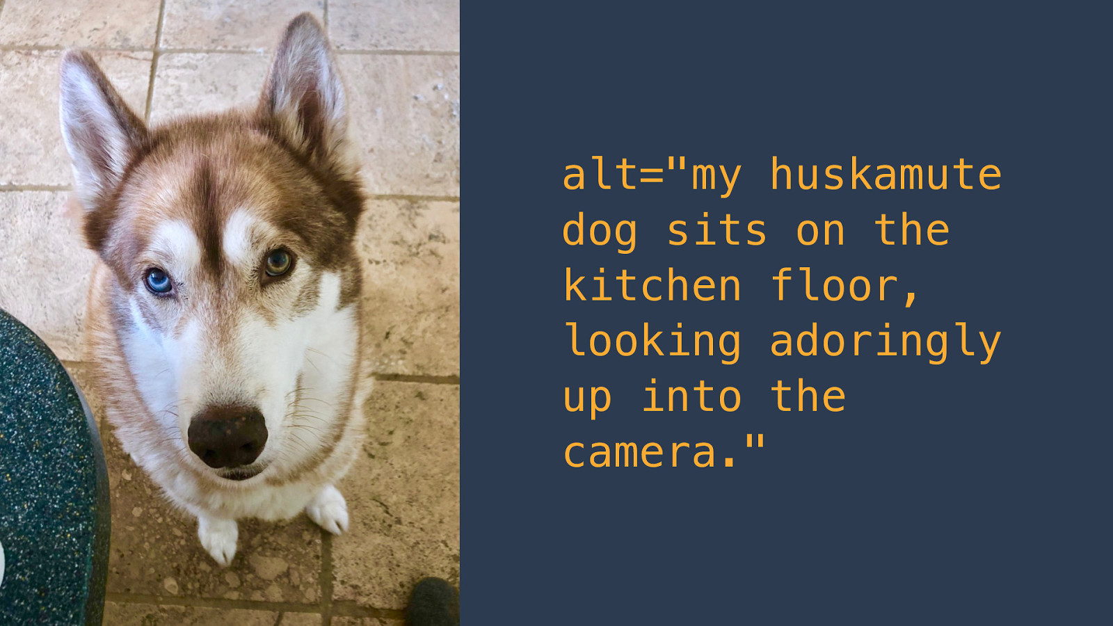
If I have a cute image like this, I want to be able to give it a text equivalent. So for this cute photo of my Oskar, I might say:
alt="my huskamute dog sits on the kitchen floor, looking adoringly up into the camera."
But often people don’t realize that you also need to provide the alternative text attribute if your image is decorative. People are using images thinking we don’t need alternative text because the image is decorative, but actually you just want to have an empty attribute: alt="", and that would tell any assistive technology (or anything else that’s browsing your page programmatically) to ignore that image. Whether or not you would put this image on your page is up to you, but I don’t think that a picture of two men high-fiving is particularly valuable to any page content.
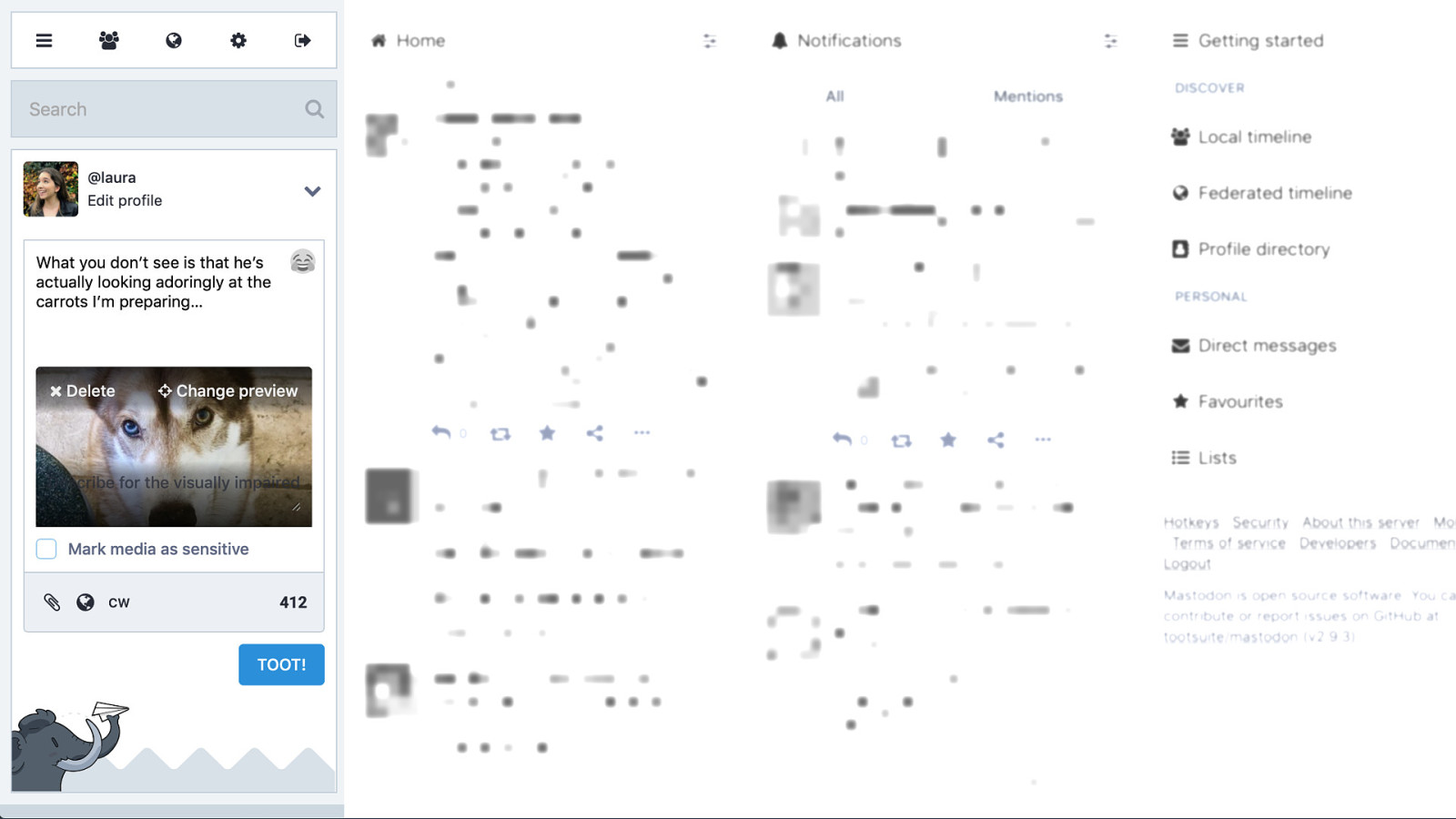
One of the reasons we don’t have alternative text everywhere is because we are not providing the means to add it in the authoring tools that we make. So when we have platforms like social media, we need to be able to give people the means to add the alternative text themselves, and we have to make it clear and visible. This is Mastodon, which is a friendly Twitter alternative, and while this isn’t the best example (it’s still one of the best I’ve found)… it’s a bad example because the photo colour means the text isn’t readable, but it says “describe for the visually impaired” over the image when you upload it. It is key to actually providing instruction to add the alternative text, which also acts as a reminder to do so. It is also telling you right away to add the alternative text, you don’t have to enable it in a setting somewhere, hidden under an accessibility setting or hidden away in an edit menu. It’s there. It reminds people to do it, and the thing is a lot of people care if you tell people this is something that could be helpful. People will do it.
Empty links are links that have no text inside them, and they’re often used for clickable areas, specifically clickable images. Which makes this another issue related to alternative text.
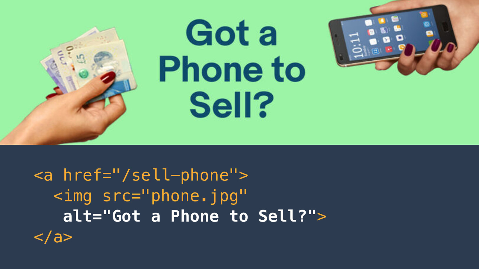
Here is an image I found where there’s text inside an image (people do still do that apparently!) and this image needs alternative text so the people that are using assistive technology can actually read what that image says.
So it’s just a case of adding that alternative text attribute into the HTML. You might be tempted to just wrap the image in a an anchor (a link) and consider the job done because you can click the image, you can go to a page. But if you just add alternative text to that image then people will be able to understand where that link will lead.
<a href="/sell-phone"><img src="phone.jpg" alt="Got a Phone to Sell?"></a>
Empty buttons are again is related to the previous issue as empty buttons are quite similar to empty links.
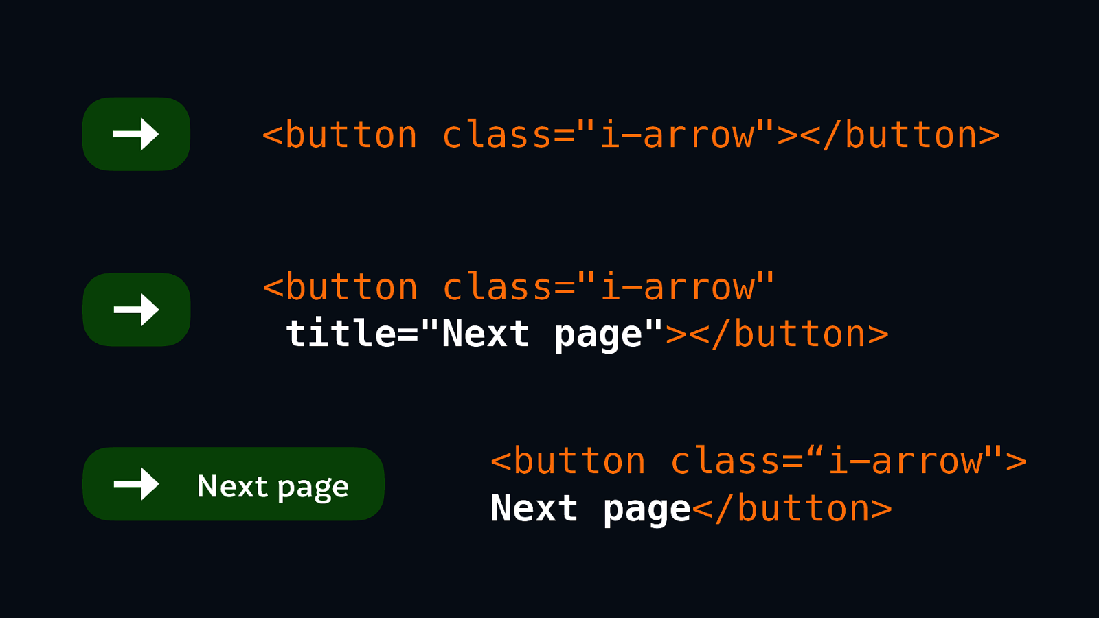
We see this issue a lot, particularly if you’re using icon fonts (and similar) where we have a nice image or an icon in our button.
Your HTML might look something like <button class="i-arrow"></button>. But assistive technology doesn’t know what that button does.
We could have the option of adding a title to that button saying “Next page:”
<button class="i-arrow" title="Next page"></button>.
That’s an option.
However, the galaxy brain option, the best ideal option, is to actually put the text in the button as well:
<button class="i-arrow">Next page</button>
Because that helps everyone. Everyone then understands that an arrow pointing right means the “next page”, it doesn’t mean the “previous page.” It also makes for a lovely nice hit area so it’s more space for people to be able to hit if they have difficulty with fine motor control, or are just using a tiny little screen or touch screen.
Missing form input labels is another similar issue.
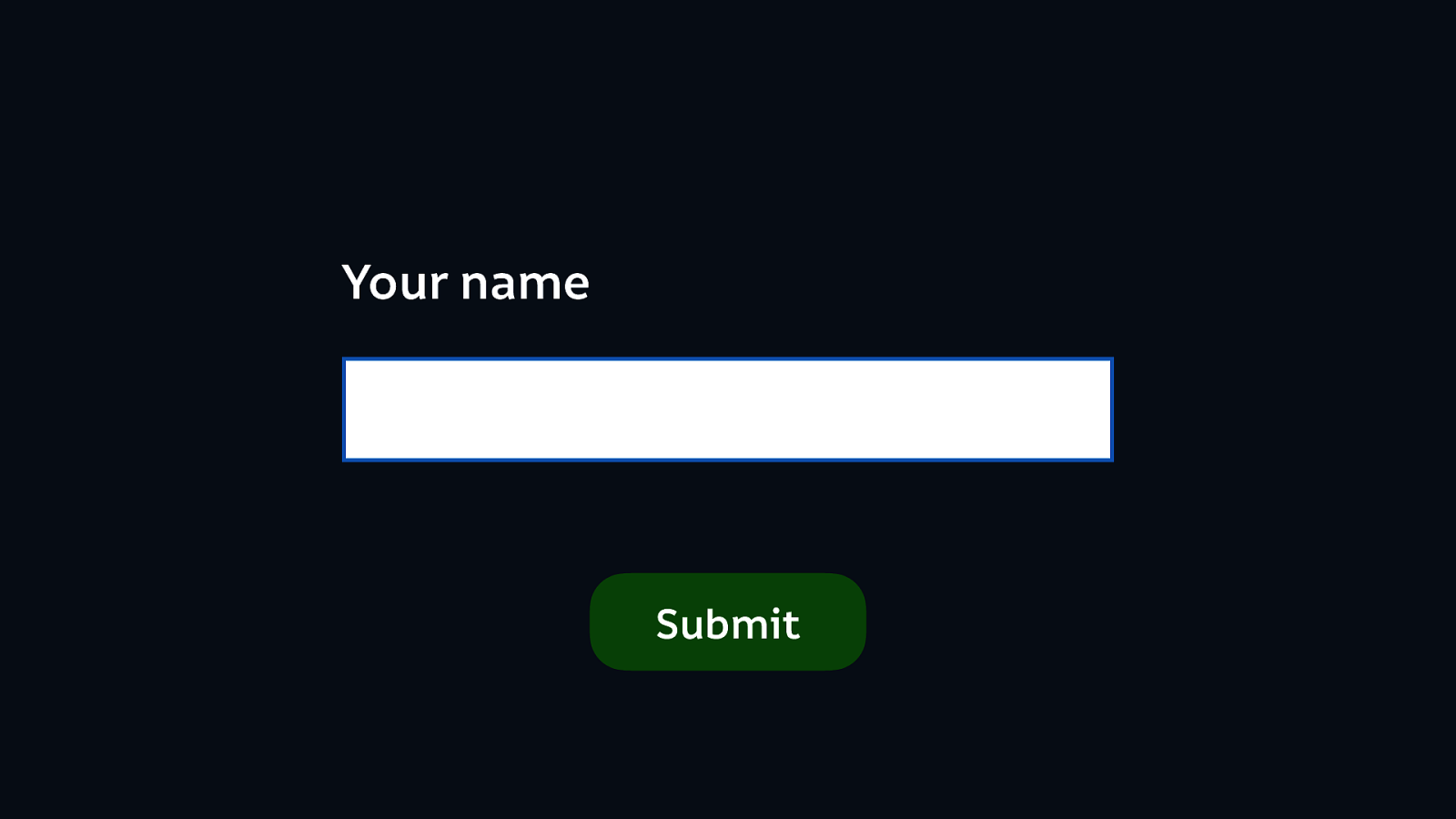
We know we all is a form input: the humble text box. And we know that we need a label so that people actually know what to put in that text box. So we often do that, and we do a pretty good job of making it visual in most forms. But we need to make it clear in the HTML as well. This is something that Bruce touched on earlier: we’re need to make it easier for people who can’t make that visual connection between the text and the input.
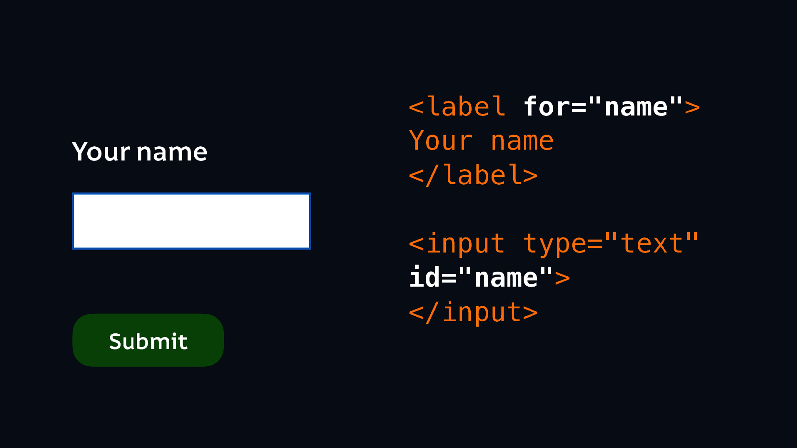
We can link those form inputs to their labels using the “for” attribute:
<label for="name">Your name</label><input type="text" id="name"></input>
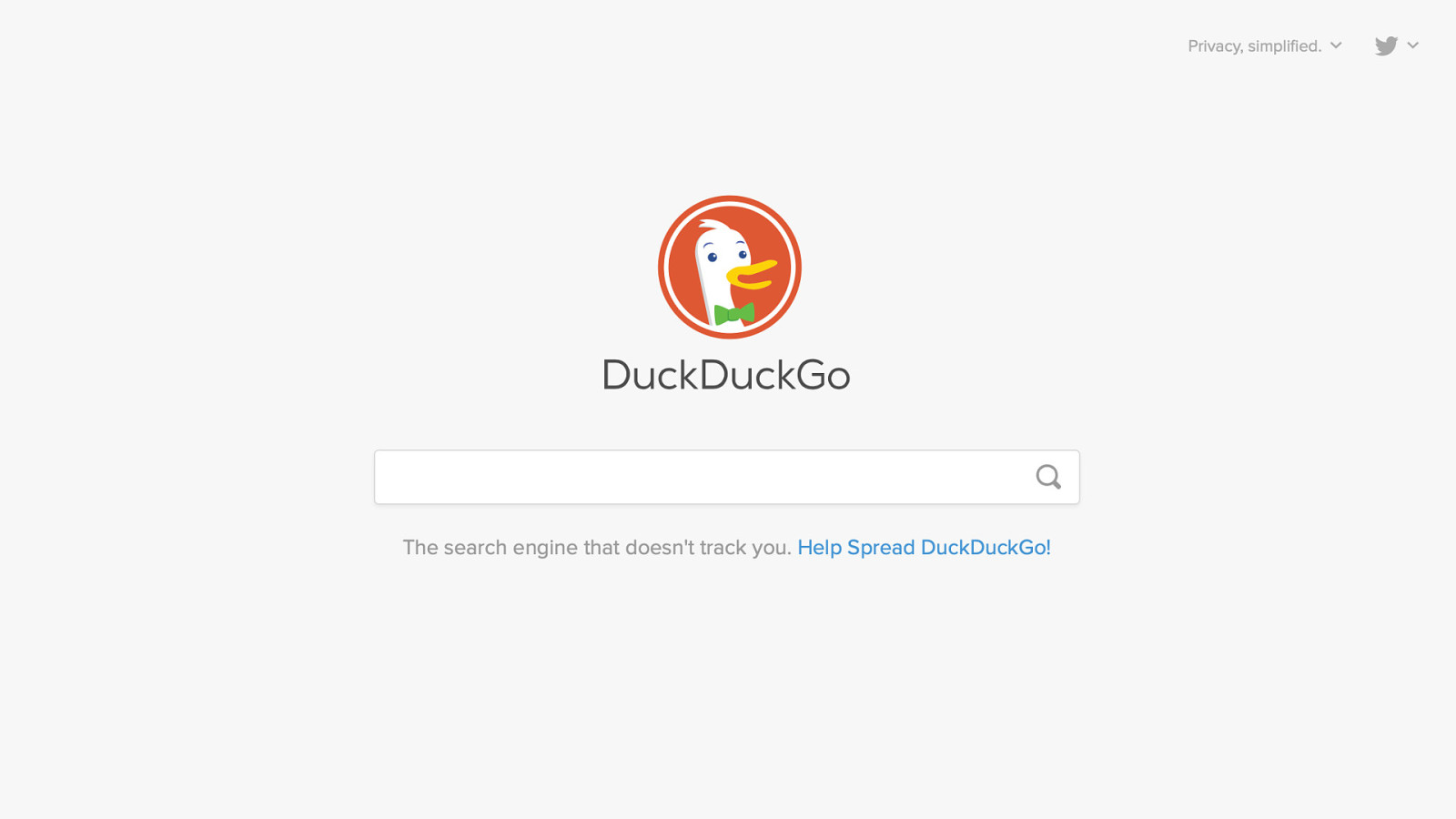
I had a hunt around because I was wondering why are people not using labels for inputs? And I realised what I think the culprit is: it’s the search input. Because nobody puts a visual label on a search input. So honestly I’d say it’s understandable. (Understandable but not excusable!) that they don’t even put a hidden label on a search input.
I love DuckDuckGo. They are fantastic, and it is a very good search engine, but there is no label in the HTML here… (sarcastically:) because it’s fine because everyone knows that when you go to a box with a magnifying glass next to it then that means search. I think our obsession with tidy and minimal interfaces is going a bit too far in this case.
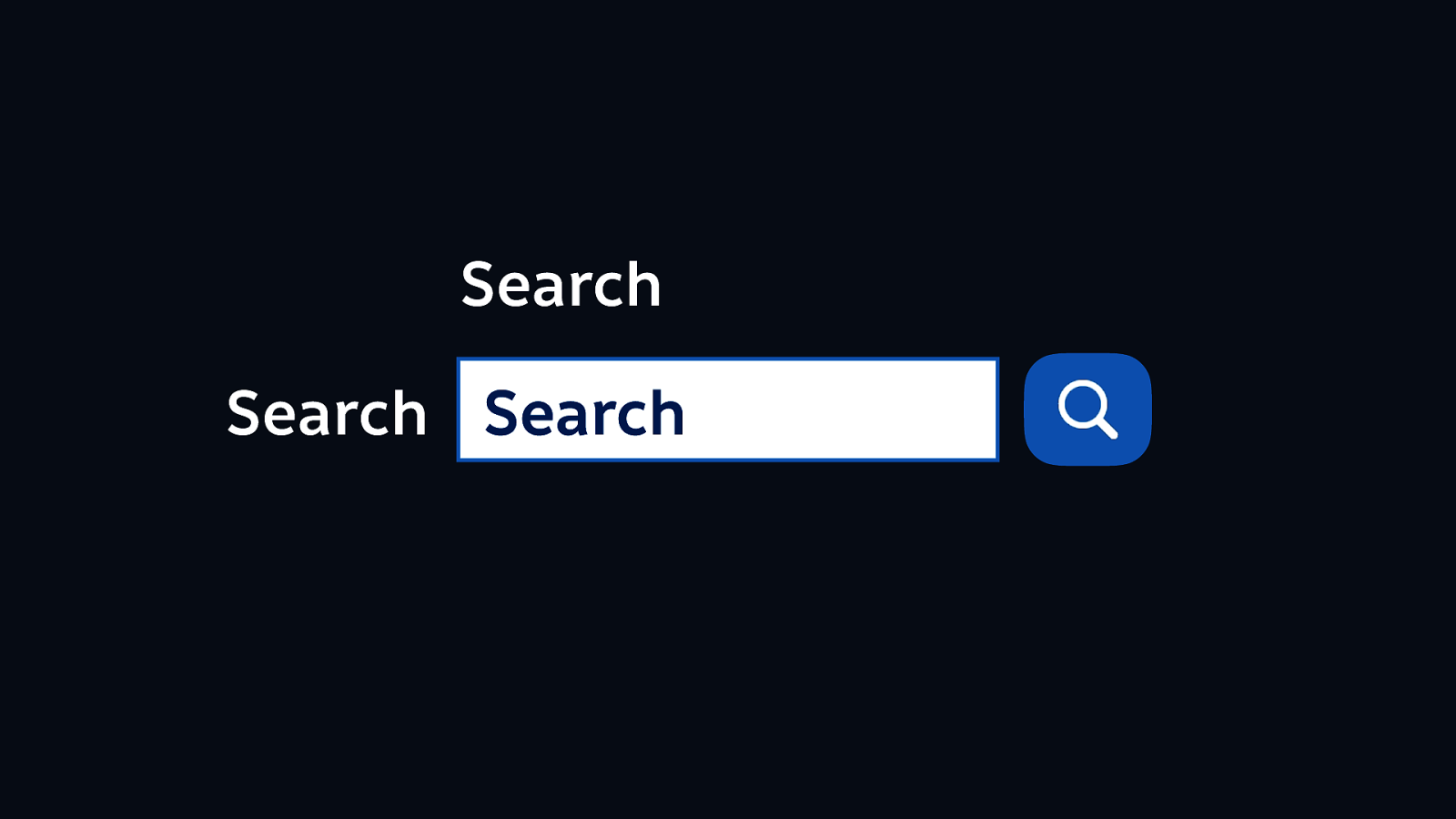
It doesn’t really matter where you put that label, just put it somewhere. (And then make sure it’s also connected in the HTML.)
Luckily Sally talked about missing document languages really well earlier so I don’t need to go into it in too much depth…
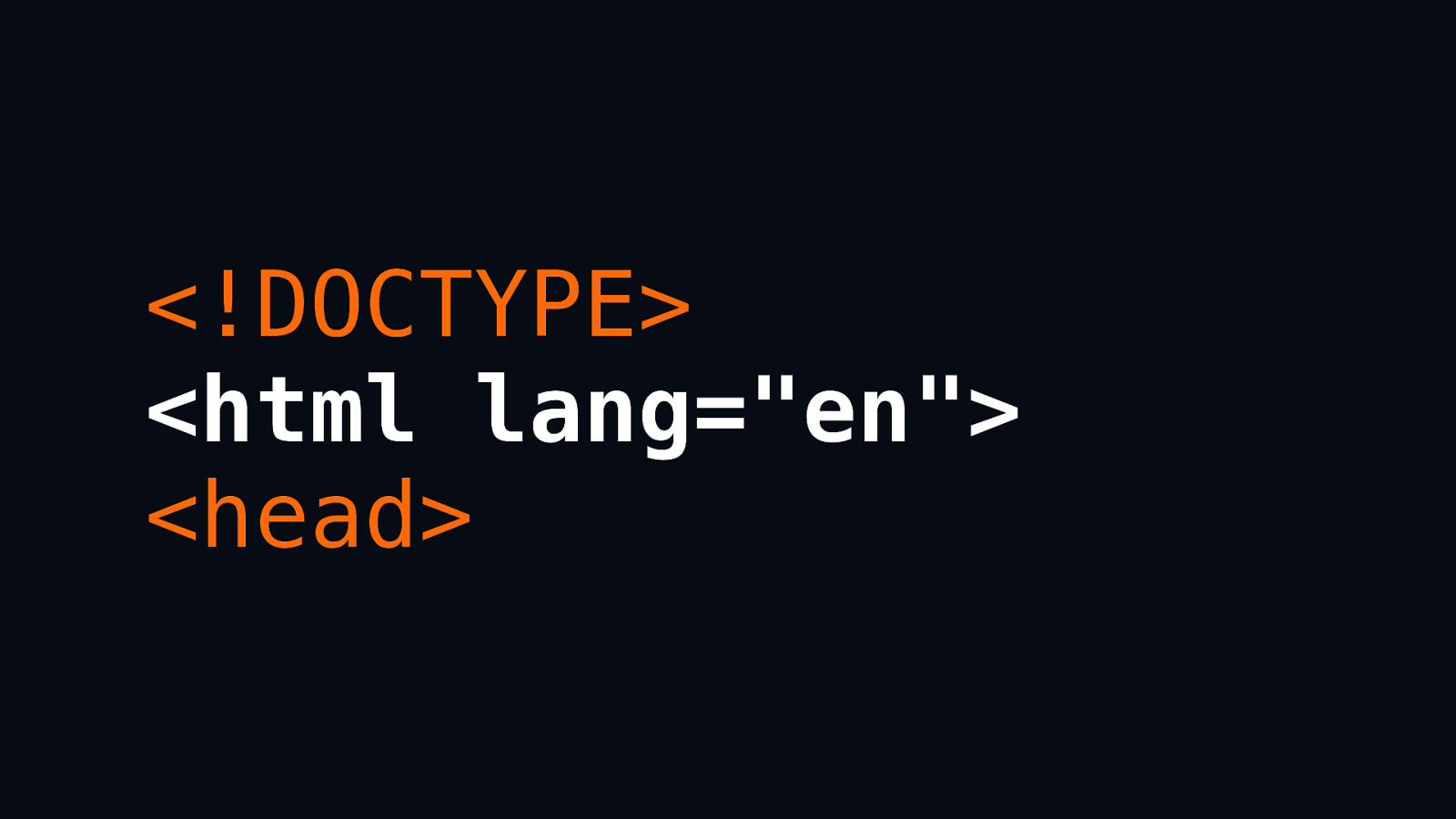
But if you just put this little fellow in the top of your HTML, you’re pretty much sorted:
<html lang="en">
And if the page is not in English, you can use the tag for any other language as well. I think a lot of us English speakers are prone to forgetting that English is not the default language, and one of the ways that this actually helps assistive technology as well is with things like pronunciation when reading the content aloud. Because the pronunciation, or the meaning, of a word can change quite significantly depending on a language. So you might be saying attention: “pay attention” in English. Or you might be saying attention: “warning” in French. (I’m not a great French speaker!)

Given that so many people keep telling me that they know the basics, how come we do keep seeing so many of these issues? I suspect it’s usually because we don’t know how to address these particular issues, and I suspect partly it’s what I was mentioning earlier:
Sacrificing other people’s experiences because of our developer experiences.
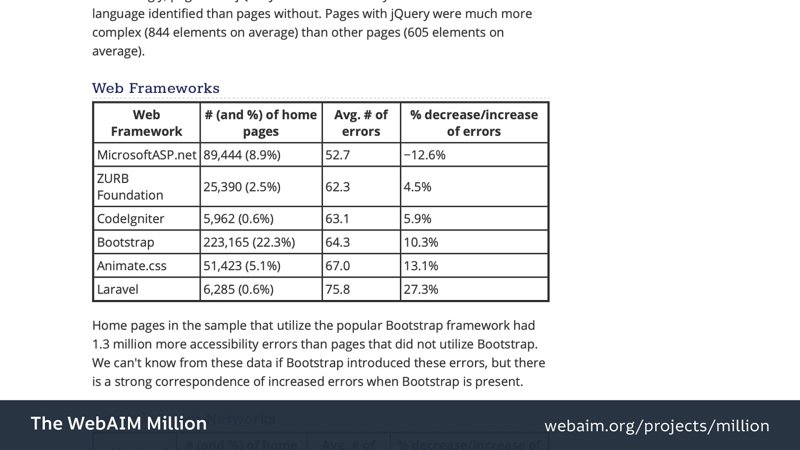
Returning to the WebAim 1 million, they actually looked into some other interesting things. Like the impact of certain frameworks on accessibility.
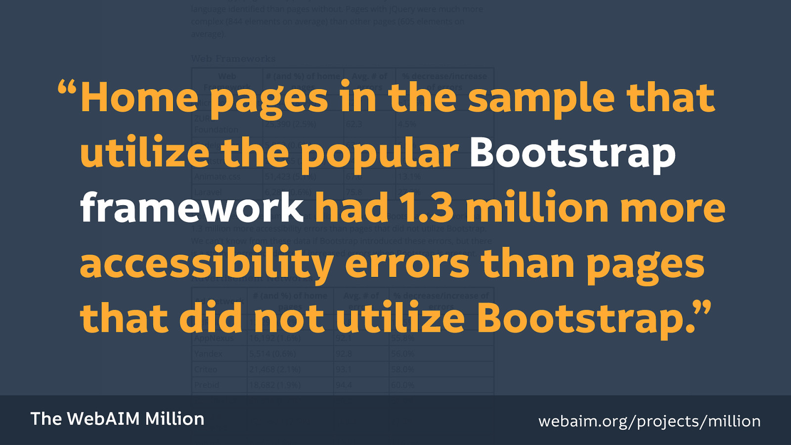
For example, Bootstrap. “Home pages in the sample that utilize the popular Bootstrap framework had 1.3 million more accessibility errors than pages that did not utilize Bootstrap.”
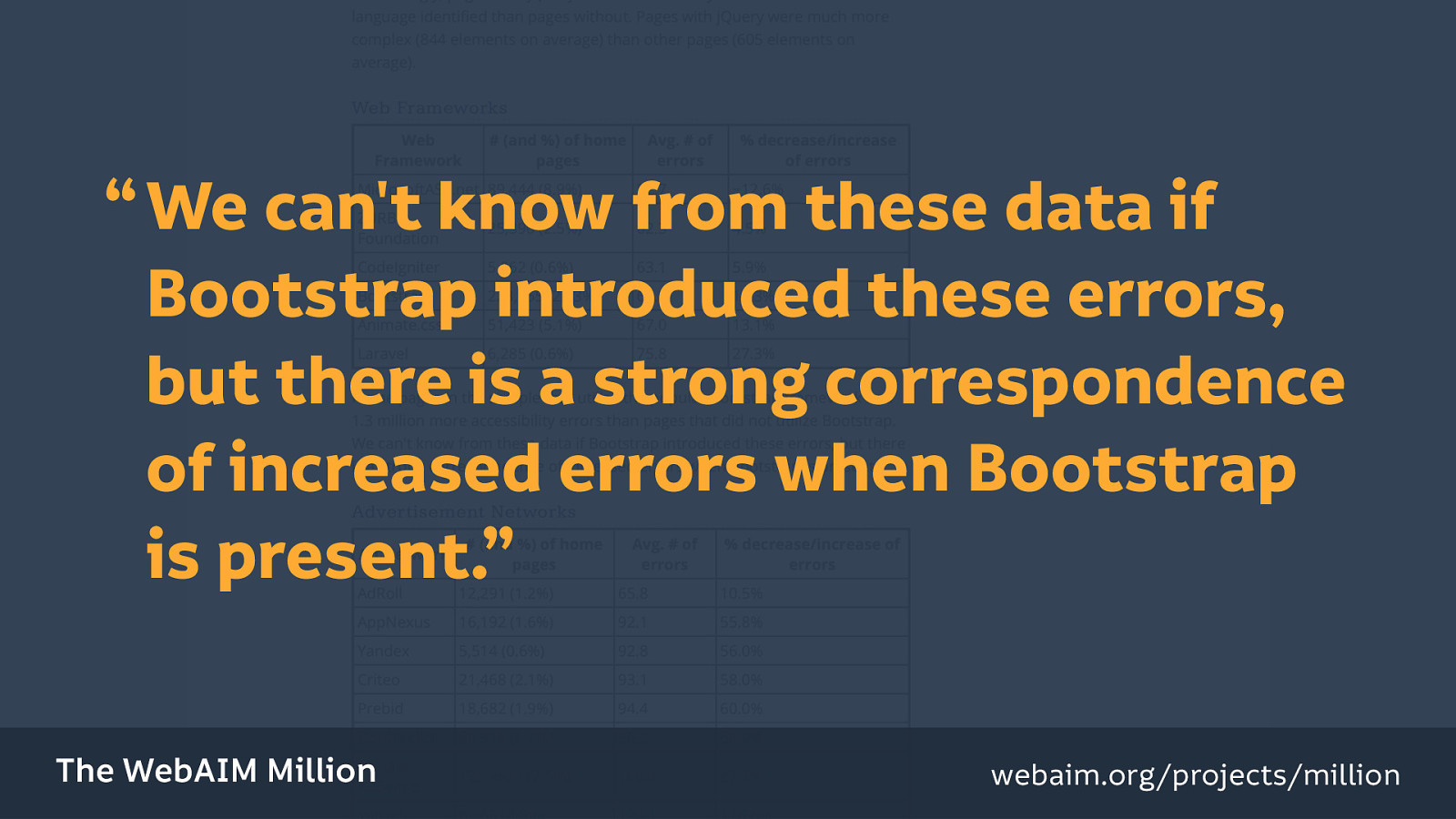
Now there is a caveat here: that “we can’t know from these data if Bootstrap introduced these errors,” specifically, “but there is a strong correspondence of increased errors when Bootstrap is present.”
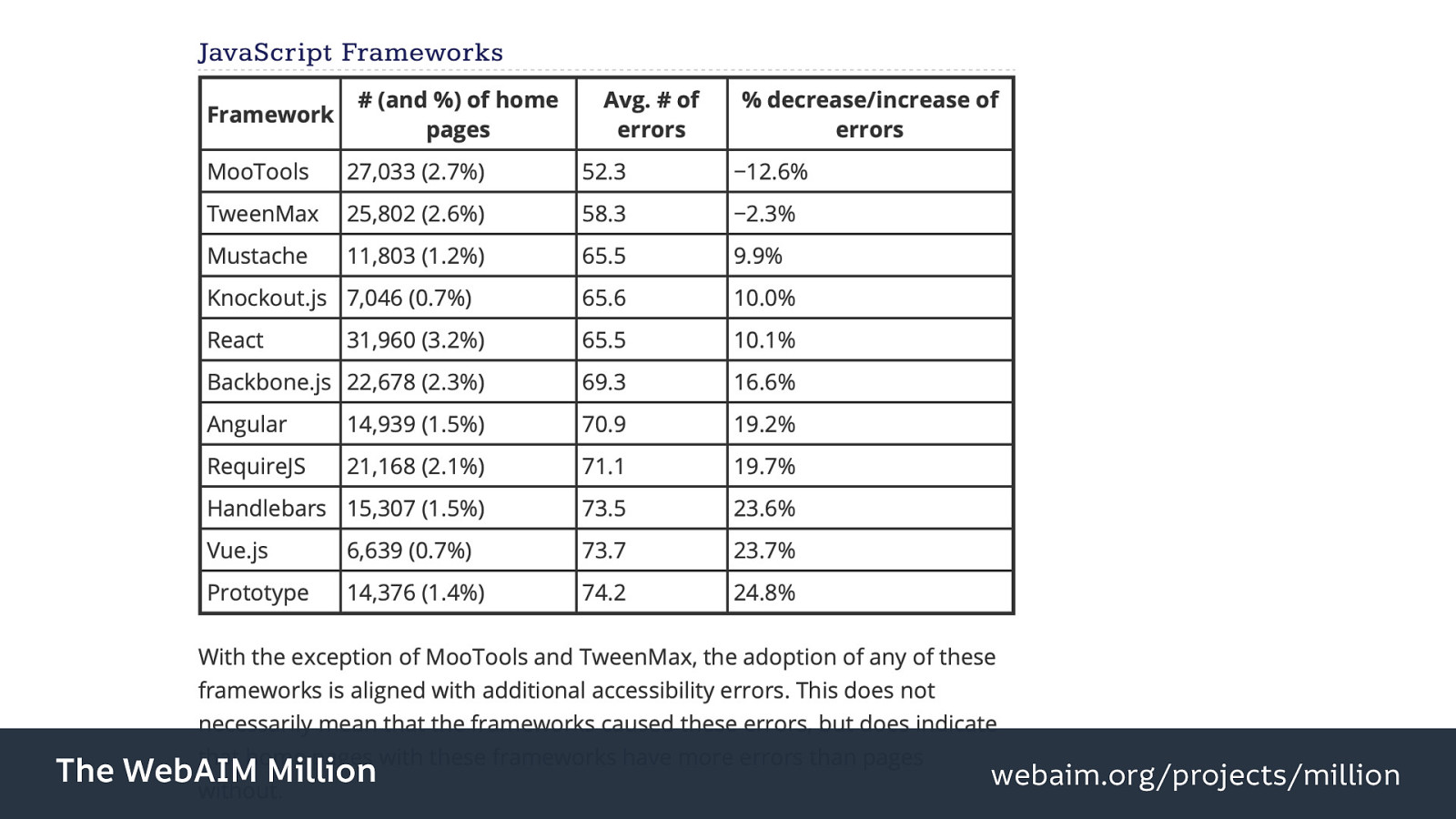
And similar applies to JavaScript frameworks: React, Angular, Vue.js. All correlating to an increase in accessibility errors on a page. (React: 31690 errors, 3.2% of homepages, averaging 65.5 errors. Angular: 14939 errors, 3.2% of homepages, averaging 70.9 errors. Vue.js: 6639 errors, 0.7% of homepages, averaging 73.7 errors.)
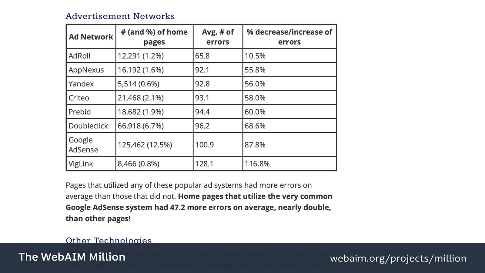
And advertising networks, and other third-party technologies…
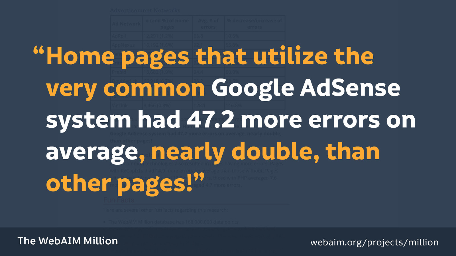
They also had an impact on accessibility: “Home pages that utilize the very common Google AdSense system had 47.2 more errors on average, nearly double, than other pages!”
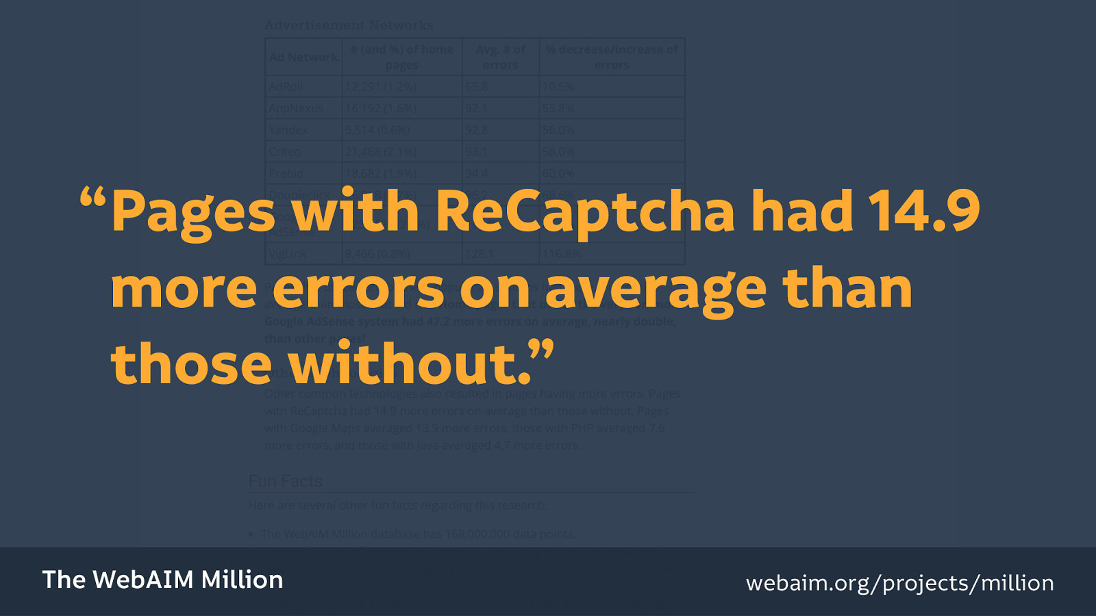
And “pages with ReCaptcha had 14.9 more errors on average than those without.”
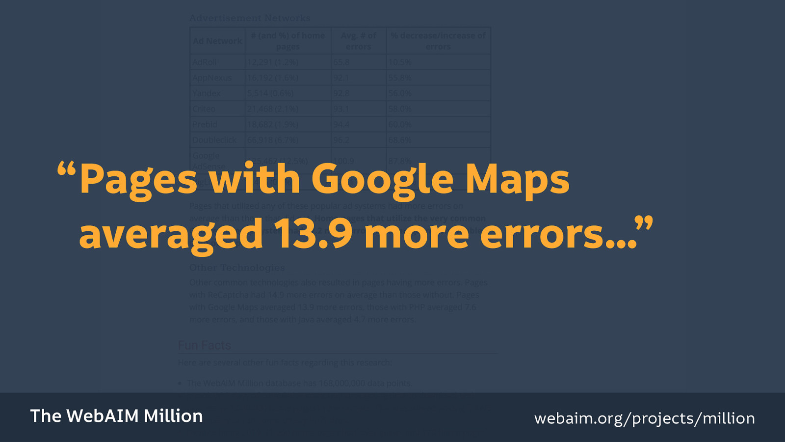
“Pages with Google Maps averaged 13.9 more errors…”
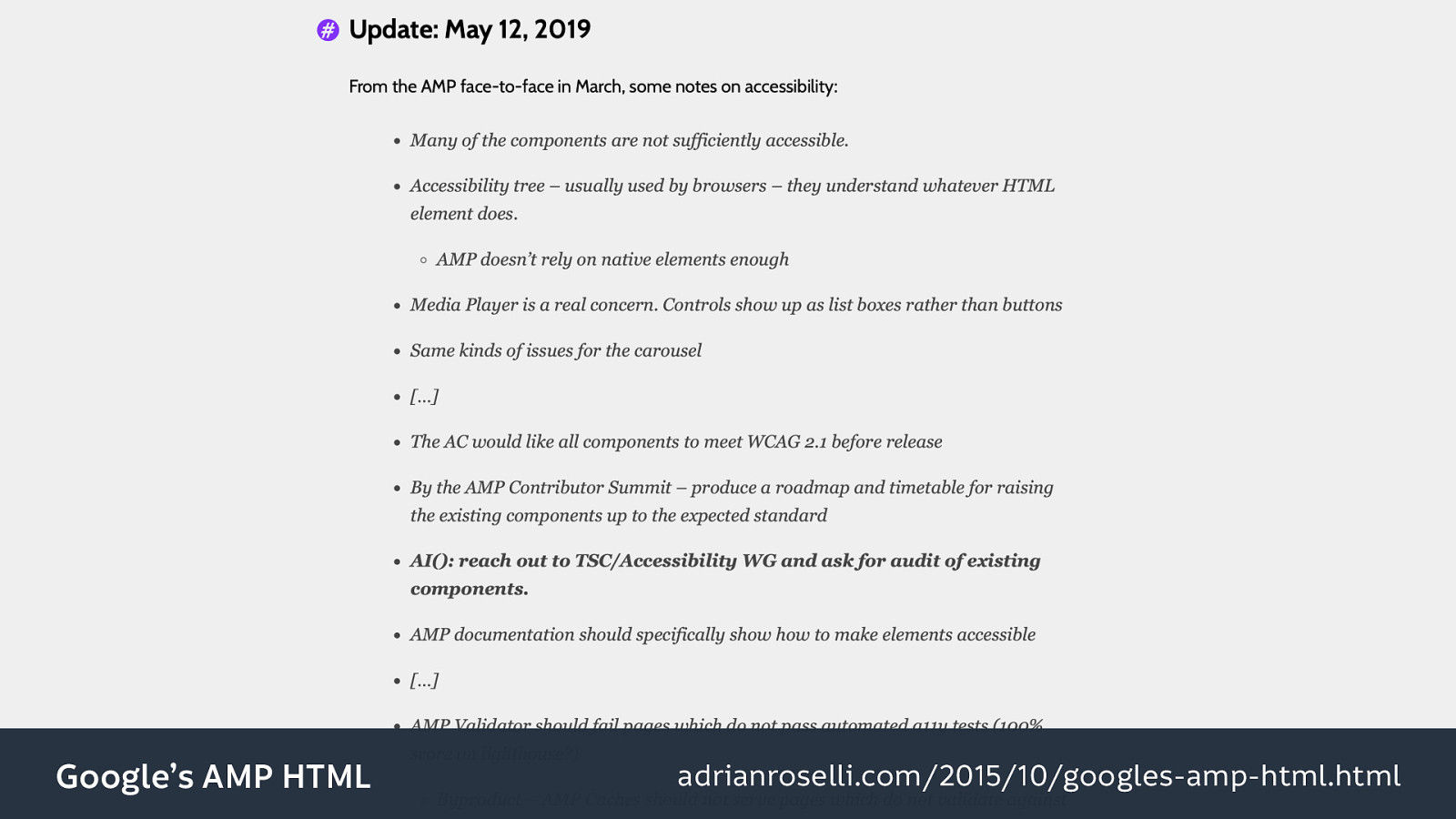
Unfortunately they didn’t look specifically into AMP. Fortunately Adrian Roselli did though, and he has a really good overview of Google’s AMP HTML, and he frequently updates the blog post. (I love it when people write like that!) Including this particular update from the 12th of May which points out that, even in four years, with the abundance of resources that Google has, the accessibility is still left wanting. And a lot of that revolves around the use of non-standard HTML elements (arguably they’re not real HTML elements) which don’t utilize all of that accessibility goodness that Bruce was talking about earlier.

So I’m not saying “get rid of all frameworks,” but be framework-sceptic. Do use a framework, but do so with caveats.
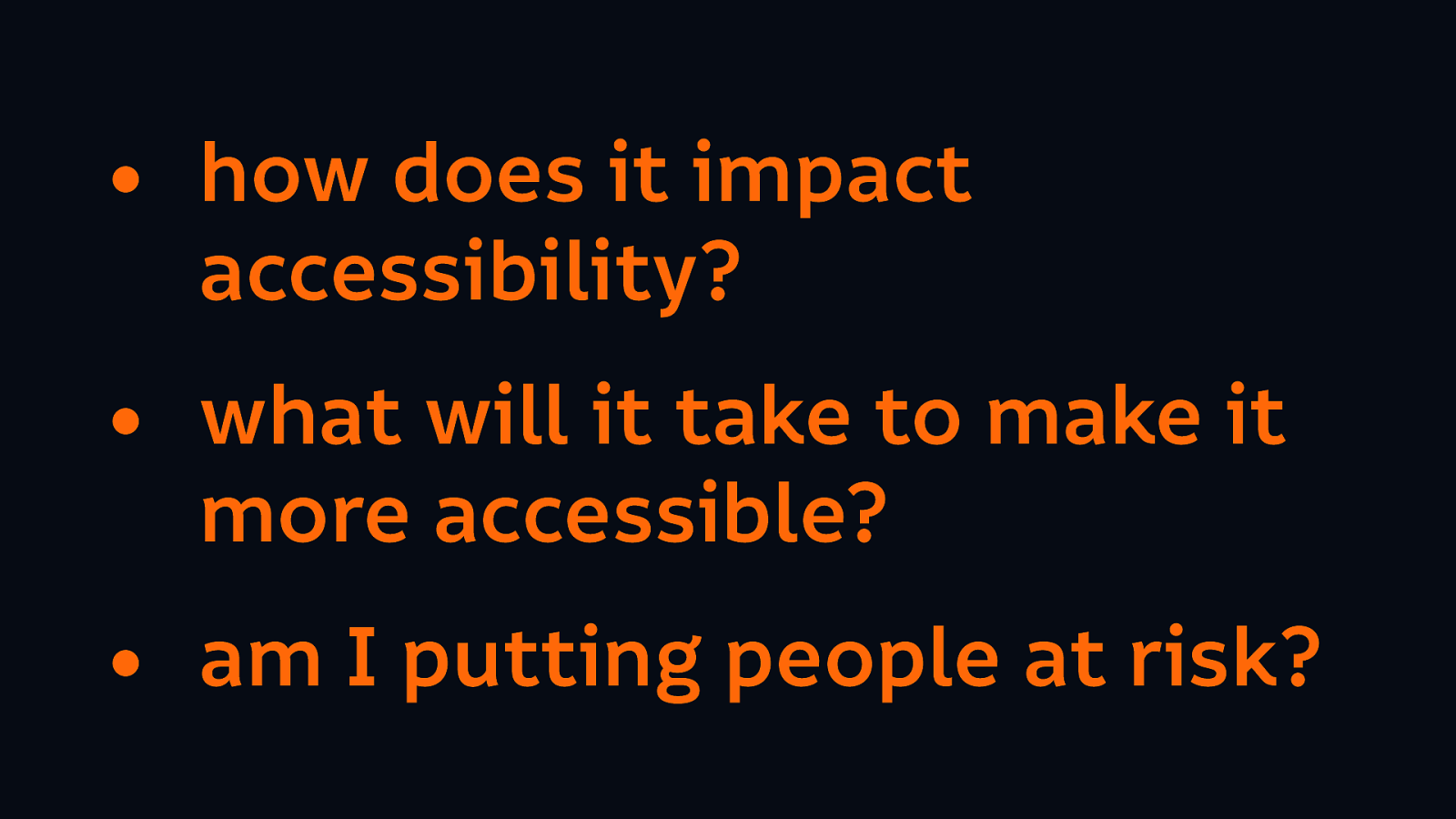
Consider how it might impact the accessibility. Consider what needs to be done to make your code or your design more accessible, and how long that would take (because it will take time, and will it take longer than writing everything from scratch in the first place?) And we mustn’t forget to consider the impact of using third-party tools at all. (And I will come back to that later…)
I think we’re entering an era where we can distinguish our products, our services, and ourselves, based on the fact that we actually care about each other.
The problem is that the tech industry builds things for people like us. People that are not necessarily the most diverse range of people. And it’s always easier to create products for people who have the same needs as us. We understand our own requirements better than anybody else, and we understand the reasons behind them better than anybody else.
A lot of successful products are created when people are scratching their own itch, they’re trying to solve a problem that they have themselves…
However we are largely people of similar ages, and abilities, and backgrounds, and educational and financial statuses. We end up creating products for people just like us (whatever our backgrounds are)…
We forget that many people have requirements that are different from our own, or even requirements that conflict with our own…
And so to create more usable and useful products we need to understand and care about those different needs.
We hear a lot about this when people talk about “empathy”: the ability to share the feelings of others. It’s what makes us okay at creating products for other people, because we can try to understand their problems and create solutions to fit their needs.
So of course, empathy is much easier to build when you work in a diverse team.

Diversity comes from that range of ages, abilities, ethnicities, socio-economic classes, personal backgrounds, genders, education levels… there are so many more characteristics which give us each that unique experience of the world.
Spending meaningful time with people whose experiences differ from our own will help us develop a greater understanding of each other’s needs. And the greater capacity a team has for understanding their audience, the more likely they are to solve that audience’s problems.
Another thing having a diverse team can also prevent is from othering our audience.
Have you ever heard people say “stupid users” or refer to their clients as “stupid”?
It’s very easy to be dismissive of people using our product if we’re thinking about them in like an us-versus-them terms.
And it’s particularly important not to do this when we’re talking about diversity and accessibility.
We need to build meaningful products that serve people’s needs and value their time.
I’m sure you’ve heard that “accessibility wins are usability wins” and it’s totally true, I totally agree with that…
But it is also a sales tactic. It’s because I’m trying to sell accessibility to you because I don’t actually think that you think it’s worth bothering making a website work for disabled people.

I like to think of that phrase “carrot or stick” when we’re talking about how to sell accessibility to people. So you might have a carrot if you’re trying to drive a donkey somewhere, and you dangle that carrot in front of them, and you say to this donkey “oh if we finish this trip, you’ll get this carrot.” Or you have a stick, and you say to the donkey “you go on the trip, or I’d beat you with the stick.” (It’s not very nice but this is a fairly common phrase!)
We have different common tactics for selling accessibility:
Make your site accessible or someone will sue you. (That’s a stick.)
Make your site accessible and you’ll get a bigger audience. (That’s a carrot.)
Make your site accessible or you’ll get bad publicity. (That’s another stick.)
Make your site accessible because usability benefits everyone. (Carrot.)
It’s all very well talking about the usability wins of making your site more accessible, but let’s not forget that it’s not the case of whether something is more delightful or a more convenient experience. It’s the difference between someone actually having access to a thing. Something working or it not working at all. Or them not having access and being shut out completely.
It’s more than irritating, it’s the kind of thing that could really impact someone’s life severely. It can be the difference between being able to access a service or not.
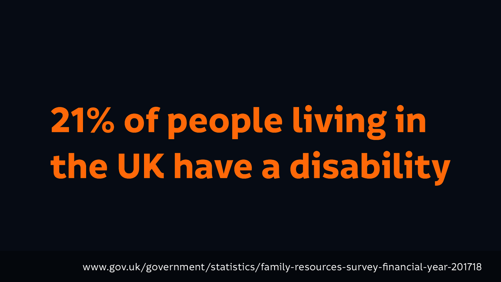
21% of people living in the UK have a disability. This is a self-identified statistic where a person is considered to have a disability if they have a long-standing illness, disability or impairment which causes substantial difficulty with day to day activities. I mean 21% is a lot of people to shut out…
Source: www.gov.uk/government/statistics/family-resources-survey-financial-year-201718
And it’s not only that, but many people with disabilities have more than one type of impairment, and impairments intersect with other parts of our lives too.
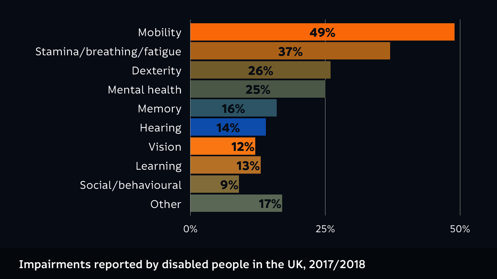
These are the impairments reported by disabled people in the UK in 2017 to 2018. (The totals will be above 100% because obviously a lot of people have more than one impairment.)
And these impairments intersect, creating new needs.
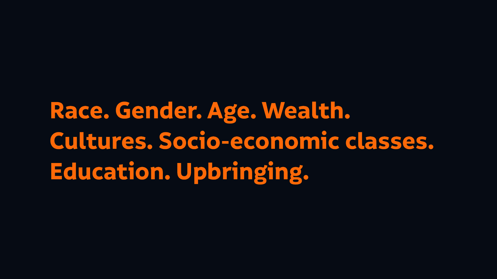
Those impairments intersect with our personal needs as well, so our accessibility needs are also impacted by things like our race, our gender, our wealth, our cultures, our socio-economic classes, our education, and our upbringing.
And some impairments are temporary: you might break your arm. They might come and go: they might be a seasonal disorder. So you may not have an impairment now, but there is a 99.99% chance that you’ll have an impairment in the future.
Not least because every one of us is ageing.
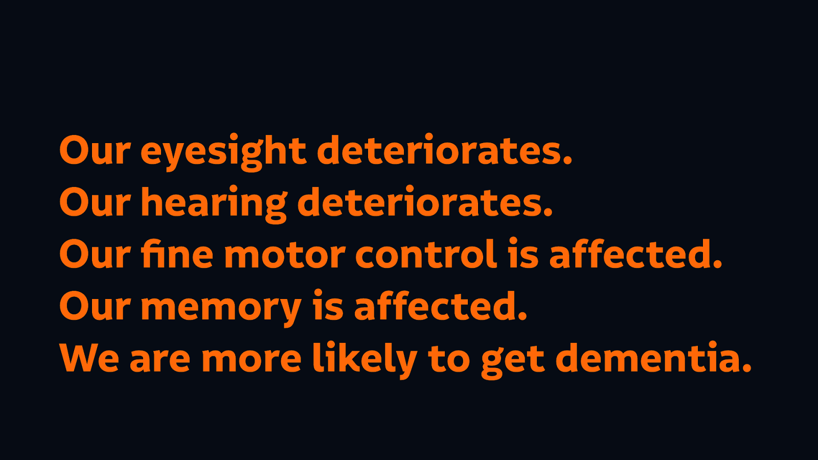
And how does that affect our use of the web? Well:

And so what happens when we don’t design for people who have impairments (including those brought about by ageing)? We sabotage our future selves.
We need to think in the long term about what we’re building. We must equip ourselves to design for a diverse audience with a wide range of needs.
We need to research, and to educate ourselves, and to talk to people that have needs that differ from our own.
We need to hire diverse teams.
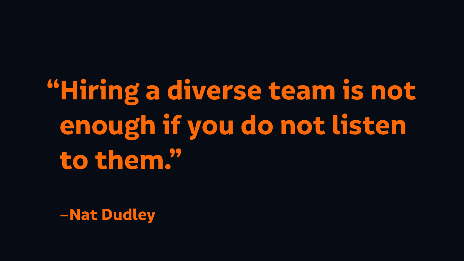
But as Nat Dudley said in a brilliant talk last year:
“Hiring a diverse team is not enough if you do not listen to them.”
We don’t just hire diverse teams so we don’t get shamed for our very white male company photos.
We also need to diversify our source material: the books we read, the people we follow on social media. If all of those people that providing the stuff we read are from the same background (or similar backgrounds) to us, they’re all going to be saying the same stuff anyway.
So we then might think “well I’ve done all this stuff, so I’m good to go. I’m ready, I’m equipped to design for other people.”
No, we have to make sure that we don’t fall into the trap that many designers fall into: of being colonial. Assuming that we know what’s best for people, even though the people that are using what we build come from different backgrounds and have different needs from us.

That’s what built the technology of the world today… designed for and used by wealthy people who look the same, come from very similar backgrounds, deciding what is good for us. These six men are in the top 13 richest people in the world.
So what motivates them to build technology for us?

Systemic inequality is higher than it has ever been.
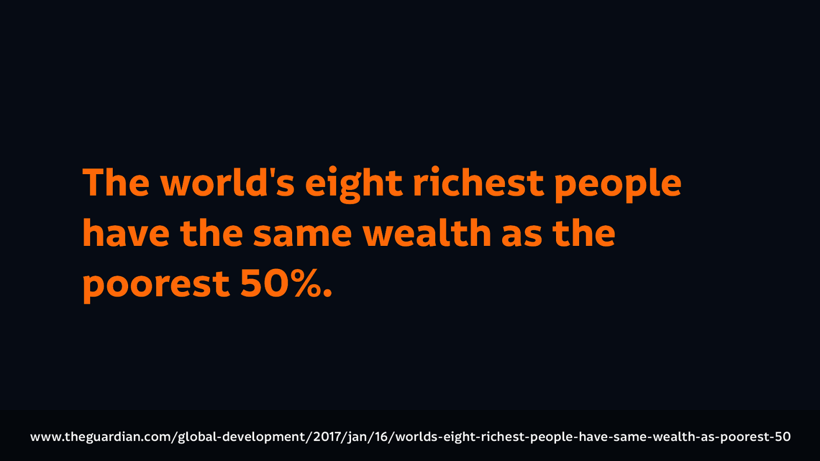
The world’s eight richest people have the same wealth as the poorest 50%.
Not only will these things not solve systemic inequality, they are actively contributing to make it worse.
And that’s why mainstream technology today is not inclusive.
And that’s why mainstream technology today is not inclusive. Because of these factors, because their technology doesn’t recognize our needs.
Because their technology is frequently harmful to us.
Because their technology excludes us.
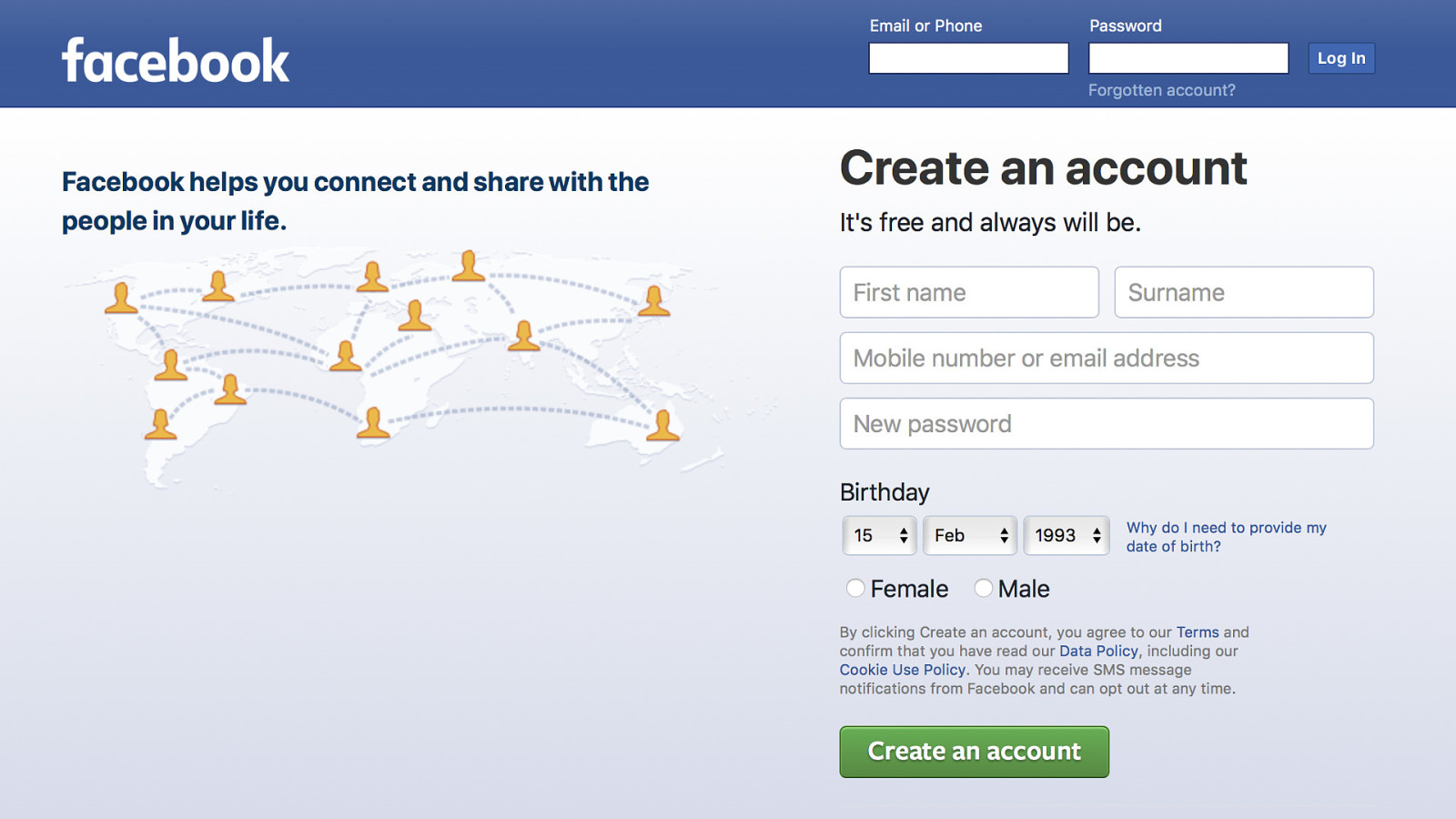
Take a look at this example from Facebook. Take a look at this example from Facebook. Who allow you to decide what your own gender is, define it yourself… but not when you sign up.
Because when you sign up, it is easier to put you in a box, because that makes it easier to target you, and to profile you.
And their technology targets us.
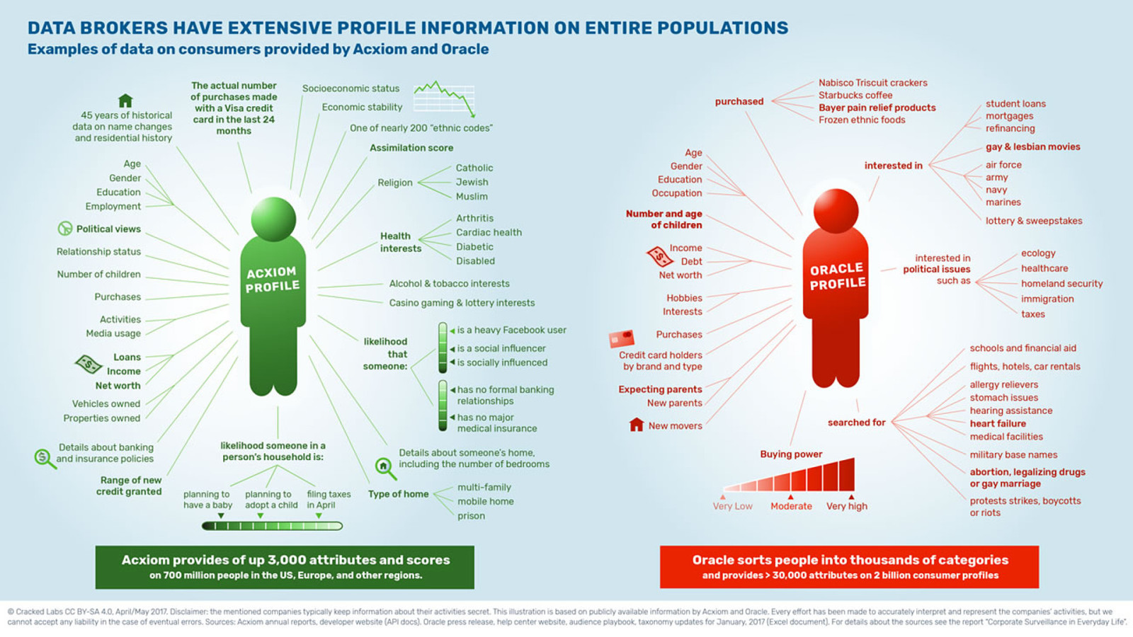
This is an example of the information that data brokers collect from various websites, things that they’ve obtained about us. Crack Labs looked into this, and in this very very tiny tiny text you can see they have information like whether they think you’re disabled, what you’ve searched for like have you searched for abortion? Or legalizing drugs? Or gay marriage? Have you searched for protests, and riots, and boycotts?
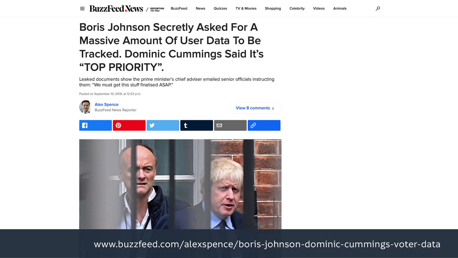
Information like that is why Johnson wants to use the gov.uk platform to profile and target citizens. Do you think that’s a wise idea?
Source: https://www.buzzfeed.com/alexspence/boris-johnson-dominic-cummings-voter-data
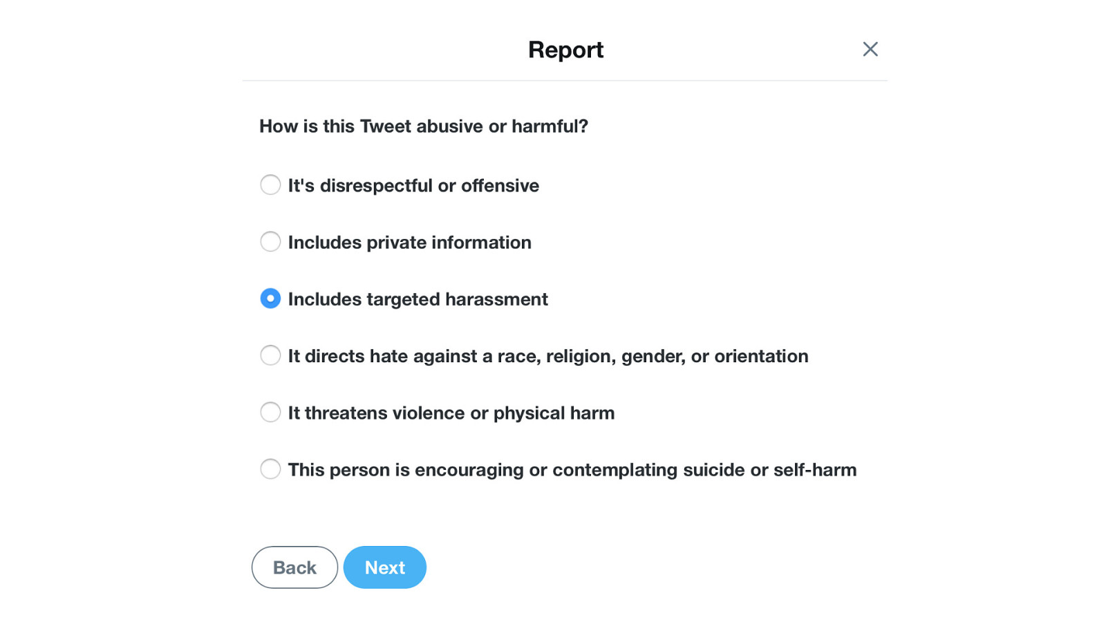
There’s a reason why filling out the Twitter form for saying that there’s a problem when you’re reporting someone does little-to-nothing…
Because abusive engagement is more valuable than no engagement to them.
Their technology stops us from getting insurance and loans, based on the information that the data brokers have on us.
Their technology passes our information on to authoritarian governments.
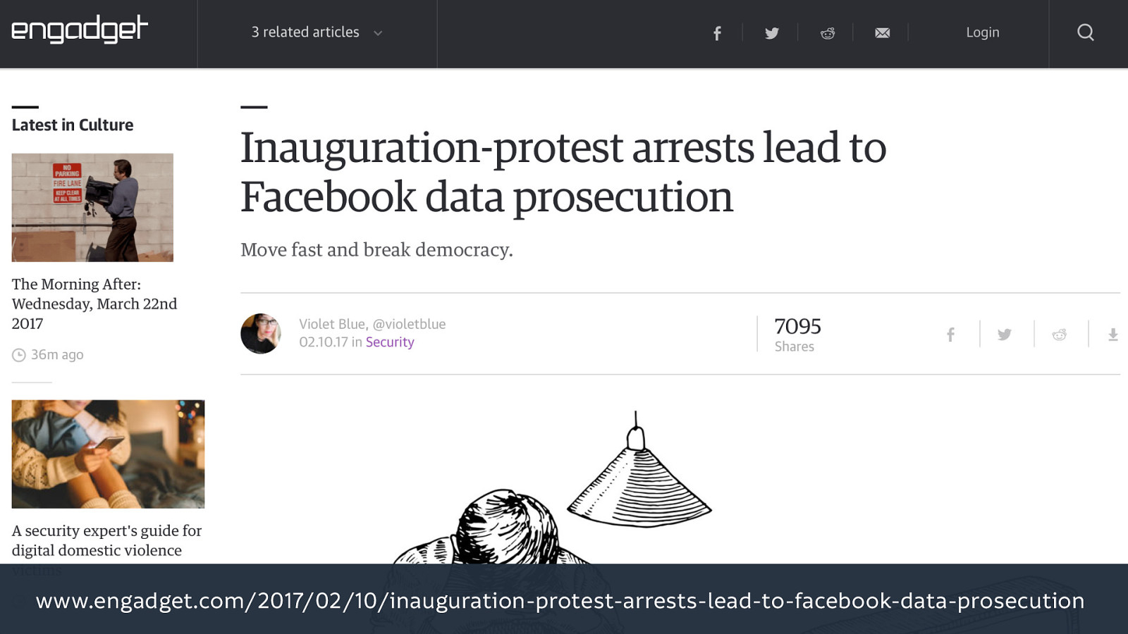
People were pre-arrested ahead of the Trump inaugaration justified by data obtained from Facebook.
Because they did already build the database of Muslim people, it’s called Facebook.
And their technology always comes with strings attached.
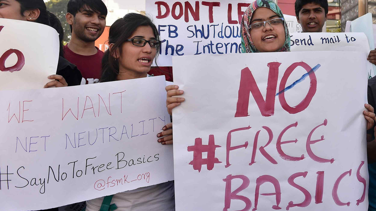
Facebook offered free internet (“Free Basics”) to people in India, free internet that happened to be restricted to accessing Facebook and accessing websites through Facebook.
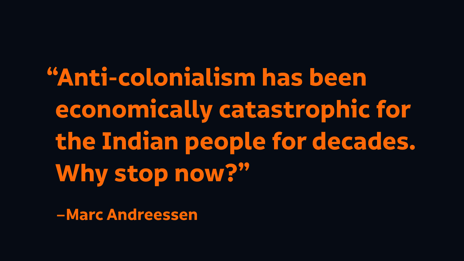
And how much do the people building this technology actually care about these things? I mean it’s fine for them, isn’t it? A the Facebook board member, Mark Andreseen said “anti-colonialism has been economically catastrophic for the Indian people for decades. Why stop now?”
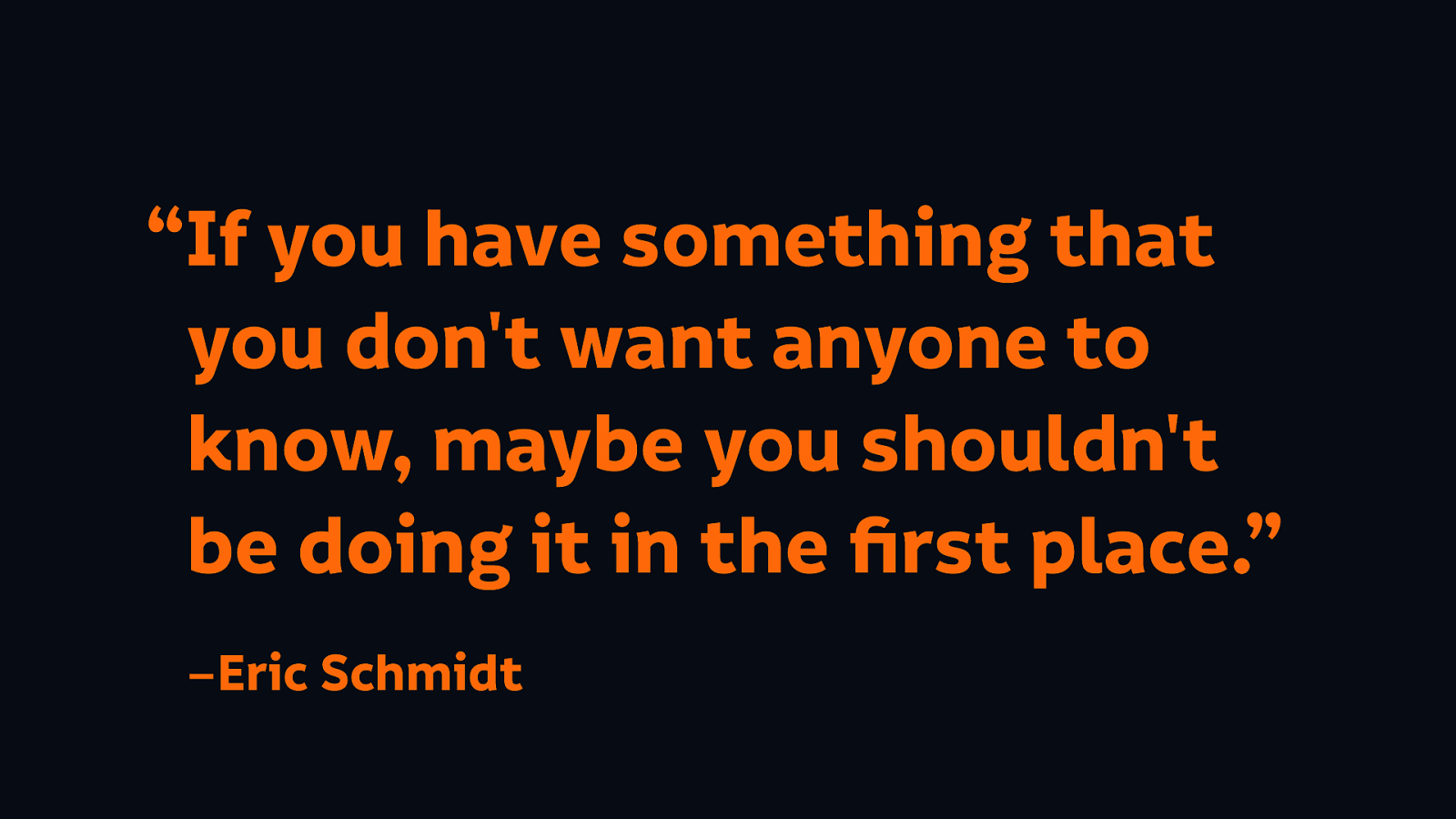
When people questioned whether Google should be collecting all of this information about us all the time, Eric Schmidt said “if you have something you don’t want anyone to know maybe you shouldn’t be doing it in the first place.”
Marginalised groups, including disabled people, are far more vulnerable to unethical technology like this.
And the lives of marginalised people are most at risk. Disabled people are already discriminated against, we shouldn’t be actively making it worse.
Marginalised people don’t always have the time and the resources to seek out alternatives.
So we can’t separate inclusive design from ethical practice. We don’t just want to open up harmful technologies to everyone
The more we actually build unethical technology, the harder we actually make it to build ethical technology. The harder it is to finance it, to find the right tools, to find the people who want to work on the alternatives.
And so again, we continue to sabotage our future selves.
And as a very wise man in this room (Heydon Pickering) once tweeted “I think not everything should be accessible. Some things shouldn’t exist at all.”
We build the new everyday things and, as the people working in technology, we have to take responsibility for that.
Technology has to be more: our lives and our families and our communities and our societies need us to build technology for more than just making money for rich people.
What’s the carrot for building beneficial everyday things? Will we be rewarded with a better society for doing this kind of work?
Is there a punishment for building harmful things? Perhaps bad publicity, or damaged reputations, or being sued. I mean all of these are sticks that might hurt us as individuals… but are we really going to be punished for harming other people?
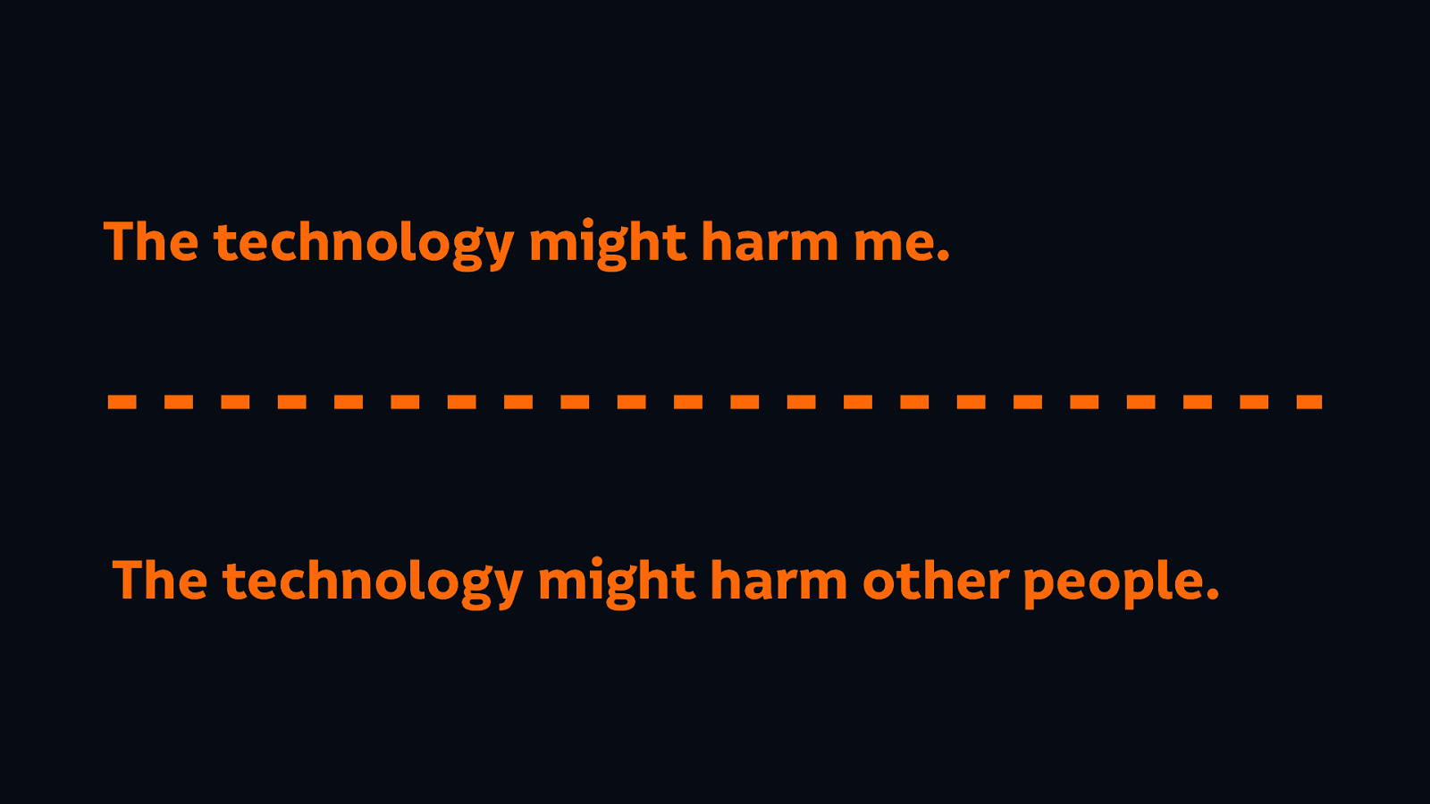
A lot of people say to me “well where do you draw the line? There’s nuance here!” I have a suggestion: could the technology harm me? Could the technology harm other people? There’s the line, draw the line before you hurt other people.
You might feel as though you’re just one tiny bit of this much bigger machine that is the tech industry.
But we are an industry made up of many persons. And if more of us made an effort, we could have a huge impact.
We have to remember that we are more than just the company that we work for. If you work for a big corporation that does unethical things, you probably didn’t make the decision to do that bad thing. But I think the time has come that we can no longer unquestioningly defend our employers.
We need to use our social capital, we need to be the change we want to see.
So what is that change? How can we be that change?
We’ve got to be comfortable being different, we can’t just follow other people’s leads when those other people aren’t being good leaders. Don’t look to heroes who can let you down, don’t be loyal to big corporations who don’t care anything for you.
Be the advisor. Do the research on inclusive, ethical technology, make recommendations to others. Make it harder for them to make excuses.

Be the advocate. Marginalised folks shouldn’t have to risk themselves to make change. Advocate for others. Advocate for the underrepresented.
Question those defaults. Try asking what a framework’s impact is on the accessibility of your page. Ask why was it been chosen to be built that way in the first place? Try asking a start-up how it makes its money!

When the advocacy isn’t getting you far enough, use your expertise to prevent unethical things from happening on your watch. You don’t have to deploy a website, and other people might not know how to deploy that website.
Be difficult. Be the person who is known for always bringing up the issue. Embrace the awkwardness that comes with your power. Call out questionable behaviour.
Don’t let anybody tell you that standing up for the needs of yourself, and others, is unprofessional. Don’t let people tell you to be quiet. Or that you’ll get things done if you’re a bit nicer.
Be the supporter. If you are not comfortable speaking up for yourself, at least be there for those that do. Remember silence is complicity.
Speaking up is risky. We’re fighting entities far bigger than ourselves. We have our lives, the way we make money at risk…
but letting technology continue this way is riskier.

In the end, I’m not here to drive you. I don’t have any power over you. (I don’t want to have any power over you!) I don’t have a gift for you for doing the right thing, I’m not going to tell you that you’re wonderful.
But you do have that power for yourself.

You can build yourself a stick, you can continue to punish yourself with it until the end of time…

or you can grow yourself a carrot.
As someone said to me after I gave a talk a few weeks ago, I’m “the woman who comes and tells people to eat their vegetables.” (I mean it’s hard not to find a little bit sexist…)
It’s not true, that’s not what I’m doing. I’m here because I want to tell you that you deserve better.
