What’s inclusive design?

A presentation at Inclusion and Equity Workshop for IDEO Design Camp in August 2019 in Chicago, IL, USA by Liz Davis
What’s inclusive design?
Liz Davis UX Designer at SPR Twitter: @lizdavis_ She/Her/Hers elizabeth.ch.davis@gmail.com
World Health Organization defines disability Disability is a complex phenomenon, reflecting the interaction between features of a person’s body and features of the society in which he or she lives. Complex Phenomenon = Experience
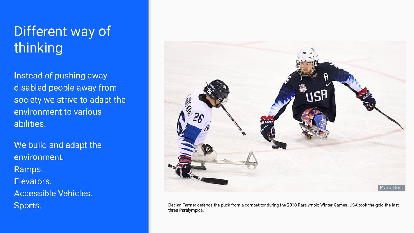
Different way of thinking Instead of pushing away disabled people away from society we strive to adapt the environment to various abilities. We build and adapt the environment: Ramps. Elevators. Accessible Vehicles. Sports. Declan Farmer defends the puck from a competitor during the 2018 Paralympic Winter Games. USA took the gold the last three Paralympics.
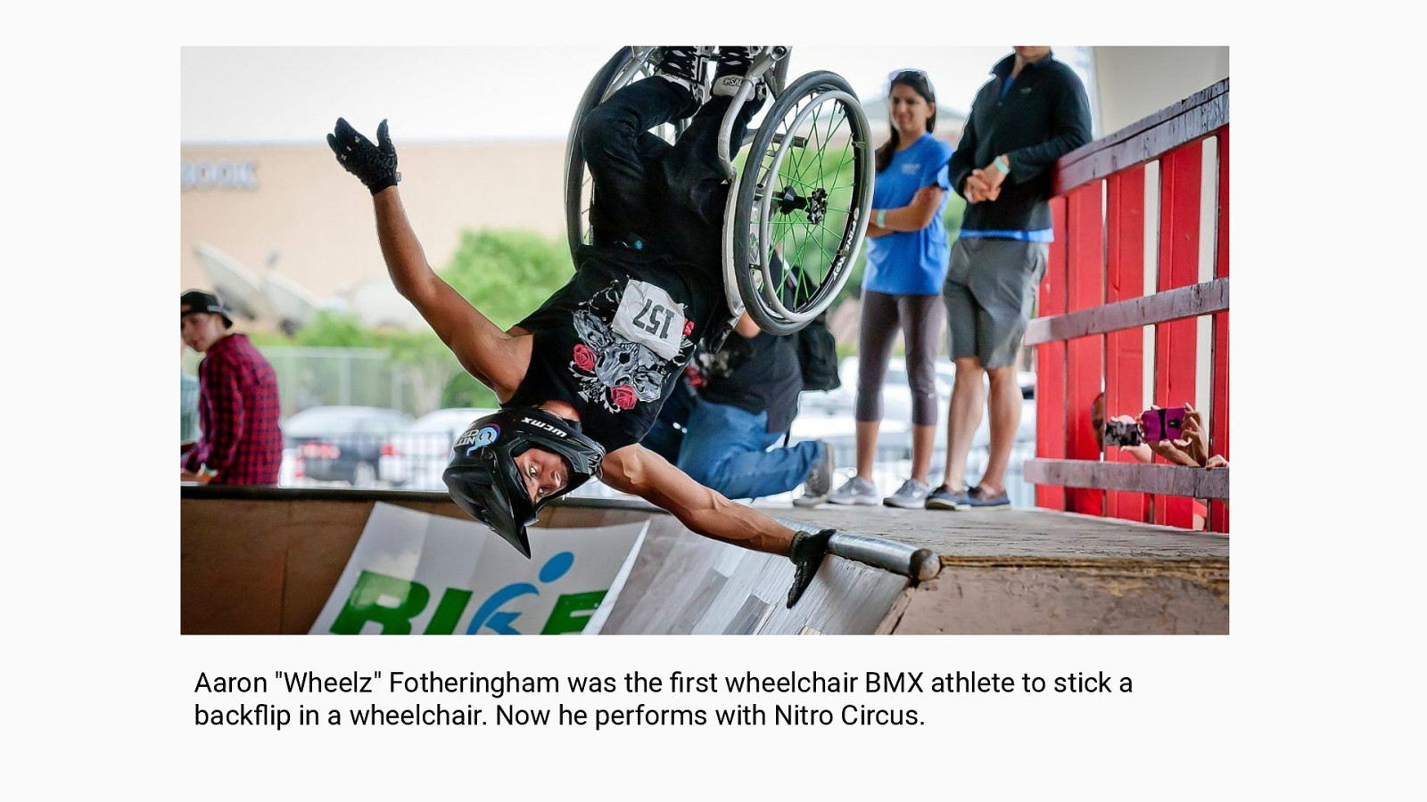
Aaron “Wheelz” Fotheringham was the first wheelchair BMX athlete to stick a backflip in a wheelchair. Now he performs with Nitro Circus.
How this relates to design. As a designer, you have the power to choose who is excluded from your design.
Exclusion No one means to exclude someone. Exclusion happens when we design something that only considers our own perspective. We create mismatches between the user and the interaction.
Identify exclusions in your design ● Ideally we want to include people with disabilities in our studies ● We can begin by identifying these mismatches by being empathetic towards different abilities.
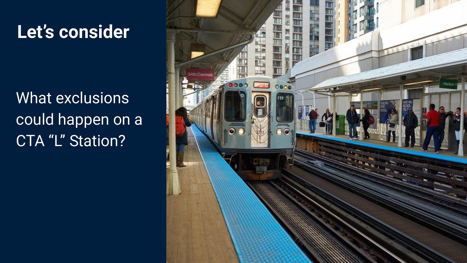
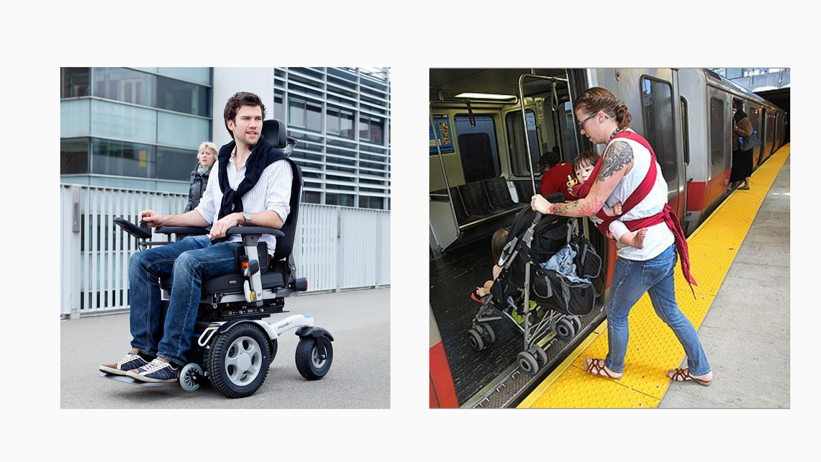
Let’s consider What exclusions could happen on a CTA “L” Station?
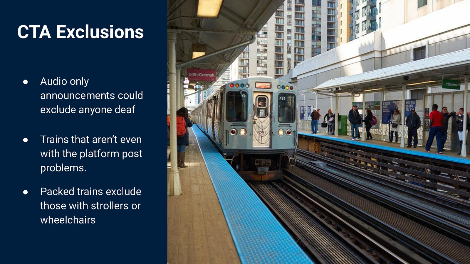
CTA Exclusions ● Audio only announcements could exclude anyone deaf ● Trains that aren’t even with the platform post problems. ● Packed trains exclude those with strollers or wheelchairs
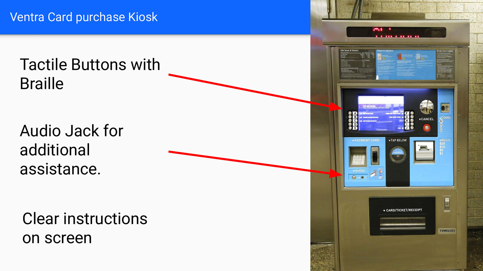
Ventra Card purchase Kiosk Tactile Buttons with Braille Audio Jack for additional assistance. Clear instructions on screen
Solve for the extreme, extend to others
Make a plan In design we can be intentional about why we choose to exclude people and take responsibility for making it better over time. ● Engage the communities when possible. ● Remember it’s okay to not be perfect. ● Be decisive on who is excluded. ● Be willing to change, and listen.
Where to start?
Quick wins Accessibility begins with designers 1. Provide Text Alternatives for Images This is especially critical if your image provides information a user needs. 2. Use Headings to Create Structure Headings provide landmarks for easier readability and screen reader users.

Quick wins Accessibility begins with designers 3. Provide Headings and Summaries for Content Having a brief summary of a large table of data, or content improves scanability. 4. Provide Clear and Meaningful Links Never label a link “click here” provide context to where the link goes, or what it does. Ex. “Continue reading this article”
Quick wins Accessibility begins with designers 5. Provide a Strong Color Contrast Small text must be a minimum 4.5:1 contrast ratio and large text must be a minimum of 3:1. There are many amazing tools/plugins to test colors. 6. Do not use color alone to convey information You can mark text green to show success, but also add an icon, shape or text.
Quick wins Accessibility begins with designers 7. Text inputs should always have a label Usability overall increases when inputs have clear labels, but this is especially critical for accessibility 8. Underline your links! Also related to #6. Overall creating a beautiful link underline to show something is clickable improves accessibility
Quick wins Accessibility begins with designers 9. Limit movement and flashing of content Moving or flashing content needs to be limited and can distract or harm users. 10. Fonts, fonts, fonts! People read fonts better when they are larger, and do not have similar looking letters.
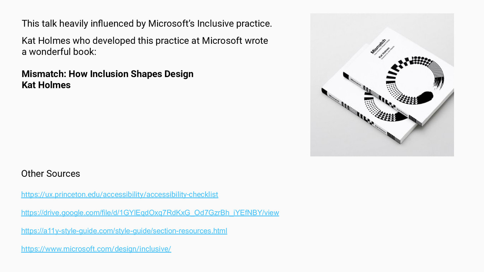
This talk heavily influenced by Microsoft’s Inclusive practice. Kat Holmes who developed this practice at Microsoft wrote a wonderful book: Mismatch: How Inclusion Shapes Design Kat Holmes Other Sources https://ux.princeton.edu/accessibility/accessibility-checklist https://drive.google.com/file/d/1GYlEqdOxq7RdKxG_Od7GzrBh_iYEfNBY/view https://a11y-style-guide.com/style-guide/section-resources.html https://www.microsoft.com/design/inclusive/
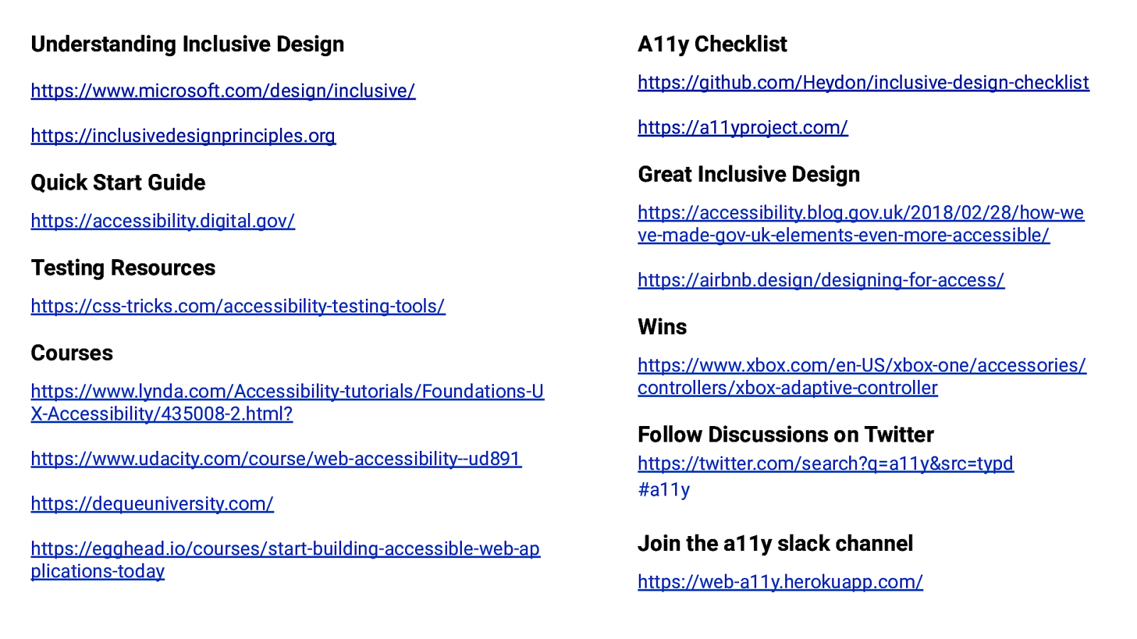
Understanding Inclusive Design A11y Checklist https://www.microsoft.com/design/inclusive/ https://github.com/Heydon/inclusive-design-checklist https://inclusivedesignprinciples.org https://a11yproject.com/ Quick Start Guide Great Inclusive Design https://accessibility.digital.gov/ https://accessibility.blog.gov.uk/2018/02/28/how-we ve-made-gov-uk-elements-even-more-accessible/ Testing Resources https://airbnb.design/designing-for-access/ https://css-tricks.com/accessibility-testing-tools/ Wins Courses https://www.lynda.com/Accessibility-tutorials/Foundations-U X-Accessibility/435008-2.html? https://www.xbox.com/en-US/xbox-one/accessories/ controllers/xbox-adaptive-controller Follow Discussions on Twitter https://www.udacity.com/course/web-accessibility—ud891 https://dequeuniversity.com/ https://egghead.io/courses/start-building-accessible-web-ap plications-today https://twitter.com/search?q=a11y&src=typd #a11y Join the a11y slack channel https://web-a11y.herokuapp.com/
Thank you! Twitter: @lizdavis_ elizabeth.ch.davis@gmail.com