Design for Developers

A presentation at ffconf 2022 in November 2022 in Brighton, UK by Lex Lofthouse

Slide 1

Slide 1

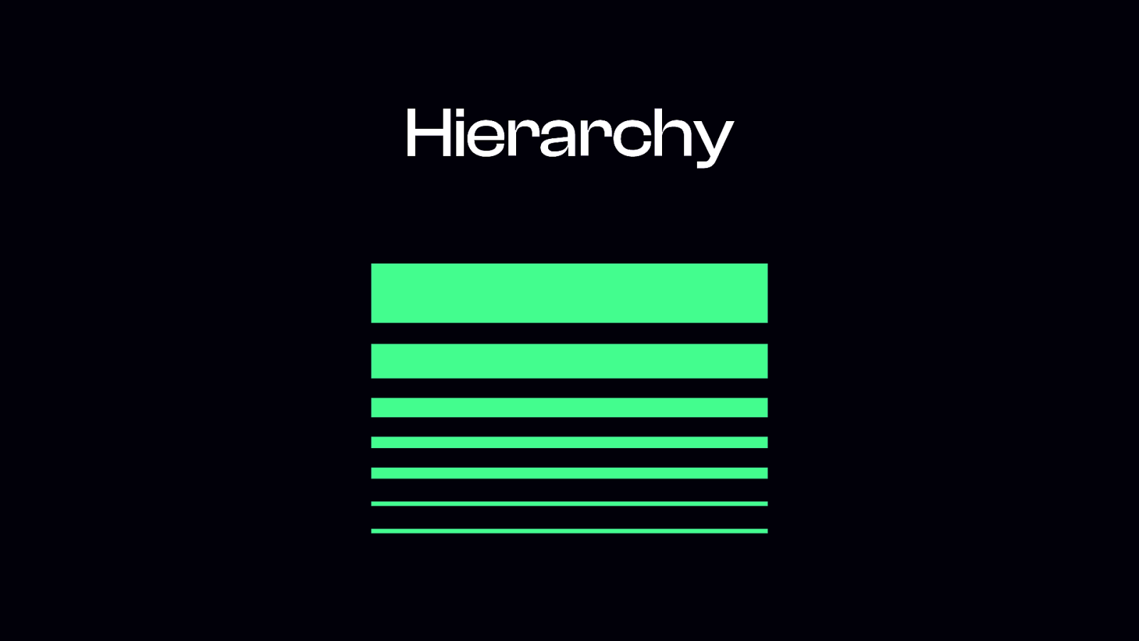
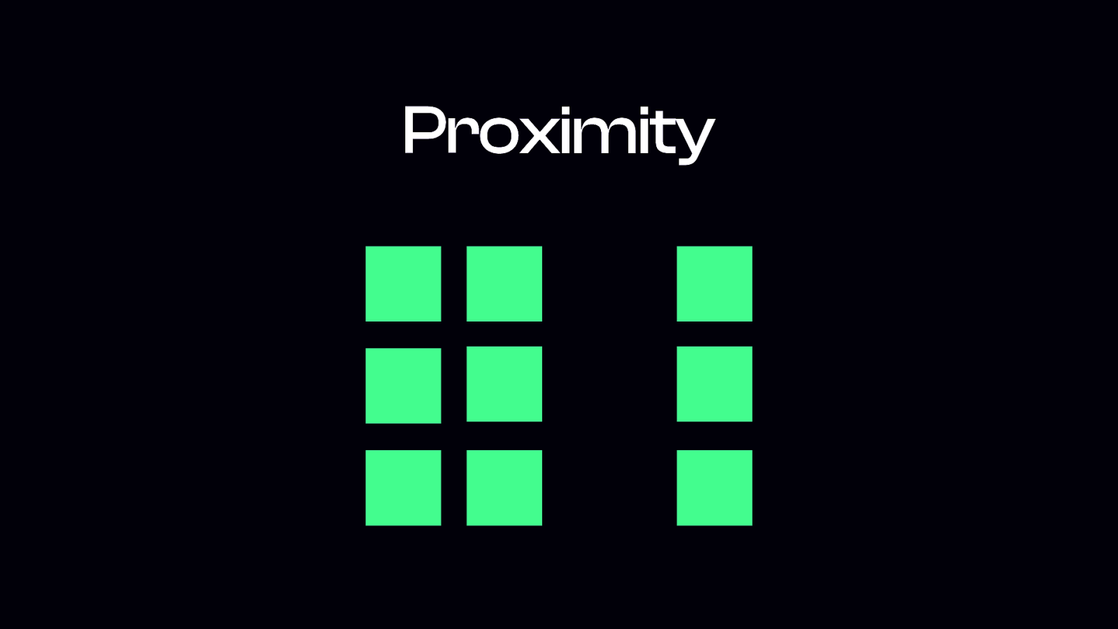
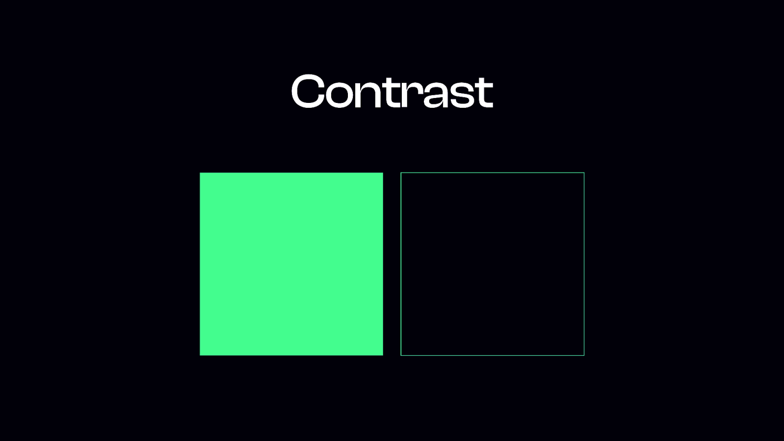
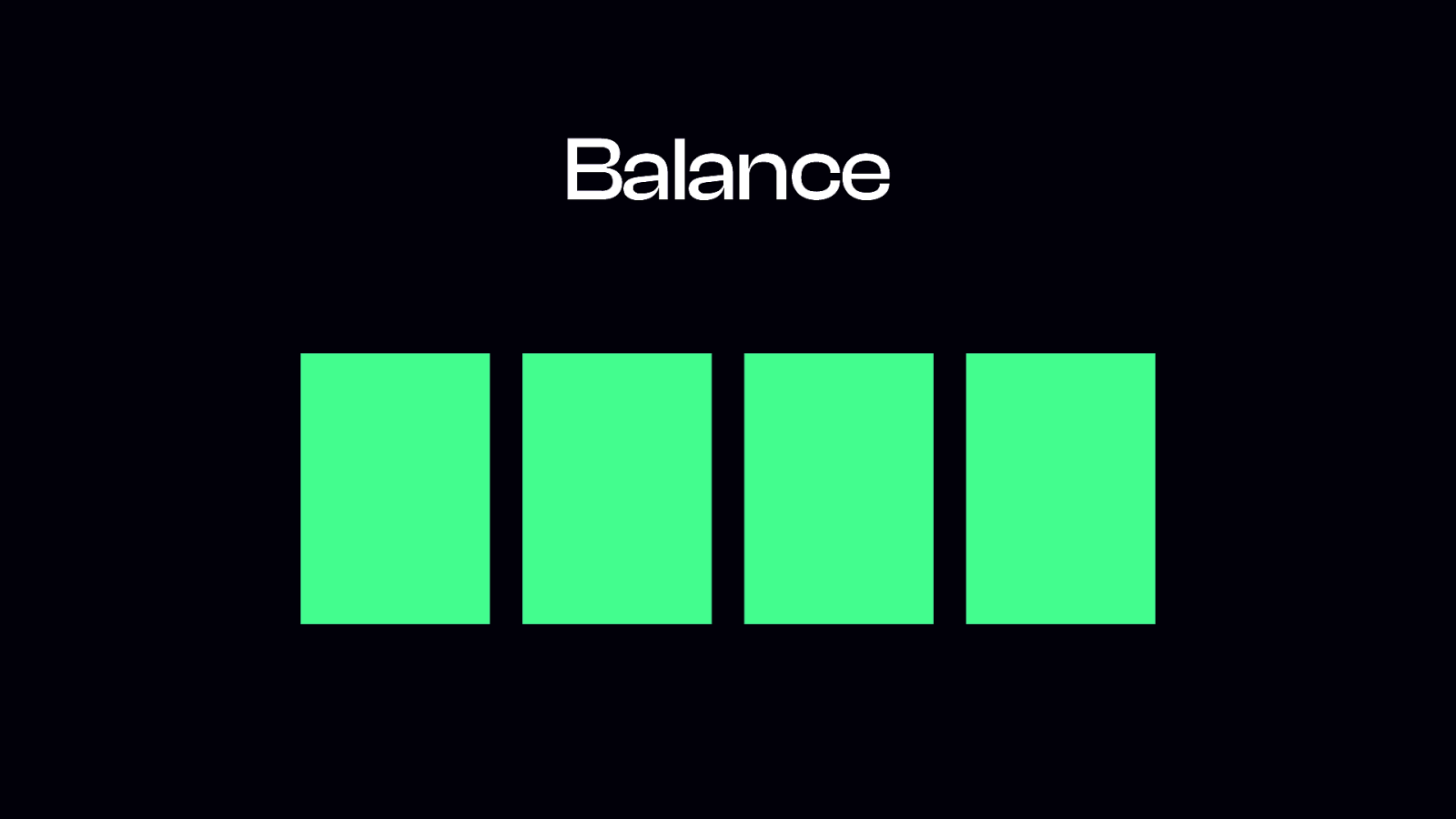
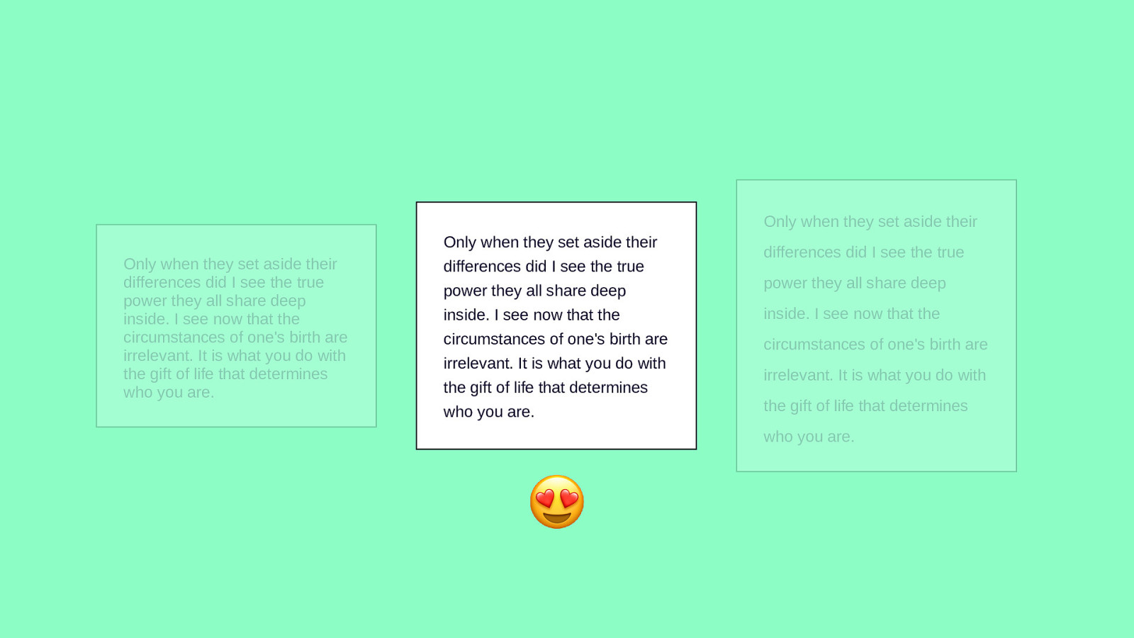
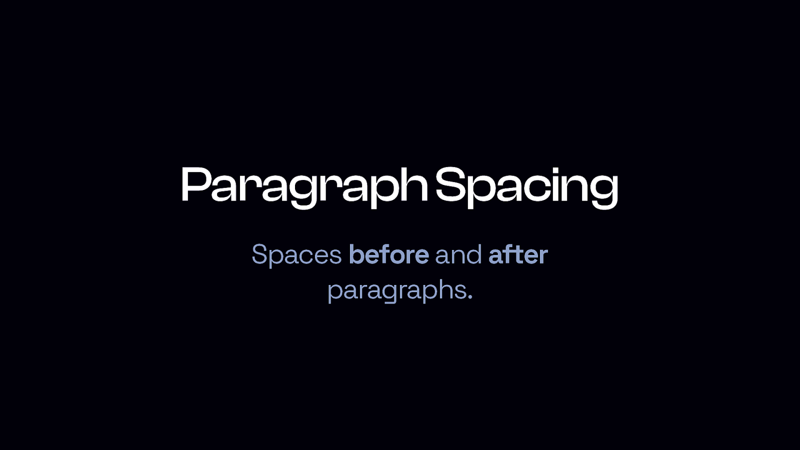
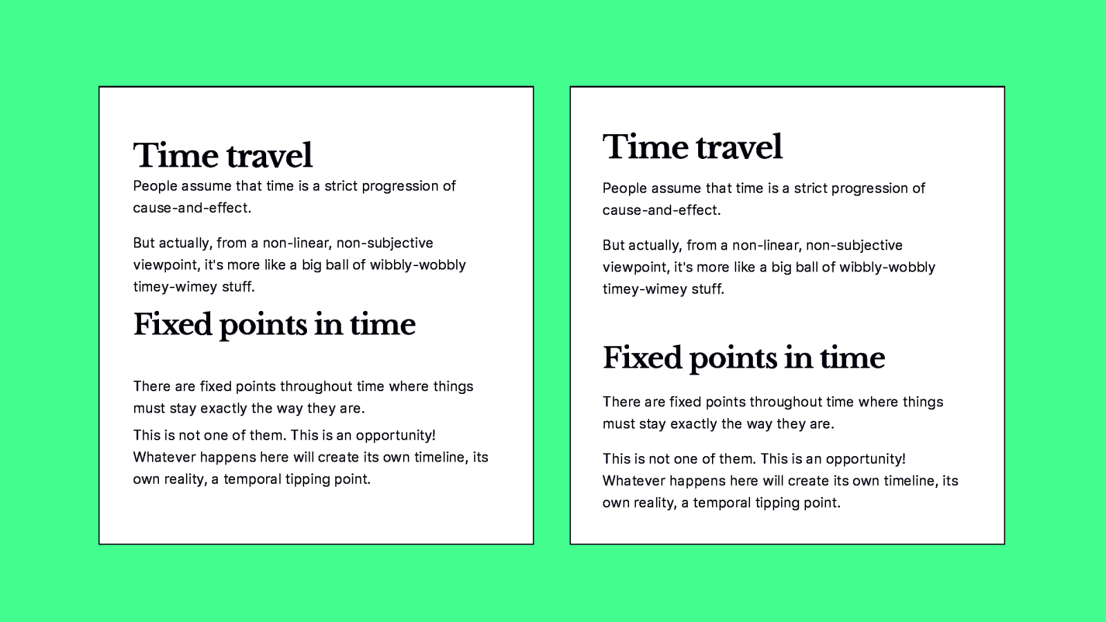
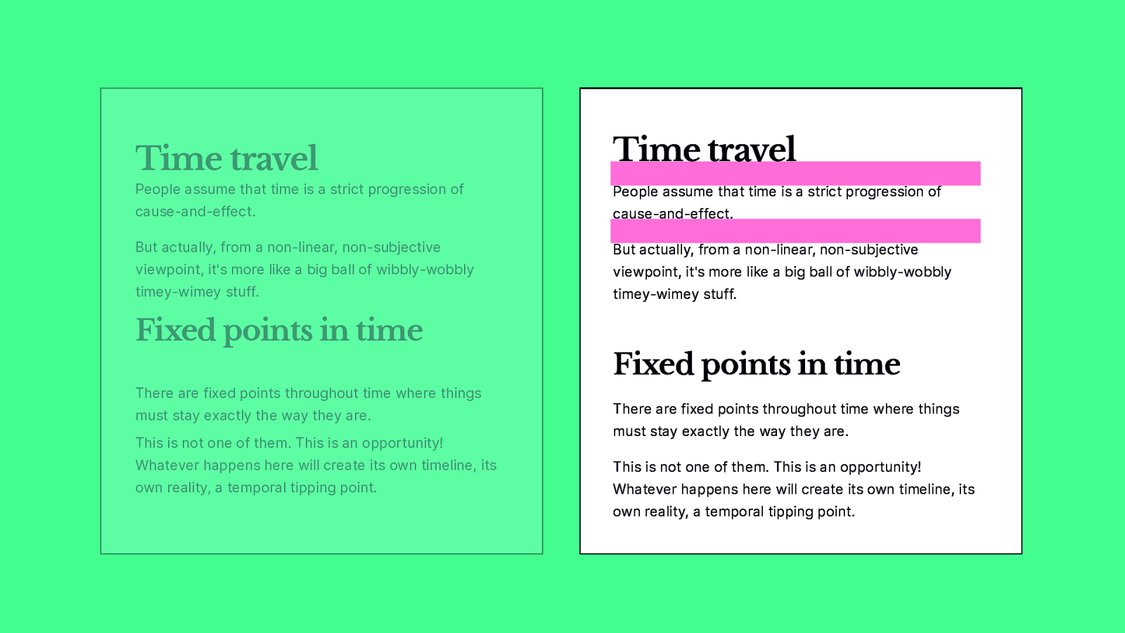
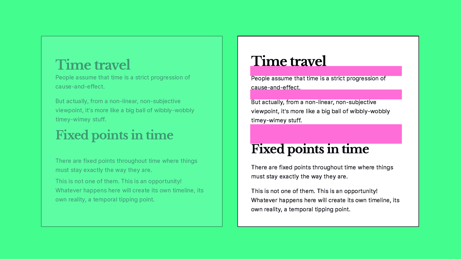
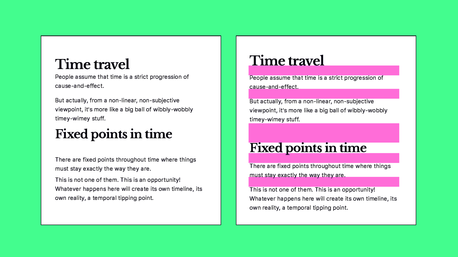
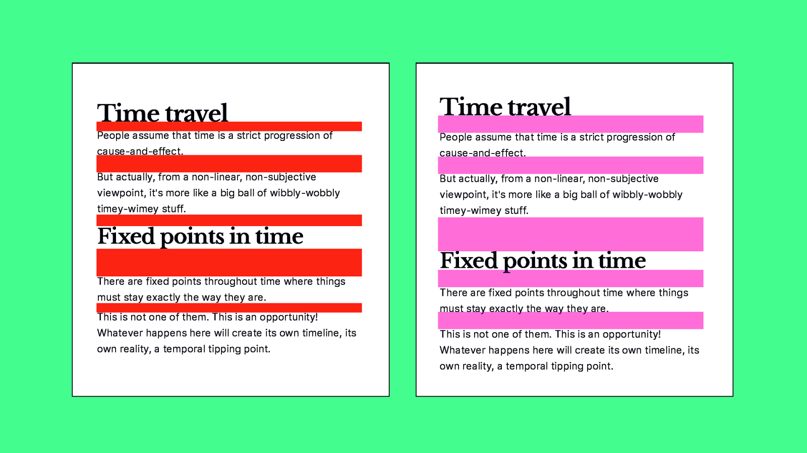
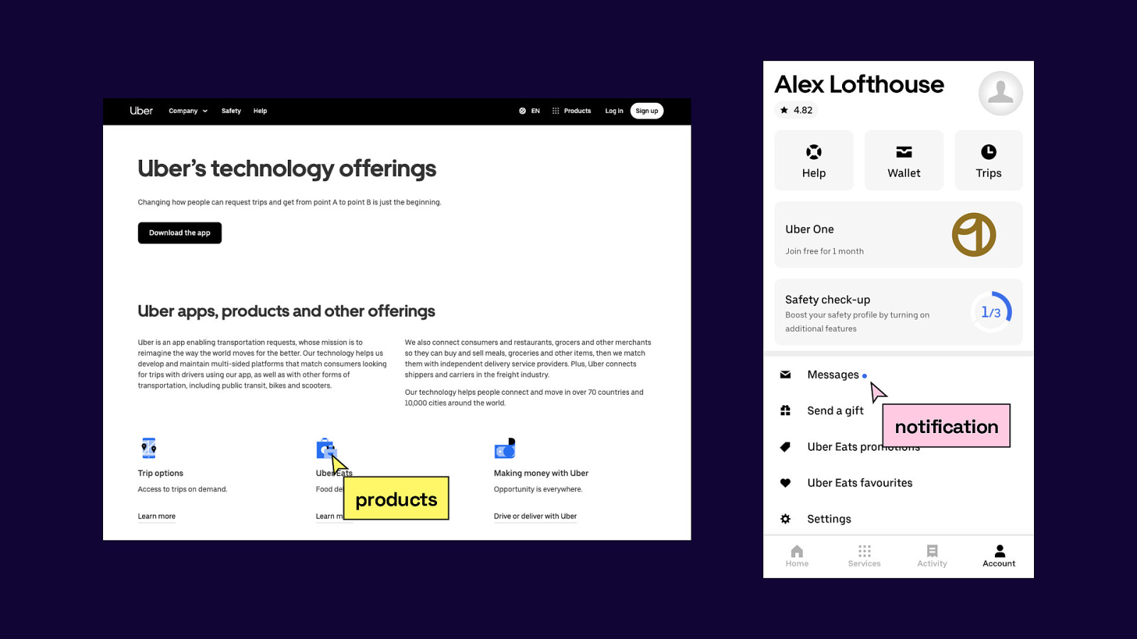
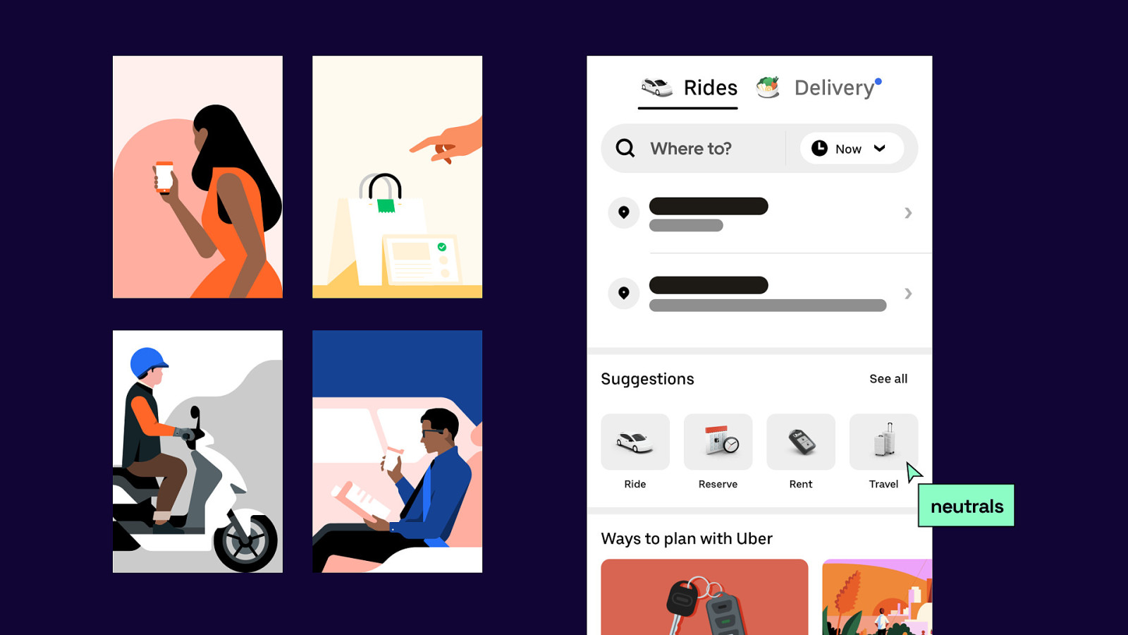
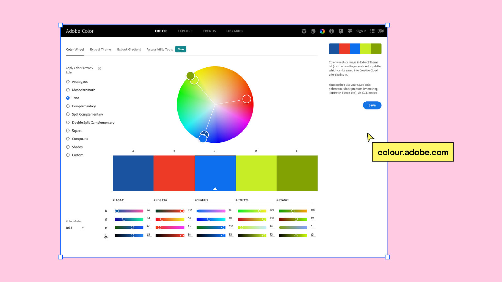
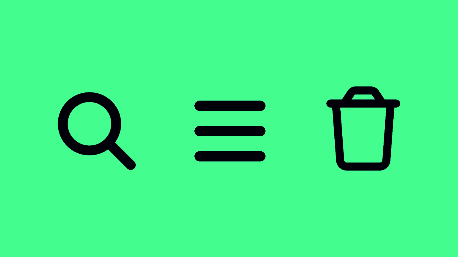
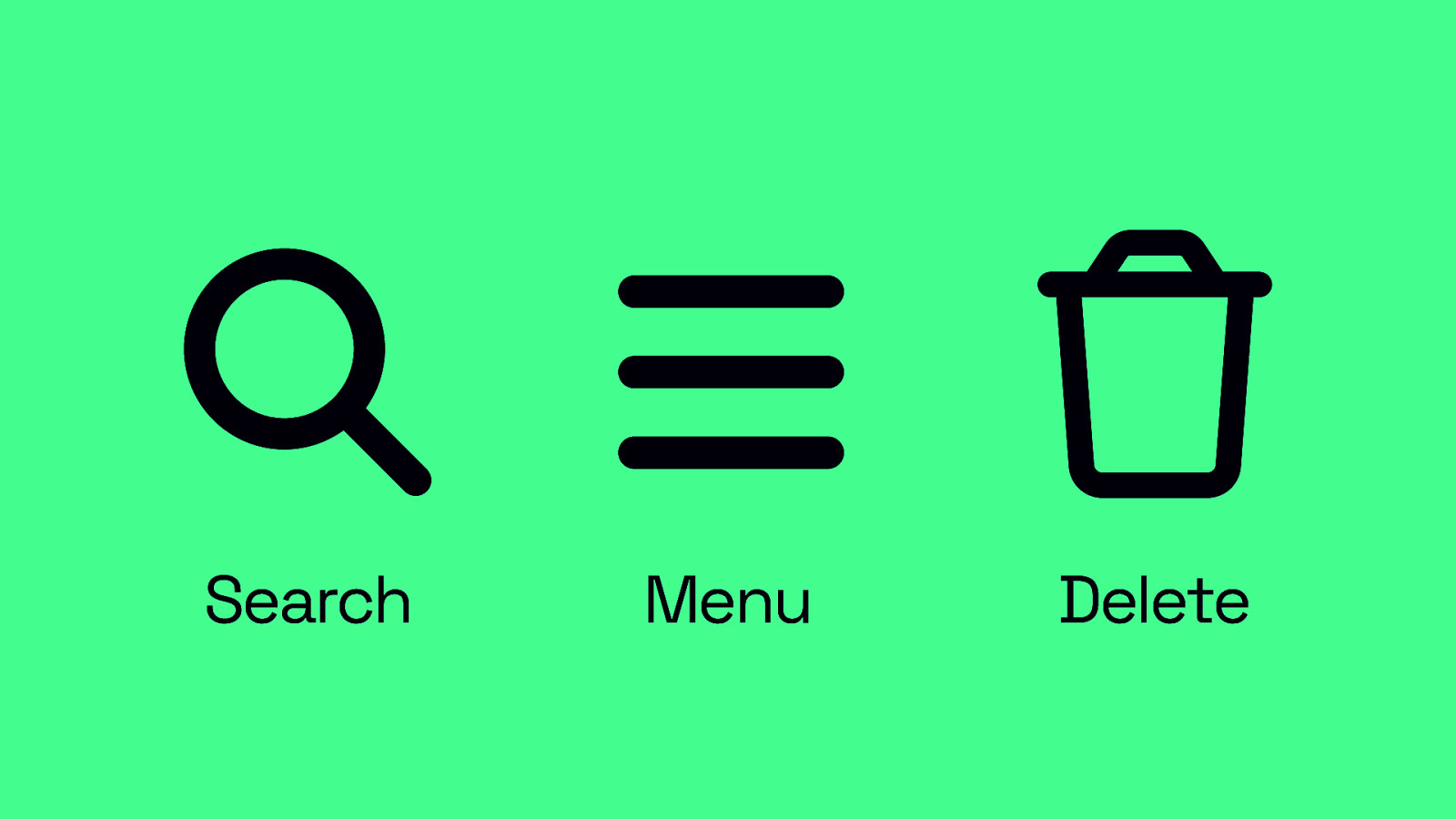
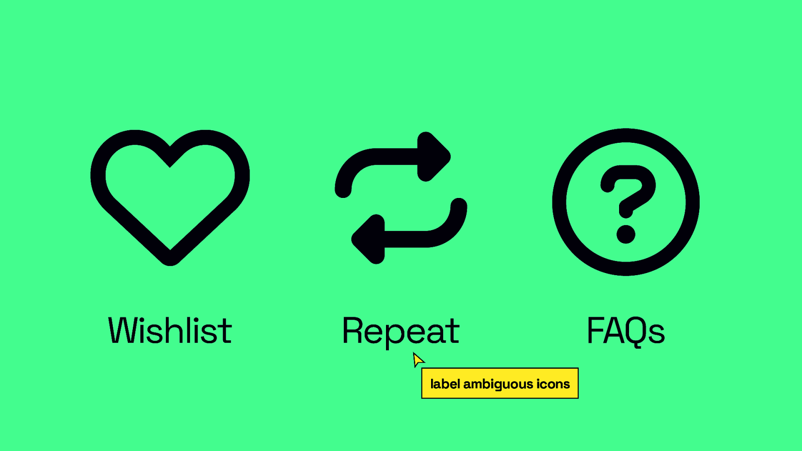
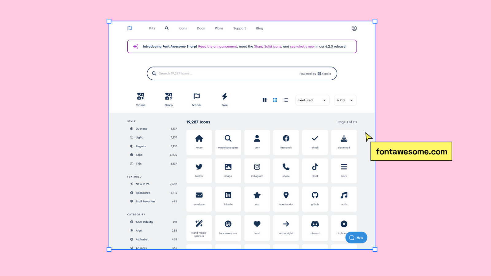
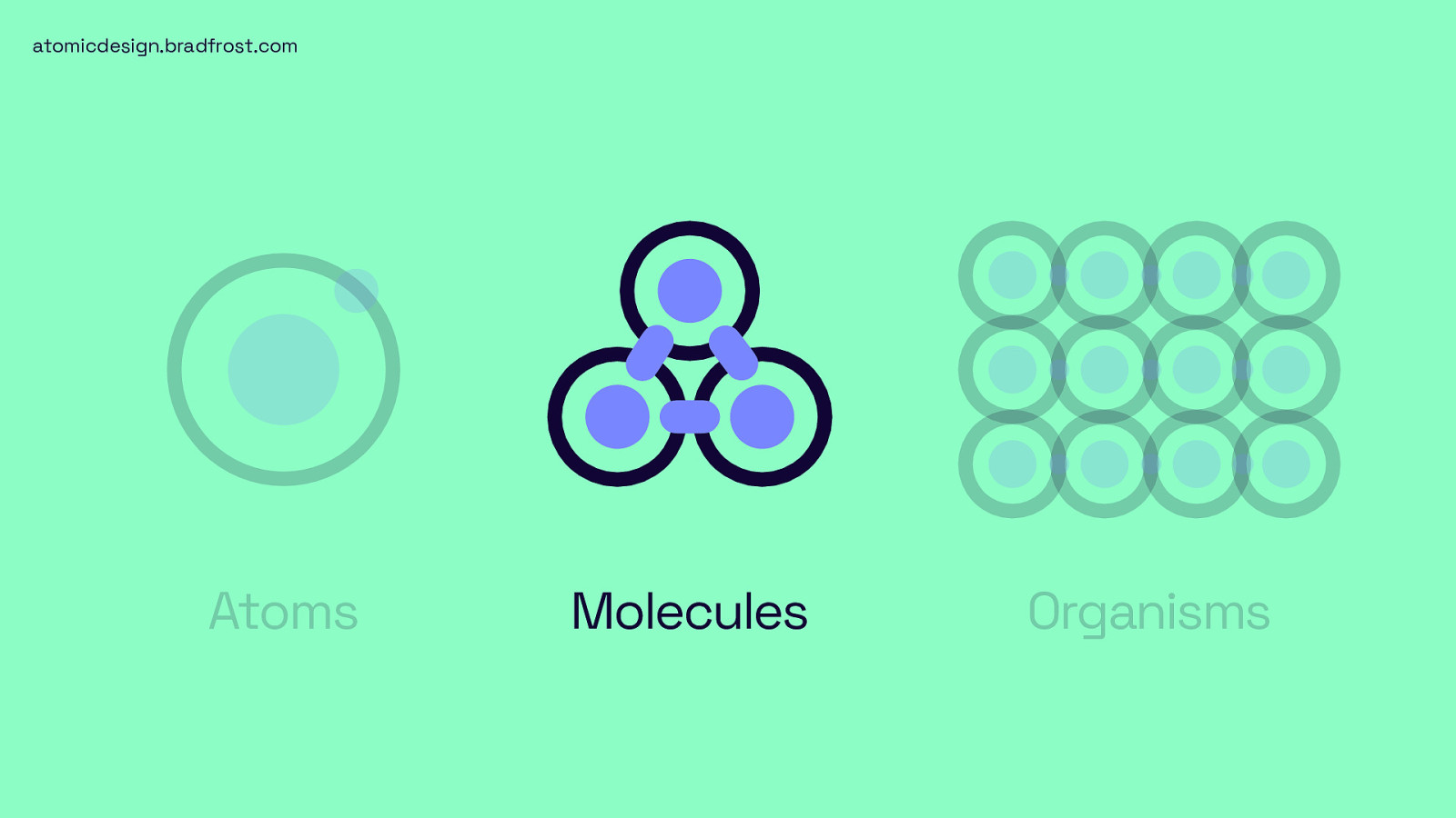
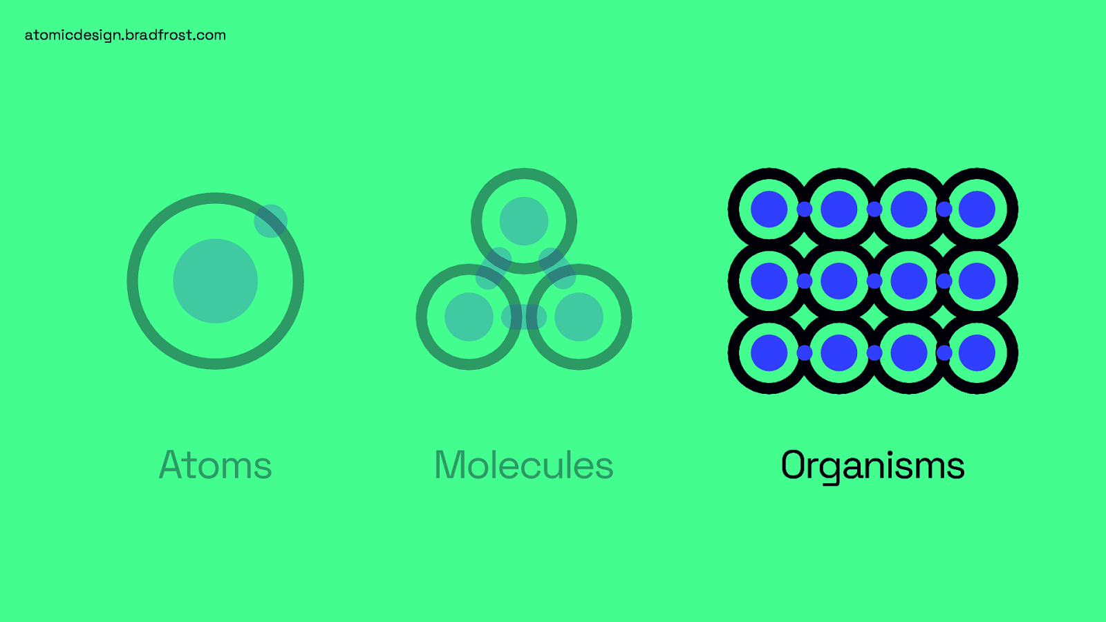
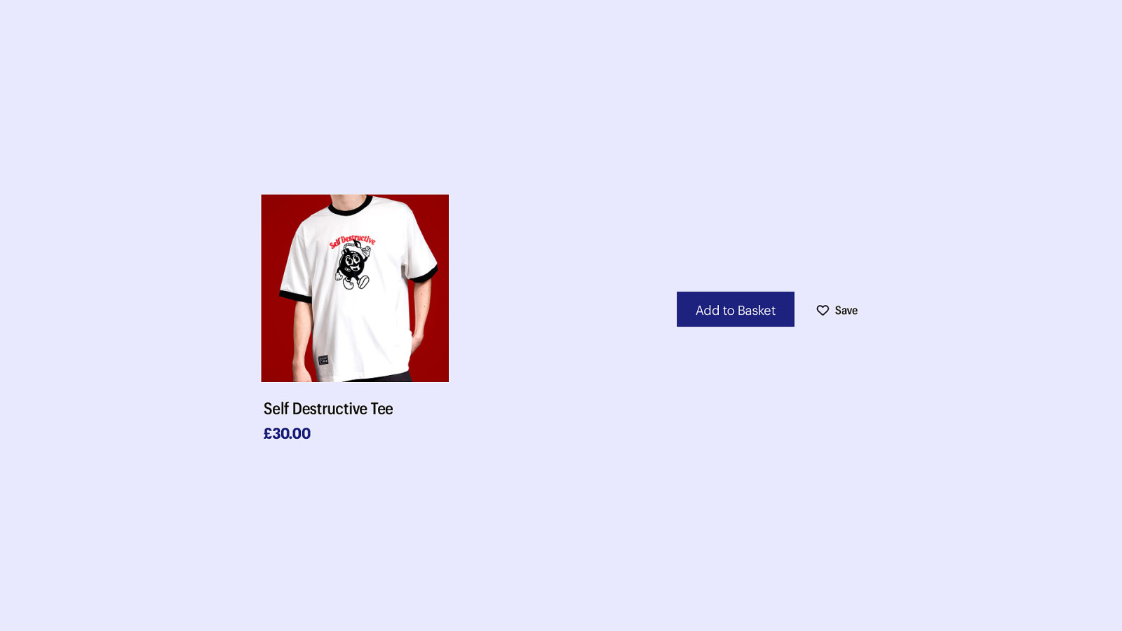
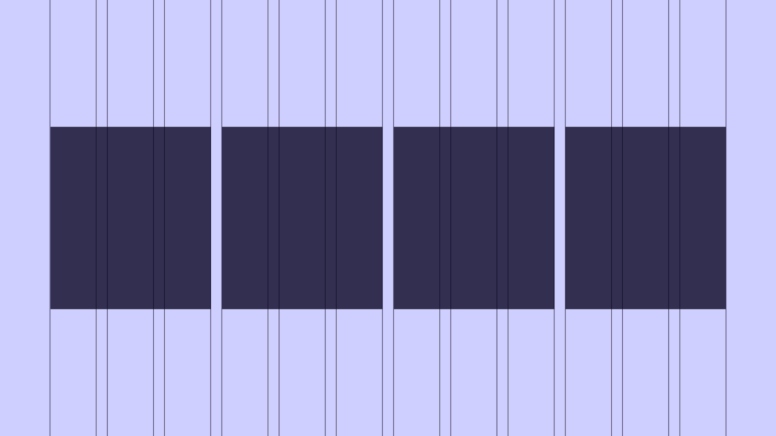
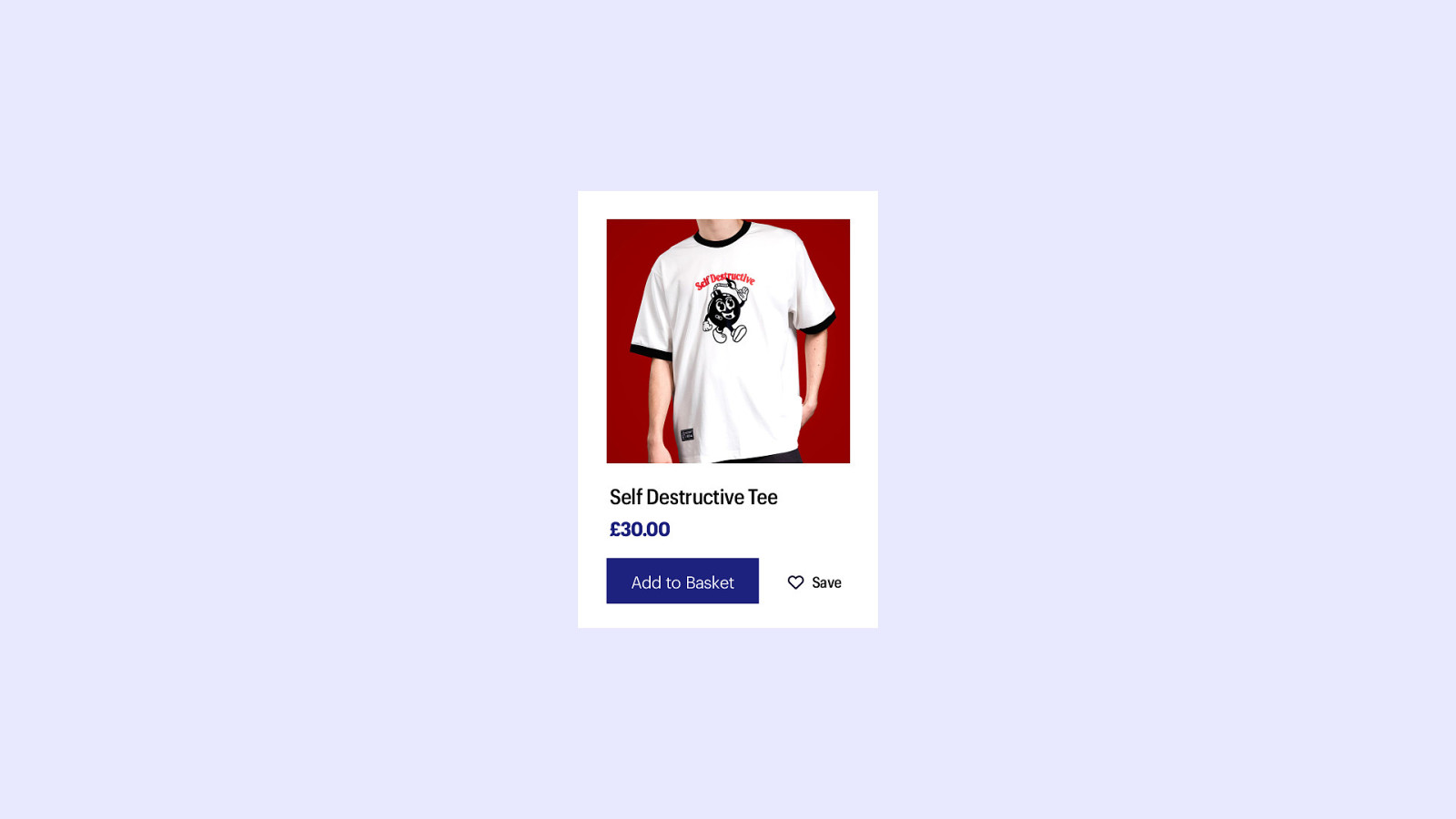
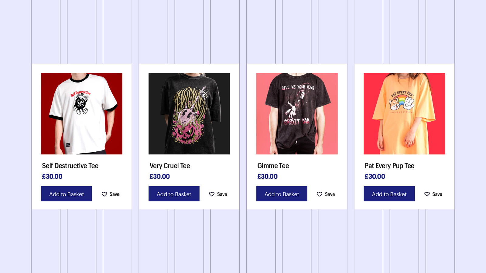
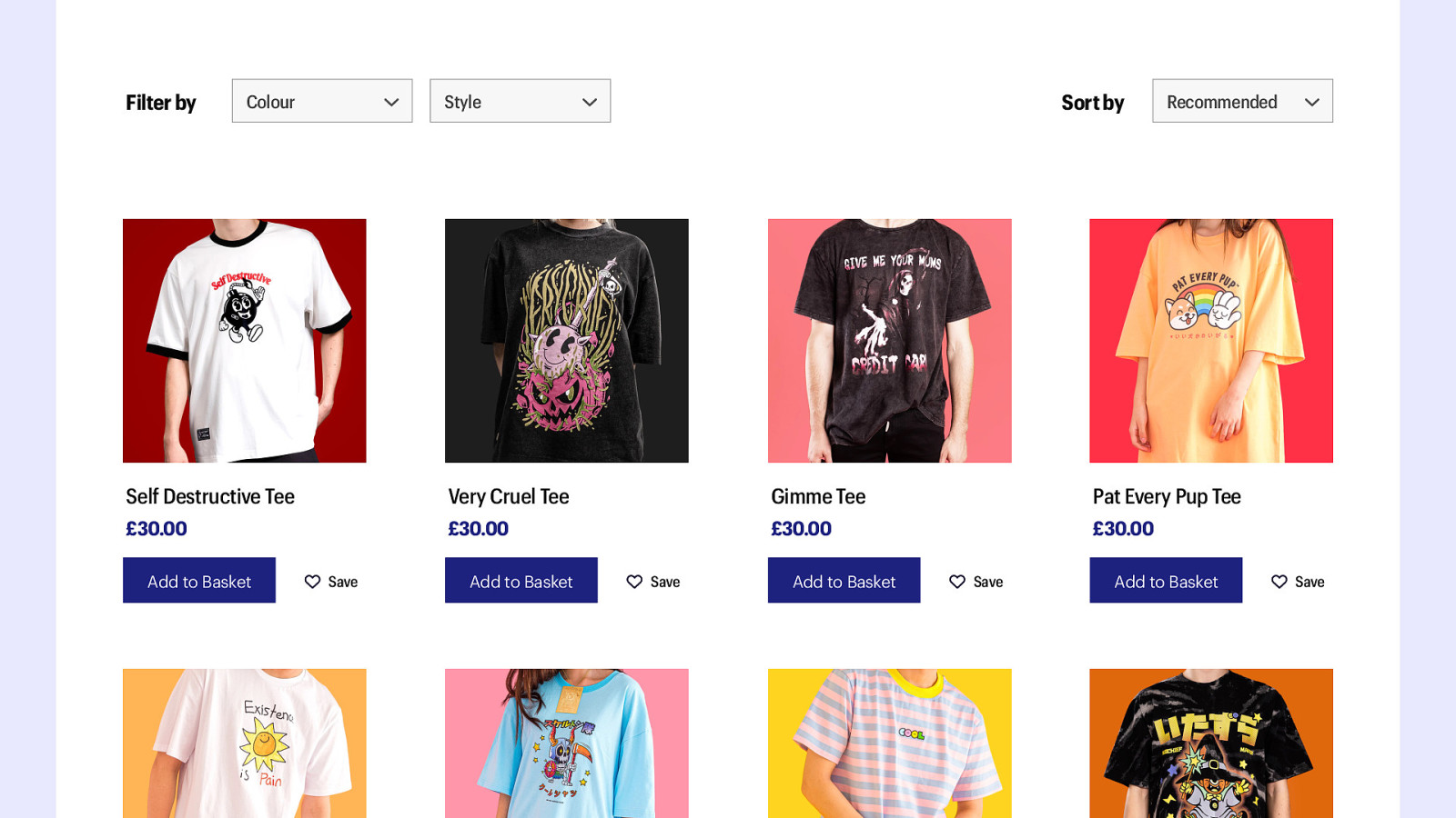
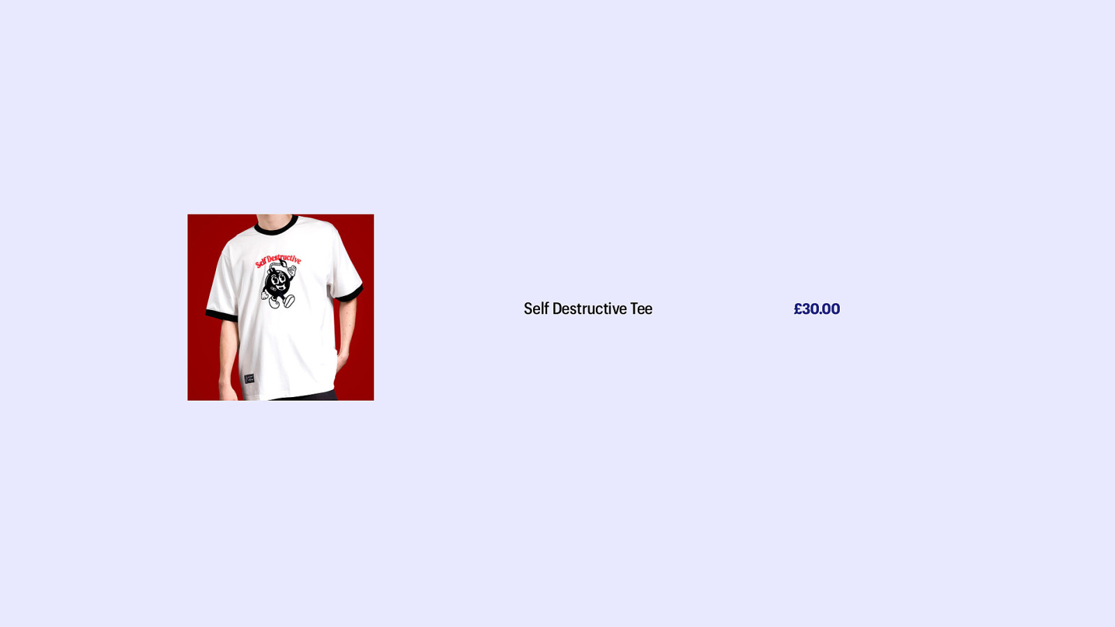
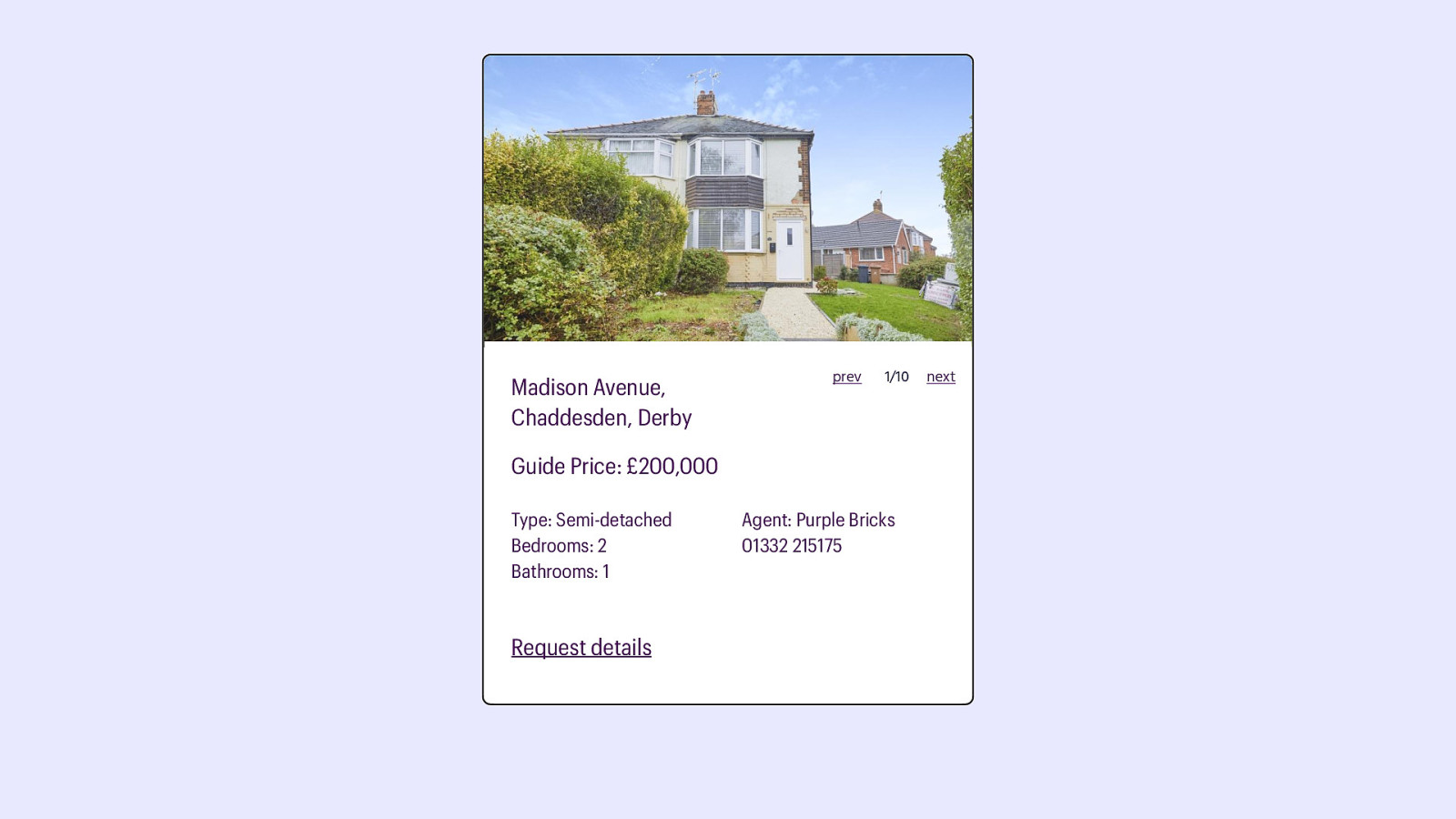
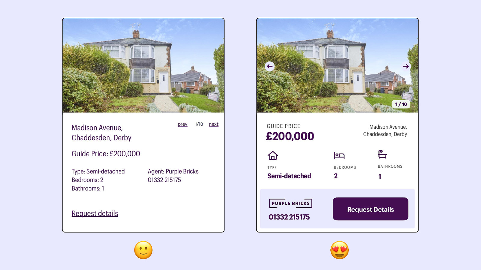
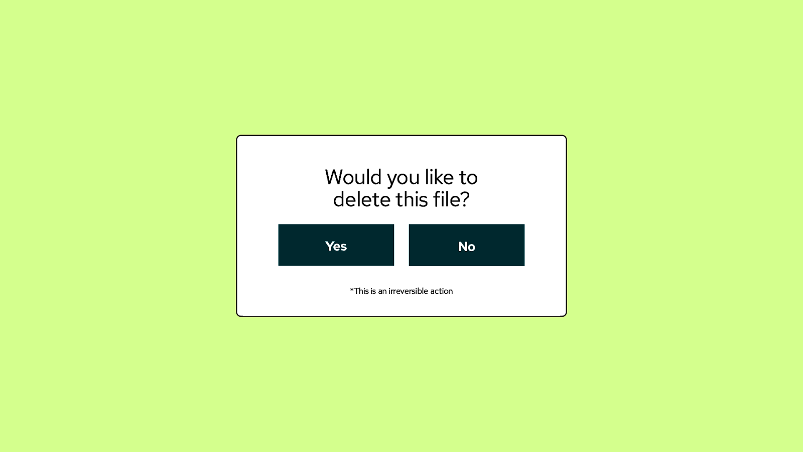
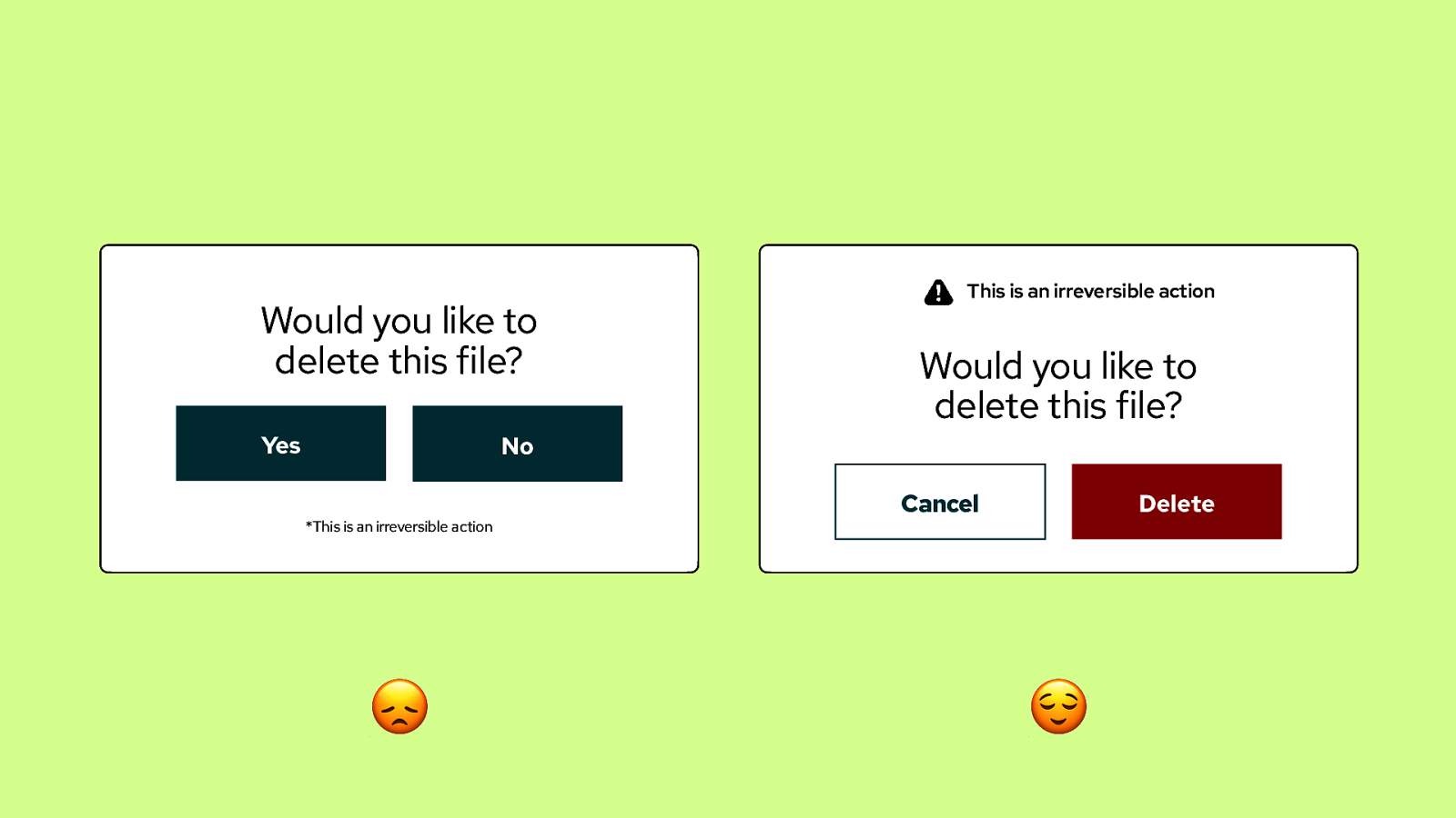
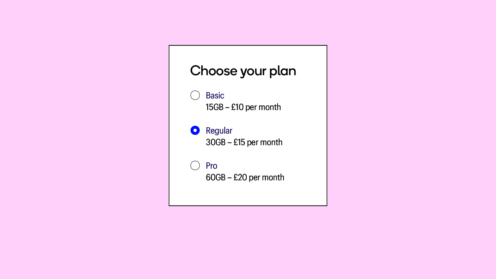
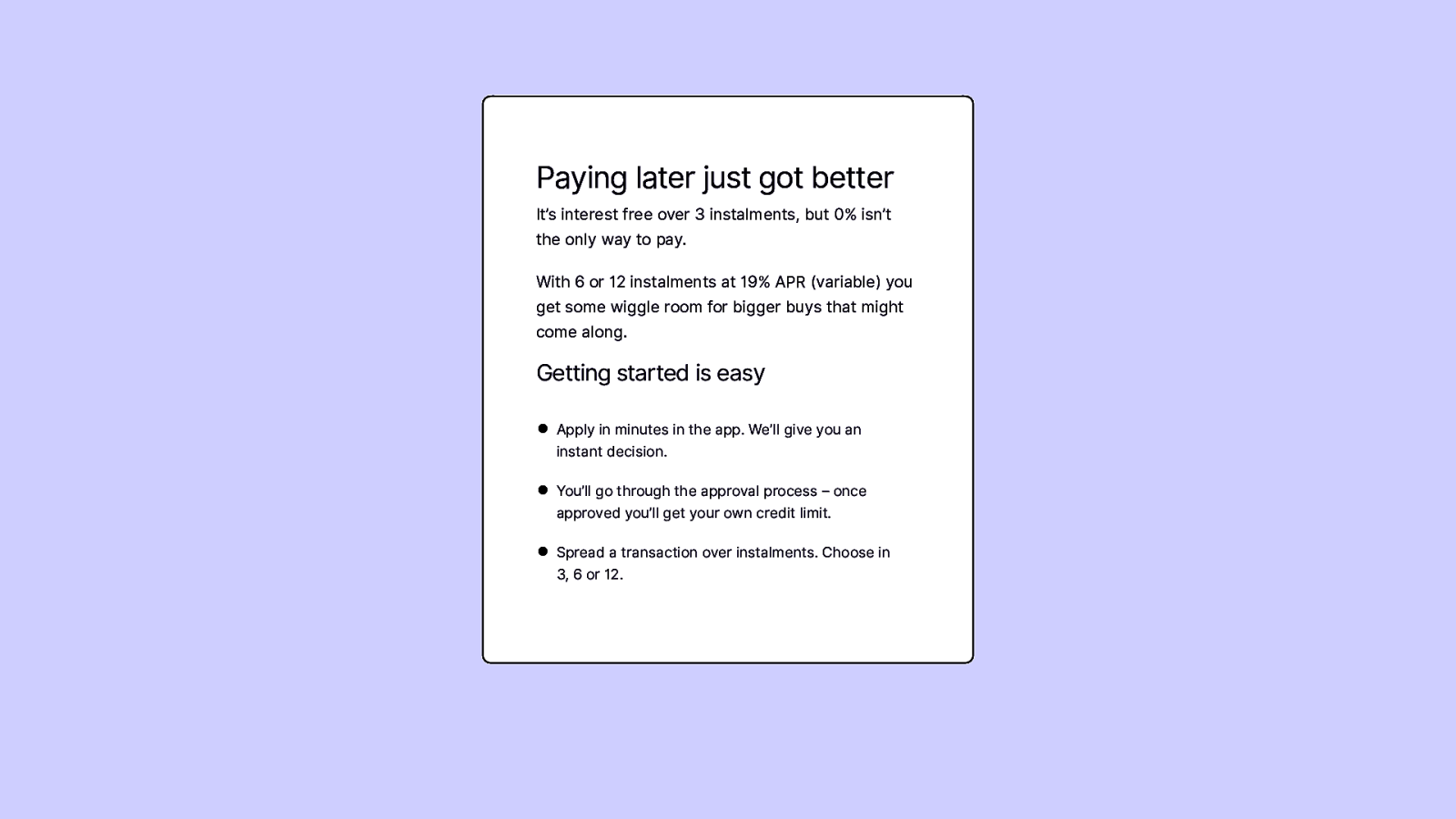
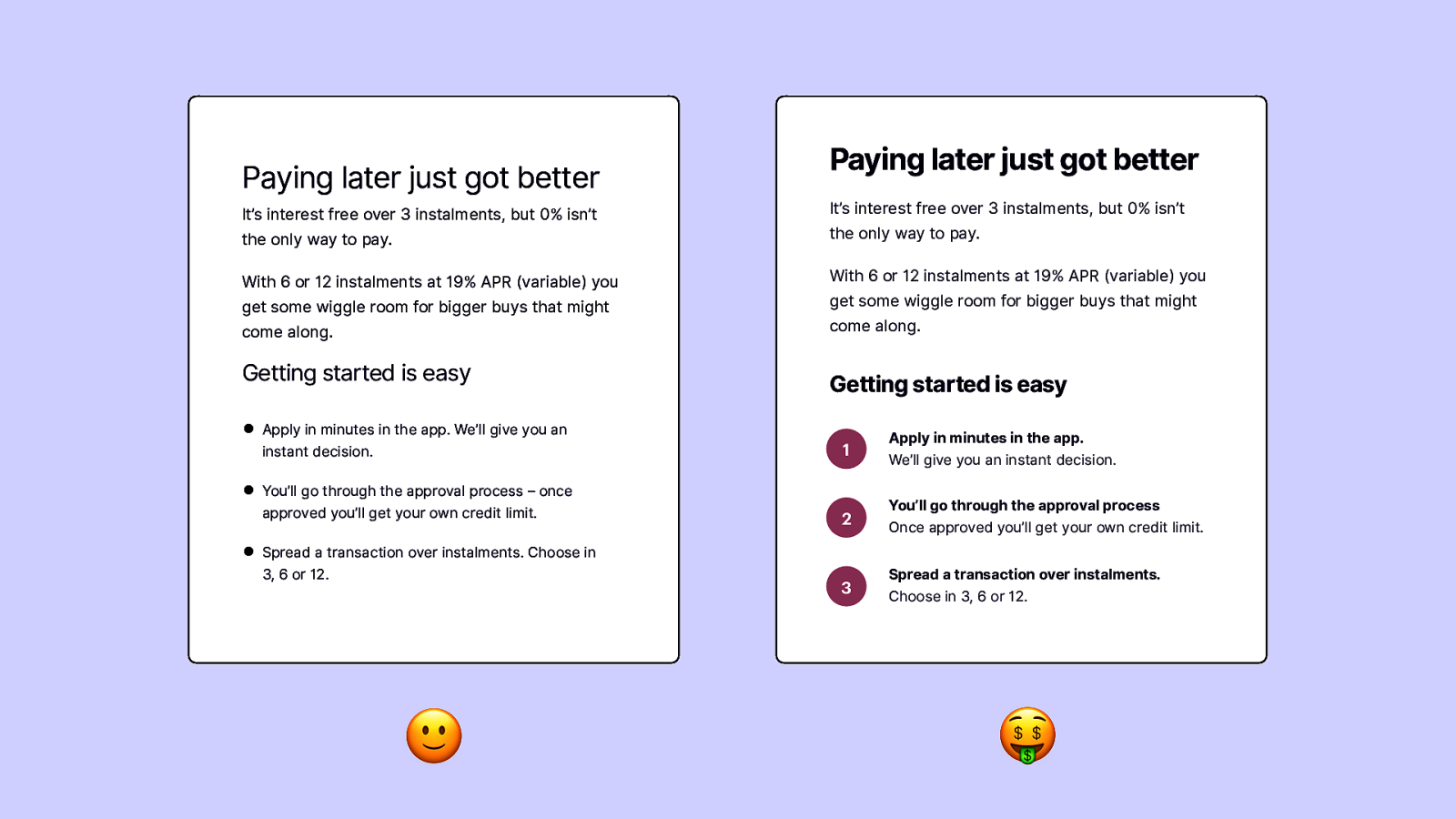
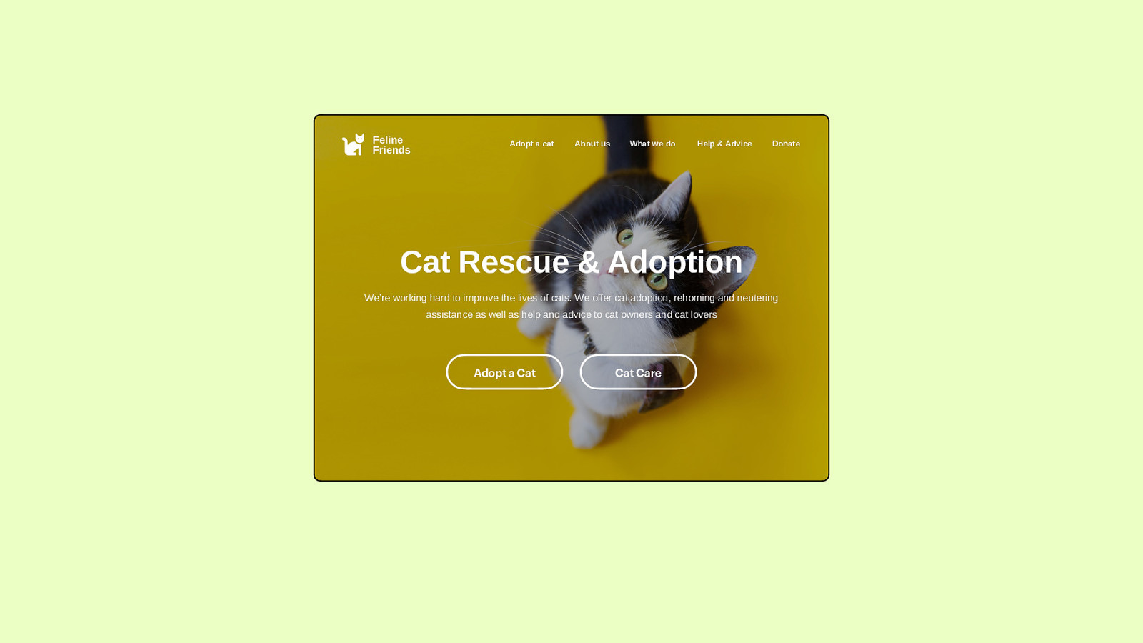
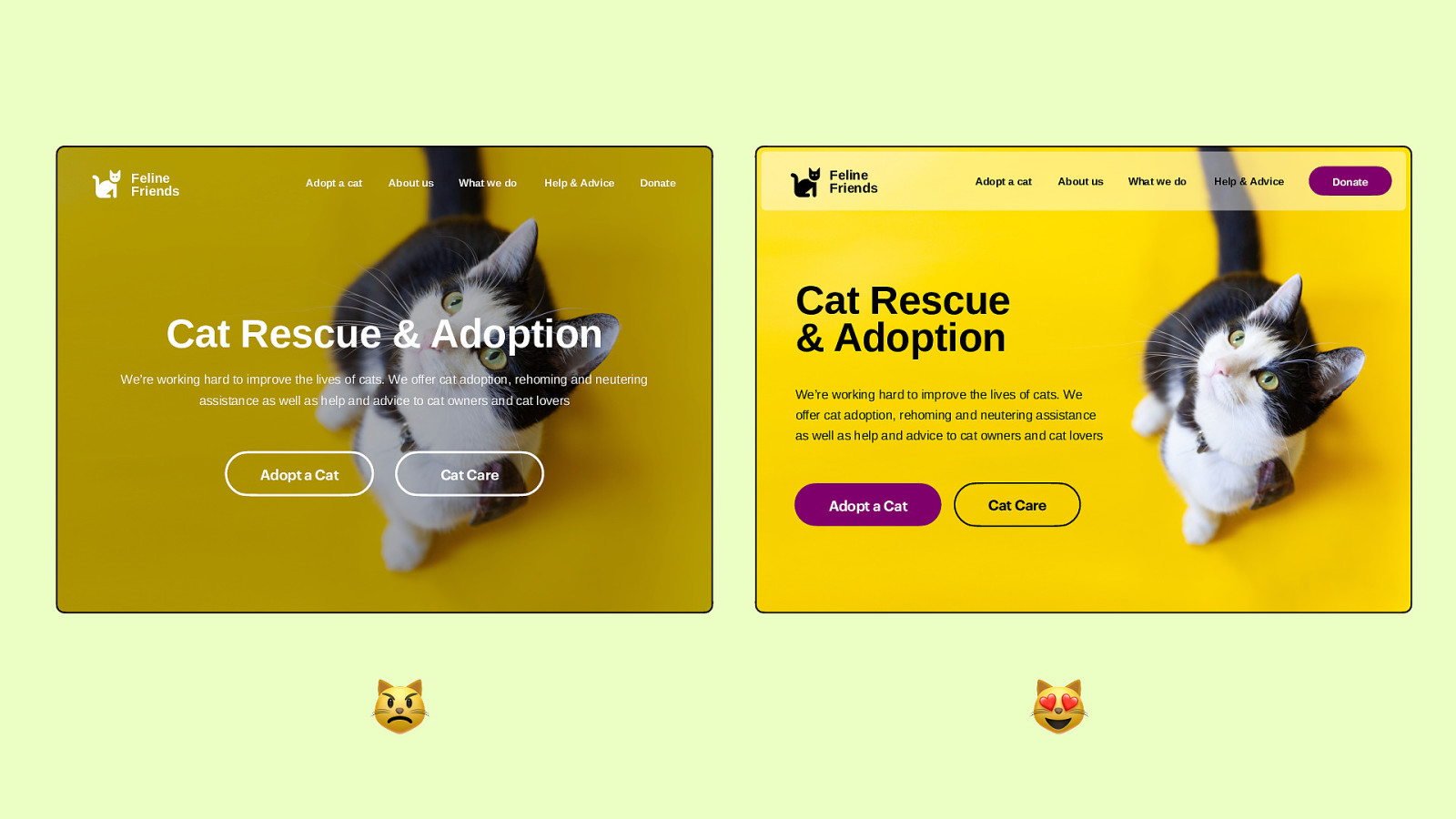
Design for Developers Lex Lofthouse @ ffconf 2022 So, this is Design for Developers, the idea for this talk came about because I have worked with a lot of developers who have asked me to share some tips and tricks with them on how to create better UI design. In some cases they’ve been working on a website without a designer and therefore have to be one, and other times is just because they want to expand their skillset. But whether you’re a developer, a designer, a bit of both or something else completely, I hope that there are some things in here that are helpful to you

Slide 2

Slide 2

So I’m 👇 Lex Lofthouse, I go by 👇 she/her pronouns and my handle on almost everything 👇 is @loftio I have been a designer for over a decade now, my Dad taught me photoshop in my early teens, I went on to study Graphic Design at Uni, and ultimately made a move into Design Agency world where 👇 I currently work for a Nottingham agency called Nzime.

Slide 3

Slide 3

*managing expectations So, before we kick off , I just wanna lay some expectations down This is a short presentation so I can’t teach you everything I know and I also won’t be giving any code based tips because I’m no expert in that!

I’m going to cover the following - Some principles of design – rules to follow. - Tips around different design elements like type and layout. - and finally, some before and after examples of how you can re ne existing designs for the front end

Slide 4

Slide 4

Principles of Design the basics So, let’s start with some basics

Slide 5

Slide 5

There are no hard and fast laws on how many principles of design, but I have chosen 4 that will help become a bit of an anchor when you’re feeling stuck designing for the web Hierarchy – Proximity – Contrast – Balance

Slide 6

Slide 6

Hierarchy Similarly to how we think of Hierarchy in other aspects of the world – It’s a system in which things are arranged according to their importance. Good design will visually indicate to you a clear hierarchy of content. Hierarchy is a relatively easy principle to implement within design, because there are a few ways to do it. One of the easiest methods of hierarchy is scale, the biggest thing on the page is probably the most important. Think about how we set up heading styles – In development we give them hierarchy in names, and in the way we style these they have a visual hierarchy, the largest one is where you eye is drawn rst.

Slide 7

Slide 7

Proximity is our second one. When it comes to design, proximity is looking at the content, understanding the relationships those pieces of content have with each other, and placing them on the page in a way that conveys that The distance or lack of between objects helps humans group things together in their brains and form those connections between the content. To use text as an example again, if we have a heading with a paragraph of text sitting closely underneath, you can safely say that those two things belong together because of their proximity to one another.

Slide 8

Slide 8

Contrast, now contrast is achieved - by having things be opposite to each other, or close enough to appear opposite in order to create a sense of emphasis. – One way we can use contrast in design is to highlight an element on a page against another. We can use contrast to draw the eye to a certain area rst – In some ways this method directly relates to our hierarchy principle. – Other times contrast is a crucial part of the interface, especially when it comes to accessibility – we can use high contrast very simply when it comes to making text legible, black text on a white background or vice versa. fi We can use colour, scale and styles to create contrast in our design.

Slide 9

Slide 9

Lastly - Balance, the distribution of visual weight across a screen This approach is symmetrical balance, this is where all of your elements are equal and distributed equally, often with an invisible centre line you can imagine down the middle like a balanced set of scales. It o ers an aesthetically pleasing layout with consistency. It’s easy to get right and it’s very common in UI design these days. ff There is also asymmetrical balance

Slide 10

Slide 10

Asymmetrical balance is used when you want to draw the eye more towards one side, but still maintaining a sense of symmetry. ff For example – one large element (on the left), weighing the same as 4 smaller ones It’s still in balance but just a more visually di erent approach.

Slide 11

Slide 11

So these are our 4 design principles. The idea with these principles is to always keep them in mind, they are key to creating a good design. If we’re talking in terms of lego, these are the instructions. Now… I want to introduce some of the major building blocks. The actual pieces of lego.

Slide 12

Slide 12

So let’s go through those building blocks we use to create a great design. I’m gonna go ahead and call them ‘design elements, and I’m not going to go into all the detail of everything, but I’m going to offer some good tips when it comes to working with these elements in design.

Slide 13

Slide 13

Again, like our principles there are more elements than I’m going to cover but here’s what we’re gonna look at today Typography – Colour – Imagery – Layout I want to just share some little bits of advice on each of these areas to help you out…

Slide 14

Slide 14

Typography Let’s look at some typography tips.

Slide 15

Slide 15

Depending on what you’re working on, you might not need to choose some fonts, so where do you start? Typically, I’d suggest choosing a font pairing for your project

Slide 16

Slide 16

I call that easy mode. Choose one font for headings and one font for paragraphs It keeps things simple.

Slide 17

Slide 17

Choosing a heading font You can be a bit braver with this choice Headings are usually shorter, larger, attention grabbing bits of copy. A more attention grabbing, decorative or stylised font can work here.

Slide 18

Slide 18

For paragraphs, we need to play it a bit safer. We need to choose a simpler font that is easy to read. This will be smaller text that appears in larger paragraphs and sections.

Slide 19

Slide 19

But where do I start? How do I know what font is good? Well, that comes down to knowing the type of brand you’re working for. Fonts, especially your heading font, should either embody that brand or compliment the style or tone. Let’s look at some examples to help demonstrate this:

Slide 20

Slide 20

So, here’s an example for a Castle. This location has history, this font echoes the styles of type from that era, and it’s got good character to it – it embodies that brand. The paragraph font I’ve chosen to compliment this is a classic serif font, it’s easy to read at smaller sizes, it pairs well in tone with the classic heading font.

Slide 21

Slide 21

Secondly, let’s look at the font choices here for a contemporary art gallery. This time our heading is bold, eye catching, it also represents the gallery’s modern style too. I’ve paired this with a basic sans serif font for the paragraph – this compliments the modern heading style and is easy to read ff This sort of paragraph font is also really versatile and works well with loads of di erent brand types.

Slide 22

Slide 22

Lastly, let’s look at an example here, this is for a trampolining centre that aimed at kids. For the heading, it’s a fun handwritten font – It’s certainly more child-like so helps convey the brand style. The paragraph font helps deliver that tone too with it’s rounded edges, but in a way that’s easier to read. There’s not always one answer when it comes to fonts (or design in general), but there are some wrong ones. If you’re not sure, play it safe and keep your choices simple, but if you want to create some more impact, get brave with those choices.

Slide 23

Slide 23

fontjoy.com An awesome tool to try out some font choices together is fontjoy.com You can randomly generate font matches, or use the slider to try more contrasting or similar styles. It’s great because you can just view these in a browser without having to download and fa about with them yourselves.

It uses Google fonts which I find quite favourable, especially working on low budget projects.

Slide 24

Slide 24

type-scale.com For time, I won’t go into detail about setting up heading styles and paragraph styles, but I do want to just point out a great tool that helps with that called type-scale.com It integrates with Google Fonts too, and gives you previews of sizing in the browser, rather than having to download those fonts beforehand.

Slide 25

Slide 25

So once we’ve got our fonts and text styles all set up, I’d like to discuss spacing - to me, this is probably the most overlooked detail by devs (sorry), but it makes a world of difference to a design.

Slide 26

Slide 26

Firstly is Line Height, so this is the spaces between continuous lines of copy.

Slide 27

Slide 27

Here’s 3 examples of different line heights to demonstrate the power of getting the balance right here. It’s a bit of a goldilocks situation.

Slide 28

Slide 28

On this end of the scale the line height is too small, it’s all bunched together which makes the text really difficult to read. Sometimes our default line spacing can look a little like this, so we need to add more space between those lines.

Slide 29

Slide 29

However, we can fall into the trap of doing this.

This is how I used to behave as a junior design and my boss used to say ‘you could t a bus through those lines’, it’s too much. In a different way this makes the text a lot harder to read. So…

Slide 30

Slide 30

Here’s where we need to be in the middle ground. This line height makes the paragraph pleasing to read, there’s enough space between the lines but not too much. Proximity is the principle we need to remember here, especially for that end example. If things are too far away, they feel like they don’t belong.

Balance too – that first example pushes it all together and it doesn’t feel like a pleasing distribution of weight on the page.

Slide 31

Slide 31

The other element of spacing to look at is paragraph spacing This is the spaces between paragraphs of text, as well as before and after headings.

Slide 32

Slide 32

Here we have two examples of paragraph spacing, one bad and one good. Let’s break down the good

Slide 33

Slide 33

Slide 34

Slide 34

Slide 35

Slide 35

If we compare this to our example on the left, we can start to see why paragraph spacing is so imperative. The proximity principle was not considered here, as the spacing of each section of text doesn’t help us connect the content together in a logical way and follow our natural way of reading.

Slide 36

Slide 36

It can be very easily missed, but this will make a world of difference to a design.

Slide 37

Slide 37

Colour So, let’s move on to some tips on colour

Slide 38

Slide 38

So, what I’d like to cover is tips around creating a colour palette to use across your design.

Slide 39

Slide 39

Top tip, start with the main colour you want to associate with your brand. Think easyJet Orange, Starbucks Green, Twitch Purple

Slide 40

Slide 40

Once we’ve got one colour, then we can start to build out three colour palettes

A Main palette – This will be your first colour, + a small selection of other more commonly used ones. Supporting palette – These will be less commonly used but typically we can have more choice of colours. Neutrals – a set of neutral colours we can use for more flexibility.

Slide 41

Slide 41

I’d like to show an example of this using a familiar brand – Uber.

Slide 42

Slide 42

So this is Uber’s main colour palette. Starting with one colour, they chose black To add to the palette they then chose white – Reason being, black and white contrast very well, contrast was one of our Design principles that we touched on at the start – colour is a great way of achieving that. Additionally they have a third main colour with the Blue – this works well with either black, white or a combination. And they will use this more as a highlight or accent colour throughout the brand.

Slide 43

Slide 43

So on their website and on the app here, you can see how they’ve implemented the colour palette and their main palette, these colours are their most common. Obviously black and white is used for great contrast here, but also see where they’ve used the blue 👇 On the website, they use it in product iconography, 👇 and on the app they use that to highlight where I need to complete security settings and to highlight that I have a message.

Slide 44

Slide 44

This is Uber’s secondary colour palette. It contains twice as many colours, but they are used a lot less within their branding And again, these colours are also chosen as they work well alongside the primary palette.

Slide 45

Slide 45

Here we can see these colours (and shades thereof) being used to communicate through illustration on their website and app. As well as this, you can then see the 👇 neutral tones, the greys, applied within the app – helping to show areas of interactivity. ff ff Having a palette structure like this will help guide you in your design, but also creates a sense of hierarchy by having di erent colour palettes work in di erent places.

Slide 46

Slide 46

colour.adobe.com So, choosing colours – tools for that.

Firstly, Adobe Colours is one I use a lot because you can create an entire palette starting with one colour like we spoke about. The different options help you create a palette based on whether you want complementary colours, monochromatic, shades and so on.

Slide 47

Slide 47

coolers.co Secondly, is coolers.co Bit more random in the way you select colours, but a good tool when you really don’t know where to start. 👇 Now coolers also has a contrast checker for accessibility. I know as developers, you’ll have a lot of technical accessibility standards to meet. As a designer, colour is literally the lowest bar to get right in terms of accessibility, so make sure you’re at least testing this. Whether it’s on here or using more robust tools like WebAIM

Slide 48

Slide 48

Imagery Ok, let’s discuss a couple of elements around imagery.

Slide 49

Slide 49

So, you might be using some photography in your design – how do you make sure these look good? Well a lot of the time it can come down to getting the focal point correct

Slide 50

Slide 50

Let’s take this image, the person here is clearly our subject and our focal point, but if we just chuck this into a design and crop it automatically it’s not going to work.

Slide 51

Slide 51

Our automatic cropping doesn’t cater for the subject being off-centre.

Slide 52

Slide 52

So, we need to consider the frame it’s going to sit in first – is it square, portrait or landscape… Make sure that subject is sitting in the right place and isn’t cut out of the frame.

Slide 53

Slide 53

You may even be working with more complex image containers, in which case you really need to check your image is going to work. Framing of images is something I see done wrong a lot, but is easily fixed with the right crop.

Slide 54

Slide 54

As well as framing, something we can also do with our images is give them a bit of enhancement Think filters, and effects – you don’t need Photoshop these days to do that anymore and social media has made this more common, as well as the cameras on our phones having decent editing tools also.

Slide 55

Slide 55

Here’s an example of a really simple effect applied to an image, good ol’ black and white. It’s a simple approach but it can also add some consistency to your photographs especially if they’re from different sources

Slide 56

Slide 56

Here’s a great example of this is action on the ffconf website itself, all of the speakers headshots are shot in different places and with different cameras and lighting But with a the same effect applied it gives the images a sense of consistency

Slide 57

Slide 57

👇 Alternatively you could go for something a little more funky, like a duotone style in your colour scheme to really make them on brand. 👇 Or, cutouts from the frame, I think this is what my clients mean when they ask me to’make it pop’.

Adding effects is definitely not a necessity, but it might be something you want to experiment with.

Slide 58

Slide 58

unsplash.com Also, if you’re looking for a free resource for photos, Unsplash is your friend. They have a wide range of images so you should hopefully find something that you’re looking for, and it’s all royalty free images.

👇 You’re not going to find the cheesy meme style stock images here

Slide 59

Slide 59

Iconography is an age old way of communicating, but something we see often on the web.

Slide 60

Slide 60

Now, I wasn’t even going to really speak about icons but there is one thing I want to mention that I often see missed. With icons, it’s very easy for us to assume the user will knows what our icon is just because we do. These are some typical icons we’ll see every day, and we all know what they mean, we know what will happen when we click them.

Slide 61

Slide 61

These are what we call ‘universal icons’.

Slide 62

Slide 62

Now consider what these icons might represent? They’re perhaps not as familiar or obvious in what their actions mean, they could be quite ambiguous. The heart could mean like That middle one could be repost That last one could be for a livechat

Slide 63

Slide 63

Or… maybe not. Maybe they’re not that obvious So my one tip for icons, 👇 please give them a label if it’s not immediately obvious what it is. It will save your users the confusion.

Slide 64

Slide 64

fontawesome.com One more thing, a great resource for nding good icons is Fontawesome

They have a huge amount of icons to use as either vector or font files, so they never lose fidelity. They offer free packs and paid packages and their library is constantly growing.

Slide 65

Slide 65

Layout Lastly let’s talk layout. This is where we start putting those pieces together.

Slide 66

Slide 66

Now I like to start with a grid, or at least columns – these give you a guide on where to place elements onto the page. Typically it’s good to use a column structure that is divisible by different numbers, which is why a 12 column grid works perfectly, and is my go-to when I’m working for the web. It is divisible by 2, 3, 4, 6.

This makes it a versatile layout for responsive design, but it also helps us maintain that all important design principle – Balance.

Slide 67

Slide 67

Here’s a typical 12 columns layout – now I know this is not a revolutionary concept in front-end development, It’s even less of a modern concept in design. Grid systems have been around since books were being printed, so designers have been familiar with this for a while. I wanted to just highlight the structure using a grid can bring to a design – when it comes to considering those design principles, grids assist in maintaining balance and also consider proximity. So… some quick examples

Slide 68

Slide 68

This shows how we can create a two column section – now imagine what these squares could contain. Symmetrically balanced we could have two of the same kind of elements in there – two columns of text, two product cards - Symmetrical balance Or we could asymmetrically balance it out

Slide 69

Slide 69

By using a 12 column layout we can consider doing this across 3 columns

Slide 70

Slide 70

4 columns

Slide 71

Slide 71

Or even 6

So grids are a great starting point as they give you a clear guide on where to put “stuff”.

Slide 72

Slide 72

So, once we’ve got a grid, cool, let’s talk about the “stuff” that go in those squares Let’s look at designing some repeatable components.

Slide 73

Slide 73

Now I’m going to borrow heavily from Brad Frost here and his Atomic Design theory – for those who may not have heard of it, Atomic Design is a framework used to help us break down a layout into a system of smaller elements. The Atomic Design methodology uses the following terms to describe how we build a component. Starting small we have: • Atoms • Molecules • And then Organisms This then builds up to pages and templates but I’m just going to focus small for now. So what does this mean in terms of UI?

Slide 74

Slide 74

Start with Atoms - they refer to the most basic building blocks for an interface, singular elements

Slide 75

Slide 75

Atoms here could be an image, a title, a price tag. Like atoms in nature, they’re important but not very useful a singular.

Slide 76

Slide 76

That is where Molecules come in. Molecules are where two or more atoms combine in order to create a part of the interface.

Slide 77

Slide 77

Our single atoms merge to become

Slide 78

Slide 78

A molecule. Things are getting more put together now.

Slide 79

Slide 79

Here’s some more atoms…

Slide 80

Slide 80

That can form into another molecule!

Slide 81

Slide 81

Then from there we have Organisms, In a similar fashion, Organisms are made up of two or more molecules combining.

Slide 82

Slide 82

Here’s our two molecules from before

Slide 83

Slide 83

Combined into an organism. Now we’ve got a full product card in action.

Slide 84

Slide 84

And then… we think about our grid… here we’ve got 4 columns

Slide 85

Slide 85

We take our organism

Slide 86

Slide 86

And we repeat it into that column structure It’s starting to come together now.

Slide 87

Slide 87

And eventually, we add more organisms like our filter and sort by, and we’re building up a product listing page.

Slide 88

Slide 88

So my tip is, if you’re feeling overwhelmed with designing an entire page, start small, start with the atoms, then build up from there.

Slide 89

Slide 89

atomicdesign.bradfrost.com

Before I move on, I just want to put the Atomic Design resources up here as I have lifted from that methodology and condensed it heavily! Atomic Design started o as a blog by Brad Frost, and then became a book, so please do check it out to fully learn more!

Slide 90

Slide 90

[Need 5-10 mins here] So I want to end this talk with some examples of how we can refine existing designs. I find that talking through the how and why is great, but by far some of the best feedback I’ve had from devs has been from showing some before and afters to show where improvements can be made.

Slide 91

Slide 91

Let’s start with a ‘card’ component here, an organism if you will – here’s one from a property website. Something I’ve been looking at all year and now have given up with because of the state of the UK economy right now, but I digress. So, we’ve got all the information we need about the house here right. Price, location, spec, image gallery, call to action. But what we’re really lacking is good hierarchy, contrast and balance. So let’s look at how we can improve it…

Slide 92

Slide 92

Both of these cards display the same information, and perform the same functions, but with big differences in how that’s communicated in the design Price - We’ve identified that as a key element we need to pull out - so it’s the biggest bit of info now. Hierarchy! Let’s revise some of that clutter too - we’ve used icons to help us condense to pull out some of the key info on the house – I’ve labelled these too Bit of contrast on the contact details - We’ve chosen a neutral tone here to pick out this section, we’ve also included their logo for more visual recognition, and we’ve changed the link to a more eye-catching button for contrast. Lastly, we’ve adjusted the controls on the image gallery to be more prominent, placing them on the image also gives them more context to what Ok… next example

Slide 93

Slide 93

Ok.. let’s look at a pop up here. Now this lesson is mostly in hierarchy but also a little bit of microcopy. So, what’s the problem with this example? Well it’s a permanent destructive action, and the warning for this is super small Also the buttons have no real differentiation to help us make our decision at first glance. A lot of mental load for the user here.

So, how do we improve this?

Slide 94

Slide 94

Firstly, let’s make that warning text more prominent, move it to the top, eye-catching icon, make sure you’ve read it. Secondly we’ve adjusted the text on the button, let’s say delete rather than yes, and cancel instead of no, really make it clear what action the user is going to take. Let’s swap them around too, let’s put the main action on the right – this is more familiar. Next, let’s address the button styling. In our new example we’ve considered both contrast and hierarchy here. One button is filled and red to help indicate the nature of the action, and the secondary action in an outlined button to help give contrast to the primary action.

These adjustments to design can really help a user quickly make a di cult decision like this.

Slide 95

Slide 95

Our next example, how can we make this radio button choice a bit more interesting?

Seems fine here, but I think we can improve

Slide 96

Slide 96

Well, let’s consider the hierarchy here. What’s the big difference between these choices that needs highlighting most? So these are data plans - so let’s make the amount of data per plan the largest differentiator, and reduce some of the other elements, we’ll keep the price bold to make sure it’s the next differentiator though. Second we’ll put these choices into nice big block components. This is creating a sense of balance in our layout, but also clearly separating our options better than the radio button style. Lastly, our selected state here invites a huge level of contrast in comparison to our previous example, it’s very clear which one has been chosen.

Simple, incremental changes can really enhance choices like these and make a users experience more enjoyable.

Slide 97

Slide 97

Here’s a quick example of how we can add a little bit more interest to just a simple block of text

This isn’t a bad example by all means, but we can sharpen it up.

Slide 98

Slide 98

Different font weights for the headings, we’re trying to add a bit more contrast and highlight what’s important The body copy colour we’ve chosen is also slightly lighter than our headings, making them stand out a bit more. Thinking about proximities, our example on the left has some spacing issues, so we’ve adjusted those. Lastly, we’ve really looked at the content around getting started, and we’ve added some icons instead of basic bullet points for a bit of visual interest and balance, as well as using bold font weight for contrast, drawing the eye to the important areas of text, great for people who just skim content. Neither one of these is wrong, but I know which one I prefer.

Slide 99

Slide 99

We’ve got an image to use, title, description and two buttons, plus the menu to think about. Now this is fine, but I can’t really see the cat! So how can we improve this?

Slide 100

Slide 100

The biggest thing for me here is that the text is sort of readable on the left, but because we’re using a bit of an overlay, it doesn’t provide us enough contrast, and it obscures the cat. The revised example uses that available space on the background image, and we instead move that image over, a better crop to allow us to place the text straight on to the image.– This gives the design a lot more contrast, and the text is much easier to read too. Secondly we’ve considered the hierarchy of the buttons, if there are two together, make them different. You’re likely to have a more prominent option so make that one obvious. Here it’s clearly the ‘adopt a cat’ button.

Finally, I’ve also looked at the menu, and tried to highlight the donation button there too, as that’s a bit priority for a rescue shelter. So again, small changes can make a big difference, whether it’s a button, a block of text or larger areas of design.

Slide 101

Slide 101

Slide 102

Slide 102