very responsive typography with @mandy_kerr @mandy_kerr Im going to be talk about responsive typography with variable fonts and what i mean by that is how we can change our typography to respond to multiple inputs, not just viewport size.

A presentation at JSConf Hawaii in February 2020 in Honolulu, HI, USA by Mandy Michael
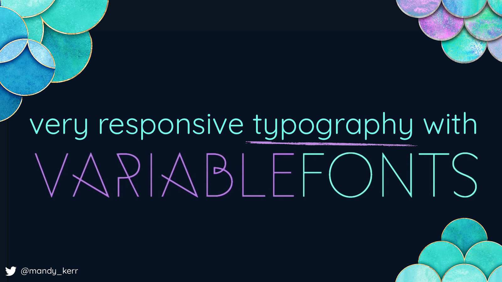
very responsive typography with @mandy_kerr @mandy_kerr Im going to be talk about responsive typography with variable fonts and what i mean by that is how we can change our typography to respond to multiple inputs, not just viewport size.

MANDY MICHAEL @mandy_kerr @mandymichael My name is Mandy Michael, you most of the demos i’ll show you today are up on Codepen so you can go and check those out later if you want.

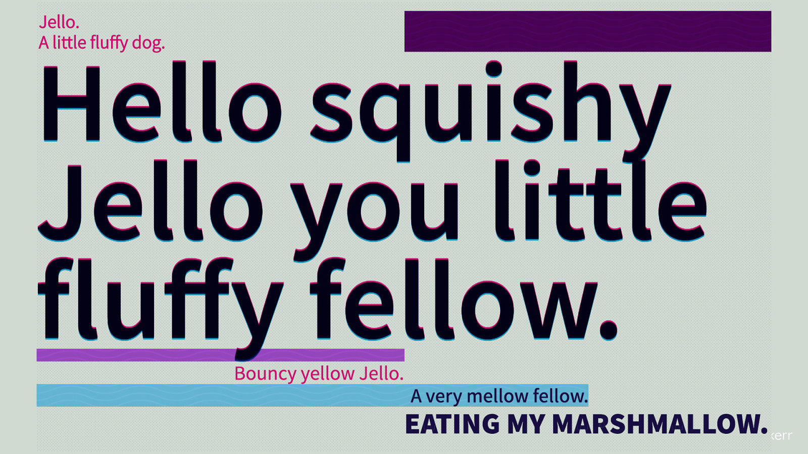
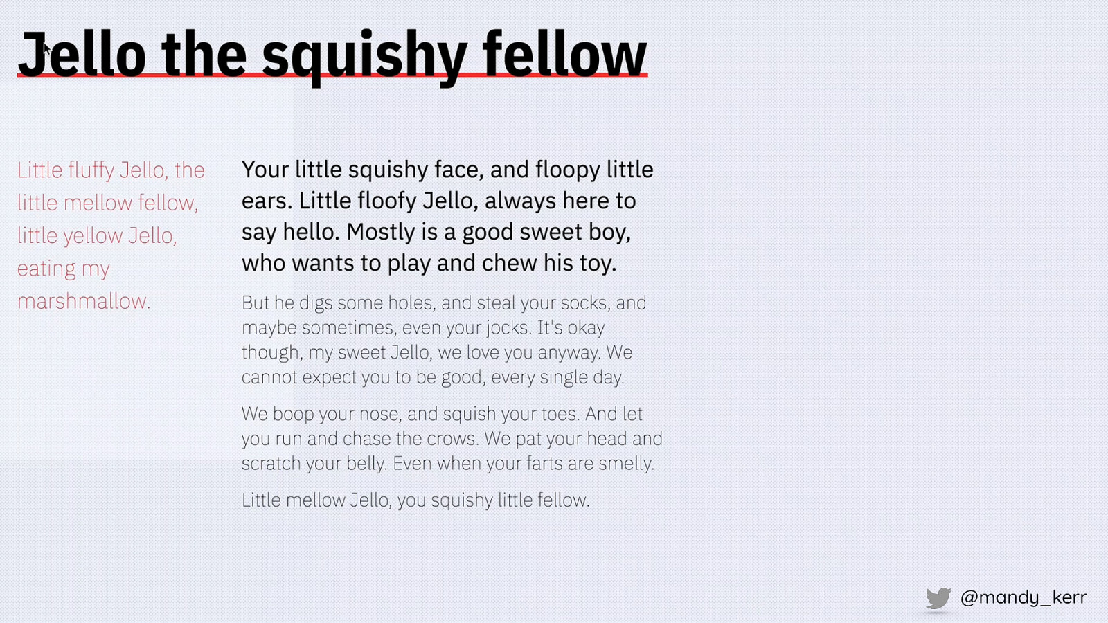
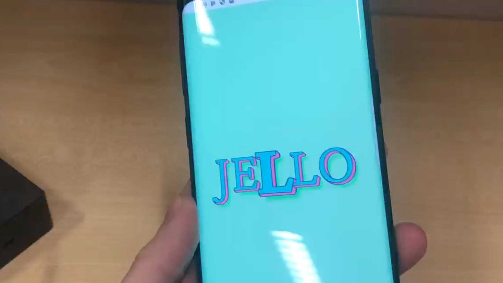
JELLO adognamedjello @mandy_kerr More importantly this is my dog, his name is jello You will find out what this is important later…

Some background on how I came to use variable fonts - a couple of years ago I started creating text effects using HTML and CSS and during my experiments it became clear to me very quickly that Variable fonts present us with some very unique opportunities that standard fonts simple cannot provide.
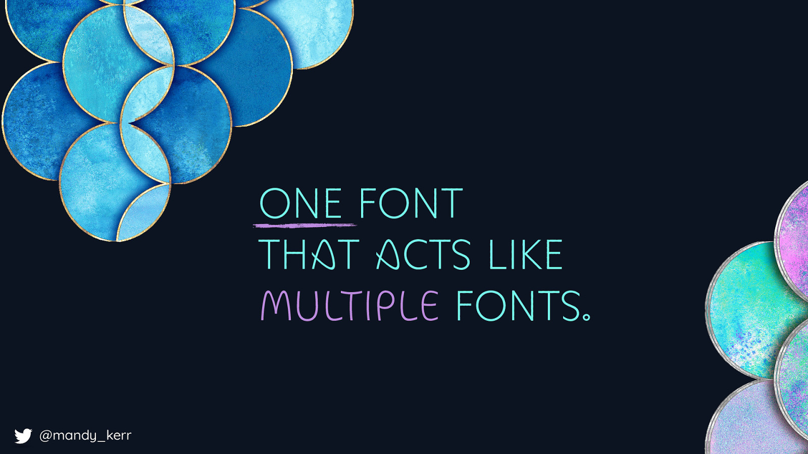
ONE FONT THAT ACTS LIKE MULTIPLE FONTS. @mandy_kerr this is because variable fonts, are one font file that acts like multiple fonts.
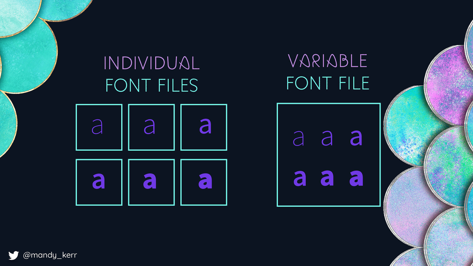
INDIVIDUAL FONT FILES a a a a a a VARIABLE FONT FILE a a a a a a @mandy_kerr What I mean by this is with a standard fonts - you might have several different font weights as separate individual files. With variable fonts all this information can exist in the one file
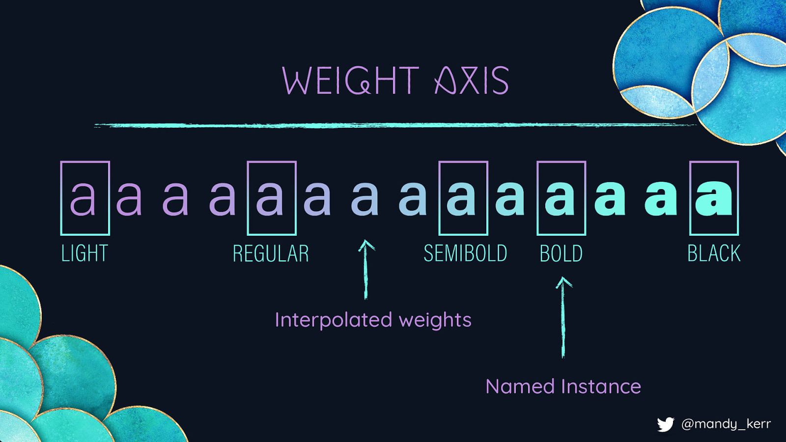
WEIGHT AXIS Interpolated weights Named Instance @mandy_kerr The way this is achieved comes down to how the fonts are created. Variable fonts contain one or more axes that provide different variations between different extremes. As an example, a light font weight to a black font weight. We can still have styles like Regular and Semibold, which are known as named instances - but we also gain the ability to interpolate the values. So along with the standard values, you can also have all the values in between, including decimal places!
@mandy_kerr Because the axis is interpolated, this means with can animate between the values creating smooth transitions between the variations, But we are not limited to just a single axis, a variable font can contain thousands of axes, and the interpolation does not just apply to the single axis but the combinations of those axes as well so whether its weight or width, OR something a little bit weird.

DECOVAR DECOVAR DECOVAR DECOVAR DECOVAR DECOVAR DECOVAR DECOVAR @mandy_kerr Like Decovar, by David Berlow - probably my favourite variable font to experiment with because it has a lot of different creative axes. Later i’ll show you some fun examples with Decovar, but before we do that, lets get the less fun stuff out of the way…like
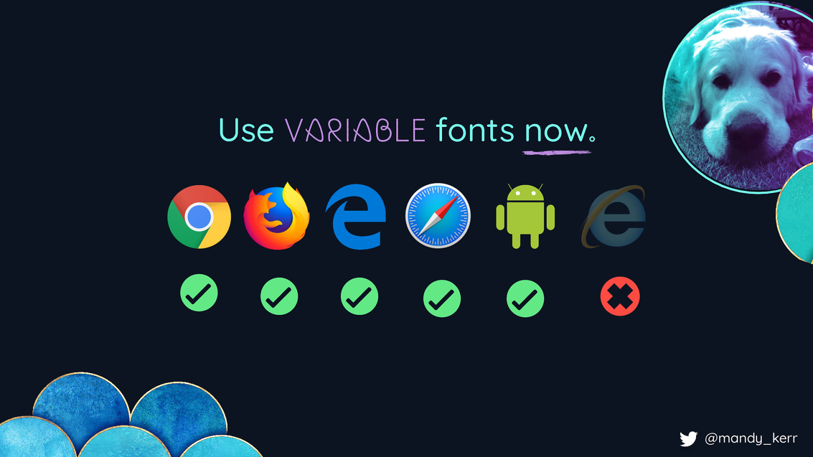
Use VARIABLE fonts now. @mandy_kerr Browser support! Which, is actually really good - we can use variable fonts now. For a browser like firefox you need High Sierra or above on a mac as it relies on the operating system to render. Chrome on the other hand has it’s own renderer so it doesn’t have that limitation. If you do have to support older browsers you can use something like CSS Feature Detection to fall back to standard fonts.
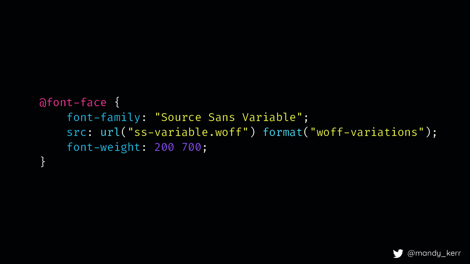
@font-face { font-family: “Source Sans Variable”; src: url(“ss-variable.woff”) format(“woff-variations”); font-weight: 200 700; } @mandy_kerr We still use font face to set up the fonts, and it’s pretty much the same
@font-face { font-family: “Source Sans Variable”; src: url(“ss-variable.woff”) format(“woff-variations”); font-weight: 200 700; } @mandy_kerr The main change is to how we define the variations for descriptors like font-weight, font-stretch and font-style. With a standard font, lets say we have to font weights, we’d currently set up a font face block for the light version, then we would do another one for the bold version and wed keep ding this until we had all the different styles w needed. But with a variable font we can just specify a range, so in this case 200 to 700
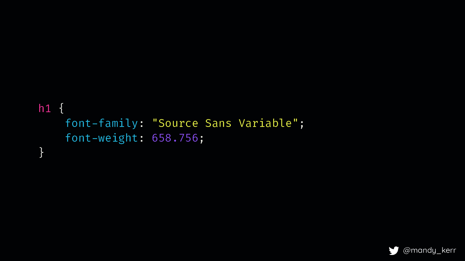
h1 { font-family: “Source Sans Variable”; font-weight: 658.756; } @mandy_kerr When we reference the font in our css, you can pick any number between 200 and 700. So for example 658. This is great for weight, because we already have a CSS property that we can use. This is known as a registered axis. There five registered axes at the moment, weight, width, slant, italic, and optical size and they are all mapped to pre-existing css properties. If we want to use something custom like the styles in Decovar, we need a new CSS property. (font-weight, font-stretch, font-style (italic and slant/oblique), font-optical-size)
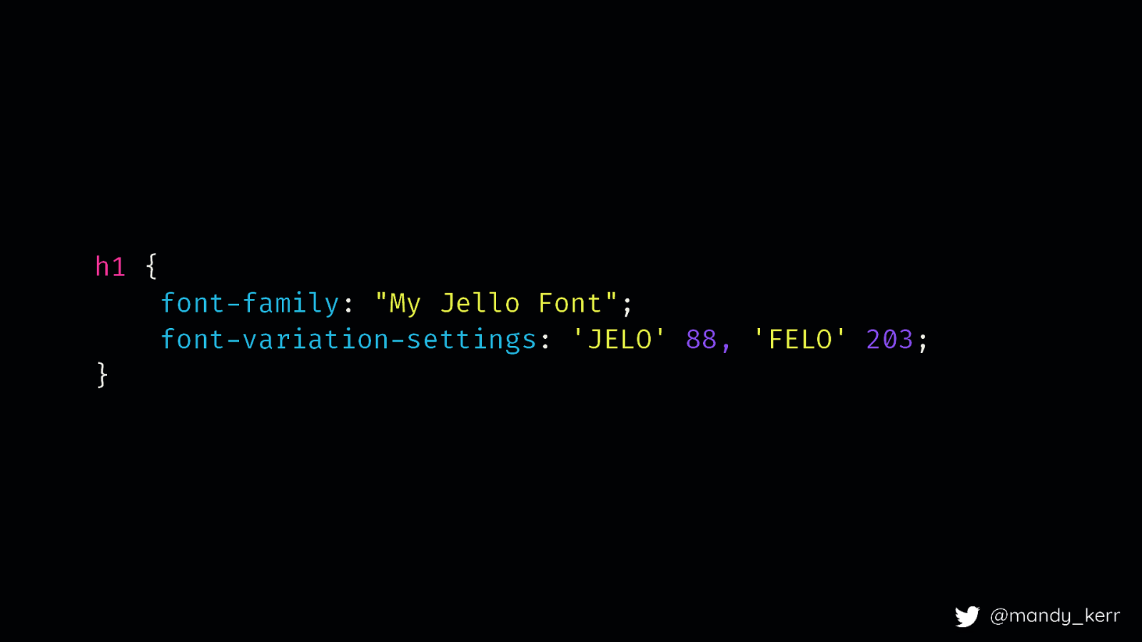
h1 { font-family: “My Jello Font”; font-variation-settings: ‘JELO’ 88, ‘FELO’ 203; }
@mandy_kerr
This property is called font-variation-settings and it enables us to define as many registered and custom axis as we need. The way we reference them is with a 4 character string (defined by the font creator, in this case me) eg, (JELO) and an associated number value. You can use registered axis in the font-variation-settings property, the codes are determined in the spec, weight is “wght” for example, typically we’d recommend you dont, its easier for you or your team to manage typography and you don’t have to change what you are doing.
Variable fonts and PERFORMANCE on the web. @mandy_kerr At this point I want to briefly talk about font performance @mandy_kerr
A good font PERFORMANCE strategy is still important for variable fonts. @mandy_kerr Variable fonts are still fonts, so you still need a good font performance strategy, things like subsetting, font-display, good compression formats, etc. But there are couple of things i wanted to mention - firstly, reducing font requests.
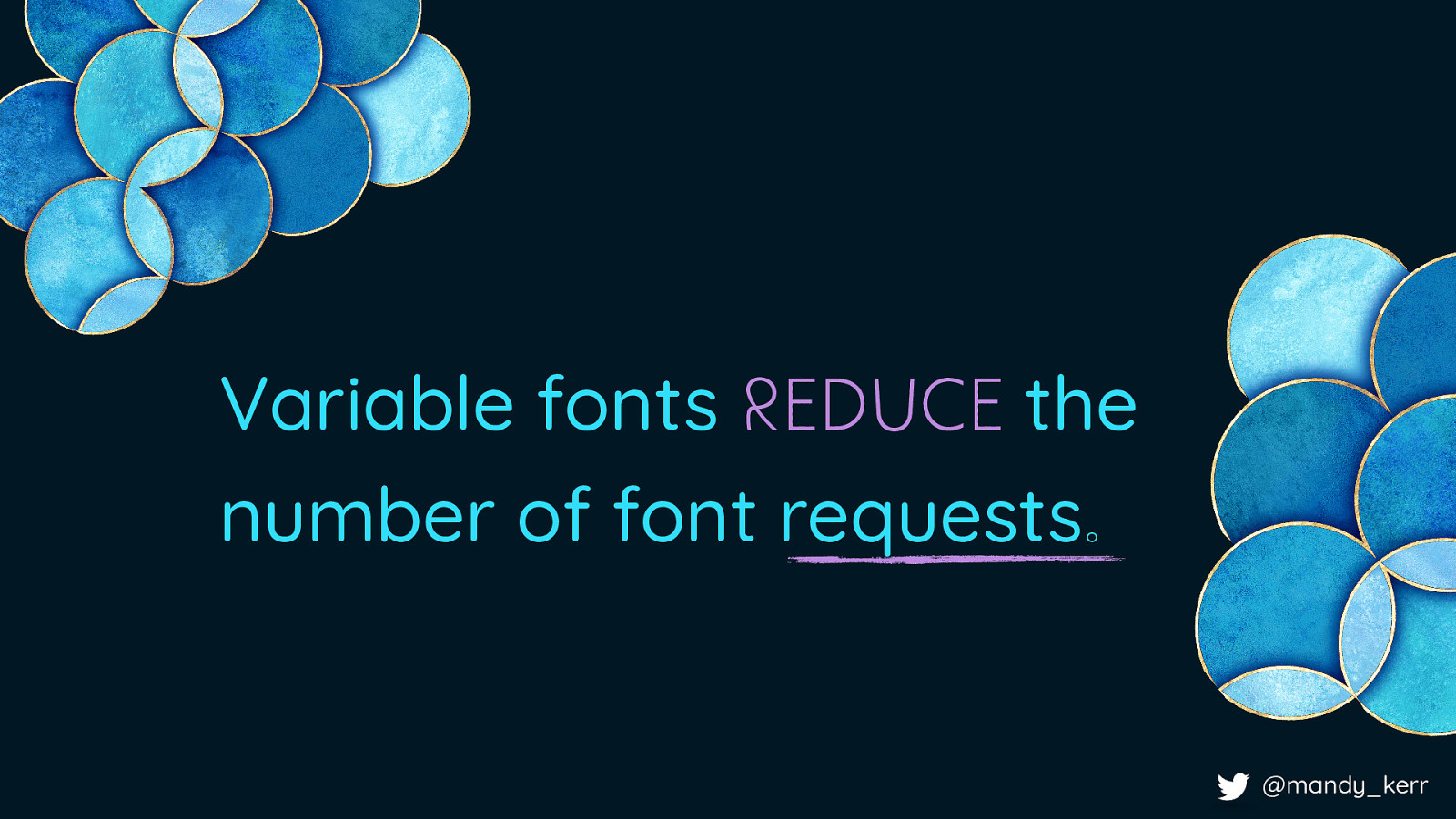
Variable fonts REDUCE the number of font requests. @mandy_kerr At the moment when we think about reducing the number of font requests, we’d weigh up the cost of design over the cost of performance, and we’d have to justify the cost before we added any new styles. But because all the data about different weights for example, exist in one file, we have reduced the number of fonts immediately by just using a variable font. The added benefit to this, is that we gain all those extra interpolated values and therefore more design opportunity as well. However, if all the data is in one file, chances are, its probably going to be huge right
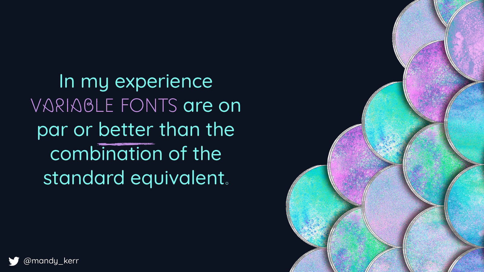
In my experience VARIABLE FONTS are on par or better than the combination of the standard equivalent. @mandy_kerr … my answer to this is not necessarily In my experience variable fonts are either on par or better than the combination of all the standard fonts on your site For example:
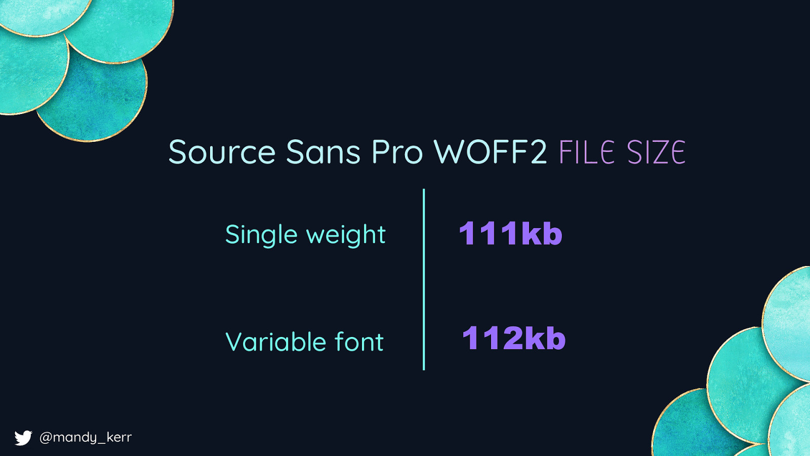
Source Sans Pro WOFF2 FILE SIZE Single weight 111kb Variable font 112kb @mandy_kerr Source sans pro - in woff2, a single weight is 111kb and the variable font is 112kb, so for a variable font, you get the single weight, plus all the other weights, PLUS all the interpolated values, for 1 kb extra. Source sans is a big font, lots of character support, so i’d personally subset this, but even if you had just two versions of source sans the variable font is still better in overall file size. You can get performance benefits by using a variable font, but it is going to vary between fonts and it will depend on how many styles you have on your site
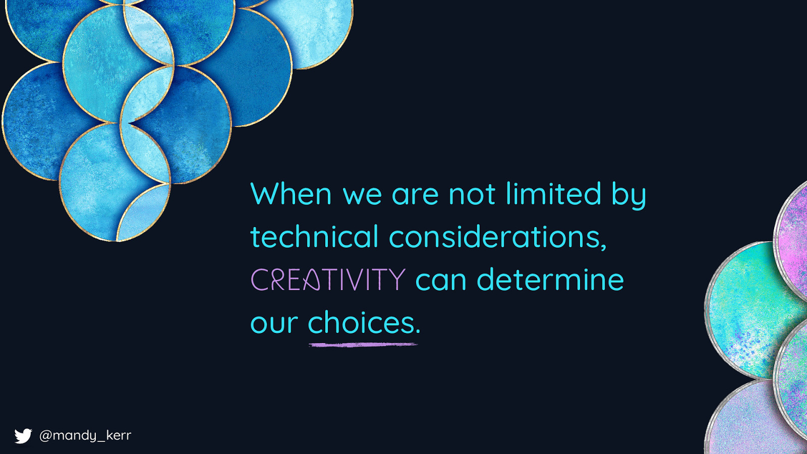
When we are not limited by technical considerations, CREATIVITY can determine our choices. @mandy_kerr 9.30 However, lets say you improve the performance, or keep it the same but have more flexible choices with a variable font. This means we can shift out focus. We can start to experiment with creating better experience for our users, Creativity can determine the choices we make and We don’t need to trade off design for performance.
@mandy_kerr So for example, this uses 13 different font weights, many of which don’t exist in the standard font — We gain much more flexibility in our design opportunities Designs which would previously have been a heavy burden on performance are now completely possible.
@mandy_kerr This means the tone the intent, the rhtymn and the meaning of our words can be changed and represented more effectively with less worry over the impacts of loading in “too many font weights”
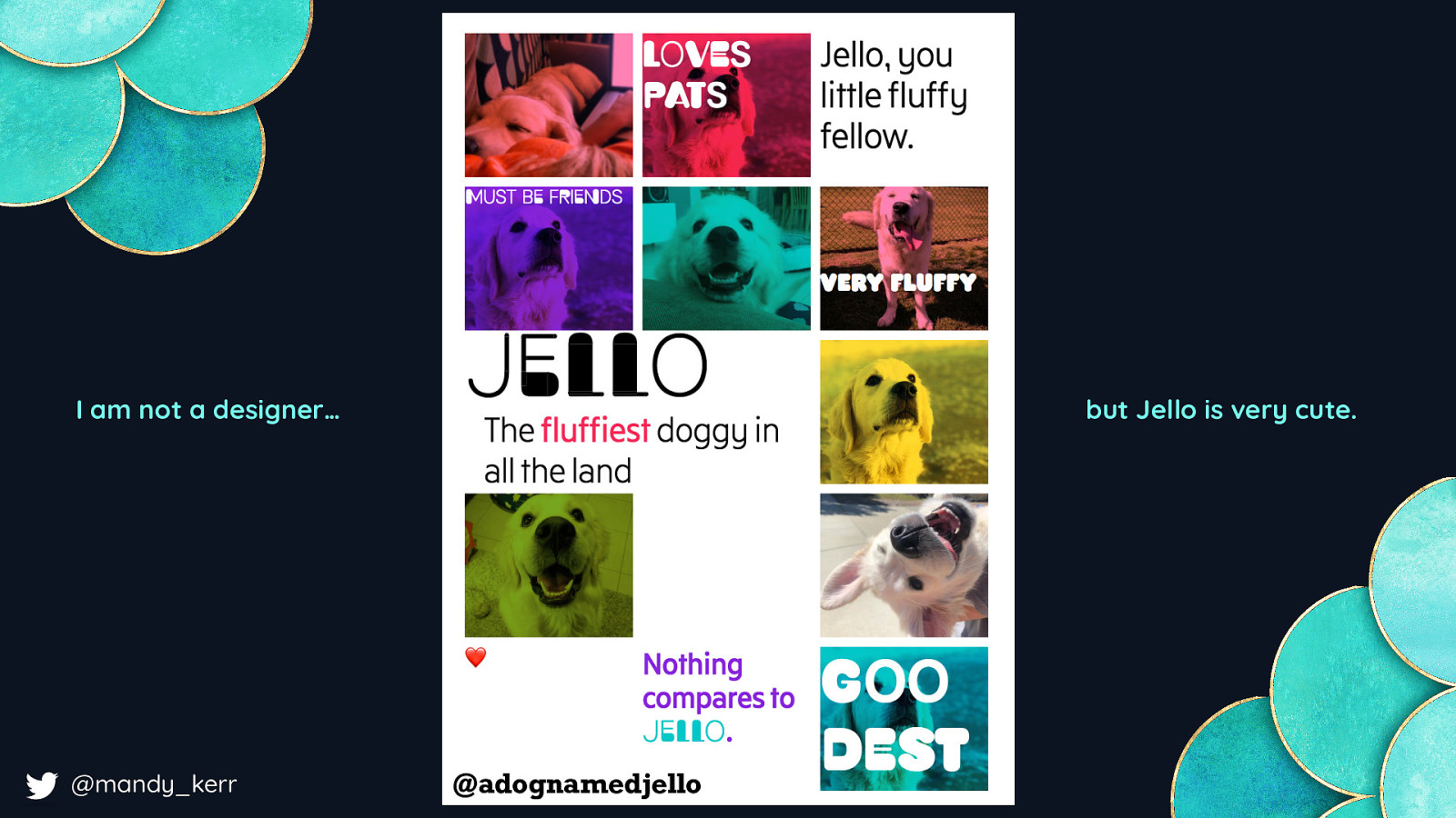
I am not a designer… @mandy_kerr but Jello is very cute. @adognamedjello and we can embrace the learnings and the growth of print design we can combine variable fonts with things like CSS grid, blend modes, shapes, to represent our content in much more interesting and engaging ways
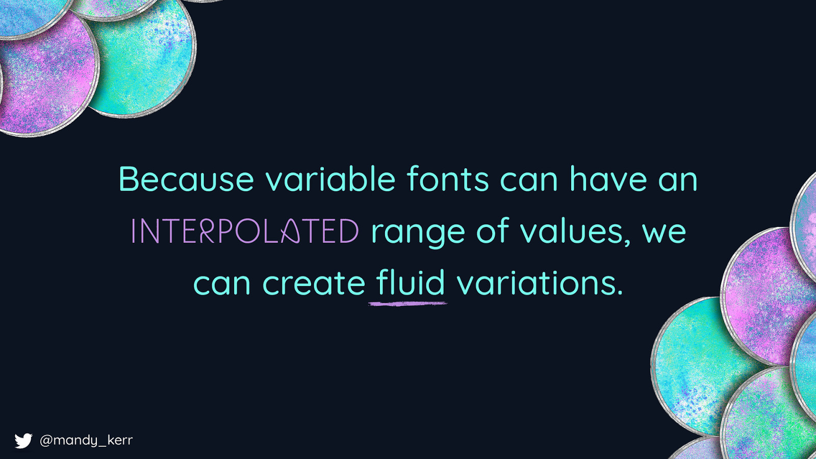
Because variable fonts can have an INTERPOLATED range of values, we can create fluid variations. @mandy_kerr But unlike print we can embrace the interactivity and the flexibility of the web because variable fonts can have that interpolated range of values we can create animations or transitions with our text using techniques we are already familiar with.

Font: Decovar by David Berlow like this. This is editable, selectable, searchable, its accessible via a screen reader, you can copy and paste it… and it it’s only html and css. @mandy_kerr
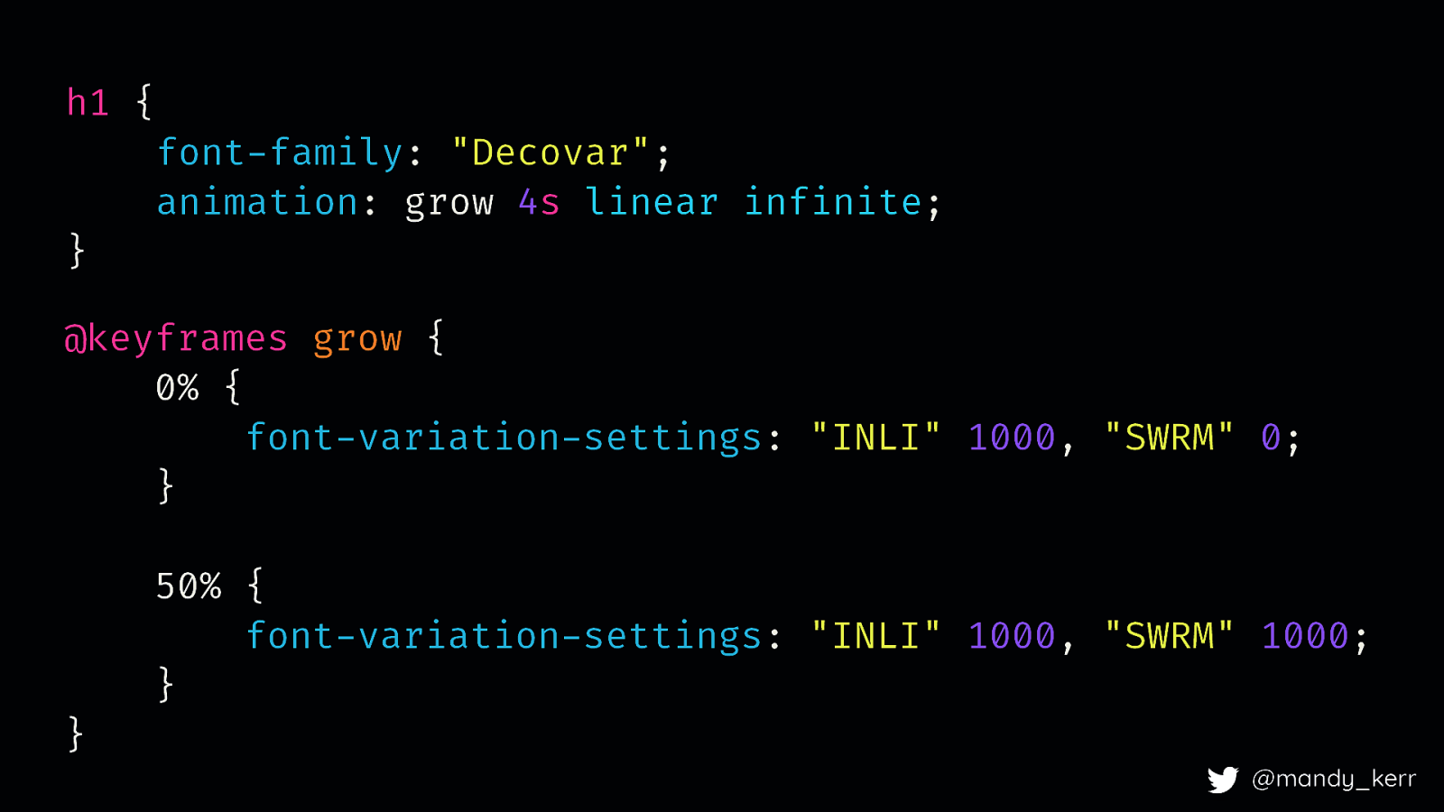
h1 { } font-family: “Decovar”; animation: grow 4s linear infinite; @keyframes grow { 0% { font-variation-settings: “INLI” 1000, “SWRM” 0; } } 50% { font-variation-settings: “INLI” 1000, “SWRM” 1000; } @mandy_kerr
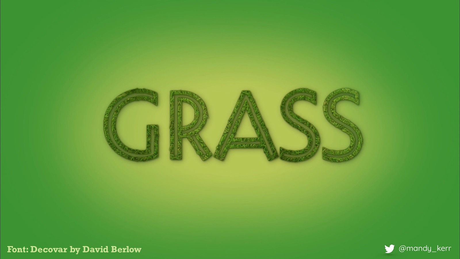
Font: Decovar by David Berlow @mandy_kerr After adding a little bit of extra CSS for texture we are left with the final effect. For the most part the heavy lifting is done by the font, most of the work is done for you and all you really need to do, is add a few lines of css for the animation. Which is pretty amazing. CODE: https://codepen.io/mandymichael/pen/YYaWop

Font: Duos Writer by Underware Because there are all sort of things we can do with variable fonts and a few lines of css Video: https://www.youtube.com/watch?v=CmYIUr0Cevw @mandy_kerr

@mandy_kerr DEMO https://codepen.io/mandymichael/pen/abbxMGb
VIDEO: https://www.youtube.com/watch?v=8NzWVnlzGlI DEMO: https://codepen.io/mandymichael/pen/dJjobp @mandy_kerr

Font: Wind VF by Hansje van Halem @mandy_kerr
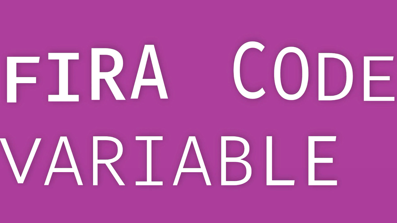
DEMO: https://codepen.io/mandymichael/pen/OJLrgdv Fira Code Animation Demo with Google Fonts V2 API

Font: Decovar by David Berlow @mandy_kerr Code: https://codepen.io/mandymichael/details/dJZQaz what i think is great about this, is that beautiful text shadow with css..i love how it disappears as the text disappears! It’s just beautiful

@mandy_kerr DEMO: https://codepen.io/mandymichael/pen/xxKJbyo Speech Recognition Voice Activation with Marshmallow the dragon - breathes text in fire What is fun for me about this is that traditionally when we create fun interactions like this, it would be restricted to svg or canvas but i think its really exciting that we can do this with real text! I LOVE the idea that our text content can really start to form and blend and become part of the rest of the design, and be less static.
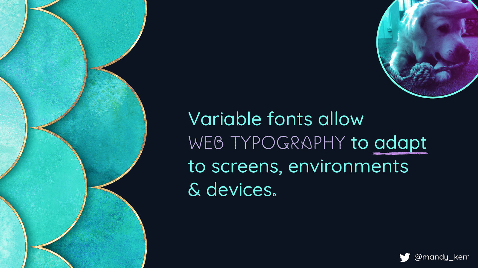
Variable fonts allow WEB TYPOGRAPHY to adapt to screens, environments & devices. @mandy_kerr It’s not just that these are beautiful or cool effects, what they demonstrate is that as developers and designers we can now control the font itself And that that means is that Variable fonts allow Typography on the web to adapt to the flexible nature of our screens, environments and devices.
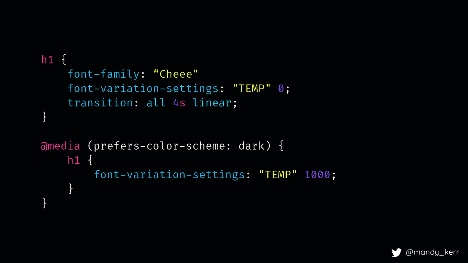
CSS Media Queries will provide access to USER PREFERENCES and environments directly in our CSS. @mandy_kerr There is currently work being done with CSS media queries, level 5 which will aim to give us more control over our designs based on environments, light contrast and colour schemes. dark mode is one of these options
h1 { } font-family: “Cheee” font-variation-settings: “TEMP” 0; transition: all 4s linear; @media (prefers-color-scheme: dark) { h1 { font-variation-settings: “TEMP” 1000; } } @mandy_kerr for dark mode we can use the prefers-color-scheme media query to check for dark mode and change our styles
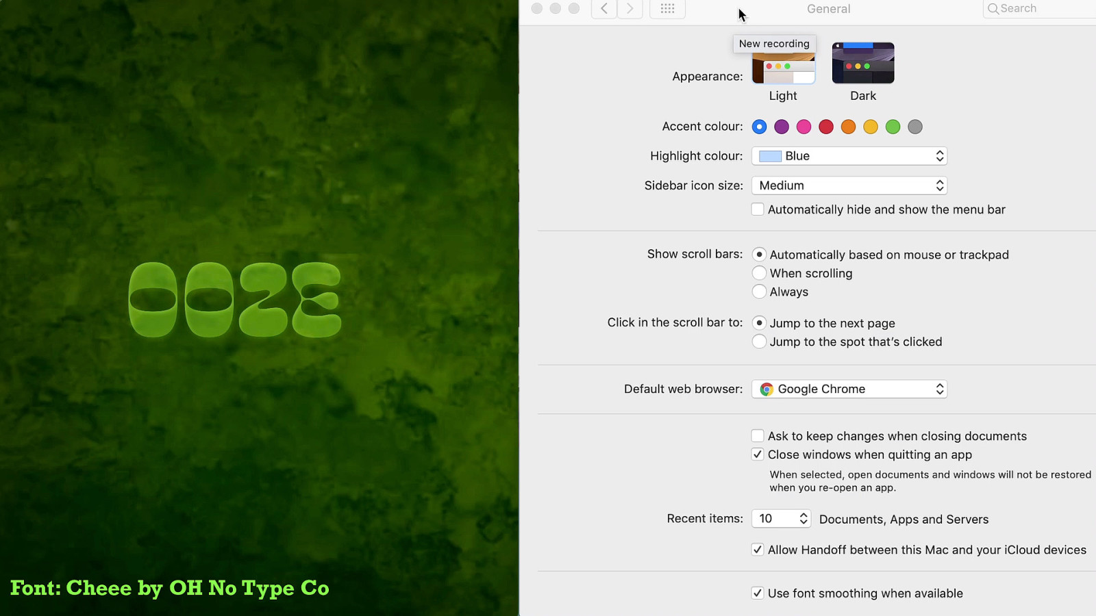
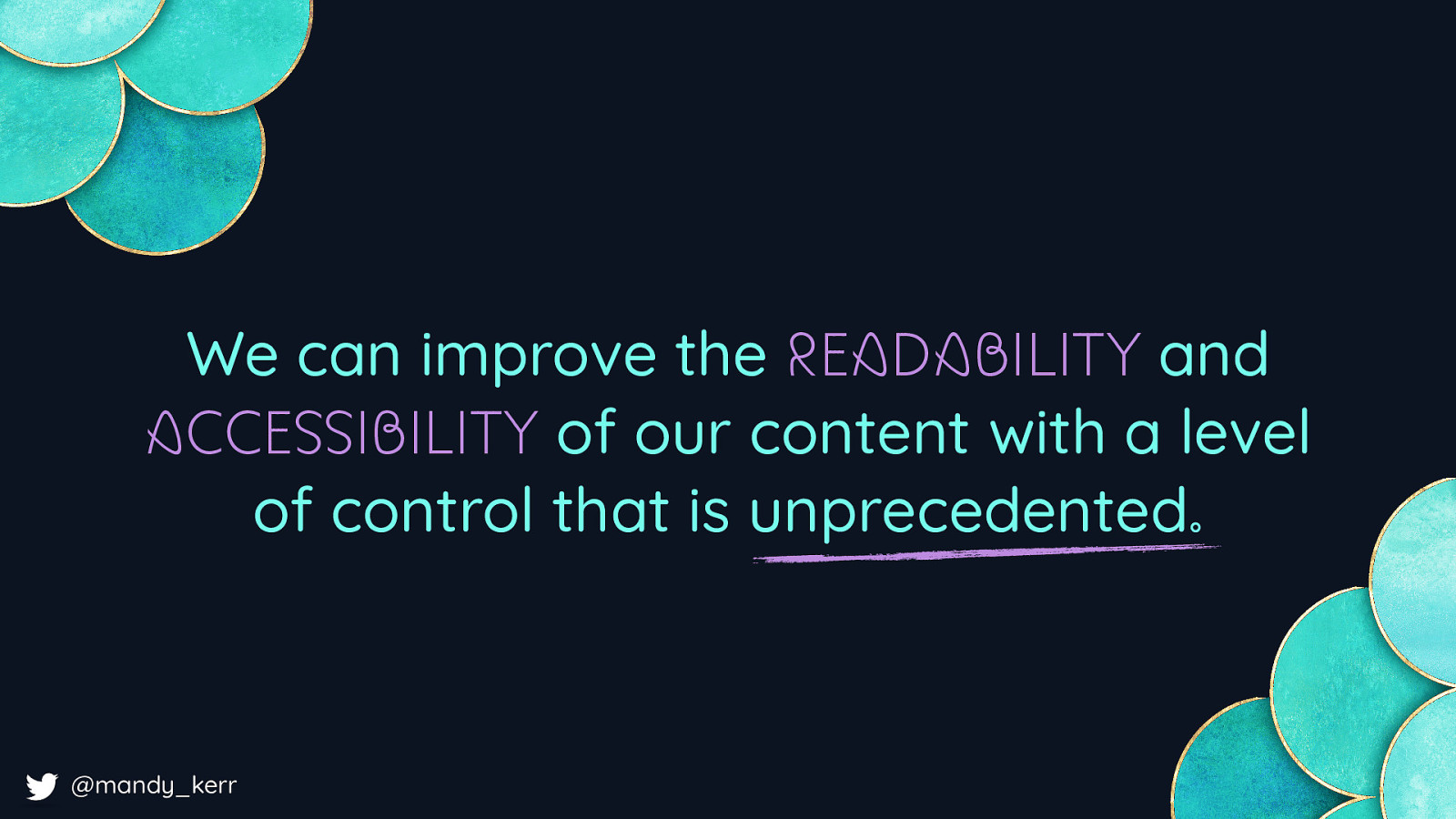
Font: Cheee by OH No Type Co @mandy_kerr VIDEO: https://www.youtube.com/watch?v=UlEnUnwOZGY We can display different effects like this, or more practically, modify the contrast, and styles to ensure better legibility When we think about things like colour contrast and stuff like that, we often just think about colour, but fonts play a big role in how legible text can be. So variable fonts allow us to modify the weight or optical size or potentially other axis to suit different colours schemes and modes. But more interestingly, when we have variable fonts, it also means our users, if they want to create their own custom stylesheets for accessibility reasons, they now have access to the variable font axis, meaning they can customise the experience to suit their needs more precisely. I don’t know about you but I feel like that is a really exciting possibility! And As CSS develops, we’ll have more access to different environmental and system features that allow us to take advantage of our users unique circumstances.
@mandy_kerr It also means we can design our typography to adjust to things like screen width - which might allow us to tweak the font weight, width, optical size or other axes to be more readable on smaller or larger screens. Where the viewport is wide we can have more detail DEMO:

@mandy_kerr When it’s smaller in a more confined space we might look at reducing the width of the font - i can’t really think of a good reason to do this, fitting stuff in a box maybe? Im sure there are heaps of great use cases! DEMO: https://codepen.io/mandymichael/pen/vYYLByj VIDEO: https://www.youtube.com/watch?v=jysrlwwmI9Q
@mandy_kerr VIDEO: https://www.youtube.com/watch?v=9Ml1QG5uwZM Another example, is when you have these beautiful designs, and it fits on specific breakpoints and then you build it and it doesn’t work. In this example as the viewport gets smaller rather than having the headline wrap, I’m reducing the width of the font, this means i can maintain the integrity of the design. This allows us to have more control over our designs and how the are represented across difference devices. I achieved this with a bit of JS, which I’m going to show you, because once you have the JS you can apply it in a whole heap of ways.
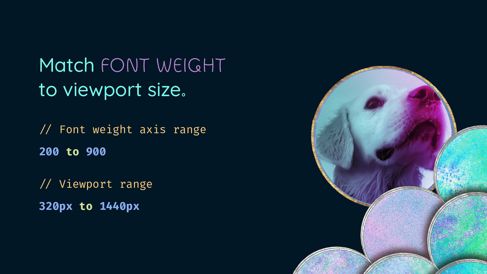
Match FONT WEIGHT to viewport size. “// Font weight axis range 200 to 900 “// Viewport range 320px to 1440px @mandy_kerr What we are going to do is match our font weight to our viewport size - as the viewport gets smaller the font weight gets heavier I need a few things - the start and end points for both the font and the event - so for the font a weight range of 200 to 900 - and for the viewport we’ll go with 320-140px
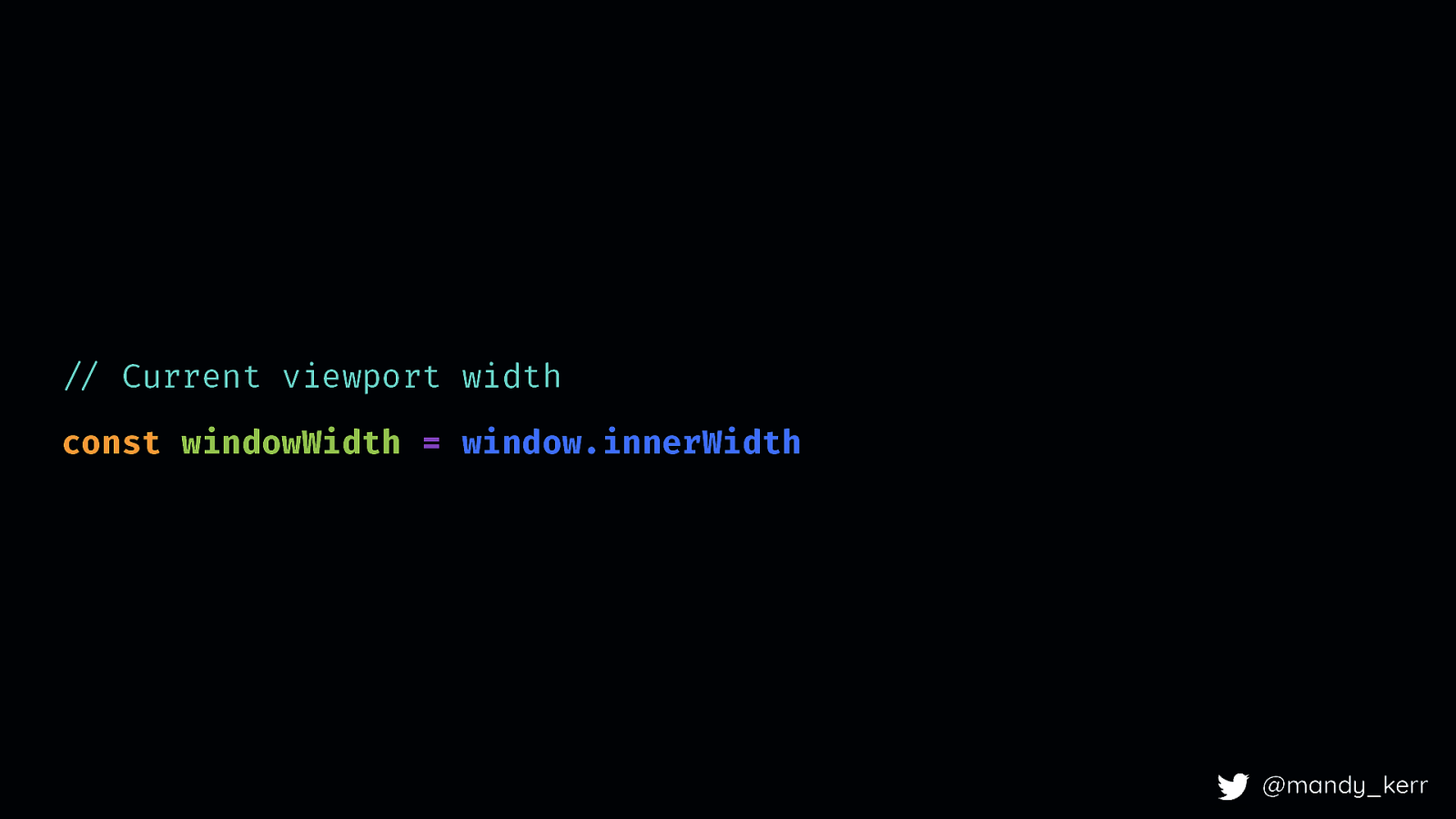
”// Current viewport width const windowWidth = window.innerWidth @mandy_kerr First we get the current viewport size with something like window.innerWidth
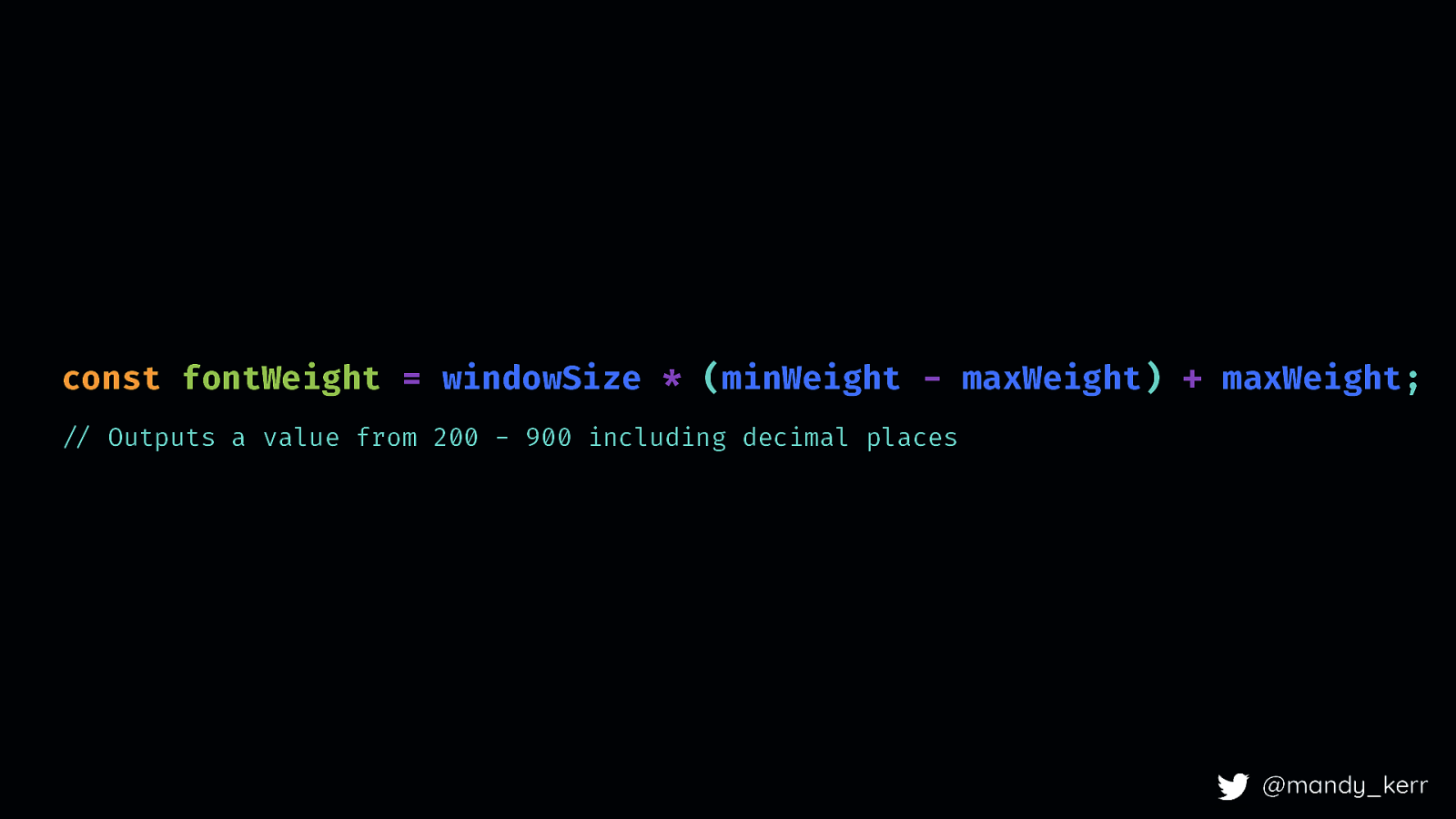
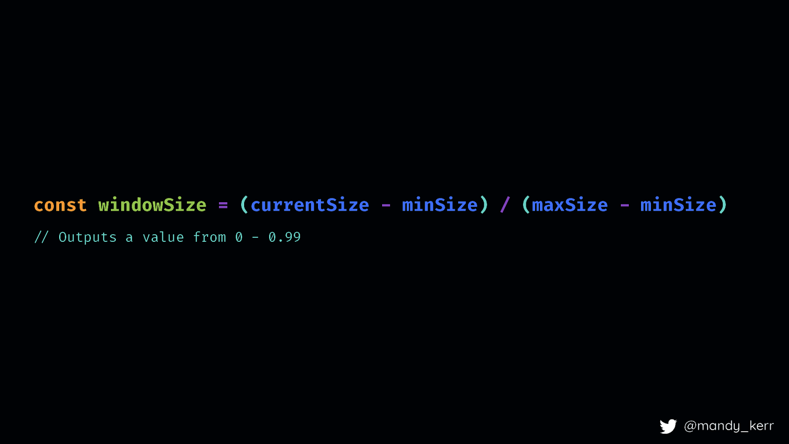
const windowSize = (currentSize - minSize) / (maxSize - minSize) “// Outputs a value from 0 - 0.99 @mandy_kerr Then we create the new scale for the viewport We do this by taking the current viewport size - minWindowSize and divide that by the maxWindowSize - minWindowSize) This will output a value from 0 - 0.99 which we can use in our calculations
const fontWeight = windowSize * (minWeight - maxWeight) + maxWeight; “// Outputs a value from 200 - 900 including decimal places @mandy_kerr We can then take that new viewport decimal values and use that to determine the font weight based on viewportscale
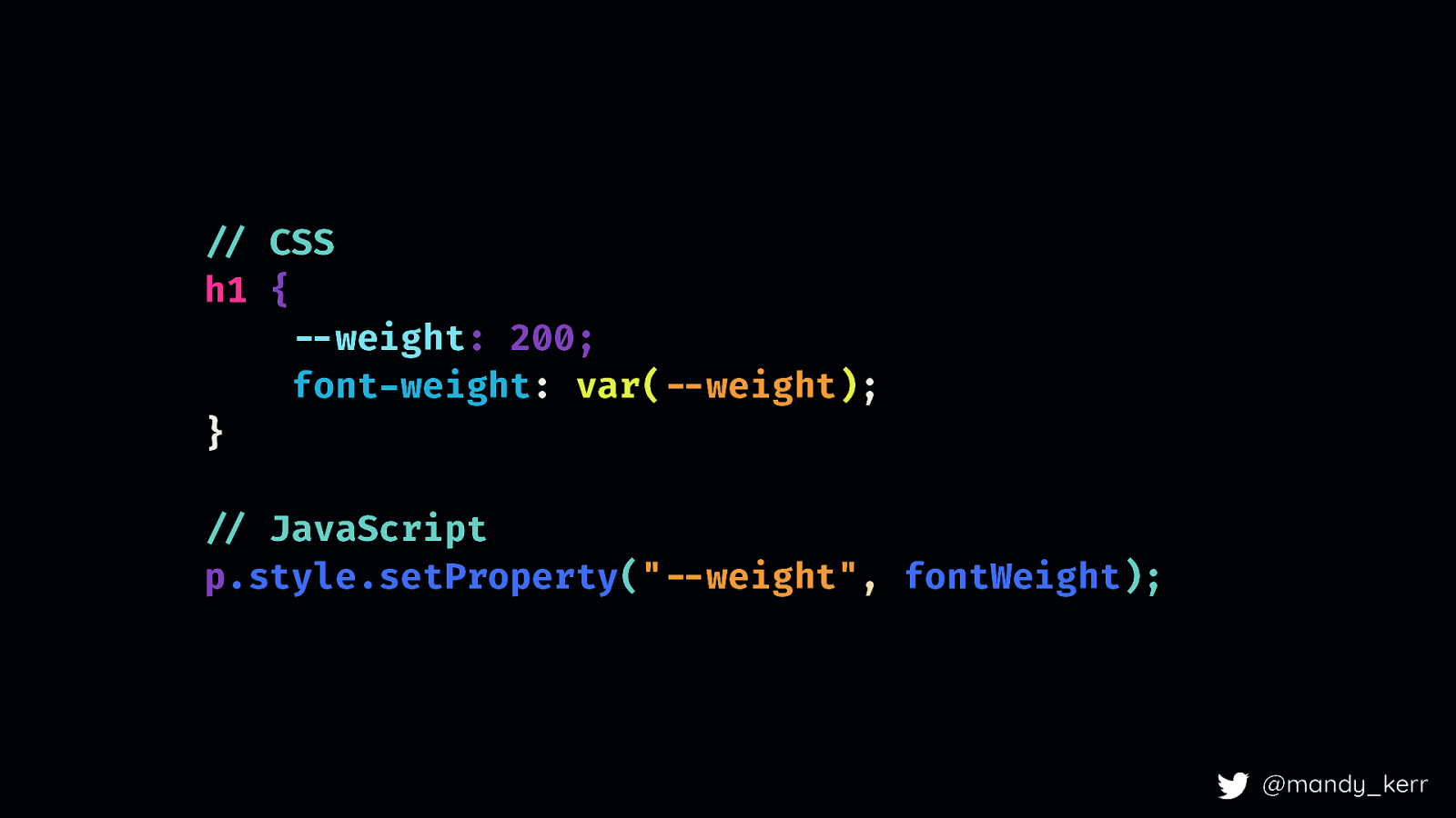
!// CSS h1 { !—weight: 200; font-weight: var(!—weight); } !// JavaScript p.style.setProperty(“!—weight”, fontWeight); @mandy_kerr You can update the CSS however you normally would, lately i’ve been using CSS Custom Properties,
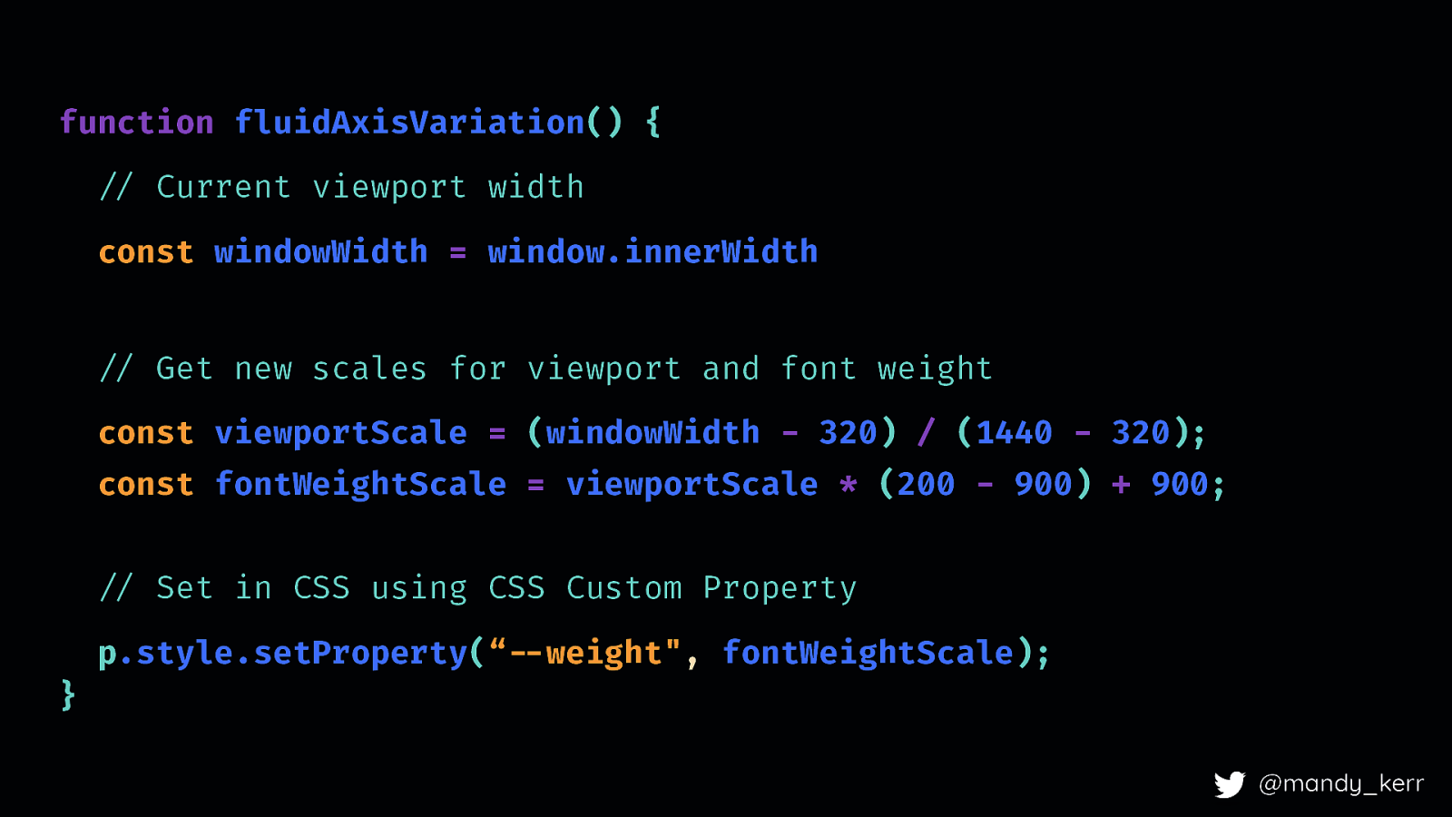
function fluidAxisVariation() { “// Current viewport width const windowWidth = window.innerWidth “// Get new scales for viewport and font weight const viewportScale = (windowWidth - 320) / (1440 - 320); const fontWeightScale = viewportScale * (200 - 900) + 900; “// Set in CSS using CSS Custom Property p.style.setProperty(“!—weight”, fontWeightScale); } @mandy_kerr Putting it all together into a function it looks a bit like this…
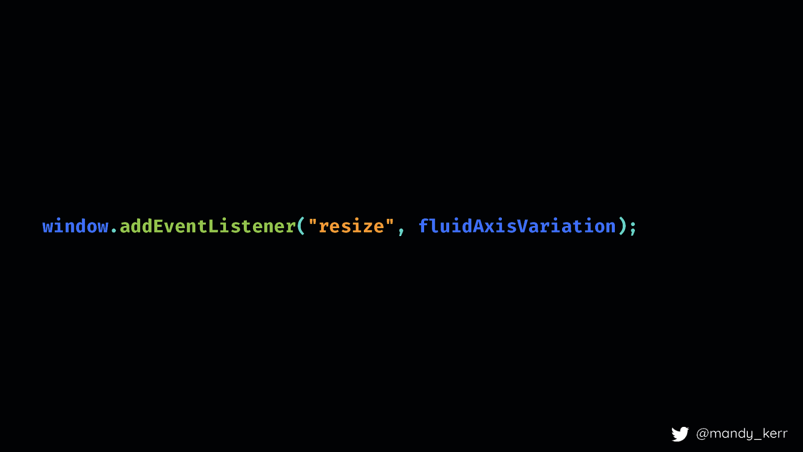
window.addEventListener(“resize”, fluidAxisVariation); @mandy_kerr The last step is adding an event listener to check for resize and update the value accordingly. So, in it’s simplest form, this will create the effect. You probably want to add some things in for better performance but the point here is that you can achieve the effect with just a few lines of JS and CSS.

@mandy_kerr 22.30 this will give us the effect we are after. Once you have this function, you can pass any event/axis range
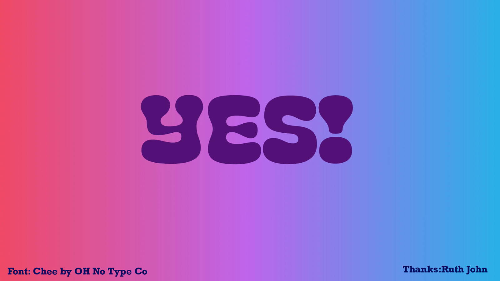
Font: Chee by OH No Type Co @mandy_kerr Meaning we can make the most of different javascript events like resize, scroll, mouse move and various other apis, VIDEO: https://www.youtube.com/watch?v=7daahuvsQz4
@mandy_kerr or even utilising the sensor api and detecting changes in device “position”.
@mandy_kerr DEMO: https://codepen.io/mandymichael/pen/JjPwMNW
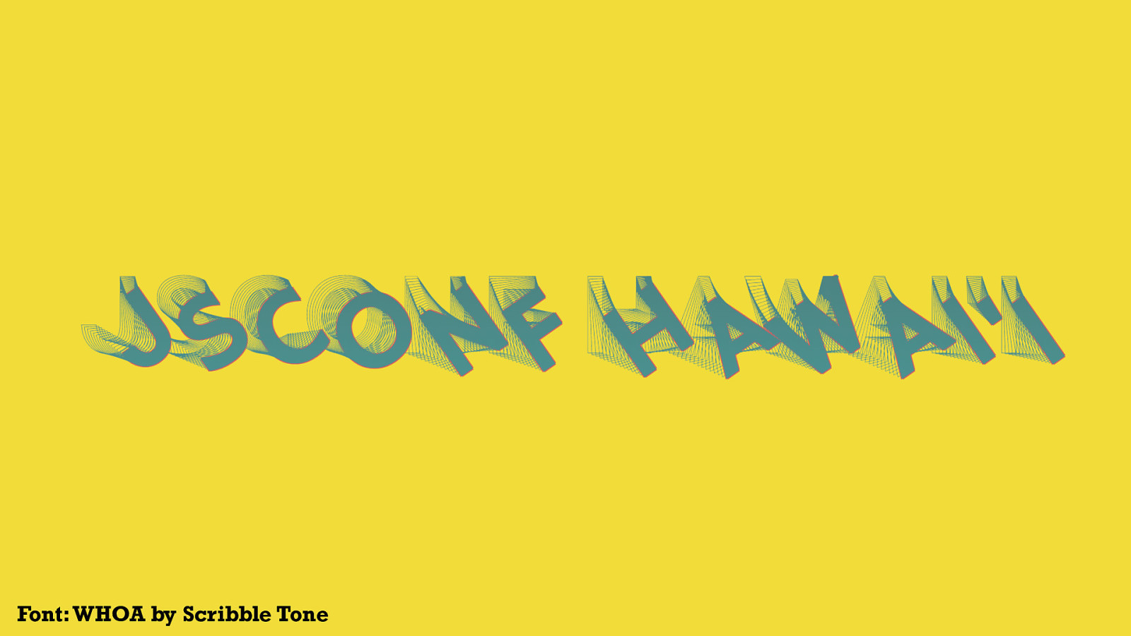
Font: WHOA by Scribble Tone DEMO: https://codepen.io/mandymichael/pen/rgwdvL Like, the slinky example from the title slides, which is controlled by the mouse position - When you move left to right it changes the rotation and when you move the mouse top to bottom it changes the vertical axis.

Font: Chee by OH No Type Co Thanks:Ruth @mandy_kerr @mandy_kerr John DEMO: https://codepen.io/mandymichael/pen/OYpqdP Or have the font respond to audio input, or the sound of your voice. With the growing use of devices like google home or alexa, voice recognition is becoming more prevalent - something like this could be incredible useful in conversational ui in visually representing the tone or intent of a persons input. Special thanks to Ruth who gave me some much better code for this!
Font: Tiny by Jack Halten Fahnestock @mandy_kerr @mandy_kerr DEMO: https://codepen.io/mandymichael/details/Mdoxpg VIDEO: https://www.youtube.com/watch?v=ivz1hdAhJmE We can improve legibility of our text with new features allowing us to query the characteristics of the user’s display or light-level This demo currently only works behind a flag, the support isn’t great but the opportunity is there for us in the future.

Font: BloomGX by Typearture (Arthur Reinders Folmer) @mandy_kerr @mandy_kerr
@mandy_kerr DEMO: Smello the Grumpy Wizard who only casts magic spells when it’s dark AND if you say the magic word.
Font by Typearture @typearture (Arthur Reinders Folmer) A Patting Jello Font! by Font by Typearture @typearture (Arthur Reinders Folmer) @mandy_kerr
It’s only because Variable fonts give us more control over each of these elements, we can fine-tune the font characteristics to maximise the legibility, readability and overall accessibility of our website text. And while these examples might seem trivial they are great demonstrations of the possibilities. This is a level of control over our fonts and text that is unprecedented.
There has never been a better time to CREATE for the web. @mandy_kerr There has never been a better time to be a developer or designer for the web and variable fonts open up doors that never existed before and they give us an opportunity to think more creatively for our users. And because technology, like CSS is always improving, we now have more opportunities than ever to combine, create and present content on the web in more creative, more meaningful and more purposeful ways - and do so in a way that is more performant and accessible. At the very least, we can improve the performance of our websites, but at it’s best, we can make more usable, more accessible, and more meaningful content - and THAT, is what gets me really excited about the future of web typography.