
A presentation at Fronteers in October 2019 in Amsterdam, Netherlands by Mandy Michael

Mandy Michael Twitter: @mandy_kerr Codepen: @mandymichael
I’m a Front End Developer and Development Manager for a News Organisation in Western Australia.
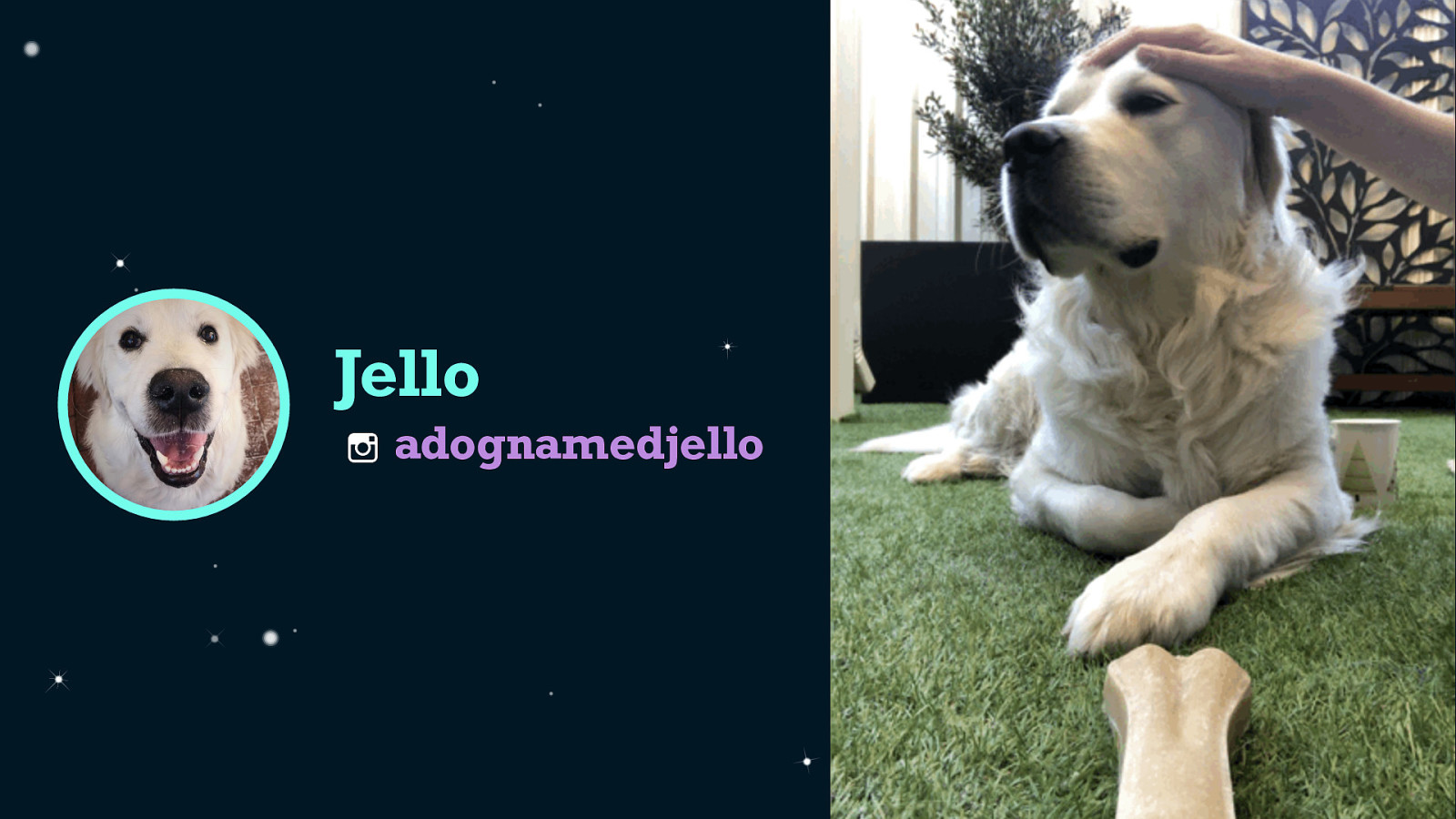
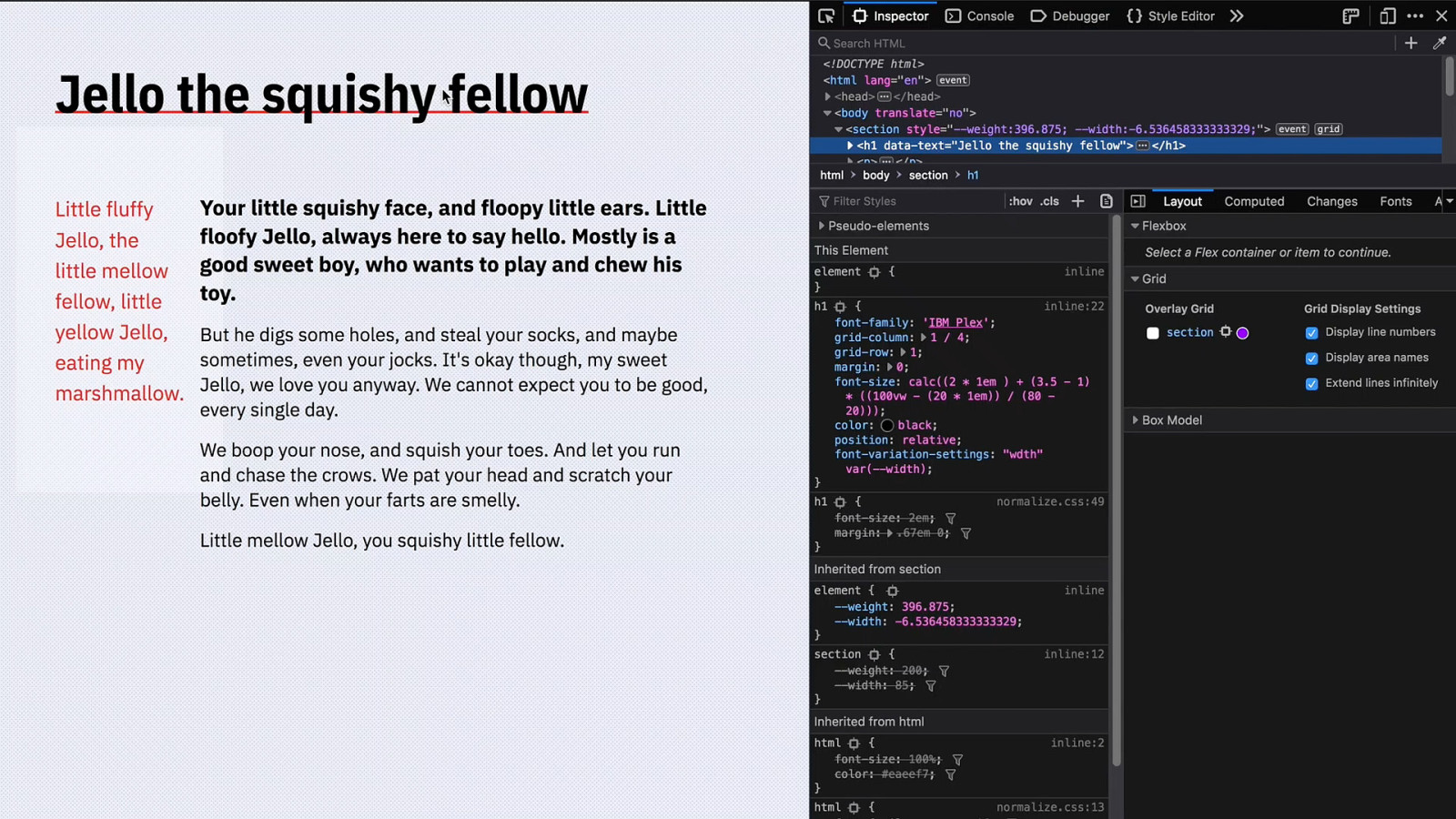
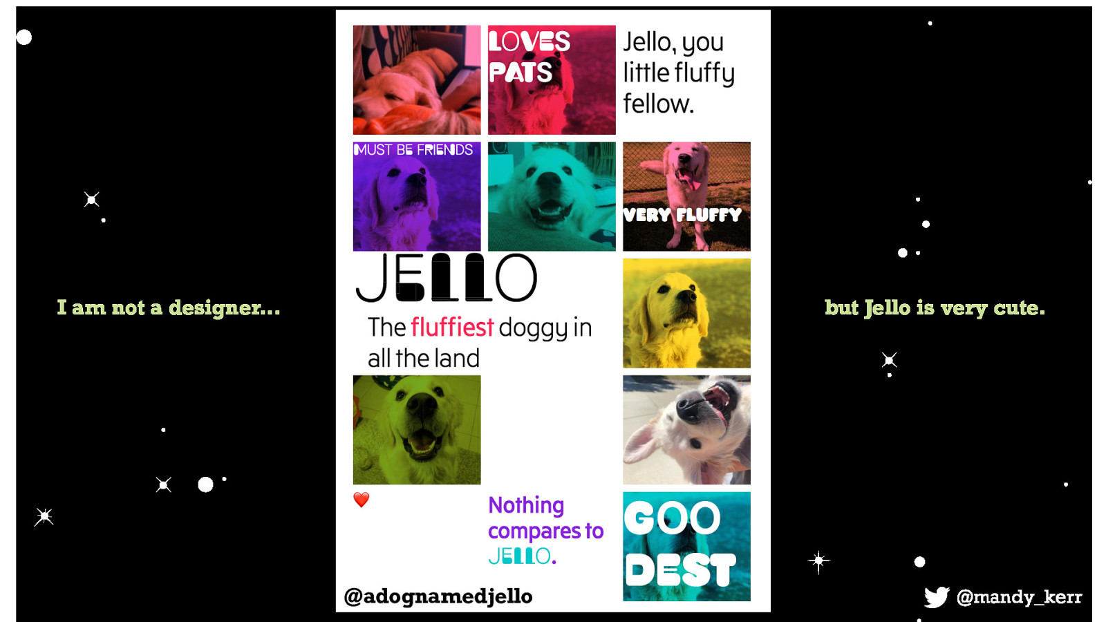
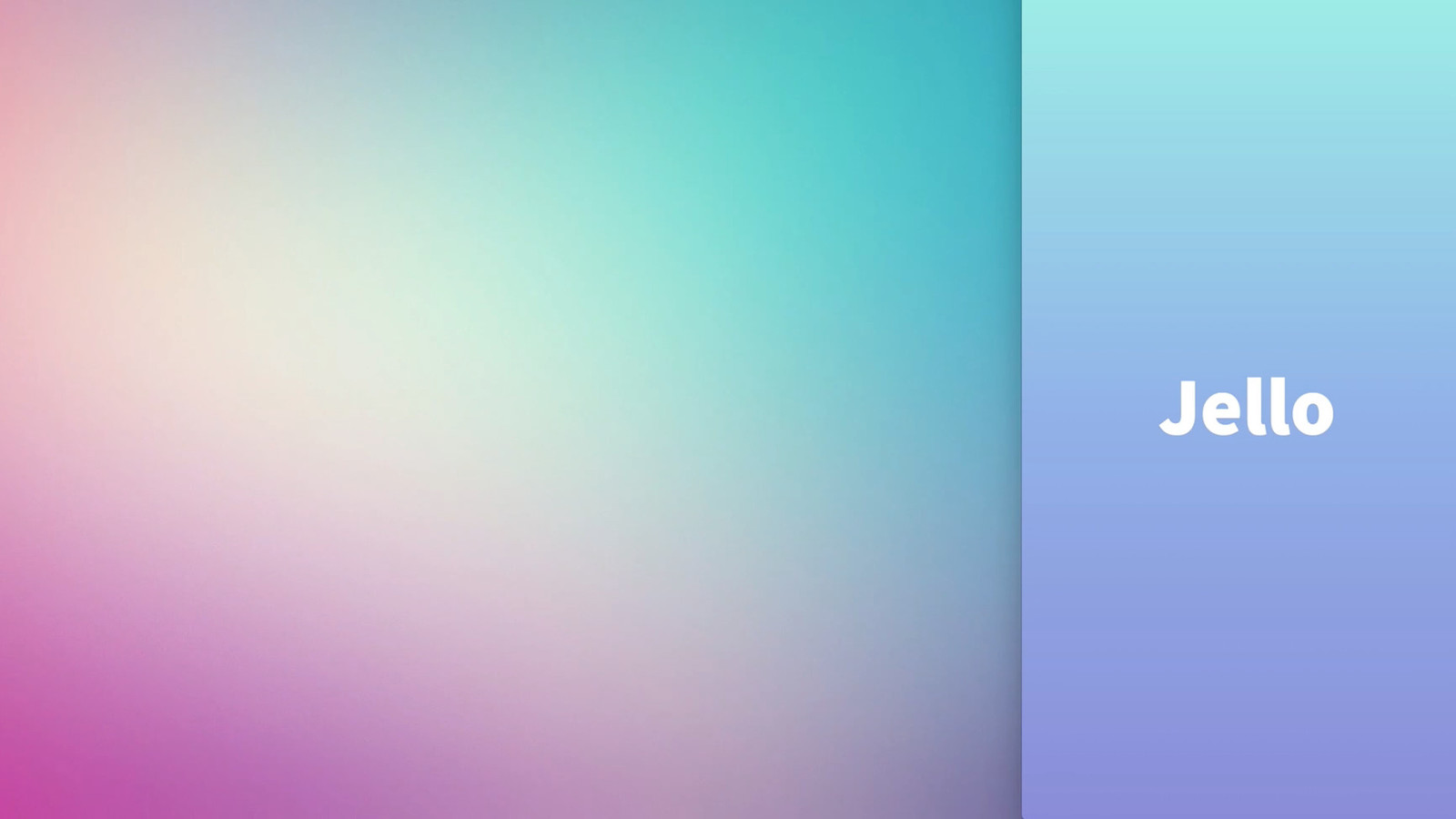
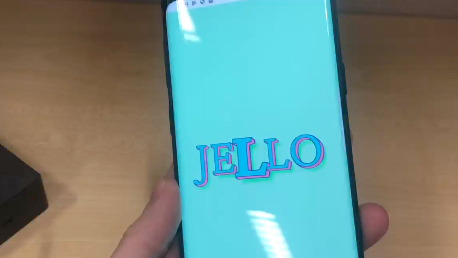
This is my dog Jello, you can find him on instagram as @adognamedjello
This is important because many of my demos use what I call “Jello Ipsum” because without the context of knowing i’m referring to a dog it can be a little confusing. So now you know i’m talking about a dog and not the food.
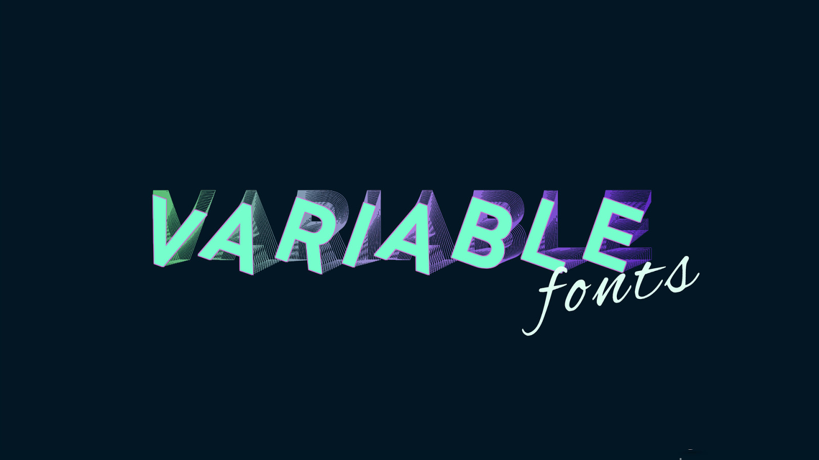
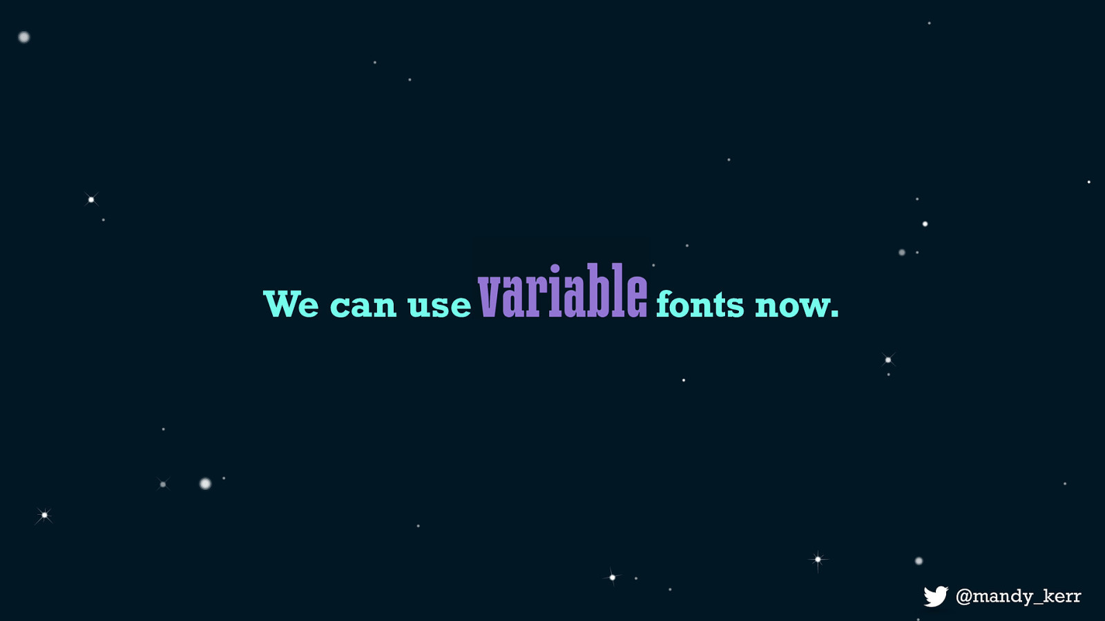
Today we are going to be talking about variable fonts, how we can use them, the performance benefits and looking at some cool demos and current and future use cases.
Most of the examples are up on codepen, and i have a site called variablefonts.dev which has a bunch of examples and blog posts explaining how they work.
What is important to know before we get started is I am a that loves to Design. I don’t make fonts, i’m not an expert in web typography, I just like to tinker with things.
Because of this, I started creating text effects and during my experiments it became clear to me very quickly that Variable fonts present us with some very unique opportunities that standard fonts simple cannot provide.
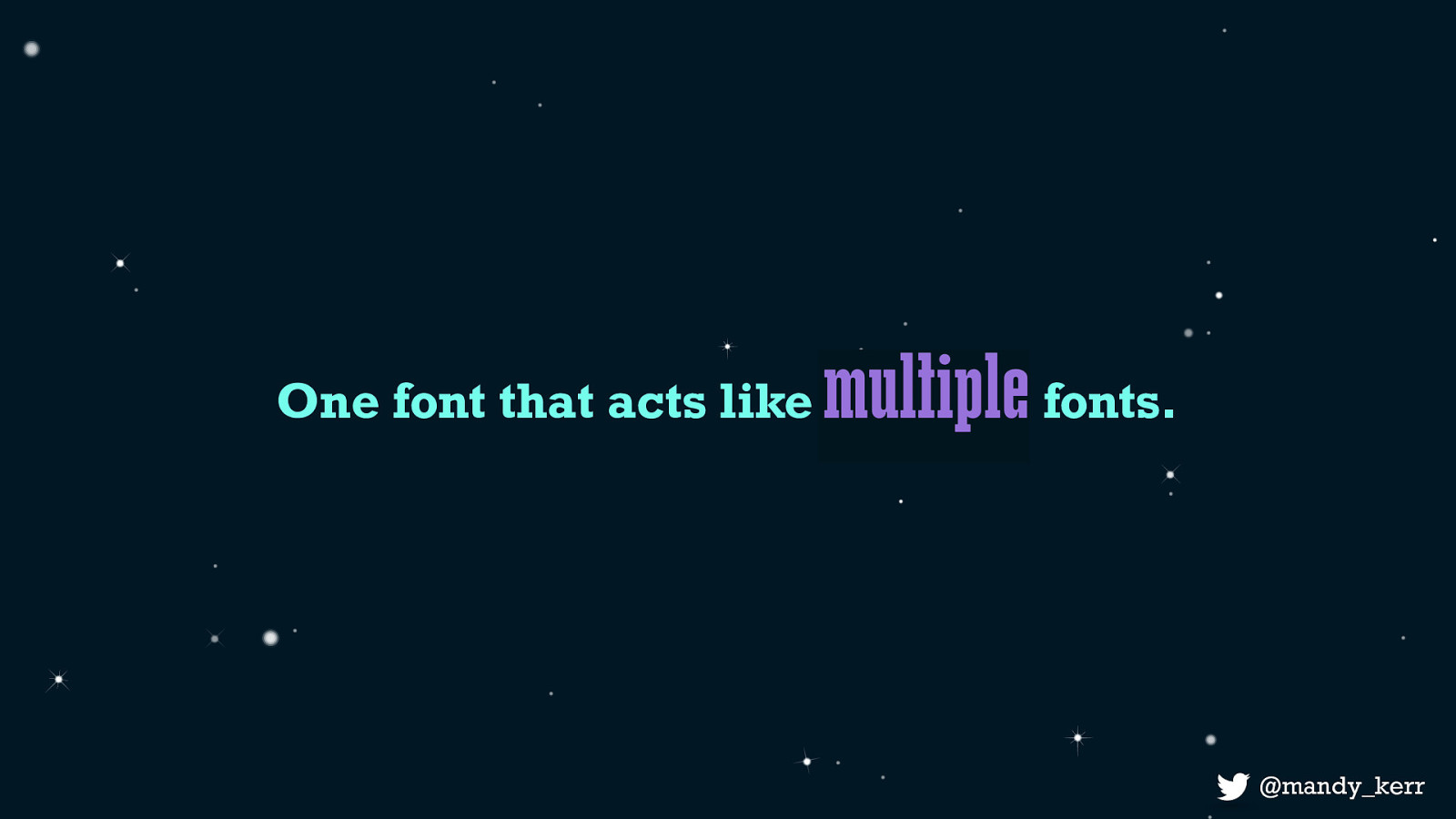
and that is Because variable fonts, are one font file that acts like multiple fonts.
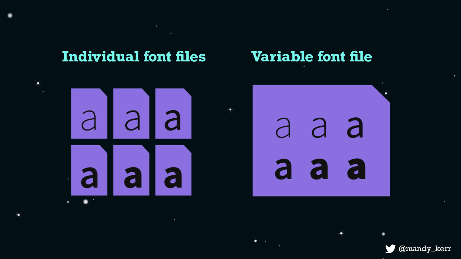
What that means is - might normally you have 6 different font styles as separate, individual files - with variable fonts all this information can exist in the one file.
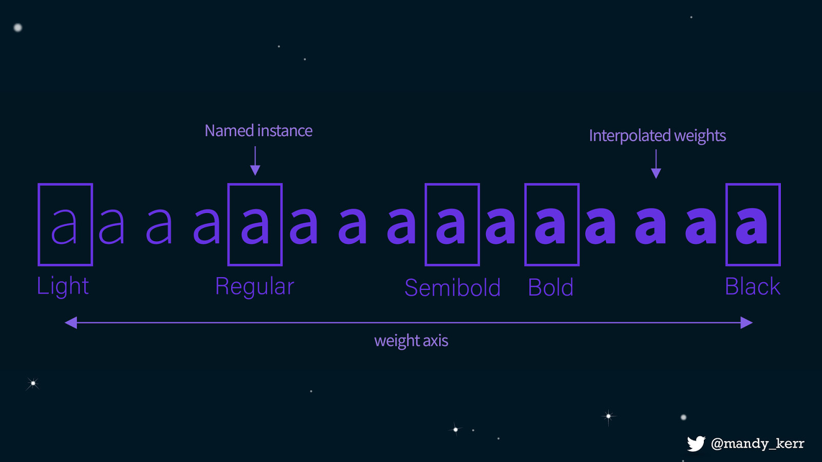
The way this is achieved comes down to how the fonts are created. Variable fonts contain one or more axes that provide different variations between different extremes.
As an example, a light font weight to a black font weight. We can still have styles like Regular and Semibold, which are known as named instances - but we also gain the ability to interpolate the values.
This allows for intermediate designs giving us a lot finer control. So along with the standard values, you can also have all the values in between, including decimal places!
and because the axis is interpolated, this means with can animate between the values creating smooth transitions between the variations.
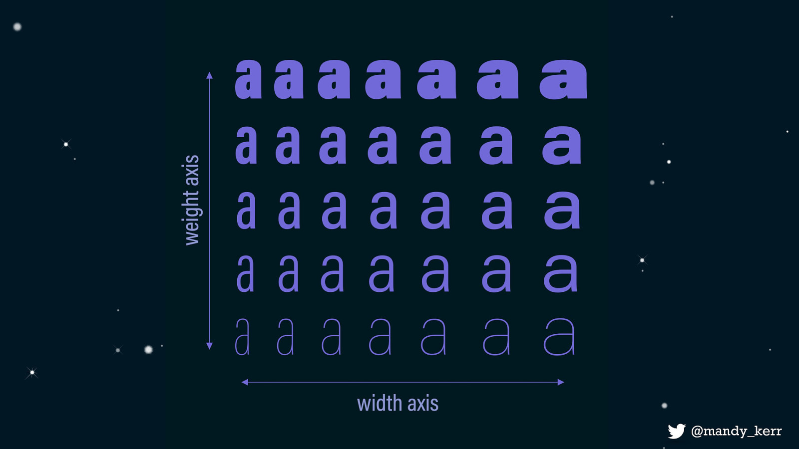
but we are not limited to just a single axis, a variable font can contain thousands of axes, and as you can see in this image the interpolation does not just apply to the single axis but the combinations of those axes as well. So if you want a wider light weight, or a heavier condensed style, no problem - All those styles can exist within the font.
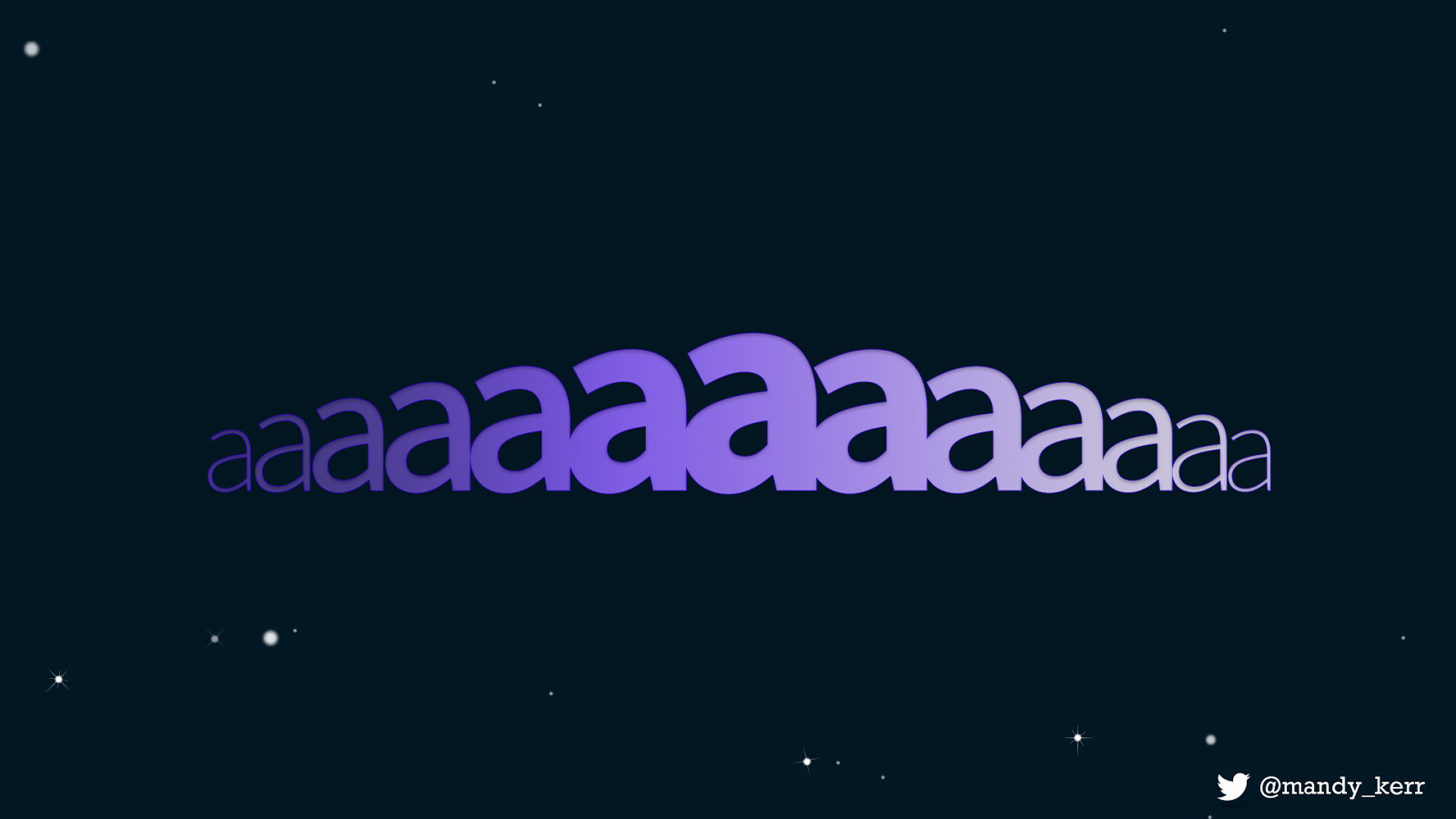
In essence a variable font gives us a single file with a greater amount of variation and a significant increase in style choices. and they don’t just have to be your standard font styles like bold and width, it could be something totally different.
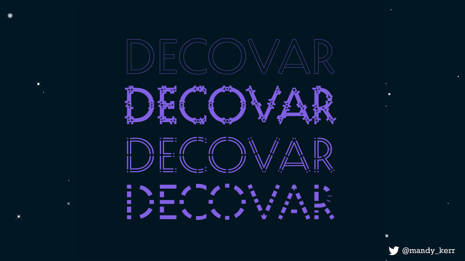
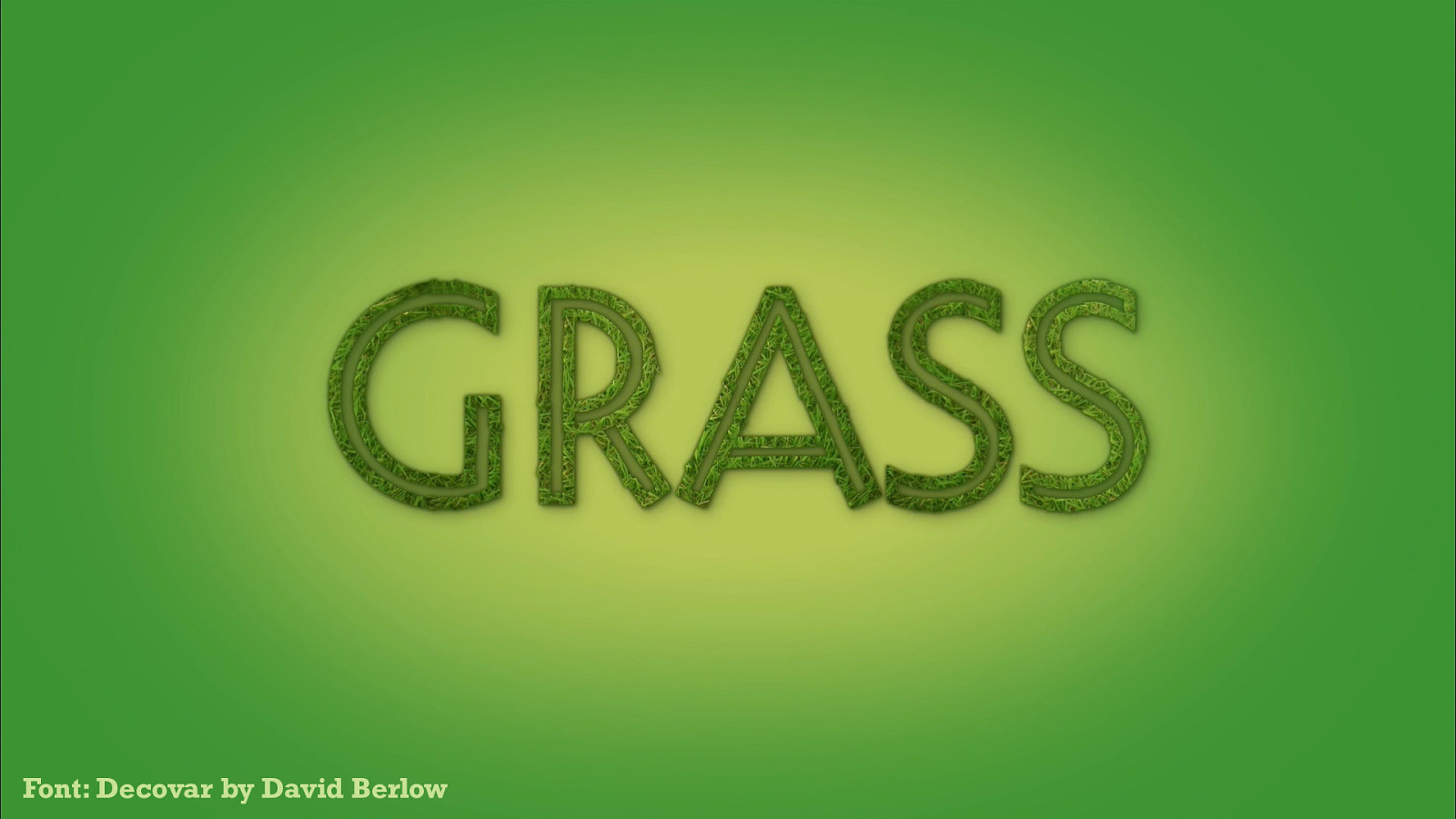
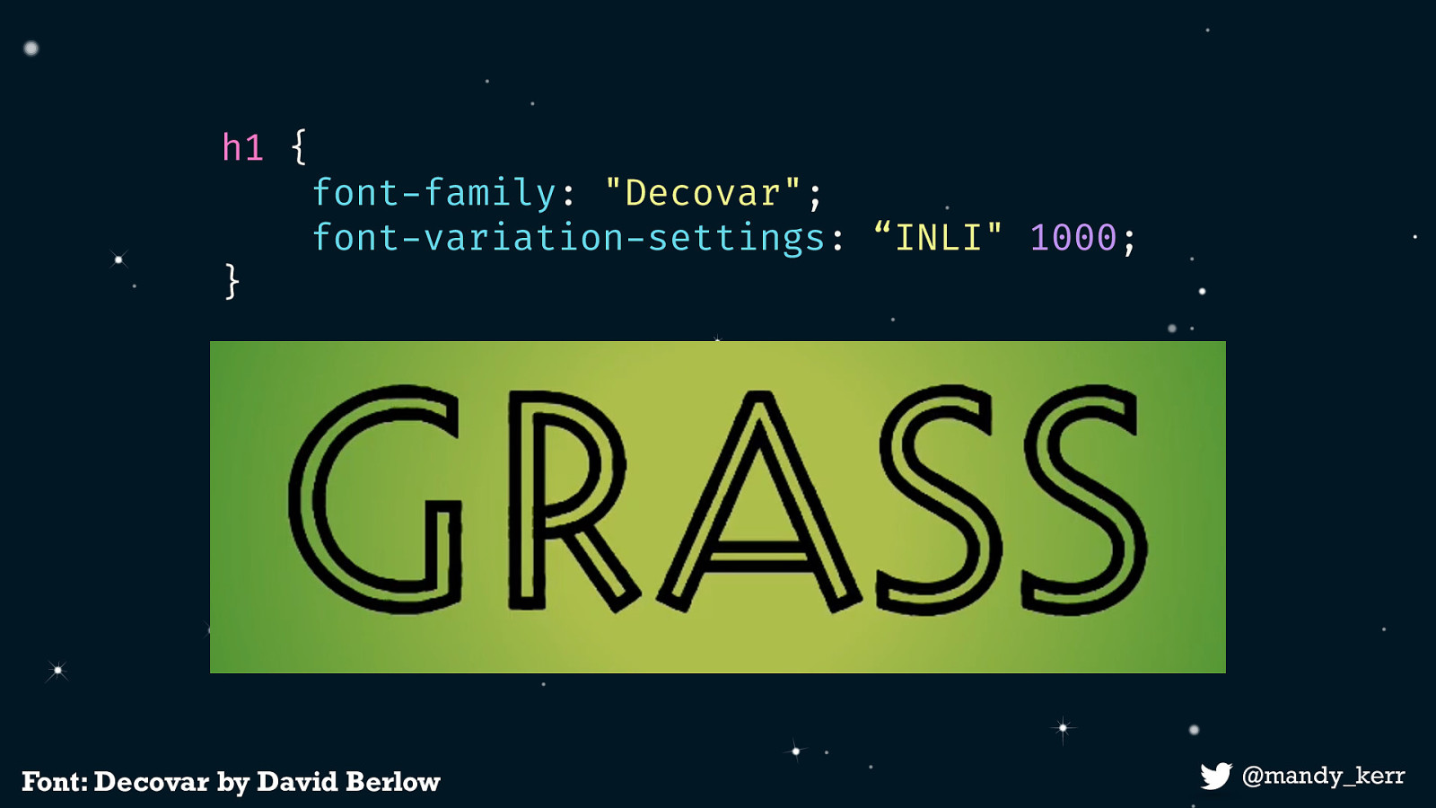
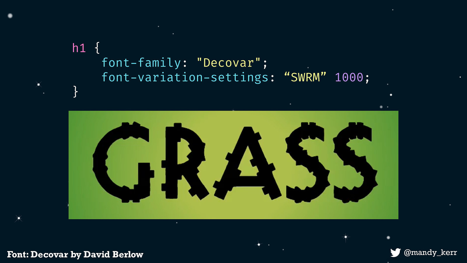
or a little bit weird, like Decovar, by David Berlow - probably my favourite variable font to experiment with because it has a lot of different creative axes.
The way that we use variable fonts is very similar to how we would normally use fonts on the web.
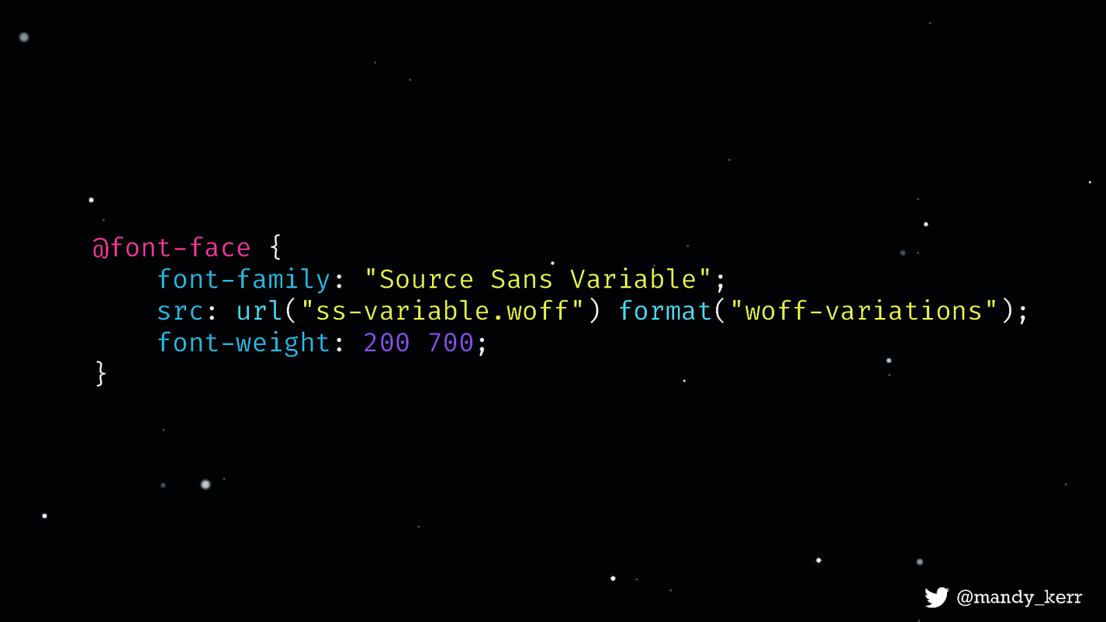
For the most part we set the fonts up the same way we do now, using font-face.
@font-face {
   font-family: "Source Sans Variable";
   src: url("ss-variable.woff") format("woff-variations");
   font-weight: 200 700;
}
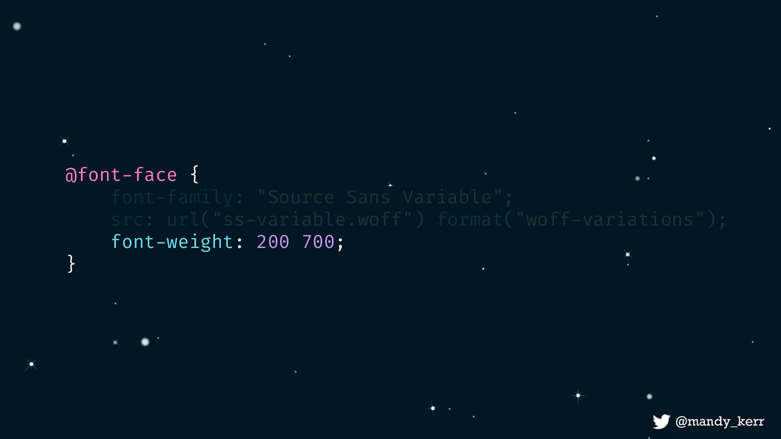
@font-face { font-family: “Source Sans Variable”; src: url(“ss-variable.woff”) format(“woff-variations”); font-weight: 200 700; } @mandy_kerr 7 The main change is to how we define the variations for descriptors like font-weight, font-stretch and font-style. In this example, where we might have previously set a font-weight of 200 and defined this as our light version and then setup another for the bold version, we can now do this all as one and just set the range we want. In this example, we set a font weight range of 200 to 700.
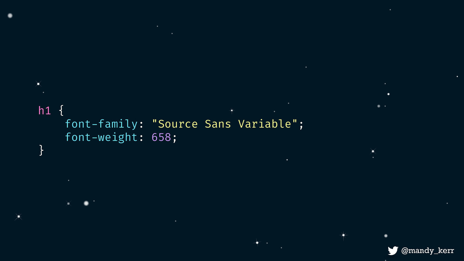
h1 { font-family: “Source Sans Variable”; font-weight: 658; }
From here we reference our font the same way we normally would in our css. But because we’ve defined a range of weights we can set the value to whatever number we want between 200 and 700. So for example 658. Now,
This is great for weight, because we already have a CSS property that we can use. This is known as a registered axis which basically means it’s been standardised in the spec. There five registered axes at the moment, weight, width, slant, italic, and optical size and they are all mapped to pre-existing css properties.
If we want to use something custom like the styles in Decovar, we need a new CSS property.
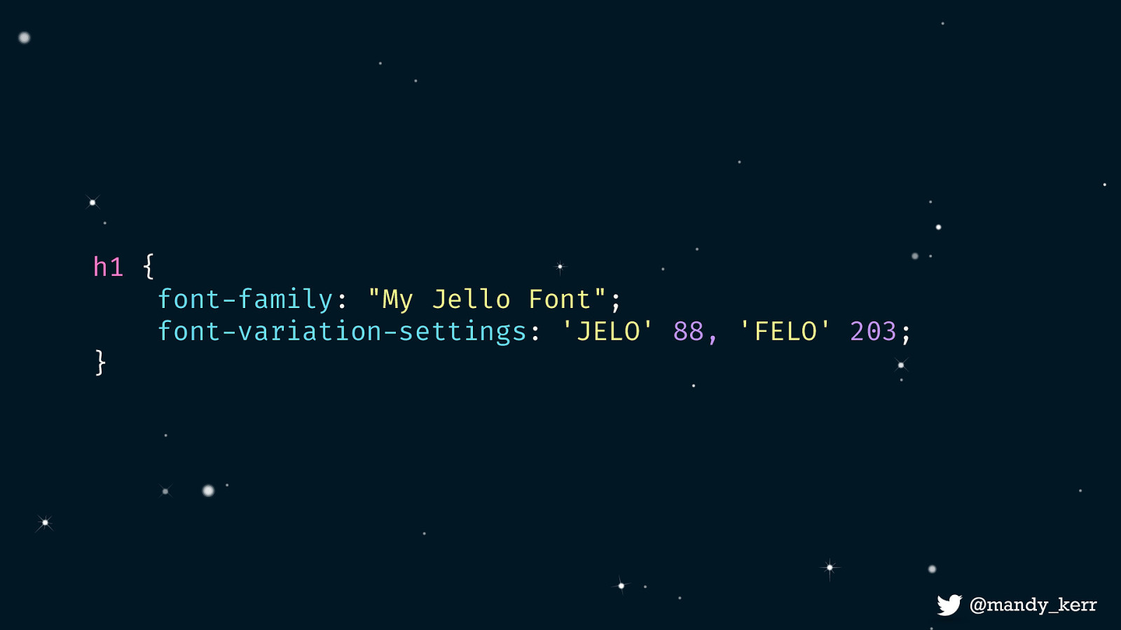
That CSS property is called font-variation-settings and it enables us to define as many registered and custom axis as we need. In this example, we have two custom axes, defined by a 4 character string, each with an associated number value. Custom axis codes are determined by the font creator, whereas a The codes for a registered axis are defined in the spec. You can use registered axis in the font-variation-settings property, but it’s strongly recommended that you use their mapped css properties, like the font-weight property instead. This actually makes it a lot easier for managing your typography anyway.
h1 { font-family: “My Jello Font”; font-variation-settings: ‘JELO’ 88, ‘FELO’ 203; }
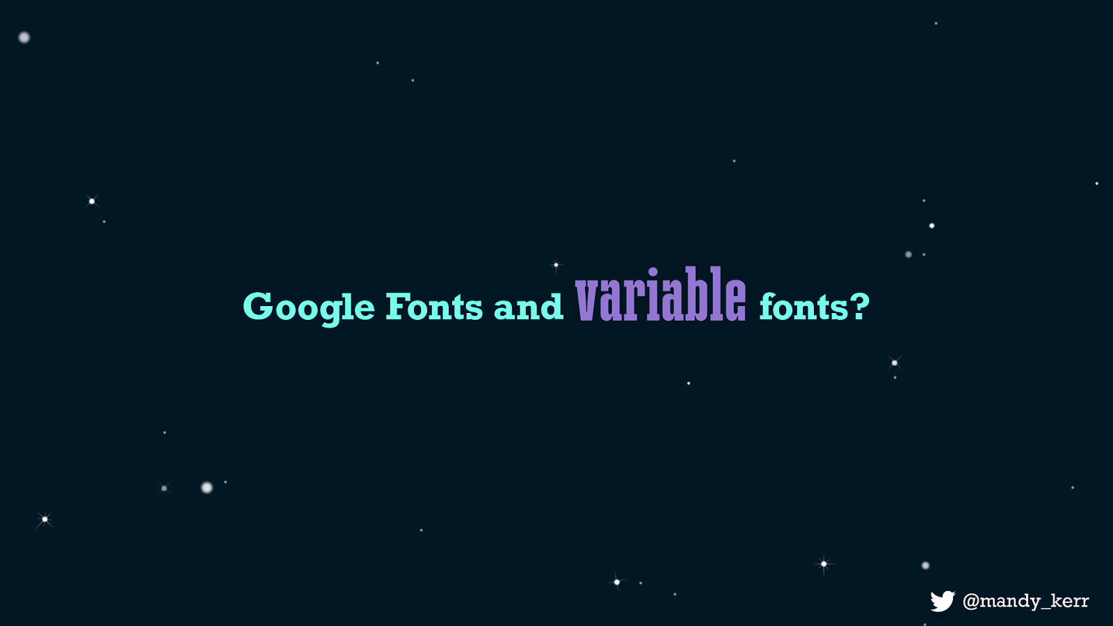
I get asked a lot if google fonts have variable fonts, I’ve always had to say “no not yet, but they are working on it” BUT, exciting news, as of a couple of weeks ago google fonts released the v2 google fonts api which supports variable fonts.
The way we use it is pretty similar to what we do now but there are a few slight changes
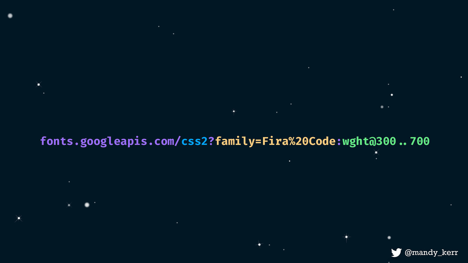
fonts.googleapis.com/css2?family=Fira%20Code:wght@300!..700
it looks like this, and its pretty similar to how we currently use it, the main difference is that now we have to define the axis e.g. weight and if we want to define a range we use the three dots to specify a axis value group. Im not going to go deeply into this, theres a few great posts out there, I’ve written about it on variablefonts.dev but also Jason has an excellent post on medium you should check out.
Firefox dev tools are really great for inspecting and playing in the browser with variable fonts.
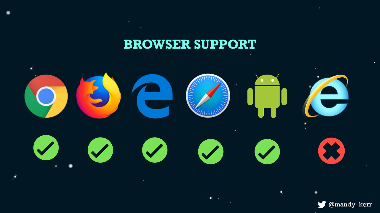
Browser Support is pretty good, all the major browsers except IE11 support variable fonts.
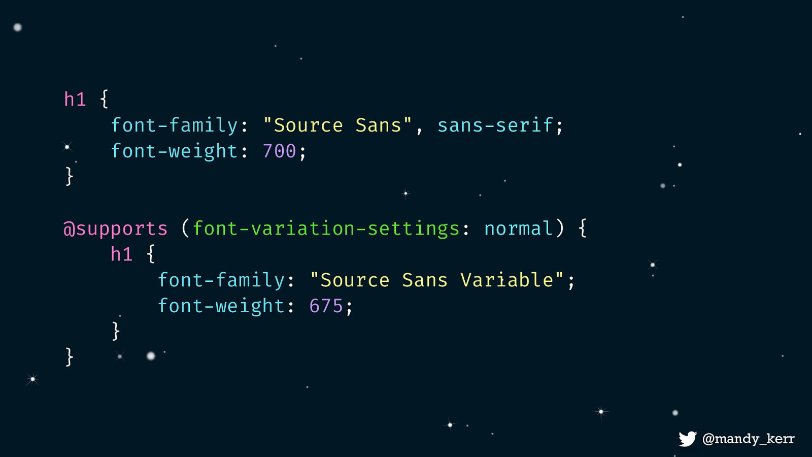
If you are worried about unsupported browsers we can use fallback fonts by making use of css feature detection. We check for font-variation-settings support and add our variable font styles inside that css block. With our standard fonts used in the unsupported browsers.
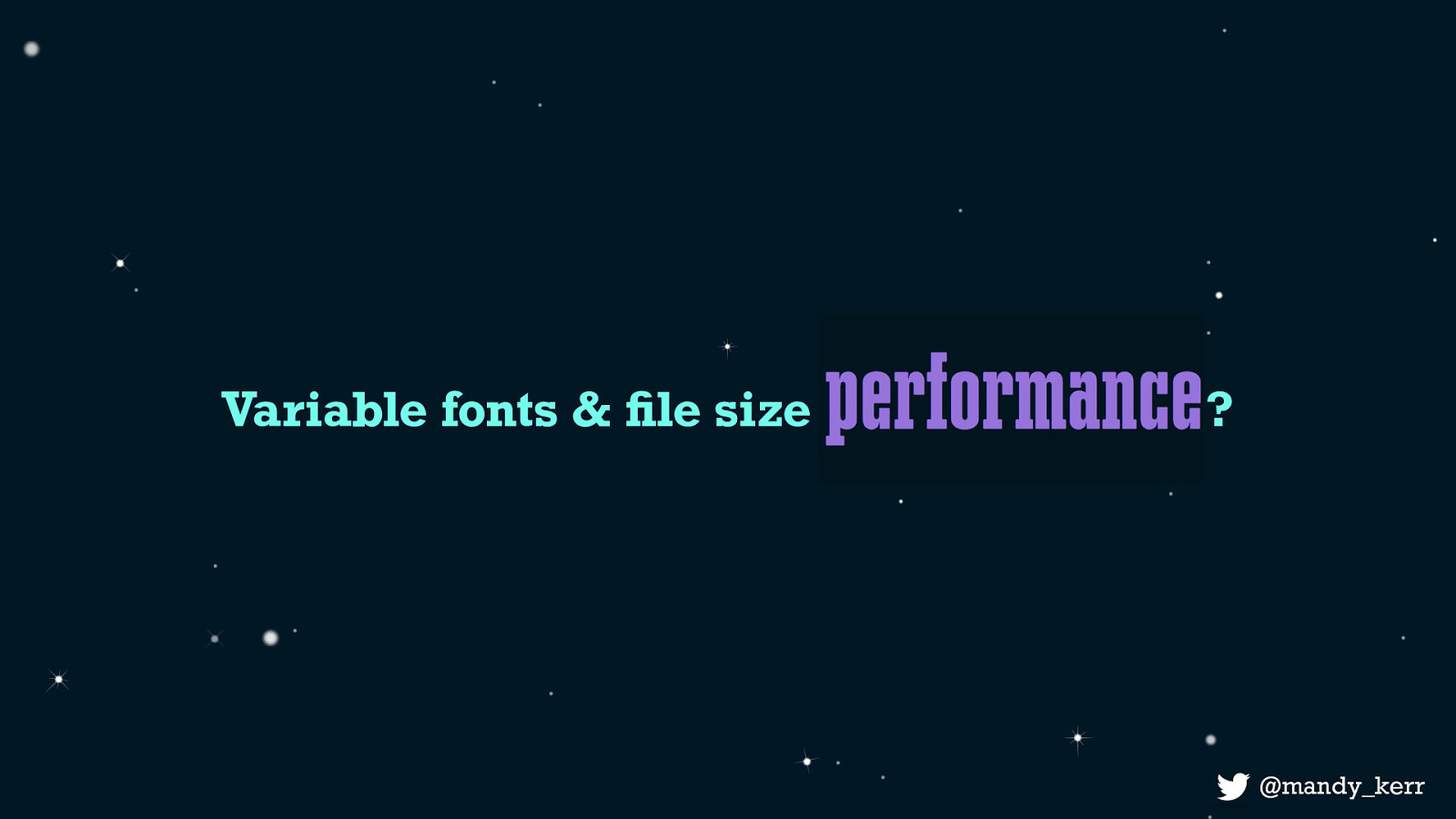
You might be wondering at this point what impact variable fonts will have on performance - and essentially it’s very similar to the current impacts of variable fonts - but lets touch on a couple of things - the number of font requests, - font-file size
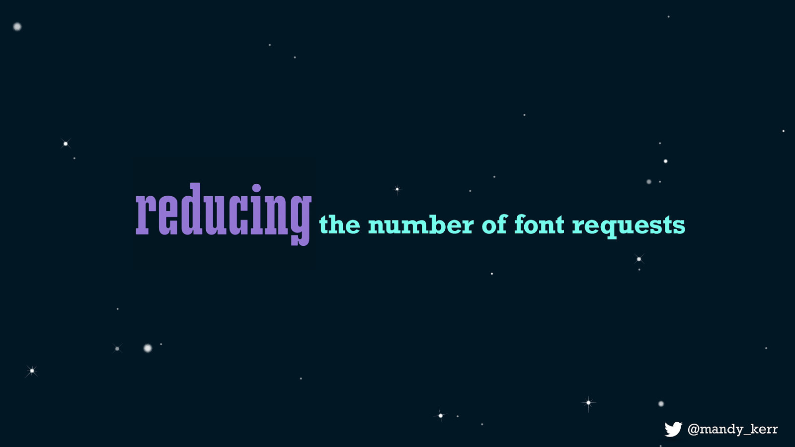
Often when we think about reducing the number of font requests it means that we need plan our typography choices and weigh up the cost of design over the cost of performance and we’d have to justify that cost before adding any new styles. This is why we typically have a bold, a regular and an maybe an italic font and not much else. Because variable fonts can contain multiple variations in the one file - this means we have immediately reduced the number of requests simply by using a variable font. But if all this data exists in the one file, what happens to file size?
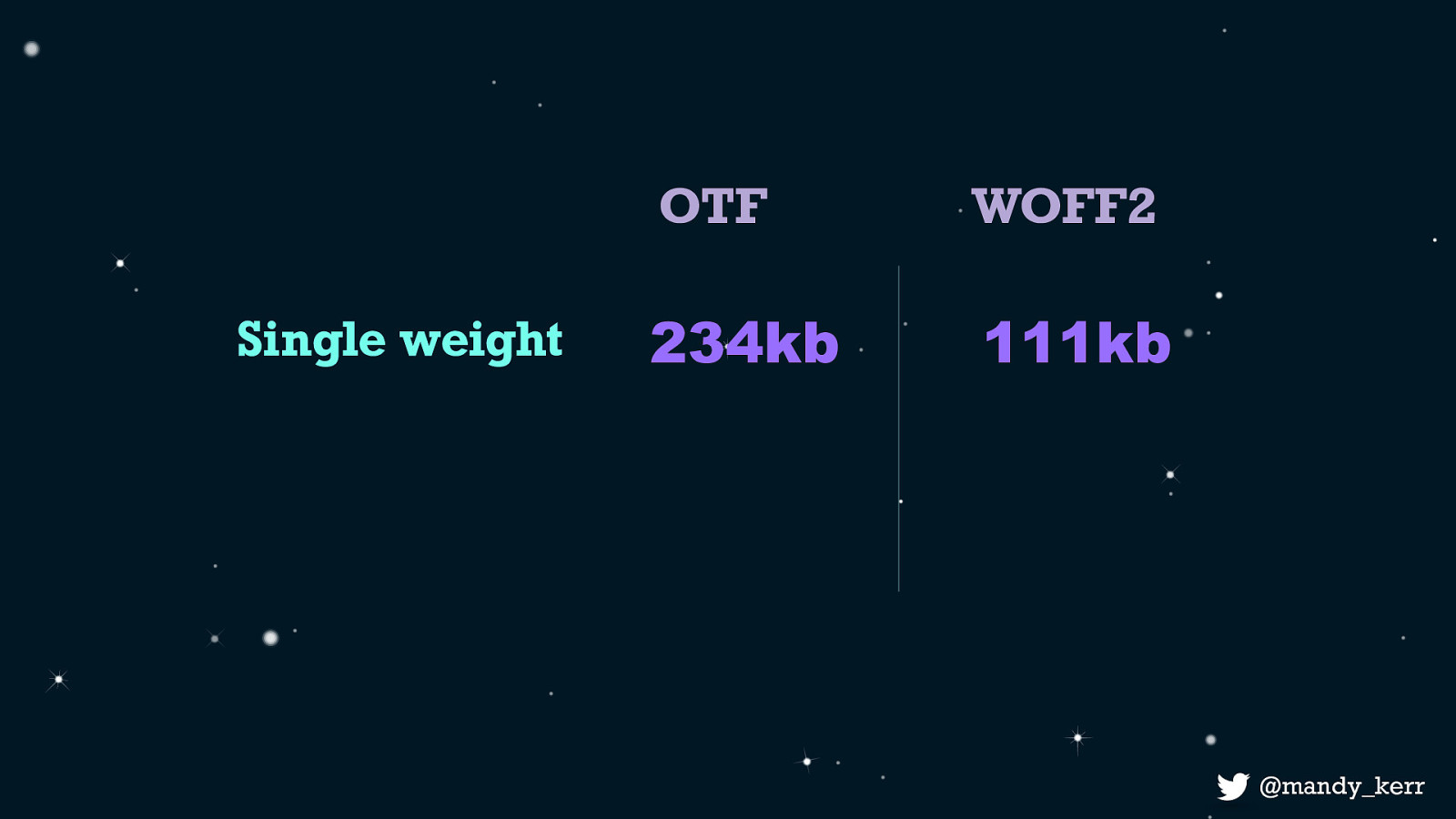
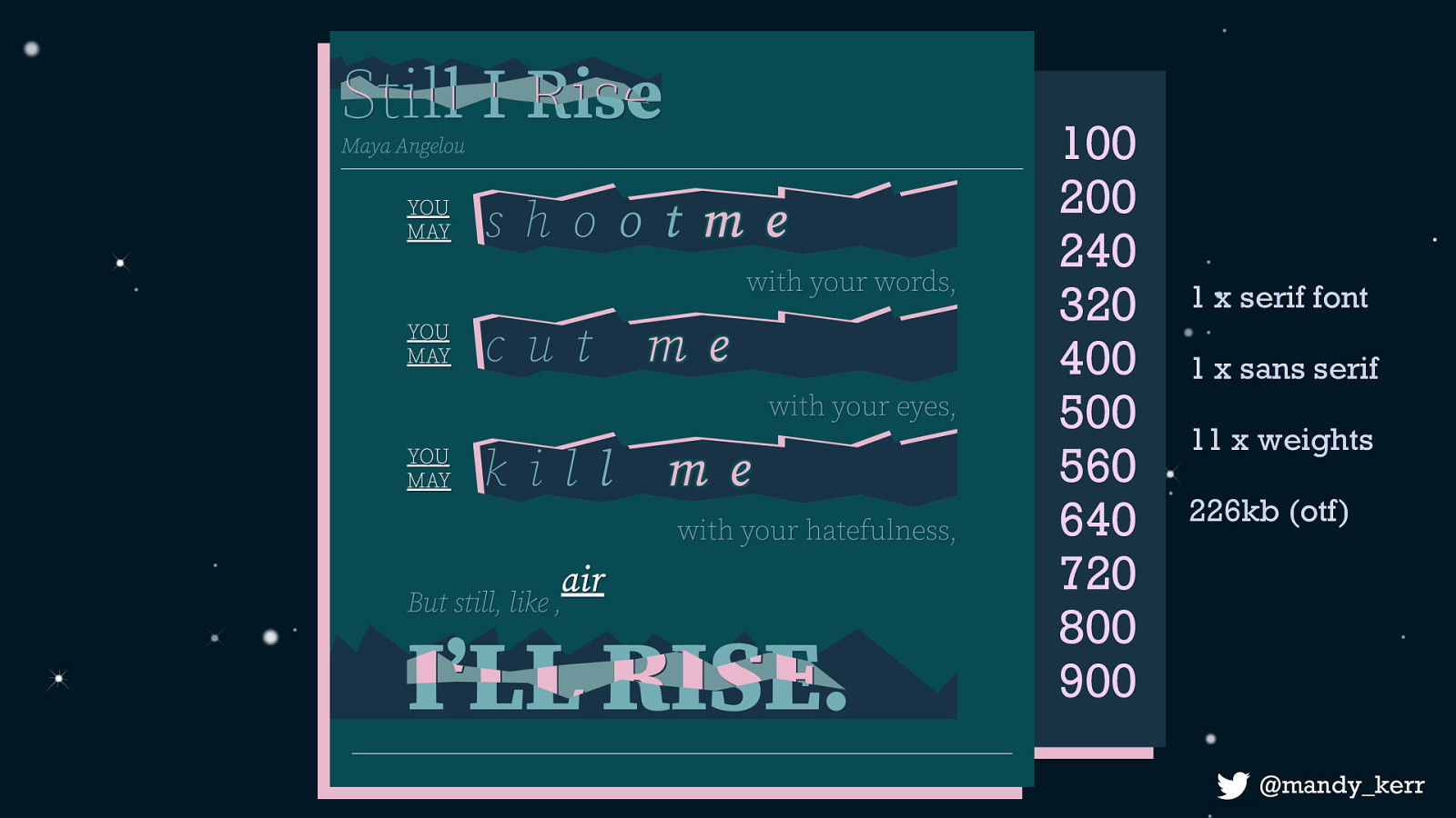
Using source sans as an example a single weight in otf format is 234kb or 111kb in woff2 format.
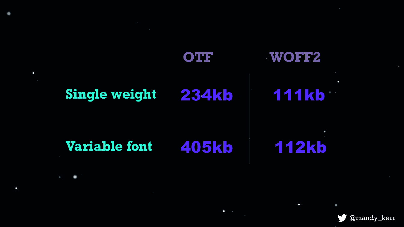
Comparing with the variable font it’s about 405kb and the woff2 is 112kb which is just 1kb more than a standard single weight. So when using efficient font formats, in this case, and imo, you can gain a lot more design opportunity with very minimal impact to performance. But this is going to vary between fonts - its not always going to be better to use a variable font over a standard font - so that is definitely something to keep in mind. If you want to talk about variable font performance in more depth, come and have a chat to me - because there are actually quite a lot of things to consider, its basically a talk in itself.
So with that in mind, we can use them, its got good support, performance of the fonts is pretty good - now we can start to shift our focus. We no longer need to trade off design for performance.
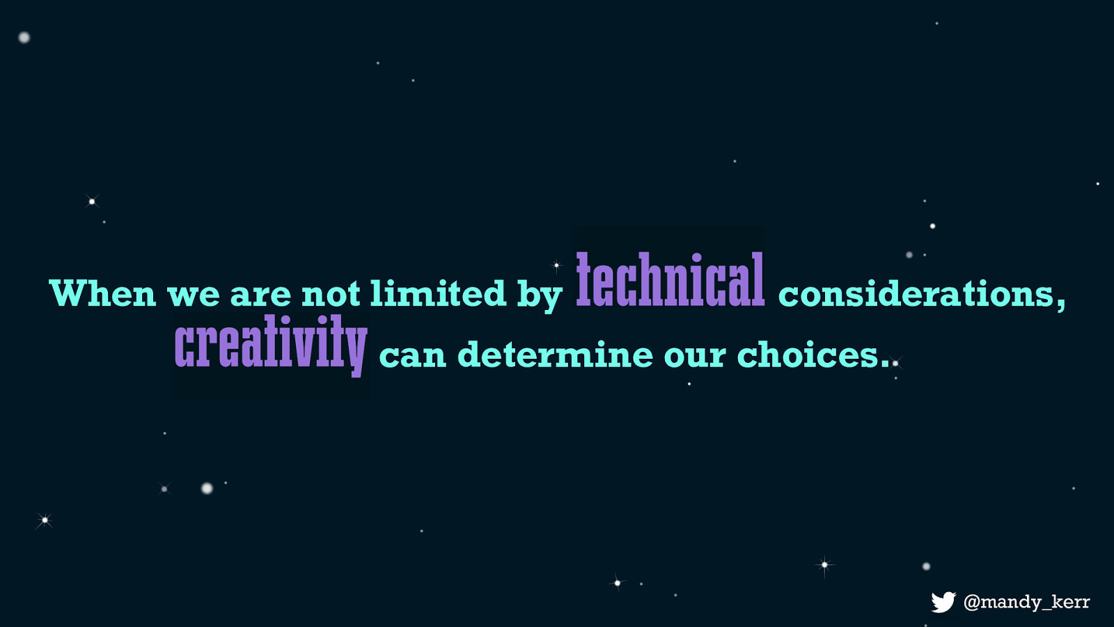
We gain much more flexibility in our design opportunities Designs which would previously have been a heavy burden on performance, or simply impossible due to the technical limitations are now completely possible.
We can start to forget about those perceived limitations and figure out how we can use this technology to create better or more interesting experiences for our users.
The tone and intent of our words can be more effectively represented with less worry over the impacts of loading in “too many font weights”
and we can embrace the learnings and the growth of print design
But unlike print design we can benefit from the flexibility and interactive nature of the web - because variable fonts can have that interpolated range of values we can create animations or transitions with our content
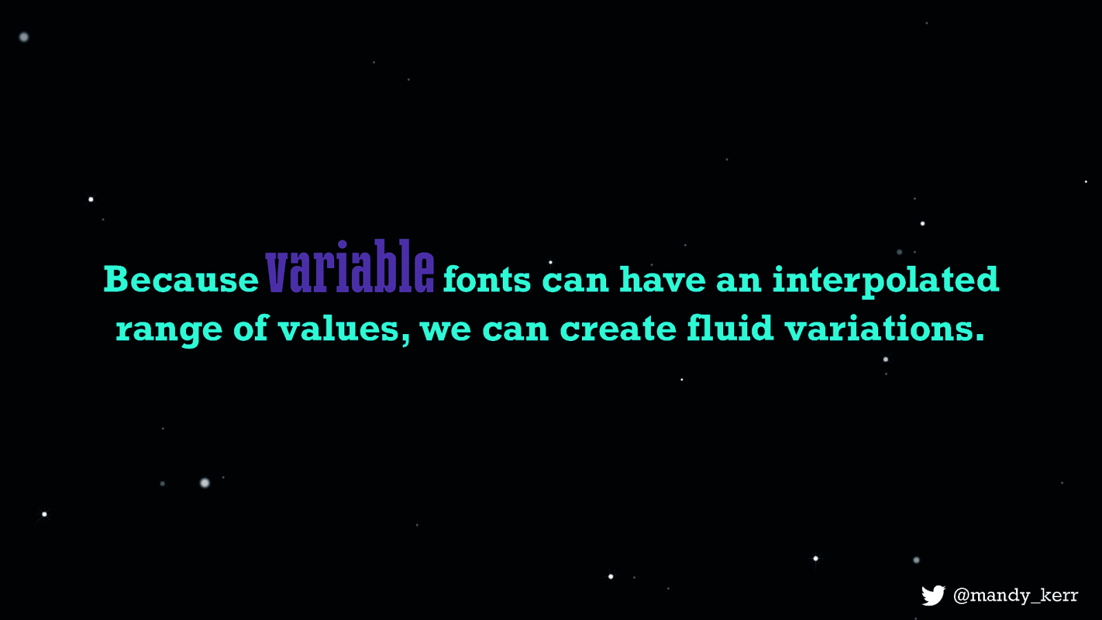
Because fonts can have an interpolated range of values, we can create fluid variations.
We can achieve these effects using techniques we may already be familiar with like css animations or transitions

And we can achieve effects like this one with only a small amount of css.
Font: Decovar by David Berlow
I’m using two axis from the font Decover, by David Berlow to create this effect, one is called Inline and the other is called Skeleton worm. Just for context - This is what inline looks like.
This is skeleton worm
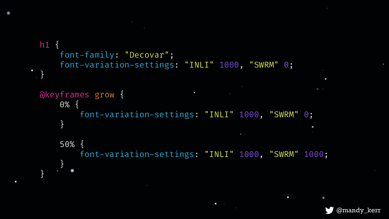
The animation itself doesn’t require a lot of CSS, in this case i’m going to use a CSS Keyframe animations. I’ve called the animation “grow” At 0% i set both skeleton worm and inline to 1000 so the animation starts “expanded” At 50% I set skeleton worm back to 0 and leave inline at 1000. Then it the animation will loop back around to 1000.
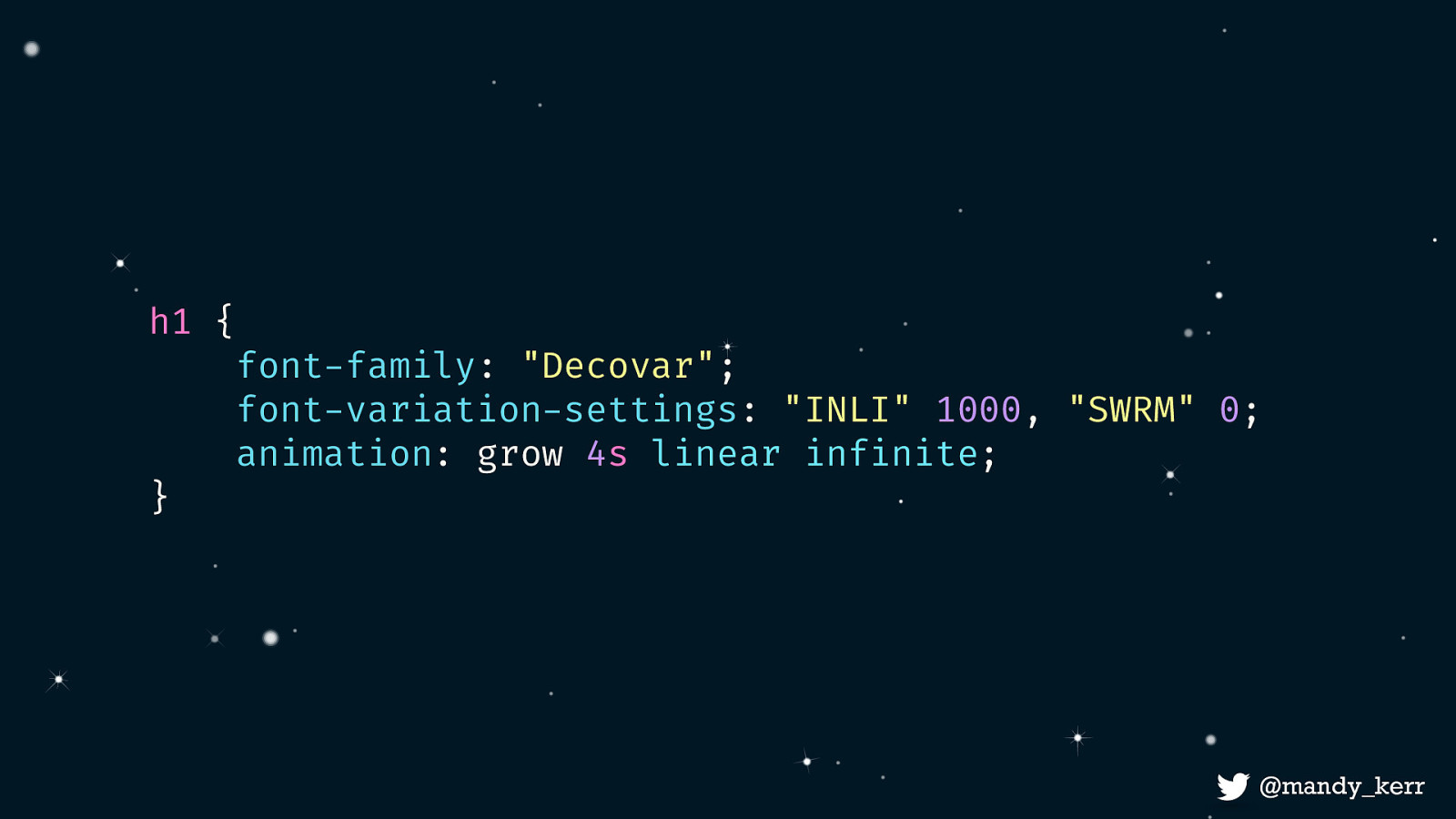
Next i add my animation property onto my h1 - it’s named grow, runs for 4s in an infinite loop.

After adding a little bit of extra CSS for texture we are left with the final effect. For the most part the heavy lifting is done by the font, most of the work is done for you and all you really need to do, is add a few lines of css for the animation. Which is pretty amazing.

Font: Duos Writer by Underware Because there are all sort of things we can do with variable fonts and a few lines of css @mandy_kerr
Font: Gingham by Christoph Koeberlin
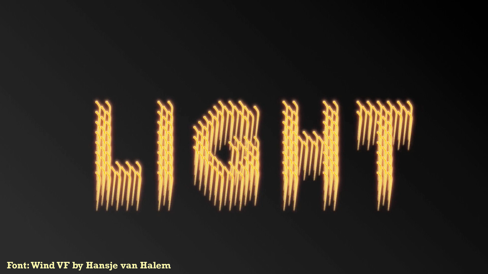
Font: Wind VF by Hansje van Halem


Font: Decovar by David Berlow
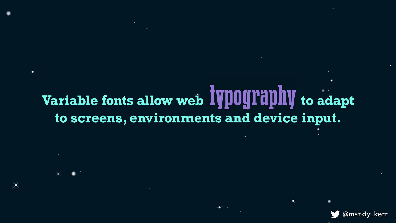
It’s not just that these are beautiful or cool effects, what they demonstrate is that as developers and designers we can now control the font itself And that that means is that Variable fonts allow Typography on the web to adapt to the flexible nature of our screens, environments and devices.
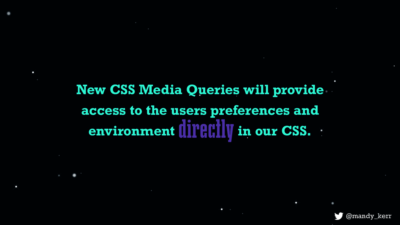
There is currently work being done with CSS media queries, level 5 which will aim to give us more control over our designs based on environments, light contrast and colour schemes. Though these are still just in draft stages, we can experiment with the prefers-color-scheme media query right now using using the much hyped operating system feature — “dark mode”.
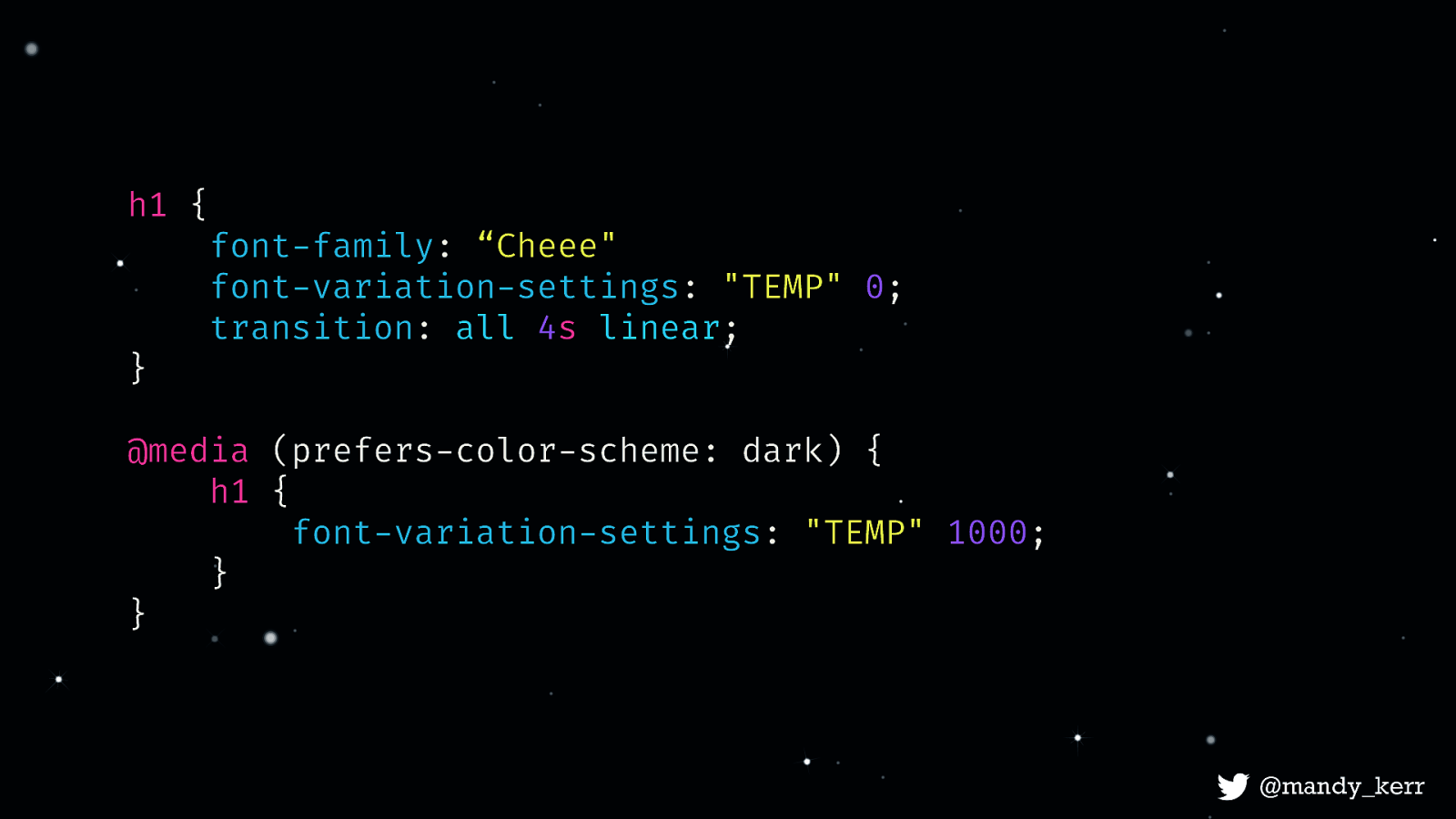
Here we use the prefers-color-scheme media query to check for dark mode and change our styles to match - just like we do when changing layout based on screen width.
We can display different effects like this, or more practically, modify the contrast, and styles to ensure better legibility. As CSS develops, we’ll have more access to different environmental and system features that allow us to take advantage of our users unique circumstances.
We can start to design our typography to adjust to things like screen width - which might allow us to tweak the font weight, width, optical size or other axes to be more readable on smaller or larger screens. Where the viewport is wide we can have more detail, when it’s smaller in a more confined space we might look at reducing the width of the font

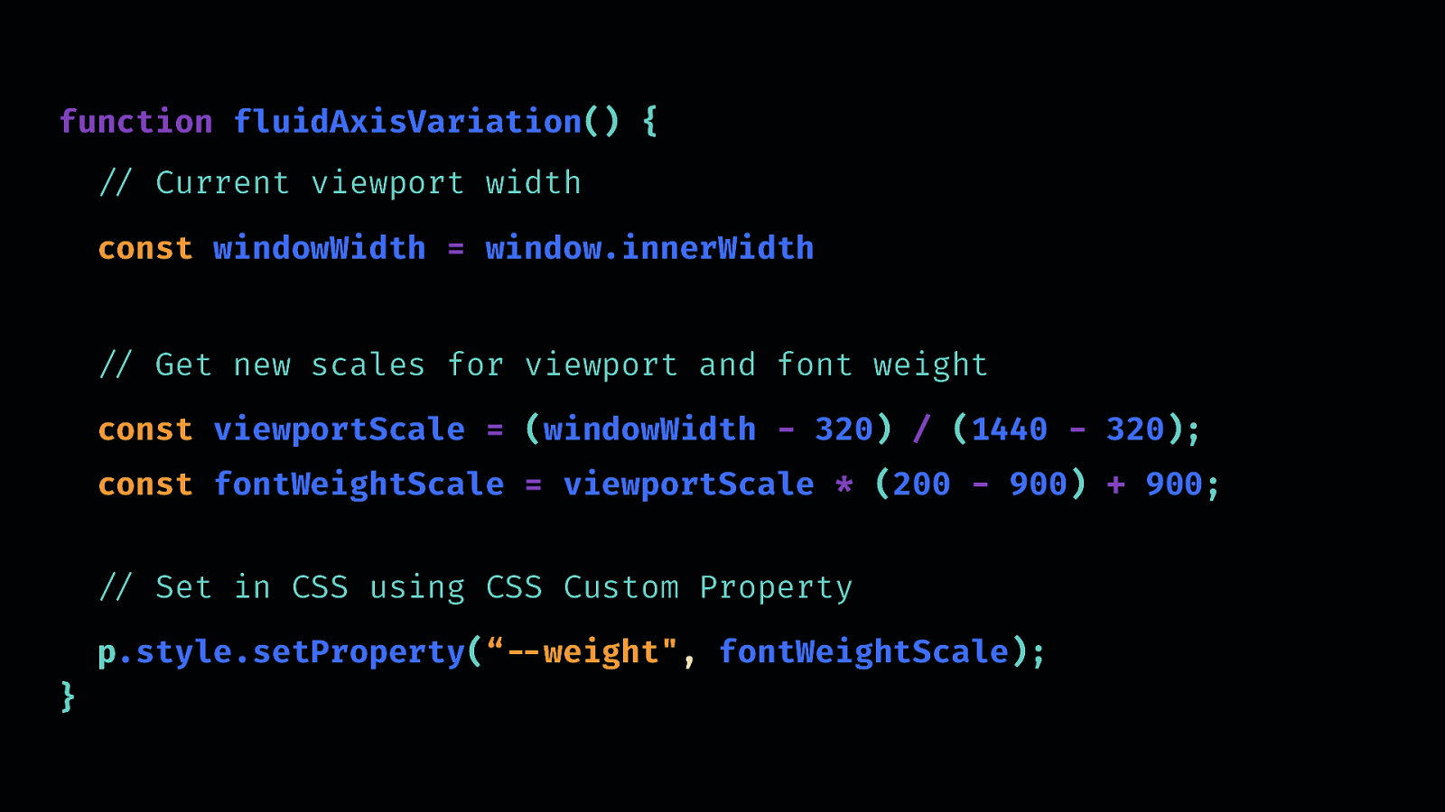
Here i’m increasing the font weight as the viewport gets smaller, but im changing paragraphs at different rates. And you may or may not have noticed that I also am reducing the width of the headline so it doesn’t wrap - instead I can maintain the integrity of the design as the viewport gets smaller. This code can be used to change any axis, once you have it, you simply pass different event values to create all sorts of interactive effects.
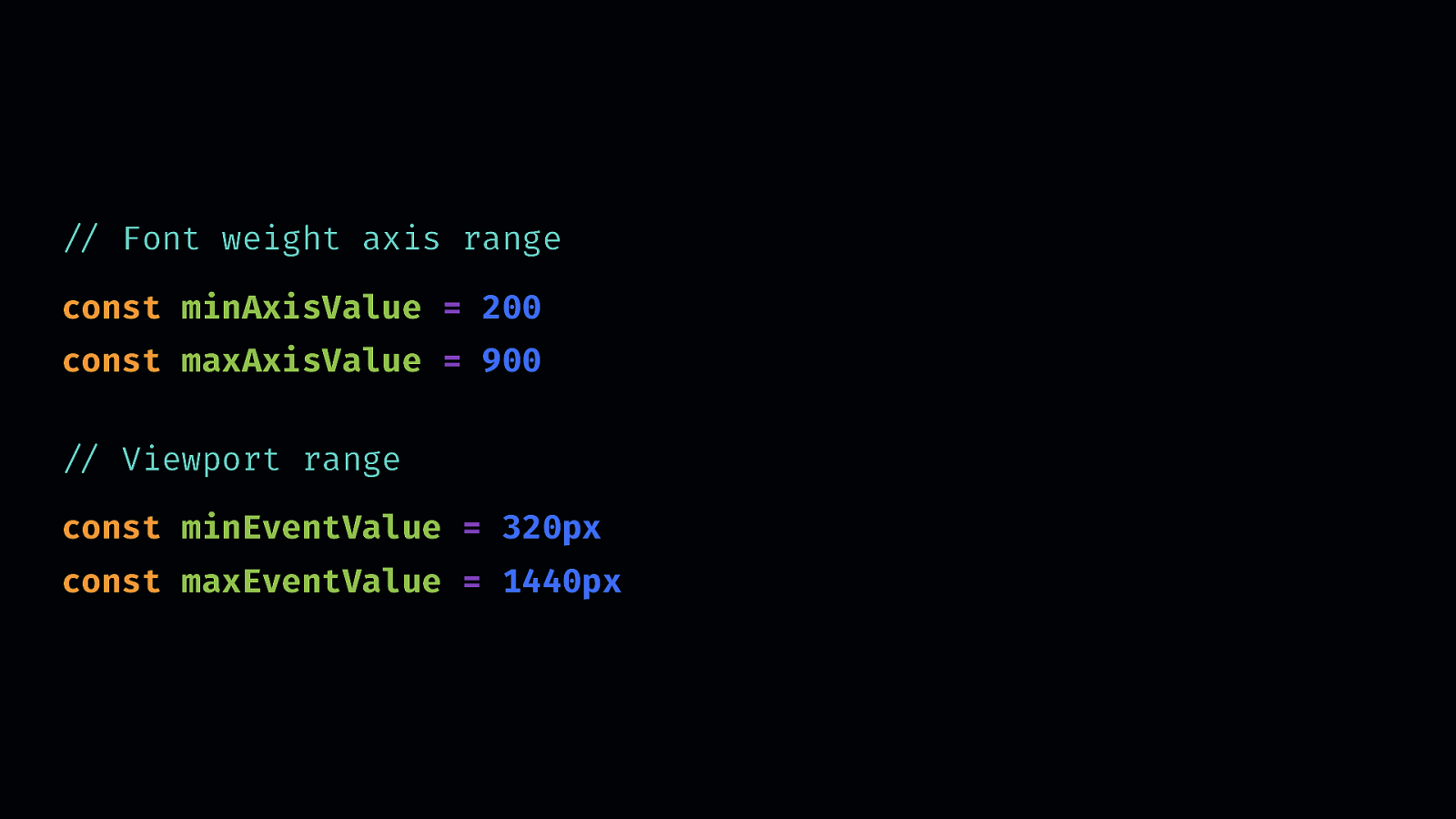
Using a straightforward example, let’s say we wanted to match our font weight to the size of our viewport - as the viewport gets smaller the font weight gets heavier.
Basically we start off by setting the start and end points for both the font and the event
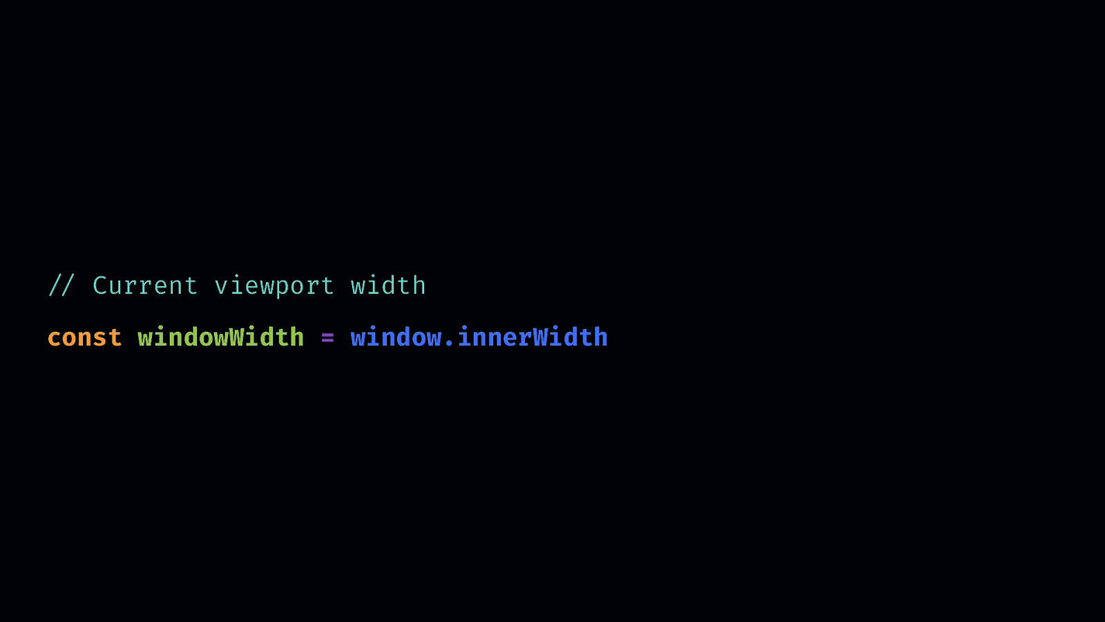
Now we have our minimum and maximum values we need the current viewport width, which we can access with something like window.innerWidth
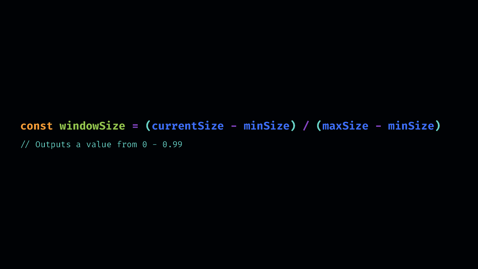
Then we create the new scale for the viewport, so rather than the pixels values we need to convert it to a range of 0 - 0.99
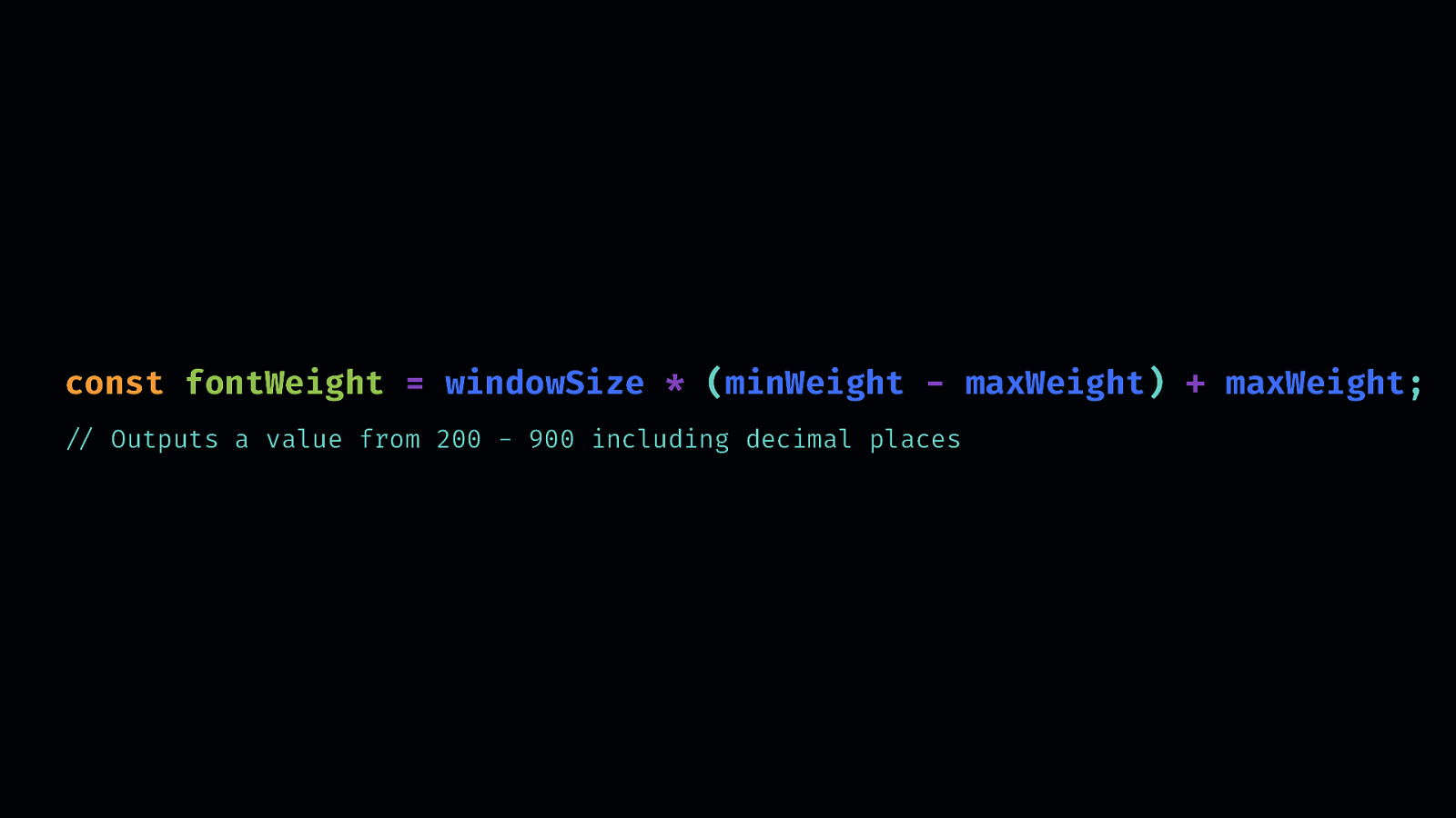
// Outputs a value from 200 - 900 including decimal places We can then take that new viewport decimal values and use that to determine the font weight based on viewportscale
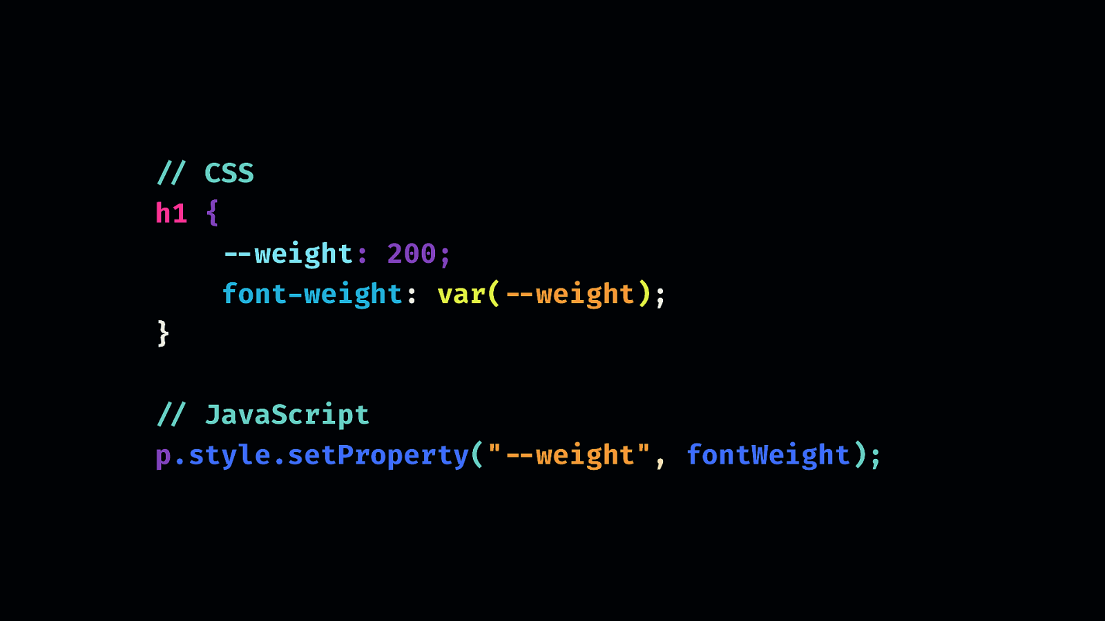
You can update the CSS however you normally would, lately i’ve been using CSS Custom Properties,
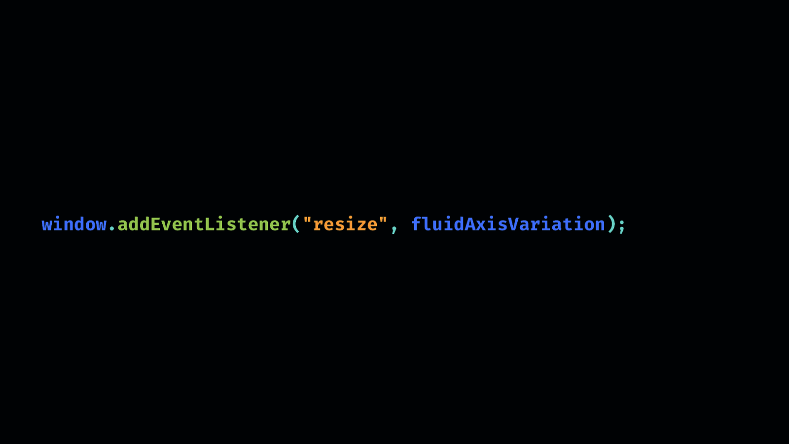
The last step is adding an event listener to check for resize and update the value accordingly. So, in it’s simplest form, this will create the effect. You probably want to add some things in for better performance but the point here is that you can achieve the effect with just a few lines of JS and CSS.

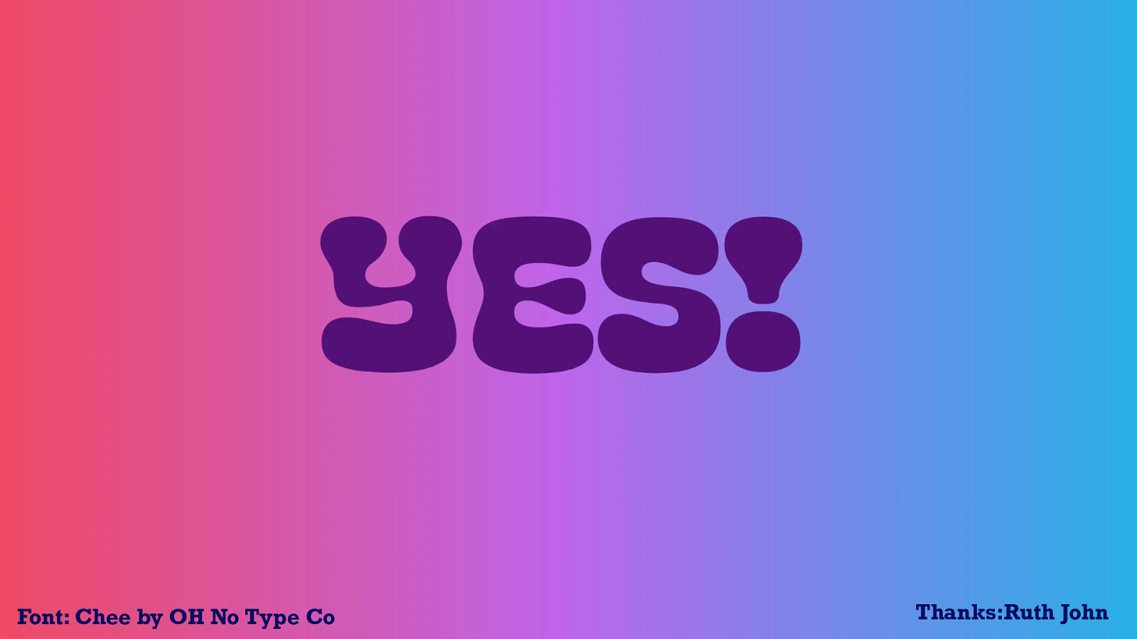
Font: Chee by OH No Type Co
We can make the most of different javascript events like resize, scroll, mouse move and various other apis, the great thing about these js events, is that once you have the formula for manipulating the font, you can applying any kinds of events to it.
or even utilising the sensor api and detecting changes in device “position”.
Device Orientation Example changing the letters based on the orientation of the device
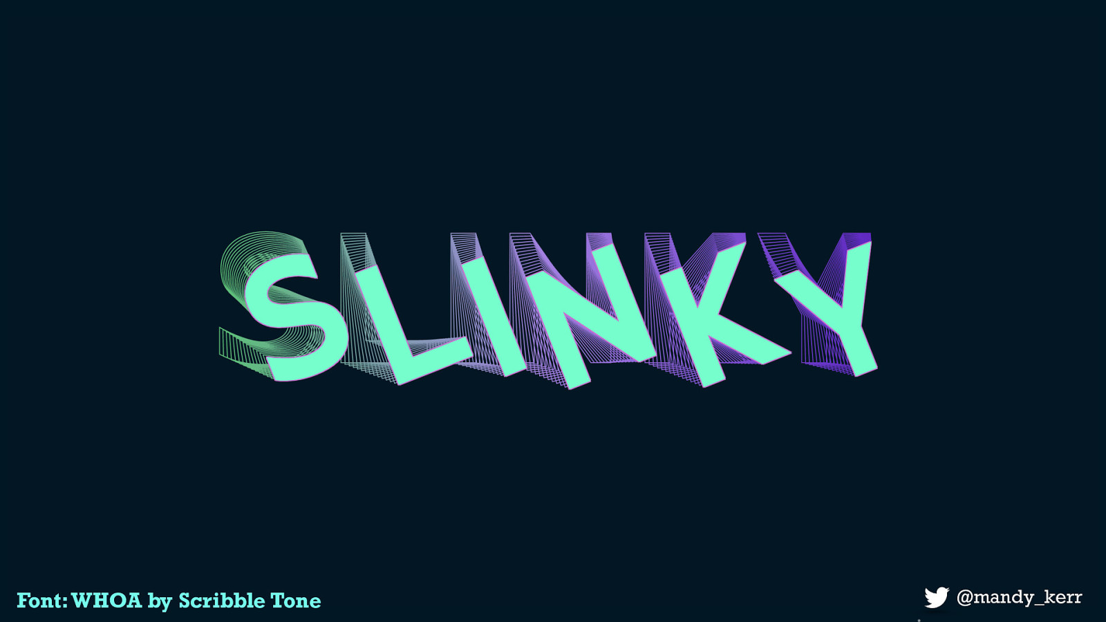
This example is controlled by the mouse position. - When you move left to right it changes the rotation and when you move the mouse top to bottom it changes the vertical axis.
Font: WHOA by Scribble Tone
Or have the font respond to audio input, or the sound of your voice. With the growing use of devices like google home or alexa, voice recognition is becoming more prevalent - something like this could be incredible useful in conversational ui in visually representing the tone or intent of a persons input.
Special thanks to Ruth who gave me some much better code for this!
Font: Chee by OH No Type Co

Font: Tiny by Jack Halten Fahnestock
we can improve legibility of our text with new features allowing us to query the characteristics of the user’s display or light-level.
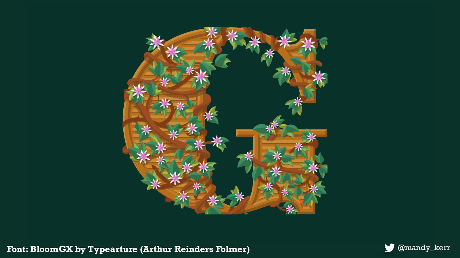
Font: BloomGX by Typearture (Arthur Reinders Folmer)

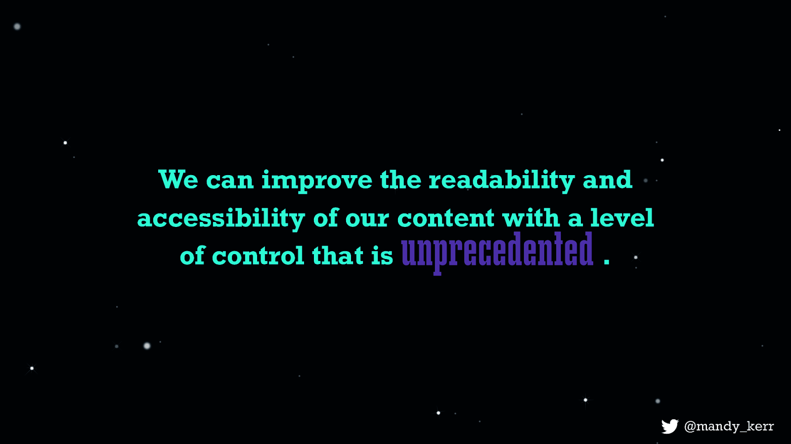
It’s only because Variable fonts give us more control over each of these elements, we can fine-tune the font characteristics to maximise the legibility, readability and overall accessibility of our website text. And while these examples might seem trivial they are great demonstrations of the possibilities. This is a level of control over our fonts and text that is unprecedented.
There has never been a better time to be a developer or designer for the web and variable fonts open up doors that never existed before and they give us an opportunity to think more creatively for our users. And because technology, like CSS is always improving, we now have more opportunities than ever to combine, create and present content on the web in more creative, more meaningful and more purposeful ways - and do so in a way that is more performant and accessible. At the very least, we can improve the performance of our websites, but at it’s best, we can make more usable, more accessible, and more meaningful content - and THAT, is what gets me really excited about the future of web typography.
v-fonts.com