The Performance Benefits of Variable Fonts

A presentation at #PerfMatters in April 2019 in Redwood City, CA, USA by Mandy Michael
The Performance Benefits of Variable Fonts

Mandy Michael Front End Developer
Twitter: @mandy_kerr
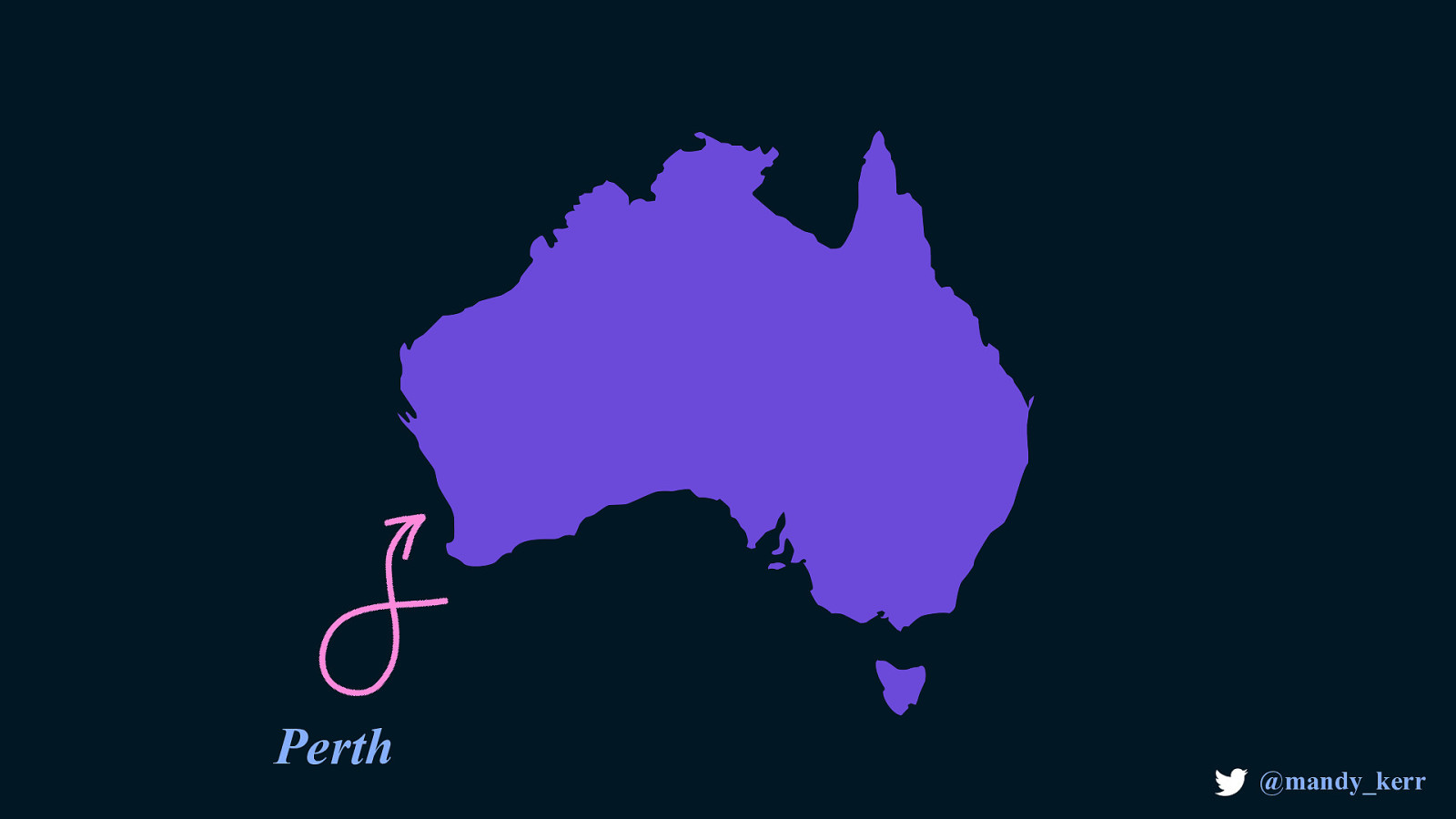
I am from Perth, which is way over on the other side of the country - it’s about a 5-6hr flight! There are two things about Perth that make it really amazing.

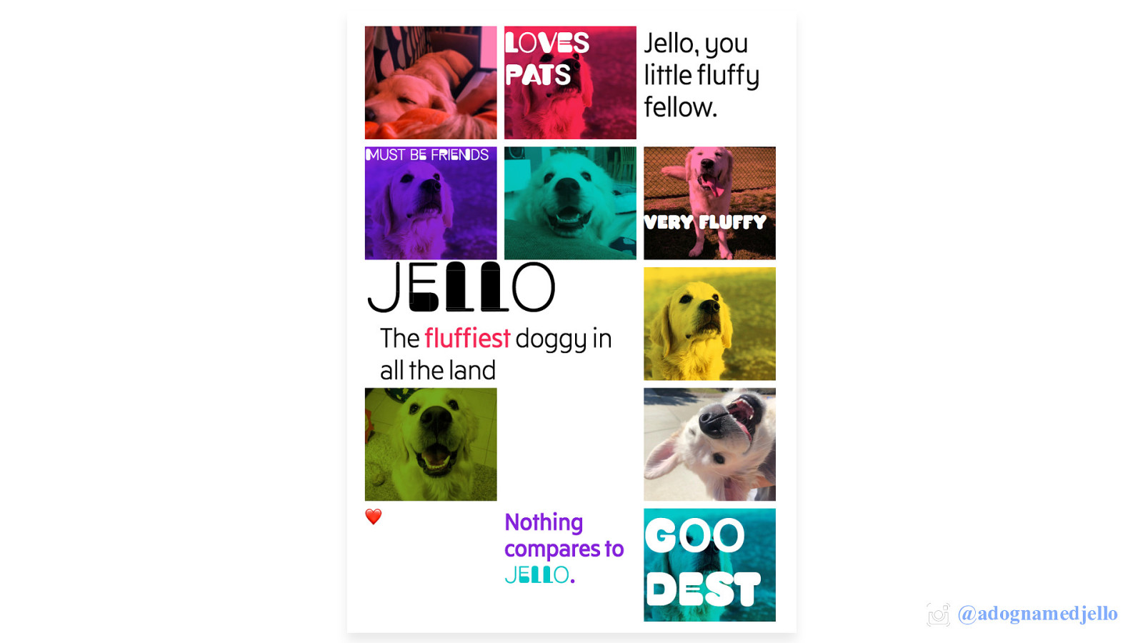
The first is my dog, Jello His instagram is adognamedjello

The second, is quokkas - which can only be found in Western Australia. I’m kind of hoping showing you two adorable animals makes you all happy and puts you in a good mood for listening to me speak about variable fonts
Which is what i’m going to talk about - specifically the performance benefits of variable fonts. First i’ll give you a quick intro to what variable fonts are, how we use them, and then run you through the the performance pros and cons! Unfortunately there are some cons. if we get time at the end i’ll show you some fun stuff
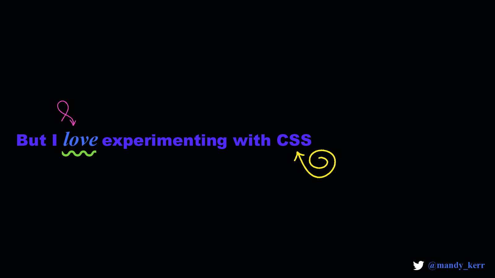
But first! I wanted to explain how I came to learn all about variable fonts. I currently work on a React Website, I write a lot of JS every day, but my passion and my love is really with CSS and design.

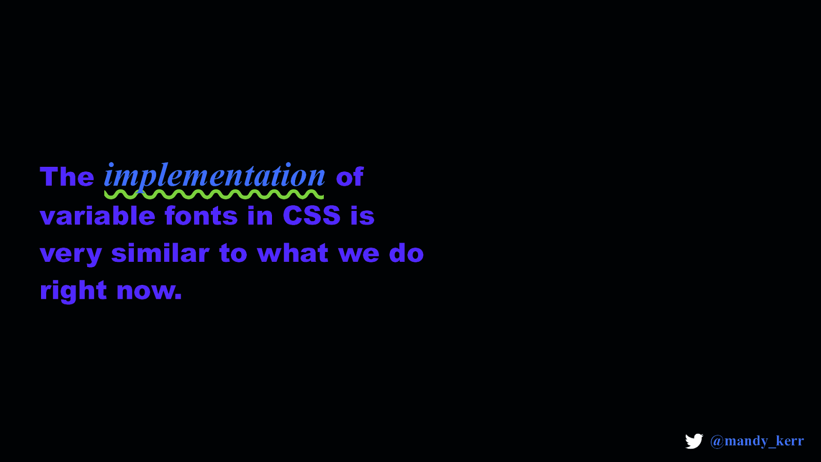
I’m a bit of a tinkerer so for the past couple of years i’ve been creating a bunch of text effects - with just CSS, HTML and Fonts. Because i use a lot of fonts, they are a big part of text effects, it became clear to me that Variable fonts present us with some very unique opportunities that standard fonts cannot provide. When we talk about variable fonts people often become interested because they hear about performance benefits, but for me it was very much about design and creativity. The reason i think this is important is that we often see Design and Performance as separate. That you cannot be both creative and performant, but i don’t believe that, and I think variable fonts are a great demonstration of how we can have both.
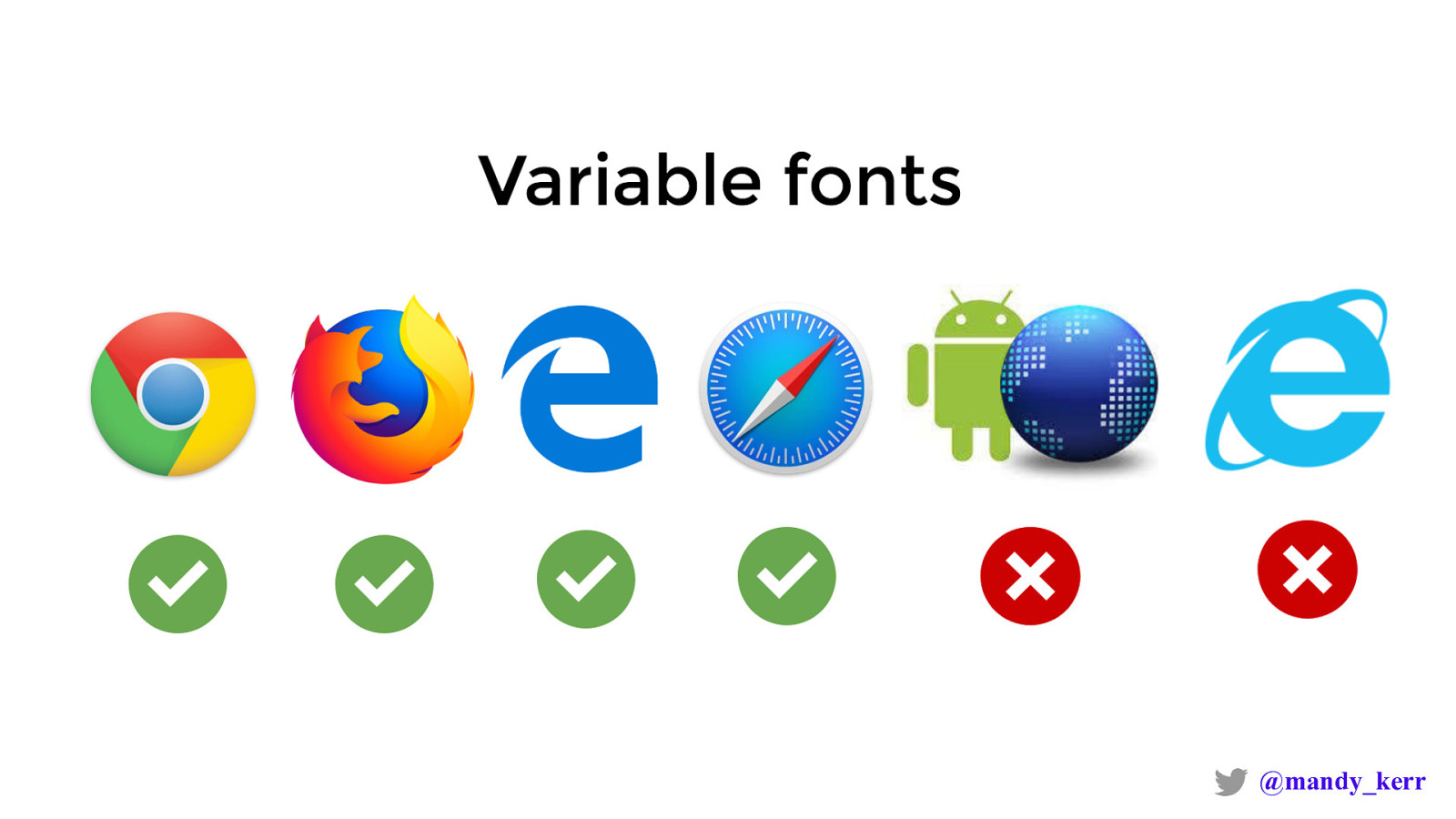
So, before we dive in I wanted to get browser support out of the way early Because it’s really good - all the major browsers support variable fonts - Given the level of support, we can definitely start using variable fonts now. So with that in mind, the best way i can describe what a variable font is.
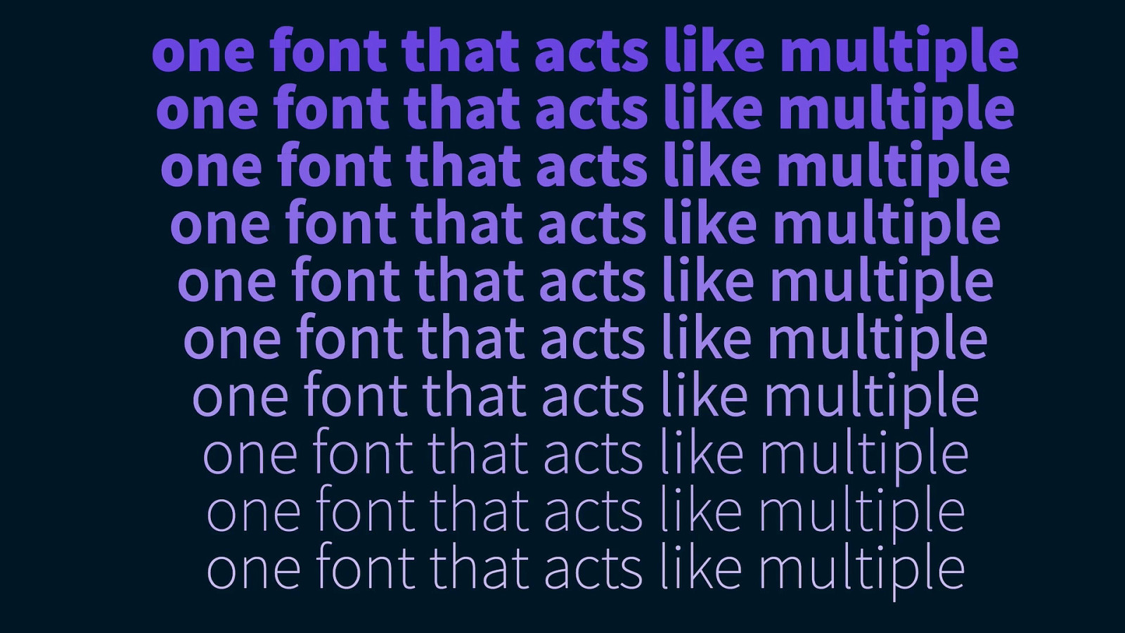
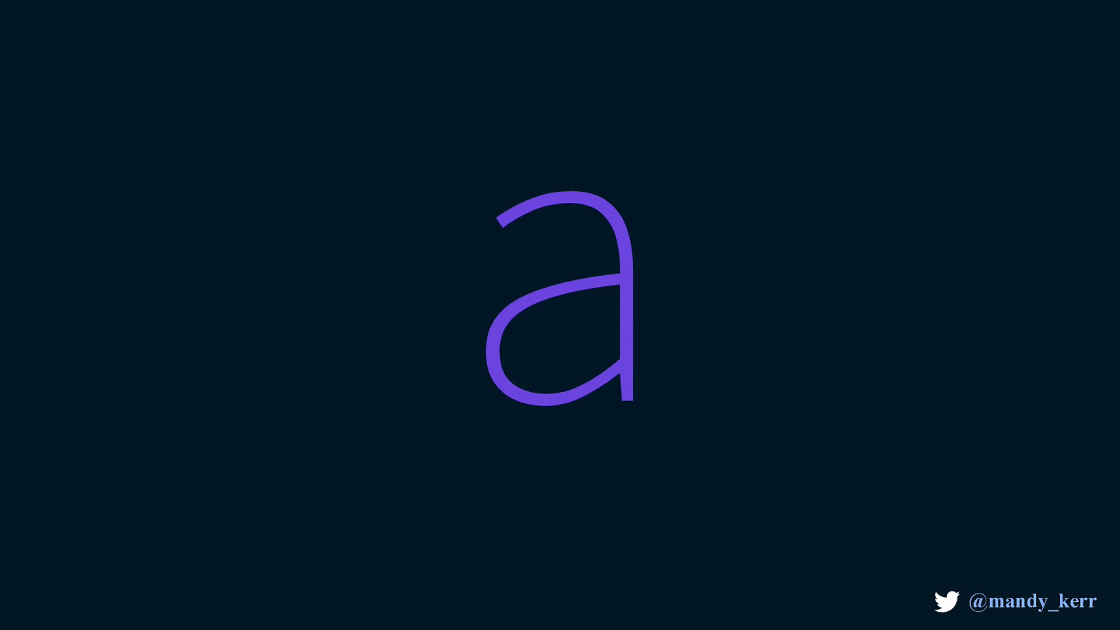
Is that they are one font file that acts like multiple fonts
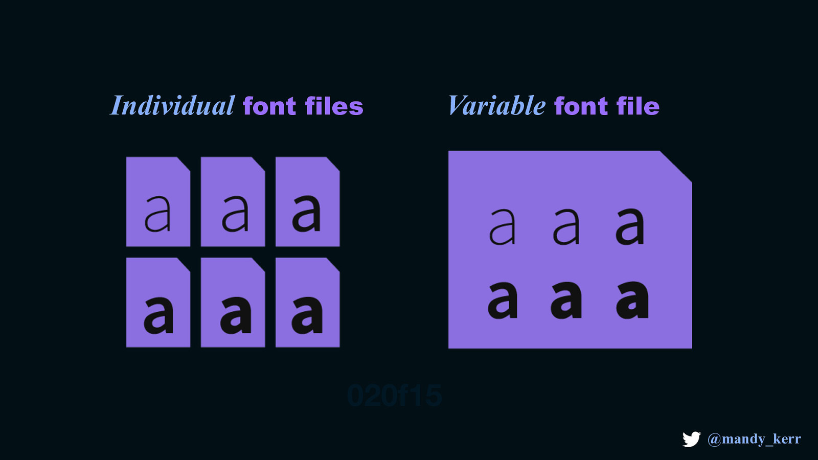
So where you might have 6 different font styles, all as separate, individual files - variable fonts can have all this information in only one file.
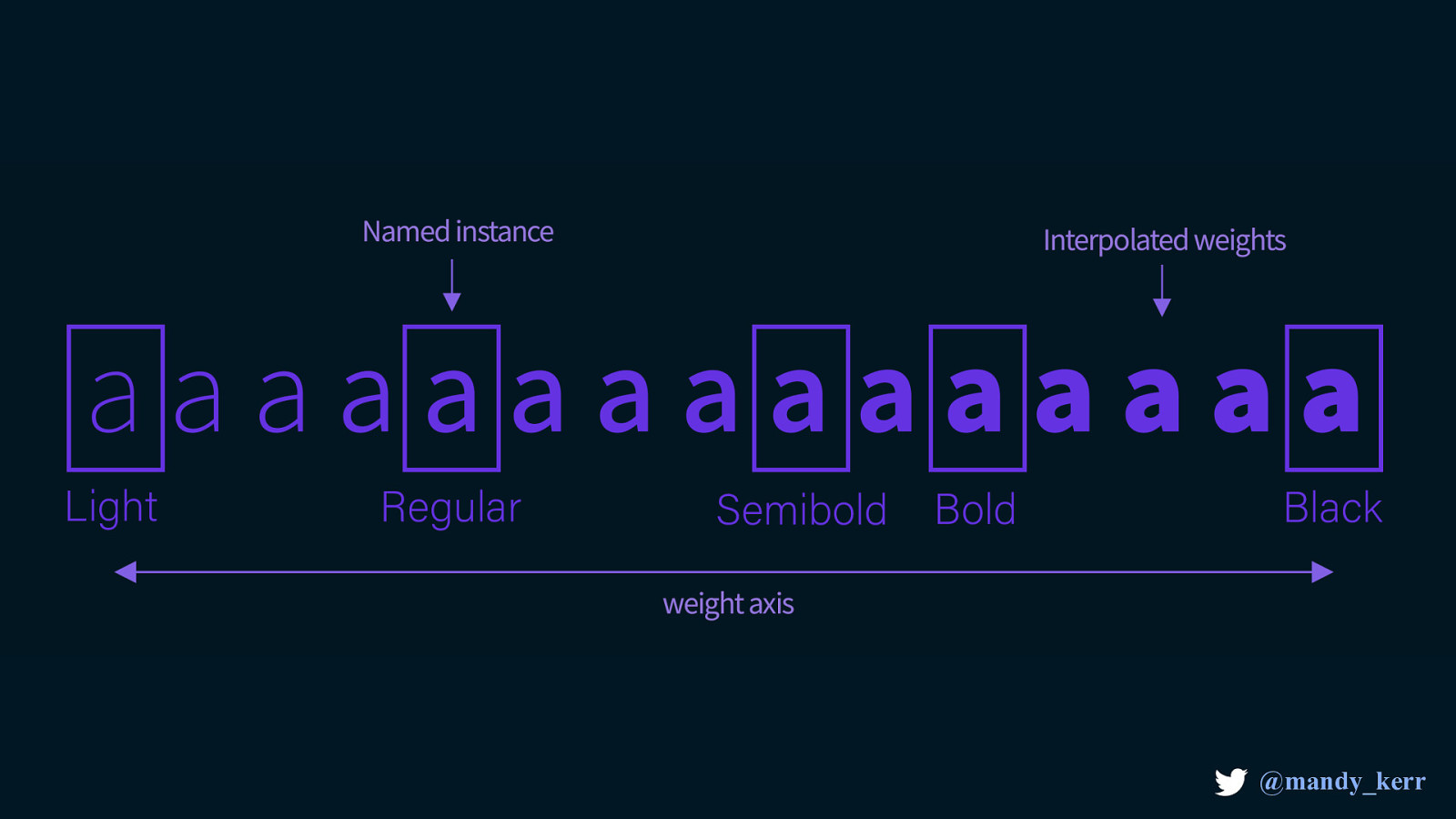
The way this is achieved is down to how the fonts are created. Variable fonts contain one or more axes that provide different variations between different extremes. As an example, a light font weight to a heavy font weight (or 200 - 900). Along the axis variable font values can be interpolated allowing for the possibility of intermediate designs, which provide finer control over the variations. So rather than having just your standard weight values, you can have all the values in between. For example 201, 202, 637, 893 and so on and so fourth. This can even include decimal places. Because these values are interpolated, it will typically result in a smaller file size than if you combined all the standard fonts together.
Additionally because the axis is interpolated, this means with can animate between the values creating smooth transitions between the variations.
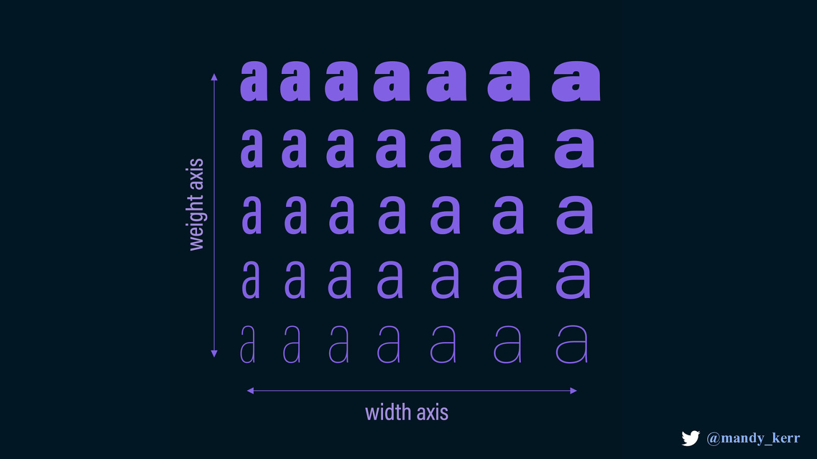
but what is even better about this is we are not limited to just a single axis, a variable font can contain thousands of axes, and as you can see in this image the interpolation does not just apply to the single axis but the combinations as well. So if you want a wider light weight, you can, or a heavier condensed style, no problem. All those styles can exist within the font.
In essence a variable font gives us a single file with a greater amount of variation and a significant increase in style choices. and they don’t just have to be your standard font styles like bold and width, it could be something totally different.
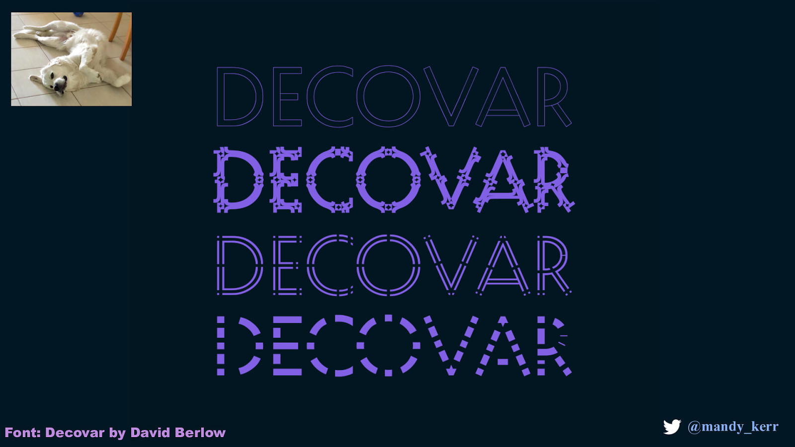
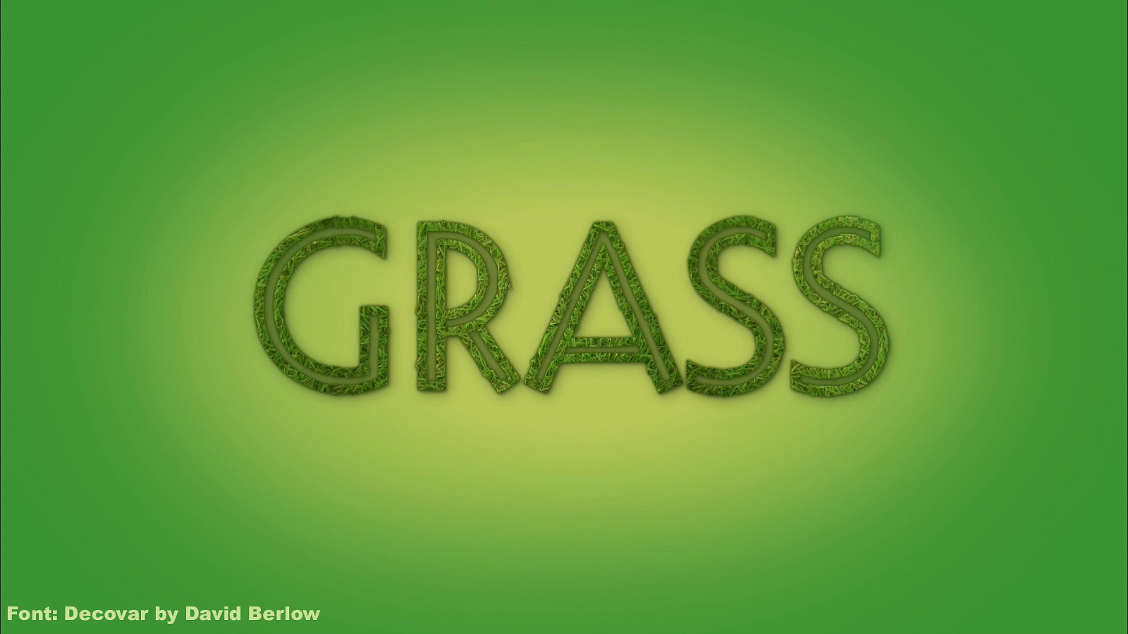
or a little bit weird, like Decovar, by David Berlow - probably my favourite variable font to experiment with! This font has a number of different and fun axis to play with - more than what I have shown on the screen. Often people thing that you have to do something special to use a variable font, but..
The way that we use variable fonts is very similar to how we would normally use fonts on the web.
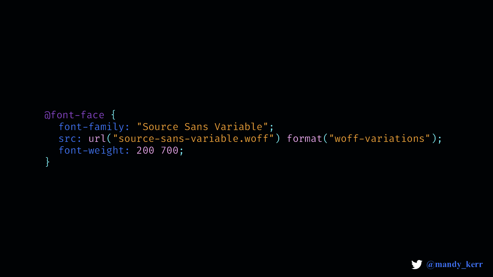
@font-face { font-family: “Source Sans Variable”; src: url(“source-sans-variable.woff”) format(“woff-variations”); font-weight: 200 700; }
For the most part we set the fonts up the same way we do now, using font-face.
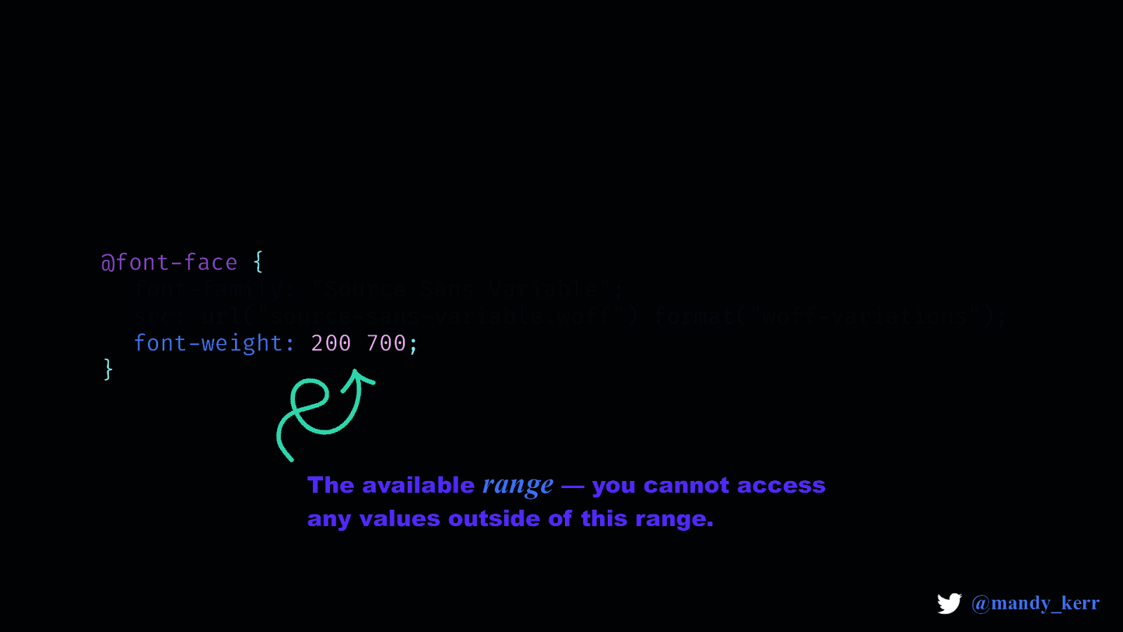
@font-face { font-family: “Source Sans Variable”; src: url(“source-sans-variable.woff”) format(“woff-variations”); font-weight: 200 700; }
The main change is to how we define the variations for descriptors like font-weight, font-stretch and font-style. In this example, where we might have previously set a font-weight of 200 and defined this as our light version and then setup another for the bold version, we can now do this all as one value and just set a range. In this example, we set a font weight of 200 to 700.
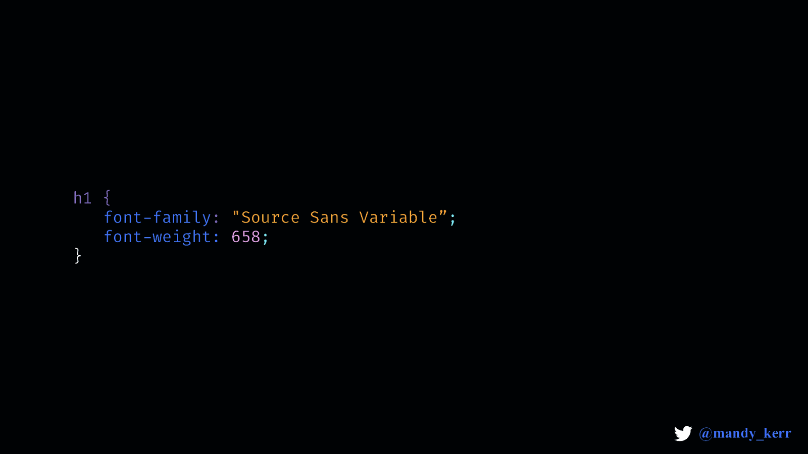
h1 { font-family: “Source Sans Variable”; font-weight: 658; }
From here we reference our font the same way we normally would in our css. But because this is a variable font and we’ve defined a range of weights we can set the value to whatever number we want between 200 and 700. So for example 658. This is great for weight, because we already have a CSS property that we can use. This is known as a registered axis which basically means it’s a common axis that the spec authors felt should be standardised. There five registered axes at the moment, weight, width, slant, italic, and optical size and they are all mapped to pre-existing css properties. In order to use something custom though, like the styles in Decovar, we need a new CSS property. (font-weight, font-stretch, font-style (italic and slant/oblique), font-optical-size)
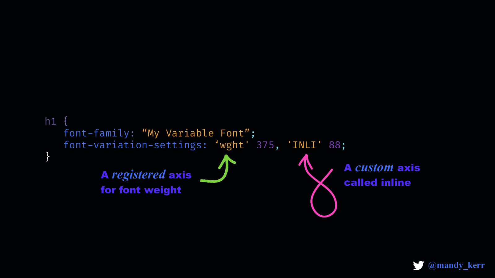
h1 { font-family: “My Variable Font”; font-variation-settings: ‘wght’ 375, ‘INLI’ 88; } A custom axis A registered axis called inline for font weight
That CSS property is called font-variation-settings and it enables us to define as many registered and custom axis as we need. In this example, we have two axes defined each with a 4 character code, and an associated number value, and each axis is separated by a comma. In this example the string ’wght’ refers to the registered axis of weight, and ‘INLI’ refers to a custom axis called inline. The codes for a registered axis are defined in the spec whereas custom axis codes are determined by the font creator. It’s really important that i mention that although you can use registered axis in the font-variation-settings property, it’s highly recommended that you use their mapped css properties, like the fontweight instead. So do this wherever possible.
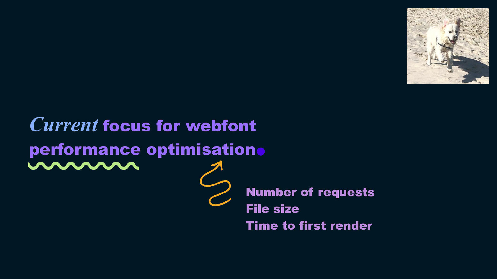
So now we know what variable fonts are and how we use them let’s finally talk about the performance benefits. Normally when we think about web-fonts and their impact on performance we’d focus on - the number of font requests, - font-file size, - and time to first render of our text So let’s look at how variable fonts fair in these situations.
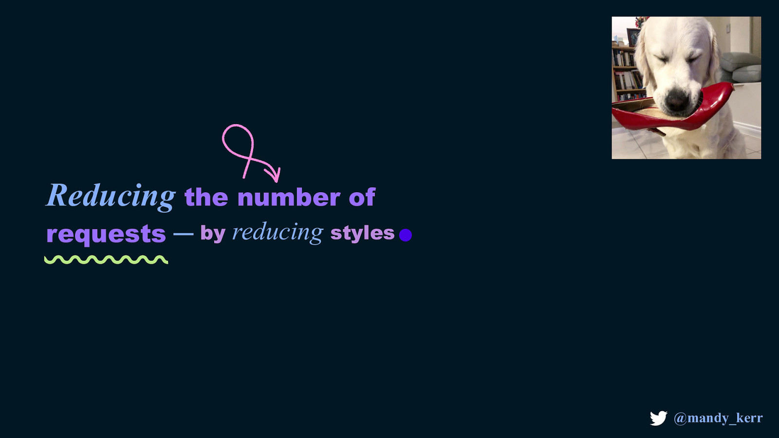
First up, reducing the number of requests. - One way we’d typically resolve reducing the number of requests is by reducing the number of style variations basically resulting in less font files - This usually meant that we’d have to plan our typography choices and weigh up the cost of design over the cost of performance and we’d have to justify that cost before adding any new styles. We have established that a variable font can contain multiple variations in the one file - this means we have immediately reduced the number of requests without having to question our designers about their typography choices. So rather than having 7 files we might only have 2. - But if the font has all the information in it, what does that do to file size?
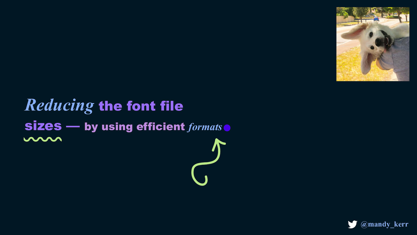
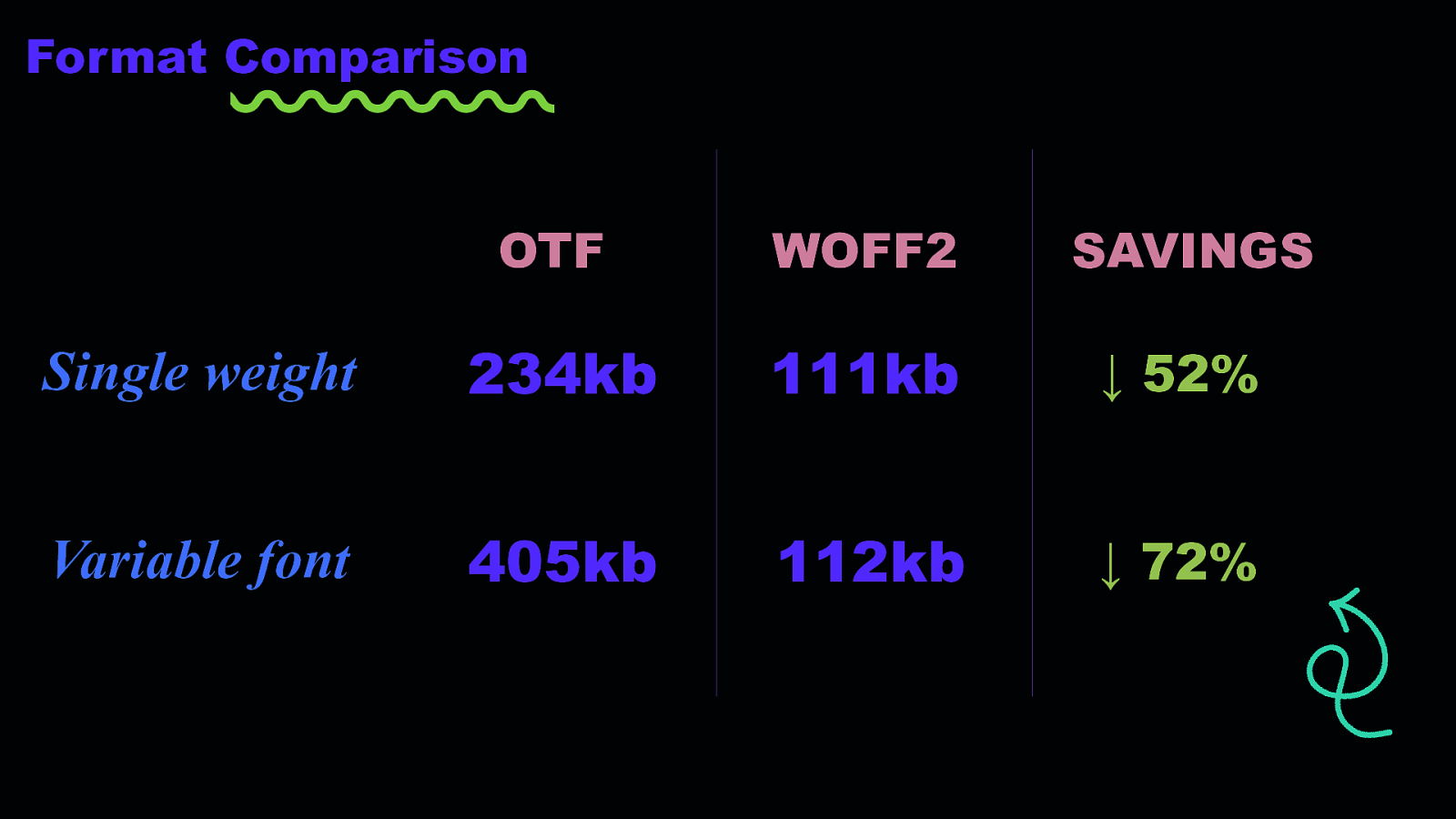
This brings me to reducing the font file size. This can be achieved in a number of ways, the first step is usually choosing the most efficient webfont formats e.g. WOFF and WOFF2
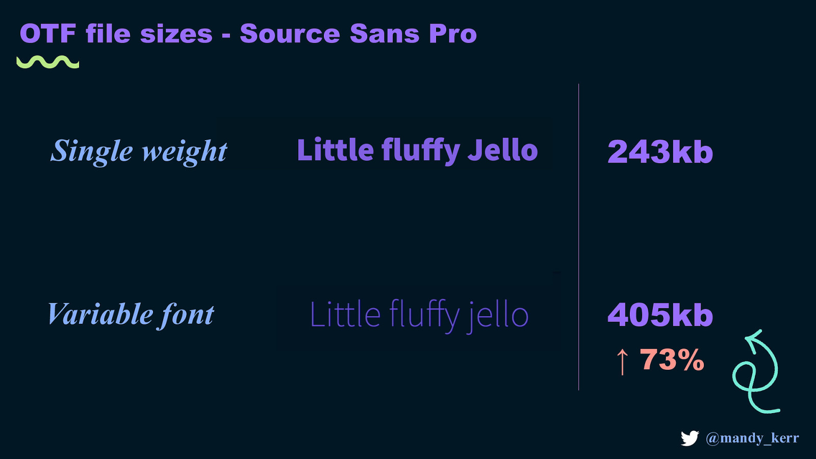
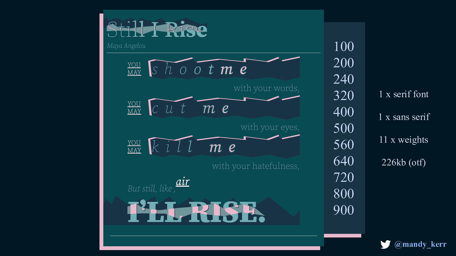
OTF file sizes - Source Sans Pro Single weight 243kb Variable font 405kb ↑ 73% @mandy_kerr At this point I want to do a bit of a comparison of font file sizes. As a baseline a single weight of the standard version of the font Source Sans Pro is approximately 243kb in OTF format. The total size of the variable font in otf is 405kb
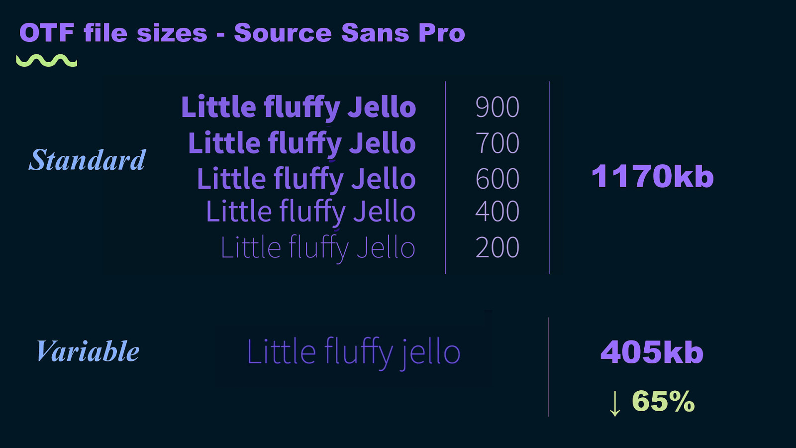
OTF file sizes - Source Sans Pro Standard 1170kb Variable 405kb ↓ 65% 15:05 For context all the available standard font weights result in a combined file size of approximately 1170kb. That is nearly 3 times the size of the variable font. Even if you just wanted the bold and regular versions of the font, 2 versions are still larger than the single variable font.
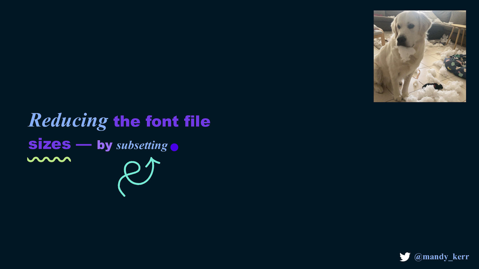
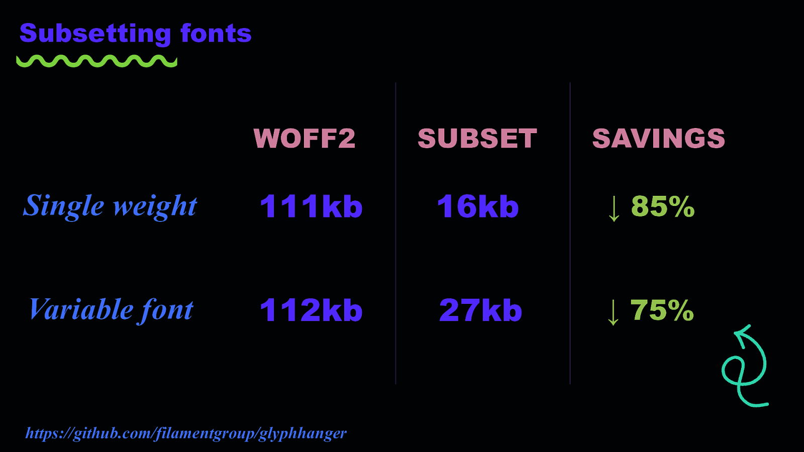
With standard fonts another way to reduce file size is by subsetting the font to remove unnecessary characters or reducing it to a specific language set like just english characters for example This obviously comes with risks and can result in parts of your typography rendering as your fallback and not your font. You can subset variable fonts with tools like glyphhanger, by filament group I wasn’t sure in the beginning if you could actually subset a variable font. But you can.
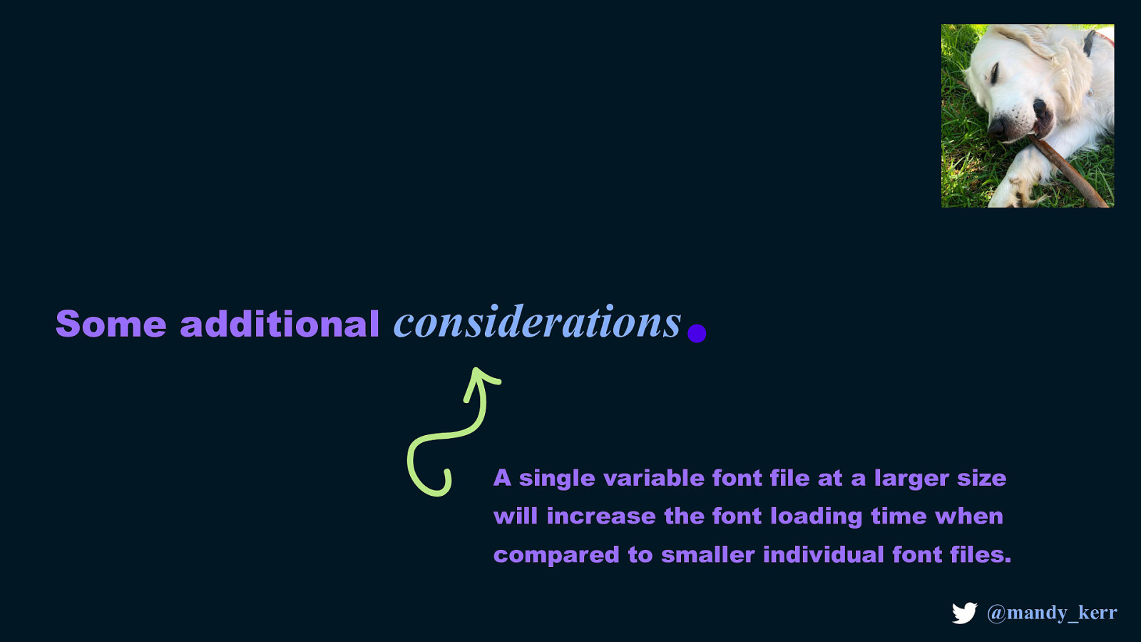
A single variable font file at a larger size will increase the font loading time when compared to smaller individual font files. With standard fonts because individually they are a smaller file size you might have your body text render quicker and then the bold text load, and so on. The benefit here is that you get content sooner. With variable fonts you have to wait for the single variable font file to load before any text is rendered - this can result in a longer delay before you see any content.
There are a couple of considerations here. Because a variable font needs all the font information to download before it can render, you wont end up with the “invisible text” problem that can affect your messaging. But also because it’s only one file, the browser will only redraw once, not multiple times (depending on how many fonts you are loading)
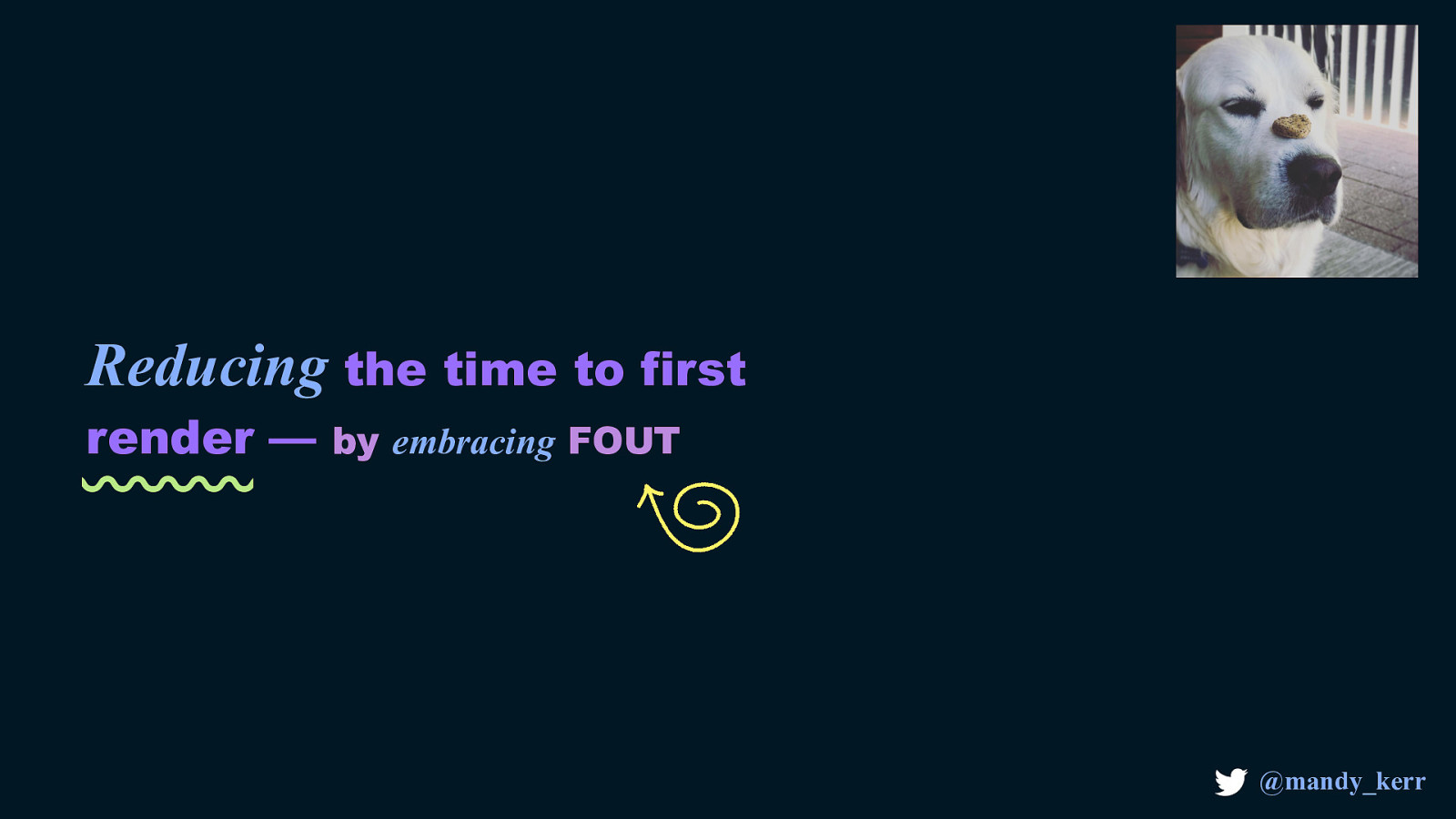
So this leads me into the last area which is reducing the time to first render. But in order to talk about that I want to quickly explain Flash of Unstyled Text and Flash of Invisible Text.
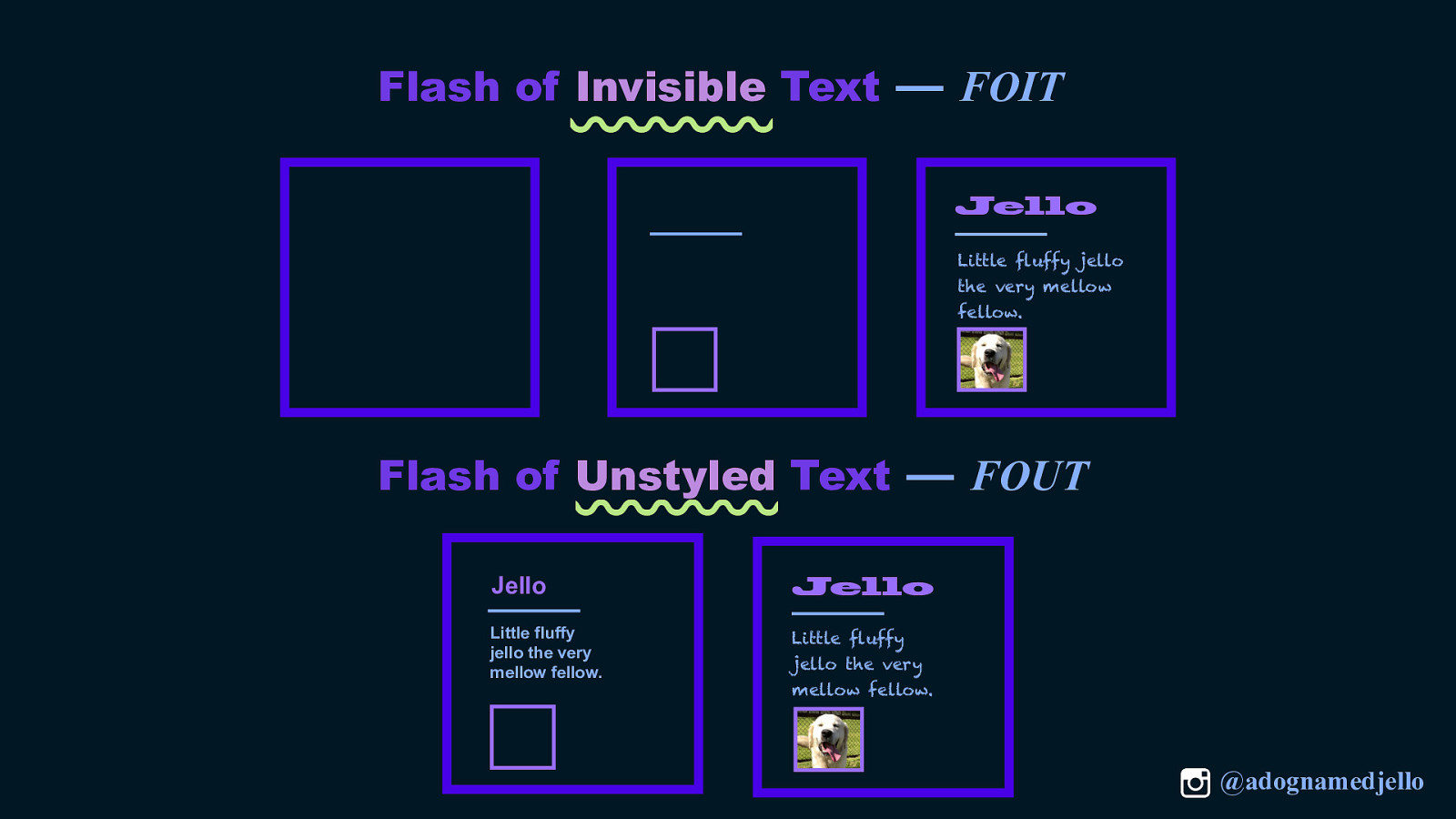
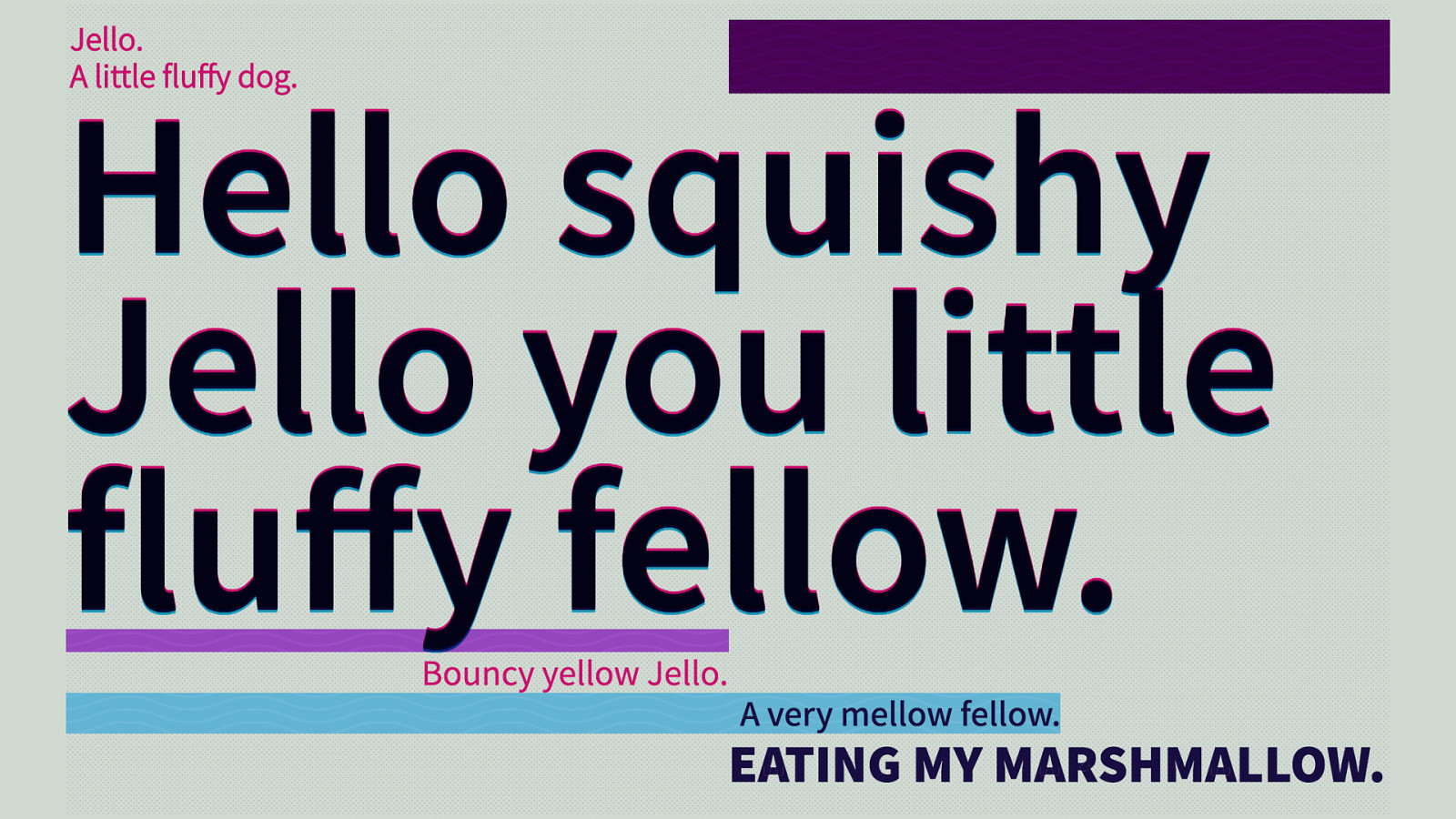
Flash of Invisible Text — FOIT Jello Little fluffy jello the very mellow fellow. Flash of Unstyled Text — FOUT Jello
Flash of invisible text is when we block or delay the font from loading until it’s available. Flash of Unstyled Text is when we load a fallback and switch or swap to our custom fonts when they are ready. A flash of unstyled text is a better experience than not being able to read your content at all - so what we want to be able to do is embrace this and try and limit the impacts as much as we can.
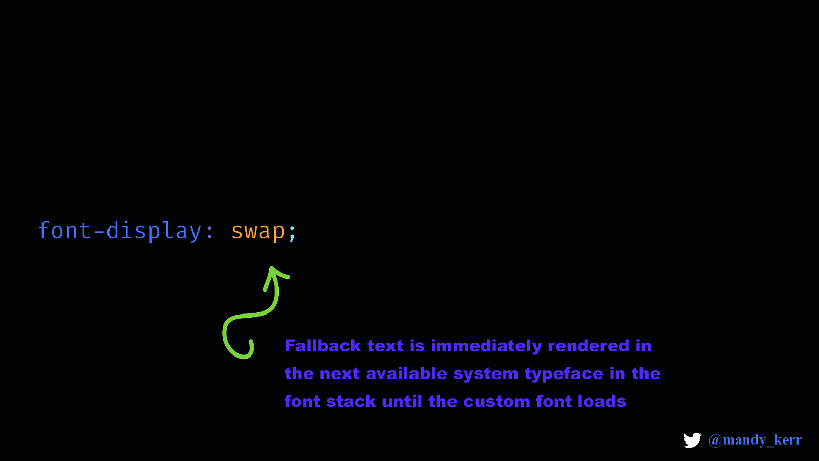
font-display: swap; In order to embrace FOUT we can use the font-display property with the value of “swap” - this will render our fallback font defined in our font stack pretty fast and swap in the custom font when it has loaded.
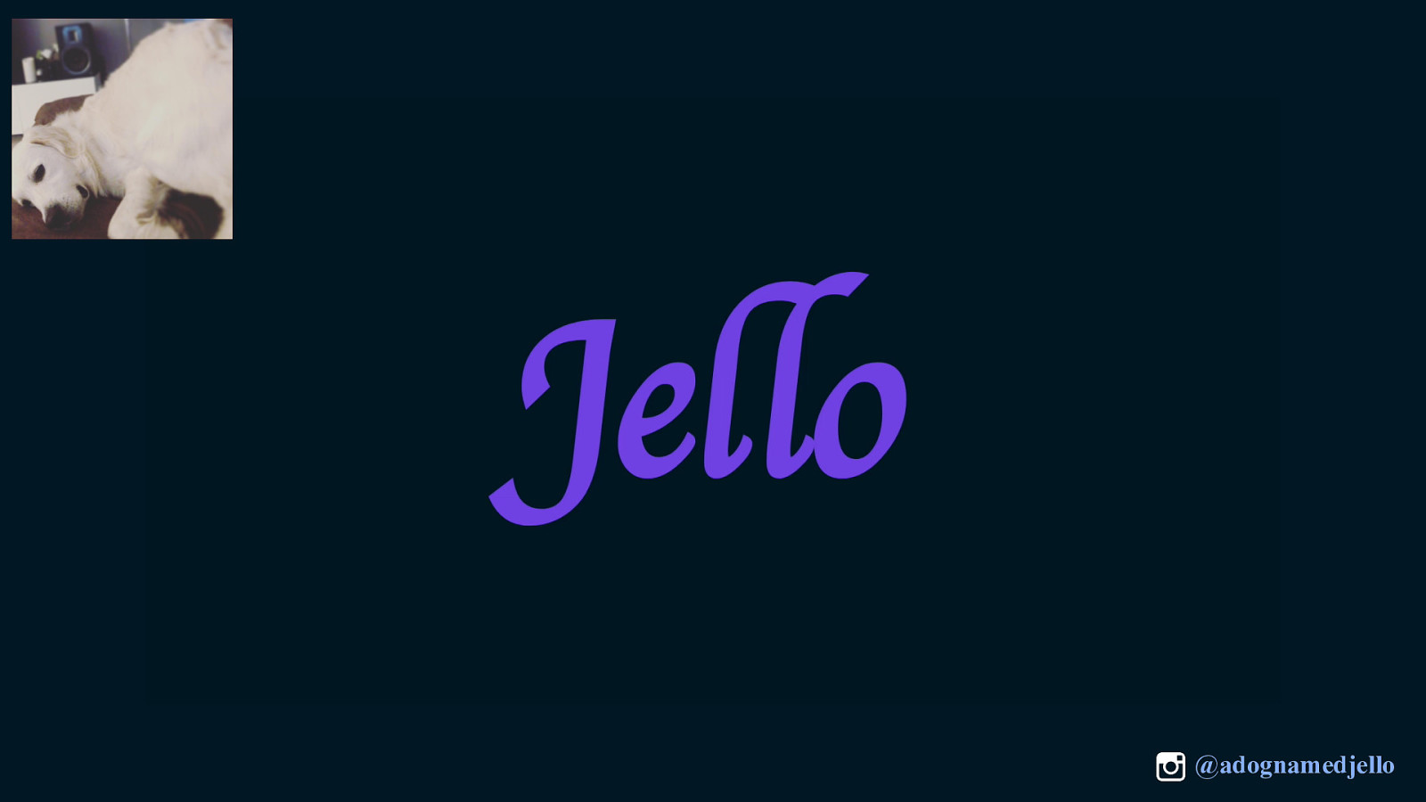
This is what it looks like when the font swaps.
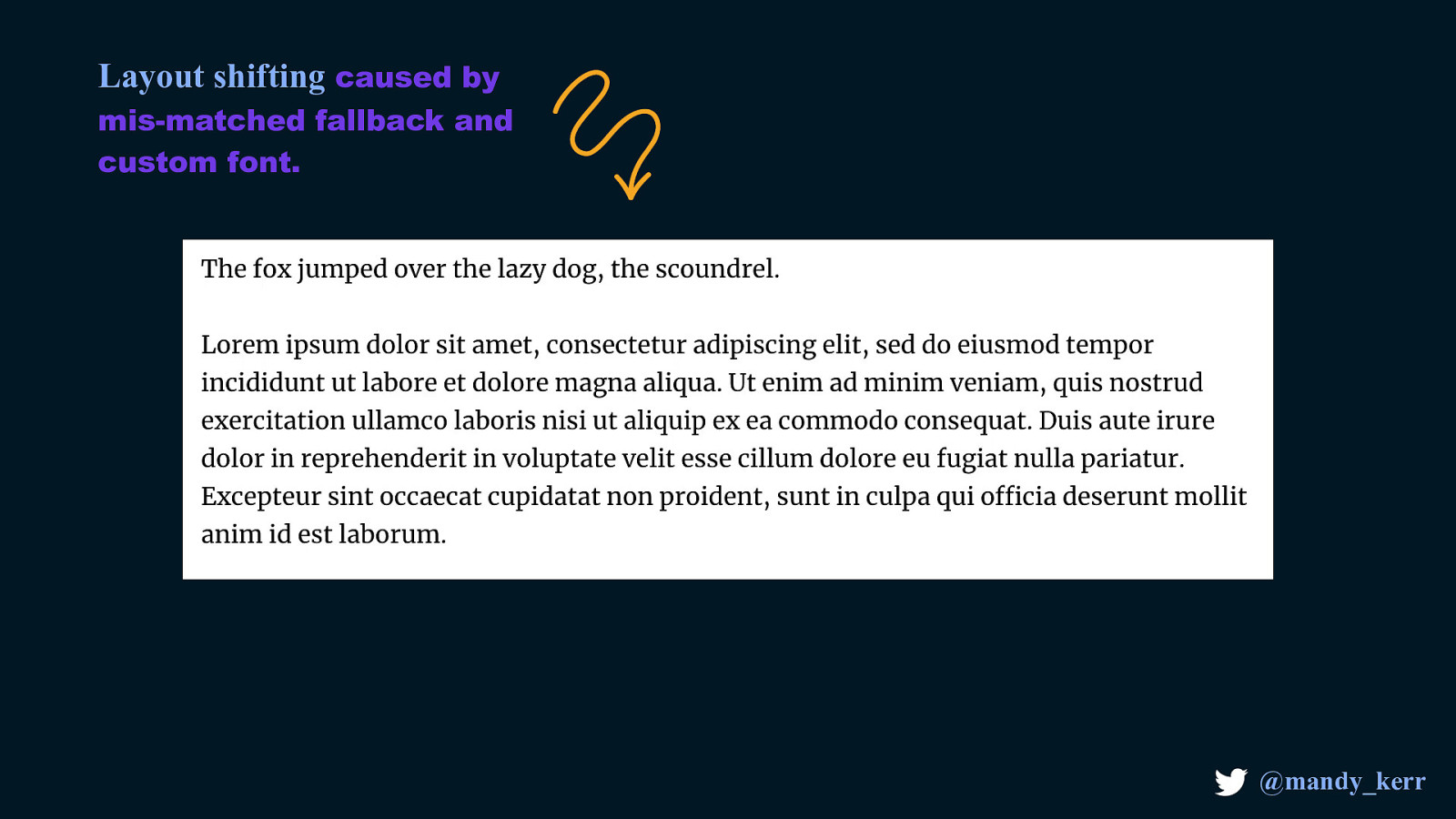
So as you saw with the Jello example when we swap between the fallback and the custom font we often see effects where the layout shifts to switch between the different “sized” fonts.
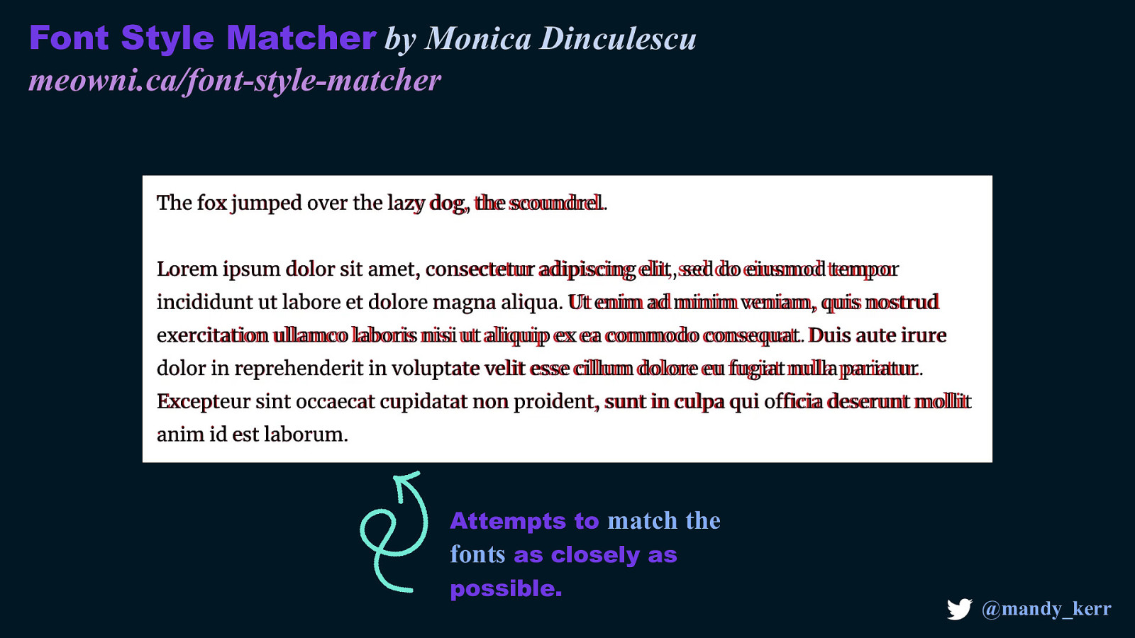
Attempts to match the fonts as closely as possible.
With Standard Fonts we can modify the line-height, size and letter spacing to try and match our fonts our system and custom fonts to reduce that layout shifting - Monica made a great tool called Font Style Matcher which can help you do this!
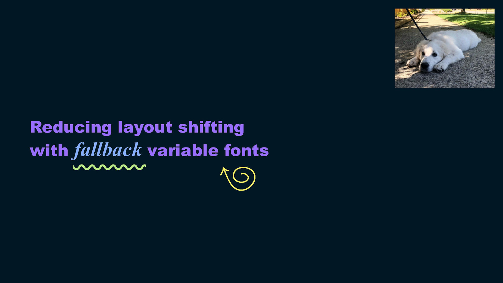
Reducing layout shifting with fallback variable fonts What i’m hoping is that as variable fonts become more widely supported across Operating Systems we can reduce this layout shifting by using a variable system font as a fallback in our font stack instead.
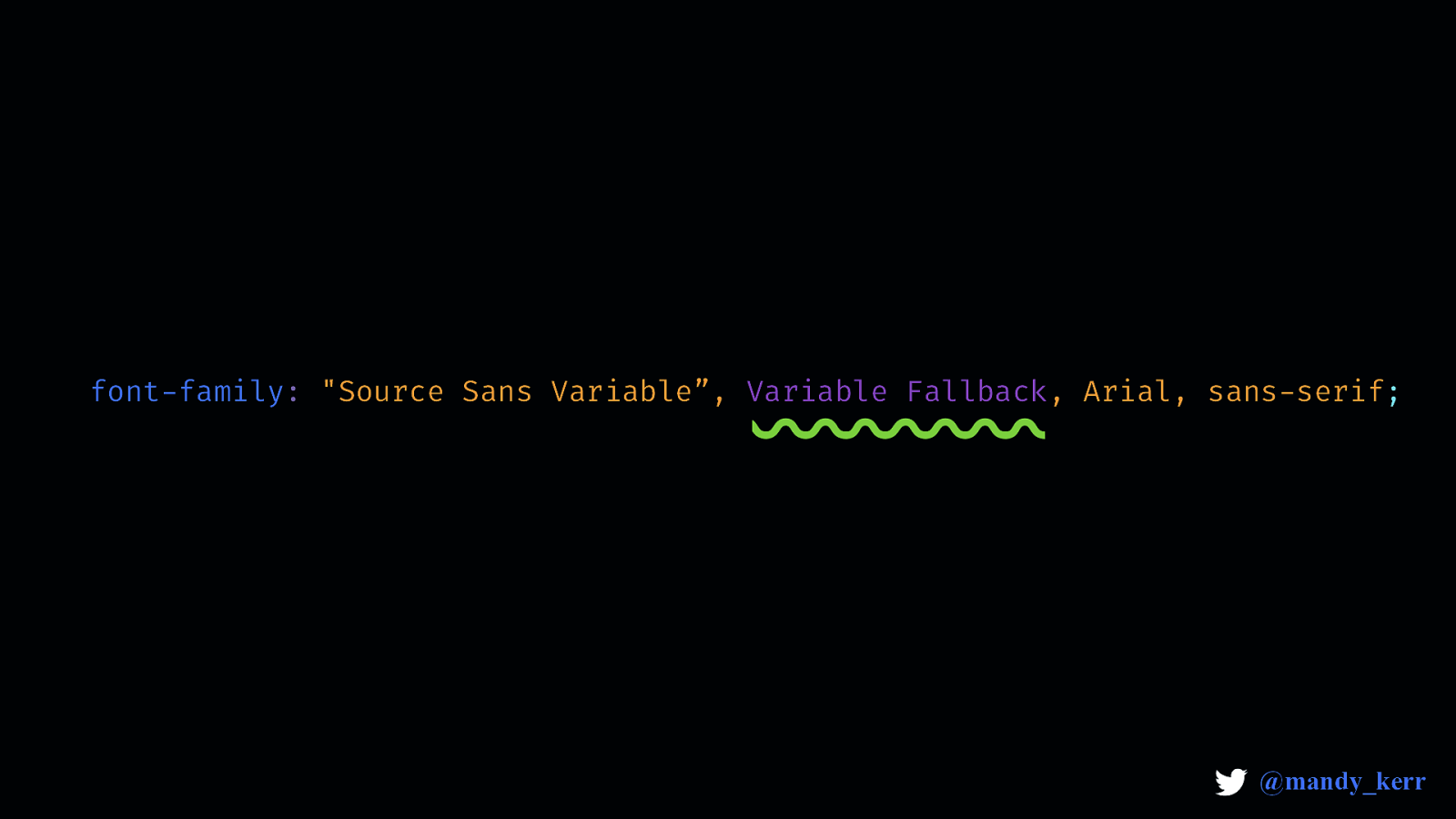
font-family: “Source Sans Variable”, Variable Fallback, Arial, sans-serif;
This would be an amazing opportunity - imagine if we had system fonts with control over weight, width and optical size or other axes - we would be able to control the font itself to match more closely with our custom fonts. Combining with the existing techniques of line-height, font size etc, we could create an incredibly smooth transition between the two fonts meaning a less noticeable Flash of Unstyled Text and less redraw!
Variable fonts can improve actual and perceived performance.
So not only do variable fonts reduce the overall combined file size, we only have one network request for the weights and styles of a font , and even though we have technology like HTTP/2 reducing network overhead of multiple files —this is still a major technical advantage. Even if you consider the slightly larger file sizes, when combined with improved font compression formats like woff2, font subsetting and font loading techniques like font-display: swap we end up in a situation where we get all the benefits of standard fonts, but a significant increase in stylistic opportunity. By combining these techniques our bandwidth and and performance issues start to become less of a problem.
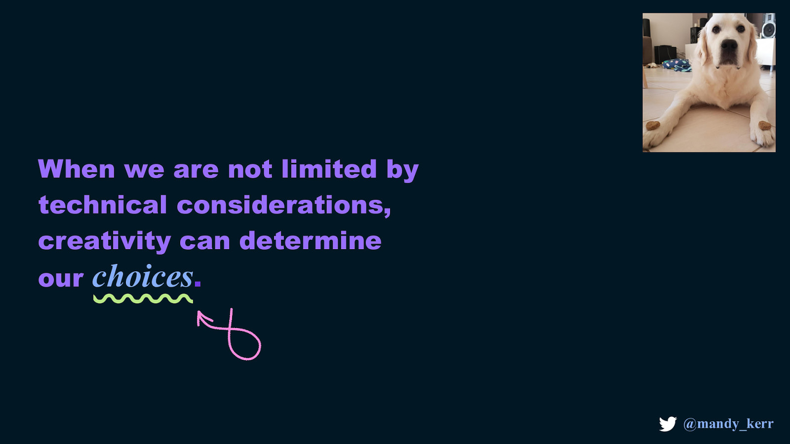
If we are able to solve some of our pre-existing technical problems around performance and fallbacks we can start to shift our focus. We no longer need to trade off design for performance. Creativity can drive our choices instead of the technical limitations.
We can be less concerned about our previous limitations. It becomes an opportunity to figure out how we can use this technology to create better experiences for our users. That variable fonts offer so much variation means we can create experiences which better suit our devices, and environments, and adjust our fonts to create more accessible and legible text.
and Being able recognise the environments our users are in allows us to move towards better font legibility and readability We can create more sufficient contrast, based on the users environment or current experience

The increase in flexibility results in much more design opportunities. Designs which would previously have been a heavy burden on performance, or simply impossible due to the technical limitations are now completely possible.
We can embrace the learnings, the growth of print design, but also benefit from the flexibility and interactive nature of the web.
Potential to reduce the need for some JavaScript libraries….maybe…* *terms and conditions apply.
Not that there is anything wrong with JavaScript, but variable fonts could help to reduce the need for some external JS libraries by enabling text effect techniques to be accomplished with just the font and some css. (Maybe a bit of hand written JS if needed). The caveat here is that SVG + JS + CSS might be smaller than the font file itself, you’d have to compare file sizes and remember all your font performance techniques like subsetting. This is obviously a huge maybe, it might not be better for performance, it might be worse. It really is going to depend on the fonts you are using.
But variable fonts make it possible for us to do things like growing text. No JS, no SVG, no Canvas . Just text and css.

Font: Duos Writer by Underware Or perhaps that text writing technique we often see. @mandy_kerr
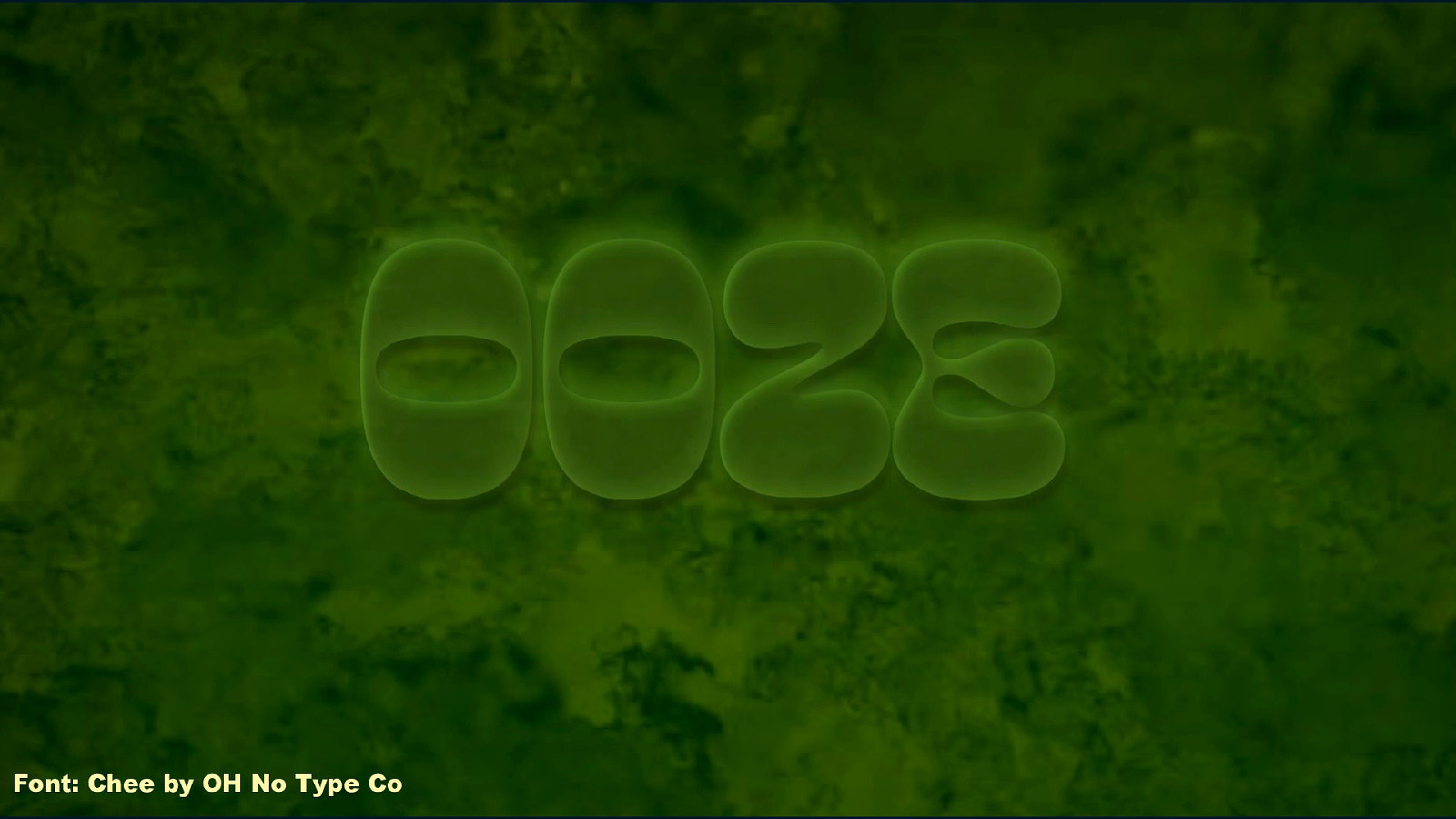
Font: Chee by OH No Type Co or oozing text - this is one of my favs, I hooked this into dark mode on mac so it oozes in dark more. Classic.
Ending on a bit of a bummer - bold move!

Of course the downside to these examples right now is that animating them can be a bit heavy not he browser. This is an effect i created, it’s up on codepen. It absolutely destroys your browser. Chrome sounds like you are standing next to the engine of an airplane when you leave this running and if you accidentally have it in multiple tabs it definitely crashes the browser. I think it’s a combination of the way variable fonts were being animated + the incredibly long text shadow (which looks amazing btw) So moral of this story is we still have way to go.
There has never been a better time to create for the web.
Regardless i think there has never been a better time to be a developer or designer for the web and variable fonts open up doors that never existed before and i think that’s pretty exciting. They mean we can potentially improve the performance of our websites and at the same time benefit from more design opportunities, and create more accessible and meaningful content.
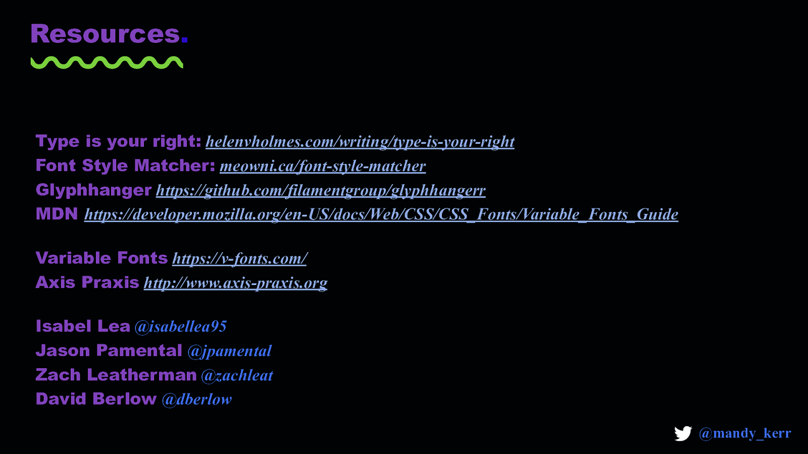
Resources. Type is your right: helenvholmes.com/writing/type-is-your-right Font Style Matcher: meowni.ca/font-style-matcher Glyphhanger https://github.com/filamentgroup/glyphhangerr MDN https://developer.mozilla.org/en-US/docs/Web/CSS/CSS_Fonts/Variable_Fonts_Guide Variable Fonts https://v-fonts.com/ Axis Praxis http://www.axis-praxis.org Isabel Lea @isabellea95 Jason Pamental @jpamental Zach Leatherman @zachleat David Berlow @dberlow @mandy_kerr Here are some resources, which i’ll tweet out.

Thank you. This presentation was proudly brought to you by Arial Black & Times New Roman.