A Deep Dive into Email Accessibility Mark Robbins REBEL @M_J_Robbins @GoRebel #LitmusLive @M_J_Robbins @GoRebel
A presentation at Litmus Live in August 2018 in London, UK by Mark Robbins
A Deep Dive into Email Accessibility Mark Robbins REBEL @M_J_Robbins @GoRebel #LitmusLive @M_J_Robbins @GoRebel
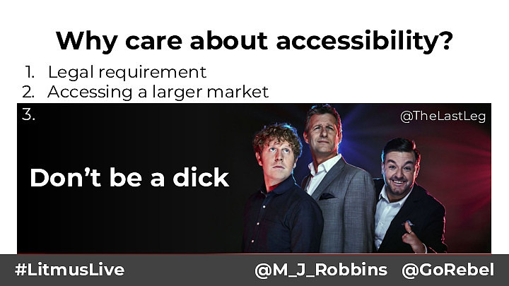
Why care about accessibility? 1. Legal requirement 2. Accessing a larger market 3.● 15%-20% of people have reading difficulties, including dyslexia @TheLastLeg ○ ● 22% of emails are opened in Gmail 8% of caucasian males suffer from some form of color blindness ○ 8% email are opened in iPad ○ 7% of emails are opened in Outlook ● 7% of working age adults have a severe dexterity difficulty Don’t be a dick ● 3-4% of people can't see well enough to read ○ 3% of emails are opened in Outlook.com Sources: statistics from government agencies and researchers in the US, UK and Canada https://www.powermapper.com/blog/website-accessibility-disability-statistics - http://emailclientmarketshare.com/ #LitmusLive @M_J_Robbins @GoRebel
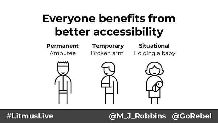
Everyone benefits from better accessibility Permanent Amputee #LitmusLive Temporary Broken arm Situational Holding a baby @M_J_Robbins @GoRebel
Quick recap #LitmusLive @M_J_Robbins @GoRebel
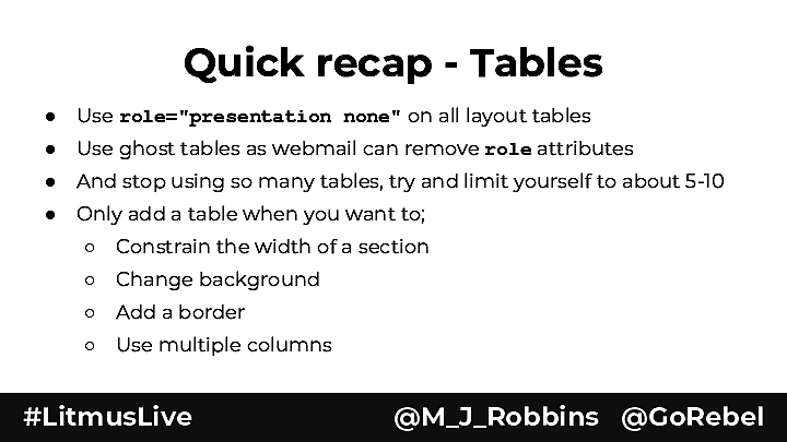
Quick recap - Tables ● Use role="presentation none" on all layout tables ● Use ghost tables as webmail can remove role attributes ● And stop using so many tables, try and limit yourself to about 5-10 ● Only add a table when you want to; ○ Constrain the width of a section ○ Change background ○ Add a border ○ Use multiple columns #LitmusLive @M_J_Robbins @GoRebel
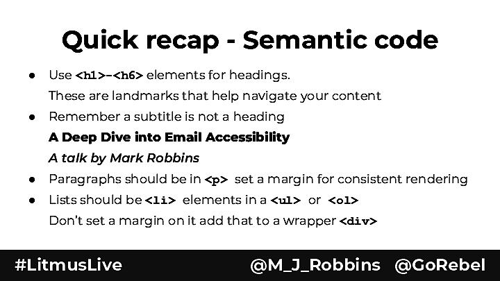
Quick recap - Semantic code ● Use <h1>-<h6> elements for headings. These are landmarks that help navigate your content ● Remember a subtitle is not a heading A Deep Dive into Email Accessibility A talk by Mark Robbins ● Paragraphs should be in <p> set a margin for consistent rendering ● Lists should be <li> elements in a <ul> or <ol> Don’t set a margin on it add that to a wrapper <div> #LitmusLive @M_J_Robbins @GoRebel
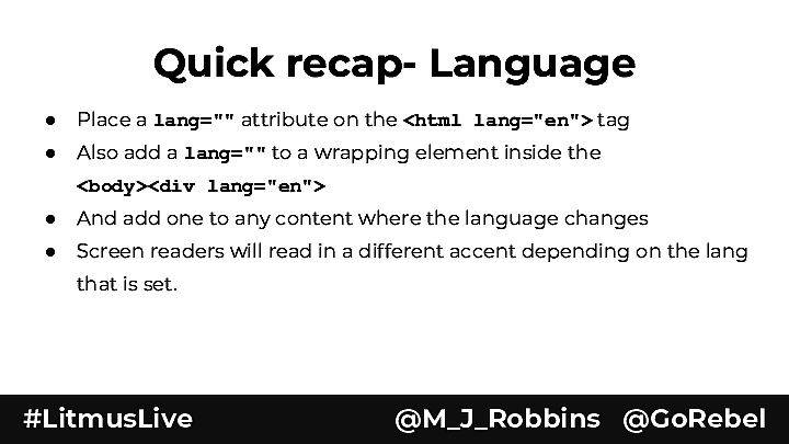
Quick recap- Language ● Place a lang="" attribute on the <html lang="en"> tag ● Also add a lang="" to a wrapping element inside the <body><div lang="en"> ● And add one to any content where the language changes ● Screen readers will read in a different accent depending on the lang that is set. #LitmusLive @M_J_Robbins @GoRebel
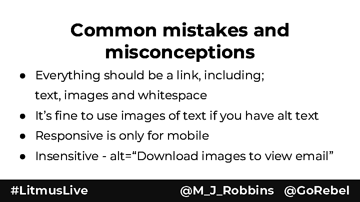
Common mistakes and misconceptions ● Everything should be a link, including; text, images and whitespace ● It’s fine to use images of text if you have alt text ● Responsive is only for mobile ● Insensitive - alt=“Download images to view email” #LitmusLive @M_J_Robbins @GoRebel

Some cool new experimental stuff #LitmusLive @M_J_Robbins @GoRebel
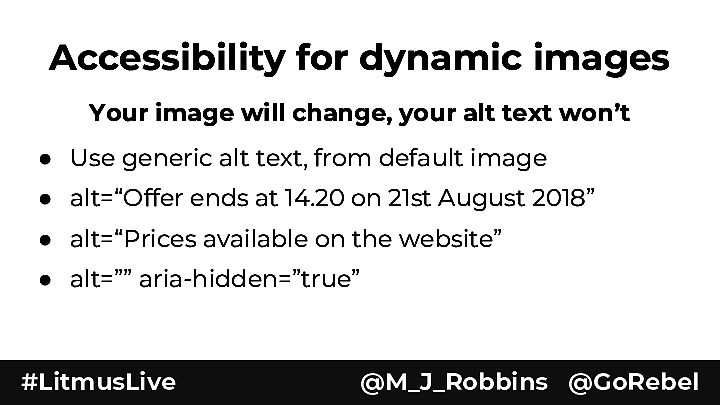
Accessibility for dynamic images Your image will change, your alt text won’t ● Use generic alt text, from default image ● alt=“Offer ends at 14.20 on 21st August 2018” ● alt=“Prices available on the website” ● alt=”” aria-hidden=”true” #LitmusLive @M_J_Robbins @GoRebel
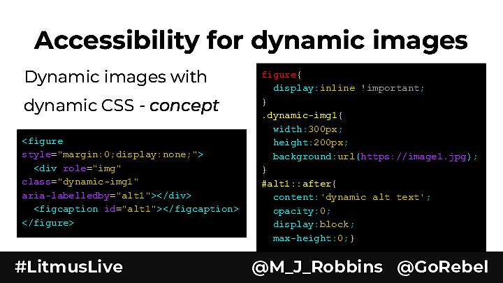
Accessibility for dynamic images Dynamic images with dynamic CSS - concept <figure style="margin:0;display:none;"> <div role="img" class="dynamic-img1" aria-labelledby="alt1"></div> <figcaption id="alt1"></figcaption> </figure> #LitmusLive figure{ display:inline !important; } .dynamic-img1{ width:300px; height:200px; background:url(https://image1.jpg); } #alt1::after{ content:'dynamic alt text'; opacity:0; display:block; max-height:0;} @M_J_Robbins @GoRebel
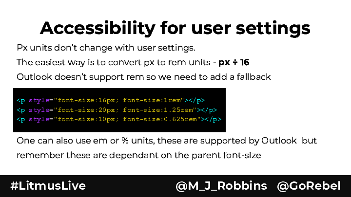
Accessibility for user settings Px units don’t change with user settings. The easiest way is to convert px to rem units - px ÷ 16 Outlook doesn’t support rem so we need to add a fallback <p style="font-size:16px; font-size:1rem"></p> <p style="font-size:20px; font-size:1.25rem"></p> <p style="font-size:10px; font-size:0.625rem"></p> One can also use em or % units, these are supported by Outlook but remember these are dependant on the parent font-size #LitmusLive @M_J_Robbins @GoRebel
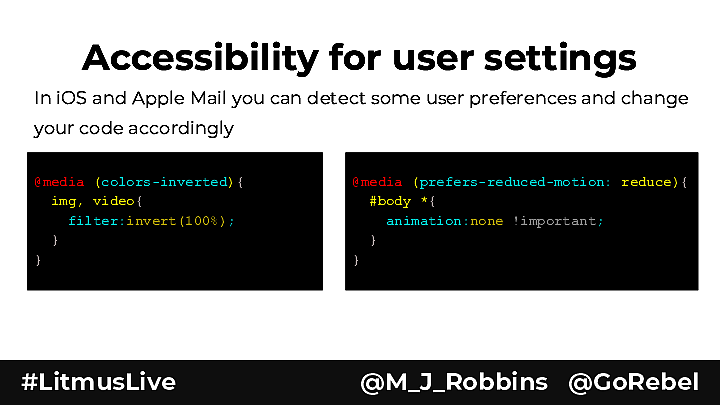
Accessibility for user settings In iOS and Apple Mail you can detect some user preferences and change your code accordingly @media (colors-inverted){ img, video{ filter:invert(100%); } } #LitmusLive @media (prefers-reduced-motion: reduce){ #body *{ animation:none !important; } } @M_J_Robbins @GoRebel
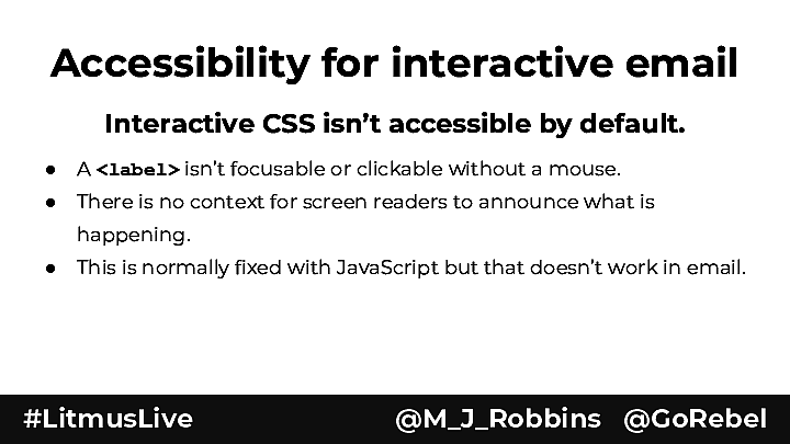
Accessibility for interactive email Interactive CSS isn’t accessible by default. ● A <label> isn’t focusable or clickable without a mouse. ● There is no context for screen readers to announce what is happening. ● This is normally fixed with JavaScript but that doesn’t work in email. #LitmusLive @M_J_Robbins @GoRebel
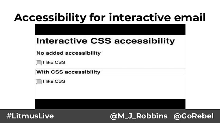
Accessibility for interactive email #LitmusLive @M_J_Robbins @GoRebel
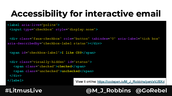
Accessibility for interactive email <label aria-live="polite"> <input type="checkbox" style="display:none"> <div class="faux-checkbox" role="button" tabindex="0" aria-label="tick box" aria-describedby="checkbox-label status"></div> <span id="checkbox-label">I like CSS</span> <div class="visually-hidden" id="status"> <span class="checked">checked</span> <span class="unchecked">unchecked</span> </div> </label> View it online: https://codepen.io/M_J_Robbins/pen/aVJBXd #LitmusLive @M_J_Robbins @GoRebel

Accessibility for interactive email #LitmusLive @M_J_Robbins @GoRebel
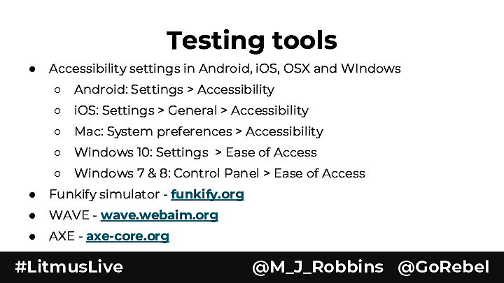
Testing tools ● Accessibility settings in Android, iOS, OSX and WIndows ○ Android: Settings > Accessibility ○ iOS: Settings > General > Accessibility ○ Mac: System preferences > Accessibility ○ Windows 10: Settings > Ease of Access ○ Windows 7 & 8: Control Panel > Ease of Access ● Funkify simulator - funkify.org ● WAVE - wave.webaim.org ● AXE - axe-core.org #LitmusLive @M_J_Robbins @GoRebel
Further Resources goo.gl/QQyG7f Curated by @wilbertheinen email.geeks.chat Slack group with an email-accessibility channel #LitmusLive @M_J_Robbins @GoRebel
Thank you Mark Robbins REBEL @M_J_Robbins @GoRebel #LitmusLive @M_J_Robbins @GoRebel