Good
Design
The Gateway to a Better Business

A presentation at WordCamp Maine in May 2016 in Portland, ME, USA by Mel Choyce
Good
Design
The Gateway to a Better Business
Mel Choyce Hi everyone! Hope you’ve all had a good lunch.
I’m Mel Choyce. I’m a design engineer at Automattic, where I mostly do UI design and front-end development. I’m also a WordPress core contributor and a guest committer. melchoyce.design @melchoyce Design Engineer at Automattic & WP Core Committer
What is design? So I know everyone just had a bunch of pizza, so let’s start things off a little easy. What is design in the first place?
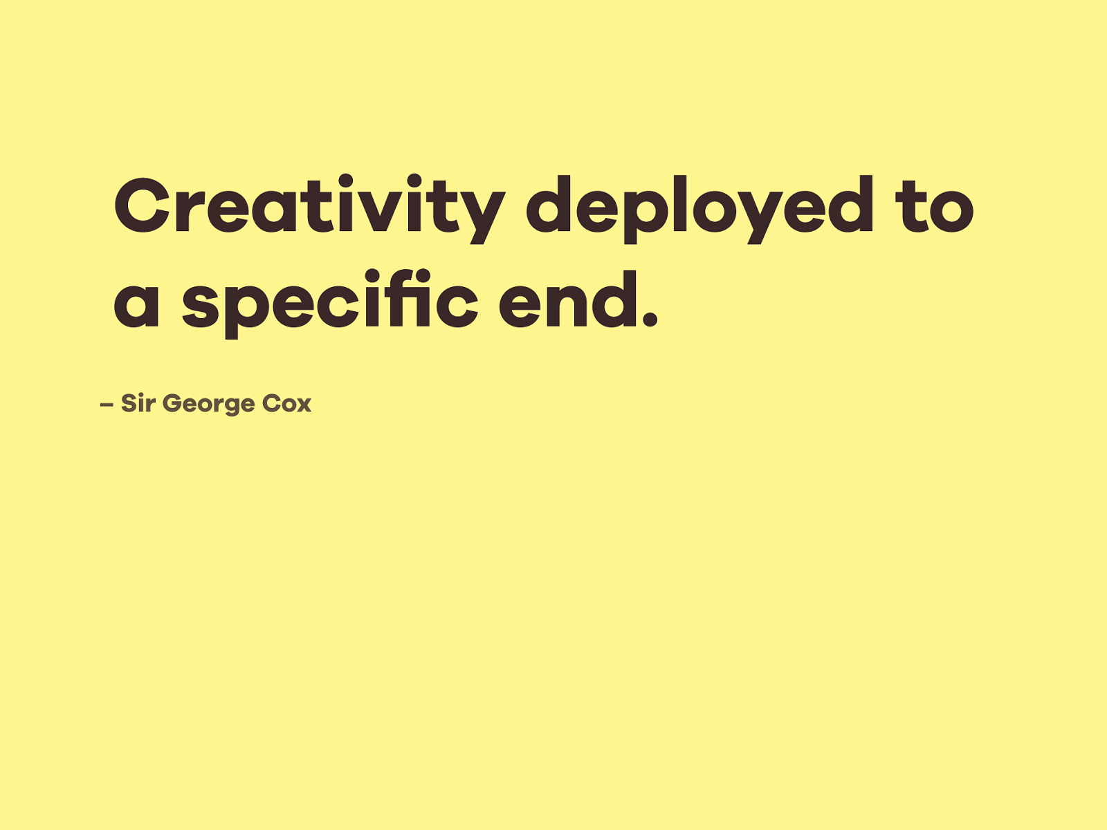
Creativity deployed to a specific end. Design is “creativity deployed to a specific end.” – Sir George Cox
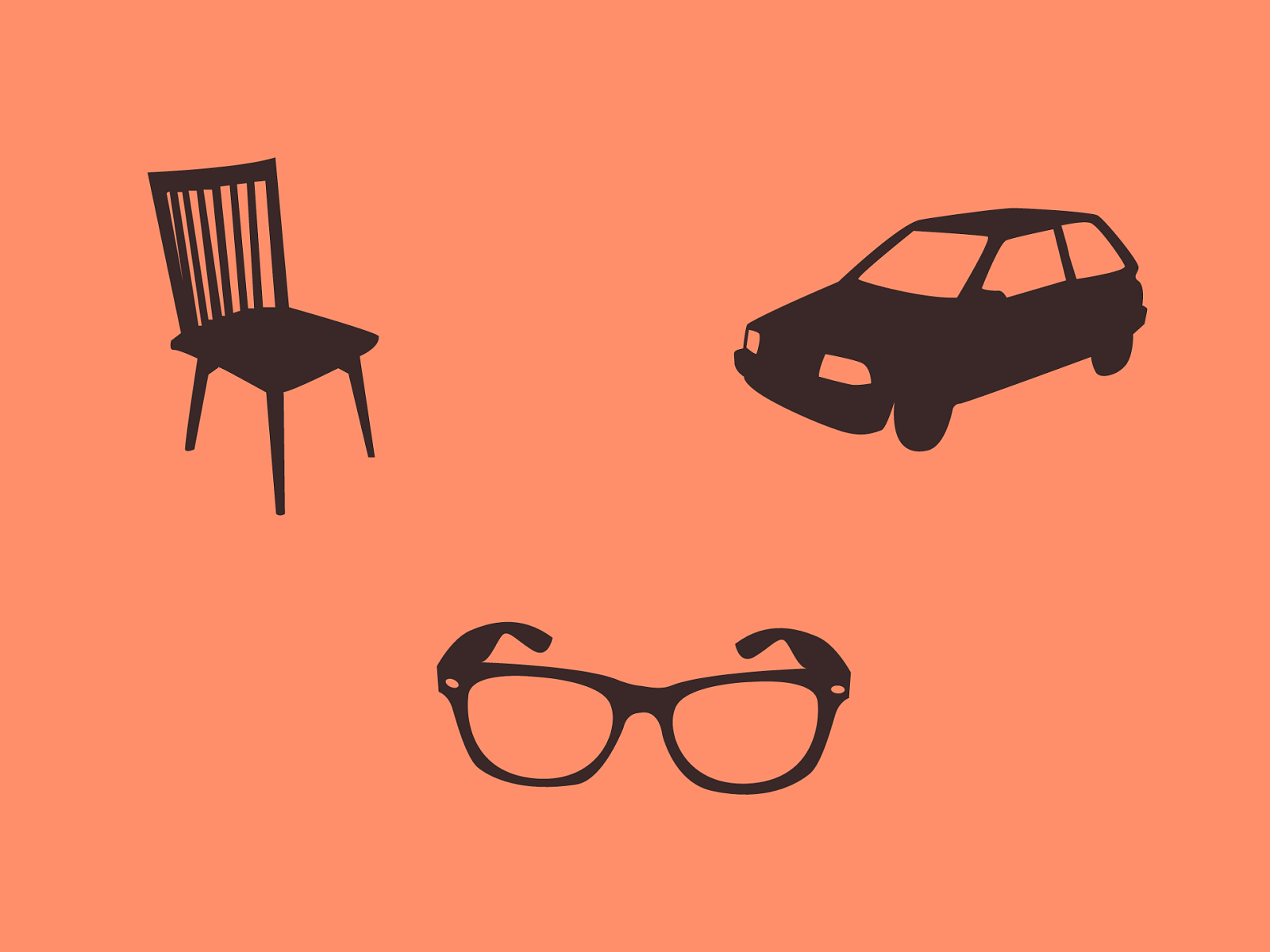
Design is taking an idea, something intangible, and making it real. Everything we interact with day-to-day has been designed in some way, whether consciously or not, from our clothing to our furniture to our transportation. Everything has gone through some kind of design process, whether formal or informal.
Design is problem solving. The design process is geared around solving the real problems and needs of individuals and organizations. Why are you designing something? Because someone has a problem, and you’re try to fix it.
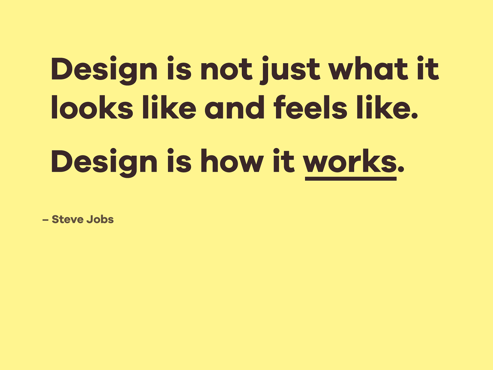
Design is not just what it
looks like and feels like.
Design is how it works.
I also agree with Steve Jobs that design isn’t just about the aesthetics of something, but it’s also how something works. It’s the entire experience of using something.
– Steve Jobs
What makes design good? So what makes a design good in the first place?
I know it when I see it. I like to joke that defining good design is like Justice Potter Stewart’s definition of pornography: “I know it when I see it.” I think that’s mostly true for everyone. People have kind of an intuitive, unconscious grasp on whether something is well designed. This intuition shows itself through your frustration or satisfaction level when using a product, or a website, or even a chair. – Justice Potter Stewart
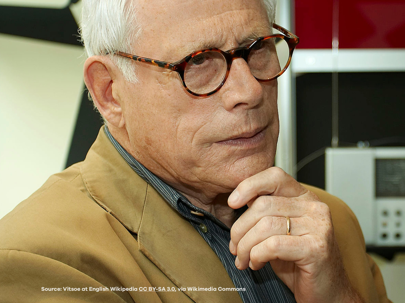
The best definition I’ve heard of good design has come from a fellow called Dieter Rams. Rams is a German industrial designer who pioneered the idea of “Less and More.” His products were both beautiful and functional.
Source: Vitsoe at English Wikipedia CC BY-SA 3.0, via Wikimedia Commons
10 Principles
of Good Design
Rams laid out ten principles to define good design.

Innovative First of all, good design is innovative.
Do any of you know those “Tasty” videos on Facebook? They’re short video recipes that are really well shot and edited and they all end in the “Tasty” logo. Anyway, there’s been a bunch of similar videos from other companies that have popped up since they got popular, but they’re never as good, and whenever I see one I just assume it’s from Tasty. They’ve totally dominated that one market and everyone else just feels like a cheap knock-off. Principles of Good Design #1
Attractive This one’s a no-brainer, but good design is attractive. It’s got to look good. Attractive design makes you go “ahhhh.” Principles of Good Design #2
Useful Good design makes a product useful. Something that looks nice but isn’t useful isn’t design — it’s art. Principles of Good Design #3
Understand- able ;) Good design also makes a product understandable. You should be able to look at a car and go, “oh hey, that’s a car. It’ll take me from point A to point B.” A well designed corkscrew will let you intuit how it should be used without needing instructions. A poorly designed corkscrew has you fumbling with your wine bottle until half the cork breaks off. A well designed website will help you navigate to the information you’re looking for without making you hunt for it. Principles of Good Design #4
Unobtrusive Good design is unobtrusive. It doesn’t get in the way of you accomplishing your task. You know what’s obtrusive? Those “subscribe” modals that pop up as soon as you enter a site, or when you’re a couple paragraphs into the articles you’re reading. Don’t design things that get int he way or distract people. Design is the tool to fulfill a need, not the focus of the need. Principles of Good Design #5
Honest Good design is honest. It doesn’t pretend to be something it’s not. It doesn’t advertise itself as a luxury car when it’s really just a Honda Civic. Honest design is upfront about what it can and cannot do, and doesn’t try to sell people on empty promises. Principles of Good Design #6
Durable Good design is built to last. Your site shouldn’t need to be redesigned every year — it should be designed in such a way that it still looks okay two or three years later. That’s not to say you can’t iterate in that time, but the structure of the design should be sound enough to take on iterations without needing to be drastically redesigned to accommodate those iterations. A design that follows period-specific trends is going to look dated pretty quickly. Principles of Good Design #7
Thorough A good design is thorough down to the last details. Nothing is left to change; every minute detail has been accounted for. On the web, this translates into confirmation messages, error states, when a page has no content, when a page has too much content… All these details should be thought about with care and attention. Principles of Good Design #8
Eco-Friendly Good design is environmentally friendly. With industrial design, that specifically means it’s sustainable and contributes to the preservation of the environment, but on the web I like to think of it in terms of the web’s ecosystem. Good design doesn’t harm an ecosystem or its denizens. This means protecting your users’ information and shielding them from abuse and harassment. If your site doesn’t protect its most vulnerable users, then it’s not eco-friendly. Principles of Good Design #9
Little Design as Possible Finally, good design is as little design as possible. Less, but better. Good design is simple, uncomplicated, and concentrates the essential aspects of a product without burdening it with extra options. Principles of Good Design #10
What does good design look like? Not everyone can invest in a full-time designer for their company, or even hire someone else to build their website. If you’re a small business owner, you might not need to — something like a free or inexpensive WordPress theme could be good enough to accomplish what you need. But if you’re building something yourself, you need to at least recognize what good design looks like so you can make more informed decisions about your site. So, let’s take a look at some design fundamentals.
Grids &
Alignment
Grids are the underlying structure to your designs; they’re like the frame to your car. Using a grid provides a solid basis for starting projects and allow you to easily align
elements with coherency and consistency. Alignment is the placement of objects along that grid; aligning objects to a grid helps guide your eyes down a page and brings
order to your website. It makes everything look better.
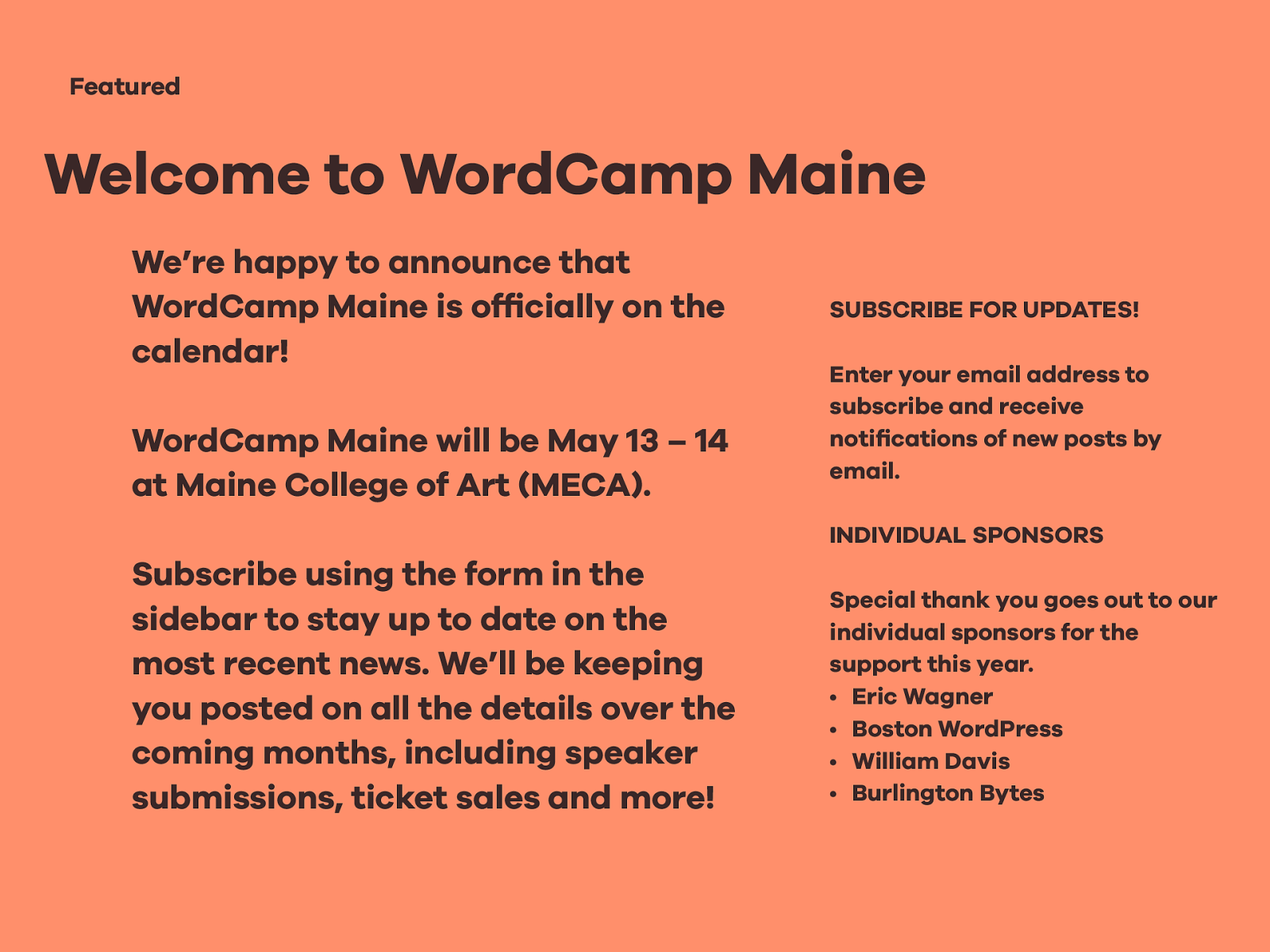
Welcome to WordCamp Maine Featured We’re happy to announce that WordCamp Maine is officially on the calendar! WordCamp Maine will be May 13 – 14 at Maine College of Art (MECA). Subscribe using the form in the sidebar to stay up to date on the most recent news. We’ll be keeping you posted on all the details over the coming months, including speaker submissions, ticket sales and more! SUBSCRIBE FOR UPDATES! Enter your email address to subscribe and receive notifications of new posts by email. INDIVIDUAL SPONSORS Special thank you goes out to our individual sponsors for the support this year. • Eric Wagner • Boston WordPress • William Davis • Burlington Bytes Let’s take a look at this layout. Nothing really lines up with anything else.
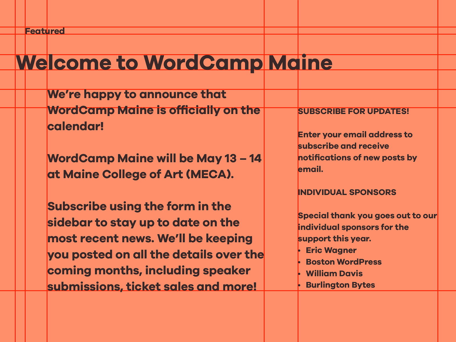
Welcome to WordCamp Maine Featured We’re happy to announce that WordCamp Maine is officially on the calendar! WordCamp Maine will be May 13 – 14 at Maine College of Art (MECA). Subscribe using the form in the sidebar to stay up to date on the most recent news. We’ll be keeping you posted on all the details over the coming months, including speaker submissions, ticket sales and more! SUBSCRIBE FOR UPDATES! Enter your email address to subscribe and receive notifications of new posts by email. INDIVIDUAL SPONSORS Special thank you goes out to our individual sponsors for the support this year. • Eric Wagner • Boston WordPress • William Davis • Burlington Bytes If we start adding some guides to indicate where elements line up, you can see there are a ton of different points of alignment.
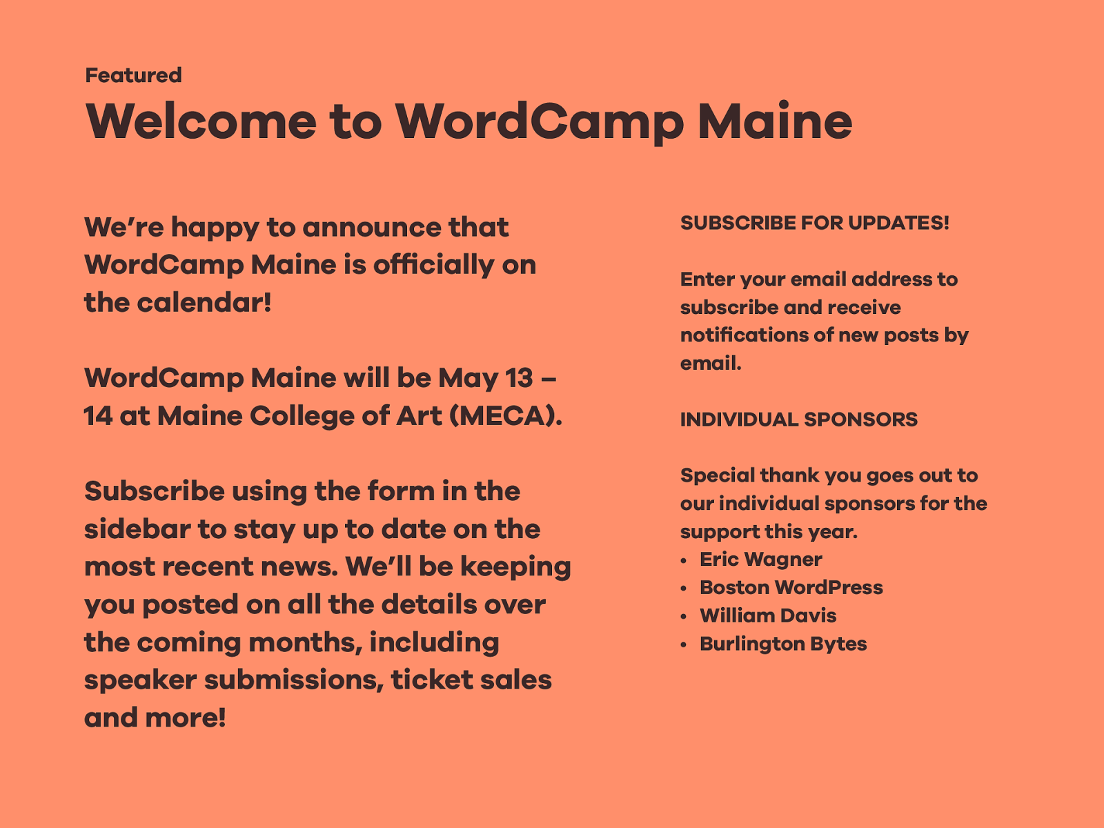
Welcome to WordCamp Maine Featured We’re happy to announce that WordCamp Maine is officially on the calendar! WordCamp Maine will be May 13 – 14 at Maine College of Art (MECA). Subscribe using the form in the sidebar to stay up to date on the most recent news. We’ll be keeping you posted on all the details over the coming months, including speaker submissions, ticket sales and more! SUBSCRIBE FOR UPDATES! Enter your email address to subscribe and receive notifications of new posts by email. INDIVIDUAL SPONSORS Special thank you goes out to our individual sponsors for the support this year. • Eric Wagner • Boston WordPress • William Davis • Burlington Bytes Now, let’s take a look at this layout, which was designed along a grid.
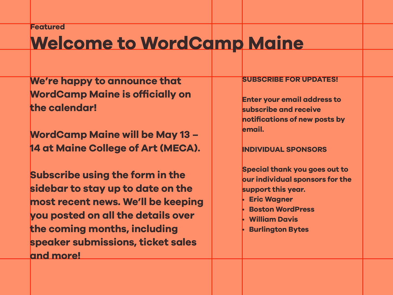
Welcome to WordCamp Maine Featured We’re happy to announce that WordCamp Maine is officially on the calendar! WordCamp Maine will be May 13 – 14 at Maine College of Art (MECA). Subscribe using the form in the sidebar to stay up to date on the most recent news. We’ll be keeping you posted on all the details over the coming months, including speaker submissions, ticket sales and more! SUBSCRIBE FOR UPDATES! Enter your email address to subscribe and receive notifications of new posts by email. INDIVIDUAL SPONSORS Special thank you goes out to our individual sponsors for the support this year. • Eric Wagner • Boston WordPress • William Davis • Burlington Bytes Definitely fewer guides. Everything lines up really well and makes it a much more coherent design.
White Space White space is the space on your site not taken up by content.
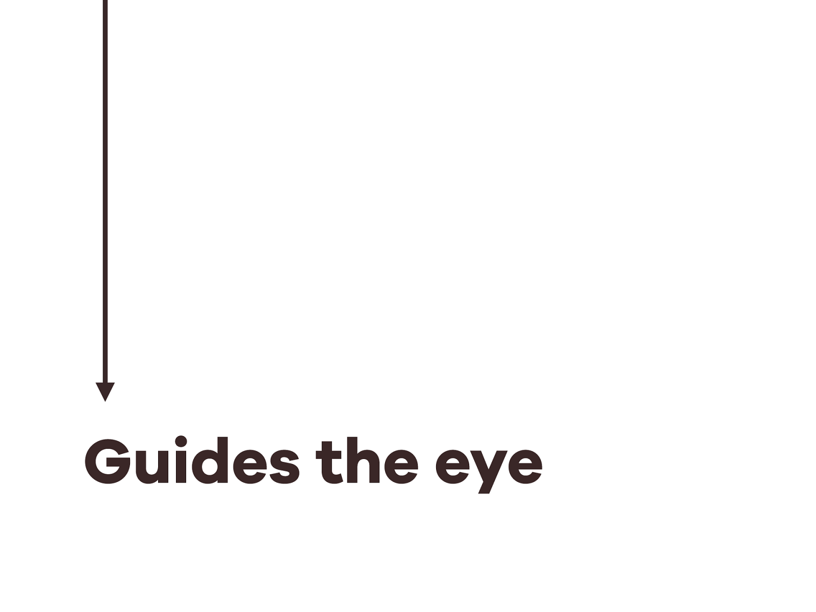
Guides the eye Like grids and alignment, white space helps guide the eye down the page and establishes hierarchy between elements. Elements with more space between them stand out; elements close together feel like a unit. You can use white space to emphasize elements like titles, or important messages, or quotes. Proper white space makes your content easier to read, so your messages are absorbed better by your visitors.
Space is good. White space is good. Give your elements ample margins and padding. I know it can sometimes feel like a site is empty if everything has some space around it, but that’s not the case. Don’t worry about fitting everything into a small space — let it breathe.
Typography Typography is one of my favorite design fundamentals.
Web Design is 95% Typography. Web Design is 95% Typography. Oliver wrote this ten years ago and it still applies today. Most of what we consume on the web is text: Facebook posts, twitter, articles, blog posts, emails, Slack — it’s all text. – Oliver Reichenstein, The Web is All About Typography. Period.
Choosing fonts Choosing fonts for your site is hard. Pairing two fonts together is especially hard.
Tone When choosing fonts, the first thing you want to consider is your tone. Are you making a small business site? A personal code portfolio? Consider your purpose & your audience when picking a font. Your developer portfolio probably doesn’t need fancy script headers, but you should pick a solid monospace font for your code examples.
If you’re unsure what kind of tone you’re going for, just go for a typeface that looks kind of neutral — not a lot of extra hanging bits, or crazy stylization. If you can describe it as “fancy,” it shouldn’t be your body text.
Legibility You also need to consider legibility and readability. Are your fonts easy to read? Did you pick a body font that looks good at smaller sizes? If people can’t read your content, your site or product has kind of already failed.
Steal Pairings Worse comes to worse, steal pairings from other sites. You can use your browser’s “Inspect Element” tool to identify what fonts a site is using. There are also some browser extensions that make figuring out the fonts easier.
Size You need to make sure your fonts are large enough to be readable. Nobody likes to read small text. Nobody.
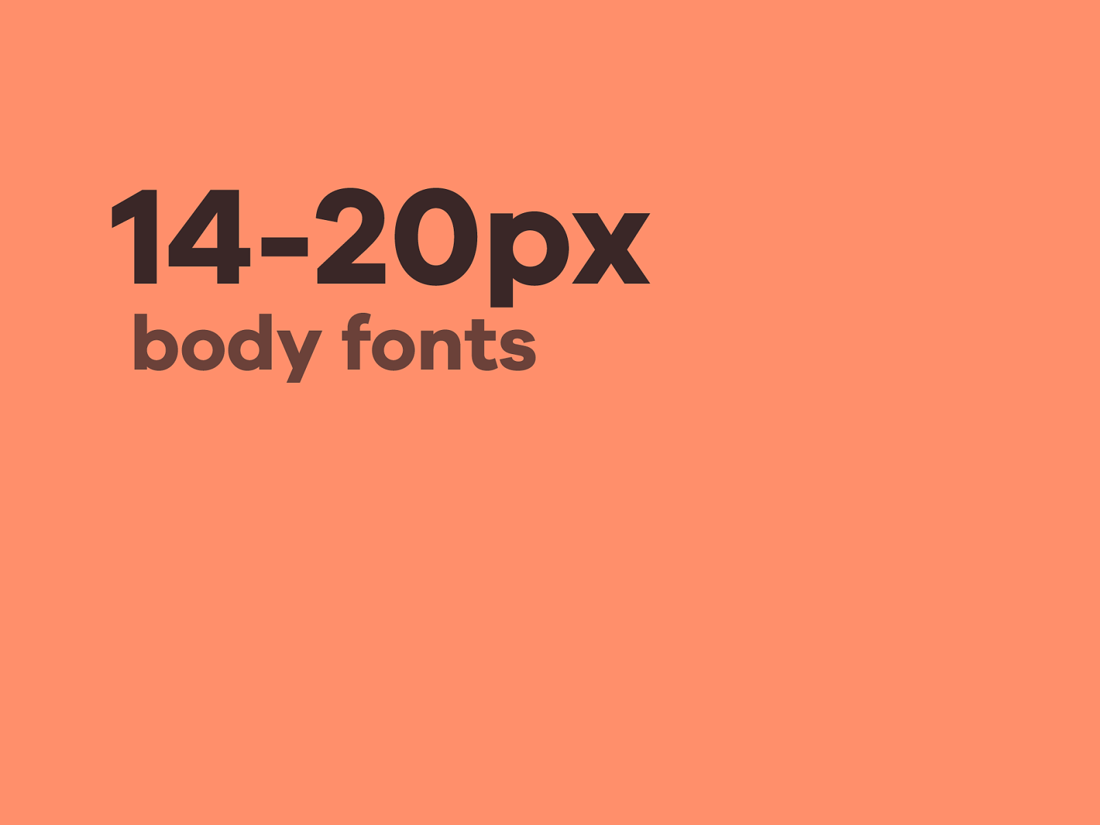
14-20px Aim for body text of at least 14px or higher. If you’re looking to be 508 compliant, your text needs to be 16px or higher. Depending on the style of your site, you can go up to 20px or even higher, but the 14-18px range is kind of a sweet spot. body fonts
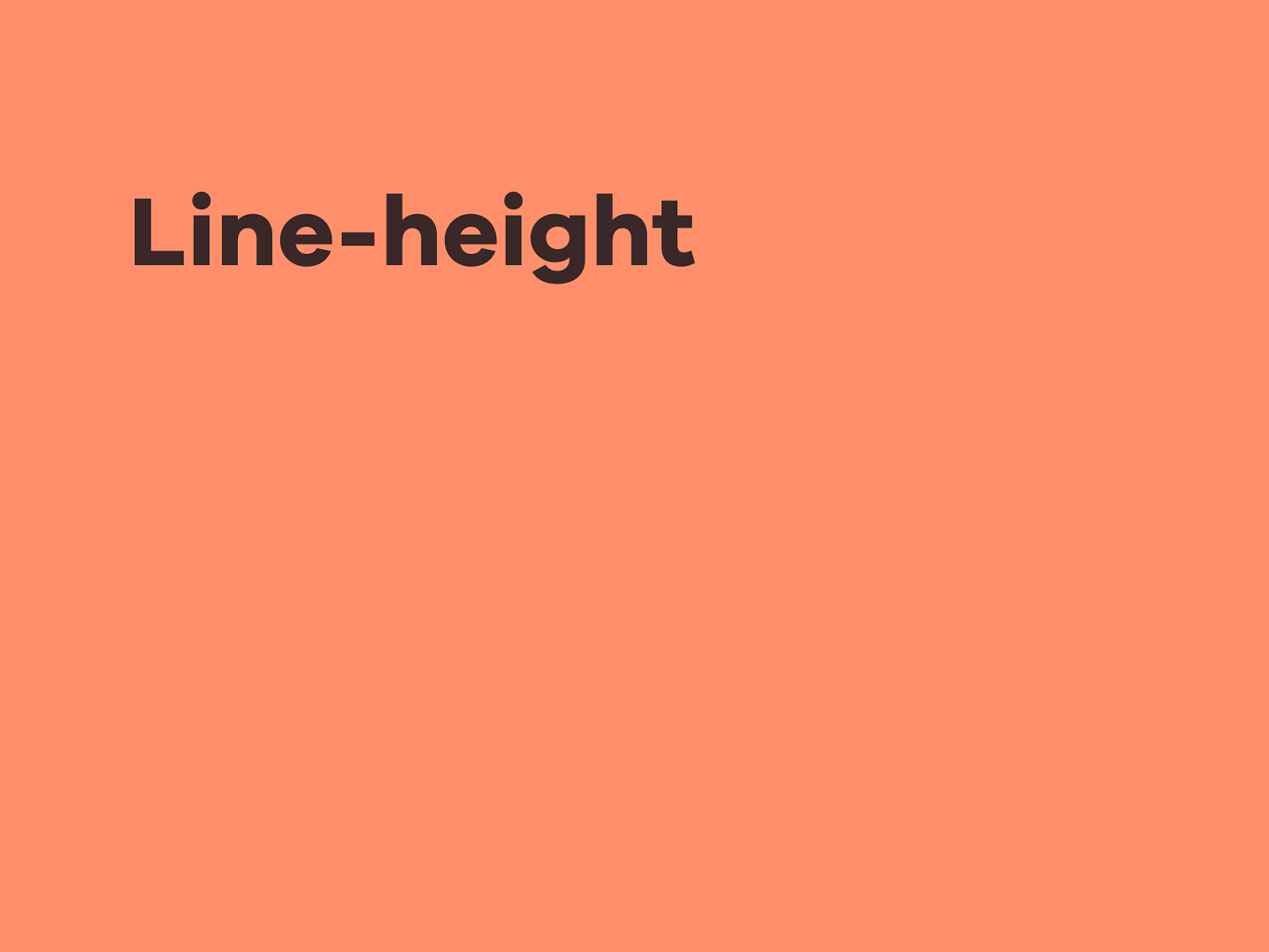
Line-height Line height, which is the amount of space between lines of text, is integral to making beautiful, readable text on the web and is one of the most commonly overlooked elements to people just starting out with design.
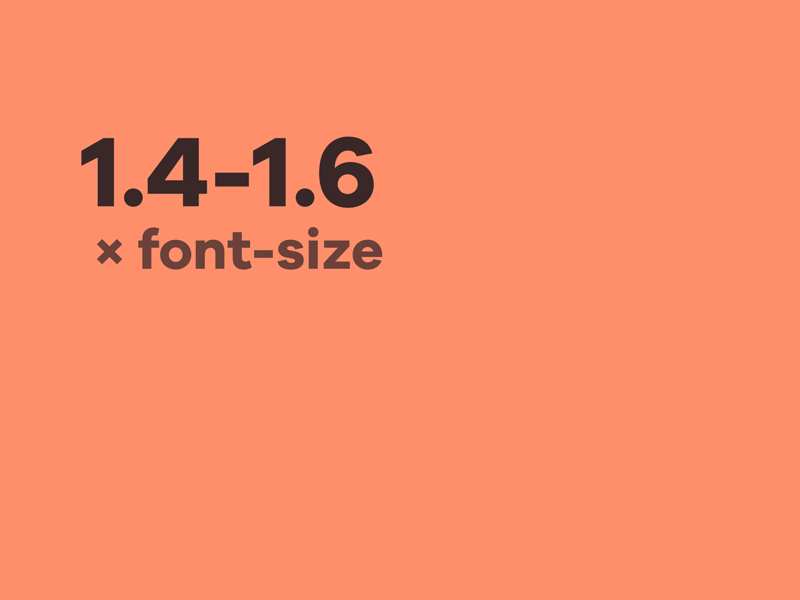
1.4-1.6 For body copy, in general you want to go with 1.4-1.6* your font size. You can go a little closer with headers, I tend to like 1.2-1.3*. × font-size
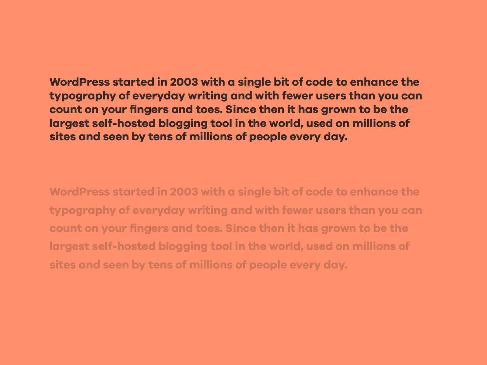
WordPress started in 2003 with a single bit of code to enhance the typography of everyday writing and with fewer users than you can count on your fingers and toes. Since then it has grown to be the largest self-hosted blogging tool in the world, used on millions of sites and seen by tens of millions of people every day. So you can see here the top example feels pretty cramped. I see a lot of sites with type this cramped and it’s so hard to read their content. WordPress started in 2003 with a single bit of code to enhance the typography of everyday writing and with fewer users than you can count on your fingers and toes. Since then it has grown to be the largest self-hosted blogging tool in the world, used on millions of sites and seen by tens of millions of people every day.
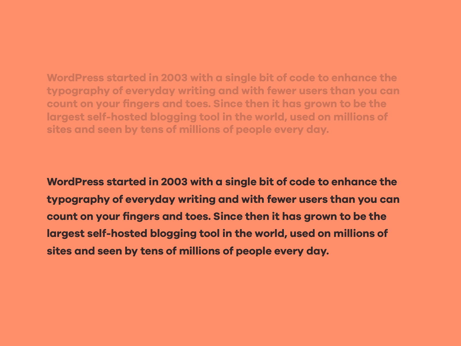
WordPress started in 2003 with a single bit of code to enhance the typography of everyday writing and with fewer users than you can count on your fingers and toes. Since then it has grown to be the largest self-hosted blogging tool in the world, used on millions of sites and seen by tens of millions of people every day. If you give it some more space, it makes everything a little easier to read. WordPress started in 2003 with a single bit of code to enhance the typography of everyday writing and with fewer users than you can count on your fingers and toes. Since then it has grown to be the largest self-hosted blogging tool in the world, used on millions of sites and seen by tens of millions of people every day.
Line-length Line length is how long text spans across your screen.
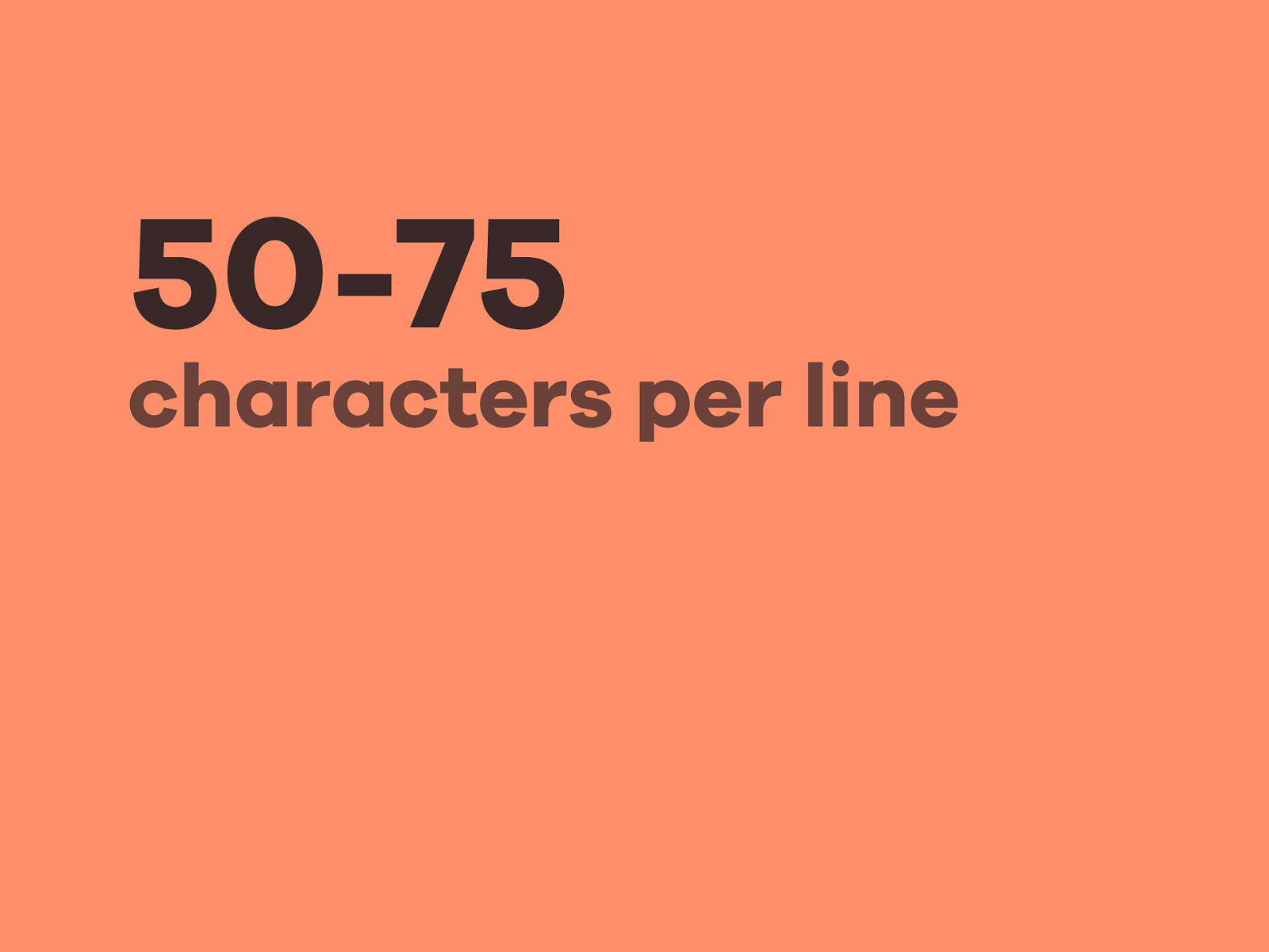
50-75 As a general rule, lines shouldn’t be more than 50-75 characters long. Sometimes more is okay, sometimes less is okay — especially on smaller devices like phones or small tablets. characters per line
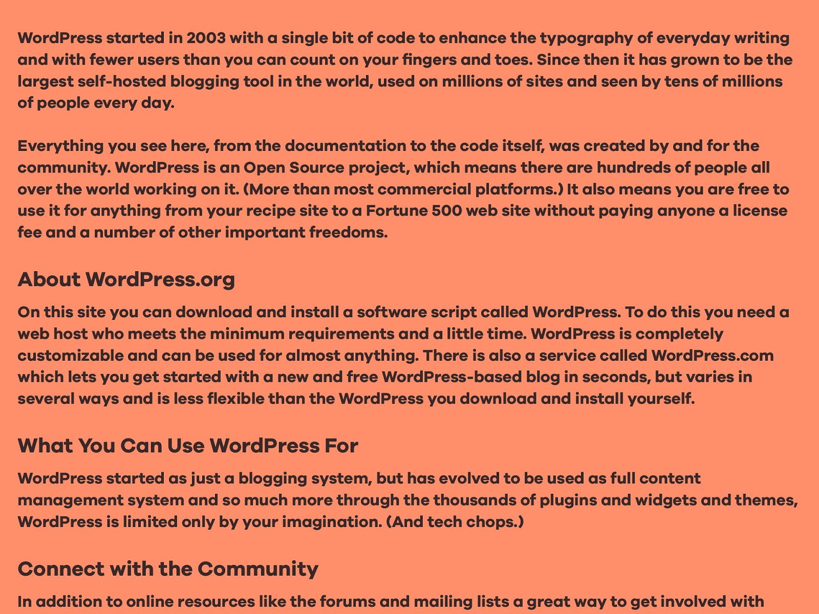
WordPress started in 2003 with a single bit of code to enhance the typography of everyday writing and with fewer users than you can count on your fingers and toes. Since then it has grown to be the largest self-hosted blogging tool in the world, used on millions of sites and seen by tens of millions of people every day. Everything you see here, from the documentation to the code itself, was created by and for the community. WordPress is an Open Source project, which means there are hundreds of people all over the world working on it. (More than most commercial platforms.) It also means you are free to use it for anything from your recipe site to a Fortune 500 web site without paying anyone a license fee and a number of other important freedoms. About WordPress.org On this site you can download and install a software script called WordPress. To do this you need a web host who meets the minimum requirements and a little time. WordPress is completely customizable and can be used for almost anything. There is also a service called WordPress.com which lets you get started with a new and free WordPress-based blog in seconds, but varies in several ways and is less flexible than the WordPress you download and install yourself. What You Can Use WordPress For WordPress started as just a blogging system, but has evolved to be used as full content management system and so much more through the thousands of plugins and widgets and themes, WordPress is limited only by your imagination. (And tech chops.) Connect with the Community In addition to online resources like the forums and mailing lists a great way to get involved with WordPress is to attend or volunteer at a WordCamp, which are free or low-cost events that happen Sometimes you see sites where the text stretches across the entire screen, which can get really wide if you have a larger computer.
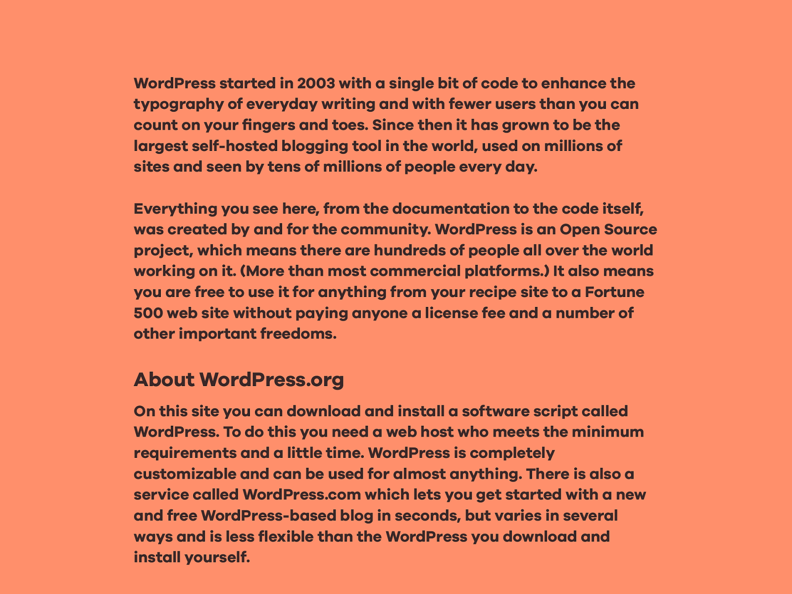
WordPress started in 2003 with a single bit of code to enhance the typography of everyday writing and with fewer users than you can count on your fingers and toes. Since then it has grown to be the largest self-hosted blogging tool in the world, used on millions of sites and seen by tens of millions of people every day. Everything you see here, from the documentation to the code itself, was created by and for the community. WordPress is an Open Source project, which means there are hundreds of people all over the world working on it. (More than most commercial platforms.) It also means you are free to use it for anything from your recipe site to a Fortune 500 web site without paying anyone a license fee and a number of other important freedoms. About WordPress.org On this site you can download and install a software script called WordPress. To do this you need a web host who meets the minimum requirements and a little time. WordPress is completely customizable and can be used for almost anything. There is also a service called WordPress.com which lets you get started with a new and free WordPress-based blog in seconds, but varies in several ways and is less flexible than the WordPress you download and install yourself. What You Can Use WordPress For Instead, your text area should have a max-width to make sure it never gets too long to comfortably read, regardless of your screen size.
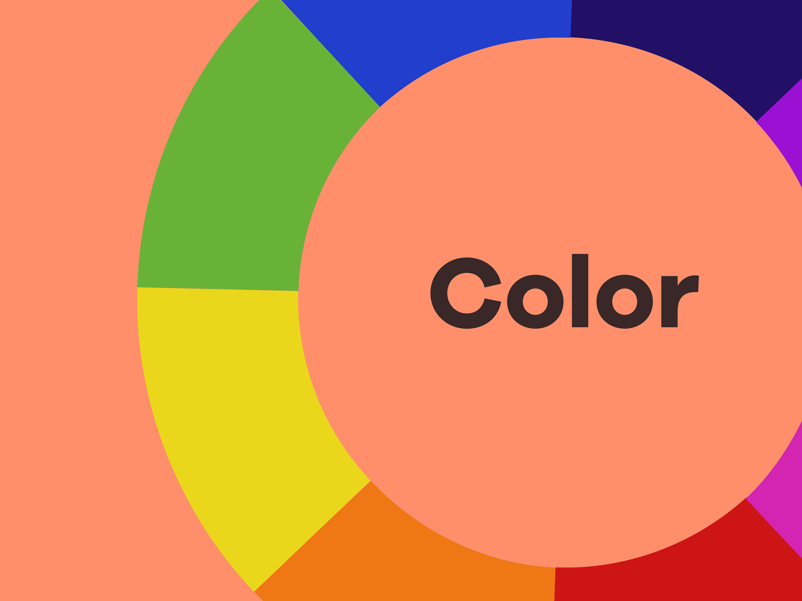
Color Color is incredibly important in your designs. It’s also in my opinion one of the hardest design fundamentals to do well.
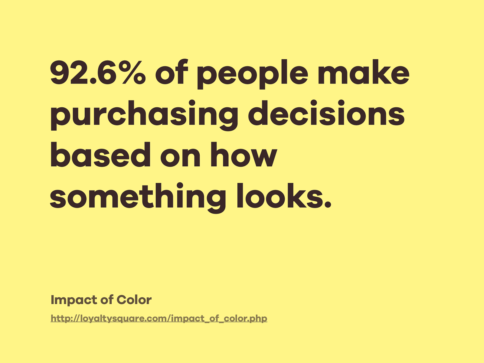
92.6% of people make purchasing decisions based on how something looks. Research conducted by the Seoul International Color Expo in 2004 found that 92.6% of people make purchasing decisions based on how something looks — especially its color. People sometimes won’t buy a product if it doesn’t come in the color they want. http://loyaltysquare.com/impact_of_color.php Impact of Color
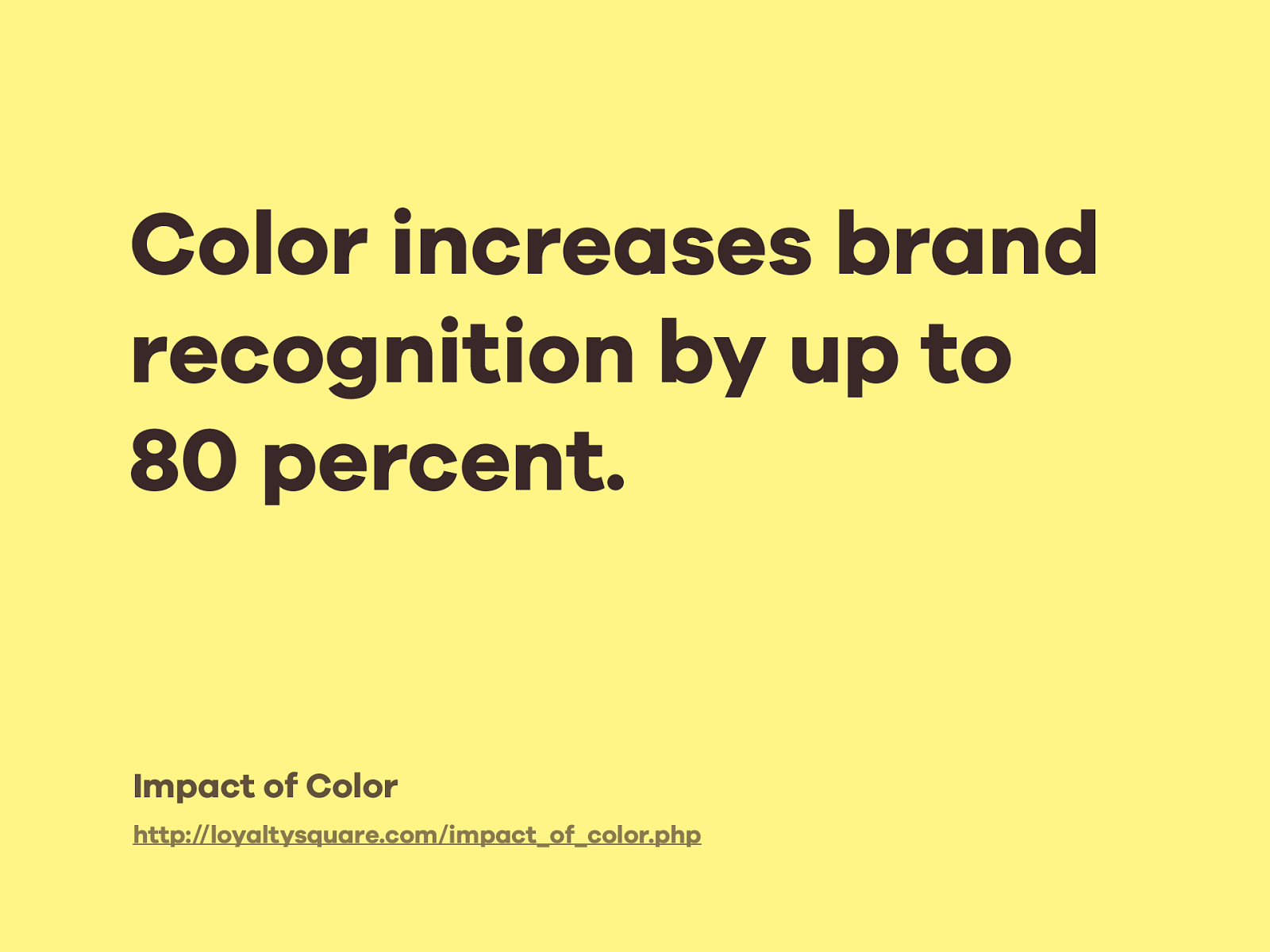
Color increases brand recognition by up to 80 percent. They also found that color increases brand recognition by up to 80 percent.
For example, Apple’s colorful iMacs rejuvenated their failing market by helping them stand out from PCs. I don’t know how many designers are in the room, but a lot of designers today fondly remember the Mac G3s as the first computers they designed on. Even thinking about those cute little bubbly machines brings up good feelings. http://loyaltysquare.com/impact_of_color.php Impact of Color
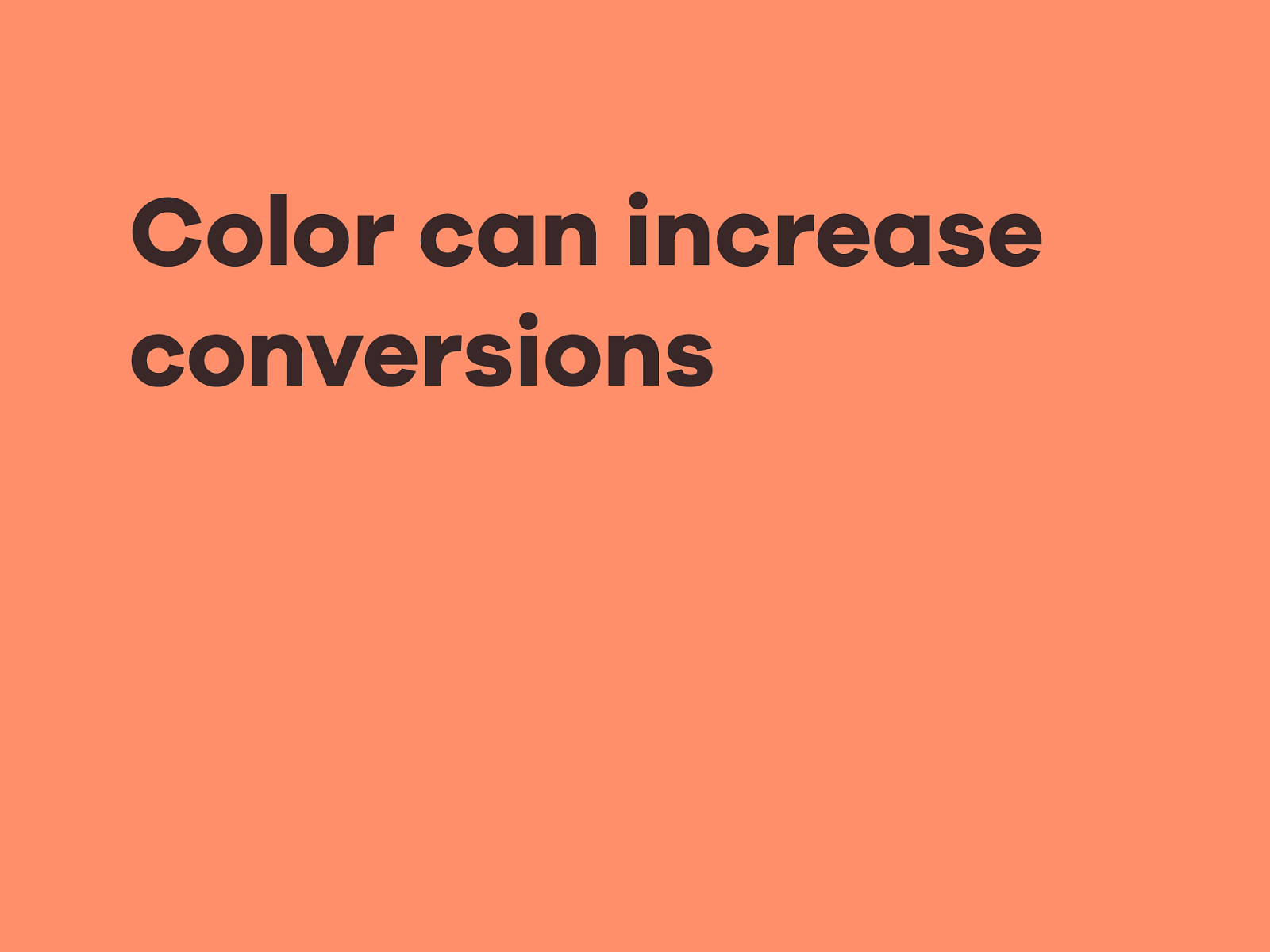
Color can increase conversions Smart use of color on your sites can also lead to an increase in conversions, which is great if you’re trying to get people to buy something or sign up for your product or service.
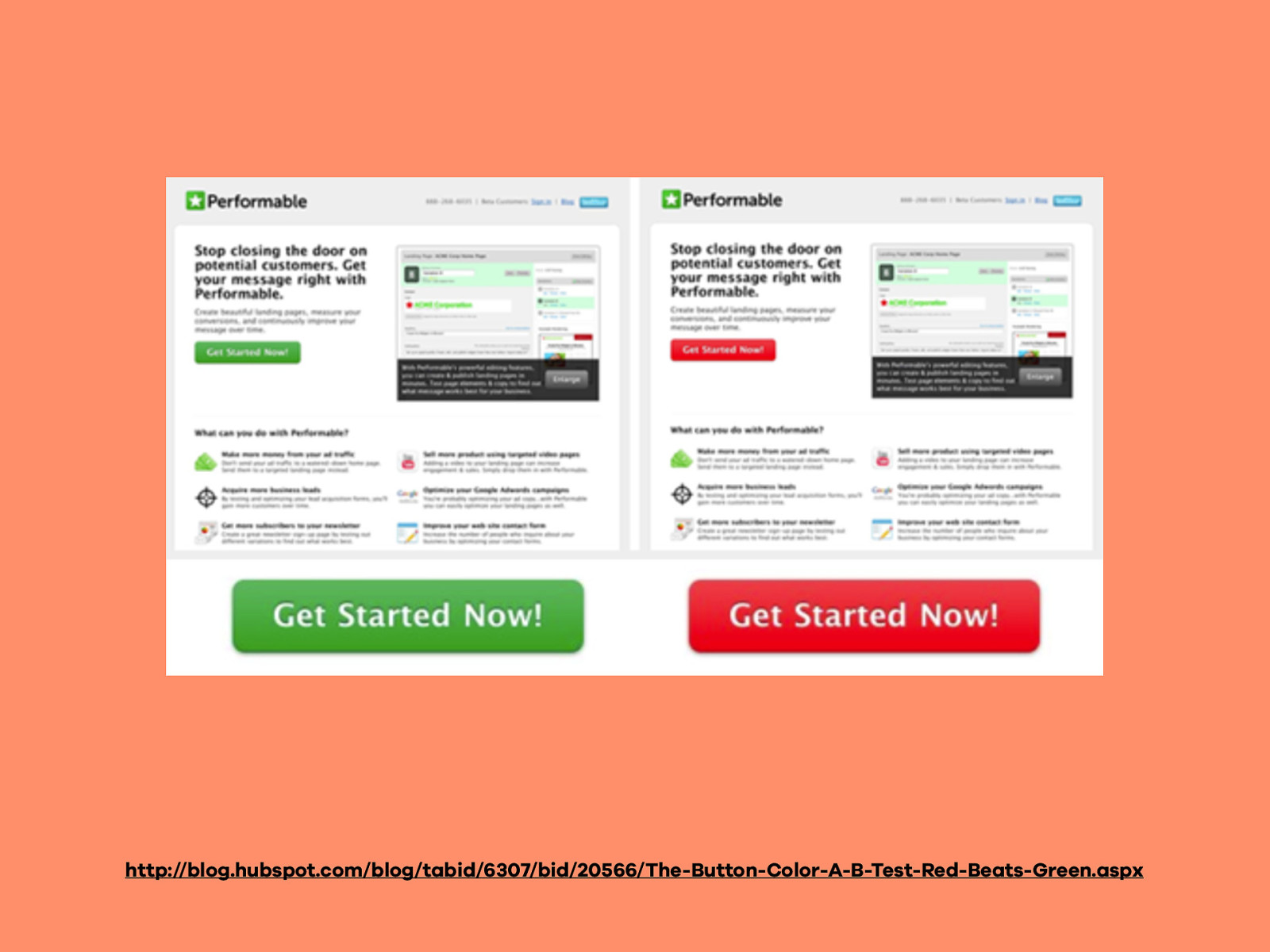
http://blog.hubspot.com/blog/tabid/6307/bid/20566/The-Button-Color-A-B-Test-Red-Beats-Green.aspx Colors have a big impact on conversions. Merely changing the color of your primary call-to-action button can have a huge impact. In an A/B test, Performable from Hubspot tested green vs. red buttons on a landing page. The red button outperformed the green button by 21%.
There is no golden ticket That said, there isn’t a “golden ticket” of color-based conversions. Often the color that performs best is the color that stands out the most on the page.
http://blog.hubspot.com/blog/tabid/6307/bid/20566/The-Button-Color-A-B-Test-Red-Beats-Green.aspx http://conversionxl.com/which-color-converts-the-best/
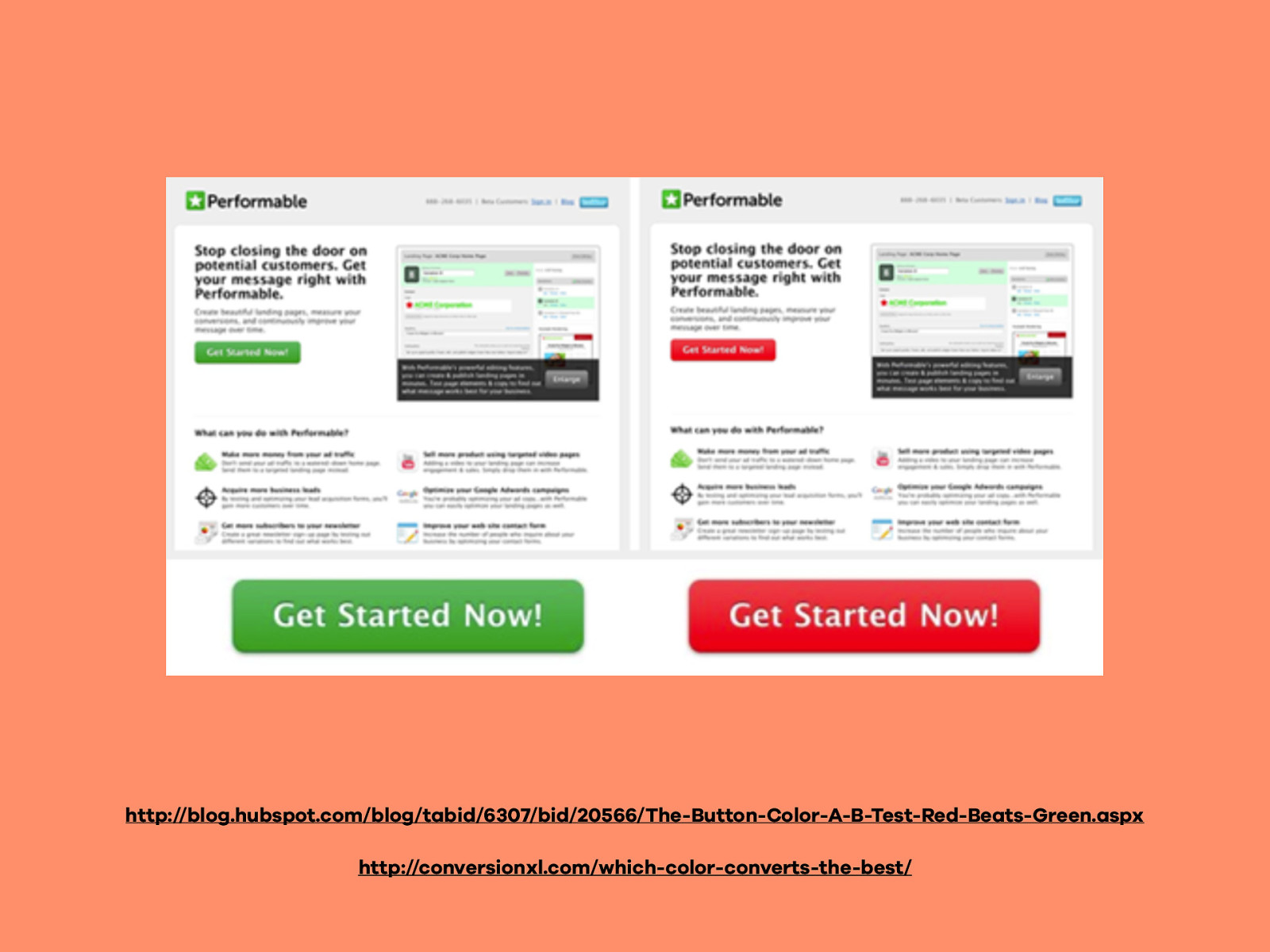
Let’s look at that example again. Notice anything interesting about the site’s color scheme? Green is one of the most prominent colors in it. If green is the primary color in your color scheme, a green CTA button isn't going to stand out. Start with a different color, and then try testing colors against each other to determine which work best within your color scheme, and which colors work best for your audience.
Making a Palette Making a cohesive color palette is hard, but there’s some tricks you can use to make something that looks nice.
What emotions do you want associated with your brand? First off, figure out what emotions you want to evoke. Do some googling into color theory to find out what colors people associate with those emotions. Then use a color building tool like Kuler or Colourlovers to build a palette. Or, just fall back to using white and shades of grey with one, maybe two accent colors. If all else fails, steal color palettes from other sites.
Balance your colors Bold, bright colors draw more attention than desaturated or lighter colors. Don’t use too many bright colors -- balance out your lights, darks, brights, pastel colors, etc.
Don’t use black Don’t use black. There is no such thing as pure black in the real world. Pure black on pure white looks garish and unnatural on the web. In place of black, use dark greys, or a dark color drawn from your color palette.
Hierarchy Hierarchy is an amalgamation of all the previous design basics. It’s especially important in typography -- making sure your headers stand out from your subheaders from your paragraph text, etc. You can use color to create hierarchy and draw attention to particular elements, making them more important than surrounding elements. Grids, alignment, and white space guide your eyes to certain elements over others. Combining all of these basics will lead to better site hierarchy.
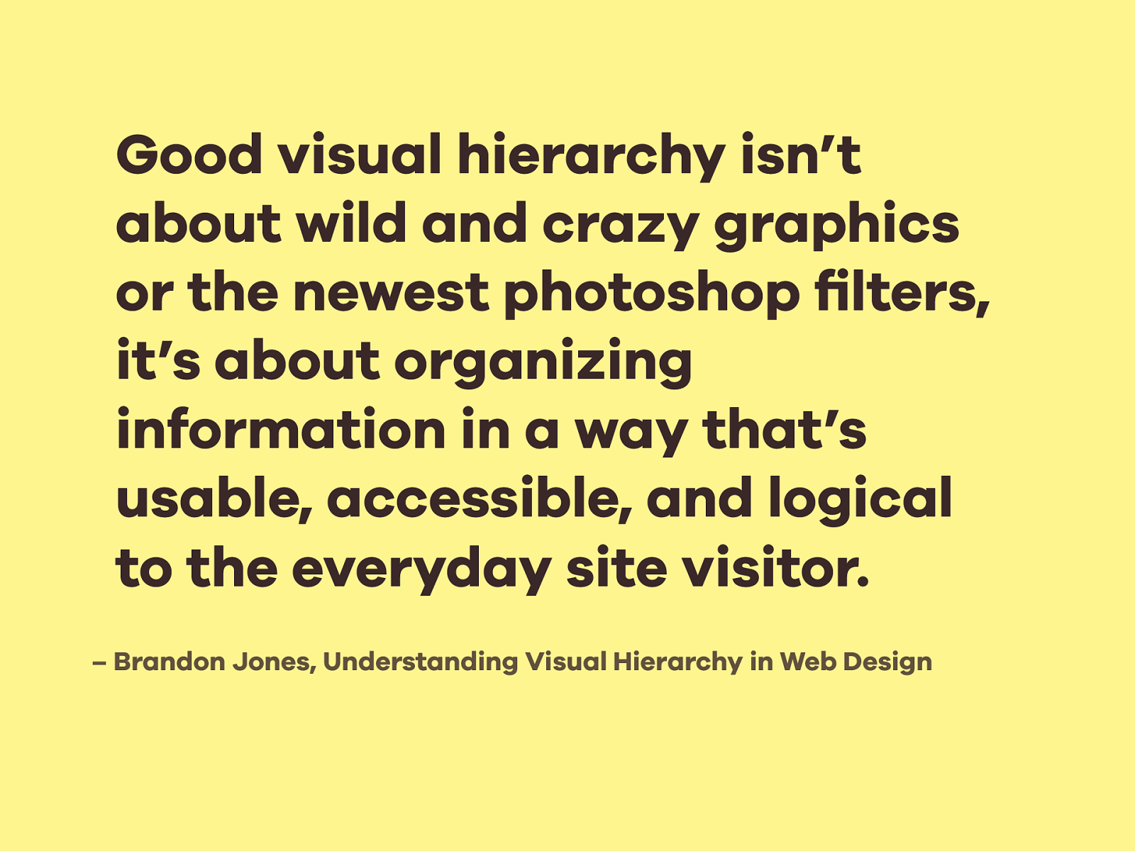
Good visual hierarchy isn’t about wild and crazy graphics or the newest photoshop filters, it’s about organizing information in a way that’s usable, accessible, and logical to the everyday site visitor. “Good visual hierarchy isn’t about wild and crazy graphics or the newest photoshop filters, it’s about organizing information in a way that’s usable, accessible, and logical to the everyday site visitor.” – Brandon Jones, Understanding Visual Hierarchy in Web Design
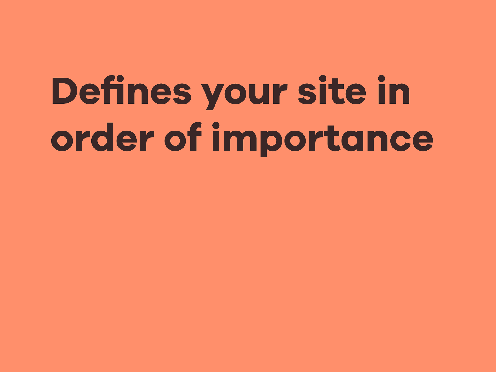
Defines your site in order of importance Establishing hierarchy helps define the focal points of your designs. It helps guide your users through your site, hitting upon the most important elements you’re trying to convey. This is great when you’re working on your small-screen layouts, too; when you know how important everything only our page is, when you go down to one column you can display it in order of importance.
Why is good design important for your business? Anyway, enough of the basics. Why am I telling you all this in the first place? Why is good design important for your business?
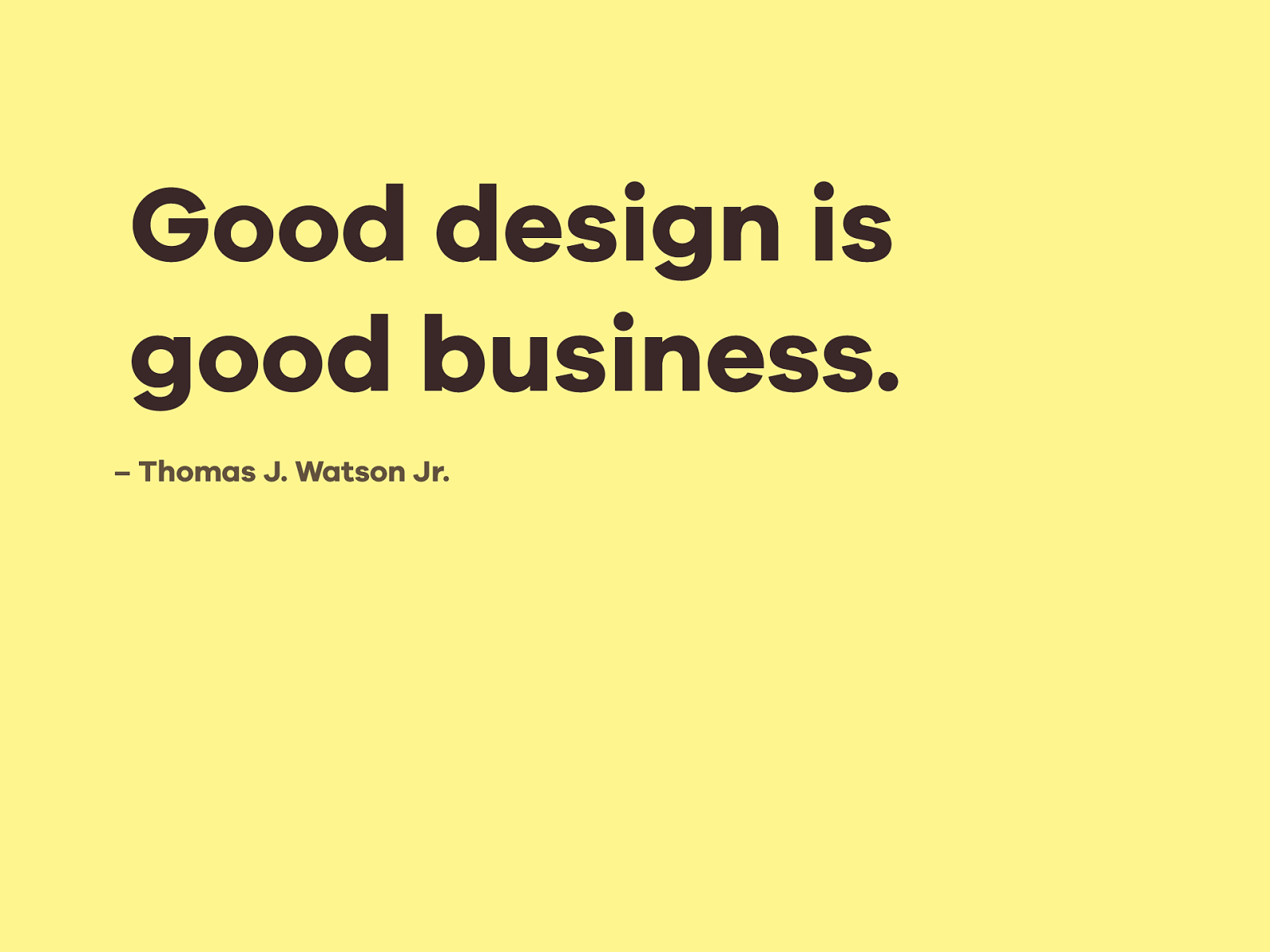
Good design is good business. Good design is good business. – Thomas J. Watson Jr.
What do these products all have in common? (Uh, aside from their eerily similar color palettes…)
They all have a designer within their founders.
It's no accident that many of the world's top brands are also design leaders. It's no accident that many of the world's top brands are also design leaders. – Ravi Sawhney, The Role of Design in Business .
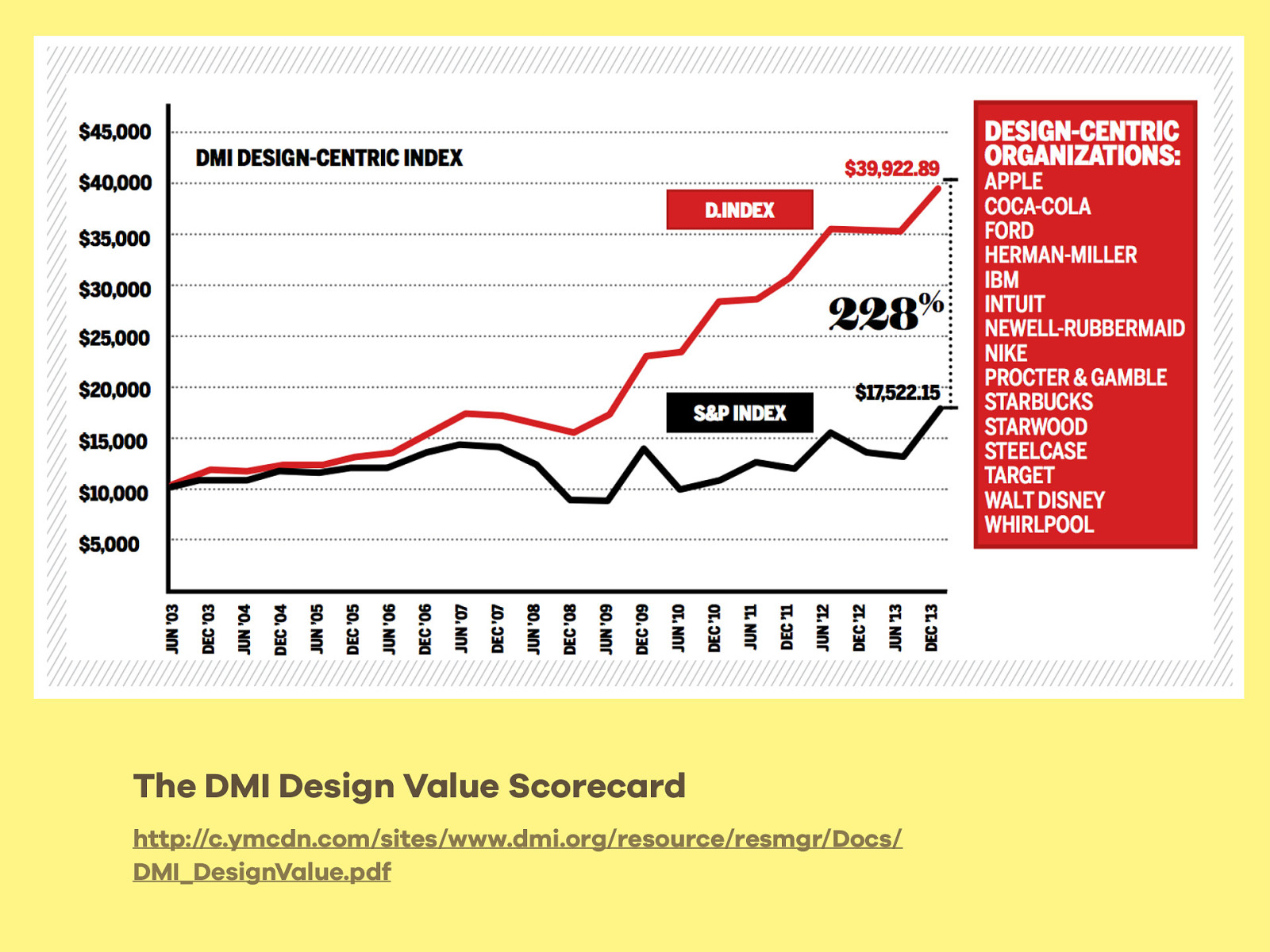
Companies that invest in design, and make design a key part of their company strategies, tend to outperform companies that don’t put the same value in design. http://c.ymcdn.com/sites/www.dmi.org/resource/resmgr/Docs/DMI_DesignValue.pdf The DMI Design Value Scorecard
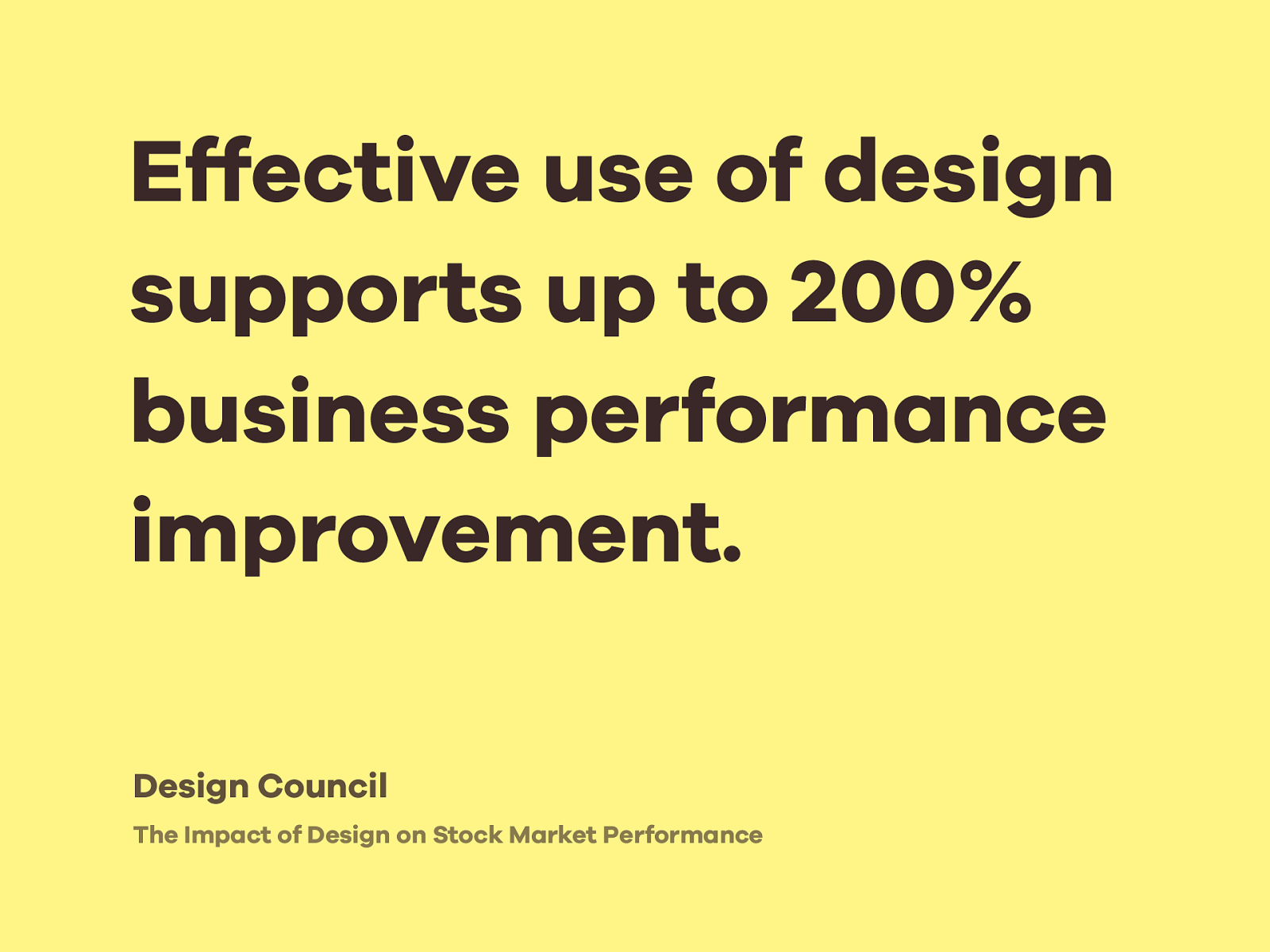
Effective use of design supports up to 200% business performance improvement. A 2004 study by the Design Council found that effective use of design supports up to 200% business performance improvement. Why is that? Well, there’s a couple things that contribute. The Impact of Design on Stock Market Performance Design Council
Establishes Trust Good design establishes trust. A well-designed site appears much more trustworthy than a poorly designed site, especially when you are trying to sell something to your users. The more trust your users have in you, the safer they feel buying from you, or giving you their contact information, or recommending you to their friends and colleagues. Anecdotally, when choosing between two options, I will always go with the one I think is better designed.
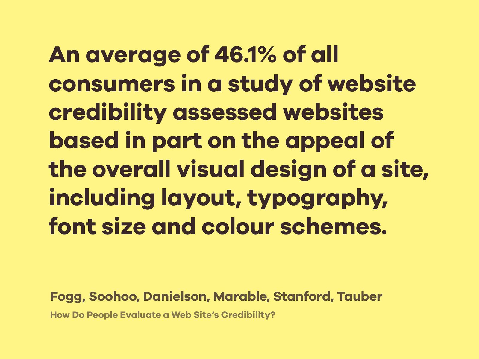
An average of 46.1% of all consumers in a study of website credibility assessed websites based in part on the appeal of the overall visual design of a site, including layout, typography, font size and colour schemes. In a study on how people determine a website’s credibility, almost 50% of comments contained something about the site’s design, either in general (“looks professional”) or in specifics (the layout, the colors, and so on).
The article reads, “the dominance of design look may be surprising at first. One might ask, Are people really so influenced by design look and not by more substantial issues? The answer appears to be yes.” How Do People Evaluate a Web Site’s Credibility? Fogg, Soohoo, Danielson, Marable, Stanford, Tauber
Creates an Emotional Connection Design also helps create an emotion connection between your site and your users. You don’t just want your users engaged -- you want them delighted. You want them to take joy in using your site or your product or your app. Emotional experiences actually imprint in our memories.
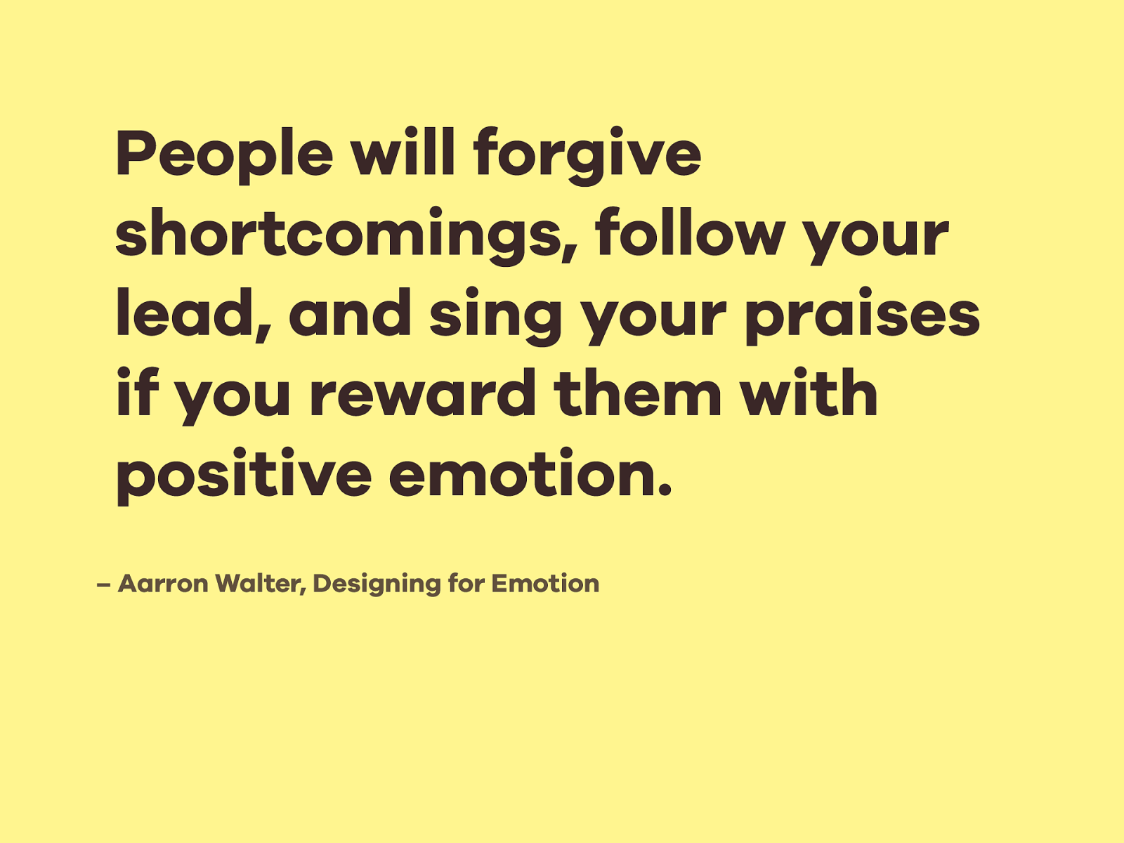
People will forgive shortcomings, follow your lead, and sing your praises if you reward them with positive emotion. “People will forgive shortcomings, follow your lead, and sing your praises if you reward them with positive emotion.” Aarron Walter, Designing for Emotion – Aarron Walter, Designing for Emotion
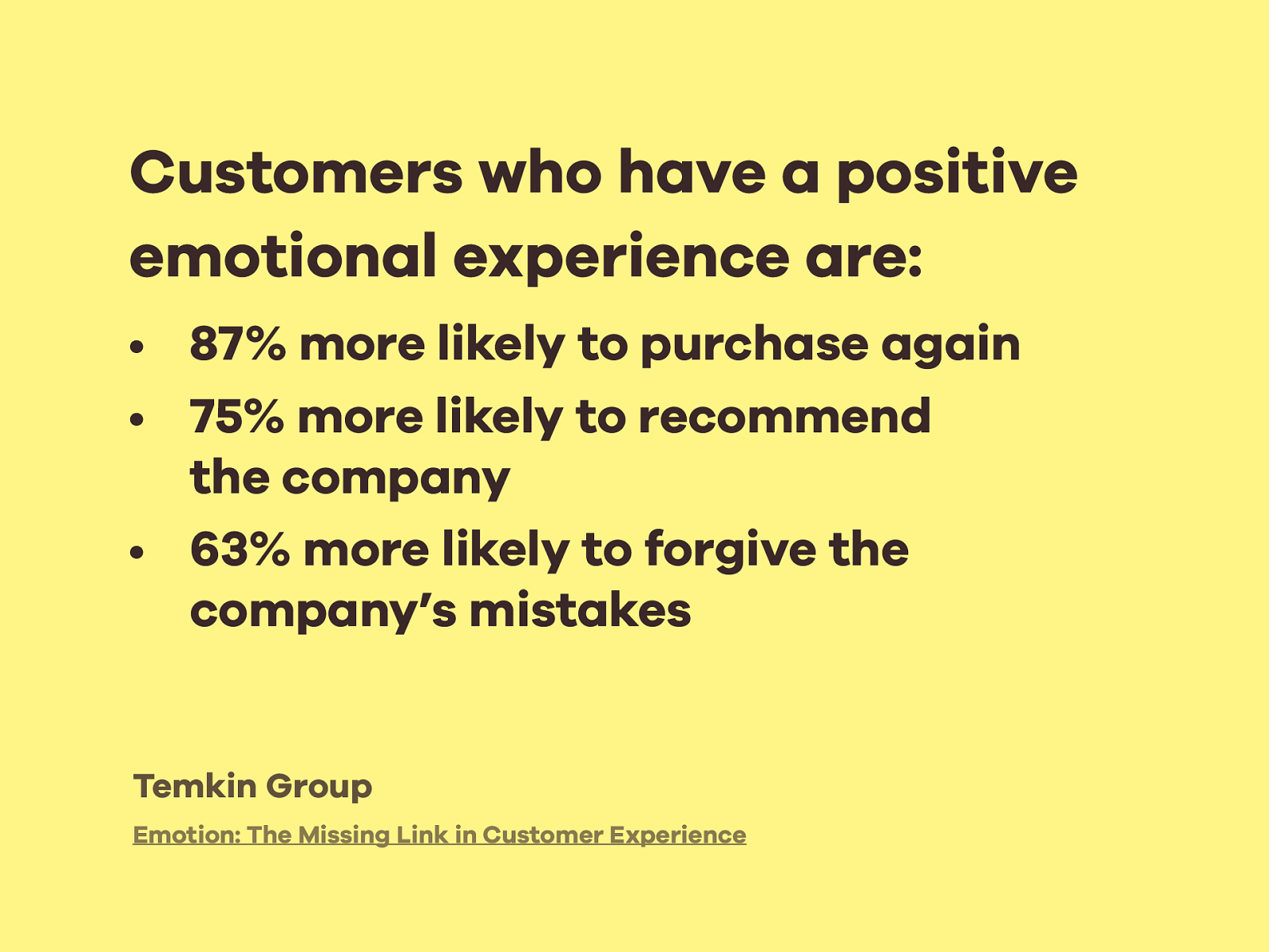
Customers who have a positive emotional experience are: • 87% more likely to purchase again • 75% more likely to recommend the company • 63% more likely to forgive the company’s mistakes Customers who have a positive emotional experience are:
87 Percent more likely to purchase again
75 Percent more likely to recommend the company
63 Percent more likely to forgive the company’s mistakes Emotion: The Missing Link in Customer Experience Temkin Group
Better for your ROI Like I said before, good design sells. A design that’s well researched, beautiful, and easy to use, marketed to an audience who finds it useful, will bring back in the money you spent building it, and will even save you money in the long run.
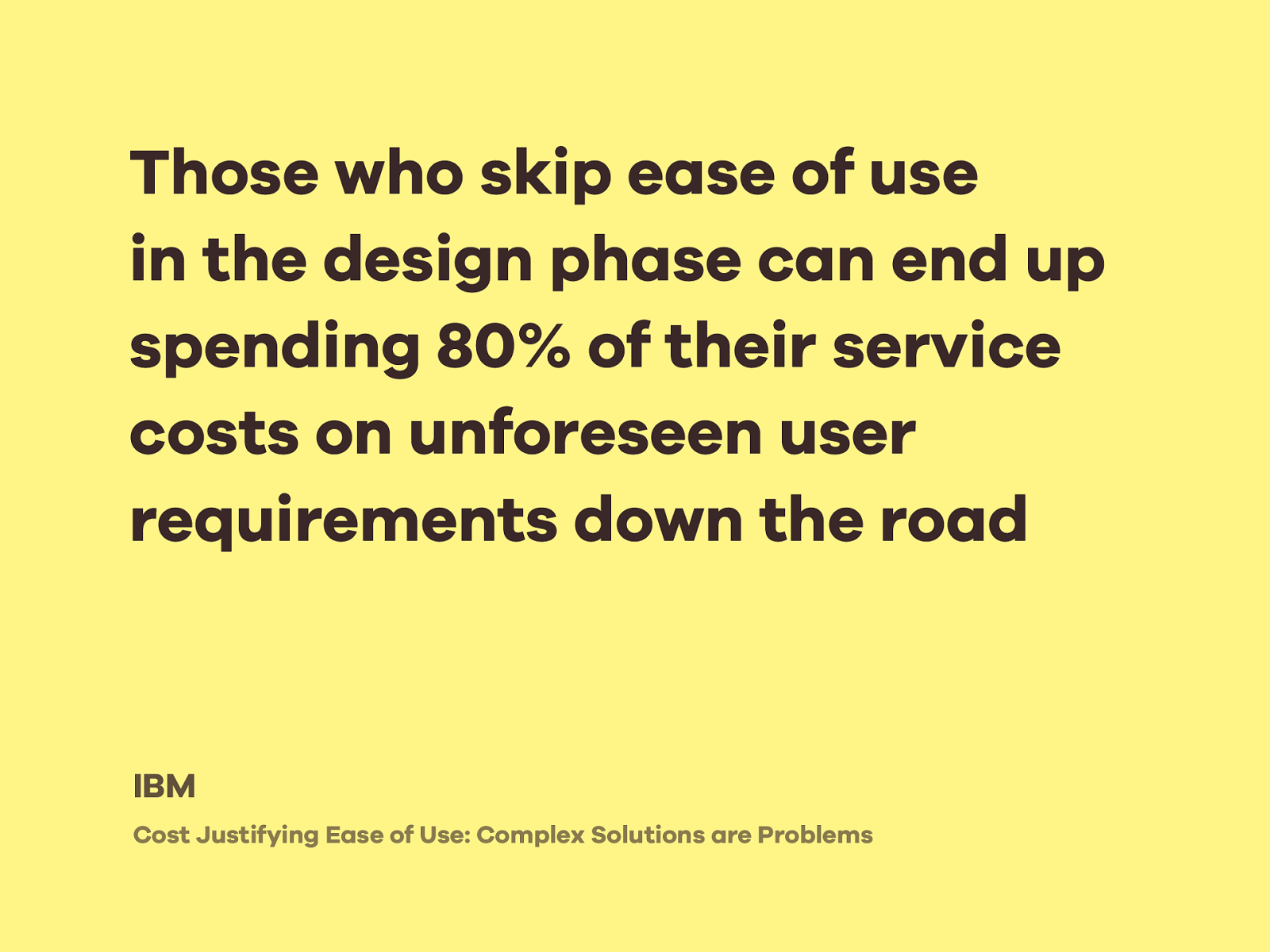
Those who skip ease of use in the design phase can end up spending 80% of their service costs on unforeseen user requirements down the road For design to be successful, it’s important to focus on how your product works, in addition to how it looks. IBM found that companies who skip “ease of use” in the design phase can end up spending 80% of their service costs on unforeseen user requirements down the road, like fixing bugs you could have caught in user testing, or reworking your product to make it more usable, or pivoting directions to target a different audience. Cost Justifying Ease of Use: Complex Solutions are Problems IBM
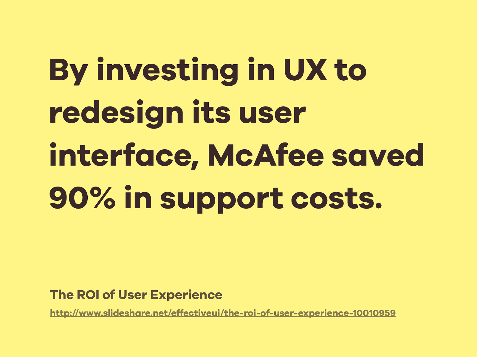
By investing in UX to redesign its user interface, McAfee saved 90% in support costs. By investing in user experience design while redesigning its product, McAfee saved 90% in support costs. That’s a whole lot of time you don’t need to spend walking confused customers through your product or service. http://www.slideshare.net/effectiveui/the-roi-of-user-experience-10010959 The ROI of User Experience
Good design is worth it. It doesn’t matter if you’re a small business, an online retailer, a freelancer, even a local coffee shop, good design is worth the investment. We’ve come to a point where good design is not just expected, it’s demanded. Mediocre and poor designs just don’t cut it anymore. The competitive landscape is too saturated; a poorly designed product cannot flourish. Whether you hire a design expert or try to improve your designs on your own, it’s worth the time and money.
Thank you! melchoyce.design @melchoyce & thanks to @folletto for a bunch of the great stats :)