Make Unique Designs by Combining Blocks
Hello WPBlockTalk! I hope everyone’s been having a great day learning about the WordPress block editor.

A presentation at WPBlockTalk in April 2020 in by Mel Choyce
Hello WPBlockTalk! I hope everyone’s been having a great day learning about the WordPress block editor.
I’m Mel Choyce-Dwan. I am a product designer who’s been involved with the WordPress community for many years. I’m a core committer, and I co-led the 4.9 core release cycle. Today I want to talk to you about making unique designs by combining blocks.
@melchoyce
Let’s start with the basics and talk about the building blocks of block building.
There are a couple key blocks that form the basis of most content. These are the fundamentals used by the vast majority of websites.
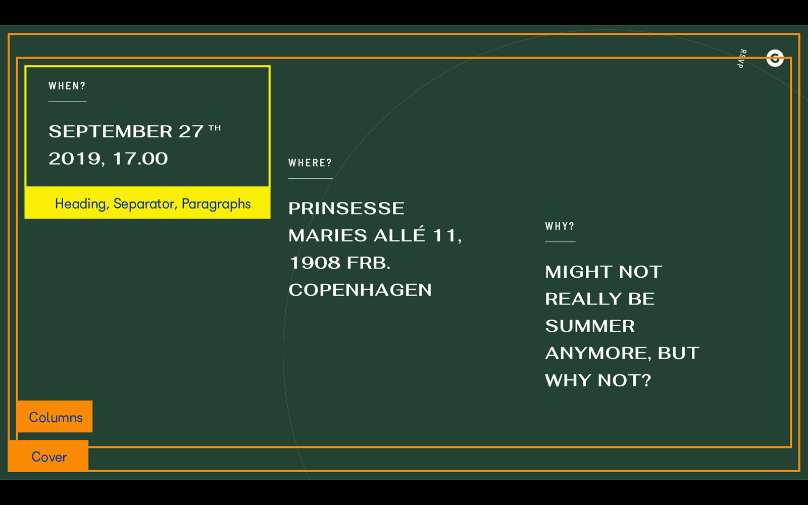
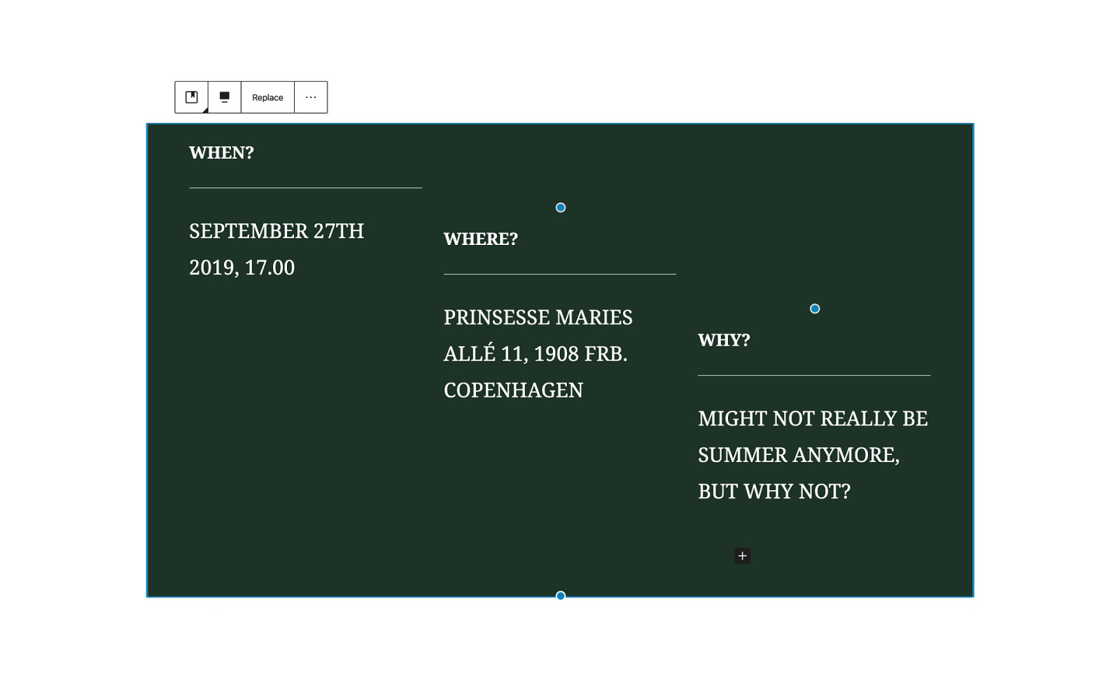
At its simplest, we have the paragraph block. The Paragraph block has a prompt that encourages you to write. You can add inline formatting, like bold or italic text, add links, and change the alignment. You can change the paragraph text or background color.
Headings range from h1–h6, but you’ll probably be staying within the h2–h4 range, which is what’s offered up in the headings toolbar that appears when you select the block. Avoid using them for decoration, and instead, stick to using the appropriate semantic level.

The list block is useful for, well, adding any sort of list to your website. Often, you can turn a long paragraph into a list to make the content a little easier to digest. It’s a great way to enhance the readability of your website.

Gutenberg provides two default quote styles, and two pullquote styles. There are tons of great opportunities for bold, attention-grabbing text by using these two quote blocks, especially if you’re writing blog posts or articles.

WordPress supports images, galleries, audio, video… all sorts of multimedia. By combining media and text, you can create rich, dynamic layouts that stand out from your average website.
WordPress also provides a number of default layout blocks you can use to provide structure for your basic blocks.
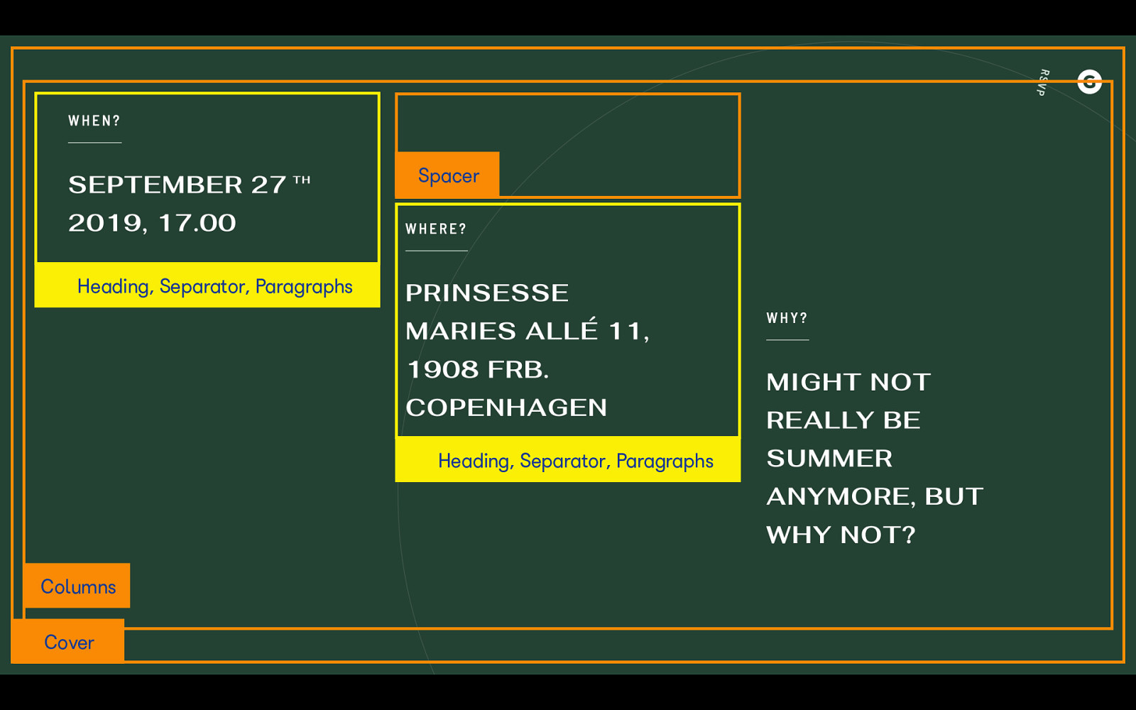
Remember spacer gifs? Well, it’s a little like that. If you don’t have control over your site’s CSS, or don’t want to write any code, you can use a spacer block to add more space between elements on your site. It’s a super useful layout tool for designers and non-technical site builders especially.
Also known as a horizontal rule, the separator block adds a line or other decorative break between elements on your site. It’s great for dividing a heading from some content, or creating a separation between two different sections.

This is where we start to get more complex. The group block allows you to, well, group multiple blocks together into one unit. For example, if you want to have a section on your homepage with a different background color, the group block could be the way to go.
Columns are by far one of the most useful blocks WordPress has introduced. Prior to the column block, adding multiple columns to a WordPress page was a clunky experience often requiring shortcodes. Now, you can create and edit columns completely visually, and don’t have to worry about leaving out a closing tag and breaking your whole layout.

The Cover block is great for adding a hero image or banner to your site, or for making bold pullquotes that break up articles. You can add a background color, image, or video, and overlay it with text and other blocks.
The Media & Text block provides a quick and easy way to add text next to an image or video, which is a common pattern seen across the web. Combining media and text blocks is an easy way to create a dynamic homepage.

Want to add three latest posts to your site’s homepage? You can do that easily with the Latest Posts block. You can switch between list or grid view, toggle on or off features like featured images and post dates, and even select posts from specific categories. This is super useful for building magazine-style layouts.
Let’s start thinking about how we can take these building blocks, and combine them. Here are some designs in the wild I found that we can use blocks to replicate.
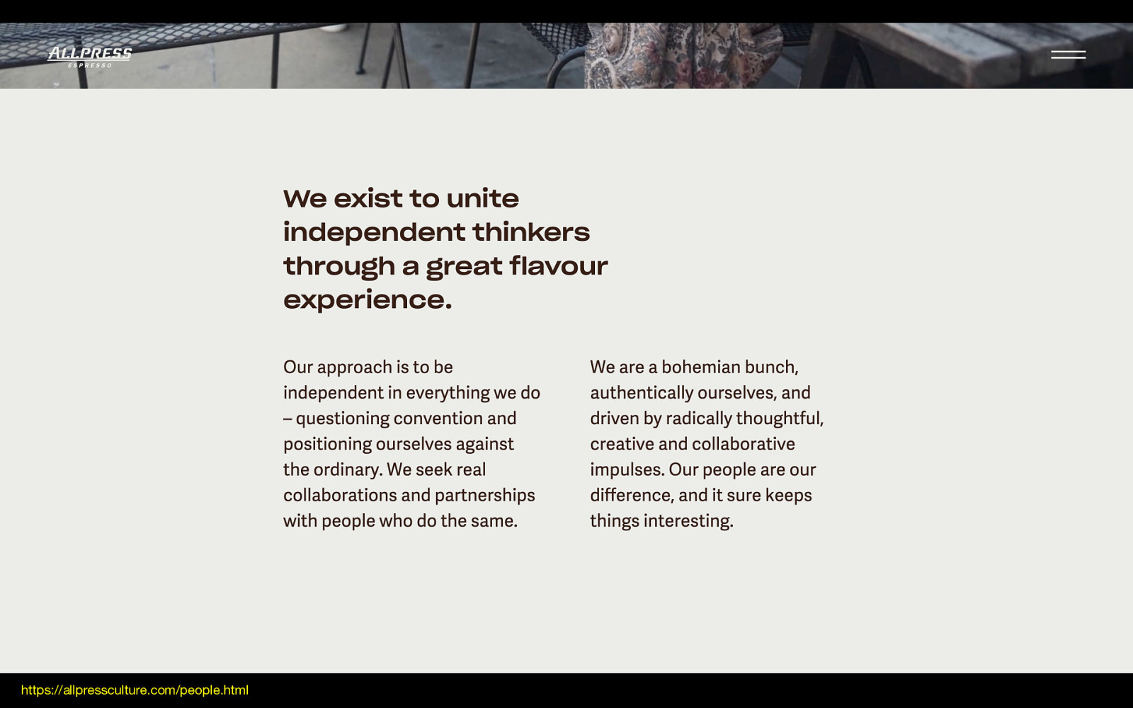
I like this example because it features a bold, clear intro sentence. It’s slightly wider than the 50/50 split column below, which makes it visually interesting and brings in some balance. Let’s start breaking it down.
https://allpressculture.com/people.html
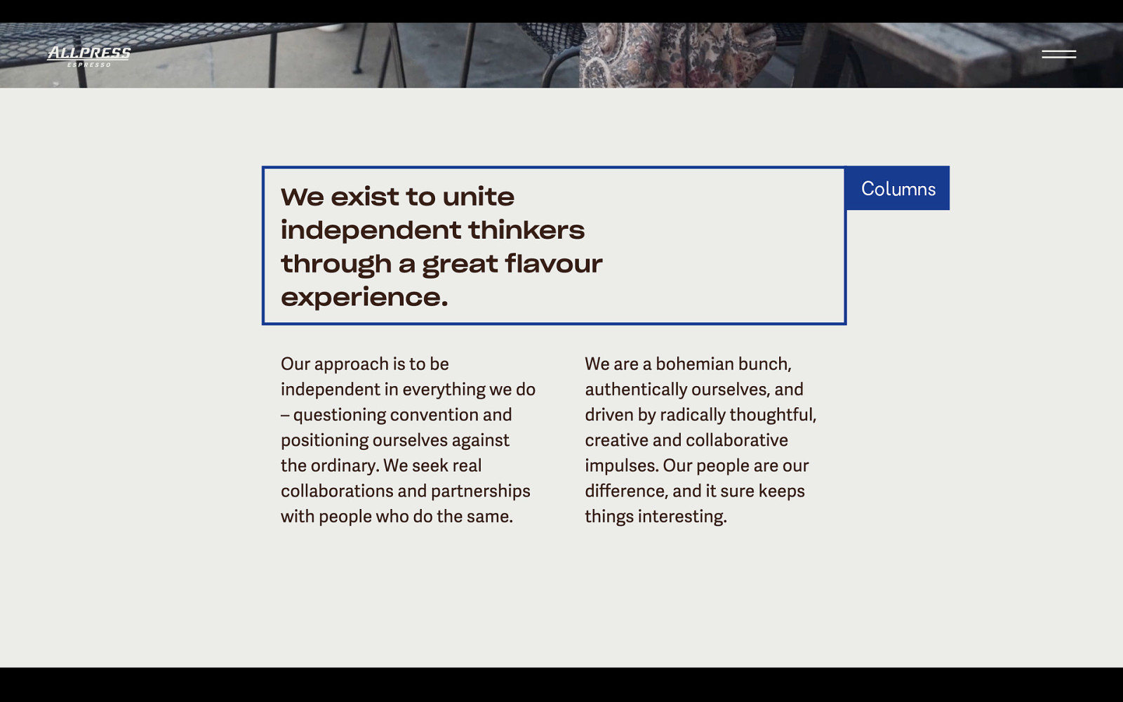
This first section, which doesn’t span the entire width of the content, can us the column block. Inside are two columns: one that’s slightly wider, say, 60 or 70%, and another empty column that’s narrower.
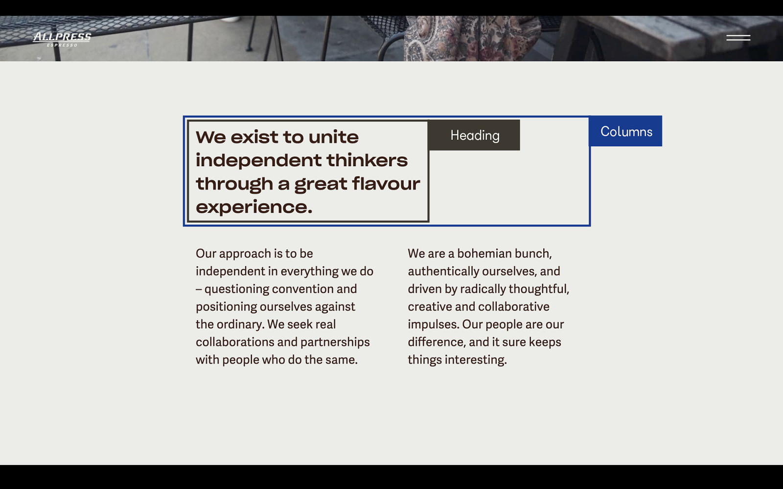
Inside that first column is a heading block.
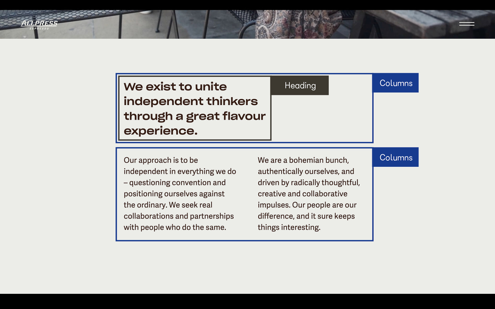
Next, we have a column block with equal sized columns inside.
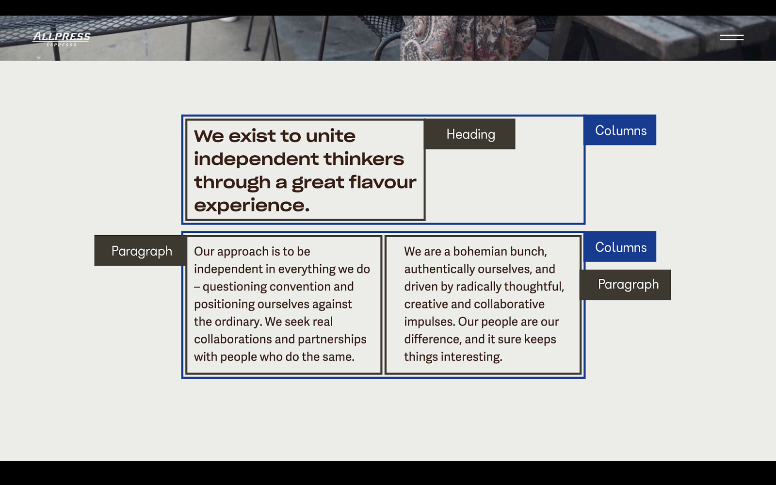
Inside each column is a paragraph.
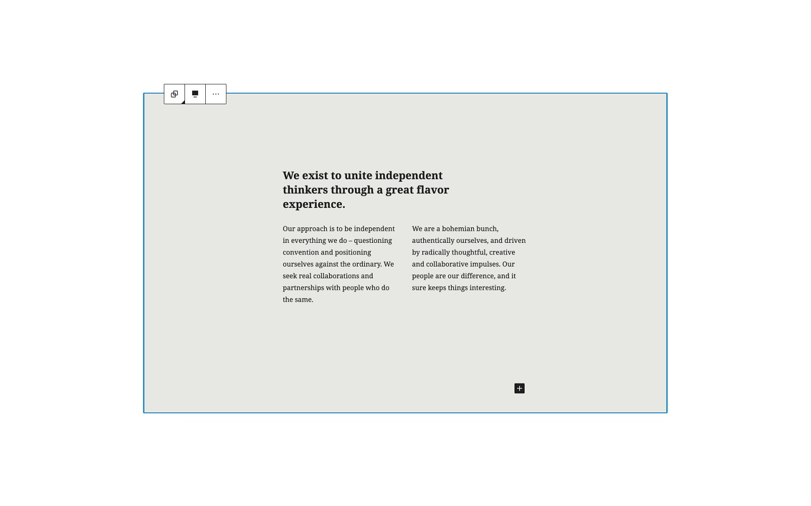
It we add that into the Gutenberg editor, we’ll get something like this.
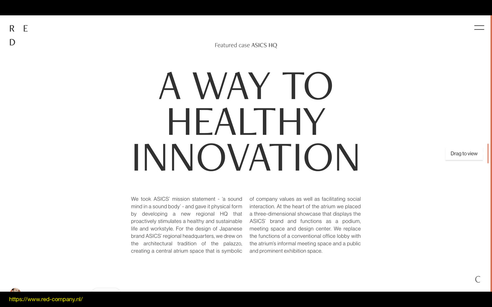
Here’s another example. I love how attention-grabbing this headline is, and the shape it forms on the page.
https://www.red-company.nl/
This top text is a centered paragraph.
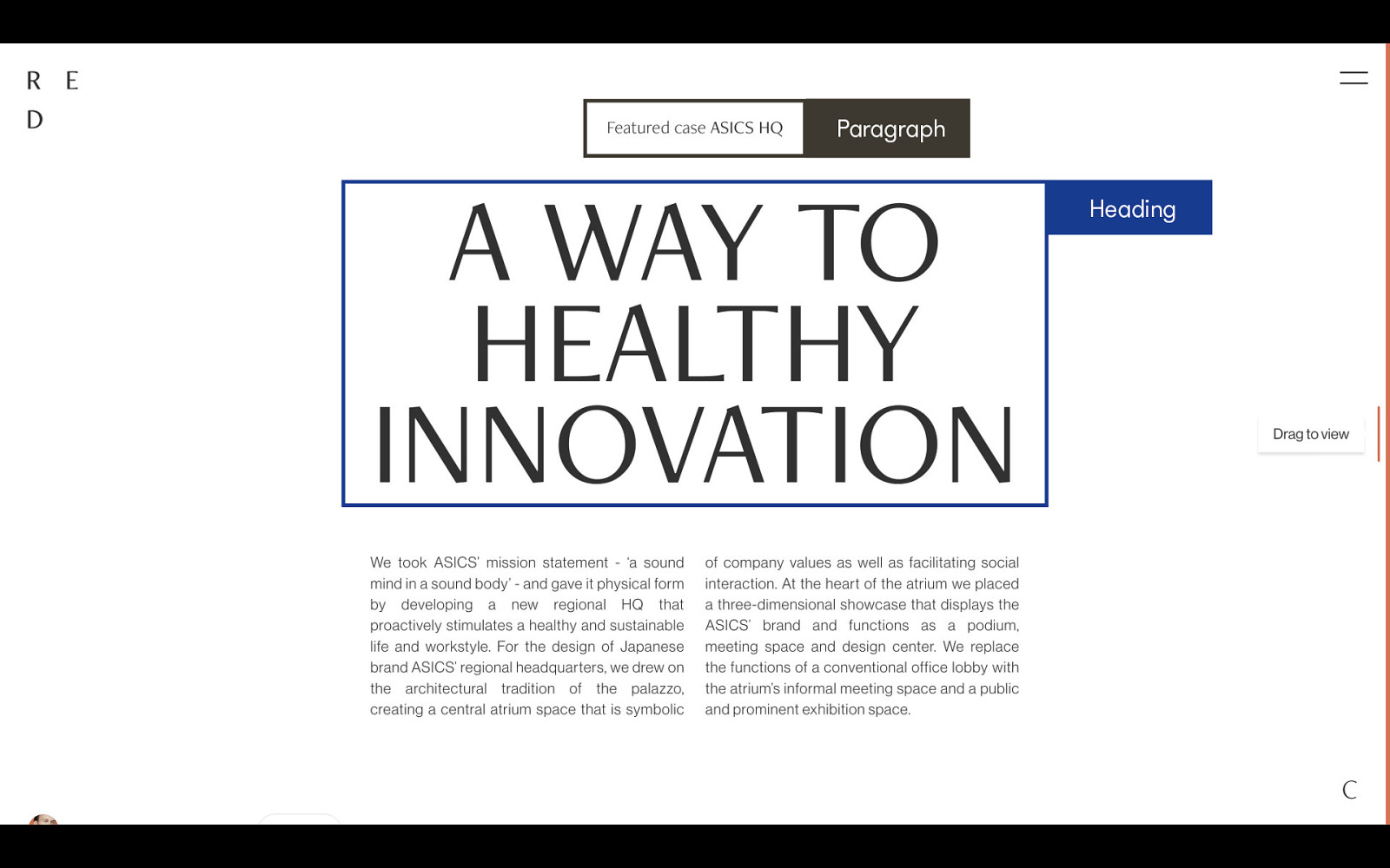
Next, we have a heading.
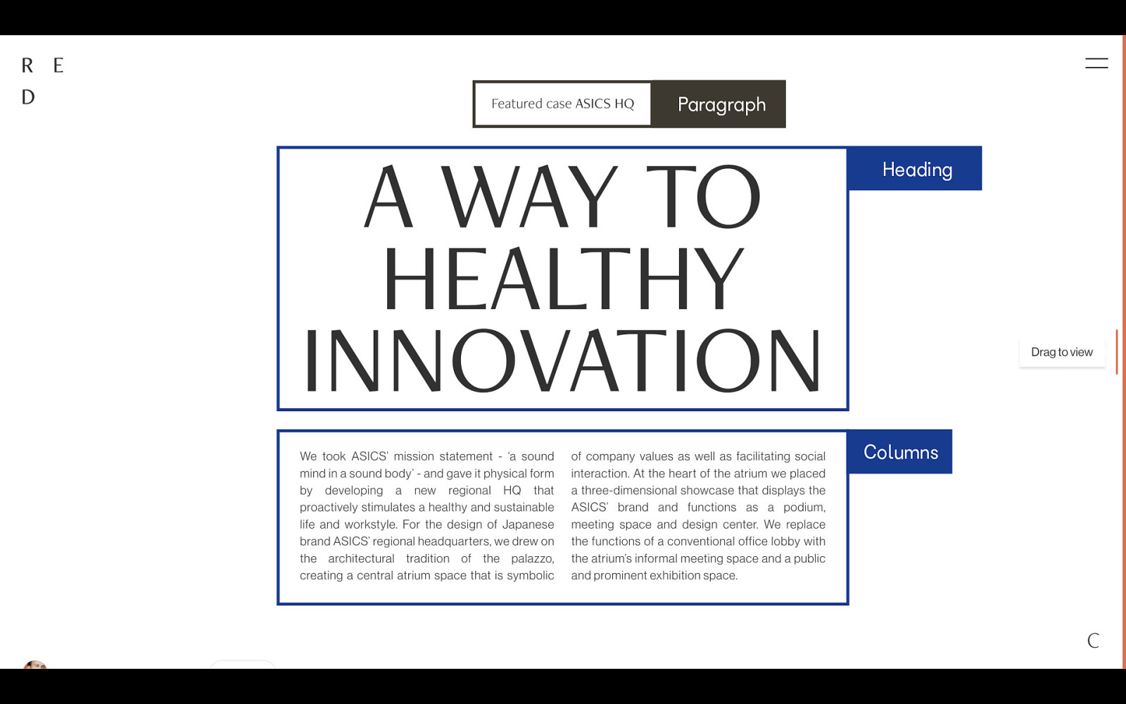
After that we have two equal width columns.
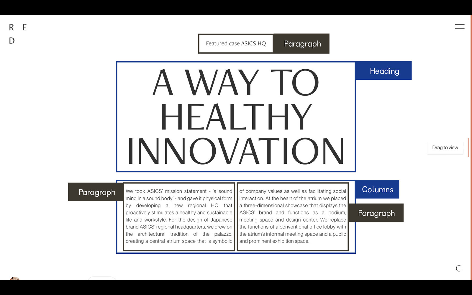
Inside each column is a paragraph.
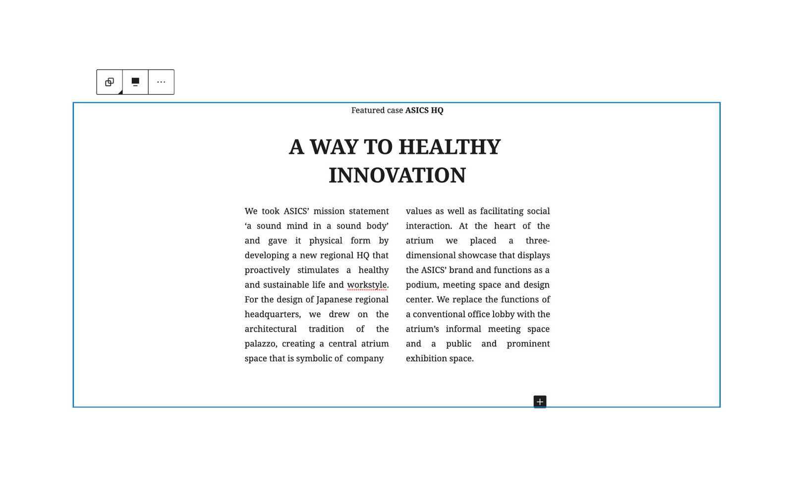
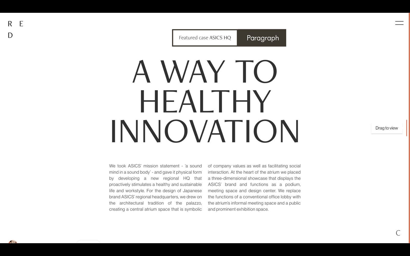
It doesn’t look as dramatic in Gutenberg without any additional styles, but a nice theme can make all the difference.
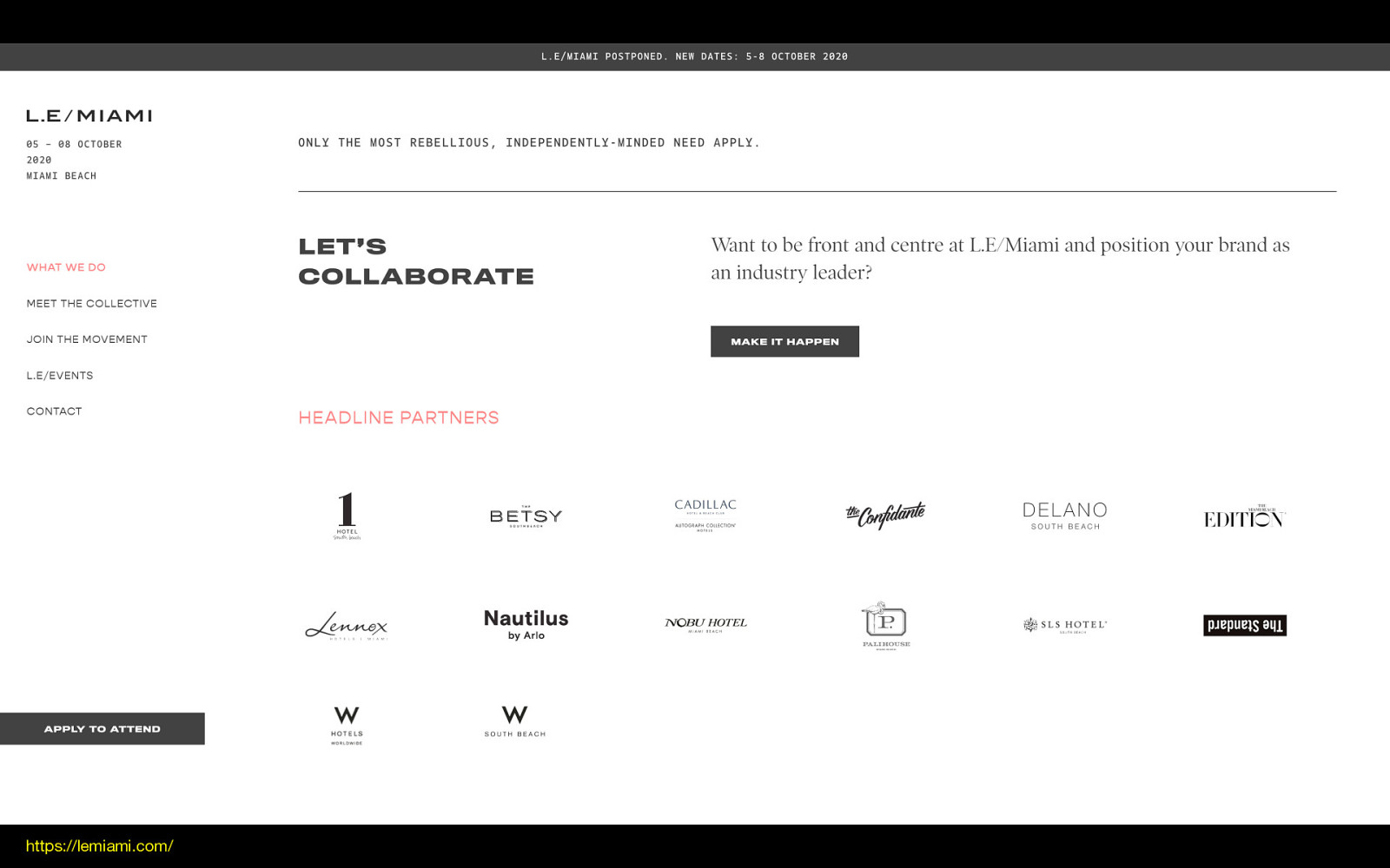
On this site, the “let’s collaborate” bar is such a common pattern, and I love the all caps header off to the side. It’s something I tried to design into Twenty Seventeen that would have worked so much better with Gutenberg. Let’s look at how to build it now that we have the right tools.
https://lemiami.com/
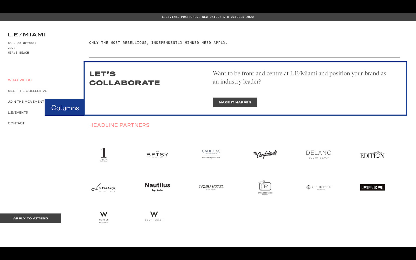
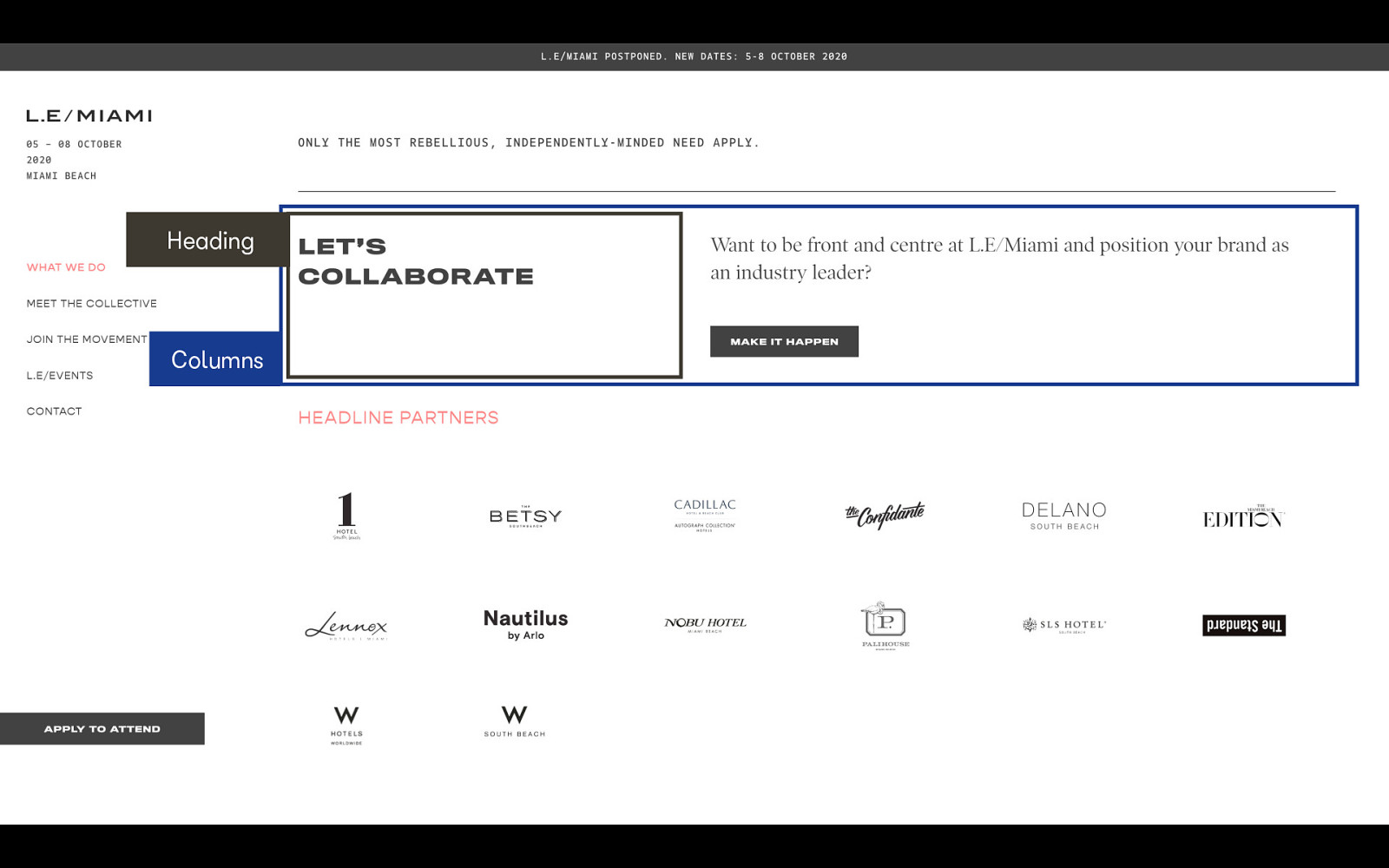
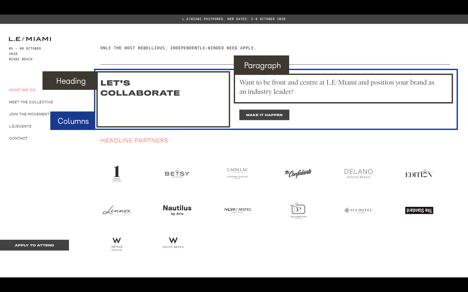
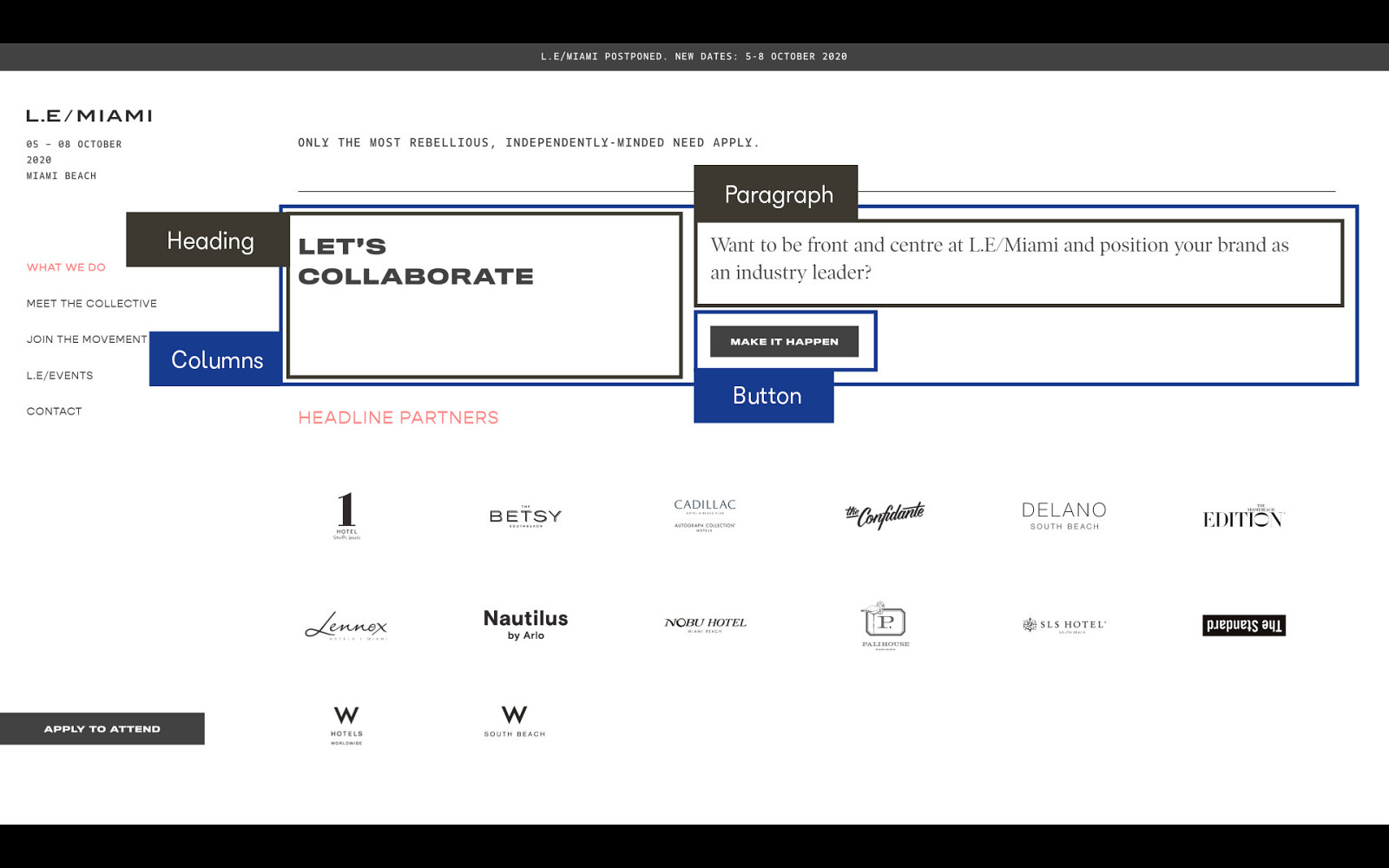
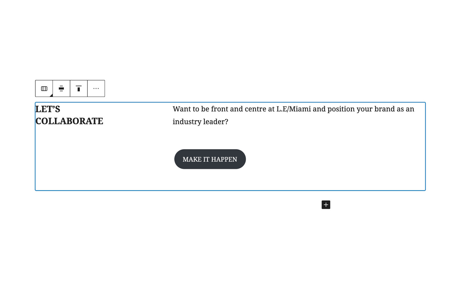
Here we are in Gutenberg. You could put this in a Group block and add a background cover, or add a nice parallax effect with a background image using a Cover block. Or, you can leave it as-is, and it’ll still look nice.
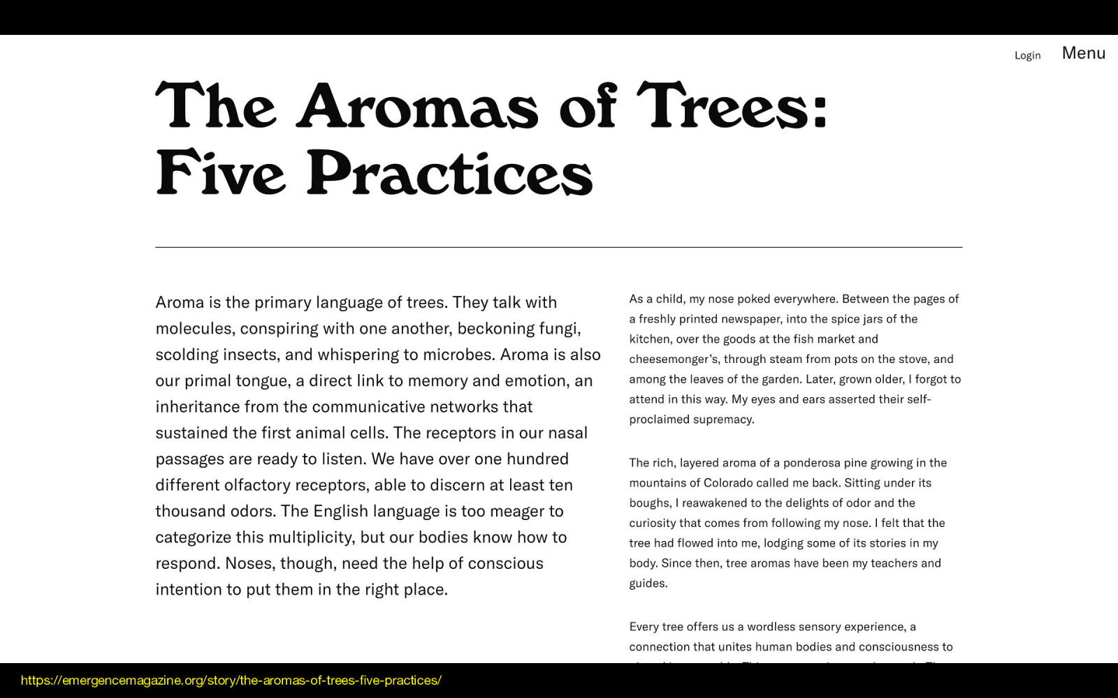
I love this article because it breaks up the content in a way that feels very editorialized. The gradation of size from title to introduction to article is so balanced, making great use of space while keeping line-lengths short.
https://emergencemagazine.org/story/the-aromas-of-trees-five-practices/
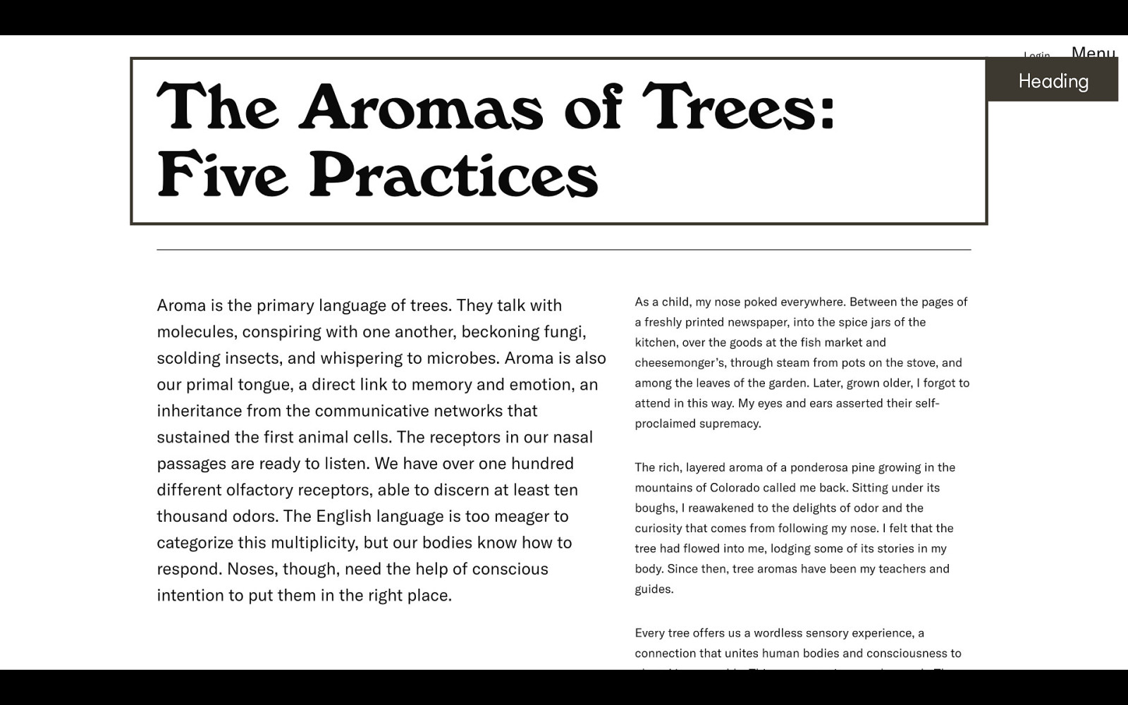
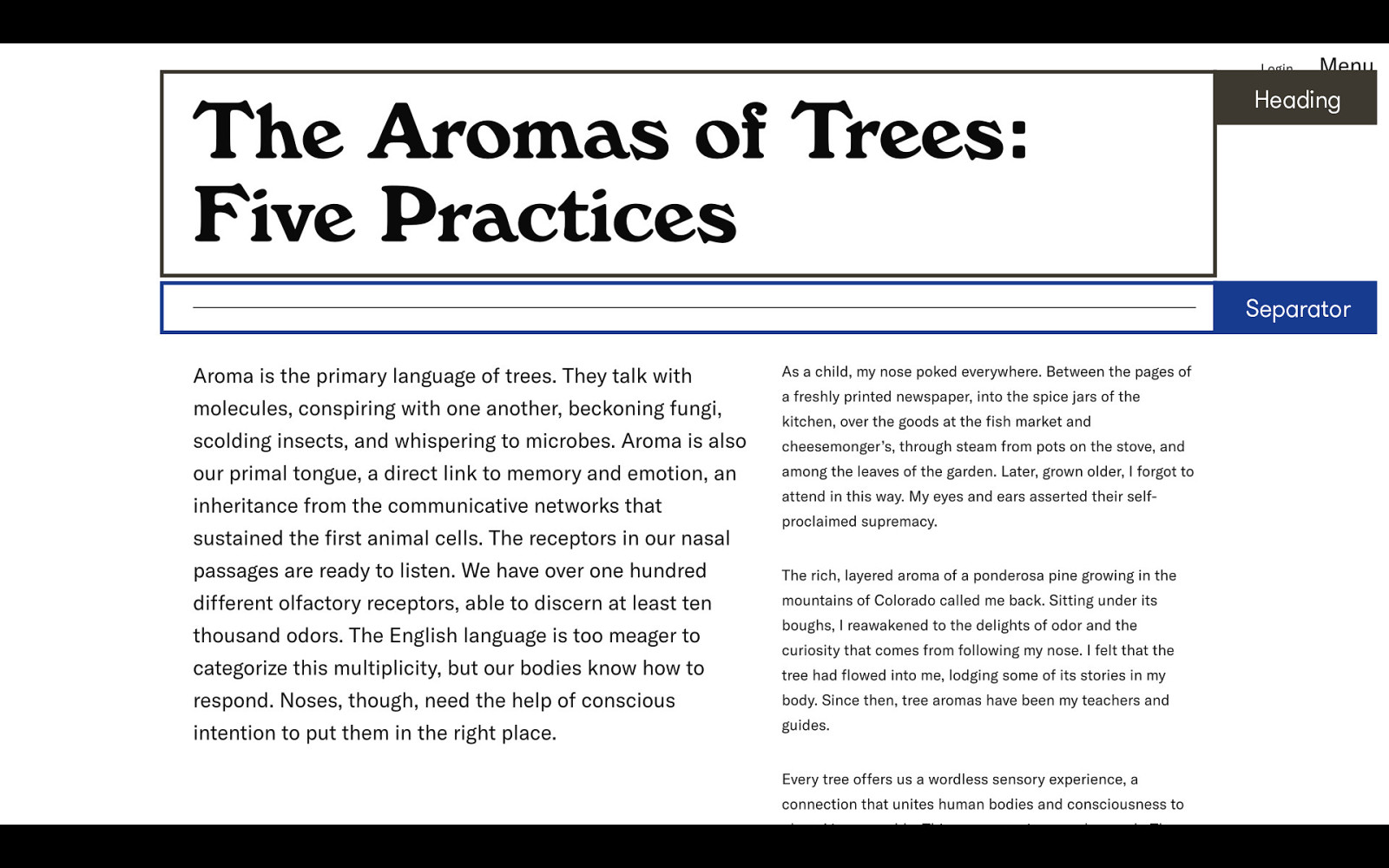
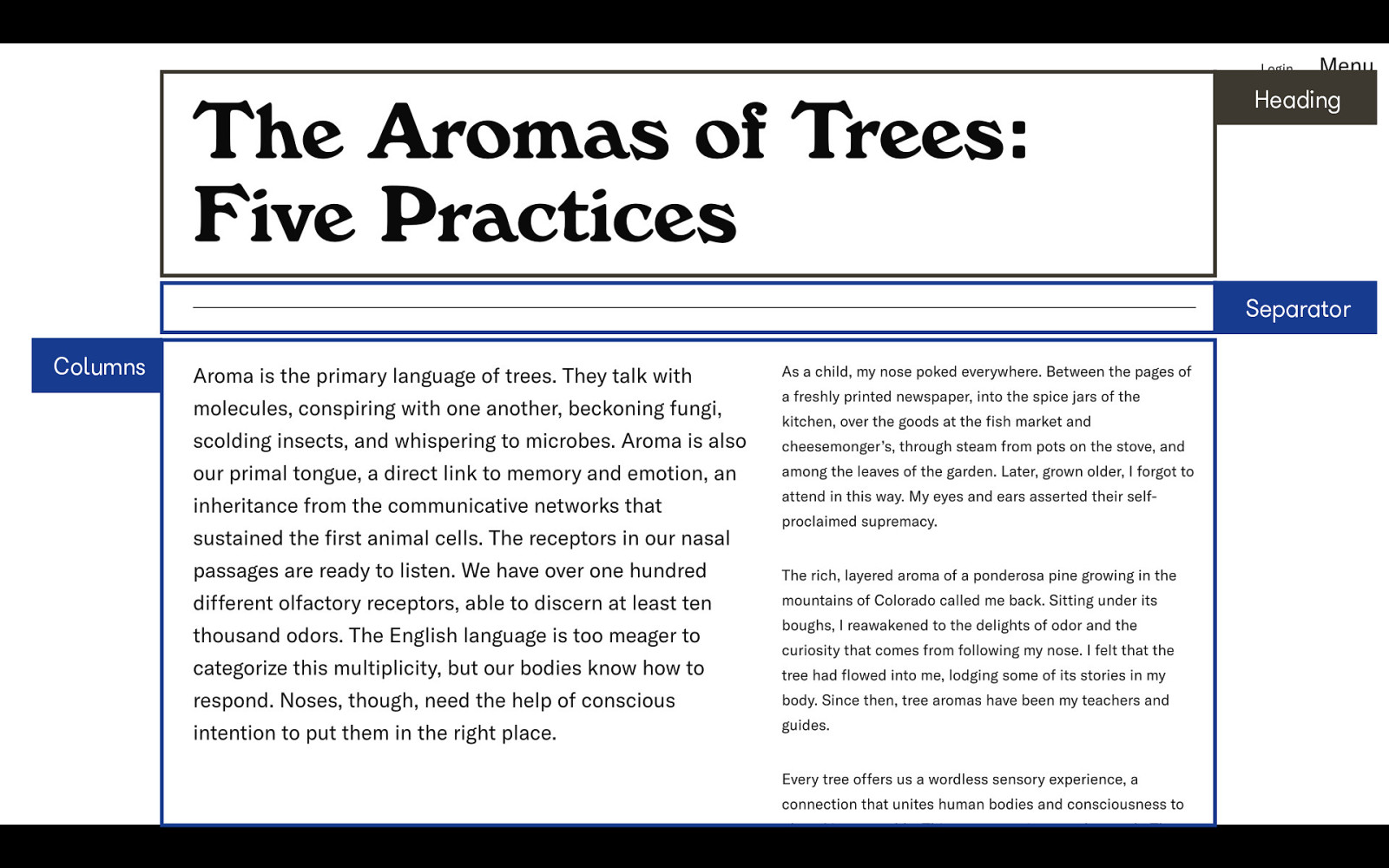
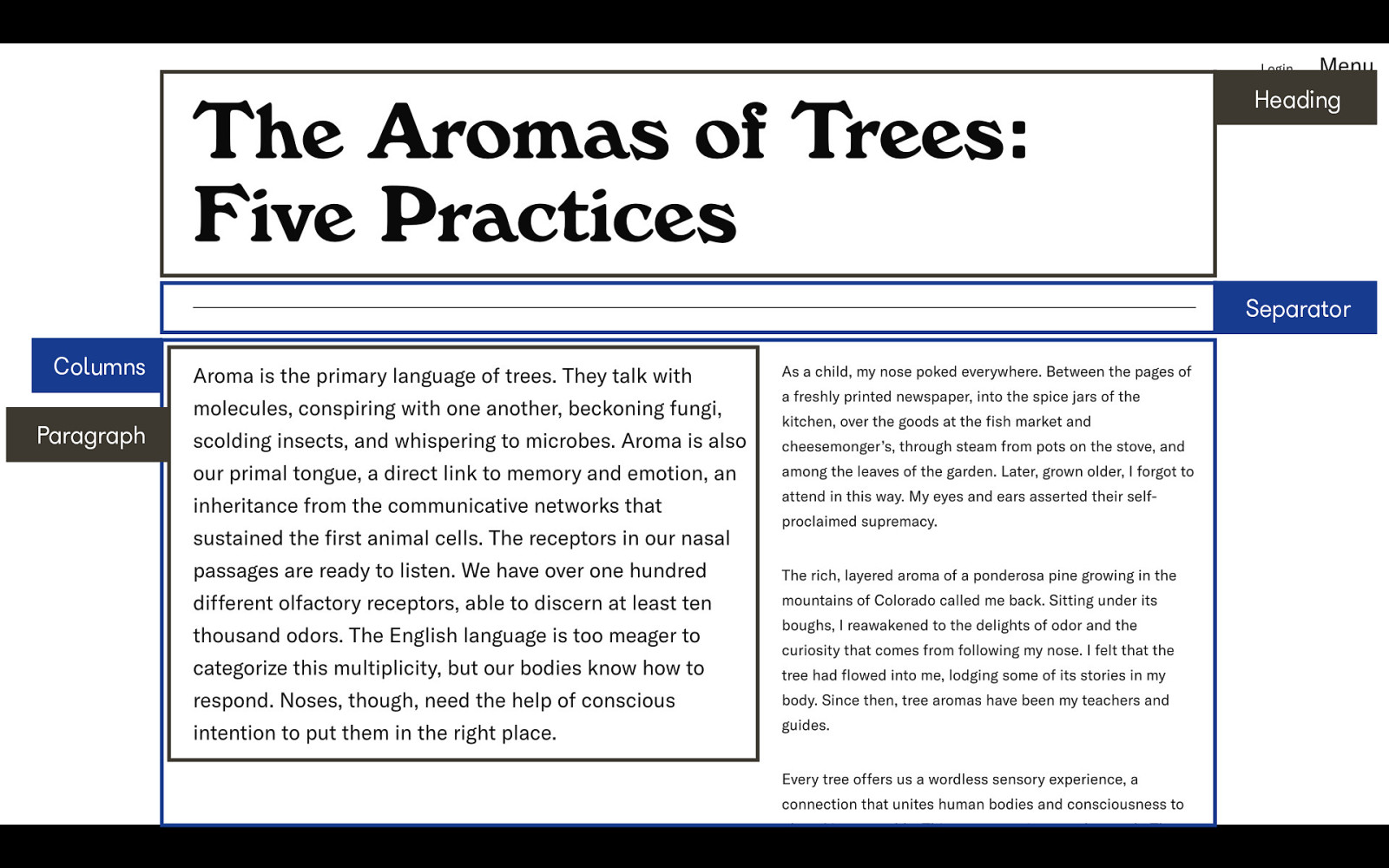
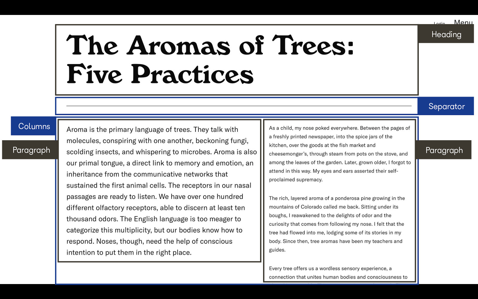
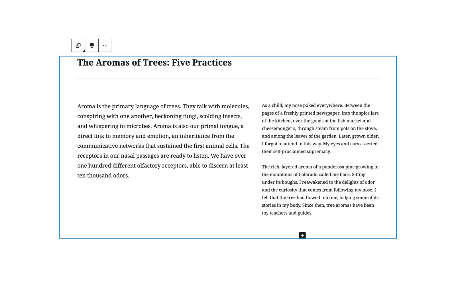
This is a layout that you’ll want to play with in Gutenberg until you get the widths and sizes just right.
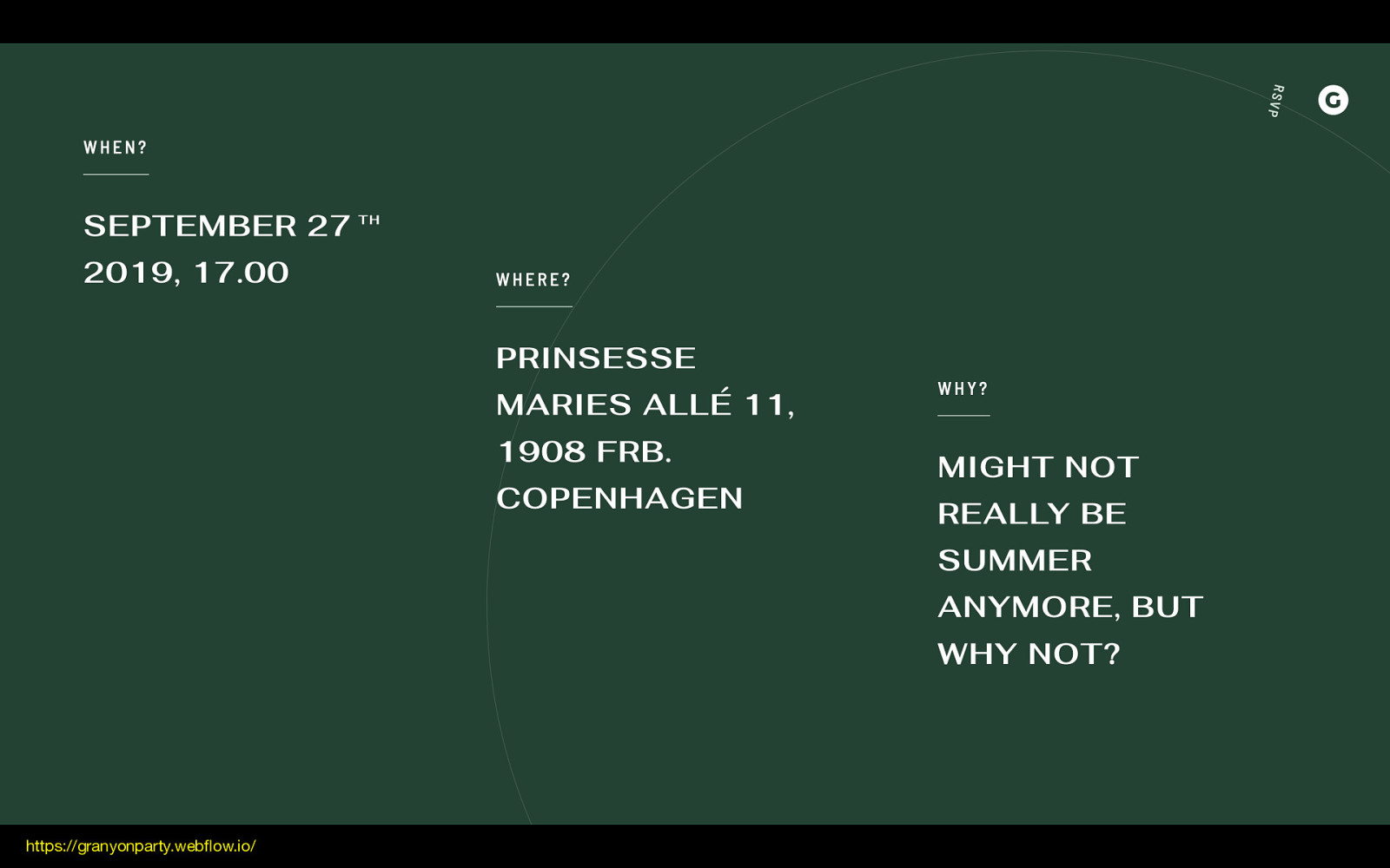
This whole site is very dynamic and fun, but I really love the flow of this diagonal section. This layout looks really complex, but it can be all be broken down using our block toolbox.
https://granyonparty.webflow.io/
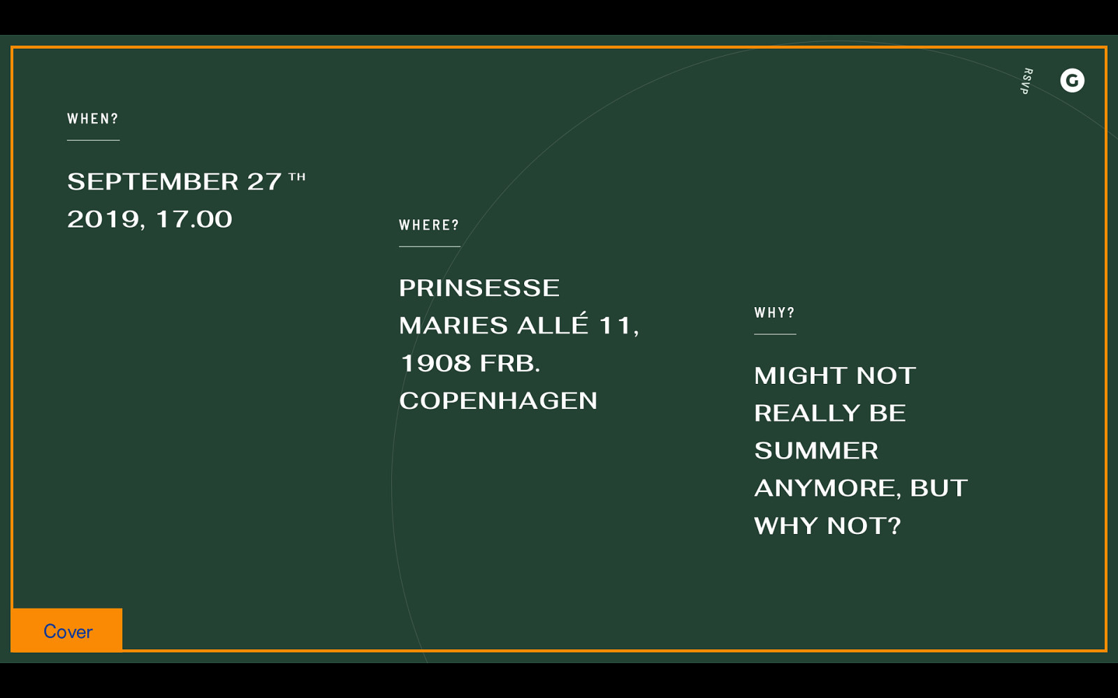
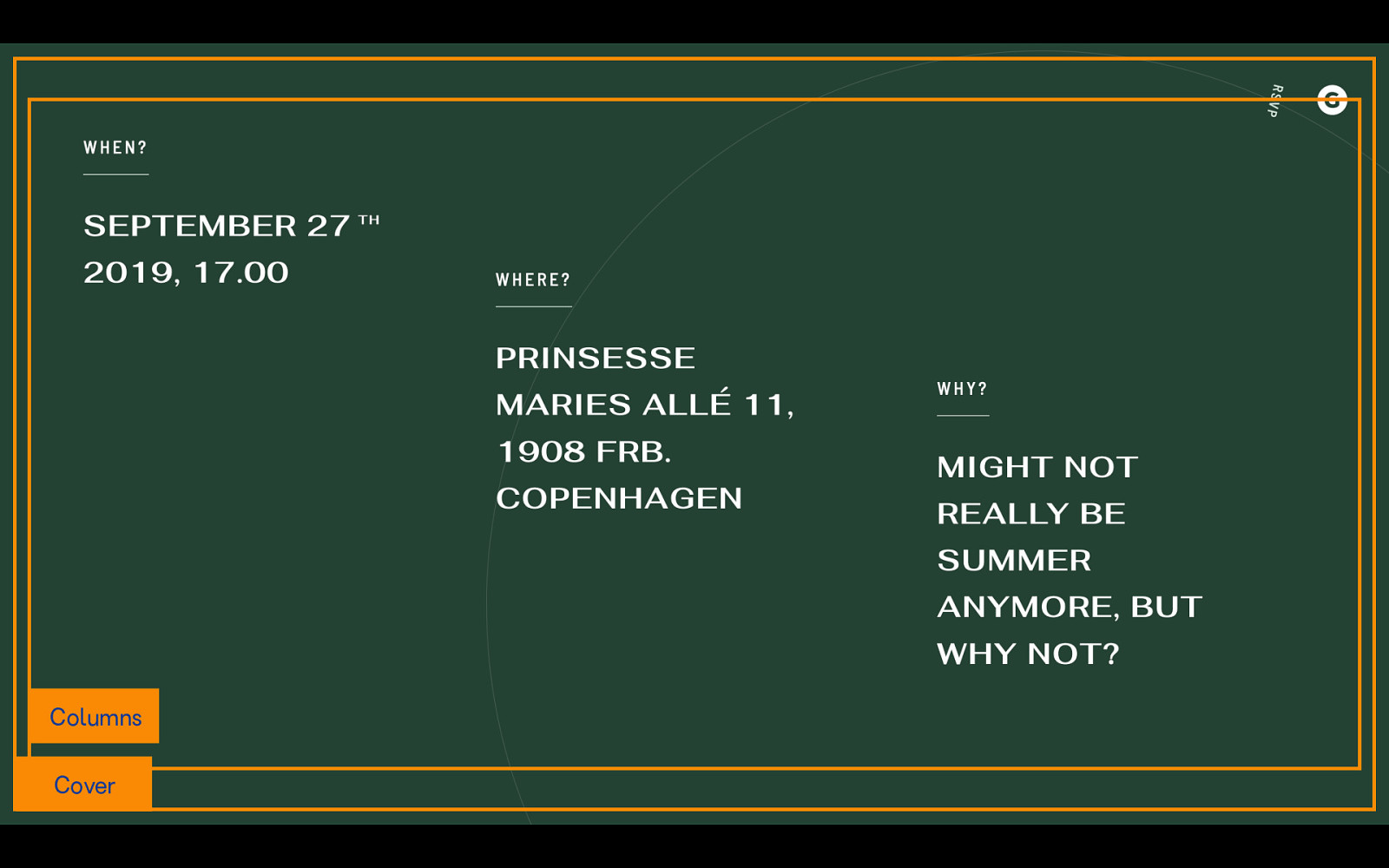
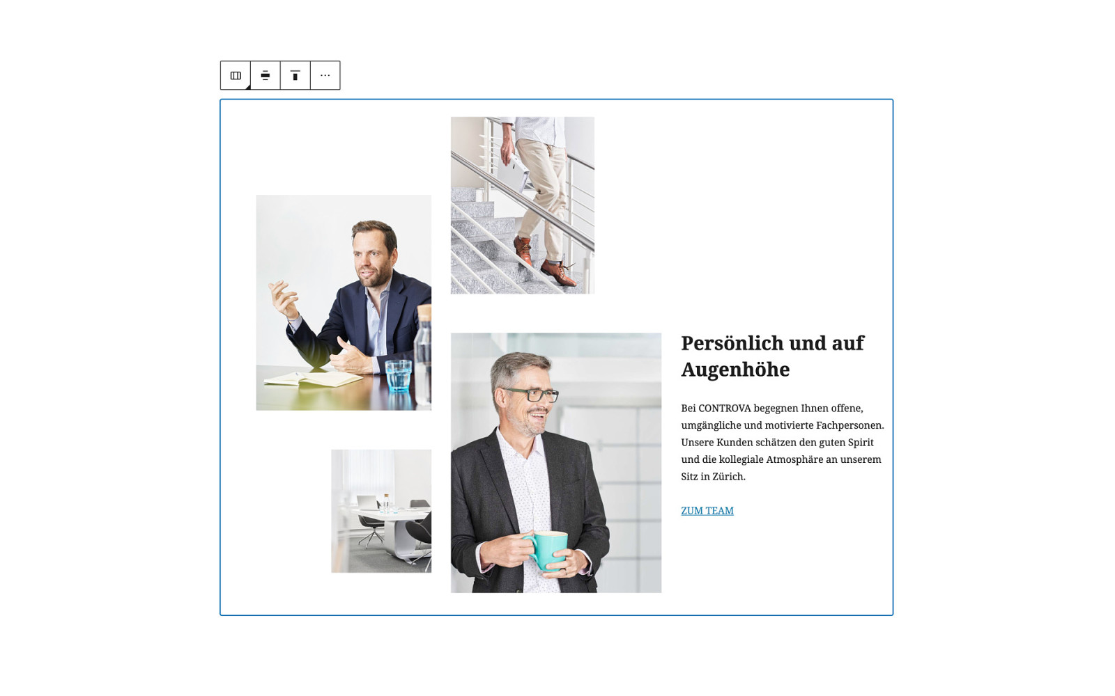
Now here’s where things start to get interesting. You can use a spacer block to push the middle column down a little bit, so it’s offset from the first column.
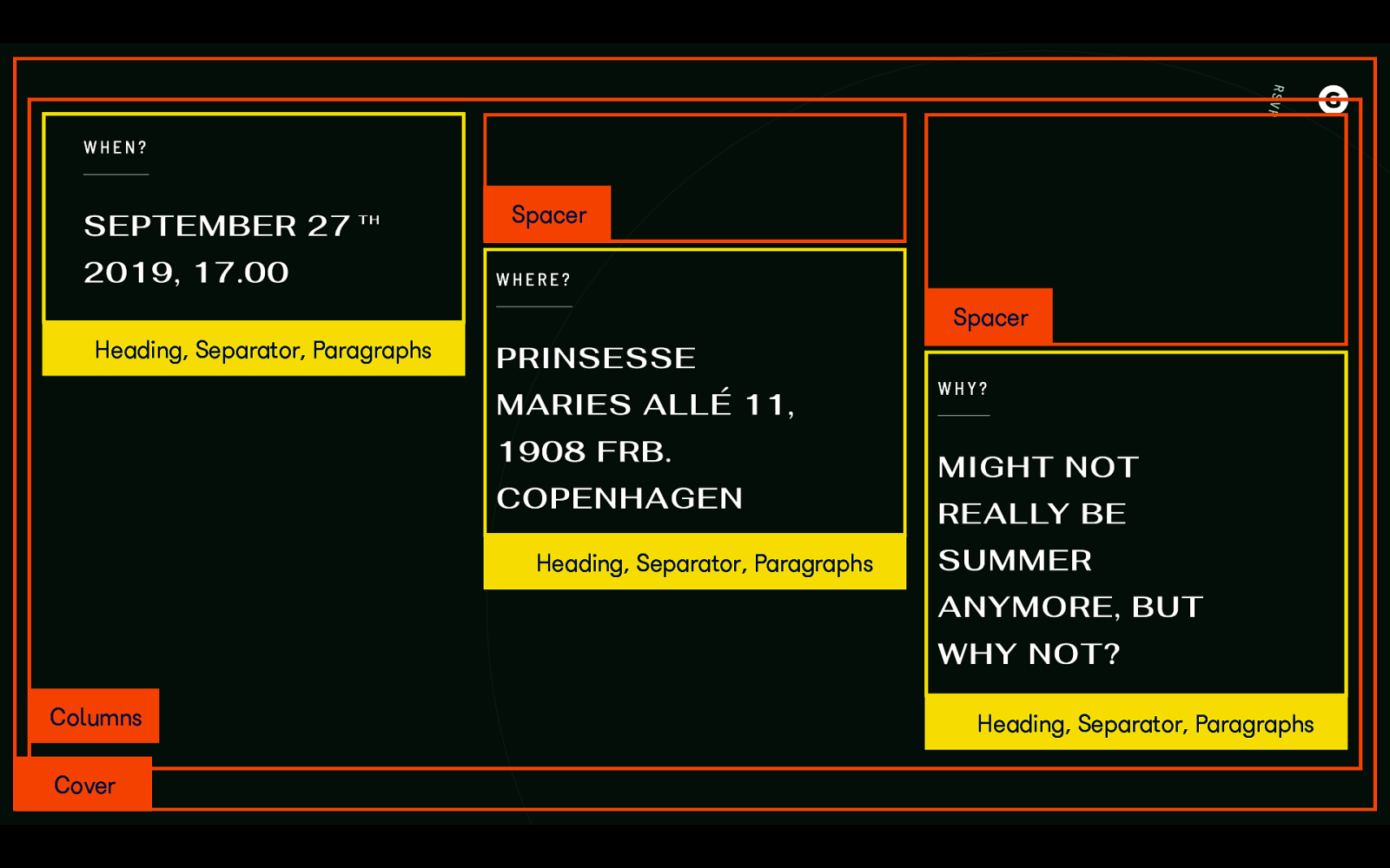
We can do this again on the third column.
One thing you’ll want to consider for your own site, is if you’re using spacers to create these kinds of offset layouts, you’ll want to add a class so you can remove or decrease those spacer heights on smaller screens. We might want to consider approaching this differently, even, by using different column alignments instead of spacer blocks. The left could be aligned top, middle aligned center, and right aligned to the bottom of the column. There are a lot of different ways to approach it.
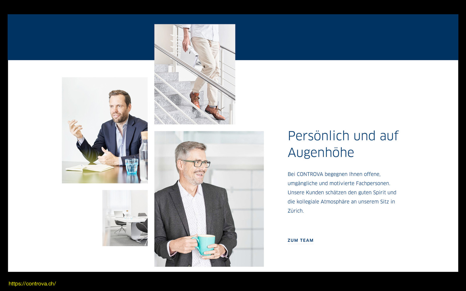
Lastly, this gallery is so much more interesting than four evenly sized and spaced images. Having different sizes and an offset arrangement brings a lot of personality to this section.
https://controva.ch/
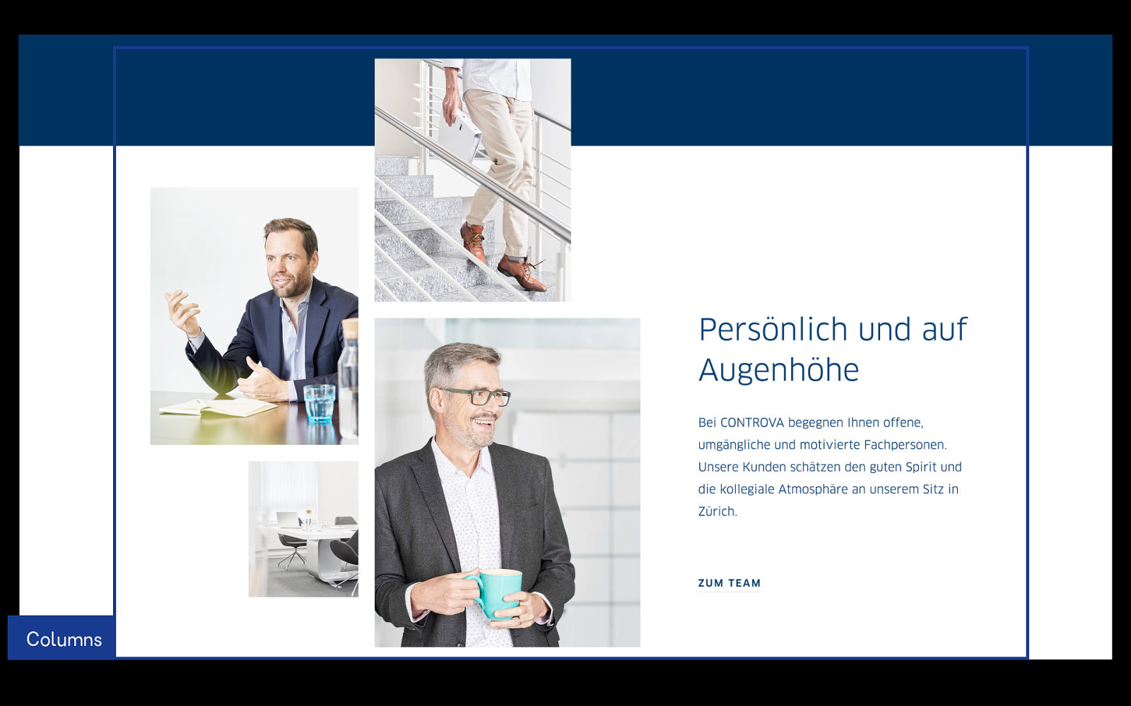
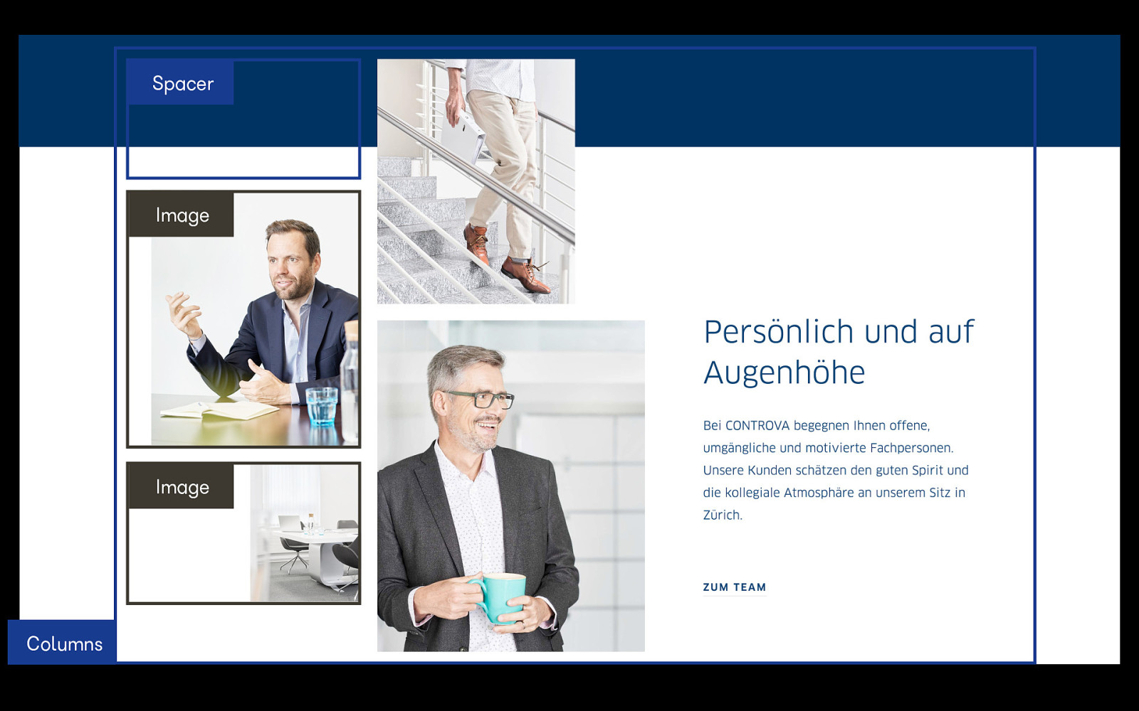
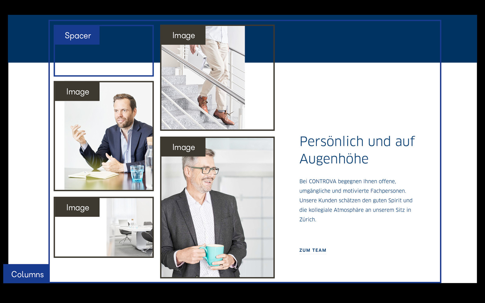
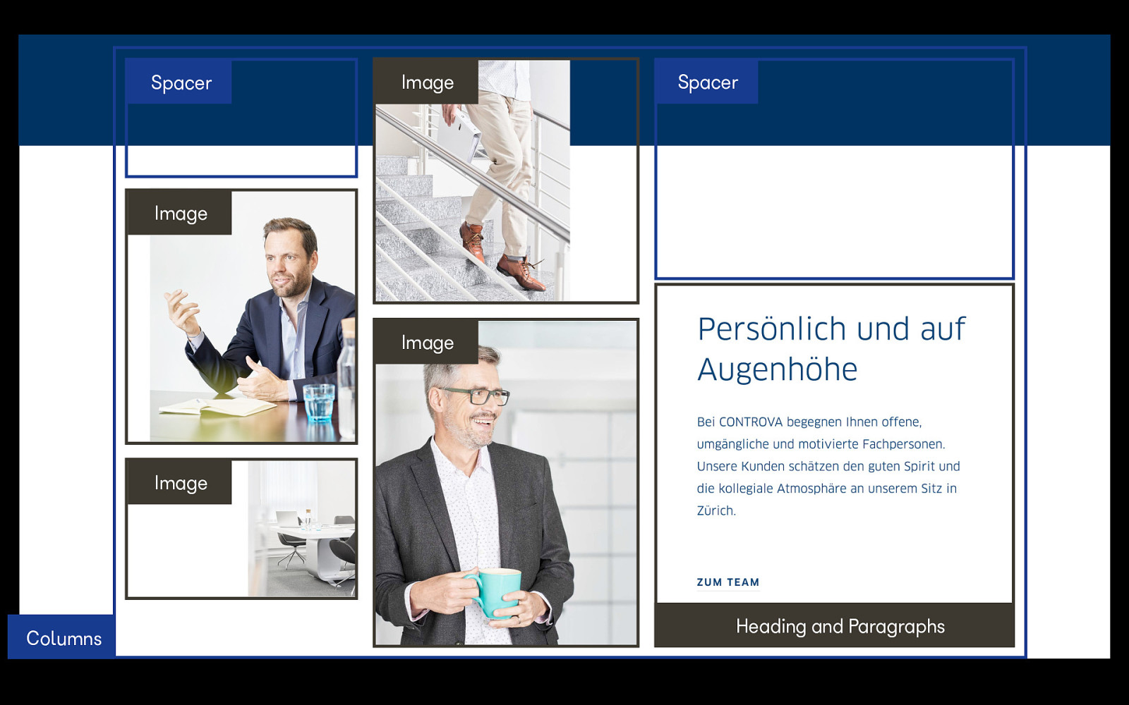
We can get pretty close, just using our basic building blocks. The possibilities are pretty endless.
Let’s take a look at taking these building blocks, and applying them to our own site.
See video for demos.
I hope everyone now has a basic understanding of how to combine blocks in the WordPress editor into attractive layouts. Now, go forth and build!
@melchoyce