
A presentation at JavaScript for WordPress in July 2019 in by Mel Choyce
I’m Mel Choyce, I’m a product designer at Automattic and I work full-time on WordPress core. I co-led the 4.9 release cycle, and am currently working on the Gutenberg block directory. You can check out updates on make.wordpress.org/design.

For most of its existence, WordPress has operated on a “document” model of writing. You have an empty container that you fill with text from top to bottom. There’s a docked formatting toolbar on top of that container.
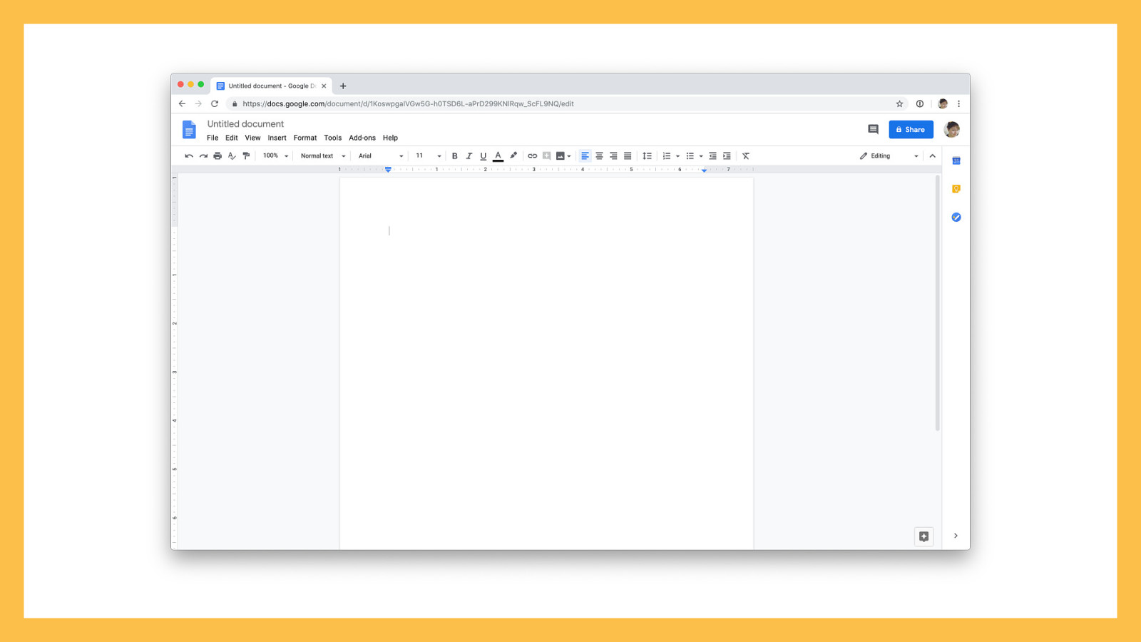
This is an interface familiar to anyone who’s ever worked in Microsoft Word or Google Docs. The web has evolved beyond displaying digital documents, but WordPress has only just started to catch up. The introduction of Gutenberg blocks takes us beyond the document model of web authorship, towards an approach that looks less like writing and more like building.
Gutenberg blocks are like Legos — each a self-contained unit that can be combined to make some pretty fantastic outcomes. Like Legos, the possibilities are only constrained by your imagination.
You don’t need to be a designer to make some pretty rad Gutenberg blocks. You just need to think a little bit like one. With some critical thinking and familiarity with core Gutenberg components and patterns, anyone can create a great block.
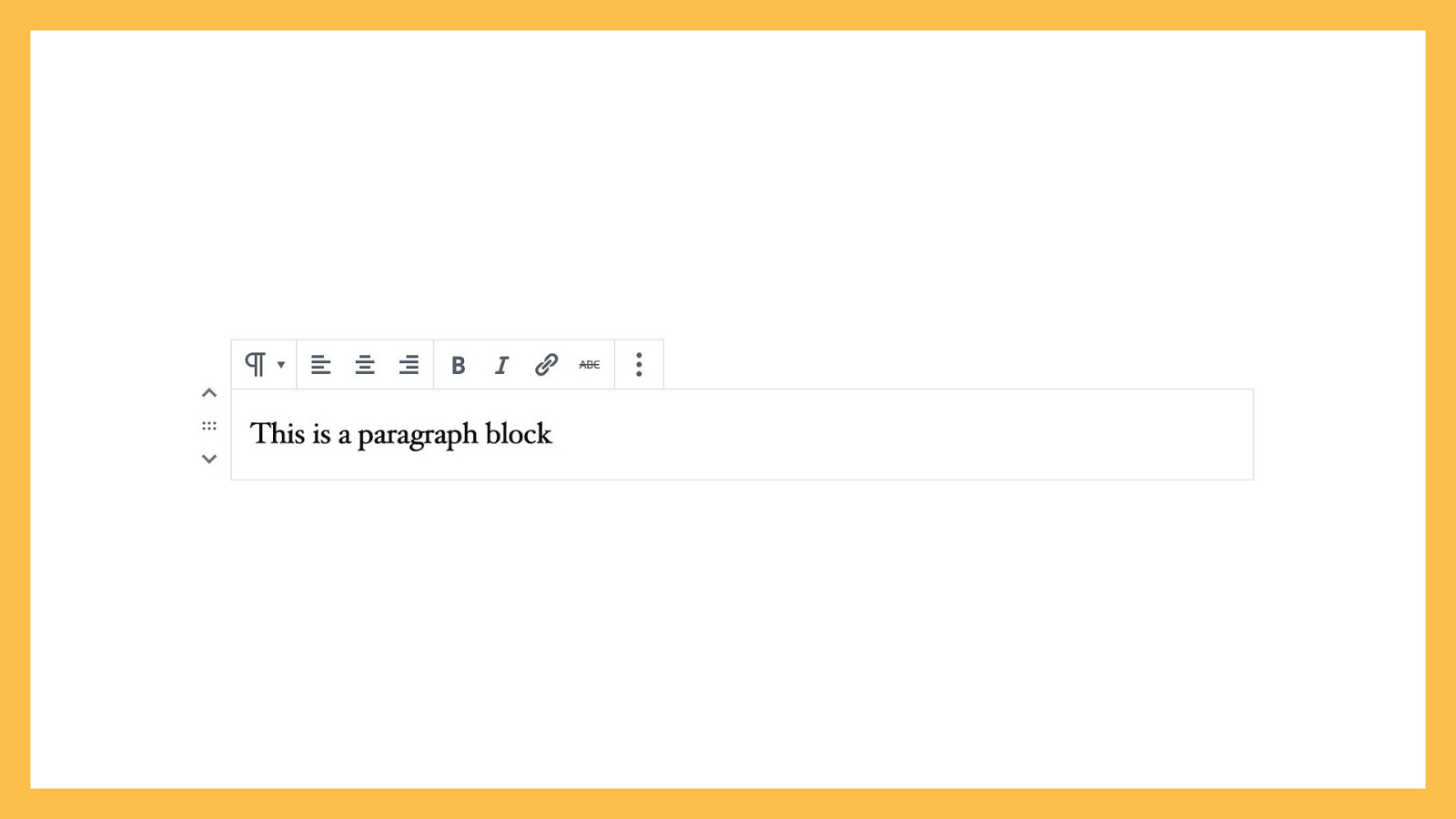
At its simplest, a block can be a paragraph. The Paragraph block has a prompt that encourages you to write. You can add inline formatting, like bold or italic text, add links, and change the alignment. If you want to turn your paragraph into a heading instead, you can do that, too. This is very similar to how WordPress has always operated.
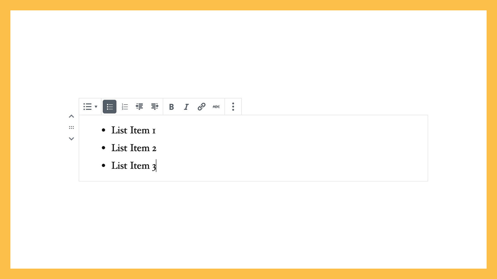
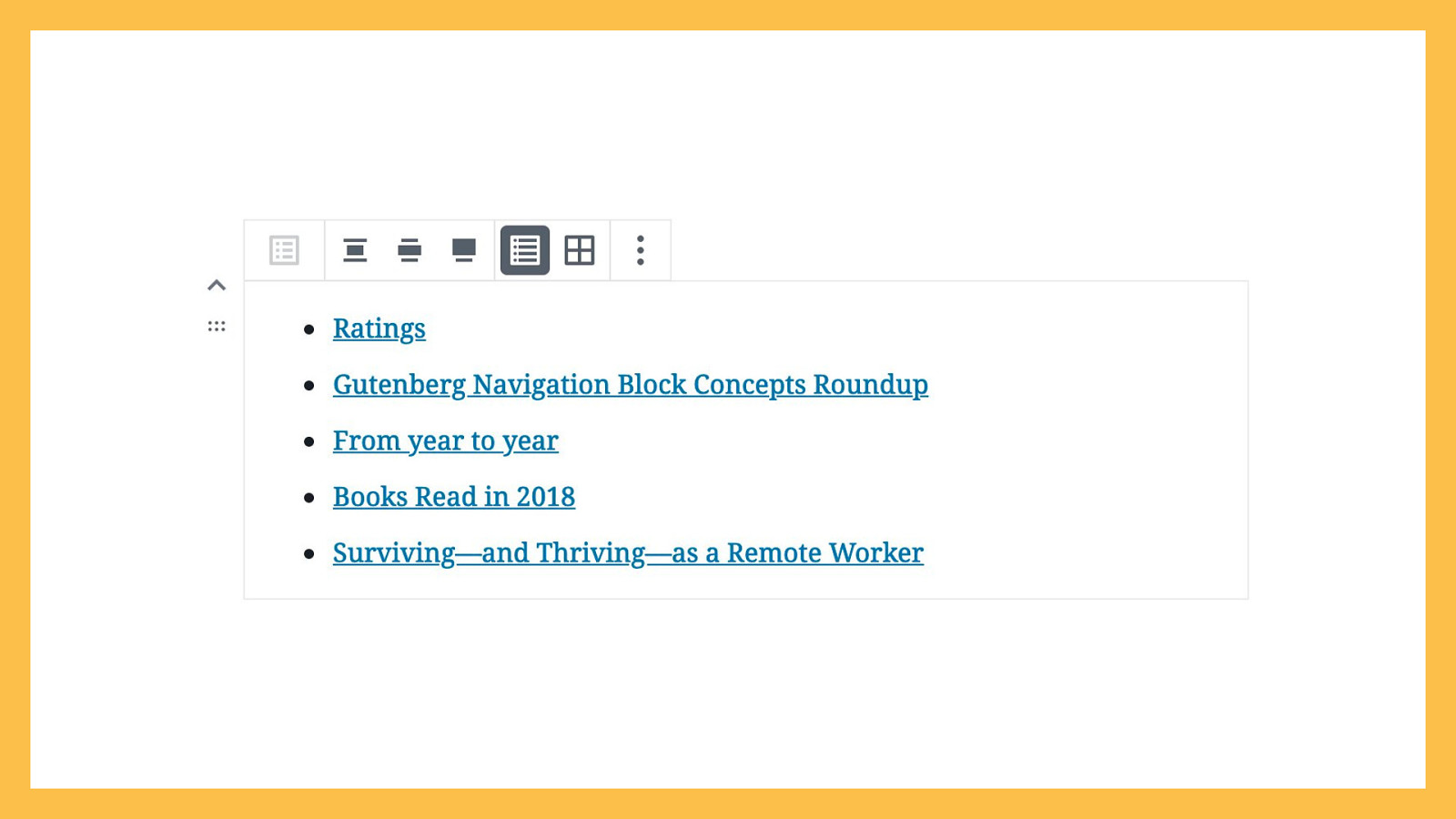
Let’s take a look at another simple block, the List. In a document-driven editing model, you would start a list by applying list formatting, via a toolbar, to existing text, or you’d go to the formatting toolbar and click ‘List’ to create a new bullet point.

This is similar in Gutenberg. You can transform a Paragraph block into a List block, or add a new List block directly to your page.
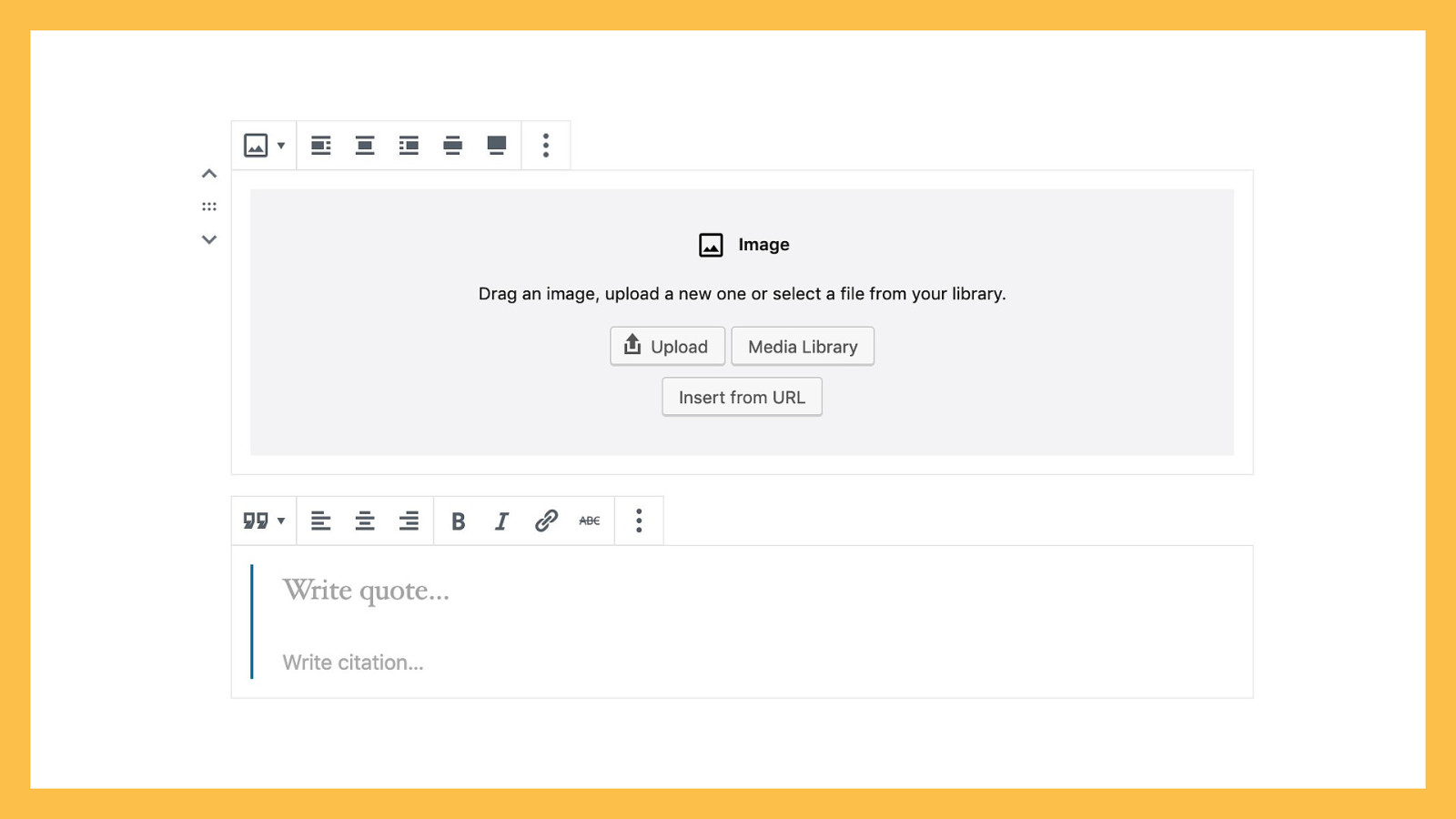
Some blocks require more than a simple text prompt. More complex blocks require more advanced setup states. For example, the Image block creates a placeholder with buttons for uploading images, selecting existing images from your media library, and for inserting an image from a URL. Similarly, the Quote block has two text inputs: the quote, in larger text, and the citation, in smaller text.
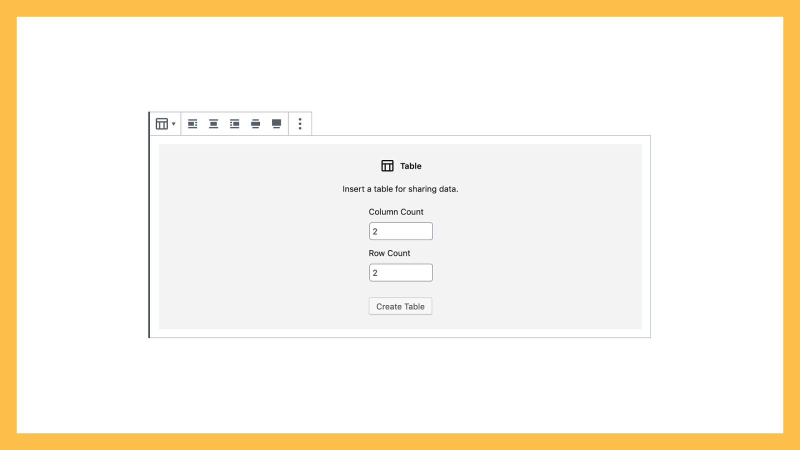
Some blocks are much more complex and need a more comprehensive setup state. The Table block requires you to select the number of columns and rows before it can render the correct placeholders.
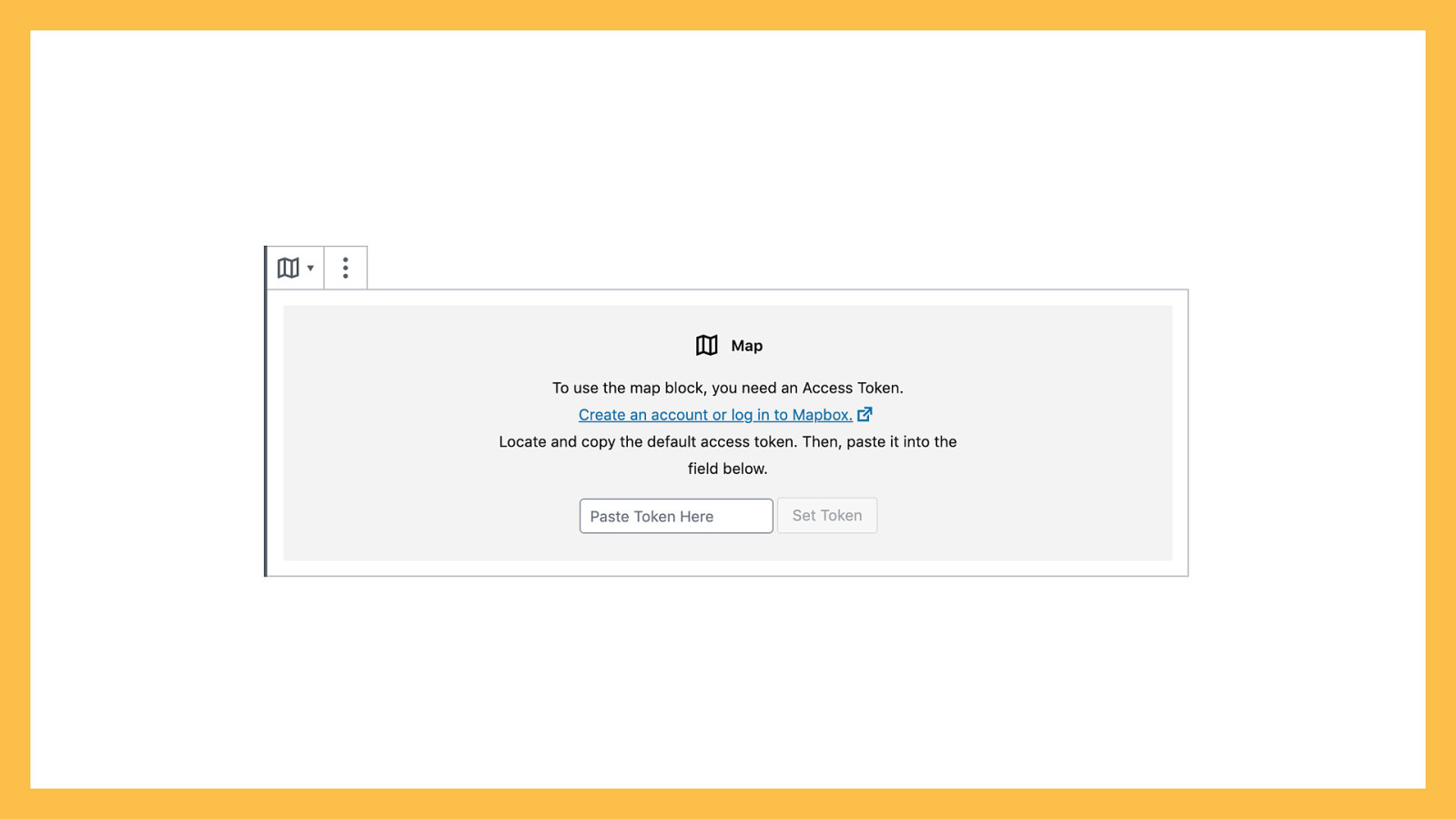
A Map block could require an API key to function.
Or, a block might be drawing dynamic content from a different part of your site — like a post, or a custom post type. The Latest Posts block, by default, displays the title of your most recent five posts, from newest to oldest, and requires no initial setup.
Gutenberg blocks are comprised of a few different elements:
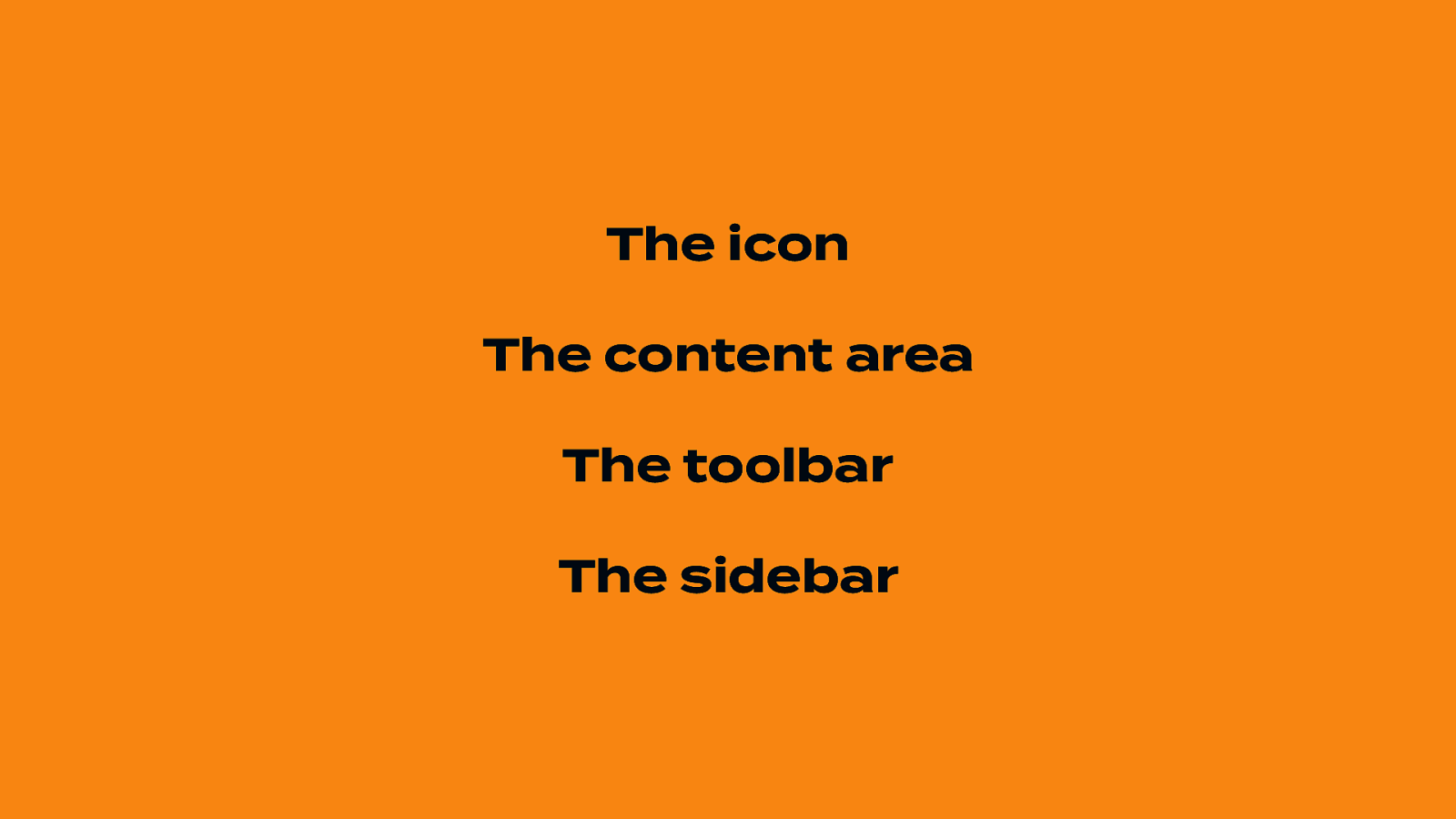
Each block has an icon used to identify it across the various block interfaces, such as the block library, the toolbar, the sidebar, and occasionally a setup state.
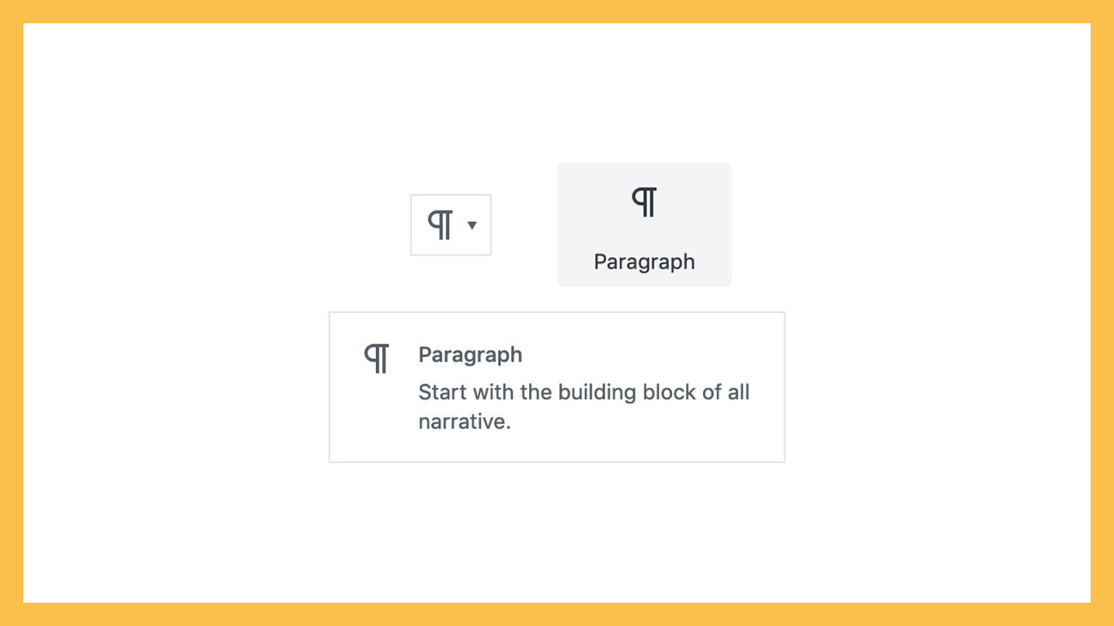
Icons are generally displayed at 24x24 pixels, but should be scalable. Use SVGs. You can pick from an existing Dashicon, design your own custom icon, or use an icon from a third-party, GPL-compatible library. Many of the new icons in Gutenberg are based on Material Design’s outlined icons, so that’s a good source if you want your block to look like it belongs. When selecting or designing a block icon, think about your block’s primary purpose. Some blocks are obvious — an Image block should use an image icon, a List block should use a list icon, and a Quote block should use a quotation mark icon.
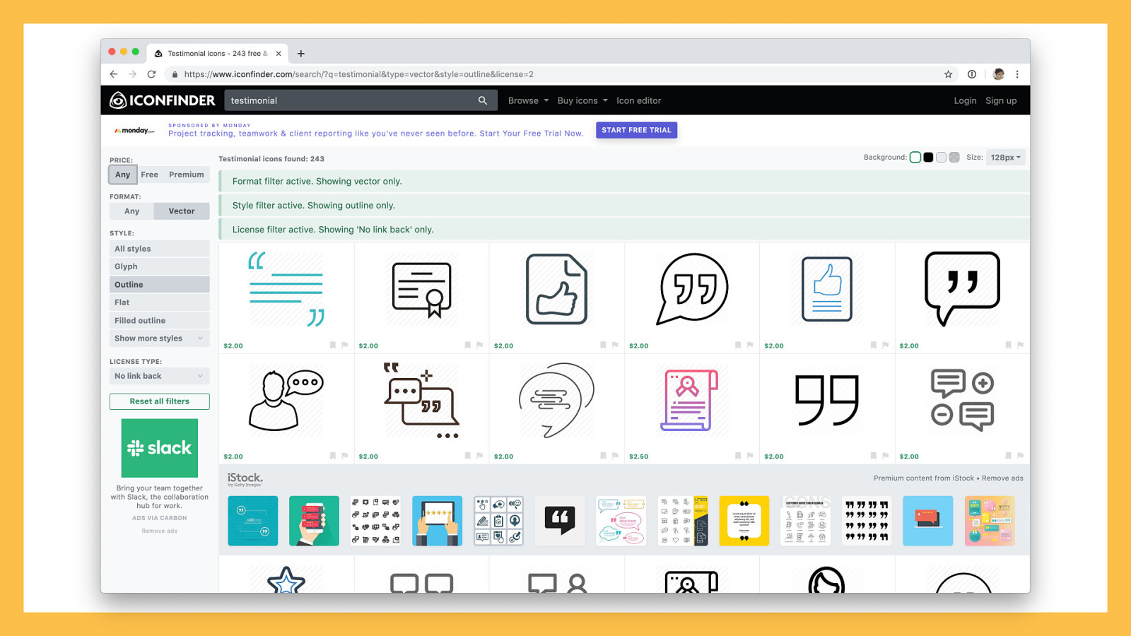
Some blocks aren’t so obvious. What icon should a Featured Content block use? How about a Carousel block? CTA? Pricing Table? You might need to get creative. Look through icon libraries, and see if they have anything that fits your block purpose. Search for your block name in something like IconFinder and see what imagery it pulls up. See if a website building service like Squarespace or Weebly has a comparable block, and what icon it’s using. When all else fails, go for the most generic representation you can find — maybe a shape, or something nondescript — and be happy your block will usually show up alongside its name.

Now that we’ve covered icons, let’s talk about what should appear in the content area of the block.
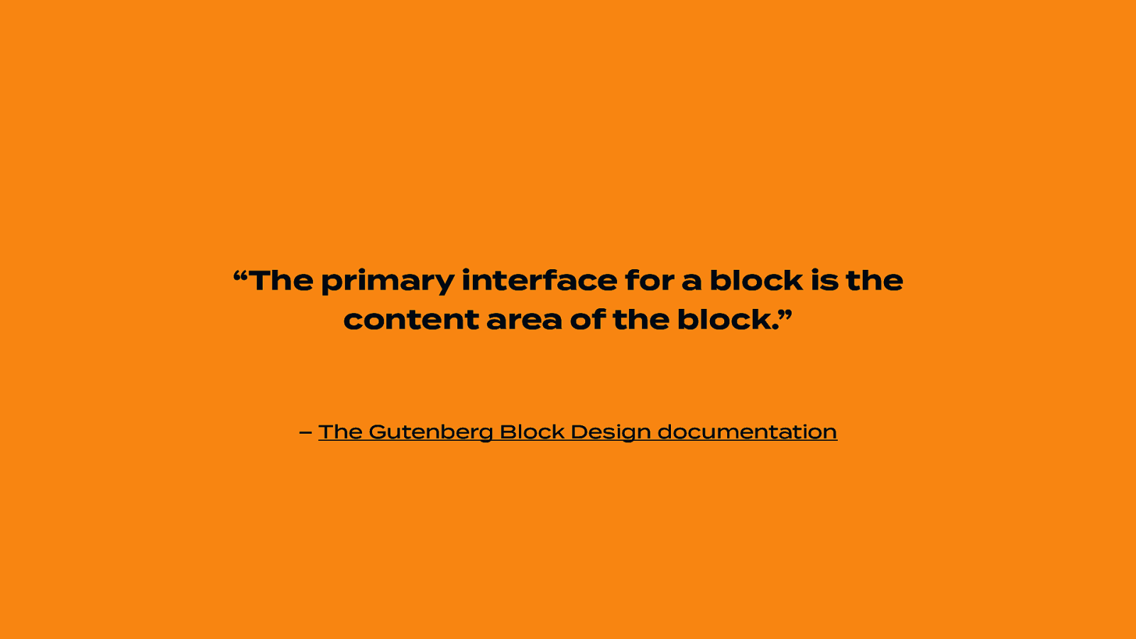
“The primary interface for a block is the content area of the block.” – The Gutenberg Block Design documentation
In an ideal world, the only thing you’d ever have to think about when adding content to a block is your content itself. What does this mean in practice? If a block needs specific information to render, ask for that information in a setup state. Need an API key? Ask for that in your setup state. Need posts from a specific taxonomy to display? Show a list of existing taxonomies in your setup state.
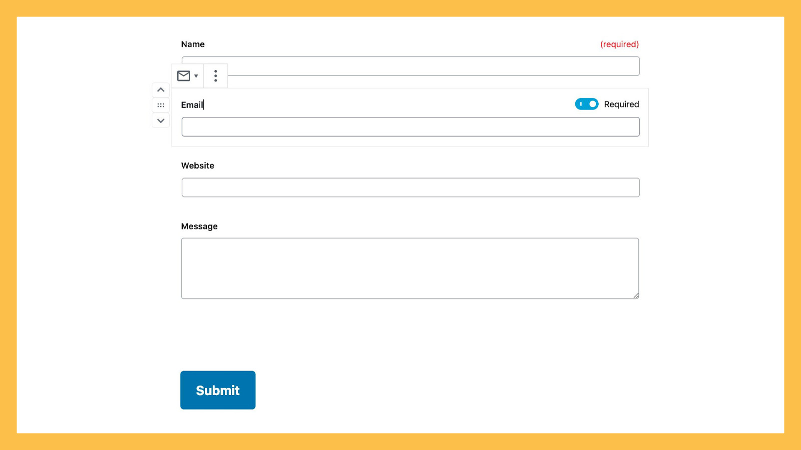
The most important settings should display inline with your block. Take, for example, the Jetpack Contact Form block. The “required” setting, which exists per-field, is displayed alongside the input label. When you select the input block, you see a toggle to turn “required” on or off. When the input field is not selected, you see a live preview of the input. Your live preview state, when your block isn’t selected, should always mimic the front-end as closely as possible.
Choose smart defaults. It’s fine to make a super configurable block, but don’t make your users or customers have to think too hard about setting it up if they want something simple. Do some initial research, whether that’s a couple of interviews with existing customers, or finding existing, comparable research from a reputable source like the Nielsen Norman Group, and try to determine which settings most of your customers change. Make these changes the default options. This suggestion trumps the previous tips. If you can provide smart defaults, do.

Next up is the block toolbar.
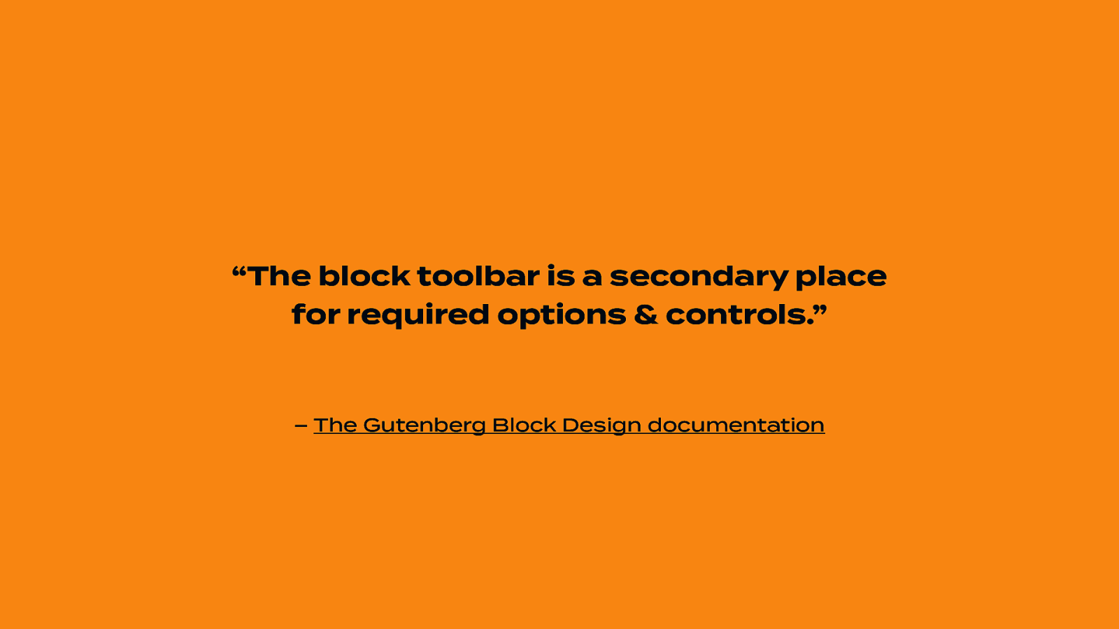
“The block toolbar is a secondary place for required options & controls.” – The Gutenberg Block Design documentation
The block toolbar usually contains layout and alignment, or text formatting options. It’s also a good place to put any inline settings you might have, like creating a footnote, for example.
By default, the toolbar displays above the block.
You can also show the toolbar at the top of your editor if you have the Top Toolbar setting enabled. Regardless of your block settings, all toolbars show the block icon, and a “more” menu with options to duplicate, move, delete the block, etc. Everything else is optional. The toolbar is a great place to include inline formatting options, like bold, italic, strikethrough, and links, if your block contains any text inputs.
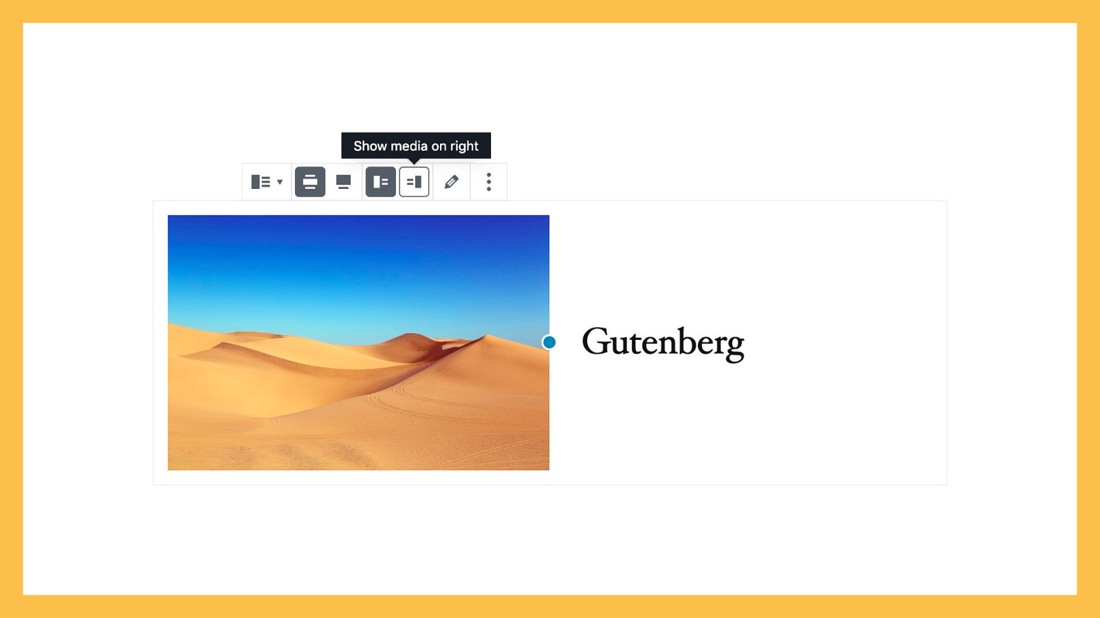
The toolbar is also the right place to include block-level alignment and layout settings for your block. In the Media & Text block, for example, there’s a Toolbar setting to display the media on the left, or the right.
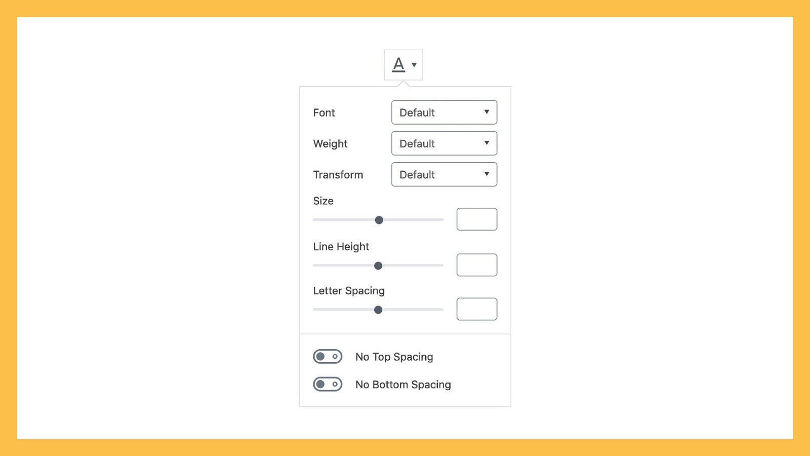
The CoBlocks plugin offers this custom font menu on all text blocks, and it’s a perfect use case for adding a feature to the toolbar.
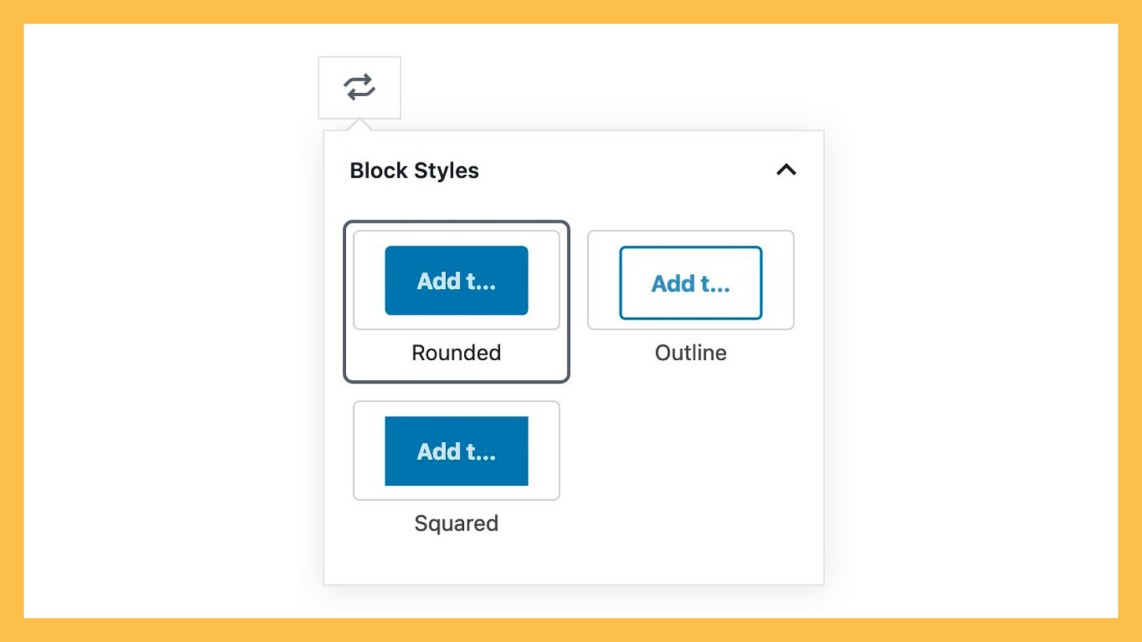
The toolbar also houses two additional options: styles, and block transforms. Block styles are alternate variations on a block which only rely on CSS. Take, for example, the Button block, which comes with three core styles: Default (rounded corners), Outline, and Squared. When these styles are available, they’re accessible via a dropdown next to your block icon. Choose a smart default, but feel free to include different styles for your custom blocks, or extend existing core blocks in interesting and unique ways. If you’re thinking about recreating a core block to add new visual options, consider adding styles instead.
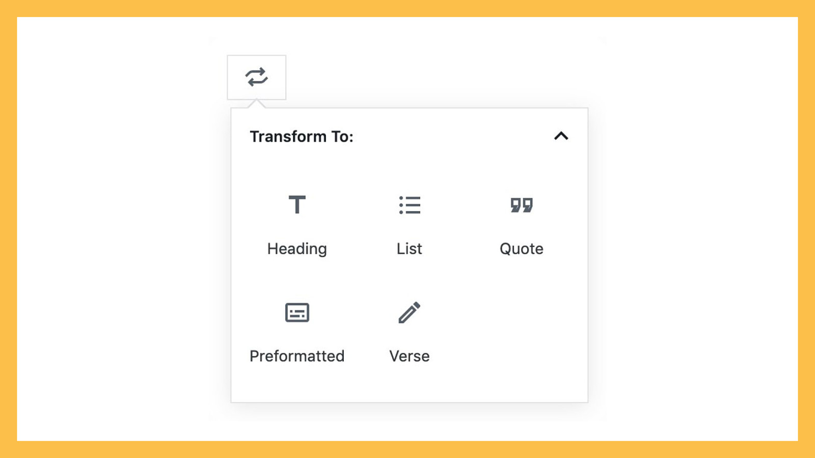
You can also transform similar blocks. A paragraph can transform into a Heading, Quote, List, Preformatted, or Verse block. An image can transform into a Gallery, Media & Text, Cover, or File block. Is your block similar to another core block? Add a transform option. You can look at Jetpack or the Block Gallery plugin for good examples of transforms. Make sure that if you do include a transform, the existing content converts smoothly to the new block type. You don’t want your users or customers to lose any data.
One caveat: the toolbar is icon-based, so only add settings you can reasonably represent using an icon, or an icon group. There will be tooltips on desktop computers, but any touch-based device won’t necessarily have labeling you can rely on.

“The block sidebar should only be used for advanced, tertiary controls.” – The Gutenberg Block Design documentation
If your block needs information to work, don’t show it in your sidebar.
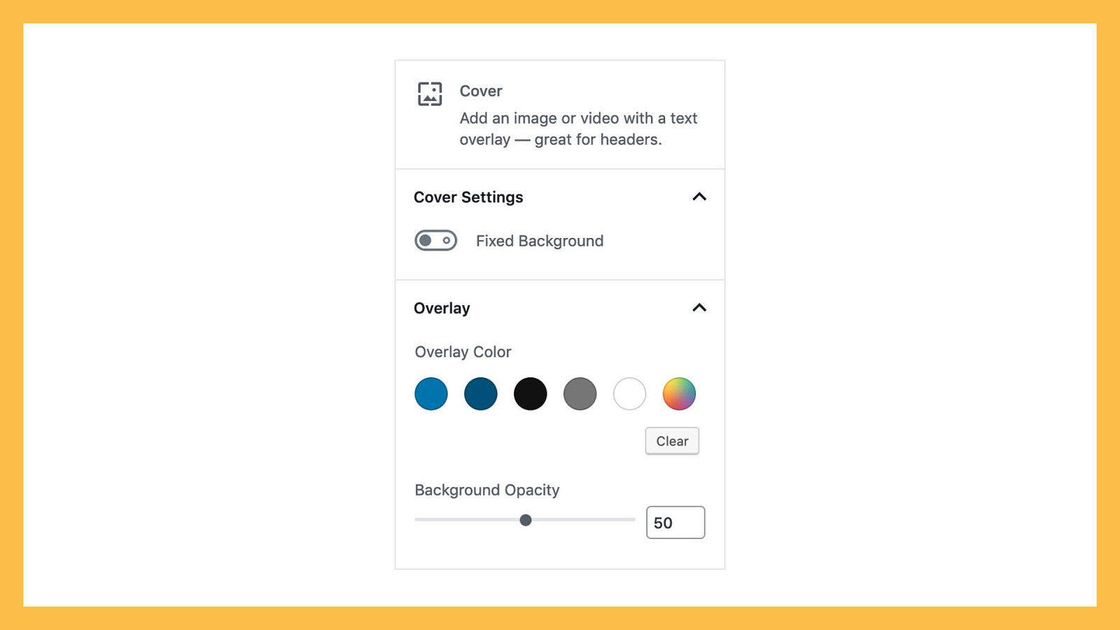
The sidebar, as you might guess, appears on the side of your editor. You can toggle it on or off, which means you can never rely on the sidebar being open. In fact, the sidebar is hidden by default on smaller screens. This makes it a good place for advanced or non-essential settings, but a bad place for any required or important settings. Settings within the sidebar should be grouped into sections based on similarity. The Paragraph block groups together text settings like font size and a drop cap toggle into a section. The Cover block groups positioning settings like ‘fixed background’ and ‘focal point’ into one section, and overlay settings like ‘color’ and ‘opacity’ into another section.
You might be tempted to add a ton of settings to your block, since they can all fit into the sidebar. However, I’d urge you to think very carefully about what settings you add to your blocks. Firstly, once you include a setting, you’re going to have to support that setting — perhaps indefinitely. If you include a setting on a whim and then suddenly end up with a constant stream of support questions about that particular setting, you might regret including it in the first place. At the very least, you should redesign the setting to make it easier to understand.
Secondly, the more settings your block includes, the more complicated it becomes. Think about your audience — who do you expect to use your blocks? If you’re aiming for site builders and freelancers, then adding a bunch of customization options might be appropriate. However, if your block is aimed at casual users or hobbyists, you should consider paring down your settings to the minimum needed for your block to be useful.
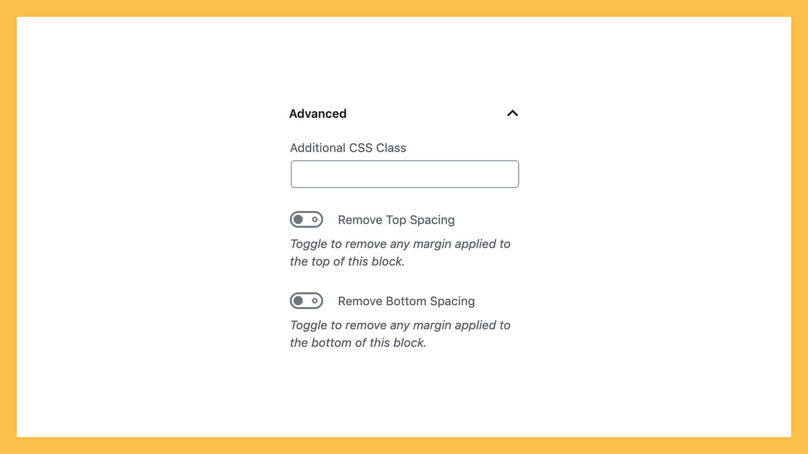
Speaking of more advanced settings, every block comes with an “Advanced” section that houses an “Additional CSS Class” option. If a user adds a class name to this, that class will be applied to your block. If you have very advanced settings, especially developer settings that can’t easily be explained to your average user, put these in your Advanced section.
Now that we know all of the elements that make up a block, let’s put it all together.
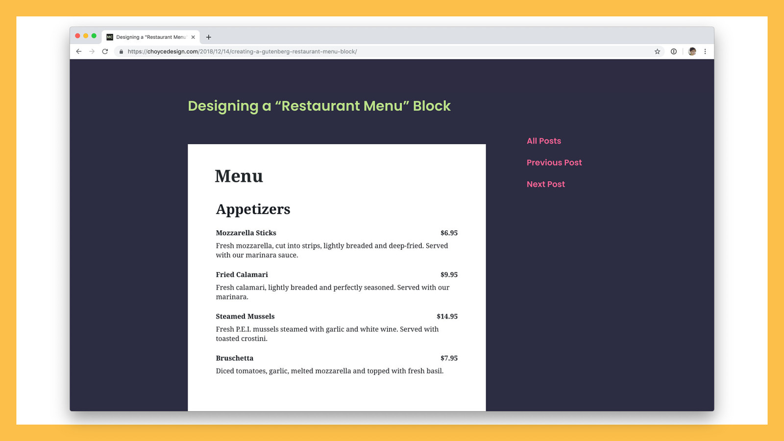
A while back I designed a Restaurant Menu block. I’ve wanted a better way of making restaurant menus since working on WordPress.com’s restaurant menu custom post type a couple years ago. The custom post type method of creating a restaurant menu felt clunky and tedious. Blocks provide a perfect opportunity to redesign this process. Gutenberg blocks put the interface within the context you’ll be displaying and previewing the menu in, rather than abstracting the interface out into a separate, unrelated screen. Text placeholders allow for an easy “fill-in-the-blanks” method for content creation. It seemed like a natural fit.

Going into this project, I assumed the vast majority of restaurant menus are pretty similar — but I wanted to validate those assumptions before I started to put pixels down onto my screen. I looked up the menus for over a dozen restaurants I like and jotted down what kind of information they included.
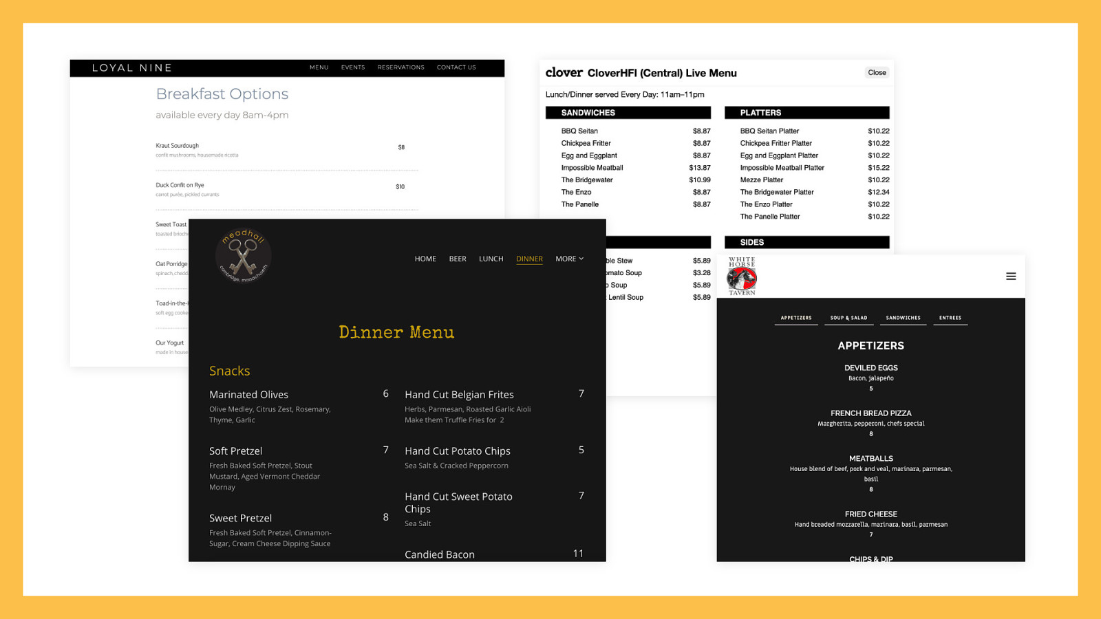
Menus were divided up into different categories, such as Appetizers, Entrees, Desserts, etc., some of which had descriptions. Almost every menu included at least a title and price for every individual menu item. Many also included descriptions. There were a scattering of other features — some menus included photos, some included how spicy a dish was, and others marked whether a dish was vegetarian or gluten free. Some menus even allowed filtering, either by category or by diet.

This is potentially a lot of features. Let’s pare it down to a minimum viable block: - Menus should be divided up into sections, each with a heading. - Each menu item should contain a title, price, and optional description. That’s all we really need for a restaurant menu. Each section could be a parent block that includes a heading, with menu items as children. Why a block per section, instead of one block for the entire menu? By breaking out the block into a menu section, your menu can be easier to rearrange, style, and scale.
A few additional options would make the block more useful for many restaurants:


Now that we’ve scoped our Restaurant Menu block, let’s figure out where each piece of the block should live.

The setup state should include placeholder text for the most important content in the menu: the section heading, and one empty menu item that includes a name, price, and description. This establishes all your baseline patterns and starts teaching people how to use your block.
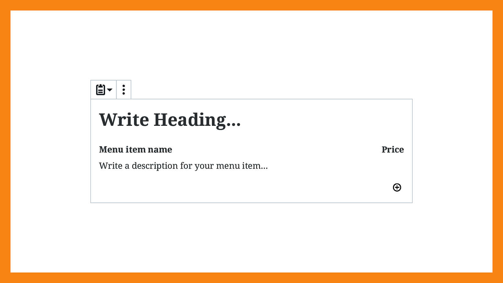
For convenience, the block should default to adding a new menu item, so all people need to do to get another item is press “enter” at the end of the description field. People can still press the “down” key to get outside of the parent block.
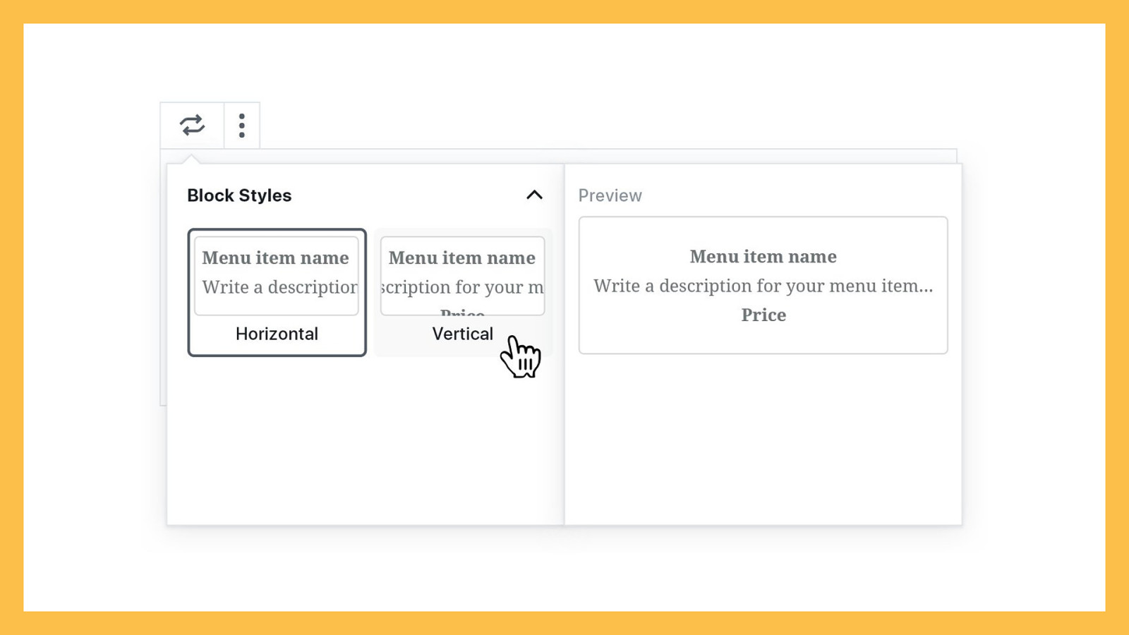
Because we have a parent block and a child block, each will have its own toolbar. Looking through our scope, the only setting that seems to belong inside the parent toolbar, the “Restaurant Menu,” is our alternate menu style:
I thought about adding support for wide- and full-width layouts to the block, but the majority of menus I saw were constrained to the content width. If a bunch of people start asking for this feature later, it’s easy enough to add support.
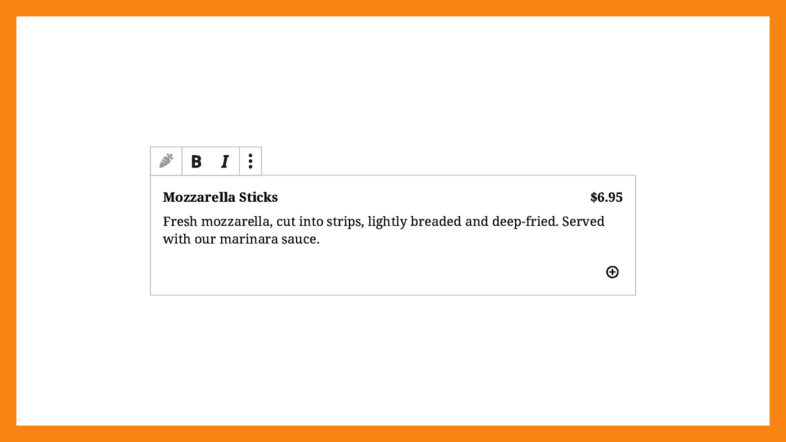
Our child block, “Menu Items,” consists of our title, price, and description. These fields could benefit from some very basic text formatting. Bold and italic seemed reasonable, so I decided to include those. Strikethrough and link, which are available in the paragraph block, feel unnecessary in this context, so I excluded them. But once again — should they prove to be desired, we could always add support in a future release!
What’s left to include in our block? There are only two settings we haven’t talked about yet: columns, and our allergen toggle.
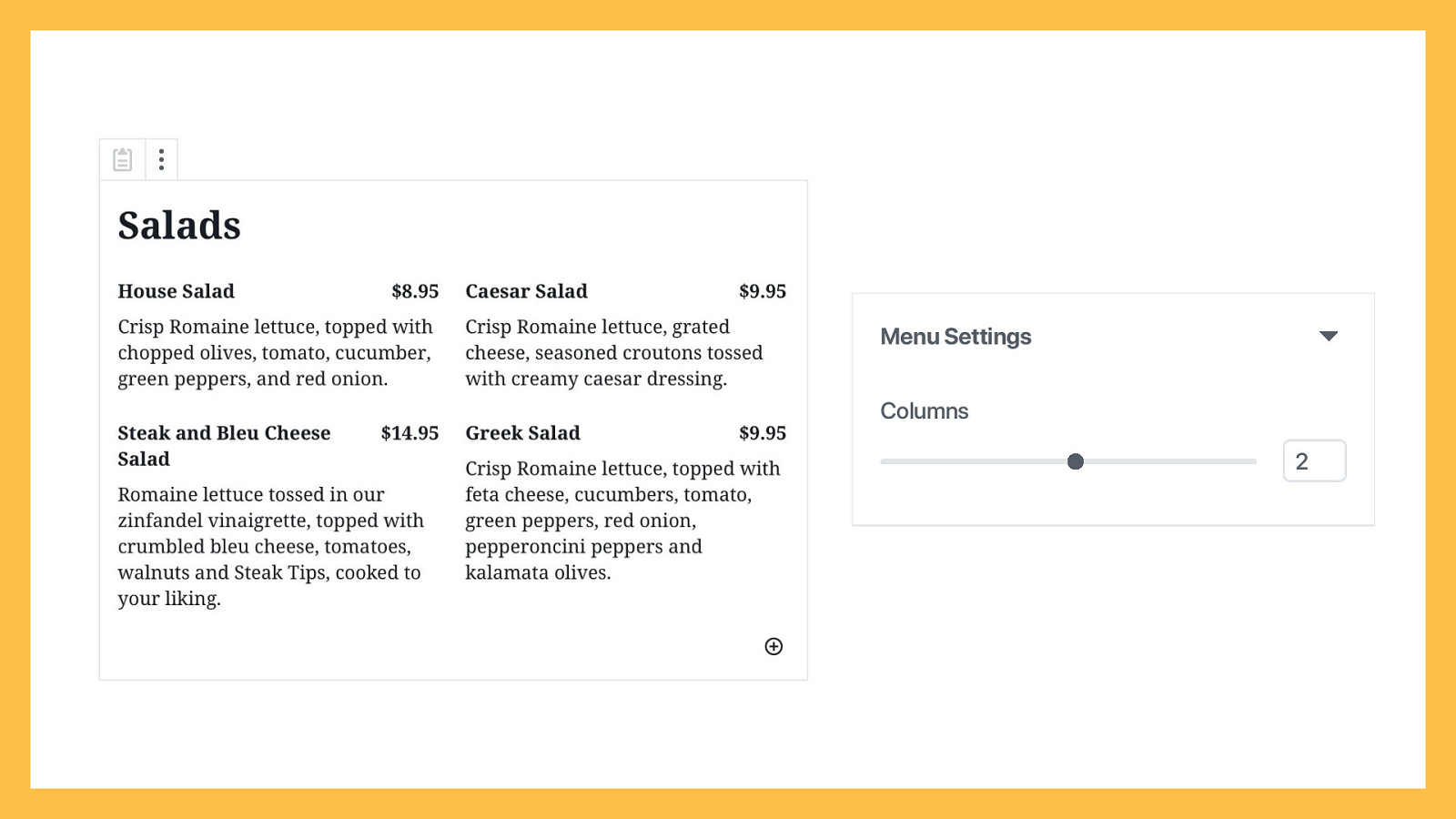
I found plenty of menus that used a one-column layout in my research, but just as many used two or more columns. It seemed like a setting worth supporting, and Gutenberg already comes with column support available. We probably don’t want to allow people to add infinite columns to the menu block, so it would make sense to limit the block to a maximum of maybe four columns.
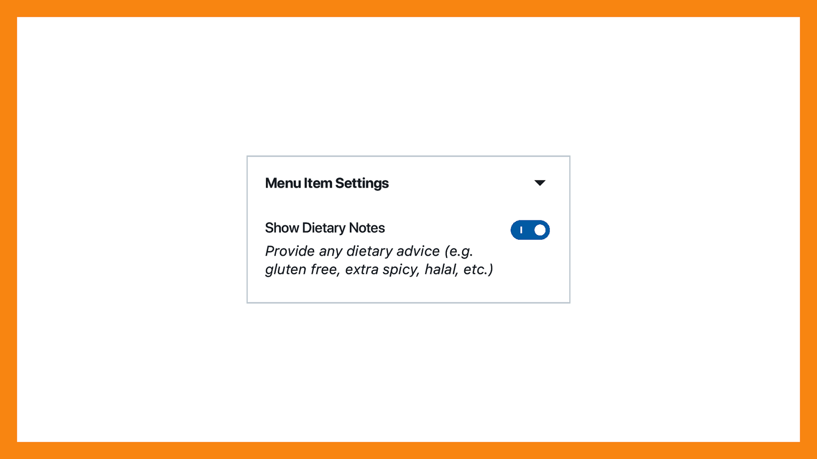
Let’s talk about the dietary notes toggle. Toggling this setting on adds a new field underneath the item description, so you can add some extra details like “gluten-free” or “vegan”. Including a description within the sidebar setting makes it clearer what the setting does, especially when it has a more ambiguous label.
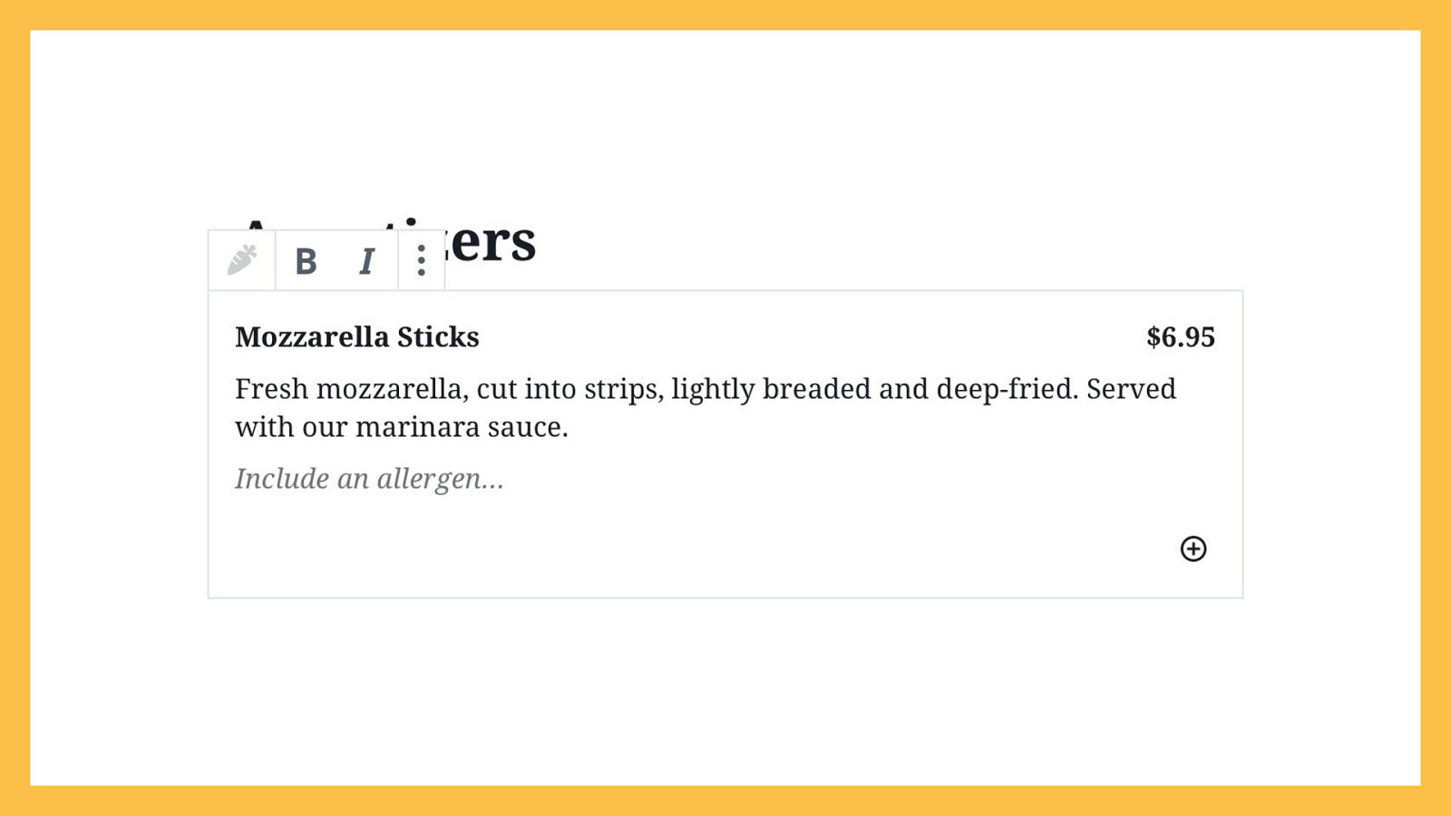
Because not every menu item will need to include an allergen, this is a setting you’d turn on for the individual menu items that need it.

Let’s not forget about the block icon! This block will need two: one for the parent block (Restaurant Menu), and one for the custom child block (Menu Item). I looked through some icon libraries, looking for inspiration. I found a clipboard that made me think of some menus I’ve received in restaurants, so I chose that for my parent block. I found a pizza icon to represent a menu item.
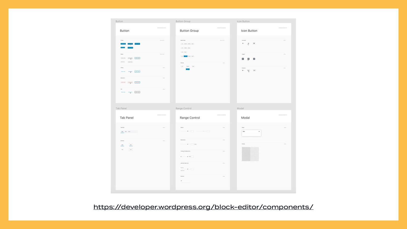
And of course — use existing Gutenberg components. Try to avoid rolling your own if you can.
https://developer.wordpress.org/block-editor/components/
Here’s what it looks like all-together.
Now you just need to finishing building your block! …Okay, done.

Before launching your block to the world, consider doing some usability testing. If you’re part of a larger team with more resources to spend on research and testing, you can pay someone to recruit and run usability tests for you — or even use your in-house team of UX experts! If you’re a lone plugin or theme developer, however, your testing doesn’t have to be super comprehensive — you can keep it small and simple.
There are better guides for telling you how to conduct usability testing than I can in our remaining time, such as Rocket Surgery Made Easy by Steve Krug. You can read a sample chapter online if you’re not quite sure if you want to invest in reading the book.
https://www.sensible.com/rsme.html
If you want something more condensed, the A List Apart article “Usability Testing Demystified,” by Dana Chisnell, is a great introduction.
https://alistapart.com/article/usability-testing-demystified/

Run at least three usability tests. If you have some additional resources, run five. Nothing’s better than testing live with people. WordCamps are a great place to connect with potential customers and have them run through your block. You can also run tests through video chat and screen share. If running your tests directly isn’t feasible, you can use an unmoderated online testing service. Any information is better than nothing, especially when you’re working with limited resources

Once you’ve run at least three tests, sit down and sift through your recordings or your notes. Find the biggest pain points in your block, and then iterate on them. Try to see if there are any established patterns from other blocks that accomplish the same task in a more straight-forward or intuitive way. If you have the time and budget, test again with some new volunteers and see if your changes improved the experience of using your block.
Worse comes to worse, if you’re super stressed about designing a block, use existing blocks as inspiration.
As David Bowie said, “the only art I’ll ever study is stuff I can steal from.” Nothing is ever truly original. (One caveat: don’t be a jerk and rip someone off.)

You can iterate ad nauseam, but at some point, you need to ship. Once you have a big enough user base, you’ll probably start hearing feedback, suggestions (and of course, bugs) directly from your customers. You can use this direct feedback to make future improvements to your block.