Google Flights Date Picker
Mr Murphy ® · @fehler
Pattern Library Example Files · 2018–[…]

A presentation at Pattern Library · Google Flights Date Picker in September 2019 in by Mr Murphy
Google Flights Date Picker
Mr Murphy ® · @fehler
Pattern Library Example Files · 2018–[…]
Google Flights’ date picker is a lovely example of a delightful interaction pattern for selecting flight dates. Despite the complexity of the information presented, the user interface is clear, chunked into a series of easily parsable steps.
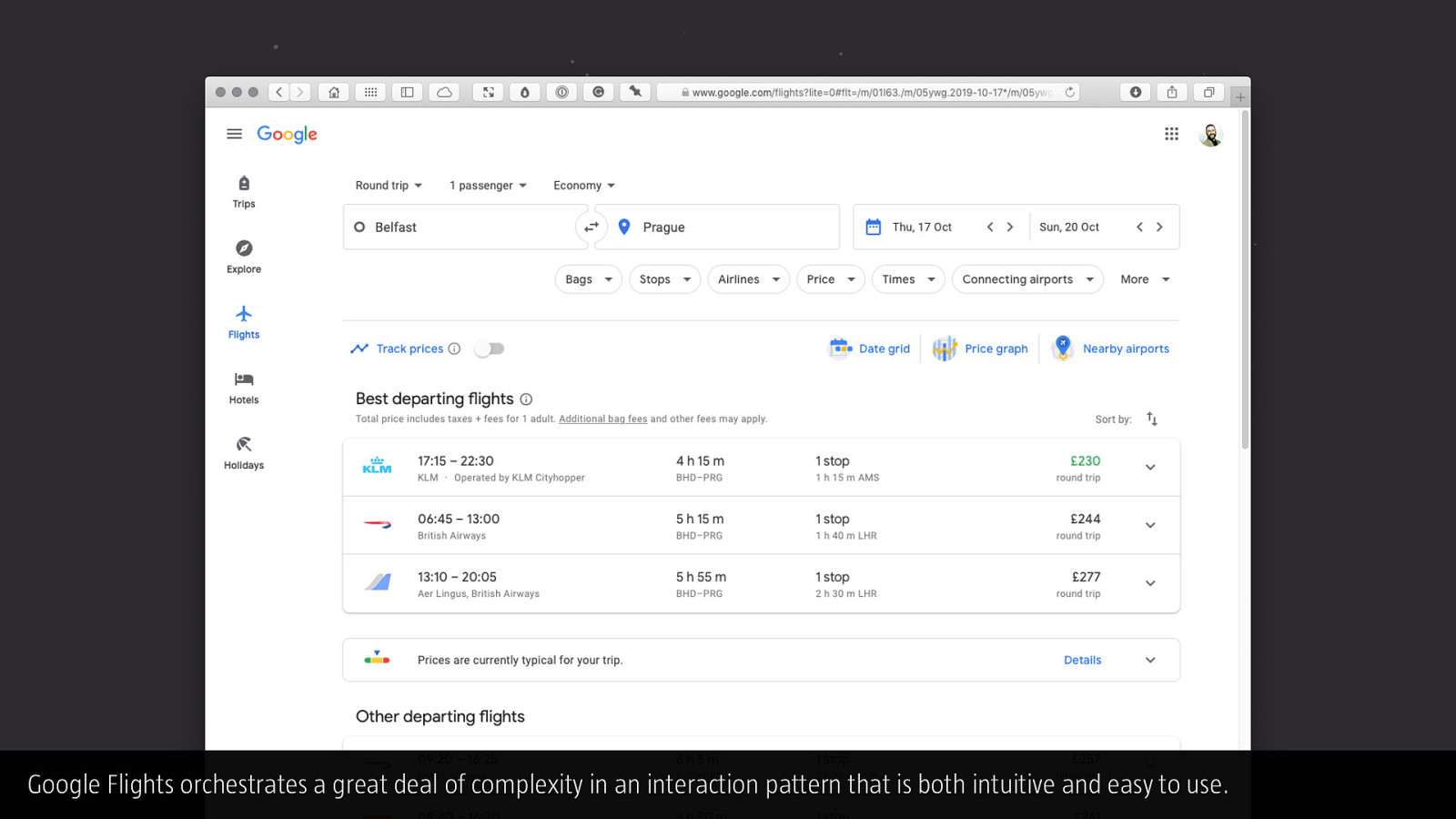
Google Flights orchestrates a great deal of complexity in an interaction pattern that is both intuitive and easy to use.
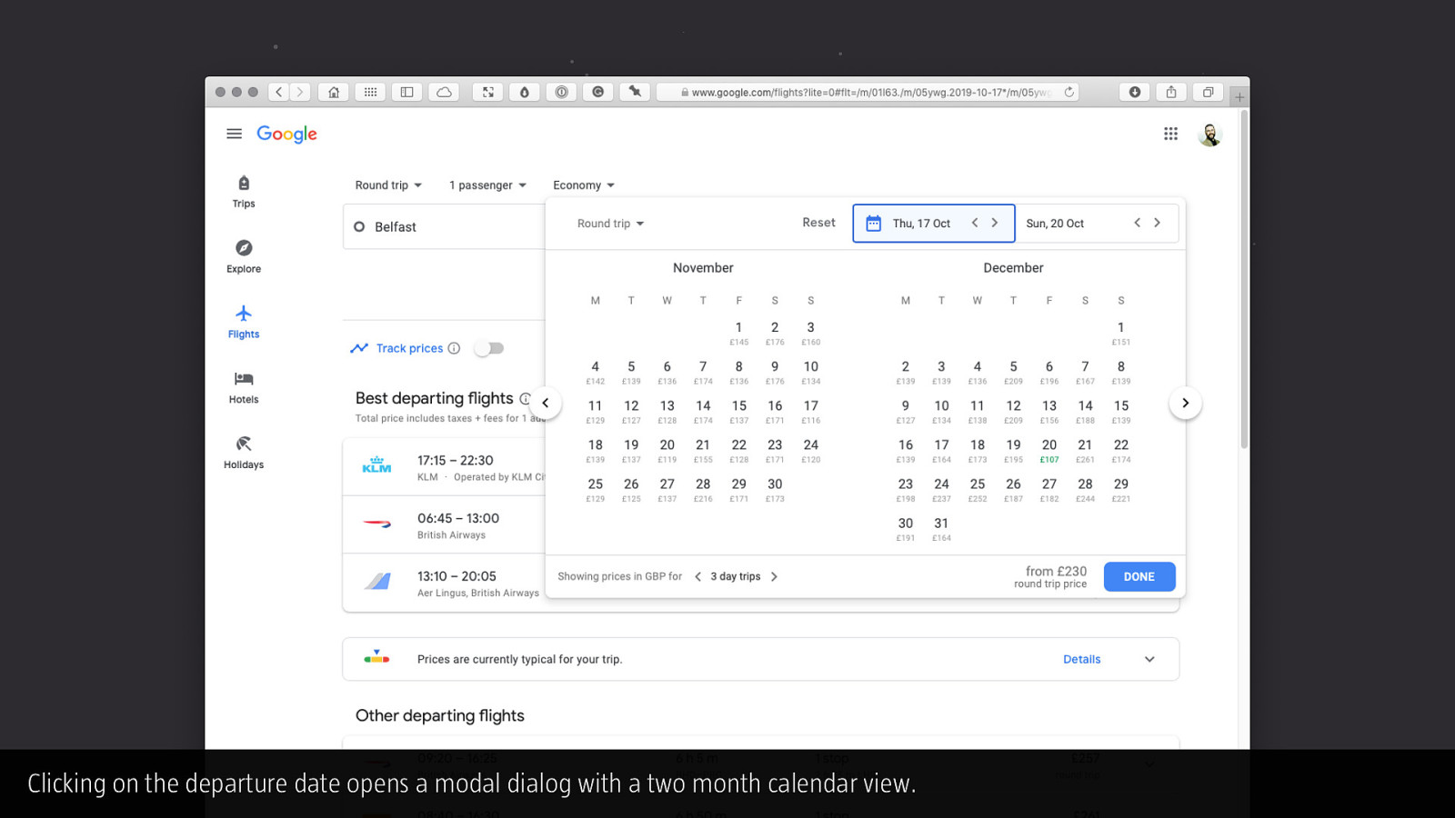
Clicking on the departure date opens a modal dialog with a two month calendar view.
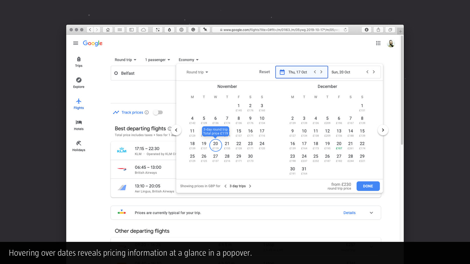
Hovering over dates reveals pricing information at a glance in a popover.
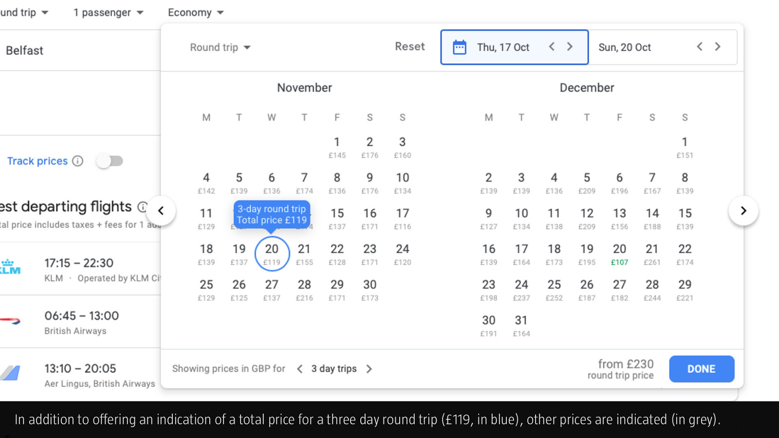
In addition to offering an indication of a total price for a three day round trip (£119, in blue), other prices are indicated (in grey).
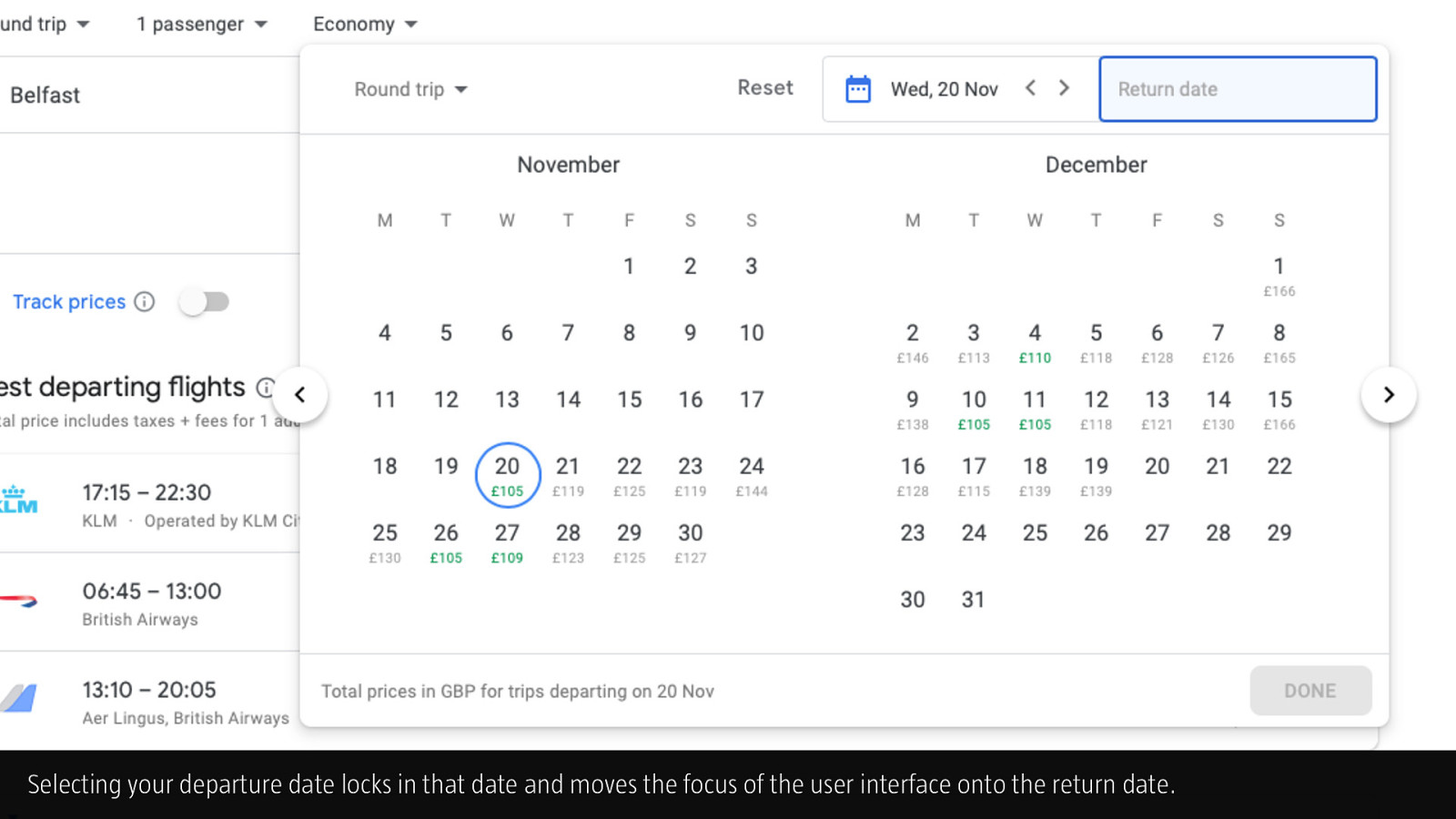
Selecting your departure date locks in that date and moves the focus of the user interface onto the return date.
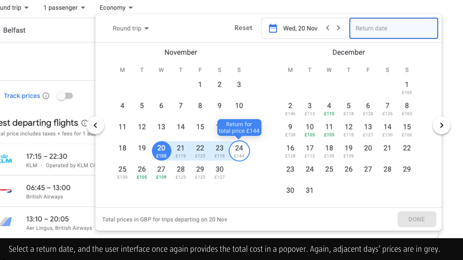
Select a return date, and the user interface once again provides the total cost in a popover. Again, adjacent days’ prices are in grey.
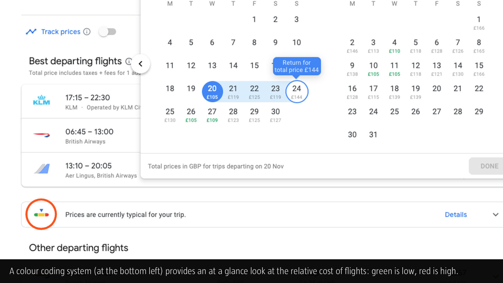
A colour coding system (at the bottom left) provides an at a glance look at the relative cost of flights: green is low, red is high.
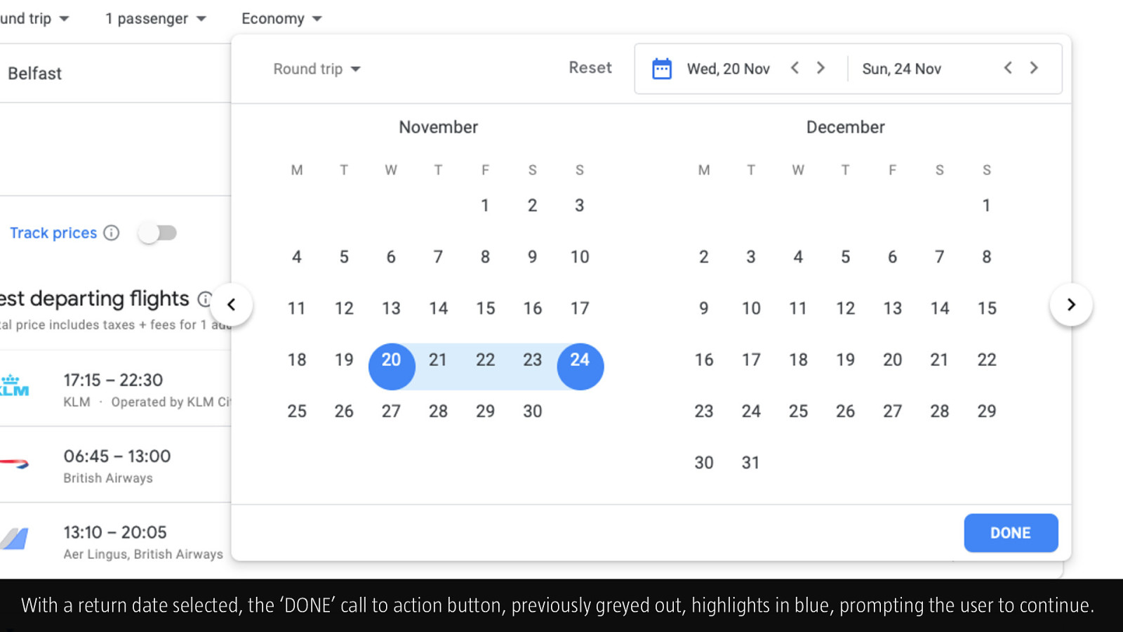
With a return date selected, the ‘DONE’ call to action button, previously greyed out, highlights in blue, prompting the user to continue.
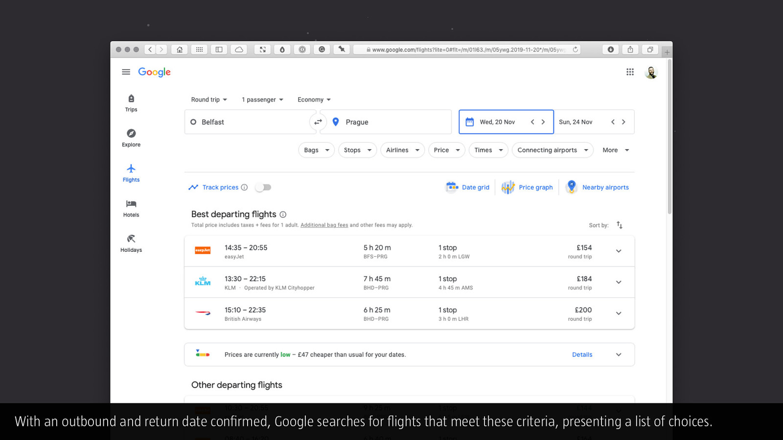
With an outbound and return date confirmed, Google searches for flights that meet these criteria, presenting a list of choices.
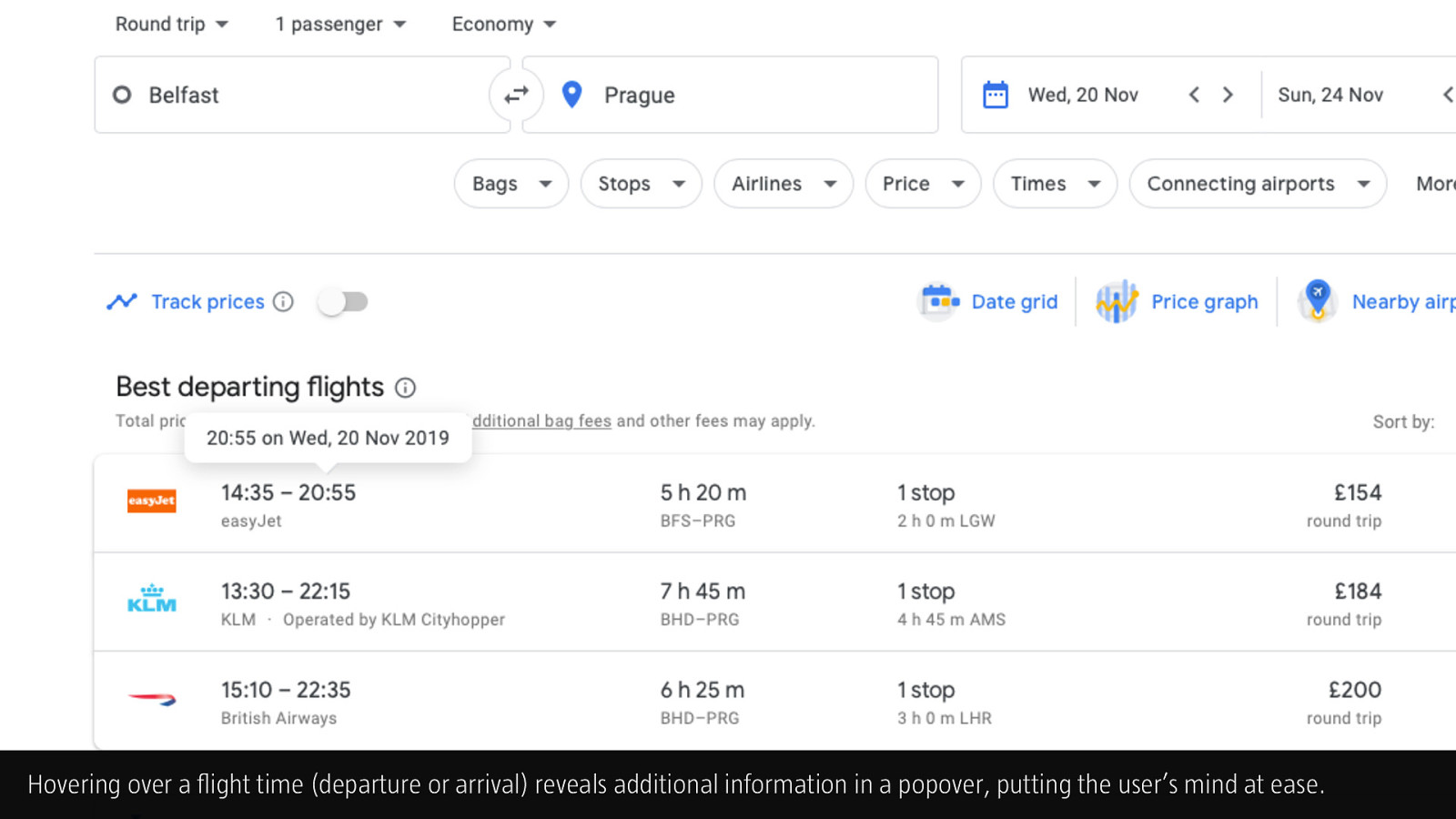
Hovering over a flight time (departure or arrival) reveals additional information in a popover, putting the user’s mind at ease.

With a departing flight selected, the user interface progresses, offering a selection of returning flights.
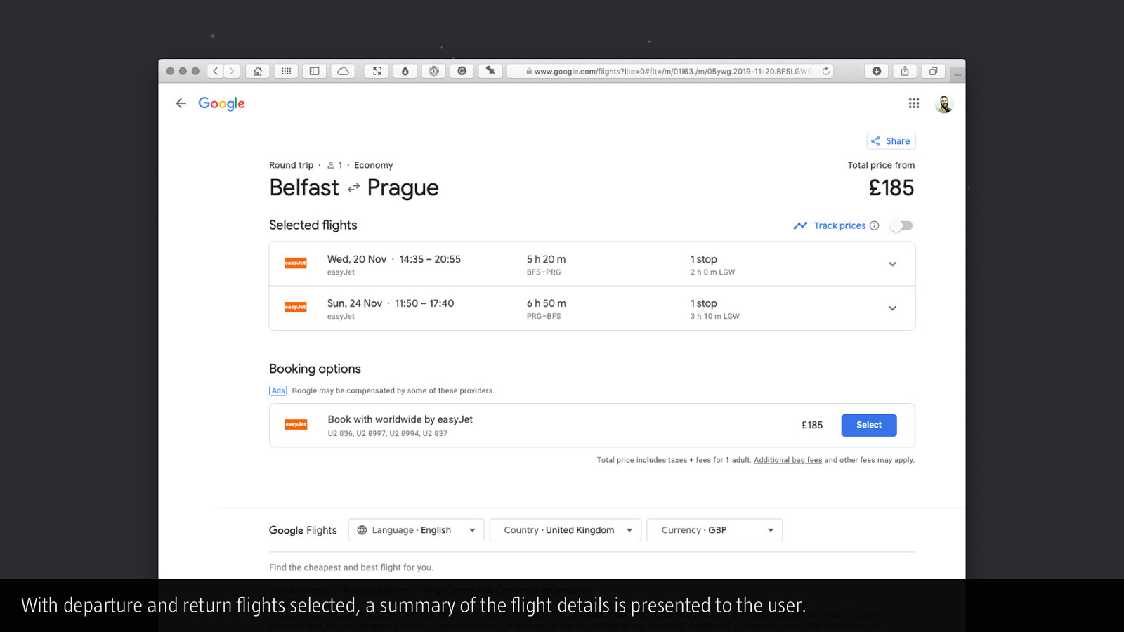
With departure and return flights selected, a summary of the flight details is presented to the user.
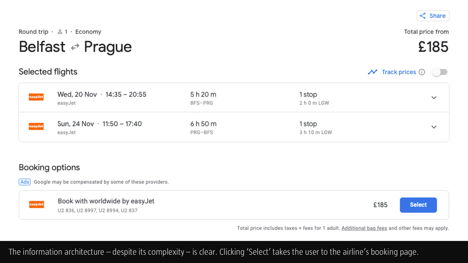
The information architecture – despite its complexity – is clear. Clicking ‘Select’ takes the user to the airline’s booking page.
If you found this deck useful, follow me on Twitter: @fehler. I’m in the process of breaking down 15+ years of workshop content into small, easily consumable components. I’ll be tweeting as I’ve finished and shared these components. Cheers!
—Christopher Murphy, @fehler