This talk is called “the emergency website kit”, and it’s about a side project I started a couple months ago, while in quarantine.
A presentation at Inclusive Design 24 in September 2020 in by Max Böck
This talk is called “the emergency website kit”, and it’s about a side project I started a couple months ago, while in quarantine.

Max Böck @mxbck https://mxb.dev So my name is Max, I’m a Frontend Developer in Vienna, Austria. I work at a small software studio called “Codista” where I mostly write HTML, CSS and Javascript. And I also like to write about the web on my blog and on Twitter.
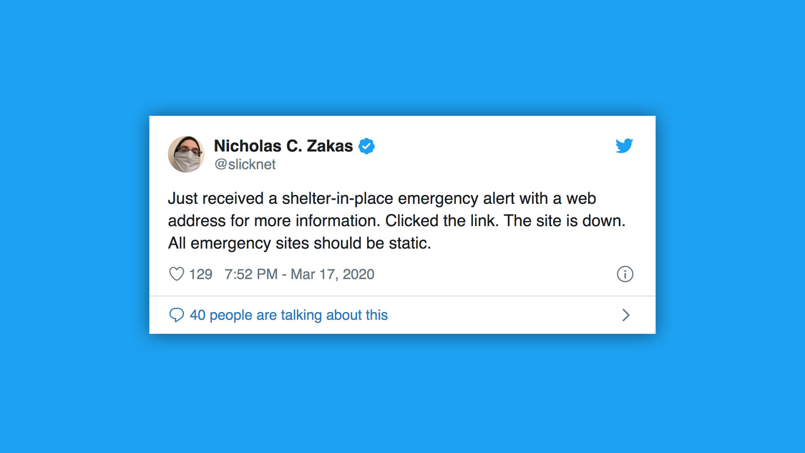
Speaking of twitter, a couple months ago I saw this tweet by Nicholas Zakas. He said he has just received a shelter in place alert with a website for more information, but when he clicked the link, the site was down. So what happened there is the site in question was quite likely running some sort of CMS. CMS websites are often not able to handle emergency situations - sudden surges in traffic can bring a server down easily. This is not an isolated case. The Corona crisis has shown that many critical websites are not prepared for these situations.
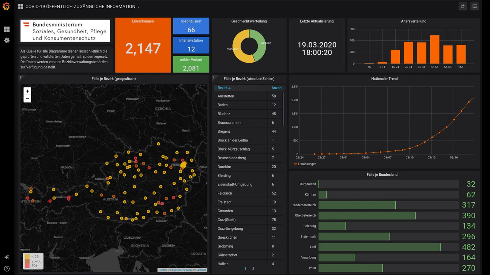
Here’s the official website of the Austrian State Department of Health - showing facts and figures on COVID-19 cases in my country. Unfortunately it had a data leak, where some of the JSON powering the dashboard contained sensible data. and when they discovered that they just replaced the entire site with a screenshot of the graphs - which wasn’t accessible at all.
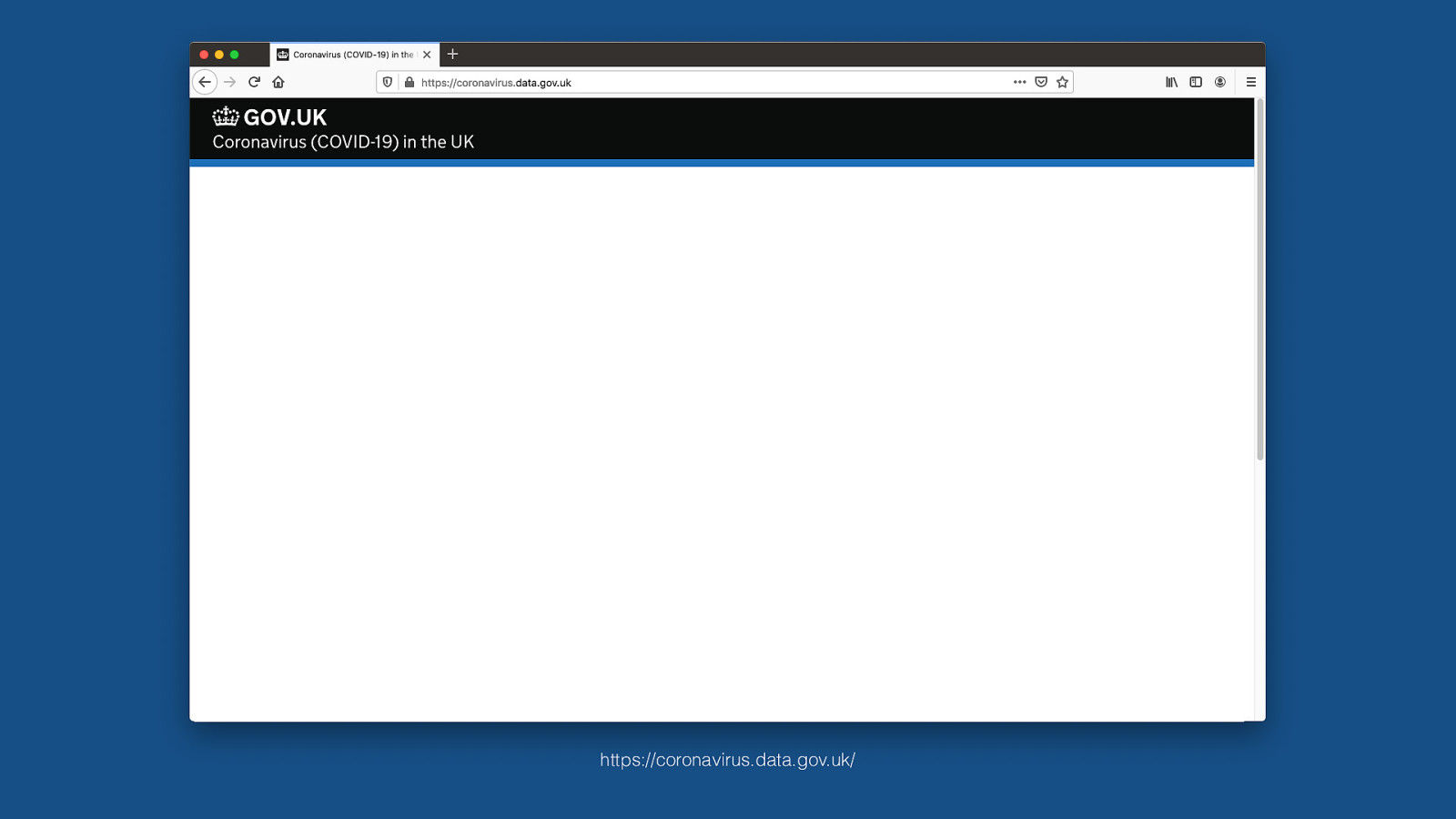
https://coronavirus.data.gov.uk/ Other countries had other problems. The UK government’s covid information site was initially built entirely with client-side javascript frameworks. They had all these interactive graphs and charts there rendered with react and three.js. That made it useless for anyone without JS support or even just with a failed request. If one of the requests timed out because of a bad connection, you would get this - which isn’t all that useful.
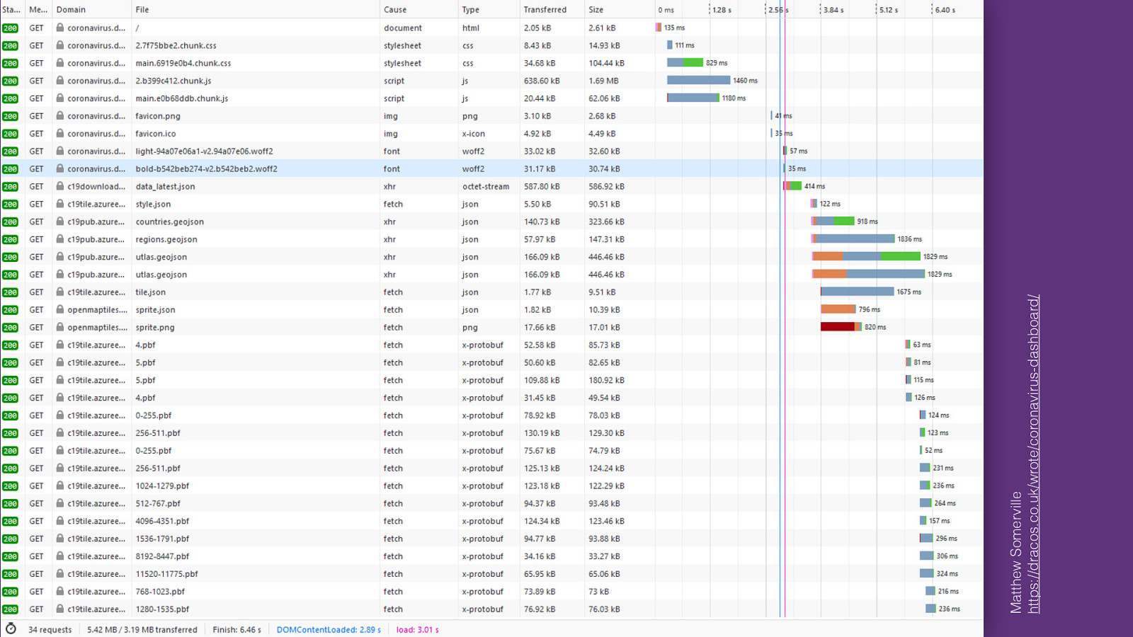
Matthew Somerville https://dracos.co.uk/wrote/coronavirus-dashboard/ And even with JS support, the site loaded so much JSON data and other stuff, it came down at about five megabytes of weight over the wire. It took on average 18 seconds to load on 3G. It was so bad that it prompted web developer Matthew Somerville to file an issue about the heavy JS reliance, only to receive the answer that “a site like that is not possible without javascript”. He later recreated the site as an experiment, using basic web tech and progressive enhancement, drastically improving the performance. So it is possible to do this right. But then why are we so bad at this?

Design Marketing Developer Experience Content Branding System Integration For most websites, there are many different concerns: marketing, design, “developer experience” (whatever that is). “I want to make it load fast, but marketing says we need 3 different tracking scripts” So we have all these people who want different things from the website. And often those things are conflicting with each other. Thats part of the reason why there are so many bloated, inaccessible sites out there. Something else gets in the way of the main objective, which is to provide value to people. But I think Emergency Sites are a special case here. They really have just one, singular purpose:

Design Marketing Developer Experience Content Branding System Integration As many People as possible need to have access to critical information. Nobody will care about the branding, nobody will care what stack it runs on. It just needs to work. This is cool in way, because it really simplifies the decision making process. Every single decision in the development of such a site can be made by answering the question: “does this help more people get access to the information they need in this particular emergency”? Once we agree on that, we can define the requirements.
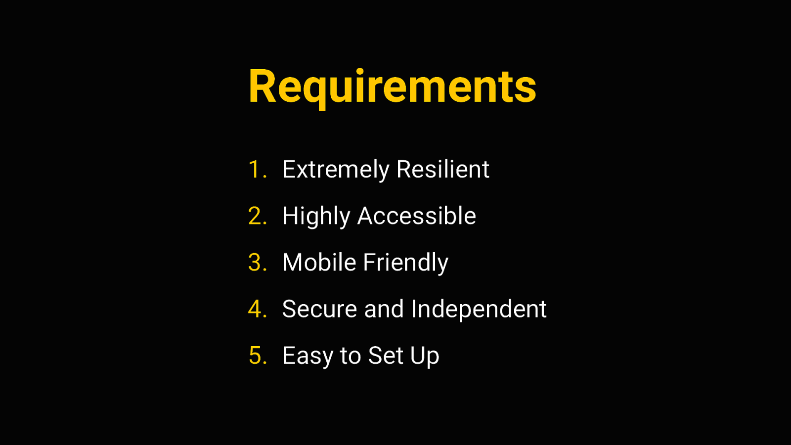
Requirements 1. Extremely Resilient 2. Highly Accessible 3. Mobile Friendly 4. Secure and Independent 5. Easy to Set Up So I’ve come up with these 5 rules. 5 traits that a website providing emergency information has to have. above all, they have to be extremely resilient. As we’ve seen before, we need to expect traffic surges. All the other requirements don’t matter if we can’t keep the site up under pressure. next, if we do get information across, we need to ensure that it is accessible, consumable and understandable by all kinds of users and devices. It’s also quite likely that people will access the site on mobile connections, so it has to be mobile friendly. It has to perform well, even in poor network conditions. Emergency sites also have to be secure and independent - by that I mean that the people in charge of the website should have complete control over its content and its availability on the web. It shouldn’t be vulnerable to attacks, and should not rely on other systems or platforms.
And Finally, it should be easy to setup and maintain by whoever publishes the information.
Resilience Let’s talk about that first point: Resilience. A resilient website is one that can withstand everything we throw at it. Now in the question of traffic surges, we might be tempted to…
Resilience through SCALE Solve the problem through scale. with more power, more servers, more caching layers, etc. But that introduces more complexity. In almost any system, the more complexity you have, the more potential for error there is. So maybe instead of adding layers, it might be smarter to take layers away.

Resilience through Simplicity Instead of Scale, we could try to achieve resilience through Simplicity. By relying on very basic, “error-proof” layers of technology. By intentionally choosing simple methods, we can make the system more stable. This is commonly known as the “Rule of Least Power”
The Rule of Least Power The Rule of Least Power is to “always chose the least powerful technology suitable for a given task”. The least powerful technology we have for providing information on the web is just plain HTML. HTML is very reliable, because there is no potential for script execution errors or misconfigured databases or whatever - and it’s also very efficient, very cheap to provide
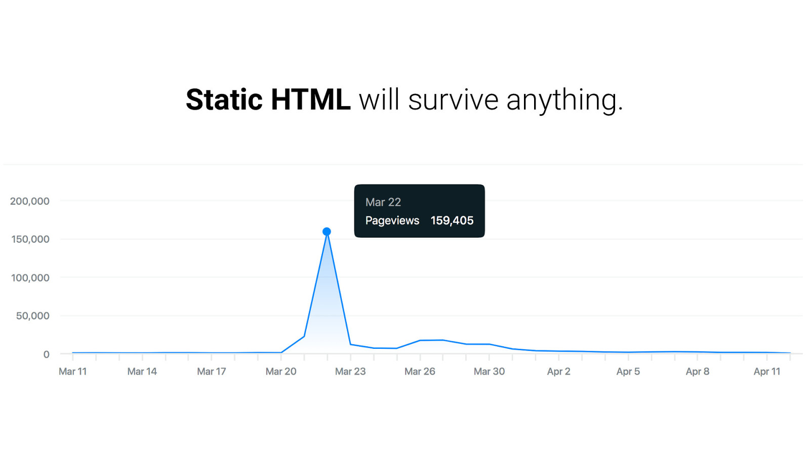
Static HTML will survive anything. static html, without any processing, is just incredibly easy to publish. You just throw it on a server and be done with it. And a single nginx or Apache server can handle a ton of static requests - it is very resistant to traffic surges because it needs hardly any computing power. This is not the first time anyone has thought about this. Back in 2018, when hurricane Florence first hit the US east coast.
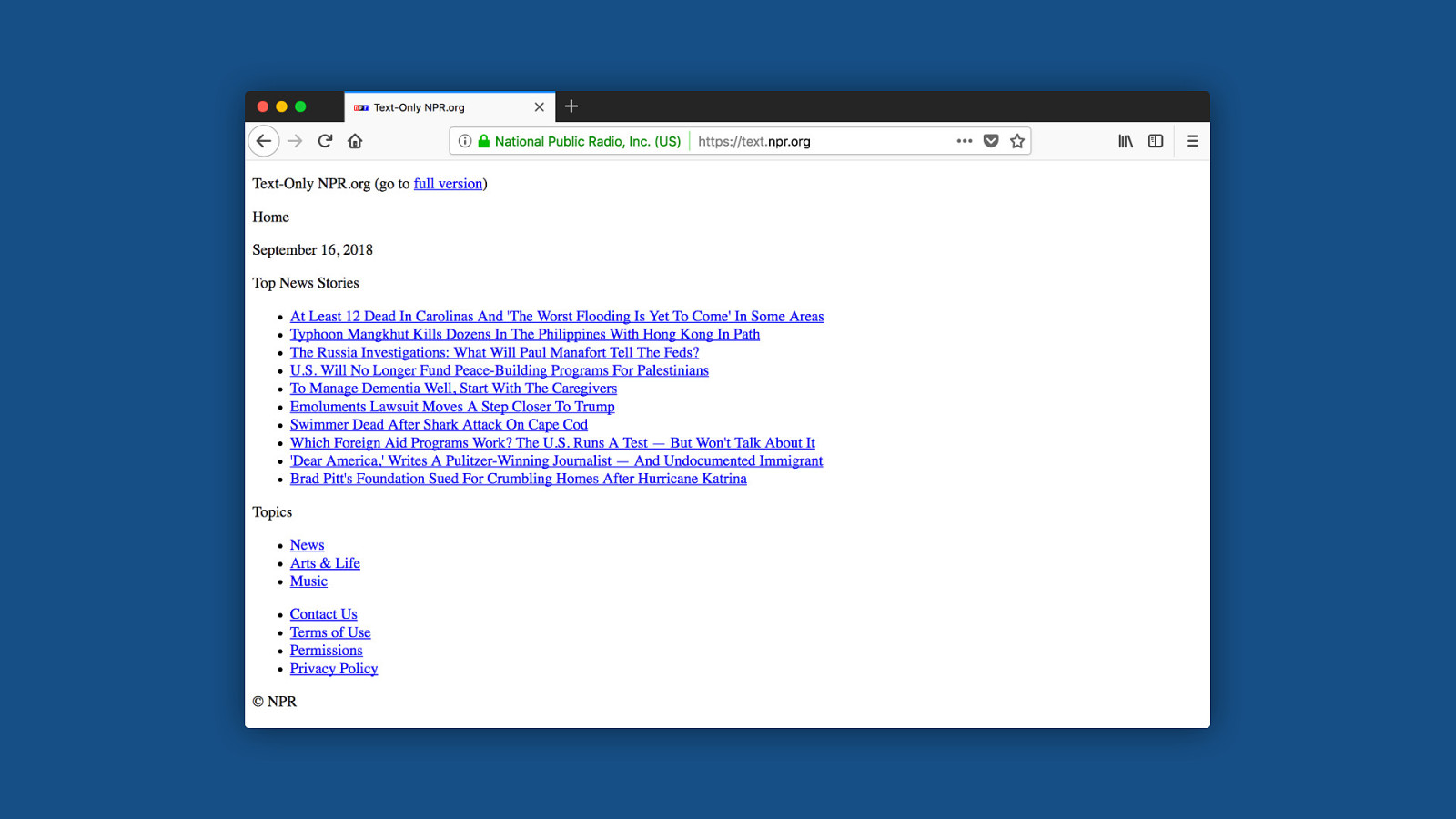
Some news sites like CNN and NPR started providing these text-only versions of their sites. basically just the content, nothing else. just HTML, to reach people with poor connections. This is the exact same content they provided on their regular website, mind you. Just stripped of everything that’s non-essential. I really liked the simplicity of this, and I wanted to build a reusable version of this. So I made a starter kit for emergency websites, that enables people to make extremely resilient, accessible, static sites.
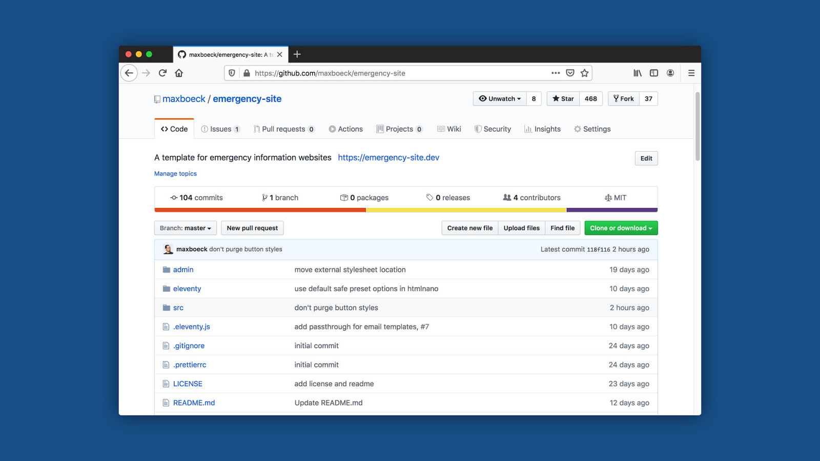
.MD HTML Like for almost all of my side projects, I used Eleventy for this, which is a static site generator based on Node. So my emergency site kit takes a bunch of markdown posts, runs them through a couple of transformations, generates the pages with it, and outputs a folder full of static HTML files. Eleventy is particularly nice there because it’s extremely barebones. unlike say Gatsby, it doesn’t ship anything per default. You have complete control over the end result in the output.
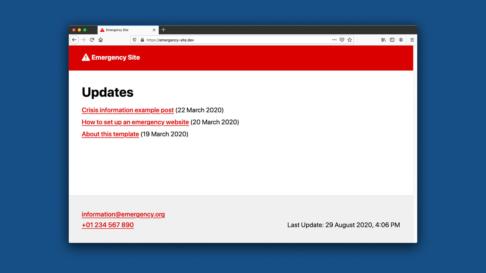
The whole thing is open-source obviously, it’s up on github, so anyone can fork this and make it their own.
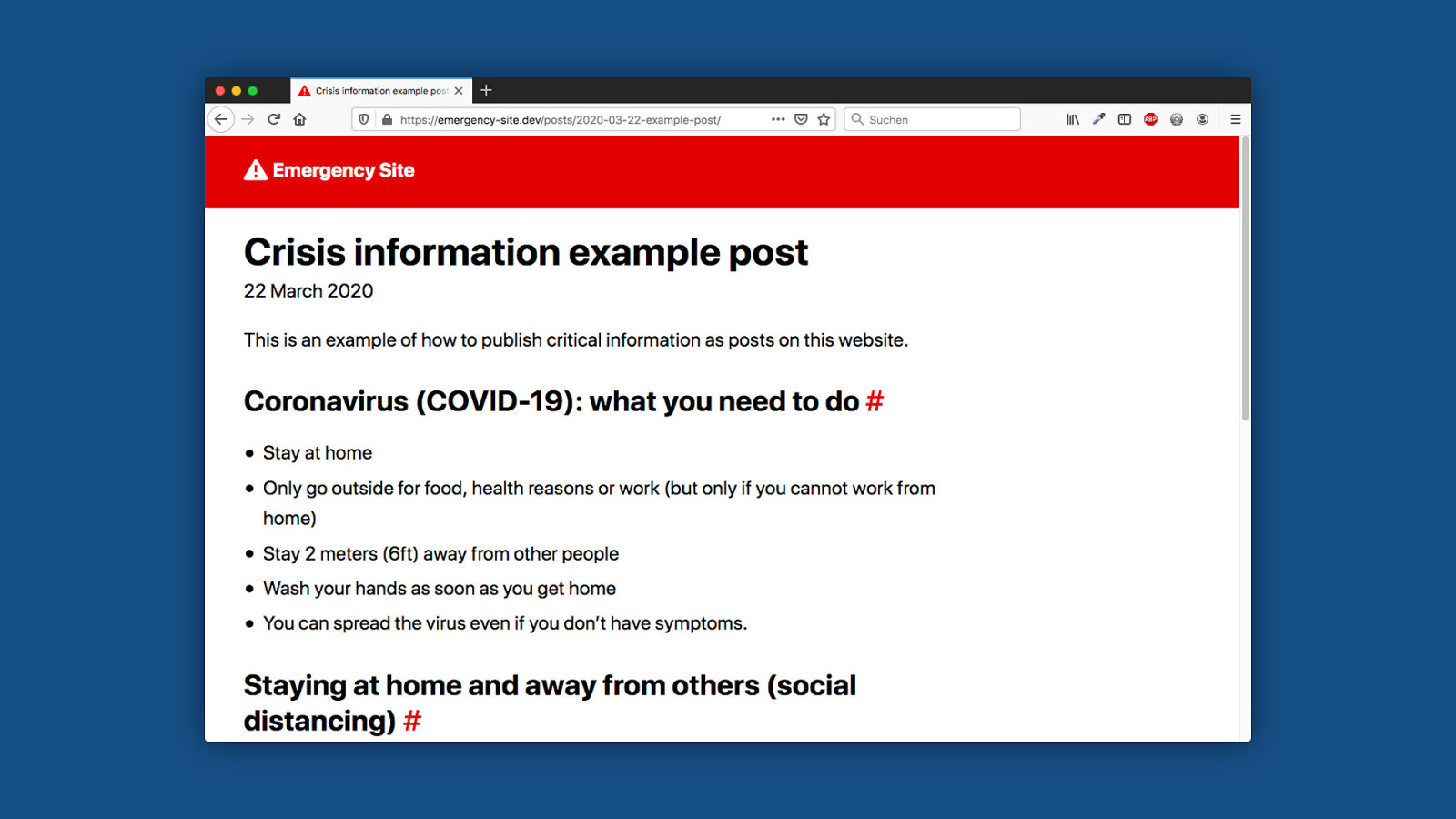
So here’s what it looks like: it’s basically just a very simple blog to publish information to help in a crisis. It has exactly two types of pages, the index here…

And a detail page for each post. it’s just an extremely stripped-down blog. It looks really simple - and that’s kind of the point :) Nevertheless there are a few helpful things built into this kit to optimize for emergency situations. And today I want to tell you about some of these things, and why they are there.
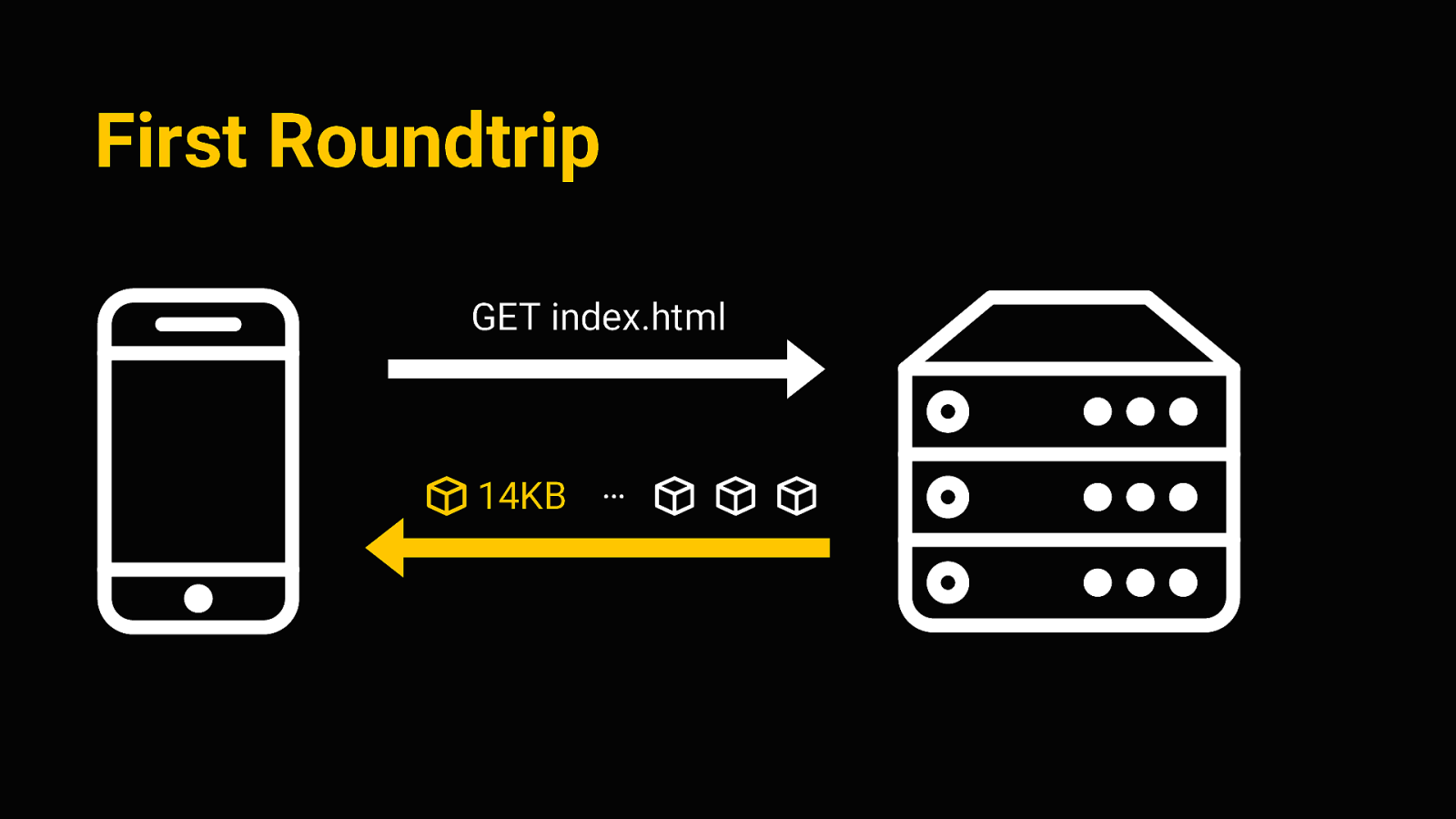
Performance Right so first up, performance obviously is an issue here. The goal I wanted to achieve is to get the smallest footprint possible, so we can deliver critical information fast. Ideally, we want a useable document with all the information within the first connection roundtrip
First Roundtrip GET index.html 14KB … The first connection roundtrip is sort of the first interaction between client and server, when we request the initial HTML file. The magic number there is 14kb - that number comes from TCP itself, where the TCP packets sent in the first connection allow for about 14kb of data to be transferred. So it’s sort of the earliest possible window we got for sending any data to the client. So if we can get the whole thing to weigh in under 14kb, that’s a very good footprint. So how can we do this? Again the main ingredient is to remove anything non-essential. But apart from that, we can do some things like…
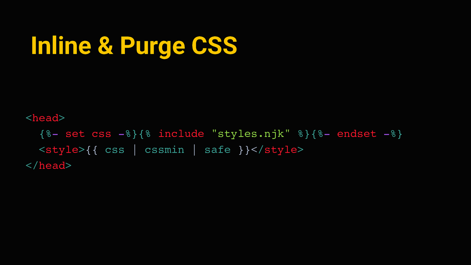
Inline & Purge CSS <head> {%- set css -%}{% include “styles.njk” %}{%- endset -%} <style>{{ css | cssmin | safe }}</style> </head> Inline and purge all of the CSS. We don’t need an external stylesheet - it’s enough to define a few sensible styles and write them directly to the document head. Eleventy makes this quite easy - we can capture the contents of our stylesheet in a variable, run that through cssmin to strip away any excess characters and whitespace, and put it in between two style tags on each page.
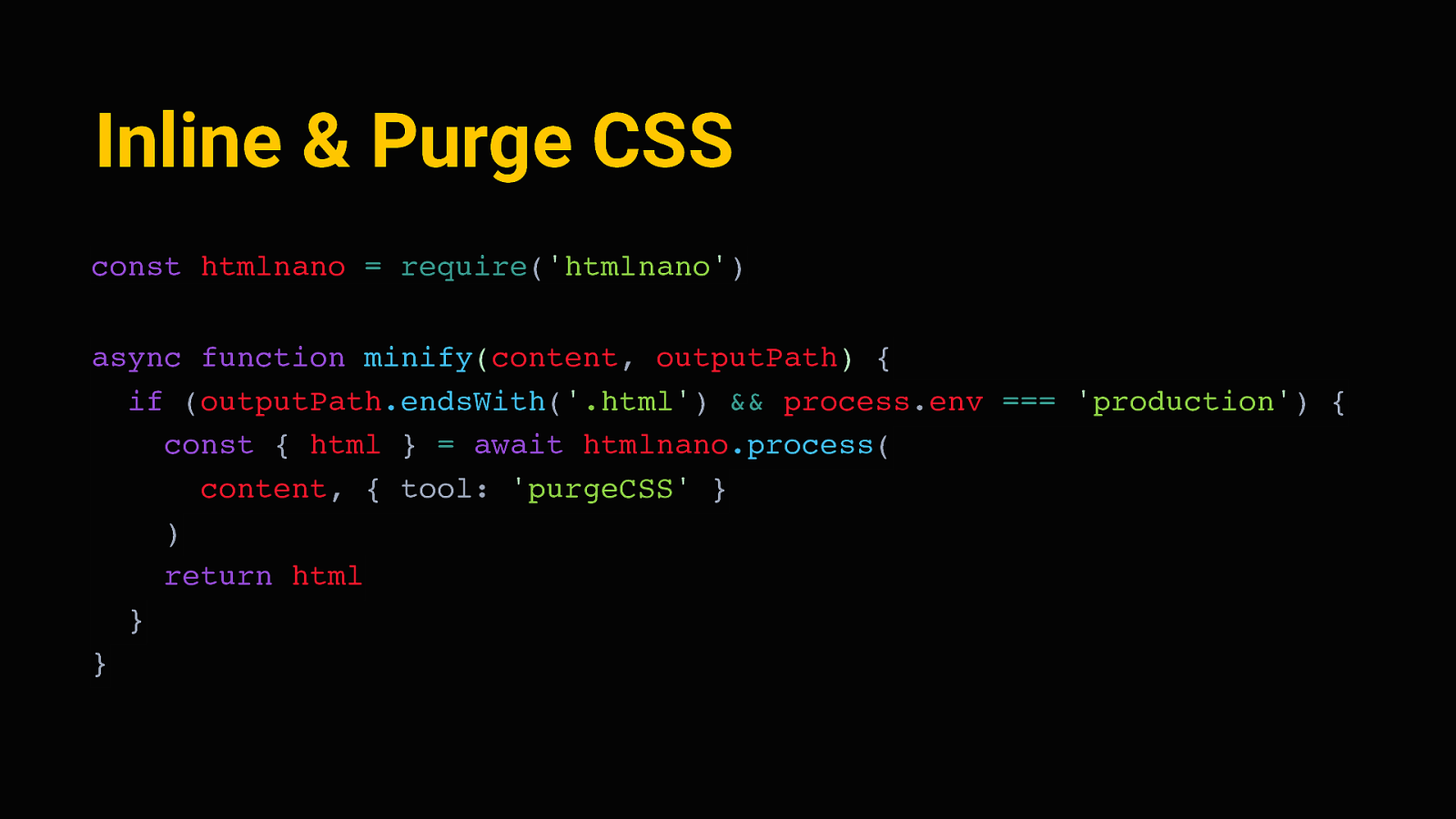
Inline & Purge CSS const htmlnano = require(‘htmlnano’) async function minify(content, outputPath) { if (outputPath.endsWith(‘.html’) && process.env === ‘production’) { const { html } = await htmlnano.process( content, { tool: ‘purgeCSS’ } ) return html } } Next, eleventy lets us define “transformations” - these are just functions, written in javascript, that process each generated page during the site build. We can hook a minification tool like HTMLnano in there, and minify all HTML pages. And since all the styles are inlined, we can also analyze each page, see which elements are on there, see which CSS rules apply, and get rid of all the CSS that does not apply. This is done with purgeCSS, so that essentially just removes every line of CSS we don’t need on a page.
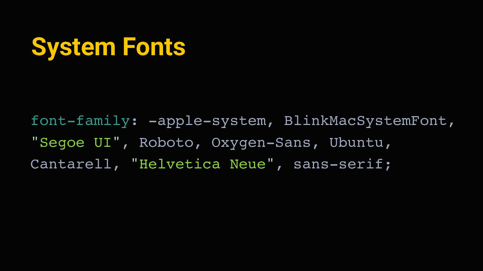
System Fonts font-family: -apple-system, BlinkMacSystemFont, “Segoe UI”, Roboto, Oxygen-Sans, Ubuntu, Cantarell, “Helvetica Neue”, sans-serif; Right , then of course we also don’t need to use any external fonts. It’s completely fine to use what we already have, save us a request and precious bytes. We can display the site in the system font stack - that’s an older trick by now, to define a font family that will fall back to whatever the users device likely uses natively.
Avoid External Resources
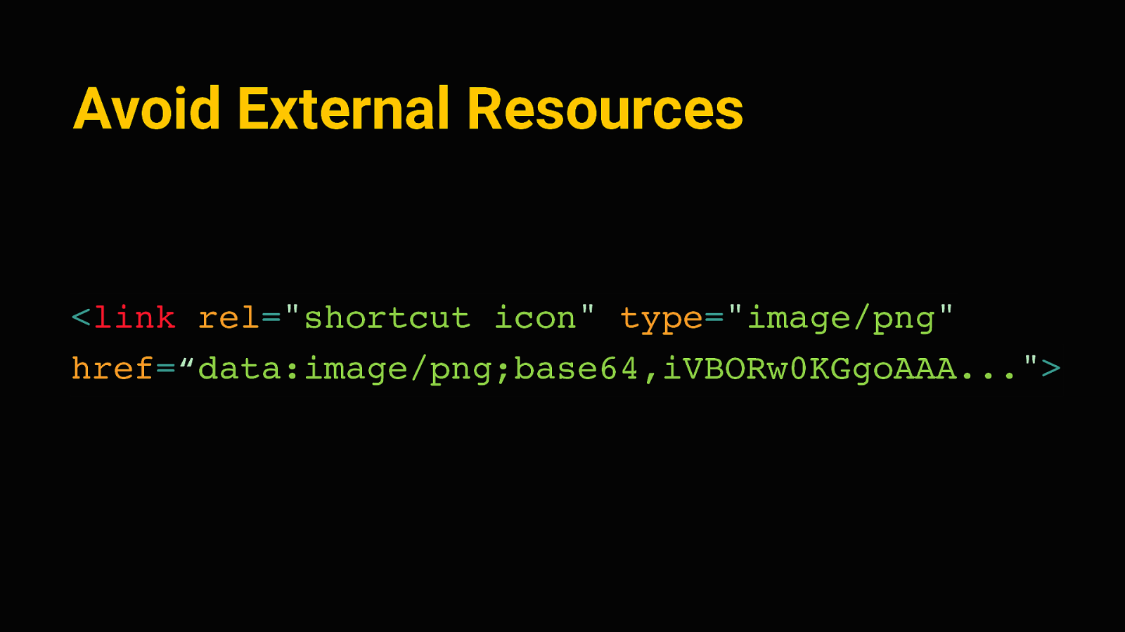
<link rel=”shortcut icon” type=”image/png” href=“data:image/png;base64,iVBORw0KGgoAAA…”> And to really avoid any further requests, we can do other small tricks. Little known fact is that whenever you go to a new domain, most browsers will actually send two requests because they’ll automatically look for a favicon file in the root of your site. We can avoid that extra request by inlining the favicon as a base 64 data URI, like this. This can be a transparent pixel or in this case, a simple default image.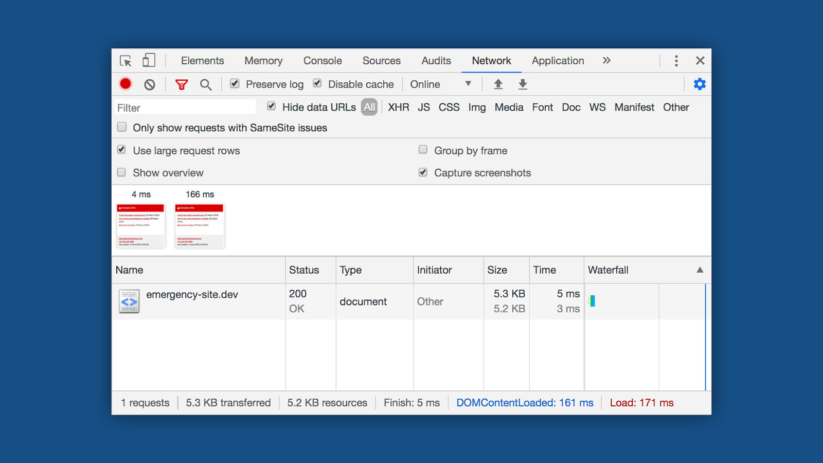
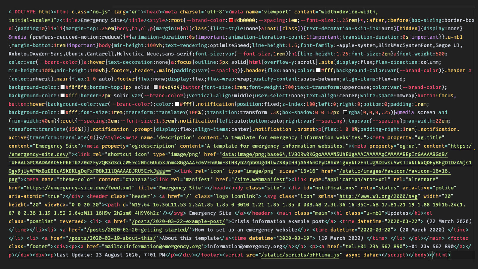
Right so doing all of that, we get this. This is the entire source code of the homepage - It fits on this slide. So in the first connection roundtrip, the webserver returns this bunch of text. And this basically contains everything we need to render the site in a single request. Roughly half of it here in the upper part of the screen is CSS; the other half is content and meta information. At this point we haven’t loaded any images that the content might contain yet, but it’s probably already useful, given that most of the information is stored as text. And since all the CSS is already there, it renders instantly.
On an average 4g connection, we can see content on the screen after 4 milliseconds. That’s so fast it feels instant. We’re done loading after about 170 milliseconds. For reference, the google home page takes about 500 milliseconds for this on the same connection.
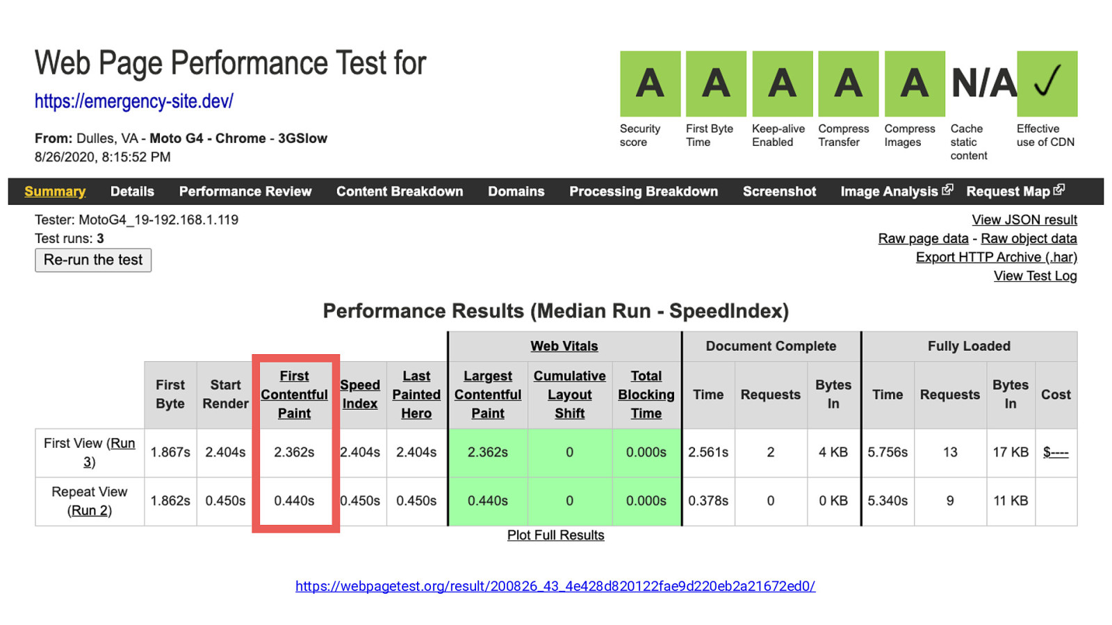
https://webpagetest.org/result/200826_43_4e428d820122fae9d220eb2a21672ed0/ Even on a MotoG4 feature phone with a very slow mobile connection, the emergency site still renders after about 2.3 seconds, and repeat visits render after about half a second. That’s the very worst case scenario for a “cell reception in the middle of nowhere”. That’s pretty good! The web is actually pretty fast if we leave out the images and javascript. :D
Accessibility The next part I want to talk about is accessibility. it’s important to make the emergency information accessible to anyone, regardless of ability or technology. Fortunately again, the beauty of the web is that we don’t have to do a lot of special work here if we made sure not to mess things up in the first place. Browsers and screen readers are very good in interpreting HTML documents, provided they have the proper structure. We can still enforce a lot of good accessibility practices through the template, and the browsers/devices will take care of the rest. Here’s some of the things the starter kit does there:
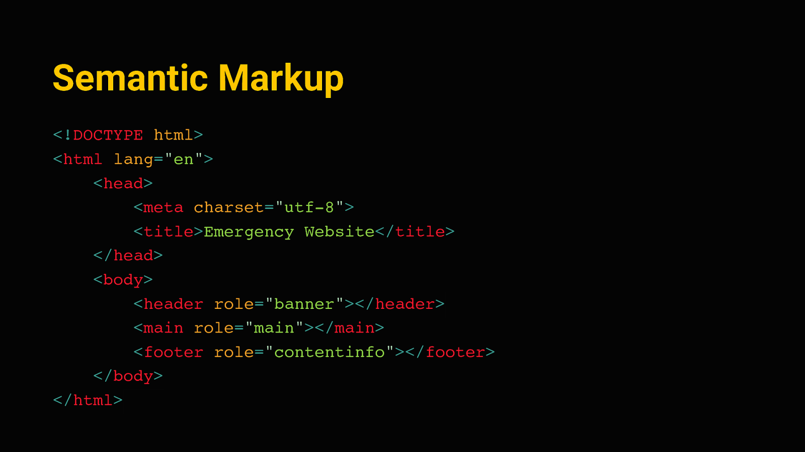
Semantic Markup <!DOCTYPE html> <html lang=”en”> <head> <meta charset=”utf-8”> <title>Emergency Website</title> </head> <body> <header role=”banner”></header> <main role=”main”></main> <footer role=”contentinfo”></footer> </body> </html> Most importantly, and I’m sure you’ve heard this from other people here today, we need HTML semantics. We can start out with a base layout that has proper landmark regions, the header, main and footer here.
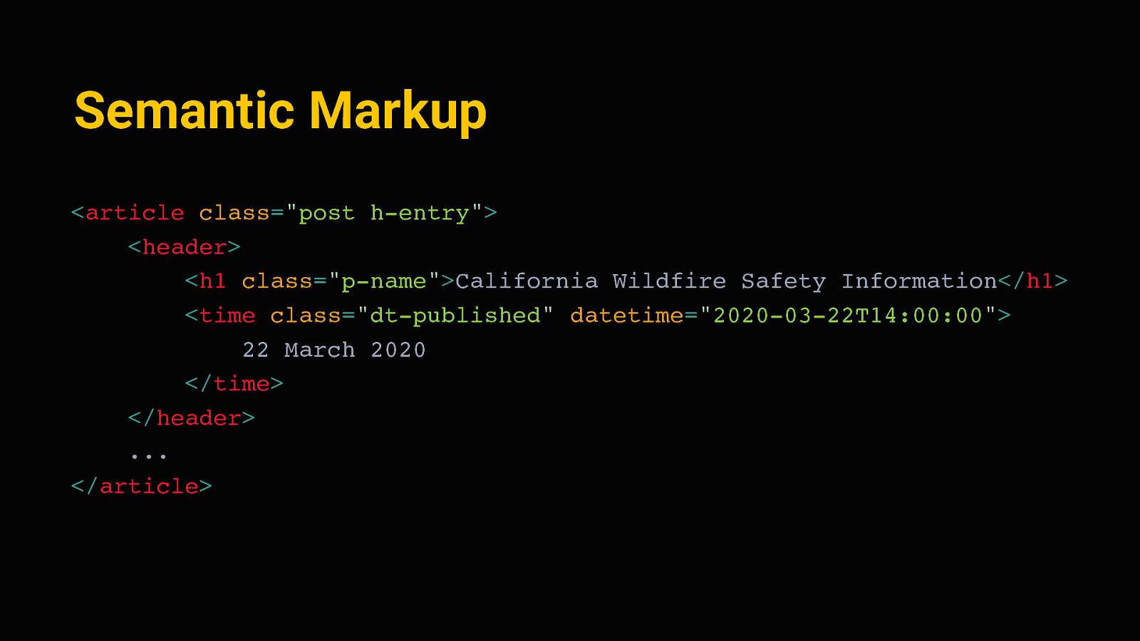
Semantic Markup <article class=”post h-entry”> <header> <h1 class=”p-name”>California Wildfire Safety Information</h1> <time class=”dt-published” datetime=”2020-03-22T14:00:00”> 22 March 2020 </time> </header> … </article> Then on the detail pages, semantic elements and micro formats can provide further hints to assistive technology, and also make the site better indexable by search engines.
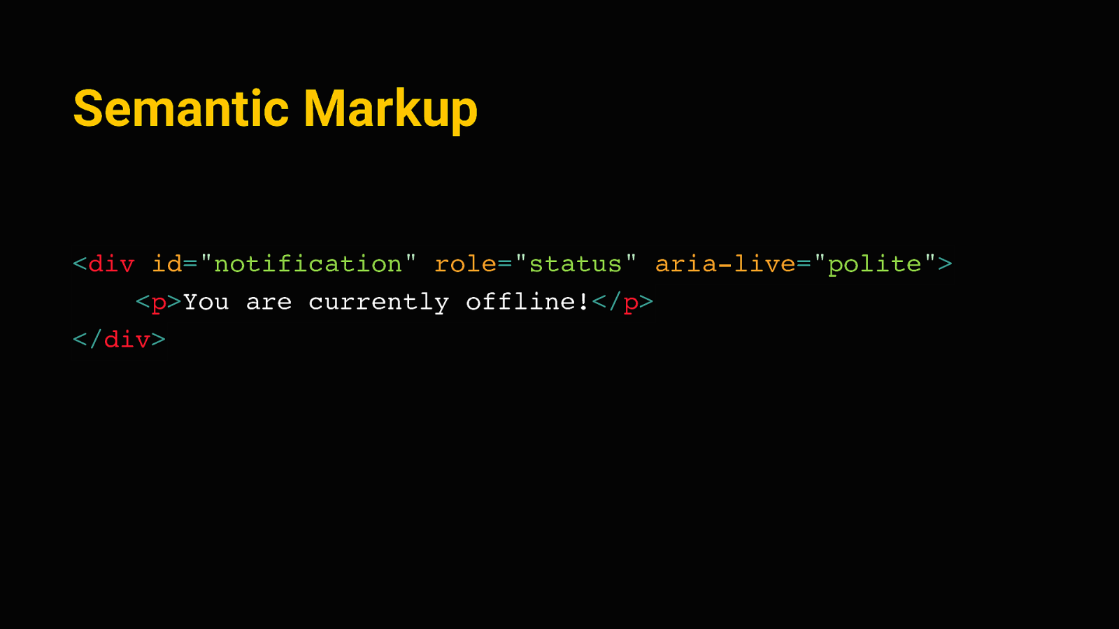
Semantic Markup <div id=”notification” role=”status” aria-live=”polite”> <p>You are currently offline!</p> </div> We can use appropriate roles and special aria attributes for less common elements as well. This is a status message for example, we’ll see this again a bit later, but think of something like the toast messages that sometimes come up on website. We can use an Aria-live region there, and a screenreader will announce this out of order, as it comes up. The aria-live “polite” value there tells it to finish announcing whatever it currently is on, and then read out the message.
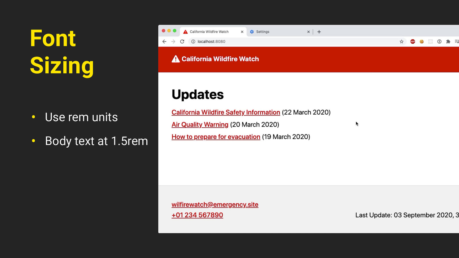
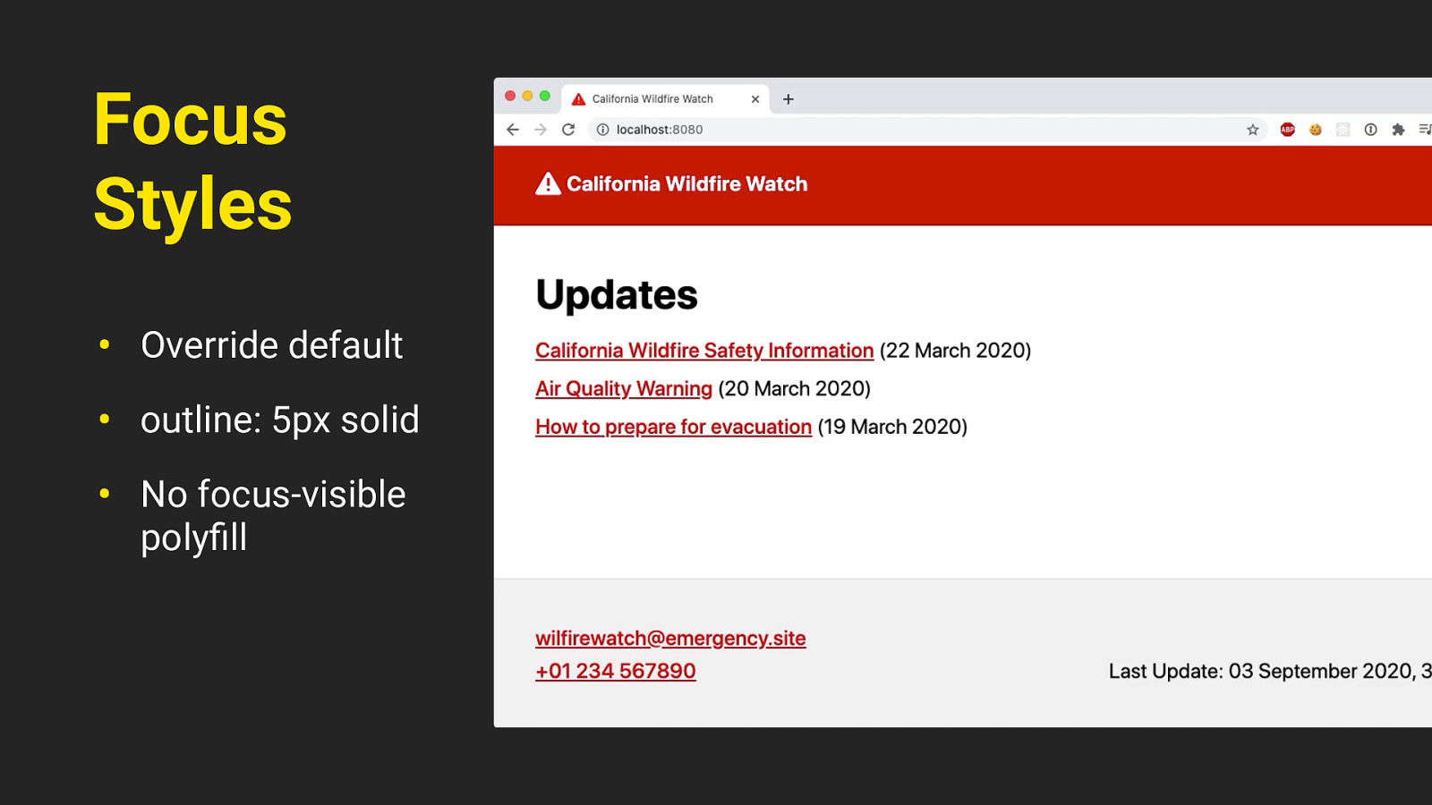
Focus Styles • Override default • outline: 5px solid • No focus-visible polyfill There’s some improved focus styles as well; we can just override the default browser focus ring with something a little more visible, like this solid outline. We don’t need to differentiate between keyboard users and mouse users for the focus ring, that’s something we usually have to do for design reasons with focus-visible or a polyfill of it. On this site, it’s fine if everyone sees the focus styles.
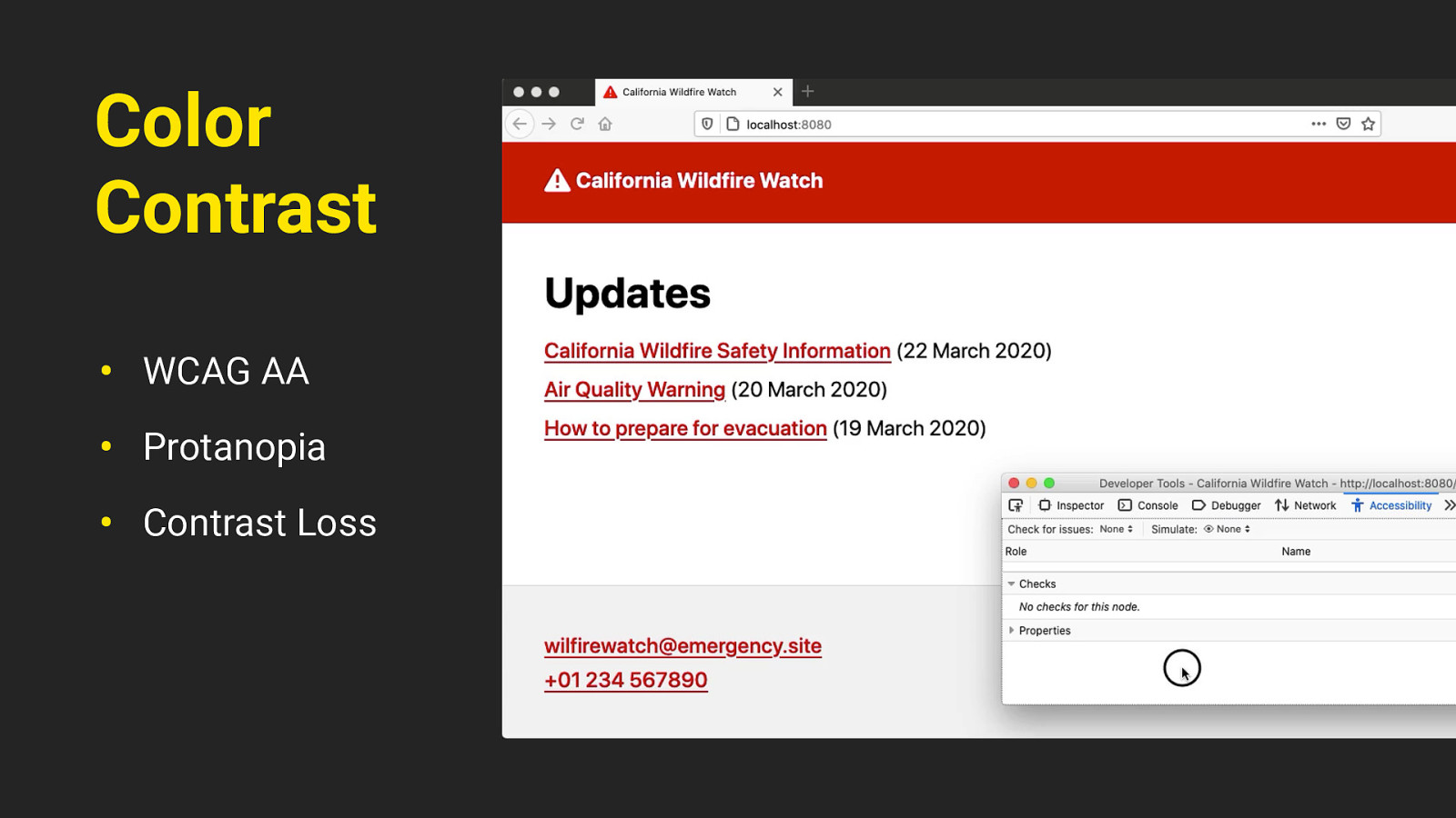
Font Sizing • Use rem units • Body text at 1.5rem The site uses flexible sizing, so everything in there is based on rem units. That way we can seamlessly scale the site up with the user’s font size preference, and people with a larger default font size will get an optimized experience.
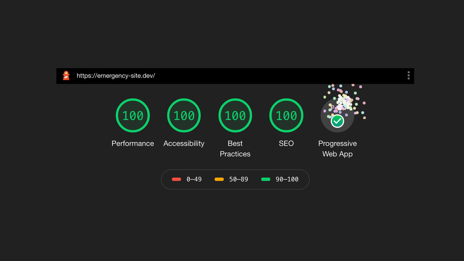
Color Contrast • WCAG AA • Protanopia • Contrast Loss The colors on the site need to have a good contrast ratio; passing the web accessibility guidelines AA standard. It uses just one primary color, and it’s tested with different types of visual impairments such as protanopia (a type of color blindness) and contrast loss. You can simulate these through the accessibility inspector in firefox developer tools by the way.
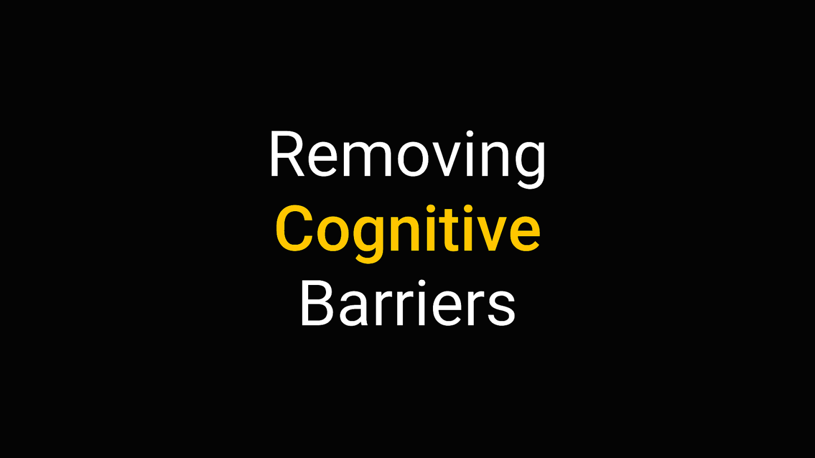
so that gives us a pretty good baseline. that’s already a very fast, resilient, accessible website. but automated testing only goes so far. There’s more to consider than a perfect AXE or lighthouse score.
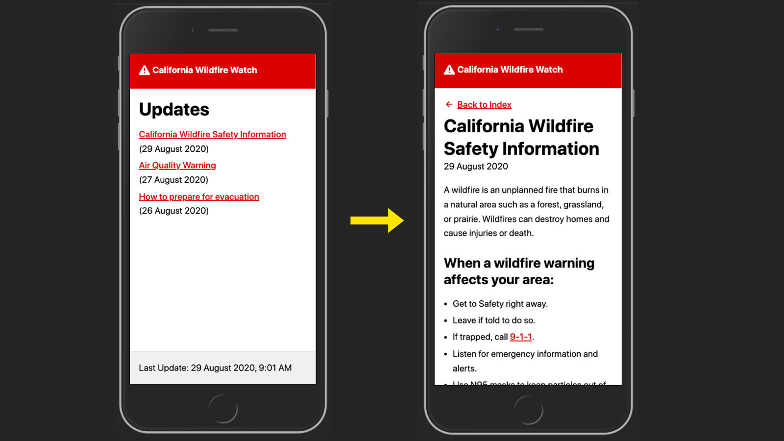
Removing Cognitive Barriers We can try to further remove cognitive barriers. It’s very possible that people are in a somewhat stressful situation when they come to an emergency website, so we should try to make the experience as self-explanatory and frictionless as possible. Nobody who’s in hurry to seek shelter has time to figure out a complicated UI
That’s why the kit does not include a classical navigation. No hamburger menu, no flyout menus you have to figure out. There’s just two levels: an index, and a detail page. You just go back and forth between them. And all Interactive elements are clearly visible as such. Beyond that we should aim for language that’s as plain and actionable as possible, to give people concrete instructions on what to do. We can use progressive enhancement to improve the site even further - for situations where users lose connection completely.
Progressive Enhancement for Offline fortunately the COVID crisis we’re currently facing doesn’t affect our internet that much. But other emergencies, for example with natural disasters, can damage network infrastructure. And the fastest site in the world won’t be of much use if people can’t go online anymore.
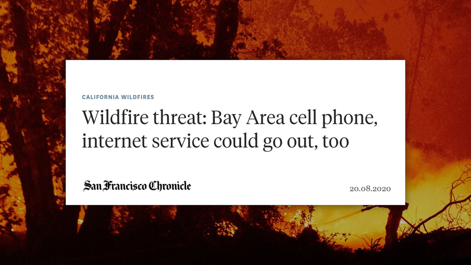
17.08.2020 20.08.2020 Take for example the wildfires in Northern California right now. Some areas had fires damaging the cell phone towers, threatening to take out the internet. So it’s very possible to have an emergency where people might initially have access to the internet, but then infrastructure is destroyed or they have to seek shelter in a place with no network connection.
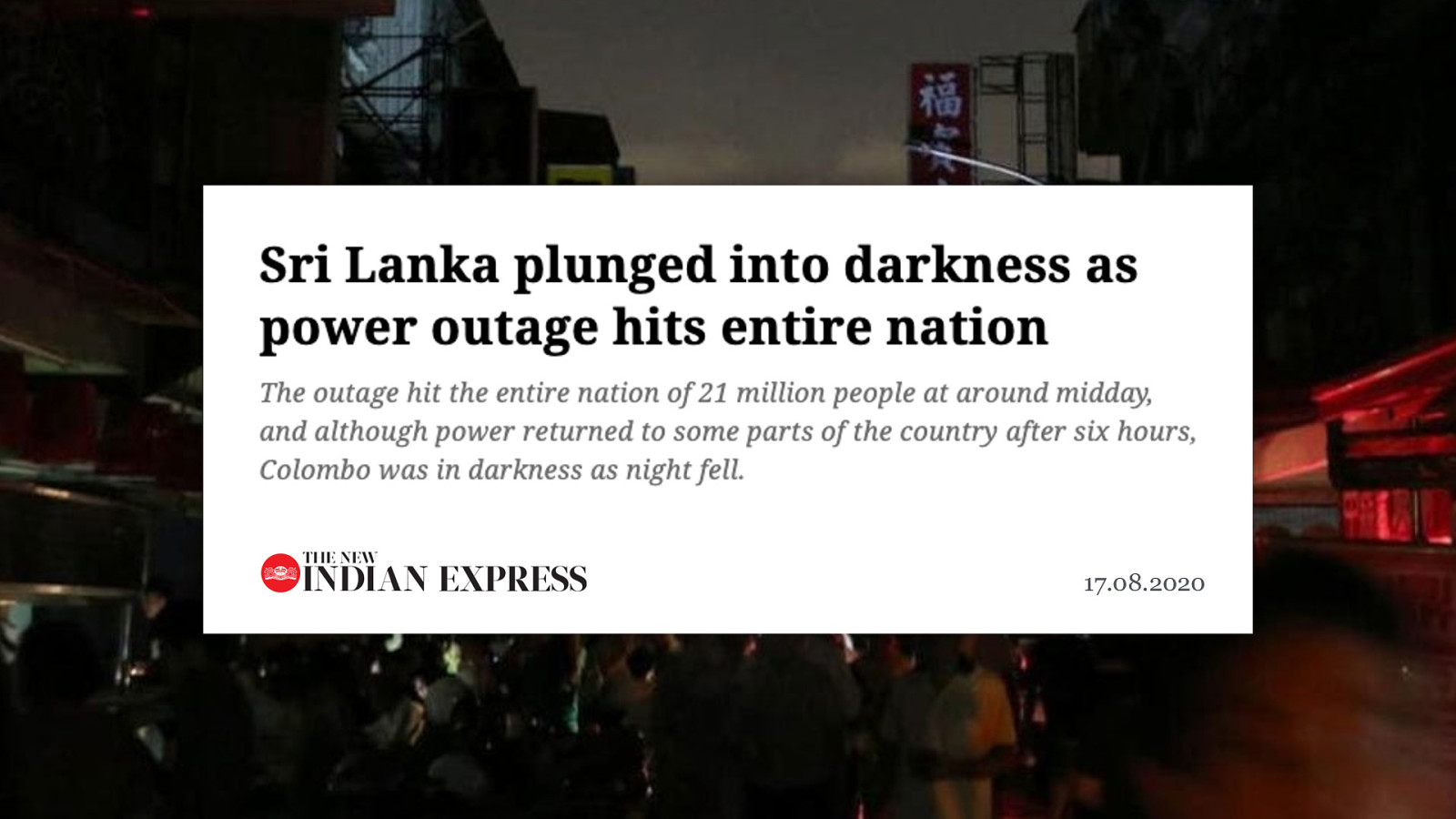
17.08.2020 17.08.2020 Or something like Sri Lanka, they just recently had a total blackout, affecting the entire country. All wireless networks went down. this is where a service worker can really help.
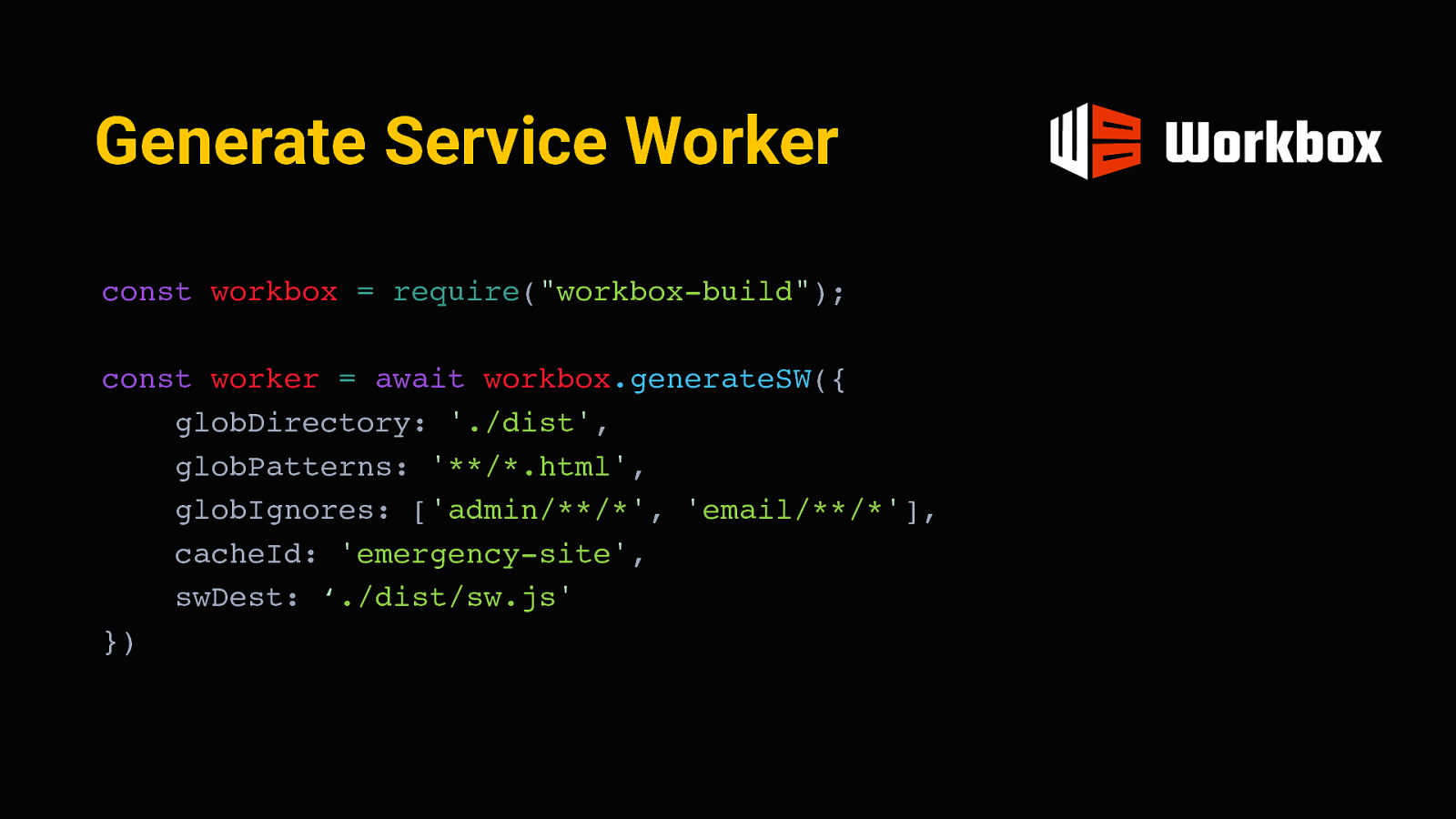
Generate Service Worker const workbox = require(“workbox-build”); const worker = await workbox.generateSW({ globDirectory: ‘./dist’, globPatterns: ‘/*.html’, globIgnores: [‘admin//’, ‘email/**/’], cacheId: ‘emergency-site’, swDest: ‘./dist/sw.js’ }) A service worker is essentially a piece of javascript that installs itself on the device and can interact with the client independently, like a mini proxy server. It’s possible to pre-cache some resources in such a service worker when a user first visits the site and store them for offline access later. I used workbox for this, which is a tool by google to generate and manage service workers. we can pass it these “globs” to tell it which of the static pages should be provided offline. After eleventy is done building the site, it will go through the final folder with the HTML pages and include their URLs in the script.
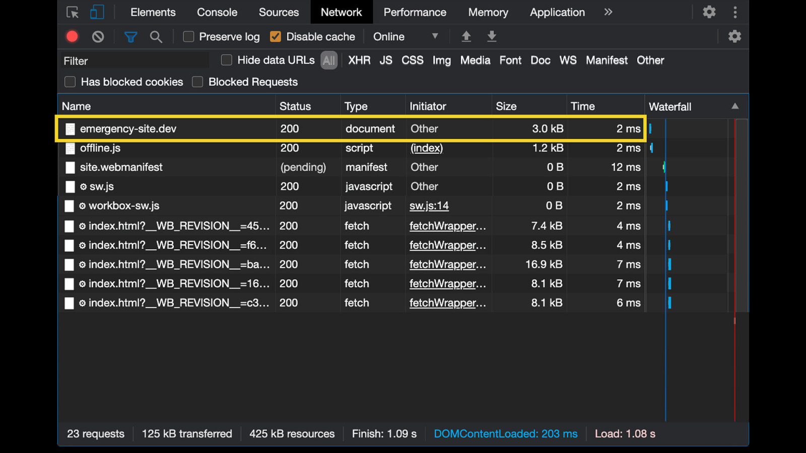
Now, whenever someone visits the site for the first time, they will first get the document, including the service worker registration.
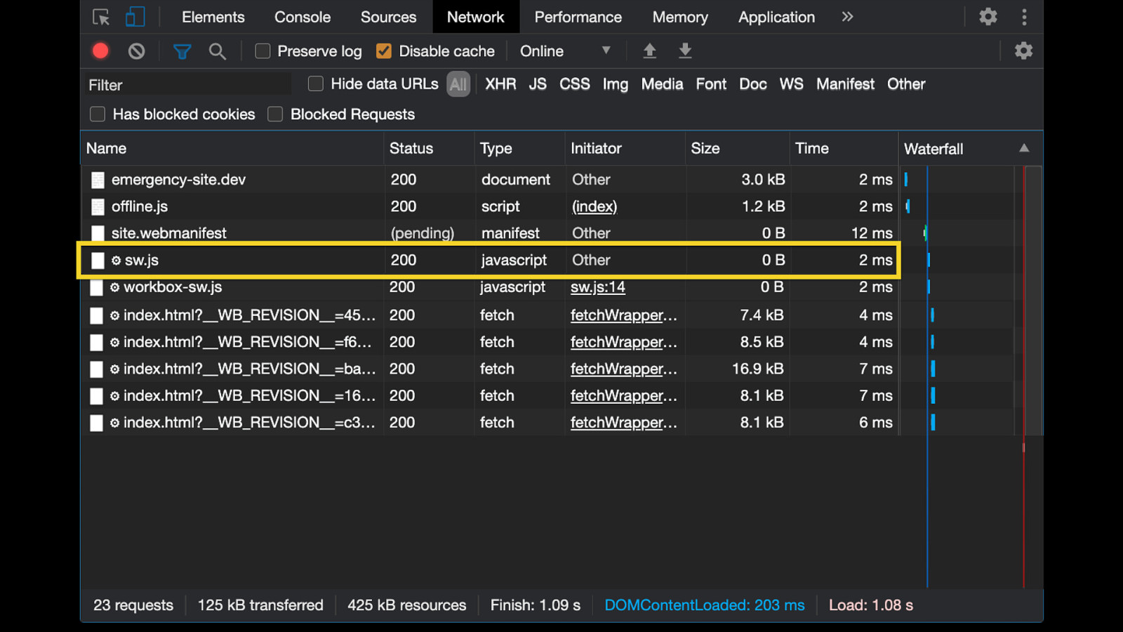
This in turn loads the service worker script generated by workbox.
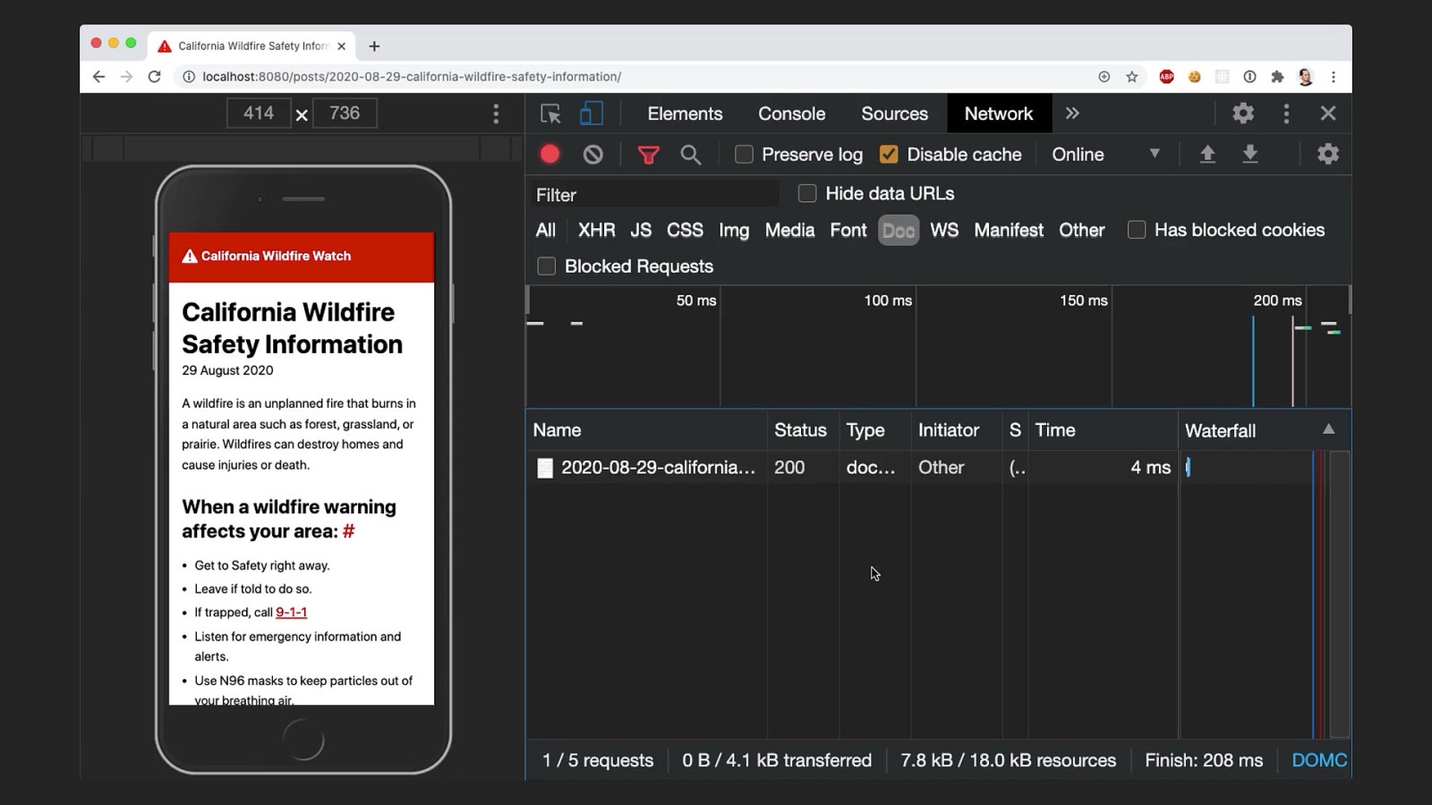
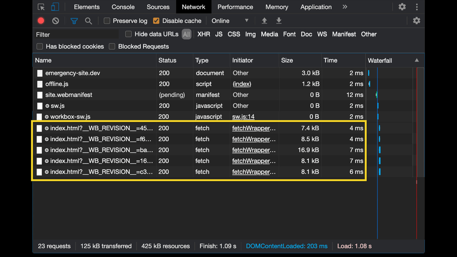
Finally, the service worker pre-fetches all the resources we defined at build time. In this case, that would be the index page and all the post html pages. You can see these requests here. From now on, these pages are cached and versioned (using a revision hash, seen here). That means all posts are now stored on the user’s device.
So now even when offline, these files are still present in the cache and can be served by the service worker. You can see here that even though I’ve set my network to “offline”, the page still loads normally. So anyone who’s had access to the site once will be able to access it later, even if they are in a situation without network connection. But there’s also a big drawback in this: whenever we cache something, this introduces the problem of stale content. Offline users will see the version of the page that was cached on their initial visit. That’s not good, what if things have changed in the meantime? Critical information has to be as up-to-date as possible.
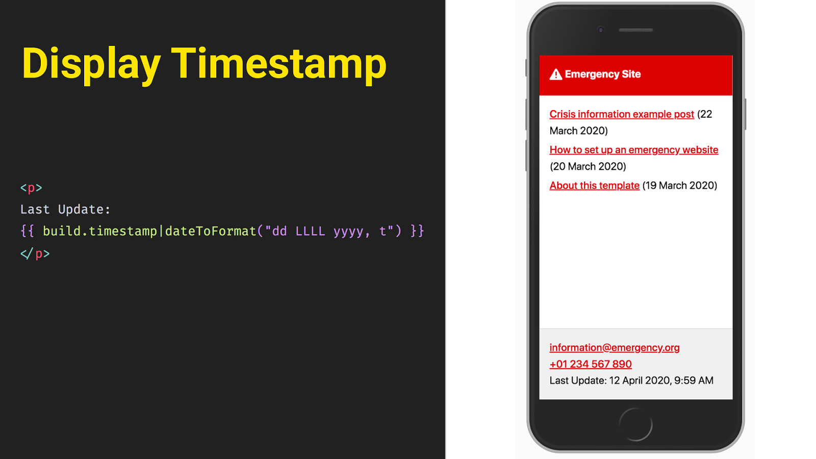
Display Timestamp We need to give the user a sense of how current the information they’re seeing is. At the very least, there needs to be some indication on the page. so the easiest thing first is just to display a timestamp. We can do that for each post individually, but also for the page as a whole, down here in the footer. Eleventy will just insert the time of the last build there.
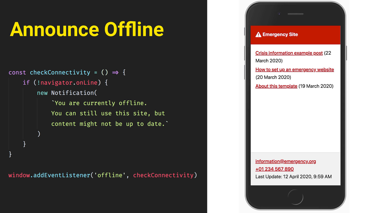
Announce Offline then, in the event that somebody is offline and views the site, we can alert users that they’re seeing a cached version. this can be done in Javascript, by using the navigator.online property and the offline event. This will trigger that little toast message at the bottom, and announce it to screen readers through an aria-live region. finally, there’s another scenario we have to think of. Even when the user has network access, they might see stale content. When someone who already has a service worker installed visits the site again, the page might not update right away.
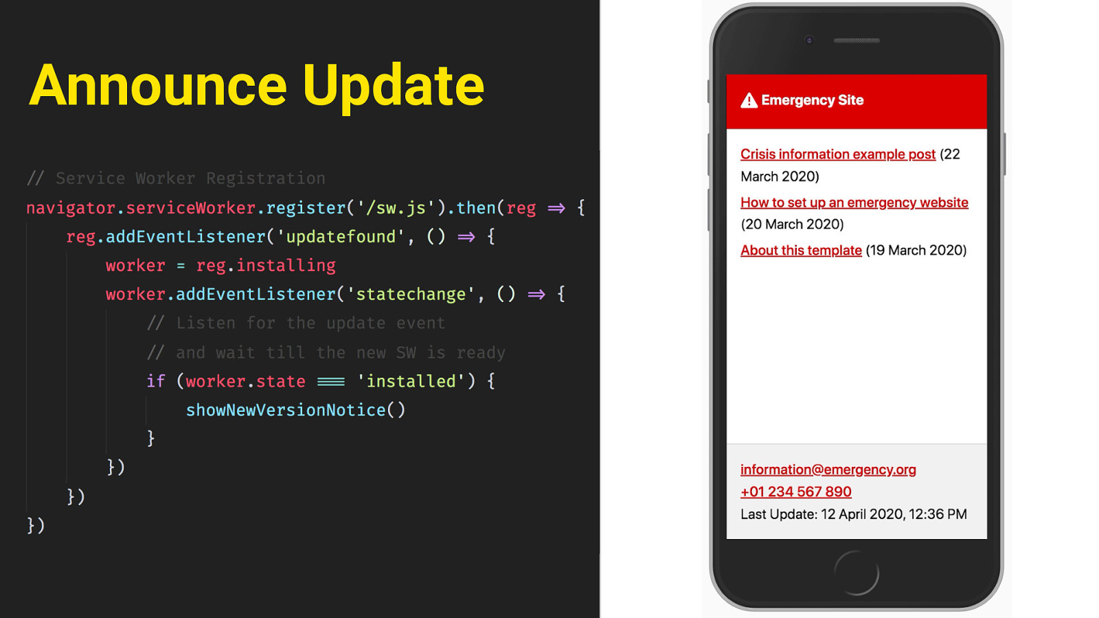
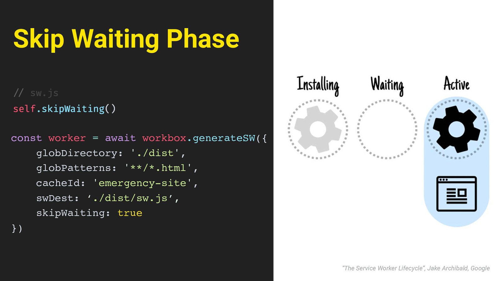
Skip Waiting Phase const worker = await workbox.generateSW({ globDirectory: ‘./dist’, globPatterns: ‘**/*.html’, cacheId: ‘emergency-site’, swDest: ‘./dist/sw.js’, skipWaiting: true }) “The Service Worker Lifecycle”, Jake Archibald, Google This is because of the way ServiceWorker works: the site will tell the user’s browser that the service worker has changed, but by default, the old worker will still remain in place in a “waiting” phase, until the user navigates away or closes the page - at which point the new service worker would be installed. This is not ideal - again a user might see outdated content and be unaware of it. We can improve that behaviour by calling the skipWaiting method inside the service worker. That will tell it to skip the waiting phase and take control of the page as soon as it has finished installing. We can set that as a configuration option in workbox. Then when the new worker is finished and in control, we still need to trigger a reload of the page, so the new content will show. It would be a bad idea to just randomly reload the page though - this is all happening in the background, and the user won’t notice any of it. They might start reading or scrolling the page, and then suddenly it would reload with no apparent cause. That’s not good.
Announce Update A better way is to show a message to announce that an updated version is available, and then let the user trigger the reload themselves. That way it’s clear what has happened, and the user is aware that there might now be new information to look for.
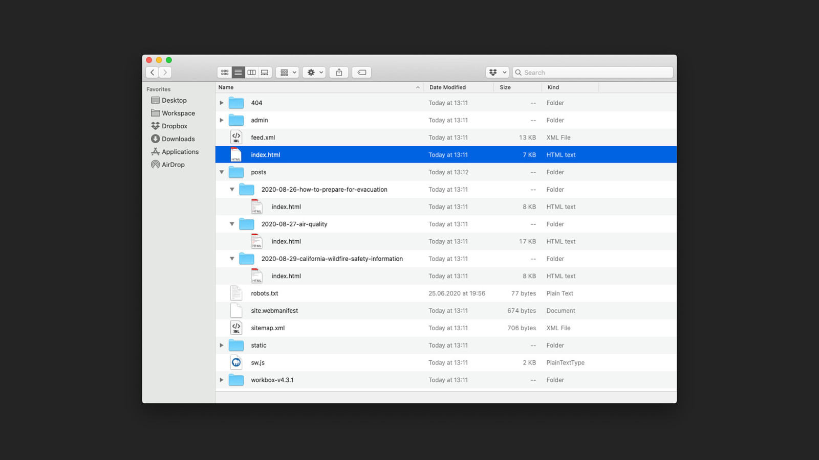
Security and Independence The issue of security and independence is one that affects emergency sites as well An emergency isn’t always perceived the same by everybody. Political movements for example deal with a lot of pushback still, people need access to information to organize. It is vital that this information is not vulnerable to outside attacks, and can’t be blocked or edited by whatever platform it’s hosted on. Static files again are a nice fit there; because unless someone has root access to the server, you can’t edit static files through something like SQL injection or flaws in the CMS. And they’re also completely independent of any tech stack that might be in place. It doesn’t matter if an existing server runs PHP or DotNet or whatever.

Since the end result is really just a folder of HTML, literally any webserver can handle it. Even if there are legacy systems in place, you can treat the emergency site as an isolated part of that system, independent of restrictions. (pause) alright so that’s the technical side of things, but there is another, completely different problem here:
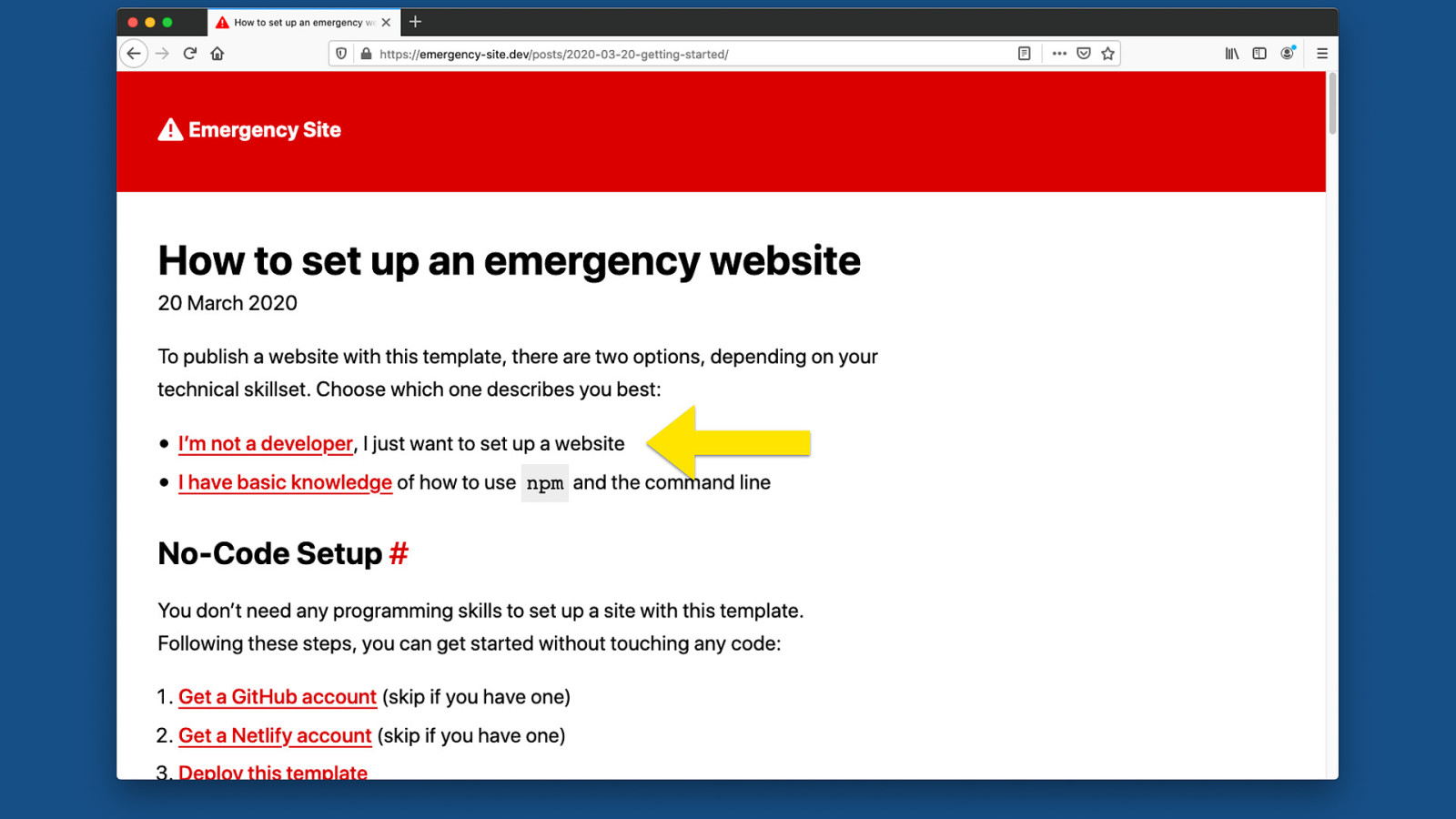
Not everyone is a Web Developer not everyone is a web developer. Not everyone is comfortable using Node or Eleventy or the Command Line. In fact I think there’s a very high chance the people in charge of getting the information out won’t know how to use this. And there might not always be an IT team to help. A lot of open source projects have a “Getting Started” Readme that says “just run npm install”. I think enabling people without that technical skillset starts with an inclusive documentation that doesn’t assume any prior knowledge.

So the documentation of the emergency kit has an option for people to say “hey I’m not a developer, I just need to get something out there quick”. Essentially what we want is a No-Code setup process, where people don’t even have to open a code editor or touch the command line.
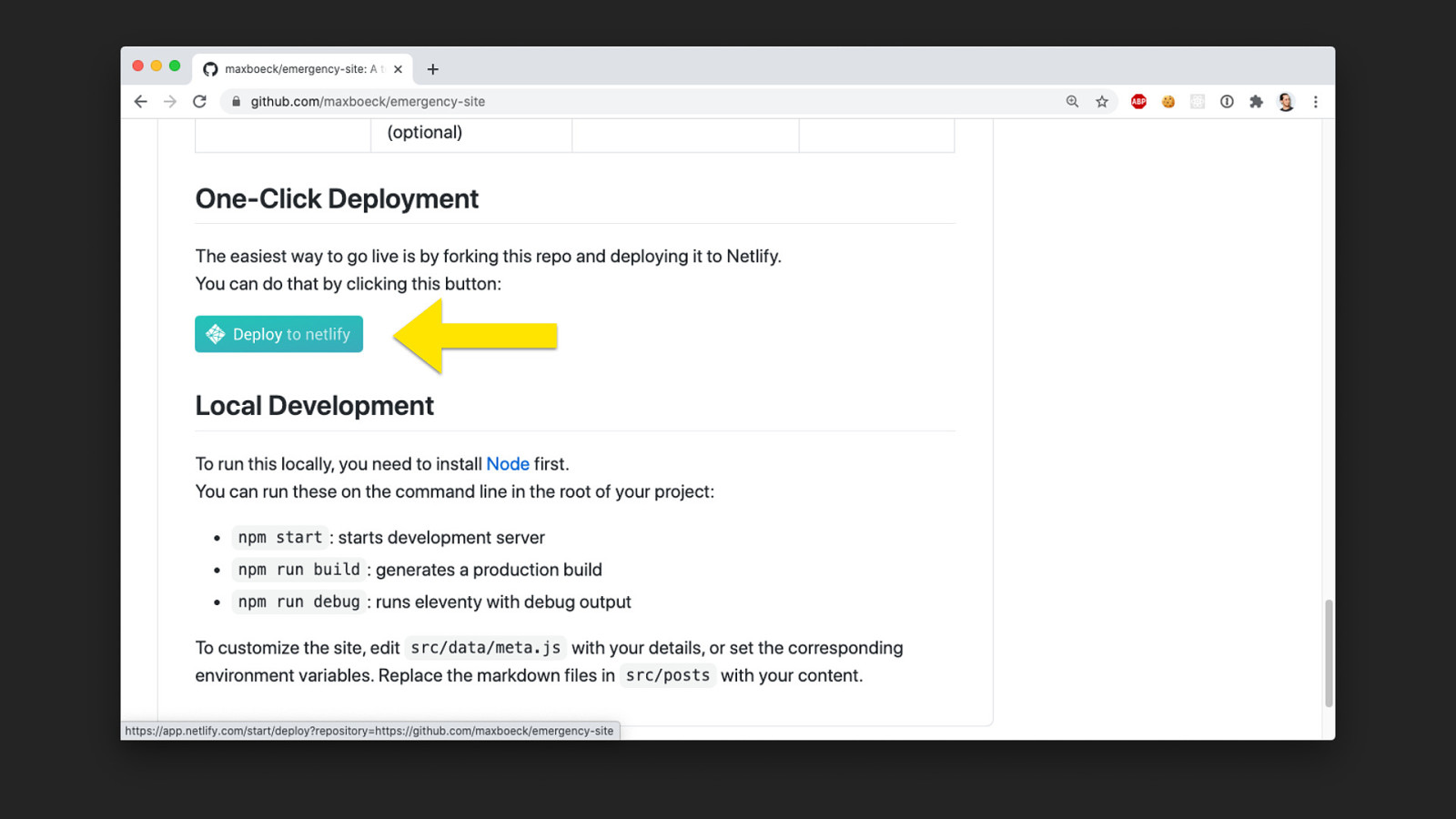
One-Click Deployment something I really like here is Netlify, because it has the ability to deploy a website straight from a git repo, without ever touching a line of code. It will basically fork the repository, deploy it to a global CDN, give it an SSL Cert and set up the Domain in one click.
It gives you this button, which we can include in the README, that will start the process with a fork, and then guide you through the setup in Netlify’s admin.
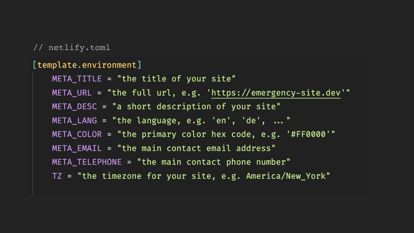
// netlify.toml And it’s even possible to define these “template environment variables”. We can use a special kind of file to set things like the site title, language, or contact phone number, and whenever someone does the “one click deployment” thing,…
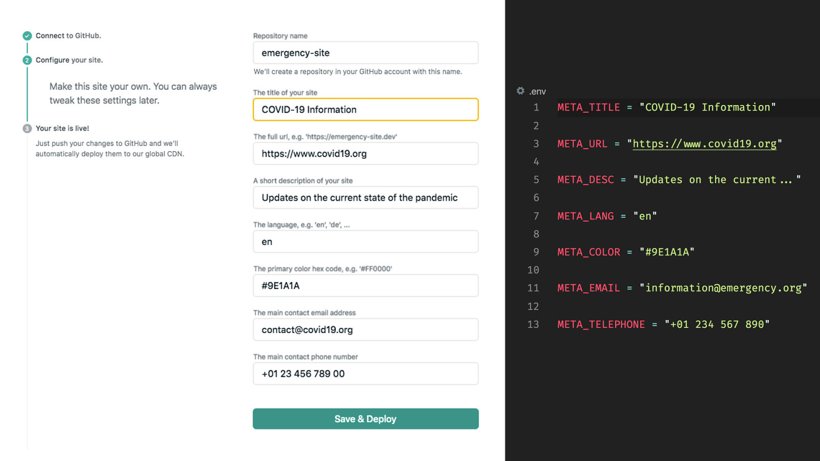
Netlify will ask the user during initial setup. You’ll get these nice regular text inputs. and these then basically translate to regular environment variables we can use in the build process. So that makes it possible to customize pretty much everything except for the posts themselves.
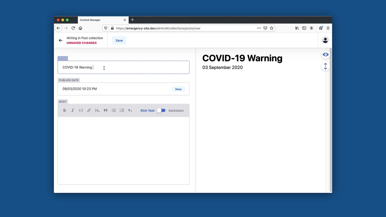
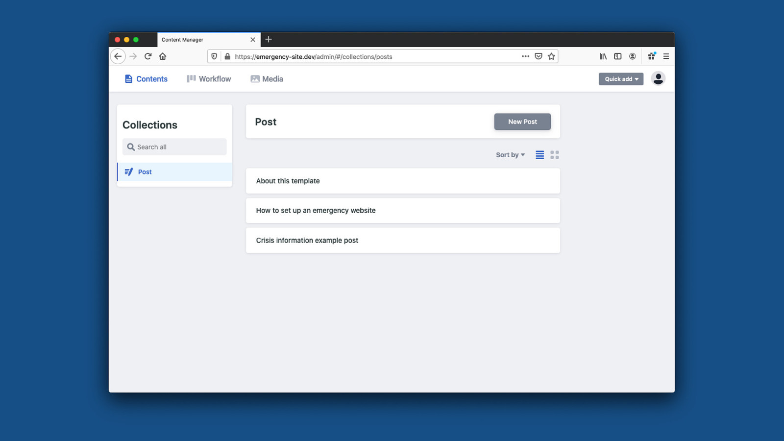
But then once the site is deployed to Netlify, you can also edit the posts in their own CMS instead of touching the markdown files. You can access this with some credentials, you’ll get this nice admin interface. if you change something here, it will create a commit to the repository and the static site will rebuild.
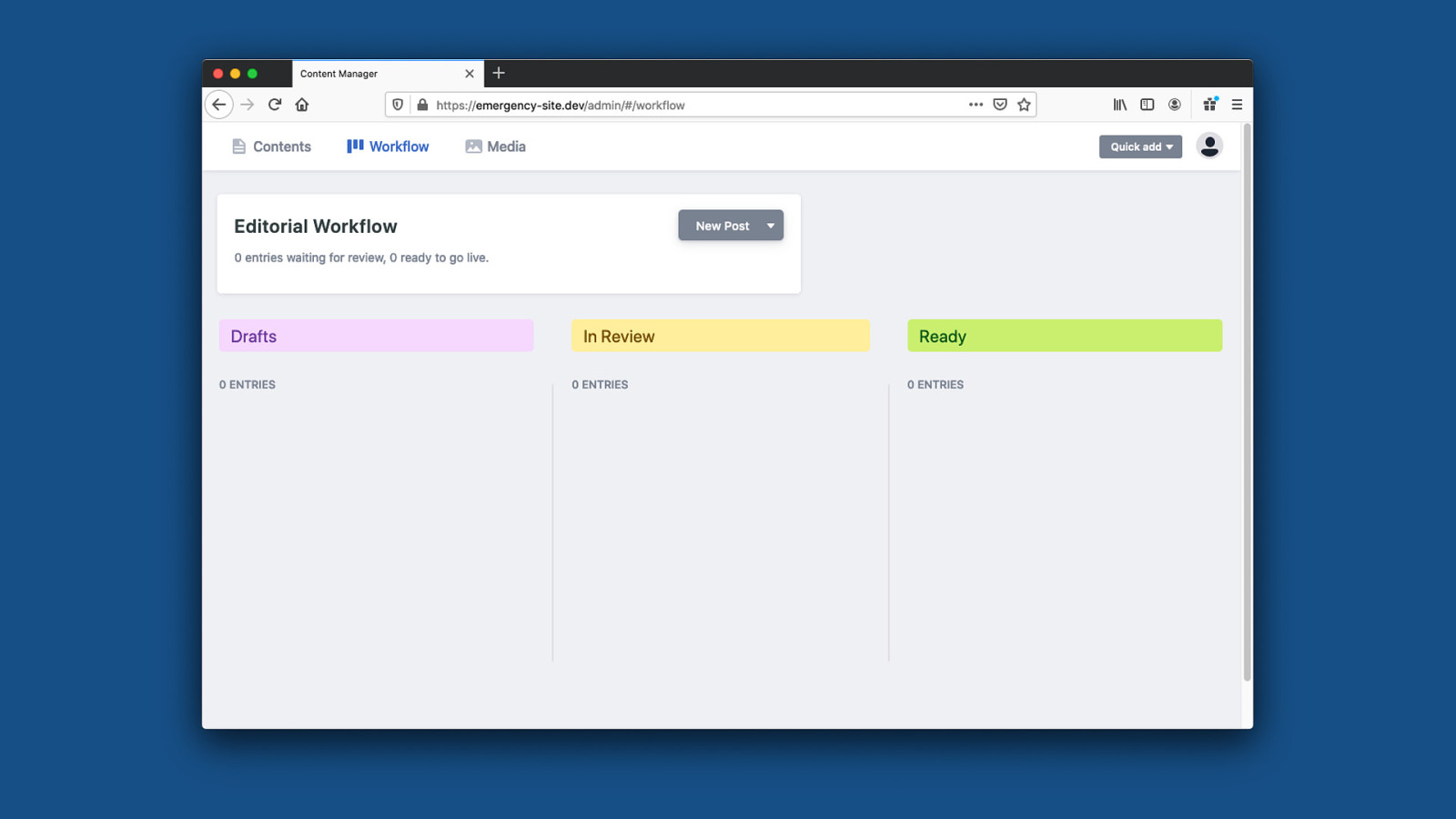
So for someone unfamiliar with markdown or code in general, this is a much better experience to create and maintain content. It will even give you a preview of the final result there.
And then, it’s even possible to have a real editorial workflow to make sure whatever goes out is properly ready and reviewed first.

Links https://github.com/maxboeck/emergency-site https://emergency-site.dev https://mxb.dev/blog/emergency-website-kit Finally - I welcome anyone who wants to contribute to the project, and If you’re interested here are the links. Here’s the project on Github, a Demo Site I’ve made and a blog post I’ve written about it. this is by no means a perfect solution, but I hope it can do some good. I hope this can find real applications. but to me, this is also an interesting project just because it forces yourself to think about websites in an extremely userfocused way.
User-First Development There is zero room for anything that does not directly improve the outcome for the end user in this project, and I think that’s a position we rarely get to take in our day-to-day work. So it’s sort of a good exercise in absolutely putting the user first.

These are Good Practices for All Websites And I think it’s important to remember that these are good practices for all websites, not just the ones dealing with emergency. Most of this is focused on good performance, good accessibility, and low complexity in general - and everyone can benefit from that. Your website may not be an emergency site, but for some users, your site could still be very important. You never know who depends on your services, and it never hurts to treat your work with the same care and diligence as if it was critical to people. I think it can make all the difference.