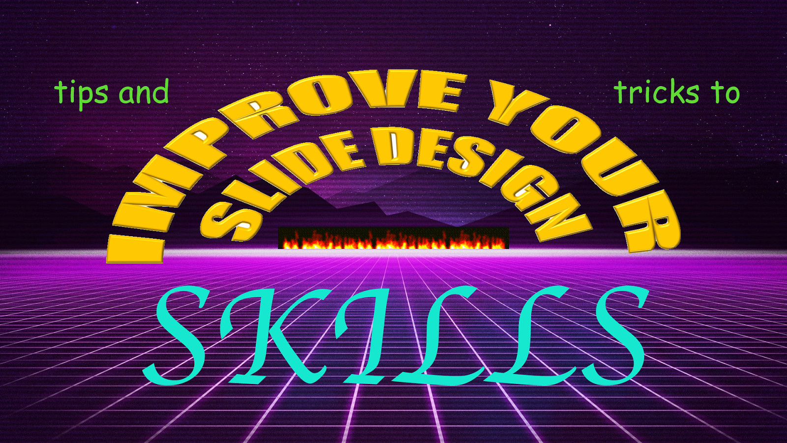
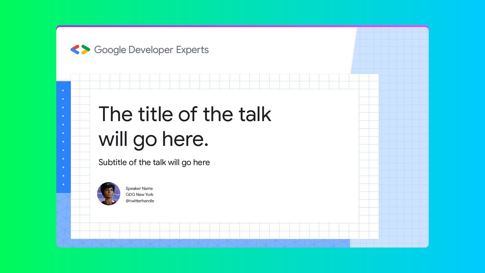
Hi! Welcome!
This is Tips and Tricks to improve your slide design… SKILLS.

A presentation at GDE Summit in January 2023 in Berlin, Germany by Niels Leenheer
Hi! Welcome!
This is Tips and Tricks to improve your slide design… SKILLS.
My Name is Niels Leenheer and I am a GDE in Web Technologies, but I started out as a graphic designer. I actually moved away from design and am now working as a software engineer and am the founder of a company that builds software for hair salons.

I was trained as a traditional Graphic Designer. I went to an Art Academy which was this bohemian… thing… and this was in the 90s and in the academy computers technology weren’t used much - or even at all. Most of the courses were about welding metal, wood working, 19th century printing techniques, developing film rolls and sculpting nudes with clay. Fun and interesting, but not a lot of help with preparing for this talk today.

So… for who is this talk. I am going to show you some tips and tricks to improve your slide design skills. So if you as a GDE regularly give talks, this might be for you.
If you thought there was nothing wrong with my title slide, this talk is definitely for you.
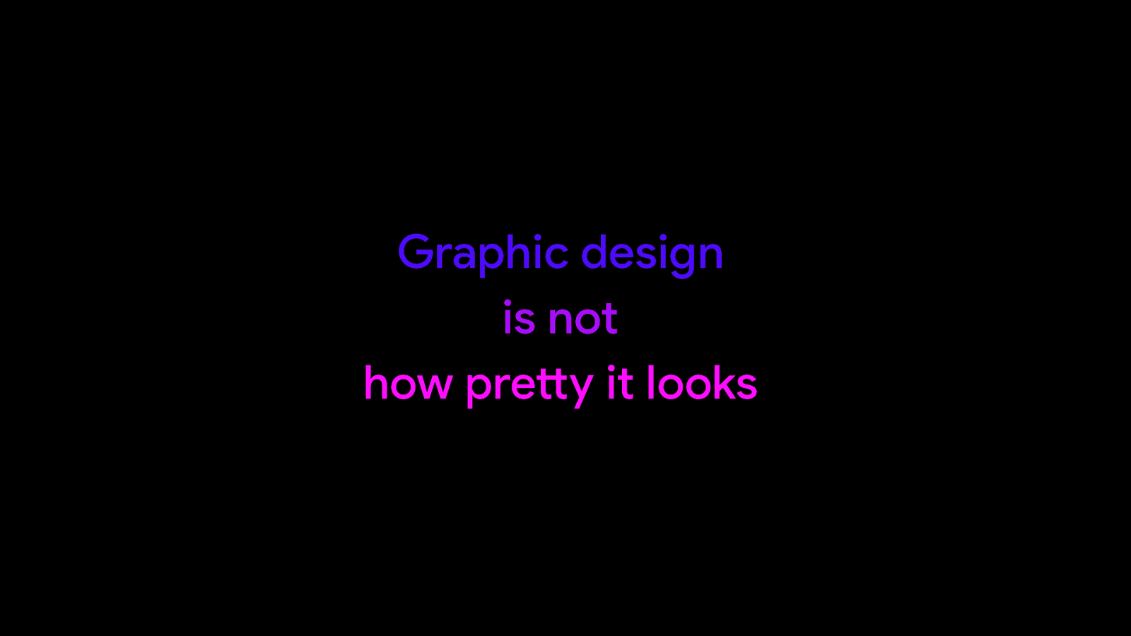
And I want to start with a saying that graphic design is not about making things look pretty. I know it is what we usually think about when we say graphic design, but classically it is much more.
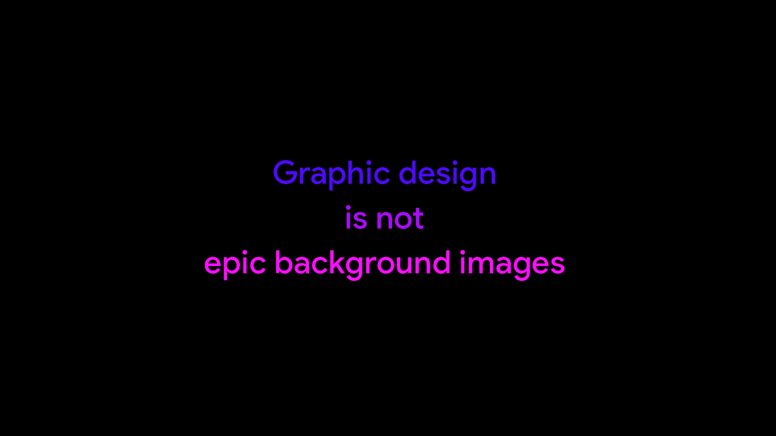
It is not: adding epic looking background photos that have nothing to do with the topic at hand.
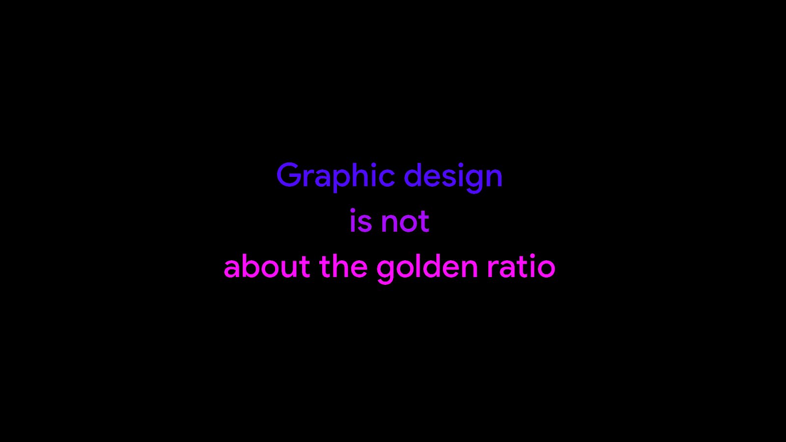
And it has nothing to do with the golden ratio. That is all bs.
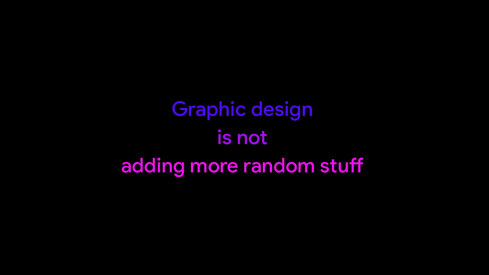
One thing it definitely is not, is adding more stuff until every square bit of slide is filled with something.

It is about using graphical elements and principles to make something work better. It’s about making things more readable and making things easier to understand. And we can use a number of techniques or rules to achieve this.
First of all, less is more. And as we’re going to see, this can apply to a lot of different aspects of design in general. The less text and graphics you have on your slide, the less distractions there are going to be for your audience. What you want is for them to be focussed on your talk and what you are saying. The idea is that your slides guide them and not distract them from what you are saying.
Be consistent, because we want to make things as easy as possible for our audience to read or understand our slides. And it is good practice to pick one set of fonts or one set of colours and go with that for your whole presentation.
And keep in mind, form follows function. We design because we want to achieve a result. We want our audience to understand what we are telling them. So every element on your slides should help with achieving that effect.
Not every audience is the same, not every room and screen is the same. So if you can adapt your slides to your audience, you should. If your audience is more advanced, you can show more details. But also adapt your text to the size of your screen. Or adapt the colours to the contrast of the screen.

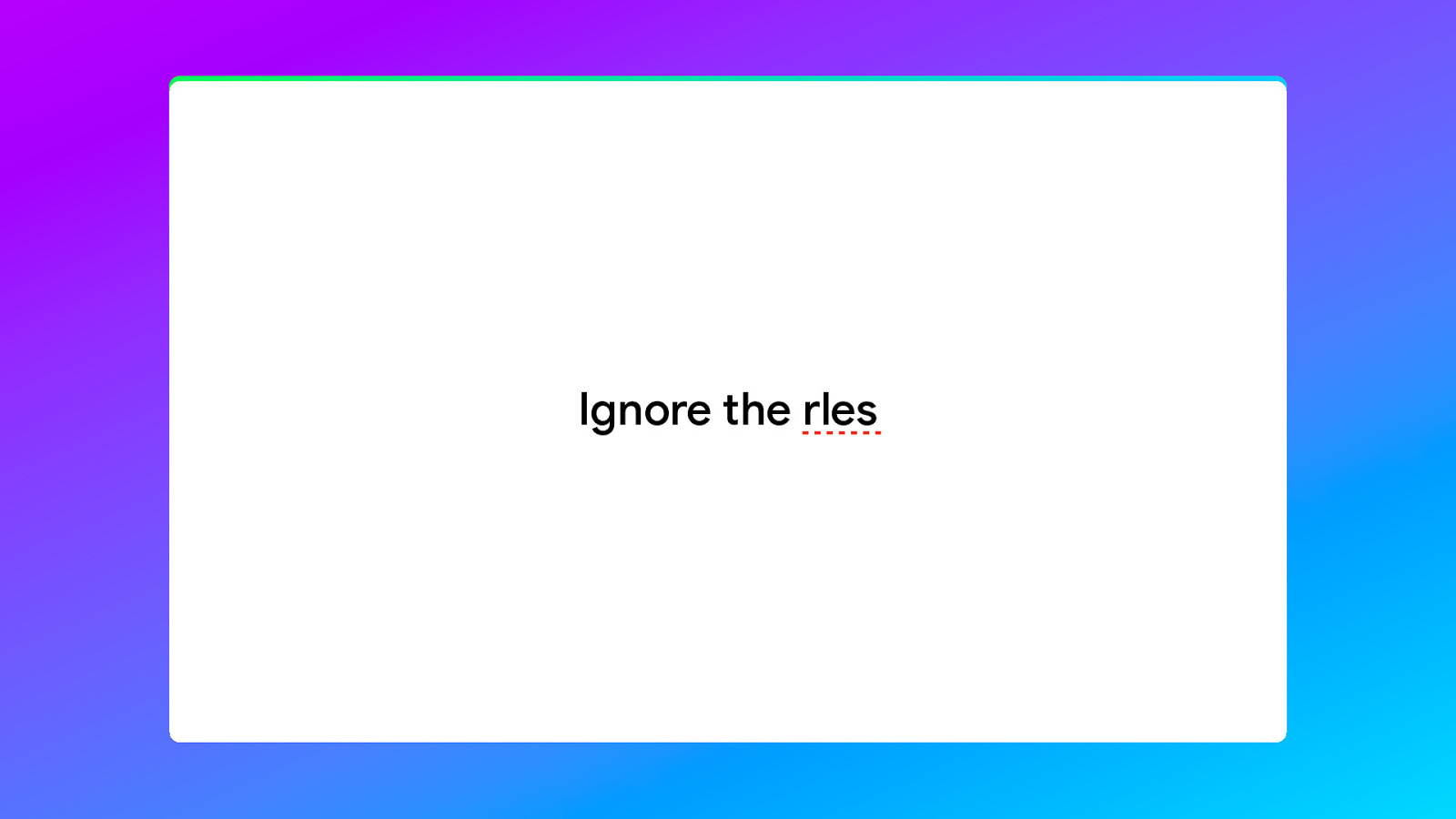
And ignore the rules. Because there are no rules that work in every situation. Some of the things I will tell you may not work for you. They might not fit your presentation style, or they might not work in the types of presentations that you are giving. But that is okay.
The most important skill that you can have is knowing when to follow rules and when to ignore them. And that is something that I can’t teach you. That is something that you learn by doing and experiencing what works for you and what doesn’t.

So, let’s go over some examples. I’ll show you a slide that I think does not really work and we’ll try to improve on it by using the principles we’ve discussed. And these examples are going to be simple, because these are basic principles of design. They will work with any style you are going for.
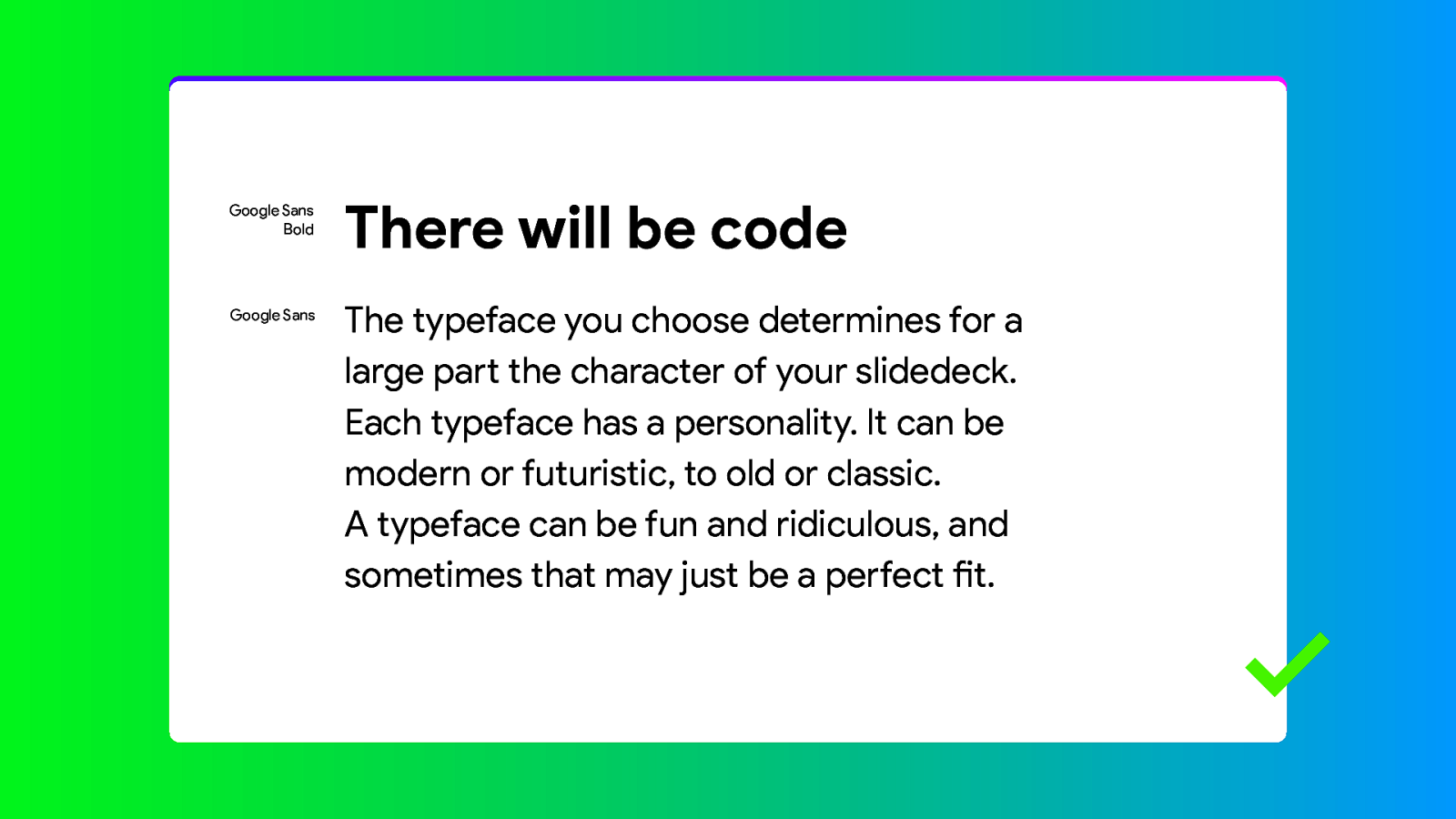
So let’s start with the basics. Typefaces. There are of course many typefaces or fonts you can use. And there is really no rule that state what you can and cannot do. But there is one important thing you should keep in mind. Legibility. How well can your audience read your slides.
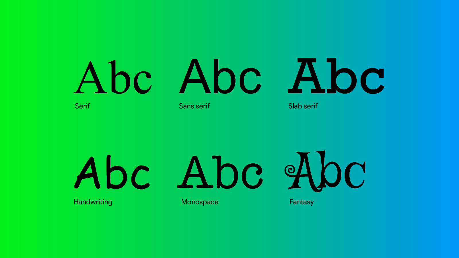
Typefaces can are generally be classified as one of these. The most common are Serif and Sans-serif fonts. These are build for legibility and can be use for headlines or body text. As you can see the serif font has a lot of smaller details, so traditionally they were less legible on low resolution displays.
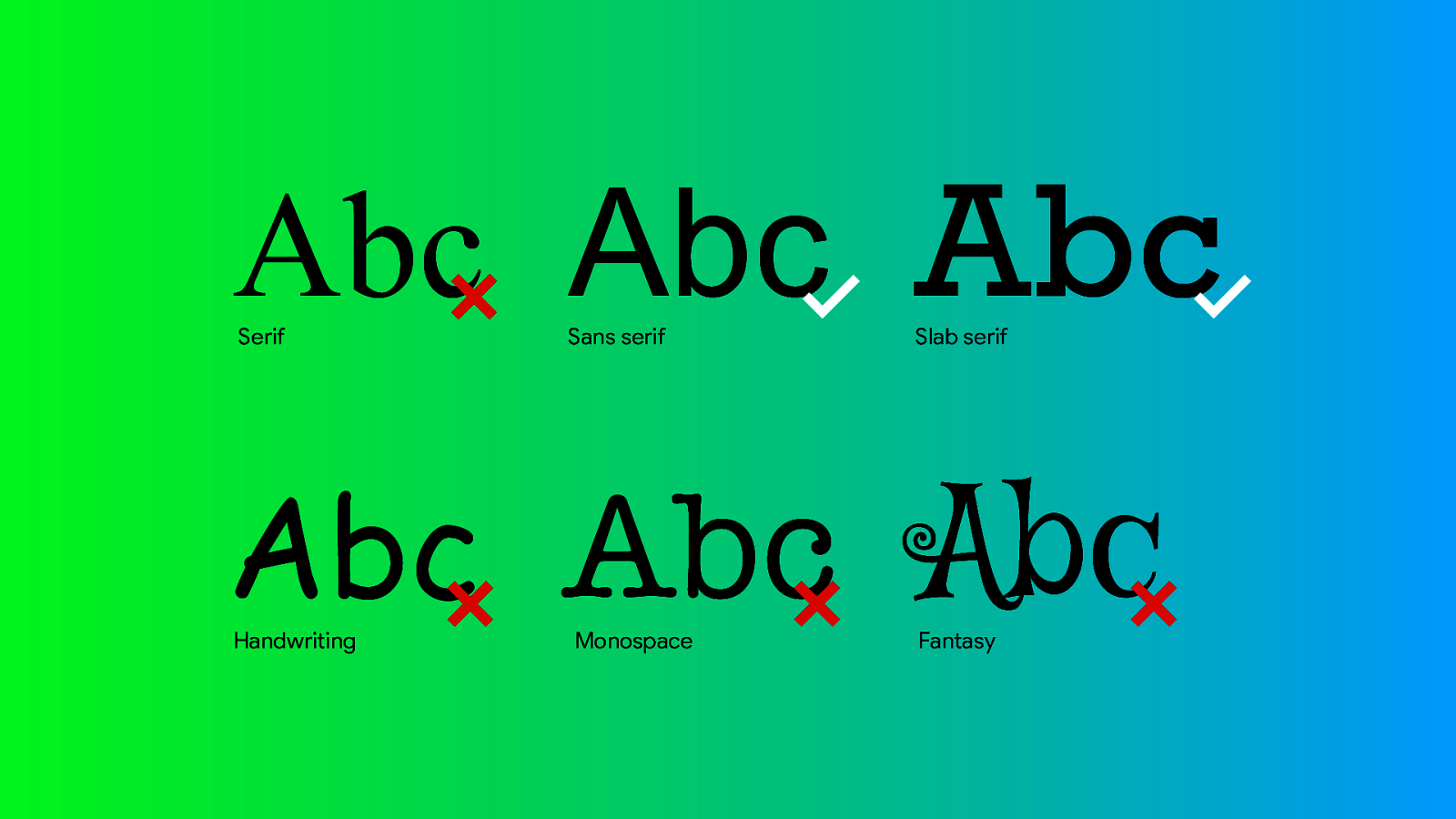
The general rule of thumb is that we want to avoid serif and any from the bottom row. Except for special purposes, like the monospaced fonts for code examples or maybe fantasy for headlines.
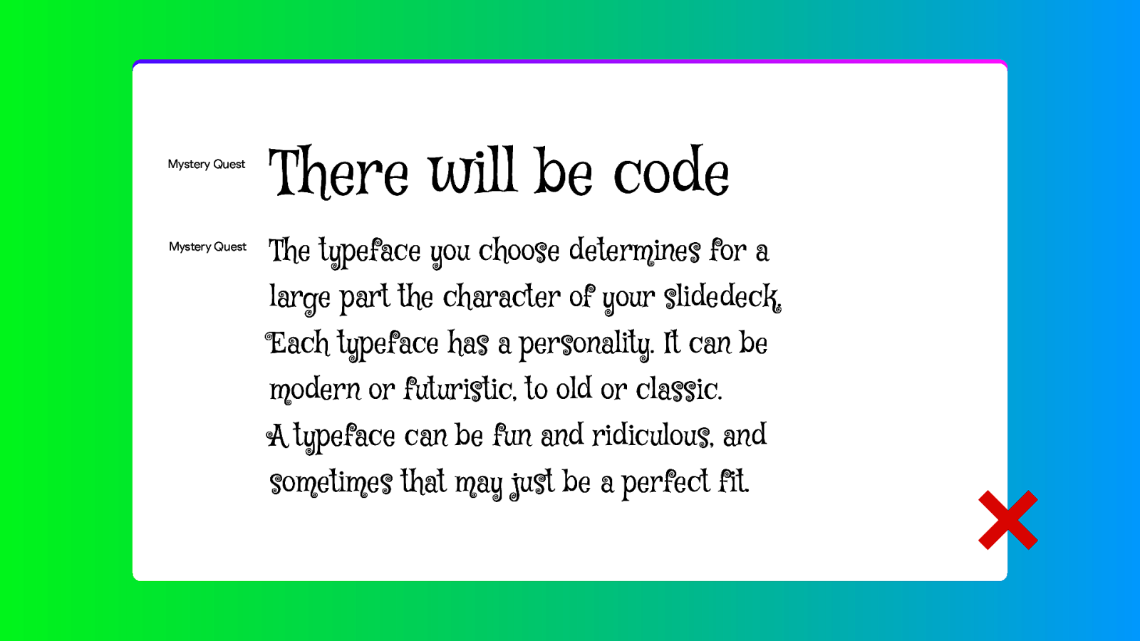
This is probably the worst thing you can do with type. It will make graphic designers around the world cry. And you don’t want that on your conscience.
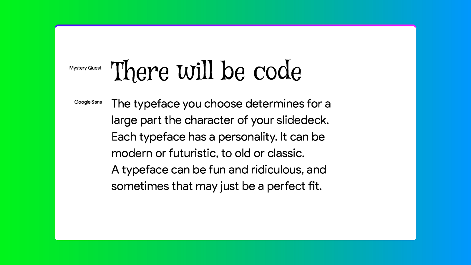
But combine it with a sans-serif font and its fine. Not going to claim this is great or good design. But legibility wise this is okay.
That also answers the question if we can use multiple fonts. And the answer is yes. But do it consistently. Don’t use a new combination on every slide. Choose one font for headings and one for the text and stick to it.
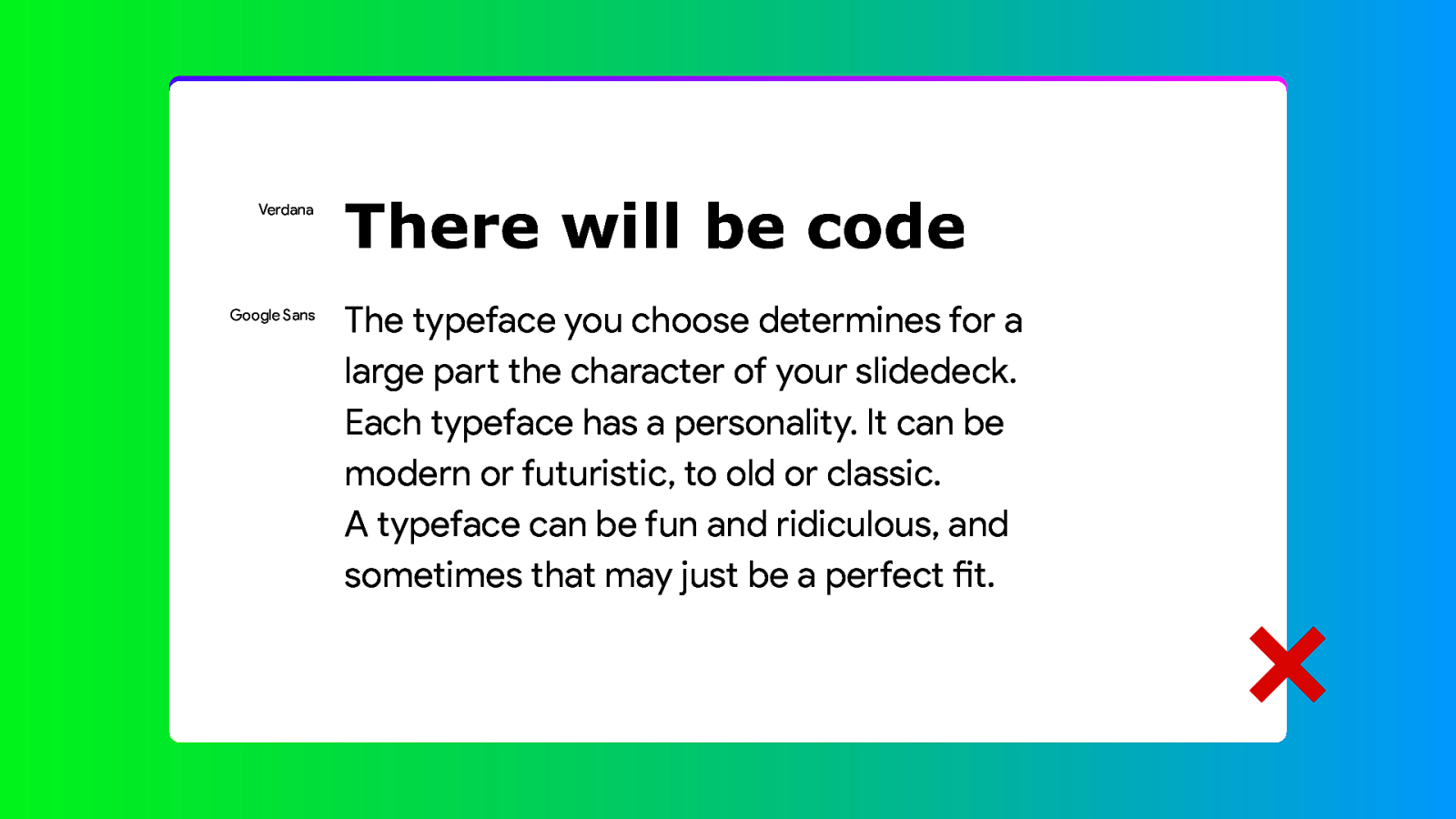
But… another rule of thumb: don’t combine two fonts from the same category. Don’t use two sans-serif fonts. Combine a sans-serif typeface from one of the other categories.
But two variants of the same typeface is of course perfectly fine.

Some typography tips
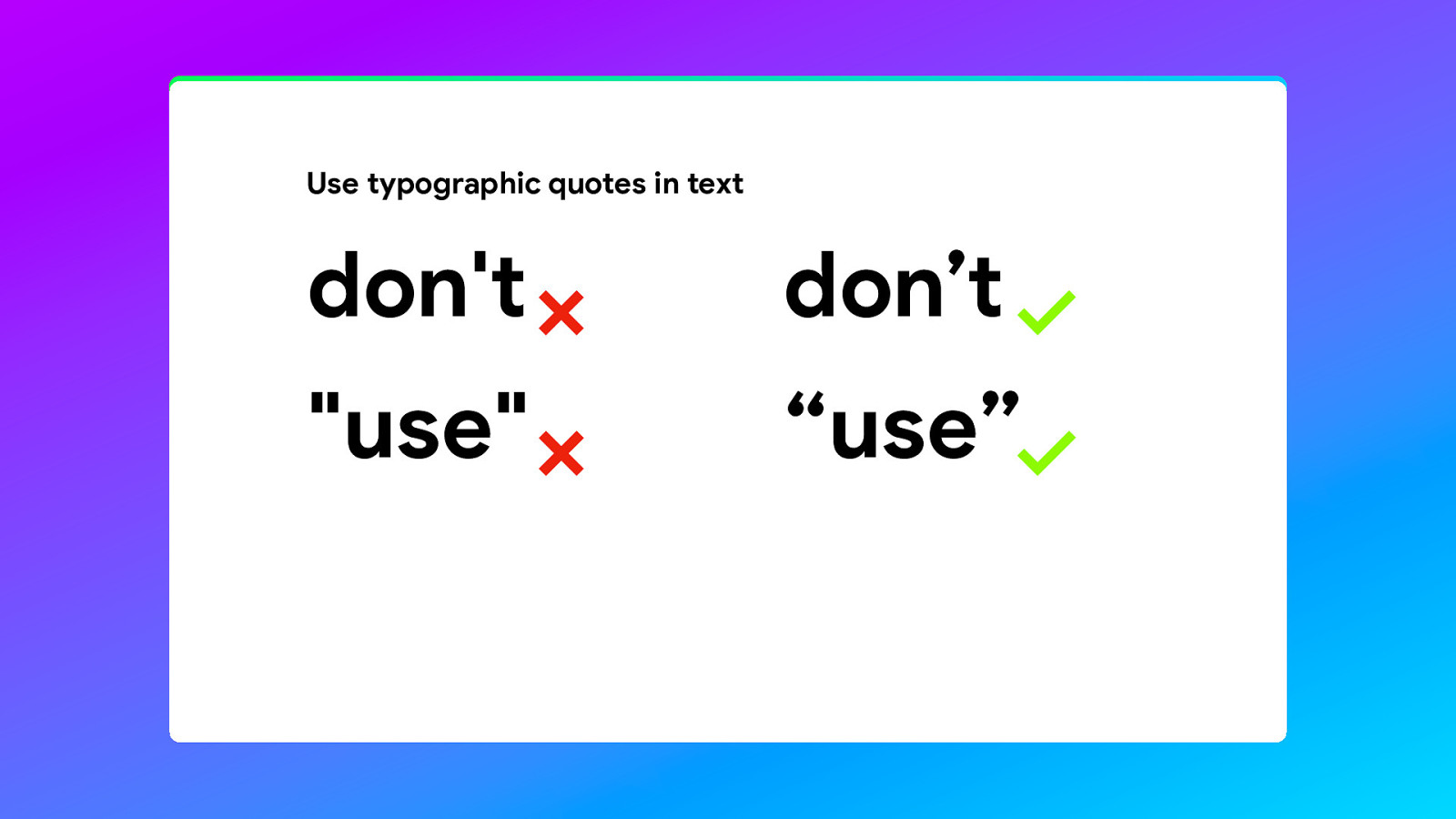
Don’t use the straight quotes in your text. Use the quotes that look like 6’s en 9’s.
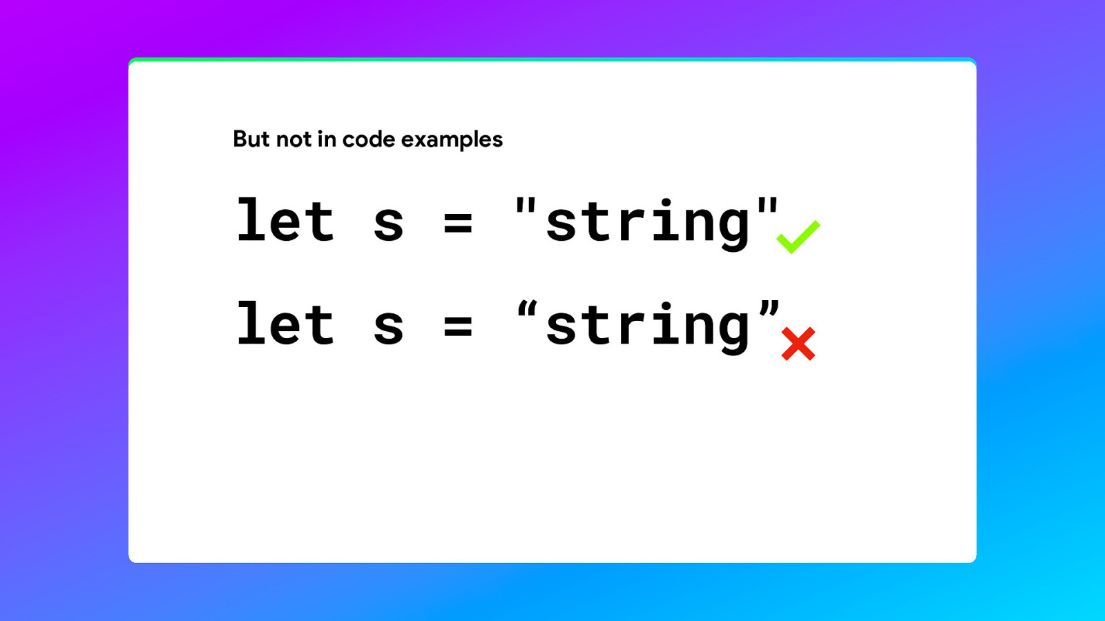
But don’t use them in your code examples, because it would make the code non-functional.
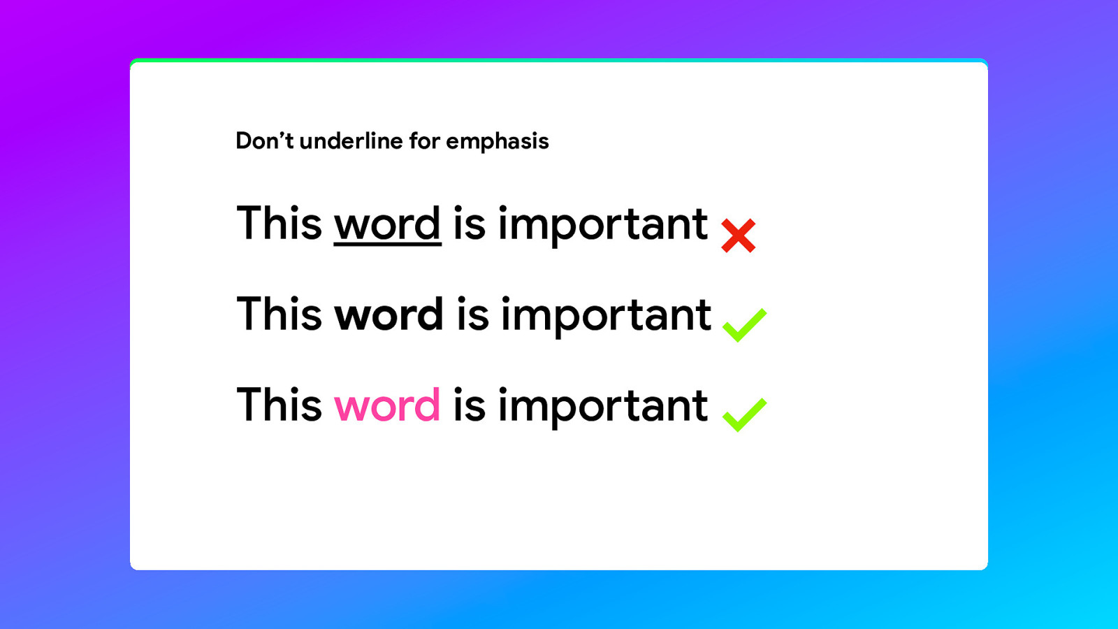
Use a bolder variant or a colour to emphasise a word. Don’t underline, because it will make the world less legible.
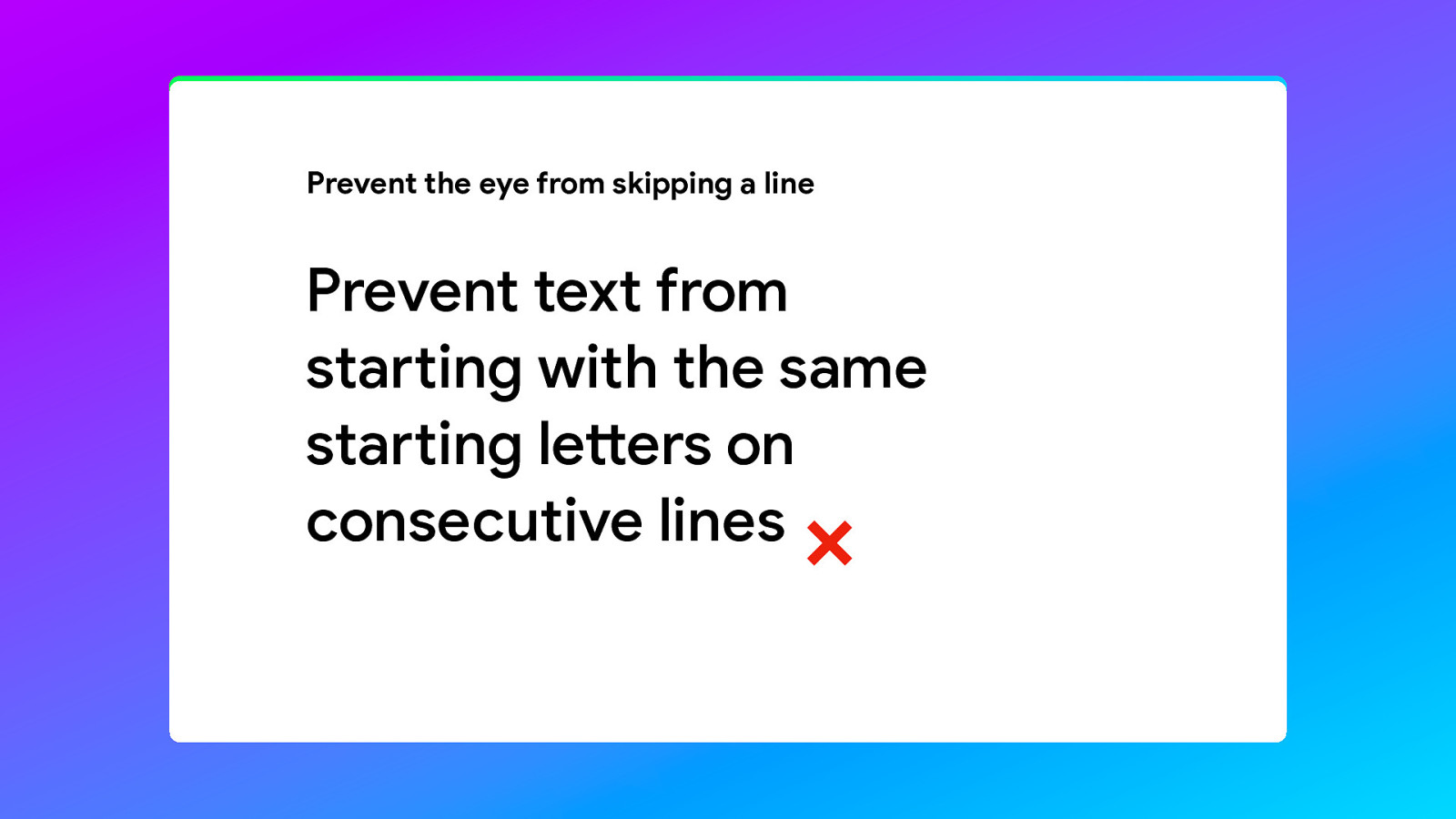
And prevent two lines from starting with the same letters, because it will make it more difficult to read. For some people the eye will skip a line.
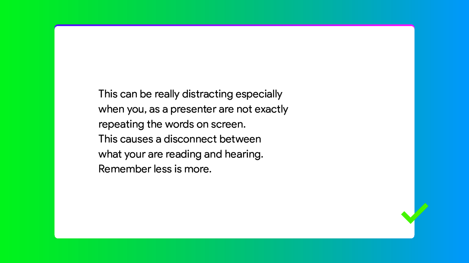
On the subject of text… How much text should you use on your slides? Remember less is more.
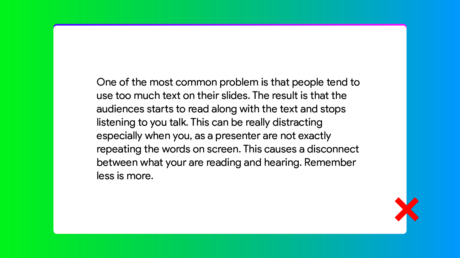
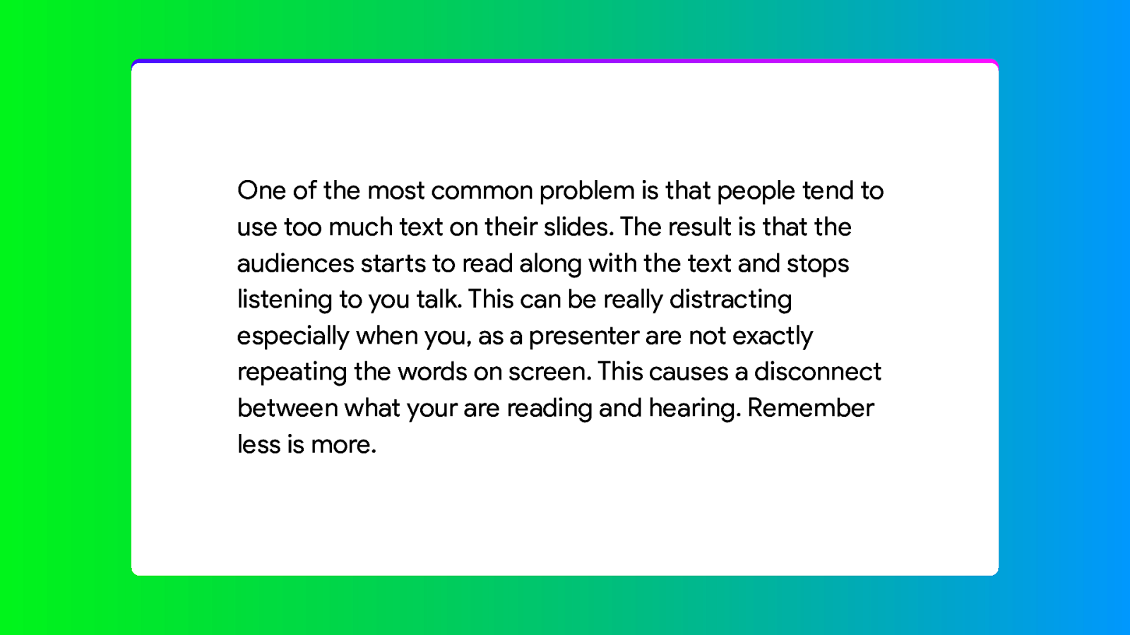
The more text you use, the more it will distract the audience from listing to you. They are reading instead of listening. Especially when you are not exactly repeating the text that your seeing on screen word for word. So it is better to use the slides as a tool to highlight what you are saying…
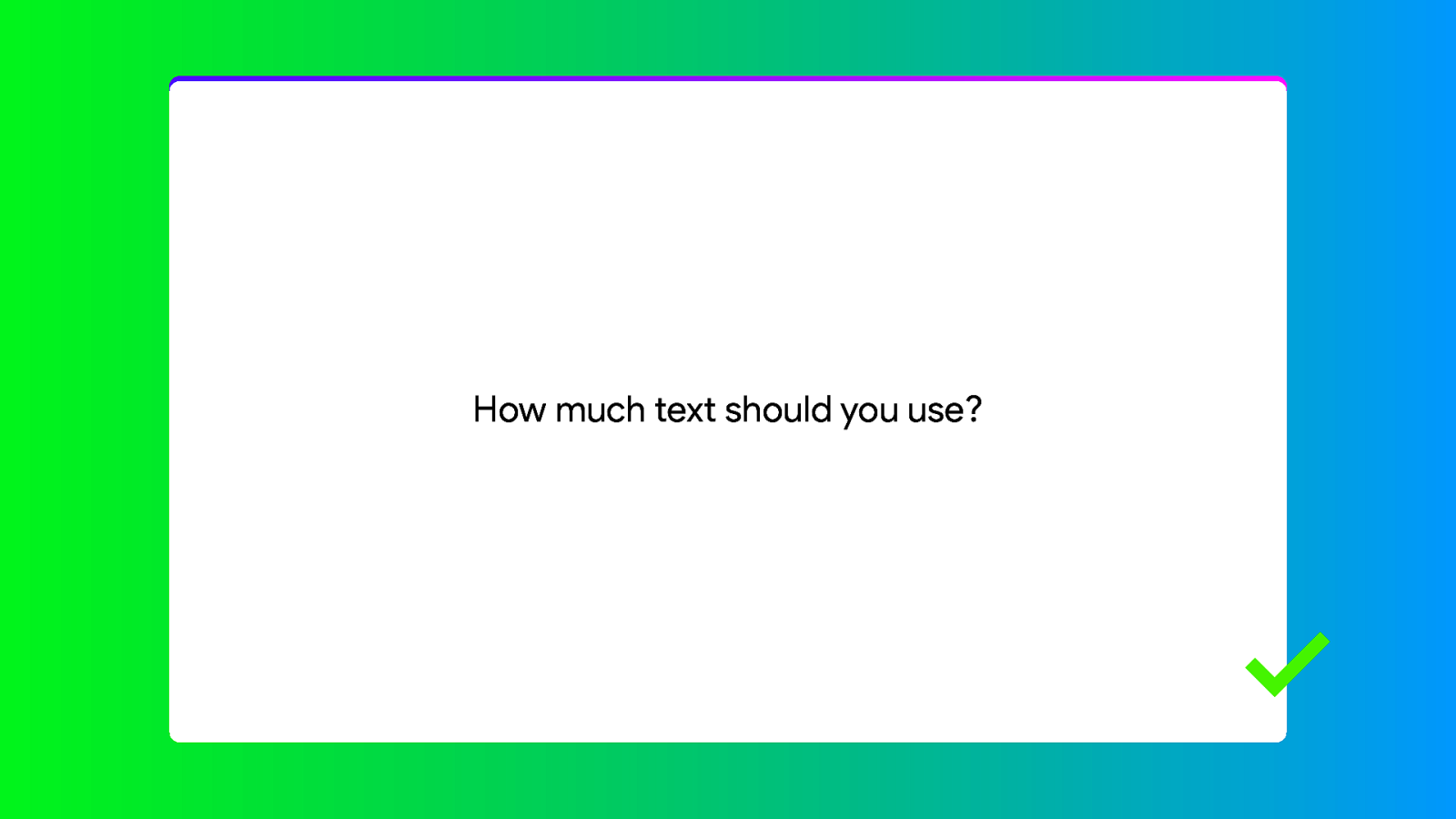
Instead you could focus on the key points you are trying to make and use the slides to underline that. You can show the question while you talk about all of the considerations.
And show the answer when you get to it.

Now I do realise that sometimes you just have to show text. Lots of text. So how can you improve the legibility? First of all, in many cases the default line height for many fonts is too small. By simply increasing the line height 110 or 120%.
And we’ve already made an improvement.
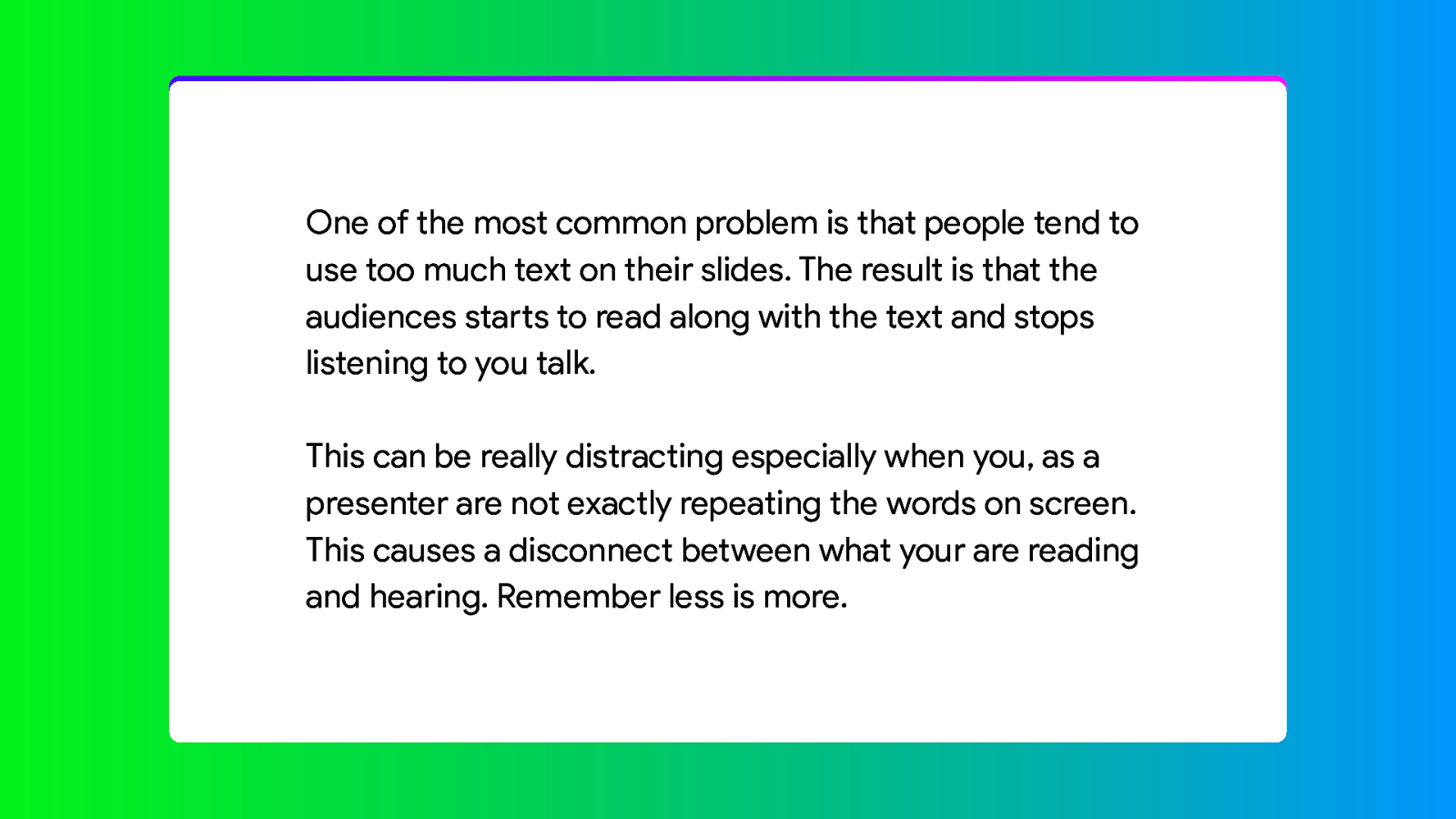
One other improvement would be to split it into multiple paragraphs. That way the eye has a resting point in between the lines.
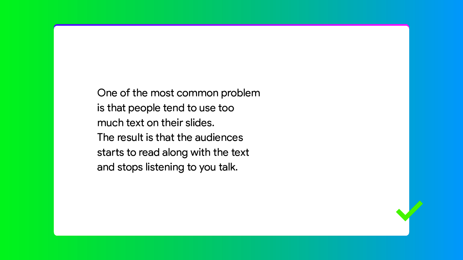
Or even split it into multiple slides. I often see presentations where every slide is kind of like a chapter, with everything belonging to that subject crammed into that single slide. But you don’t have to do that. You can use as many slides you want.
The golden rule is 6 times 6. A maximum of 6 lines with a maximum of 6 words. If you have very short words, you can use 7, but less is always better.
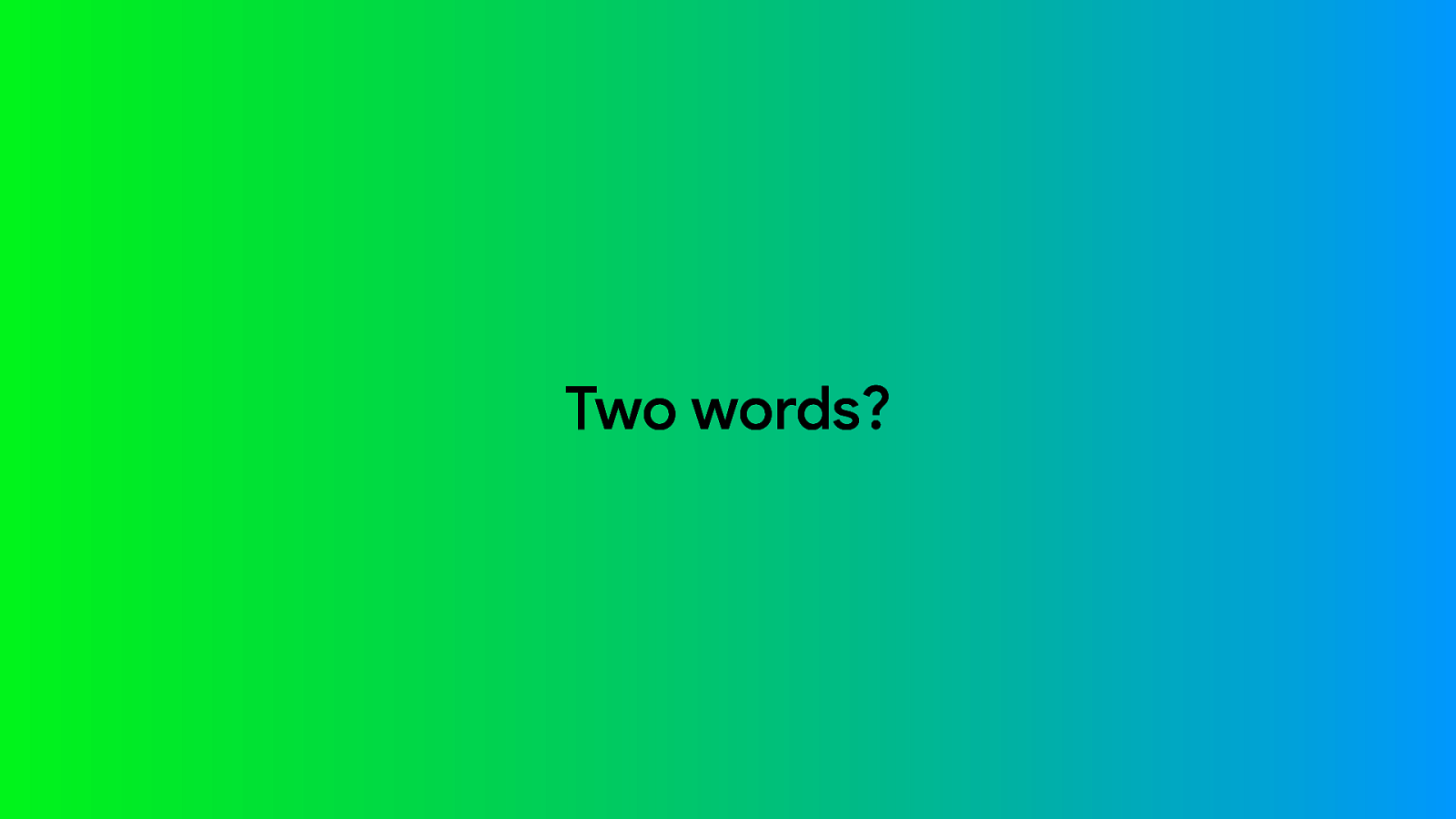
So, how far can you go with the whole less is more thing? A single sentence… or Two words?

One?

None?

You can show completely black slides if you want. It can be used to signal a transition. Or when you just want to talk on a personal level to the audience for a while, because you want to share something thoughtful. You can just step away from the lectern for a bit. Change you tone of voice. Take a pause….. The danger is of course that somebody will point out that your slides don’t work…

It’s actually a problem that also occurs in printed books. Around 1900, when people bought a book and saw an empty page, they figured that it was a printing error and that the text was missing. It wasn’t, empty pages are often the result of the binding process. But they would write in to the publishers informing them of the printing error and asking for the missing text. The publishers got so sick of having to answer these letters that they started printing text on empty pages.

This page intentionally left blank. This slide intentionally left blank?

One thing publishers also did was use ornaments like these to signal a transition or empty page. These are called Fleurons and often shaped like a leaf or flower. We could do something like that.

I like this one. It feels very personal and distinguished.

But seriously, this technique can be very impactful in a story, but also a bit disrupting. I don’t have the answer for you what you should or should not do. It is just another tool in your toolbox.

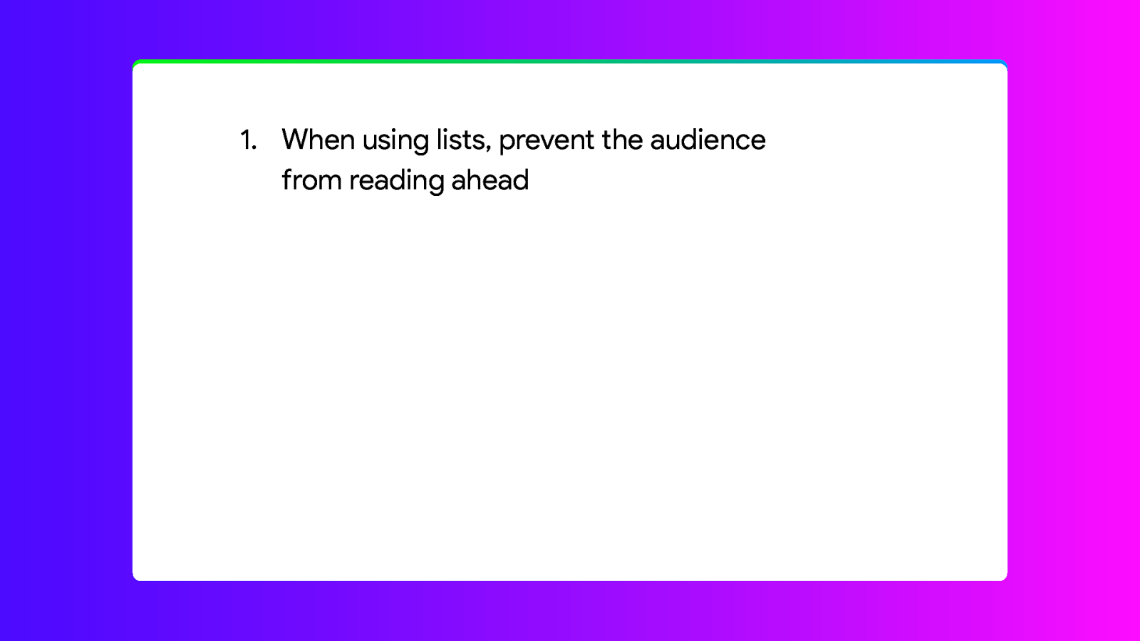
Back to the tips and tricks. I am not a big fan of lists.
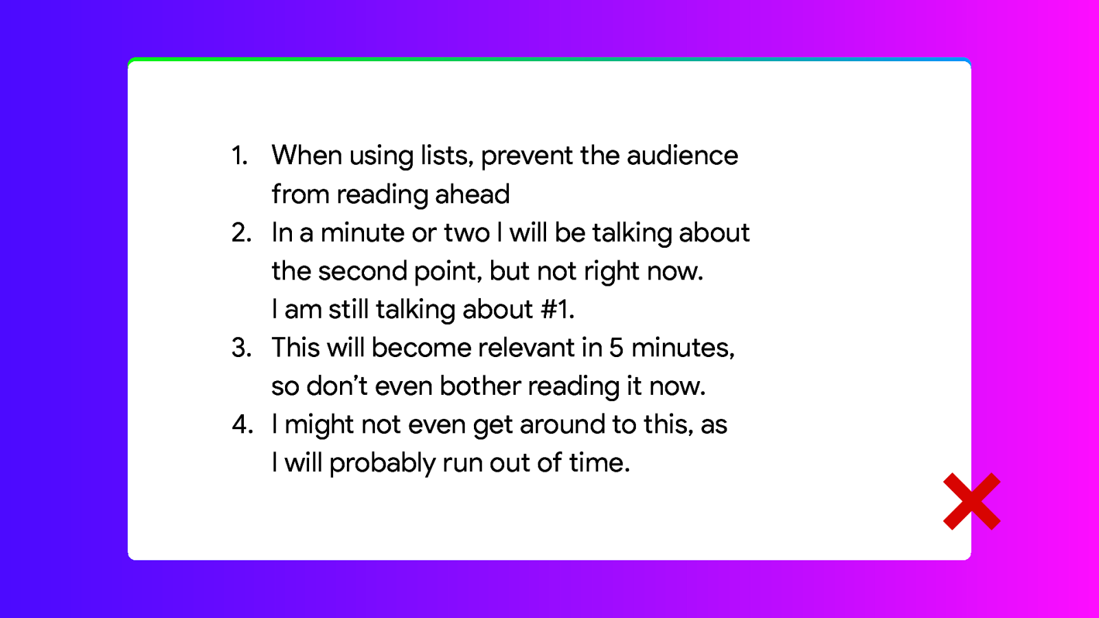
There is often too much text and we’ve already talked about that. But there are ways to make lists usable. The first thing I often see is that the items are often too close to each other. You can already improve the readability by adding a bit of space between the points.
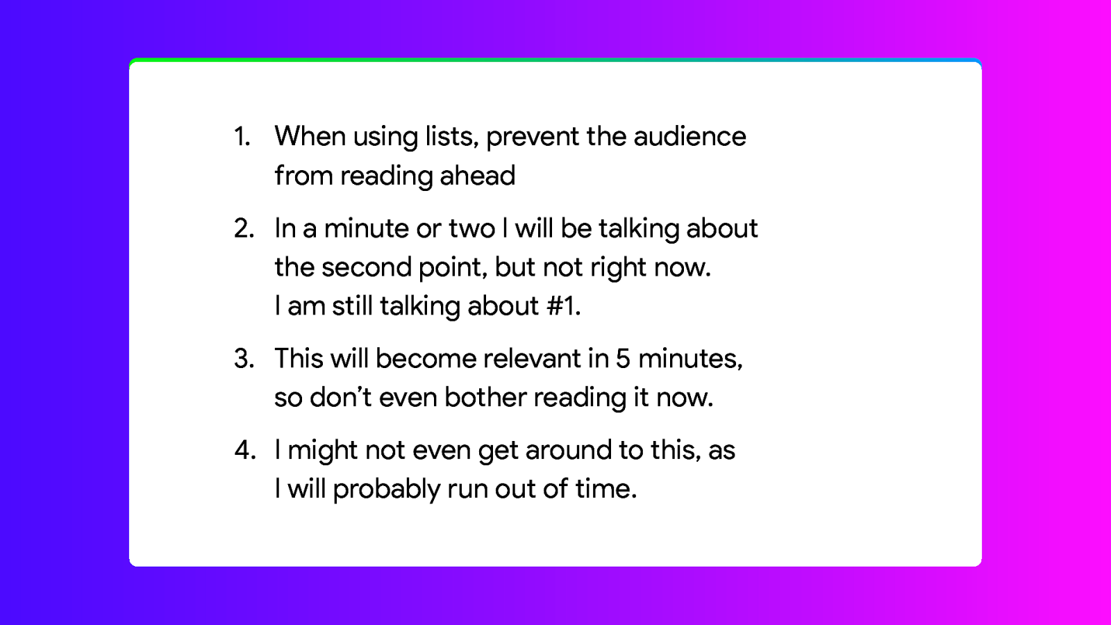
Like this. This will separate the text into separate points that are visually separate. That means the text is consistent with the function it performs.
But we can of course do better, by starting with the first point and gradually adding each new point when we talk about it.
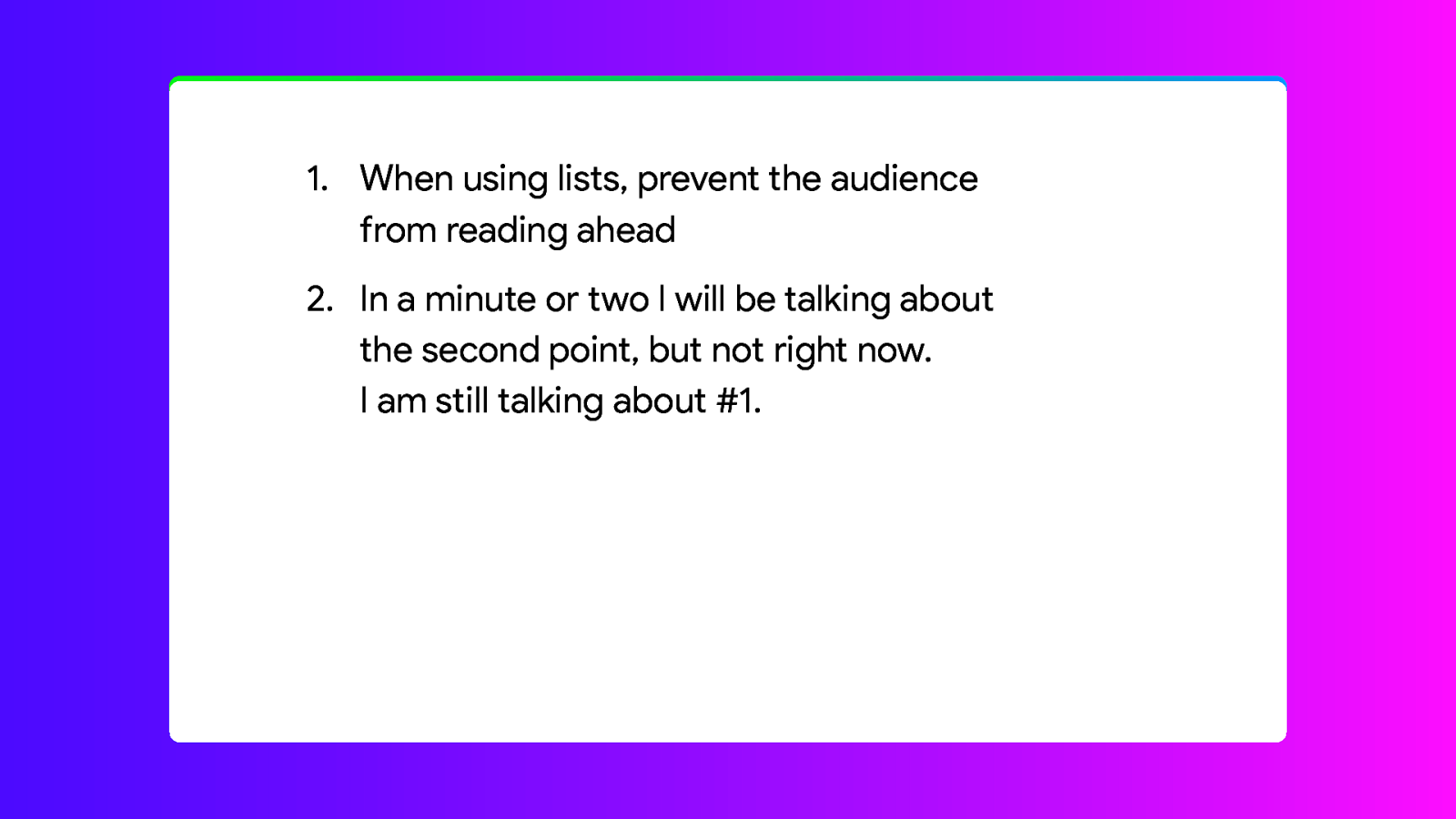
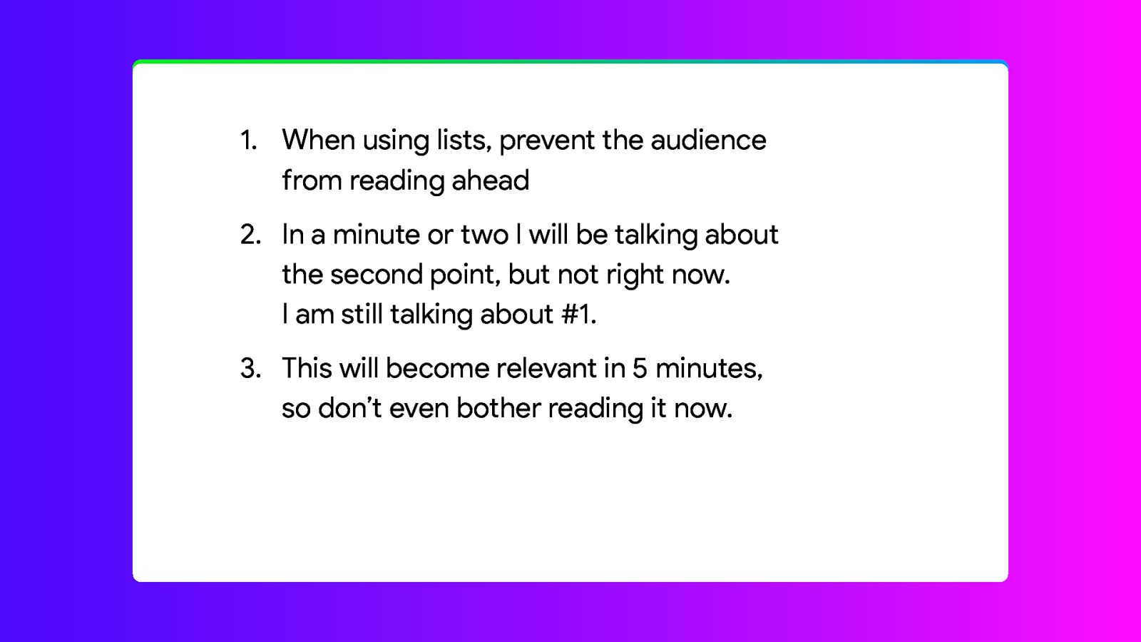

And you can even improve on that, by de-emphasising the items you already covered. Right now it is immediately clear which point we’re talking about.
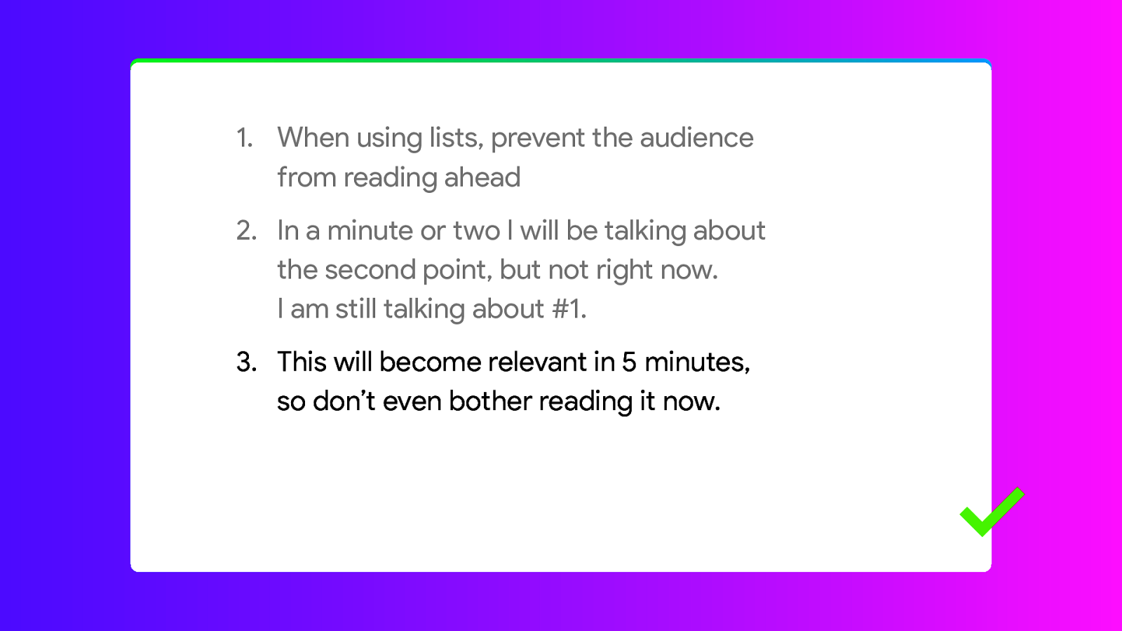
Pro tip: If you use stages to reveal each item, there are two options to go forward. Forward to the next stage. Or forward to the next slide. So if you run out of time in the middle of point 3, instead of going forward to the next stage, you just go to the next slide and nobody will know there even was a point 4.

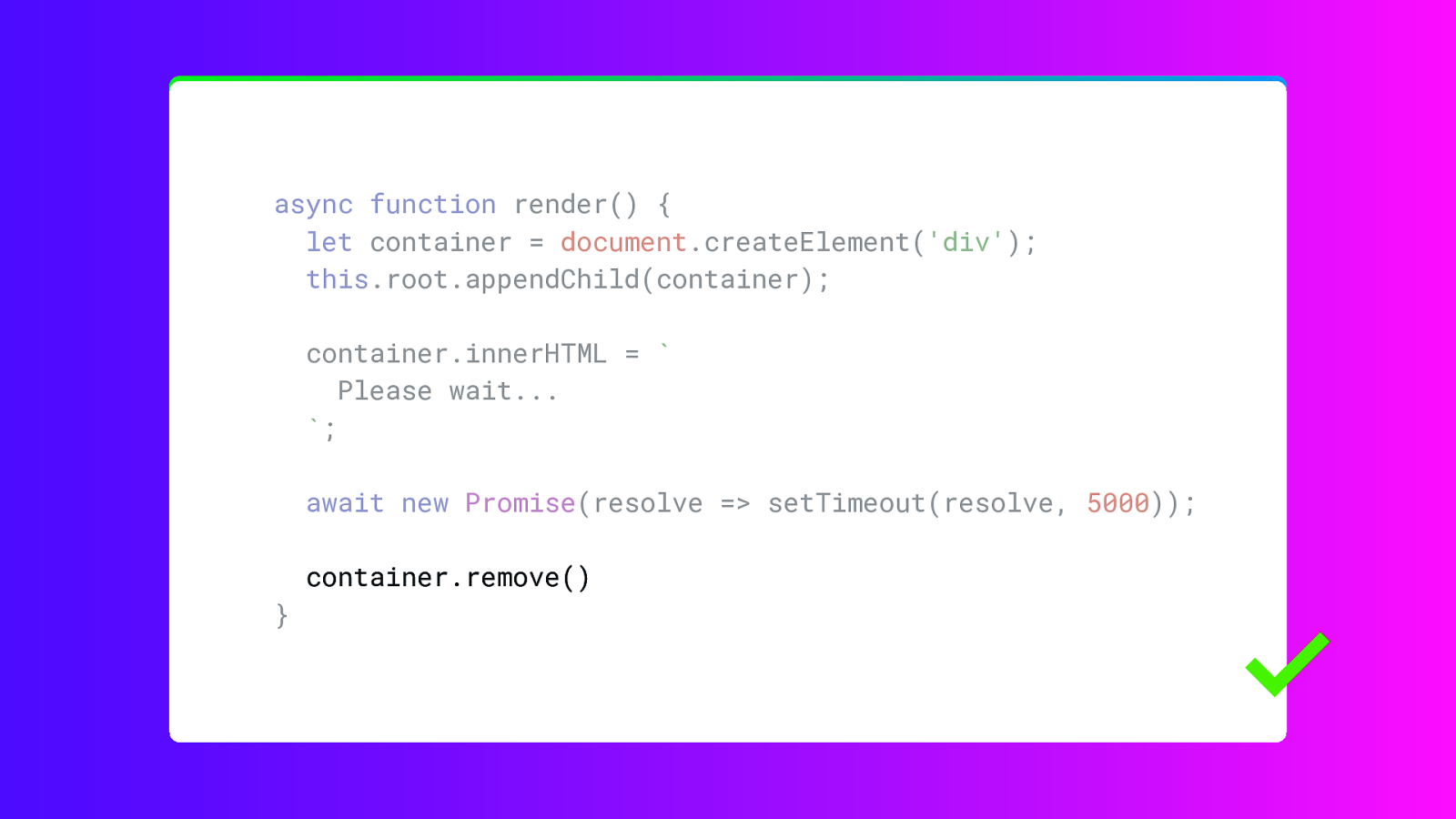
Let’s talk about code examples for a bit.
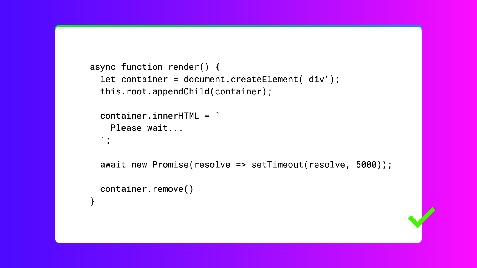
If you show any code always use a mono-spaced font. Like Roboto Mono. But any monospaced font will work, just don’t use a typewriter font, like Courier.
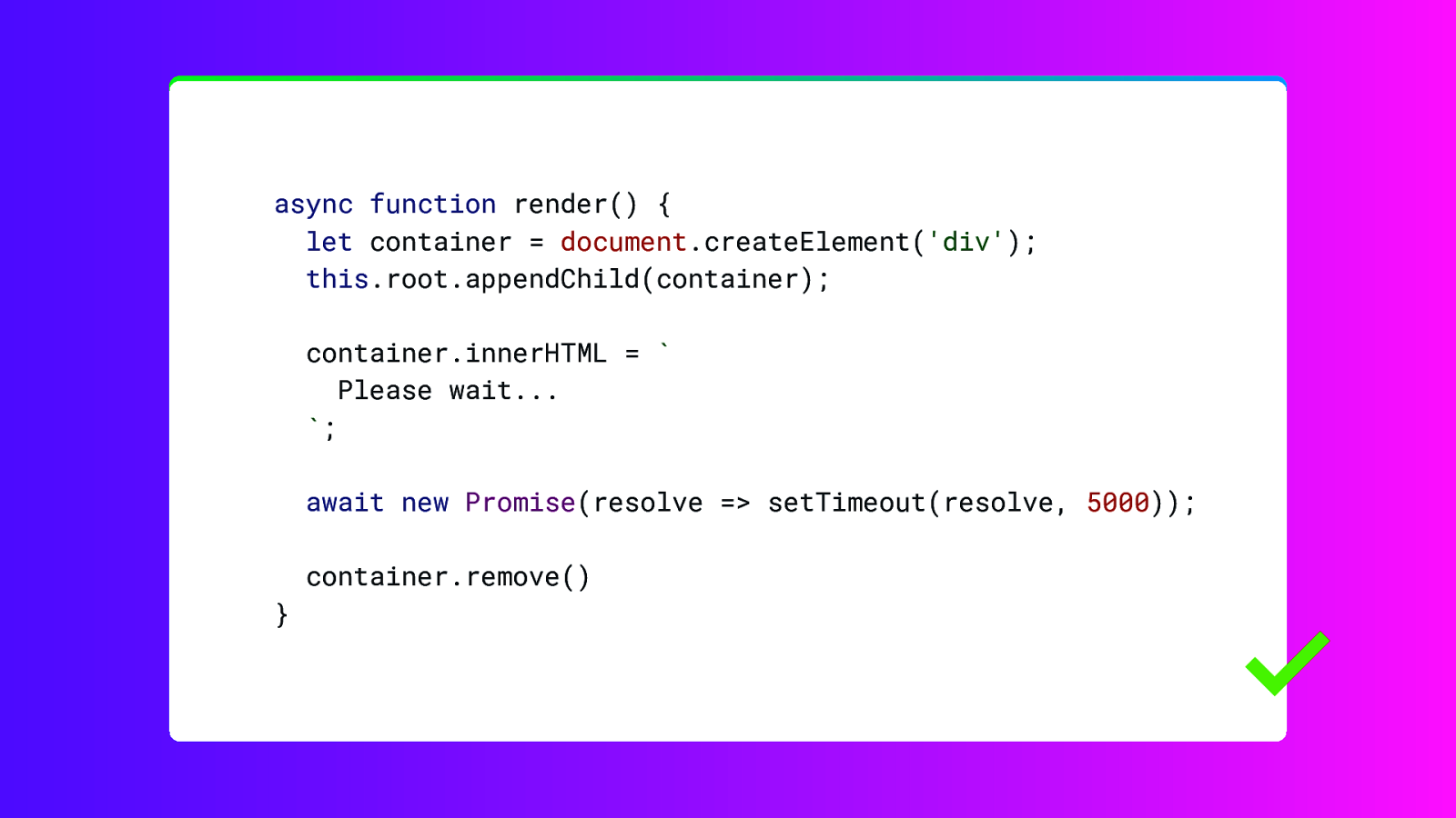
What often helps is adding code highlighting. Unfortunately this is something that Keynote, Powerpoint and Google Slides don’t really support well. But there are websites and tools that can help with that.
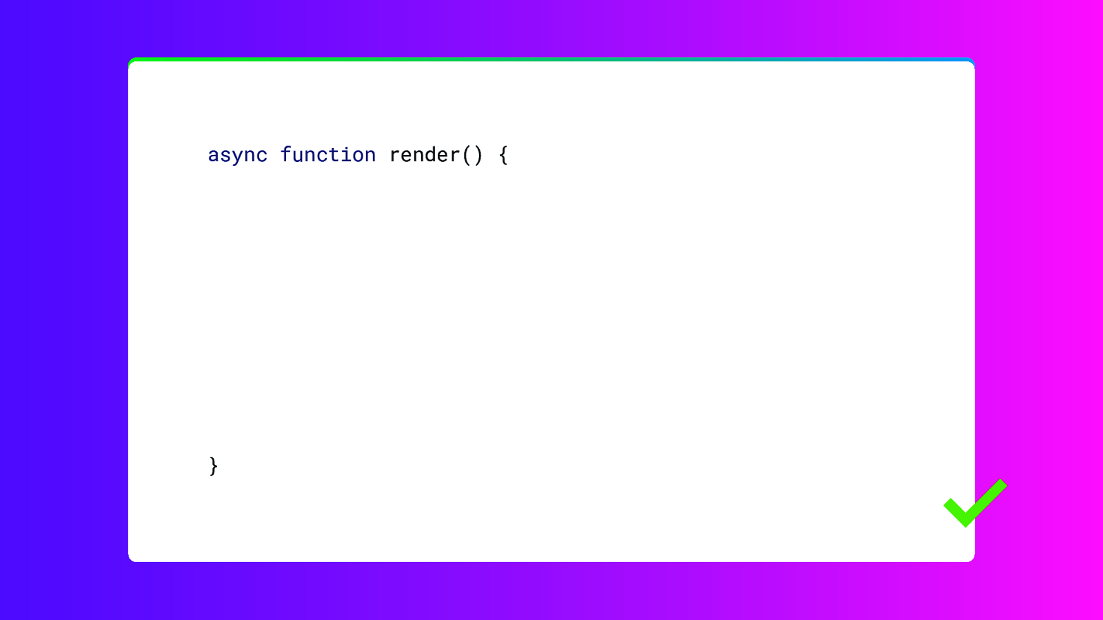
And just like the lists, I find revealing sections of the code one by one a really helpful way to let the audience understand what is happening.
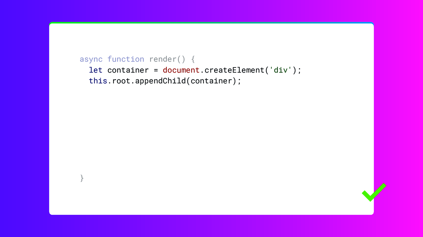
Again, you would not do this when the code is basically used as an illustration.
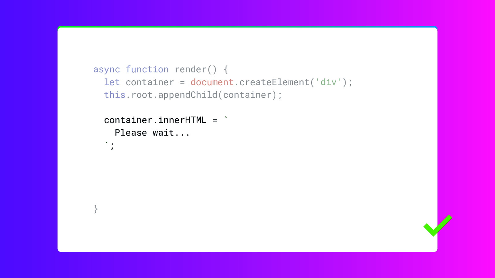
But if you want to explain what is happening in this function.
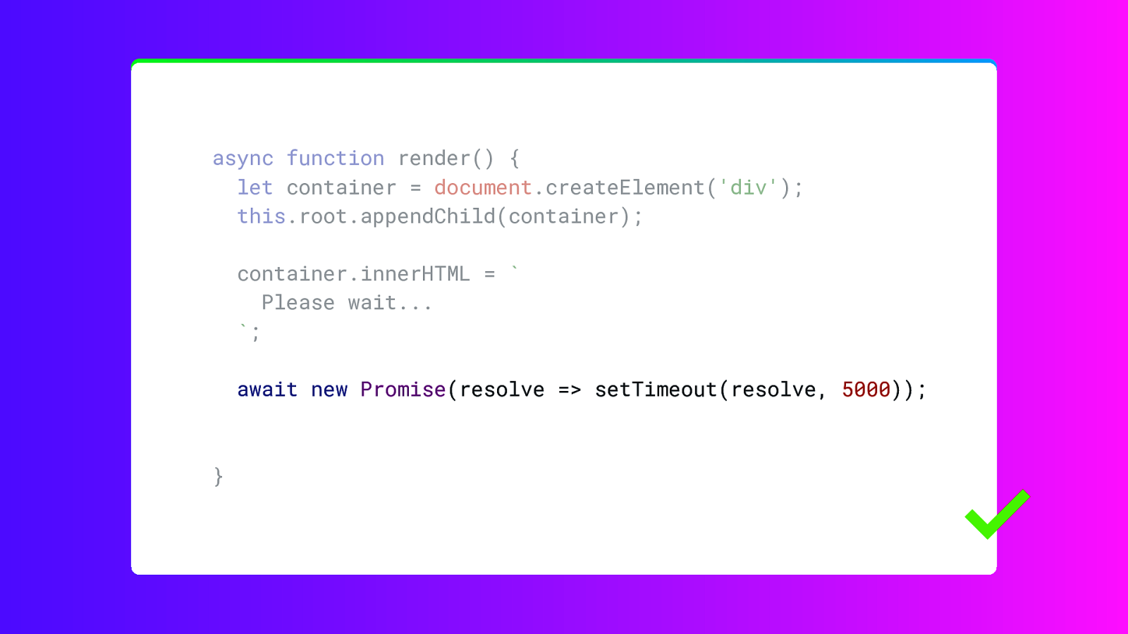
You can just go over each section.

One thing you can use to liven up your presentation is the use of photos or other types of illustrations and images.

And a full screen photo can be really great as a background while you talk. But please make sure the photo is on point. The audience should be able to find the link to what you are saying without having to think too hard. Otherwise the photo will distract from what you are saying. This photo is actually kind of a stretch. Not really on topic, but we’re in Berlin, so… and besides our hotel is on there. Right there!
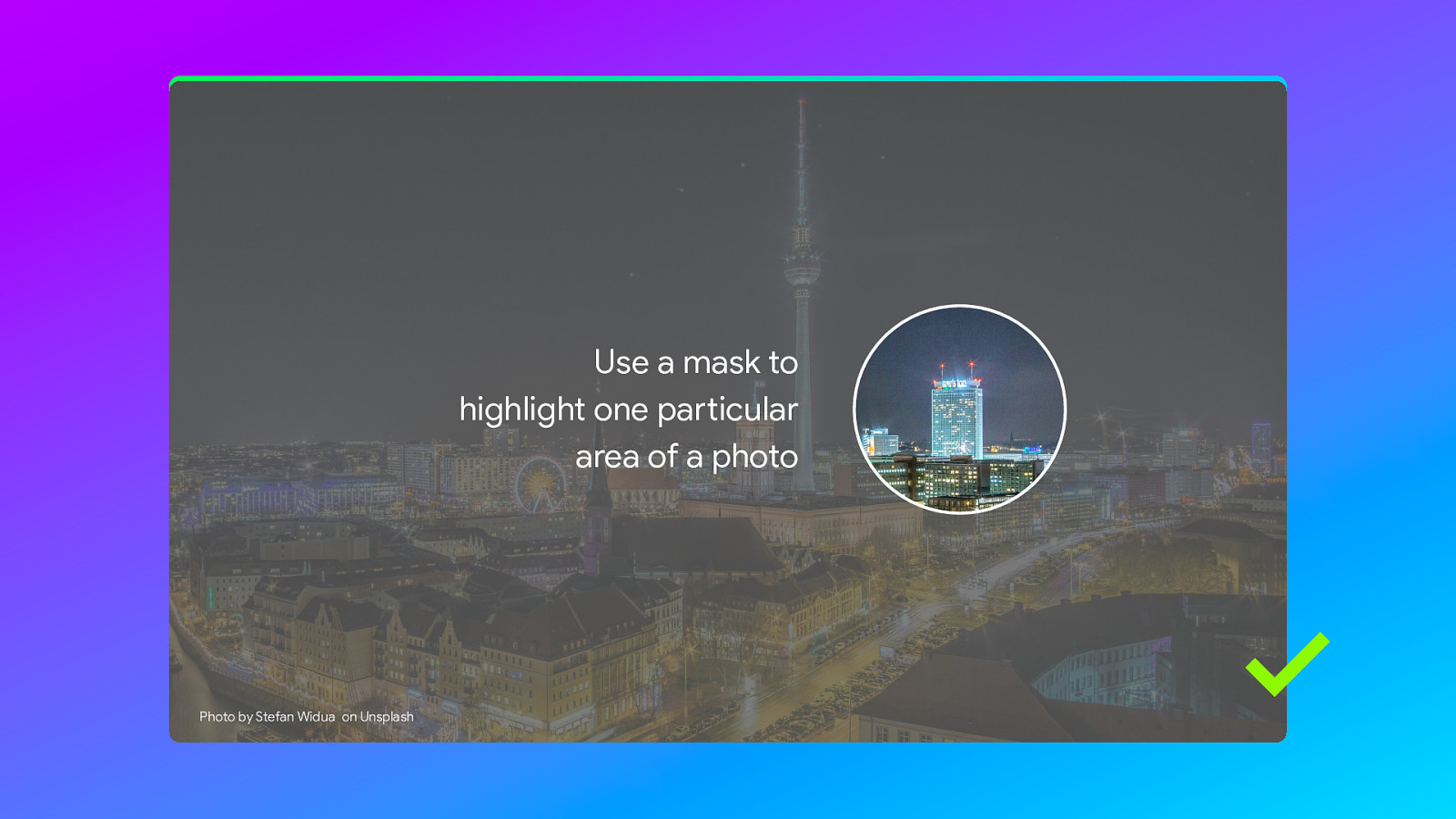
Another pro tip: you can use masks to highlight one particular area of a photo, by duplicating the photo. The top photo is cropped to a circle and the bottom one isn’t cropped, but has a reduced opacity.
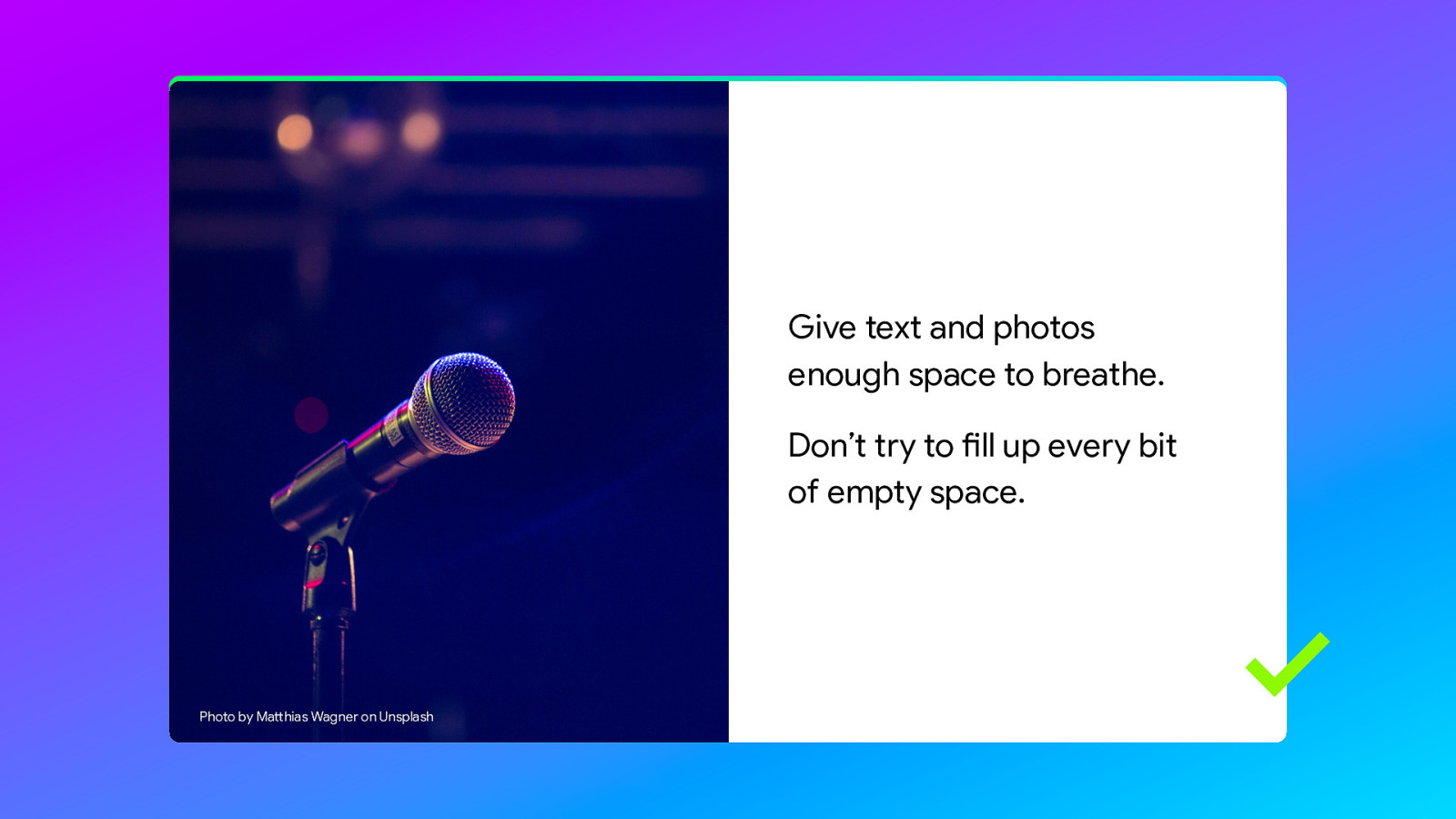
It is perfectly fine to combine a photo with text. Just make sure you give the text and the photo enough space to breath.
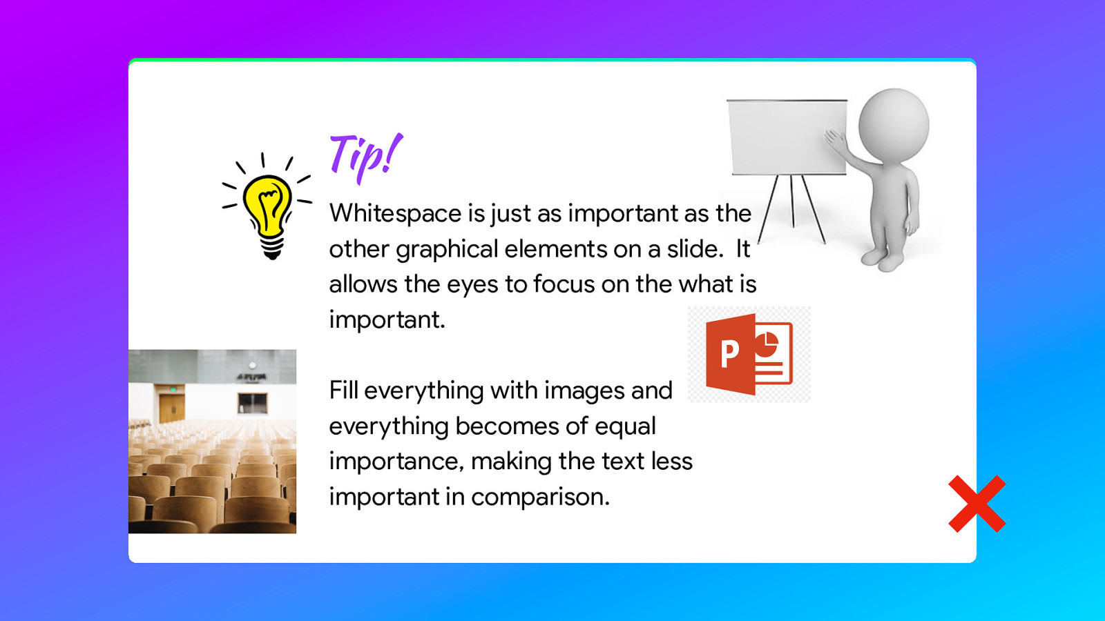
Whitespace allows the eyes to focus on what is important. If you page is a mess of different photos it distracts from the text.
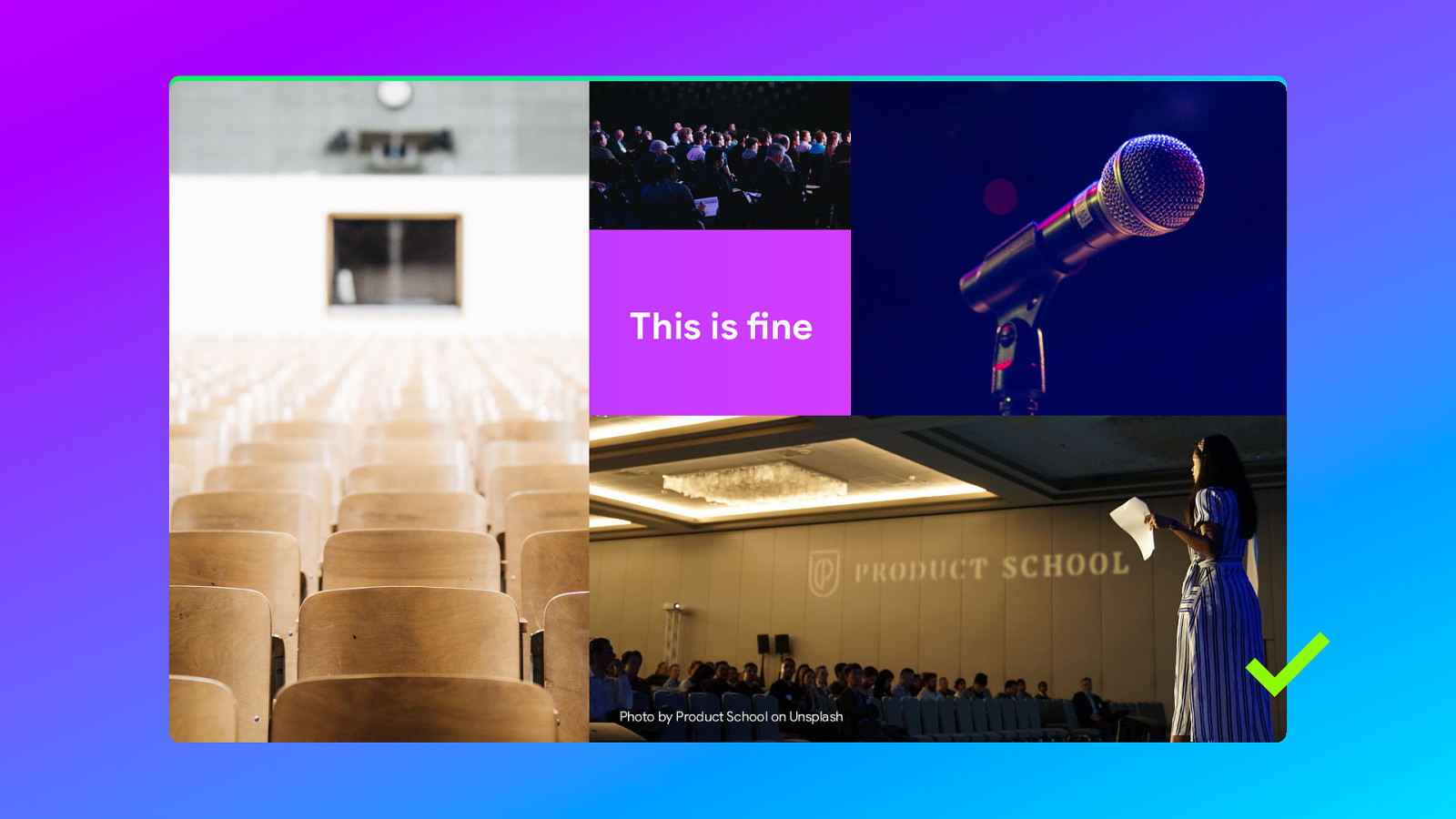
But using multiple images on one slide is fine in itself. It depends on want to achieve with that slide.
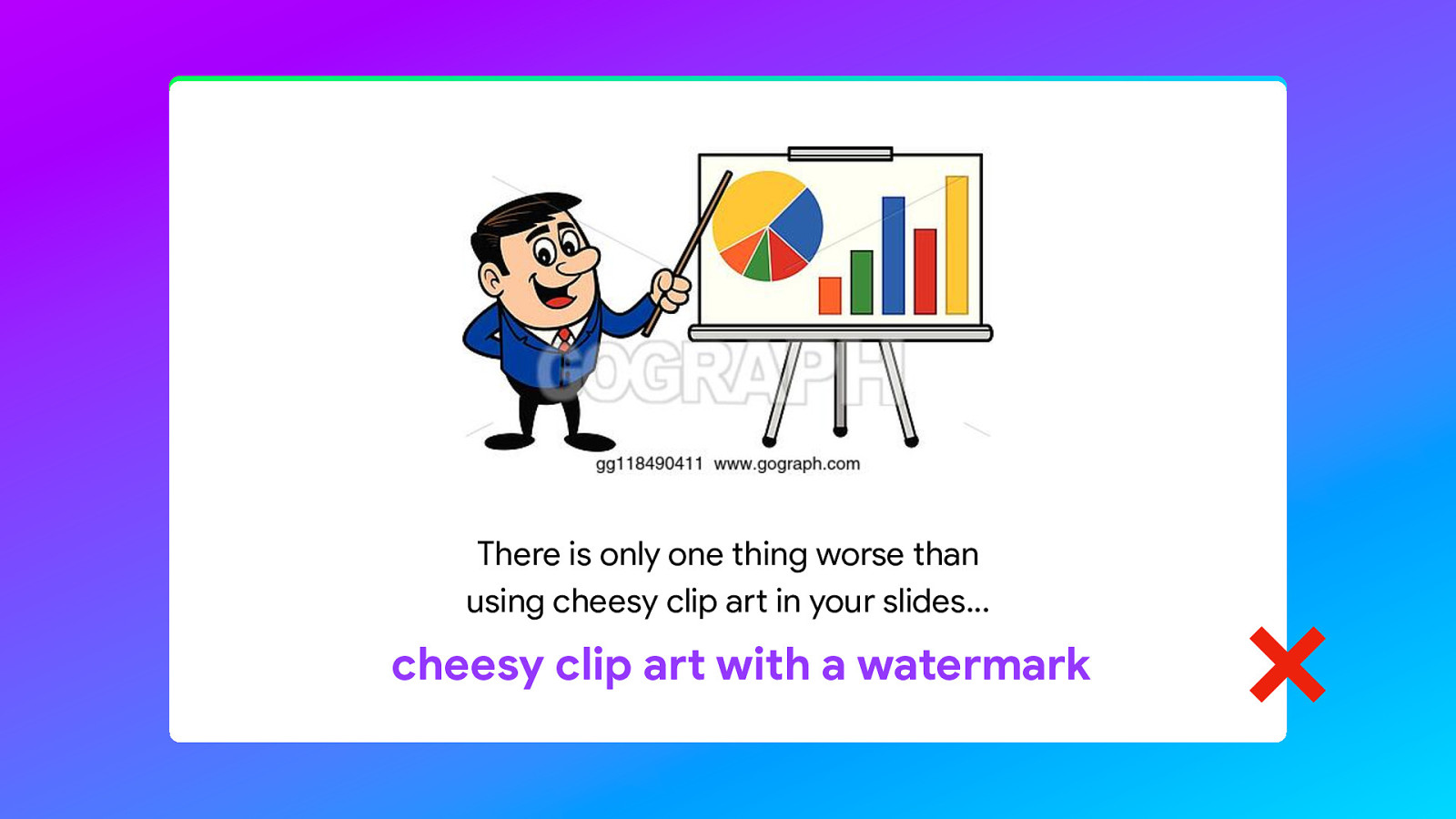
Oh… and do not, under any circumstance add this kind of cheesy soul-less, generic clip art. Oh… and also do not use this flame transition. Ever.
On the subject of GIFs… I am only going to say one thing. Be careful and don’t overdo it.
What about screenshots in particular.
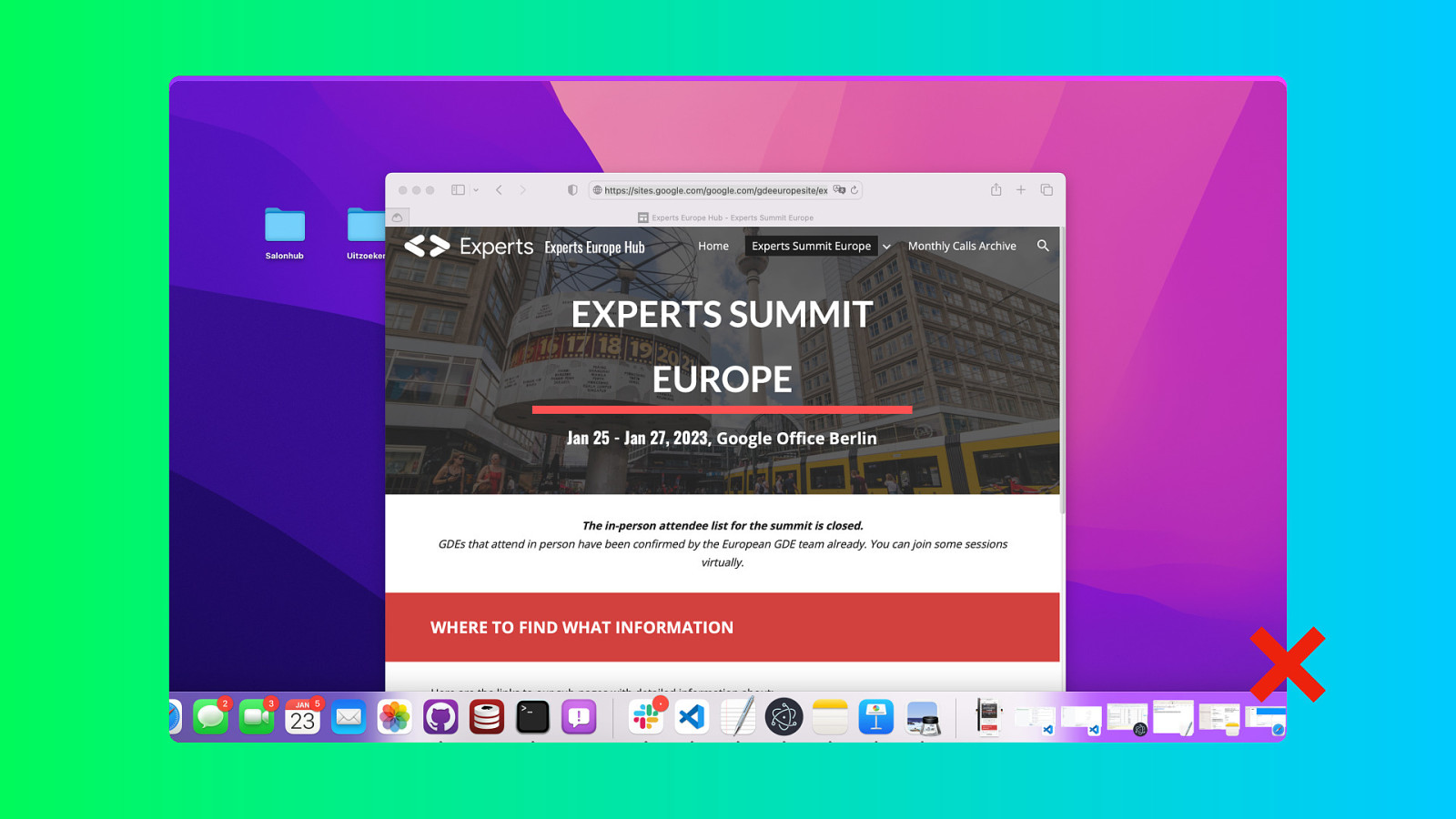
I hope there is one thing we can all agree on. It is that you should never include a screenshot of the whole screen with background windows, docks, menubars or icons visible. The audience does not care about how many unread emails you have. That is kind of off topic.

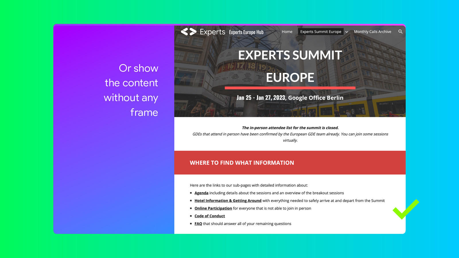
But personally I also don’t like these cut off screenshots that still retain some of the background. It would be better to make a screenshot of just the window and place it on a neutral background. That border of colour kind of distracts from what is in that window.

What I often use is a generic frame for my screenshots. A really primitive drawing of a window in which I place just the contents of the window. It works really well to take away any distractions.

And it works for mobile phones too!
One other option is to show the contents full screen, or largely full screen. Another tip: You can actually take full page screenshots from the developer tools. Go to the Elements tab, select the HTML node and in the menu there should be an option to capture the page. It’s there in both Chrome and Safari.
And then you can use animation to scroll down.

And now a subject we could do a whole talk about in itself. Data visualisation or graphs and charts.
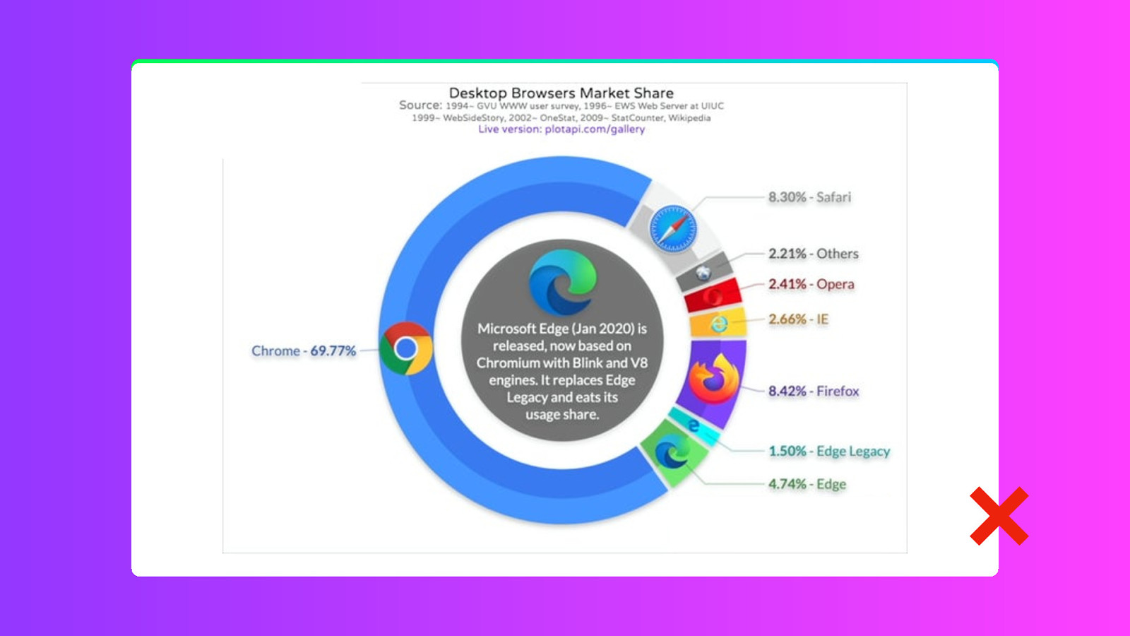
What I often see is that talks contain graphs that have been copied from some the internet. Or some internal dashboard. And that causes two problems. First the chart itself is probably not what you actually want to show, but it contains the information. But likely it contains a whole lot of other information that is not relevant. The information density is too high.
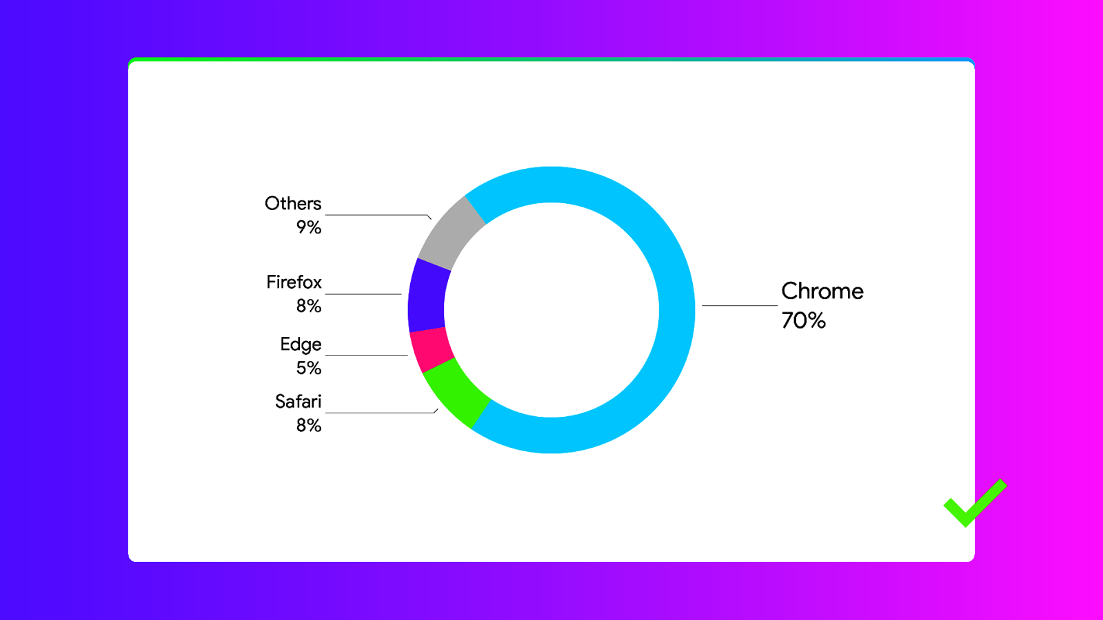
Again, less is more. Remove the data that is irrelevant. Leave what is relevant. And if you recreate the chart, then you also have to opportunity solve the second problem and use the proper typefaces and color. Consistency.
And using templates is fine.
Personally I don’t use them, because you will loose a bit of personality. But the GDE templates are actually really good and a lot of the choices that you need to make when you build your own slide deck have already been made for you. I highly recommend checking out the digital assets that were shared with you a couple of days ago.

And not really graphic design, but just a bonus tip.
Let somebody else read your slides before you go on stage. It can be a colleague or a partner.
And if you have a partner like mine, they would probably be more than willing to point out every single mistake you make. And give their opinion… even if you don’t really want them to.
So, your slides are finished. They look good. And now it is time give the talk.

You fly out to a conference you’ve never spoken at before and you don’t know what to expect. You arrive at the venue and instead of a large screen cinema screen…
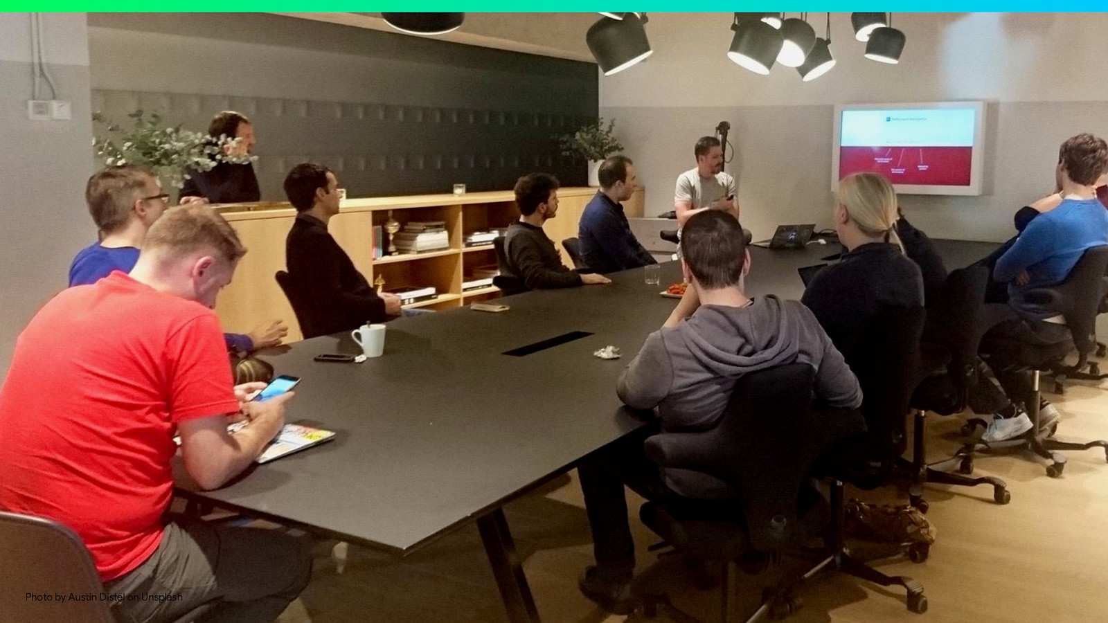
…you have to present on a small television screen. Oh. Ok.

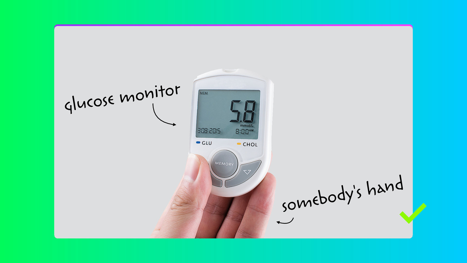
But that won’t work. The text is way too small. One way to solve it. If you have the time… Go over all of your slides and increase the text size. So this…
Becomes this… And thanks to the less is more approach you actually have the space to increase the text size.
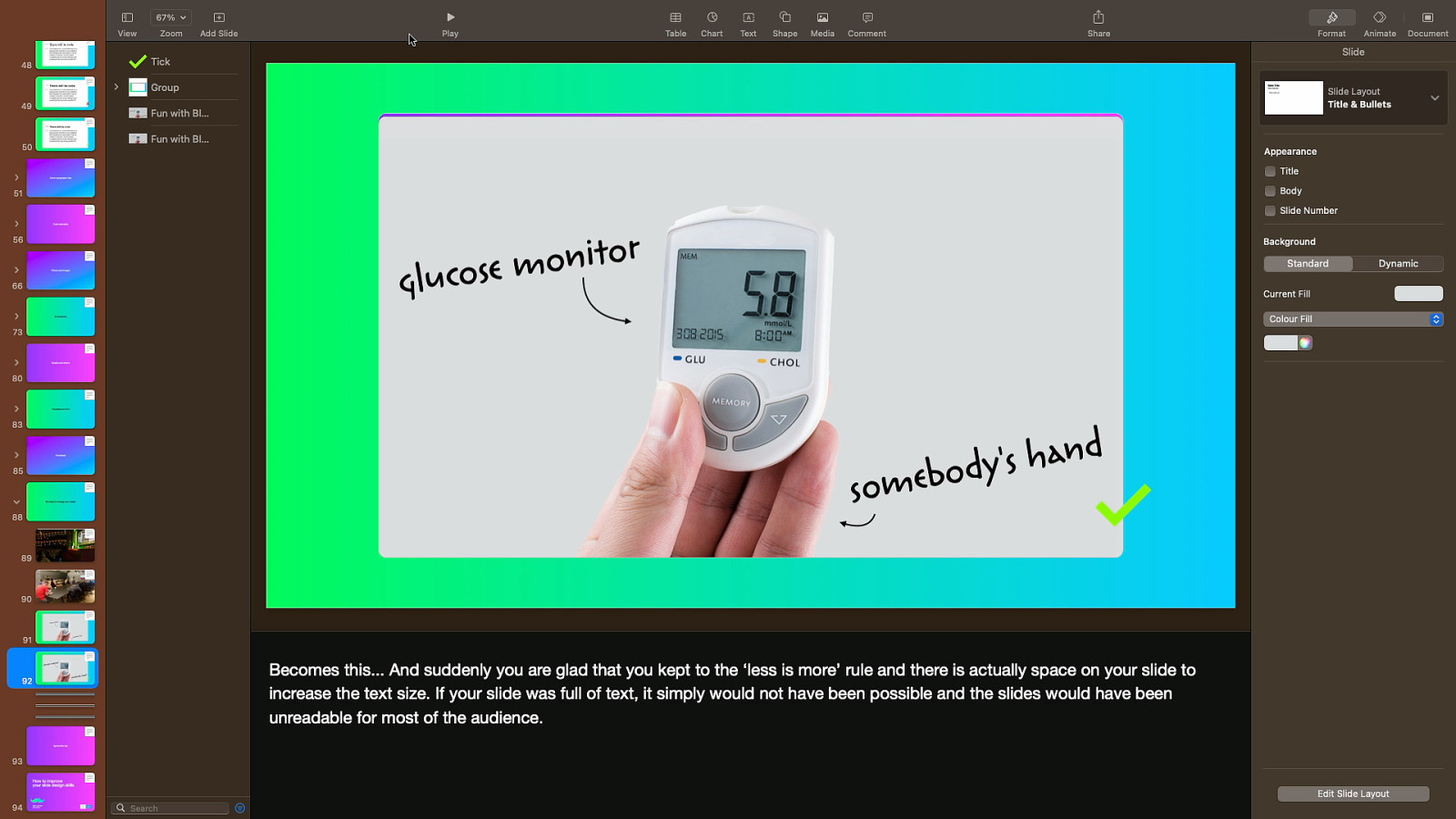
But… Only if you have the time. Don’t make any last-minute changes.

And finally. In conclusion. The rules I mentioned will help you design better slides. And I mean better slides for your audience. This is not about making things pretty. But most likely they will become prettier as a side effect. You get that for free.

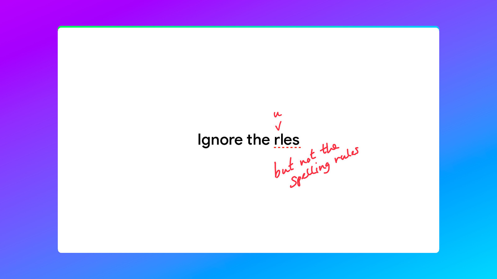
Once again, feel free to ignore the rles. And yes, I am being consistent here. It is your talk, you can do what you want. I probably broken every one of these rules in this talk alone, and that is okay.

So this was How to improve your slide design skills and thanks for listening. I’m Niels Leenheer. Follow me @html5test. Also on mastodon.social. I’ll publish the slides later today and will add a lot of handy tools and resources that you can use. And If you have any questions, I’ll be around here the whole day. Come up to talk to me. Thanks!