How to design an accessible Form MUNICH ACCESSIBILITY MEETUP @nuriapenya #a11yMUC

A presentation at Munich Accessibility Meetup in October 2018 in Munich, Germany by Núria Peña
How to design an accessible Form MUNICH ACCESSIBILITY MEETUP @nuriapenya #a11yMUC
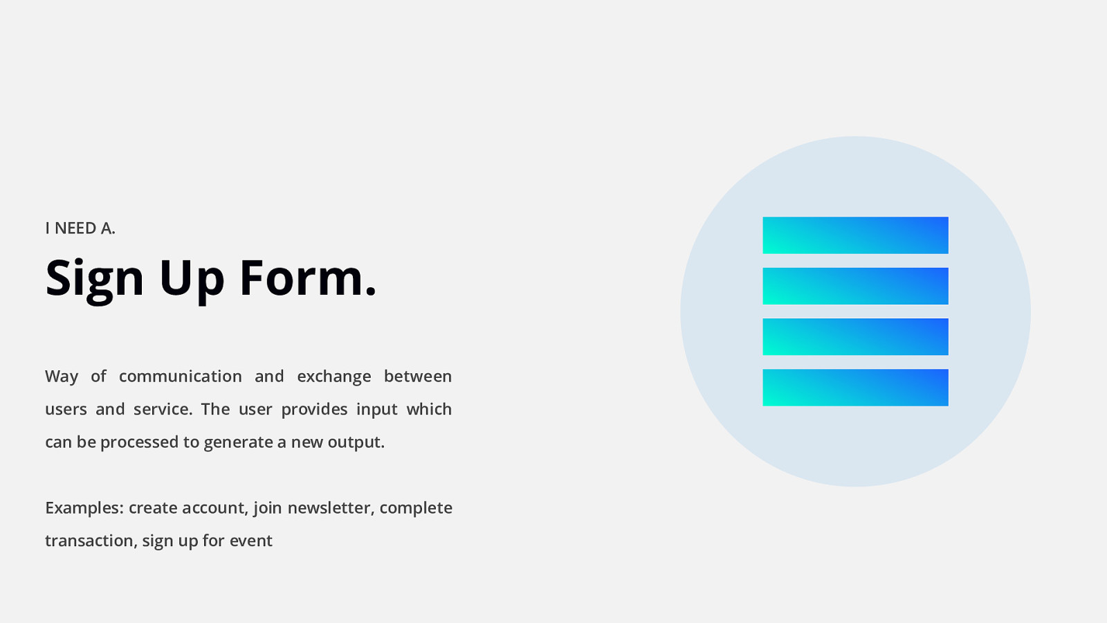
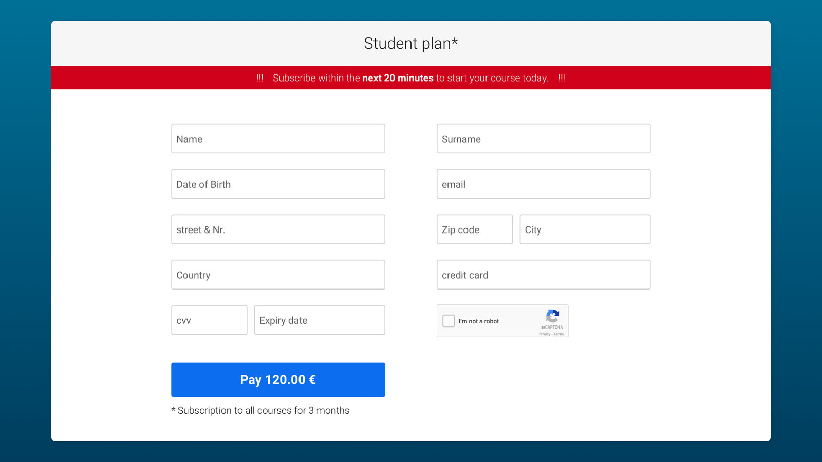
I NEED A. Sign Up Form. Way of communication and exchange between users and service. The user provides input which can be processed to generate a new output. Examples: create account, join newsletter, complete transaction, sign up for event

Let’s reflect. Take some time to think about the form we just showed. What issues do you see? What could be done differently?
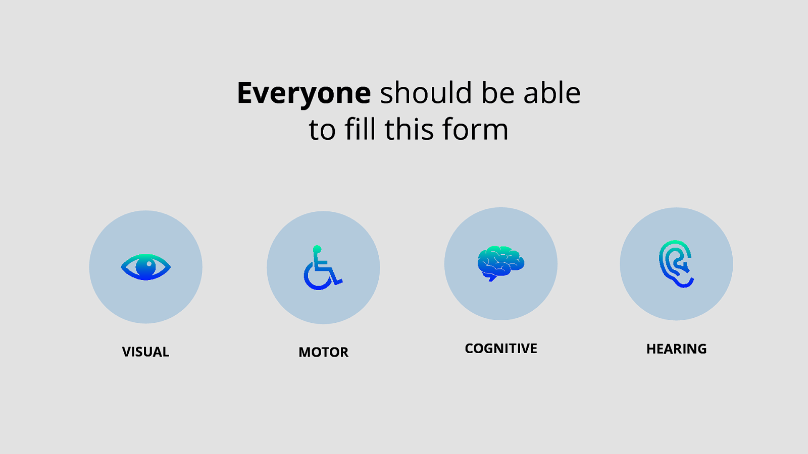
Everyone should be able to fill this form VISUAL MOTOR COGNITIVE HEARING
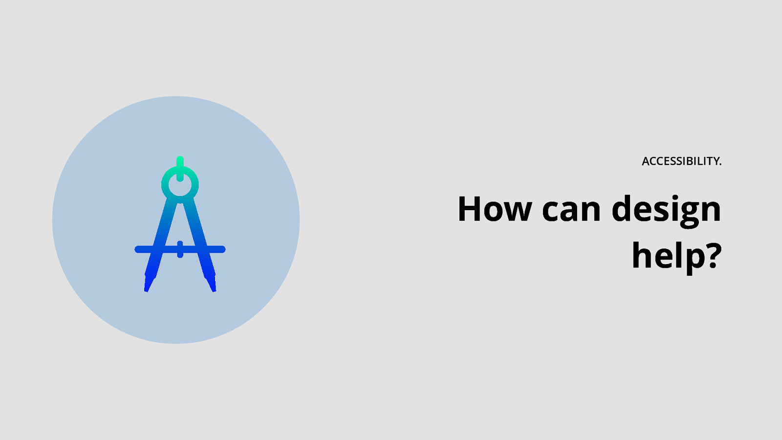
ACCESSIBILITY. How can design help?
Structure.
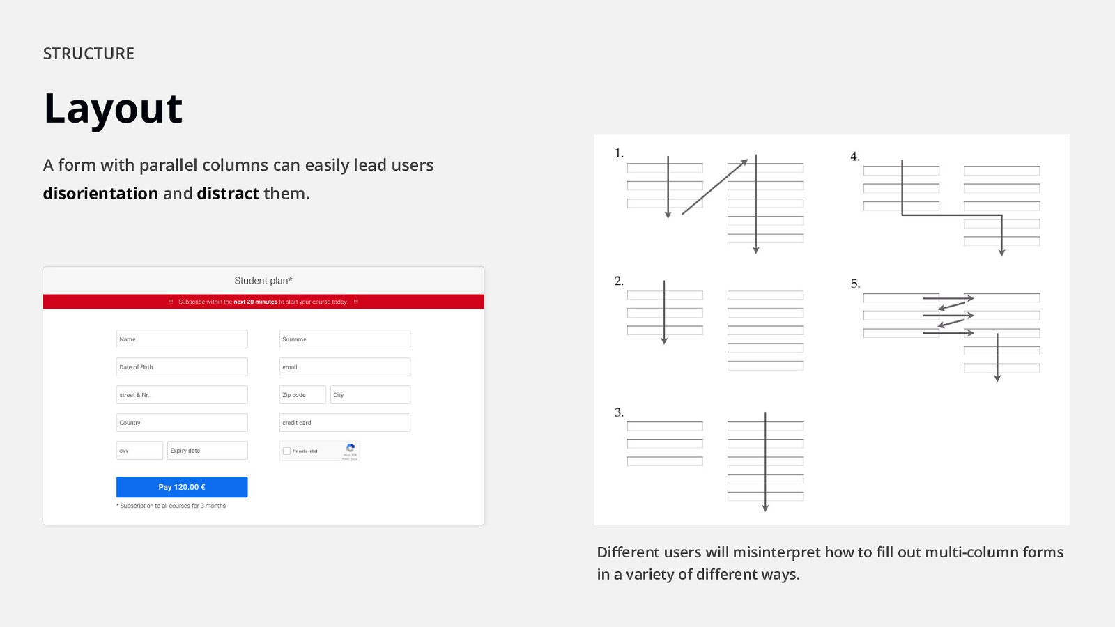
$ STRUCTURE Layout A form with parallel columns can easily lead users disorientation and distract them. Different users will misinterpret how to fill out multi-column forms in a variety of different ways.
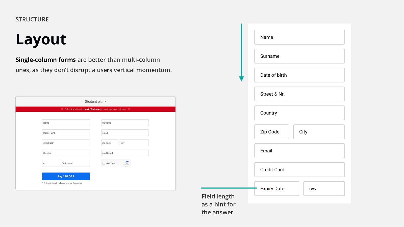
$ STRUCTURE Layout Single-column forms are better than multi-column ones, as they don’t disrupt a users vertical momentum. Field length as a hint for the answer
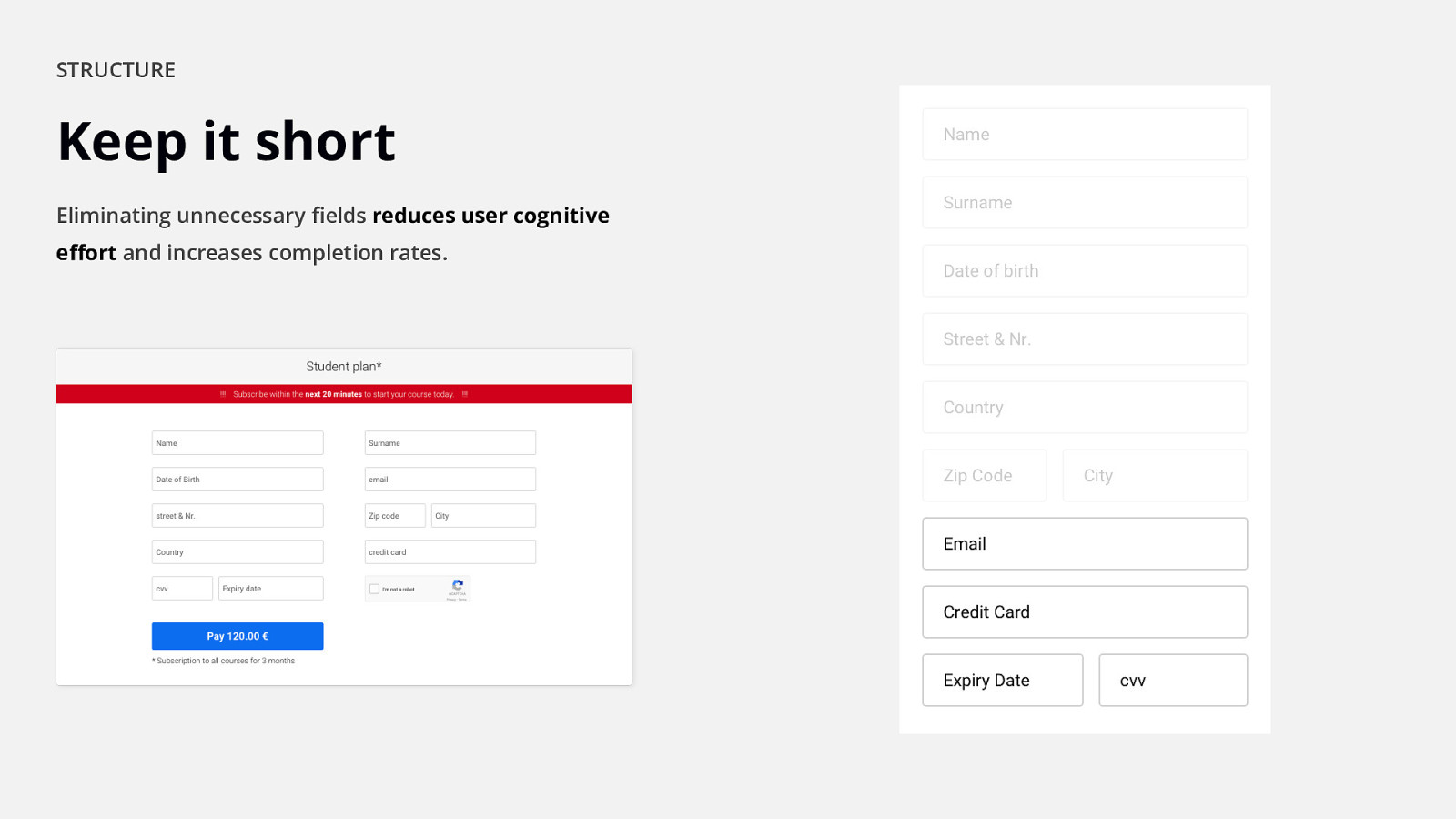
$ STRUCTURE Keep it short Eliminating unnecessary fields reduces user cognitive effort and increases completion rates.
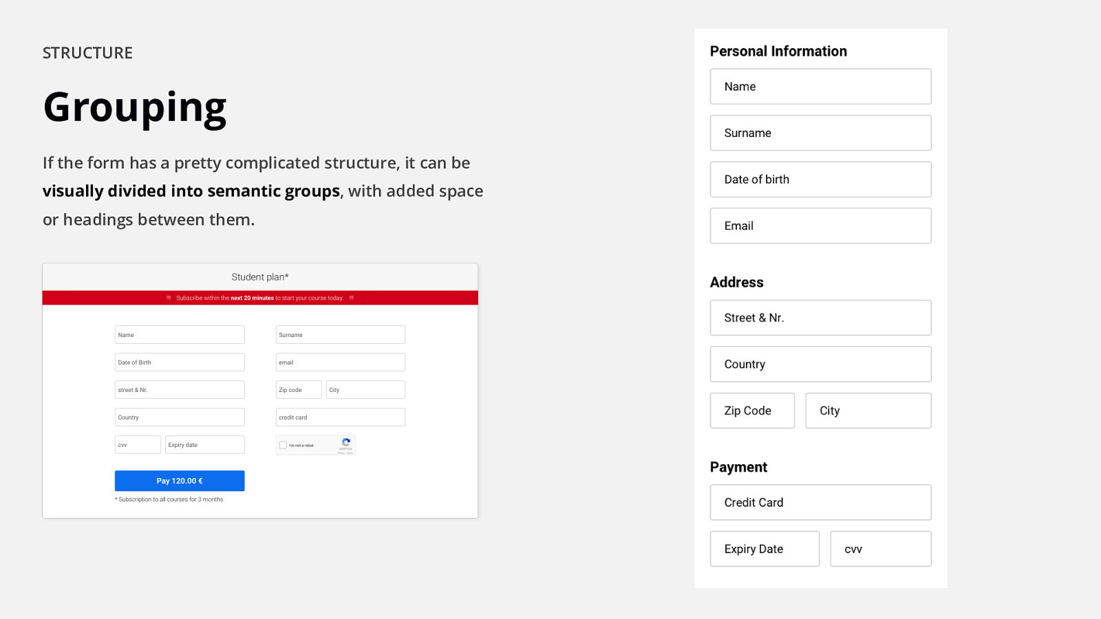
$ STRUCTURE Grouping If the form has a pretty complicated structure, it can be visually divided into semantic groups, with added space or headings between them.
Inputs.
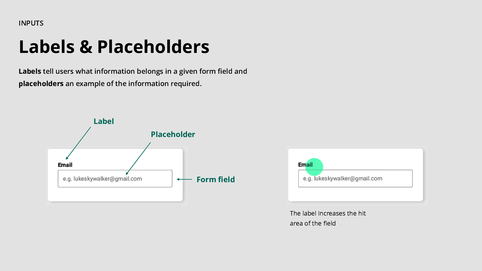
$ INPUTS Labels & Placeholders Labels tell users what information belongs in a given form field and placeholders an example of the information required. Label Placeholder Email Email e.g. lukeskywalker@gmail.com Form field e.g. lukeskywalker@gmail.com The label increases the hit area of the field
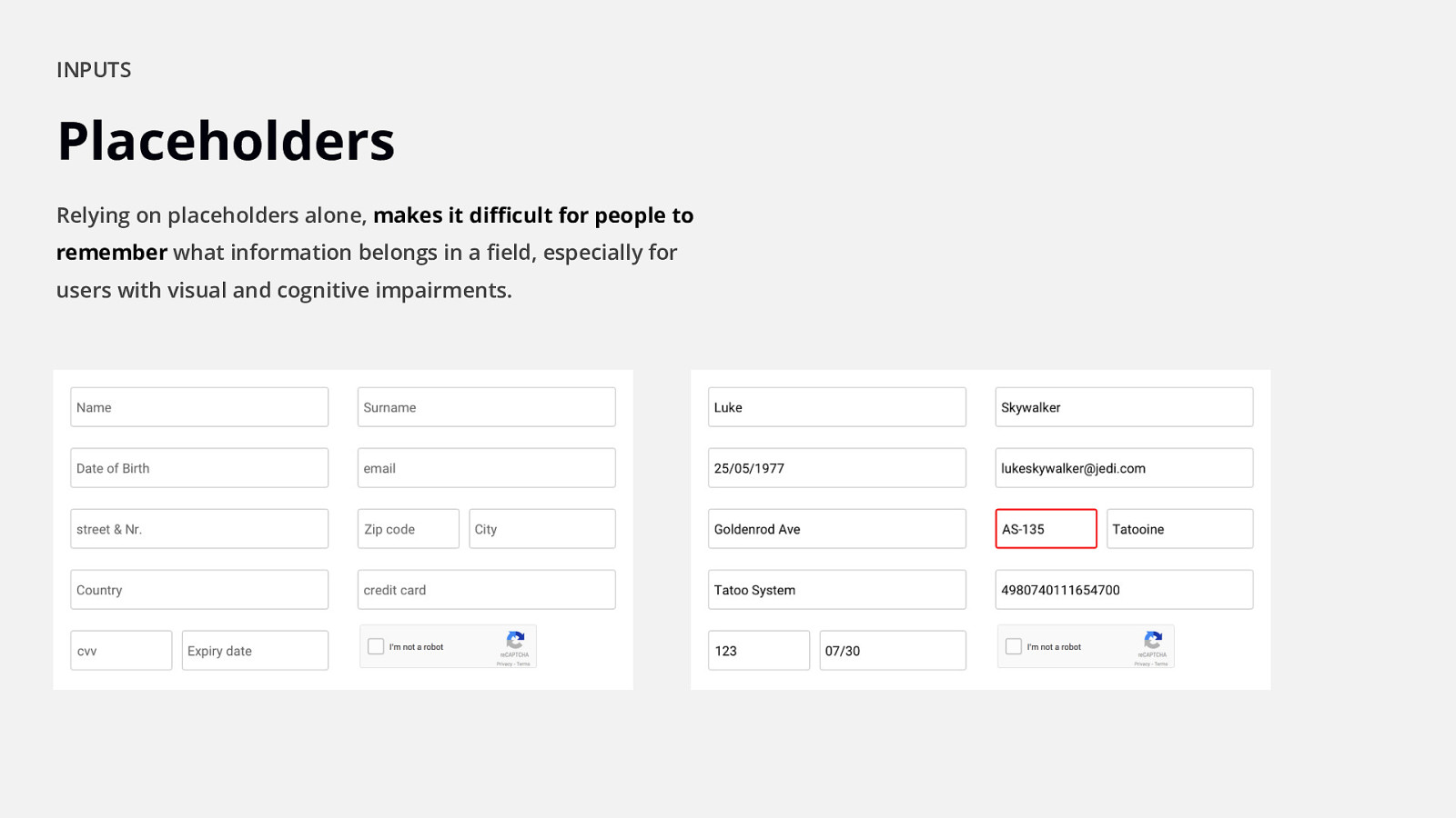
$ INPUTS Placeholders Relying on placeholders alone, makes it difficult for people to remember what information belongs in a field, especially for users with visual and cognitive impairments. “Wait… what was I doing?”
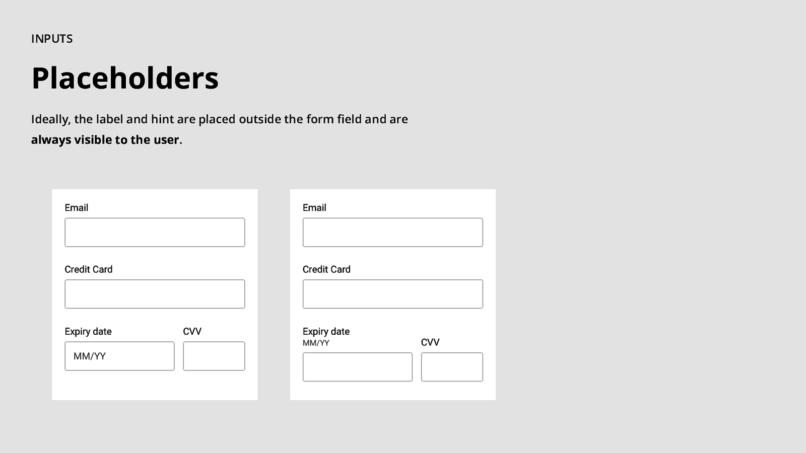
$ INPUTS Placeholders Ideally, the label and hint are placed outside the form field and are always visible to the user.
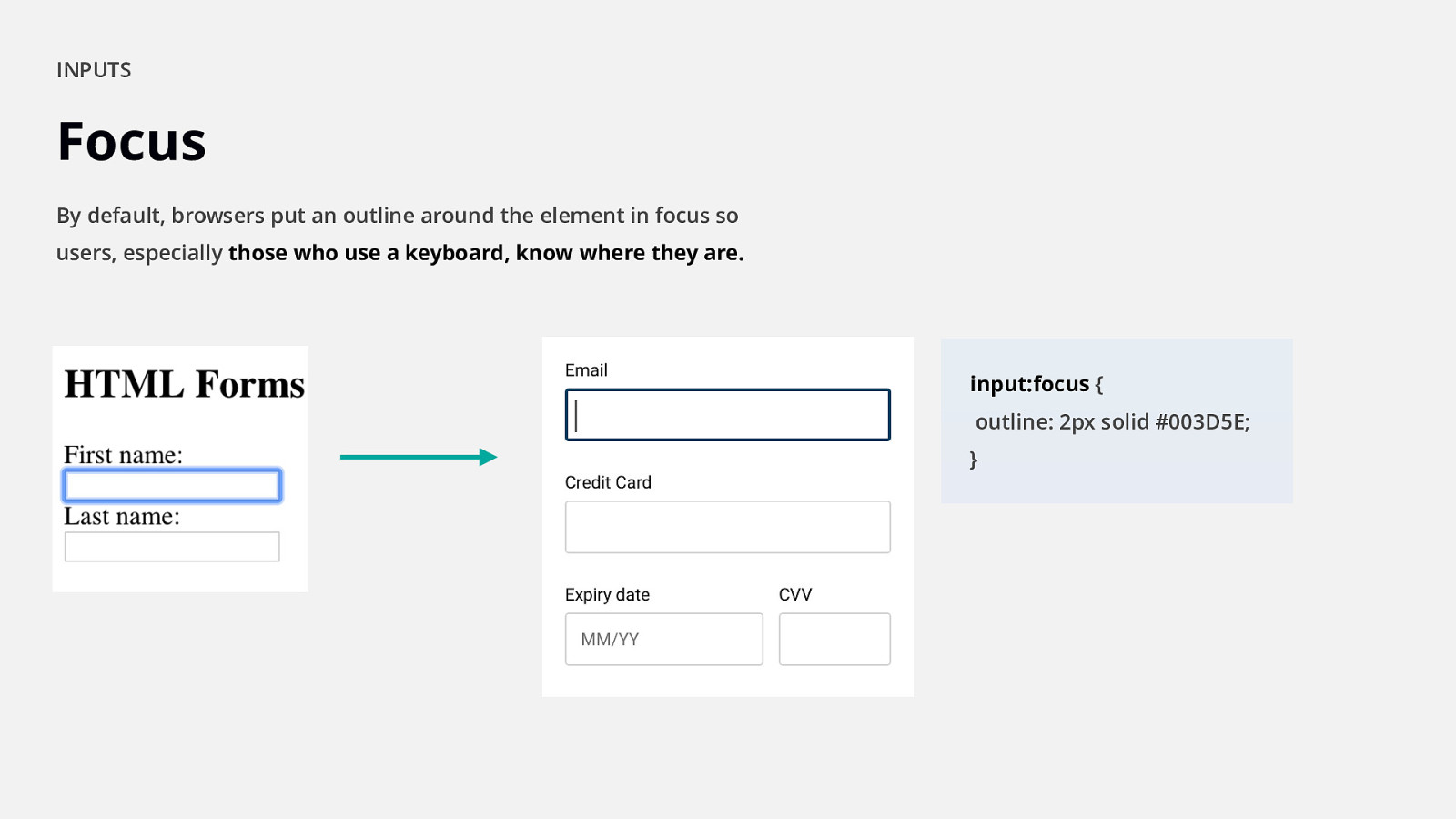
$ INPUTS Focus By default, browsers put an outline around the element in focus so users, especially those who use a keyboard, know where they are. input:focus { outline: 2px solid #003D5E; }

Validation.
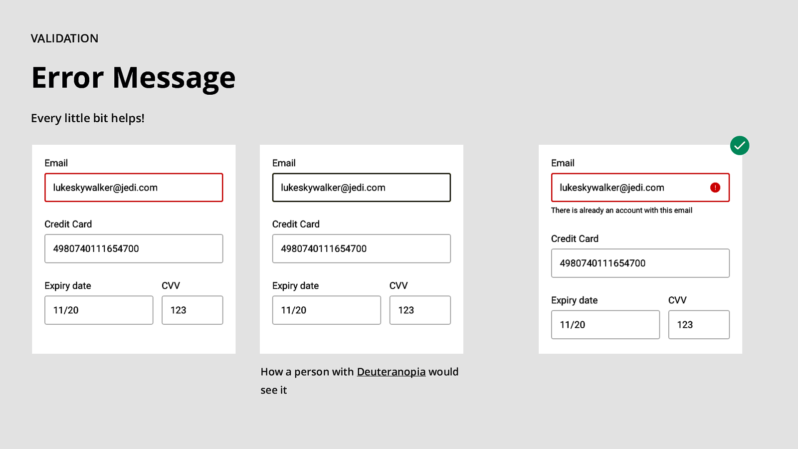
$ VALIDATION Error Message Every little bit helps! How a person with Deuteranopia would see it

ACCESSIBILITY. Development Insights.
ACCESSIBILITY. Testing.
In a nutshell…
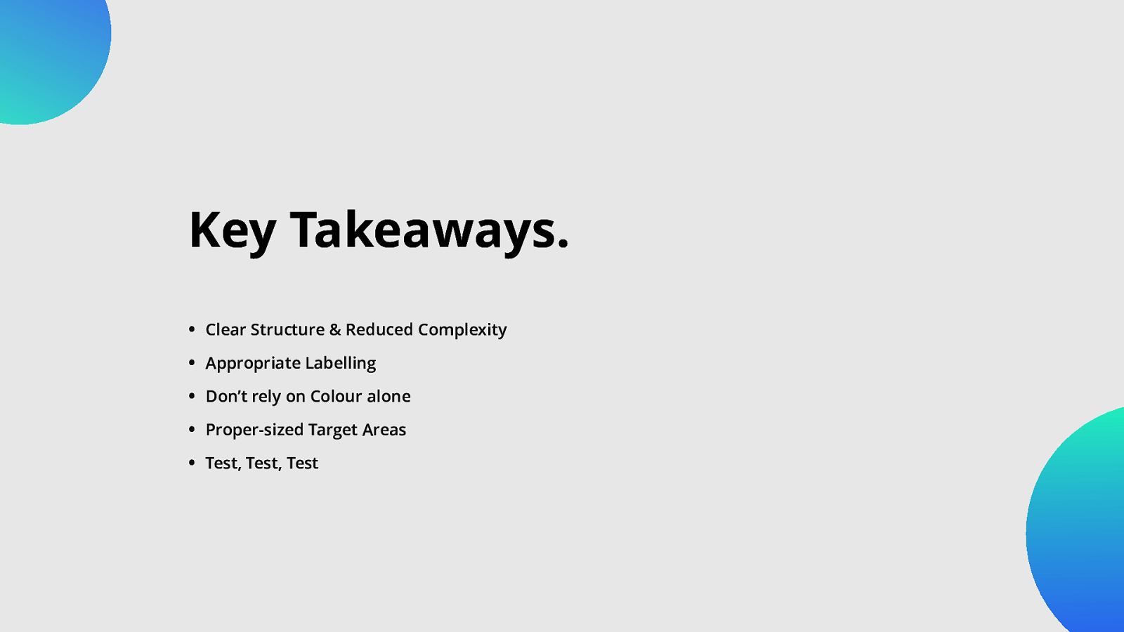
Key Takeaways. • Clear Structure & Reduced Complexity • Appropriate Labelling • Don’t rely on Colour alone • Proper-sized Target Areas • Test, Test, Test
Thank You! Q&A
BRAINSTORMING. What do you want next? sli.do @A11yMunich /Munich-Accessibility-Meetup #a11yMUC
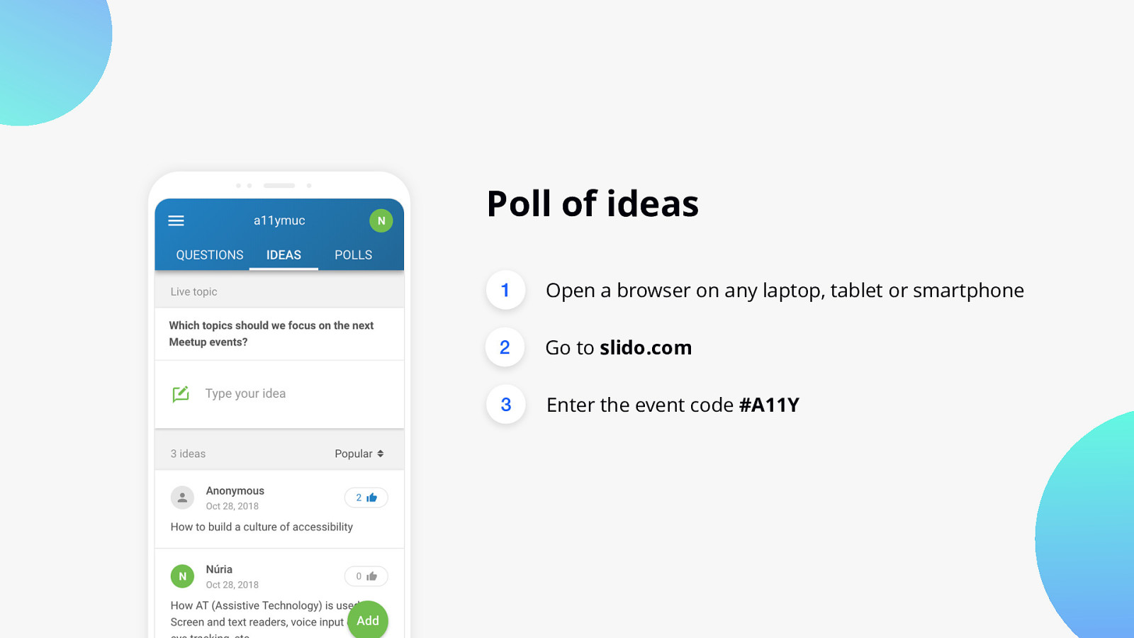
Poll of ideas 1 Open a browser on any laptop, tablet or smartphone 2 Go to slido.com 3 Enter the event code #A11Y