Component and Style Guide Driven Development of WordPress Themes for Developers

A presentation at WordCamp Brighton 2018 in August 2018 in Brighton, UK by Oscar Duignan
Component and Style Guide Driven Development of WordPress Themes for Developers
Who am I? • My name is Oscar Duignan • My twitter handle is @socialpoetry • I’m a senior developer for a London based digital agency called Binary Vision Hello everyone
Component and Style Guide Driven Development of WordPress Themes for Developers Today I’m talking about “Component and style guide driven development of WordPress themes”
Before I get stuck in…

What are components? In the context of this talk
they are styled elements, the building blocks of your user interface, blocks of markup that repeat across your website
ideally with their styles encapsulated using modular CSS naming schemes to make them easy to re-use
a component focused approach to design is an alternative to building lots of bespoke layouts
Instead we identify patterns in our designs and encapsulate them in blocks of markup that we can re-use and compose into other more complex components
The aim is to improve the development process for implementors to stop us reimplementing the same patterns over again across a website and also give end users a more consistent and predictable experience
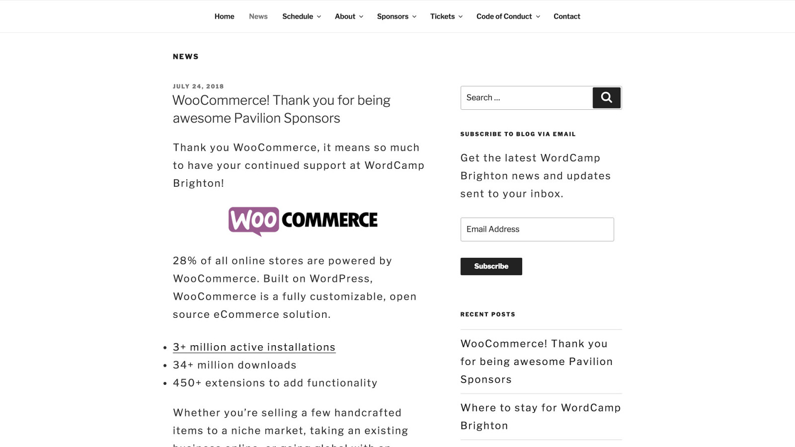
Using the conference news page as an example
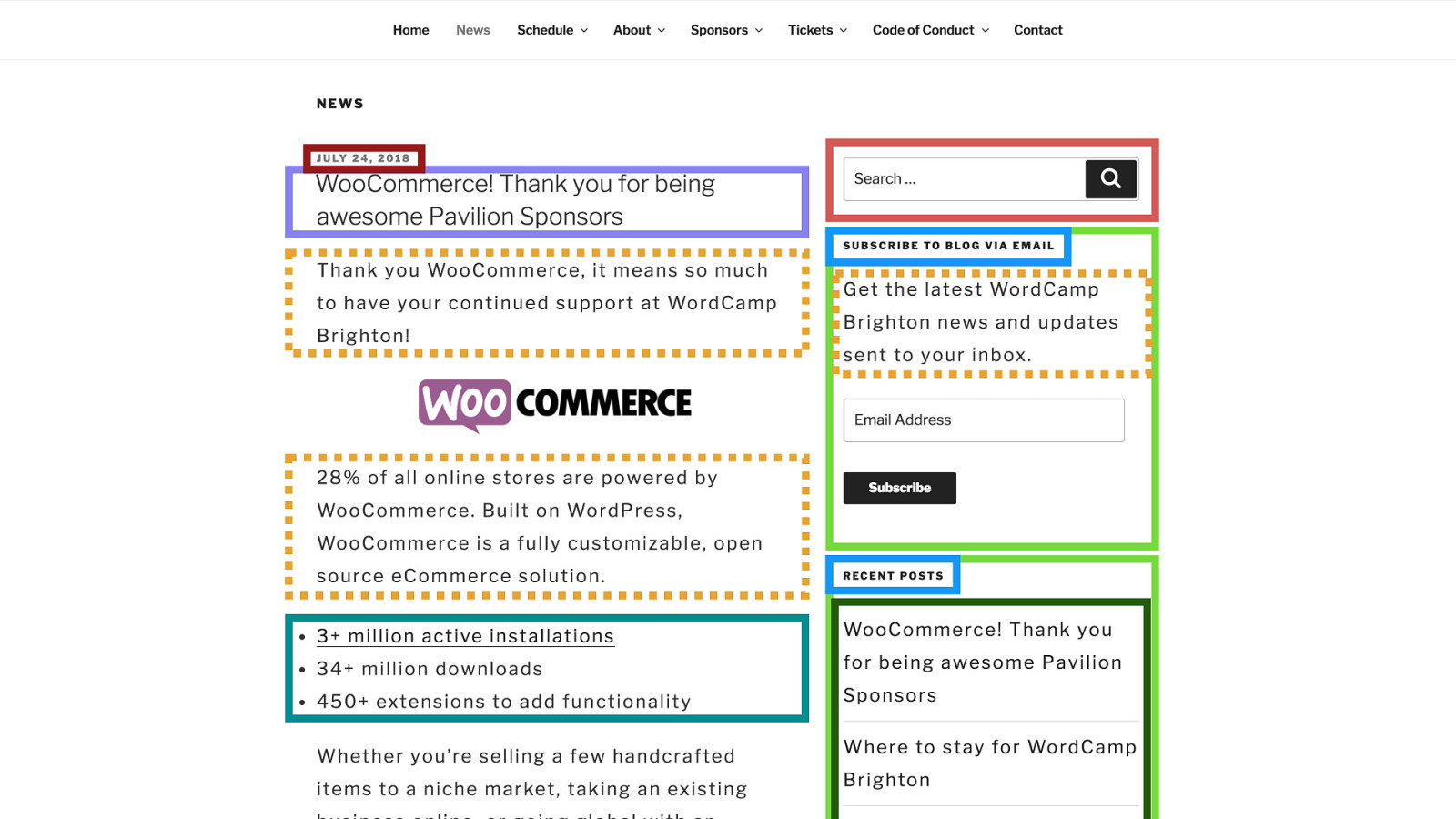
I’ve highlighted a few possible components as a visual reference
so they might just be simple styled elements like the headings, paragraphs, and lists
or they might be more complex blocks, composed of a few elements, like
the search form
the light green sidebar boxes which have a title and some variable content
or the dark green list of links in the second sidebar box which has a custom list style, link styles, spacing, and separators compared to a normal list
And…
What are style guides? and so what do i mean by style guide?
I mean a catalogue of our components that describes how to use them
There are a few different names floating around for this type of style guide
“living” style guides, pattern libraries, and component libraries
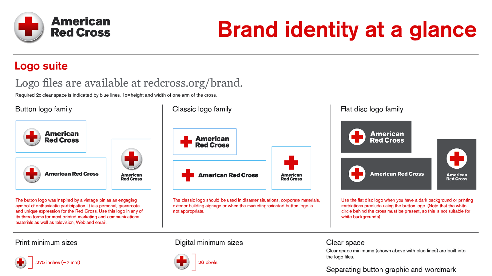
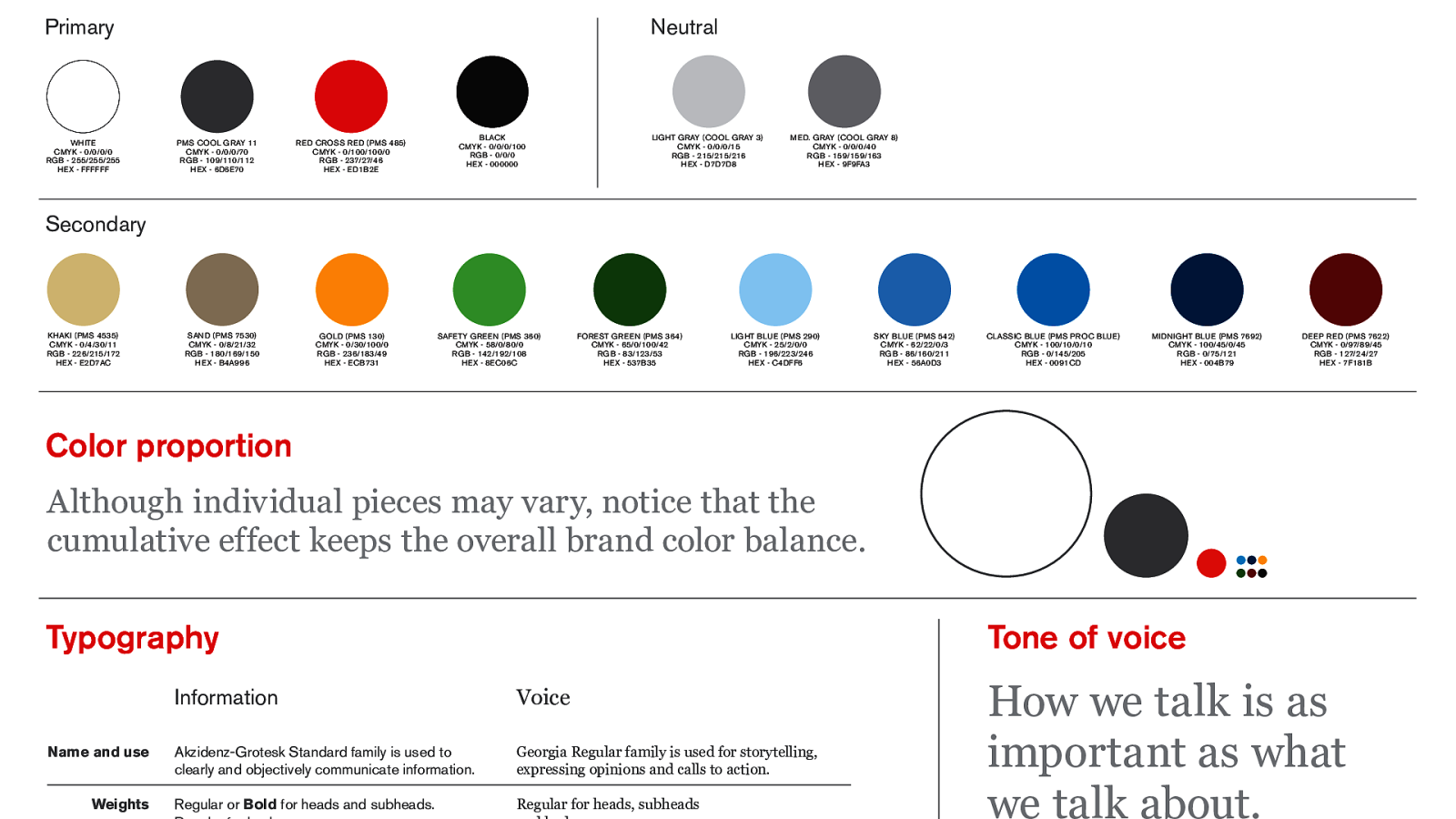
If you’ve worked with design agencies before you might be thinking of something along the lines of brand guidelines…
the essential form of a web style guide seem to be a list of components on the left
and when you select one an example of how it will look and details of how you can use it on the right
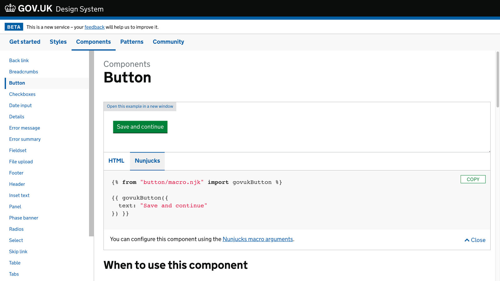
the gov.uk design system is a good example of this
and…
then you’re probably familiar with this one, even though it doesn’t call itself a style guide it fits our definition
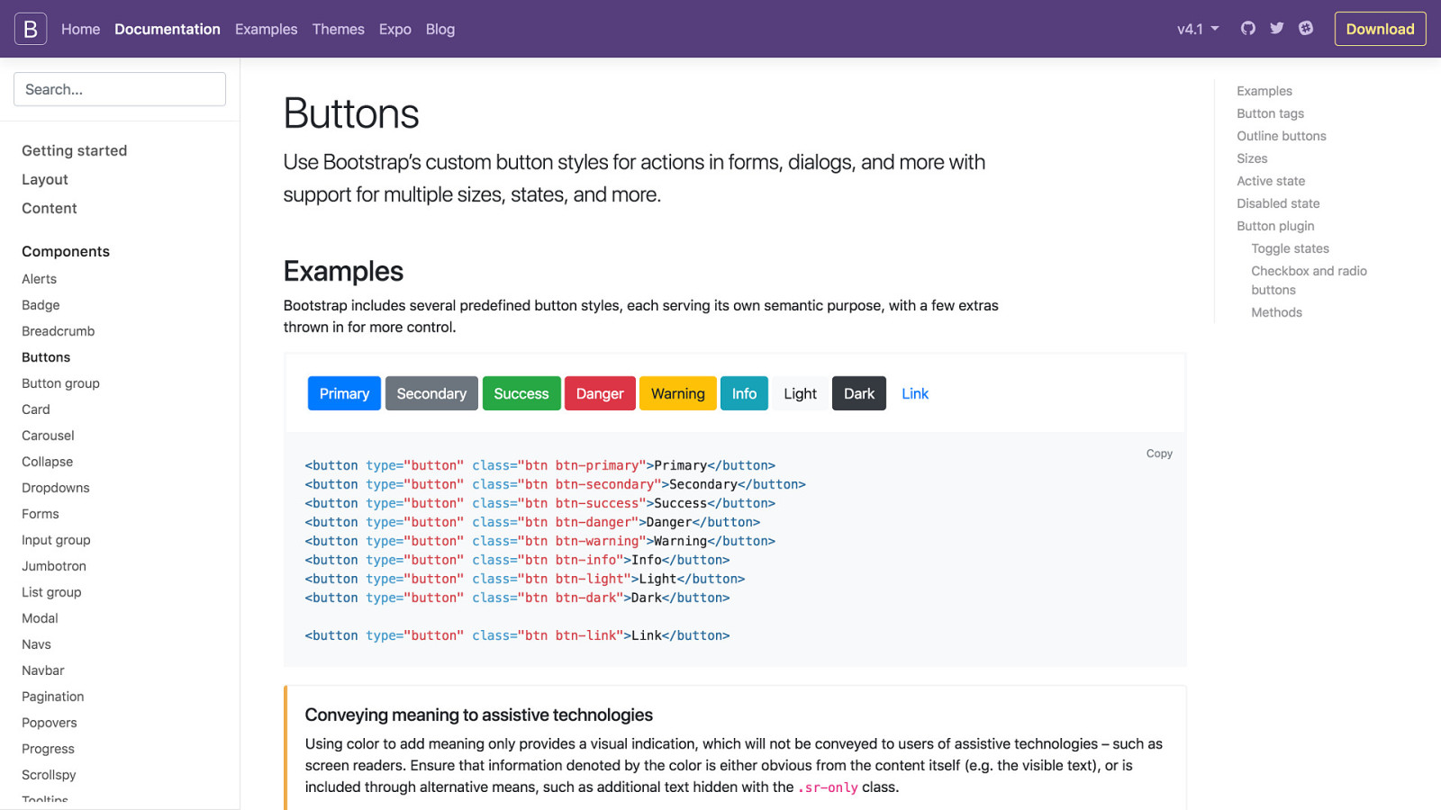
the bootstrap documentation
but these are all the products of large development efforts from big organisations
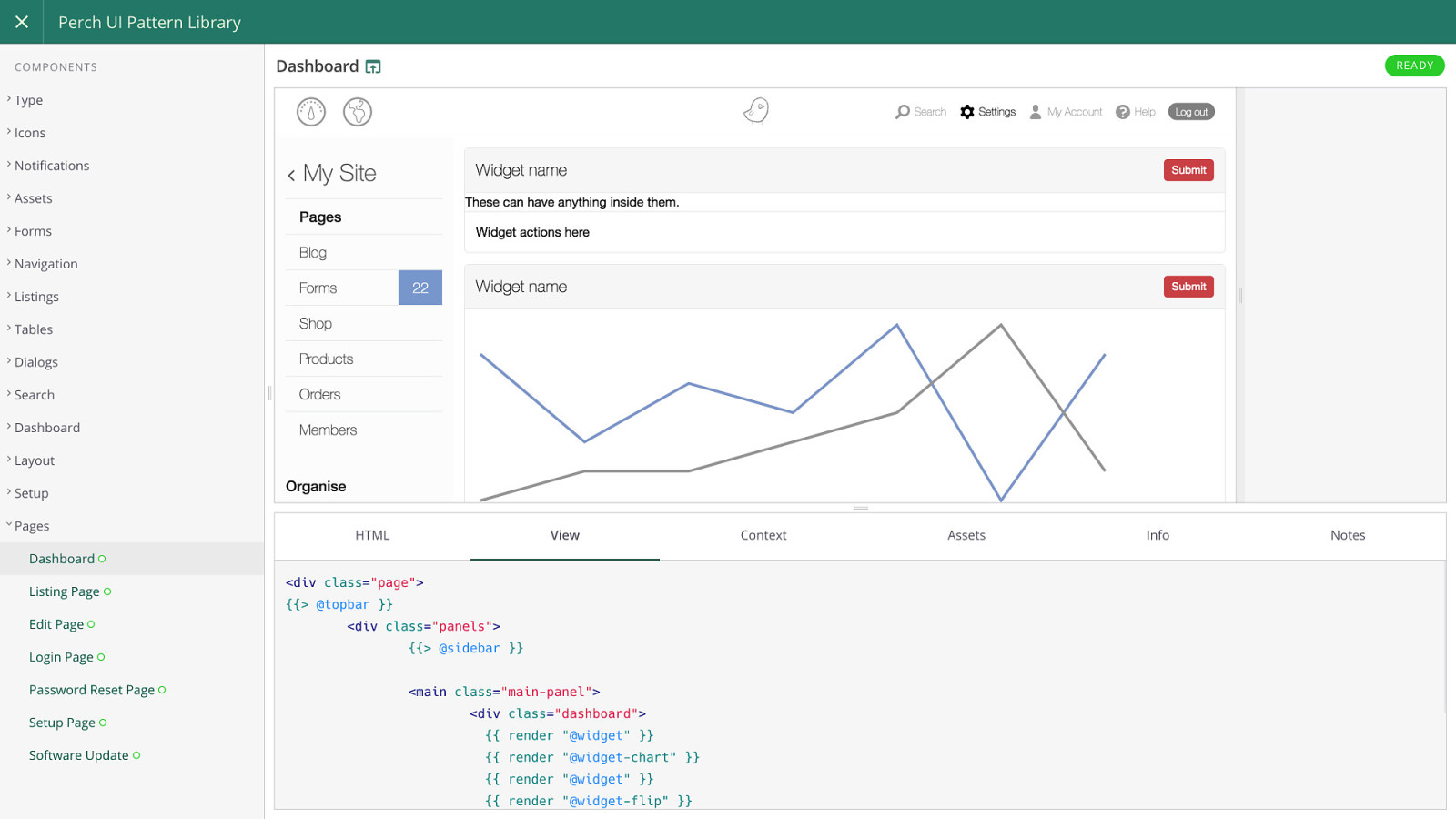
something closer to what you might create for your websites is the perch UI pattern library
built using Fractal - a tool for building web style guides
now…

What make’s a good style guide? now I’ve explained the core functionality
list of components, example of how they will look, details of how to use them
I want to go back through those examples quickly and highlight some other features that I think make for a good style guide
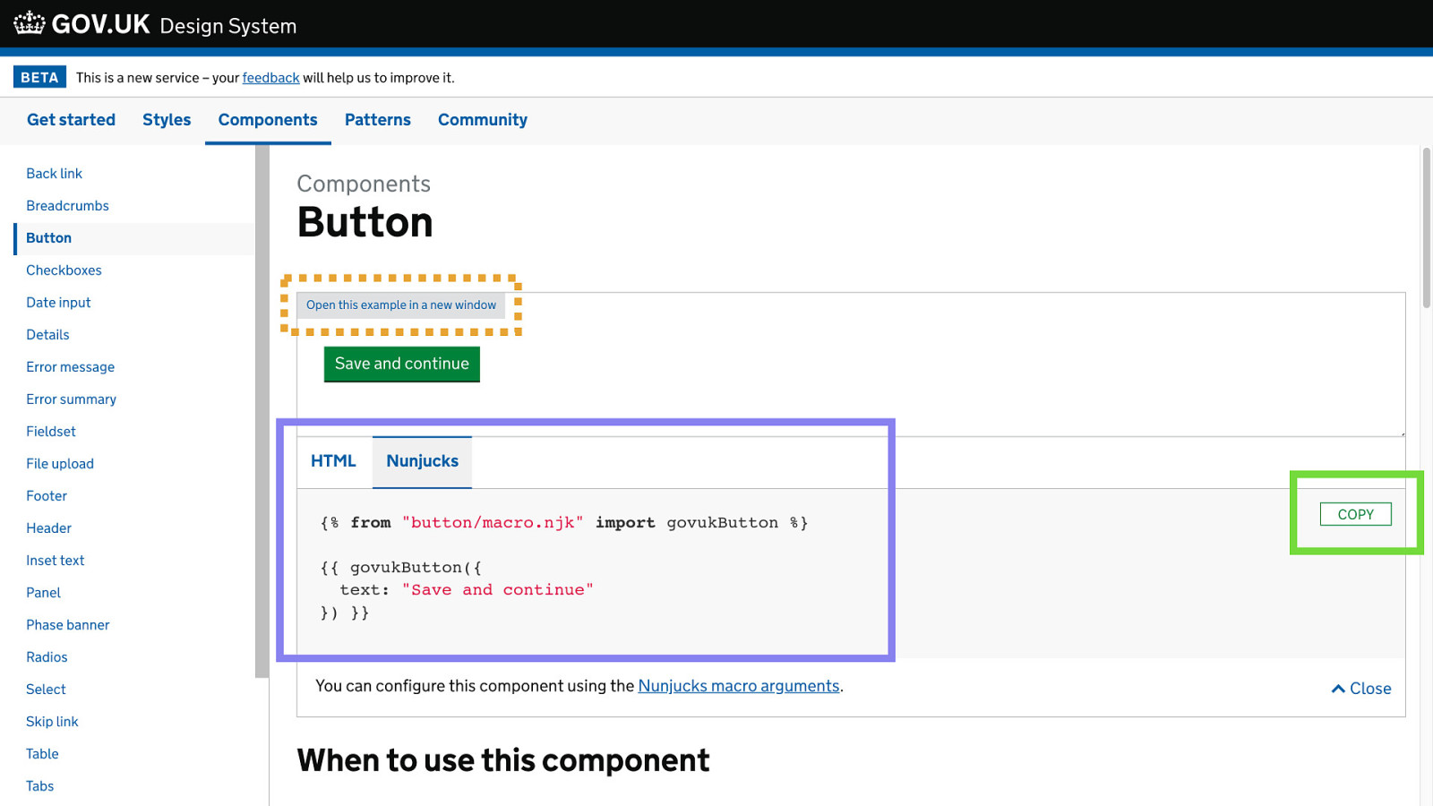
on gov.uk you have
open an isolated view of just how the component looks
great for automated tests
then the components are available as templates as well as markup you can copy and paste and they show both ways you can use them
style guides grow pretty big, and the pages get pretty dense
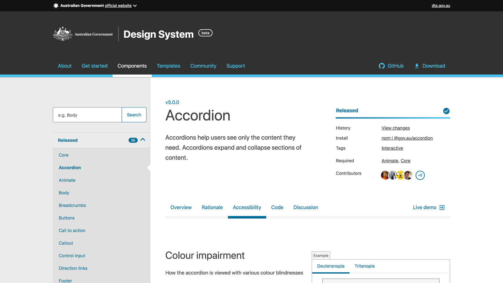
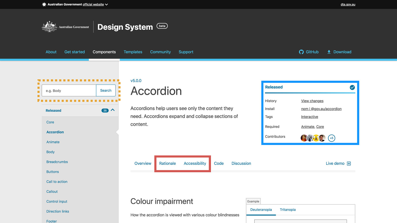
the australian site has worked pretty hard to keep their style guide navigable
with search and important meta data featured at the top of the page
they also promote accessibility information prominently in their styleguide, encouraging people to think about this throughout the design process and not just as an afterthought
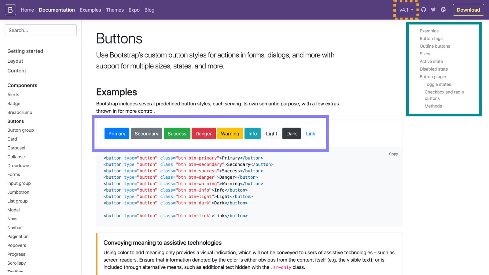
bootstrap has a table of contents on the right so you’re able to quickly scan a long page without scrolling and know what is there
and they show all the variations of a component in one place so you can quickly compare them and see gaps or mistakes in styling. Imagine instead having to go to a different page for each variation
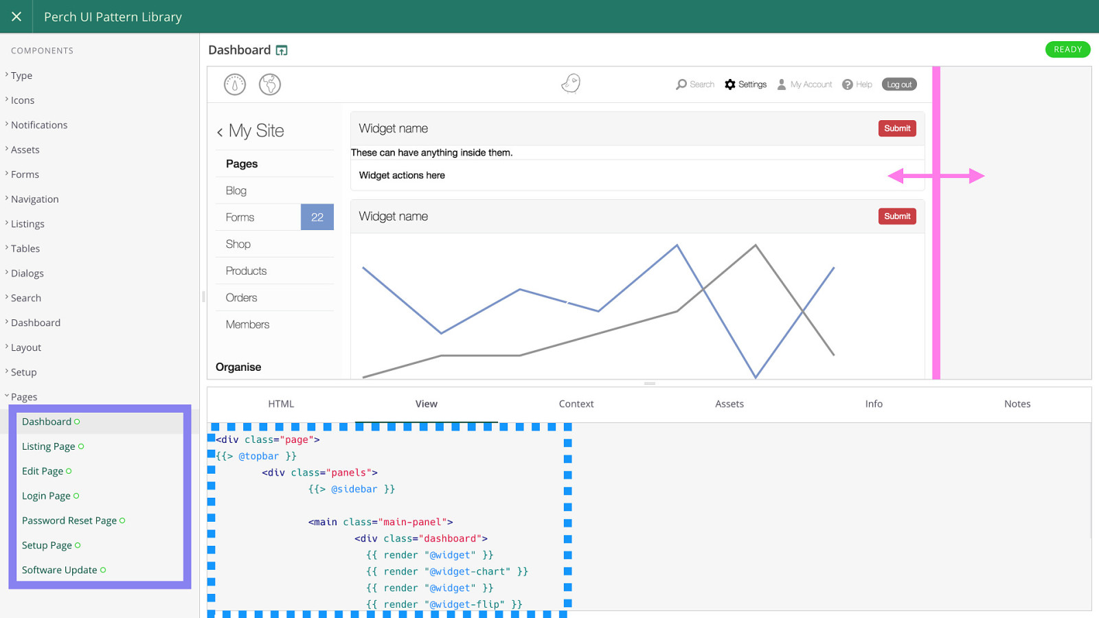
the perch pattern library has the example inside an iframe which you can resize with the bit I’ve highlighted in pink to view the component at different breakpoints. Not everyone (colleagues and clients) are comfortable using browser developer tools
and they have also created examples of the different layouts on the site to show components in the context they were envisioned
then they show you clearly in the view tab which components have been used to construct the one you’re looking at, making it easy to find the thing you need

Do you really need one? so there are a lot of different things you can include in your style guides
but they can have a high cost to introduce into your development process, and there are some foundational things you might want to establish before you start using them
so you should consider carefully if you really need one
if it’s a one off site that won’t be developed further then you might not recoup that overhead
—-
and easier solutions to some problems that might be a better fit for you initially
some examples
lots of websites aren’t going to be developed further, if it’s not going to be maintained, you have a fixed design to work from, or you’re working on it alone then it might not be much help to have a style guide!

When can they help? But there are certain situations where over time even if adoption takes some time you can get a good return on your investment
Style guides shine when you need to coordinate development between lots of people and roles, or over time different people will be working on the site
Documentation is an essential part of successful projects, but often absent for the front ends of our websites. If you weren’t there when the thing was designed, then you have to reverse engineer the interface to find out how to do things or track down someone who may or may not still be available
Style guides are also amazing for facilitating user testing. They can be tested against directly, or used as an up to date reference for testers who are testing the finished product
How do you create one? A lot of people I talk to don’t need to be sold on the benefits though, they just stumble when it comes to figuring out how to implement them
I’ve got experience with two tools for building style guides that I’m going to introduce you to
The first is…

KSS Node KSS stands for Knyle StyleSheets it’s a documentation format for CSS (a way to include structured information inside CSS comments that can then be parsed and used to create documentation).
KSS node uses this documentation format and some conventions to parse the information it needs for components out of comments included in the CSS.
It’s quite actively maintained and because it’s powered by inline comments it’s got a very low barrier to entry and maintenance. Anyone who edits your CSS will see the comments with the documentation that gets turned into your style guide and hopefully be able to update it.
It also supports twig templates, which means if you want to re-use templates between your style guide and your WordPress theme then this is possible with a bit of work as there is an implementation of twig for php and javascript, which KSS node is written using.
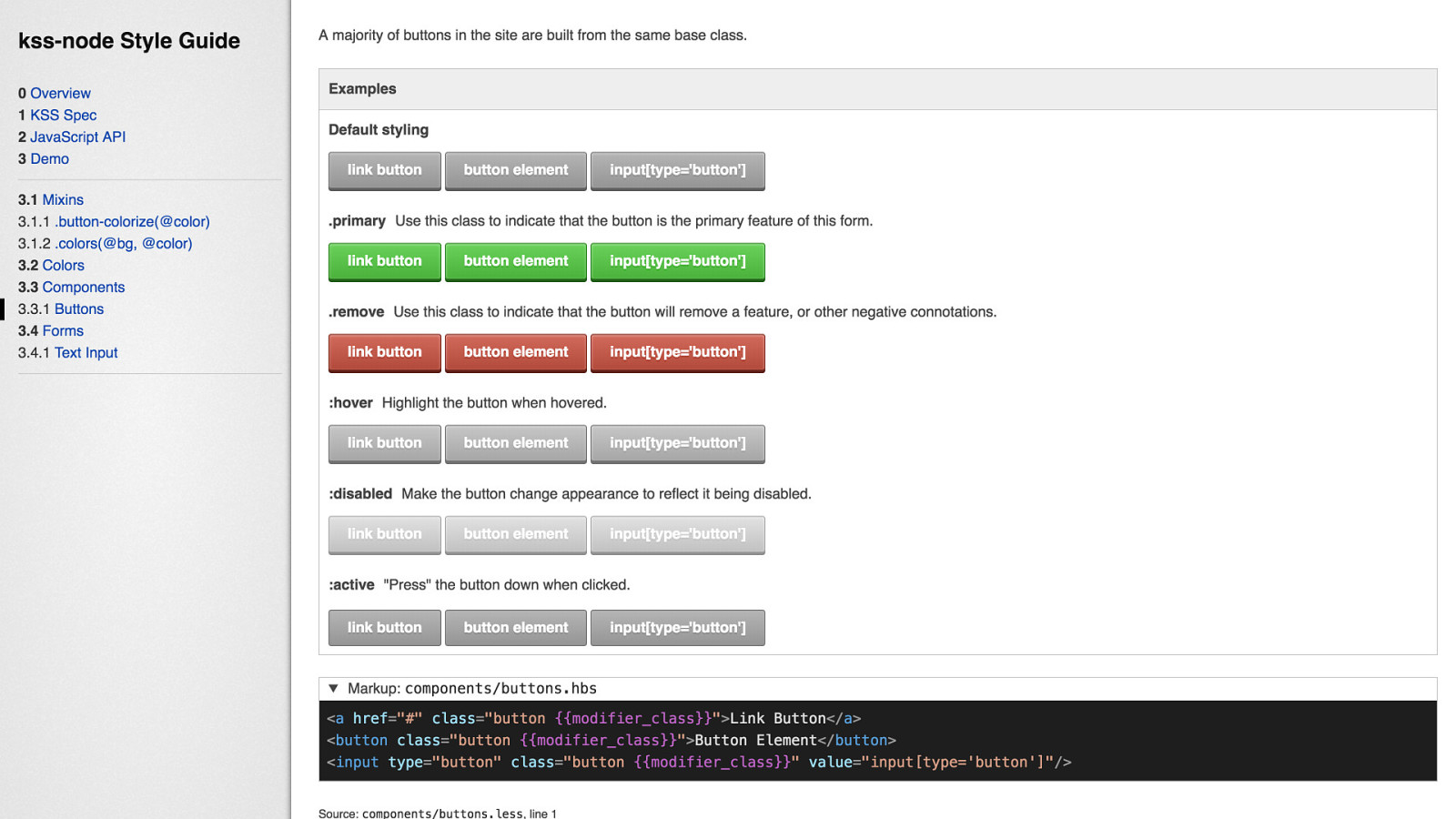
The default template generates style guides that look like this, one of the great features of KSS-Node for me is the easy generation of the component variations and their different states, which make it easy for you to view at a glance what things look like without any interaction and with minimal additional configuration.
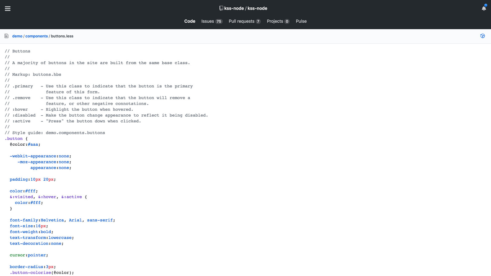
The CSS that generates the content on the slide before looks like this. The comment tells you the name of the component, a description, where to find the markup example, the different variations to display, and the section within the style guide it should be placed in.
Simple, but it can be limiting in the same way that it enables you to get started quickly and I found it di ffi cult to extend when I wanted to add more meta data. I also think the default template could use a bit more work to make it more friendly out of the box.

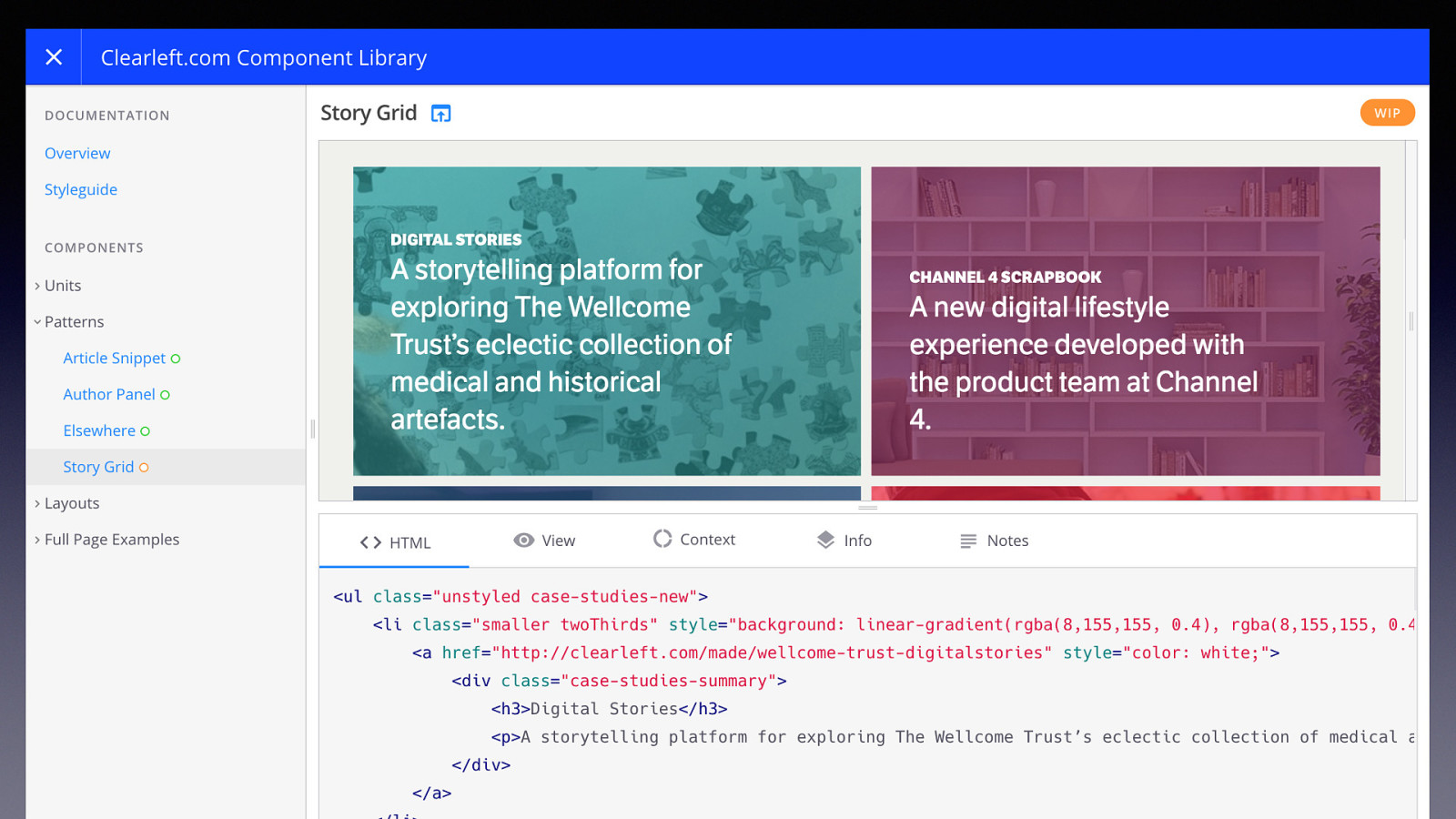
Fractal Fractal is a project from a company called Clearleft a very well known and regarded design consultancy that have been around for a long time and, coincidentally, are based in Brighton.
With fractal you specify your configuration with separate configuration files rather than inline CSS comments. Which gives you a bit more flexibility in terms of the content you can add and I feel make it a bit more easily extensible.
Unfortunately development has been stalled for a while, I believe it was mostly the work of a couple of developers who due to changes in situation could no longer spend much time on the project and this alongside a push to rearchitect the project into a v2 caused development to languish.
However, luckily, this was recently brought to the attention of wider audiences, I believe I noticed an increase in attention after a smashing magazine post by Rachel Andrews who was documenting her dev process with fractal which I showed a snapshot of earlier in the Perch example. And now it looks like there have been a lot of people offering support to continue the development of the tool as noted in recent updates to their README on github.
So I feel a lot more comfortable recommending it’s use now.
THE…
the default theme for fractal looks a lot more polished than KSS node, given it’s origins in a design consultancy this isn’t surprising
however I think the initial configuration and learning curve is steeper than with KSS node, and it feels like the tool is maybe more complicated in it’s implementation than it needs to be. Which I think is one of the things the rearchitect to v2 was aiming to work on, however although there are now offers from possible maintainers it’s not clear to me that work on a v2 will continue, I think we are more likely to see incremental work on v1
By default it uses mustache for templates - it seems like it might have support for twig but I’m not sure how feature complete and ready for use that is. There are implementations of mustache for PHP so you can with some work look to re-use templates between your styleguide and your website to reduce duplication
I’d recommend looking at and experimenting with both tools if you can afford it and see which suits you better. But if you can only look at one, try Fractal because there seems to me to be more and better documentation available and it gets you closer to something useful out of the box.
Both tools have good explanations of the initial config you need to get started and generate your first style guide.
Once you’ve worked out what you’re going to build it with you need to decide…

Where will you create it? You might initially decide to spin up a separate repository for it, however I would recommend you start by just keeping the configuration files for your style guide in a sub folder of your theme repository. Seems like a small decision, but splitting things prematurely can throw up problems that slow you down and you need to be e ffi cient if you’re trying this for the first time so you don’t end up having to stop your work on it to focus on the actual work of creating your website.
Where it might be useful to keep it in a separate repository would be if you were going to supply your styles and js via a plugin or NPM module rather than a theme so they can be more easily re-used between different websites.
Then it’s good to think about…

How will you manage your component markup? There are two options here, and you will probably use both depending on the situation
The simplest and default for all tools is that
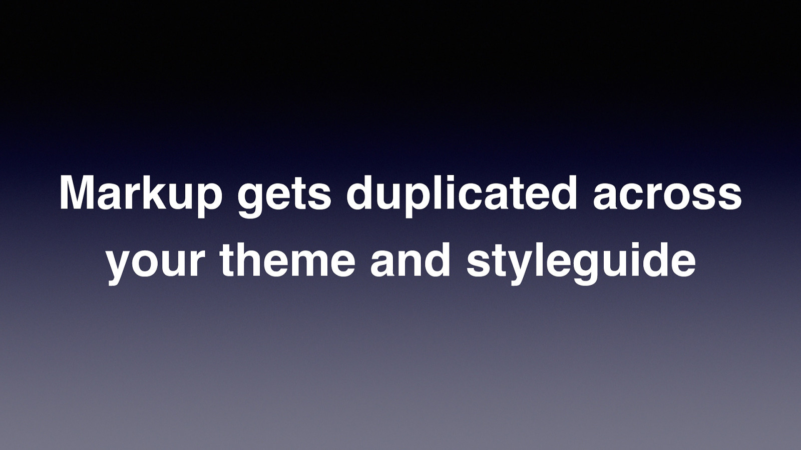
Markup gets duplicated across your theme and styleguide if you only use one approach it will be this one, however it can make maintenance more di ffi cult if your project is quite big and has a lot of templates
If you change a component, you might have a lot of places that need to be updated. Maybe a developer will change a component that is used in places that they can’t access or don’t maintain or know about. Or someone will update the markup in the theme and not realise that the markup in the style guide is now out of date.
An alternative to this is…
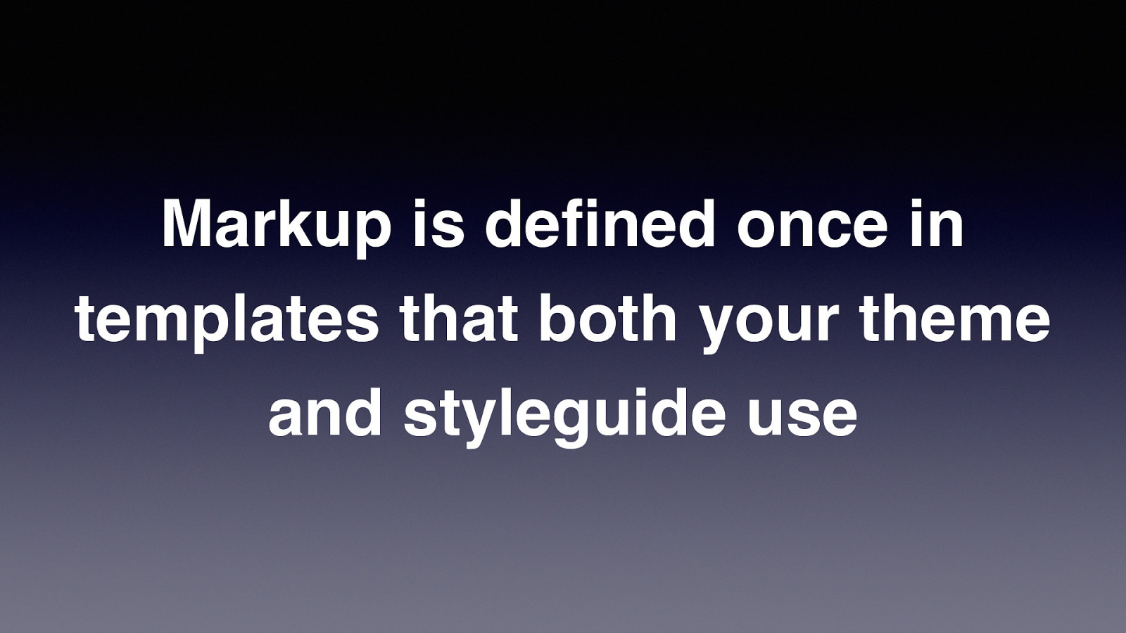
Markup is defined once in templates that both your theme and styleguide use The style guide build tools already use template languages internally, so it’s possible to create your component templates so that they can be re-used between the style guide and your wordpress theme
You need to create an API which in practice would just mean a function that you use for resolving the location of templates and rendering them with the supplied contextual data.
The gov.uk design system is a good example of a location that this is used, and for big projects that are maintained for a long time I think this is really essential. Though while using this method you will likely still have places where the HTML is written manually.
Besides re-use another way this helps is it keeps the output consistent. Someone isn’t able to leave out attributes or elements they think aren’t needed which might not have a visible impact for them but affect the accessibility of the component, or to swap the type of elements used in such a way that the accessibility of the component is impacted or how it displays on certain devices is changed.
Because this isn’t out of the box with any of the tools and lots of people don’t have experience with templating engines in wordpress, it might be worth skipping this to start with, and just ensuring that within wordpress you are limiting the amount of times you are repeating markup by encapsulating the html for your components in php functions when it needs to be re-used in several places.
NEXT…
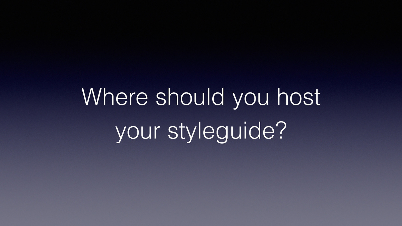
Where should you host your styleguide? You could just build the style guide when you deploy the site and keep it in a sub folder of your webroot, it will be static html and most hosts will just serve the files without any changes to your web server configuration.
However some wordpress hosts have deployment processes which are di ffi cult to modify so adding in a step to compile your styleguide might not be that easy. It also means you can’t see and share your styleguide until you have setup your wordpress hosting, so I would recommend instead using…

Netlify, it’s simple and most likely free hosting for your styleguide (depending on the the requirements) hosting for static websites. You can set it up so that it watches your repository and rebuilds the site when a change is pushed so your style guide is always up to date and then you aren’t blocked waiting for someone to setup your wordpress hosting. I use it regularly and have never had any problems with the service, I have also rolled my own static hosting using cloud file storage and as easy as that is, this is easier and I don’t recommend it unless you are already using those services.
Next, now that you’ve answered the important starting questions I want to go through…

An overview of the
development process (for me)…
So I’ve talked about why designing with components and style guides is helpful and how to do it, but the talk is component and style guide driven development. So I
wanted to step back and look at the high level flow of using these tools as part of the process from the start
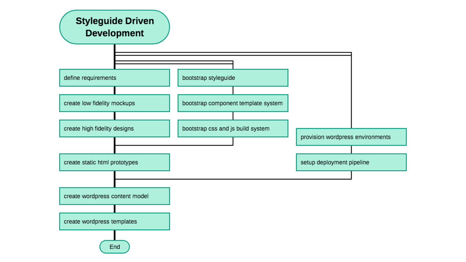
So this is a little simplified flow chart of the different steps involved in the development process when developing with a style guide. It reads from top to bottom (DRAKON format) and the lines that diverge from the main line are things that can happen in parallel.
The key thing for me is that when you’re developing against a style guide it becomes easier to decouple the work on the front end from the integration work into wordpress.
You can quickly prototype and test designs, and because you then re-use the css and js you created for your style guide and static designs in wordpress (and also templates if you’re re-using templates between the styleguide and your wordpress theme) you aren’t throwing away work.
And the style guide serves as a place to put documentation that is available throughout the development process, where as normally documentation is a step at the end of the project.
I also feel like a lot of development processes tend to skip creating static versions of designs and go straight to creating in wordpress, I think this is a mistake because developing in wordpress is relatively expensive compared to working in static html that you can quickly deploy with something like netlify.
SO…
Thank you for listening! • Slides will be available online, I'll tweet a link to them and any more resources I have from @socialpoetry with the conference hash tag • You can grab me anytime if you want to talk about this more or get my contact details I hope if you’ve heard about style guides and pattern libraries before that this has given you some helpful information to help you break the seal and have a go at using them on a project. Or if you’ve never heard of them before that it’s given you a decent introduction.
I think for wordpress themes, where we have a lot that are sold as generic templates, supplying a style guide alongside your theme could be very useful. And in teams style guides provide great benefits in lots of areas and once you’re comfortable using them they become a default on almost every project.
—
other bits that are semi-related
complements compiling your wordpress content as static website using node js or a tool like gatsbyjs
how does gutenberg change things? Not massively, as I think gutenberg is just outputting static html so your patterns would still apply, might want to have a separate styleguide of gutenberg components though to manage the styles for the input components. Stuff like react-storybook is good to look at in this arena.