A presentation at Create Leicester in April 2018 in Leicester, UK by Paul Robert Lloyd

Imagine you were designing a city. Where would you start? Perhaps with its layout?
What would this look like? Might it be based on a grid, like that of New York? Or avenues radiating from squares like Paris?
How about one based around the shape of a bird?
A city with such a layout exists. It is called Brasília, and it is the capital of Brazil.

Until 1960, Brazil’s capital was Rio de Janeiro. A coastal city, it was seen as vulnerable to attack, with the country’s republican constitution of 1891 stating that the capital should move inland.
It wasn’t until Juscelino Kubitschek became President in 1956, that its construction would be ordered. His election campaign had promised “fifty years of prosperity in five” and building a new capital was a key pledge. By this point, moving the capital for defensive reasons made little sense. No, this was more of a political gesture; a means of announcing Brazil to the world as an optimistic and forward-looking country, ready to move on from its colonial past.

Kubitschek invited the architect Oscar Niemeyer to design the capital’s landmark civic buildings, with Lúcio Costa winning the contest to arrange it’s urban plan.
Niemeyer and Costa had worked together previously, and both admired the thinking of their contemporary, Le Corbusier.
Le Corbusier – considered the pioneer of modern urbanism – believed that good architecture could produce good societies. He advocated ideas like organising cities around zones within which different activities would take place, and lifting residential areas off from the ground so that cars and other services could run underneath.
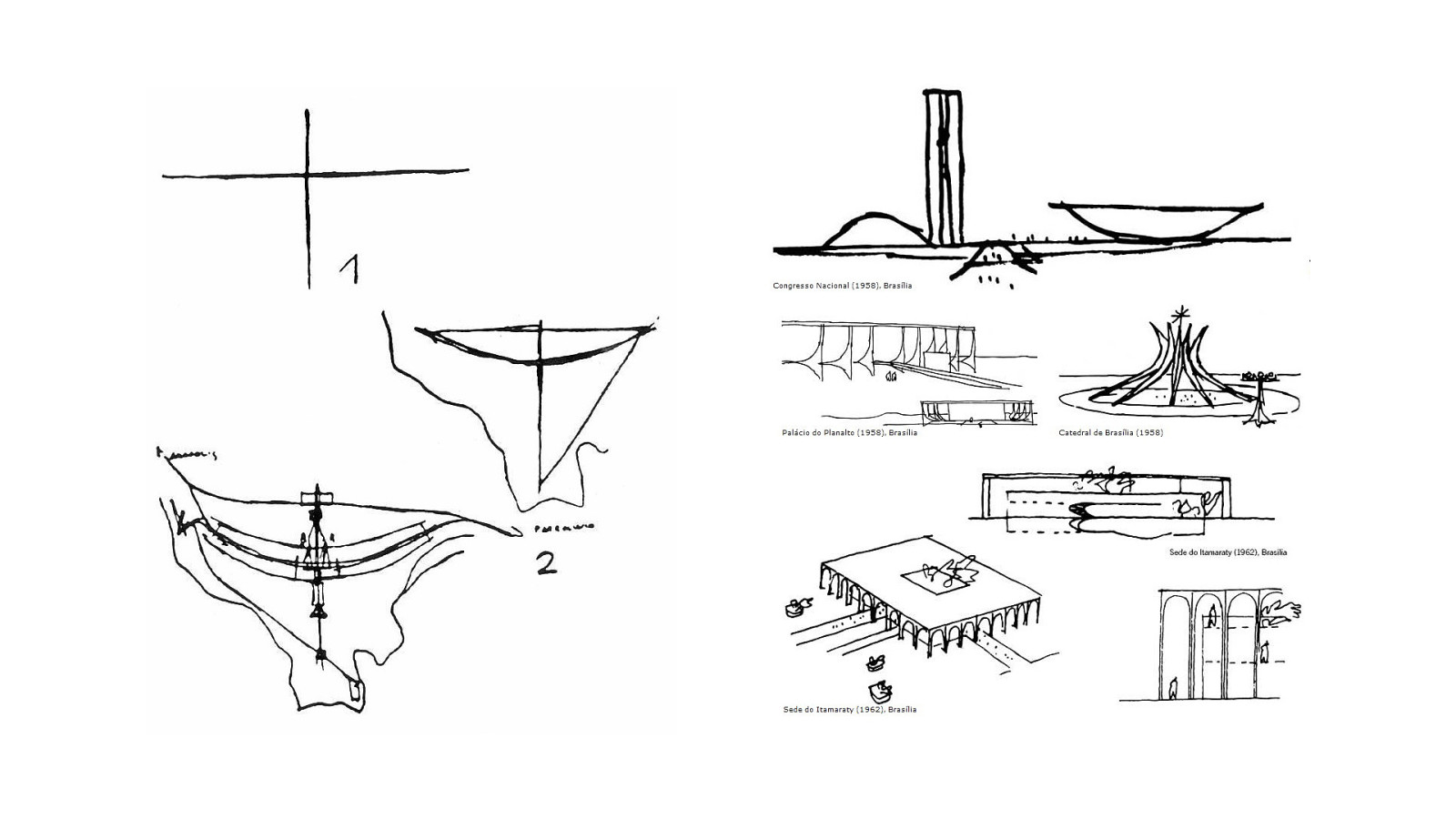
Adopting these ideas as the basis for their project, and with Brazil’s vast and unpopulated central plateau as their canvas, Costa and Niemeyer got to work.
Few people are given the opportunity to design a city, let alone a new capital, so you can imagine the effort, idealism – and no doubt ego – that went into this endeavour.
Beyond acting as a symbol for a bold and modern country, they hoped their design could help transform Brazil’s heavily stratified society into a more egalitarian one. They imagined governors and ambassadors, living next to janitors and labourers, with everyone using the same entrances and sharing the same spaces.

After just 41 months of construction, their new city was born.
With Costa’s logical layout and Niemeyer’s distinctive buildings, Brasília is considered a definitive example of 20th-century modernist urban planning, and the city received UNESCO World Heritage status in 1987.
Yet, while aesthetically pleasing, it fails as a place to live.
Built around the car, distances between buildings are often too large and everything just feels disconnected. Its environment is somewhat stark and sterile – to the extent that many residents will head to the airport on a Friday evening to escape to the more vibrant cities of São Paulo and Rio.

But the city has much bigger problems, and they stem from Costa’s distinctive bird-like layout that you saw earlier.
This layout and its mono-functional zoning limited the amount of residential space available. As people moved to the city in search of work, and the population grew rapidly, so Brazil’s racial class structures began to reassert themselves. Soon into its construction, the workers helping to build the city were banished to distant satellite towns. Segregated from the middle-classes, they would spend their meagre salaries on commutes into and out of the city.
My brother lives in Brazil. He told me that most citizens consider Brasília to be a city built for the rich, by the rich. Quite different from the egalitarian aspirations of its two architects.

In 1980, the art critic Robert Hughes said…
Nothing dates faster than people’s fantasies about the future. This is what you get when perfectly decent, intelligent and talented men start thinking in terms of space, rather than place, and about single rather than multiple meanings. It’s what you get when you design for political aspirations and not real human needs. You get miles of jerry-built platonic nowhere infested with Volkswagens. This, one may fervently hope, is the last experiment of its kind. The utopian buck, stops here.
There’s a lot to unpack in Hughes critique, but whenever I hear it, I wonder if the same criticisms could be levelled at our own industry. We’ve certainly adopted the modernist aesthetic, with trends departing from the decorative and experimental, toward the minimalistic and apparently materially truthful.
But what of the political aspirations that surround our work?
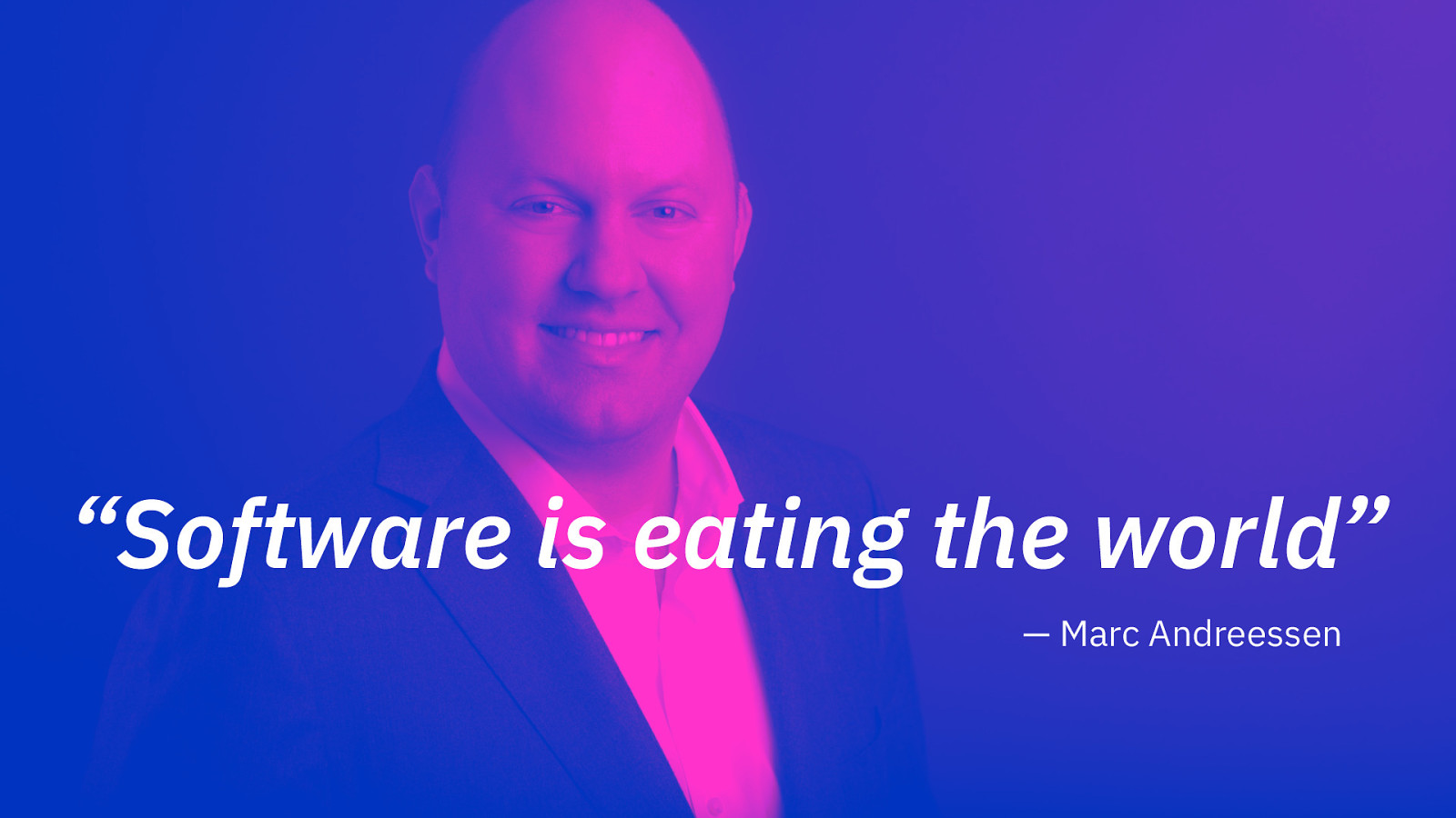
In 2011, Marc Andreessen penned an essay for the Wall Street Journal, in which he suggested that every company needed to become a software company for it to remain relevant:
Six decades into the computer revolution, four decades since the invention of the microprocessor, and two decades into the rise of the modern Internet, all of the technology required to transform industries through software finally works and can be widely delivered at global scale.
He was right. We’re now in the midst of a cultural shift in which technology companies are dictating large parts of our economy. And they have largely benefited from two phenomena.

The first is network effects.
Metcalfe’s Law states that the value of a network is proportional to the square of the number of connected users. Simply put, a single phone on its own is useless, but connect it to a second, and you can make a connection. With five phones, you can make 10 separate connections, with 12 phones, 66 and so on.
The Internet has clearly benefitted from this effect, and by extension so have the companies built upon it.

The second phenomenon has been the decreasing cost of hardware. This has essentially been driven down to zero – even more so since companies like Amazon have commoditised the infrastructure required for data storage and delivery.
So, with a low cost base, a potential audience of billions, and exponential growth an inherent trait of the platform, the Internet has become a haven for investors, with limitless venture capital made available to those who believe they can take advantage of these factors.

Given this emphasis on technology, Silicon Valley has become the epicentre of our industry.
Populated by white, middle-class (mostly male) college-graduates, here you'll find a culture that stands at the altar of computation, where the only law that matters is that of Moore, and everything can be reduced to a series of ones and zeros.
It’s a place where the only question that matters is can it be done, never should it be done.

That many of these companies were founded by engineers, means they suffer from intensely technocratic cultures. Within it, design was regarded as little more than decoration; an activity you would tack on to the end of a product’s development, once the important work had been done.
Famously, when Larry Page was asked what Google’s design aesthetic was he replied “Pine”, referring to an old command line program that was known primarily for its speed.
At Yahoo, its former CEO Marissa Mayer, talked about how she and a small team of in-house designers came up with the company’s new logo during a weekend – and you could tell! I wonder if they tested 41 shades of purple, too?
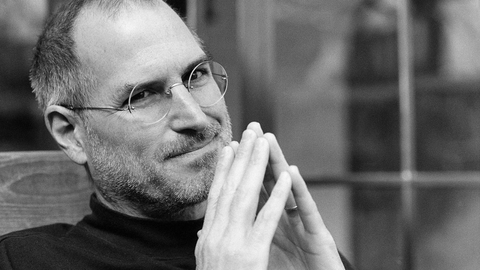
It wasn’t until Steve Jobs led Apple to become the largest publicly traded corporation in the world, that other technology companies started to take design seriously. His incessant focus on design was exemplified by the launch of the iPod and later the iPhone. Proof – if it were needed – that consumers valued good design.
With their empathy for users, understanding of human behaviour and a research-driven process, designers were now well positioned to help companies meet and exceed their customers’ expectations. Before long, organisations like Samsung, IBM and Google started to spend millions of dollars building in-house design studios.
Designers had finally found themselves a seat at the top table.
But what of the companies in which that table sat?
Now undoubtedly, this talk has been influenced by current events – how could it not? However, I’ve been hating on Silicon Valley before it was cool. In part, this is due to having lived and worked there for two years just as it was rebuilding itself after the dot-com bubble. Been there, done that, got the branded hoodie.
As I’ve watched these companies grow ever more dominant and successful, so I have seen the ideas they promote percolate through into the wider digital design and development communities. Look at these ideas in any detail, and you will see a number of priorities emerge. Once you notice them, like the dodgy kerning on Yahoo’s logo, they can’t be unseen.
The first of these priorities is growth and the desire to build at scale.
This is to be expected; companies gain investment on the basis that they can reach a large audience. And besides, growth for the sake of growth is capitalism’s resting state.
Yet these monetary reasons have been obscured and reframed by the sort of idealism that often creeps into Silicon Valley’s groupthink, with its leaders seeing growth as a moral imperative.
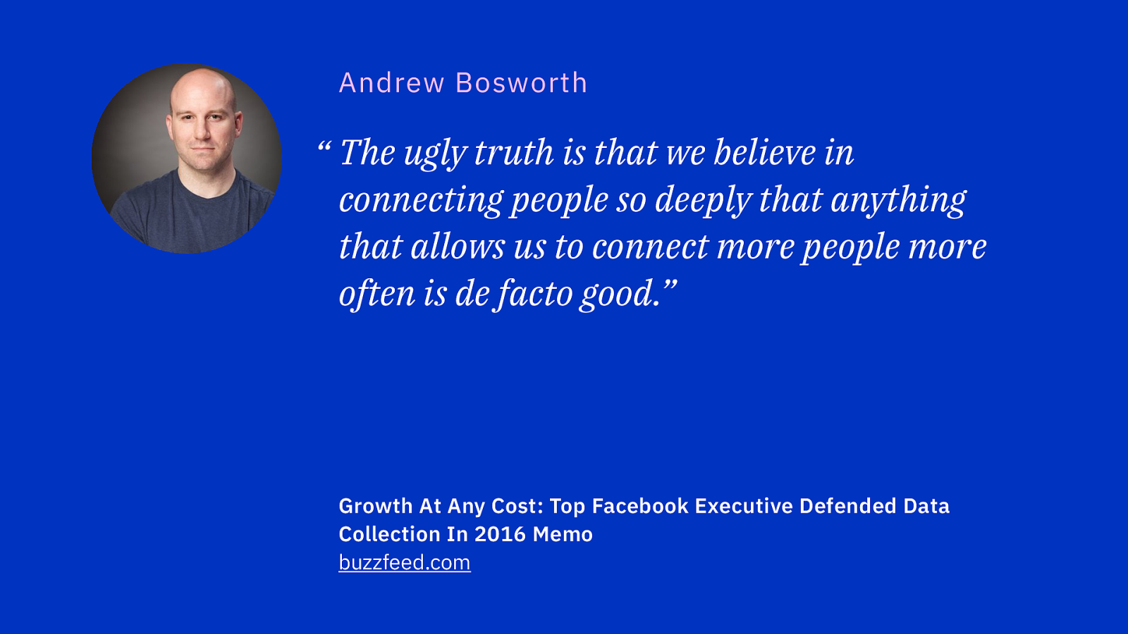
In an internal memo written in 2016, a senior executive at Facebook attempted to justify the company’s growth at all cost strategy:
The ugly truth is that we believe in connecting people so deeply that anything that allows us to connect more people more often is de facto good.
His memo goes on to use this as justification for questionable practices around contact importing, and the subtle language they use to ensure people remain searchable – although there were plenty of other examples he could have chosen.
Over at Twitter, its a fundamental belief in free-speech – whatever that speech may contain – has been used as cover for its desire to grow, yet the result has been to create a network distinguished by its poisonous and unpleasant atmosphere.
On a more practical level, designing at scale requires skill, patience and an acceptance that the more users means accounting for greater diversity.
Systems administrators will talk about five nines; ensuring a service uptime of 99.999%. If you can achieve this, over the course of a year, your service will be down for just five minutes and 15 seconds, an acceptable level of failure.
To approach design with the same mindset is problematic. A decision that may adversely affect 0.001% of users can be dismissed as an edge case, but if your product serves 2 billion users, that decision will still affect 2 million people. People are not edge cases.
The second priority is speed, by which I mean the desire to ship new features quickly.
As it becomes cheaper and easier to build products, and with incentives rewarding delivery, product managers will push to get something out the door and improve it later.
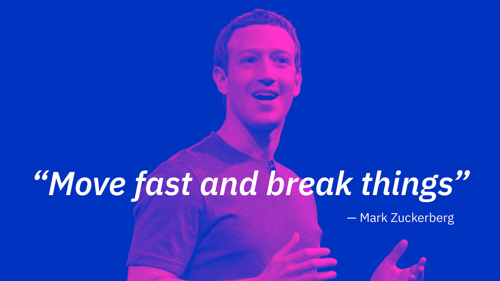
We see start-ups built on the back of mantras such as “ask for forgiveness, not permission”, “always be hustling” and of course “move fast and break things”; a motto that long hinted that Facebook was more concerned with shipping features than taking responsibly for them once they had launched.
This focus on speed has led to a variety of processes and workflows being adopted.
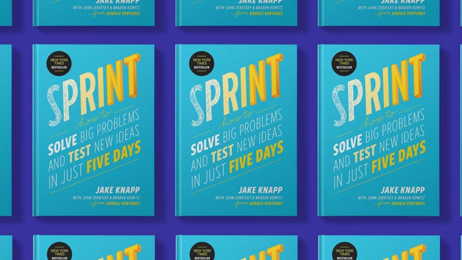
Chief among these is Agile. A product of software delivery, it’s a process designers often need to slot into. They will talk about the difficulty of making long-term decisions or being able to look holistically at problems, when this process demands small pieces of separated work.
In recent years, ideas like minimal viability, Lean UX and Design Sprints have gained favour. These processes tend to focus on minimising risk, failing fast and getting feedback from users at the earliest opportunity. This is all great and should be encouraged, but the overriding purpose of these ideas is speeding up delivery – I mean, the clue is in the title!
If designing for an audience of billions encourages you to make generalisations, then operating at speed leaves you little time to consider the potential ramifications.

This emphasis on speed has also dictated the shape of our tools.
Abstraction and modularisation enable products to be built quicker. This has led to the development of component-oriented frameworks like Angular, React and Vue. At the same, designers are starting to adopt similar modular approaches. While this alignment is encouraging, I worry that design is increasingly becoming a servant to the needs of the engineer rather than those of the user; the question is always “should designers learn to code”, never the other way round.
There is also a growing sense that these tools are being adopted primarily for the benefit of internal team dynamics – the rise of the term ‘developer experience’ being just one signifier.
Finally, there’s this compulsive deference to data, and the idea that the more of it you can collate, the better informed you will be about your customers and how they use your product.
By this point, data acquisition has become an addition. Companies collect and hoard data even if they don’t need it. Further still, they have been poor custodians. Last month it was a breach at Facebook. Before that it was Equifax, LinkedIn and Yahoo. If data is the new oil, then storing large amounts means building your company on top of a highly flammable material.
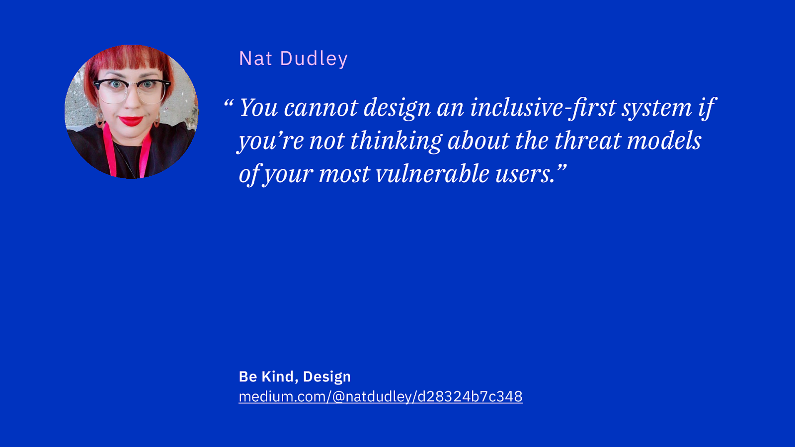
At this year’s Webstock in New Zealand, Nat Dudley gave a powerful talk about inclusive design. She noted that storing data about people, especially those in minorities or in vulnerable situations, can put them at risk ~~should it~~ when it leaks.
You cannot design an inclusive-first system if you’re not thinking about the threat models of your most vulnerable users.

Besides, focus too hard on the numbers, and you end up making incremental changes and optimising within local maximums. Rather than seek out new approaches, ultimately this can result in a company becoming vulnerable to disruption from competitors who have chosen to experiment.
And let’s not forget that data can very be easily manipulated. Depending on how you choose to query or present it, different stories can be told.
You needn’t look far to find the effects these priorities can have on the design of digital products. Perhaps there’s no better example than that of Booking.com.
I tend to avoid the site because it has always felt a bit sketchy, but last year I wanted to stay at a particular hotel, and it was only available on this site. Booking this hotel may be one of the worst online experiences I’ve encountered. Every page on the site felt like it was shouting at me, encouraging me to book; I could actually feel my heart race as I was pushed through the checkout flow. I felt agitated, angry, and exhausted.
How on earth does a design team end up producing such a user-hostile product like this?
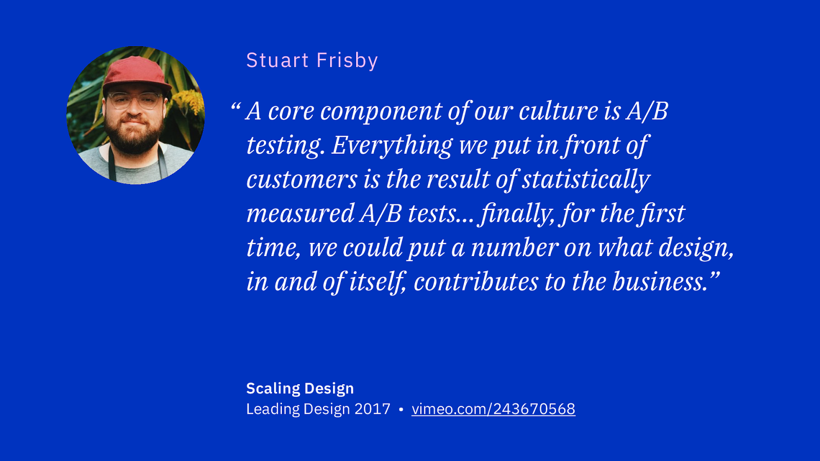
Stuart Frisby, Booking.com’s Director of Design, speaking at Leading Design conference last year, talked about how he joined an engineering-led company heavily invested in A/B testing. Rather than question if this was the right approach, he saw this as a means of measuring the value his team could provide to the company.
At an earlier talk he gave in 2015, he talked about how and why booking.com uses A/B testing…

One of the core principles and core cultures of our organisation is that we want to be very customer focused, and A/B testing is really a way for us to institutionalise that customer focus in a way that makes it very difficult for us to be anything else. All of the features that we deliver are designed, developed and tested in order to validate that they are already better than what we have for customers.
Having a focus on the customer sounds great. Yet, here’s what Stuart said just a few moments later:

So you have a hypothesis. The next step is to figure out how you prove if that hypothesis or true or not, so we go through a process of metric setting. For us as an e-commerce company, it’s pretty straight-forward: that key metric is always do we earn more money doing this or less.
There’s a weird perverse cognitive dissonance at play here that is as fascinating as it is distressing.
Making more money and treating customers with respect are not mutually exclusive; you need to find the sweet spot between making money and having happy customers. Booking.com have decided to focus exclusively on the former, with predictable results.

Dark patterns are interfaces purposely designed to trick you into doing something you hadn’t intended. Unsurprisingly, Booking.com is drowning in them. They manipulate customers by:
The site is a visual cacophony of popups and banners, notifications and suggestive microcopy. It’s a disgrace.
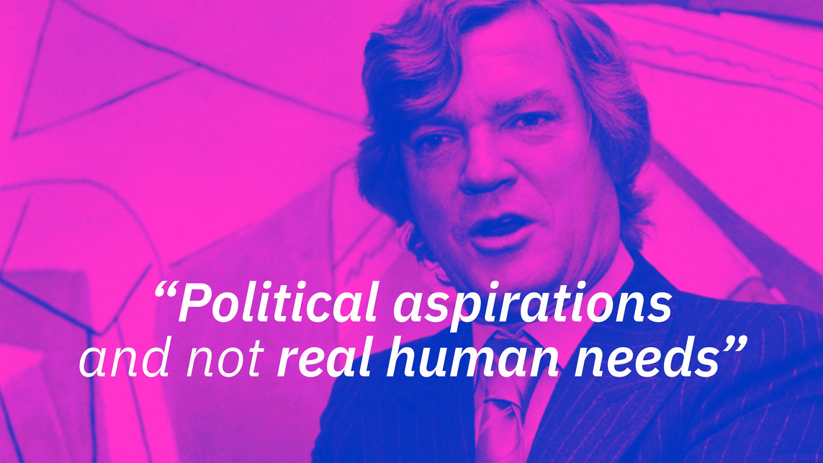
This is what you get when you design for political aspirations and not real human needs. You get endlessly click-tracked pages infested with Dark Patterns.
However much a company says it values customers – and most companies say they do – what matters is what’s being measured. If a culture priorities speed, cost and engagement, over quality, value and suitability, then we need to be mindful of the middle-to-long term effects the resulting decisions may have.
If “culture eats strategy for breakfast”,
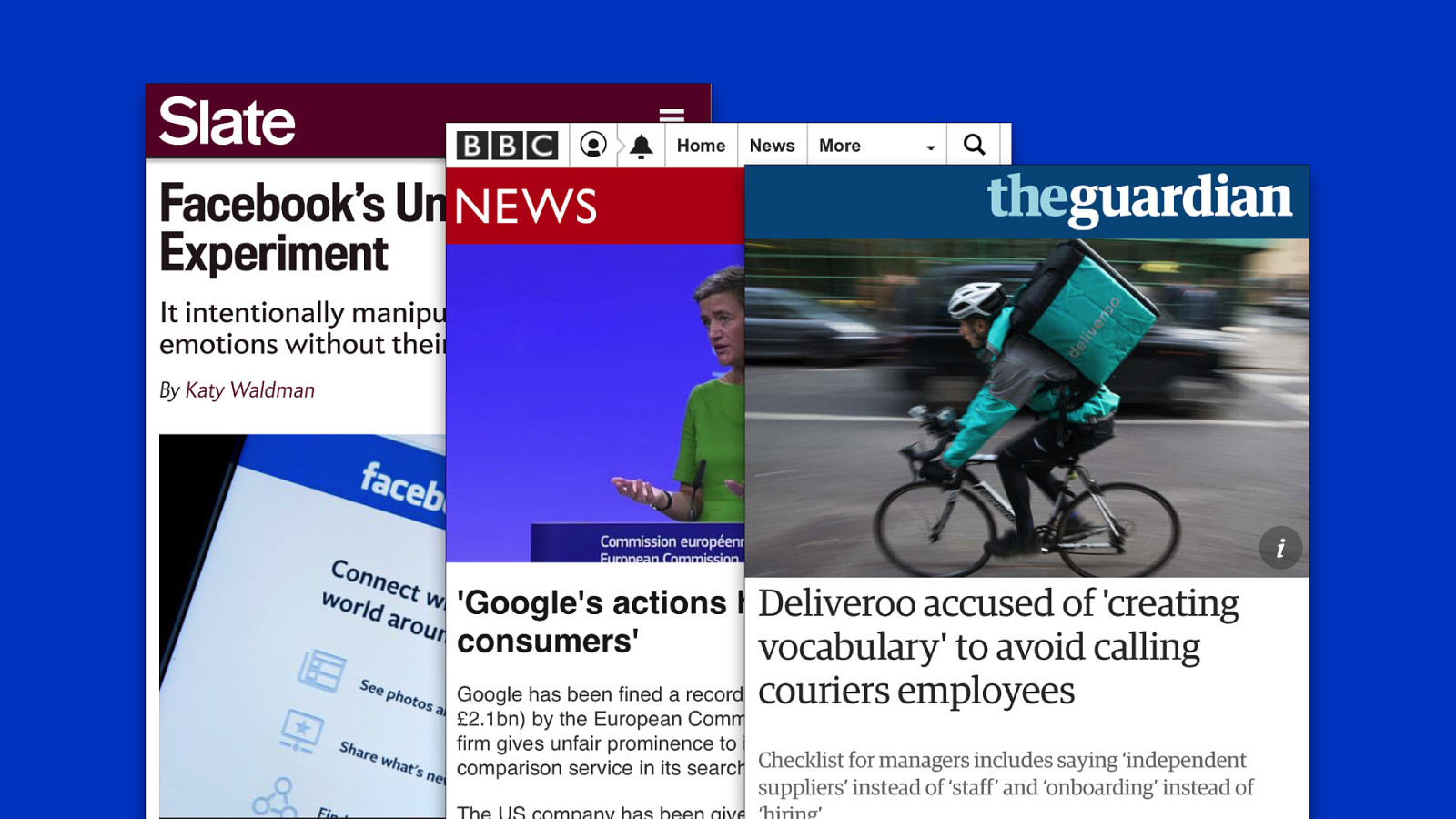
how do you advocate for user agency in a culture that permits manipulating peoples emotions without their consent?
how do you approach the design of a search result component within an organisation that has a habit of abusing its near-monopoly position?
how do you craft tone-of-voice guidelines for a company that also produces guidance on how to refer to employees such that their rights can be undermined?
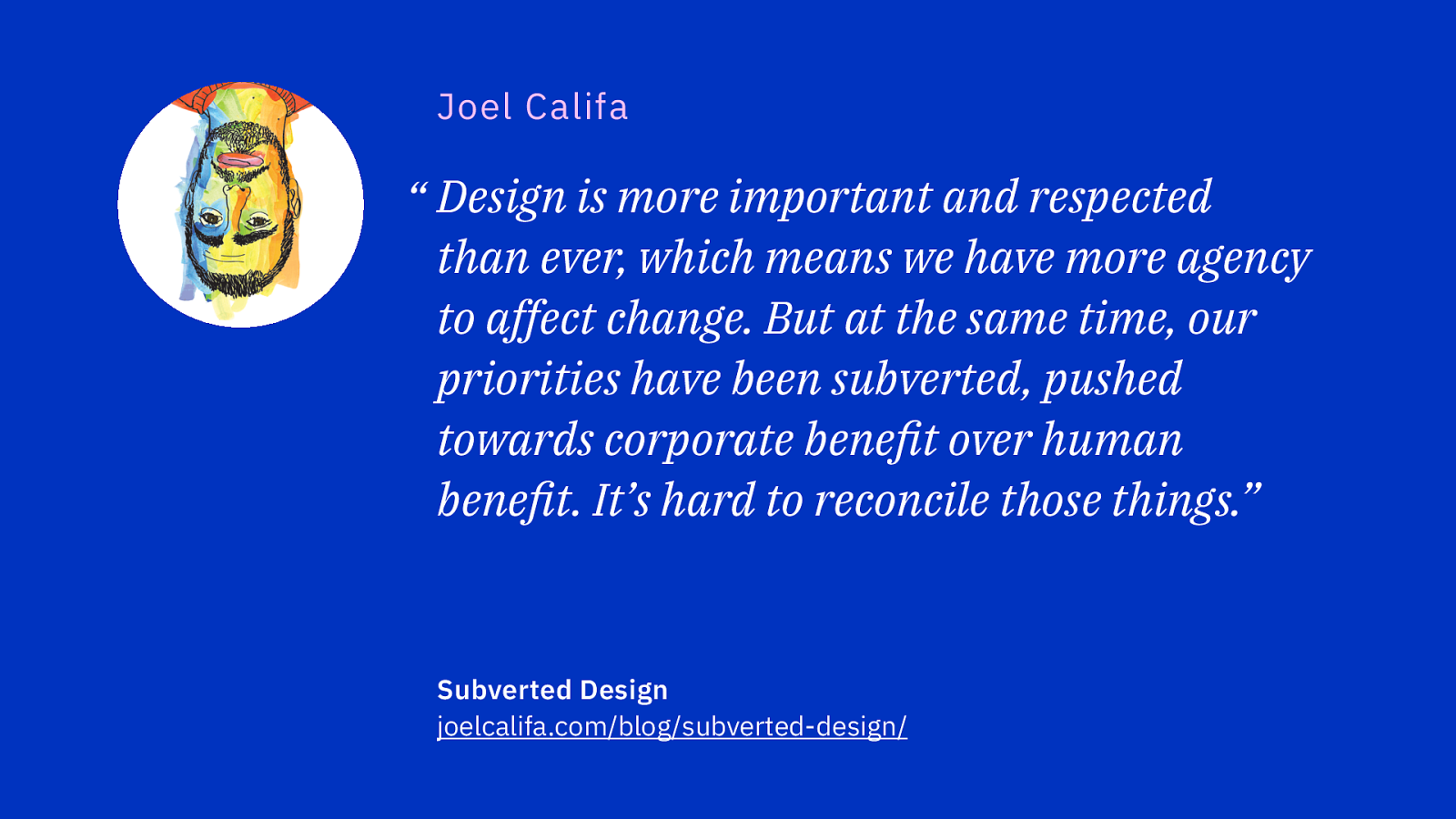
Earlier this year, Joel Califa, a designer at GitHub, described how internal cultures can subvert designers such that they end up working in service of business goals at the expense of user needs.
He noticed that designers who would advocate from the perspective of the user were perceived as naive, and junior. Those that were seen as more pragmatic and business-minded, were rewarded with seniority and garnered more respect from managers and leaders.
Slowly, he noticed his language changing too, replacing words like polish and value with ones such as adoption or engagement.
Joel concluded his piece by arguing that designers could repent before pledging allegiance to users once again. But if we’ve been subverted once, what’s to say we won’t be again?

It seems as if designers have been tricked into thinking we have a seat at table, when in fact we’ve been taken hostage, only to develop Stockholm syndrome. Eager to demonstrate that we can do more than make things pretty, we brought our cognitive insights to the table and began talking about persuasive design the design of casinos in order to bolster our credibility. In doing so, we have become accomplishes in exploiting users.
How on earth can we rectify this situation? Can designers be relied on to save themselves from themselves?
Fortunately, a conversation is emerging around possible solutions.

Some are making the case for a code of ethics, perhaps some a kind of Hippocratic Oath for designers.
If we can wield so much power, surely we should require a license to practice before we’re allowed near a Sketch file. Perhaps we need an accreditation scheme or a professional body that can kick designers out should they have done wrong.
Others argue that design is already a fairly exclusive cabal, and such a scheme would only serve to make design less accessible and exaggerate its elitist tendancies. Surely, far better to educate people about what design is and how it can be used to achieve both good and bad outcomes?
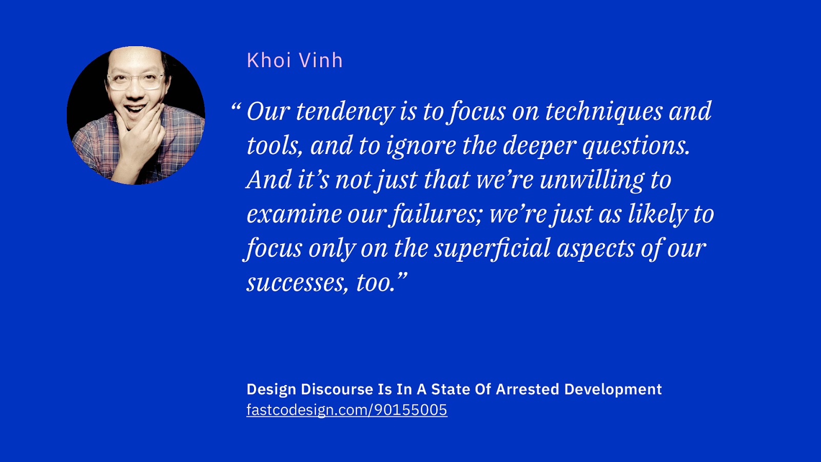
This is an approach people like Khoi Vinh are advocating. Rather than seeking accreditation, he’s been advocating for digital design to become subject to thoughtful, critical journalism.
This is especially true since the discourse among designers can tend toward the shallow and superficial, and can be influenced by having an eye on furthering one’s own career.
Therefore, such journalism would require writers that are independent of the industry. Only that way can their words carry any credibility.
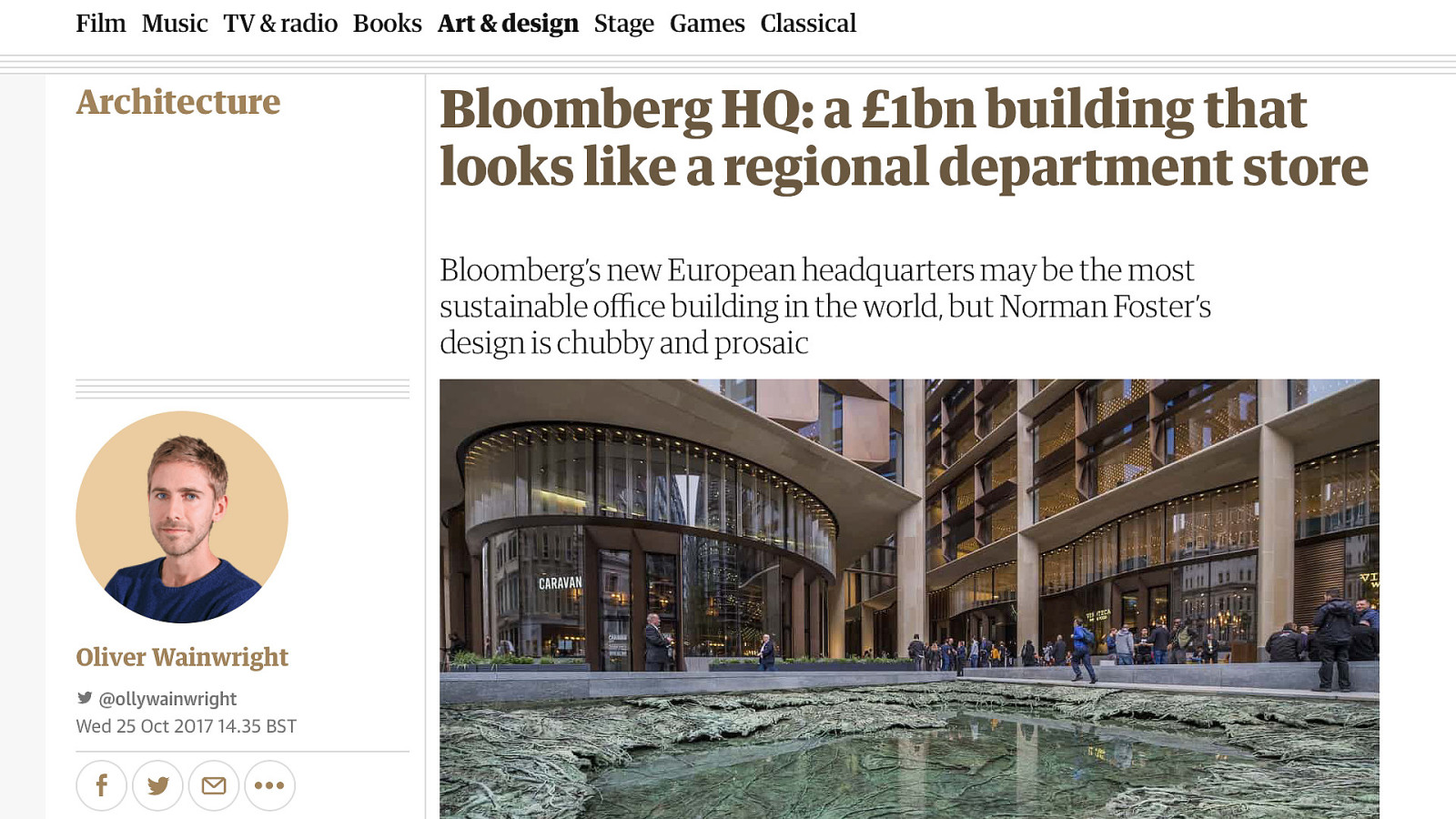
Almost every other creative and commercial endeavour tends to be supported by a critical body of review and critique. Most of us will be familiar with film reviews – hello to Jason Isaacs – but there are examples closer to home too.
The architectural profession is supported by professional critics who question and examine the context surrounding a particular work, and whether the resulting building meets the needs of both the client and those that will inhabit the space – Robert Hughes being just one example.
Wanting independent critical journalism about web design may seem high-minded, and without the will and the funding, impossible to achieve. Still, it’s one of the few ideas I’ve seen that could free designers from the situation they’ve found themselves.
Like the companies they work for, corporate designers need some form of oversight too.
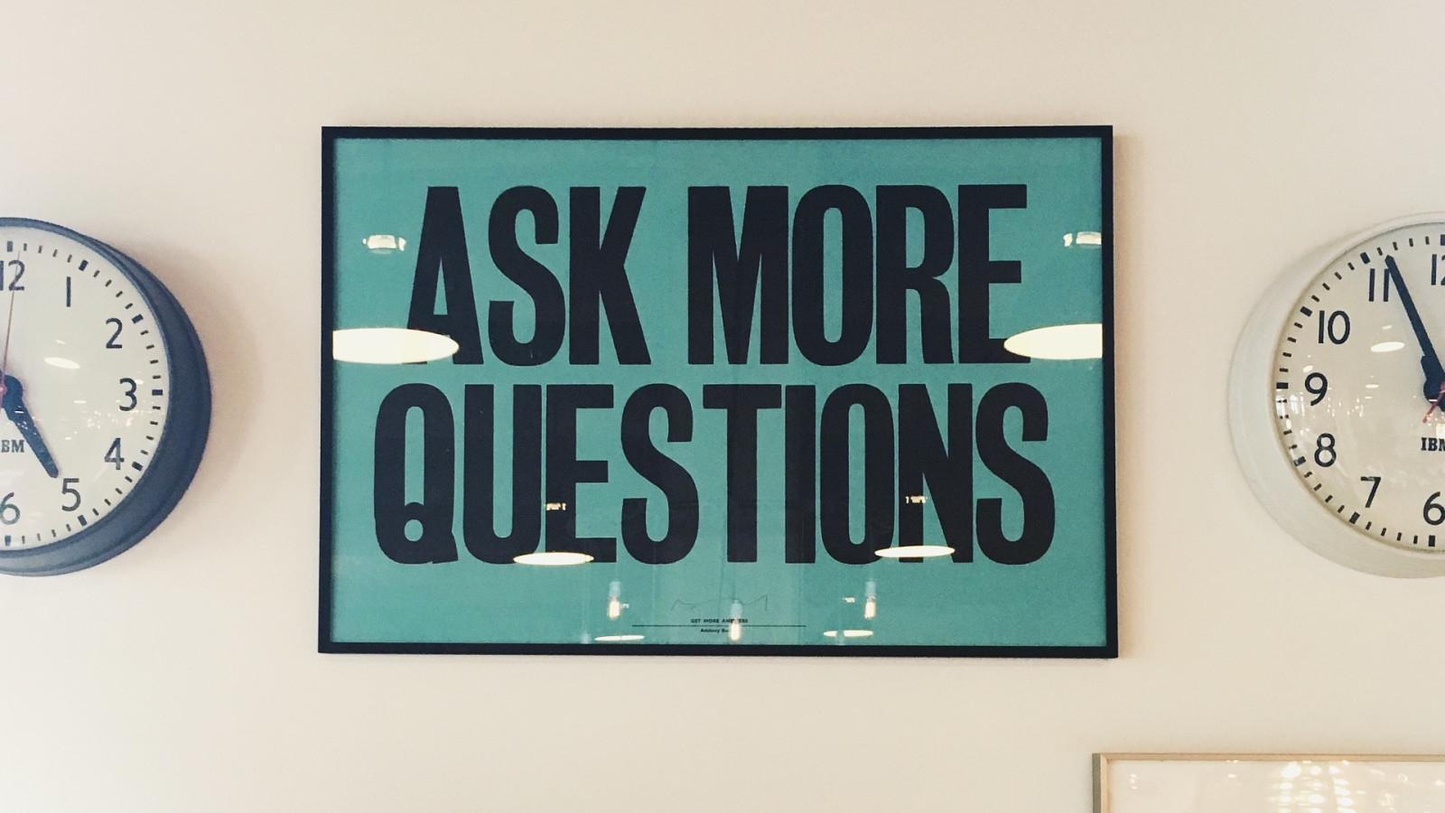
Until such independent appraisal exists, we need to take it upon ourselves to be more critical and introspective. This shouldn’t be too hard. After all, design is all about questioning what already exists and asking how it could be improved for the better.
What processes can we develop to give us time to properly judge a feature; to consider who it is serving, and if it can be misused? To question those default settings?
Perhaps we need a new set of motivational posters. Rather than “move fast and break things“, perhaps “slow down and ask more questions”.

As digital designers, we tend to suffer from the firewall that exists between us the people who experience our work. Regardless of how much user testing and research we undertake, we rarely get to experience first hand what customers’ day-to-day experience is really like.
One way we can counter this is by building more diverse teams, to bring a greater diversity of experiences, insights and ideas to our products.
Of course, that’s easy to say, but I stand here tonight, in a line-up featuring two white men called Paul! I knew ahead of tonight that this would be the case, but I didn’t ask to speak on another night to allow the line up to be more diverse. Most of the references in this talk have featured men.
The first step is awareness. But to change our culture for the better, we need to take action. Each of us has work to do.
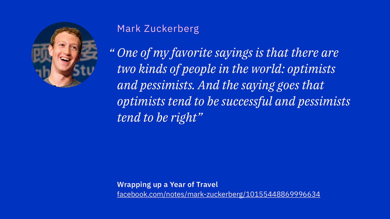
I want to finish tonight with this thought from Mark Zuckerberg:
One of my favorite sayings is that there are two kinds of people: optimists and pessimists. And the saying goes: optimists tend to be successful, and pessimists tend to be right. The idea is that if you think something's going to be terrible, then you’re going to look for data points that prove you right. And you’re going to find them! That’s what pessimists do. But if you believe something is possible, then you’re going to look for a way to make it work, and even when you make mistakes, even when people doubt you, you’re just going to keep pushing forward until you find a way to make it happen.
We have every reason to be optimistic, but at what point does this optimism become blind? The open and democratic futures we imagined the Internet enabling seem quite distant now. Fantasies of a world that would accept the sort of radical transparency Zuckerberg wished for haven’t exactly met with reality.

As my friend Cennydd likes to says:
Cynicism is like vinegar. A splash helps the taste. But add too much and the sourness overwhelms everything.
We are fortunate that our industry has matured to the point that our clients and employers are large organisations with thousands, if not millions of customers. Focusing on growth, trying to deliver things faster, seeking more data; these priorities are not new. It’s just that the web enables us to achieve them on a larger scale, and so their impact is far greater. This can’t be an excuse for us not to question our role and consider how we protect ourselves from ourselves.
If software is eating the world, then perhaps we should reach for the bottle of vinegar, and add a splash of cynicism. That way, we can all enjoy the resulting meal.
Thank-you!