UNDERSTANDING INFORMATION ARCHITECTURE Paul Rissen, Product Manager Springer Nature @R4ISSTATIC
A presentation at Understanding Information Architecture for City University, London in February 2020 in London, UK by Paul Rissen

UNDERSTANDING INFORMATION ARCHITECTURE Paul Rissen, Product Manager Springer Nature @R4ISSTATIC
OUR PLAN FOR TODAY • What is Information Architecture? • Information Architecture in practice • The Future of Information Architecture @R4ISSTATIC What is IA = basic definitions, quick lay-of-the-land IA in practice = techniques for research and ‘doing’ IA 2

WHAT IS INFORMATION ARCHITECTURE? @R4ISSTATIC
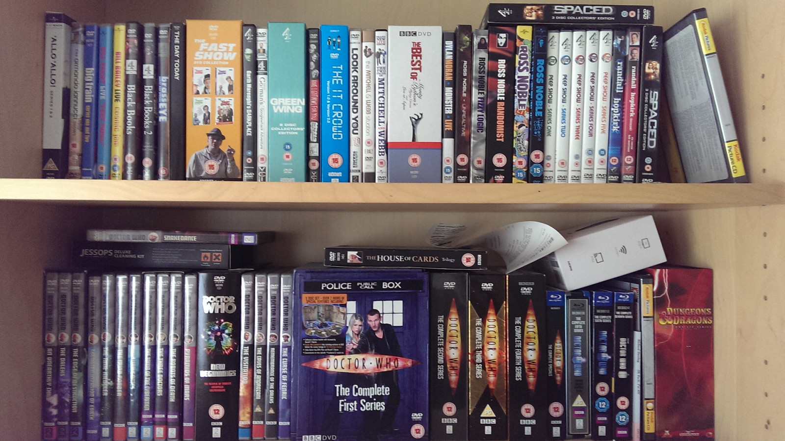
Take a look at my bookshelf. What does it say about me, aside from my obvious love for Doctor Who? Well, there’s some vague ordering here. The top shelf is all comedy, the bottom shelf almost all DW. The comedy is arranged alphabetically, and then by time, the DW by time.
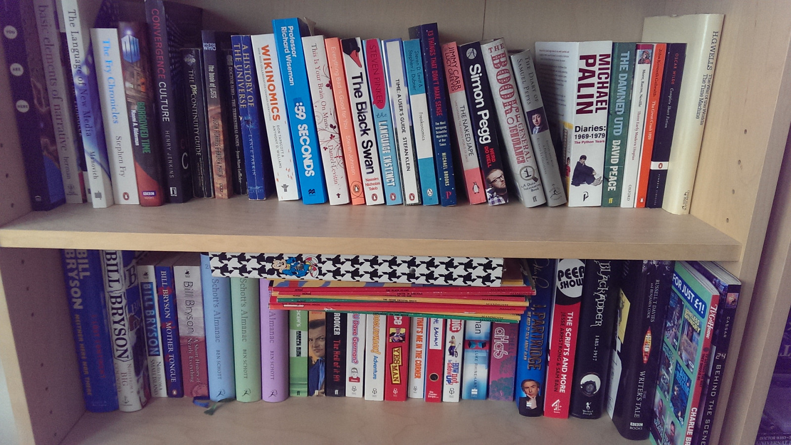
In contrast, look at these two shelves. Pretty much no organisation here. If anything, I’ve tried to stack heavier books at the bottom.
Information Architecture is about making sense Ω So, at it’s most basic, IA is about making sense about designing things so that we can wrap our heads around them.
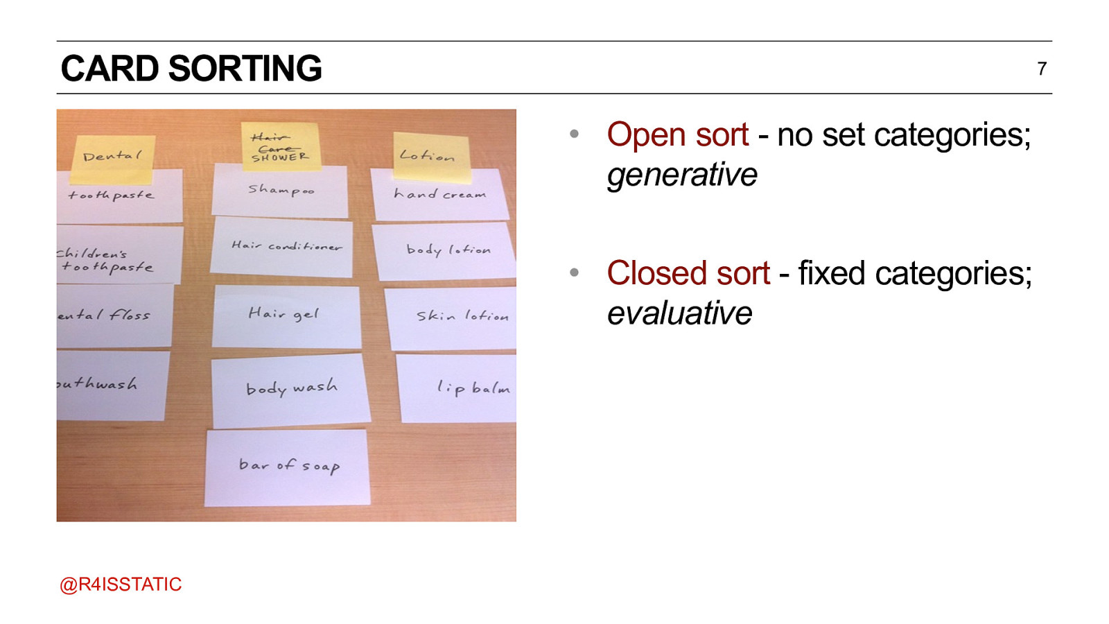
CARD SORTING 7 • Open sort - no set categories; generative • Closed sort - fixed categories; evaluative @R4ISSTATIC What you’ve just done, is what we call a card sort. There are two types: Open sort - generative; it is typically used to discover patterns in how participants classify, which in turn helps generate ideas for organizing information. Closed sort - evaluative; it is typically used to judge whether a given set of category names provides an effective way to organize a given collection of content. But as you can see, the world is more complicated than that.
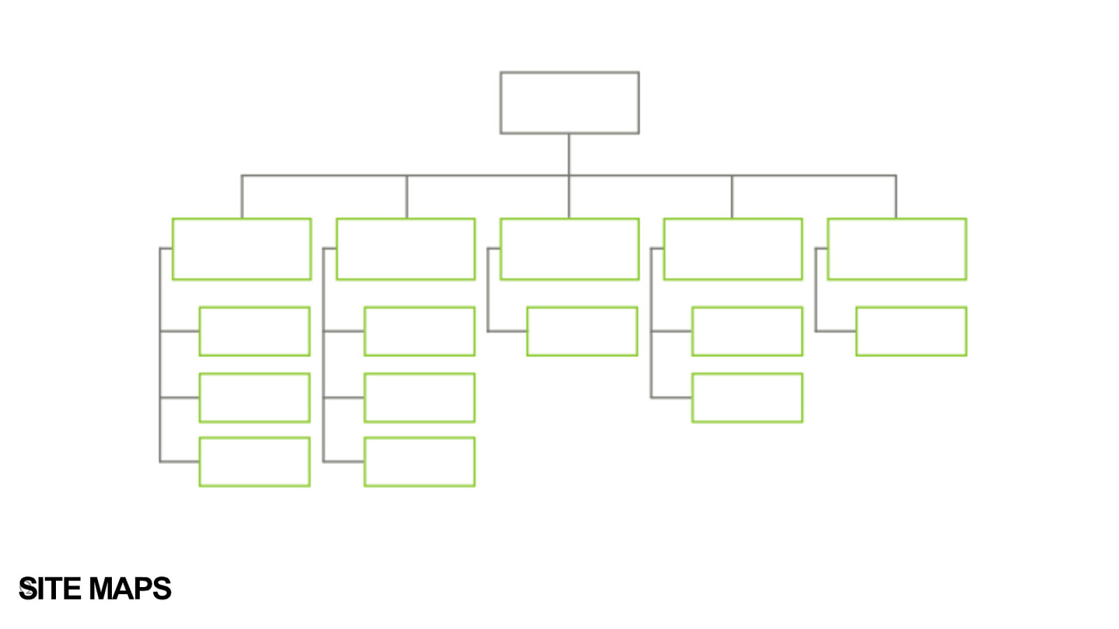
Ω SITE MAPS Hierarchies bring us to one of the common deliverables that IAs find themselves being asked to do. Site Maps. It seems logical, right? Computers have got us so used to folder structures, so that’s how we organise our websites, right? But there are problems.
THE PROBLEMS WITH HIERARCHY • Things can only be in one category. • Requires users to understand your structure before they can use the site. • Difficult to deal with changes and updates to your structure. @R4ISSTATIC It’s a classic case of porting a design pattern from one medium over to another. It works (just), but breaks very easily, and doesn’t use the full potential. 9
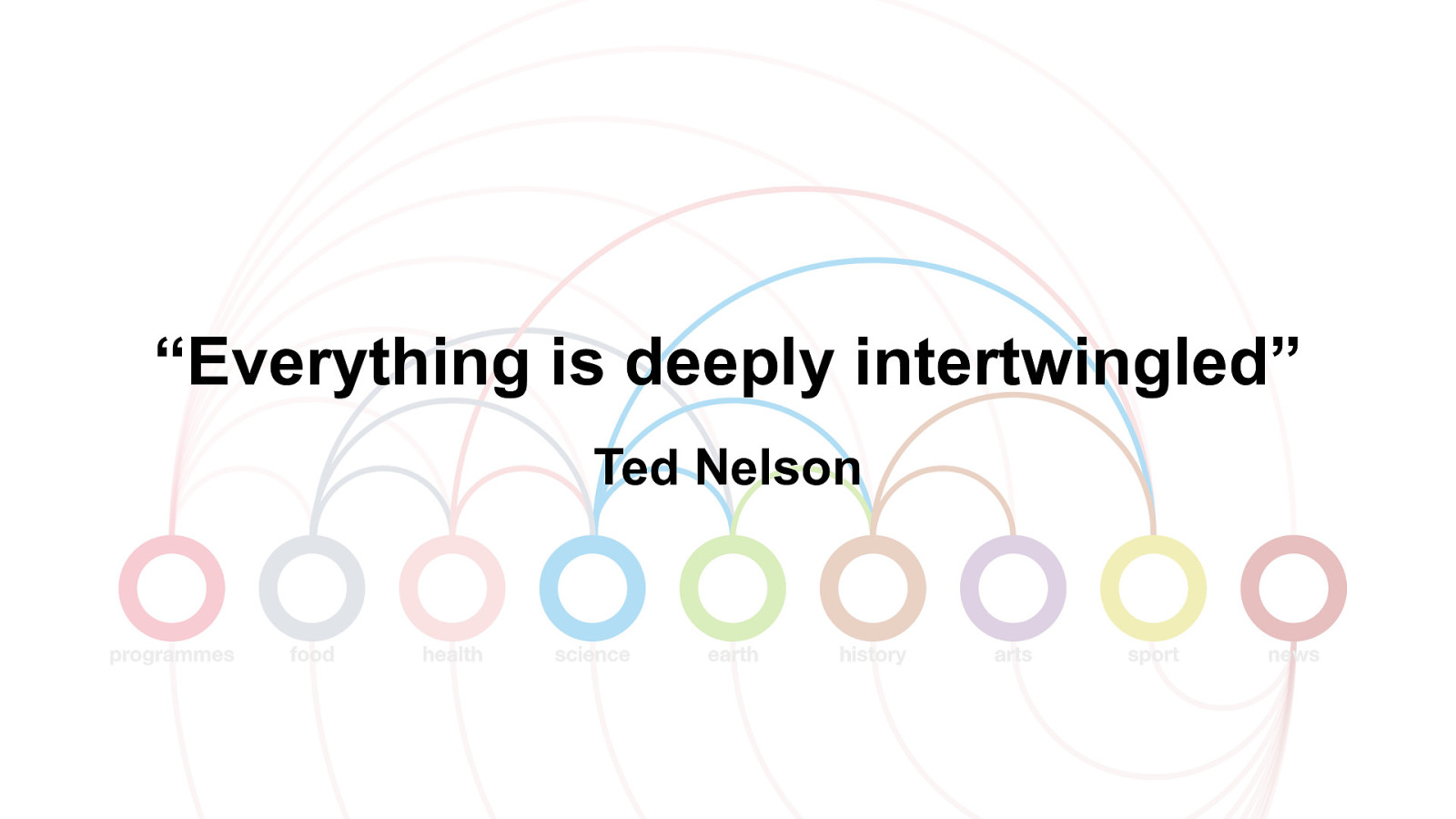
“Everything is deeply intertwingled” Ted Nelson In the words of the hypertext pioneer, Ted Nelson, once wrote “Everything is deeply intertwingled.” What he meant is that although we make artificial boundaries between subjects, between brands, websites, the truth is that reality is complex.
Information Architecture is about making sense of a messy world Ω IA is about making sense - of a messy world (maybe add the point from the Influencing Machine - that ‘information overload’ isn’t necessarily the problem - it’s more that we lack good ways of filtering, navigating, understanding the information)
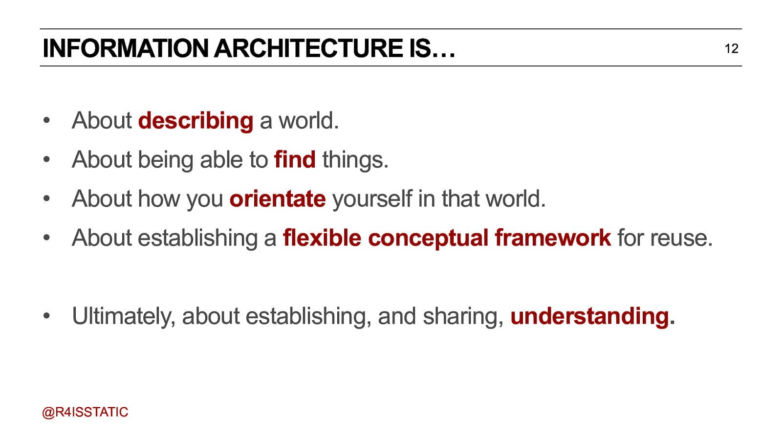
INFORMATION ARCHITECTURE IS… • About describing a world. • About being able to find things. • About how you orientate yourself in that world. • About establishing a flexible conceptual framework for reuse. • Ultimately, about establishing, and sharing, understanding. @R4ISSTATIC Describing = what are the conceptual ‘things’ in your content? Finding = how do people find the thing they’re looking for - both via internal navigation, and via search engines Orientation = how do people make sense of the context? What onward journeys are there? What happens next? Framework = you define a structure for your content, so you can reuse it, and present understanding back to the world. 12
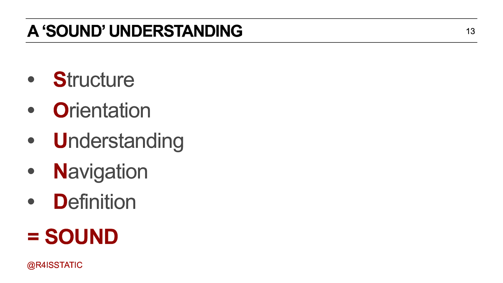
A ‘SOUND’ UNDERSTANDING • • • • • Structure Orientation Understanding Navigation Definition = SOUND @R4ISSTATIC A bit cheesy, but there you go. OK, so let’s try it in action… 13

INFORMATION ARCHITECTURE IN PRACTICE @R4ISSTATIC Let’s start from the page level, then we’ll look at a site as a whole. (about 15-20 mins in?)
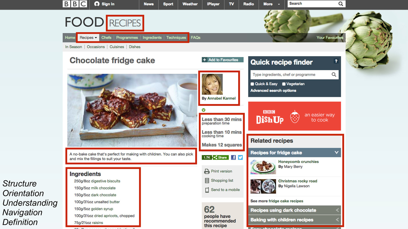
Structure Orientation Understanding Navigation Definition This is a recipe page from the BBC website. What things on this page help establish SOUND? 1. 2. 3. 4. 5. 6. 7. ‘Recipes’ makes it clear you’re looking at a recipe page - you’re in that ‘section’ of the site. The top navigation. Notice particularly these ones which are all ‘things’ in the world of the BBC & Food. The chef. A piece of orientation, and familiarity, but also potential onward journey - other recipes by the same chef. The title, obviously, and the description, help understanding, confirming that this is what the user was looking for. The timings and portions, or what we might call the ‘properties’ or ‘facets’ of the recipe. The ingredients - notice particularly that many of these are clickable links - just like the chef. And finally, onward journeys, to other recipes for the same dish, and other related things - all of which stemming from the world of food. All of the above could be considered information architecture. It’s important to note here, though, that this isn’t about wireframes for a page. It’s about the information on that page - what information is useful, what is the hierarchy of that information? So how is this done?
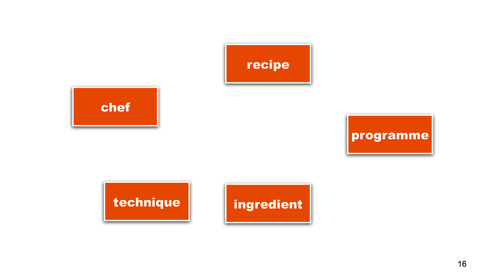
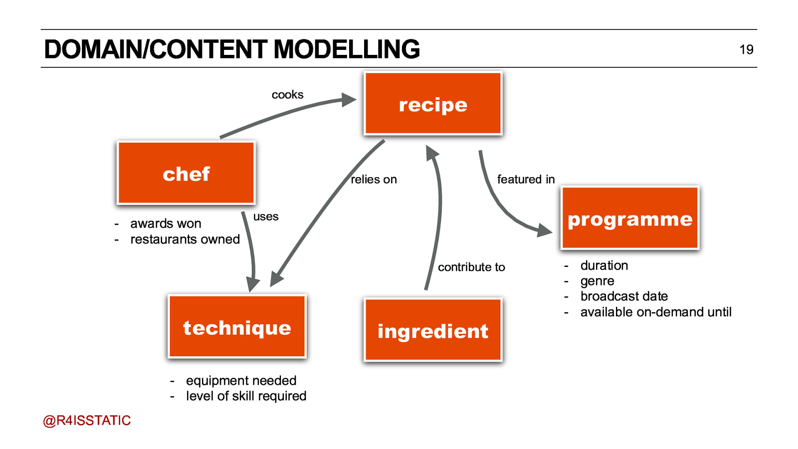
recipe chef programme technique ingredient 16 Well, it’s interesting that in the example of food, we were talking about the various things in the world.
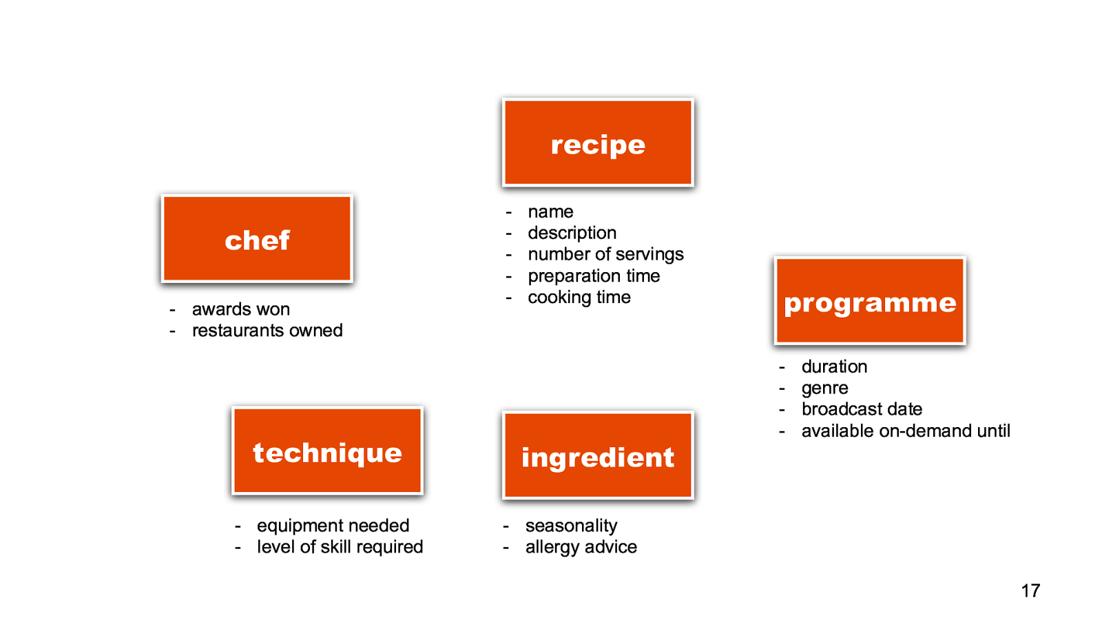
name description number of servings preparation time cooking time ingredient programme - duration genre broadcast date available on-demand until
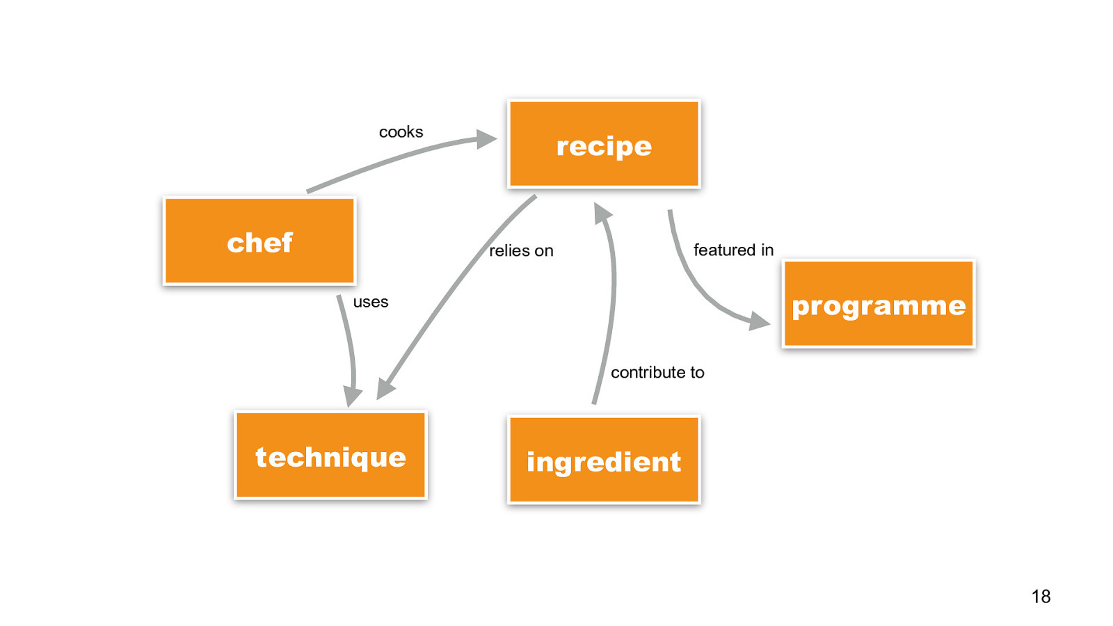
cooks chef recipe featured in relies on programme uses contribute to technique ingredient 18 and each of them are connected together in some way..
duration genre broadcast date available on-demand until
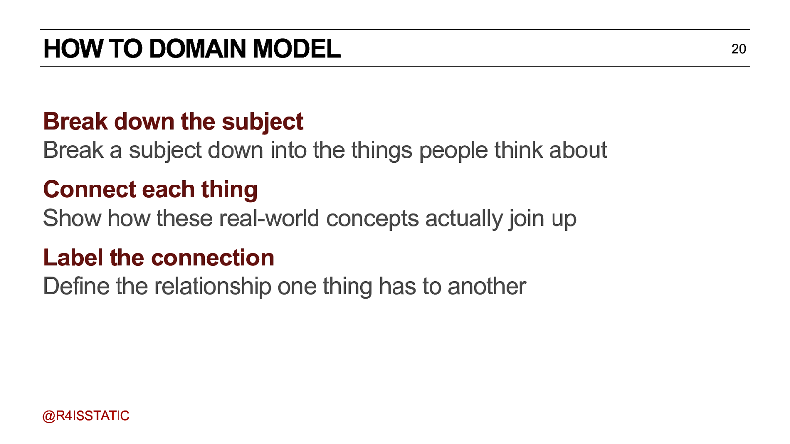
HOW TO DOMAIN MODEL Break down the subject Break a subject down into the things people think about Connect each thing Show how these real-world concepts actually join up Label the connection Define the relationship one thing has to another @R4ISSTATIC 20
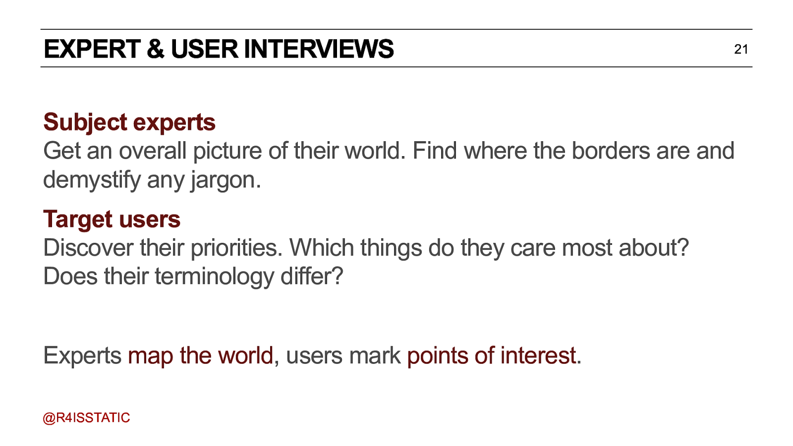
EXPERT & USER INTERVIEWS 21 Subject experts Get an overall picture of their world. Find where the borders are and demystify any jargon. Target users Discover their priorities. Which things do they care most about? Does their terminology differ? Experts map the world, users mark points of interest. @R4ISSTATIC Talk to subject experts. Get an overall picture of their world and ask as many questions as we can. Our goal is to understand which things are important in their world, what those things are called, and how they relate to one another. Then we talk to users, and find out what regular people consider to be important. Where their terminology is different, how their mental model is simplified. Experts are great for giving you that authoritative grounding, but they can be too rooted in unnecessary detail or suffer from organisational tunnel vision, where things outside their own job aren’t considered important. So you need to strike that balance between accessibility and authority.
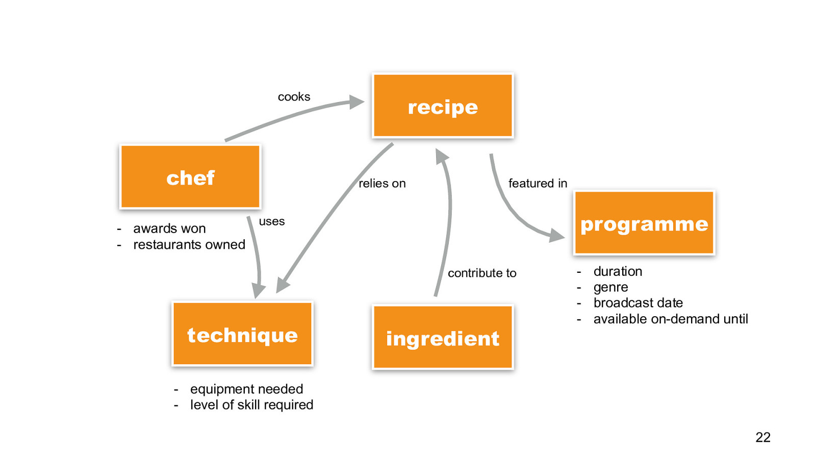
duration genre broadcast date available on-demand until
INFORMATION ARCHITECTURE IN PRACTICE: URL DESIGN @R4ISSTATIC Let’s start from the page level, then we’ll look at a site as a whole.
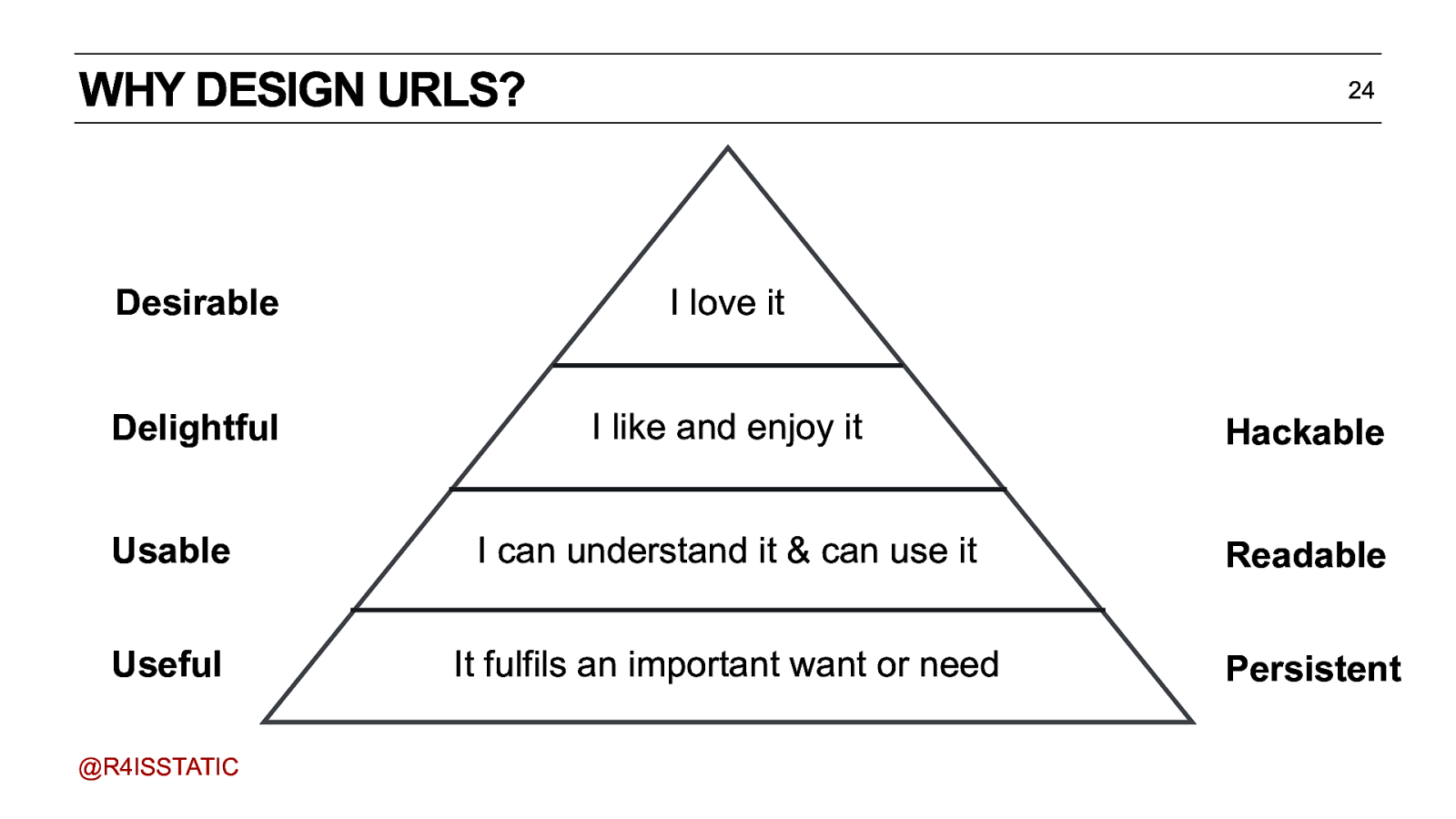
WHY DESIGN URLS? 24 Desirable I love it Delightful I like and enjoy it Hackable Usable I can understand it & can use it Readable Useful It fulfils an important want or need Persistent @R4ISSTATIC The things that you want your audience to be able to find. In order to be able find these things, to point people at them, they need to be addressable - they need to have URLs. You’ve probably heard of Maslow’s Hierarchy of needs. Another way of looking at it, is: useful, usable, delightful, desirable And, when applied to URL design - yes, you do need to design URLs - this translates to…persistent, readable, hackable.
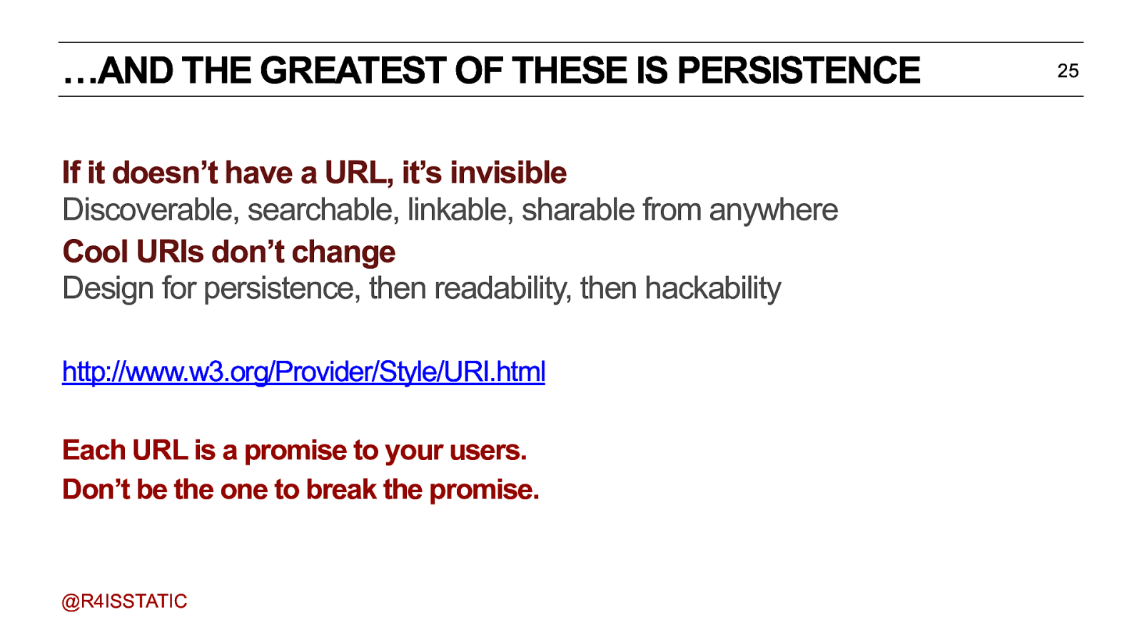
…AND THE GREATEST OF THESE IS PERSISTENCE 25 If it doesn’t have a URL, it’s invisible Discoverable, searchable, linkable, sharable from anywhere Cool URIs don’t change Design for persistence, then readability, then hackability http://www.w3.org/Provider/Style/URI.html Each URL is a promise to your users. Don’t be the one to break the promise. @R4ISSTATIC Persistence is the key. If you have a small enough dataset, and you can make your URLs human-readable, then great. That will help your SEO - because more people will understand what they’re clicking on. But if you don’t design your URLs to be persistent, then you’re failing User Experience 101 - a 404 (or worse, a 500) is the worst UX possible. Each URL is a promise you make to your users. Don’t be the one to break the promise.
A NOTE ON HUMAN-READABLE URLS 26 “One thing we do know is the importance of links to Page Rank and if URLs move, links break and Page Rank evaporates… Keyword stuffed URLs suggest to users that they’re hackable when they aren’t. So we didn’t and /programmes doesn’t seem to have suffered in the eyes of Google et al… @R4ISSTATIC They’re not evil. But they’re not a silver bullet, either.
A NOTE ON HUMAN-READABLE URLS 27 “…cost is the big factor in all of this. For large data volumes you need human intervention to allocate URL keys. And human intervention is expensive. And humans make mistakes and change their minds. So you need to start storing history to generate redirects. Which adds storage and code complexity and makes things more expensive.” @R4ISSTATIC
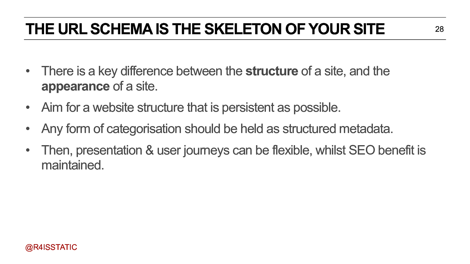
THE URL SCHEMA IS THE SKELETON OF YOUR SITE • There is a key difference between the structure of a site, and the appearance of a site. • Aim for a website structure that is persistent as possible. • Any form of categorisation should be held as structured metadata. • Then, presentation & user journeys can be flexible, whilst SEO benefit is maintained. @R4ISSTATIC This is the skeleton of your site. It doesn’t meant that users have to navigate through every part - it’s the building blocks of the user journeys. Plus it shows how you can make natural navigation. AND it’s good for SEO. 28

cooks chef recipe featured in relies on programme uses contribute to technique ingredient 29 This is where our old friend the domain model can come in handy - it’s a network, a web, not a file structure.
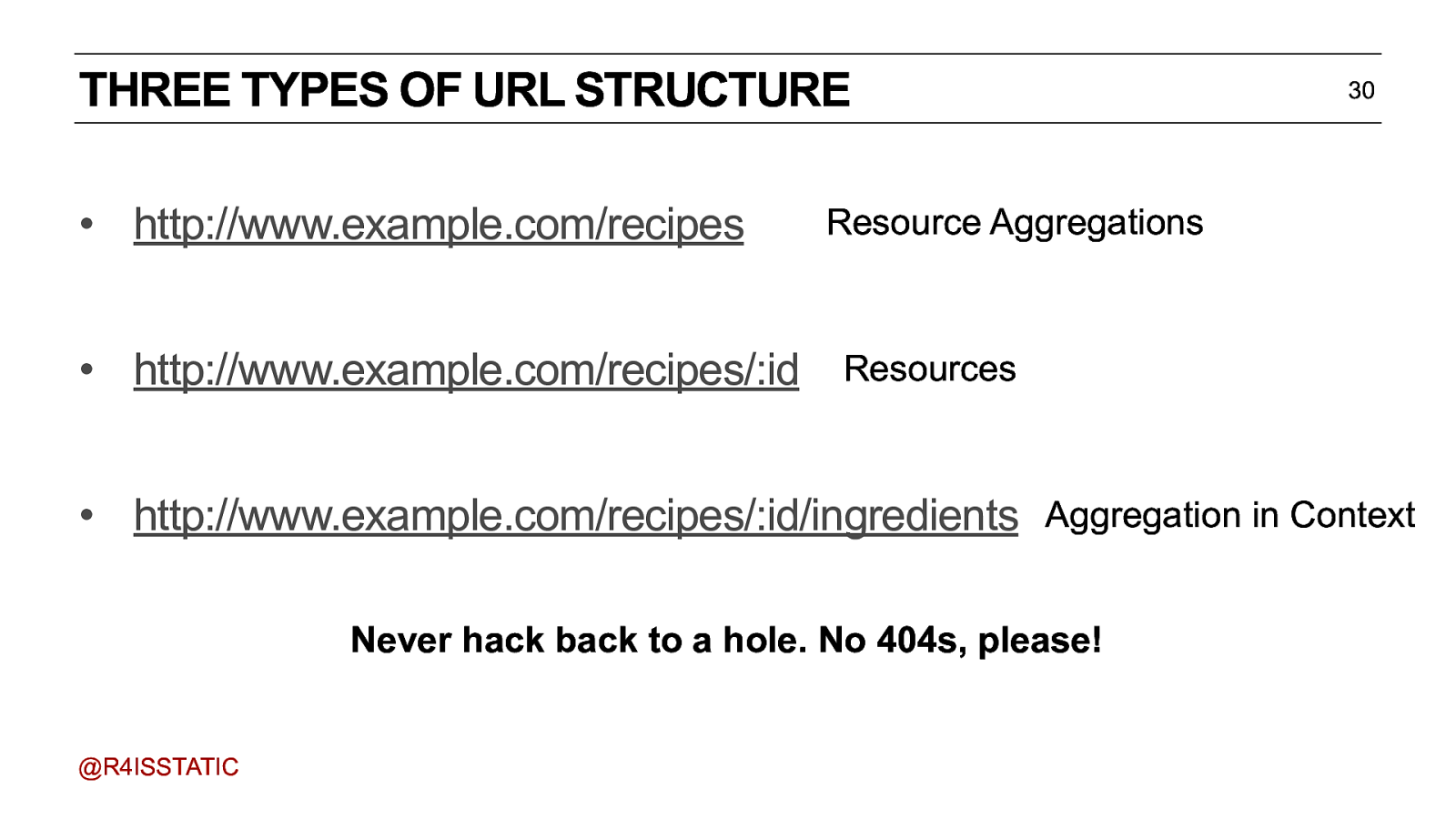
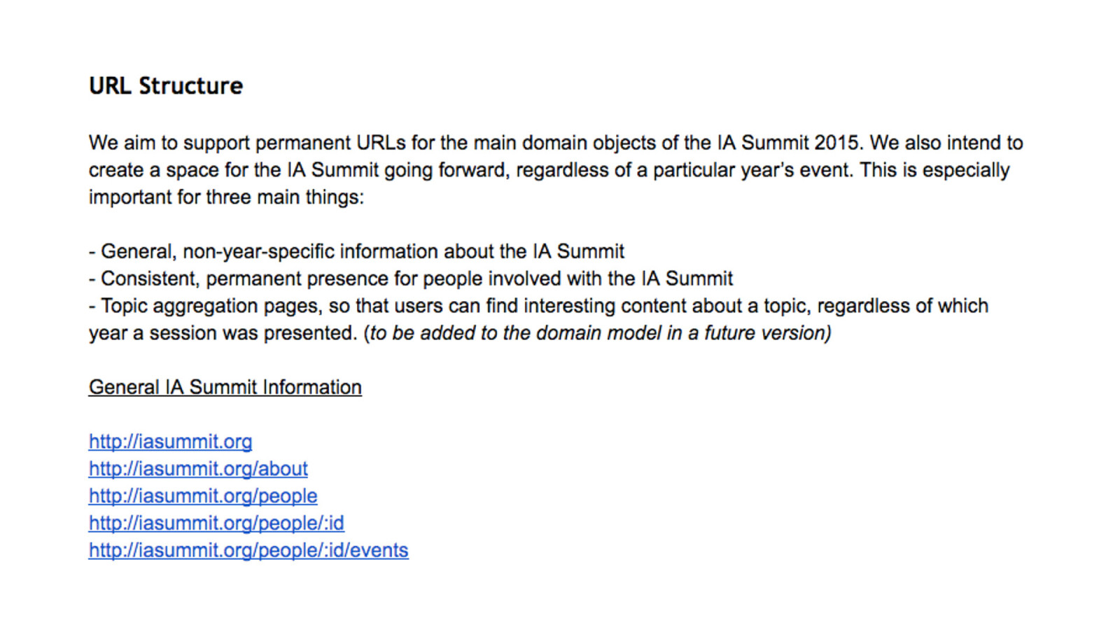
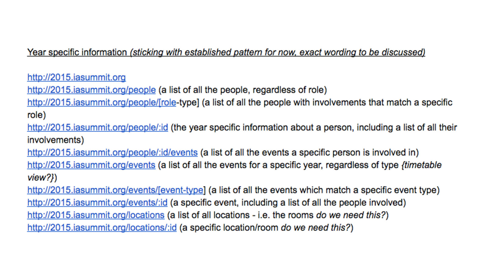
THREE TYPES OF URL STRUCTURE • http://www.example.com/recipes 30 Resource Aggregations • http://www.example.com/recipes/:id Resources • http://www.example.com/recipes/:id/ingredients Aggregation in Context Never hack back to a hole. No 404s, please! @R4ISSTATIC First, you need a URL for each ‘type’ of thing in your model - an aggregation of all the instances. Then, obviously, you need a page-per-instance, what we talked about when we talked about being able to find the things. And finally, sometimes, you might want to have a collection of things in the context of a single thing. But remember - when you get down to the ingredient itself, it’s back to the resource itself.
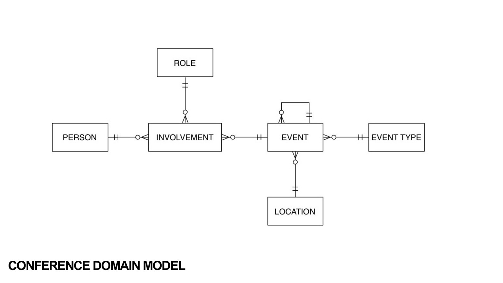
CONFERENCE DOMAIN MODEL
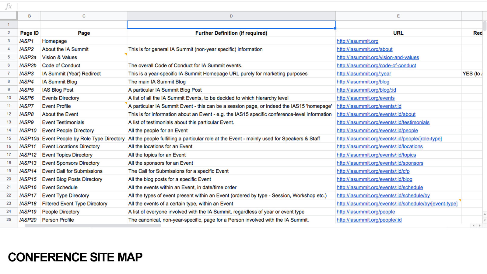
CONFERENCE SITE MAP
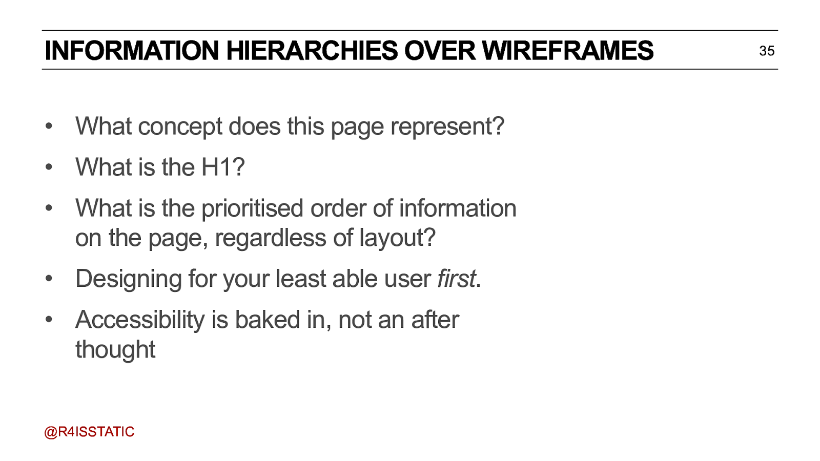
INFORMATION HIERARCHIES OVER WIREFRAMES • What concept does this page represent? • What is the H1? • What is the prioritised order of information on the page, regardless of layout? • Designing for your least able user first. • Accessibility is baked in, not an after thought @R4ISSTATIC Think of it as designing the small screen first - without any javascript or CSS. This will help you bake in accessibility from the ground up. Think back to the recipe page. Which brings us to the question - who is your least able user? 35

THE FUTURE OF INFORMATION ARCHITECTURE @R4ISSTATIC
WHO IS YOUR LEAST ABLE USER? • Answer: the machine. @R4ISSTATIC 37
COMPUTERS ARE STUPID. • Computers can’t understand the world. • All they see is strings of letters and numbers. • But we can ‘teach’ them about the world, by feeding them our domain models in a language they understand - an Ontology @R4ISSTATIC 38
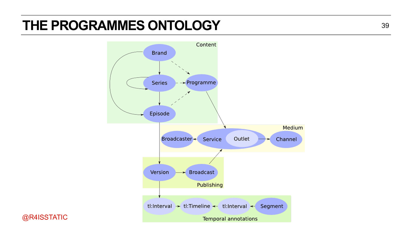
THE PROGRAMMES ONTOLOGY @R4ISSTATIC As you can see, it’s quite similar to a domain model. 39
TRIPLE STATEMENTS • Computers speak in triples • Subject, predicate, object • The cat, sat on, the mat. @R4ISSTATIC 40
TRIPLE STATEMENTS 41 • ‘Fugitive of the Judoon’ was broadcast on BBC One. • ‘Fugitive of the Judoon’ was first broadcast on Sunday 26th January 2020. • ‘Fugitive of the Judoon’ was directed by Nida Manzoor. @R4ISSTATIC
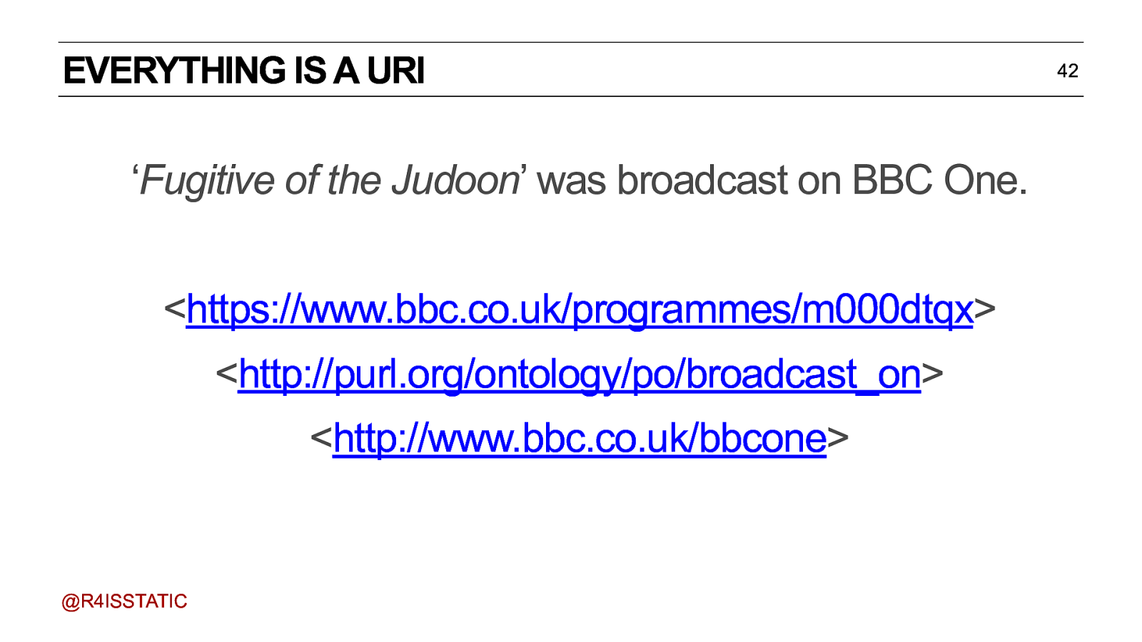
EVERYTHING IS A URI ‘Fugitive of the Judoon’ was broadcast on BBC One. https://www.bbc.co.uk/programmes/m000dtqxhttp://purl.org/ontology/po/broadcast_onhttp://www.bbc.co.uk/bbcone @R4ISSTATIC 42
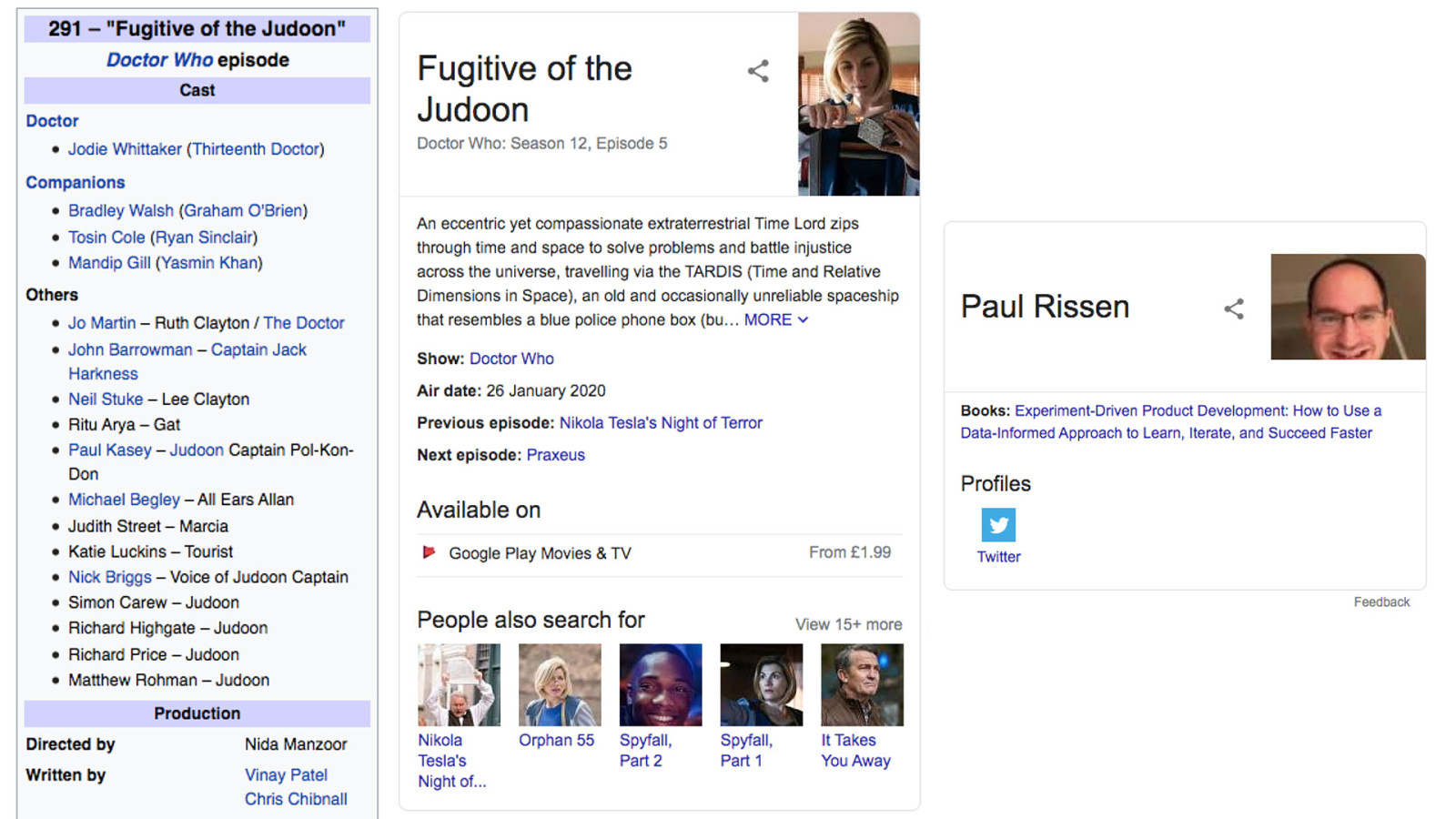
Knowledge graph. Increasingly, people aren’t even going to come to your website. Because what they’re interested in aren’t the pages - it’s the things those pages are about. Get your stuff right (see first episode date ;-) )
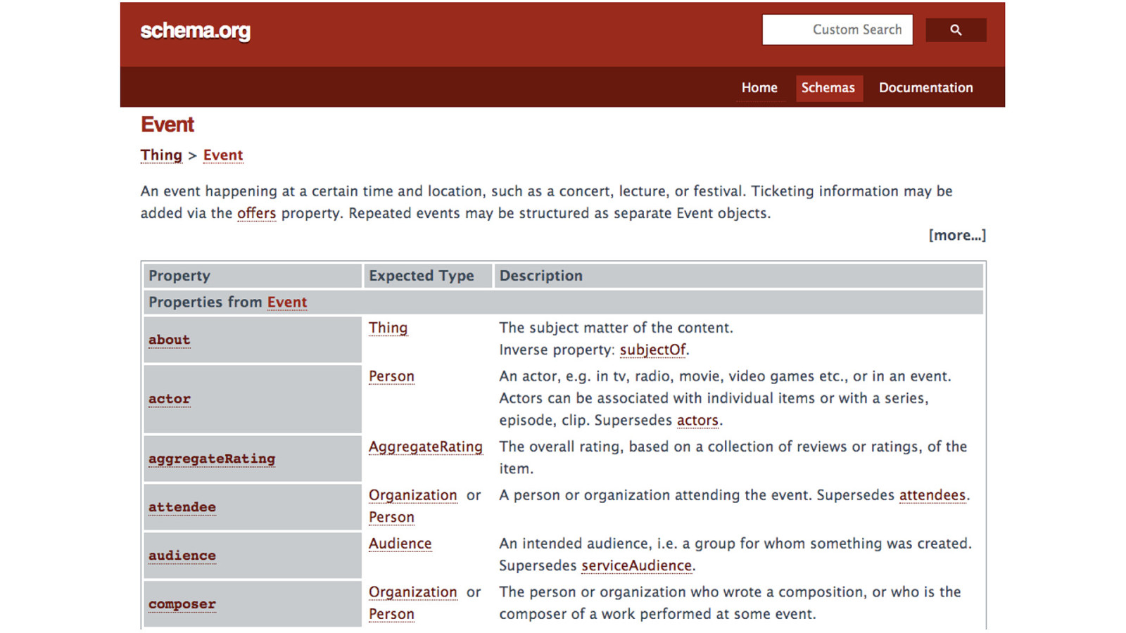
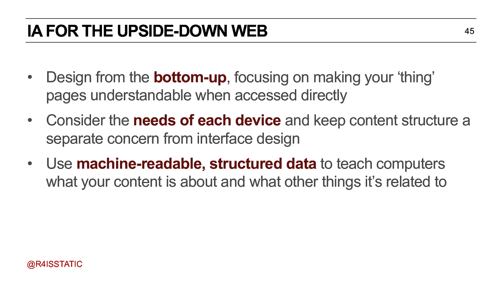
IA FOR THE UPSIDE-DOWN WEB 45 • Design from the bottom-up, focusing on making your ‘thing’ pages understandable when accessed directly • Consider the needs of each device and keep content structure a separate concern from interface design • Use machine-readable, structured data to teach computers what your content is about and what other things it’s related to @R4ISSTATIC

CASE STUDY: BBC NEWS @R4ISSTATIC
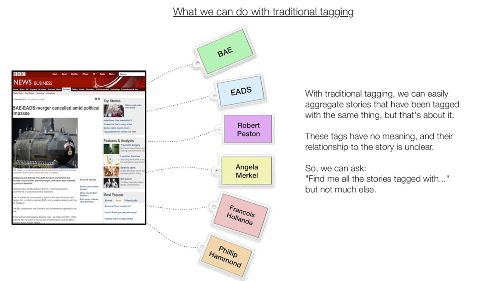
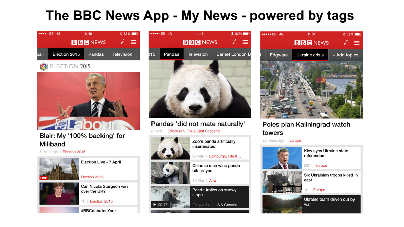
How we’re using it in News
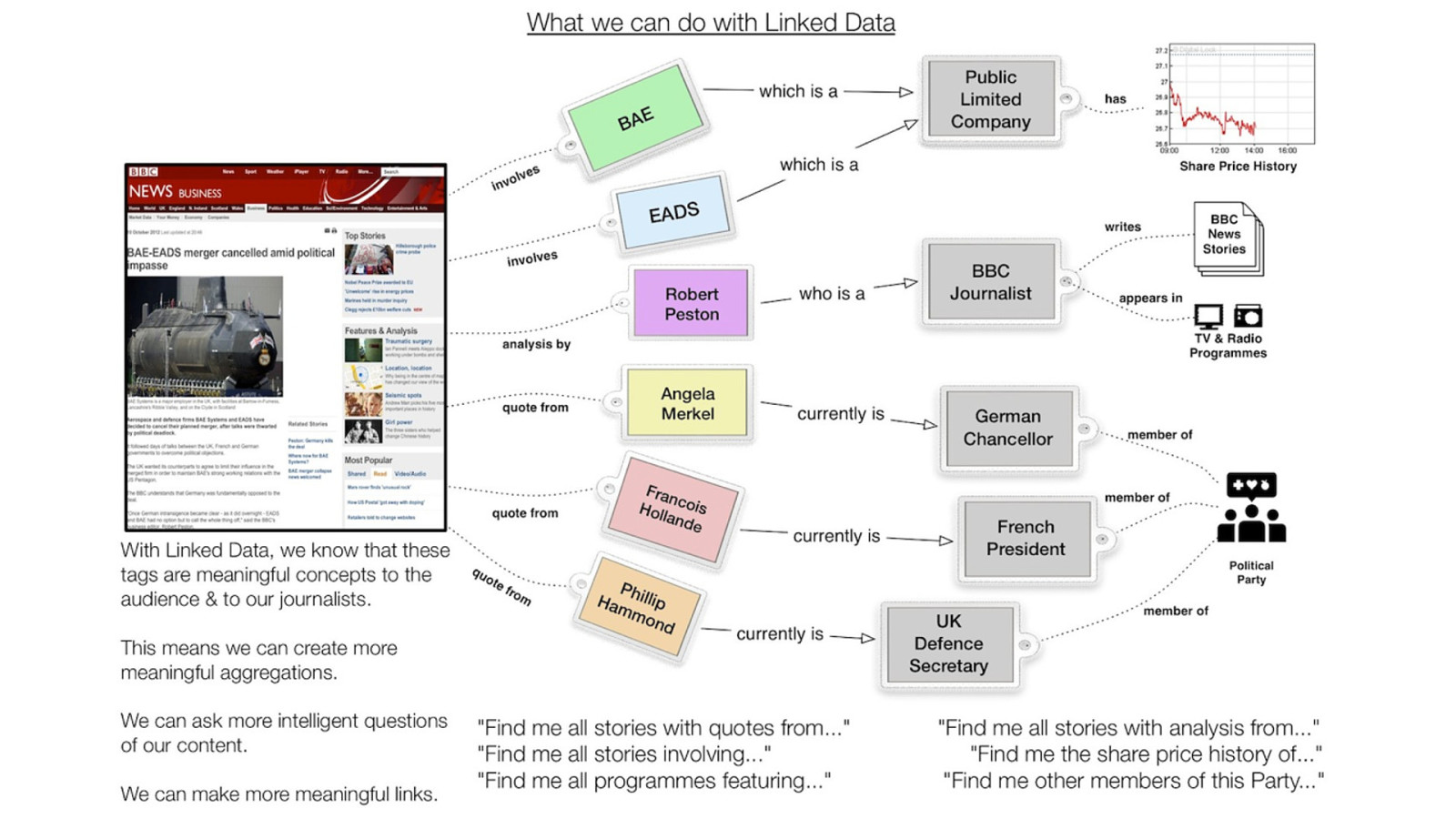
It’s the links, the predicates, the verbs, that matter.

SUMMARY We’re almost out of time, so let’s wrap up and look at what we’ve covered.
WHAT HAVE WE COVERED? • • • • • 51 Card Sorting and Hierarchies SOUND and page-level IA Domain Modelling for user mental model-based site-wide IA Persistent URL design as a key part of UX Teaching machines to understand our world @R4ISSTATIC
QUESTIONS TO ASK ON A PROJECT • • • • • • 52 Does the information on this page make sense to users? What about the hierarchy of that information? What if you only had one column? Does the site hold together in a meaningful way? What URL will each thing be at? How persistent will they be? If redesigning, how do we ensure current experience won’t be disrupted? (redirects, for instance) • What information is accessible without any CSS or Javascript? • What information (if any) is machine readable? @R4ISSTATIC
REMEMBER… • Try not to impose your understanding on your audience. • Listen to why people make certain choices • Expect disagreement • Use real customers, not staff • Remember there is no perfect answer - do what works for the majority of your audience, and then help out the others. Information Architecture is a conversation with your users. @R4ISSTATIC There is no perfect answer. Remember, it’s about communicating and understanding the world. If we already had perfect communication, we’d have world peace. 53
…AND MOST CRUCIALLY… • Information Architecture is a key part of User Experience. • It is most concerned with providing users with what they want, when they want it, and showing them the next step. • Good IA lives or dies by its’ relationship with users. • If it doesn’t take into account an understanding of the user’s world, it will fail. @R4ISSTATIC and I hope I’ve shown you the importance of understanding your users, and that it is a valuable part of UX. 54
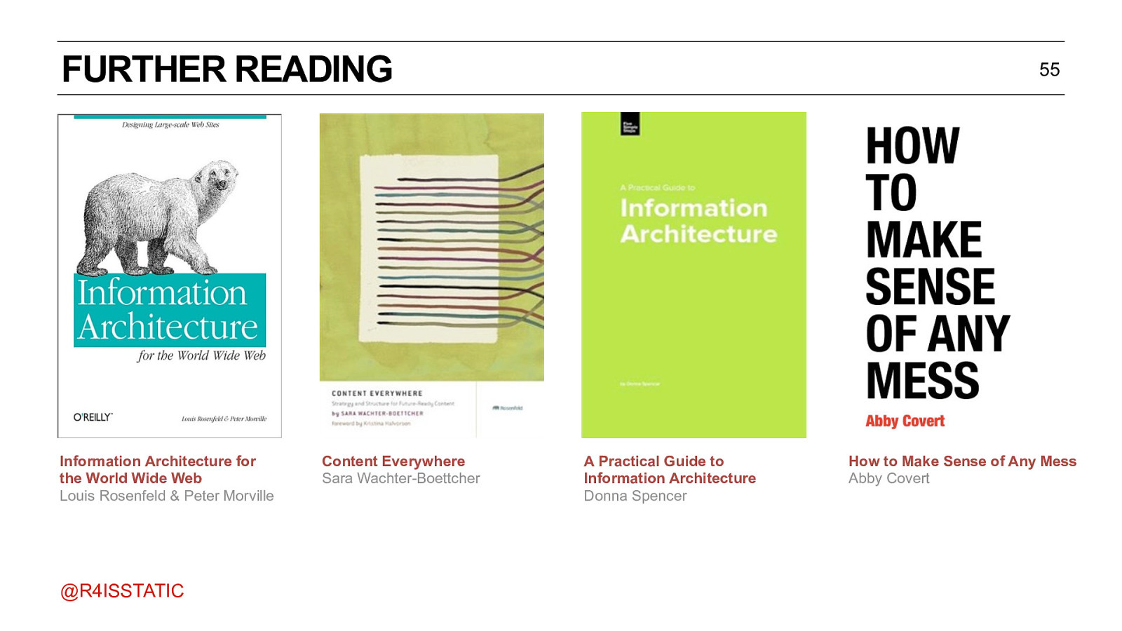
FURTHER READING Information Architecture for the World Wide Web Louis Rosenfeld & Peter Morville @R4ISSTATIC Content Everywhere Sara Wachter-Boettcher 55 A Practical Guide to Information Architecture Donna Spencer How to Make Sense of Any Mess Abby Covert
FURTHER READING 56 • How we make websites - BBC Radio Labs http://www.bbc.co.uk/blogs/radiolabs/2009/01/how_we_make_websites.shtml • Designing for your least able user - BBC Radio Labs http://www.bbc.co.uk/blogs/radiolabs/2009/03/designing_for_your_least_able.shtml • http://www.bbc.co.uk/ontologies • http://www.bbc.co.uk/things • Designing a URL Structure for BBC programmes - an in depth look at URL design considerations: http://smethur.st/posts/176135860 @R4ISSTATIC

THANK YOU! r4isstatic@outlook.com https://www.paulrissen.com @r4isstatic