CSS Layout from the inside out Rachel Andrew, State of the Browser, October, 2021

A presentation at State of the Browser in October 2021 in London, UK by Rachel Andrew
CSS Layout from the inside out Rachel Andrew, State of the Browser, October, 2021

The Holy Grail
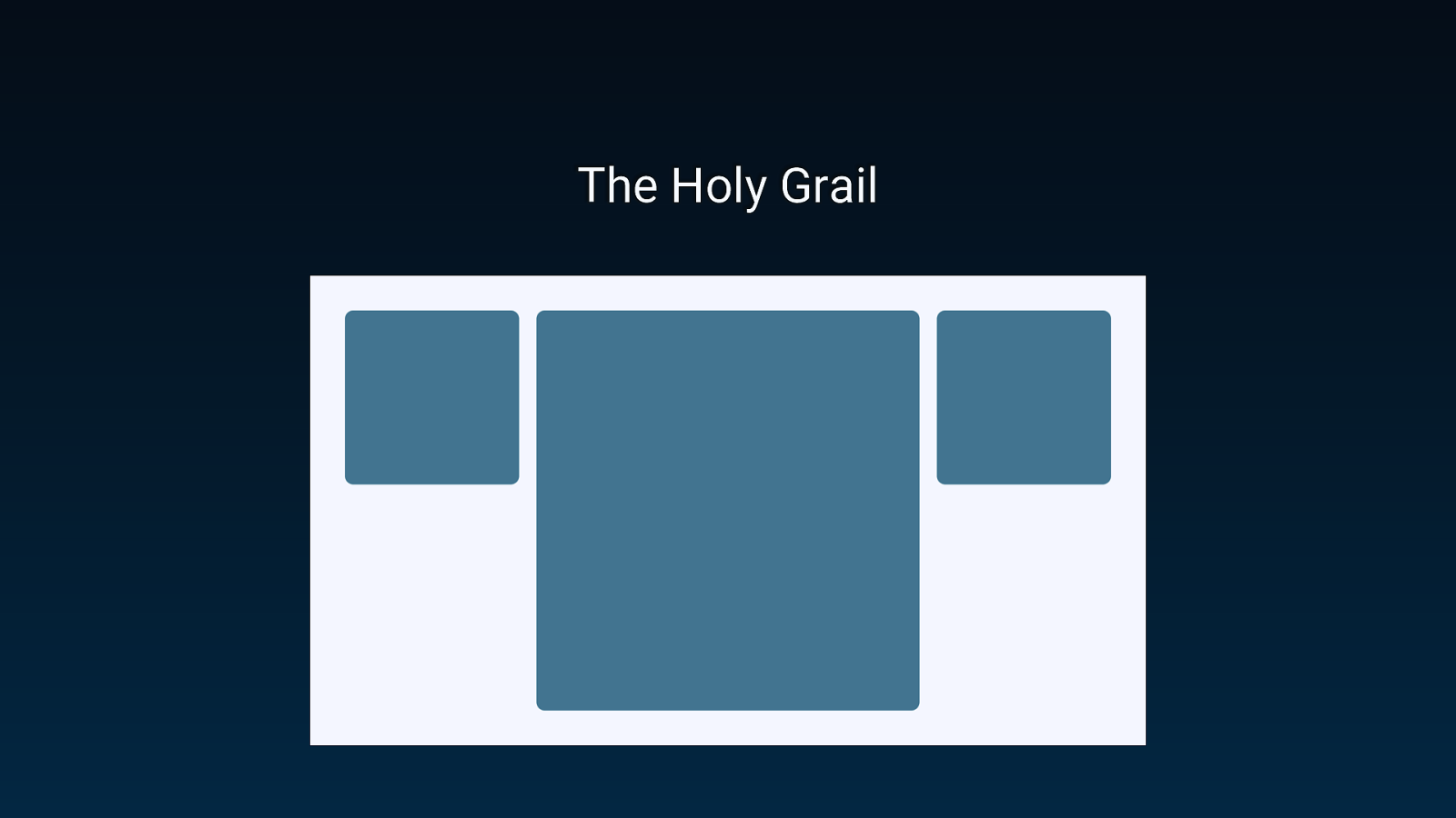
The Holy Grail
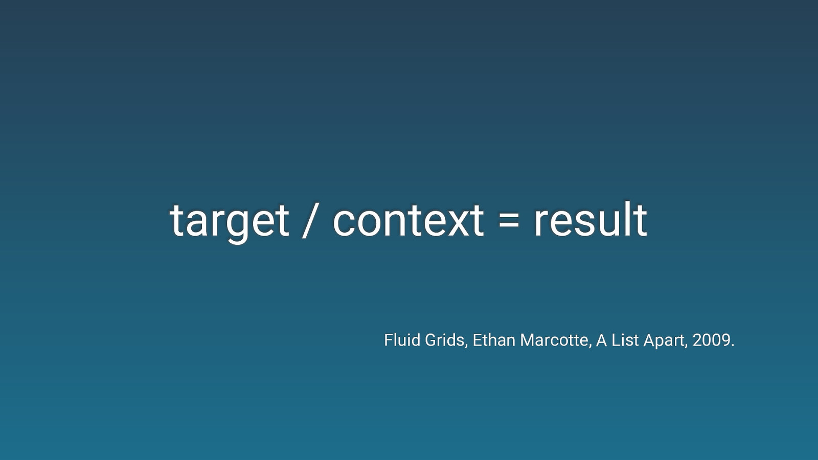
target / context = result Fluid Grids, Ethan Marcotte, A List Apart, 2009.
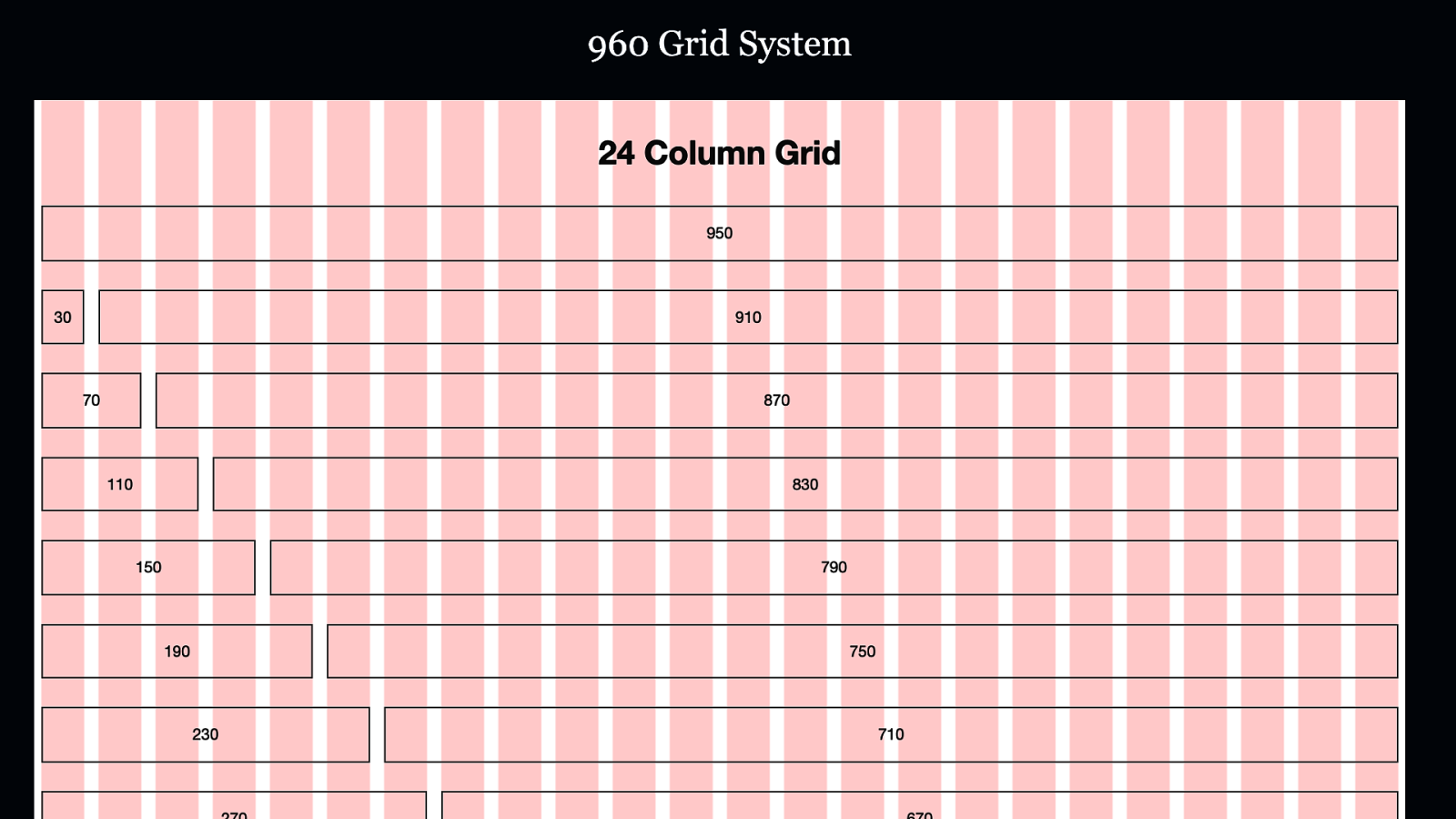
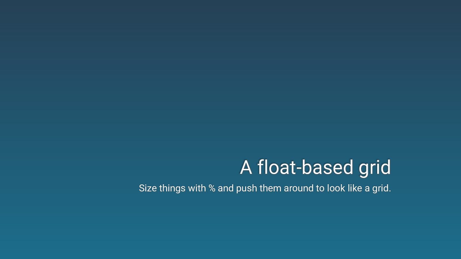
A float-based grid Size things with % and push them around to look like a grid.
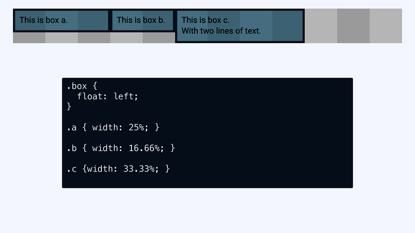
.box { float: left; } .a { width: 25%; } .b { width: 16.66%; } .c {width: 33.33%; }

The biggest problems in (float-based) web design? Clearing floats and getting equal height columns.
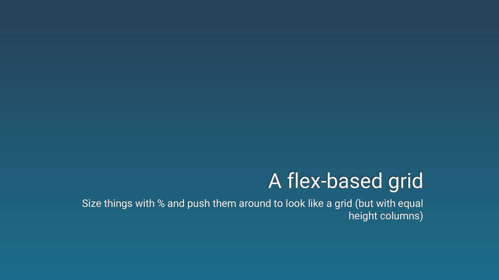
A flex-based grid Size things with % and push them around to look like a grid (but with equal height columns)
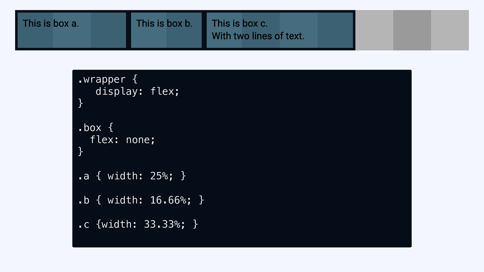
.wrapper { display: flex; } .box { flex: none; } .a { width: 25%; } .b { width: 16.66%; } .c {width: 33.33%; }
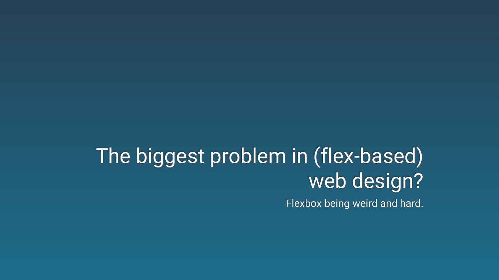
The biggest problem in (flex-based) web design? Flexbox being weird and hard.
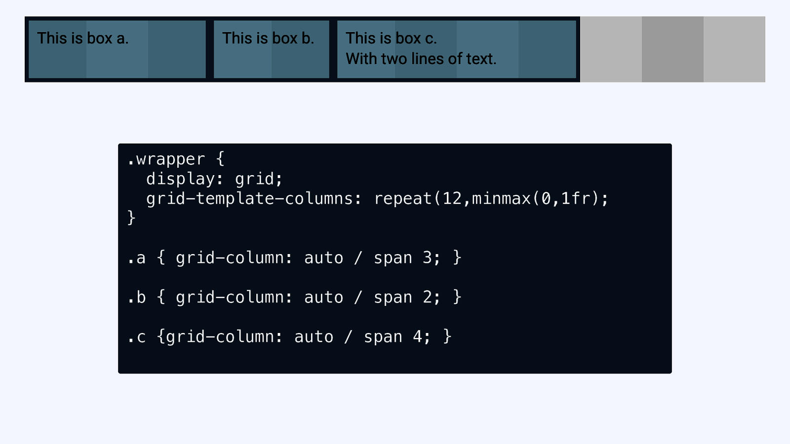
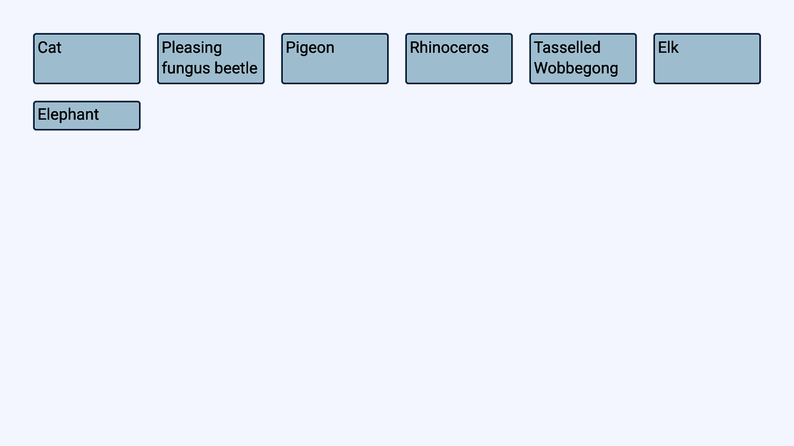
.wrapper { display: grid; grid-template-columns: repeat(12,minmax(0,1fr); } .a { grid-column: auto / span 3; } .b { grid-column: auto / span 2; } .c {grid-column: auto / span 4; }
Has grid made flexbox redundant?
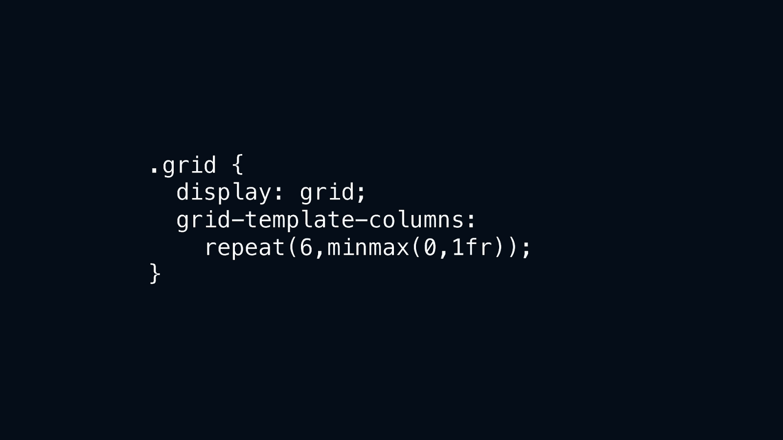
.grid { display: grid; grid-template-columns: repeat(6,minmax(0,1fr)); }
minmax(0,1fr)
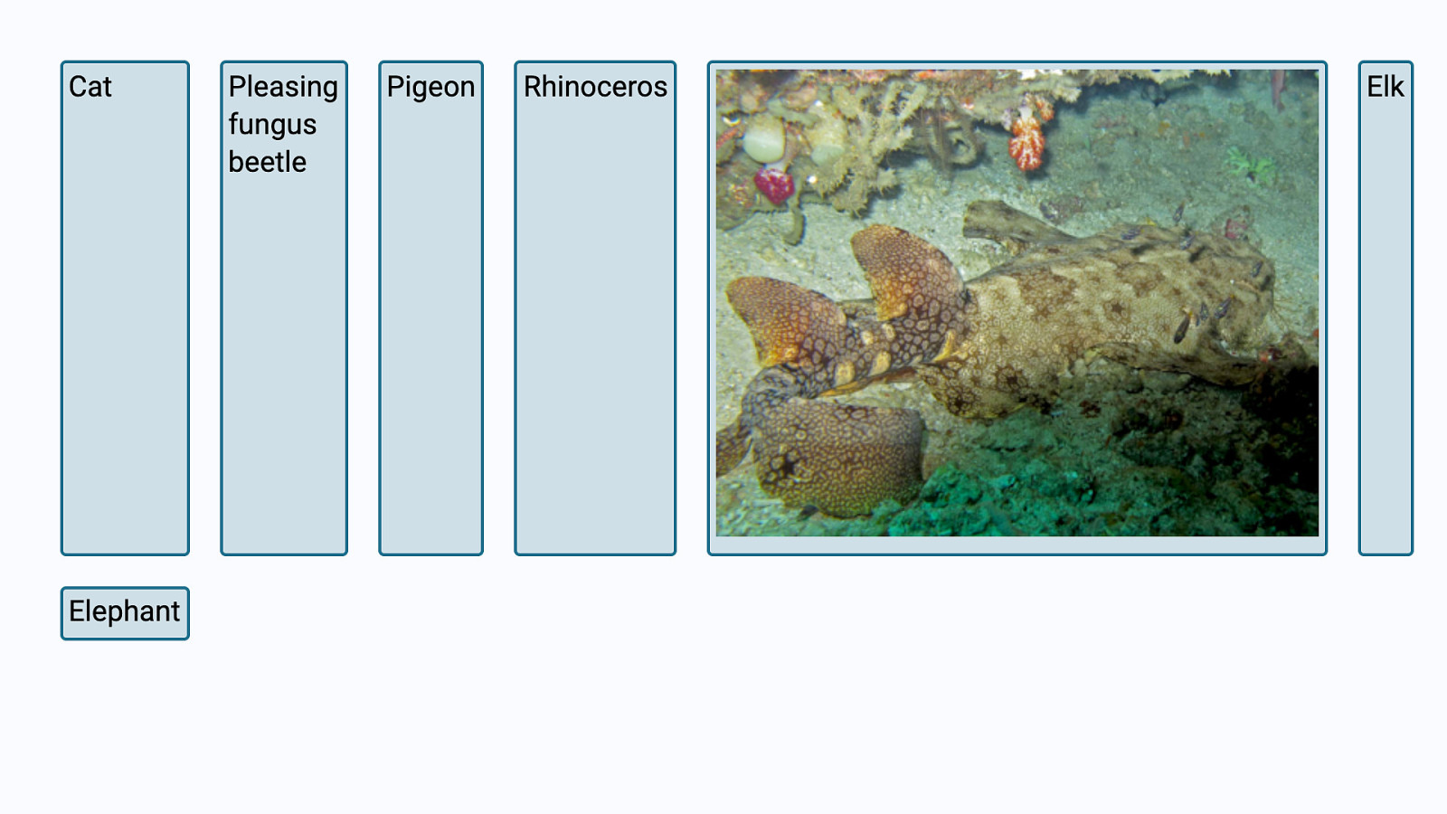
minmax(auto,1fr)
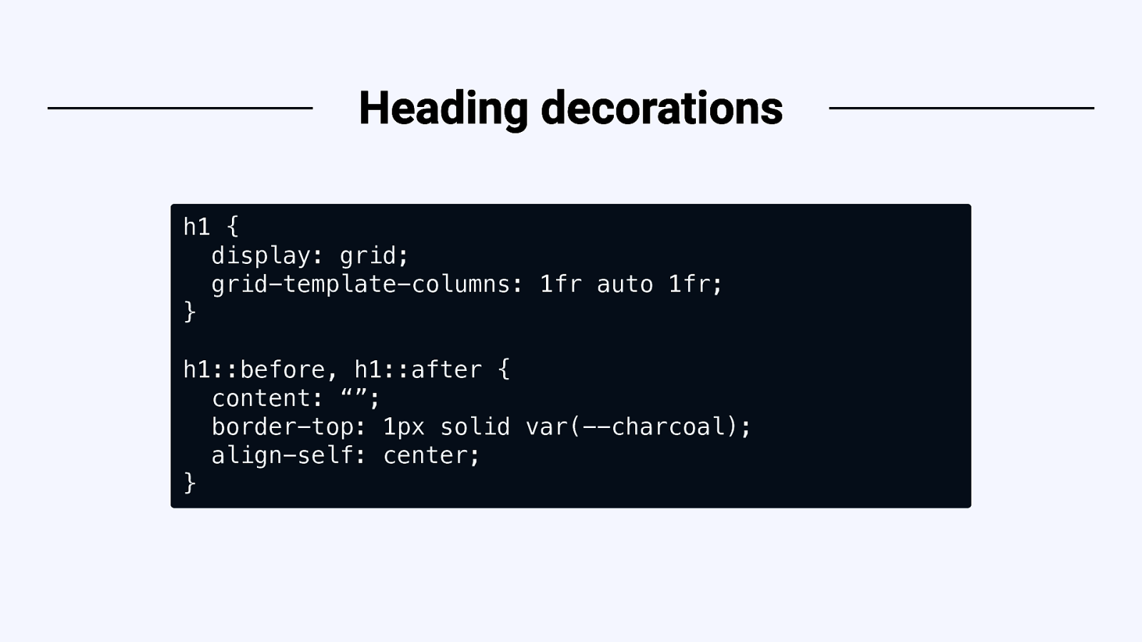
h1 { display: grid; grid-template-columns: 1fr auto 1fr; } h1::before, h1::after { content: “”; border-top: 1px solid var(—charcoal); align-self: center; }

Aspect Ratios

The “padding hack” https://css-tricks.com/aspect-ratio-boxes/
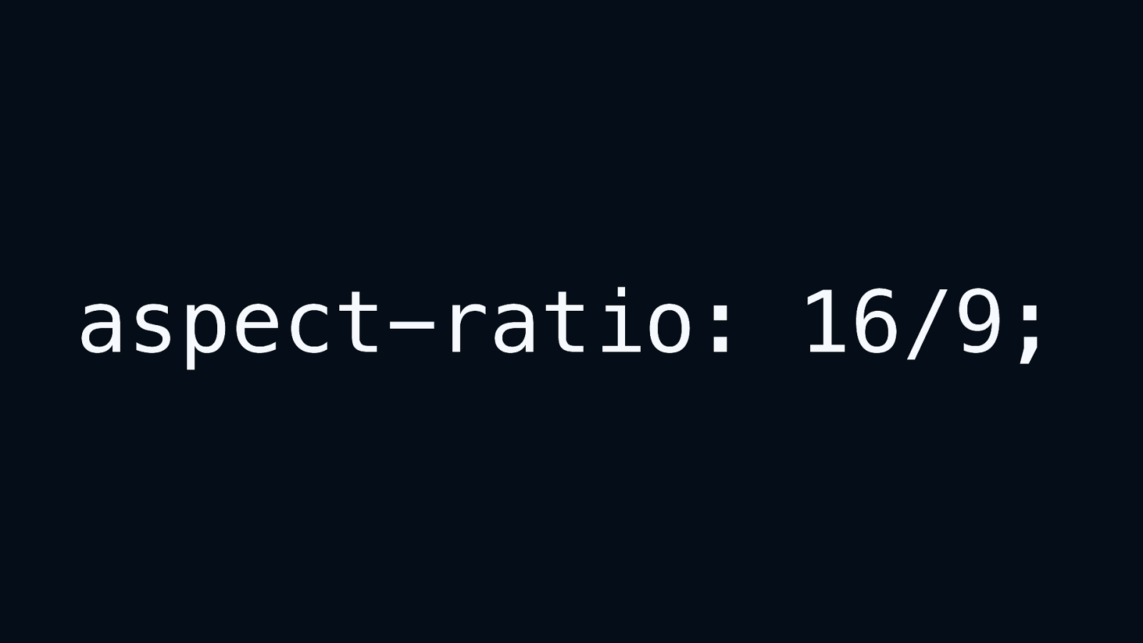
aspect-ratio: 16/9;
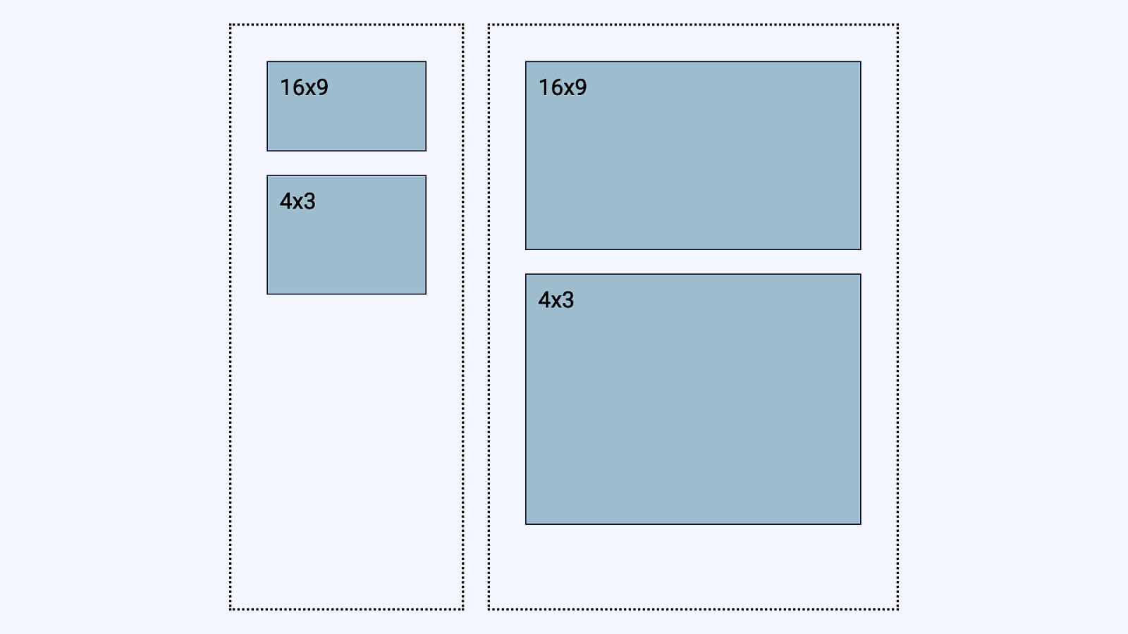
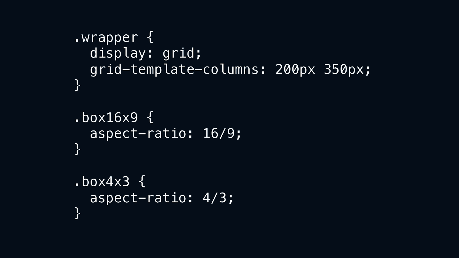
.wrapper { display: grid; grid-template-columns: 200px 350px; } .box16x9 { aspect-ratio: 16/9; } .box4x3 { aspect-ratio: 4/3; }

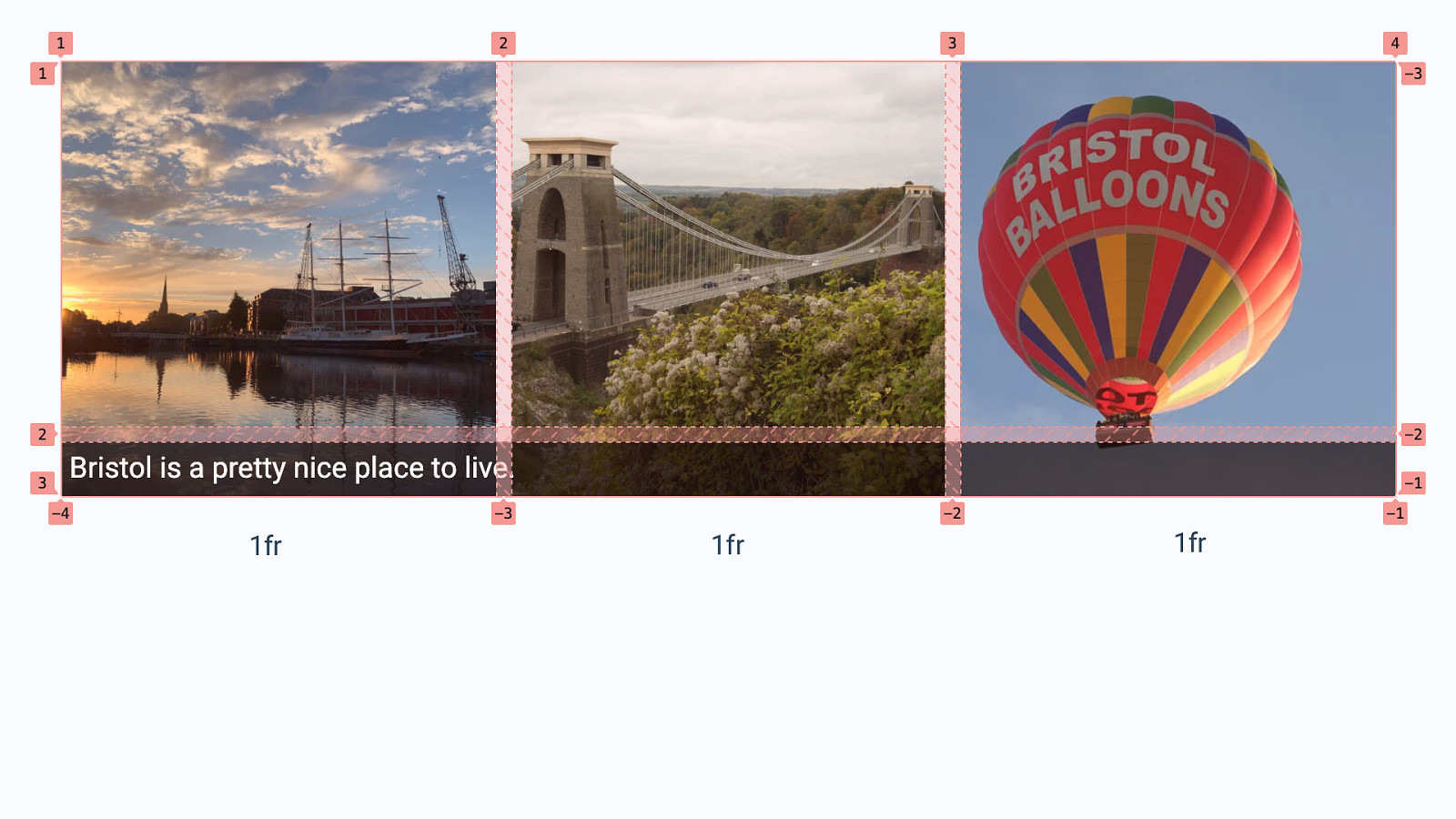
1fr 1fr 1fr
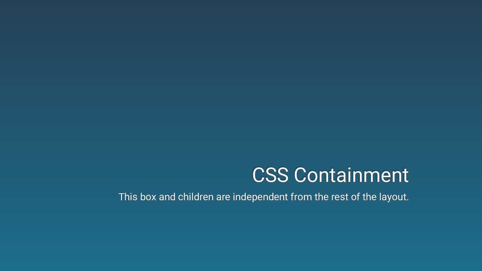
CSS Containment This box and children are independent from the rest of the layout.
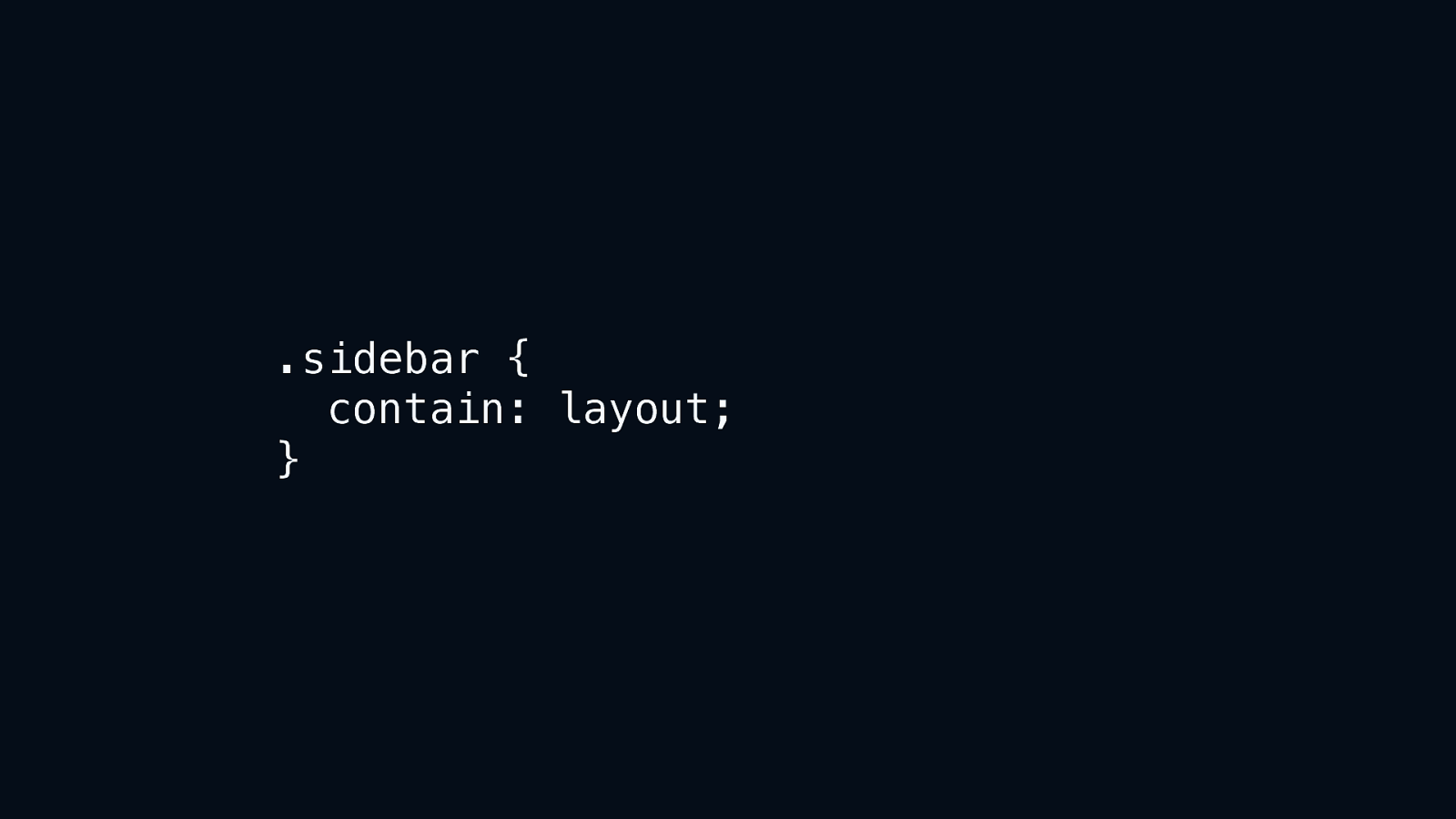
.sidebar { contain: layout; }
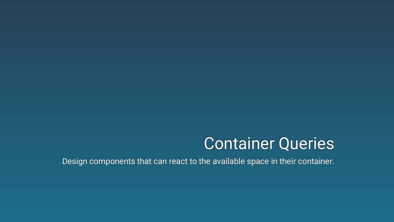
Container Queries Design components that can react to the available space in their container.


Try out Container Queries In chrome://flags enable “CSS Container Queries”.
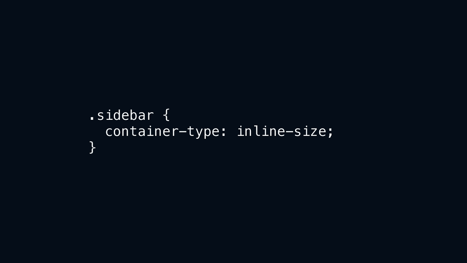
.sidebar { container-type: inline-size; }
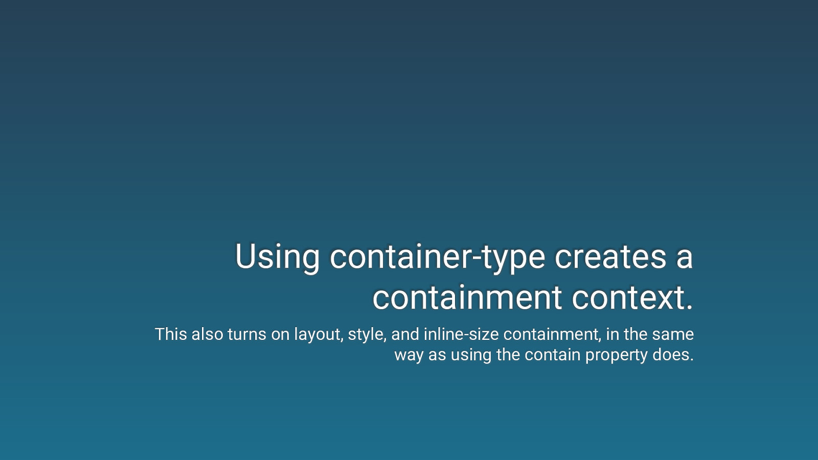
Using container-type creates a containment context. This also turns on layout, style, and inline-size containment, in the same way as using the contain property does.
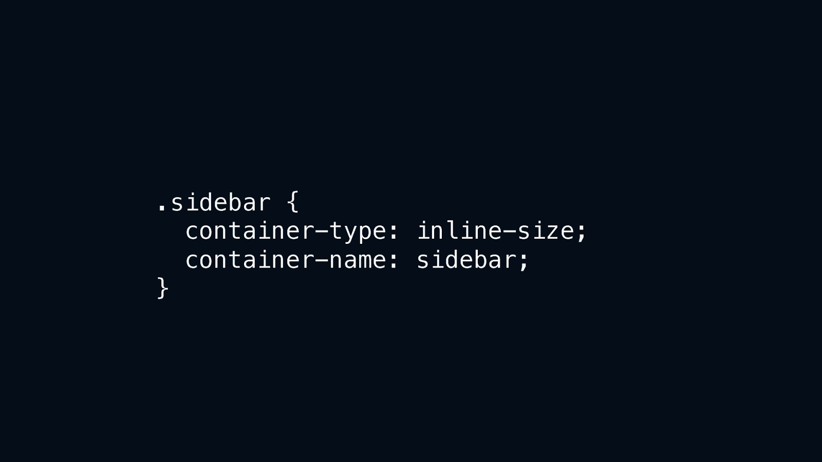
.sidebar { container-type: inline-size; container-name: sidebar; }
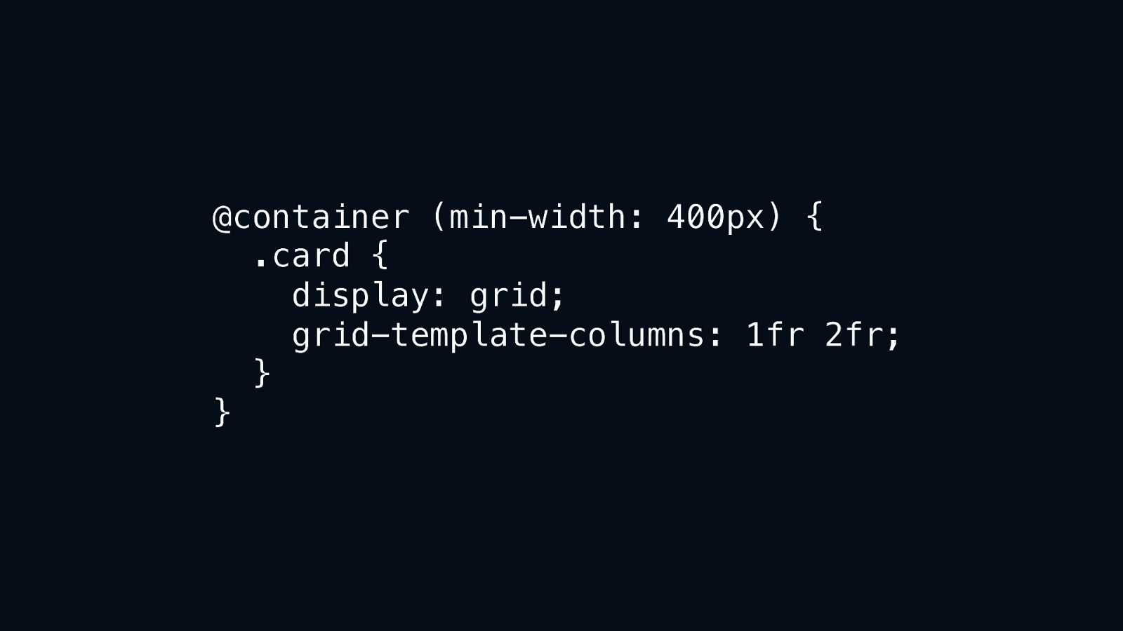
@container (min-width: 400px) { .card { display: grid; grid-template-columns: 1fr 2fr; } }
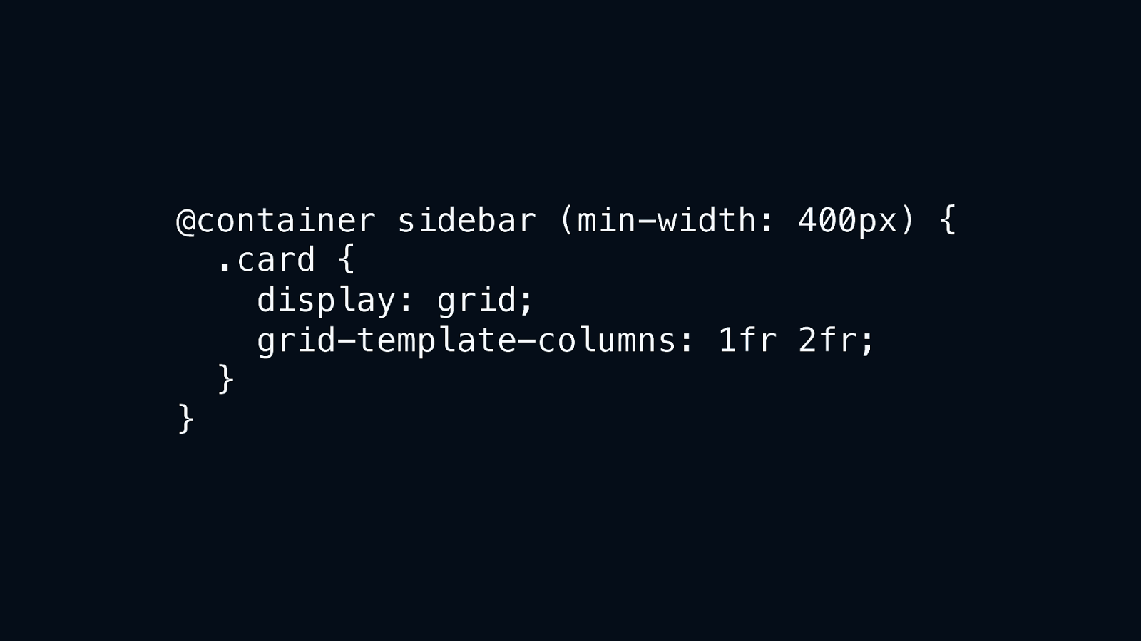
@container sidebar (min-width: 400px) { .card { display: grid; grid-template-columns: 1fr 2fr; } }
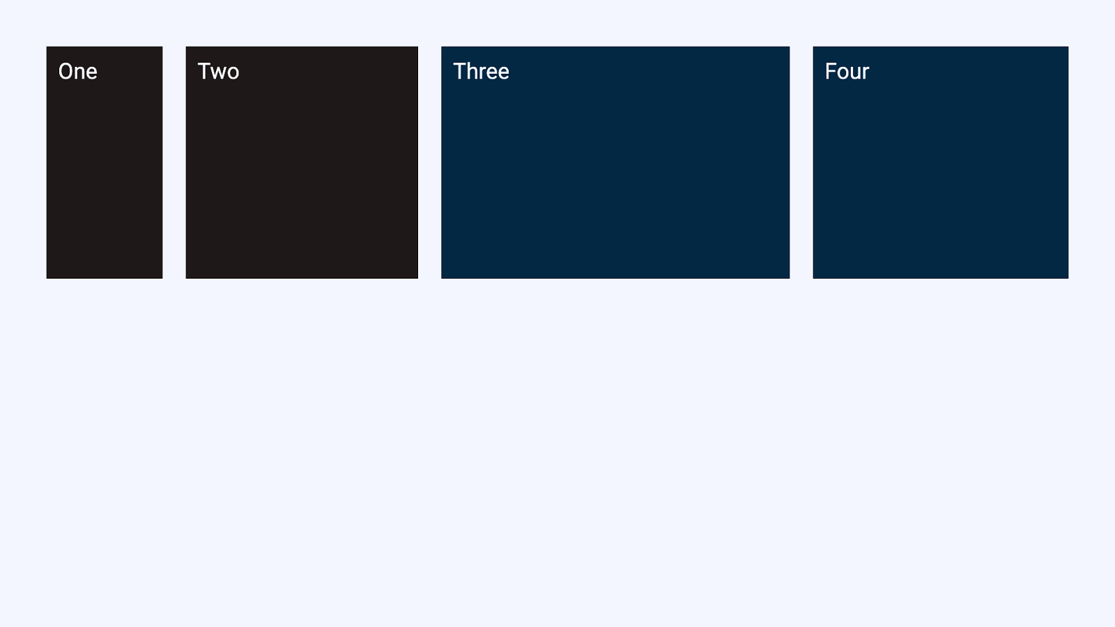
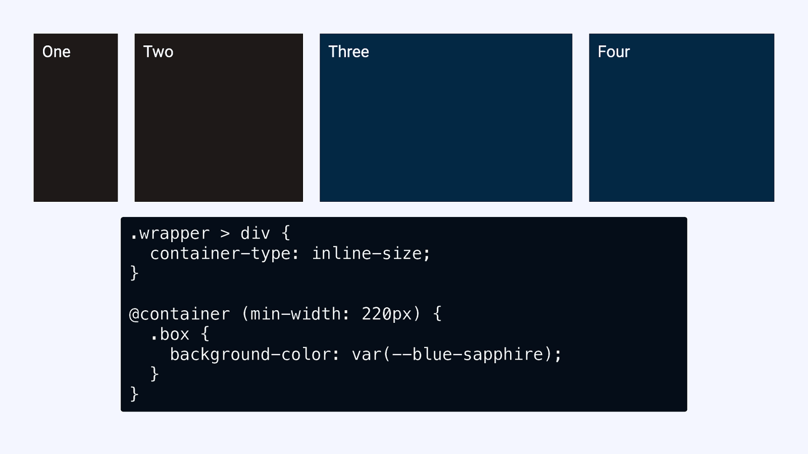
.wrapper > div { container-type: inline-size; } @container (min-width: 220px) { .box { background-color: var(—blue-sapphire); } }
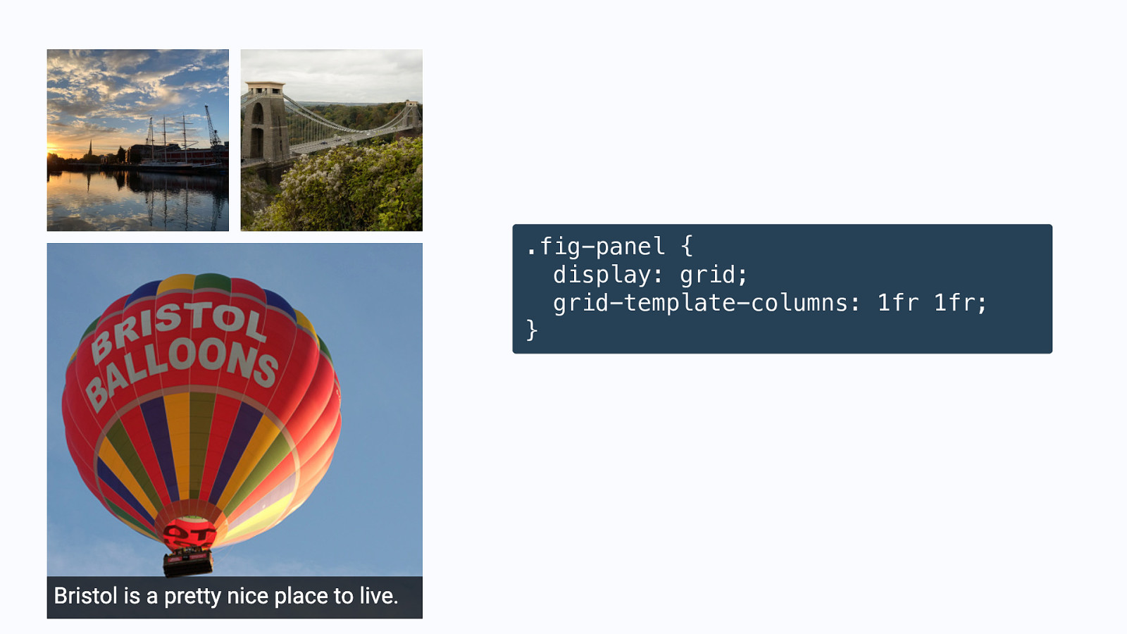
.fig-panel { display: grid; grid-template-columns: 1fr 1fr; }
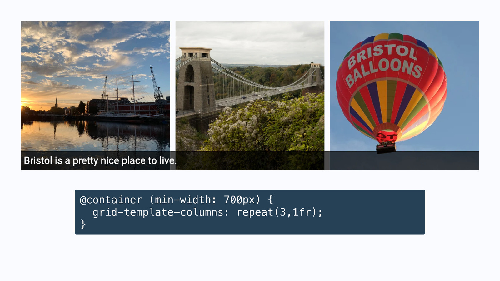
@container (min-width: 700px) { grid-template-columns: repeat(3,1fr); }

This seems so simple! Why did it take so long?
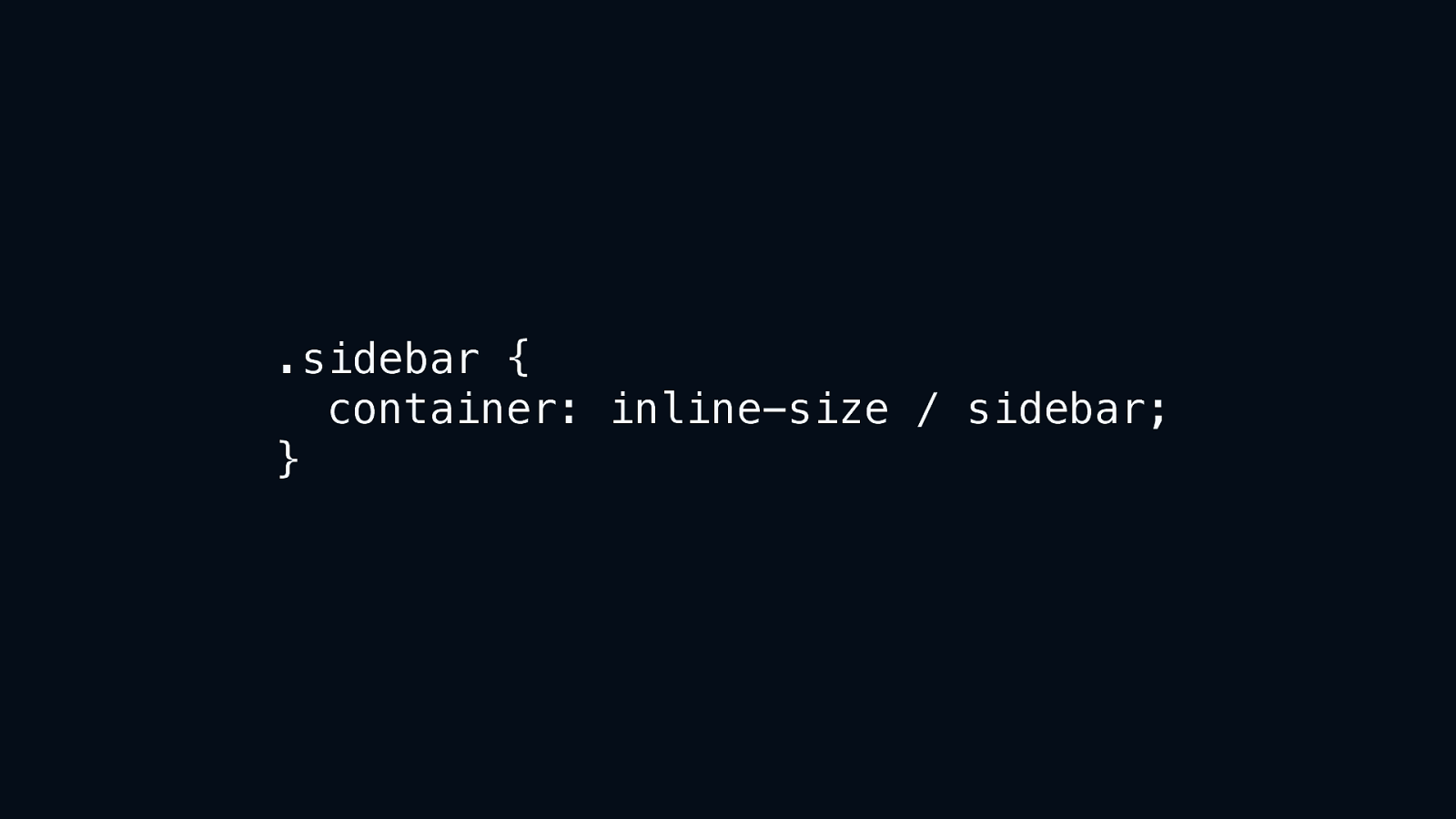
.sidebar { container: inline-size / sidebar; }
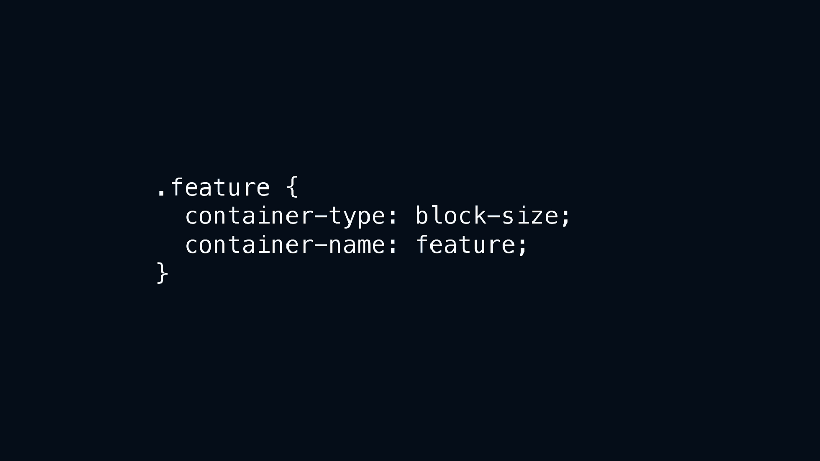
.feature { container-type: block-size; container-name: feature; }

Container Queries are coming But they probably aren’t the solution to all your problems.
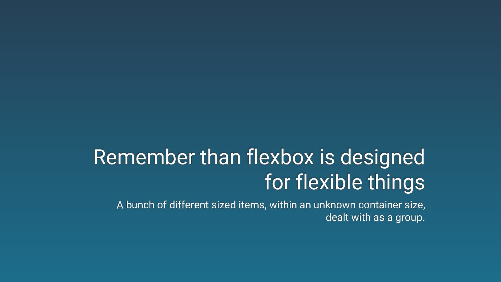
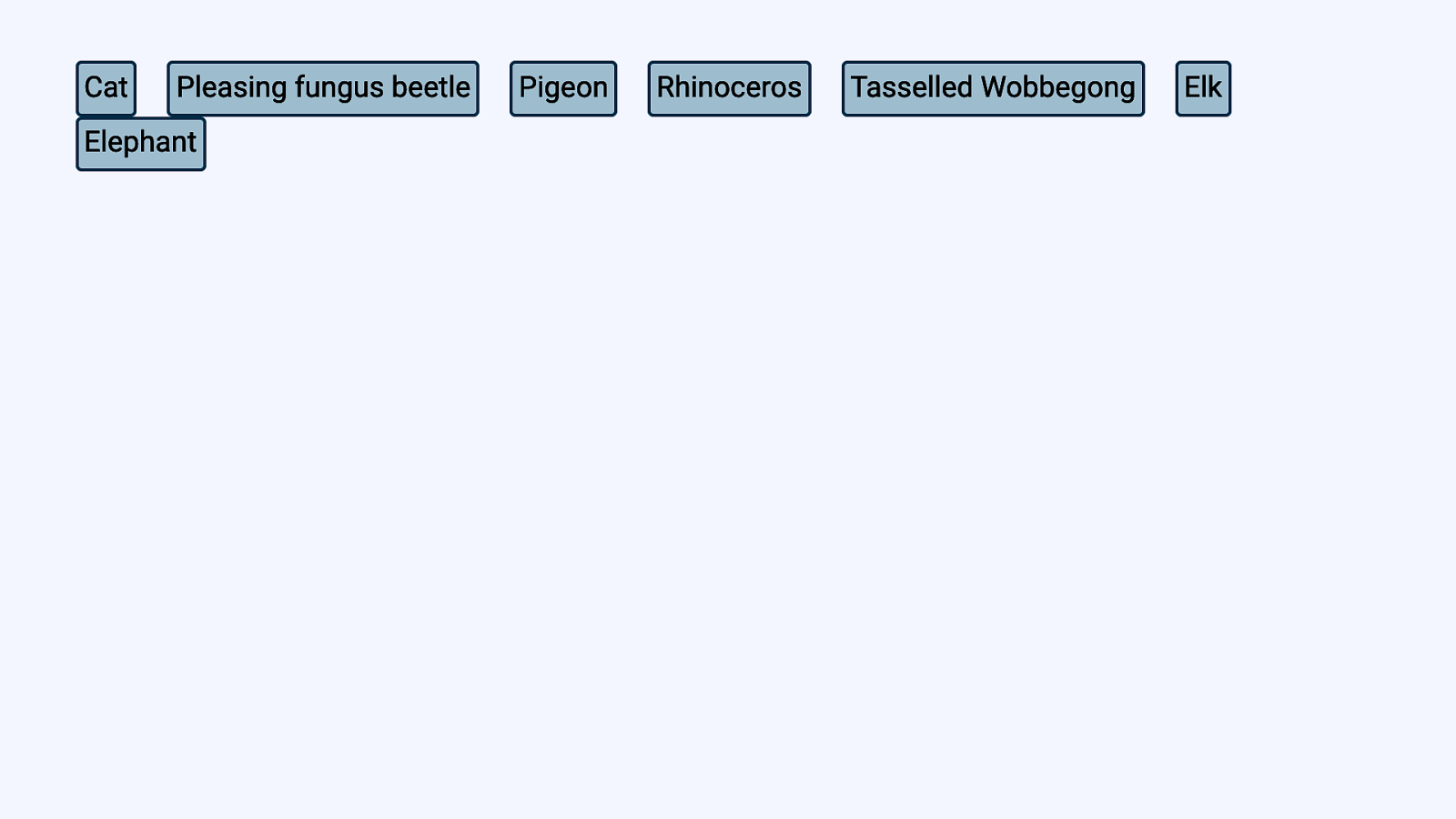
Remember than flexbox is designed for flexible things A bunch of different sized items, within an unknown container size, dealt with as a group.

Use intrinsic and range sizing methods with grid minmax(), min-content, max-content, auto, and fit-content()

But, do get excited for Container Queries! Try it out! If you spot any issues or think of a potential enhancement, let the CSS Working Group know:

Thank you! Find me @rachelandrew Slides at: https://noti.st/rachelandrew