Solving layout problems with CSS Grid & friends Rachel Andrew @ View Source London x

A presentation at View Source in October 2017 in London, UK by Rachel Andrew

Solving layout problems with CSS Grid & friends Rachel Andrew @ View Source London x

Rachel Andrew - I do things on the web. ▸ @rachelandrew on Twitter ▸ https://rachelandrew.co.uk ▸ Invited Expert to the CSS Working Group ▸ Editor in Chief at Smashing Magazine ▸ co-founder Perch and Perch Runway CMS - https://grabaperch.com
▸ Google Developer Expert about me.
Most usefully to know in the context of this talk is that I’m an invited expert to the CSS working group, so I kind of help make CSS. Although you can’t blame me for all of it.
And I’m hoping that perhaps you have heard about this new specification CSS Grid … which is a new layout method for the web. It shipped into browsers earlier this year.
And if you do front end stu ff and even if you haven’t looked at grid yet then maybe you’ve looked at flexbox and maybe you wonder.
… why not use Flexbox? So, about this Grid thing … At some point I’ll be able to retire this section from every talk that I do, but the most asked of the frequently asked questions is “why is grid di ff erent to flexbox”. So I continue to answer it.
Defined in the specification is the biggest and most obvious reason.
Do you need layout in one dimension or two? Flexbox is one-dimensional and grid is two-dimensional. What does that mean?
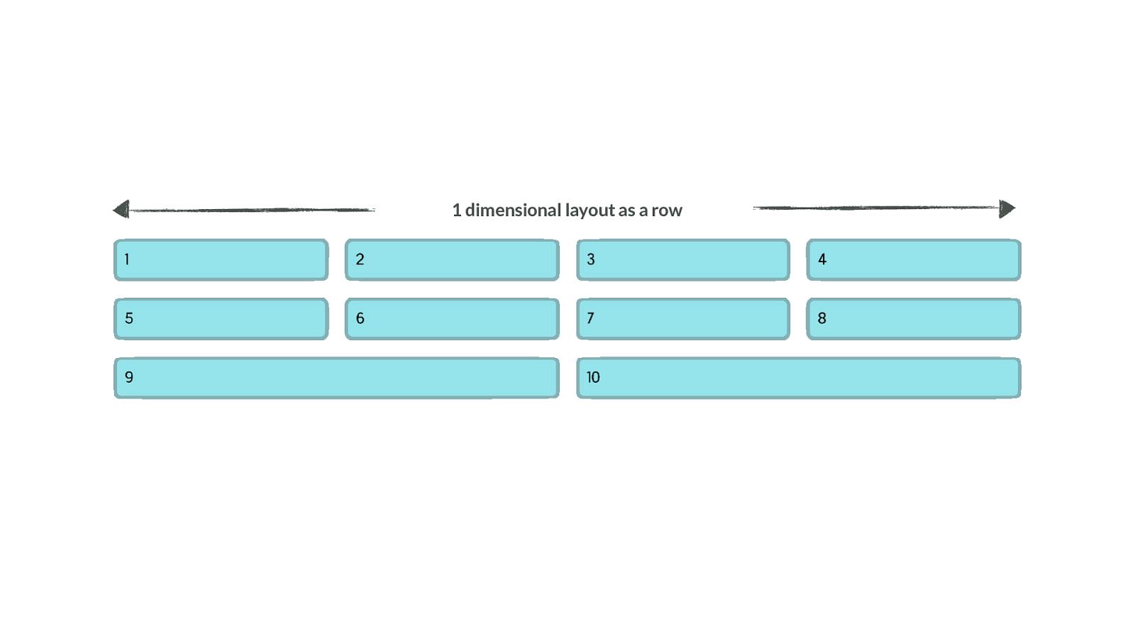
1 dimensional layout as a row Here is a flex layout, growing and shrinking to distribute content according to the available screen width. You can see that when we have fewer items in the last row the grid breaks. This is because flexbox - although you can wrap onto new rows - is doing layout in a single dimension. Here we are concerned with rows - each row becomes a new flex container. To line things up in columns you would need to restrict that flexibility.
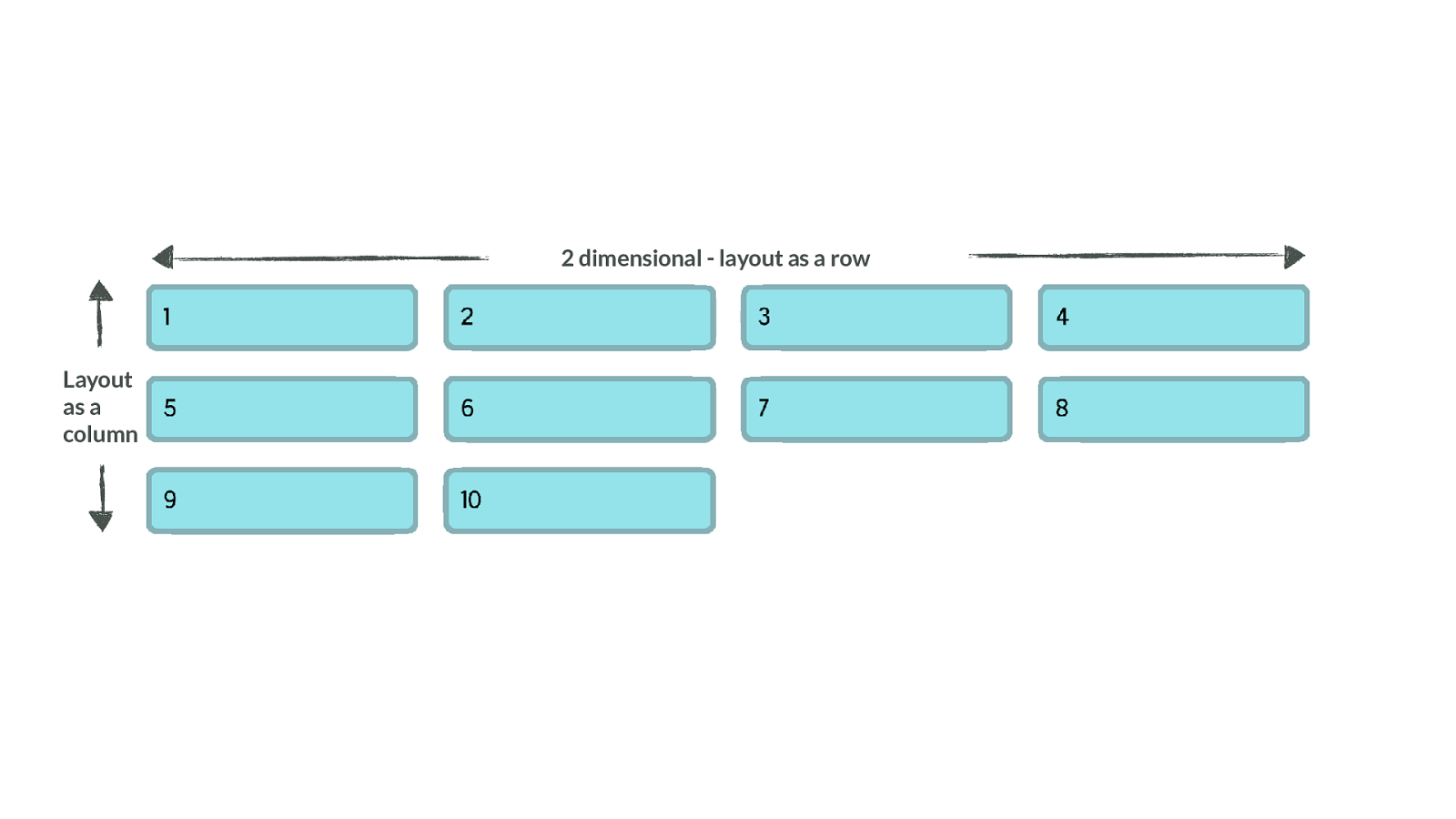
2 dimensional - layout as a row Layout as a column If instead we look at grid, and the same kind of layout. Here you can see that the items are lining up in rows and in columns. This is what we mean by two dimensional.
Grid works from the container in So this is really key to remember with grid layout, we’re working from the container in.
Every other method of creating a grid, involves sizing the individual items. Every method we had in CSS to create a grid before grid layout, required that you gave the items inside your layout a size. This size meant that other items could sit alongside it - giving the appearance of a grid.
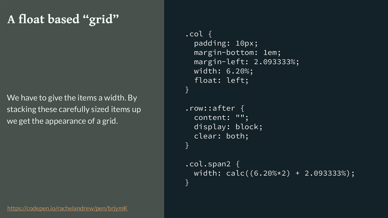
.col { padding: 10px; margin-bottom: 1em; margin-left: 2.093333%; width: 6.20%; float: left; } .row::after { content: ""; display: block; clear: both; } .col.span2 { width: calc((6.20%*2) + 2.093333%); } A float based “grid” We have to give the items a width. By stacking these carefully sized items up we get the appearance of a grid. https://codepen.io/rachelandrew/pen/brjymK
Here is a simplified float example - pretty much the barebones of what any float based grid framework will be doing.
Row wrappers that force clearing, percentages for a column and the gutter using a margin, adding up the percentages either manually or using calc() or in Sass to get the totals for any item that spans.
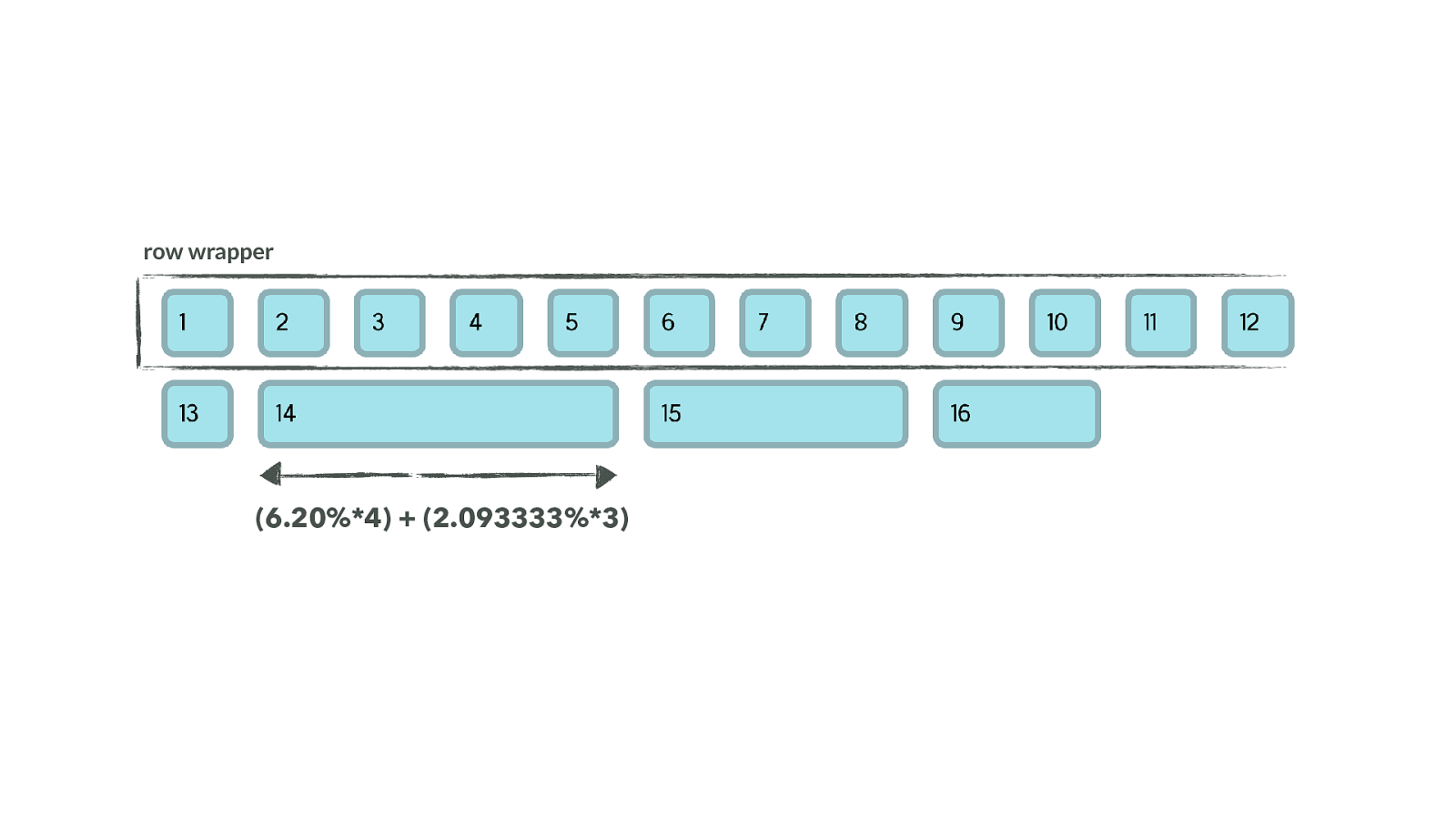
row wrapper (6.20%*4) + (2.093333%*3) We end up with this kind of thing.
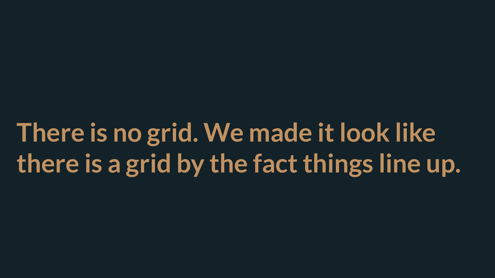
There is no grid. We made it look like there is a grid by the fact things line up. There is no grid. We’re faking the appearance of a grid. By doing all the work of lining things up.
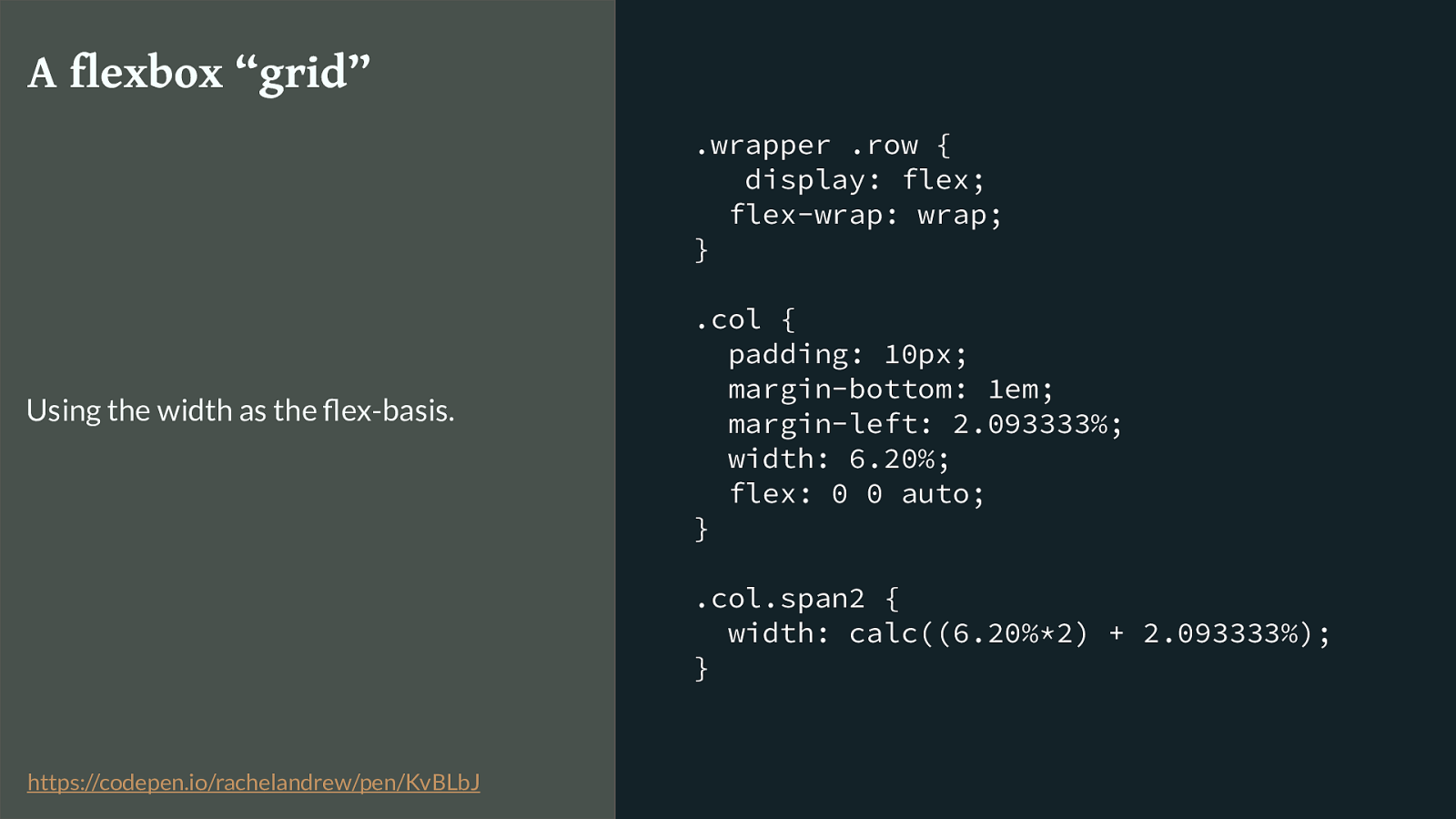
.wrapper .row { display: flex; flex-wrap: wrap; } .col { padding: 10px; margin-bottom: 1em; margin-left: 2.093333%; width: 6.20%; flex: 0 0 auto; } .col.span2 { width: calc((6.20%*2) + 2.093333%); } A flexbox “grid” Using the width as the flex-basis. https://codepen.io/rachelandrew/pen/KvBLbJ
So what about flexbox based grid frameworks - they exist. Flexbox works on the container, when you say display flex the items become flex items. That’s true - but as we have seen that doesn’t give you a grid. To get a grid - guess what - you have to put widths on the items.
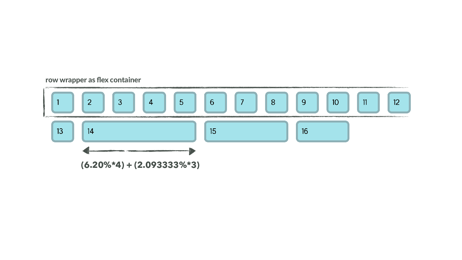
row wrapper as flex container (6.20%*4) + (2.093333%*3) Again, we have these row wrappers - this time the wrapper is a flex container. Then we use the width on the item as the flex-basis by giving a flex-basis of auto.
So we haven’t got to do any clearing, and we’ll be able to use alignment in flexbox to stretch to full height but we really aren’t using flexbox for what it is good at here - and we’re still doing all the maths.
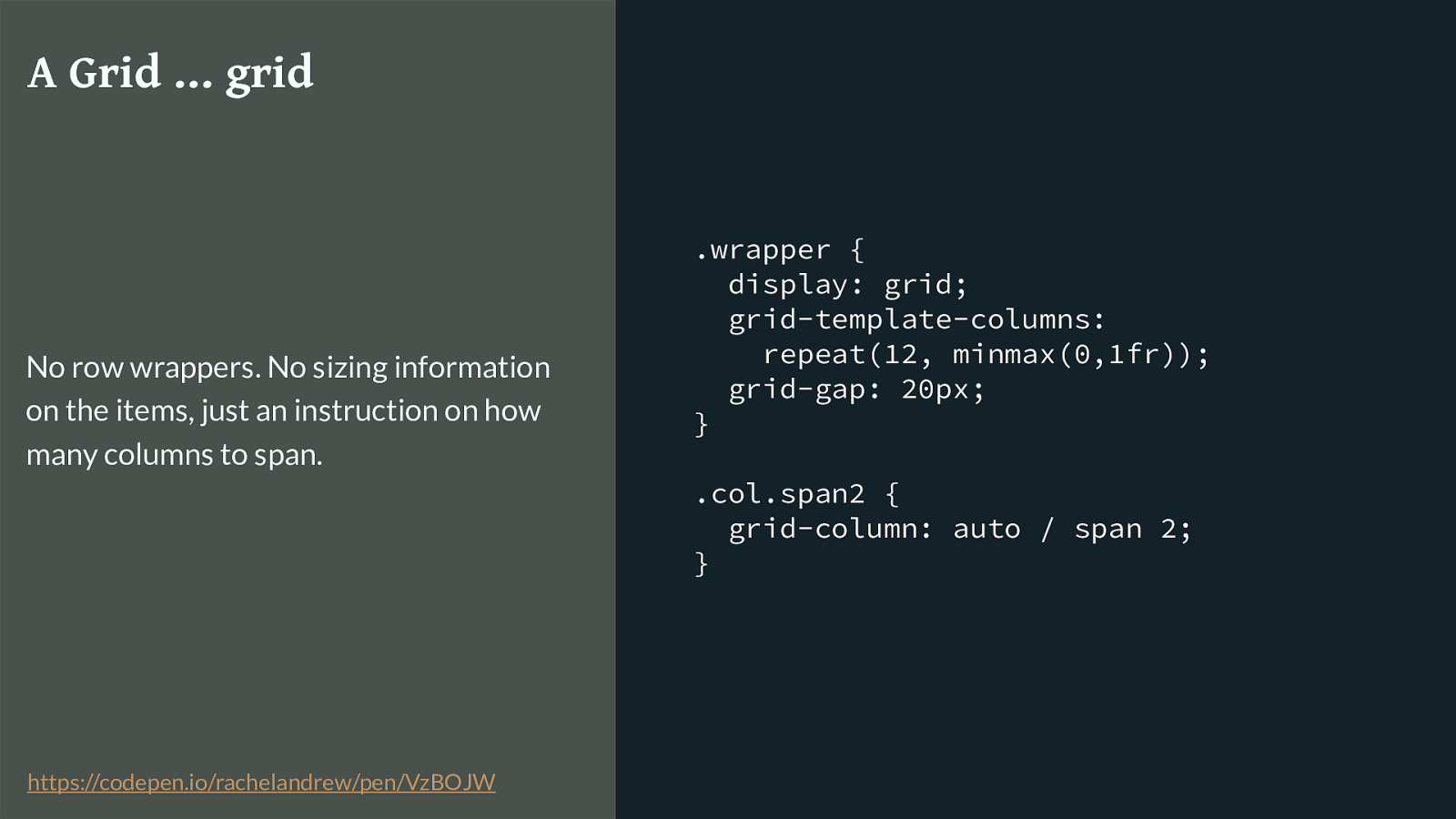
.wrapper {
display: grid;
grid-template-columns:
repeat(12, minmax(0,1fr));
grid-gap: 20px;
}
.col.span2 {
grid-column: auto / span 2;
}
A Grid … grid
No row wrappers. No sizing information
on the items, just an instruction on how
many columns to span.
https://codepen.io/rachelandrew/pen/VzBOJW
So here we are doing this with grid layout. No maths.
What happens on the item is a simple instruction as to how many tracks to span.
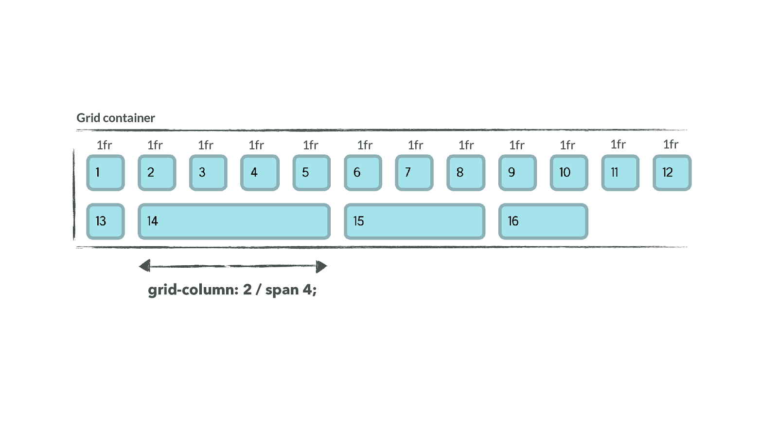
Grid container grid-column: 2 / span 4; 1fr 1fr 1fr 1fr 1fr 1fr 1fr 1fr 1fr 1fr 1fr 1fr So this is a very di ff erent concept. We define the size of columns when we set up our tracks. We then tell items how many columns to span, in one of the ways that grid has for us to do that, but the sizing comes from the container. We don’t have anything else that behaves like this.
Grid frameworks create something that looks like a grid by controlling item size.
CSS Grid Layout creates an actual grid
and you place items into it.
CSS Grid Layout is a native CSS framework. Built into the browser . It’s no wonder people are puzzled and keep sending me grid based grid frameworks that have row wrappers and are thus 1 dimensional.
The reason we created those frameworks around older layout methods, is that doing all that maths to calculate sizing is hard and boring and error prone. No-one wants to spend their life adding percentages. So we create frameworks, all we need to do is add a class and we get a block of the right size.
We don’t need this with grid. The browser does the maths for you. You create the grid and then decide whether how many of those defined tracks your item spans, where it starts. The sizing is worked out for you.
Every single abstraction I have seen so far has tried to force grid back into that old way of doing things. Don’t do it. Make the shift in thinking.
Sizing Grid Tracks Precision & Flexibility And so sizing is everything when it comes to the grid, and we have a bunch of new sizing concepts to learn. You’ve already seen two of them in action.
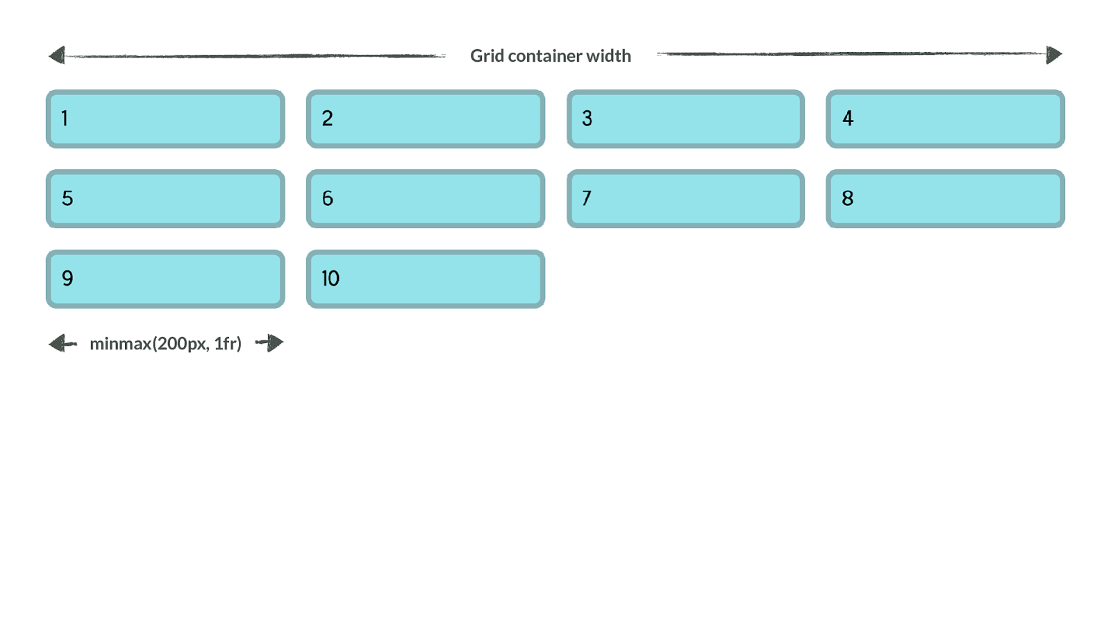
Grid container width minmax(200px, 1fr) The example of as many columns as will fit, uses two methods designed to work on the grid container to enable flexible sized tracks.
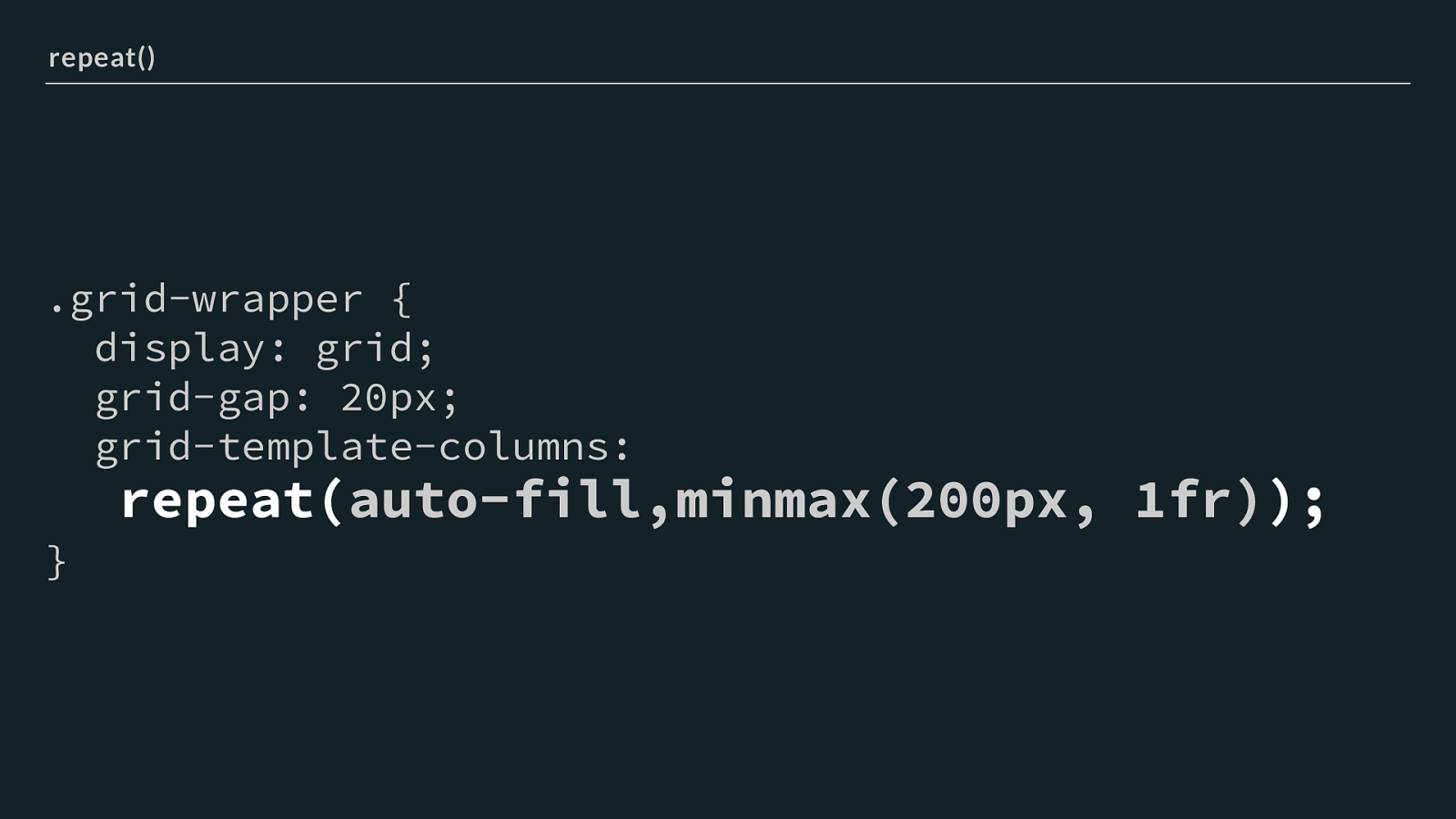
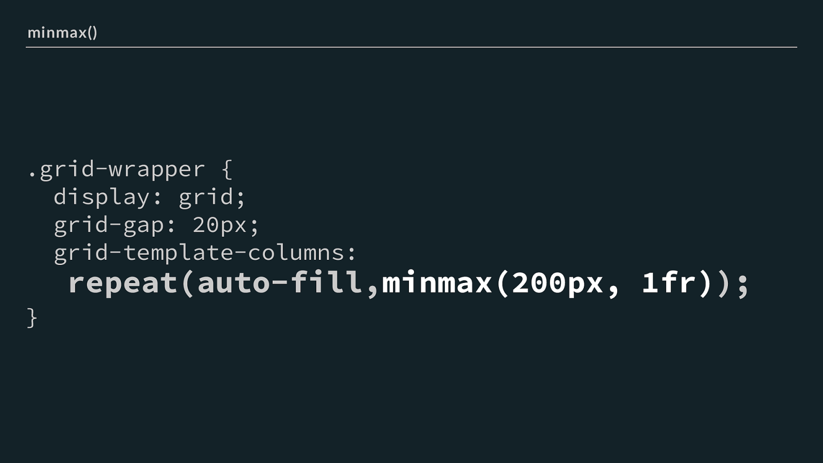
.grid-wrapper { display: grid; grid-gap: 20px; grid-template-columns:
repeat( auto-fill,minmax(200px, 1fr) );
} repeat() The repeat statement tells the browser to repeat the pattern inside the brackets
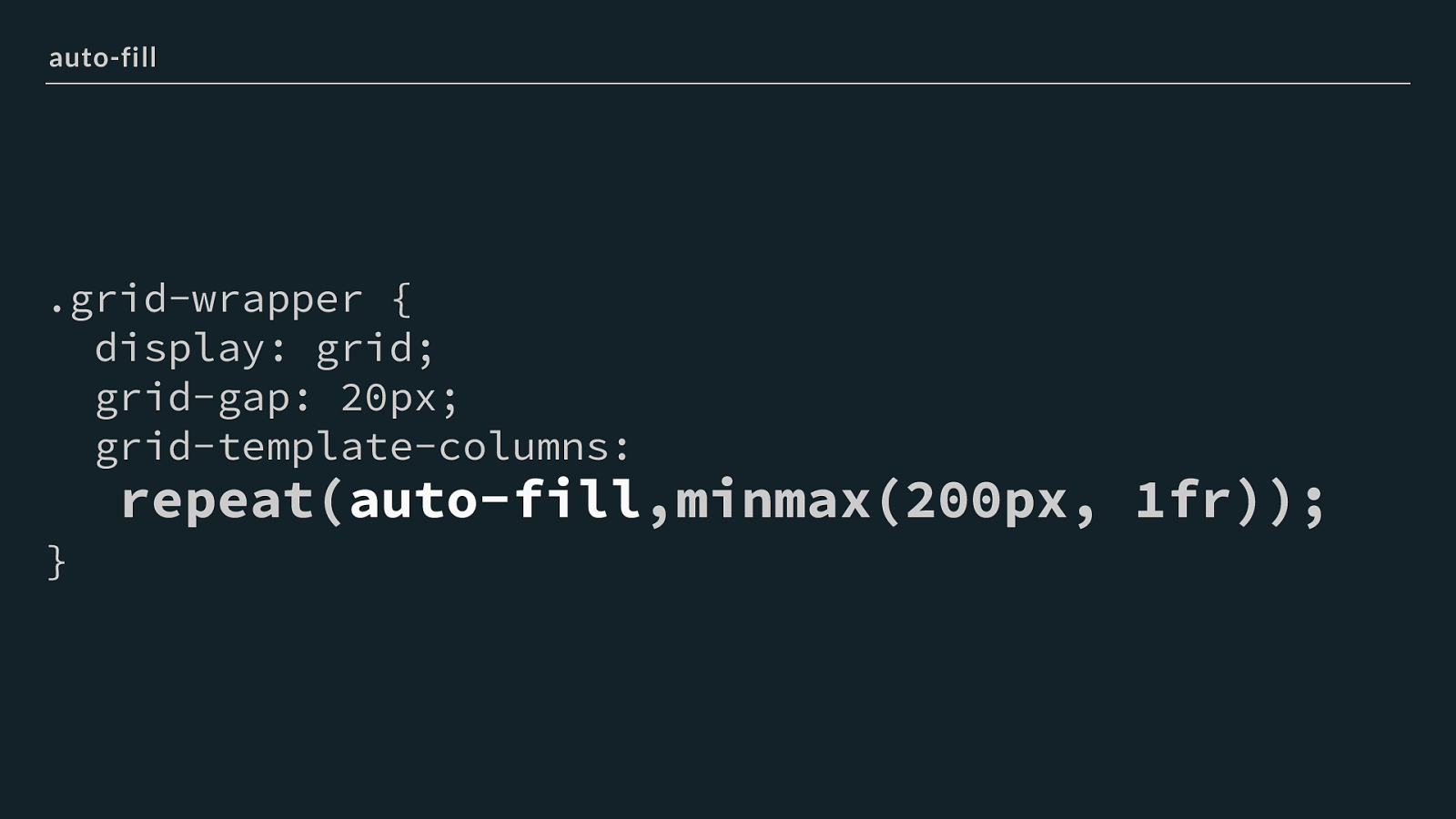
.grid-wrapper { display: grid; grid-gap: 20px; grid-template-columns:
repeat( auto-fill ,minmax(200px, 1fr));
} auto-fill We are using auto-fill the pattern will be repeated as many times as will fit - you could put a number here to get a fixed number of repeats.
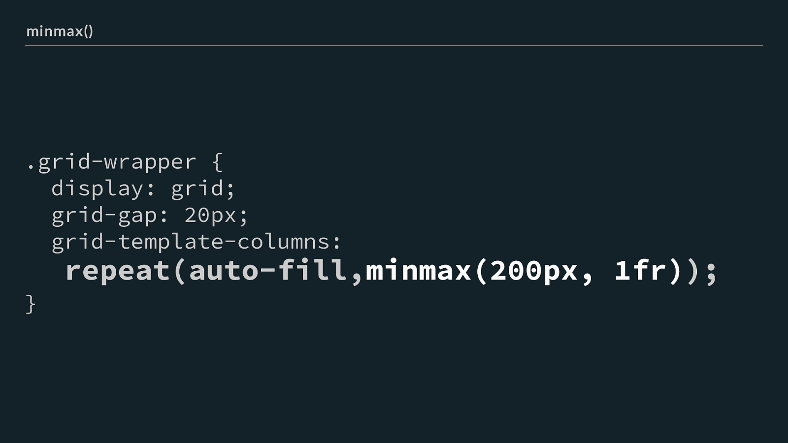
.grid-wrapper { display: grid; grid-gap: 20px; grid-template-columns:
repeat(auto-fill, minmax(200px, 1fr) );
} minmax() We then add use minmax() it allows us to set a minimum and a maximum value for a track size. The minimum will be the smallest size we want our columns to shrink to. I’ve used 200 pixels. The maximum is 1fr or one fraction of the available space. The e ff ect of this in our example is that after working out how many 200 pixels columns will fit, the browser redistributes the space left over to the other columns.
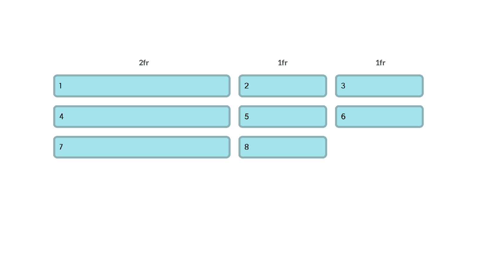
The fr unit - distributing available space The fr unit is incredibly useful.
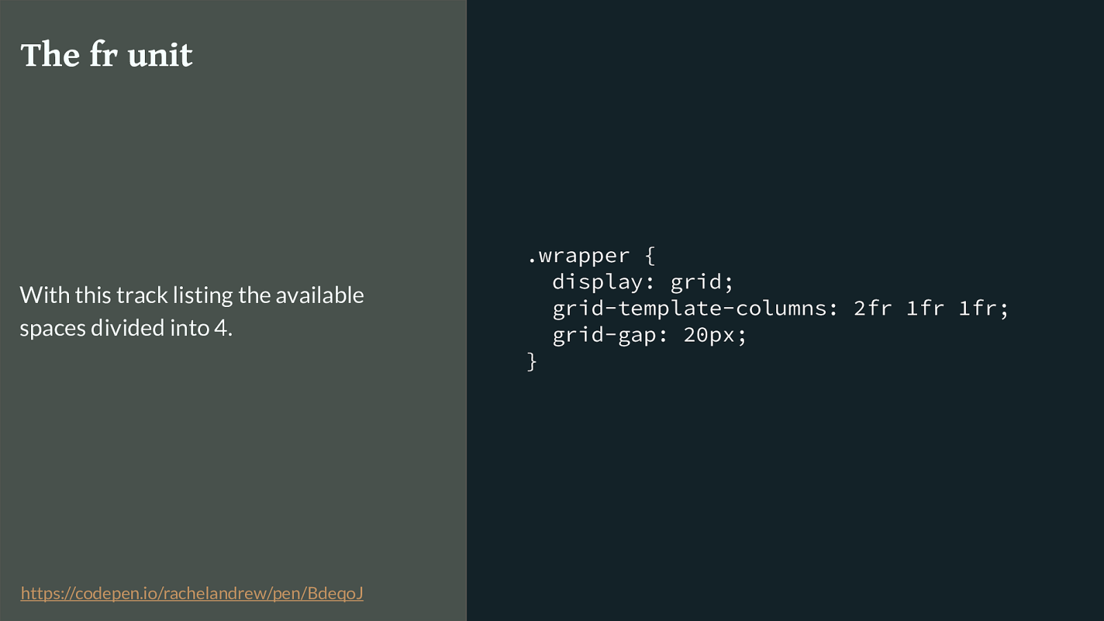
.wrapper { display: grid; grid-template-columns: 2fr 1fr 1fr; grid-gap: 20px; } The fr unit With this track listing the available spaces divided into 4. https://codepen.io/rachelandrew/pen/BdeqoJ
You can specify di ff erent fr values for tracks, sharing out the available space in proportion.
1fr 1fr 2fr
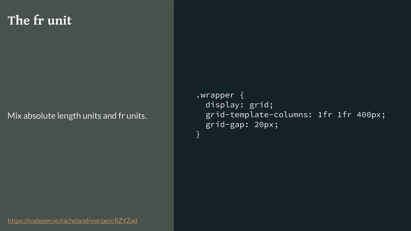
.wrapper { display: grid; grid-template-columns: 1fr 1fr 400px; grid-gap: 20px; } The fr unit Mix absolute length units and fr units. https://codepen.io/rachelandrew/pen/RZYZad
You can mix fr units and fixed length units. In which case the fr units will be calculated on the available space left after we have taken away the space for those fixed tracks.
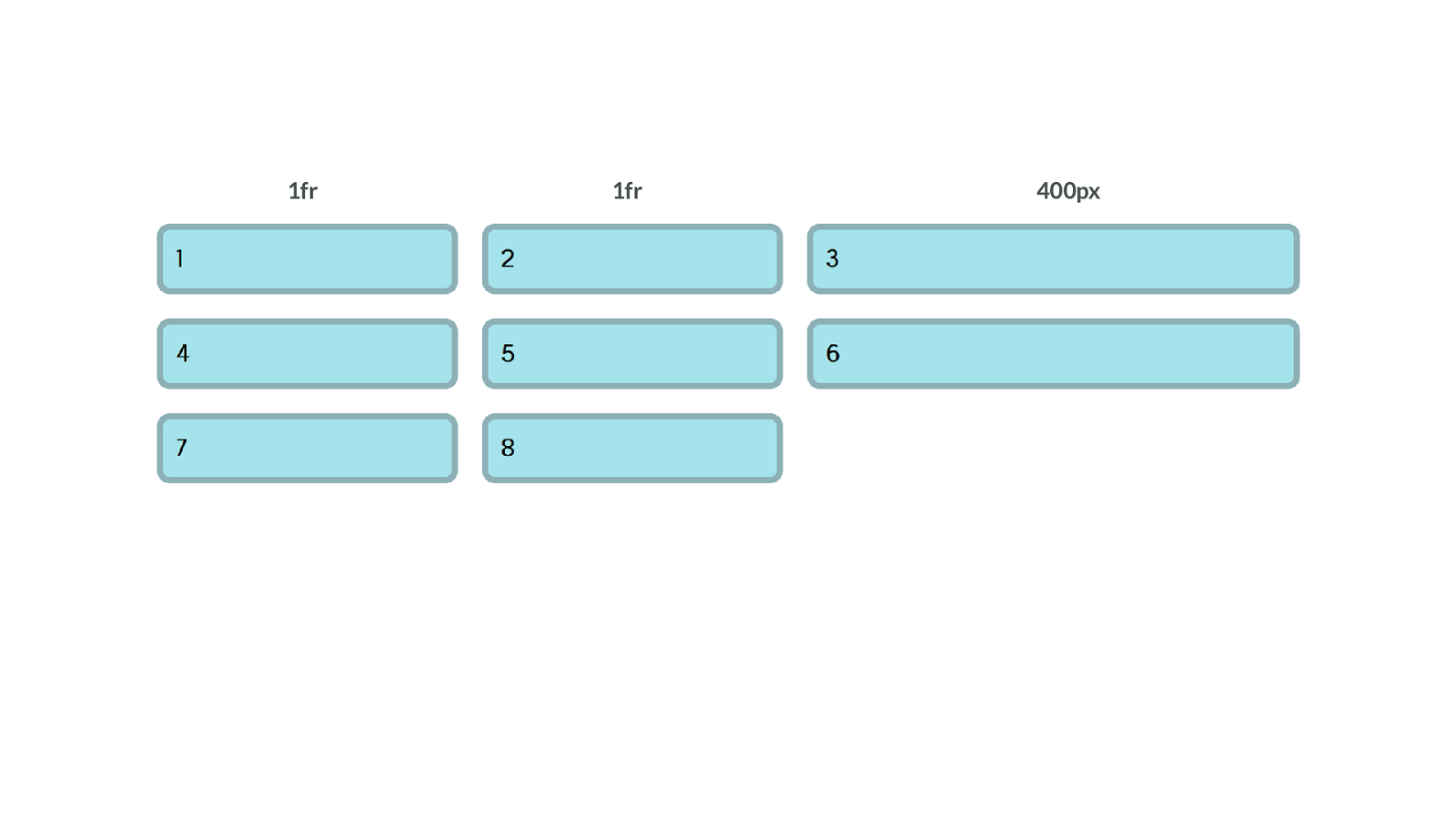
400px 1fr 1fr
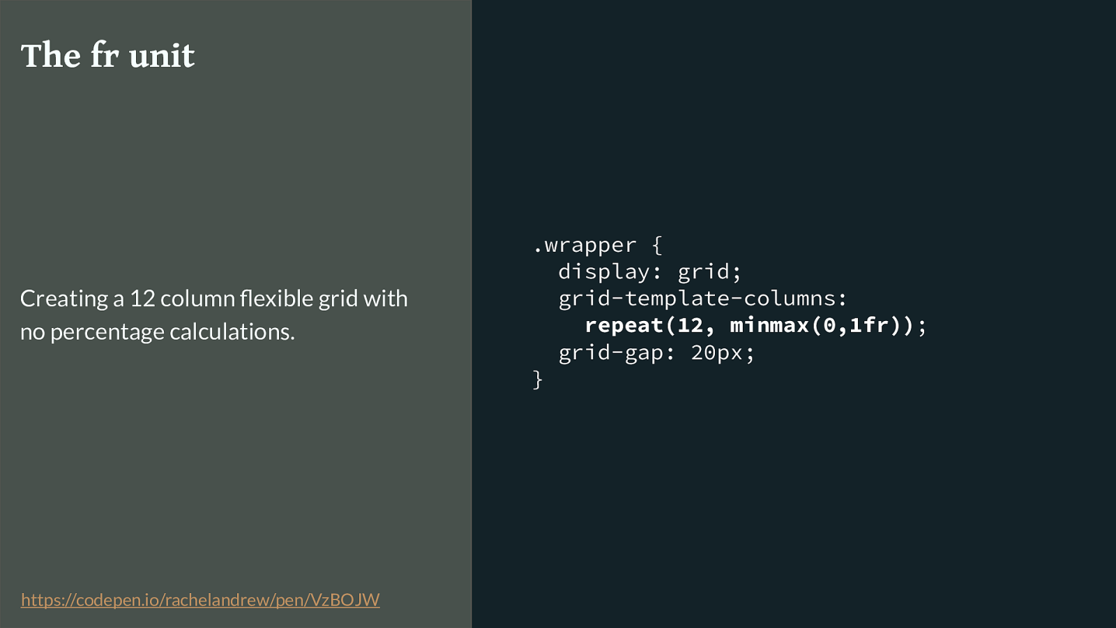
.wrapper { display: grid; grid-template-columns:
repeat(12, minmax(0,1fr)) ; grid-gap: 20px; } The fr unit Creating a 12 column flexible grid with no percentage calculations. https://codepen.io/rachelandrew/pen/VzBOJW
In our 12 column grid example the fr unit means we don’t need to worry about the fixed pixel width used for the gutter tracks. No more calculating percentages. The fixed width is removed from the available space before it is shared out.
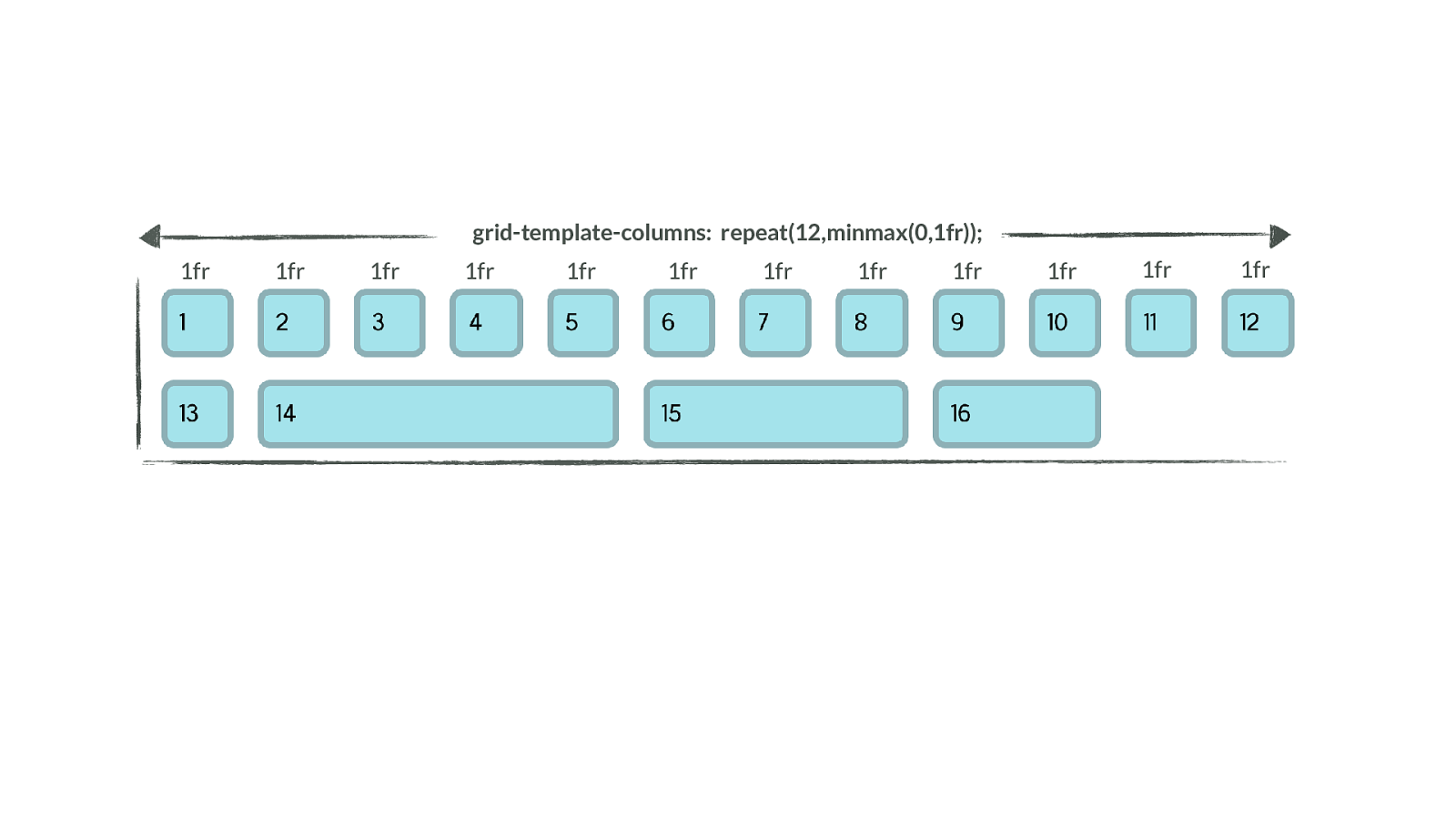
grid-template-columns: repeat(12,minmax(0,1fr)); 1fr 1fr 1fr 1fr 1fr 1fr 1fr 1fr 1fr 1fr 1fr 1fr Which gives us this, the column tracks detailed on the container.
The fr unit replaces percentages in most cases when using grid layout. A really common problem people have with moving to grid is they don’t appreciate that the fr unit replaces in most cases the need for percentages. You can let the browser do the calculations for you!
.grid-wrapper { display: grid; grid-gap: 20px; grid-template-columns:
repeat(auto-fill, minmax(200px, 1fr) );
} minmax() I also want to highlight the minmax() function to you. This allows us to set a minimum and a maximum size for tracks.
Useful here to ensure our tracks don’t get too small, also useful to create precise looking layouts that have tolerance for extra content suddenly getting jammed in - something that happens on the web.
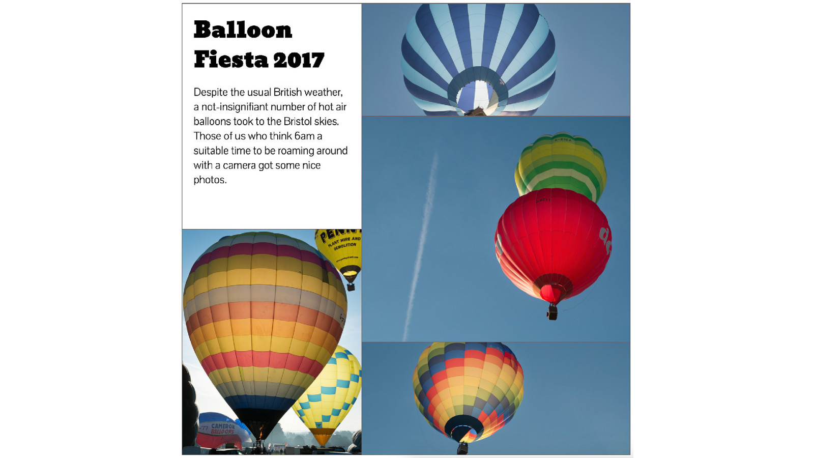
Here is an example. I wanted to create a panel that is similar to the panel of photos you see on Facebook. With di ff erent size photos arranged to make a neat looking grid.
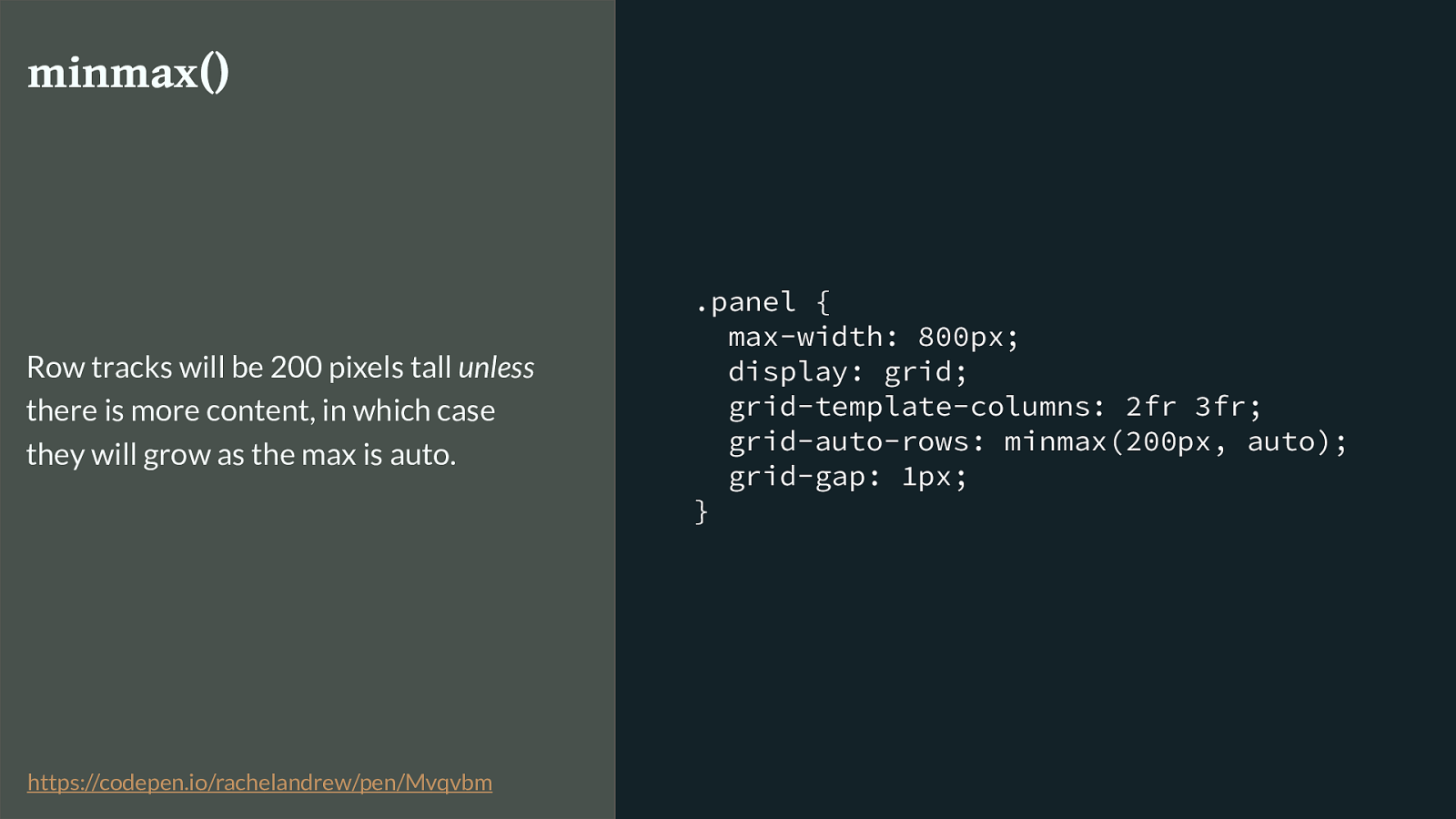
.panel { max-width: 800px; display: grid; grid-template-columns: 2fr 3fr; grid-auto-rows: minmax(200px, auto); grid-gap: 1px; } minmax() Row tracks will be 200 pixels tall unless
there is more content, in which case they will grow as the max is auto. https://codepen.io/rachelandrew/pen/Mvqvbm
Here is the grid definition for the panel. You can see I have defined column tracks, I have also used he grid-auto-rows property to define sizing of rows that grid creates in the implicit grid. Any new row created to contain content will be 200 pixels tall, but has a maximum of auto.
This means that if there is more content than will fit - the track will expand so we don’t get overflows.
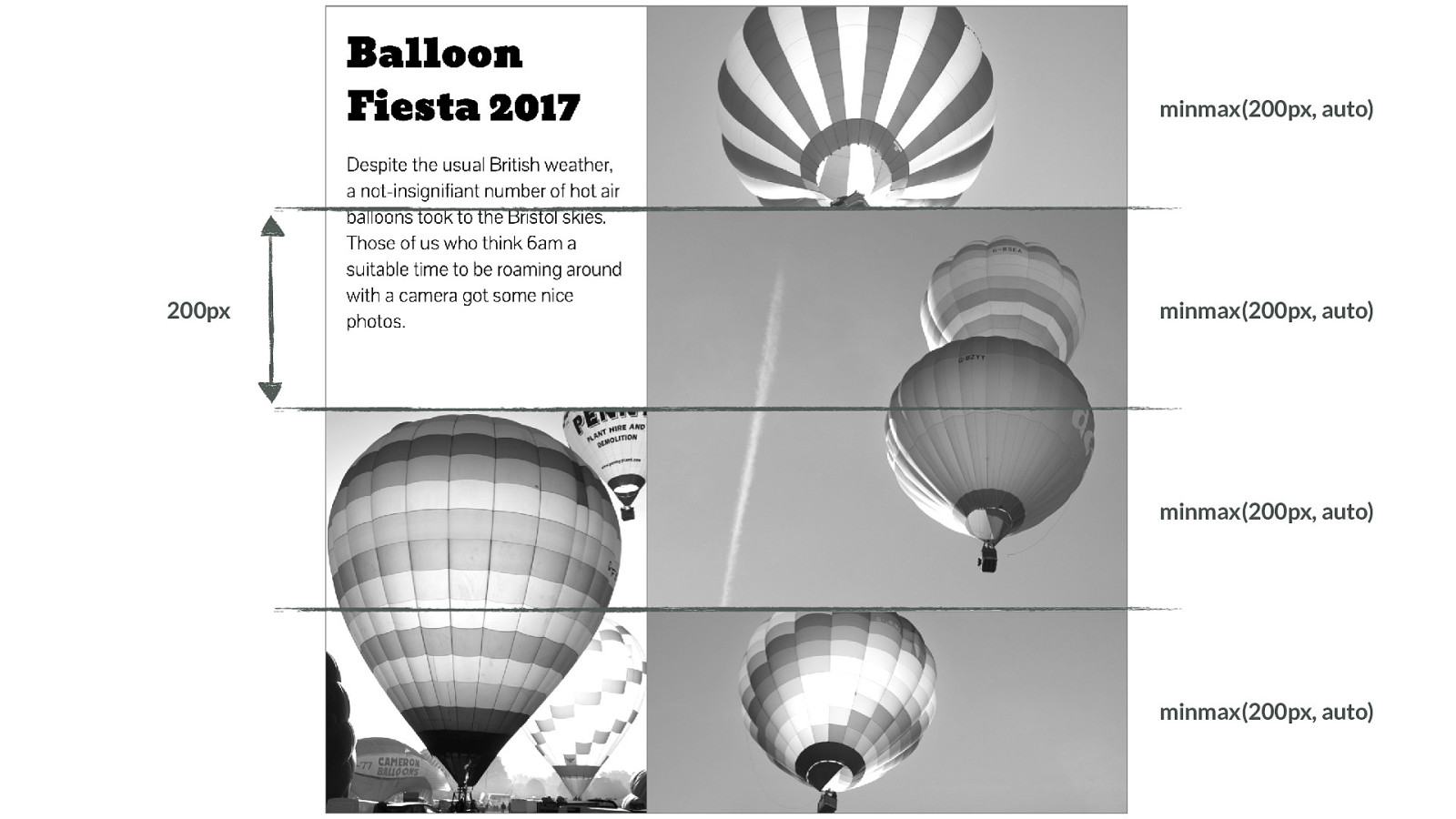
minmax(200px, auto) minmax(200px, auto) minmax(200px, auto) minmax(200px, auto) 200px I’m highlighting the row lines here, you can see how they each grow to 200 pixels tall.
If we add some content to the intro box.

You can see how to has expanded to take the content - as has the entire row.
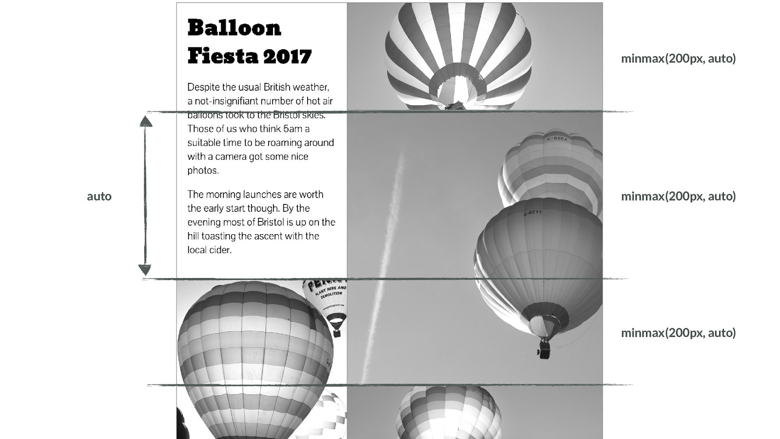
minmax(200px, auto) minmax(200px, auto) minmax(200px, auto) auto So that’s something to consider - if one box can grow - what happens to everything else in the row or column. It needs to be able to absorb the space. I’m using object fit contain to make the image grow to fill whatever space is assigned.
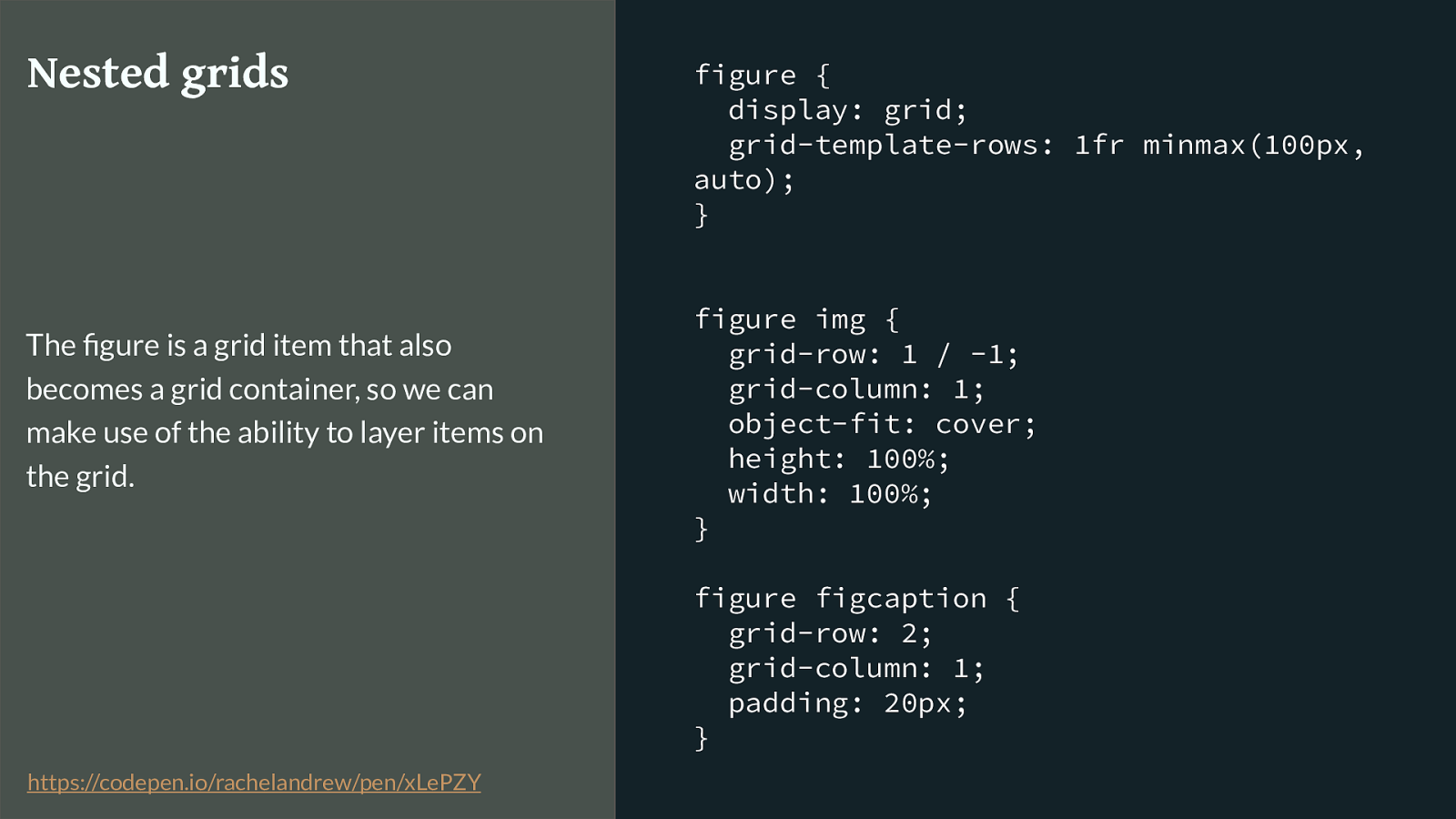
figure { display: grid; grid-template-rows: 1fr minmax(100px, auto); } figure img { grid-row: 1 / -1; grid-column: 1; object-fit: cover; height: 100%; width: 100%; } figure figcaption { grid-row: 2; grid-column: 1; padding: 20px; } Nested grids The figure is a grid item that also becomes a grid container, so we can make use of the ability to layer items on the grid. https://codepen.io/rachelandrew/pen/xLePZY
I’m then going to use the same technique to add a caption. The figure is actually a two row track grid - I’ve caused the image to span 2 rows, then placed the caption in row 2 so it overlays the image. It has a minimum height of 100 pixels and once again a max of auto.
Which gives us this.
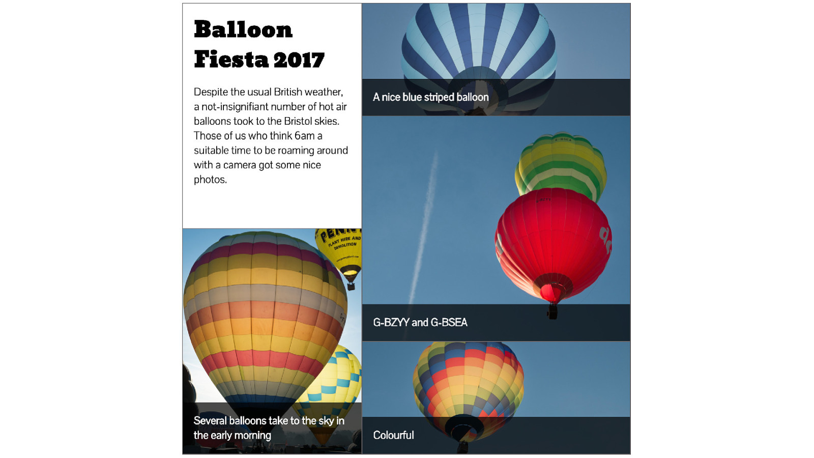
Note that the captions at the bottom don’t line up, the one on the left has grown taller as it has two lines, this is due to our use of minmax() however because those captions are part of the nested figure subgrid they don’t have relationship to each other and we can’t ask the caption for the colourful balloon to be as tall as the one on the left - more on this later.

New sizing keywords from the CSS Sizing specification Before that I wanted to continue a little while with sizing. We have seen that we define our grid on the parent and then place our content into the cells created, we’ve also seen however that content can define the size of tracks - you just have to remember that unlike with flexbox the change to track sizing will apply right along that row or column.
We have some new sizing keywords that can be used to help with this content defined sizing.
CSS Intrinsic & Extrinsic Sizing Module Level 3: https://www.w3.org/TR/css-sizing-3/
▸ min-content ▸ max-content ▸ fit-content
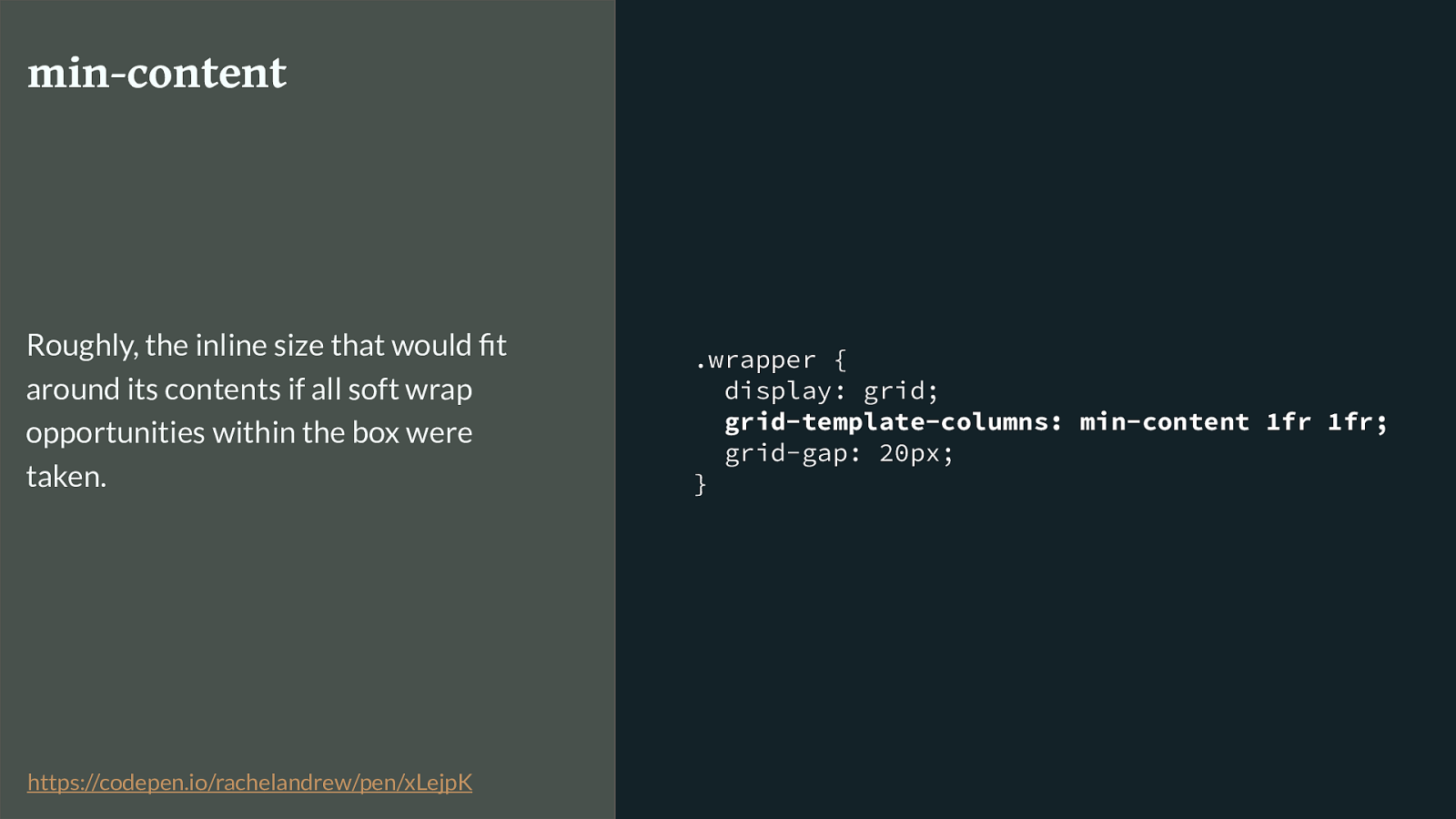
.wrapper { display: grid; grid-template-columns: min-content 1fr 1fr; grid-gap: 20px; } min-content Roughly, the inline size that would fit around its contents if all soft wrap opportunities within the box were taken. https://codepen.io/rachelandrew/pen/xLejpK
Min-content will use all the wrapping opportunities available to it to be as small as it can be.
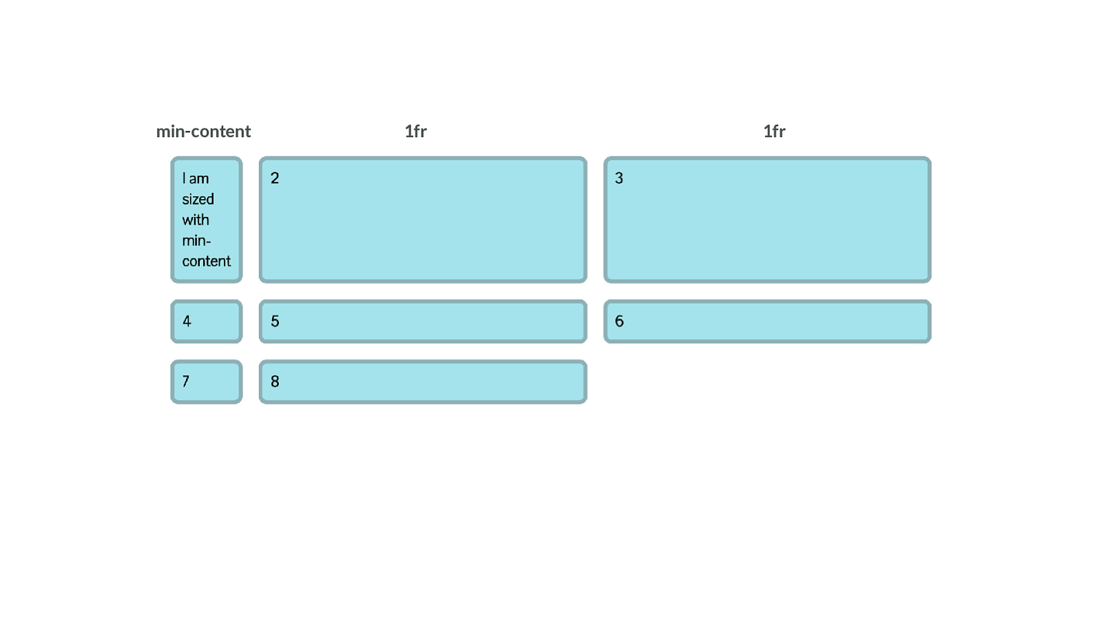
1fr 1fr min-content Giving us a track like this,
.wrapper { display: grid;
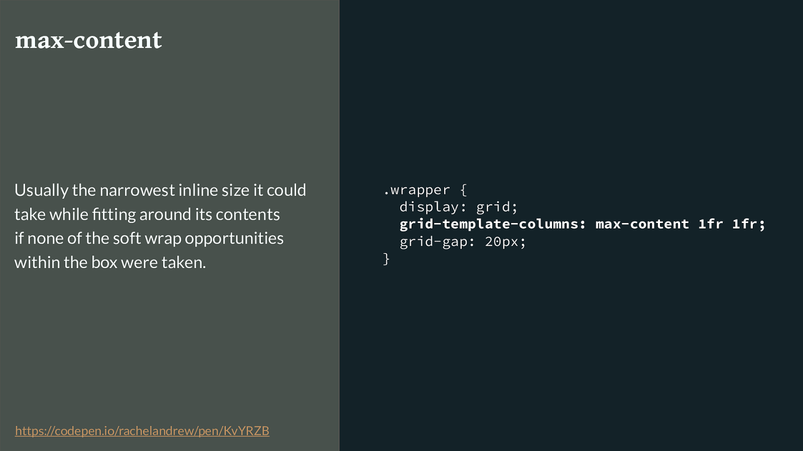
grid-template-columns: max-content 1fr 1fr; grid-gap: 20px; } max-content Usually the narrowest inline size it could take while fitting around its contents if none of the soft wrap opportunities within the box were taken. https://codepen.io/rachelandrew/pen/KvYRZB
Max-content does the opposite - trying to get as big as possible.
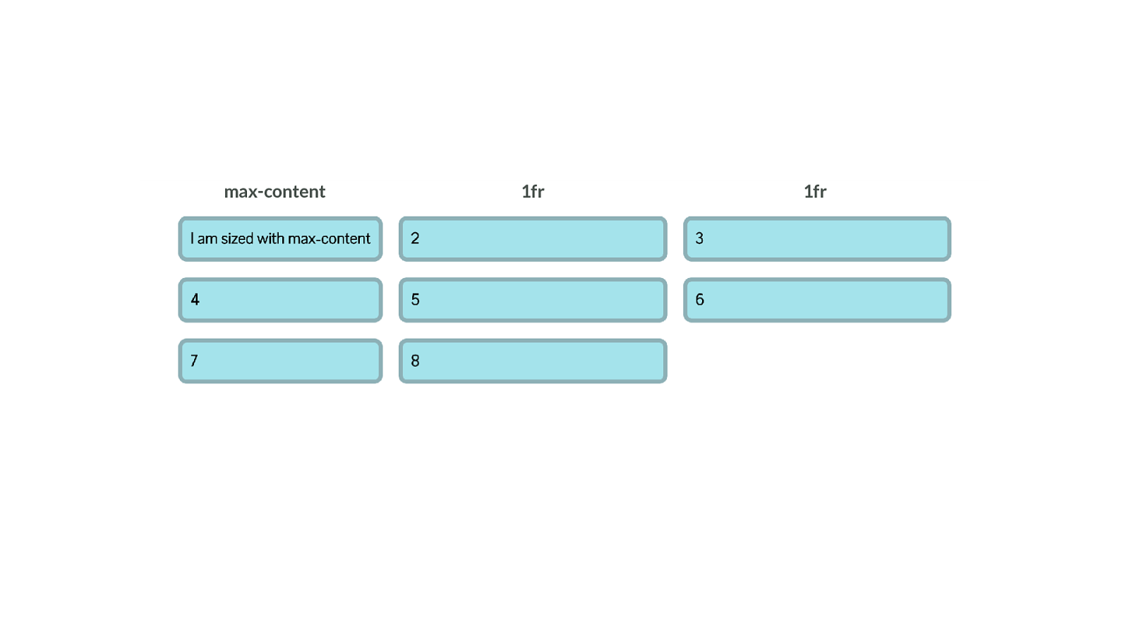
1fr 1fr max-content Spreading out like this.
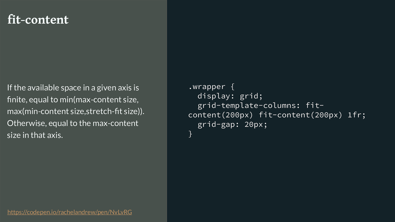
.wrapper {
display: grid;
grid-template-columns: fit-
content(200px) fit-content(200px) 1fr;
grid-gap: 20px;
}
fit-content
If the
available space
in a given axis is
finite, equal to
min(max-content size,
max(min-content size,stretch-fit size)).
Otherwise, equal to the
max-content
size
in that axis.
https://codepen.io/rachelandrew/pen/NvLvRG
Fit-content - we pass in a value, and the track will act like max-content until it hits the size set in the value then it stops.
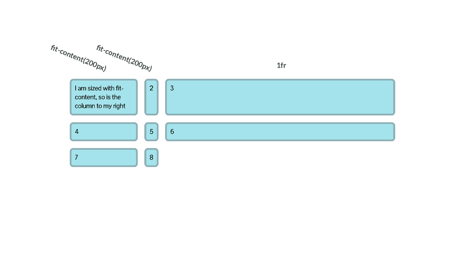
1fr fit-content(200px) fit-content(200px) So in grid we can have a column that grows until it hits the size specified in fit-content - but if it is naturally narrower, it doesn’t grow to that size - such as the second column here.
I could easily spend a whole talk just on sizing, but have a play around with these ideas, as they can give you a lot of creative possibilities when used with Grid in particular.

CSS is here to help Dealing with old browsers So then we come to old browsers, I can’t talk about grid without getting into this subject.
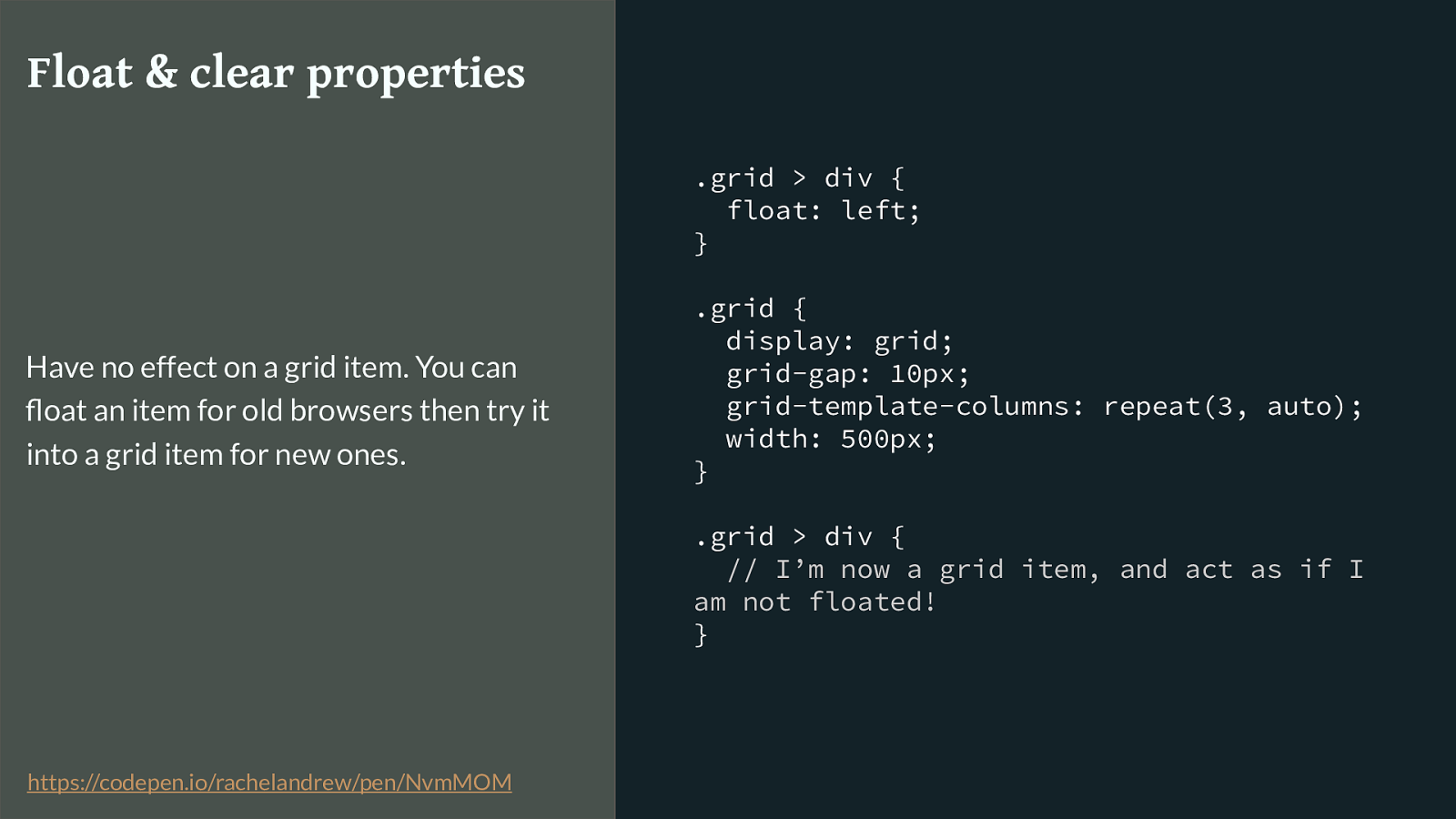
.grid > div { float: left; } .grid { display: grid; grid-gap: 10px; grid-template-columns: repeat(3, auto); width: 500px; } .grid > div {
// I’m now a grid item, and act as if I am not floated!
} Float & clear properties Have no effect on a grid item. You can float an item for old browsers then try it into a grid item for new ones. https://codepen.io/rachelandrew/pen/NvmMOM
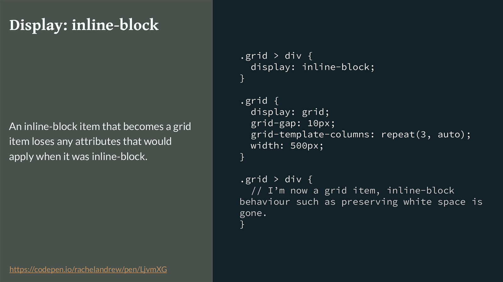
.grid > div { display: inline-block; } .grid { display: grid; grid-gap: 10px; grid-template-columns: repeat(3, auto); width: 500px; } .grid > div {
// I’m now a grid item, inline-block behaviour such as preserving white space is gone. } Display: inline-block An inline-block item that becomes a grid item loses any attributes that would apply when it was inline-block. https://codepen.io/rachelandrew/pen/LjvmXG
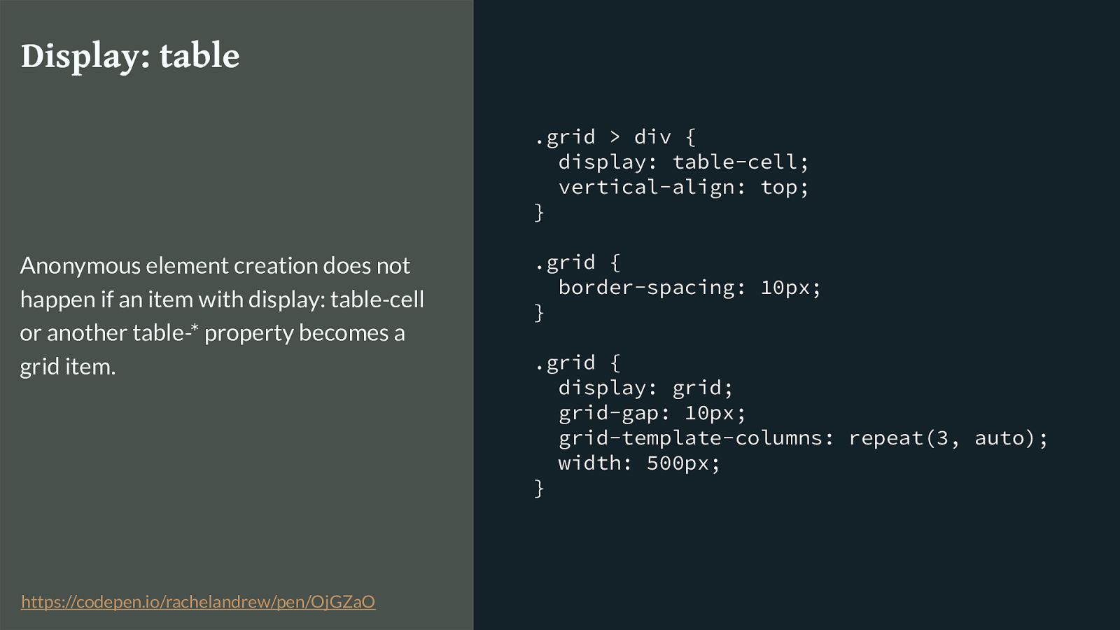
.grid > div { display: table-cell; vertical-align: top; } .grid { border-spacing: 10px; } .grid { display: grid; grid-gap: 10px; grid-template-columns: repeat(3, auto); width: 500px; } Display: table Anonymous element creation does not happen if an item with display: table-cell or another table-* property becomes a grid item. https://codepen.io/rachelandrew/pen/OjGZaO
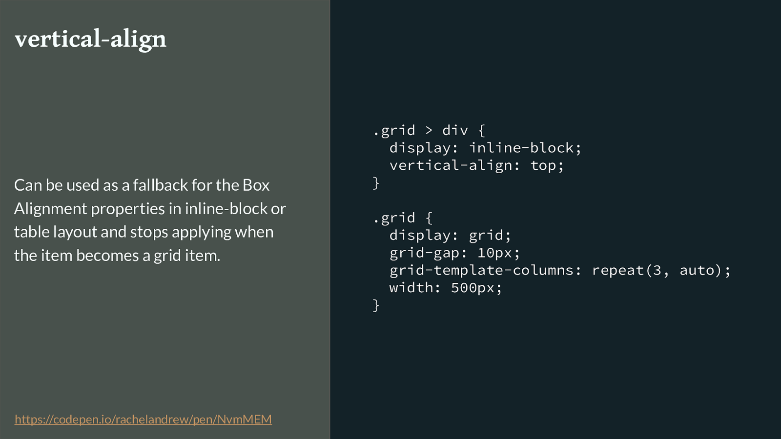
.grid > div { display: inline-block; vertical-align: top; } .grid { display: grid; grid-gap: 10px; grid-template-columns: repeat(3, auto); width: 500px; } vertical-align Can be used as a fallback for the Box Alignment properties in inline-block or table layout and stops applying when the item becomes a grid item. https://codepen.io/rachelandrew/pen/NvmMEM
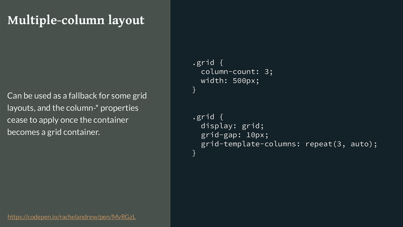
.grid { column-count: 3; width: 500px; } .grid { display: grid; grid-gap: 10px; grid-template-columns: repeat(3, auto); } Multiple-column layout Can be used as a fallback for some grid layouts, and the column-* properties cease to apply once the container becomes a grid container. https://codepen.io/rachelandrew/pen/MvRGzL
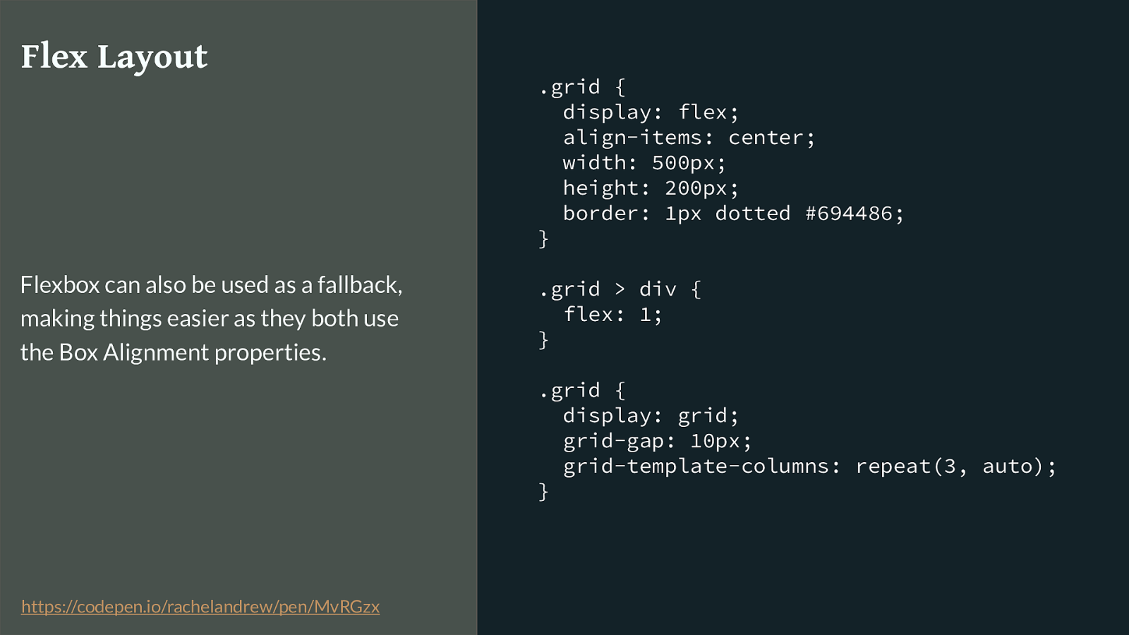
.grid { display: flex; align-items: center; width: 500px; height: 200px; border: 1px dotted #694486; } .grid > div { flex: 1; } .grid { display: grid; grid-gap: 10px; grid-template-columns: repeat(3, auto); } Flex Layout Flexbox can also be used as a fallback, making things easier as they both use the Box Alignment properties. https://codepen.io/rachelandrew/pen/MvRGzx
Use the cascade . Write code for old browsers then code for new browsers. So, a lot of the time you can create fallbacks just by using the way CSS works. As long as your grid code comes last, browsers that understand the first instruction but don’t understand grid will do the first thing, browsers that do understand grid know that once an item is a grid item this other stu ff does not apply.
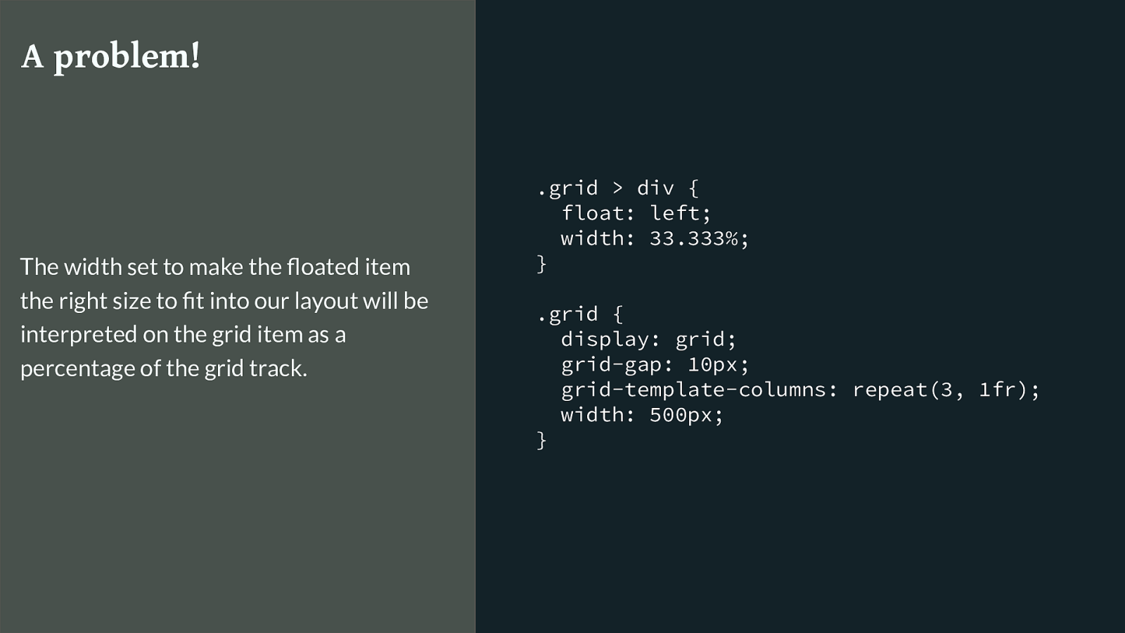
.grid > div { float: left; width: 33.333%; } .grid { display: grid; grid-gap: 10px; grid-template-columns: repeat(3, 1fr); width: 500px; } A problem! The width set to make the floated item the right size to fit into our layout will be interpreted on the grid item as a percentage of the grid track. There are of course places however where your grid supporting browsers are going to use some of the non-grid code and get into a mess. Sometimes we do need to essentially fork our code.
This is a key example. If I want to make a three column layout with floats, I set them to 33.333% and they float up next to each other. I then turn their parent into a grid container and the float stops floating. However that 33.333% will be interpreted as a % of the grid track (which is already a third of the container.) I need a way to tell the browser not to use the item width when we are in a grid layout.
But CSS has fixed that problem for you too. With Feature Queries.
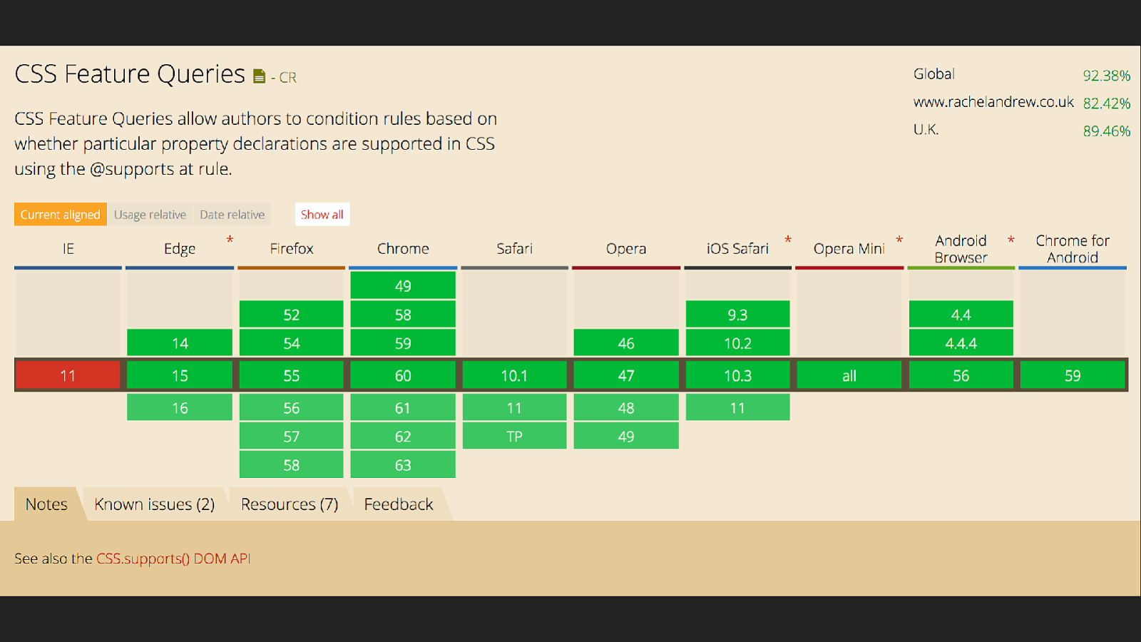
Feature Queries have really good support, and because we are going to use them in the same way we did our other overrides it doesn’t matter than IE11 doesn’t have support for them. So in the case of our example we use feature queries like this.
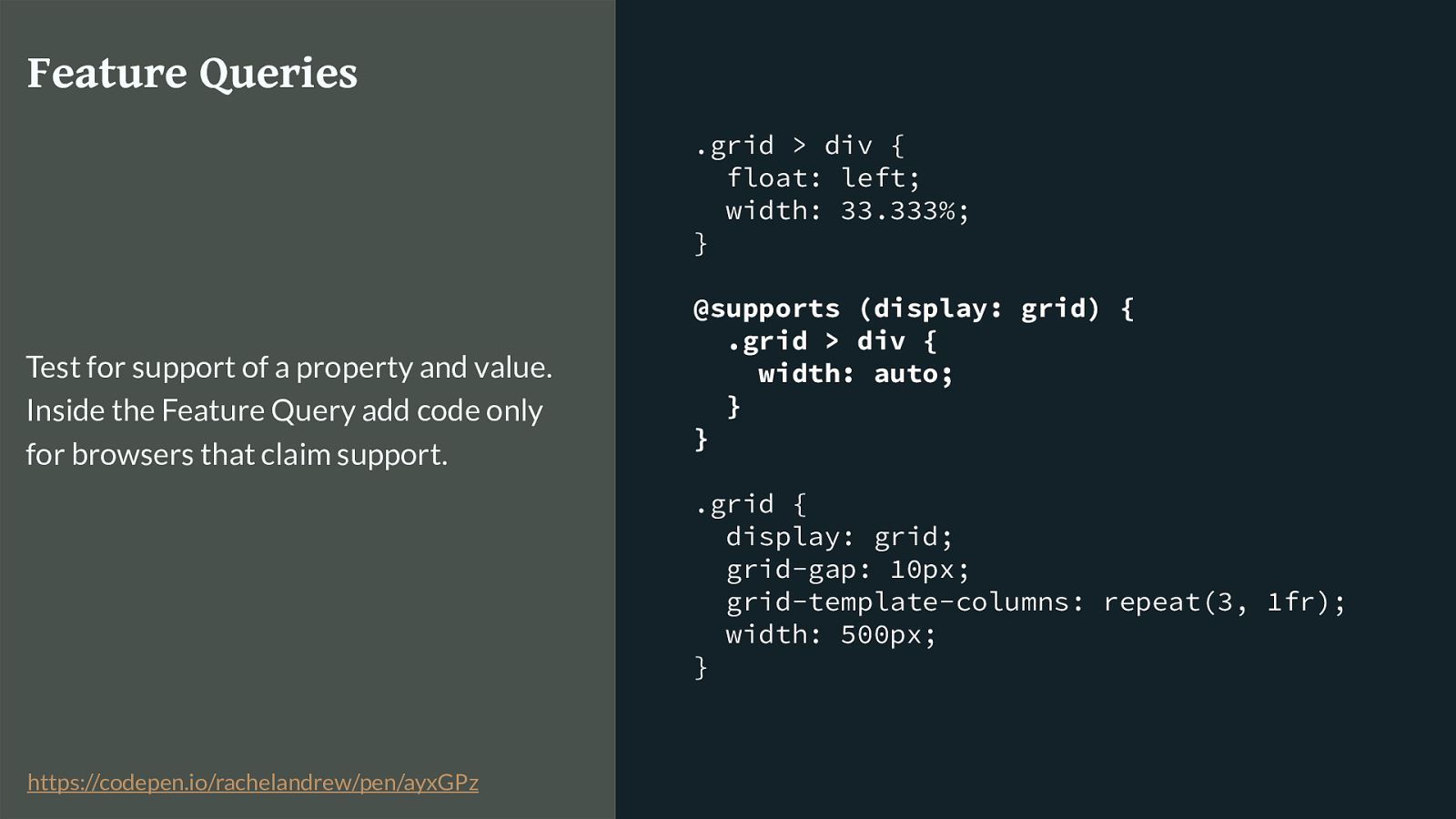
.grid > div { float: left; width: 33.333%; } @supports (display: grid) { .grid > div { width: auto; } } .grid { display: grid; grid-gap: 10px; grid-template-columns: repeat(3, 1fr); width: 500px; } Feature Queries Test for support of a property and value. Inside the Feature Query add code only for browsers that claim support. https://codepen.io/rachelandrew/pen/ayxGPz
I test for the browser claiming that it supports display: grid. If it does, I set the width back to auto. That’s it. Our columns now won’t be shrinking down to a third of the size of the column track.
You need to understand CSS How we use the cascade, how we can create graceful fallbacks with minimal code is all down to to the way that CSS just works. What this means is that you really do need to understand CSS and how best to structure things to take advantage of this stu ff . If you have spent the last few years adding a class provided by your framework to do front end development then you might have some catching up to do. It’s worth it.

The fundamentals of CSS haven’t changed The fundamentals of CSS are not fast moving. They are pretty much the same things that we’ve been using for 20 years. Learning the fundamentals means you will be able to learn the new shiny far more easily, fail to learn them because you are too busy looking at the shiny and it will all seem like an obscure black box.

Subgrids? Next for Grid I promised that I would talk a bit about what might come next for grid layout once the Level 1 specification is finished and adopted by browsers.
Something a lot of people want is the ability to have items nested deeper than the direct children of the element with display: grid participate in the overall layout.
Here is a good example of why we might want subgrid.
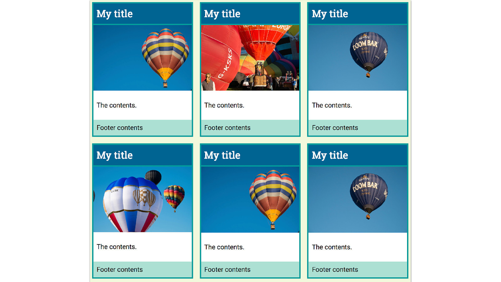
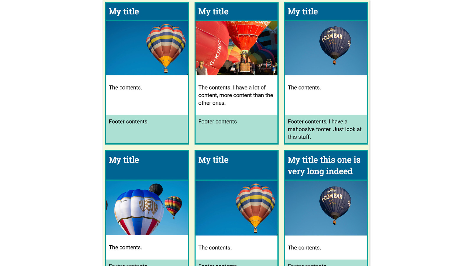
Look at this layout, this is the sort of nice layout you get from a designer who believes in a world where text will emerge from the CMS with perfectly identical line lengths.
Everything lines up really neatly, and we can use grid very simply here to create our lined up boxes.
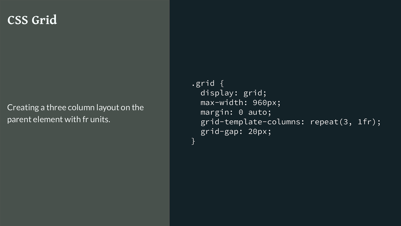
.grid { display: grid; max-width: 960px; margin: 0 auto; grid-template-columns: repeat(3, 1fr); grid-gap: 20px; } CSS Grid Creating a three column layout on the parent element with fr units. Then the real world of real data rather than our designers world of identical data happens.
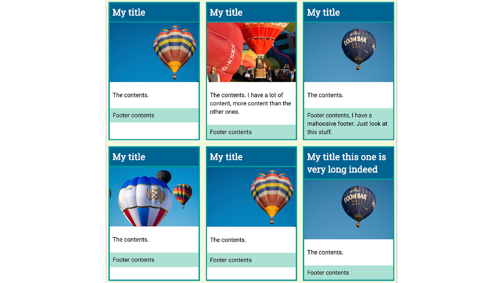
And we end up with this.
And we think, I would really like to line up these boxes across the row., and we can’t, because the internals of each box are not participating in the grid layout.
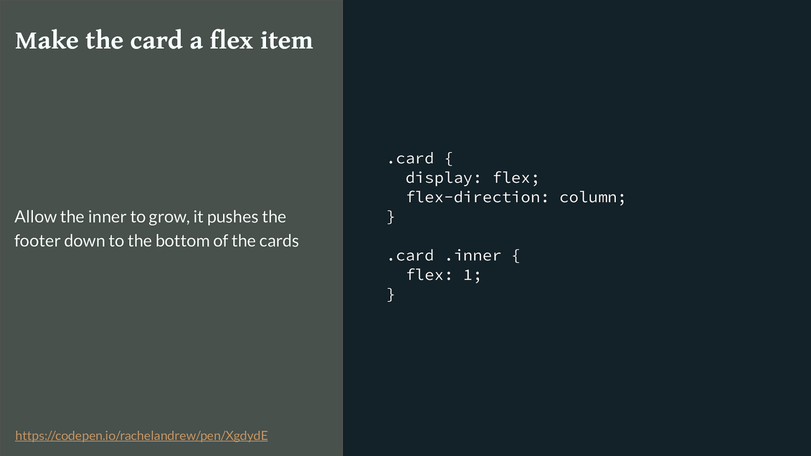
.card { display: flex; flex-direction: column; } .card .inner { flex: 1; } Make the card a flex item Allow the inner to grow, it pushes the footer down to the bottom of the cards https://codepen.io/rachelandrew/pen/XgdydE
The best we can do is make the internals a nested grid or make the card a flex container, and then push the footer down to the bottom.
Like this.
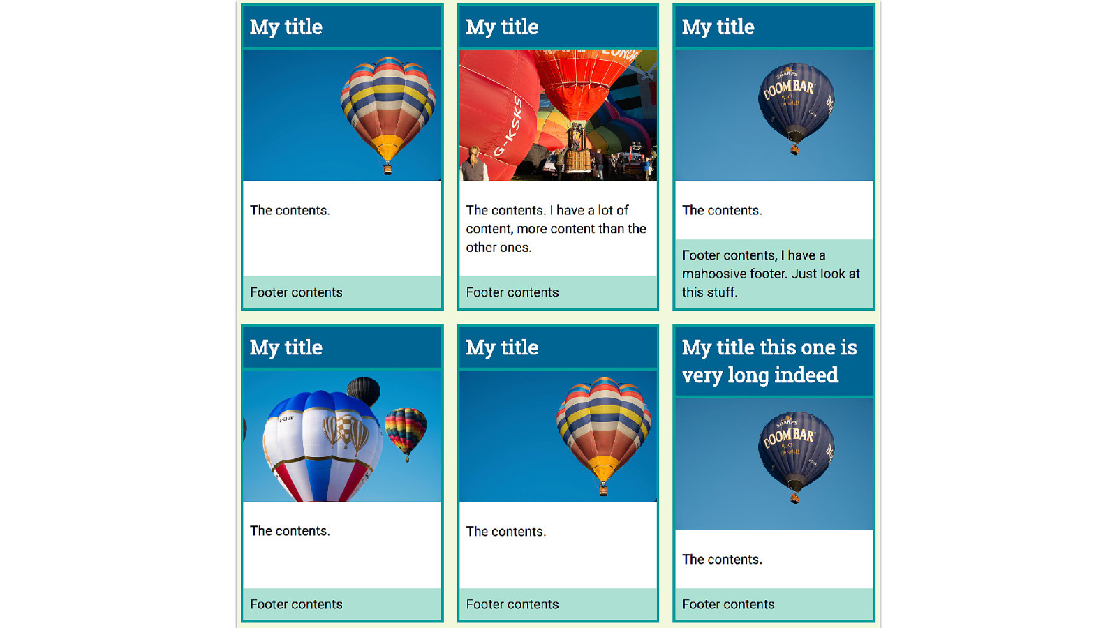
However the internal elements still don’t line up neatly across the design. What I want is that if the title needs two lines, right across the row should have that same height even if the content is shorter, likewise with the footer or content area.
The subgrid spec that was pushed into level 2 could solve this problem.
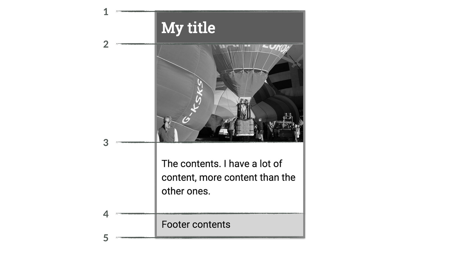
1 2 3 4 5 For our sub grid our main grid would need to have four rows available for each card, as the card has four elements. In the sub grid spec as was when it was removed from L1 there is no concept of the implicit grid in a sub grid element, the outer grid needs to provide the rows and columns that it needs.
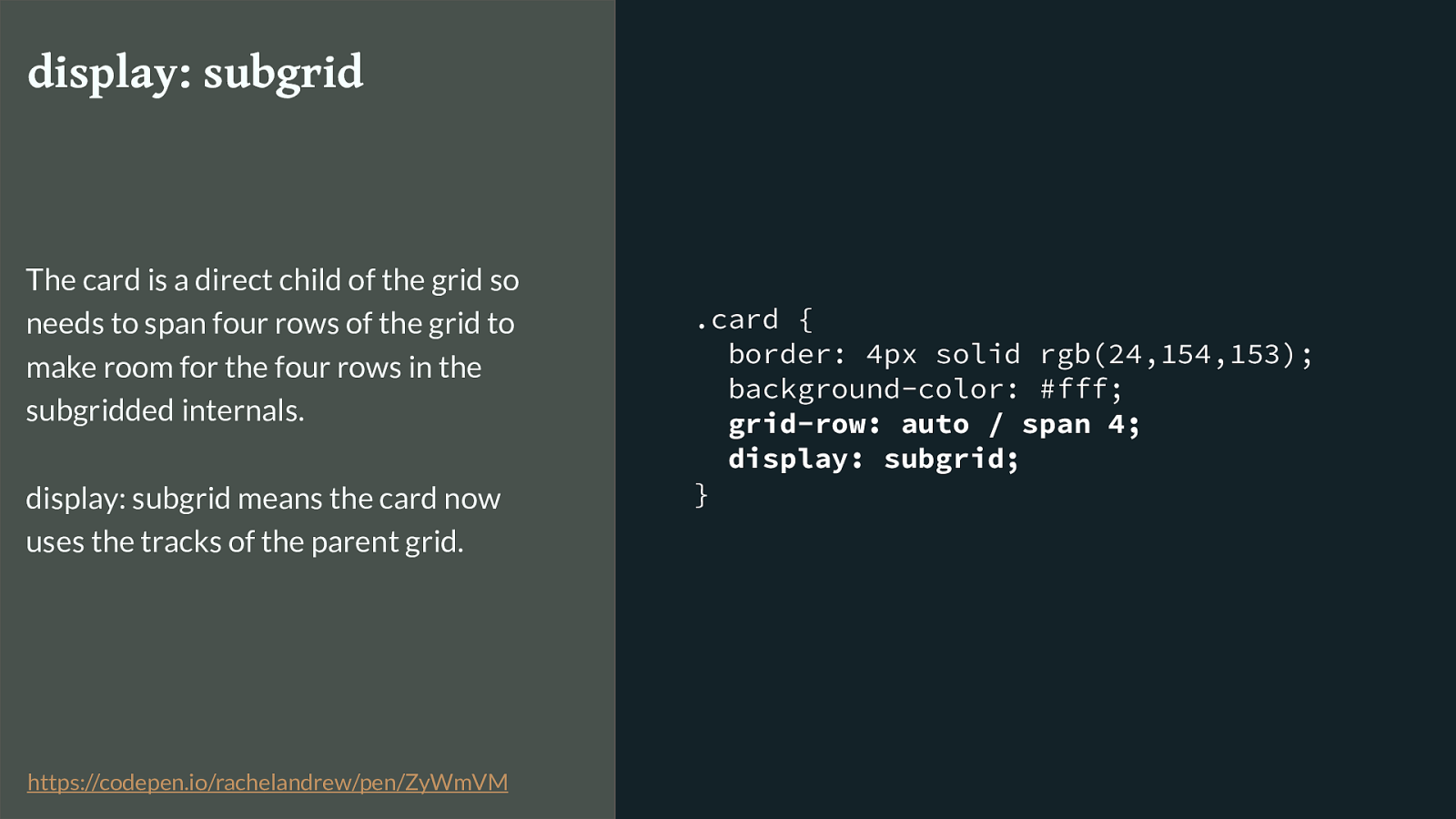
.card { border: 4px solid rgb(24,154,153); background-color: #fff;
grid-row: auto / span 4; display: subgrid; } display: subgrid The card is a direct child of the grid so needs to span four rows of the grid to make room for the four rows in the subgridded internals. display: subgrid means the card now uses the tracks of the parent grid. https://codepen.io/rachelandrew/pen/ZyWmVM
I’m asking for this direct child of the grid to span four row lines.
Then setting the value of display to subgrid.
The elements inside the card are now participating in the grid layout of the parent which means the sizing right across the track is using the same grid and our things line up.
In reality we would probably also need to deal with the gap - perhaps by adding a margin to the cards or elements inside.
This is all completely theoretical, there are no implementations of this.
And in fact I hope that the limited sub grid spec pushed into Level 2 isn’t what we end up with, but to know what we do need we need to see use cases. So if you come up with a use case that needs subgrid please write about it.
Subgrid Links & Thoughts ▸ https://rachelandrew.co.uk/archives/2017/03/16/subgrid-moved-to-level-2-of-the- css-grid-specification/
▸ https://github.com/w3c/csswg-drafts/issues/958
▸ https://github.com/rachelandrew/cssgrid-ama/issues/13
▸ http://meyerweb.com/eric/thoughts/2016/01/15/subgrids-considered-essential/
Mor stu ff here and you can comment on the issue on the CSS Wg GitHub.
Masonry Layout Next for Grid It seems pretty common that people will see grid and think that it is possible to do a Masonry or Pinterest like layout with it. That isn’t the case despite everyone wanting it to be so very much.

We can make things look like that if we carefully place each item. My gallery to demonstrate how auto works, looks like a Masonry layout - but I was positioning each item to get that look.
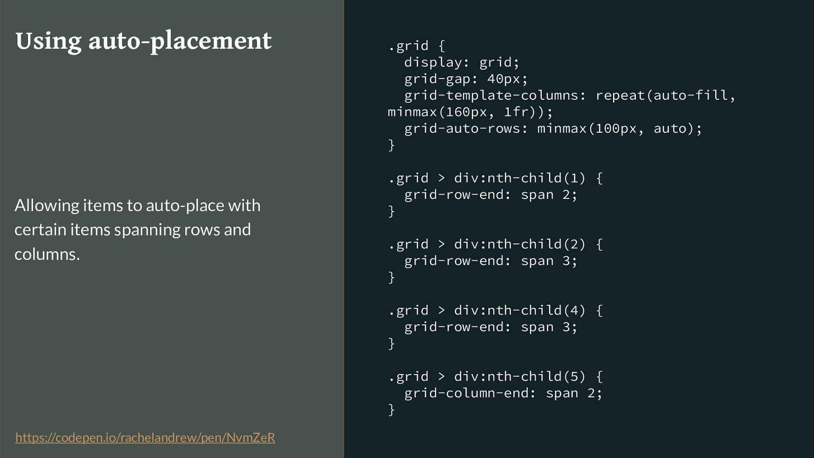
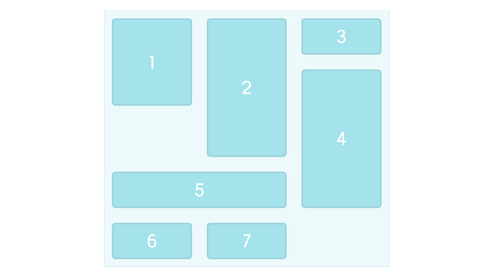
.grid { display: grid; grid-gap: 40px; grid-template-columns: repeat(auto-fill, minmax(160px, 1fr)); grid-auto-rows: minmax(100px, auto); } .grid > div:nth-child(1) { grid-row-end: span 2; } .grid > div:nth-child(2) { grid-row-end: span 3; } .grid > div:nth-child(4) { grid-row-end: span 3; } .grid > div:nth-child(5) { grid-column-end: span 2; } Using auto-placement Allowing items to auto-place with certain items spanning rows and columns. https://codepen.io/rachelandrew/pen/NvmZeR
Grid layout auto-placement gets us part of the way there. We can take a bunch of things - throw them at a grid and grid will place them one into each cell. We can even - as I have here - give some of those items rules to make them span cells - for example having a landscape image span two column tracks.
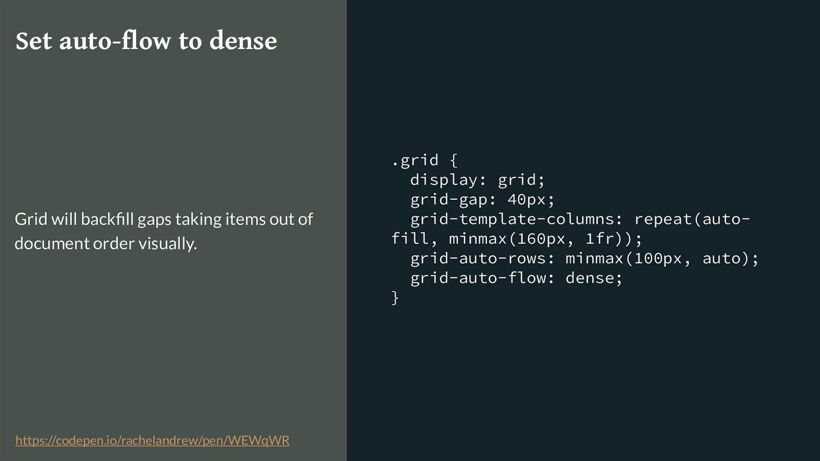
.grid { display: grid; grid-gap: 40px; grid-template-columns: repeat(auto- fill, minmax(160px, 1fr)); grid-auto-rows: minmax(100px, auto); grid-auto-flow: dense; } Set auto-flow to dense Grid will backfill gaps taking items out of document order visually. https://codepen.io/rachelandrew/pen/WEWqWR
By setting grid-auto-flow to dense, we can even backfill the gaps left when an item is too big to be placed due to those spanning rules. However this still isn’t Masonry.
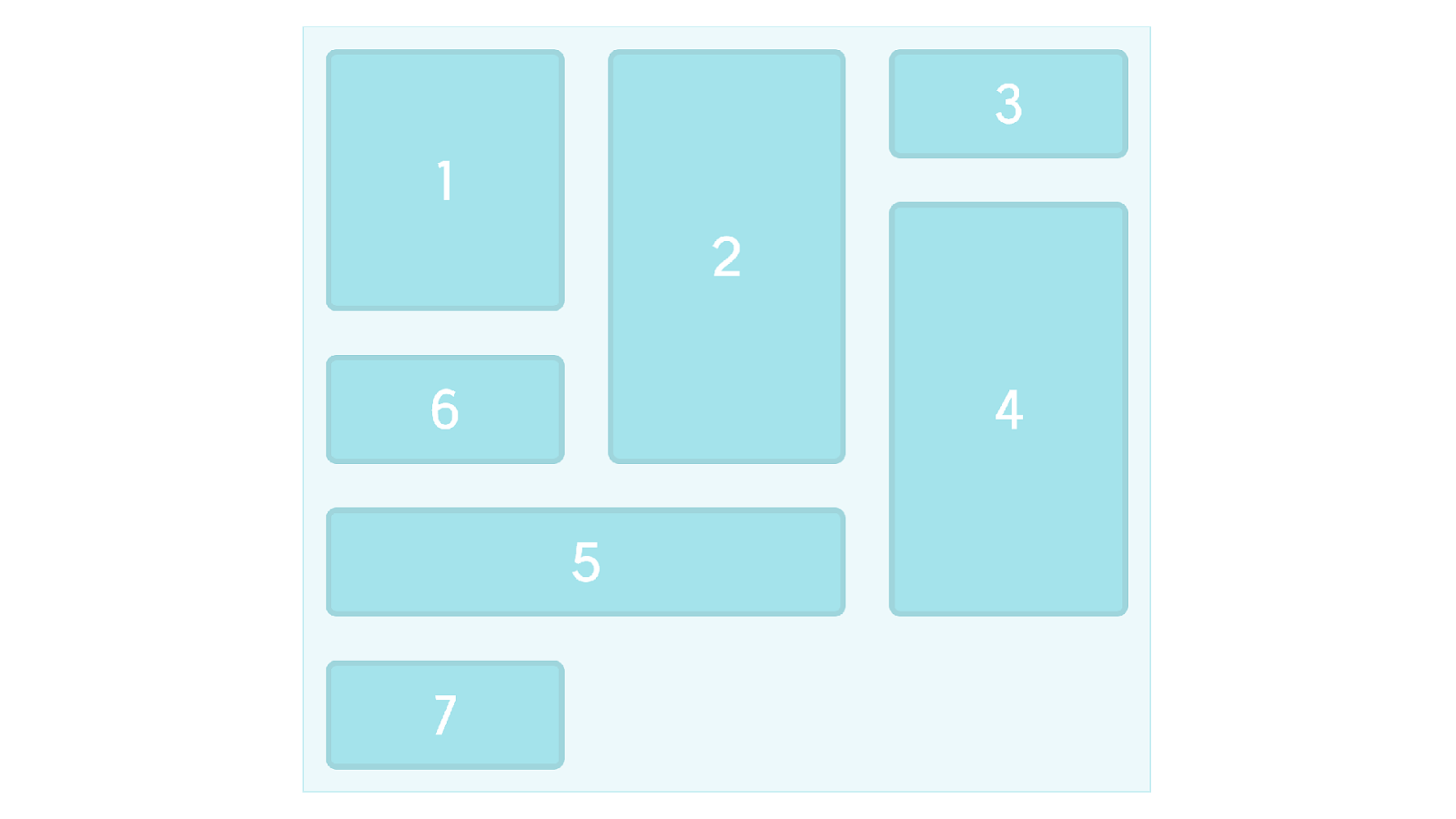
However this isn’t really what people want when they ask for masonry. This is still a strict grid with rows and columns.
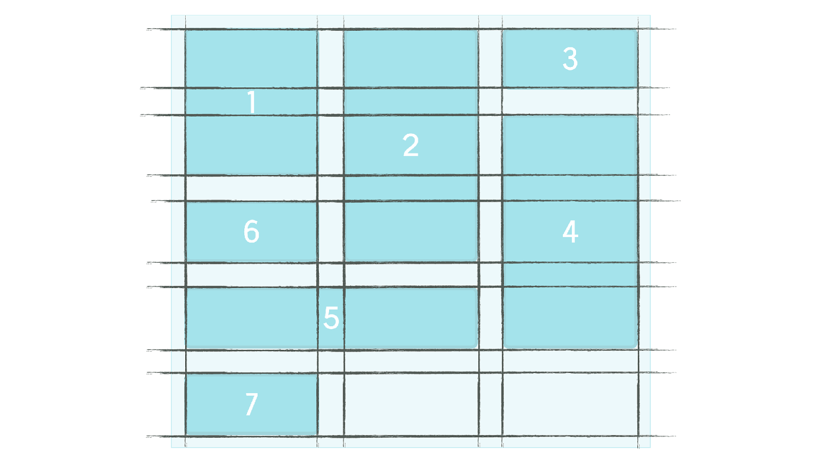
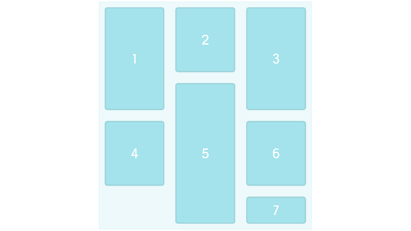
A Masonry layout looks more like this. Items would ideally stay in document order, and move up and down to accommodate the di ff erent sizes of boxes. To do this with Grid Layout you need to have lots of row tracks available and then position your items using line based positioning.
Currently you are actually closer to Masonry with something like multiple column layout except then you then end up with things placing down the column rather than across the row. Plus multicol is a big buggy right now so you can end up with issues of boxes splitting into columns and various suboptimal things happening.
Masonry Layouts ▸ https://rachelandrew.co.uk/archives/2017/01/18/css-grid-one-layout-method-not- the-only-layout-method/
▸ https://github.com/w3c/csswg-drafts/issues/945 I’ve written some more thoughts on this, and you can also take a look at the issue on GitHub with various people discussing the issue.
So these are just two things we are thinking about as we see people use grid.

This is all new. And remember as you start to play with this stu ff

We are all learning. So we are all learning this together and please, if you manage to solve a problem with new layout methods or if you hit an unsolvable one

Solve problems and share what you find out. Write about what you have learned, share it, tell the CSS WG what is missing. This is your platform to create on, we want to make more things possible.
Grid Resources ▸ Visit Grid by Example for worked examples, patterns with fallbacks, and a free video tutorial: https://gridbyexample.com
▸ I created a huge set of guides for MDN: https://developer.mozilla.org/en-US/docs/Web/CSS/CSS_Grid_Layout
▸ Over 5 years of grid thoughts on my site at: https://rachelandrew.co.uk/archives/tag/cssgrid
▸ GridBugs! I’m collecting and trying to get fixed interop issues: https://github.com/rachelandrew/gridbugs
And if you’ve not experimented with grid yet have a look at these links.
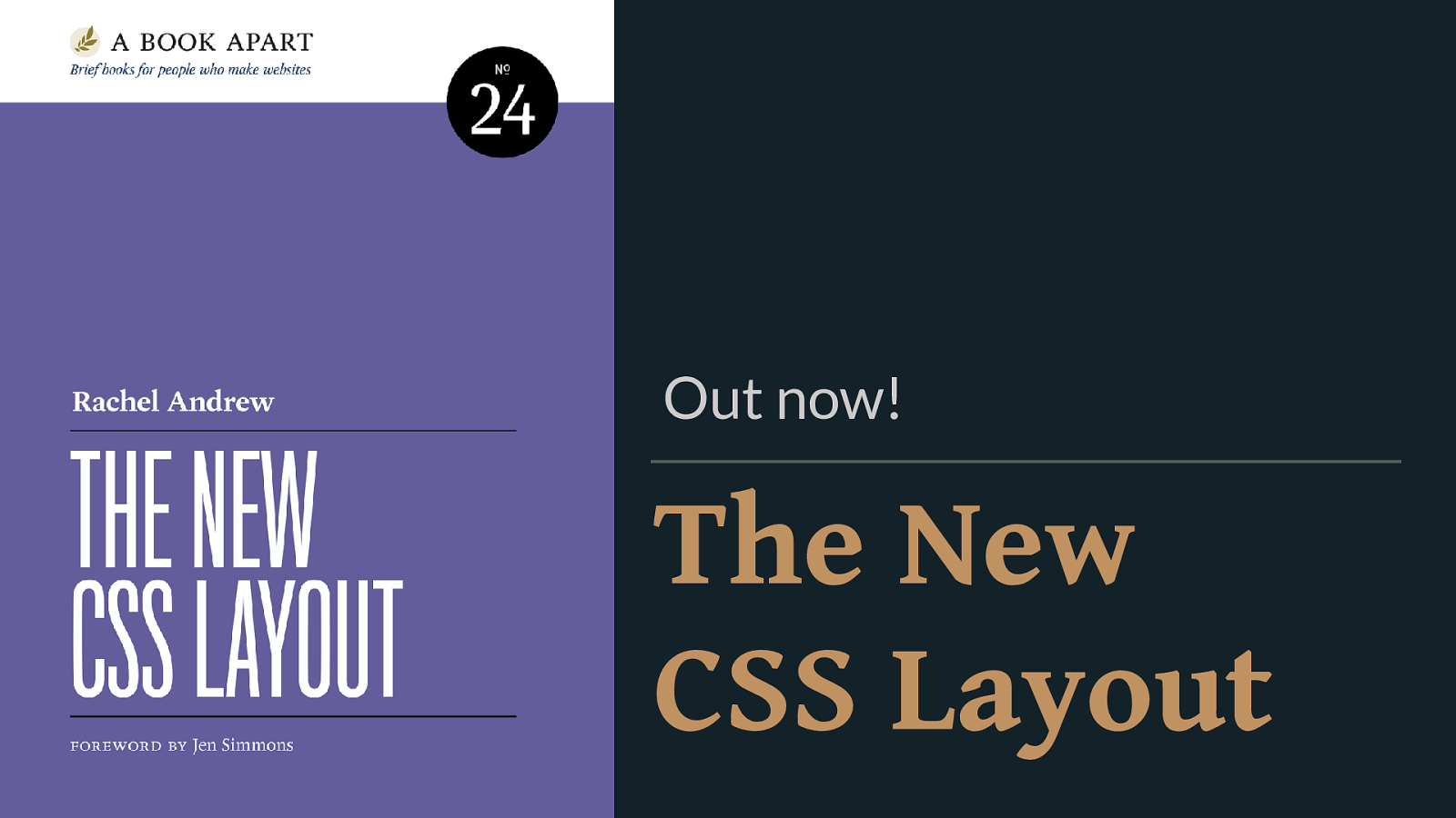
The New CSS Layout Out now! This month
Thank you! @rachelandrew Slides & Resources: https://rachelandrew.co.uk/speaking/event/view-source-2017