@rachelandrew WordPress Meetup, Seattle Unlocking the Power of CSS Grid Layout So Grid Layout is a thing. We can now celebrate one year of having Grid Layout in browsers. We mostly think it is cool, and some of us have even shipped sites using it.

A presentation at WordPress Community Meetup, Seattle in March 2018 in Seattle, WA, USA by Rachel Andrew
@rachelandrew WordPress Meetup, Seattle Unlocking the Power of CSS Grid Layout So Grid Layout is a thing. We can now celebrate one year of having Grid Layout in browsers. We mostly think it is cool, and some of us have even shipped sites using it.
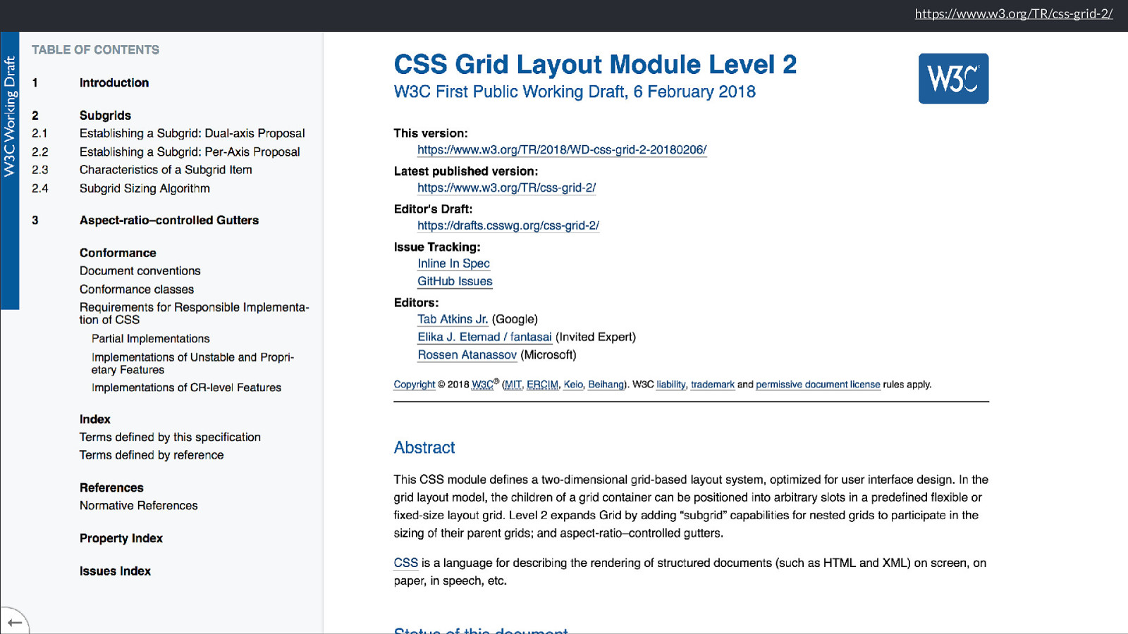
https://www.w3.org/TR/css-grid-2/
The CSS Working Group already have a first public working draft of Grid Level 2. Published yesterday.
I have given up trying to answer all of the questions I get sent, instead trying to write articles that address those issues. It has however become very apparent where a lot of the issues people have with Grid originate .
The first of those is Sizing.
How big is that box? People are very confused about how big things are, and very confused about how grid and flexbox distribute space.
The reason it is confusing is that we have spent years using layout methods that are very straightforward when it comes to the size of items in our layouts.
We have sized things with length units, which make sense, be that pixels or ems or rems, we know what 100 pixels or 10 em means.
https://alistapart.com/article/fluidgrids
We have also sized things with percentages, using straightforward maths to figure out dimensions for flexible grids. Those percentages don’t look so pretty in our stylesheets, but they are understandable. We make sure we don’t end up with more than 100 % and everything will be ok.
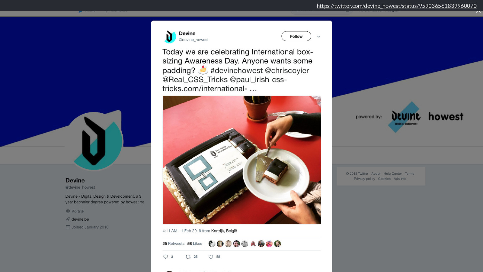
https://twitter.com/devine_howest/status/959036561839960070
We got box-sizing: border-box and everything was made easier.

We got layout frameworks that even did all of the calculating for us.
https://www.smashingmagazine.com/2018/01/understanding-sizing-css-layout/ And then Flexbox and grid layout came along, and they seemed to behave a bit strangely. Elements in our designs became bigger or smaller than we thought they should.
The result being that people started to create flexbox based grids which used percentages, just like their floated forebears. With grid, the first thing most people seem to do is try to create layouts based on percentage, going back to what they know to work. Keeping away from the slightly mysterious fr unit, that never seems to quite do what they expect.
So I have pretty much declared this year as the year of “how big is that box”, because I think that understanding sizing is the route to finding solutions for layout patterns that we previously had to rely on JavaScript for. I’m not a JavaScript hater, but it makes me sad when it is invoked for things that we have CSS solutions for, and which can be done in a more straightforward way, a more performanant way in CSS.
How big is a grid? So lets have a look at how grid works out sizing, and learn some interesting and useful things along the way.
To learn about this we need to scroll way, way down the specification. Down to those bits that we web developers usually decide are for browser engineers, and ignore.
We get to the bit of the spec that defines the grid sizing algorithm.
And there we enter the rabbit hole, for to understand the grid sizing algorithm we need to know things about how we figure out how big things are in general.
And you’ll be glad to know I’m not going to line by line explain the algorithm to you today - if you have any questions after this talk come and ask me and I’ll have a go. Instead I’m going to highlight a few things that are interesting and useful about how grid works out sizing.
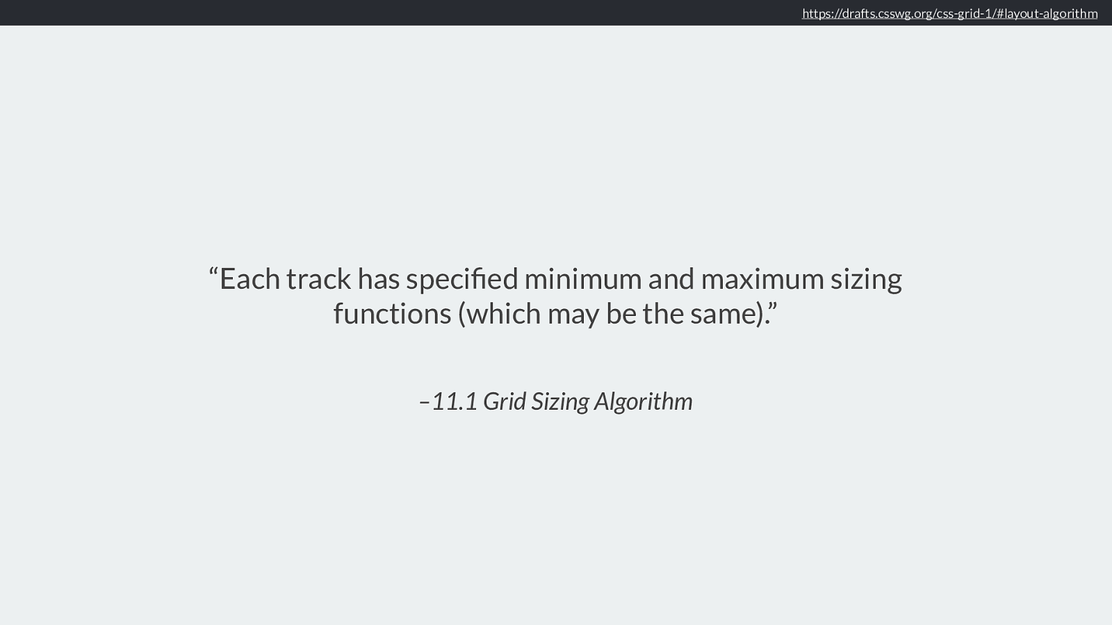
– 11.1 Grid Sizing Algorithm “Each track has specified minimum and maximum sizing functions (which may be the same).” https://drafts.csswg.org/css-grid-1/#layout-algorithm
The spec says that each track has specified minimum and maximum sizing functions (which may be the same). What are these?
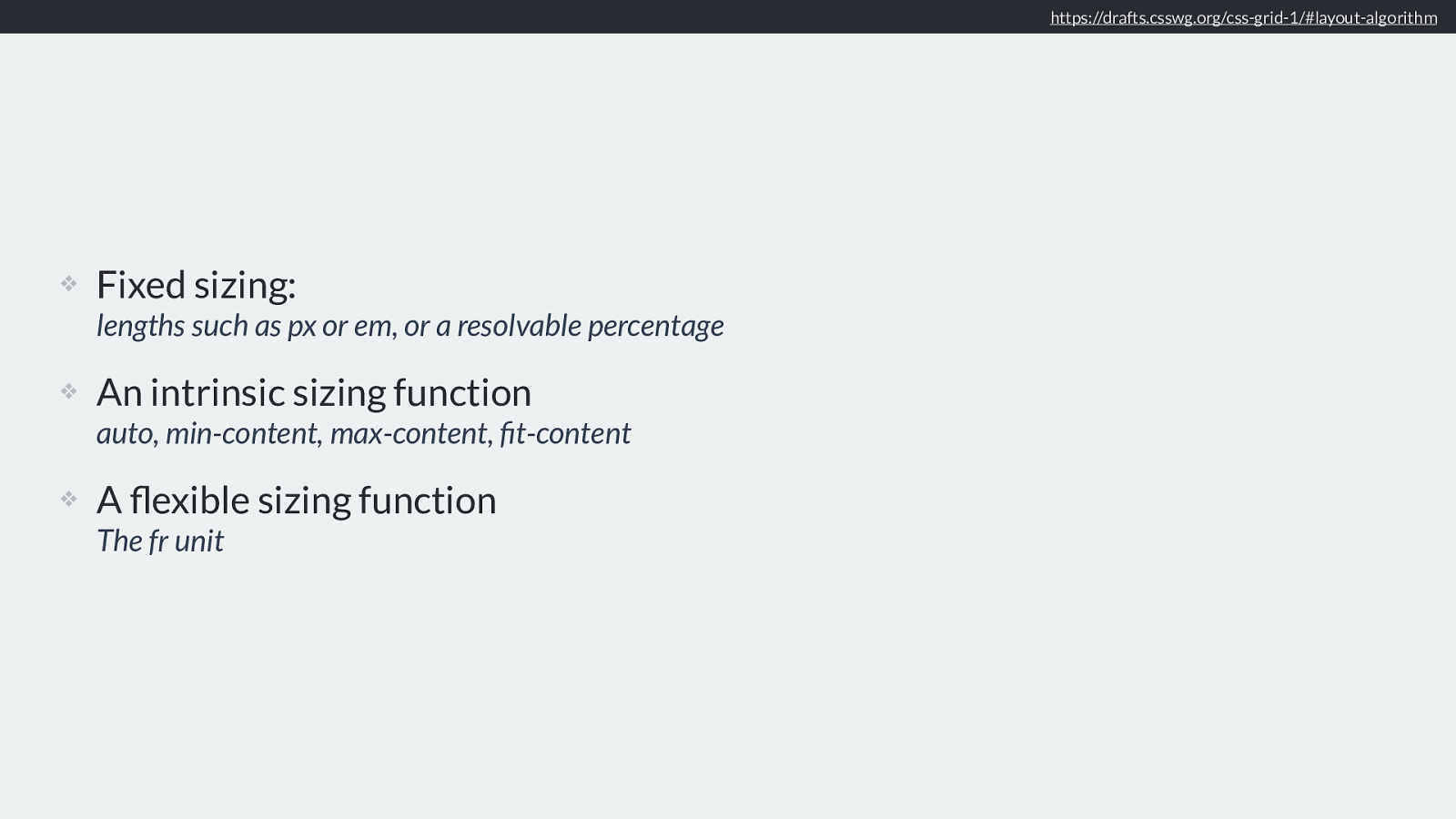
❖ Fixed sizing: lengths such as px or em, or a resolvable percentage
❖ An intrinsic sizing function auto, min-content, max-content, fit-content
❖ A flexible sizing function The fr unit https://drafts.csswg.org/css-grid-1/#layout-algorithm
There are three types of sizing we need to consider. Fixed sizing, Intrinsic Sizing or flexible.
Fixed sizing is something we are all familiar with, it’s how we’ve been doing layouts for years. Sizing things either as a length unit - be that pixels, ems or any other length. Percentages also fall into this type of sizing, as long as they can be resolved against something, for example a grid track sized as 20% resolves to a length which is 20% of the width of the grid container. Therefore when working out sizing resolvable percentages are treated in the same way as any other fixed length - even though we probably see them as flexible in our heads.
Next we have intrinsic sizing, you might be most familiar with auto, but we also have the specific intrinsic sizing keywords of min-content, max-content and fit-content.
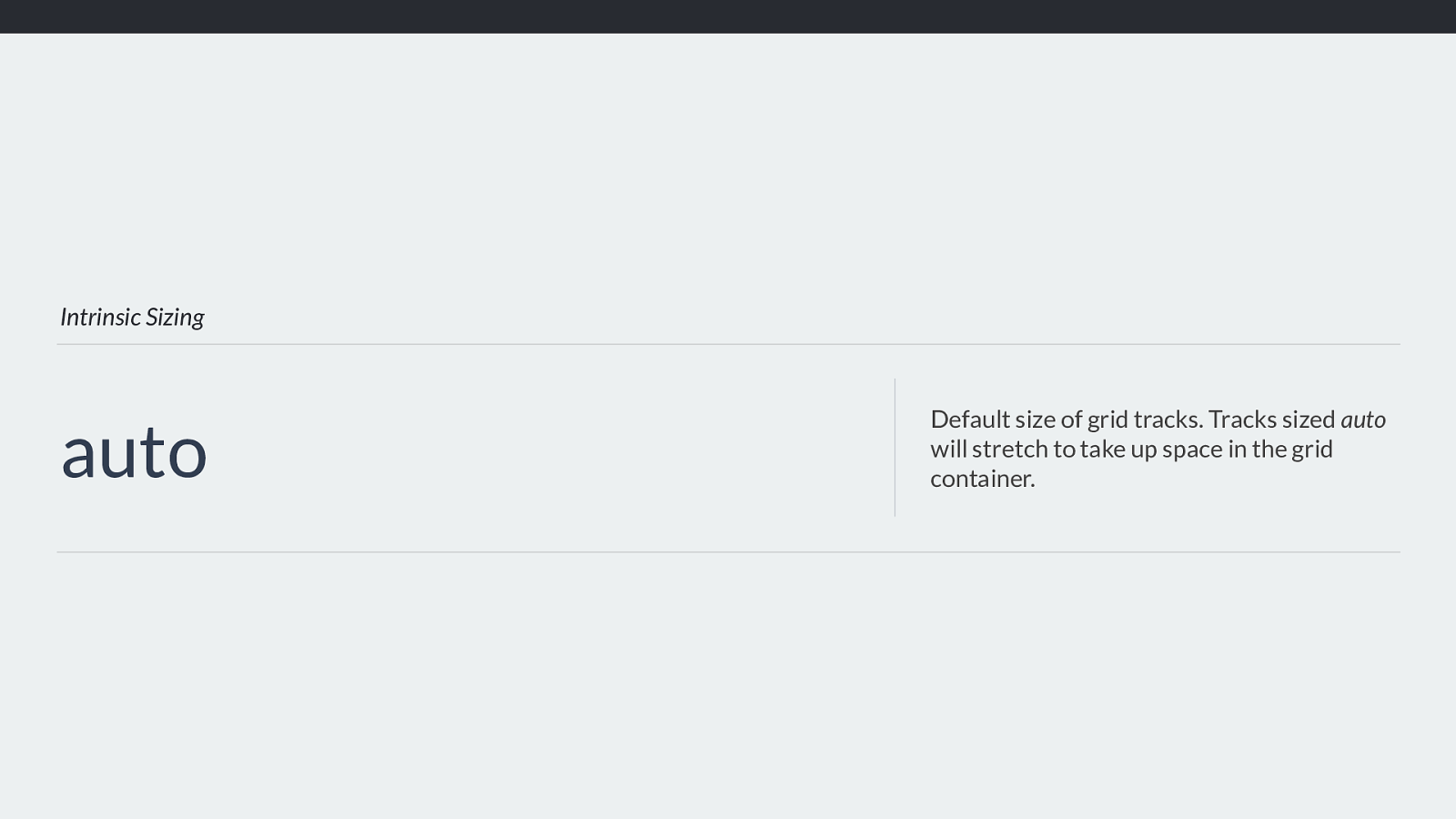
Intrinsic Sizing auto Default size of grid tracks. Tracks sized auto
will stretch to take up space in the grid container. Auto when used for track sizing, can be generally thought of as being “big enough to fit the content”, we’ll look at what auto really means in a little more depth. However if you have ever created a grid with auto sized rows you will know that those rows expand to take the content you place into them, and do not cause overflows.
Something useful to know about auto and track sizing is that if you use auto for track sizing this will stretch by default, unlike the other sizing functions. Where you will tend to notice this is with column tracks.
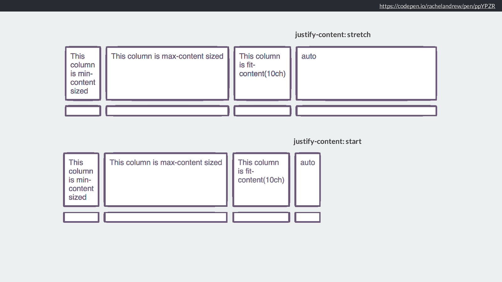
https://codepen.io/rachelandrew/pen/ppYPZR
justify-content: start
justify-content: stretch
Therefore if this example I have used auto for the final column track. It is stretching to take up the remaining space in the inline direction, however the actual size created
by the auto track, is what you see if you add justify-content: start to override that stretching behaviour.
This can make auto seem a bit mysterious in grid as it stretches by default.
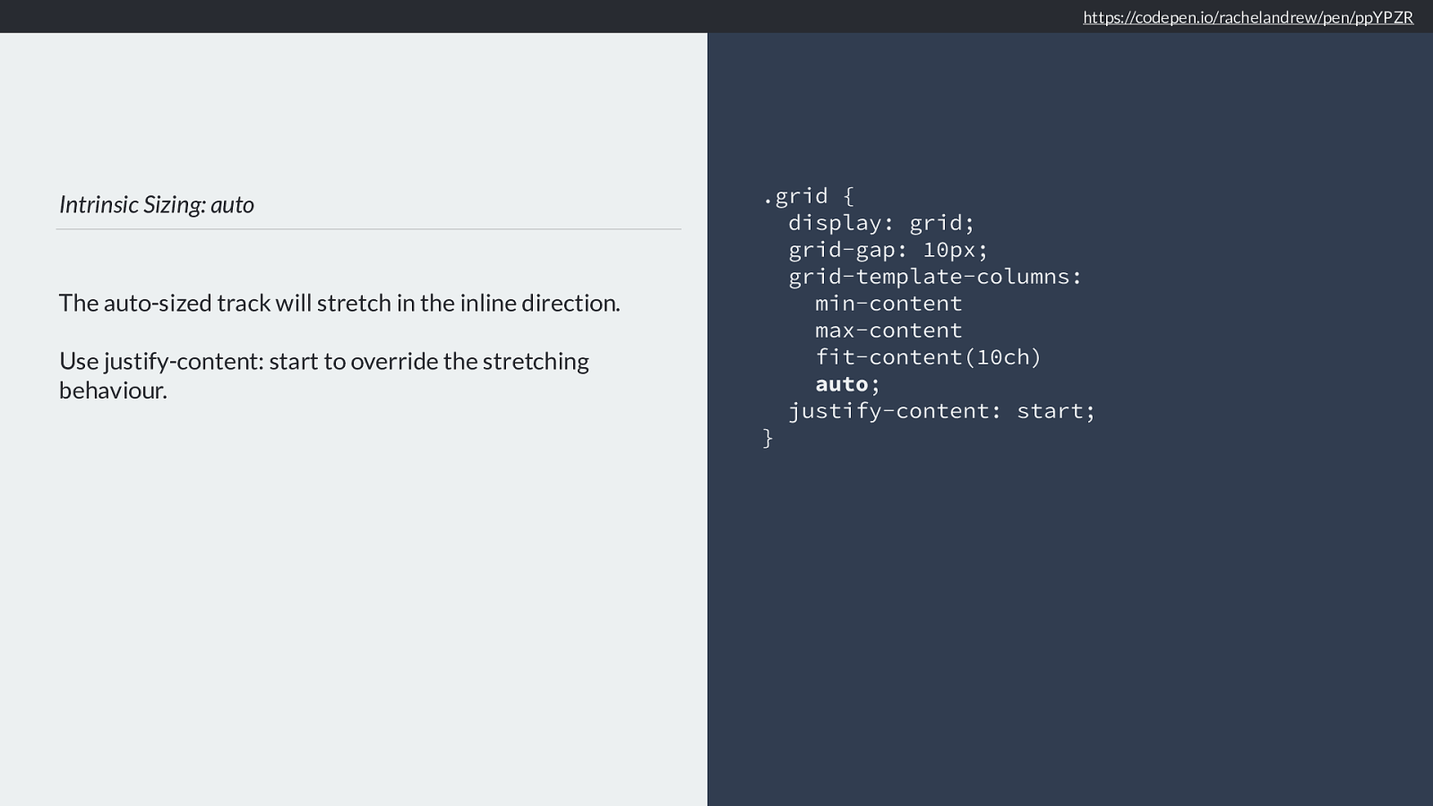
Intrinsic Sizing: auto
The auto-sized track will stretch in the inline direction.
Use justify-content: start to override the stretching
behaviour.
.grid {
display: grid;
grid-gap: 10px;
grid-template-columns:
min-content

max-content

fit-content(10ch)
auto ; justify-content: start; } https://codepen.io/rachelandrew/pen/ppYPZR
So remember that the default for justify-content is stretch, and auto tracks will stretch. Don’t want that behaviour? Set justify-content start on the container or target the individual item with justify-item start.
We then have some new sizing keywords, these aren’t only for grid you can use them for sizing elsewhere. These keywords also form important concepts that we need to understand to understand how sizing is worked out.
Intrinsic Sizing
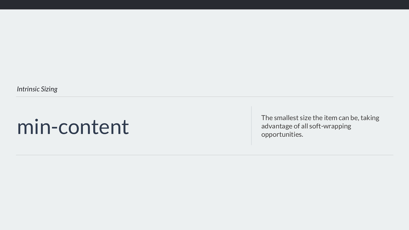
min-content
The smallest size the item can be, taking
advantage of all soft-wrapping
opportunities.
You can use the keyword min-content for track sizing. This will make the track as small as it can be without the content breaking out of the track. In the case of a track
containing text, the text will take all soft-wrapping opportunities, essentially becoming as wide as the longest word.

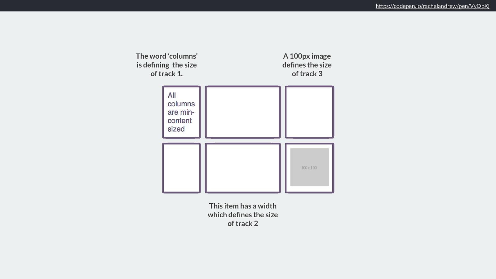
Intrinsic Sizing: min-content Grid tracks sized with min-content will become as small as they can without causing overflows. .grid { display: grid; grid-gap: 10px; grid-template-columns:
min-content
min-content
min-content
; }
https://codepen.io/rachelandrew/pen/VyOpXj
In this example I have created three column tracks, all sized using min-content. Therefore the track content now impacts the track sizing, rather than us deciding how big the track will be, and then the content being forced into it.
https://codepen.io/rachelandrew/pen/VyOpXj
The word ‘columns’ is defining the size of track 1. This item has a width which defines the size of track 2 A 100px image defines the size of track 3 If any item in that track has a width of some sort, or contains something with a fixed width, then the size will be dictated by that width.
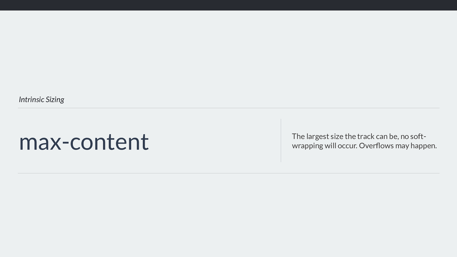
Intrinsic Sizing max-content The largest size the track can be, no soft- wrapping will occur. Overflows may happen. Using max-content for track sizing means that the track will get as big as it possibly can, based on the content or any width applied to items etc. The content will no longer wrap so you may get overflows if this causes the track to get larger than the space in the grid container.
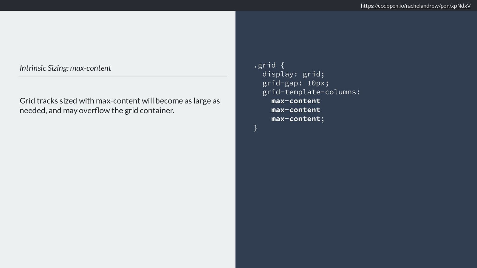
Intrinsic Sizing: max-content Grid tracks sized with max-content will become as large as needed, and may overflow the grid container. .grid { display: grid; grid-gap: 10px; grid-template-columns:
max-content
max-content
max-content
; } https://codepen.io/rachelandrew/pen/xpNdxV
So here we have three tracks all sized with max-content, once again the browser needs to look at the content to determine the track sizes.
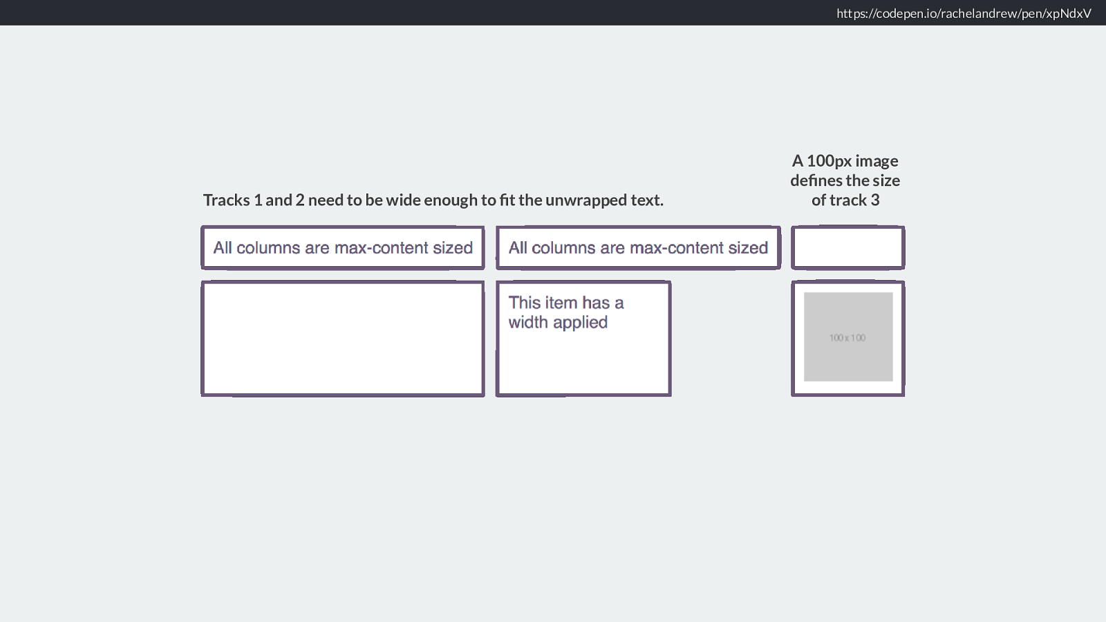
https://codepen.io/rachelandrew/pen/xpNdxV Tracks 1 and 2 need to be wide enough to fit the unwrapped text. A 100px image defines the size of track 3 You can see how the first and second tracks stretch out to the maximum size of content in that track. The second column track has an item with a width in it. The width of that item is constrained but the track it is in stretches wide enough for the longer content above to be at max-content.
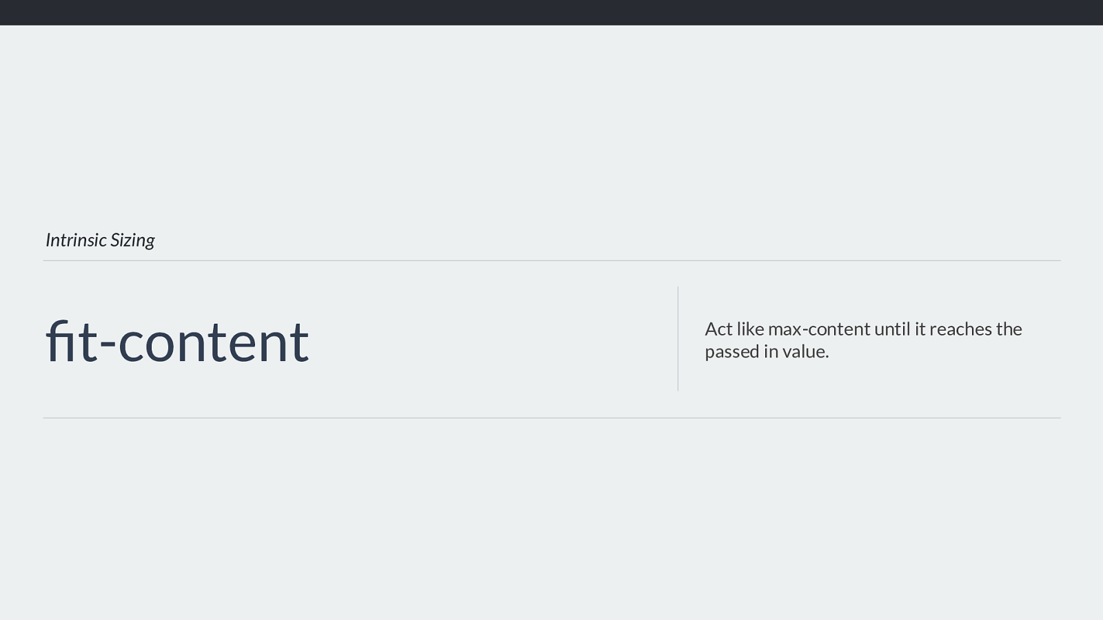
Intrinsic Sizing fit-content Act like max-content until it reaches the passed in value. Then we have fit-content. This keywords acts like max-content, but you pass in a value. Once the track grows to that value it is clamped and won’t get larger than that.
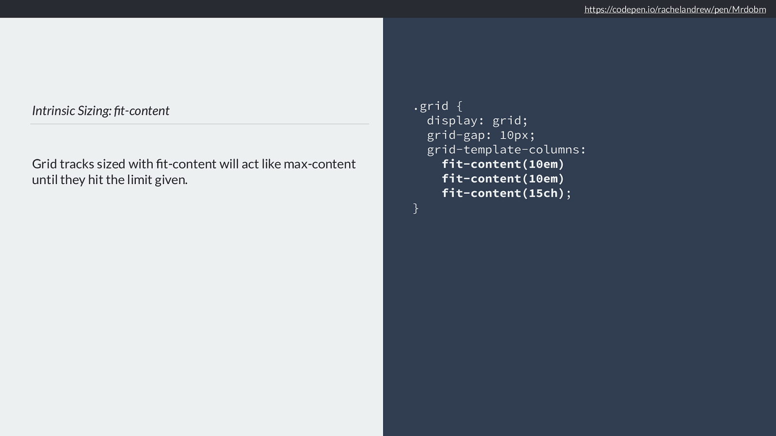
Intrinsic Sizing: fit-content Grid tracks sized with fit-content will act like max-content until they hit the limit given. .grid { display: grid; grid-gap: 10px; grid-template-columns:
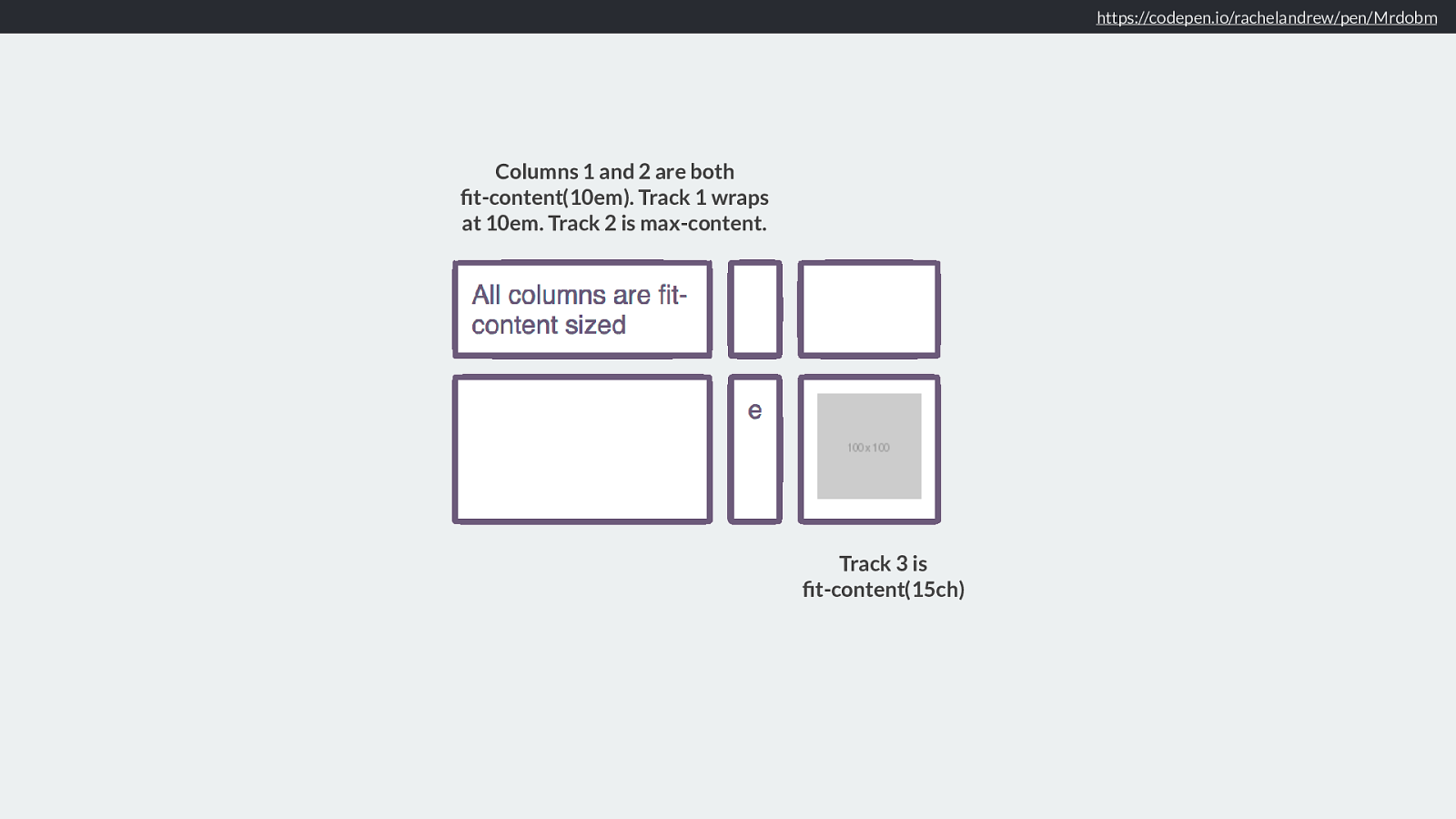
fit-content (10em) fit-content(10em) fit-content(15ch) ; } https://codepen.io/rachelandrew/pen/Mrdobm
So I have 3 tracks here, the first two clamped at 10em that last one at 15ch - fifteen characters.
https://codepen.io/rachelandrew/pen/Mrdobm
Track 3 is fit-content(15ch) Columns 1 and 2 are both fit-content(10em). Track 1 wraps at 10em. Track 2 is max-content. Remember these concepts, as we’ll be seeing how they apply generally in a bit.
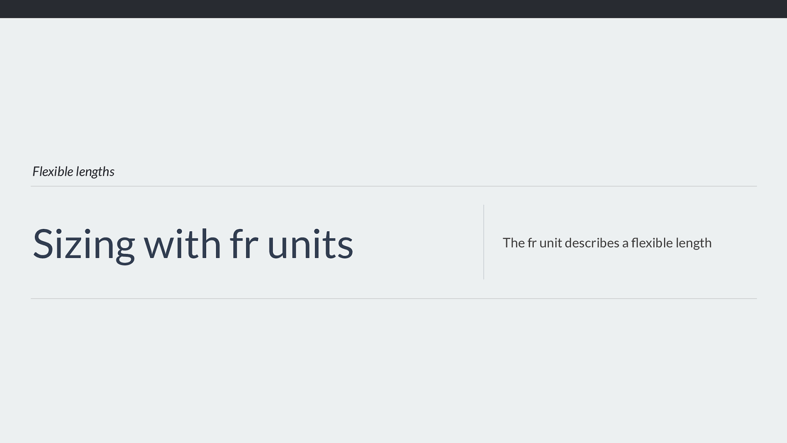
Flexible lengths Sizing with fr units The fr unit describes a flexible length Before that let’s look at the fr unit, which is a unit designed for grid layout.
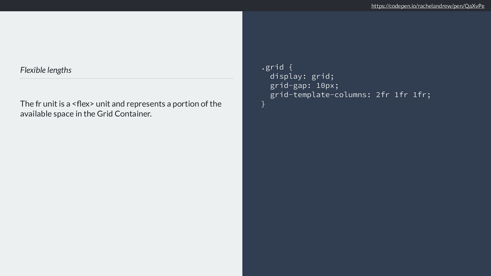
Flexible lengths The fr unit is a <flex> unit and represents a portion of the available space in the Grid Container. .grid { display: grid; grid-gap: 10px; grid-template-columns: 2fr 1fr 1fr; } https://codepen.io/rachelandrew/pen/QaXvPe
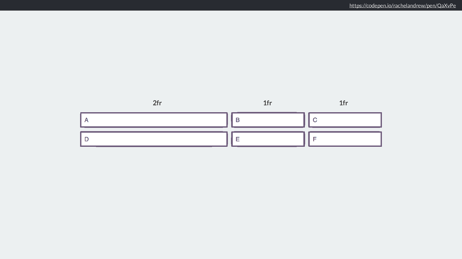
It is a flex unit, defining a flexible length. A portion of the space in the grid container. If I define three tracks one of 2fr and 2 of 1fr. The available spaces divided into 4 and shared out, two parts to track 1, 1 part each to track 2 and 3.
https://codepen.io/rachelandrew/pen/QaXvPe
2fr 1fr 1fr Like this. Now this does lead people to believe that the fr unit shares out all of the space evenly, 12 tracks of 1 fr should be 12 equal tracks, not quite as we will see as we dig deeper.
Minimum & Maximum sizing functions So now we know the di ff erent ways we can size tracks, we can figure out the minimum and maximum sizing functions for each track.
minmax() The minmax() function is part of the grid layout specification, and gives us an easy way to start thinking about minimum and maximum sizing.

Minimum Sizing Function
The minimum size for these two tracks is 100px, and 10em.
.grid {
display: grid;
grid-template-columns:
minmax(100px, auto)
minmax(10em, 20em);
}
If you use minmax() for your track, then the minimum size of that track is the value used for the first value passed to minmax(). It won’t get smaller than that.
In this case 100px, or 10em.
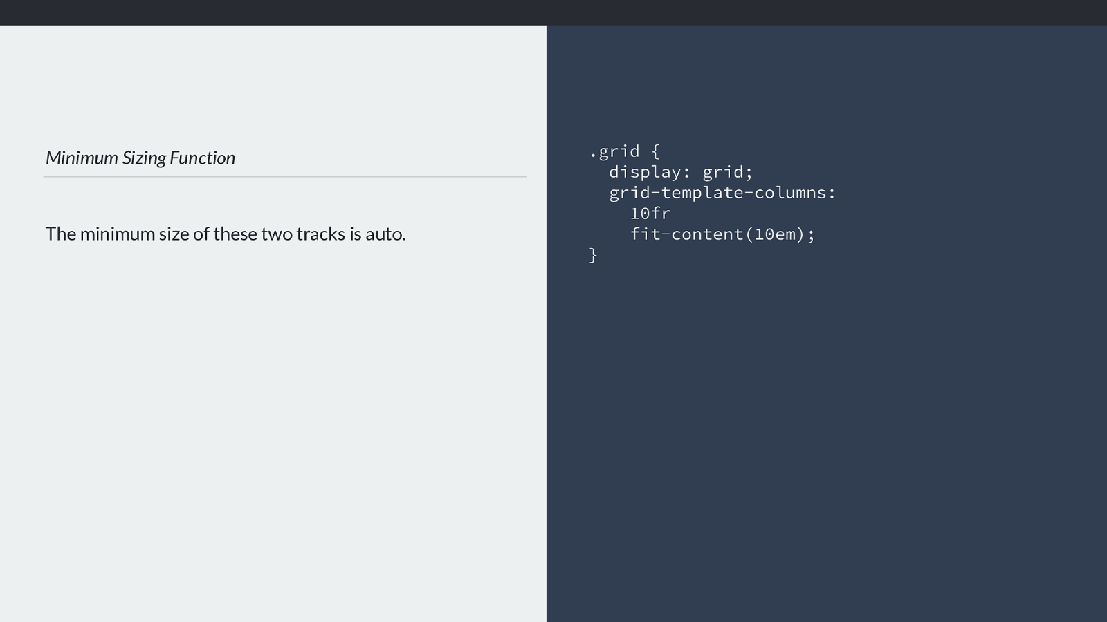
Minimum Sizing Function
The minimum size of these two tracks is auto.
.grid {
display: grid;
grid-template-columns:
10fr
fit-content(10em);
}
If you use fr units or fit-content, then the minimum size of that track is auto.

Minimum Sizing Function
The minimum size of the first track is 100px, the second
track is 50px (10% of 500).
.grid {
width: 500px;
display: grid;
grid-template-columns:
100px
10%;
}
Otherwise you used a length or a percentage, in which case the minimum sizing function is that length, or the percentage resolved to a length.
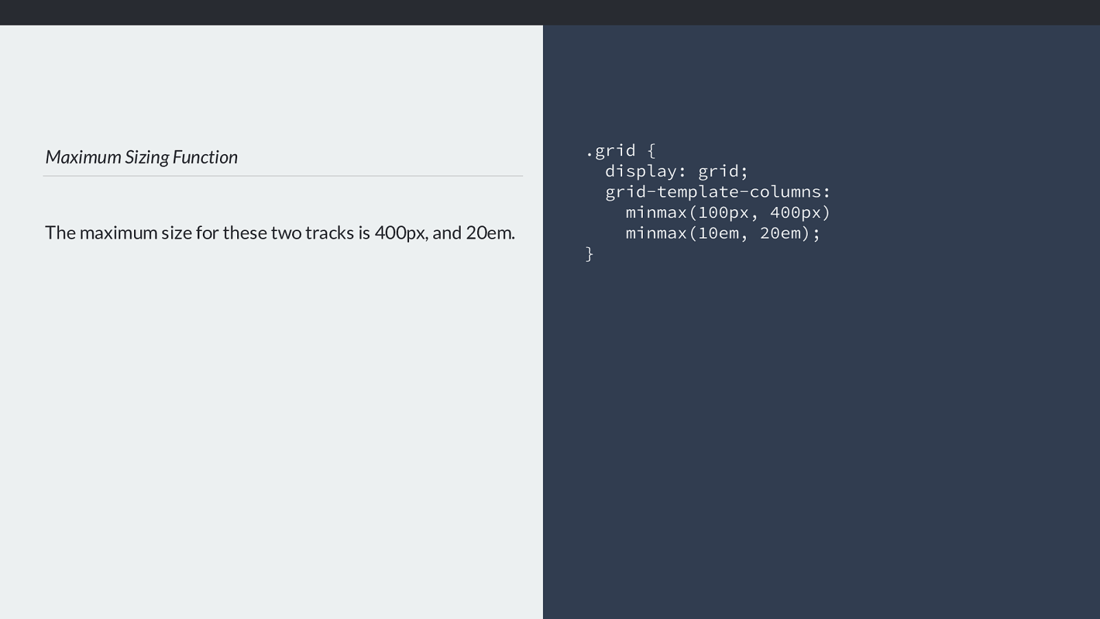
Maximum Sizing Function
The maximum size for these two tracks is 400px, and 20em.
.grid {
display: grid;
grid-template-columns:
minmax(100px, 400px)
minmax(10em, 20em);
}
If you use minmax() for your track, then the maximum size of that track is the value used for the second value passed to minmax(). It won’t get larger
than that.
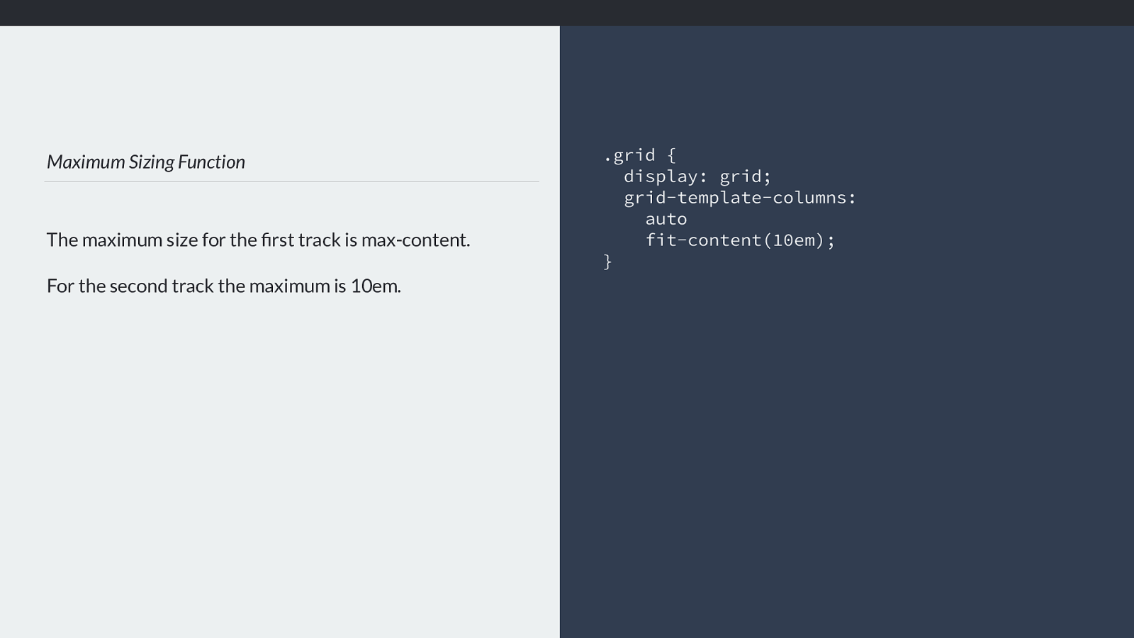
Maximum Sizing Function
The maximum size for the first track is max-content.
For the second track the maximum is 10em.
.grid {
display: grid;
grid-template-columns:
auto
fit-content(10em);
}
If you used auto or fit-content then this should be treated as max-content, unless you have passed a value to fit-content in which case that becomes the max.
We now know what the minimum and maximum size of our tracks should be, and can work out how big our tracks are and ultimately how big our grid is.
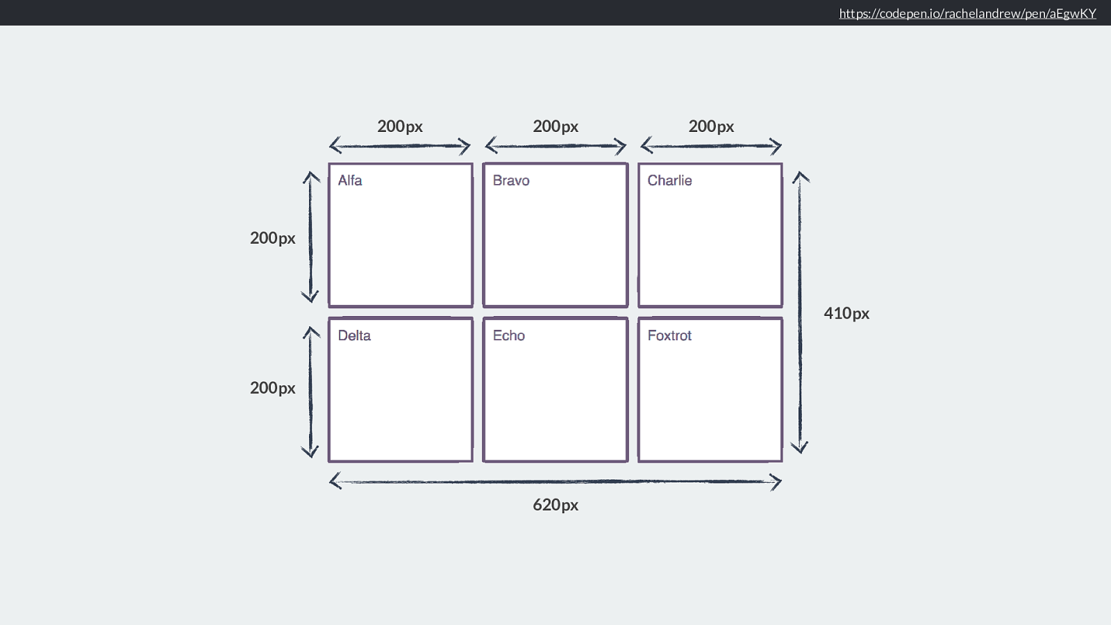
https://codepen.io/rachelandrew/pen/aEgwKY
200px 200px 200px 200px 200px 620px 410px The simplest case will be if we have a fixed size for our tracks. The minimum and maximum sizing functions are the same as a length, or as a percentage which can be resolved to a length.
So in this example everything is a fixed size, nothing is intrinsically sized, or using an fr unit . We have tracks that are 200 pixels wide, 20 pixels tall and there is a gap of 10 pixels between each track.
So here is where pretty much all of our existing float based grid systems stop - everything in those systems is a fixed length, or a percentage.
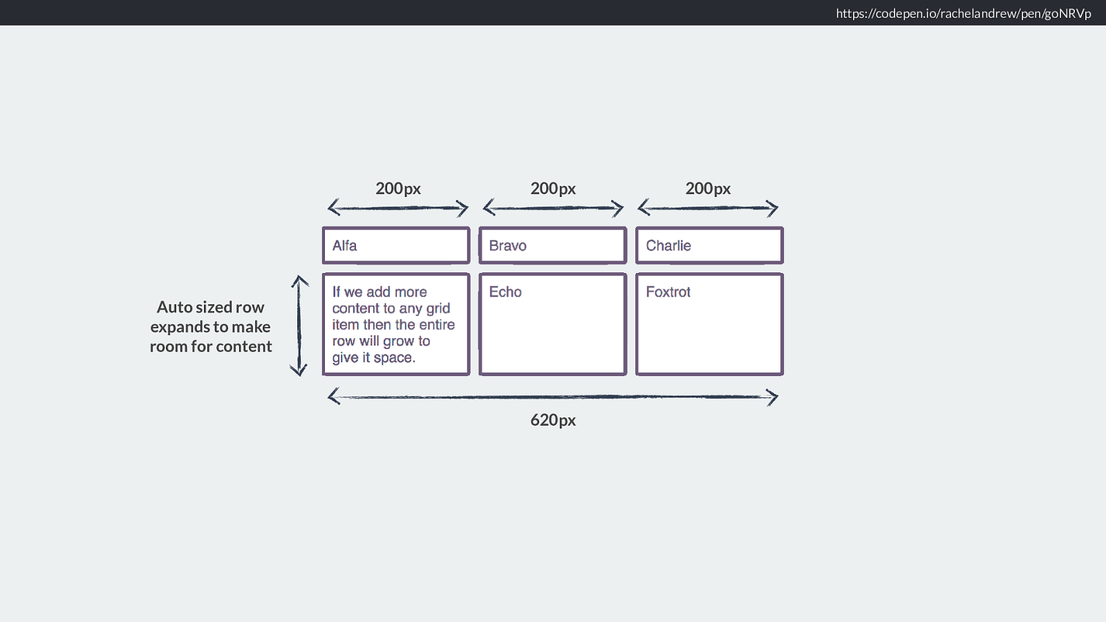
https://codepen.io/rachelandrew/pen/goNRVp
200px
200px
200px
620px
Auto sized row
expands to make
room for content
However in most cases we will want to take advantage of the ability of grid to create flexible grids, or to use intrinsic sizing of some sort. At the very least we usually want
to allows rows to grow to contain the content in them. We might used a fixed sized grid for our columns, but the simplest uses of grid tend to leave the rows to auto.
Therefore the browser needs to work out how much space the row needs to fit the tallest item in the row.
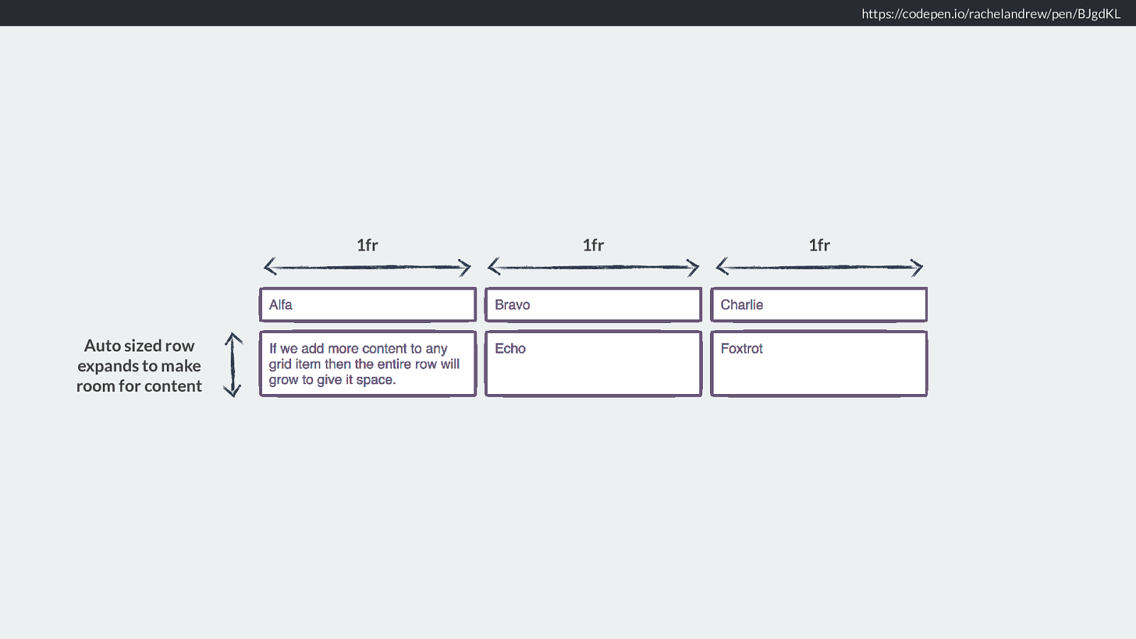
https://codepen.io/rachelandrew/pen/BJgdKL Auto sized row expands to make room for content 1fr 1fr 1fr More likely I am going to want to use a flex sizing function, the fr unit to size my tracks, and allow the content to define the row height. This gets a bit more interesting in terms of working out the size of the rows.
Because after working out how much content there is and expanding the rows this may well have a knock on e ff ect in terms of the size of 1fr.
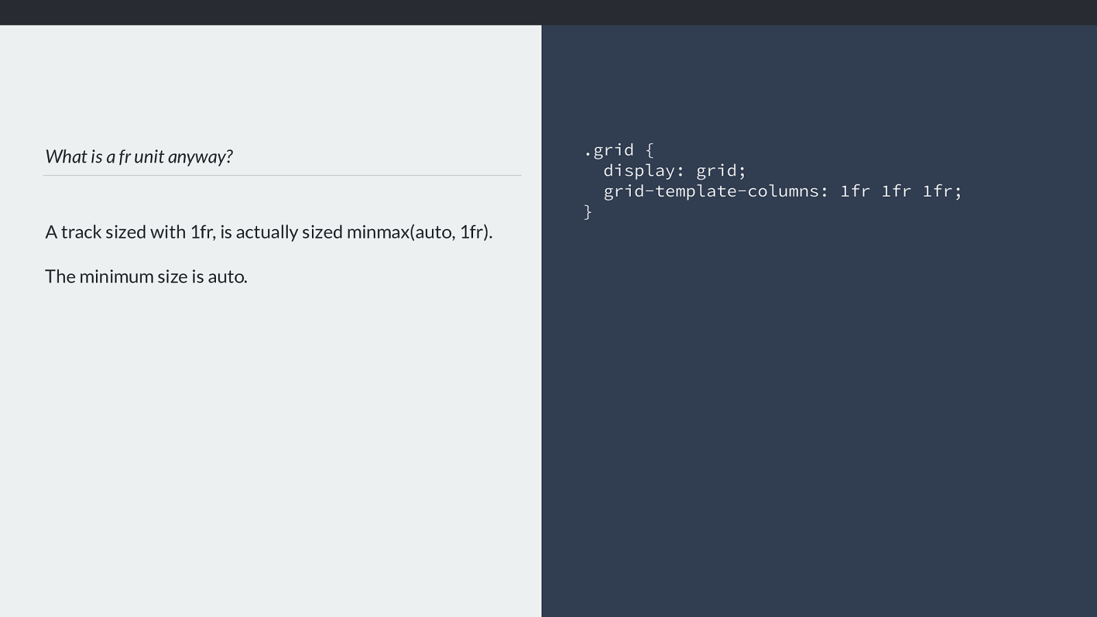
What is a fr unit anyway? A track sized with 1fr, is actually sized minmax(auto, 1fr). The minimum size is auto. .grid { display: grid; grid-template-columns: 1fr 1fr 1fr; } I mentioned earlier that having a set of 1fr tracks doesn’t quite mean they will be equal sized.
If the track is sized with fr units then it is as if we have used the following sizing function minmax(auto, 1fr). So the minimum size is auto.
Grid needs to give the tracks an auto minimum and then share out the remaining space in proportion. This means that in this example, we have three 1fr tracks, however
they are not equal with, if I add a very long word, or something with a width defined to the first track the auto minimum is much larger for that track and we no longer
have three equal width columns.
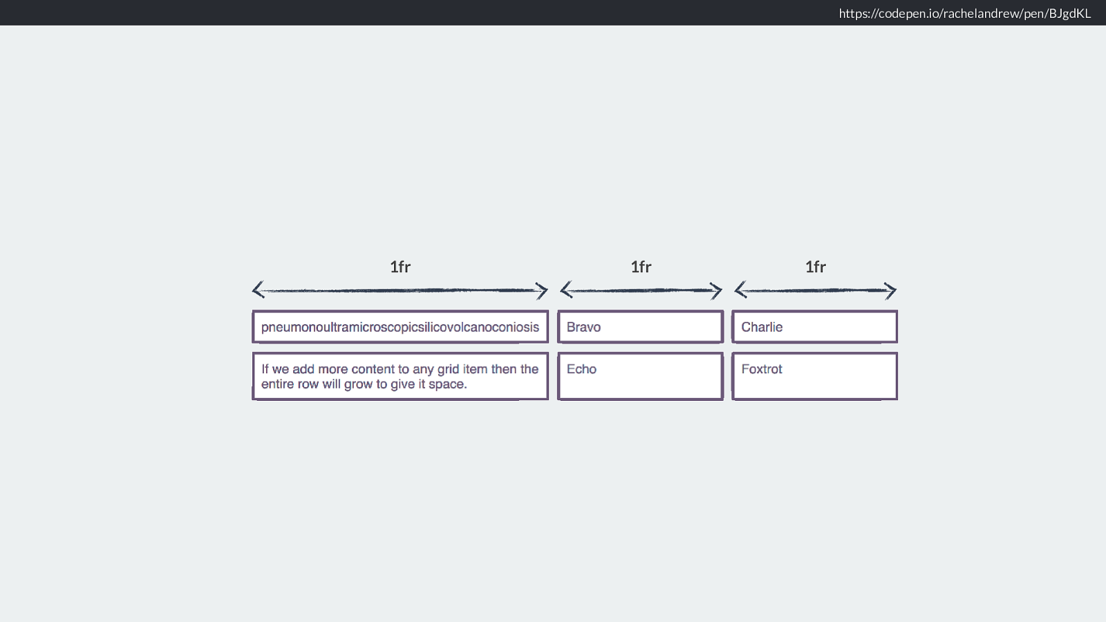
https://codepen.io/rachelandrew/pen/BJgdKL 1fr 1fr 1fr Like this.
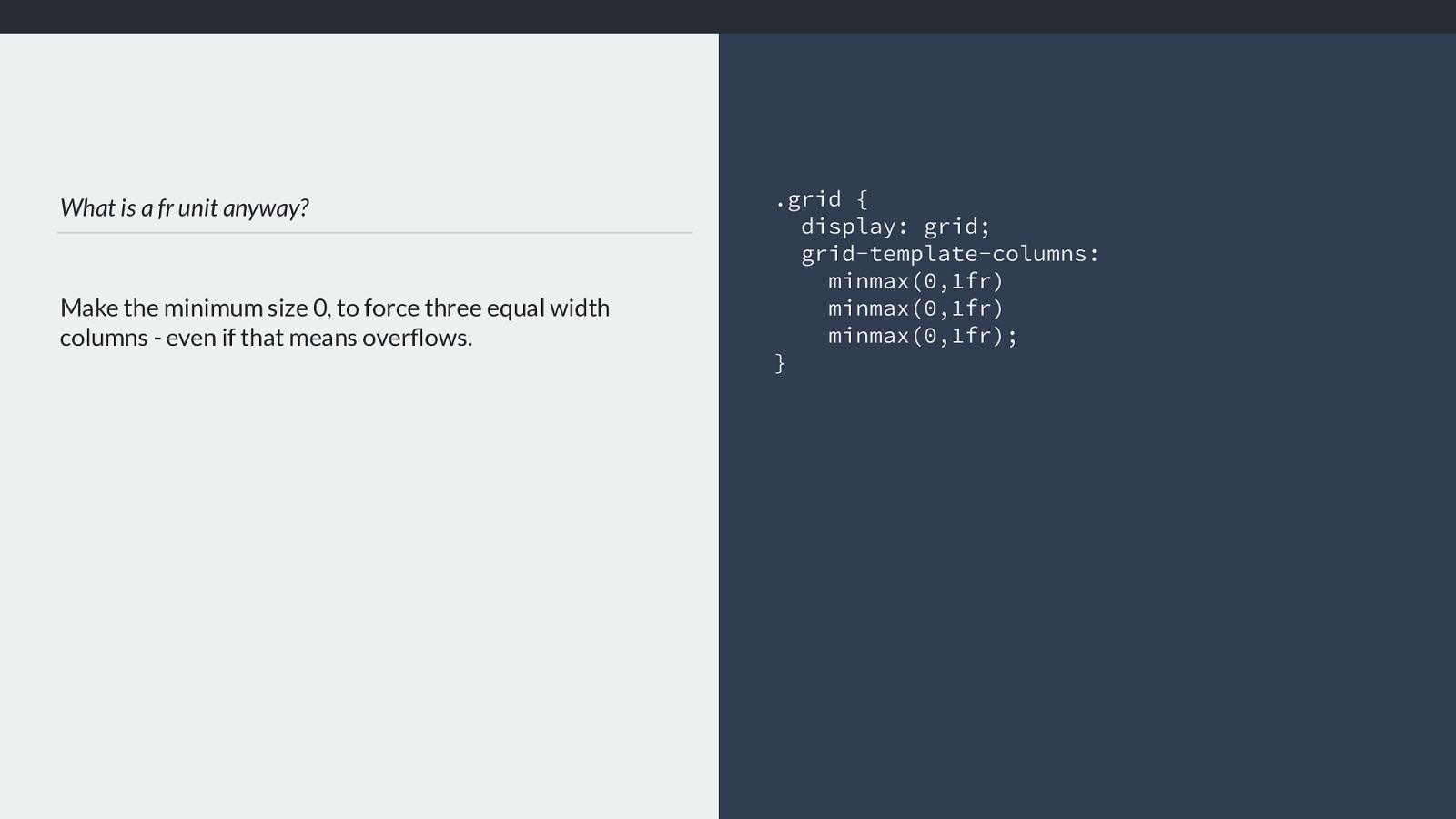
What is a fr unit anyway? Make the minimum size 0, to force three equal width columns - even if that means overflows. .grid { display: grid; grid-template-columns: minmax(0,1fr) minmax(0,1fr)
minmax(0,1fr) ; } Which leads us to a useful bit of knowledge. If you do want three equal tracks using fr units, then you need to make the minimum sizing function zero, by explicitly using minmax(0,1fr)
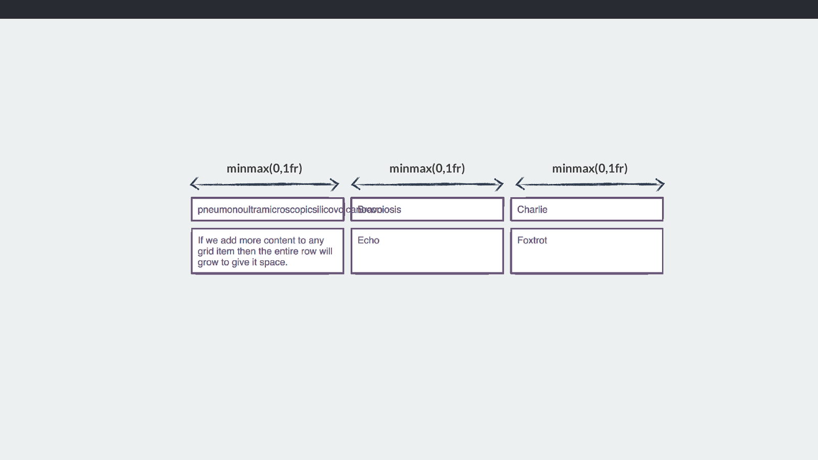
minmax(0,1fr) minmax(0,1fr) minmax(0,1fr) This then might cause overflows. Which is why the default is auto, as if there is space, we’re assuming you would rather the bigger thing got some space rather than overflowed.
However that can seem a little unintuitive if you were expecting 3 tracks of 1fr to be three equal sized tracks. It often turns out that way, but it isn’t quite what is happening.
So this seems like quite a lot of work if you think about it. The browser is having to work out what size it thinks the fr is, then look at the track and figure out what the minimum size of the content, then re-do the algorithm if that size has changed to make sure we are distributing space accordingly.
And that’s not all. Grid items don’t just span one track.
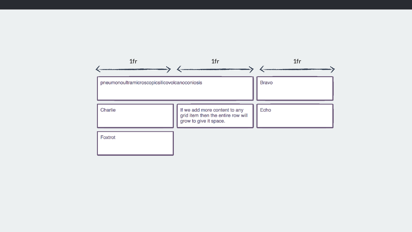
1fr 1fr 1fr Often a grid area spans several tracks, and therefore the content that can change the track sizing is spread over multiple tracks.
I’ve gone back to 1fr tracks here, which when our item containing the long word was placed into it make the first column track much wider. When we allow it to span two tracks, then the space it needs is over two tracks not one and so it can fit into 2 tracks, so the first track does not need to grow larger.
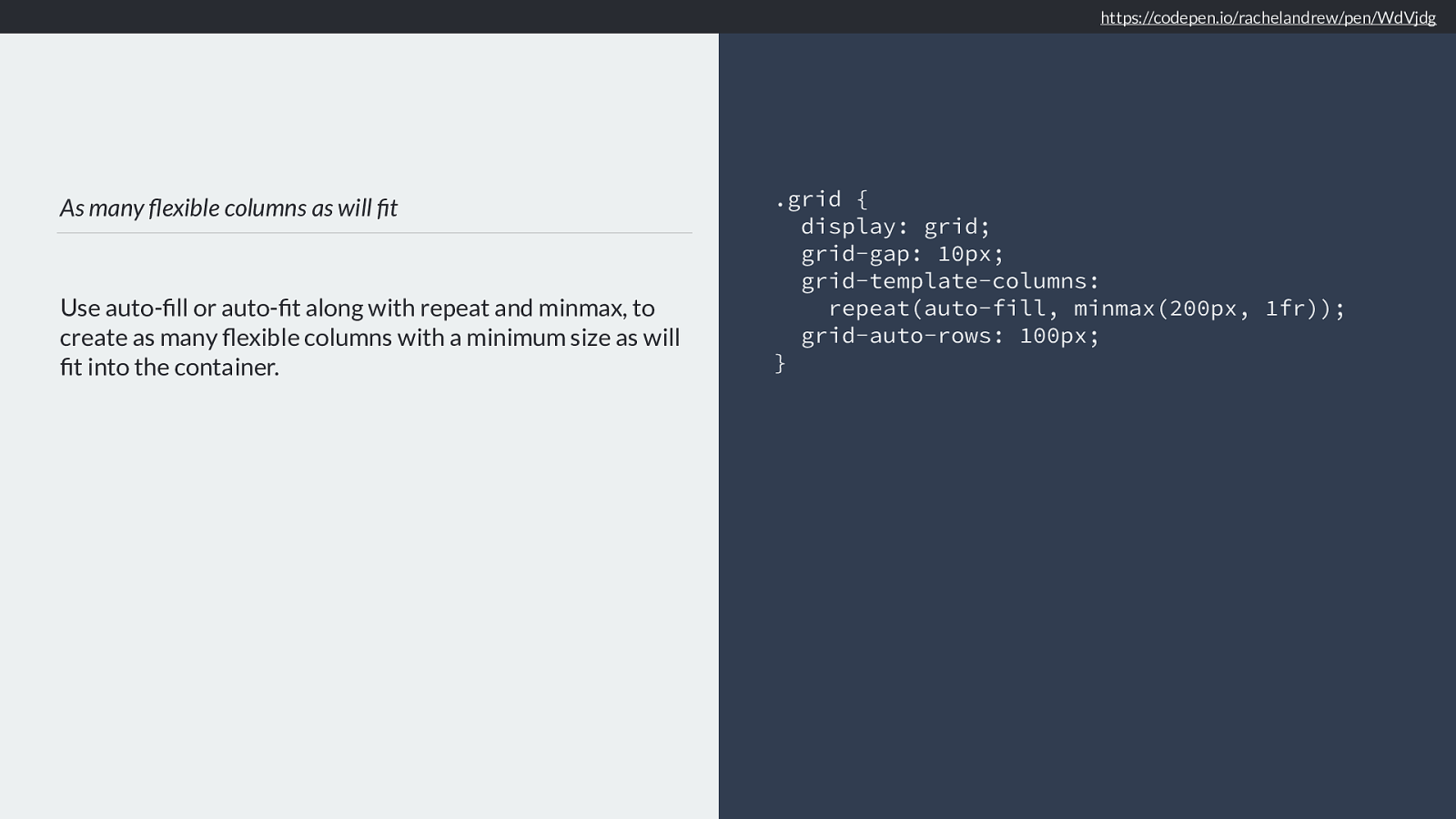
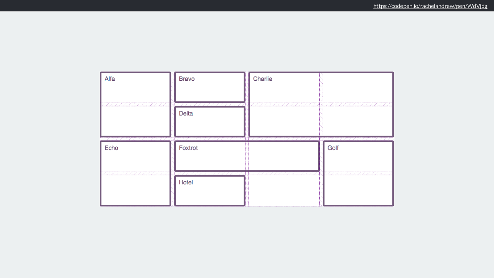
As many flexible columns as will fit Use auto-fill or auto-fit along with repeat and minmax, to create as many flexible columns with a minimum size as will fit into the container. .grid { display: grid; grid-gap: 10px; grid-template-columns:
repeat(auto-fill, minmax(200px, 1fr));
grid-auto-rows: 100px;
}
https://codepen.io/rachelandrew/pen/WdVjdg
Then we have everyone’s favourite trick. The ability to add as many columns as will fit into the grid container by using repeat notation and the auto-fill and auto-fit keywords.
What is happening here might make more sense now we have looked at sizing. We are asking grid layout to auto fill as many column tracks as will fit in the container. We are handing out a minimum size of 200 pixels, so the columns won’t collapse smaller than that, and a maximum of 1fr. So 1fr of the available space.
https://codepen.io/rachelandrew/pen/WdVjdg
And so we can get nice arrangements of boxes,
https://codepen.io/rachelandrew/pen/WdVjdg Which will be responsive. And you can see we have these gaps in the arrangement.
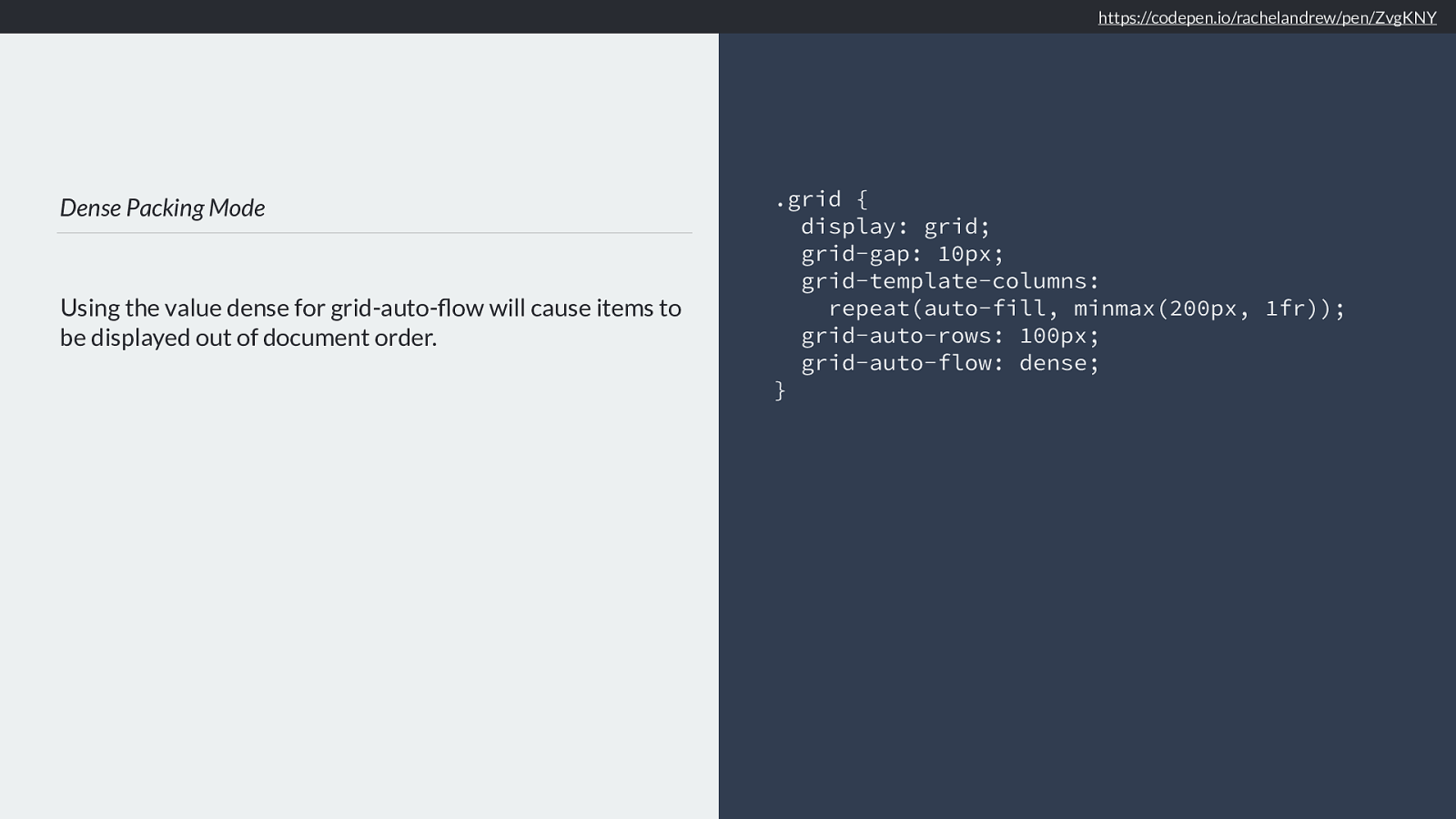
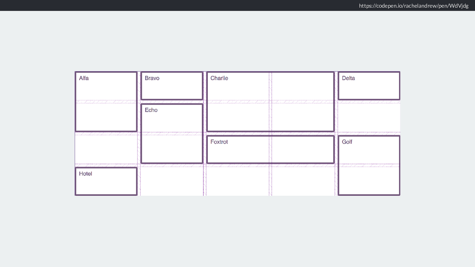
Dense Packing Mode Using the value dense for grid-auto-flow will cause items to be displayed out of document order. .grid { display: grid; grid-gap: 10px; grid-template-columns:
repeat(auto-fill, minmax(200px, 1fr)); grid-auto-rows: 100px;
grid-auto-flow: dense;
} https://codepen.io/rachelandrew/pen/ZvgKNY
So we can then set auto-flow to dense
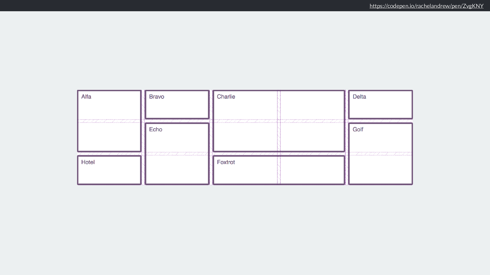
https://codepen.io/rachelandrew/pen/ZvgKNY
So we are able to create a grid with a flexible number of flexible columns, and pack it densely, and the browser just does this for us. With a few lines of CSS. It’s magic.
There are so many creative possibilities here. Once we get anyway from always thinking of a grid as the Bootstrap-like 12 column grid, we have much more freedom to create interesting layouts.
Upside down and back to front Then there is something very important about grid layout. It really doesn’t matter which way up your grid is.
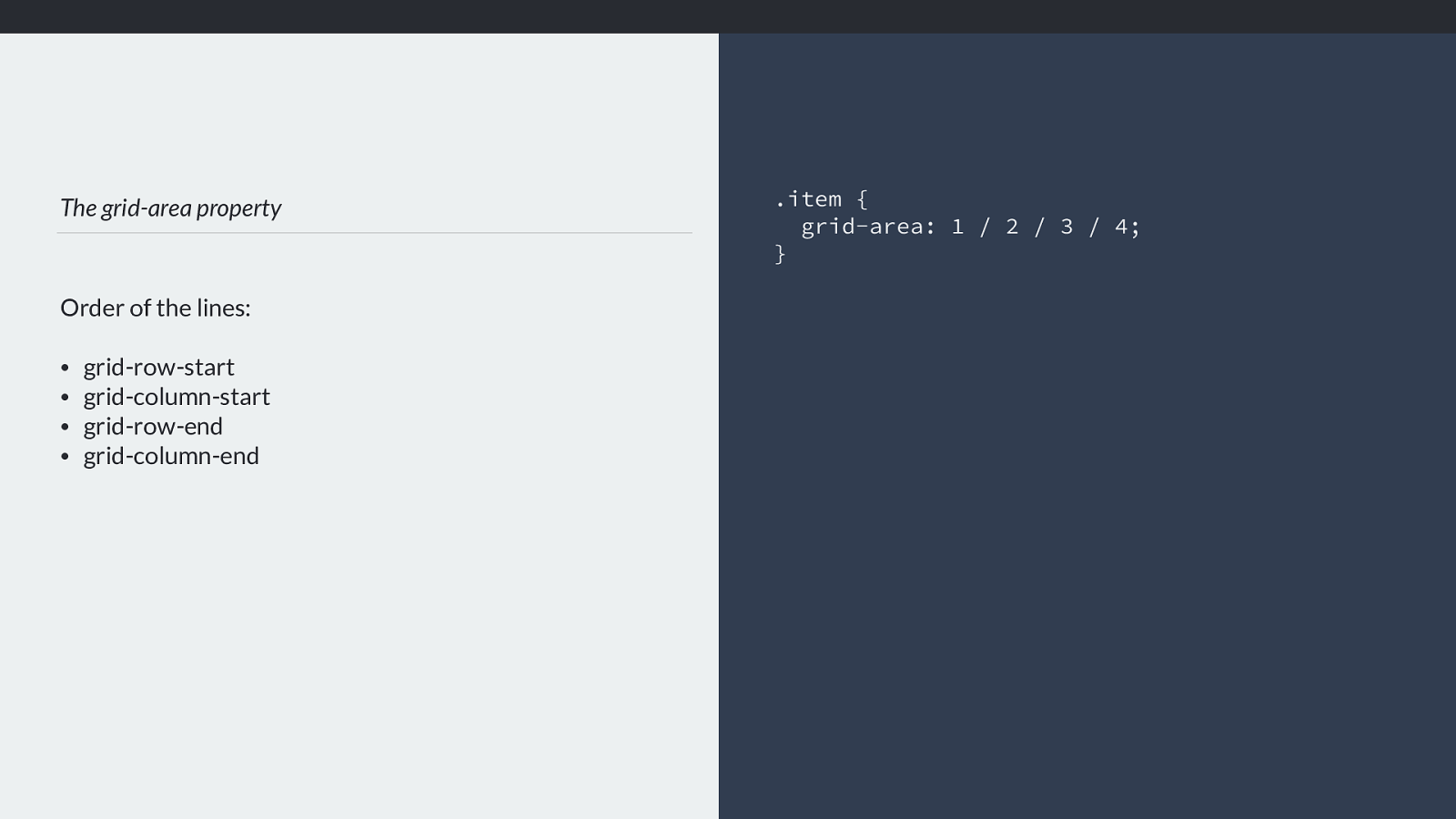
The grid-area property Order of the lines: • grid-row-start
• grid-column-start
• grid-row-end
• grid-column-end .item {
grid-area: 1 / 2 / 3 / 4; } My original CSS Grid presentation, long before grid shipped in browsers went through all of the properties for grid layout and explained them with demos.
I would explain that you could define all four lines of a grid are with the grid-area property and that the order of the lines was
grid-row-start
grid-column-start
grid-row-end
grid-column-end
This is the opposite of how we declare lines in everything else in CSS.

Logical Properties and Writing Modes The answer is that these values have moved away from the underlying assumption that content on the web maps to the physical dimensions of the screen, with the first word of a sentence being top left of the box it is in. The order of lines in grid-area makes complete sense if you had never encountered the existing way that we set these values in a shorthand. We set the two start lines first, then the two end lines.
This means that if we change the writing mode of our document to a vertical one, the position of a block remains relative to the writing mode of the document, rather than the physical properties of the screen.
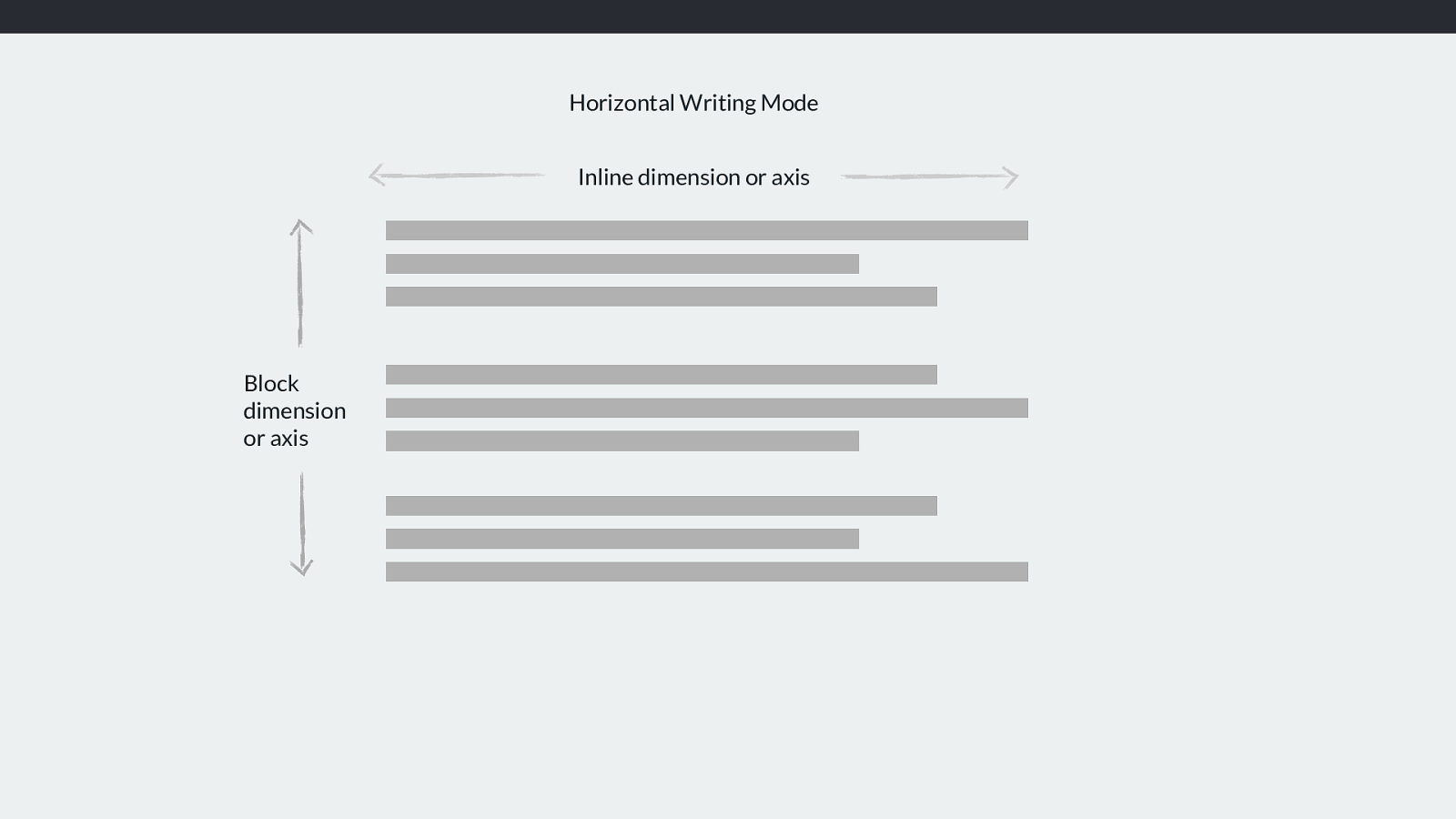
Inline dimension or axis
Horizontal Writing Mode
Block
dimension
or axis
In any writing system with a horizontal writing mode - whether the text is left to right like English or right to left like Arabic the inline dimension is along the rows of text left
to right or right to left.
The Block dimension runs down the page top to bottom. You’ll sometimes see mention the inline or the block axis when working with grid or flexbox, and this is what it means. If something is being aligned on the block axis and you are working in a horizontal writing mode. The blog axis is the one that the blocks lay out on as they display down the block dimension of the page.
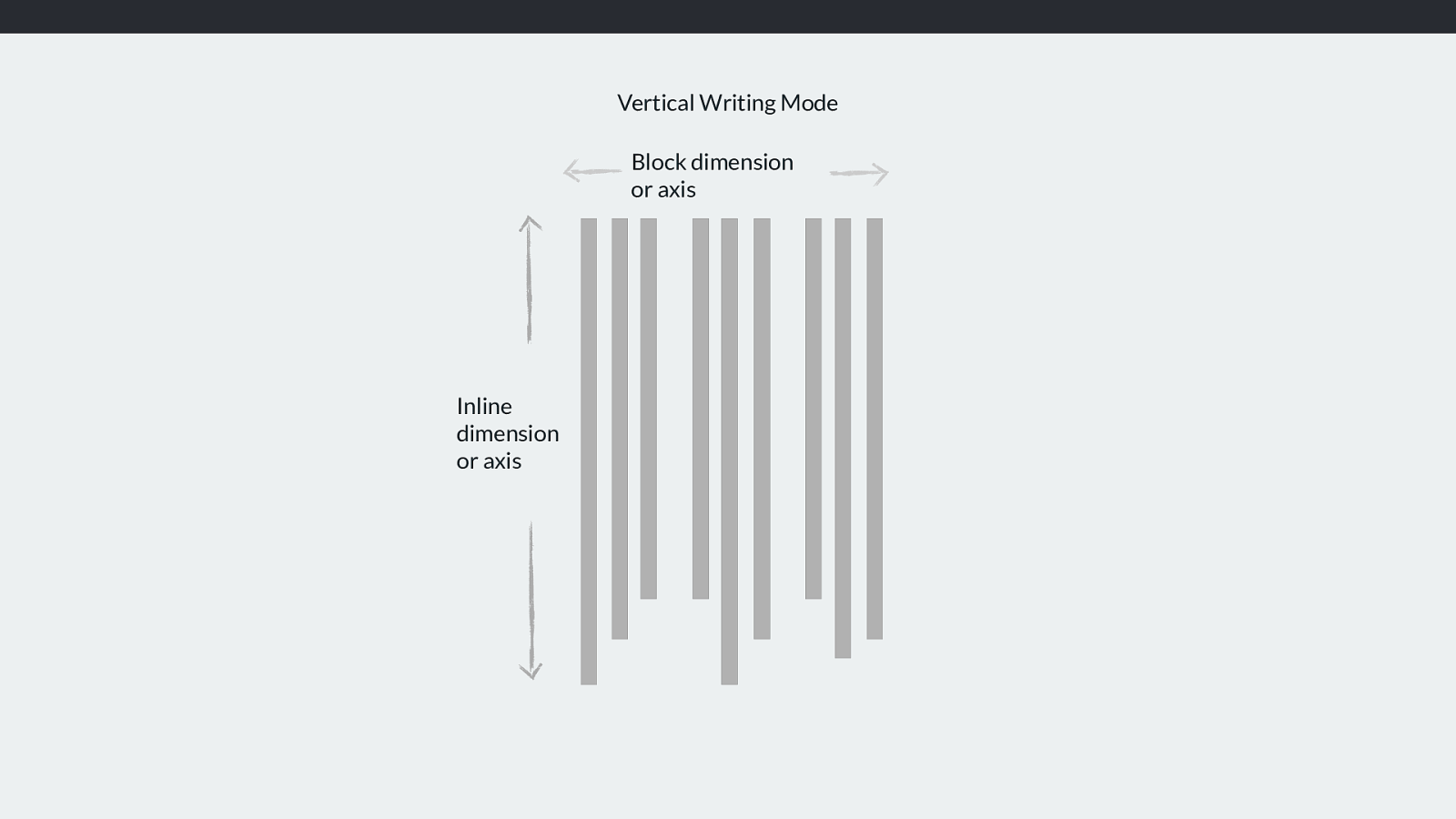
Block dimension
or axis
Vertical Writing Mode
Inline
dimension
or axis
If we were working in a document with a vertical writing mode then the inline direction would be top to bottom, the block dimension running horizontally.
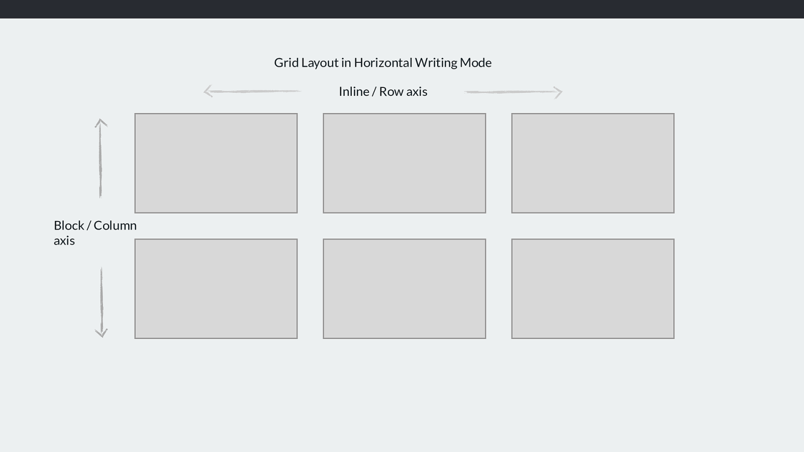
Inline / Row axis Block / Column axis Grid Layout in Horizontal Writing Mode In Grid Layout, the inline axis is sometimes described as the Row axis and the Block axis as the Column axis.
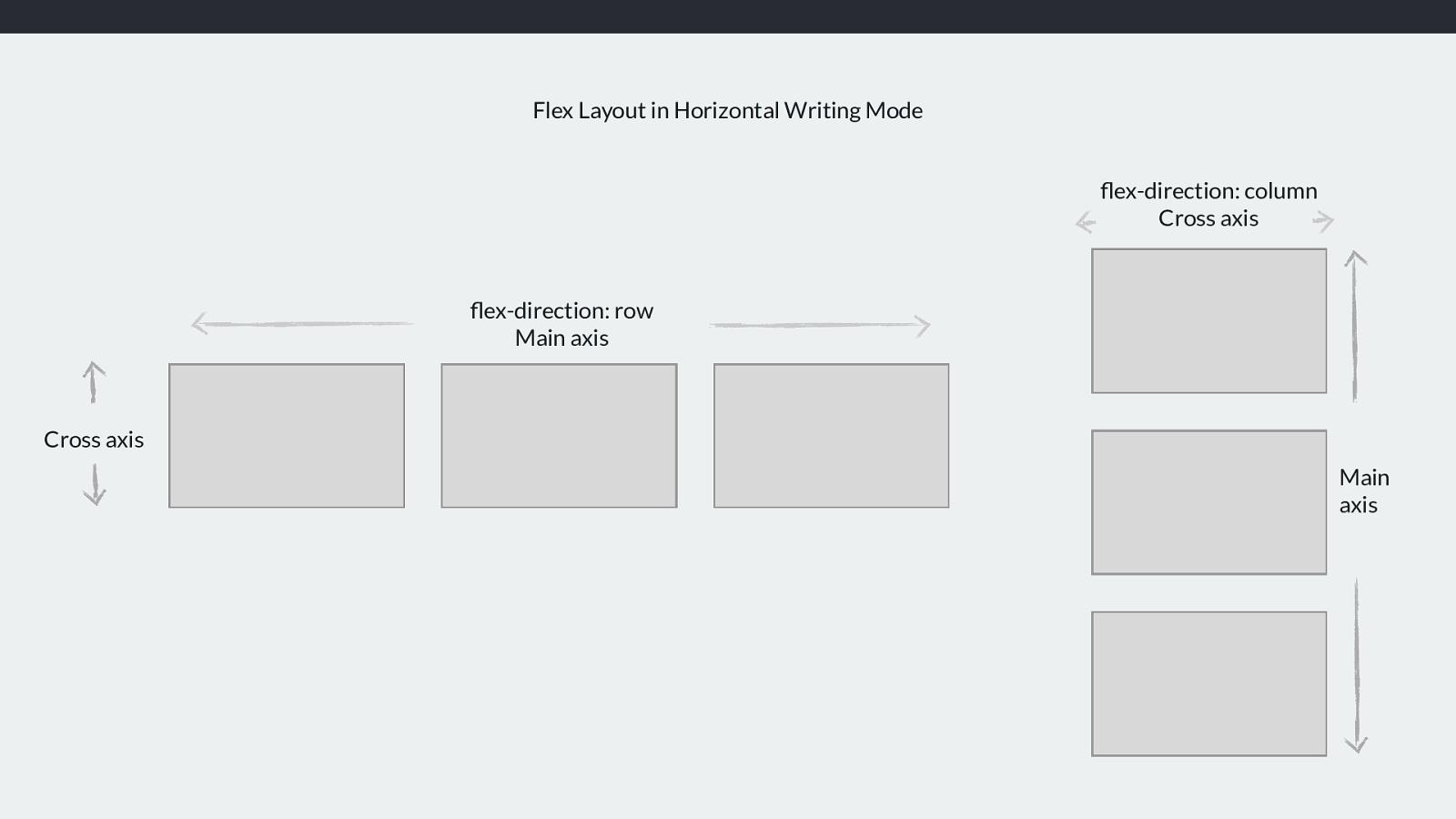
flex-direction: row
Main axis
Cross axis
flex-direction: column
Cross axis
Main
axis
Flex Layout in Horizontal Writing Mode
Flex layout is a little more complex in this regard because of the fact that we can have a flex-direction of row or column. In flexbox it makes more sense to refer to the
main and cross axis.
The main axis is the one dictated by the flex-direction. By default this goes along the row (and therefore the inline axis)
The cross axis runs across down the columns (the block axis).
So we when are setting the start and end lines of a grid area, all we know is that we have start and end lines. We don’t actually know if we have top right bottom or left.
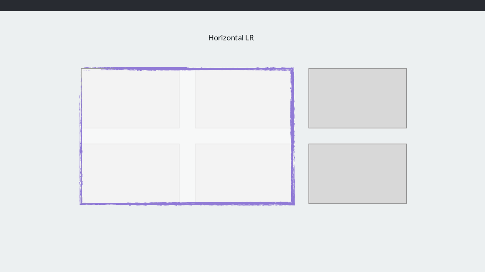
Horizontal LR So if this is my three column two row grid and I want a grid-area - in a horizontal, left to right writing mode - to cover the first two column and first two row tracks (click) like this.
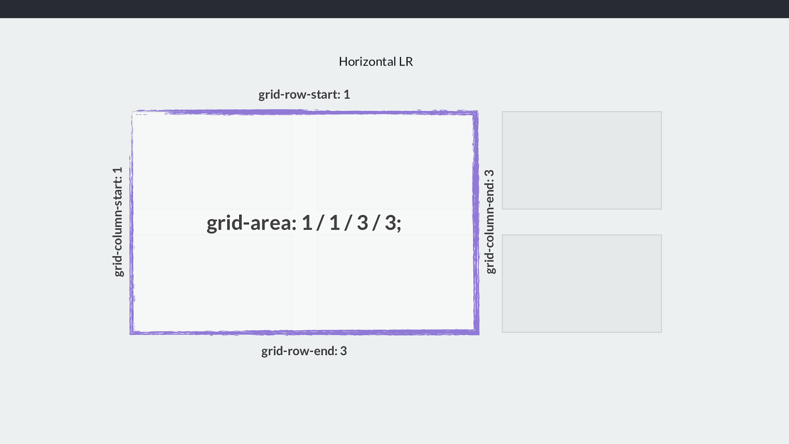
Horizontal LR grid-row-start: 1 grid-row-end: 3 grid-column-start: 1 grid-area: 1 / 1 / 3 / 3; grid-column-end: 3 We can see the column and row start and end lines and how - in the grid area property we set both starts then both ends.
And if we are in a language like Arabic running right to left, it stats the same. However start is now on the right.
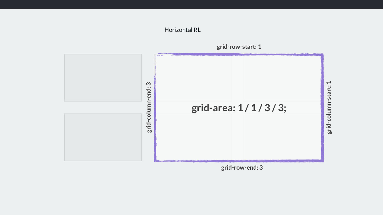
Horizontal RL grid-row-start: 1 grid-row-end: 3 grid-column-start: 1 grid-area: 1 / 1 / 3 / 3; grid-column-end: 3 We can see the column and row start and end lines and how - in the grid area property we set both starts then both ends.
And if we are in a language like Arabic running right to left, it stats the same. However start is now on the right.
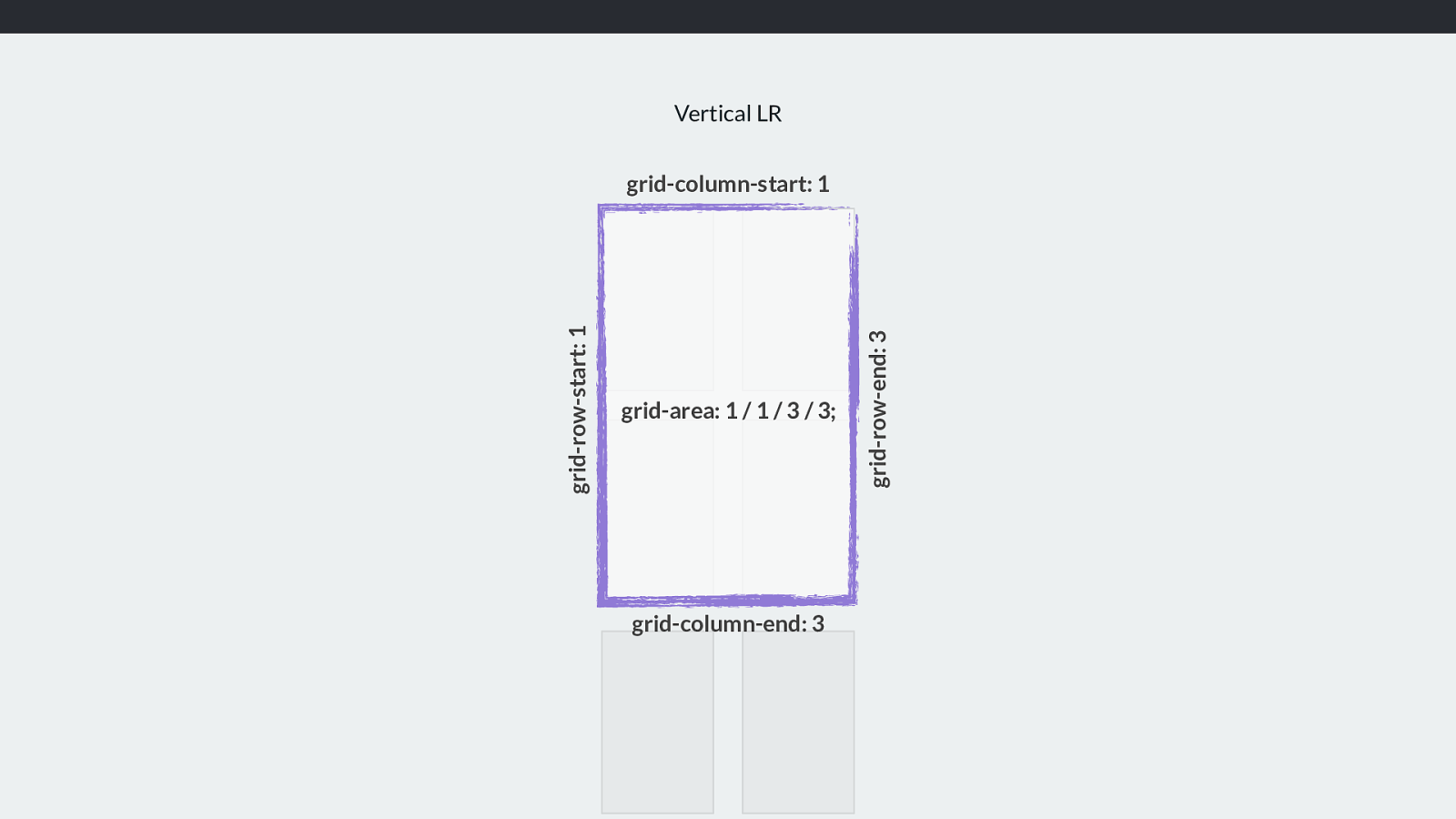
Vertical LR grid-column-start: 1 grid-column-end: 3 grid-row-end: 3 grid-area: 1 / 1 / 3 / 3; grid-row-start: 1 And if we end up working with a writing mode that has our content running vertically, we have this.
The grid essentially works in the same way whichever way up it is. The line-based positioning works the same whichever way up it is.
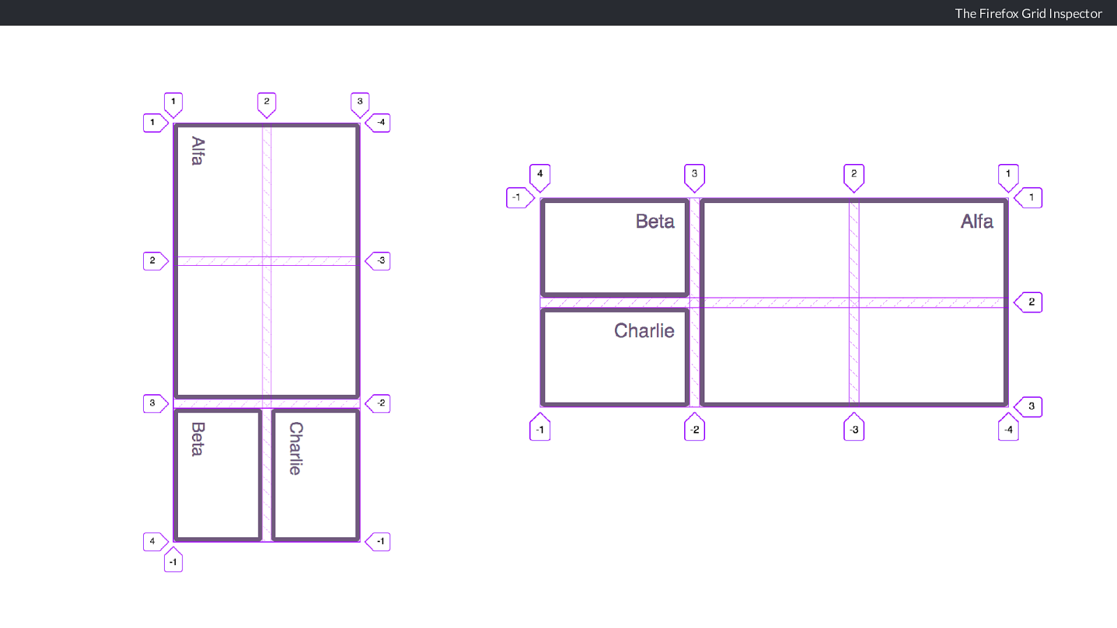
The Firefox Grid Inspector You will find the Firefox Grid Inspector very useful here.
These are screenshots from Firefox of the example I just demonstrated. Firefox DevTools will add line numbers and a grid outline so you can see exactly how the positioning works.
Alignment and the Grid So now we know how grid respects writing modes. Another area of confusion will hopefully make more sense.
How does alignment work in grid layout?
Alignment also considers the writing mode of the document and so we don’t think about left and right, top and bottom. We again think about start and end in each dimension.
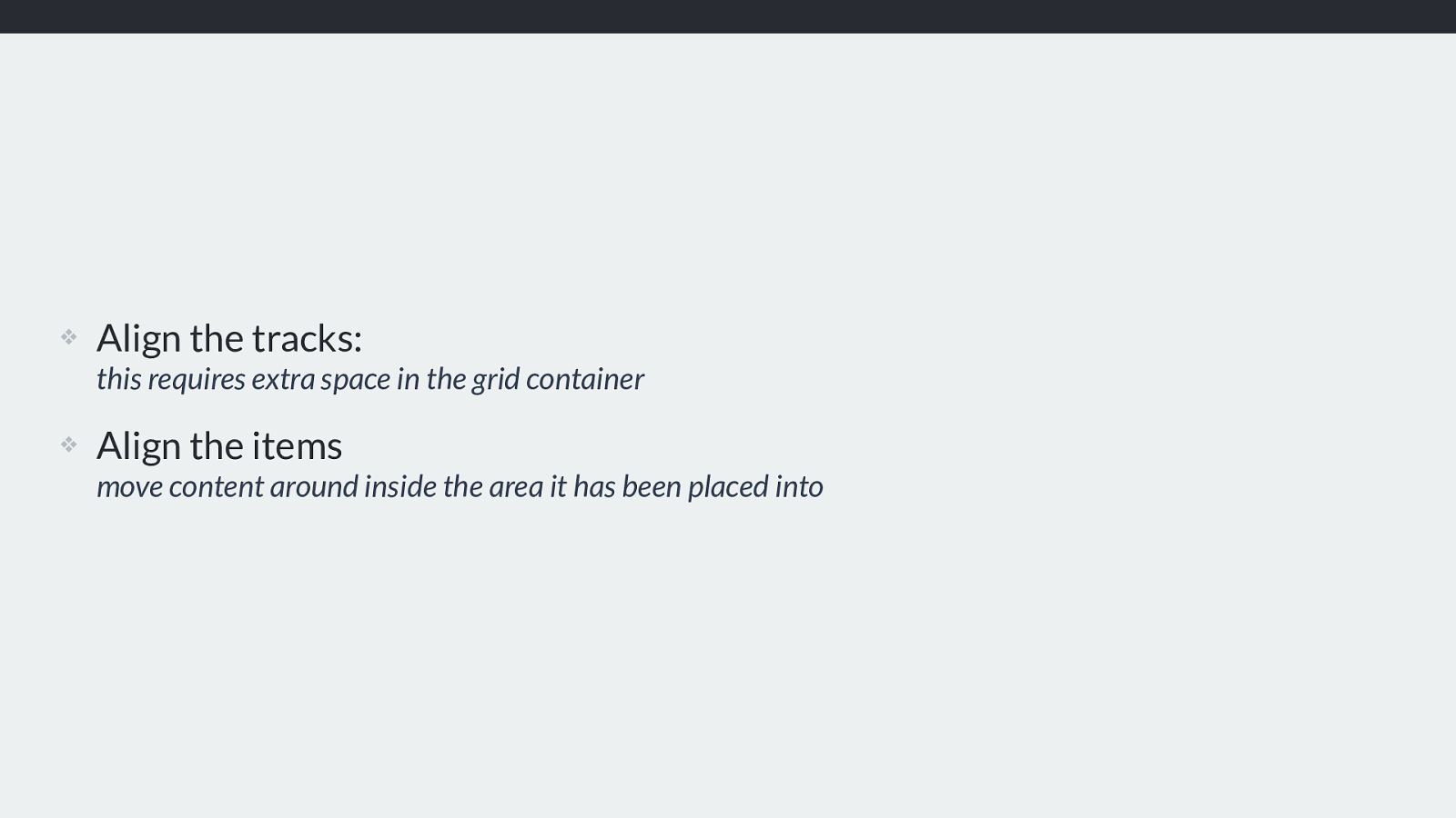
❖ Align the tracks: this requires extra space in the grid container
❖ Align the items move content around inside the area it has been placed into We have two di ff erent things we might want to align in our grid layout.
The tracks themselves, assuming there is extra space in the grid container.
The items themselves.
Box Alignment Specification https://www.w3.org/TR/css-align-3/
Alignment is defined in the Box Alignment specification, rather than the grid layout spec.
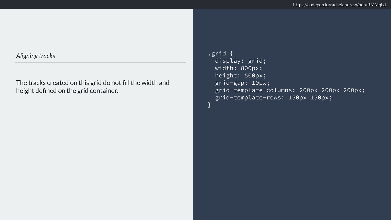
Aligning tracks The tracks created on this grid do not fill the width and height defined on the grid container. .grid { display: grid; width: 800px; height: 500px; grid-gap: 10px; grid-template-columns: 200px 200px 200px; grid-template-rows: 150px 150px; } https://codepen.io/rachelandrew/pen/RMMqLd Let’s look at aligning tracks first.
I have a grid container which contains some fixed size tracks. The total amount of space needed to layout those tracks is less than the width and height of the container.
This means we have some free space we can play with. By default the tracks are aligned to the start dimension in both rows and columsn.
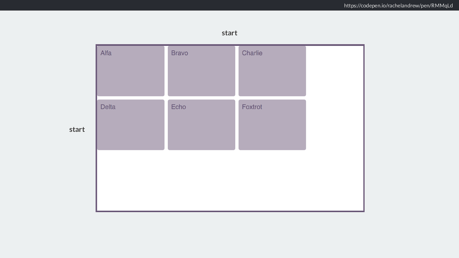
https://codepen.io/rachelandrew/pen/RMMqLd start start So this is the start - in English anyway
align-content and justify-content Aligning tracks What should I do with free space in the Grid Container? The content properties deal with free space, what do we want to do with that leftover space.
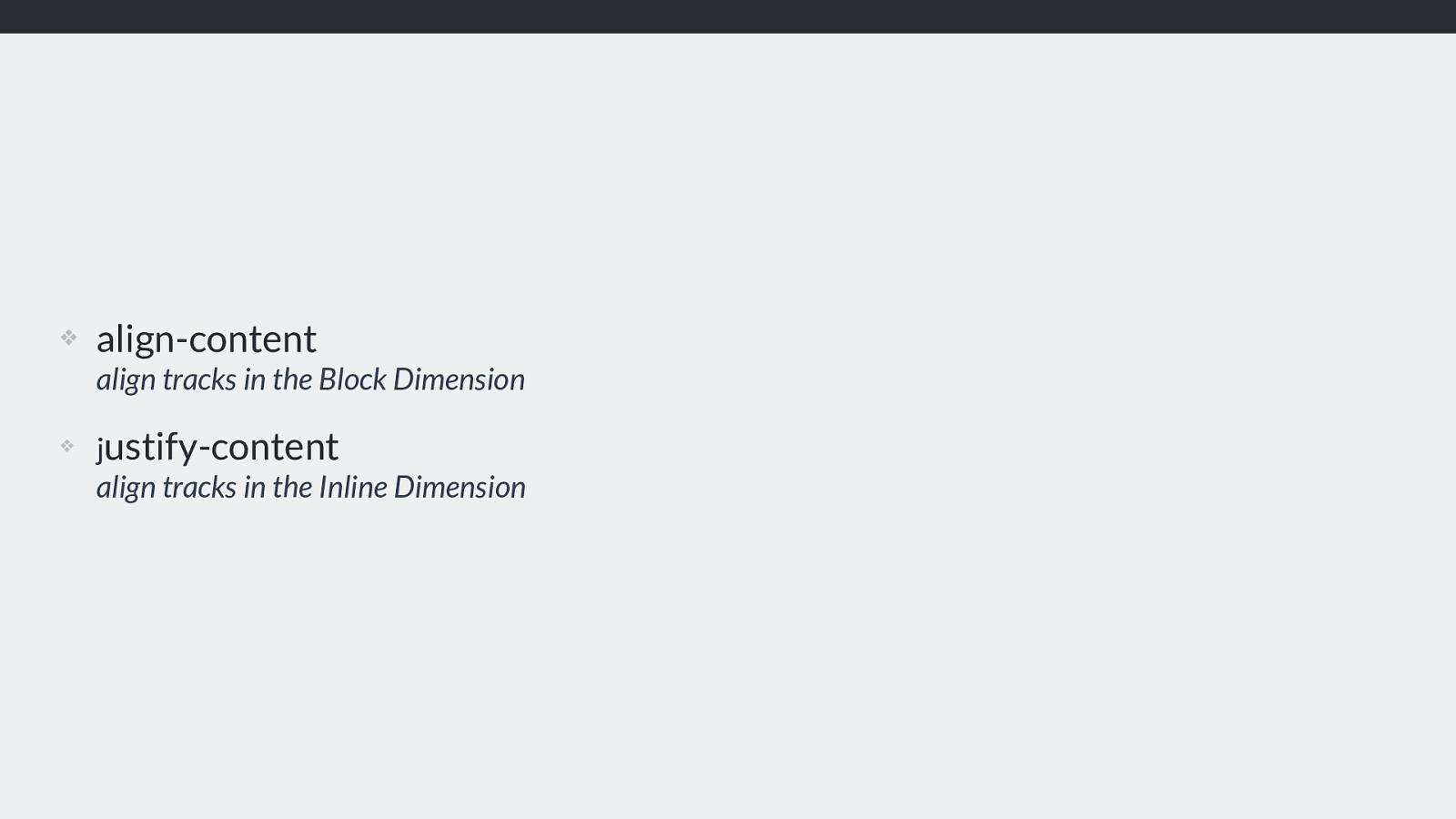
❖ align-content align tracks in the Block Dimension
❖ j ustify-content align tracks in the Inline Dimension Align content works in th eblock dimension and justify content the inline dimension.
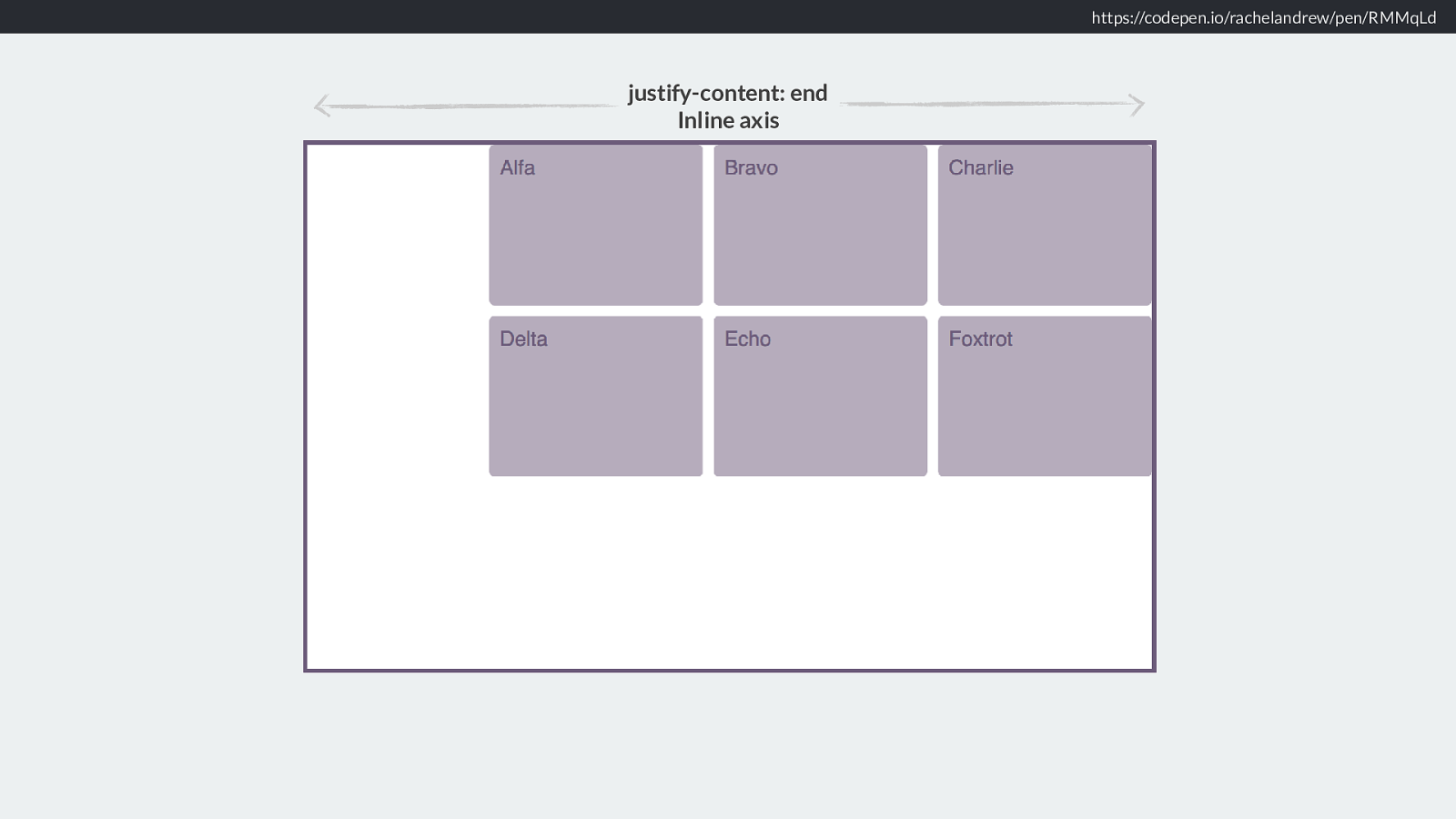
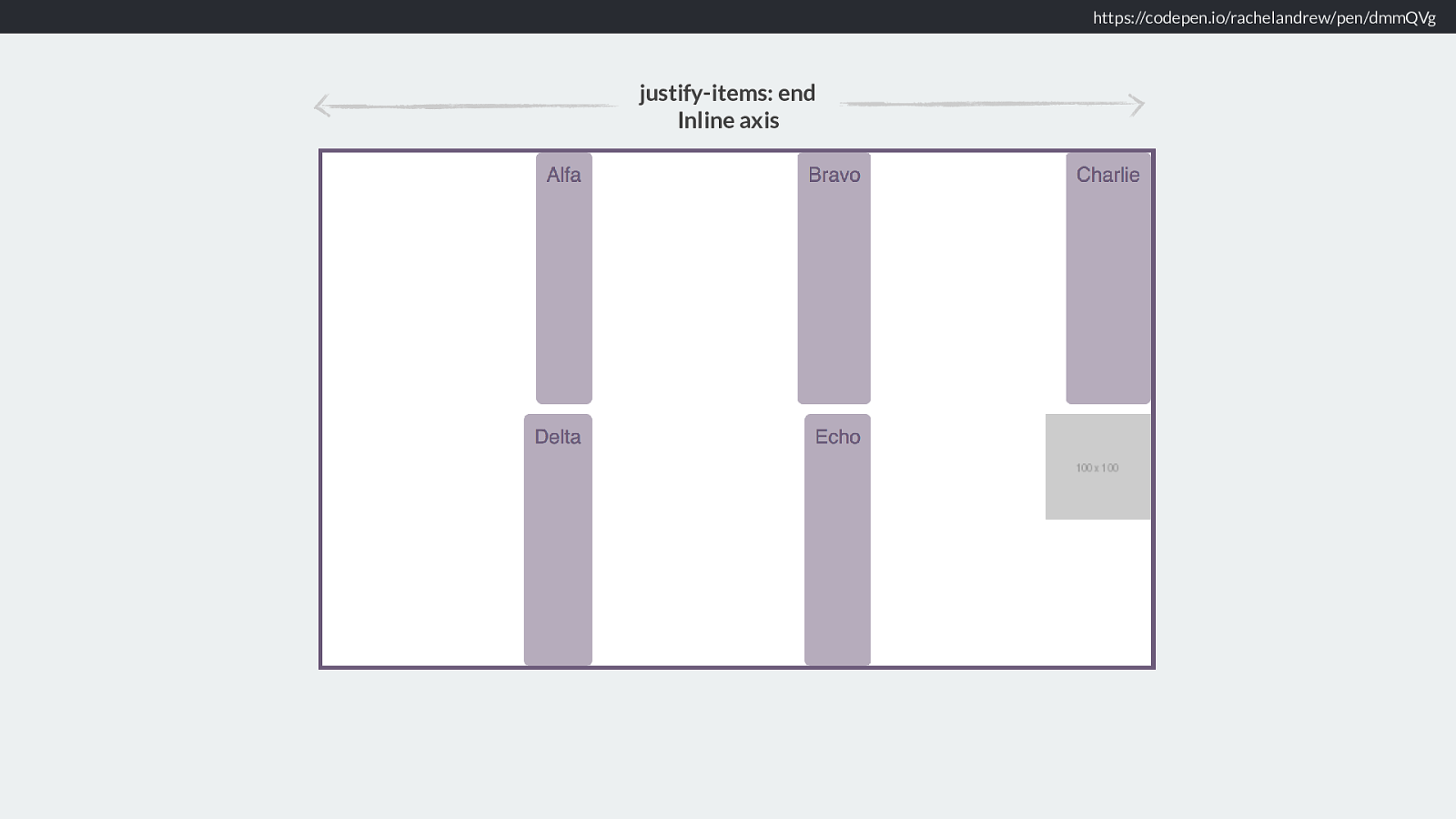
https://codepen.io/rachelandrew/pen/RMMqLd justify-content: end Inline axis So, if I want all my tracks to move to the end of the grid in the inline direction - along the rows.
I use justify-content: end.
Justifying to the end line of the grid. What this means is that the free space is now placed before our tracks.
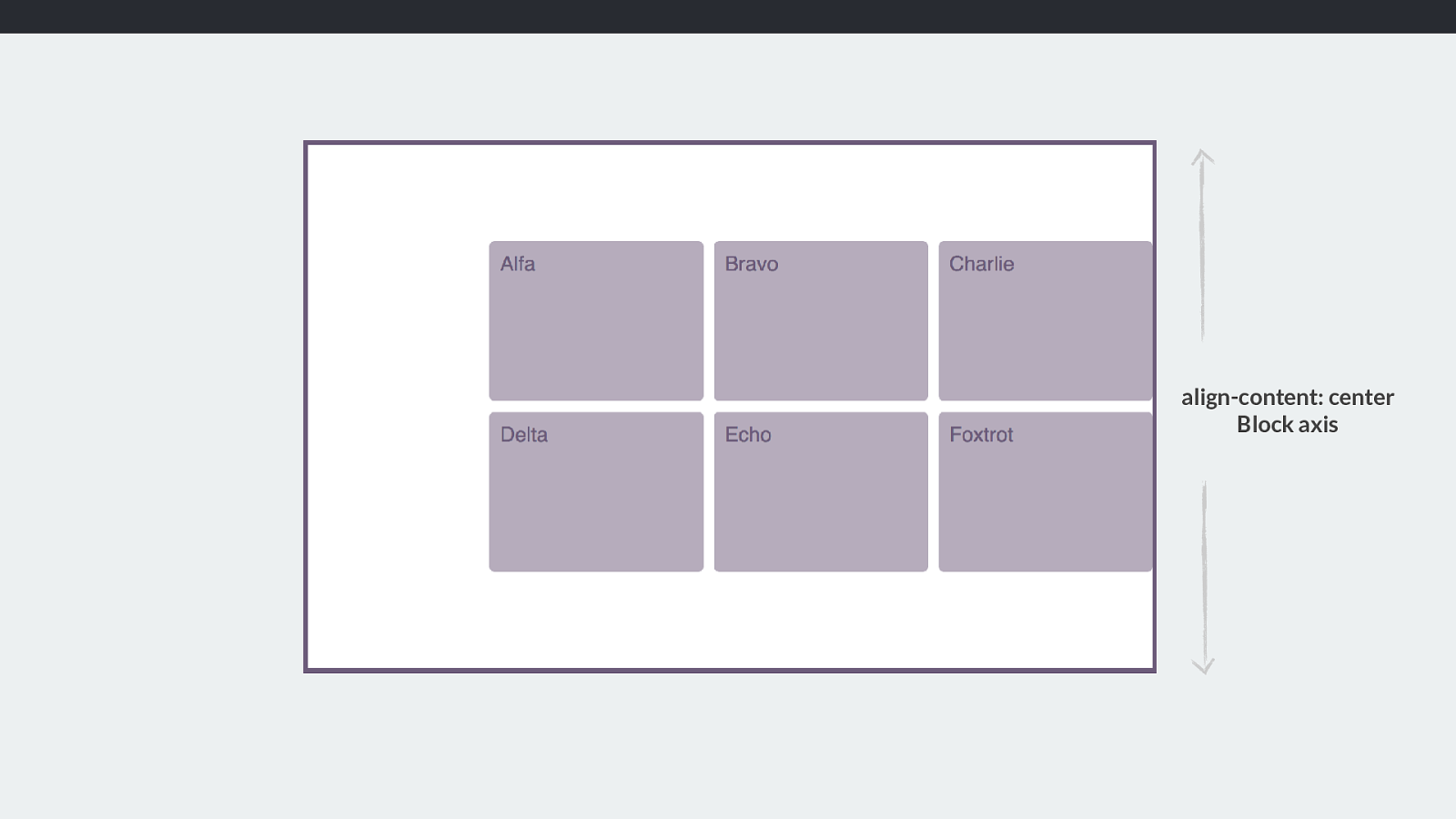
align-content: center Block axis I want them in the centre, in the block dimension.
Align-content centre. Our free space is placed above and below our tracks.
What we are doing here is distributing space, we decide where we want our tracks and therefore what happens with the space leftover. SO just like flexbox.
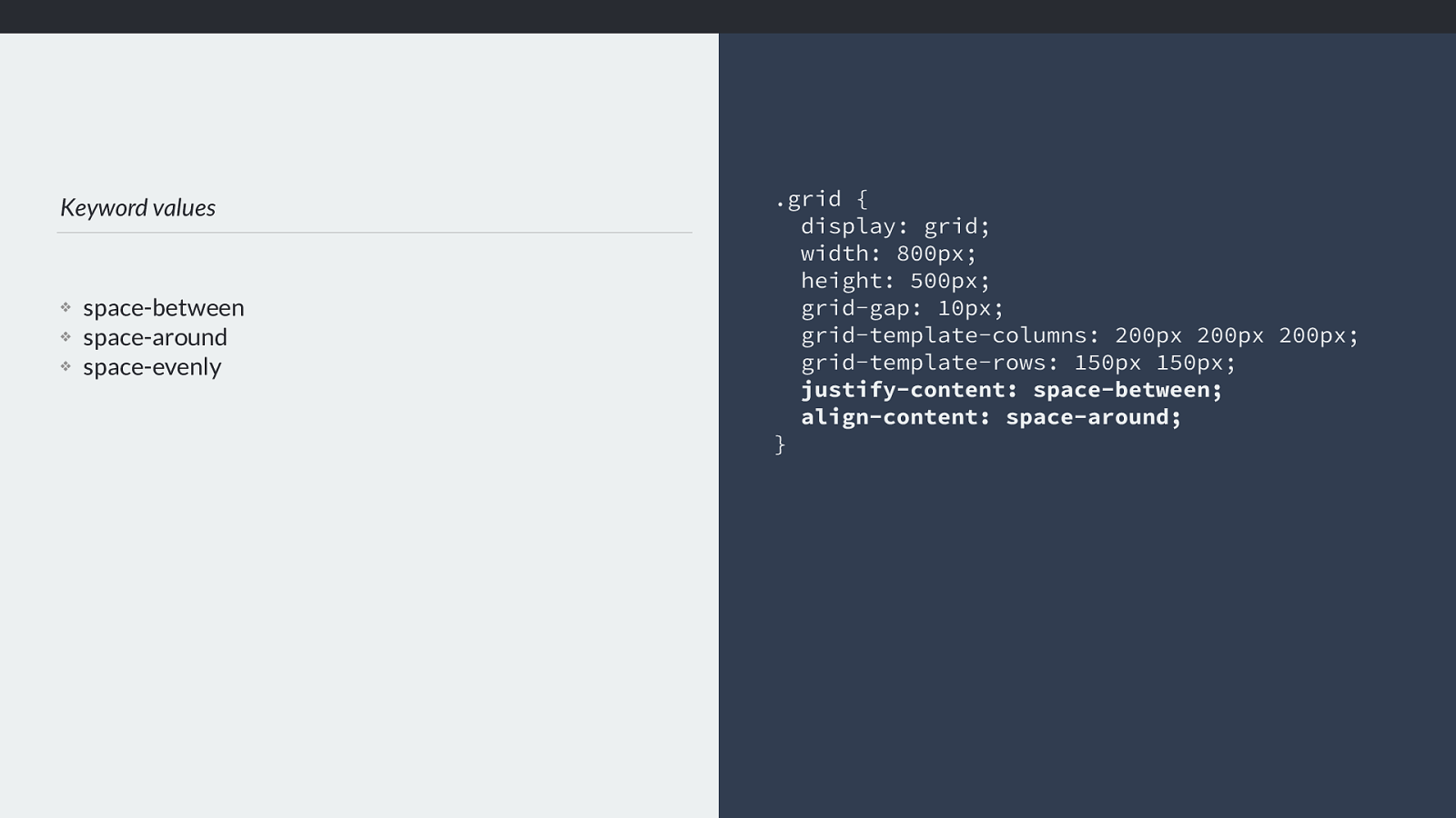
Keyword values ❖ space-between ❖ space-around ❖ space-evenly .grid { display: grid; width: 800px; height: 500px; grid-gap: 10px; grid-template-columns: 200px 200px 200px; grid-template-rows: 150px 150px; justify-content: space-between; align-content: space-around; } We can use the keywords, space-between, space-around or space-evenly.
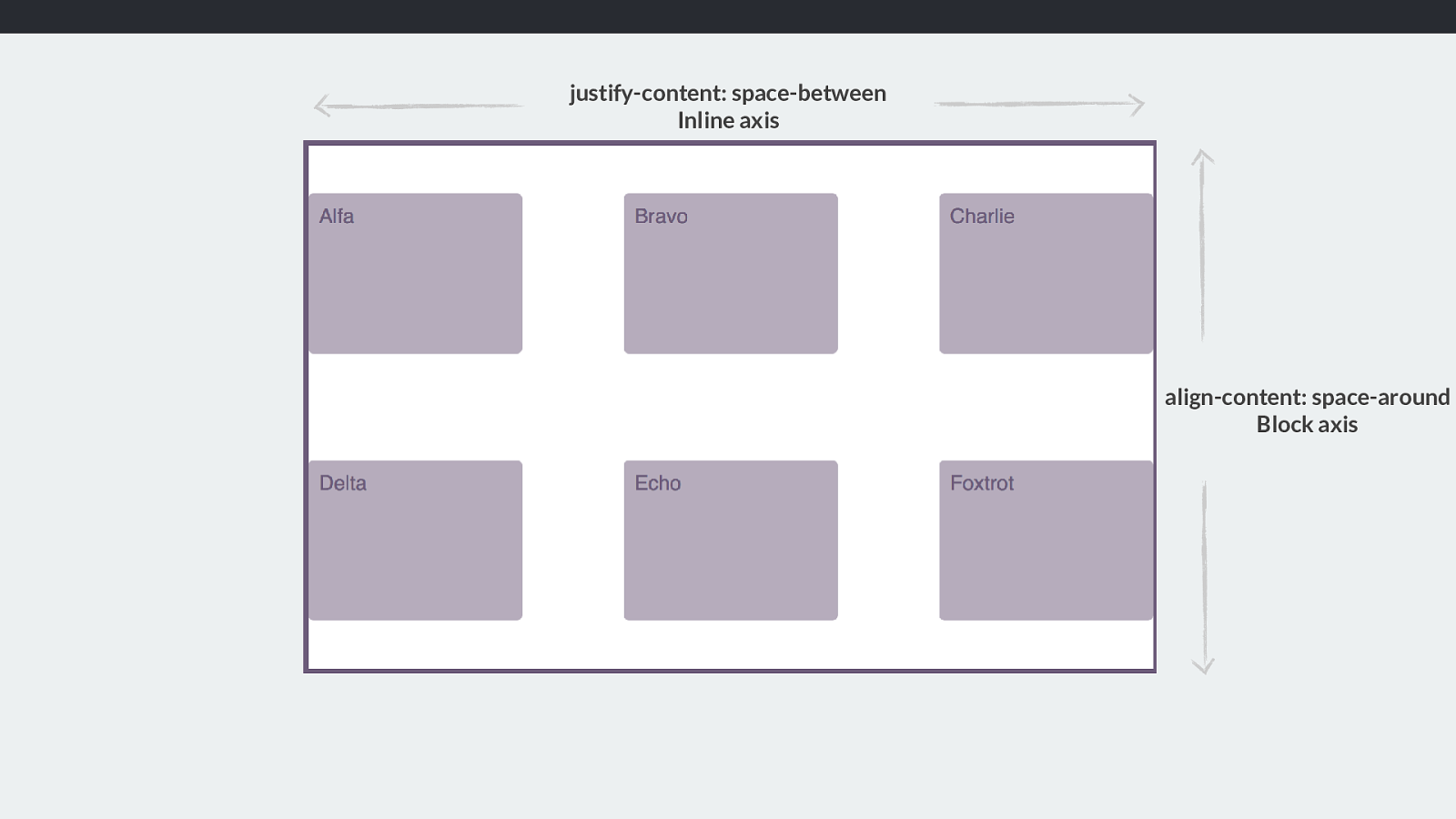
justify-content: space-between Inline axis align-content: space-around Block axis If you have used flexbox you have probably used the values space-around and space-between. You can use this with grid tracks too.
Align-Content space-between, justify-content space-around.
Our free space is divided up and placed between, or on either side of the items. Note that this will make the gaps bigger, and any item crossing the gaps will get bigger.
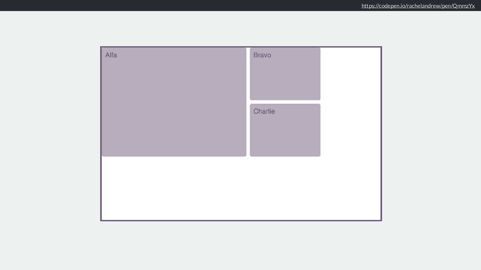
https://codepen.io/rachelandrew/pen/QmmzYx As you can see here, we have a large item spanning over two columns and two rows.
https://codepen.io/rachelandrew/pen/QmmzYx justify-content: space-between Inline axis align-content: space-around Block axis With space-around in the block dimension and space between inline that block gets a lot bigger as it absorbs the larger track space.
But that is justify and align content. Only useful if you have additional space in your grid after placing tracks.
Works pretty much like flexbox justify-content.
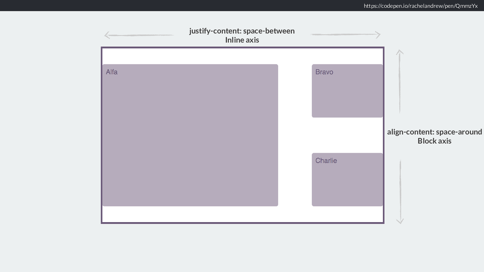
And this all, as you might have guessed works exactly the same way if we use a di ff erent writing mode. Start in the inline direction is always where a sentence starts. Start in the Block dimension will go down the blocks of the page.
https://codepen.io/rachelandrew/pen/wmmNaj justify-content: end Inline axis align-content: center Block axis Like this.
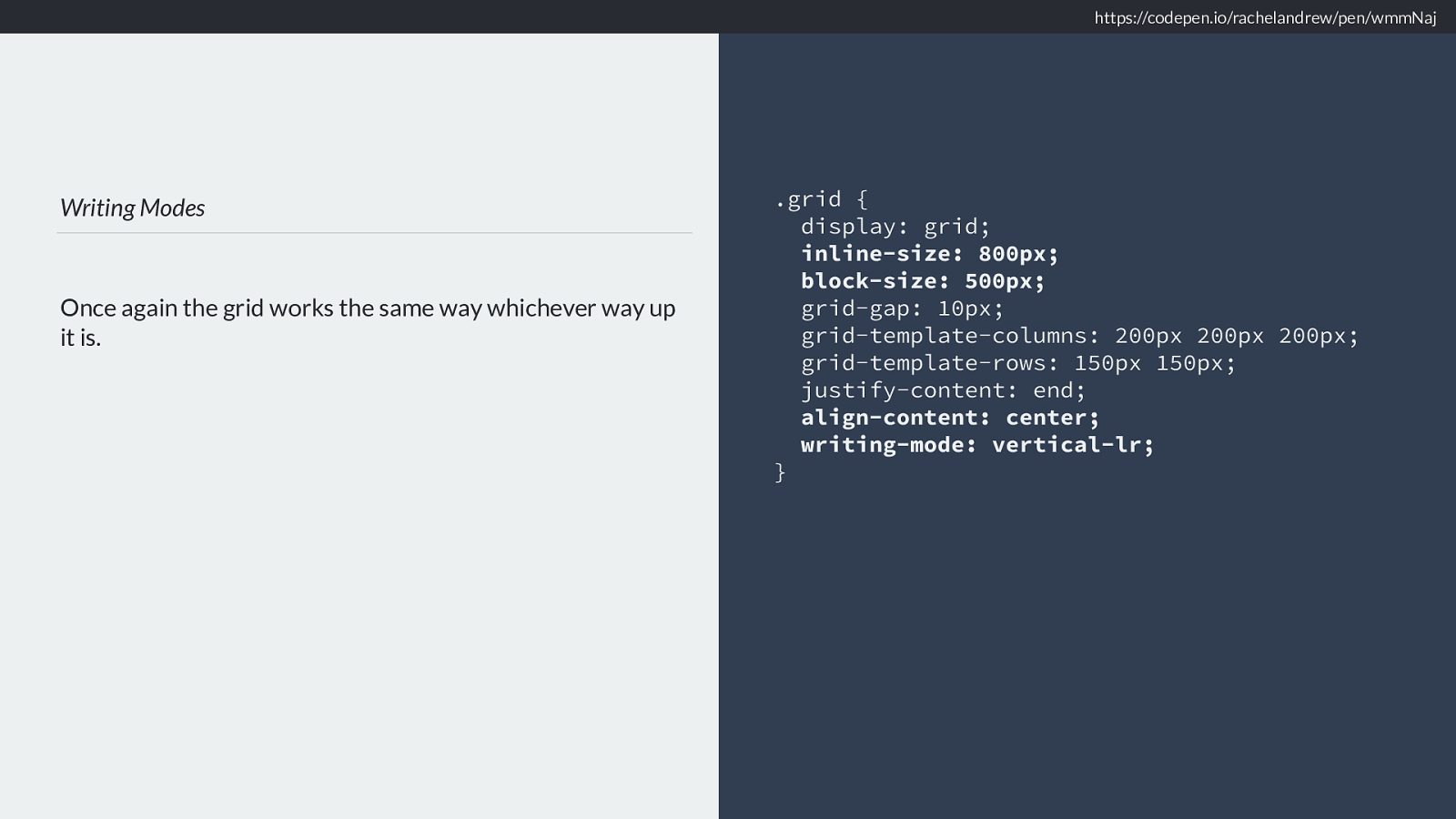
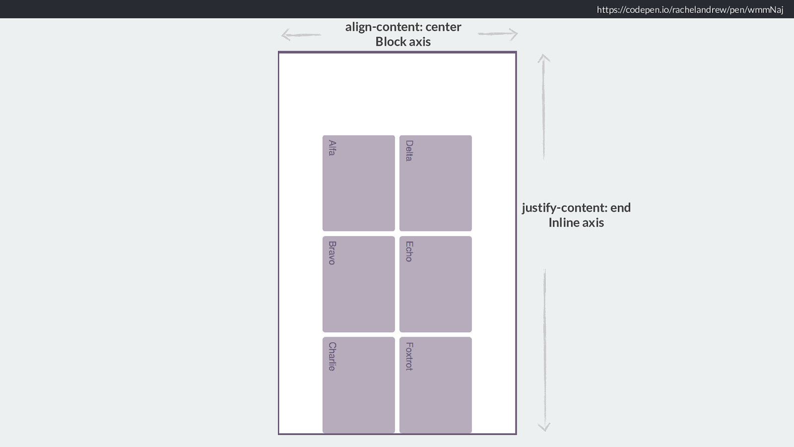
Writing Modes Once again the grid works the same way whichever way up it is. .grid { display: grid; inline-size: 800px; block-size: 500px; grid-gap: 10px; grid-template-columns: 200px 200px 200px; grid-template-rows: 150px 150px; justify-content: end; align-content: center; writing-mode: vertical-lr; } https://codepen.io/rachelandrew/pen/wmmNaj And in the code you can see the use of block-size instead of height and inline-size instead of width
These are new logical properties which I really do not have time to explain now, however this week I published an article on Smashing which explains them in great detail.
https://www.smashingmagazine.com/2018/03/understanding-logical-properties-values/ You can find that here.
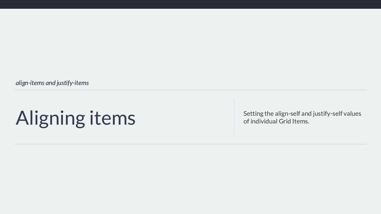
align-items and justify-items Aligning items Setting the align-self and justify-self values of individual Grid Items. We then have the items that are placed onto our grid.
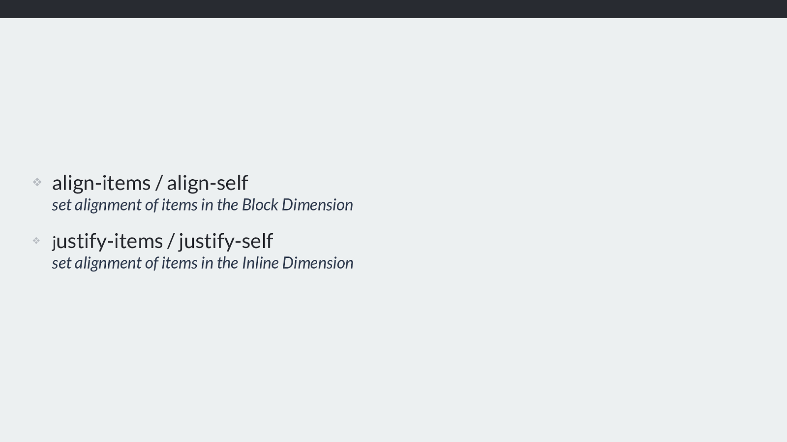
❖ align-items / align-self set alignment of items in the Block Dimension
❖ j ustify-items / justify-self set alignment of items in the Inline Dimension
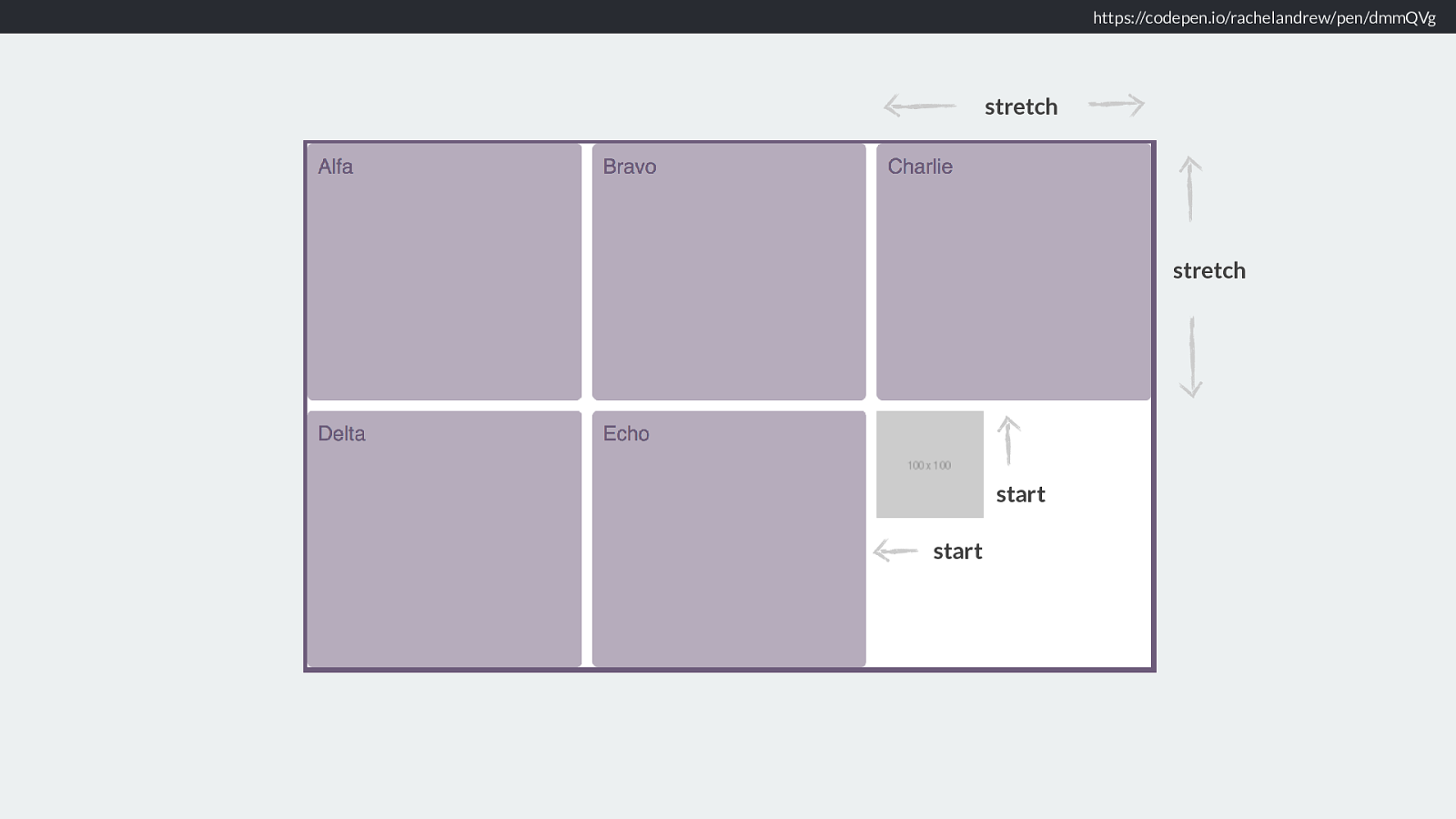
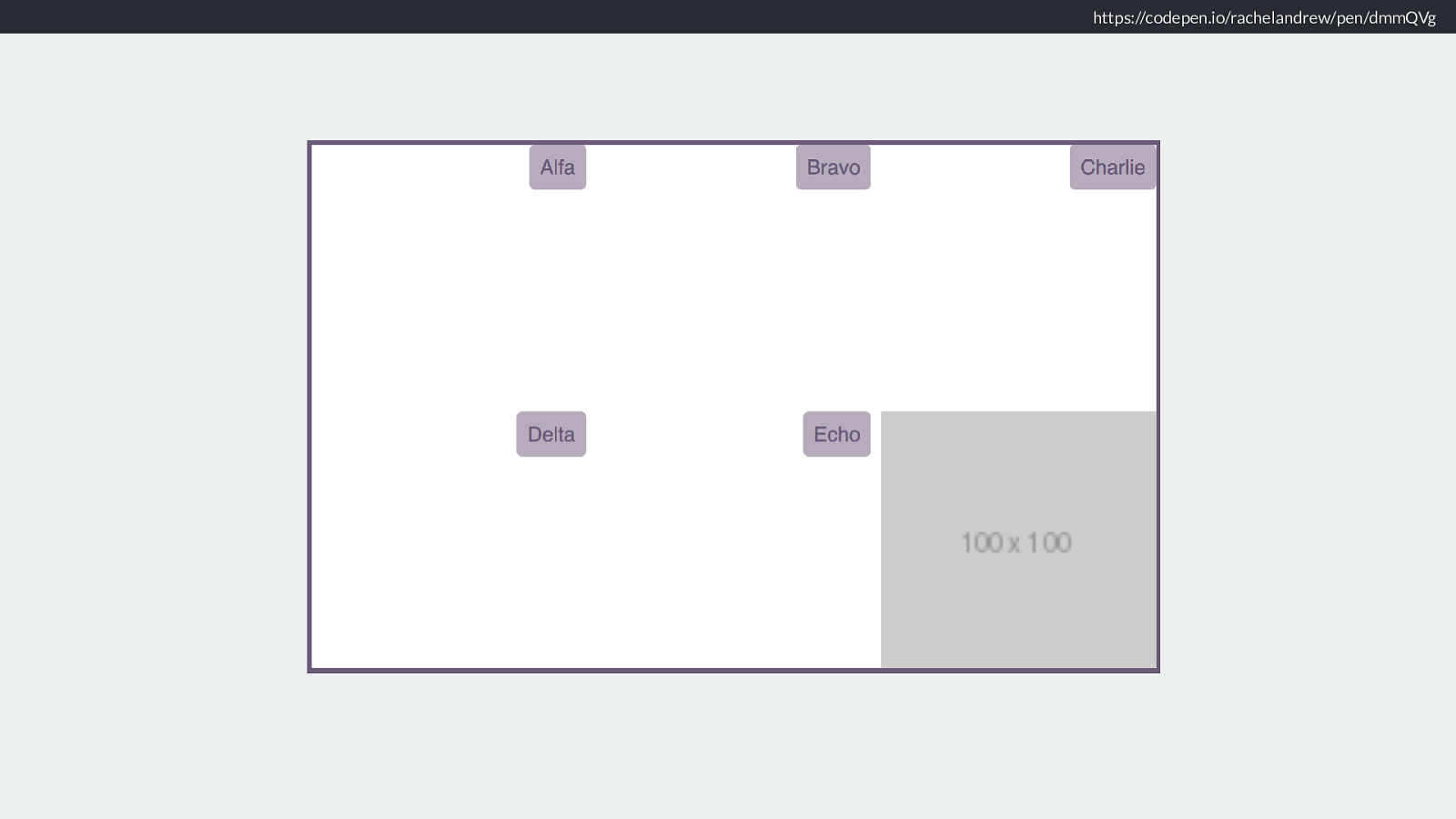
https://codepen.io/rachelandrew/pen/dmmQVg stretch stretch start start The default for align-items and justify items is stretch, unless the content has an intrinsic aspect ratio - for example an image. In which case it will be start.
This means that generally content will stretch over the area - for example a div with a background colour, will cover the entire area, but we don’t stretch images out of shape. You can of course change this and that is what our alignment properties are for.
https://codepen.io/rachelandrew/pen/dmmQVg justify-items: end Inline axis
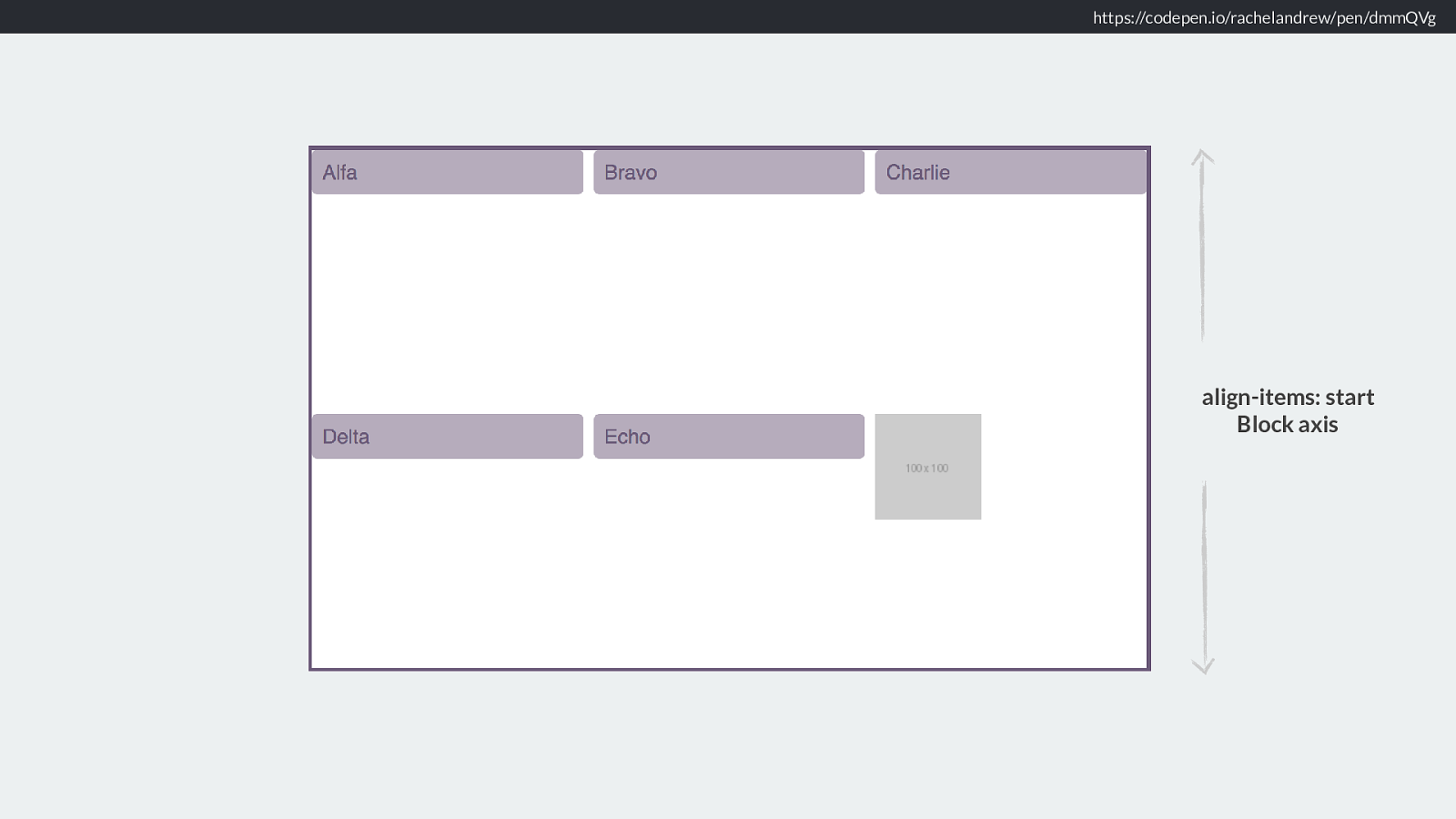
https://codepen.io/rachelandrew/pen/dmmQVg align-items: start Block axis
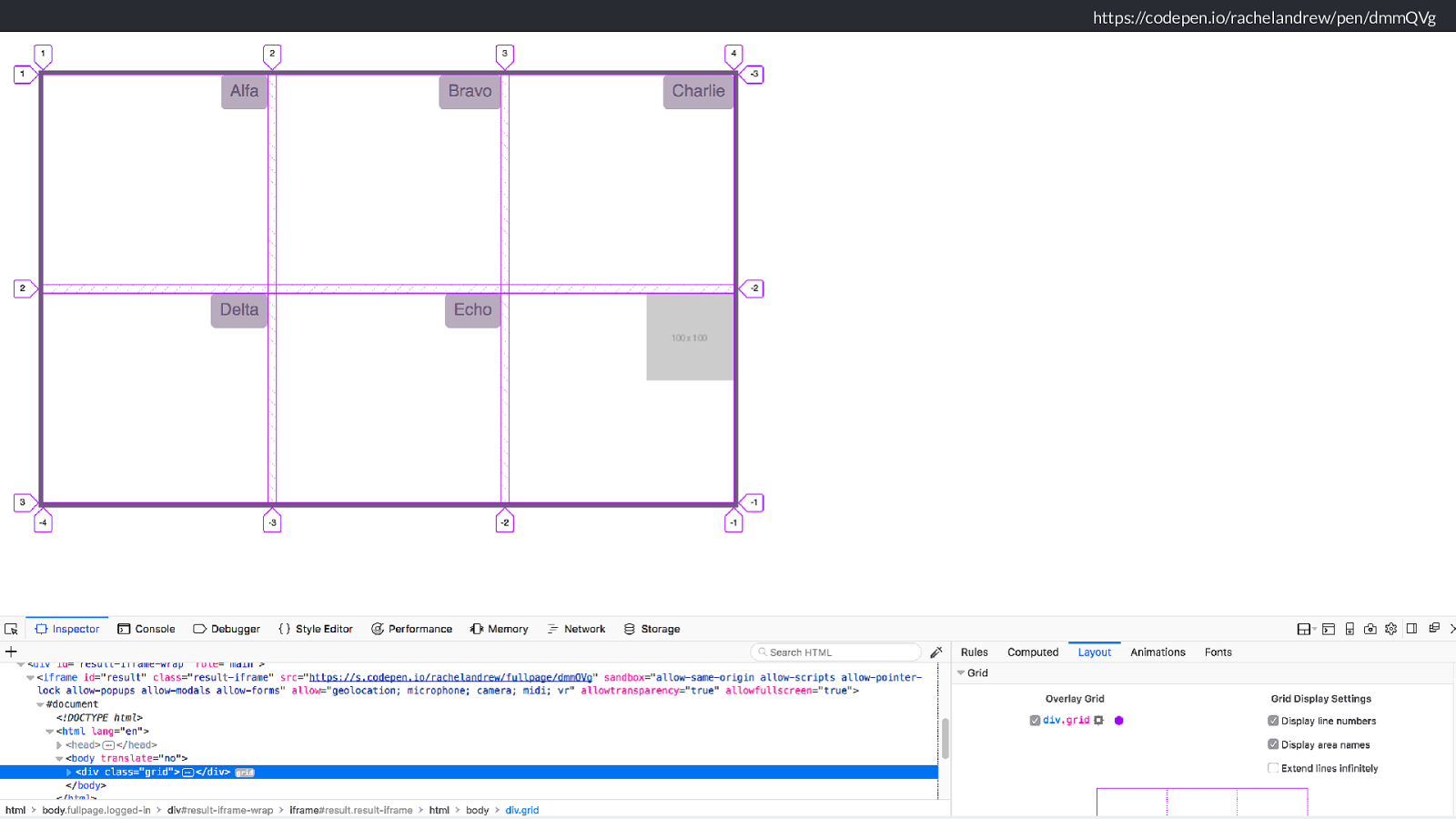
https://codepen.io/rachelandrew/pen/dmmQVg If we use the Firefox Grid Inspector you can see that the areas are still the same, it’s just the alignment of items inside them we have changed.
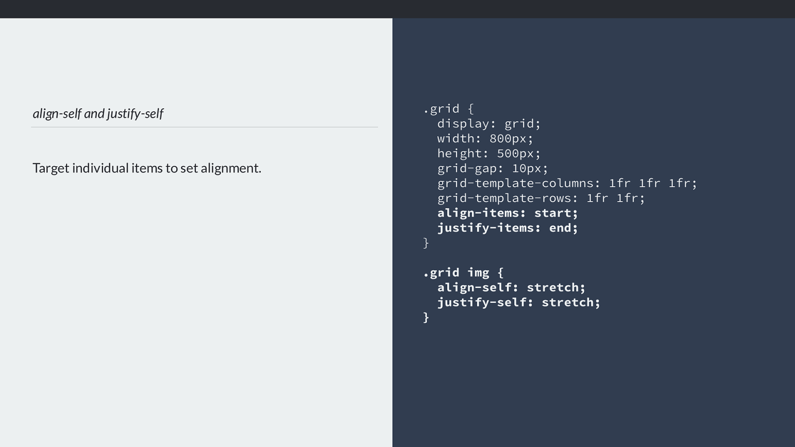
align-self and justify-self Target individual items to set alignment. .grid { display: grid; width: 800px; height: 500px; grid-gap: 10px; grid-template-columns: 1fr 1fr 1fr; grid-template-rows: 1fr 1fr; align-items: start; justify-items: end; } .grid img { align-self: stretch; justify-self: stretch; } What align items and justify items is doing is setting the Ali and justify self properties on individual items.
So if we did want that image to stretch rather than align to start, we could make it so and leave the other items alone.
https://codepen.io/rachelandrew/pen/dmmQVg Like this.
So … you have all this new ability with sizing, and all these new alignment features, all tied together with he fact that Grid layout properly respects writing modes which you can use to set languages intros writing modes, but also for creative purposes. and I hope that you understand the grid a little more. But, I wanted to finish with the thin thing I am saying a lot this year.
Please stop asking me this question. “Where is my magic Grid Polyfill? ” When I demo all of this stu ff , typically someone will ask something which is essentially - can I have a magical polyfill which will fix grid in older browsers.
The answer is no. No you can’t. Here is why.
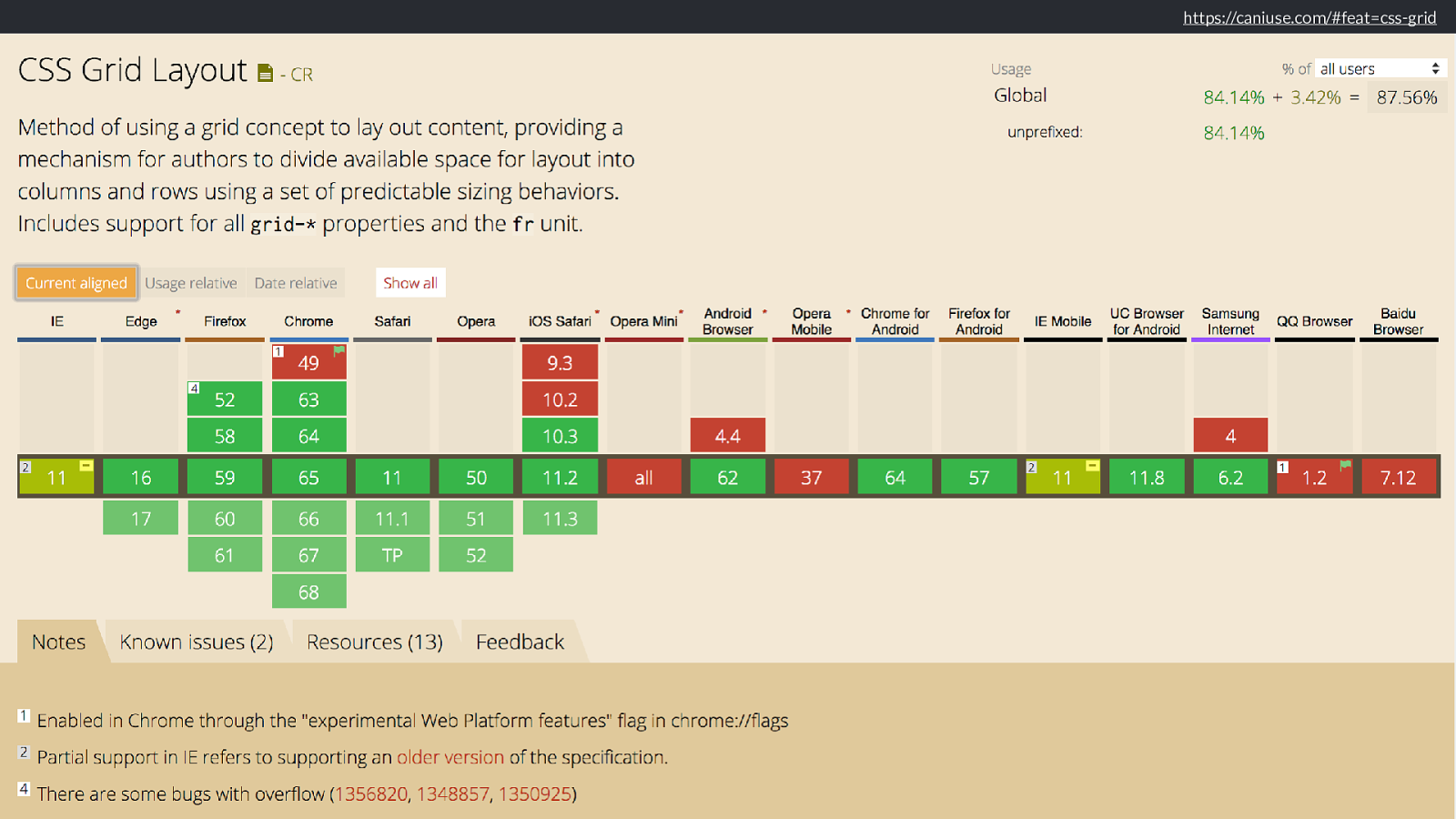
https://caniuse.com/#feat=css-grid
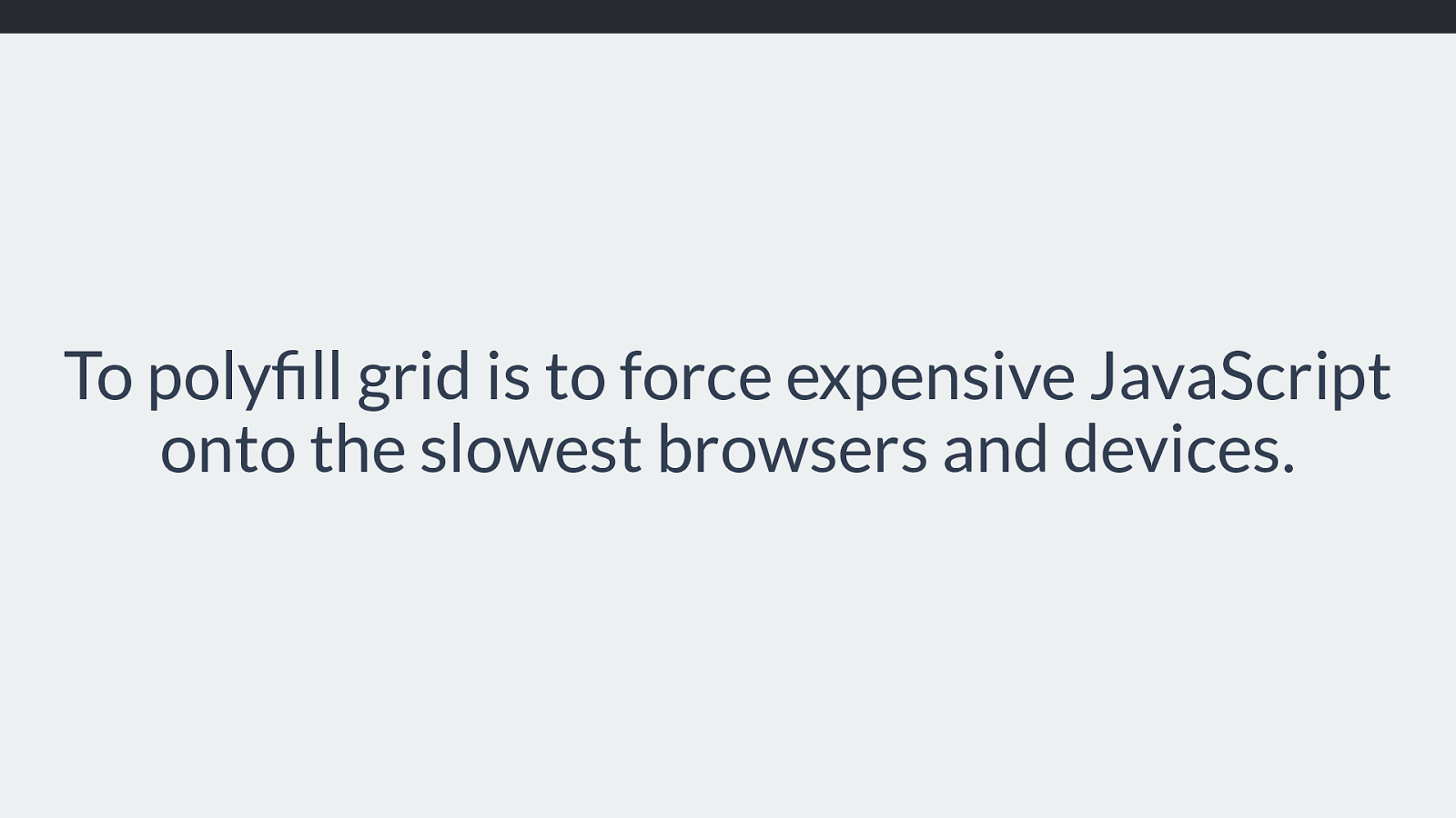
To polyfill grid is to force expensive JavaScript onto the slowest browsers and devices. The things grid is doing perform incredibly well.
What does not perform well is JavaScript attempting to do what grid is doing. This isn’t an anti-JavaScript thing, it’s just a fact.
And the browsers that don’t support grid, increasingly they are going to be browsers that can’t be upgraded due to being on old devices. So slow devices, often the user’s only access to the web, often on expensive data plans.
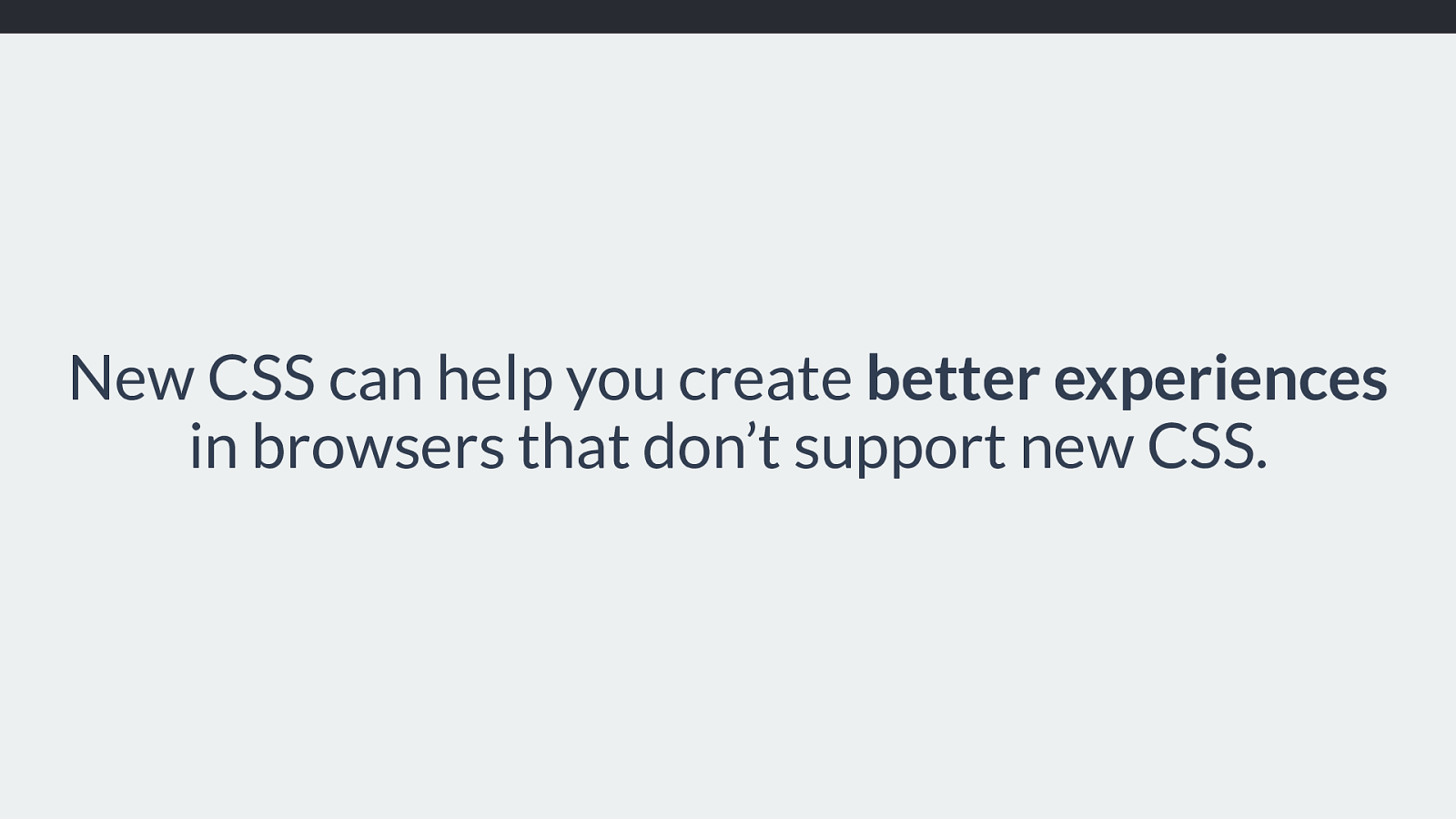
New CSS can help you create better experiences
in browsers that don’t support new CSS. By being amazingly lightweight in terms of required CSS, in addition to not requiring wrapper elements around each row, grid can enable you to make a better experience for people who don’t even support grid.
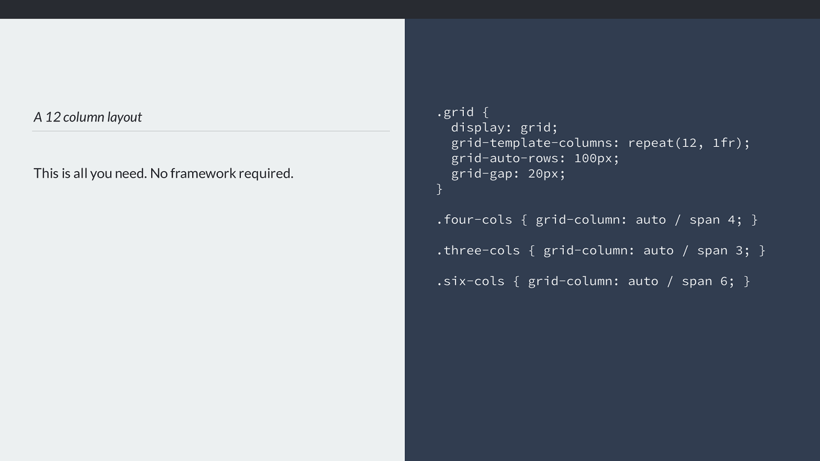
A 12 column layout This is all you need. No framework required. .grid { display: grid; grid-template-columns: repeat(12, 1fr); grid-auto-rows: 100px; grid-gap: 20px; } .four-cols { grid-column: auto / span 4; } .three-cols { grid-column: auto / span 3; } .six-cols { grid-column: auto / span 6; } The grid layout that allows a 12 column, flexible layout with all boxes in a row as tall as each other is four lines of code, plus a line of code for each unique positioned item. You can a ff ord for those few lines of code to be downloaded by a browser that won’t parse them due to not supporting grid.
New CSS knows about old CSS And we don’t need to leave older browsers with no layout you can create fallbacks just using CSS for those older browsers.
Because n ew CSS knows about old CSS.
This lets you b uild a simpler, yet still usable layout for your old browsers, and your non-supporting browsers.
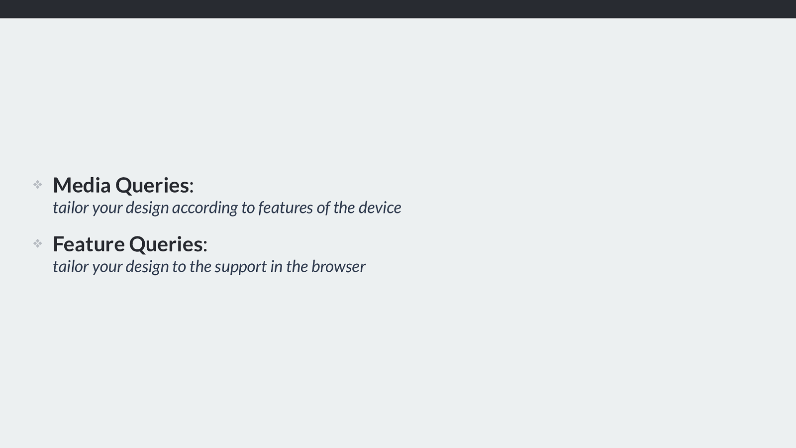
❖ Media Queries : tailor your design according to features of the device
❖ Feature Queries : tailor your design to the support in the browser Just as you build a layout tailored to small screen devices by using media queries, you can build a layout tailored to your non-grid supporting browsers using Feature Queries.
It’s the same thing. We’re providing good experiences to users no matter whether they are accessing content on a low-powered phone, an iPhone 10, a small laptop, or a top of the line Mac or Windows machine.
See these things as the same, what features does this device have, what features doe this browser have?
https://codepen.io/rachelandrew/pen/aqbdOy
By considering what happens if our user has almost nothing, we structure our content well. If that content then just loads in block layout, one thing after another. That will actually be pretty good for most small screen devices anyway, certainly better than a horrible janky experience of trying to create something else using JavaScript.
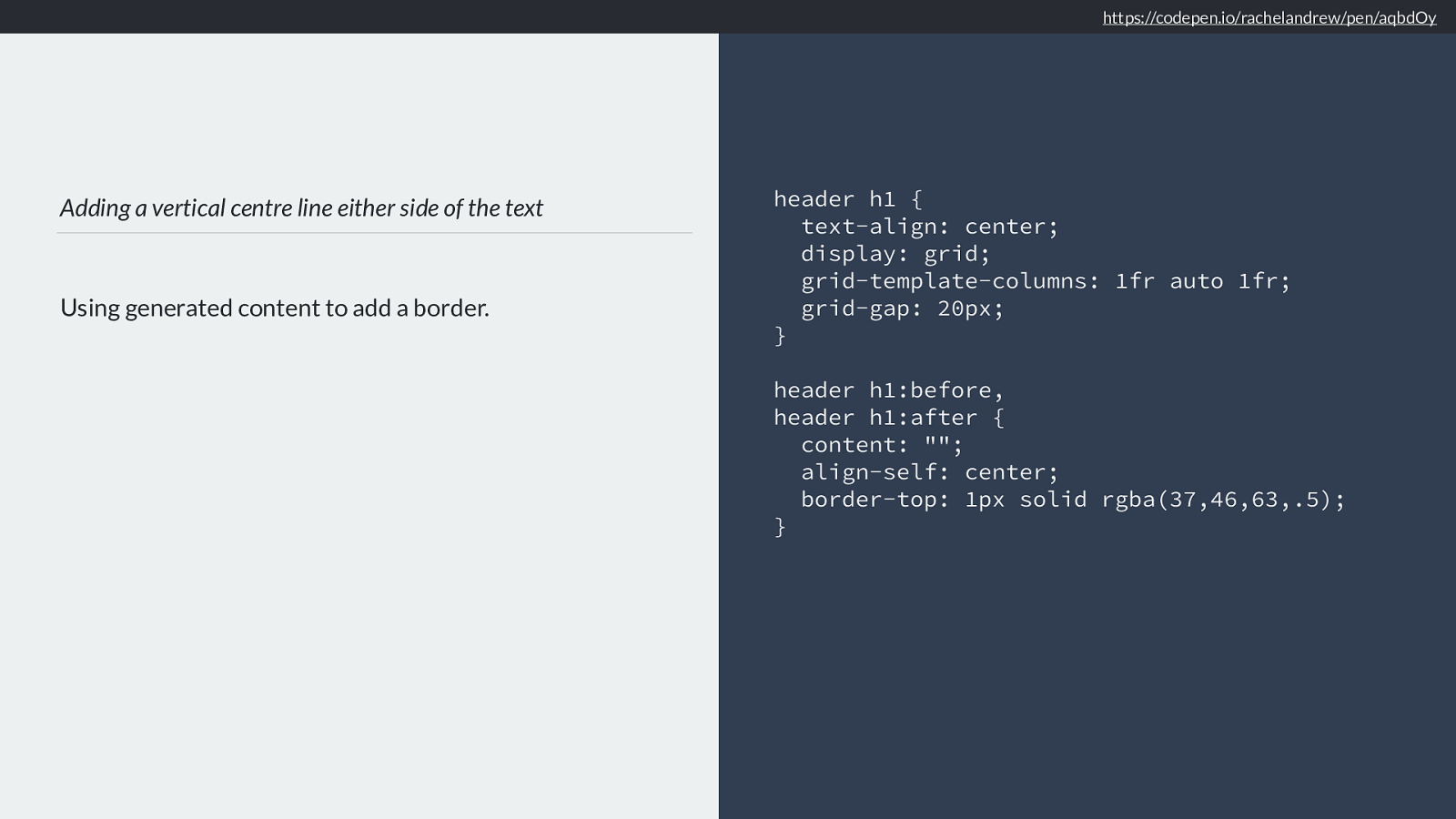
Adding a vertical centre line either side of the text Using generated content to add a border. header h1 { text-align: center; display: grid; grid-template-columns: 1fr auto 1fr; grid-gap: 20px; }
header h1:before, header h1:after { content: ""; align-self: center; border-top: 1px solid rgba(37,46,63,.5);
} https://codepen.io/rachelandrew/pen/aqbdOy
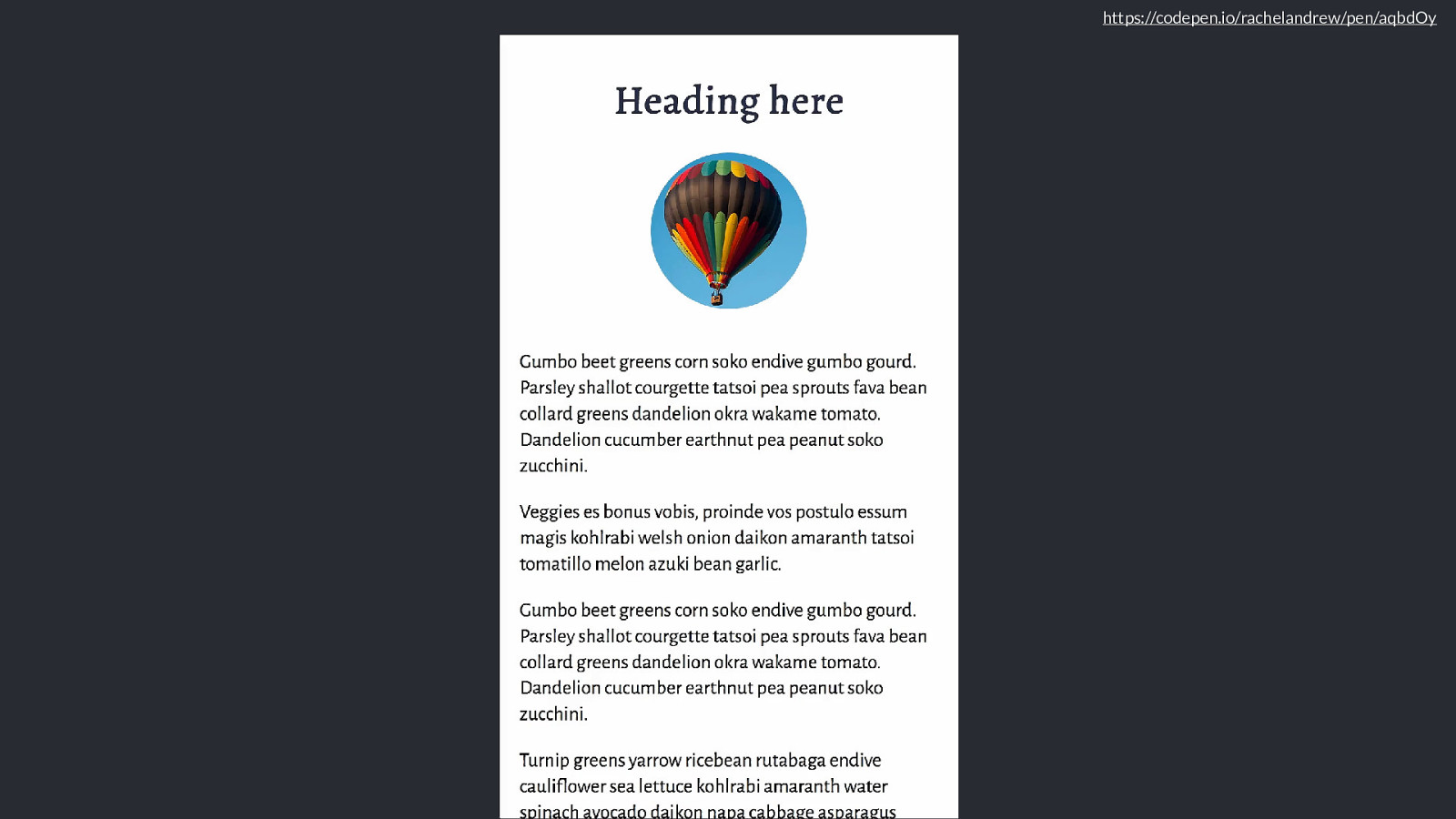
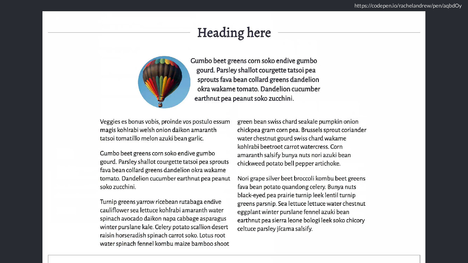
Perhaps that small device does have CSS Grid, I’m going to add a little header detail with one of my favourite tricks.
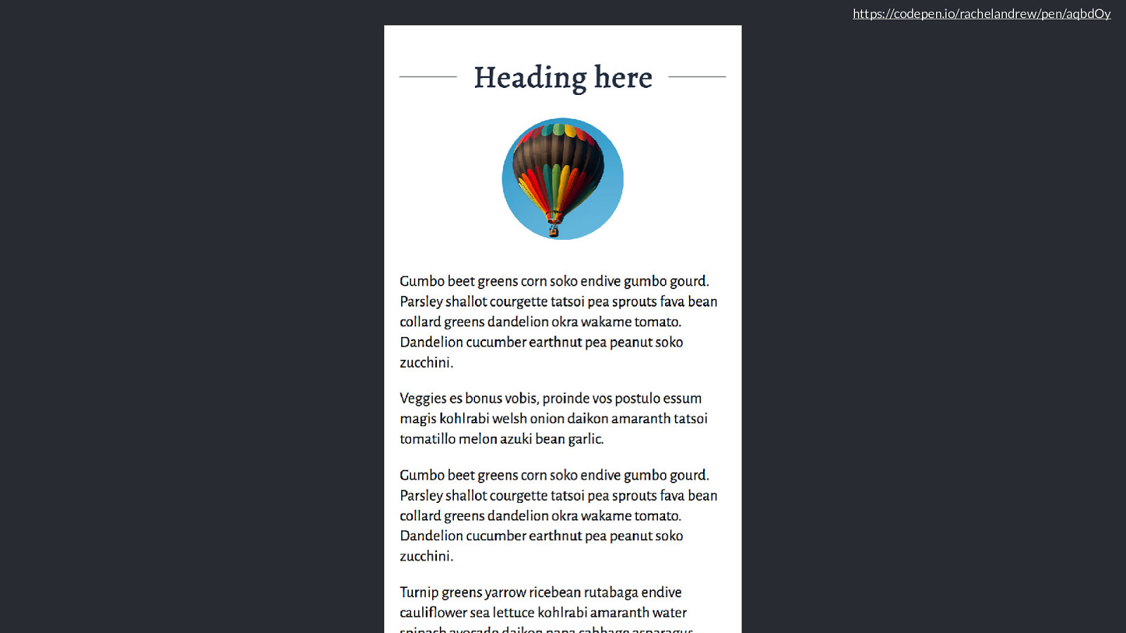
https://codepen.io/rachelandrew/pen/aqbdOy
So this looks nice in a grid supporting browser.
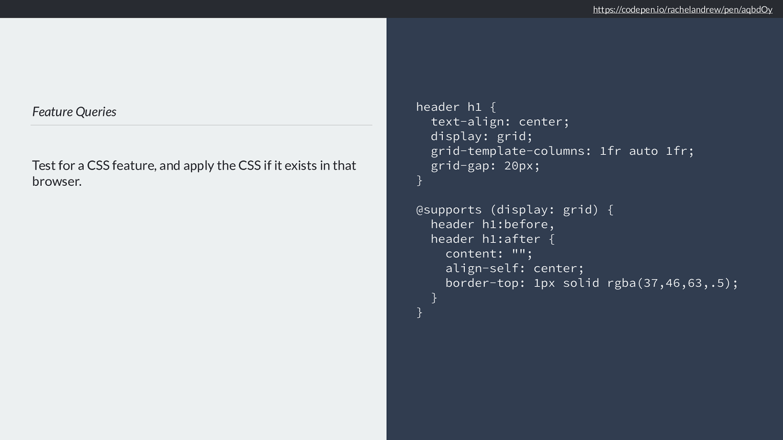
Feature Queries Test for a CSS feature, and apply the CSS if it exists in that browser. header h1 { text-align: center; display: grid; grid-template-columns: 1fr auto 1fr; grid-gap: 20px; }
@supports (display: grid) { header h1:before, header h1:after { content: ""; align-self: center; border-top: 1px solid rgba(37,46,63,.5); } } https://codepen.io/rachelandrew/pen/aqbdOy
I’ve not had an issue with the generated content appearing in a non-grid supporting browser, as we’re using a border top on some content that has no width, it’s the fr units that cause it to stretch in the inline direction once we are in a grid layout. However, if you were adding something that would display - for example using generated content to insert an icon, or an emoji or something, you could wrap the generated content bit in a feature query.
So I’m checking with the browser if it supports the display property with a value of grid. That way we only generate the borders if we have grid layout to position them.
We don’t need to worry about browsers that don’t support grid reading the grid CSS, they just ignore it. You could wrap the whole lot in a feature query if you wanted - but there is no need to.
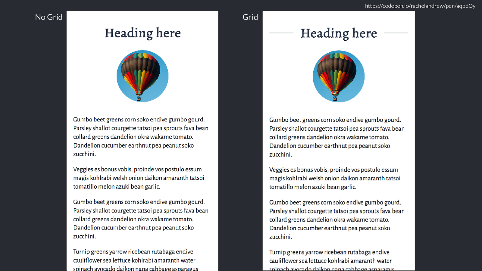
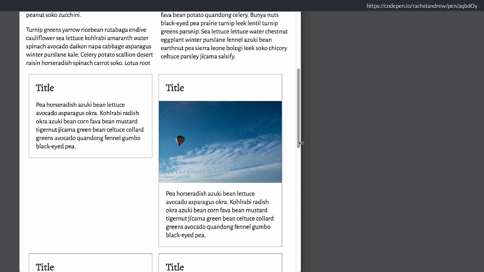
https://codepen.io/rachelandrew/pen/aqbdOy No Grid Grid So we have mobile with no grid, mobile with grid
And this image here
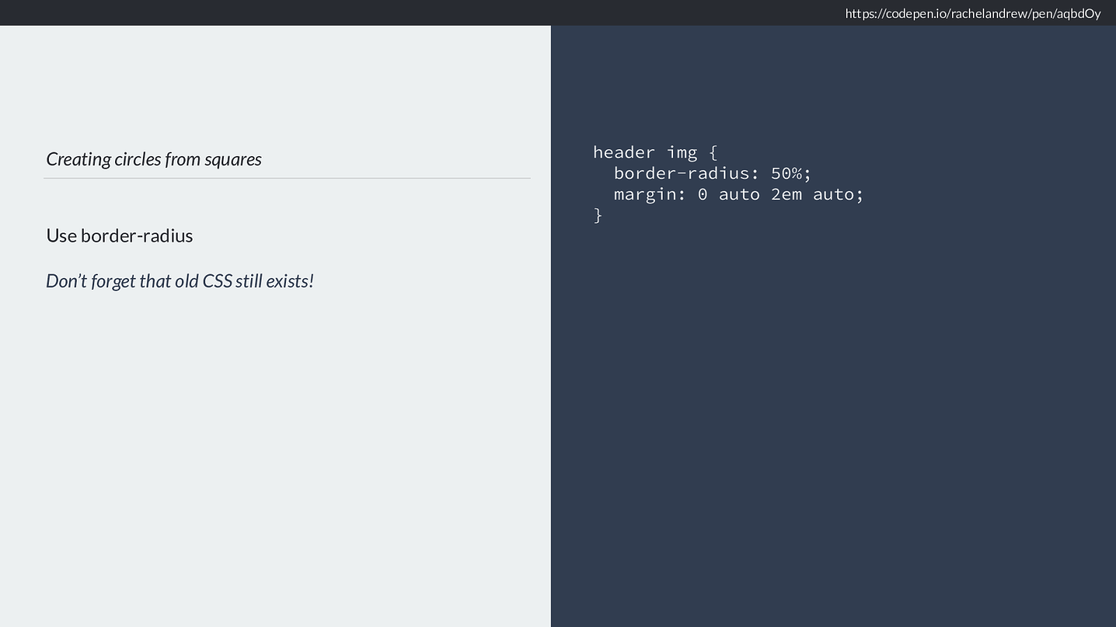
Creating circles from squares Use border-radius Don’t forget that old CSS still exists! header img { border-radius: 50%; margin: 0 auto 2em auto; } https://codepen.io/rachelandrew/pen/aqbdOy Nothing fancy, it’s a square image I turned into a circle using border-radius, that’s really well supported/
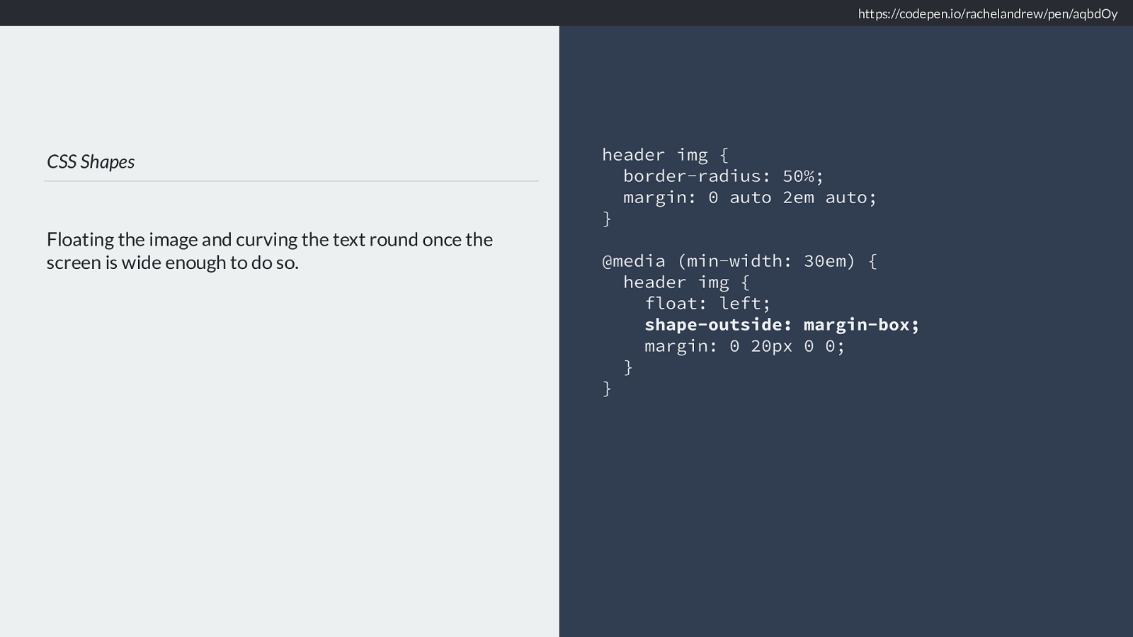
CSS Shapes Floating the image and curving the text round once the screen is wide enough to do so. header img { border-radius: 50%; margin: 0 auto 2em auto; }
@media (min-width: 30em) { header img { float: left;
shape-outside: margin-box;
margin: 0 20px 0 0;
} }
https://codepen.io/rachelandrew/pen/aqbdOy As we get a bit wider, I’d like to do something neat with it. I’ll float it left and cause the text to curve round it by using shape-outside margin-box.
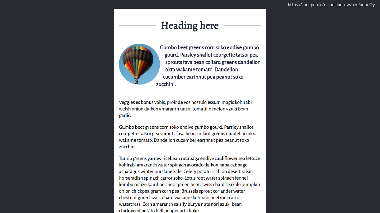
https://codepen.io/rachelandrew/pen/aqbdOy Like this. And it doesn’t matter about browsers that don’t support CSS Shapes because they just ignore it, and
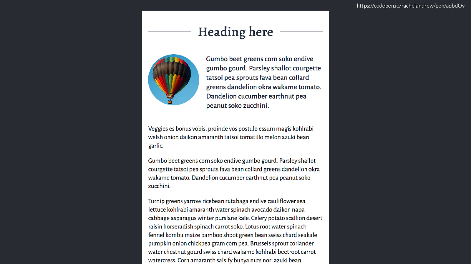
https://codepen.io/rachelandrew/pen/aqbdOy because it is applied to a float, we get squared o ff text rather than the curved text.
THis is Firefox, who currently don’t support shapes, but will do later this year as I understand it. So once that feature ships in Firefox, those users will get the nice curve.
https://codepen.io/rachelandrew/pen/aqbdOy We start to get wider.
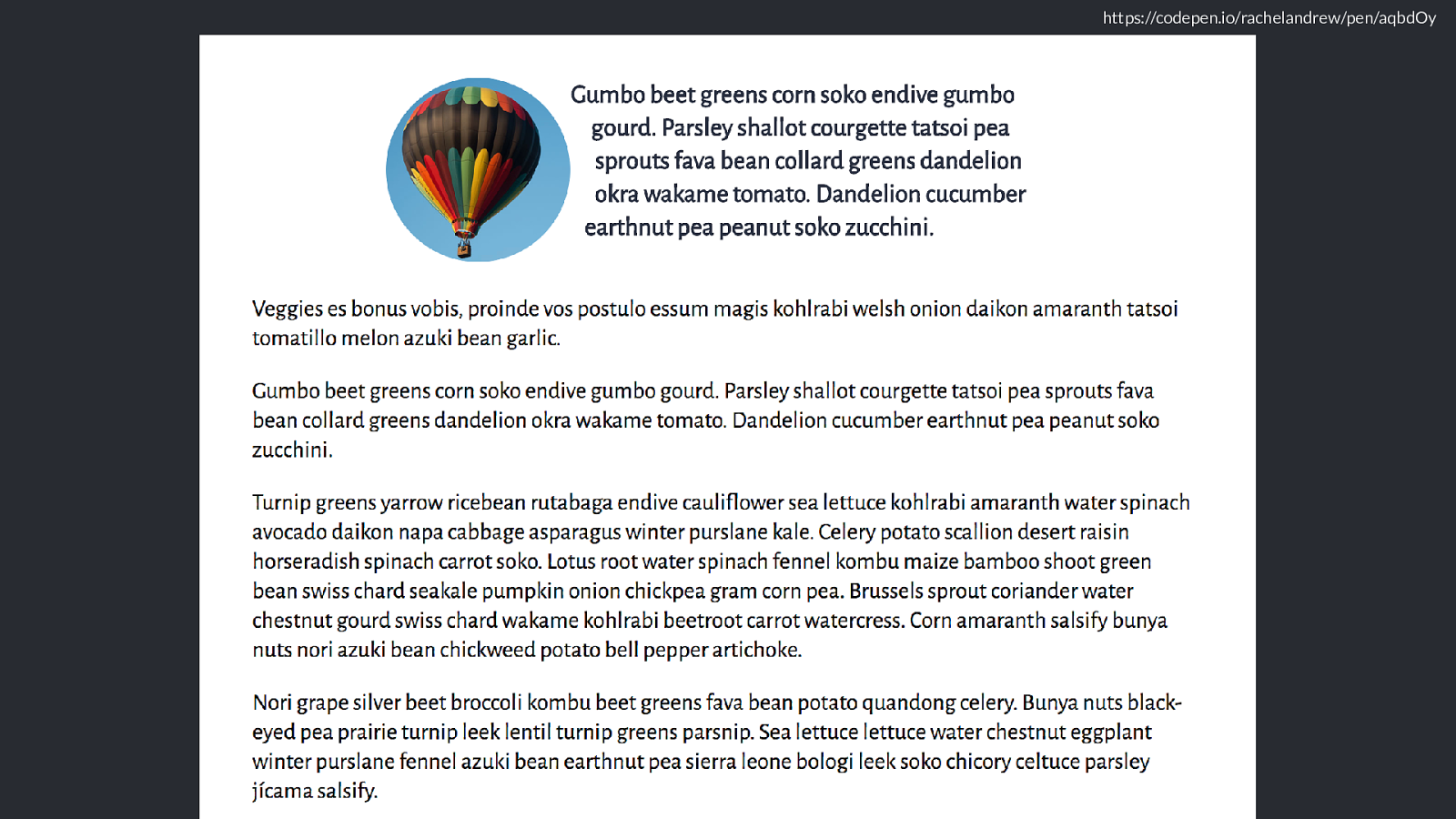
I then have this section, which is a chunky block of text.
which I’d like to break into two columns. As the co-editor of the multiple column layout spec I have to put a little bit of multi col somewhere, and the nice thing with multicol is it’s really well supported.
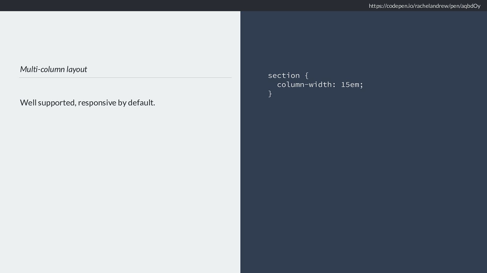
Multi-column layout Well supported, responsive by default.
section { column-width: 15em;
} https://codepen.io/rachelandrew/pen/aqbdOy Let’s do column-width 15em, so we’ll only get two columns when the available space is wide enough to support them.
The problem with multicol is if someone is on a very short screen, a phone in landscape mode perhaps they might end up scrolling up and down to read. So let’s use a vertical media query checking for height.
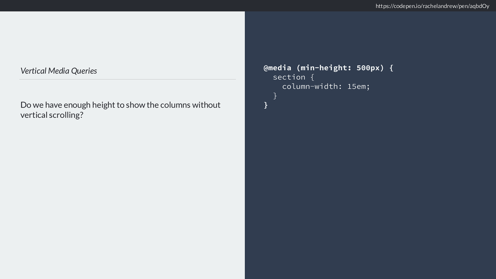
Vertical Media Queries Do we have enough height to show the columns without vertical scrolling? @media (min-height: 500px) { section { column-width: 15em; } } https://codepen.io/rachelandrew/pen/aqbdOy Then we only get the columns if we have enough height. These vertical media queries can be really useful, we tend to always think about screen width - sometimes height is the important metric.
https://codepen.io/rachelandrew/pen/aqbdOy We get this, the columns only kick in once there is enough room for 2 15 em columns so we don’t need a width media query, and the height media query stops them showing on short screens. [click]
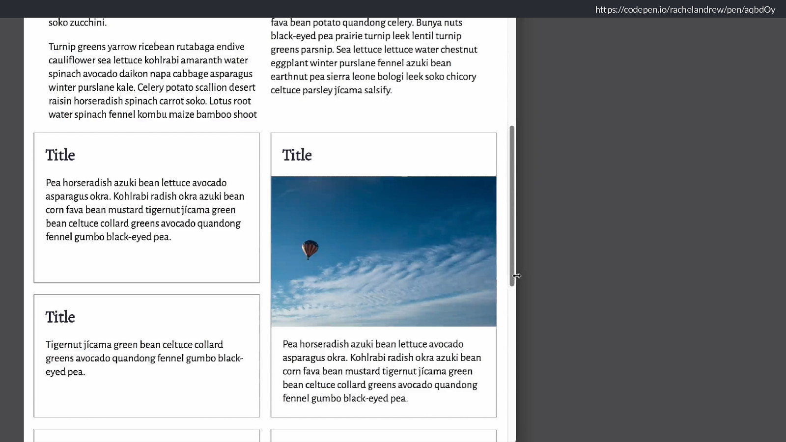
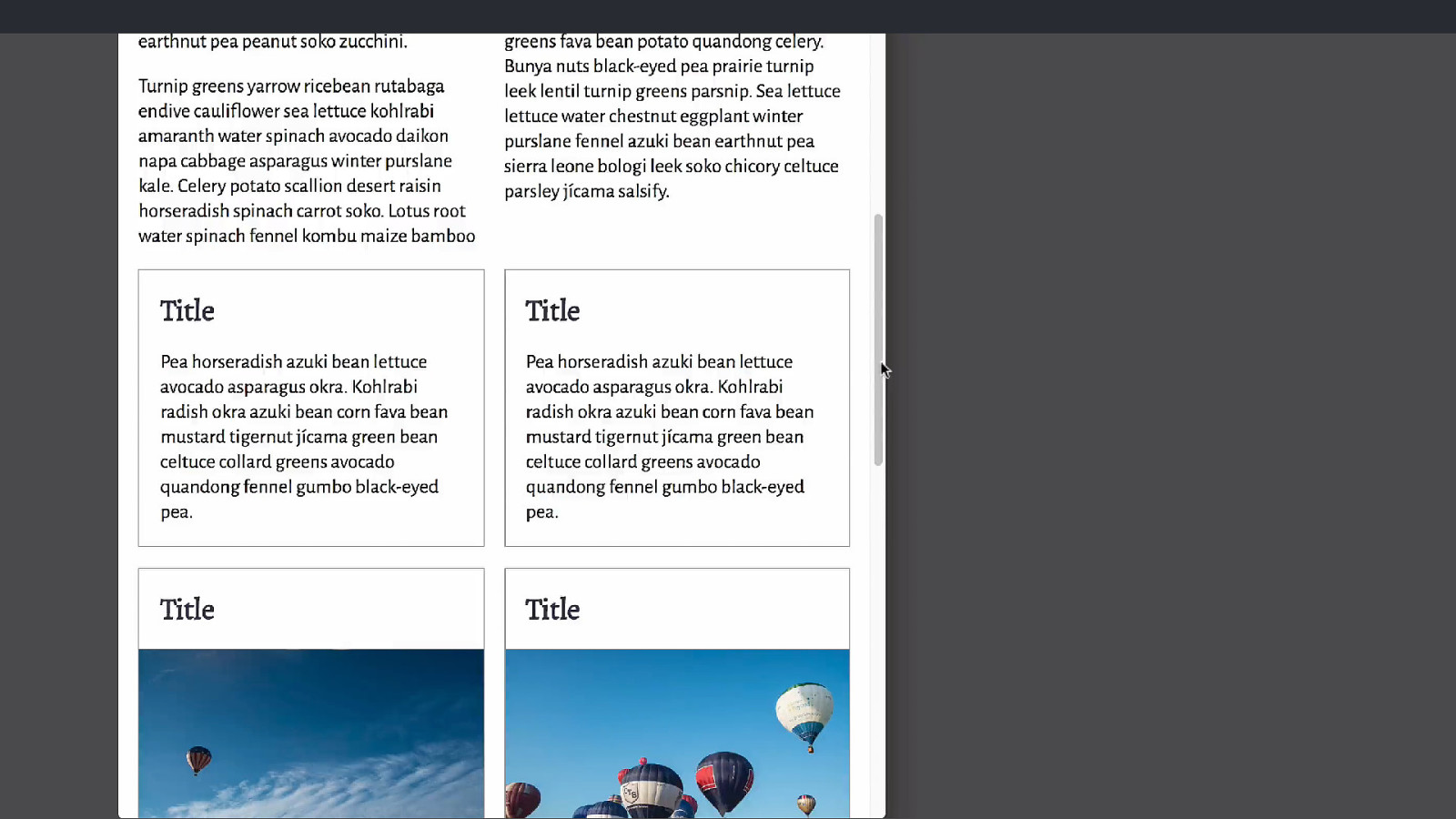
To finish o ff my article component I want to do something with the cards at the bottom of the layout now we have some room for them to display more than 1 in a row.
and finally I want to arrange those boxes into a grid, which lines up with my columns and where I can cause the cards which have an image to span two rows of the grid.
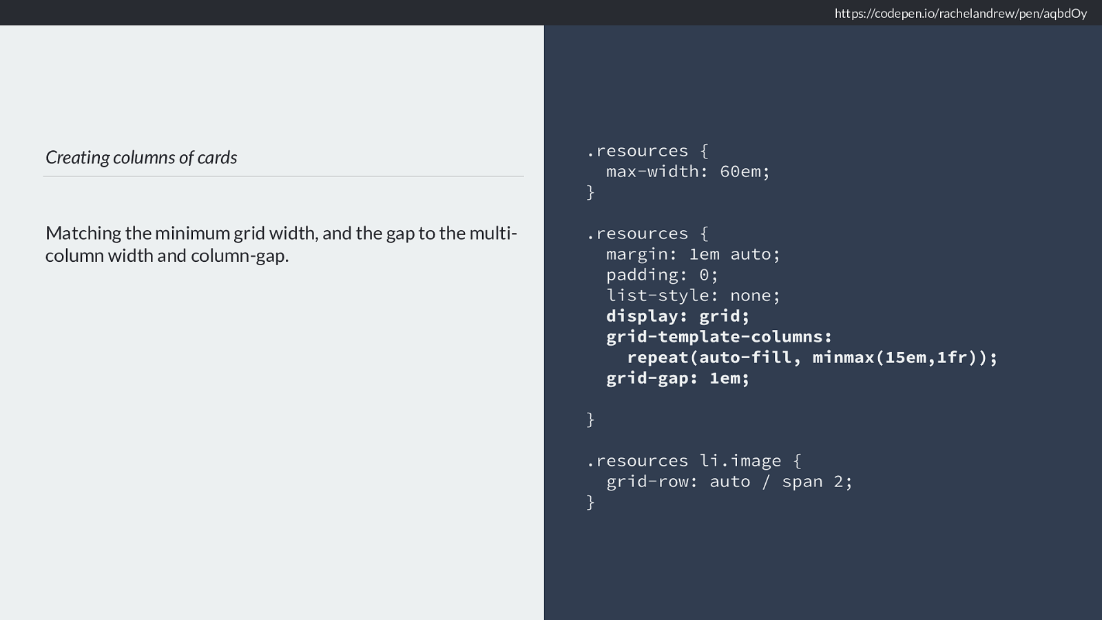
Creating columns of cards Matching the minimum grid width, and the gap to the multi- column width and column-gap. .resources { max-width: 60em; }
.resources { margin: 1em auto; padding: 0; list-style: none; display: grid; grid-template-columns:
repeat(auto-fill, minmax(15em,1fr)); grid-gap: 1em;
}
.resources li.image { grid-row: auto / span 2; } https://codepen.io/rachelandrew/pen/aqbdOy I’m setting resources to max-width 60 em and then using the grid auto-fill functionality to fill that container with columns which are a minimum of 15em. This means we only get more than one column over 15em, enough room for 2 15em columns plus the gutter we get two, and we max out with three.
If we have two columns they line up with the multicol element due to grid-gap being 1em which is the default column gap for multicol.
https://codepen.io/rachelandrew/pen/aqbdOy Of course this will only work for people with grid. So we need to make a decision about non-grid browsers. You could of course leave it alone. Or we can choose some other method. Let’s try display inline-block.
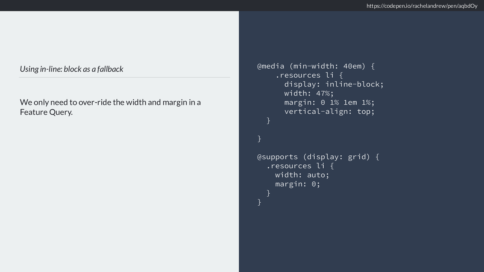
Using in-line: block as a fallback We only need to over-ride the width and margin in a Feature Query. @media (min-width: 40em) { .resources li { display: inline-block; width: 47%; margin: 0 1% 1em 1%; vertical-align: top; }
}
@supports (display: grid) { .resources li { width: auto; margin: 0; } } https://codepen.io/rachelandrew/pen/aqbdOy
https://codepen.io/rachelandrew/pen/aqbdOy And we get this,
Using inline -block means that our cards still run left to right. An alternative if it is ok for the cards to display down the columns rather than along the rows would be to use multicol here just like we do in the first section.

Using multi-column layout as a fallback
We don’t need to override the column-* properties. They
are ignored once we are in grid layout.
@media (min-width: 40em) {
.resources {
column-width: 15em;
}
.resources li {
break-inside: avoid;
}
}
Here is a multi example
So this is another option.
The reason I’m showing this today though isn’t so much to show you how to do fallbacks with grid layout, though there are a few tips in there you might find handy. It’s because I need you to realise how little you need do achieve a good experience for all your users.
As you develop your site, think of this stu ff component by component. It’s a lot easier than worrying about the whole site or application at once.
We can achieve a lot with a little CSS. The key thing is that to create a component that works in all these cases, from small to large screens from browsers without grid, to those without shapes to those with everything needs trivial amounts of code . Without needing to ask those on the most limited devices to download JavaScript that also causes a janky experience.

Before worrying if a technique performs well, ask yourself if you need it at all. In the drive to try and make new techniques look the same in old browsers we can start to do things that cause a suboptimal experience for the very users we claim to be trying to help by addin gthe polyfill.
Reframe the browser support conversation. Reframe the discussions you have around browser and device support with your clients or colleagues. It should never be “how do we make this look the same in all browsers” but “how do we give a good experience in all browsers”.
Don’t worry about making their experience the same.
Make their experience good.

We have the tools to provide great experiences for everyone. We are in a better position now to provide great experiences to everyone than we ever have been. Don’t let lack of support hold you back from realising amazing designs or great experiences for the people who have support for this stu ff , but likewise don’t let all the shiny mean you forget about those who don’t yet have it.
It’s become a bit of a trite thing to say for conference stages that the web is for everyone, but I truly believe that. I’m not here to build shiny toys for rich people, and even with the way in which this medium has been used for some not great things of late, I still believe in the power of the web to change lives, allow content to be accessed and ideas shared.
https://rachelandrew.co.uk/speaking/event/seattle-wp-2018
Thank you! @rachelandrew https://rachelandrew.co.uk