Grid, content re-ordering and accessibility
Rachel Andrew : https://noti.st/rachelandrew

A presentation at axe-con 2021 in March 2021 in by Rachel Andrew
Rachel Andrew : https://noti.st/rachelandrew
I’m a web developer who cares, and I’m learning just as much as those of you watching today. And I think that has to be the case for all of us, no matter how expert we think we are because things are always evolving.
That’s really where I start today, with the fact our layout systems are changing and we need to learn the implications of that - good and bad. So this talk is mostly me speaking my brains about an issue that I can see becoming an increasing one. I want more people to talk and think about the potential issues of new layout so we can fix them.
Today I’m going to talk about the accessibility issues raised by new layout. How we can avoid them in our own work. Consider how the platform could evolve to help.
One of the first things that I thought was really exciting about grid was it really does give us a proper separation of content and presentation. Which was something we used to go on about back in the earliest days of CSS Layout.
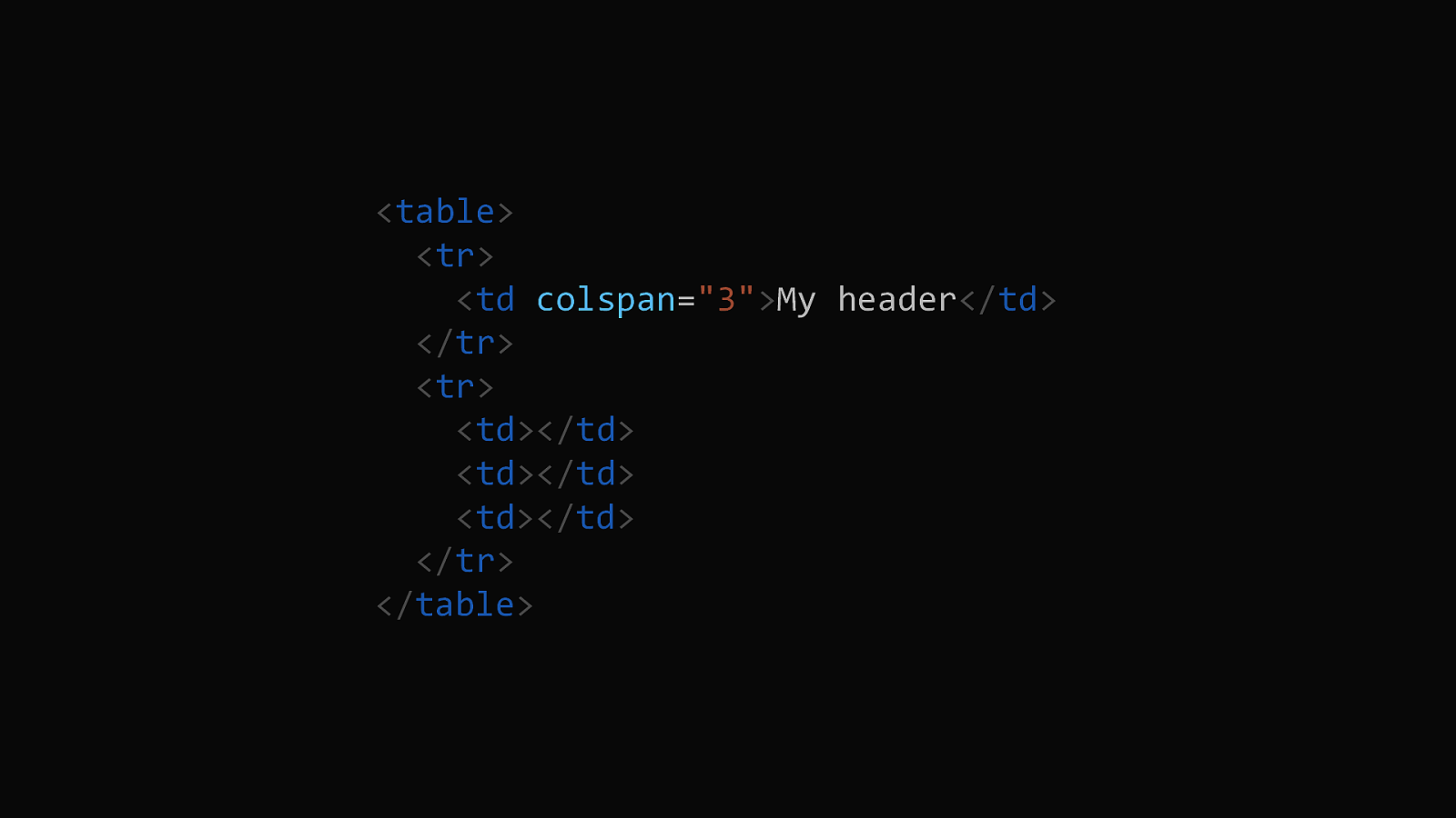
If you used a table for layout, you were making decisions about layout in markup. If I had a table with three columns for my site, and a header that should span all of those columns, then I added colspan="3" to make it so. Even worse, tables for layout, in particular once we were nested tables into table cells and fragmenting content between them, could be inaccessible to screen readers. To anything that didn’t understand the layout, content was arbitrarily broken up.
6
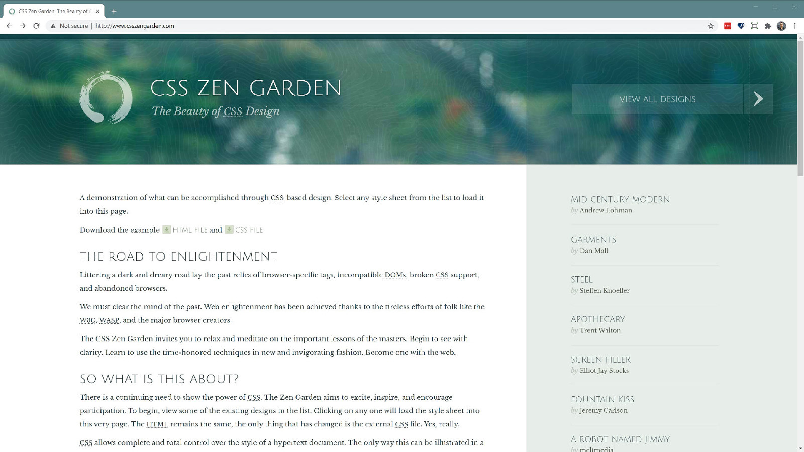
CSS Layout exponents, of which I was one, talked about separating content and document structure from presentation. With the launch of the CSS Zen Garden this idea became somewhat mainstream, the web moved away from tables as the primary layout mechanism slowly but surely. However, while sites like the CSS Zen Garden showed that one document could be presented in various different ways. Ultimately layout was somewhat tied to the document structure. 7
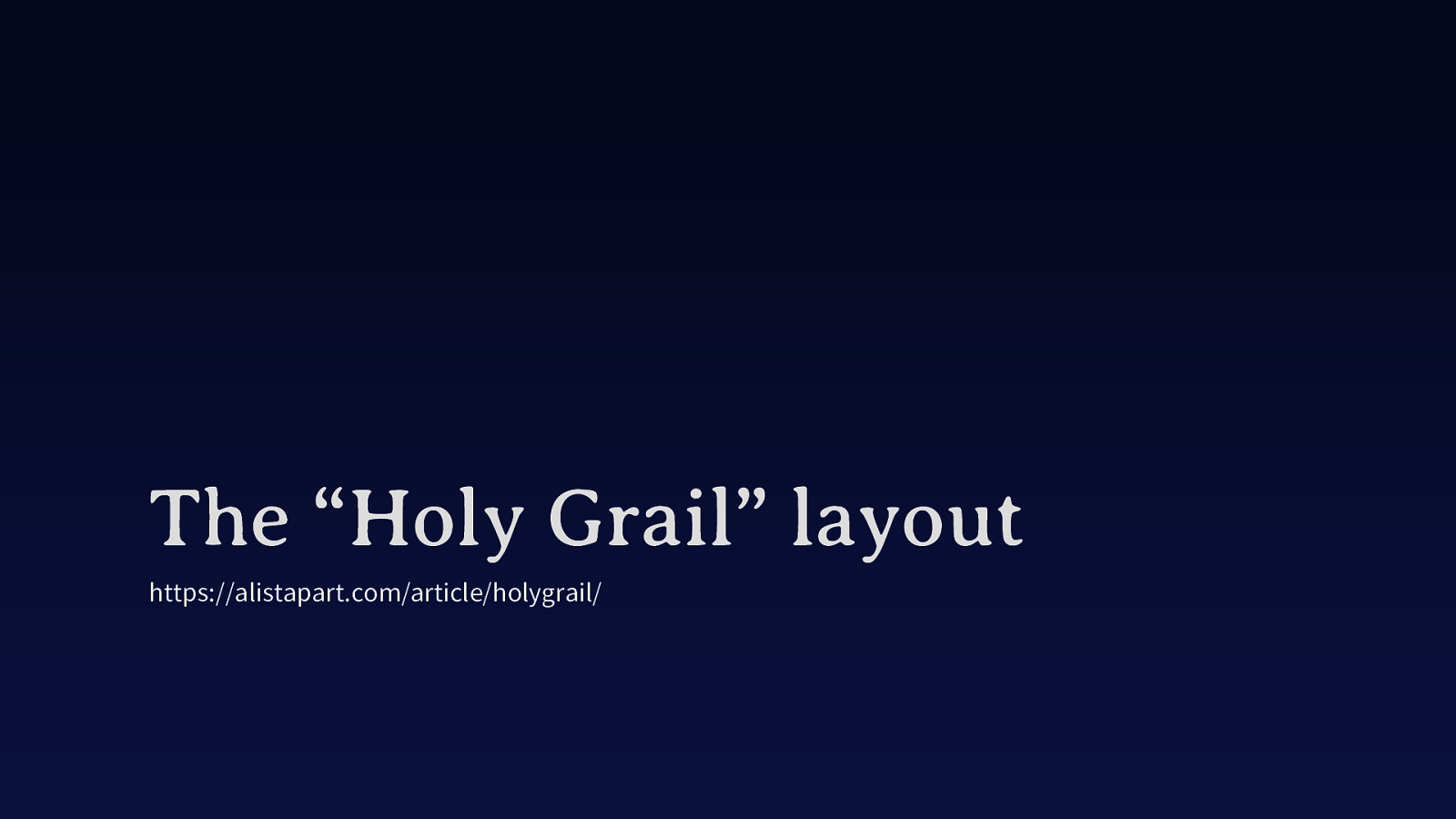
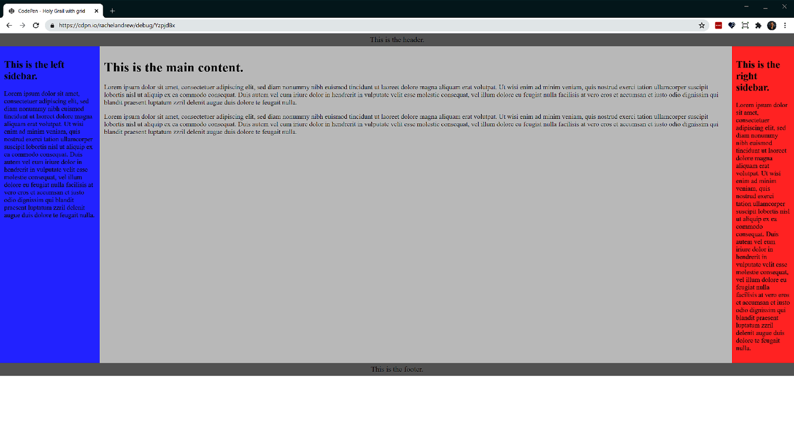
The “Holy Grail” layout described a three column layout, with the columns being able to be in any order in the markup. It was pretty tricky to achieve.
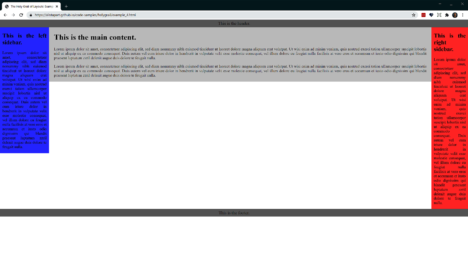
Here is a screenshot of the demo from the A List Apart article, showing a three column layout with two fixed width columns and a flexible central area.
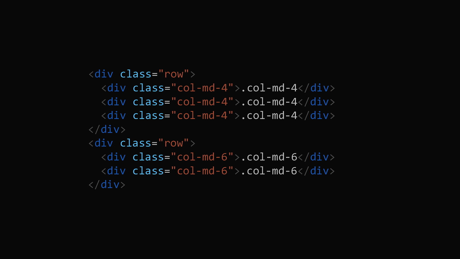
Many of us have been using float-based column systems before grid and flexbox showed up. These things were very much tied to their markup. Here is the markup of a row using the Bootstrap float-based grid. Each item here is constrained within a containing row, and due to the fact you can only float left or right, the items tend to stay roughly in source order.
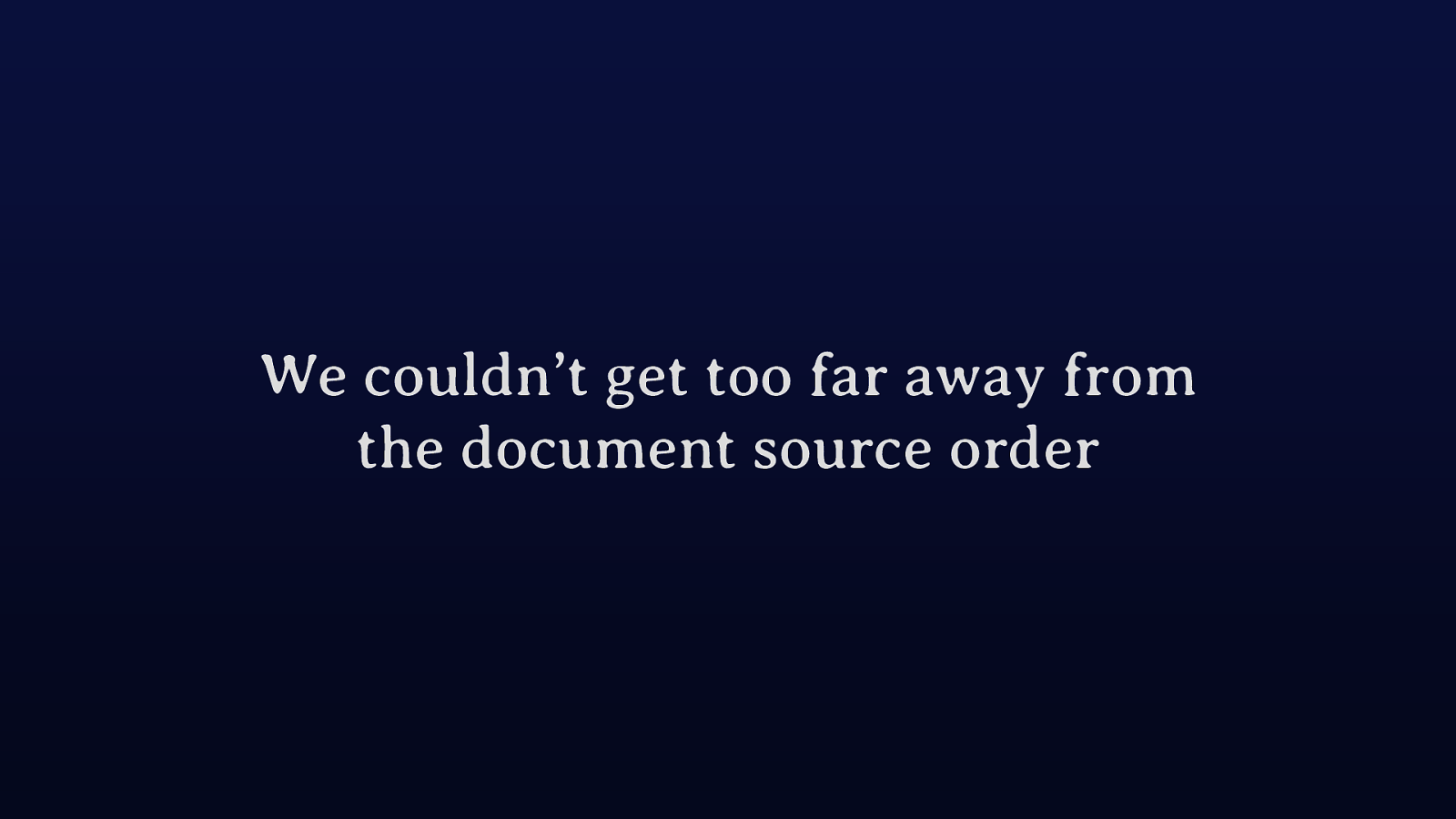
And in a way this wasn’t a bad thing. The fact that we couldn’t easily move too far away from document structure stopped us all making a right old mess. The only real way to move an item completely away from where it sat in the document, was to use absolute positioning. And, it isn’t possible to build an entire layout in a robust way by positioning everything so we didn’t tend to head down that path.

All we had was normal flow and the ability to take things out of that flow. Because pretty much everything was in flow, the design flowed along with the content and we couldn’t jumble it up too much. However now we really can have a layout which is separate from the content, we can re-order things at different breakpoints. The restriction of source order affecting layout is gone. We can now switch those columns around any way we want.
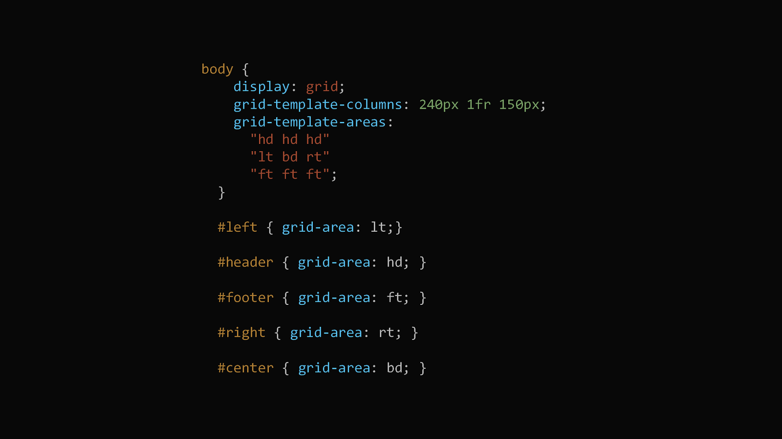
Here is the CSS needed to do the Holy Grail layout with grid, no hoops are needed to be jumped through to make this work.
And we get full height columns in the grid version shown in this screenshot, something impossible in the original version. A huge limitation has gone.
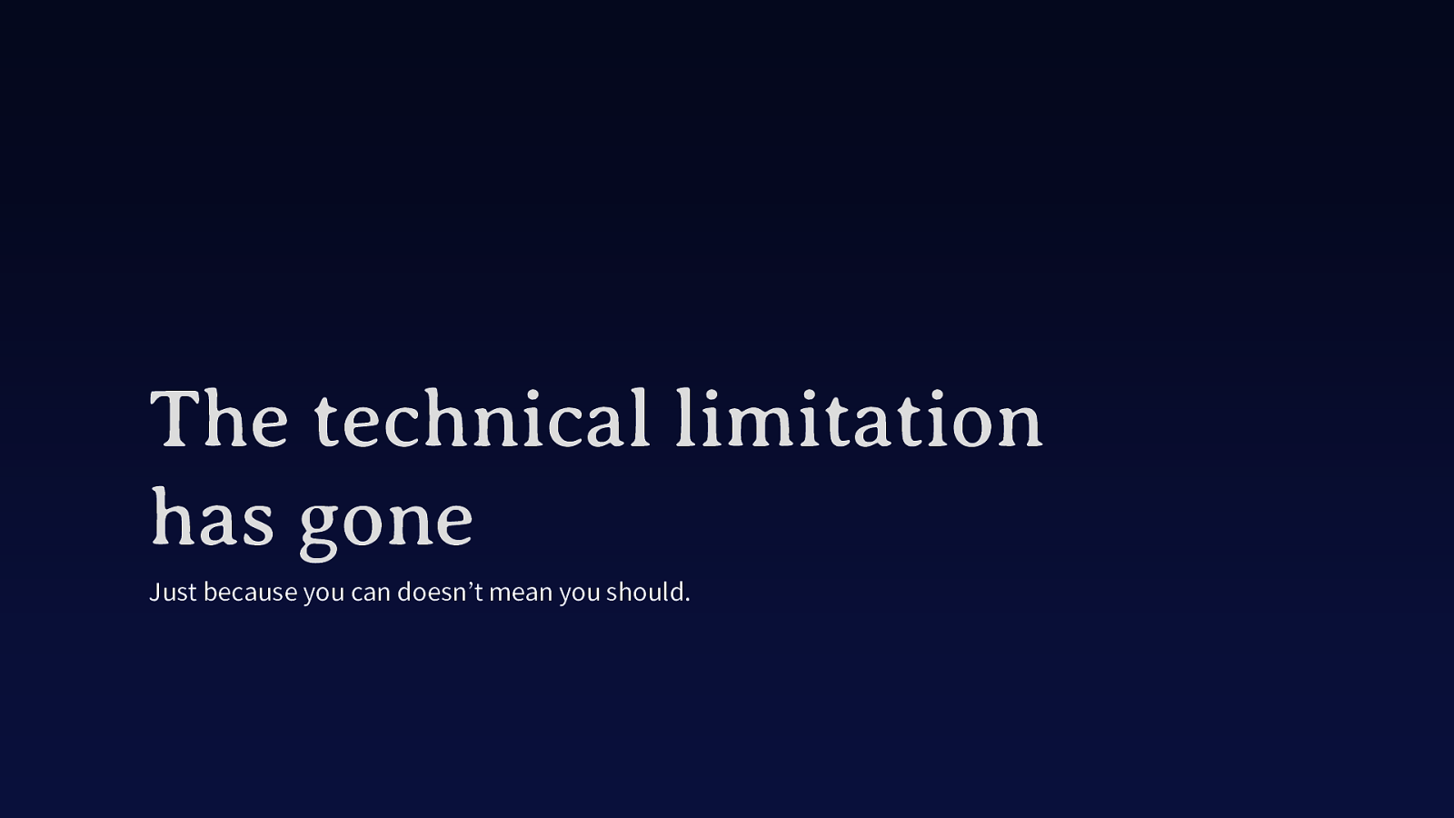
The limitation has technically gone. However, in terms of accessibility it still exists. Like many things on the web, just because you can do it doesn’t mean you should. And, disconnecting your visual display from the source is one of those things.
The reading order of the content in the source is the order that a user tabbing around your document will follow, and the order that any screen reader will announce the content. Switching a couple of columns around might not be so bad but it can get worse. The demos I am showing here can all be founded in the resources for this talk, so you can try them out yourself.
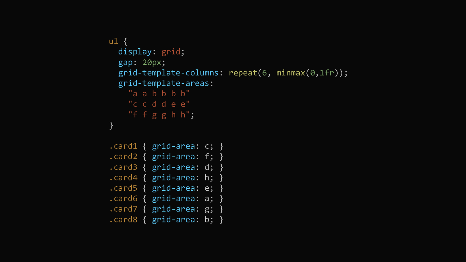
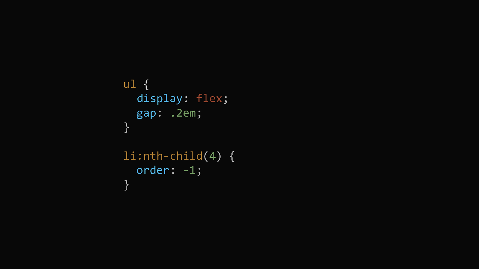
Here are some examples of the issue. This is grid, with a layout using grid-template-areas.
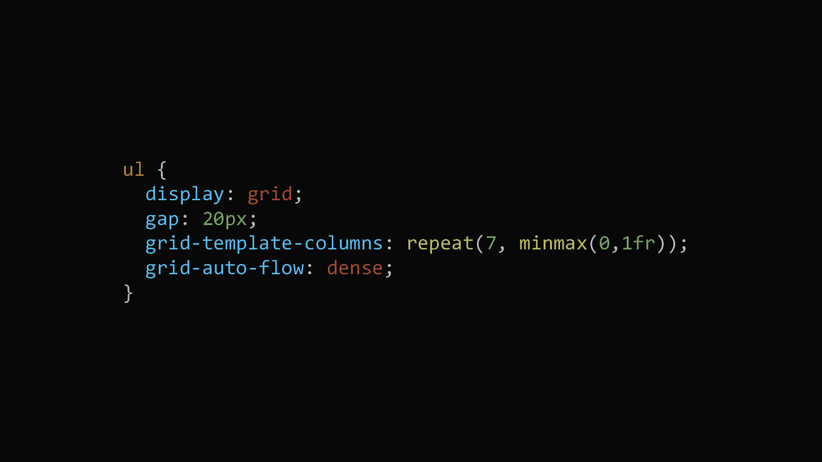
Using grid-auto-flow: dense turns on a dense packing mode. If there are gaps left in the auto-placed layout, grid will try to fill the gaps with items that come later in the source.
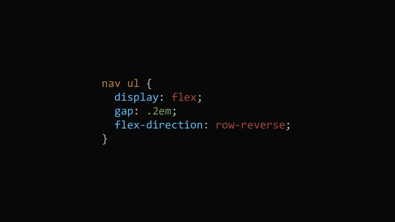
Not just grid, the same problem can happen in one dimension with flexbox. Here I have set the flex-direction to row-reverse.
So this is a problem I want you to be aware of as you get excited about the possibilities of new layout. As a teacher of this stuff it makes me feel as if I’m showing you new things but then snatching some of it away. But before we get too sad about out web developing lives, how much of a problem is this? It turns out that in most cases the layout will naturally follow source order. You just need to keep it in mind as you work.
Once liberated from needing to place your items in rows in order to be able to float them in the right order, it might be tempting to not worry too much about source order. After all, you can move stuff about using grid layout. All that matters is that the element is there, a child of the grid container. You should be able to load your document without a stylesheet and it make sense. Headings should look like headings, things should flow in the right order. This is the document that a screen reader is reading, but also working with a sensible document will actually make your life easier.
That normal flow, the way that things in CSS layout when we don’t do any layout, will help you if you work with it. Only direct children of the grid become grid or flex items. Inside each item we go right back to normal flow, and that is often exactly what you want. 24
A well ordered document will also make it much easier to create fallbacks for browsers that don’t support grid. For some people, they are now happy to do a very low key layout for Internet Explorer. Essentially keeping the content in normal flow and doing a few tweaks with floats or flexbox for anything that needs it. However if you want to do a more complete fallback solution you will need that sensible, solid document as the basis for that.
The fact that only direct children become grid items can make it rather tempting to remove semantic elements to make more things a direct child and therefore possible to position. However semantic structures like lists are really important when it comes to a screen reader understanding your content.
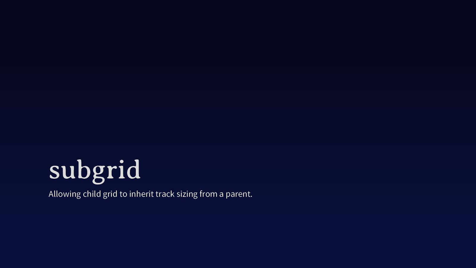
This is one area where a solution to the problem is already well on the way. The subgrid value of grid-template-rows and grid-template-columns means that child items can inherit the grid on their parents. This means that you can keep semantic structures, make the child a grid and set these properties to subgrid.
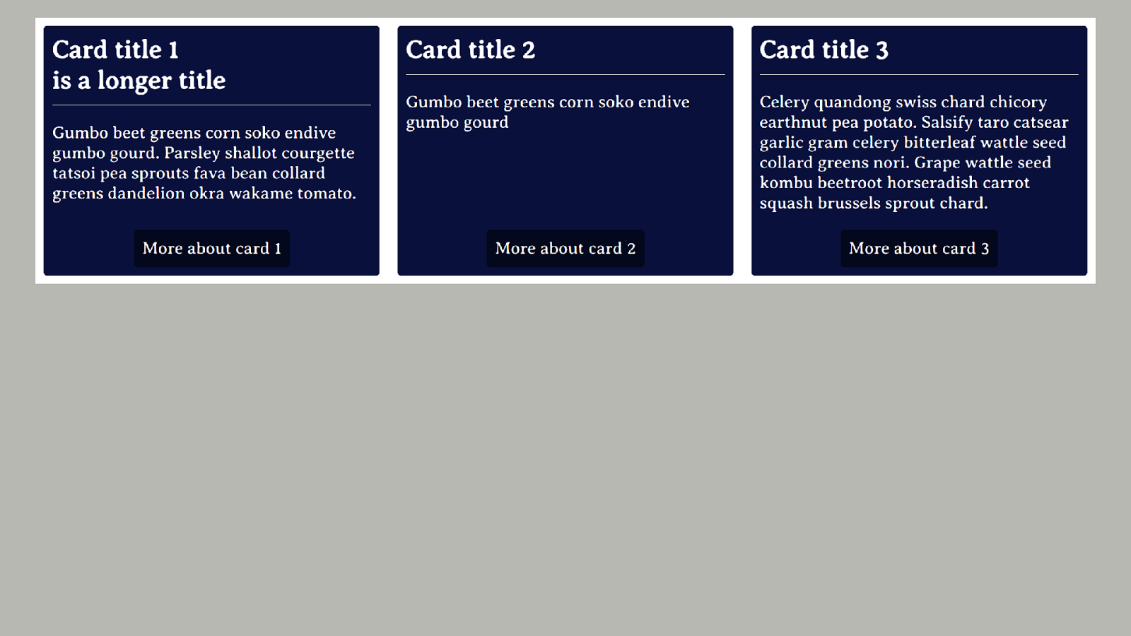
The cards are in a grid, but the individual cards themselves don’t line up with each other. The first heading is taller than the other two and so the line underneath doesn’t line up across the grid.
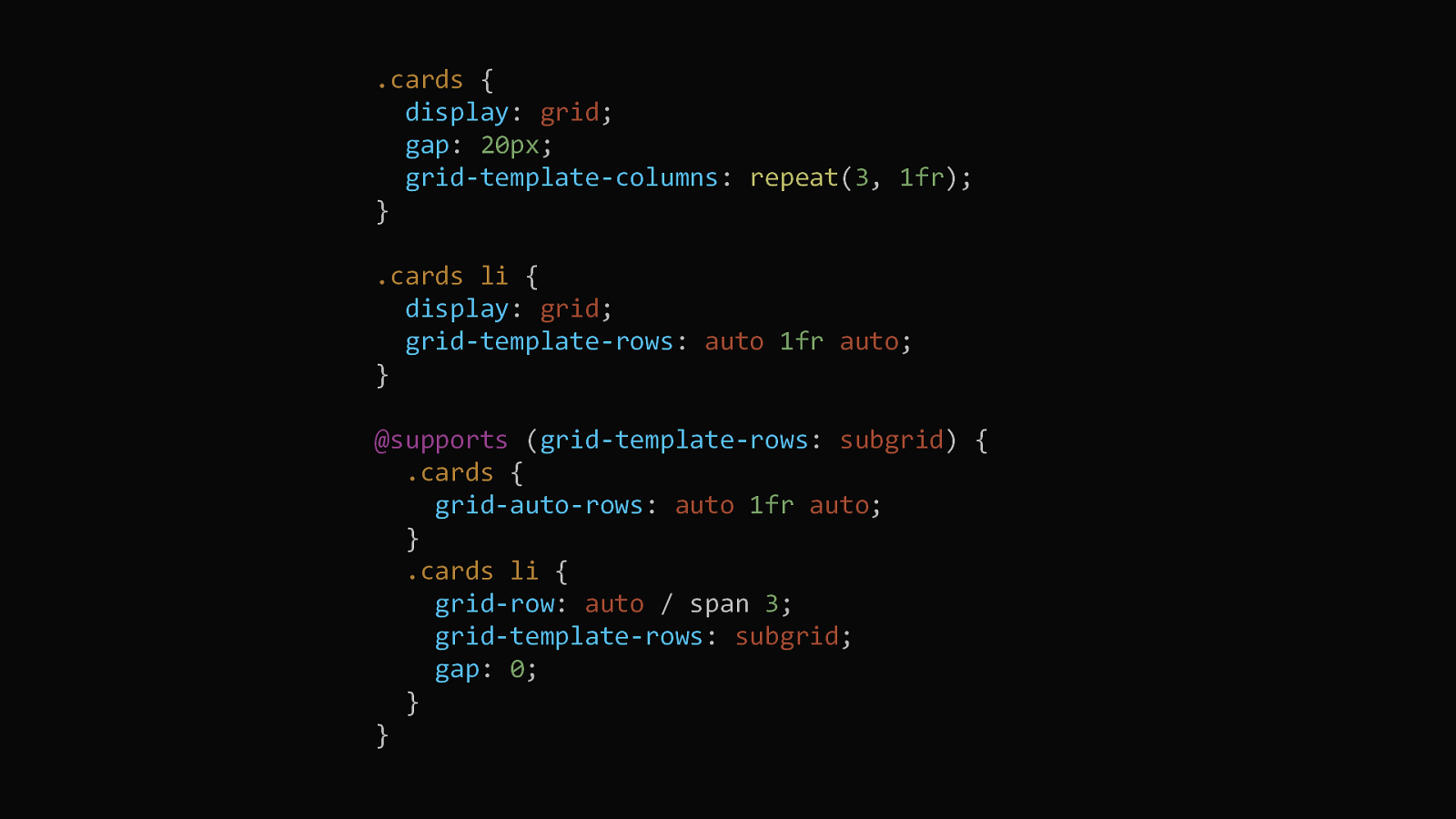
We can use subgrid to create three rows for each card, span the card across them and then set grid-template-rows to subgrid. This means that our headings are all in the same row and so can respect the height of the tallest.
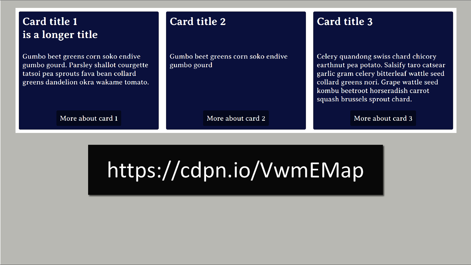
In this screenshot the line underneath the headings is aligned across the grid. Subgrid is in Firefox and is in development in Chrome.

We also have display: contents which an be really useful for removing semantic elements which are not needed in layout.
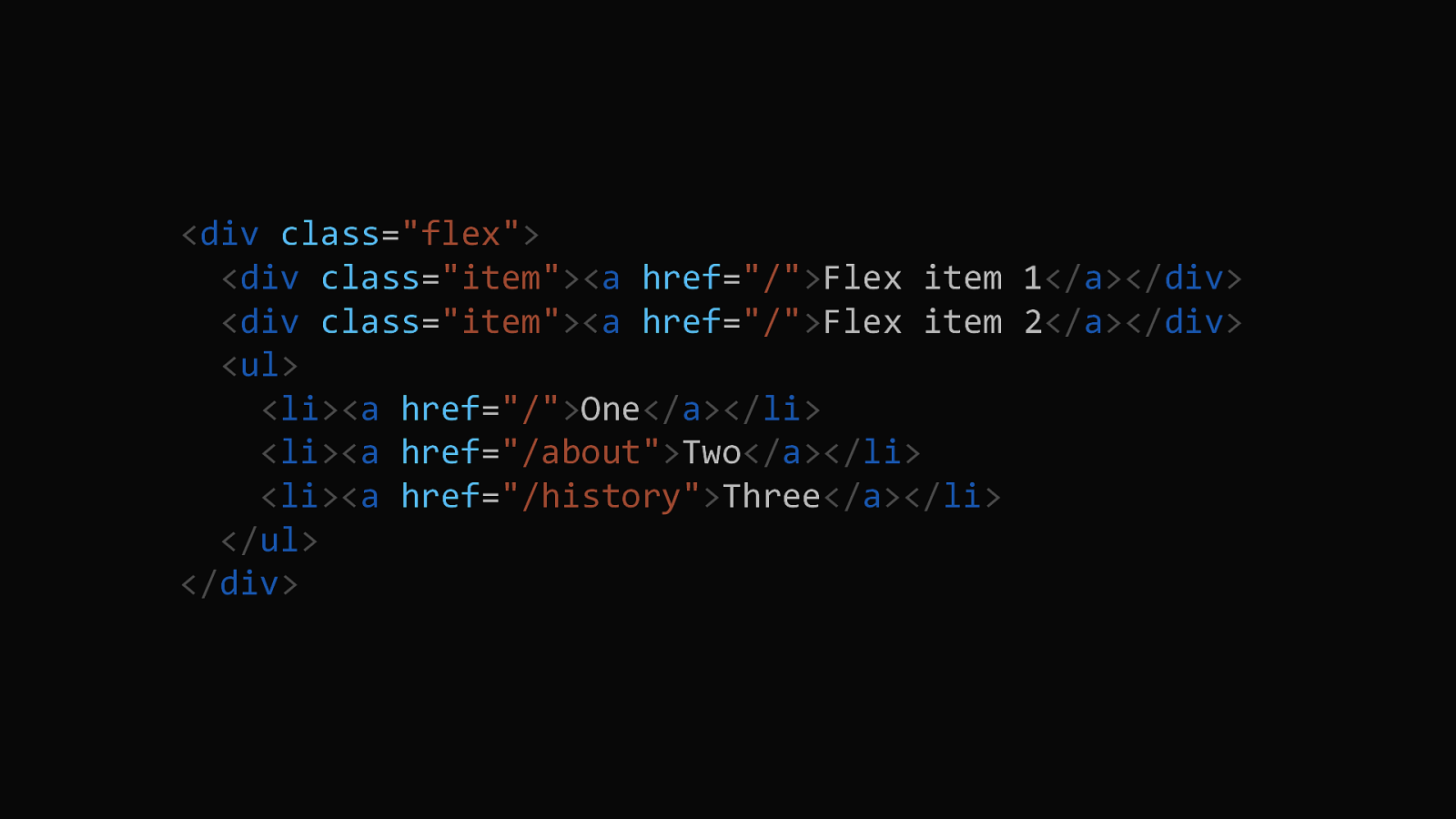
If we have a layout that includes some stand alone items and some that are inside a structure like a list.
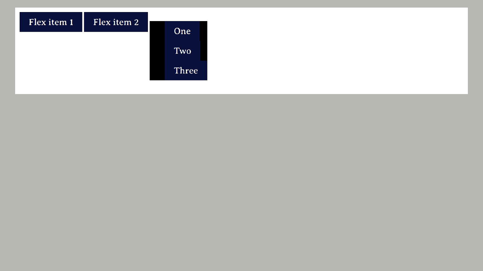
I’m using flexbox so the first two items are direct children of the flex container, the third item is a ul. So it becomes part of the flex layout, it’s children do not.
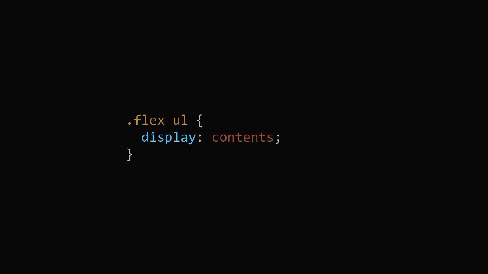
Adding display: contents to the ul removes that box from the layout.
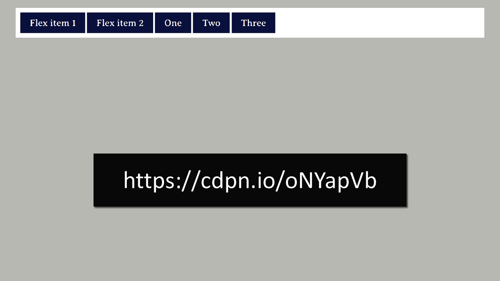
Which means that the list items can participate in the flex layout.
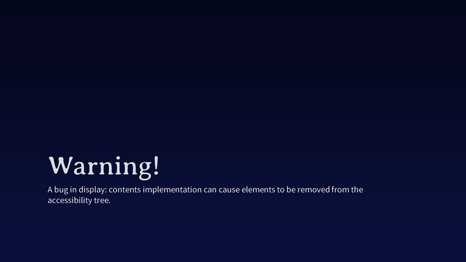
A bug in display: contents implementation can cause elements to be removed from the accessibility tree.
Unfortunately browsers implemented display: contents a bit like display: none in that it removes the element from the accessibility tree. Firefox have fixed the problem, and it looks as if it is fixed in Chrome Canary so should be coming to Chrome and Chromium based browsers soon, but do check that your use of display contents doesn’t prevent accessibility devices from understanding that your list is a list and so on.

Don’t be tempted to fix a problem in your source by playing with order in flexbox or rearranging things in grid. If you have decided you want about to come after contact, do it in the HTML and not in the CSS.
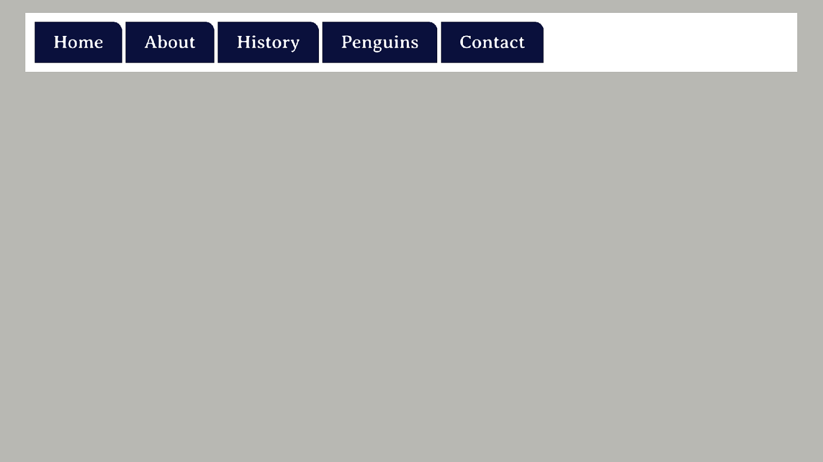
Here I have some items in source order, however I have decided that I need the navigation item for Penguins to come first. Because editing the source seems like too much work.
I’m going to fix it in CSS with the order property.

Some good advice never changes!
We are back to the age-old advice of start with a document which has a solid semantic document order, exactly as we used to preach in the early days of CSS layout. Then, if you do use any sort of content reordering, test test test to make sure you haven’t made a mess.
The good thing about this problem is it is very easy to test. Just pop your mouse in a drawer and navigate your site using the keyboard. This may well pick up other problems too. However in this particular case you are looking for a logical progression through the content, no jumping around all over the place.
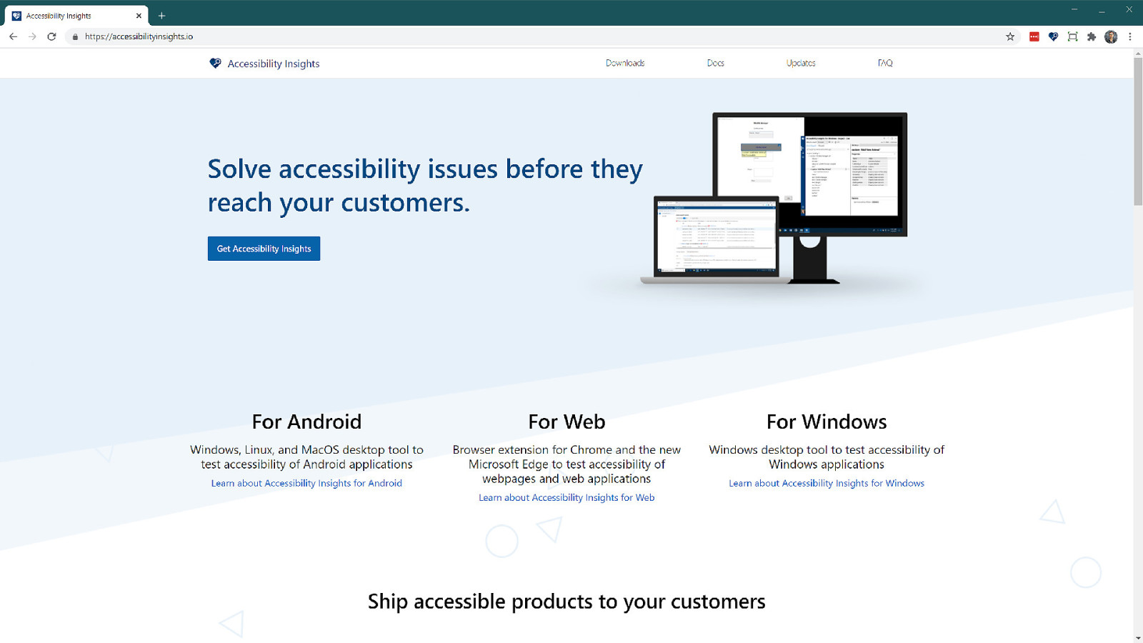
You can also use the accessibility insights extension. The tab stop checker shows you visually the path someone will take through your content.
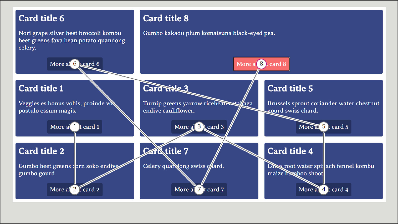
Here I see the tab order of one of the demos I showed earlier, I can see that the path taken around isn’t logical.
As an aside, do also check that changing display type has not changed how something is reporting itself to assistive devices. Changing display is only meant to change the visual display of things, it should not prevent a list being a list for example. As we saw with display: contents however sometimes browsers get that wrong. Check my resources for this talk for links to more info on this stuff. In fact as all of these new methods appear please do report any issues that you find, bugs happen. It might be that an issue wasn’t understood at spec level, or perhaps it has been misinterpreted by a browser, or you just find a regular old bug. If using some CSS seems to come along with a11y problems, let the CSS WG know, or raise it with the browser concerned.
Allowing developers to take advantage of content re-ordering.
Now I’ve made you all sad by telling you not to do things, what’s the real solution? I believe that we need a better way to deal with the disconnect scenario. As soon as you move away from handcoding sites, to layouts created by tools we will absolutely see more disconnected from source layouts. If you are building a layout by dragging elements around a canvas you are disconnected from the source, you will very quickly forget what it looks like under there.
I think on looking at the issue this is where most people get to. Why don’t we just follow the visual order? Seems straightforward. In fact, for a time Firefox implemented flexbox so that if you changed the order of items using flex-direction or order, this would change the order in which you would tab through them too.
I think this would be somewhat dangerous. As I’ve already explained, for the majority of the time the display following the source order is what you want. It’s a solid default. The web is all about good defaults. If you sling some reasonably marked up content onto the web and do no styling at all, you get a readable webpage because browsers have implemented internal stylesheets that give us good defaults.
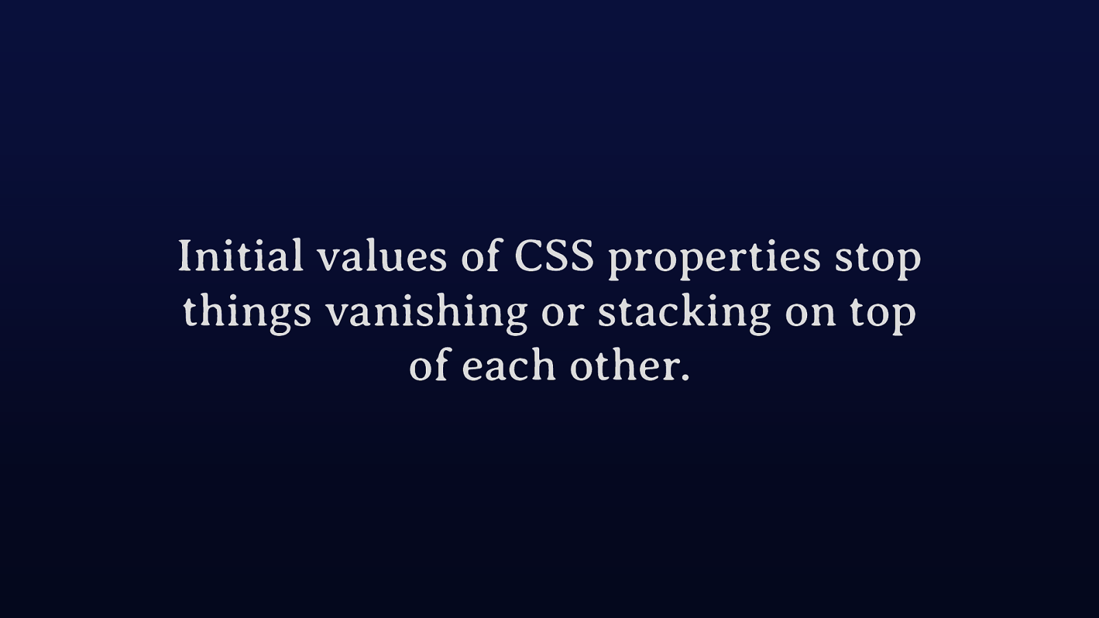
The initial values of CSS properties are considered very carefully to avoid data loss. These defaults avoid things vanishing off the side of the viewport or being overlapped by other things. Good defaults.
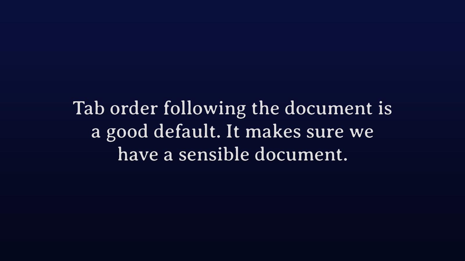
Tab order following document order is a good default, it means that we have to take a bit of care over our document, because it underpins what is displayed on the screen and at the same time is what is read out to screen readers. If we had taken an approach of switching layout to follow visual order, then it would be easy to stop caring about the document order, but also would leave us and browser engines having to do more work and make more decisions about how this even would work.
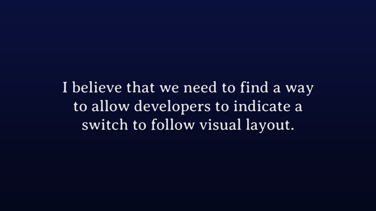
While I think the document order is the best default, I think we should be investigating ways to allow developers to opt into a visual ordering for everything on a component basis. This would mean that if there was a part of your page which used grid techniques to move things around at a certain breakpoint, or used masonry layout, or a dense packing order you could tell browsers to follow the visual order of things.

It’s possible that some of the work done on spatial navigation could help here. This is a spec designed to allow people to navigation using arrow keys, such as is common on TV remotes and so on. Rather than tabbing through each item on a grid you would be able to use arrow keys to move more quickly to the location you want to get to. This navigation is defined in CSS and therefore has some similarities to what we would need to be able to opt into visual ordering.
Just over a year ago we had our last CSSWG face to face that was actually in person and, like many of these meetings, the interesting chats happened over coffee in the breaks. I really miss these meetings because of that.
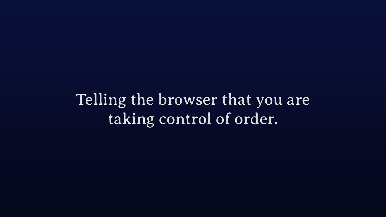
A few of us were chatting about the idea of being able to use an attribute on an element to have children with an order that was explicitly unimportant. Which would mean that the developer was taking control of that order from that point.
Therefore, if you had the densely packed example I used earlier. On the element which becomes a grid container we would use our new attribute. Perhaps we could then give that attribute values, visual (use information gathered from the layout to form the order) or document (being the default).
As with spatial navigation the actual visual order is being controlled with CSS. So, in our densely packed grid layout, when grid takes an item to fill in a gap the browser would tab to that item after the one that visually comes before it rather than where it appears in the source.
I’m not a browser engineer and I don’t know how feasible this technique would be. Perhaps there are better ways to approach it.
However I do think we need to solve it before adding more cool ways to do layout which give flexibility over the layout over the source. We know that telling people not to do something doesn’t work, those who really care will test and take care but many won’t know about the issues or just want to get the job done.
Increasingly people are going to use visual tools, which essentially abstract the problem away as the designer never looks at the source document, they are just dragging things around until they get the layout that they want.

If this interests you, this is the most relevant discussion on the CSSWG repo. Please have a look and add your thoughts.
