Perch, patterns, and old browsers. Rachel Andrew @ Patterns Day x

A presentation at Patterns Day in June 2017 in Brighton, UK by Rachel Andrew

Perch, patterns, and old browsers. Rachel Andrew @ Patterns Day x
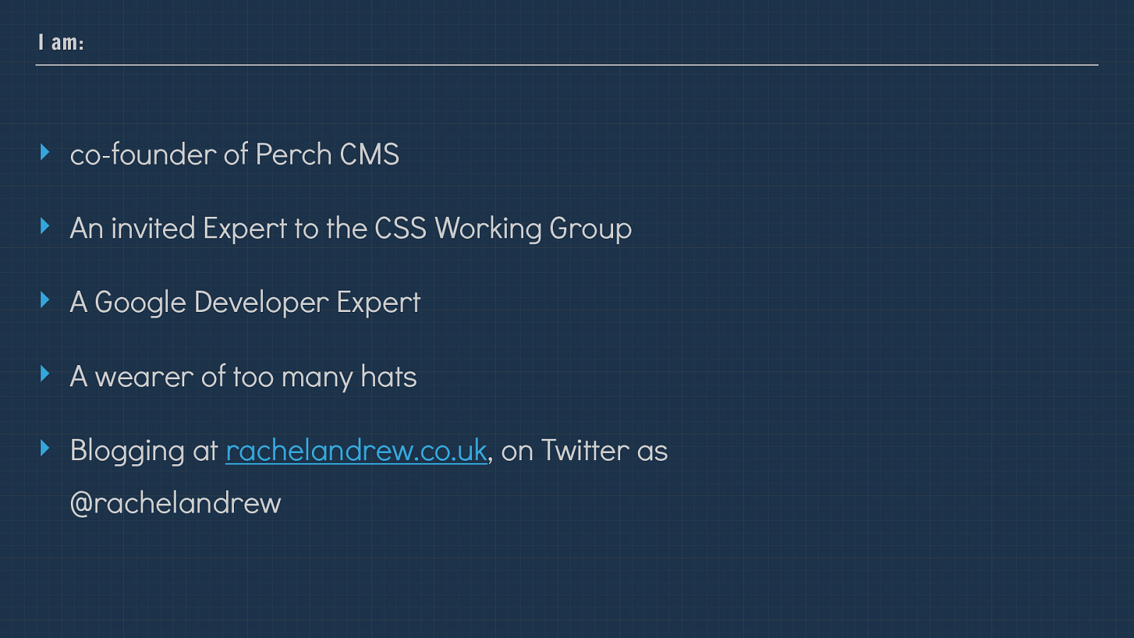
I am: ‣ co-founder of Perch CMS ‣ An invited Expert to the CSS Working Group ‣ A Google Developer Expert ‣ A wearer of too many hats ‣ Blogging at rachelandrew.co.uk , on Twitter as @rachelandrew I’m Rachel Andrew, I’m a web developer and co-founder of the small CMS Perch and it’s bigger friend Perch Runway.
I’m going to talk to you for the next little while about how we used a pattern library when redesigning the Perch User Interface when launching version 3 of the product. Sharing some of the things we learned during that process which I hope will be useful for anyone here who is tackling a project that perhaps isn’t just a regular website.
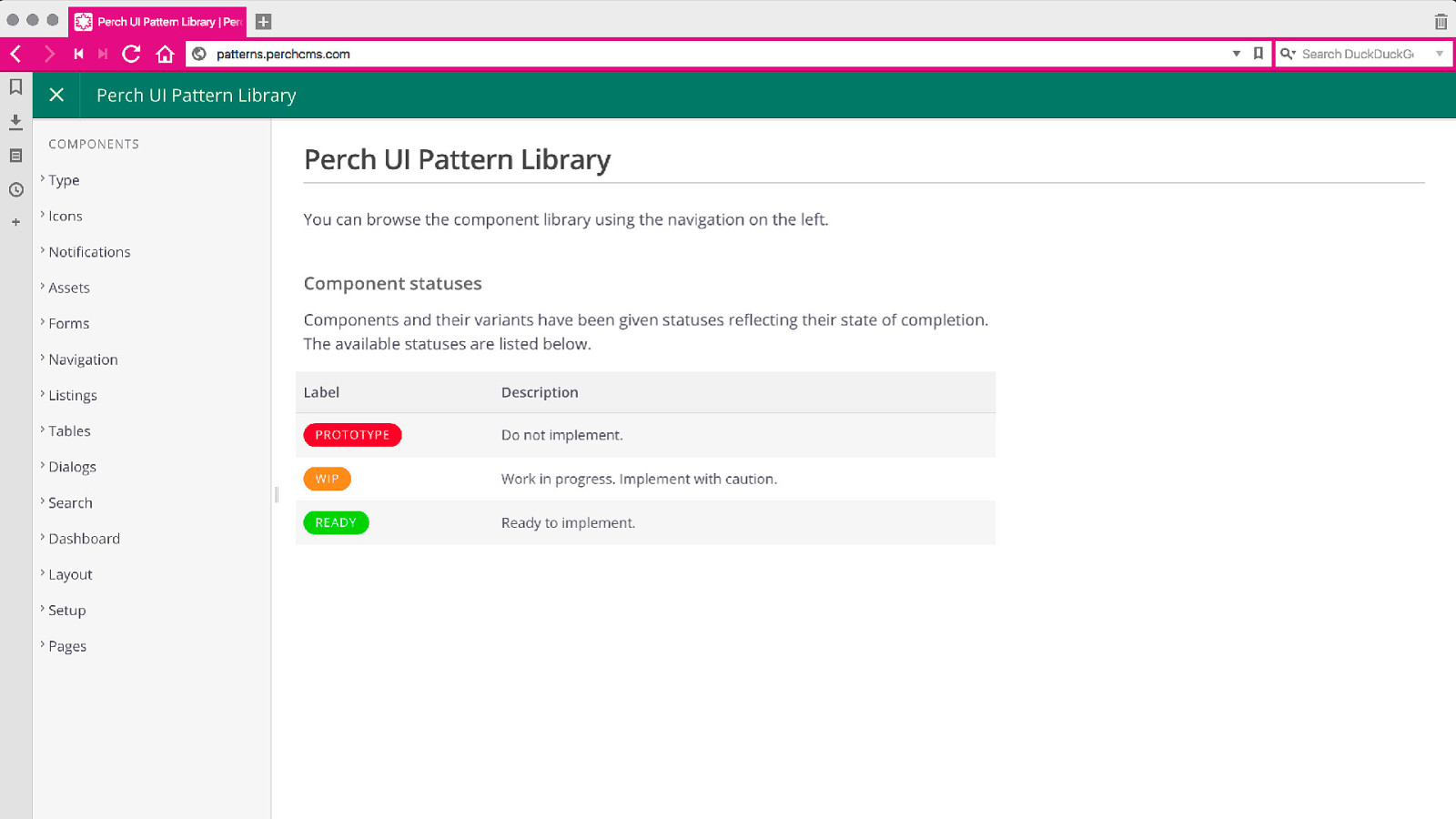
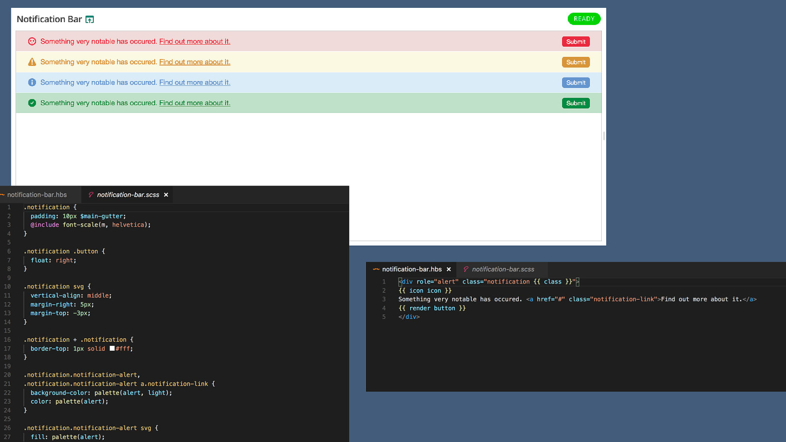
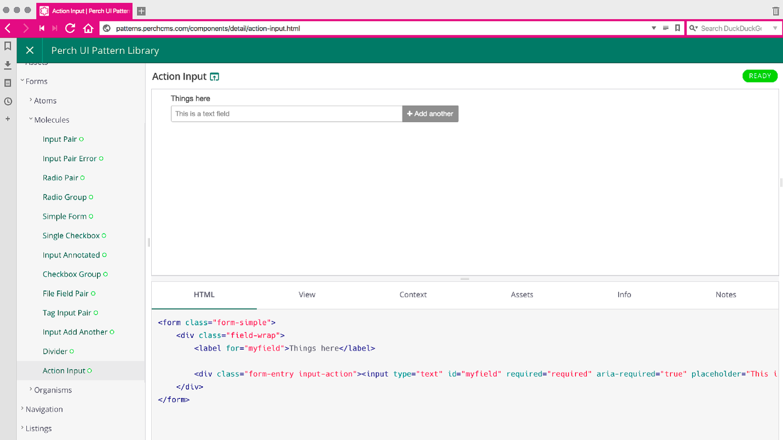
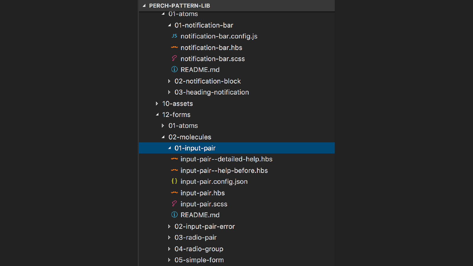
This is the Perch Pattern library. It’s online and you can go take a look at it.

Redesigning the Perch Control Panel. Perch is now eight years old as of May 2017, and about a year ago I began thinking about the redesign and re development of the User Interface for our version 3 release.
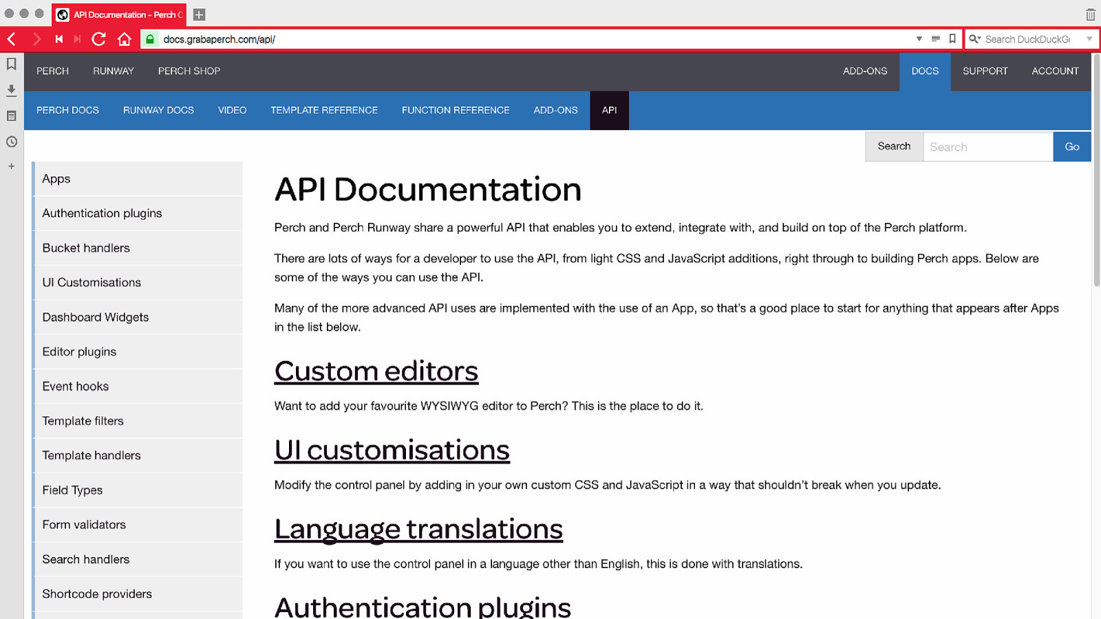
To understand why this was no ordinary UI redesign task, you need to know a little bit about how Perch works and the particular challenges a UI redesign of Perch brought us.
Perch takes a structured content approach to content management. Instead of having a big text editor area, Perch has a wide range of Field Types, both ones we have written and third party ones and these are used to ensure that when content is entered it is entered in a useful format - for example a date is a date - and that what the content represents is stored.
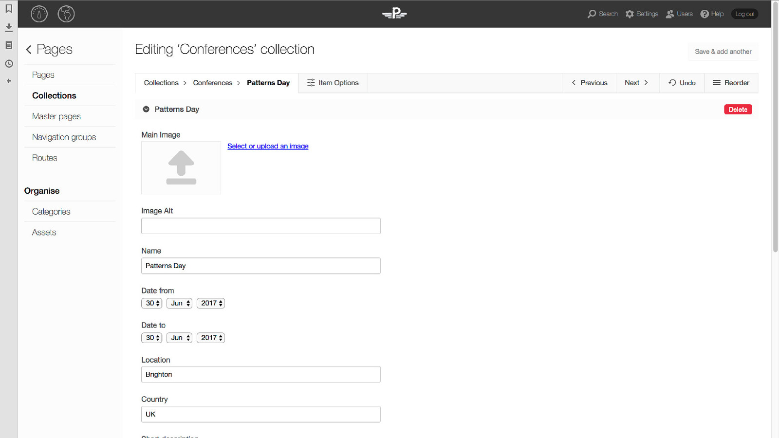
So this is my site, where I am adding the details for a conference - this conference. I’ve defined fields for the various pieces of information I need to collect. This form was created because I selected the Conferences template when setting this region up in the control panel.
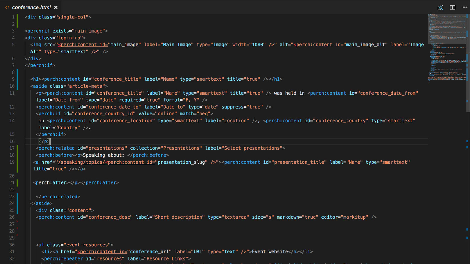
This is that template, an html fragment containing the markup I need to display this on the front end plus Perch template tags defining the field types I want to use to collect the content in the right way.
In this way, a template not only defines the way the content is displayed on the front end but it defines the schema for that piece of content, and therefore the fields that appear in admin.
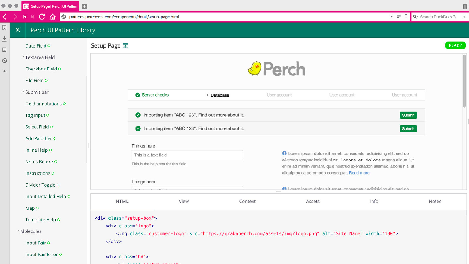
It isn’t just the field types that could appear in any order. The person developing the site can add dividers, help text along with the field, before the field, before the entire form.
They might have developed their own custom Field Type doing any sort of thing. Or developed a full add-on for Perch which uses our Field Types.
Perch also has a whole bunch of additional add-ons we have developed.
There is a whole lot of UI and we don’t really know what any individual control panel looks like.

The Perch UI has to exist as a set of independent components that can be displayed in any order. It’s really important for that reason that the Perch UI consists of components that are as self contained as possible.
I’d been speaking at various events where Brad Frost has talked about Atomic Design, and also read lots of the things written by fellow speakers at this event and people like Anna Debenham regarding style guides and pattern libraries. I felt that the would be the best way to approach the perch UI, treat it as a set of components from the outset, as this would save us getting into a situation where we were expecting for example one field to always follow another.

We needed a pattern library. So I decided pretty much at the outset we needed some kind of pattern library
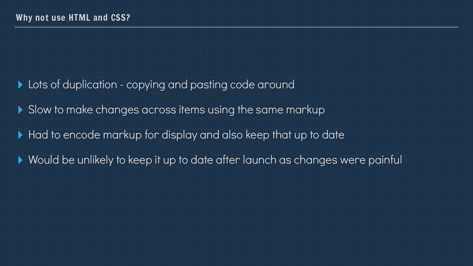
Why not use HTML and CSS? ▸ Lots of duplication - copying and pasting code around ▸ Slow to make changes across items using the same markup ▸ Had to encode markup for display and also keep that up to date ▸ Would be unlikely to keep it up to date after launch as changes were painful I actually started this work just in HTML, however I didn’t need to get far into that process to realise that maintaining this giant HTML file and stylesheet was going to become more of a burden, and that it probably wouldn’t get updated once we had shipped Perch.
As Laura mentioned earlier, if you don’t use the pattern library if it isn’t a living thing it gets out of date and becomes less useful.

Pattern library tooling Having decided that just writing a big bunch of HTML wasn’t going to cut it, I looked to see what was already in existence.
At the time there were a variety of possible tools to help generate pattern libraries. I’m certainly not averse to rolling our own thing, and considered that, however especially for things like this, that are not core to our product I’m generally keen to see if any other tool can get us at least some of the way to our goal. We have enough custom code to write.
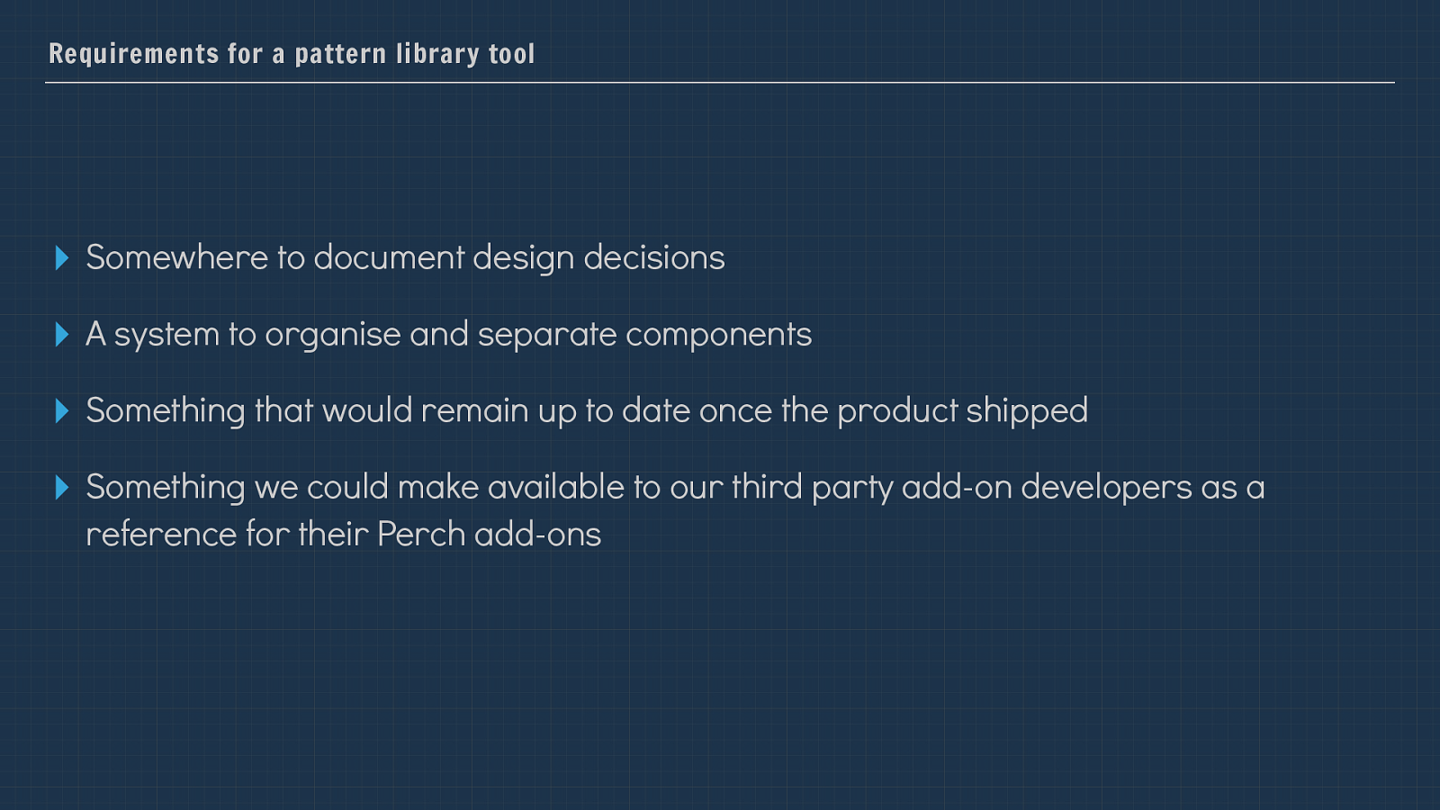
Requirements for a pattern library tool ▸ Somewhere to document design decisions ▸ A system to organise and separate components ▸ Something that would remain up to date once the product shipped ▸ Something we could make available to our third party add-on developers as a reference for their Perch add-ons So I stepped back fro actually working on the UI for a bit and considered what it was that we really wanted out of this pattern library.
Many systems at the time assumed we were building a website. I researched a number of options, one thing became clear however and that was many of the systems at the time assumed we were building some kind of website, or at least a web application. I felt as if we would end up fighting a bit with the pattern library tooling to make it work for our use case, which really is a disparate collection of bits. Far more so than components for the average website.
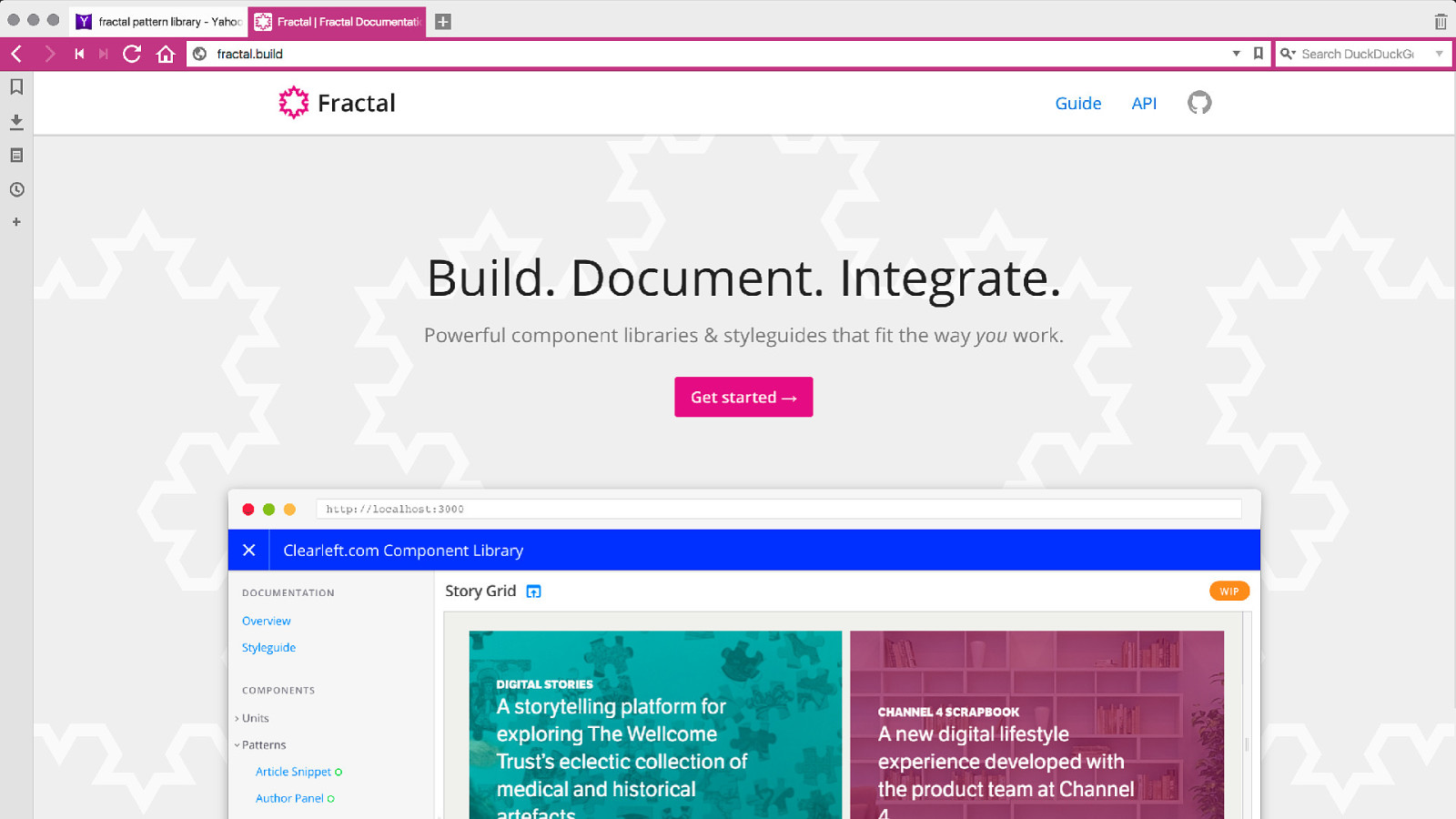
It was then that I came across Fractal, the pattern library system being developed by Clearleft. What immediately stood out to be was that the system seemed highly agnostic in terms of it dictating exactly what we were building. It made very few assumptions, leaving the decisions to us as to how we organised our patterns.
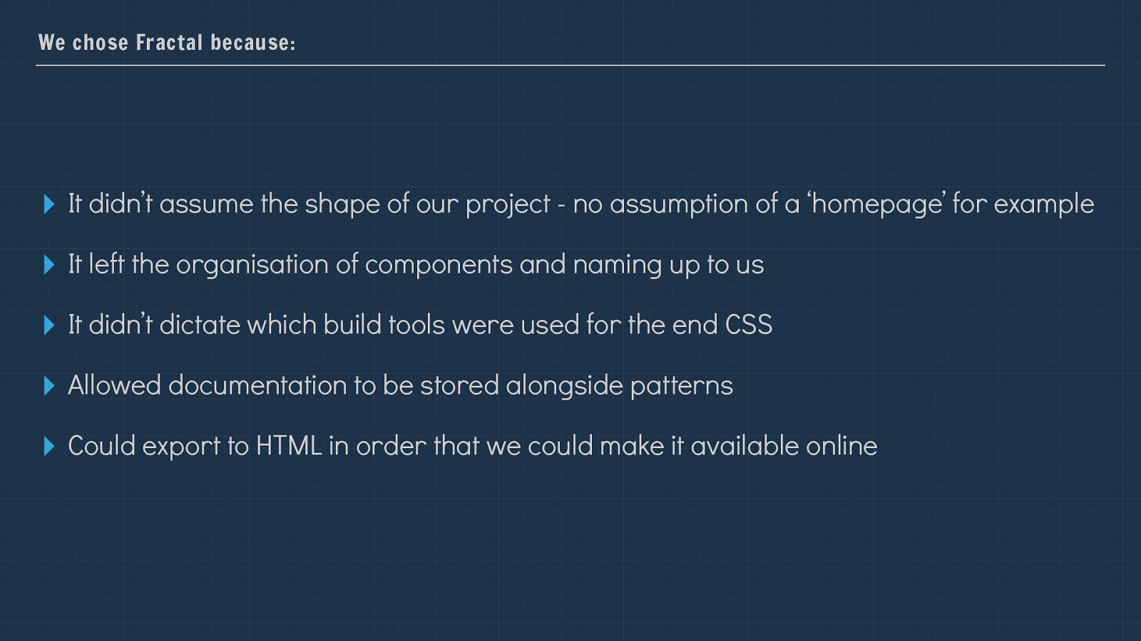
We chose Fractal because:
▸
It didn’t assume the shape of our project - no assumption of a ‘homepage’ for example
▸
It left the organisation of components and naming up to us
▸
It didn’t dictate which build tools were used for the end CSS
▸
Allowed documentation to be stored alongside patterns
▸
Could export to HTML in order that we could make it available online
Fractal was in a reasonably early stage itself when we selected it, however we were comfortable working with something that might change and it seemed to fit our
needs far more neatly than anything else we had looked at, so I made a start by adding all my existing bits and pieces of HTML to the system.
I’m going to talk a bit about some of the things we learned as we did so.

Pattern Library as Source of Truth. It’s one thing to work with a pattern library during development of your site or application, but unless you are careful it can soon start to drift as people make “quick changes” to the code outside of the system and never go back to update the patterns.
To solve this problem before it could start we decided to not only make the pattern library the source of truth but in fact to make it the only place where CSS is generated.
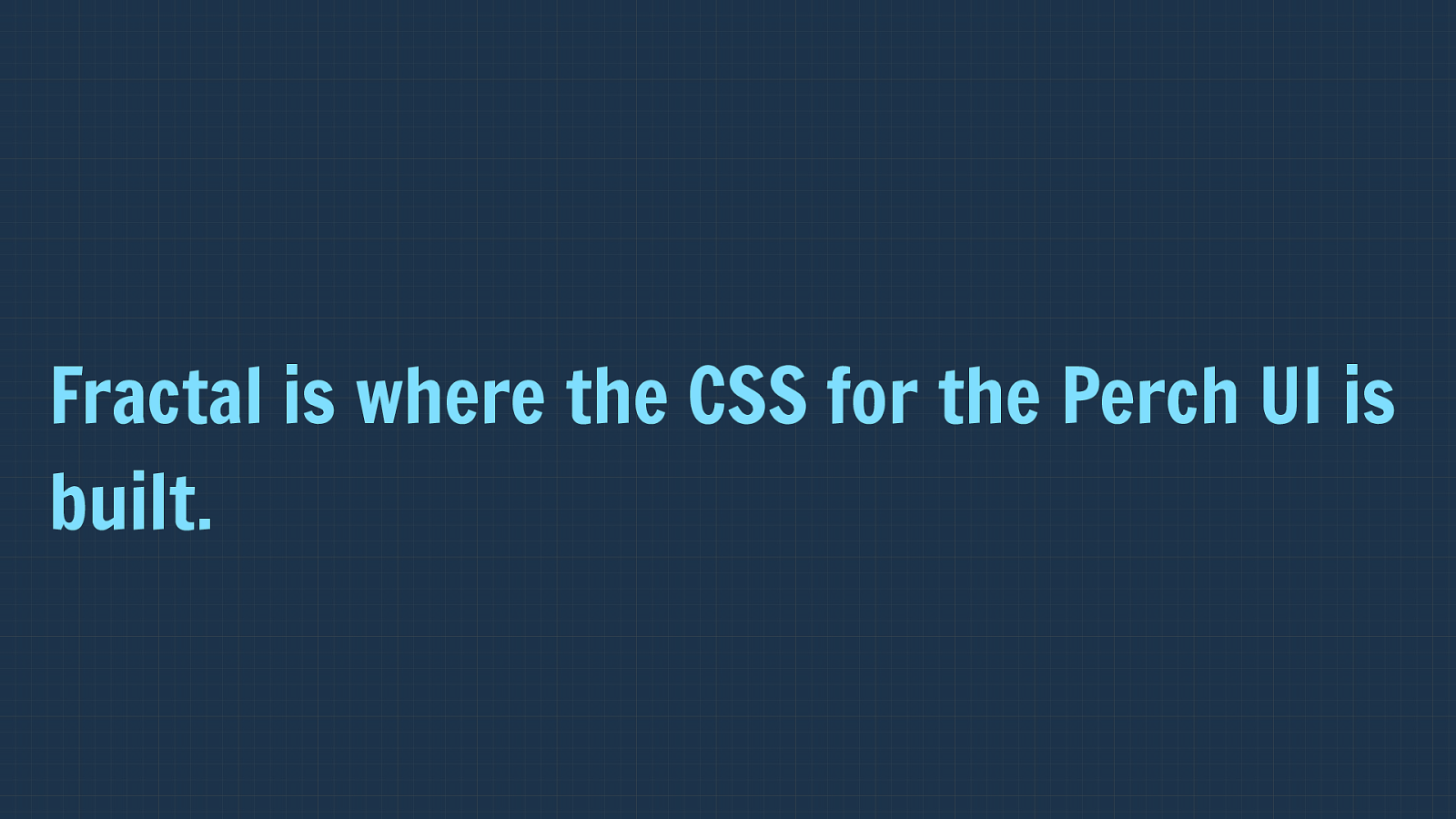
Fractal is where the CSS for the Perch UI is built. The CSS for the Perch UI is generated with Fractal and the a script copies the built CSS over to the Perch project. At no point is the output CSS edited anywhere else.
Each component has a template file, and then the Sass to go along with it. These are then compiled together along with some default rules.
I’ve taken this same process and used it on other sites since building the Perch UI and it works really well. It keeps all the build stu ff in the pattern library too, so I don’t have a bunch of stu ff in every project that is there to build CSS.
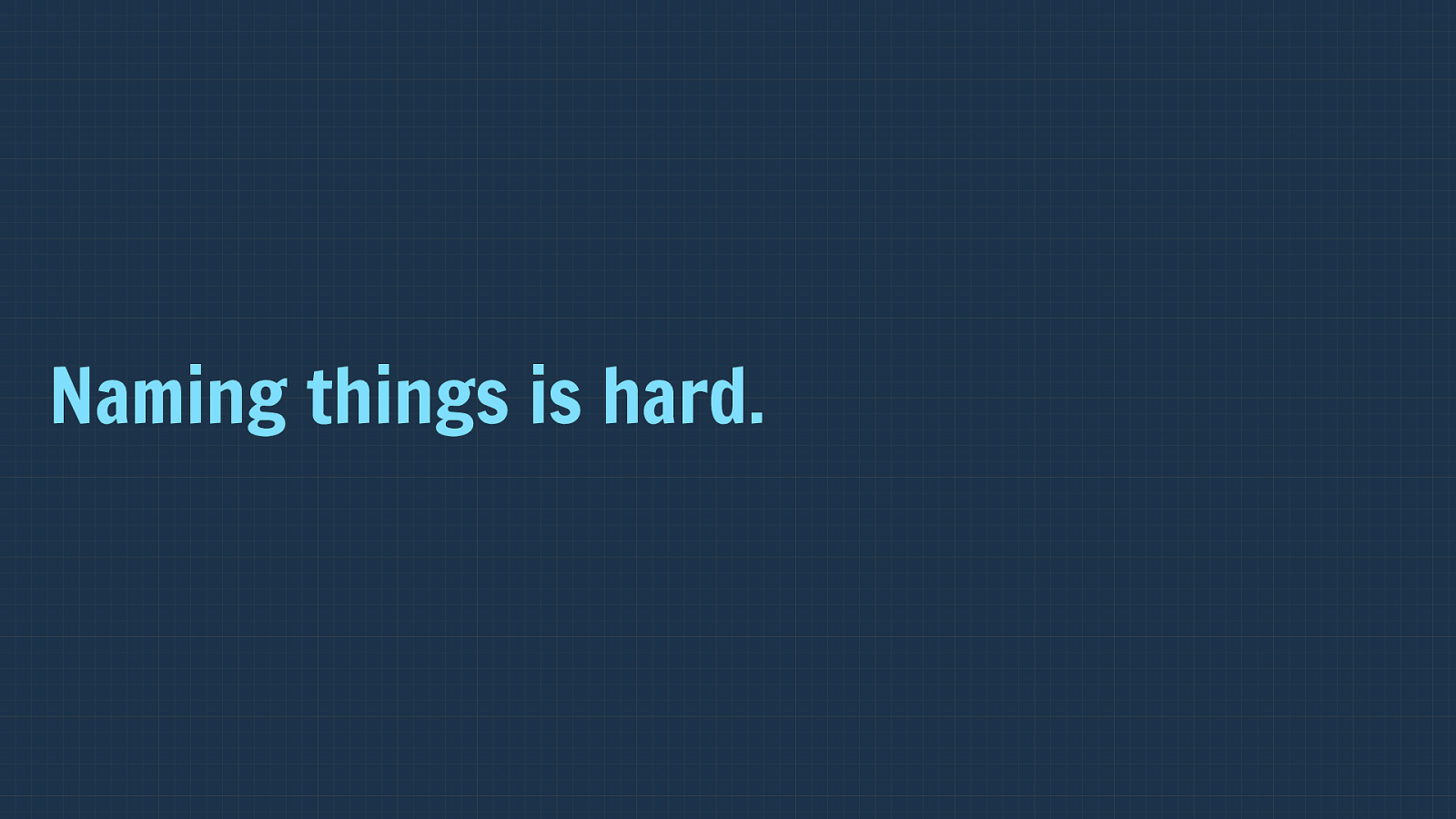
Naming things is hard. I started using Brad Frost’s terminology of atoms, molecules and so on as I didn’t have a better idea of how to structure the components.
If you aren’t familiar with Brad’s book I would suggest you go check it out, there is a load of helpful thinking around this stu ff .
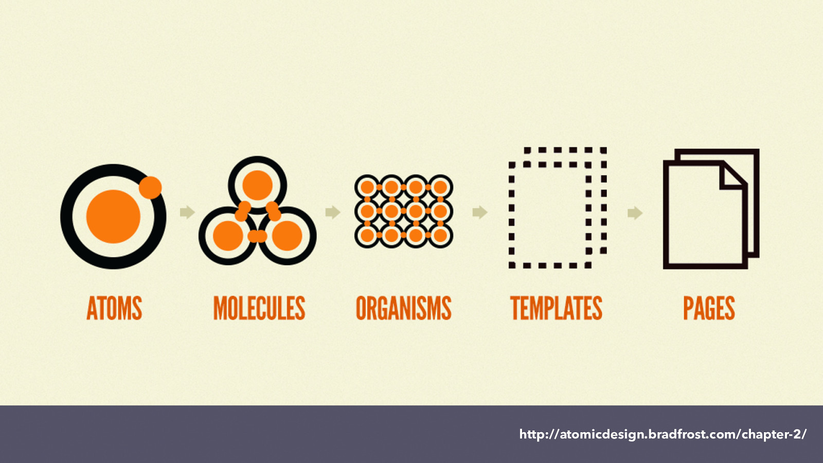
http://atomicdesign.bradfrost.com/chapter-2/ Brad breaks things down into Atoms, which then are grouped into molecules, which are grouped into organisms that become templates and pages.
Initially this worked fine, however we have rather a lot of components in the Perch UI, and we soon found that we couldn’t find anything in the pattern library.
After some trial and error we have settled on a system of naming items by type of thing, but then breaking it down inside the type to atoms - being the very small pieces, molecules being a composite thing and then organisms being larger pieces of the UI.
We also have some complete views of certain pages to check how these key views are coming together, in order that we didn’t need to spin up a version of Perch in order to see the view complete - as there were points during development where we weren’t in a position to see the UI as a complete thing as parts of it were not complete as yet.
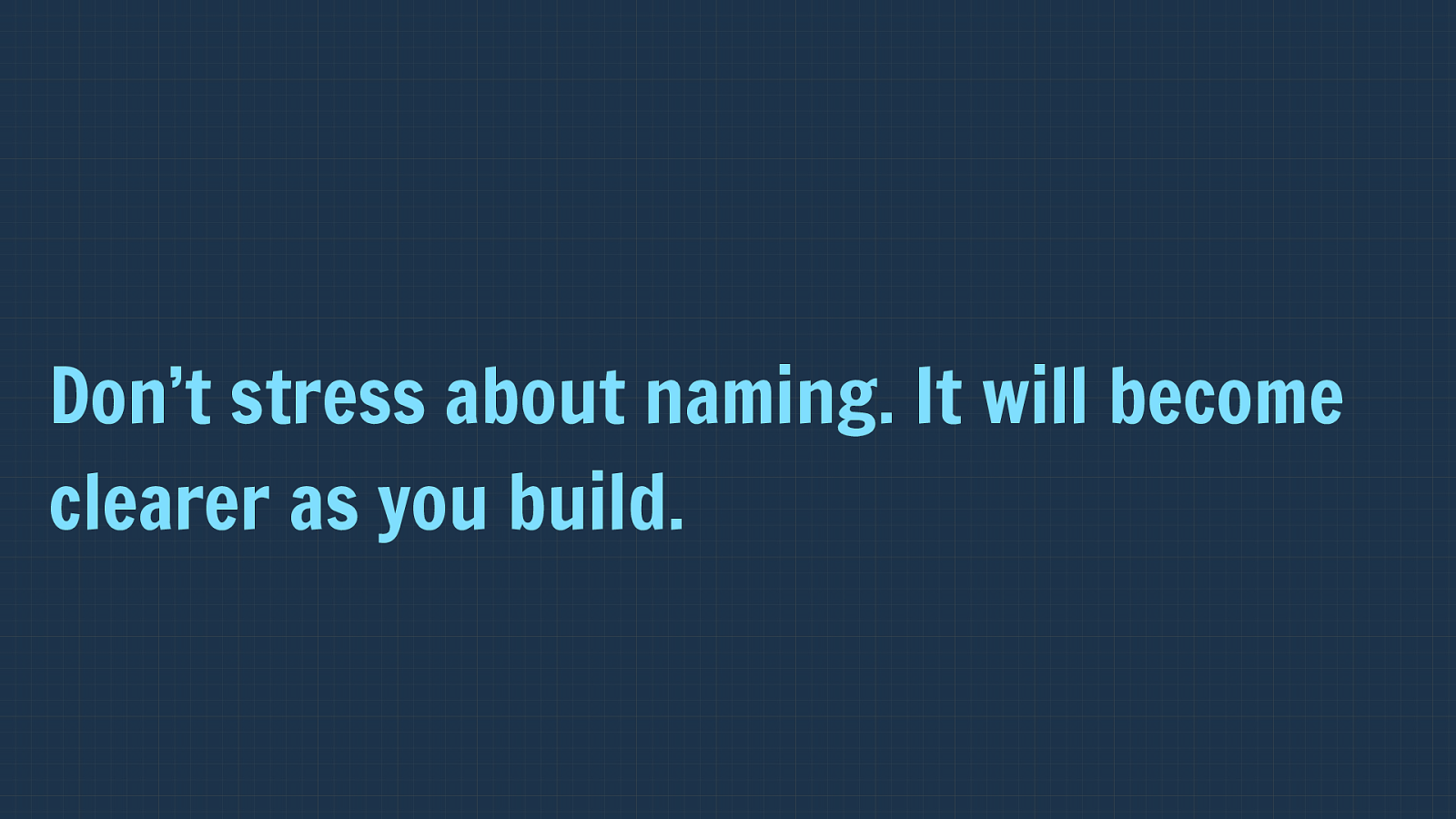
Don’t stress about naming. It will become clearer as you build. There are a couple of things to highlight from this experience. Firstly, that you probably shouldn’t stress too much about naming initially. It will become clearer how you should structure and name things as you go along.
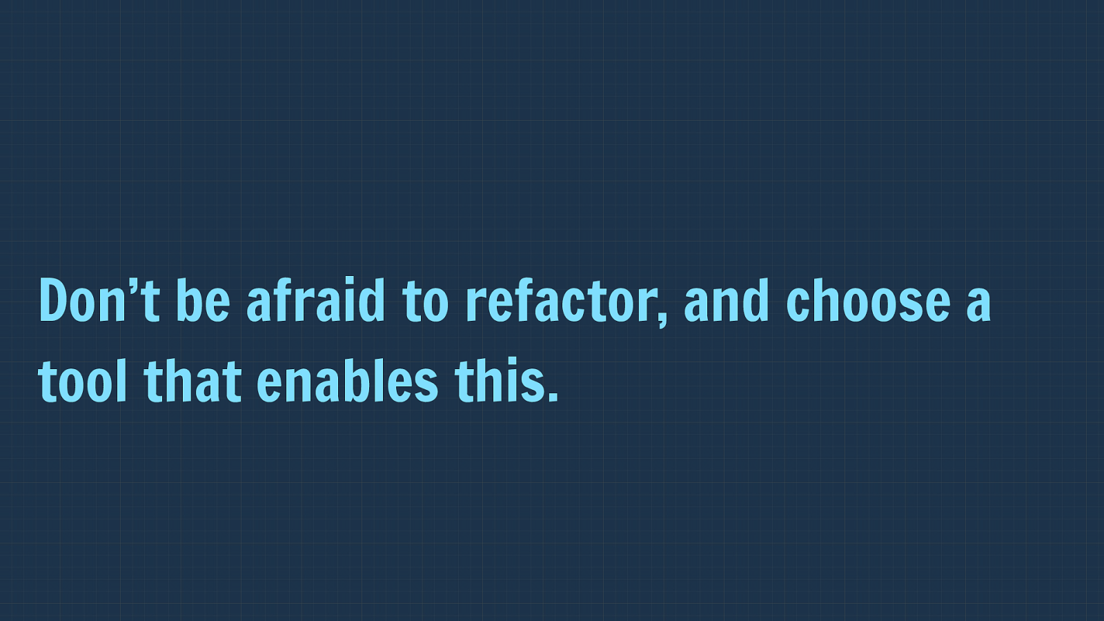
Don’t be afraid to refactor, and choose a tool that enables this. However you do need a tool with the flexibility to let you do this, it turned out that Fractal worked very well in this regard.
It essentially is a structure of folders and files, so to refactor we only needed to rearrange the file structure and things would appear in the correct place with their new name.

Reduced Test Case First development Something really interesting that has come out of working with a pattern library is what I’m calling reduced test case first development.
Perch supports right back to IE9.
That said as a small team, and one that wants to take advantage of newer CSS, we also don’t want to find our development held back by trying to make everything work in exactly the same way on older browsers.
So we take an approach of “has to work on the hotel computer” for IE9 and 10. Meaning that you should be able to edit your site without a problem from a terrible computer in your hotel etc. However the full experience will be available in more modern browsers and from IE11 up. As we rely heavily on flexbox in the Perch UI (we shipped before Grid was available), we need to deal with versions of IE that use old flexbox and also IE9 with no flexbox.
I didn’t worry about old browsers until after we had built the UI. I didn’t worry about old browsers until we were done with the UI.
I didn’t even look.
This probably seems backwards to a lot of you. Should we not be getting our base experience working and then layer on the new methods?
Flexbox & Grid are so different. If you build using old methods first you won’t take advantage of their creative possibilities. The things is that flexbox and especially grid, are so di ff erent to that came before that if you start with what works in old browsers you will often end up in a situation where you may as well not bother using the new techniques. You’ve limited your design to what works in old browsers.
Start with solid markup.

Build your up to date experience using up to date methods. If you start with the top of the line experience you’ll find that your code is leaner and you are able to be creative in the new ways that these techniques allow.
Then look at the browsers that don’t support these newer methods. But then, at some point you have to look at the old browsers.
By the time I did this with the Perch UI Drew and I had spent months working on this. How long do you reckon I spent getting it all working from IE9 up?
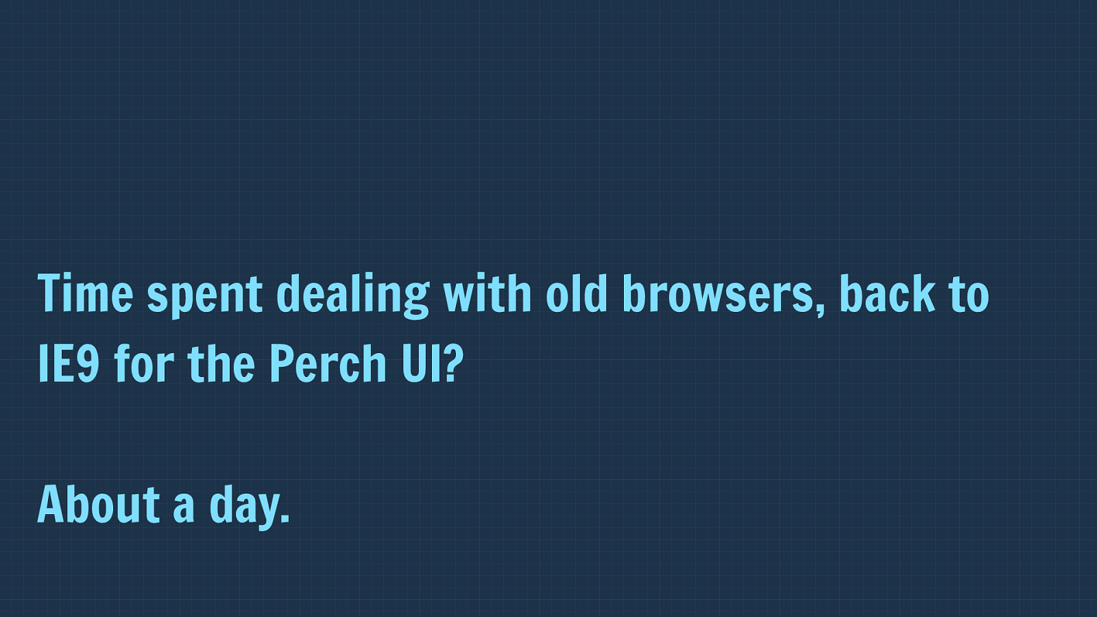
Time spent dealing with old browsers, back to IE9 for the Perch UI?
About a day. About a day.
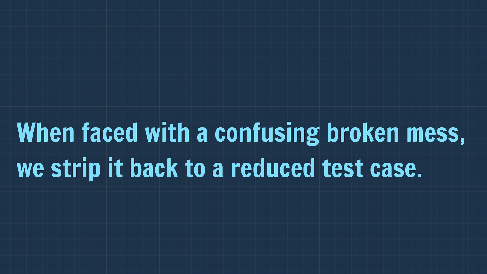
When faced with a confusing broken mess, we strip it back to a reduced test case. The thing is that the problem with leaving browser compatibility till the end of a project when working in a traditional way, building out entire pages or views at once, is that you then look at the site or application all at once and see it all blown up and start to panic.
If you do find yourself in that situation then usually the best advice is to reduce down the broken bits to find out exactly what is causing the problem. Create yourself a reduced test case that highlights only the broken thing.
And what are the patterns in your pattern library?

Components are already a reduced test case. Reduced test cases, or very close to being so. Therefore you can look at the individual components. See why they are broken in a browser, fix them individually. If the components work and the overall layout is broken then you can isolate exactly which two things next to each other in the layout cause the problem. After all your layout is just a big component into which little components fit.
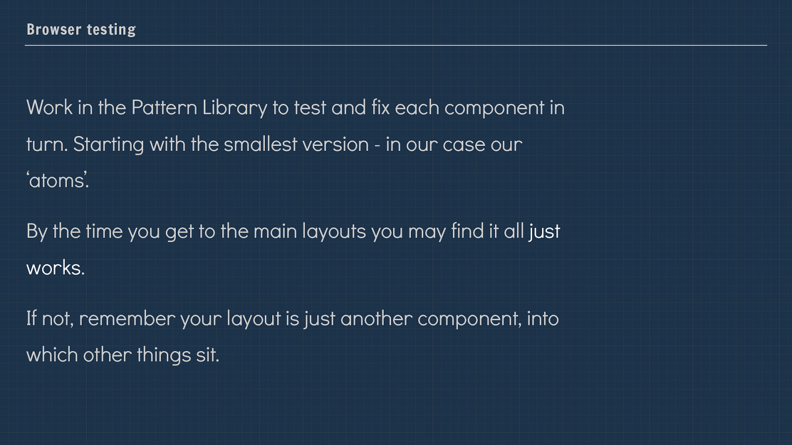
Browser testing Work in the Pattern Library to test and fix each component in turn. Starting with the smallest version - in our case our ‘atoms’. By the time you get to the main layouts you may find it all just works . If not, remember your layout is just another component, into which other things sit. This last part is increasingly true as we move to using CSS Grid Layout. You can treat your overall layout as a component of the design.
Working pattern library first is a very good way to start using new CSS. So as it turned out, in addition to solving our problems at Perch and enabling out shipping of Perch 3 with the redesigned UI, and providing the same information we were working with to our API developers, working in this way made me realise how e ff ective it was as a method of embracing new CSS in a non-scary way.
Use Grid on a small element of your design. For example, perhaps you want to start using CSS Grid - but know that perhaps 30% of your visitors don’t have grid support yet.
You might want to start bringing CSS Grid into some of your components. This is a great place to start, rather than feeling you need to do so on your entire layout.
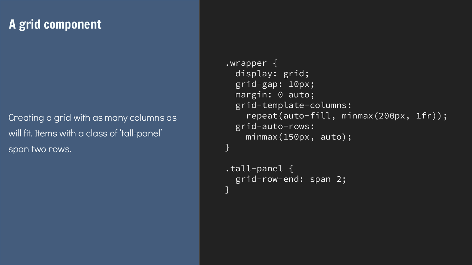
So here is an example that coulee be a simple component in a design. It takes advantage of something that grid layout does really well - the ability to have items spanning rows.
.wrapper {
display: grid;
grid-gap: 10px;
margin: 0 auto;
grid-template-columns:
repeat(auto-fill, minmax(200px, 1fr));
grid-auto-rows:
minmax(150px, auto);
}
.tall-panel {
grid-row-end: span 2;
}
A grid component
Creating a grid with as many columns as
will fit. Items with a class of ‘tall-panel’
span two rows.
I’m creating here a component that will have as many columns as will fit into the container at a minimum of 200 pixels and a maximum of 1 fr.
My rows will be a minimum of 150 pixels tall and a maximum of auto to ensure they will stretch to contain any content.
Then I have this tall panel grid item, which I have set to span two rows. Anything with that class will be two rows tall.
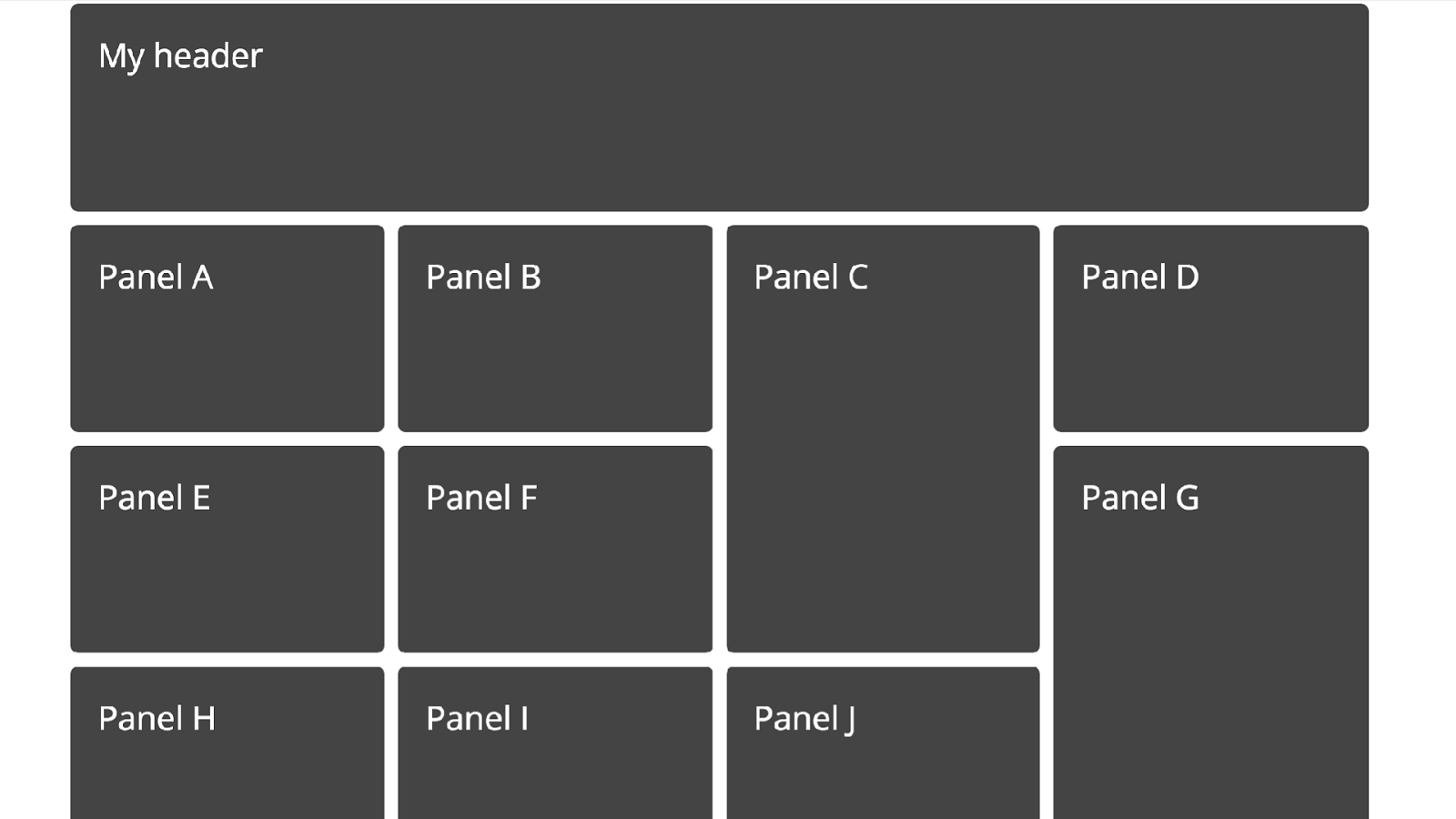
Which gives us something like this.
A non grid-supporting browser is going to lay this component out in block flow, items appearing one below the other.
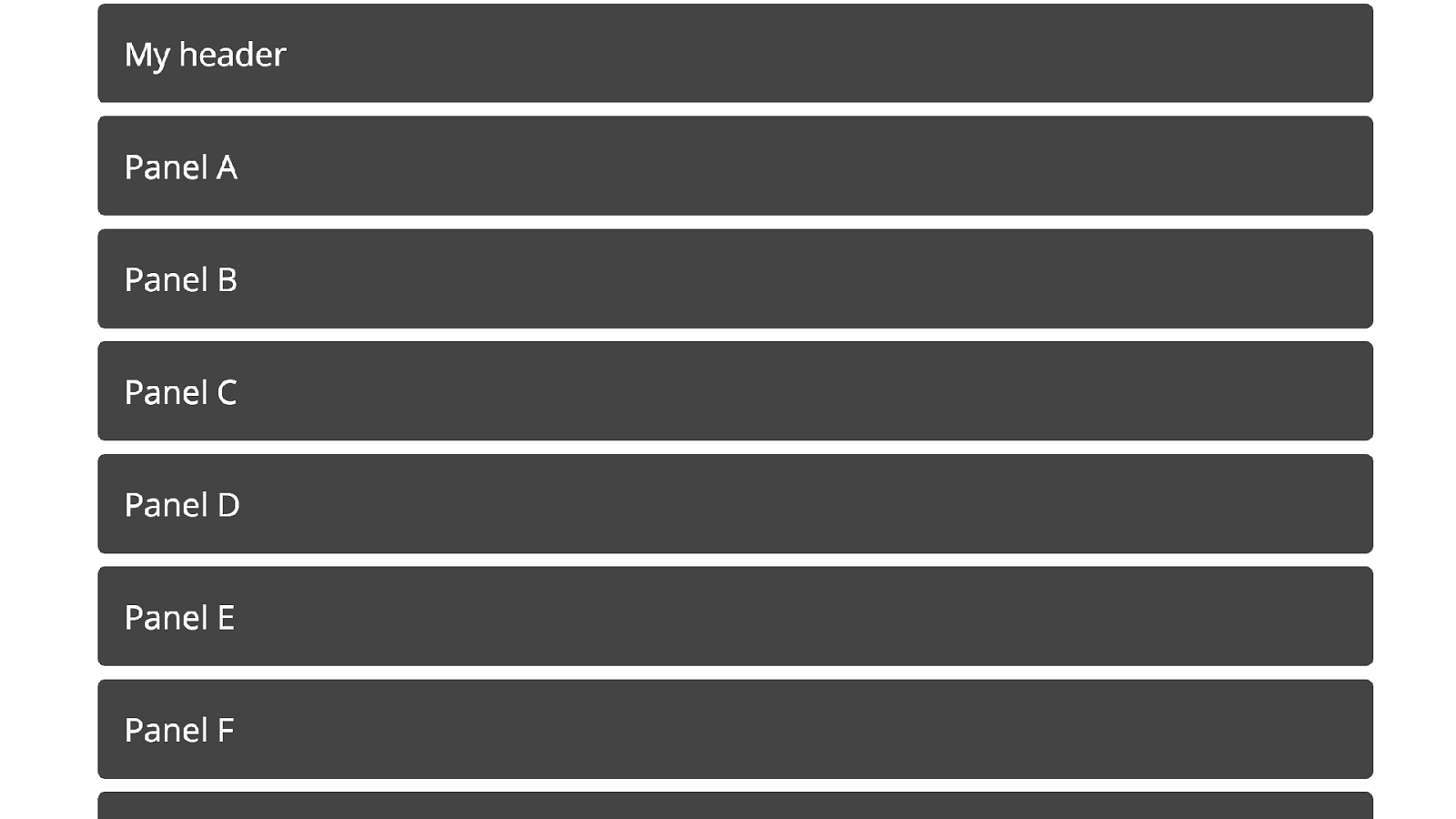
It might be that the component is small enough that this is ok, you could just leave it to display like this. However let’s say this would mean the blocks were spread right across the screen, so you want to create some sort of fallback.
It would be hard to get a fallback with panels neatly spanning two rows without add a lot of extra markup, but perhaps you could use flexbox to get a similar layout without that.
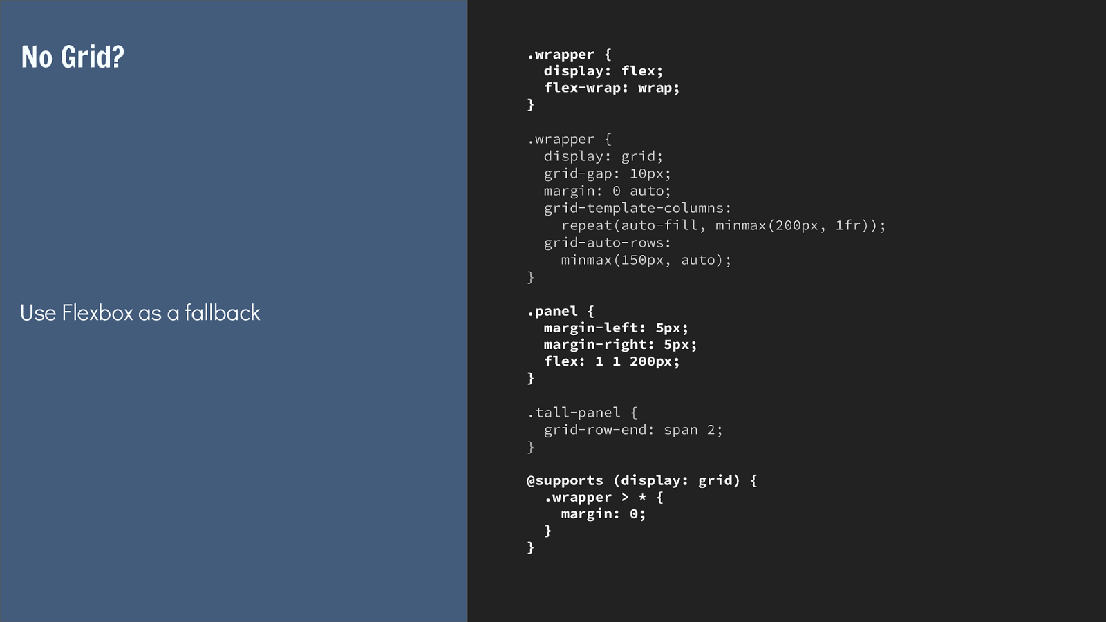
.wrapper {
display: flex;
flex-wrap: wrap;
}
.wrapper {
display: grid;
grid-gap: 10px;
margin: 0 auto;
grid-template-columns:
repeat(auto-fill, minmax(200px, 1fr));
grid-auto-rows:
minmax(150px, auto);
}
.panel {
margin-left: 5px;
margin-right: 5px;
flex: 1 1 200px;
}
.tall-panel {
grid-row-end: span 2;
}
@supports (display: grid) {
.wrapper > * {
margin: 0;
}
}
No Grid?
Use Flexbox as a fallback
So I’m pretty much able to rely on the fact that if a flex item becomes a grid item it loses its flex properties, so as long as I declare display flex before display grid, if our
browser doesn’t support grid it will ignore the grid value of display and make the child items of wrapper flex items. So the flex properties on panel will apply to set a width
on the panel.
If the browser supports grid then the items will become grid items. The flex property is ignored as the sizing is now defined by the grid container.
In my feature queries all I need to do is remove the margin if the browser supports grid, as in grid layout we can use grid gap.
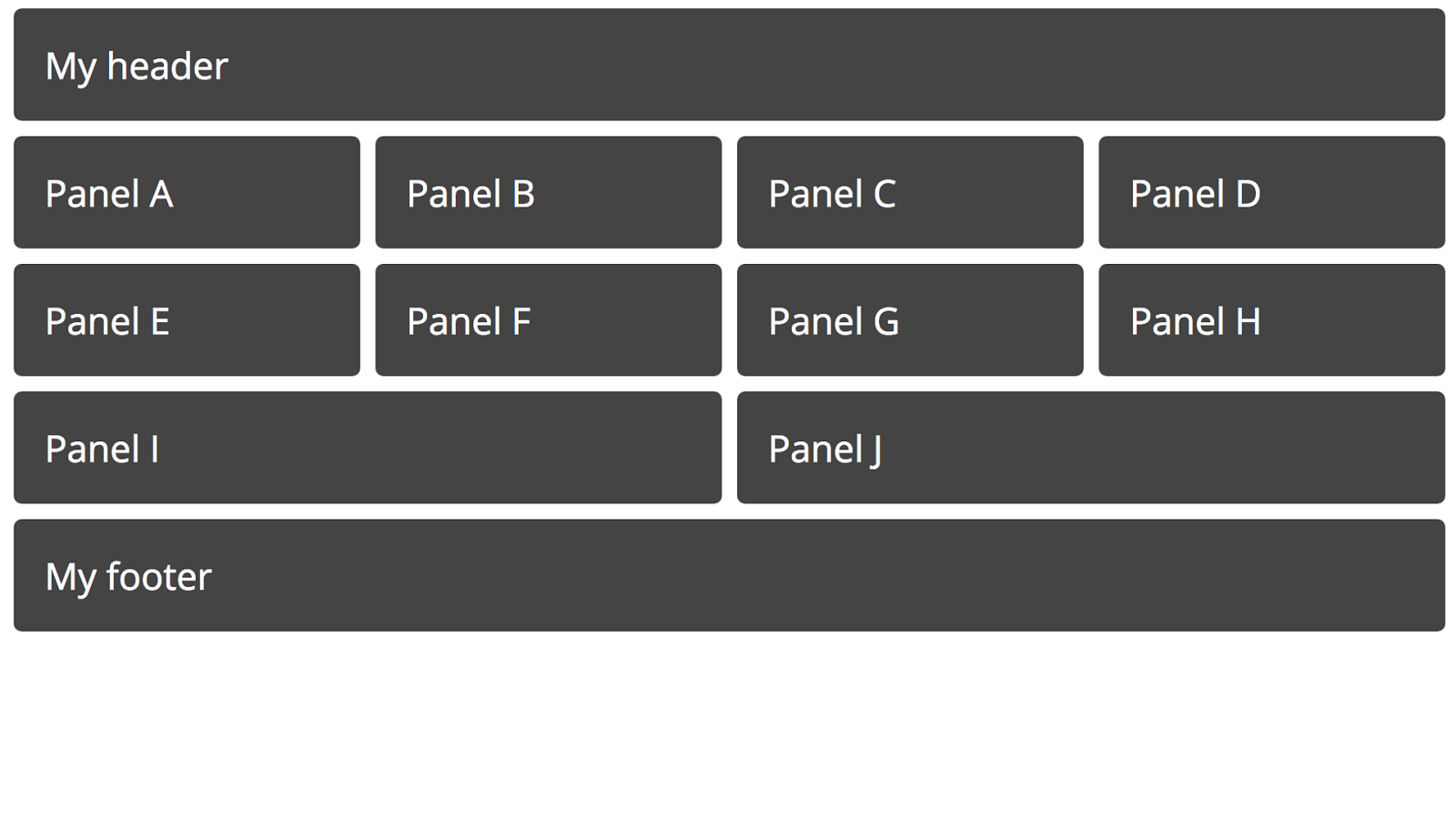
Which gives you this. That component is now a self contained part of your design, ready to be dropped in to work in an ideal way for grid browsers and a perfectly acceptable way for older browsers.
Keep fallback code with the component in the pattern library. Using a system like Fractal you can keep your fallback code in the pattern library alongside the up to date code, it’s really obvious in that scenario what it is and what it does.
Keeping al of this together in the pattern ensures that our use of the cascade doesn’t get jumbled up turning our grid items into flex items in grid supporting browsers.
It also means that in the future, you can remove that additional CSS far more easily as you know where it is and how to find it.

I ! pattern libraries! I can honestly say that moving to work pattern library first has pretty much transformed the way I build websites, I can’t imagine starting a new project any other way at this point. My up coming redesign of my own site is in a pattern library, the Perch docs, the Perch websites all started life in Fractal. For the Perch websites we have di ff erent colour themes for the di ff erent properties - all managed via Sass and through the pattern library which generates the individual CSS files for each site.
Some final thoughts.

Designing a component seems less overwhelming than designing a whole site. As a developer, who sometimes has to design things I find that using a pattern library has helped me to be more creative and less overwhelmed by design. I can work on a component and get that to a level I am happy with without having the blank page syndrome of the entire site staring at me.
Developing CSS in the Pattern Library makes CSS more manageable. I really think that working out of a pattern library deals with one of the big problems in CSS, that of organising large code bases over time.
You can consider the organisation of the code as a separate thing inside the library and then use your build tools to organise it in the best way for your site.
Pattern library first keeps the build process and the runtime process separate. Keeping all of our build process in the pattern library keeps the site projects clean and tidy and allows us to experiment with individual components outside of the site.

Components are reduced test cases. Allowing you to more easily embrace new techniques and deal with old browsers. Working component first means working reduced test case first.
Choose tools that allow you to refactor the pattern library as things change. Don’t stress the naming and organisation. It will be hard smoke sure you have a tool that allows you to workout out as you go along.
Make the pattern library the source of truth and it can’t get out of date. And figure out a way to make the pattern library the source of truth, if you have to work in it to create new CSS then it can never drift from what is used on the website.
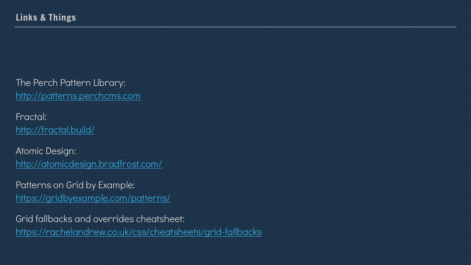
Links & Things The Perch Pattern Library: http://patterns.perchcms.com
Fractal: http://fractal.build/
Atomic Design: http://atomicdesign.bradfrost.com/
Patterns on Grid by Example: https://gridbyexample.com/patterns/
Grid fallbacks and overrides cheatsheet: https://rachelandrew.co.uk/css/cheatsheets/grid-fallbacks
Thank you! @rachelandrew Resources and slides: https://rachelandrew.co.uk/speaking/event/patterns-day