Making Things Better @rachelandrew #aeaden

A presentation at An Event Apart Denver in October 2019 in Denver, CO, USA by Rachel Andrew
Making Things Better @rachelandrew #aeaden
Redefining the technical possibilities of CSS
“Tableless web design” The move from tables to CSS for layout meant simplifying our designs.
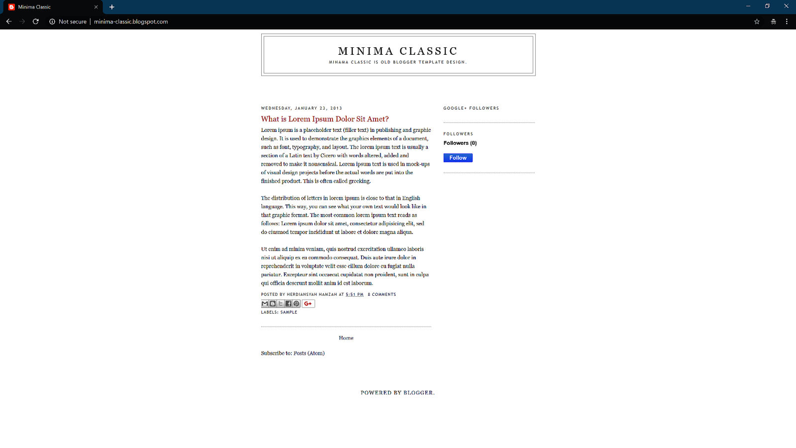
What we see as good web design is rooted in the technical limitations of CSS2
How we see the web is still informed by those early days.
“The web is not print”
“[I] accepted that CSS is just hacks over top of a document model that was never designed to be used like it is today” - Bailey Ling http://bling.github.io/blog/2013/04/13/dot-net-slash-wpf-to-html-slash-css-slash-javscript/
We have solved many of those problems That doesn’t mean we got all of them!
You never know how tall anything is on the web.

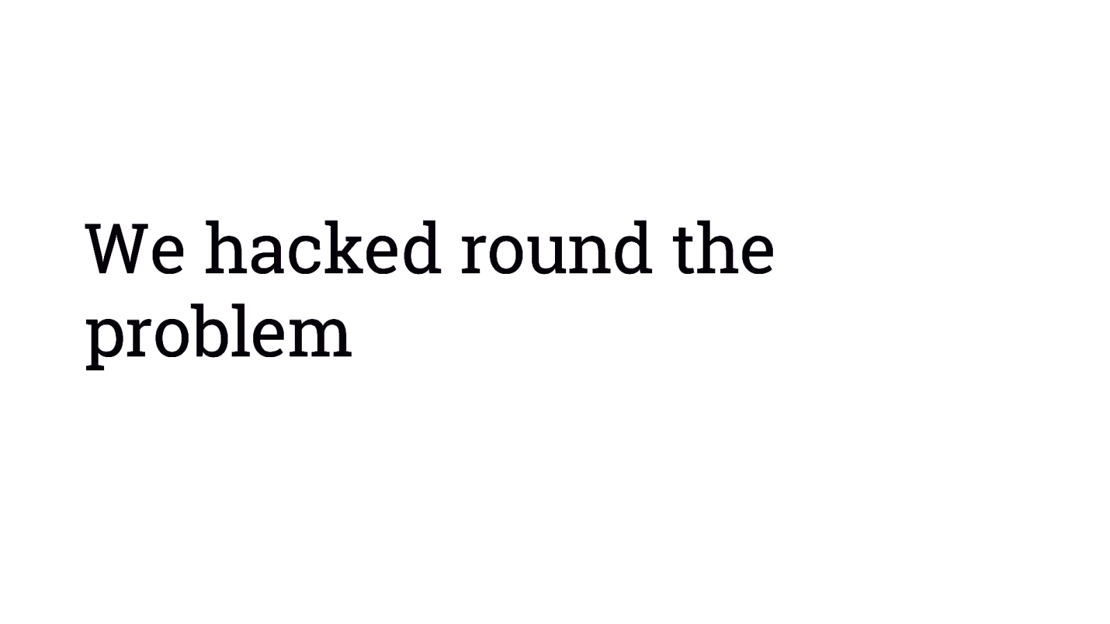
We hacked round the problem
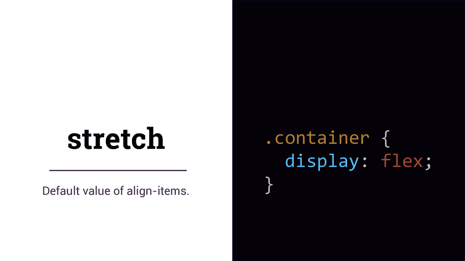
stretch Default value of align-items. .container { display: flex; }
The default behaviour of these methods is the thing we struggled with for so long.
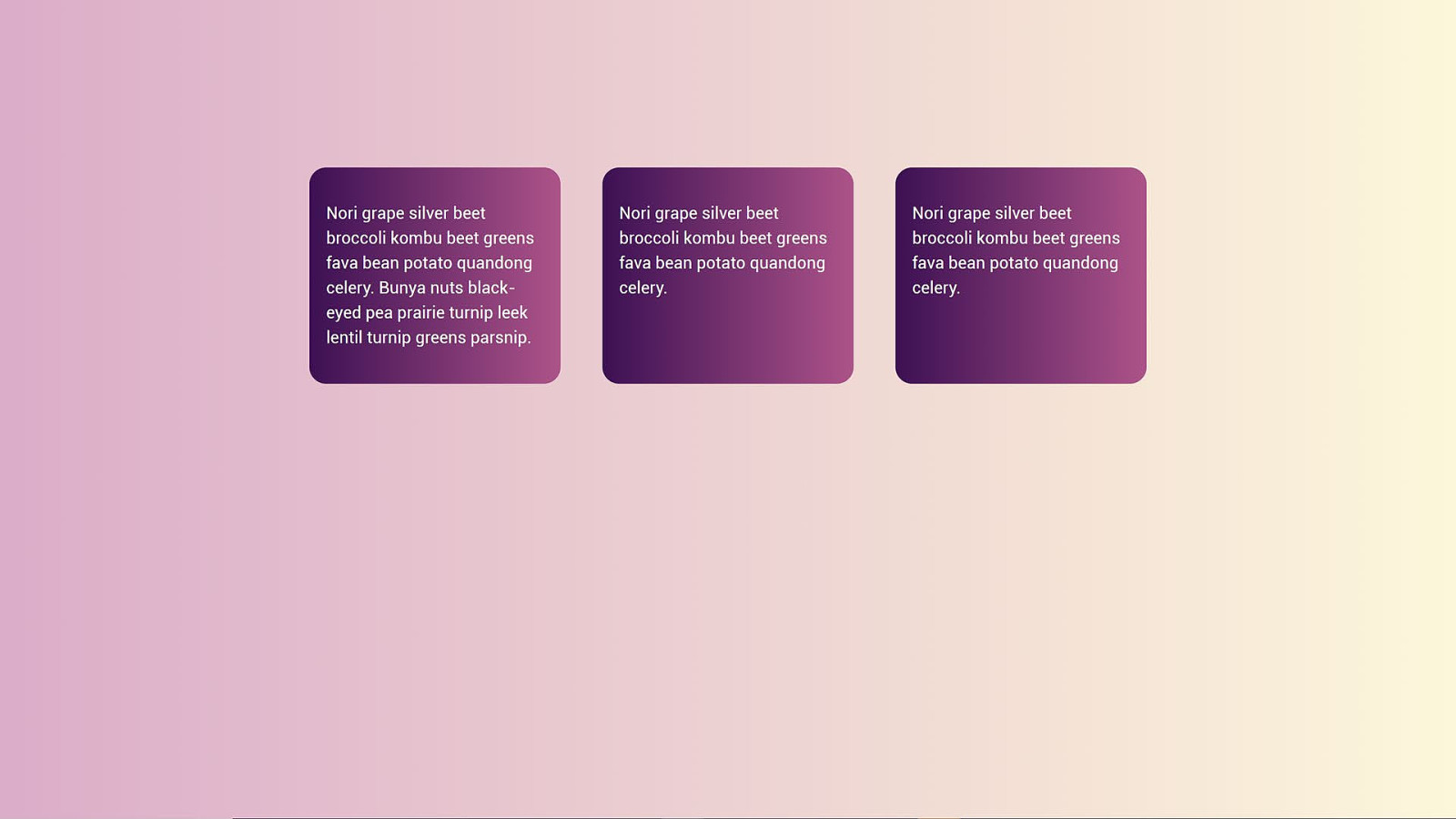
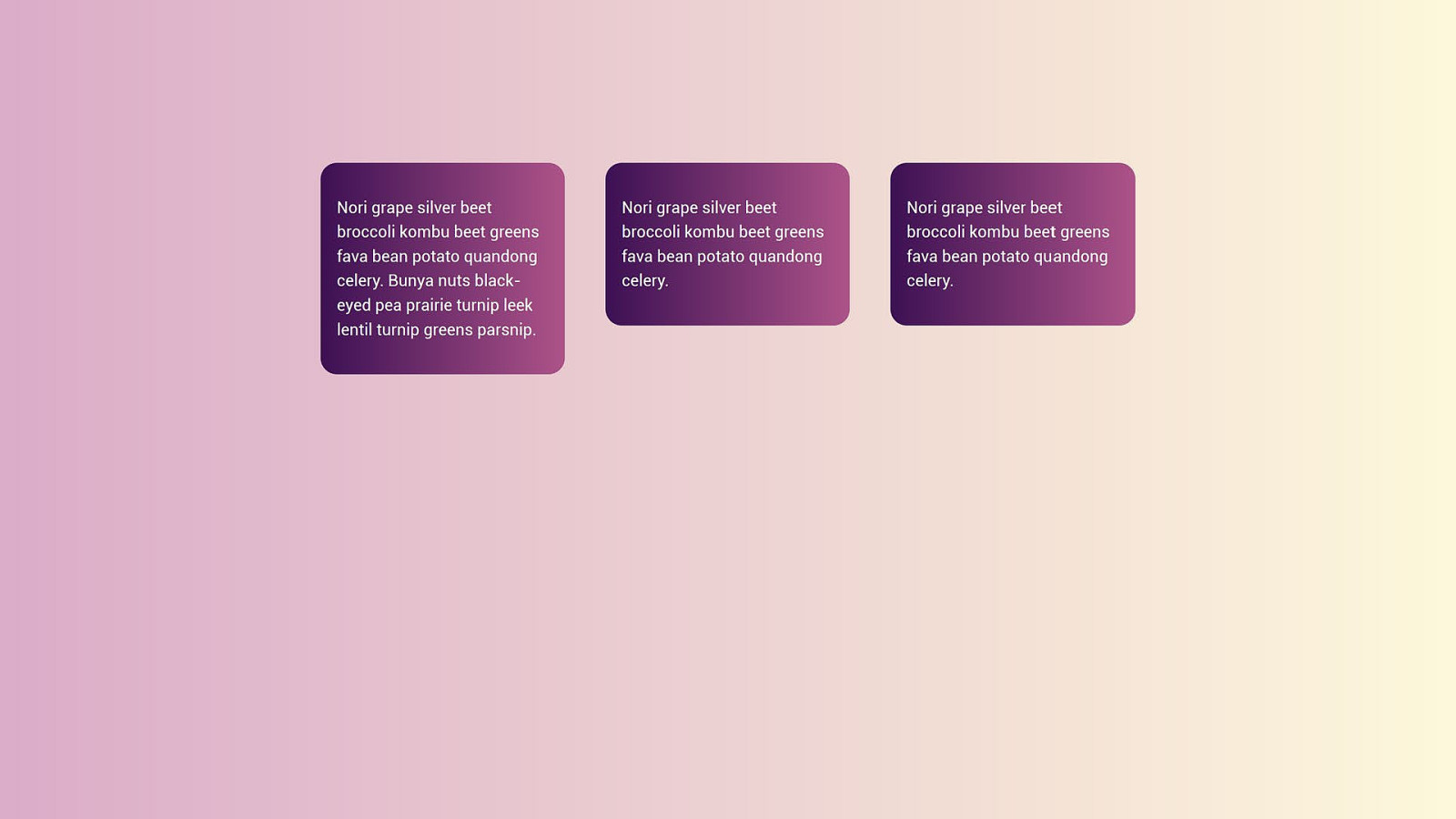
How big is this box?
Graduating To Grid https://aneventapart.com/news/post/graduating-to-grid-by-rachel-andrew-aea-video
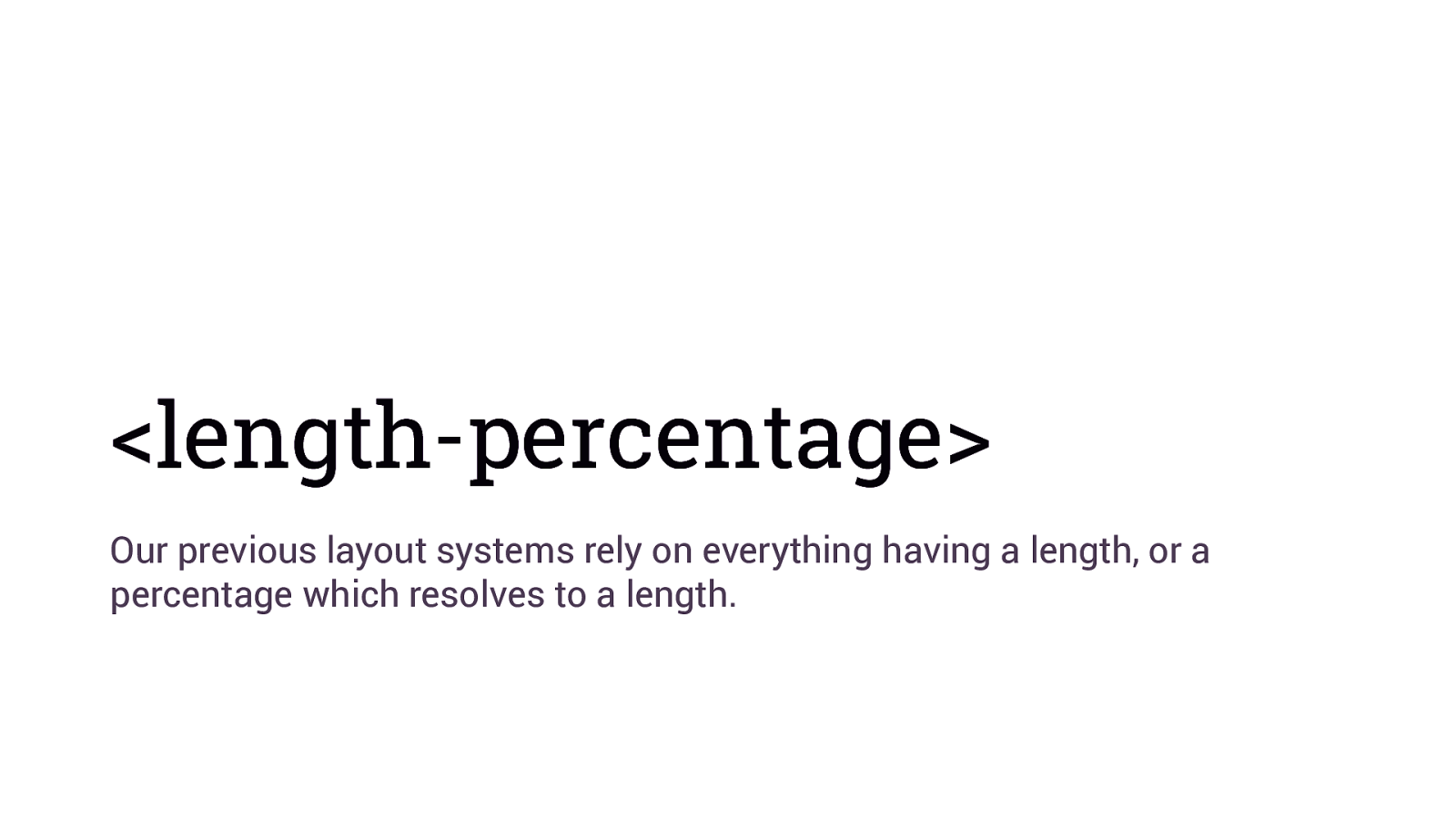
<length-percentage> Our previous layout systems rely on everything having a length, or a percentage which resolves to a length.
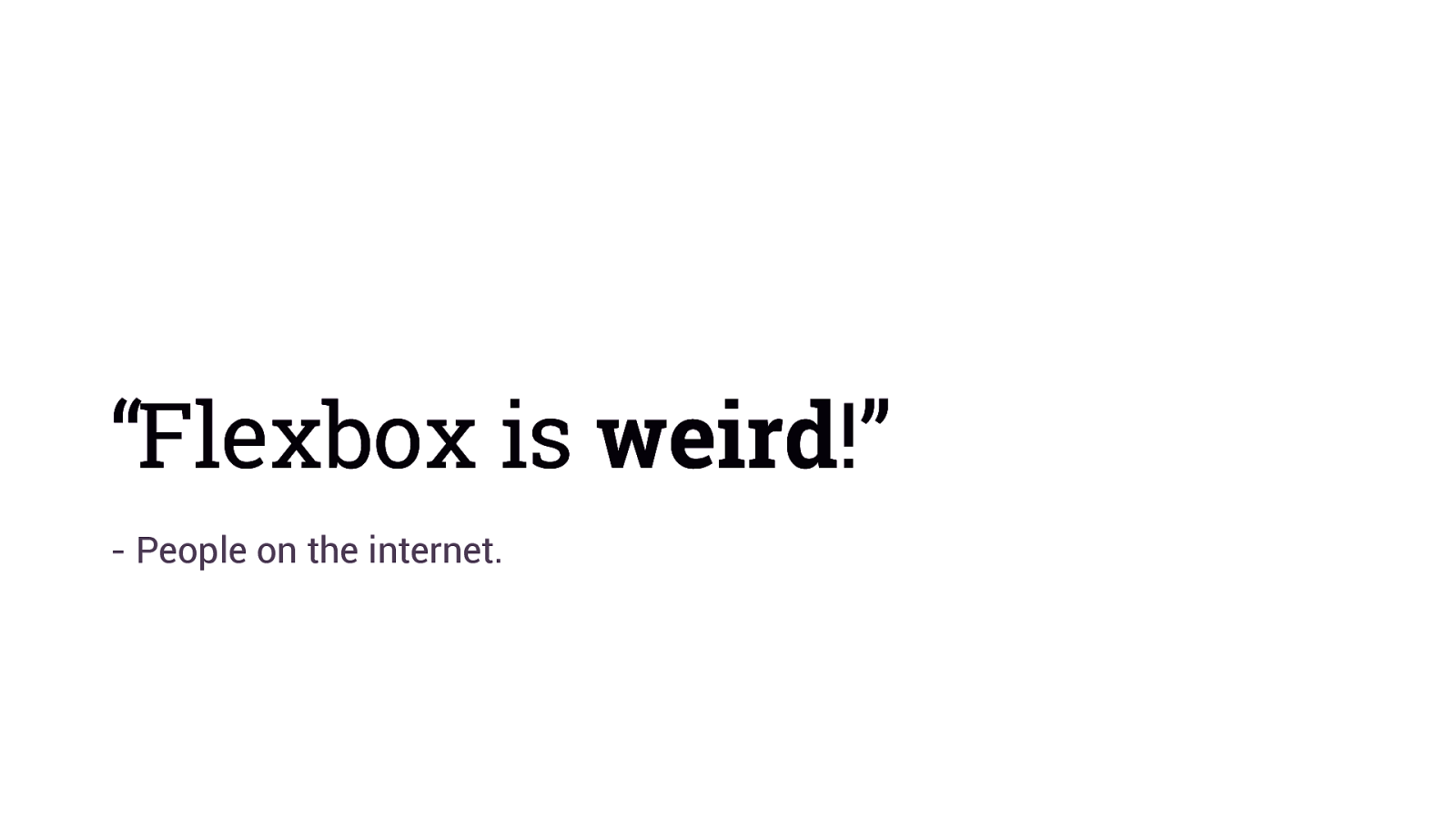
“Flexbox is weird!” - People on the internet.
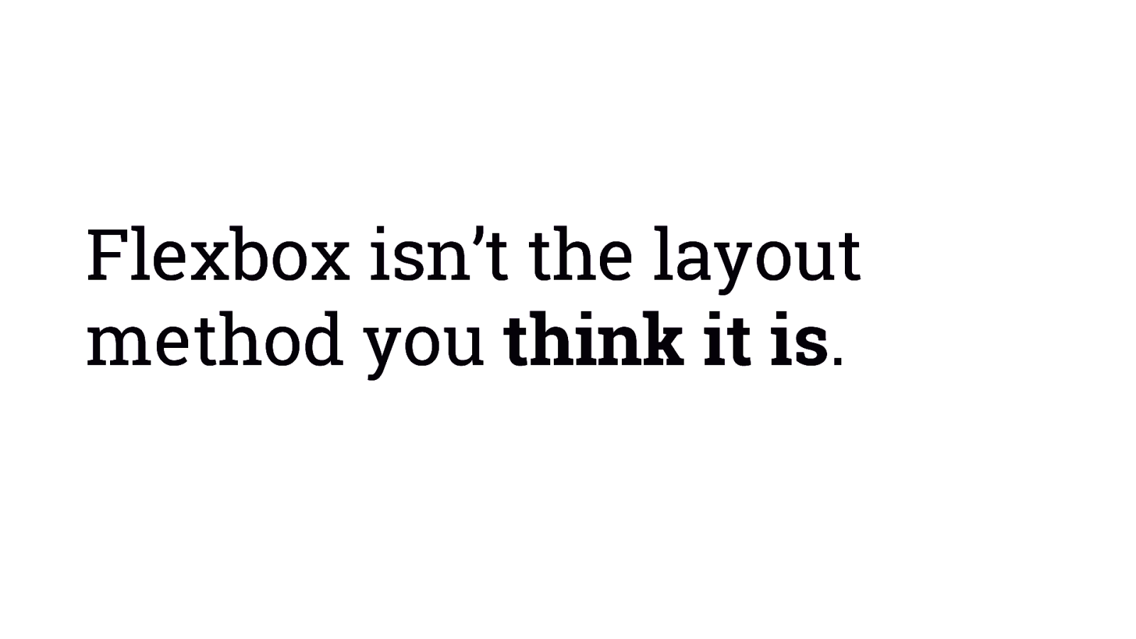
Flexbox isn’t the layout method you think it is.
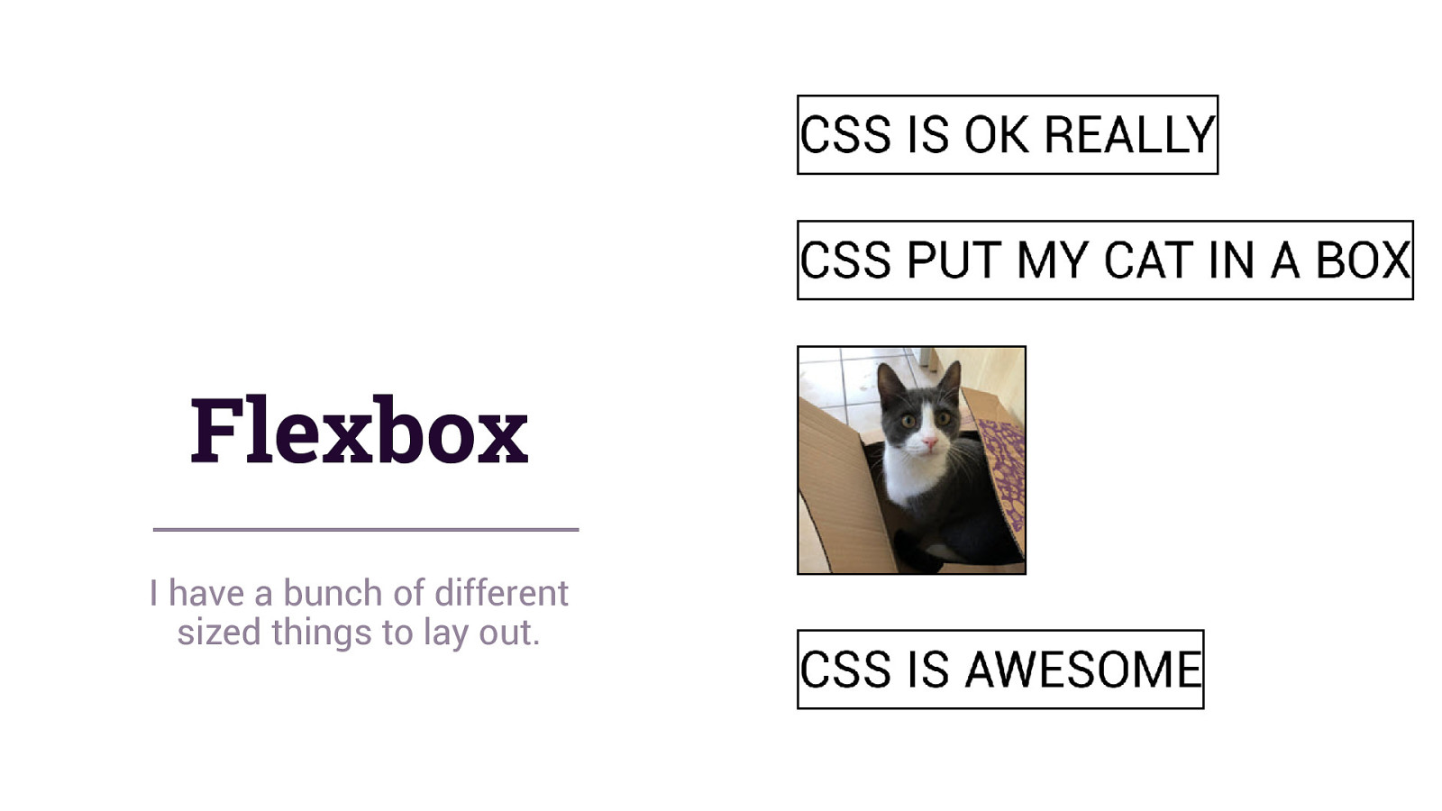
Flexbox I have a bunch of different sized things to lay out.
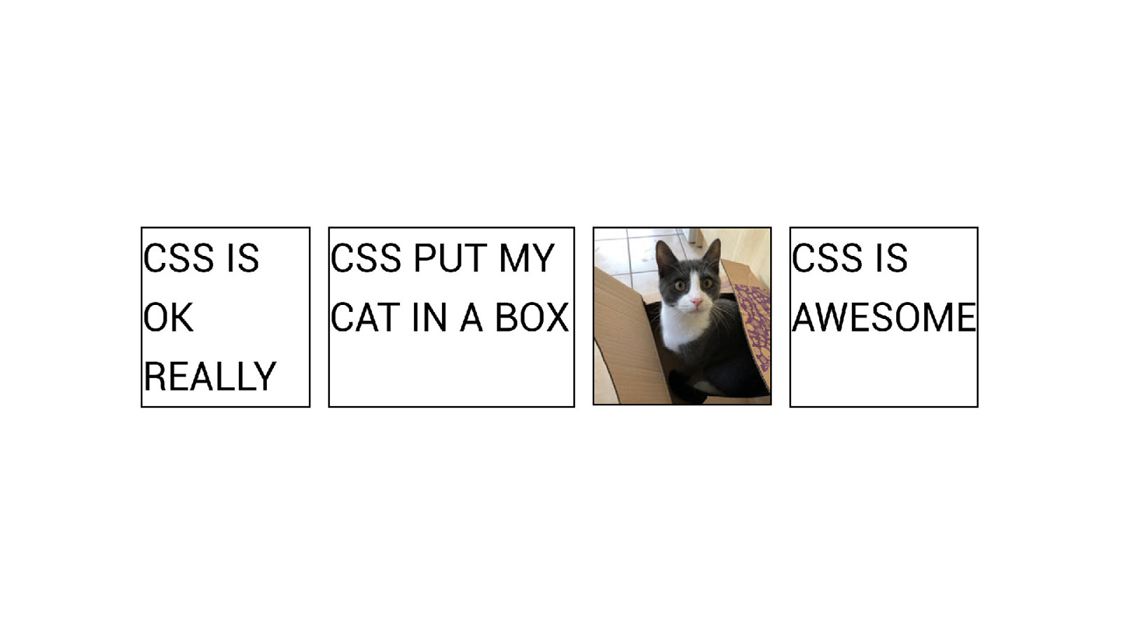
Not everything requires a CSS hack. CSS may have solved your problem.
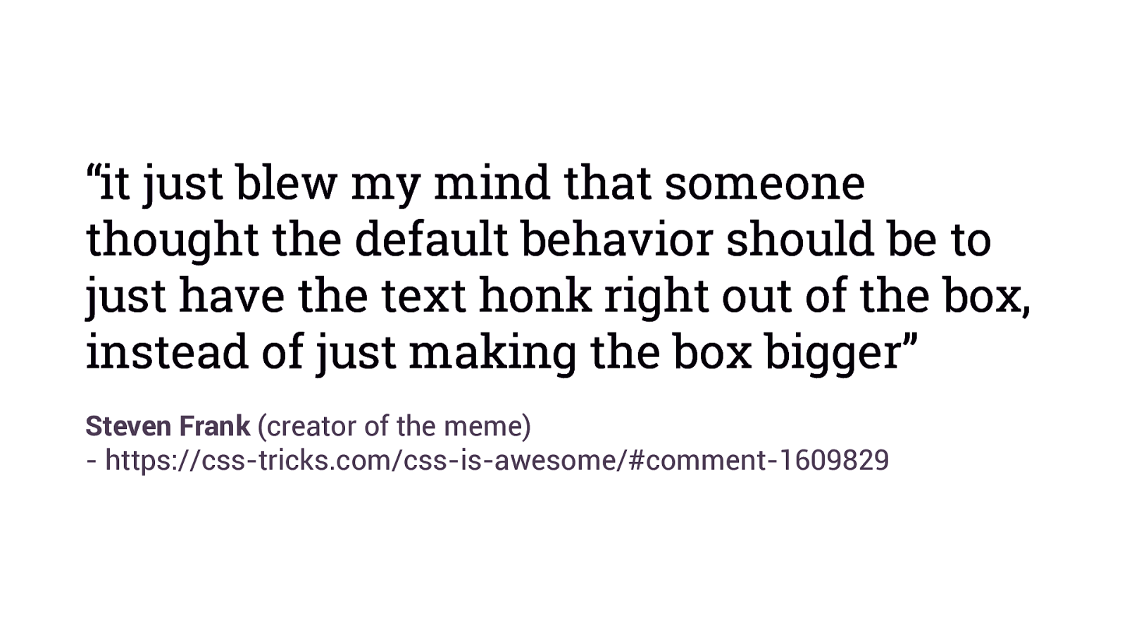
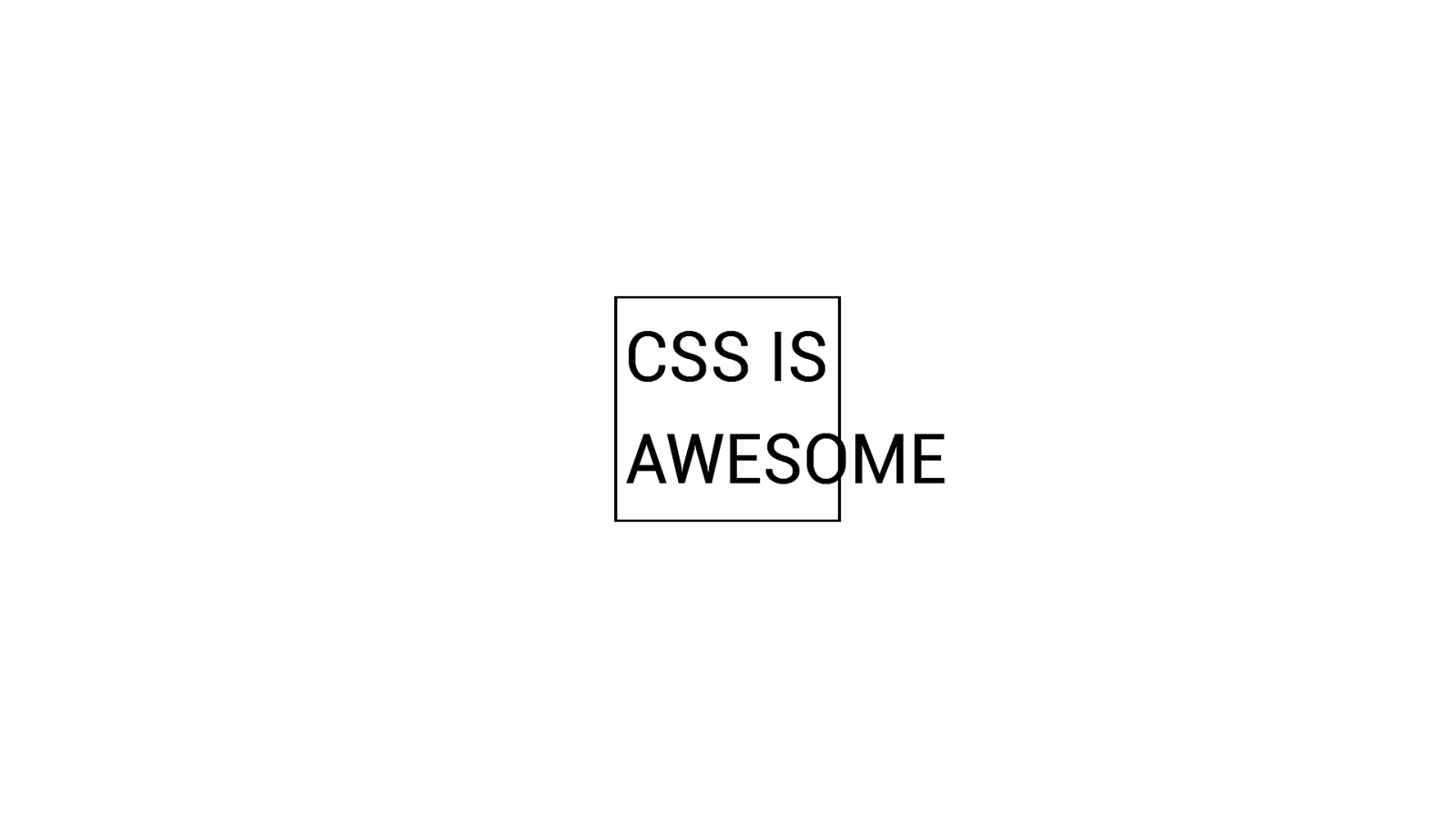
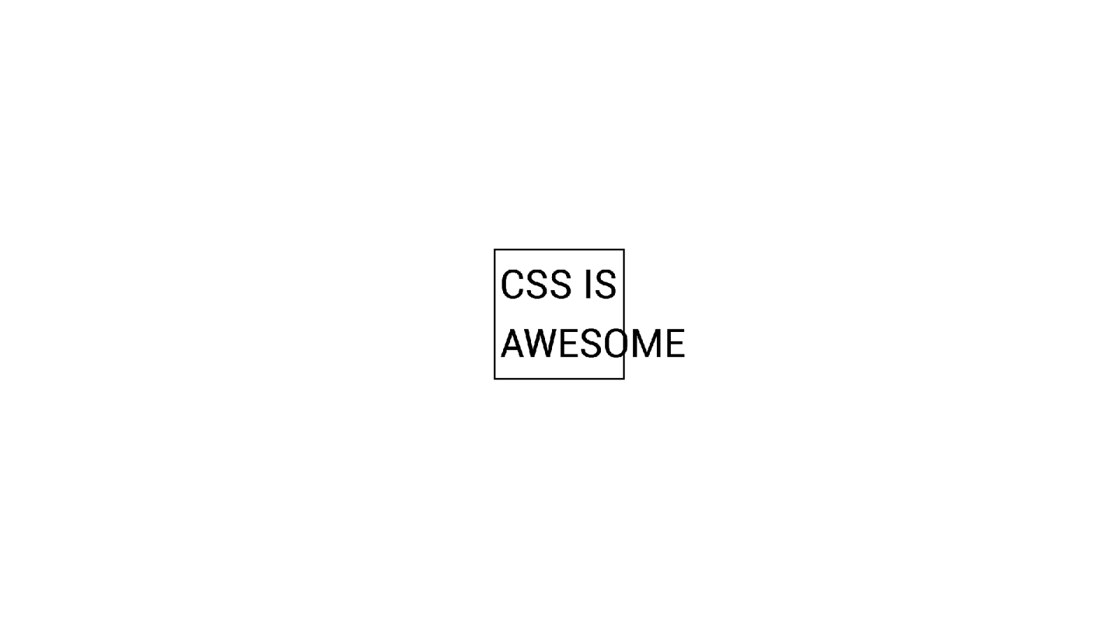
“it just blew my mind that someone thought the default behavior should be to just have the text honk right out of the box, instead of just making the box bigger” Steven Frank (creator of the meme) - https://css-tricks.com/css-is-awesome/#comment-1609829
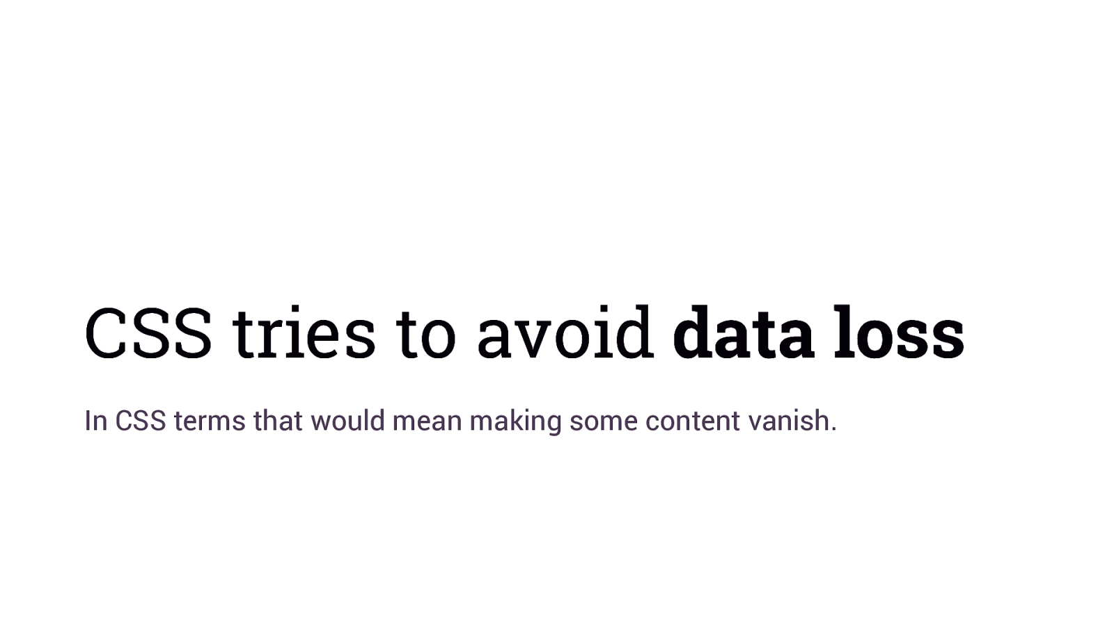
CSS tries to avoid data loss In CSS terms that would mean making some content vanish.
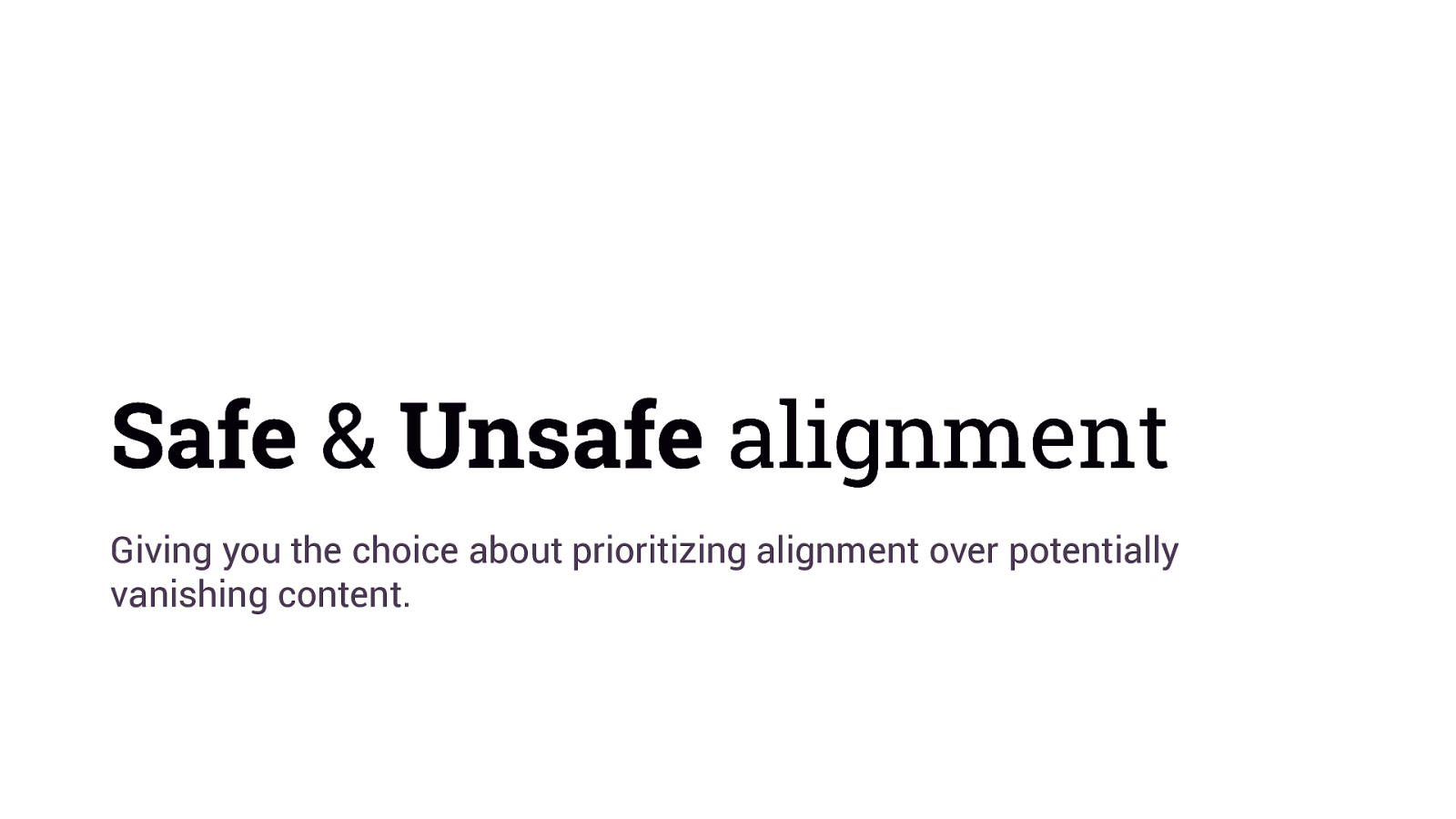
Safe & Unsafe alignment Giving you the choice about prioritizing alignment over potentially vanishing content.
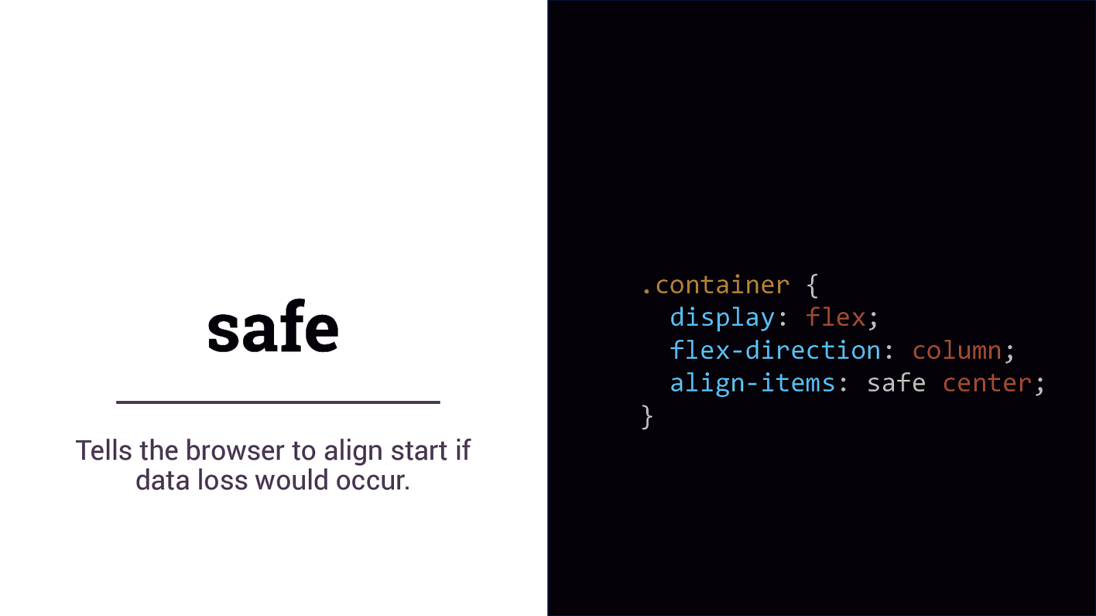
safe Tells the browser to align start if data loss would occur. .container { display: flex; flex-direction: column; align-items: safe center; }
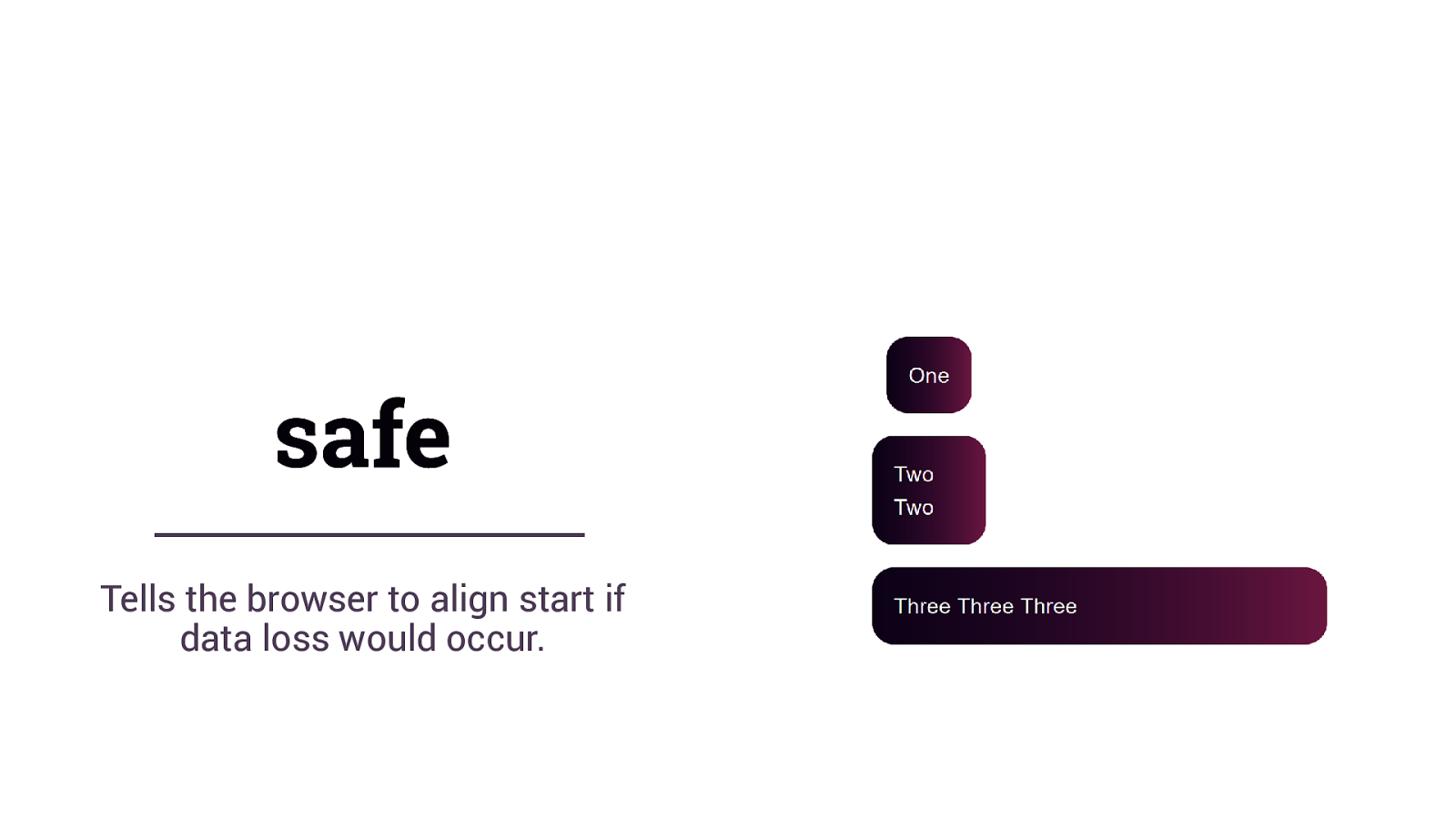
safe Tells the browser to align start if data loss would occur.
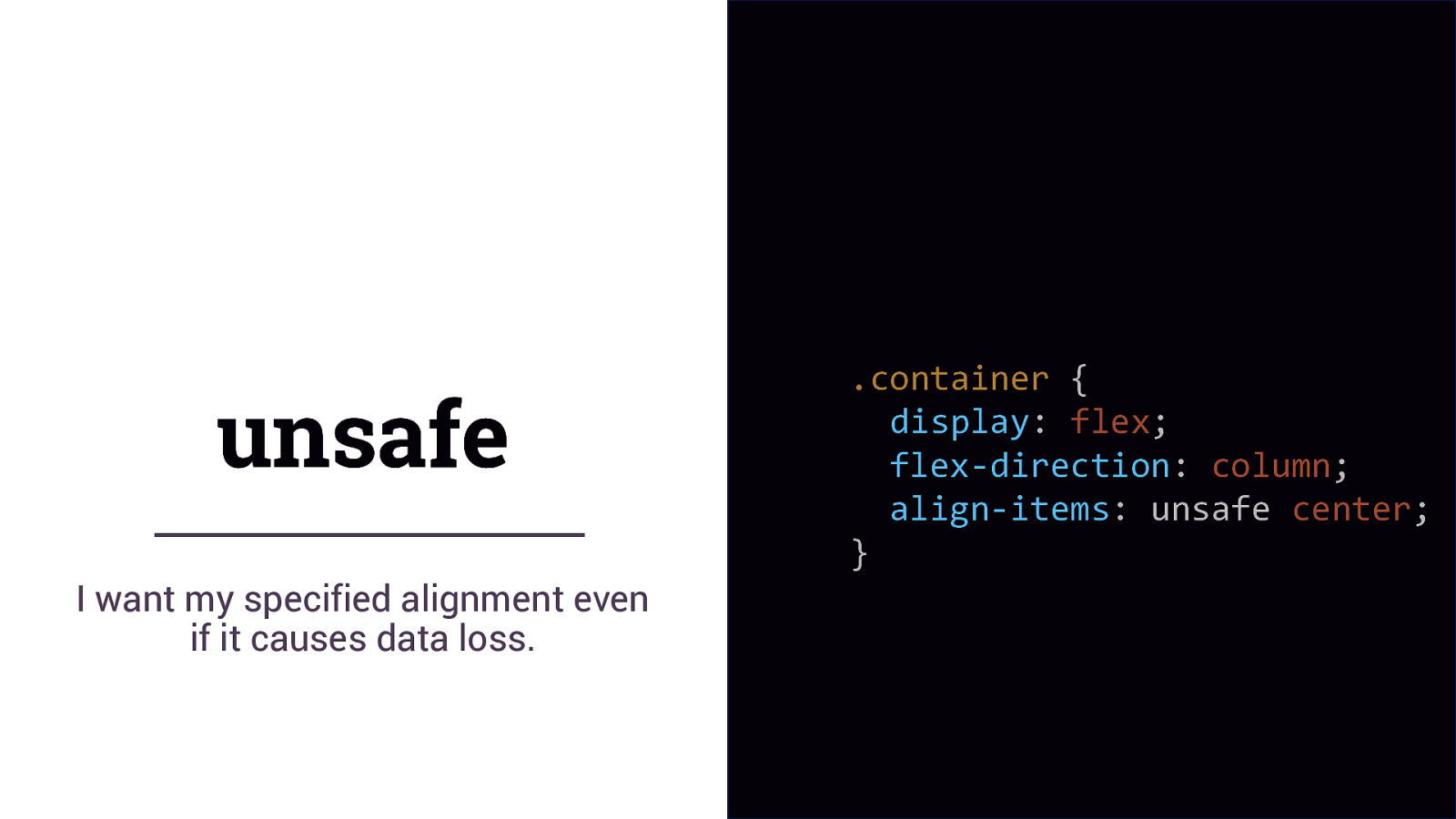
unsafe I want my specified alignment even if it causes data loss. .container { display: flex; flex-direction: column; align-items: unsafe center; }
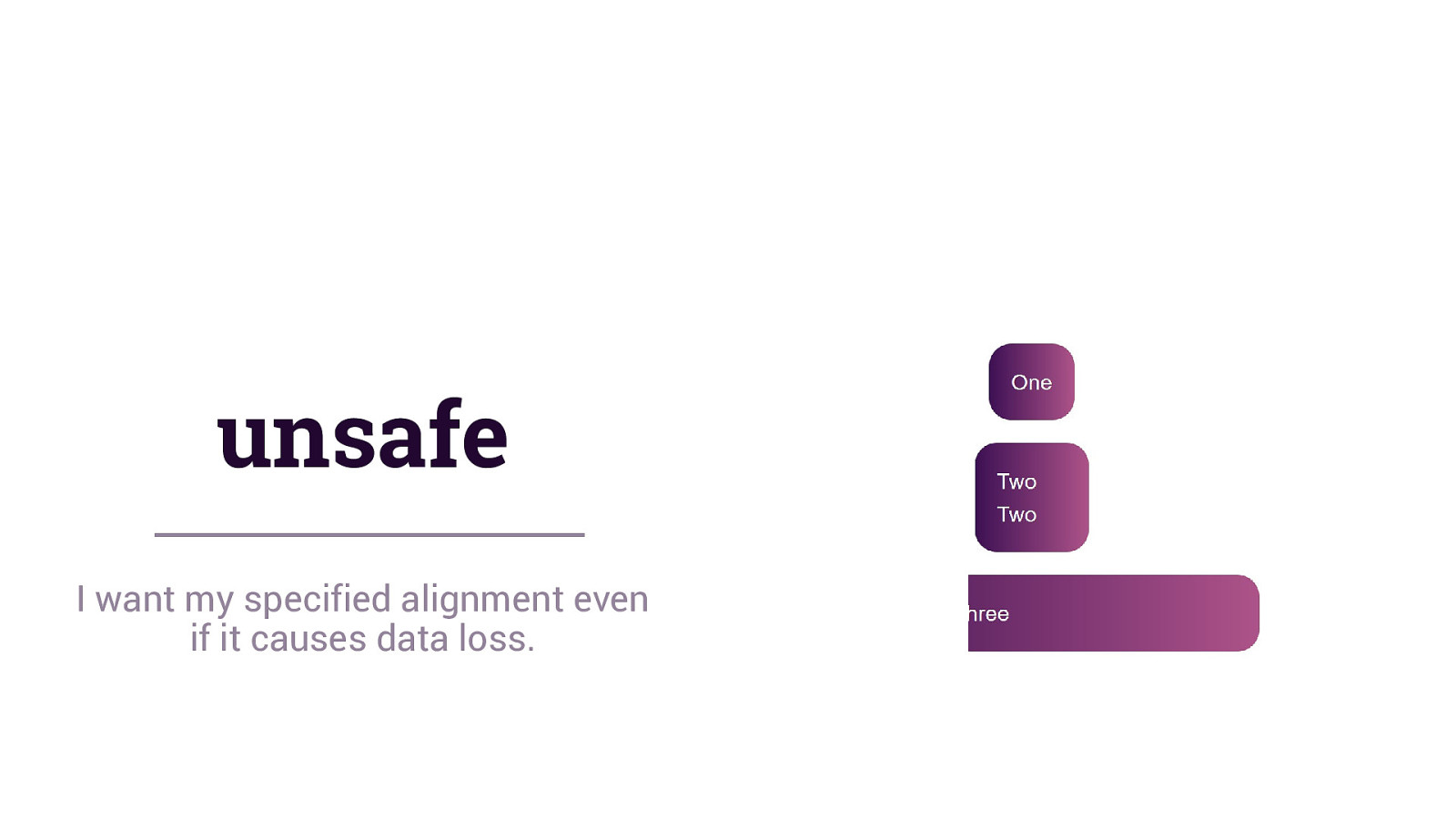
unsafe I want my specified alignment even if it causes data loss.
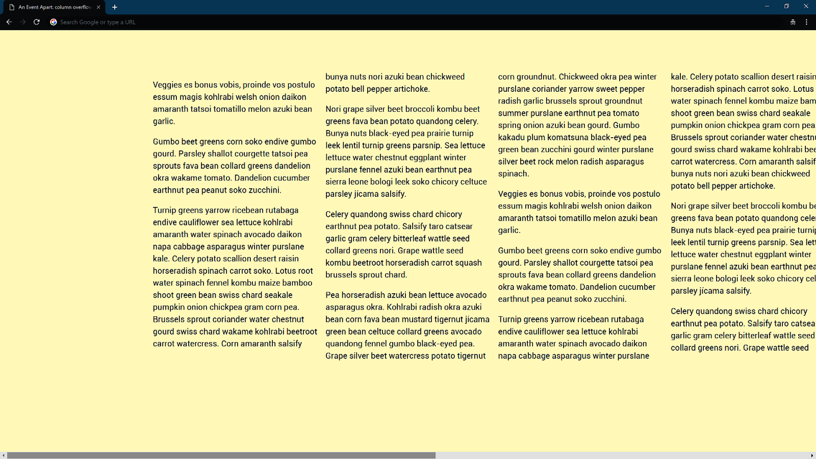
Overflow happens
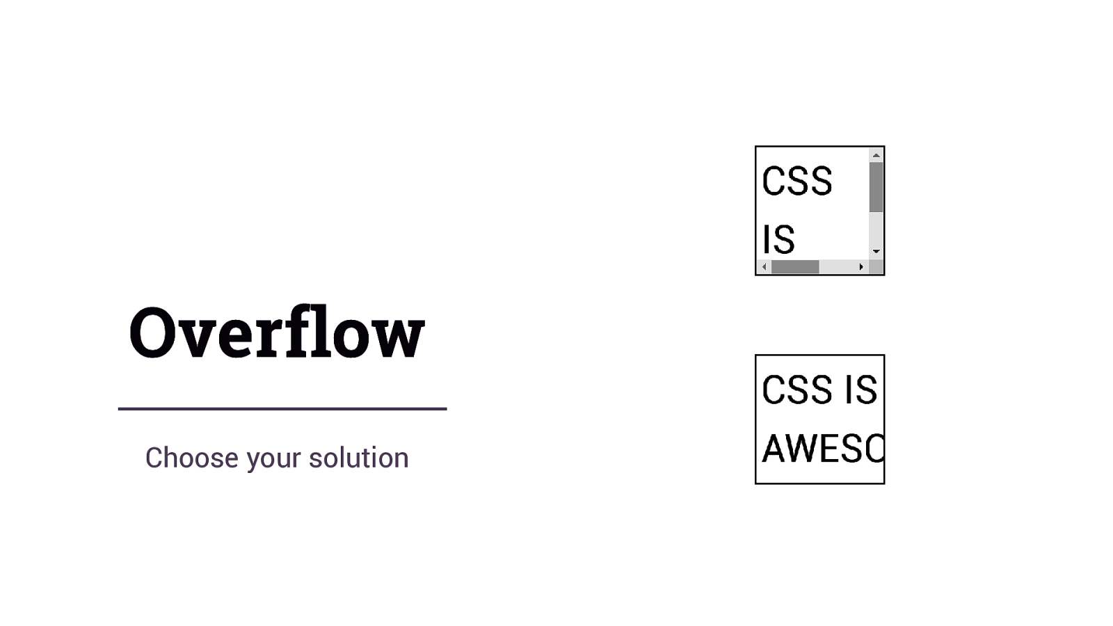
Overflow Choose your solution
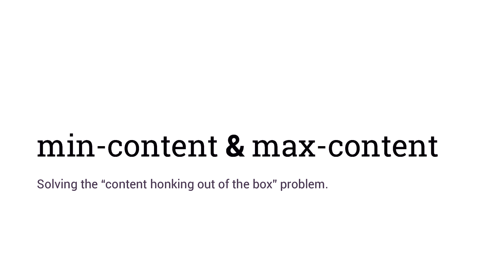
min-content & max-content Solving the “content honking out of the box” problem.
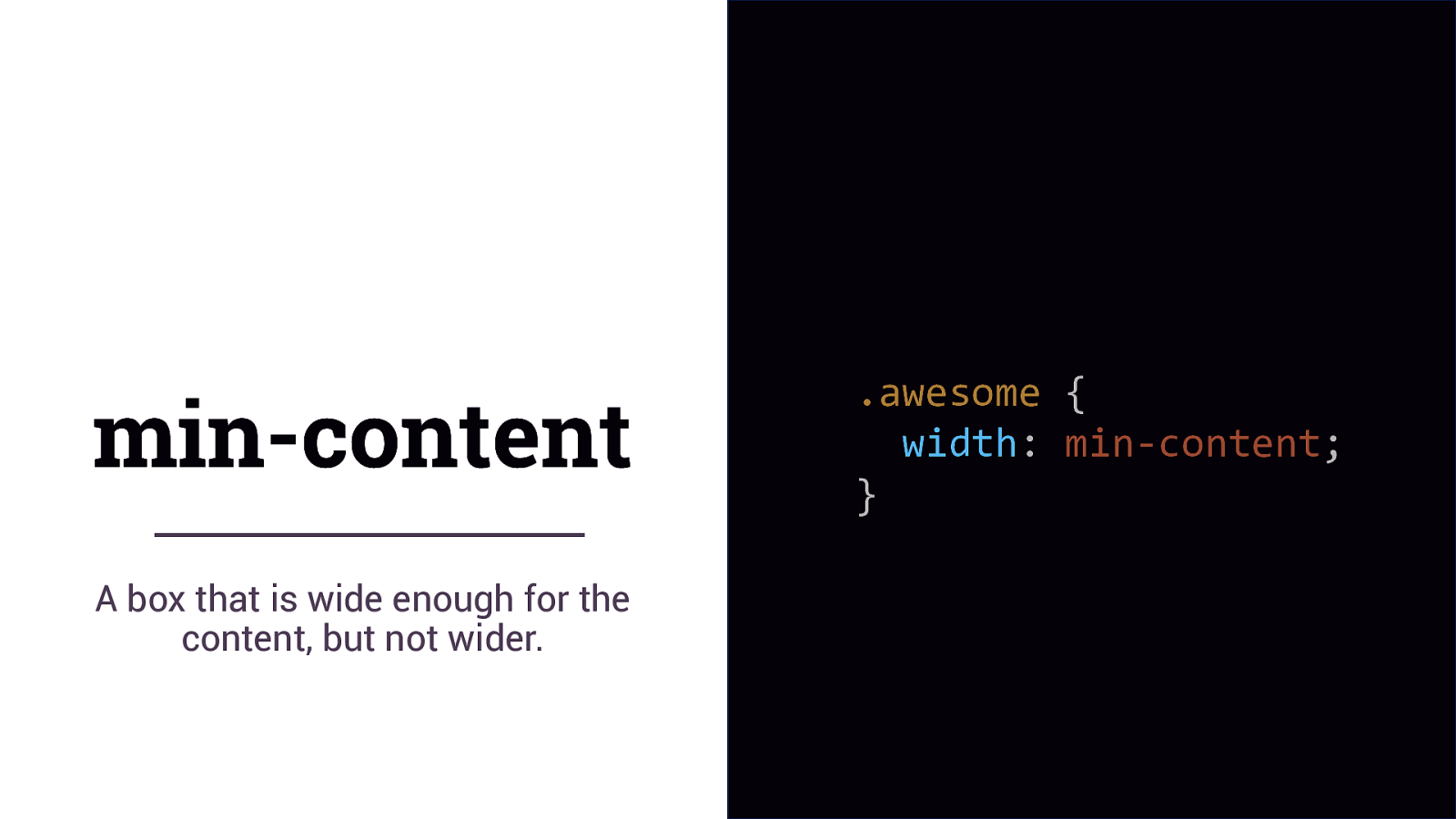
min-content A box that is wide enough for the content, but not wider. .awesome { width: min-content; }
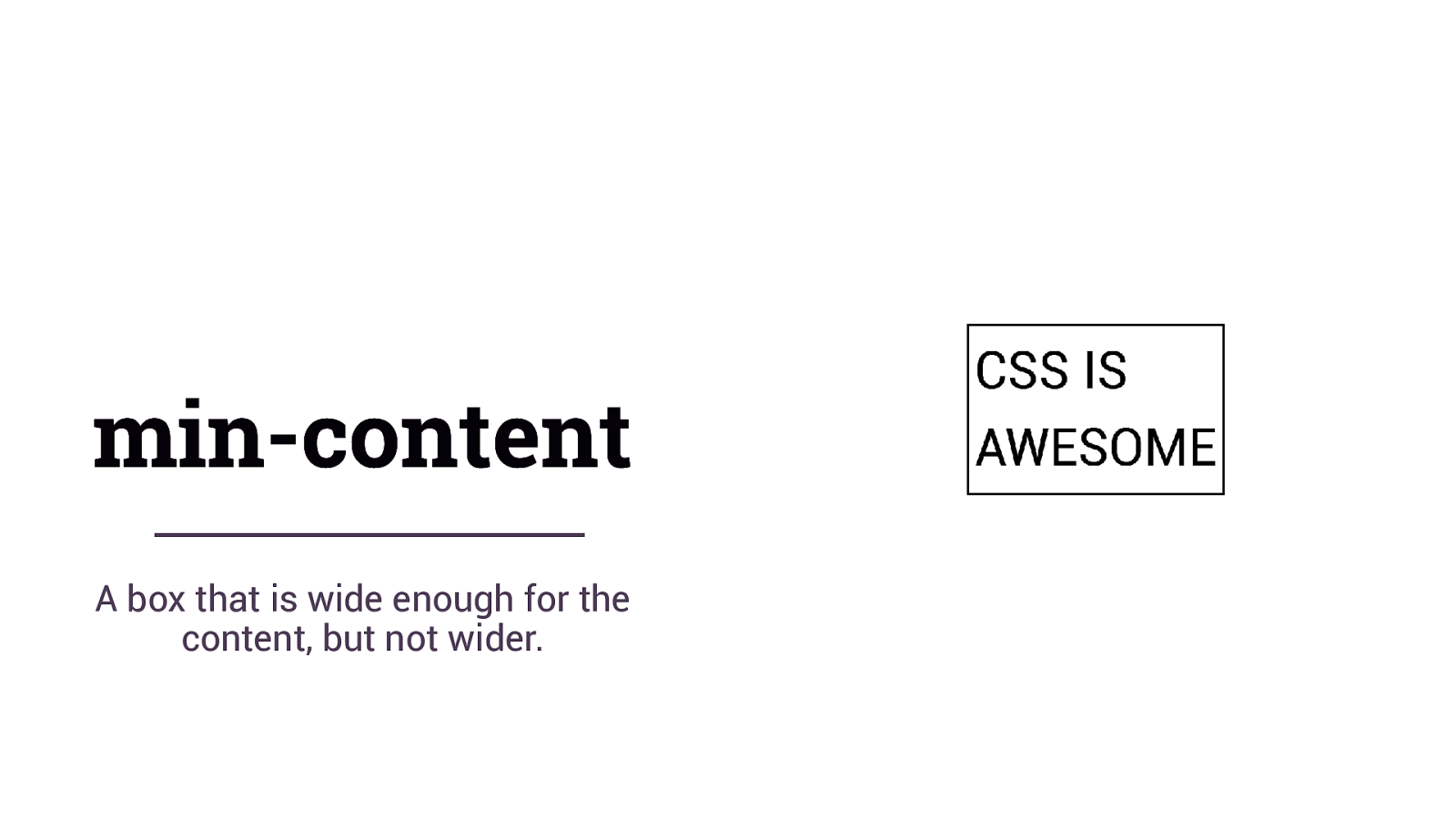
min-content A box that is wide enough for the content, but not wider.
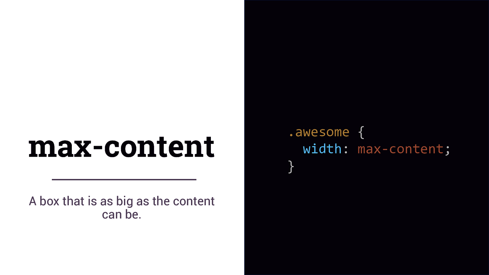
max-content A box that is as big as the content can be. .awesome { width: max-content; }
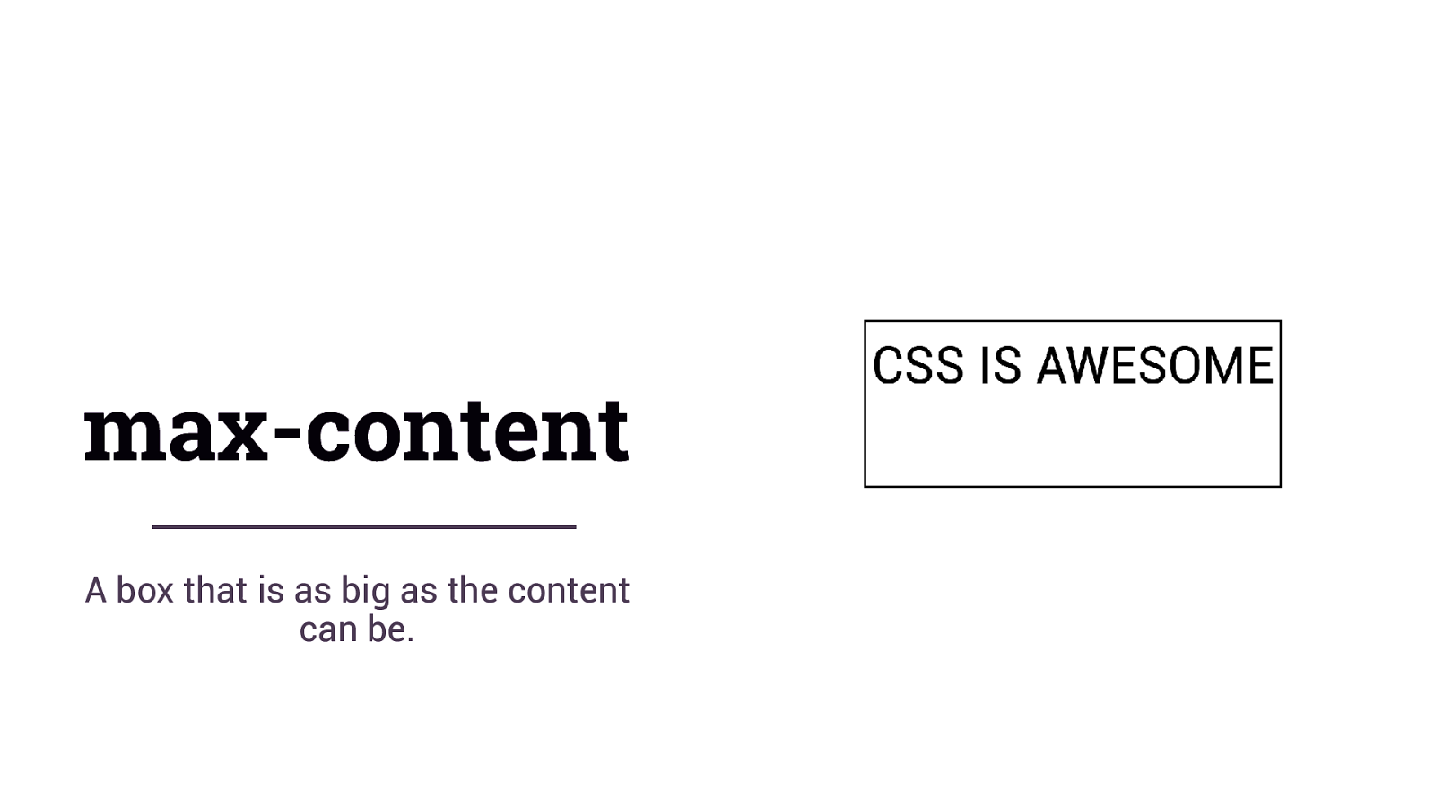
max-content A box that is as big as the content can be.
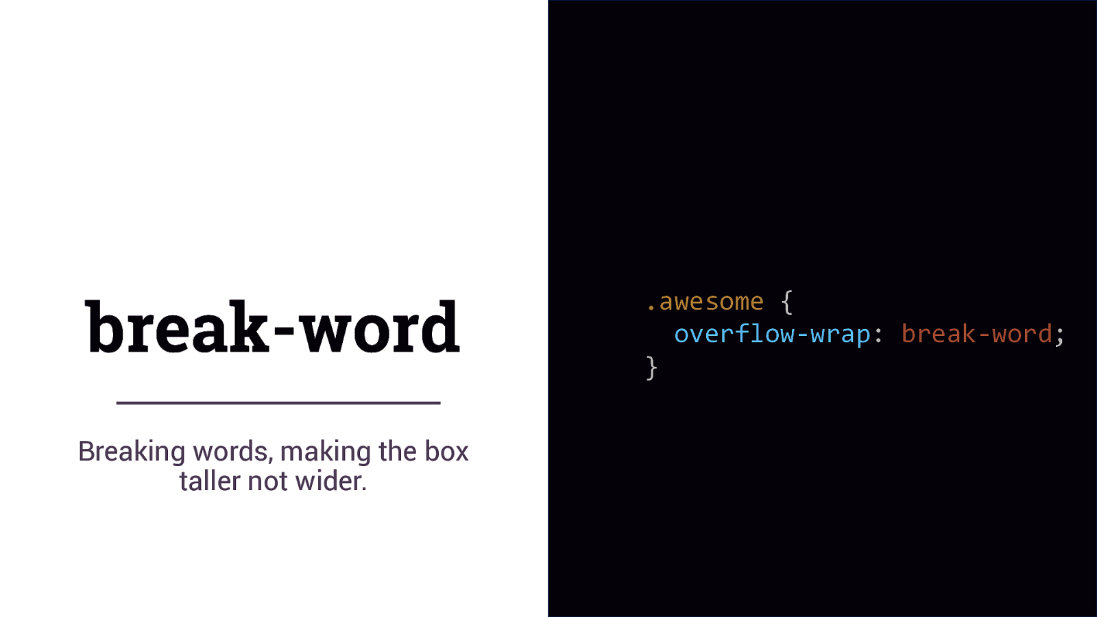
break-word Breaking words, making the box taller not wider. .awesome { overflow-wrap: break-word; }
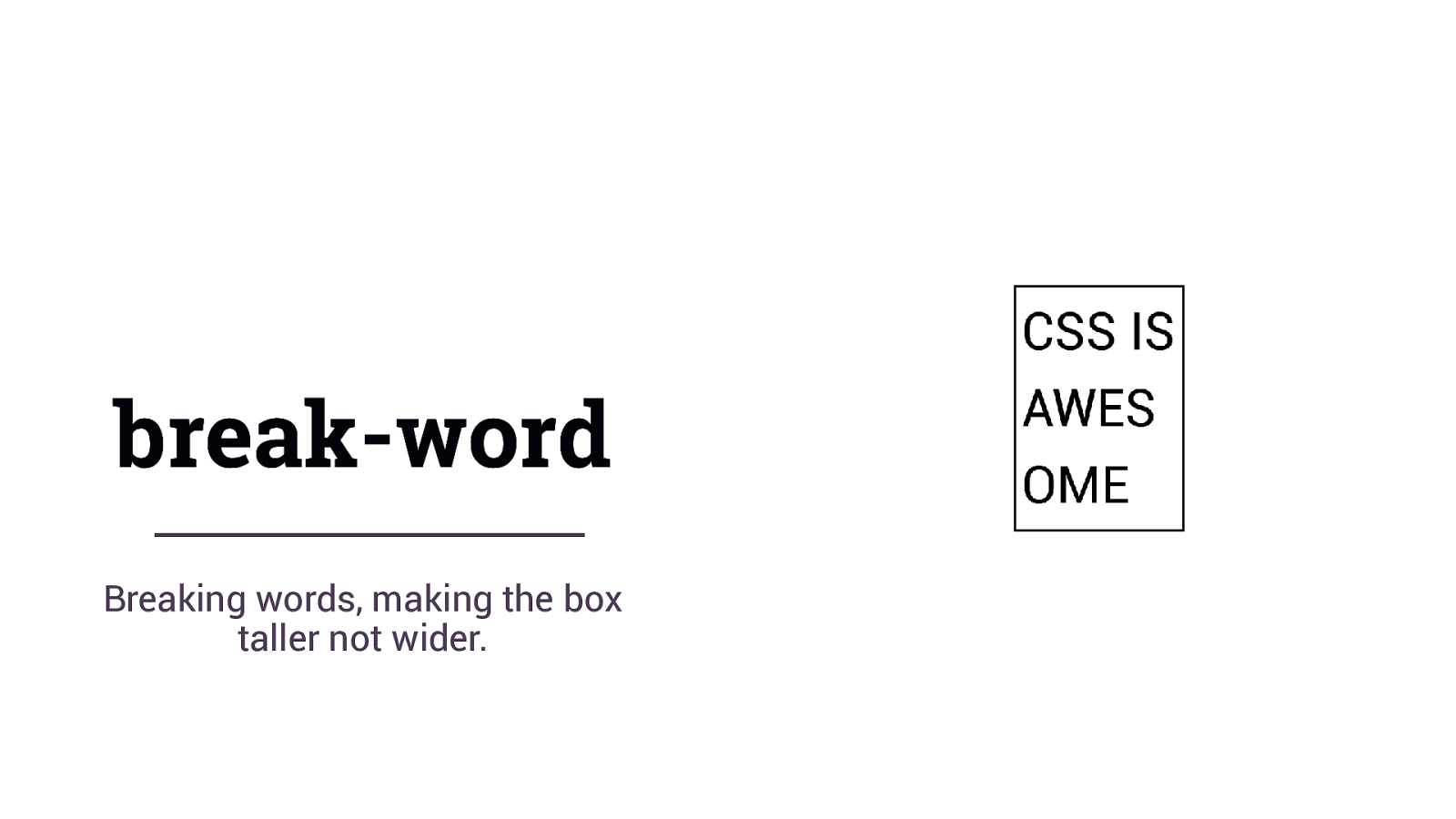
break-word Breaking words, making the box taller not wider.
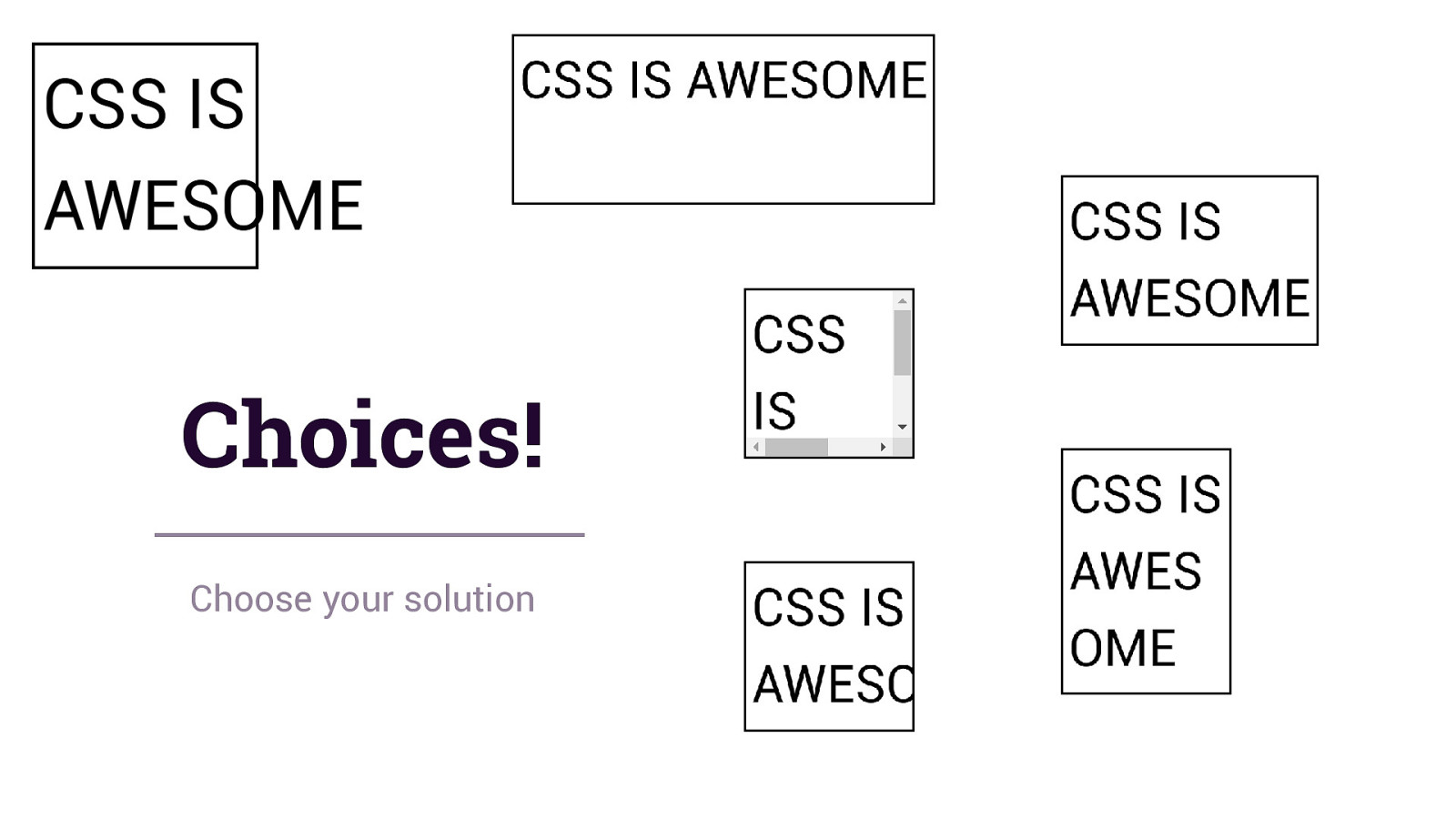
Choices! Choose your solution
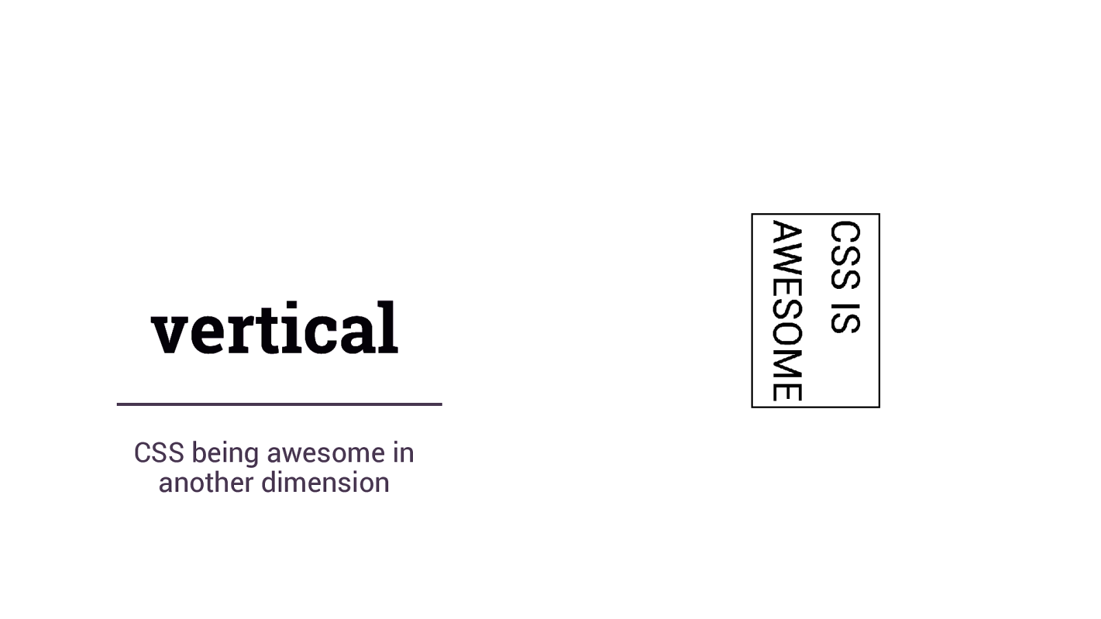
vertical CSS being awesome in another dimension
The web is not left to right
Flexbox & Grid Take an agnostic approach to the writing mode of the document.
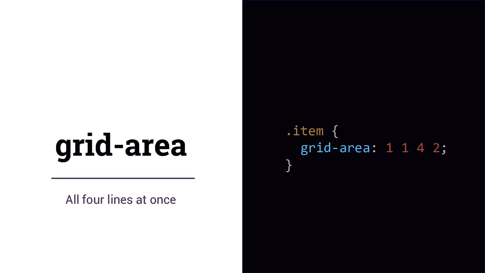
grid-area All four lines at once .item { grid-area: 1 1 4 2; }
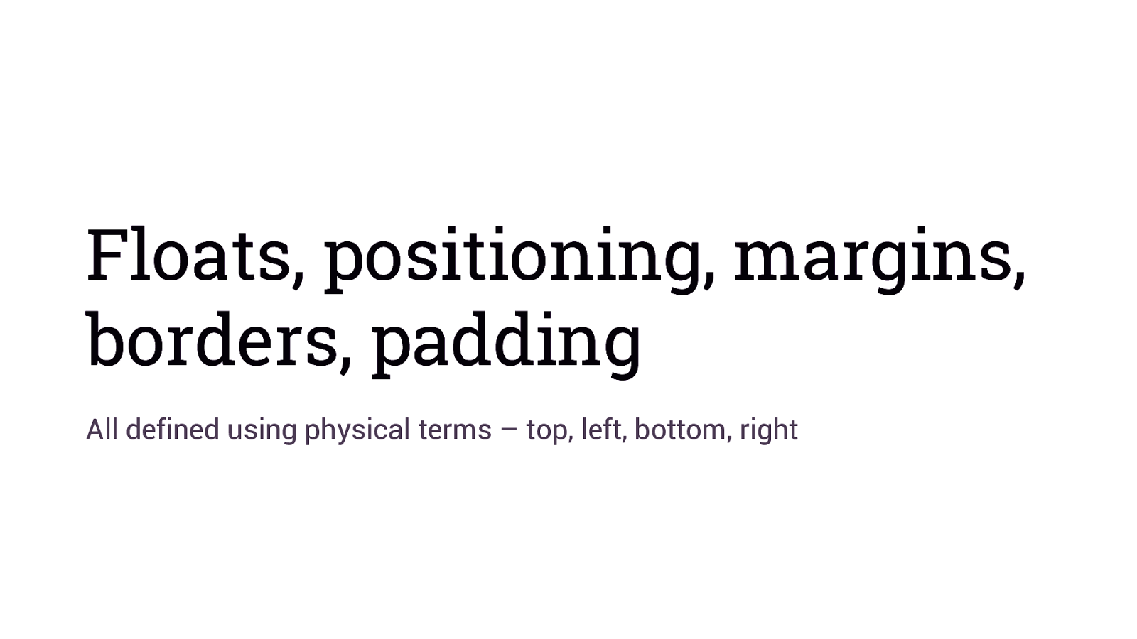
Floats, positioning, margins, borders, padding All defined using physical terms – top, left, bottom, right
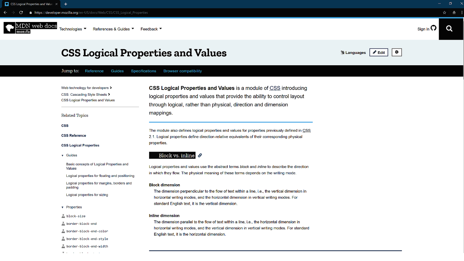
Logical Properties & Values https://www.w3.org/TR/css-logical-1/
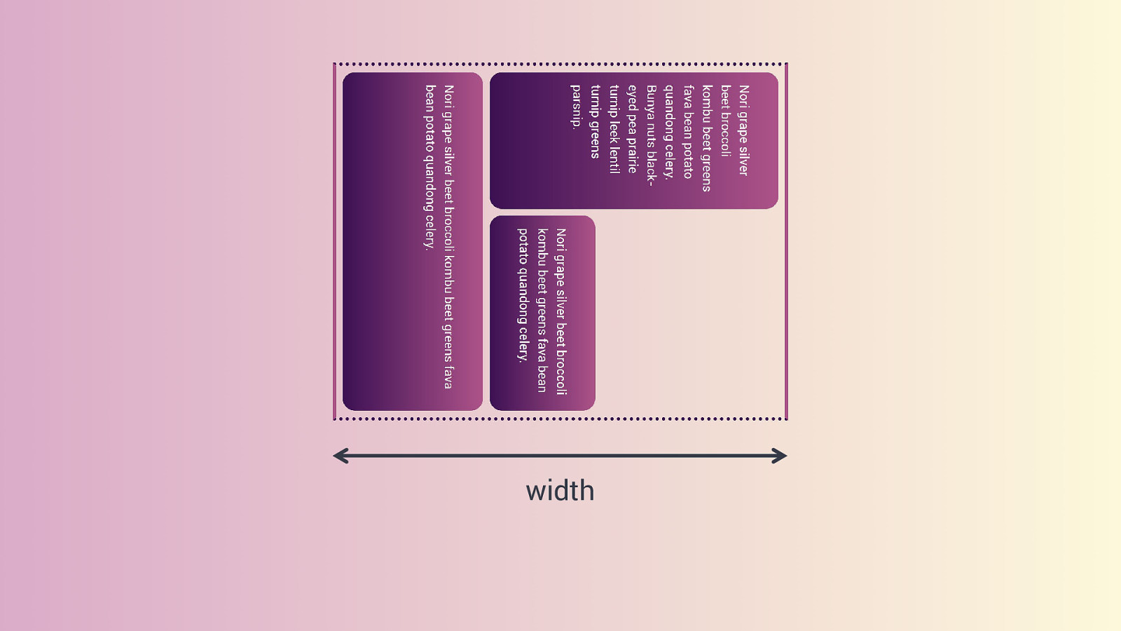
width
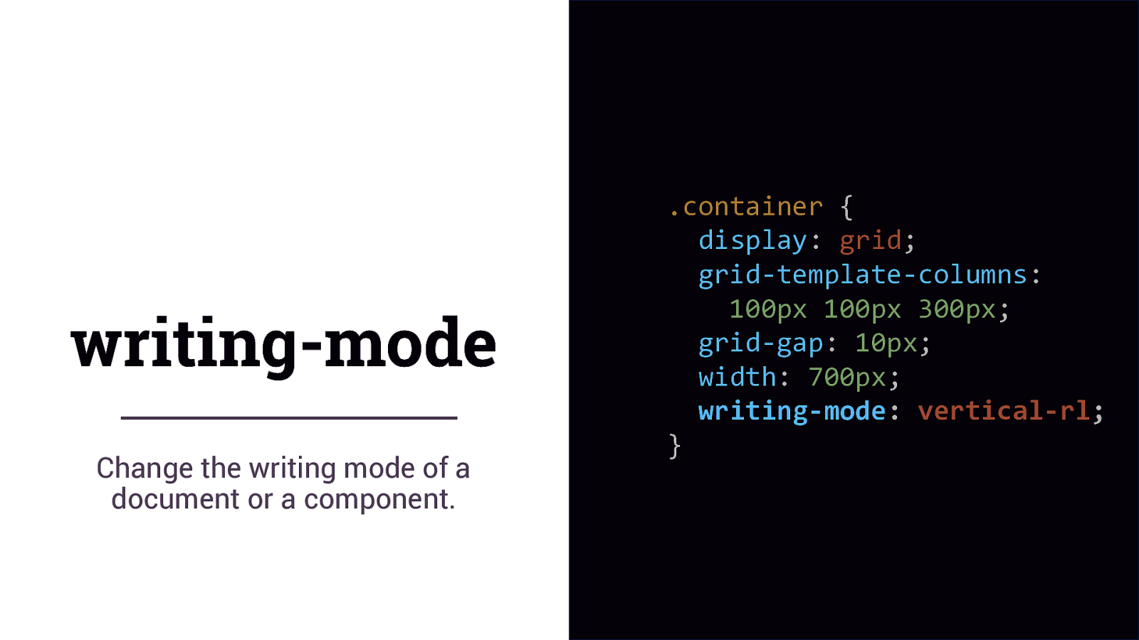
writing-mode Change the writing mode of a document or a component. .container { display: grid; grid-template-columns: 100px 100px 300px; grid-gap: 10px; width: 700px; writing-mode: vertical-rl; }
width
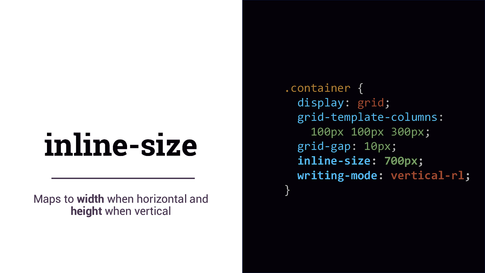
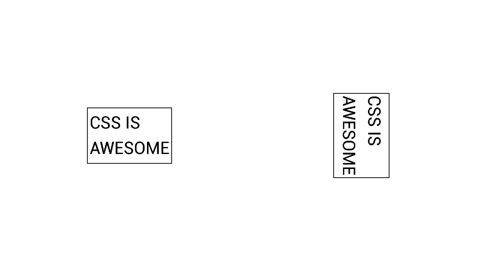
inline-size Maps to width when horizontal and height when vertical .container { display: grid; grid-template-columns: 100px 100px 300px; grid-gap: 10px; inline-size: 700px; writing-mode: vertical-rl; }
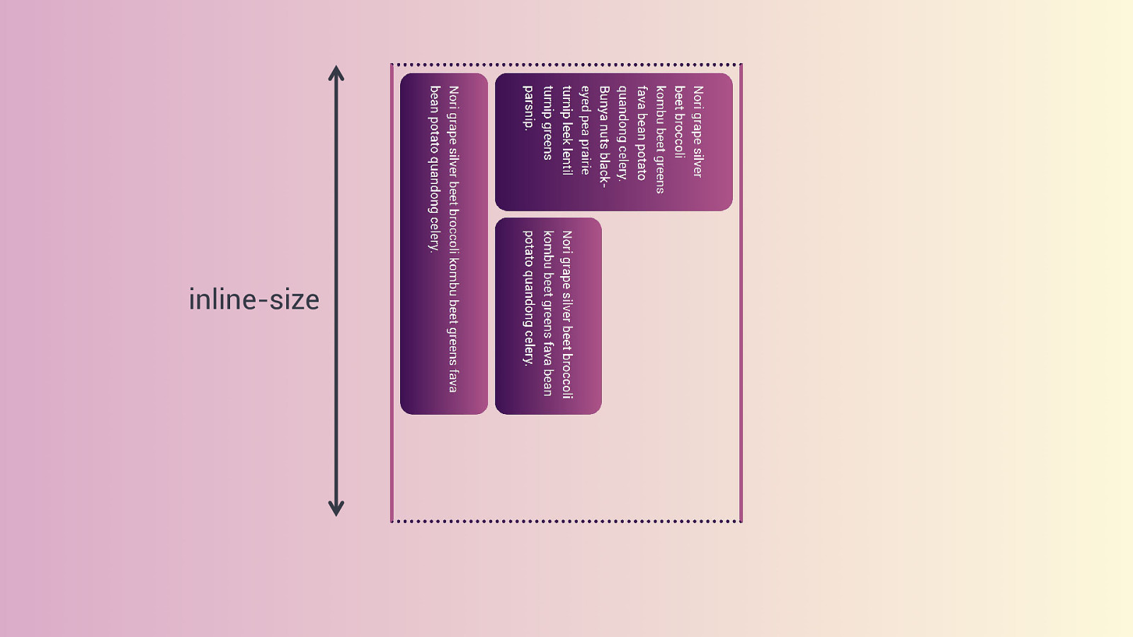
inline-size
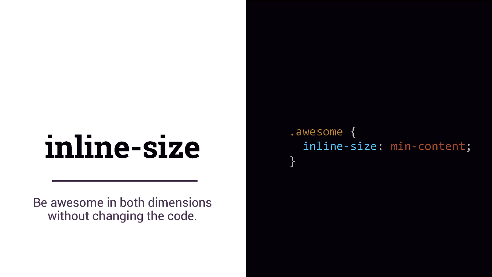
inline-size Be awesome in both dimensions without changing the code. .awesome { inline-size: min-content; }
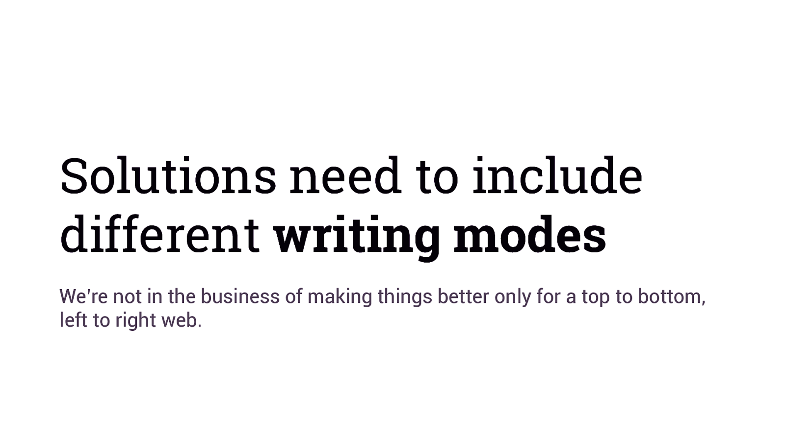
Solutions need to include different writing modes We’re not in the business of making things better only for a top to bottom, left to right web.
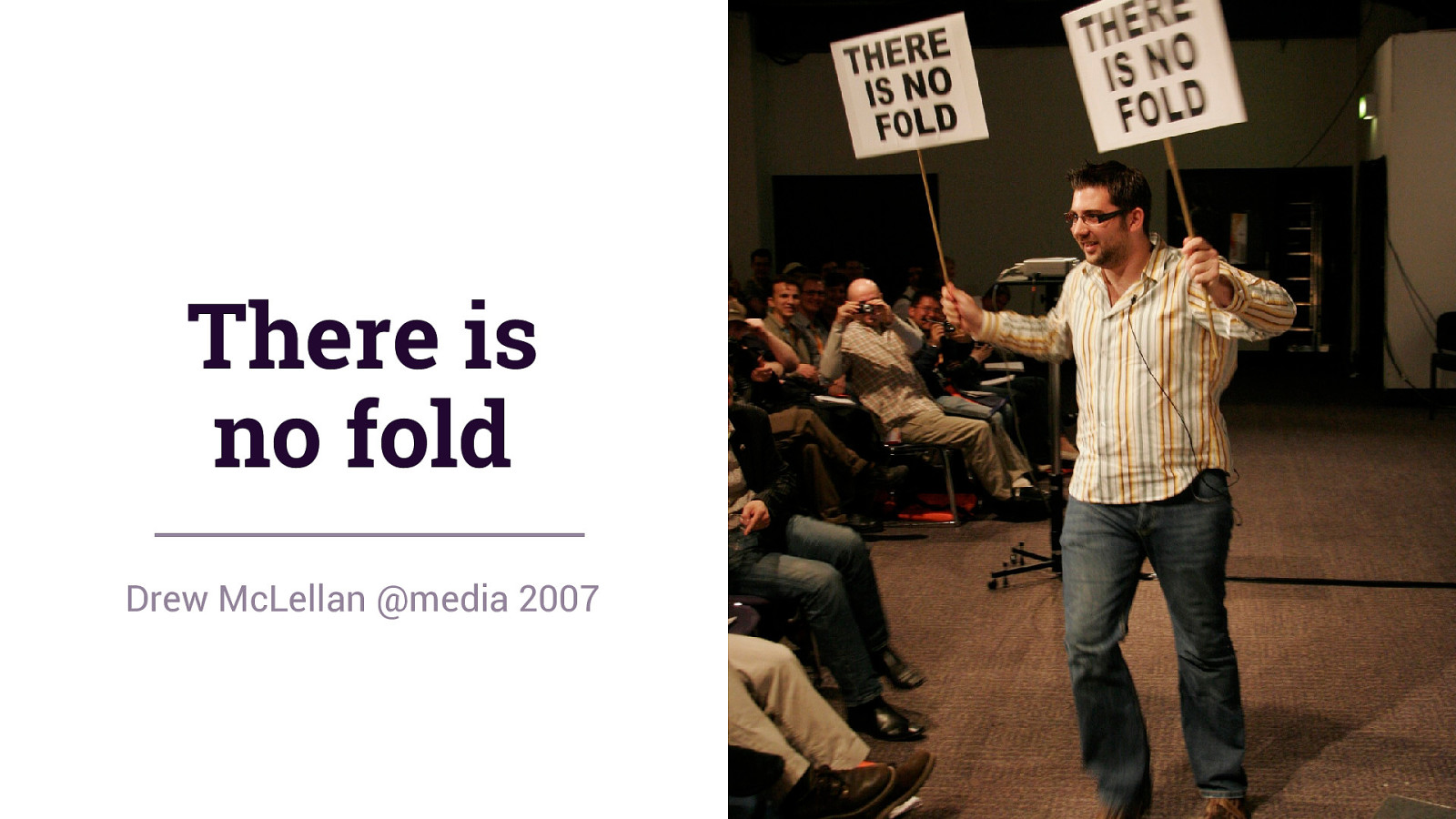
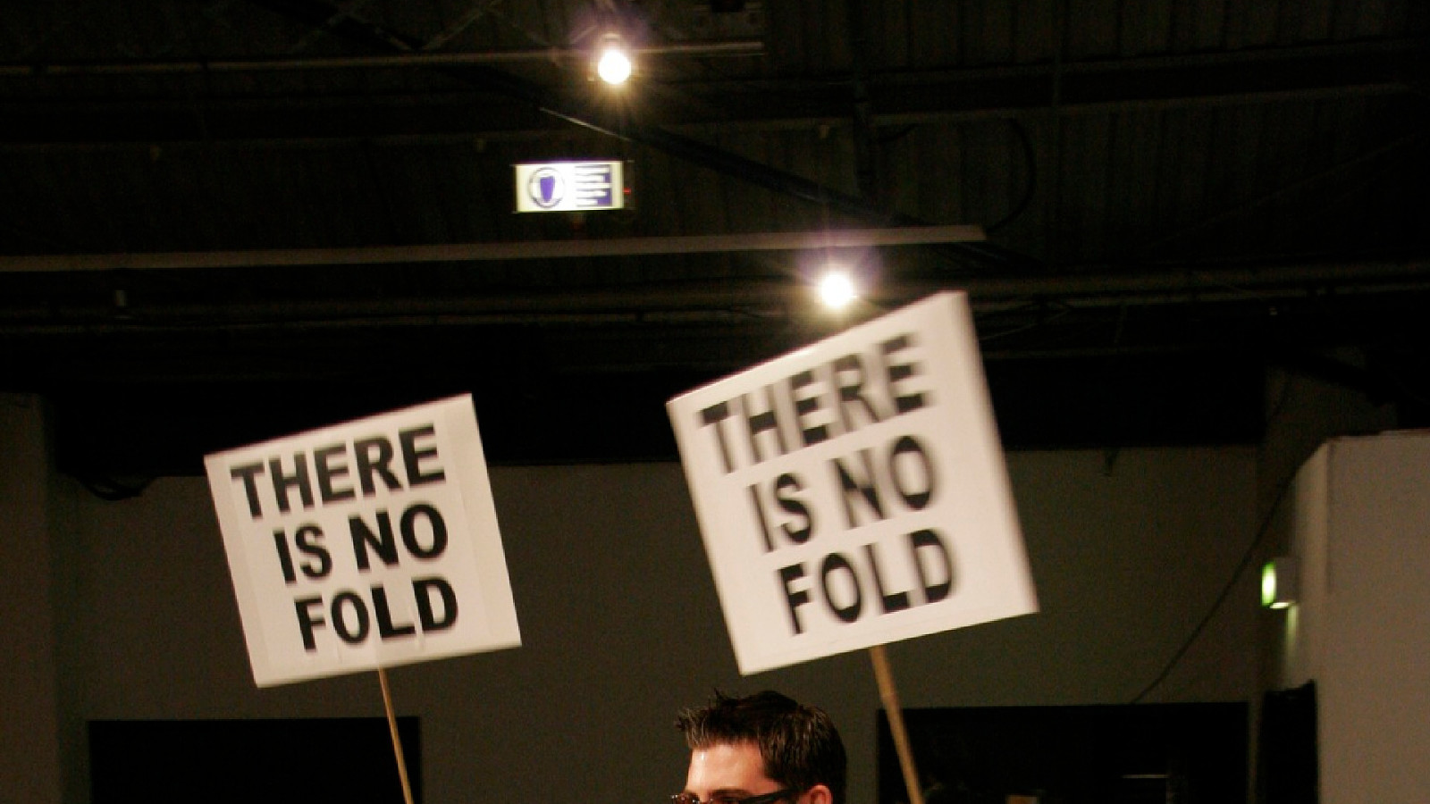
There is no fold Drew McLellan @media 2007
We know where the fold is
Viewport Units Representing the height and width of the current viewport

100vw 100% of the viewport width
100vh 100% of the viewport height
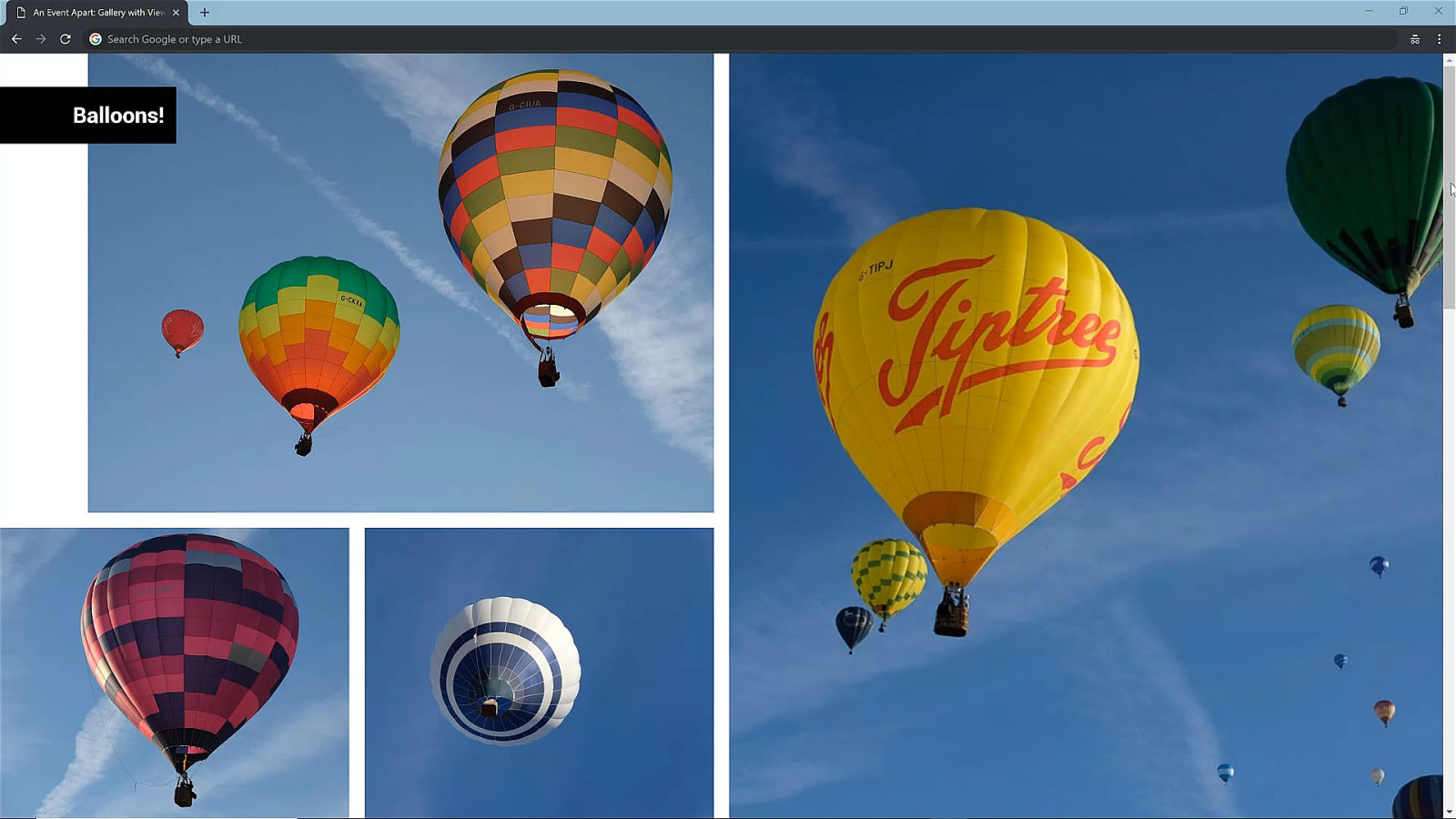
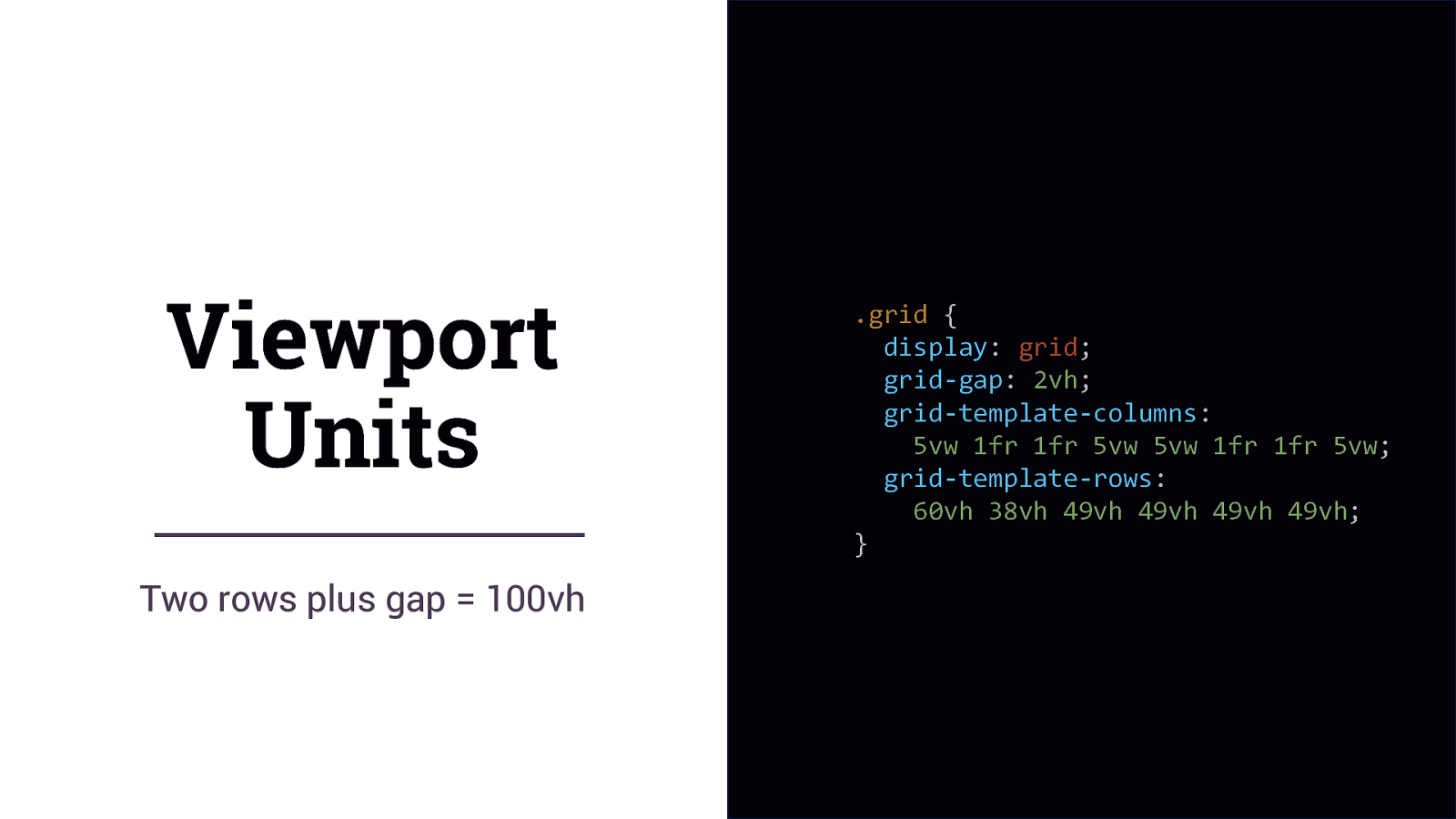
Viewport Units Two rows plus gap = 100vh .grid { display: grid; grid-gap: 2vh; grid-template-columns: 5vw 1fr 1fr 5vw 5vw 1fr 1fr 5vw; grid-template-rows: 60vh 38vh 49vh 49vh 49vh 49vh; }
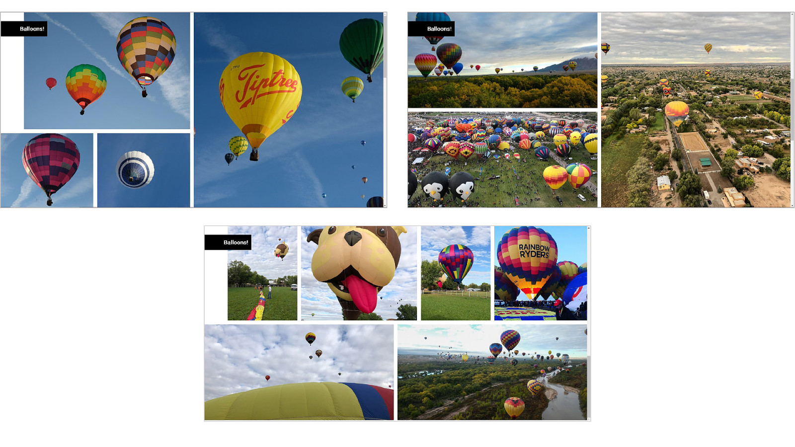
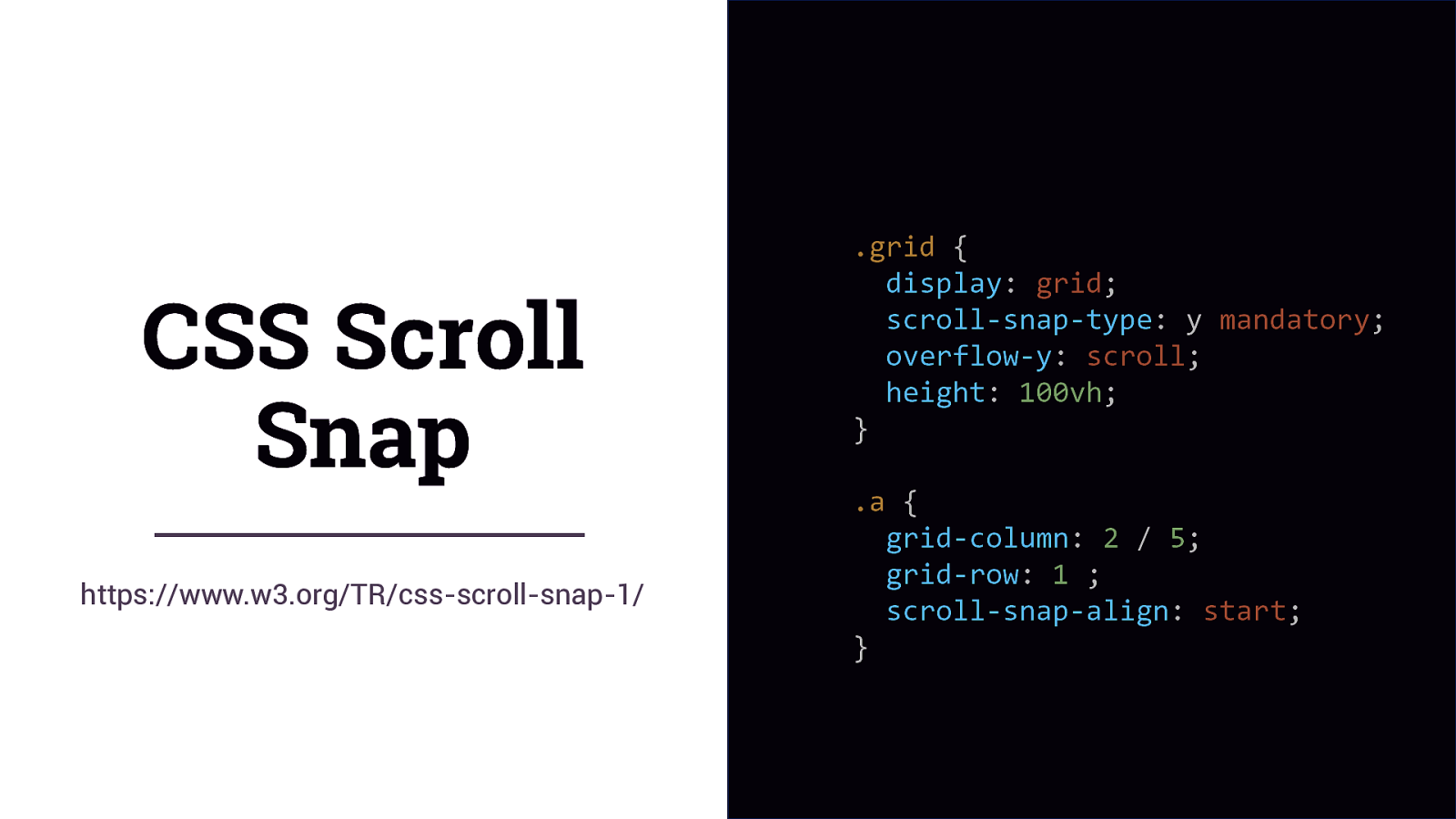
CSS Scroll Snap https://www.w3.org/TR/css-scroll-snap-1/ .grid { display: grid; scroll-snap-type: y mandatory; overflow-y: scroll; height: 100vh; } .a { grid-column: 2 / 5; grid-row: 1 ; scroll-snap-align: start; }
Paged vs Continuous Media
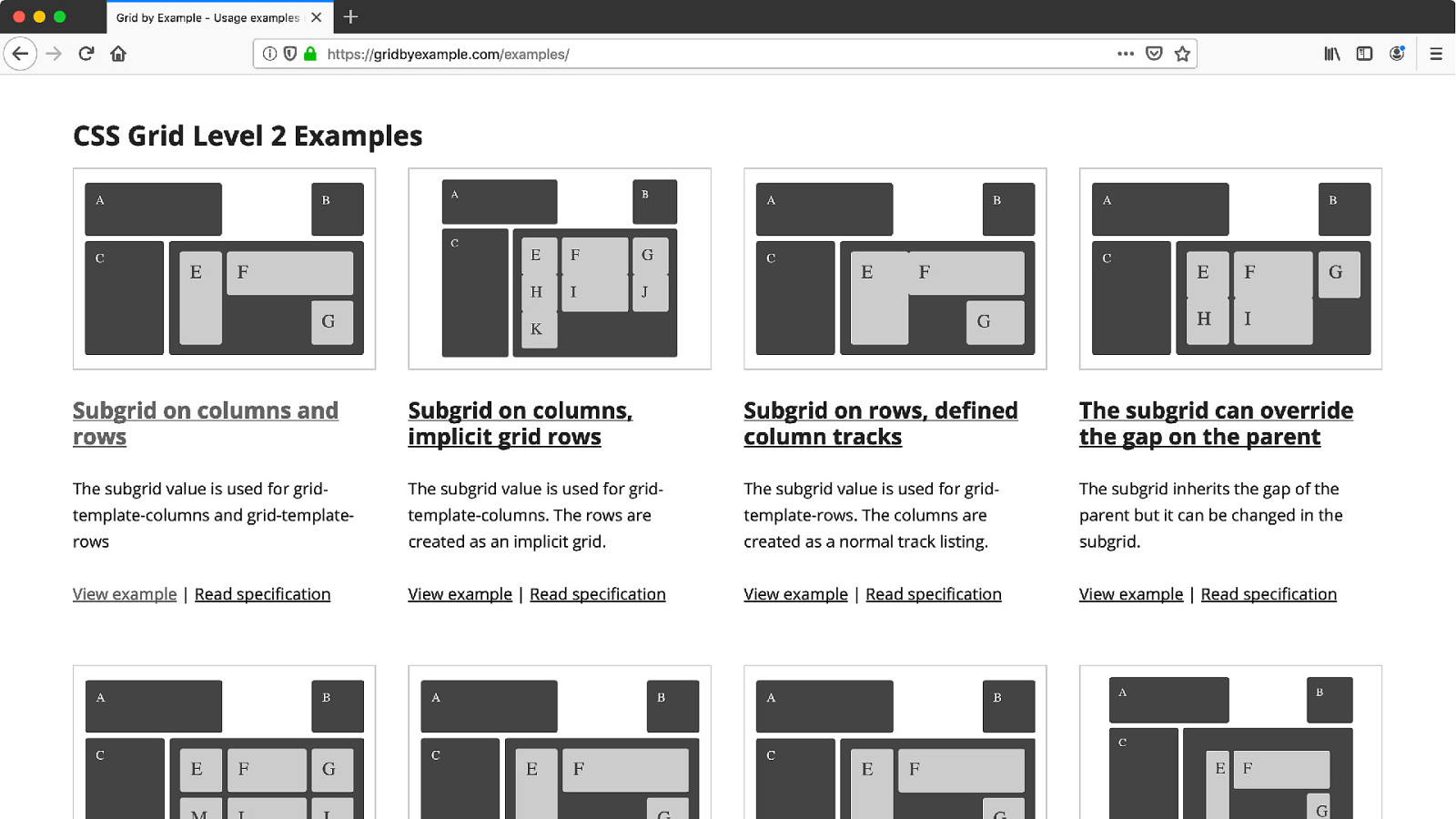
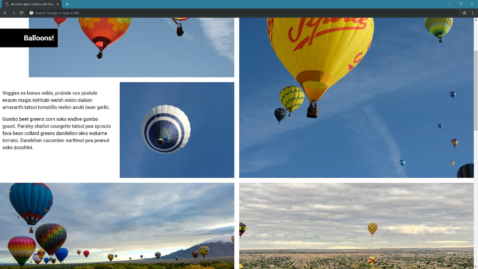
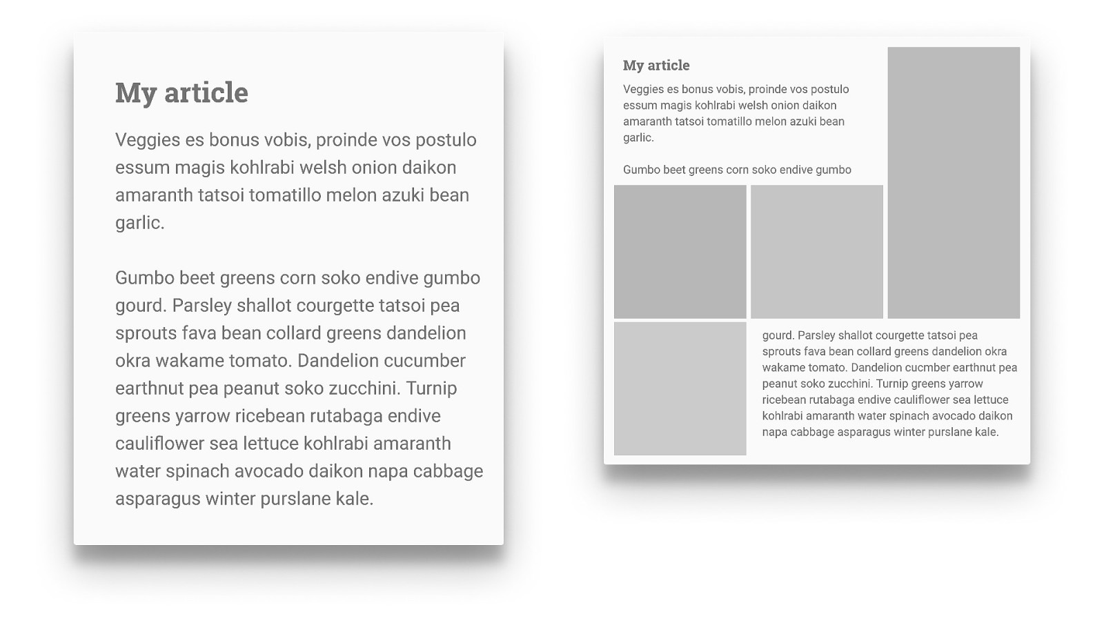
Grid & Subgrid What next for Grid Layout?
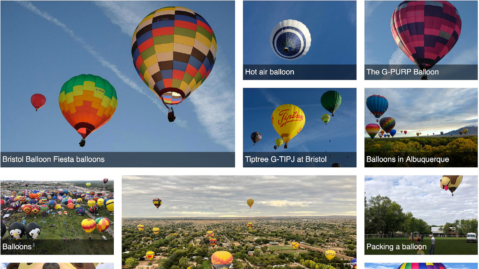
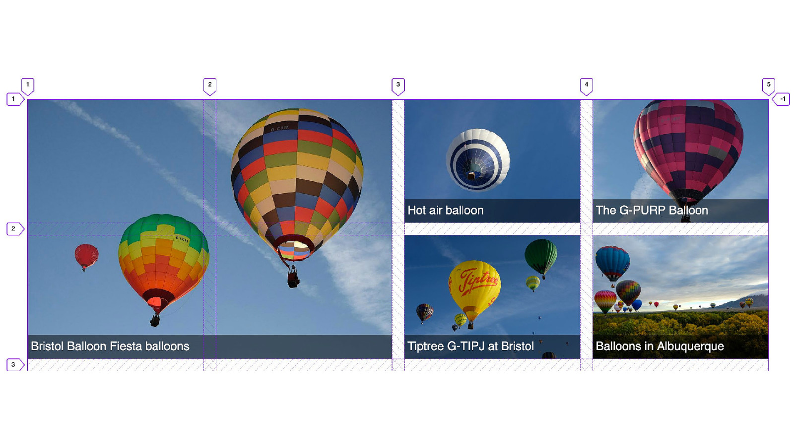
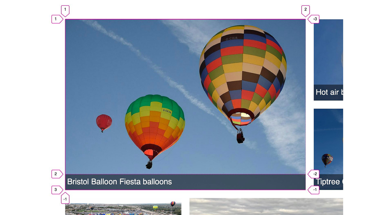
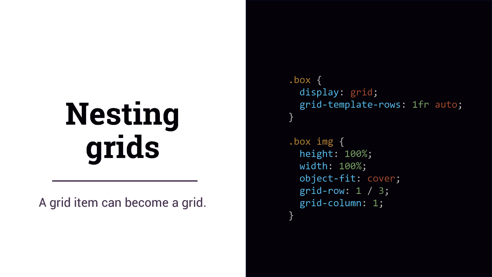
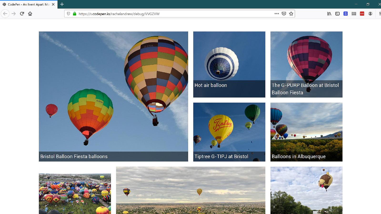
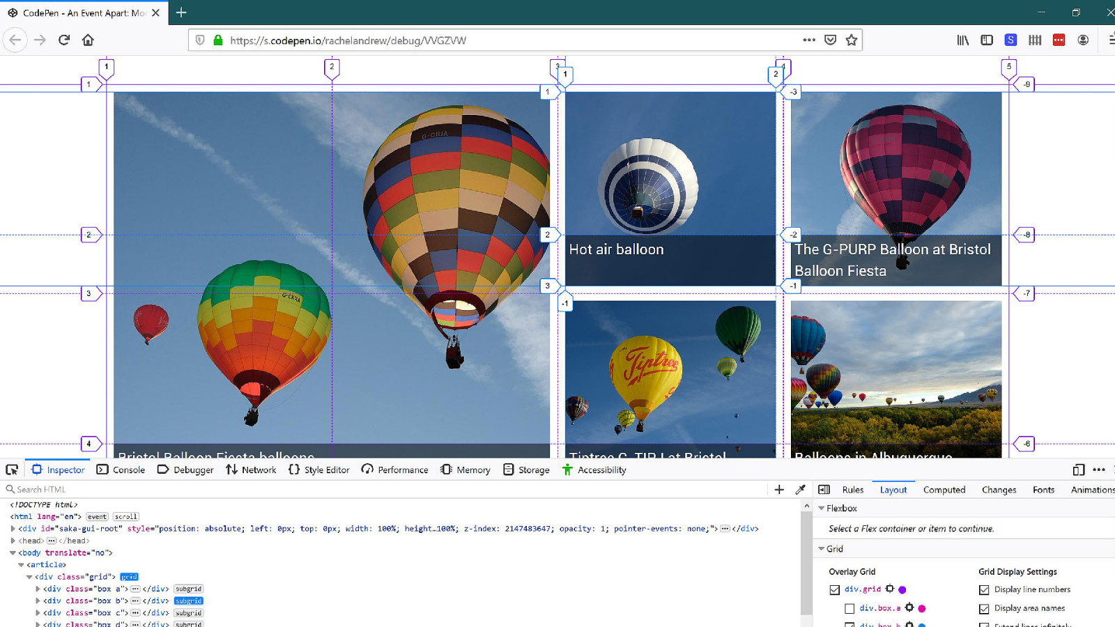
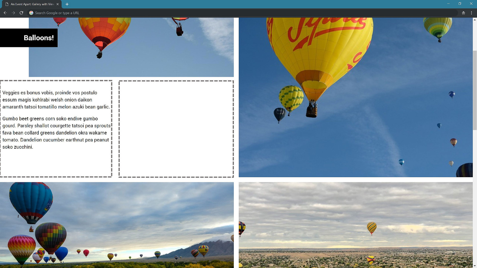
Nesting grids A grid item can become a grid. .box { display: grid; grid-template-rows: 1fr auto; } .box img { height: 100%; width: 100%; object-fit: cover; grid-row: 1 / 3; grid-column: 1; }

You never know how tall anything is on the web.
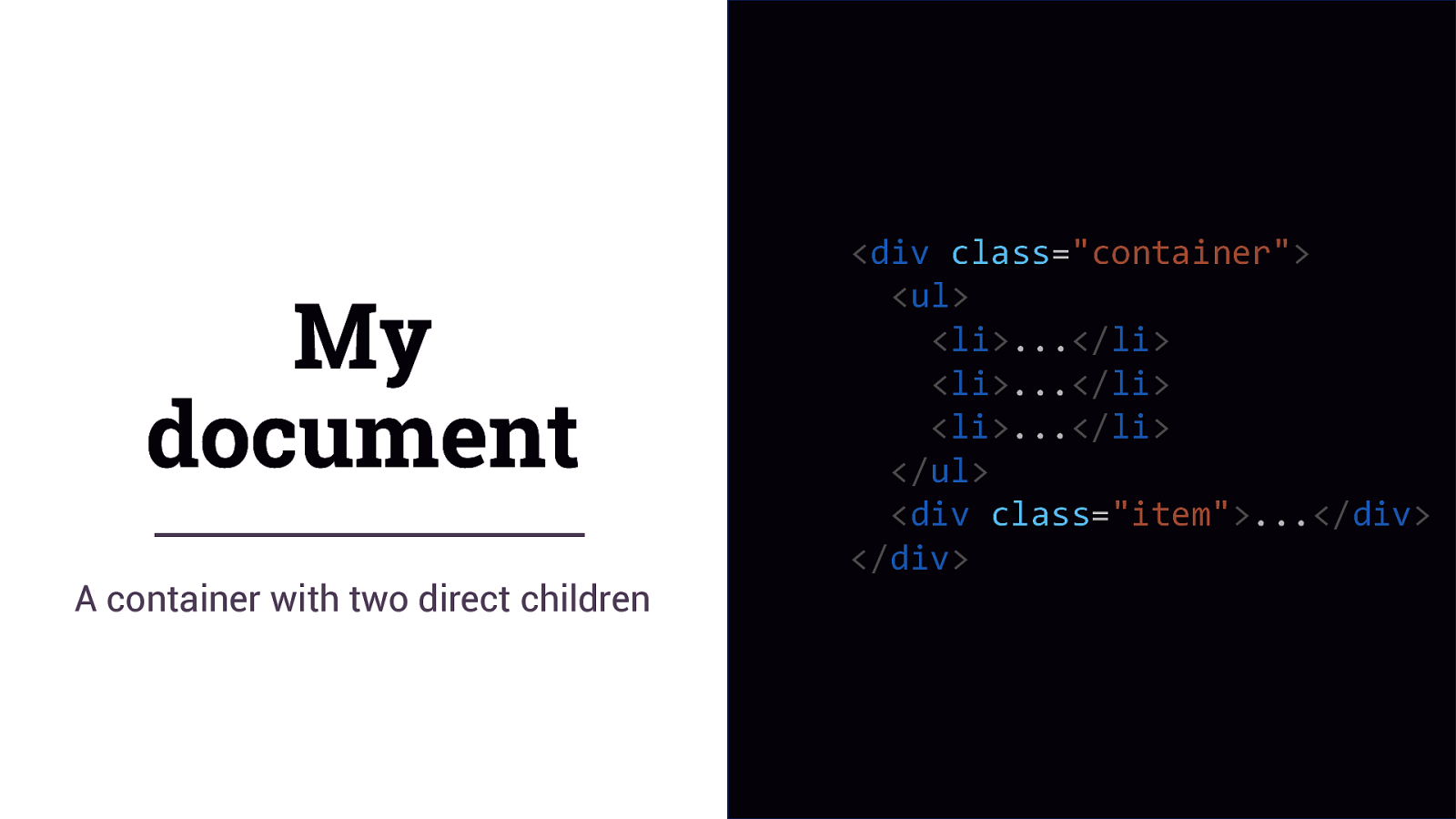
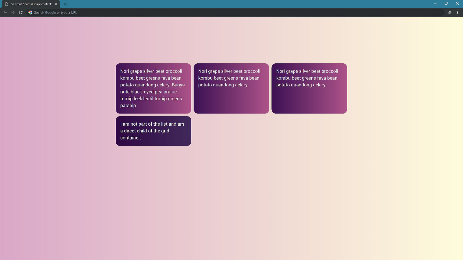
My document A container with two direct children
<div class=”container”> <ul> <li>…</li> <li>…</li> <li>…</li> </ul> <div class=”item”>…</div> </div>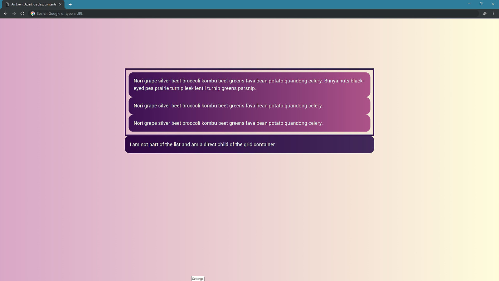
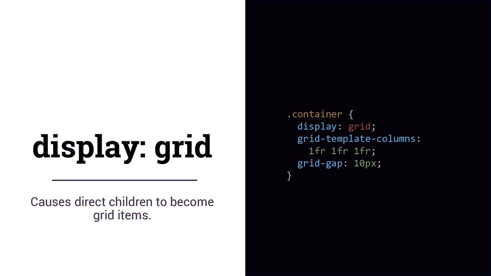
display: grid Causes direct children to become grid items. .container { display: grid; grid-template-columns: 1fr 1fr 1fr; grid-gap: 10px; }
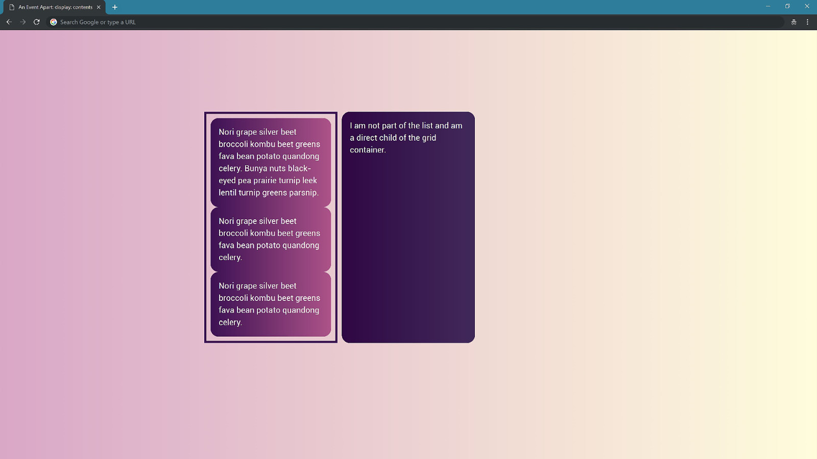
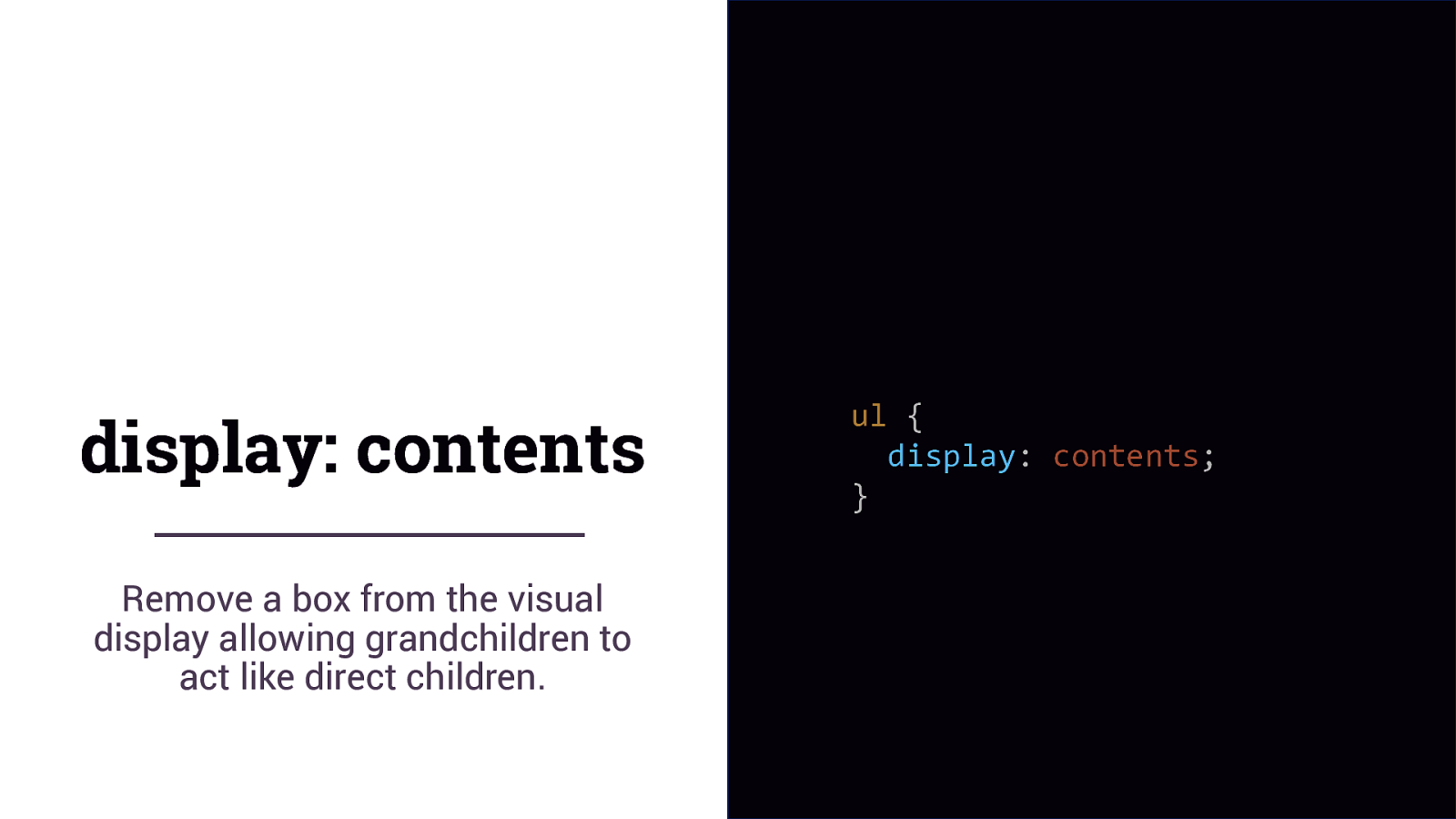
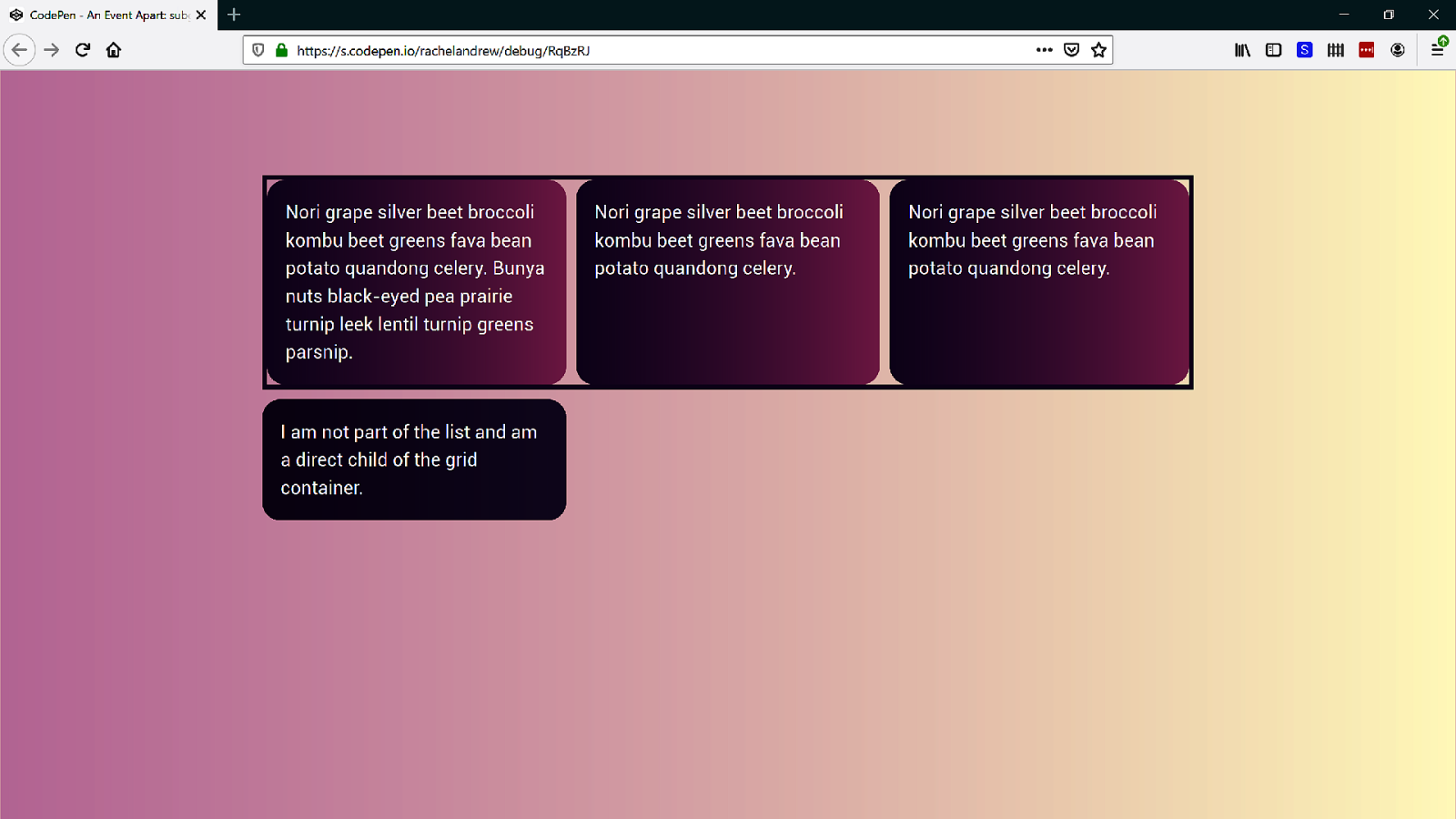
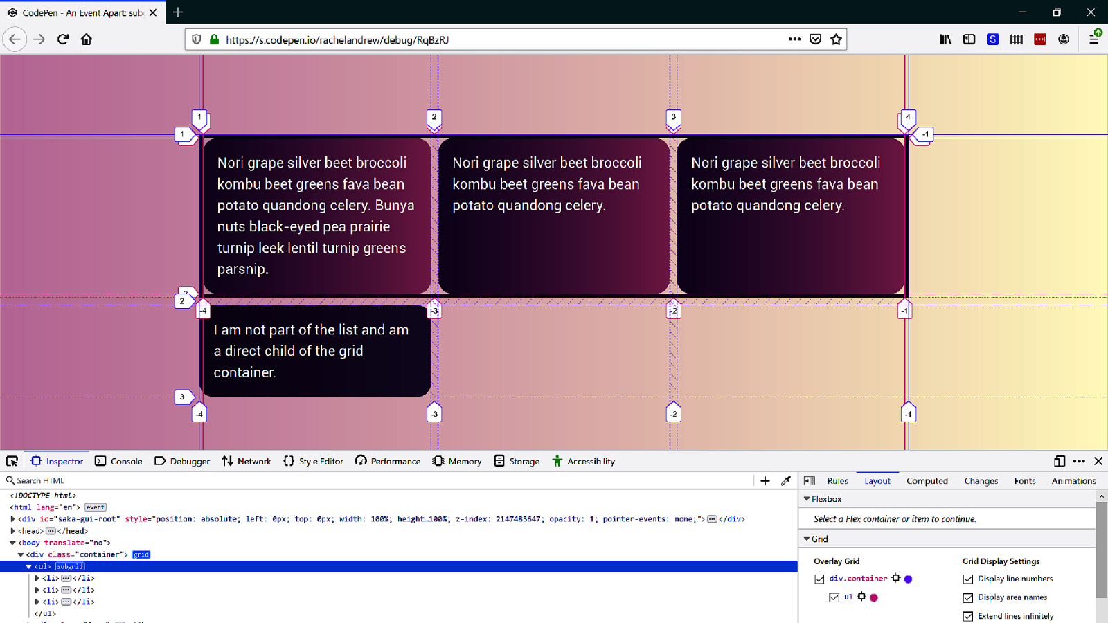
display: contents Remove a box from the visual display allowing grandchildren to act like direct children. ul { display: contents; }
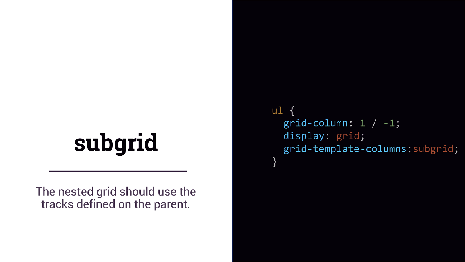
subgrid The nested grid should use the tracks defined on the parent. ul { grid-column: 1 / -1; display: grid; grid-template-columns:subgrid; }
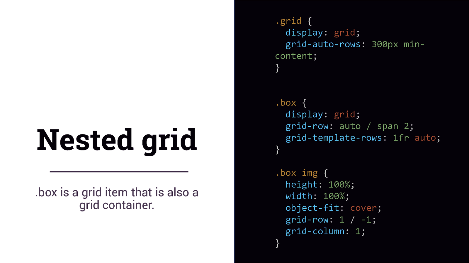
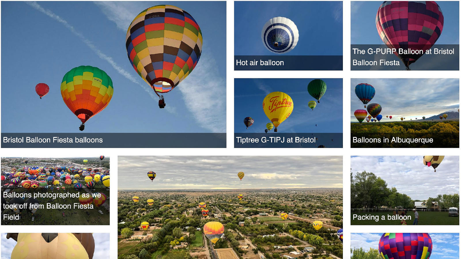
.grid { display: grid; grid-auto-rows: 300px mincontent; } Nested grid .box is a grid item that is also a grid container. .box { display: grid; grid-row: auto / span 2; grid-template-rows: 1fr auto; } .box img { height: 100%; width: 100%; object-fit: cover; grid-row: 1 / -1; grid-column: 1; }
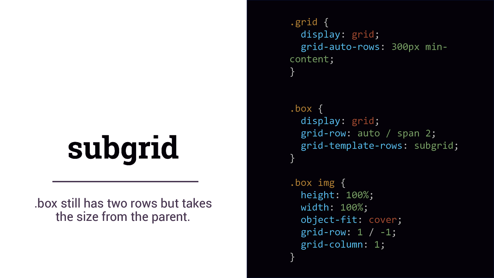
.grid { display: grid; grid-auto-rows: 300px mincontent; } subgrid .box still has two rows but takes the size from the parent. .box { display: grid; grid-row: auto / span 2; grid-template-rows: subgrid; } .box img { height: 100%; width: 100%; object-fit: cover; grid-row: 1 / -1; grid-column: 1; }
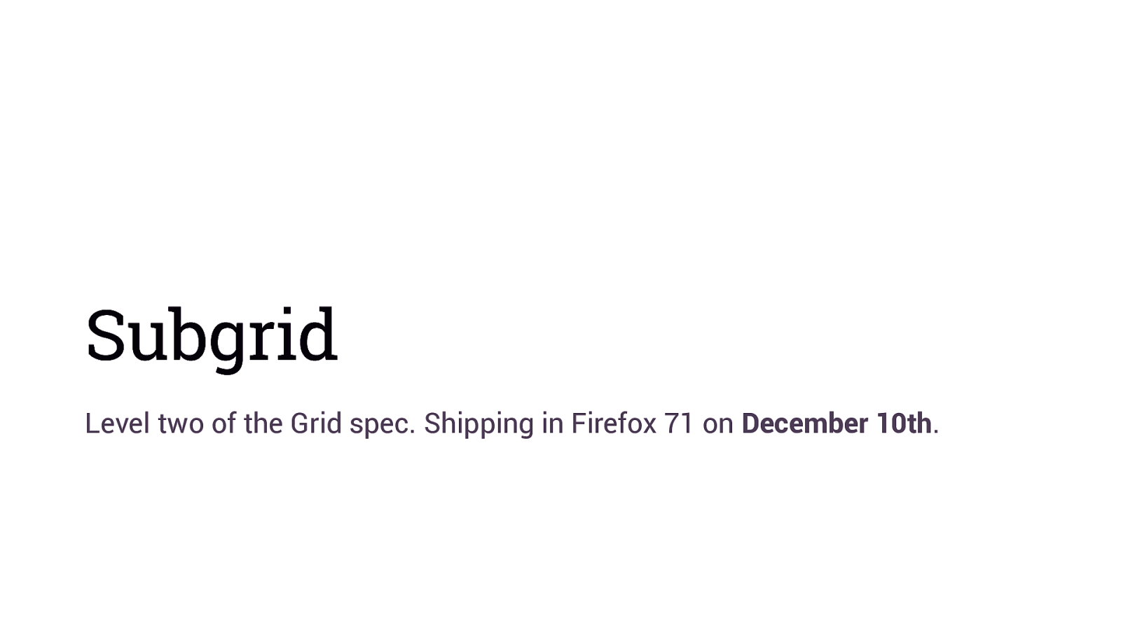
Subgrid Level two of the Grid spec. Shipping in Firefox 71 on December 10th.
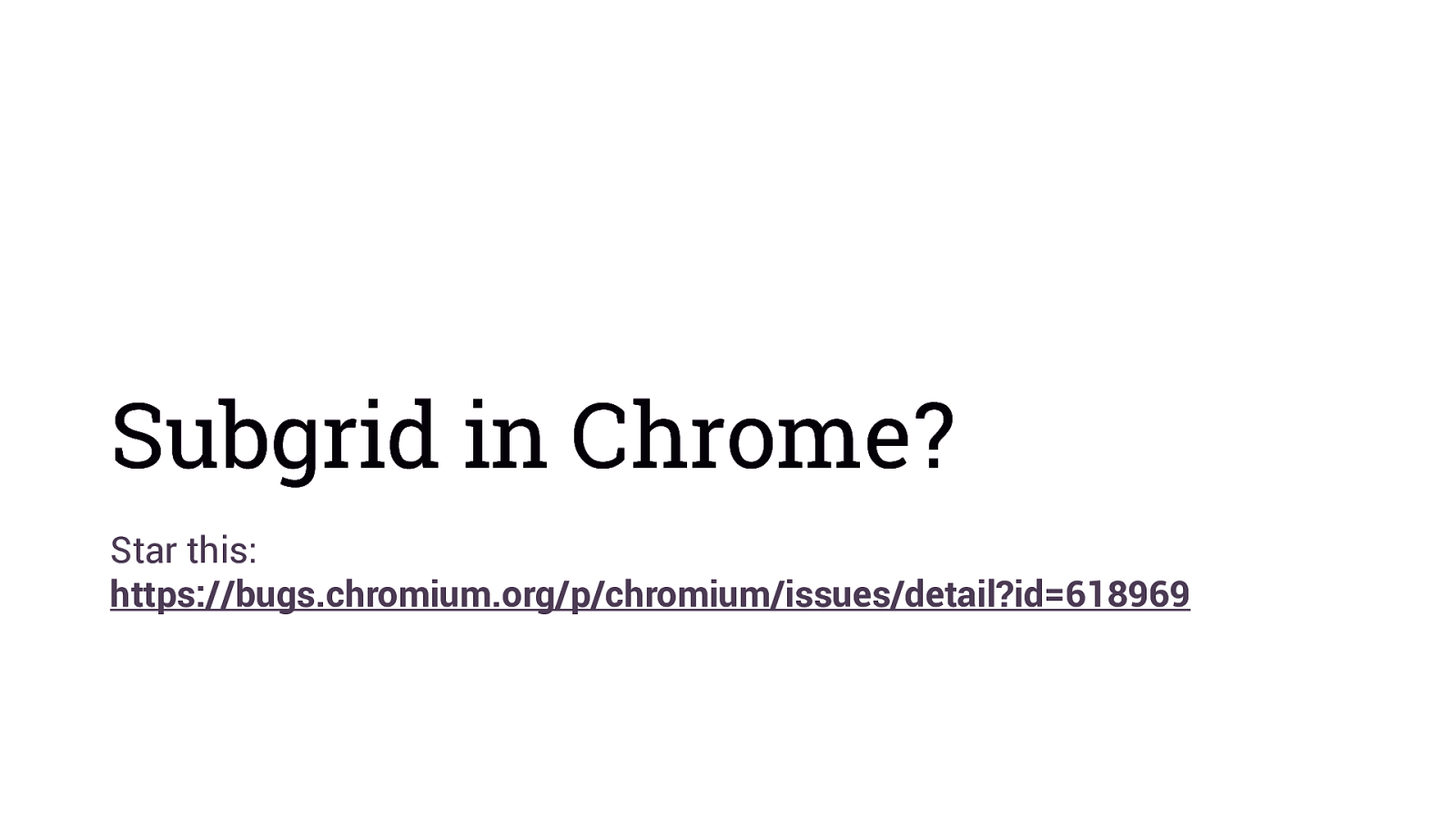
Subgrid in Chrome? Star this: https://bugs.chromium.org/p/chromium/issues/detail?id=618969
You will hit problems. Find new technical limitations.
We just can’t do that yet.
We get the new stuff when we create it.
Finding the edges
You don’t know how tall things are on the web
Overflow and Multicol
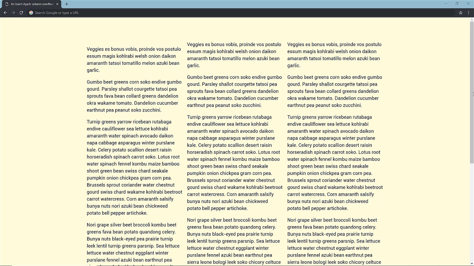
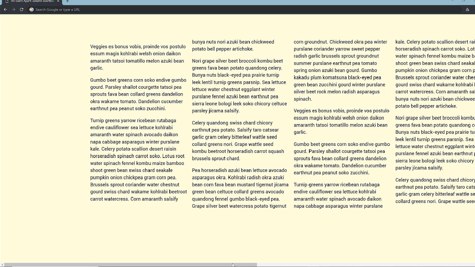
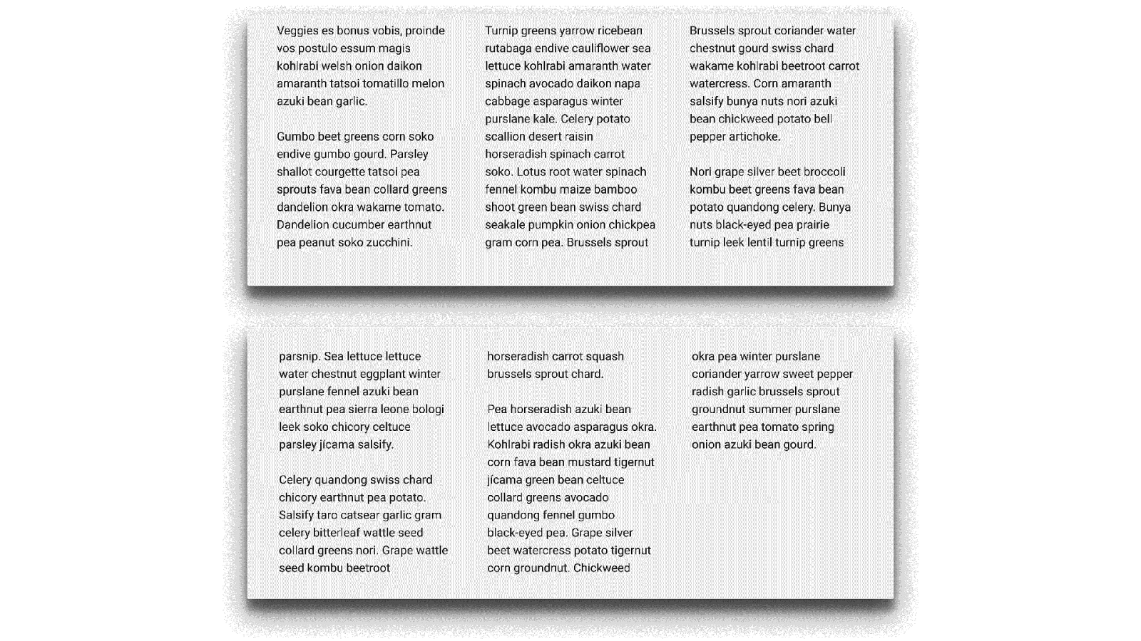
Overflow in the Block Dimension Something for Multiple-column Layout level 2?
Paged Media CSS – not just for web browsers.
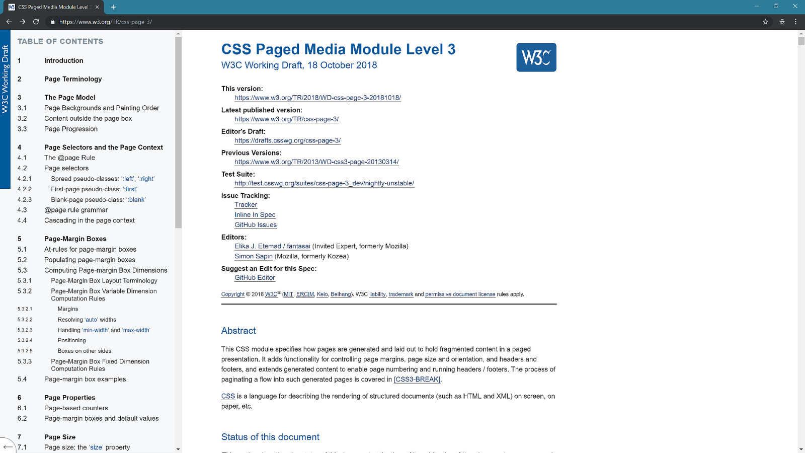
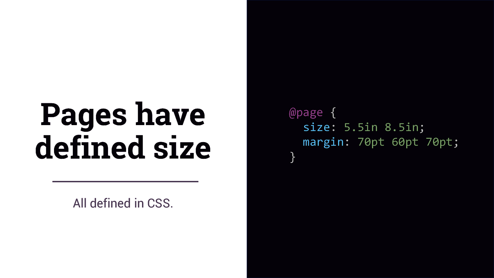
Pages have defined size All defined in CSS. @page { size: 5.5in 8.5in; margin: 70pt 60pt 70pt; }
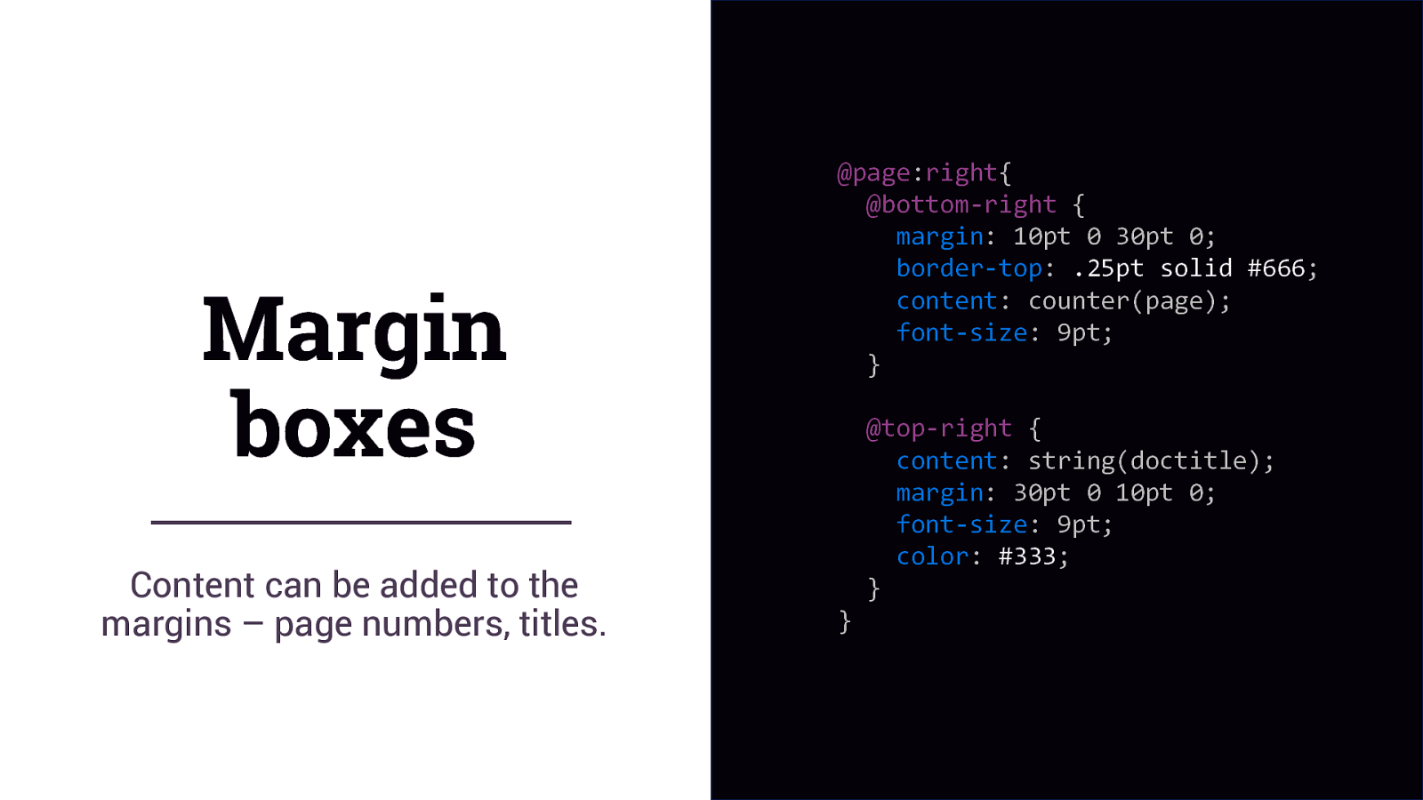
Margin boxes Content can be added to the margins – page numbers, titles. @page:right{ @bottom-right { margin: 10pt 0 30pt 0; border-top: .25pt solid #666; content: counter(page); font-size: 9pt; } } @top-right { content: string(doctitle); margin: 30pt 0 10pt 0; font-size: 9pt; color: #333; }
Paged Contexts Take content and flow it through as many pages as are required to display all of the content.
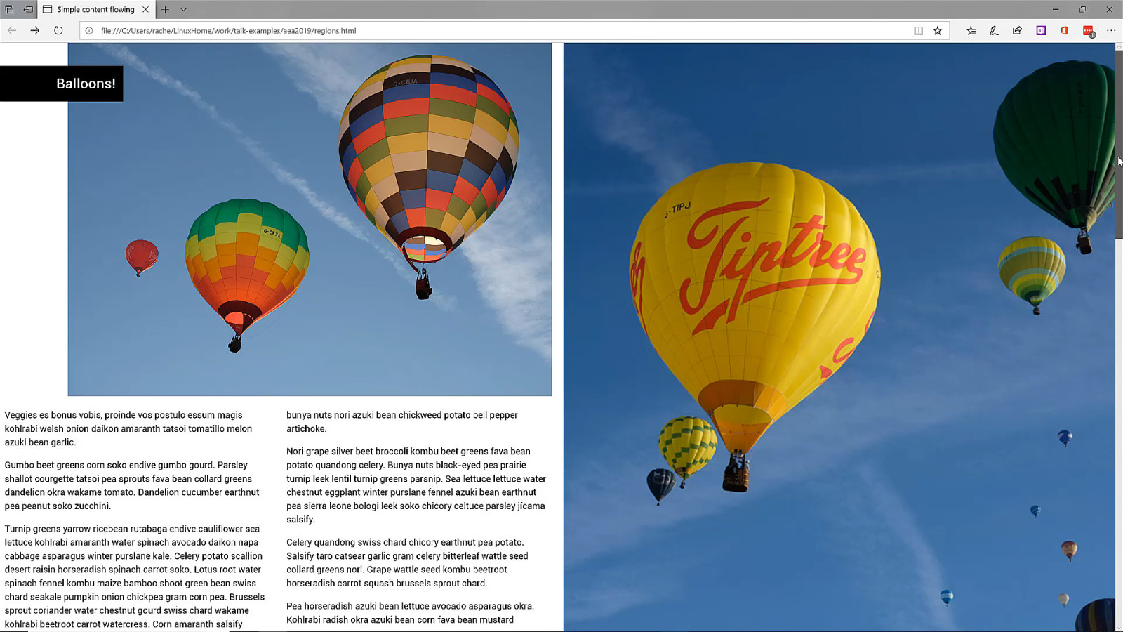
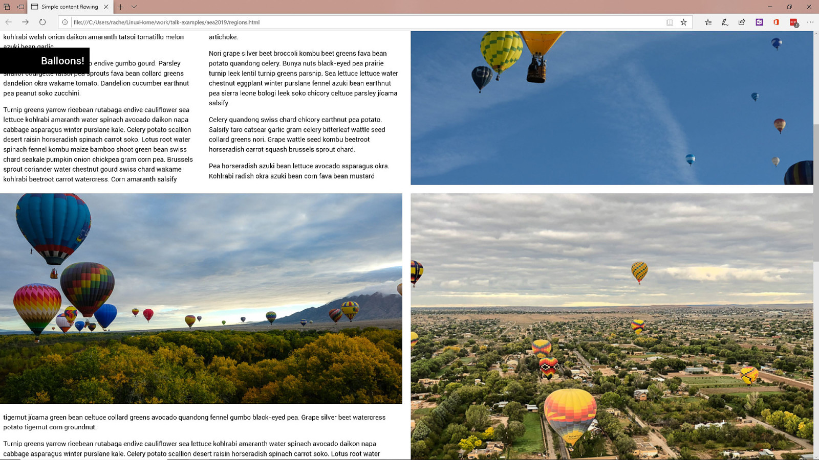
CSS Regions A problematic attempt to flow content through disconnected boxes.
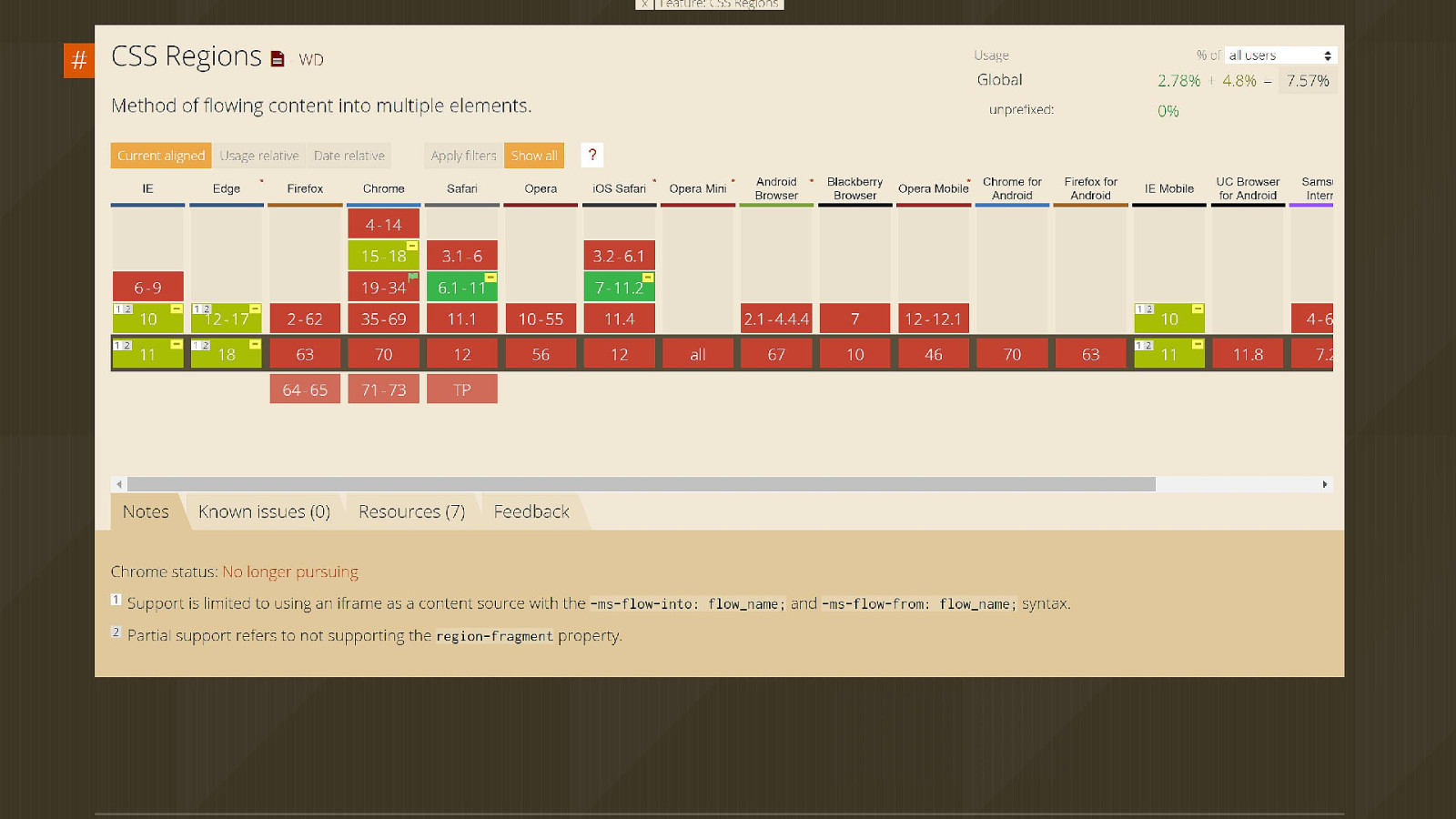
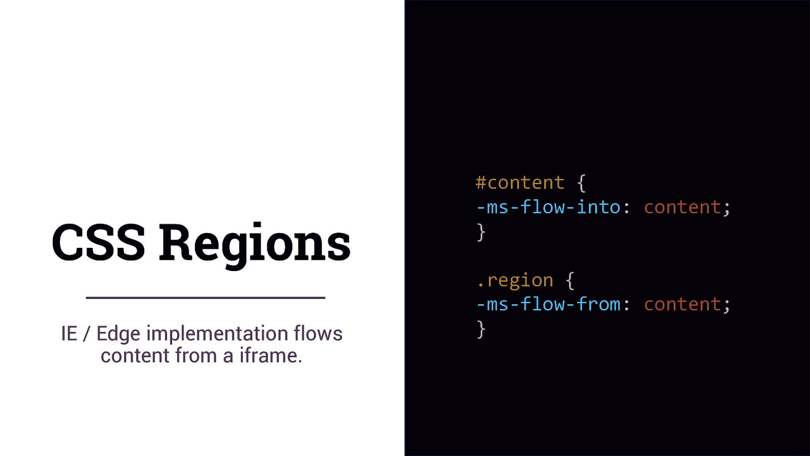
CSS Regions IE / Edge implementation flows content from a iframe. #content { -ms-flow-into: content; } .region { -ms-flow-from: content; }
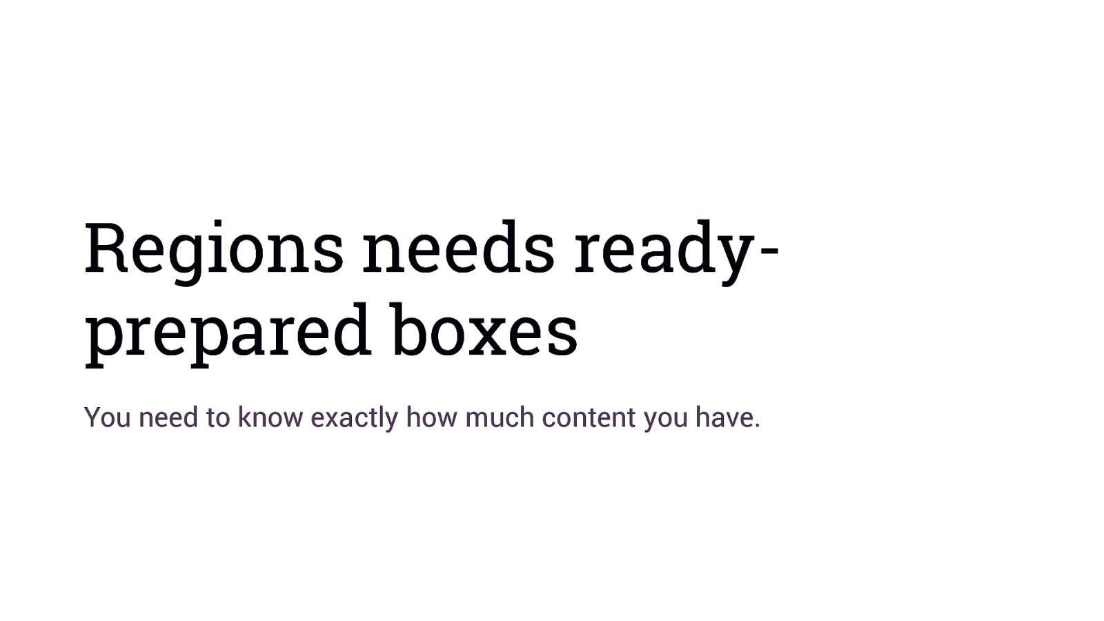
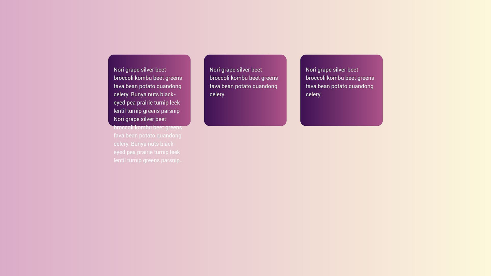
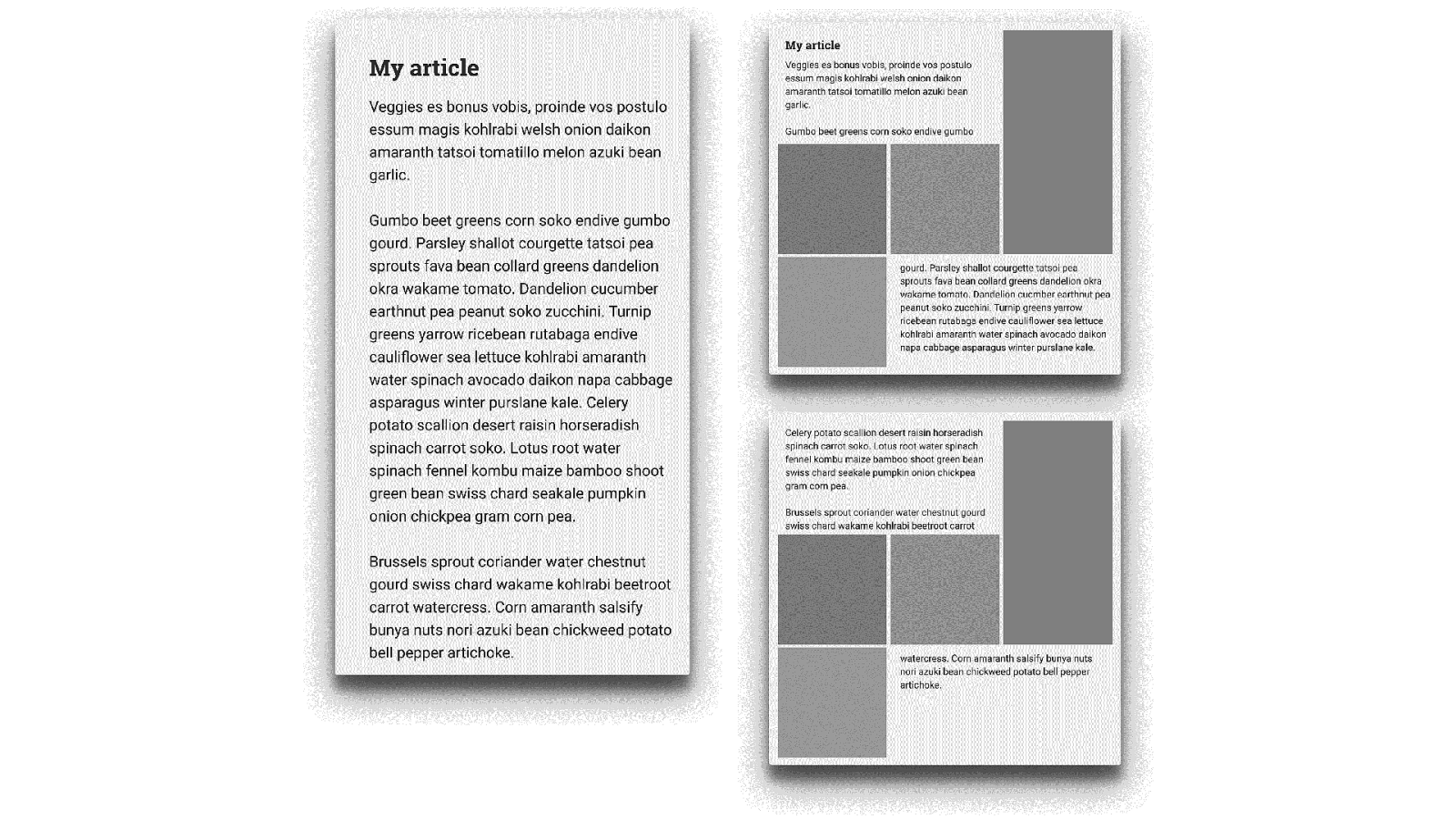
Regions needs readyprepared boxes You need to know exactly how much content you have.
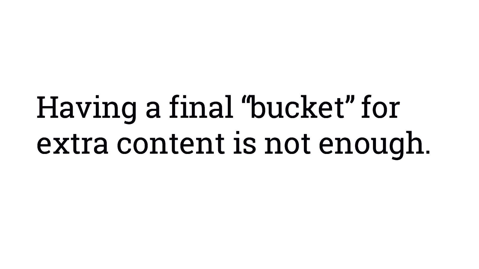
Having a final “bucket” for extra content is not enough.
Dealing with overflow Because we never really know how big anything is on the web.
Web design has always involved this battle with overflow.
Perhaps Regions paved the way for something better.
Content thread and semantics fully separate from layout. Without needing to simplify the design to get there.
Fragmentation How does content break between pages, columns or regions?
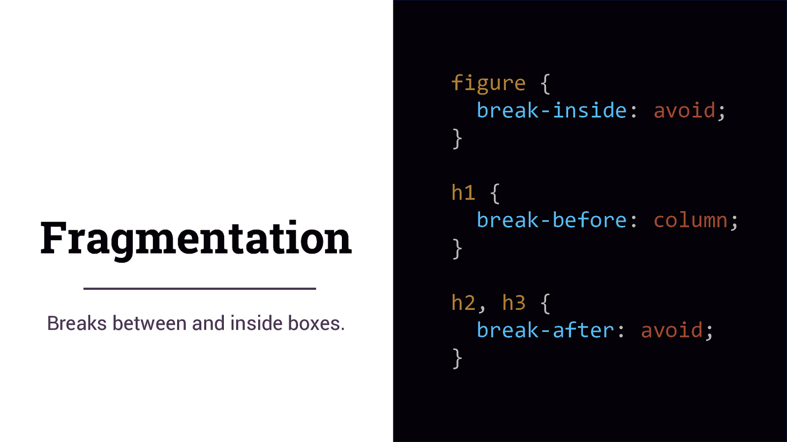
figure { break-inside: avoid; } Fragmentation Breaks between and inside boxes. h1 { break-before: column; } h2, h3 { break-after: avoid; }
We create new things to solve problems
Show your problems This is how we make things better.
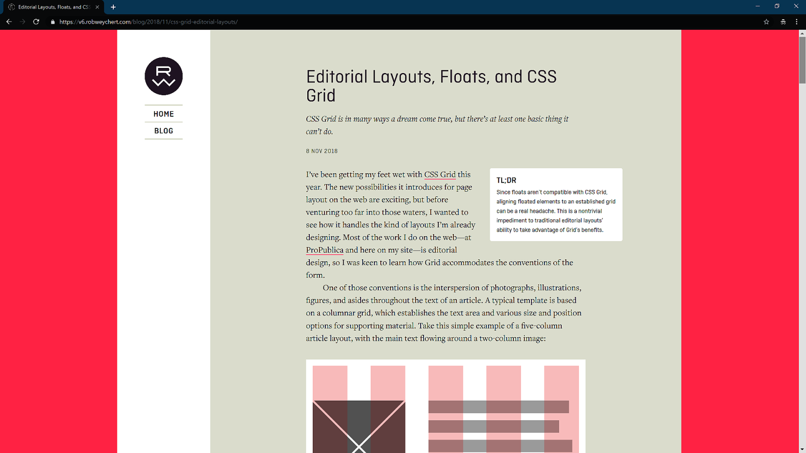
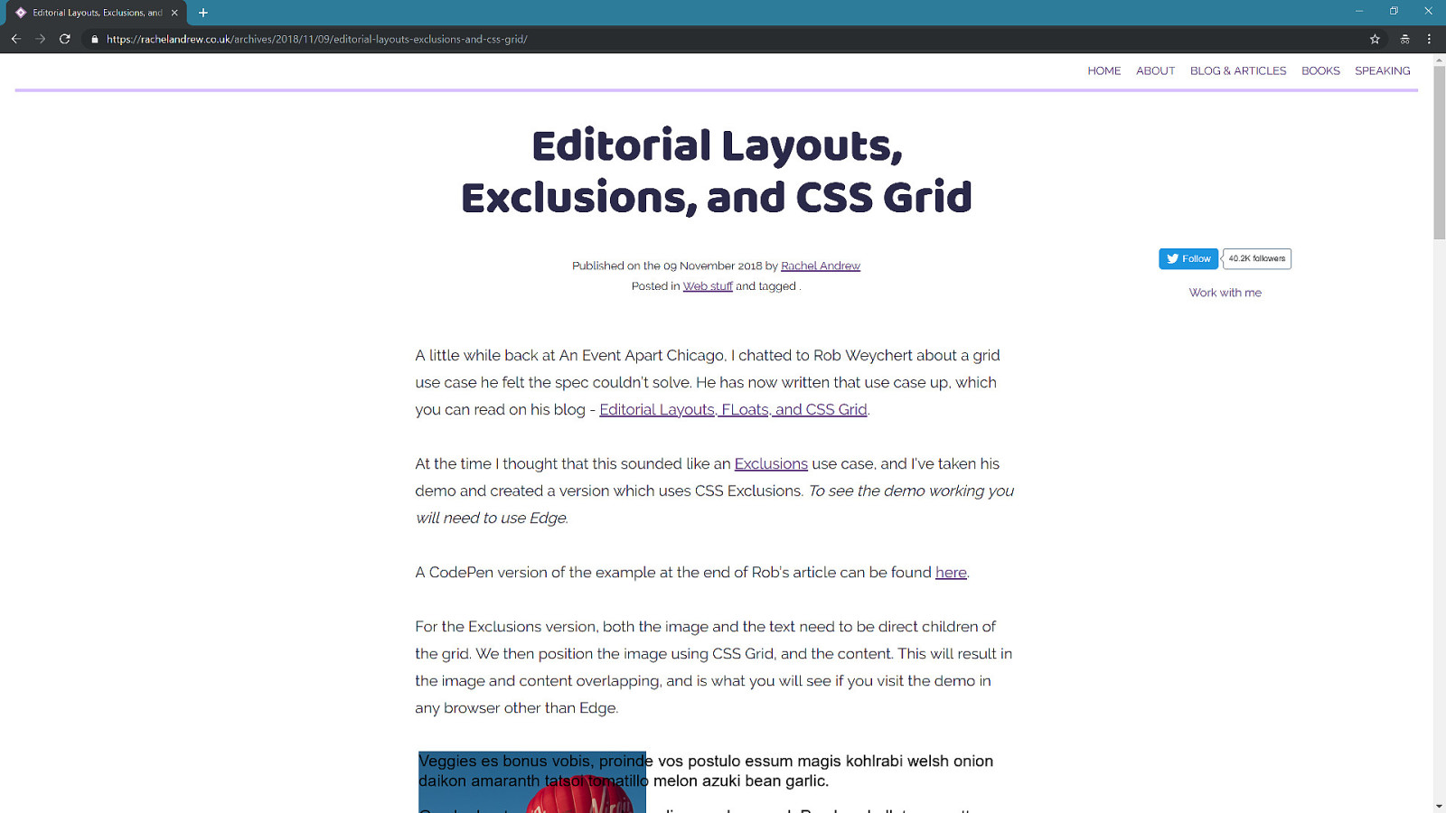
Why can’t I do that?
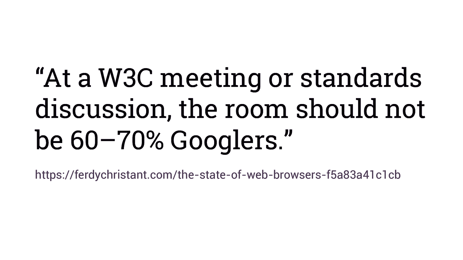
“At a W3C meeting or standards discussion, the room should not be 60–70% Googlers.” https://ferdychristant.com/the-state-of-web-browsers-f5a83a41c1cb
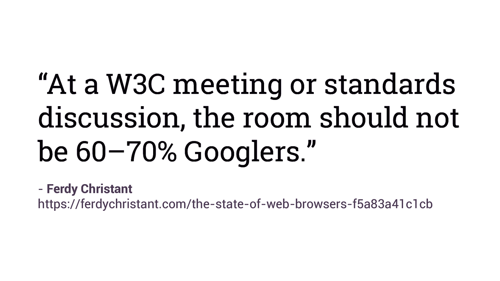
“At a W3C meeting or standards discussion, the room should not be 60–70% Googlers.” - Ferdy Christant https://ferdychristant.com/the-state-of-web-browsers-f5a83a41c1cb
More than ever the web needs diversity of thought.
Thank you @rachelandrew