The New CSS Layout Rachel Andrew @rachelandrew Slides & Code at https://noti.st/rachelandrew

A presentation at W3C Developer Meetup in October 2018 in Lyon, France by Rachel Andrew
The New CSS Layout Rachel Andrew @rachelandrew Slides & Code at https://noti.st/rachelandrew
I do web stuff. Web developer since 1996, teaching CSS for almost as long. Co-founder Perch CMS & Notist. Author or co-author of 23 books on web development. Smashing Magazine Editor in Chief. Writer for MDN. CSS Working Group Invited Expert. Google Developer Expert. I like long runs and small airplanes. Slides & Code at https://noti.st/rachelandrew
A layout system for CSS For the first time! Slides & Code at https://noti.st/rachelandrew
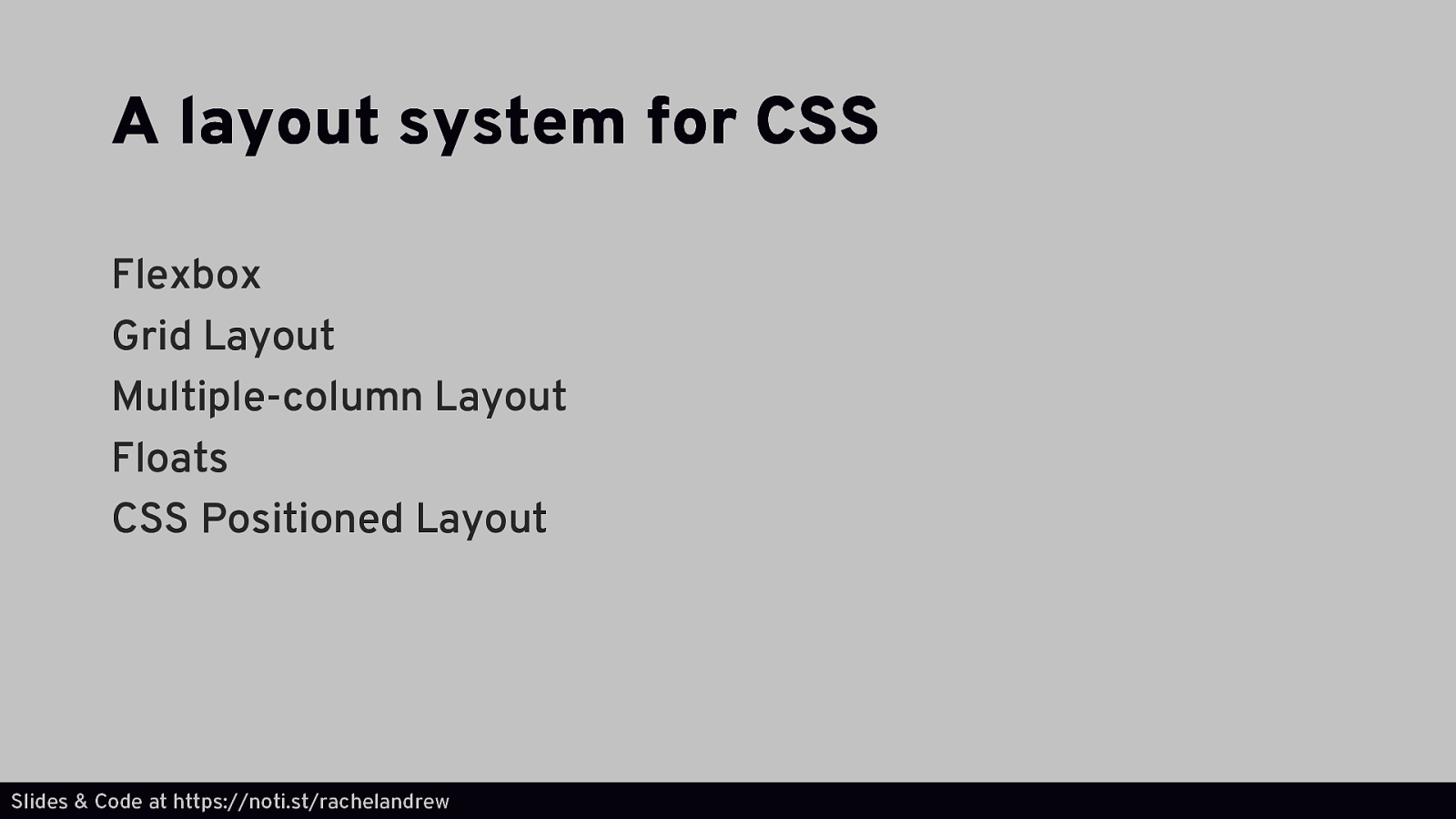
A layout system for CSS Flexbox Grid Layout Multiple-column Layout Floats CSS Positioned Layout Slides & Code at https://noti.st/rachelandrew
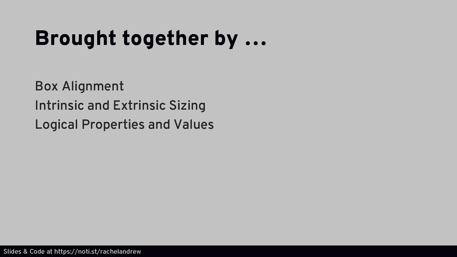
Brought together by … Box Alignment Intrinsic and Extrinsic Sizing Logical Properties and Values Slides & Code at https://noti.st/rachelandrew
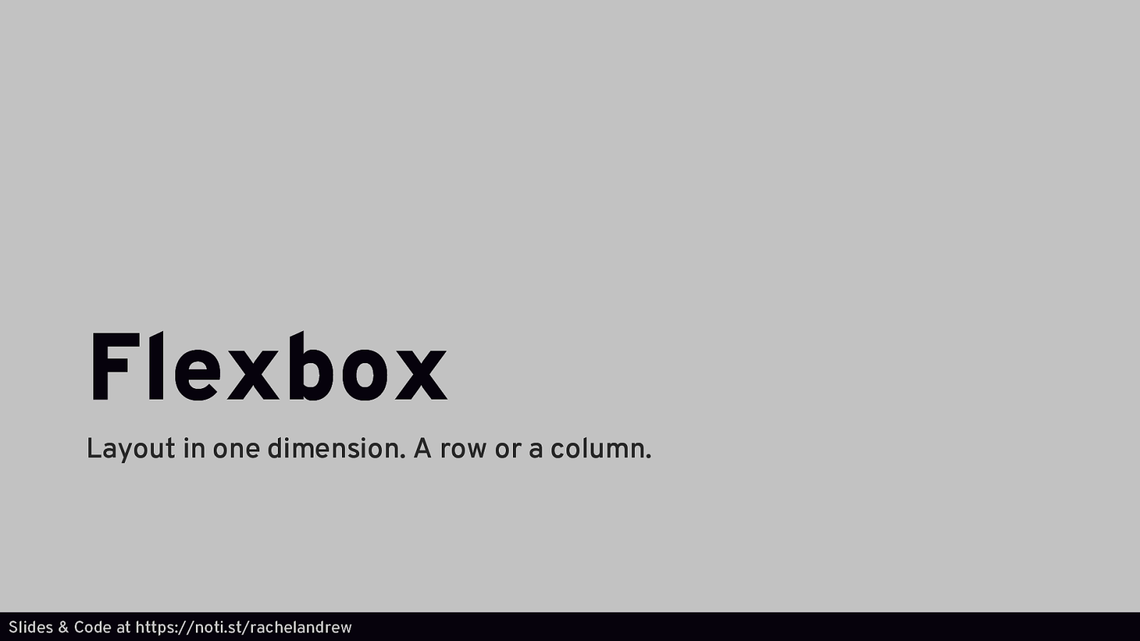
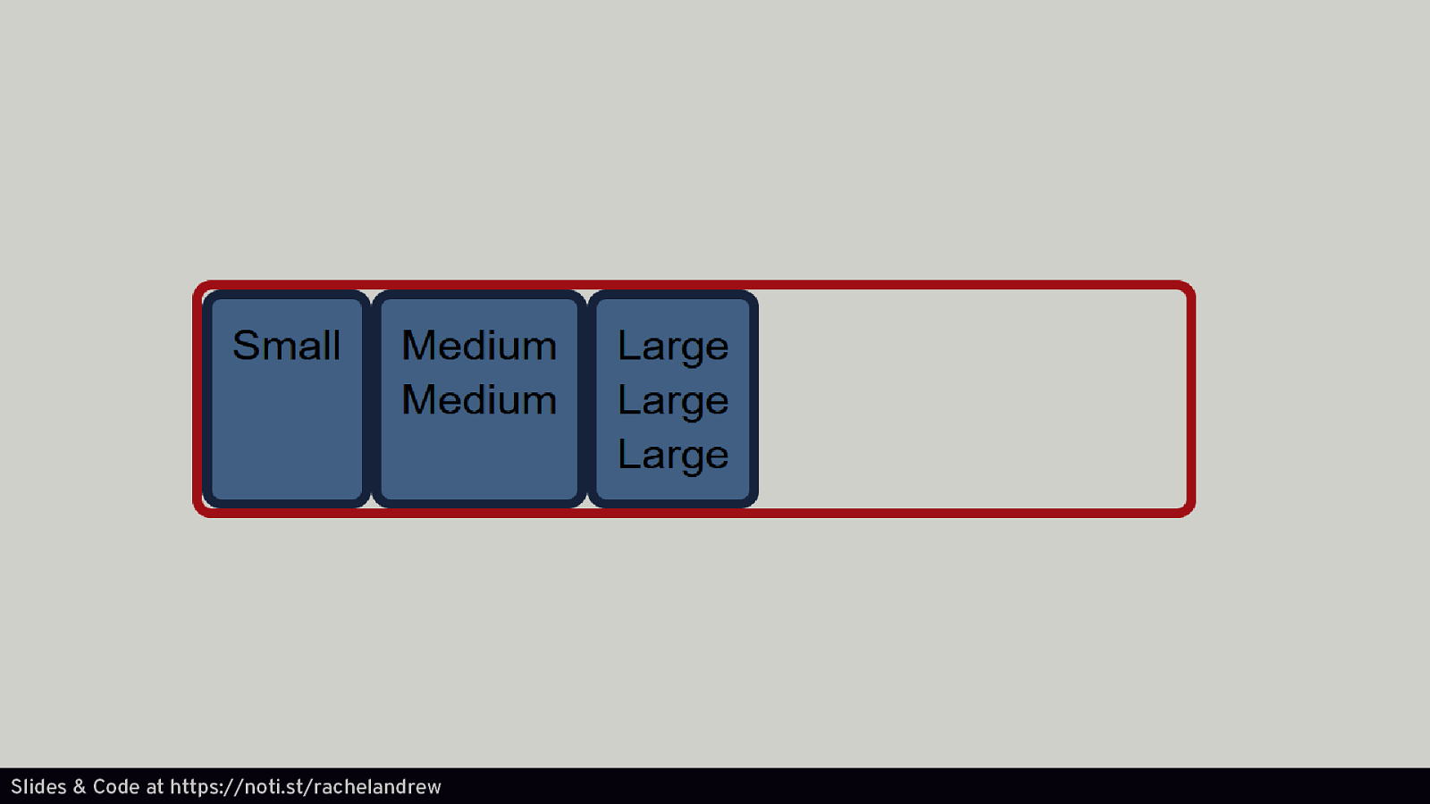
Flexbox Layout in one dimension. A row or a column. Slides & Code at https://noti.st/rachelandrew
Slides & Code at https://noti.st/rachelandrew
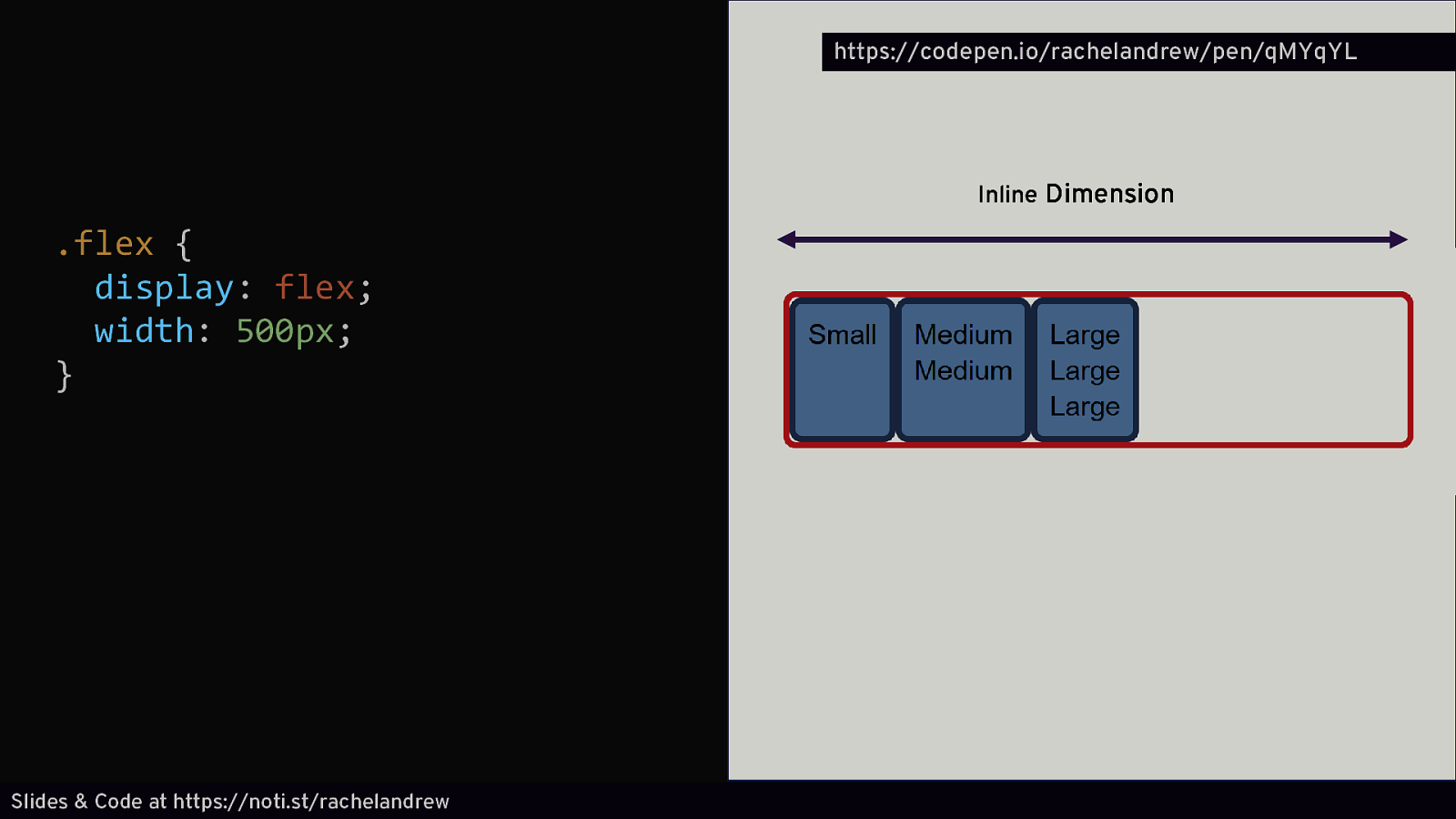
https://codepen.io/rachelandrew/pen/qMYqYL Inline Dimension .flex { display: flex; width: 500px; } Slides & Code at https://noti.st/rachelandrew
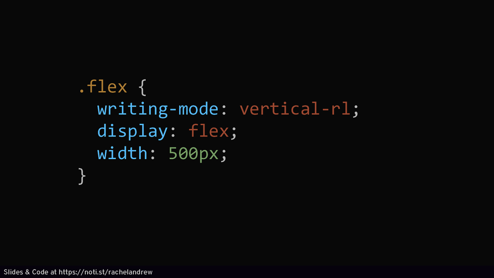
.flex { writing-mode: vertical-rl; display: flex; width: 500px; } Slides & Code at https://noti.st/rachelandrew
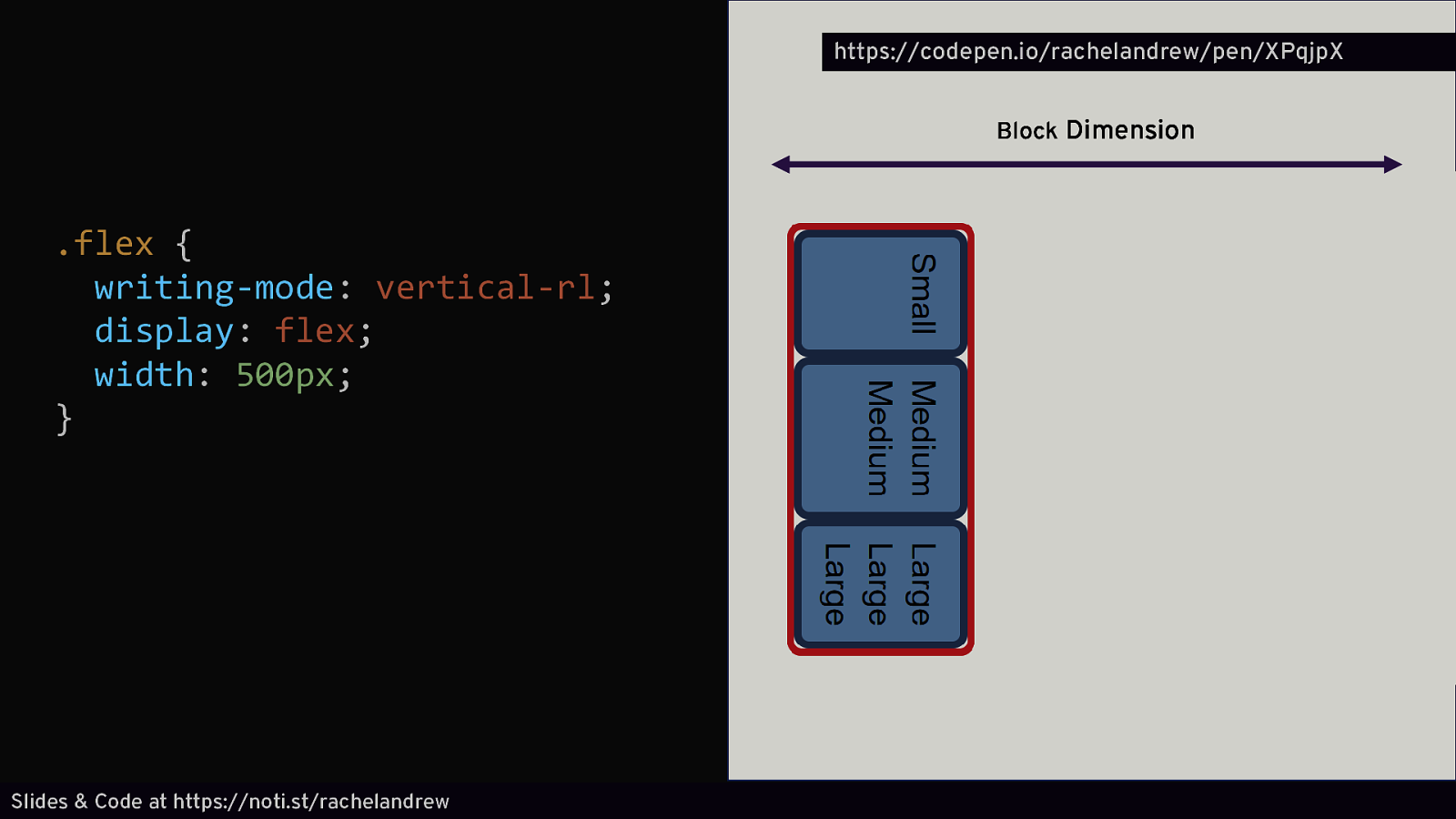
https://codepen.io/rachelandrew/pen/XPqjpX Block Dimension .flex { writing-mode: vertical-rl; display: flex; width: 500px; } Slides & Code at https://noti.st/rachelandrew
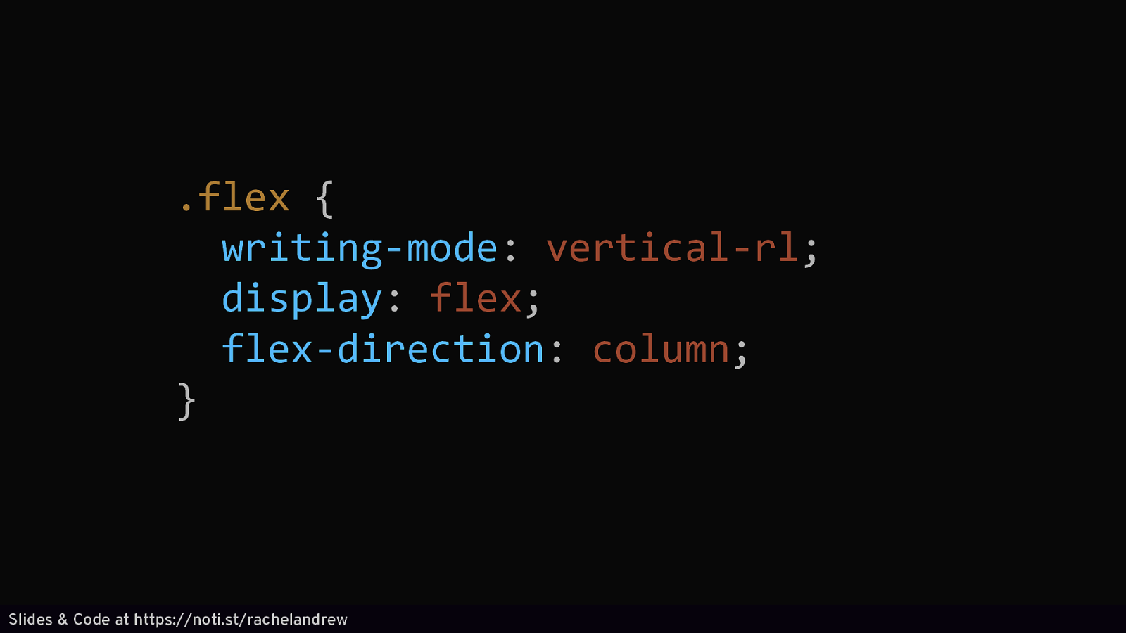
.flex { writing-mode: vertical-rl; display: flex; flex-direction: column; } Slides & Code at https://noti.st/rachelandrew
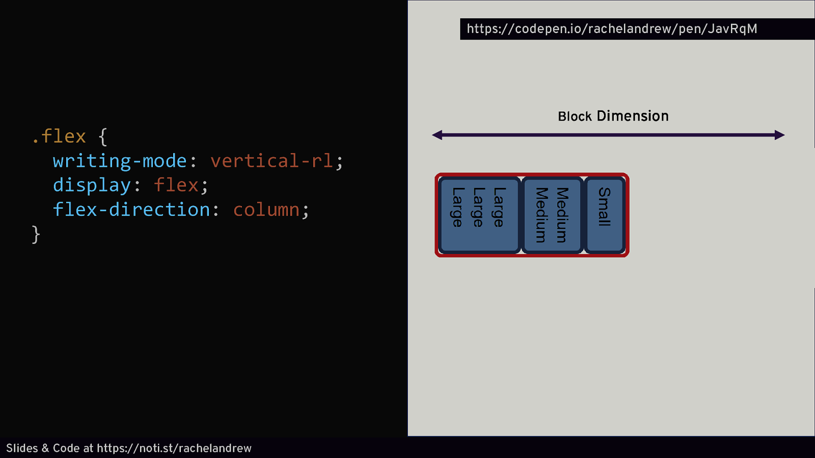
https://codepen.io/rachelandrew/pen/JavRqM .flex { writing-mode: vertical-rl; display: flex; flex-direction: column; } Slides & Code at https://noti.st/rachelandrew Block Dimension
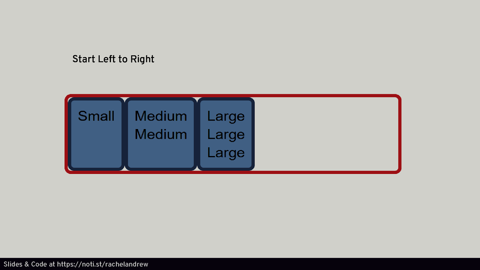
Start Left to Right Slides & Code at https://noti.st/rachelandrew
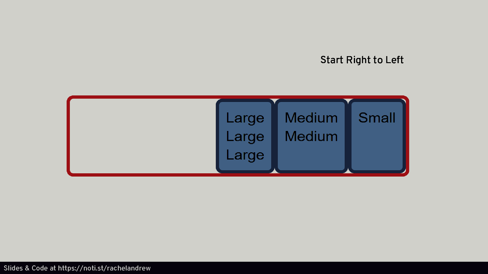
Start Right to Left Slides & Code at https://noti.st/rachelandrew
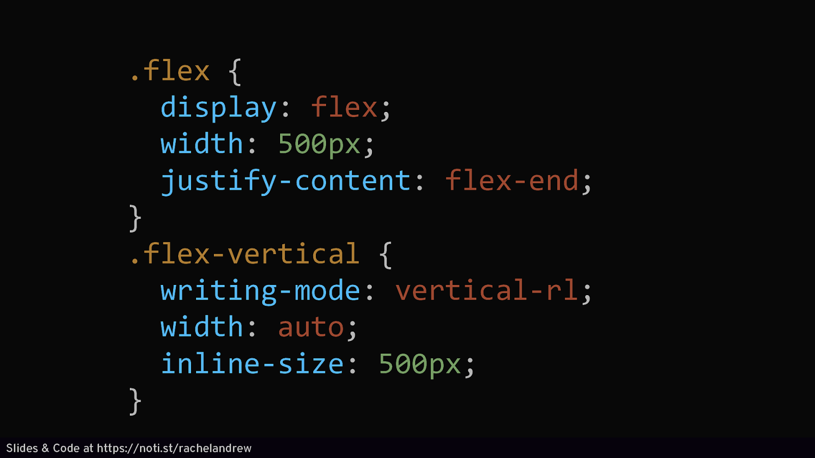
.flex { display: flex; width: 500px; justify-content: flex-end; } .flex-vertical { writing-mode: vertical-rl; width: auto; inline-size: 500px; } Slides & Code at https://noti.st/rachelandrew
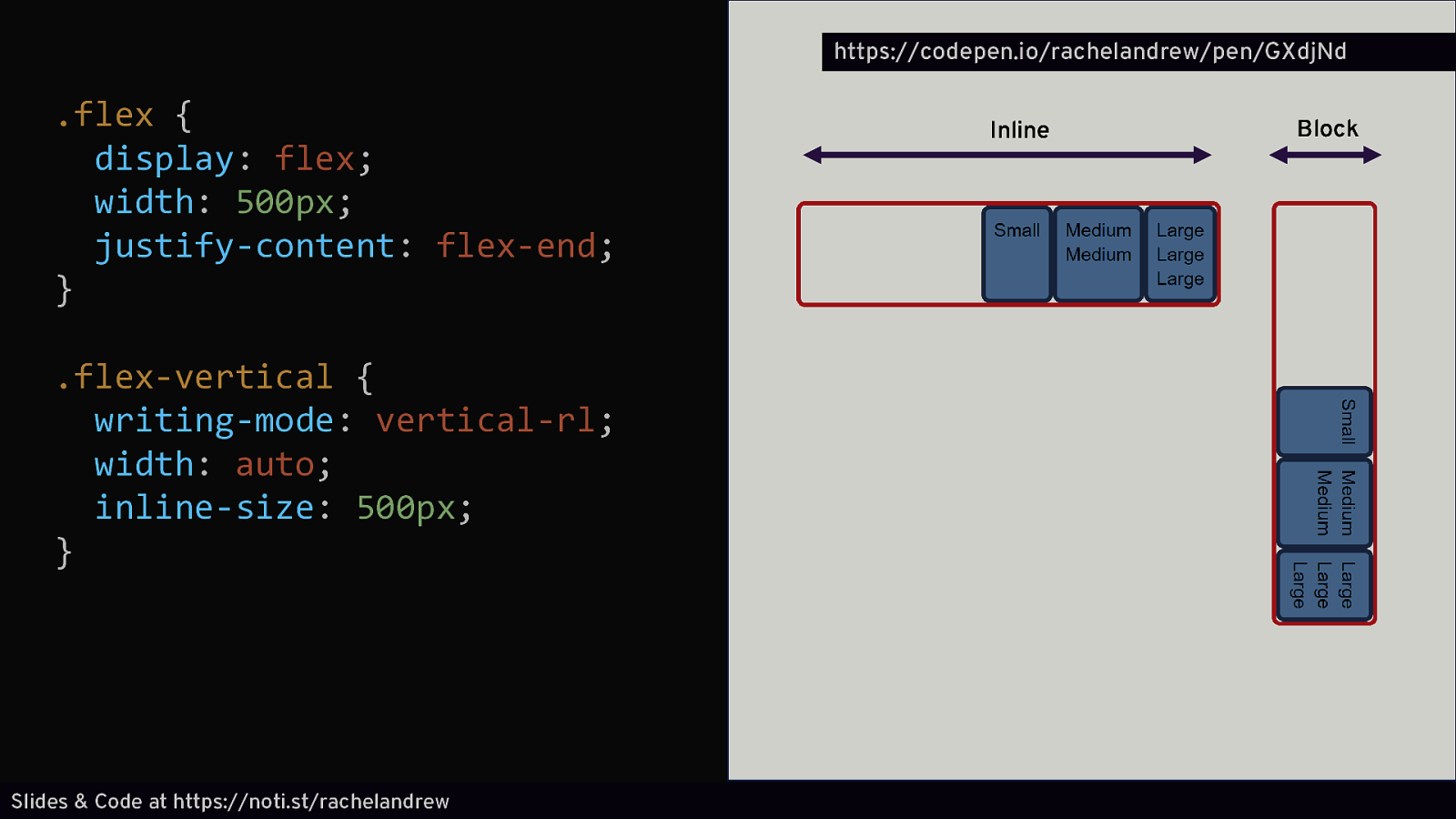
https://codepen.io/rachelandrew/pen/GXdjNd .flex { display: flex; width: 500px; justify-content: flex-end; } .flex-vertical { writing-mode: vertical-rl; width: auto; inline-size: 500px; } Slides & Code at https://noti.st/rachelandrew Inline Block
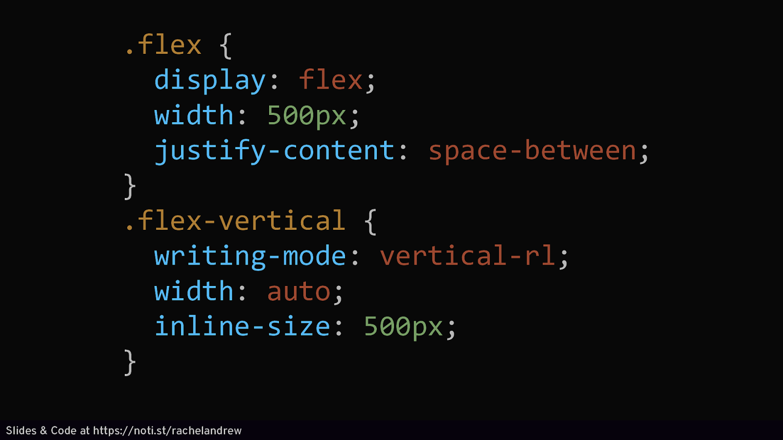
.flex { display: flex; width: 500px; justify-content: space-between; } .flex-vertical { writing-mode: vertical-rl; width: auto; inline-size: 500px; } Slides & Code at https://noti.st/rachelandrew
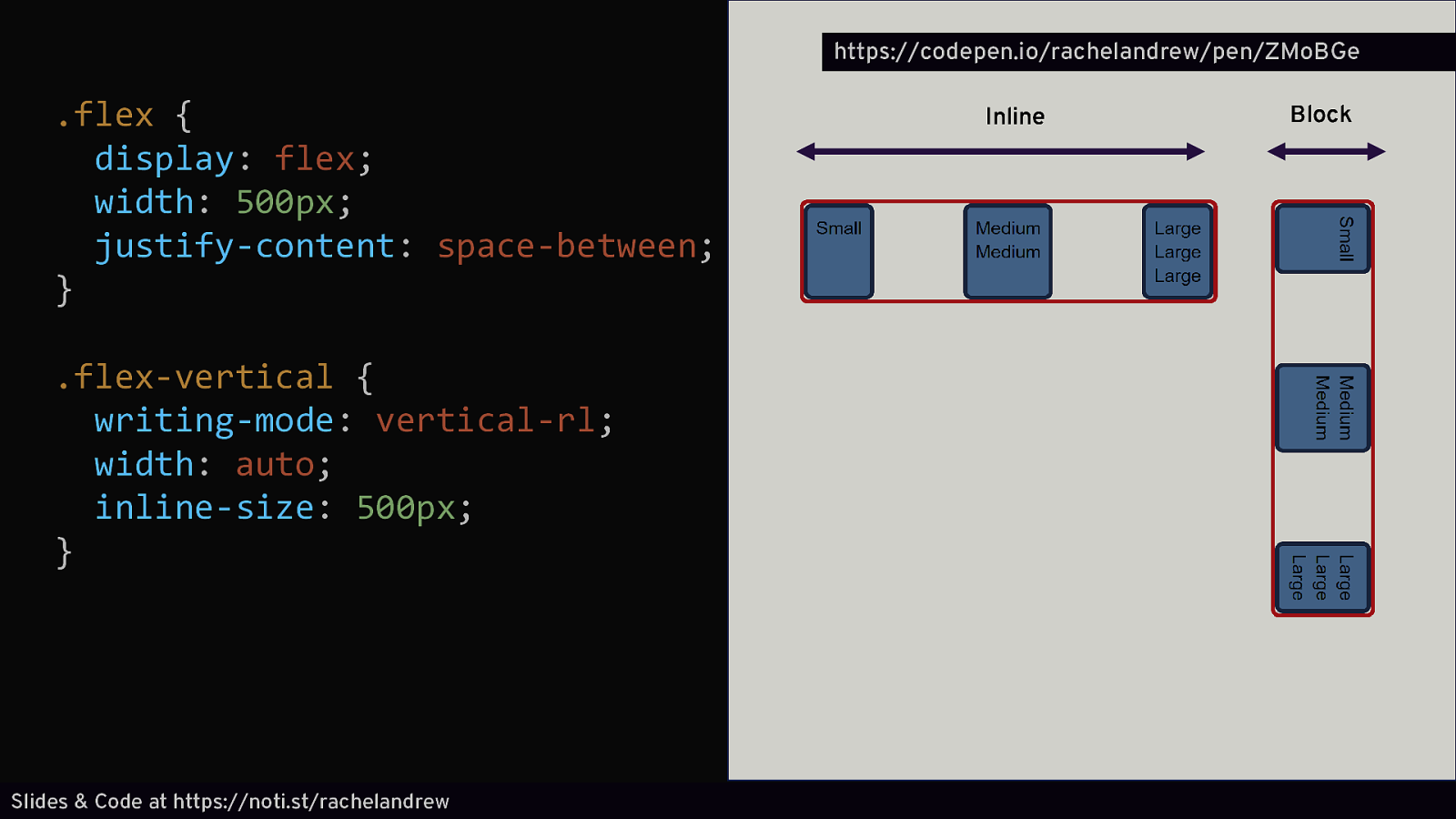
https://codepen.io/rachelandrew/pen/ZMoBGe .flex { display: flex; width: 500px; justify-content: space-between; } .flex-vertical { writing-mode: vertical-rl; width: auto; inline-size: 500px; } Slides & Code at https://noti.st/rachelandrew Inline Block
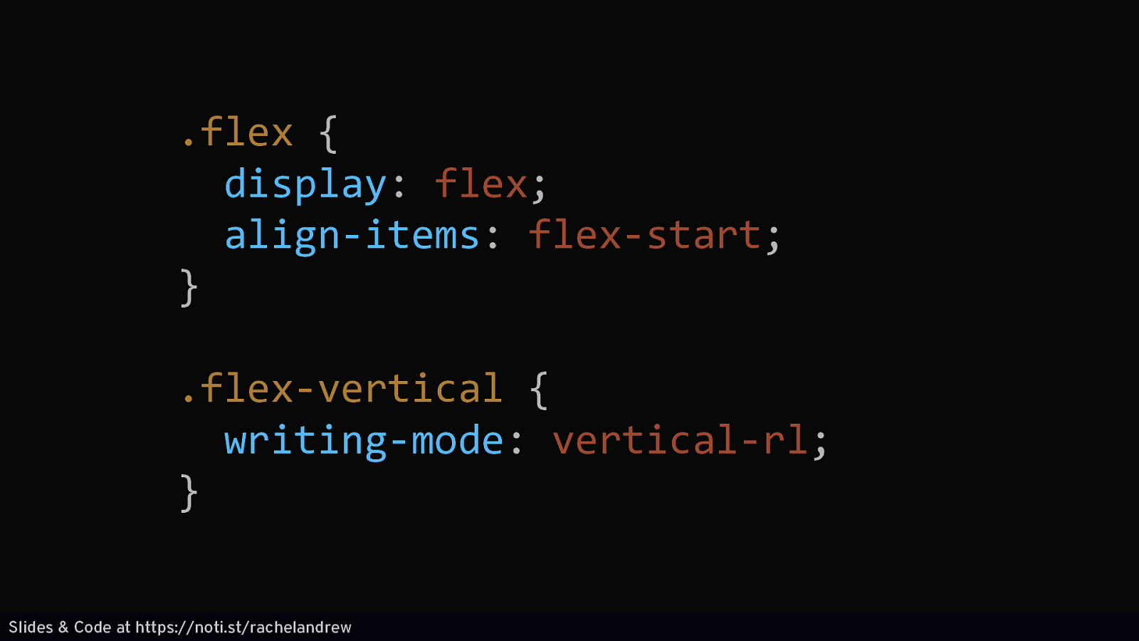
.flex { display: flex; align-items: flex-start; } .flex-vertical { writing-mode: vertical-rl; } Slides & Code at https://noti.st/rachelandrew
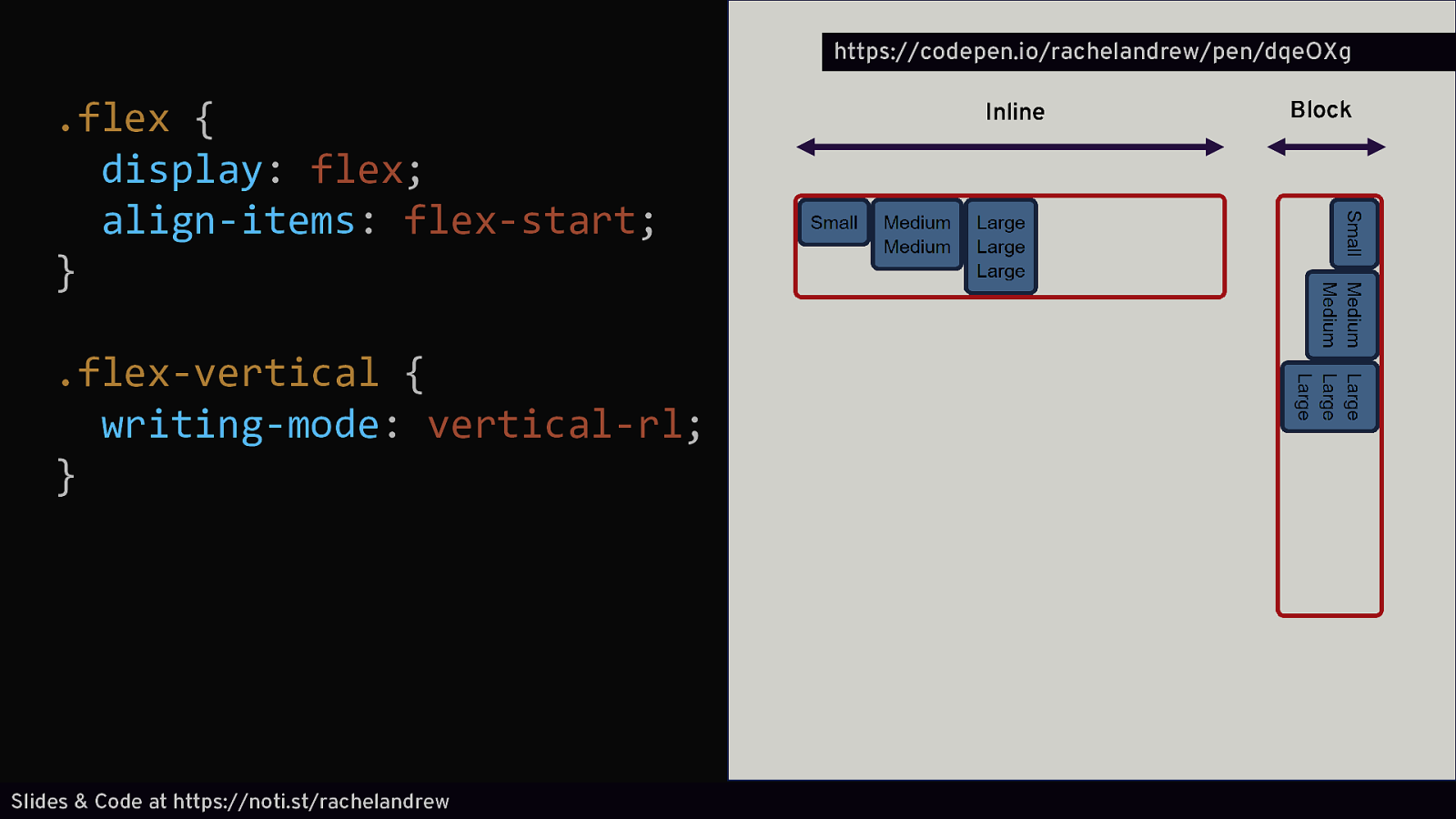
https://codepen.io/rachelandrew/pen/dqeOXg .flex { display: flex; align-items: flex-start; } .flex-vertical { writing-mode: vertical-rl; } Slides & Code at https://noti.st/rachelandrew Inline Block
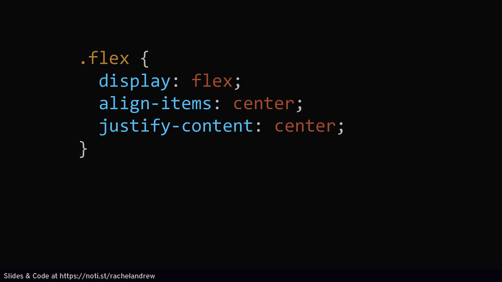
.flex { display: flex; align-items: center; justify-content: center; } Slides & Code at https://noti.st/rachelandrew
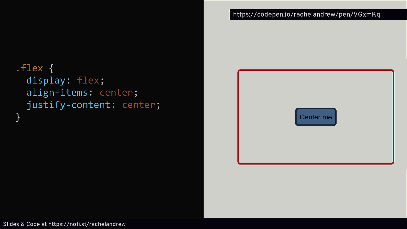
https://codepen.io/rachelandrew/pen/VGxmKq .flex { display: flex; align-items: center; justify-content: center; } Slides & Code at https://noti.st/rachelandrew
CSS Grid Layout Layout in two dimensions. Rows and Columns. Slides & Code at https://noti.st/rachelandrew
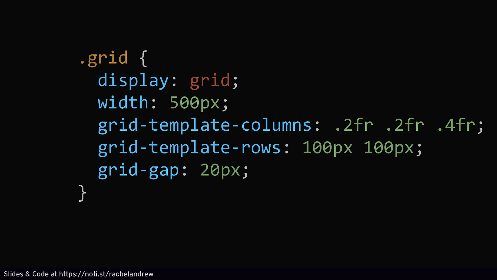
.grid { display: grid; width: 500px; grid-template-columns: .2fr .2fr .4fr; grid-template-rows: 100px 100px; grid-gap: 20px; } Slides & Code at https://noti.st/rachelandrew
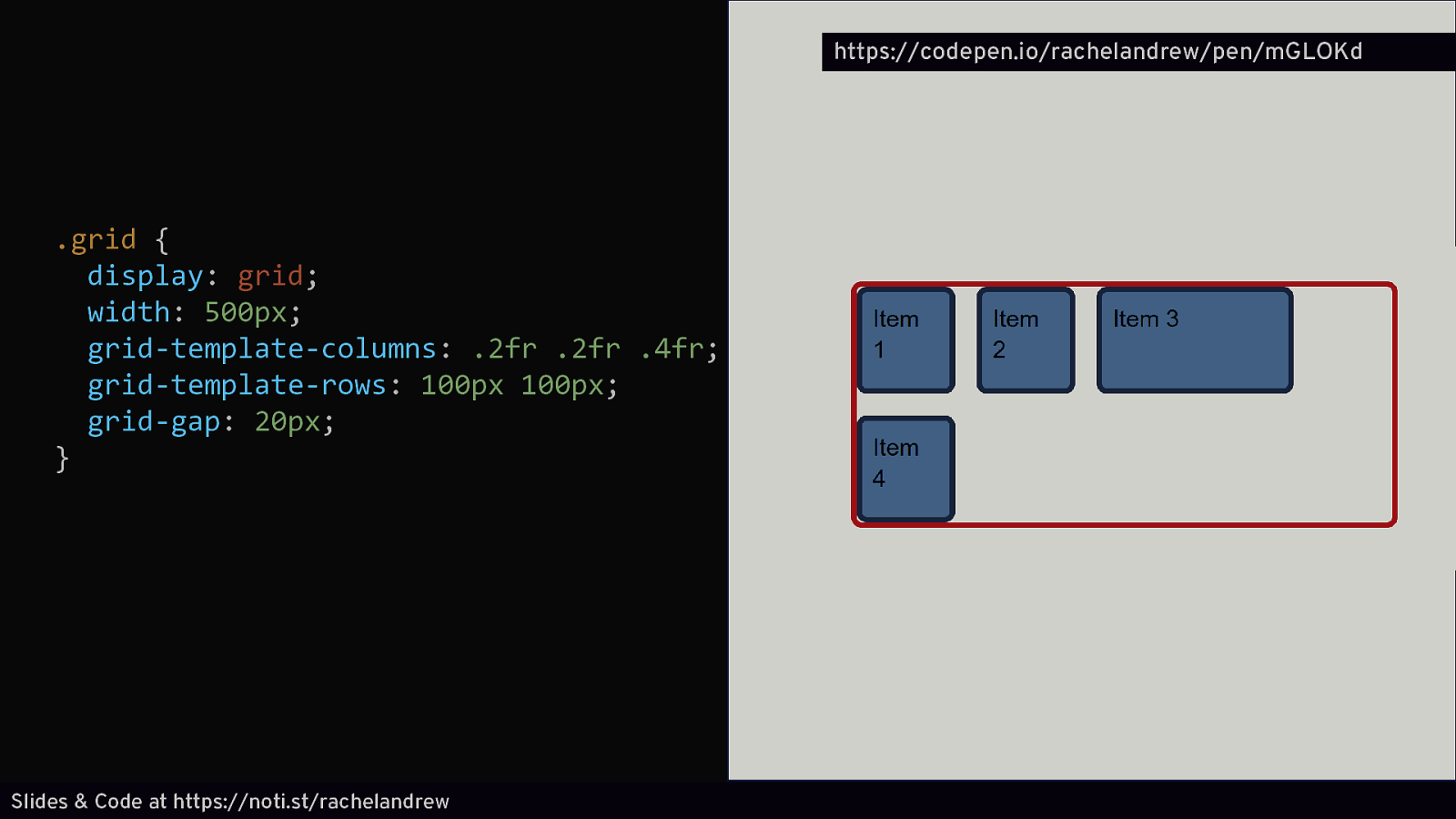
https://codepen.io/rachelandrew/pen/mGLOKd .grid { display: grid; width: 500px; grid-template-columns: .2fr .2fr .4fr; grid-template-rows: 100px 100px; grid-gap: 20px; } Slides & Code at https://noti.st/rachelandrew
Slides & Code at https://noti.st/rachelandrew

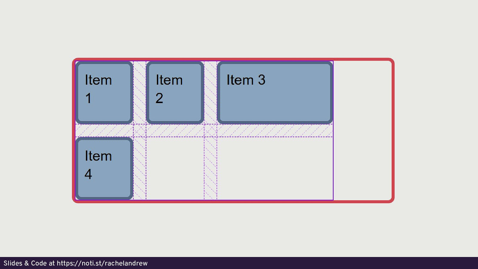
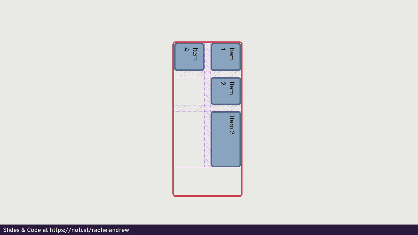
Firefox Grid Inspector https://developer.mozilla.org/en-US/docs/Tools/Page_Inspector/How_to/Examine_grid_layouts Slides & Code at https://noti.st/rachelandrew
Slides & Code at https://noti.st/rachelandrew
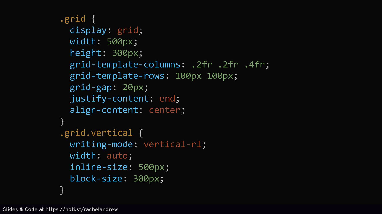
.grid { display: grid; width: 500px; height: 300px; grid-template-columns: .2fr .2fr .4fr; grid-template-rows: 100px 100px; grid-gap: 20px; justify-content: end; align-content: center; } .grid.vertical { writing-mode: vertical-rl; width: auto; inline-size: 500px; block-size: 300px; } Slides & Code at https://noti.st/rachelandrew
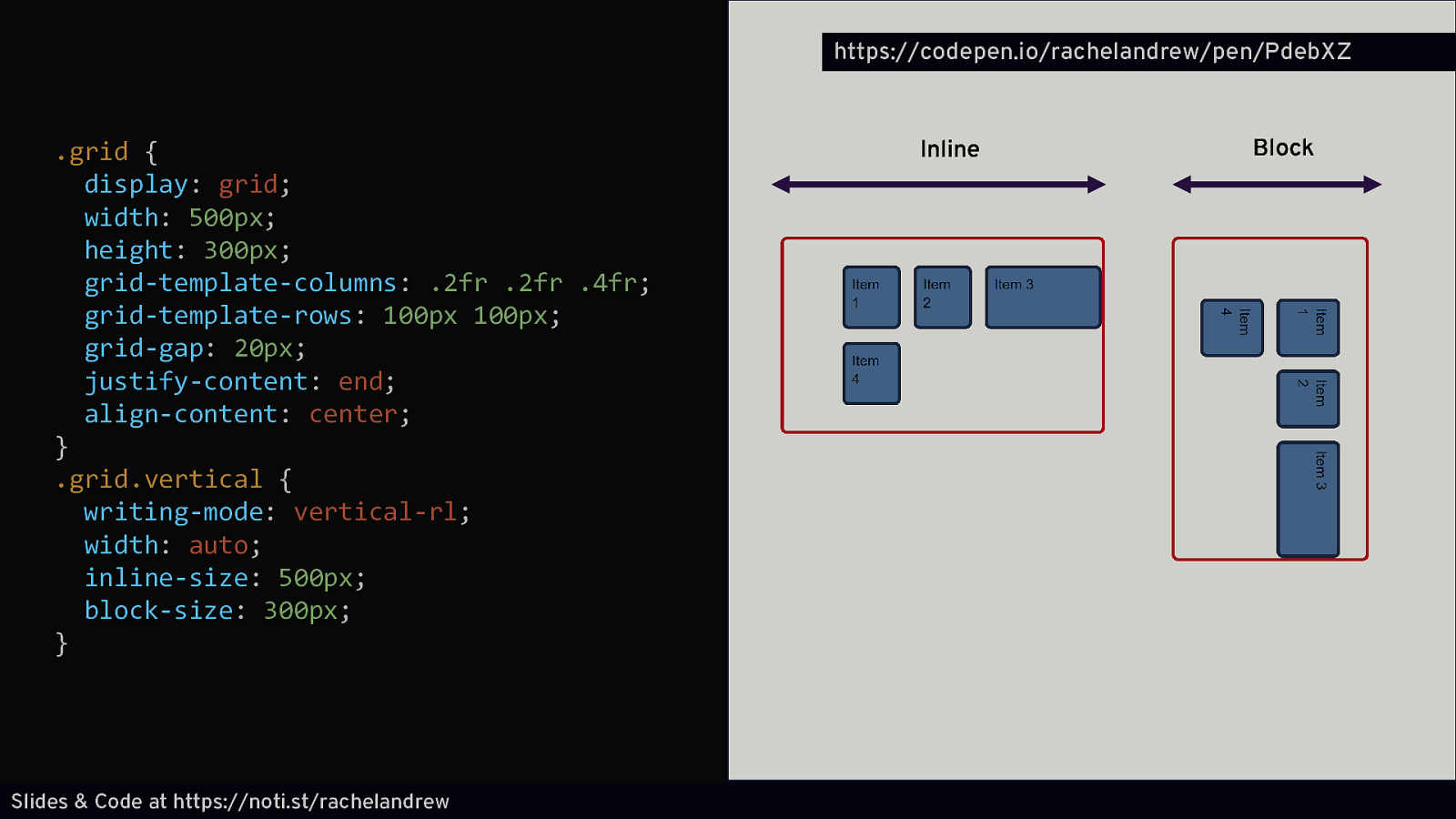
https://codepen.io/rachelandrew/pen/PdebXZ .grid { display: grid; width: 500px; height: 300px; grid-template-columns: .2fr .2fr .4fr; grid-template-rows: 100px 100px; grid-gap: 20px; justify-content: end; align-content: center; } .grid.vertical { writing-mode: vertical-rl; width: auto; inline-size: 500px; block-size: 300px; } Slides & Code at https://noti.st/rachelandrew Inline Block
.grid { display: grid; width: 500px; grid-template-columns: 1fr 1fr 2fr; grid-template-rows: 100px 100px; grid-gap: 20px; align-items: start; justify-items: end; } .grid.vertical { writing-mode: vertical-rl; width: auto; inline-size: 500px; } Slides & Code at https://noti.st/rachelandrew
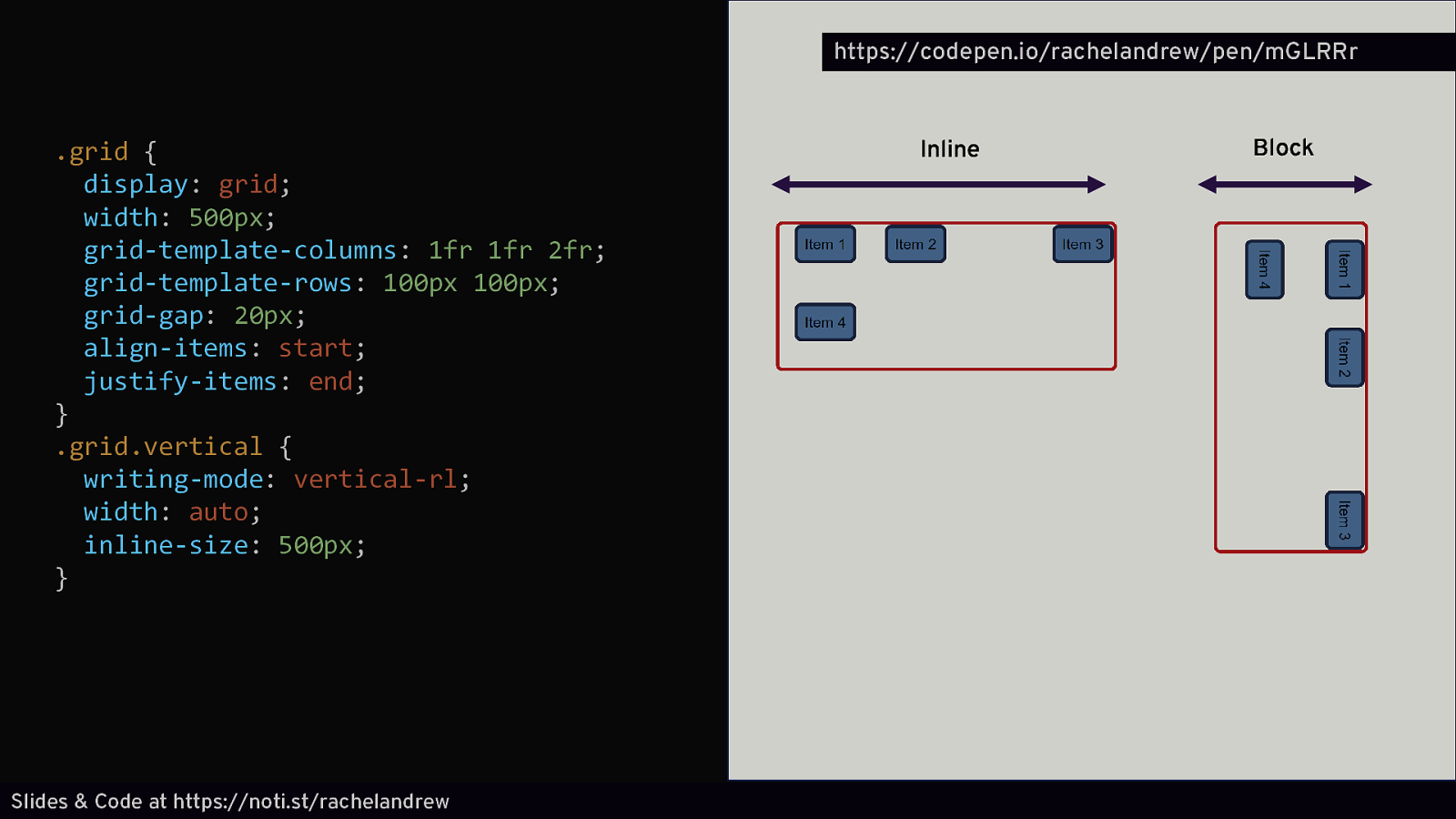
https://codepen.io/rachelandrew/pen/mGLRRr .grid { display: grid; width: 500px; grid-template-columns: 1fr 1fr 2fr; grid-template-rows: 100px 100px; grid-gap: 20px; align-items: start; justify-items: end; } .grid.vertical { writing-mode: vertical-rl; width: auto; inline-size: 500px; } Slides & Code at https://noti.st/rachelandrew Inline Block
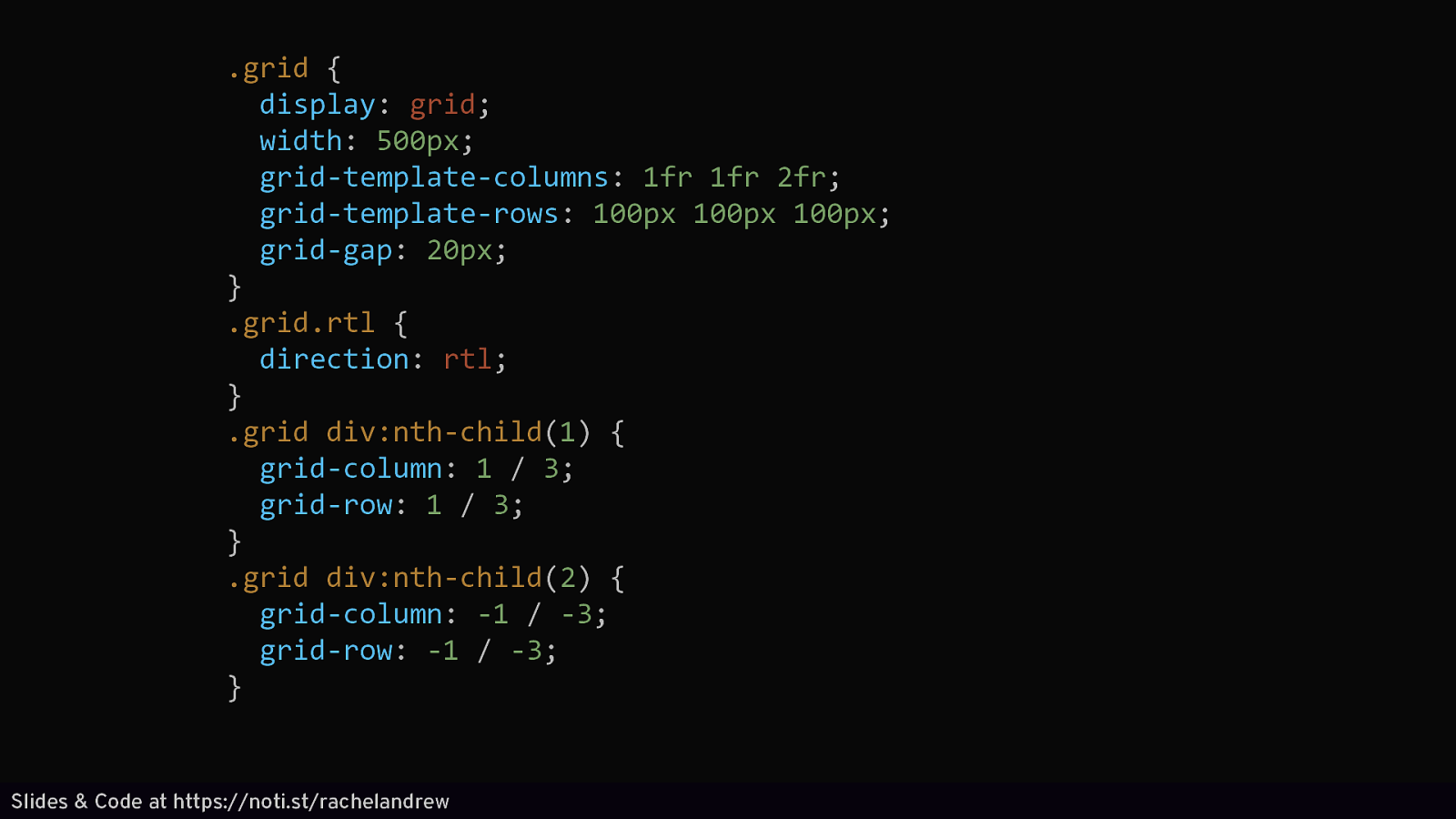
.grid { display: grid; width: 500px; grid-template-columns: 1fr 1fr 2fr; grid-template-rows: 100px 100px 100px; grid-gap: 20px; } .grid.rtl { direction: rtl; } .grid div:nth-child(1) { grid-column: 1 / 3; grid-row: 1 / 3; } .grid div:nth-child(2) { grid-column: -1 / -3; grid-row: -1 / -3; } Slides & Code at https://noti.st/rachelandrew
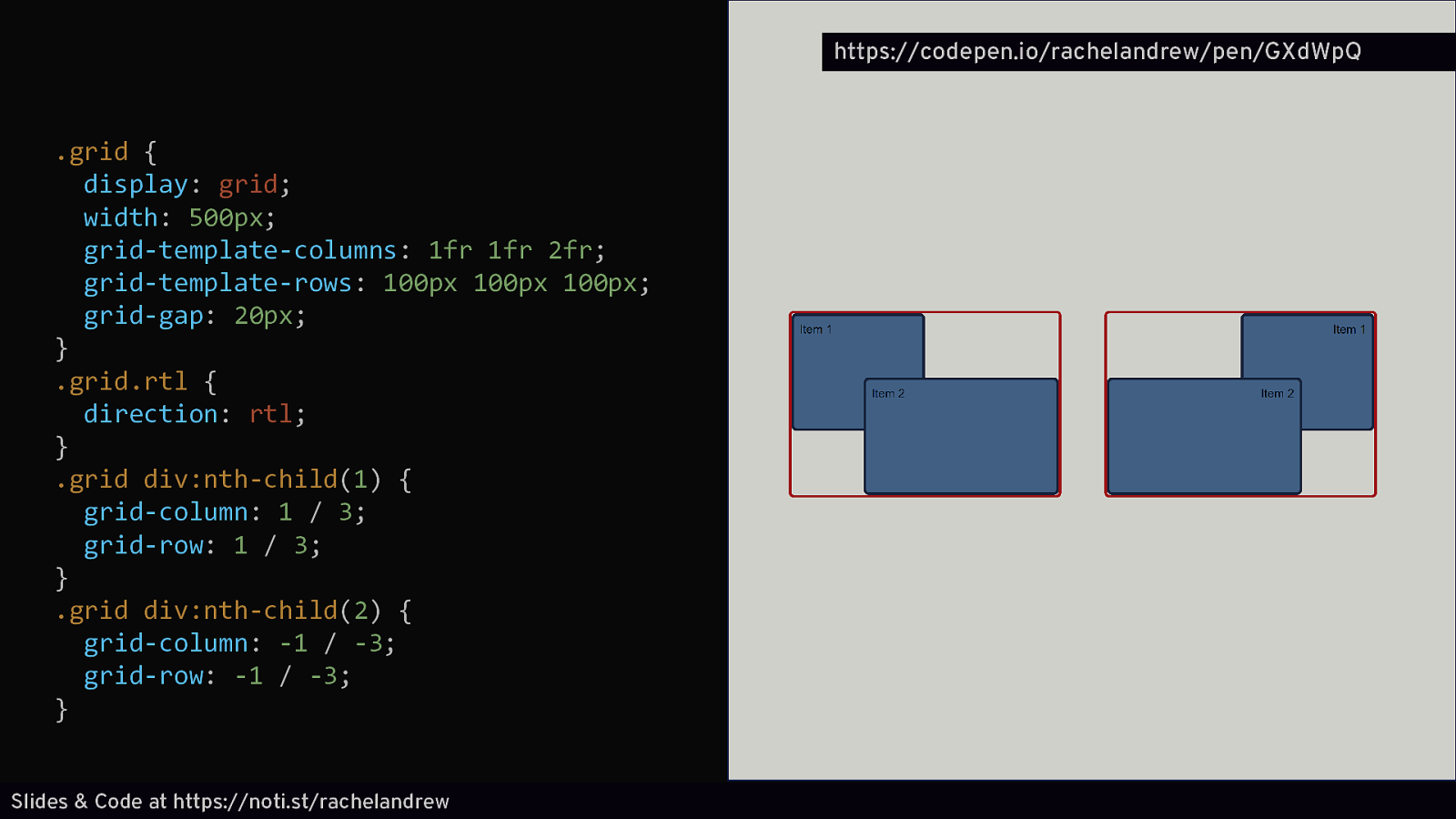
https://codepen.io/rachelandrew/pen/GXdWpQ .grid { display: grid; width: 500px; grid-template-columns: 1fr 1fr 2fr; grid-template-rows: 100px 100px 100px; grid-gap: 20px; } .grid.rtl { direction: rtl; } .grid div:nth-child(1) { grid-column: 1 / 3; grid-row: 1 / 3; } .grid div:nth-child(2) { grid-column: -1 / -3; grid-row: -1 / -3; } Slides & Code at https://noti.st/rachelandrew
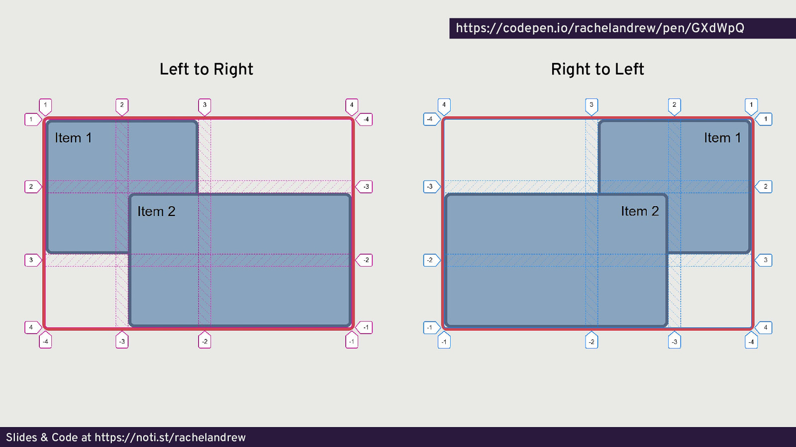
https://codepen.io/rachelandrew/pen/GXdWpQ Left to Right Slides & Code at https://noti.st/rachelandrew Right to Left
A true system for layout Designed for the job. Writing mode aware. Consistent. Slides & Code at https://noti.st/rachelandrew

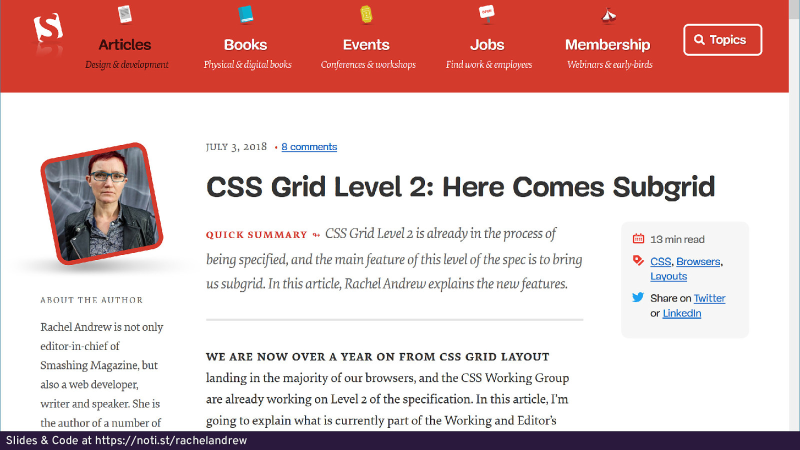
What’s next? CSS Grid Level 2 “subgrids” Slides & Code at https://noti.st/rachelandrew
Slides & Code at https://noti.st/rachelandrew
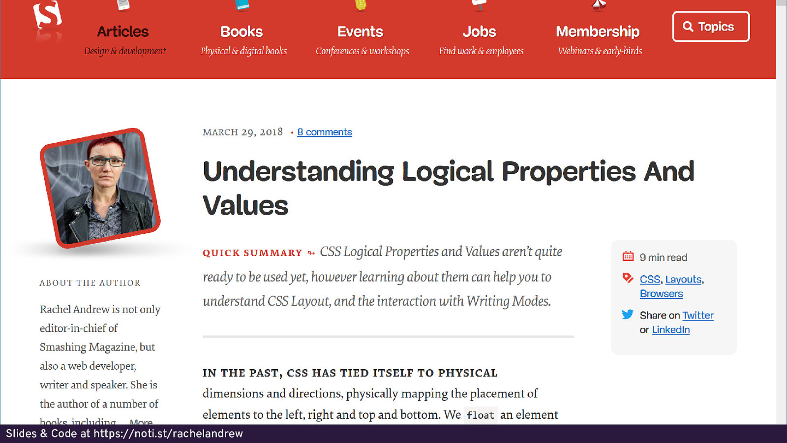
What’s next? Logical Properties & Values Slides & Code at https://noti.st/rachelandrew
Slides & Code at https://noti.st/rachelandrew
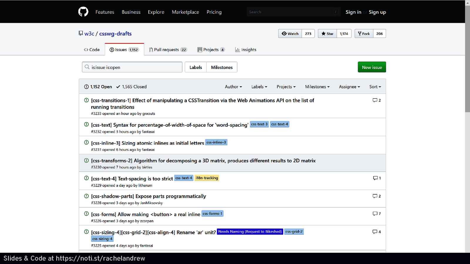
What’s next? Box Alignment in Block Layout Slides & Code at https://noti.st/rachelandrew

What’s next? What’s important to you? Slides & Code at https://noti.st/rachelandrew
Slides & Code at https://noti.st/rachelandrew
Thank you! https://noti.st/rachelandrew/SIXCfs Slides & Code at https://noti.st/rachelandrew