Now You See It. Rachel Andrew @ An Event Apart San Francisco 2019

A presentation at An Event Apart San Francisco 2019 in December 2019 in San Francisco, CA, USA by Rachel Andrew
Now You See It. Rachel Andrew @ An Event Apart San Francisco 2019
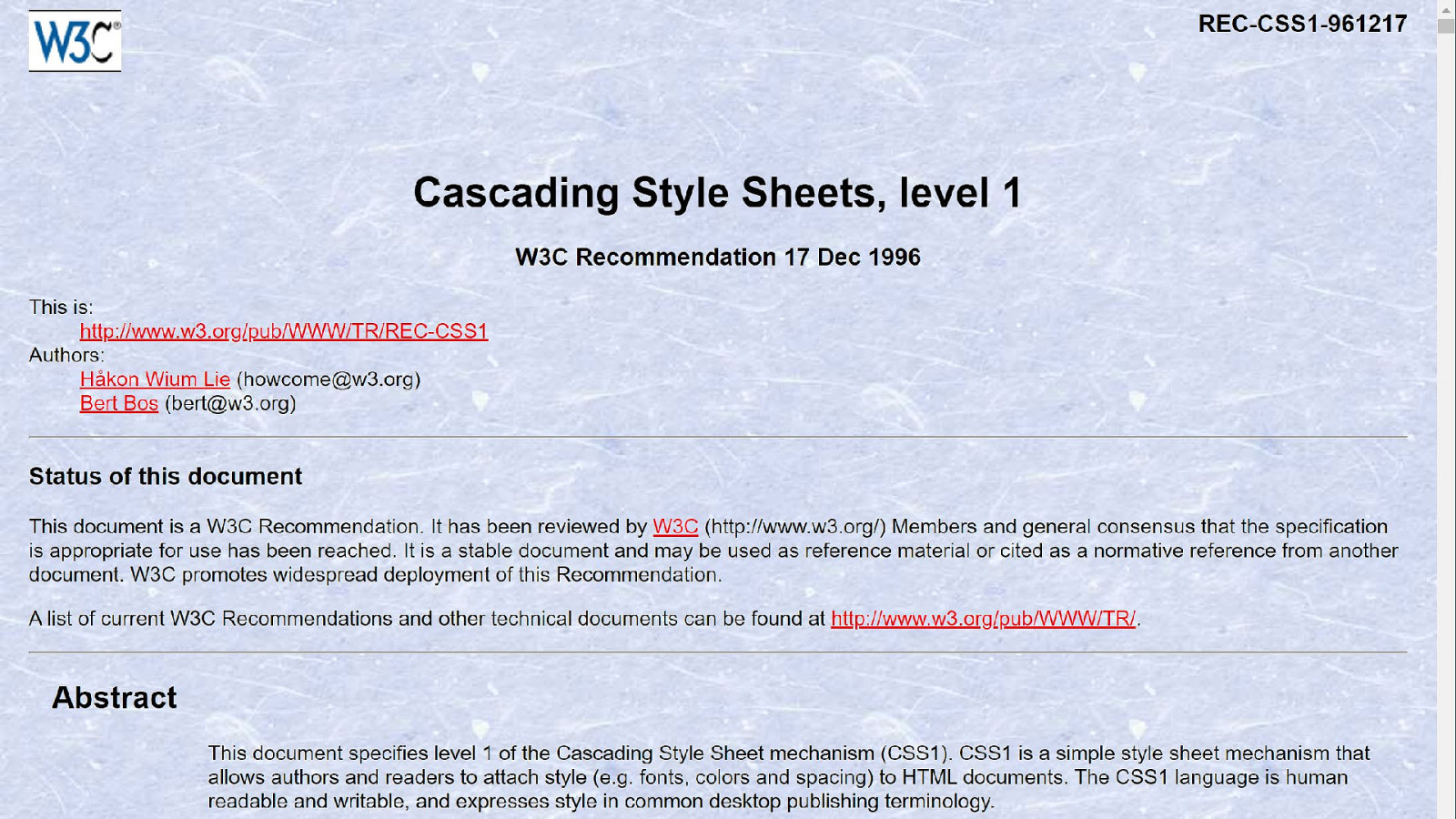
CSS1 Recommendation December 1996
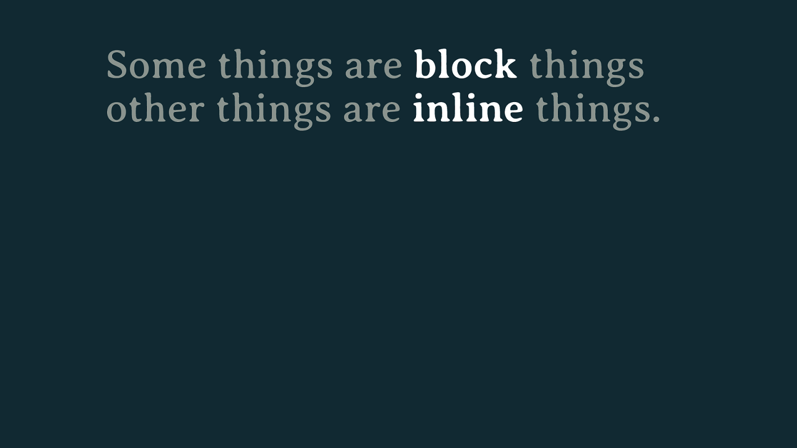
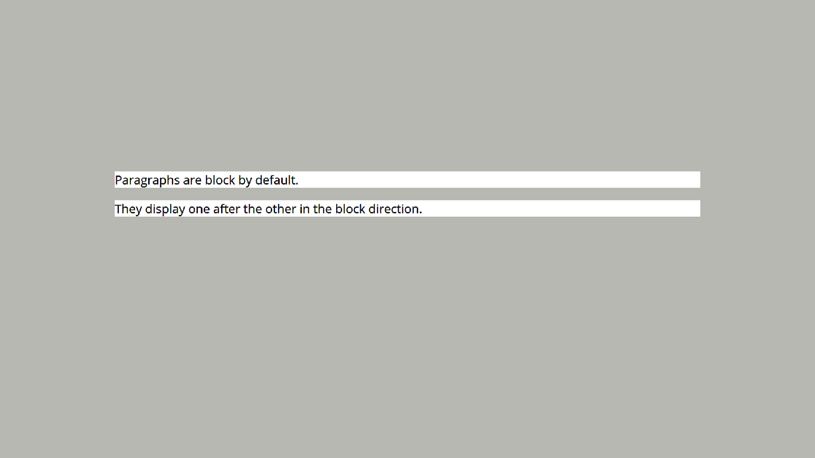
Some things are block things other things are inline things.
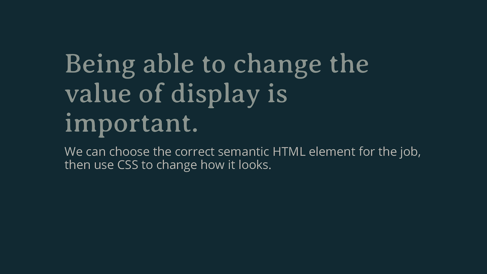
Being able to change the value of display is important. We can choose the correct semantic HTML element for the job, then use CSS to change how it looks.
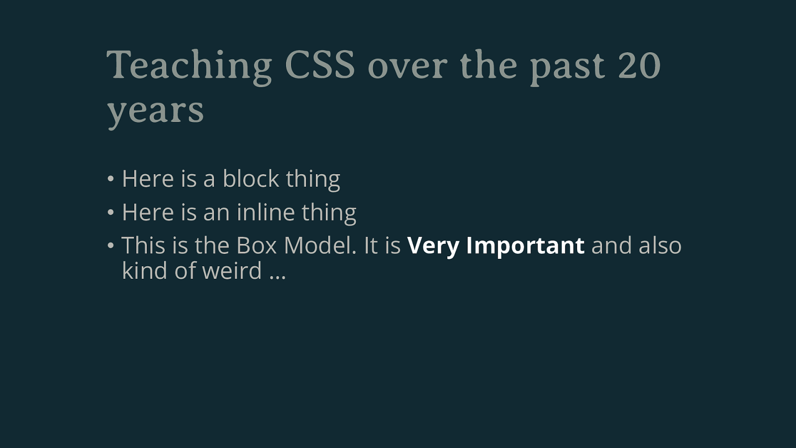
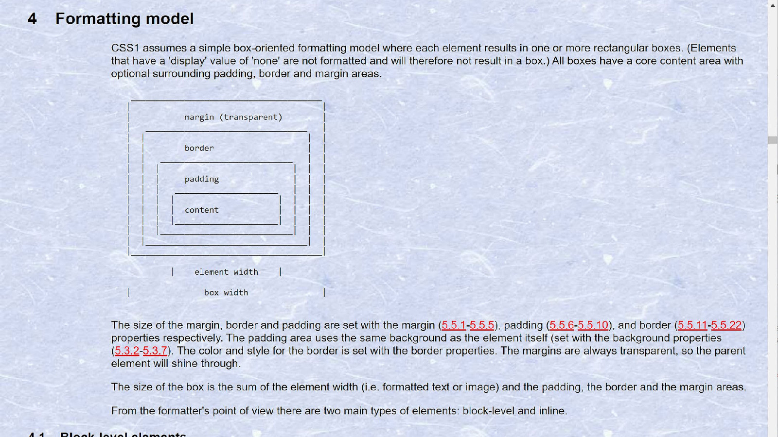
Teaching CSS over the past 20 years • Here is a block thing • Here is an inline thing • This is the Box Model. It is Very Important and also kind of weird …
display
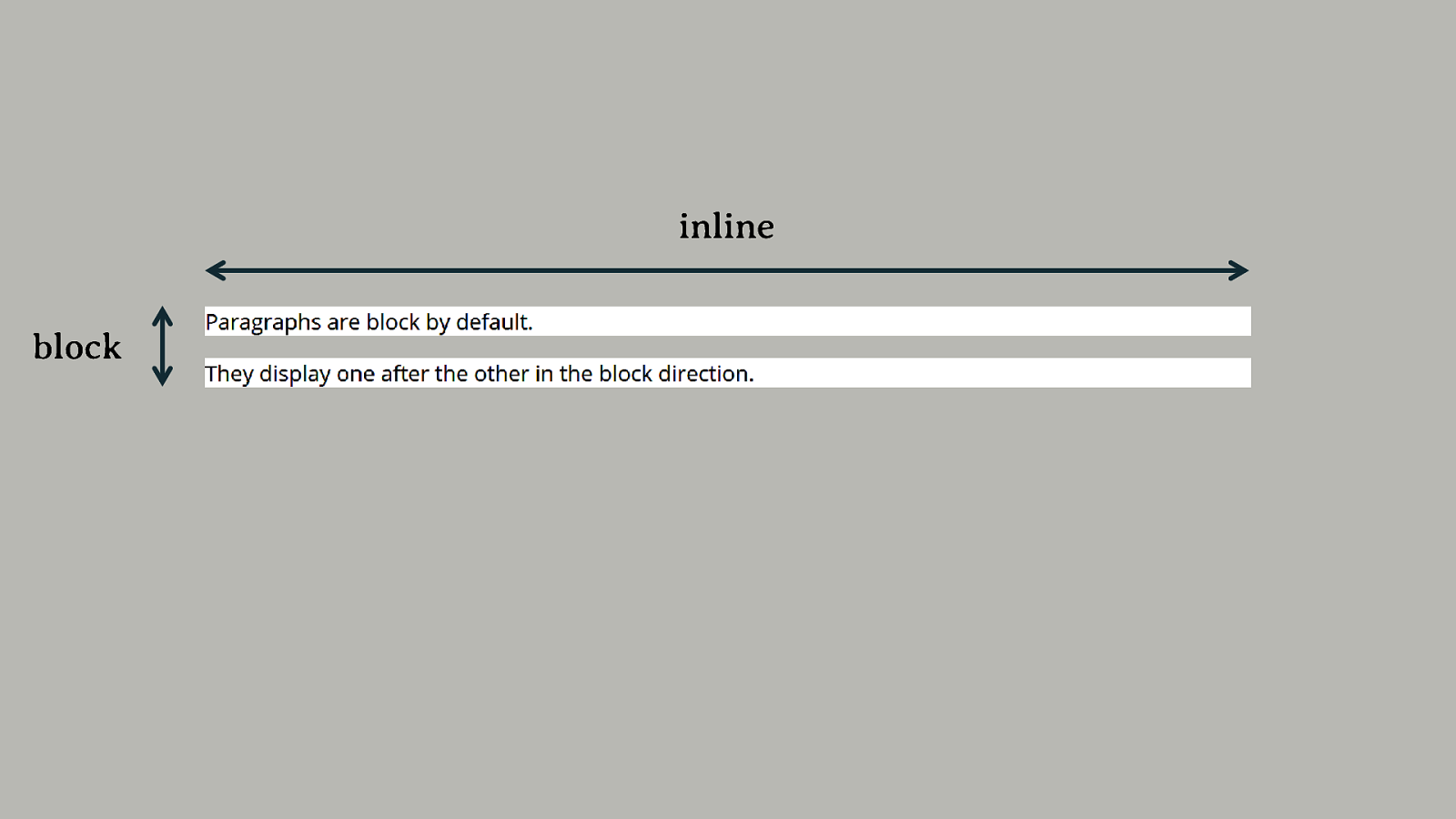
block and inline
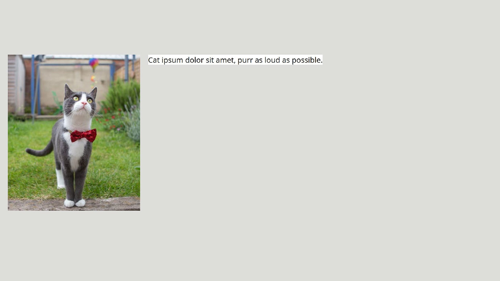
inline block
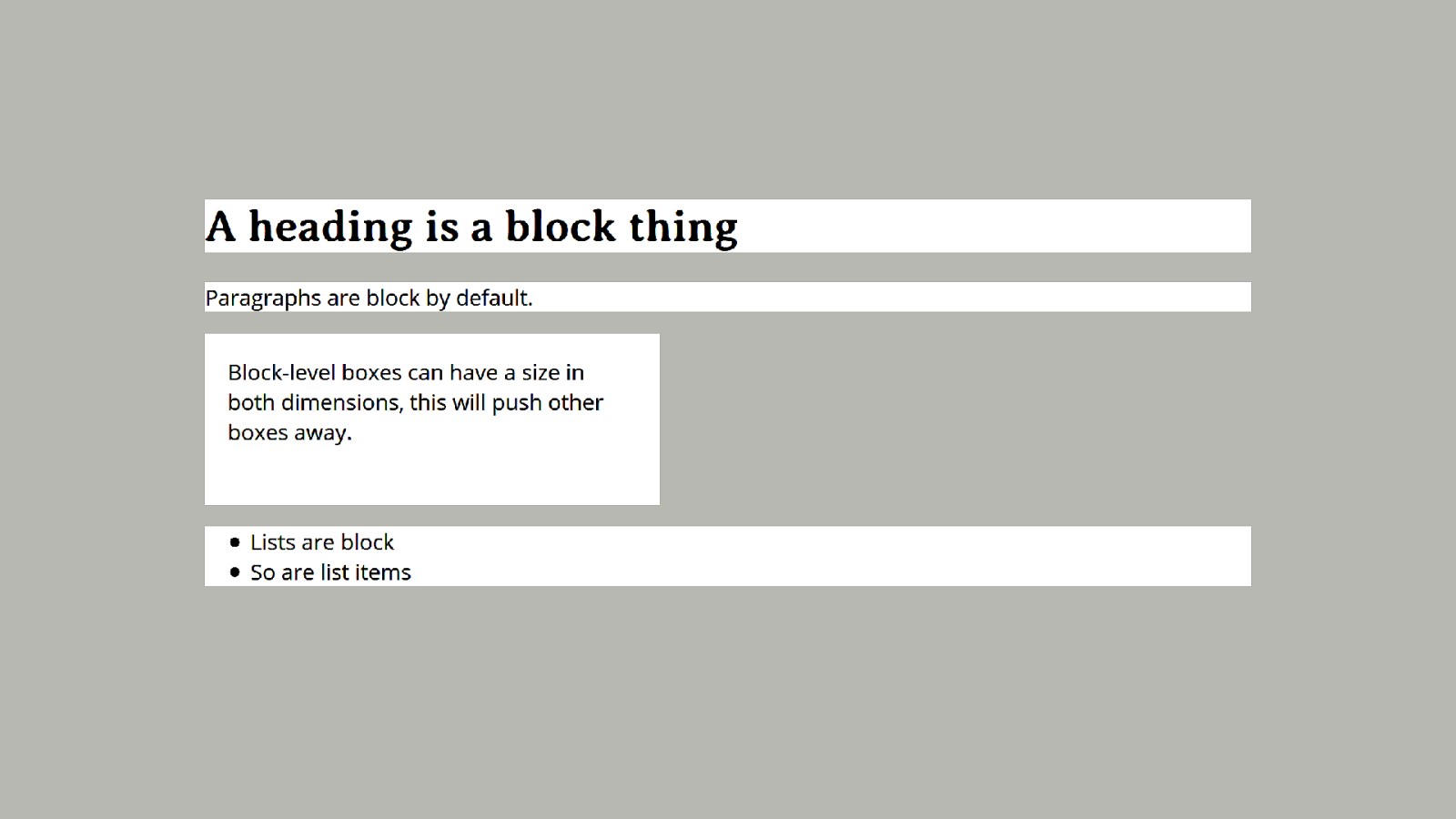
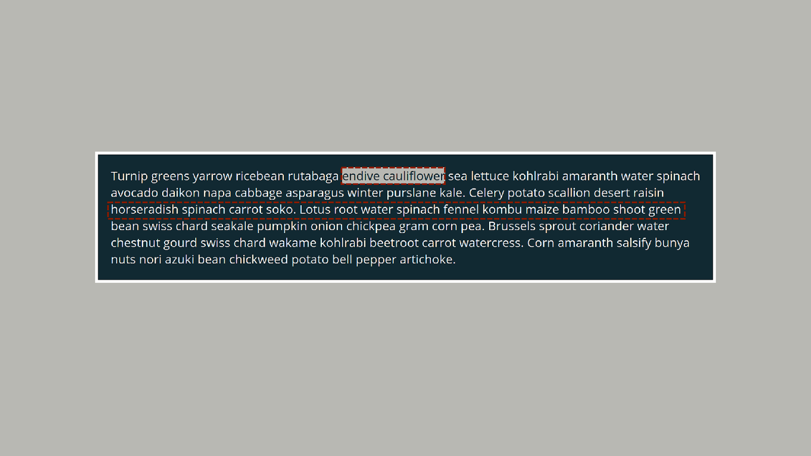
Block and inline • The block dimension is the direction that paragraphs lay out in your writing mode. • The inline direction is the direction in which sentences run in your writing mode.
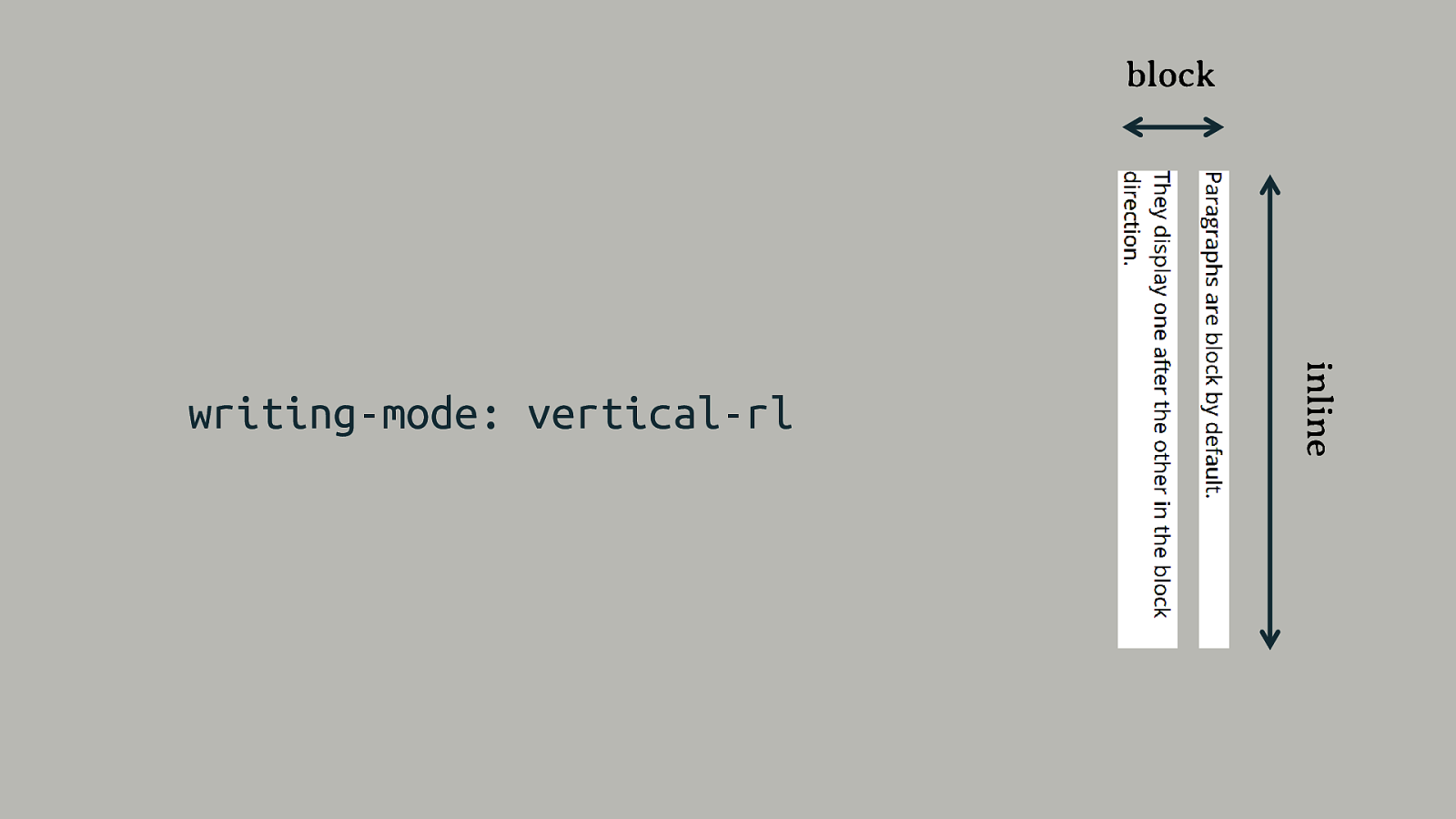
block inline writing-mode: vertical-rl
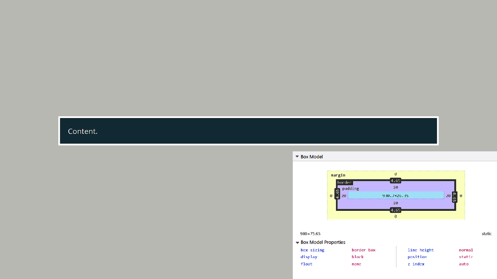
Normal Flow block and inline layout
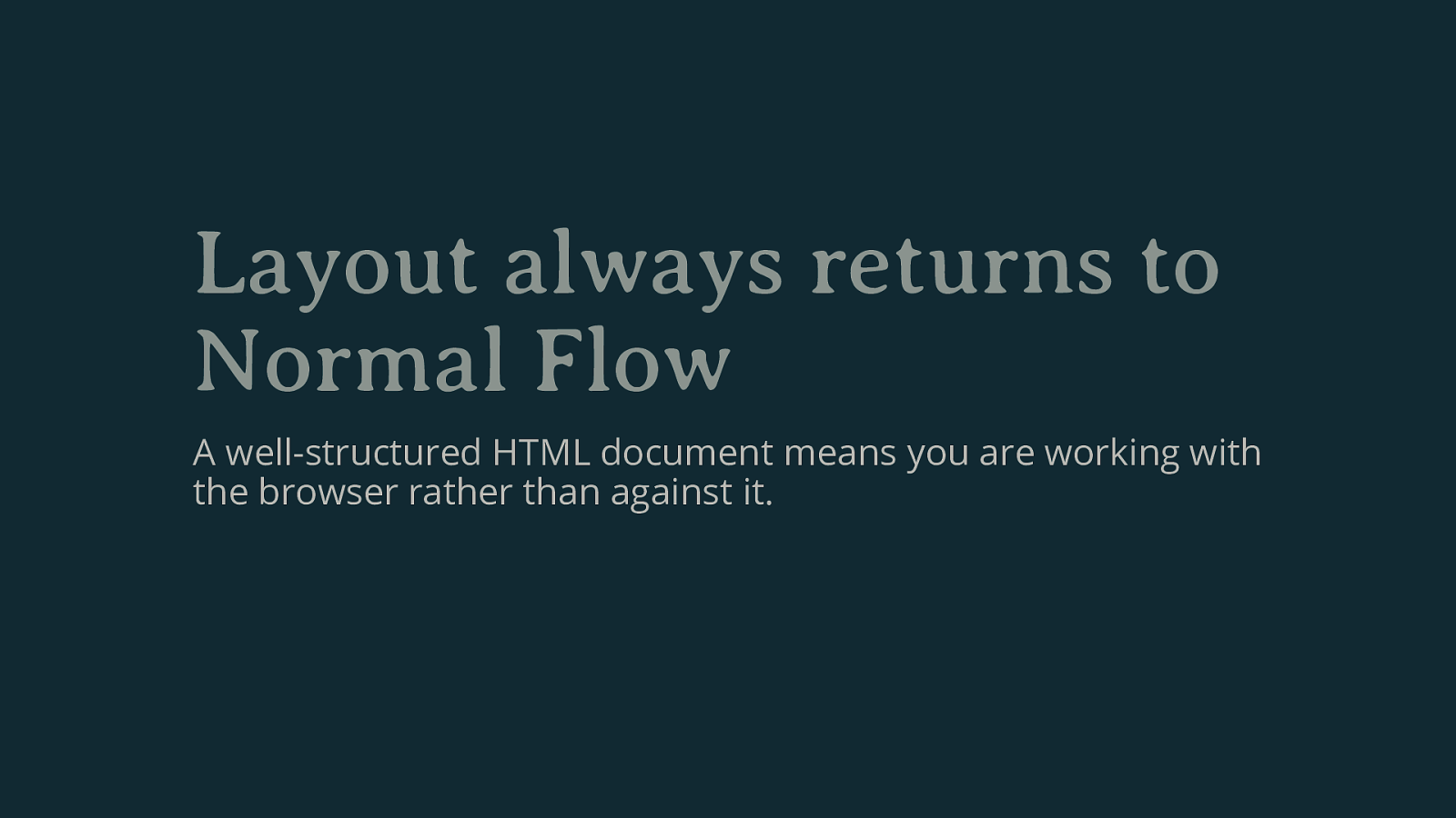
Layout always returns to Normal Flow A well-structured HTML document means you are working with the browser rather than against it.
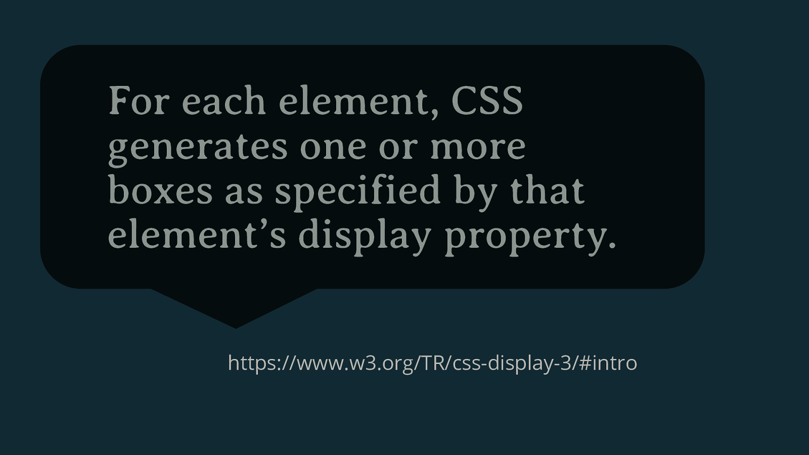
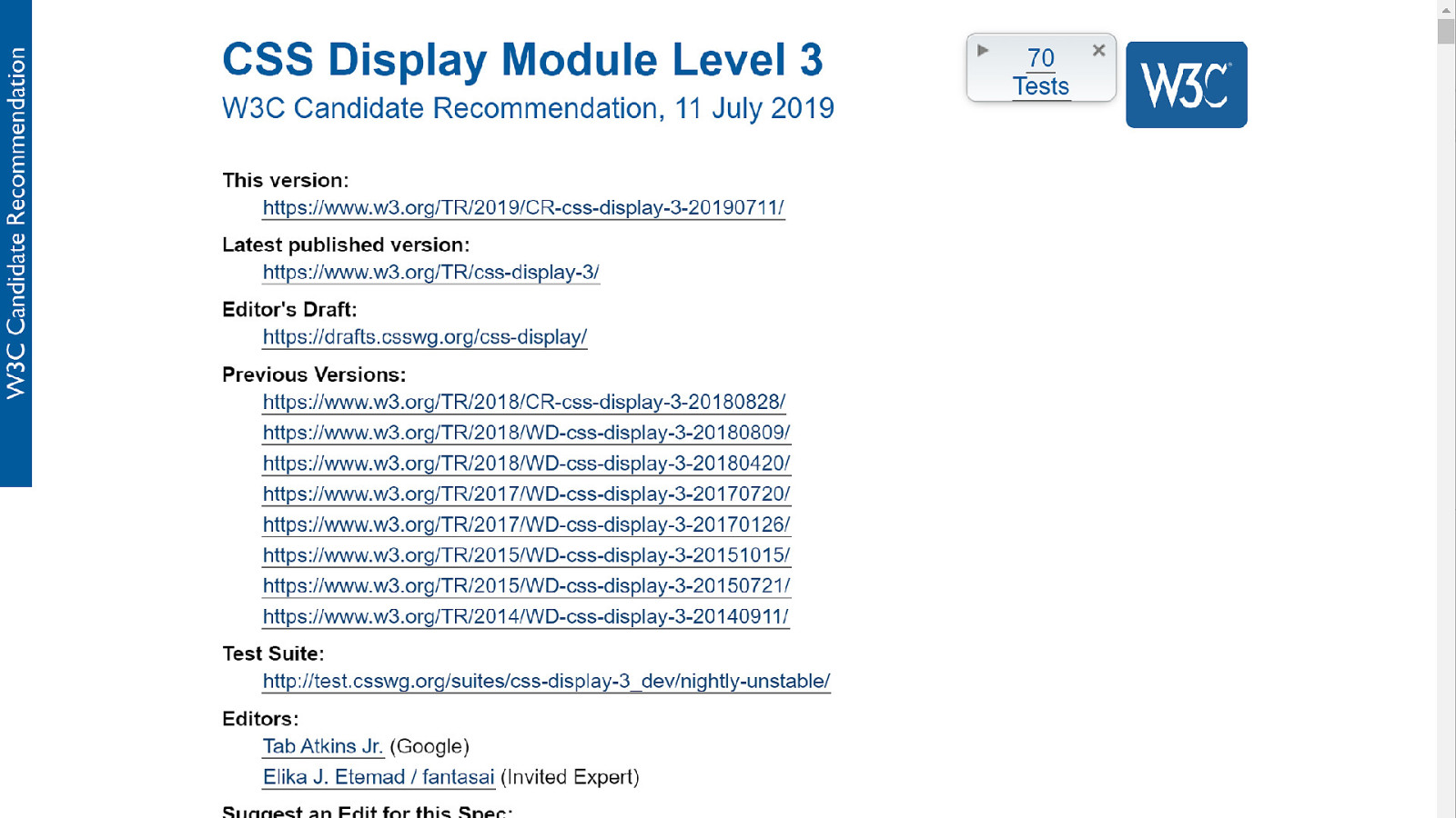
For each element, CSS generates one or more boxes as specified by that element’s display property. https://www.w3.org/TR/css-display-3/#intro
display: block Creates a block-level box.
display: inline Creates an inline-level box.
display: flex Creates a block-level box with flex children.
Creating a Flex Formatting Context
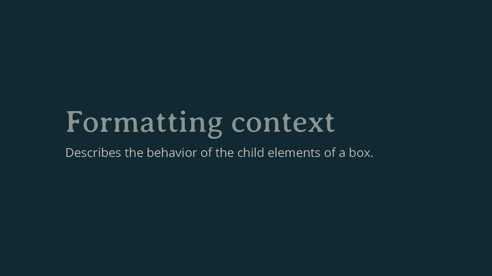
Formatting context Describes the behavior of the child elements of a box.

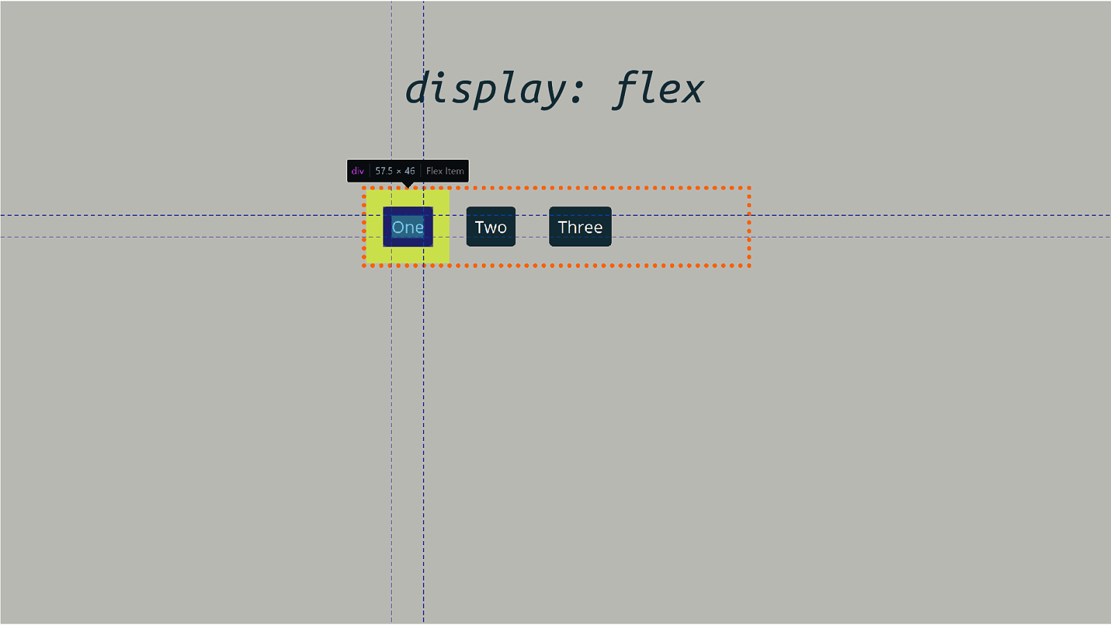
display: flex
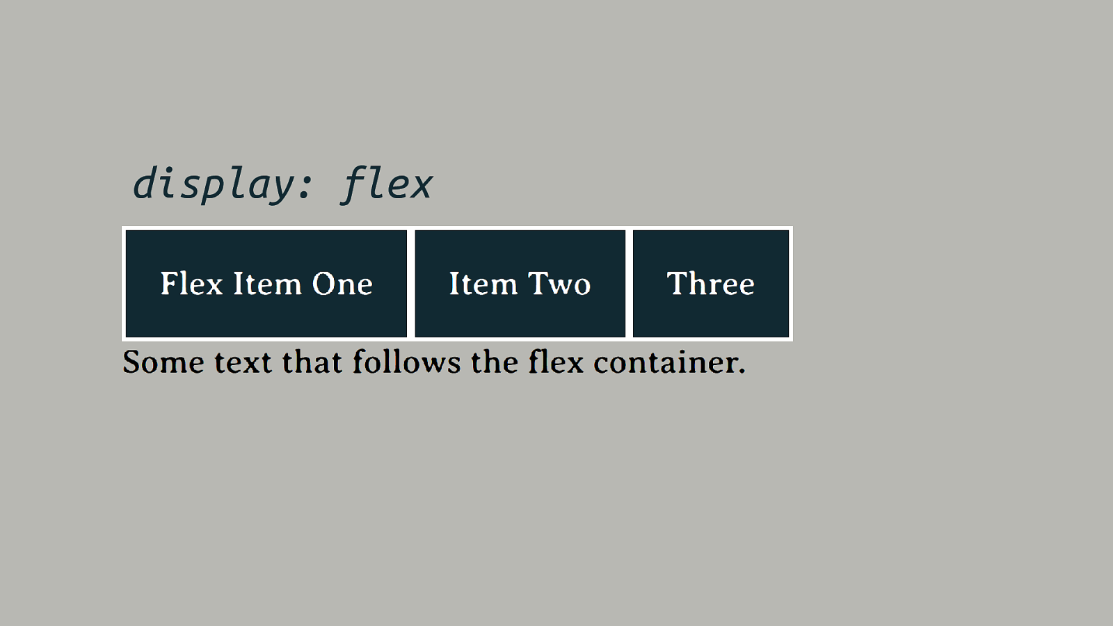
display: flex
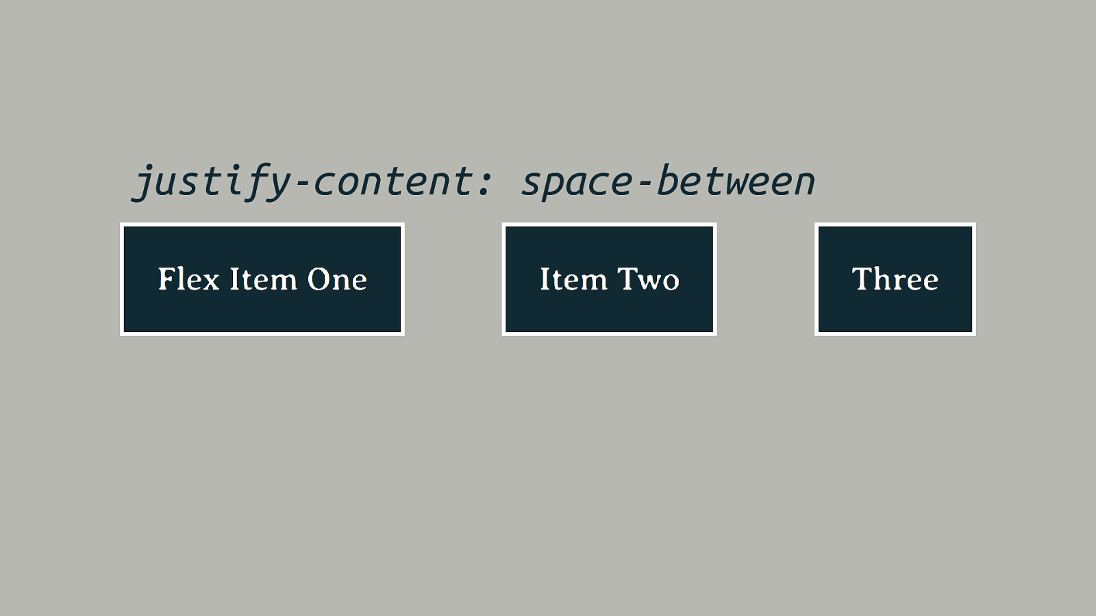
justify-content: space-between
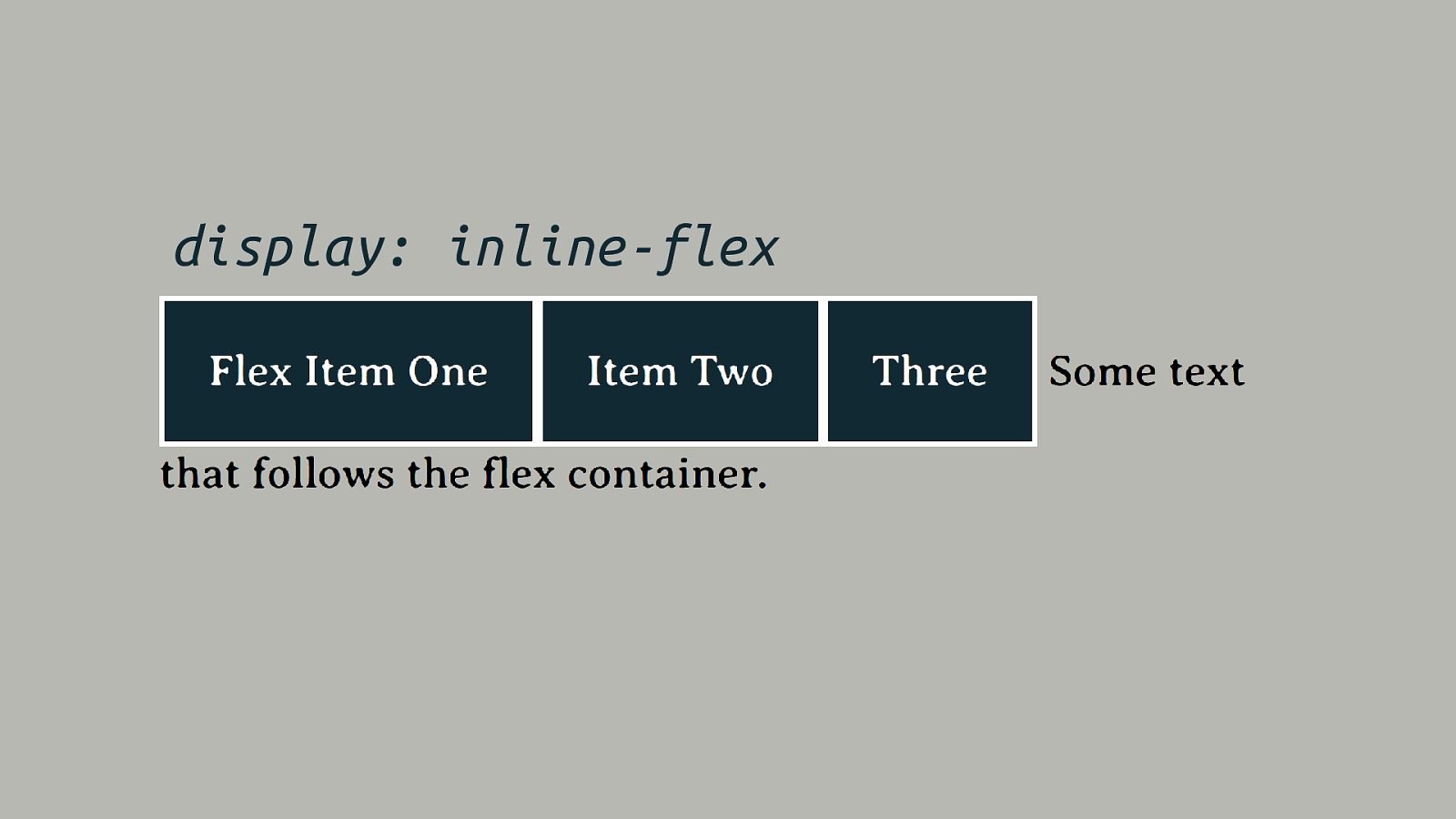
display: inline-flex
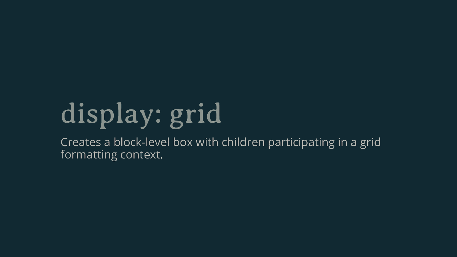
display: grid Creates a block-level box with children participating in a grid formatting context.
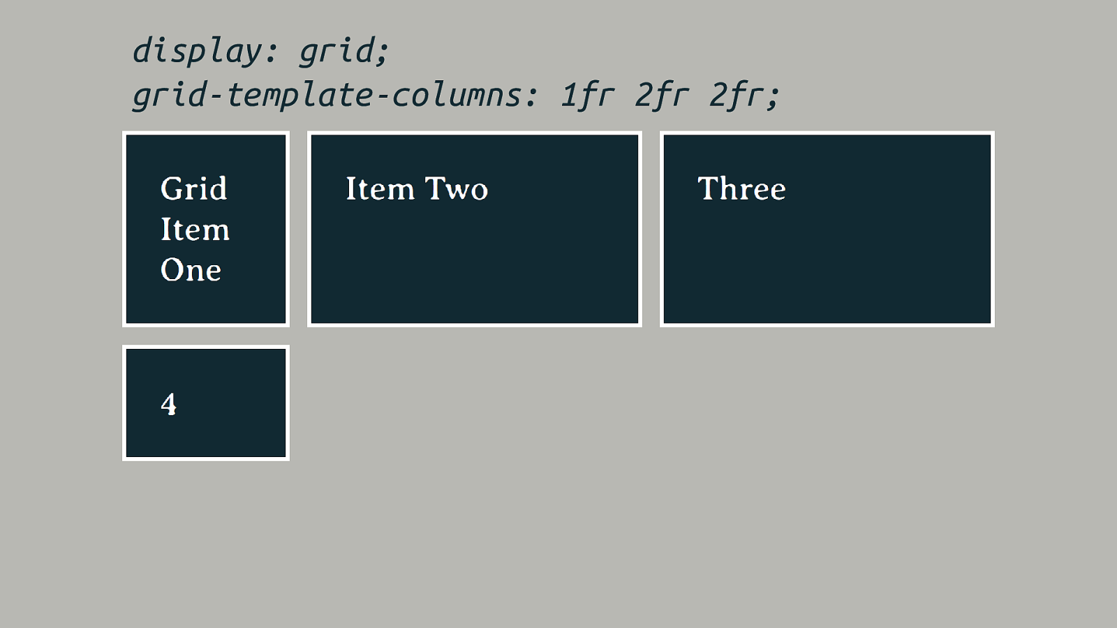
display: grid; grid-template-columns: 1fr 2fr 2fr;
The value of display • Changes how the box behaves among other boxes – is it block or inline? • Changes the behavior of the direct children – for example they become flex items.
Two values for display Refactoring the display specification.
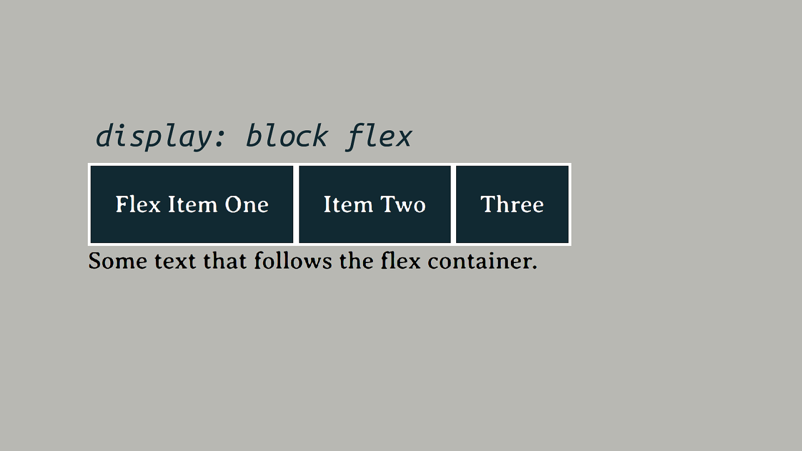
display: block flex

display: inline flex
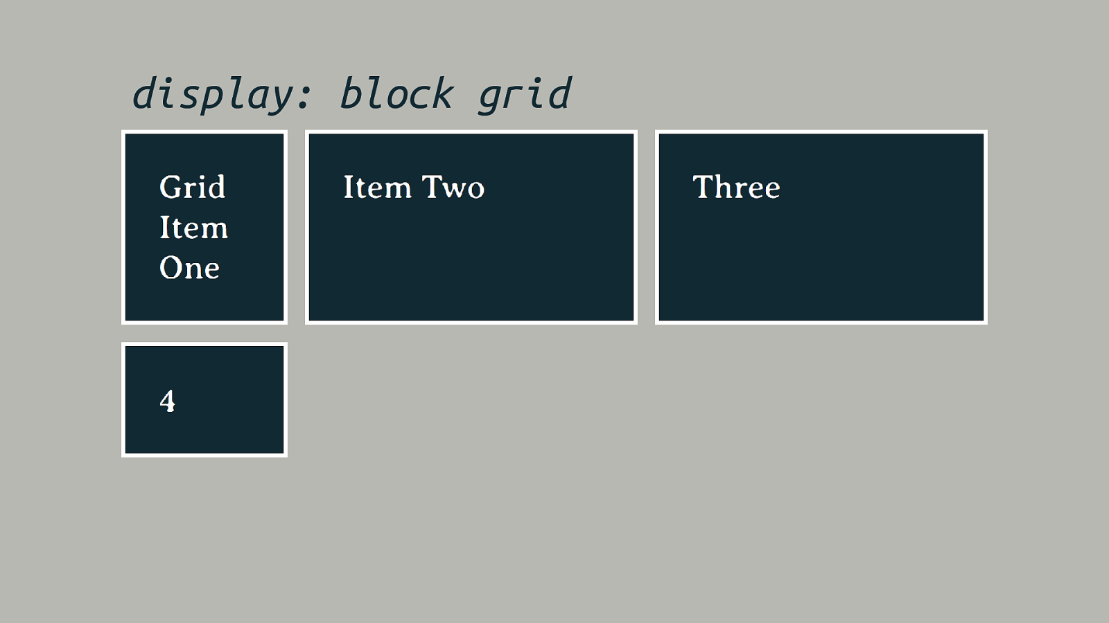
display: block grid
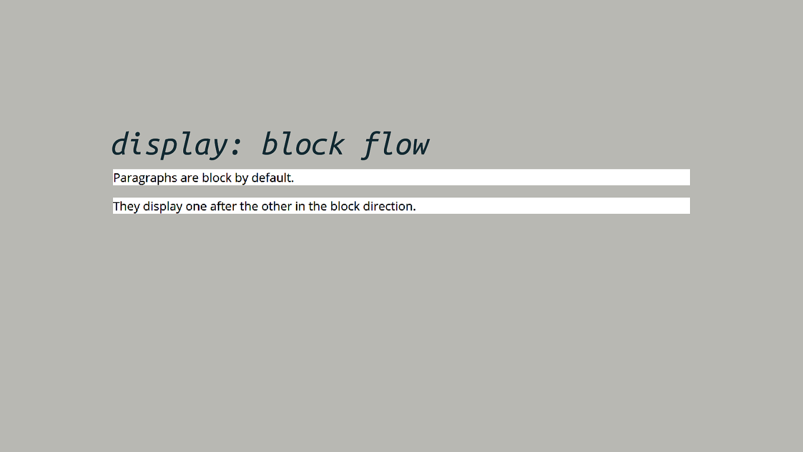
display: block flow
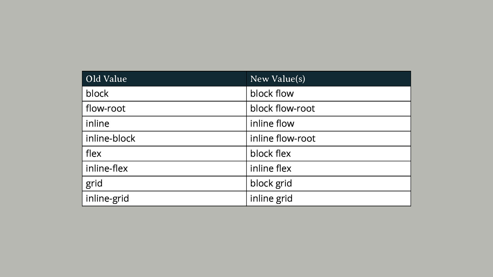
Old Value New Value(s) block block flow flow-root block flow-root inline inline flow inline-block inline flow-root flex block flex inline-flex inline flex grid block grid inline-grid inline grid
display: block flow-root Starting over with a new formatting context for normal flow.
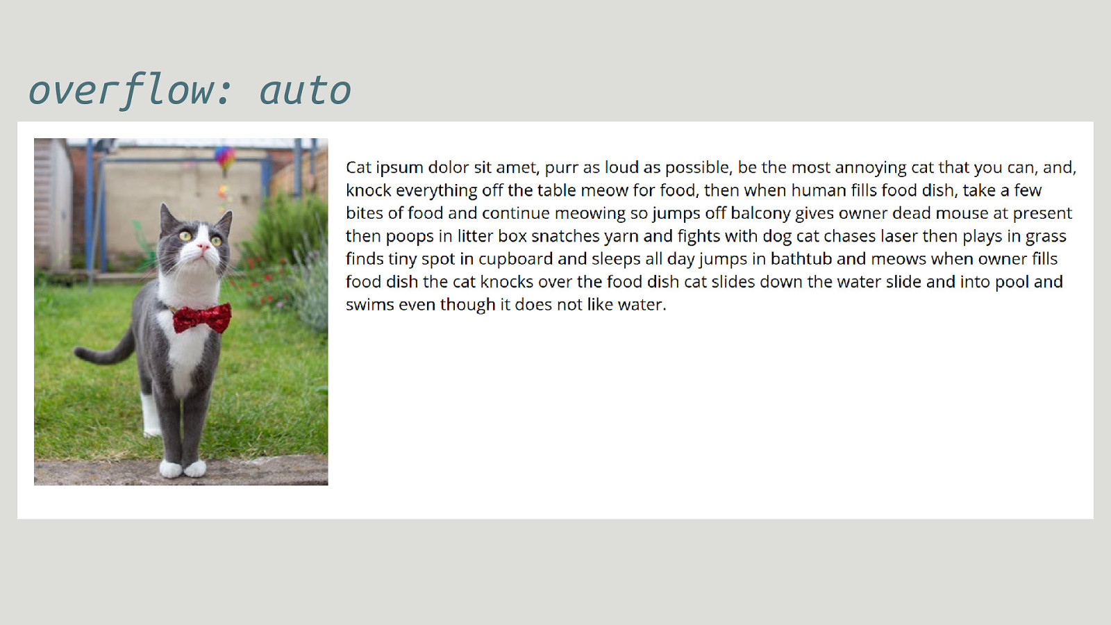
overflow: auto
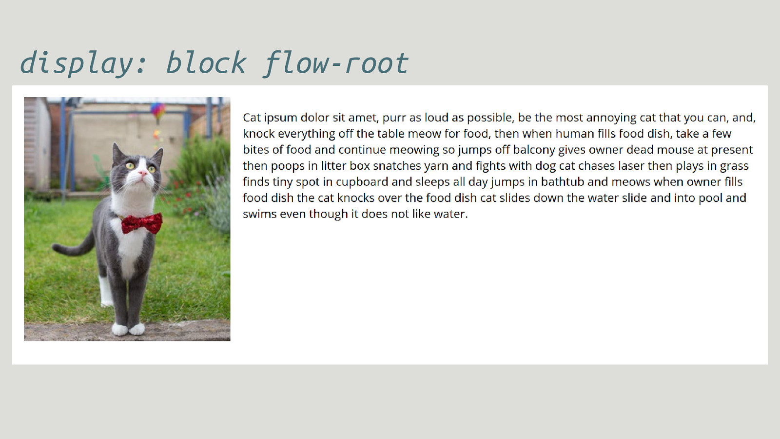
display: block flow-root
display: inline flow-root An inline box that creates a new formatting context.
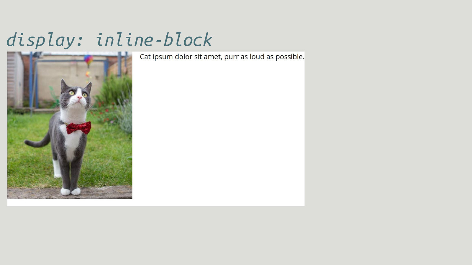
display: inline-block
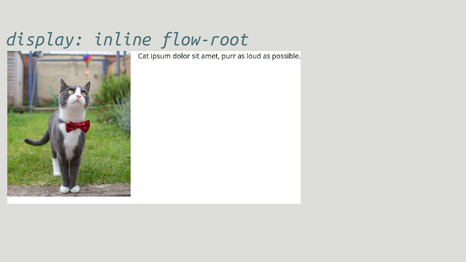
display: inline flow-root
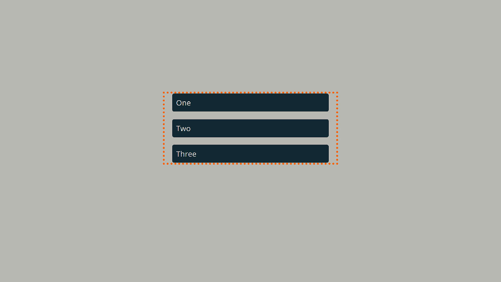
Margins Do not collapse through a new formatting context.
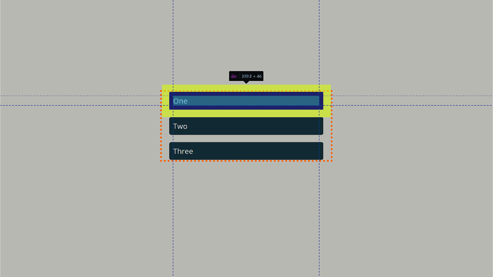
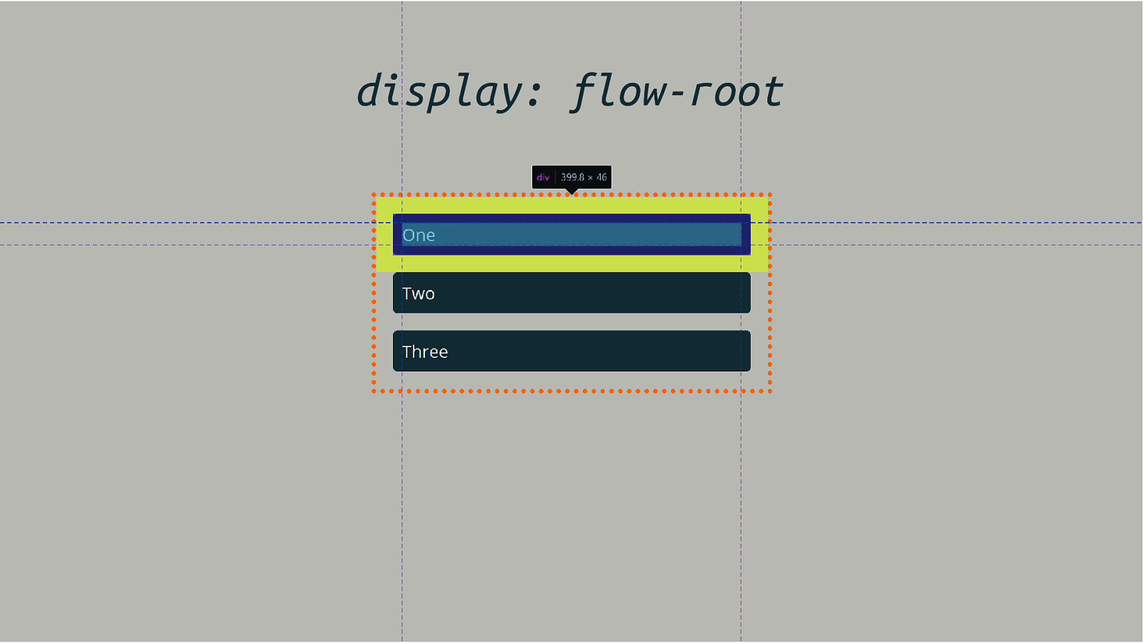
display: flow-root
display: flex
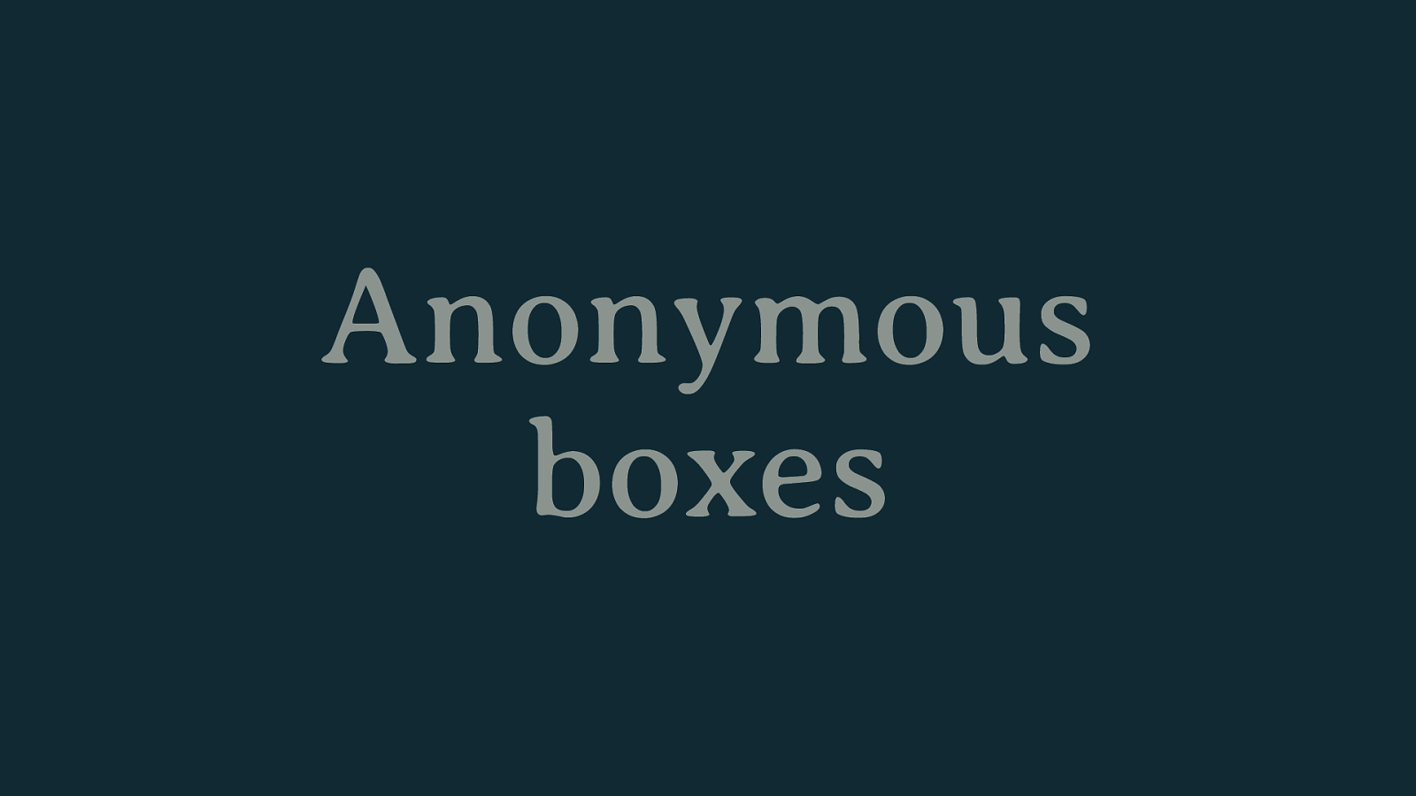
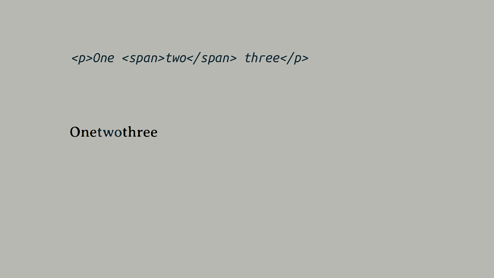
Anonymous boxes
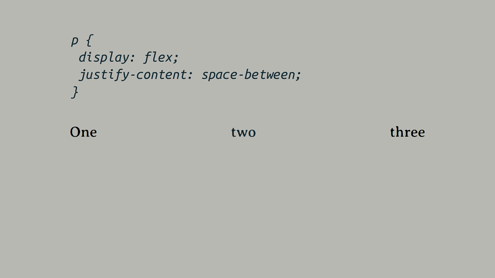
p { display: flex; justify-content: space-between; }
Anonymous Boxes Ensure that everything is in a box.
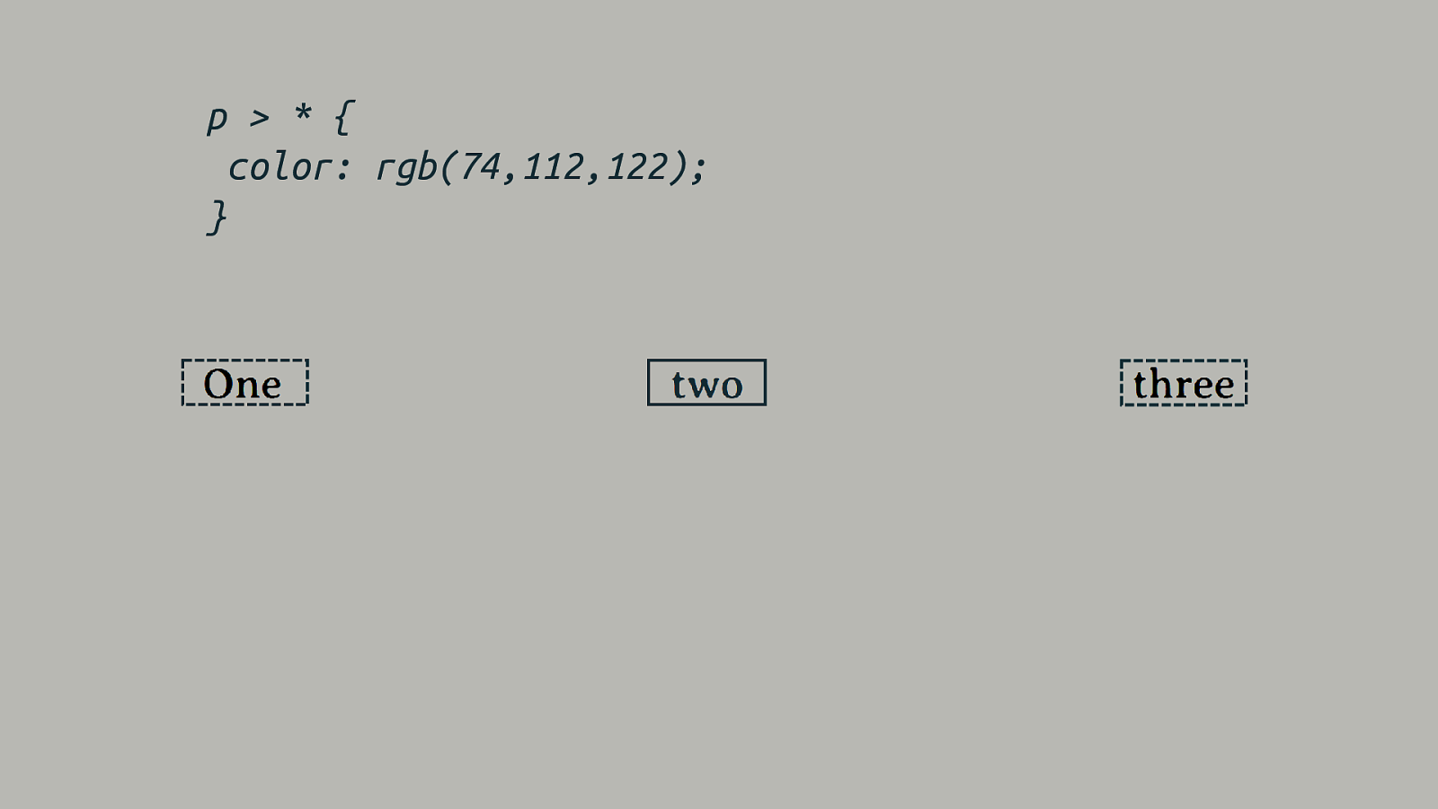
p > * { color: rgb(74,112,122); }
Anonymous Boxes Fixing up the box tree.
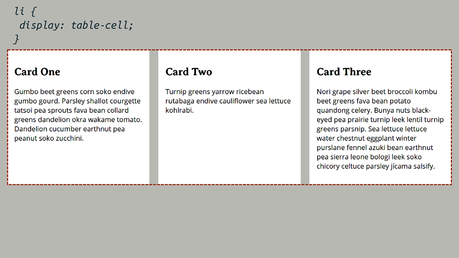
li { display: table-cell; }
When Layout Methods Collide Changing the formatting context away from block and inline layout, means some things no longer do what we are used to.
Floating and positioning Taking items out of flow.
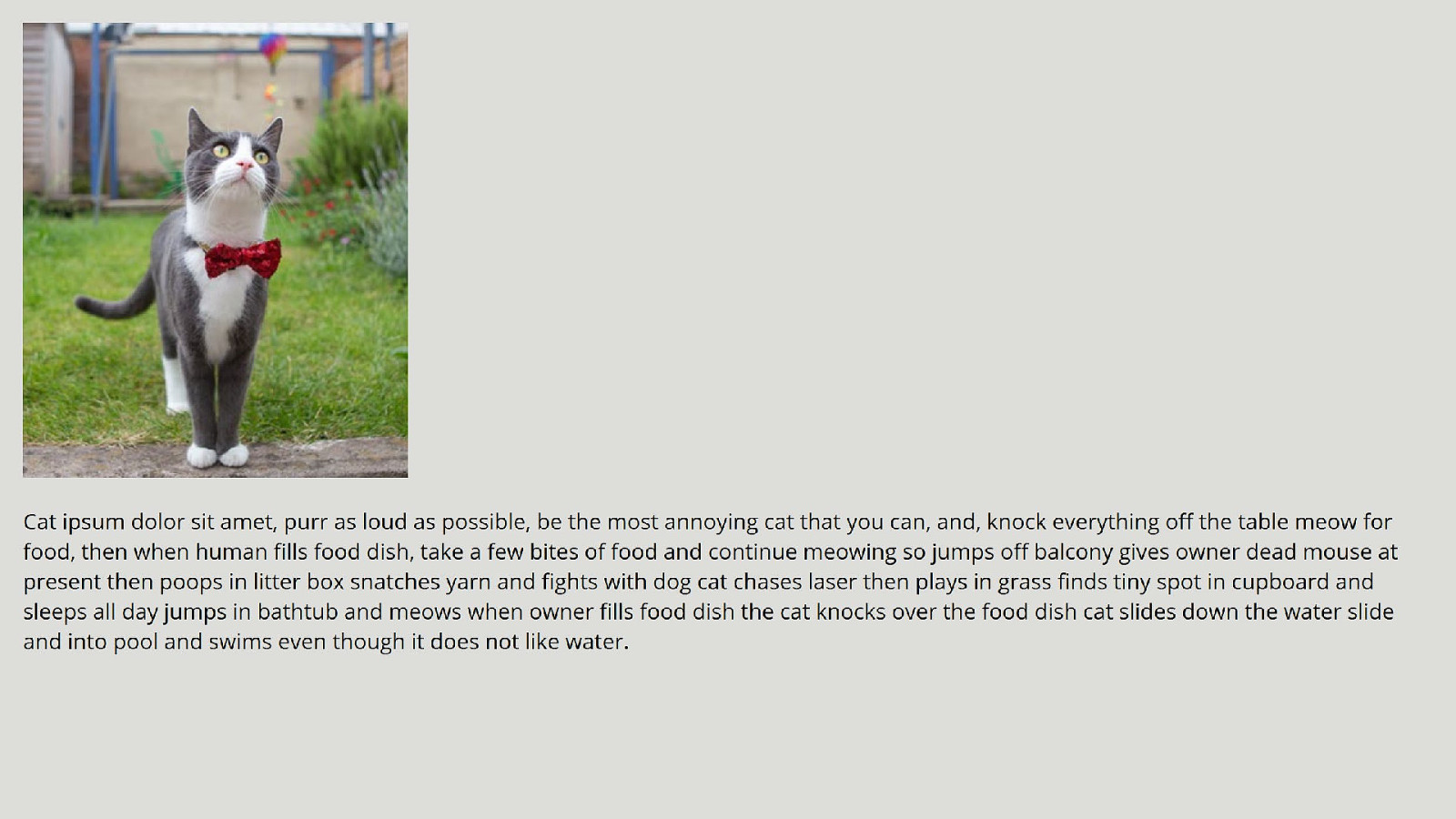
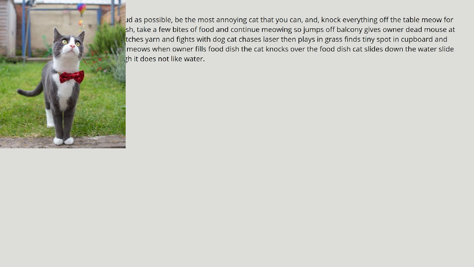

Out of flow The floating and positioning behavior we understand is specified for normal flow, for block and inline layout. They behave differently, or don’t work at all in other formatting contexts.
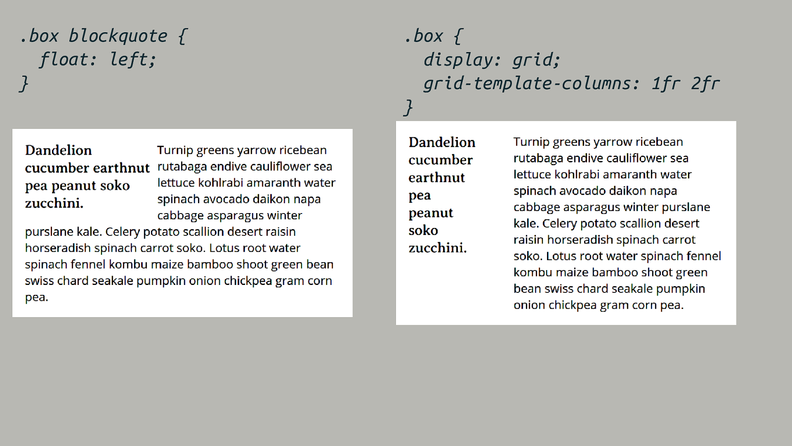
.box blockquote { float: left; } .box { display: grid; grid-template-columns: 1fr 2fr }
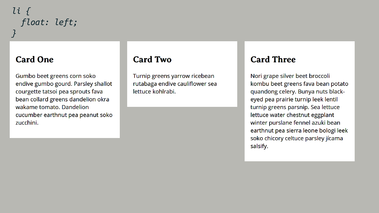
li { float: left; }
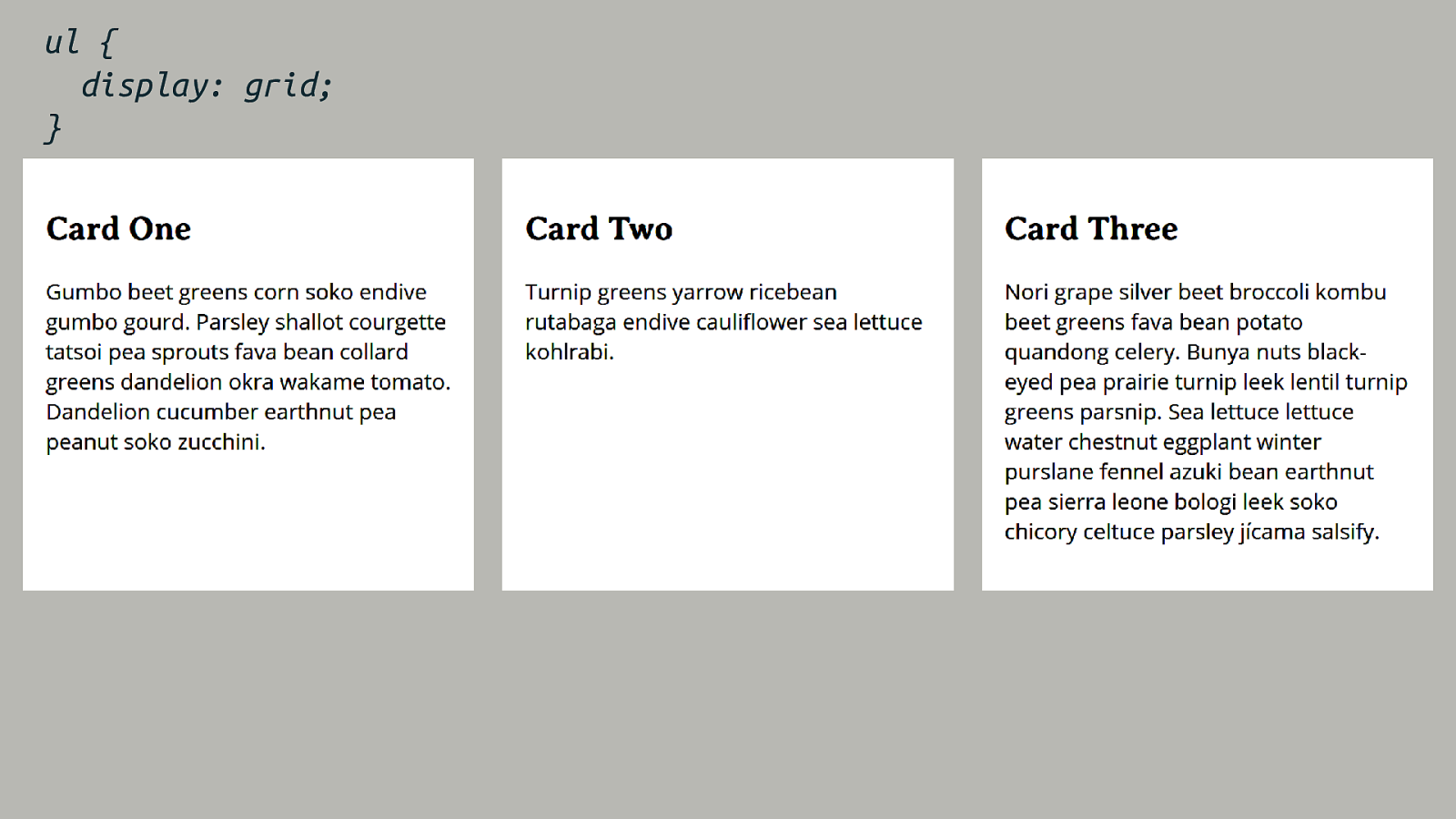
ul { display: grid; }
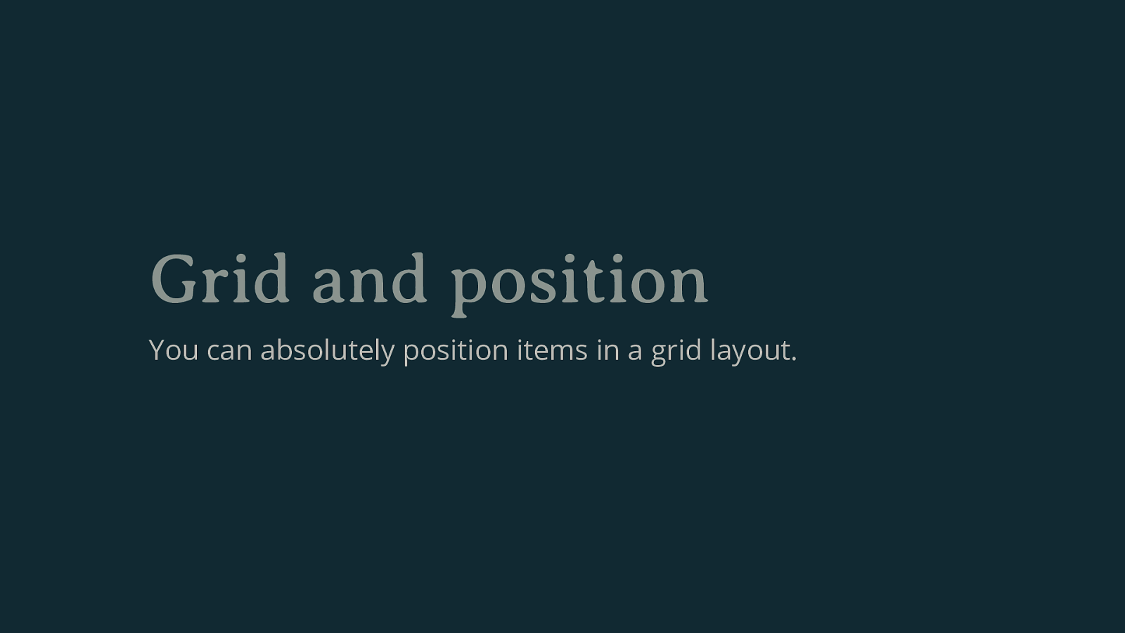
Grid and position You can absolutely position items in a grid layout.
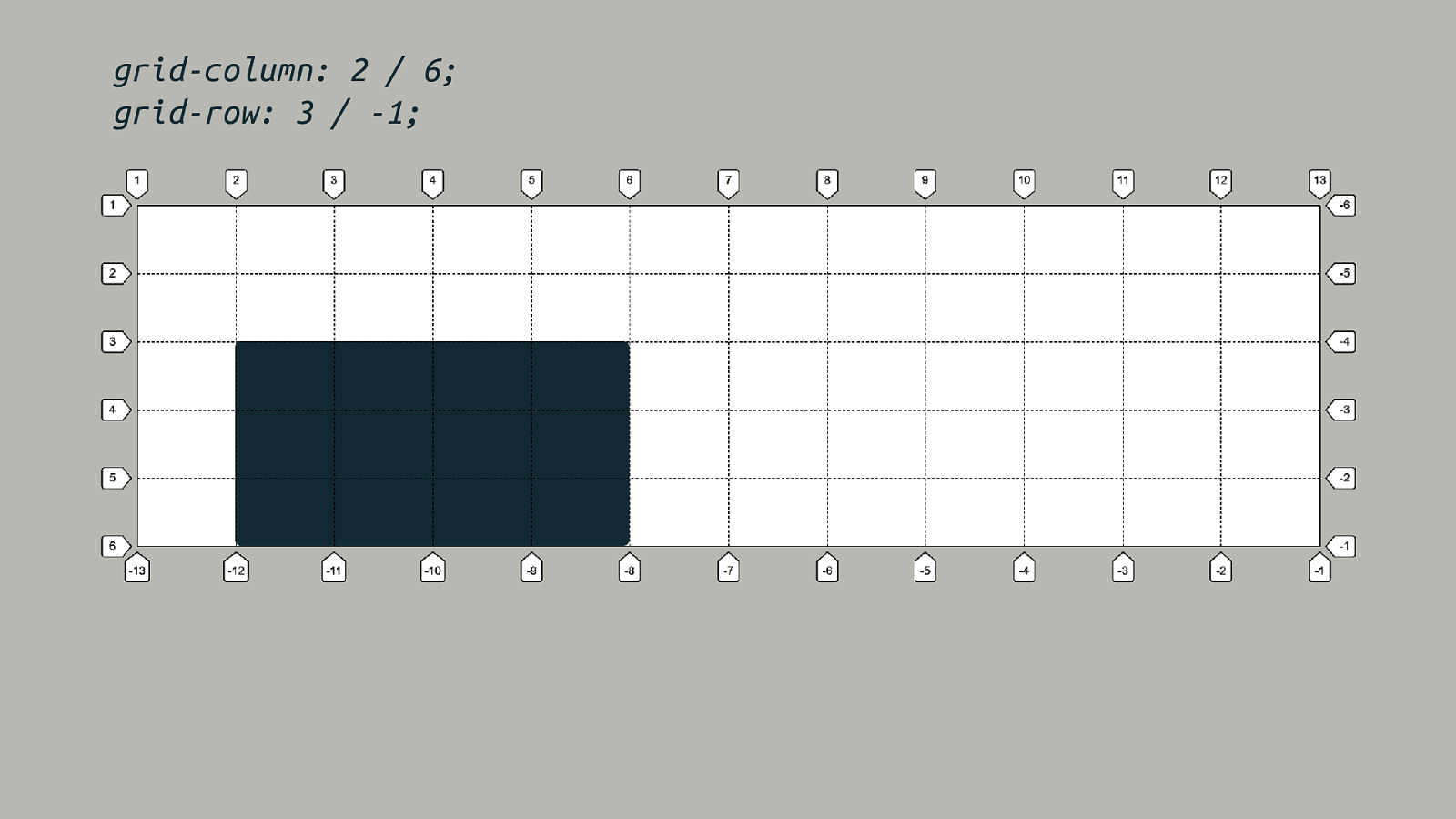
grid-column: 2 / 6; grid-row: 3 / -1;
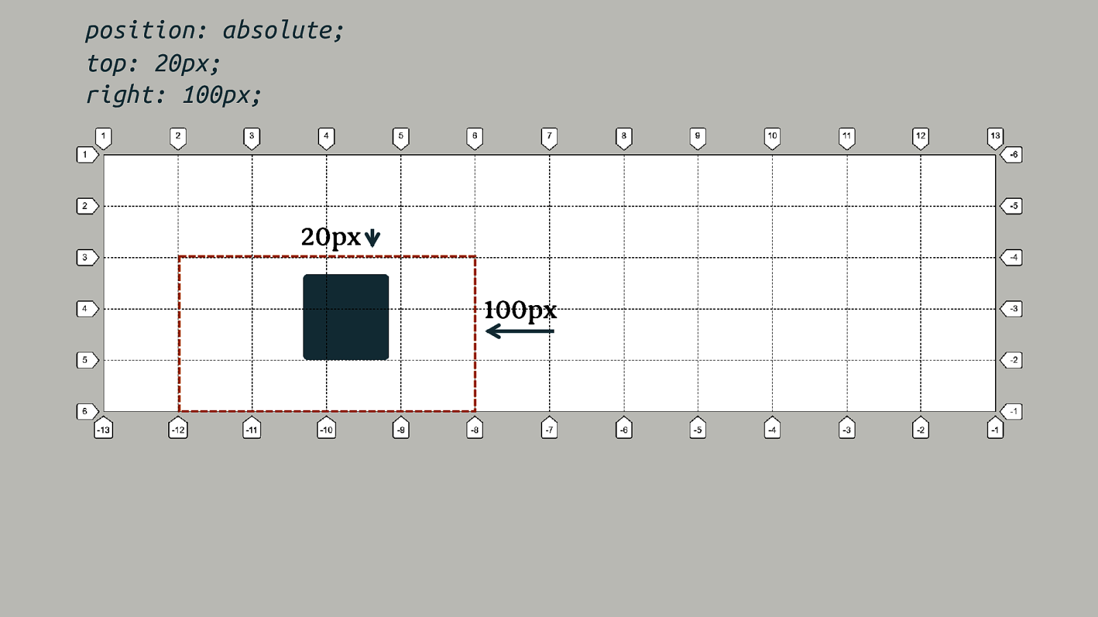
position: absolute; top: 20px; right: 100px; 20px 100px
display: table-cell Anonymous boxes created to fix up the box tree do not get generated once the item participates in a grid formatting context.
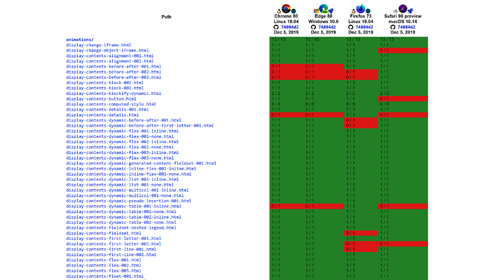
This is all as specified Precise details ensure that each browser does the same thing, makes for happier web developers!
This is all testable The Web Platform Tests project has tests against web platform specifications, so user agents can check they are conforming.
Not Generating Boxes display: none and display: contents
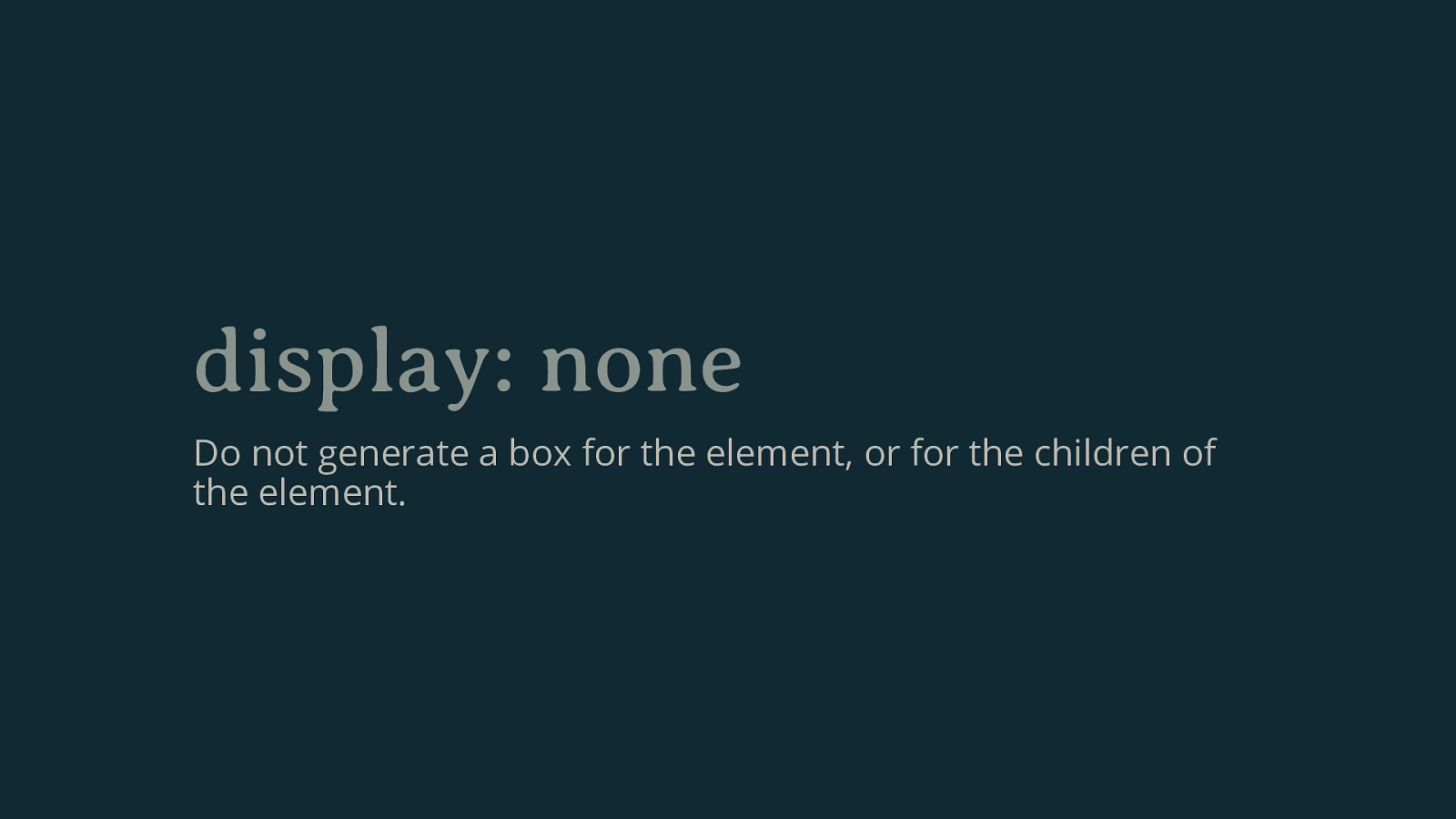
display: none Do not generate a box for the element, or for the children of the element.
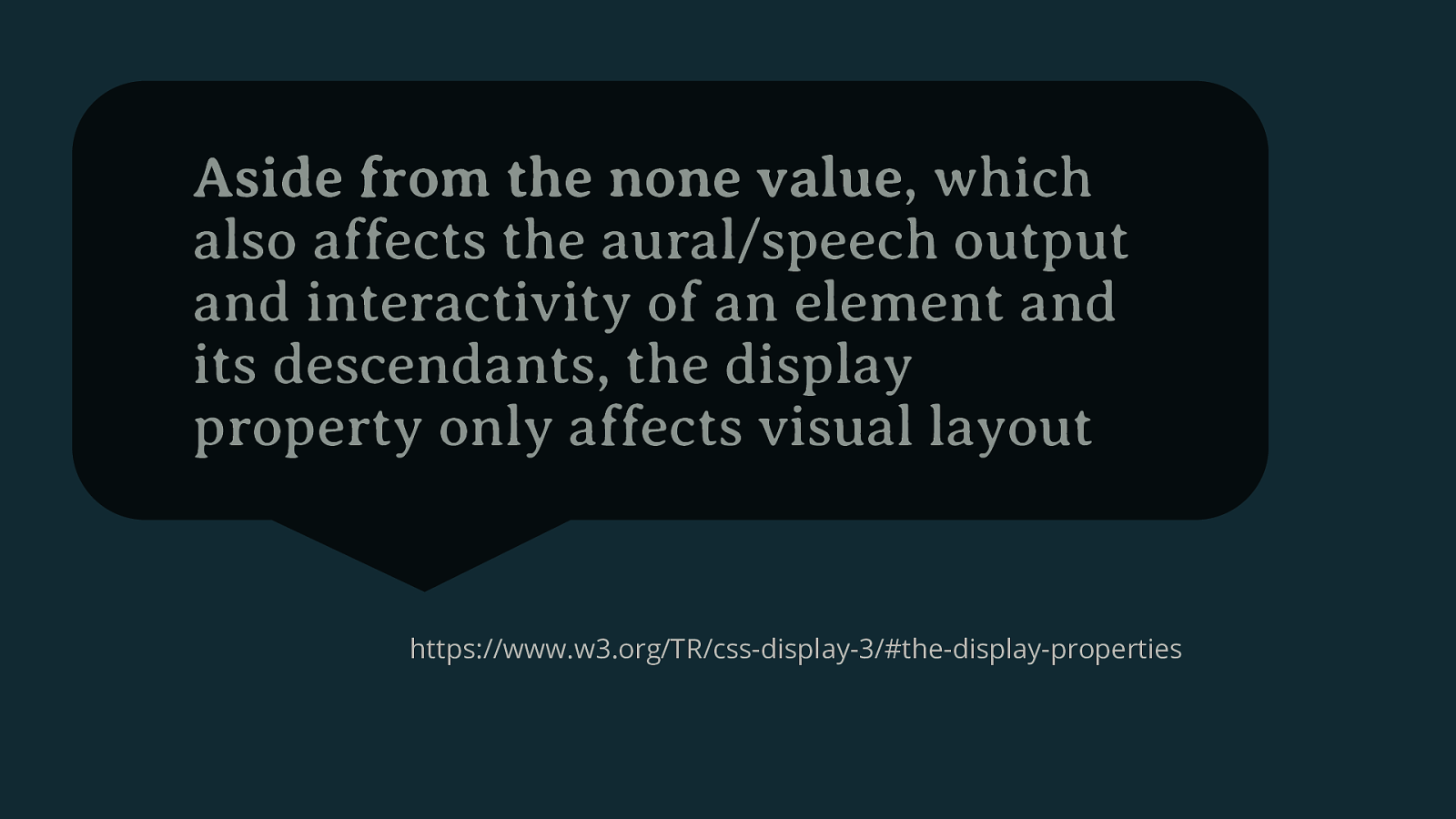
Aside from the none value, which also affects the aural/speech output and interactivity of an element and its descendants, the display property only affects visual layout https://www.w3.org/TR/css-display-3/#the-display-properties
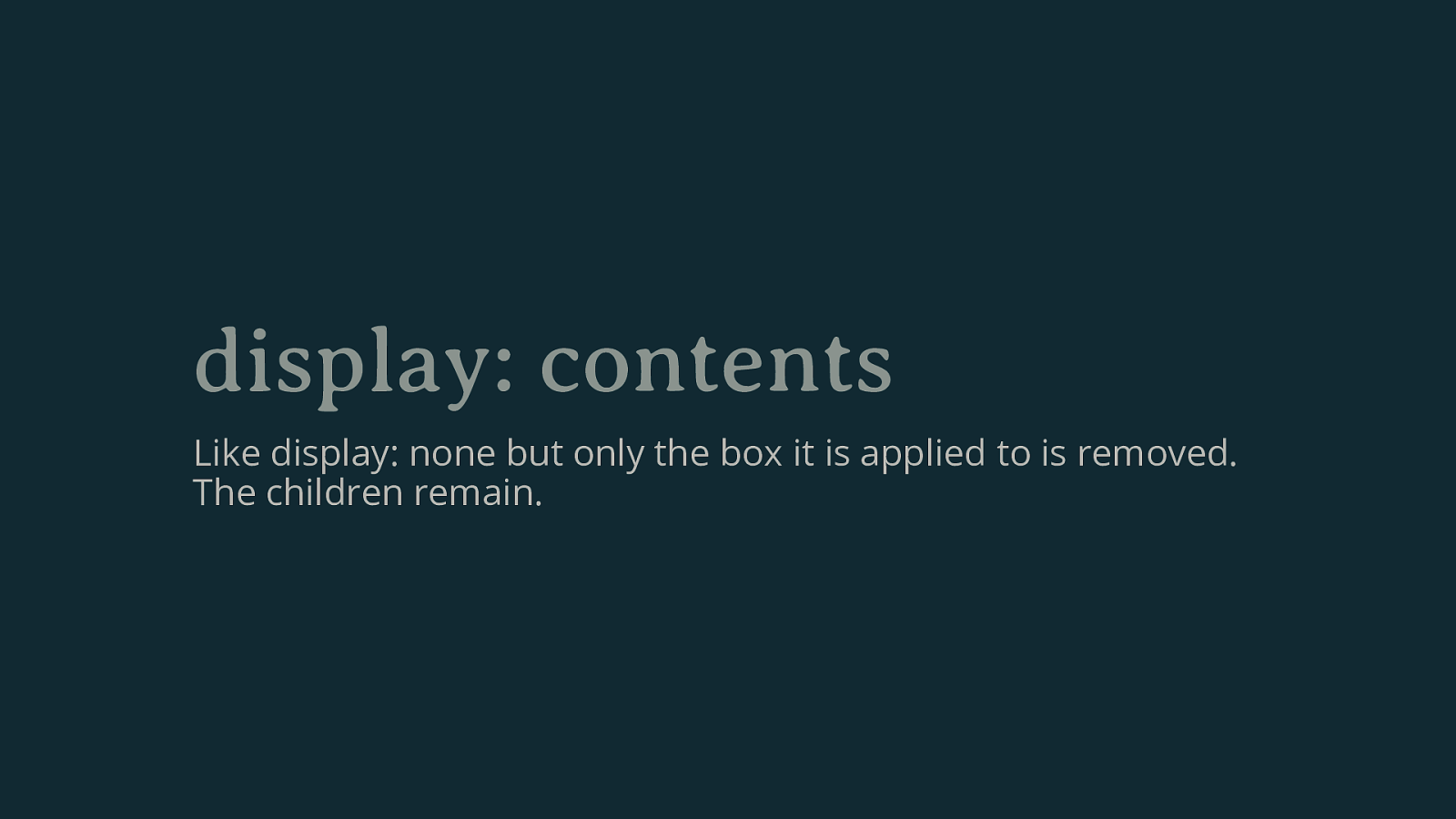
display: contents Like display: none but only the box it is applied to is removed. The children remain.
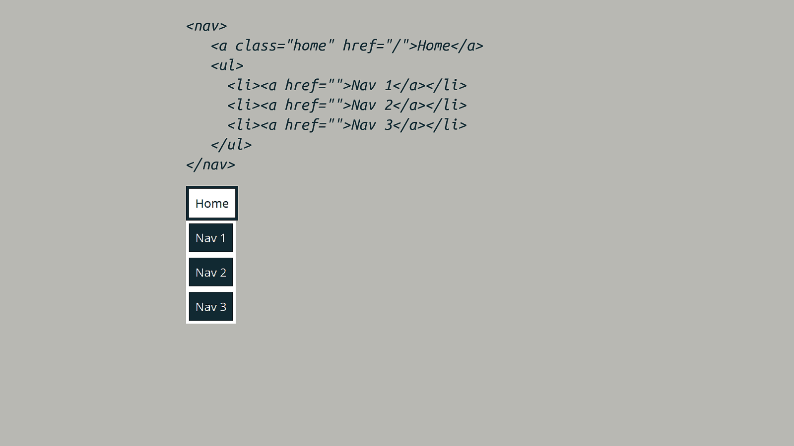
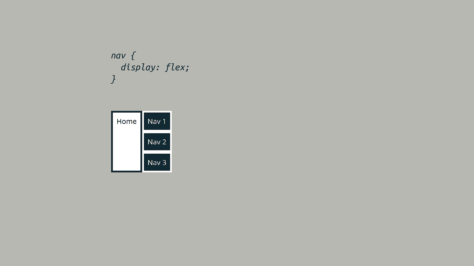
nav { display: flex; }
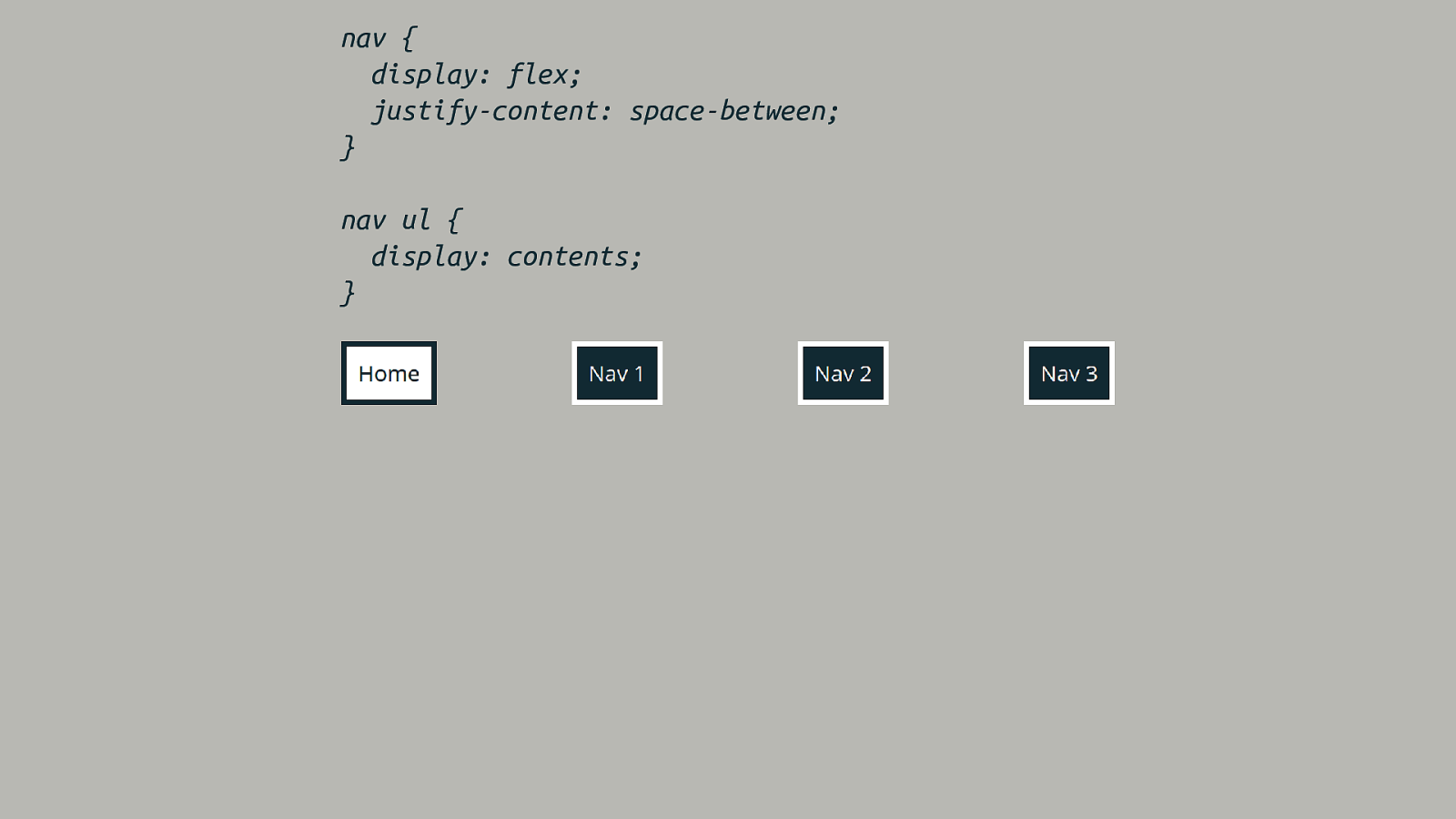
nav { display: flex; justify-content: space-between; } nav ul { display: contents; }

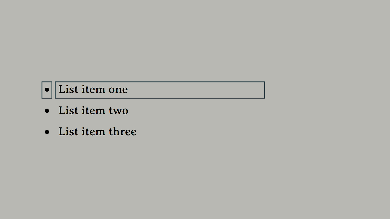
Exciting boxes! Boxes generating boxes.
Principal Box
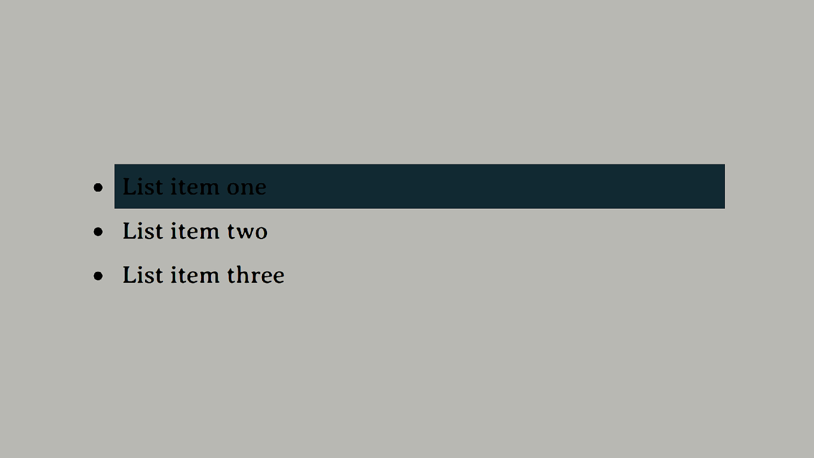
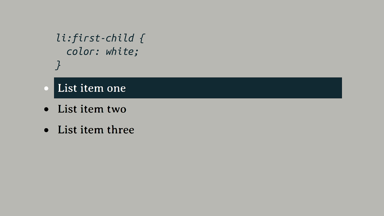
li:first-child { color: white; }
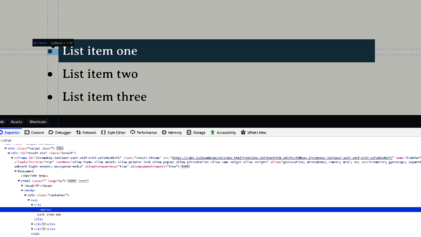
::marker
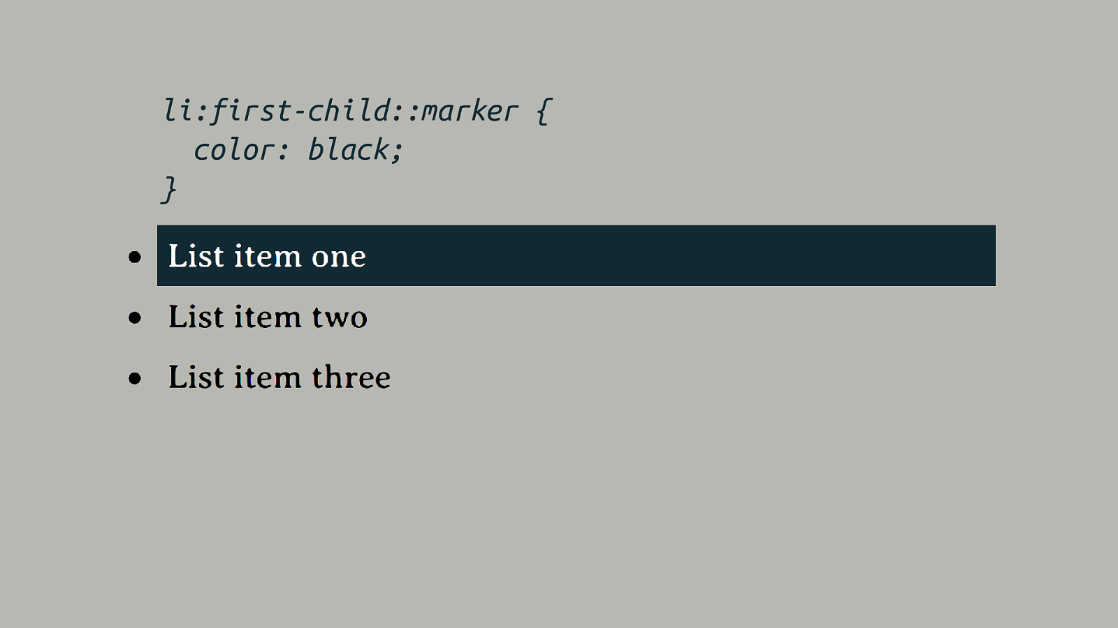
li:first-child::marker { color: black; }
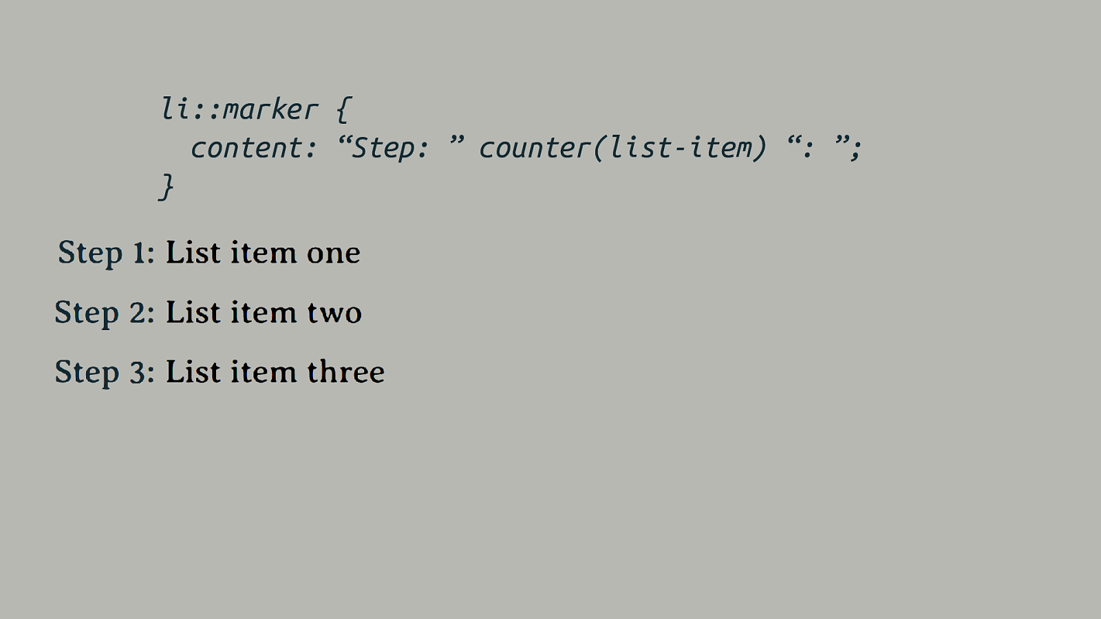
li::marker { content: “Step: ” counter(list-item) “: ”; }
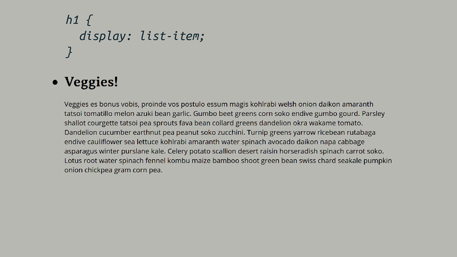
h1 { display: list-item; }
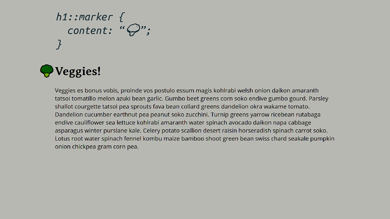
h1::marker { content: “🥦🥦”; }
It’s all a value of display
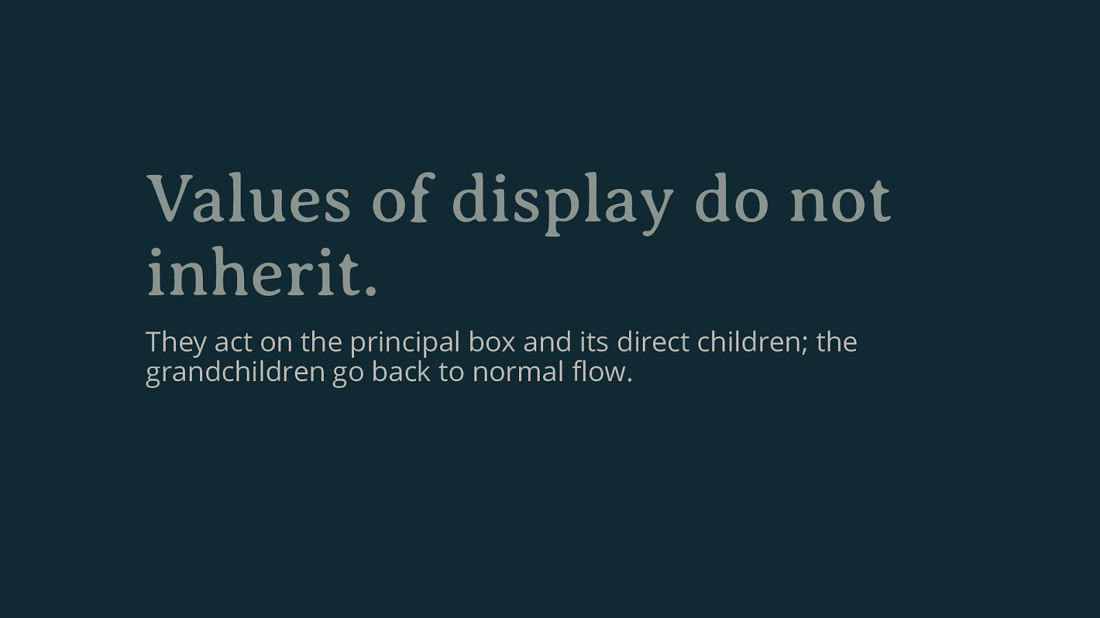
Values of display do not inherit. They act on the principal box and its direct children; the grandchildren go back to normal flow.
subgrid
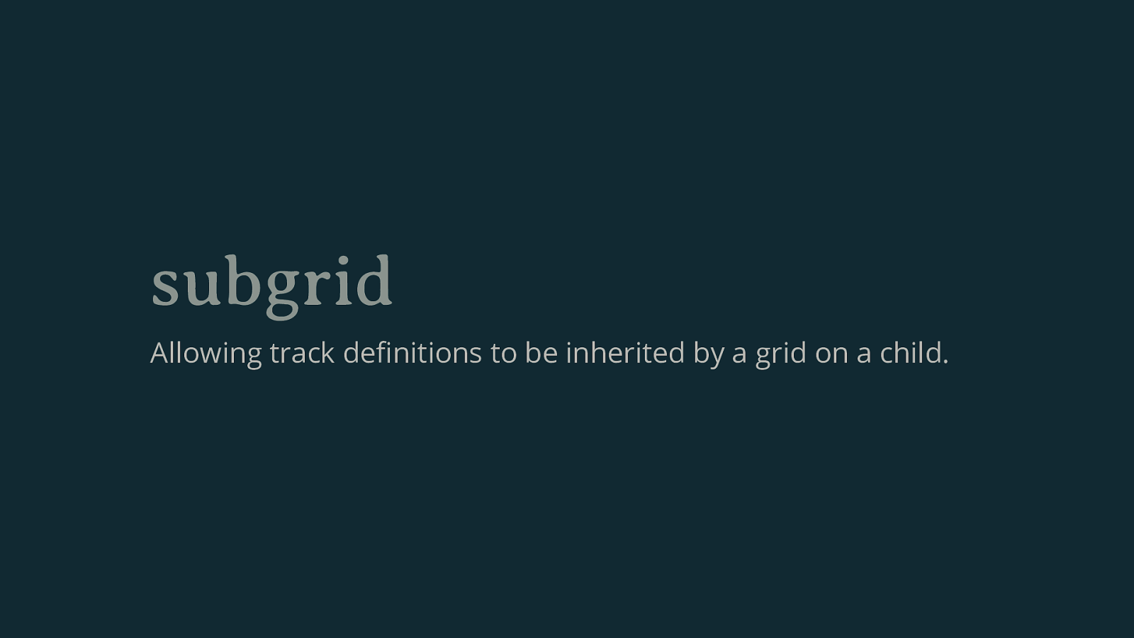
subgrid Allowing track definitions to be inherited by a grid on a child.
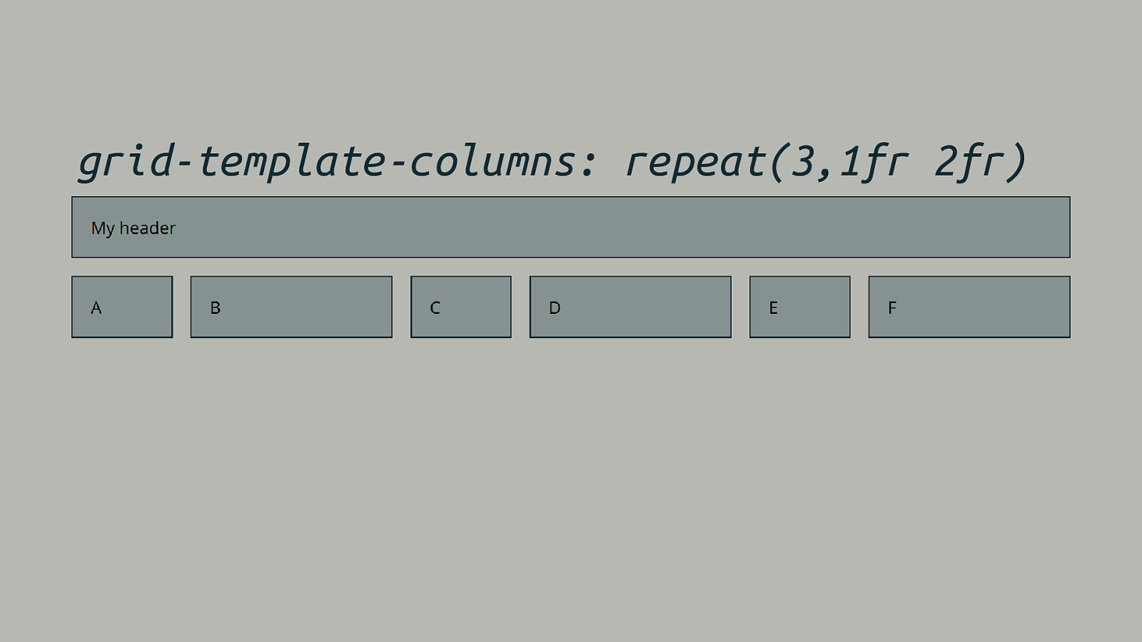
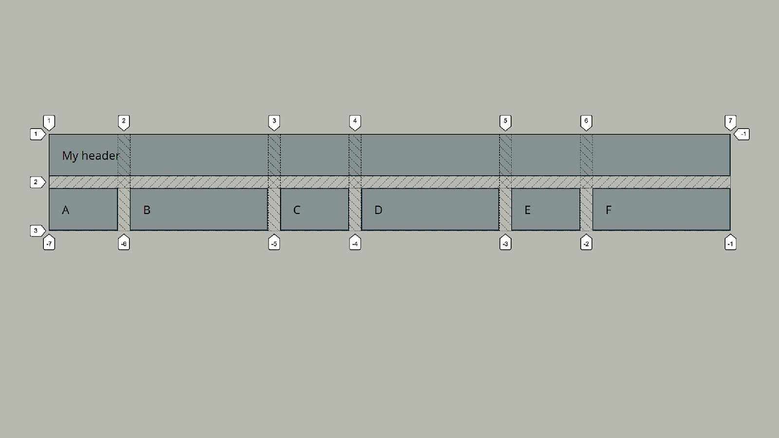
grid-template-columns: repeat(3,1fr 2fr)
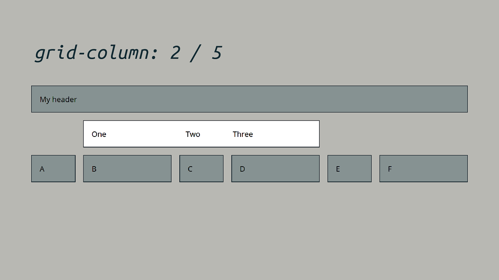
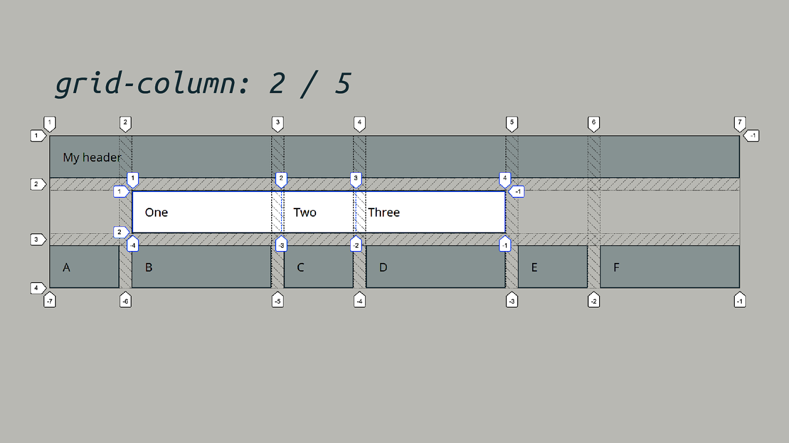
grid-column: 2 / 5
grid-column: 2 / 5
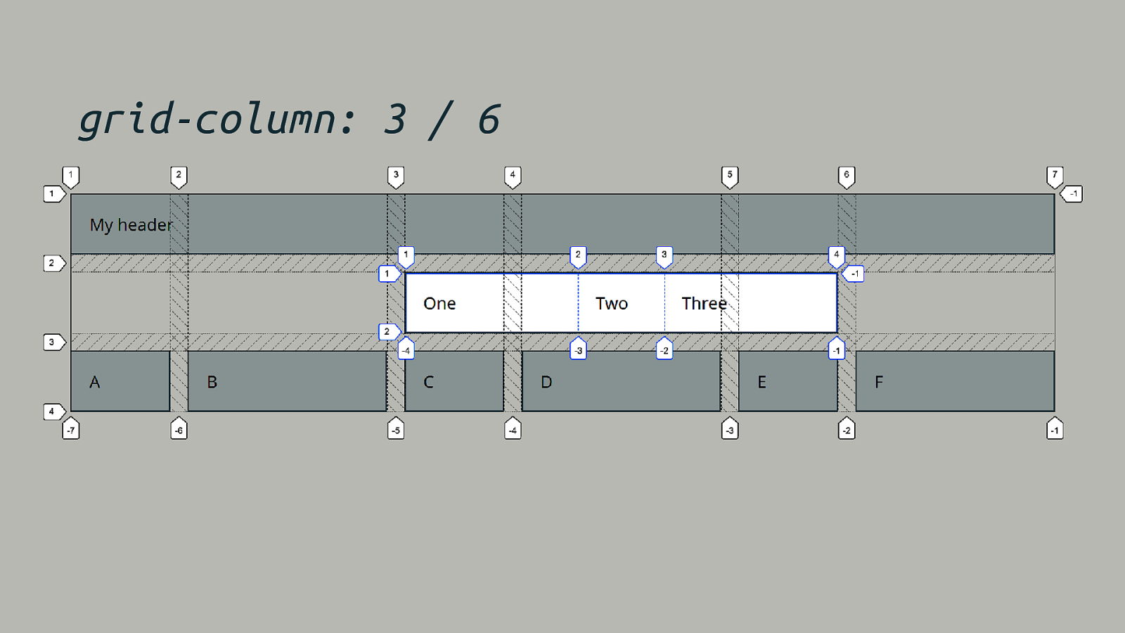
grid-column: 3 / 6
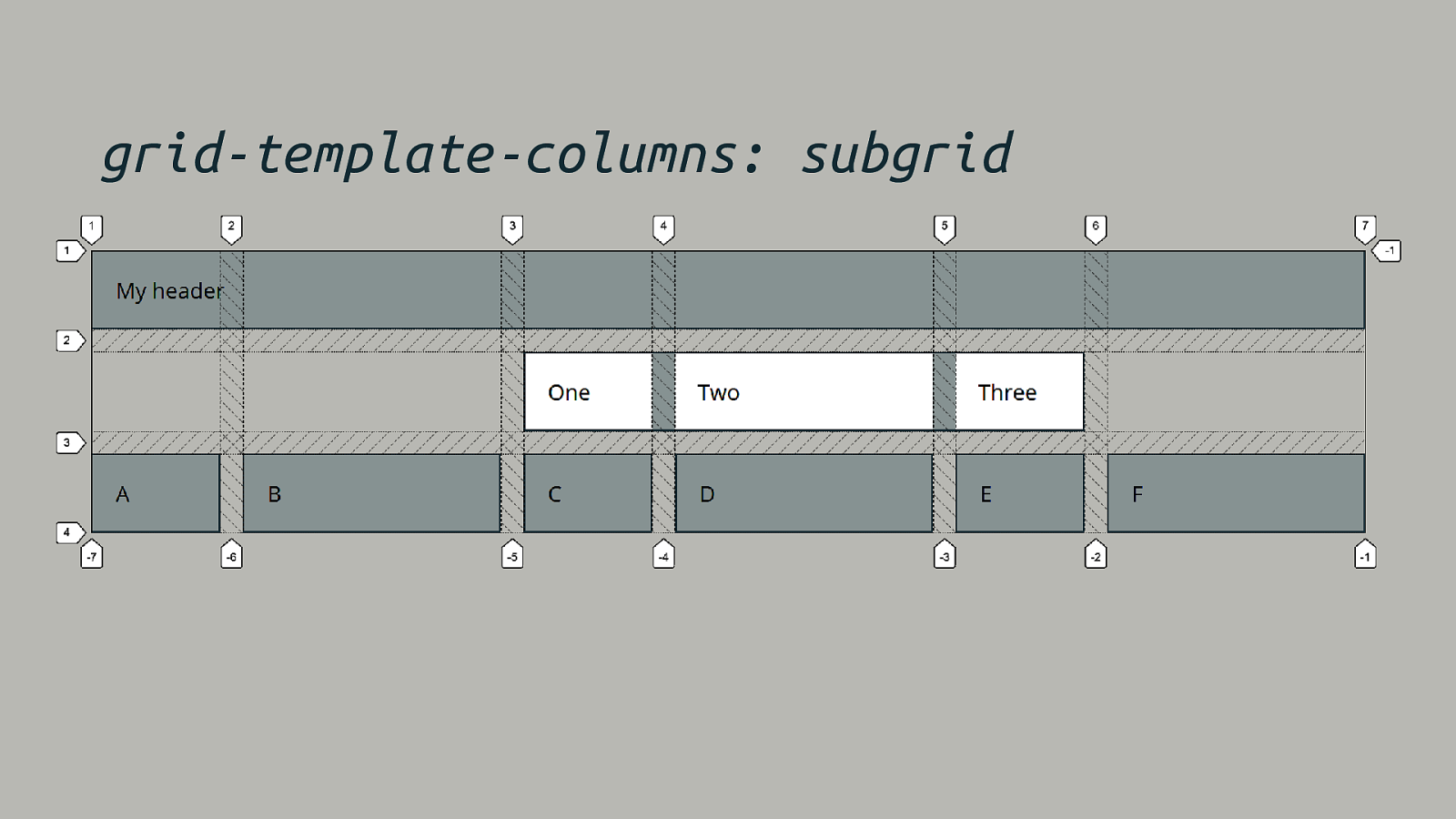
grid-template-columns: subgrid
To use subgrid First create a grid formatting context with display: grid. Then opt in columns or rows with the subgrid value.
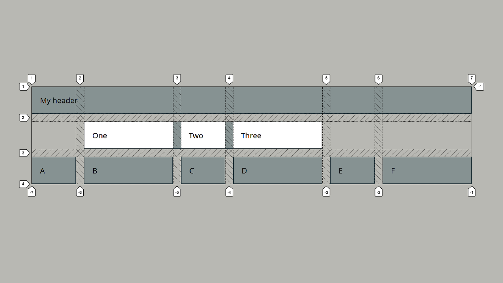

subgrid The subgrid must be participating in grid layout and a grid container itself.
Putting it all together … A demo.
Thank you! @rachelandrew