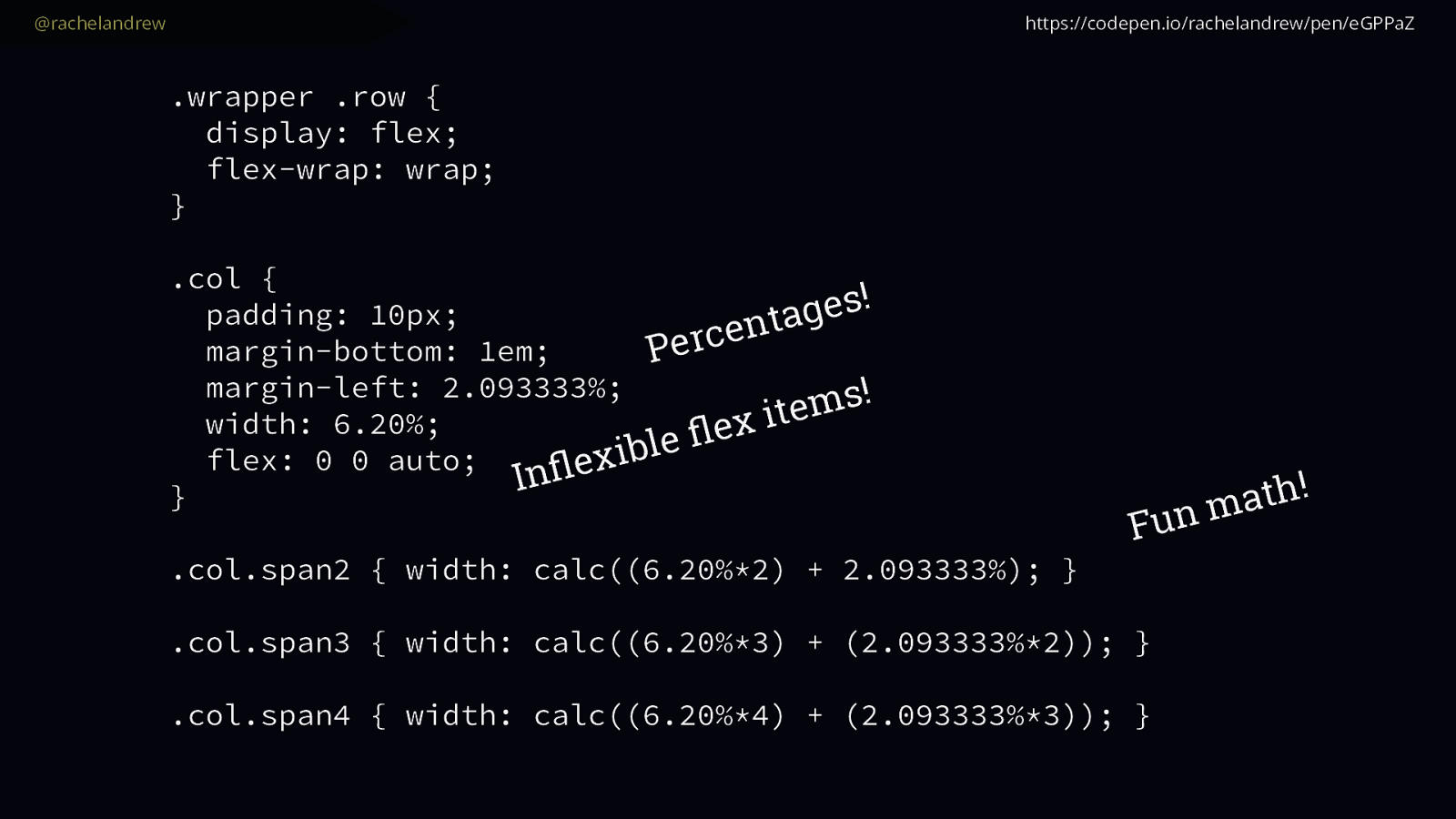
Graduating to Grid

A presentation at An Event Apart Boston in June 2018 in Boston, MA, USA by Rachel Andrew

Slide 1

Slide 1

Graduating to Grid An Event Apart Boston 2018 
 @rachelandrew When I wrote the talk I gave for the last year at An Event Apart, Grid Layout was still a hopeful coming soon feature. We were pretty sure it would ship into browsers in 2017. We just didn’t know exactly when, and which browsers.

It looked as if Chrome would be ready, and Firefox. But what about Safari? The code was there, developed by the team at Igalia as they also worked on the Chrome implementation, but would Apple ship it?

Slide 2

Slide 2

@rachelandrew And there was great rejoicing. Then, in March 2017.

Firefox, then Chrome, Then Safari, including iOS Safari and Opera shipped within a couple of weeks.

Slide 3

Slide 3

@rachelandrew https://wpdev.uservoice.com/forums/257854-microsoft-edge-developer/suggestions/6514853-update-css-grid And we all gave Edge the side-eye.

Slide 4

Slide 4

@rachelandrew https://caniuse.com/#search=grid Then in October Edge shipped their updated implementation.

This huge spec is now available for us to use in all the mainstream production browsers.

I’m very happy about that, and on a few podcasts and so on since I’ve been asked

Slide 5

Slide 5

@rachelandrew What’s it like being in the middle of a launch of a big new CSS feature? What was it like seeing it shipped?

And here is the thing, while I’d been speaking and writing and teaching grid for years, other than Grid by Example I’d not built a production site in it, and neither had anyone else.

But within three months 70% of browsers had grid support. On one of my sites 90% of visitors have grid support. All of sudden it wasn’t just Jen and I talking about grid, everyone was talking about grid.

Slide 6

Slide 6

@rachelandrew It involved a lot of email. And my inbox exploded. People realised they needed to know more about this, and while prior to launch I was pretty much able to answer the few questions I was being emailed, there was no way I could deal with the hundreds a week that started to show up and actually do any work.

Slide 7

Slide 7

@rachelandrew Grid is: • Exciting

  • a real game changer • Confusing
  • it doesn’t seem to do what I thought it would • Scary
  • there are so many new properties to learn! But those emails demonstrated a few things to me.
  1. People were excited about grid, they had started to play with it and realised just how game changing it is.

  2. People were confused. They had different ideas about what grid should do than what it was designed to do.

  3. People were scared - they felt this was another new thing to learn, there seemed to be a lot of it

And while I was putting together this talk I put out a survey, I’ll be referring to some of the findings throughout this talk and one of the questions I asked was.

Slide 8

Slide 8

@rachelandrew –Me, in a survey question “Q. How do you feel when you see a new 
 CSS feature announced?” I finished my survey by asking people how they felt when they saw a new CSS feature announced.

And among the responses were things like

Slide 9

Slide 9

@rachelandrew –Survey response “Excited but also worried about falling behind.”

Slide 10

Slide 10

@rachelandrew –Survey response “Excited, until I share it with colleagues and 
 they pick it apart”

Slide 11

Slide 11

@rachelandrew –Survey response “Oh no, a new way to have inconsistencies between 
 web browsers.”

Slide 12

Slide 12

@rachelandrew –Survey response “Tired.” And perhaps some of you here today identify with that feeling. A feeling perhaps of being overaweelmed, of being tired. Perhaps of getting excited and then being knocked down.

Of worrying that browsers will mean you can use features.

Something else I get a lot of is people emailing asking me to rubber stamp their choices. They want someone to tell them that they were doing the right thing.

Slide 13

Slide 13

@rachelandrew I can’t tell you what to do. And while I can be a listening ear about your issues and give some generic advice, unless I’m there with you in your situation, sat with your team working on your codebase I can’t tell you how to implement grid or even if you should, in your situation.

Slide 14

Slide 14

@rachelandrew I can help you develop the skills to 
 make those decisions yourself . But I hope I can help you to go one better than just take my advice.

What I can tell you is that you can get to a point where you don’t need someone to rubber stamp your decisions. Where you can feel confident in your plan and importantly be confident enough to explain to colleagues, your boss or your clients why what you are doing is the right thing.

That’s where you want to be. Not constantly asking for permission or approval from me or anyone else.

Slide 15

Slide 15

@rachelandrew I want you to be the amazing CSS layout person on your team. So how can we get there? Well that’s what this talk is about, it’s about Grid and new layout absolutely.

But it’s about routes to navigate real understanding of these things so you can run with this stuff and use it in the way that is appropriate for your projects.

I can give you some useful code which might help you now, but what I really want you to take away is an understanding that you have the capability to be the confident layout person in your team.

So lets get started.

Slide 16

Slide 16

@rachelandrew You need to understand CSS. This fact underpins everything I am going to say today. There is no shortcut, there is no magical tool, if you want to have confidence in using CSS you need to actually understand it.

Slide 17

Slide 17

@rachelandrew Understanding CSS is not about learning every property and value by heart. 
 
 (my main skill is “can use a search engine”) Understanding CSS does not mean becoming a walking encyclopaedia of properties.

I’m not, I know all the layout stuff very well but I have to look up how to do a transform every single time. That’s fine, we have this internet thing that turns out to be pretty good at making information accessible to us.

However just looking up properties and values tends not to be enough. Think of the difference between knowing some vocabulary in a foreign language so you can announce COFFEE or BEER, versus having a handle on grammar and sentence structure so you can actually have a conversation.

Slide 18

Slide 18

@rachelandrew Core ideas that help CSS layout make sense . It’s the same with CSS, you can know some syntax, know how to look up things and put them in a stylesheet, but without an understanding of some core underpinnings of the language your attempts will never flow, and you might sometimes end up with some of that weird heat treated milk in your coffee.

So what are those core things today. What concepts should we know in order to really take advantage of all the new stuff coming to CSS, to be able to elegantly enhance layouts that still work well for our users who are stuck with older browsers, perform well for people with limited bandwidth.

And you may find you kind of understand these things already but didn’t have a name for them, I’m using the names they are given in the spec as you’ll find that my knowing what these things are and what they are called, specs will be much easier to read so you can go right to the source.

Slide 19

Slide 19

@rachelandrew Cascading Style Sheets So the first word in the phrase cascading style sheets is really important. The cascade.

Love it or hate it, if you are going to do CSS you need to know it exists.

Slide 20

Slide 20

@rachelandrew Inheritance

  • which properties will inherit values from their parent. The fact that styles cascade means that if you declare a font on the body element, all of the elements inside the body will also take on that font-face.

If we want to use Helvetica in our site, we don’t need to add a font-family of Helvetica to every single element. We just add it to the body and then everything will be Helvetica unless we make a special case - perhaps by using a different font for headings.

Slide 21

Slide 21

@rachelandrew Specificity

  • which rule wins when two things could apply to the same element. And you can’t talk about the cascade without encountering specificity because in a situation where several rules can affect one element we need to know which one wins. That’s what specificity is all about.

Slide 22

Slide 22

@rachelandrew https://developer.mozilla.org/en-US/docs/Learn/CSS/Introduction_to_CSS/Cascade_and_inheritance I’m not going to head down a rabbit hole of examples of the cascade and specificity today, but please. If you think you might be a bit fuzzy about how it works. Or if you sometimes end up in situations where you restore to sticking important on a selector to get it to work. Have a look at this article on MDN. It will not take up much of your time to go through, and it will give you a solid basis for understanding how things work.

Slide 23

Slide 23

@rachelandrew Block and inline dimensions When we talk about flexbox and grid we often talk about the two axes along which your content will run.

We talk about flexbox being one dimensional, grid two.

These axes correspond to the Block and Inline dimensions.

Slide 24

Slide 24

@rachelandrew Inline dimension or axis Horizontal Writing Mode Block
dimension 
 or axis In any writing system with a horizontal writing mode - whether the text is left to right like English or right to left like Arabic the inline dimension is along the rows of text left to right or right to left.

The Block dimension runs down the page top to bottom. You’ll sometimes see mention the inline or the block axis when working with grid or flexbox, and this is what it means. If something is being aligned on the block axis and you are working in a horizontal writing mode. The blog axis is the one that the blocks lay out on as they display down the block dimension of the page.

Slide 25

Slide 25

@rachelandrew Block dimension
or axis Vertical Writing Mode Inline
dimension 
 or axis If we were working in a document with a vertical writing mode then the inline direction would be top to bottom, the block dimension running horizontally.

Slide 26

Slide 26

@rachelandrew Inline / Row axis Block / Column axis Grid Layout in Horizontal Writing Mode In Grid Layout, the inline axis is sometimes described as the Row axis and the Block axis as the Column axis.

Slide 27

Slide 27

@rachelandrewflex-direction: row Main axis Cross axisflex-direction: column Cross axis Main
axis Flex Layout in Horizontal Writing Mode Flex layout is a little more complex in this regard because of the fact that we can have a flex-direction of row or column. In flexbox it makes more sense to refer to the main and cross axis.

The main axis is the one dictated by the flex-direction. By default this goes along the row (and therefore the inline axis)

The cross axis runs across down the columns (the block axis).

The reasons we don’t say top to bottom and left to right are hopefully obvious in terms of how I introduced this subject. The inline axis only runs left to right if we are working in a language that runs left to right. The Block axis top to bottom only when we are in a horizontal writing mode.

Slide 28

Slide 28

@rachelandrew Sizing Matters Something that has become very obvious to me over the last few months is no-one understands how big anything is, what the natural or intrinsic size of things on your webpage are.

This matters, because we are moving from a world where we controlled the sizing to one where we can allow the browser, and even the content to do the work of controlling the sizing.

Slide 29

Slide 29

@rachelandrew https://codepen.io/rachelandrew/pen/ZXMwdB This is what I mean.

Here what we need to do to create a grid out of floats.

Slide 30

Slide 30

@rachelandrew https://codepen.io/rachelandrew/pen/ZXMwdB row wrapper (6.20%*4) + (2.093333%*3) 6.20% This is, simplified, what any float based grid system does. If you are using something where you apply classes to items to ask them to span 2 columns or three, and it uses floats under the hood, it’s doing something like this.

We have a row wrapper to stop things hopping up into other rows.

We give everything a percentage, including the gaps between items which is a percentage margin, we then add up those percentages to get items that span multiple tracks.

Slide 31

Slide 31

@rachelandrew .col { margin-bottom: 1em; margin-left: 2.093333%; width: 6.20%; float: left; } .row::after { content: ""; display: block; clear: both; } .col.span2 { width: calc((6.20%*2) + 2.093333%); } .col.span3 { width: calc((6.20%*3) + (2.093333%*2)); } .col.span4 { width: calc((6.20%*4) + (2.093333%*3)); } https://codepen.io/rachelandrew/pen/ZXMwdB Fun math! Clearing! Percentages! We are working out the sizes of the columns plus any gutter and sticking that percentage into the CSS. As long as our percentages don’t exceed 100%, and we have wrappers around our rows to stop things in the next row popping up onto this row, we get something that looks like a grid.

Looks like a grid being the key thing, it only looks like a grid because we have carefully worked out these sizes, as long as we keep doing that on each row the things line up.

Slide 32

Slide 32

@rachelandrew Percentages • Ugly • Easy to understand • If they total more than 100% bad things happen. • 
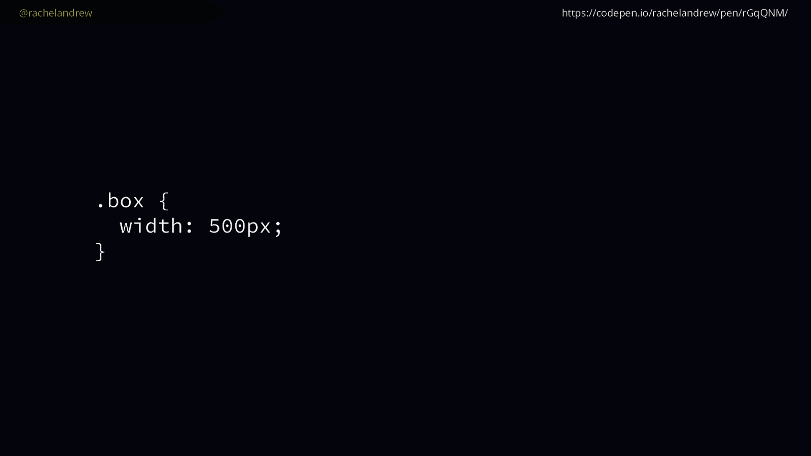
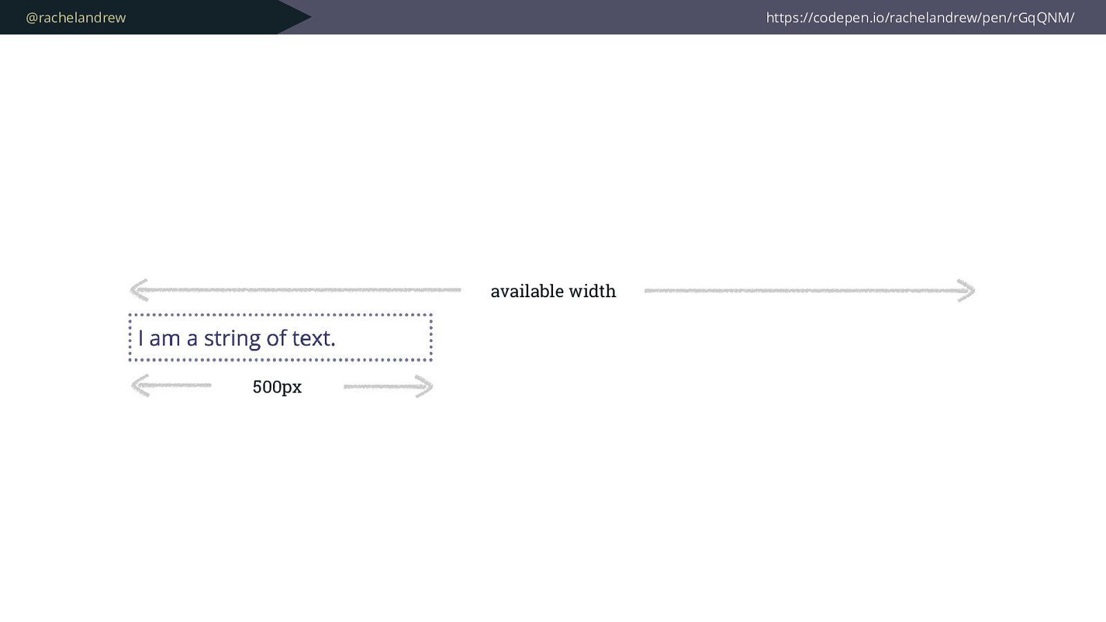
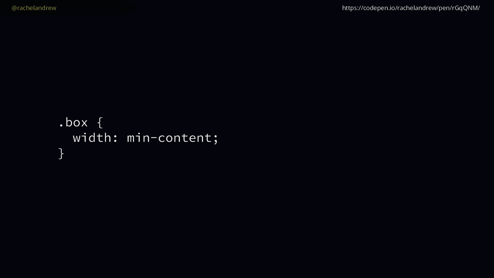
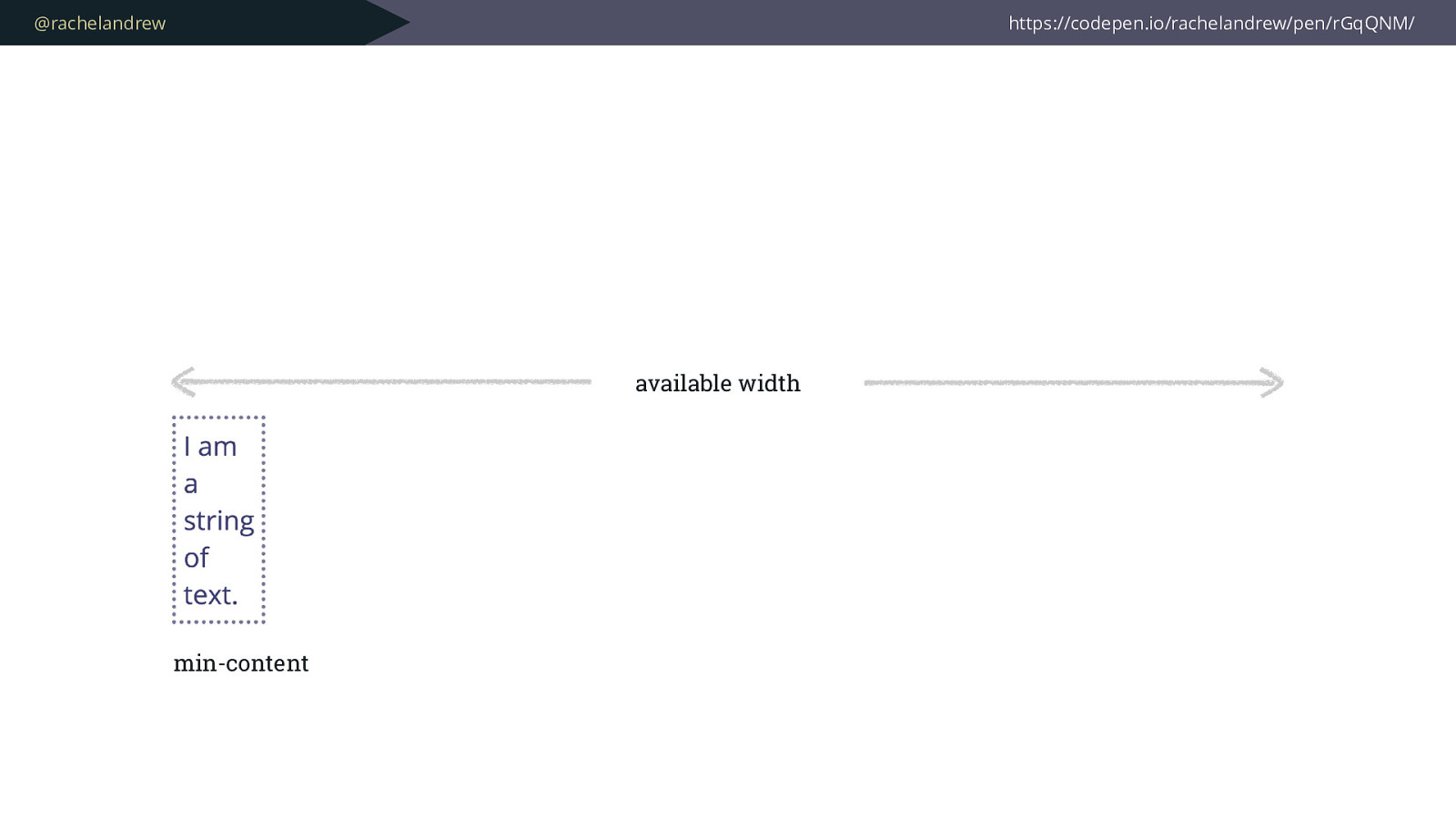
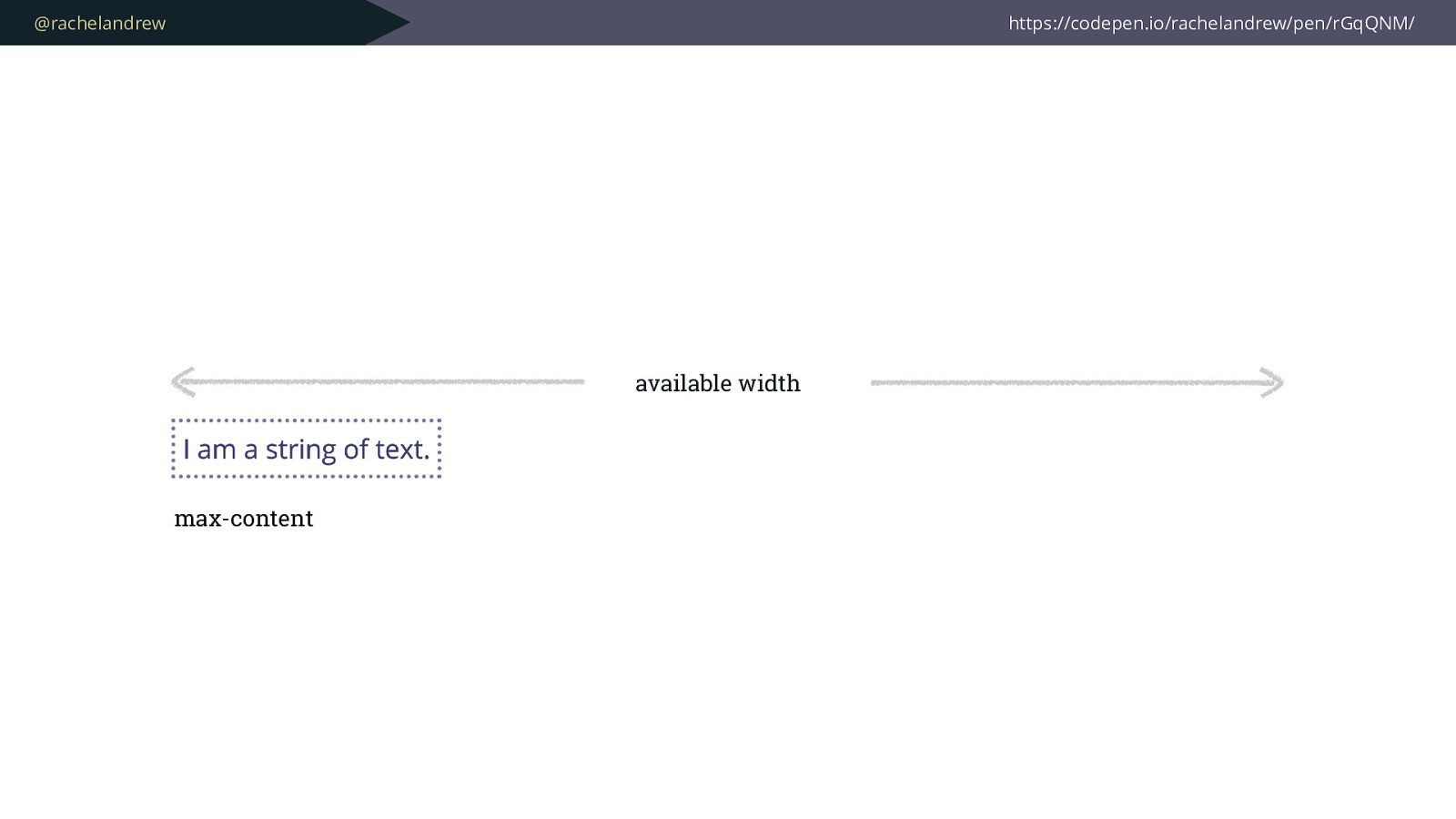
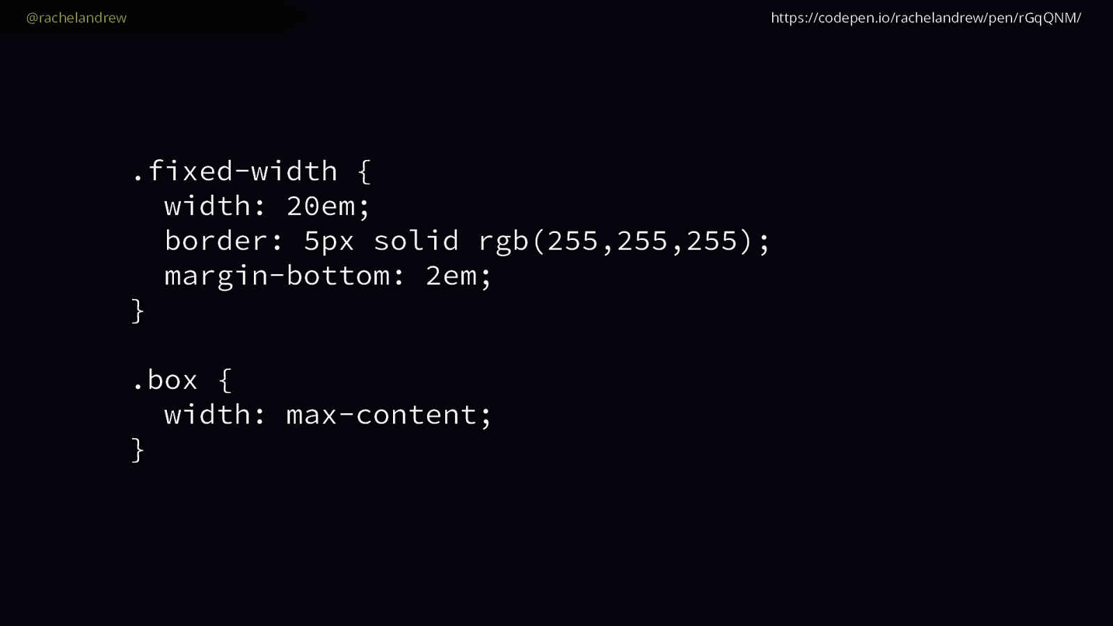
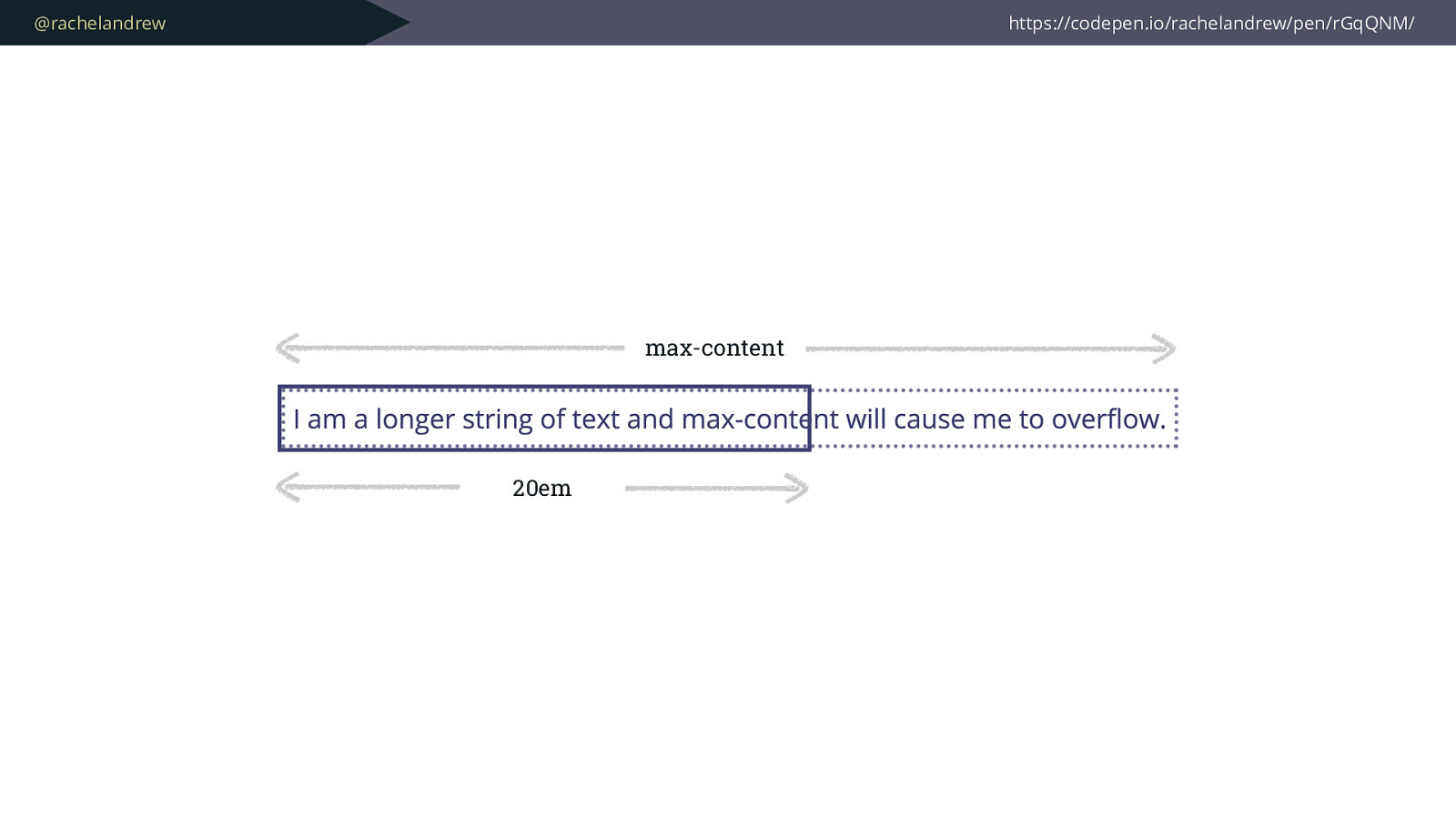
Can be converted from an ideal pixel size using a straightforward calculation. 
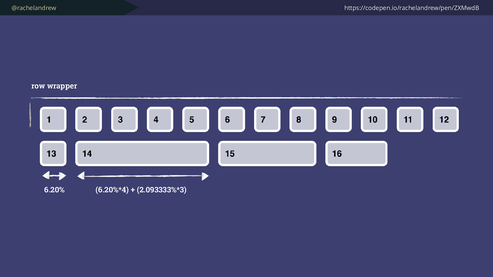
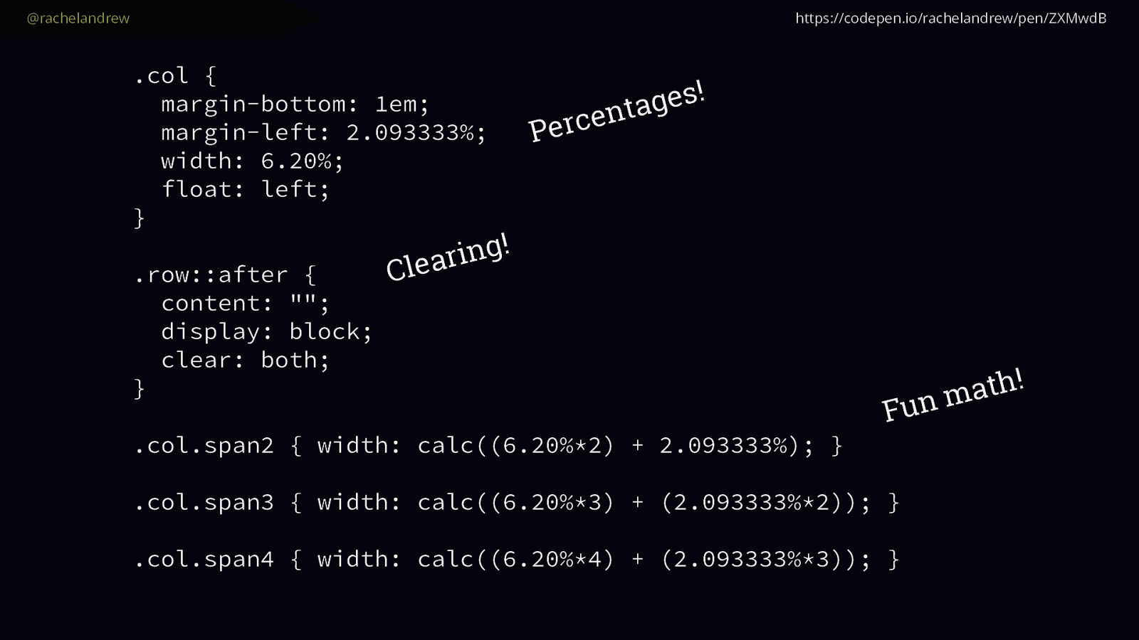
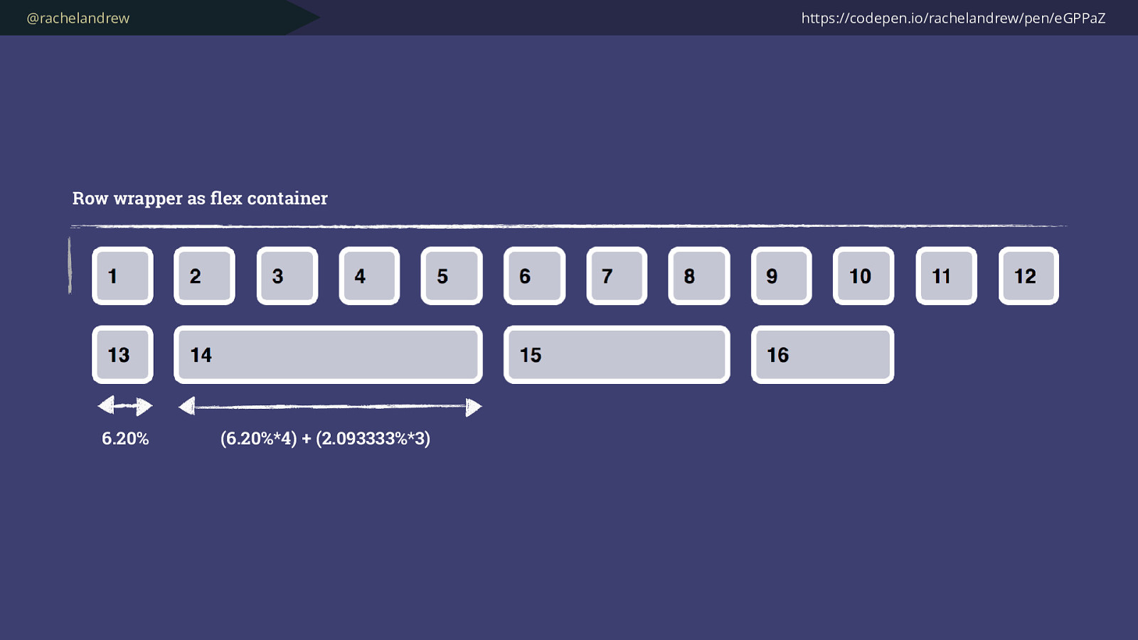
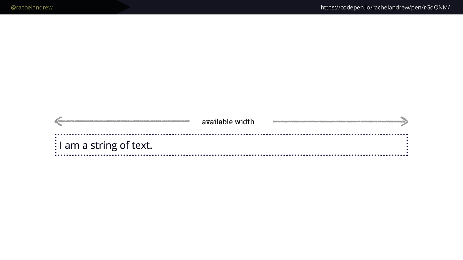
And percentages, while they look horrible in our CSS, and aren’t exactly fun to calculate are understandable. We can work out what percentage value we need to pop in, based on an ideal pixel size using the method Ethan Marcotte taught us in his seminal piece on responsive design.

We understand that if we have more than 100% bad things will happen to our layout.

By doing the work to figure this stuff out, either with a calculator on our desk or allowing some tool or framework to have figured it out for us, we are in control.

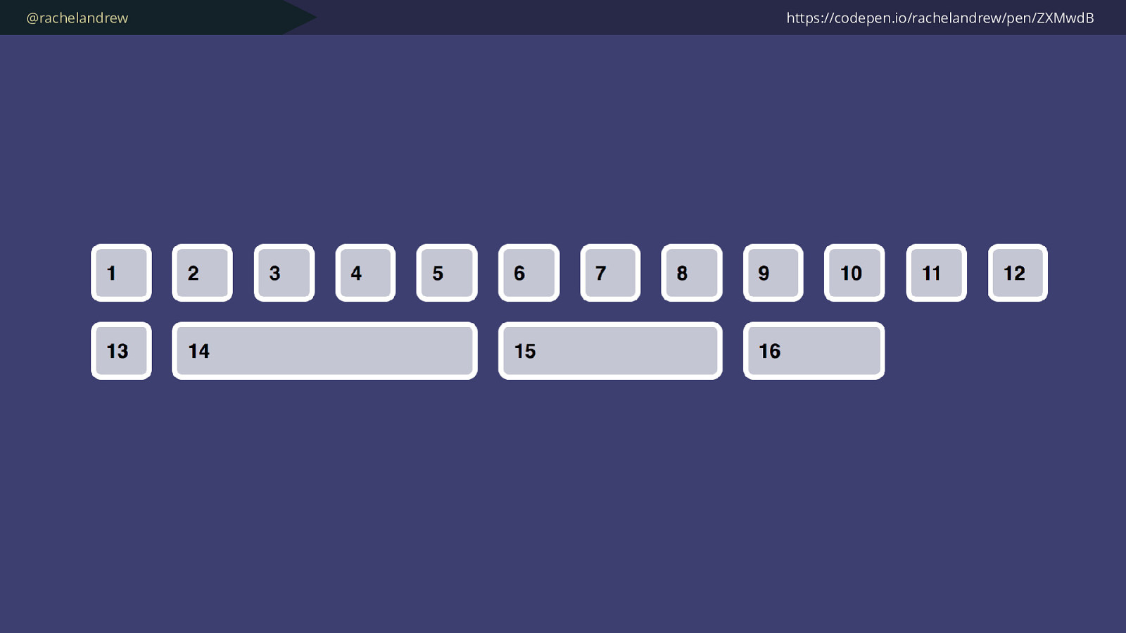
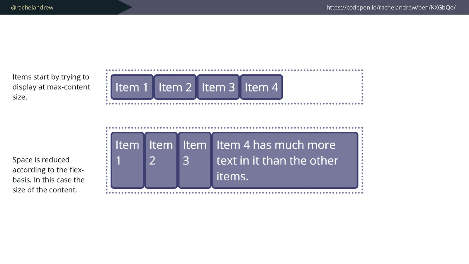
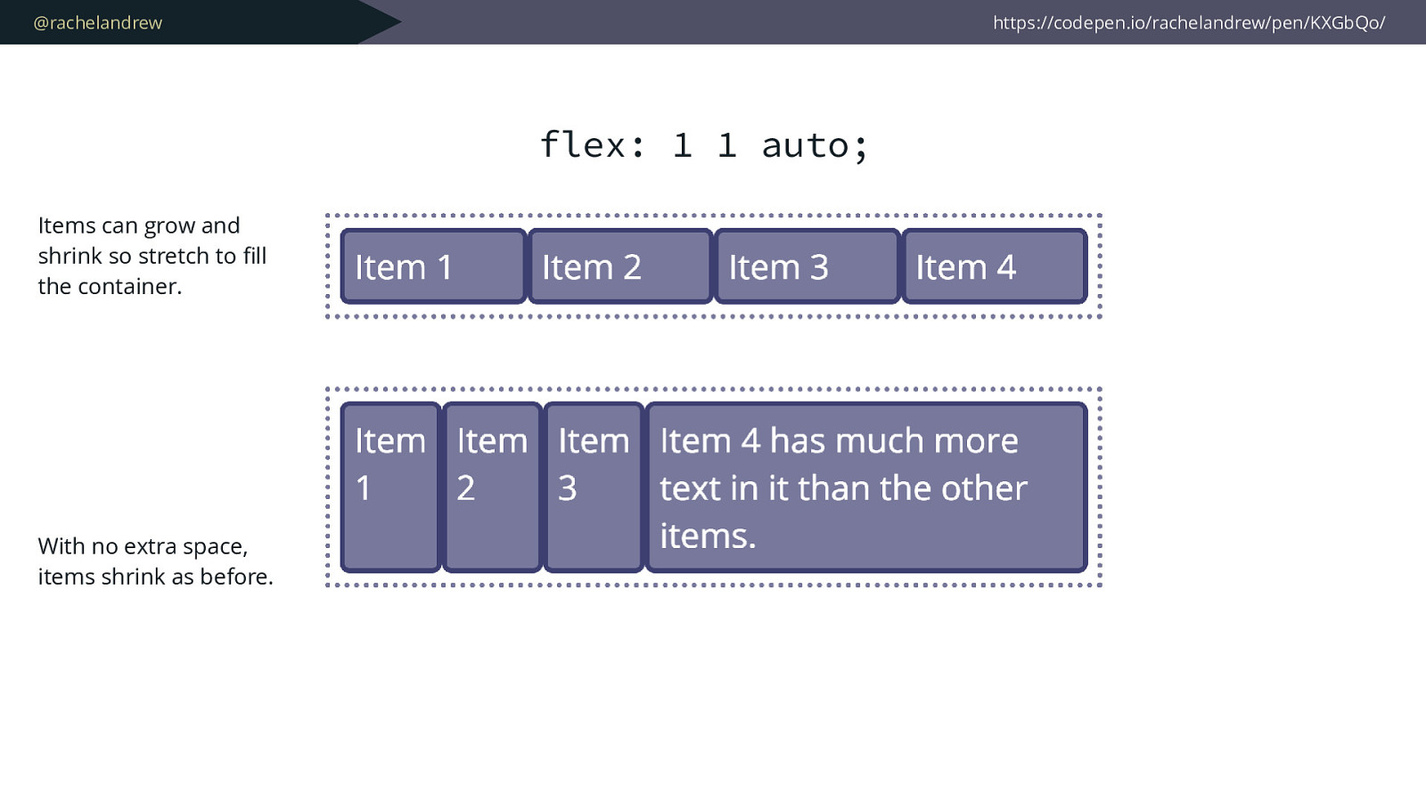
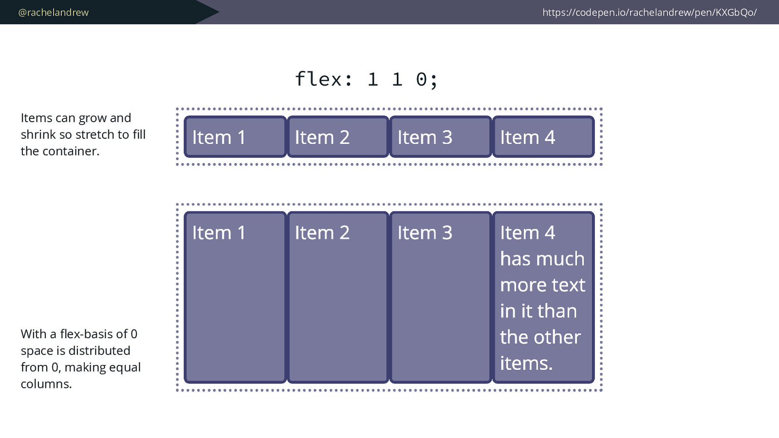
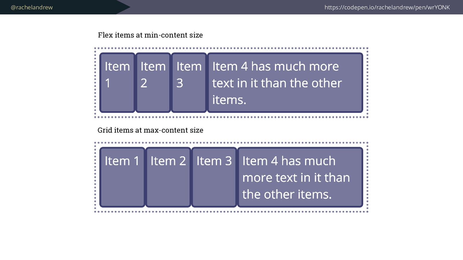
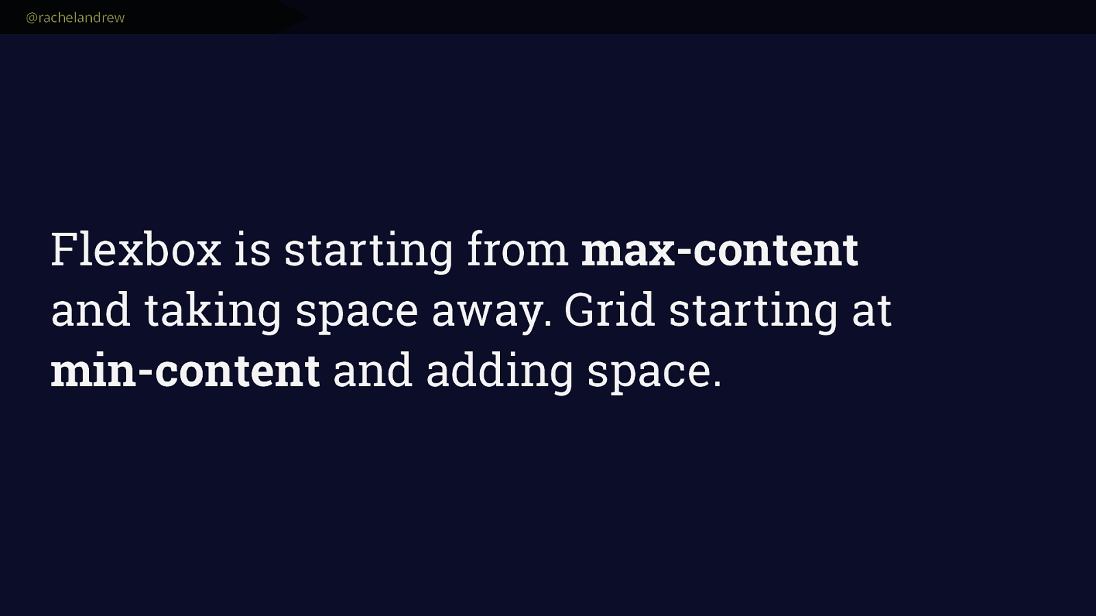
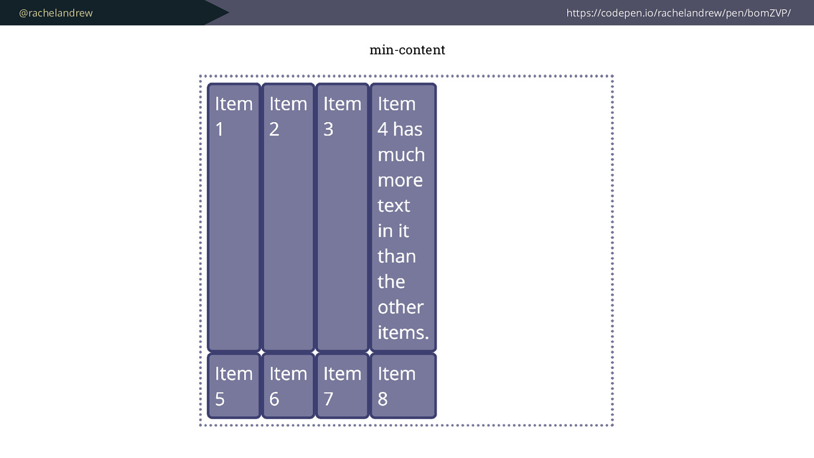
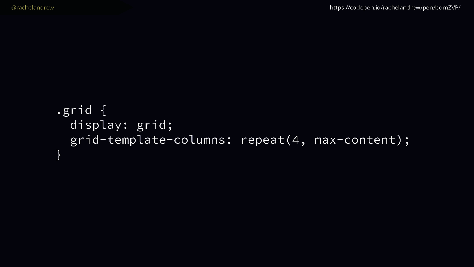
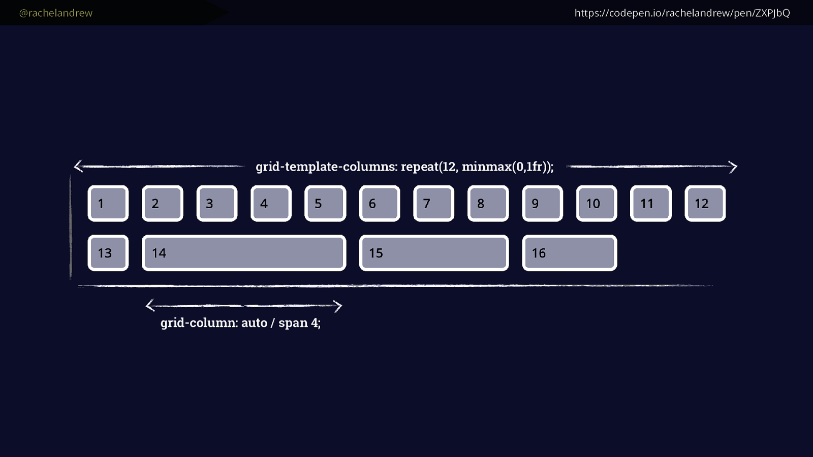
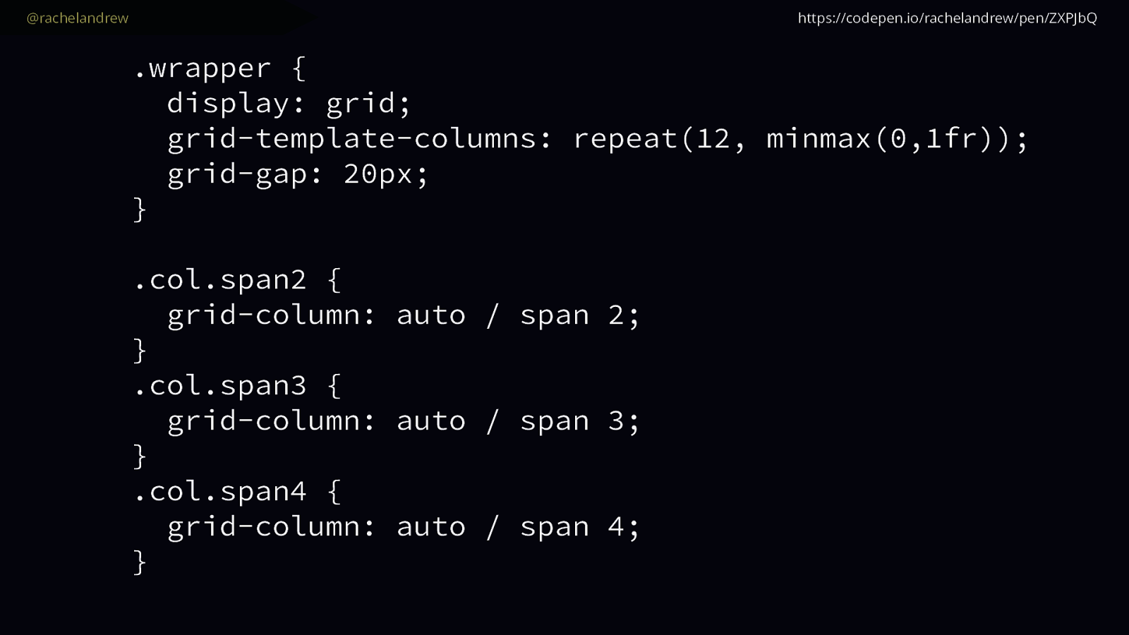
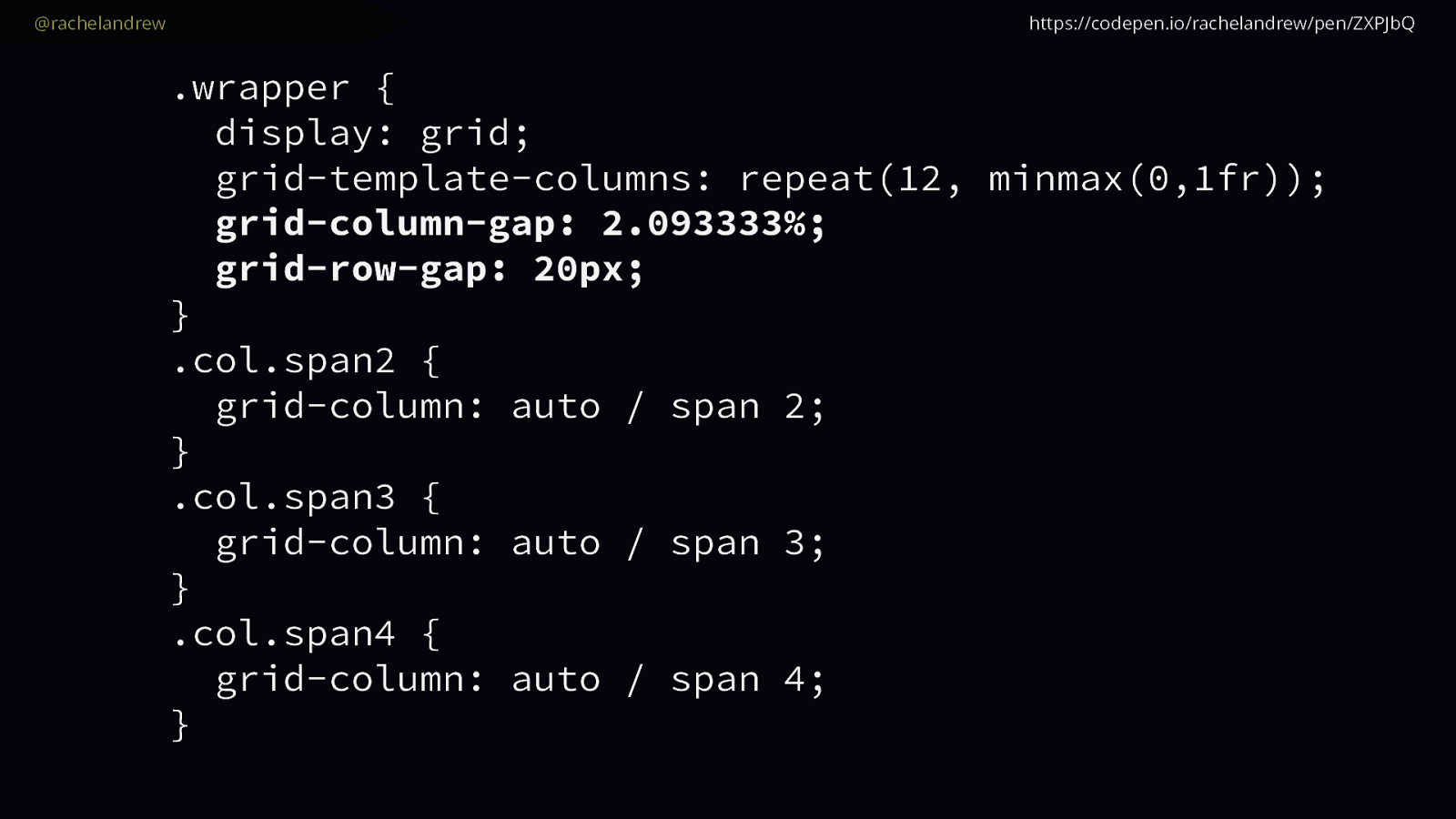
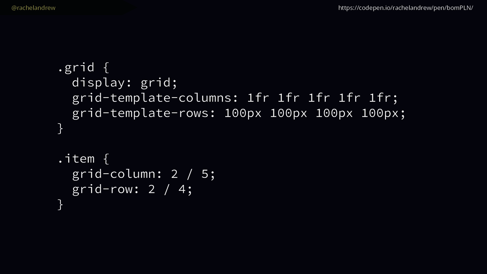
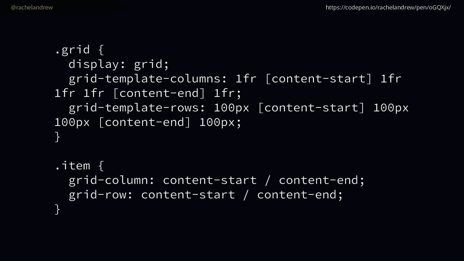
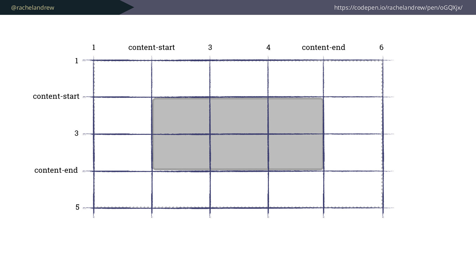
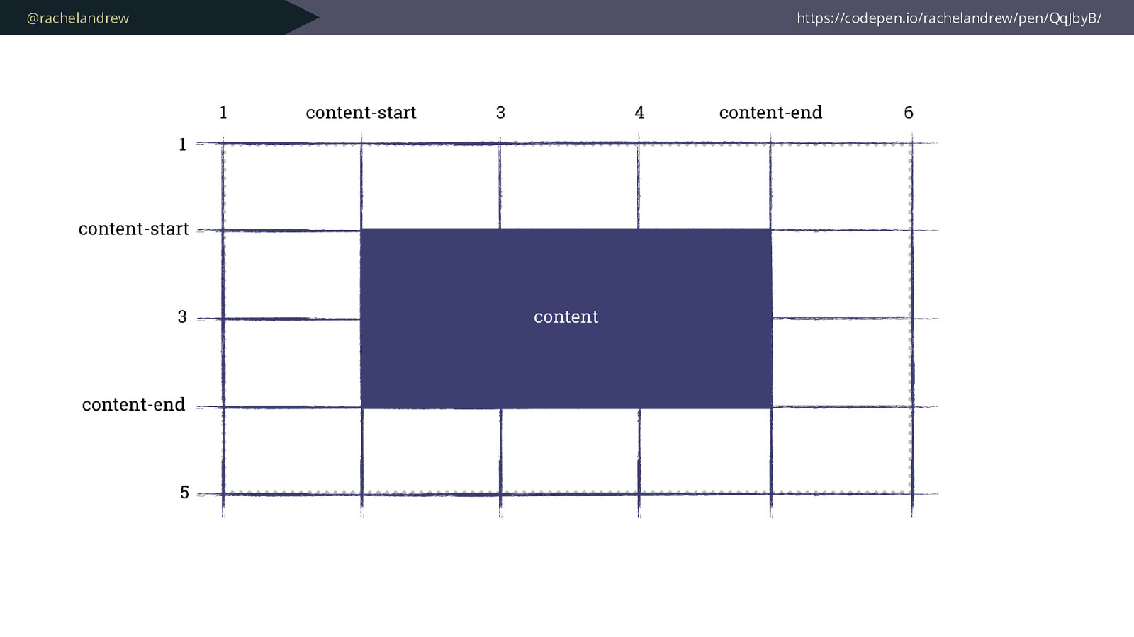
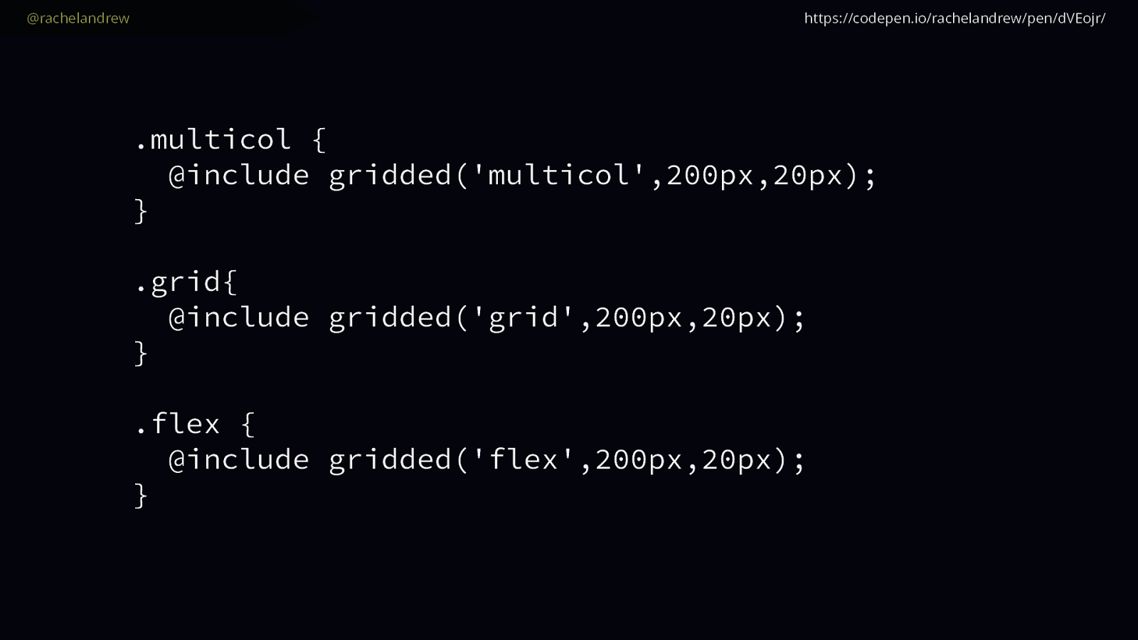
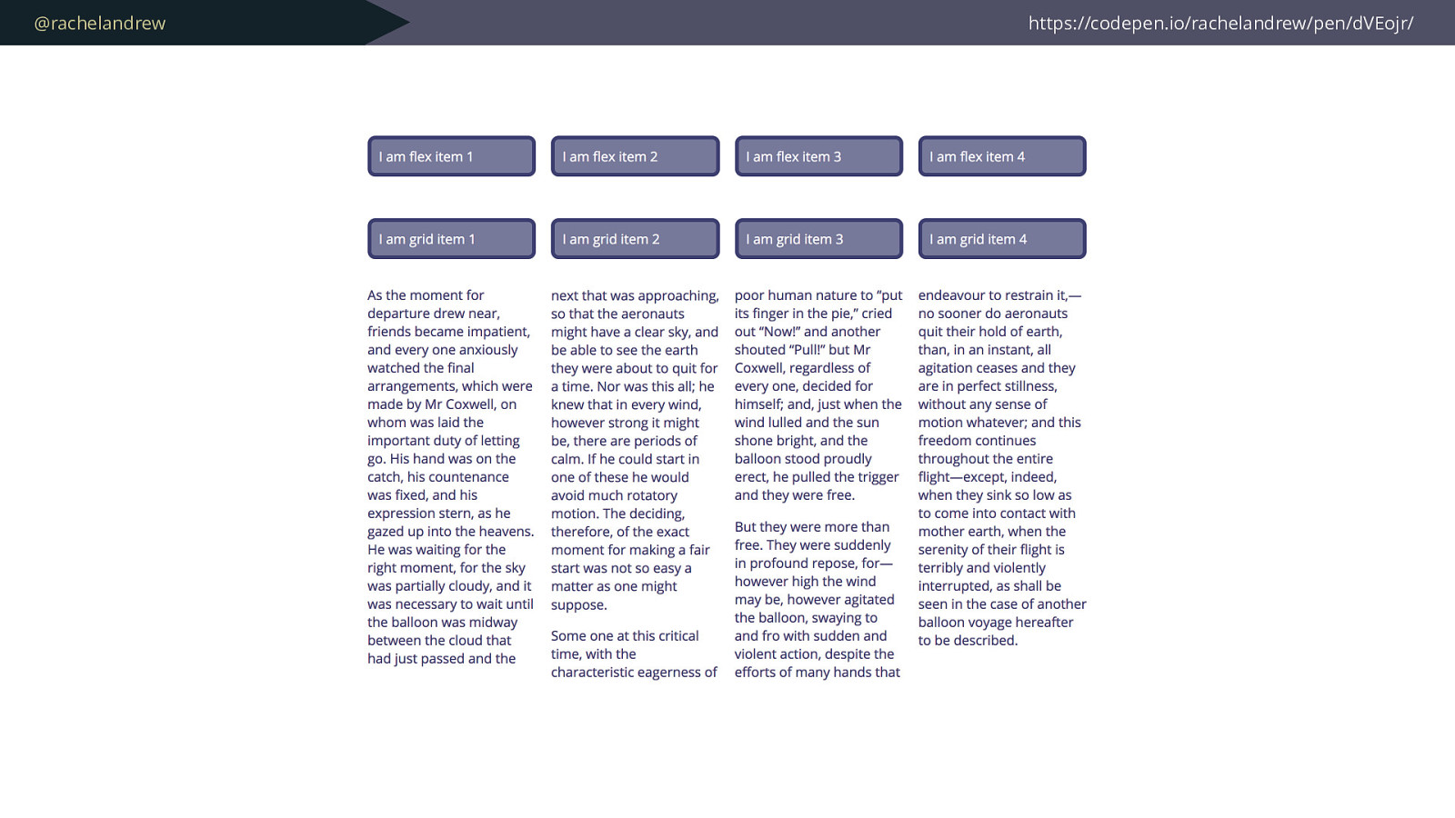
One of the nice features of new layout, of flexbox and grid is that they can take away a lot of the pain of calculating this stuff, but in doing so we start to run into the under the hood sizing constructs that they are built upon, and they seem confusing when compared to good old percentages, and the temptation is to return to our familiar methods.

Slide 33

Slide 33

@rachelandrew https://codepen.io/rachelandrew/pen/eGPPaZ In fact one of the objections people raise against grid layout is that they can do all of this with flexbox, and you can do some of it. You can fake a grid in flexbox just as you can fake a grid with floats.

Slide 34

Slide 34

@rachelandrew Row wrapper as flex container (6.20%*4) + (2.093333%*3) 6.20% https://codepen.io/rachelandrew/pen/eGPPaZ You know how? By restricting the flexibility of flexbox by giving everything percentage widths - returning to doing the calculations yourself.

Slide 35

Slide 35

@rachelandrew .wrapper .row { display: flex; flex-wrap: wrap; } .col { padding: 10px; margin-bottom: 1em; margin-left: 2.093333%; width: 6.20%; flex: 0 0 auto; } .col.span2 { width: calc((6.20%*2) + 2.093333%); } .col.span3 { width: calc((6.20%*3) + (2.093333%*2)); } .col.span4 { width: calc((6.20%*4) + (2.093333%*3)); } https://codepen.io/rachelandrew/pen/eGPPaZ Fun math! Percentages! Inflexible fl ex items! This is an improvement over floats granted.

We don’t need clearing and we can take advantage of all the nice alignment stuff in flexbox …

Slide 36

Slide 36

@rachelandrew Past layout methods create the appearance of a grid, by lining things up. but make no mistake, you are still faking a grid by lining stuff up.

This is really important to understand if you are transitioning to using grid layout. The difference in layout models. The fact that with grid layout we actually have a grid, into which things can be placed. Everything that came before involves us making something that looks like a grid, by giving things sizes, lining them up and pushing them around.

Slide 37

Slide 37

@rachelandrew CSS Intrinsic and Extrinsic Sizing https://drafts.csswg.org/css-sizing-3/
However this new world brings new challenges and sizing that suddenly starts to seem more complex than the ugly but understandable percentage.

So let’s look at our new world of sizing. Let’s have a look at the impossible to say on stage specification - CSS Intrinsic and Extrinsic sizing. This is the specification that details exactly how big that thing is.

It deals with the Intrinsic size of things, which is the size their content would have them ignoring any external influences, such as a parent item restricting their width.

It deals with the** Extrinsic** size of things, which is the size they are based on external influences such as a parent element having a width and constraining it.

Slide 38

Slide 38

@rachelandrew /* html */ 


<div class="box"> I am a string of text. </div> /* css */ 
 .box { padding: 10px; border: 5px dotted rgba(255,255,255,.7); margin-bottom: 2em; } https://codepen.io/rachelandrew/pen/rGqQNM/ Consider a string of text, and see how these things act.

I have a div, inside that is my text and I have given the div a border so we can see it.

Slide 39

Slide 39

@rachelandrew https://codepen.io/rachelandrew/pen/rGqQNM/ available width A div is a block level element and as such, if we apply no width to it, our box will stretch out in the inline dimension as far as it can go. So as wide as the viewport or any container that it is in. That container provides the extrinsic size for the item. An external thing causing the box to be a certain size.

Slide 40

Slide 40

@rachelandrew .box { 
 width: 500px; 
 } https://codepen.io/rachelandrew/pen/rGqQNM/ We could ask our box to be a specific size, adding a constraint to it. Say 500 pixels. In that case our div will become 500 pixels in the inline direction, so 500 pixels wide.

Slide 41

Slide 41

@rachelandrew https://codepen.io/rachelandrew/pen/rGqQNM/ 500px available width Like this.

Slide 42

Slide 42

@rachelandrew https://codepen.io/rachelandrew/pen/rGqQNM/ max content min content However, the content of our box has a size, and perhaps we would like the content to dictate the size rather than have something external constraining it, or putting a lengthy of some sort on the div around our text.

The maximum size of this string of text would be if it didn’t wrap at all, so here it is all stretched out on a single line, this is as big as it gets. **That is it’s max-content size. **

The string also has a minimum size. If it wraps everywhere possible the minimum size will be the size of the longest word. This is the min-content size.

Slide 43

Slide 43

@rachelandrew .box { 
 width: min-content; 
 } https://codepen.io/rachelandrew/pen/rGqQNM/ We can ask our box to display using this content size using some new keywords in CSS, we have min-content. If we use that for width …

Slide 44

Slide 44

@rachelandrew https://codepen.io/rachelandrew/pen/rGqQNM/ available width min-content Our content will take all of the soft wrapping opportunities available to it become as small in the inline direction as it can be.

Slide 45

Slide 45

@rachelandrew .box { width: max-content; } https://codepen.io/rachelandrew/pen/rGqQNM/ If we use max-content however it will do the opposite,

Slide 46

Slide 46

@rachelandrew https://codepen.io/rachelandrew/pen/rGqQNM/ available width max-content it will become as wide as it can be taking none of the soft wrapping opportunities available to it.

Slide 47

Slide 47

@rachelandrew

<div class="fixed-width"> <div class="box"> I am a longer string of text and max-content will cause me to overflow. </div> </div> https://codepen.io/rachelandrew/pen/rGqQNM/ I want to show you what happens with max-content however if our string is now stretched out longer than something which is forcing an extrinsic size. So here I have put my box into a fixed width container.

Slide 48

Slide 48

@rachelandrew .fixed-width { width: 20em; border: 5px solid rgb(255,255,255); margin-bottom: 2em; } .box { width: max-content; } https://codepen.io/rachelandrew/pen/rGqQNM/ The outer container, which is giving us our available width is set to 20em.

The box inside is set to max-content.

Slide 49

Slide 49

@rachelandrew https://codepen.io/rachelandrew/pen/rGqQNM/ 20em max-content We now get an overflow situation. Which is generally not what you want and so the default sizing for content is to fit the container where possible, so to go to the maximum inline size that won’t cause an overflow.

So all of this seems a bit academic, although you may well find these content keywords useful themselves. However it all becomes very important when we are dealing with flex and grid layouts. A lot of the confusion with these layouts comes from not understanding how space is being distributed and it all comes down to these concepts of sizing.

Let’s take a look at flexbox.

Slide 50

Slide 50

@rachelandrew

<div class="box"> <div>Item 1</div> <div>Item 2</div> <div>Item 3</div> <div>Item 4</div> </div> https://codepen.io/rachelandrew/pen/KXGbQo/ So here is flexbox. I have my content here marked up as a set of divs inside a wrapper div that will become a flex container, and the items become flex items and do what flex items do by default, they display as a row.

They display as a row and each of the items will try to go to max-content size, as we have enough space in our container they do so.

Slide 51

Slide 51

@rachelandrew https://codepen.io/rachelandrew/pen/KXGbQo/ Items start by trying to display at max-content size. Space is reduced according to the flex- basis. In this case the size of the content. However if we added more content to one item then the smaller items start to collapse and end up at min-content size.

How does flexbox work this out?

It starts from the max-content size which is what you can see from the first image. We have enough room and then some for our items so they display at max-content.

Once we add all of our content, then there isn’t enough space for all the items to display at max-content and so flexbox starts to remove space from all of the items, and it does so in proportion according to their flex basis, which by default is auto which means in this case it looks at the content size. Therefore our item with the longest text loses less space than the smaller items. However they will never shrink smaller than min-content size.

Slide 52

Slide 52

@rachelandrew https://codepen.io/rachelandrew/pen/KXGbQo/ Items can grow and shrink so stretch to fill the container. With no extra space, items shrink as before. flex: 1 1 auto; The answer to controlling this behaviour is to use the flex-grow flex-shrink and flex-basis properties. And now you know something about sizing they make more sense.

For example, if you want the items to fill the container when there is extra space available. You could use a flex grow of 1, flex shrink of 1 and a flex basis of auto. In the first case where we have extra space, and the items are pretty much the same size, we get what appears to be 4 equal size items.

The second case hasn’t changed - because there is no extra space, we’re still reducing space from auto just like before.

Slide 53

Slide 53

@rachelandrew https://codepen.io/rachelandrew/pen/KXGbQo/ Items can grow and shrink so stretch to fill the container. With a flex-basis of 0 space is distributed from 0, making equal columns. flex: 1 1 0; If you do want equally sized items no matter how much content is in the item, then you don’t want growing and shrinking to be calculated from the size of the content. Instead you can set a flex-basis of 0.

Now we end up the space distribution starting at 0 and assigning space to items in proportion.

Slide 54

Slide 54

@rachelandrew https://codepen.io/rachelandrew/pen/wrYONK Flex items at min-content size Grid items at max-content size So if we take a look at this algorithm in grid layout it works in a similar way, with a tiny difference.

On this slide I am comparing the layout in flexbox and grid.

In grid layout the algorithm works by taking the min-content size and adding space in proportion, capping each one at max-content. So our small items get space added to them rather than taken away and so end up at max-content size.

Slide 55

Slide 55

@rachelandrew Flexbox is starting from max-content


 and taking space away. Grid starting at 
 min-content and adding space. You might never run into these differences. However if you do, having some idea of the fact that there is an algorithm under the hood, can make this all less mysterious.

This is where you get your super powers.

Slide 56

Slide 56

@rachelandrew .grid { display: grid; grid-template-columns: repeat(4, min-content); } https://codepen.io/rachelandrew/pen/bomZVP/ And now we have some idea of what is going on, we can look at the various ways to play with sizing in our grids.

Those content keywords I mentioned earlier can be used to set a track size. If you want your track to be as small as it possibly can be based on the content, use min- content.

I’m creating 4 column tracks at min-content size.

Slide 57

Slide 57

@rachelandrew https://codepen.io/rachelandrew/pen/bomZVP/ min-content You can see how each track has become as small as it can, the long text has wrapped where possible.

Slide 58

Slide 58

@rachelandrew .grid { display: grid; grid-template-columns: repeat(4, max-content); } https://codepen.io/rachelandrew/pen/bomZVP/ To make your track as big as it possibly can be - and remember that might cause overflows.

Use max-content.

Slide 59

Slide 59

@rachelandrew https://codepen.io/rachelandrew/pen/bomZVP/ max-content You can see how the grid with only small amounts of text in has gone to max-content size and still has room in the container. The second grid has the longer text in and an overflow has happened.

Slide 60

Slide 60

@rachelandrew .grid { display: grid; grid-template-columns: repeat(4, fit-content(15ch)); } https://codepen.io/rachelandrew/pen/Oxqgqo We also have fit-content. This is an incredibly useful sizing keyword that can be passed a value.

In this case I am passing in 15 ch, which should stop the track growing at 15 characters of space.

Slide 61

Slide 61

@rachelandrew https://codepen.io/rachelandrew/pen/Oxqgqo fit-content(15ch) All of these tracks are sized using fit-content. In the top section none of the tracks ever reach 15 characters wide so they are at max-content.

In the second example our long text does reach 15 characters and so stops growing at that size and the content wraps.

And the reason to know about this stuff? Well…

Slide 62

Slide 62

@rachelandrew https://codepen.io/rachelandrew/pen/ZXPJbQ You can absolutely still make a 12 column grid if that is what you want to do, or if you are adding grid elements to an existing design.

It will be a far simpler construction as we can lose the row wrappers and the pushing around of things and instead add our sizing to the container.

Slide 63

Slide 63

@rachelandrew https://codepen.io/rachelandrew/pen/ZXPJbQ grid-template-columns: repeat(12, minmax(0,1fr)); grid-column: auto / span 4; So we could make a grid using fr units and fixed width gaps. The thing to remember with grid is that unlike our previous methods, you can let grid work out the sizing for you. Meaning that we can use a fixed length unit for the gap - grid will take that away before distributing available space.

Slide 64

Slide 64

@rachelandrew .wrapper { display: grid; grid-template-columns: repeat(12, minmax(0,1fr)); grid-gap: 20px; } .col.span2 { grid-column: auto / span 2; } .col.span3 { grid-column: auto / span 3; } .col.span4 { grid-column: auto / span 4; } https://codepen.io/rachelandrew/pen/ZXPJbQ So this is all we need.

Slide 65

Slide 65

@rachelandrew .wrapper { display: grid; grid-template-columns: repeat(12, minmax(0,1fr)); grid-column-gap: 2.093333%; grid-row-gap: 20px; } .col.span2 { grid-column: auto / span 2; } .col.span3 { grid-column: auto / span 3; } .col.span4 { grid-column: auto / span 4; } https://codepen.io/rachelandrew/pen/ZXPJbQ However you can still use percentages for your column gaps if you want to.

An excellent reason to do so is when adding grid components to a layout that also has flex or floated columns. To get things to line up across the different components you could use the supported everywhere percentages. That’s not wrong. Don’t obsess over right and wrong, all of these things are valid in the spec. Use what suits your use case.

Slide 66

Slide 66

@rachelandrew –Rebuilding Slack.com
“In the end, we discovered that a column-based grid   wasn’t actually needed. Since Grid allows you to create a custom grid to match whatever layout you have, we didn’t need to force it into 12 columns. Instead, we created CSS Grid objects for some of the common layout patterns in the designs.” https://slack.engineering/rebuilding-slack-com-b124c405c193 However remember that you don’t have to stick to a 12 column grid.

This quote is from an article about the redesign of slack.com they noted that they started out trying to create a standard 12 column grid, then realised they didn’t need to do so. Grid enabled more flexibility than that.

Instead of worrying about fixed sizes we can create components that are content size aware.

Slide 67

Slide 67

@rachelandrew https://codepen.io/rachelandrew/pen/RLOxMB Here is a very simple example of a media object. I’d like the image never to be bigger than 300 pixels - so the 500 pixel wide image should size down due to max-width on the image being 100%

However an image smaller than 300 pixels should only take up the space it needs.

Slide 68

Slide 68

@rachelandrew https://codepen.io/rachelandrew/pen/RLOxMB 300px 120px I want to do this with one component not needing to add a class for bigger or smaller images.

Slide 69

Slide 69

@rachelandrew .media { display: grid; grid-template-columns: fit-content(300px) 1fr; grid-gap: 20px; } https://codepen.io/rachelandrew/pen/RLOxMB We can this using fit-content with a max of 300px set. The second track is 1fr, so it will take up any extra space once the space has been worked out for the image.

I love creating these these very flexible components.

Slide 70

Slide 70

@rachelandrew https://codepen.io/rachelandrew/pen/jGRzzv/ Or creating very precise looking layouts, with elements that can expand if the content needs them to by using minmax().

Slide 71

Slide 71

@rachelandrew .panel { display: grid; grid-gap: 1px; grid-template-columns: 1fr 1fr 3fr; grid-template-rows:
minmax(100px, auto)
minmax(50px, auto)
minmax(250px, auto)
minmax(50px, auto)
minmax(150px, auto); } https://codepen.io/rachelandrew/pen/jGRzzv/ Here is the grid code.

3 columns, 5 row tracks.

Slide 72

Slide 72

@rachelandrew https://codepen.io/rachelandrew/pen/jGRzzv/ Min 50px 
 Max auto This who layout is in a single grid. The two columns on the right are spanning the 5 rows of the explicit grid and use multicol inside the wider 3fr grid column.

The second row has a minimum size of 50 pixels. However the content in the second column, second row is taller than 50 pixels so it expands.

And it is worth remembering that in a two dimensional model this expansion is going to happen right across the row.

There is a gap between our 2nd and third image. Thats a minimum of 50 pixels, plus the grid gap. If we added text in between the two images it would expand due to auto.

However the row will also expand if the multicol section becomes taller. It spans across all of the rows of the grid so additional space needs to be added to tracks to cope with that.

Slide 73

Slide 73

@rachelandrew https://codepen.io/rachelandrew/pen/jGRzzv/ Min 50px 
 Max auto Min 50px 
 Max auto And you can see that here. So a very simple set of row tracks can allow a daily complex layout that responds within parameters that we set.

That’s pretty cool. So

Slide 74

Slide 74

@rachelandrew This is not exciting . But it will let you do exciting things. While digging into sizing isn’t that exciting.

It is when you start to play with the different ways that you can size your grid tracks that the time you put into learning sizing pays o ff .

It is the CSS equivalent of eating your vegetables and getting enough sleep.

And if you write CSS, or design things that are laid out with CSS I really believe that sizing it absolutely key if you want to be able to take advantage of everything we have today in CSS layout, and the things that are to come.

Slide 75

Slide 75

@rachelandrew Why so complicated ? I keep hearing - either in my inbox, or on Twitter that grid is really complicated, there are all these properties, why has it been made so di ffi cult … this is a general problem with any software development. I see it with my own CMS product. People want fully featured … but also easy.

Slide 76

Slide 76

@rachelandrew More capability & flexibility means 
 more to learn Sadly it is a fact of life that if something is made more flexible and capable, there will be more of it to learn.

There are a whole bunch of properties defined in the grid specification, add to those all the things that are part of sizing or Box Alignment and I can see why it all looks overwhelming.

However it is worth remembering that you don’t need to learn all of it, and in fact many features of grid are just different ways to achieve the same end result. In order that they can fit into different workflows.

Yet once you have switched your mind set to a grid way of thinking, to an understanding that we define things on the container rather than pushing items around to make it look like a grid it all becomes a lot clearer.

And even with the apparent multitude of ways to position items there is something pretty key to understand.

Slide 77

Slide 77

@rachelandrew It is all just lines . Everything sits on top of a grid of lines. You need to understand grid lines, and placing items on lines. The other methods are what people like to term sugar on top of that

  • the phrase makes me cringe, never mind, Let’s take a look at what I mean.

Slide 78

Slide 78

@rachelandrew https://codepen.io/rachelandrew/pen/bomPLN/ Here is an example of a grid. The layout looks like this.

Slide 79

Slide 79

@rachelandrew https://codepen.io/rachelandrew/pen/bomPLN/ 1 1 2 3 4 5 2 3 4 5 6 And if I overlay the lines you can see that I have a grid consisting of five column tracks and four row tracks. Which gives me 6 column lines and 5 row lines. I’m working in English so column line 1 starts on the left and numbers across the grid, row line 1 starts at the top and numbers down the grid.

Slide 80

Slide 80

@rachelandrew .grid { display: grid; grid-template-columns: 1fr 1fr 1fr 1fr 1fr; grid-template-rows: 100px 100px 100px 100px; } .item { grid-column: 2 / 5; grid-row: 2 / 4; } https://codepen.io/rachelandrew/pen/bomPLN/ Here is the definition and the line-based positioning of the item.

Slide 81

Slide 81

@rachelandrew https://codepen.io/rachelandrew/pen/oGQXjx/ 1 1 content-start 3 content-end 5 content-start 3 4 content-end 6 I can name some of my lines, if I like. And use the names to place items rather than the number.

Slide 82

Slide 82

@rachelandrew .grid { display: grid; grid-template-columns: 1fr [content-start] 1fr 1fr 1fr [content-end] 1fr; grid-template-rows: 100px [content-start] 100px 100px [content-end] 100px; } .item { grid-column: content-start / content-end; grid-row: content-start / content-end; } https://codepen.io/rachelandrew/pen/oGQXjx/

Slide 83

Slide 83

@rachelandrew https://codepen.io/rachelandrew/pen/oGQXjx/ 1 1 content-start 3 content-end 5 content-start 3 4 content-end 6 So this gets interesting in that, you don’t need to call the lines something dash start and something dash end. But if you do, you get a named area of the main named you used.

So because we have content-start and content-end for rows and columns. This gives us an area, defined by those lines called content.

Slide 84

Slide 84

@rachelandrew https://codepen.io/rachelandrew/pen/QqJbyB/ 1 1 content-start 3 content-end 5 content-start 3 4 content-end 6 content And rather than place our item via named lines - we could instead use the grid-area property to do so.

Slide 85

Slide 85

@rachelandrew .grid { display: grid; grid-template-columns: 1fr [content-start] 1fr 1fr 1fr [content-end] 1fr; grid-template-rows: 100px [content-start] 100px 100px [content-end] 100px; } .item { grid-area: content; } https://codepen.io/rachelandrew/pen/QqJbyB/ So I’m now defining my lines, then placing the item with grid-area: content. The thing is that magic grid area is less magical than you might think. What grid-area really is, is a shorthand for listing all four lines at once.

In fact, grid area content is really.

Slide 86

Slide 86

@rachelandrew .grid { display: grid; grid-template-columns: 1fr [content-start] 1fr 1fr 1fr [content-end] 1fr; grid-template-rows: 100px [content-start] 100px 100px [content-end] 100px; } .item { grid-area: content / content / content / content; } https://codepen.io/rachelandrew/pen/QqJbyB/ This

Grid-area: content content content content.

Slide 87

Slide 87

@rachelandrew grid-area: content / content / content / content; https://codepen.io/rachelandrew/pen/QqJbyB/ grid-row-start grid-column-start grid-row-end grid-column-end The order of the lines in this shorthand are

grid-row-start

grid-column-start

grid-row-end

Grid-column-end

And the reason these are all set to content, is that when you have a grid area, which we created from our lines. You also get line names created by that grid area of the main name used. So if you specify grid-column-start as content, or grid-row-start as content then that will resolve to the start edge of the content area, and if you specify grid-row-end or grid-column-end as content that resolves to the end edge of the content area. 


Slide 88

Slide 88

@rachelandrew https://codepen.io/rachelandrew/pen/QqJbyB/ 1 1 content-start content 3 content-end content 5 content-start content 3 4 content-end content 6 content So each of our lines can have two names, the content-start and end that we specified plus the line name content.

Slide 89

Slide 89

@rachelandrew grid-area: content / content / content / content; https://codepen.io/rachelandrew/pen/QqJbyB/ grid-row-start grid-column-start grid-row-end grid-column-end And the reason it works that we can just say grid-area content is due to some specific wording in the CSS spec about what happens if you do not specify all of the lines for grid-area are are using an ident (a named line rather than a number)


Slide 90

Slide 90

@rachelandrew grid-area: content / content / content ; https://codepen.io/rachelandrew/pen/QqJbyB/ grid-row-start grid-column-start grid-row-end • grid-column-end is set to the value used for grid-column-start, which is ‘content’. If we specify only three lines - so miss out grid-column-end. Then grid-column end will be set to the same value as grid-column start - which is the line named content so it will resolve to the end edge of the area named content,


Slide 91

Slide 91

@rachelandrew grid-area: content / content ; https://codepen.io/rachelandrew/pen/QqJbyB/ grid-row-start grid-column-start • grid-row-end is set to the value used for grid-column-start, which is ‘content’. • grid-column-end is set to the value used for grid-column-start, which is ‘content’. If we specify only two lines - so miss out grid-column-end and grid-row-end. Then grid-column end will be set to the same value as grid-column start - which is the line named content so it will resolve to the end edge of the area named content, and grid-row-end will be set to the same value as grid-row-start - once again that will be content and be the end row edge.


Slide 92

Slide 92

@rachelandrew grid-area: content ; https://codepen.io/rachelandrew/pen/QqJbyB/ grid-row-start • The other three values are set to the same as grid-row-start, so all are set to ‘content’ If we specify only one - so miss out grid-column-end, grid-row-end and grid-column-start. Then all of the values become the same as grid-row-start so will resolve to the start and end edges of that area. Which is why the grid-area property works. It’s just a shorthand way of specifying lines. 


Slide 93

Slide 93

@rachelandrew .grid { display: grid; grid-template-columns: 1fr 1fr 1fr 1fr 1fr; grid-template-rows: 100px 100px 100px 100px; grid-template-areas:
". . . . ." ". content content content ." ". content content content ." ". . . . ." } .item { grid-area: content ; } https://codepen.io/rachelandrew/pen/xXQGVG/ And to complete the picture. We can create a named area using grid-template-areas, without naming any lines. However all grid-area is doing is placing the item in the same way, at the start and end of the area named content that we have defined using grid-template-areas.

Slide 94

Slide 94

@rachelandrew https://codepen.io/rachelandrew/pen/xXQGVG/ 1 1 content 3 content 5 content 3 4 content 6 content content content content content content So we’ve created an area called content, and we now have lines named content.

We also have something else. What if we wanted to position something using a named line at the end of that content area.

Slide 95

Slide 95

@rachelandrew https://codepen.io/rachelandrew/pen/xXQGVG/ 1 1 content 3 content 5 content 3 4 content 6 content content content content content content Just here.

I can’t use grid-column-start content because that will put it after the start of the content area.

In this example we don’t have the named lines from the earlier example of content-start and content-end. Or do we?

Slide 96

Slide 96

@rachelandrew https://codepen.io/rachelandrew/pen/xXQGVG/ 1 1 content content-start 3 5 content 
 content-start 3 4 content content-end 6 content content content content content content content content-end Yes we do.

Grid has a solution for that, if you create an area with grid-template-areas you will also get a named line of the main name you used - in our case content, with -start and -end appended for the start and end of columns and rows.

Which means we can position our item using grid-row: content-start and grid-column: content-end

Slide 97

Slide 97

@rachelandrew .grid { display: grid; grid-template-columns: 1fr 1fr 1fr 1fr 1fr; grid-template-rows: 100px 100px 100px 100px; grid-template-areas:
". . . . ." ". content content content ." ". content content content ." ". . . . ." } .item {
grid-area: content ;
} .item2 { grid-row-start: content-start; grid-column-start: content-end; } https://codepen.io/rachelandrew/pen/xXQGVG/ Like this.

Slide 98

Slide 98

@rachelandrew https://codepen.io/rachelandrew/pen/xXQGVG But it is all just a grid of lines. And if something is appearing in an odd place going back to what line it think s it is odd is exactly the best place to start.

Everything else is a choice you have.

Slide 99

Slide 99

@rachelandrew You have real choice for the first time. And this is the thing, we actually do have a choice over how we do layout now.

And if you are starting a brand new project today. I would really be taking a good hard look at what is now available to you. Forgetting your assumptions based on what was not possible in the past. Things have changed.

Slide 100

Slide 100

@rachelandrew What would be the best method to achieve this design pattern? We can look at the best methods for achieving design patterns.

Slide 101

Slide 101

@rachelandrew Could we solve this problem with a new design pattern? We can think up design patterns that are unusual, that solve problems in new ways.

Slide 102

Slide 102

@rachelandrew Instead of “which patterns does our framework give us to use?” We don’t have to just pick from a selection of options that a framework or just the technical limitations of pushing things around leave us with.

And this is all very nice however, I know that she of you are thinking. This is fine if you want to do a shiny new thing .. but I work on an existing thing.

Slide 103

Slide 103

@rachelandrew How old is the oldest CSS in your project? Hands up if it is older than 5 years.

Keep your hand up if older than 10 years

Keep it up if you know there are still tables for layout in there.

Right.

Slide 104

Slide 104

@rachelandrew 368

people working on existing projects 29
had CSS in their codebase written 10 years or more ago. That’s nearly 8%

So me standing up here preaching about doing exciting new things, well thats great and I hope you all have personal projects in which to play. But. The day job right?

Slide 105

Slide 105

@rachelandrew Old CSS in your project doesn’t mean you can’t use new CSS. So here’s the thing. The existence of crummy old CSS in your codebase doesn’t mean you can’t use new CSS.

I imagine that sometimes you need to add a new component - perhaps some feature of a site. Perhaps everything always needs to sit inside an older framework of navigation and header, but you can design components or a section of the page using newer techniques.

Slide 106

Slide 106

@rachelandrew This is where understanding CSS comes in really useful. If you have figured out how the cascade and inheritance works, you are in a position to understand which things will leak through into your component, what you might need to overwrite.

If you have figured out sizing, you can play a few tricks to ensure that your CSS grid component can sit inside an older layout and still line up neatly.

I’m kind of expecting my next slide is going to result in all the other speakers racing onto stage and dragging me off. Behold Bootstrap on the An Event Apart stage.

Slide 107

Slide 107

@rachelandrew https://codepen.io/rachelandrew/pen/wrbwOz/ But I wanted to show you something.

So what I have here is a layout that uses floats for the main page framework, it is using standard Bootstrap - version 3 with the floated grid. I’ve used the Bootstrap Grid to position the sidebar and main content. I did this because I wanted to take an off the shelf thing, something that even if you aren’t using Bootstrap migh tbe like your own framework.

Slide 108

Slide 108

@rachelandrew https://codepen.io/rachelandrew/pen/wrbwOz/ Then I decided to use CSS Grid in order that I could easily have as many columns as will fit for my gallery component, have some items spanning two row tracks, and use the dense packing mode.

So that gallery, is a grid component popped inside a Bootstrap layout, and it works really nicely. We get to take advantage of grid layout, we don’t need to rewrite our website.

Slide 109

Slide 109

@rachelandrew img { max-width: 100%; } .gallery { display: grid; grid-template-columns: repeat(auto-fill,minmax(200px,1fr)); grid-gap: 10px 20px; grid-auto-flow: dense; } .portrait { grid-row-end: span 2; } figcaption { text-align: center; font-size: 1.5em; } https://codepen.io/rachelandrew/pen/wrbwOz/ This is all the CSS I needed to use for that component, so we can take advantage of new stuff within our old stu ff . Don’t feel as if it has to be all or nothing, you can save time with new layout when creating a component, or do things that were previously impossible without needing to throw everything away.

Slide 110

Slide 110

@rachelandrew Creating systems with new layout. And if you are in the position of starting a brand new thing, but also if you are augmenting an old thing. You now have all of this neat stuff to play with. To make decisions about how to use. This means that you can look at any component in your site and ask yourself which layout method suits it best.

Slide 111

Slide 111

@rachelandrew Other layout methods still exist . Something that I’ve found, is that often people embracing a new method forget that there are still use cases for the old ones.

I remember seeing this when we moved from using tables for layout to CSS, people got the idea that tables were bad and started trying to lay out tabular data as a set of divs. The same is true for floats. I’ve had a number of conversations with people who were trying to invent floats using CSS Grid.

Slide 112

Slide 112

@rachelandrew https://codepen.io/rachelandrew/pen/ZXNYob/ Floating the image means the text wraps round. Defining a grid on the container means we don’t get the wrapping behaviour. You might want the wrapping behaviour of a float. If you do, use a float, if not you could define a grid on the parent or behaves turn it into a flex container to lay the content tout as two columns.

Slide 113

Slide 113

@rachelandrew https://codepen.io/rachelandrew/pen/RLmNvY/ Using column-width of 200px means we get more columns if there is room, fewer with less available width. Multi-column layout splits content into equal width columns. Multiple column layout might be a really great choice if you just want to collapse a linear list of small things into equal columns.

Like these checkboxes. I love multicol for being able to responsively collapse down bits of UI.

Slide 114

Slide 114

@rachelandrew https://codepen.io/rachelandrew/pen/OxYVmL Flex items with the value of justify-content set to space-between. I also use flexbox to centre the word in the circle. Flexbox if you have a bunch of items you just want to equally space along a row.

Slide 115

Slide 115

@rachelandrew You don’t need a grid-shaped hammer for every layout task. Don’t decide you need a grid shaped hammer for every job. It’s one of a set of tools at your disposal.

Slide 116

Slide 116

@rachelandrew Off-the-shelf frameworks are designed to solve generic problems. And something that has happened as we have relied a lot of frameworks and other people’s code is that we’ve ended up absorbing solutions for problems we don’t have into our codebases. As any off the shelf code has to be very generic.

Slide 117

Slide 117

@rachelandrew Do you want your project to inherit the CSS issues of the rest of the world ? It has to solve a lot of problems, and these problems might not be your problems.

Slide 118

Slide 118

@rachelandrew Build your own framework* 
 
 * framework doesn’t mean “all-encompassing behemoth” And you can essentially replace the convenience factor of using something like Foundation or Bootstrap with your own layout utilities.

Slide 119

Slide 119

@rachelandrew Solving your specific problems only will result in lighter, easier to understand code Then instead of inheriting the rest of the world’s CSS problems

Something I’m working on at the moment has a variety of things to lay out that suit different layout methods - but I want them all to line up with each other - and I wondered if it would be possible to create a Sass mixin that I could throw a layout type and a base size at, and get the layout I wanted.

Slide 120

Slide 120

@rachelandrew @mixin gridded($type: grid, $col: 20em, $gap: 20px) { @if ($type == 'flex') { display: flex; flex-wrap: wrap; margin-left: -#{$gap} ; > * { flex: 1 1 $col; margin: 0 0 $gap $gap; } } @if ($type == 'grid') { display: grid; grid-template-columns: repeat(auto-fill, minmax($col,1fr)); grid-gap: $gap; } @if ($type == 'multicol') { column-gap: $gap; column-width: $col; }
} https://codepen.io/rachelandrew/pen/dVEojr/ And here it is. It night look a little obscure especially if you don’t use Sass, but what we have is a Sass Mixin called “gridded”.

I pass it a type of layout - grid, flex or multicol plus some information about the size I’m aiming for, for the tracks, flex items or columns plus the gaps between them. It then creates my CSS. The flex output is the most complicated as I need to deal with the current lack of the column-gap property in flexbox, plus create a rule for the flex items rather than doing everything on the parent as I do for grid and multicol.

Slide 121

Slide 121

@rachelandrew .multicol { @include gridded('multicol',200px,20px); } .grid{ @include gridded('grid',200px,20px); } .flex { @include gridded('flex',200px,20px); } https://codepen.io/rachelandrew/pen/dVEojr/ This is how I use the system in my Sass when I want to create one of these layouts.

Slide 122

Slide 122

@rachelandrew https://codepen.io/rachelandrew/pen/dVEojr/ And here is an example of the three types, you can see they all match in terms spacing.

Now this is very specific to something I’m doing, and isn’t a perfect solution for everything - but that’s the point. You don’t need to lean on someone else’s framework - come up with your own stuff. With tools and utilities that do the exact thing that you need and want.

Slide 123

Slide 123

@rachelandrew Working with less capable browsers. These may not always be old browsers . Now, I need to come to the issue of browser support because if I don’t talk about it here now, you are going to come and talk to me about it later.

In 2006, Yahoo - who at the time had many of the leading minds on the web working for them published chart and a blog post written by Nate Koechley detailed something they called Graded Browser Support. This was a companion to the YUI - Yahoo User Interface library - which had been made available and was a way to explain the browser support choices being made.

Graded Browser Support categorised browsers into up to date modern browsers - the ones that should get all of the features included in YUI, ancient browsers which should receive a simpler experience and experimental or unknown browsers. The GBS was updated quarterly, with browsers being removed from class A as they became older.

How GBS was actually implemented at Yahoo changed over the years, however the fact that this approach was backed with all the data that Yahoo had was really important.

Slide 124

Slide 124

@rachelandrew A lack of understanding on one side. A lack of confidence on the other. Because a lot of conversations about browser support, and this goes right back to using CSS for layout over 15 years ago, typically happen with a lack of understanding on one side - your client, boss, team member doesn’t understand it is possible to support all browsers while providing different experiences to di ff erent browsers.

That lack of understanding then meets with a lack of confidence on the developer’s side. In that position you are pretty sure this progressively enhanced approach is possible - but perhaps don’t have the resources, examples of just the confidence to assert the arguments.

Slide 125

Slide 125

@rachelandrew https://web.archive.org/web/20060318055841/http://developer.yahoo.com/yui/articles/gbs/gbs_browser-chart.html And that is what the YUI Graded Browser Support gave a lot of people. Yahoo were obviously a giant company, and they weren’t just a company targeting techies. If they felt it was ok to drop a browser to C-grade on their properties, then that was a very good argument for most other companies to do the same - unless they had very compelling data of their own to make a case against it.

I had to grab this copy of the 2006 chart from the Internet Archive. The GBS page is no more.

Slide 126

Slide 126

@rachelandrew Building confidence in your CSS skills will help you to make your case to use newer methods. (Although quite often asking permission is optional) The thing is that as you become more confident in CSS, and stop considering it as a language likely to blow up and cause you horrible problems all the time you’ll find it far easier to make a case to use newer techniques.

In fact you’ll probably find you don’t need to make a case because you’ll be able to come u with a solution and demonstrate it works and supports the business aims well. No matter what browser the visitor is using.

Slide 127

Slide 127

@rachelandrew Old browser versions 39%


 of survey respondents cited IE11 as oldest IE supported. So lets look at old browsers quickly, this tends to mean Internet Explorer for most people and with my survey 39% of people said IE11 was the oldest IE they had to support. If we add IE 10 and 11 together.

Slide 128

Slide 128

@rachelandrew Old browser versions 63%


 of survey respondents support IE10+ We get 63% of people who need to support IE10 upwards.

What I am not doing today is going through a whole heap of code for supporting older browsers because I’ve written a lot about it, links are in the show notes.

Slide 129

Slide 129

@rachelandrew IE10 & 11 have the -ms prefixed older version of grid layout. https://rachelandrew.co.uk/archives/2016/11/26/should-i-try-to-use-the-ie-implementation-of-css-grid-layout/ But if IE 10 or 11 is your lowest supported version, then you can potentially use the older grid layout implementation - no auto placement or grid-template-areas and the syntax is a little different, but possible to use.

Slide 130

Slide 130

@rachelandrew For other desktop browsers supporting 
 the last 2 versions is common. And if we look at people’s reported support of other browsers, a lot of people just said the latest version, for those that have a policy it is often the last two versions.

We know about old browsers, and you can code around lack of support. However there are browsers that may well never get grid support, there are people using devices that won’t update to new browsers, and even as those old browsers go away, new features are going to emerge.

Slide 131

Slide 131

@rachelandrew https://drafts.csswg.org/css-grid-2/ The CSS Working Group are already working on Grid Level 2, which is all about implementing the subgrid feature.

Slide 132

Slide 132

@rachelandrew 1 1 2 3 4 5 2 3 4 5 6 Once subgrid is enabled, we could take our grid like this.

Slide 133

Slide 133

@rachelandrew .grid { display: grid; grid-template-columns: 1fr 1fr 1fr 1fr 1fr; grid-template-rows: 100px 100px 100px 100px; } .item { grid-column: 2 / 5; grid-row: 2 / 4; } Where the item is positioned like this, and turn the columns and or rows of the item into a subgrid.

Slide 134

Slide 134

@rachelandrew .grid { display: grid; grid-template-columns: 1fr 1fr 1fr 1fr 1fr; grid-template-rows: 100px 100px 100px 100px; } .item { grid-column: 2 / 5; grid-row: 2 / 4; display: grid; grid-template-columns: subgrid;
grid-template-rows: subgrid; } Instead of creating tracks for rows or columns, you indicate you want to use the tracks defined on the parent.

Slide 135

Slide 135

@rachelandrew 1 1 2 3 4 5 2 3 4 5 6 1 2 3 4 1 2 3 The subgrid then uses the lines of the parent, although the subgrid indexes work from 1 just like any other grid. So if that purple box was a child of item - which is the grey sub gridded area, we would place it from column line 2 to 4 and after row line 1.

Slide 136

Slide 136

@rachelandrew .item { grid-column: 2 / 5; grid-row: 2 / 4; display: grid; grid-template-columns: subgrid;
grid-template-rows: subgrid; } .item > div { grid-column: 2 / 4; grid-row: 1; } Instead of creating tracks for rows or columns, you indicate you want to use the tracks defined on the parent.

THis will be very cool, its our most requested feature for Grid, but although we hope it will ship quickly cross browser, there will once again be browsers lagging behind, or users lagging behind in upgrades. This is how the web always will be.

And if we step away from the future and look at the past few months and add some lesser known browsers to caniuse.

Slide 137

Slide 137

@rachelandrew http://caniuse.com/#search=css%20grid (December 2017) This is a screenshot from December last year. The key browser I want you to look at is the mention of UC Browser for Android. If we switch this to usage relative.

Slide 138

Slide 138

@rachelandrew http://caniuse.com/#search=css%20grid (December 2017) It seems that browser is a lot more used than you might think - maybe you have never heard of it.

Slide 139

Slide 139

@rachelandrew http://gs.statcounter.com/ Worldwide it has just under 8% market share. In India it has 35%, coming second only to Chrome.

And here is the thing I really want to talk about when it comes to browsers that don’t support grid.

Slide 140

Slide 140

@rachelandrew Many browsers without support for Grid and other new CSS at this point are mobile browsers . And a lot of those are mobile browsers, and even more key

Slide 141

Slide 141

@rachelandrew Many of the browsers without support are most popular in areas where data is expensive or devices less powerful. A lot of those are browsers on devices that are popular in areas of the world where the devices are typically less powerful, and the data is expensive.

And I wanted to call the out because of something I hear over and over again, it came up in my survey,

Slide 142

Slide 142

@rachelandrew –Survey responses “Grid too young and would need a ton of polyfills.” “Lack of a good css grid polyfill that works with postcss and supports not so old browsers” A number of responses mentioned poyfills for grid - this comes up on Twitter and in conference Q&A a lot too. People are searching for some kind of drop it I and forget about it polypill for grid to make it work in old or non supporting browsers.

Slide 143

Slide 143

@rachelandrew Stop looking for polyfills and shims. They will make the experience worse for less capable browsers and devices. Please stop looking for this. Why would you force a load of JavaScript onto a less capable device?

Slide 144

Slide 144

@rachelandrew –Jeffrey Zeldman “The time it takes your customer to get 
 the information she came for.” As Jeffrey said this morning, this is most of the important thing. How quickly can your visitor get the information they need? The customer is not worrying about whether the site looks identical in two browsers, your customer is not A/B Testing your website. She just wants to get that important info, or buy that widget.

And the search for a magic polyfill really misses a key point of these new layout methods.

Slide 145

Slide 145

@rachelandrew Using Grid rather than loading a big framework can help create a better experience even for browsers that don’t support Grid . They give us this amazing opportunity to create lighter, quicker and less expensive in real monetary terms for much of the world.

We can use our shiny new CSS to make the web better for people who don’t support shiny new CSS. How cool is that?

Slide 146

Slide 146

@rachelandrew Feature Queries

  • use CSS to ask if the browser supports a feature before using it. And CSS has even developed features such as feature queries that make this easier - we don’t need to load in Modernizr or similar to test for grid support.

We don’t need to sniff for browser versions - which of course would probably leave us completely forgetting about something like UC Browser.

We can use CSS alone to enhance CSS. The cool thing about feature queries is that when this happens.

Slide 147

Slide 147

@rachelandrew https://twitter.com/dieulot/status/938858161699807233 People whose browser updates to the latest UC Browser will suddenly get the coolest version of the layout. They won’t be downloading anything new. It was there waiting for them all along.

Slide 148

Slide 148

@rachelandrew http://gs.statcounter.com/browser-version-market-share/all/india/#monthly-201703-201803

And it is worth remembering that as we celebrate another browser with grid - and it is worth celebrating - that there will always be browser X, the unknown, and there will be those who don’t or can’t update. For example version 12 of UC Browser is the one with grid, there are lots of people possible old android phones, unable to update.

By using our new methods responsibly we get to support that browser and its users wherever they are.

Slide 149

Slide 149

@rachelandrew Create complex layouts for browsers that support them with a few lines of CSS . Our new layout methods are elegant, work with feature queries and are designed to overwrite older layout methods, adding that support adds just a few lines of CSS which isn’t going to have a huge impact on a browser that doesn’t get the grid layout version.

By using your skills in layout, you can start out by creating simpler experiences for mobile browsers, for more limited browsers and devices and then with a few lines of CSS turn on a fancy grid layout for those browsers with support.

Those few lines of code will not cause a problem to those limited devices. What will cause them a problem is if you then attempt to load in a who heap of JavaScript to give them the fancy layout.

Being able to do cool new stuff is great, being able to save developer time is great.

Slide 150

Slide 150

@rachelandrew Making the web available to everyone . 
 That’s exciting. But this, this is key. It has to be. I don’t want to be creating cool things just for rich people, I want to play a little part in a web that perhaps enables a person in India who can only be online for short bursts to access information, to learn, to look for work, to be part of this.

This has never been about the new shiny for the new shiny’s sake. I’d have got bored a long time ago if it was.

Slide 151

Slide 151

@rachelandrew –Me, in a survey question “Q. How do you feel when you see a new 
 CSS feature announced?” And I’m going to wrap up going back to that survey question I mentioned at the start, and the somewhat downbeat responses.

I’m glad to say they weren’t all of the responses, in fact they weren’t the majority of responses. There were a lot of people who said they were

Slide 152

Slide 152

@rachelandrew “Excited!” Excited.

Which is exactly what Id like you to be for a whole host of reasons - and I think Jen’s talk up next will build on that.

Slide 153

Slide 153

Thank you! @rachelandrew