New CSS features you can use today! RACHEL ANDREW, GOOGLE

A presentation at Revo.js in October 2023 in Timișoara, Romania by Rachel Andrew
New CSS features you can use today! RACHEL ANDREW, GOOGLE
Rachel Andrew Content lead for Chrome Web Developer Relations at Google, CSS Working Group member. rachelandrew@google.com | @rachelandrew on social media.
New CSS features are exciting! But they often aren’t useful to us if they don’t work in all major browsers.
Interoperable Features CSS THAT WORKS IN ALL MAJOR BROWSER ENGINES.
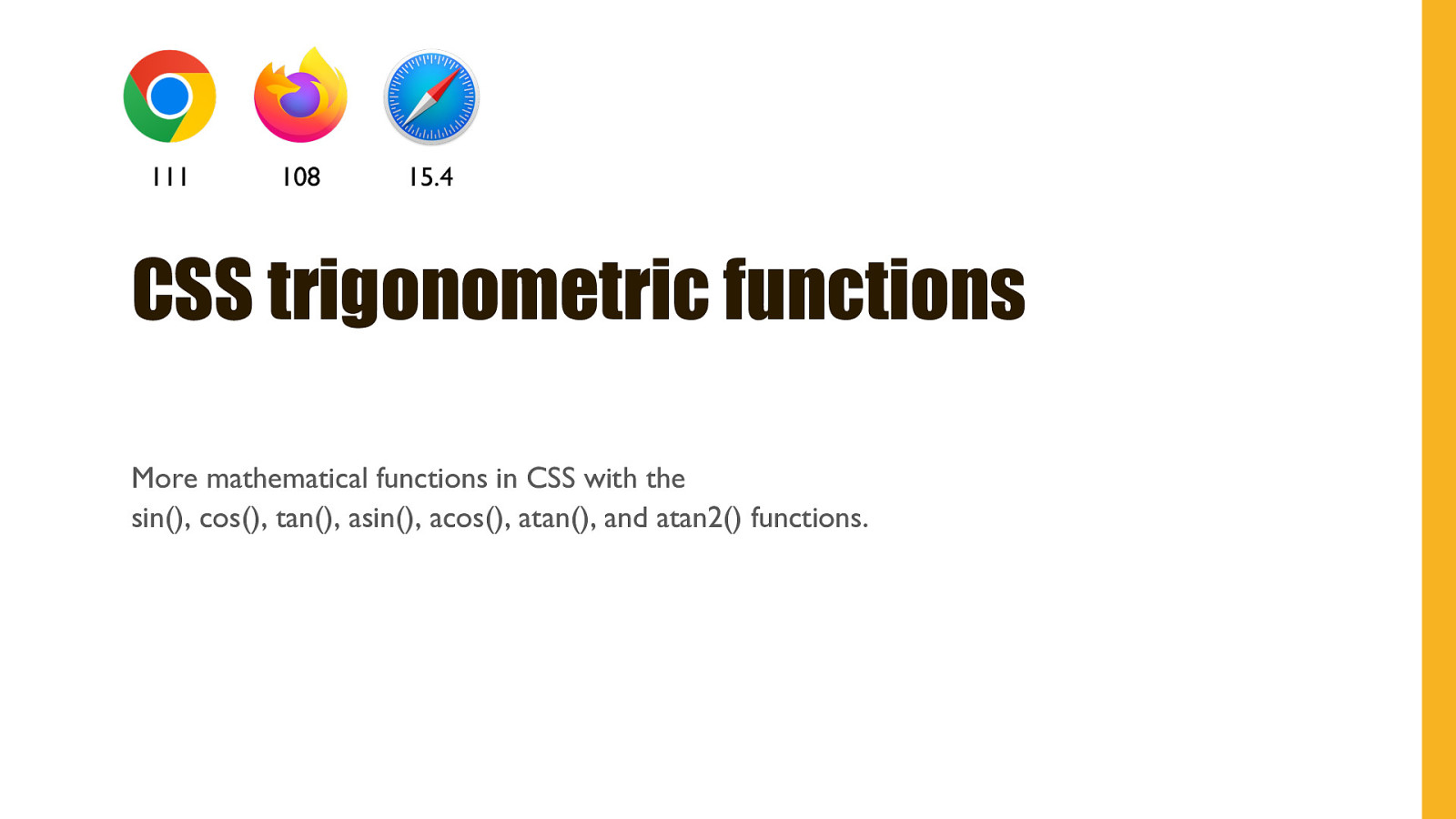
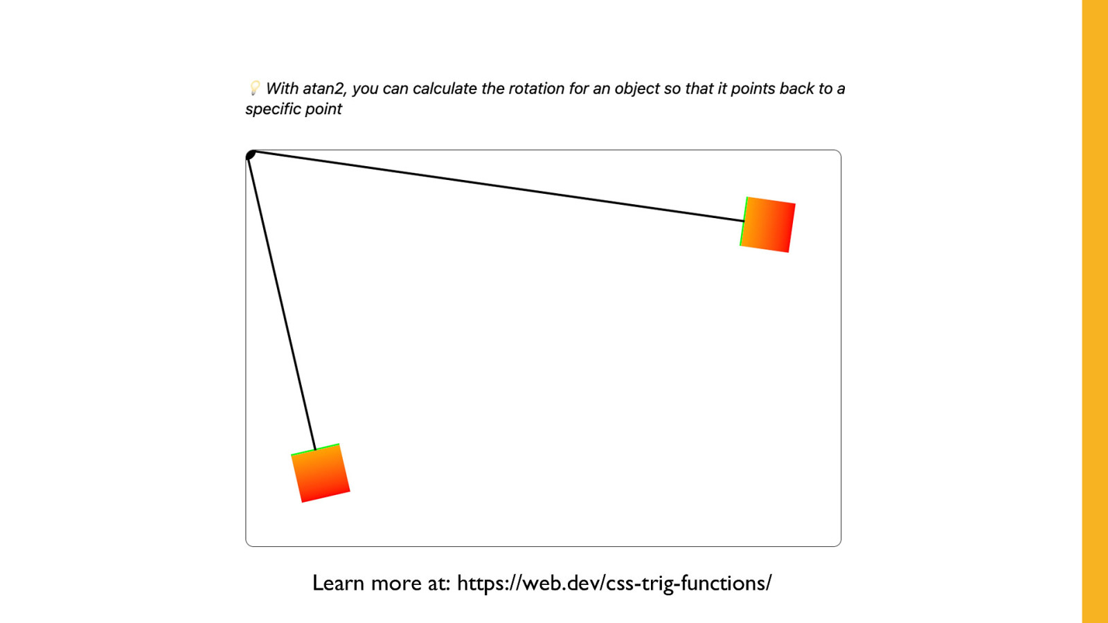
111 108 15.4 CSS trigonometric functions More mathematical functions in CSS with the sin(), cos(), tan(), asin(), acos(), atan(), and atan2() functions.
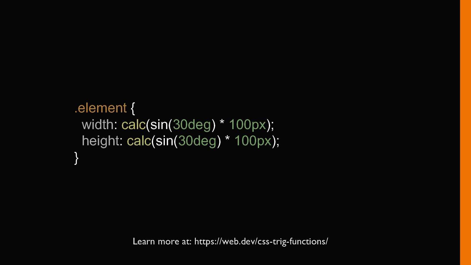
.element { width: calc(sin(30deg) * 100px); height: calc(sin(30deg) * 100px); } Learn more at: https://web.dev/css-trig-functions/
Learn more at: https://web.dev/css-trig-functions/
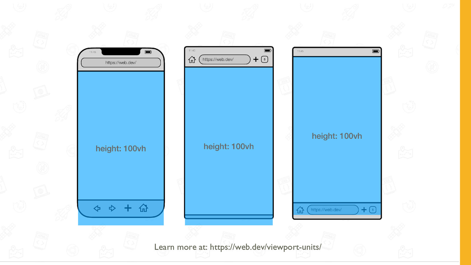
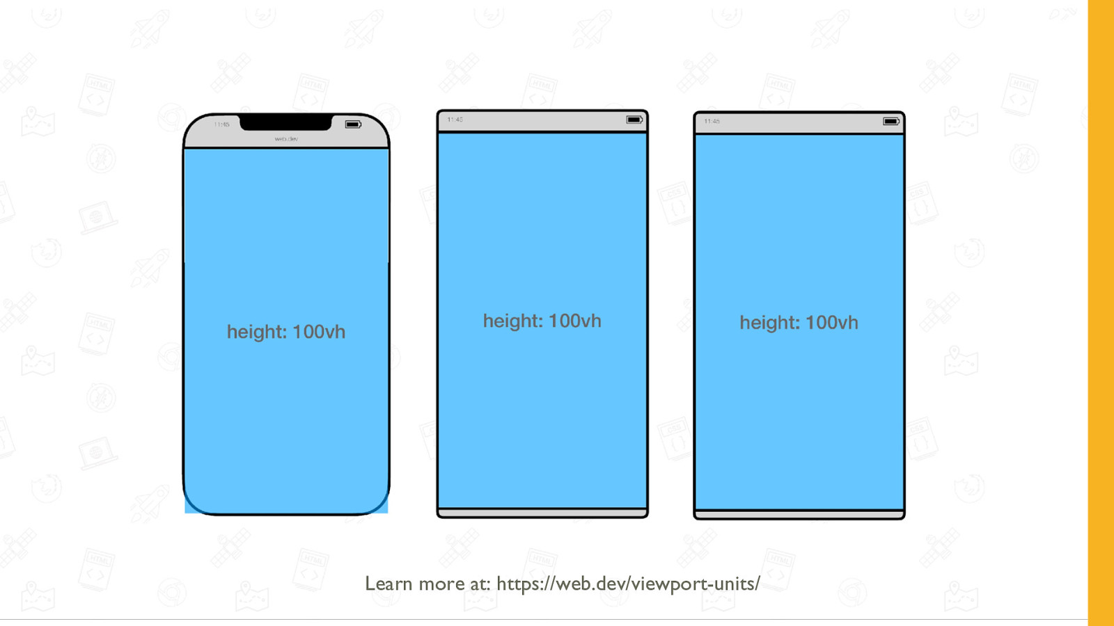
108 101 15.4 Viewport units Representing the large, small, and dynamic viewport.
Learn more at: https://web.dev/viewport-units/
Learn more at: https://web.dev/viewport-units/
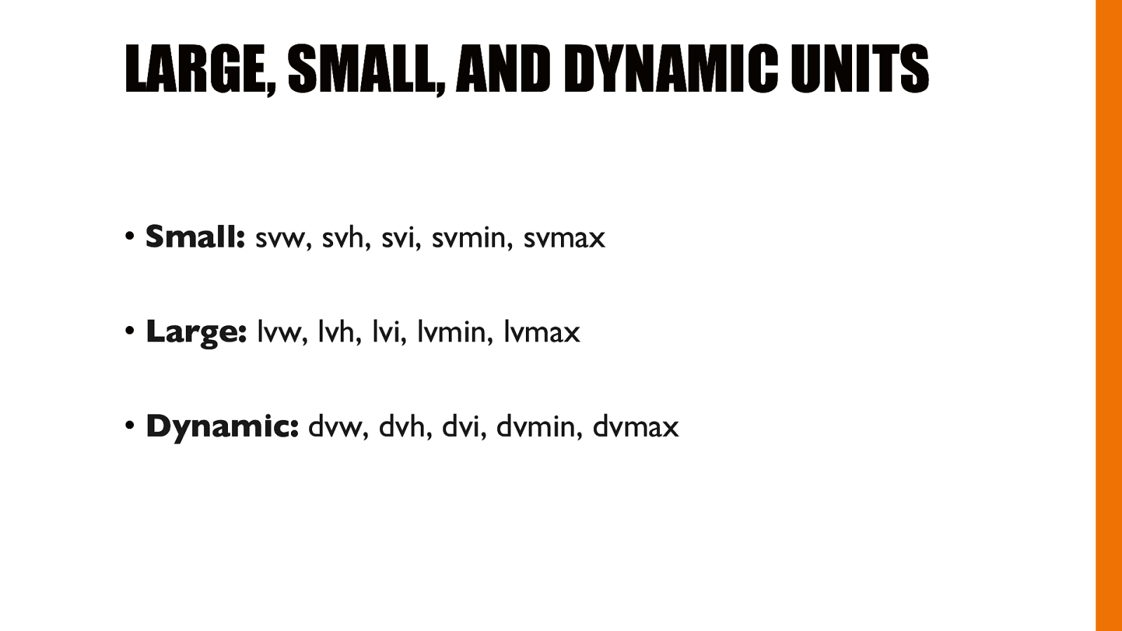
LARGE, SMALL, AND DYNAMIC UNITS • Small: svw, svh, svi, svmin, svmax • Large: lvw, lvh, lvi, lvmin, lvmax • Dynamic: dvw, dvh, dvi, dvmin, dvmax
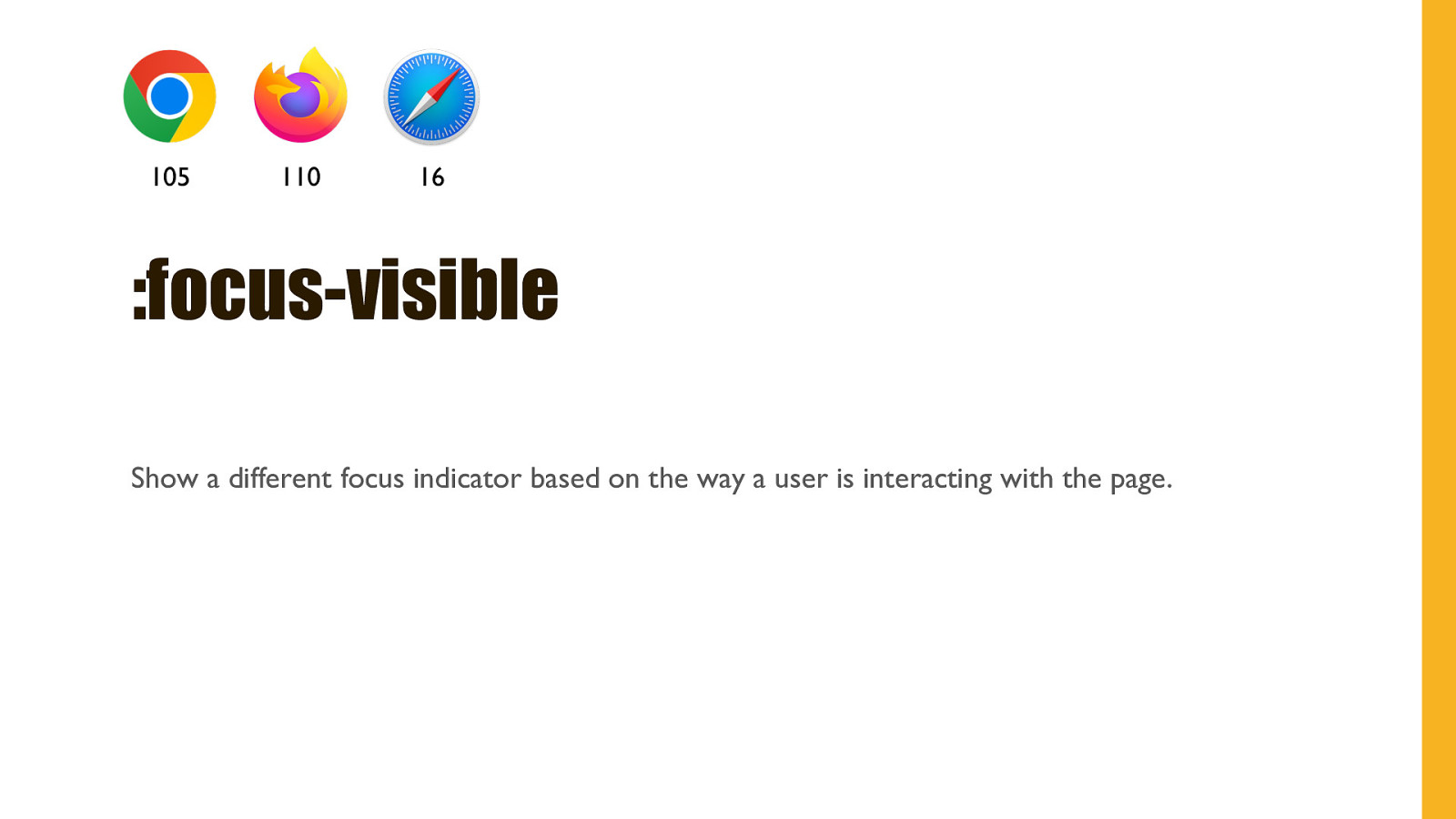
105 110 16 :focus-visible Show a different focus indicator based on the way a user is interacting with the page.
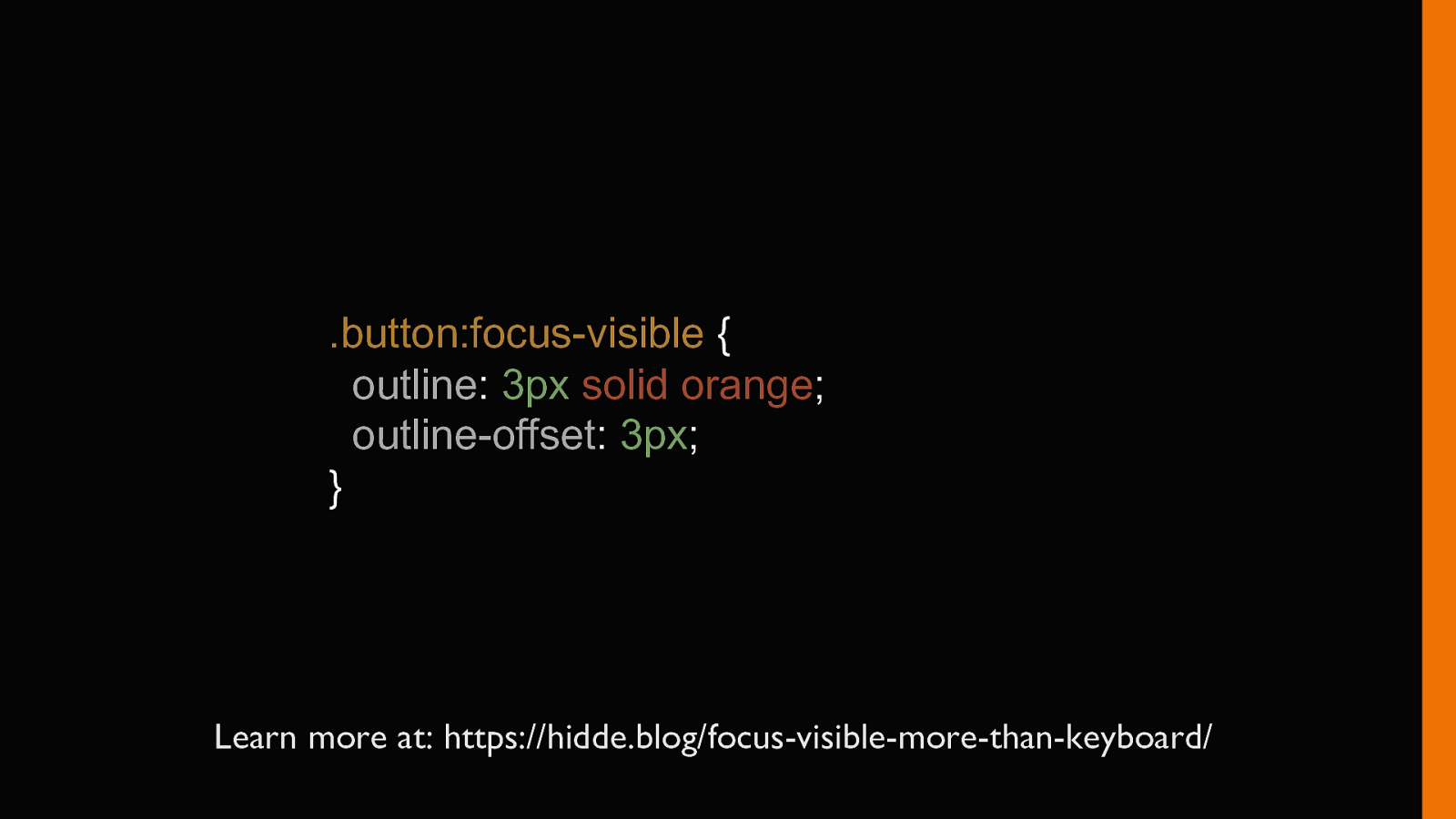
.button:focus-visible { outline: 3px solid orange; outline-offset: 3px; } Learn more at: https://hidde.blog/focus-visible-more-than-keyboard/
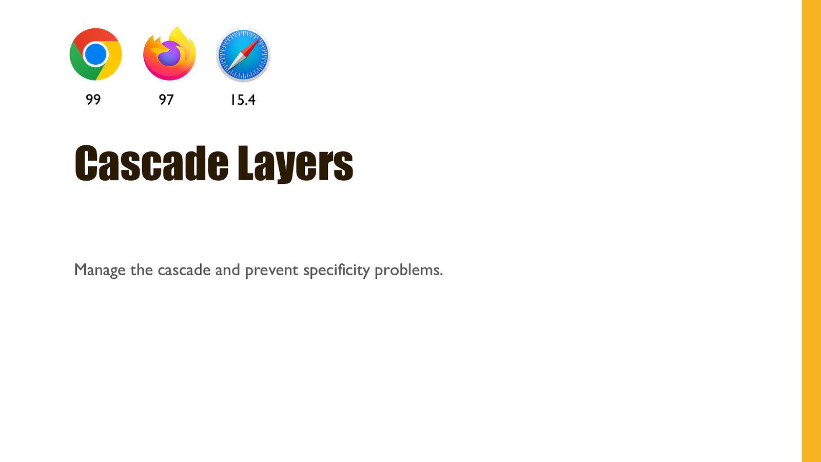
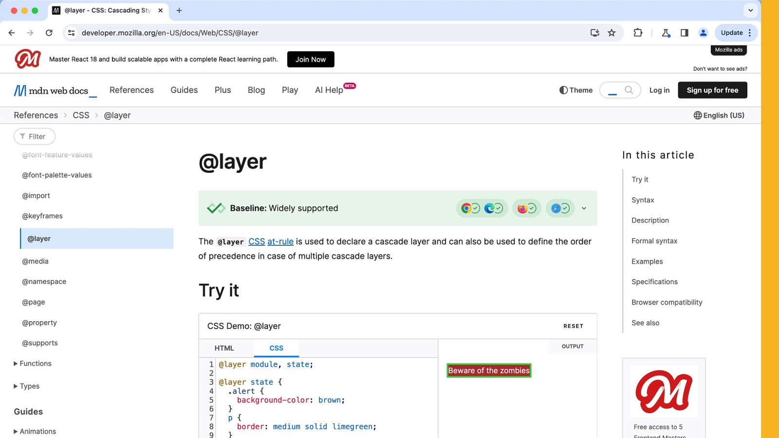
99 97 15.4 Cascade Layers Manage the cascade and prevent specificity problems.
@layer utilities { .padding-sm { padding: 0.5rem; } .padding-lg { padding: 0.8rem; } } Learn more at: https://developer.chrome.com/blog/cascade-layers/
@layer framework, layout, utilities; Learn more at: https://developer.chrome.com/blog/cascade-layers/
105 110 16 Size container queries Testing the size of the container, rather than the viewport.
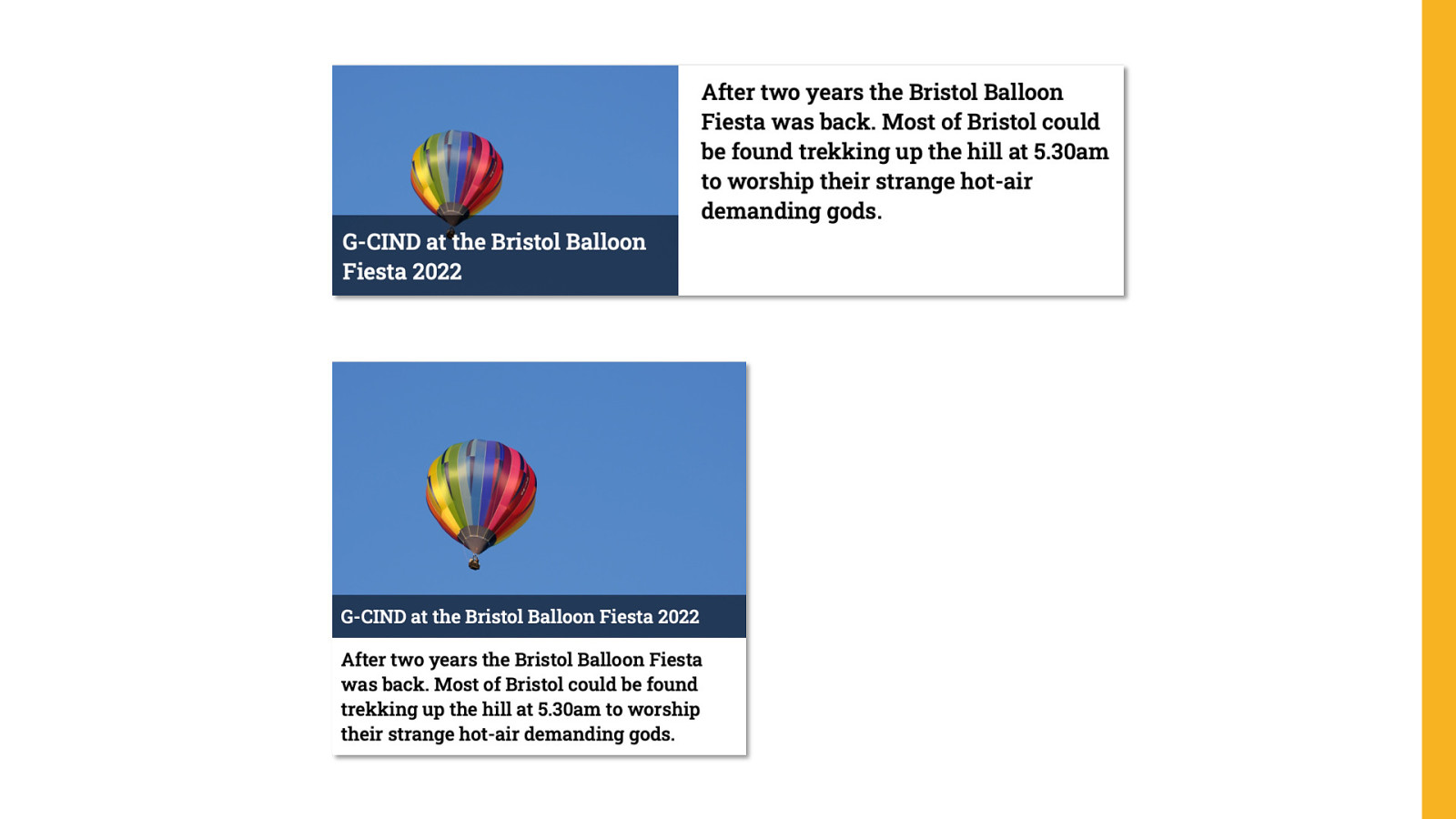
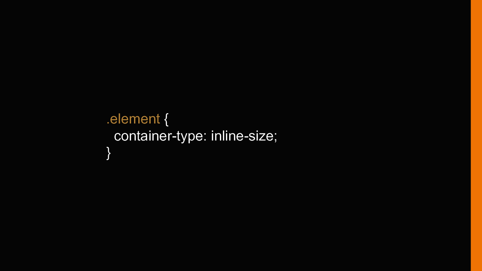
.element { container-type: inline-size; }
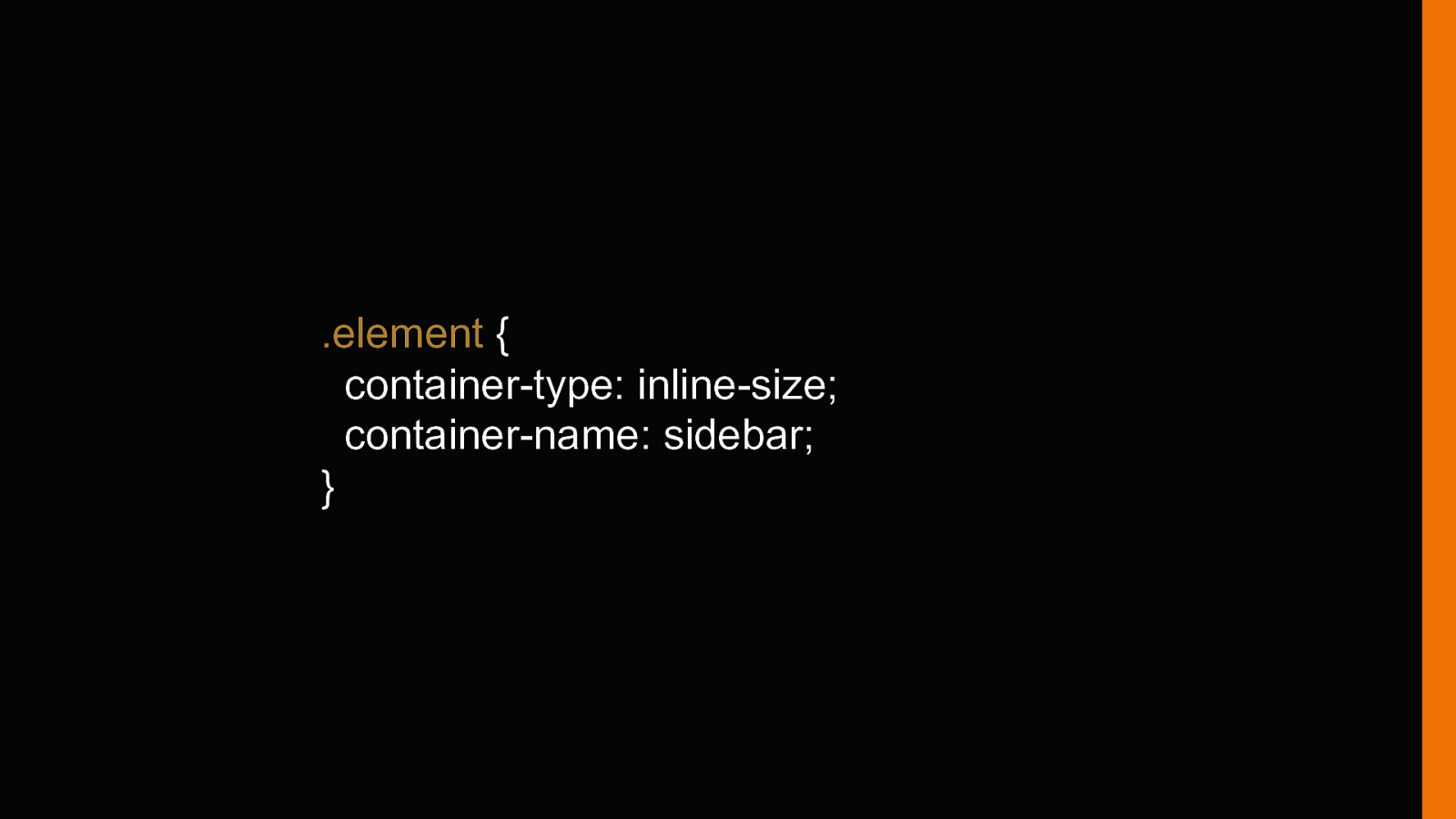
.element { container-type: inline-size; container-name: sidebar; }
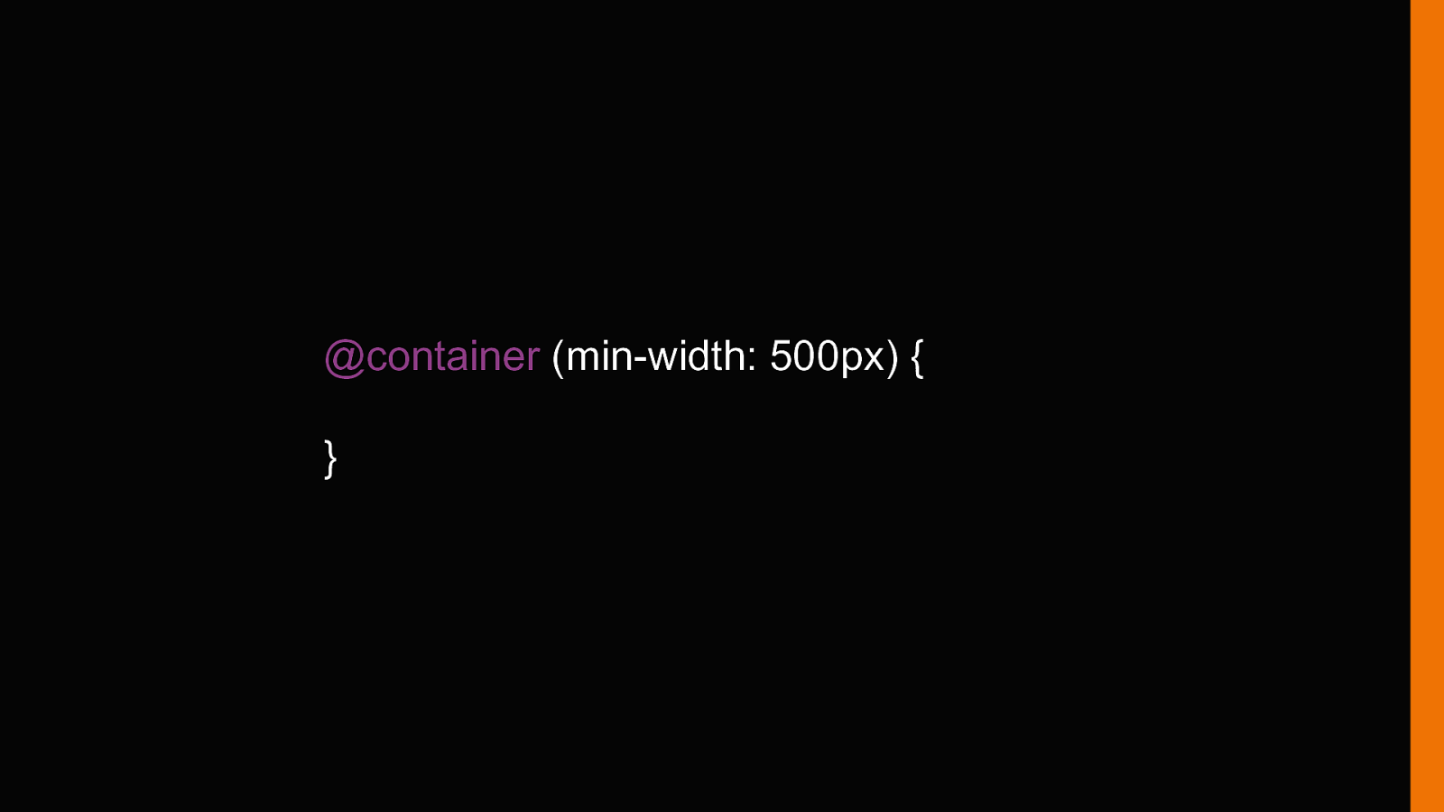
@container (min-width: 500px) { }
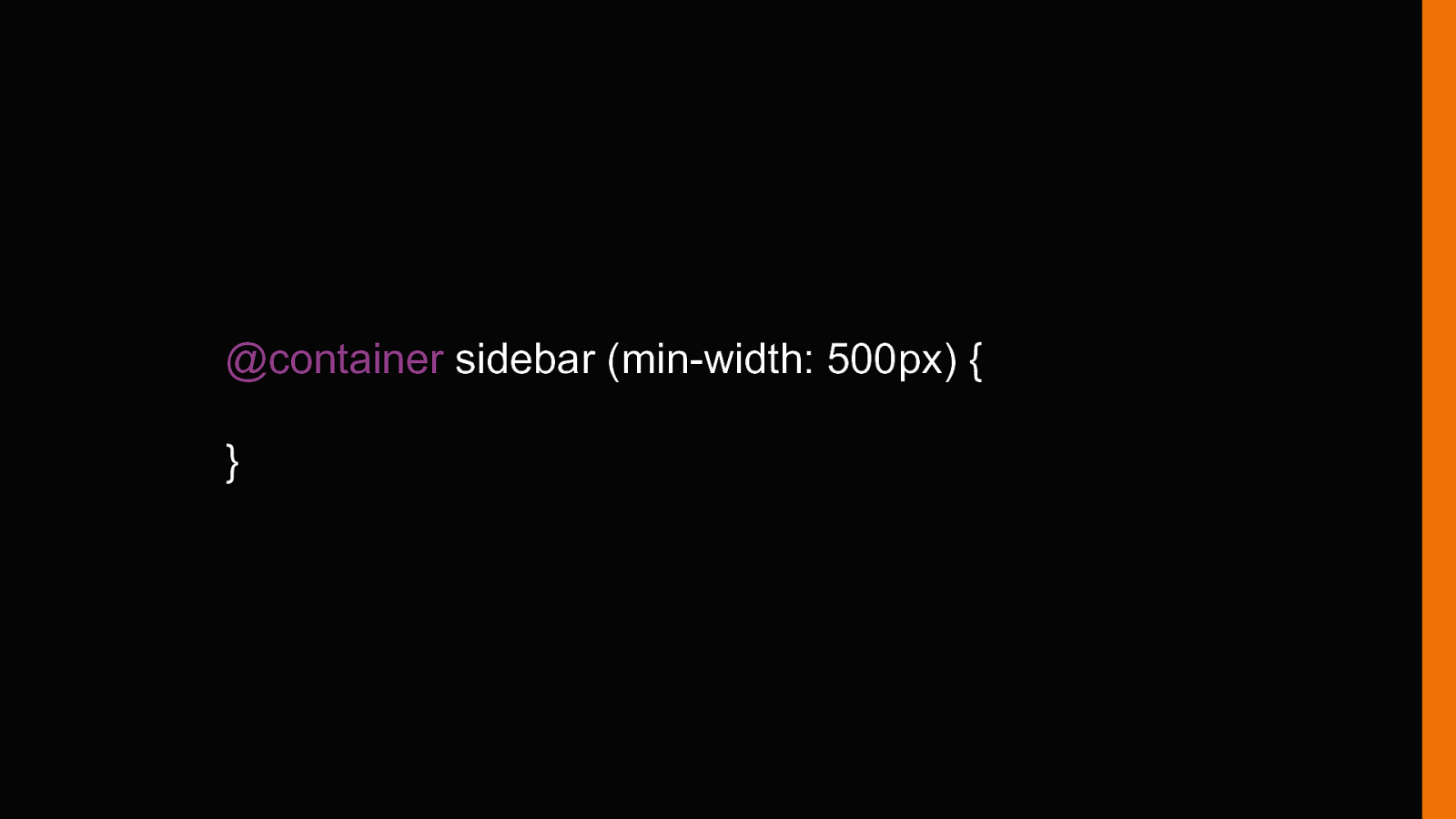
@container sidebar (min-width: 500px) { }
104 102 16.4 Media queries range syntax Streamline your media queries.
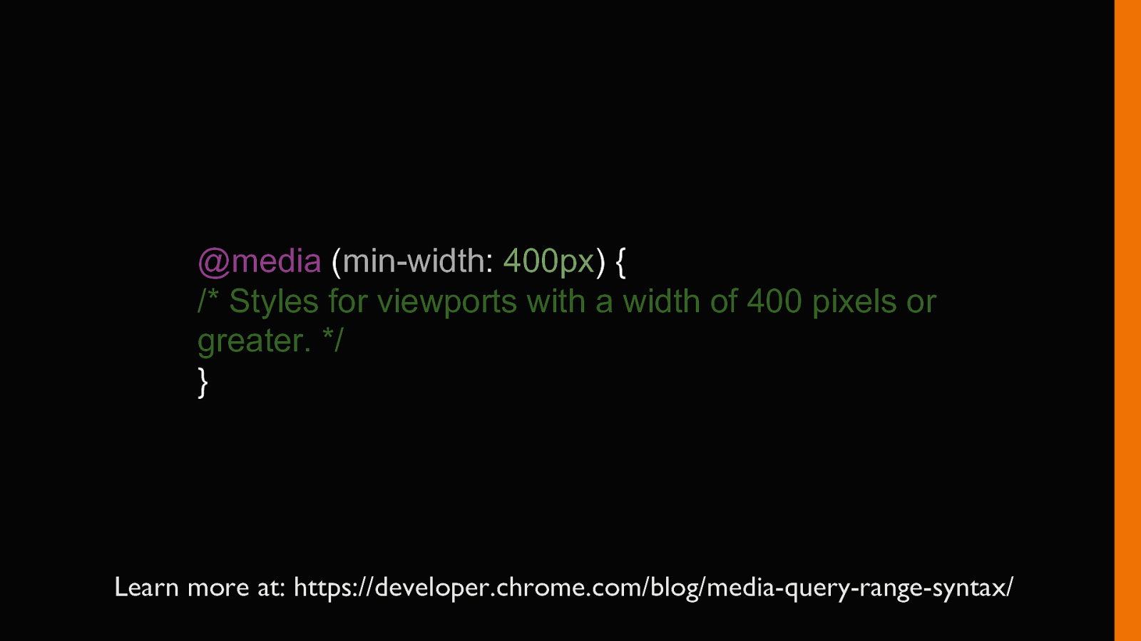
@media (min-width: 400px) { /* Styles for viewports with a width of 400 pixels or greater. */ } Learn more at: https://developer.chrome.com/blog/media-query-range-syntax/
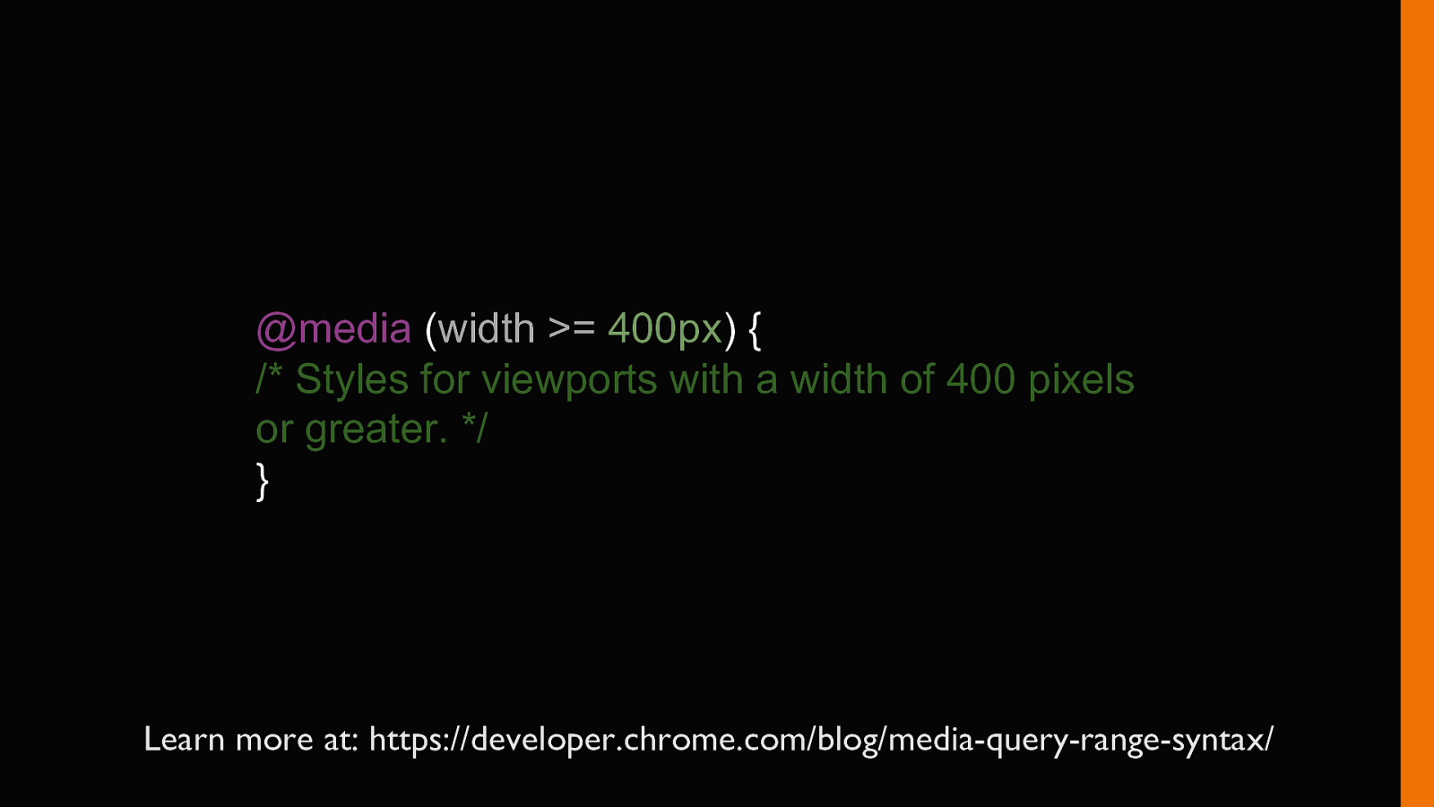
@media (width >= 400px) { /* Styles for viewports with a width of 400 pixels or greater. */ } Learn more at: https://developer.chrome.com/blog/media-query-range-syntax/
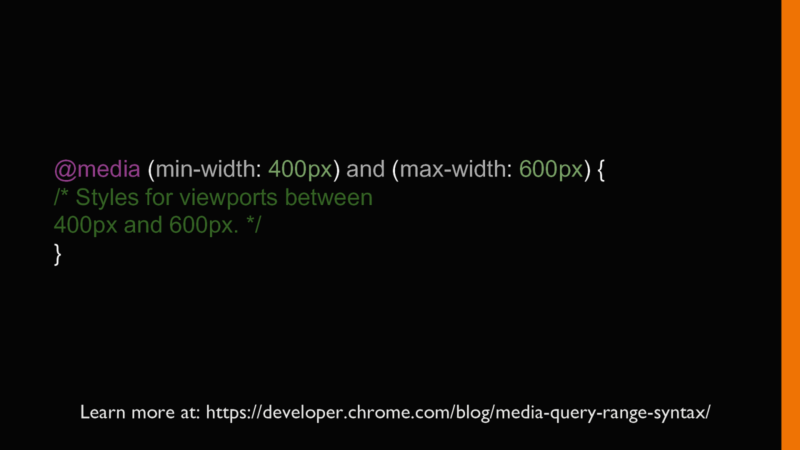
@media (min-width: 400px) and (max-width: 600px) { /* Styles for viewports between 400px and 600px. */ } Learn more at: https://developer.chrome.com/blog/media-query-range-syntax/
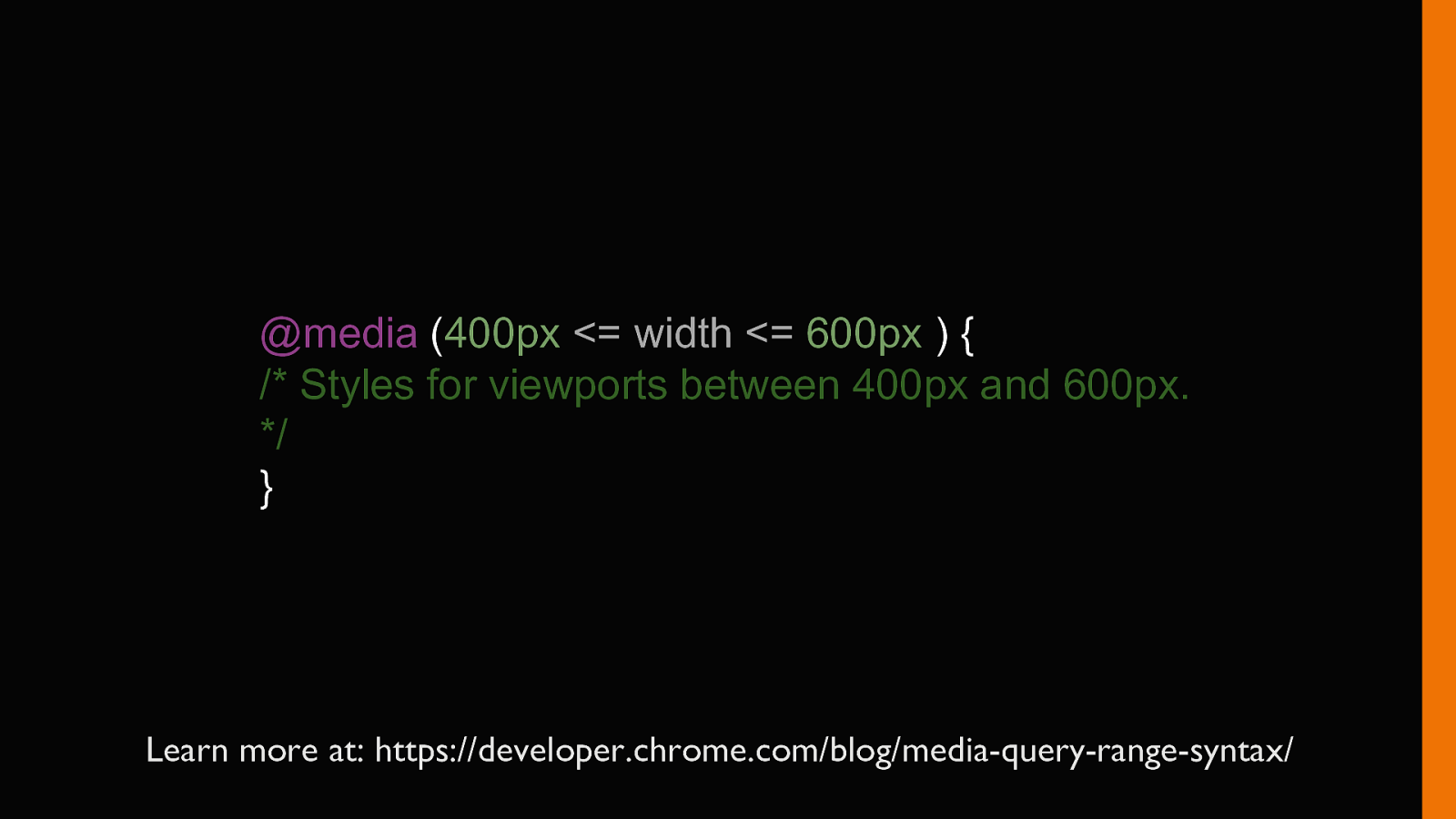
@media (400px <= width <= 600px ) { /* Styles for viewports between 400px and 600px. */ } Learn more at: https://developer.chrome.com/blog/media-query-range-syntax/
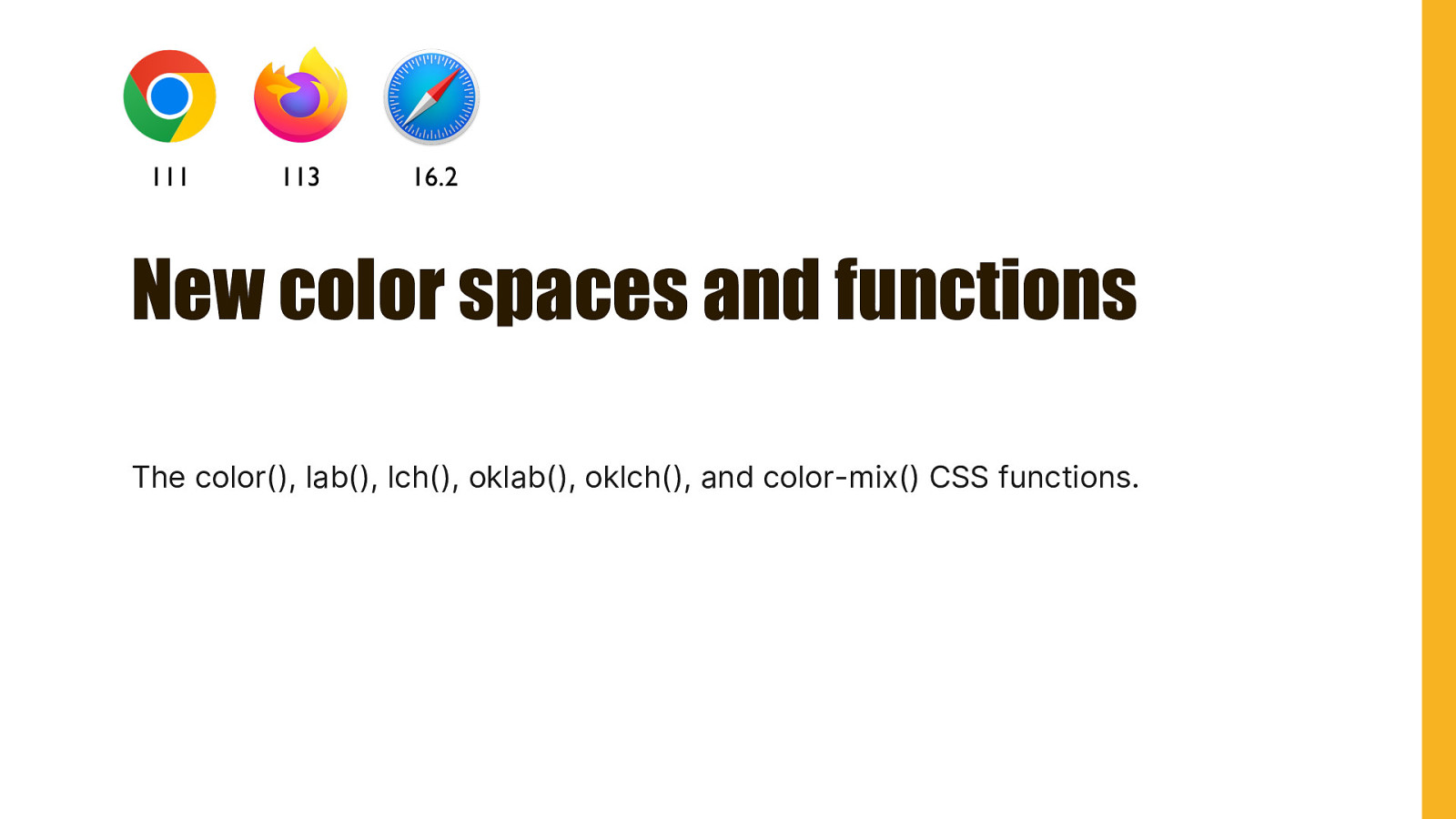
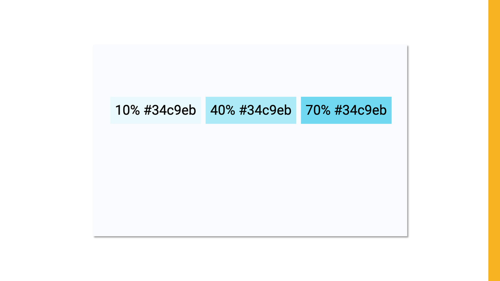
111 113 16.2 New color spaces and functions The color(), lab(), lch(), oklab(), oklch(), and color-mix() CSS functions.
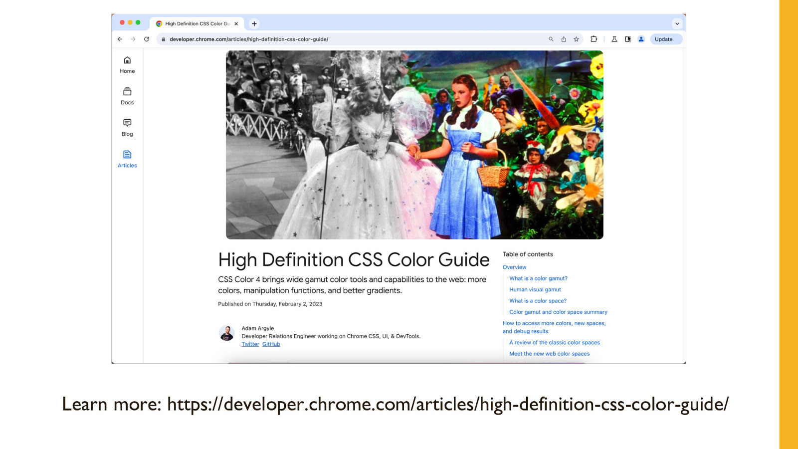
Learn more: https://developer.chrome.com/articles/high-definition-css-color-guide/
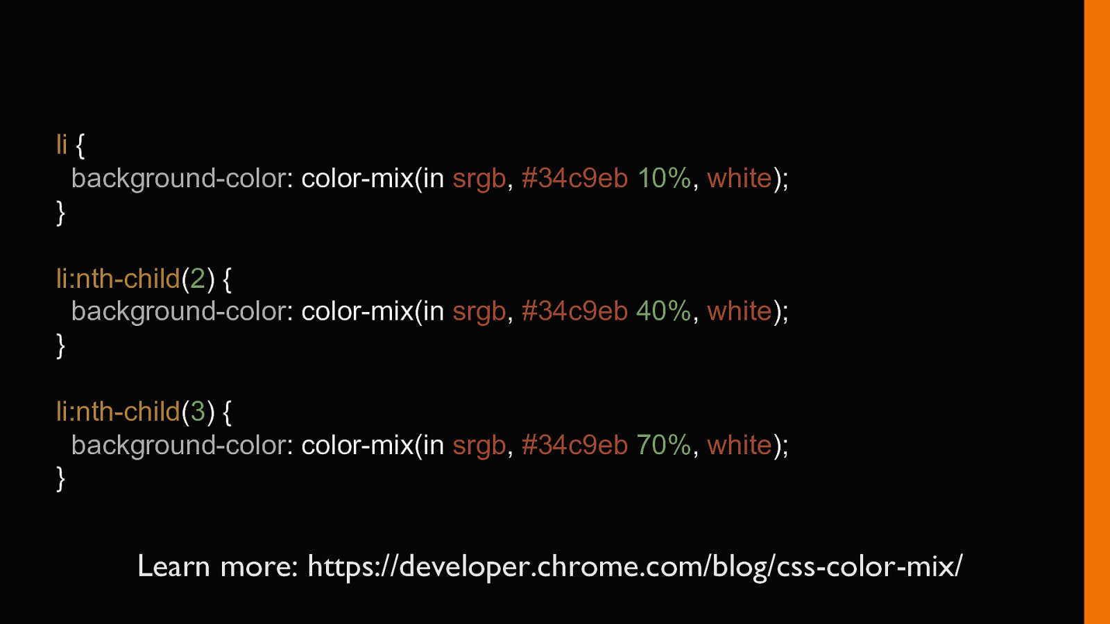
li { background-color: color-mix(in srgb, #34c9eb 10%, white); } li:nth-child(2) { background-color: color-mix(in srgb, #34c9eb 40%, white); } li:nth-child(3) { background-color: color-mix(in srgb, #34c9eb 70%, white); } Learn more: https://developer.chrome.com/blog/css-color-mix/
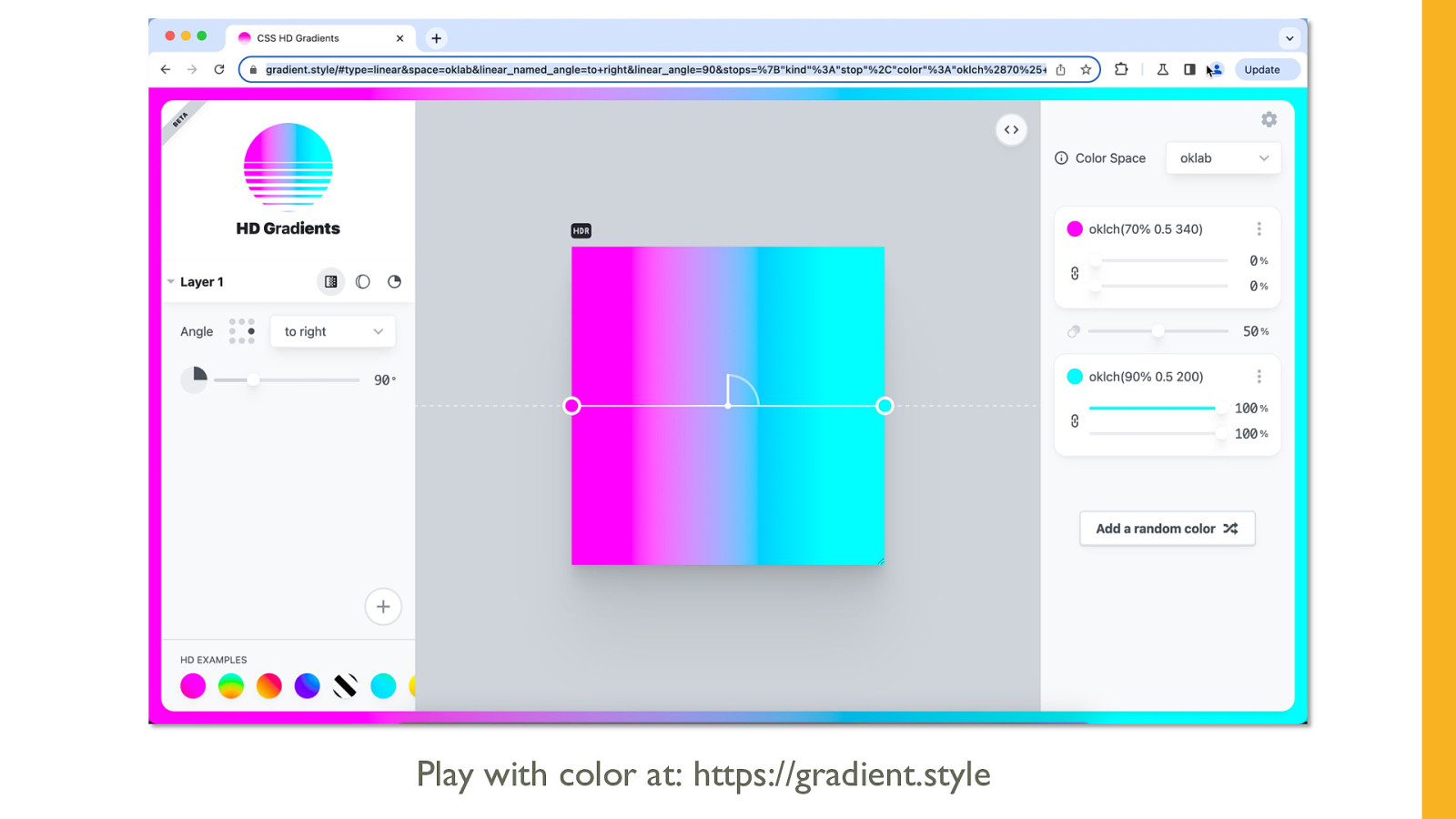
Play with color at: https://gradient.style
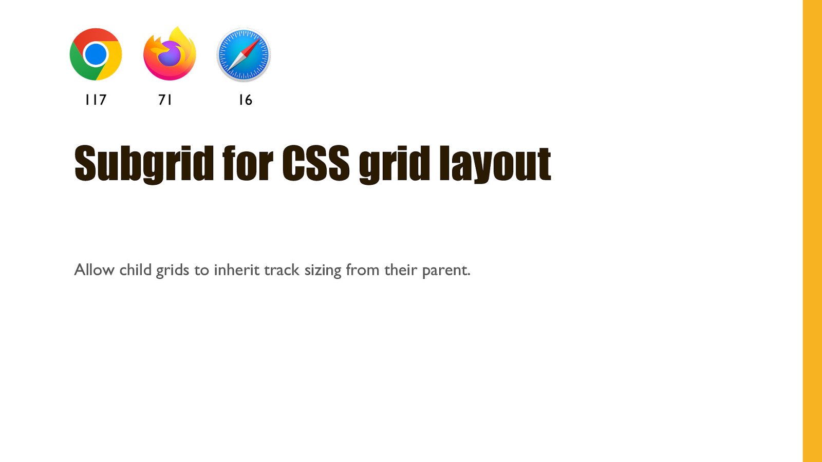
117 71 16 Subgrid for CSS grid layout Allow child grids to inherit track sizing from their parent.
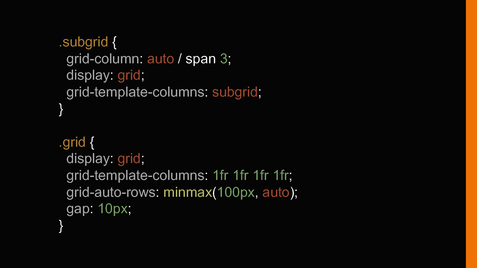
.subgrid { grid-column: auto / span 3; display: grid; grid-template-columns: subgrid; } .grid { display: grid; grid-template-columns: 1fr 1fr 1fr 1fr; grid-auto-rows: minmax(100px, auto); gap: 10px; }
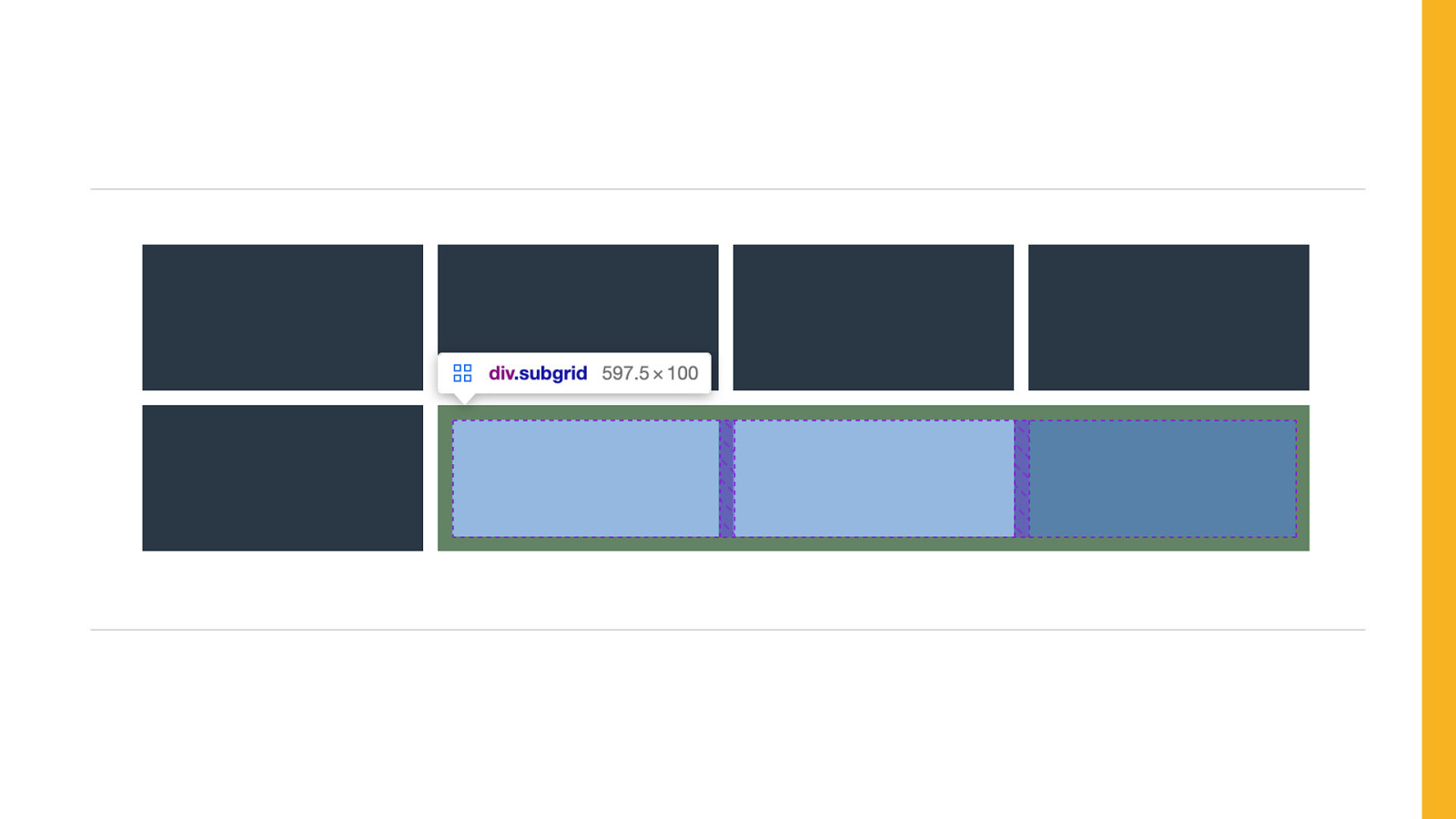
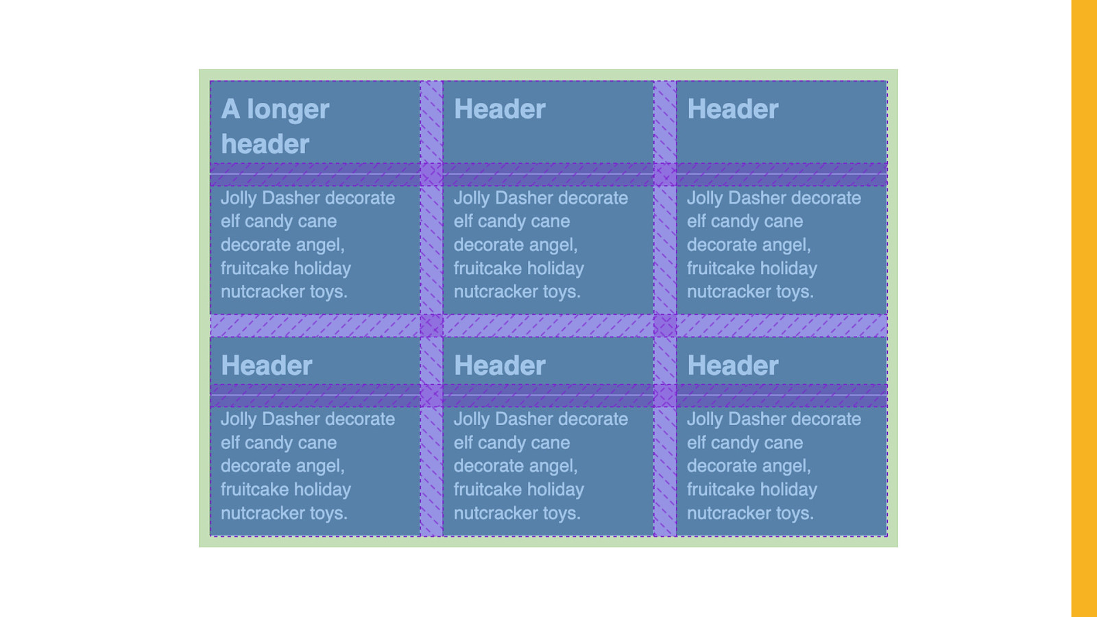
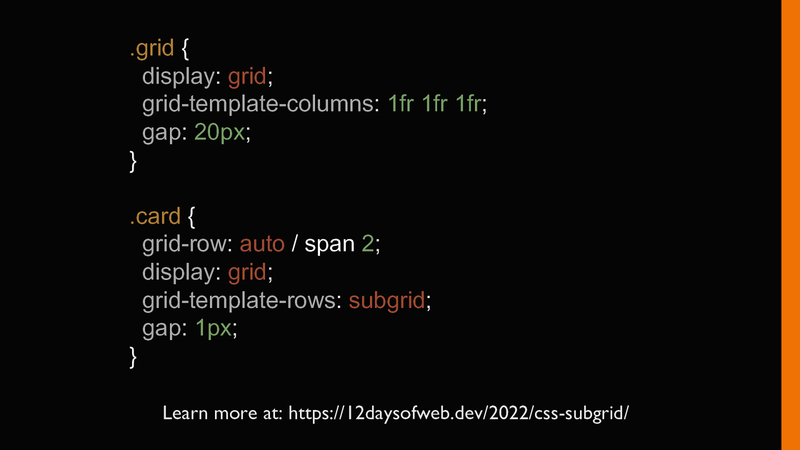
.grid { display: grid; grid-template-columns: 1fr 1fr 1fr; gap: 20px; } .card { grid-row: auto / span 2; display: grid; grid-template-rows: subgrid; gap: 1px; } Learn more at: https://12daysofweb.dev/2022/css-subgrid/

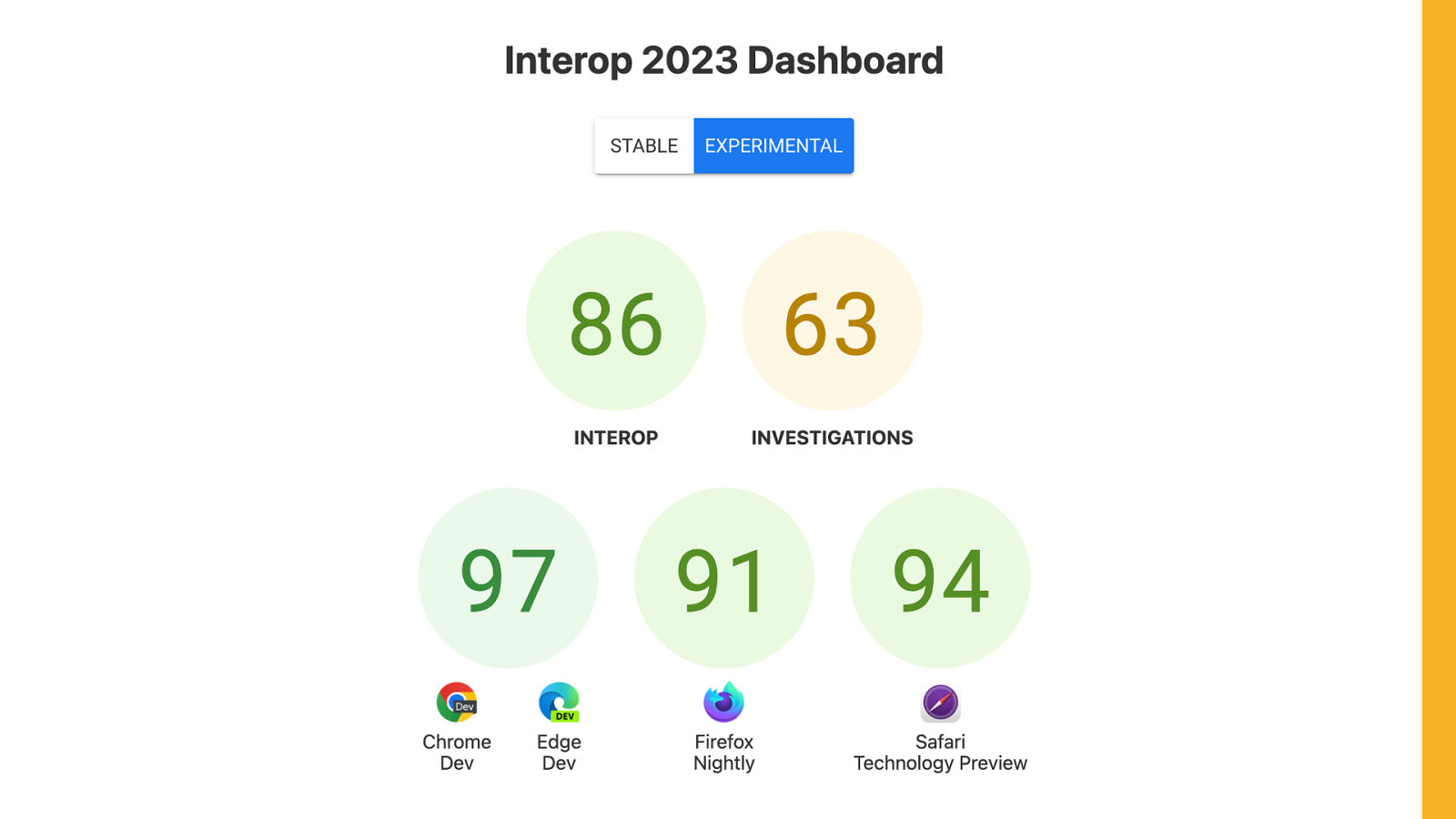
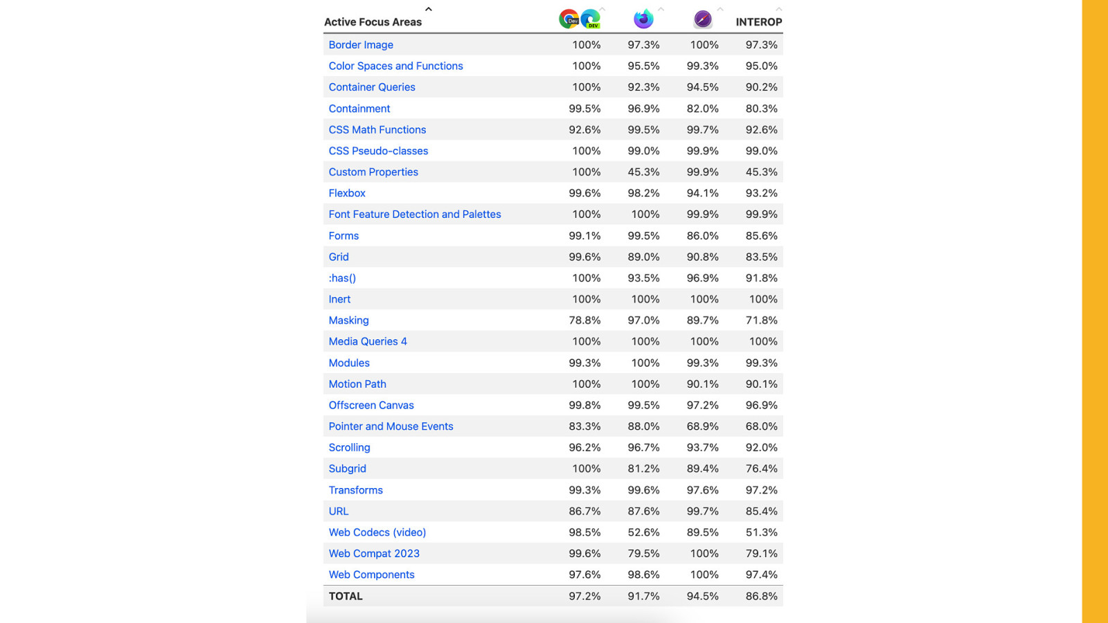
Coming soon INTEROP 2023 FEATURES.
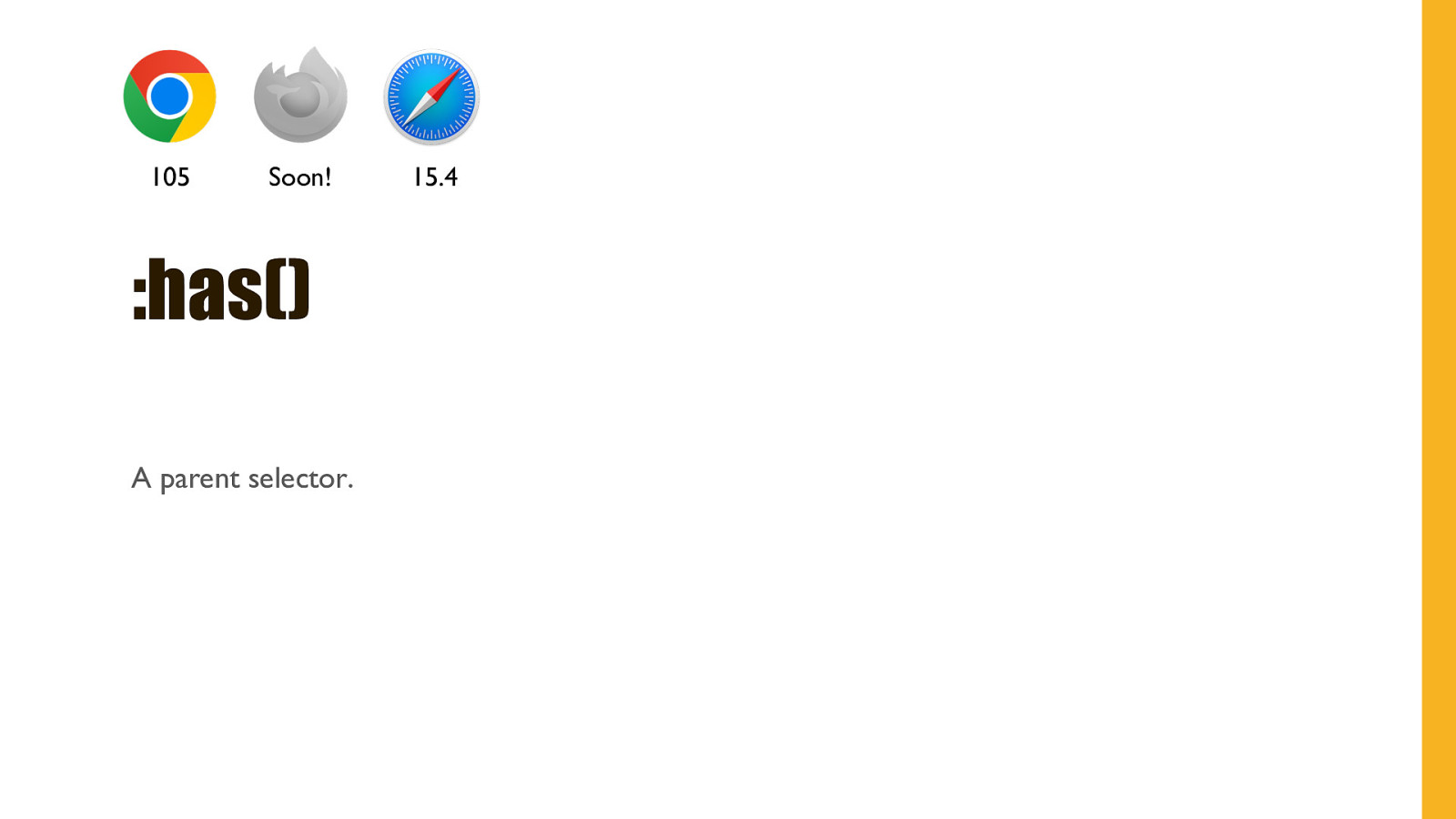
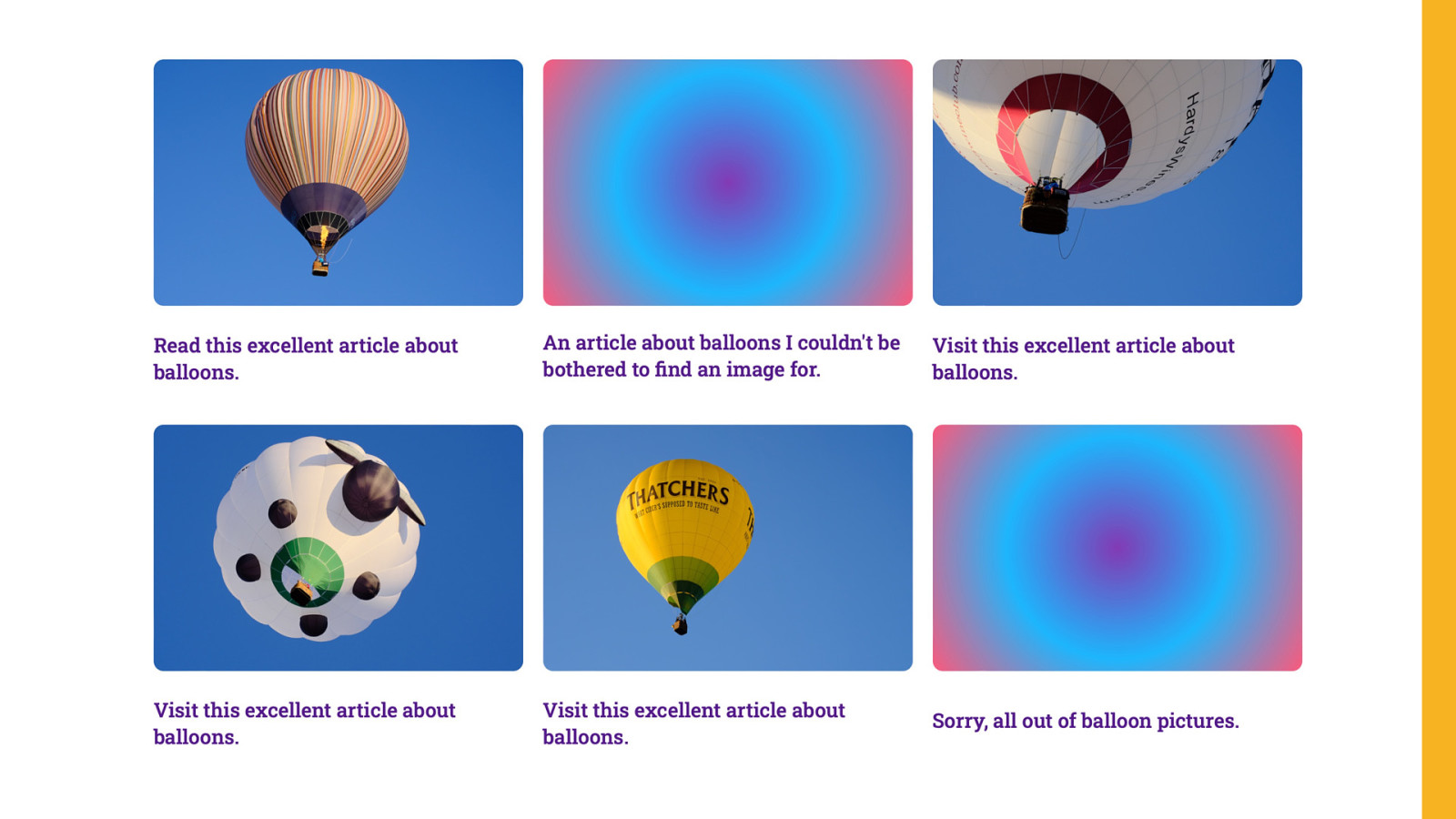
105 Soon! :has() A parent selector. 15.4
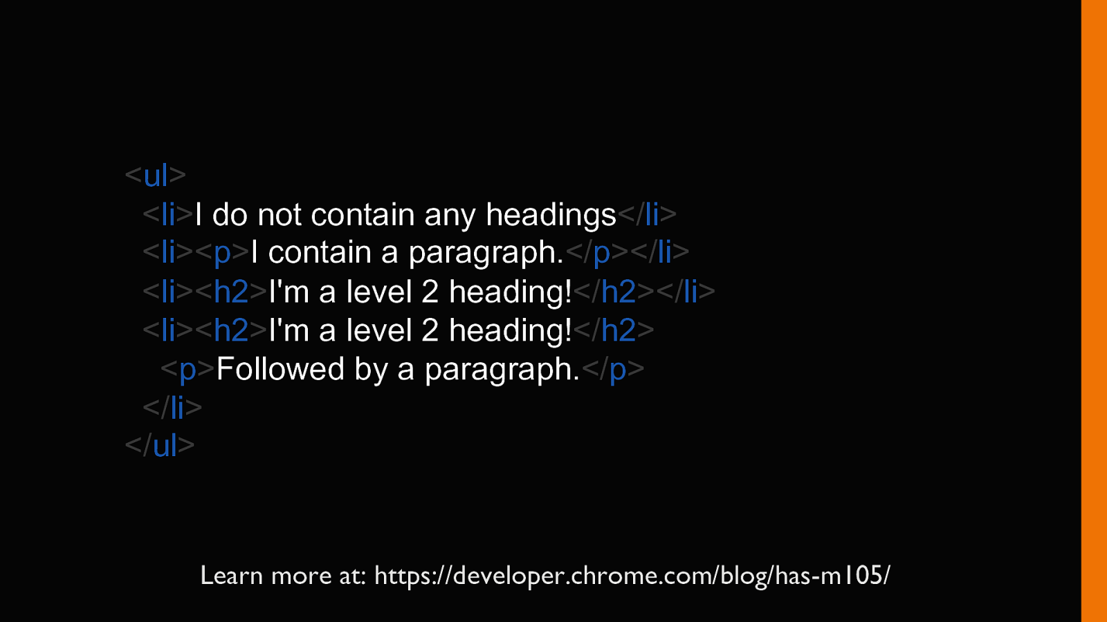
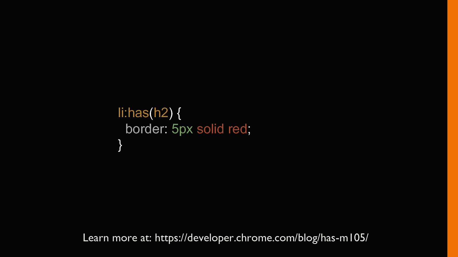
li:has(h2) { border: 5px solid red; } Learn more at: https://developer.chrome.com/blog/has-m105/
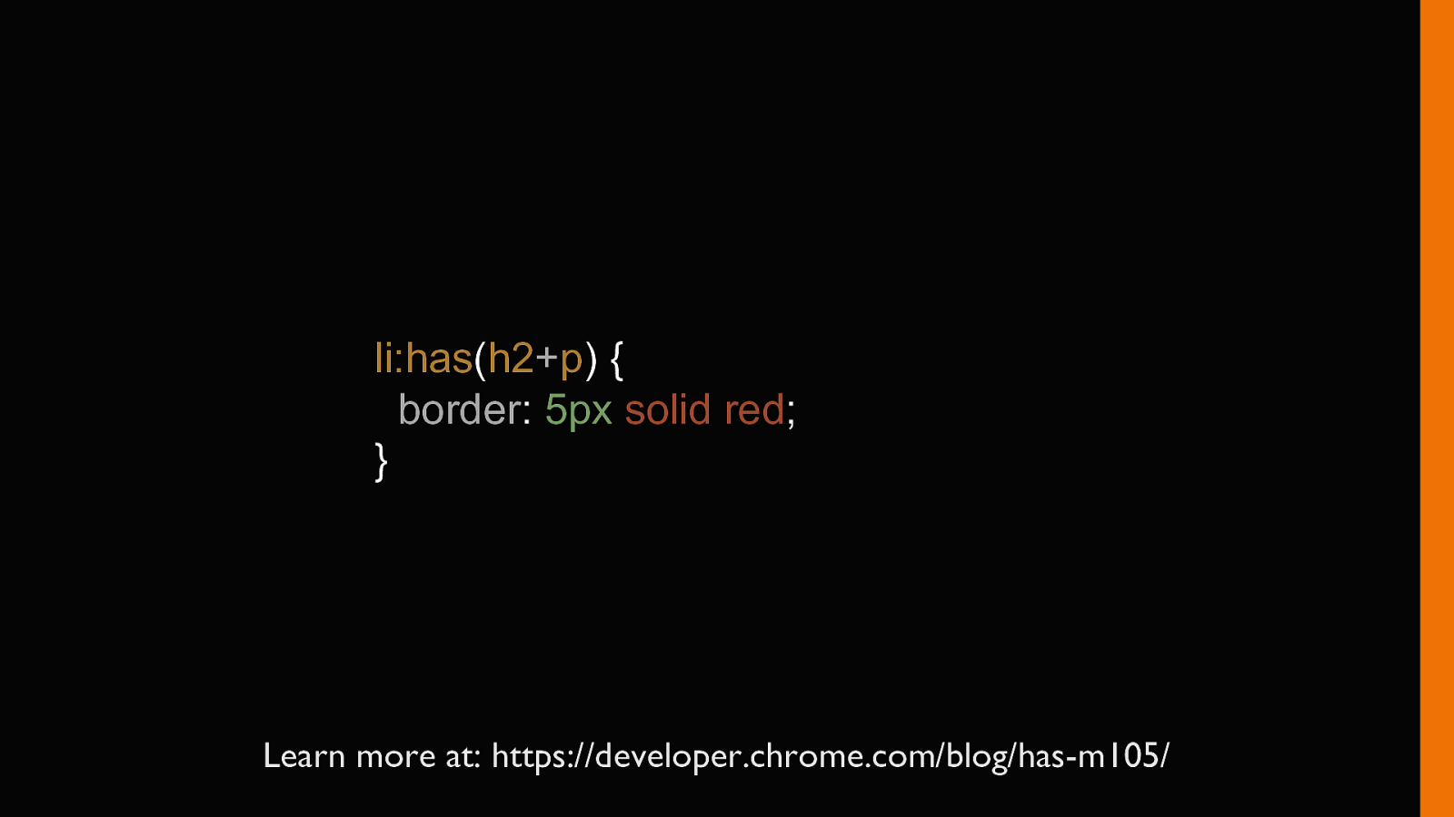
li:has(h2+p) { border: 5px solid red; } Learn more at: https://developer.chrome.com/blog/has-m105/
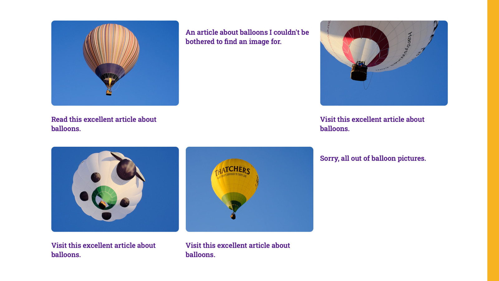
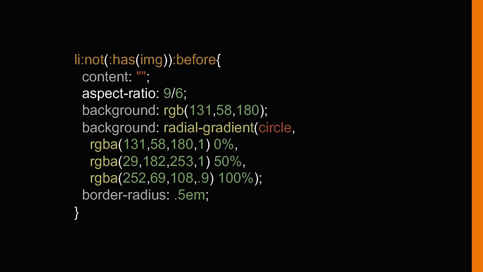
li:not(:has(img)):before{ content: “”; aspect-ratio: 9/6; background: rgb(131,58,180); background: radial-gradient(circle, rgba(131,58,180,1) 0%, rgba(29,182,253,1) 50%, rgba(252,69,108,.9) 100%); border-radius: .5em; }
85 Soon! 16.4 @property Define type, default values, and inheritance for CSS custom properties.
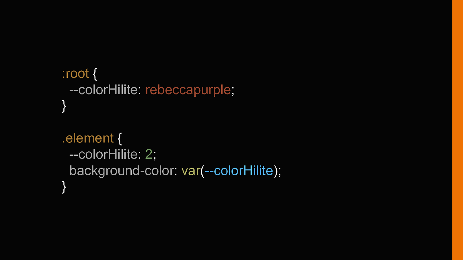
:root { —colorHilite: rebeccapurple; } .element { —colorHilite: 2; background-color: var(—colorHilite); }
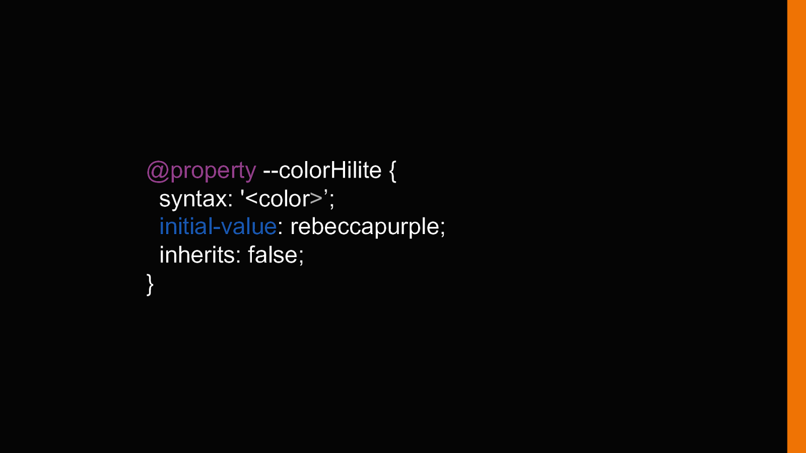
@property —colorHilite { syntax: ‘<color>’; initial-value: rebeccapurple; inherits: false; }
Interop 2024 is happening https://web.dev/interop-2024-proposals/
https://web.dev/baseline/