START USING CSS GRID LAYOUT TODAY @rachelandrew @ DevFest Nantes Hello,

A presentation at GDG DevFest Nantes in October 2017 in Nantes, France by Rachel Andrew
START USING CSS GRID LAYOUT TODAY @rachelandrew @ DevFest Nantes Hello,

Rachel Andrew ▸ CSS Working Group Invited Expert ▸ Google Developer Expert ▸ co-founder Perch CMS ▸ Old Nerd. ▸ You can fi nd me in most places as @rachelandrew you can email me@rachelandrew.co.uk or check out my site at https://rachelandrew.co.uk
So, this is me and some of the places you might find me online. I am always interested in talking about this stu ff . It’s why I’m here.
And perhaps some of you know a little bit about the stu ff I’ve been doing around a little CSS specification called CSS Grid layout. I spent years telling people about this upcoming specification, until I’m pretty sure many people thought I was promoting some kind of CSS vapourware,
Until in March this year grid landed almost simultaneously in the production versions of Firefox, Chrome, Safari, iOS safari and Opera
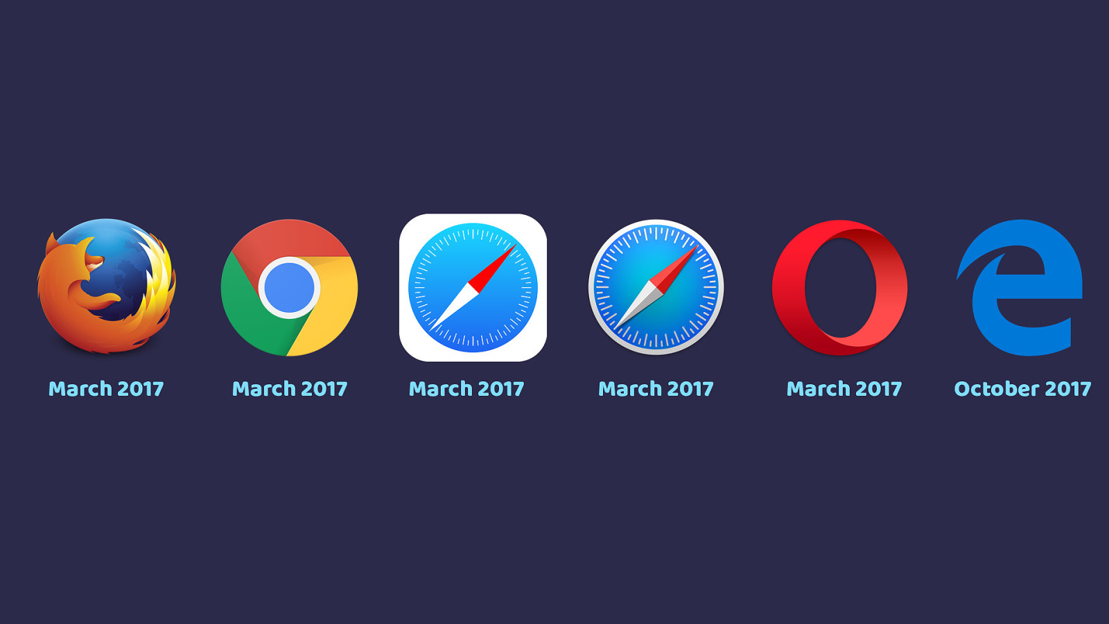
March 2017 March 2017 March 2017 March 2017 March 2017 October 2017 Edge have an updated version of the spec in Edge 16 which came out this week. This means we have up to date grid in every major desktop browser.
Laying out the future with grid and flexbox ▸ What is grid & why is it di ff erent to fl exbox? ▸ How do I get started using grid in production? ▸ What about old browsers? ▸ How can we help encourage browsers to give us cool new stu ff ? In the time I have I can’t teach you all of CSS Grid Layout, some you will be getting a whole lot more grid in my workshop on Wednesday. At the end of this talk I’ll give you plenty of resources. Instead of telling you everything I know, what I’m going to do is answer my most frequently asked questions.
what is grid layout and why is it di ff erent from flexbox or other layout methods
How can I get started using grid in production?
How will I deal with browsers that don’t yet support grid layout?
I also want to cover how stu ff gets into browsers, and the ways you can get involved in that.
Why not use flexbox? CSS Grid Layout I am frequently informed by the helpful people on Twitter that Flexbox exists. Why do we need a new layout method?
There is also the ba ffl ing assumption that this is a competing layout method to flexbox. As if the CSS working group are creating some sort of CSS specification deathmatch. That isn’t the case, these two specs do di ff erent things.
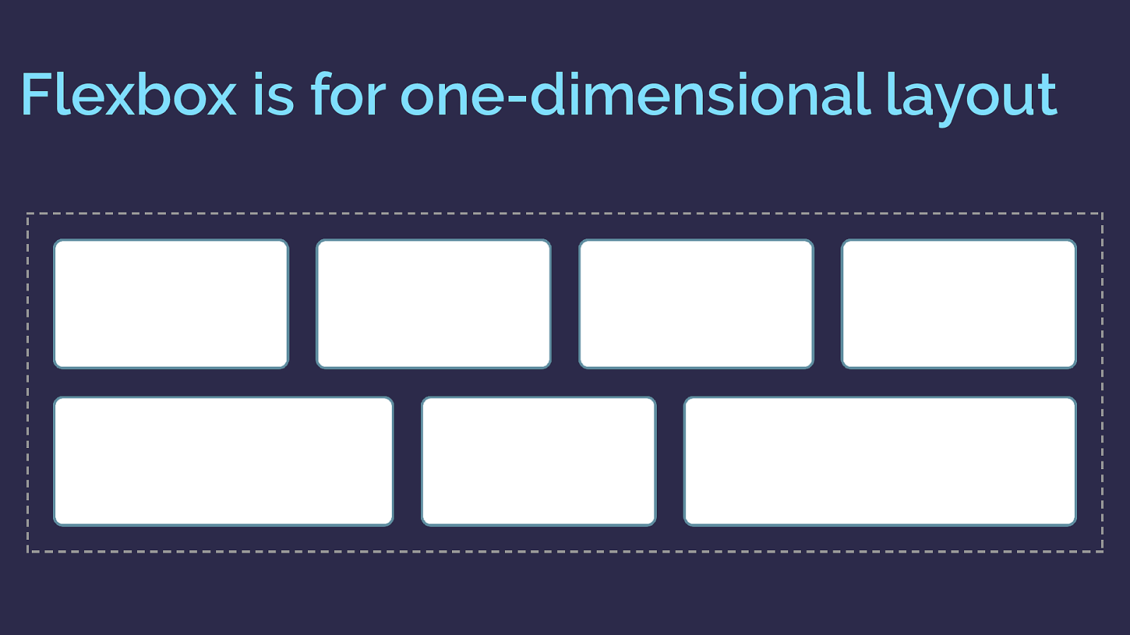
Flexbox is for one-dimensional layout There are a few answers to the grid or flexbox question. The obvious, and detailed in the spec, di ff erence is that flexbox is one dimensional, grid is two dimensional.
If you want to lay something out as a row or a column then flexbox works.
here is a flexbox example. I have a collection of items laid out with flexbox and allowed to wrap.
As you can see as they wrap they do not remain in a strict grid. So this is one dimensional layout. In this case I am controlling the main axis - the row. Each row as the items wrap is a shiny new flex container. Space distribution happens across that row.
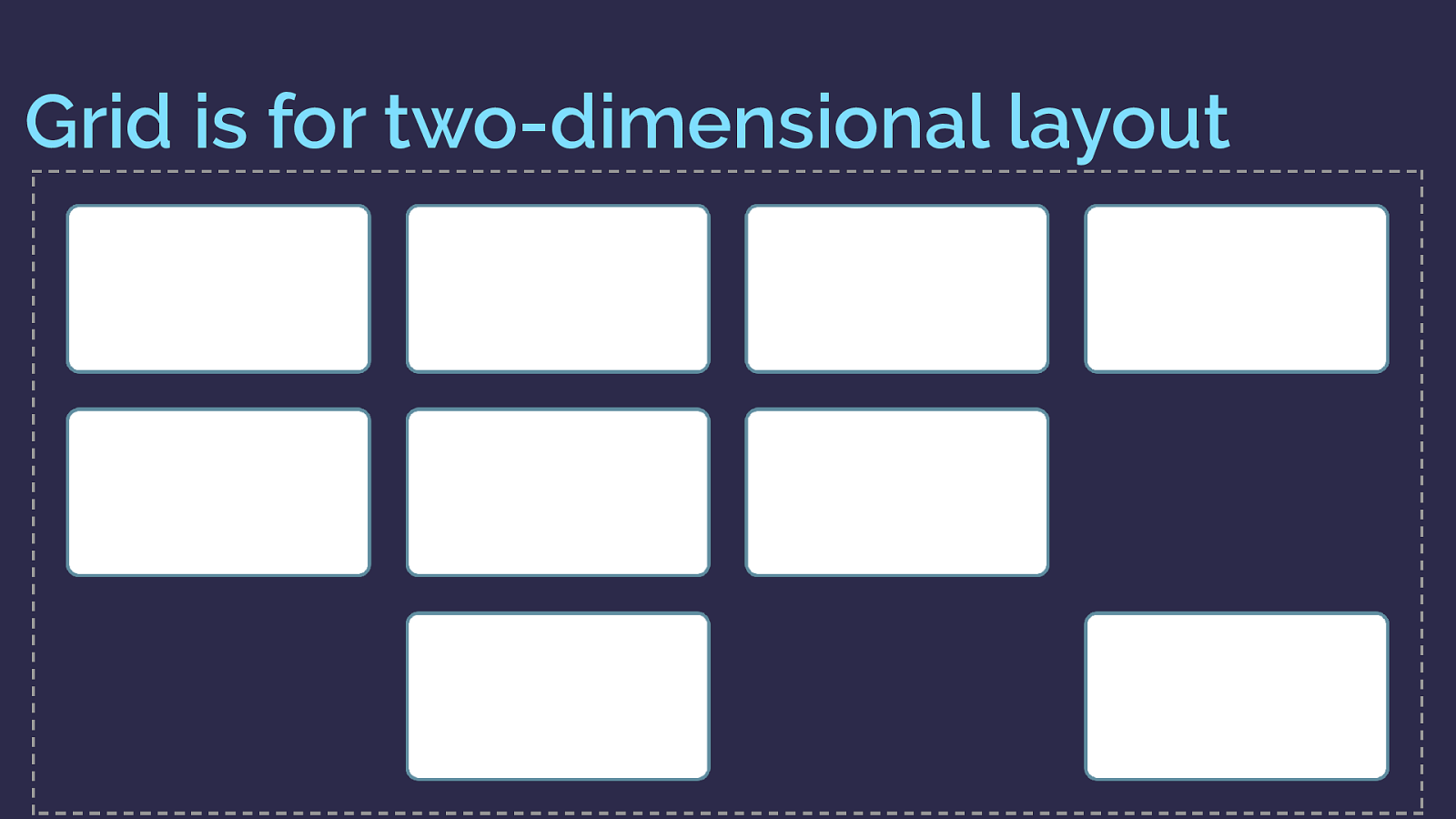
Grid is for two-dimensional layout Grid however is two dimensional
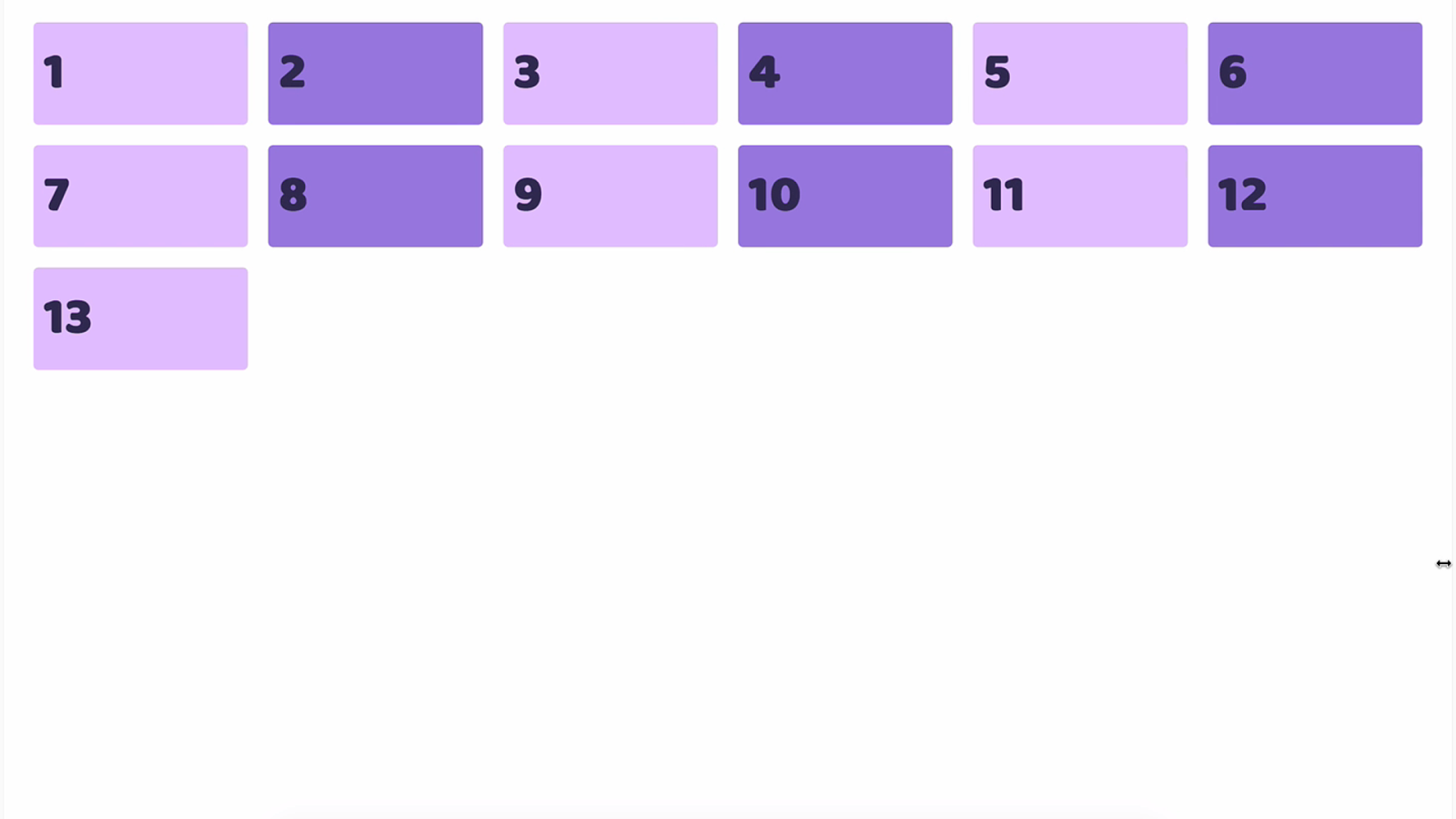
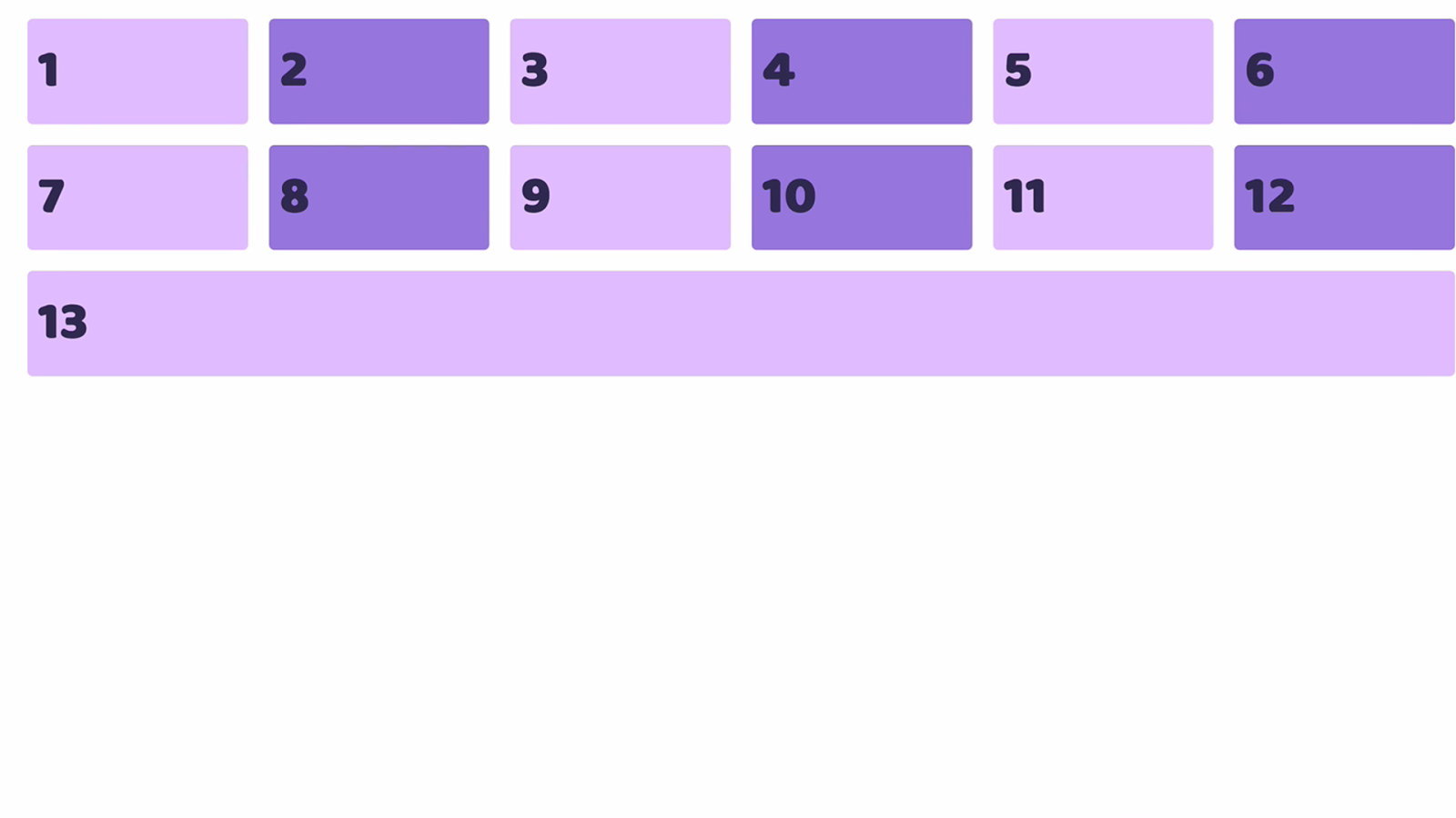
So here is the same layout with grid. You can see the items here not only create flexible rows, but also line up in their column too.
So this is two dimensional layout. A row and a column at the same time.
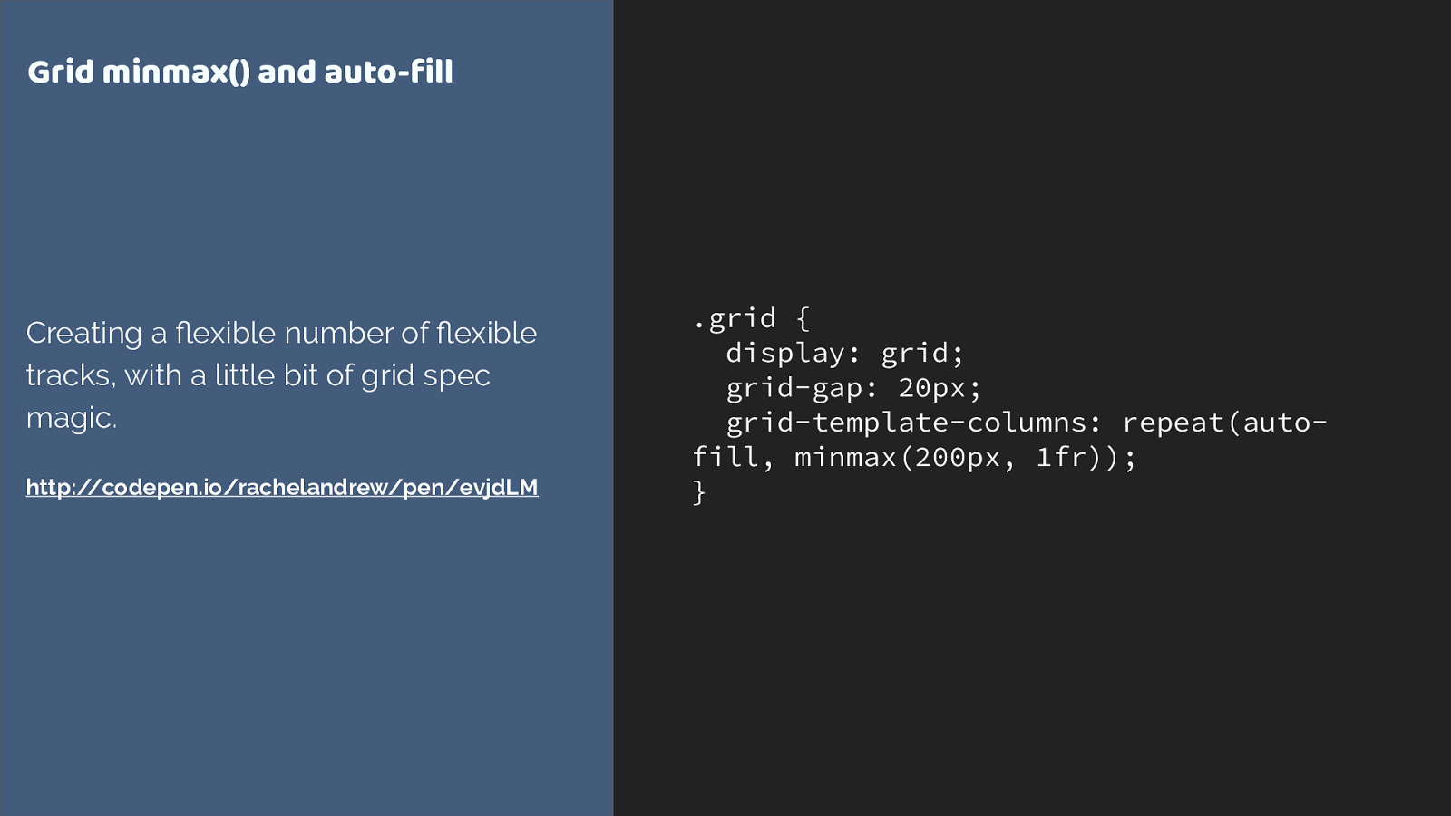
.grid { display: grid; grid-gap: 20px; grid-template-columns: repeat(auto- fill, minmax(200px, 1fr)); } Grid minmax() and auto-fill Creating a fl exible number of fl exible tracks, with a little bit of grid spec magic. http://codepen.io/rachelandrew/pen/evjdLM
This is all we need to apply to the container to create that layout.
We’re using repeat syntax, auto-filling columns that are a minimum of 200 pixels with the extra shared out between all columns as max is 1fr.
And you might be thinking, I can get round that flexbox problem by adding percentage widths to my flex items. Which is exactly the point at which you should be thinking “is this a grid issue?”
If you are adding widths to all your fl ex items, you probably need grid. As soon as you start constraining the flexibility of flexbox by adding the sort of percentage widths we use with float or inline block layouts. That is an excellent sign you really need grid.
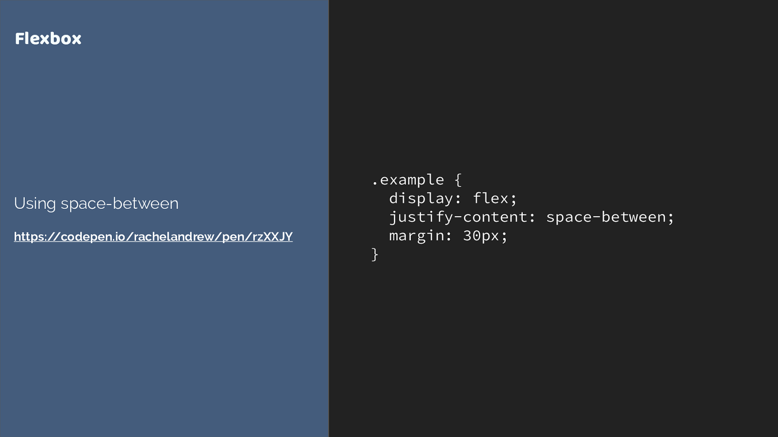
.example { display: flex; justify-content: space-between; margin: 30px; } Flexbox Using space-between https://codepen.io/rachelandrew/pen/rzXXJY
Another way to look at this, is that flexbox works from the content out and grid works layout in.
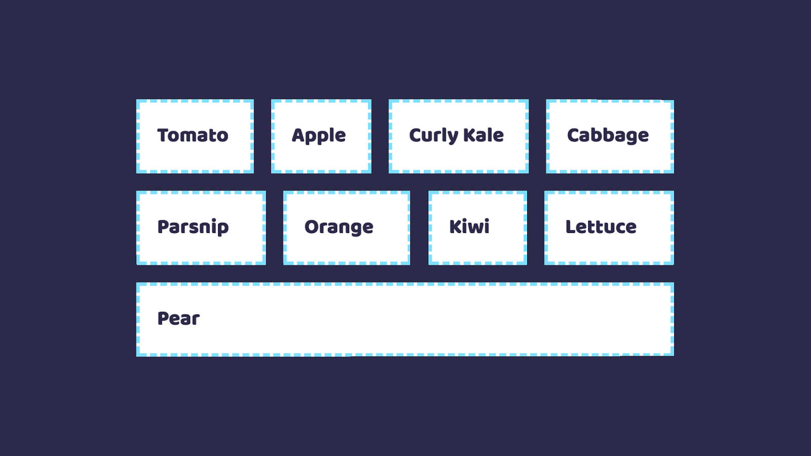
Say you have a collection of things, which could be di ff erent sizes. You want to let the content dictate the size and them all to space out.
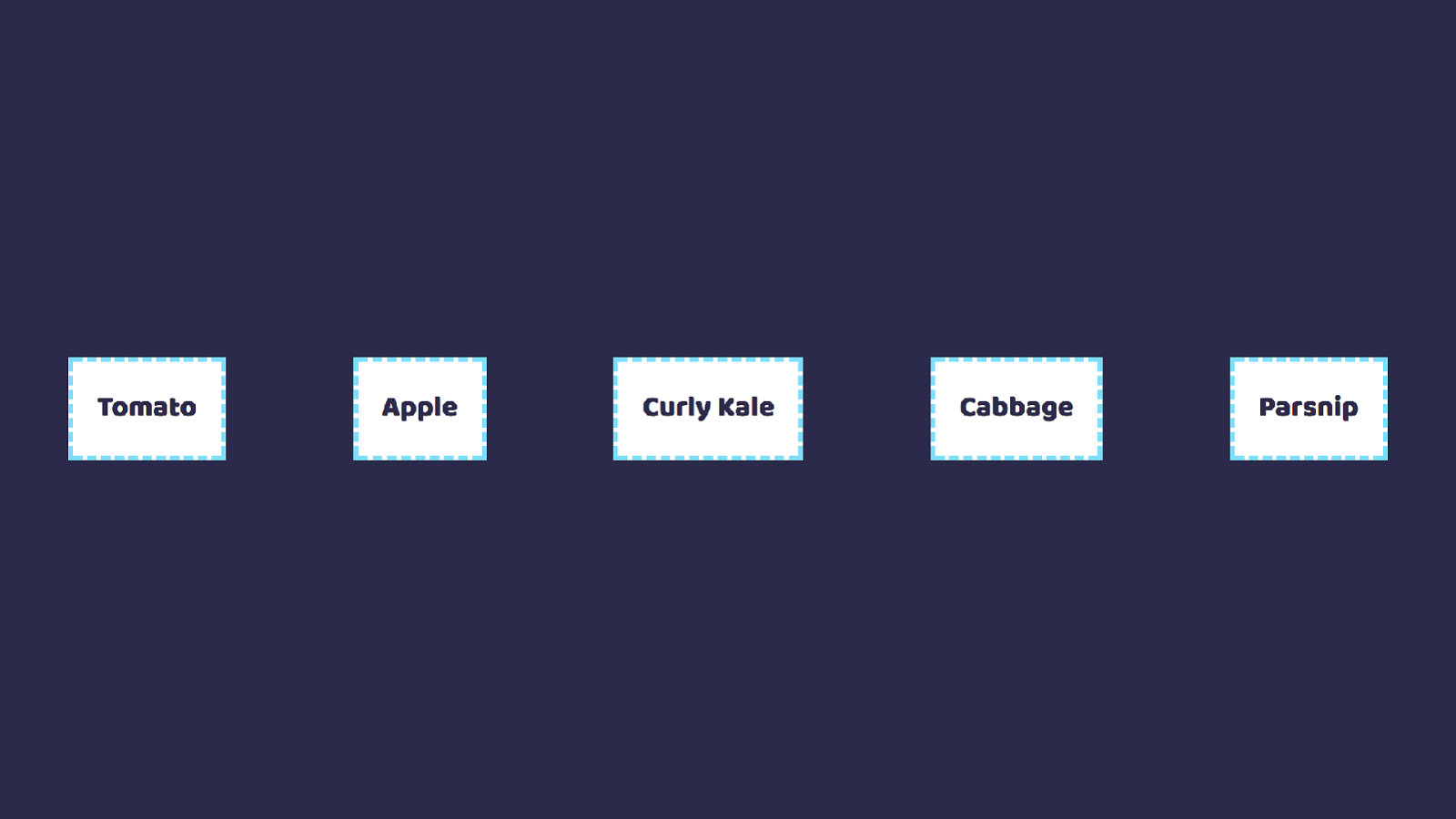
So this list of fruit and veg here. The space between them is the same, the content is di ff erent sizes.
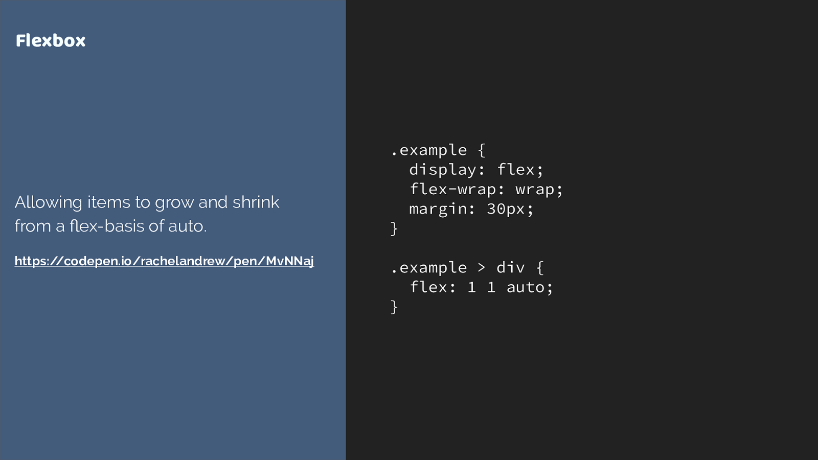
.example { display: flex; flex-wrap: wrap; margin: 30px; } .example > div { flex: 1 1 auto; } Flexbox Allowing items to grow and shrink from a fl ex-basis of auto. https://codepen.io/rachelandrew/pen/MvNNaj
Or we allow items to grow and shrink from a flex basis of auto, each line will become a new flex container, so things won’t line up in columns.
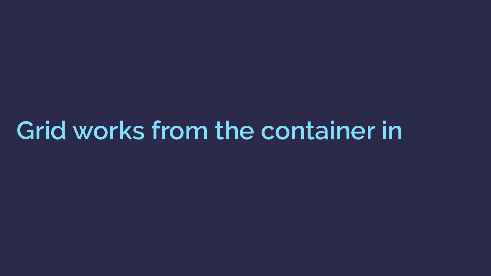
Grid works from the container in With grid you say, here is the grid, items need to fit into this grid. You can cause the items to span more than one track and you can align items inside their areas but they are constrained by the grid tracks into which you place them.
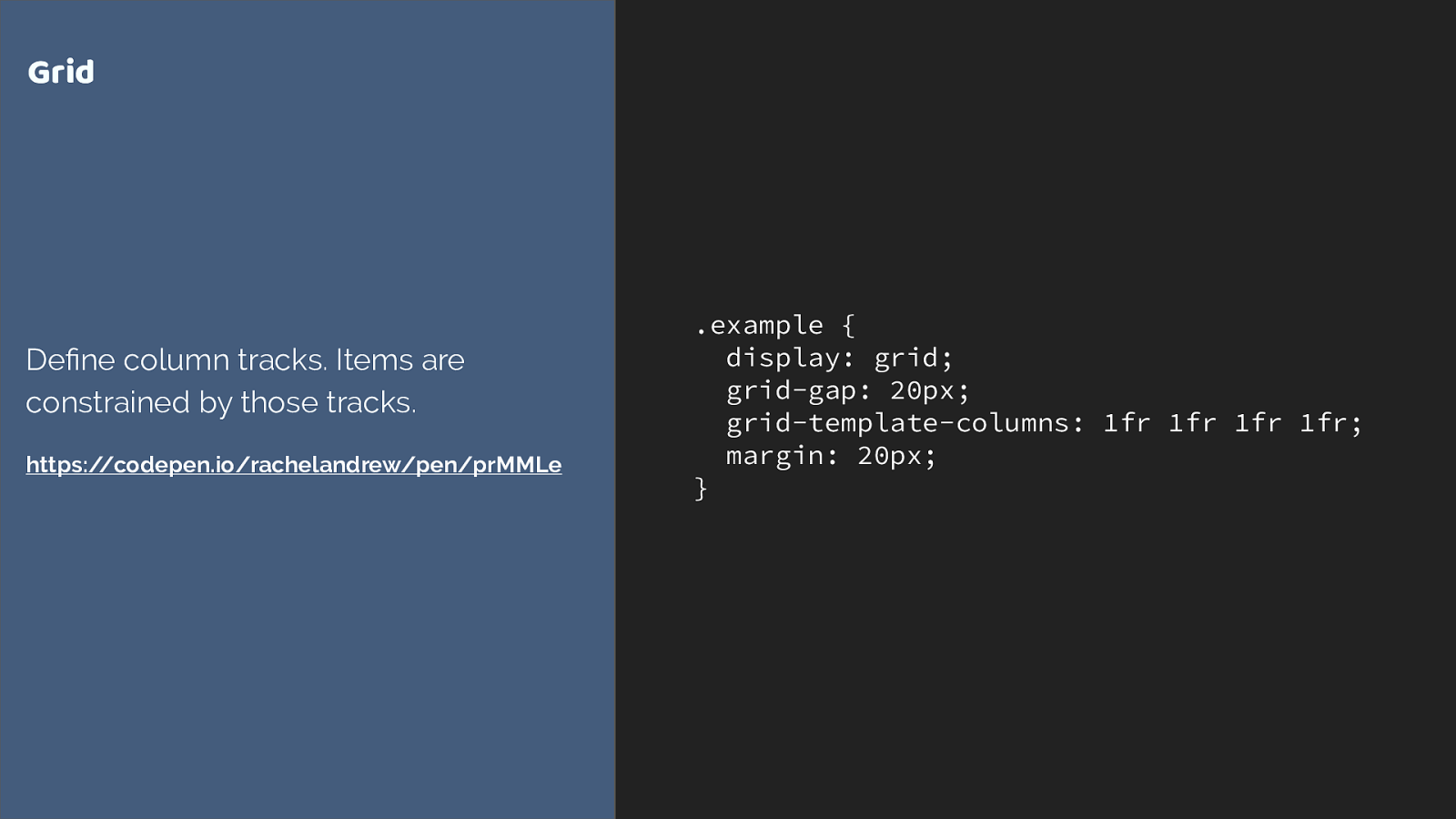
.example { display: grid; grid-gap: 20px; grid-template-columns: 1fr 1fr 1fr 1fr; margin: 20px; } Grid De fi ne column tracks. Items are constrained by those tracks. https://codepen.io/rachelandrew/pen/prMMLe So here I’m creating a four column track grid using the fr unit, representing a fraction of the available space in the grid container.
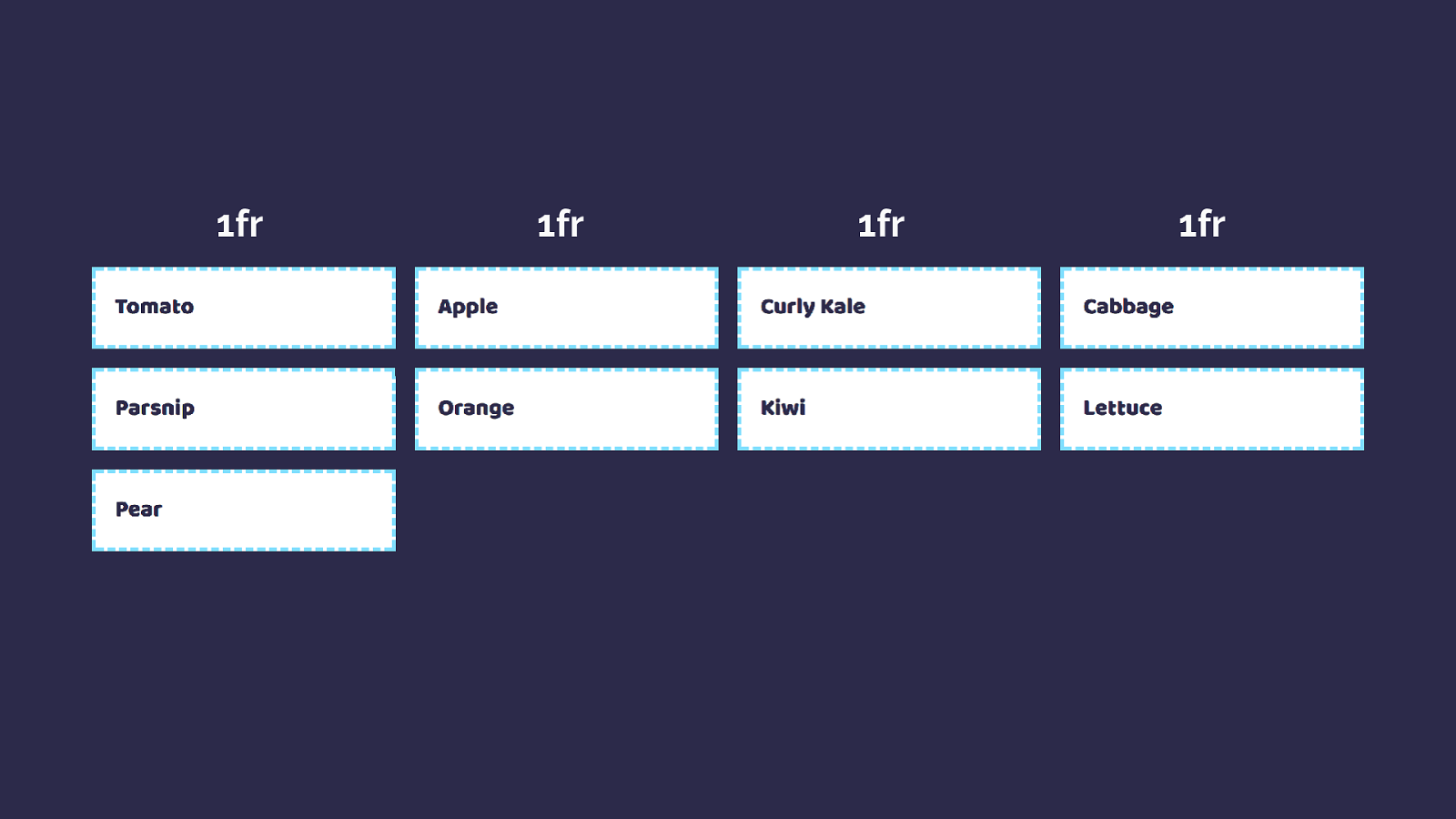
1fr 1fr 1fr 1fr we don’t add anything to the items to get this.
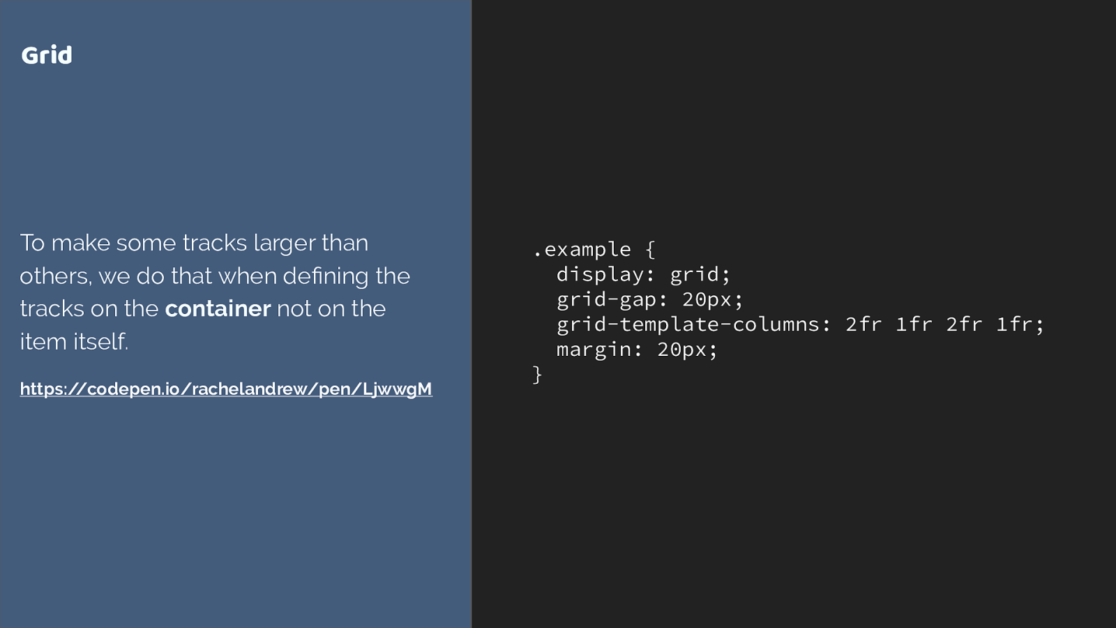
.example { display: grid; grid-gap: 20px; grid-template-columns: 2fr 1fr 2fr 1fr; margin: 20px; } Grid To make some tracks larger than others, we do that when de fi ning the tracks on the container not on the item itself. https://codepen.io/rachelandrew/pen/LjwwgM We can also cause some tracks to take more of that space. In this example we have three tracks two of 2fr and one of 1fr. The available space is split into 5 and shared out in proportiion.
2fr 1fr 2fr 1fr Again, nothing added to the items. The track is causing the sizing.
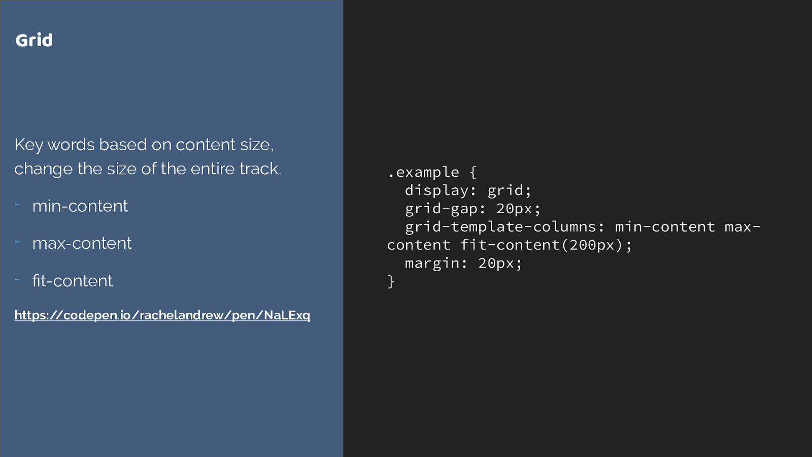
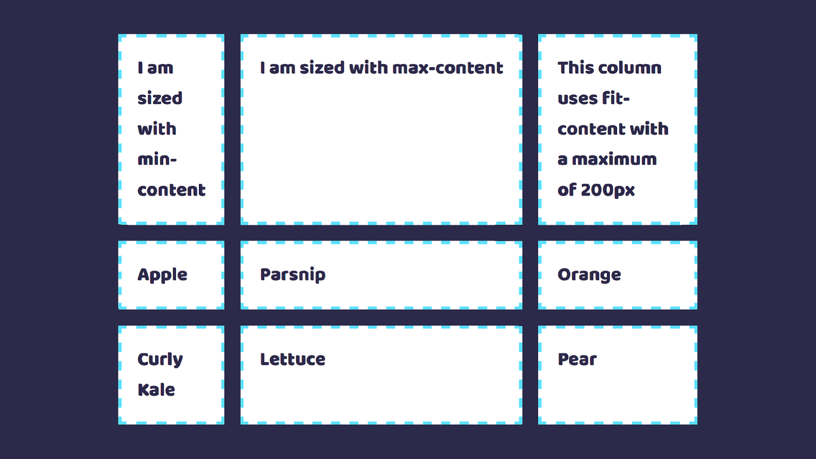
fi t-content https://codepen.io/rachelandrew/pen/NaLExq We can allow content to define track size, but it then defines the entire track. We have some specific keywords we can use for this sizing
Min-content
Max-content
Fit-content
Other layout methods start with the item . I think the reason I get asked this question a lot though is that using grid requires a mindset shift. Almost all of our existing layout methods work by adding things to the item.
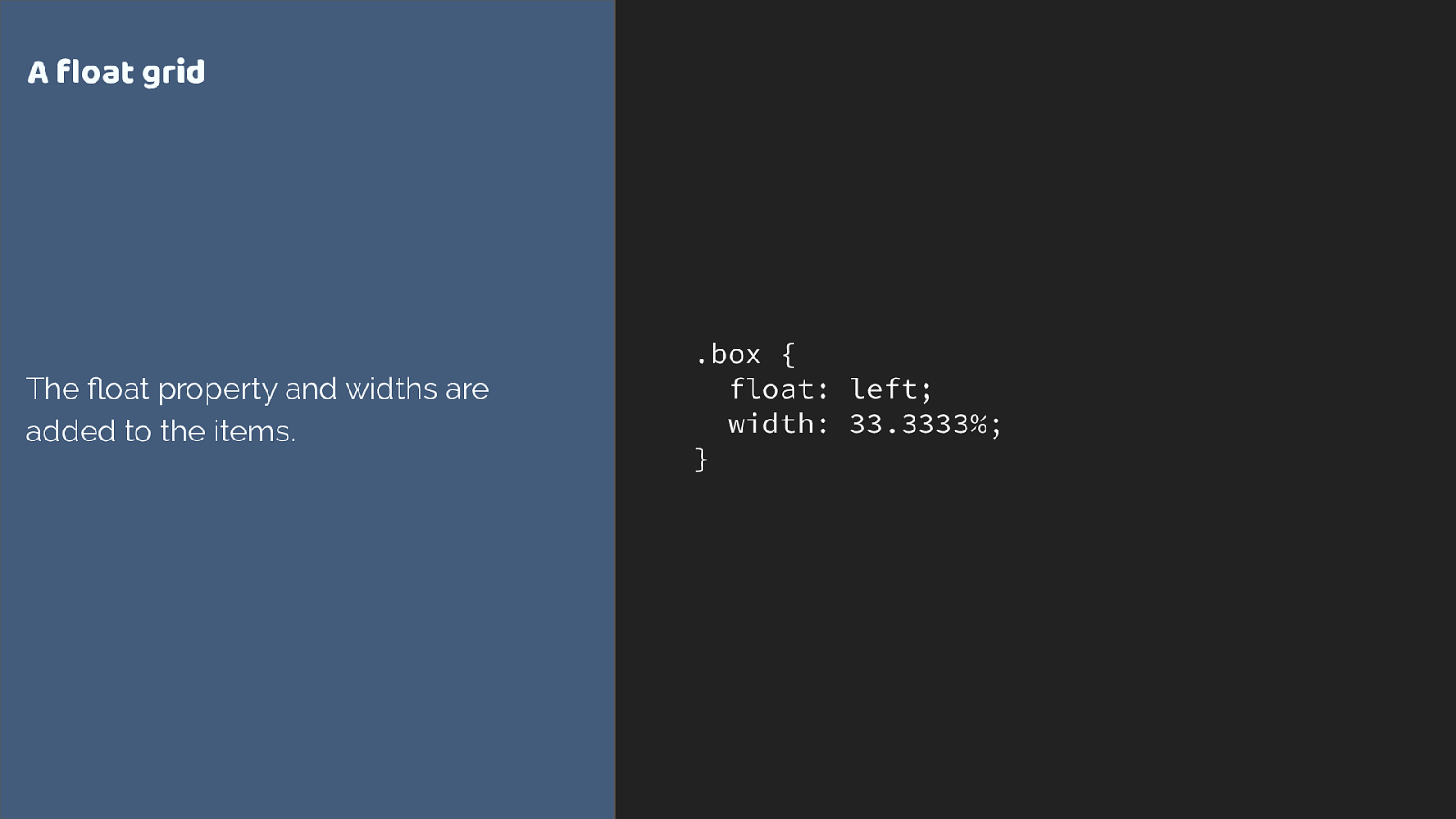
.box { float: left; width: 33.3333%; } A float grid The fl oat property and widths are added to the items. Here is a simplified float grid. I need to add widths to my items in order to lay them out on the grid.
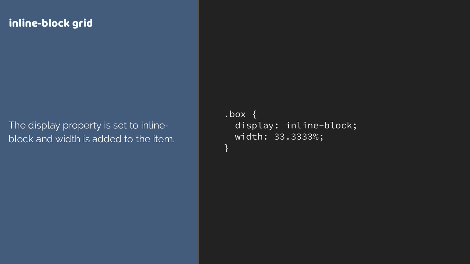
.box { display: inline-block; width: 33.3333%; } inline-block grid The display property is set to inline- block and width is added to the item. Inline-block is exactly the same. I am working on the item. It gets set to display: inline-block, it gets a width. The wrapper just provides the 100%.
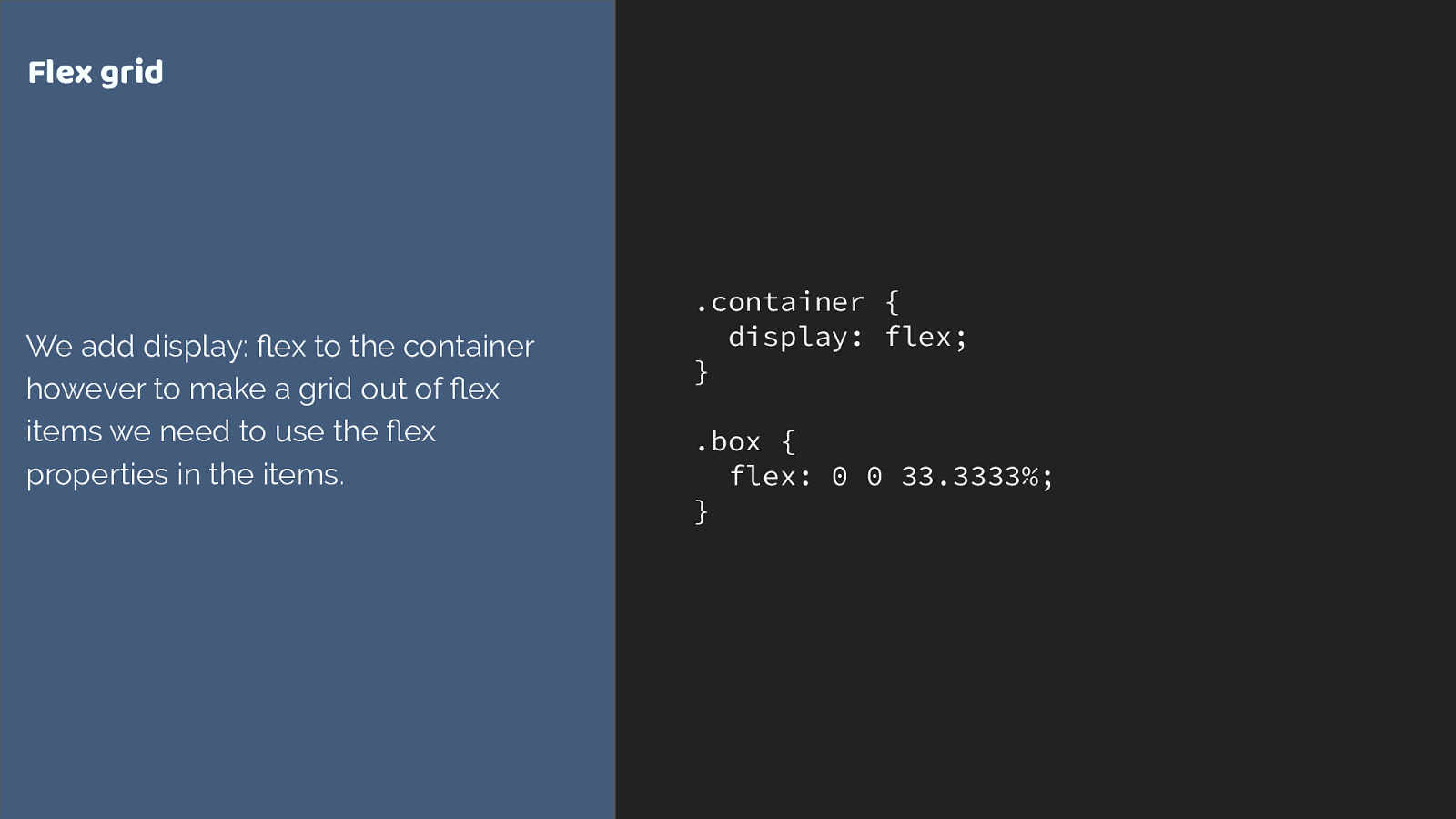
.container { display: flex; } .box { flex: 0 0 33.3333%; } Flex grid We add display: fl ex to the container however to make a grid out of fl ex items we need to use the fl ex properties in the items. and while we do declare display flex on a parent element, and the children become grid items, if we want to change the behaviour of the flex items, we have to target the items themselves. Adding the flex property to set flex grow flex shrink and flex basis. Perhaps adding a width just like we would for a floated item to make a flex grid.
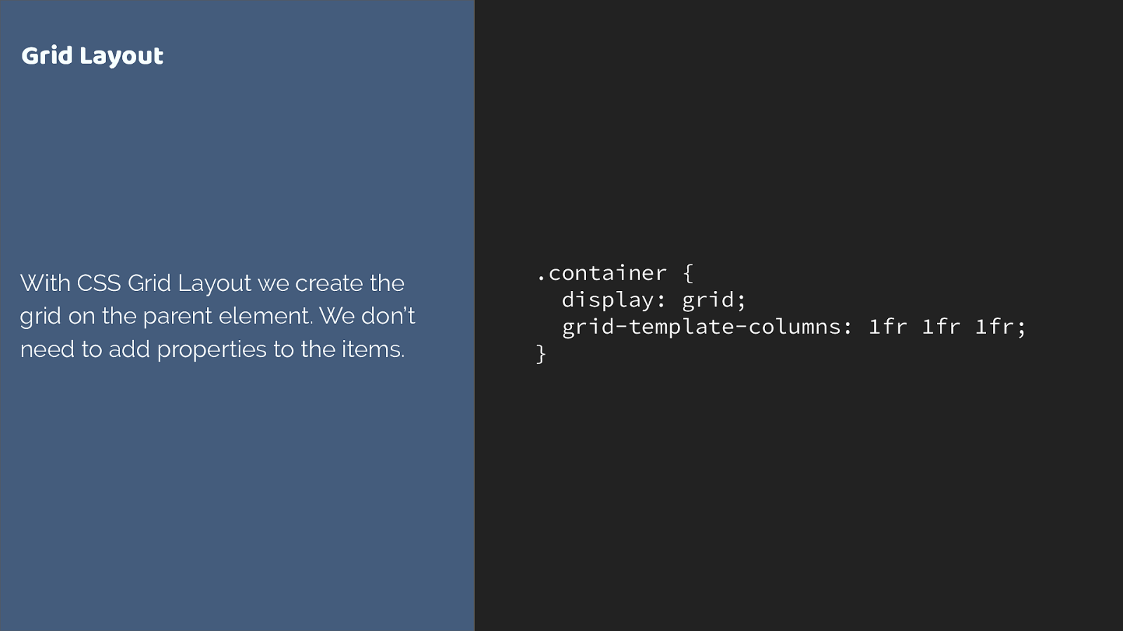
.container { display: grid; grid-template-columns: 1fr 1fr 1fr; } Grid Layout With CSS Grid Layout we create the grid on the parent element. We don’t need to add properties to the items. grid is di ff erent. We do all of our grid creation on the parent. The only other layout method that does anything similar is multi-column layout.
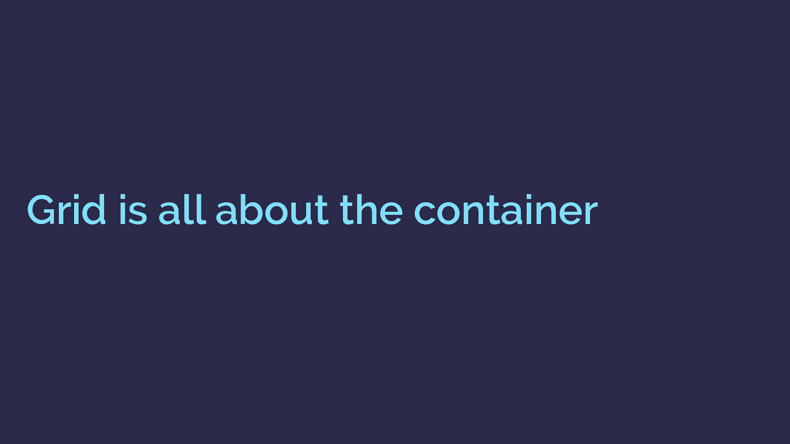
Grid is all about the container grid is about containers.
Once you know this, the decision of whether to use grid or flexbox becomes easier. There will be times you could use either, and there isn’t a right or wrong.
And this focus on the container enables all kinds of interesting things to happen.
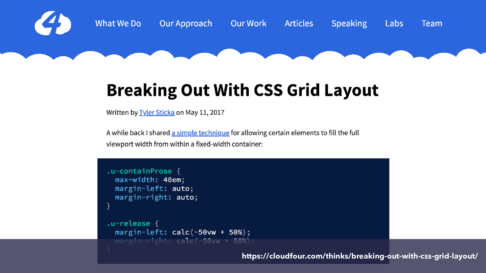
https://cloudfour.com/thinks/breaking-out-with-css-grid-layout/
One such thing is the technique shown in this tutorial by Tyler Sticka. Demonstrating how we can use grid to make a full width element when we have a width constrained column, a really common design pattern.
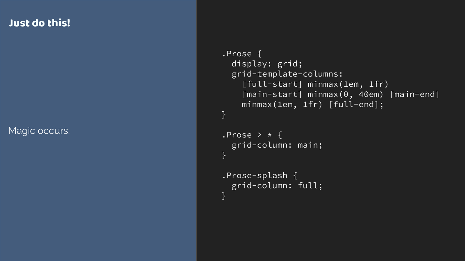
.Prose {
display: grid;
grid-template-columns:
[full-start] minmax(1em, 1fr)
[main-start] minmax(0, 40em) [main-end]
minmax(1em, 1fr) [full-end];
}
.Prose > * {
grid-column: main;
}
.Prose-splash {
grid-column: full;
}
Just do this!
Magic occurs.
It’s a great technique. All you need are these few lines of code. I’d not thought of solving this issue in this way, it is a really elegant solution and I’m not bashing the
original tutorial at all - it was very much in the style of ‘hey look at this cool thing’.
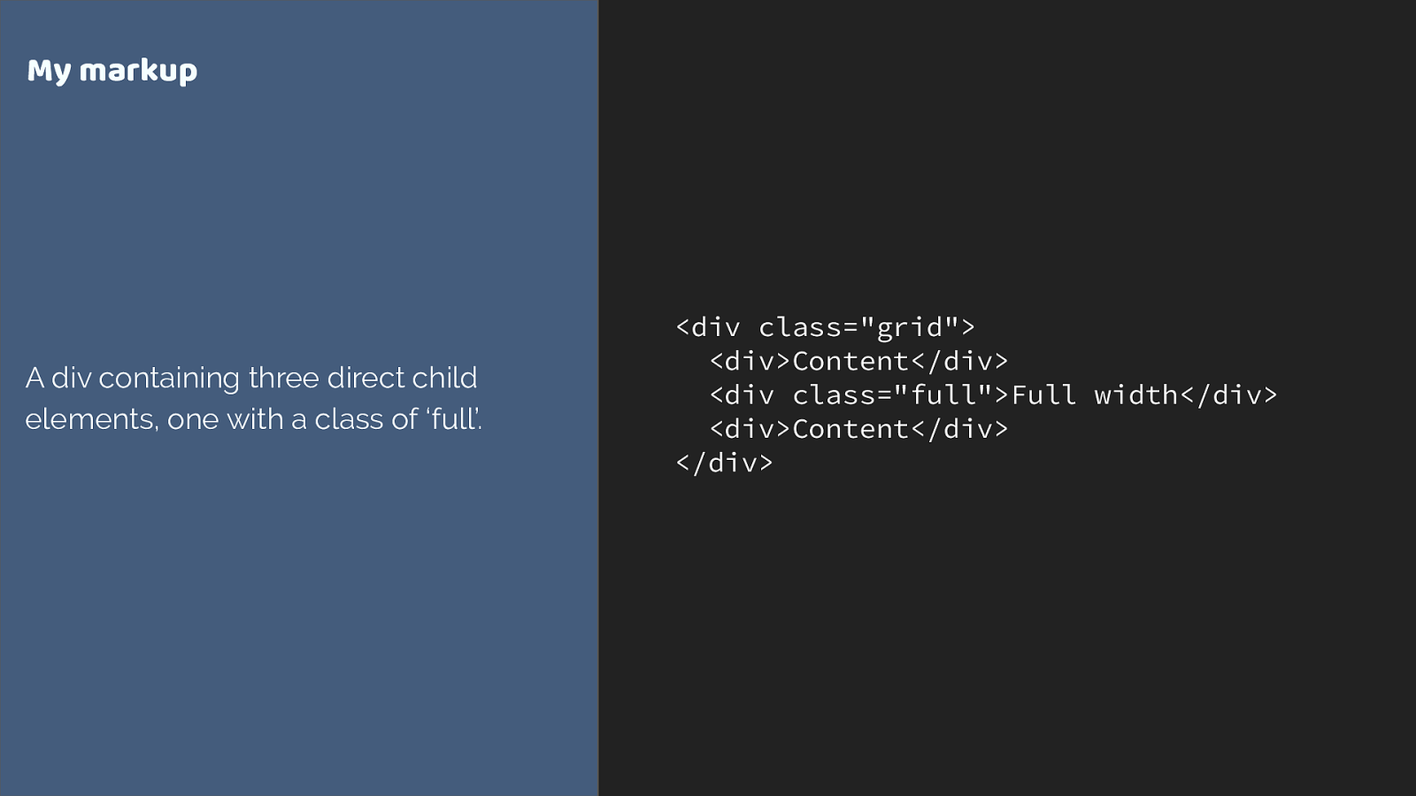
But why … how does this even work. Where does main or full come from?
And here we can open up a whole bunch of interesting things about grid’s container first approach. Let’s break it down.
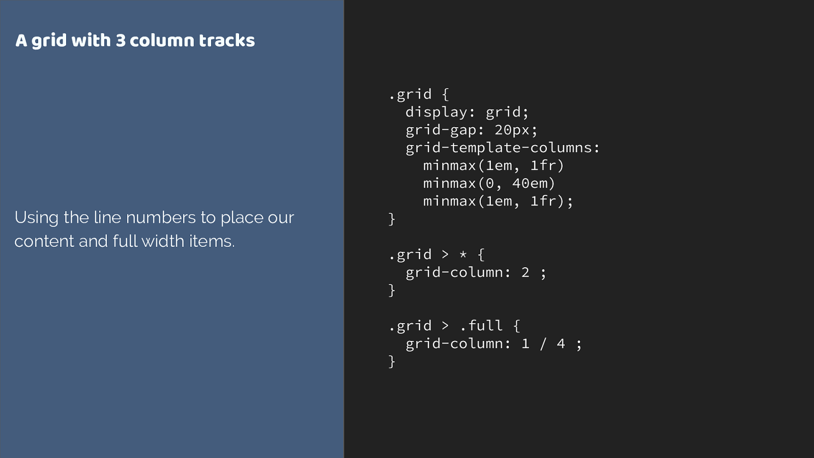
.grid {
display: grid;
grid-gap: 20px;
grid-template-columns:
minmax(1em, 1fr)
minmax(0, 40em)
minmax(1em, 1fr);
}
.grid > * {
grid-column: 2 ;
}
.grid > .full {
grid-column: 1 / 4 ;
}
A grid with 3 column tracks
Using the line numbers to place our
content and full width items.
I create a grid with three column tracks.
I then set all of the direct children so start after grid column line 2 and anything with a class of full to be full width at line one to 4.
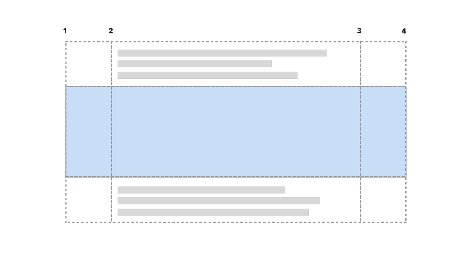
1 2 3 4 So here is the grid with the line numbers. The first item goes into the centre after line 2, the second is full width so stretches right across. The 3rd is a regular item going into the centre.
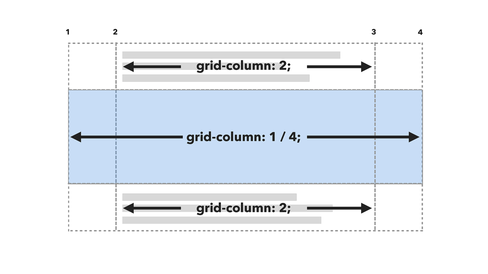
1 2 3 4 grid-column: 2; grid-column: 1 / 4; grid-column: 2; just like this. However the example used names not numbers. So now you need to know you can name lines.
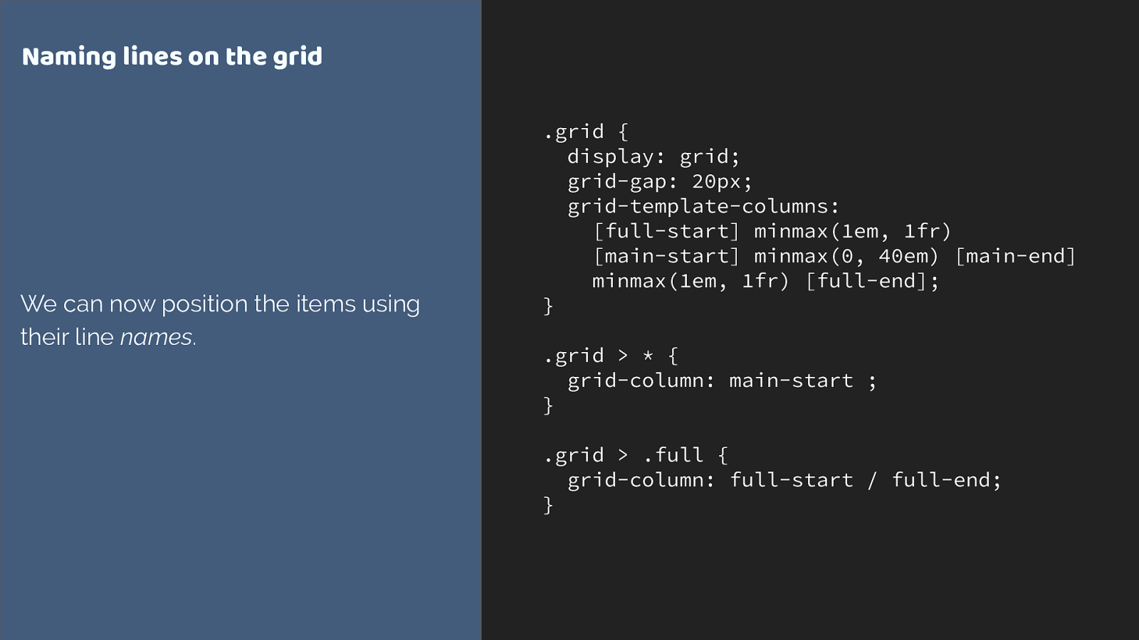
.grid {
display: grid;
grid-gap: 20px;
grid-template-columns:
[full-start] minmax(1em, 1fr)
[main-start] minmax(0, 40em) [main-end]
minmax(1em, 1fr) [full-end];
}
.grid > * {
grid-column: main-start ;
}
.grid > .full {
grid-column: full-start / full-end;
}
Naming lines on the grid
We can now position the items using
their line
names
.
You do that in the square brackets before or after the track - remember naming lines not tracks.
Then we can swap our numbers for line names.
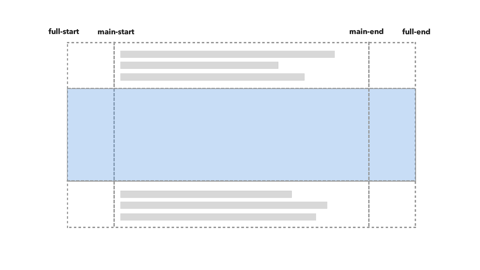
full-start main-start main-end full-end Here is the grid.
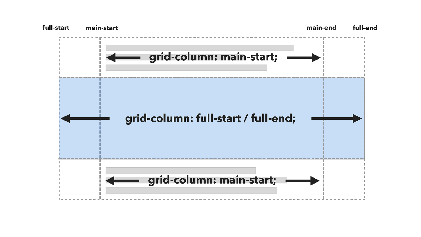
grid-column: main-start; grid-column: full-start / full-end; full-start main-start main-end full-end grid-column: main-start; And the positioning works like this.
But this isn’t quite the same as the example. The example looks more like this.

grid-column: main; grid-column: full; full-start main-start main-end full-end grid-column: main; It’s as if it is targeting the tracks or tracks rather than the lines, and line based positioning only targets lines not tracks.
.grid {
display: grid;
grid-gap: 20px;
grid-template-columns:
[full-start] minmax(1em, 1fr)
[main-start] minmax(0, 40em) [main-end]
minmax(1em, 1fr) [full-end];
}
.grid > * {
grid-column: main;
}
.grid > .full {
grid-column: full;
}
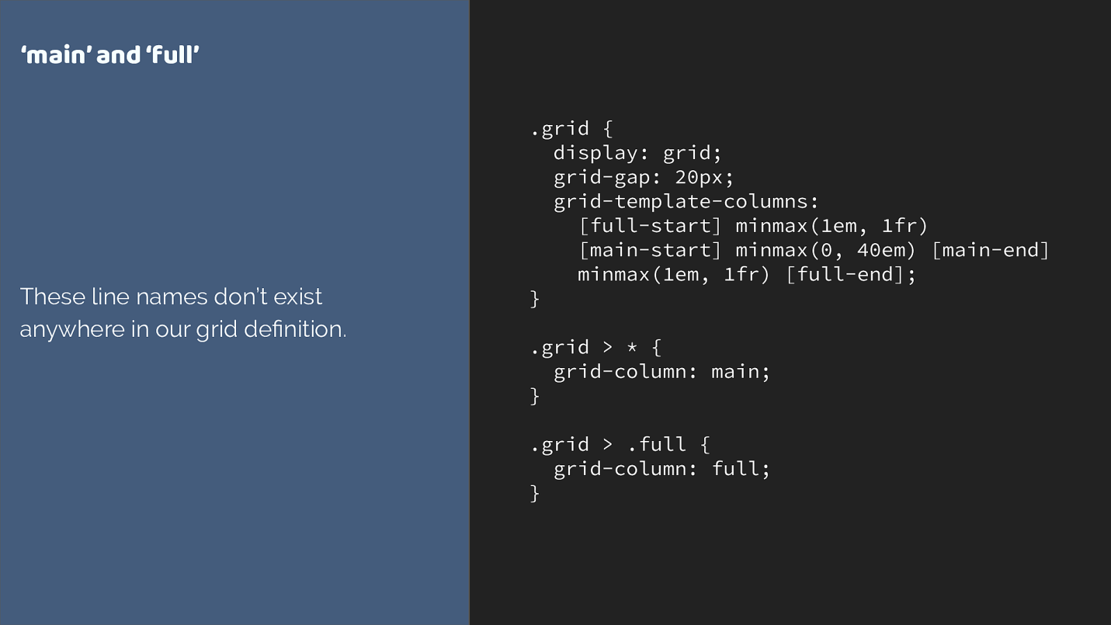
‘main’ and ‘full’
These line names don’t exist
anywhere in our grid de
fi
nition.
We seem to be using line names that don’t exist anywhere. To understand this you need to know something else about grid layout.
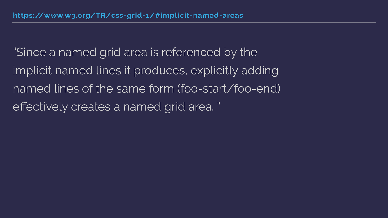
https://www.w3.org/TR/css-grid-1/#implicit-named-areas “Since a named grid area is referenced by the implicit named lines it produces, explicitly adding named lines of the same form (foo-start/foo-end) e ff ectively creates a named grid area. ” When you name lines with -start and -end for columns and rows, you get a named area of the main name used.
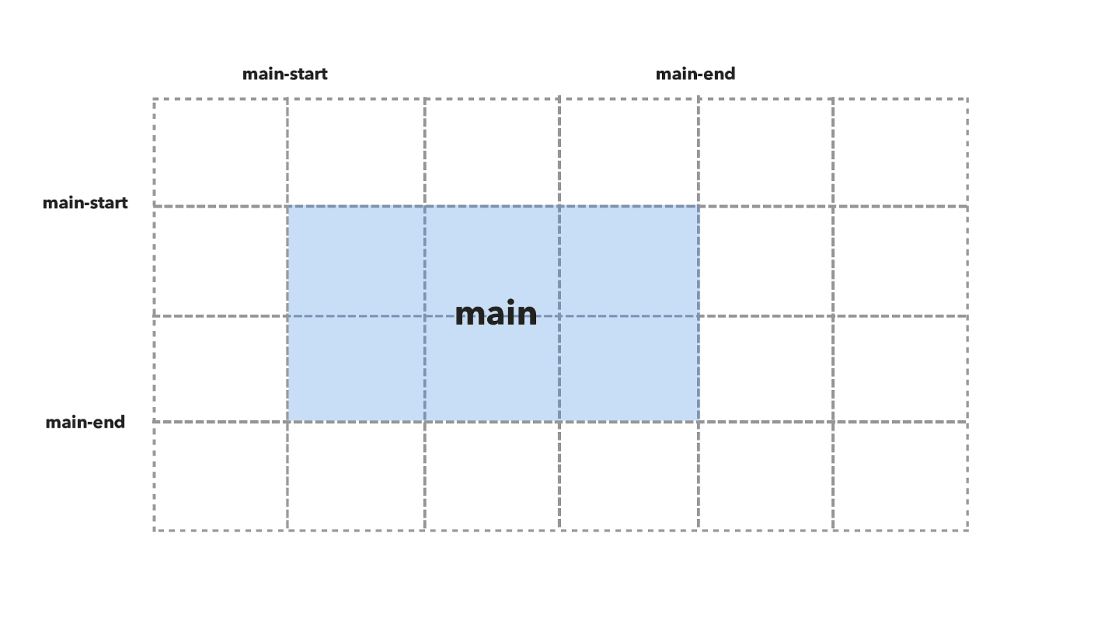
main-start main-start main-end main-end main So in this diagram you can see that I have named grid lines for main-start and main-end both for columns and for rows.
This creates a named grid area called main.
.grid {
display: grid;
grid-gap: 20px;
grid-template-columns:
100px [main-start]
100px 100px 100px [main-end]
100px 100px;
grid-template-rows:
100px [main-start]
100px 100px [main-end] 100px;
}
.item {
grid-area: main;
}
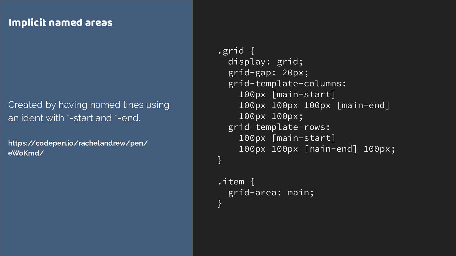
Implicit named areas
Created by having named lines using
an ident with *-start and *-end.
https://codepen.io/rachelandrew/pen/
eWoKmd/
You would end up with code like this, creating the lines then placing the item with grid-area: main.
But this isn’t quite what we want either.
The example uses grid-column, not grid-area.
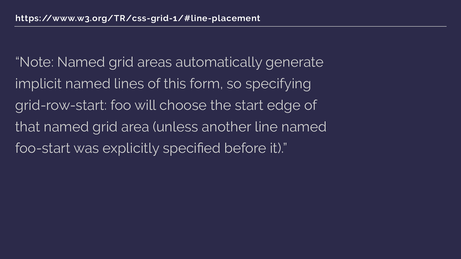
https://www.w3.org/TR/css-grid-1/#line-placement “Note: Named grid areas automatically generate implicit named lines of this form, so specifying grid-row-start: foo will choose the start edge of that named grid area (unless another line named foo-start was explicitly speci fi ed before it).” And here we finish our trip down the rabbit hole, with two more bits of the spec.
If you specify row or column start as the name of a named area - in our case main - then the start line will resolve to the start edge of that named grid area. So this gets our full width column starting at line 1 when we give grid-column a value of full.
AND
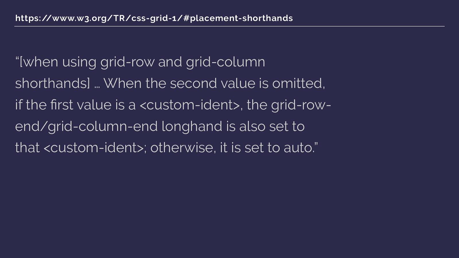
https://www.w3.org/TR/css-grid-1/#placement-shorthands “[when using grid-row and grid-column shorthands] … When the second value is omitted, if the fi rst value is a <custom-ident>, the grid-row- end/grid-column-end longhand is also set to that <custom-ident>; otherwise, it is set to auto.” We're using a shorthand grid-column, and if you only give it one ident - which we are doing - then the end line, grid-column-end is set to the same ident. Which then means we have grid-column-end full, which will make the end line that end edge of that area, line 4.
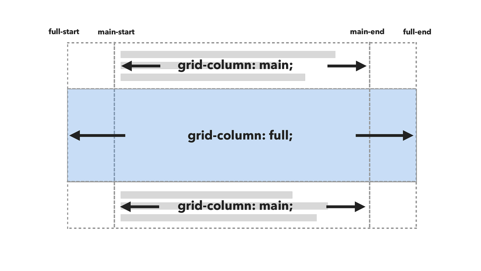
grid-column: main; grid-column: full; full-start main-start main-end full-end grid-column: main; So this.
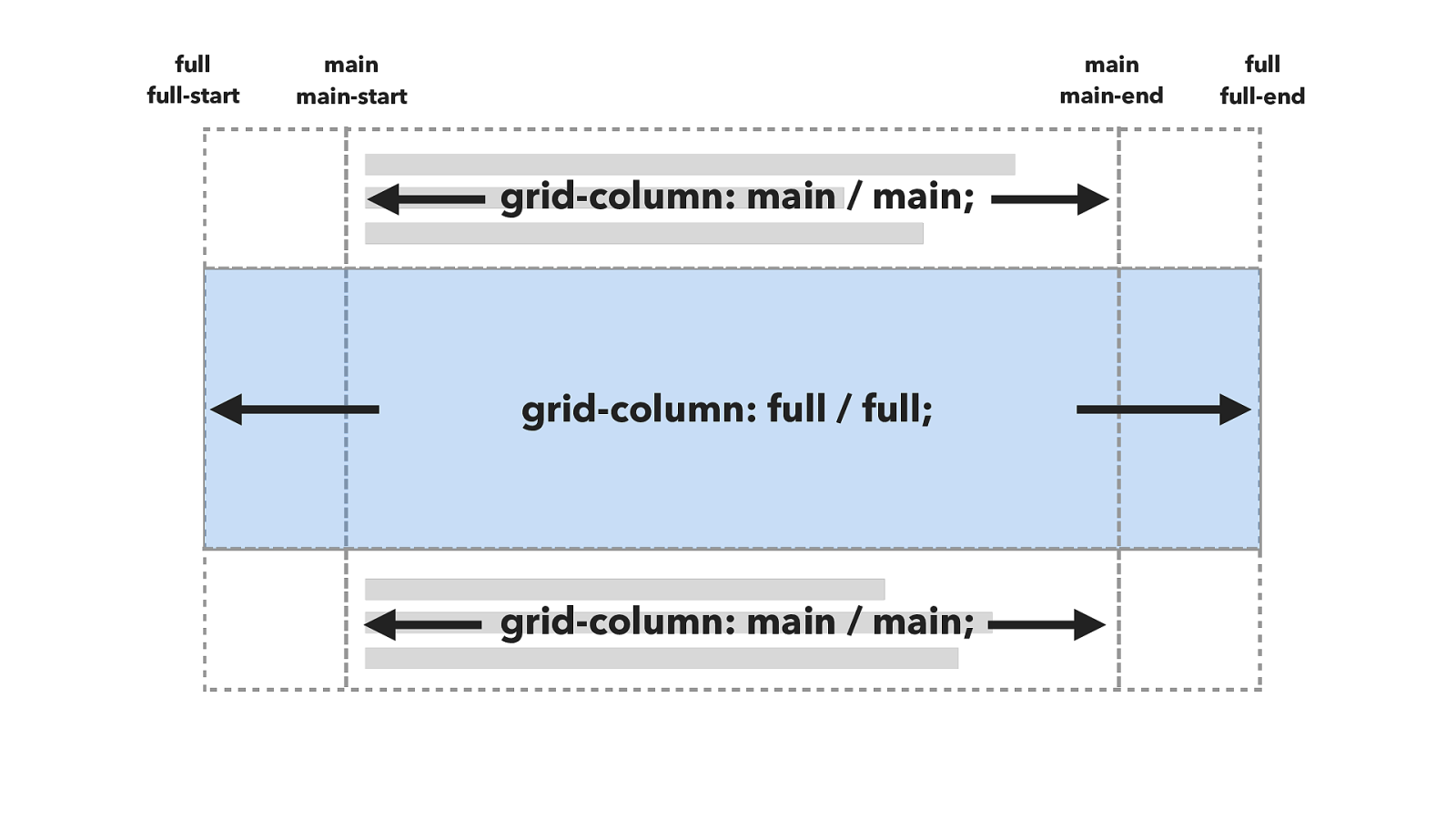
grid-column: main / main; grid-column: full / full; full-start main-start main-end full-end grid-column: main / main; full full main main Is really this.
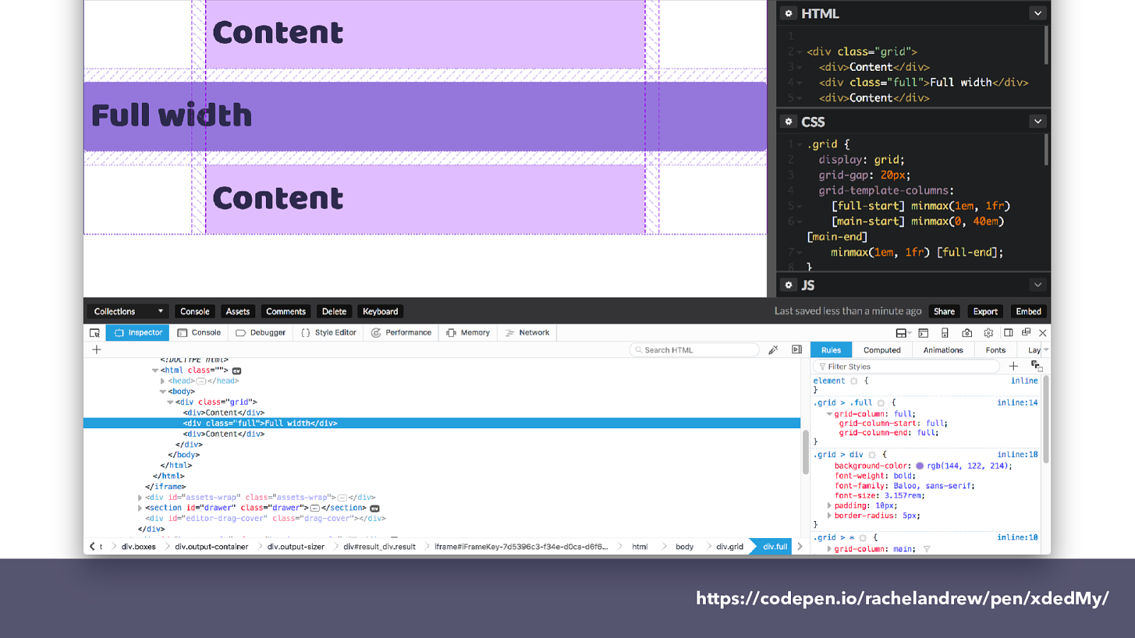
https://codepen.io/rachelandrew/pen/xdedMy/
which you can see in the resources I’ll be sharing with you for this talk. If you inspect the element using the Firefox grid inspector you can see the lines of the grid and how grid-column-start and grid-column-end both have full as a value.
And you now have an insight into what goes on in my head.
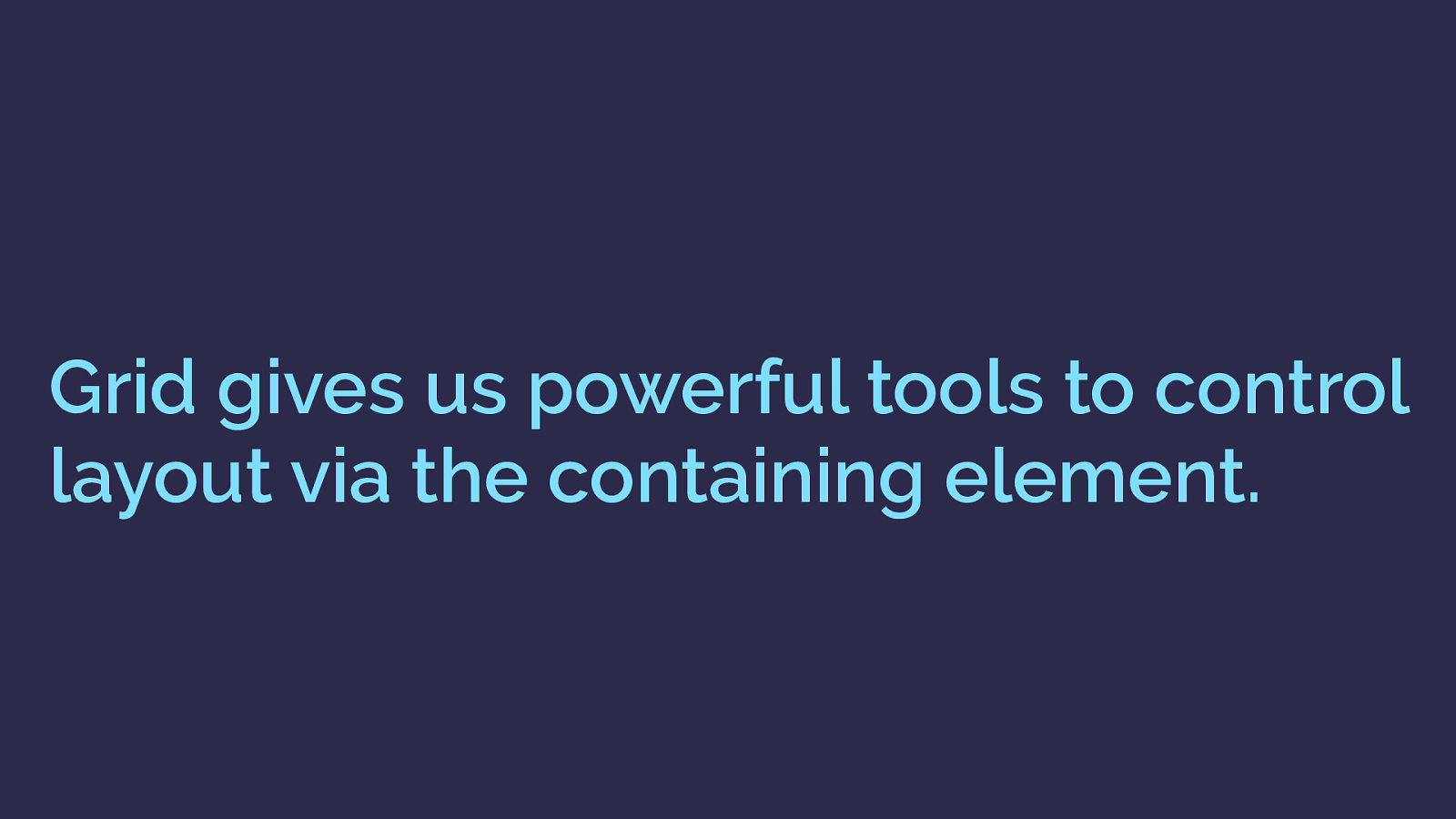
Grid gives us powerful tools to control
layout via the containing element.
BUT
What all this shows us is that grid gives us a far greater amount of control from the containing element. Rather than a flexbox approach, or the approach of any of our legacy methods, or targeting the child elements.
We have this vast set of tools, that you can start to unpack as you learn grid and try and solve problems with it.
Using grid in production CSS Grid Layout You know why grid has been created and I’ve shown you a little bit of grid code - let’s have a look at a whole lot more with some worked examples.
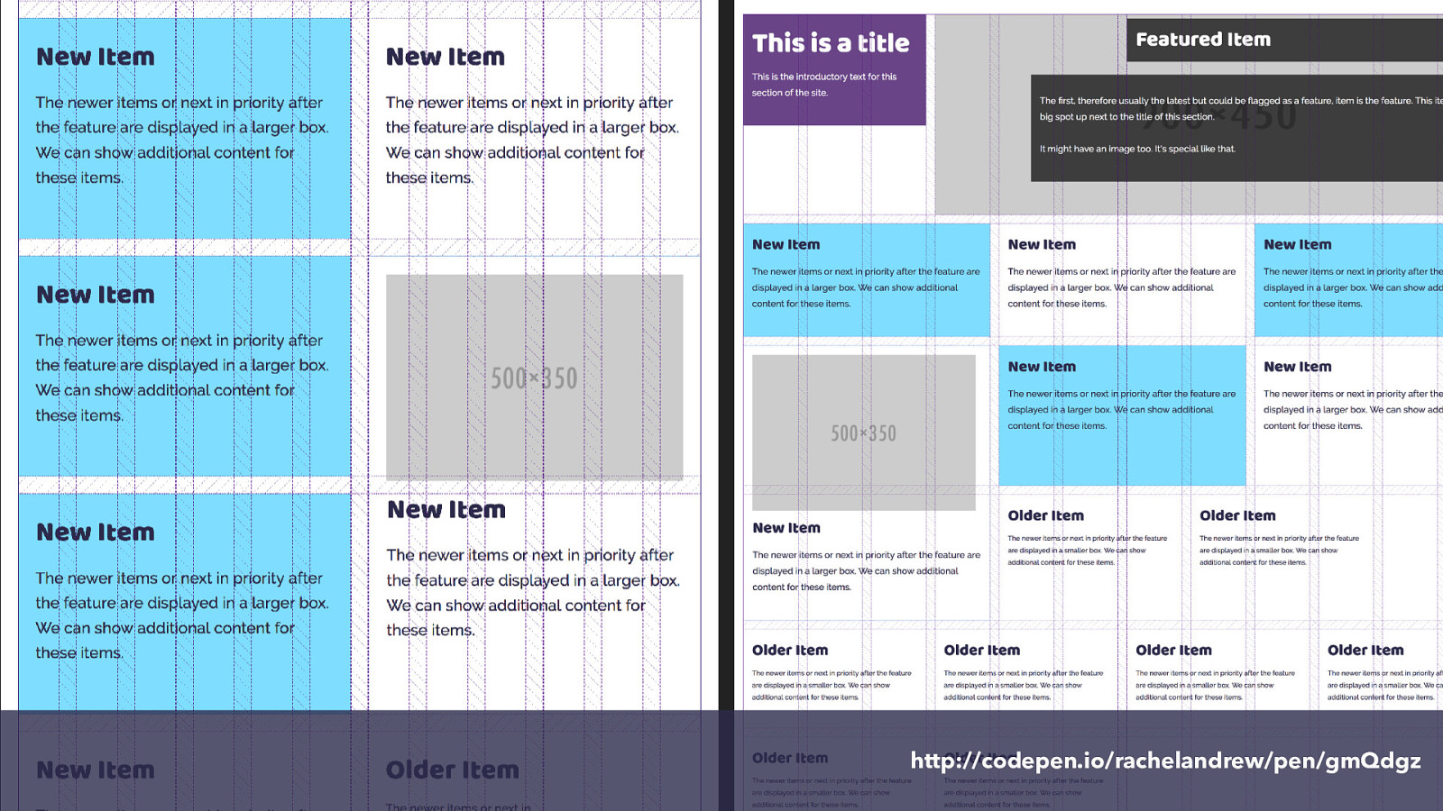
These examples are from the redesign of my website. After several years of talking about grid in theory I was excited to actually build a site with it. My personal site is as good a place as any to start, and these design patterns have become part of the site that is now live at rachelandrew.co.uk so you can go have a look.
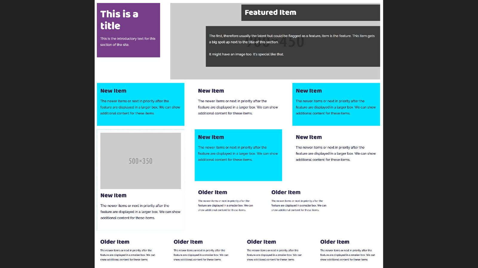
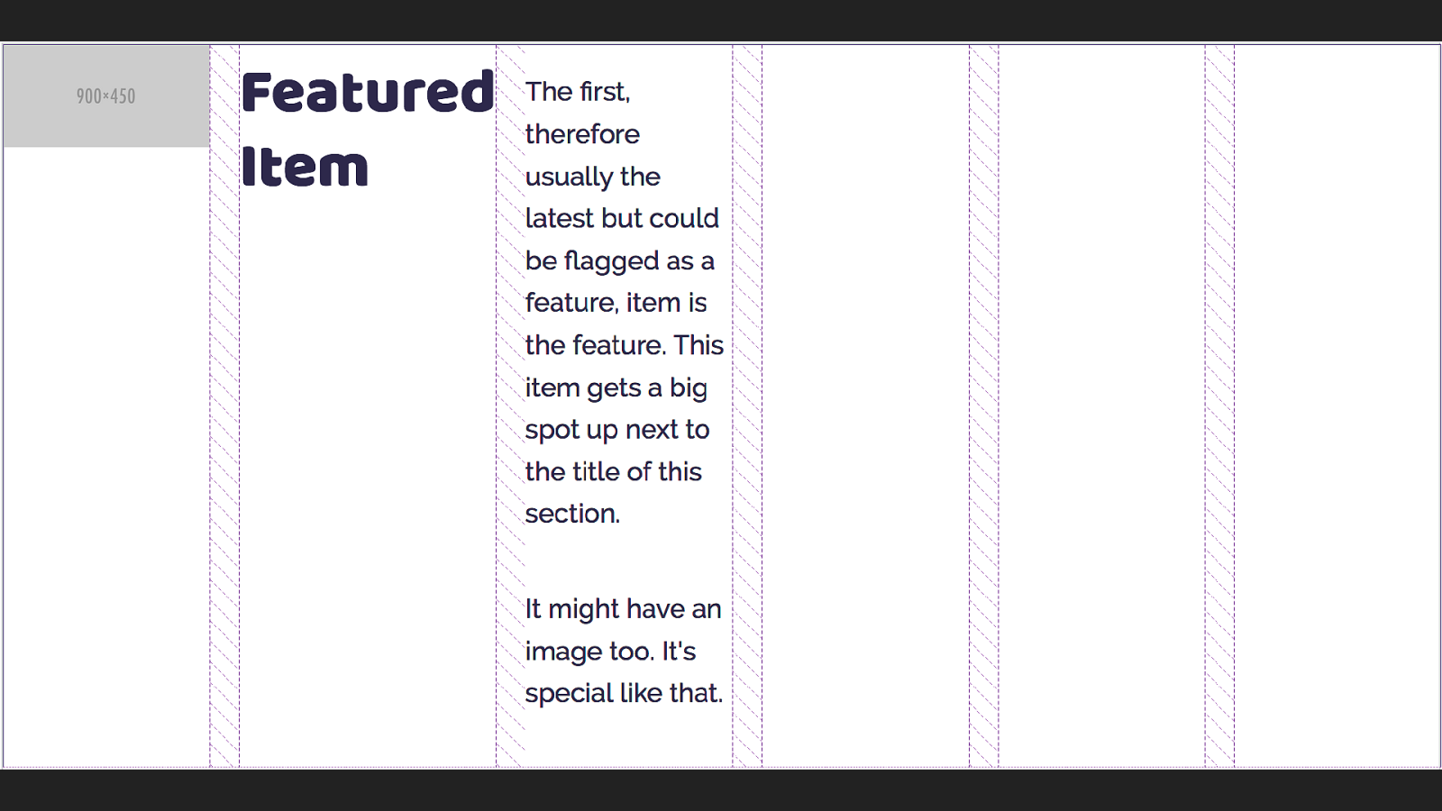
My site is mostly listings of things, talks I’m going to give or have given. Blog posts, podcasts I have been a guest on and books I’ve written. My previous design had everything in little boxes, I wanted to continue this idea on my new site, and had an idea for a listing that would have a featured item at the top - the latest blog posts or some other thing that I had featured, with boxes getting smaller
This is the example in my pattern library which has all the boxes in, as a bit of a jumble so I could check how they would behave.
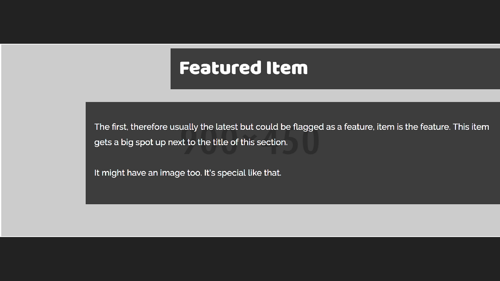
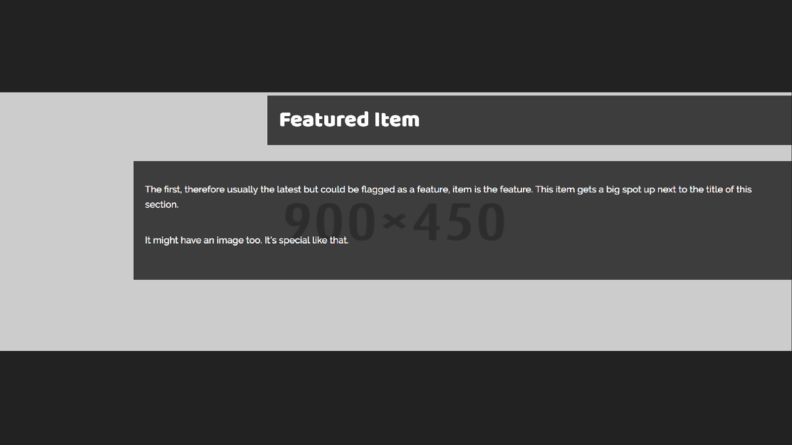
The first thing I did was to identify the di ff erent types of boxes in my design, to work on in the pattern library.I decided to start with this feature block and built the markup for this pattern.
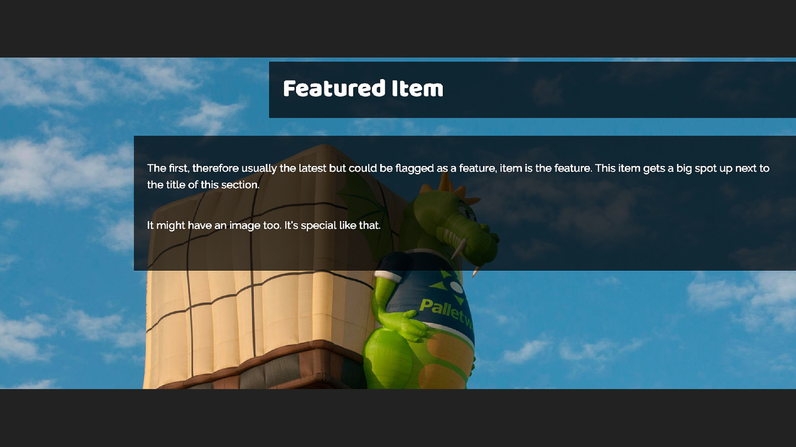
The idea of this box is that I can display images behind the feature text, usually of hot air balloons.
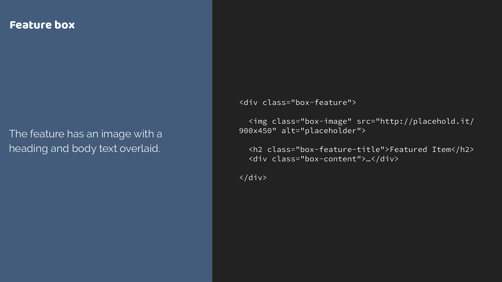
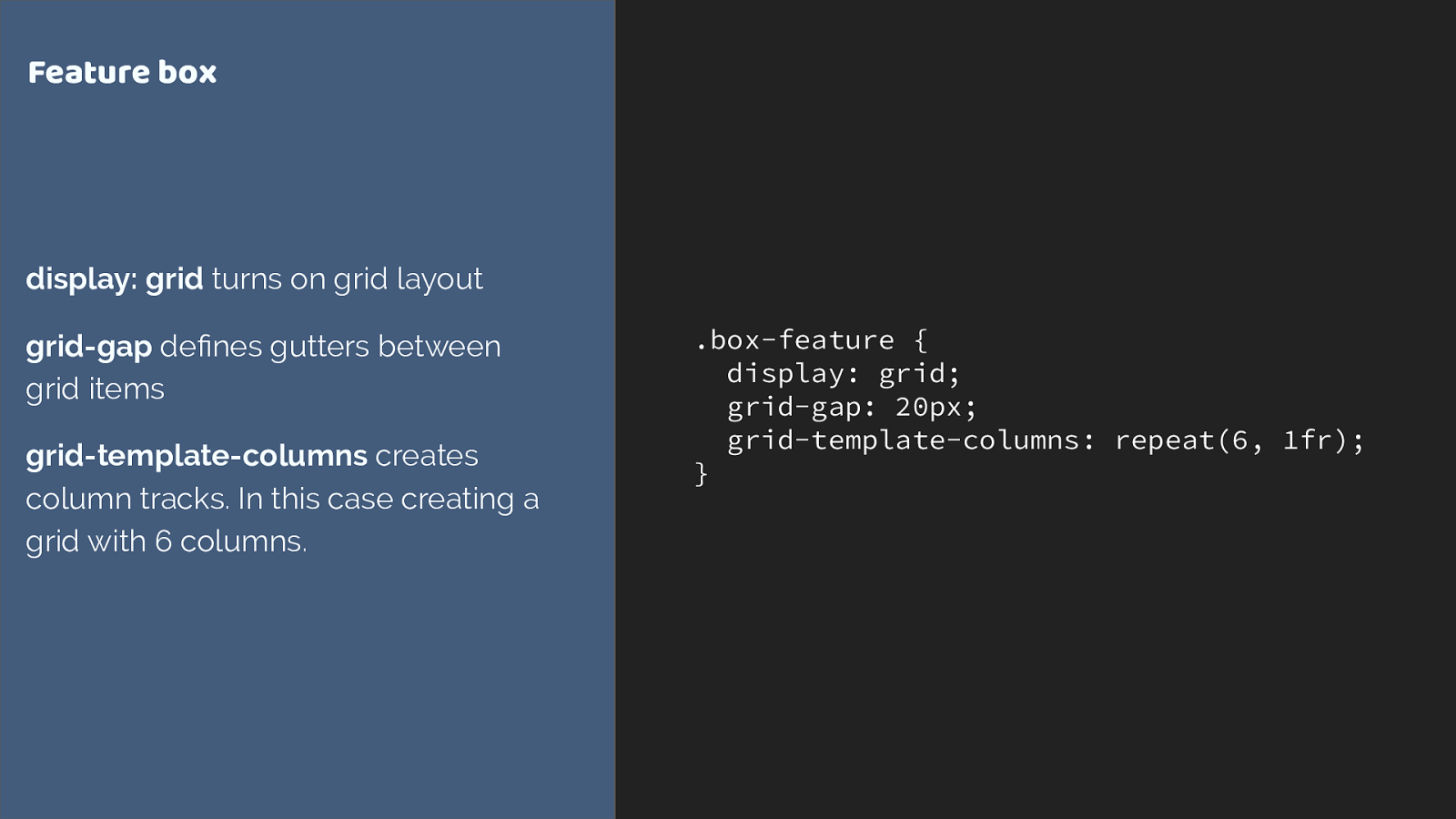
.box-feature {
display: grid;
grid-gap: 20px;
grid-template-columns: repeat(6, 1fr);
}
Feature box
display: grid
turns on grid layout
grid-gap
de
fi
nes gutters between
grid items
grid-template-columns
creates
column tracks. In this case creating a
grid with 6 columns.
This is our container. We turn on grid with display grid and now all of the direct children are grid items.
Grid gap creates a gap between our tracks.
We then define column tracks with grid-template-columns. The repeat notation I’ve used here creates six 1fr tracks.
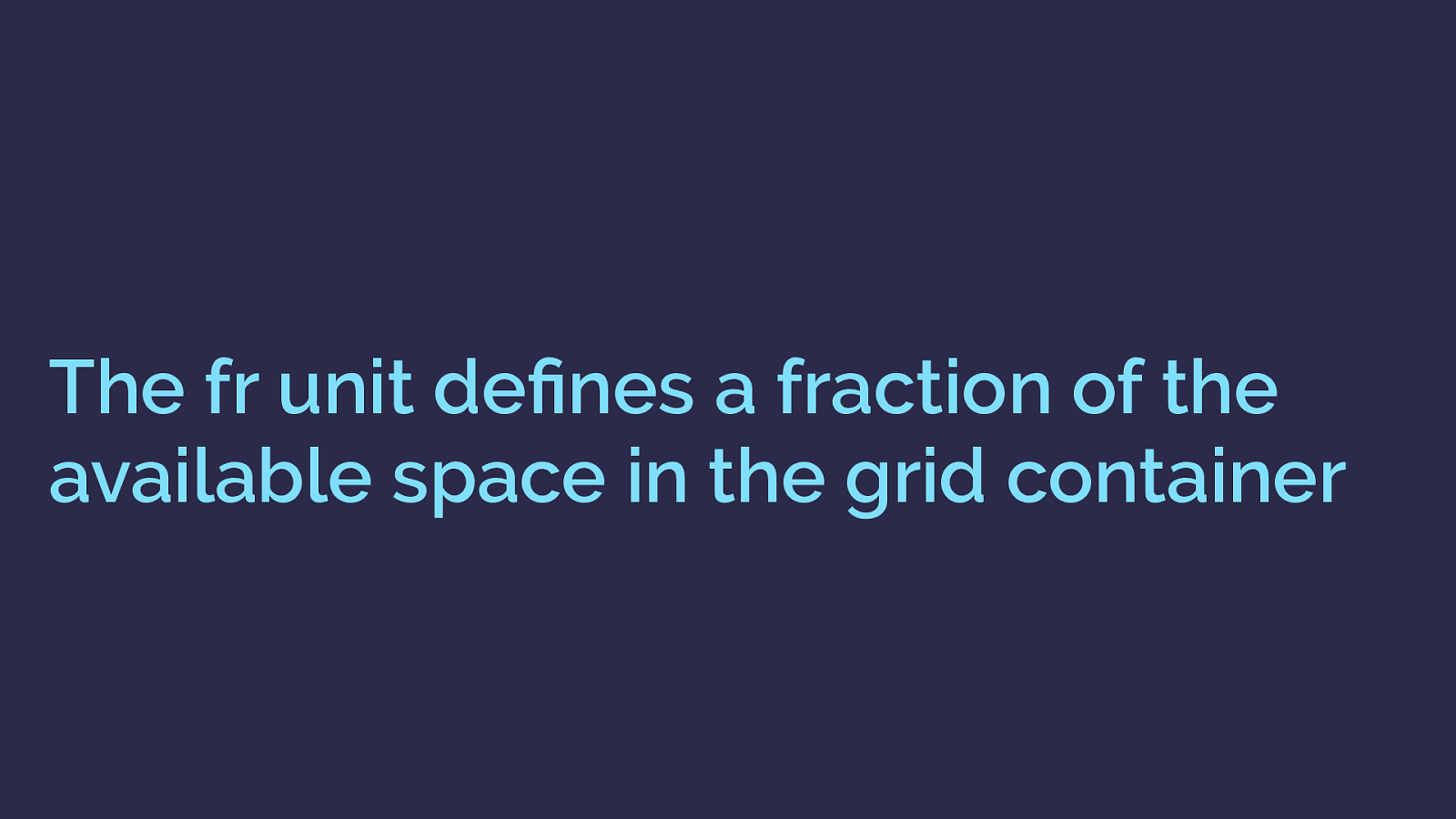
The fr unit de fi nes a fraction of the available space in the grid container This fr unit has been created for grid layout, it defines and fraction of the available space in the grid container.
Six 1 fr tracks will ultimately give us 6 equal width tracks.
I am using the Firefox Grid Inspector to highlight the grid tracks we have created - you can see the shaded area, which is the grid gap. Grid has placed the direct children of the container one into each grid cell. So we don’t get overlaps - but we probably want to actually position these items.
Also note that the second column is pushing wider due to the fact that the fr unit distributes available space - it actually does so from a minimum size of auto which means that content can make a track wider.
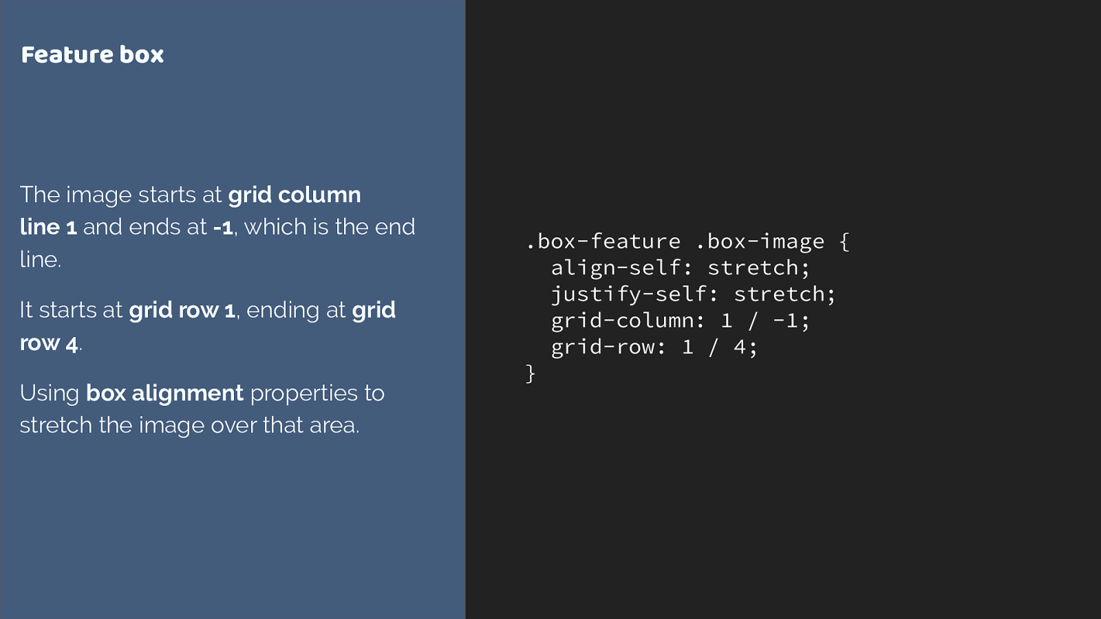
.box-feature .box-image { align-self: stretch; justify-self: stretch; grid-column: 1 / -1; grid-row: 1 / 4; } Feature box The image starts at grid column line 1 and ends at -1 , which is the end line. It starts at grid row 1 , ending at grid row 4 . Using box alignment properties to stretch the image over that area. I’m using the line based positioning method to stretch the image over the grid area. From column line 1 to line -1, which is from the first to last column line.
Then from row line 1 to 4. The grid-column and grid-row properties are shorthands for grid-column-start and grid-column end, grid-row-start and grid-row-end.
Two other things.
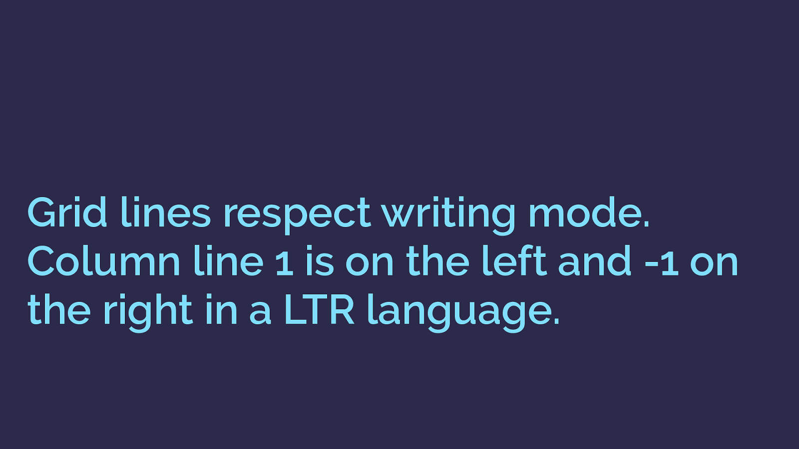
Grid lines respect writing mode. Column line 1 is on the left and -1 on the right in a LTR language. In English column line 1 is on the left and lines count up from there.
You can count back the other way with column line -1 being on the far right.
In a right to left language column line 1 would be on the right and -1 on the left.
Explicit vs. Implicit Grid ▸ The Explicit Grid is created when you de fi ne tracks with grid-template- columns and grid-template-rows ▸ If you place an item outside of that grid, or auto-placed content requires further row or column tracks these are added by grid as the Implicit Grid . we are also seeing an example of both the explicit grid - defined by grid-template-columns and the implicit grid, auto generated row tracks caused by me placing the image from line 1 to 4.
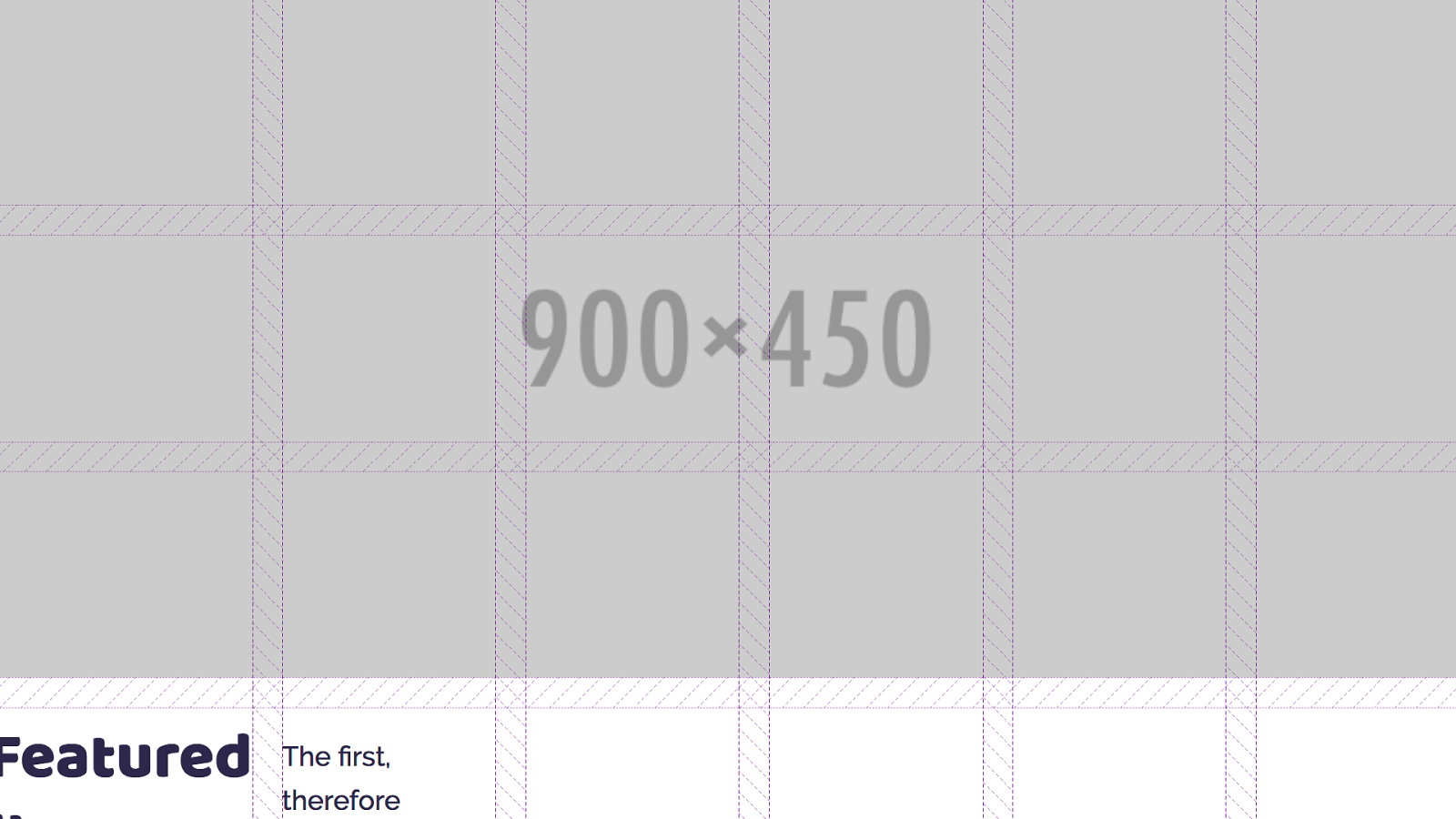
we can see the image here with grid tracks overlaid using the excellent Firefox grid inspector.
If you are using grid, the inspector is very helpful.
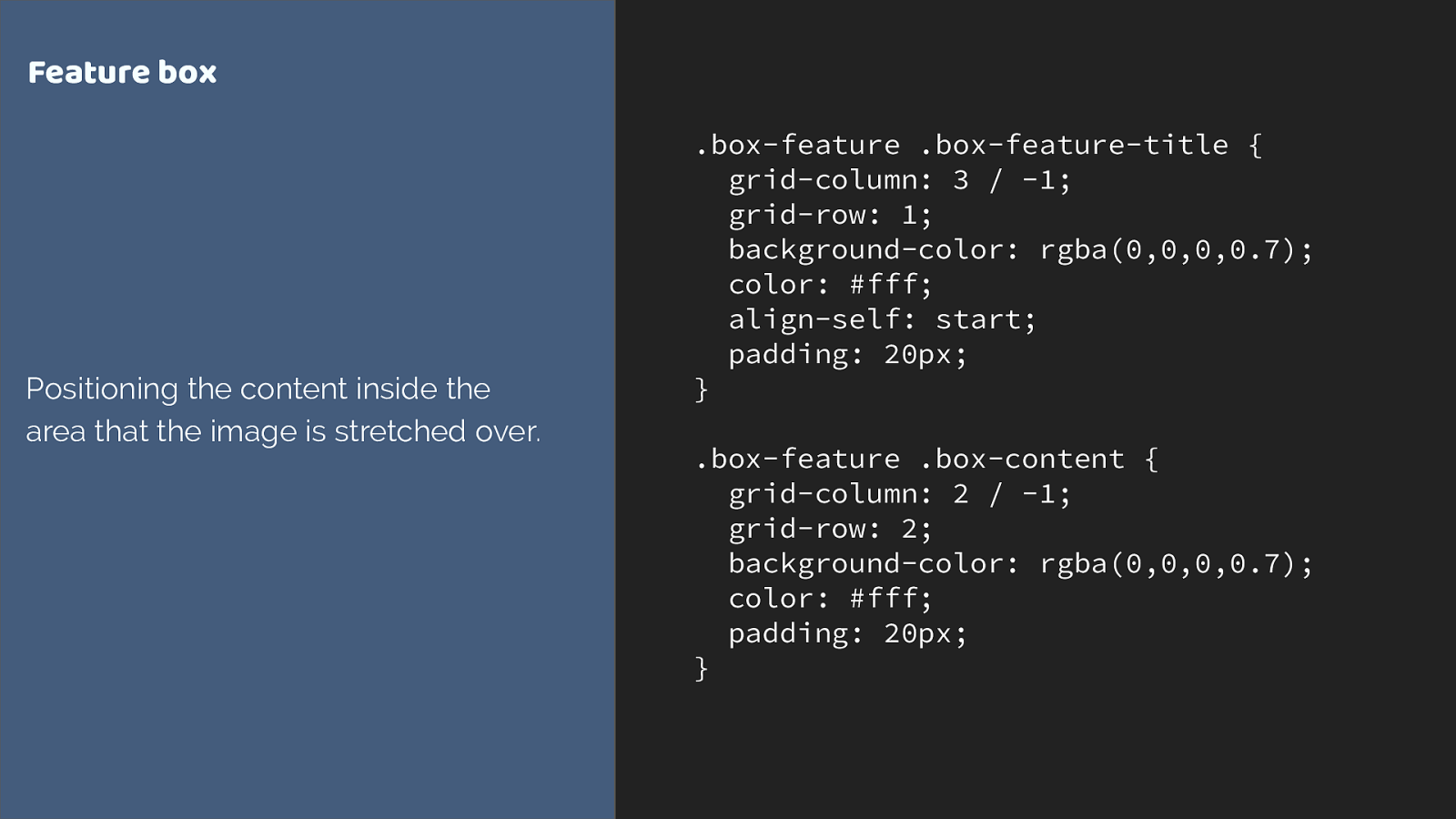
.box-feature .box-feature-title { grid-column: 3 / -1; grid-row: 1; background-color: rgba(0,0,0,0.7); color: #fff; align-self: start; padding: 20px; } .box-feature .box-content { grid-column: 2 / -1; grid-row: 2; background-color: rgba(0,0,0,0.7); color: #fff; padding: 20px; } Feature box Positioning the content inside the area that the image is stretched over. I can then position the content using line based placement into the same row and column tracks the image occupies.
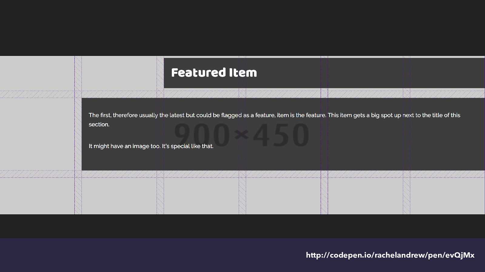
http://codepen.io/rachelandrew/pen/evQjMx and we get this - again with the tracks highlighted.
You can see how that second auto-generated track in the implicit grid is growing to take the content placed into it.
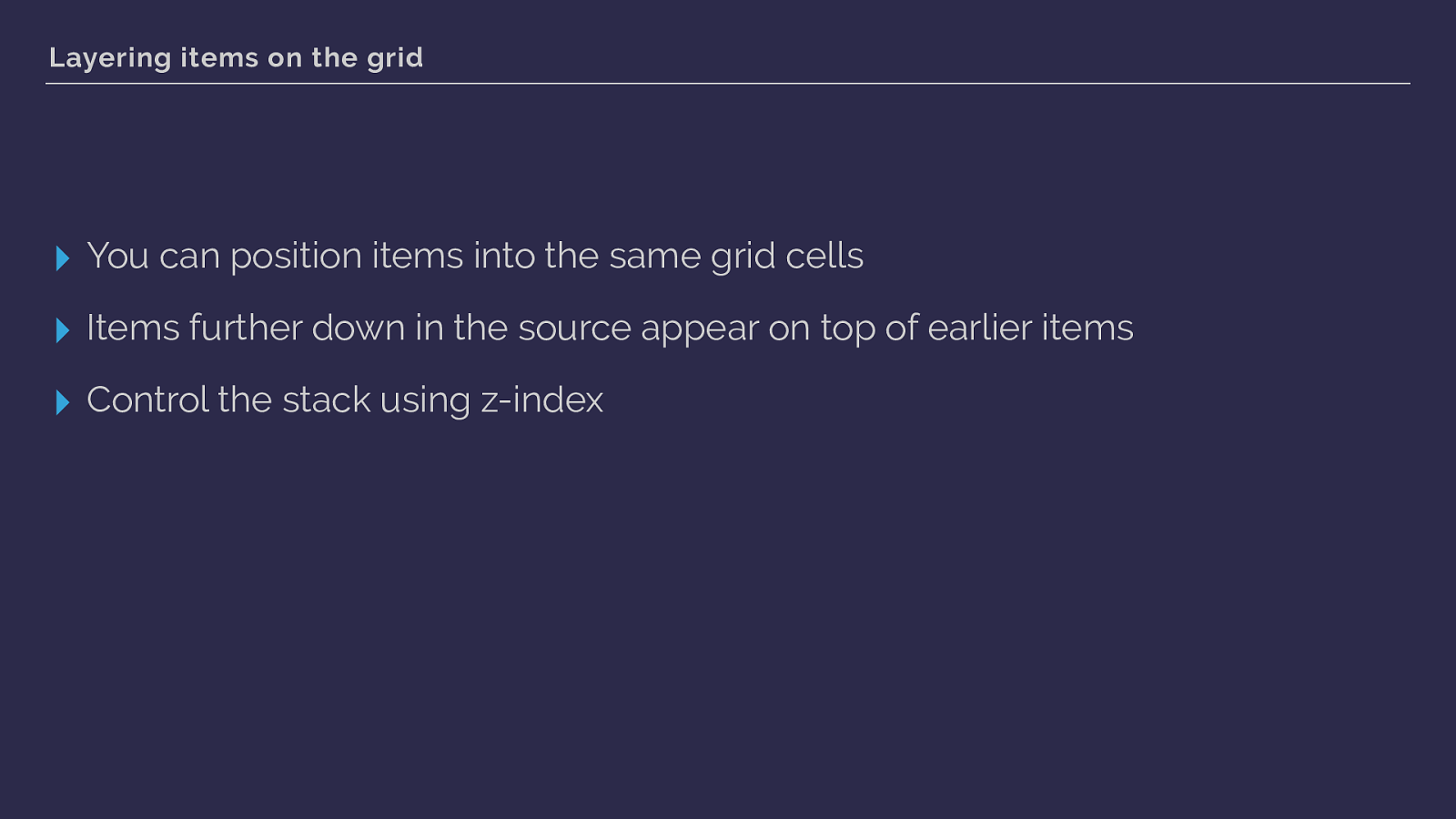
Layering items on the grid ▸ You can position items into the same grid cells ▸ Items further down in the source appear on top of earlier items ▸ Control the stack using z-index this shows us we can use grid to layer items.
As you would expect items that come last end up on top - but you can use z-index to change the stacking order.
This little item has shown us a whole bunch of the features of grid layout. We have used fr units and repeat notation. You saw how grid auto places items that haven’t been positioned. Covered the implicit and explicit grid. We’ve seen line-based positioning at work, you know that grid respects writing mode, we’ve used some of the box alignment properties you may already know from flexbox.
That’s quite a lot for a little box!
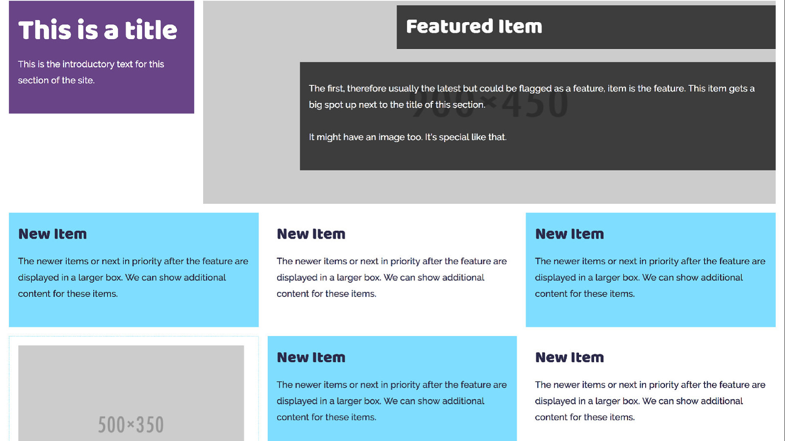
The other boxes in my listing are simpler and don’t use grid themselves - however all of these items sit in a grid layout which creates the listing. Here we are going to rely heavily on auto placement but also create some rules for items.
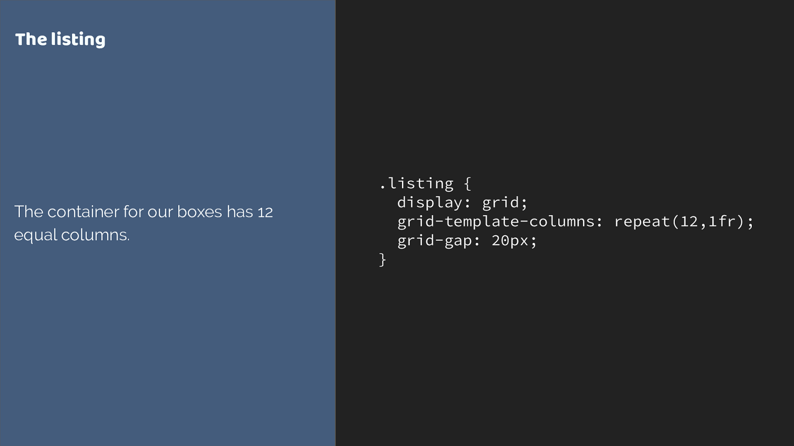
.listing { display: grid; grid-template-columns: repeat(12,1fr); grid-gap: 20px; } The listing The container for our boxes has 12 equal columns. This time I am creating a 12 column flexible grid.
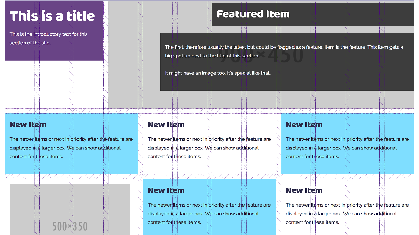
This is where we are trying to get to - with the 12 column grid displayed again using Firefox grid inspector to highlight the grid. You can see how the boxes span cells.
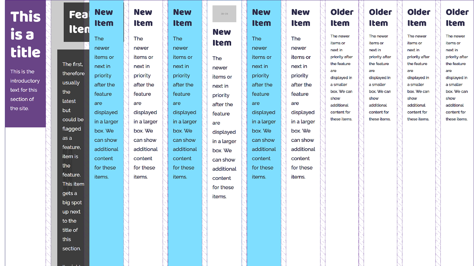
However without any rules to to control the children we end up with grid trying to auto place everything, and stu ff things into skinny columns.
What we want to do is make sure that our title appears top left, and the feature on the right.
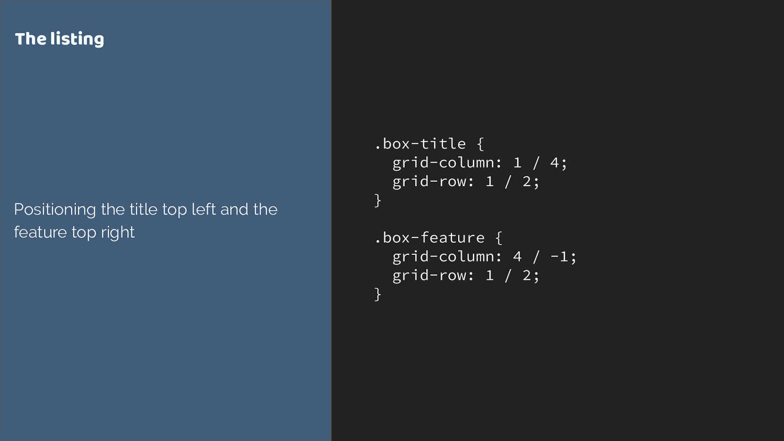
.box-title {
grid-column: 1 / 4;
grid-row: 1 / 2;
}
.box-feature {
grid-column: 4 / -1;
grid-row: 1 / 2;
}
The listing
Positioning the title top left and the
feature top right
we are using line-based positioning again. Placing the two items on our grid.
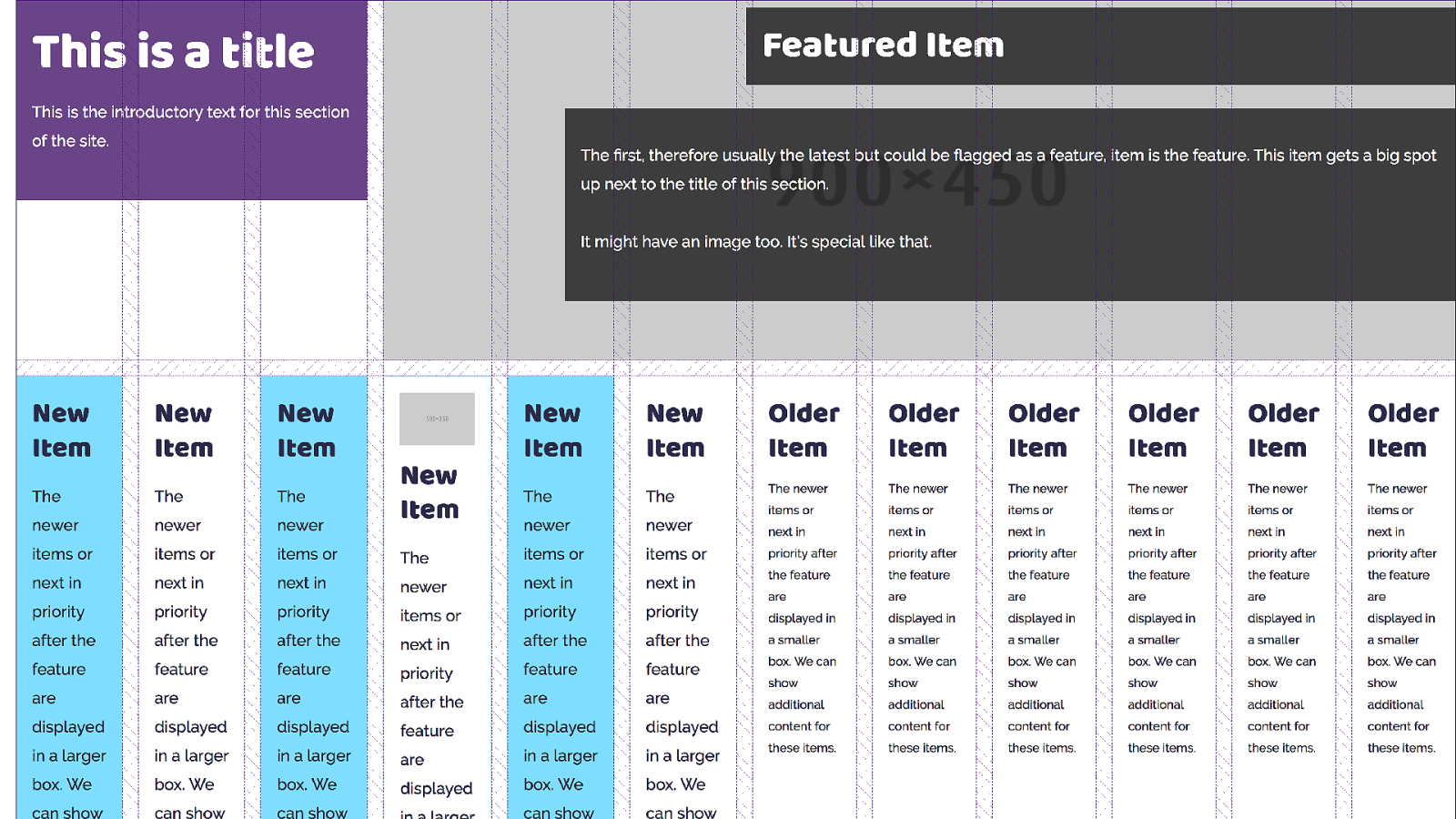
The others just follow along being auto-placed. Again grid is trying to fit them one into each cell.
I want grid to do that auto-placement thing as I don’t know how many items I will have in each listing, however I want my items to span multiple tracks, and I can do that by setting up rules.
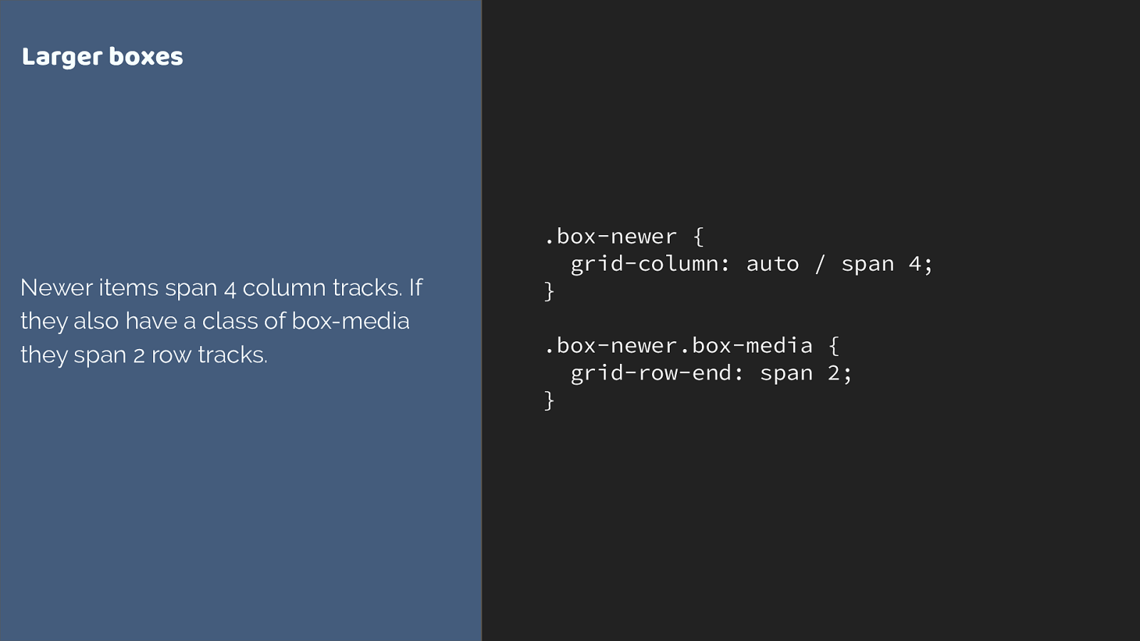
.box-newer { grid-column: auto / span 4; } .box-newer.box-media { grid-row-end: span 2; } Larger boxes Newer items span 4 column tracks. If they also have a class of box-media they span 2 row tracks. We can do this by using the shorthand, setting the start line to auto, and asking grid to span 4 tracks.
I’m also getting my media boxes which have an image or video in to span 2 row tracks. Here I’m using the longhand grid-column-end. Either way is fine - if you don’t specify a start line the default is auto.
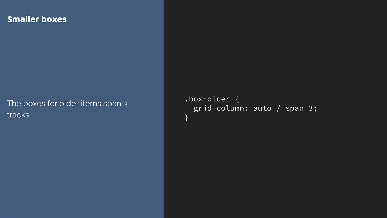
.box-older { grid-column: auto / span 3; } Smaller boxes The boxes for older items span 3 tracks. then for my smaller boxes I am spanning 3 tracks.
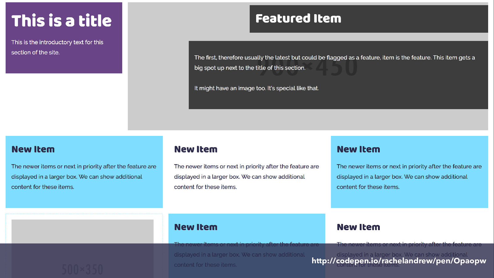
http://codepen.io/rachelandrew/pen/Opaopw and here it is.
So we have defined our grid on the container.
Items auto place into the grid.
We can explicitly position items using line-based placement, or we can ask items to span tracks of the grid without changing their start line.
Going responsive CSS Grid I’ve been showing you the rules I created for my widest breakpoint.
With your layout being defined in CSS, it is straightforward to make changes for various breakpoints. You can either change the grid definition on the container or you can change the rules that apply to the items. In this case I decided to keep my 12 column grid, but change how items display on it.
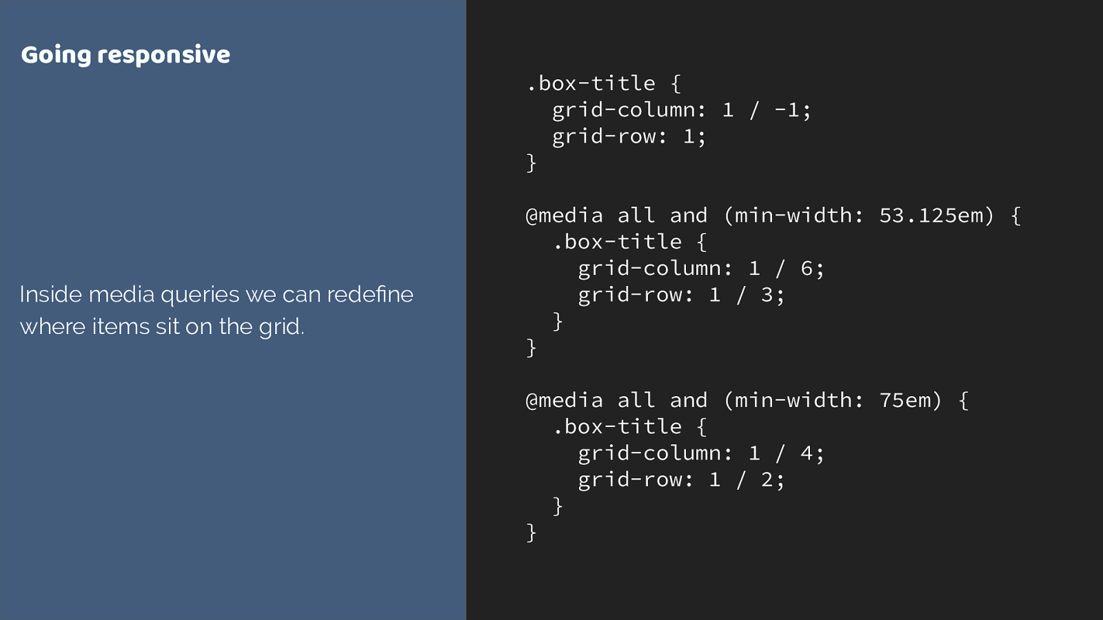
.box-title {
grid-column: 1 / -1;
grid-row: 1;
}
@media all and (min-width: 53.125em) {
.box-title {
grid-column: 1 / 6;
grid-row: 1 / 3;
}
}
@media all and (min-width: 75em) {
.box-title {
grid-column: 1 / 4;
grid-row: 1 / 2;
}
}
Going responsive
Inside media queries we can rede
fi
ne
where items sit on the grid.
Here I start with my title spanning right across the grid for very narrow screens. As we get more screen real estate I change where it is placed.
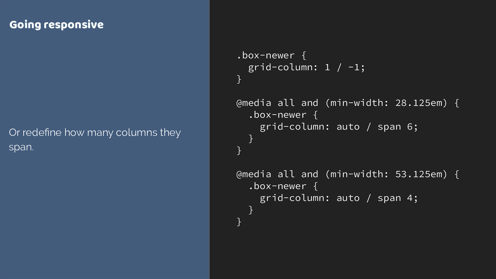
.box-newer {
grid-column: 1 / -1;
}
@media all and (min-width: 28.125em) {
.box-newer {
grid-column: auto / span 6;
}
}
@media all and (min-width: 53.125em) {
.box-newer {
grid-column: auto / span 4;
}
}
Going responsive
Or rede
fi
ne how many columns they
span.
we can also change the way the boxes auto place.
At narrow breakpoints they span 6 tracks, dropping to 4.
http://codepen.io/rachelandrew/pen/gmQdgz ao we have kept that 12 column grid, the columns are narrower on smaller screens so to keep things readable we span more columns.
What about old browsers? CSS Grid Layout At the top of this talk I showed you the current status of grid browser support, as people’s browsers update we are going to see a very high level of grid support by the end of this year.
However the reality of old browsers existing isn’t going to vanish overnight. The thing is, defined into the specification are details of how grid interacts with older layout methods.
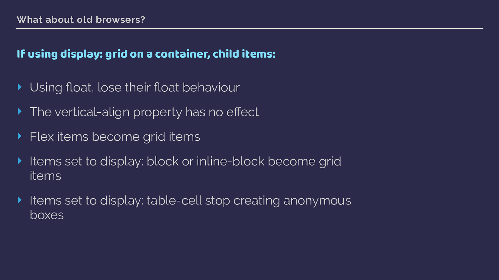
What about old browsers? If using display: grid on a container, child items: ‣ Using fl oat, lose their fl oat behaviour ‣ The vertical-align property has no e ff ect ‣ Flex items become grid items ‣ Items set to display: block or inline-block become grid items ‣ Items set to display: table-cell stop creating anonymous boxes This is all defined in the spec. Once a parent element becomes a grid container, a lot of the methods you may have used to deal with older browsers stop having any e ff ect on the items.
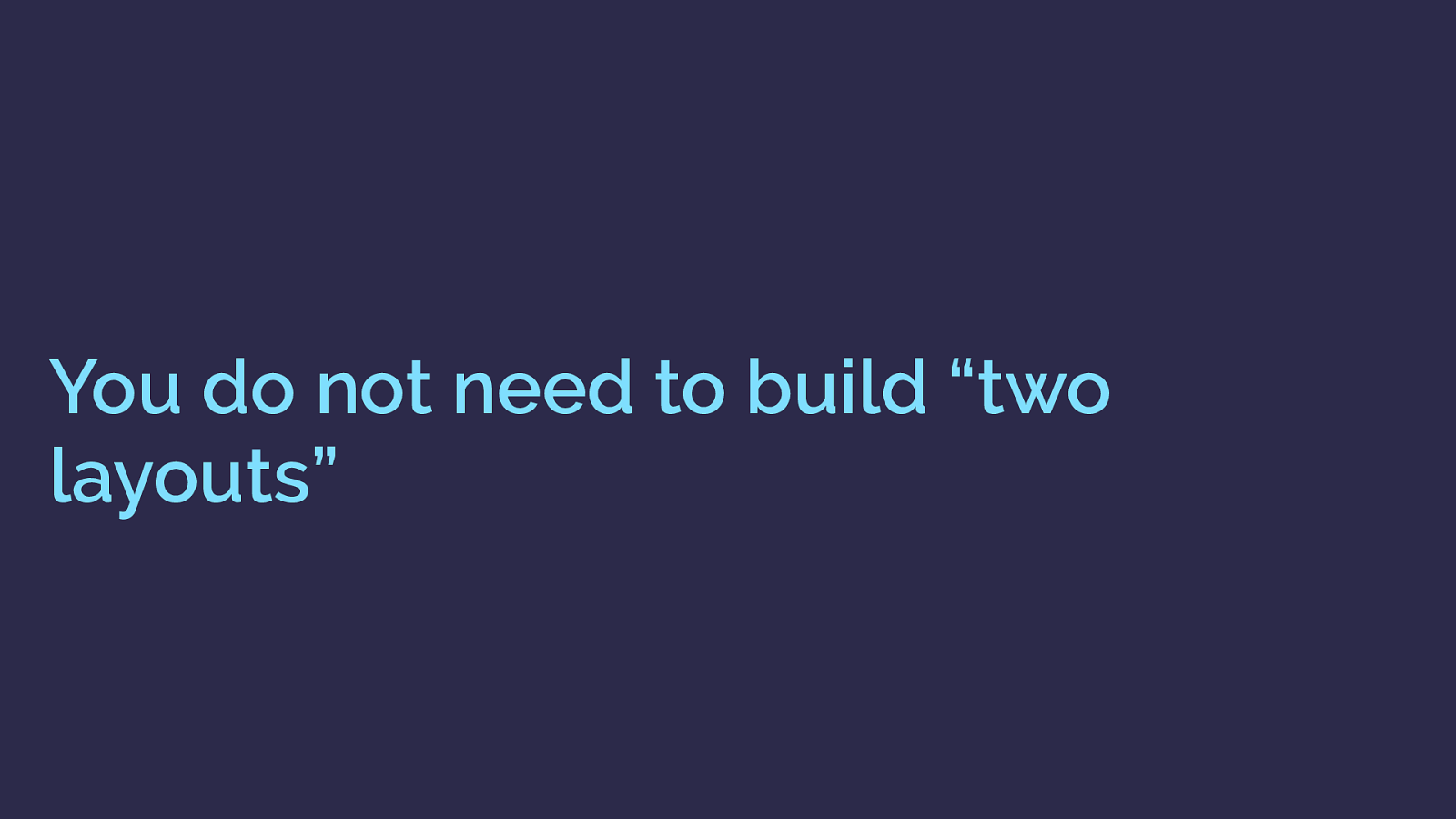
You do not need to build “two layouts” you don’t need to build two layouts, or completely fork your code. Grid works really well as an enhancement.
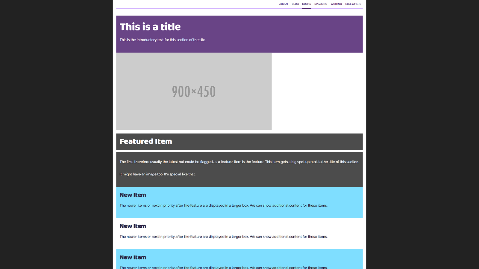
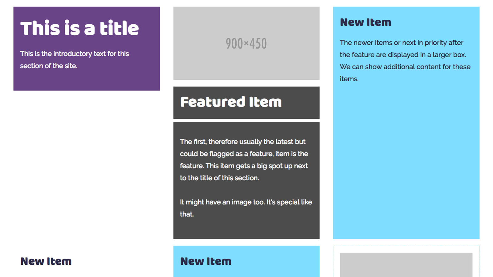
Here is our listing page in a browser that doesn’t support grid layout. As you would expect, everything is displaying in document flow, so each box goes wide and falls one under the other.
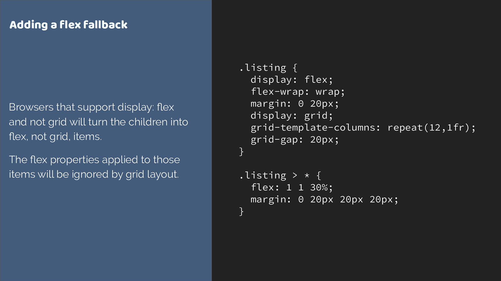
.listing { display: flex; flex-wrap: wrap; margin: 0 20px; display: grid; grid-template-columns: repeat(12,1fr); grid-gap: 20px; } .listing > * { flex: 1 1 30%; margin: 0 20px 20px 20px; } Adding a flex fallback Browsers that support display: fl ex and not grid will turn the children into fl ex, not grid, items. The fl ex properties applied to those items will be ignored by grid layout. The listing is pretty easy to create a fallback layout for. We just need to pick an alternate way to display our boxes. In this case I chose flex layout.
Flex items will just become grid items if grid is supported.
One thing I do need to do however is remove that margin I have added to flex items, as the grid-gap property is controlling the spacing in grid layout.

Feature Queries are your new best friend For this, we can use a feature query. Feature queries look like a media query, but instead of checking for a screen size we check if a browser reports support of a CSS property and value.
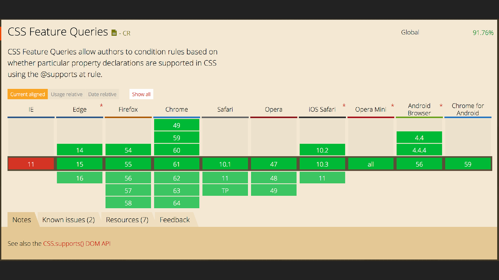
The nice thing about feature queries is that there are no browsers supporting grid layout that don’t support feature queries - so we can use this technique to check for support.
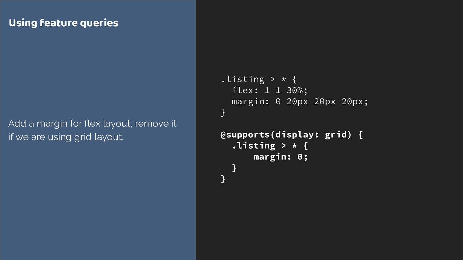
.listing > * { flex: 1 1 30%; margin: 0 20px 20px 20px; } @supports(display: grid) { .listing > * { margin: 0; } } Using feature queries Add a margin for fl ex layout, remove it if we are using grid layout. We don’t need to remove the flex properties it is ignored anyway when the flex item becomes a grid item, as defined in the spec. You only need to override things that would make a di ff erent to the layout.
we now have this layout, so a final thing I want to do is to make the title and feature box have similar proportions to our grid layout.
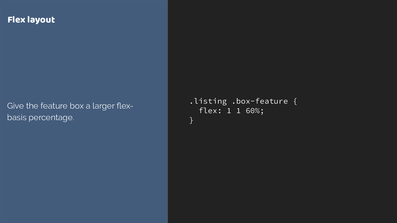
.listing .box-feature { flex: 1 1 60%; } Flex layout Give the feature box a larger fl ex- basis percentage. giving the box a larger flex basis
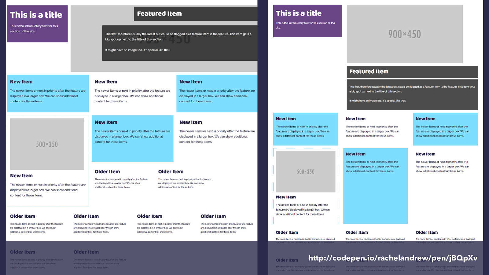
http://codepen.io/rachelandrew/pen/jBQpXv and here is our flex version alongside the grid version. We could go further with this, we could absolutely position the layered elements on the feature box if we wanted to for example, but this is a reasonable layout for my own site where I’m aiming to showcase grid to some extent and where I do have a high number of modern browsers.
However what you have seen is that we really don’t need a lot of additional CSS to perform these overrides, as grid items naturally override a lot of the behaviour.
A quick guide to things you might use as a fallback.
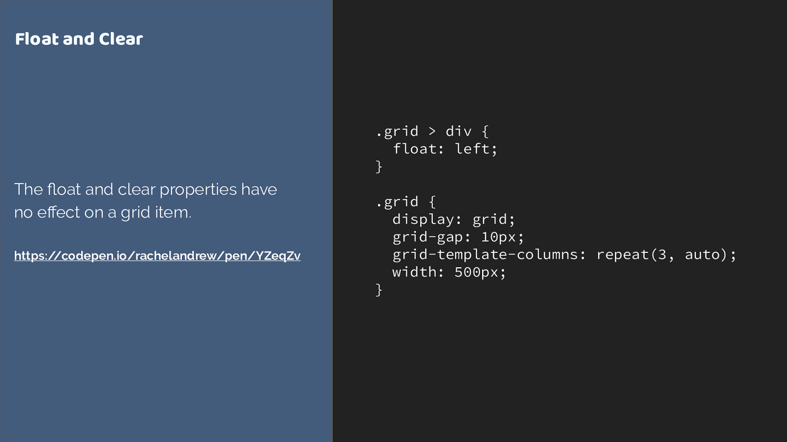
.grid > div { float: left; } .grid { display: grid; grid-gap: 10px; grid-template-columns: repeat(3, auto); width: 500px; } Float and Clear The fl oat and clear properties have no e ff ect on a grid item. https://codepen.io/rachelandrew/pen/YZeqZv float and clear have no e ff ect on a grid item
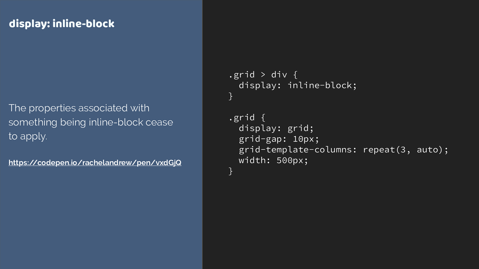
.grid > div { display: inline-block; } .grid { display: grid; grid-gap: 10px; grid-template-columns: repeat(3, auto); width: 500px; } display: inline-block The properties associated with something being inline-block cease to apply. https://codepen.io/rachelandrew/pen/vxdGjQ Inline-block
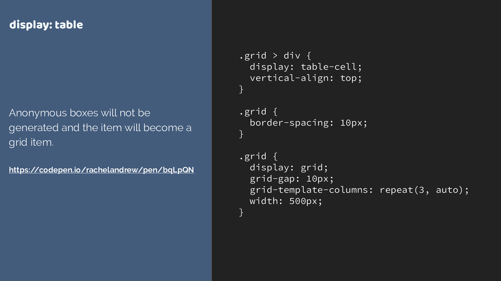
.grid > div { display: table-cell; vertical-align: top; } .grid { border-spacing: 10px; } .grid { display: grid; grid-gap: 10px; grid-template-columns: repeat(3, auto); width: 500px; } display: table Anonymous boxes will not be generated and the item will become a grid item. https://codepen.io/rachelandrew/pen/bqLpQN display: table
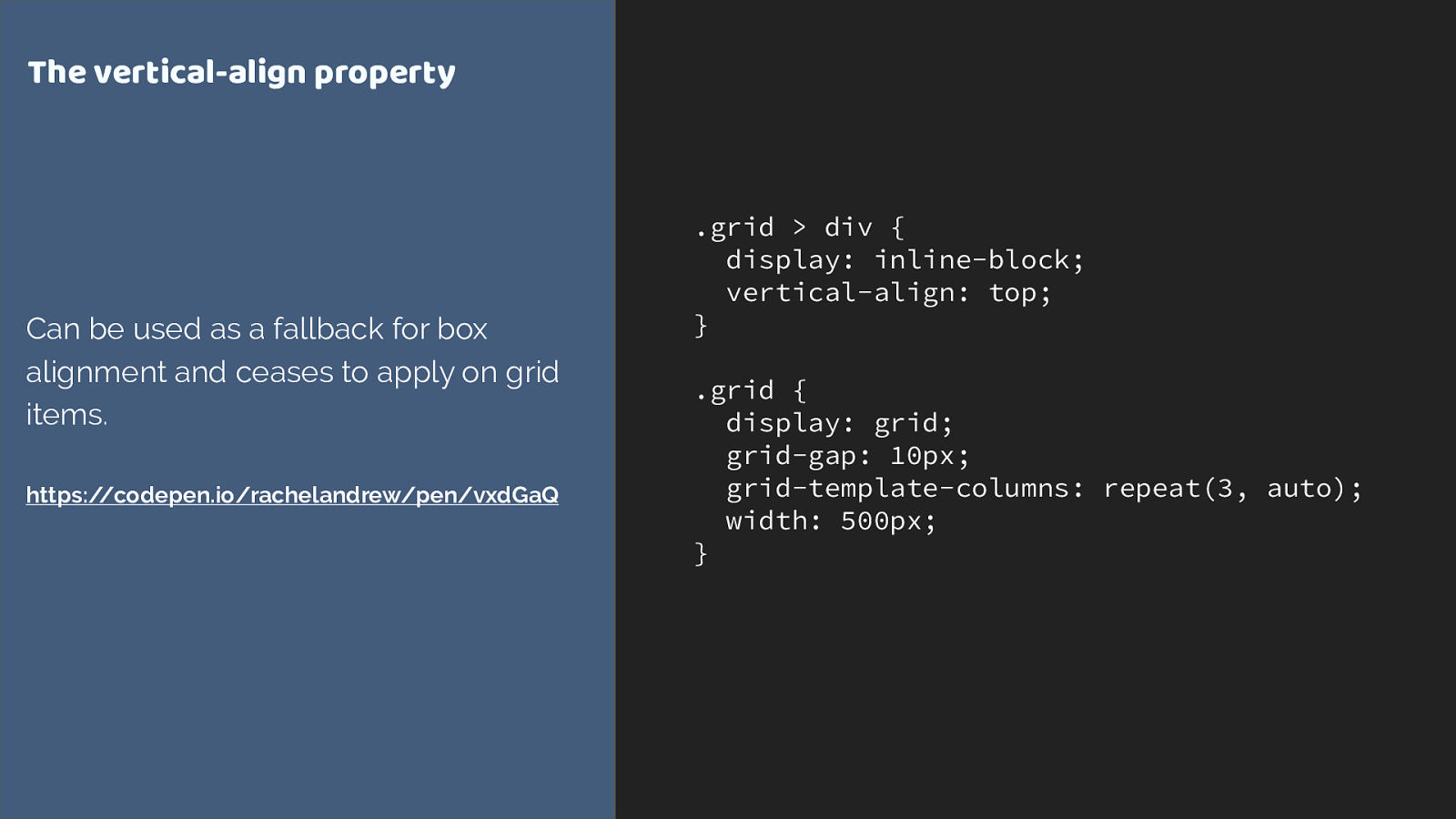
.grid > div { display: inline-block; vertical-align: top; } .grid { display: grid; grid-gap: 10px; grid-template-columns: repeat(3, auto); width: 500px; } The vertical-align property Can be used as a fallback for box alignment and ceases to apply on grid items. https://codepen.io/rachelandrew/pen/vxdGaQ Vertical-align
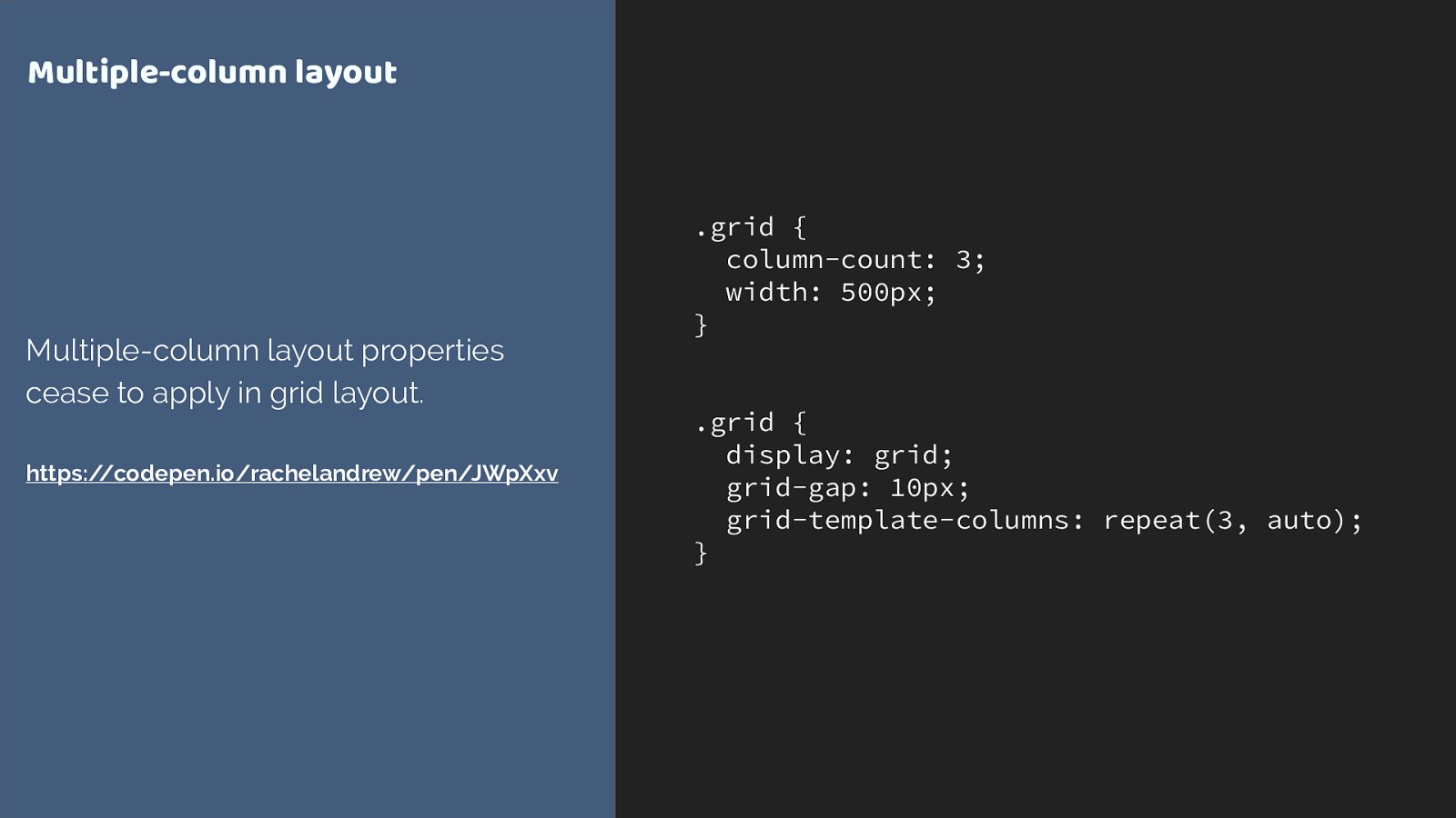
.grid { column-count: 3; width: 500px; } .grid { display: grid; grid-gap: 10px; grid-template-columns: repeat(3, auto); } Multiple-column layout Multiple-column layout properties cease to apply in grid layout. https://codepen.io/rachelandrew/pen/JWpXxv Multi-col
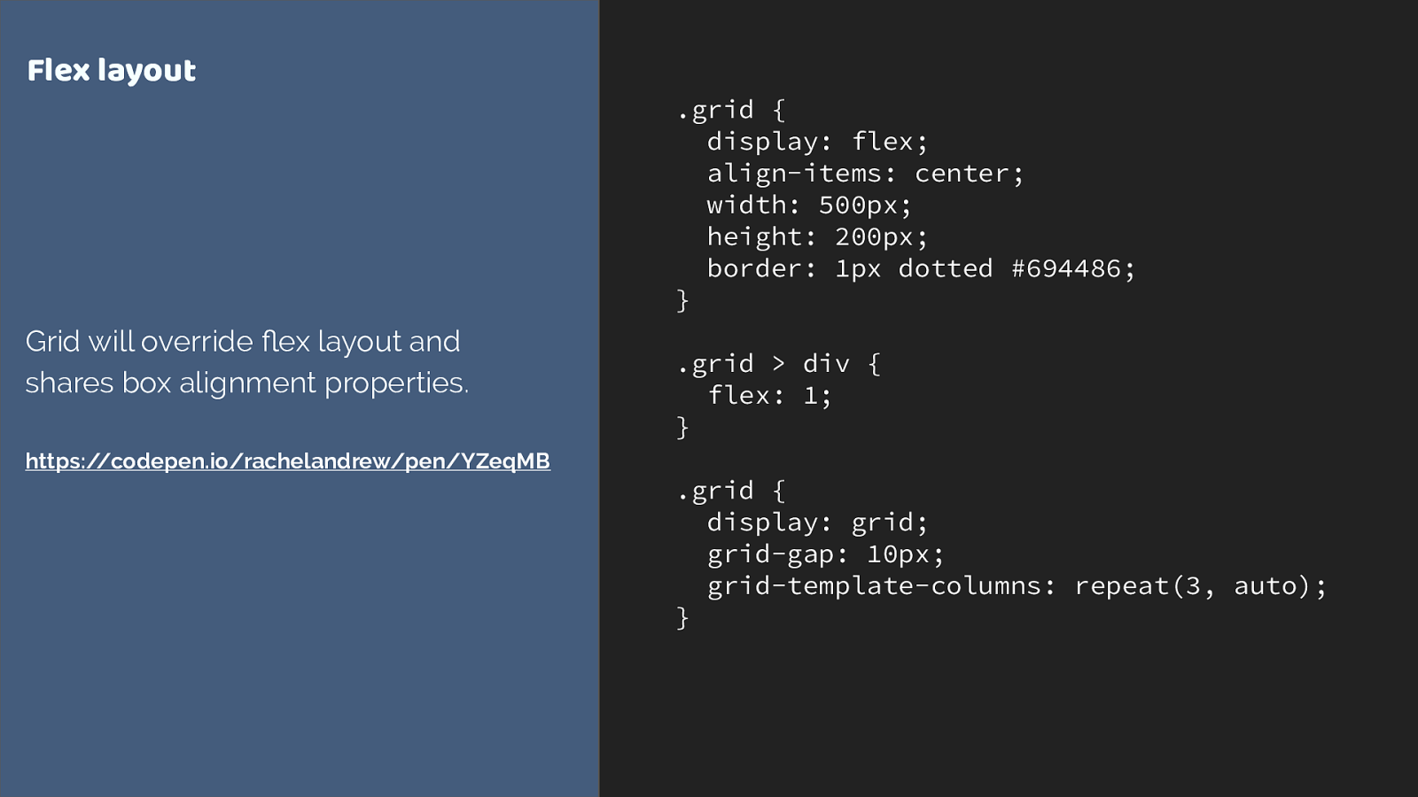
.grid { display: flex; align-items: center; width: 500px; height: 200px; border: 1px dotted #694486; } .grid > div { flex: 1; } .grid { display: grid; grid-gap: 10px; grid-template-columns: repeat(3, auto); } Flex layout Grid will override fl ex layout and shares box alignment properties. https://codepen.io/rachelandrew/pen/YZeqMB Flex

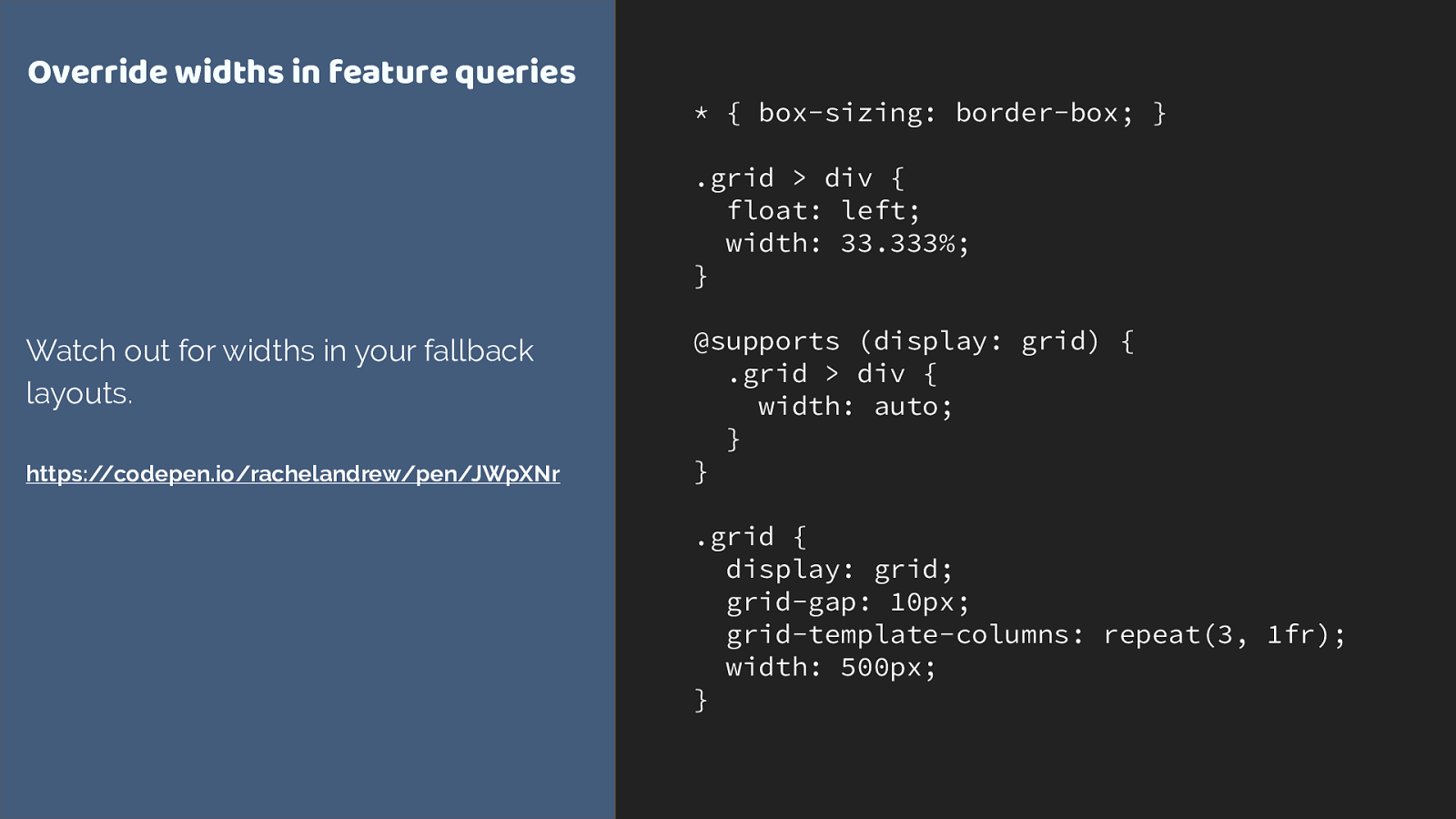
Overrides inside @supports are mostly widths & margins What you find in practice is you mostly need to override widths and margins.
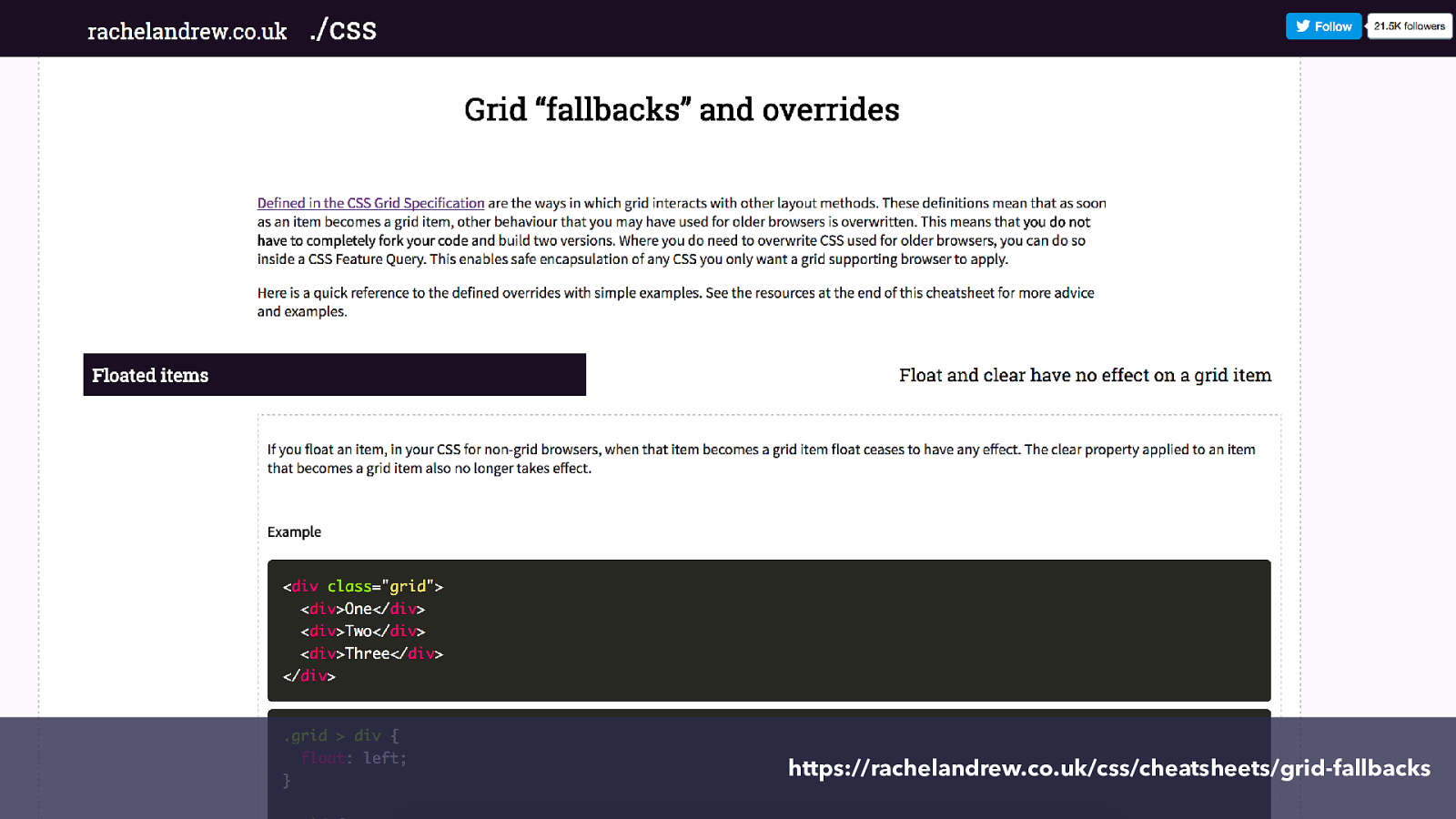
https://rachelandrew.co.uk/css/cheatsheets/grid-fallbacks I made you a cheatsheet to help.
So what of Edge and IE?
Before anyone starts Microsoft bashing, remember that we only have grid layout because the IE team worked on the spec and implemented it in IE10. It is a shame that Edge didn’t ship an update at the same time as other browsers - but from a business point of view I can understand why they might wait until the spec is implemented and other implementations has shipped.
So currently, Edge, IE10 and 11 have the old grid spec implemented. So you can use that for IE fallbacks, and it works very well if in a more limited way than new grid.
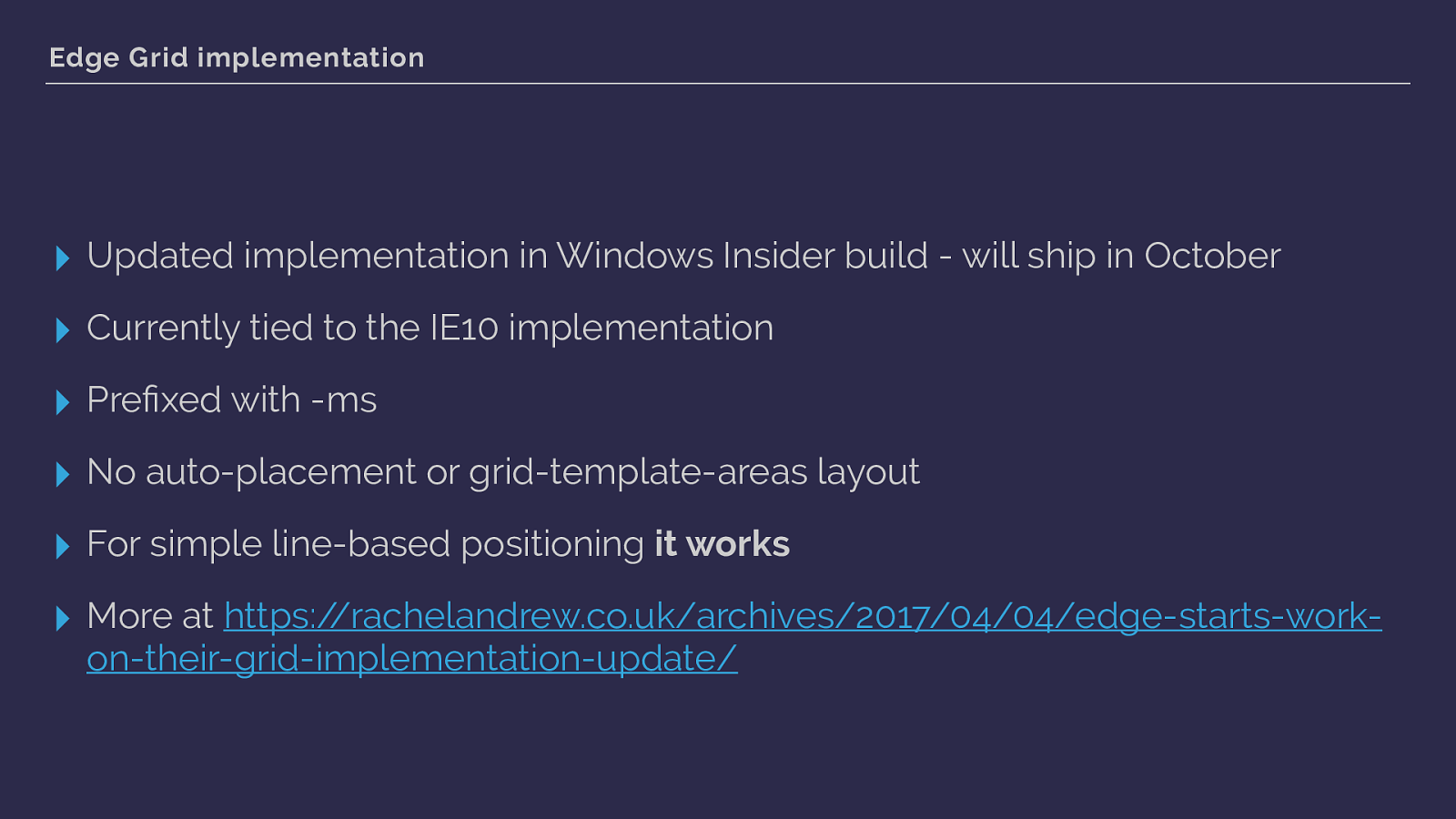
Edge Grid implementation
▸
Updated implementation in Windows Insider build - will ship in October
▸
Currently tied to the IE10 implementation
▸
Pre
fi
xed with -ms
▸
No auto-placement or grid-template-areas layout
▸
For simple line-based positioning
it works
▸ More at https://rachelandrew.co.uk/archives/2017/04/04/edge-starts-work- on-their-grid-implementation-update/
here are the main things to be aware of.
What we have in Edge is currently tied to the IE implementation and prefixed - so when edge updates you can safely keep using the prefixed version for old IE.
That link is to a post with more details of that version, and links to code examples.
However as of October 17th when updated Edge ships we will have new grid available in Edge too.
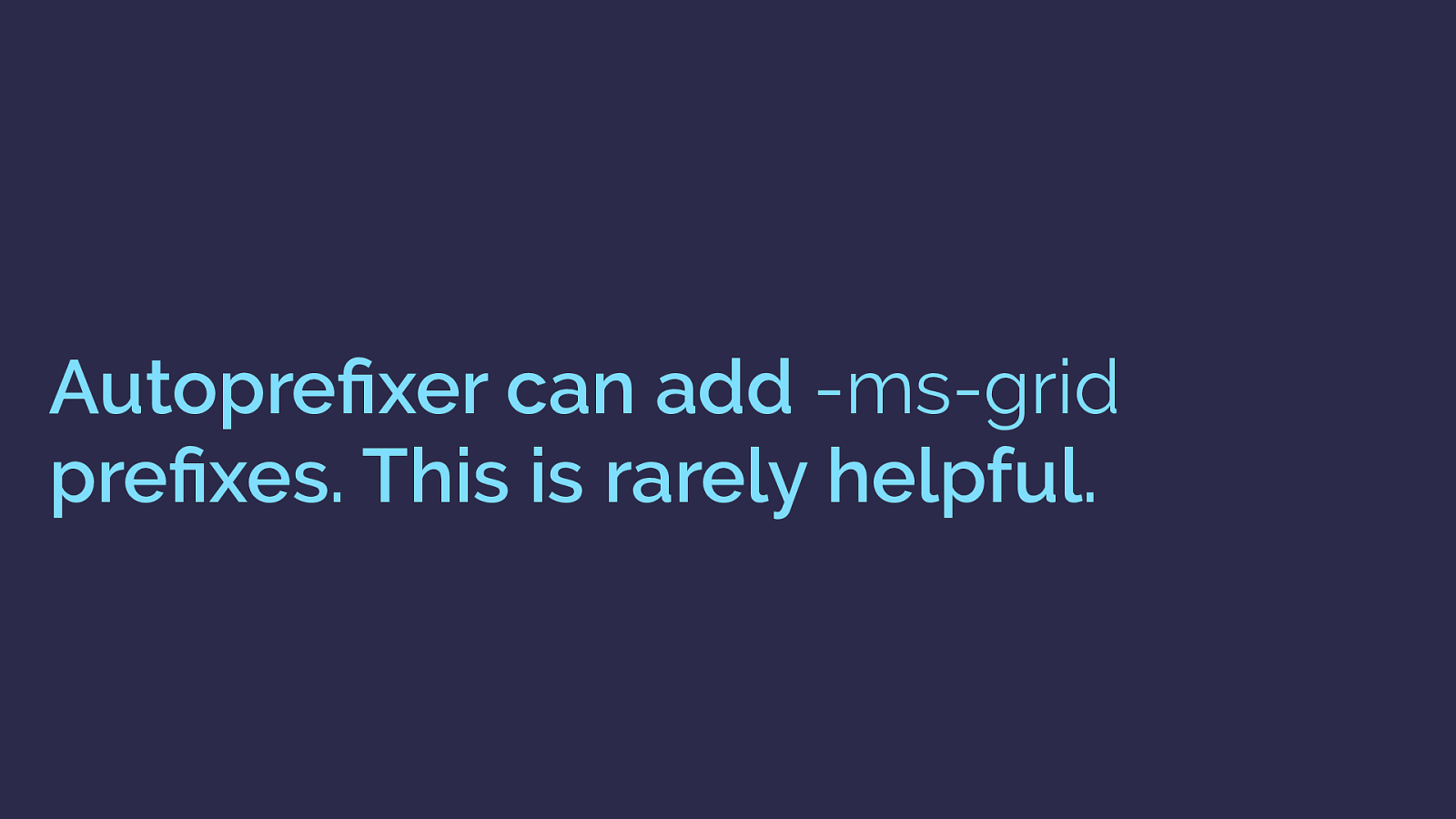
Autopre fi xer can add -ms-grid
pre fi xes. This is rarely helpful. Autoprefixer has implemented support to map the basic grid properties to the -ms version, but as soon as you have used anything unsupported, odd things can happen. There were versions of autoprefixer that enabled this prefixing by default which in most cases just blow up you layout in IE. From v. 7 the grid stu ff is o ff by default.

March 2017 March 2017 March 2017 March 2017 March 2017 October 2017 But lets go back to this slide. All of these browsers that support grid, Edge which does support grid and will soon support new grid.
How does this even happen, and why hasn’t a browser implemented your favourite feature? Ultimately behind every browser is a business - and while interoperability of CSS is really important to all browser vendors - those decisions as to which features to start work on are essentially a business decision. BUT. We have more influence on those decisions than you might think.

Let browser vendors know which features you want. If you want certain features, especially things that have already been implemented by one browser, you need to use those features, write about them, vote them up, as it is that usage data that browser vendors look at when making those decisions. It’s why it is worth adding something to a site as an enhancement even if only 50% of people use it. That data is noticed.
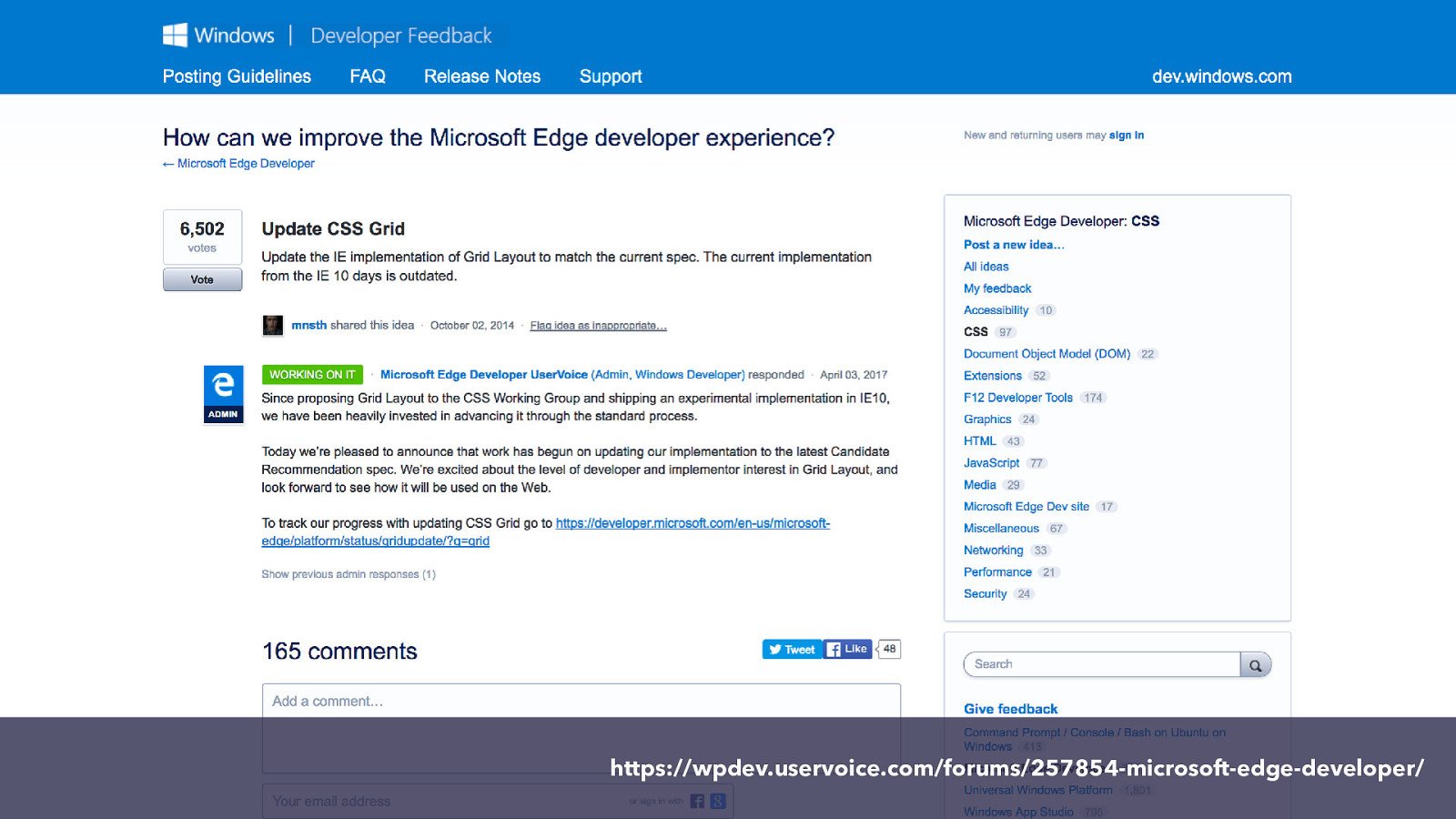
https://wpdev.uservoice.com/forums/257854-microsoft-edge-developer/ This is the Edge UserVoice, you can find features here and vote on them. This interest is noted.
Remember that it isn’t just the engineers who work on implementing this stu ff you have to convince - it’s the people who they will need to make a business case to in order to do the work.
People demanding a feature is going to help.
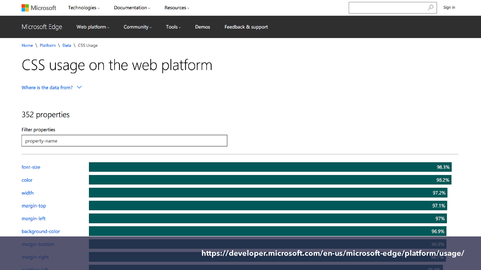
https://developer.microsoft.com/en-us/microsoft-edge/platform/usage/ Also, actually using features. Even if they aren’t implemented everywhere demonstrates that they are wanted.
This is the Microsoft data site showing data on usage of various properties.
So I’m going to show you something that I would love to see implemented. Like Grid it is a spec that has started life in a Microsoft browser. Although the initial spec was one developed by Adobe - and was linked to the CSS Shapes spec you may be familiar with,
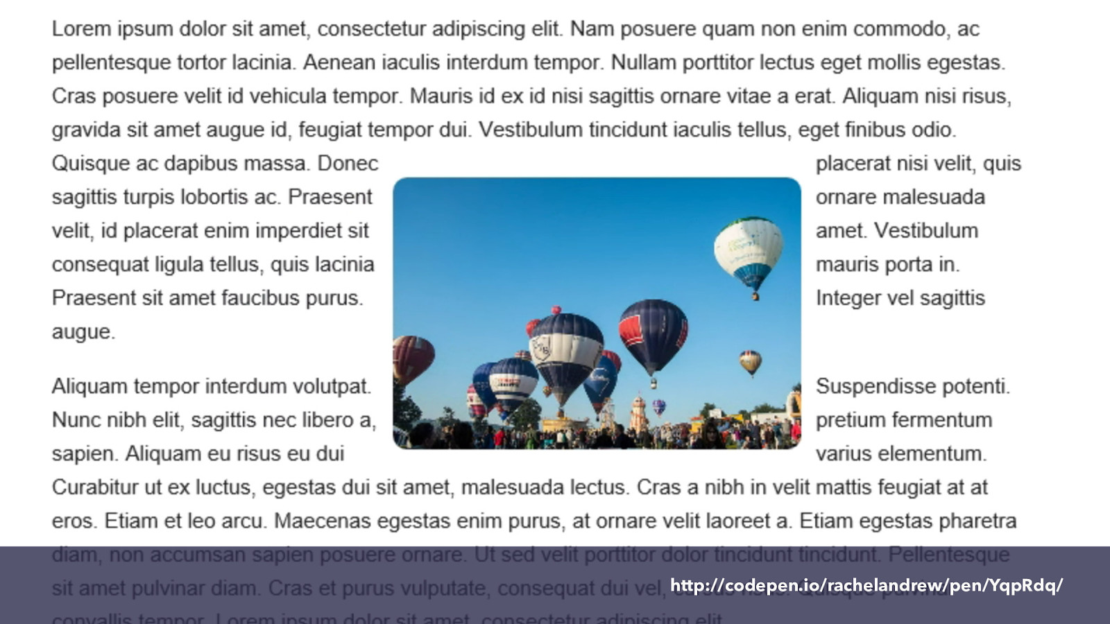
http://codepen.io/rachelandrew/pen/YqpRdq/ CSS Exclusions.
Removed from the Shapes spec into it’s own spec. This defines a property that allows us to wrap content around all sides of an item - like this image here. That’s what you see if you use Edge to view that example.
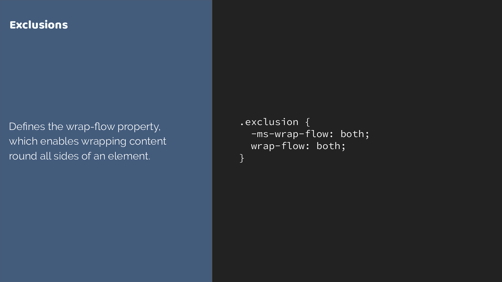
.exclusion { -ms-wrap-flow: both; wrap-flow: both; } Exclusions De fi nes the wrap- fl ow property, which enables wrapping content round all sides of an element. This is only implemented in IE and Edge. It makes a huge amount of sense alongside Grid layout. Exclusions doesn’t define any positioning information itself. It just defines the way other content responds to the thing which has the wrap-flow property applied to it. You position the item by whatever method, then use the property to get the text to wrap around.
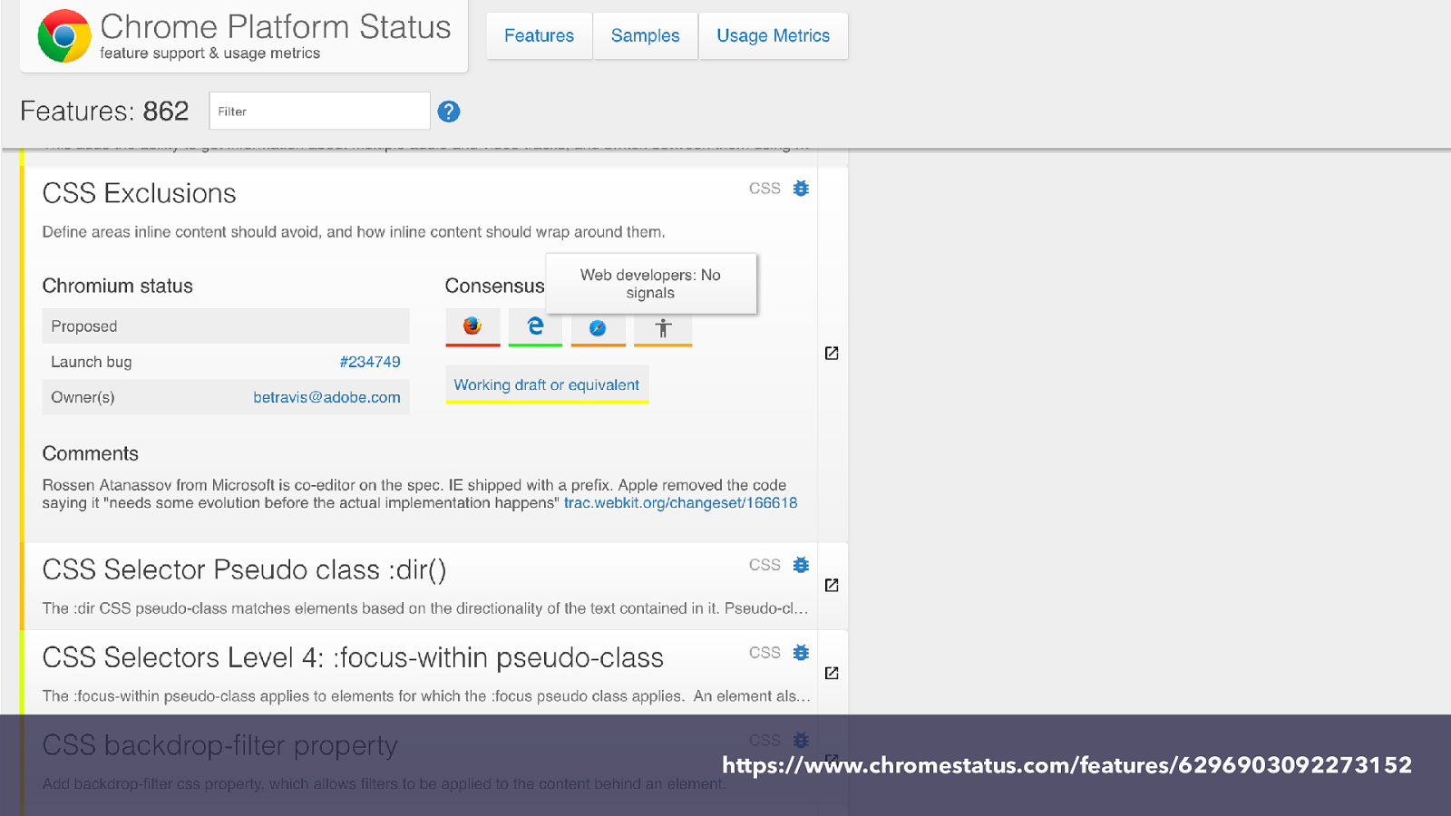
https://www.chromestatus.com/features/6296903092273152 Now on Chrome platform status they tell us there are “no public signals”, which is pretty much true. But, we could change that. If anyone else agrees with me that being able to wrap text around both sides of an item might be pretty handy. You could write about this.
Talk about it.
Tell your friends. The ones that are web developers anyway. The others might think you are a bit odd.
SO this is a pet feature of mine, however there are many many other interesting bits of CSS only found in one browser. If you find yourself thinking I wish we could have that, take that thought to the web so that vendors know.

You can get involved in the future of CSS. and it isn’t just about things that exist but aren’t implemented.
You don’t need to be part of the CSS Working Group to be able to influence what ends up in a CSS Spec.
As you start to work with grid you will find things you can’t yet do with it.
Here is an example. One of the first limitations people run into is they would like to be able to style the grid cells and tracks themselves - without needing to put in an empty element.
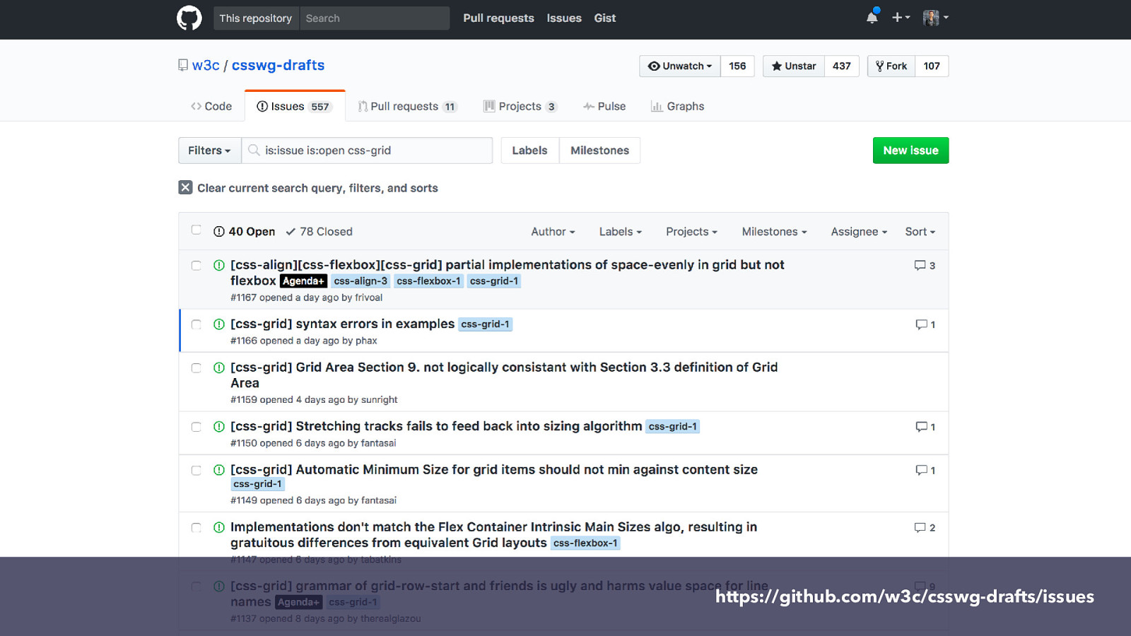
https://github.com/w3c/csswg-drafts/issues If you run into something that can’t be done you can head over to the CSS WG drafts repository, and search the issues already raised against that spec.
If you don’t find the same problem raised, you can raise it. Just like any issue on any open source project. Try and give a use case example, so not just “I want x” but “I want x because it would help solve this particular real world issue”.
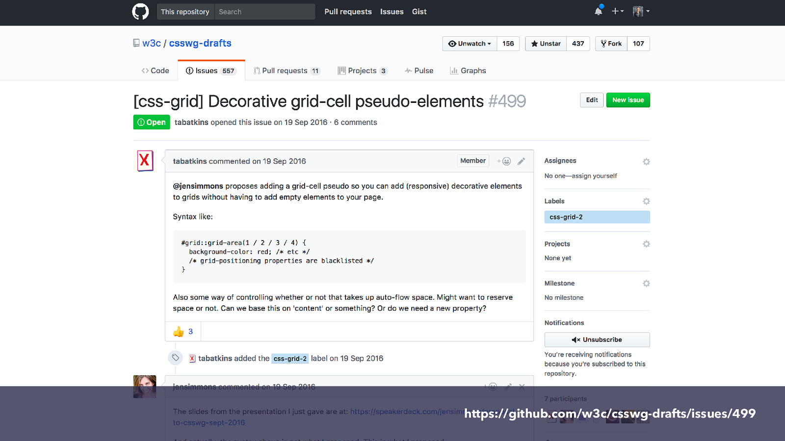
https://github.com/w3c/csswg-drafts/issues/499 You might find the issue - so here is the one about styling cells. If you go to that issue you will see that several people have added their thoughts and use cases, This is really helpful. When this topic comes up for discussion at a meeting of the working group we will be able to consider all of these use cases. It shows that this is needed and also makes sure that the solution added to the spec, actually solves your problems.
You can also see there is a tag here css-grid-2 this mean sit is being considered for level 2 - because level 1 is essentially done at this stage. However it being in level 2 doesn’t mean it will be forever before it is implemented. Things can sometimes move quite quickly.
Get involved with CSS ▸ Comment on or raise new issues against CSS speci fi cations ▸ Raise bugs against browsers ▸ Vote on features where browsers have a platform to do so ▸ Write about new features - it demonstrates we want them ▸ Be nice while doing it. Browser engineers and spec editors work within constraints just as you do in your projects. There are lots of ways to get involved with CSS. With new features there are often very few people commenting on and raising issues. If you do so your voice is likely to be heard. All the specifications have issues tracked on GitHub. So you can go to GitHub and see the issues raised and add some.
is here! CSS Grid So that said, I want to celebrate that CSS Grid is here. This has been such a quick fly through of grid, but what I hope I have shown is that it is possible to start to look at ways i which you might like to use it in small ways. Is it worth it? Yes if it can solve problems you might otherwise be unable to solve in a good way. Many sites are seeing 70 to 80% of browsers with grid support already.
Your site and visitors may vary, but if you are starting a new project now, given the adoption rate and how long sites tend to stick around I would be using it.
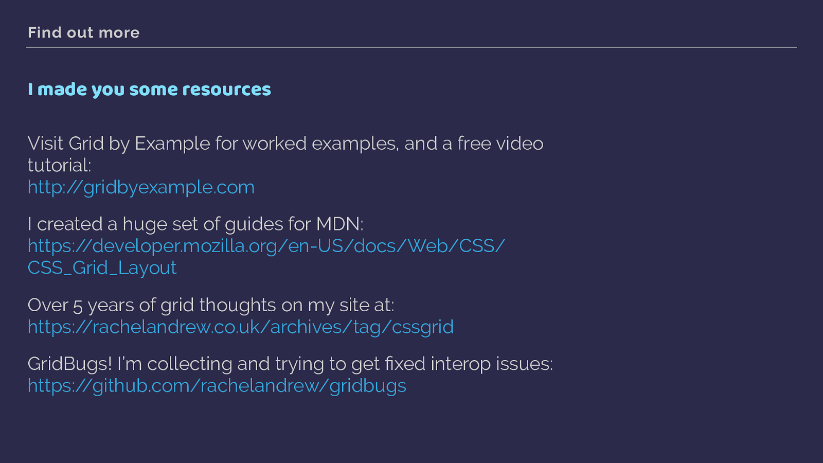
Find out more I made you some resources Visit Grid by Example for worked examples, and a free video tutorial: http://gridbyexample.com
I created a huge set of guides for MDN: https://developer.mozilla.org/en-US/docs/Web/CSS/ CSS_Grid_Layout
Over 5 years of grid thoughts on my site at: https://rachelandrew.co.uk/archives/tag/cssgrid
GridBugs! I’m collecting and trying to get fi xed interop issues: https://github.com/rachelandrew/gridbugs
Here are a few resources.
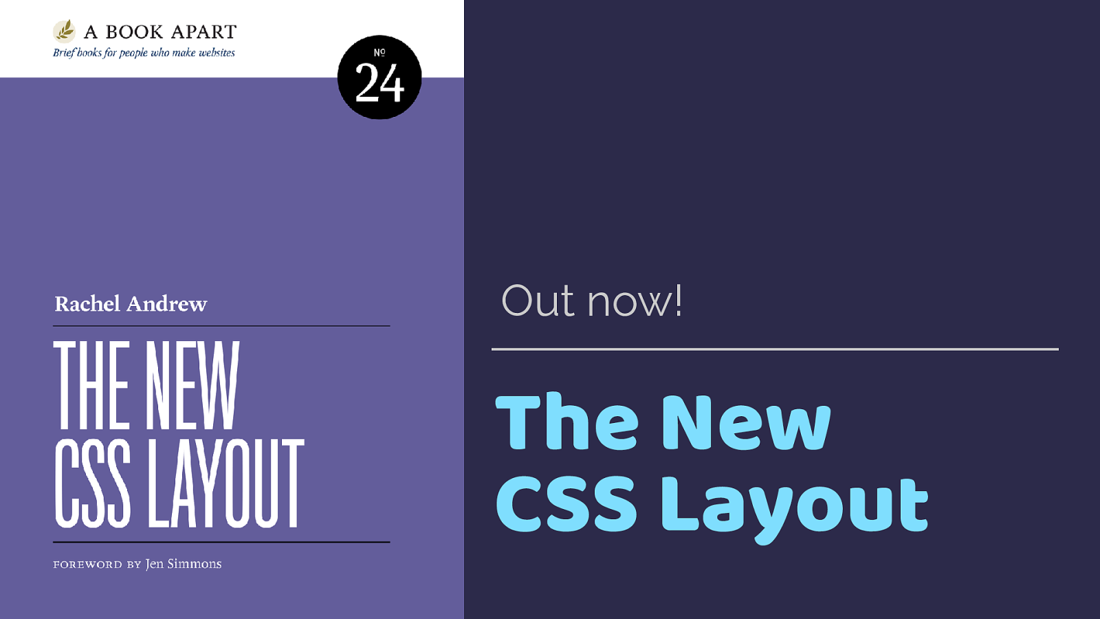
The New CSS Layout Out now!

THANK YOU! @rachelandrew https://rachelandrew.co.uk/speaking/event/gdg-nantes and the slides and a link to all of the code pen examples can be found here.
Thanks for listening.