How to understand CSS @rachelandrew

A presentation at An Event Apart Spring Summit in April 2021 in by Rachel Andrew
How to understand CSS @rachelandrew
If you work in web development learning CSS is not optional.
Revisit the things you already know
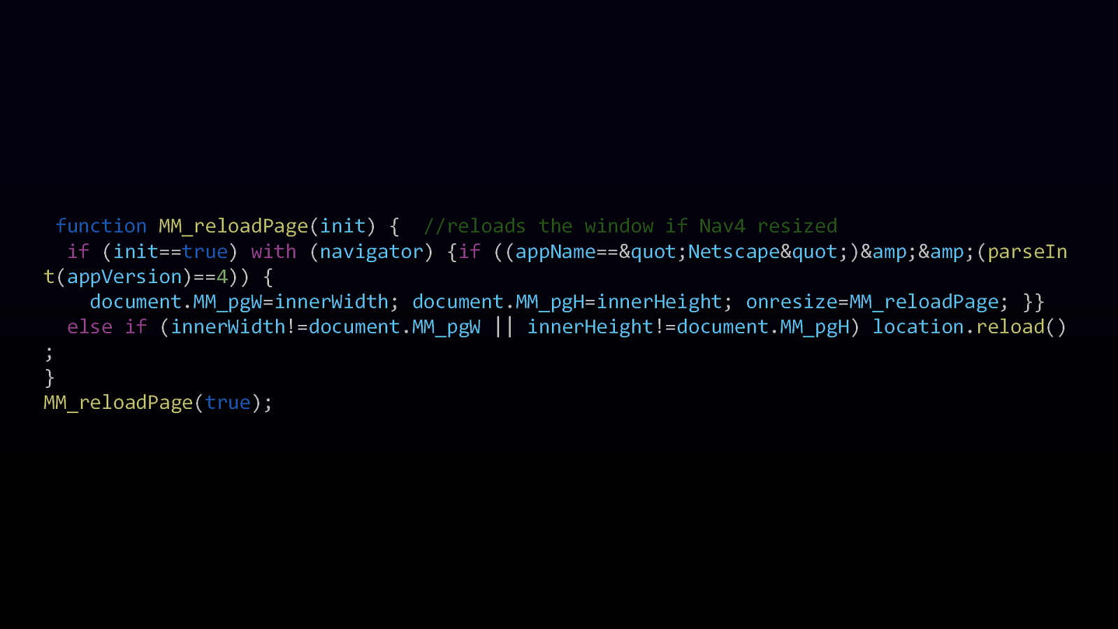
function MM_reloadPage(init) { //reloads the window if Nav4 resized if (init==true) with (navigator) {if ((appName==”Netscape”)&&(parseIn t(appVersion)==4)) { document.MM_pgW=innerWidth; document.MM_pgH=innerHeight; onresize=MM_reloadPage; }} else if (innerWidth!=document.MM_pgW || innerHeight!=document.MM_pgH) location.reload() ; } MM_reloadPage(true);
It’s true! Some things in CSS have weird names, strange casing, and odd rules.
We can’t break the web
Naming things is hard

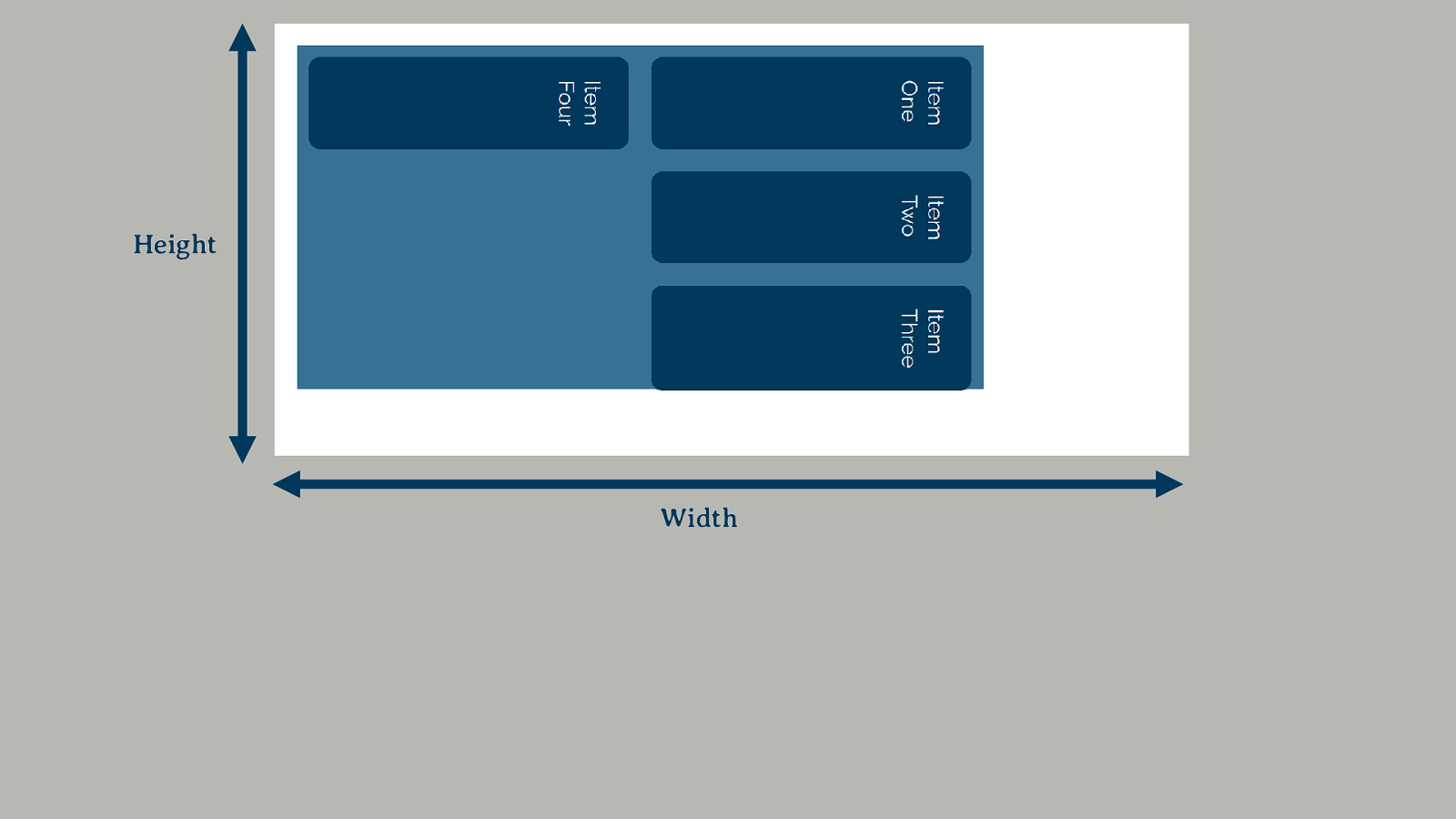
Writing Modes A writing-mode agnostic way of working.
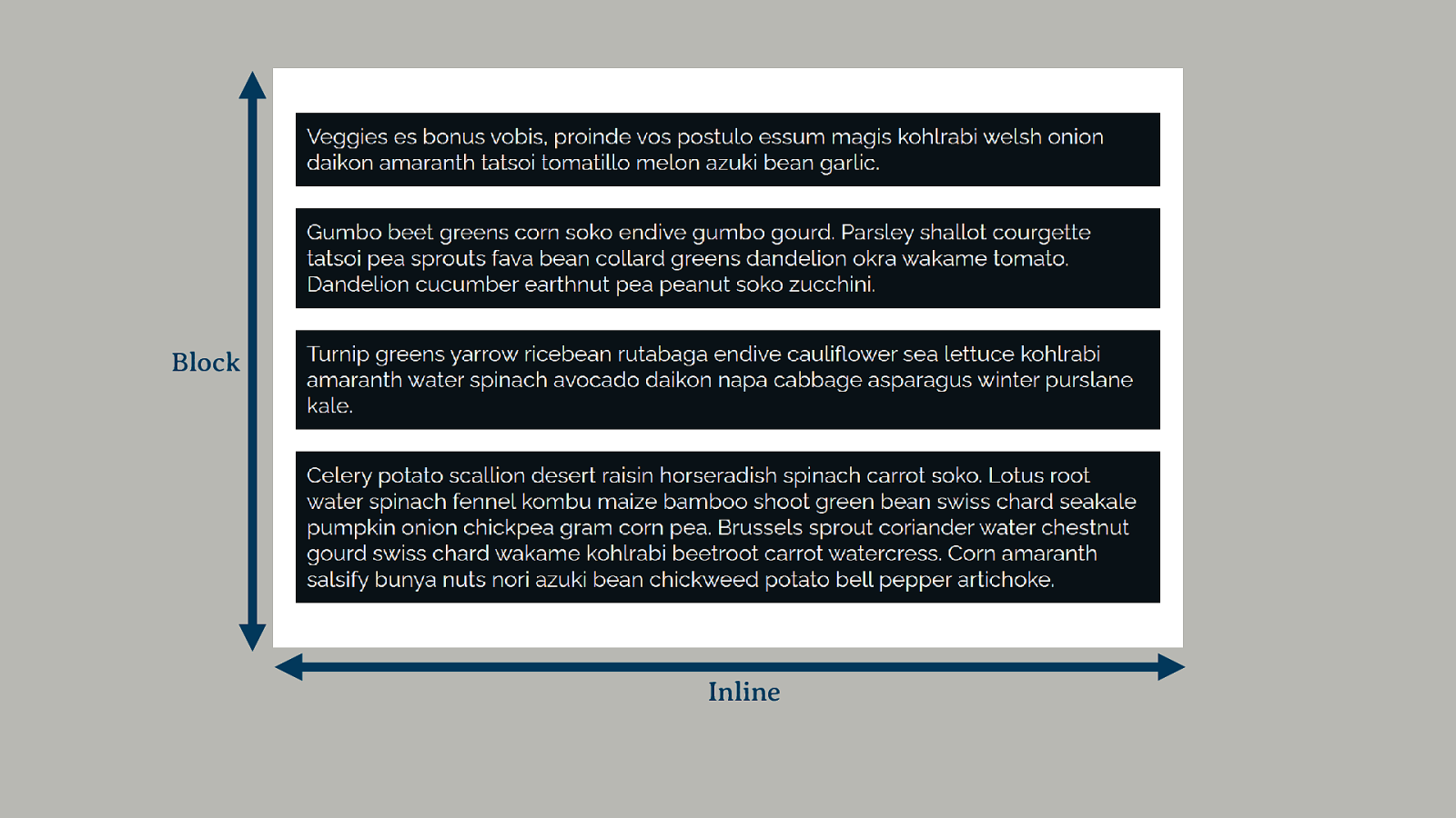
Block Inline
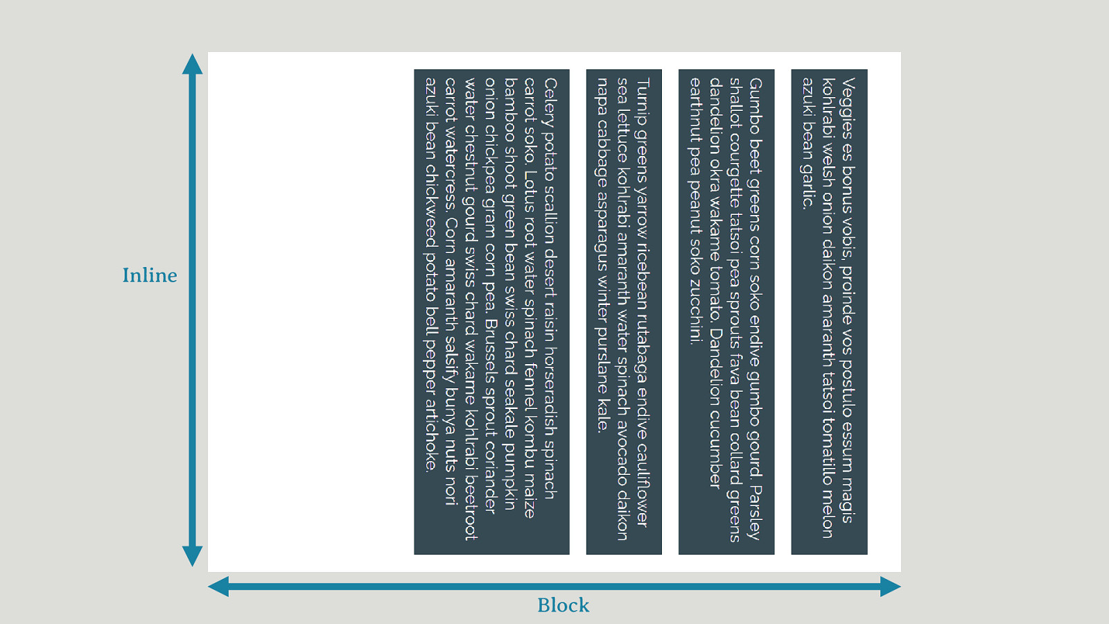
Inline Block
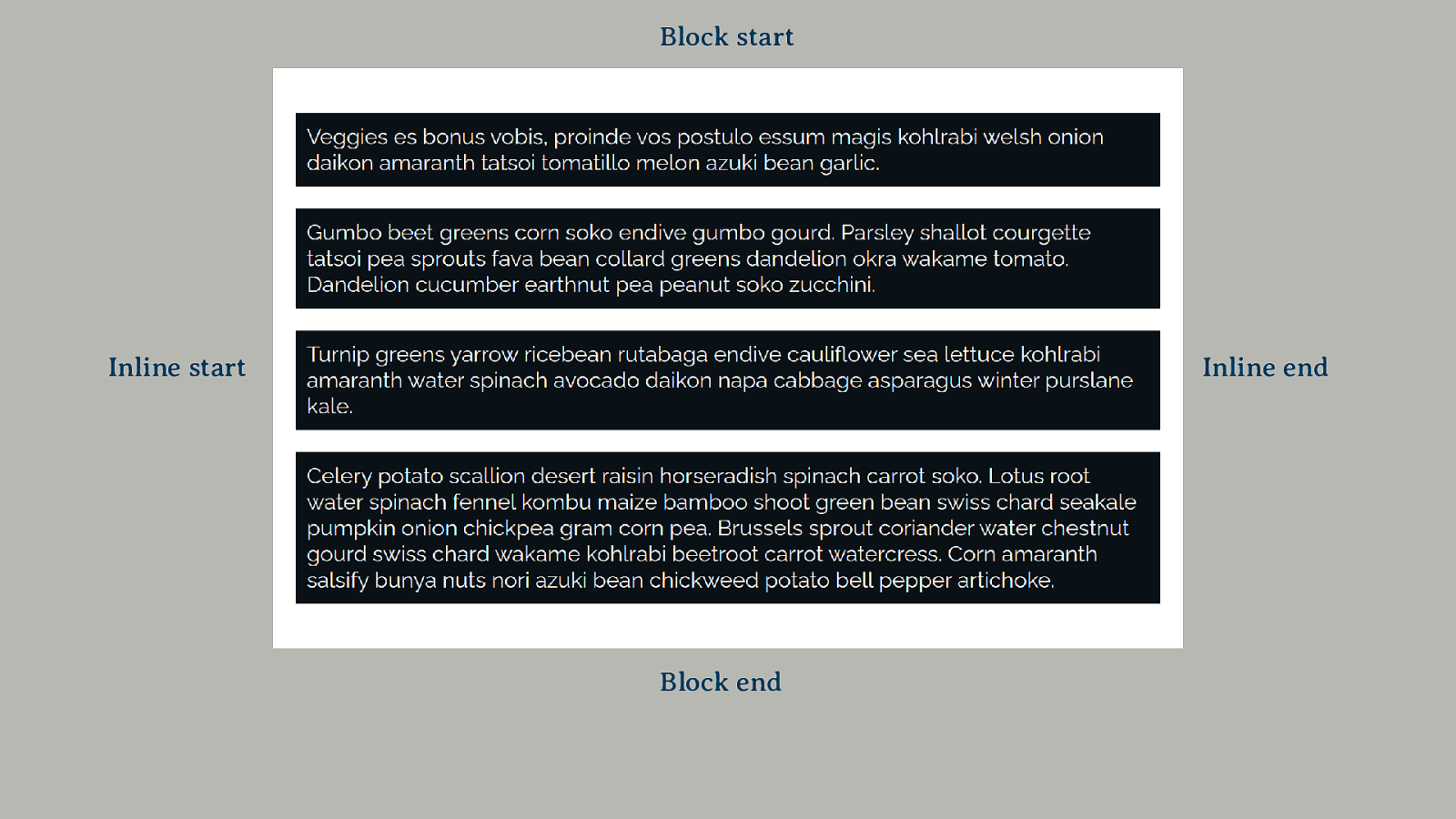
Block start Inline start Inline end Block end
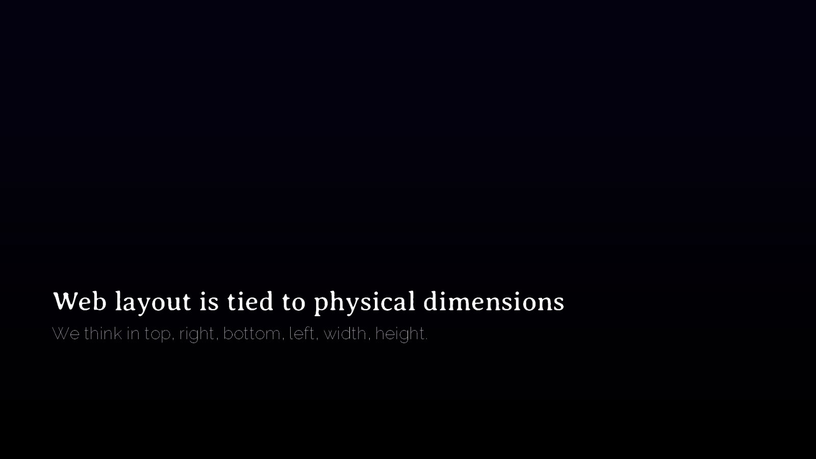
Web layout is tied to physical dimensions We think in top, right, bottom, left, width, height.
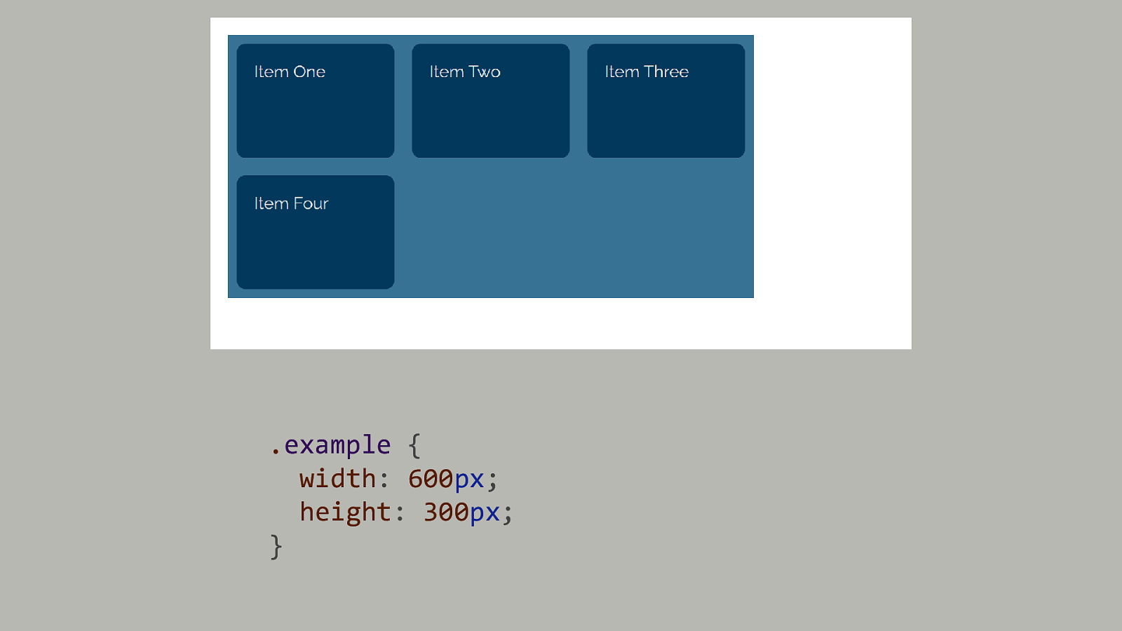
.example { width: 600px; height: 300px; }
Height Width

Logical Properties & Values Mapping the physical to the flow-relative.
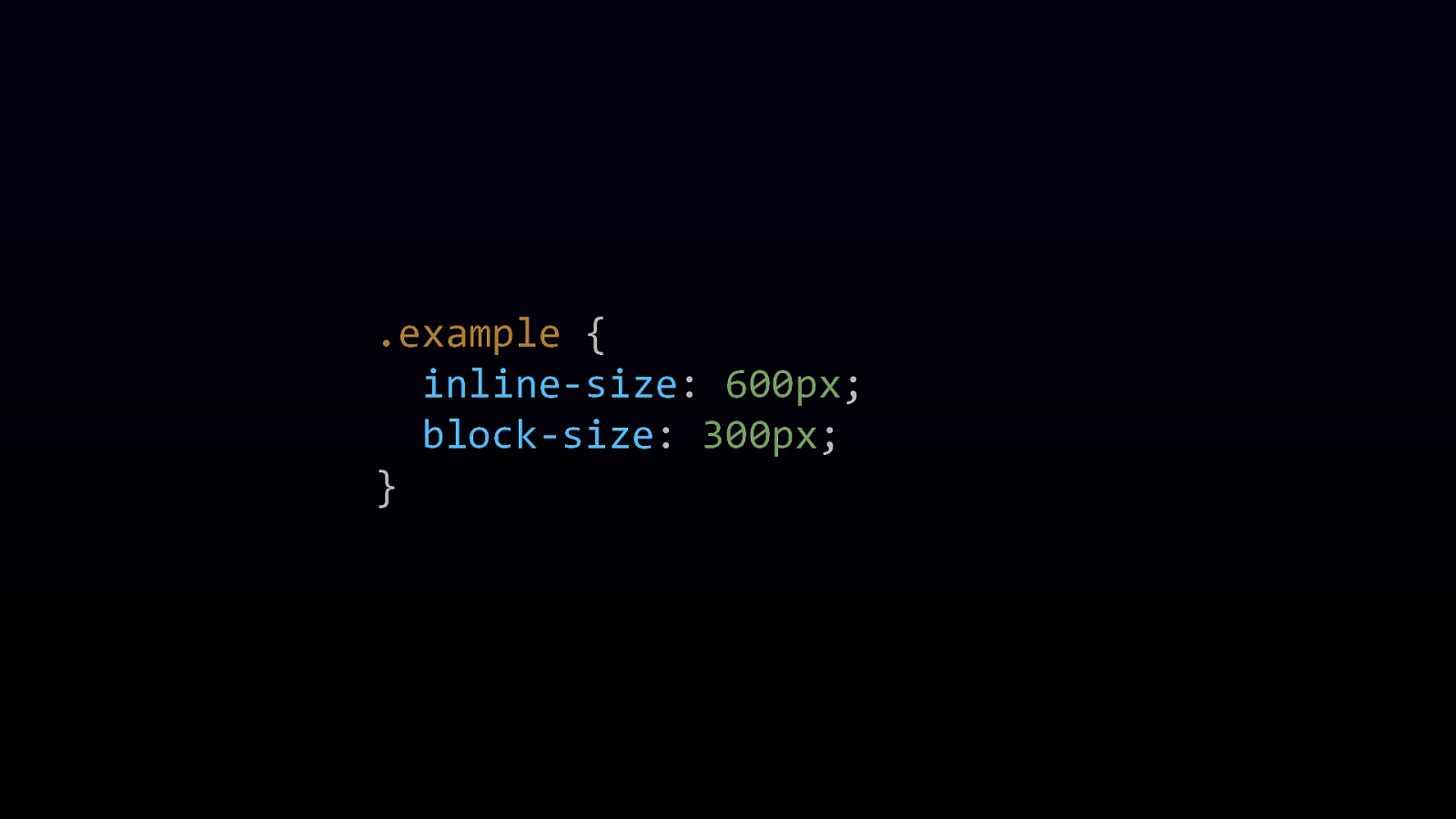
.example { inline-size: 600px; block-size: 300px; }
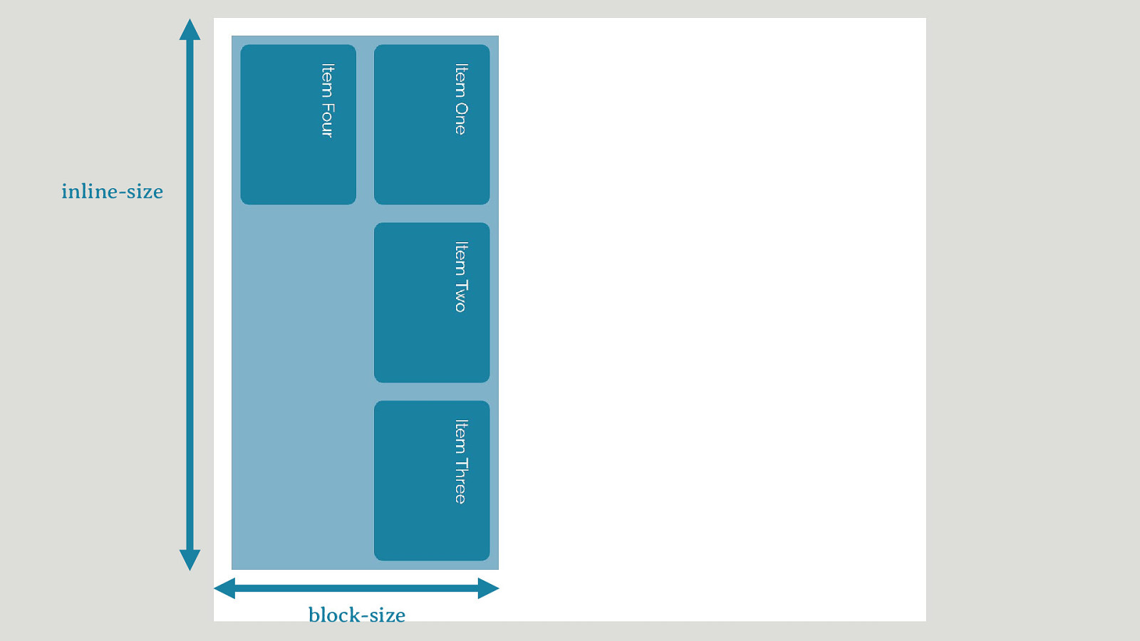
inline-size block-size
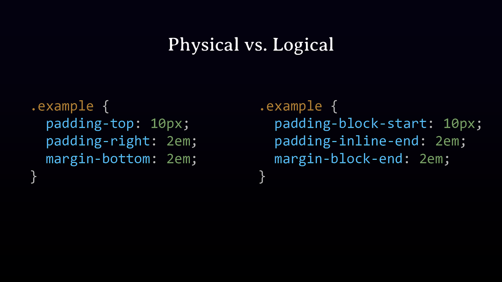
Physical vs. Logical .example { padding-top: 10px; padding-right: 2em; margin-bottom: 2em; } .example { padding-block-start: 10px; padding-inline-end: 2em; margin-block-end: 2em; }
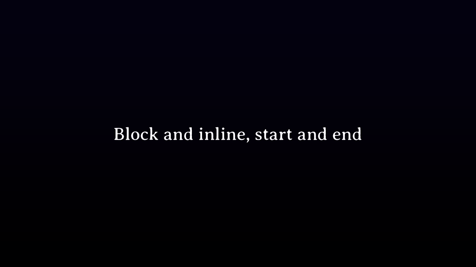
Block and inline, start and end

Initial Values Every property has a value.
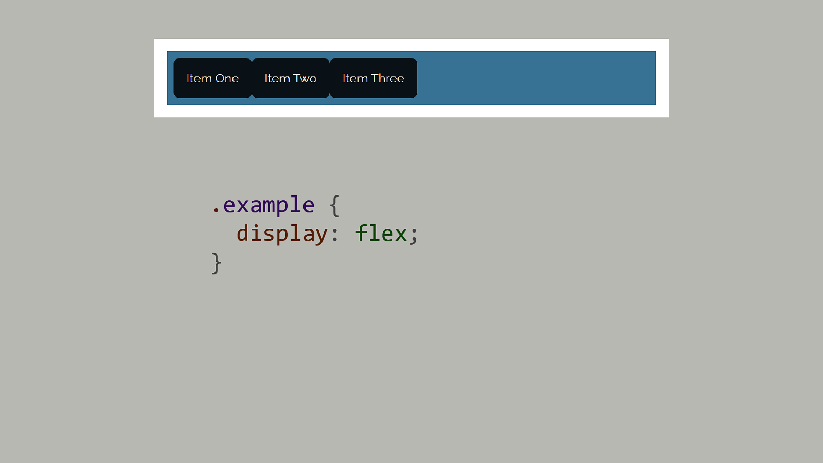
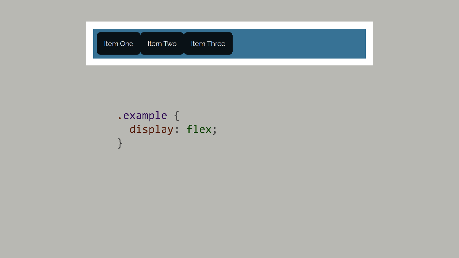
.example { display: flex; }

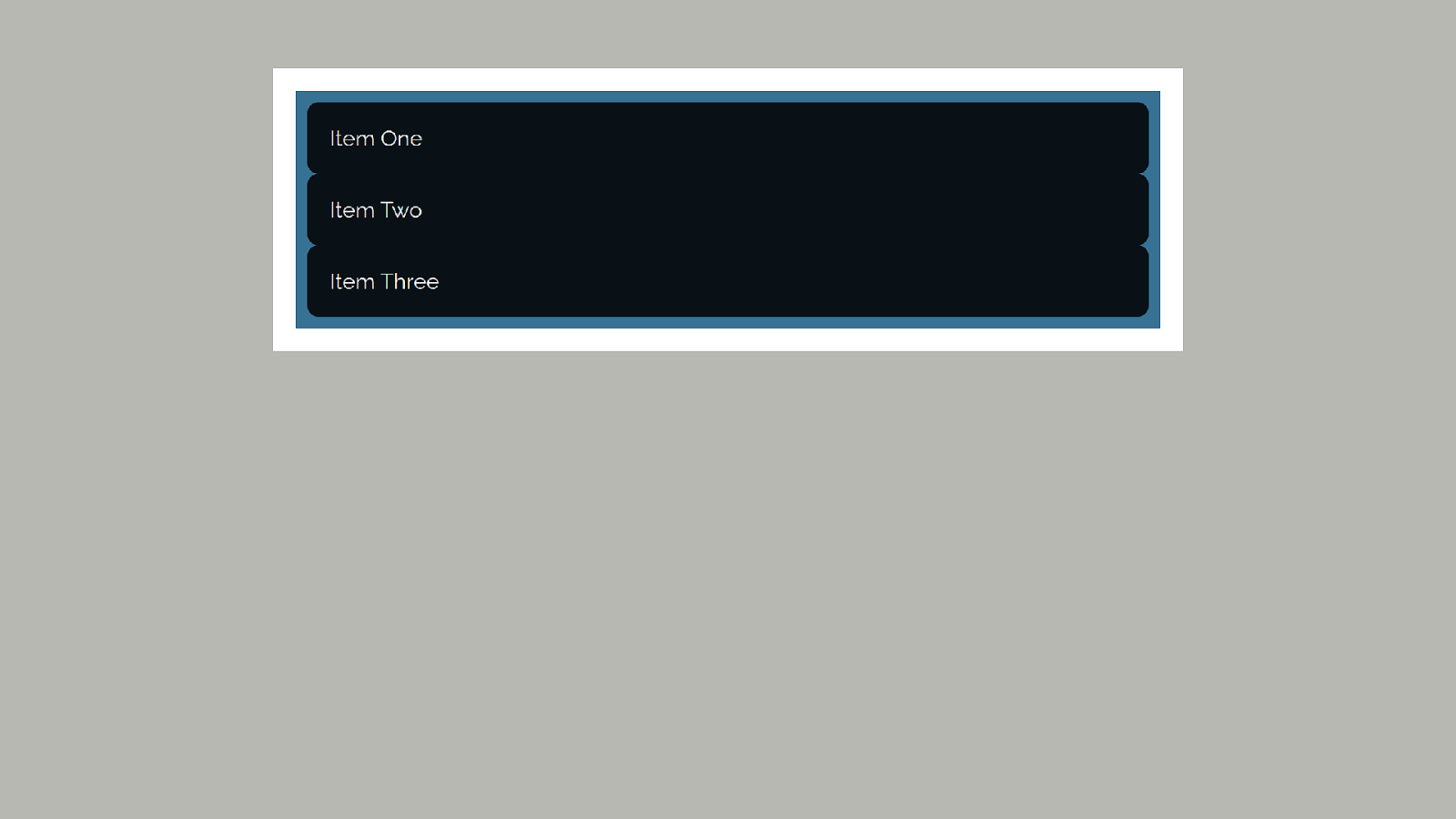
Normal flow Block and inline layout
Formatting contexts Switching from block to flex or grid.

.example { display: flex; }
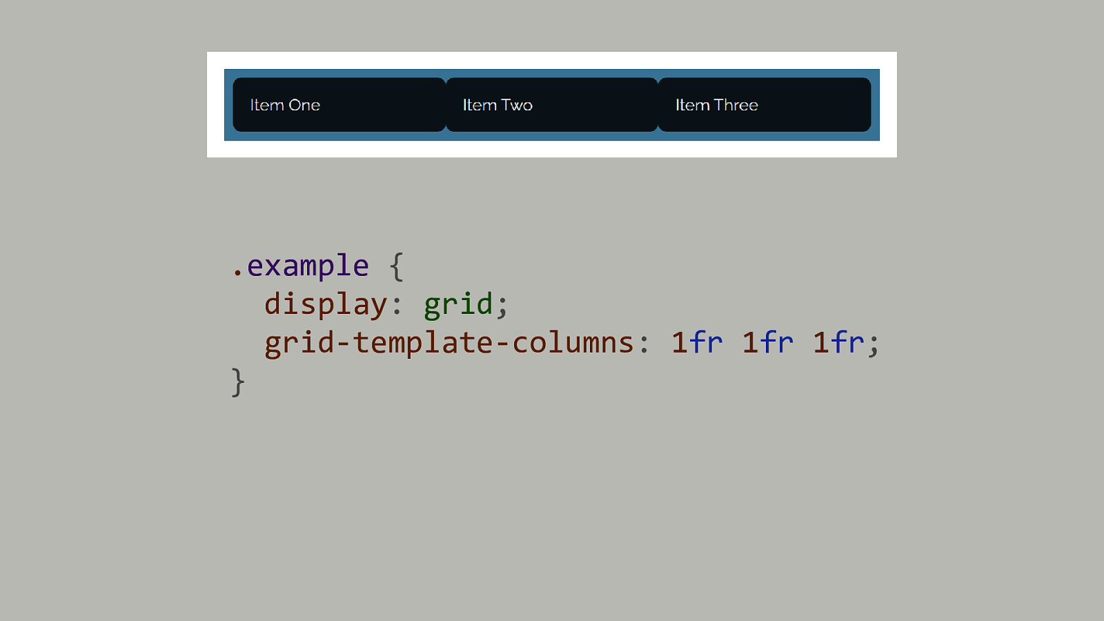
.example { display: grid; grid-template-columns: 1fr 1fr 1fr; }
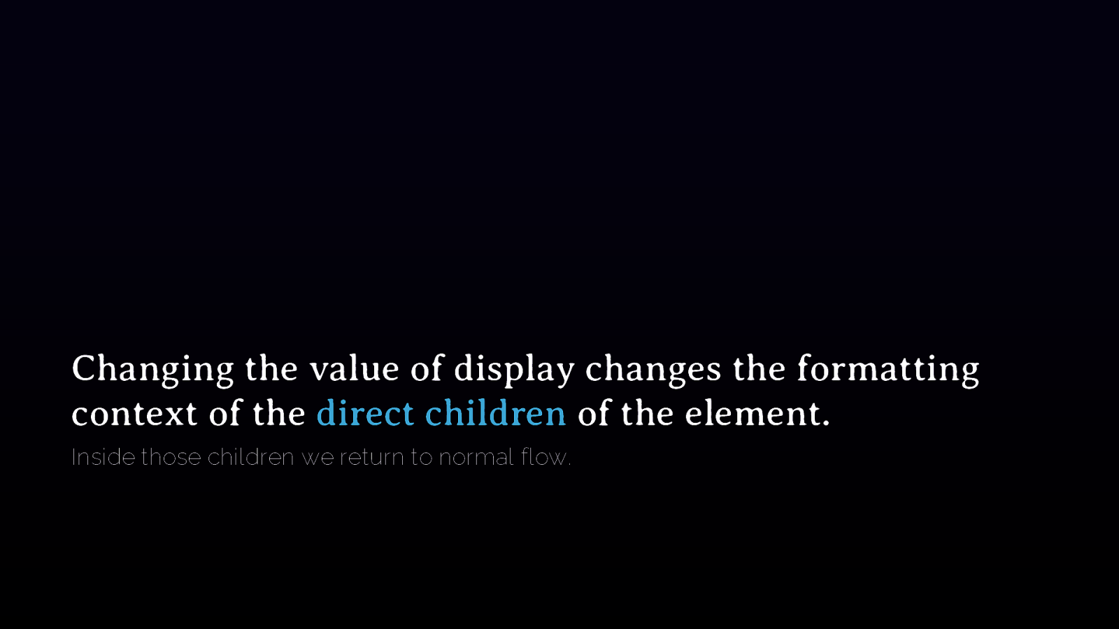
Changing the value of display changes the formatting context of the direct children of the element. Inside those children we return to normal flow.

Generated content The strange world of ::before and ::after
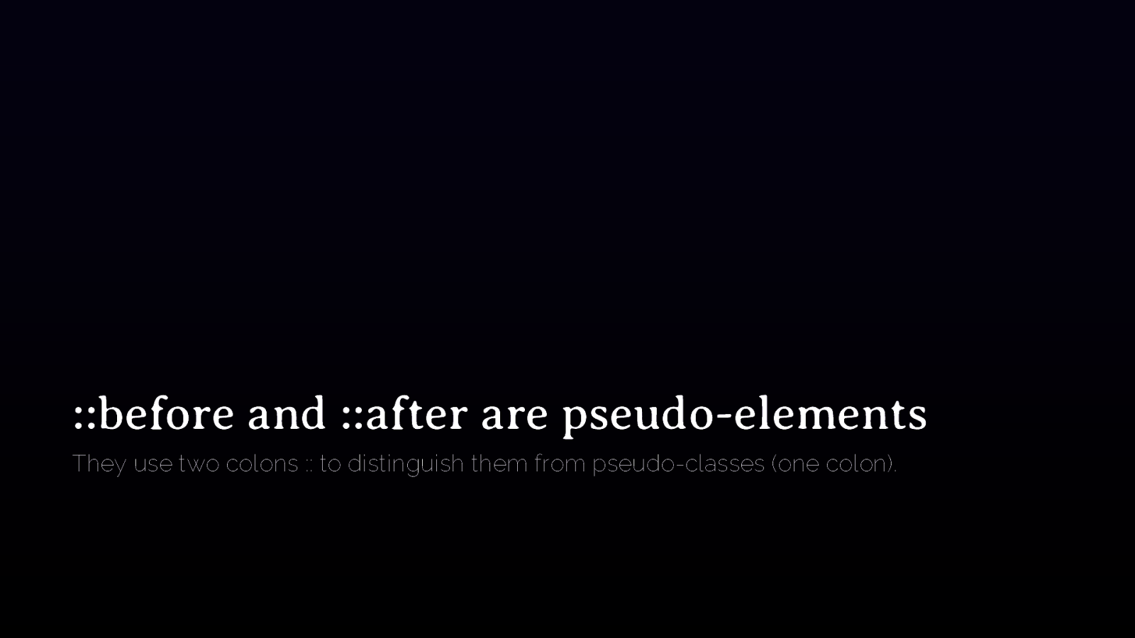
::before and ::after are pseudo-elements They use two colons :: to distinguish them from pseudo-classes (one colon).
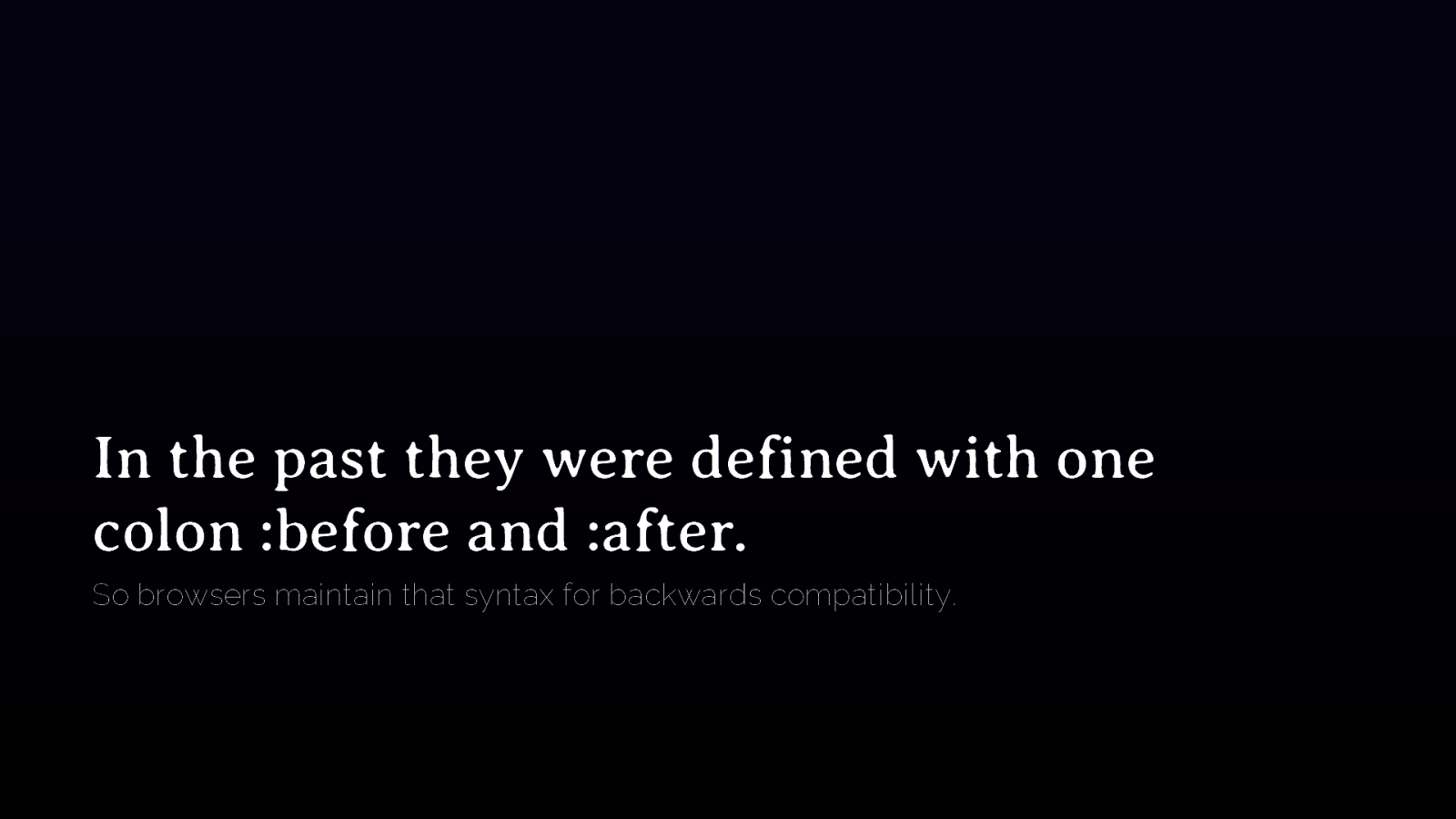
In the past they were defined with one colon :before and :after. So browsers maintain that syntax for backwards compatibility.
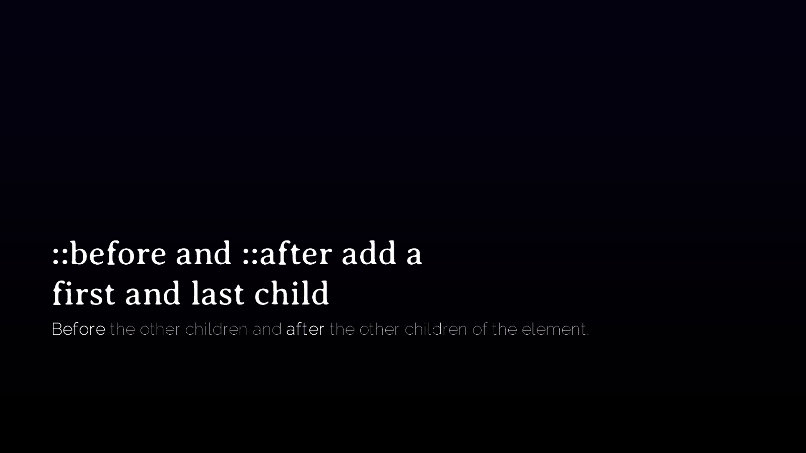
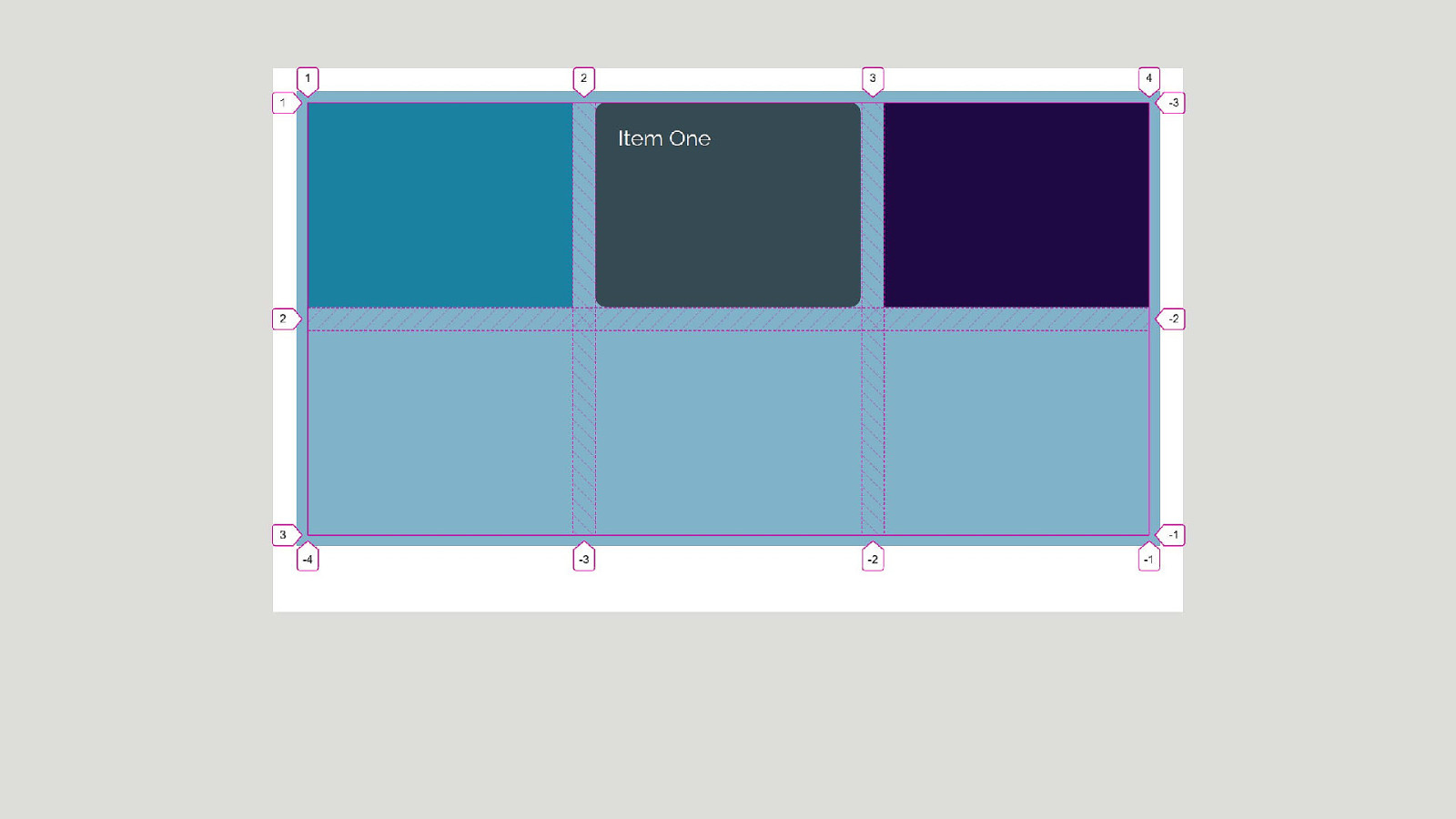
::before and ::after add a first and last child Before the other children and after the other children of the element.
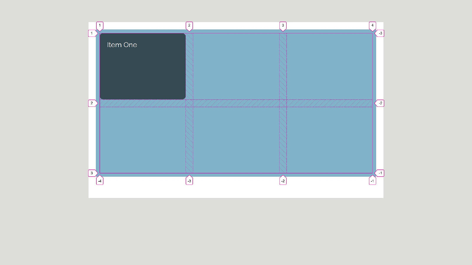
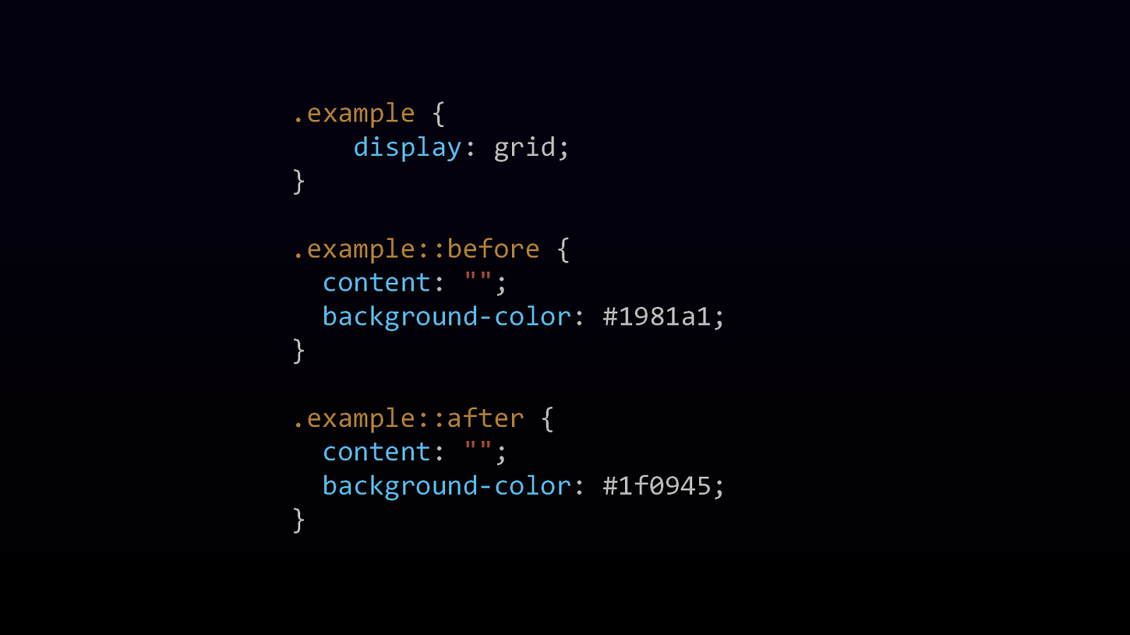
.example { display: grid; } .example::before { content: “”; background-color: #1981a1; } .example::after { content: “”; background-color: #1f0945; }
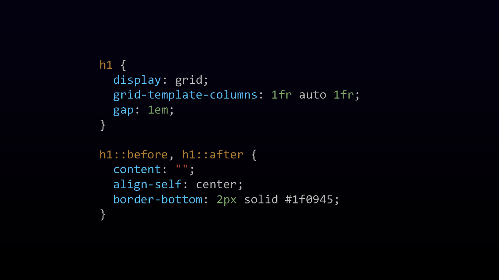
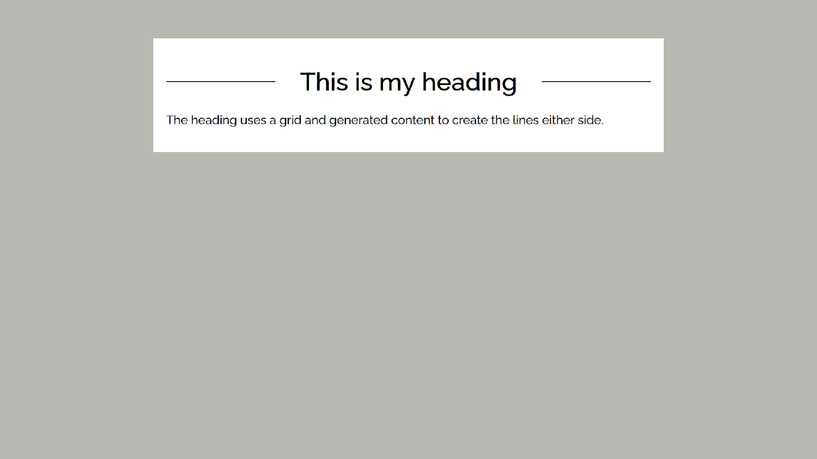
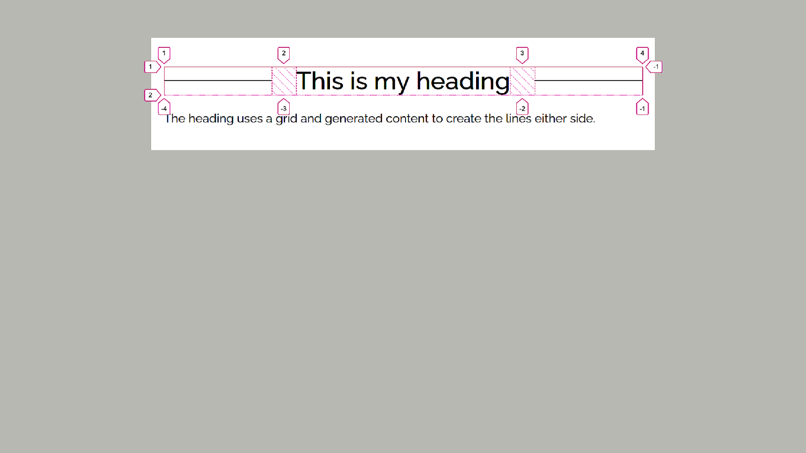
h1 { display: grid; grid-template-columns: 1fr auto 1fr; gap: 1em; } h1::before, h1::after { content: “”; align-self: center; border-bottom: 2px solid #1f0945; }

Busting out of flow Position and float

display: flow-root Creates a new Block Formatting Context
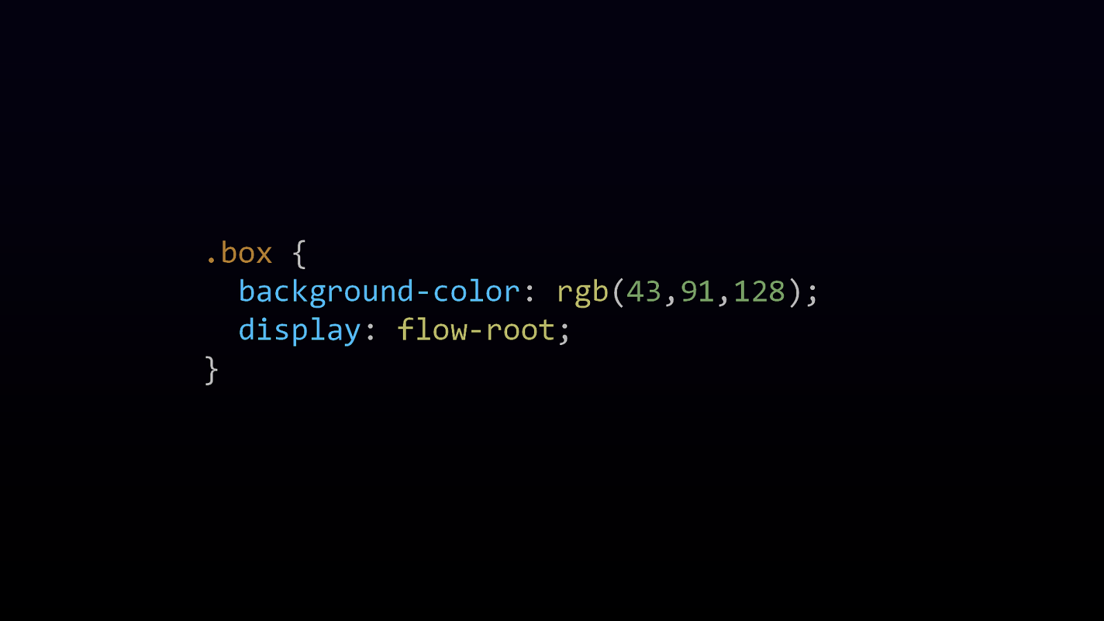
.box { background-color: rgb(43,91,128); display: flow-root; }

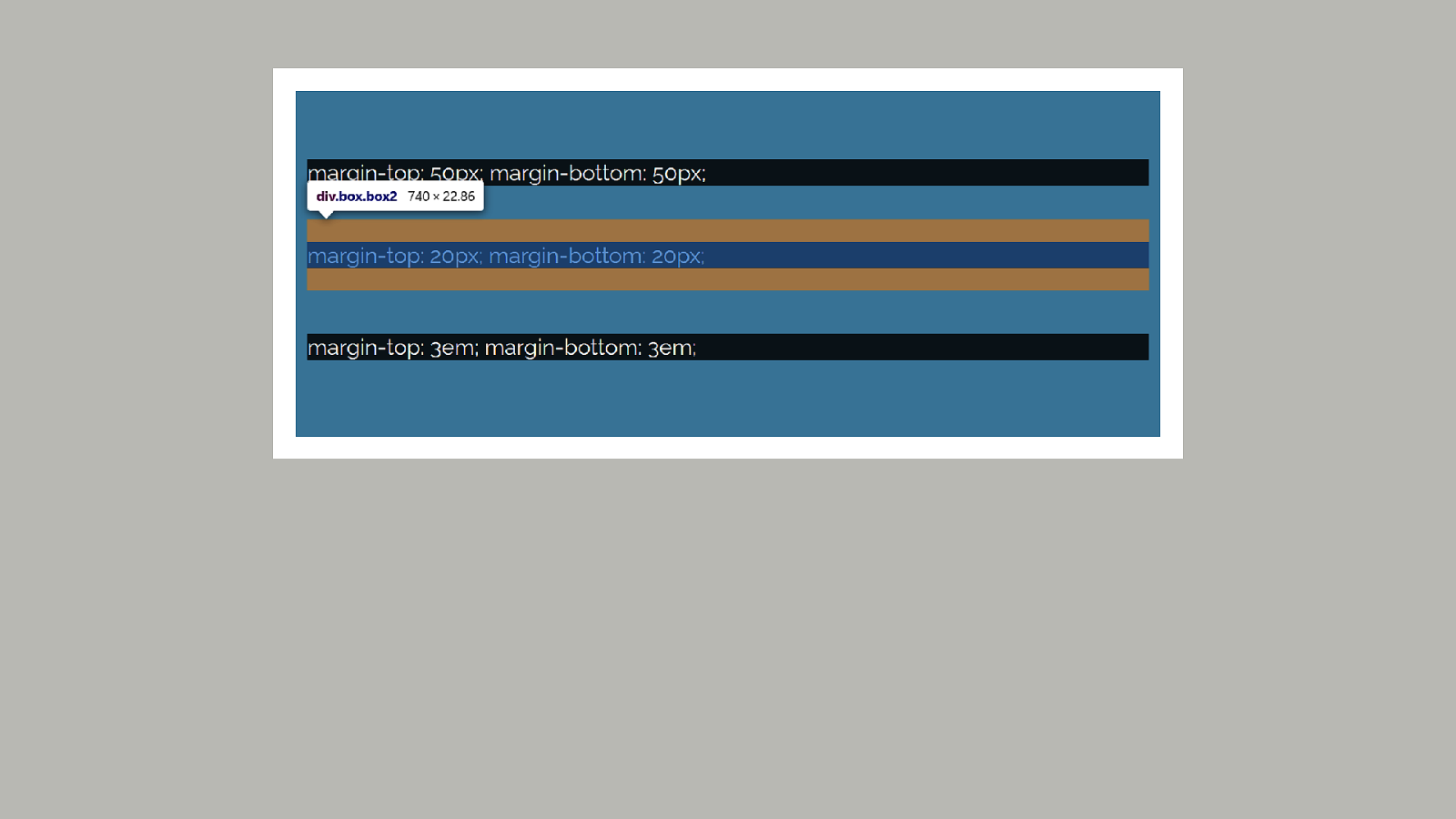
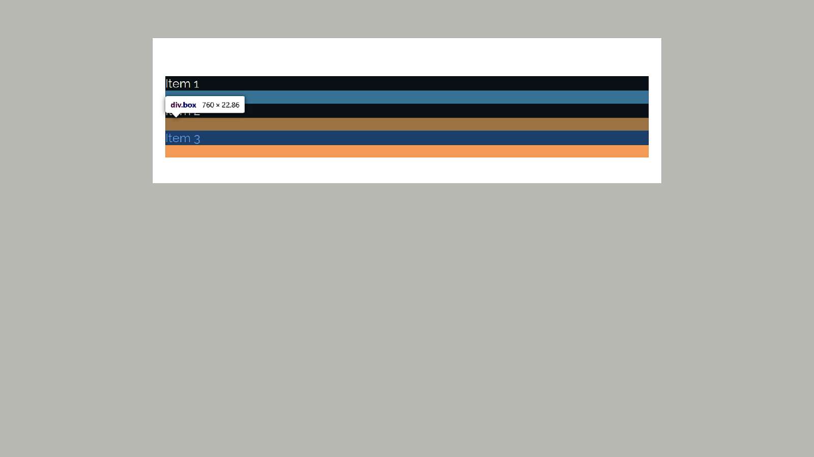
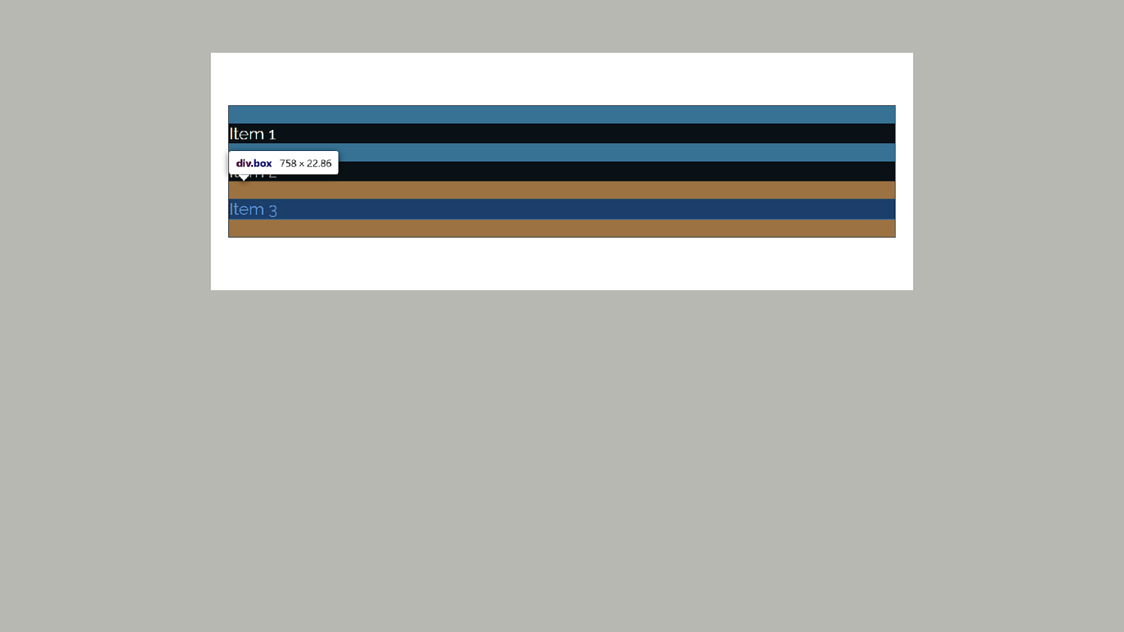
Margin collapsing The rules around combining margins.
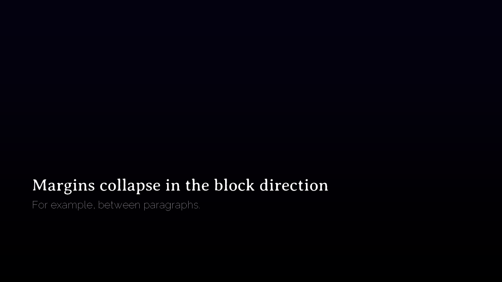
Margins collapse in the block direction For example, between paragraphs.
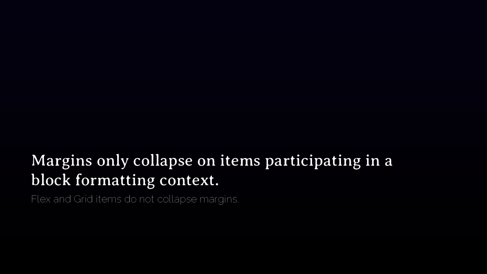
Margins only collapse on items participating in a block formatting context. Flex and Grid items do not collapse margins.

Adjacent children The margin-bottom of a paragraph will combine with the margin-top of a following paragraph.
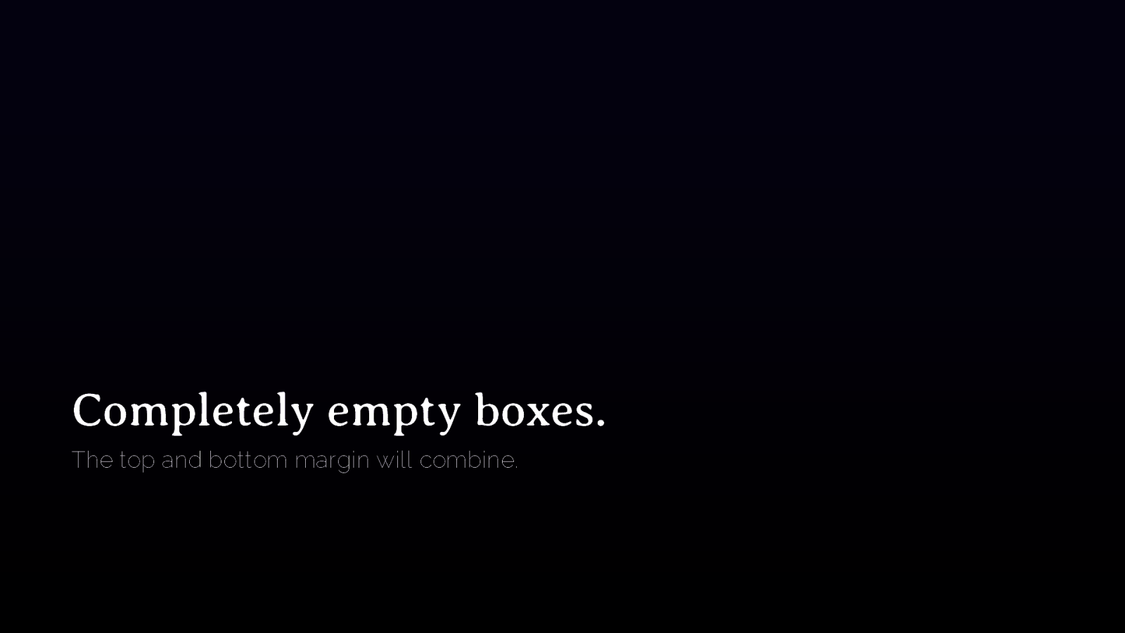
Completely empty boxes. The top and bottom margin will combine.
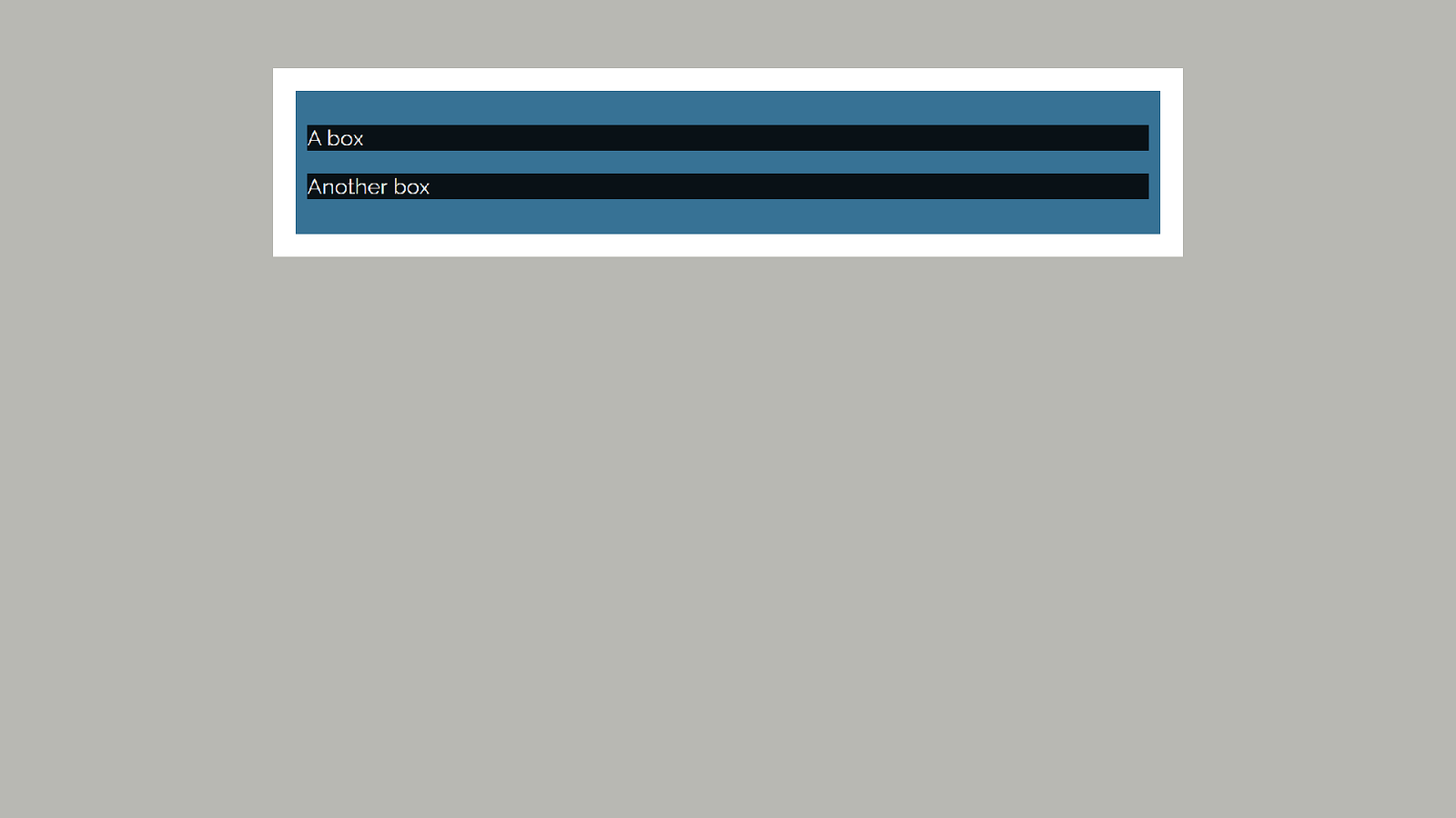
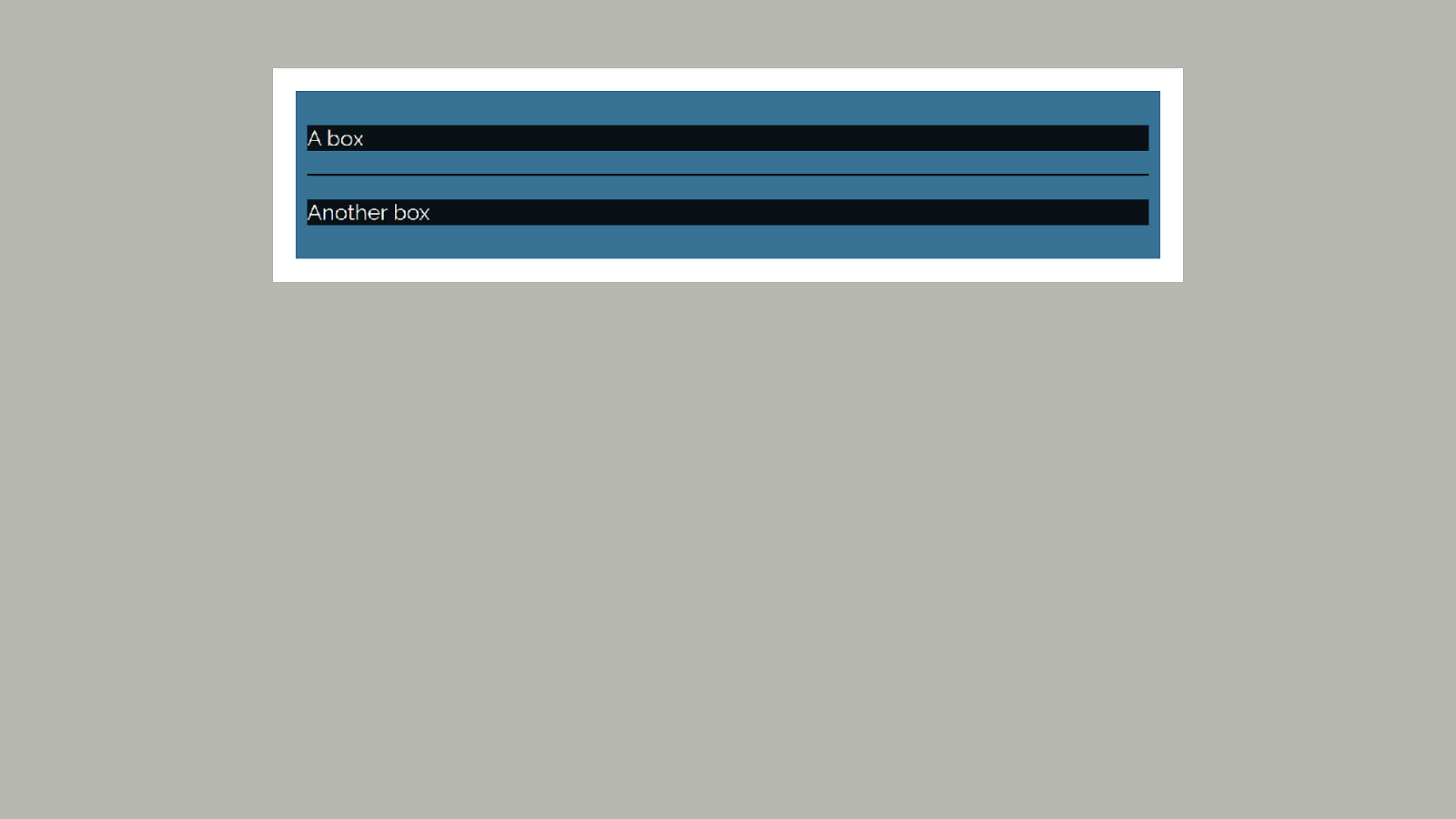
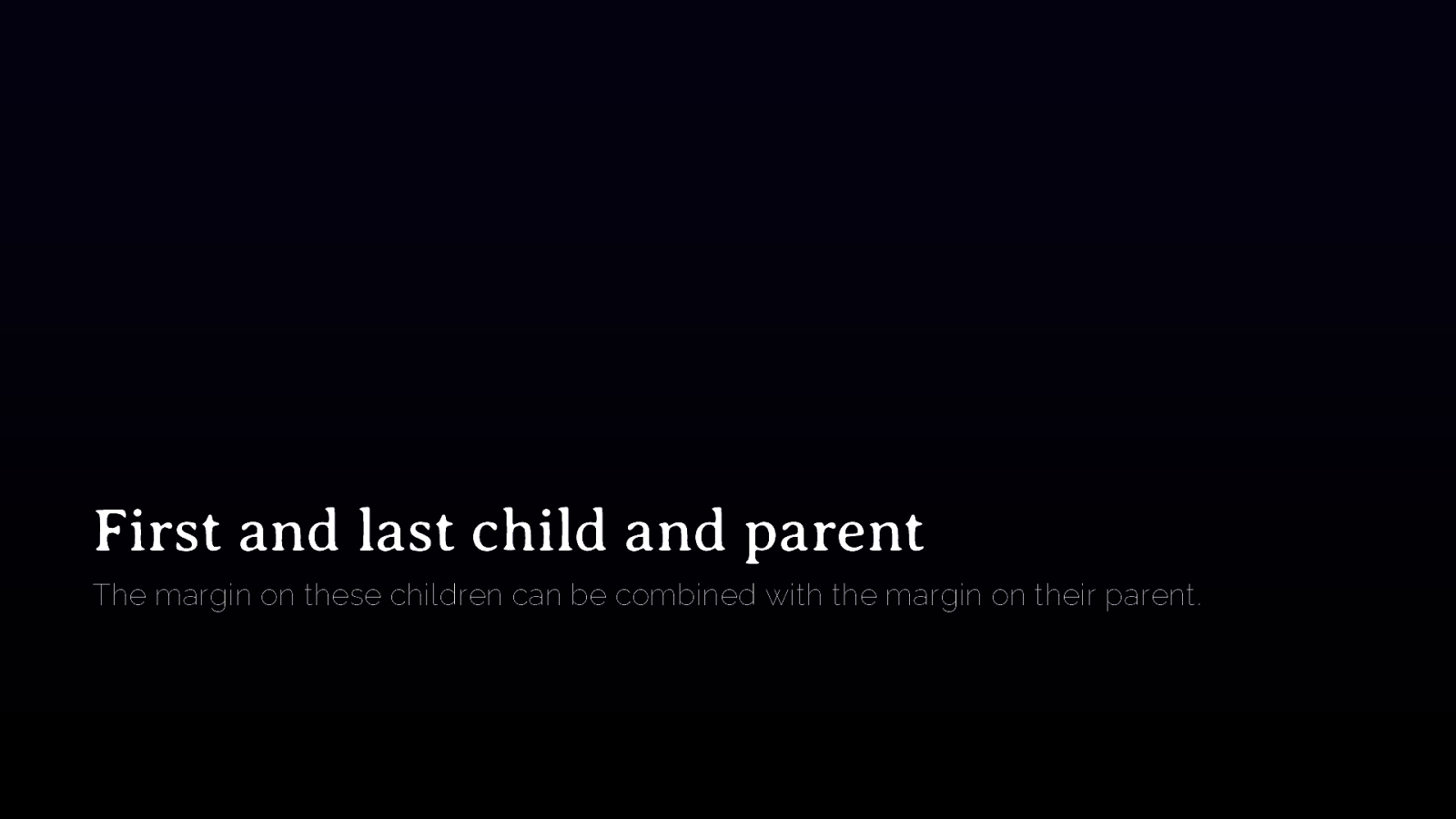
First and last child and parent The margin on these children can be combined with the margin on their parent.

Box Alignment https://drafts.csswg.org/css-align/
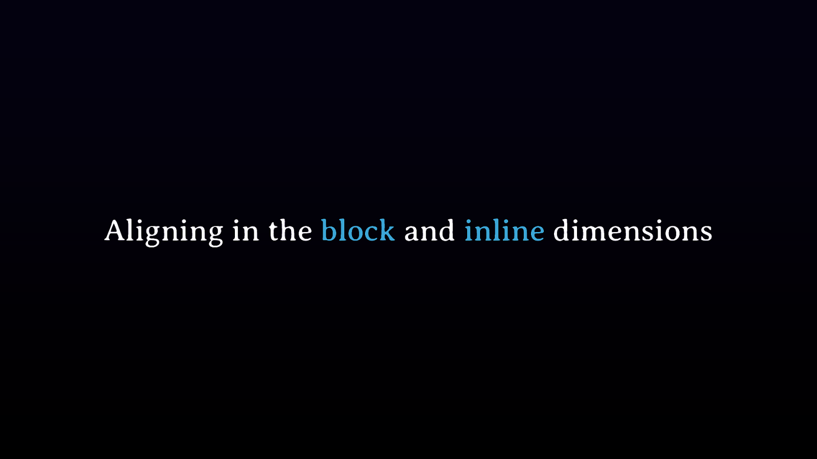
Aligning in the block and inline dimensions
Distribution of space and alignment of items within their space
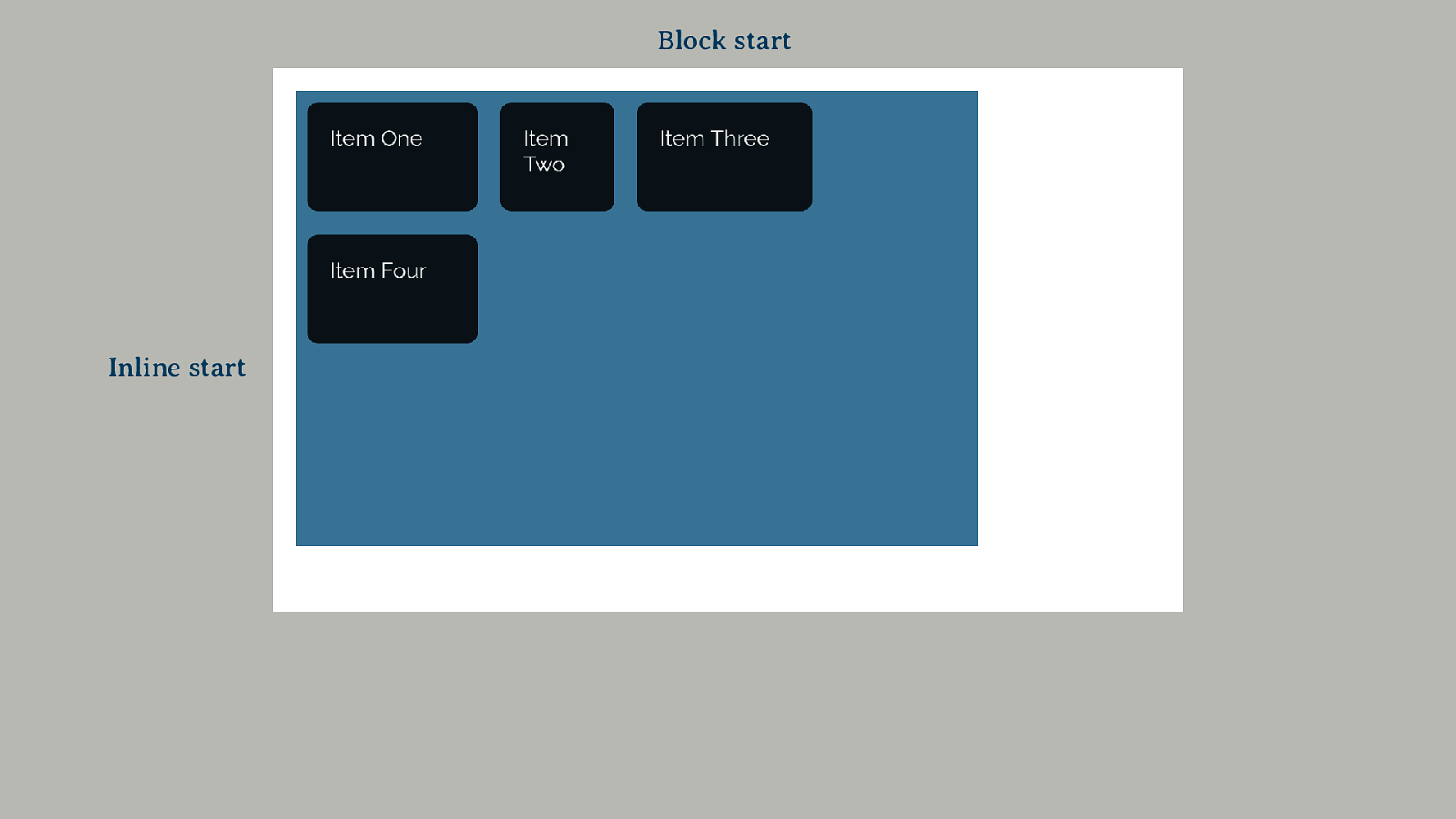
Block start Inline start

justify-content In grid, inline space distribution between tracks.
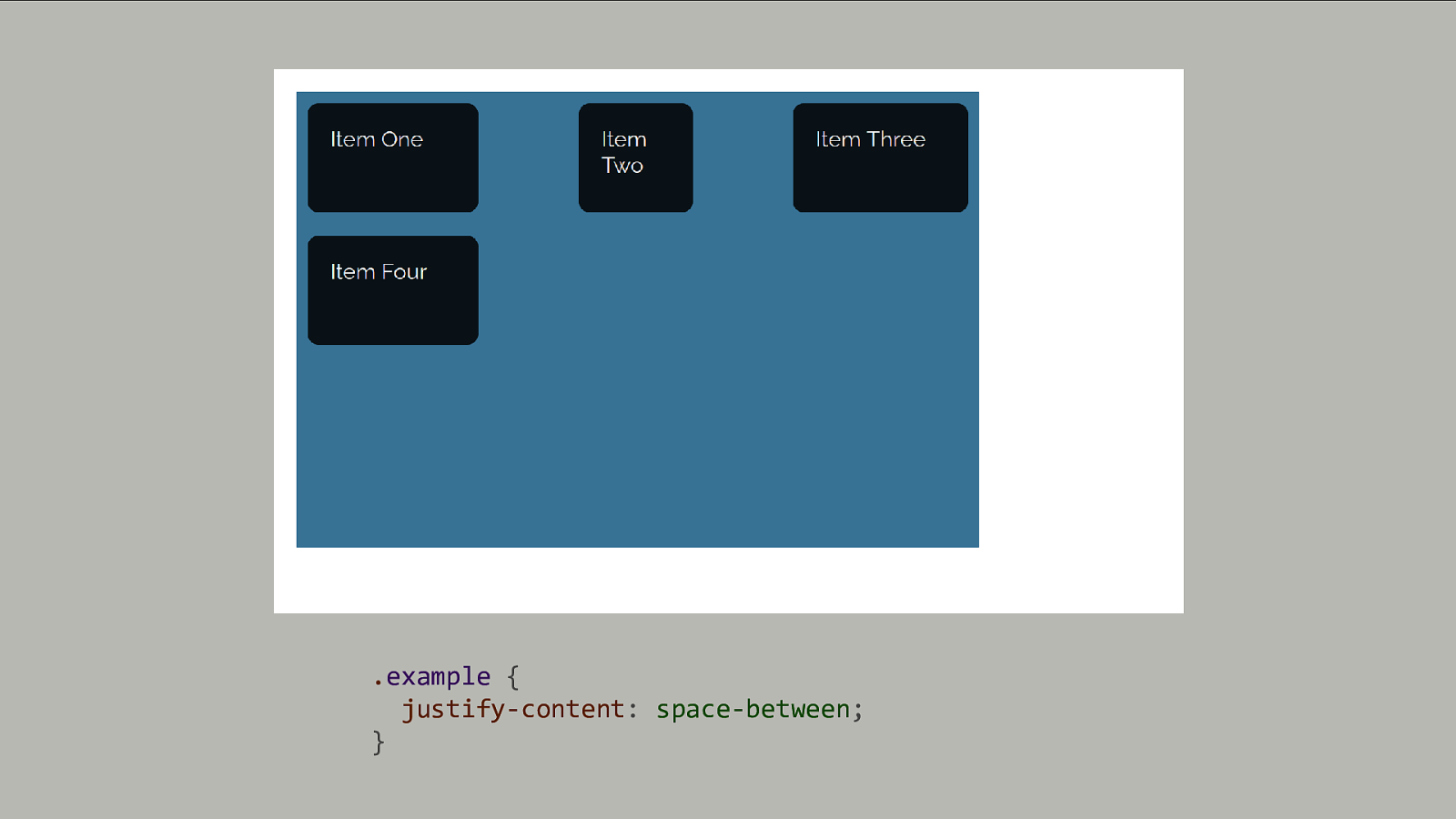
.example { justify-content: space-between; }
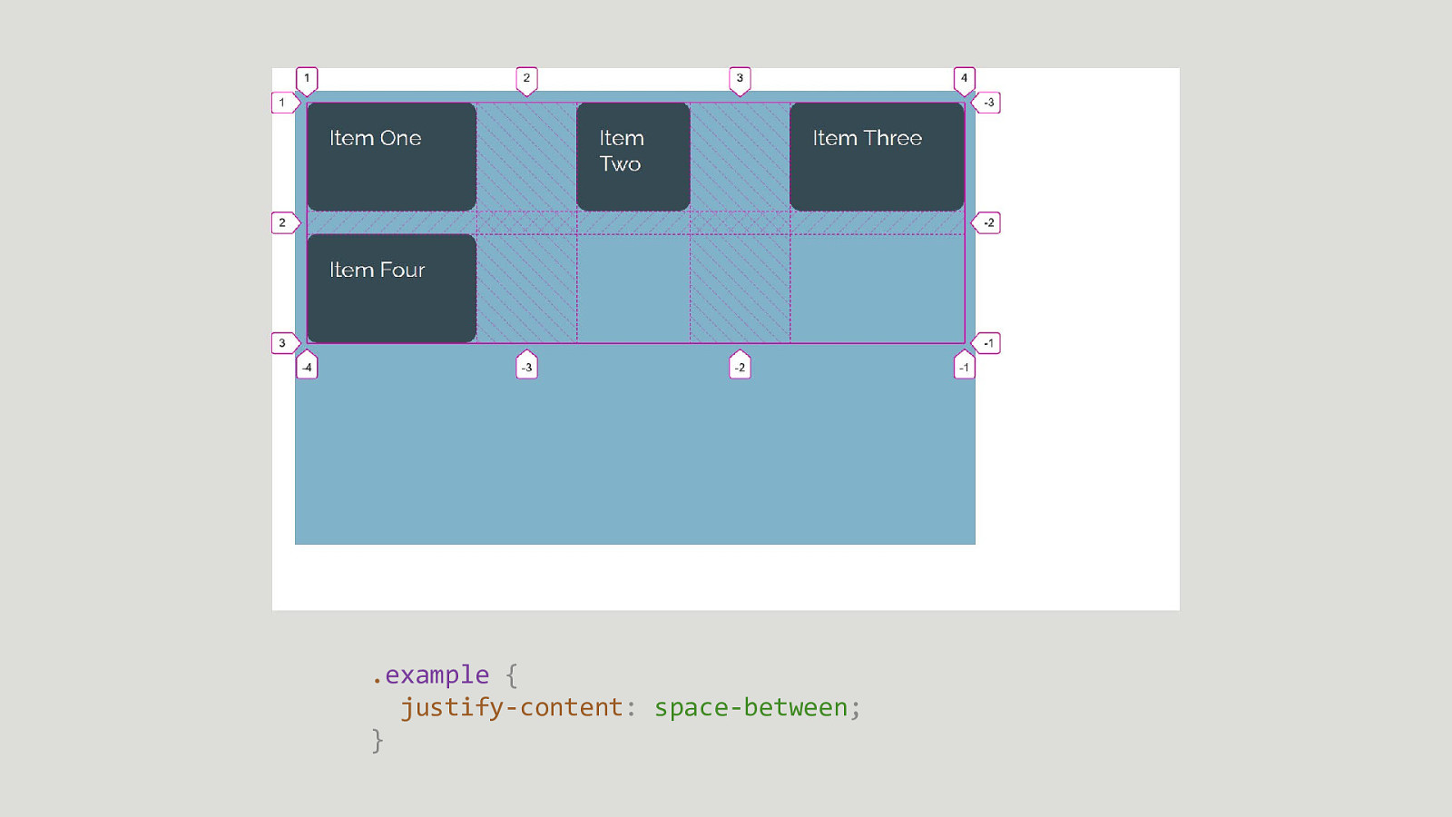
.example { justify-content: space-between; }

align-content In Grid, block dimension space distribution between tracks
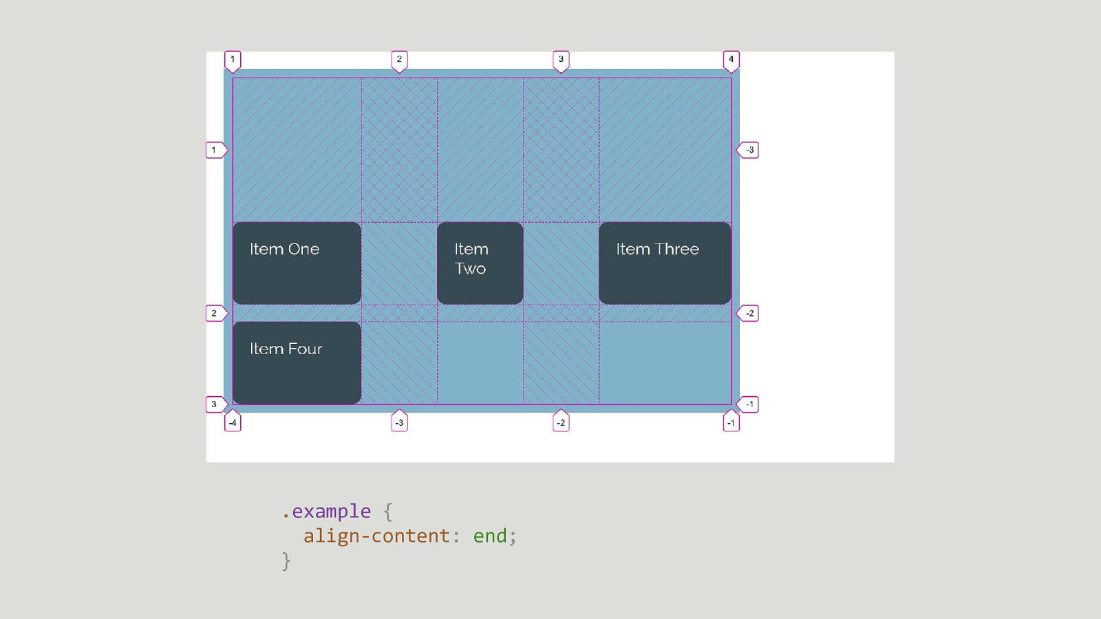
.example { align-content: end; }
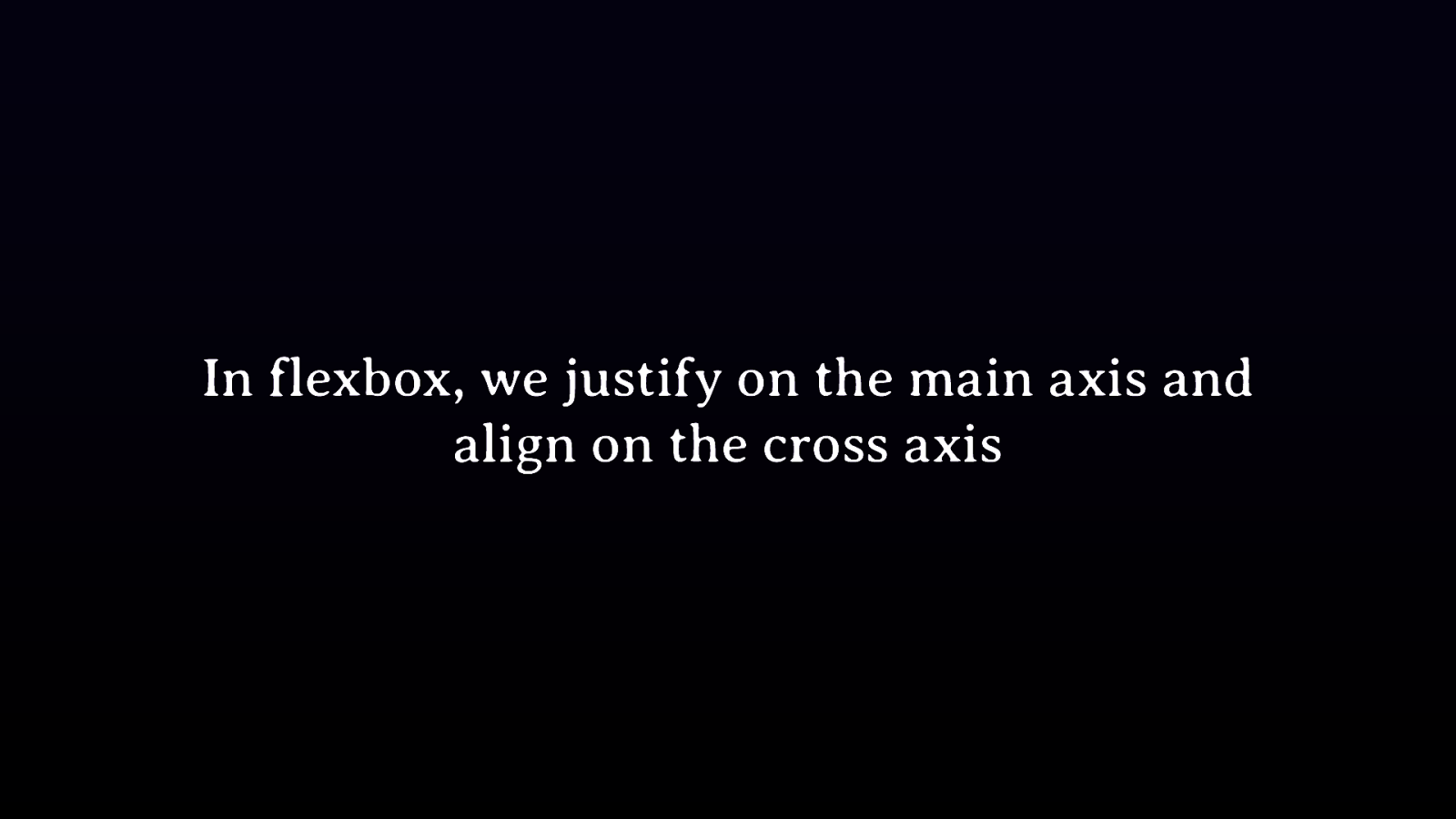
In flexbox, we justify on the main axis and align on the cross axis
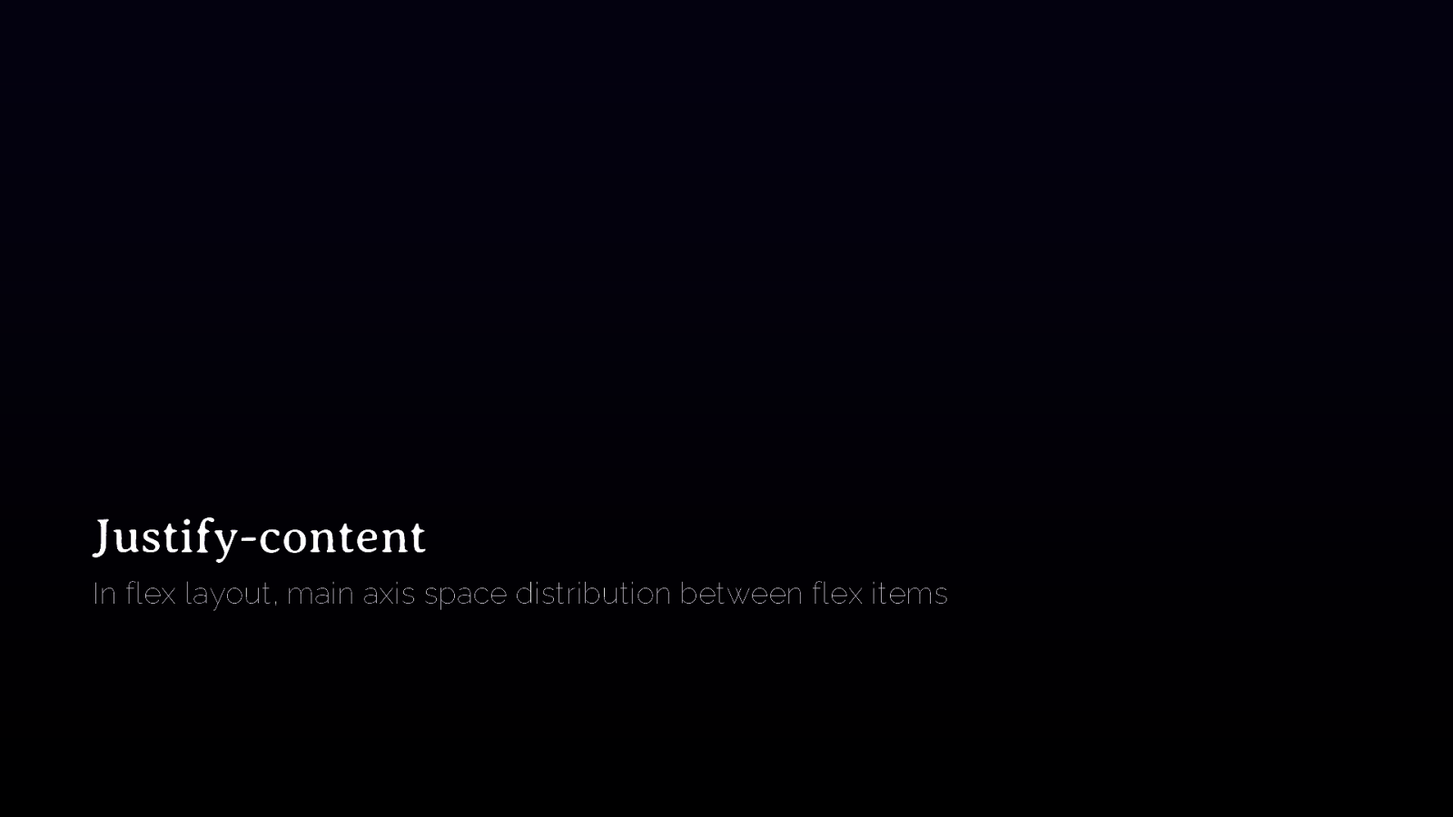
Justify-content In flex layout, main axis space distribution between flex items
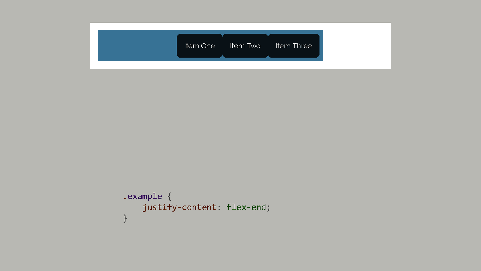
.example { justify-content: flex-end; }
align-content In flex layout, cross-axis space distribution between lines
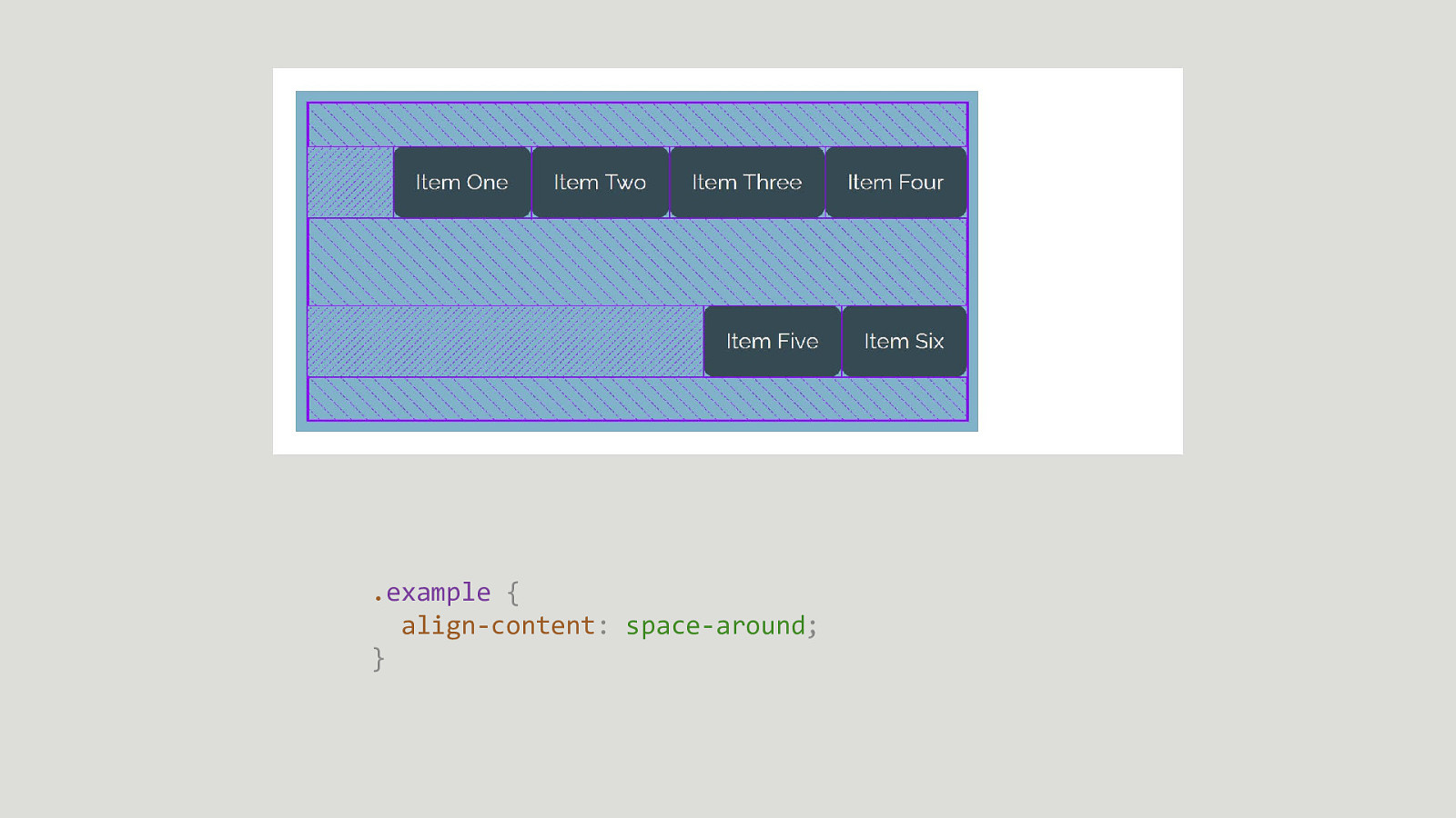
.example { align-content: space-around; }
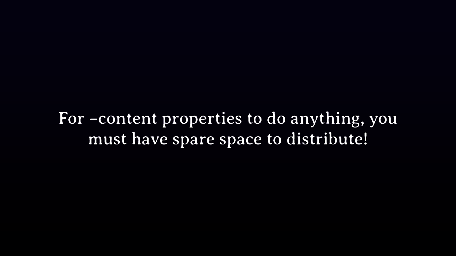
For –content properties to do anything, you must have spare space to distribute!
Aligning items inside their areas
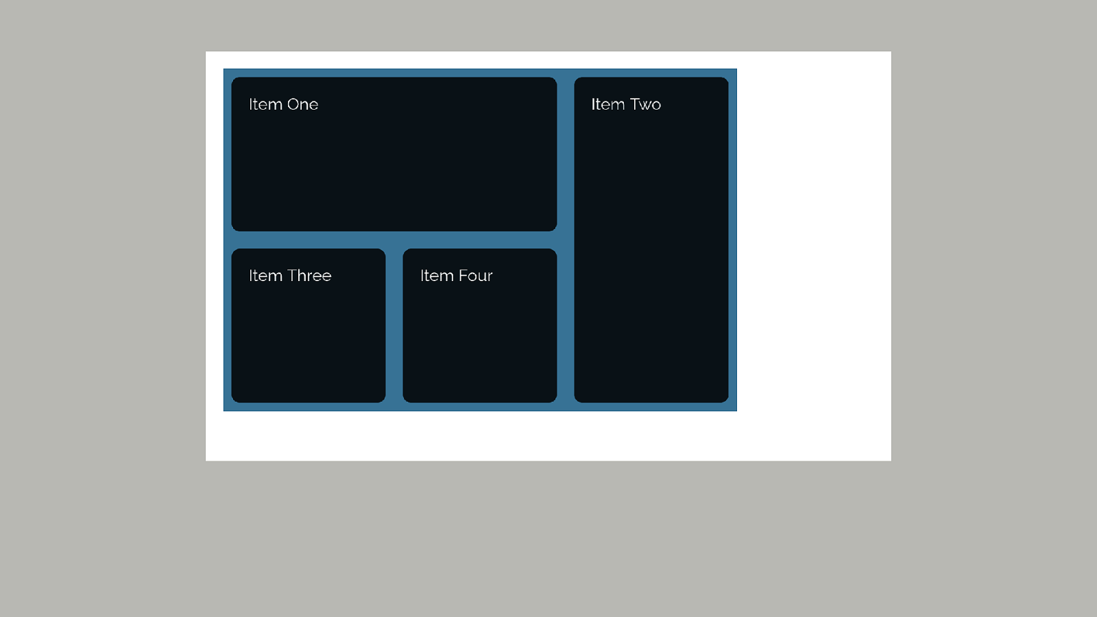
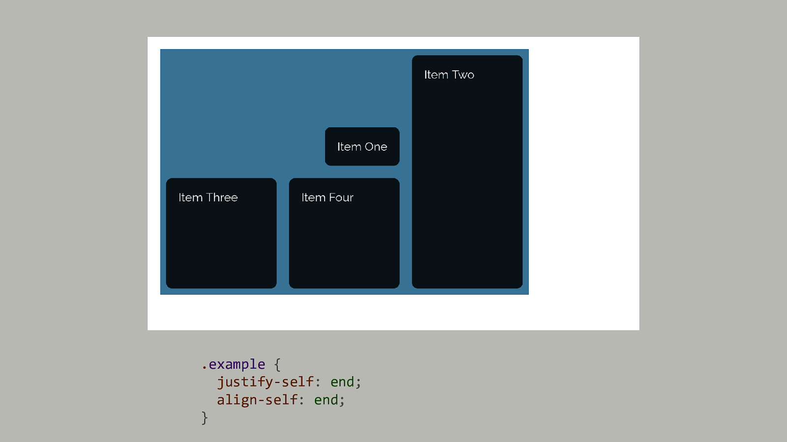
.example { justify-self: end; align-self: end; }
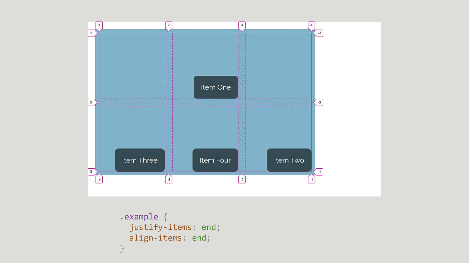
.example { justify-items: end; align-items: end; }
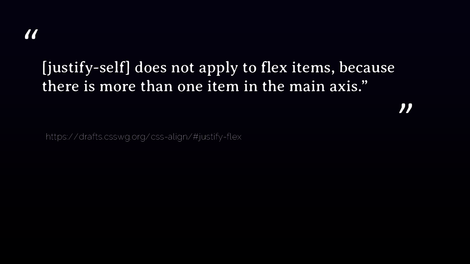
“ [justify-self] does not apply to flex items, because there is more than one item in the main axis.” https://drafts.csswg.org/css-align/#justify-flex ”
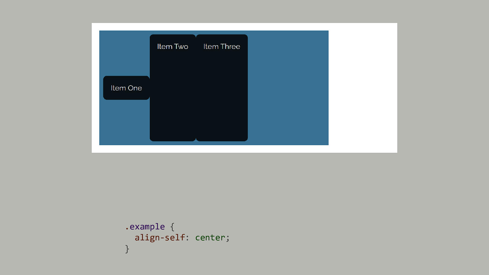
.example { align-self: center; }
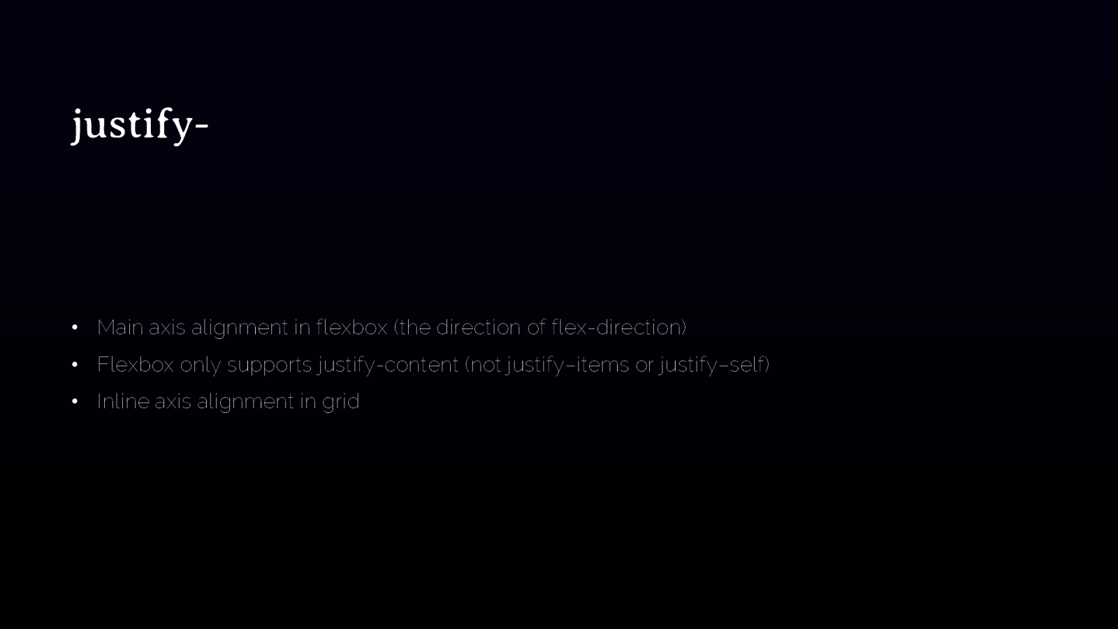
justify- • Main axis alignment in flexbox (the direction of flex-direction) • Flexbox only supports justify-content (not justify–items or justify–self) • Inline axis alignment in grid

align- • Cross axis alignment in flexbox • Block axis alignment in grid
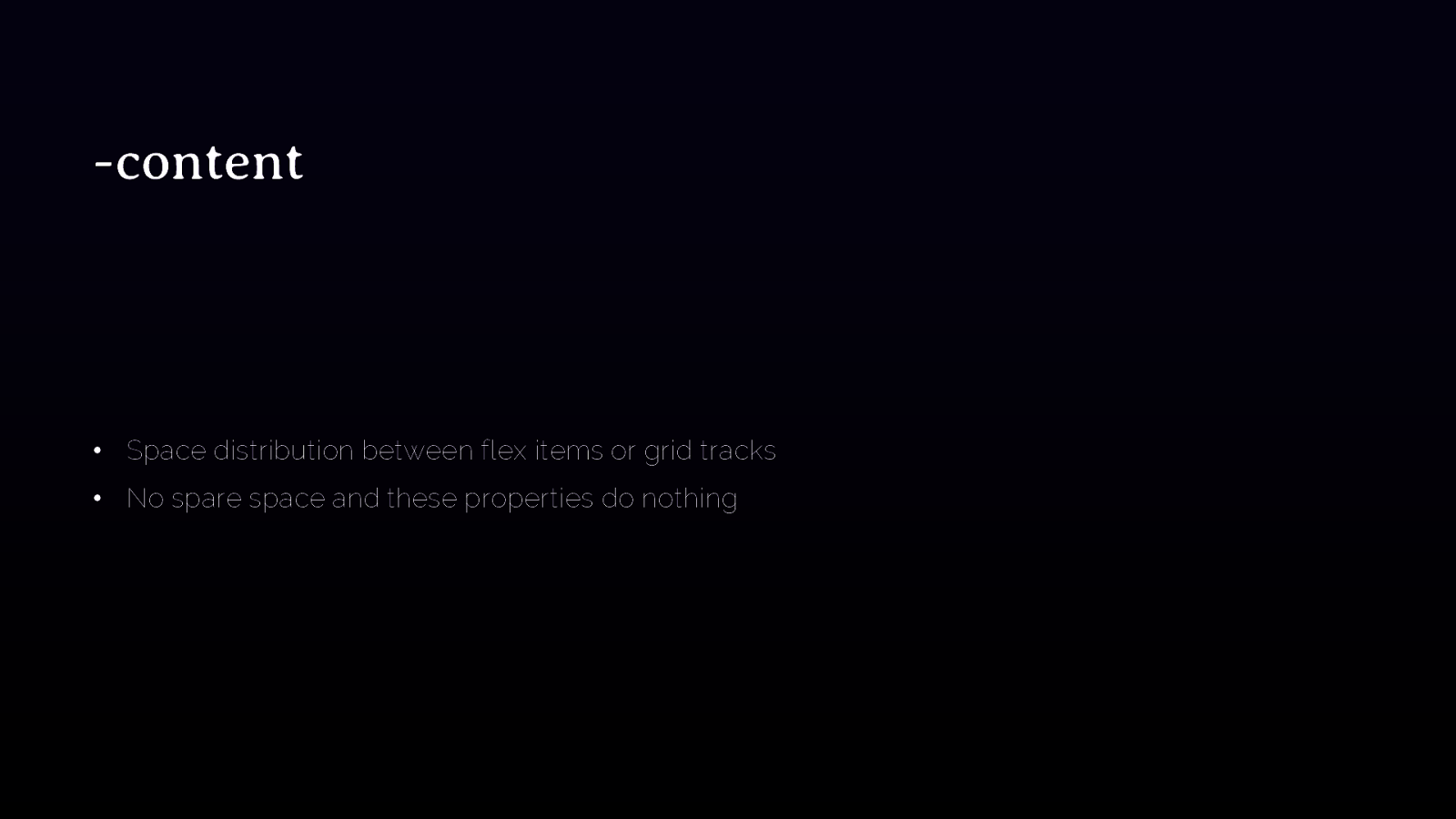
-content • Space distribution between flex items or grid tracks • No spare space and these properties do nothing
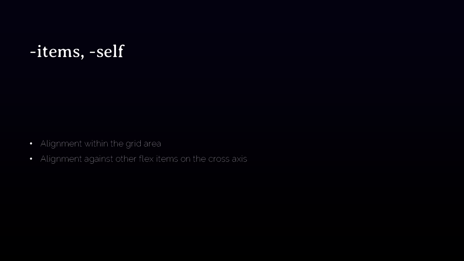
-items, -self • Alignment within the grid area • Alignment against other flex items on the cross axis

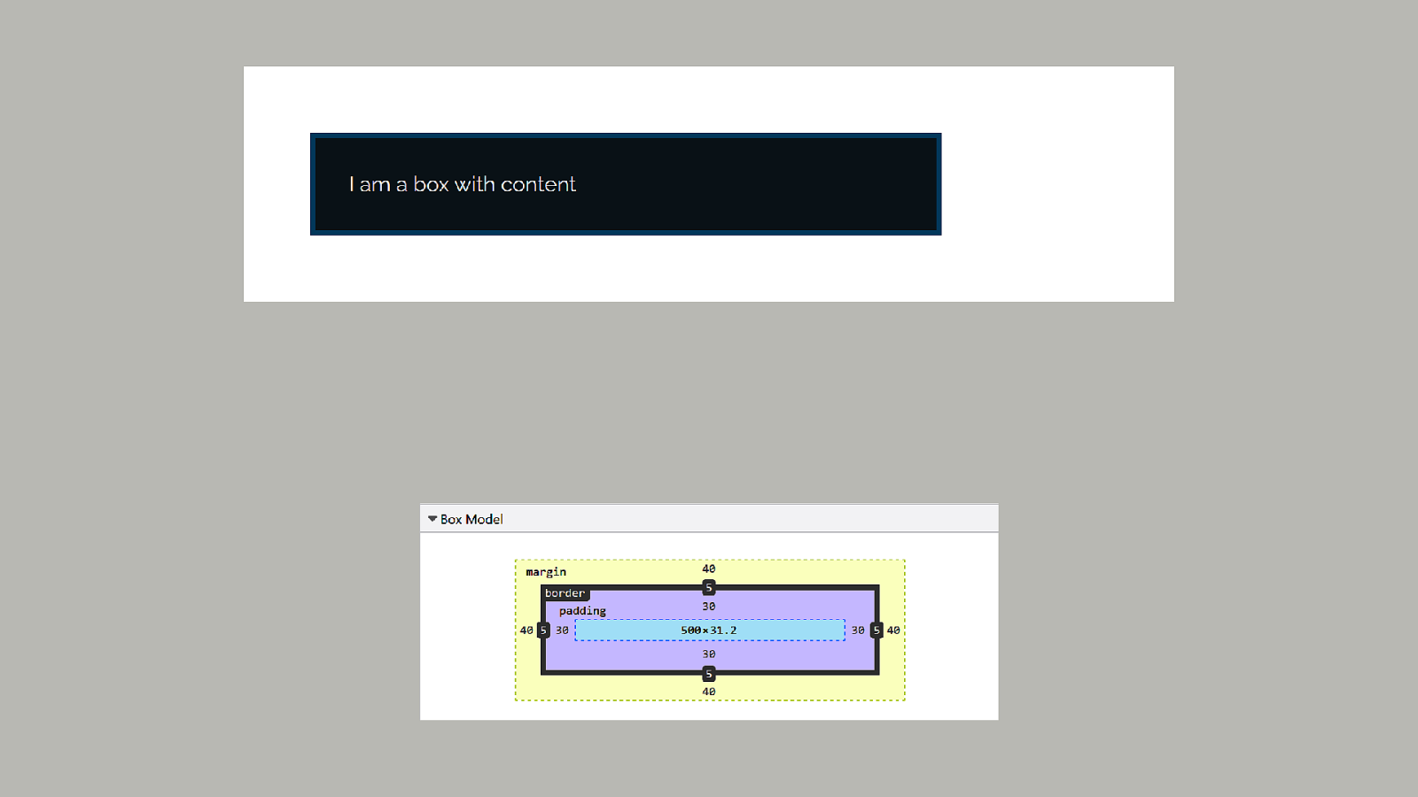
Box sizing https://drafts.csswg.org/css-sizing-3/
What about the Box Model? Isn’t there a rule that anyone talking about CSS must show a box model diagram?
When we had to control the size of each item in a layout, the Box Model was very important.

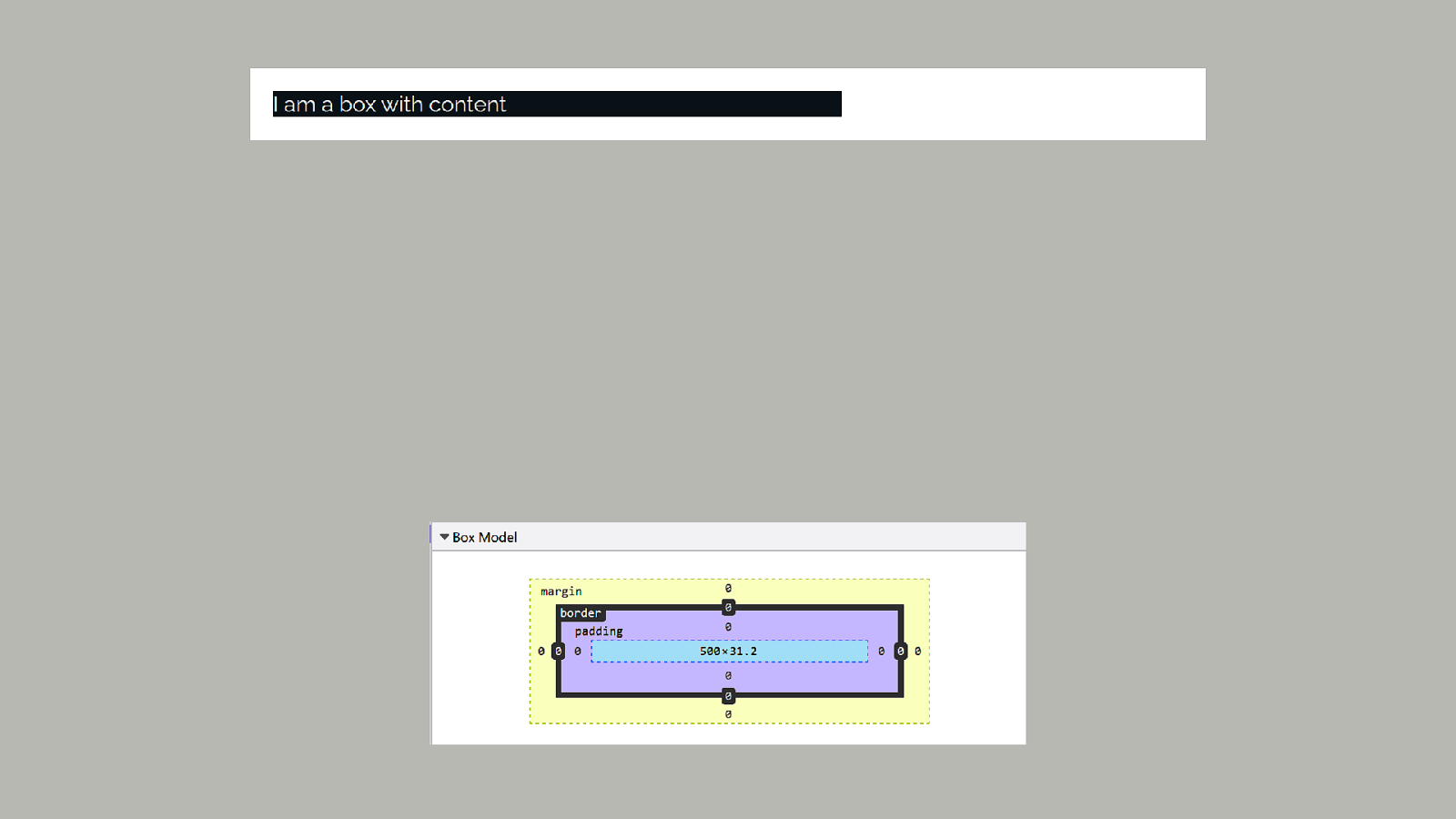
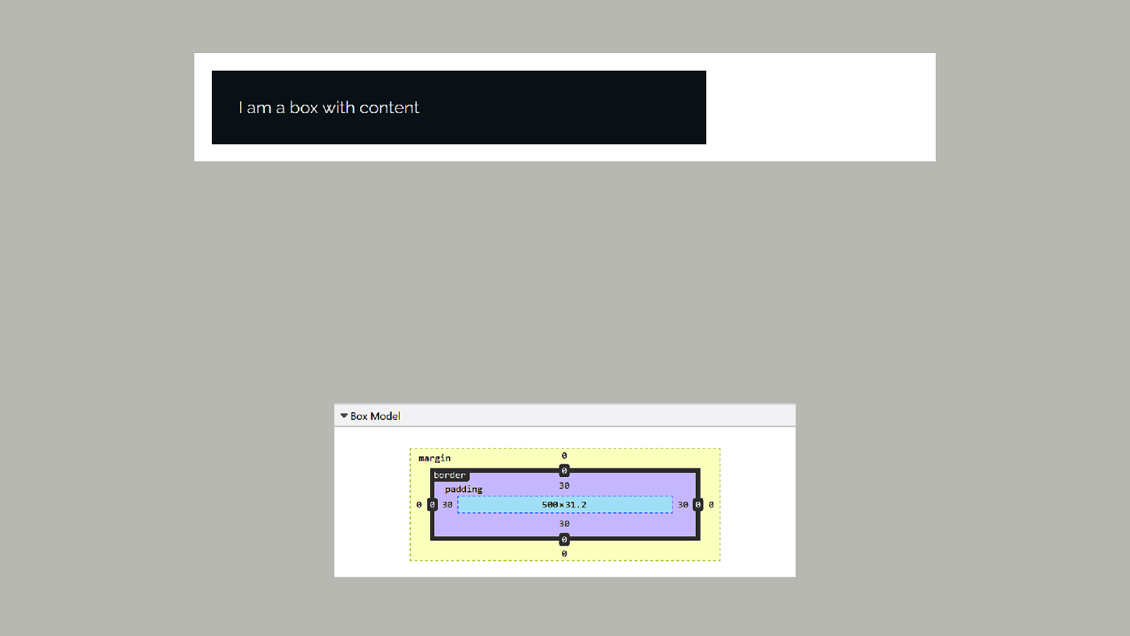

What is the inline-size or width of the box? By default, the content-box
If you want your specified width to include padding and border… … set the box-sizing property to border-box.
.example { box-sizing: border-box; }
In the past everything was a length or a percentage.
What is the minimum and maximum size of this thing
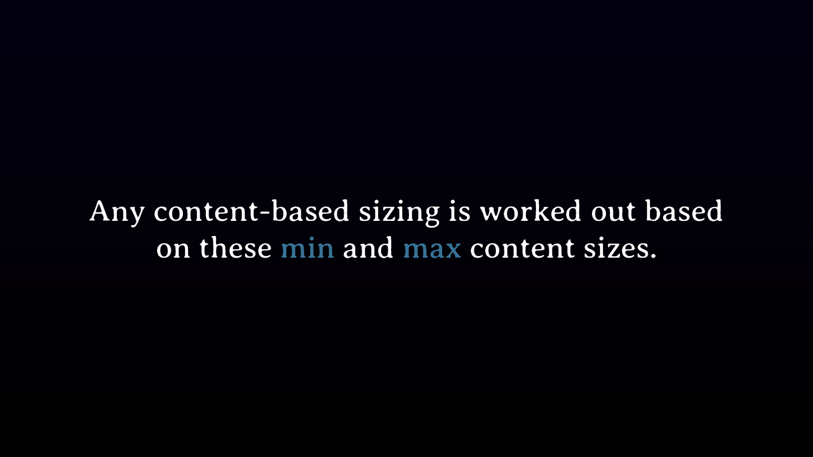
Any content-based sizing is worked out based on these min and max content sizes.
.example { display: flex; }
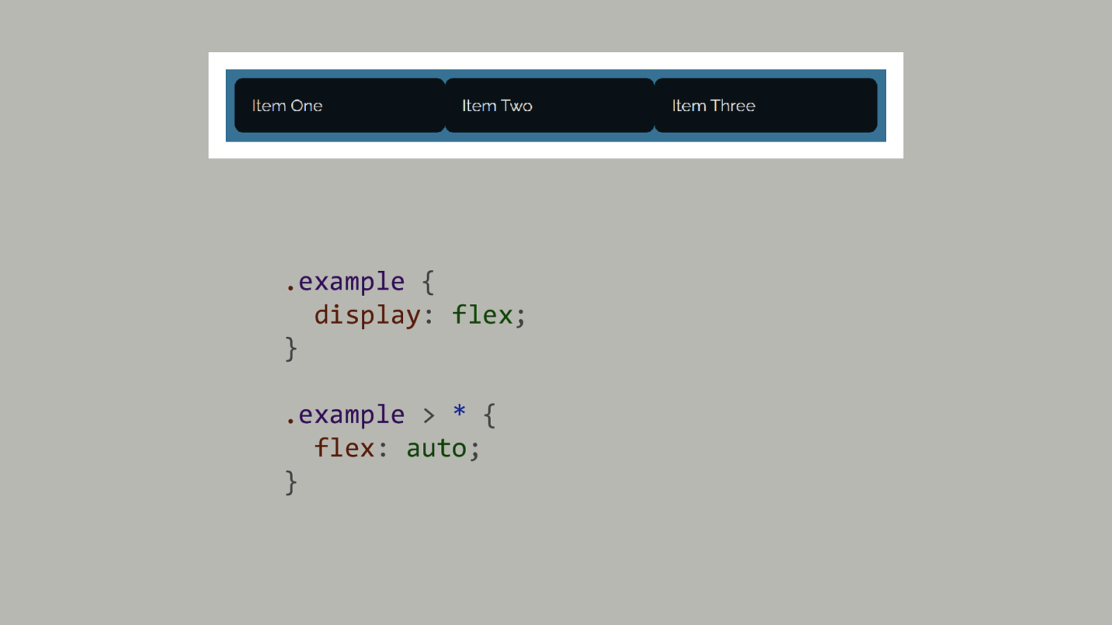
.example { display: flex; } .example > * { flex: auto; }
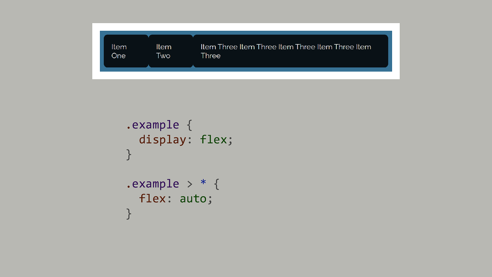
.example { display: flex; } .example > * { flex: auto; }
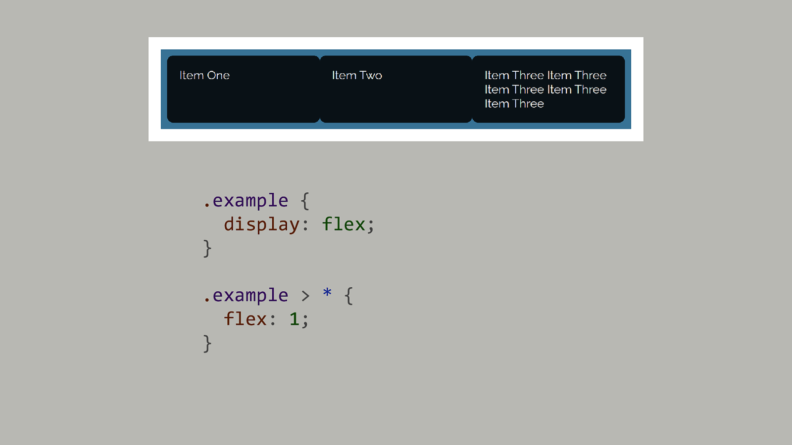
.example { display: flex; } .example > * { flex: 1; }
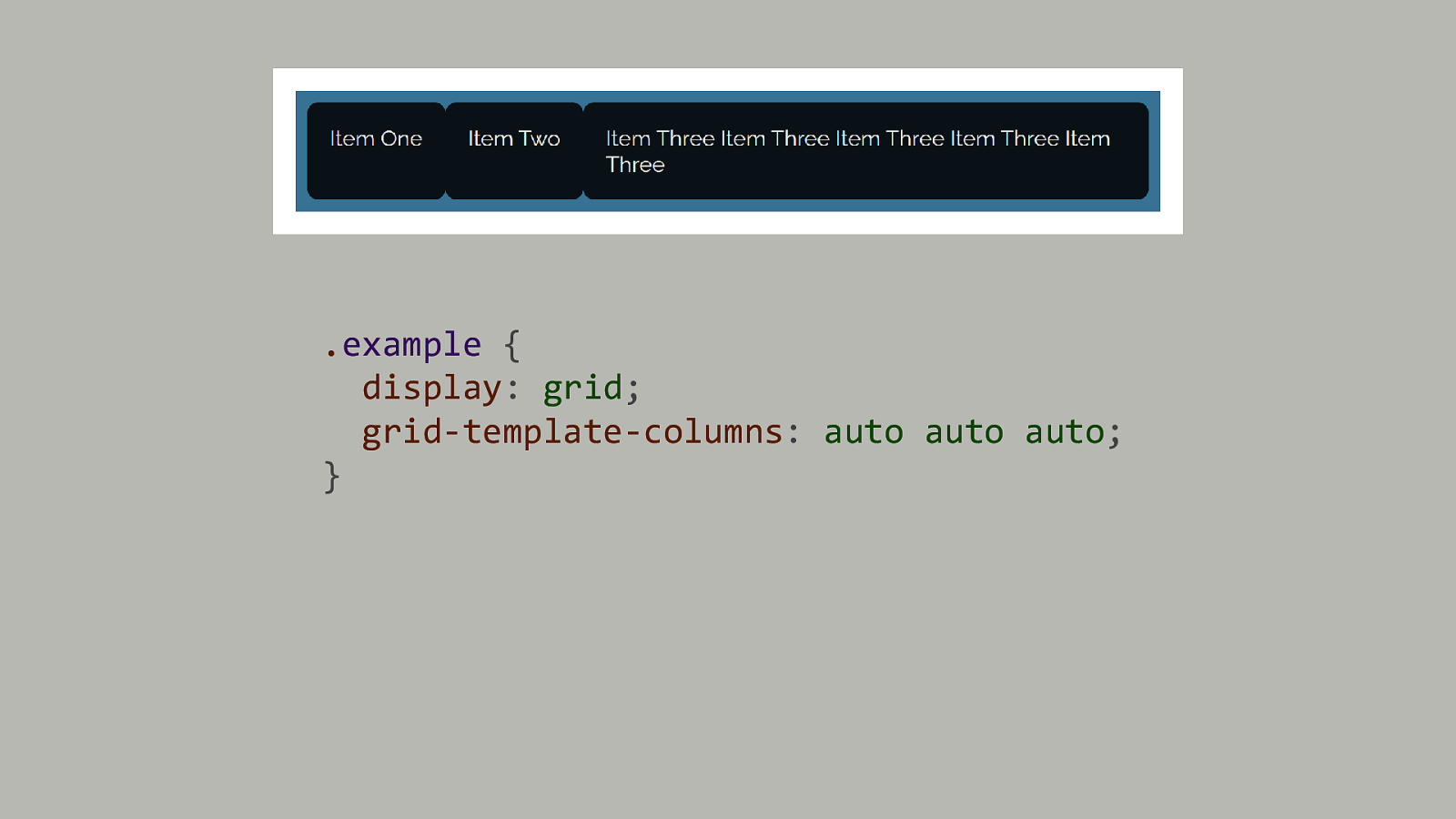
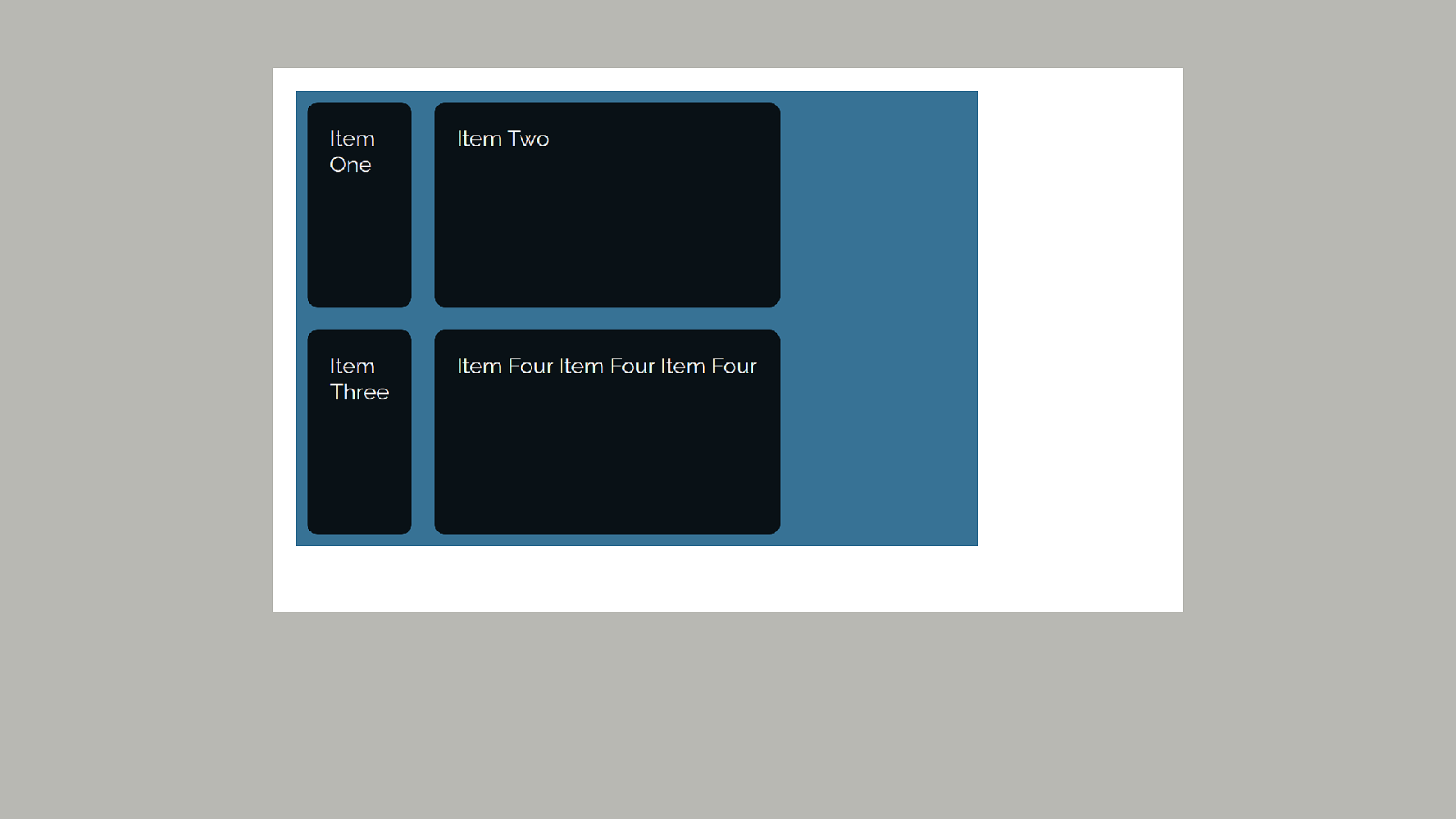
.example { display: grid; grid-template-columns: auto auto auto; }
Do not be afraid of the specifications! Interesting information lives there.

Thank you! @rachelandrew