START USING CSS GRID LAYOUT TODAY @rachelandrew @ Smashing Conf SF

A presentation at Render Conf 2017 in March 2017 in Oxford, UK by Rachel Andrew
START USING CSS GRID LAYOUT TODAY @rachelandrew @ Smashing Conf SF

Rachel Andrew ▸ CSS Working Group Invited Expert ▸ Google Developer Expert ▸ co-founder Perch CMS ▸ Old Nerd. ▸ You can find me in most places as @rachelandrew you can email me@rachelandrew.co.uk or check out my site at https://rachelandrew.co.uk
So, this is me and some of the places you might find me online.
I’ve been talking about grid layout for around 4 years, and this talk is quite exciting because this is the first talk I have done since grid shipped.
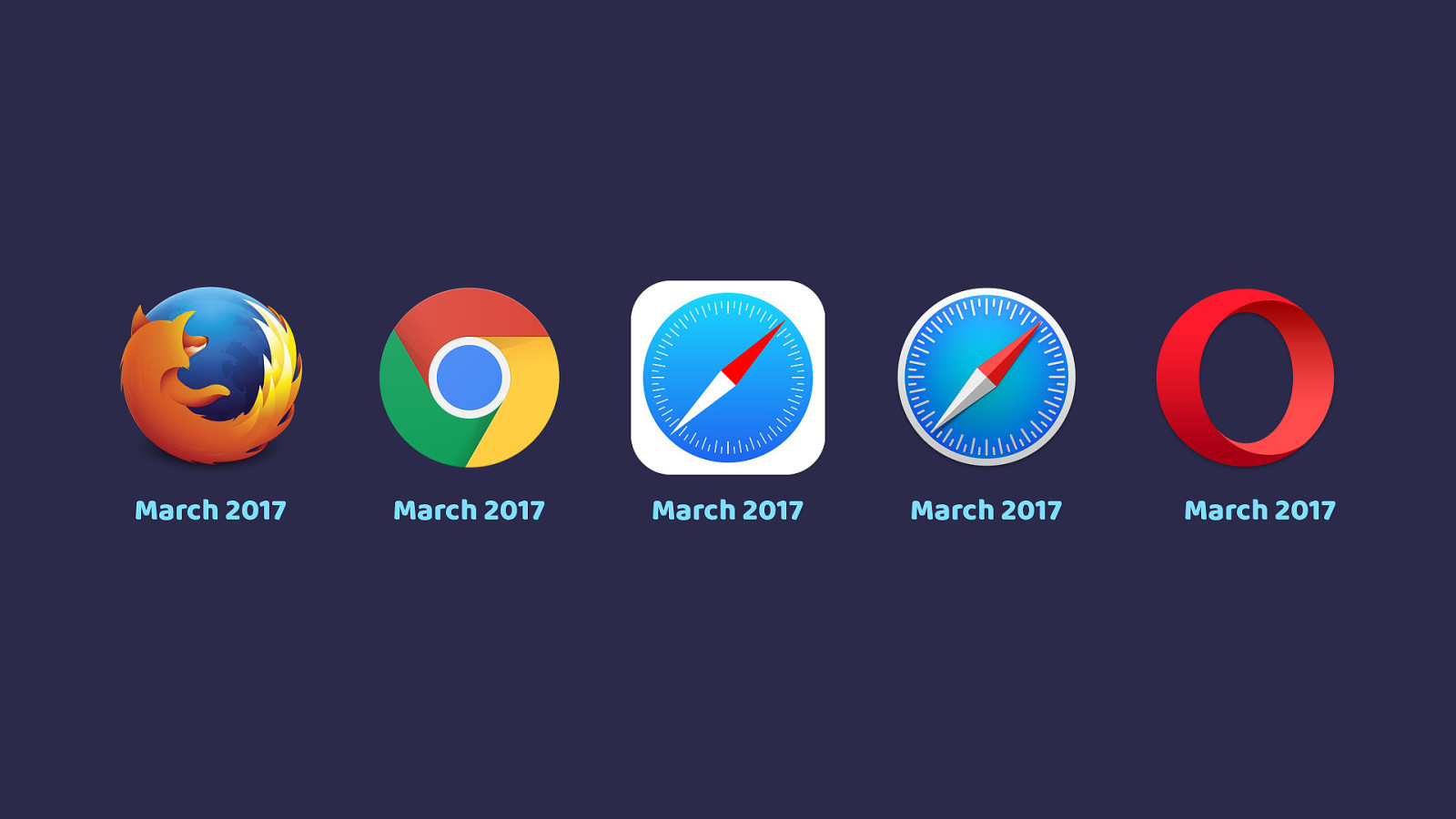
March 2017 March 2017 March 2017 March 2017 March 2017 In an unprecedented move Grid shipped into all of these browsers within weeks of each other, starting with Firefox then Chrome, Opera and Safari this week. I can’t tell you how amazing it is to see something I’ve spent so much time with for the last few years actually happen.
Start using CSS Grid Layout Today ▸ What is grid & why is it different to fl exbox? ▸ How do I get started using grid in production? ▸ What about old browsers? In half an hour I can’t teach you all of CSS Grid Layout, some you will be getting a whole lot more grid in my workshop tomorrow. At the end of this talk I’ll give you plenty of resources. Instead of telling you everything I know, what I’m going to do is answer my most frequently asked questions.
what is grid layout and why is it different from flexbox or other layout methods
How can I get started using grid in production?
How will I deal with browsers that don’t yet support grid layout? Hopefully this will give you enough of an overview that you’ll be keen to really dive into this new layout method.
Why not use flexbox? CSS Grid Layout I am frequently informed by the helpful people on Twitter that Flexbox exists. Why do we need a new layout method?
There is also the ba ffl ing assumption that this is a competing layout method to flexbox. As if the CSS working group are creating some sort of CSS specification deathmatch. That isn’t the case, these two specs do different things.
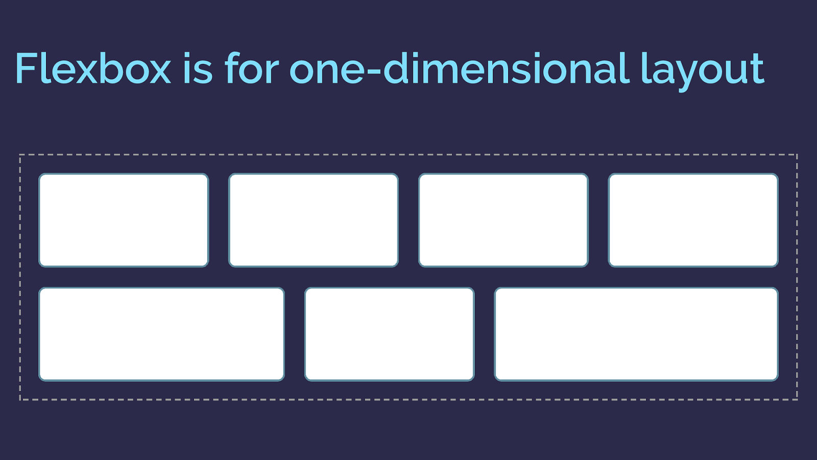
Flexbox is for one-dimensional layout There are a few answers to that question. The obvious, and detailed in the spec, difference is that flexbox is one dimensional, grid is two dimensional.
If you want to lay something out as a row or a column then flexbox works.
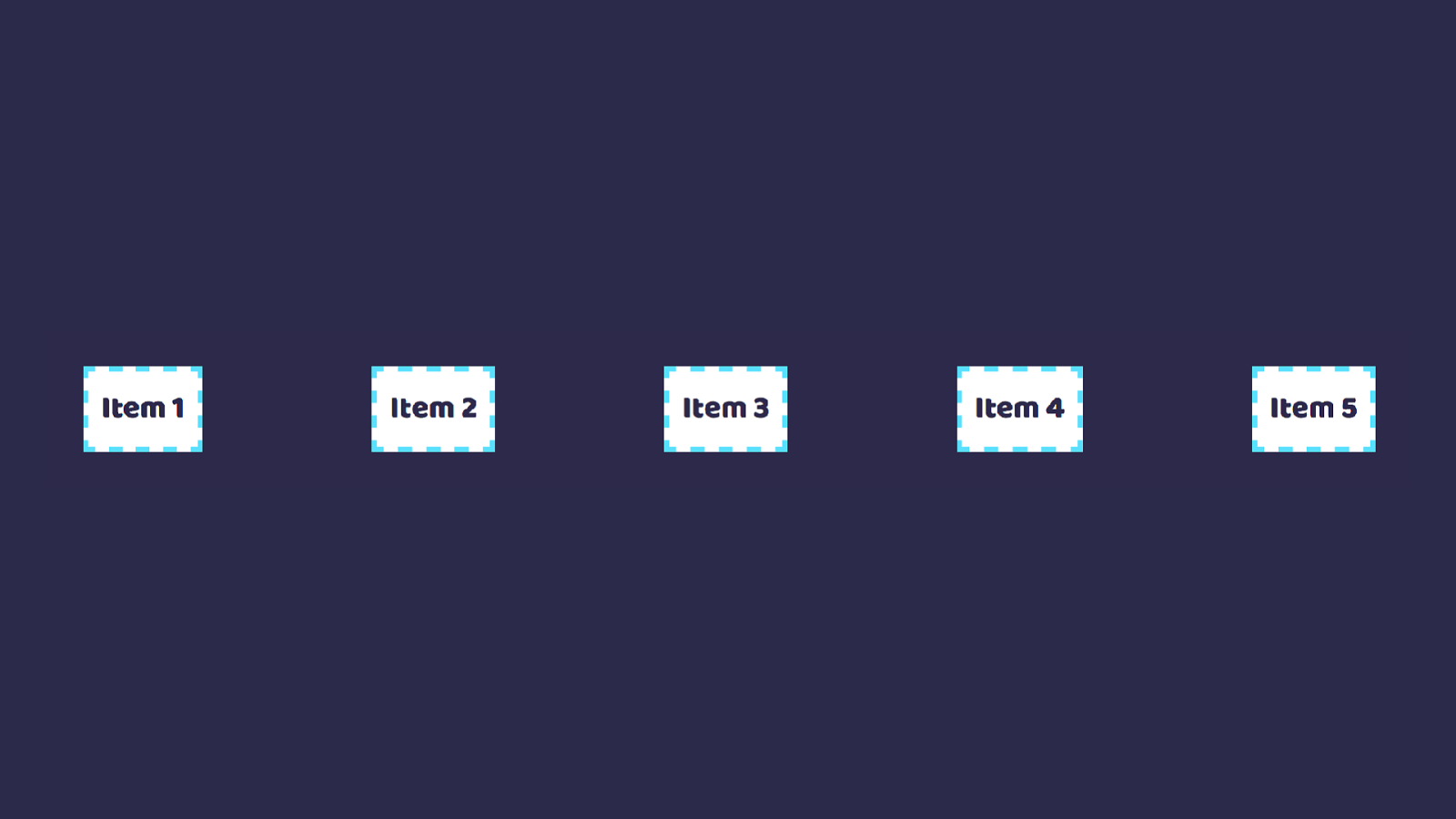
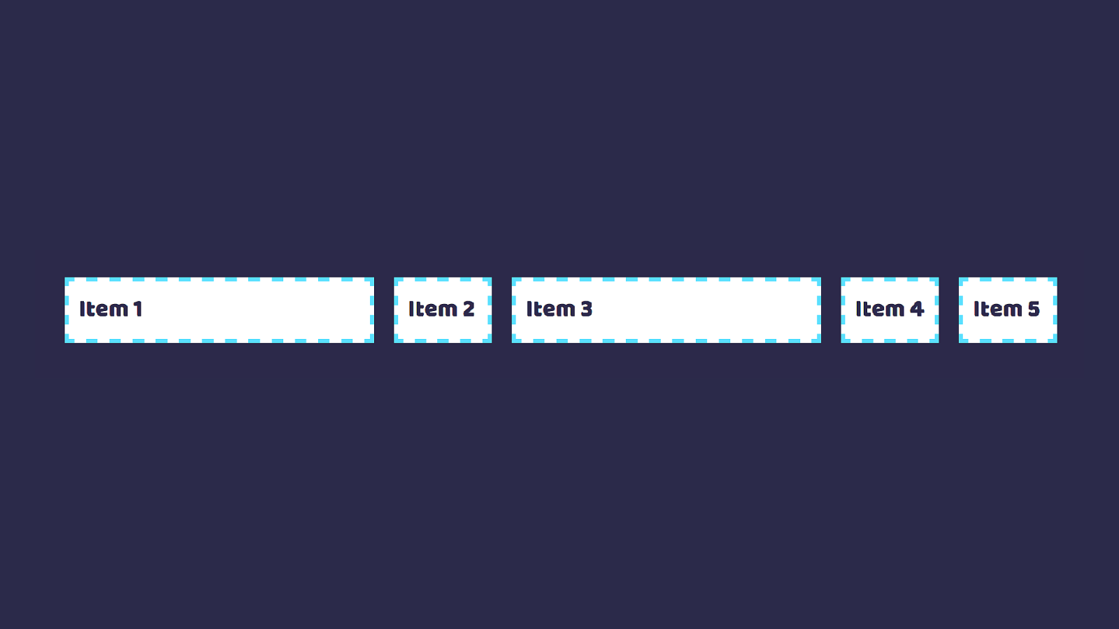
here is a flexbox example. I have a collection of items laid out with flexbox and allowed to wrap.
As you can see as they wrap they do not remain in a strict grid. So this is one dimensional layout. In this case I am controlling the main axis - the row. Each row as the items wrap is a shiny new flex container. Space distribution happens across that row.
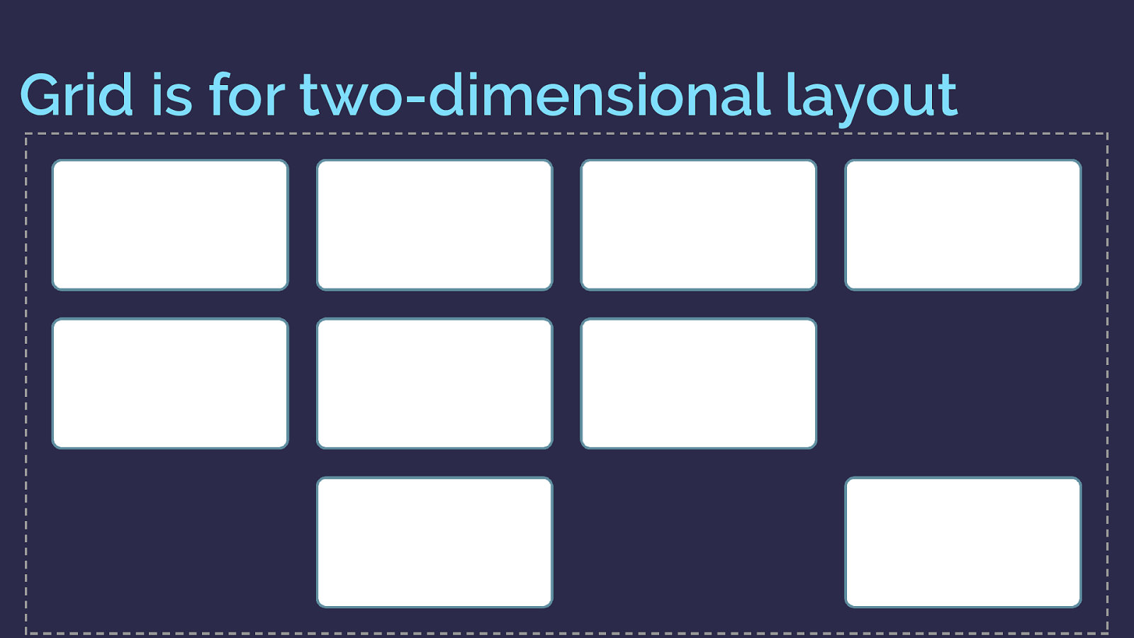
Grid is for two-dimensional layout Grid however is two dimensional
So here is the same layout with grid. You can see the items here not only create flexible rows, but also line up in their column too.
So this is two dimensional layout. A row and a column at the same time.
And you might be thinking, I can get round that flexbox problem by adding percentage widths to my flex items. Which is exactly the point at which you should be thinking “is this a grid issue?”
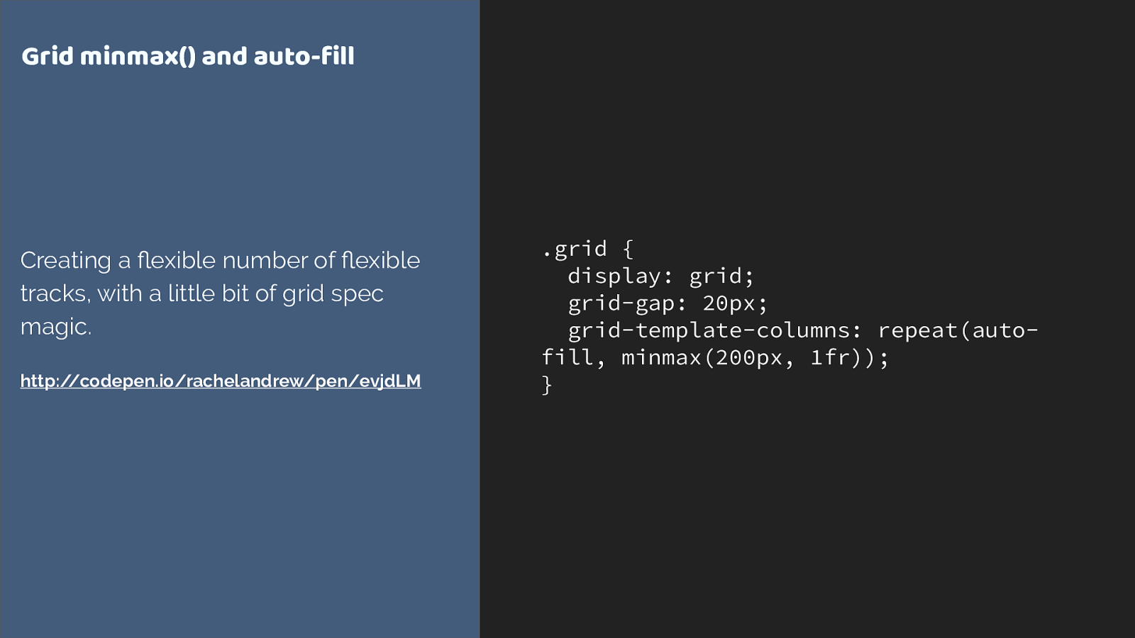
.grid { display: grid; grid-gap: 20px; grid-template-columns: repeat(auto- fill, minmax(200px, 1fr)); } Grid minmax() and auto-fill Creating a flexible number of fl exible tracks, with a little bit of grid spec magic. http://codepen.io/rachelandrew/pen/evjdLM
This is all we need to apply to the container to create that layout.
We’re using repeat syntax, auto-filling columns that are a minimum of 200 pixels with the extra shared out between all columns as max is 1fr.
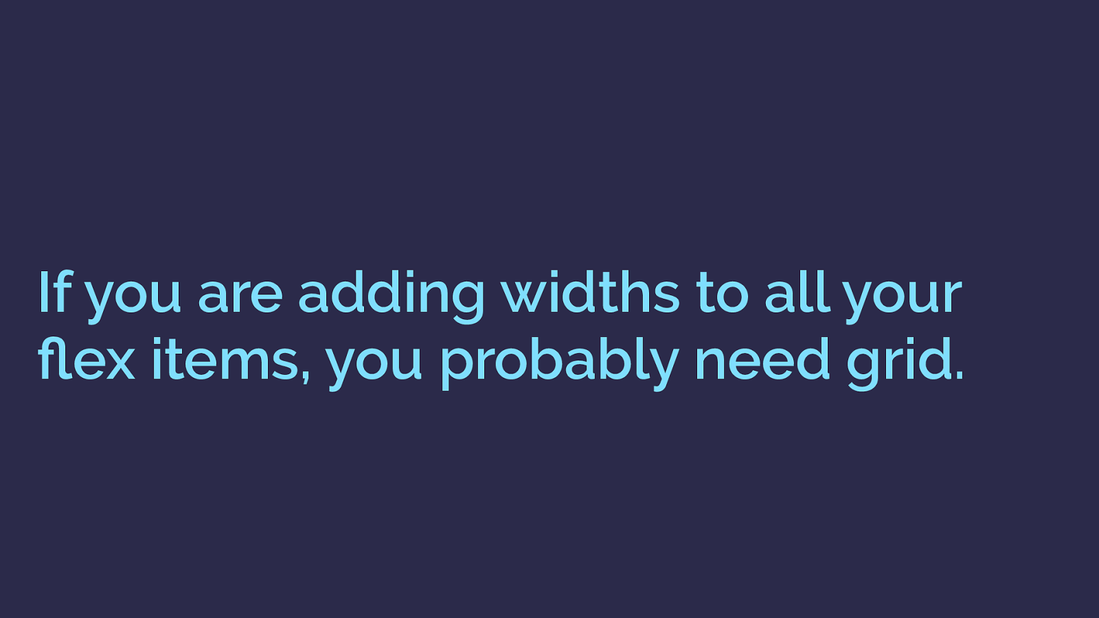
If you are adding widths to all your flex items, you probably need grid. As soon as you start constraining the flexibility of flexbox by adding the sort of percentage widths we use with float or inline block layouts. That is an excellent sign you really need grid.
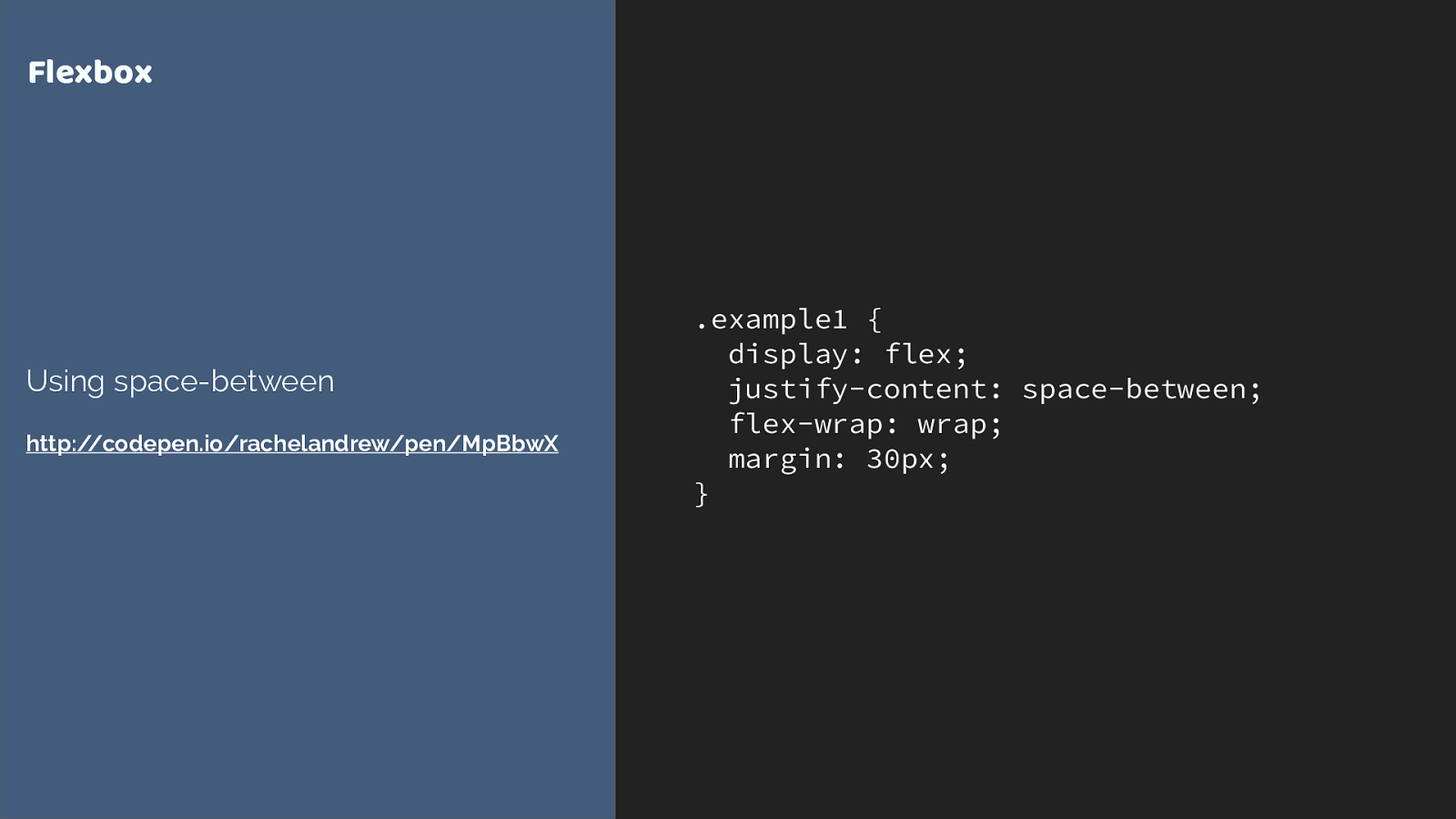
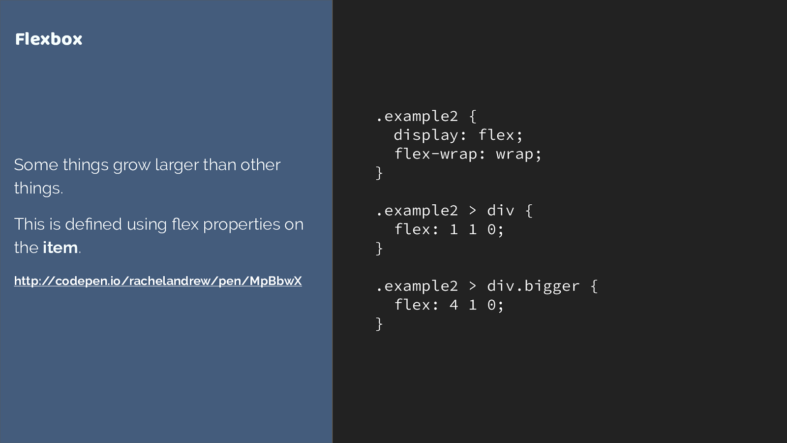
.example1 { display: flex; justify-content: space-between; flex-wrap: wrap; margin: 30px; } Flexbox Using space-between http://codepen.io/rachelandrew/pen/MpBbwX
Another way to look at this, is that flexbox works from the content out and grid works layout in.
Say you have a collection of things, which could be different sizes. You want to let the content dictate the size and them all to space out.
.example2 {
display: flex;
flex-wrap: wrap;
}
.example2 > div {
flex: 1 1 0;
}
.example2 > div.bigger {
flex: 4 1 0;
}
Flexbox
Some things grow larger than other
things.
This is defined using
fl
ex properties on
the
item
.
http://codepen.io/rachelandrew/pen/MpBbwX
or you want some things to grow bigger than other things where there is free space in the container. The content is dictating the layout here. Flexbox is managing the space distribution.
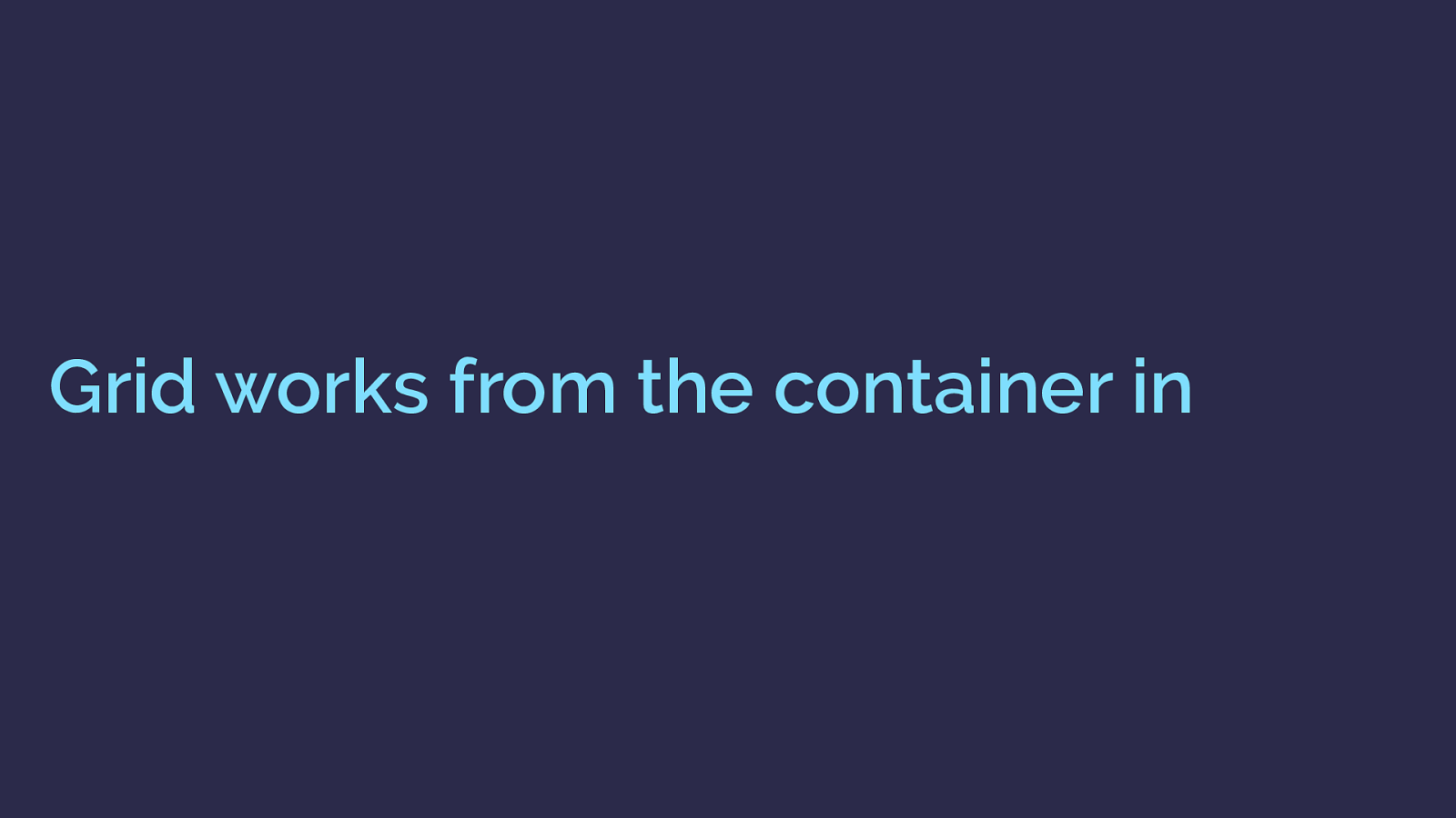
Grid works from the container in With grid you say, here is the grid, items need to fit into this grid. You can cause the items to span more than one track and you can align items inside their areas but they are constrained by the grid tracks into which you place them.
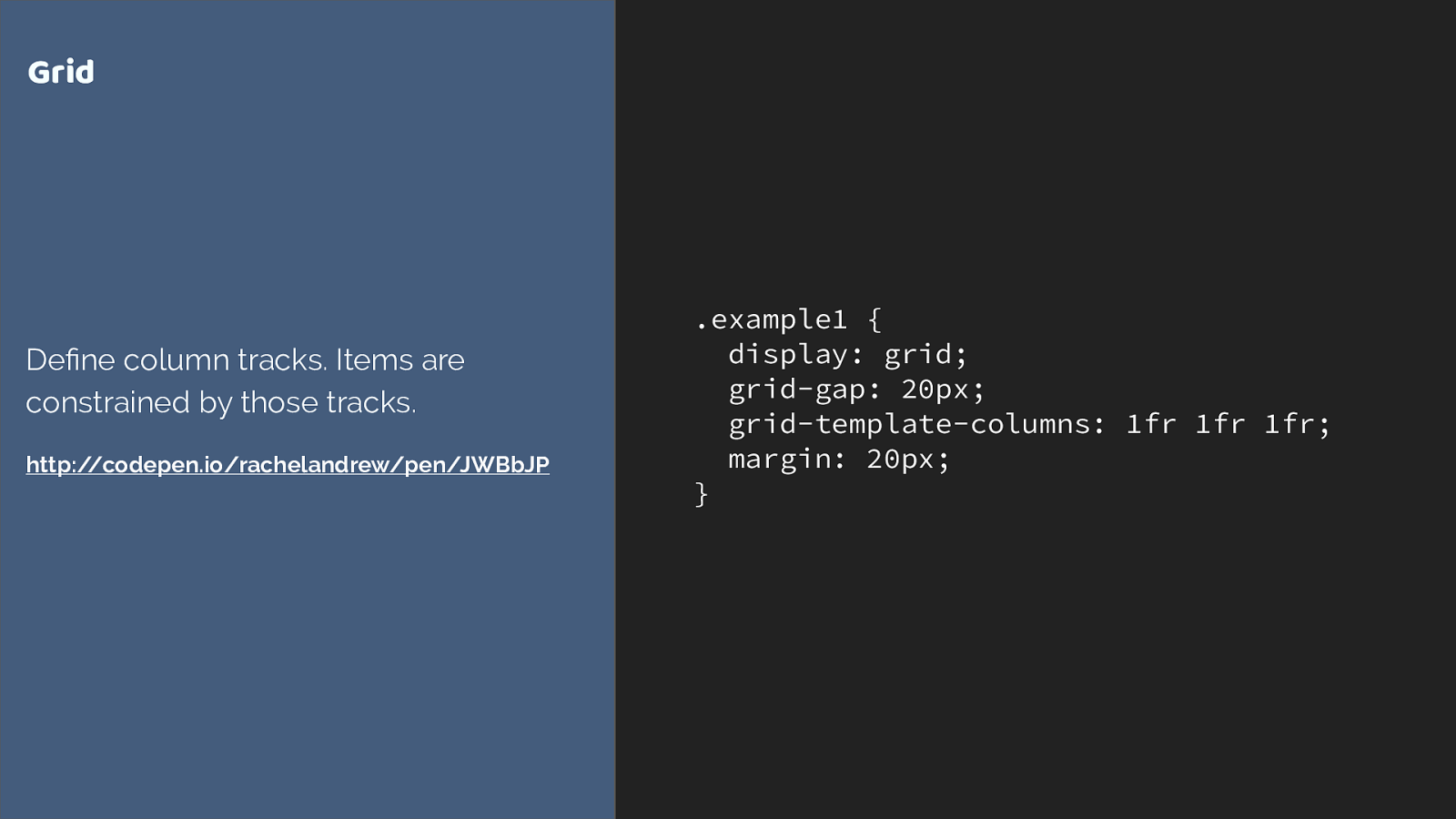
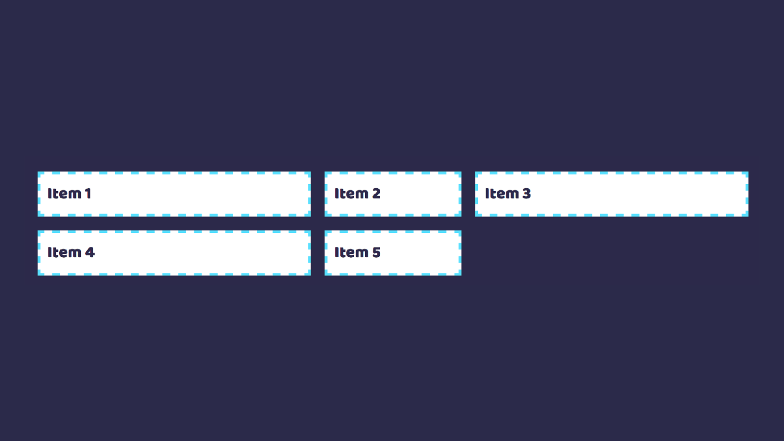
.example1 { display: grid; grid-gap: 20px; grid-template-columns: 1fr 1fr 1fr; margin: 20px; } Grid Define column tracks. Items are constrained by those tracks. http://codepen.io/rachelandrew/pen/JWBbJP So here I’m creating a three column track grid using the fr unit, representing a fraction of the available space in the grid container.
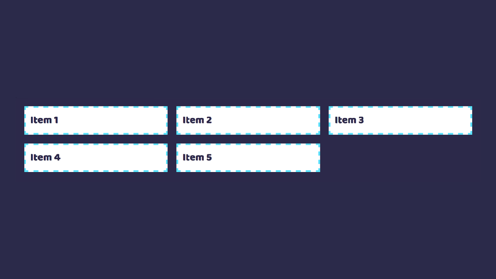
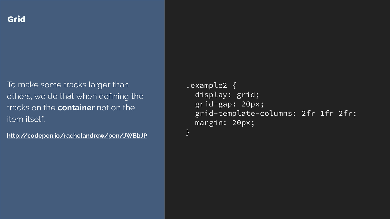
.example2 { display: grid; grid-gap: 20px; grid-template-columns: 2fr 1fr 2fr; margin: 20px; } Grid To make some tracks larger than others, we do that when defining the tracks on the container not on the item itself. http://codepen.io/rachelandrew/pen/JWBbJP We can also cause some tracks to take more of that space. In this example we have three tracks two of 2fr and one of 1fr. The available space is split into 5 and shared out in proportiion.
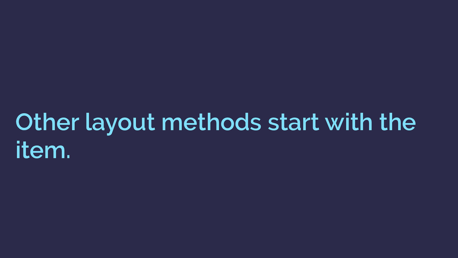
Other layout methods start with the item. I think the reason I get asked this question a lot though is that using grid requires a mindset shift. Almost all of our existing layout methods work by adding things to the item.
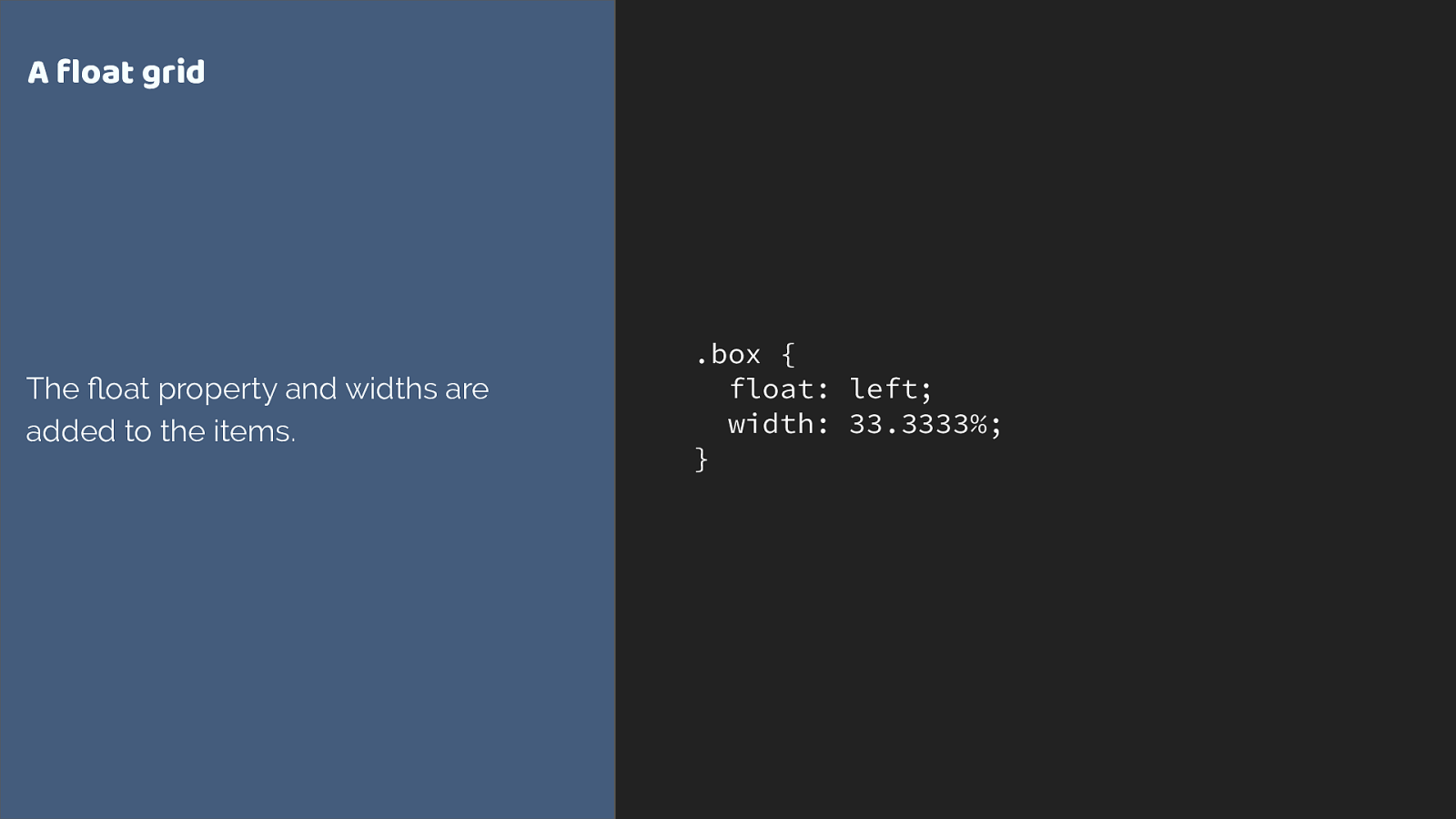
.box { float: left; width: 33.3333%; } A float grid The float property and widths are added to the items. Here is a simplified float grid. I need to add widths to my items in order to lay them out on the grid.
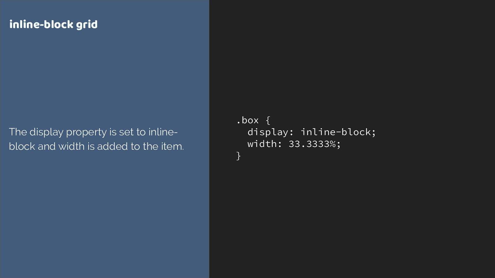
.box { display: inline-block; width: 33.3333%; } inline-block grid The display property is set to inline- block and width is added to the item. Inline-block is exactly the same. I am working on the item. It gets set to display: inline-block, it gets a width. The wrapper just provides the 100%.
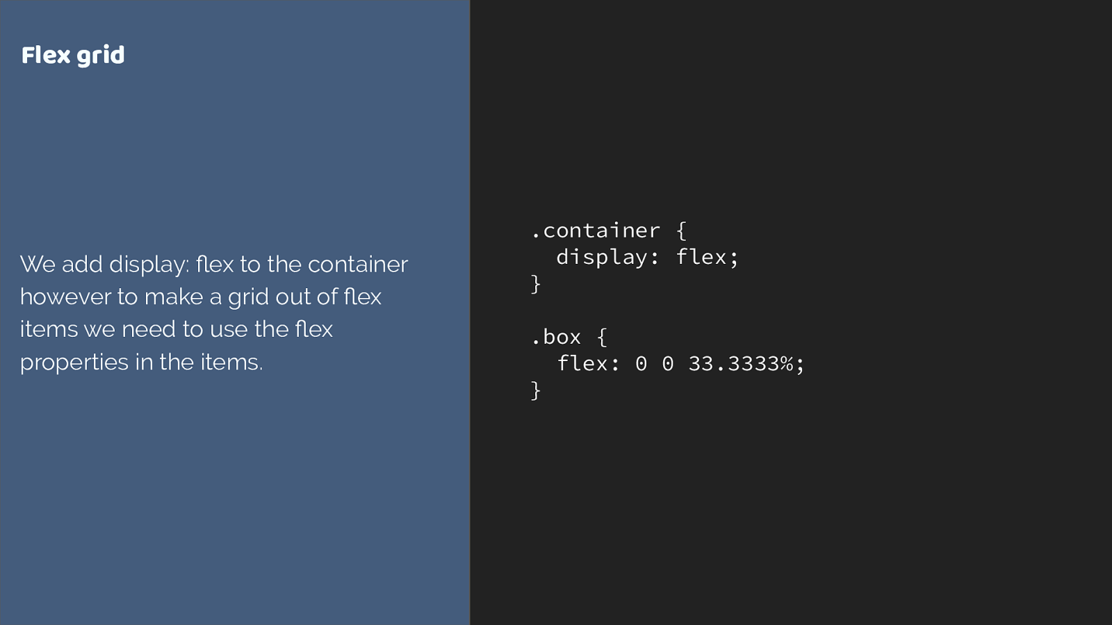
.container { display: flex; } .box { flex: 0 0 33.3333%; } Flex grid We add display: flex to the container however to make a grid out of flex items we need to use the flex properties in the items. and while we do declare display flex on a parent element, and the children become grid items, if we want to change the behaviour of the flex items, we have to target the items themselves. Adding the flex property to set flex grow flex shrink and flex basis. Perhaps adding a width just like we would for a floated item to make a flex grid.
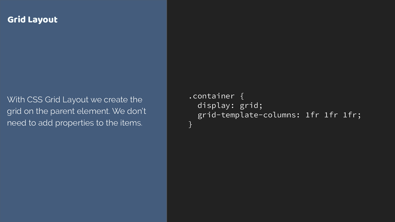
.container { display: grid; grid-template-columns: 1fr 1fr 1fr; } Grid Layout With CSS Grid Layout we create the grid on the parent element. We don’t need to add properties to the items. grid is different. We do all of our grid creation on the parent. The only other layout method that does anything similar is multi-column layout.
Grid is all about the container grid is about containers.
Once you know this, the decision of whether to use grid or flexbox becomes easier. There will be times you could use either, and there isn’t a right or wrong.
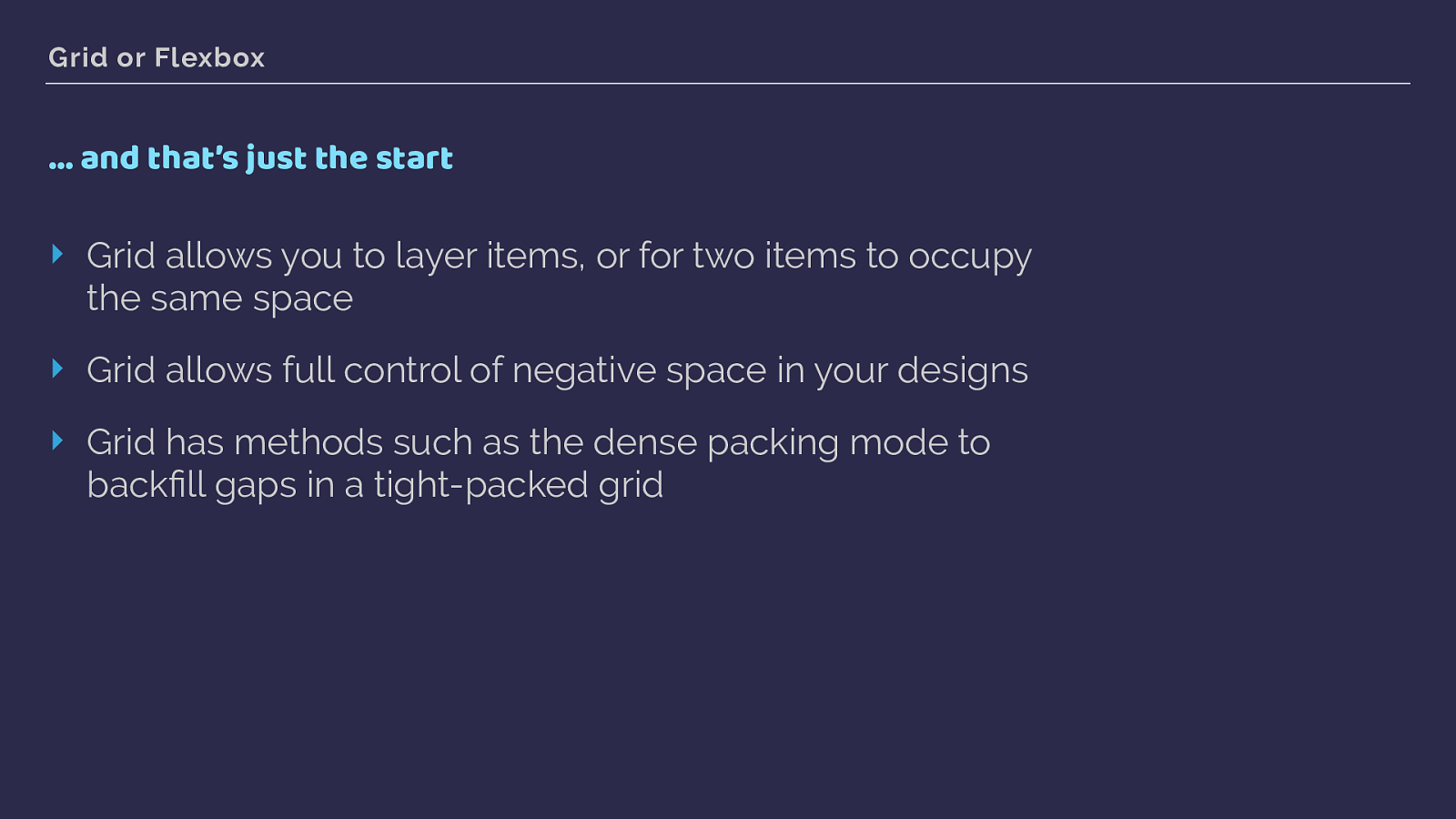
Grid or Flexbox … and that’s just the start ‣ Grid allows you to layer items, or for two items to occupy the same space ‣ Grid allows full control of negative space in your designs ‣ Grid has methods such as the dense packing mode to backfill gaps in a tight-packed grid There are additional features over the flexbox spec in the grid spec, and we’ll look at a few of those in the rest of this talk. However in terms of those places where you could use on or the other here is a quick guide.
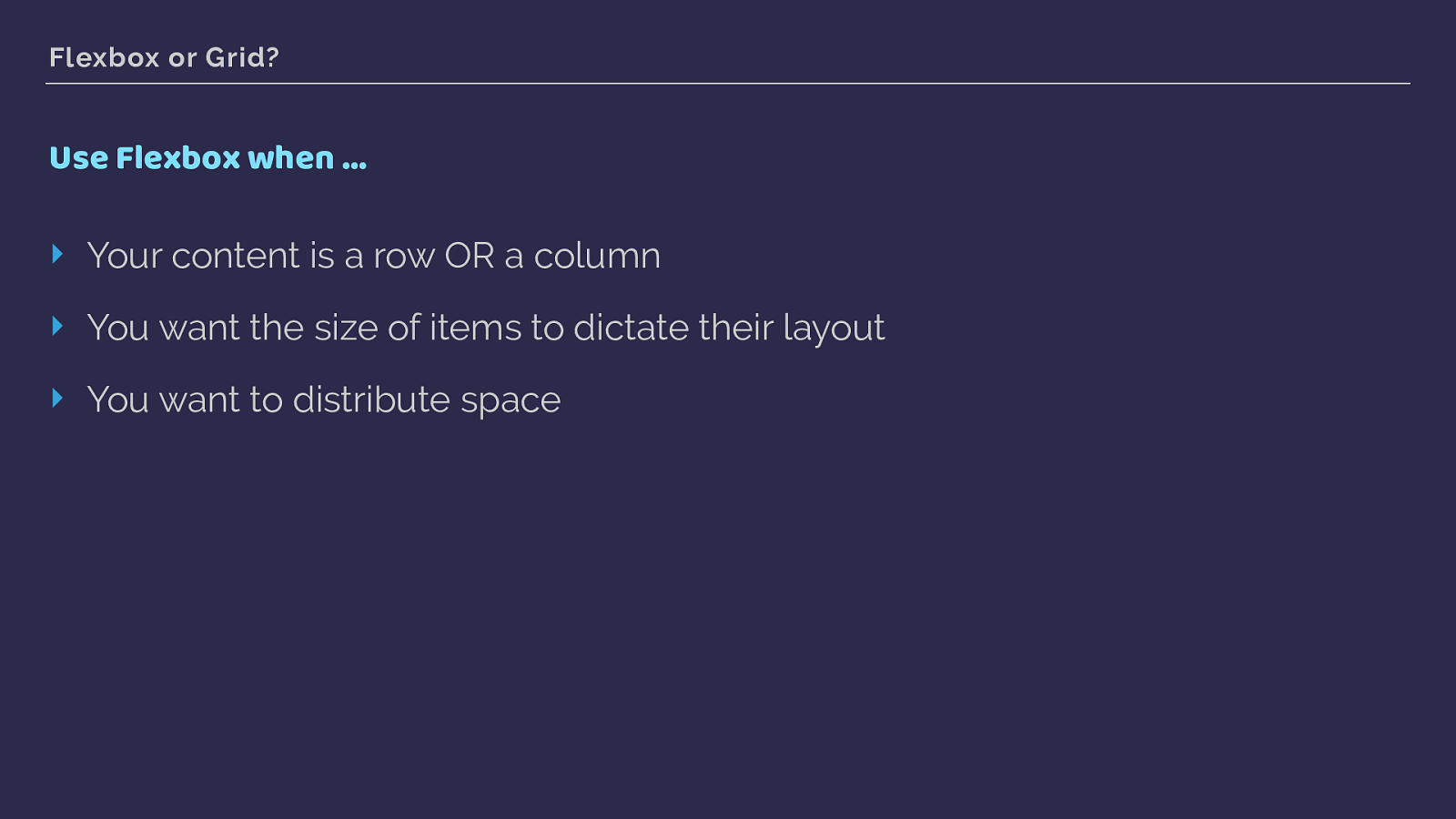
Flexbox or Grid? Use Flexbox when … ‣ Your content is a row OR a column ‣ You want the size of items to dictate their layout ‣ You want to distribute space Flexbox
content is a row or a column
you want the size of items to dictate layout
you want to distribute space
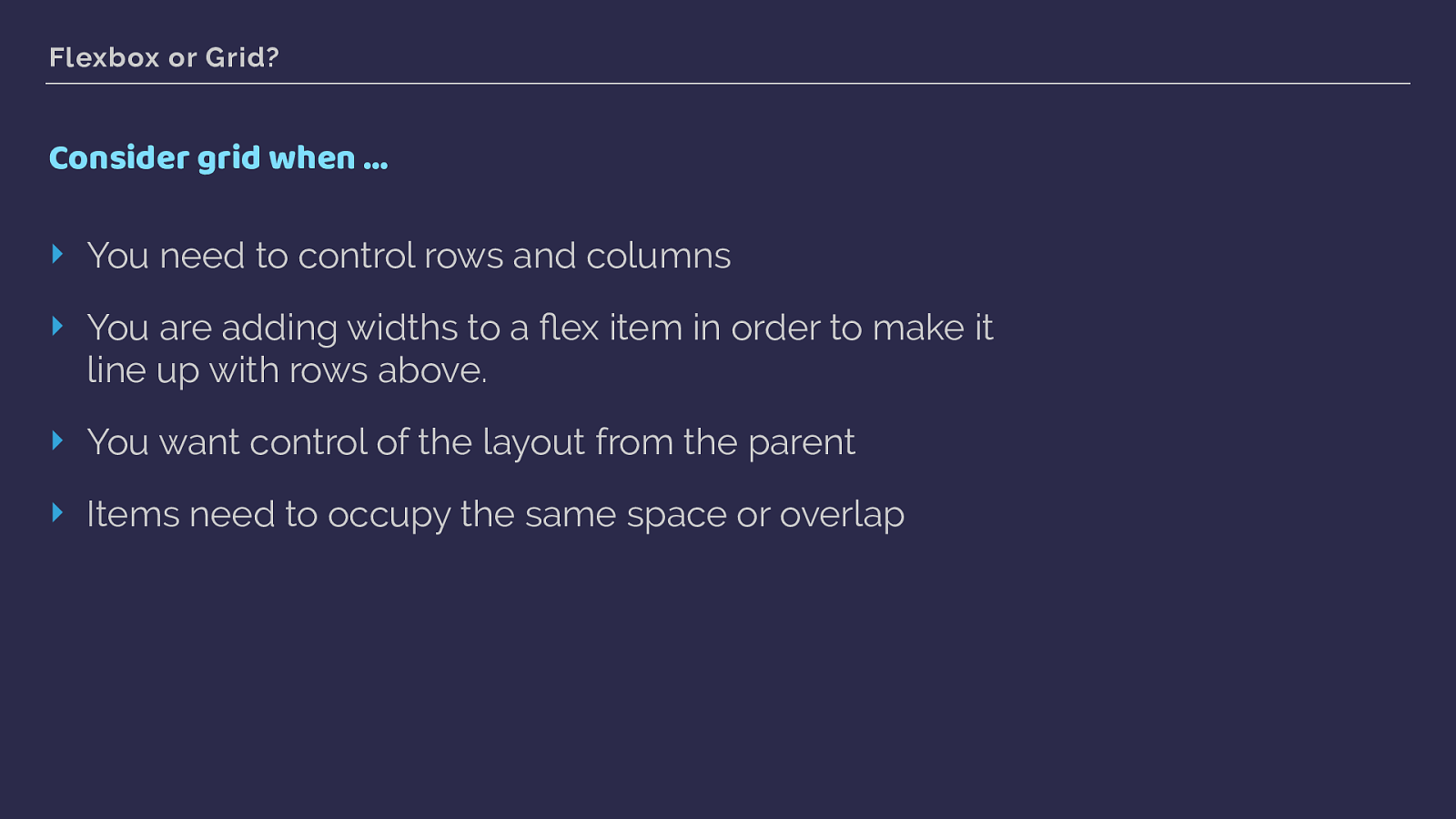
Flexbox or Grid? Consider grid when … ‣ You need to control rows and columns ‣ You are adding widths to a flex item in order to make it line up with rows above. ‣ You want control of the layout from the parent ‣ Items need to occupy the same space or overlap As soon as you start constraining the flexibility of flexbox by adding the sort of percentage widths we use with float or inline block layouts. That is an excellent sign you really need grid.
If you want to create a layout on the parent, and have items fall into place on it. That’s grid.
and if you layout needs items to overlay each other thats a part of the grid spec.
Using grid in production CSS Grid Layout You know why grid has been created and I’ve shown you a little bit of grid code - let’s have a look at a whole lot more with some worked examples.
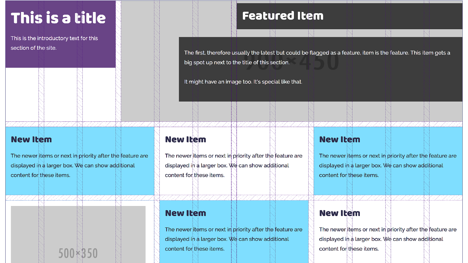
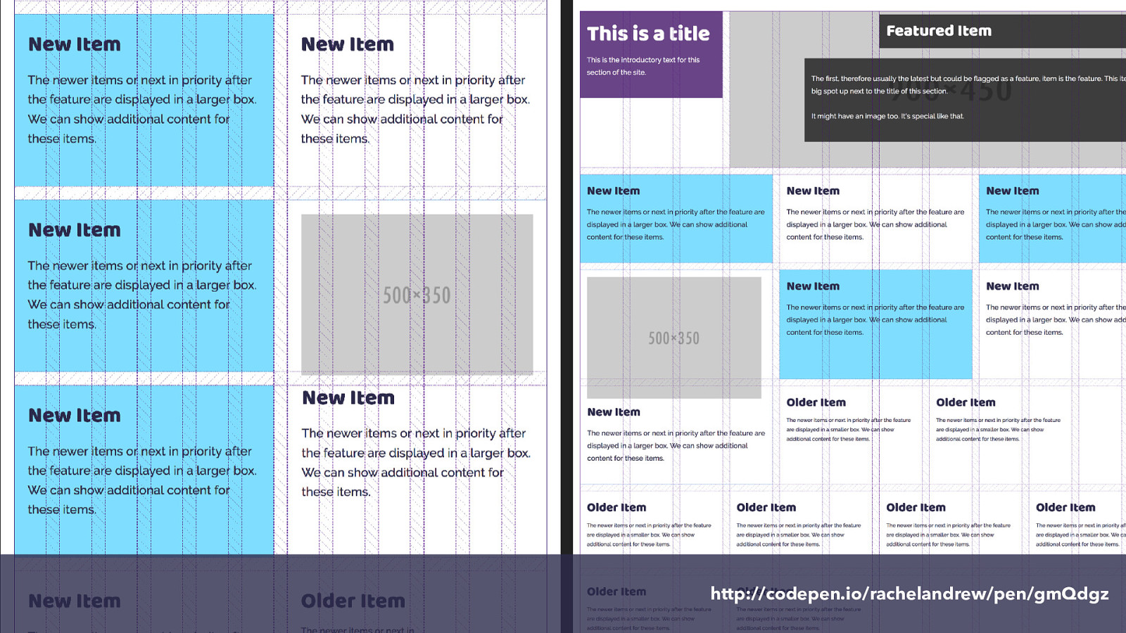
These examples are from the redesign of my website. After several years of talking about grid in theory I was excited to actually build a site with it. My personal site is as good a place as any to start. I’ve not rolled this out yet, I’m working in the pattern library Fractal, to create the various elements on my site and see how they will work as they are combined into a grid layout.
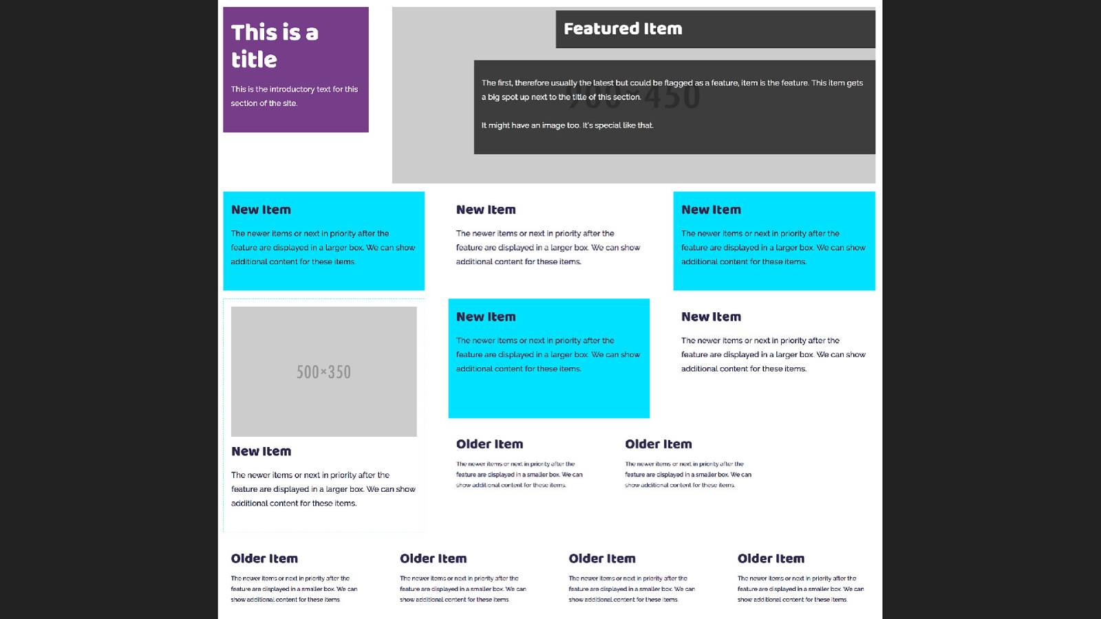
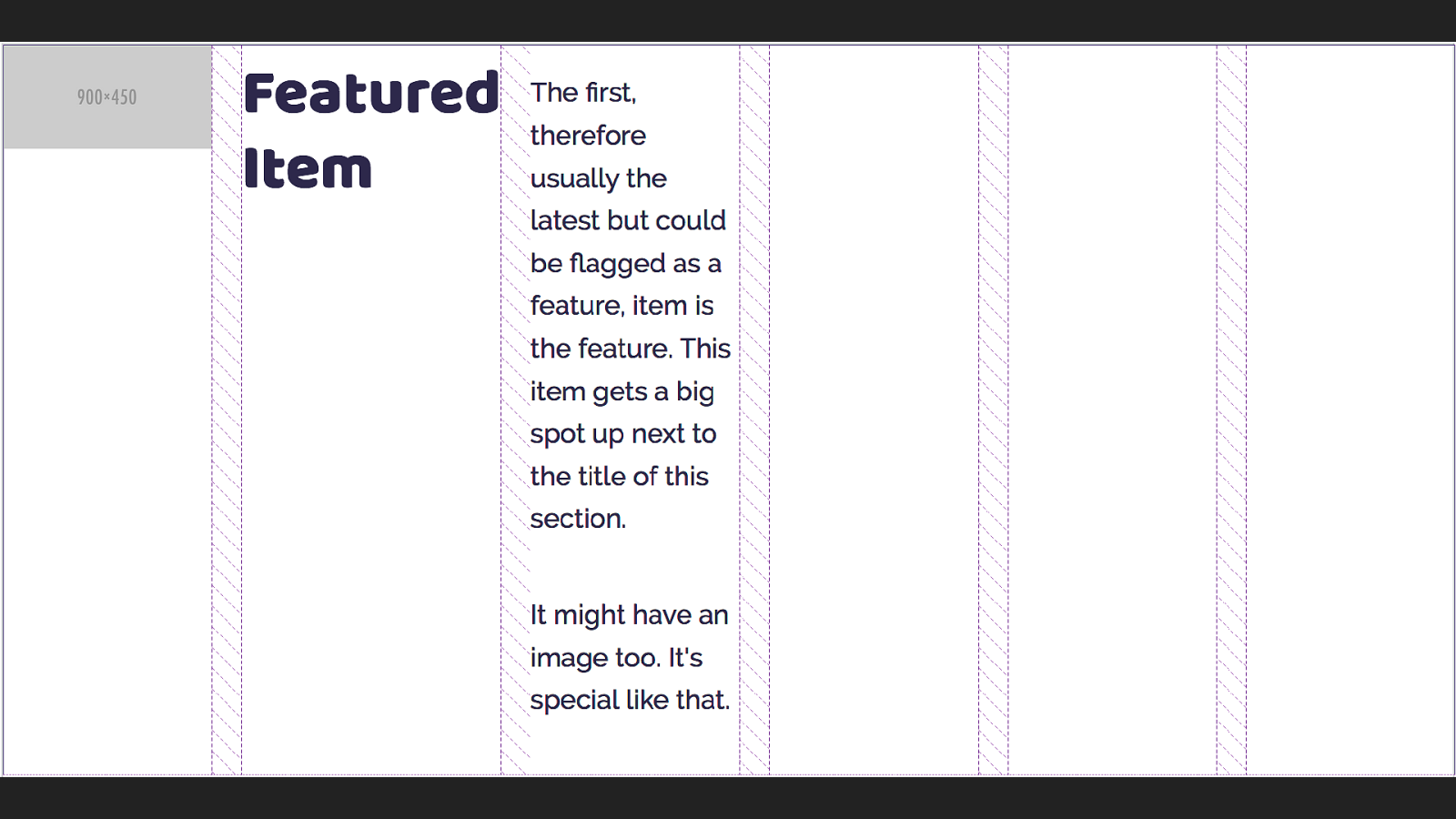
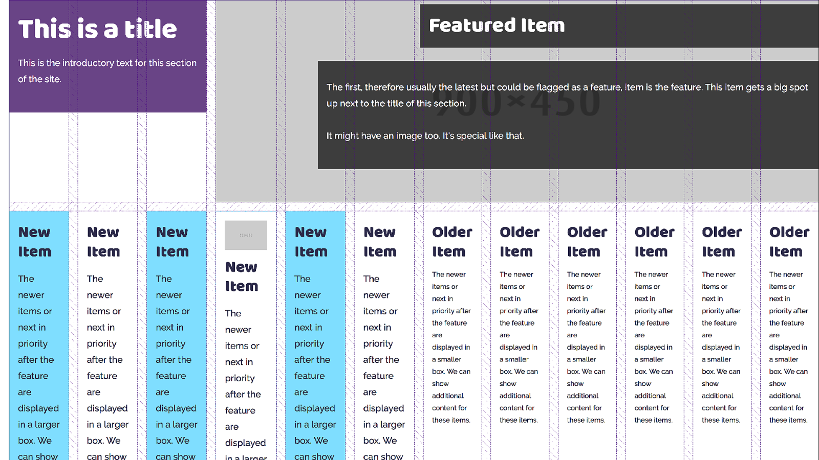
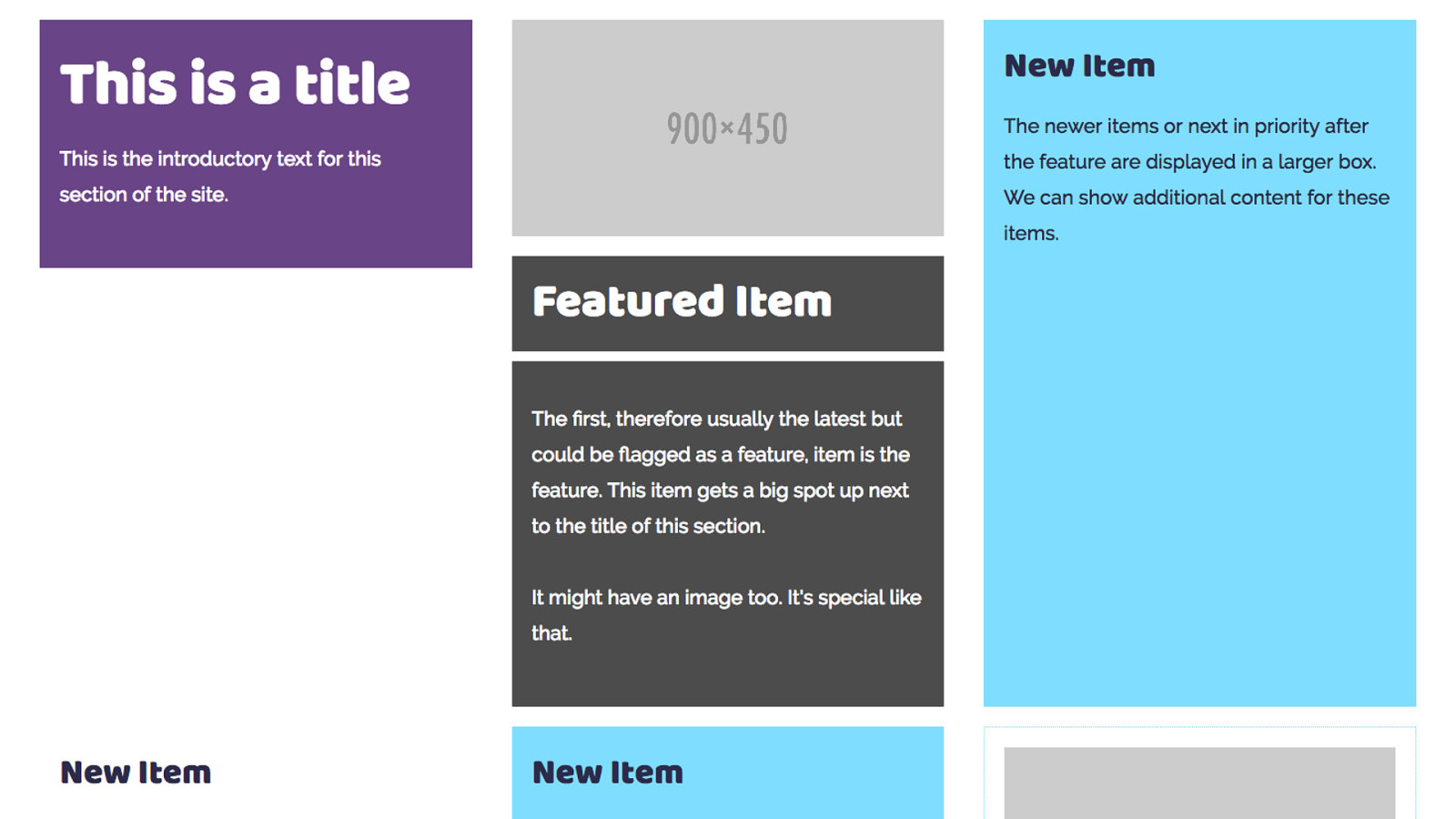
My site is mostly listings of things, talks I’m going to give or have given. Blog posts, podcasts I have been a guest on and books I’ve written. My previous design had everything in little boxes, I wanted to continue this idea on my new site, and had an idea for a listing that would have a featured item at the top - the latest blog posts or some other thing that I had featured, with boxes getting smaller
This is the example in my pattern library which has all the boxes in, as a bit of a jumble so I could check how they would behave.
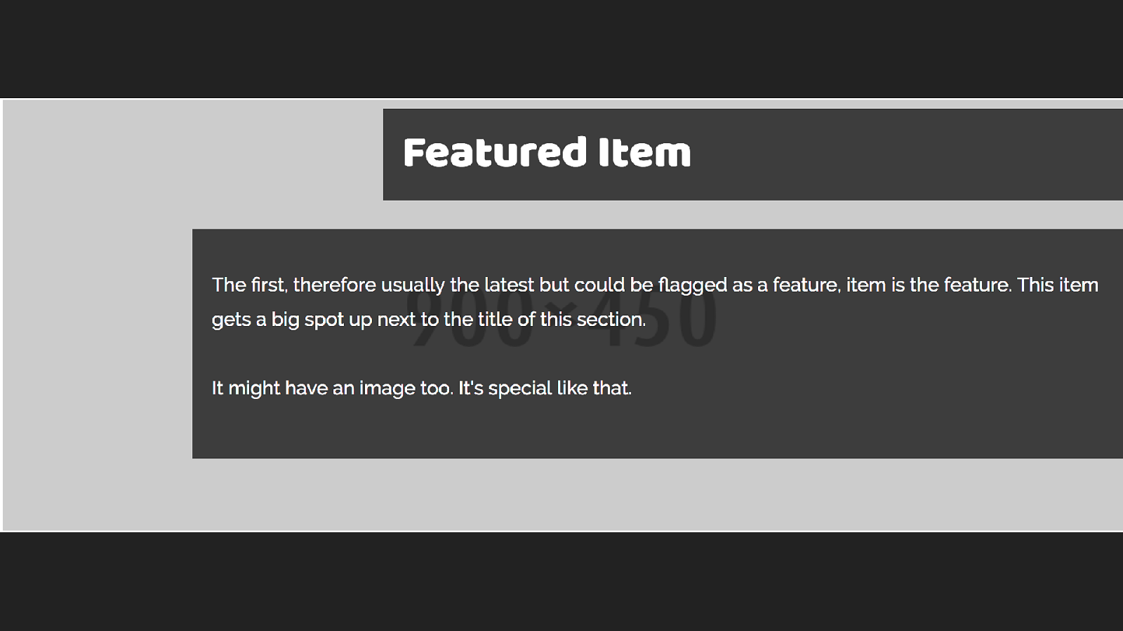
The first thing I did was to identify the different types of boxes in my design, to work on in the pattern library.I decided to start with this feature block and built the markup for this pattern.
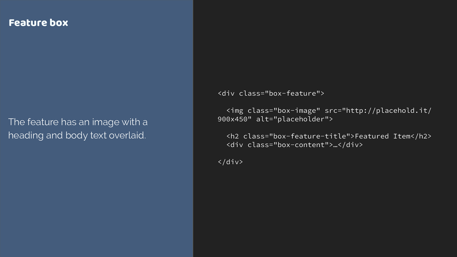
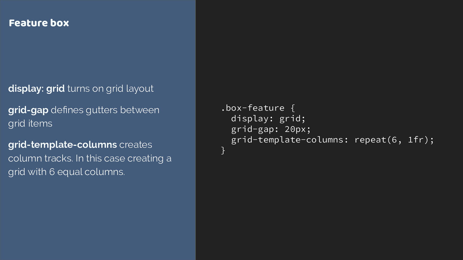
.box-feature {
display: grid;
grid-gap: 20px;
grid-template-columns: repeat(6, 1fr);
}
Feature box
display: grid
turns on grid layout
grid-gap
defines gutters between
grid items
grid-template-columns
creates
column tracks. In this case creating a
grid with 6 equal columns.
This is our container. We turn on grid with display grid and now all of the direct children are grid items.
Grid gap creates a gap between our tracks. We then define column tracks with grid-template-columns. The repeat notation I’ve used here creates six 1fr tracks.
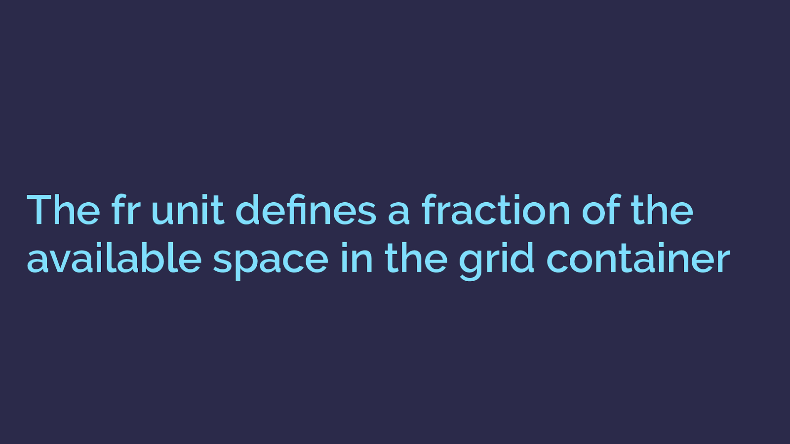
The fr unit defines a fraction of the available space in the grid container This fr unit has been created for grid layout, it defines and fraction of the available space in the grid container.
Six 1 fr tracks gives us 6 equal width tracks.
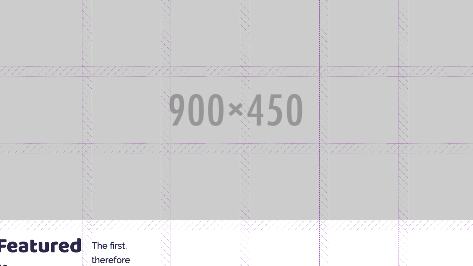
I am using the Firefox Grid Inspector to highlight the grid tracks we have created - you can see the shaded area, which is the grid gap. Grid has placed the direct children of the container one into each grid cell. So we don’t get overlaps - but we probably want to actually position these items.
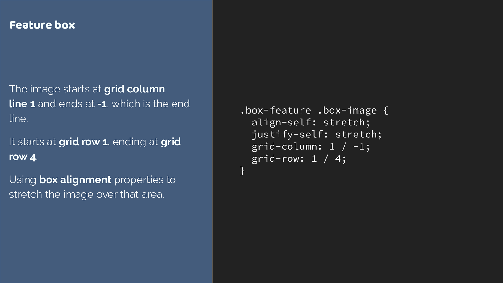
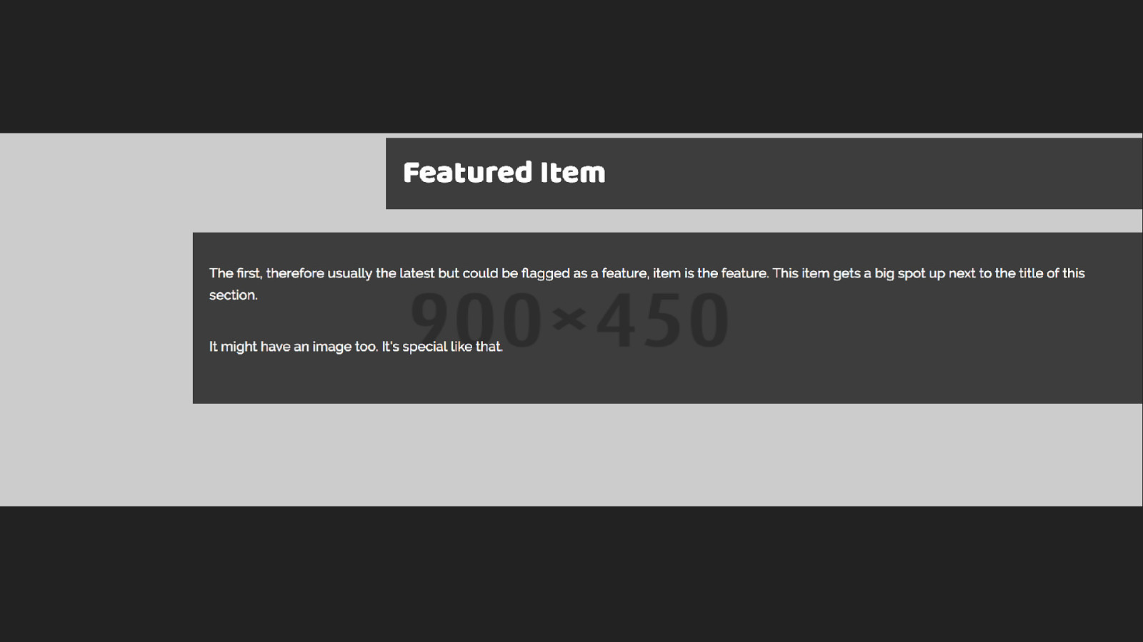
.box-feature .box-image { align-self: stretch; justify-self: stretch; grid-column: 1 / -1; grid-row: 1 / 4; } Feature box The image starts at grid column line 1 and ends at -1 , which is the end line. It starts at grid row 1 , ending at grid row 4 . Using box alignment properties to stretch the image over that area. I’m using the line based positioning method to stretch the image over the grid area. From column line 1 to line -1, which is from the first to last column line.
Then from row line 1 to 4. The grid-column and grid-row properties are shorthands for grid-column-start and grid-column end, grid-row-start and grid-row-end.
Two other things.
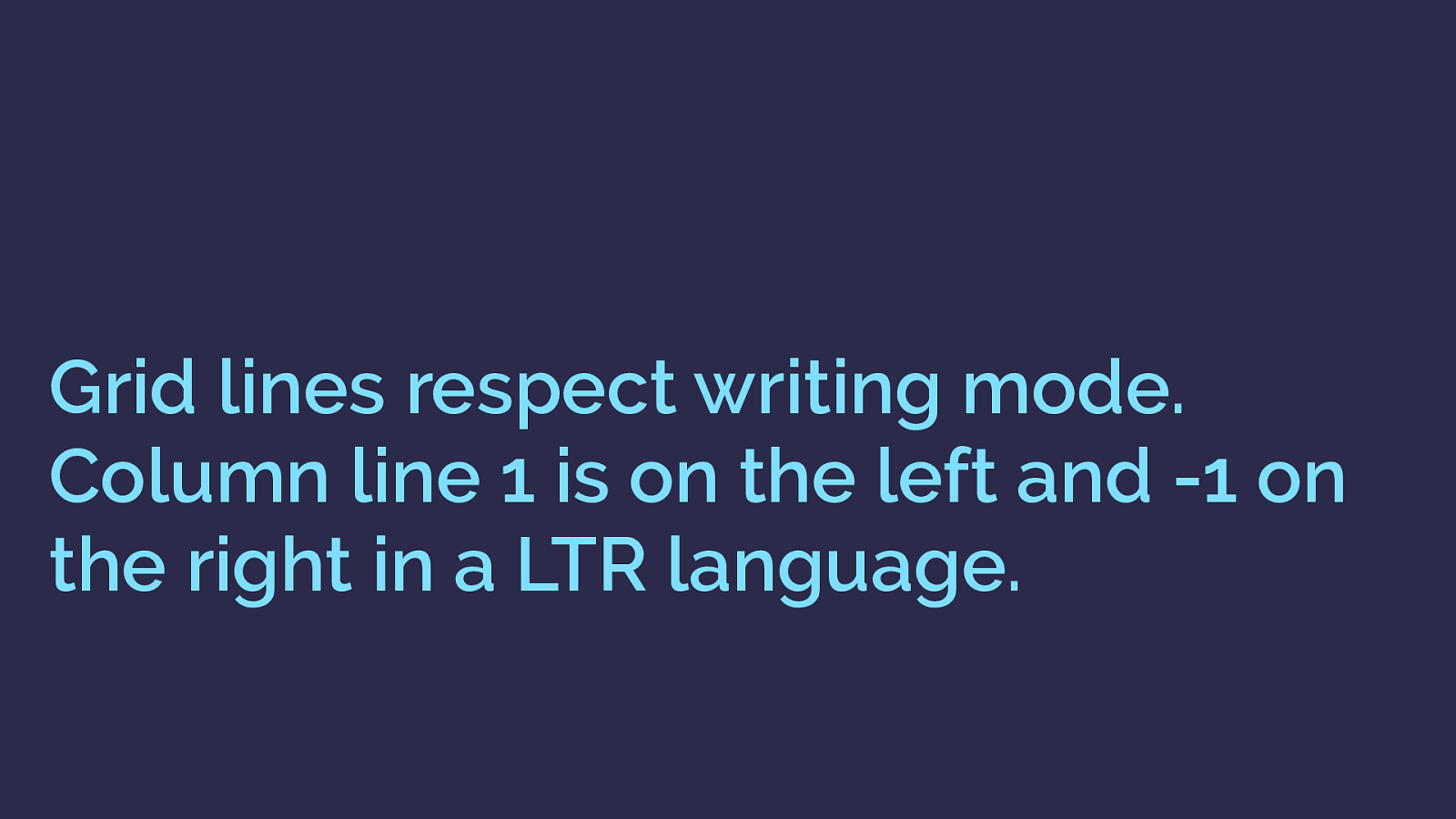
Grid lines respect writing mode. Column line 1 is on the left and -1 on the right in a LTR language. In English column line 1 is on the left and lines count up from there.
You can count back the other way with column line -1 being on the far right.
In a right to left language column line 1 would be on the right and -1 on the left.
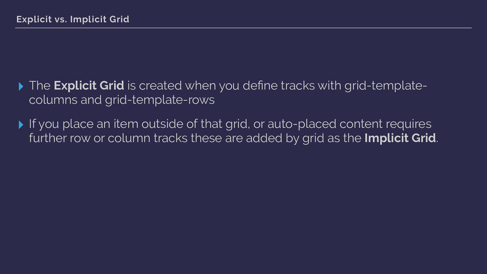
Explicit vs. Implicit Grid ▸ The Explicit Grid is created when you define tracks with grid-template- columns and grid-template-rows ▸ If you place an item outside of that grid, or auto-placed content requires further row or column tracks these are added by grid as the Implicit Grid . we are also seeing an example of both the explicit grid - defined by grid-template-columns and the implicit grid, auto generated row tracks caused by me placing the image from line 1 to 4.
we can see the image here with grid tracks overlaid using the excellent Firefox grid inspector.
If you are using grid, the inspector is very helpful.
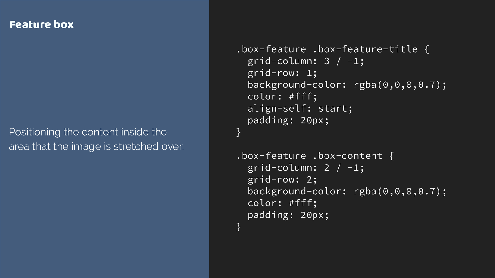
.box-feature .box-feature-title { grid-column: 3 / -1; grid-row: 1; background-color: rgba(0,0,0,0.7); color: #fff; align-self: start; padding: 20px; } .box-feature .box-content { grid-column: 2 / -1; grid-row: 2; background-color: rgba(0,0,0,0.7); color: #fff; padding: 20px; } Feature box Positioning the content inside the area that the image is stretched over. I can then position the content using line based placement into the same row and column tracks the image occupies.
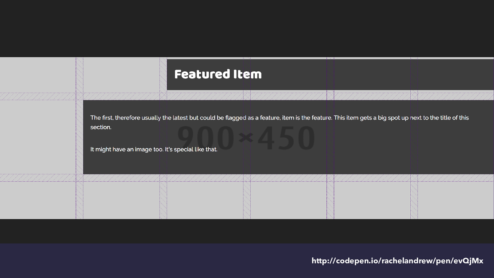
http://codepen.io/rachelandrew/pen/evQjMx and we get this - again with the tracks highlighted.
You can see how that second auto-generated track in the implicit grid is growing to take the content placed into it.
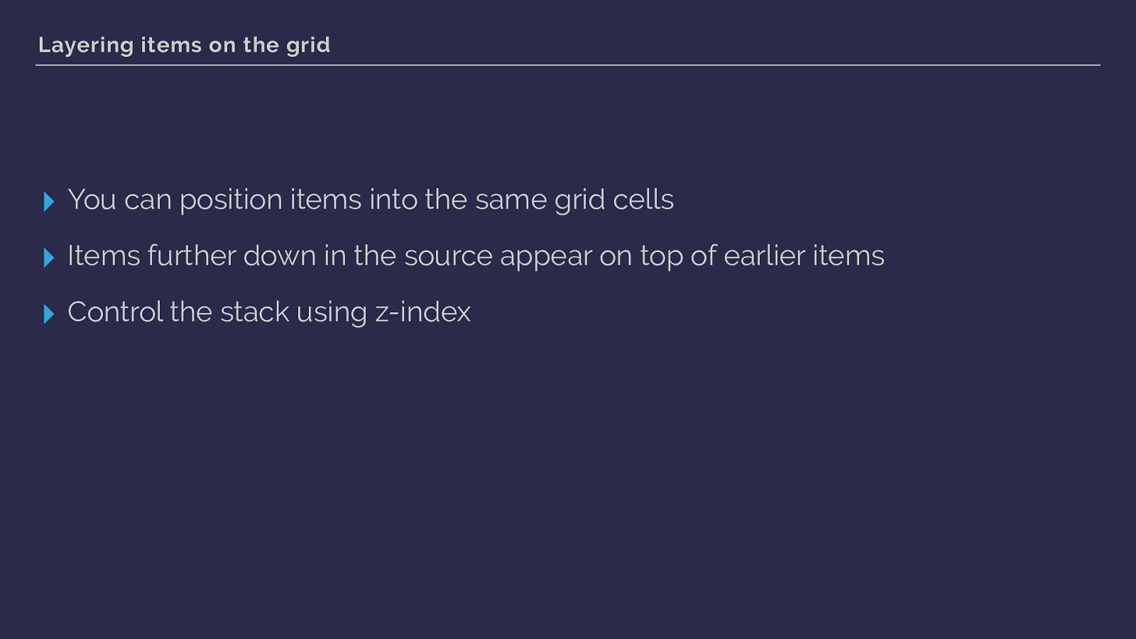
Layering items on the grid ▸ You can position items into the same grid cells ▸ Items further down in the source appear on top of earlier items ▸ Control the stack using z-index this shows us we can use grid to layer items.
As you would expect items that come last end up on top - but you can use z-index to change the stacking order.
This little item has shown us a whole bunch of the features of grid layout. We have used fr units and repeat notation. You saw how grid auto places items that haven’t been positioned. Covered the implicit and explicit grid. We’ve seen line-based positioning at work, you know that grid respects writing mode, we’ve used some of the box alignment properties you may already know from flexbox.
That’s quite a lot for a little box!
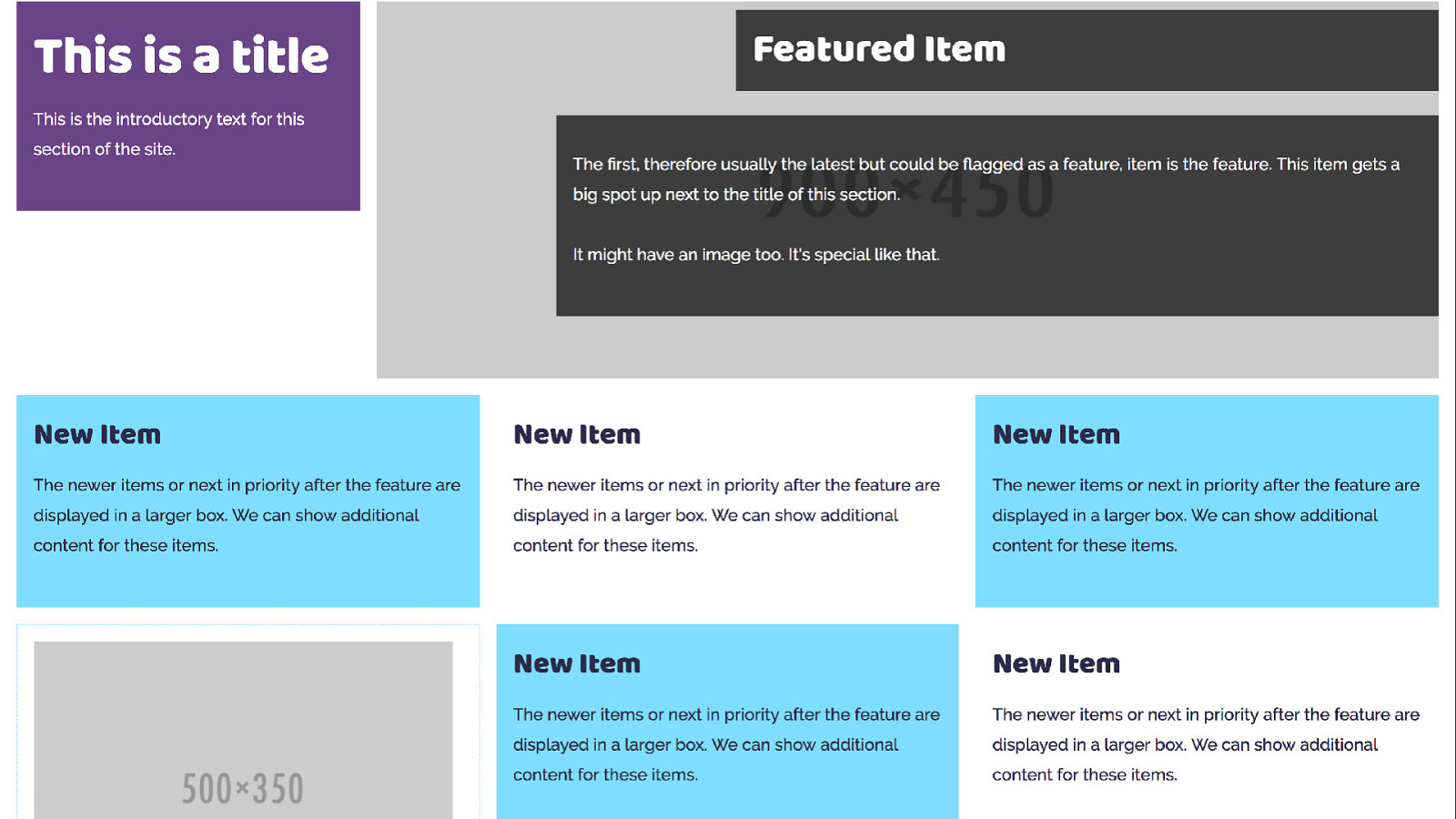
The other boxes in my listing are simpler and don’t use grid themselves - however all of these items sit in a grid layout which creates the listing. Here we are going to rely heavily on auto placement but also create some rules for items.
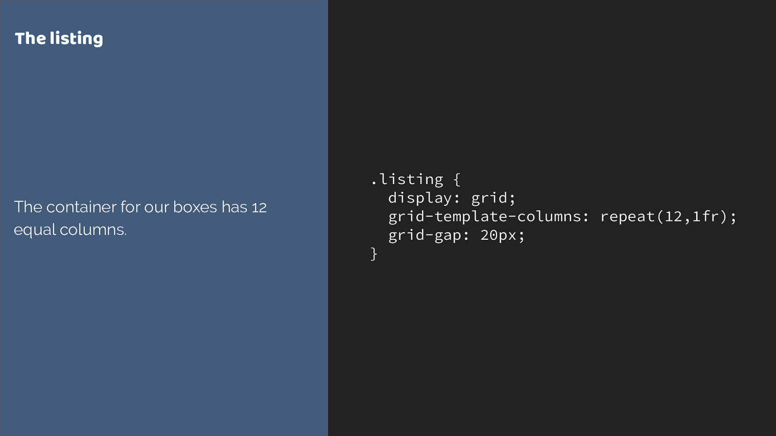
.listing { display: grid; grid-template-columns: repeat(12,1fr); grid-gap: 20px; } The listing The container for our boxes has 12 equal columns. This time I am creating a 12 column flexible grid.
This is where we are trying to get to - with the 12 column grid displayed again using Firefox grid inspector to highlight the grid. You can see how the boxes span cells.
However without any rules to to control the children we end up with grid trying to auto place everything, and stuff things into skinny columns.
What we want to do is make sure that our title appears top left, and the feature on the right.
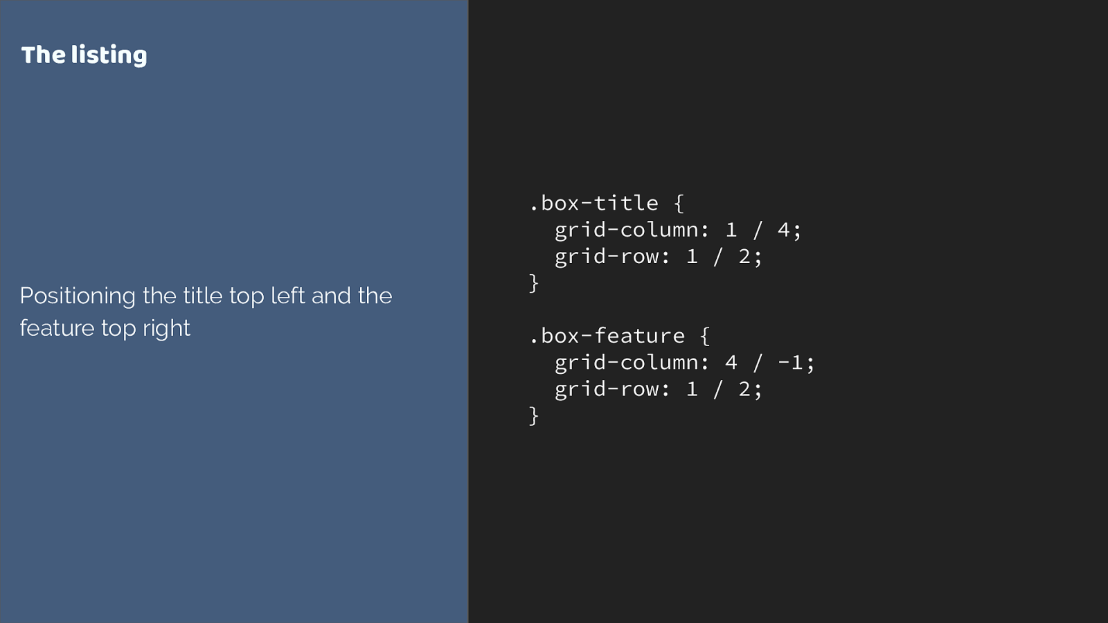
.box-title {
grid-column: 1 / 4;
grid-row: 1 / 2;
}
.box-feature {
grid-column: 4 / -1;
grid-row: 1 / 2;
}
The listing
Positioning the title top left and the
feature top right
we are using line-based positioning again. Placing the two items on our grid.
The others just follow along being auto-placed. Again grid is trying to fit them one into each cell.
I want grid to do that auto-placement thing as I don’t know how many items I will have in each listing, however I want my items to span multiple tracks, and I can do that by setting up rules.
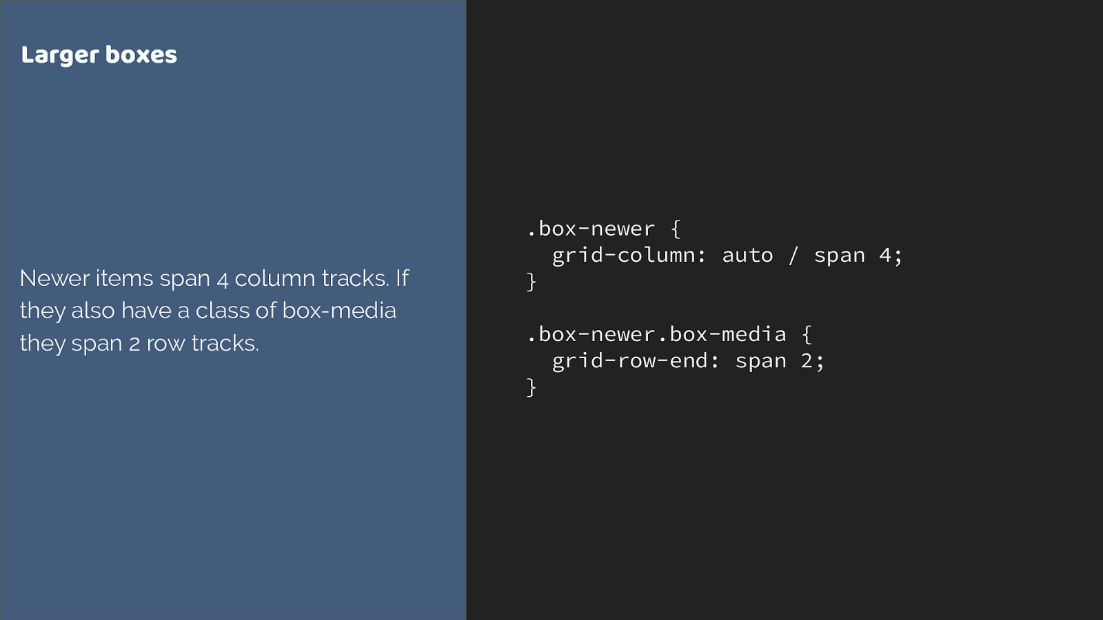
.box-newer { grid-column: auto / span 4; } .box-newer.box-media { grid-row-end: span 2; } Larger boxes Newer items span 4 column tracks. If they also have a class of box-media they span 2 row tracks. We can do this by using the shorthand, setting the start line to auto, and asking grid to span 4 tracks.
I’m also getting my media boxes which have an image or video in to span 2 row tracks. Here I’m using the longhand grid-column-end. Either way is fine - if you don’t specify a start line the default is auto.
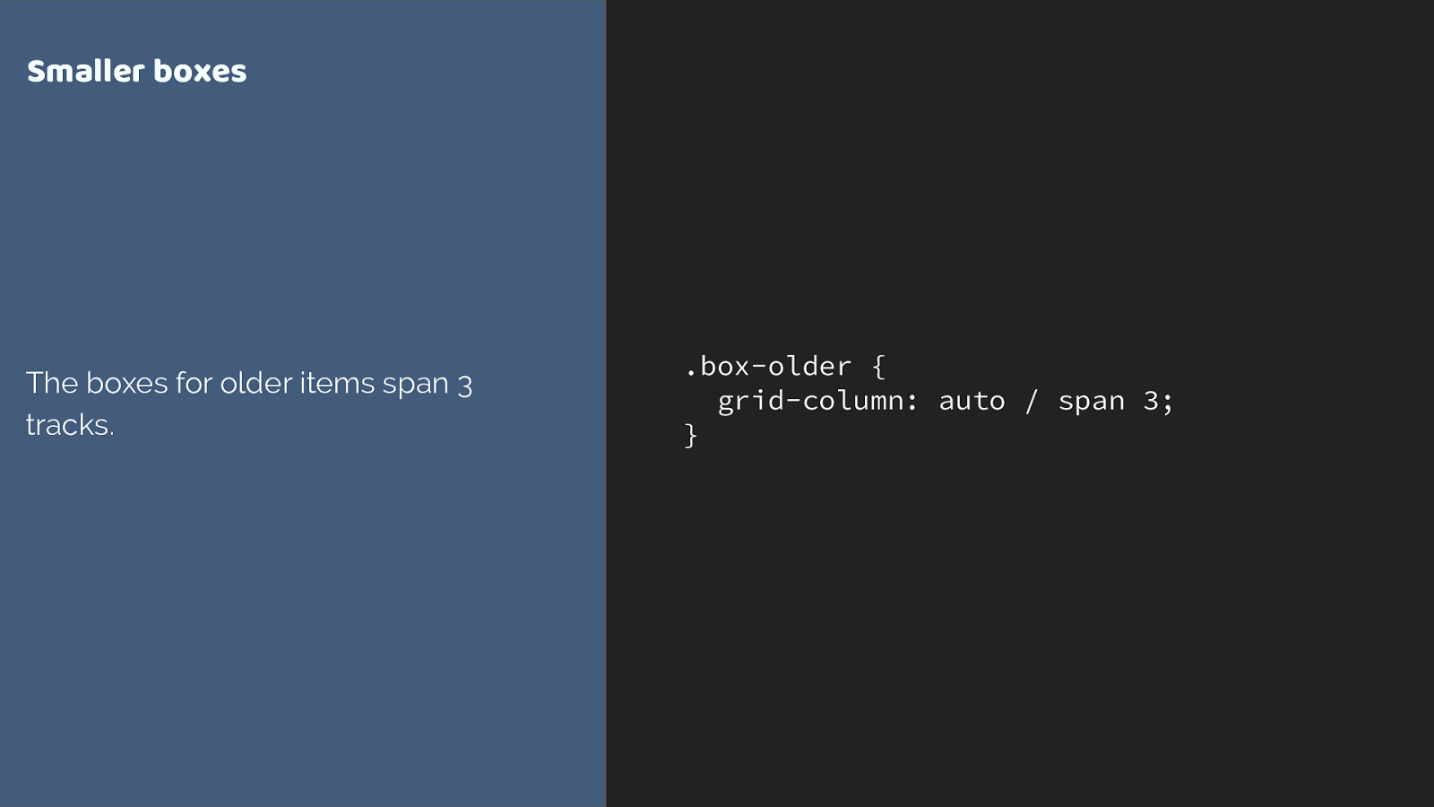
.box-older { grid-column: auto / span 3; } Smaller boxes The boxes for older items span 3 tracks. then for my smaller boxes I am spanning 3 tracks.
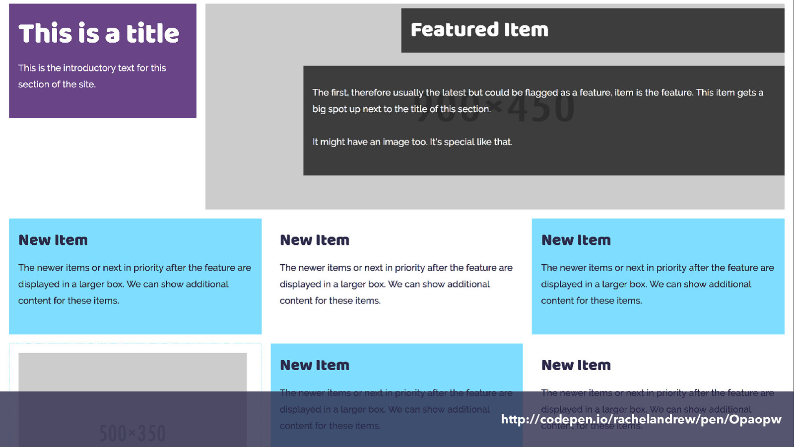
http://codepen.io/rachelandrew/pen/Opaopw and here it is.
So we have defined our grid on the container.
Items auto place into the grid.
We can explicitly position items using line-based placement, or we can ask items to span tracks of the grid without changing their start line.
Going responsive CSS Grid I’ve been showing you the rules I created for my widest breakpoint.
With your layout being defined in CSS, it is straightforward to make changes for various breakpoints. You can either change the grid definition on the container or you can change the rules that apply to the items. In this case I decided to keep my 12 column grid, but change how items display on it.
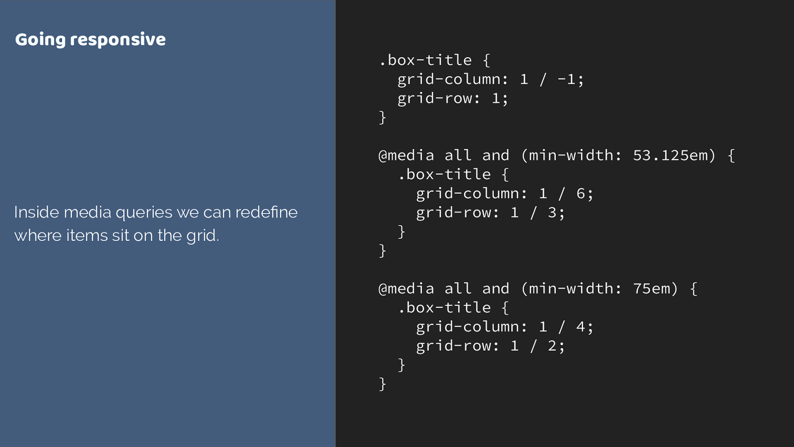
.box-title {
grid-column: 1 / -1;
grid-row: 1;
}
@media all and (min-width: 53.125em) {
.box-title {
grid-column: 1 / 6;
grid-row: 1 / 3;
}
}
@media all and (min-width: 75em) {
.box-title {
grid-column: 1 / 4;
grid-row: 1 / 2;
}
}
Going responsive
Inside media queries we can redefine
where items sit on the grid.
Here I start with my title spanning right across the grid for very narrow screens. As we get more screen real estate I change where it is placed.
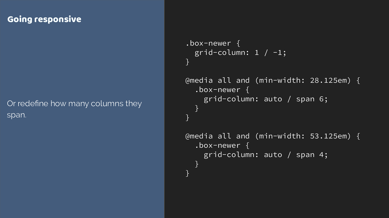
.box-newer {
grid-column: 1 / -1;
}
@media all and (min-width: 28.125em) {
.box-newer {
grid-column: auto / span 6;
}
}
@media all and (min-width: 53.125em) {
.box-newer {
grid-column: auto / span 4;
}
}
Going responsive
Or redefine how many columns they
span.
we can also change the way the boxes auto place.
At narrow breakpoints they span 6 tracks, dropping to 4.
http://codepen.io/rachelandrew/pen/gmQdgz ao we have kept that 12 column grid, the columns are narrower on smaller screens so to keep things readable we span more columns.
What about old browsers? CSS Grid Layout At the top of this talk I showed you the current status of grid browser support, as people’s browsers update we are going to see a very high level of grid support by the end of this year.
However the reality of old browsers existing isn’t going to vanish overnight. The thing is, defined into the specification are details of how grid interacts with older layout methods.
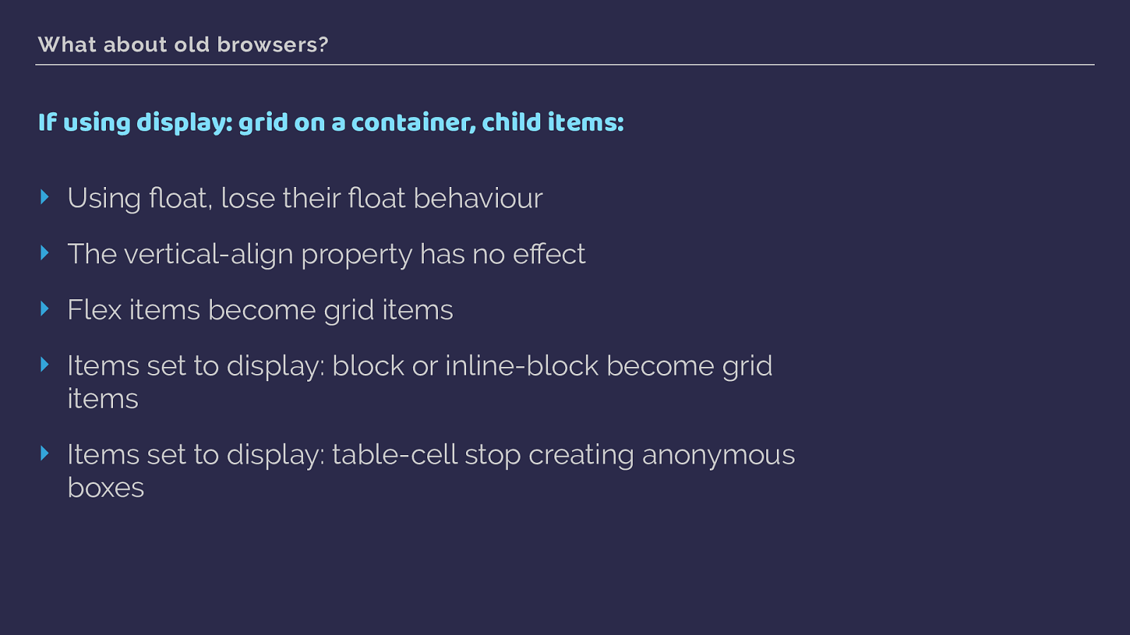
What about old browsers? If using display: grid on a container, child items: ‣ Using float, lose their fl oat behaviour ‣ The vertical-align property has no effect ‣ Flex items become grid items ‣ Items set to display: block or inline-block become grid items ‣ Items set to display: table-cell stop creating anonymous boxes This is all defined in the spec. Once a parent element becomes a grid container, a lot of the methods you may have used to deal with older browsers stop having any effect on the items.
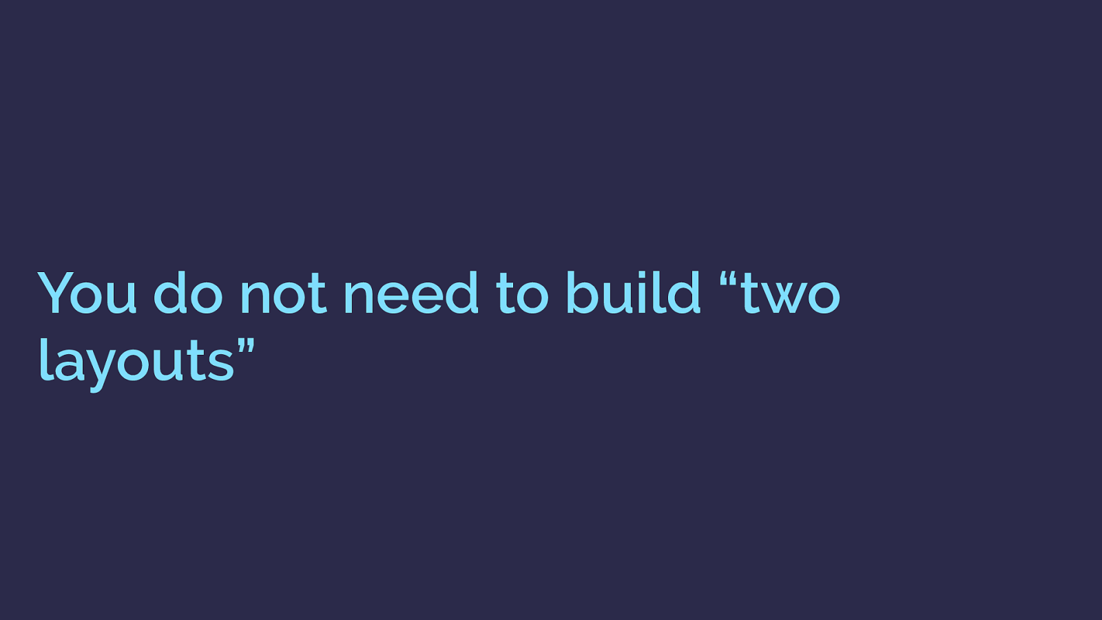
You do not need to build “two layouts” you don’t need to build two layouts, or completely fork your code. Grid works really well as an enhancement.
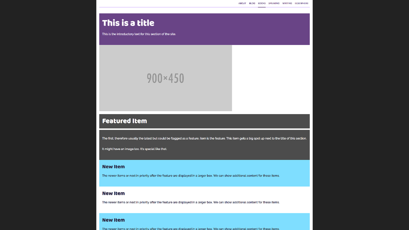
Here is our listing page in a browser that doesn’t support grid layout. As you would expect, everything is displaying in document flow, so each box goes wide and falls one under the other.
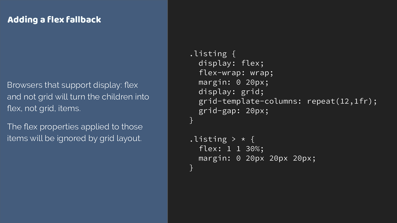
.listing { display: flex; flex-wrap: wrap; margin: 0 20px; display: grid; grid-template-columns: repeat(12,1fr); grid-gap: 20px; } .listing > * { flex: 1 1 30%; margin: 0 20px 20px 20px; } Adding a flex fallback Browsers that support display: flex and not grid will turn the children into flex, not grid, items. The flex properties applied to those items will be ignored by grid layout. The listing is pretty easy to create a fallback layout for. We just need to pick an alternate way to display our boxes. In this case I chose flex layout.
Flex items will just become grid items if grid is supported.
One thing I do need to do however is remove that margin I have added to flex items, as the grid-gap property is controlling the spacing in grid layout.

Feature Queries are your new best friend For this, we can use a feature query. Feature queries look like a media query, but instead of checking for a screen size we check if a browser reports support of a CSS property and value.
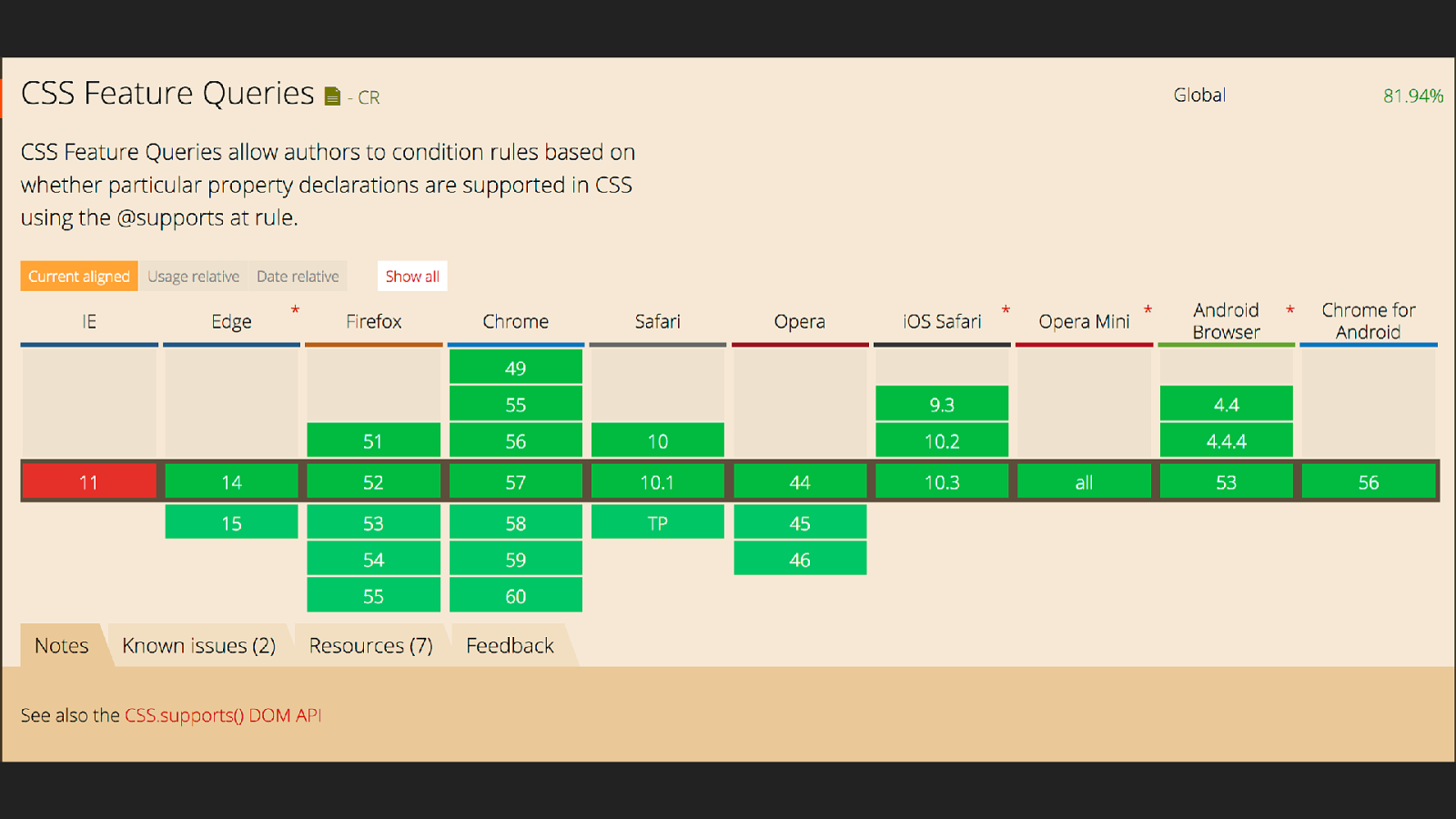
The nice thing about feature queries is that there are no browsers supporting grid layout that don’t support feature queries - so we can use this technique to check for support.
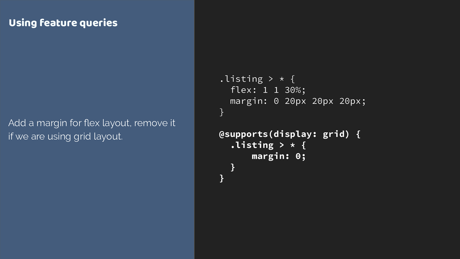
.listing > * { flex: 1 1 30%; margin: 0 20px 20px 20px; } @supports(display: grid) { .listing > * { margin: 0; } } Using feature queries Add a margin for flex layout, remove it if we are using grid layout. We don’t need to remove the flex properties it is ignored anyway when the flex item becomes a grid item, as defined in the spec. You only need to override things that would make a different to the layout.
we now have this layout, so a final thing I want to do is to make the title and feature box have similar proportions to our grid layout.
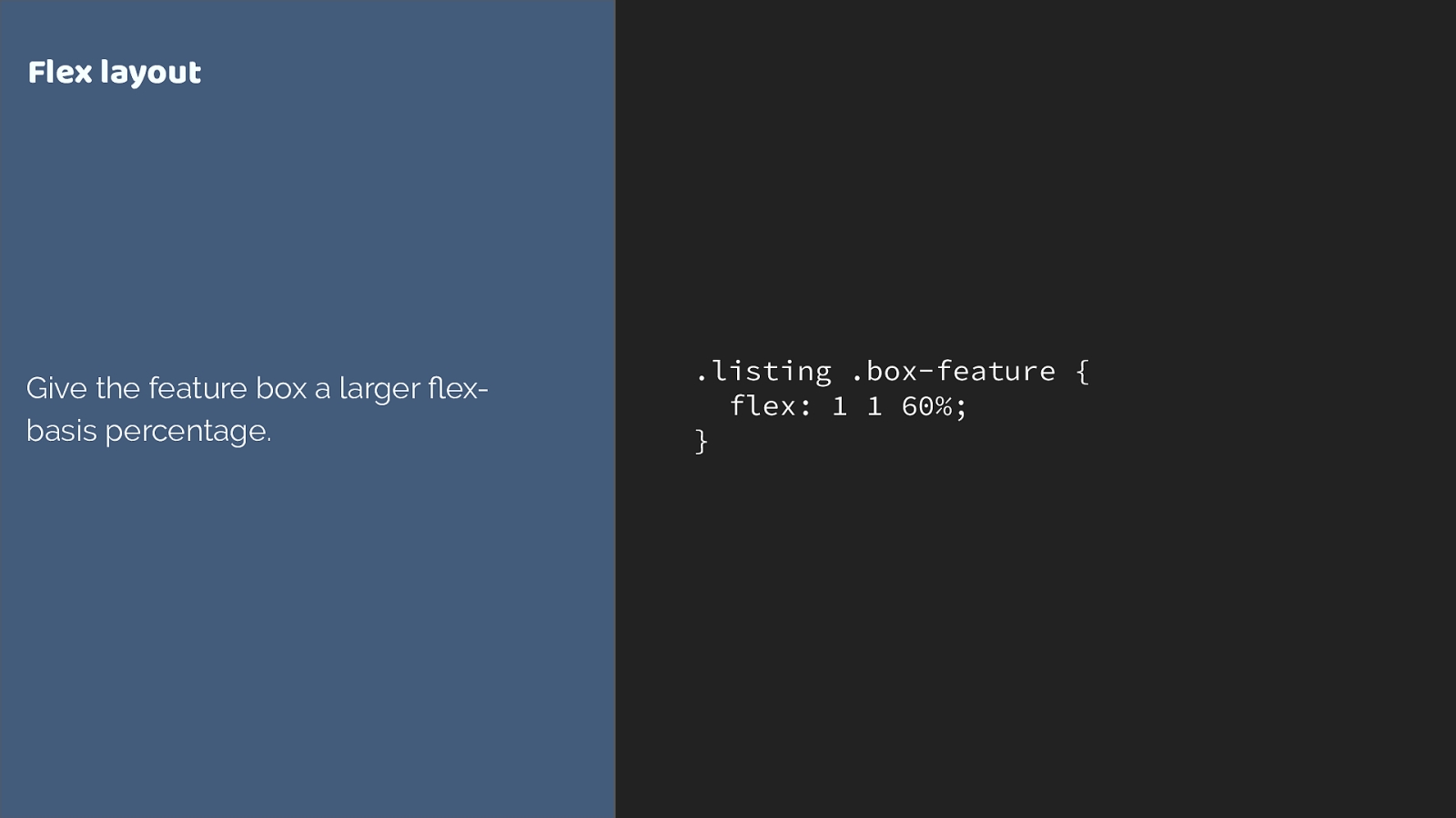
.listing .box-feature { flex: 1 1 60%; } Flex layout Give the feature box a larger flex- basis percentage. giving the box a larger flex basis
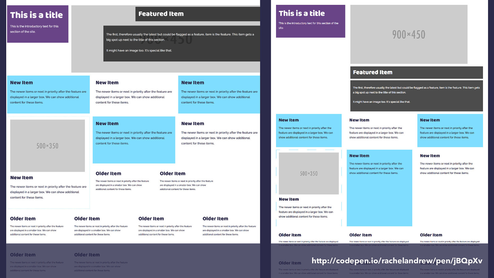
http://codepen.io/rachelandrew/pen/jBQpXv and here is our flex version alongside the grid version. We could go further with this, we could absolutely position the layered elements on the feature box if we wanted to for example, but this is a reasonable layout for my own site where I’m aiming to showcase grid to some extent and where I do have a high number of modern browsers.
However what you have seen is that we really don’t need a lot of additional CSS to perform these overrides, as grid items naturally override a lot of the behaviour.
A quick guide to things you might use as a fallback.
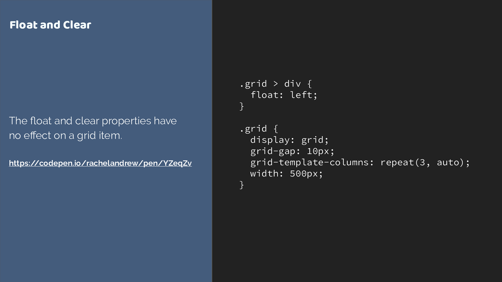
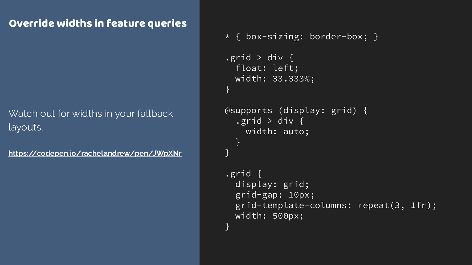
.grid > div { float: left; } .grid { display: grid; grid-gap: 10px; grid-template-columns: repeat(3, auto); width: 500px; } Float and Clear The float and clear properties have no effect on a grid item. https://codepen.io/rachelandrew/pen/YZeqZv float and clear have no effect on a grid item
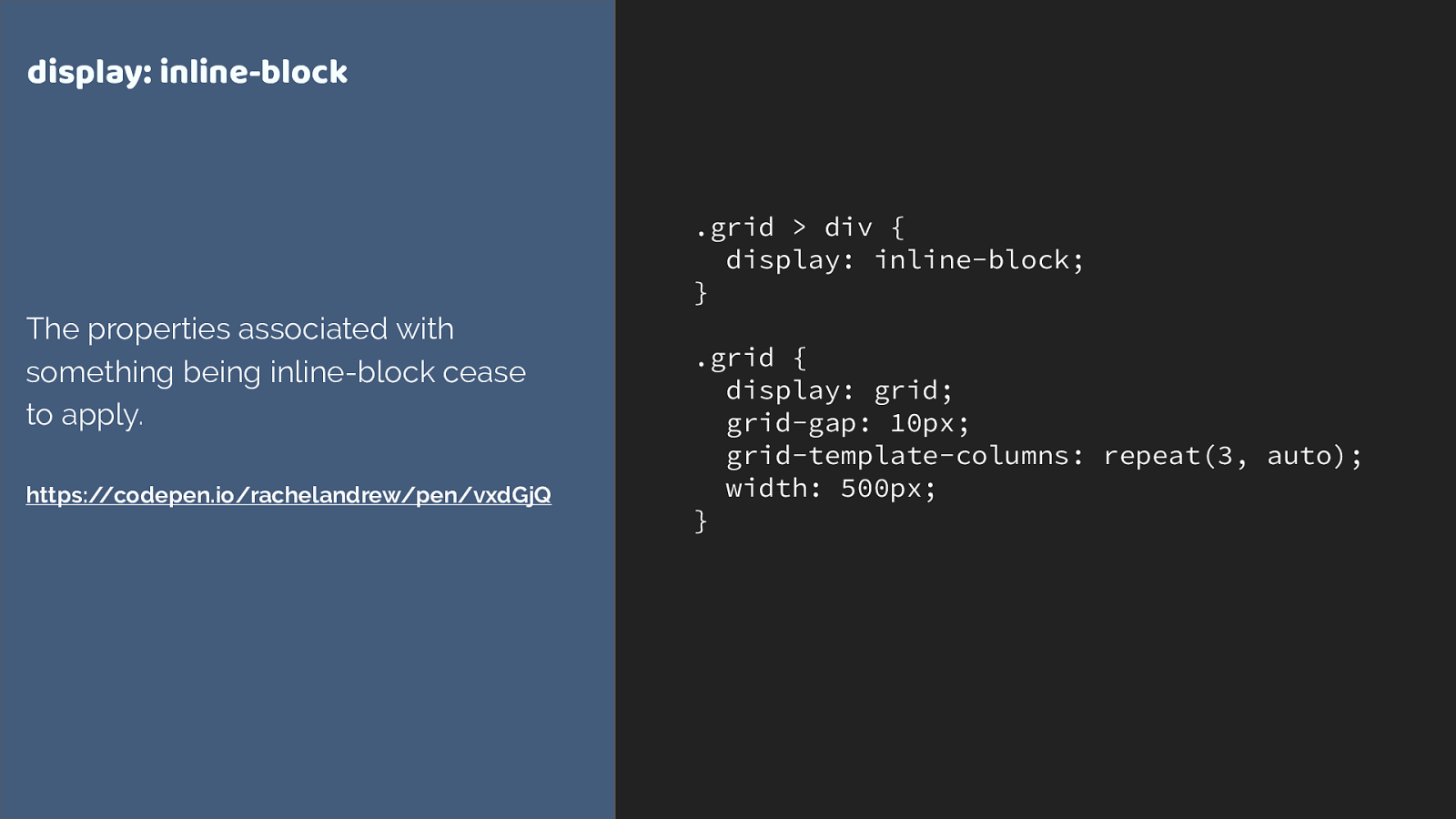
.grid > div { display: inline-block; } .grid { display: grid; grid-gap: 10px; grid-template-columns: repeat(3, auto); width: 500px; } display: inline-block The properties associated with something being inline-block cease to apply. https://codepen.io/rachelandrew/pen/vxdGjQ Inline-block
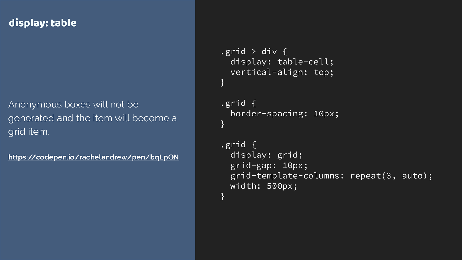
.grid > div { display: table-cell; vertical-align: top; } .grid { border-spacing: 10px; } .grid { display: grid; grid-gap: 10px; grid-template-columns: repeat(3, auto); width: 500px; } display: table Anonymous boxes will not be generated and the item will become a grid item. https://codepen.io/rachelandrew/pen/bqLpQN display: table
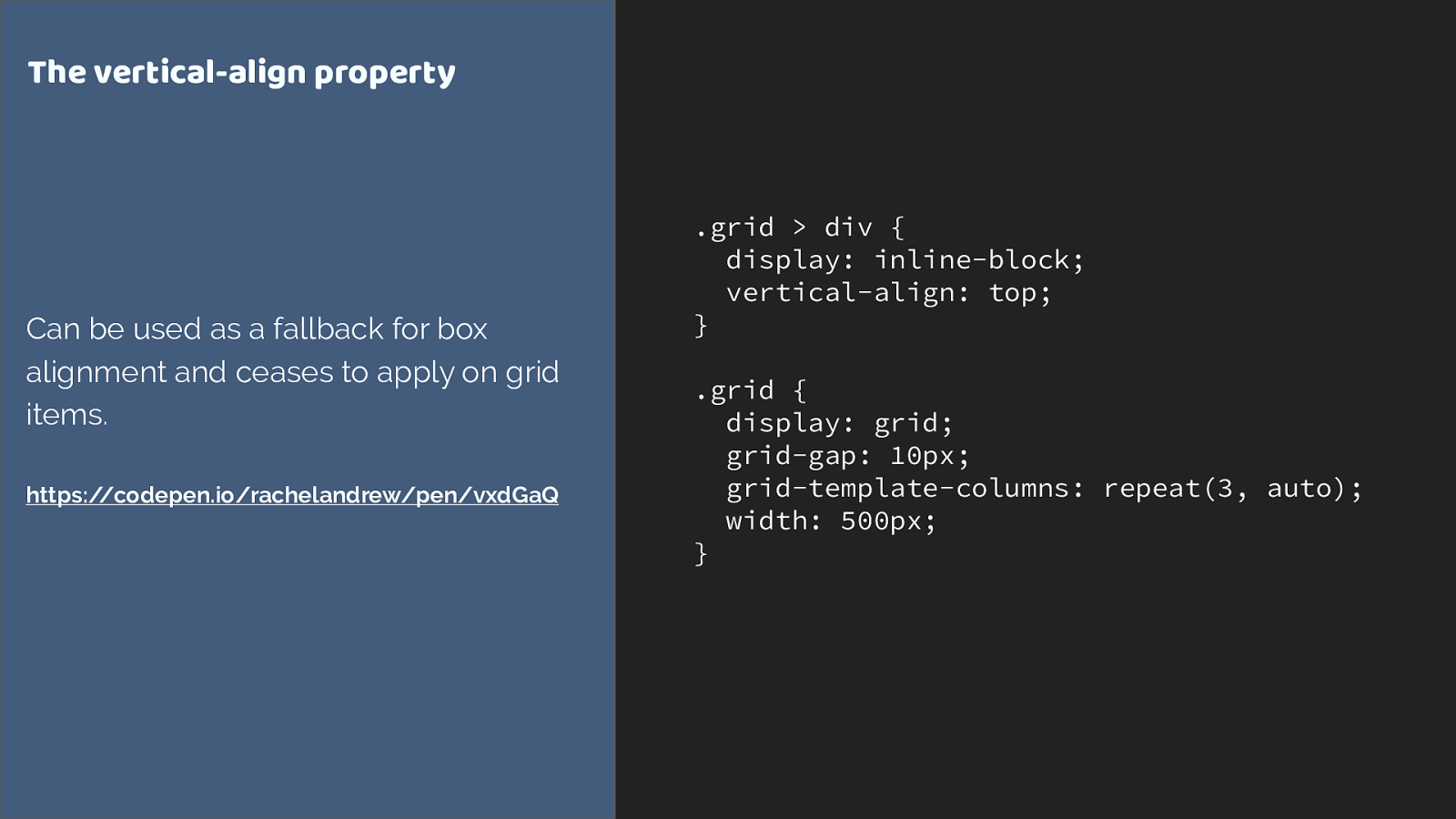
.grid > div { display: inline-block; vertical-align: top; } .grid { display: grid; grid-gap: 10px; grid-template-columns: repeat(3, auto); width: 500px; } The vertical-align property Can be used as a fallback for box alignment and ceases to apply on grid items. https://codepen.io/rachelandrew/pen/vxdGaQ Vertical-align
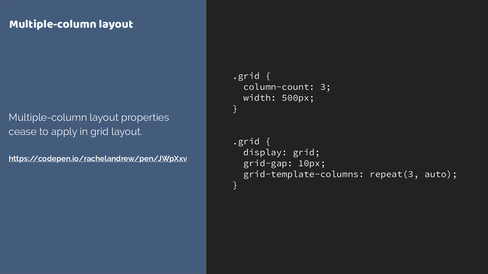
.grid { column-count: 3; width: 500px; } .grid { display: grid; grid-gap: 10px; grid-template-columns: repeat(3, auto); } Multiple-column layout Multiple-column layout properties cease to apply in grid layout. https://codepen.io/rachelandrew/pen/JWpXxv Multi-col
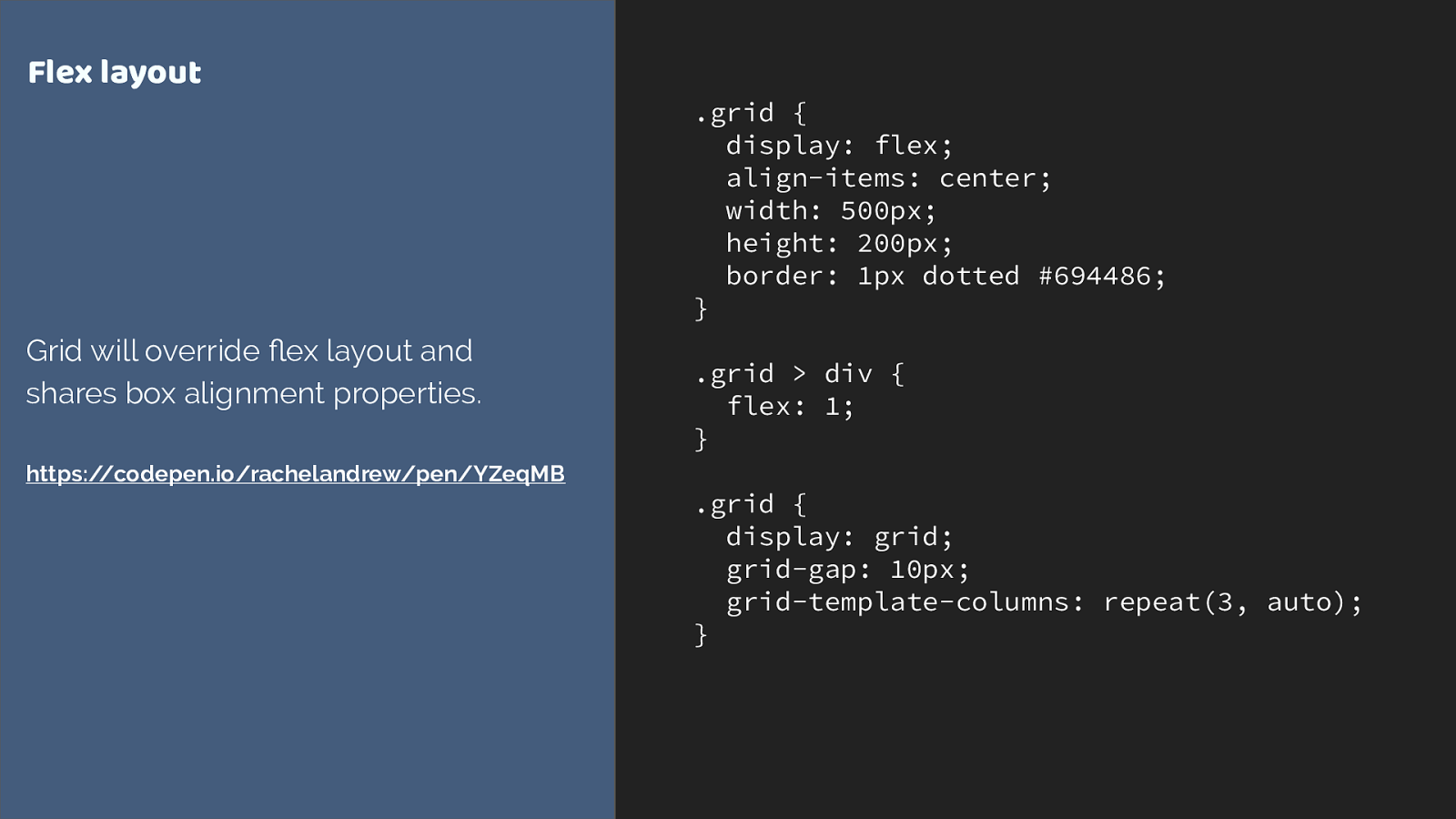
.grid { display: flex; align-items: center; width: 500px; height: 200px; border: 1px dotted #694486; } .grid > div { flex: 1; } .grid { display: grid; grid-gap: 10px; grid-template-columns: repeat(3, auto); } Flex layout Grid will override flex layout and shares box alignment properties. https://codepen.io/rachelandrew/pen/YZeqMB Flex

Overrides inside @supports are mostly widths & margins What you find in practice is you mostly need to override widths and margins.
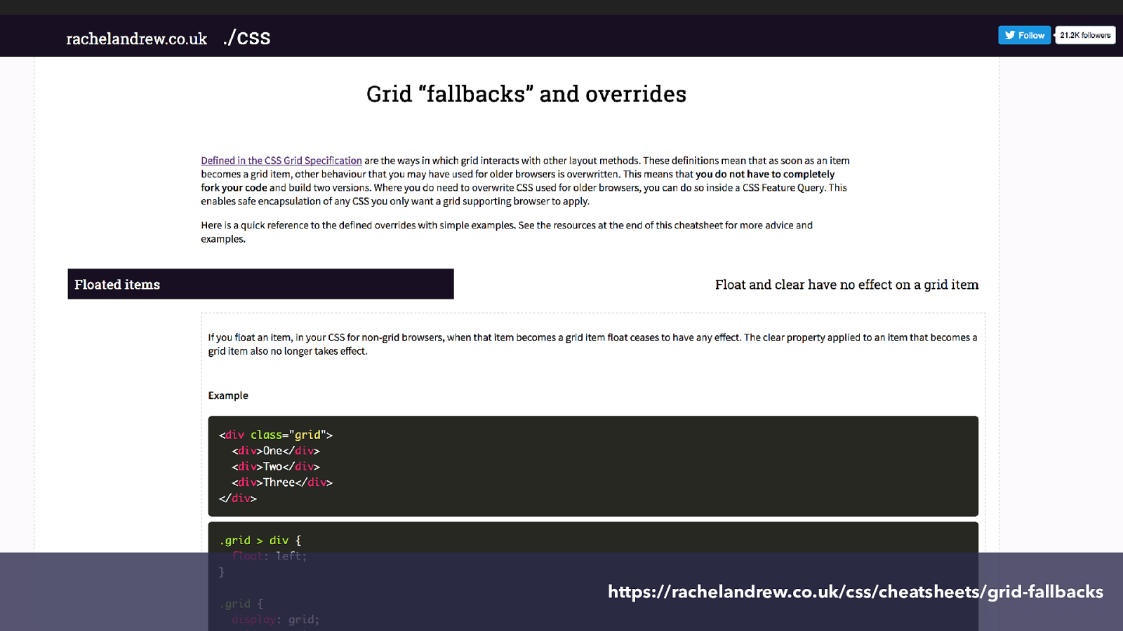
https://rachelandrew.co.uk/css/cheatsheets/grid-fallbacks I made you a cheatsheet to help.
March 2017 March 2017 March 2017 March 2017 March 2017 So what about Edge.
CSS Grid Layout came from the IE Team. It’s unlikely we would have grid at all in browsers had they not initially worked on the spec and implemented it in IE10. Edge still has that early IE10 implementation, so we kind of have grid in Edge, but it’s a limited and somewhat different specification which does some of the things the current spec does, in a slightly different way.
is here! CSS Grid This has been such a quick fly through of grid, but what I hope I have shown is that it is possible to start to look at ways i which you might like to use it in small ways. Is it worth it? Yes if it can solve problems you might otherwise be unable to solve in a good way. Remember that with three major browsers now having support, a site you are building now could easily have 70% support for grid by the time it launches.