Multicol and fragmentation Rachel Andrew, Developer Content Lead, Chrome.

A presentation at CSS Day in June 2025 in Amsterdam, Netherlands by Rachel Andrew
Multicol and fragmentation Rachel Andrew, Developer Content Lead, Chrome.
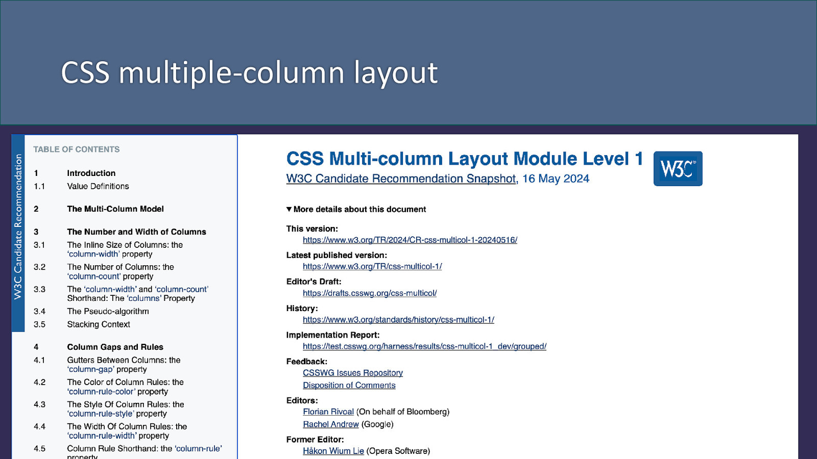
CSS multiple-column layout
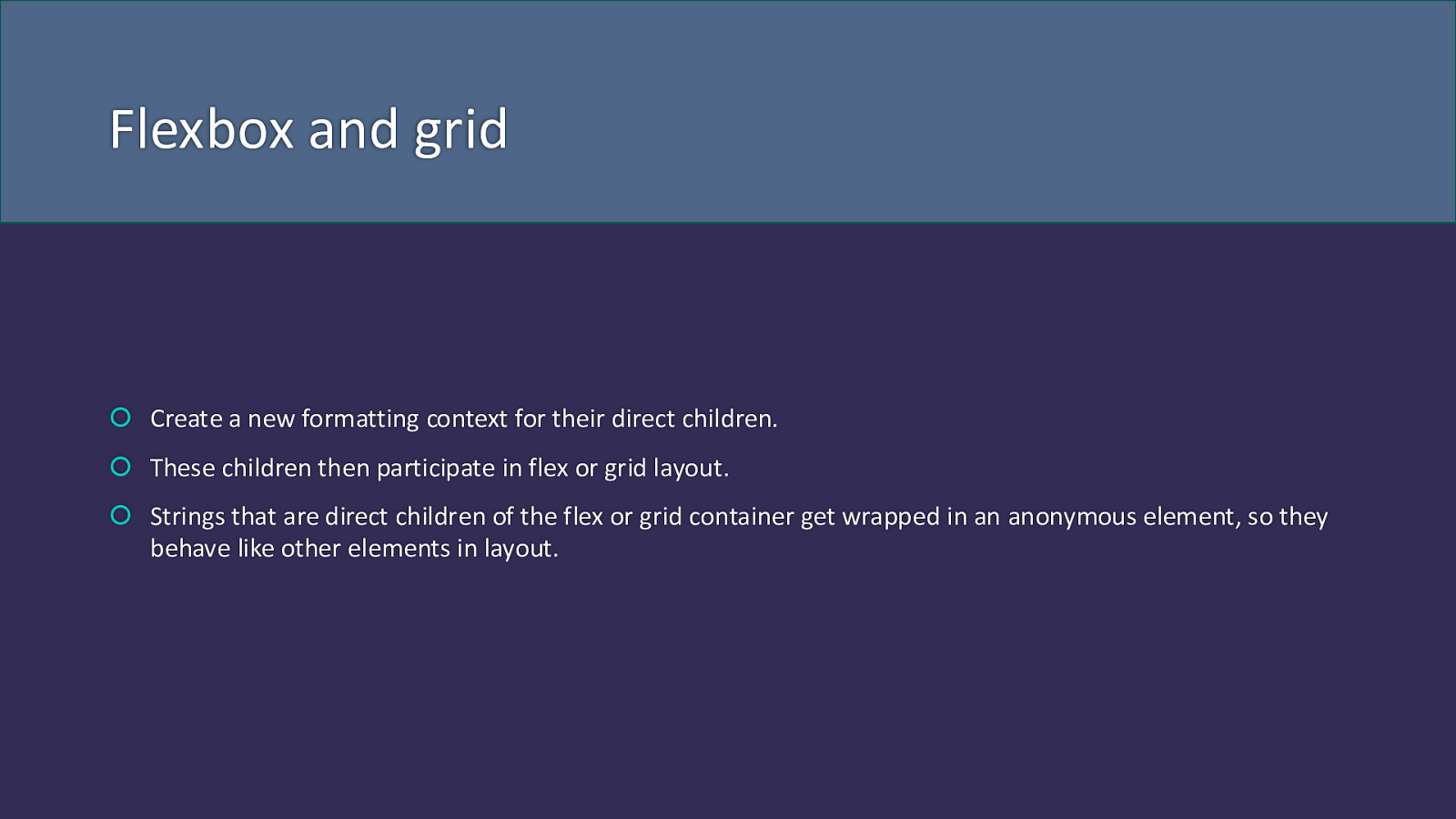
Flexbox and grid Create a new formatting context for their direct children. These children then participate in flex or grid layout. Strings that are direct children of the flex or grid container get wrapped in an anonymous element, so they behave like other elements in layout.
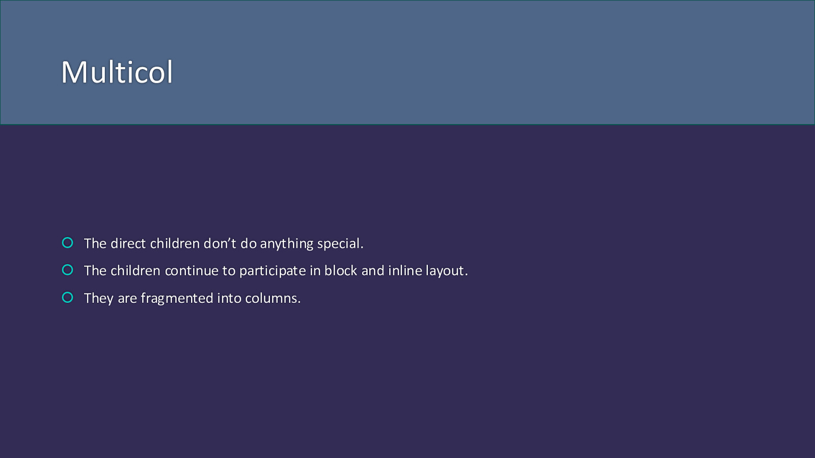
Multicol The direct children don’t do anything special. The children continue to participate in block and inline layout. They are fragmented into columns.
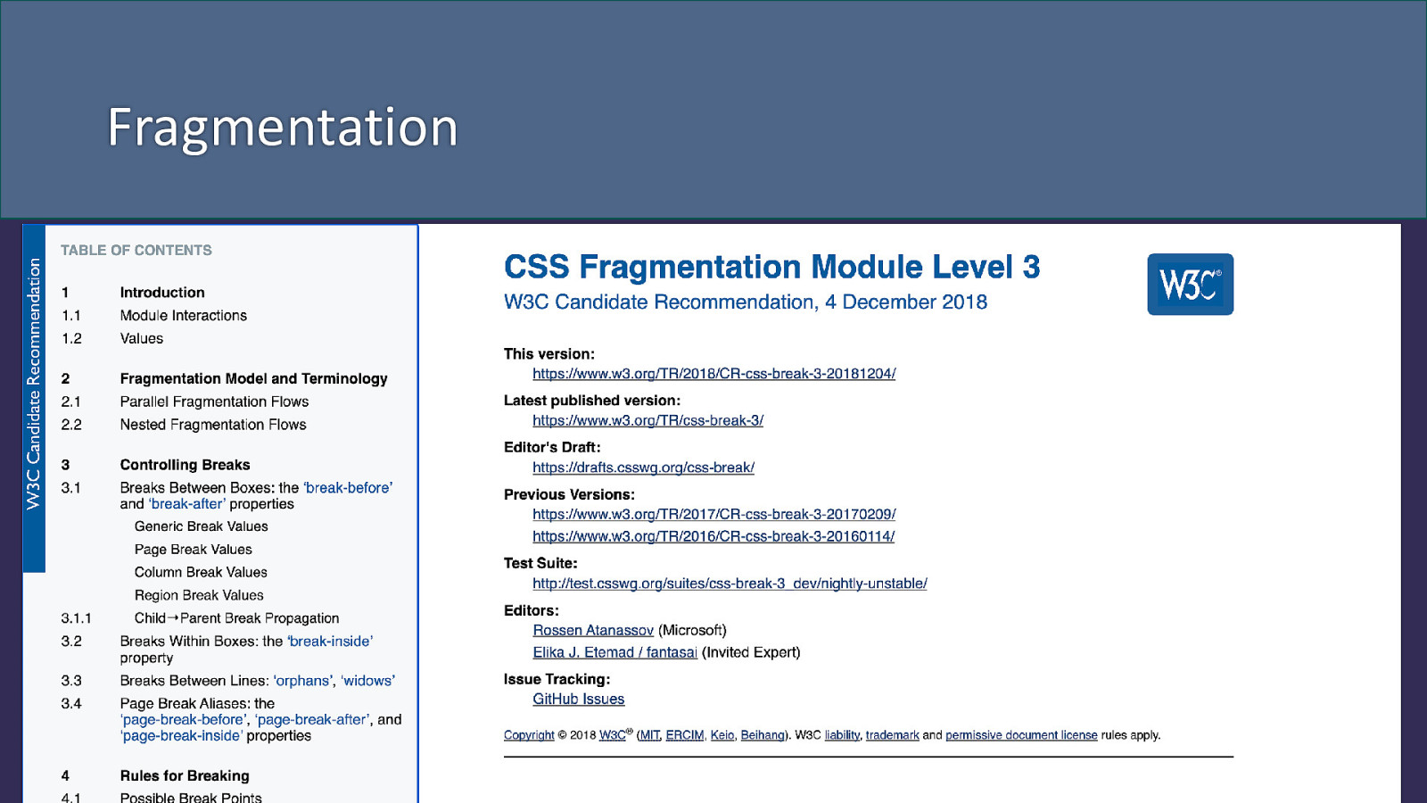
Fragmentation
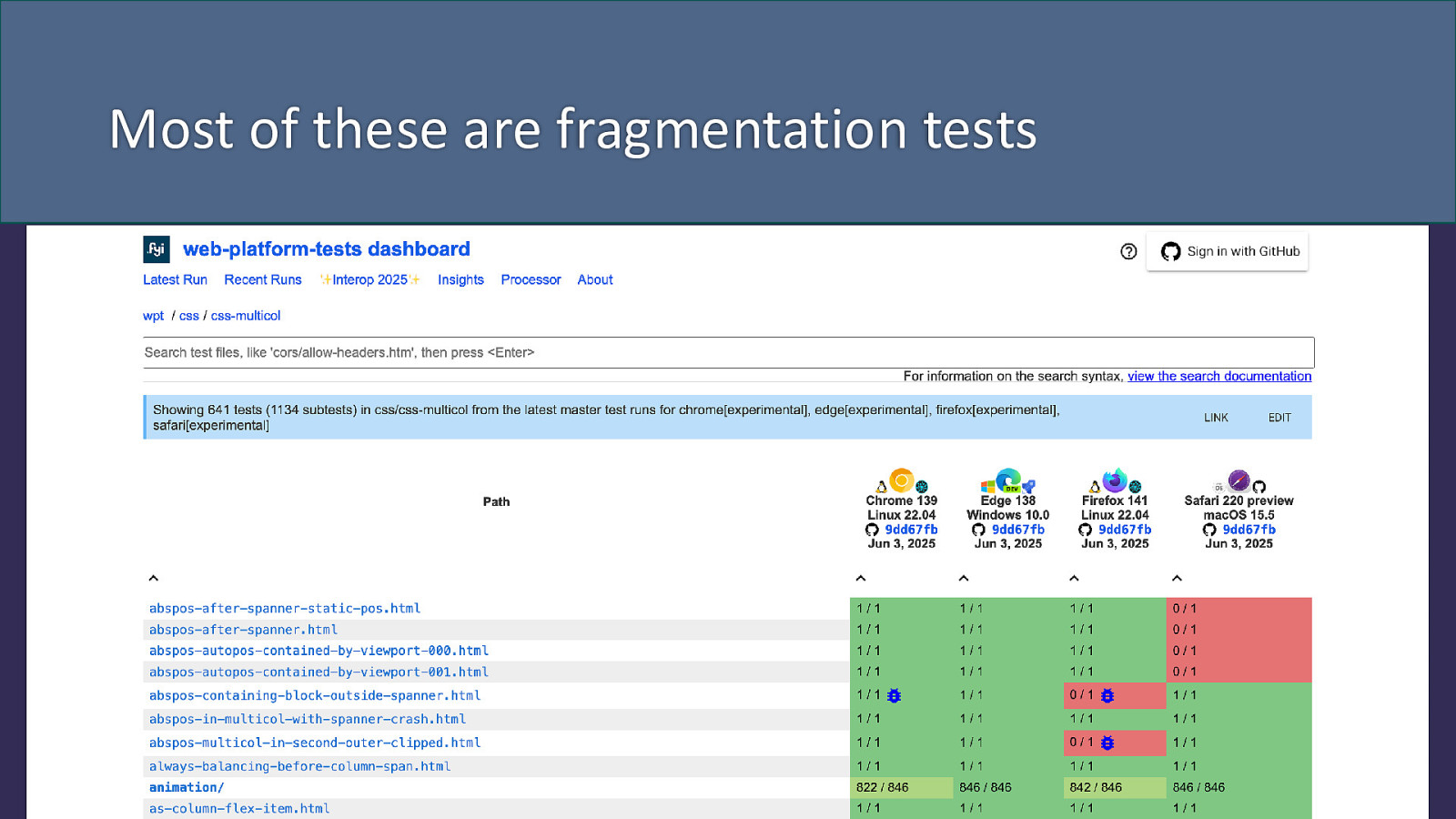
Most of these are fragmentation tests
Fragmentation
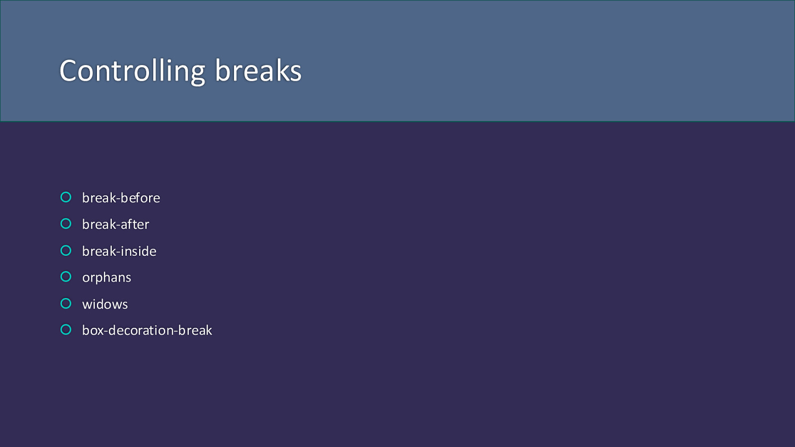
Controlling breaks break-before break-after break-inside orphans widows box-decoration-break

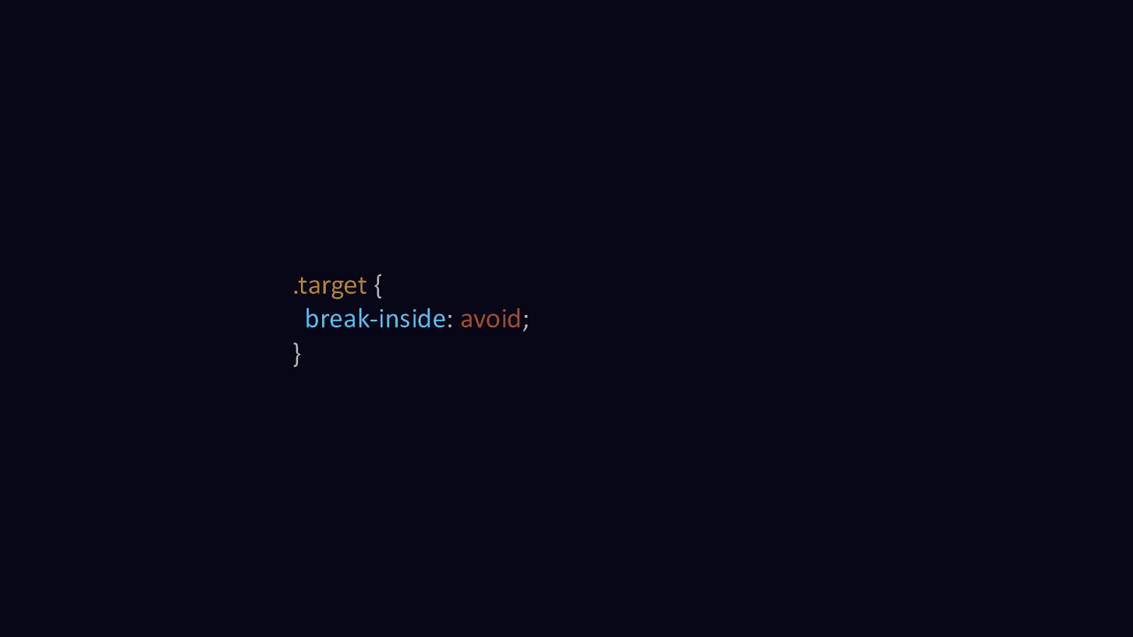
.target { break-inside: avoid; }
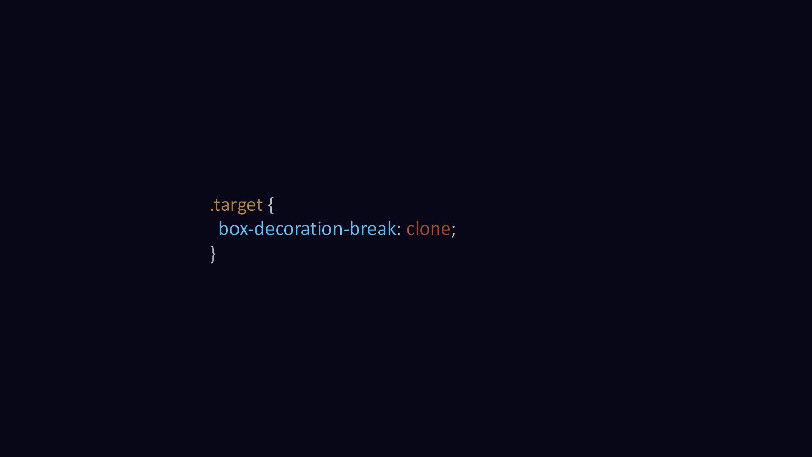
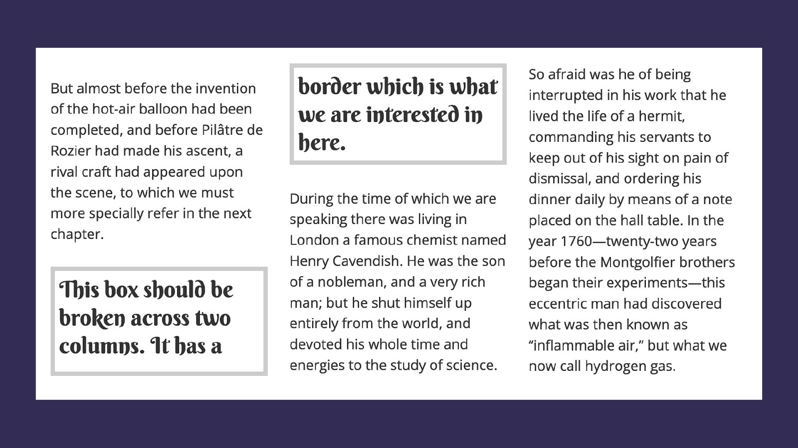
.target { box-decoration-break: clone; }
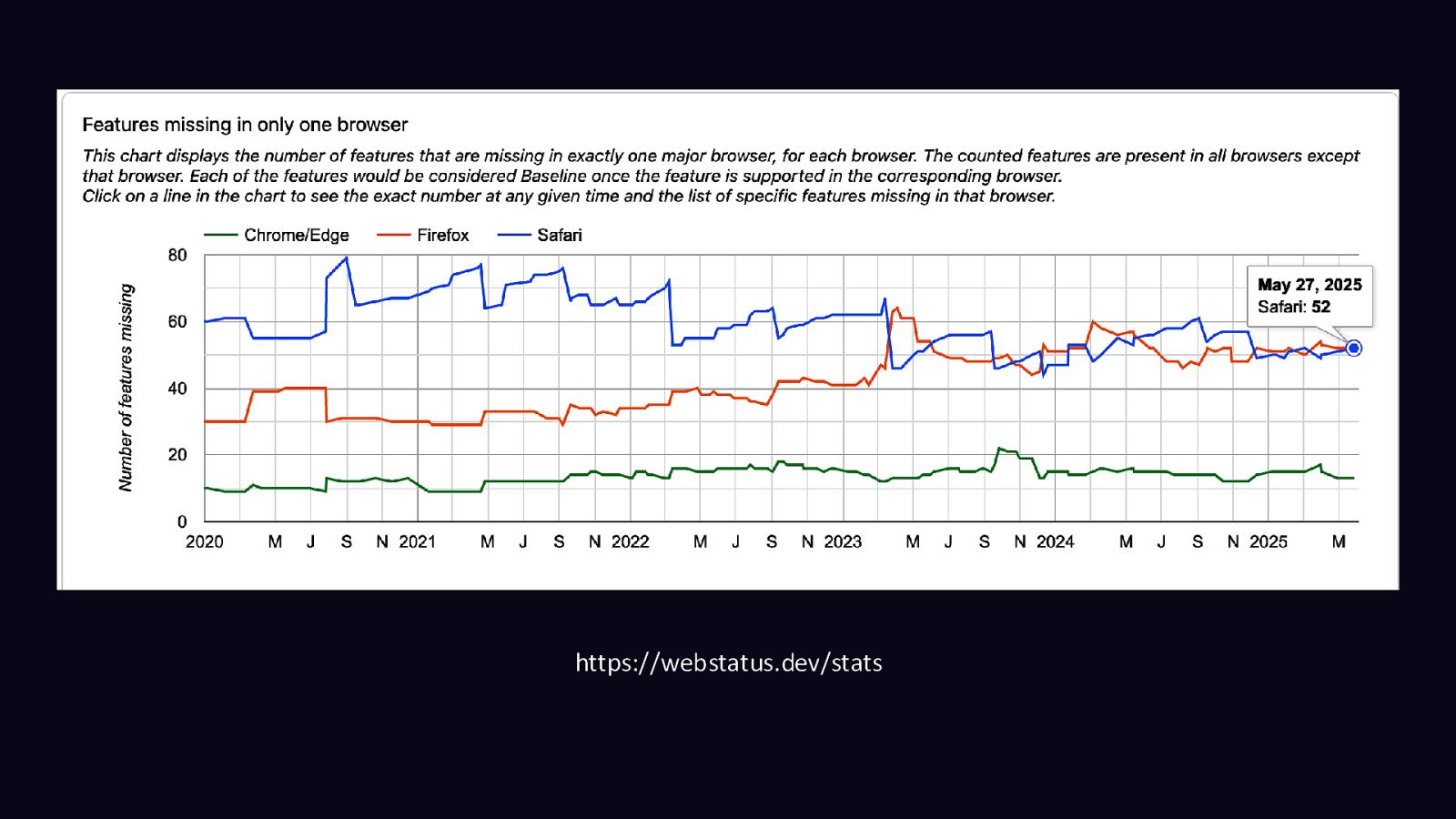
https://webstatus.dev/stats
RenderingNG
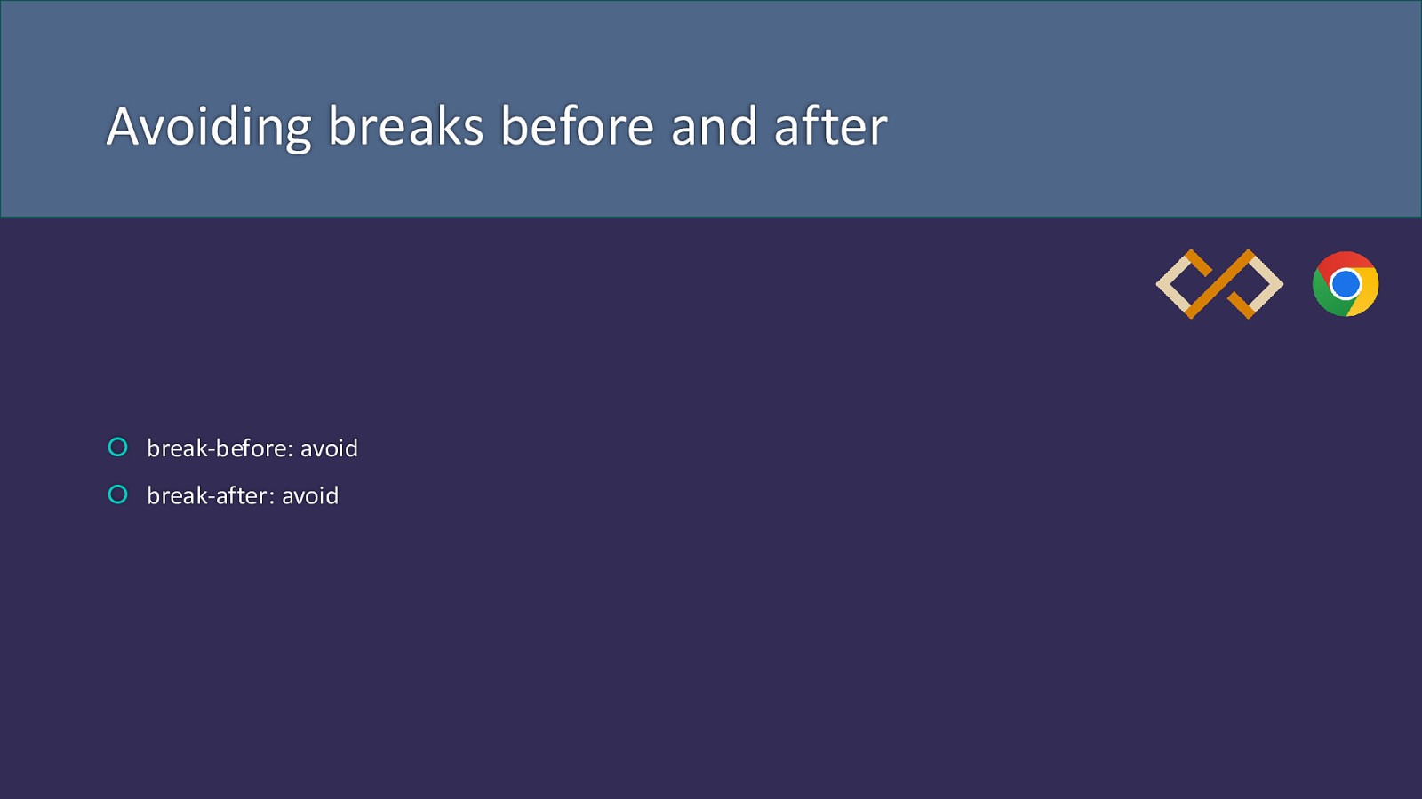
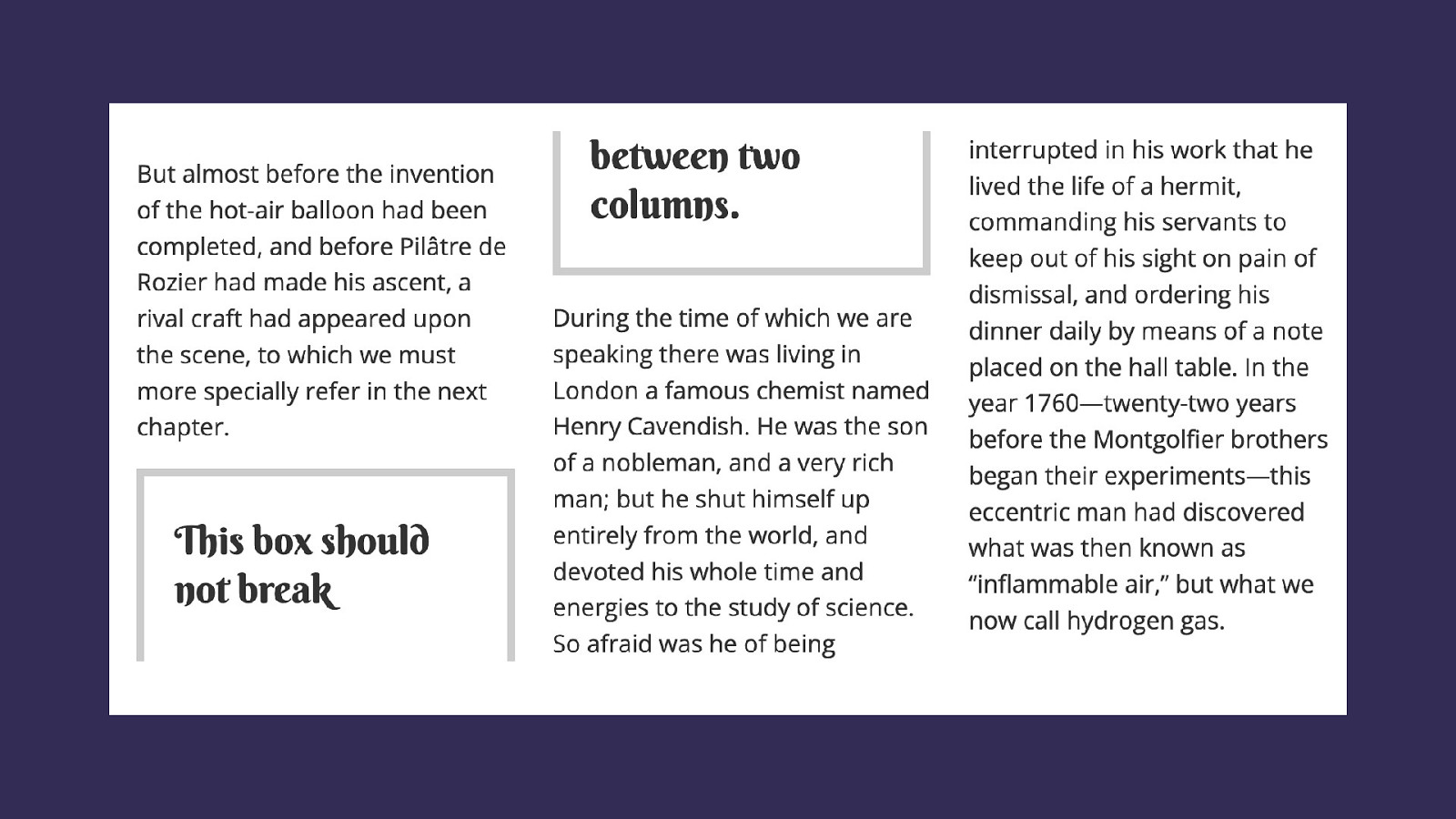
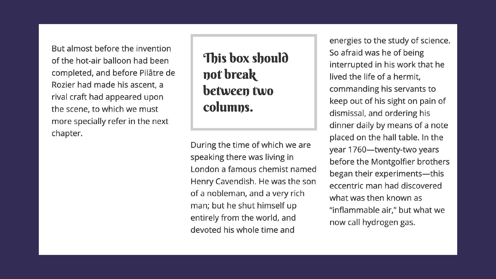
Avoiding breaks before and after break-before: avoid break-after: avoid
CSS for print
Print and PDFs from the web
Paged Media Paged Media Level 3: https://www.w3.org/TR/css-page-3/ Generated Content for Paged Media: https://drafts.csswg.org/css-gcpm/

Add content to page headers and footers
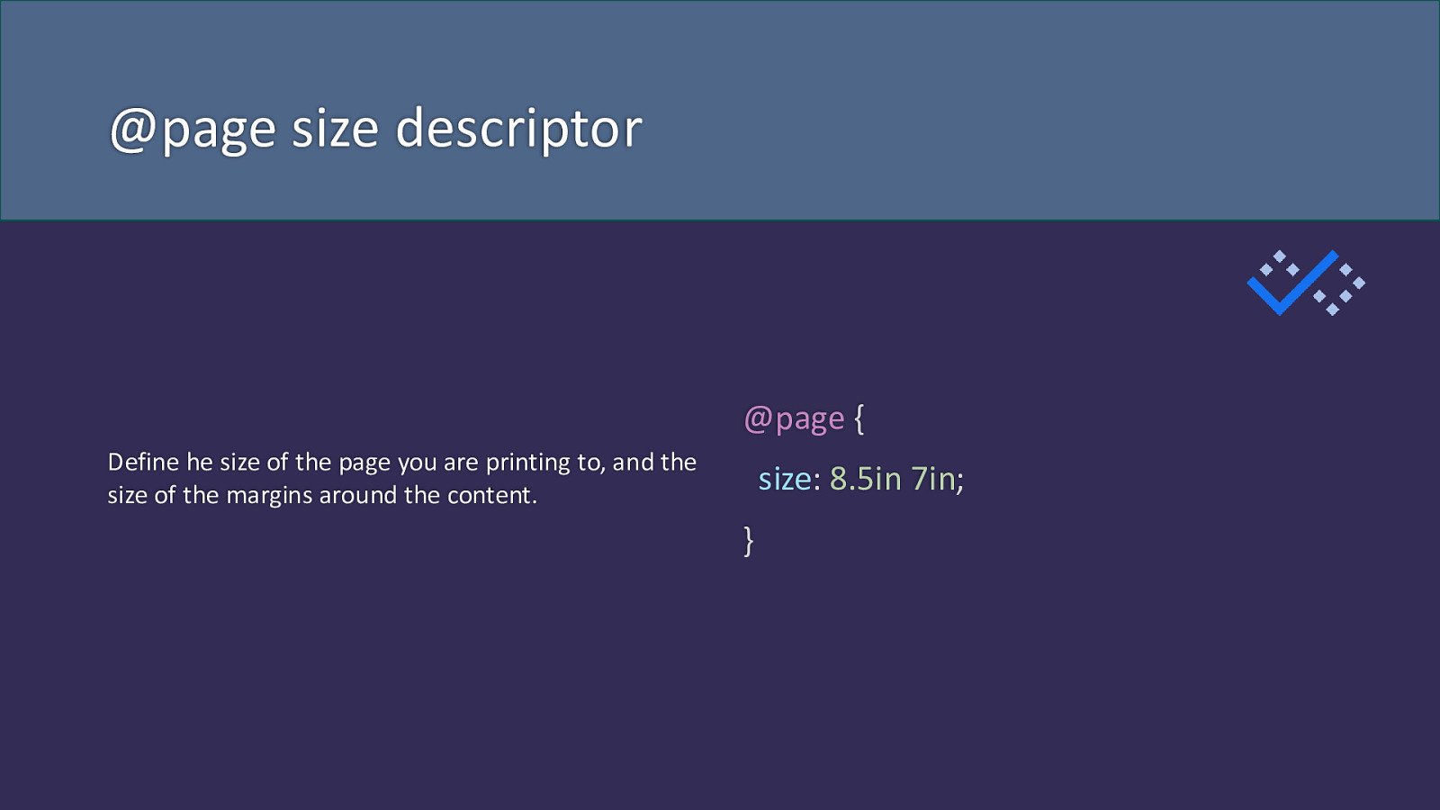
@page size descriptor @page { Define he size of the page you are printing to, and the size of the margins around the content. size: 8.5in 7in; }
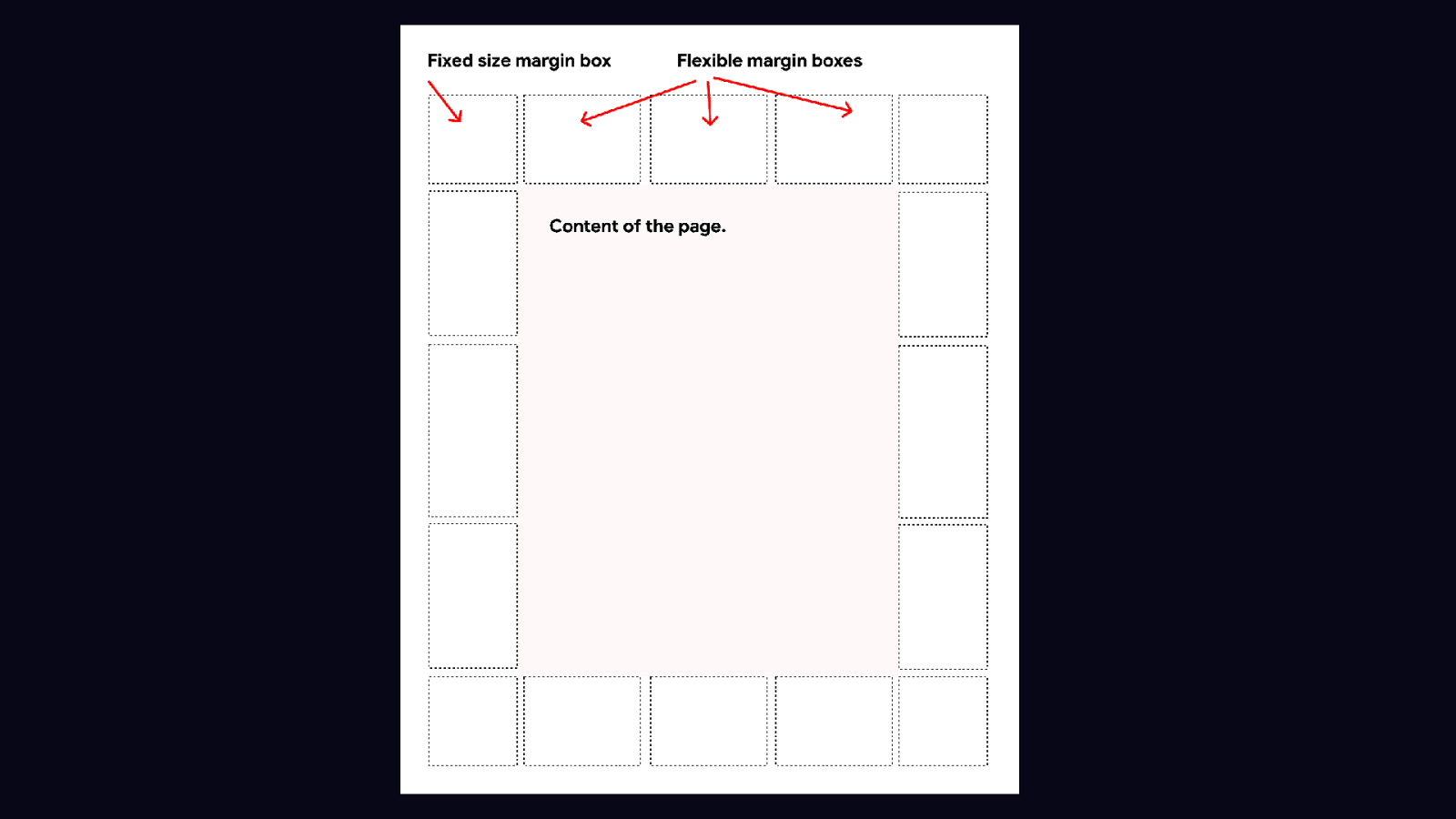
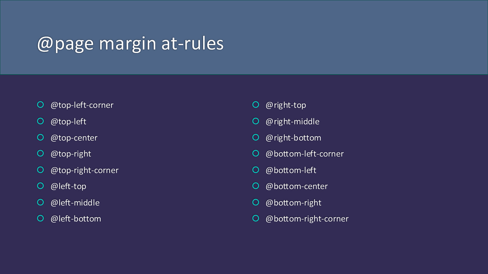
@page margin at-rules @top-left-corner @right-top @top-left @right-middle @top-center @right-bottom @top-right @bottom-left-corner @top-right-corner @bottom-left @left-top @bottom-center @left-middle @bottom-right @left-bottom @bottom-right-corner
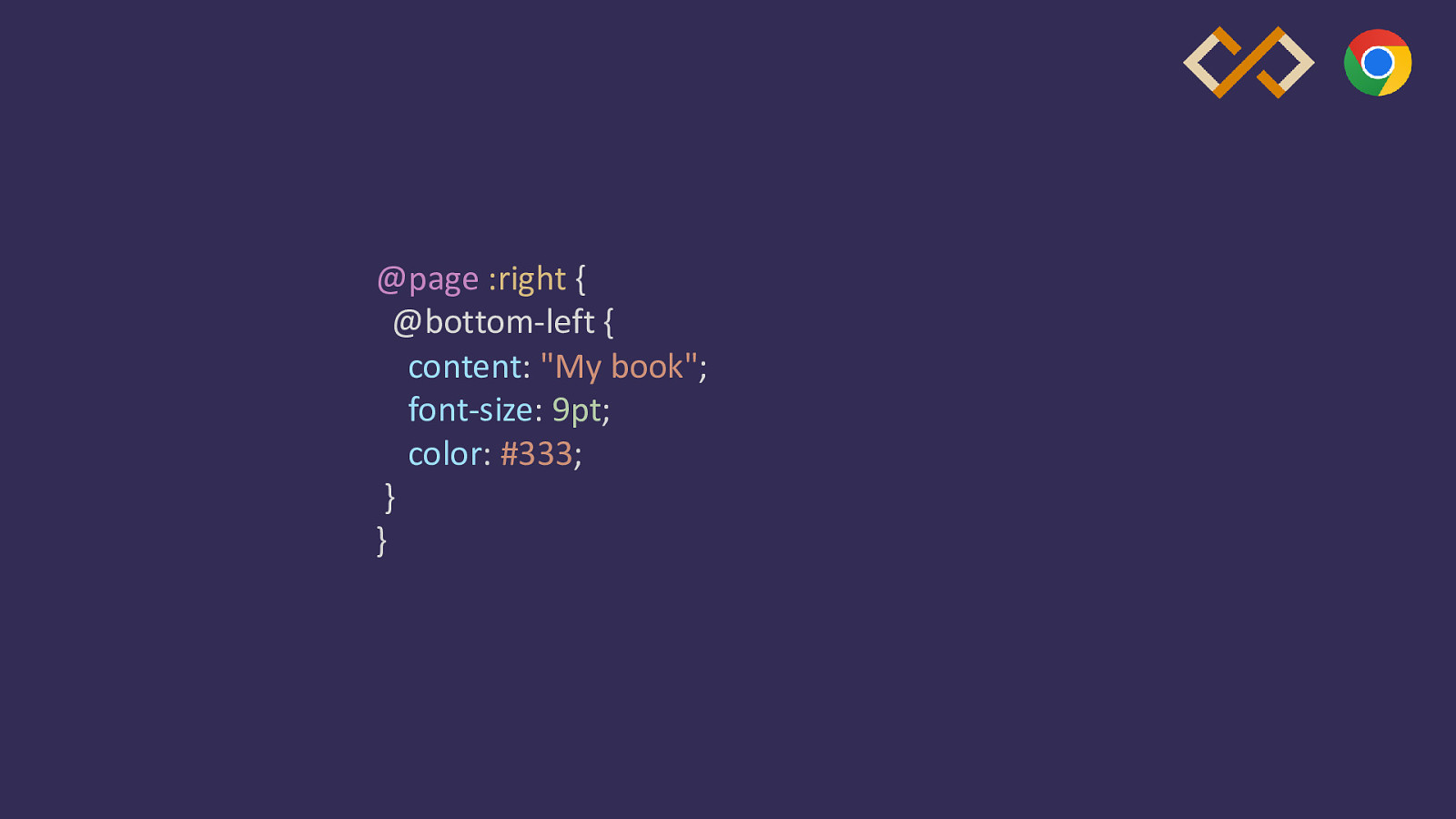
@page :right { @bottom-left { content: “My book”; font-size: 9pt; color: #333; } }
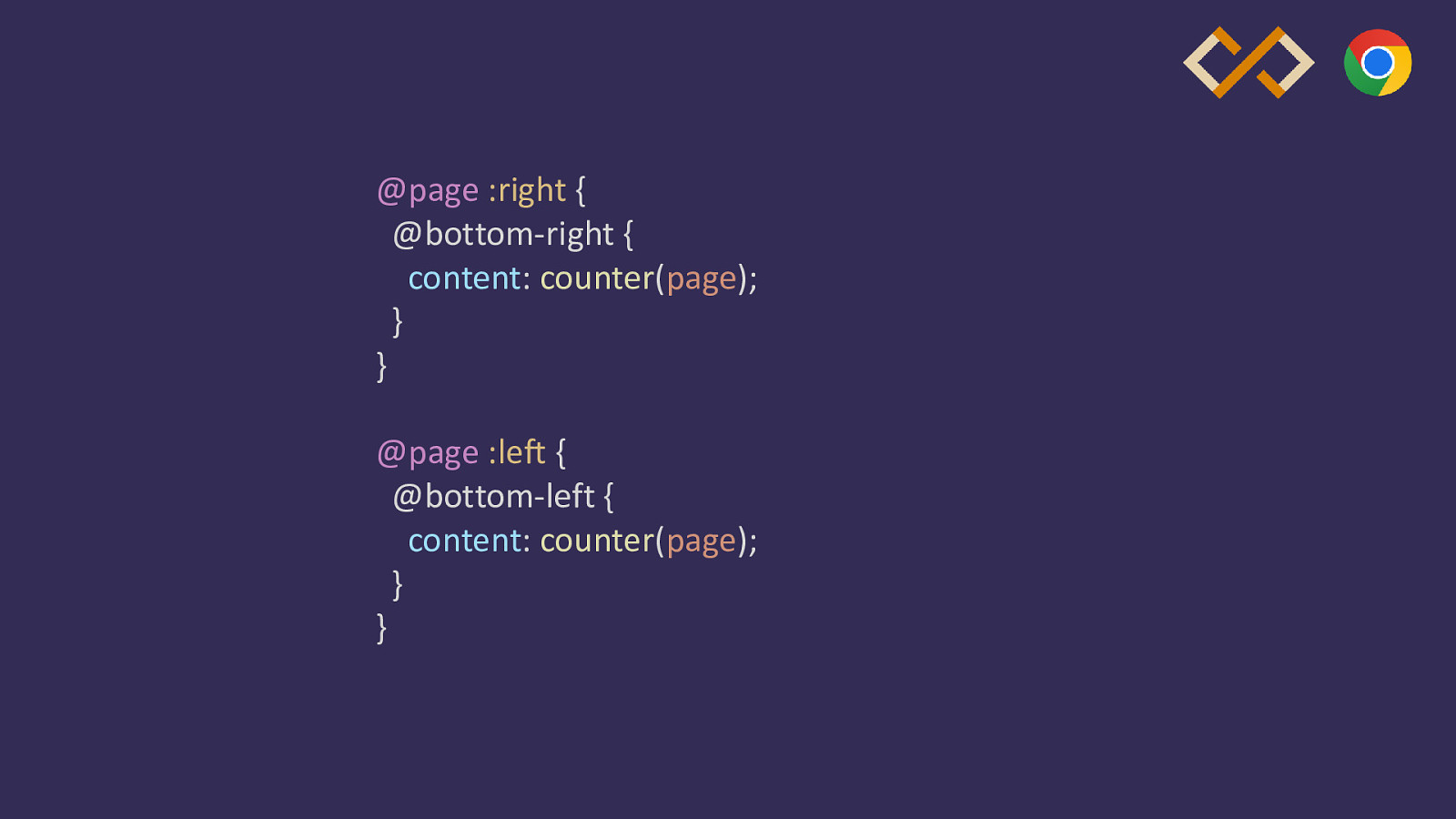
@page :right { @bottom-right { content: counter(page); } } @page :left { @bottom-left { content: counter(page); } }
Print things that browsers don’t do These things are all in the spec.
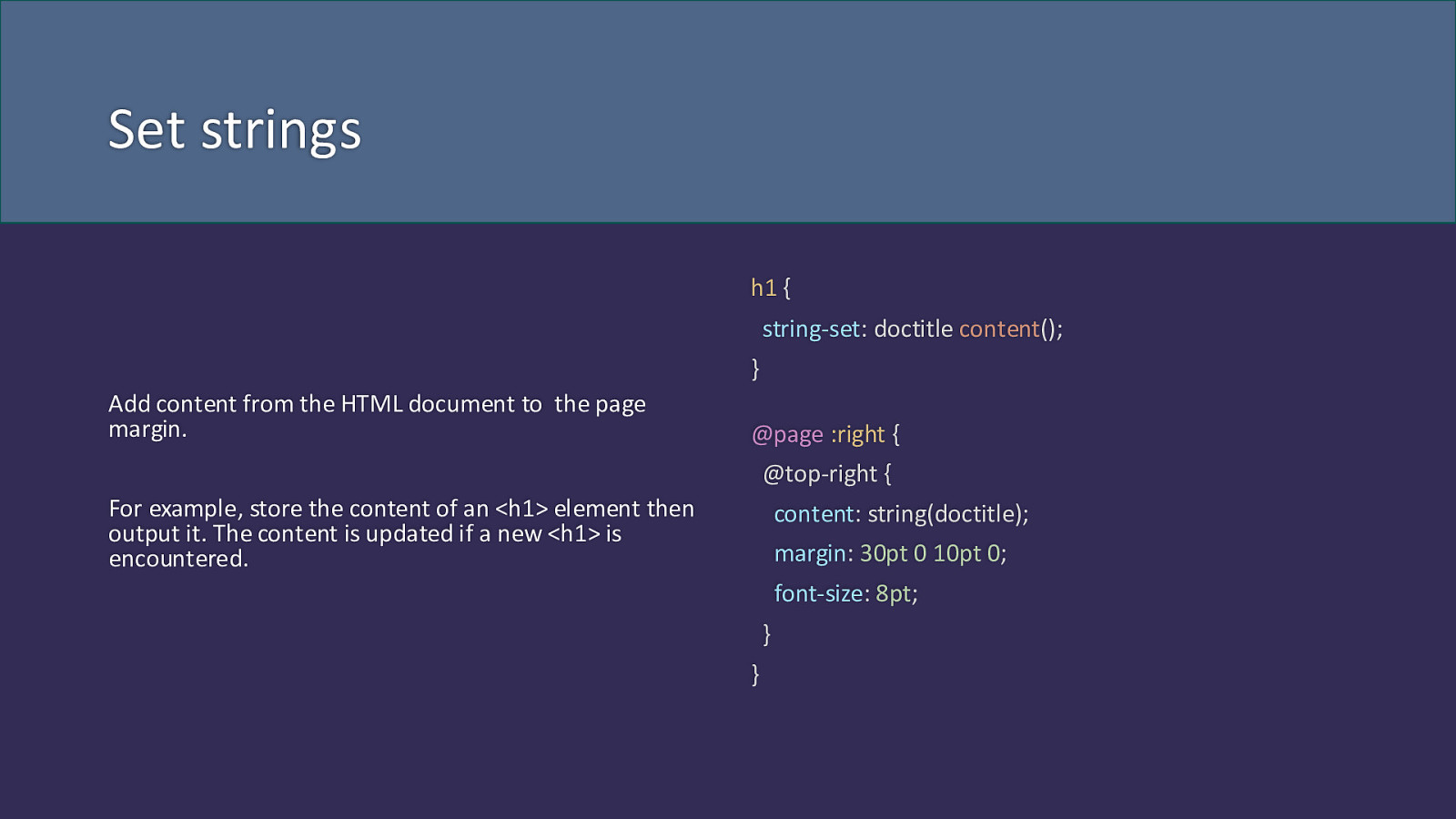
Set strings h1 { string-set: doctitle content(); } Add content from the HTML document to the page margin. @page :right { @top-right { For example, store the content of an <h1> element then output it. The content is updated if a new <h1> is encountered. content: string(doctitle); margin: 30pt 0 10pt 0; font-size: 8pt; } }
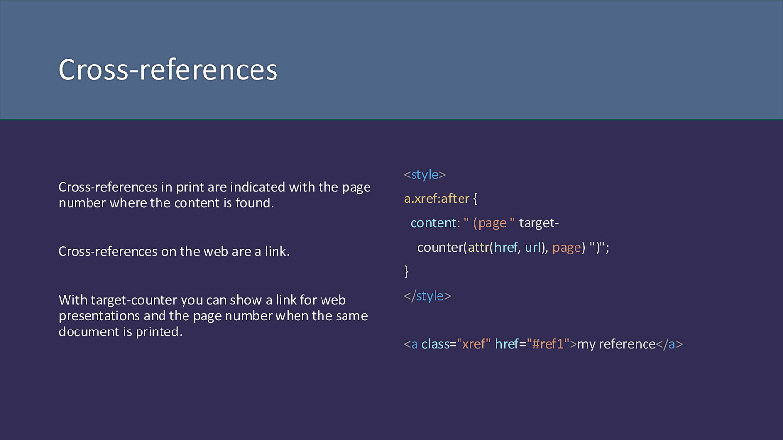
Cross-references Cross-references in print are indicated with the page number where the content is found.
<style> a.xref:after { content: ” (page ” targetcounter(attr(href, url), page) “)”; Cross-references on the web are a link. } With target-counter you can show a link for web presentations and the page number when the same document is printed. </style> <a class=”xref” href=”#ref1”>my reference</a>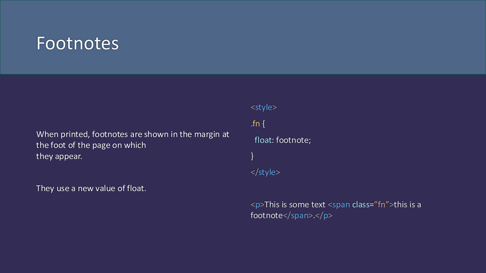
Footnotes <style> .fn { When printed, footnotes are shown in the margin at the foot of the page on which they appear. float: footnote; } </style> They use a new value of float. <p>This is some text <span class=”fn”>this is a footnote</span>.</p>
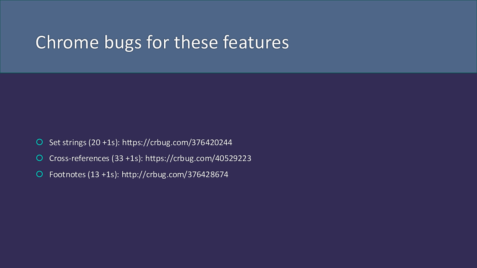
Chrome bugs for these features Set strings (20 +1s): https://crbug.com/376420244 Cross-references (33 +1s): https://crbug.com/40529223 Footnotes (13 +1s): http://crbug.com/376428674
We’ve become trained in what the web can’t do
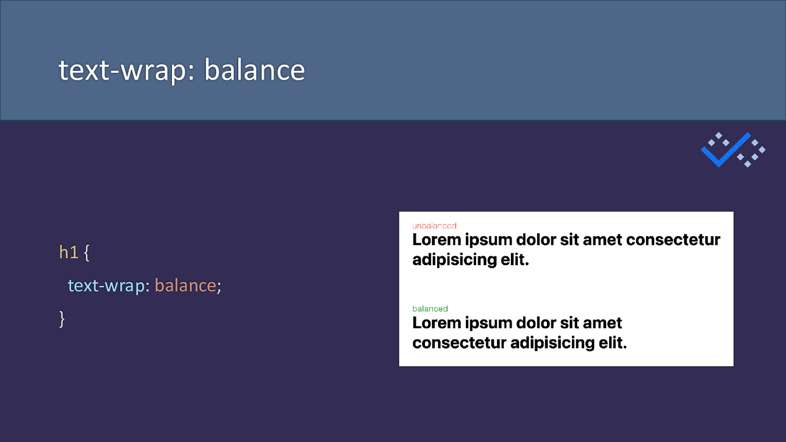
text-wrap: balance h1 { text-wrap: balance; }
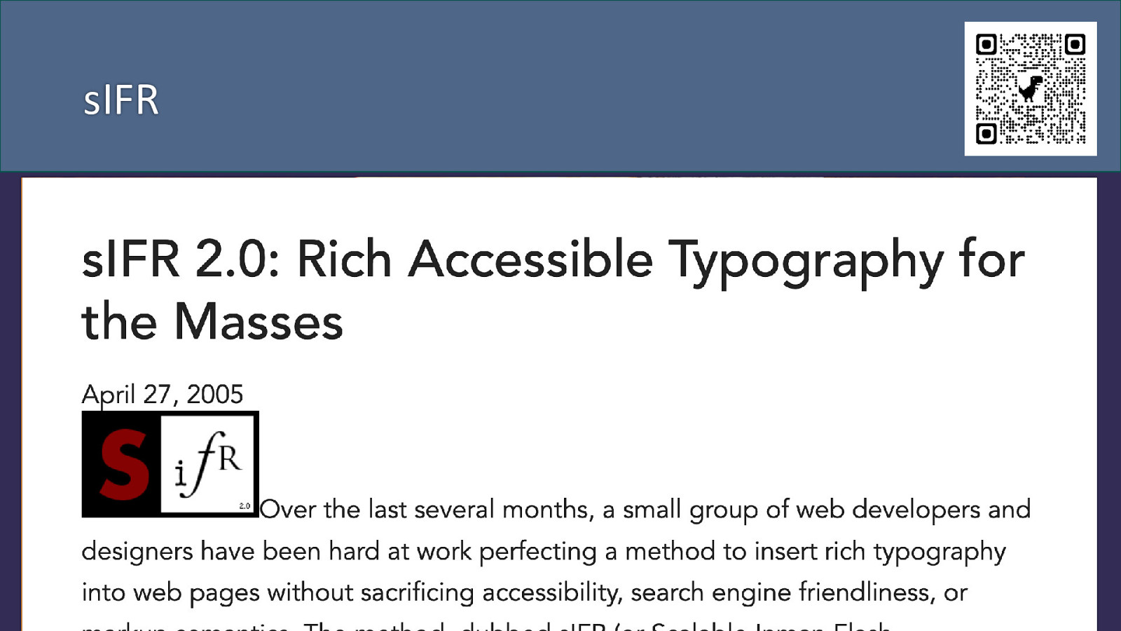
sIFR
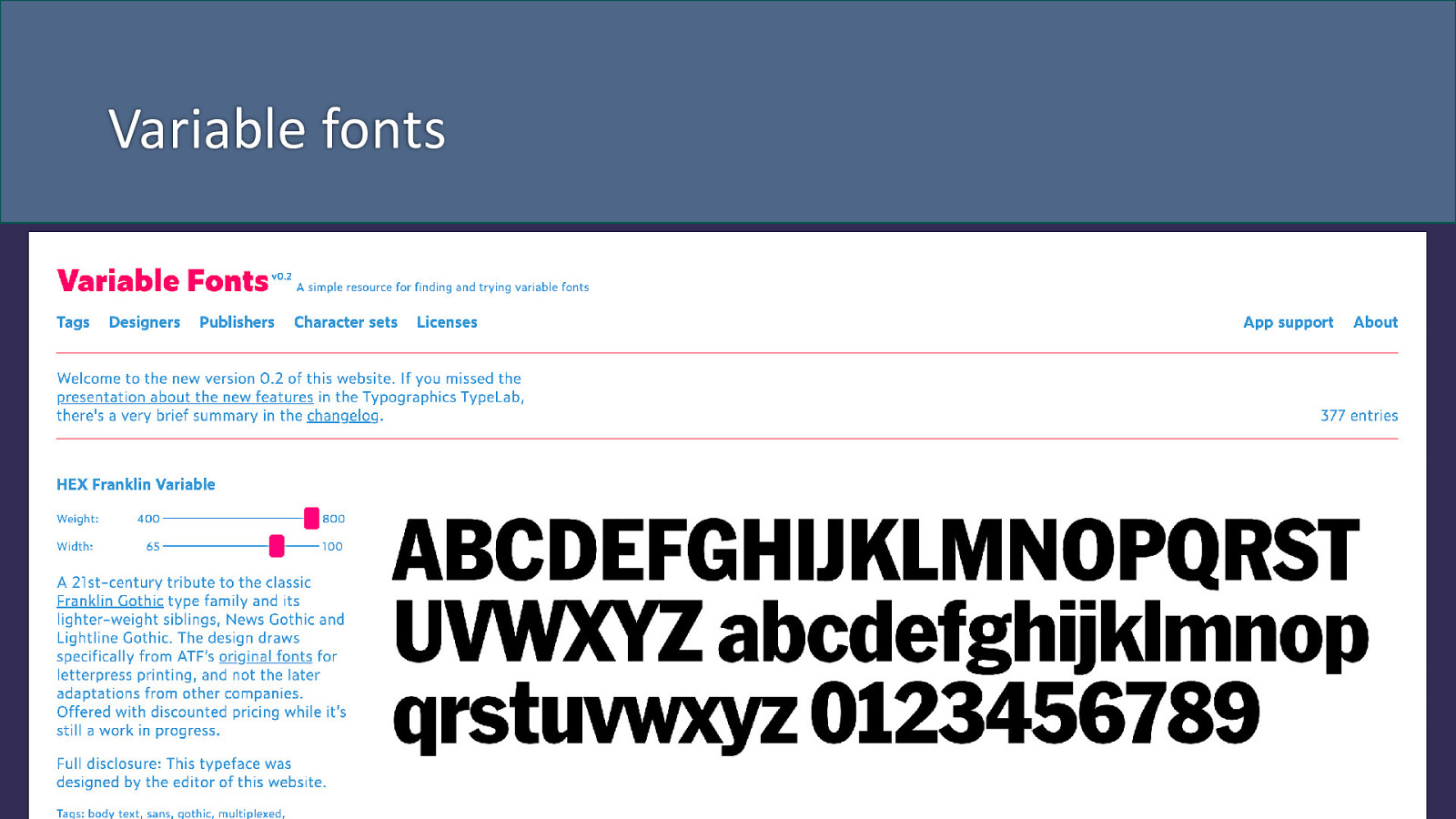
Variable fonts
Are you pre or post responsive design? The concept of responsive design is now 15 years old. Bootstrap was launched in 2011.
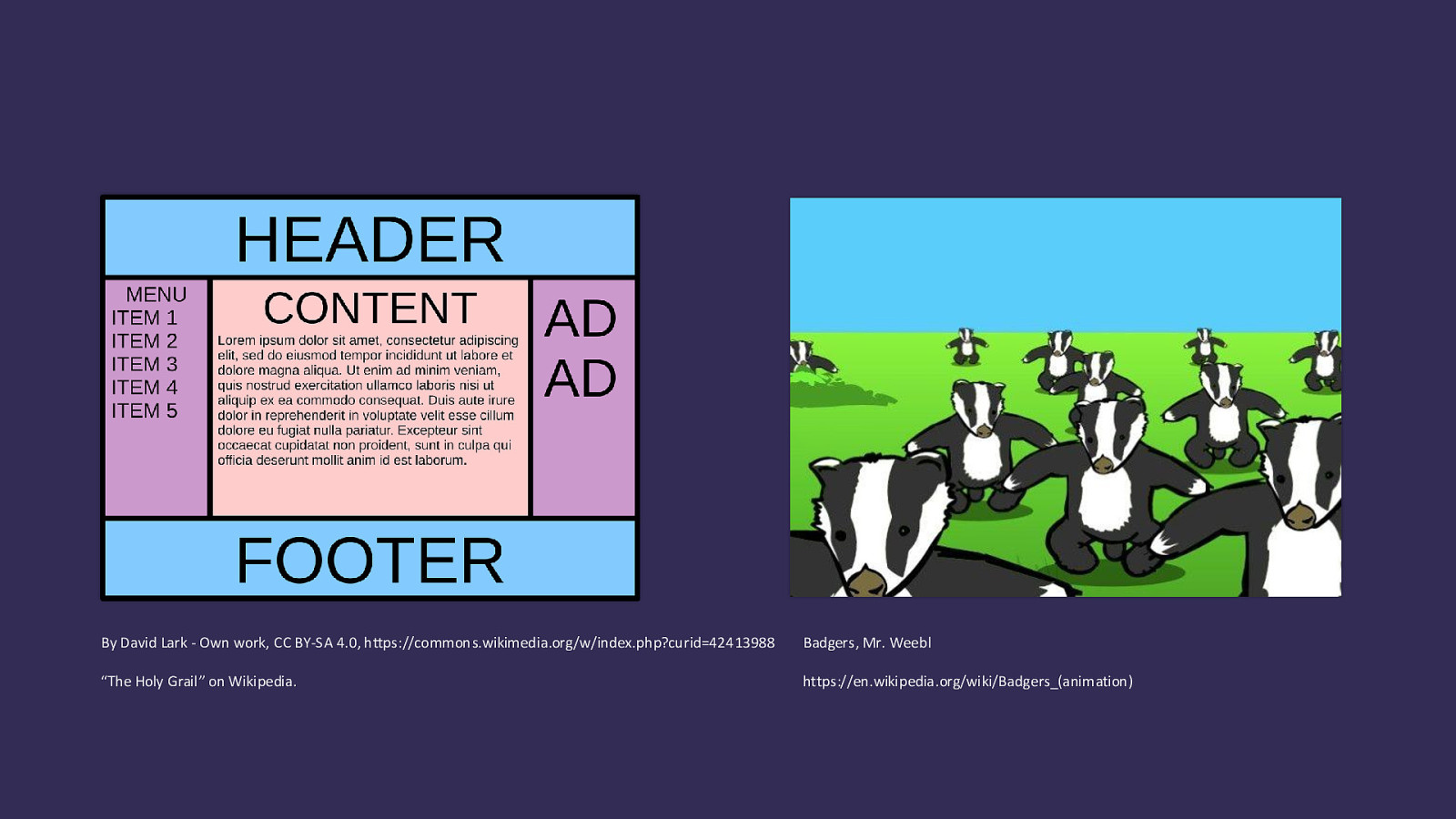
By David Lark - Own work, CC BY-SA 4.0, https://commons.wikimedia.org/w/index.php?curid=42413988 Badgers, Mr. Weebl “The Holy Grail” on Wikipedia. https://en.wikipedia.org/wiki/Badgers_(animation)
CSS for developer experience A lot of new CSS gives us better ways to do the things we can already do
The web just doesn’t work like that
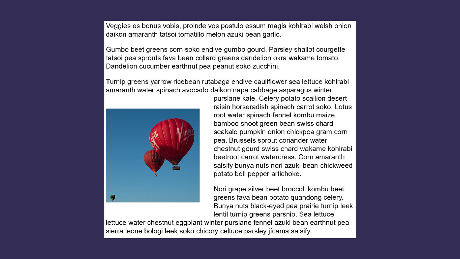
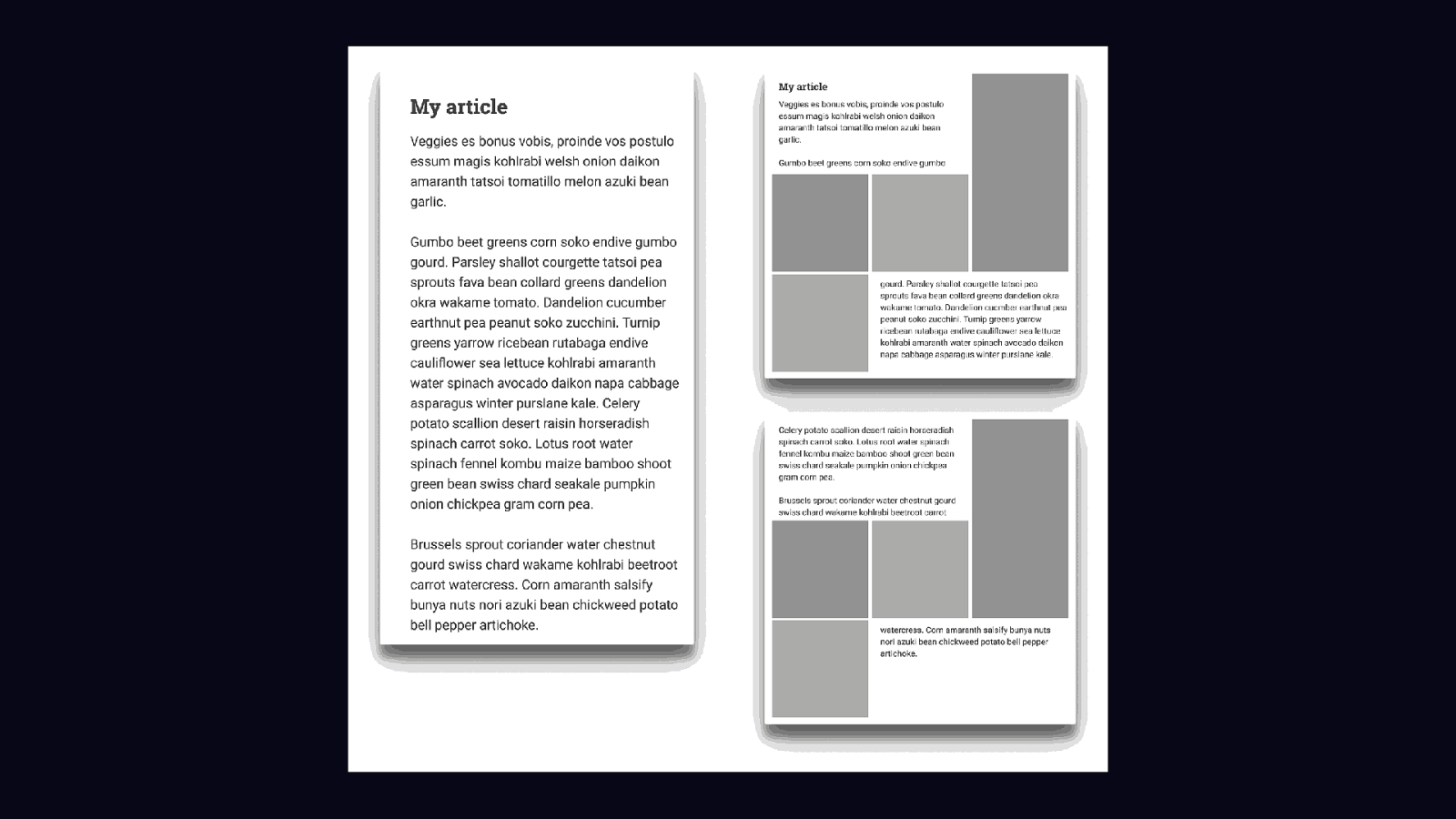
Creating rows in multicol Multiple-column Layout Level 2
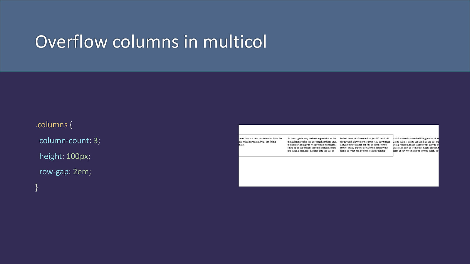
Overflow columns in multicol .columns { column-count: 3; height: 100px; row-gap: 2em; }
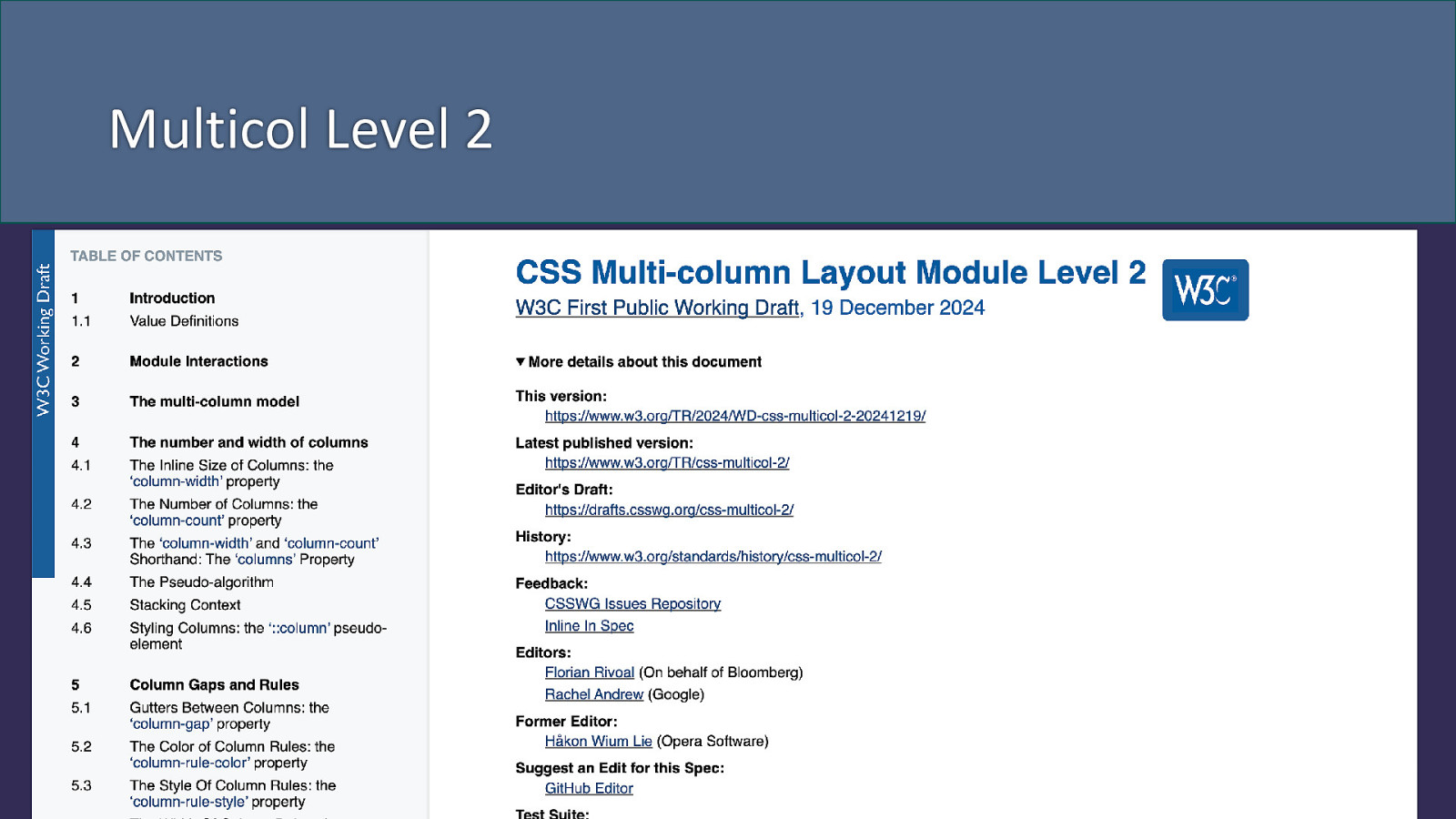
Multicol Level 2
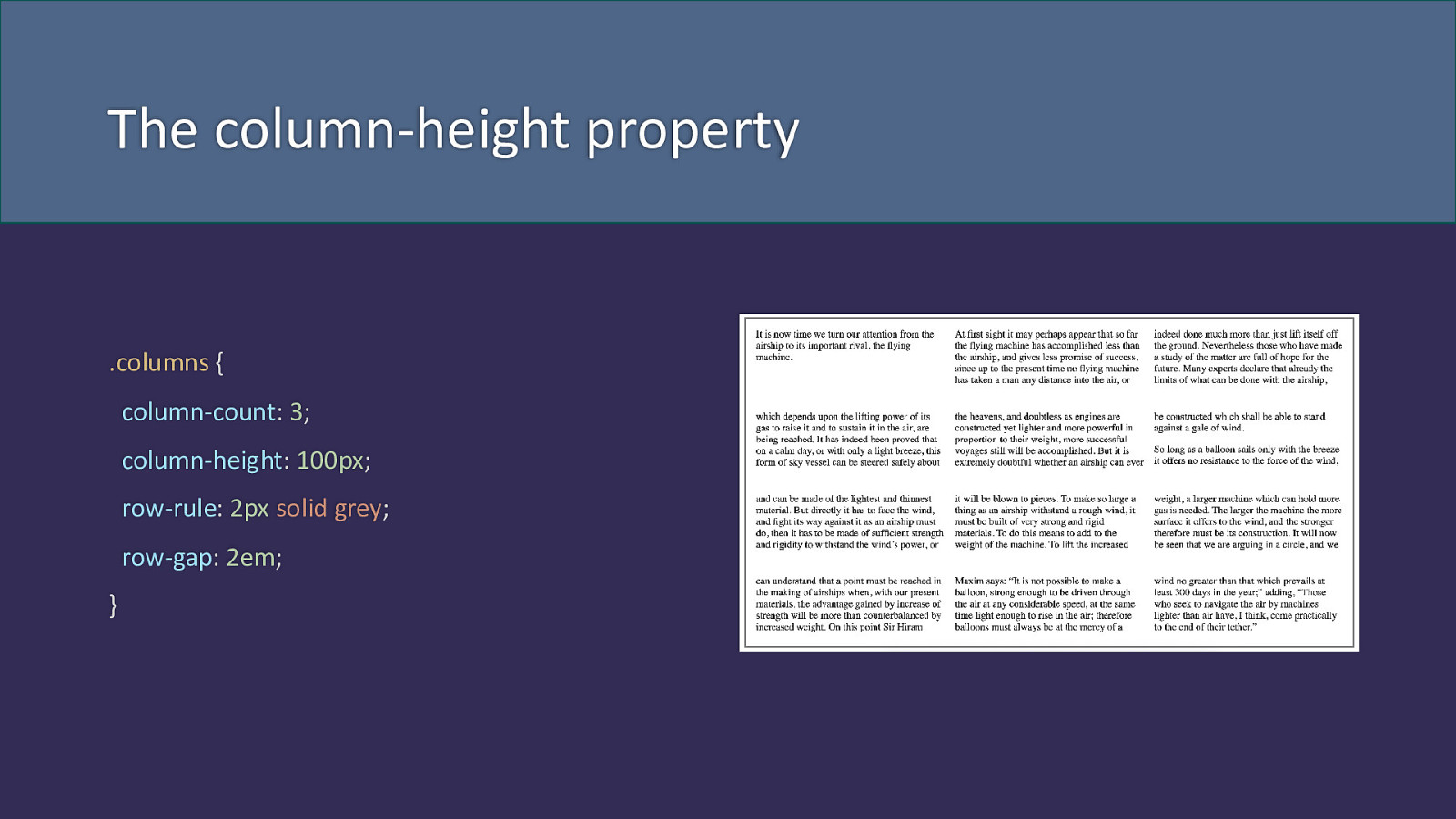
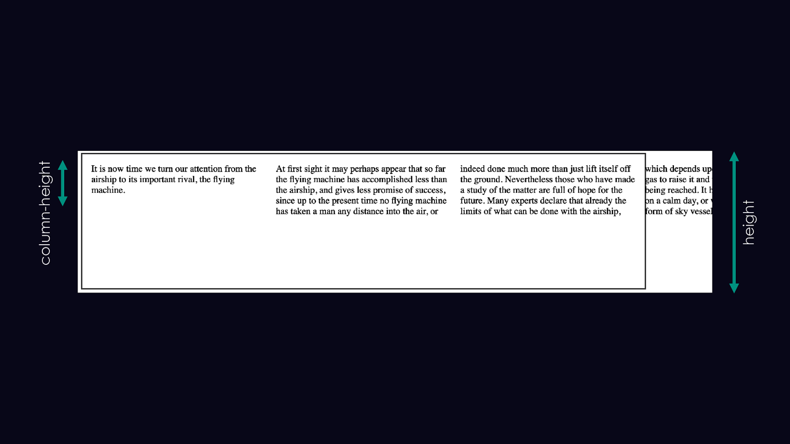
The column-height property .columns { column-count: 3; column-height: 100px; row-rule: 2px solid grey; row-gap: 2em; }
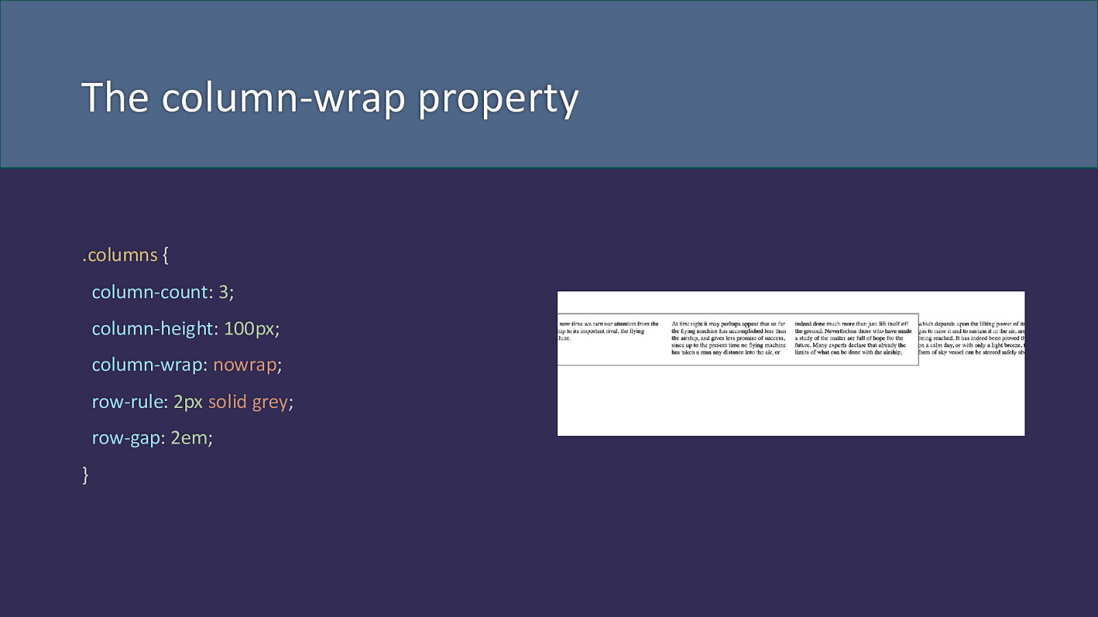
The column-wrap property .columns { column-count: 3; column-height: 100px; column-wrap: nowrap; row-rule: 2px solid grey; row-gap: 2em; }
height column-height
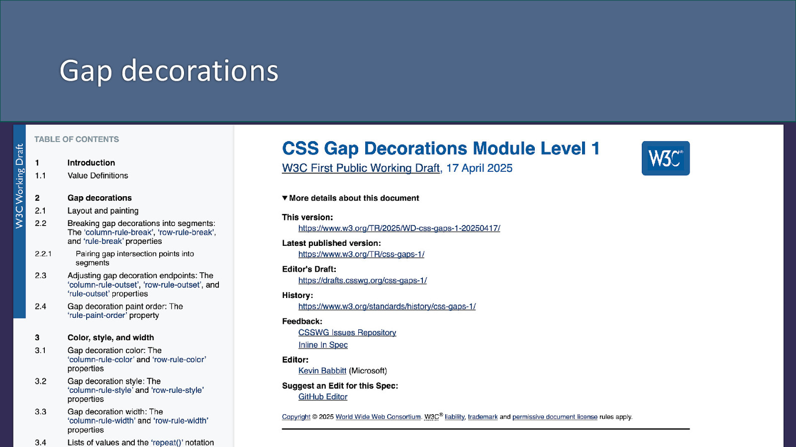
Gap decorations
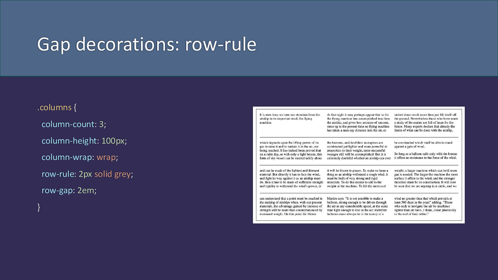
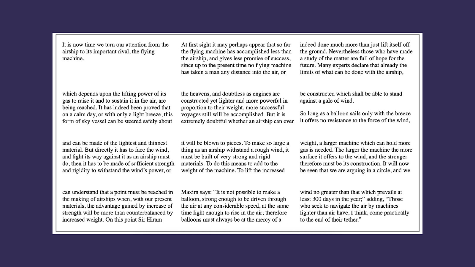
Gap decorations: row-rule .columns { column-count: 3; column-height: 100px; column-wrap: wrap; row-rule: 2px solid grey; row-gap: 2em; }
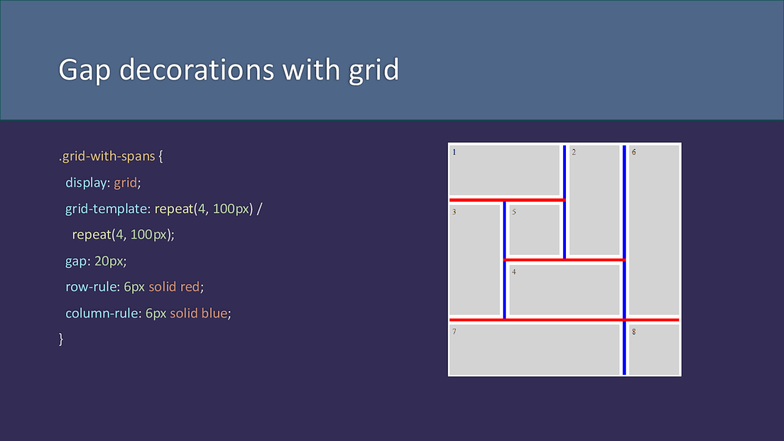
Gap decorations with grid .grid-with-spans { display: grid; grid-template: repeat(4, 100px) / repeat(4, 100px); gap: 20px; row-rule: 6px solid red; column-rule: 6px solid blue; }
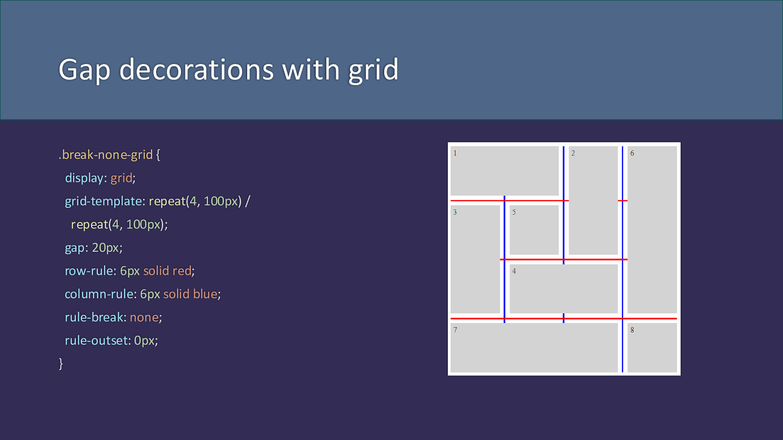
Gap decorations with grid .break-none-grid { display: grid; grid-template: repeat(4, 100px) / repeat(4, 100px); gap: 20px; row-rule: 6px solid red; column-rule: 6px solid blue; rule-break: none; rule-outset: 0px; }
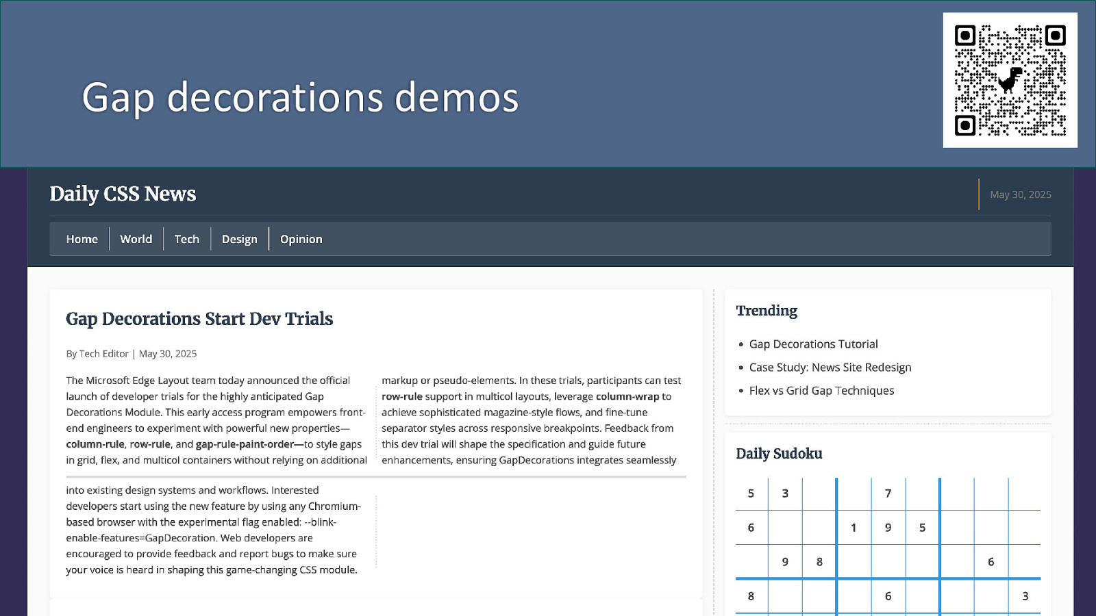
Gap decorations demos
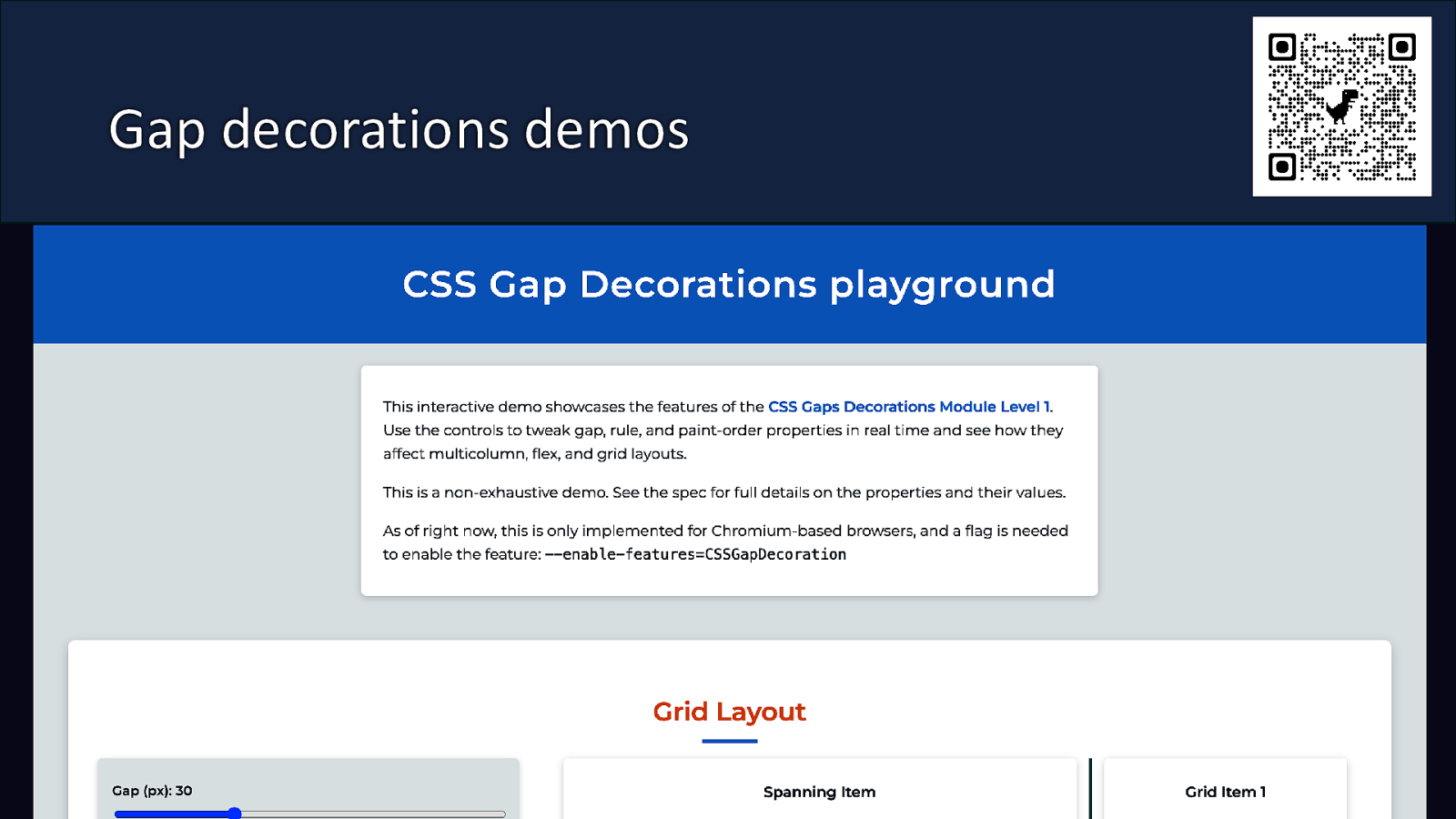
Gap decorations demos
Is the web moving closer to paged media?
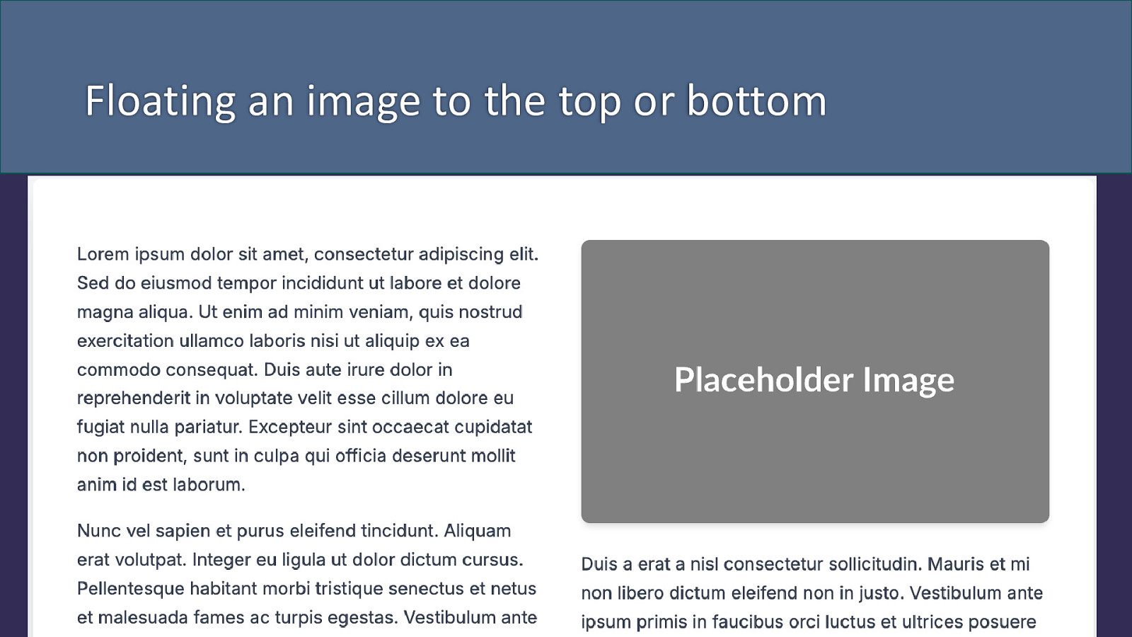
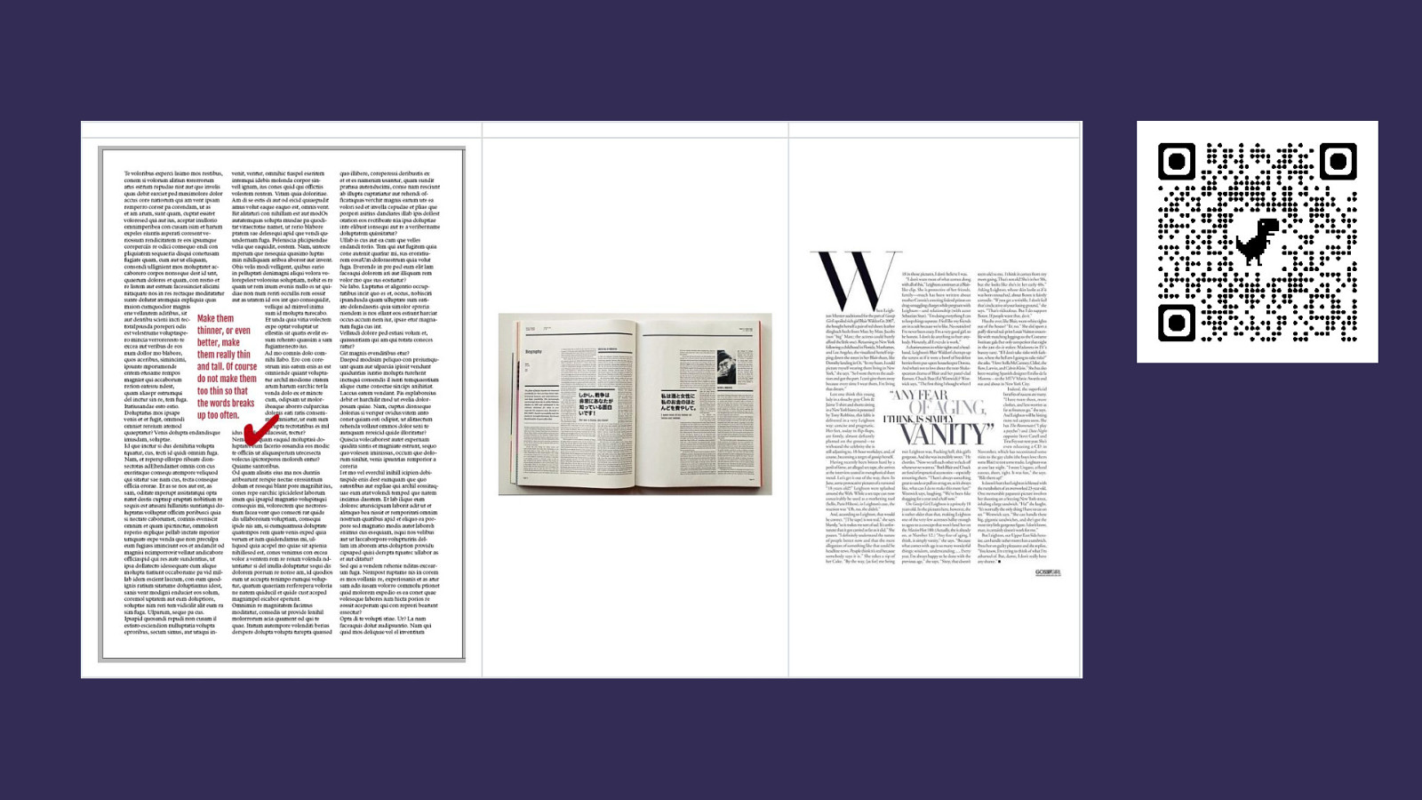
Floating an image to the top or bottom
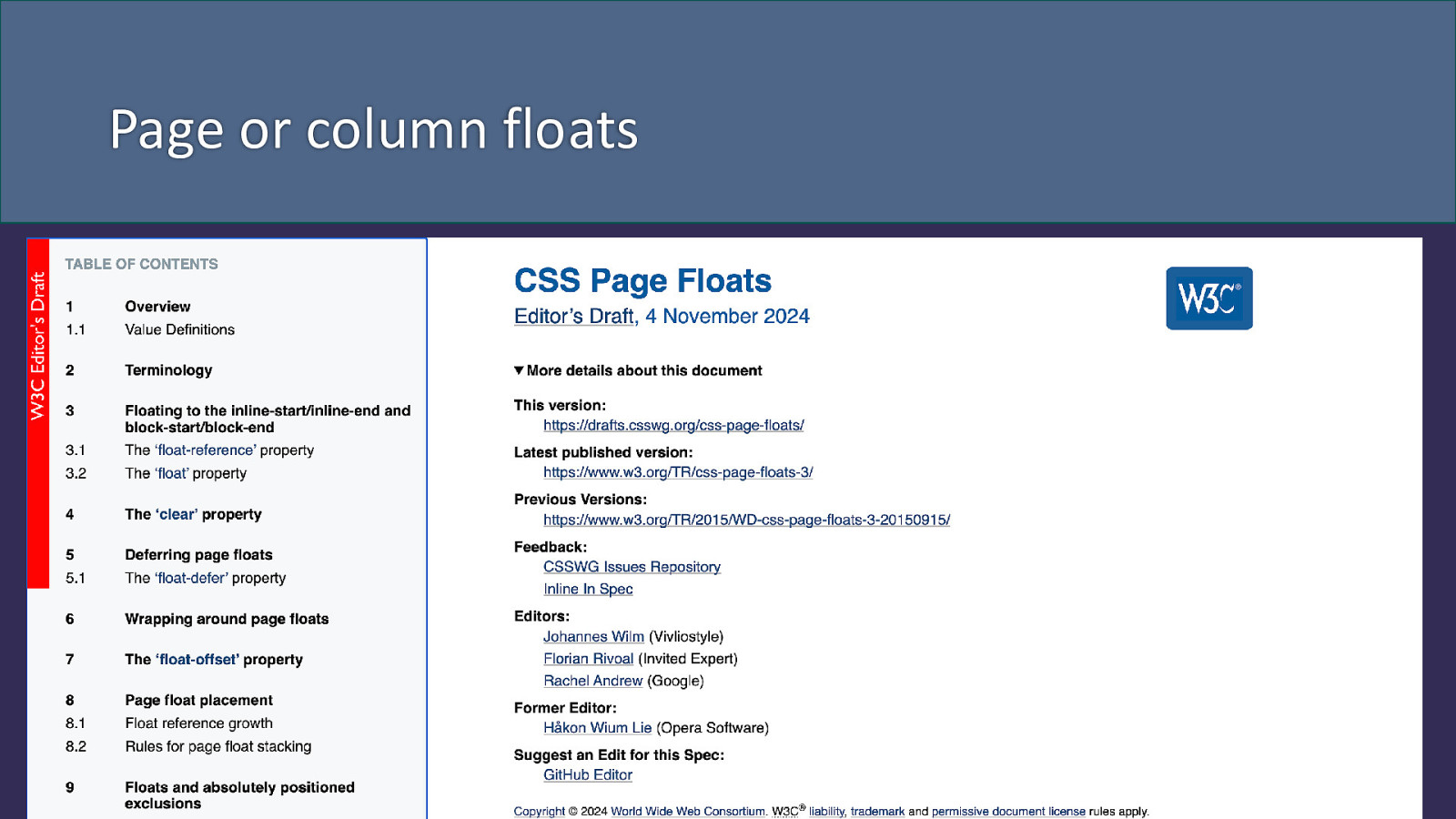
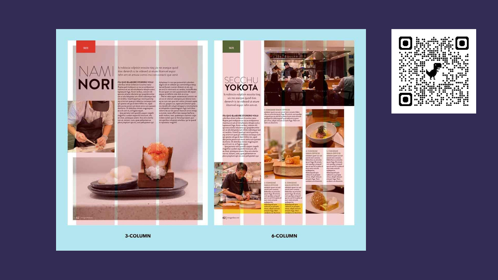
Page or column floats
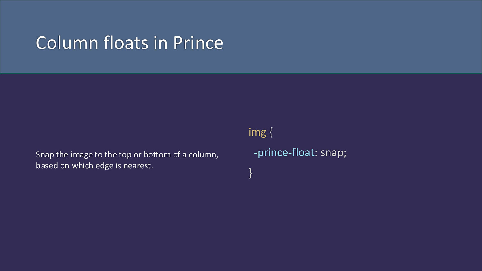
Column floats in Prince img { Snap the image to the top or bottom of a column, based on which edge is nearest. -prince-float: snap; }

column-span: <integer> .spanner { .spanner { column-span: all; } column-span: 2; }

Exclusions
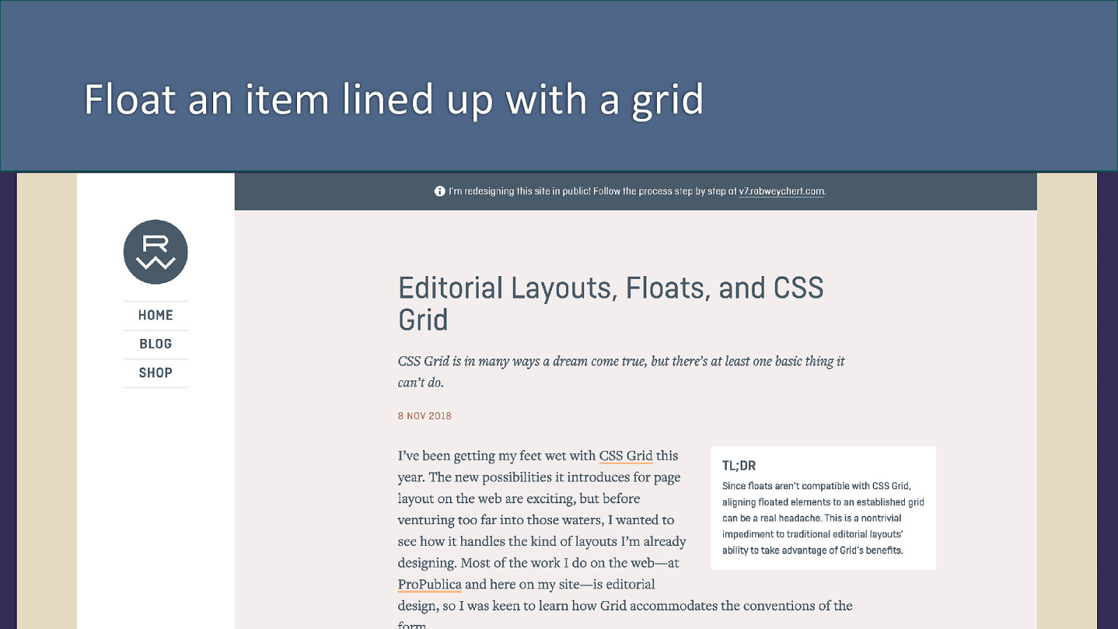
Float an item lined up with a grid
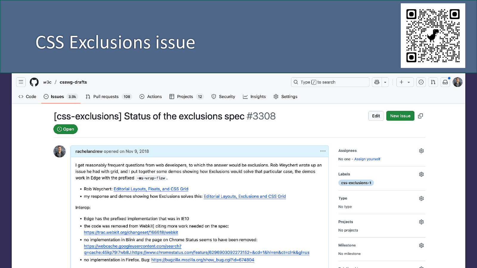
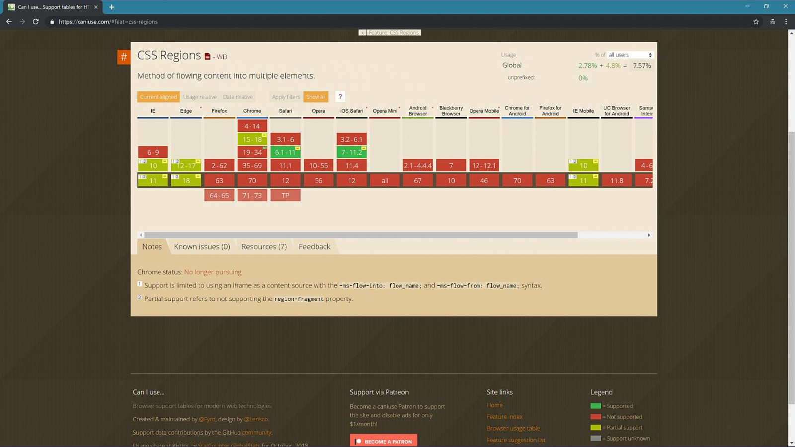
CSS Exclusions issue
Regions? Like multicol, but with disconnected fragmaintainers.
Connective features Not exciting on their own, but act as multipliers and enablers of exciting things
Raise issues to show us the things you can’t do Don’t worry about how it’s done, explain what the use case is.

reading-flow Getting one of those impossible things done
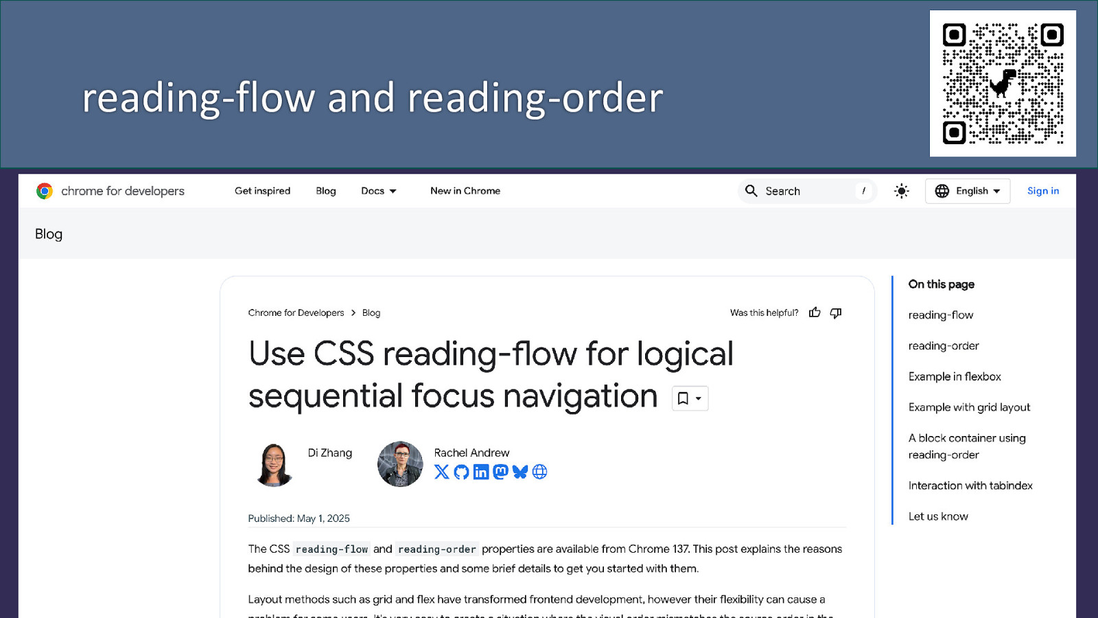
reading-flow and reading-order

Thank you