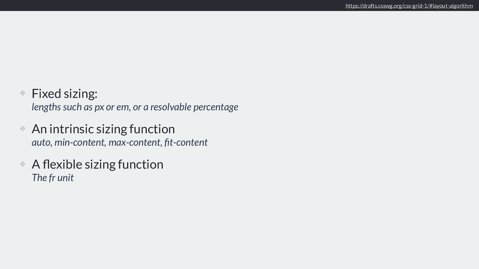
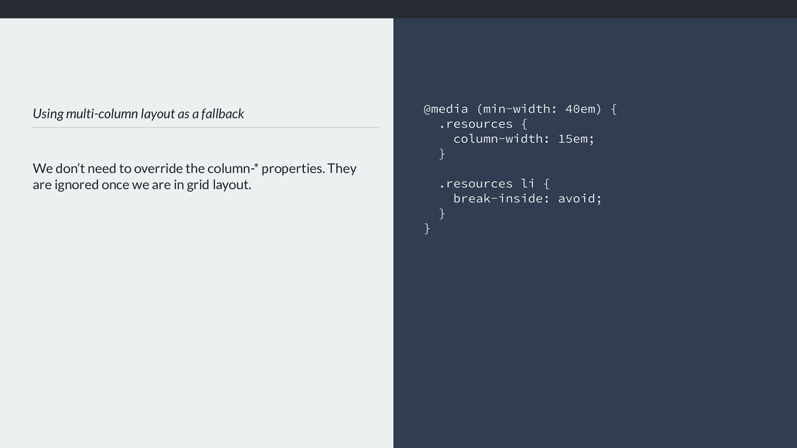
Into The Weeds of CSS Layout

A presentation at Smashing Conference in February 2018 in London, UK by Rachel Andrew

Slide 1

Slide 1

@rachelandrew at Smashing Conf London Into the Weeds of CSS Layout https://www.flickr.com/photos/protake/17383852206/ So Grid Layout is a thing. It won’t be long until we can celebrate one year of having Grid Layout in browsers. We mostly think it is cool, and some of us have even shipped sites using it.

Slide 2

Slide 2

https://www.w3.org/TR/css-grid-2/

The CSS Working Group already have a first public working draft of Grid Level 2. Published yesterday.

I have given up trying to answer all of the questions I get sent, instead trying to write articles that address those issues. It has however become very apparent where a lot of the issues people have with Grid originate, and I think that place is one that is quite interesting when it comes to talking about performance for a couple of reasons. That place is sizing.

Slide 3

Slide 3

How big is that box? People are very confused about how big things are, and very confused about how grid and flexbox distribute space.

The reason it is confusing is that we have spent years using layout methods that are very straightforward when it comes to the size of items in our layouts.

We have sized things with length units, which make sense, be that pixels or ems or rems, we know what 100 pixels or 10 em means.

Slide 4

Slide 4

https://alistapart.com/article/fluidgrids

We have also sized things with percentages, using straightforward maths to figure out dimensions for flexible grids. Those percentages don’t look so pretty in our stylesheets, but they are understandable. We make sure we don’t end up with more than 100 % and everything will be ok.

Slide 5

Slide 5

https://twitter.com/devine_howest/status/959036561839960070

We got box-sizing: border-box and everything was made easier.

Slide 6

Slide 6

We got layout frameworks that even did all of the calculating for us.

Slide 7

Slide 7

https://www.smashingmagazine.com/2018/01/understanding-sizing-css-layout/ And then Flexbox and grid layout came along, and they seemed to behave a bit strangely. Elements in our designs became bigger or smaller than we thought they should.

The result being that people started to create flexbox based grids which used percentages, just like their floated forebears. With grid, the first thing most people seem to do is try to create layouts based on percentage, going back to what they know to work. Keeping away from the slightly mysterious fr unit, that never seems to quite do what they expect.

So I have pretty much declared this year as the year of “how big is that box”, because I think that understanding sizing is the route to finding solutions for layout patterns that we previously had to rely on JavaScript for. I’m not a JavaScript hater, but it makes me sad when it is invoked for things that we have CSS solutions for, and which can be done in a more straightforward way, a more performanant way in CSS.

Slide 8

Slide 8

How big is a grid? But when you start to really look at what grid layout enables, some of it looks a bit scary in terms of how well it might perform.

Slide 9

Slide 9

To learn about this we need to scroll way, way down the specification. Down to those bits that we web developers usually decide are for browser engineers, and ignore.

We get to the bit of the spec that defines the grid sizing algorithm.

And there we enter the rabbit hole, for to understand the grid sizing algorithm we need to know things about how we figure out how big things are in general.

And you’ll be glad to know I’m not going to line by line explain the algorithm to you today - if you have any questions after this talk come and ask me and I’ll have a go. Instead I’m going to highlight a few things that are interesting and useful about how grid works out sizing.

Slide 10

Slide 10

–11.1 Grid Sizing Algorithm “Each track has specified   minimum   and   maximum   sizing functions   (which may be the same).” https://drafts.csswg.org/css-grid-1/#layout-algorithm

The spec says that each track has specified minimum and maximum sizing functions (which may be the same). What are these?

Slide 11

Slide 11

❖ Fixed sizing: 
 lengths such as px or em, or a resolvable percentage

❖ An intrinsic sizing function 
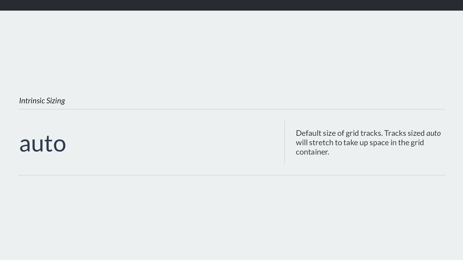
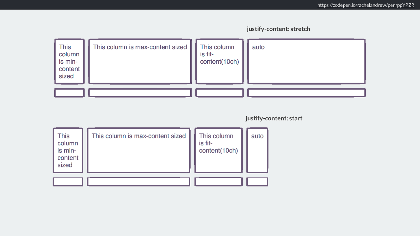
 auto, min-content, max-content, fit-content
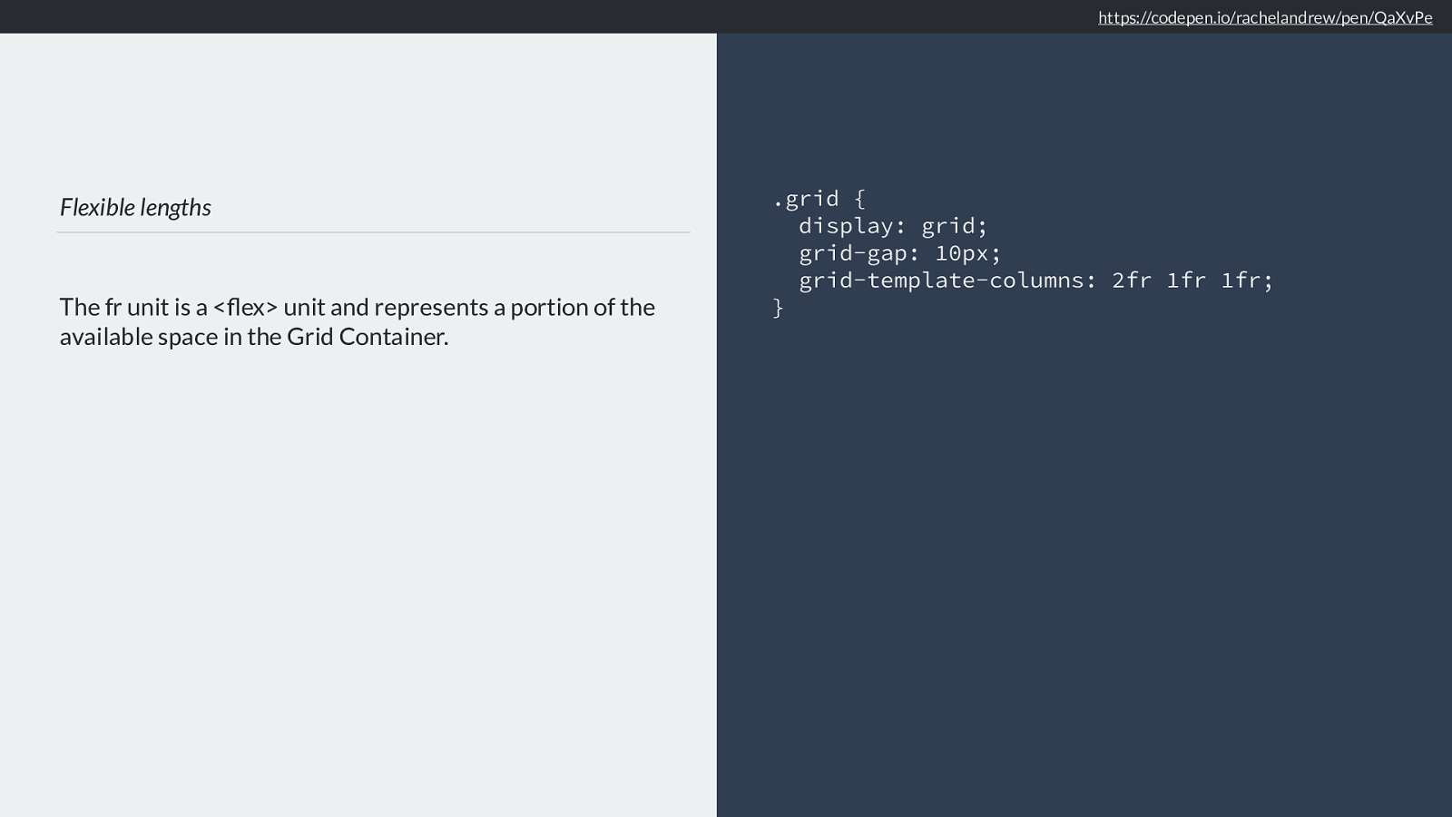
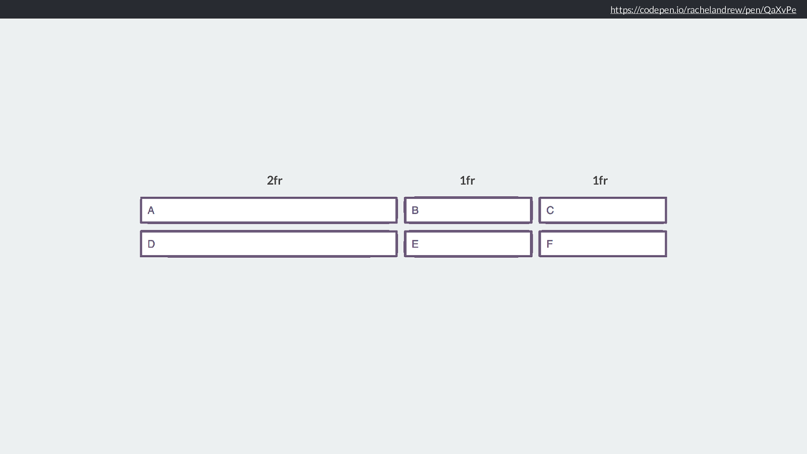
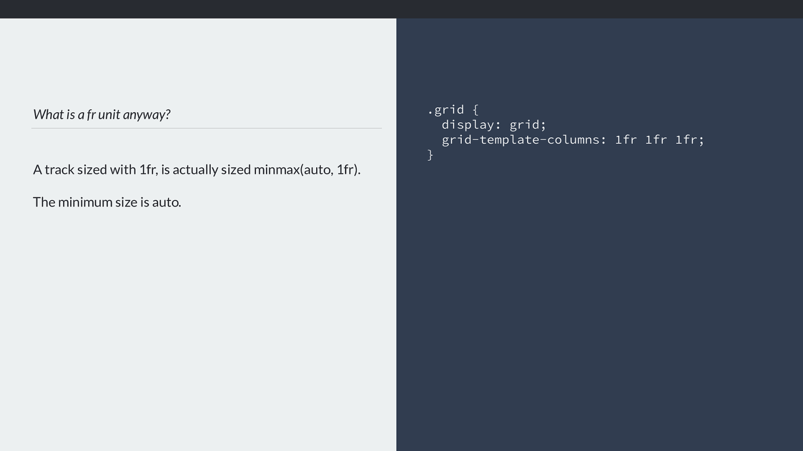
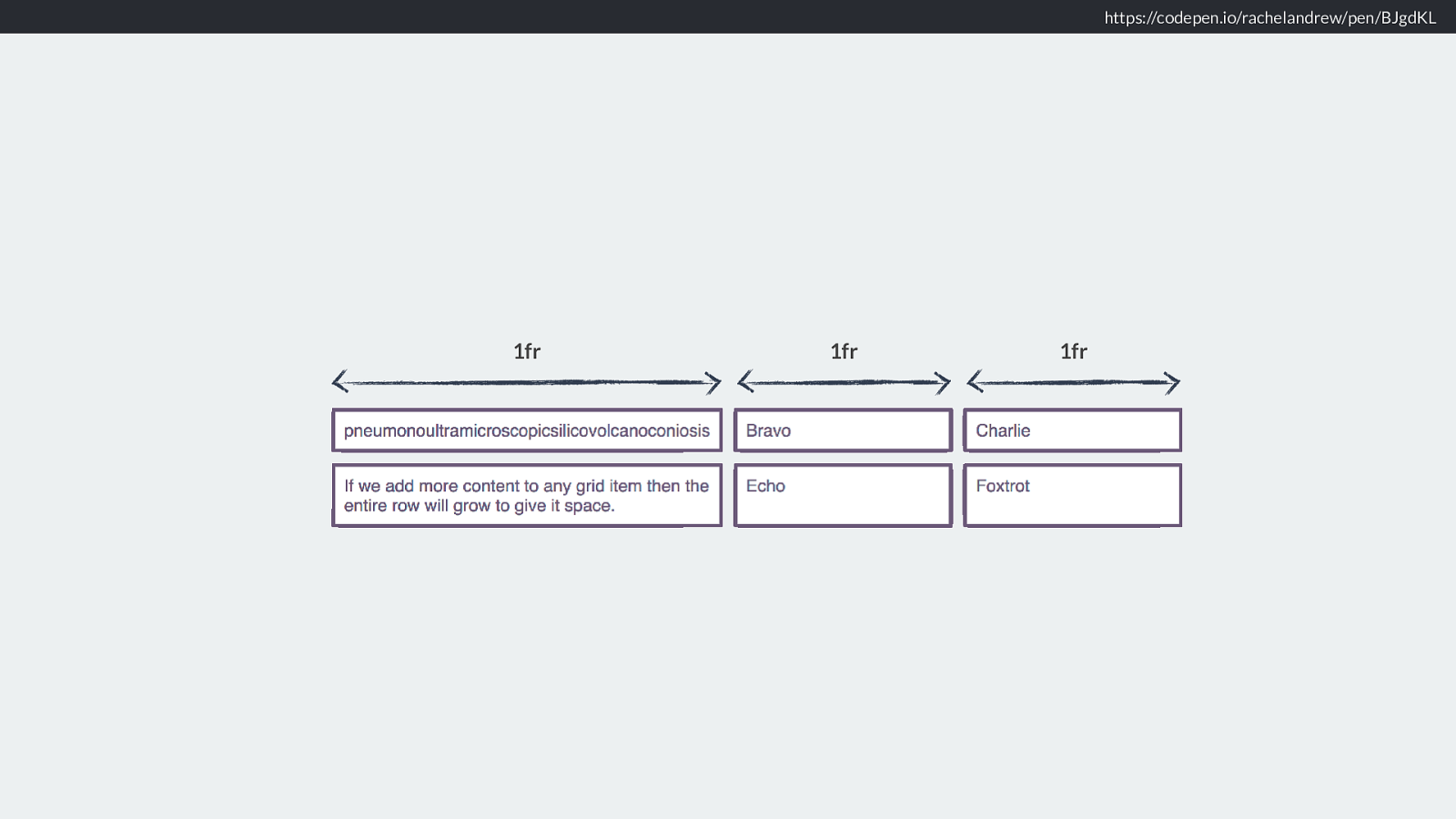
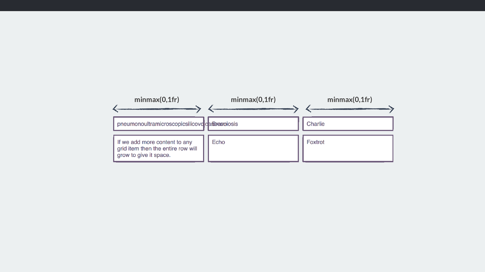
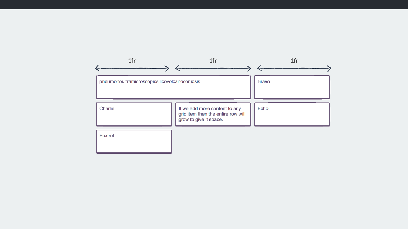
❖ A flexible sizing function 
 The fr unit https://drafts.csswg.org/css-grid-1/#layout-algorithm

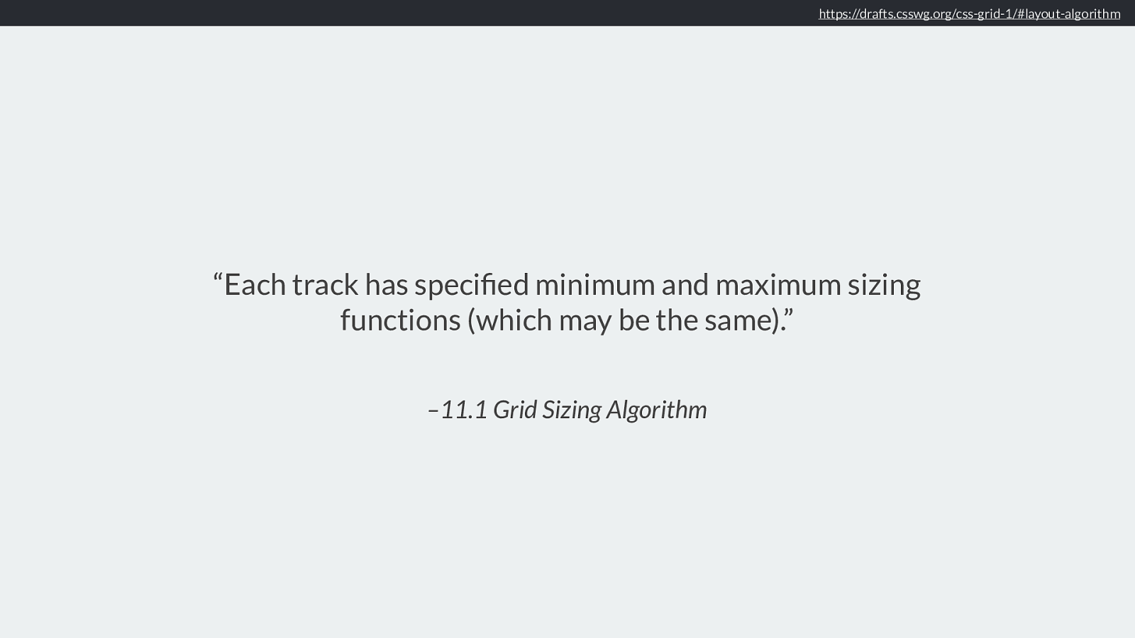
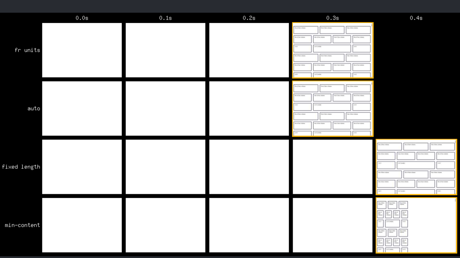
There are three types of sizing we need to consider. Fixed sizing, Intrinsic Sizing or flexible.

Fixed sizing is something we are all familiar with, it’s how we’ve been doing layouts for years. Sizing things either as a length unit - be that pixels, ems or any other length. Percentages also fall into this type of sizing, as long as they can be resolved against something, for example a grid track sized as 20% resolves to a length which is 20% of the width of the grid container. Therefore when working out sizing resolvable percentages are treated in the same way as any other fixed length - even though we probably see them as flexible in our heads.

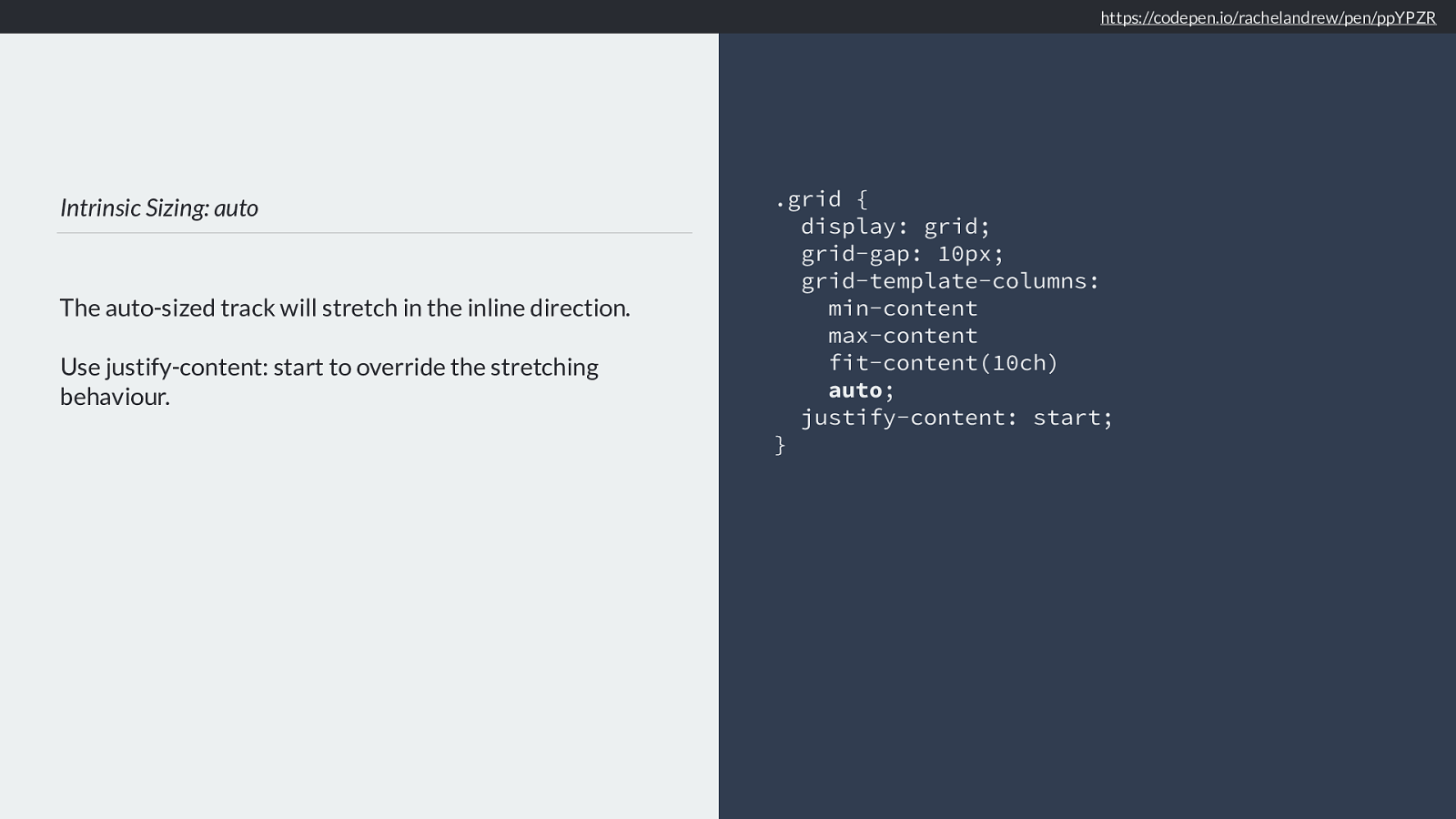
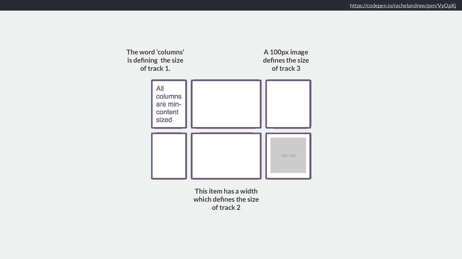
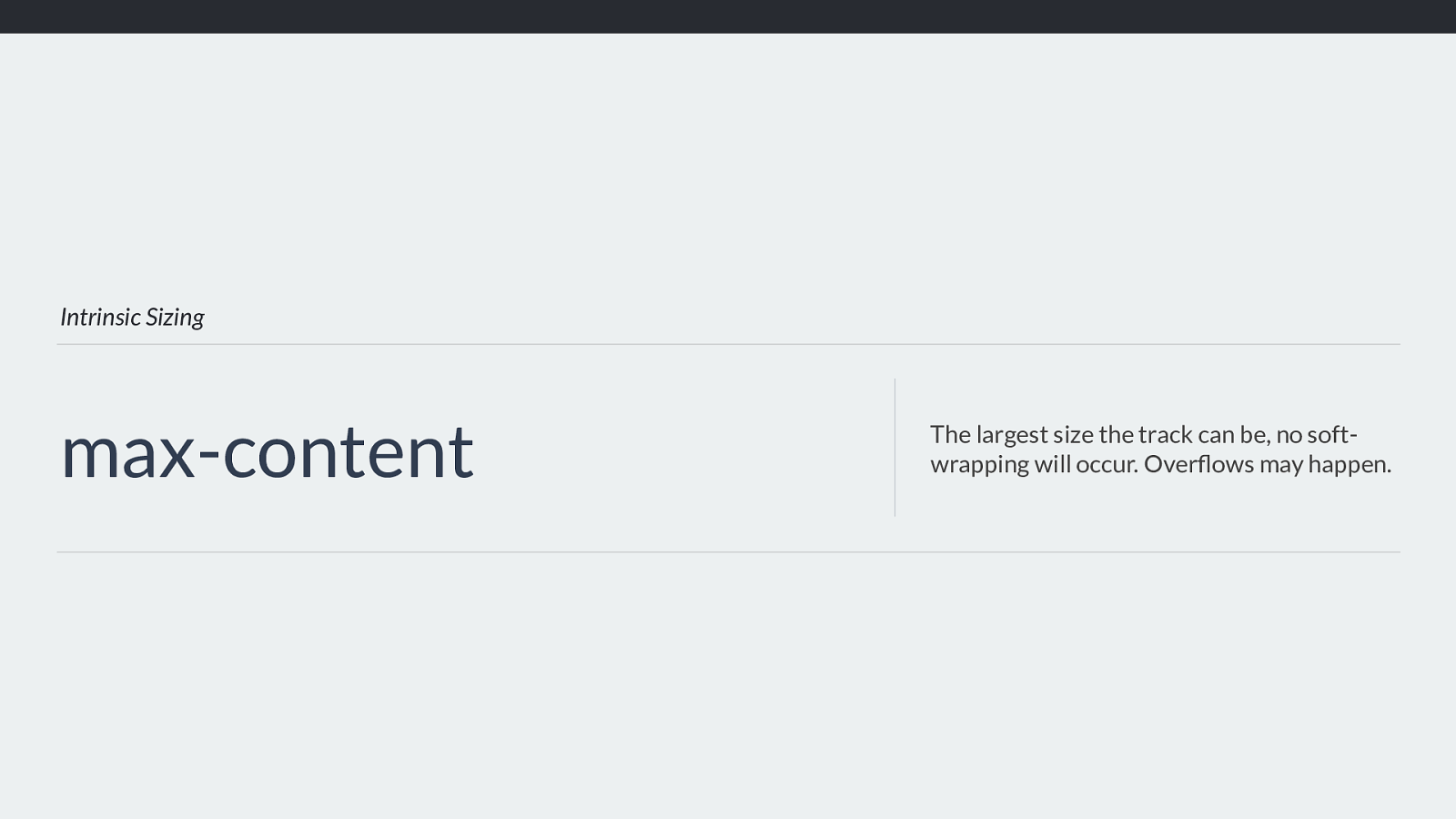
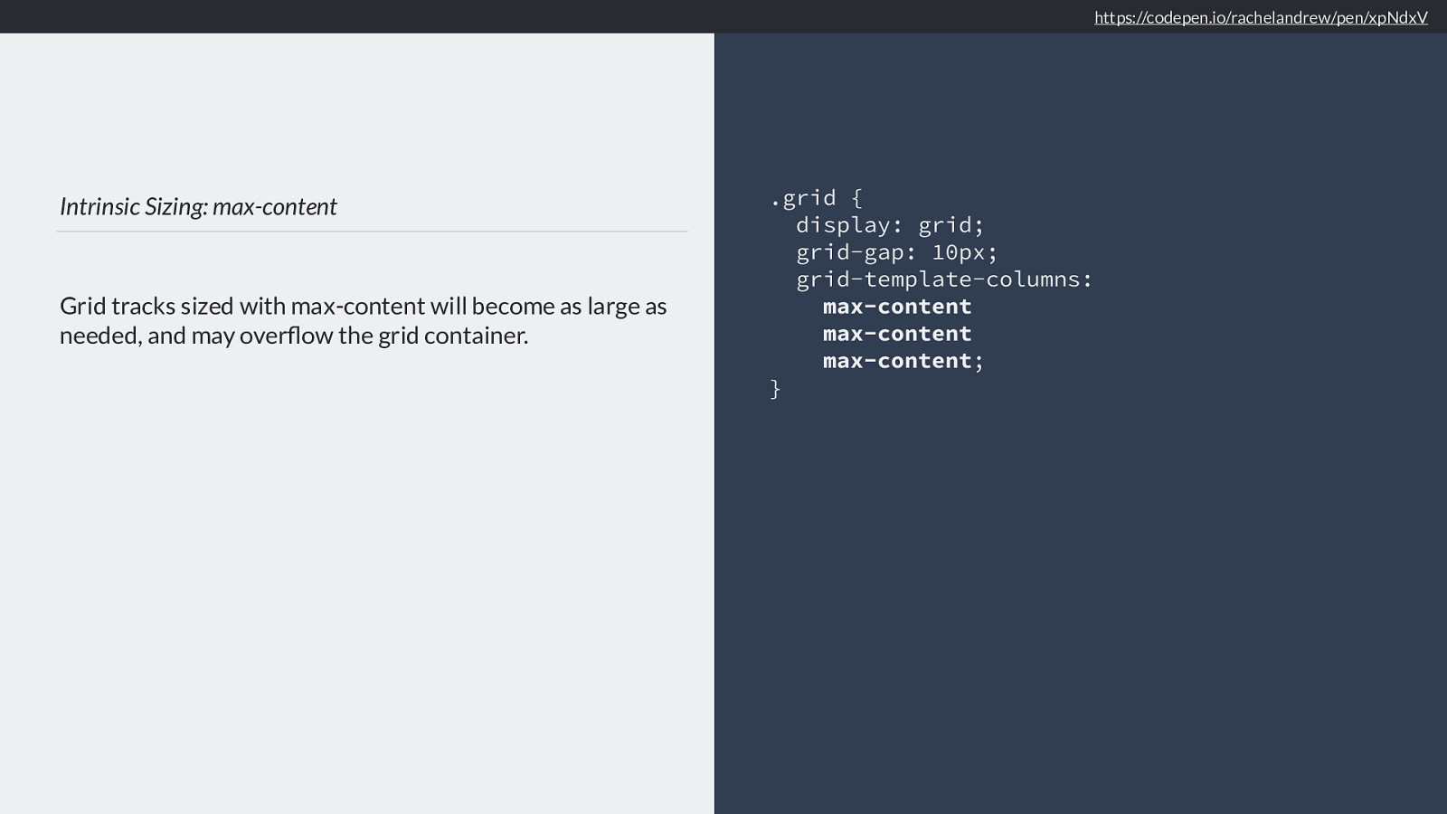
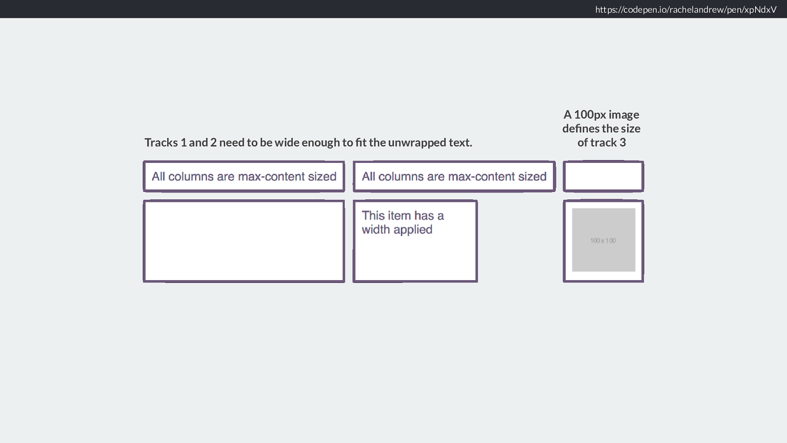
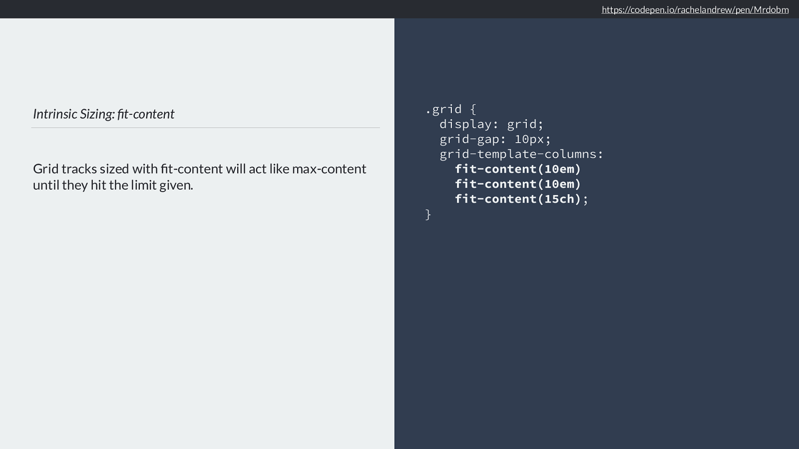
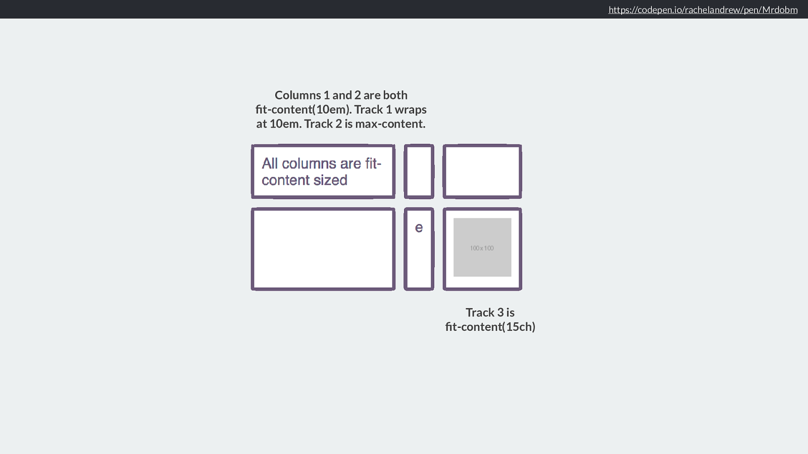
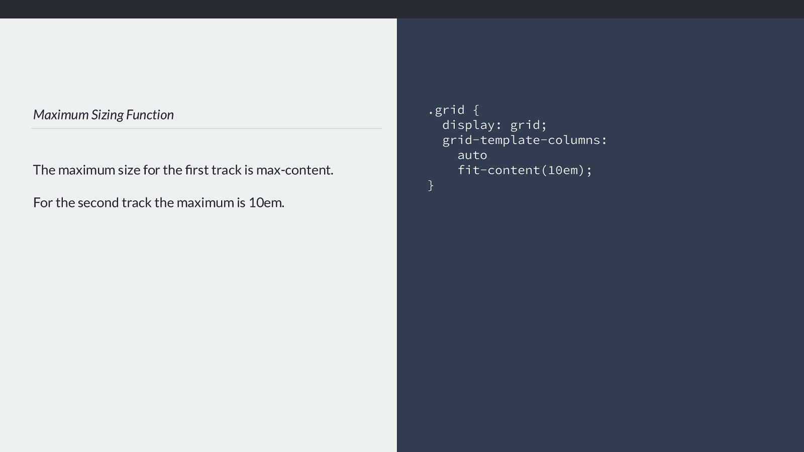
Next we have intrinsic sizing, you might be most familiar with auto, but we also have the specific intrinsic sizing keywords of min-content, max-content and fit-content.

Slide 12

Slide 12

Intrinsic Sizing auto Default size of grid tracks. Tracks sized auto

will stretch to take up space in the grid container. Auto when used for track sizing, can be generally thought of as being “big enough to fit the content”, we’ll look at what auto really means in a little more depth. However if you have ever created a grid with auto sized rows you will know that those rows expand to take the content you place into them, and do not cause overflows.

Something useful to know about auto and track sizing is that if you use auto for track sizing this will stretch by default, unlike the other sizing functions. Where you will tend to notice this is with column tracks.

Slide 13

Slide 13

https://codepen.io/rachelandrew/pen/ppYPZR

justify-content: start justify-content: stretch Therefore if this example I have used auto for the final column track. It is stretching to take up the remaining space in the inline direction, however the actual size created by the auto track, is what you see if you add justify-content: start to override that stretching behaviour.

This can make auto seem a bit mysterious in grid as it stretches by default.

Slide 14

Slide 14

Intrinsic Sizing: auto The auto-sized track will stretch in the inline direction.
Use justify-content: start to override the stretching behaviour. .grid { display: grid; grid-gap: 10px; grid-template-columns:
min-content
max-content
fit-content(10ch)

auto ; justify-content: start; } https://codepen.io/rachelandrew/pen/ppYPZR

So remember that the default for justify-content is stretch, and auto tracks will stretch. Don’t want that behaviour? Set justify-content start on the container or target the individual item with justify-item start.

We then have some new sizing keywords, these aren’t only for grid you can use them for sizing elsewhere. These keywords also form important concepts that we need to understand to understand how sizing is worked out.

Slide 15

Slide 15

Intrinsic Sizing min-content The smallest size the item can be, taking advantage of all soft-wrapping opportunities. You can use the keyword min-content for track sizing. This will make the track as small as it can be without the content breaking out of the track. In the case of a track containing text, the text will take all soft-wrapping opportunities, essentially becoming as wide as the longest word.

Slide 16

Slide 16

Intrinsic Sizing: min-content Grid tracks sized with min-content will become as small as they can without causing overflows. .grid { display: grid; grid-gap: 10px; grid-template-columns:

min-content min-content min-content ; } https://codepen.io/rachelandrew/pen/VyOpXj

In this example I have created three column tracks, all sized using min-content. Therefore the track content now impacts the track sizing, rather than us deciding how big the track will be, and then the content being forced into it.

Slide 17

Slide 17

https://codepen.io/rachelandrew/pen/VyOpXj

The word ‘columns’ is defining the size of track 1. This item has a width which defines the size of track 2 A 100px image defines the size of track 3 If any item in that track has a width of some sort, or contains something with a fixed width, then the size will be dictated by that width.

Slide 18

Slide 18

Intrinsic Sizing max-content The largest size the track can be, no soft- wrapping will occur. Overflows may happen. Using max-content for track sizing means that the track will get as big as it possibly can, based on the content or any width applied to items etc. The content will no longer wrap so you may get overflows if this causes the track to get larger than the space in the grid container.

Slide 19

Slide 19

Intrinsic Sizing: max-content Grid tracks sized with max-content will become as large as needed, and may overflow the grid container. .grid { display: grid; grid-gap: 10px; grid-template-columns:

max-content max-content max-content ; } https://codepen.io/rachelandrew/pen/xpNdxV

So here we have three tracks all sized with max-content, once again the browser needs to look at the content to determine the track sizes.

Slide 20

Slide 20

https://codepen.io/rachelandrew/pen/xpNdxV Tracks 1 and 2 need to be wide enough to fit the unwrapped text. A 100px image defines the size of track 3 You can see how the first and second tracks stretch out to the maximum size of content in that track. The second column track has an item with a width in it. The width of that item is constrained but the track it is in stretches wide enough for the longer content above to be at max-content.

Slide 21

Slide 21

Intrinsic Sizing fit-content Act like max-content until it reaches the passed in value. Then we have fit-content. This keywords acts like max-content, but you pass in a value. Once the track grows to that value it is clamped and won’t get larger than that.

Slide 22

Slide 22

Intrinsic Sizing: fit-content Grid tracks sized with fit-content will act like max-content until they hit the limit given. .grid { display: grid; grid-gap: 10px; grid-template-columns:

fit-content(10em) fit-content(10em) fit-content(15ch) ; } https://codepen.io/rachelandrew/pen/Mrdobm

So I have 3 tracks here, the first two clamped at 10em that last one at 15ch - fifteen characters.

Slide 23

Slide 23

https://codepen.io/rachelandrew/pen/Mrdobm

Track 3 is 
 fit-content(15ch) Columns 1 and 2 are both 
 fit-content(10em). Track 1 wraps at 10em. Track 2 is max-content. Remember these concepts, as we’ll be seeing how they apply generally in a bit.

Slide 24

Slide 24

Flexible lengths Sizing with fr units The fr unit describes a flexible length Before that let’s look at the fr unit, which is a unit designed for grid layout.

Slide 25

Slide 25

Flexible lengths The fr unit is a <flex> unit and represents a portion of the available space in the Grid Container. .grid { display: grid; grid-gap: 10px; grid-template-columns: 2fr 1fr 1fr; } https://codepen.io/rachelandrew/pen/QaXvPe

It is a flex unit, defining a flexible length. A portion of the space in the grid container. If I define three tracks one of 2fr and 2 of 1fr. The available spaces divided into 4 and shared out, two parts to track 1, 1 part each to track 2 and 3.

Slide 26

Slide 26

https://codepen.io/rachelandrew/pen/QaXvPe

2fr 1fr 1fr Like this. Now this does lead people to believe that the fr unit shares out all of the space evenly, 12 tracks of 1 fr should be 12 equal tracks, not quite as we will see as we dig deeper.

Slide 27

Slide 27

Minimum & Maximum sizing functions So now we know the di ff erent ways we can size tracks, we can figure out the minimum and maximum sizing functions for each track.

Slide 28

Slide 28

minmax() The minmax() function is part of the grid layout specification, and gives us an easy way to start thinking about minimum and maximum sizing.

Slide 29

Slide 29

Minimum Sizing Function The minimum size for these two tracks is 100px, and 10em. .grid { 
 display: grid; grid-template-columns:
minmax(100px, auto) minmax(10em, 20em); } If you use minmax() for your track, then the minimum size of that track is the value used for the first value passed to minmax(). It won’t get smaller than that.

In this case 100px, or 10em.

Slide 30

Slide 30

Minimum Sizing Function The minimum size of these two tracks is auto. .grid { 
 display: grid; grid-template-columns:
10fr fit-content(10em); } If you use fr units or fit-content, then the minimum size of that track is auto.

Slide 31

Slide 31

Minimum Sizing Function The minimum size of the first track is 100px, the second track is 50px (10% of 500). .grid { width: 500px; 
 display: grid; grid-template-columns:
100px 10%; } Otherwise you used a length or a percentage, in which case the minimum sizing function is that length, or the percentage resolved to a length.

Slide 32

Slide 32

Maximum Sizing Function The maximum size for these two tracks is 400px, and 20em. .grid { 
 display: grid; grid-template-columns:
minmax(100px, 400px) minmax(10em, 20em); } If you use minmax() for your track, then the maximum size of that track is the value used for the second value passed to minmax(). It won’t get larger than that.

Slide 33

Slide 33

Maximum Sizing Function The maximum size for the first track is max-content. For the second track the maximum is 10em. .grid { 
 display: grid; grid-template-columns:
auto fit-content(10em); } If you used auto or fit-content then this should be treated as max-content, unless you have passed a value to fit-content in which case that becomes the max.

We now know what the minimum and maximum size of our tracks should be, and can work out how big our tracks are and ultimately how big our grid is.

Slide 34

Slide 34

https://codepen.io/rachelandrew/pen/aEgwKY

200px 200px 200px 200px 200px 620px 410px The simplest case will be if we have a fixed size for our tracks. The minimum and maximum sizing functions are the same as a length, or as a percentage which can be resolved to a length.

So in this example everything is a fixed size, nothing is intrinsically sized, or using an fr unit. We have tracks that are 200 pixels wide, 20 pixels tall and there is a gap of 10 pixels between each track.

So here is where pretty much all of our existing float based grid systems stop - everything in those systems is a fixed length, or a percentage.

Slide 35

Slide 35

https://codepen.io/rachelandrew/pen/goNRVp 200px 200px 200px 620px Auto sized row expands to make room for content However in most cases we will want to take advantage of the ability of grid to create flexible grids, or to use intrinsic sizing of some sort. At the very least we usually want to allows rows to grow to contain the content in them. We might used a fixed sized grid for our columns, but the simplest uses of grid tend to leave the rows to auto. Therefore the browser needs to work out how much space the row needs to fit the tallest item in the row.

Slide 36

Slide 36

https://codepen.io/rachelandrew/pen/BJgdKL Auto sized row expands to make room for content 1fr 1fr 1fr More likely I am going to want to use a flex sizing function, the fr unit to size my tracks, and allow the content to define the row height. This gets a bit more interesting in terms of working out the size of the rows.

Because after working out how much content there is and expanding the rows this may well have a knock on e ff ect in terms of the size of 1fr.

Slide 37

Slide 37

What is a fr unit anyway? A track sized with 1fr, is actually sized minmax(auto, 1fr). The minimum size is auto. .grid { 
 display: grid; grid-template-columns: 1fr 1fr 1fr; } I mentioned earlier that having a set of 1fr tracks doesn’t quite mean they will be equal sized.

If the track is sized with fr units then it is as if we have used the following sizing function minmax(auto, 1fr). So the minimum size is auto.

Grid needs to give the tracks an auto minimum and then share out the remaining space in proportion. This means that in this example, we have three 1fr tracks, however they are not equal with, if I add a very long word, or something with a width defined to the first track the auto minimum is much larger for that track and we no longer have three equal width columns.

Slide 38

Slide 38

https://codepen.io/rachelandrew/pen/BJgdKL 1fr 1fr 1fr Like this.

Slide 39

Slide 39

What is a fr unit anyway? Make the minimum size 0, to force three equal width columns - even if that means overflows. .grid { 
 display: grid; grid-template-columns: 
 minmax(0,1fr) minmax(0,1fr) minmax(0,1fr); } Which leads us to a useful bit of knowledge. If you do want three equal tracks using fr units, then you need to make the minimum sizing function zero, by explicitly using minmax(0,1fr)

Slide 40

Slide 40

minmax(0,1fr) minmax(0,1fr) minmax(0,1fr) This then might cause overflows. Which is why the default is auto, as if there is space, we’re assuming you would rather the bigger thing got some space rather than overflowed.

However that can seem a little unintuitive if you were expecting 3 tracks of 1fr to be three equal sized tracks. It often turns out that way, but it isn’t quite what is happening.

So this seems like quite a lot of work if you think about it. The browser is having to work out what size it thinks the fr is, then look at the track and figure out what the minimum size of the content, then re-do the algorithm if that size has changed to make sure we are distributing space accordingly.

And that’s not all. Grid items don’t just span one track.

Slide 41

Slide 41

1fr 1fr 1fr Often a grid area spans several tracks, and therefore the content that can change the track sizing is spread over multiple tracks.

I’ve gone back to 1fr tracks here, which when our item containing the long word was placed into it make the first column track much wider. When we allow it to span two tracks, then the space it needs is over two tracks not one and so it can fit into 2 tracks, so the first track does not need to grow larger.

Slide 42

Slide 42

As many flexible columns as will fit Use auto-fill or auto-fit along with repeat and minmax, to create as many flexible columns with a minimum size as will fit into the container. .grid { display: grid; grid-gap: 10px; grid-template-columns:
repeat(auto-fill, minmax(200px, 1fr)); grid-auto-rows: 100px;
} https://codepen.io/rachelandrew/pen/WdVjdg

Then we have everyone’s favourite trick. The ability to add as many columns as will fit into the grid container by using repeat notation and the auto-fill and auto-fit keywords.

What is happening here might make more sense now we have looked at sizing. We are asking grid layout to auto fill as many column tracks as will fit in the container. We are handing out a minimum size of 200 pixels, so the columns won’t collapse smaller than that, and a maximum of 1fr. So 1fr of the available space.

Slide 43

Slide 43

https://codepen.io/rachelandrew/pen/WdVjdg

And so we can get nice arrangements of boxes,

Slide 44

Slide 44

https://codepen.io/rachelandrew/pen/WdVjdg Which will be responsive. And you can see we have these gaps in the arrangement.

Slide 45

Slide 45

Dense Packing Mode Using the value dense for grid-auto-flow will cause items to be displayed out of document order. .grid { display: grid; grid-gap: 10px; grid-template-columns:
repeat(auto-fill, minmax(200px, 1fr)); grid-auto-rows: 100px;
grid-auto-flow: dense; } https://codepen.io/rachelandrew/pen/ZvgKNY

So we can then set auto-flow to dense

Slide 46

Slide 46

https://codepen.io/rachelandrew/pen/ZvgKNY

So we are able to create a grid with a flexible number of flexible columns, and pack it densely, and the browser just does this for us. With a few lines of CSS. It’s magic.

Or you can create your tracks using min and max content, place your grid items and grid will use the size of those items to inform the overall layout proportions. I don’t think people have really dug into the creative possibilities of this yet.

But is it performant magic? Does all this come at a cost?

Slide 47

Slide 47

This must be pretty slow, right ? And this is something I get asked a lot, I can understand why people think it might be slow, especially if you have ever tried to do this stu ff with JavaScript, and to be honest I didn’t really know.

I remembered an article by Ben Frain where he had tested Flexbox versus display: table.

Slide 48

Slide 48

https://benfrain.com/css-performance-test-flexbox-v-css-table-fight/ https://benfrain.com/css-performance-test-flexbox-v-css-table-fight/

This is the article if you want to have a look at that, but he did a nice simple comparison, simply loading up a big document and seeing which layout method won.

So I did the same.

Slide 49

Slide 49

A Flexbox Grid with Bootstrap 4 Uses flexbox for the grid, I used the default Bootstrap grid classes.

<div class="container-fluid"> <div class="row"> <div class="col-sm">One of three columns</div> <div class="col-sm">One of three columns</div> <div class="col-sm">One of three columns</div> </div> <div class="row"> <div class="col-sm">One of four columns</div> <div class="col-sm">One of four columns</div> <div class="col-sm">One of four columns</div> <div class="col-sm">One of four columns</div> </div> <div class="row"> <div class="col">1 of 3</div> <div class="col-6">2 of 3 (wider)</div> <div class="col">3 of 3</div> </div>

<!— repeat 999 times —>

</div> https://rachelandrew.github.io/into-the-weeds/bootstrap/

I made a flex layout using Bootstrap 4. That was fun.

Who doesn’t want 999 rows of Bootstrap markup.

Slide 50

Slide 50

A Float Based Grid with Column Setter Using floats with this Sass-based framework. .row::after { content: ""; display: block; clear: both; } .row > div { border: 5px solid #6c5b7b; border-radius: 5px; padding: 10px; min-height: 100px; margin-bottom: 20px; } .four-cols { width: 31.42857%; float: left; margin-right: 2.85714%; } .three-cols { width: 22.85714%; float: left; margin-right: 2.85714%; } .six-cols { width: 48.57143%; float: left; margin-right: 2.85714%; } .row > :last-child { margin-right: 0;
} https://rachelandrew.github.io/into-the-weeds/grid/

Everyone was talking about some new framework for float and flex based grid the other day, so I used it to make a float layout using column-setter. I’m not sure why we need a new framework for float based grids, but here we are. Anyway, it generates this sort of familiar looking stu ff with markup pretty much the same as for Bootstrap but losing the presentational type classes.

Slide 51

Slide 51

CSS Grid We lost the row wrappers in the HTML for the Grid version. .grid { display: grid; grid-template-columns: repeat(12, 1fr); grid-auto-rows: 100px; grid-gap: 20px; } .four-cols { grid-column: auto / span 4; } .three-cols { grid-column: auto / span 3; } .six-cols { grid-column: auto / span 6; } And a 12 column grid layout.

You immediately see that the grid layout loses all the extra markup for rows. Row wrappers which are not needed in grid, so the HTML page itself was lighter. I find I generally end up with a smaller document when using grid, I’m not nesting elements just to hang styling o ff them, or to act as clearing wrappers.

So we end up with three documents which each should visually display 999 rows.

Slide 52

Slide 52

The all looked pretty much like this.

I posted the links to Web Page Test.

Slide 53

Slide 53

And the results were pretty boring. Grid loads a bit faster, the flex layout is the slowest. But this is on a huge document. I ran this test a few times and this was pretty much the average result.

https://www.webpagetest.org/video/compare.php? tests=180204_64_9ad6ea85301db9735589131ebc76dca2,180204_FB_14f4412f14c24624022b76c376fcbfa1,180204_C5_e8759cd092718aa92686d00f4d435937

But what was interesting, was that it didn’t seem to matter too much what I did to the grid layout. Whether columns used a fixed length or flexible, whether they were auto. Whether we were doing the auto-fill as many columns as will fit thing. On this giant document grid performed pretty much the same.

Slide 54

Slide 54

https://www.webpagetest.org/video/compare.php?tests=180204_RG_7acc4364664d616cb53e11882636c2d4,180204_ZC_c639a4096c3a07e16ea21b745a55e90d, 180204_BQ_9c865e08080b96010336ee84c3ef0a2e,180204_78_c7bb8528cb4f2522af925ce8bbe4aebb

Which is useful to know, if you are heavily using grid. There aren’t certain features waiting to bite you in terms of performance as far as I can see.

I could have gone further with this testing - and if you want to the documents are in a repo in GitHub, it would be interesting to know the di ff erences when we do any kind of transform and so on. Let me know if you decide to dig into this.

I could also have left it there, grid does ok - good work browsers, but all of this made me think about another question I get asked a lot.

Slide 55

Slide 55

–everyone on the web “Where is my magic Grid Polyfill?” “is there a polyfill for Grid?”

Slide 56

Slide 56

https://www.reddit.com/r/web_design/comments/700tfh/is_there_a_working_polyfill_for_css_grid_for_ie_11/

The internet is being asked this question a lot it seems as well, as this thread on Reddit sends a huge amount of tra ffi c to my site daily. I even broke my “stay away from Reddit” rule to post something helpful there, as so many people are obviously looking for this.

You do not want a polyfill for grid layout, to polyfill all of those features I showed you, all that ability to do space distribution, to dense pack things, to equalise heights and to span rows as well as columns. If you try to do all of this, it is going to be incredibly expensive in terms of rendering.

Slide 57

Slide 57

http://brm.io/jquery-match-height-demo/ So what would happen if we try to polyfill grid features? I’m not going there, I don’t want my terrible example to get used in production. So I thought I’d look for one feature of grid as a test.

The default behaviour of grid items is to stretch to cover the grid area they are in. So we get “full height columns” with ease. I figured people would be doing this with JavaScript and I found this plugin.

None of this is a dig at the developer of this plugin, I found a load of these all over the web, tried a few and they all behaved in pretty much the same way.

Slide 58

Slide 58

I took the floated layout example, and added some content, so we ended up with unequal boxes.

Then I added the plugin, and reloaded. [CLICK] this is a video…

Oh dear. About 11 seconds to load.

And this is just for equal height columns, and of course a slightly unfair test as you probably aren’t creating vast documents.

Slide 59

Slide 59

As a fairer comparison I made a much smaller document, a more realistic one, and also created the same layout with the same content heights with grid.

https://www.webpagetest.org/video/compare.php?tests=180204_QE_1e4dfd66995dcd65bb44eb158853057a,180204_CT_dda37c4163acbb82a5212975925b2acc

These documents have 39 rows each. They both get on screen at pretty much the same time, but then we have a long wait before the equal heights kicks in and finished loading.

Add to this all of the other things that grid can do and you are going to make a nasty janky mess if you try and polyfill that.

Slide 60

Slide 60

Sorry. And that demo was obviously extreme to make a point. In most cases we’re not loading vast data structures and doing something as expensive with JavaScript, but sometimes in our attempts to get things looking the same, looking right for everyone we can start to do really suboptimal things.

Slide 61

Slide 61

We develop in an environment far more powerful than that of our users. These suboptimal things are worse, when they are happening in an environment that isn’t the main one that we use. What I mean is that, you build a site. You test the site in your target browsers. It seems ok. However it is likely that most of the time when you work on that site you are looking at it on a well powered computer or device over a fast connection.

You don’t see the polyfilled version day to day.

Slide 62

Slide 62

Testing often does not reflect realistic day to day use, or realistic data. Your testing doesn’t necessarily reflect day to day use of the site.

Your testing may well happen before huge amounts of data are loaded into the site.

It is quite easy for us to believe we have tested the experience for people using older, or lower powered devices, yet we’ve done that at a point in time where the amount of content in the site wasn’t realistic.

Slide 63

Slide 63

You are Barking up the wrong tree with this question. “Where is my magic Grid Polyfill?” Please stop asking this question.

This is a terrible question.

Slide 64

Slide 64

https://caniuse.com/#search=grid

Because the thing is, that increasingly, the browsers without Grid are browsers not running on our fancy high powered devices. But those running on devices which are lower powered, older computers, older mobile devices, mobile devices that are more limited and popular in countries such as India, where UC Browser has over 30 % of market share.

Why would you force a bunch of JavaScript onto a low powered device?

Slide 65

Slide 65

https://caniuse.com/#search=grid

You might not have heard of Uc Browser, but here it is currently with no grid support with a chunk of market share, do you worry about IE11, is your product or service of interest to people in India? Should you be putting more time into UC Browser instead?

As it turns out though, it’s not so hard to support these browsers.

Slide 66

Slide 66

New CSS can help you create better experiences

in browsers that don’t support new CSS. By being amazingly lightweight in terms of required CSS, in addition to not requiring wrapper elements around each row, grid can enable you to make a better experience for people who don’t even support grid.

Slide 67

Slide 67

A 12 column layout .grid { display: grid; grid-template-columns: repeat(12, 1fr); grid-auto-rows: 100px; grid-gap: 20px; } .four-cols { grid-column: auto / span 4; } .three-cols { grid-column: auto / span 3; } .six-cols { grid-column: auto / span 6; } The grid layout that allows a 12 column, flexible layout with all boxes in a row as tall as each other is four lines of code, plus a line of code for each unique positioned item. You can a ff ord for those few lines of code to be downloaded by a browser that won’t parse them due to not supporting grid.

Slide 68

Slide 68

New CSS knows about old CSS And we don’t need to leave older browsers with no layout you can create fallbacks just using CSS for those older browsers.

Because new CSS knows about old CSS.

This lets you build a simpler, yet still usable layout for your old browsers, and your non-supporting browsers.

Slide 69

Slide 69

❖ Media Queries : 
 tailor your design according to features of the device

❖ Feature Queries : 
 tailor your design to the support in the browser Just as you build a layout tailored to small screen devices by using media queries, you can build a layout tailored to your non-grid supporting browsers using Feature Queries.

It’s the same thing. We’re providing good experiences to users no matter whether they are accessing content on a low-powered phone, an iPhone 10, a small laptop, or a top of the line Mac or Windows machine.

See these things as the same, what features does this device have, what features doe this browser have?

Slide 70

Slide 70

https://codepen.io/rachelandrew/pen/aqbdOy

By considering what happens if our user has almost nothing, we structure our content well. If that content then just loads in block layout, one thing after another. That will actually be pretty good for most small screen devices anyway, certainly better than a horrible janky experience of trying to create something else using JavaScript.

Slide 71

Slide 71

Adding a vertical centre line either side of the text Using generated content to add a border. header h1 { text-align: center; display: grid; grid-template-columns: 1fr auto 1fr; grid-gap: 20px; } header h1:before, header h1:after { content: ""; align-self: center; border-top: 1px solid rgba(37,46,63,.5); } https://codepen.io/rachelandrew/pen/aqbdOy

Perhaps that small device does have CSS Grid, I’m going to add a little header detail with one of my favourite tricks.

Slide 72

Slide 72

https://codepen.io/rachelandrew/pen/aqbdOy

So this looks nice in a grid supporting browser.

Slide 73

Slide 73

Feature Queries Test for a CSS feature, and apply the CSS if it exists in that browser. header h1 { text-align: center; display: grid; grid-template-columns: 1fr auto 1fr; grid-gap: 20px; } @supports (display: grid) { header h1:before, header h1:after { content: ""; align-self: center; border-top: 1px solid rgba(37,46,63,.5); } } https://codepen.io/rachelandrew/pen/aqbdOy

I’ve not had an issue with the generated content appearing in a non-grid supporting browser, as we’re using a border top on some content that has no width, it’s the fr units that cause it to stretch in the inline direction once we are in a grid layout. However, if you were adding something that would display - for example using generated content to insert an icon, or an emoji or something, you could wrap the generated content bit in a feature query.

So I’m checking with the browser if it supports the display property with a value of grid. That way we only generate the borders if we have grid layout to position them.

We don’t need to worry about browsers that don’t support grid reading the grid CSS, they just ignore it. You could wrap the whole lot in a feature query if you wanted - but there is no need to.

Slide 74

Slide 74

https://codepen.io/rachelandrew/pen/aqbdOy No Grid Grid So we have mobile with no grid, mobile with grid

And this image here

Slide 75

Slide 75

Creating circles from squares Use border-radius Don’t forget that old CSS still exists! header img { border-radius: 50%; margin: 0 auto 2em auto; } https://codepen.io/rachelandrew/pen/aqbdOy Nothing fancy, it’s a square image I turned into a circle using border-radius, that’s really well supported/

Slide 76

Slide 76

CSS Shapes Floating the image and curving the text round once the screen is wide enough to do so. header img { border-radius: 50%; margin: 0 auto 2em auto; } @media (min-width: 30em) { header img { float: left;

shape-outside: margin-box;

margin: 0 20px 0 0; 

} } https://codepen.io/rachelandrew/pen/aqbdOy As we get a bit wider, I’d like to do something neat with it. I’ll float it left and cause the text to curve round it by using shape-outside margin-box.

Slide 77

Slide 77

https://codepen.io/rachelandrew/pen/aqbdOy Like this. And it doesn’t matter about browsers that don’t support CSS Shapes because they just ignore it, and

Slide 78

Slide 78

https://codepen.io/rachelandrew/pen/aqbdOy because it is applied to a float, we get squared o ff text rather than the curved text.

THis is Firefox, who currently don’t support shapes, but will do later this year as I understand it. So once that feature ships in Firefox, those users will get the nice curve.

Slide 79

Slide 79

https://codepen.io/rachelandrew/pen/aqbdOy We start to get wider.

I then have this section, which is a chunky block of text.

which I’d like to break into two columns. As the co-editor of the multiple column layout spec I have to put a little bit of multi col somewhere, and the nice thing with multicol is it’s really well supported.

Slide 80

Slide 80

Multi-column layout Well supported, responsive by default.

section { column-width: 15em; } https://codepen.io/rachelandrew/pen/aqbdOy Let’s do column-width 15em, so we’ll only get two columns when the available space is wide enough to support them.

The problem with multicol is if someone is on a very short screen, a phone in landscape mode perhaps they might end up scrolling up and down to read. So let’s use a vertical media query checking for height.

Slide 81

Slide 81

Vertical Media Queries Do we have enough height to show the columns without vertical scrolling? @media (min-height: 500px) { section { column-width: 15em; } } https://codepen.io/rachelandrew/pen/aqbdOy Then we only get the columns if we have enough height. These vertical media queries can be really useful, we tend to always think about screen width - sometimes height is the important metric.

Slide 82

Slide 82

https://codepen.io/rachelandrew/pen/aqbdOy We get this, the columns only kick in once there is enough room for 2 15 em columns so we don’t need a width media query, and the height media query stops them showing on short screens. [click]

To finish o ff my article component I want to do something with the cards at the bottom of the layout now we have some room for them to display more than 1 in a row.

and finally I want to arrange those boxes into a grid, which lines up with my columns and where I can cause the cards which have an image to span two rows of the grid.

Slide 83

Slide 83

Creating columns of cards Matching the minimum grid width, and the gap to the multi- column width and column-gap. .resources { max-width: 60em; } .resources { margin: 1em auto; padding: 0; list-style: none; display: grid; grid-template-columns:
repeat(auto-fill, minmax(15em,1fr)); grid-gap: 1em;

} .resources li.image { grid-row: auto / span 2; } https://codepen.io/rachelandrew/pen/aqbdOy I’m setting resources to max-width 60 em and then using the grid auto-fill functionality to fill that container with columns which are a minimum of 15em. This means we only get more than one column over 15em, enough room for 2 15em columns plus the gutter we get two, and we max out with three.

If we have two columns they line up with the multicol element due to grid-gap being 1em which is the default column gap for multicol.

Slide 84

Slide 84

https://codepen.io/rachelandrew/pen/aqbdOy Of course this will only work for people with grid. So we need to make a decision about non-grid browsers. You could of course leave it alone. Or we can choose some other method. Let’s try display inline-block.

Slide 85

Slide 85

Using in-line: block as a fallback We only need to over-ride the width and margin in a Feature Query. @media (min-width: 40em) { .resources li { display: inline-block; width: 47%; margin: 0 1% 1em 1%; vertical-align: top; }

} @supports (display: grid) { .resources li { width: auto; margin: 0; } } https://codepen.io/rachelandrew/pen/aqbdOy

Slide 86

Slide 86

https://codepen.io/rachelandrew/pen/aqbdOy And we get this,

Using inline -block means that our cards still run left to right. An alternative if it is ok for the cards to display down the columns rather than along the rows would be to use multicol here just like we do in the first section.

Slide 87

Slide 87

Using multi-column layout as a fallback We don’t need to override the column-* properties. They are ignored once we are in grid layout. @media (min-width: 40em) { .resources { column-width: 15em; } .resources li { break-inside: avoid; }
} Here is a multi example

Slide 88

Slide 88

So this is another option.

The reason I’m showing this today though isn’t so much to show you how to do fallbacks with grid layout, though there are a few tips in there you might find handy. It’s because I need you to realise how little you need do achieve a good experience for all your users.

As you develop your site, think of this stu ff component by component. It’s a lot easier than worrying about the whole site or application at once.

Slide 89

Slide 89

We can achieve a lot with a little CSS. The key thing is that to create a component that works in all these cases, from small to large screens from browsers without grid, to those without shapes to those with everything needs trivial amounts of code. Without needing to ask those on the most limited devices to download JavaScript that also causes a janky experience.

Slide 90

Slide 90

Before worrying if a technique performs well, ask yourself if you need it at all. In the drive to try and make new techniques look the same in old browsers we can start to do things that cause a suboptimal experience for the very users we claim to be trying to help by addin gthe polyfill.

Slide 91

Slide 91

Reframe the browser support conversation. Reframe the discussions you have around browser and device support with your clients or colleagues. It should never be “how do we make this look the same in all browsers” but “how do we give a good experience in all browsers”.

Don’t worry about making their experience the same.

Make their experience good.

Slide 92

Slide 92

We have the tools to provide great experiences for everyone. We are in a better position now to provide great experiences to everyone than we ever have been. Don’t let lack of support hold you back from realising amazing designs or great experiences for the people who have support for this stu ff , but likewise don’t let all the shiny mean you forget about those who don’t yet have it.

It’s become a bit of a trite thing to say for conference stages that the web is for everyone, but I truly believe that. I’m not here to build shiny toys for rich people, and even with the way in which this medium has been used for some not great things of late, I still believe in the power of the web to change lives, allow content to be accessed and ideas shared. I know that’s something that Vitaly and everyone at Smashing care about too.

Slide 93

Slide 93

https://rachelandrew.co.uk/speaking/event/smashing-london-2018 Thank you! @rachelandrew https://rachelandrew.co.uk