WHAT I DISCOVERED ABOUT LAYOUT VIA CSS GRID @rachelandrew #cssday

A presentation at CSS Day 2017 + Browser API Special in June 2017 in Amsterdam, Netherlands by Rachel Andrew
WHAT I DISCOVERED ABOUT LAYOUT VIA CSS GRID @rachelandrew #cssday
Two years ago I stood on this very nice stage and talked to you about CSS Grid Layout. At the time it was still a specification with implementations hidden behind browser experimental flags. I promised that it was coming soon and at last, this March, it landed.
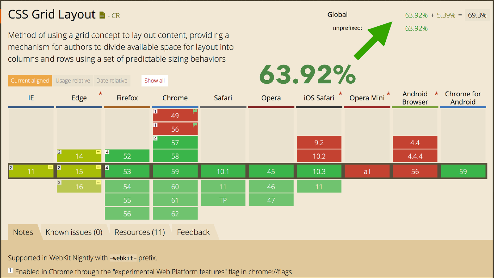
63.92% We are now 3 months on, this 63% figure is the global Can I Use figure it rises to 69% if you include the prefixed IE and current Edge version, I have a site with over 80% support. With the usual caveats that your mileage and the people visiting your site may vary however, this is pretty much unprecedented. A huge huge spec, a groundbreaking spec has shipped into browsers and gained this much adoption in three months.

It’s not CSS Vaporware!* * I’m very happy about this This is because of the huge amount of work that happened before grid appeared in browsers.
By the time grid shipped I’d been writing and speaking about it for almost 5 years, like some kind of CSS Vaporware. So I’m personally very glad it did eventually land! I’ve spent a lot of time writing about and explaining the specification in order to encourage people to play with it, and the thing is. I thought I understood CSS layout at the start of this process, and I did, as well as most people.
However, what I’ve learned over the past few years, while working with the grid spec, has surprised me in that I now know how much I didn’t know before.
The more I know about CSS, the more I realise I don’t know. So, today. I’m going to tell you about some of the interesting things I’ve learned about layout while learning grid and teaching it to other people. Some of it directly part of the grid specification and some parts of other specs, some things which go way way back but I never really knew that’s why they worked.
What I’ve discovered is that now I know how this stuff works, what used to be confusing now makes sense, and I would encourage anyone who builds websites to look a little deeper into the CSS specifications themselves. That learning will save you time in the future.
This talk is essentially a collection of interesting things I learned about layout, and CSS while spending time figuring out the grid spec. I hope you’ll find some of it interesting but that it will also inspire you to head down a few CSS rabbit holes of your own. If it does - be sure to write about it, everyone is new to this, we can teach each other how best to use it.
My sides are full of code, it’s all on CodePen so you can play with it later.
Grid is a value of display, so the first branch of our grid family tree is the display module.
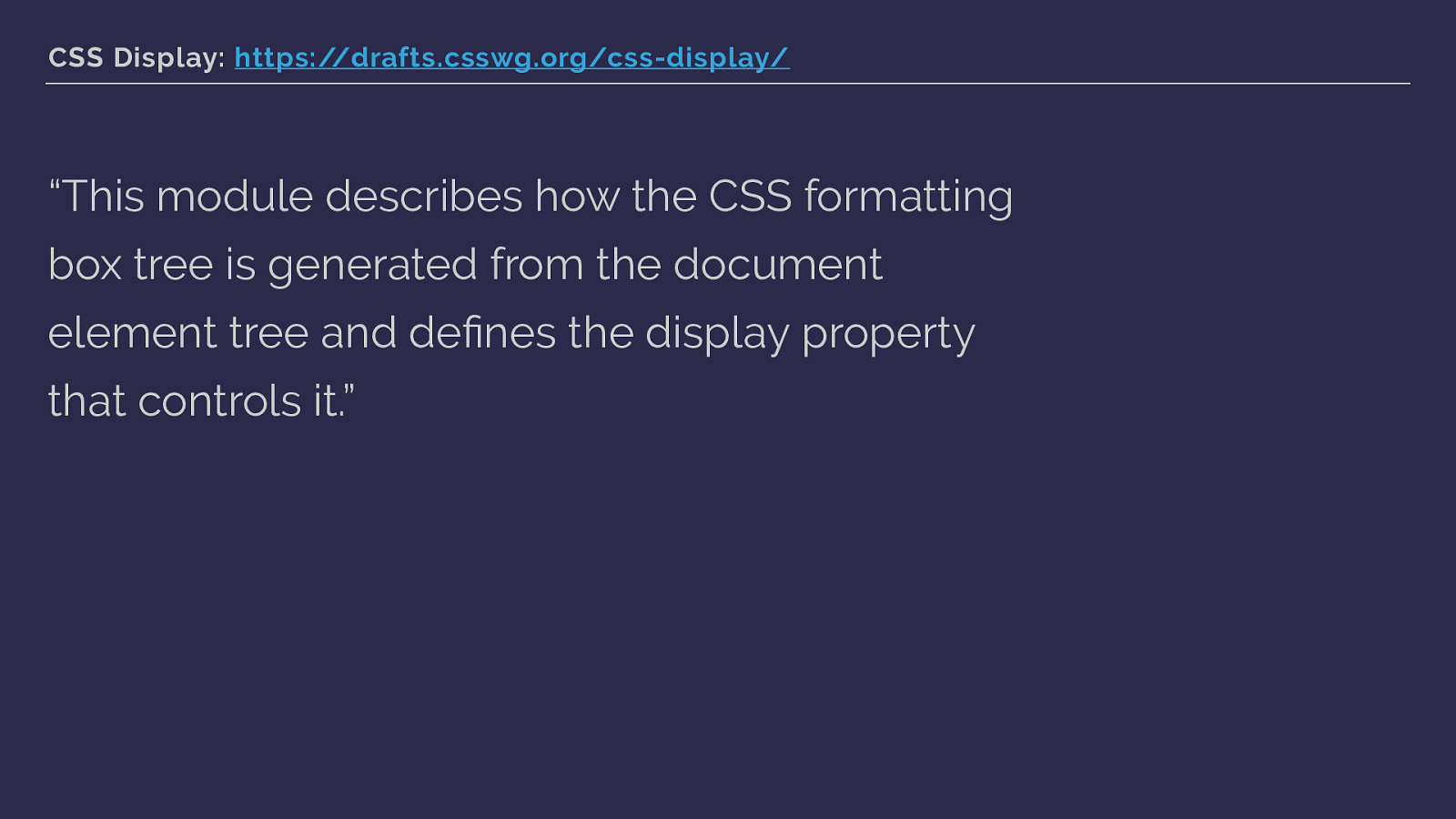
CSS Display: https://drafts.csswg.org/css-display/
“This module describes how the CSS formatting box tree is generated from the document element tree and defines the display property that controls it.” Display is the property that really defines how our web pages are laid out. How the boxes that are generated are displayed, how they behave in relationship to their parent, and how their children behave.
If you think you know display, I can assure you that there are plenty of things you can dig up that will blow your mind if you just start digging.
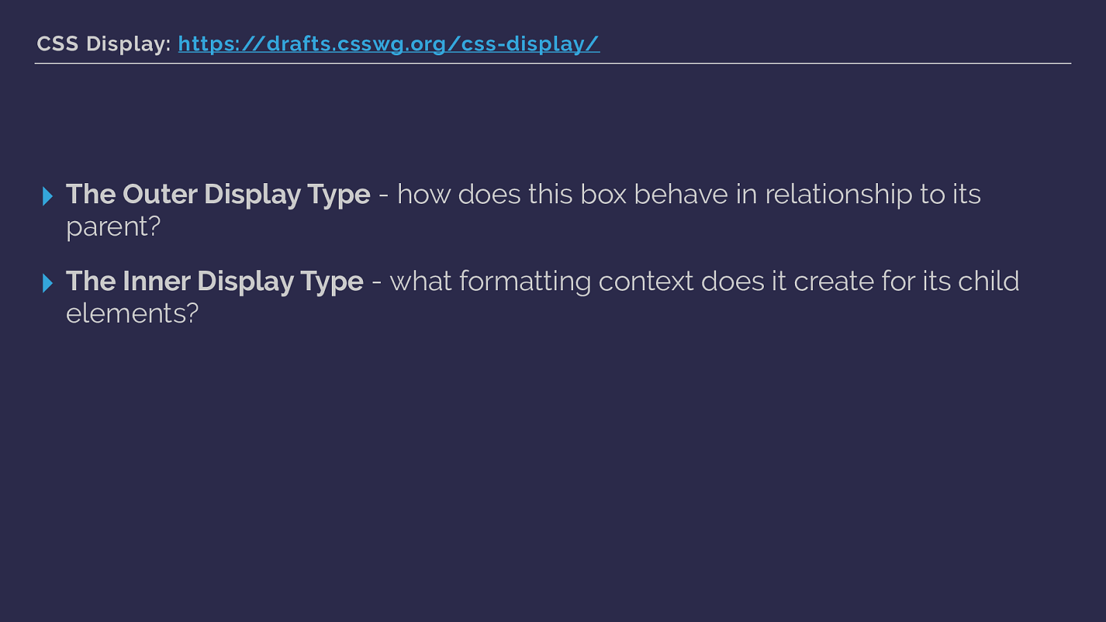
CSS Display: https://drafts.csswg.org/css-display/
▸ The Outer Display Type
It defines the outer and inner display type of boxes.
The outer display type dictates how the box behaves in relationship to its parent element. The inner display type is what dictates how child elements behave. Understanding that elements have this outer and inner display model is important as everything we control with the display property defines these things for the element.
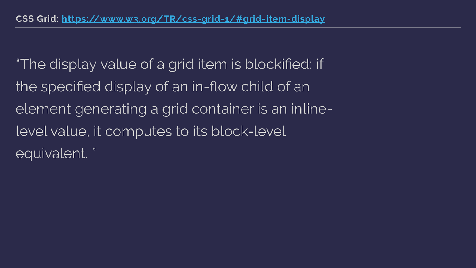
CSS Grid: https://www.w3.org/TR/css-grid-1/#grid-item-display “The display value of a grid item is blockified: if the specified display of an in-flow child of an element generating a grid container is an inline- level value, it computes to its block-level equivalent. ” Hold that information about outer and inner display types in your head as we shu ffl e back to the grid spec.
The grid spec contains some marvellous words such as blockified, what on earth does that mean? Back to display …
CSS Display: https://www.w3.org/TR/css-display/#transformations
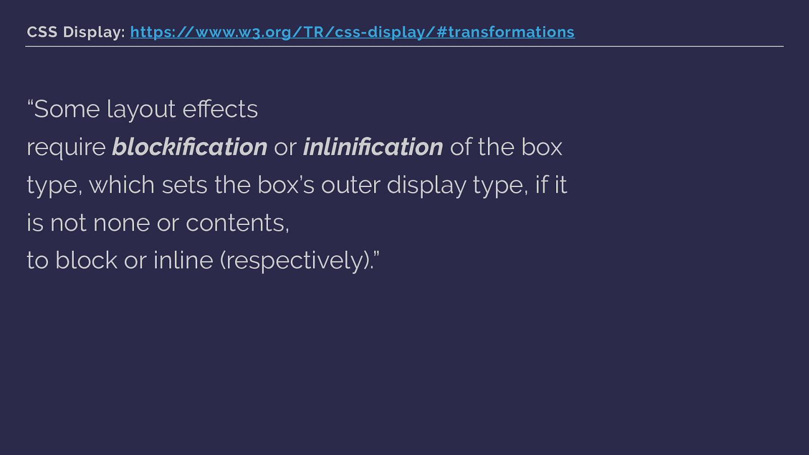
“Some layout effects require blockification or inlinification of the box type, which sets the box’s outer display type, if it is not none or contents, to block or inline (respectively).” and here we see this.
OK … let’s look at an example.
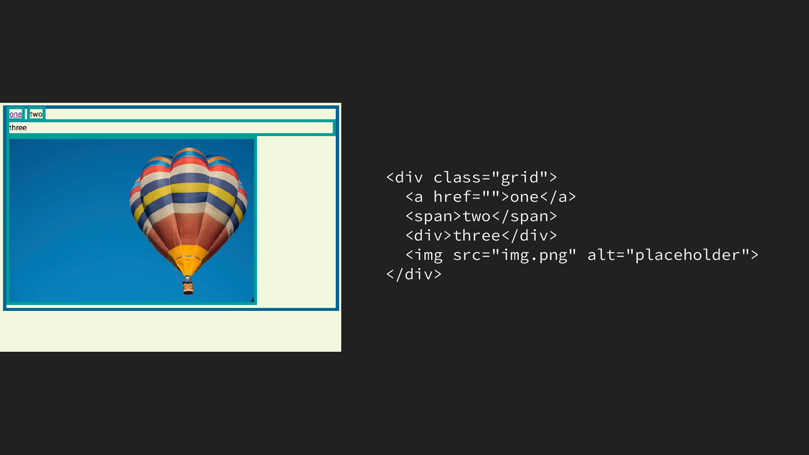
Here are some items inside a wrapper element, two inline items - a link and a span, a div which is block level and an image which is a replaced element.
You can see that our inline items are displaying inline, the block level div is taking up the full width as block level stuff does.
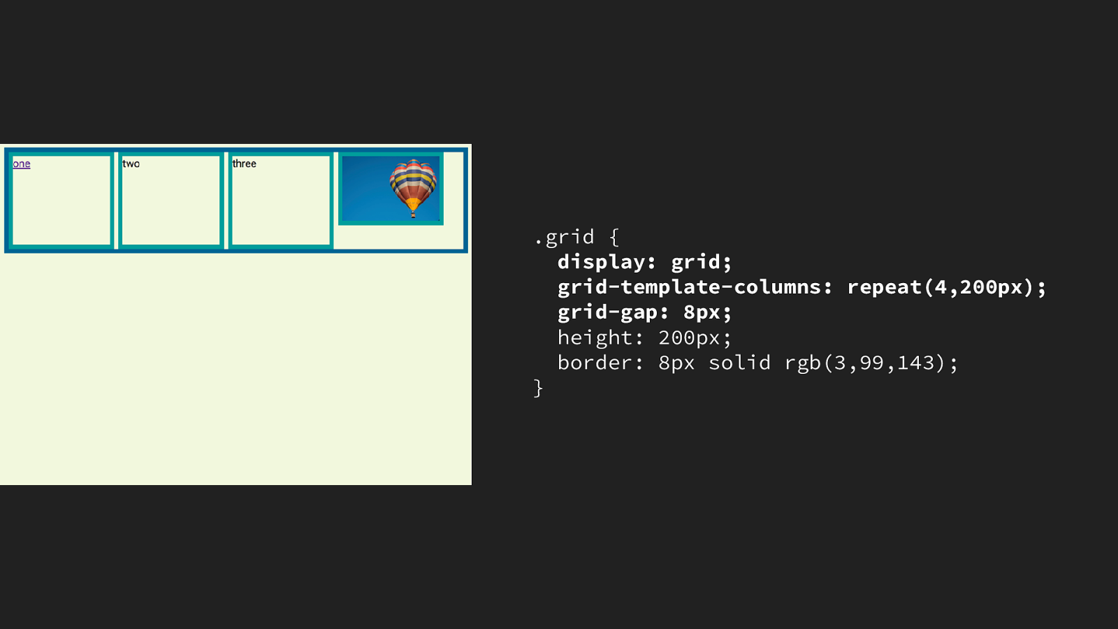
If we make the container a grid, all of the direct children become grid items. The a and span elements are blockified. They become grid items, but their inline characteristics - for example preserving white space have gone. These items are grid items however, they aren’t participating in block layout but instead grid layout.

Why is knowing this useful? So … we have these transformations happening, why do we care about this as people building websites. Is this not just some obscure thing browsers are doing.
It’s generally helpful to understand that these transformations occur, it explains why elements have certain attributes when they use one display type and others when they use a different one.
It’s specifically helpful when wanting to create fallbacks with grid and flexbox, because these transformations mean that we can override old layout methods with grid or flexbox by defining one after the other. Here is an example of that.
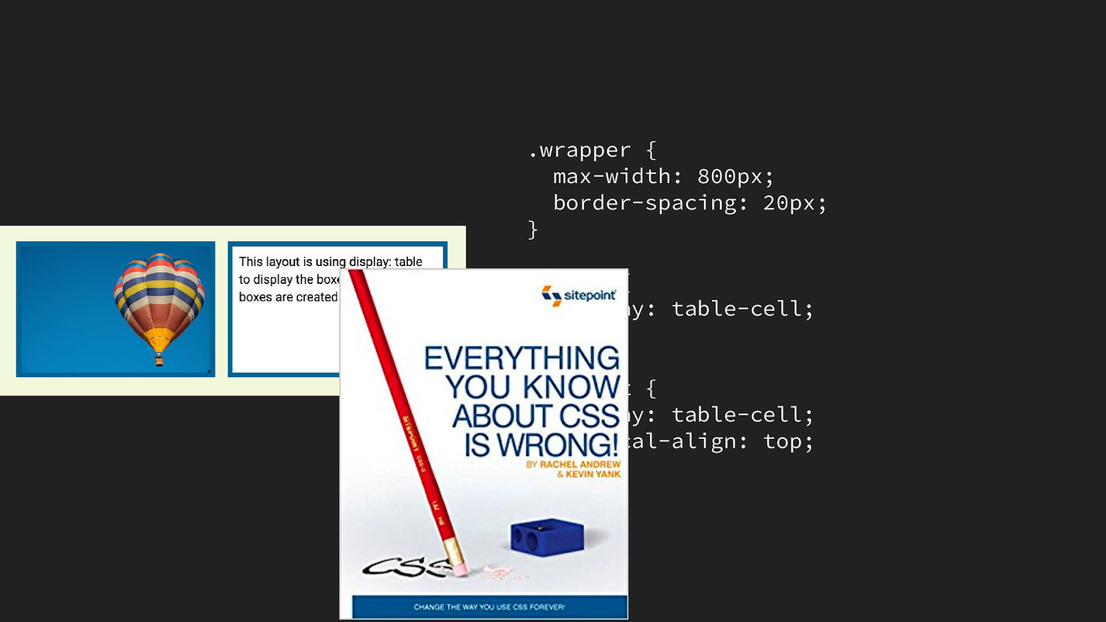
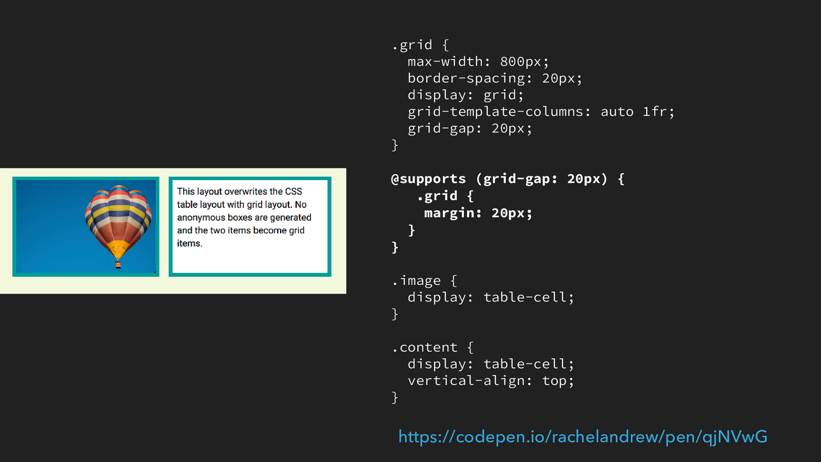
Using display: table can be a handy way to deal with older browsers that don’t have grid or flex support. By using display table we give our items relationship in the same way that items within an HTML table have relationship.
In this example I have two items, a div that contains an image and one container content. I set these items to display: table-cell, I can then use the vertical-align property to align the text content to the top of the column and the border-spacing property on the parent to space out the cells. I actually wrote a whole book about it. In 2008. That title was not my idea … anyway.
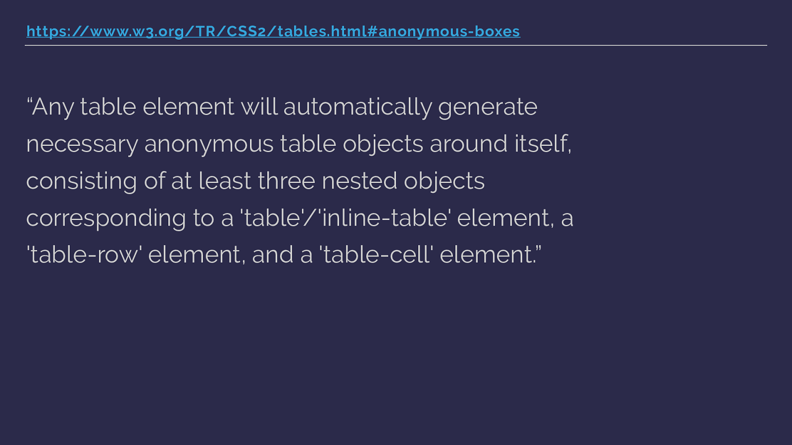
https://www.w3.org/TR/CSS2/tables.html#anonymous-boxes
“Any table element will automatically generate necessary anonymous table objects around itself, consisting of at least three nested objects corresponding to a 'table'/'inline-table' element, a 'table-row' element, and a 'table-cell' element.” This thing with declaring something as a table-cell is that you then get anonymous boxes around the element.
Anonymous boxes essentially fix up the box tree - a table cell should have a row and a parent table element, so these are created.
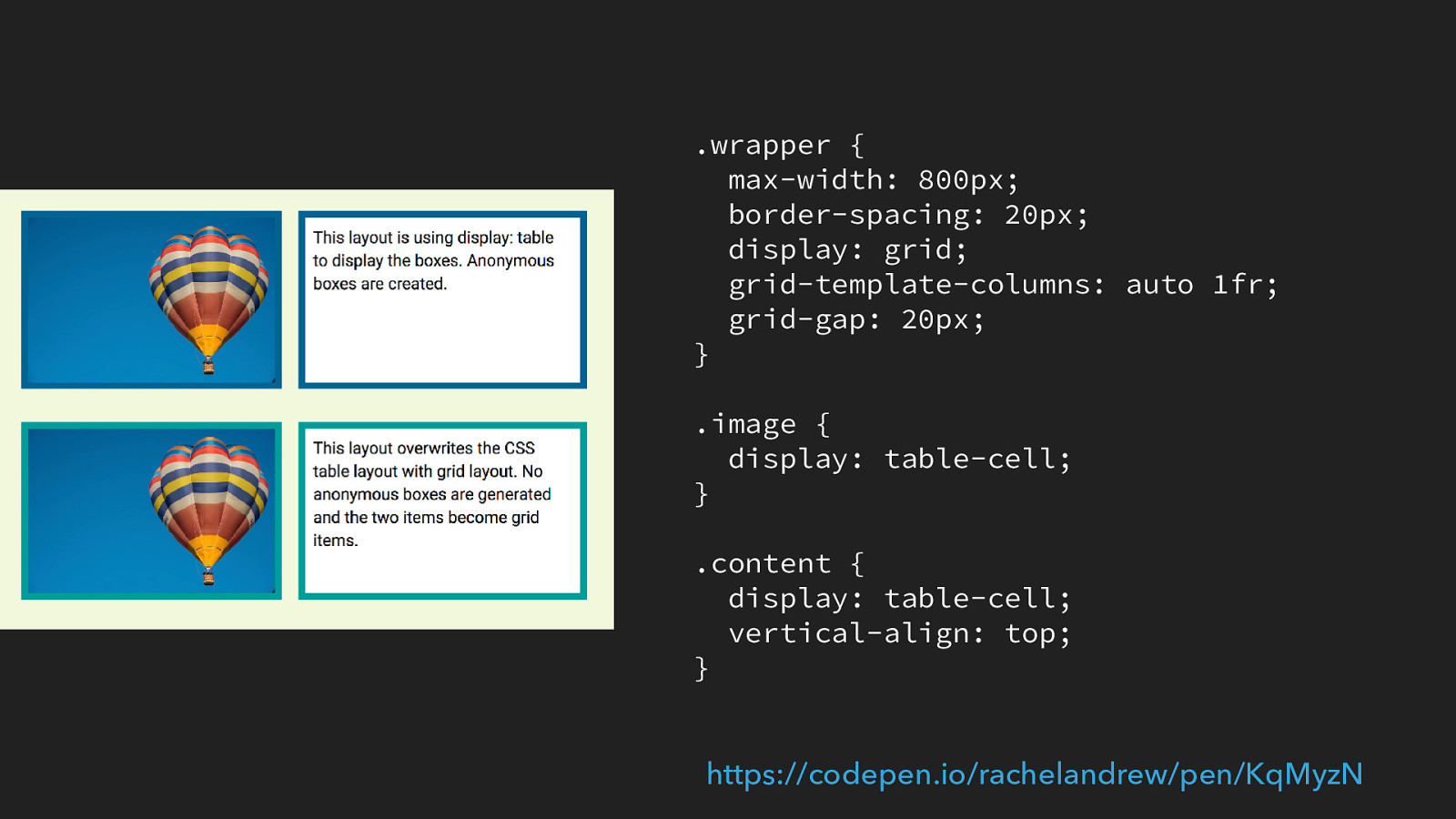
So what happens if we then turn these things into a grid item - do we end up with the anonymous boxes getting in our way?
CSS Grid: https://www.w3.org/TR/css-grid-1/#grid-item-display
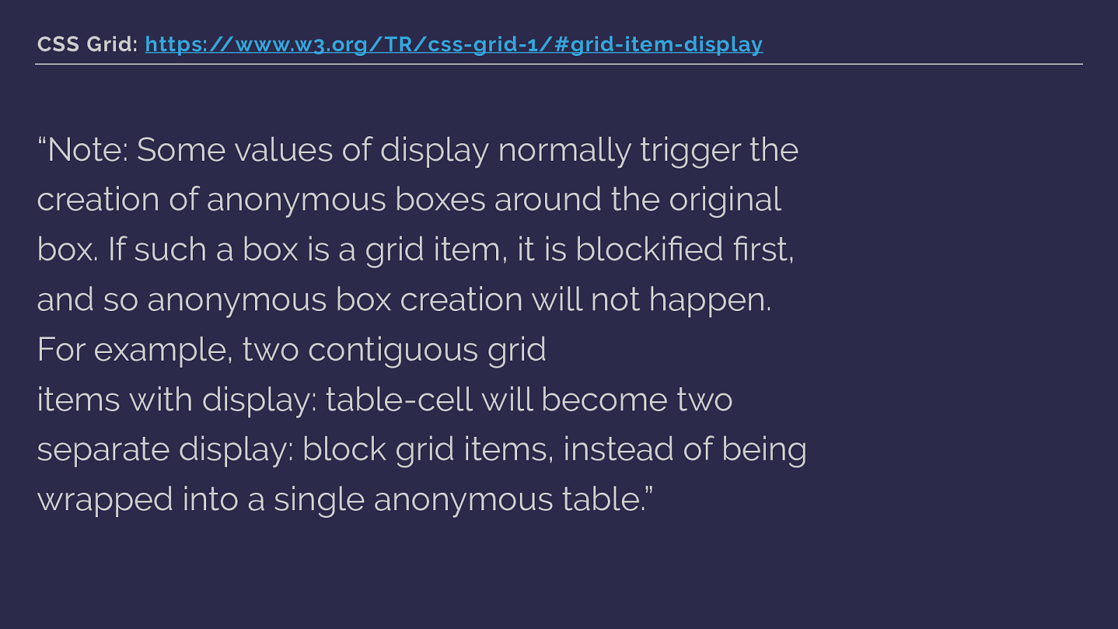
“Note: Some values of display normally trigger the creation of anonymous boxes around the original box. If such a box is a grid item, it is blockified fi rst, and so anonymous box creation will not happen. For example, two contiguous grid items with display: table-cell will become two separate display: block grid items, instead of being wrapped into a single anonymous table.” CSS Grid has you covered. The blockification happens first, so the items stop being table cells before they are transformed into grid items and the anonymous boxes won’t be generated.
https://codepen.io/rachelandrew/pen/KqMyzN
Which means we can override the CSS table display with CSS grid display and create a nice fallback for older browsers without ending up with a mess in our grid layout.
We don’t necessarily need to use feature queries to wrap all of our grid code and make two layouts. Instead we can use display: table-cell and also the vertical-align property, which we can use when we are working in table display. This gives us our full height columns for old browsers. We can then just define our grid code.
The items with a class of image and a class of content now become grid items, they are blockified and so the table value stops taking effect as does the borderspacing used to space out the cells, and also the vertical-align property as this has no effect on grid items. You can just leave them there when in a grid layout, they won’t cause you a problem.
.grid {
max-width: 800px;
border-spacing: 20px;
display: grid;
grid-template-columns: auto 1fr;
grid-gap: 20px;
}
@supports (grid-gap: 20px) {
.grid {
margin: 20px;
}
}
.image {
display: table-cell;
}
.content {
display: table-cell;
vertical-align: top;
}
https://codepen.io/rachelandrew/pen/qjNVwG
In the real-world the only stuff you might need to stick into a feature query is a margin on the parent, because borders-acing also creates space around the table.
Creating fallbacks ▸ You do not need to write two sets of code ▸ Write your fallback code and then write your grid code ▸ In many cases the spec has you covered ▸ Use Feature Queries to isolate things that would apply to both grid-supporting and non-supporting browsers
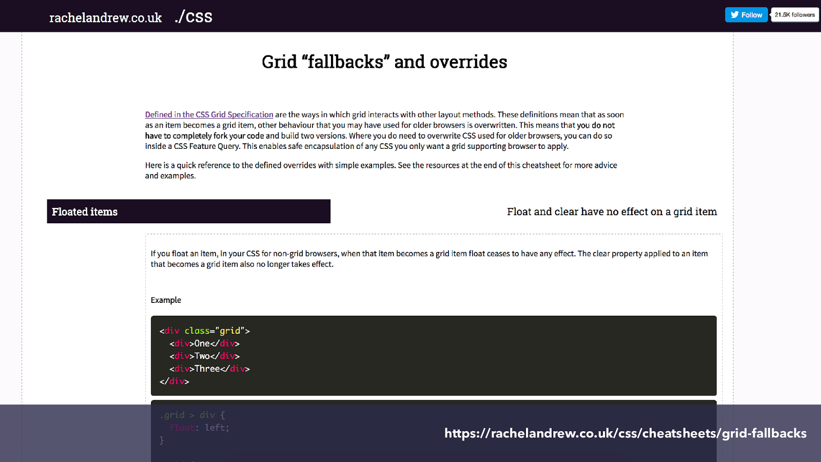
https://rachelandrew.co.uk/css/cheatsheets/grid-fallbacks I’ve written up some practical examples of doing this here.
I really think there is an opportunity for the expert CSS developer in terms of being able to really take advantage of new specifications. If you know how CSS works, creating good fallbacks is not di ffi cult. So you can be as creative as you want for new browsers knowing that you have the chops to make sure people using older ones still get a good experience. This is how you get to take advantage of the things that Mark will be talking about next.

What happened to subgrid? In recent CSS Grid specification drafts was another value of display, display: subgrid.
The specification around how sub grids should be implemented changed over the course of development of the grid layout module, and with no implementations as the spec went to CR, the feature was moved to Level 2 of the specification. It is still being discussed however, here is the sort of problem sub grid might solve.
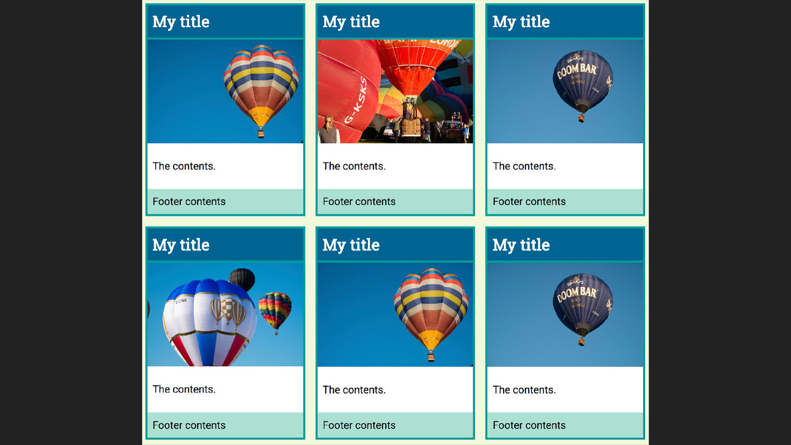
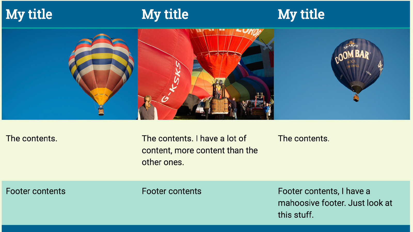
Look at this layout, this is the sort of nice layout you get from a designer who believes in a world where text will emerge from the CMS with perfectly identical line lengths.
Everything lines up really neatly, and we can use grid very simply here to create our lined up boxes.
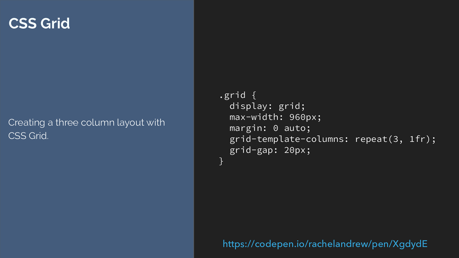
.grid { display: grid; max-width: 960px; margin: 0 auto; grid-template-columns: repeat(3, 1fr); grid-gap: 20px; } CSS Grid Creating a three column layout with CSS Grid. https://codepen.io/rachelandrew/pen/XgdydE
Then the real world of real data rather than our designers world of identical data happens.
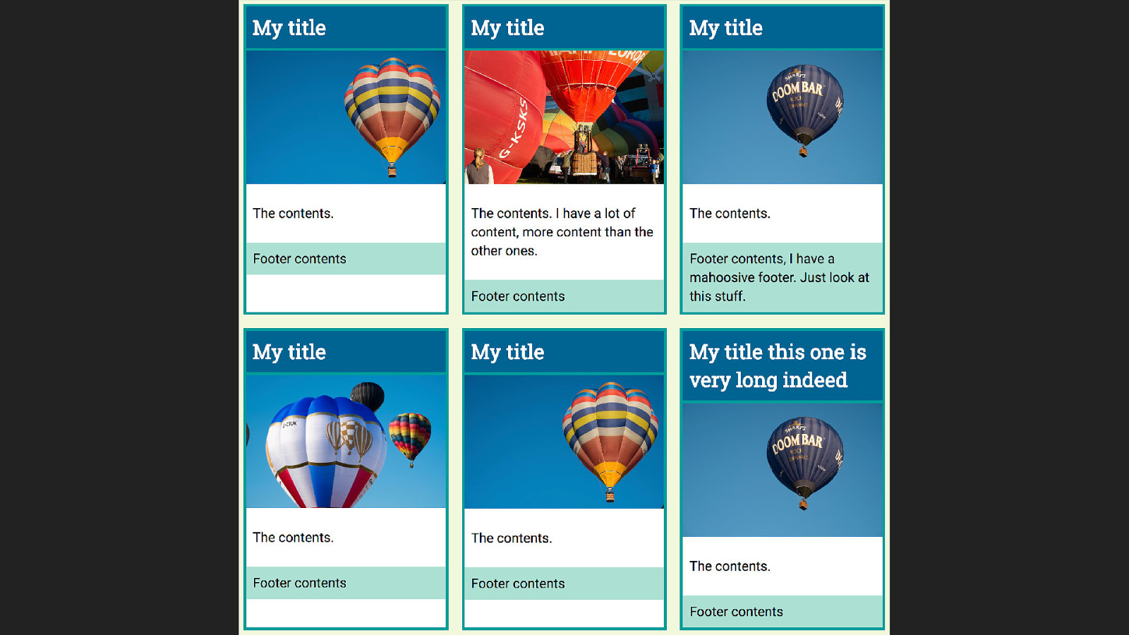
And we end up with this.
And we think, I would really like to line up these boxes across the row., and we can’t, because the internals of each box are not participating in the grid layout.
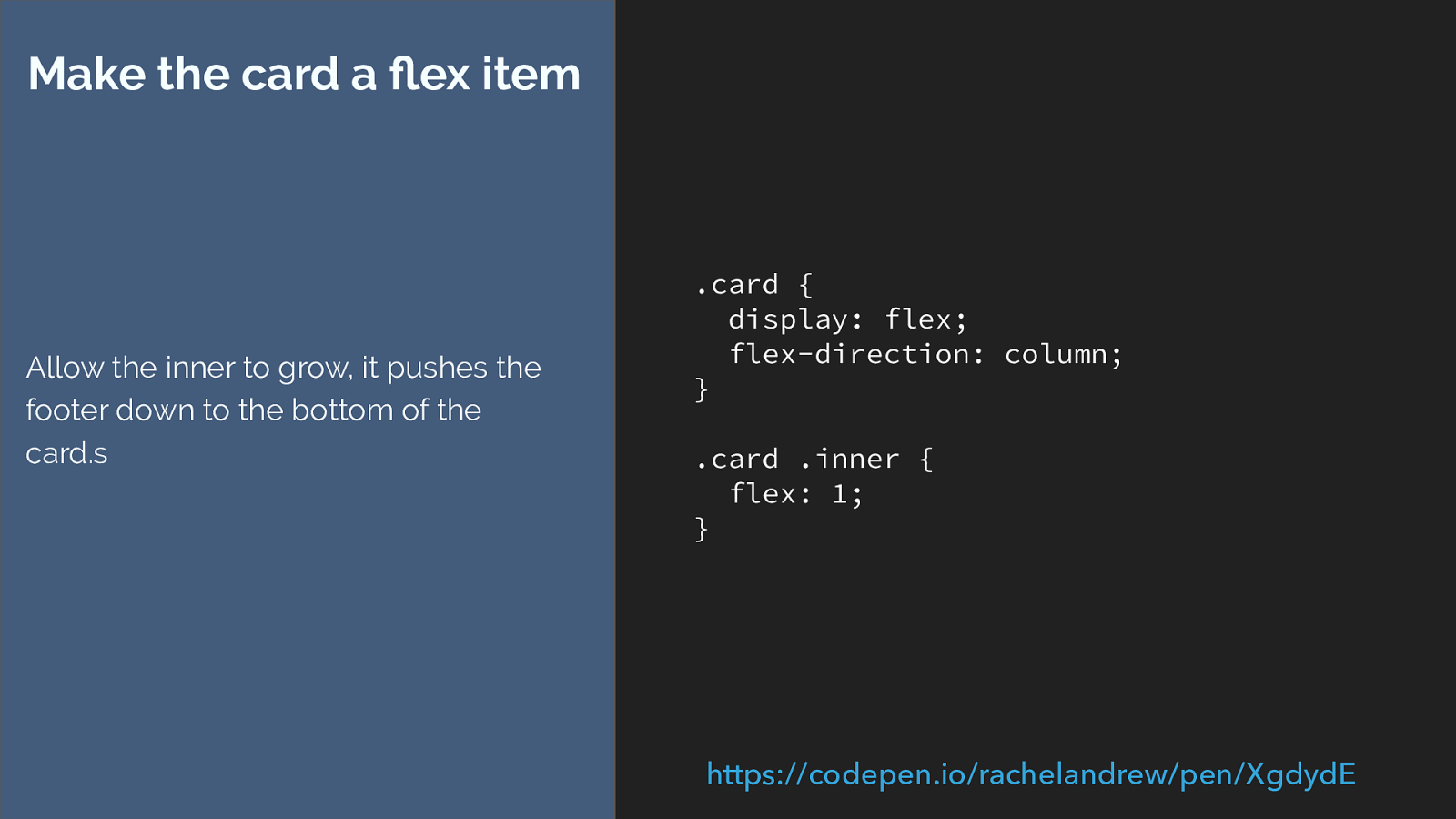
.card { display: flex; flex-direction: column; } .card .inner { flex: 1; } Make the card a flex item Allow the inner to grow, it pushes the footer down to the bottom of the card.s https://codepen.io/rachelandrew/pen/XgdydE
The best we can do is make the internals a nested grid or make the card a flex container, and then push the footer down to the bottom.
Like this.
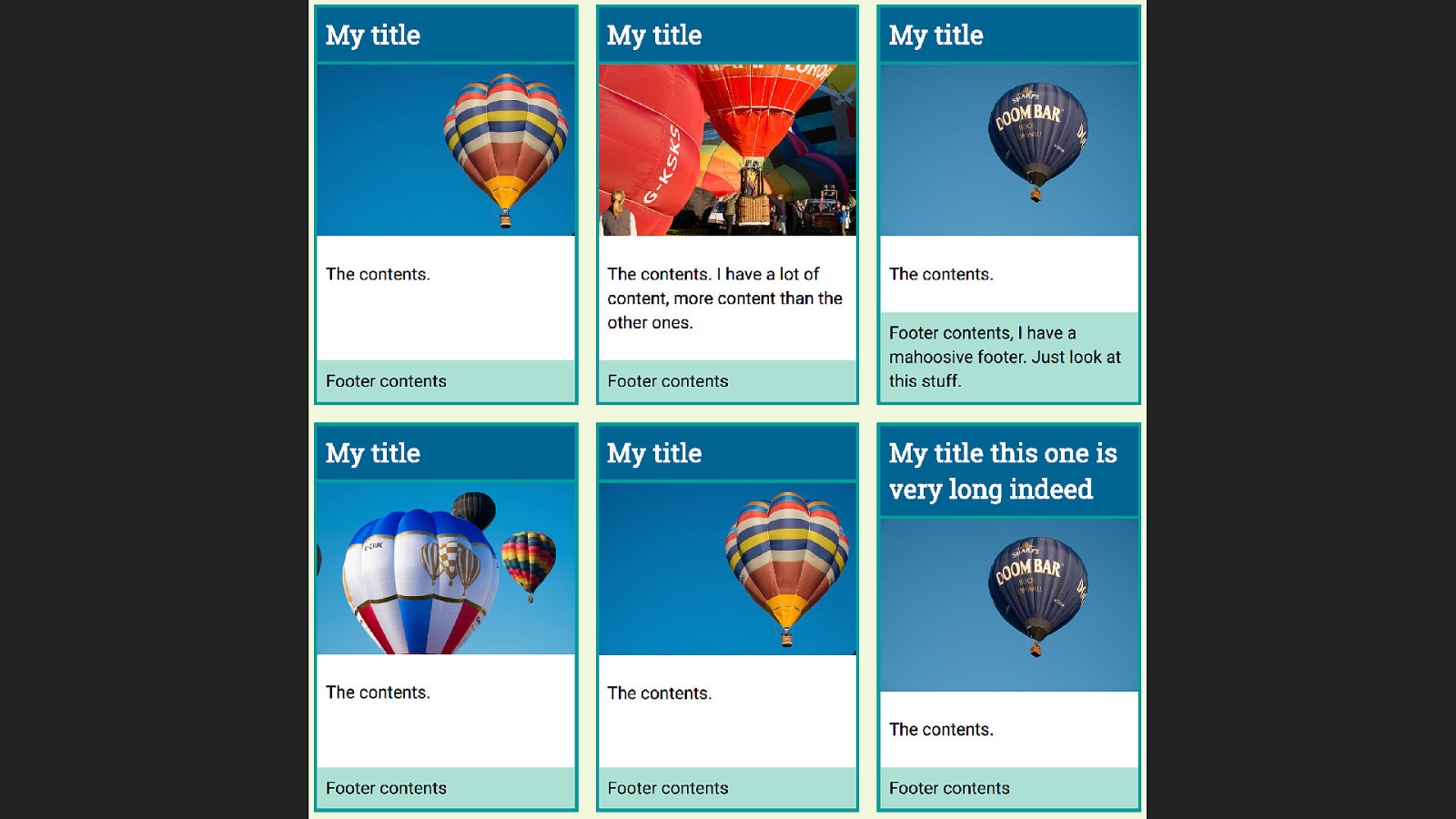
However the internal elements still don’t line up neatly across the design. What I want is that if the title needs two lines, right across the row should have that same height even if the content is shorter, likewise with the footer or content area.
The subgrid spec that was pushed into level 2 could solve this problem.

1 2 3 4 5 For our sub grid our main grid would need to have four rows available for each card, as the card has four elements. In the sub grid spec as was when it was removed from L1 there is no concept of the implicit grid in a sub grid element, the outer grid needs to provide the rows and columns that it needs.
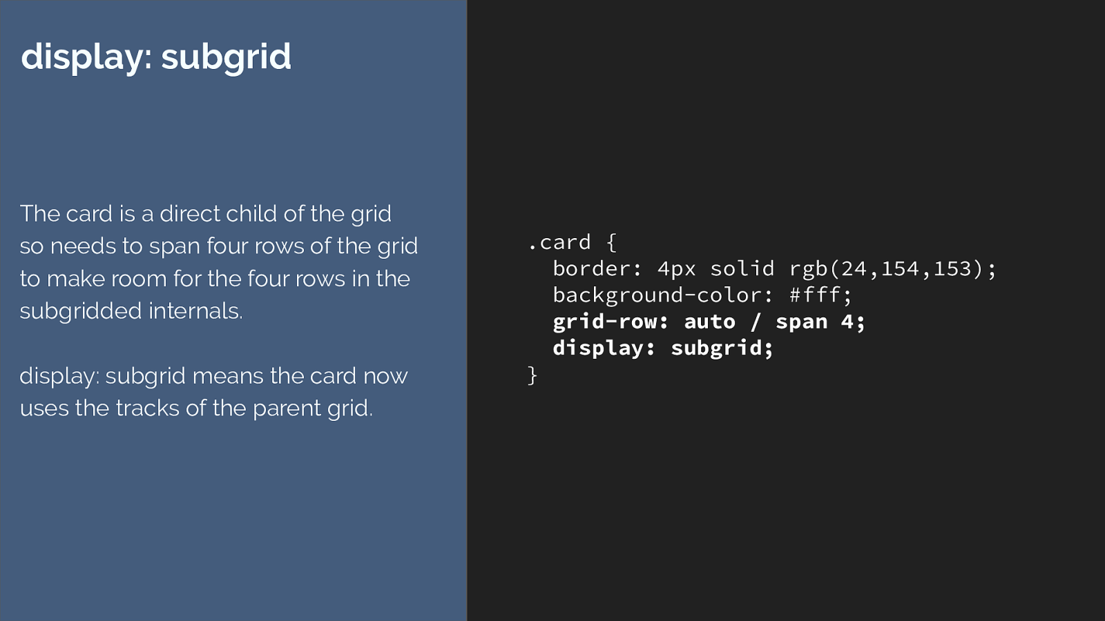
.card { border: 4px solid rgb(24,154,153); background-color: #fff;
grid-row: auto / span 4; display: subgrid; } display: subgrid The card is a direct child of the grid so needs to span four rows of the grid to make room for the four rows in the subgridded internals. display: subgrid means the card now uses the tracks of the parent grid. I’m asking for this direct child of the grid to span four row lines.
Then setting the value of display to subgrid.
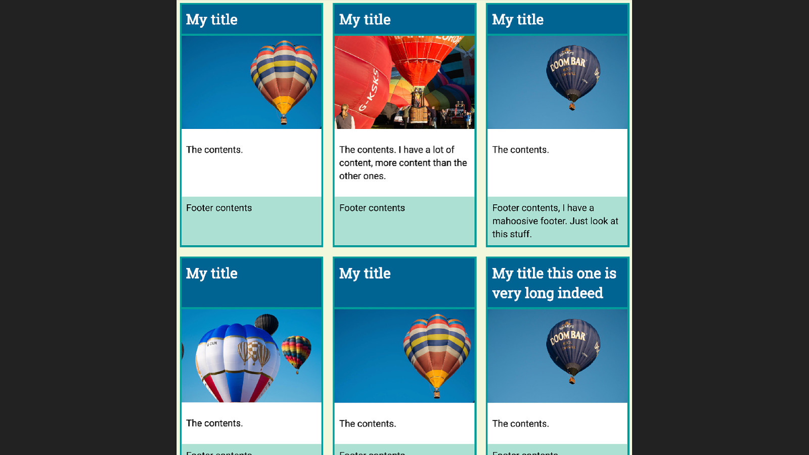
The elements inside the card are now participating in the grid layout of the parent which means the sizing right across the track is using the same grid and our things line up.
In reality we would probably also need to deal with the gap - perhaps by adding a margin to the cards or elements inside.
This is all completely theoretical, there are no implementations of this.
Subgrid links and thoughts ▸ https://rachelandrew.co.uk/archives/2017/03/16/subgrid-moved-to-level-2- of-the-css-grid-specification/
▸ https://github.com/w3c/csswg-drafts/issues/958
▸ https://github.com/rachelandrew/cssgrid-ama/issues/13
▸ http://meyerweb.com/eric/thoughts/2016/01/15/subgrids-considered- essential/
I think sub grid is important.
If you do too here are some links to explore.
In particular if you have sub grid use cases then please post them one of those threads is a discussion of the feature in the CSS Grid WG github issues.

Vanishing boxes with display:contents So we don’t yet have sub grid but if you ever end up in a sub grid discussion, people say but display: contents we have display contents - this solves a lot of sub grid problems.
It solves a class of problems, but these are different problems. To understand the di ff erence we need to head back to the display spec.
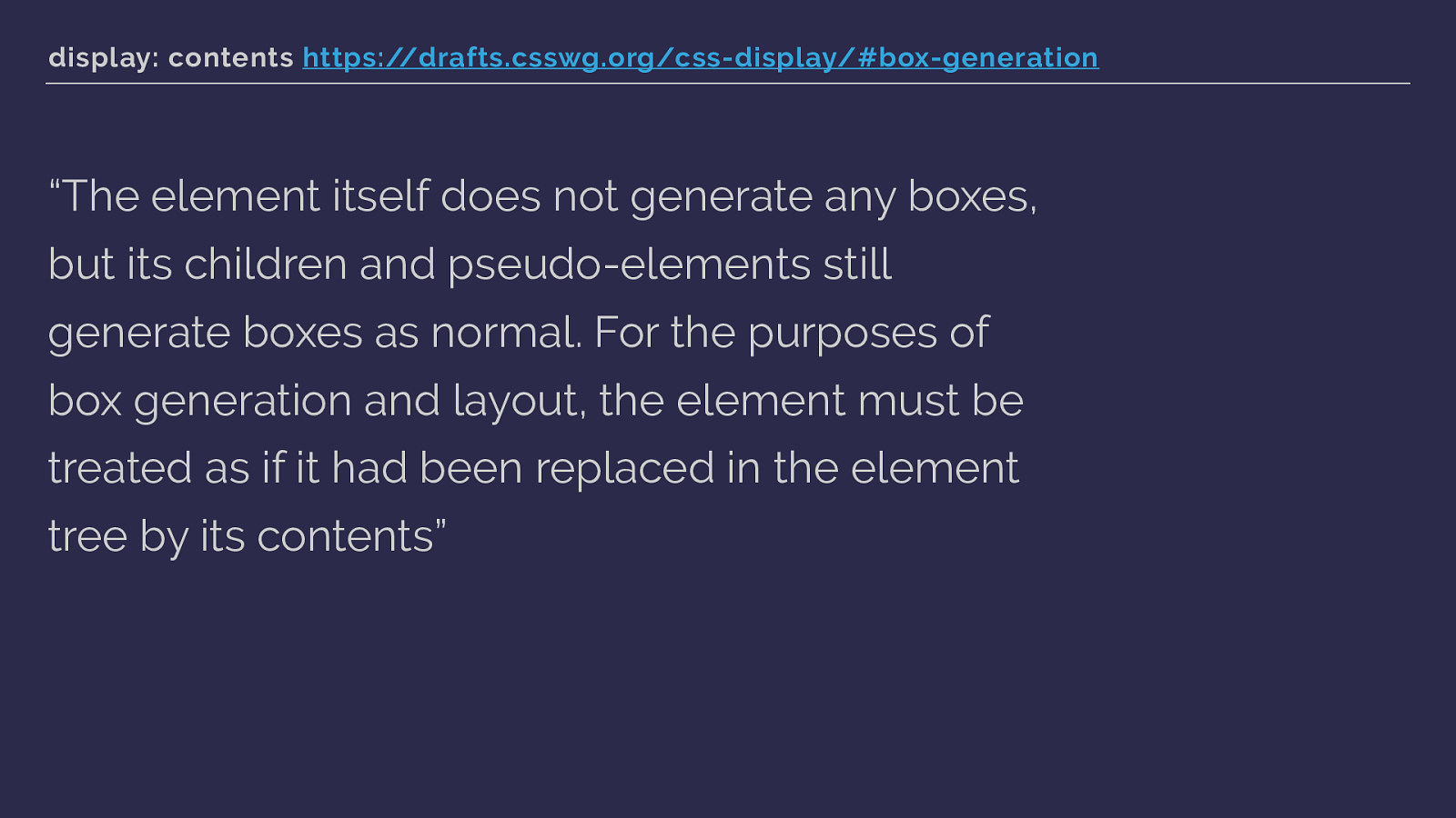
display: contents https://drafts.csswg.org/css-display/#box-generation
“The element itself does not generate any boxes, but its children and pseudo-elements still generate boxes as normal. For the purposes of box generation and layout, the element must be treated as if it had been replaced in the element tree by its contents” This is what display says about display: contents.
If an element does not generate any boxes, the children of that element can then participate in the flex or grid layout - layout that otherwise would have effected their now vanished parent. That sounds … fun.
Much easier to see with an example.
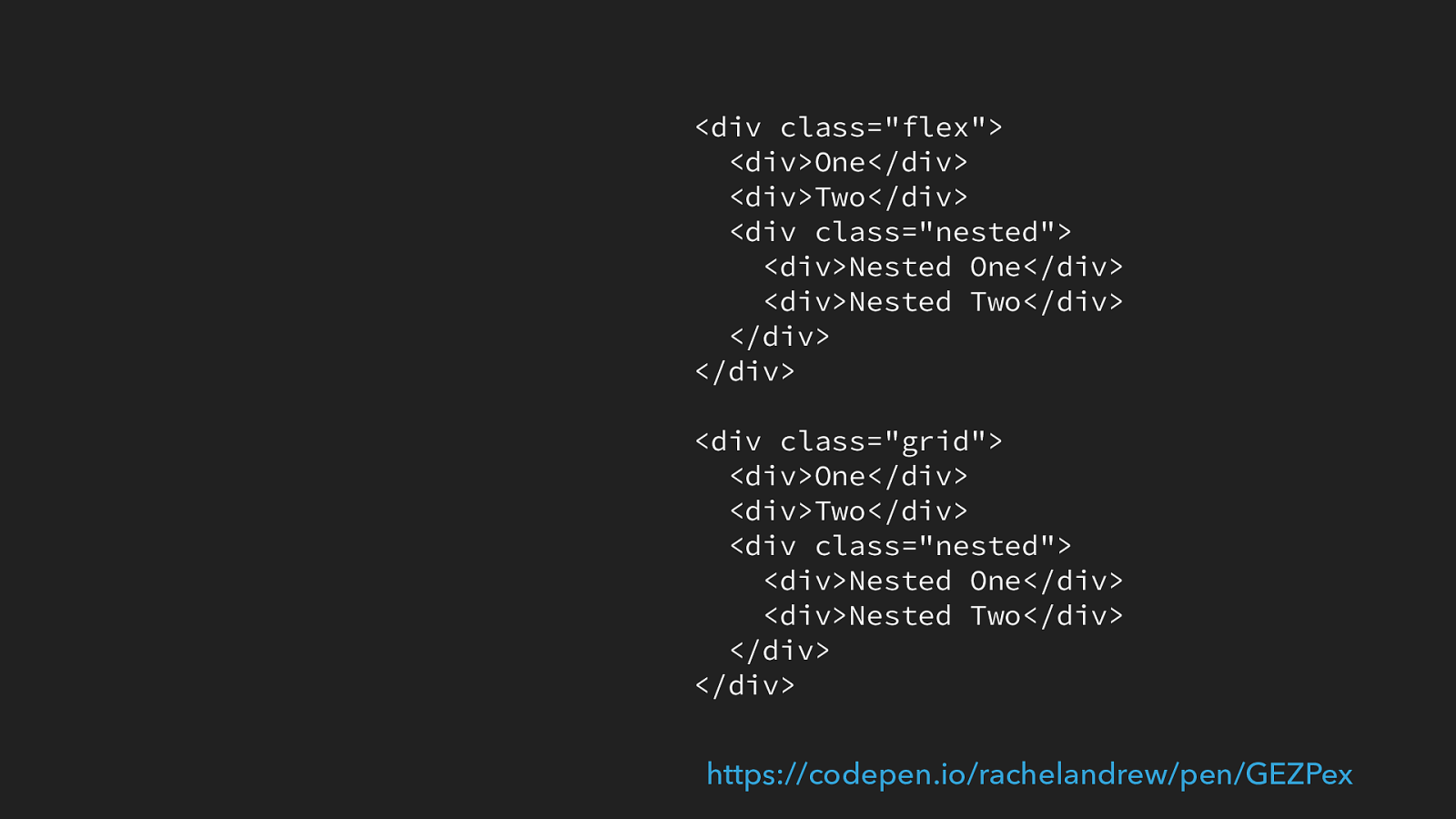
So here are two sets of HTML, identical other than one has a class of flex and another has a class of grid.
We have three div elements. The last one has two items nested inside it.
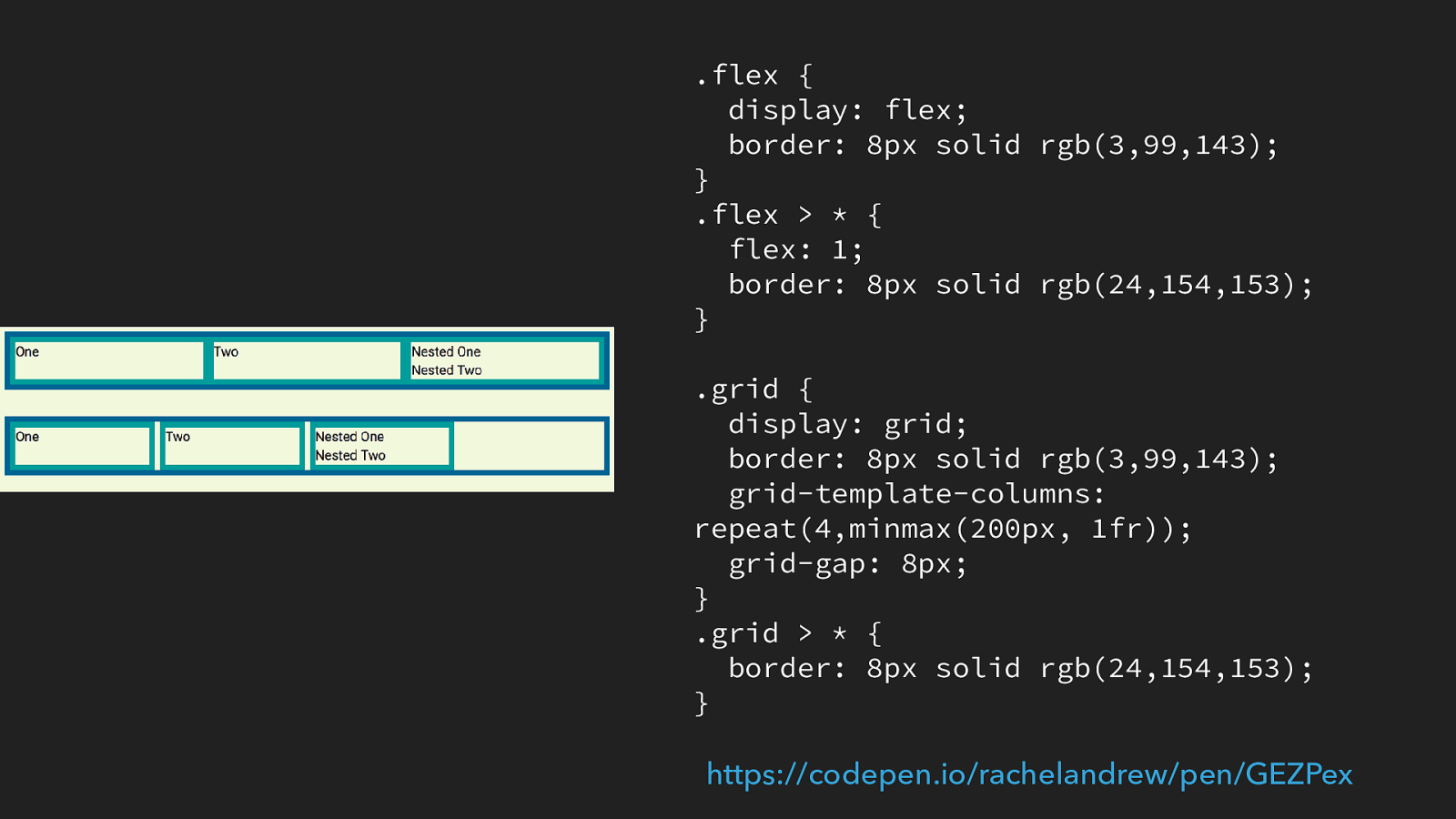
.flex { display: flex; border: 8px solid rgb(3,99,143); } .flex > * { flex: 1; border: 8px solid rgb(24,154,153); } .grid { display: grid; border: 8px solid rgb(3,99,143); grid-template-columns: repeat(4,minmax(200px, 1fr)); grid-gap: 8px; } .grid > * { border: 8px solid rgb(24,154,153); } https://codepen.io/rachelandrew/pen/GEZPex
If we make two simple layouts one with flex and one with grid we get this. This is what you would expect as both flexbox and grid only turn the direct children into flex or grid items. The nested items are using block layout so display one after the other.
You can also see I have put borders around the direct children of the flex or grid items.
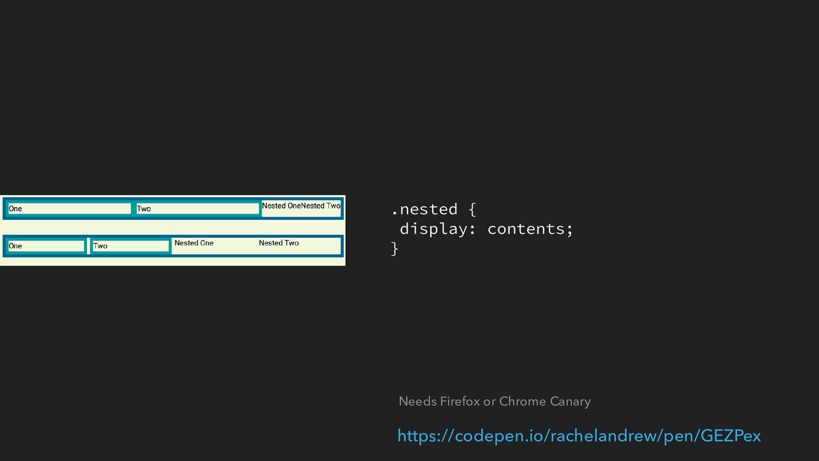
.nested { display: contents; } https://codepen.io/rachelandrew/pen/GEZPex
Needs Firefox or Chrome Canary We have a class on the third item in both layouts, so we can target it and set it to display: contents. Them if you are using Firefox or Chrome Canary [click] the box of nested disappears, and two nested items become flex or grid items.
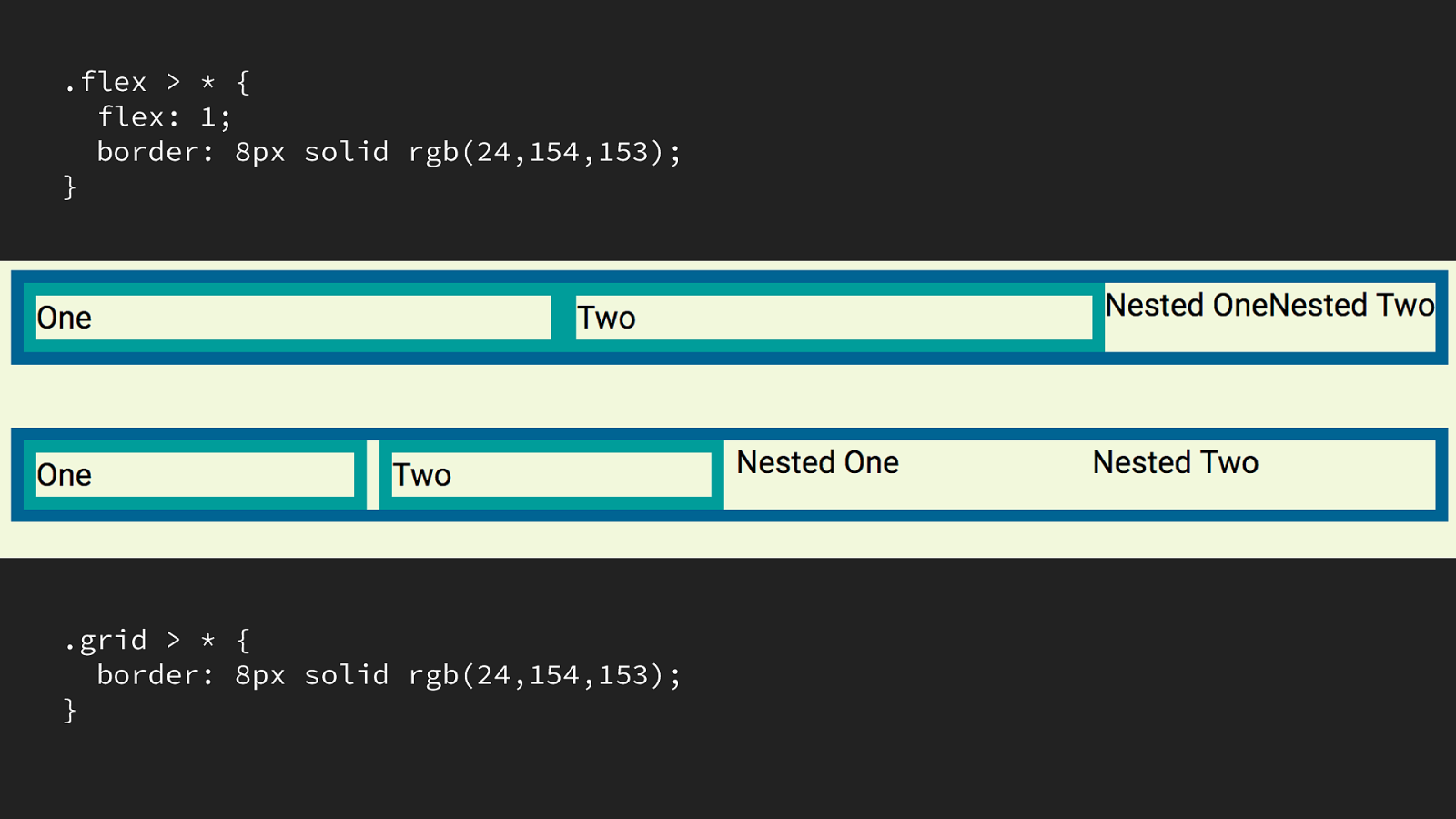
.flex > * { flex: 1; border: 8px solid rgb(24,154,153); } .grid > * { border: 8px solid rgb(24,154,153); } Things to note, I purposely used a selector that would target the direct children of our flex and grid containers.
The nested items have not become direct children via this method - you can see that the flex items have not had flex: 1 assigned to them they use the default flex properties. The flex and grid items that are nested do not have a border applied as the direct children do. So when using this technique not in a demo you would need to make sure you also targeted those items.
Also the border that was around the initial item - the one we applied display: contents - has gone because the box has gone. This means we can’t apply backgrounds and borders to the vanished element.

and therein is the reason that display: contents can’t patch a lack of subgrid.
If we go back to our previous example with the cards that we want to have lined up.
We could apply display: contents to the card - that’s the direct child of the grid container.
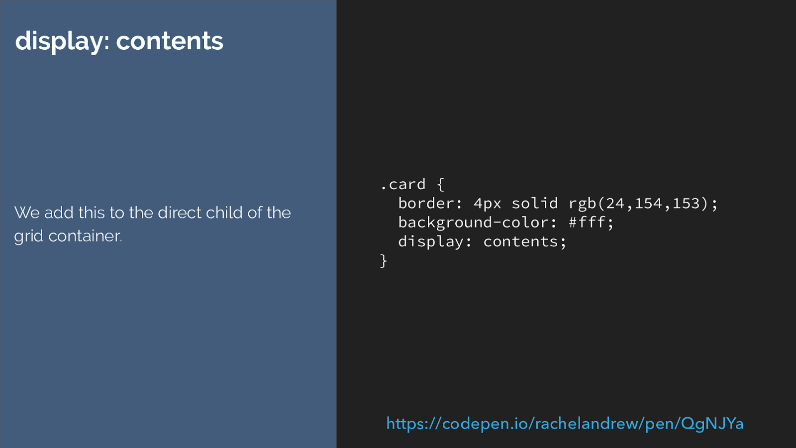
.card { border: 4px solid rgb(24,154,153); background-color: #fff; display: contents; } display: contents We add this to the direct child of the grid container. https://codepen.io/rachelandrew/pen/QgNJYa
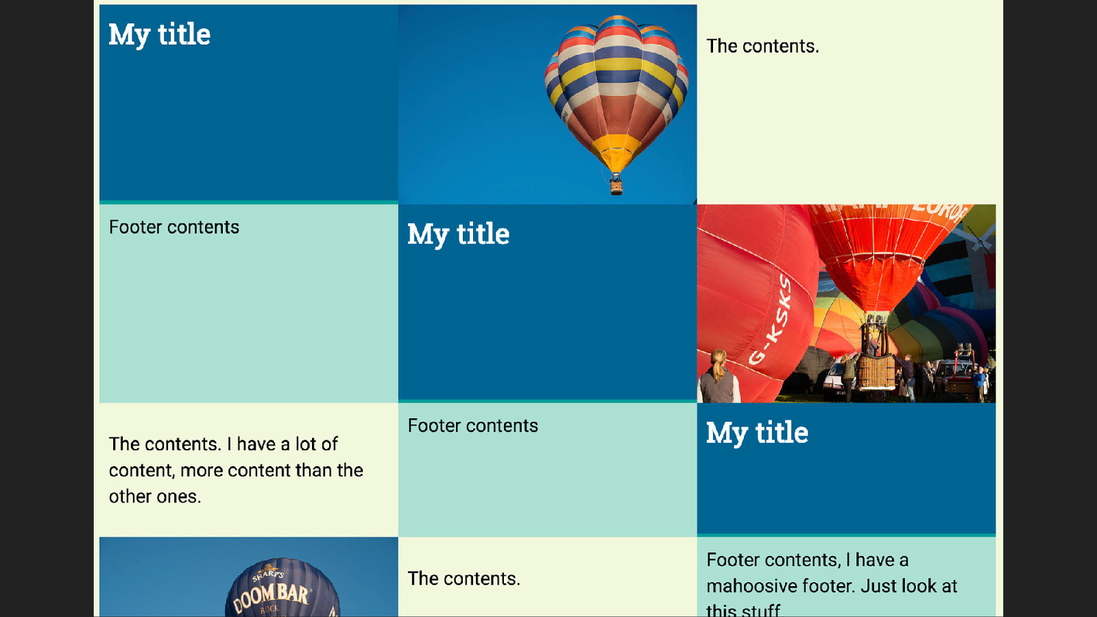
But this doesn’t get us what we want because we are using auto placement. With the outer box gone each element inside is now auto placing itself across the grid.
You can auto place by column which would mean that they stayed in their columns but you would then need to know how many items you had and thus how many rows your grid should have.
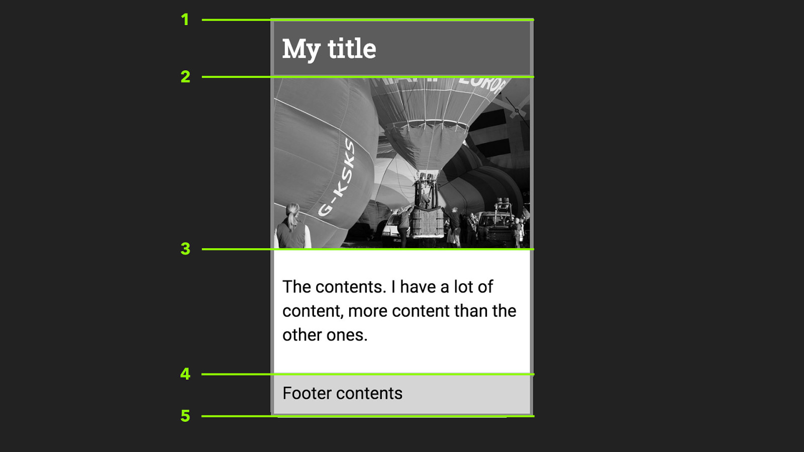
1 2 3 4 5 So we need our card to have four rows available to it - just as it would in the earlier sub grid example.
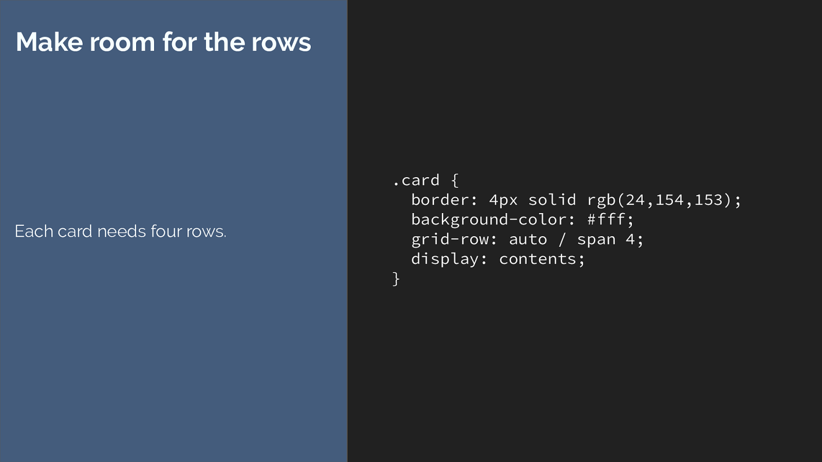
.card { border: 4px solid rgb(24,154,153); background-color: #fff; grid-row: auto / span 4; display: contents; } Make room for the rows Each card needs four rows. So we can set the card item to start on line auto and span four row tracks, but that isn’t going to make any difference here, the box has gone, the items continue to auto place across the grid.
So what we need to do, is actual place our items onto the grid using line-based placemtn. Losing the ability to auto-place the things.
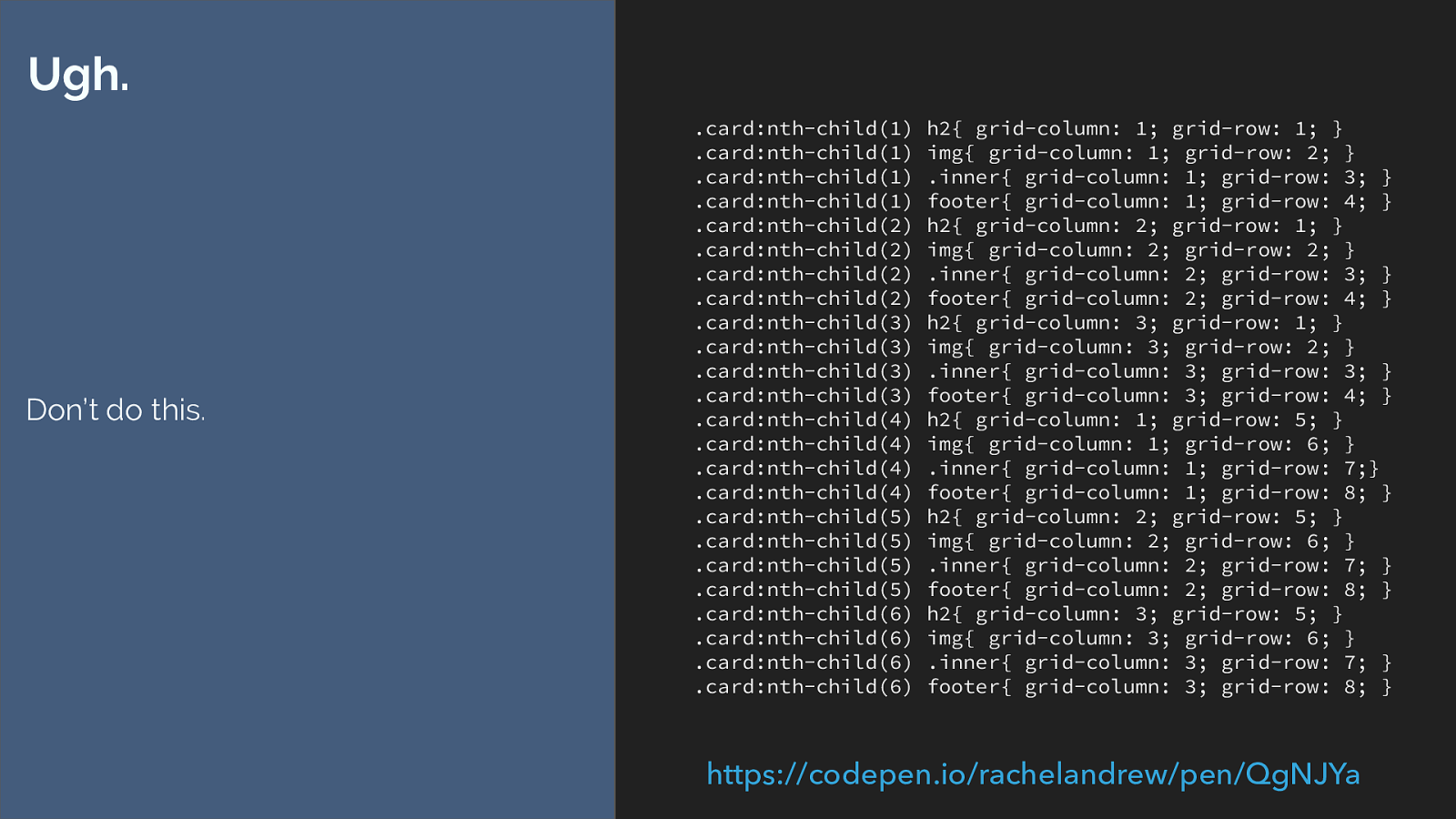
.card:nth-child(1) h2{ grid-column: 1; grid-row: 1; } .card:nth-child(1) img{ grid-column: 1; grid-row: 2; } .card:nth-child(1) .inner{ grid-column: 1; grid-row: 3; } .card:nth-child(1) footer{ grid-column: 1; grid-row: 4; } .card:nth-child(2) h2{ grid-column: 2; grid-row: 1; } .card:nth-child(2) img{ grid-column: 2; grid-row: 2; } .card:nth-child(2) .inner{ grid-column: 2; grid-row: 3; } .card:nth-child(2) footer{ grid-column: 2; grid-row: 4; } .card:nth-child(3) h2{ grid-column: 3; grid-row: 1; } .card:nth-child(3) img{ grid-column: 3; grid-row: 2; } .card:nth-child(3) .inner{ grid-column: 3; grid-row: 3; } .card:nth-child(3) footer{ grid-column: 3; grid-row: 4; } .card:nth-child(4) h2{ grid-column: 1; grid-row: 5; } .card:nth-child(4) img{ grid-column: 1; grid-row: 6; } .card:nth-child(4) .inner{ grid-column: 1; grid-row: 7;} .card:nth-child(4) footer{ grid-column: 1; grid-row: 8; } .card:nth-child(5) h2{ grid-column: 2; grid-row: 5; } .card:nth-child(5) img{ grid-column: 2; grid-row: 6; } .card:nth-child(5) .inner{ grid-column: 2; grid-row: 7; } .card:nth-child(5) footer{ grid-column: 2; grid-row: 8; } .card:nth-child(6) h2{ grid-column: 3; grid-row: 5; } .card:nth-child(6) img{ grid-column: 3; grid-row: 6; } .card:nth-child(6) .inner{ grid-column: 3; grid-row: 7; } .card:nth-child(6) footer{ grid-column: 3; grid-row: 8; } Ugh. Don’t do this. https://codepen.io/rachelandrew/pen/QgNJYa
Eww …
and even after doing that it’s not really the same design. We’ve lost the card background and spacing and we can’t even get that spacing back with a margin on the card because the card has gone.
It’s all horrible. Don’t do this. Display contents is fantastic, when it is available in browsers you will find uses for it, but it isn’t going to replace the need for sub grid. it’s not the same thing.
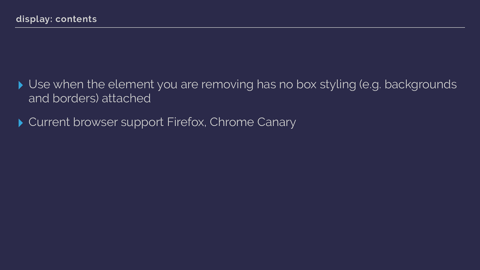
display: contents ▸ Use when the element you are removing has no box styling (e.g. backgrounds and borders) attached ▸ Current browser support Firefox, Chrome Canary So at the moment display contents has limited browser support, but support is coming. It’s a neat feature and will be really handy if you have markup added for semantic reasons that you then want to remove for styling purposes.
And from there I’m going to jump out of display and briefly to a couple of other linked specifications.

It is all logical. When I started talking about CSS Grid, I would introduce the line-based placement properties, and then demonstrate the shorthands - finishing with grid-area explaining that the order of these properties was:
row-start
column-start
row-end
column-end
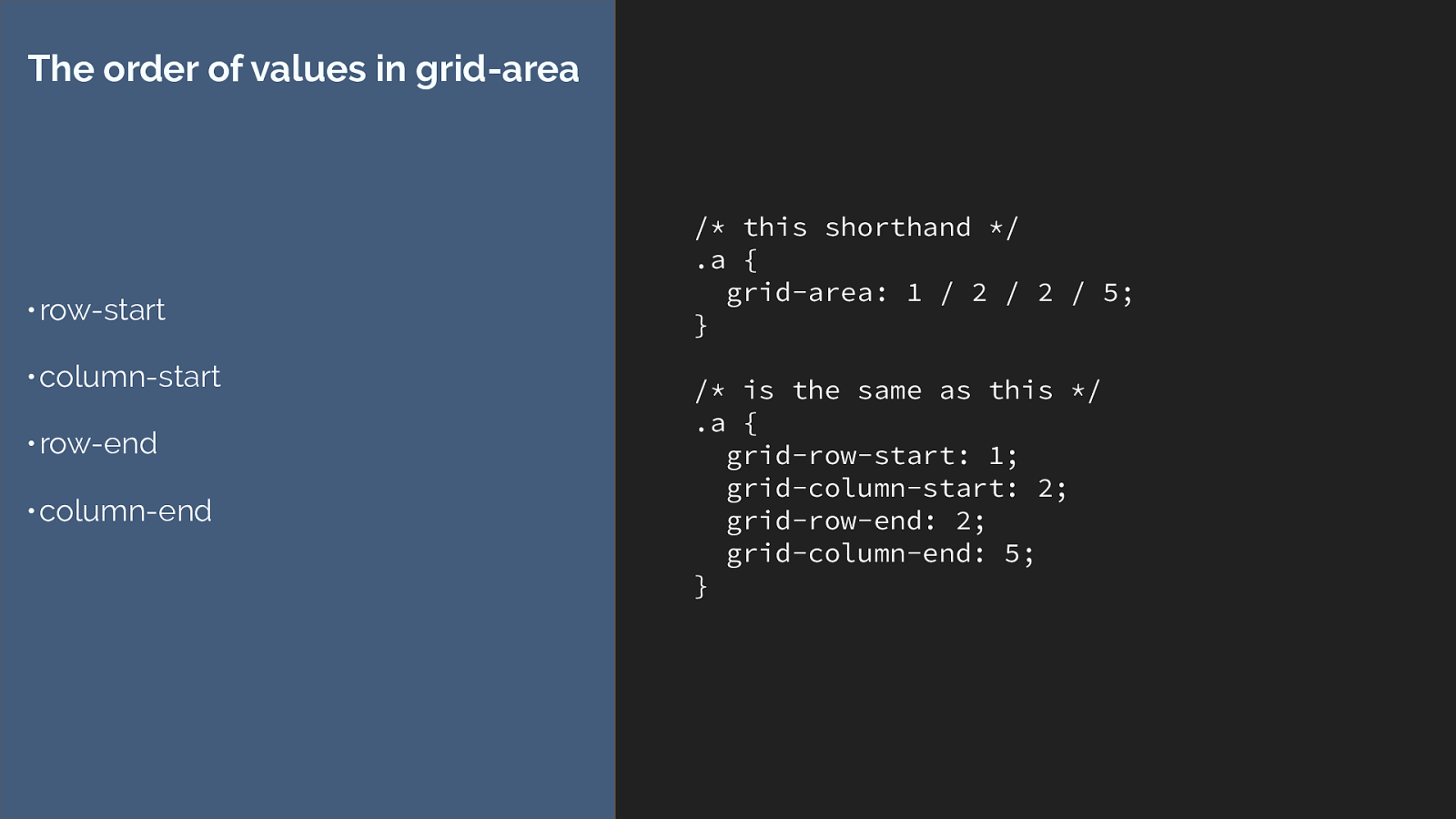
/* this shorthand / .a { grid-area: 1 / 2 / 2 / 5; } / is the same as this */ .a { grid-row-start: 1; grid-column-start: 2; grid-row-end: 2; grid-column-end: 5; } The order of values in grid-area • row-start • column-start • row-end • column-end Which means they go the opposite way to the top right bottom left order we are all used to for setting things like margins and paddings.
Why????
Because the CSS Working Group like making your life hard … well not really it’s Because our new specs have caught up to the fact that the entire world is not using a left to right and top to bottom language. They only go the “wrong” way round if you are someone who uses a left to right language.
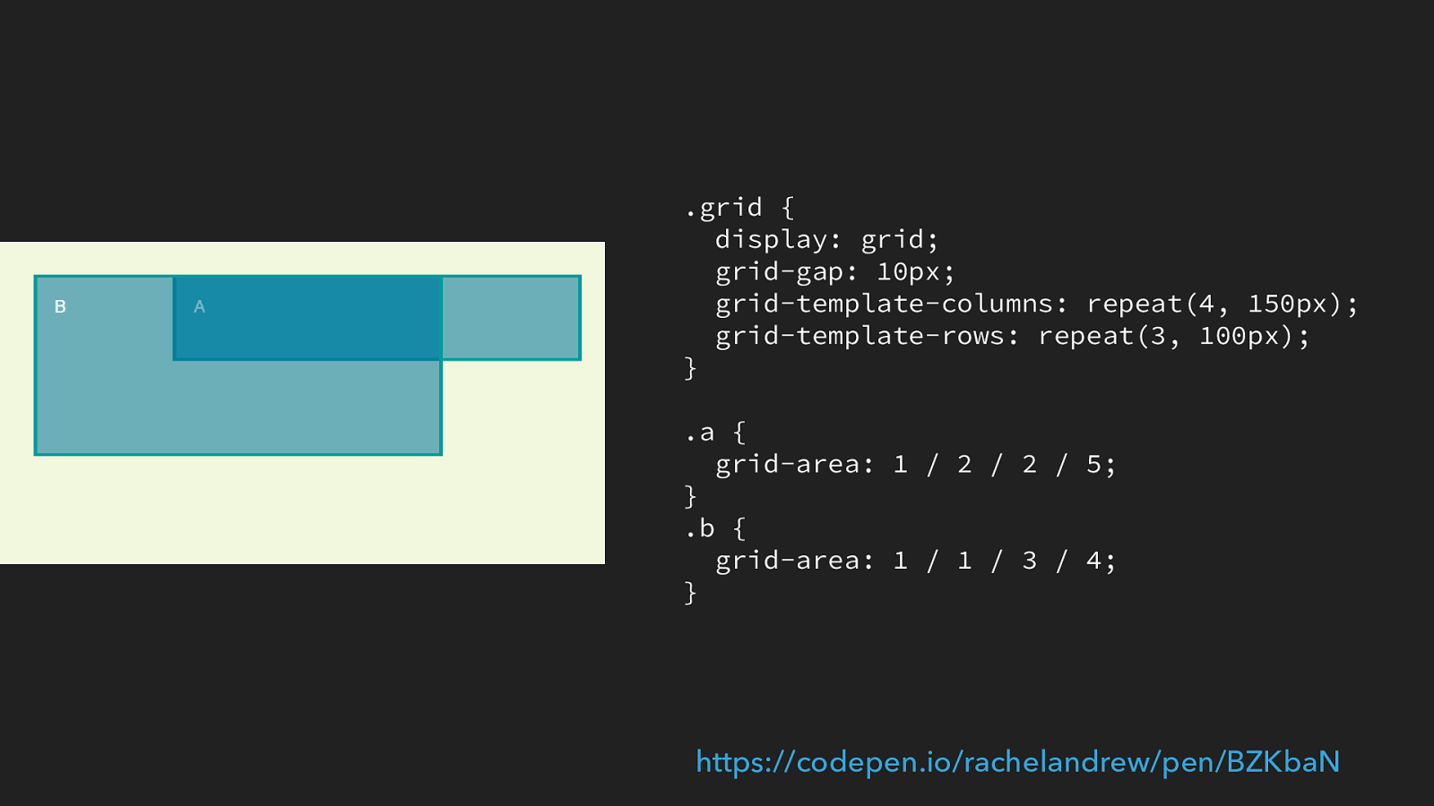
.grid { display: grid; grid-gap: 10px; grid-template-columns: repeat(4, 150px); grid-template-rows: repeat(3, 100px); } .a { grid-area: 1 / 2 / 2 / 5; } .b { grid-area: 1 / 1 / 3 / 4; } https://codepen.io/rachelandrew/pen/BZKbaN
If we take a look at this example. We have a simple grid and I have placed two items onto that grid using this line-based placement shorthand of grid-area.
In English I’m working left to right so line 1 is the left hand side of the grid.
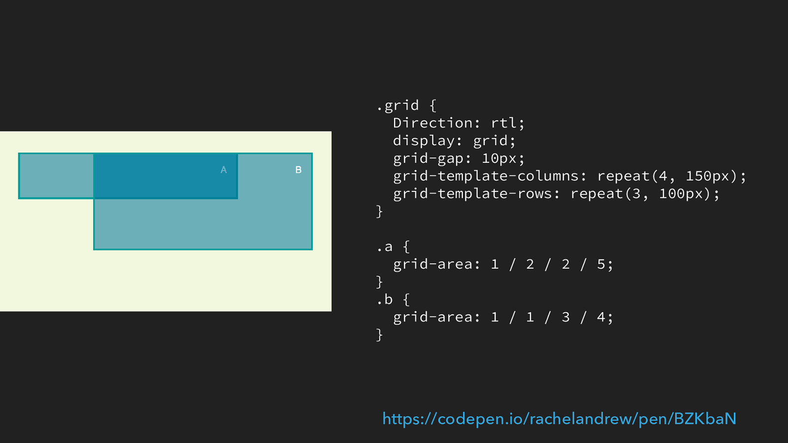
.grid { Direction: rtl; display: grid; grid-gap: 10px; grid-template-columns: repeat(4, 150px); grid-template-rows: repeat(3, 100px); } .a { grid-area: 1 / 2 / 2 / 5; } .b { grid-area: 1 / 1 / 3 / 4; } https://codepen.io/rachelandrew/pen/BZKbaN
If I switch the direction either on the entire page or just for this element, to rtf then line 1 is now on the right hand side of the grid. The order of lines is still exactly the same. In this case however row-start 1 is on the right hand side of the grid.
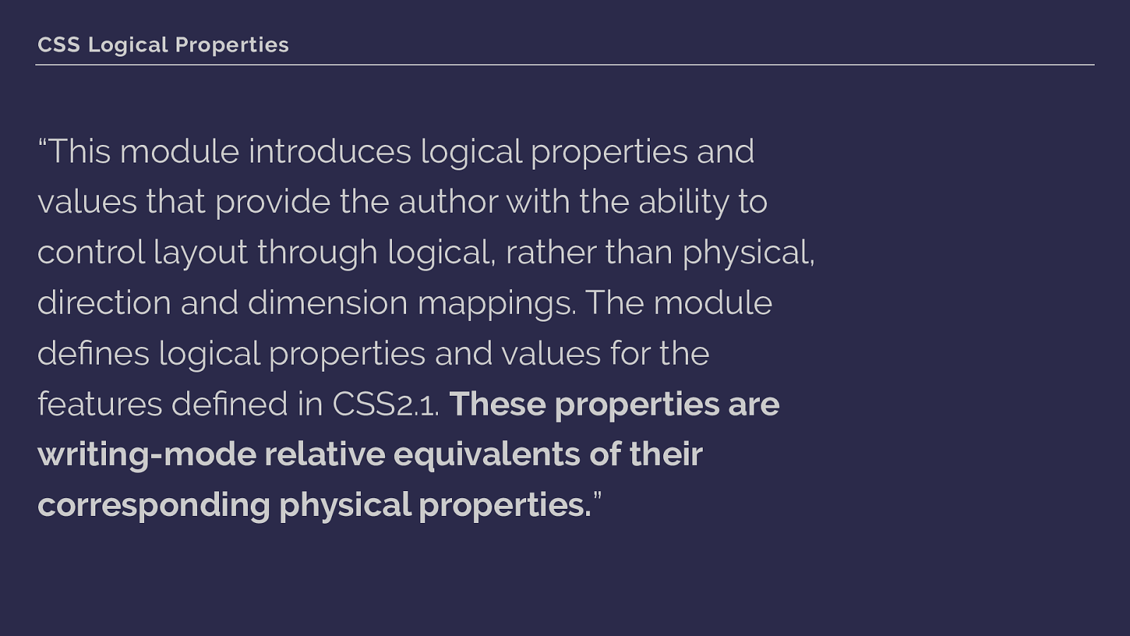
CSS Logical Properties “This module introduces logical properties and values that provide the author with the ability to control layout through logical, rather than physical, direction and dimension mappings. The module defines logical properties and values for the features defined in CSS2.1. These properties are writing-mode relative equivalents of their corresponding physical properties. ” The grid is therefore writing mode aware, the line-based placement we are using respects the writing mode of the document and is not tied to the physical direction mappings we have used in older CSS. So here we introduce two other specifications to our Grid family tree:
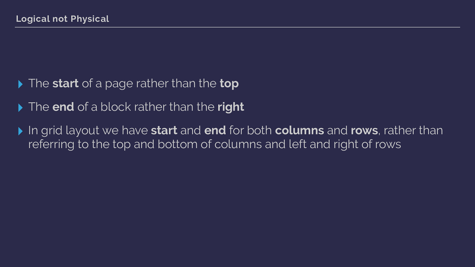
Logical not Physical ▸ The start of a page rather than the top
▸ The end of a block rather than the right
▸ In grid layout we have start and end for both columns and rows , rather than referring to the top and bottom of columns and left and right of rows So with our strange order of lines, we’re setting both starts and then both ends.
I’m not going to spend too much time looking at writing modes, because later this morning Jen Simmons is going to dive into that part of the picture.
But while the order of lines in the shorthand grid area syntax might not be too much of a bother to you, understanding logical properties becomes vital when trying to understand how alignment works in our new specifications. As instead of aligning to the top and bottom, left and right we use the concepts of start and end edges. Once again, it’s the logical rather than physical properties that we are using.
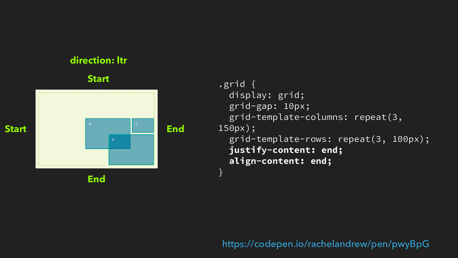
.grid { display: grid; grid-gap: 10px; grid-template-columns: repeat(3, 150px); grid-template-rows: repeat(3, 100px);
justify-content: end; align-content: end; } https://codepen.io/rachelandrew/pen/pwyBpG
End End Start Start direction: ltr So working in English or Dutch, left to right languages then start is on the top and left of the grid, end is bottom and right. If we set justify-content to end and align- content to end and we have more space in the container than the tracks take up they will be aligned to the bottom right.
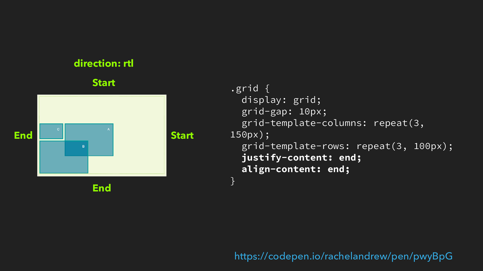
.grid { display: grid; grid-gap: 10px; grid-template-columns: repeat(3, 150px); grid-template-rows: repeat(3, 100px);
justify-content: end; align-content: end; } https://codepen.io/rachelandrew/pen/pwyBpG
End End Start Start direction: rtl We don’t change the grid code, but change the writing mode to rtf as it would be working in Arabic, now the tracks are aligned bottom and left.
Wrapping my head around this stuff, and how it applies to both flexbox and grid layout, took some time.
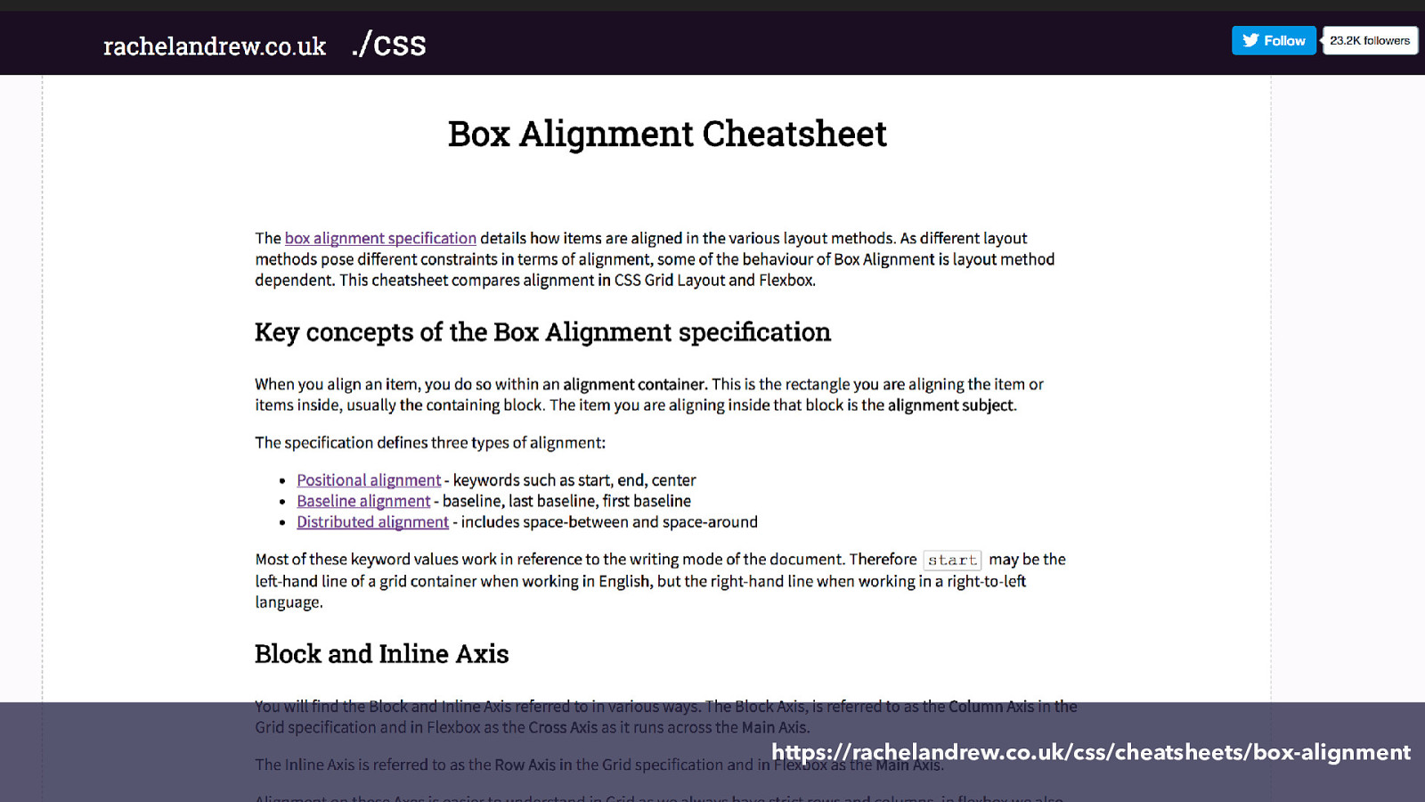
https://rachelandrew.co.uk/css/cheatsheets/box-alignment Having done so I made a cheatsheet to help other people do the same.
You will be learning lots more about this stuff in Jen’s talk later this morning, so look forward to that and I’m going to leave writing modes and logical properties to dig into something I have been playing with very recently.

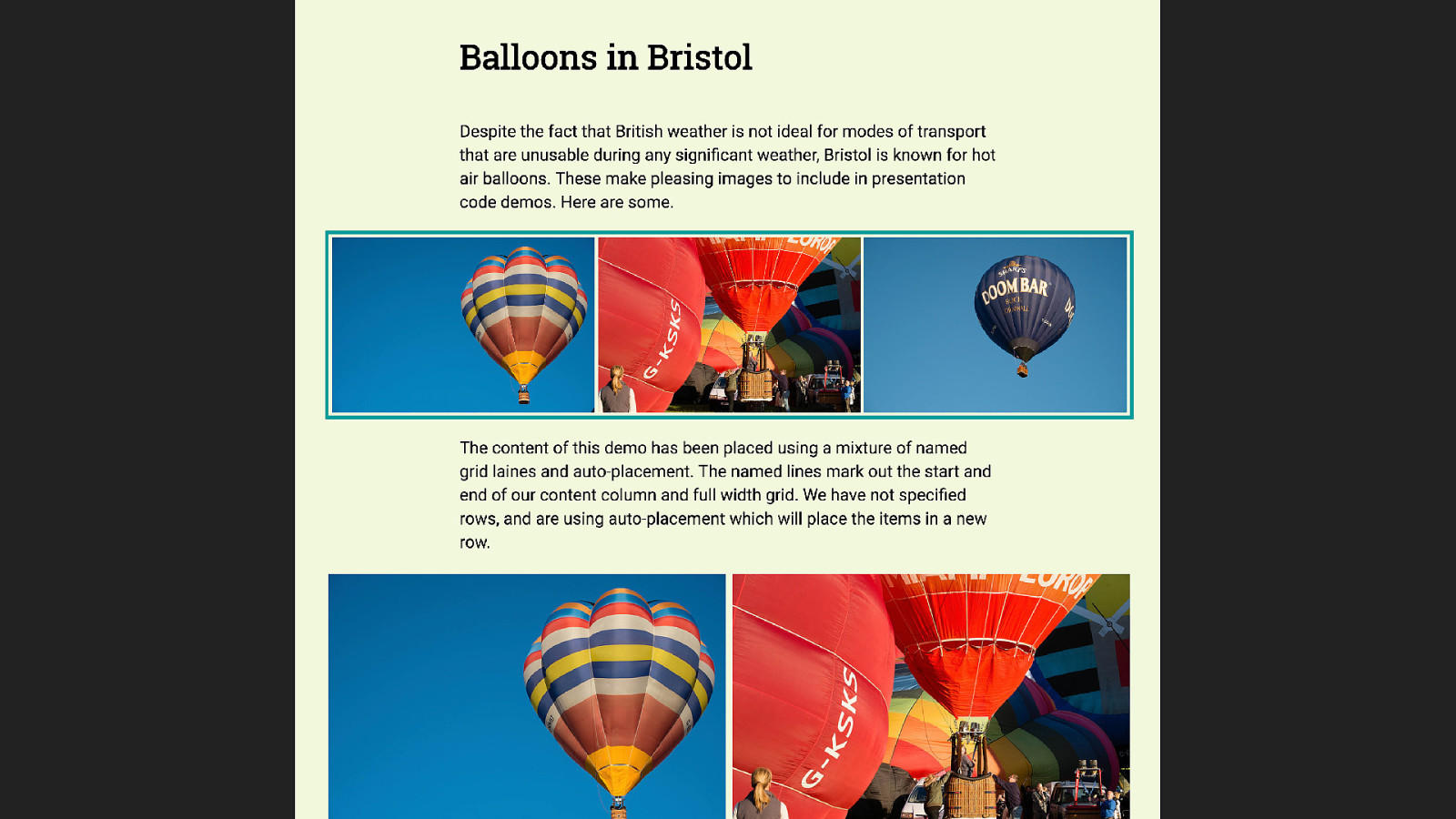
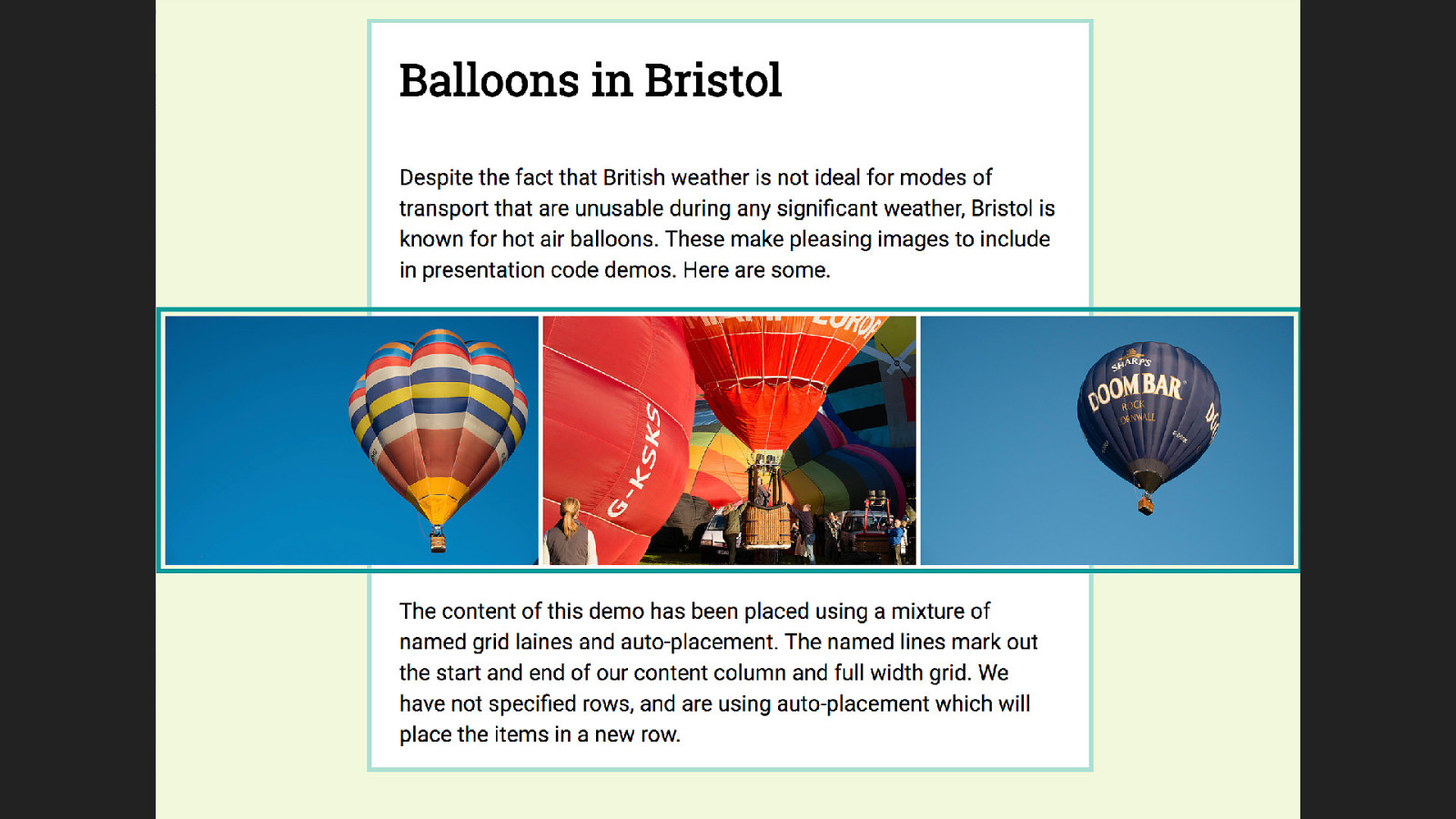
What’s in a name? The ability to name lines and grid areas are nice features of CSS Grid Layout. On the surface these seem to be pretty simple constructs, but the rabbit hole you can open up is deep and wiggly. I started looking at this after reading a blog post that detailed a nice break out technique.
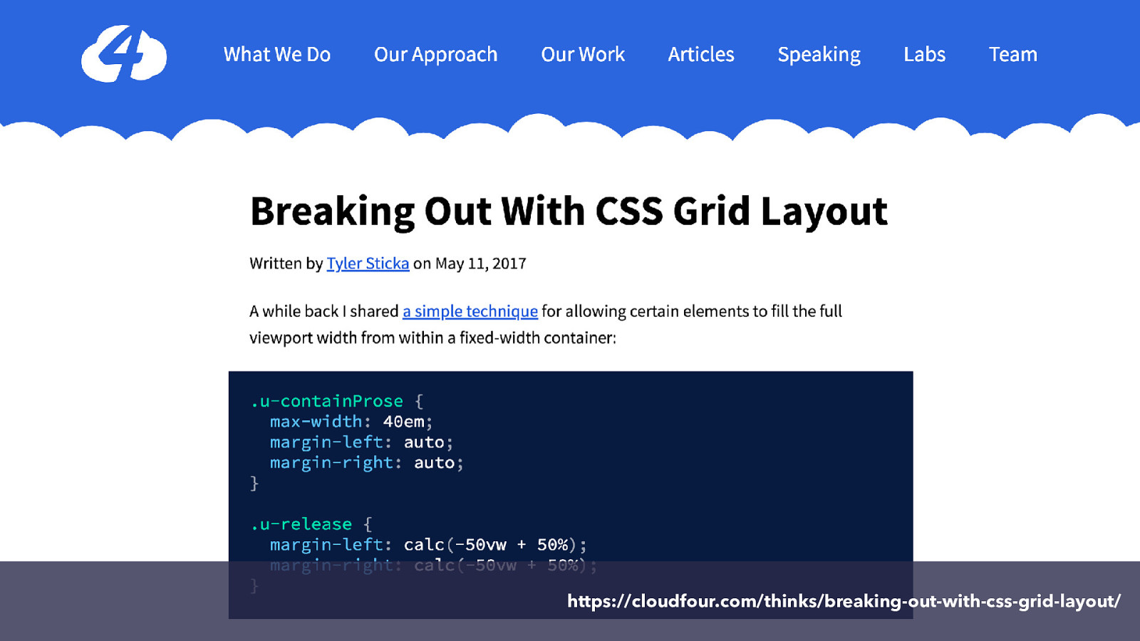
https://cloudfour.com/thinks/breaking-out-with-css-grid-layout/
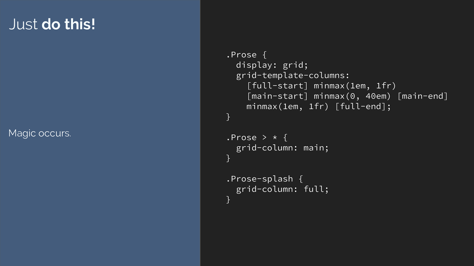
.Prose {
display: grid;
grid-template-columns:
[full-start] minmax(1em, 1fr)
[main-start] minmax(0, 40em) [main-end]
minmax(1em, 1fr) [full-end];
}
.Prose > * {
grid-column: main;
}
.Prose-splash {
grid-column: full;
}
Just
do this!
Magic occurs.
This is the code from that article. It’s a great technique. All you need are these few lines of code. I’d not thought of solving this issue in this way, it is a really elegant
solution and I’m not bashing the original tutorial at all - it was very much in the style of ‘hey look at this cool thing’.
But why … how does this even work. Where does main or full come from?

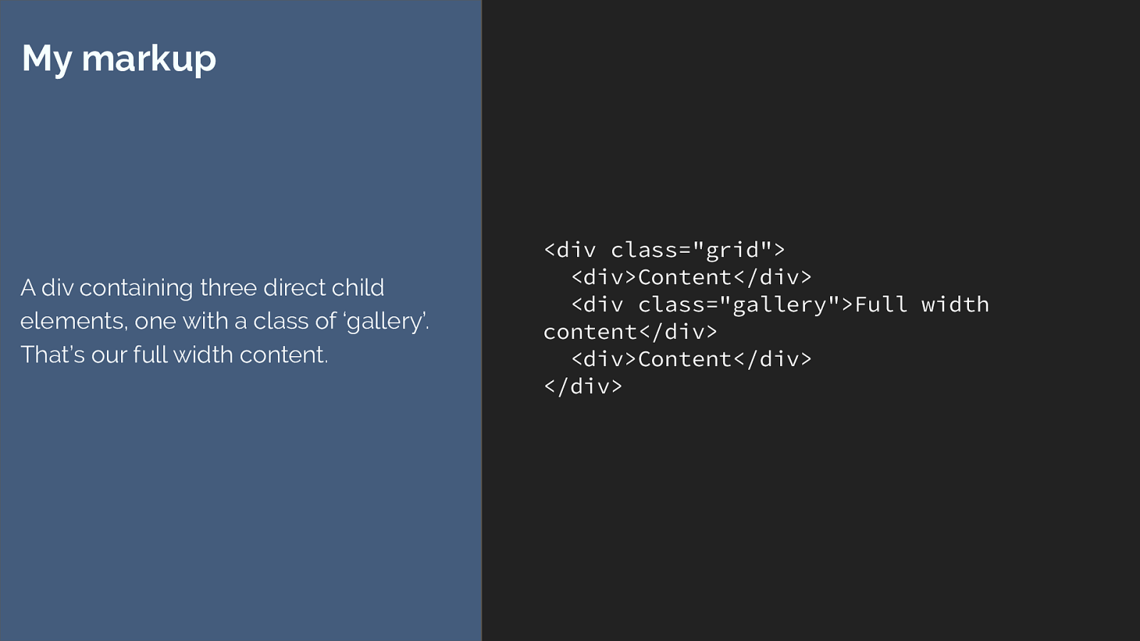
And so I built this, and thought it would be pretty useful to break down the various ways we can achieve something like this.
.grid {
display: grid;
grid-template-columns:
minmax(1em, 1fr)
minmax(0, 660px)
minmax(1em, 1fr);
}
.grid > * {
grid-column: 2 ;
}
.grid > .gallery {
grid-column: 1 / -1 ;
}
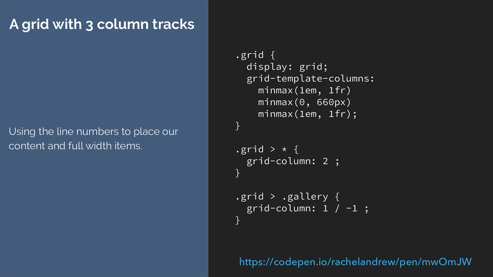
A grid with 3 column tracks
Using the line numbers to place our
content and full width items.
https://codepen.io/rachelandrew/pen/mwOmJW
I create a grid with three column tracks.
I then set all of the direct children so start after grid column line 2 and anything with a class of full to be full width at line one to minus one which is the end of our grid.
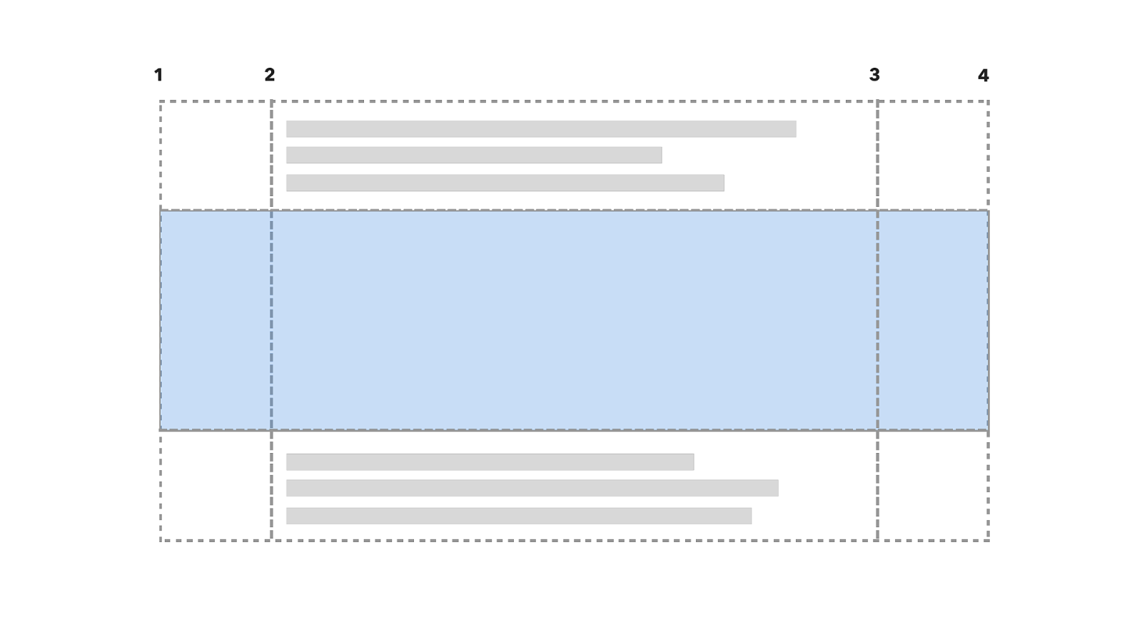
1 2 3 4 So here is the grid with the line numbers. The first item goes into the centre after line 2, the second is full width so stretches right across. The 3rd is a regular item going into the centre.
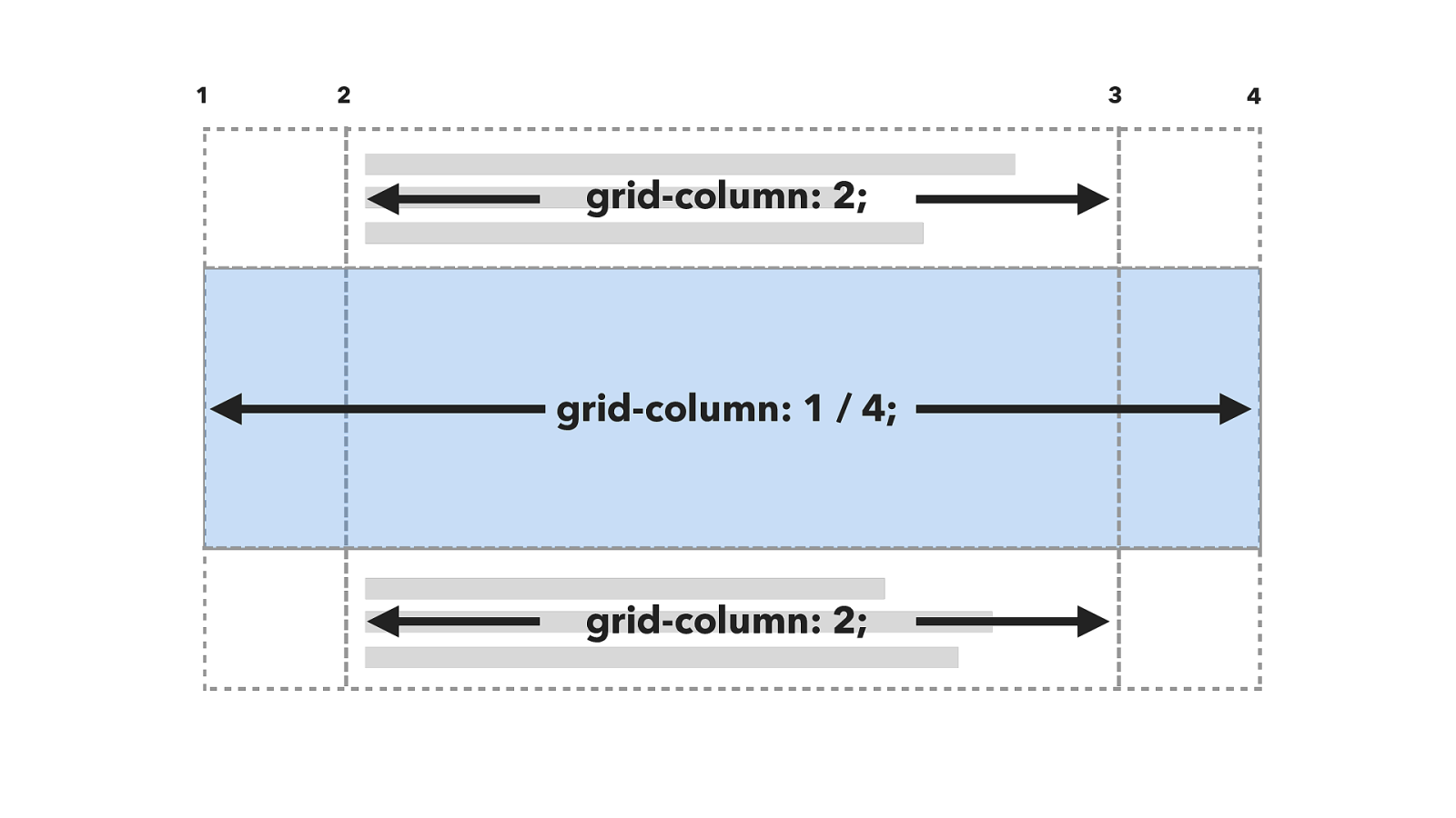
1 2 3 4 grid-column: 2; grid-column: 1 / 4; grid-column: 2; just like this.
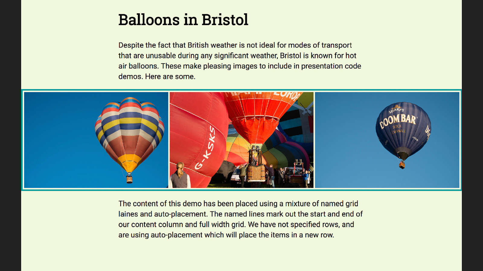
This gives us the design we want - however the example used names not numbers. So now you need to know you can name lines.
.grid {
display: grid;
grid-template-columns:
[full-start] minmax(1em, 1fr)
[main-start] minmax(0, 660px)
[main-end] minmax(1em, 1fr)
[full-end];
}
.grid > * {
grid-column: main-start;
}
.grid > .gallery {
grid-column: full-start / full-end;
}
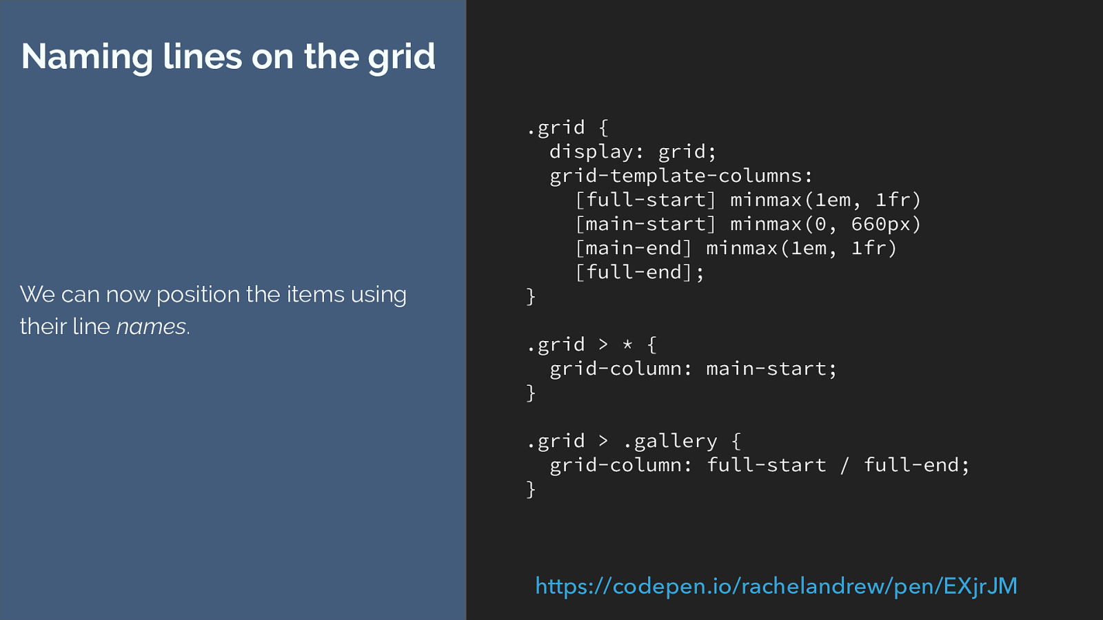
Naming lines on the grid
We can now position the items using
their line
names
.
https://codepen.io/rachelandrew/pen/EXjrJM
You do that in the square brackets before or after the track - remember naming lines not tracks.
Then we can swap our numbers for line names.
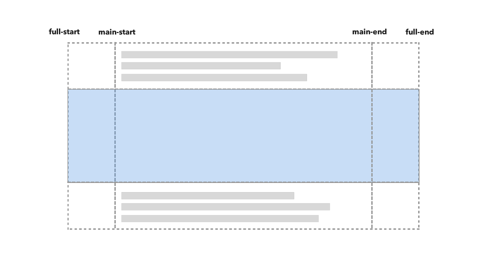
full-start main-start main-end full-end Here is the grid.
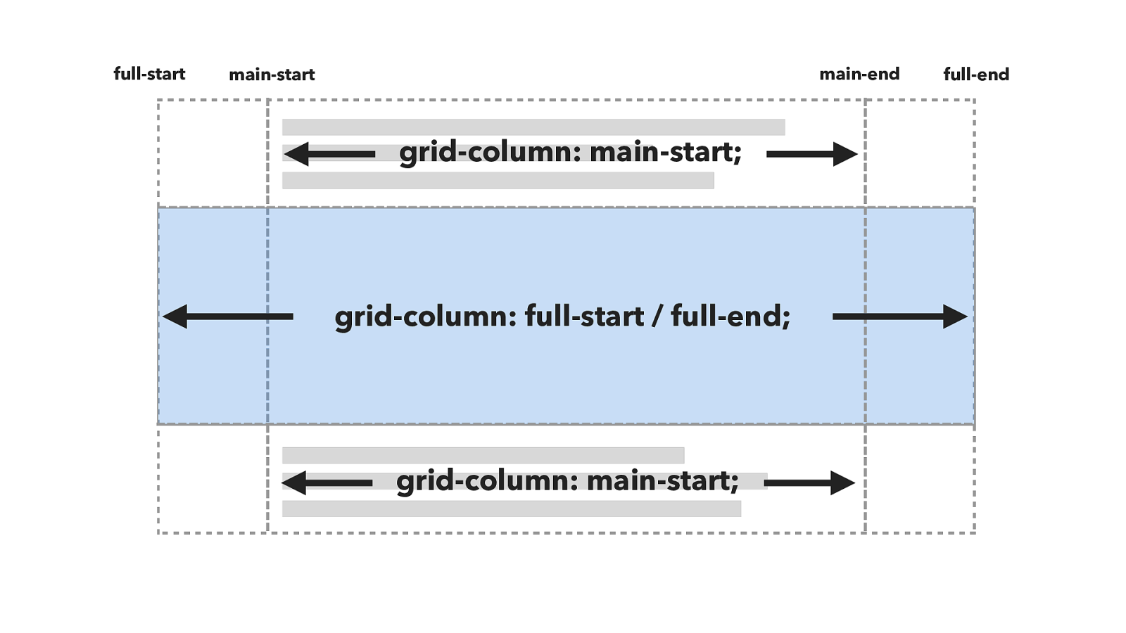
grid-column: main-start; grid-column: full-start / full-end; full-start main-start main-end full-end grid-column: main-start; And the positioning works like this.
But this isn’t quite the same as the example. The example looks more like this.
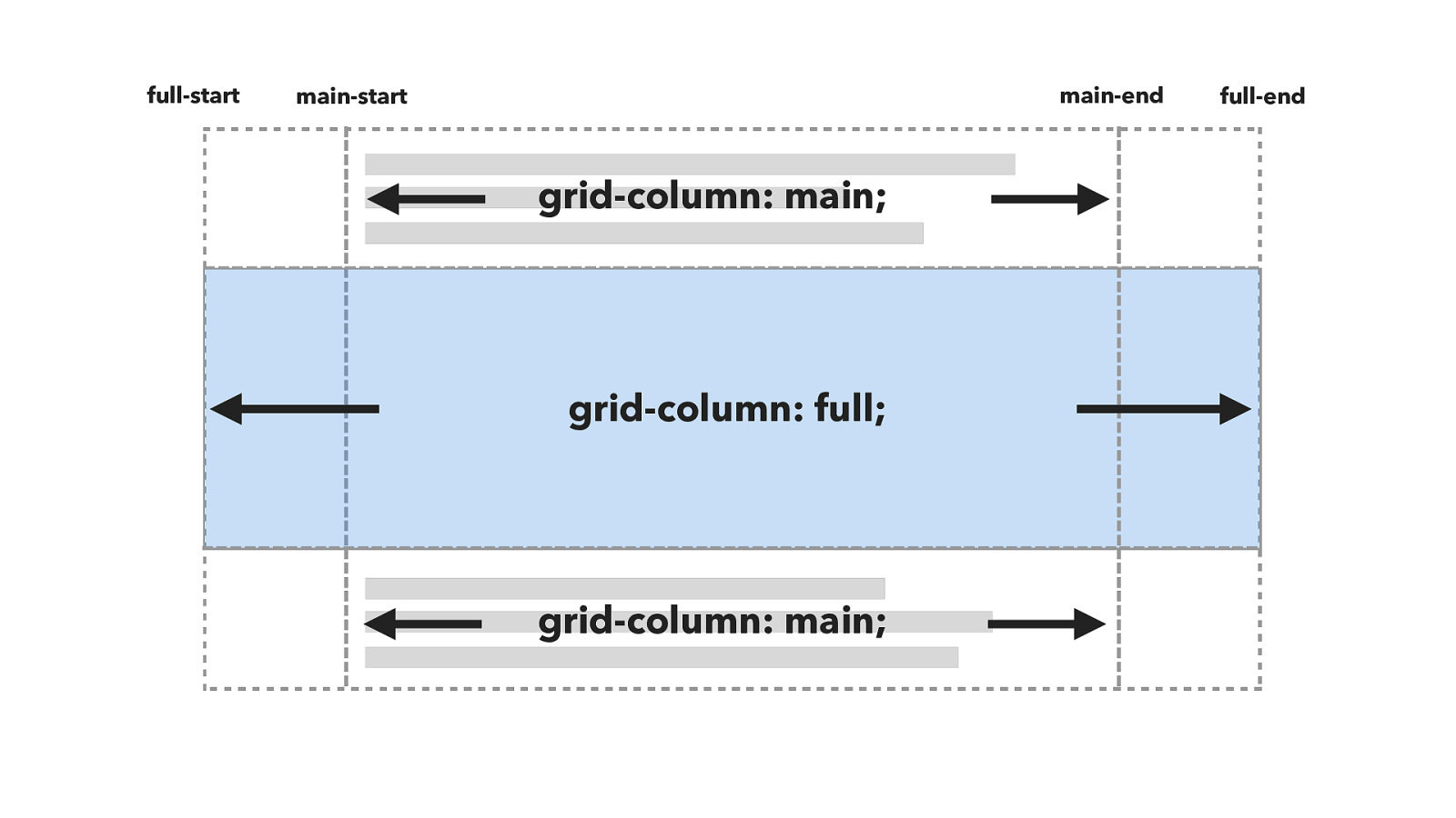
grid-column: main; grid-column: full; full-start main-start main-end full-end grid-column: main; But this isn’t quite the same as the example. The example uses the names full, and main rather than specifying start and end lines. It’s as if it is targeting the tracks or tracks rather than the lines, and line based positioning only targets lines not tracks.
.grid {
display: grid;
max-width: 960px;
margin: 0 auto;
grid-template-columns: [full-start]
minmax(1em, 1fr)
[main-start] minmax(0, 660px) [main-end]
minmax(1em, 1fr) [full-end];
}
.grid > * {
grid-column: main;
}
.grid > .gallery {
grid-column: full;
}
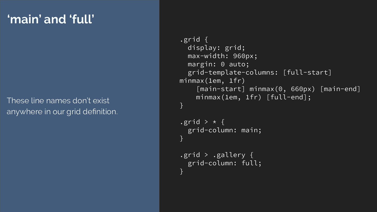
‘main’ and ‘full’
These line names don’t exist
anywhere in our grid definition.
We seem to be using line names that don’t exist anywhere. To understand this you need to know something else about grid layout.
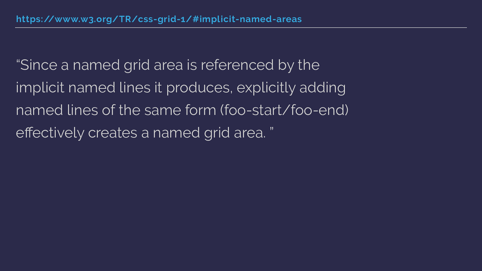
https://www.w3.org/TR/css-grid-1/#implicit-named-areas “Since a named grid area is referenced by the implicit named lines it produces, explicitly adding named lines of the same form (foo-start/foo-end) effectively creates a named grid area. ” When you name lines with -start and -end for columns and rows, you get a named area of the main name used.
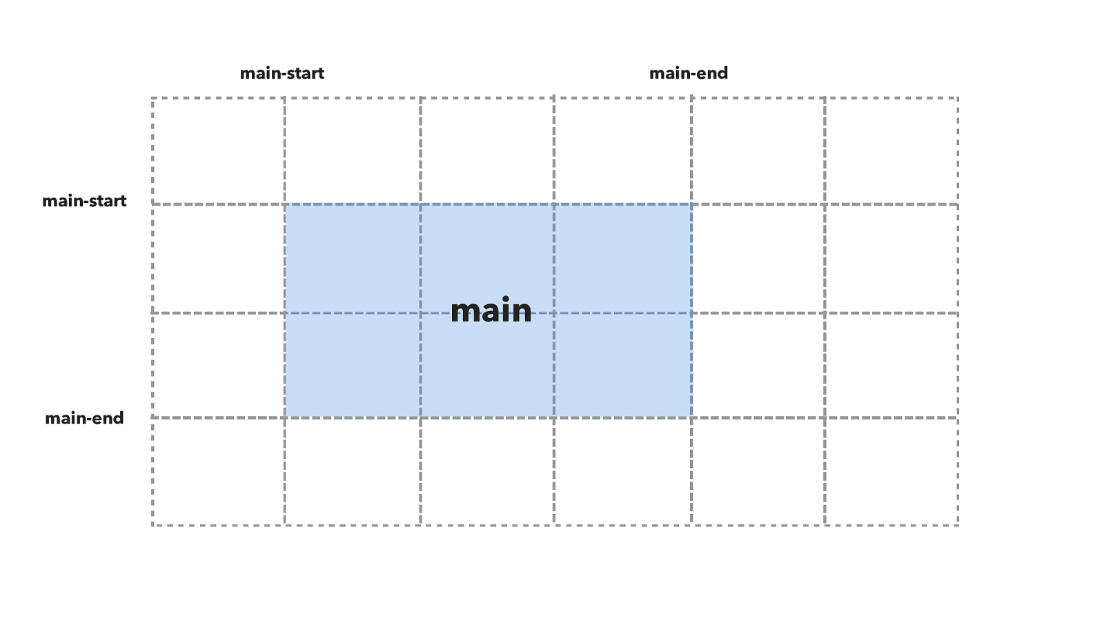
main-start main-start main-end main-end main So in this diagram you can see that I have named grid lines for main-start and main-end both for columns and for rows.
This creates a named grid area called main.
.grid {
display: grid;
grid-gap: 20px;
grid-template-columns:
100px [main-start]
100px 100px 100px [main-end]
100px 100px;
grid-template-rows:
100px [main-start]
100px 100px [main-end] 100px;
}
.item {
grid-area: main;
}
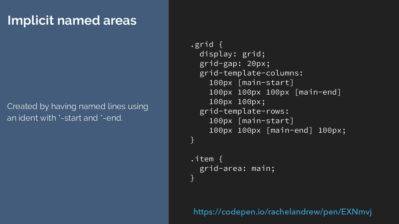
Implicit named areas
Created by having named lines using
an ident with *-start and *-end.
https://codepen.io/rachelandrew/pen/EXNmvj
You would end up with code like this, creating the lines then placing the item with grid-area: main.
.grid {
display: grid;
grid-template-columns: [full-start]
minmax(1em, 1fr)
[main-start] minmax(0, 660px) [main-
end]
minmax(1em, 1fr) [full-end];
grid-template-rows: auto auto [full-
start] auto [full-end];
}
.grid > * {
grid-column: main-start;
}
.grid > .gallery {
grid-area: full;
}
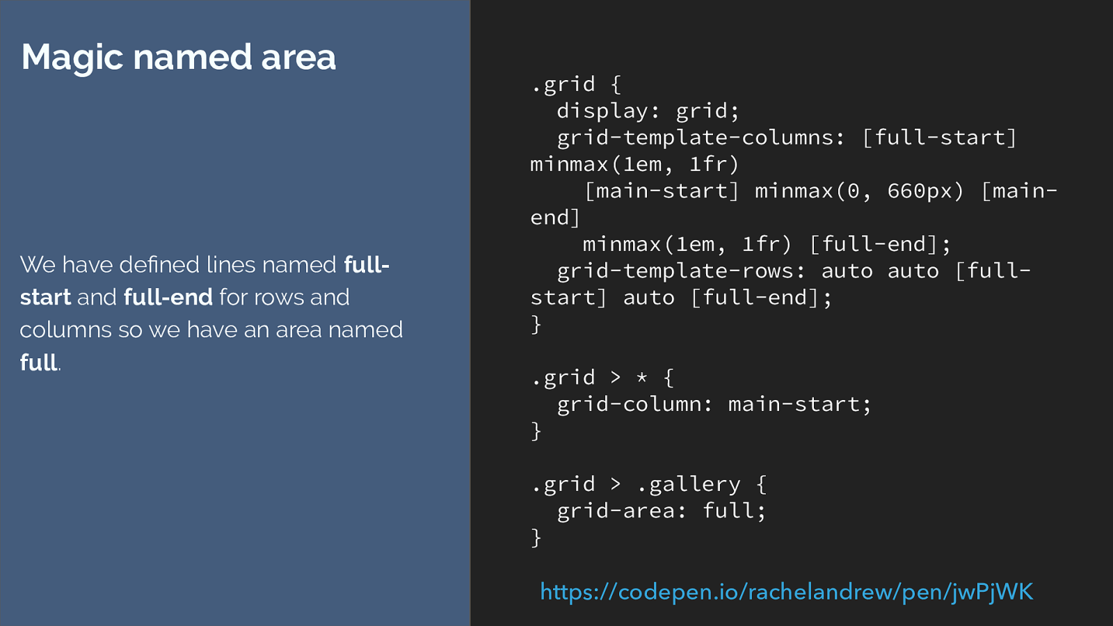
Magic named area
We have defined lines named
full-
start
and
full-end
for rows and
columns so we have an area named
full
.
https://codepen.io/rachelandrew/pen/jwPjWK
So with our example we could edit the code to look like this.
But this isn’t quite what we want either.
The example uses grid-column, not grid-area. I’m also defining row tracks to give me my areas, and if I target the same area twice the item is going to go into that area twice.
I also don’t have an area for the regular column so I’m having to continue to use grid-column for that. This is suboptimal - better to use line numbers or names really. But.
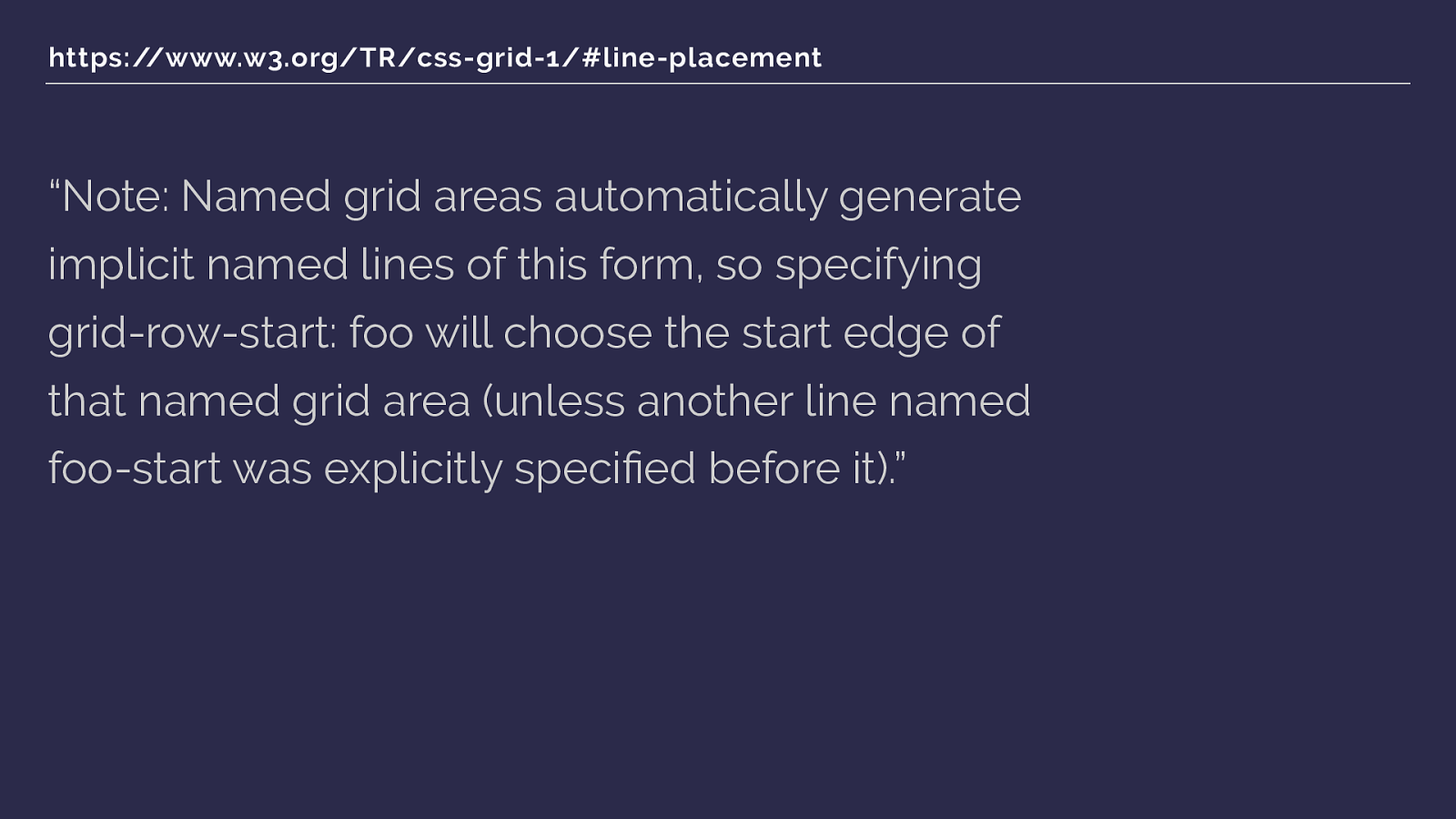
https://www.w3.org/TR/css-grid-1/#line-placement “Note: Named grid areas automatically generate implicit named lines of this form, so specifying grid-row-start: foo will choose the start edge of that named grid area (unless another line named foo-start was explicitly specified before it).” We can go a step further.
If you specify row or column start as the name of a named area - in our case main - then the start line will resolve to the start edge of that named grid area. So this gets our full width column starting at line 1 when we give grid-column a value of full.
So
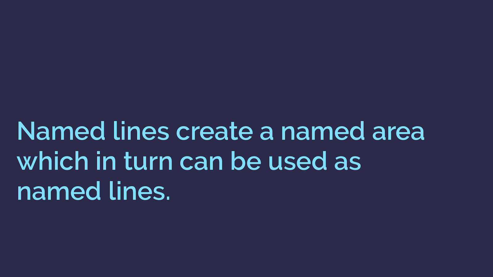
Named lines create a named area which in turn can be used as named lines. If you name lines with -start and -end you get a named area.
That named are in turn can be used as a named line, referring to the start and end edges of the defined area.
AND
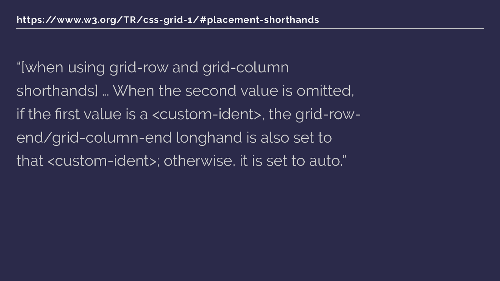
https://www.w3.org/TR/css-grid-1/#placement-shorthands “[when using grid-row and grid-column shorthands] … When the second value is omitted, if the first value is a <custom-ident>, the grid-row- end/grid-column-end longhand is also set to that <custom-ident>; otherwise, it is set to auto.” We're using a shorthand grid-column, and if you only give it one ident - which we are doing - then the end line, grid-column-end is set to the same ident. Which then means we have grid-column-end full, which will make the end line that end edge of that area, line 4.

grid-column: main; grid-column: full; full-start main-start main-end full-end grid-column: main; So this syntax,
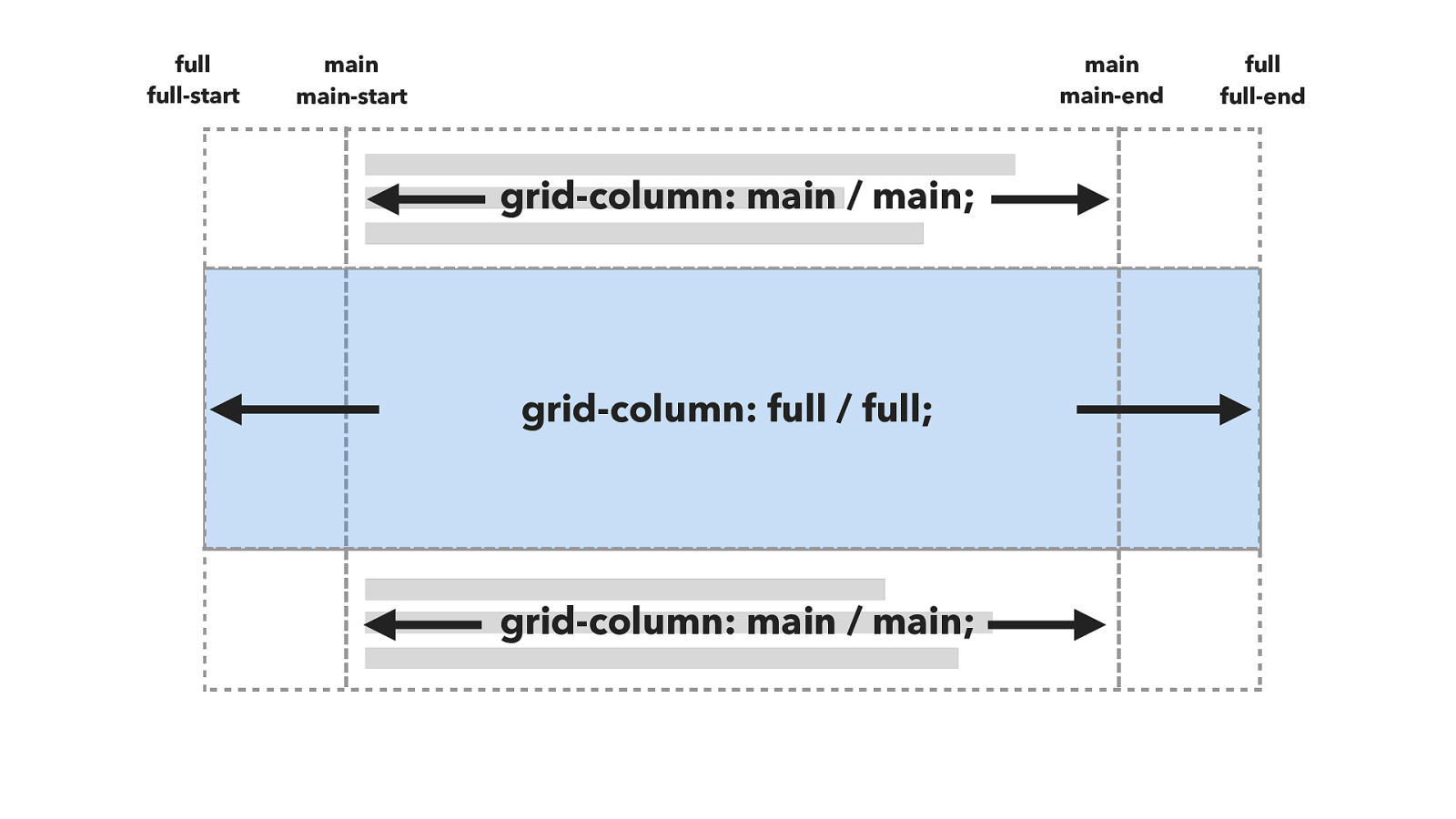
grid-column: main / main; grid-column: full / full; full-start main-start main-end full-end grid-column: main / main; full full main main Is really this.
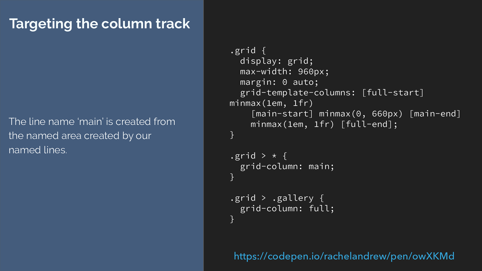
.grid {
display: grid;
max-width: 960px;
margin: 0 auto;
grid-template-columns: [full-start]
minmax(1em, 1fr)
[main-start] minmax(0, 660px) [main-end]
minmax(1em, 1fr) [full-end];
}
.grid > * {
grid-column: main;
}
.grid > .gallery {
grid-column: full;
}
Targeting the column track
The line name ‘main’ is created from
the named area created by our
named lines.
https://codepen.io/rachelandrew/pen/owXKMd
which gives us this. The ability to say grid-column main or grid-column full. Wow. That’s a deep habit hole for that.
I think it gives some interesting possibilities though. Being able to build a simple design framework for example that uses this ability to place items into different slots.
This is really just a continuation of the technique we have been using. In this case I have added two panels at the bottom of the layout.
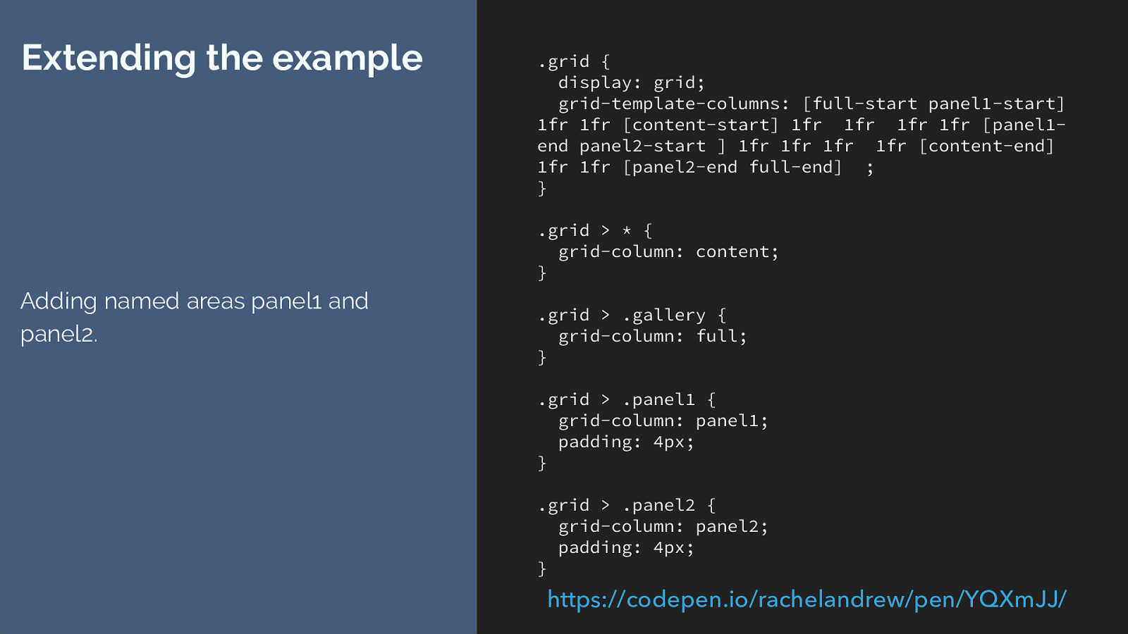
.grid { display: grid; grid-template-columns: [full-start panel1-start] 1fr 1fr [content-start] 1fr 1fr 1fr 1fr [panel1- end panel2-start ] 1fr 1fr 1fr 1fr [content-end] 1fr 1fr [panel2-end full-end] ; } .grid > * { grid-column: content; } .grid > .gallery { grid-column: full; } .grid > .panel1 { grid-column: panel1; padding: 4px; } .grid > .panel2 { grid-column: panel2; padding: 4px; } Extending the example Adding named areas panel1 and panel2. https://codepen.io/rachelandrew/pen/YQXmJJ/
I think there are some really interested use cases for this technique, and we haven’t even got to the end of the naming fun yet.
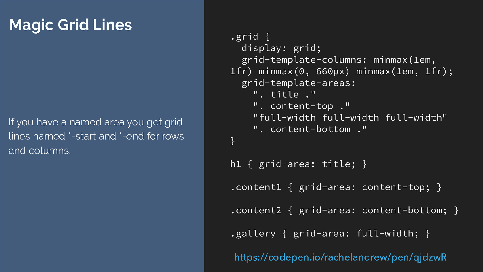
.grid { display: grid; grid-template-columns: minmax(1em, 1fr) minmax(0, 660px) minmax(1em, 1fr); grid-template-areas: ". title ." ". content-top ." "full-width full-width full-width" ". content-bottom ." } h1 { grid-area: title; } .content1 { grid-area: content-top; } .content2 { grid-area: content-bottom; } .gallery { grid-area: full-width; } Magic Grid Lines If you have a named area you get grid lines named *-start and *-end for rows and columns. https://codepen.io/rachelandrew/pen/qjdzwR
While on the subject of naming I showed you that we get a magic grid area when we named lines, well that also works in reverse. You can get magic named lines from your grid areas.
So here I have created a layout that looks just the same as the one we have been working with, this time however I have used grid-template-areas to lay out the items.

I want to be able to put a background colour on that main content column, however we can’t add backgrounds and borders to grid areas right now.
Our magic lines give us a way to do this.
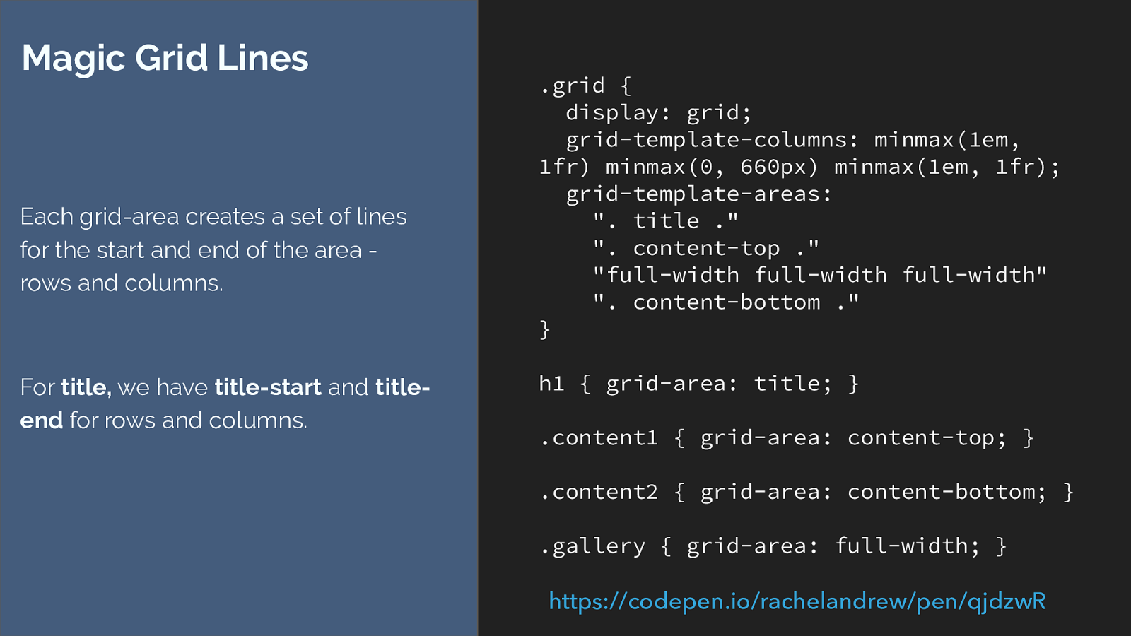
.grid { display: grid; grid-template-columns: minmax(1em, 1fr) minmax(0, 660px) minmax(1em, 1fr); grid-template-areas: ". title ." ". content-top ." "full-width full-width full-width" ". content-bottom ." } h1 { grid-area: title; } .content1 { grid-area: content-top; } .content2 { grid-area: content-bottom; } .gallery { grid-area: full-width; } Magic Grid Lines Each grid-area creates a set of lines for the start and end of the area - rows and columns. For title, we have title-start and title- end for rows and columns. https://codepen.io/rachelandrew/pen/qjdzwR
Every defined grid area is inside 4 lines. These lines are named dash start and dash end for rows and columns.
We can use those lines to position some generated content.
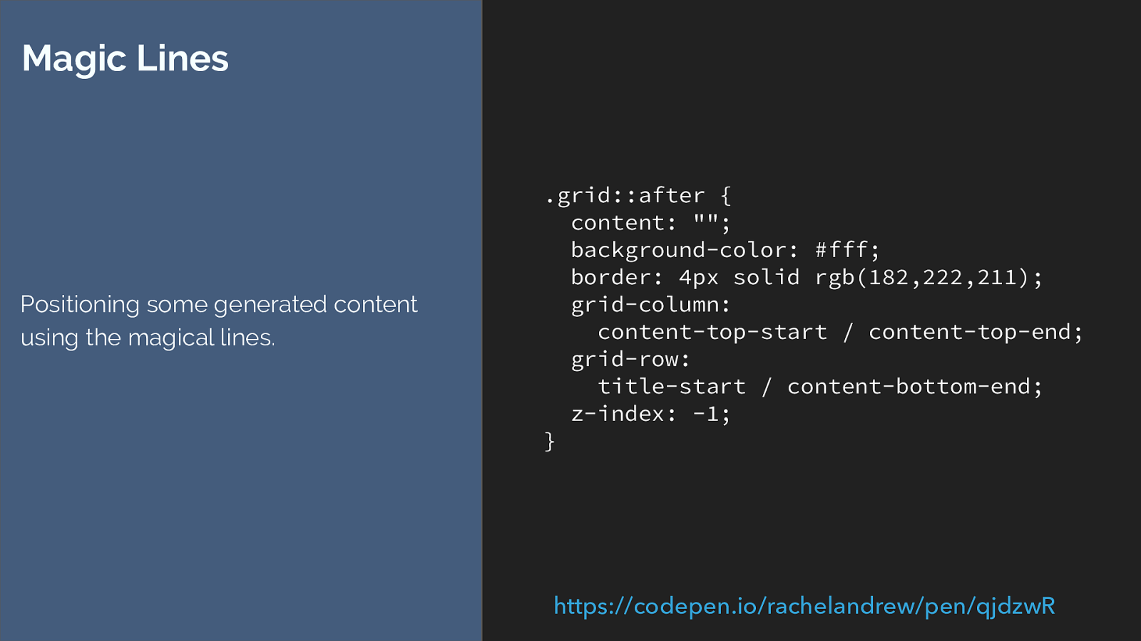
.grid::after {
content: "";
background-color: #fff;
border: 4px solid rgb(182,222,211);
grid-column:
content-top-start / content-top-end;
grid-row:
title-start / content-bottom-end;
z-index: -1;
}
Magic Lines
Positioning some generated content
using the magical lines.
https://codepen.io/rachelandrew/pen/qjdzwR
Then we use the named lines to place the items
so we get this. if you look at the example code you can see that the background runs behind the gallery. Stretching right over the area marked out by those lines.
It’s a useful method to get the appearance of background and or borders on areas.

Things appearing in unexpected places. Here is something that happened as I was working on these examples.
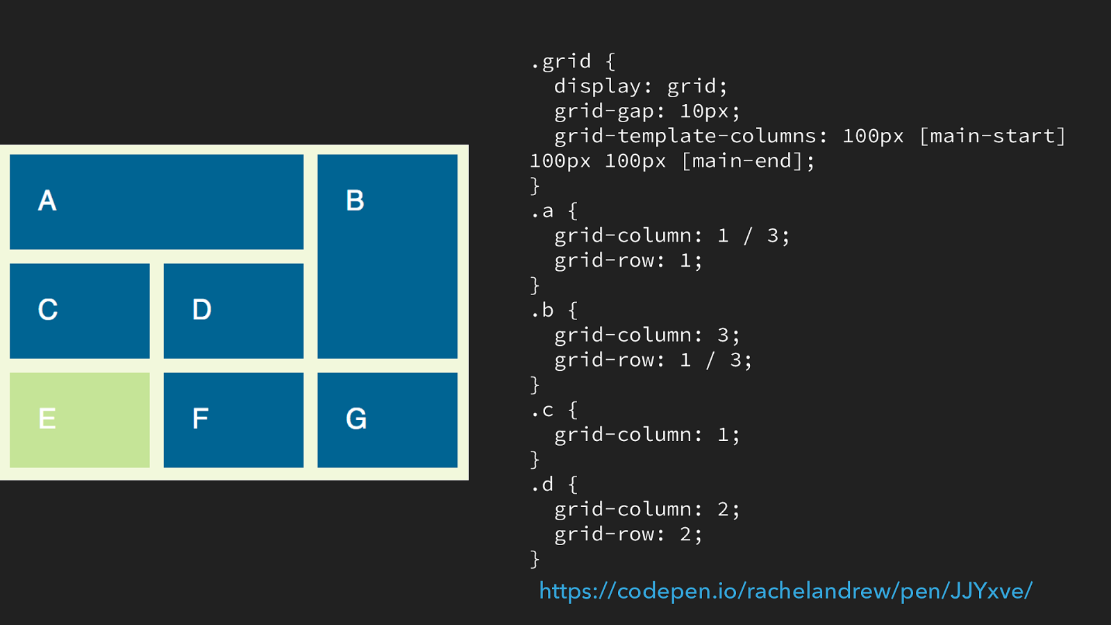
.grid { display: grid; grid-gap: 10px; grid-template-columns: 100px [main-start] 100px 100px [main-end]; } .a { grid-column: 1 / 3; grid-row: 1; } .b { grid-column: 3; grid-row: 1 / 3; } .c { grid-column: 1; } .d { grid-column: 2; grid-row: 2; } https://codepen.io/rachelandrew/pen/JJYxve/
I’ve defined a grid here, and named columns main-start and main-end, but have not named rows. I’ve positioned a few items and allowed e, f, and g to auto place below them.
What do you think will happen to e, if I put it into grid-area main - note that we haven’t defined rows for main.
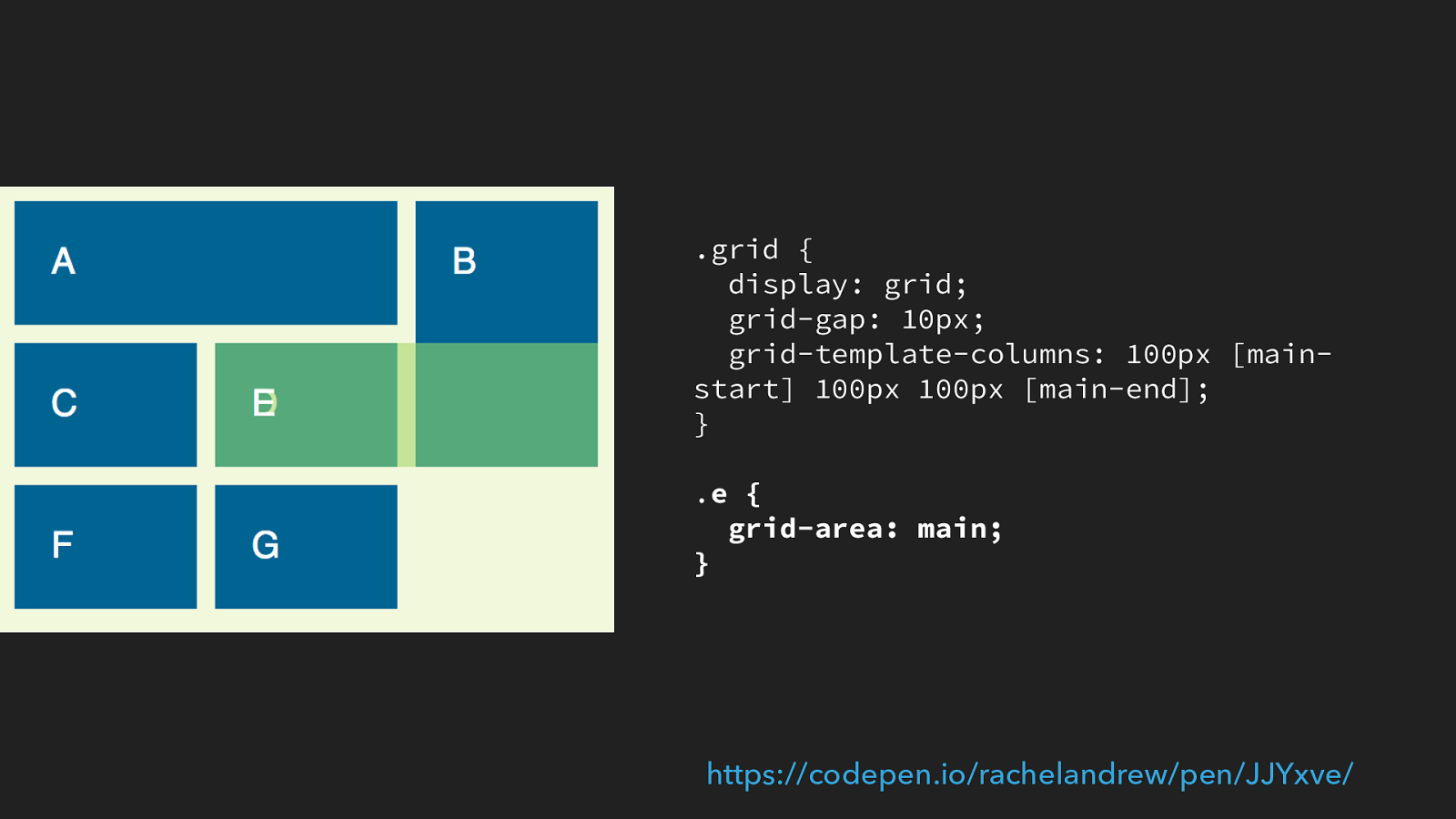
.grid { display: grid; grid-gap: 10px; grid-template-columns: 100px [main- start] 100px 100px [main-end]; } . e { grid-area: main; } https://codepen.io/rachelandrew/pen/JJYxve/
whatever you thought was going to happen, this happens. So we have column lines main-start and main-end. Which is where it has placed itself between, but instead of placing itself below the grid, which I first expected to happen it has sat itself in row 2.
This ba ffl ed me to the extent that I had to ask fantasi, one of the spec authors. She explained that by defining the name ‘main’ for columns, I had also defined it for rows. As I hadn’t done so explicitly, then the spec defines that as the first implicit line.
A grid always had a line 1 (at the start) so with no defined rows, the first implicit line is line two, so grid area main is between row lines 2 and 3 and column lines 2 and 4.
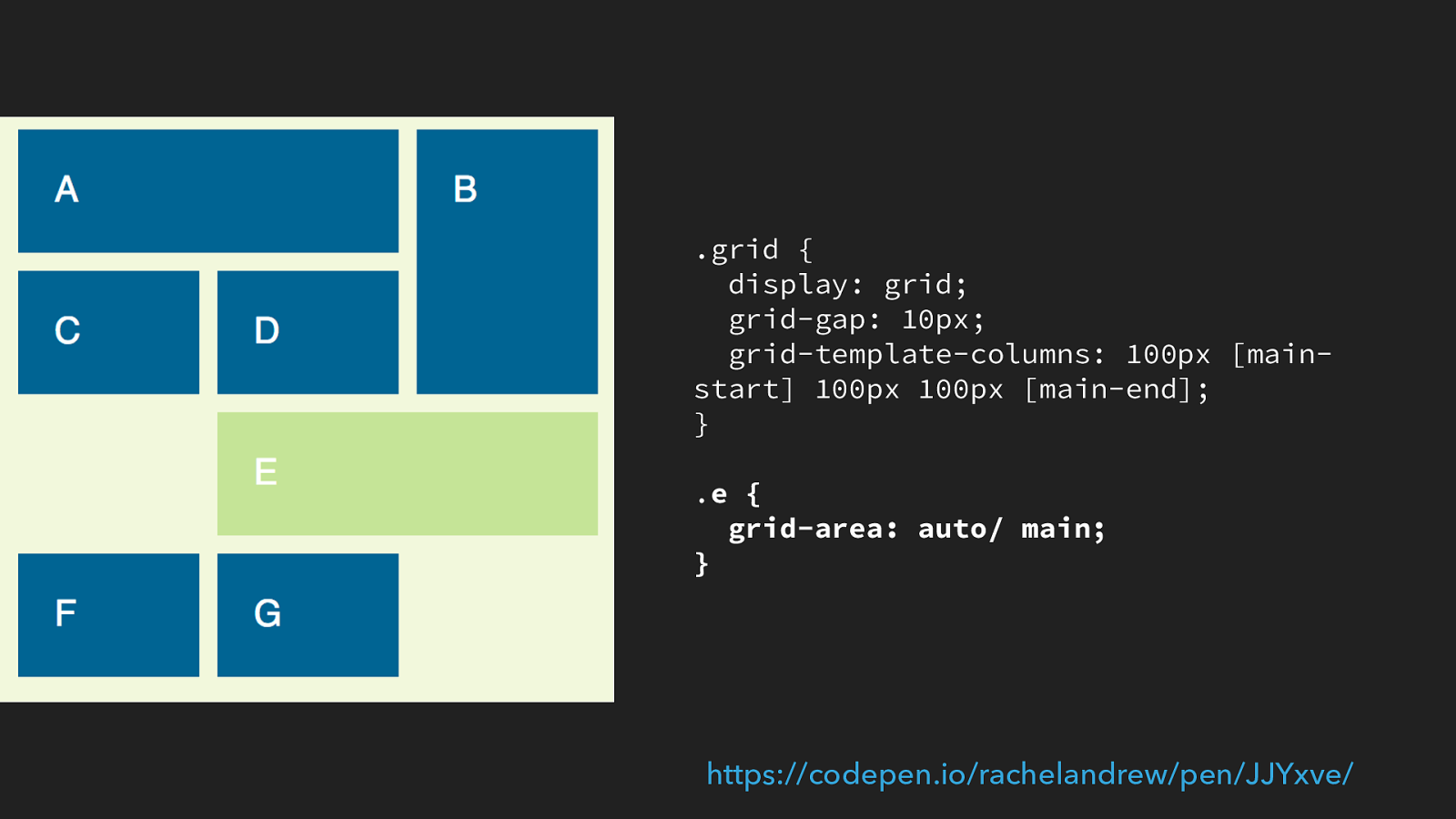
.grid { display: grid; grid-gap: 10px; grid-template-columns: 100px [main- start] 100px 100px [main-end]; } . e { grid-area: auto/ main; } https://codepen.io/rachelandrew/pen/JJYxve/
If we change it to auto / main then it takes it’s row placement as auto, which prevents the overlapping issue from occurring so, in the words of fantasia who knows more about these things than I do if you want auto placement, ask for it.
and I would add to that, if you find yourself at the bottom of a grid rabbit hole and can’t figure out what is going on. Put together a reduced test case and ask someone. In particular with knew CSS specs it may be that you are confused about somewhere that the spec could be clearer. This stuff is hard, and new and there is no shame in saying I have absolutely no idea what is happening there.

So many possibilities. I could quite literally carry on all day unpacking these things, CSS grid opens up so many possibilities.
Don’t be afraid to head down the grid rabbit hole. Don’t be afraid to questions what you know. CSS is changing but there are also so many things that we have traditionally used because they worked, without really knowing why they work. Starting to understand that will let you take advantage of what we have today, and all the cool stuff that is to come.
Find out more I made you some resources Visit Grid by Example for worked examples, patterns with fallbacks, and a free video tutorial: gridbyexample.com
I created a huge set of guides for MDN: https://developer.mozilla.org/en-US/docs/Web/CSS/ CSS_Grid_Layout
Over 4 years of grid thoughts on my site at: https://rachelandrew.co.uk/archives/tag/cssgrid
CSS Grid AMA: https://github.com/rachelandrew/cssgrid-ama
To help here are a few resources I have been creating, there is a huge pile of stuff over at Grid by Example including tutorial videos

THANK YOU! @rachelandrew Resources & code: https://rachelandrew.co.uk/speaking/event/cssday-nl-2017 and the slides and a link to all of the code pen examples can be found here.
Thanks for listening.