A presentation at An Event Apart Seattle in April 2018 in Seattle, WA, USA by Rachel Andrew

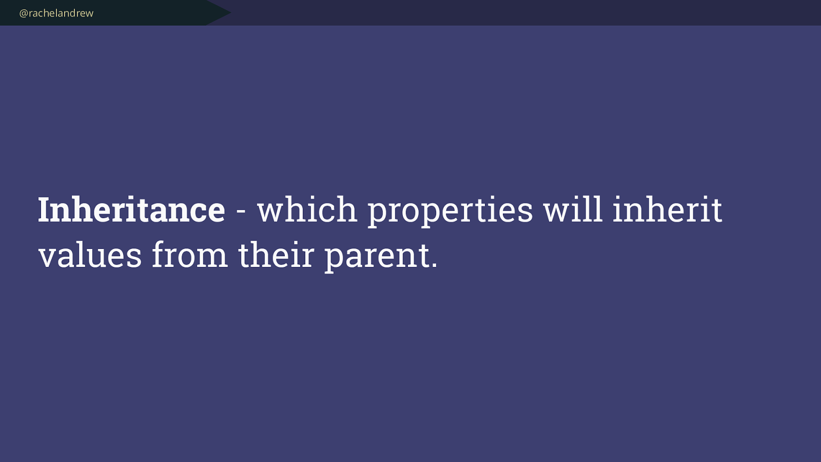
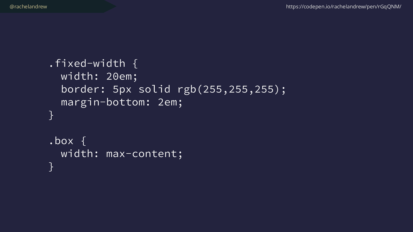
@rachelandrew .fixed-width { width: 20em; border: 5px solid rgb(255,255,255); margin-bottom: 2em; }
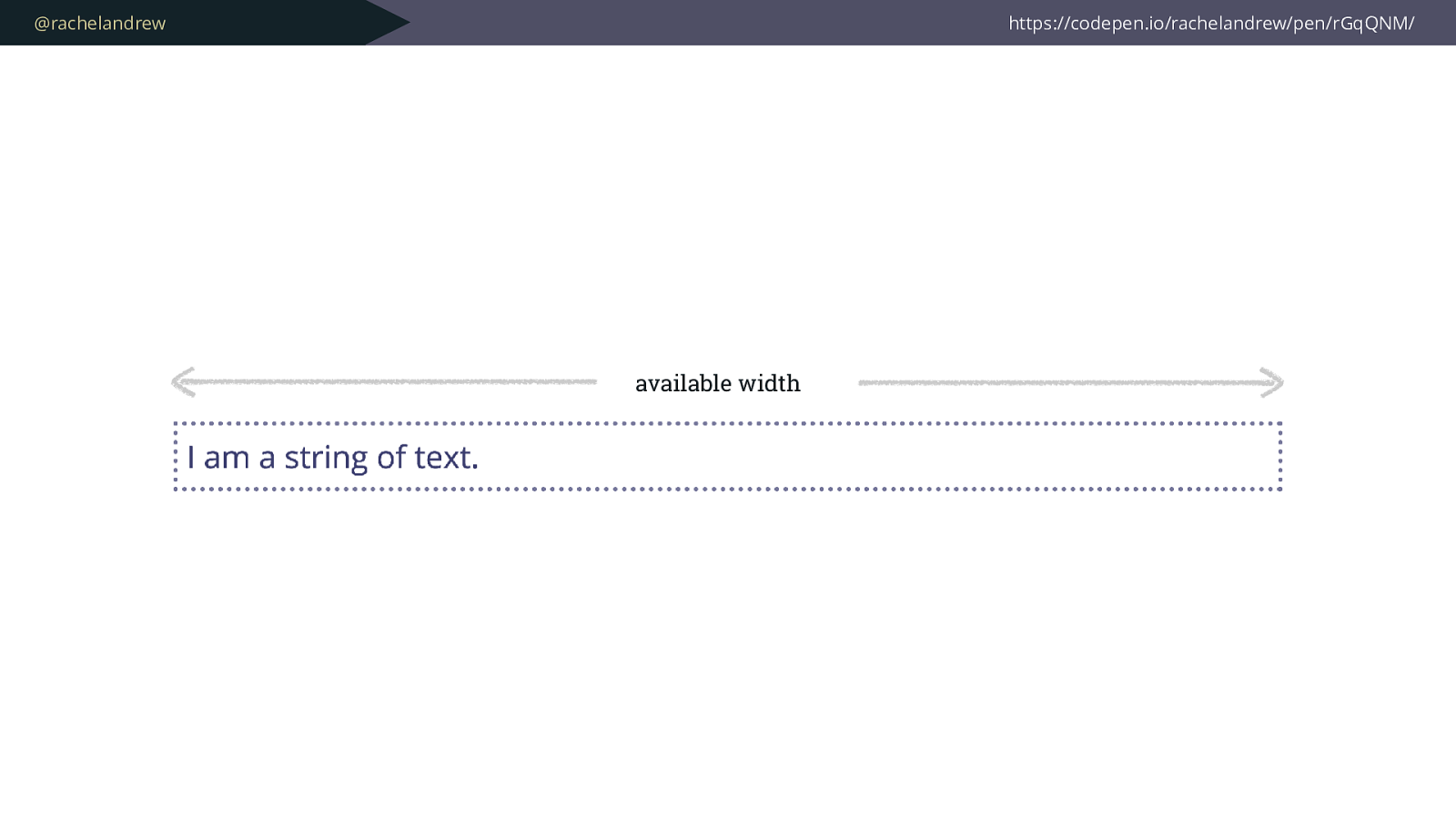
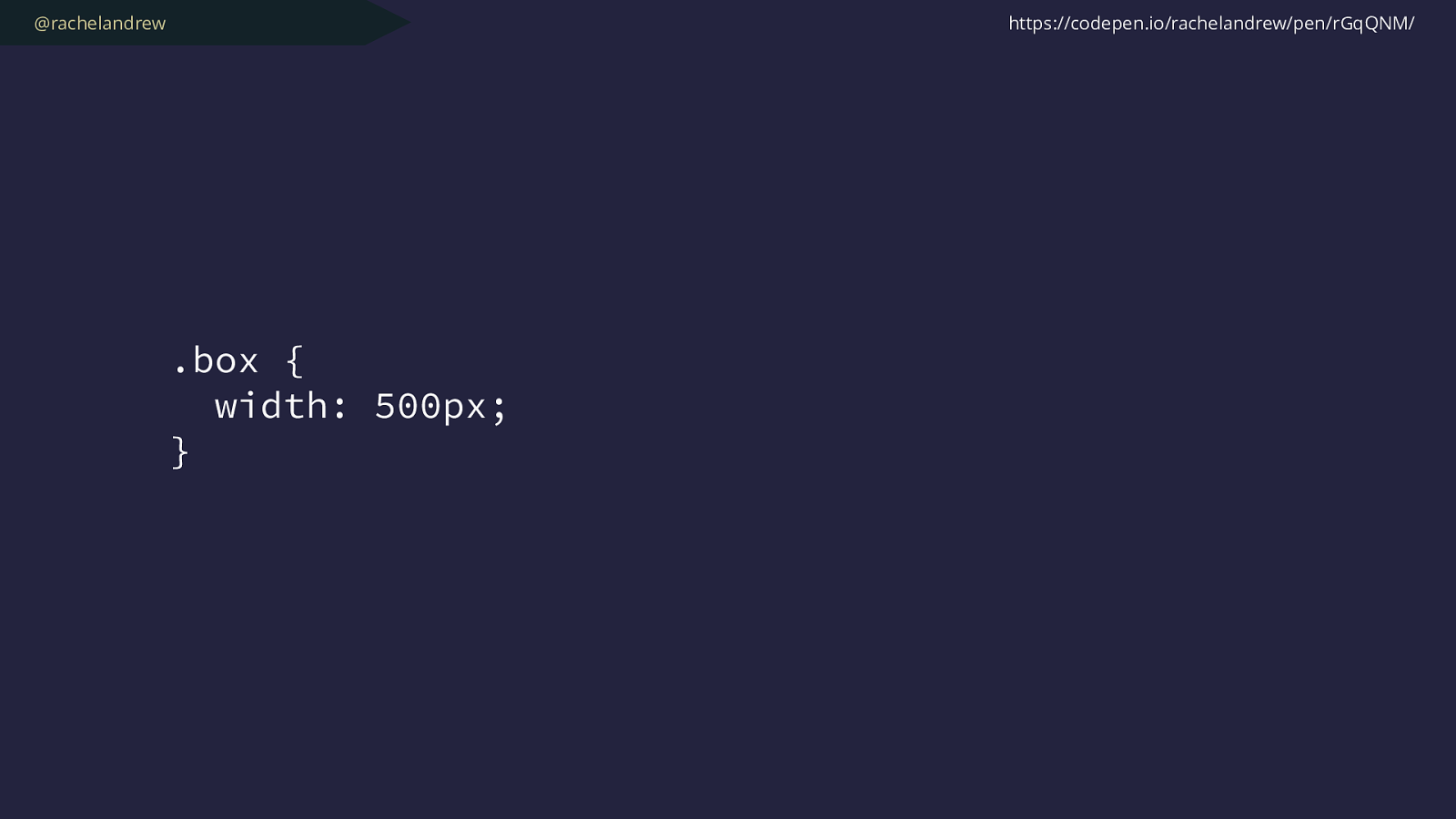
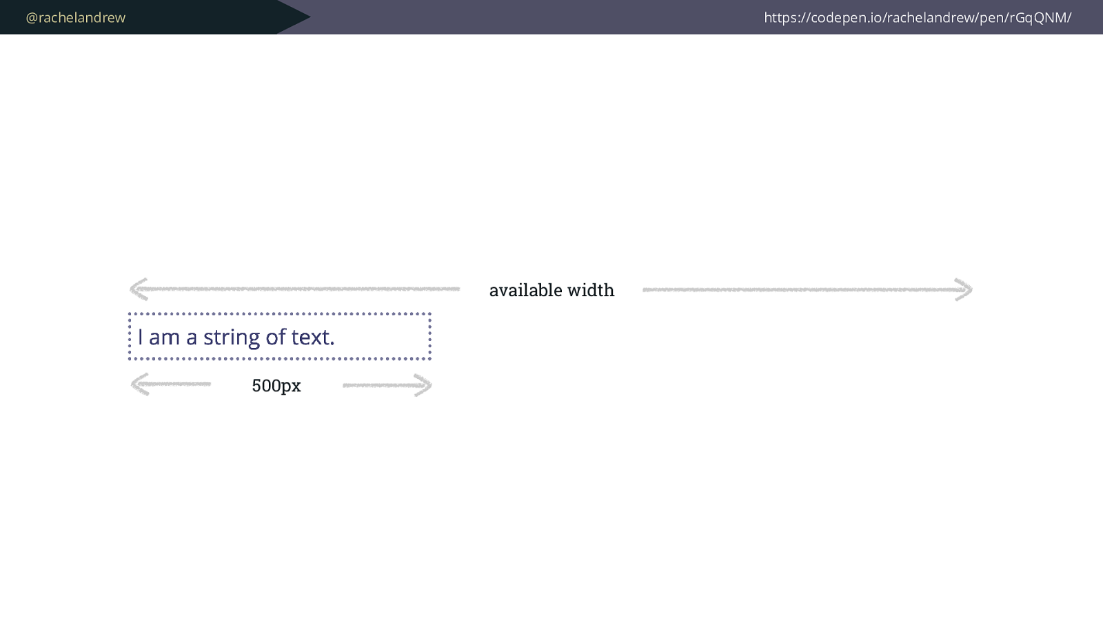
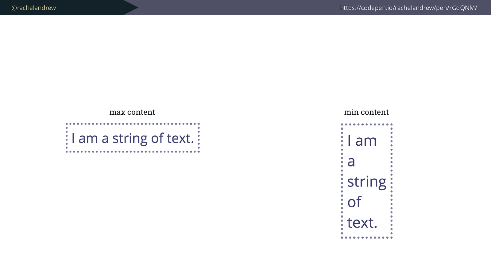
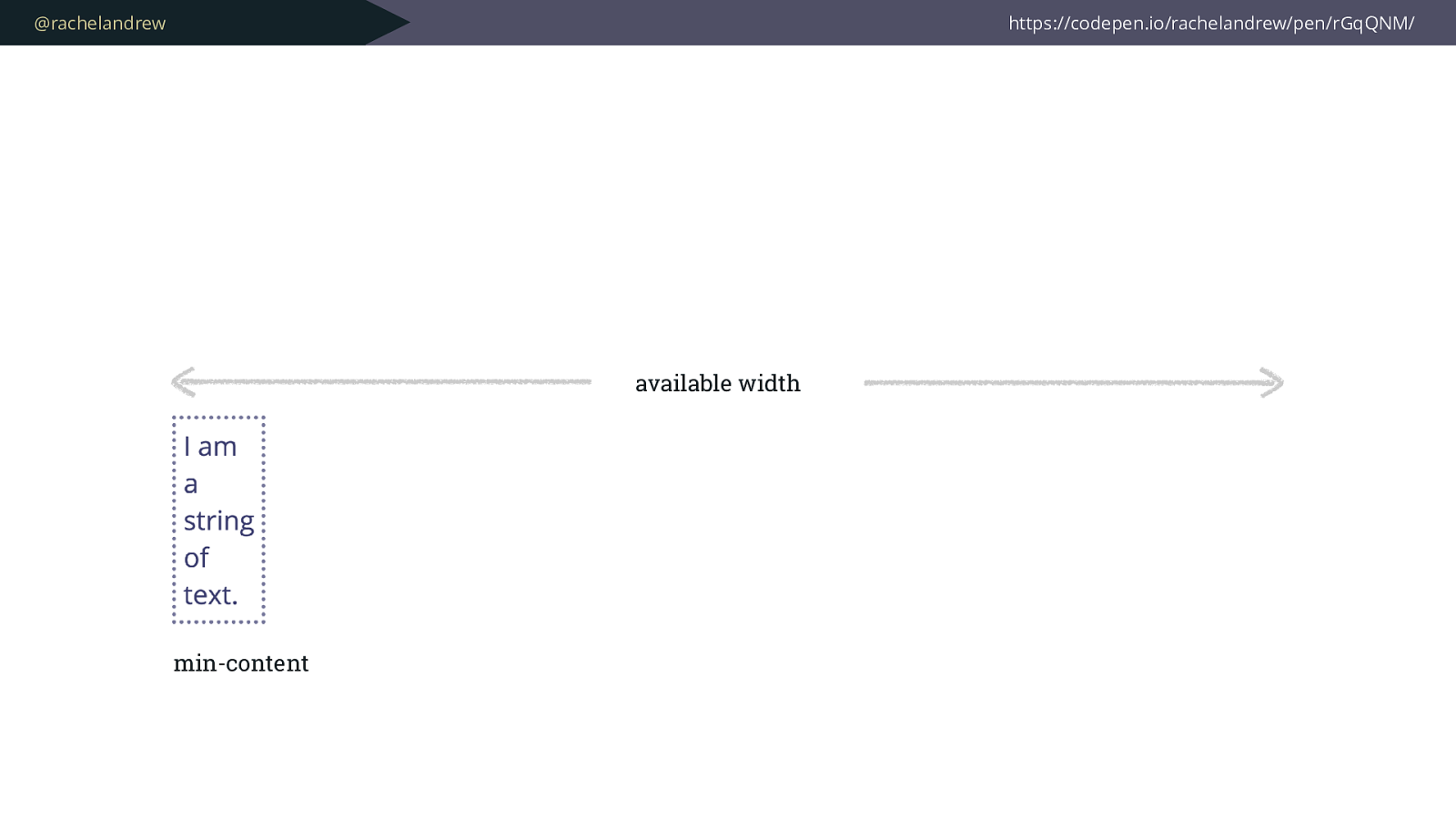
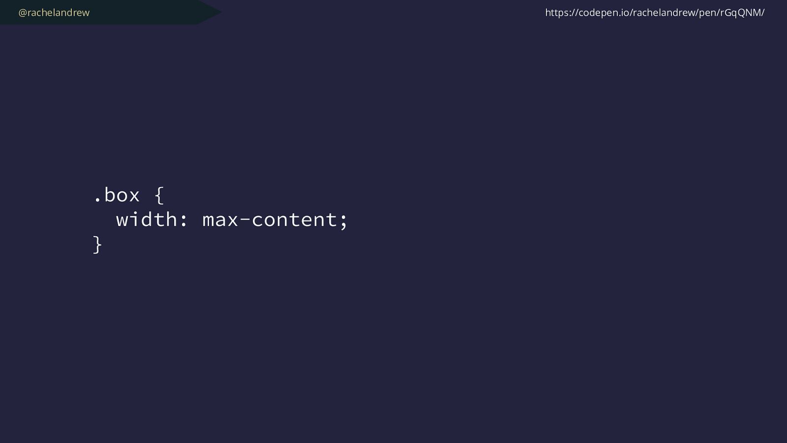
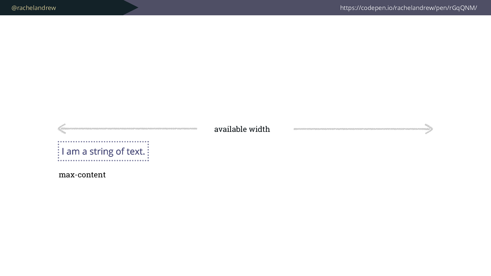
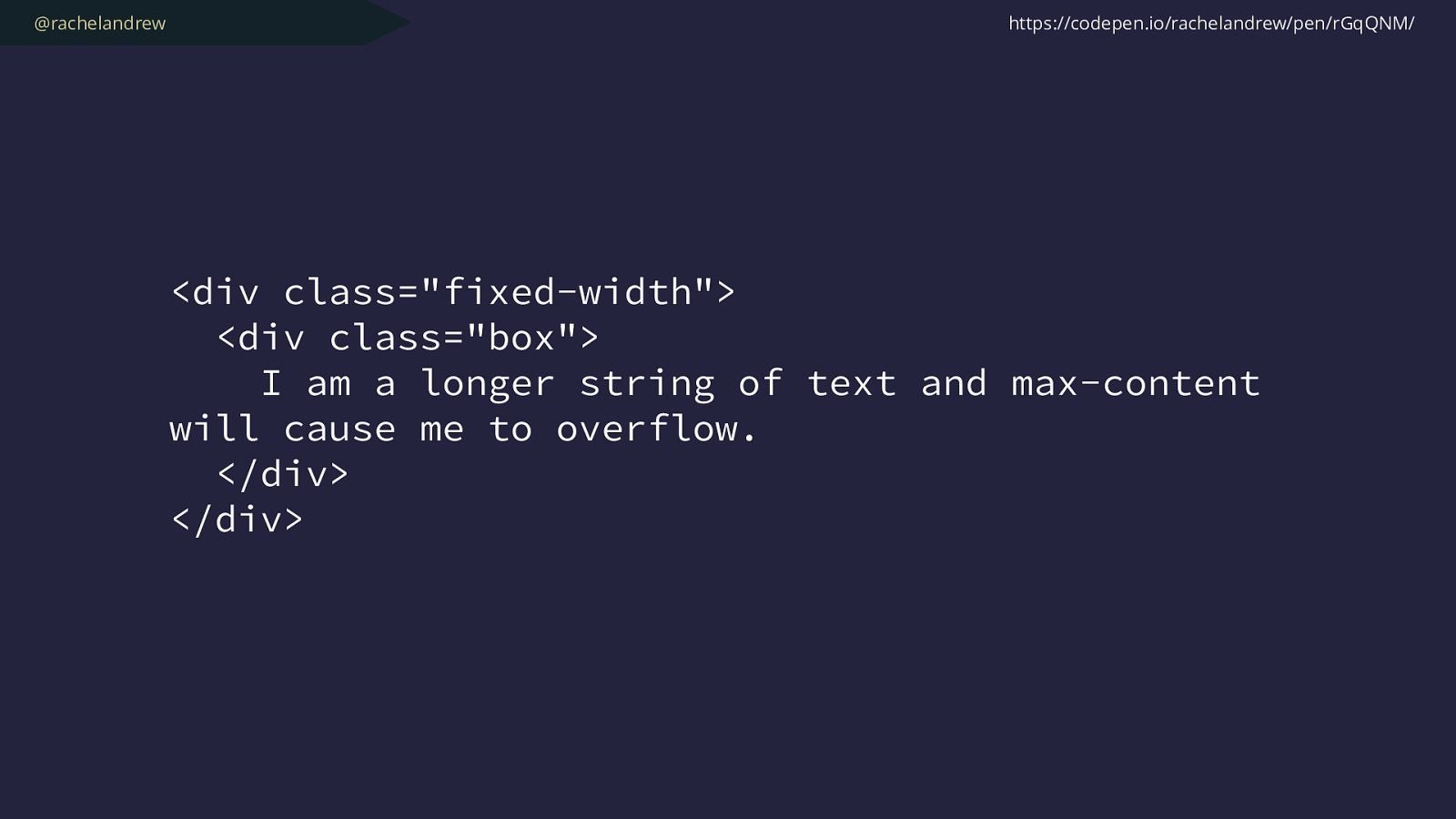
.box { width: max-content; } https://codepen.io/rachelandrew/pen/rGqQNM/
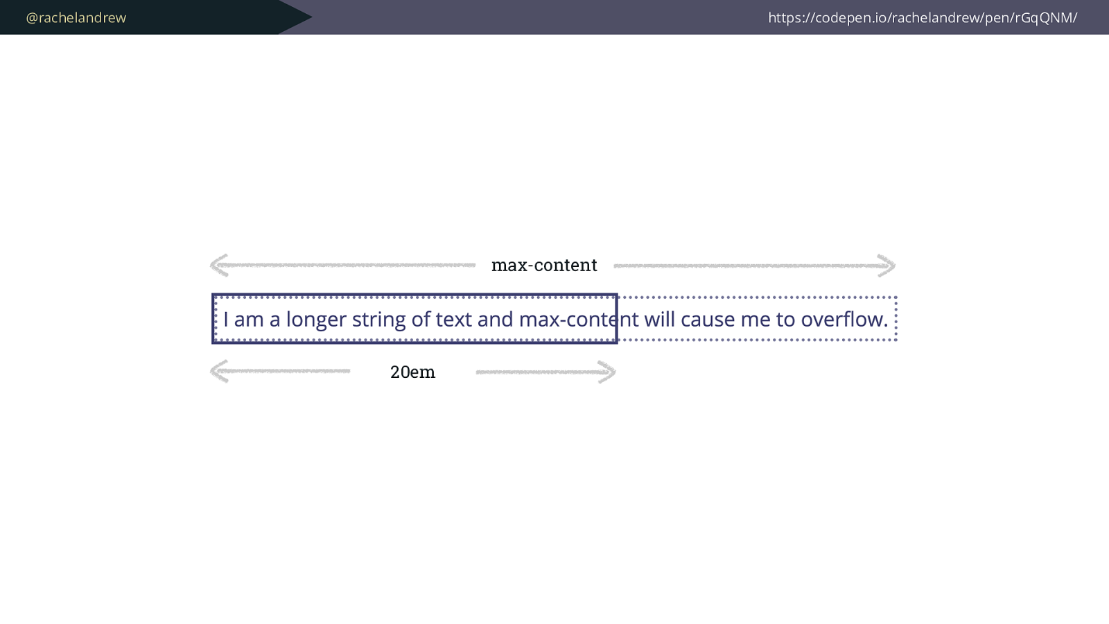
@rachelandrew https://codepen.io/rachelandrew/pen/rGqQNM/ 20em max-content
@rachelandrew
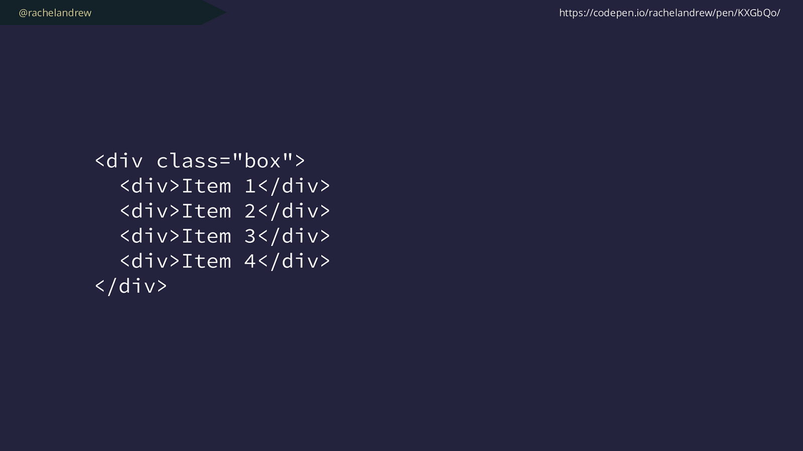
<div class="box"> <div>Item 1</div> <div>Item 2</div> <div>Item 3</div> <div>Item 4</div> </div> https://codepen.io/rachelandrew/pen/KXGbQo/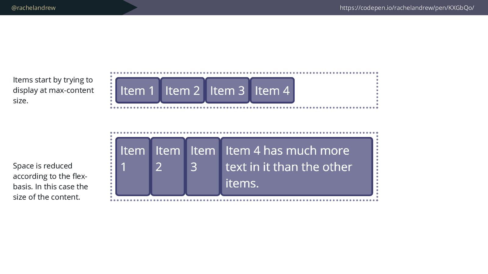
@rachelandrew https://codepen.io/rachelandrew/pen/KXGbQo/ Items start by trying to display at max-content size. Space is reduced according to the fl ex- basis. In this case the size of the content.
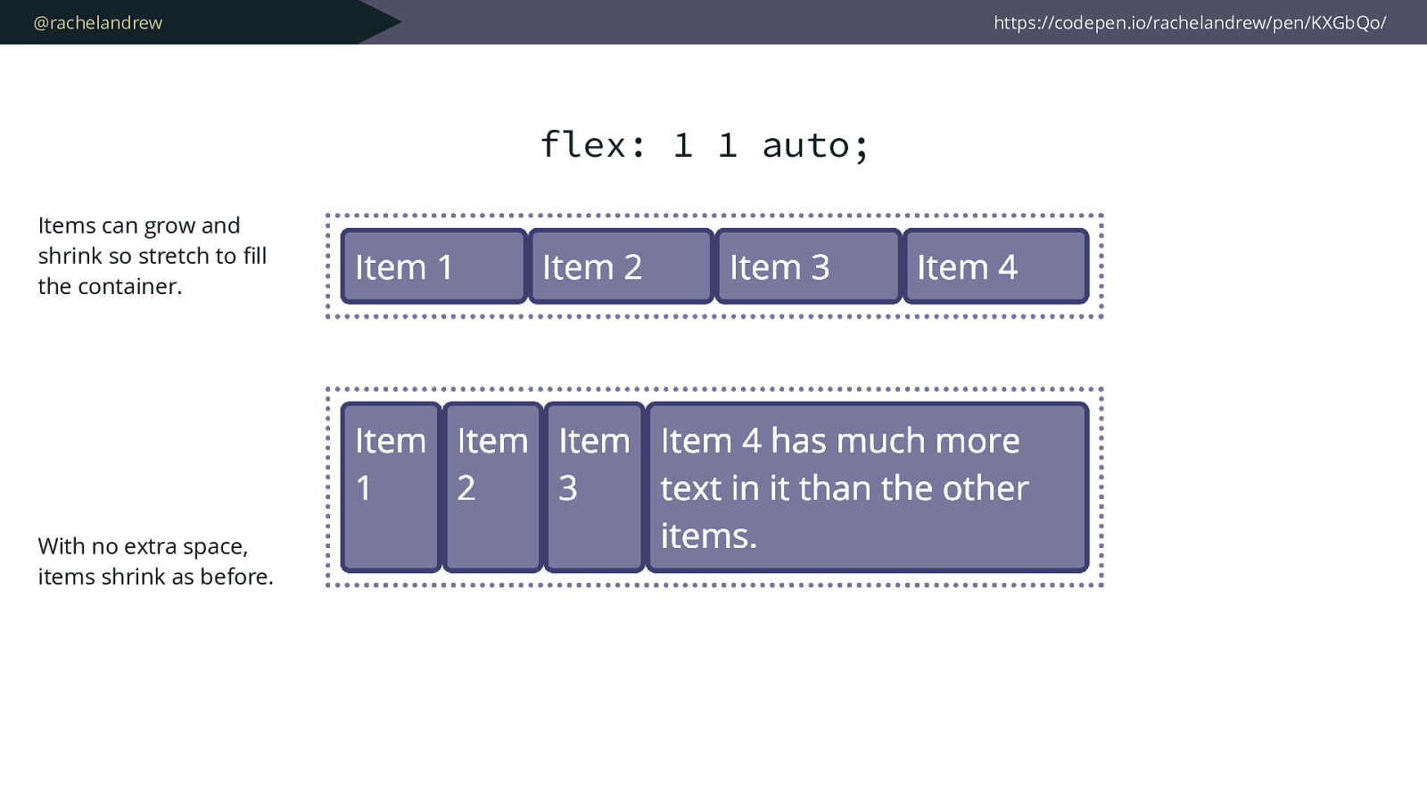
@rachelandrew https://codepen.io/rachelandrew/pen/KXGbQo/ Items can grow and shrink so stretch to fi ll the container. With no extra space, items shrink as before. flex: 1 1 auto;
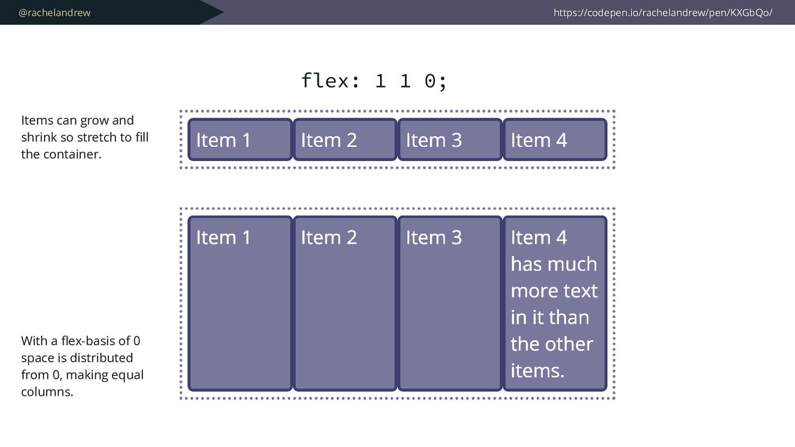
@rachelandrew https://codepen.io/rachelandrew/pen/KXGbQo/ Items can grow and shrink so stretch to fi ll the container. With a fl ex-basis of 0 space is distributed from 0, making equal columns. flex: 1 1 0;
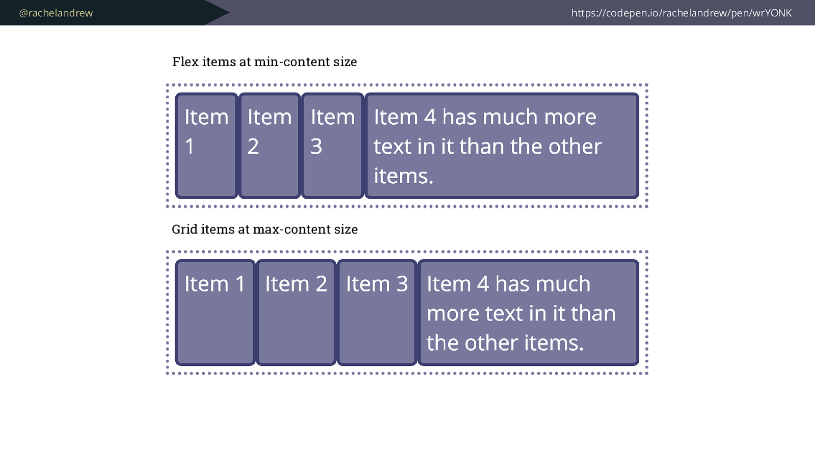
@rachelandrew https://codepen.io/rachelandrew/pen/wrYONK Flex items at min-content size Grid items at max-content size
@rachelandrew Flexbox is starting from max-content
and taking space away. Grid starting at min-content and adding space.

@rachelandrew .grid { display: grid; grid-template-columns: repeat(4, min-content); } https://codepen.io/rachelandrew/pen/bomZVP/
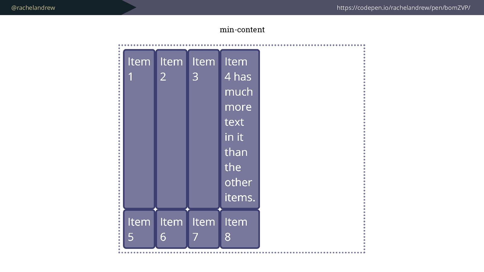
@rachelandrew https://codepen.io/rachelandrew/pen/bomZVP/ min-content
@rachelandrew .grid { display: grid; grid-template-columns: repeat(4, max -content); } https://codepen.io/rachelandrew/pen/bomZVP/
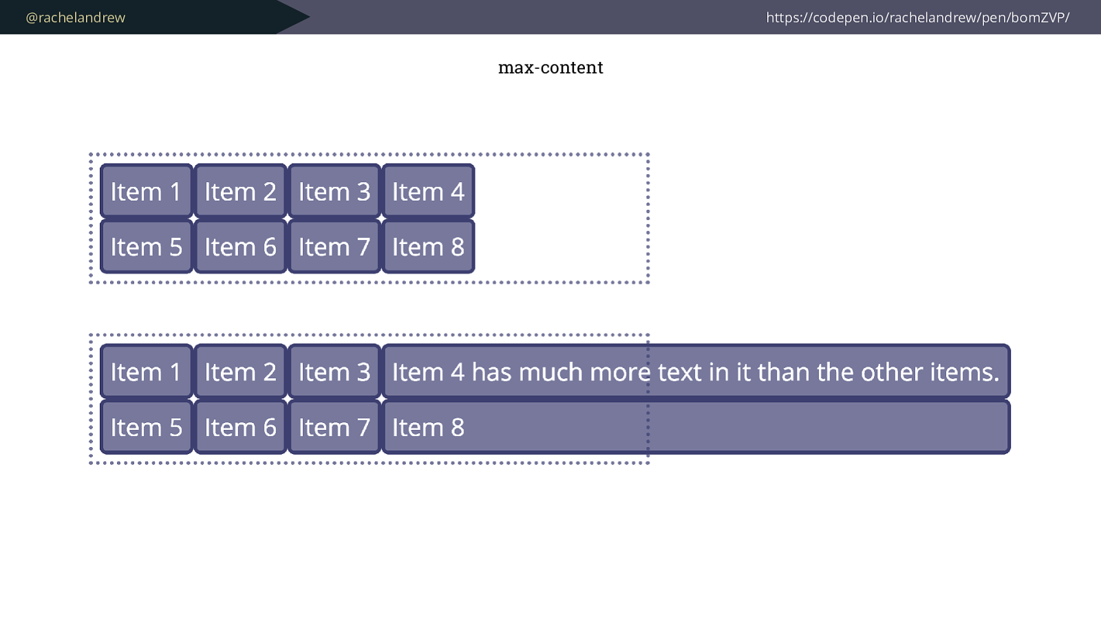
@rachelandrew https://codepen.io/rachelandrew/pen/bomZVP/ max-content
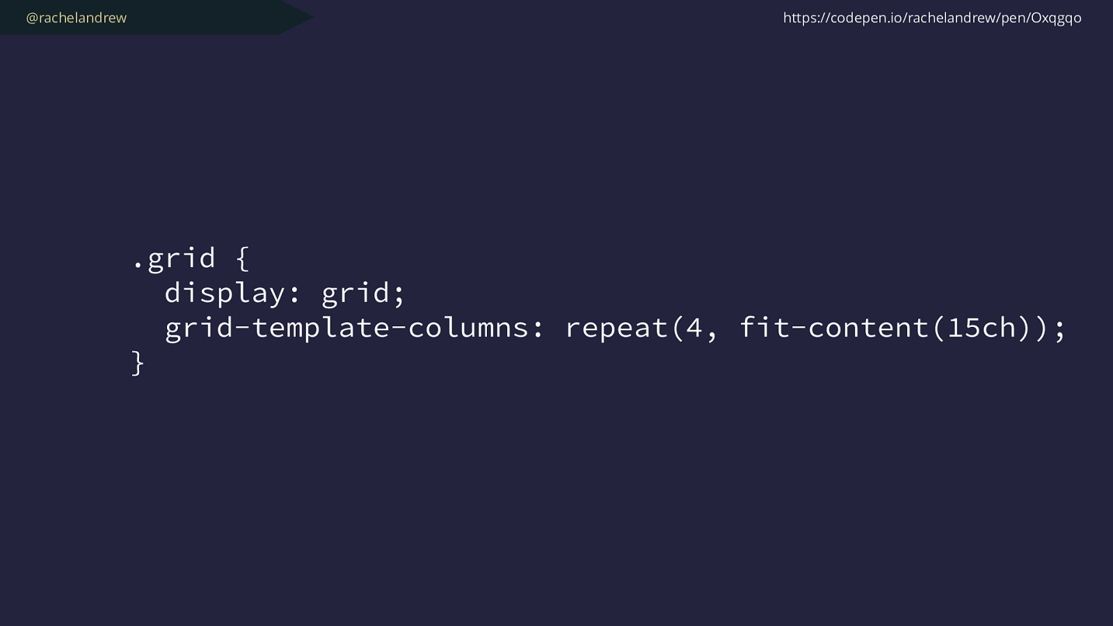
@rachelandrew .grid { display: grid; grid-template-columns: repeat(4, fit-content(15ch) ); } https://codepen.io/rachelandrew/pen/Oxqgqo
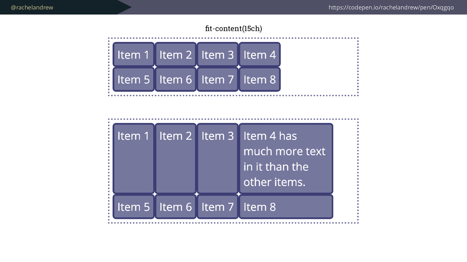
@rachelandrew https://codepen.io/rachelandrew/pen/Oxqgqo fit-content(15ch)
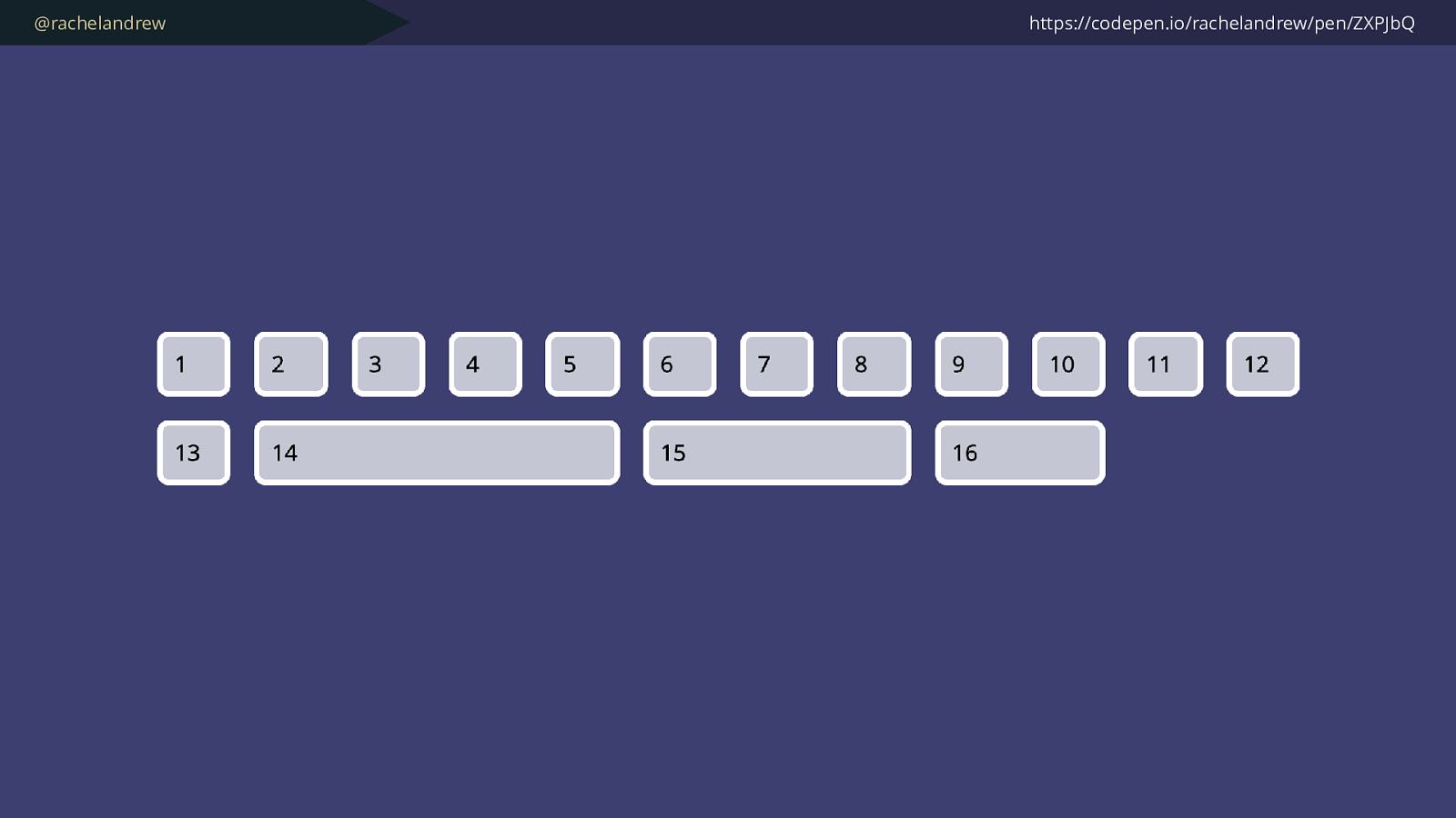
@rachelandrew https://codepen.io/rachelandrew/pen/ZXPJbQ
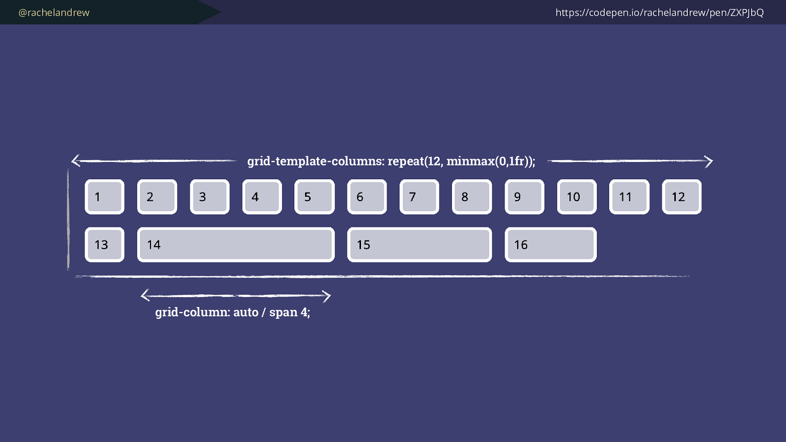
@rachelandrew https://codepen.io/rachelandrew/pen/ZXPJbQ grid-template-columns: repeat(12, minmax(0,1fr)); grid-column: auto / span 4;
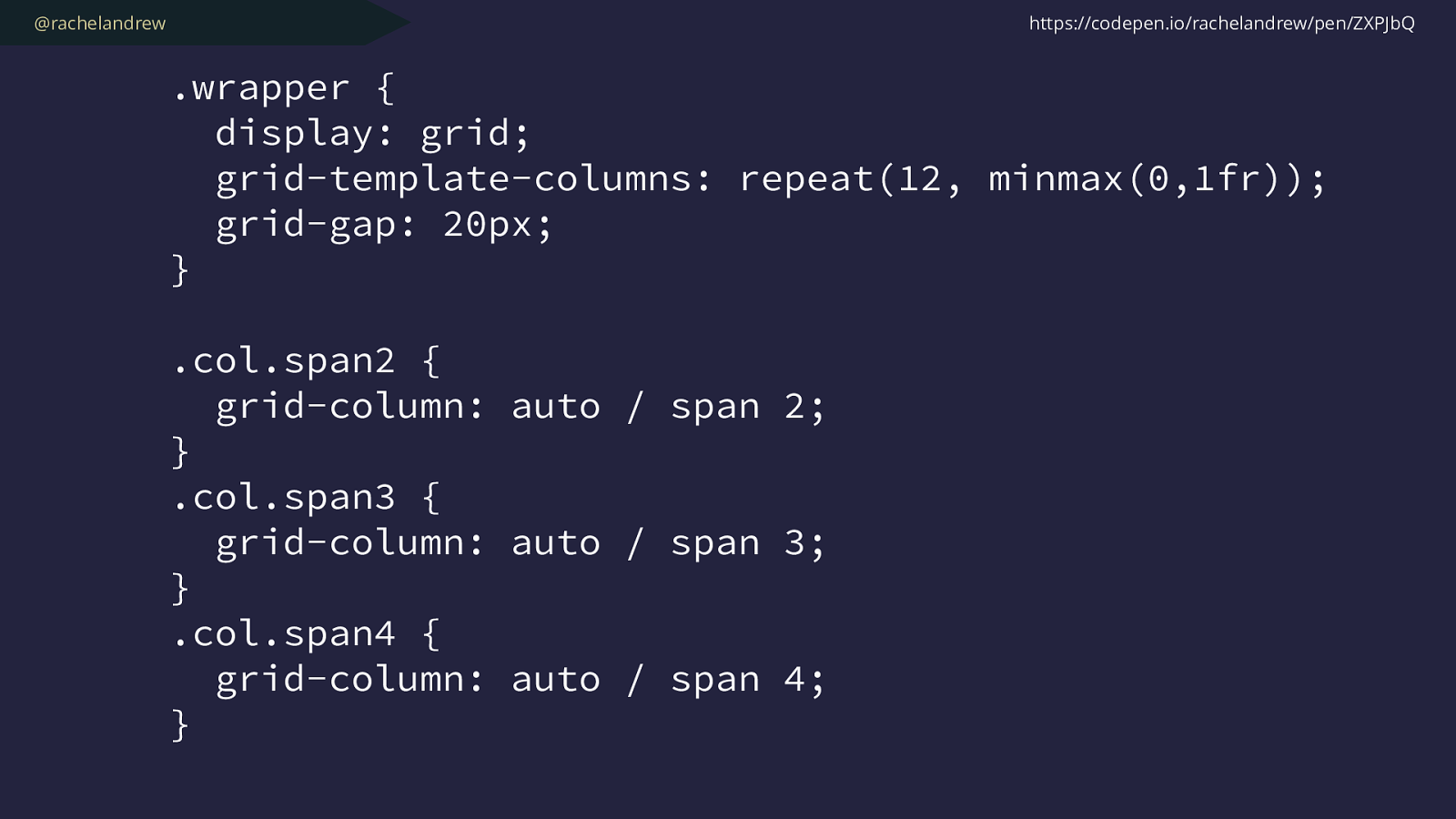
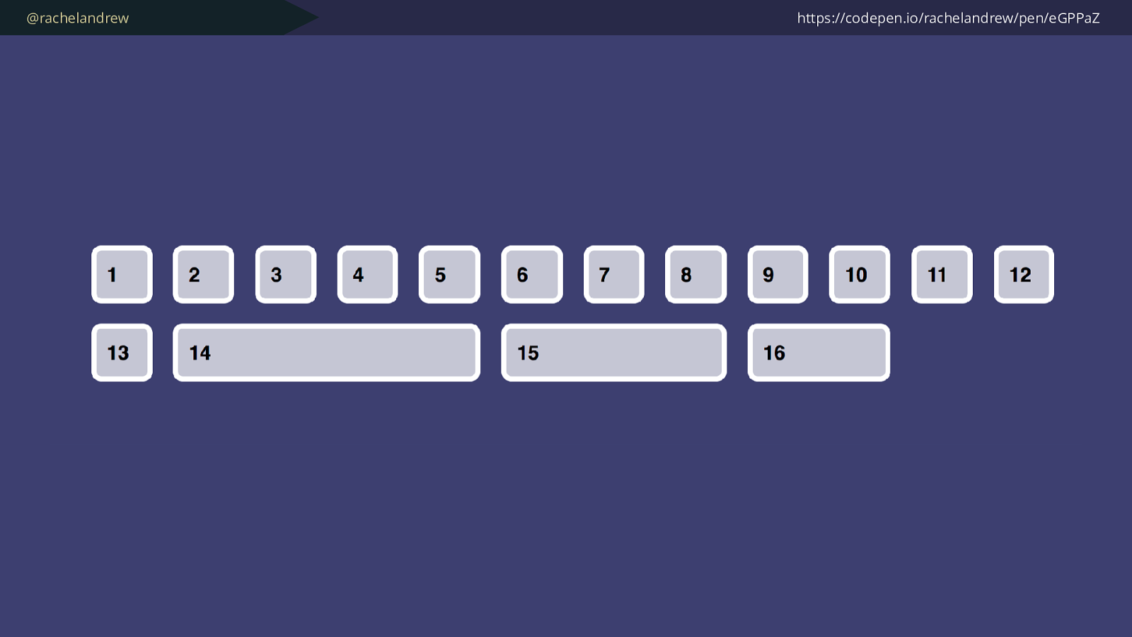
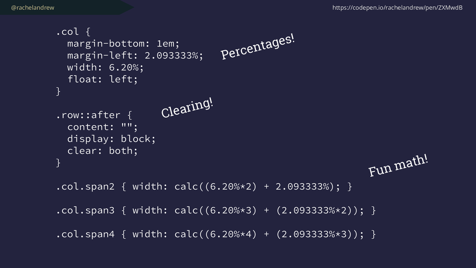
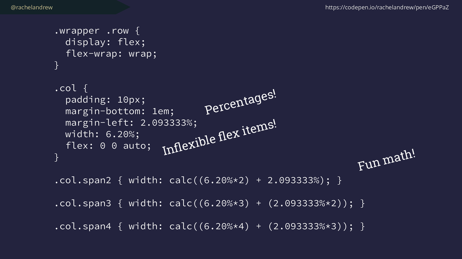
@rachelandrew .wrapper { display: grid; grid-template-columns: repeat(12, minmax(0,1fr)); grid-gap: 20px; }
.col.span2 { grid-column: auto / span 2; }
.col.span3 { grid-column: auto / span 3; } .col.span4 { grid-column: auto / span 4; } https://codepen.io/rachelandrew/pen/ZXPJbQ
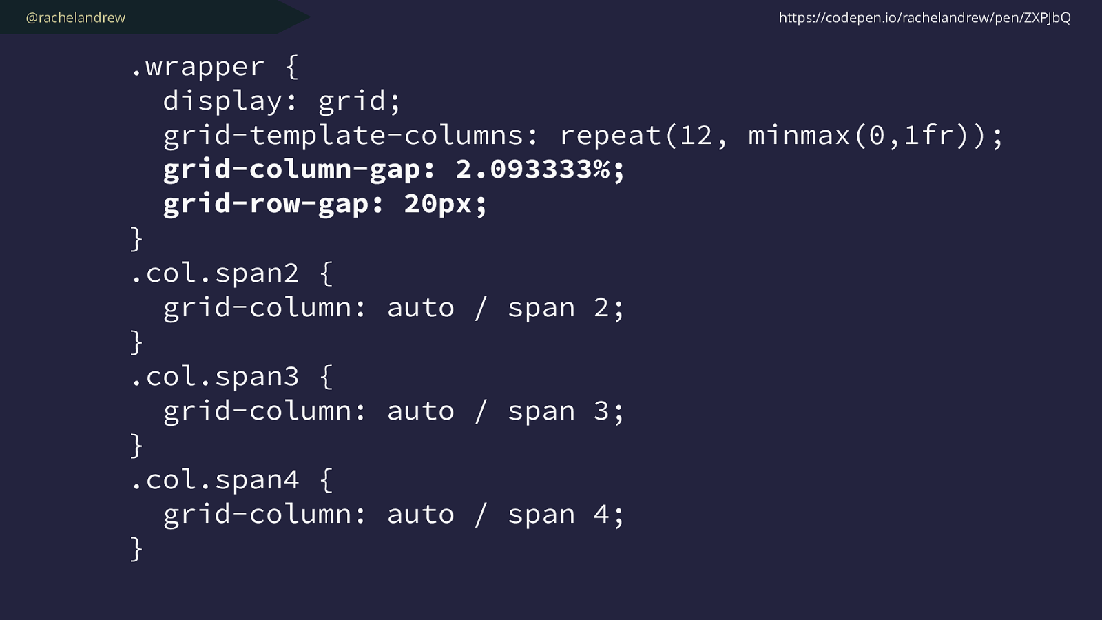
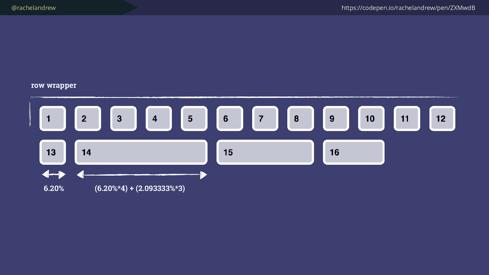
@rachelandrew .wrapper { display: grid; grid-template-columns: repeat(12, minmax(0,1fr)); grid-column-gap: 2.093333%; grid-row-gap: 20px; } .col.span2 { grid-column: auto / span 2; }
.col.span3 { grid-column: auto / span 3; } .col.span4 { grid-column: auto / span 4; } https://codepen.io/rachelandrew/pen/ZXPJbQ
@rachelandrew
–
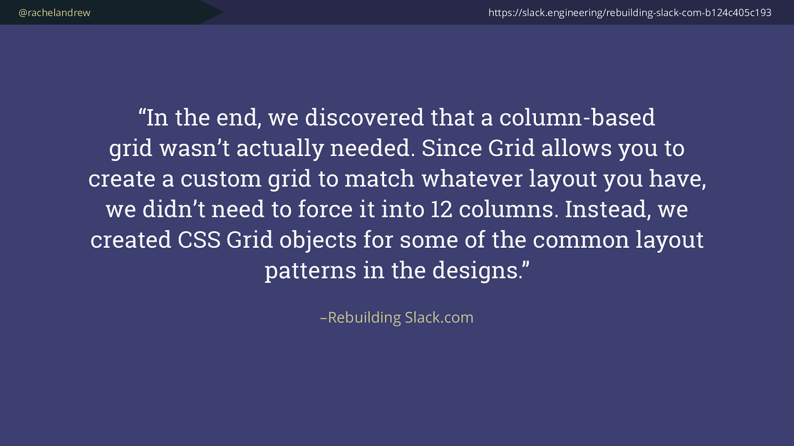
Rebuilding Slack.com
“In the end, we discovered that a column-based
grid
wasn’t actually needed. Since Grid allows you to
create a custom grid to match whatever layout you have,
we didn’t need to force it into 12 columns. Instead, we
created CSS Grid objects for some of the common layout
patterns in the designs.”
https://slack.engineering/rebuilding-slack-com-b124c405c193
@rachelandrew https://codepen.io/rachelandrew/pen/RLOxMB
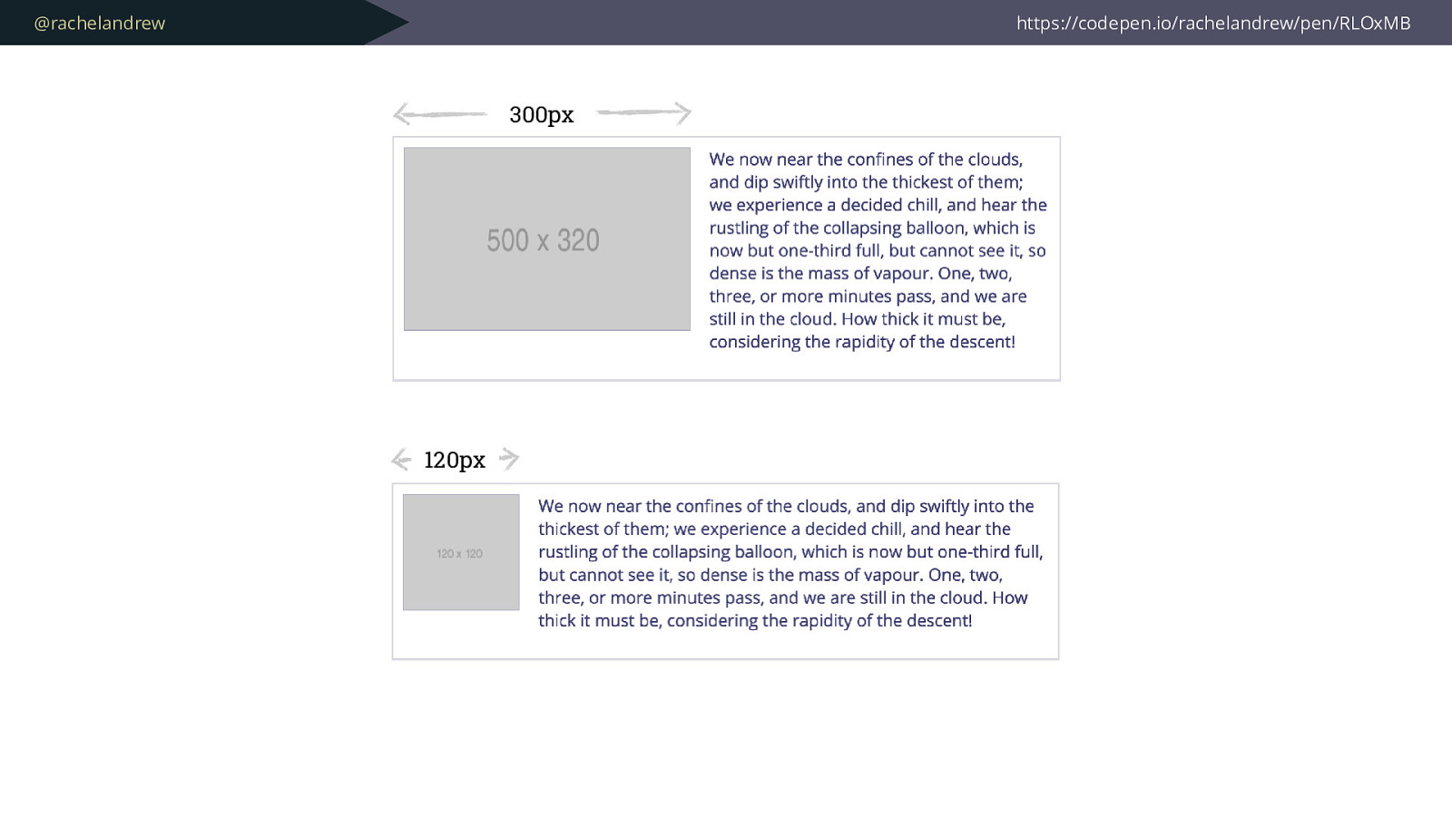
@rachelandrew https://codepen.io/rachelandrew/pen/RLOxMB 300px 120px
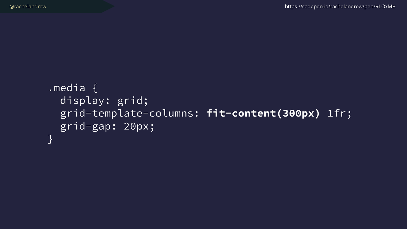
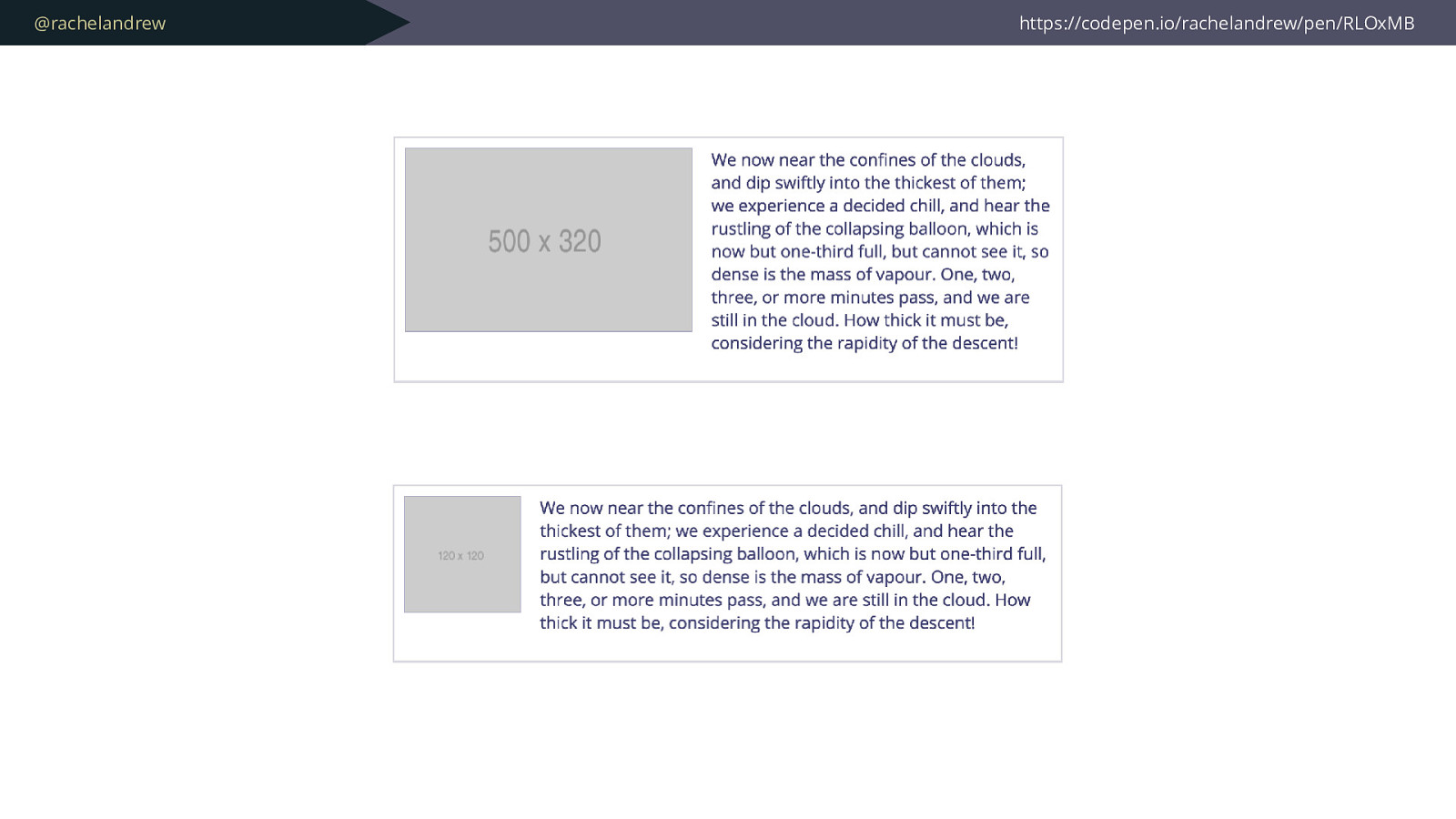
@rachelandrew .media { display: grid; grid-template-columns: fit-content(300px) 1fr; grid-gap: 20px; } https://codepen.io/rachelandrew/pen/RLOxMB
@rachelandrew https://codepen.io/rachelandrew/pen/jGRzzv/
@rachelandrew
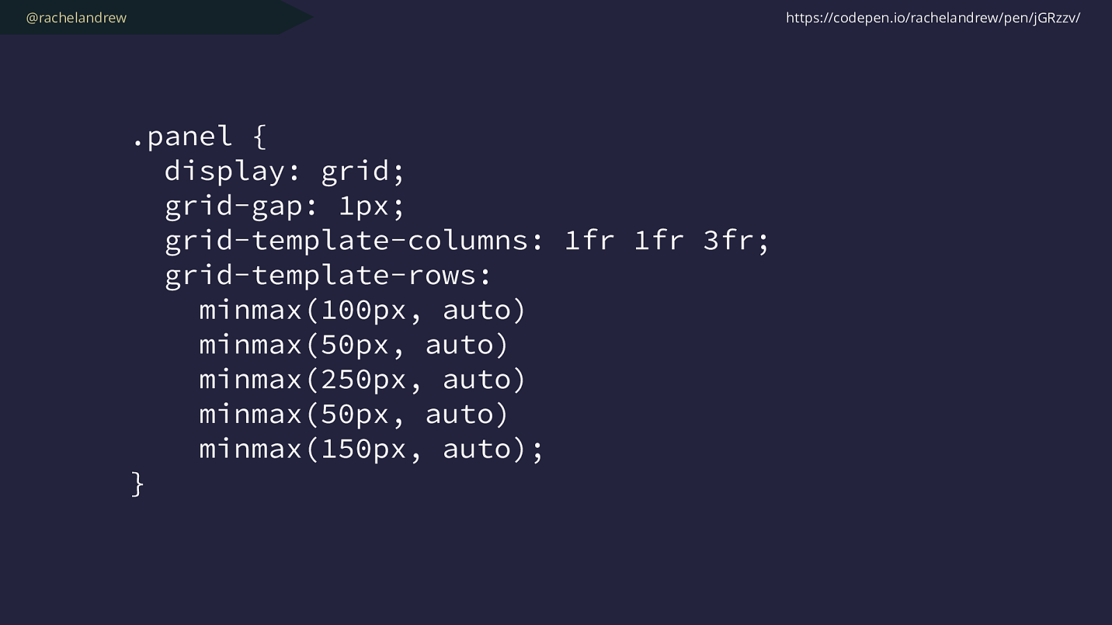
.panel {
display: grid;
grid-gap: 1px;
grid-template-columns: 1fr 1fr 3fr;
grid-template-rows:
minmax(100px, auto)
minmax(50px, auto)
minmax(250px, auto)
minmax(50px, auto)
minmax(150px, auto);
}
https://codepen.io/rachelandrew/pen/jGRzzv/
@rachelandrew https://codepen.io/rachelandrew/pen/jGRzzv/ Min 50px Max auto
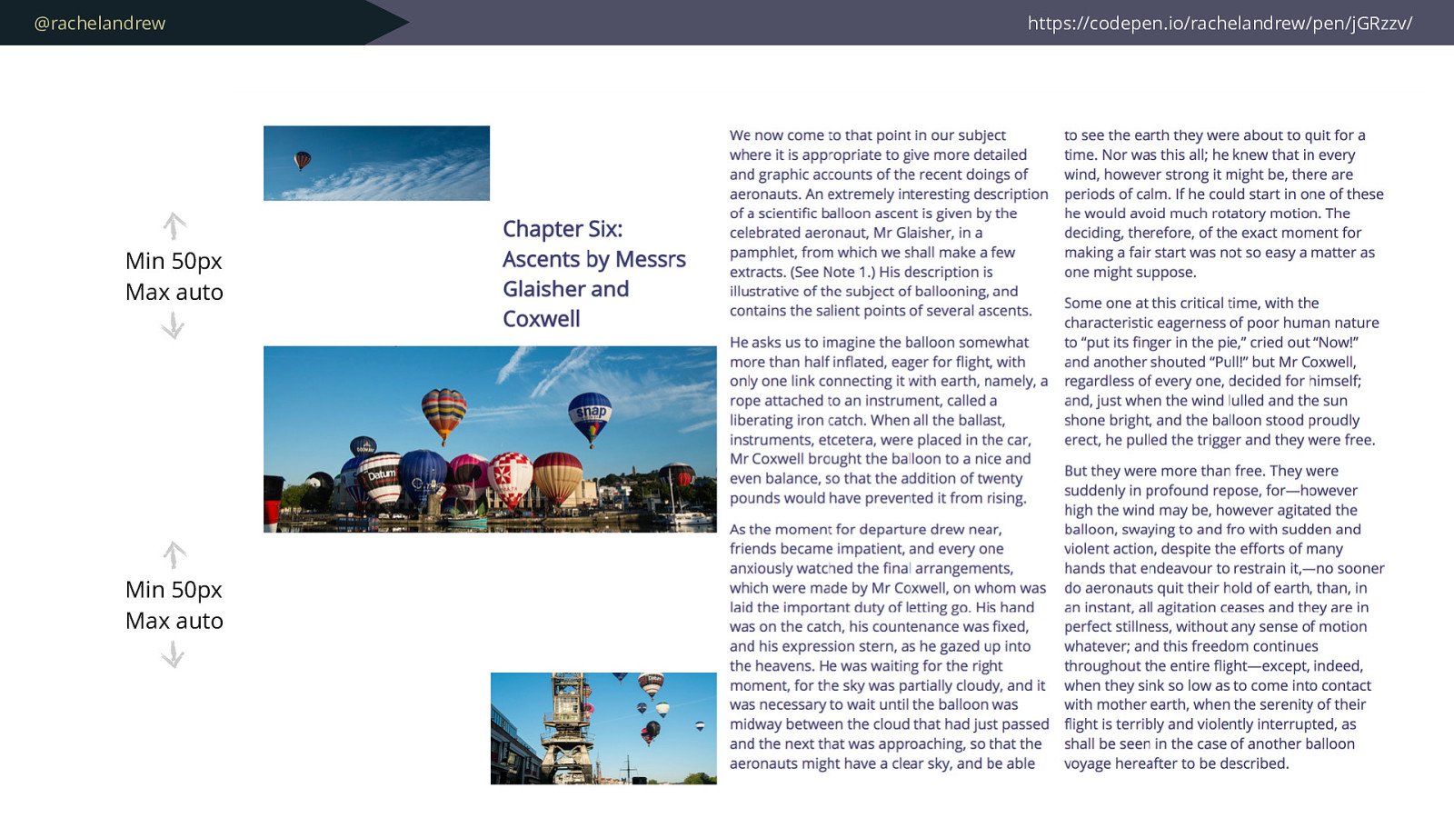
@rachelandrew https://codepen.io/rachelandrew/pen/jGRzzv/ Min 50px Max auto Min 50px Max auto
@rachelandrew This is not exciting . But it will let you do exciting things.
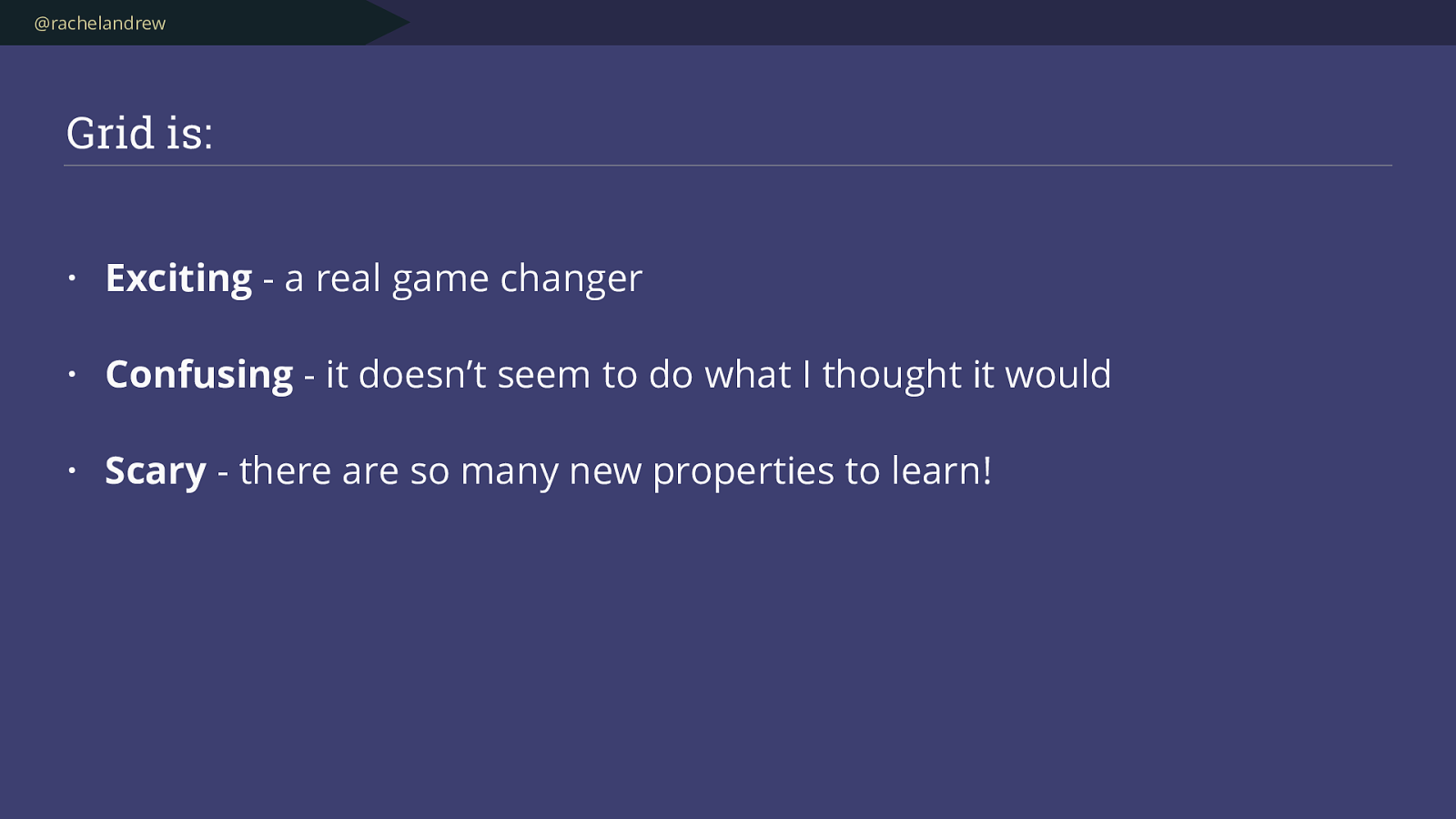
@rachelandrew Why so complicated ?
@rachelandrew More capability & fl exibility means more to learn
@rachelandrew It is all just lines .
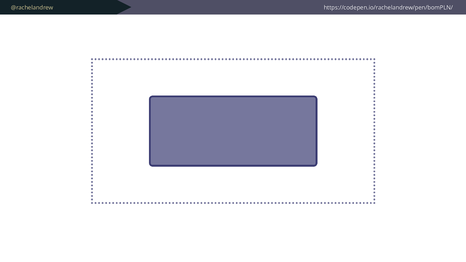
@rachelandrew https://codepen.io/rachelandrew/pen/bomPLN/
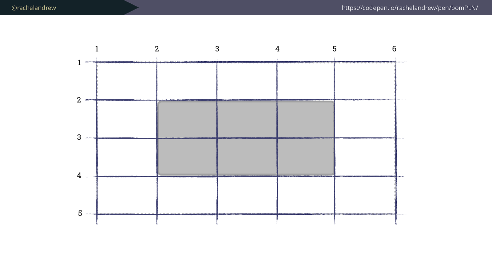
@rachelandrew https://codepen.io/rachelandrew/pen/bomPLN/ 1 1 2 3 4 5 2 3 4 5 6
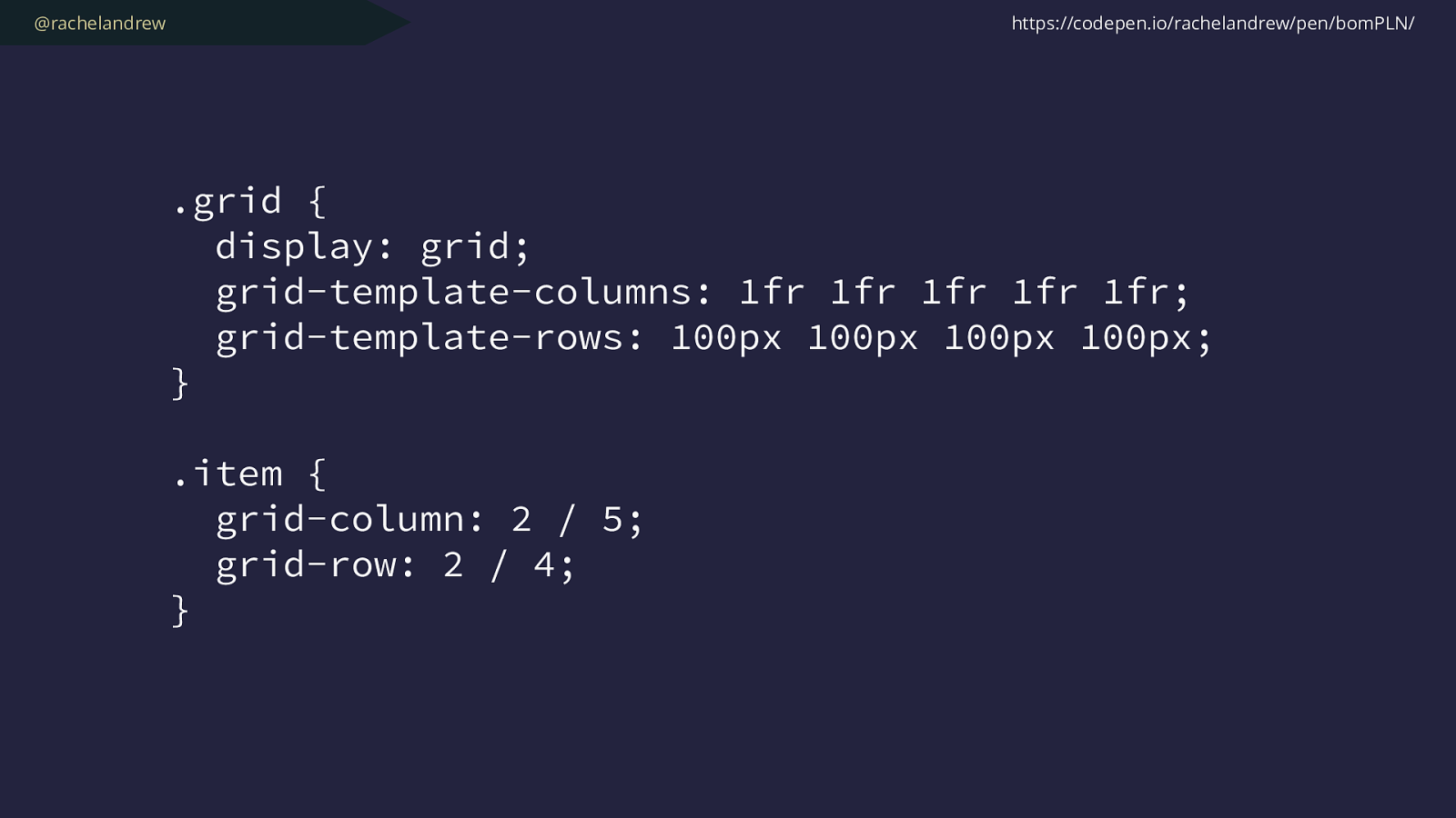
@rachelandrew .grid { display: grid; grid-template-columns: 1fr 1fr 1fr 1fr 1fr; grid-template-rows: 100px 100px 100px 100px; } .item { grid-column: 2 / 5; grid-row: 2 / 4; } https://codepen.io/rachelandrew/pen/bomPLN/
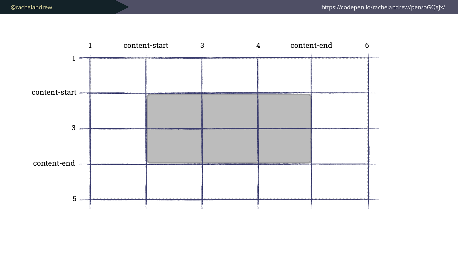
@rachelandrew https://codepen.io/rachelandrew/pen/oGQXjx/ 1 1 content-start 3 content-end 5 content-start 3 4 content-end 6
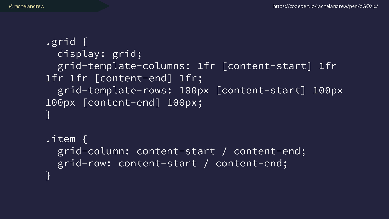
@rachelandrew .grid { display: grid; grid-template-columns: 1fr [content-start] 1fr 1fr 1fr [content-end] 1fr; grid-template-rows: 100px [content-start] 100px 100px [content-end] 100px; } .item { grid-column: content-start / content-end ; grid-row: content-start / content-end ; } https://codepen.io/rachelandrew/pen/oGQXjx/

@rachelandrew https://codepen.io/rachelandrew/pen/oGQXjx/ 1 1 content-start 3 content-end 5 content-start 3 4 content-end 6
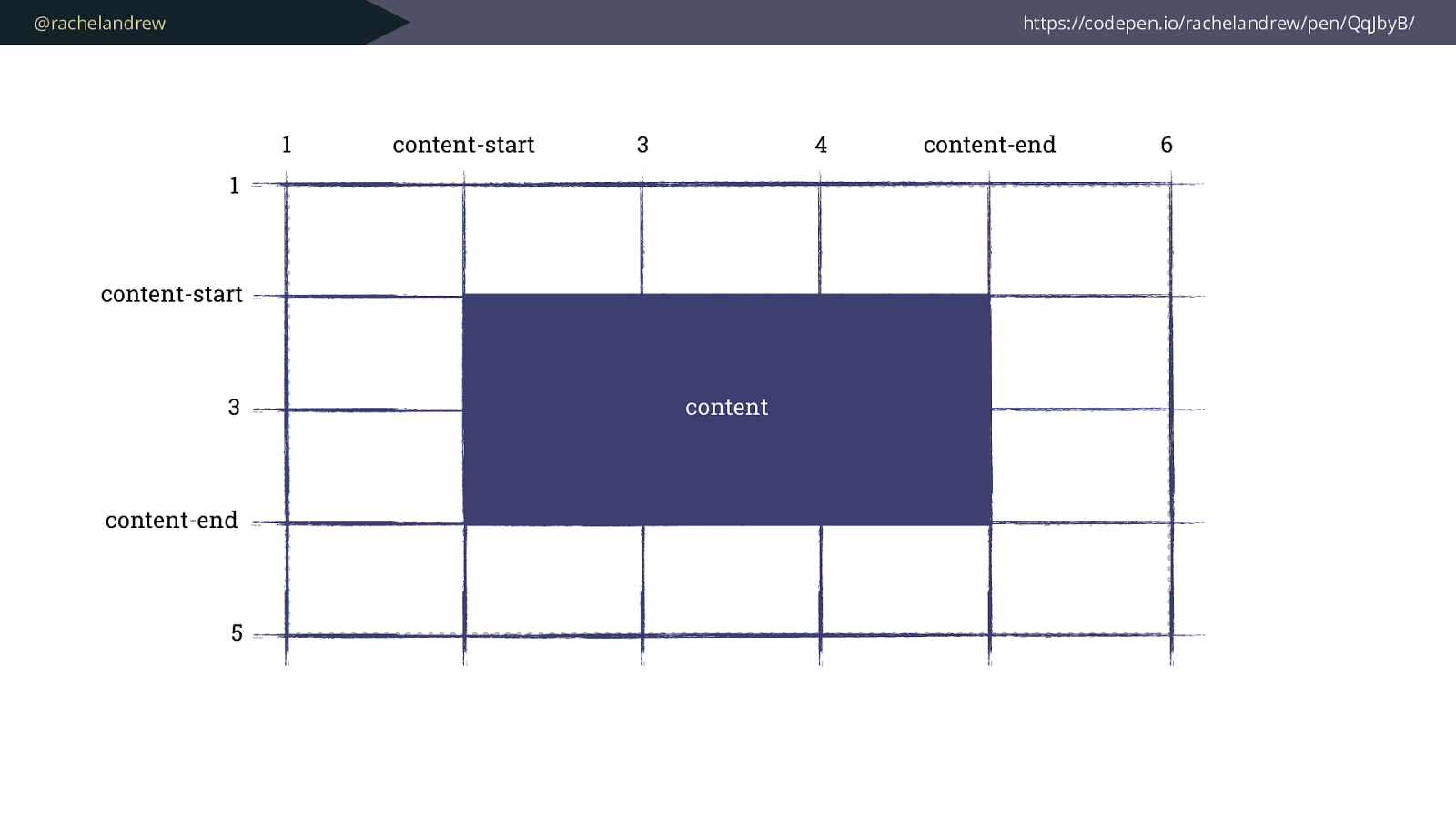
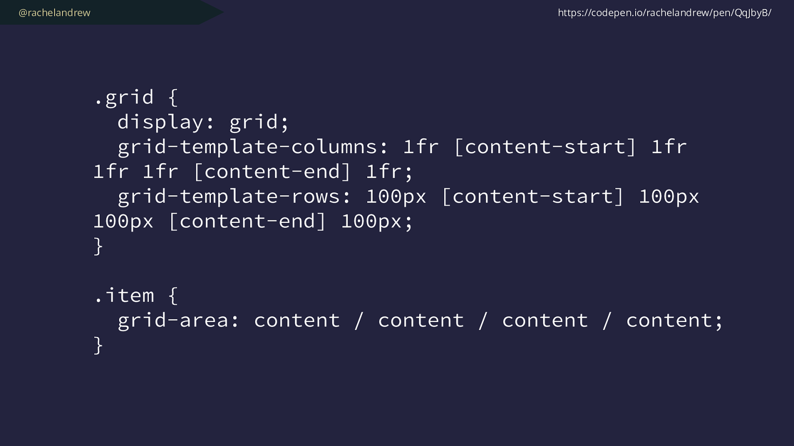
@rachelandrew https://codepen.io/rachelandrew/pen/QqJbyB/ 1 1 content-start 3 content-end 5 content-start 3 4 content-end 6 content
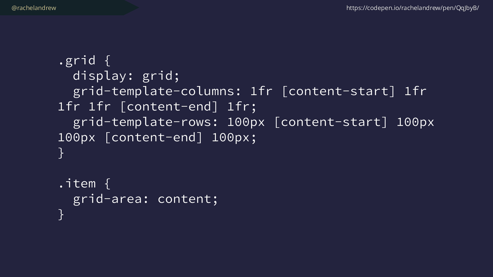
@rachelandrew .grid { display: grid; grid-template-columns: 1fr [content-start] 1fr 1fr 1fr [content-end] 1fr; grid-template-rows: 100px [content-start] 100px 100px [content-end] 100px; } .item { grid-area: content ; } https://codepen.io/rachelandrew/pen/QqJbyB/
@rachelandrew .grid { display: grid; grid-template-columns: 1fr [content-start] 1fr 1fr 1fr [content-end] 1fr; grid-template-rows: 100px [content-start] 100px 100px [content-end] 100px; } .item { grid-area: content / content / content / content ; } https://codepen.io/rachelandrew/pen/QqJbyB/

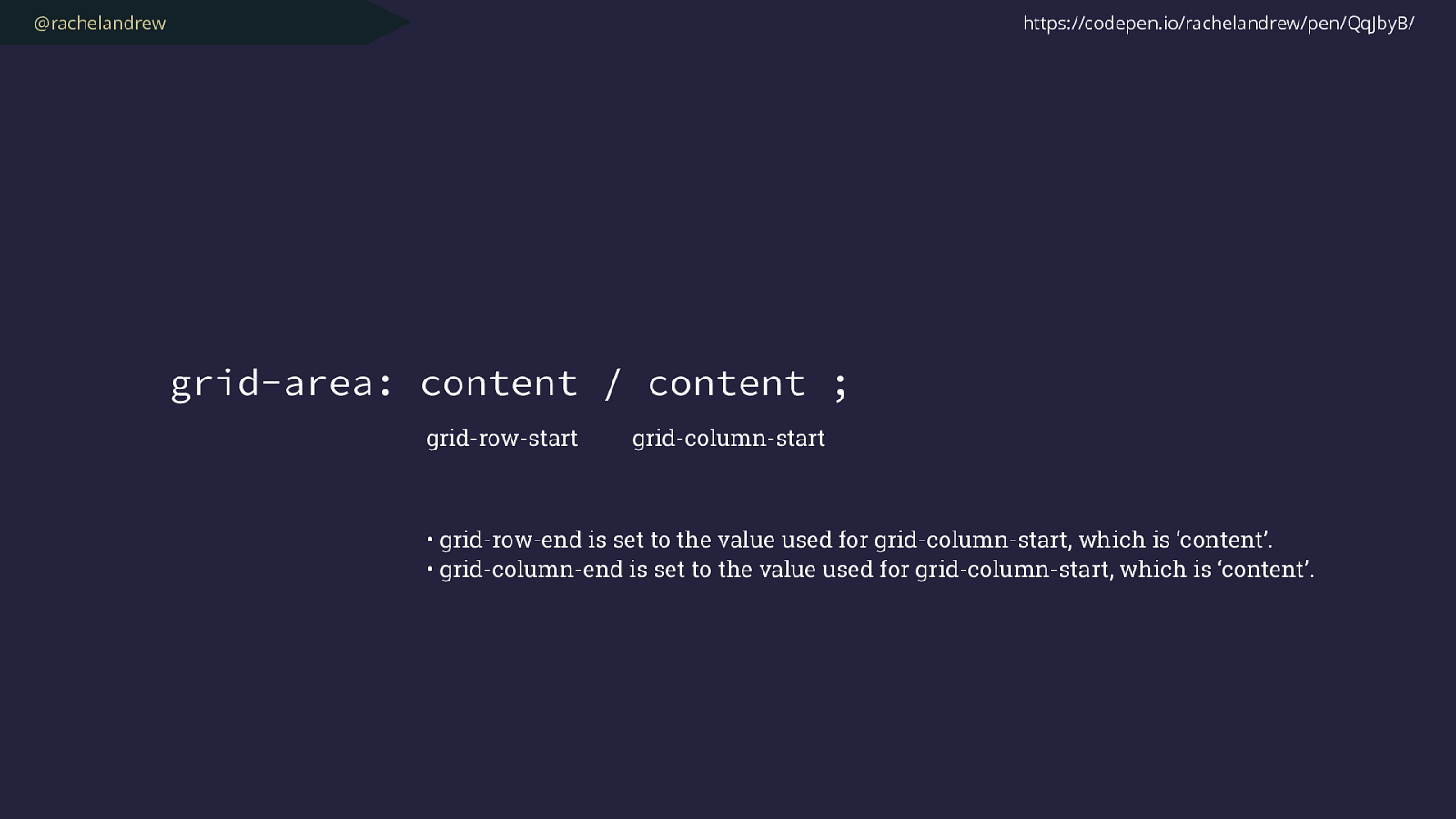
@rachelandrew grid-area: content / content / content / content ; https://codepen.io/rachelandrew/pen/QqJbyB/ grid-row-start grid-column-start grid-row-end grid-column-end
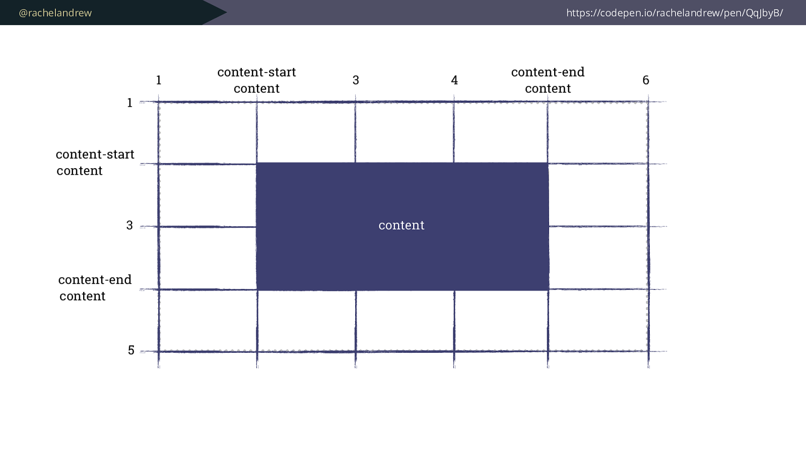
@rachelandrew https://codepen.io/rachelandrew/pen/QqJbyB/ 1 1 content-start content 3 content-end content 5 content-start content 3 4 content-end content 6 content
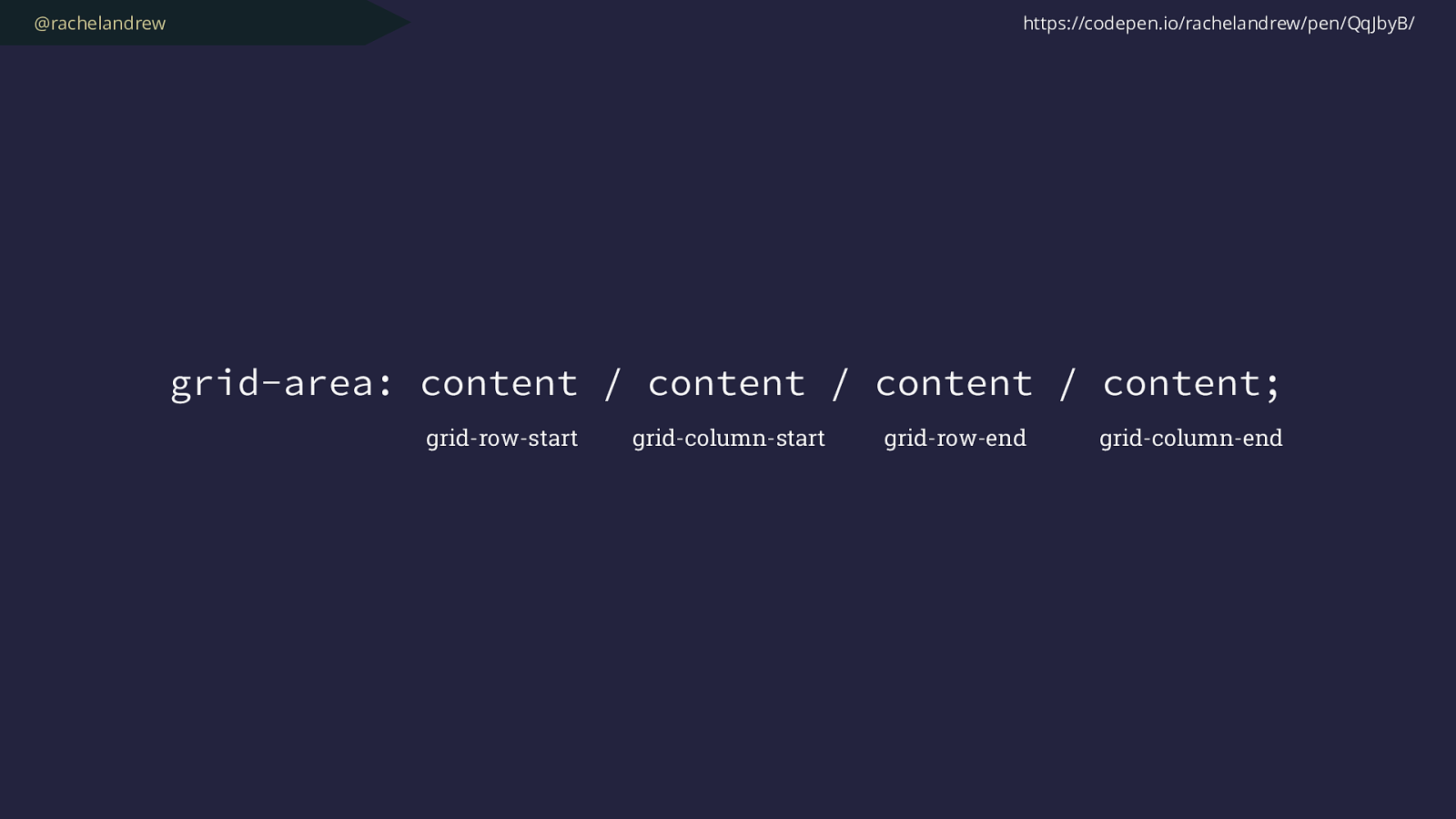
@rachelandrew grid-area: content / content / content / content ; https://codepen.io/rachelandrew/pen/QqJbyB/ grid-row-start grid-column-start grid-row-end grid-column-end
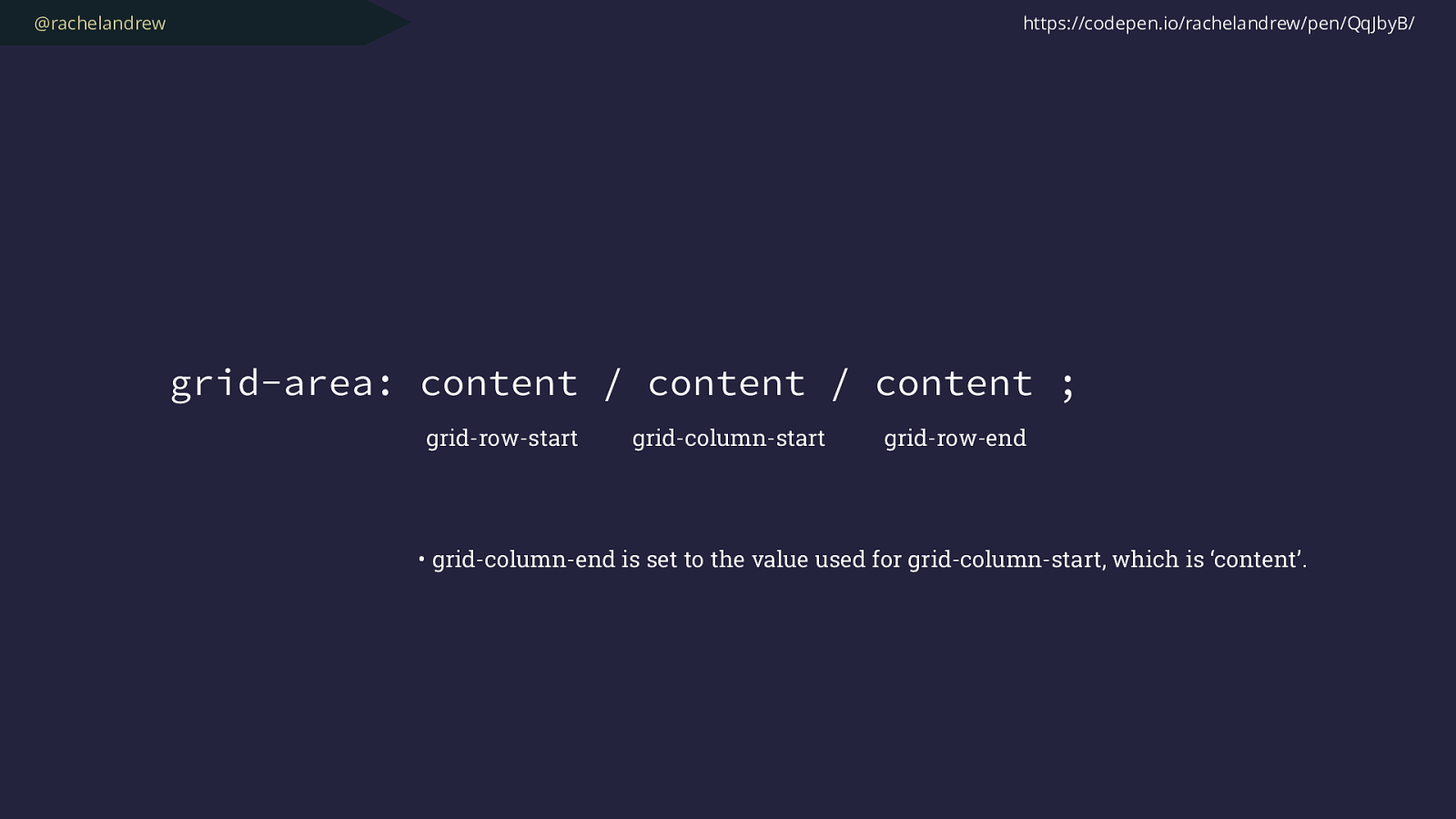
@rachelandrew grid-area: content / content / content ; https://codepen.io/rachelandrew/pen/QqJbyB/ grid-row-start grid-column-start grid-row-end • grid-column-end is set to the value used for grid-column-start, which is ‘content’.
@rachelandrew grid-area: content / content ; https://codepen.io/rachelandrew/pen/QqJbyB/ grid-row-start grid-column-start • grid-row-end is set to the value used for grid-column-start, which is ‘content’. • grid-column-end is set to the value used for grid-column-start, which is ‘content’.
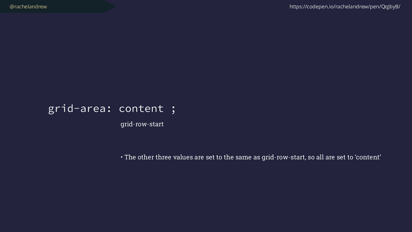
@rachelandrew grid-area: content ; https://codepen.io/rachelandrew/pen/QqJbyB/ grid-row-start • The other three values are set to the same as grid-row-start, so all are set to ‘content’
@rachelandrew
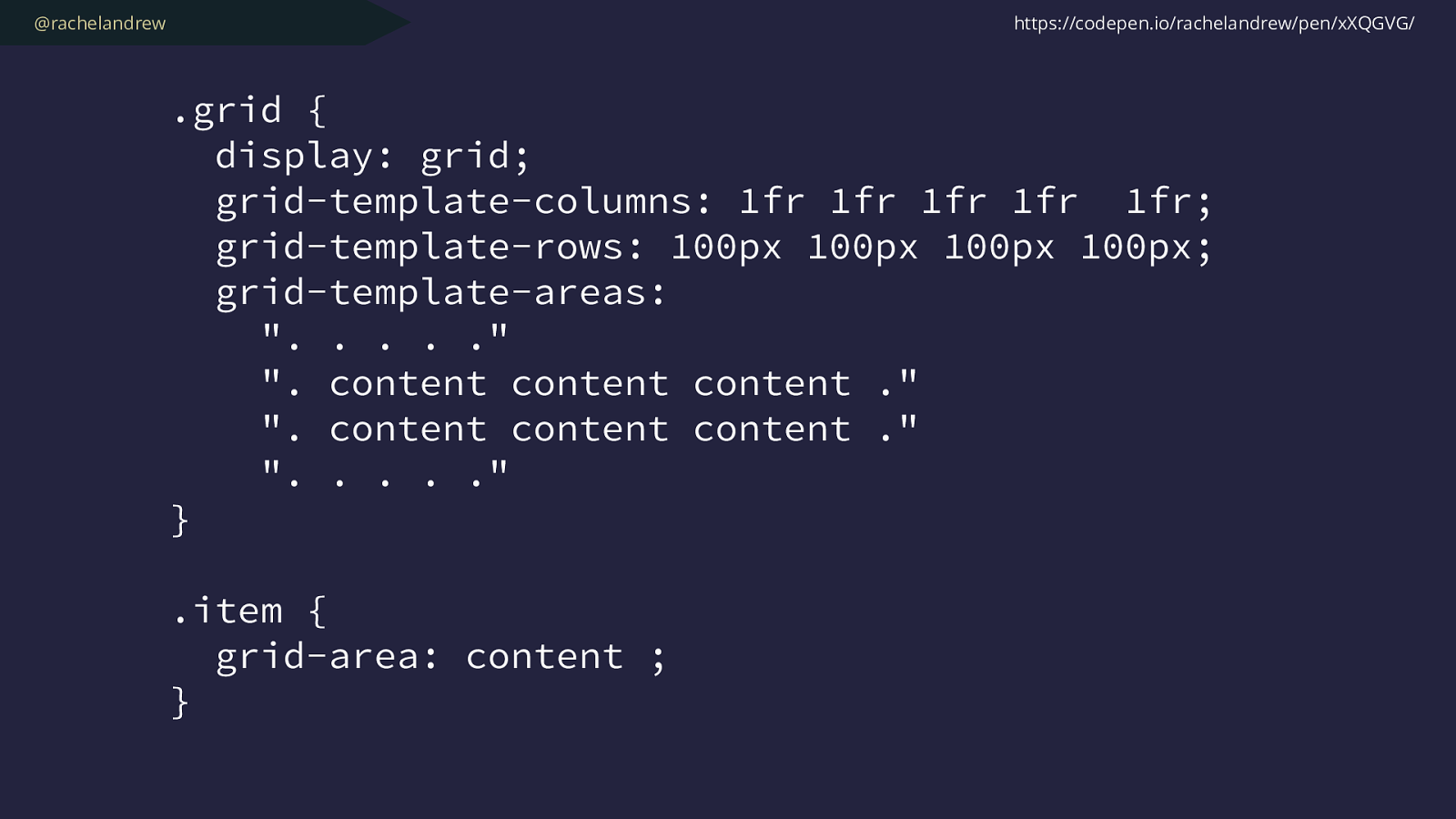
.grid {
display: grid;
grid-template-columns: 1fr 1fr 1fr 1fr 1fr;
grid-template-rows: 100px 100px 100px 100px;
grid-template-areas:
". . . . ."
". content content content ."
". content content content ."
". . . . ."
}
.item { grid-area: content ;
} https://codepen.io/rachelandrew/pen/xXQGVG/
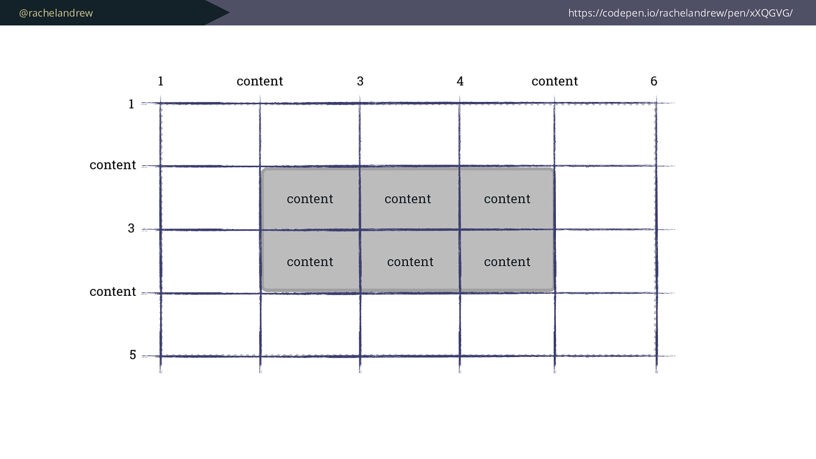
@rachelandrew https://codepen.io/rachelandrew/pen/xXQGVG/ 1 1 content 3 content 5 content 3 4 content 6 content content content content content content
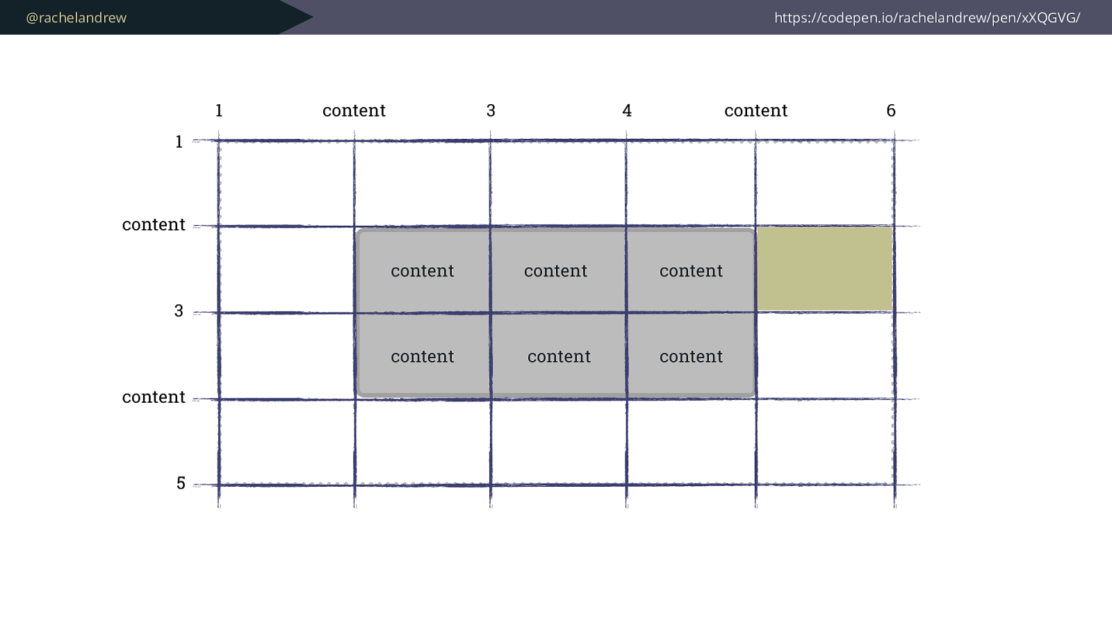
@rachelandrew https://codepen.io/rachelandrew/pen/xXQGVG/ 1 1 content 3 content 5 content 3 4 content 6 content content content content content content
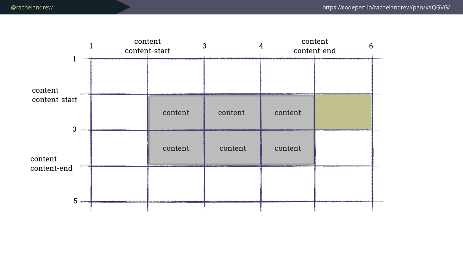
@rachelandrew https://codepen.io/rachelandrew/pen/xXQGVG/ 1 1 content
content-start 3 5 content content-start 3 4 content content-end 6 content content content content content content content
content-end
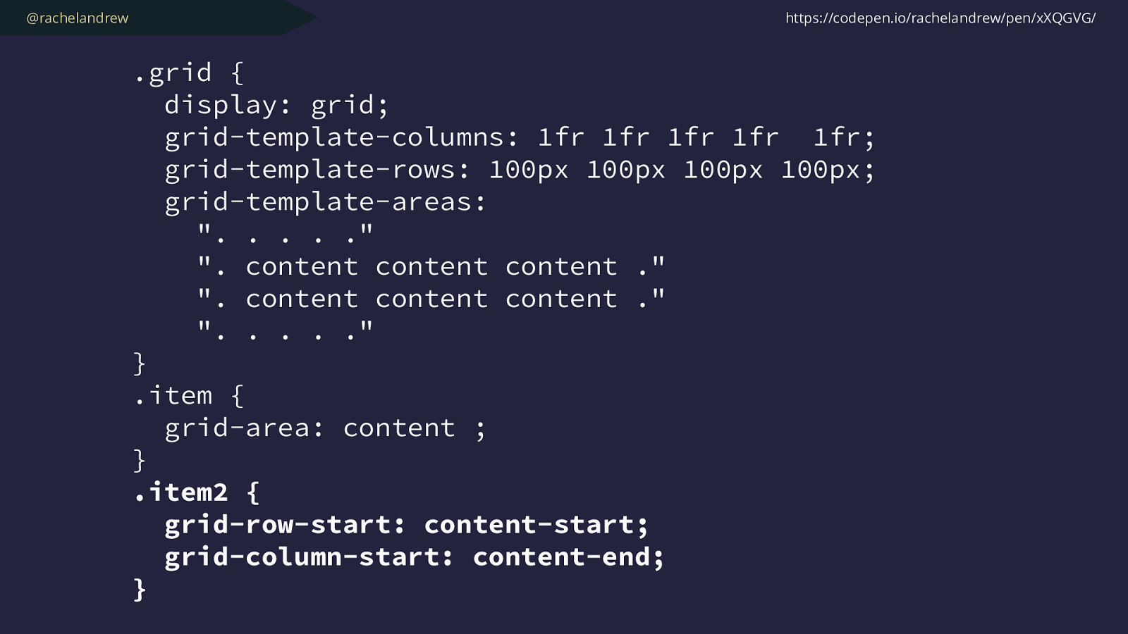
@rachelandrew
.grid {
display: grid;
grid-template-columns: 1fr 1fr 1fr 1fr 1fr;
grid-template-rows: 100px 100px 100px 100px;
grid-template-areas:
". . . . ."
". content content content ."
". content content content ."
". . . . ."
}
.item {
grid-area: content ;
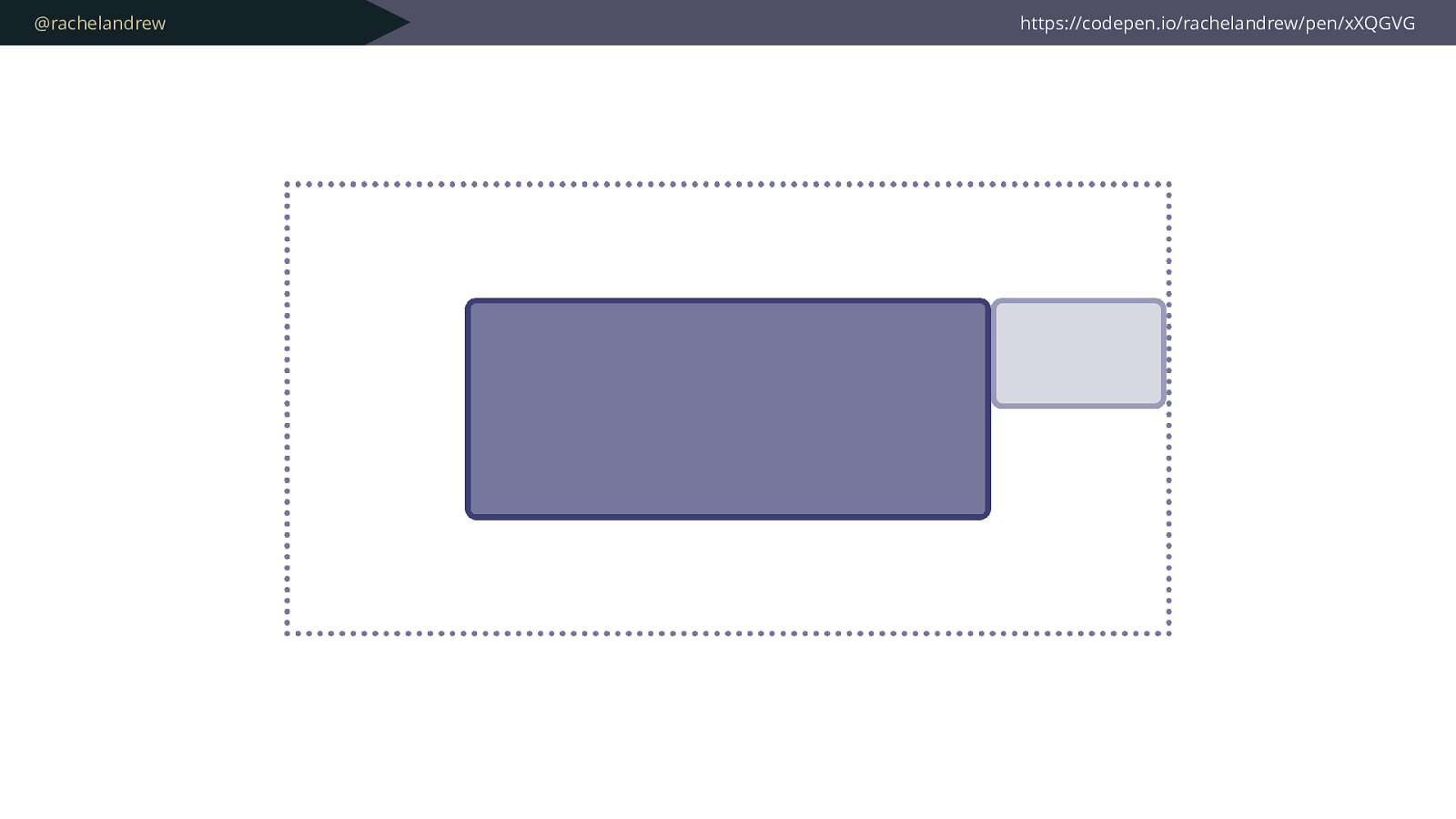
} .item2 { grid-row-start: content-start; grid-column-start: content-end;
} https://codepen.io/rachelandrew/pen/xXQGVG/
@rachelandrew https://codepen.io/rachelandrew/pen/xXQGVG
@rachelandrew You have real choice for the first time.
@rachelandrew What would be the best method to achieve this design pattern?
@rachelandrew Could we solve this problem with a new design pattern?
@rachelandrew Instead of “which patterns does our framework give us to use?”
@rachelandrew How old is the oldest CSS in your project?
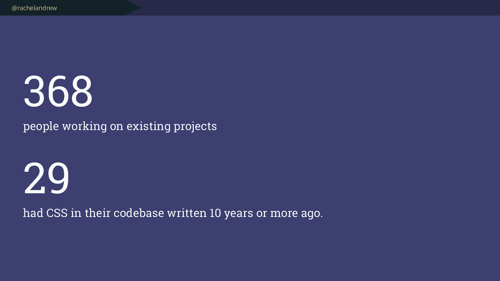
@rachelandrew 368
people working on existing projects
29
had CSS in their codebase written 10 years or more ago.
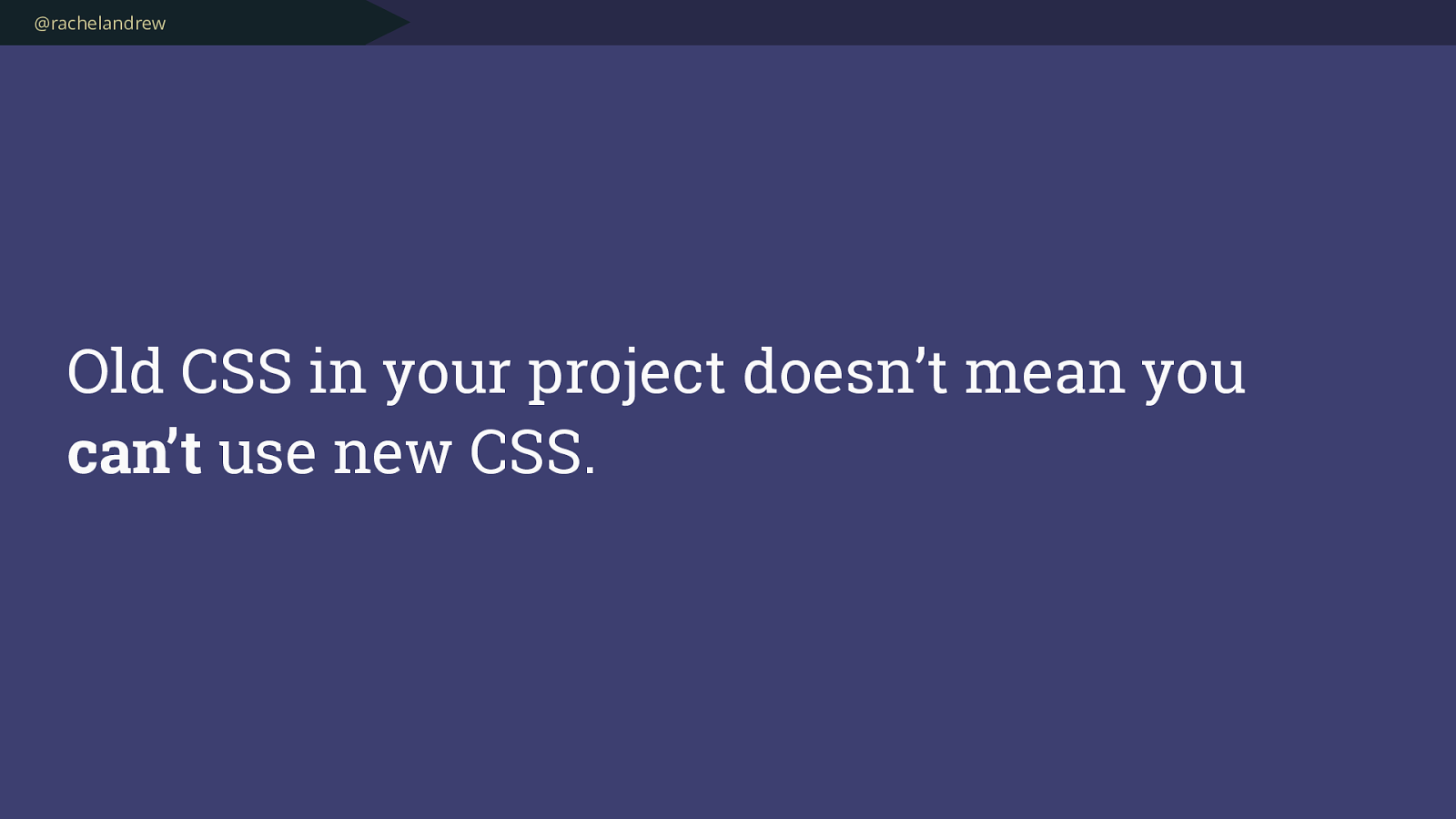
@rachelandrew Old CSS in your project doesn’t mean you can’t use new CSS.
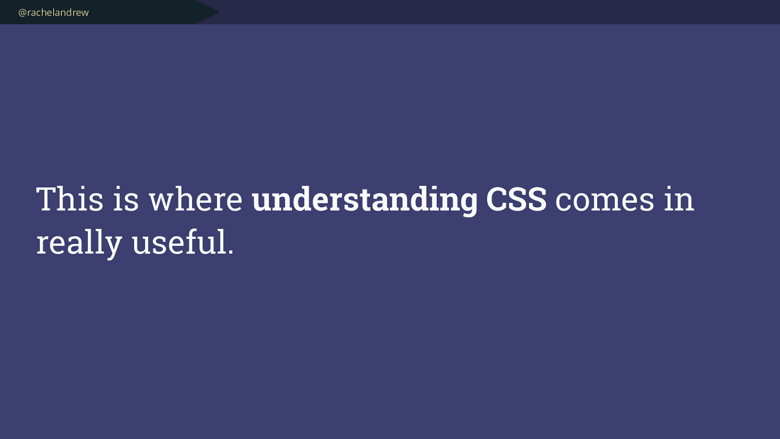
@rachelandrew This is where understanding CSS comes in really useful.
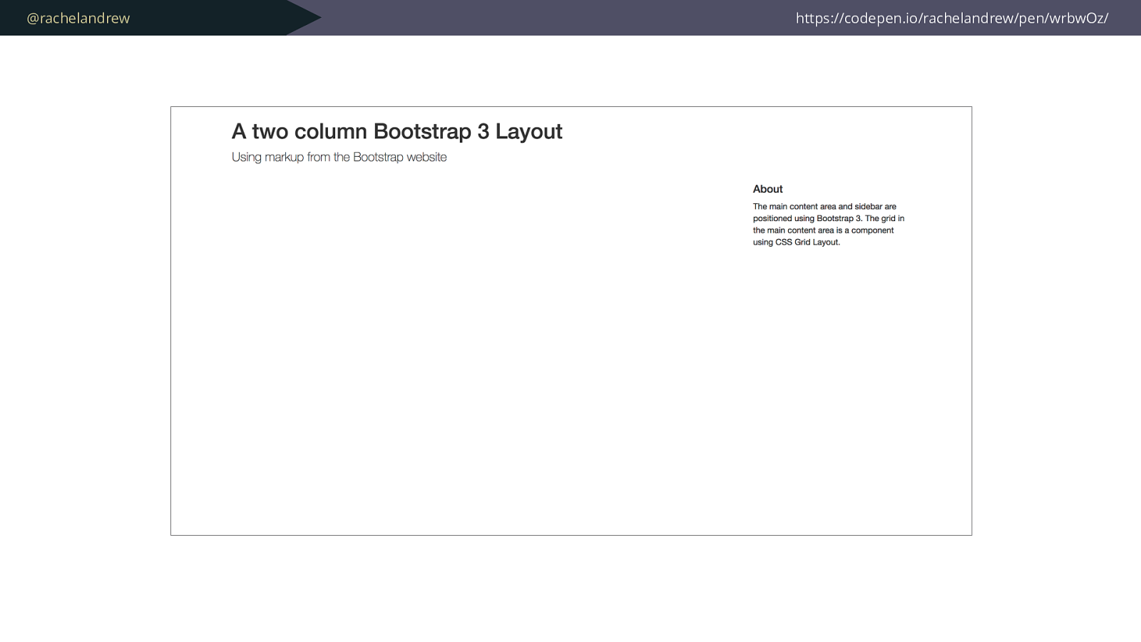
@rachelandrew https://codepen.io/rachelandrew/pen/wrbwOz/
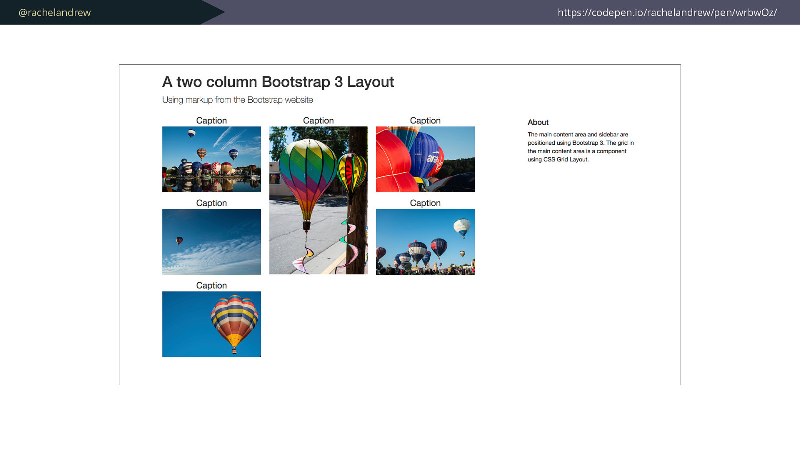
@rachelandrew https://codepen.io/rachelandrew/pen/wrbwOz/
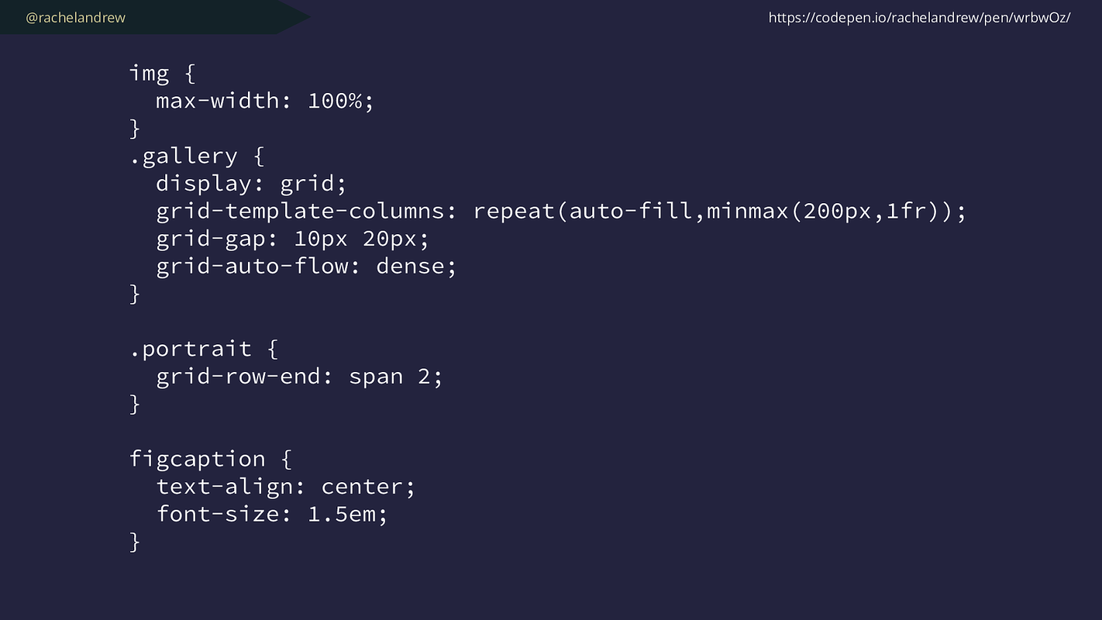
@rachelandrew img { max-width: 100%; } .gallery { display: grid; grid-template-columns: repeat(auto-fill,minmax(200px,1fr)); grid-gap: 10px 20px; grid-auto-flow: dense; } .portrait { grid-row-end: span 2; } figcaption { text-align: center; font-size: 1.5em; } https://codepen.io/rachelandrew/pen/wrbwOz/
@rachelandrew Creating systems with new layout.
@rachelandrew Other layout methods still exist .
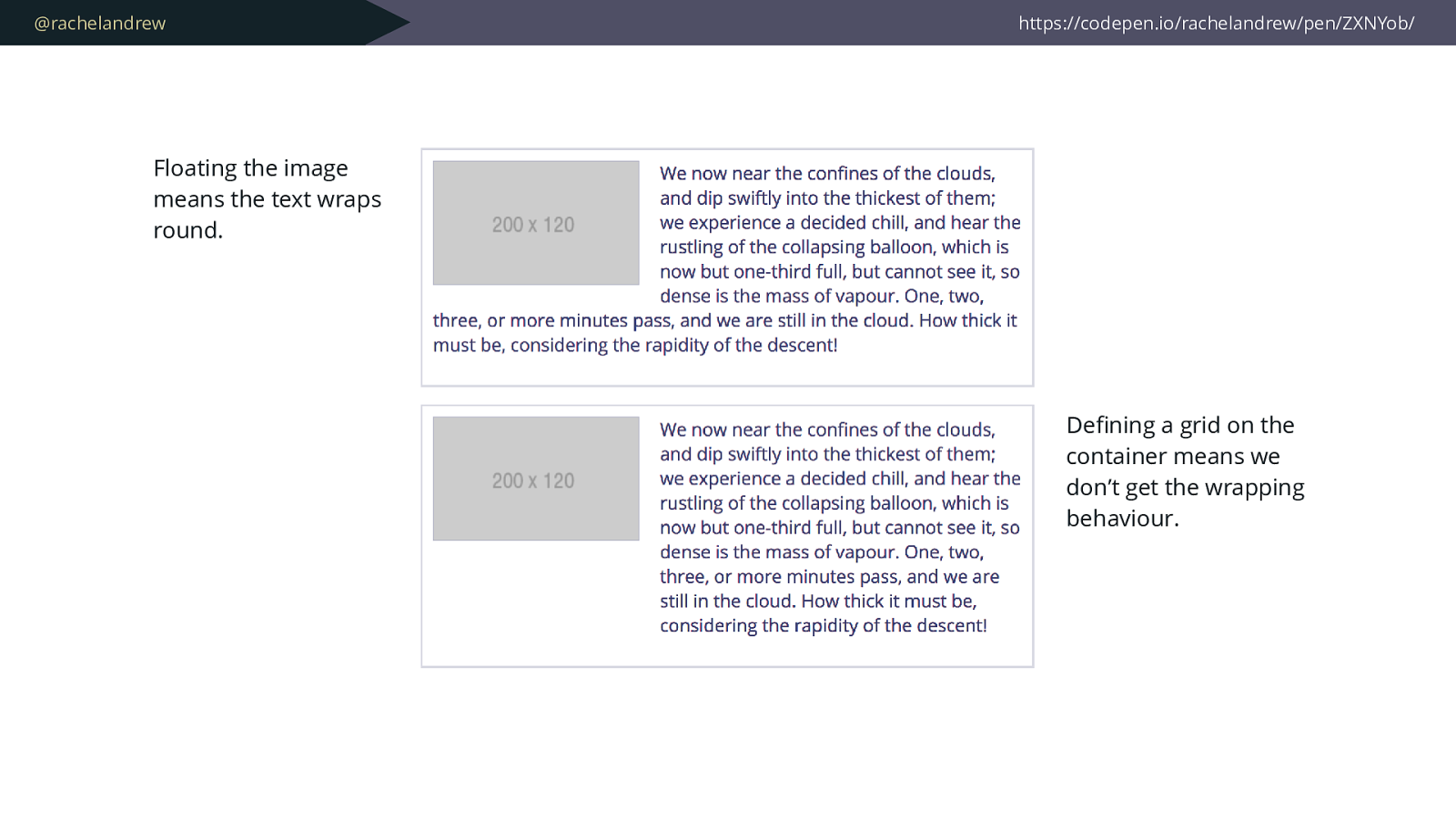
@rachelandrew https://codepen.io/rachelandrew/pen/ZXNYob/ Floating the image means the text wraps round. De fi ning a grid on the container means we don’t get the wrapping behaviour.
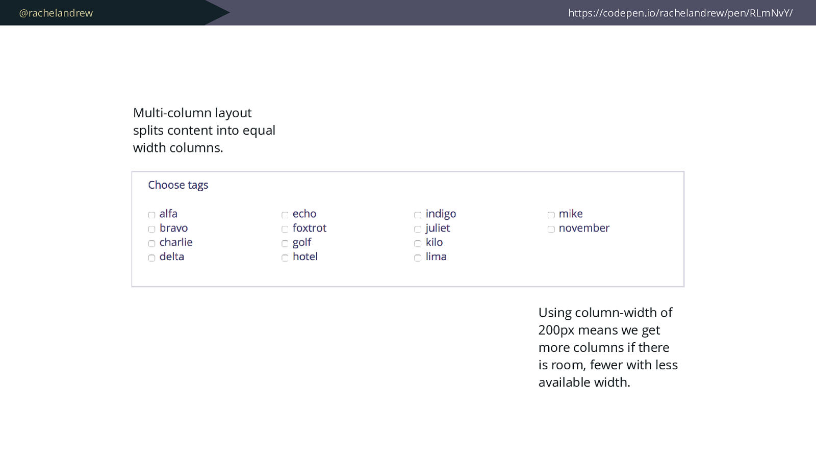
@rachelandrew https://codepen.io/rachelandrew/pen/RLmNvY/ Using column-width of 200px means we get more columns if there is room, fewer with less available width. Multi-column layout splits content into equal width columns.
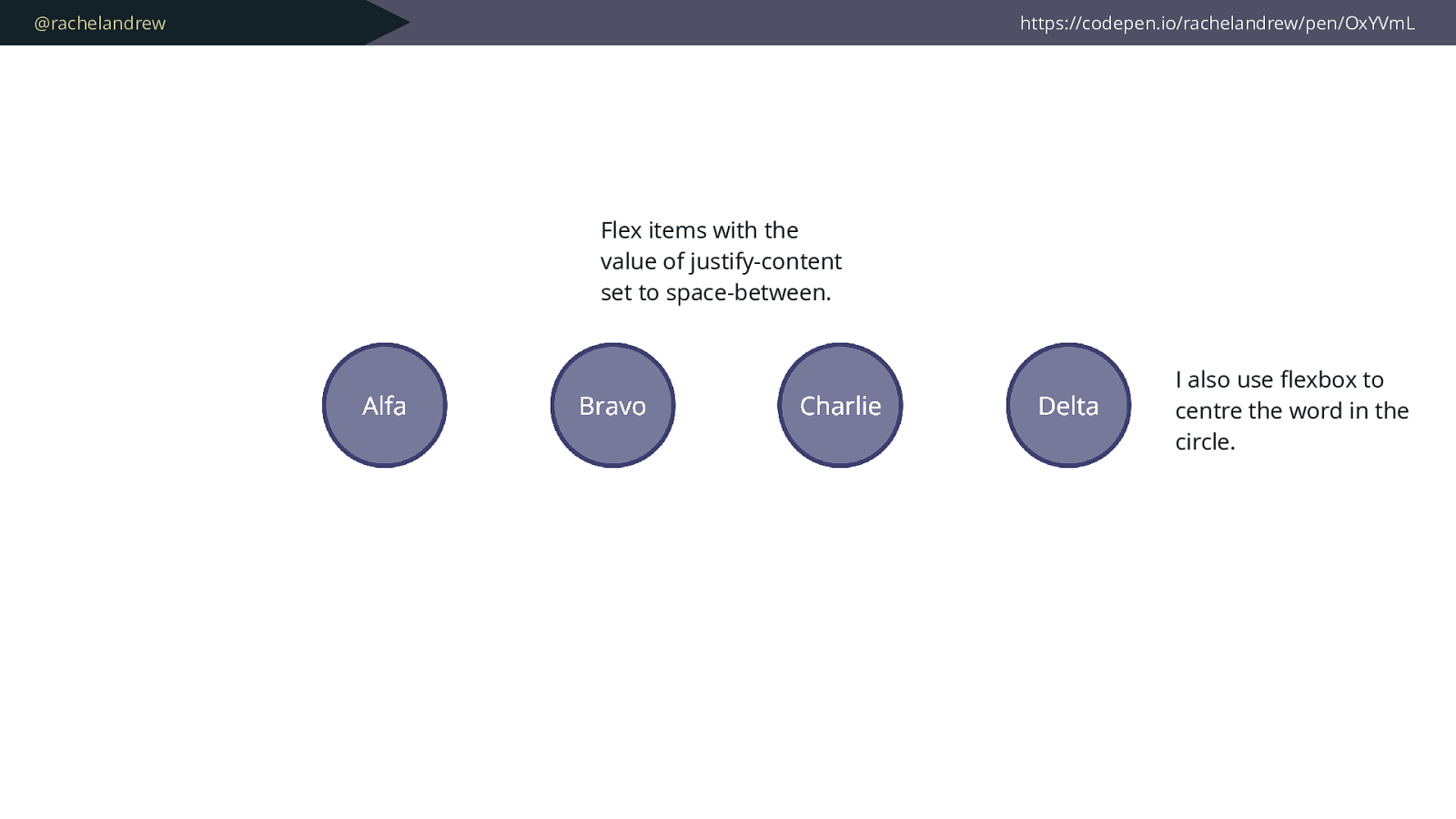
@rachelandrew https://codepen.io/rachelandrew/pen/OxYVmL Flex items with the value of justify-content set to space-between. I also use fl exbox to centre the word in the circle.
@rachelandrew You don’t need a grid-shaped hammer for every layout task.
@rachelandrew Off-the-shelf frameworks are designed to solve generic problems.
@rachelandrew Do you want your project to inherit the CSS issues of the rest of the world ?
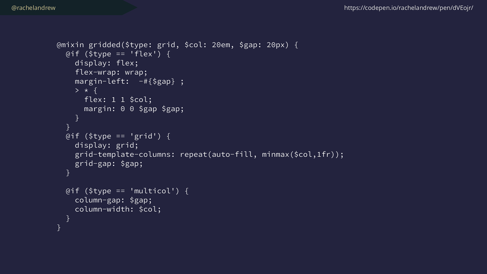
@rachelandrew Build your own framework* * framework doesn’t mean “all-encompassing behemoth”
@rachelandrew Solving your specific problems only will result in lighter, easier to understand code
@rachelandrew
@mixin gridded($type: grid, $col: 20em, $gap: 20px
) {
@if ($type == 'flex') {
display: flex;
flex-wrap: wrap;
margin-left: -#{$gap} ;
> * {
flex: 1 1 $col;
margin: 0 0 $gap $gap;
}
}
@if ($type == 'grid') {
display: grid;
grid-template-columns: repeat(auto-fill, minmax($col,1fr));
grid-gap: $gap;
}
@if ($type == 'multicol') {
column-gap: $gap;
column-width: $col;
}
}
https://codepen.io/rachelandrew/pen/dVEojr/
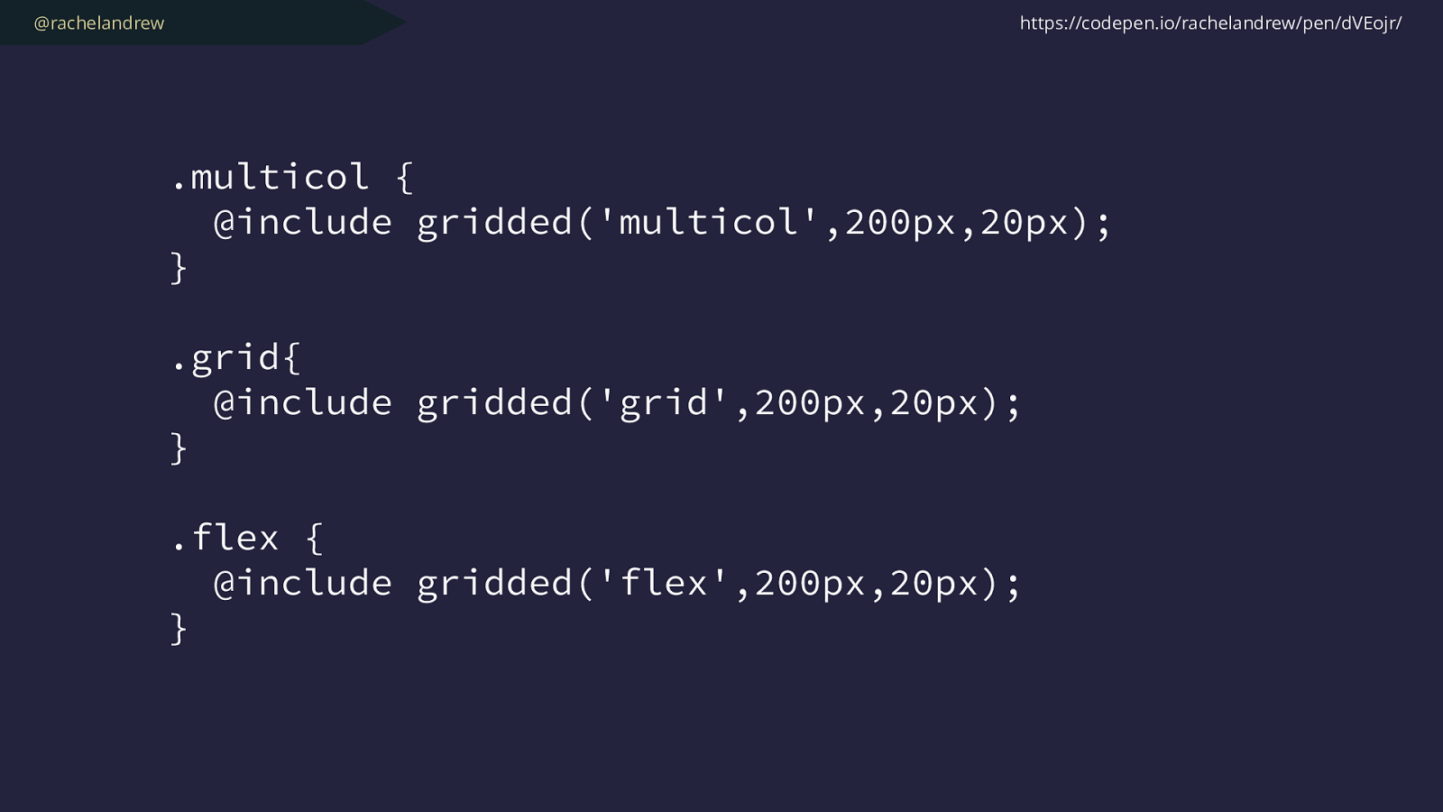
@rachelandrew .multicol { @include gridded('multicol',200px,20px); } .grid{ @include gridded('grid',200px,20px); } .flex { @include gridded('flex',200px,20px); } https://codepen.io/rachelandrew/pen/dVEojr/
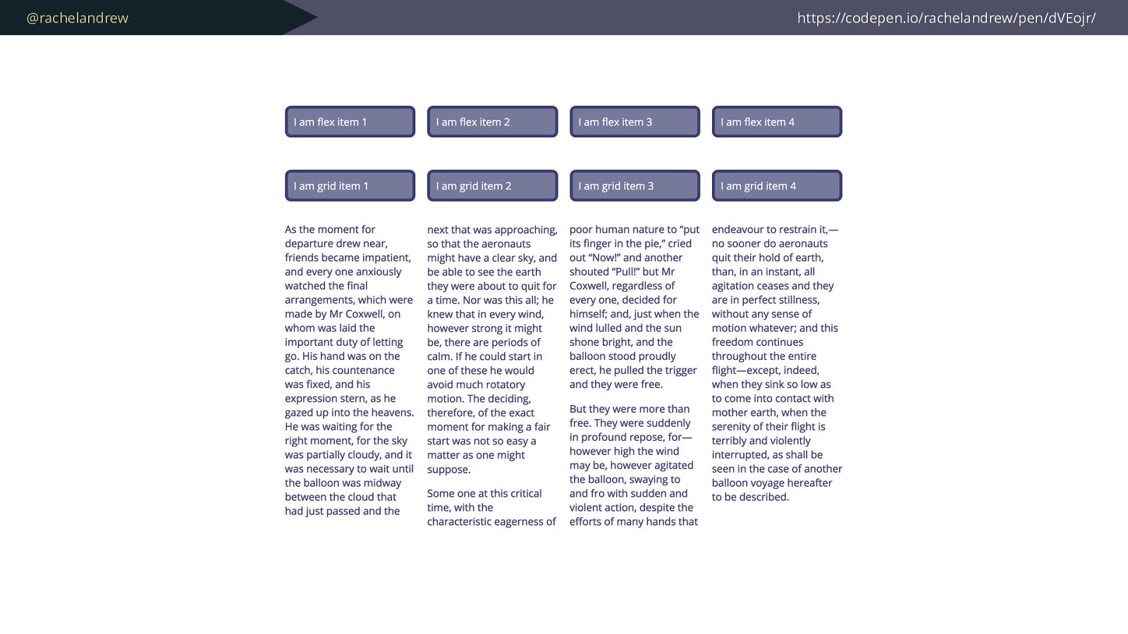
@rachelandrew https://codepen.io/rachelandrew/pen/dVEojr/
@rachelandrew Working with less capable browsers. These may not always be old browsers .
@rachelandrew A lack of understanding on one side. A lack of confidence on the other.
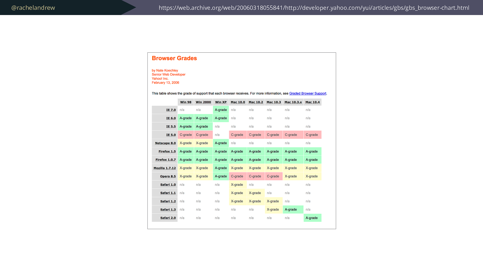
@rachelandrew https://web.archive.org/web/20060318055841/http://developer.yahoo.com/yui/articles/gbs/gbs_browser-chart.html
@rachelandrew Building confidence in your CSS skills will help you to make your case to use newer methods. (Although quite often asking permission is optional)
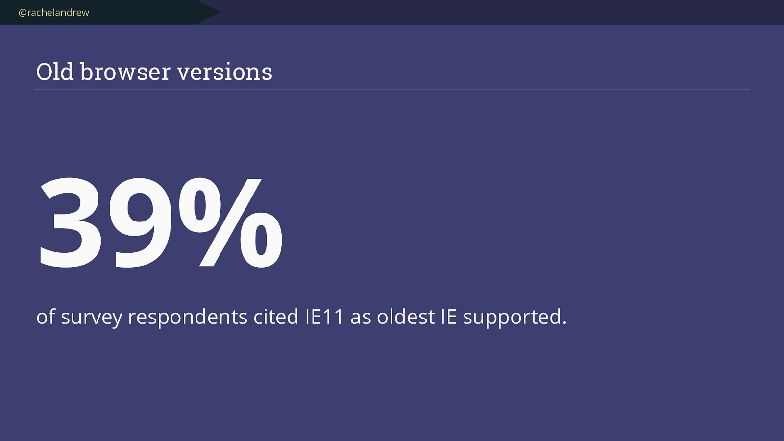
@rachelandrew Old browser versions 39%
of survey respondents cited IE11 as oldest IE supported.
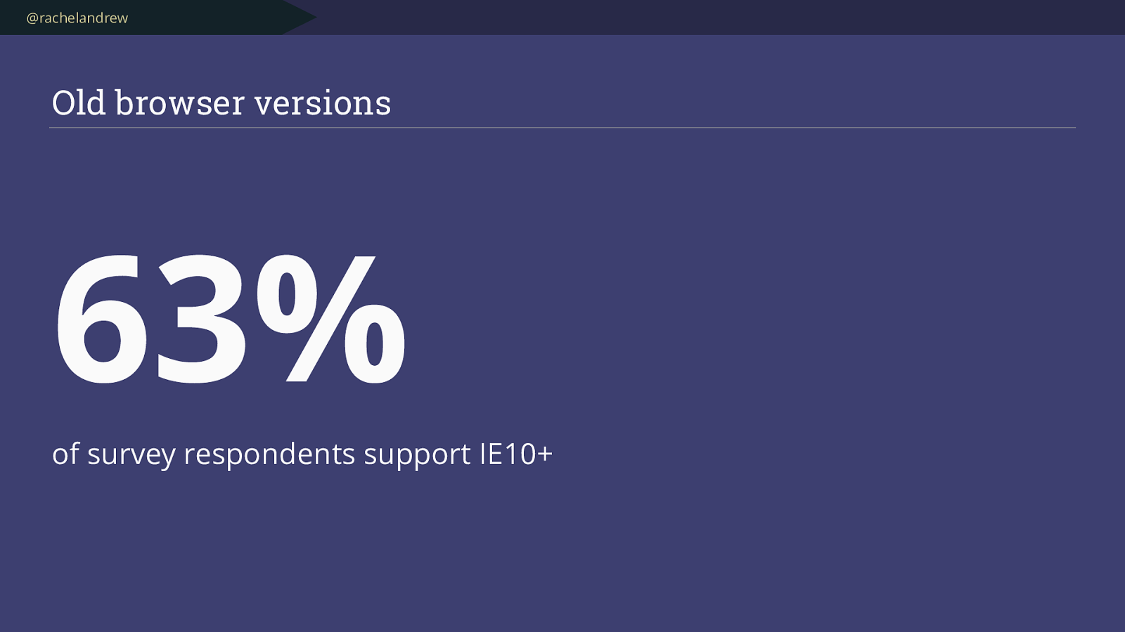
@rachelandrew Old browser versions 63%
of survey respondents support IE10+
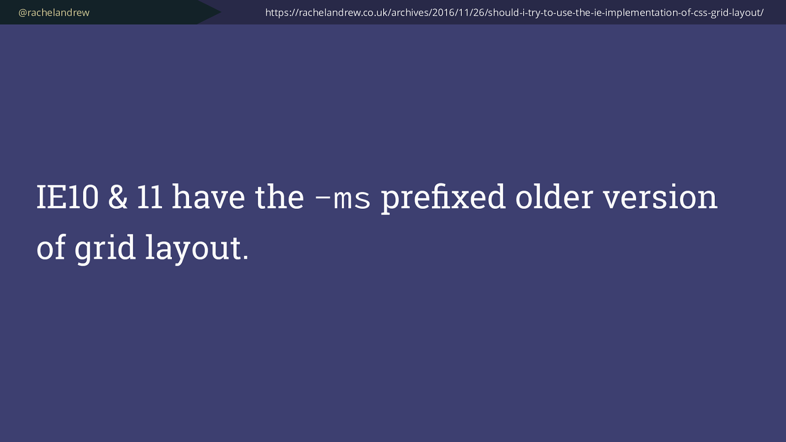
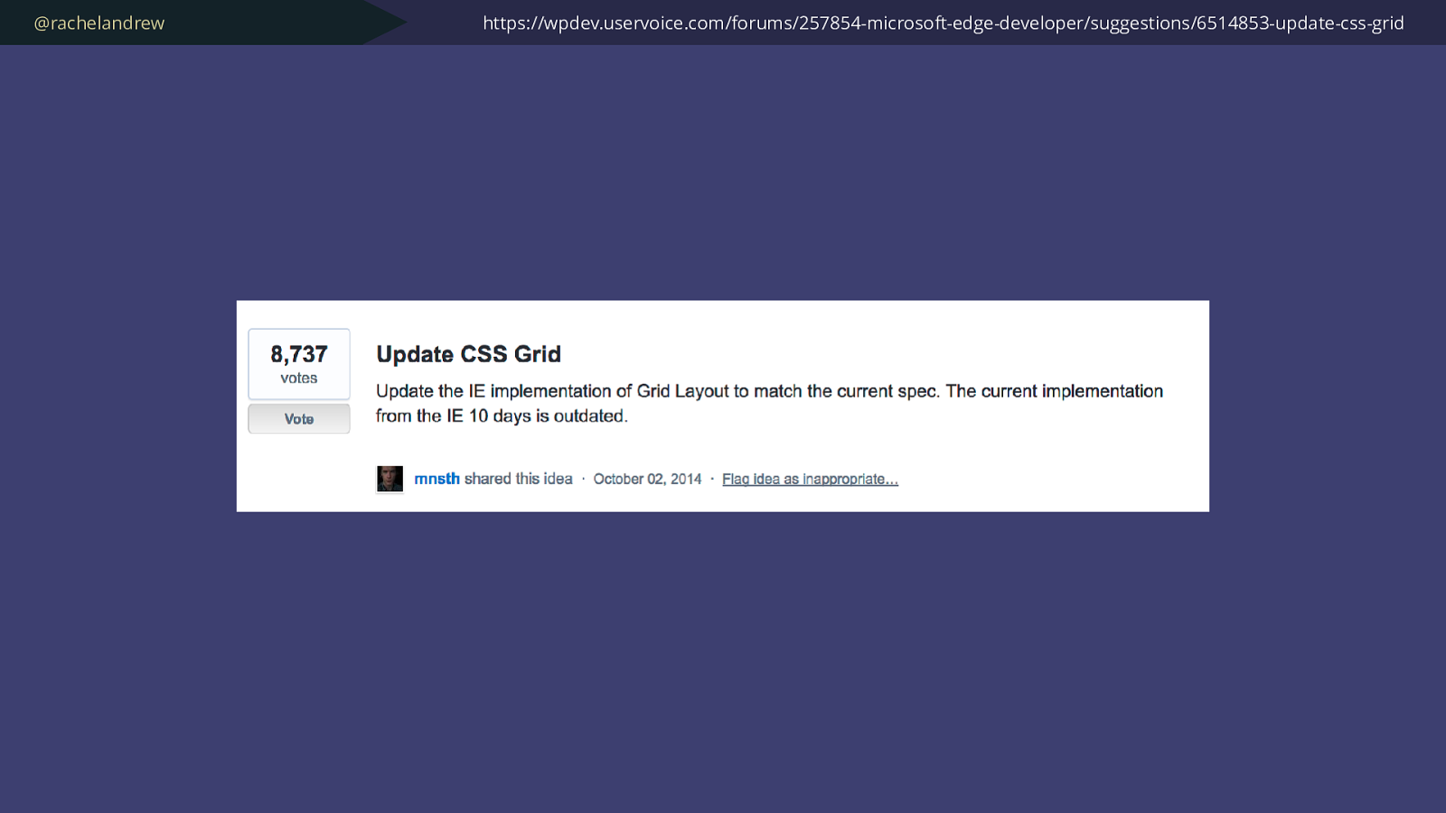
@rachelandrew IE10 & 11 have the -ms prefixed older version of grid layout. https://rachelandrew.co.uk/archives/2016/11/26/should-i-try-to-use-the-ie-implementation-of-css-grid-layout/
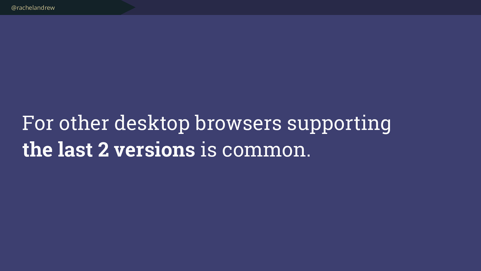
@rachelandrew For other desktop browsers supporting the last 2 versions is common.
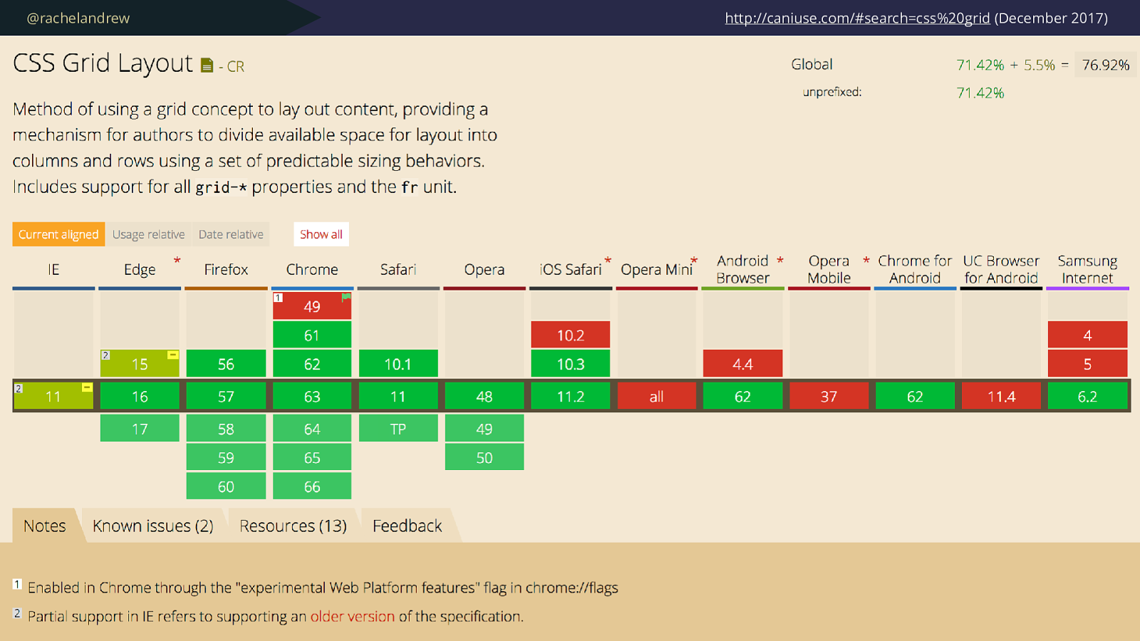
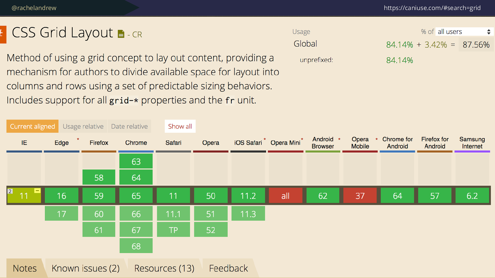
@rachelandrew http://caniuse.com/#search=css%20grid (December 2017)
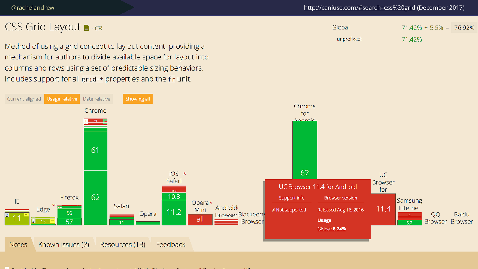
@rachelandrew http://caniuse.com/#search=css%20grid (December 2017)
@rachelandrew http://gs.statcounter.com/
@rachelandrew Many browsers without support for Grid and other new CSS at this point are mobile browsers .
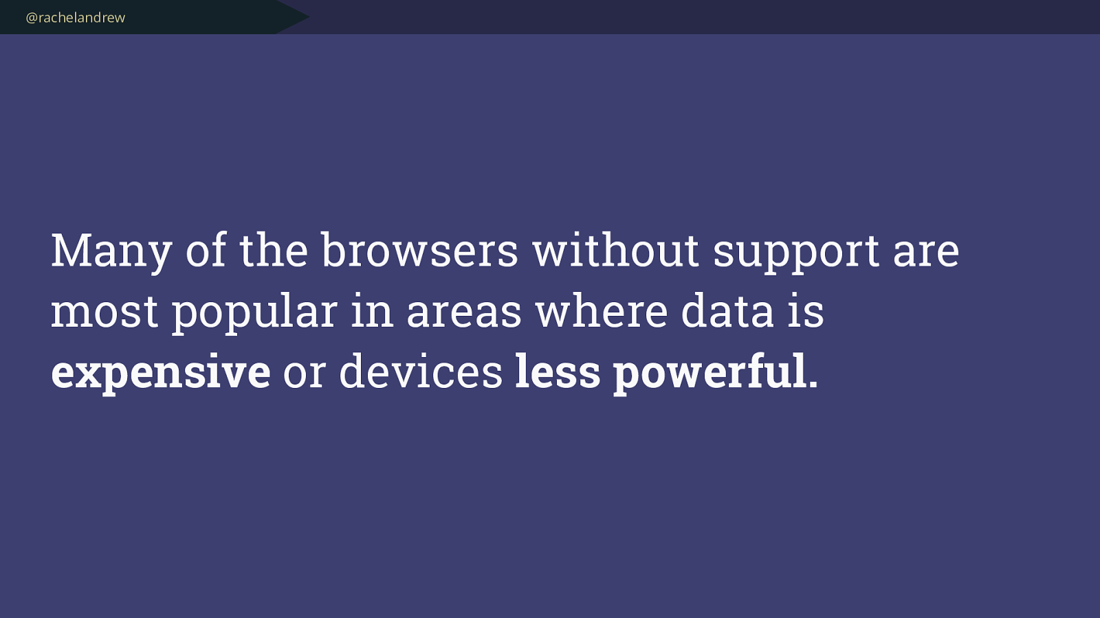
@rachelandrew Many of the browsers without support are most popular in areas where data is expensive or devices less powerful.
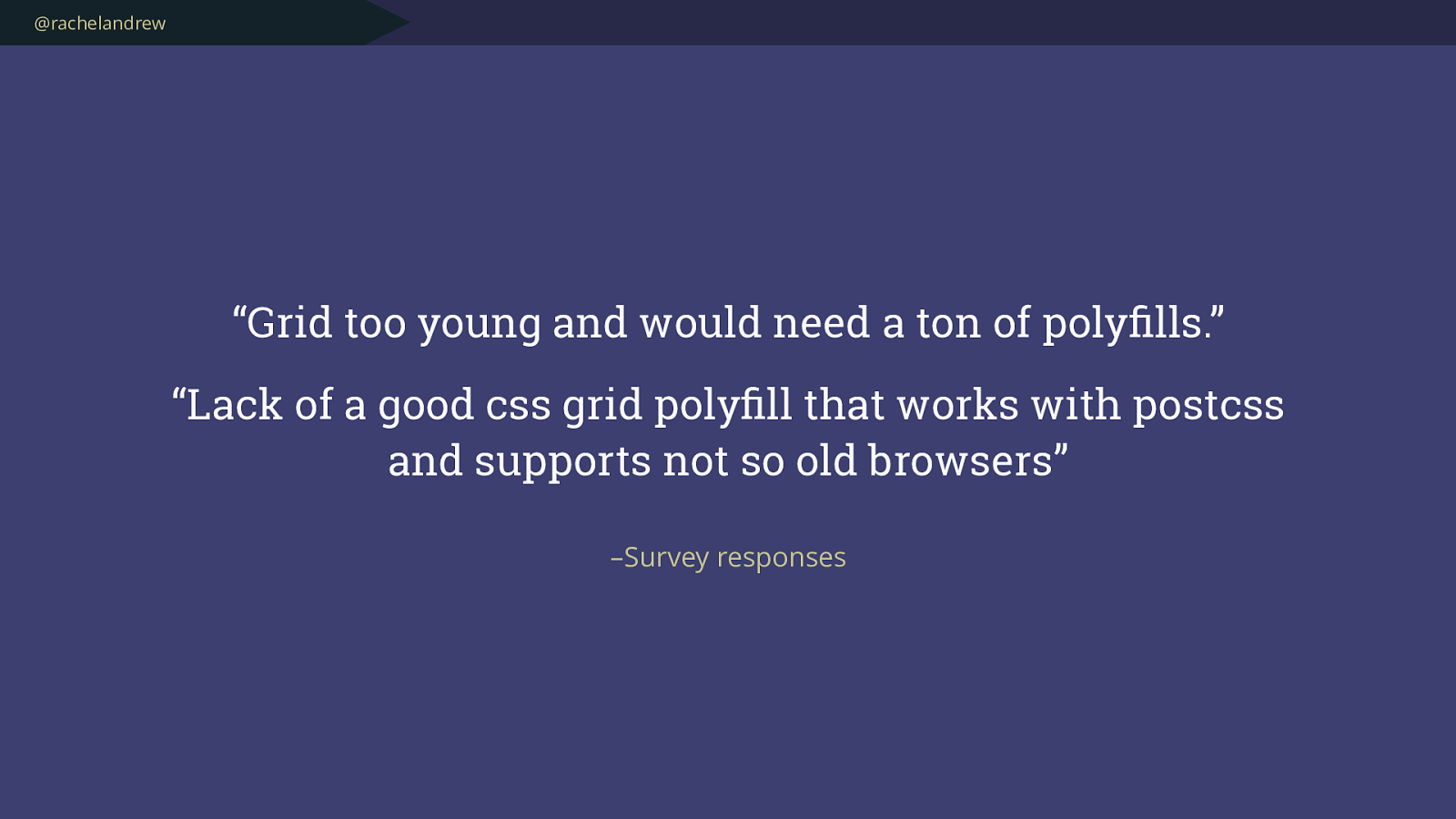
@rachelandrew – Survey responses “Grid too young and would need a ton of polyfills.”
“Lack of a good css grid polyfill that works with postcss and supports not so old browsers ”
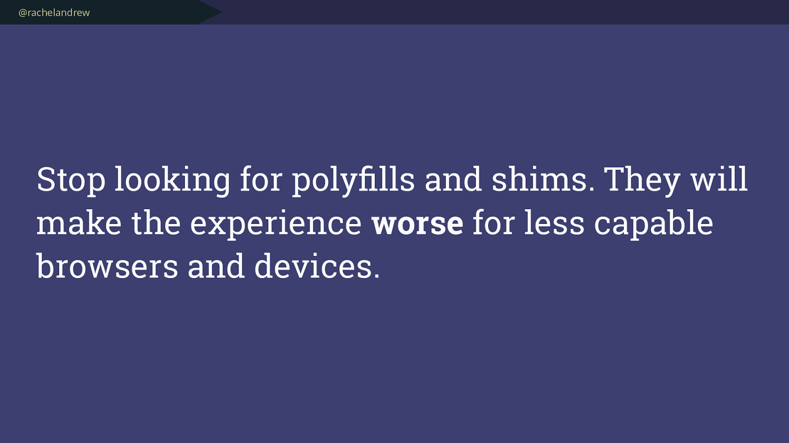
@rachelandrew Stop looking for polyfills and shims. They will make the experience worse for less capable browsers and devices.
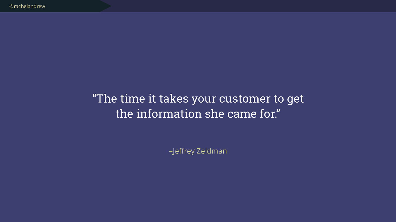
@rachelandrew – Je ff rey Zeldman “The time it takes your customer to get the information she came for.”
@rachelandrew Using Grid rather than loading a big framework can help create a better experience even for browsers that don’t support Grid .
@rachelandrew Feature Queries
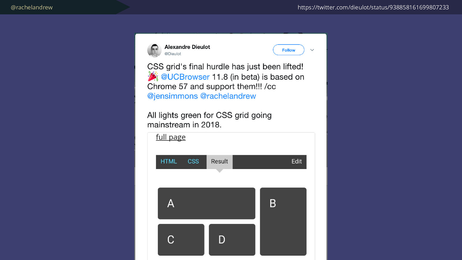
@rachelandrew https://twitter.com/dieulot/status/938858161699807233
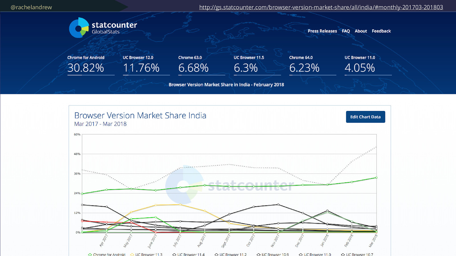
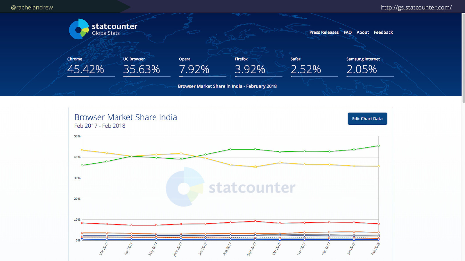
@rachelandrew http://gs.statcounter.com/browser-version-market-share/all/india/#monthly-201703-201803
@rachelandrew Create complex layouts for browsers that support them with a few lines of CSS .
@rachelandrew Making the web available to everyone . That’s exciting.

@rachelandrew – Me, in a survey question “Q. How do you feel when you see a new CSS feature announced?”
@rachelandrew “Excited! ”
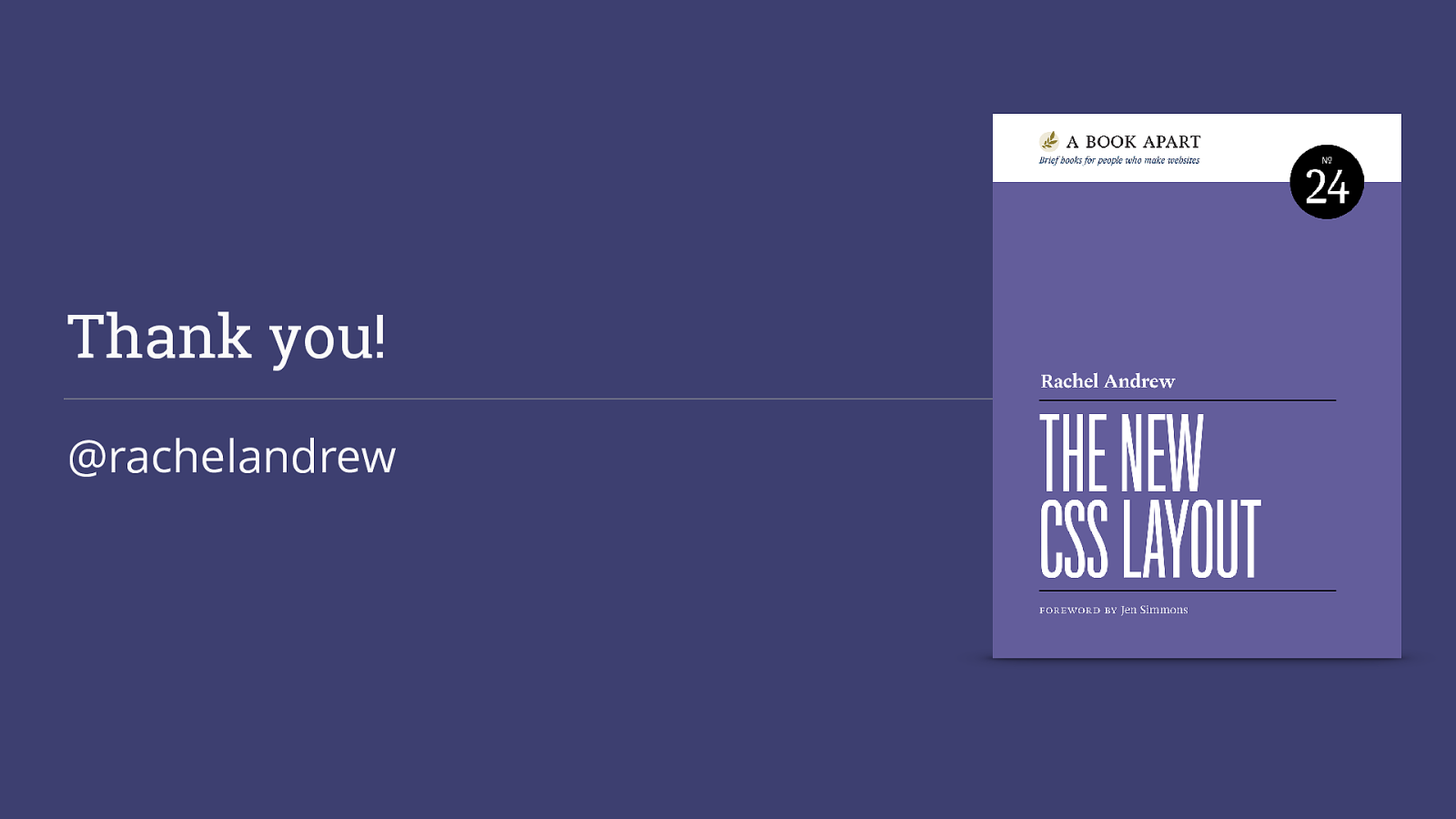
Thank you! @rachelandrew