@rachelandrew Frontend Conf Zurich, August 2018 Unlocking the Power of CSS Grid Layout

A presentation at Frontend Conference in August 2018 in Zürich, Switzerland by Rachel Andrew

@rachelandrew Frontend Conf Zurich, August 2018 Unlocking the Power of CSS Grid Layout
https://www.w3.org/TR/css-grid-2/

How big is that box?
https://alistapart.com/article/fluidgrids

https://twitter.com/devine_howest/status/959036561839960070
https://www.smashingmagazine.com/2018/01/understanding-sizing-css-layout/

How big is a grid?

https://drafts.csswg.org/css-grid-1/#layout-algorithm “Each track has specified minimum and maximum sizing functions (which may be the same).” –11.1 Grid Sizing Algorithm
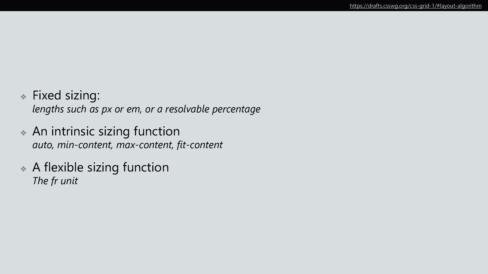
https://drafts.csswg.org/css-grid-1/#layout-algorithm ❖ Fixed sizing: ❖ An intrinsic sizing function ❖ A flexible sizing function lengths such as px or em, or a resolvable percentage auto, min-content, max-content, fit-content The fr unit
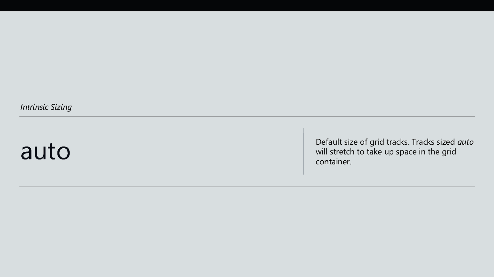
Intrinsic Sizing auto Default size of grid tracks. Tracks sized auto will stretch to take up space in the grid container.
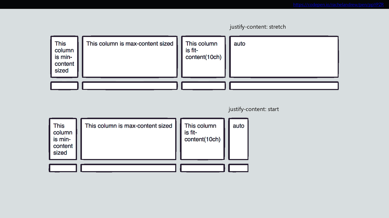
https://codepen.io/rachelandrew/pen/ppYPZR justify-content: stretch justify-content: start
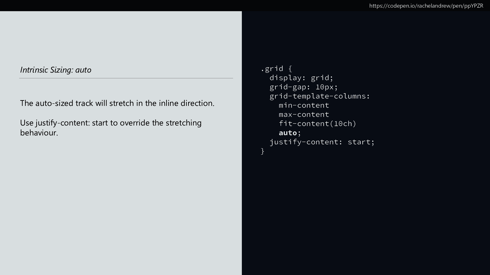
https://codepen.io/rachelandrew/pen/ppYPZR Intrinsic Sizing: auto The auto-sized track will stretch in the inline direction. Use justify-content: start to override the stretching behaviour. .grid { display: grid; grid-gap: 10px; grid-template-columns: min-content max-content fit-content(10ch) auto; justify-content: start; }
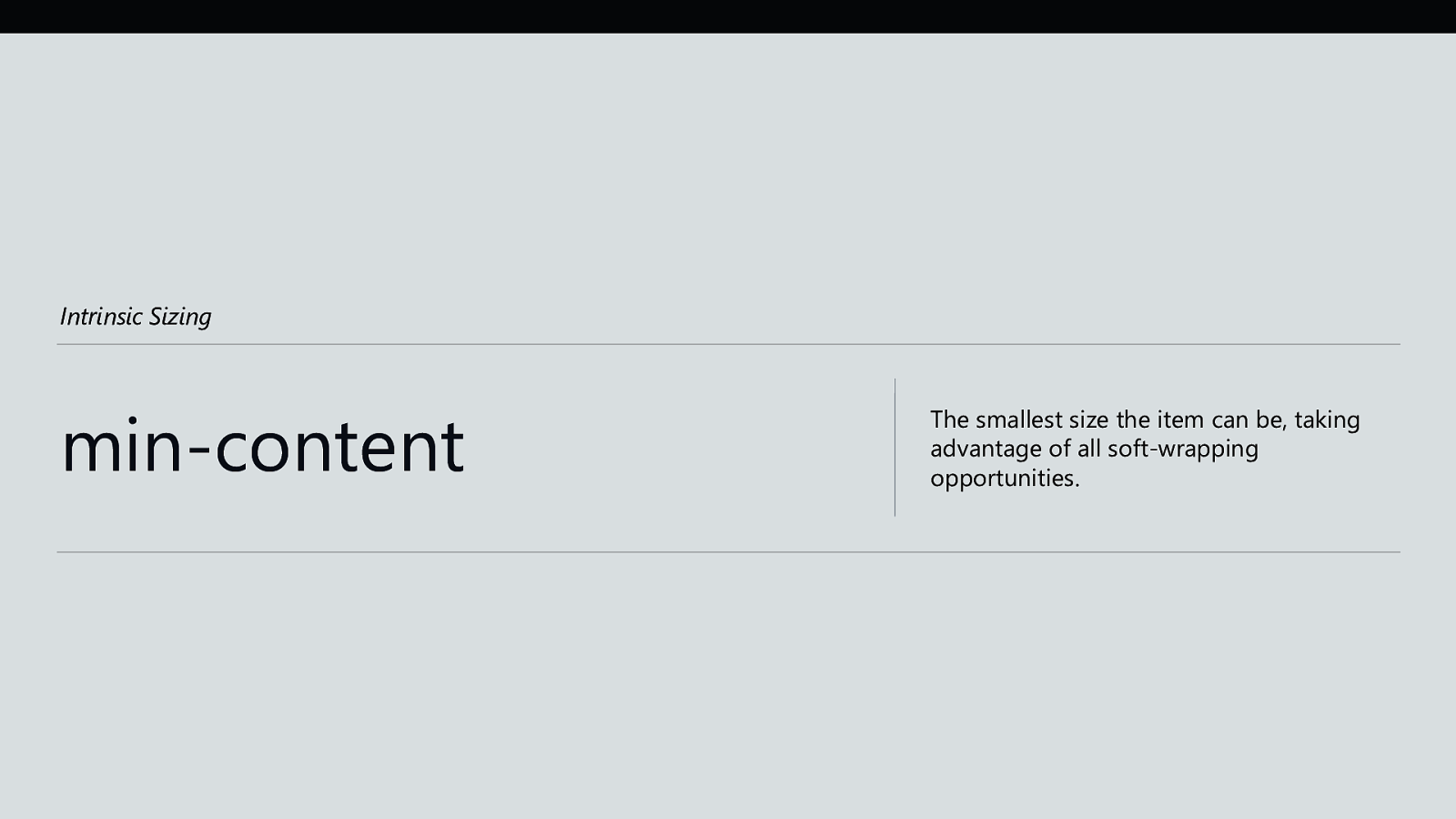
Intrinsic Sizing min-content The smallest size the item can be, taking advantage of all soft-wrapping opportunities.

https://codepen.io/rachelandrew/pen/VyOpXj Intrinsic Sizing: min-content Grid tracks sized with min-content will become as small as they can without causing overflows. .grid { display: grid; grid-gap: 10px; grid-template-columns: min-content min-content min-content; }
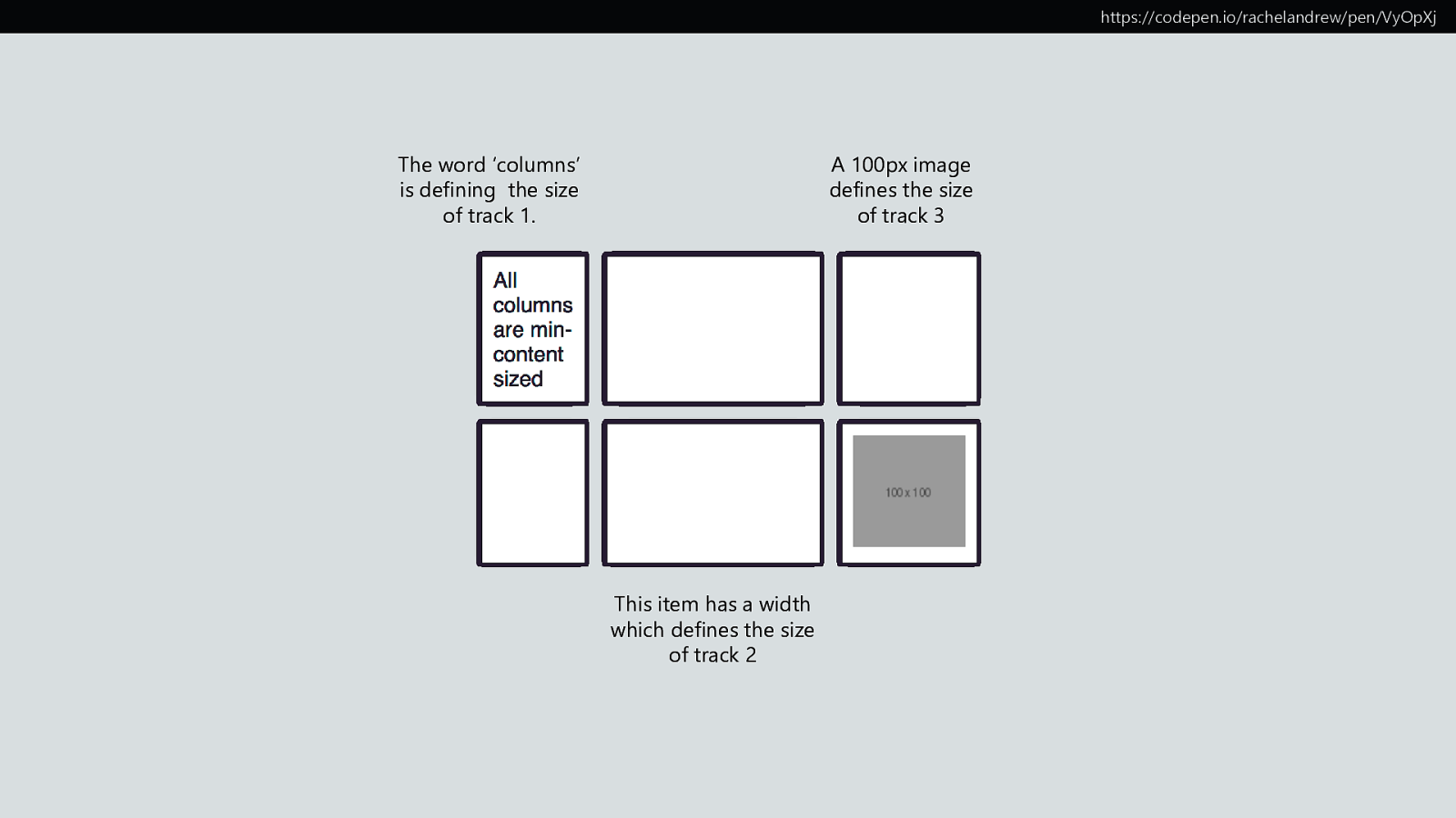
https://codepen.io/rachelandrew/pen/VyOpXj The word ‘columns’ is defining the size of track 1. A 100px image defines the size of track 3 This item has a width which defines the size of track 2
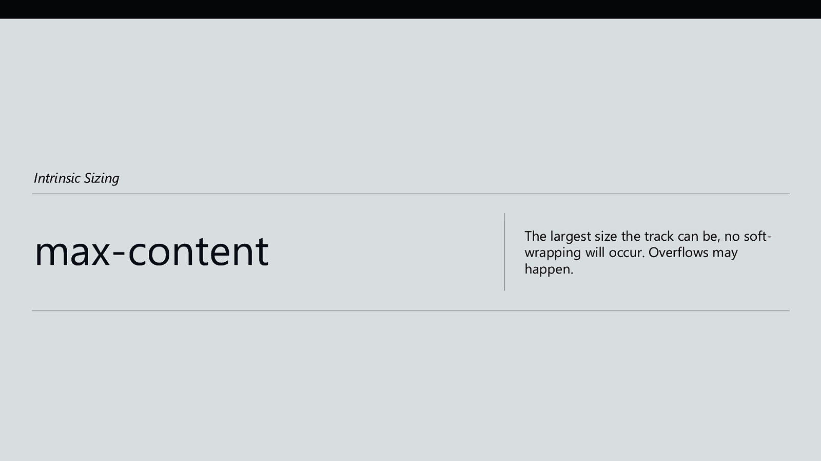
Intrinsic Sizing max-content The largest size the track can be, no softwrapping will occur. Overflows may happen.
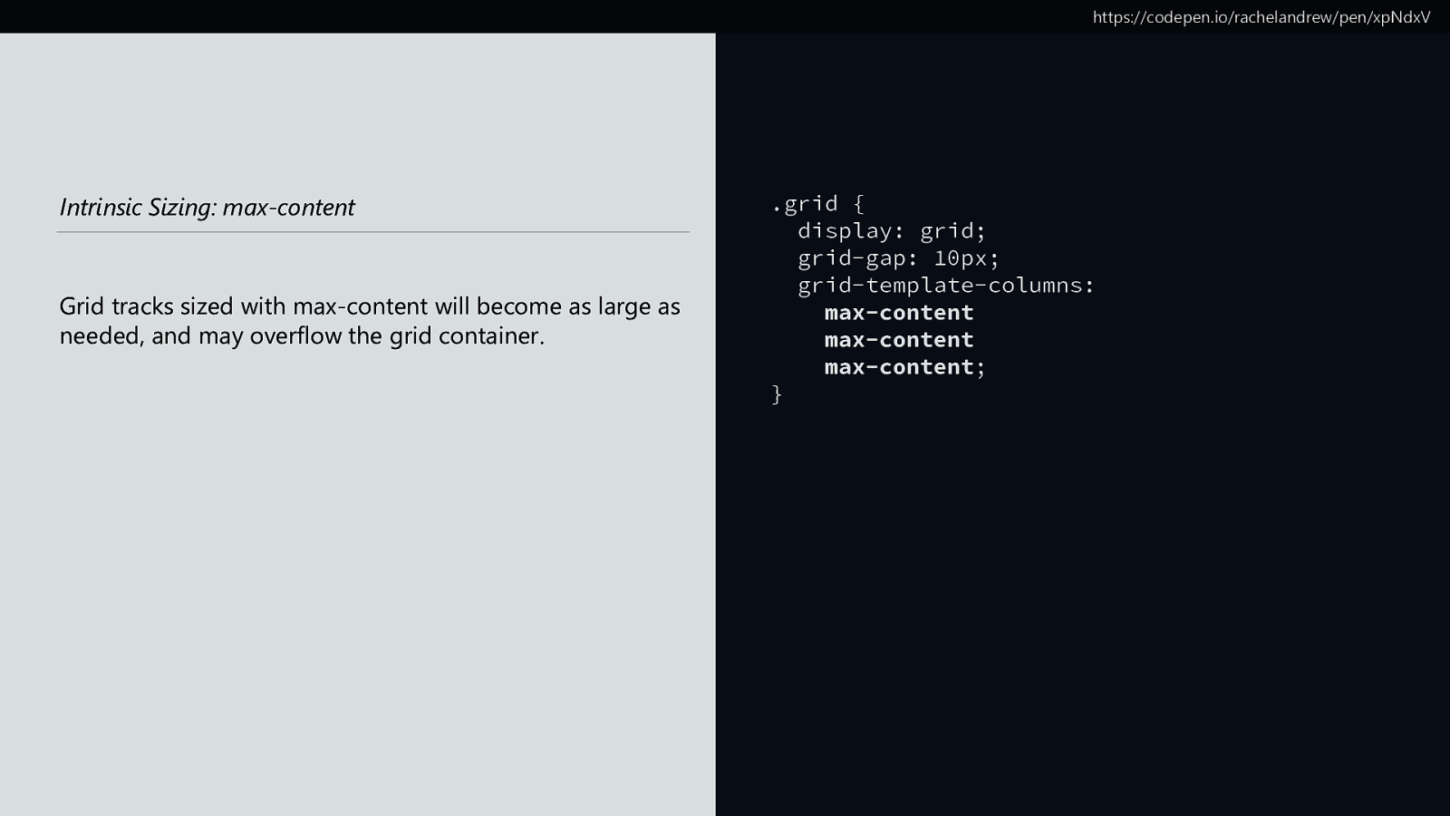
https://codepen.io/rachelandrew/pen/xpNdxV Intrinsic Sizing: max-content Grid tracks sized with max-content will become as large as needed, and may overflow the grid container. .grid { display: grid; grid-gap: 10px; grid-template-columns: max-content max-content max-content; }
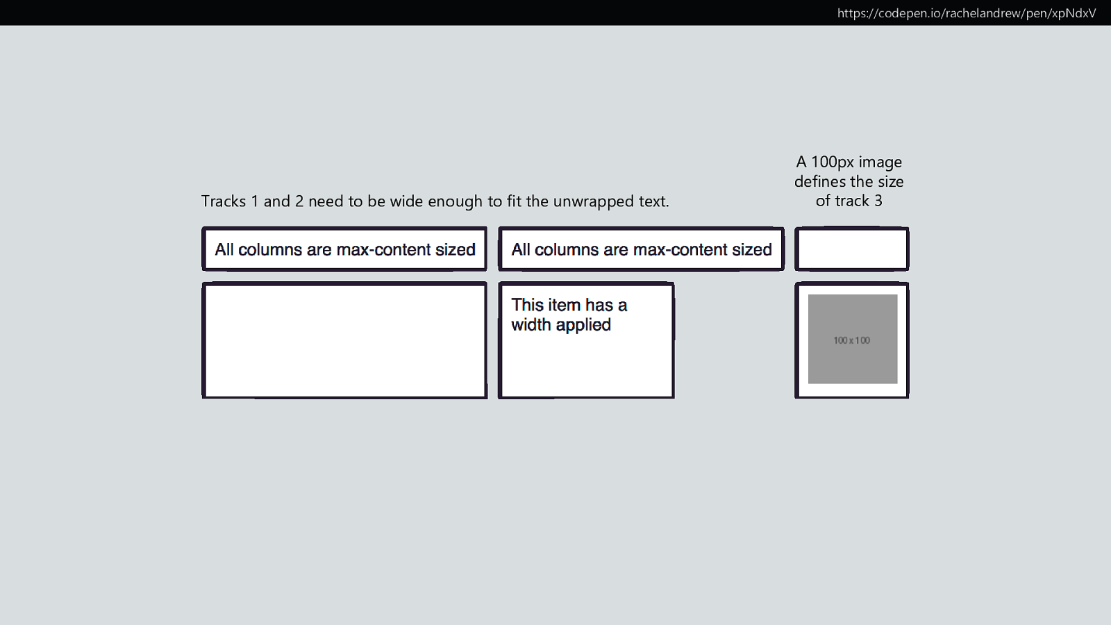
https://codepen.io/rachelandrew/pen/xpNdxV Tracks 1 and 2 need to be wide enough to fit the unwrapped text. A 100px image defines the size of track 3
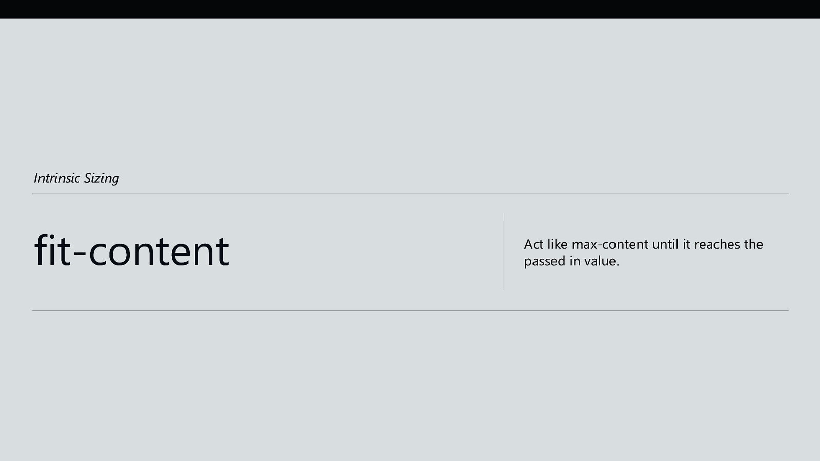
Intrinsic Sizing fit-content Act like max-content until it reaches the passed in value.
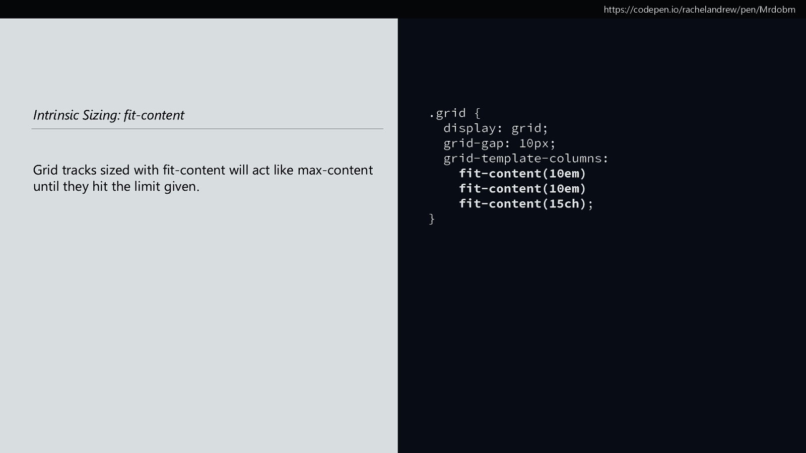
https://codepen.io/rachelandrew/pen/Mrdobm Intrinsic Sizing: fit-content Grid tracks sized with fit-content will act like max-content until they hit the limit given. .grid { display: grid; grid-gap: 10px; grid-template-columns: fit-content(10em) fit-content(10em) fit-content(15ch); }
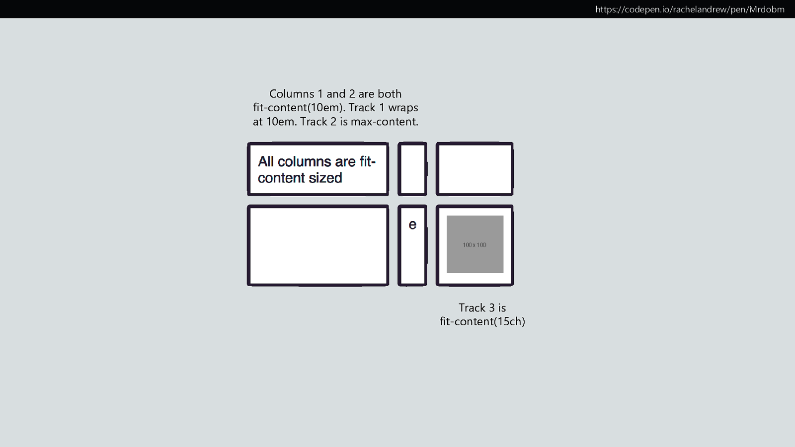
https://codepen.io/rachelandrew/pen/Mrdobm Columns 1 and 2 are both fit-content(10em). Track 1 wraps at 10em. Track 2 is max-content. Track 3 is fit-content(15ch)
Flexible lengths Sizing with fr units The fr unit describes a flexible length
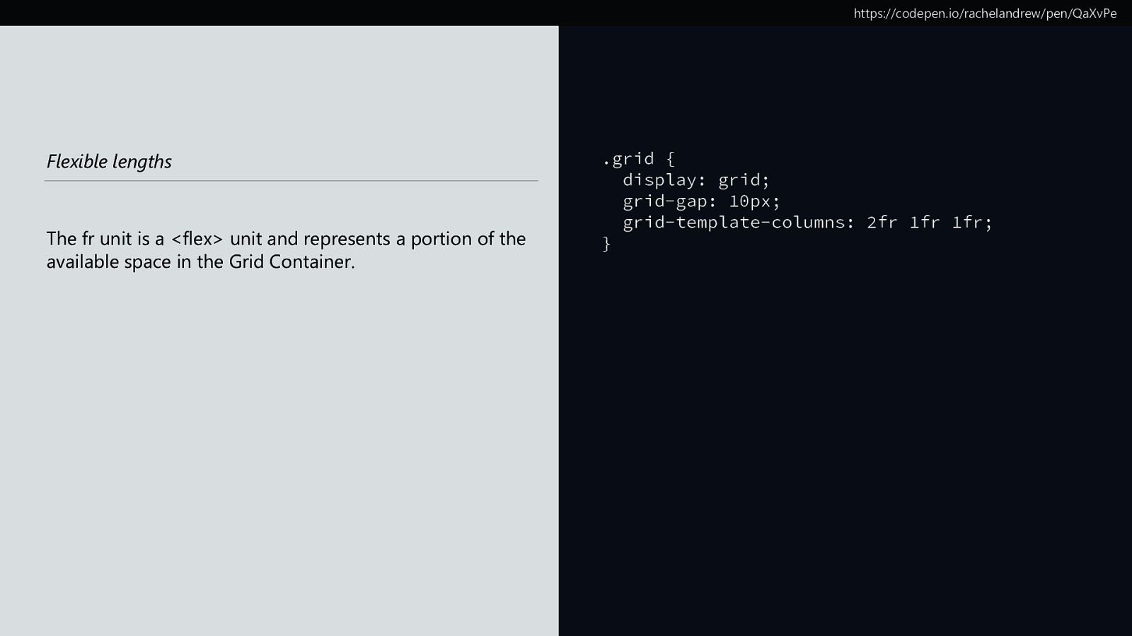
https://codepen.io/rachelandrew/pen/QaXvPe Flexible lengths The fr unit is a <flex> unit and represents a portion of the available space in the Grid Container. .grid { display: grid; grid-gap: 10px; grid-template-columns: 2fr 1fr 1fr; }
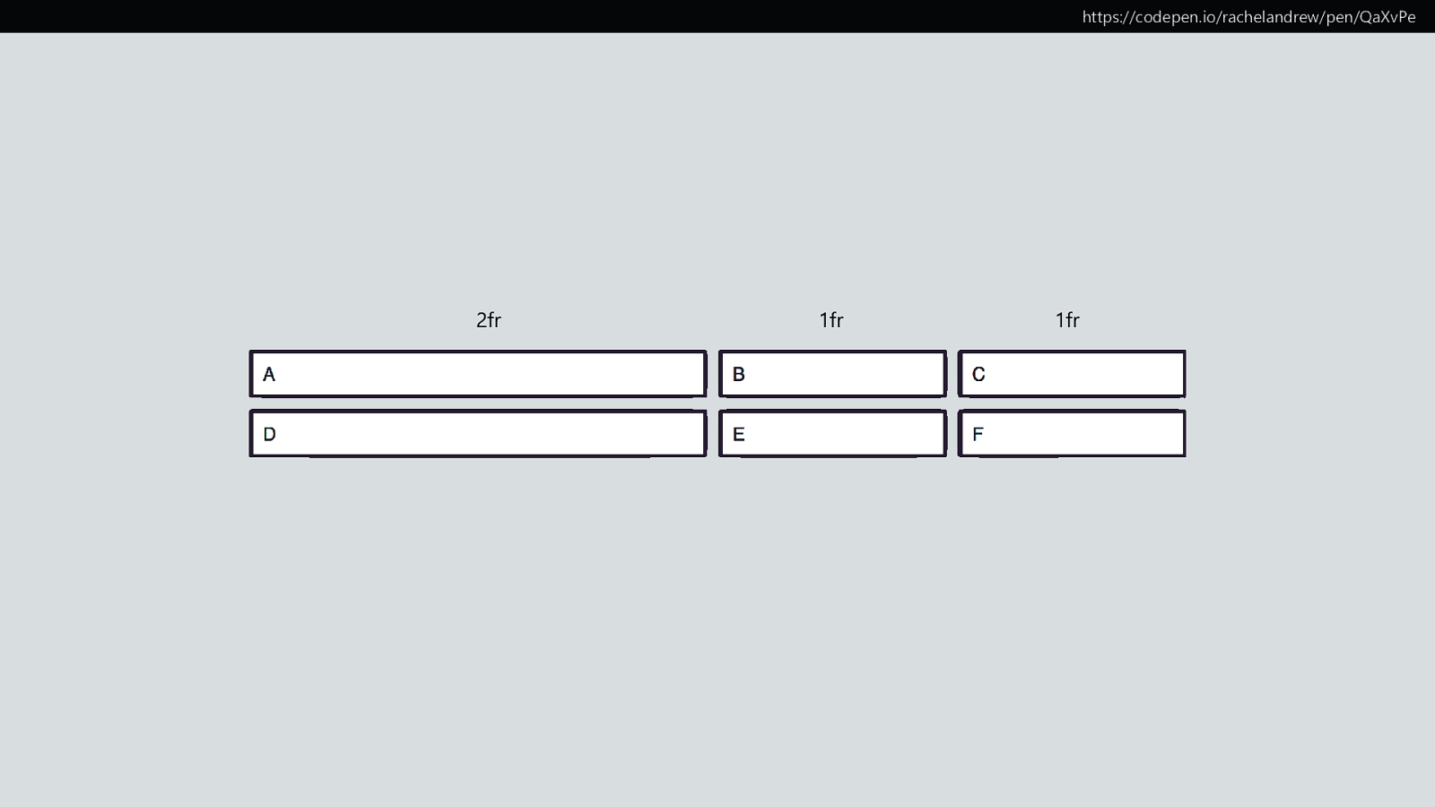
https://codepen.io/rachelandrew/pen/QaXvPe 2fr 1fr 1fr
Minimum & Maximum sizing functions

minmax()
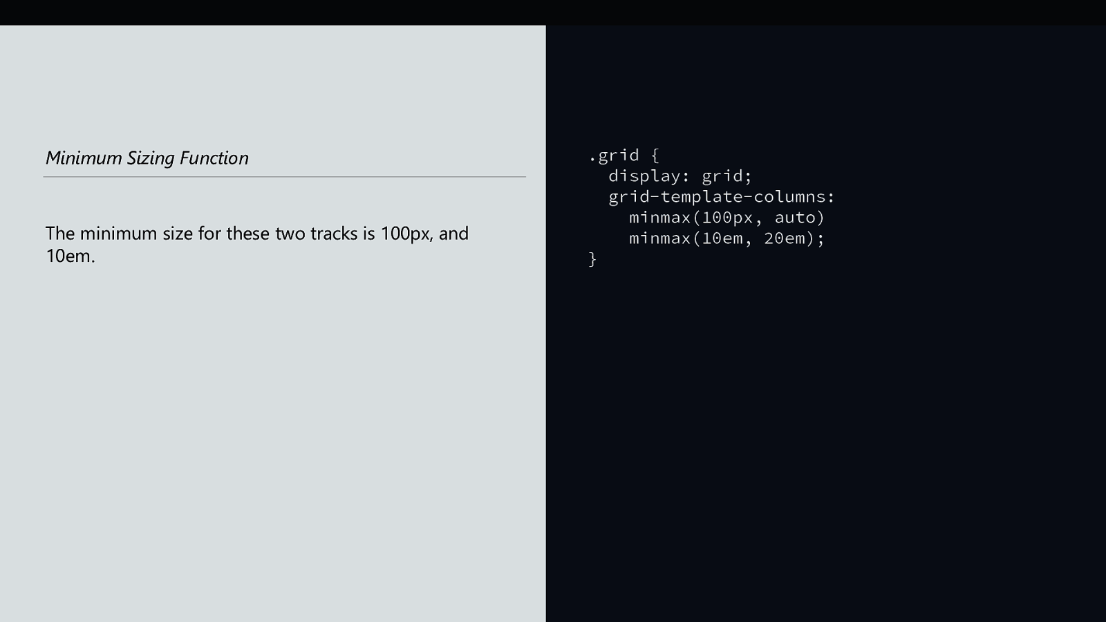
Minimum Sizing Function The minimum size for these two tracks is 100px, and 10em. .grid { display: grid; grid-template-columns: minmax(100px, auto) minmax(10em, 20em); }

Minimum Sizing Function The minimum size of these two tracks is auto. .grid { display: grid; grid-template-columns: 10fr fit-content(10em); }

Minimum Sizing Function The minimum size of the first track is 100px, the second track is 50px (10% of 500). .grid { width: 500px; display: grid; grid-template-columns: 100px 10%; }
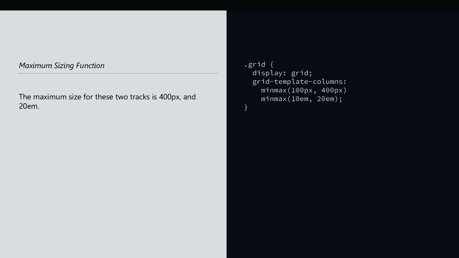
Maximum Sizing Function The maximum size for these two tracks is 400px, and 20em. .grid { display: grid; grid-template-columns: minmax(100px, 400px) minmax(10em, 20em); }
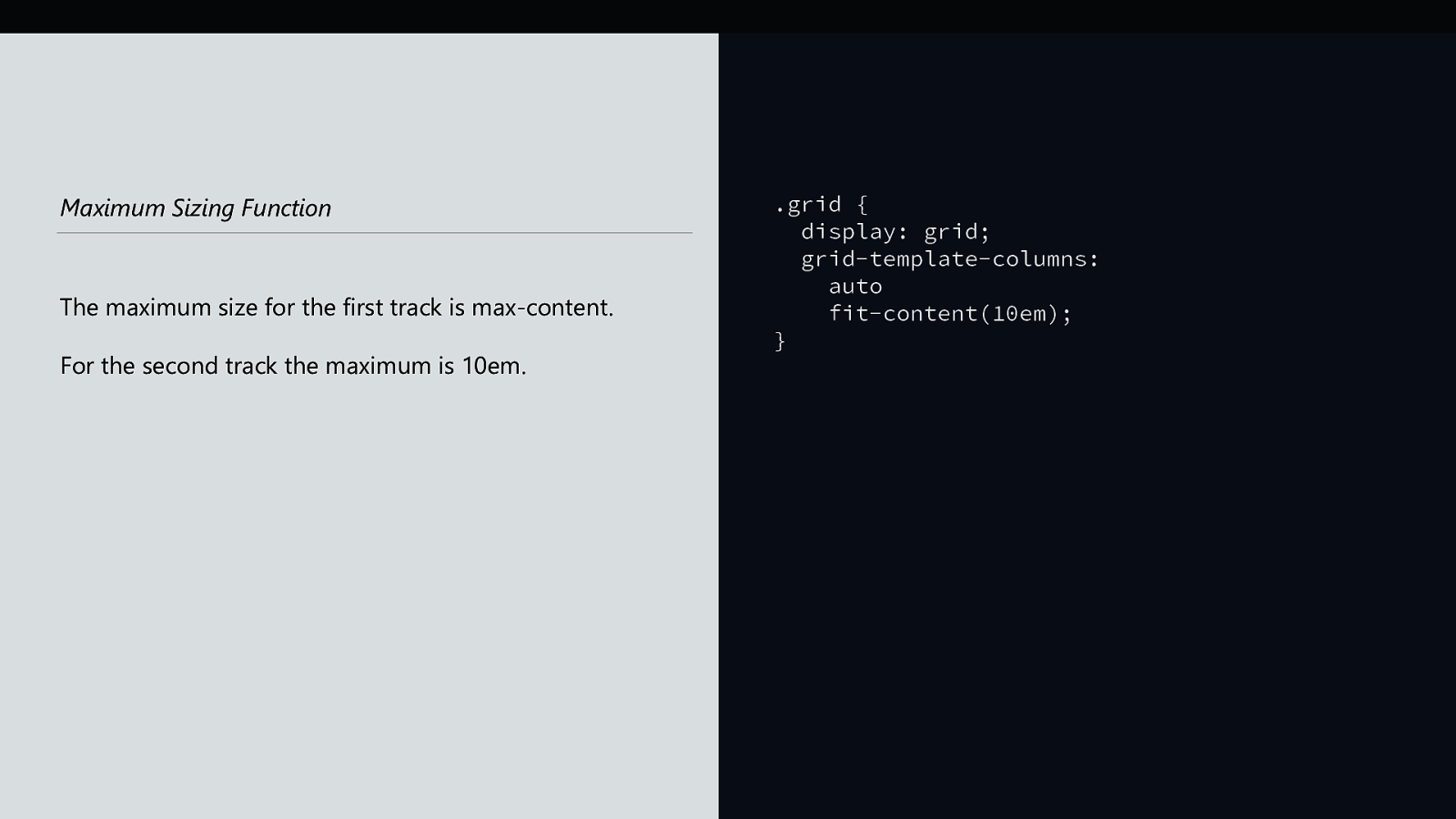
Maximum Sizing Function The maximum size for the first track is max-content. For the second track the maximum is 10em. .grid { display: grid; grid-template-columns: auto fit-content(10em); }
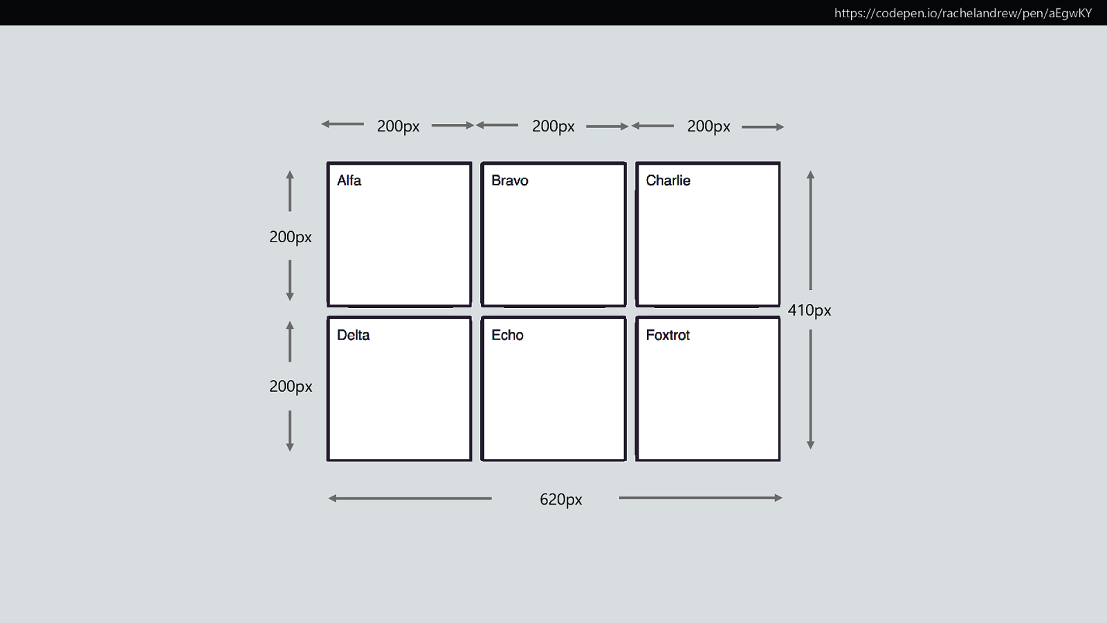
https://codepen.io/rachelandrew/pen/aEgwKY 200px 200px 200px 200px 410px 200px 620px
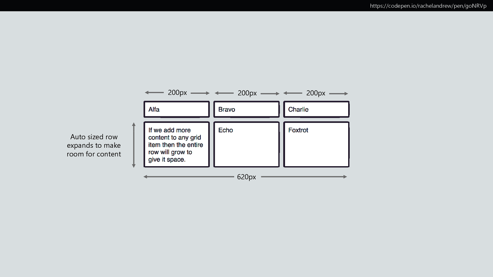
https://codepen.io/rachelandrew/pen/goNRVp 200px 200px Auto sized row expands to make room for content 620px 200px
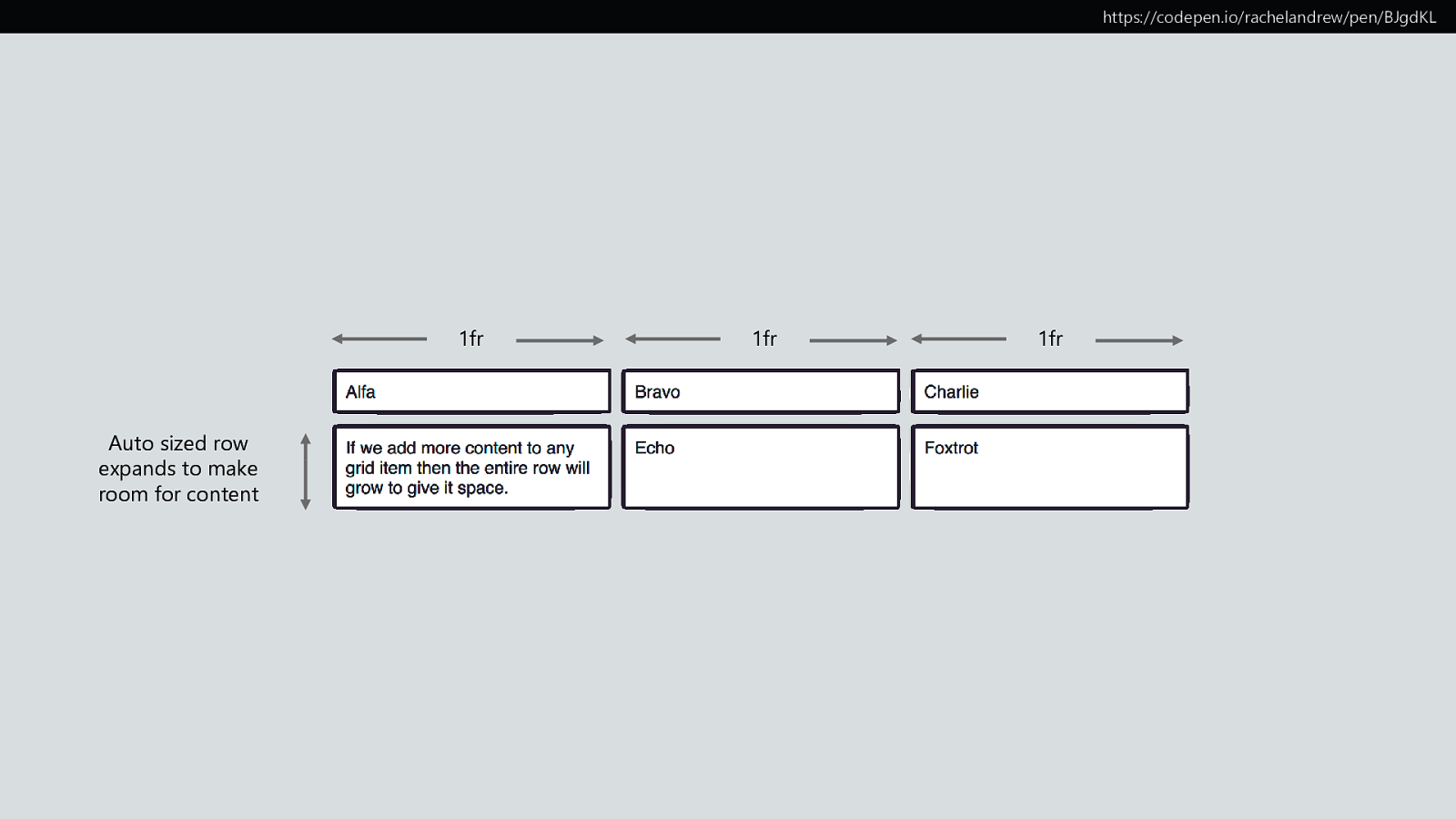
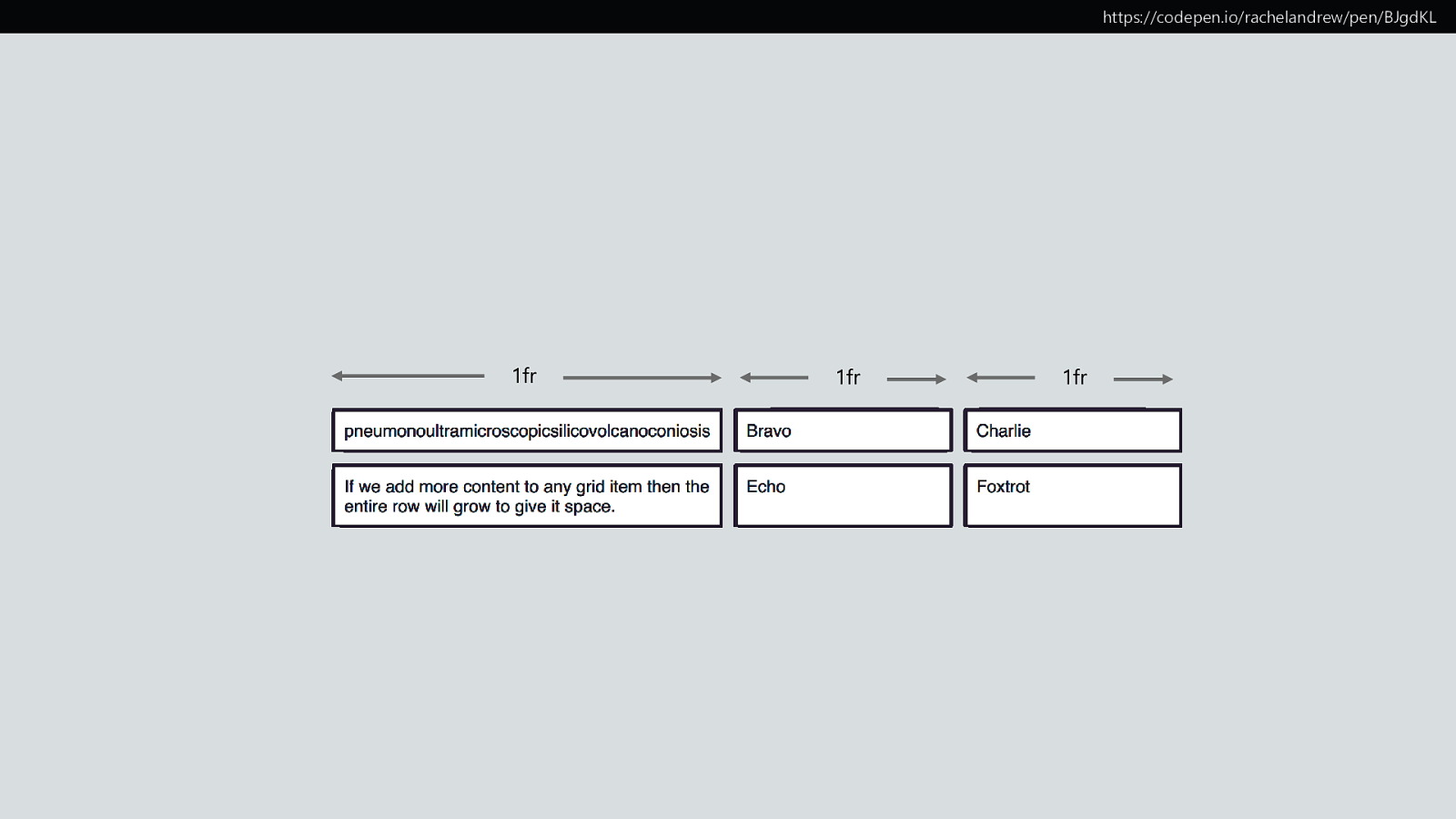
https://codepen.io/rachelandrew/pen/BJgdKL 1fr Auto sized row expands to make room for content 1fr 1fr
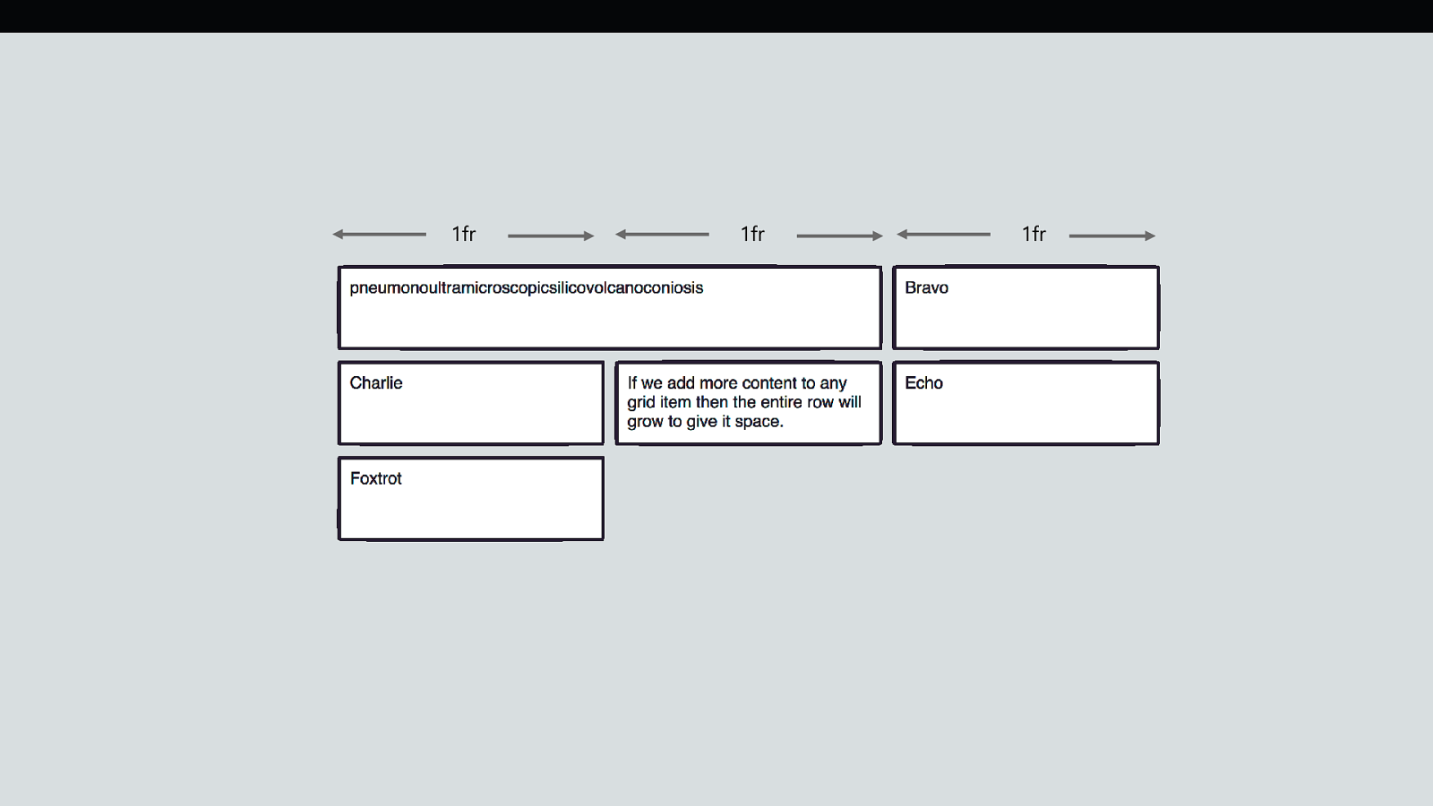
What is a fr unit anyway? A track sized with 1fr, is actually sized minmax(auto, 1fr). The minimum size is auto. .grid { display: grid; grid-template-columns: 1fr 1fr 1fr; }
https://codepen.io/rachelandrew/pen/BJgdKL 1fr 1fr 1fr
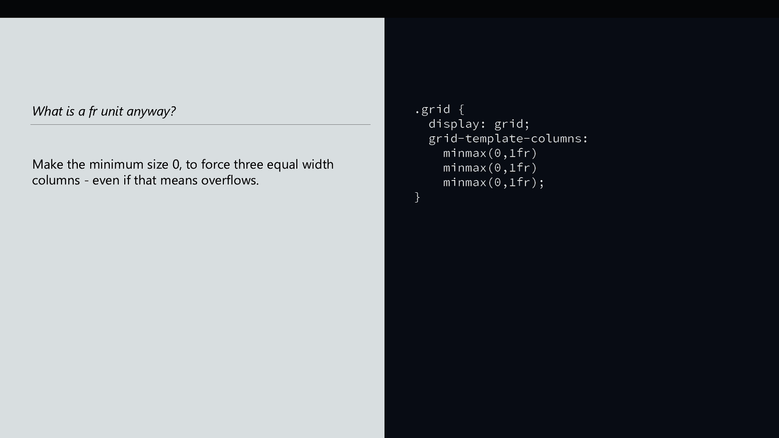
What is a fr unit anyway? Make the minimum size 0, to force three equal width columns - even if that means overflows. .grid { display: grid; grid-template-columns: minmax(0,1fr) minmax(0,1fr) minmax(0,1fr); }
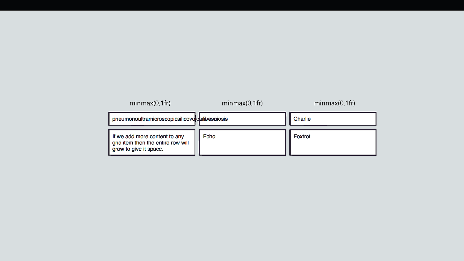
minmax(0,1fr) minmax(0,1fr) minmax(0,1fr)
1fr 1fr 1fr

https://codepen.io/rachelandrew/pen/WdVjdg As many flexible columns as will fit Use auto-fill or auto-fit along with repeat and minmax, to create as many flexible columns with a minimum size as will fit into the container. .grid { display: grid; grid-gap: 10px; grid-template-columns: repeat(auto-fill, minmax(200px, 1fr)); grid-auto-rows: 100px; }
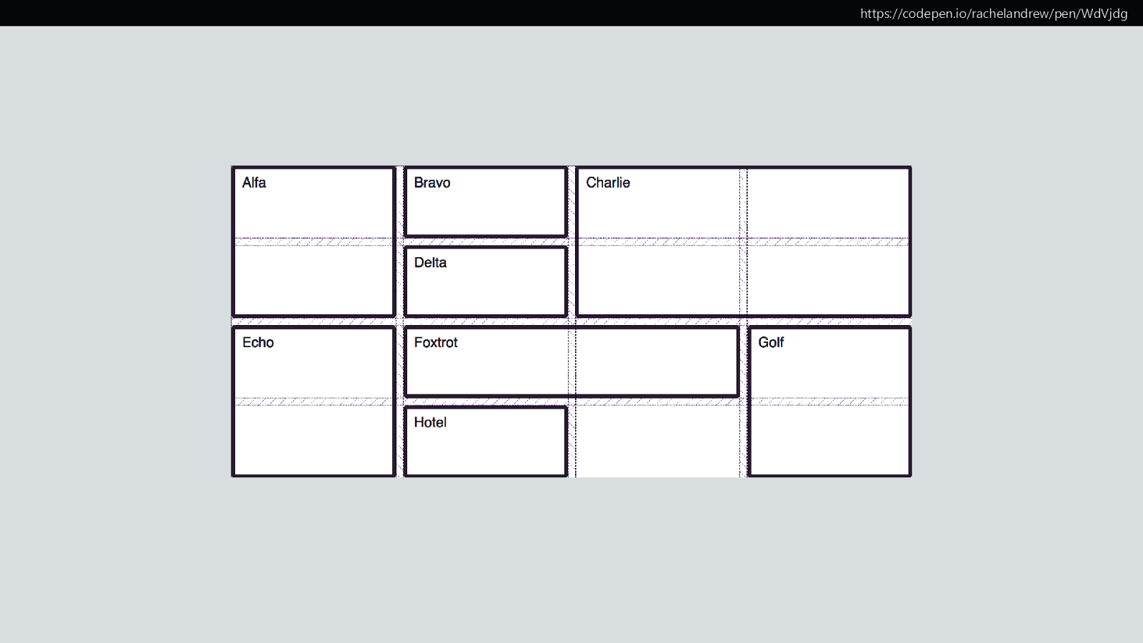
https://codepen.io/rachelandrew/pen/WdVjdg
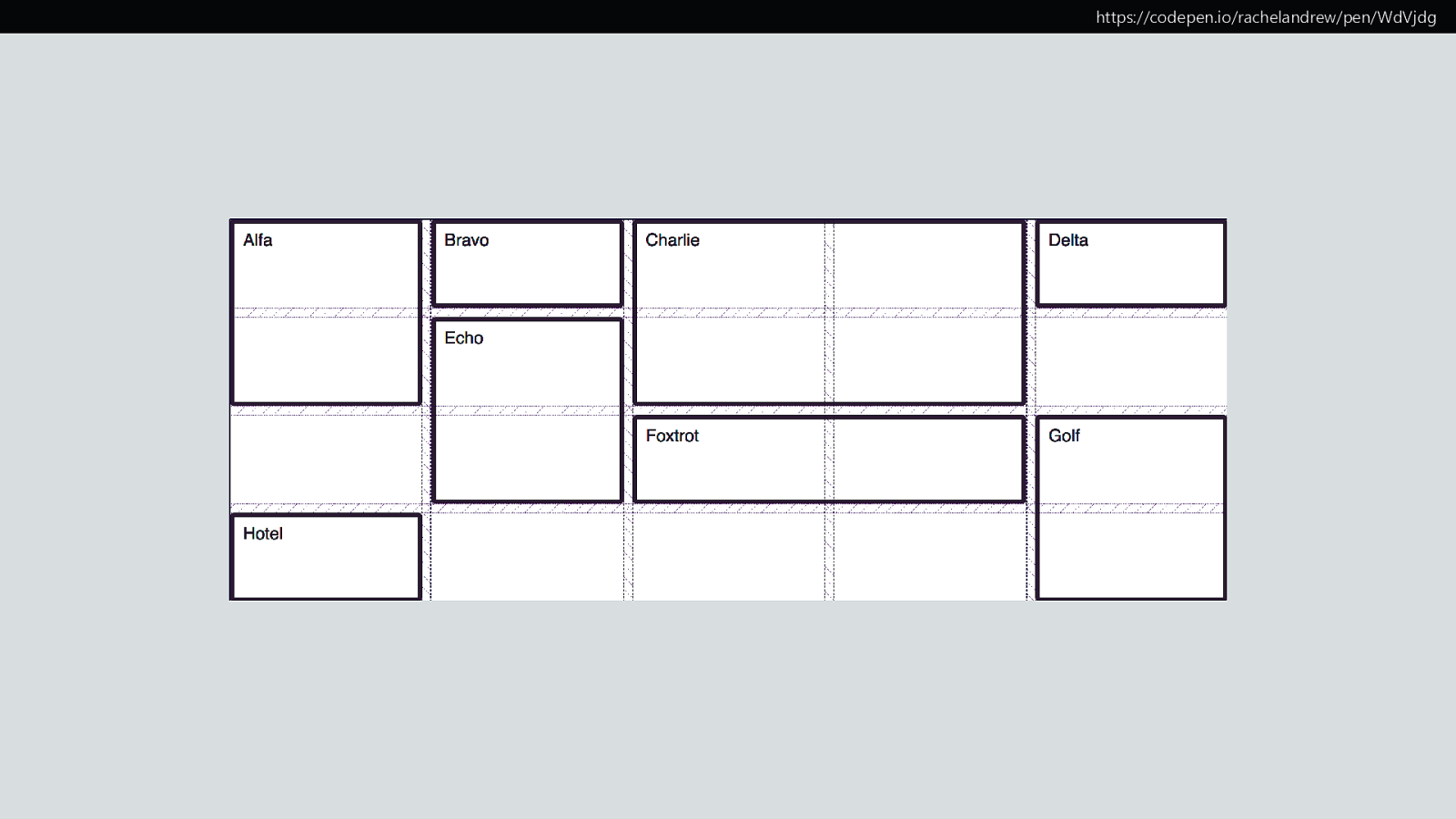
https://codepen.io/rachelandrew/pen/WdVjdg

https://codepen.io/rachelandrew/pen/ZvgKNY Dense Packing Mode Using the value dense for grid-auto-flow will cause items to be displayed out of document order. .grid { display: grid; grid-gap: 10px; grid-template-columns: repeat(auto-fill, minmax(200px, 1fr)); grid-auto-rows: 100px; grid-auto-flow: dense; }
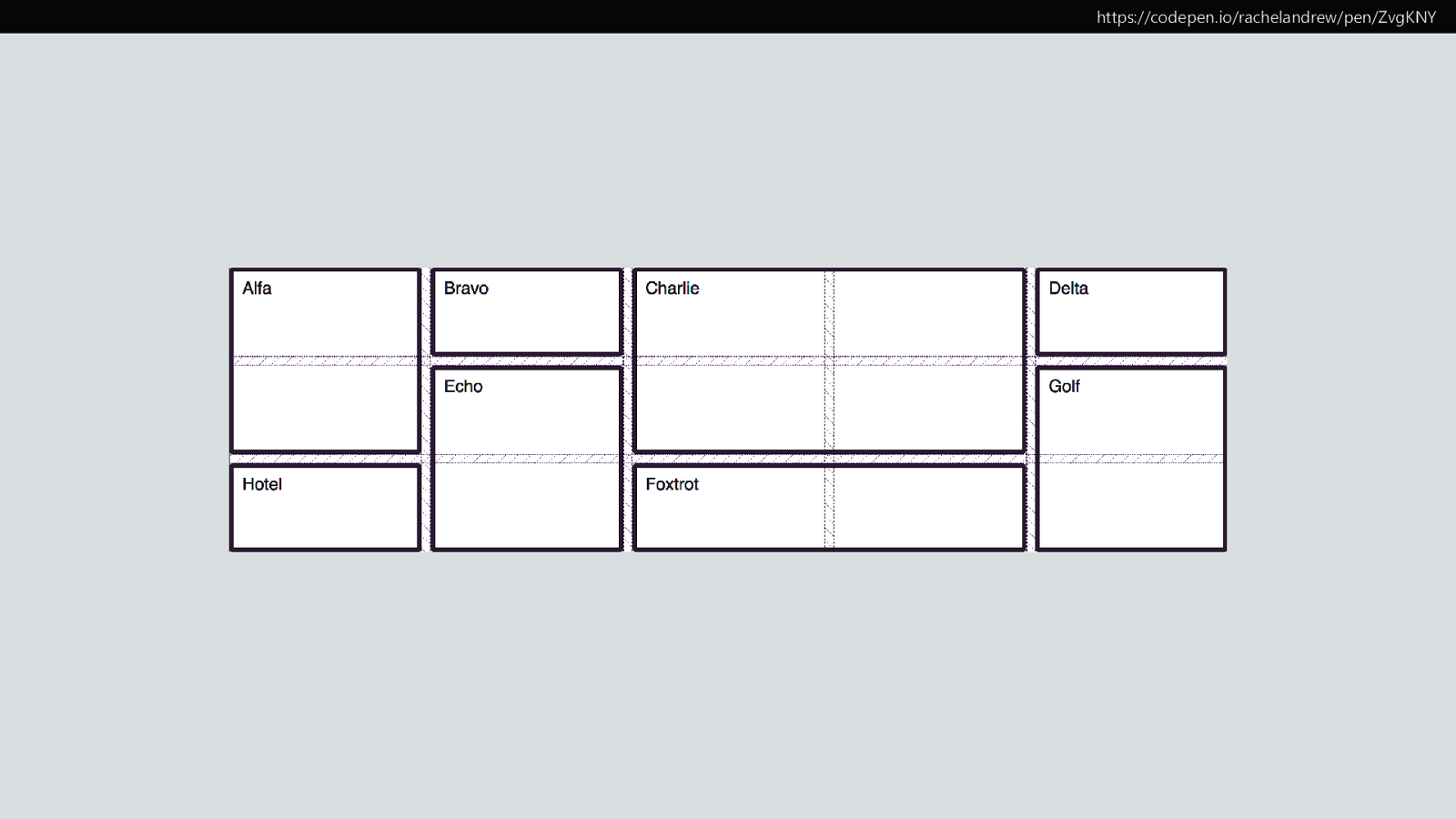
https://codepen.io/rachelandrew/pen/ZvgKNY

Upside down and back to front
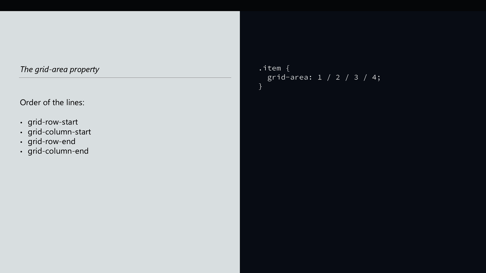
The grid-area property Order of the lines: • • • • grid-row-start grid-column-start grid-row-end grid-column-end .item { grid-area: 1 / 2 / 3 / 4; }

Logical Properties and Writing Modes
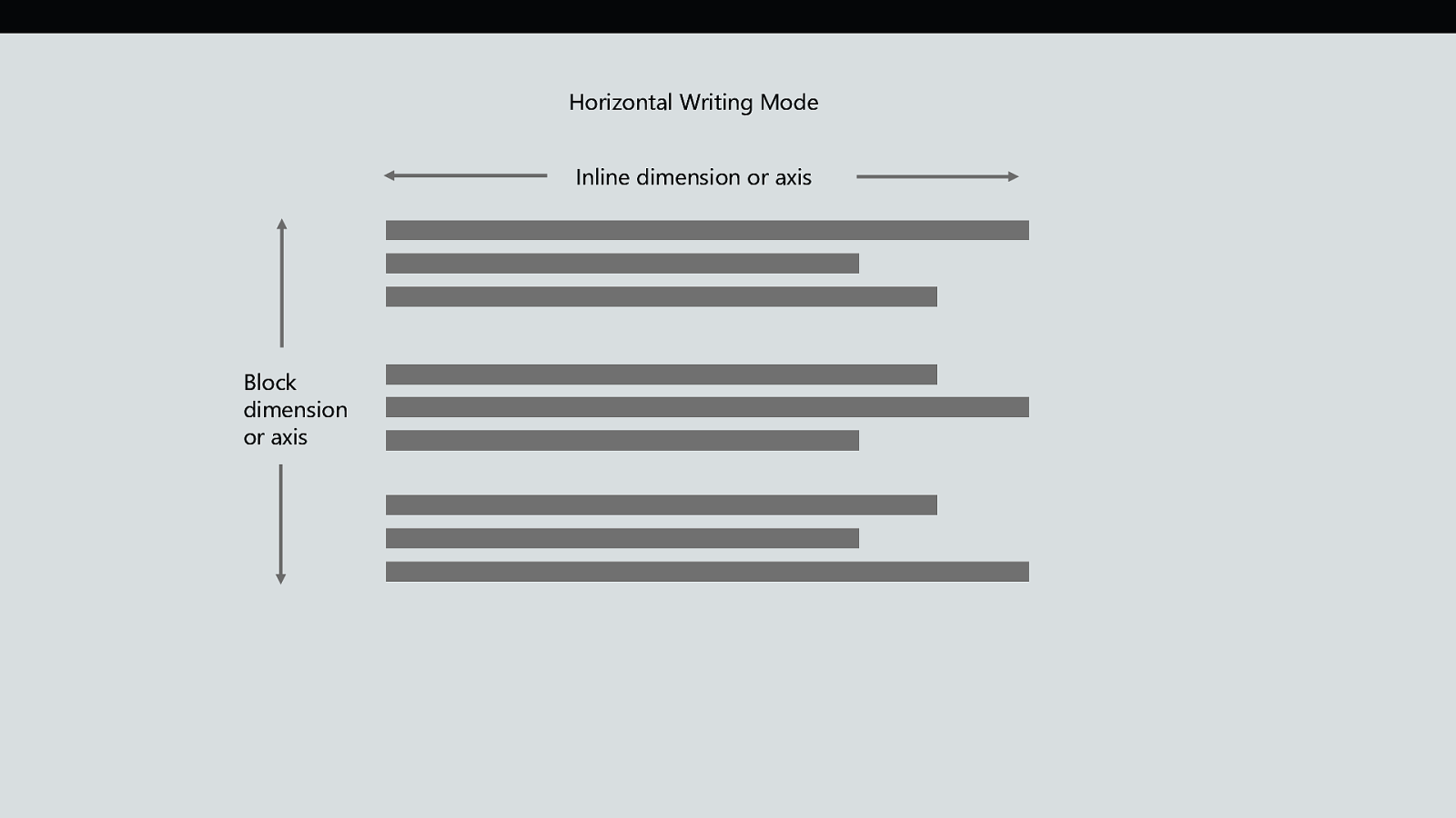
Horizontal Writing Mode Inline dimension or axis Block dimension or axis
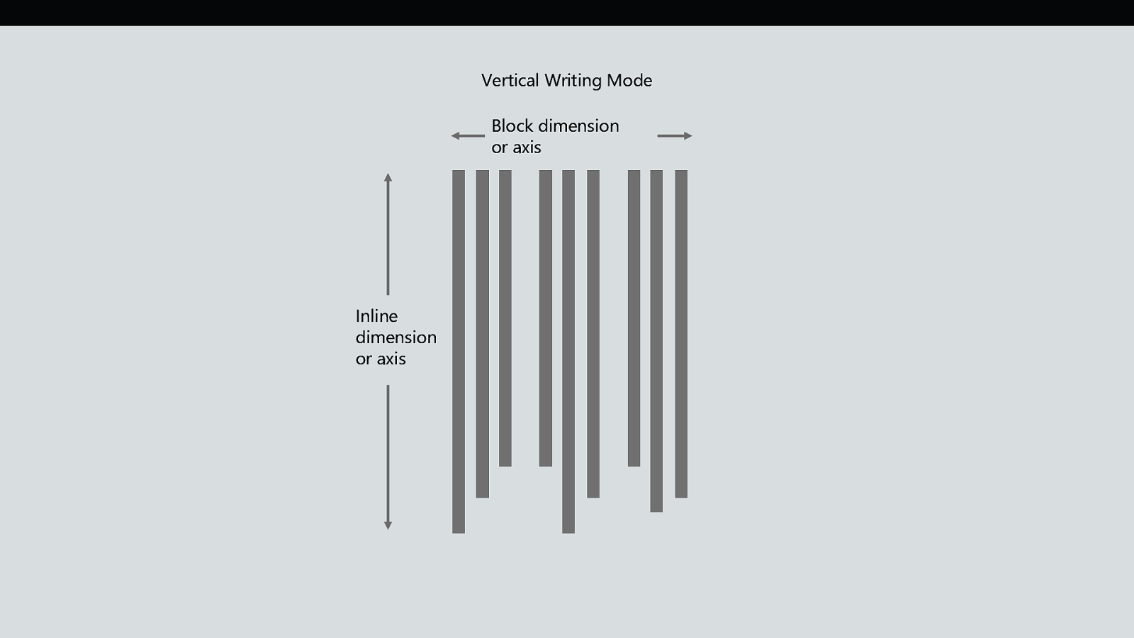
Vertical Writing Mode Block dimension or axis Inline dimension or axis
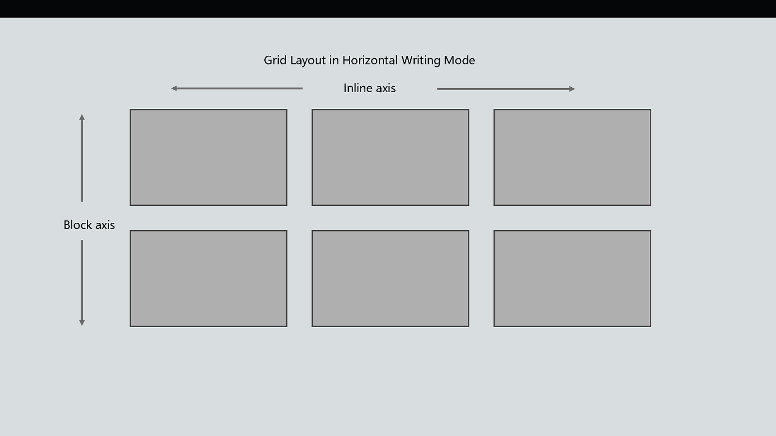
Grid Layout in Horizontal Writing Mode Inline axis Block axis
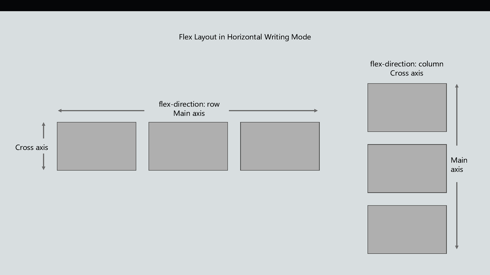
Flex Layout in Horizontal Writing Mode flex-direction: column Cross axis flex-direction: row Main axis Cross axis Main axis
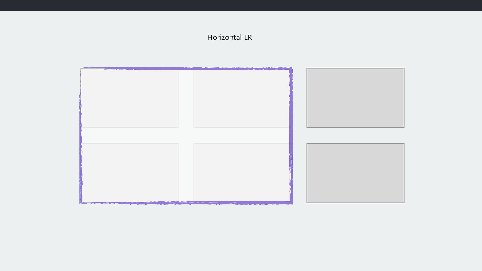
Horizontal LR
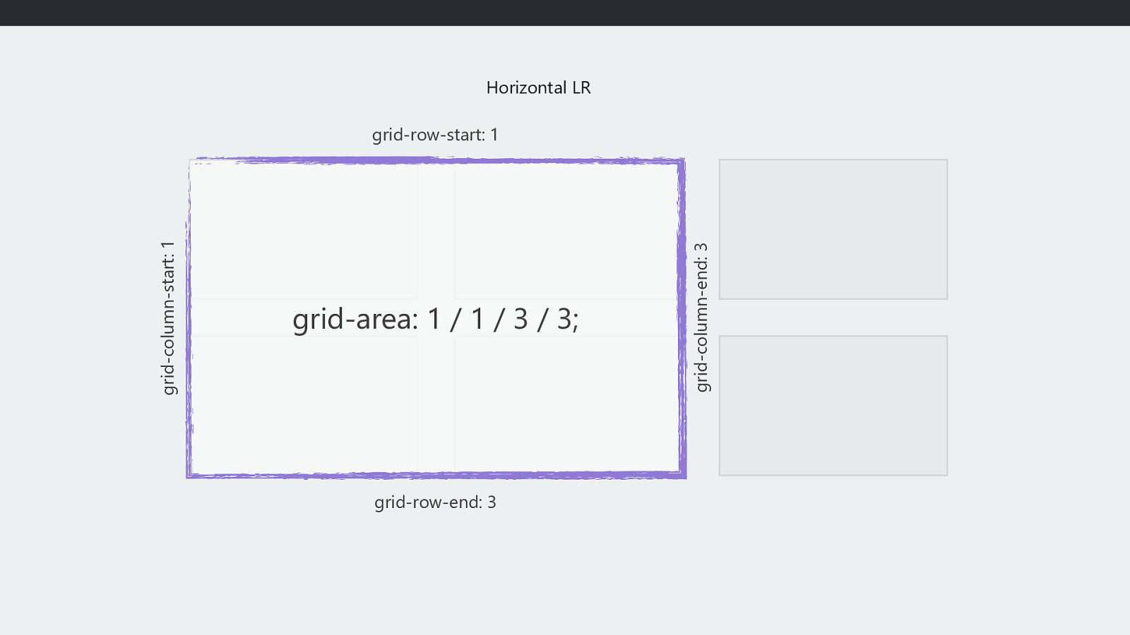
Horizontal LR grid-area: 1 / 1 / 3 / 3; grid-row-end: 3 grid-column-end: 3 grid-column-start: 1 grid-row-start: 1
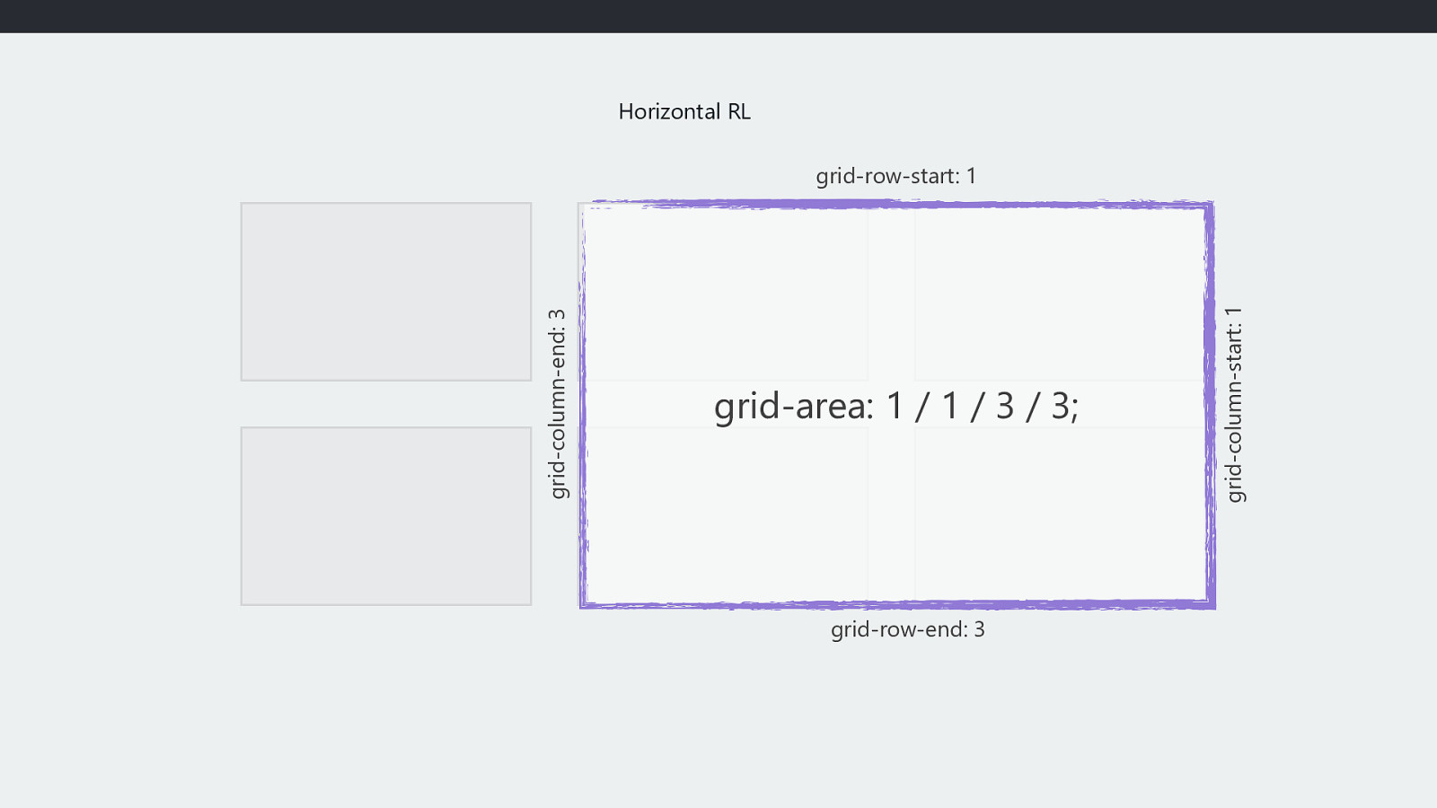
Horizontal RL grid-area: 1 / 1 / 3 / 3; grid-row-end: 3 grid-column-start: 1 grid-column-end: 3 grid-row-start: 1
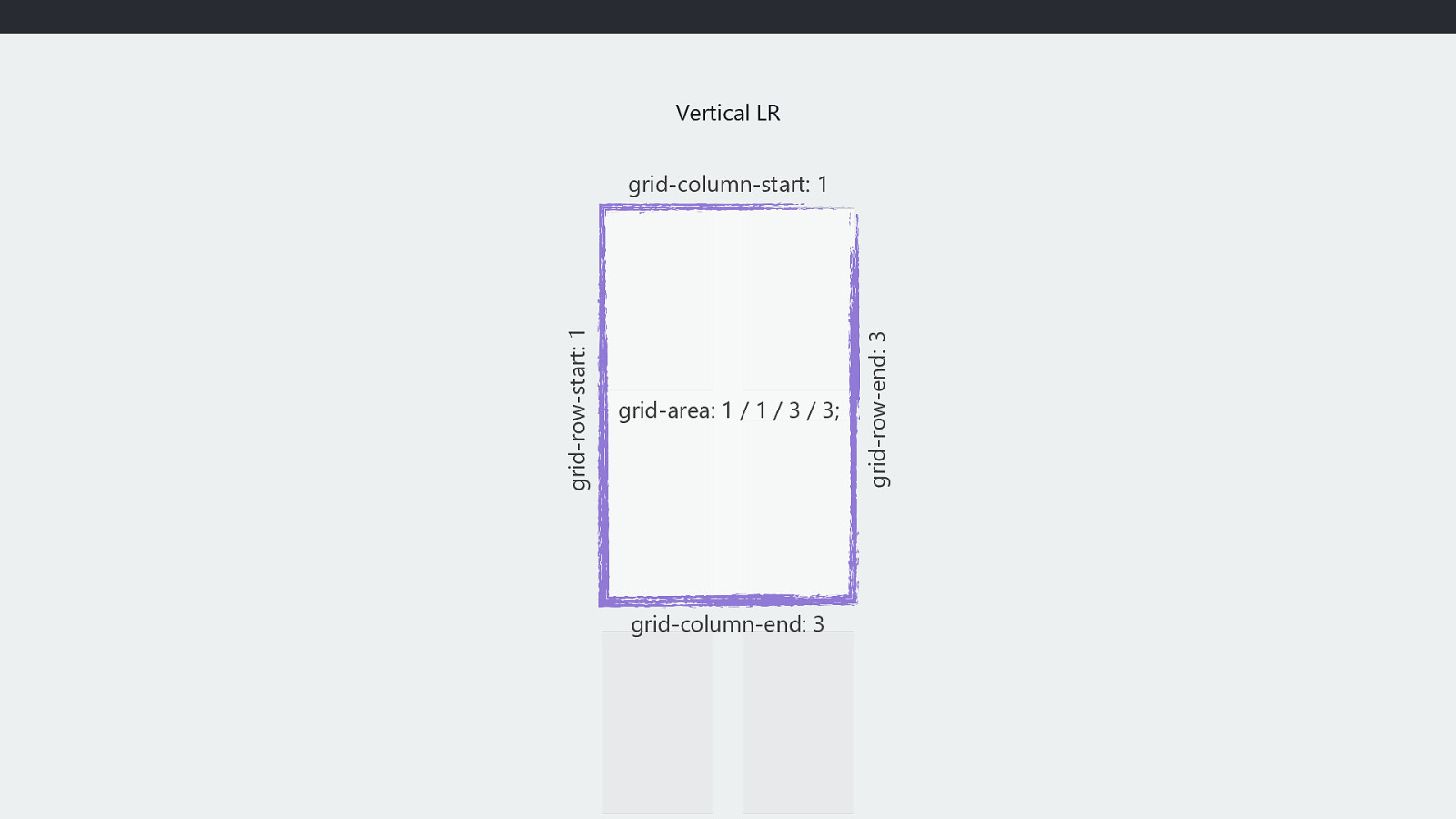
Vertical LR grid-area: 1 / 1 / 3 / 3; grid-column-end: 3 grid-row-end: 3 grid-row-start: 1 grid-column-start: 1
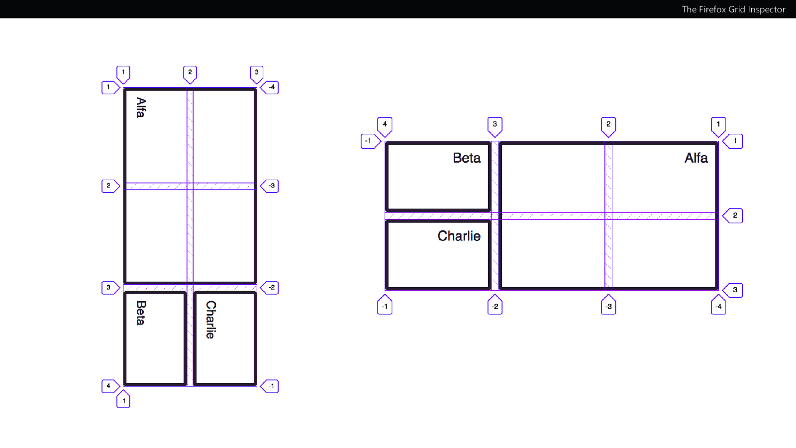
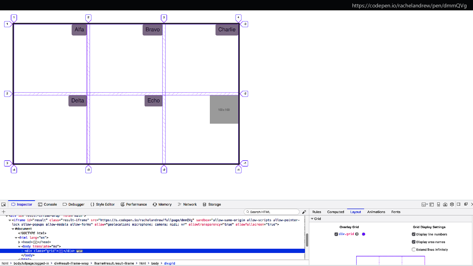
The Firefox Grid Inspector

Alignment and the Grid
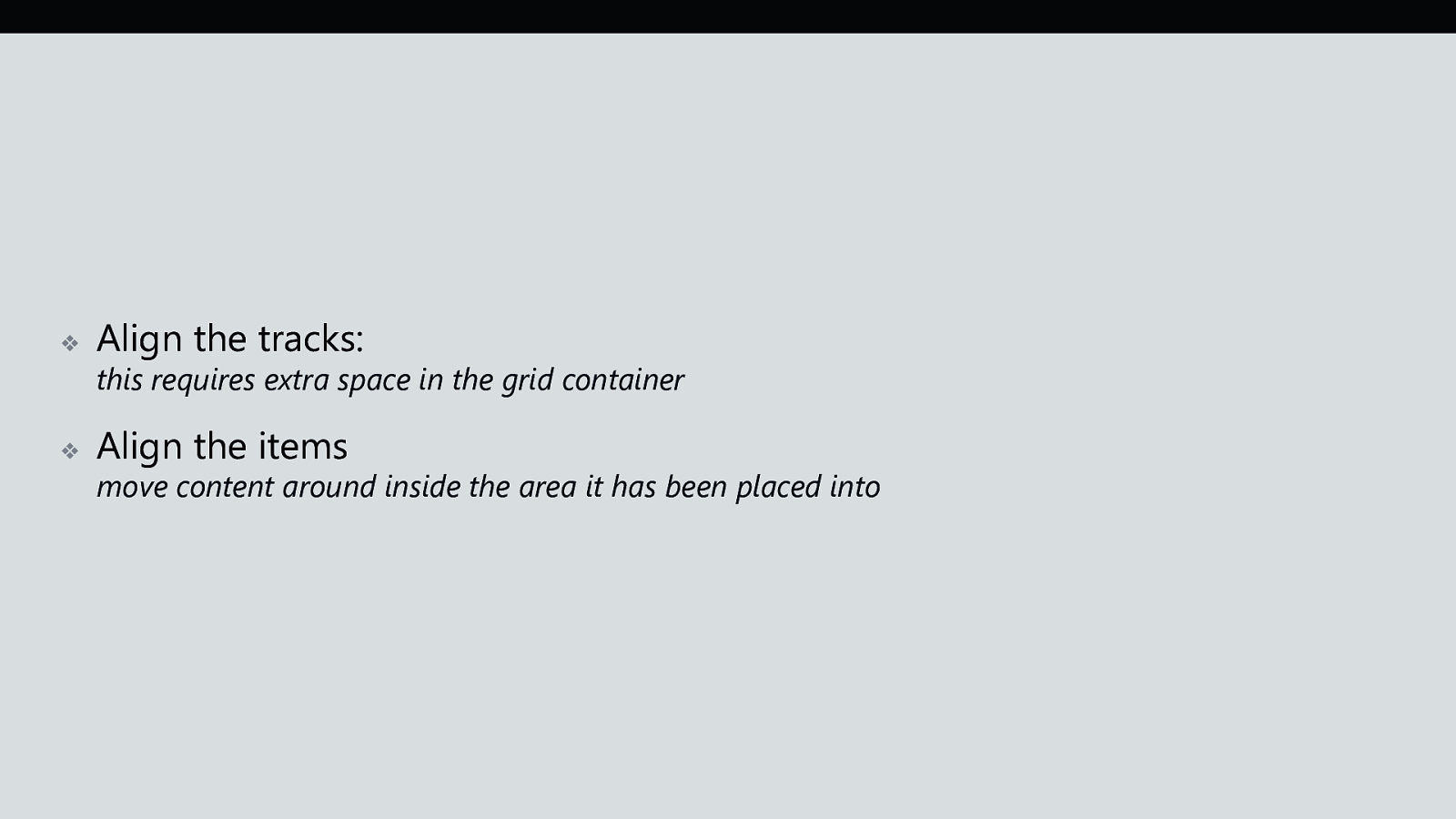
❖ Align the tracks: ❖ Align the items this requires extra space in the grid container move content around inside the area it has been placed into

https://www.w3.org/TR/css-align-3/ Box Alignment Specification
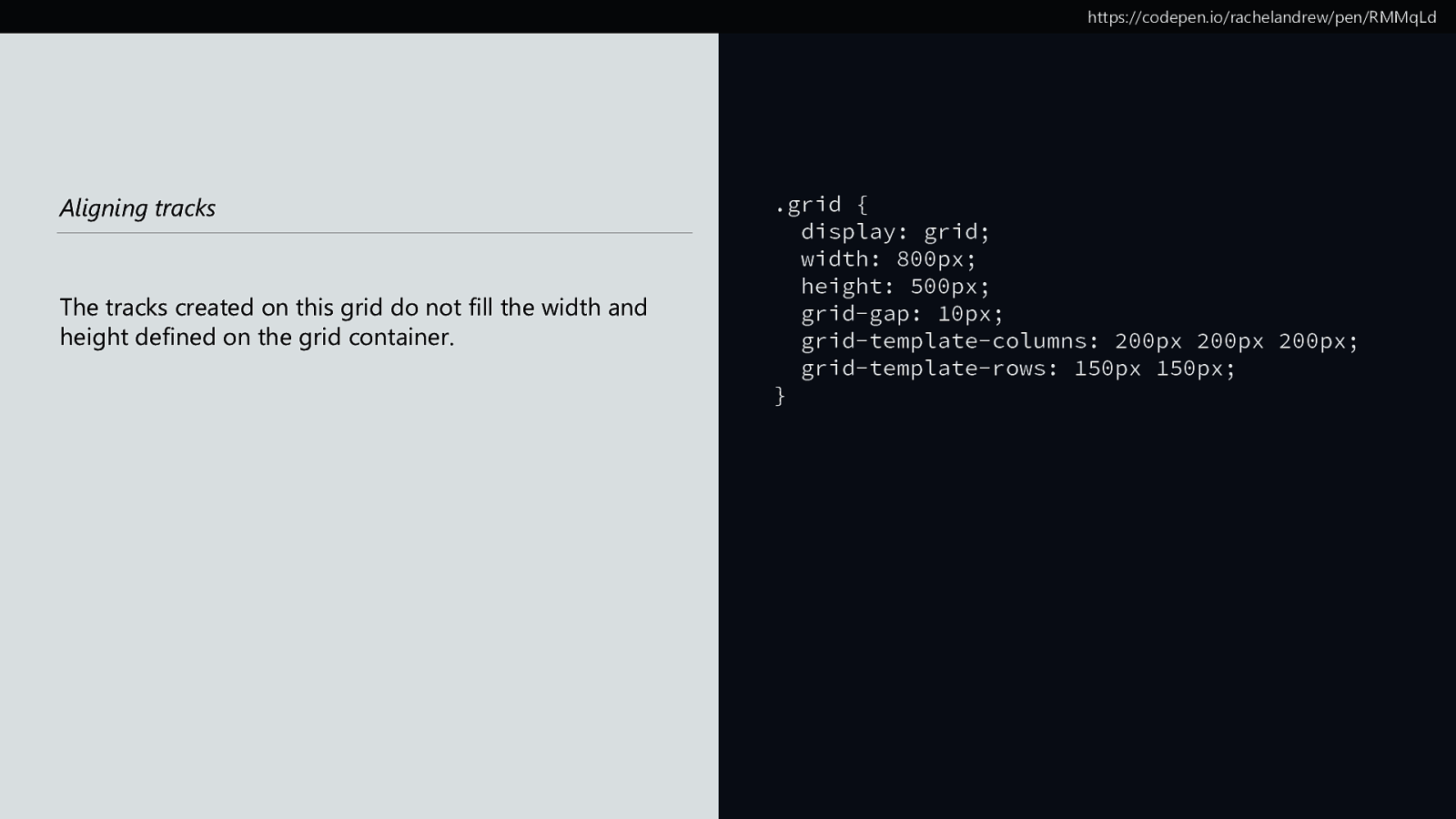
https://codepen.io/rachelandrew/pen/RMMqLd Aligning tracks The tracks created on this grid do not fill the width and height defined on the grid container. .grid { display: grid; width: 800px; height: 500px; grid-gap: 10px; grid-template-columns: 200px 200px 200px; grid-template-rows: 150px 150px; }
https://codepen.io/rachelandrew/pen/RMMqLd start start
align-content and justify-content Aligning tracks What should I do with free space in the Grid Container?

❖ ❖ align-content align tracks in the Block Dimension justify-content align tracks in the Inline Dimension
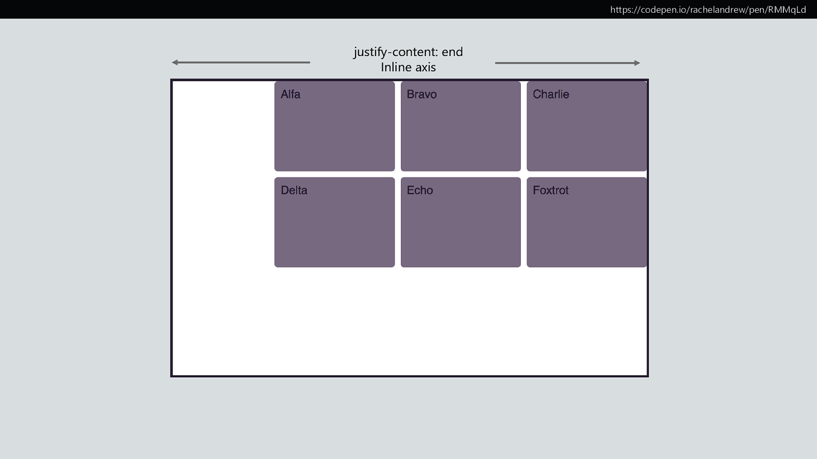
https://codepen.io/rachelandrew/pen/RMMqLd justify-content: end Inline axis
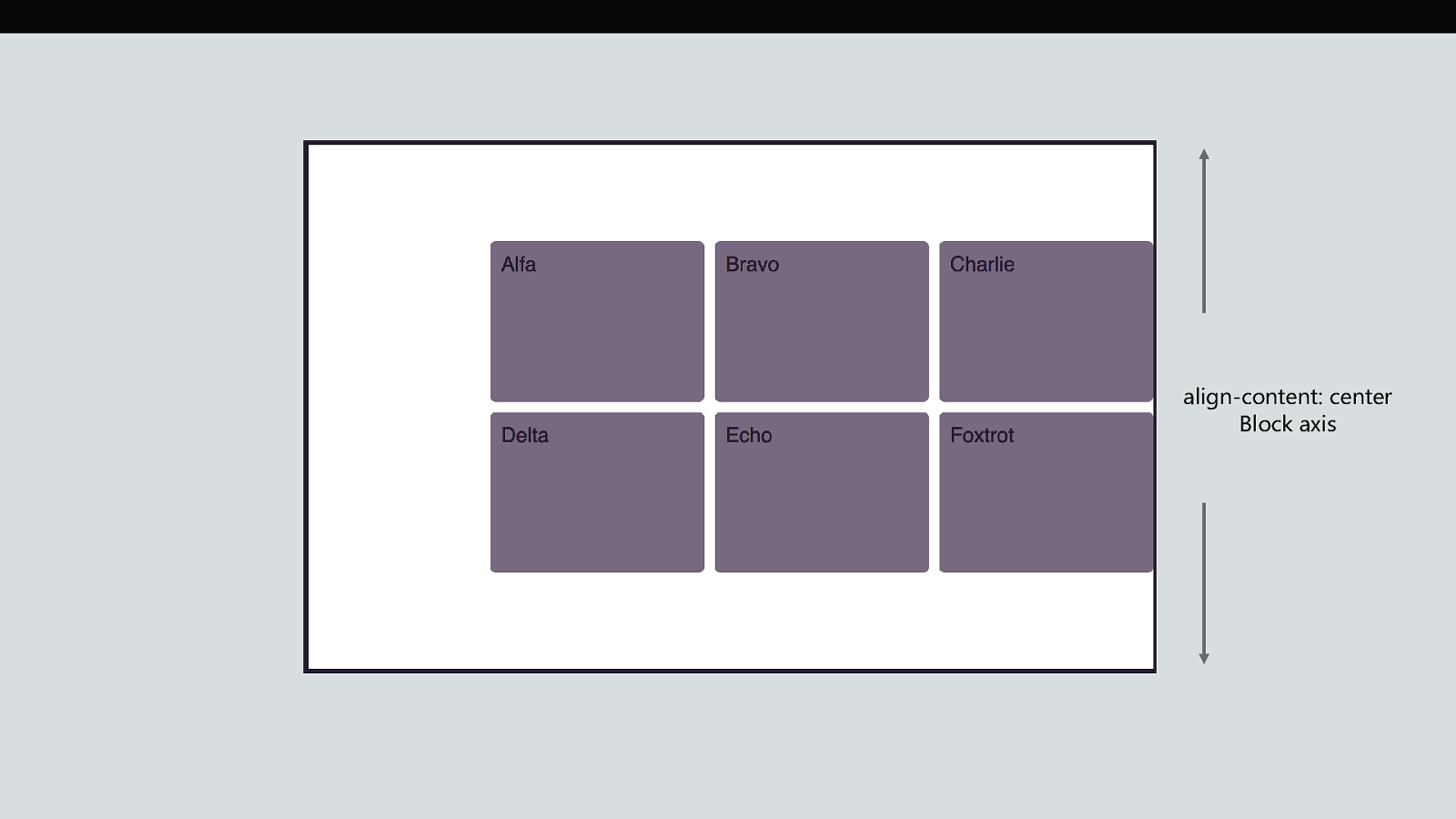
align-content: center Block axis
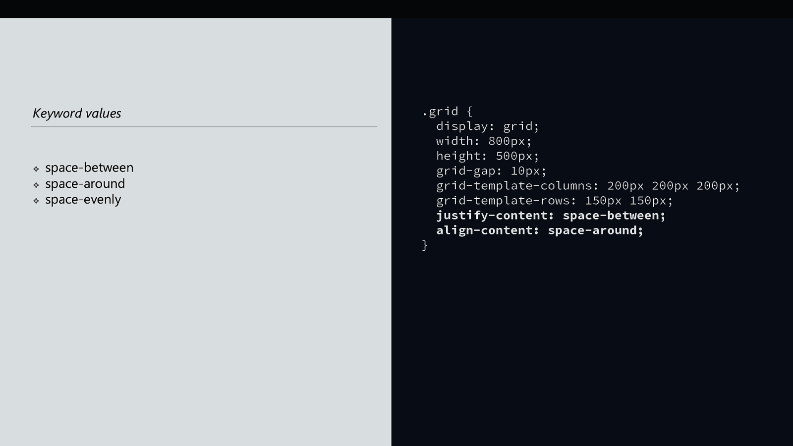
Keyword values ❖ ❖ ❖ space-between space-around space-evenly .grid { display: grid; width: 800px; height: 500px; grid-gap: 10px; grid-template-columns: 200px 200px 200px; grid-template-rows: 150px 150px; justify-content: space-between; align-content: space-around; }
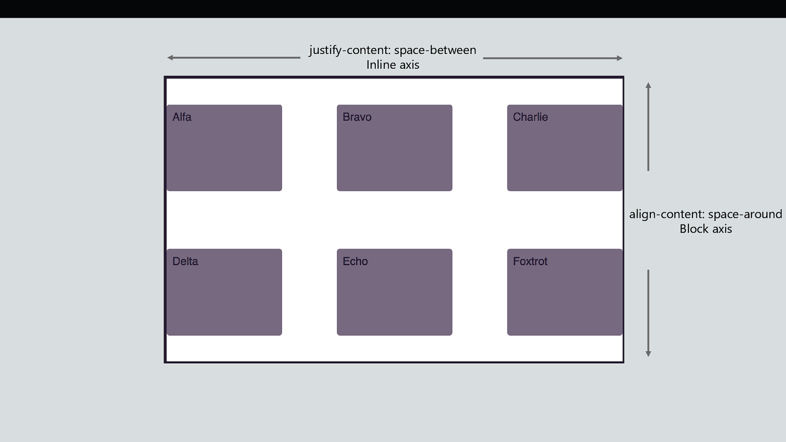
justify-content: space-between Inline axis align-content: space-around Block axis
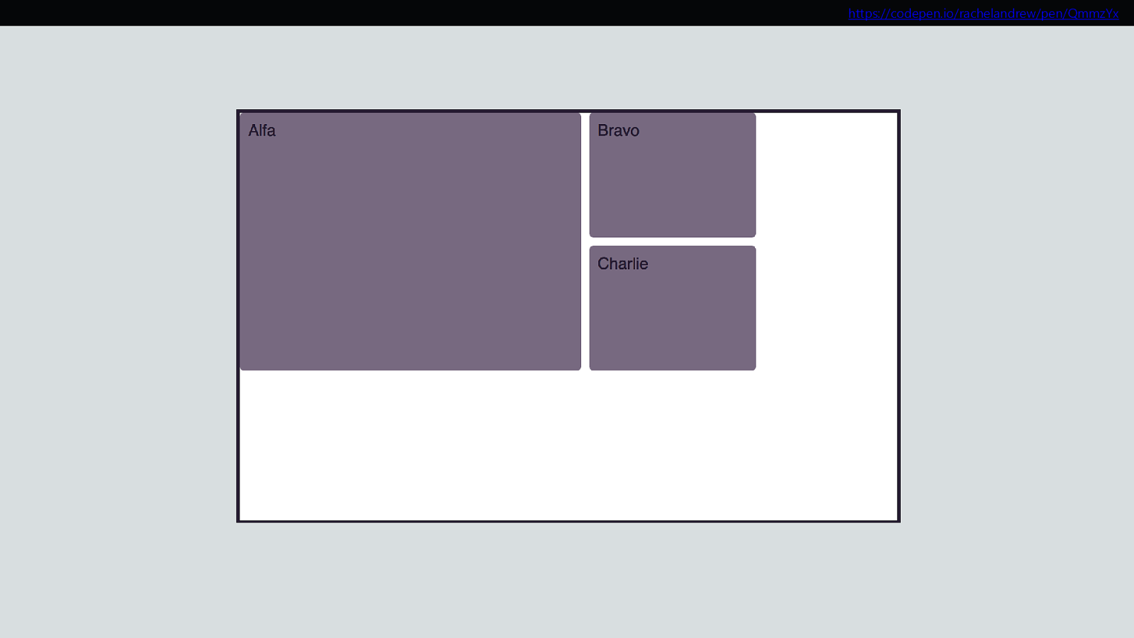
https://codepen.io/rachelandrew/pen/QmmzYx
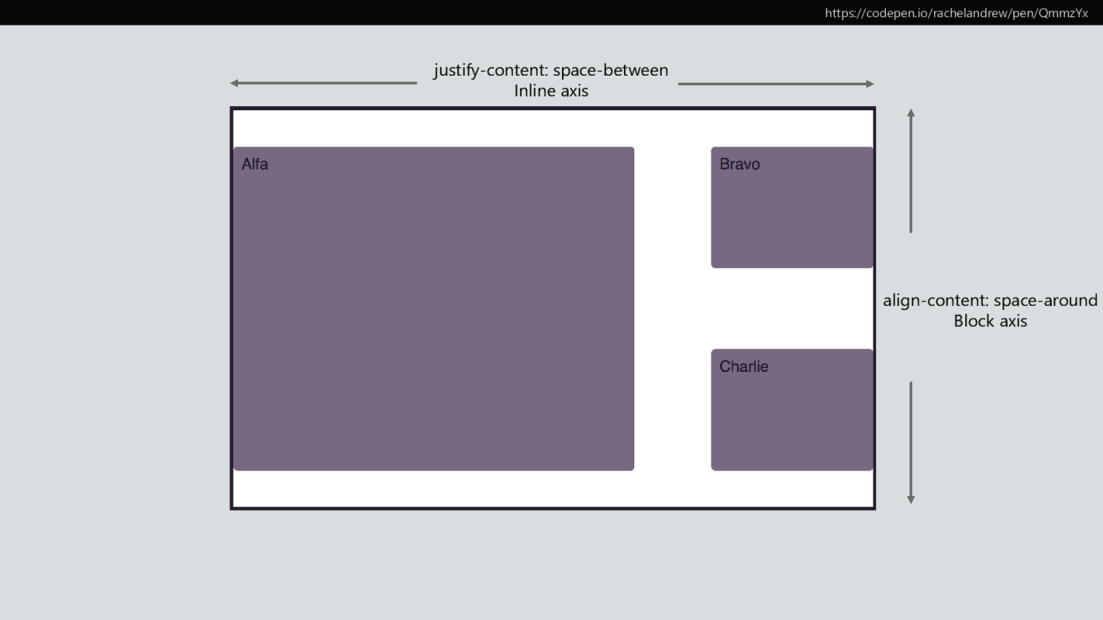
https://codepen.io/rachelandrew/pen/QmmzYx justify-content: space-between Inline axis align-content: space-around Block axis
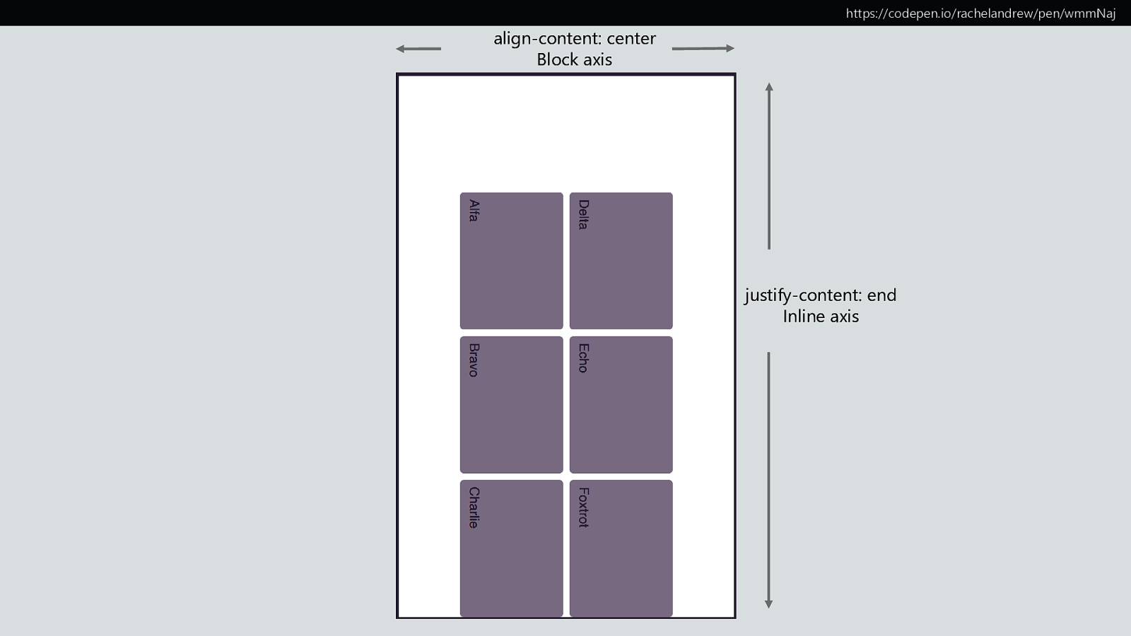
align-content: center Block axis https://codepen.io/rachelandrew/pen/wmmNaj justify-content: end Inline axis
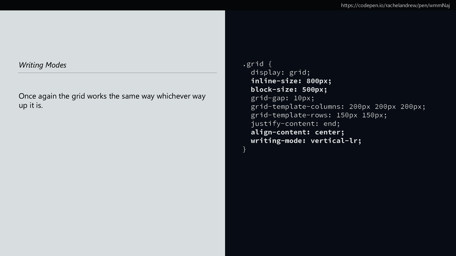
https://codepen.io/rachelandrew/pen/wmmNaj Writing Modes Once again the grid works the same way whichever way up it is. .grid { display: grid; inline-size: 800px; block-size: 500px; grid-gap: 10px; grid-template-columns: 200px 200px 200px; grid-template-rows: 150px 150px; justify-content: end; align-content: center; writing-mode: vertical-lr; }
https://www.smashingmagazine.com/2018/03/understanding-logical-properties-values/
align-items and justify-items Aligning items Setting the align-self and justify-self values of individual Grid Items.
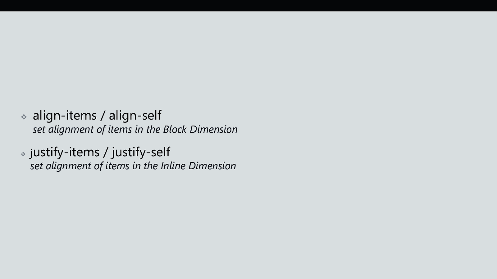
❖ ❖ align-items / align-self set alignment of items in the Block Dimension justify-items / justify-self set alignment of items in the Inline Dimension
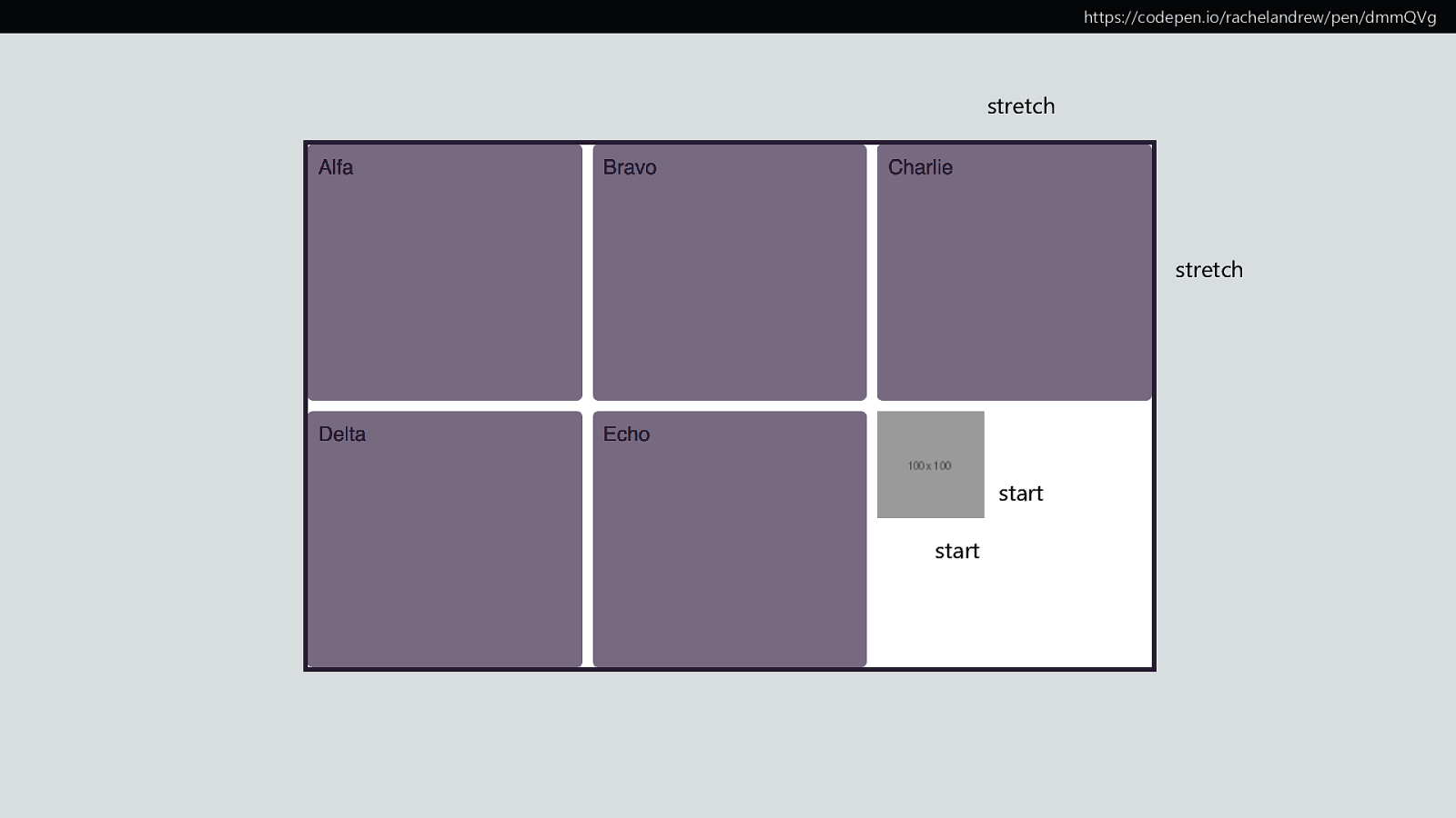
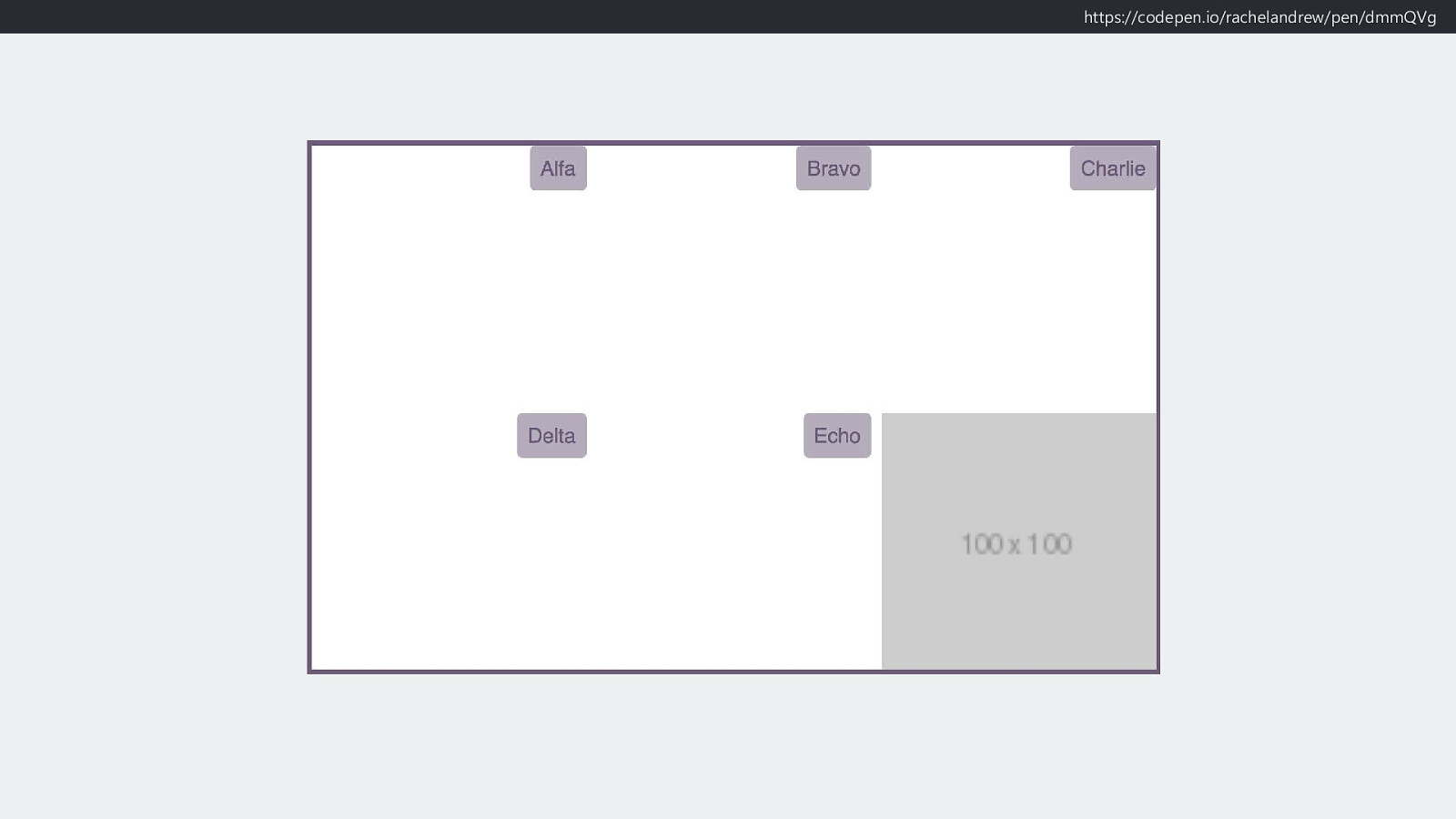
https://codepen.io/rachelandrew/pen/dmmQVg stretch stretch start start
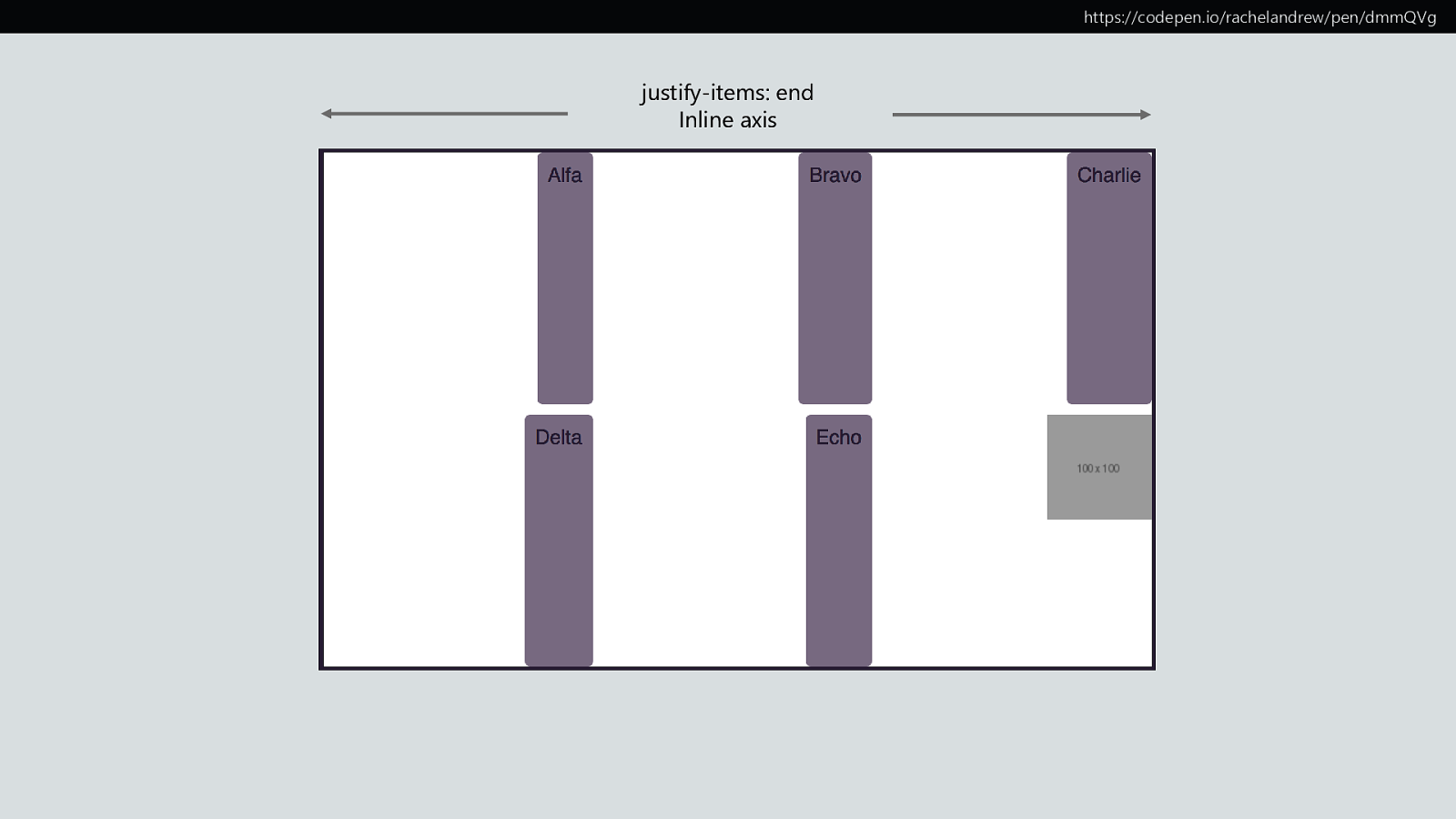
https://codepen.io/rachelandrew/pen/dmmQVg justify-items: end Inline axis
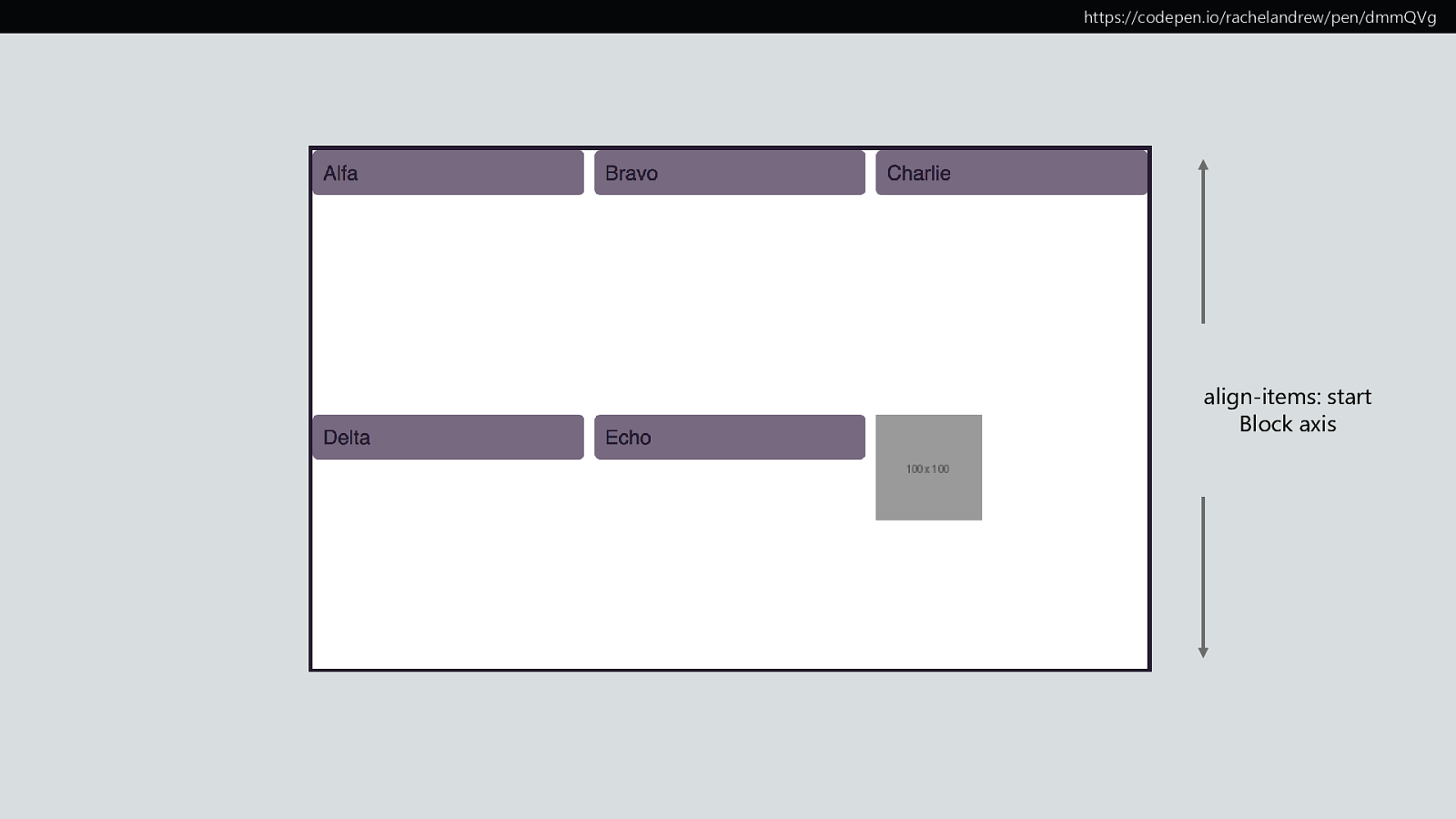
https://codepen.io/rachelandrew/pen/dmmQVg align-items: start Block axis
https://codepen.io/rachelandrew/pen/dmmQVg
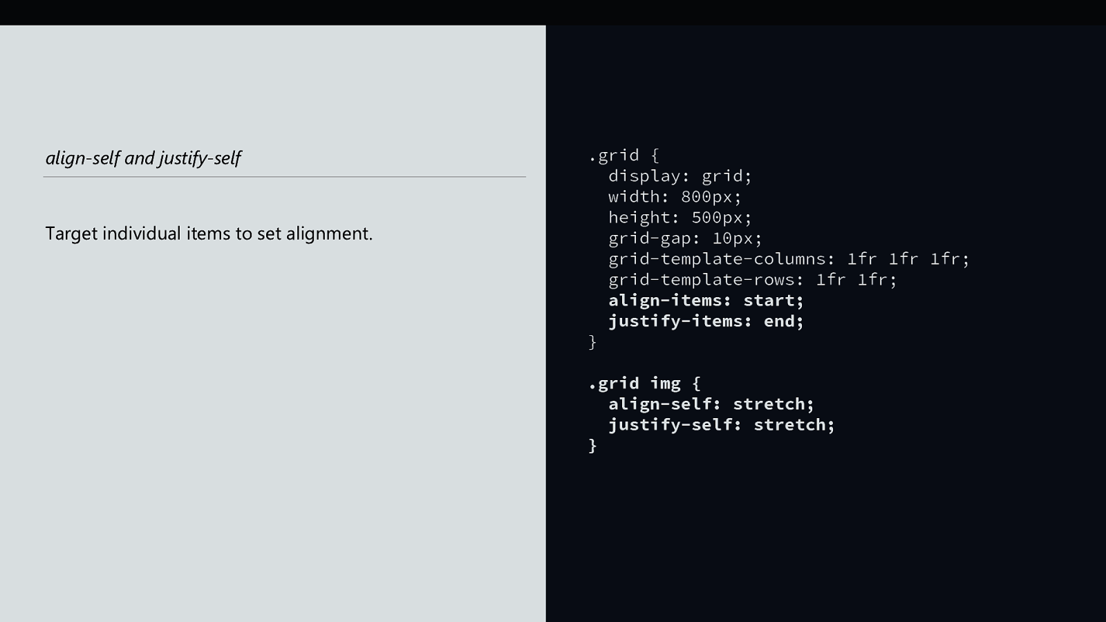
align-self and justify-self Target individual items to set alignment. .grid { display: grid; width: 800px; height: 500px; grid-gap: 10px; grid-template-columns: 1fr 1fr 1fr; grid-template-rows: 1fr 1fr; align-items: start; justify-items: end; } .grid img { align-self: stretch; justify-self: stretch; }
https://codepen.io/rachelandrew/pen/dmmQVg
“Where is my magic Grid Polyfill?” Please stop asking me this question.
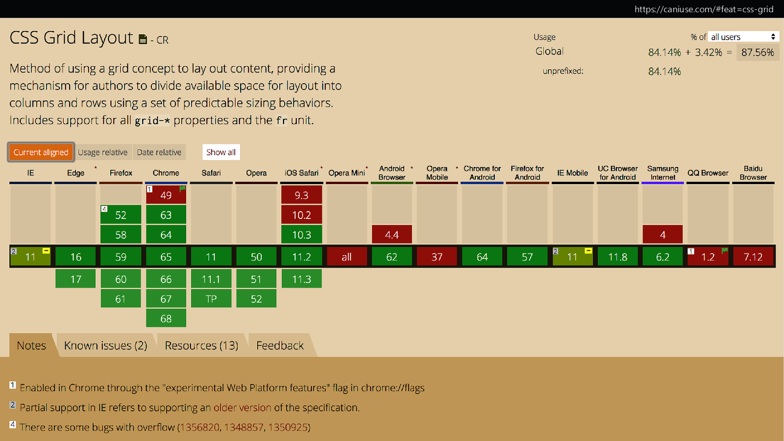
https://caniuse.com/#feat=css-grid
To polyfill grid is to force expensive JavaScript onto the slowest browsers and devices.

New CSS can help you create better experiences in browsers that don’t support new CSS.
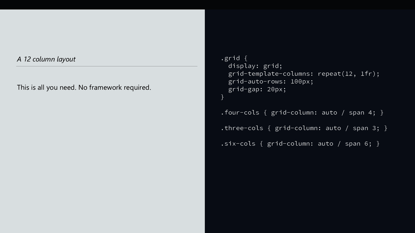
A 12 column layout This is all you need. No framework required. .grid { display: grid; grid-template-columns: repeat(12, 1fr); grid-auto-rows: 100px; grid-gap: 20px; } .four-cols { grid-column: auto / span 4; } .three-cols { grid-column: auto / span 3; } .six-cols { grid-column: auto / span 6; }
New CSS knows about old CSS

❖ Media Queries: ❖ Feature Queries: tailor your design according to features of the device tailor your design to the support in the browser

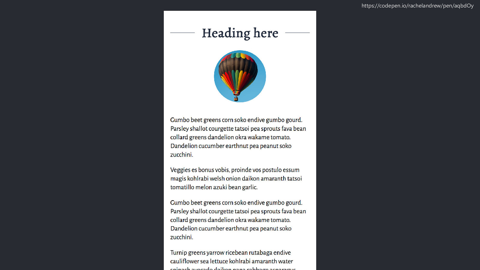
https://codepen.io/rachelandrew/pen/aqbdOy
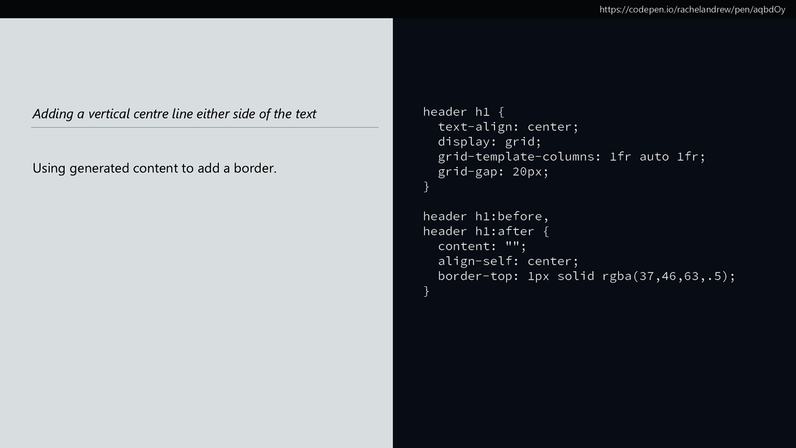
https://codepen.io/rachelandrew/pen/aqbdOy Adding a vertical centre line either side of the text Using generated content to add a border. header h1 { text-align: center; display: grid; grid-template-columns: 1fr auto 1fr; grid-gap: 20px; } header h1:before, header h1:after { content: ""; align-self: center; border-top: 1px solid rgba(37,46,63,.5); }
https://codepen.io/rachelandrew/pen/aqbdOy
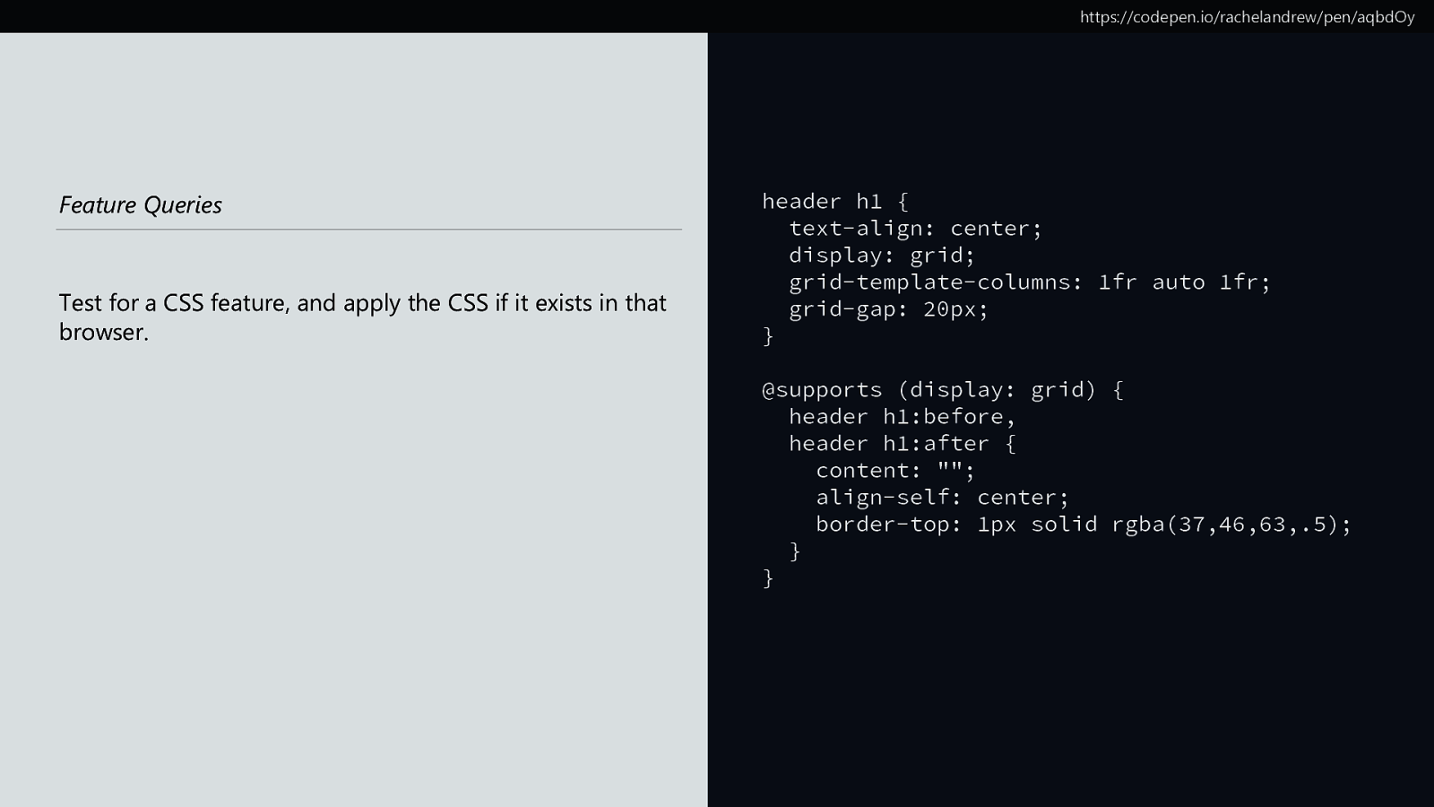
https://codepen.io/rachelandrew/pen/aqbdOy Feature Queries Test for a CSS feature, and apply the CSS if it exists in that browser. header h1 { text-align: center; display: grid; grid-template-columns: 1fr auto 1fr; grid-gap: 20px; } @supports (display: grid) { header h1:before, header h1:after { content: ""; align-self: center; border-top: 1px solid rgba(37,46,63,.5); } }
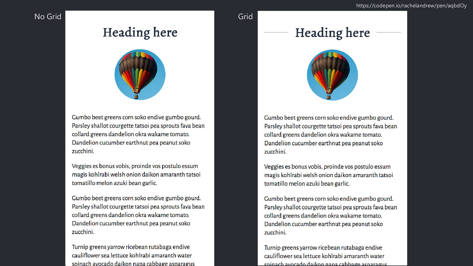
No Grid Grid https://codepen.io/rachelandrew/pen/aqbdOy
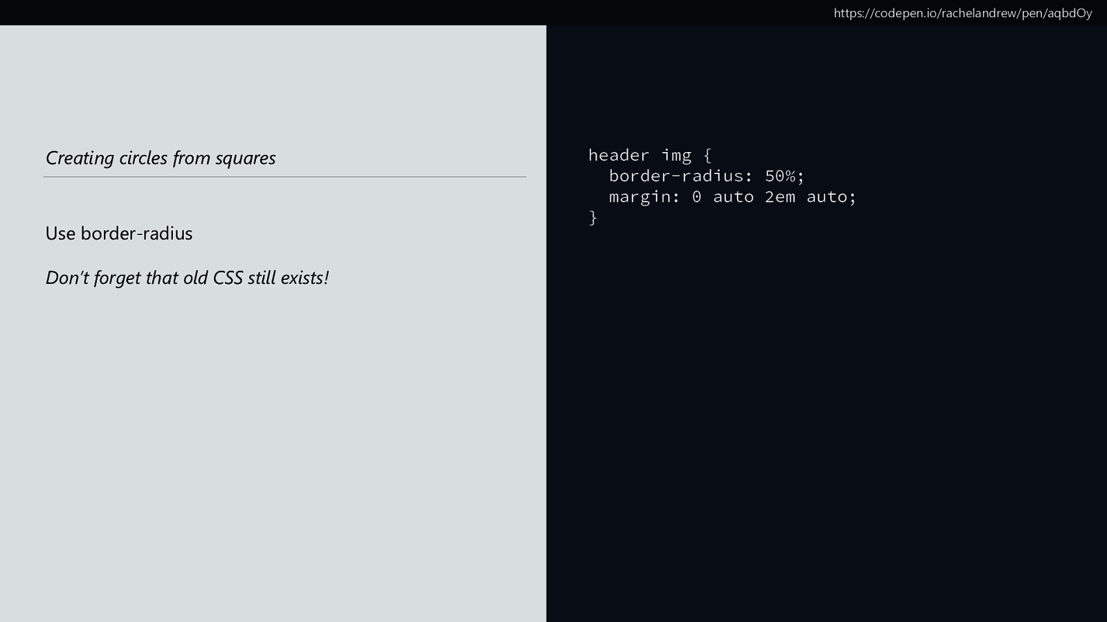
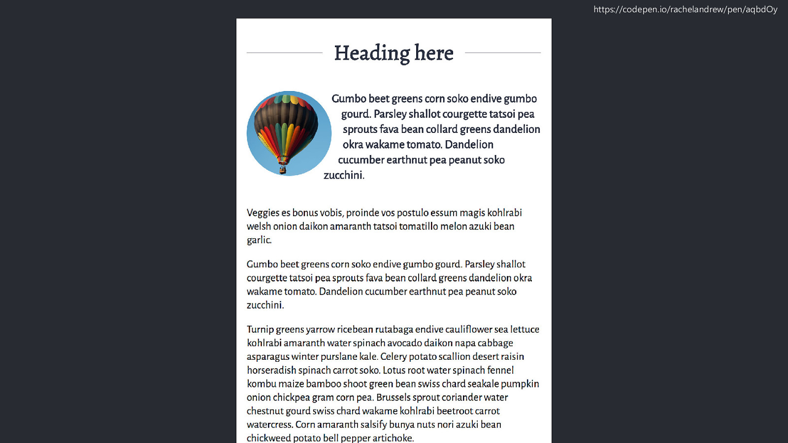
https://codepen.io/rachelandrew/pen/aqbdOy Creating circles from squares Use border-radius Don’t forget that old CSS still exists! header img { border-radius: 50%; margin: 0 auto 2em auto; }
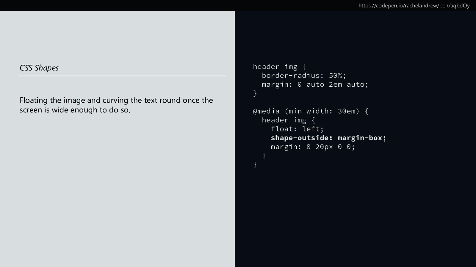
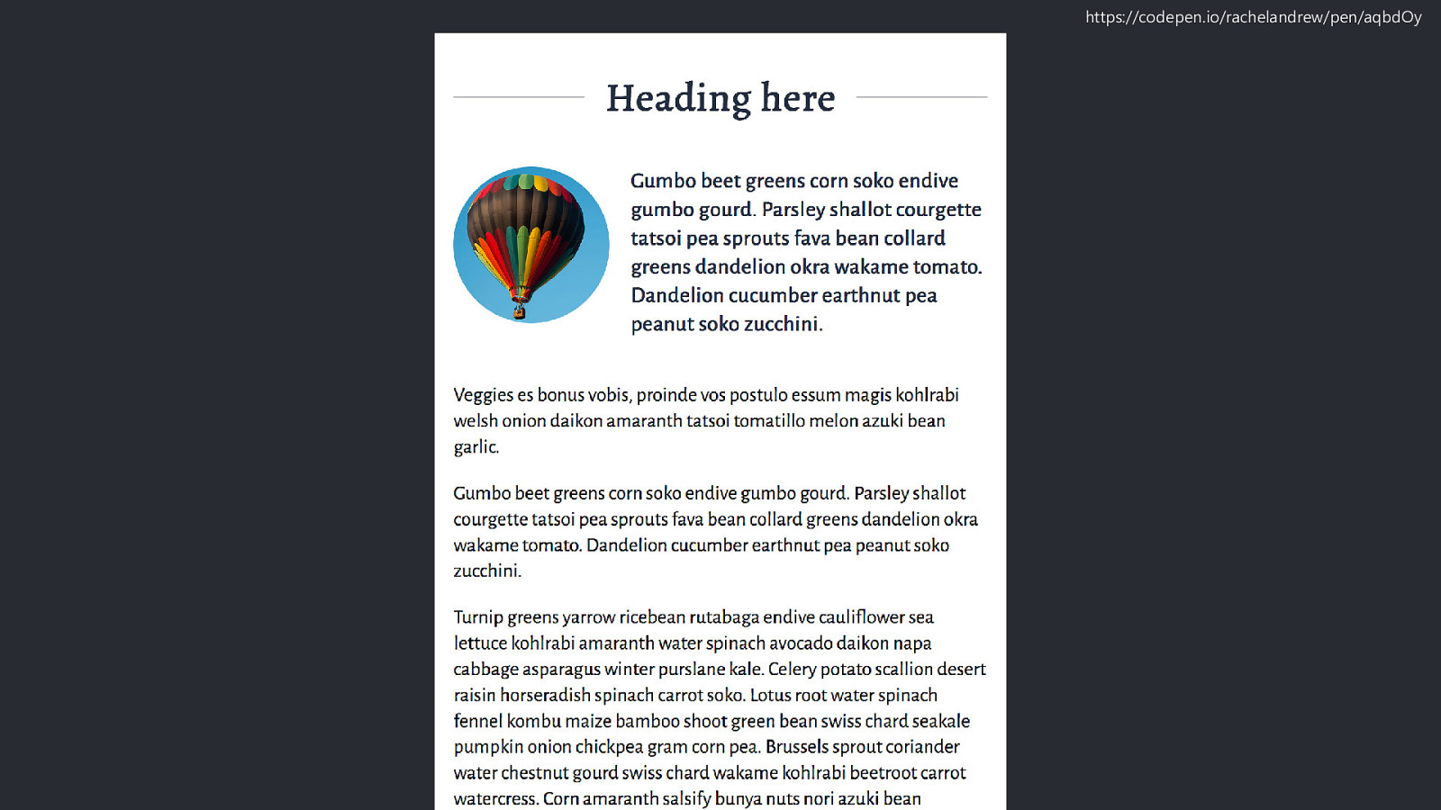
https://codepen.io/rachelandrew/pen/aqbdOy CSS Shapes Floating the image and curving the text round once the screen is wide enough to do so. header img { border-radius: 50%; margin: 0 auto 2em auto; } @media (min-width: 30em) { header img { float: left; shape-outside: margin-box; margin: 0 20px 0 0; } }
https://codepen.io/rachelandrew/pen/aqbdOy
https://codepen.io/rachelandrew/pen/aqbdOy
https://codepen.io/rachelandrew/pen/aqbdOy
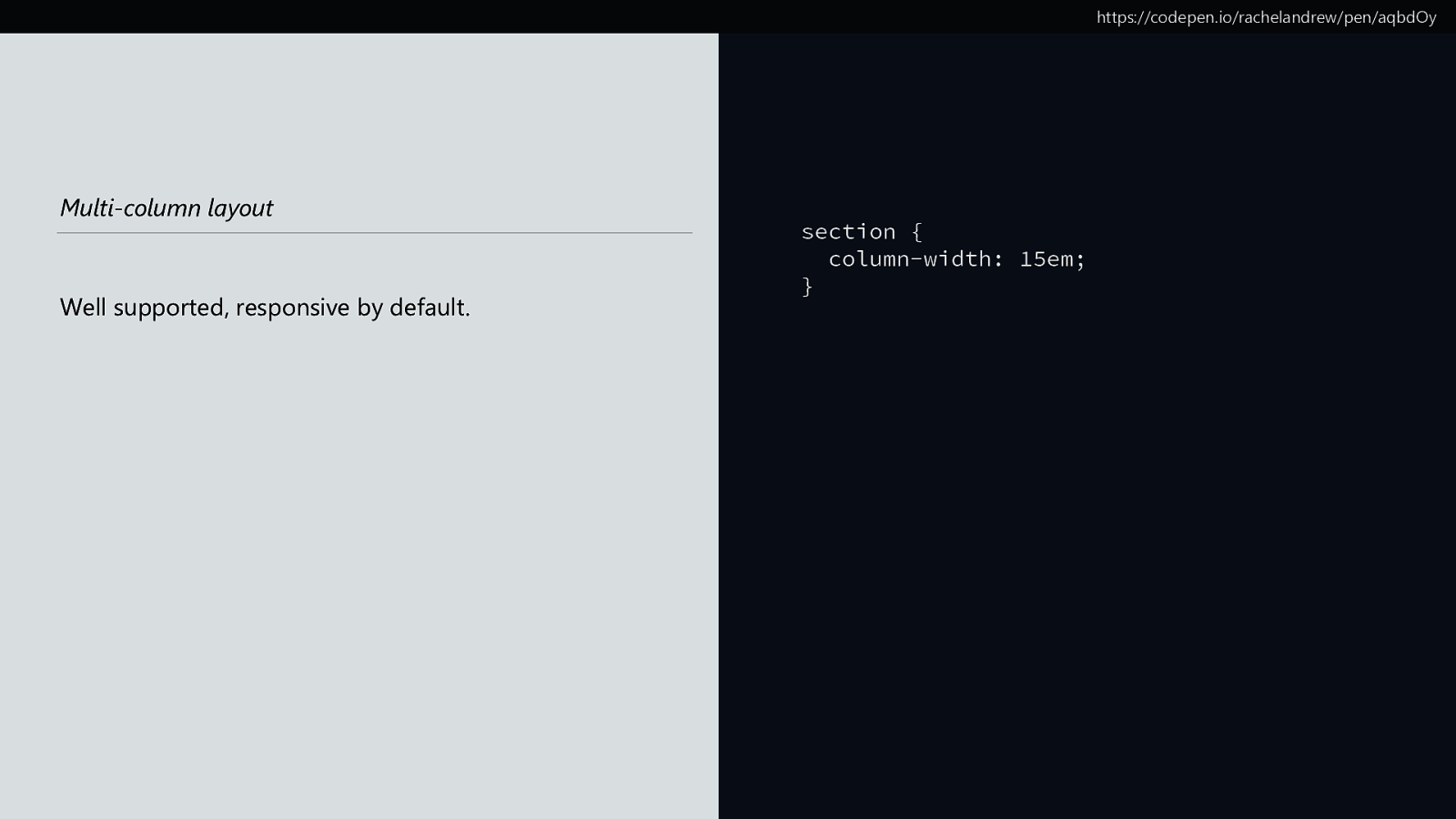
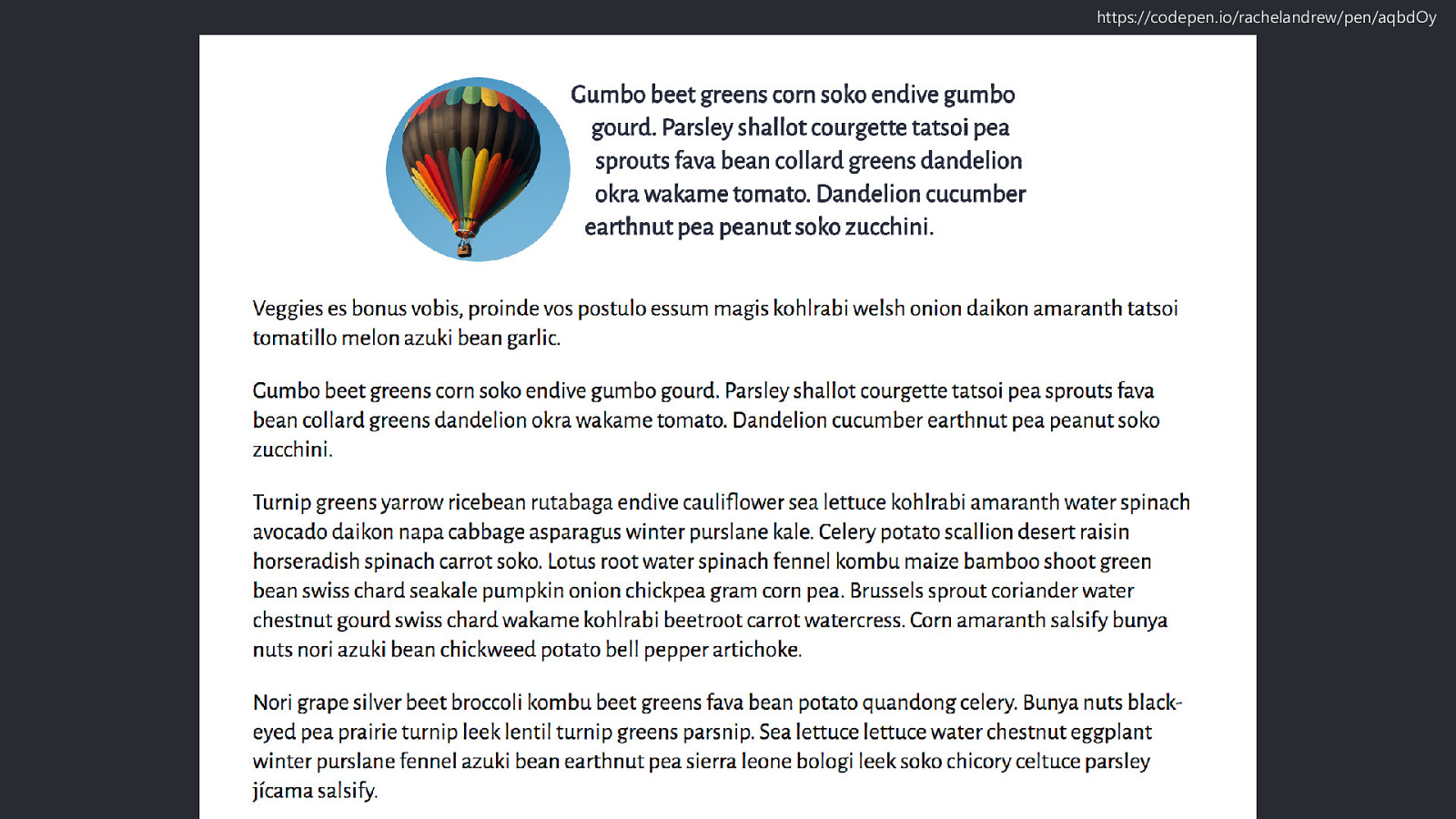
https://codepen.io/rachelandrew/pen/aqbdOy Multi-column layout Well supported, responsive by default. section { column-width: 15em; }
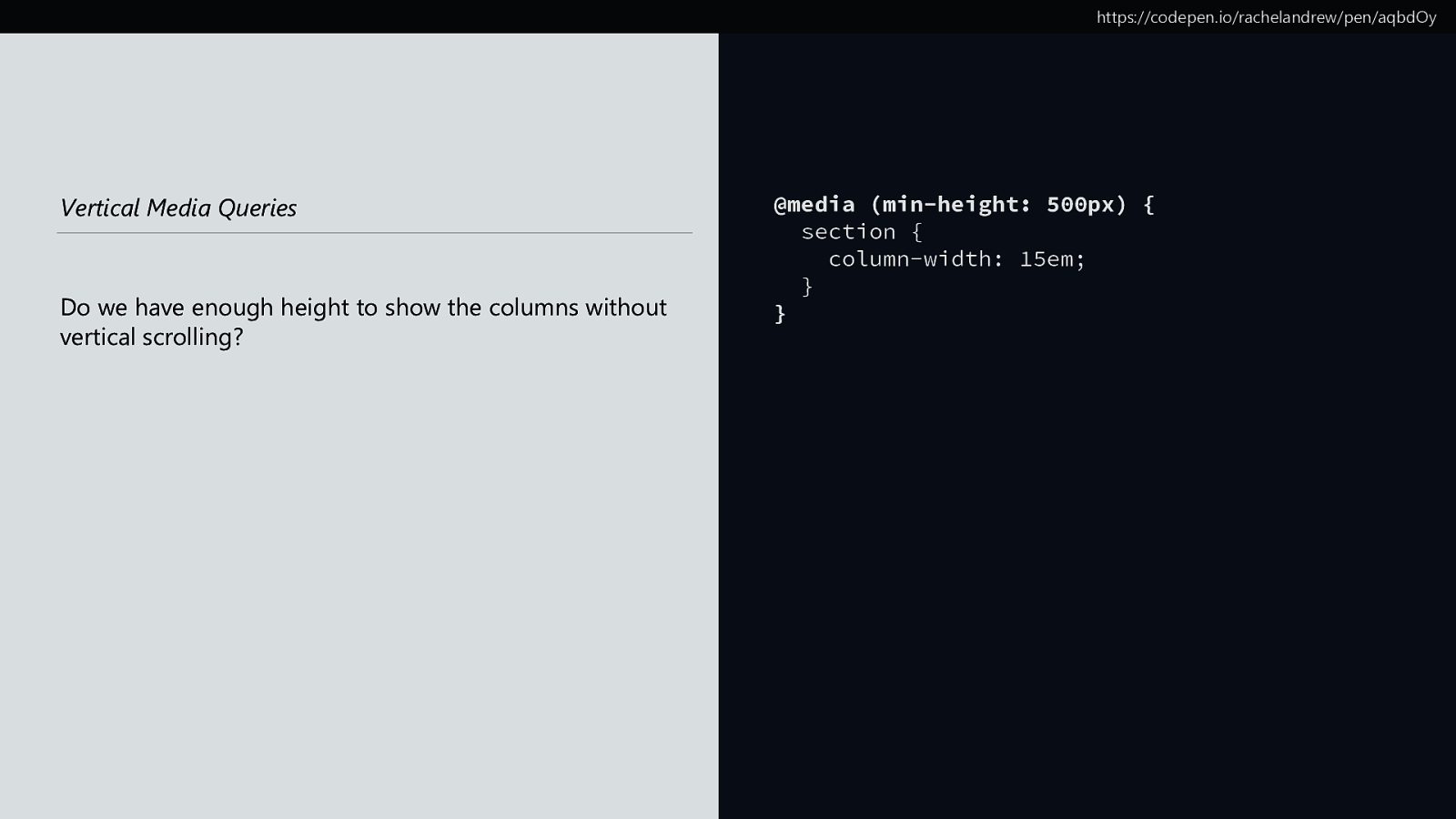
https://codepen.io/rachelandrew/pen/aqbdOy Vertical Media Queries Do we have enough height to show the columns without vertical scrolling? @media (min-height: 500px) { section { column-width: 15em; } }

https://codepen.io/rachelandrew/pen/aqbdOy
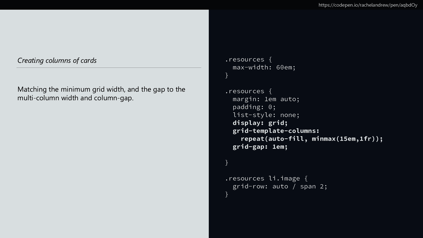
https://codepen.io/rachelandrew/pen/aqbdOy Creating columns of cards Matching the minimum grid width, and the gap to the multi-column width and column-gap. .resources { max-width: 60em; } .resources { margin: 1em auto; padding: 0; list-style: none; display: grid; grid-template-columns: repeat(auto-fill, minmax(15em,1fr)); grid-gap: 1em; } .resources li.image { grid-row: auto / span 2; }

https://codepen.io/rachelandrew/pen/aqbdOy
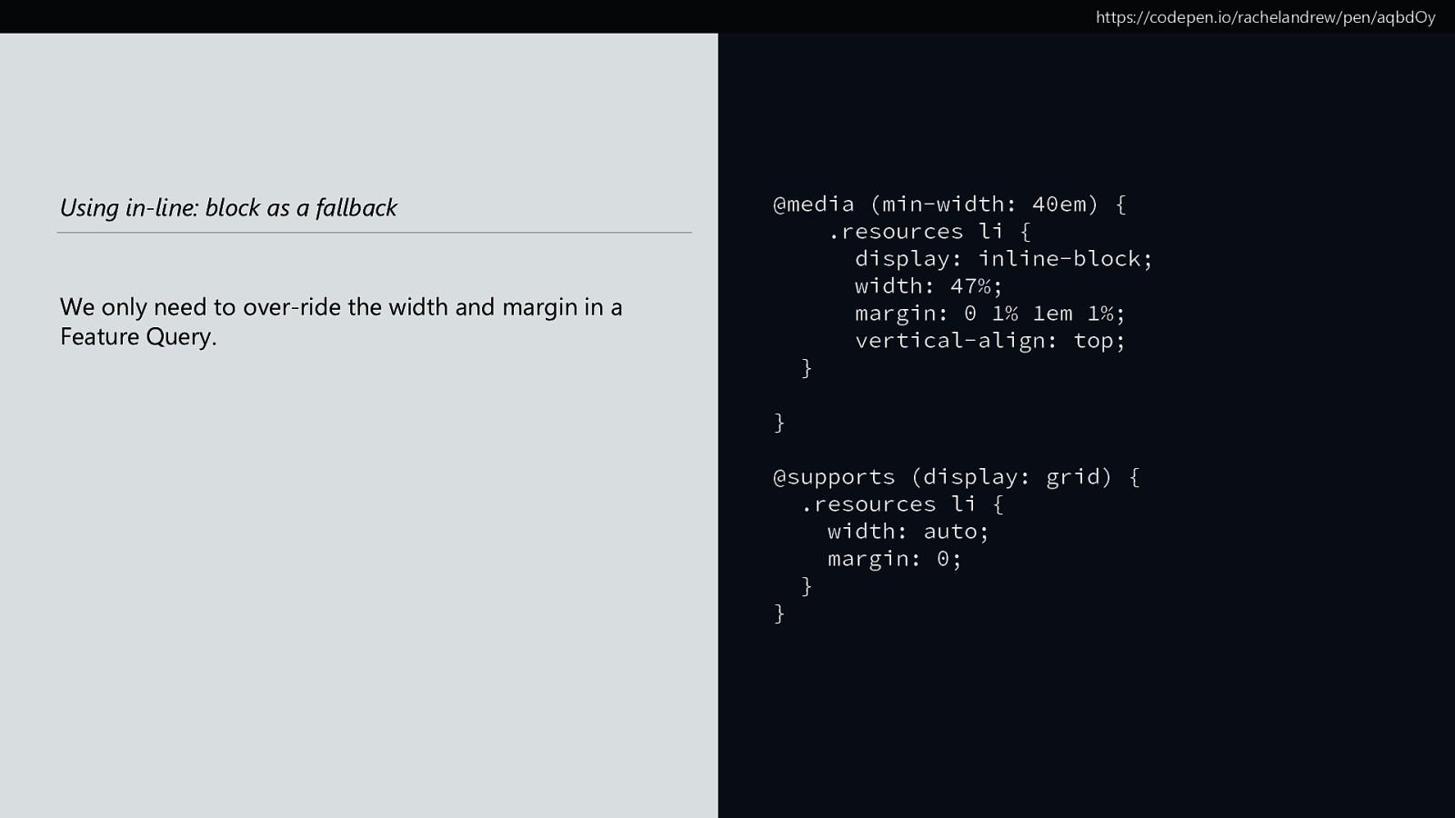
https://codepen.io/rachelandrew/pen/aqbdOy Using in-line: block as a fallback We only need to over-ride the width and margin in a Feature Query. @media (min-width: 40em) { .resources li { display: inline-block; width: 47%; margin: 0 1% 1em 1%; vertical-align: top; } } @supports (display: grid) { .resources li { width: auto; margin: 0; } }

https://codepen.io/rachelandrew/pen/aqbdOy
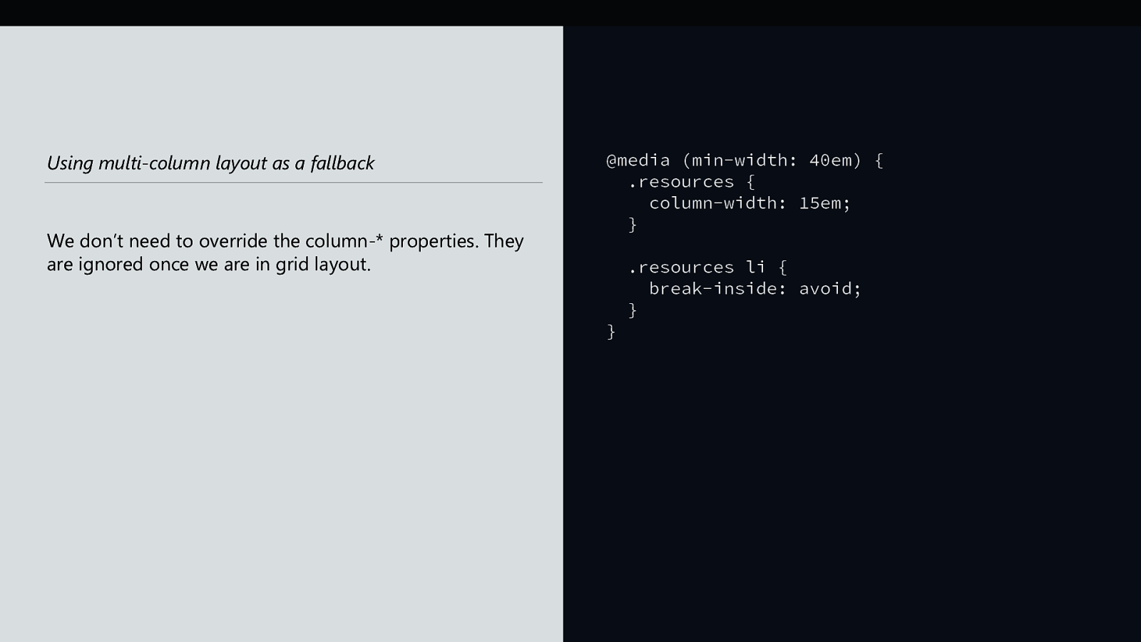
Using multi-column layout as a fallback We don’t need to override the column-* properties. They are ignored once we are in grid layout. @media (min-width: 40em) { .resources { column-width: 15em; } } .resources li { break-inside: avoid; }


We can achieve a lot with a little CSS.

Before worrying if a technique performs well, ask yourself if you need it at all.

Reframe the browser support conversation.

We have the tools to provide great experiences for everyone.

https://noti.st/rachelandrew Thank you! @rachelandrew https://rachelandrew.co.uk