When new CSS features collide Possibility and Complexity at the Intersections Rachel Andrew, Google

A presentation at CSS Cafe in April 2023 in by Rachel Andrew
When new CSS features collide Possibility and Complexity at the Intersections Rachel Andrew, Google

When new CSS features collide Possibility and Complexity at the Intersections Rachel Andrew, Google
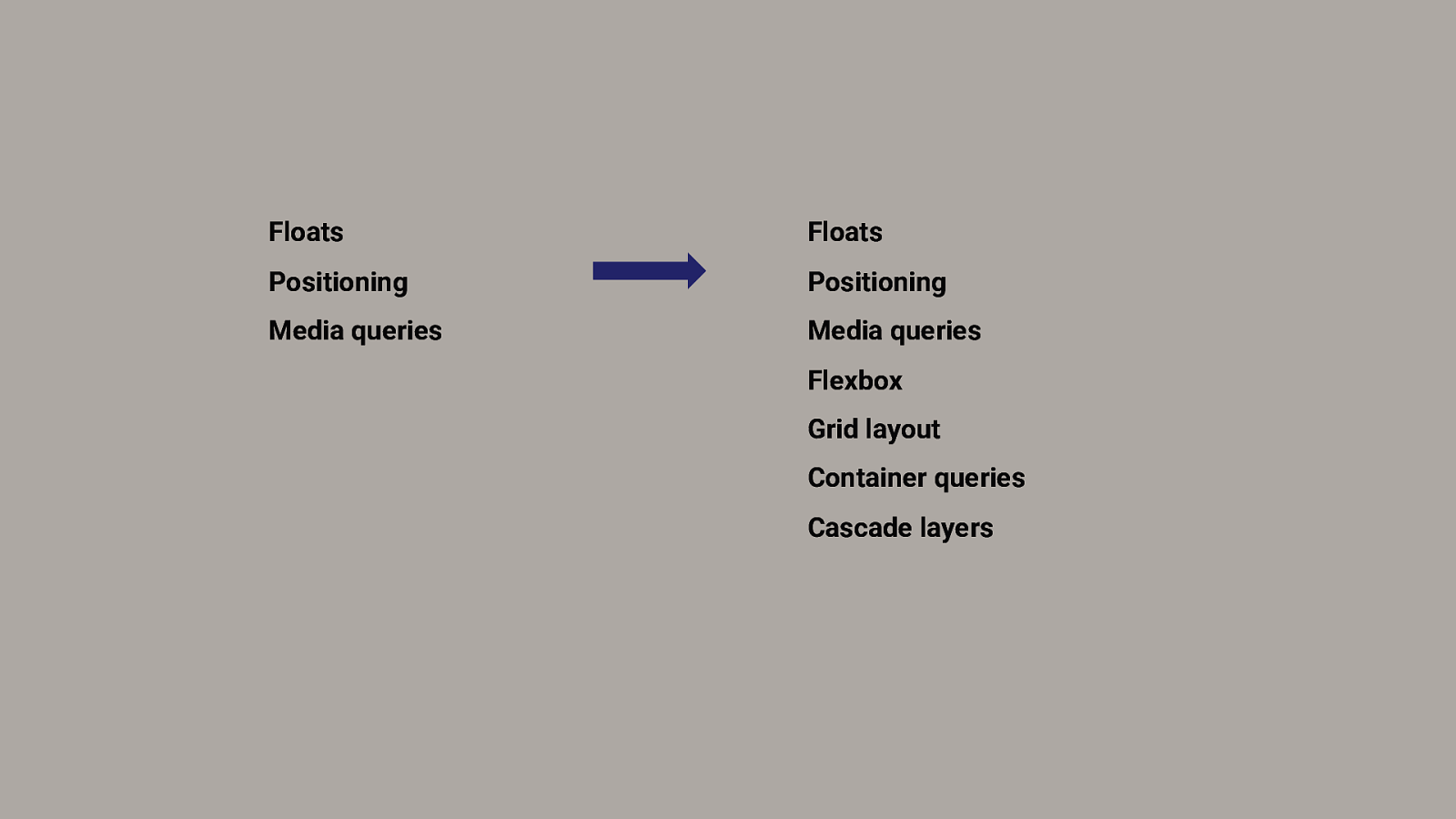
Floats Floats Positioning Positioning Media queries Media queries Flexbox Grid layout Container queries Cascade layers

“ If I would have asked people what they wanted, they would have said faster horses. (Probably not) Henry Ford. ”
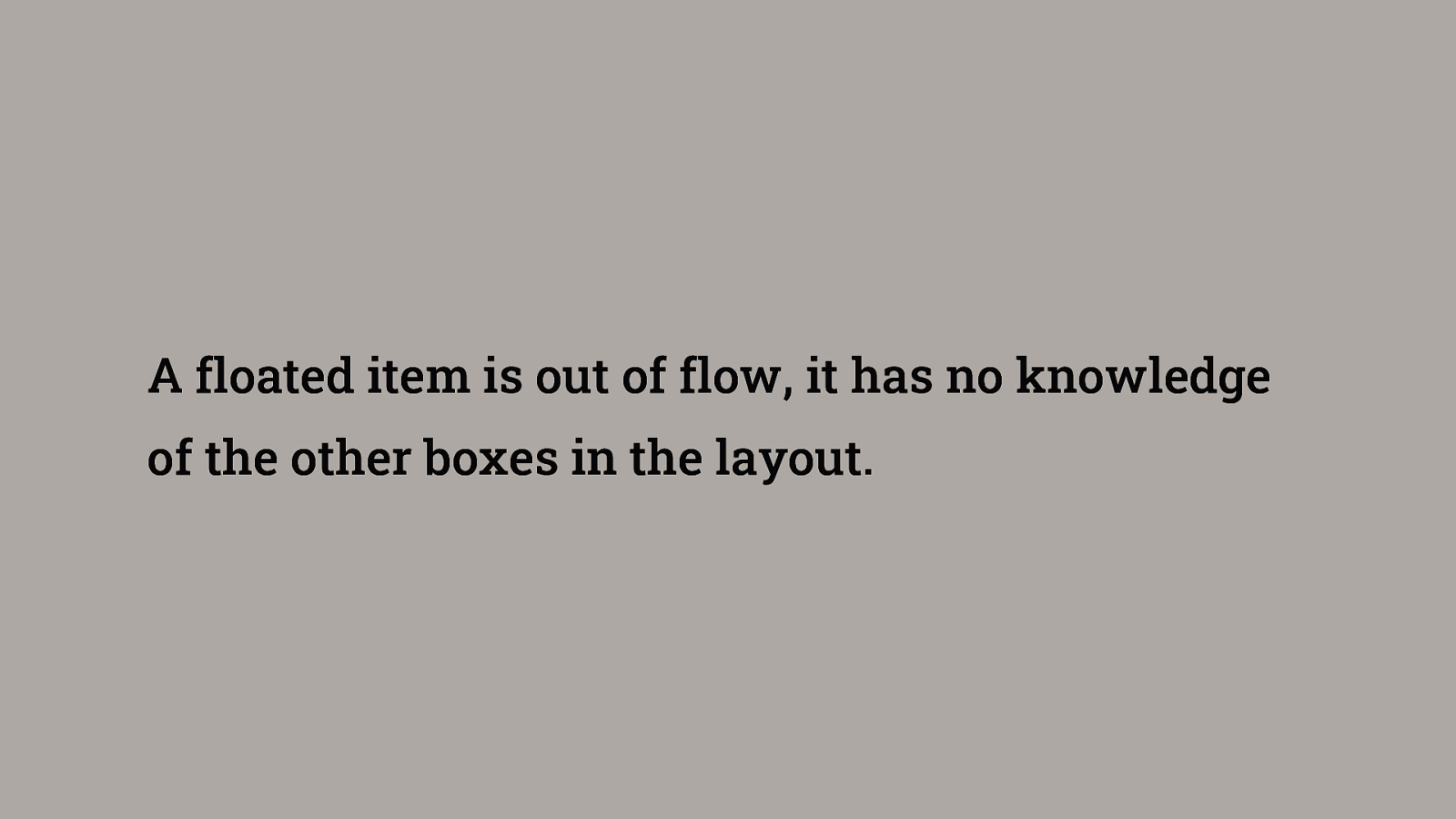
A floated item is out of flow, it has no knowledge of the other boxes in the layout.
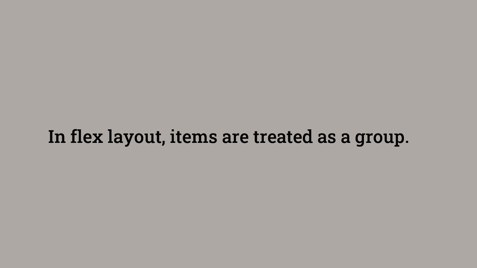
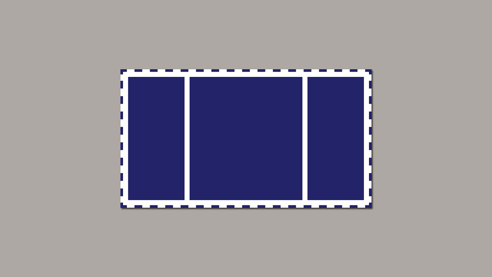
In flex layout, items are treated as a group.
“ I wanted to get it out there and get other people to have a look at it. ” Me, in The Story of CSS Grid, from Its Creators
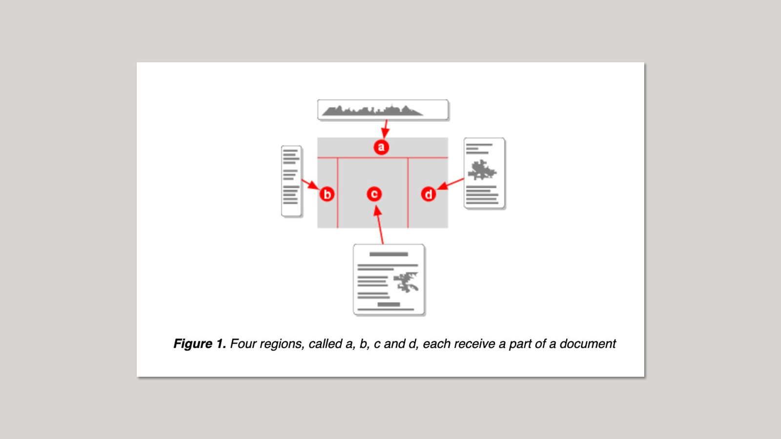
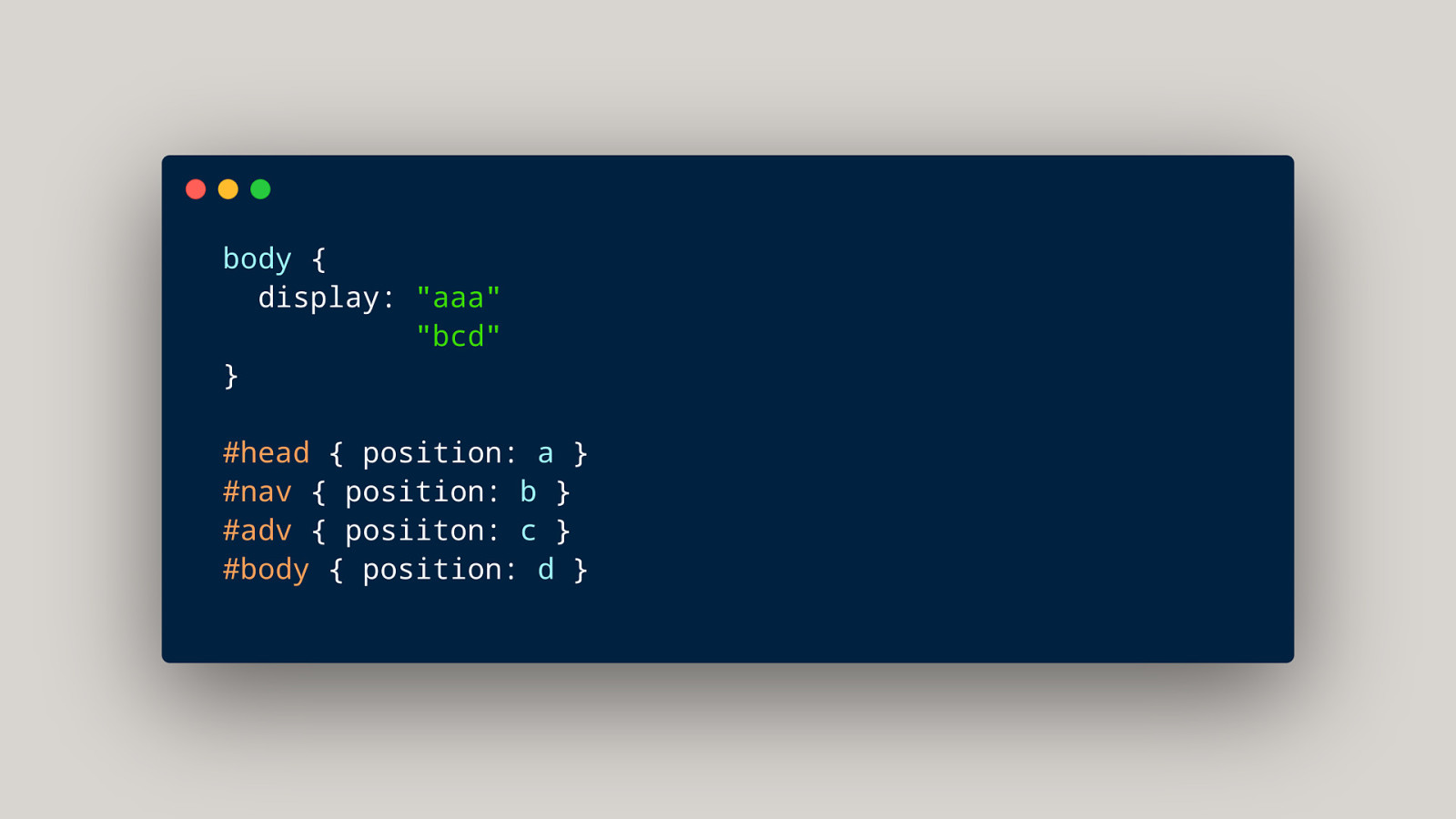
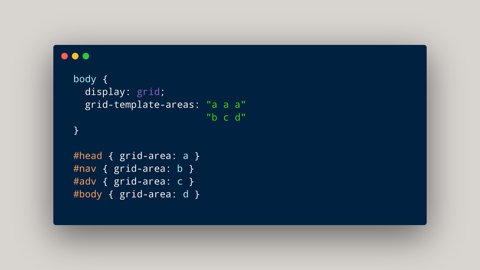
Why use grid instead of flexbox?
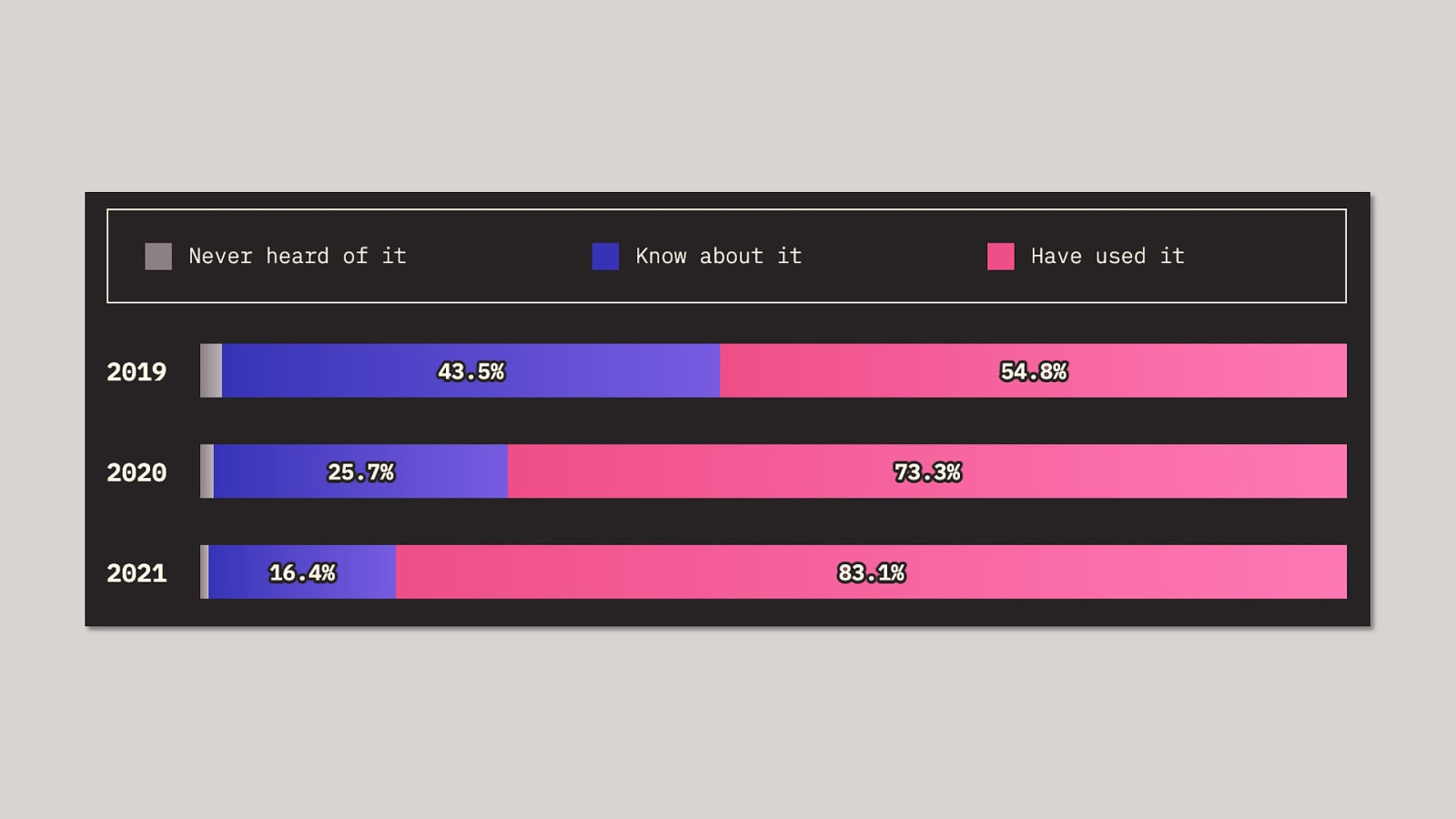
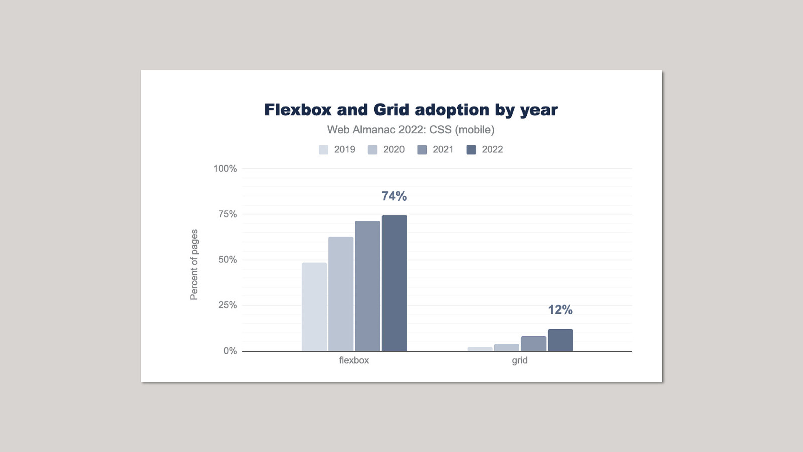
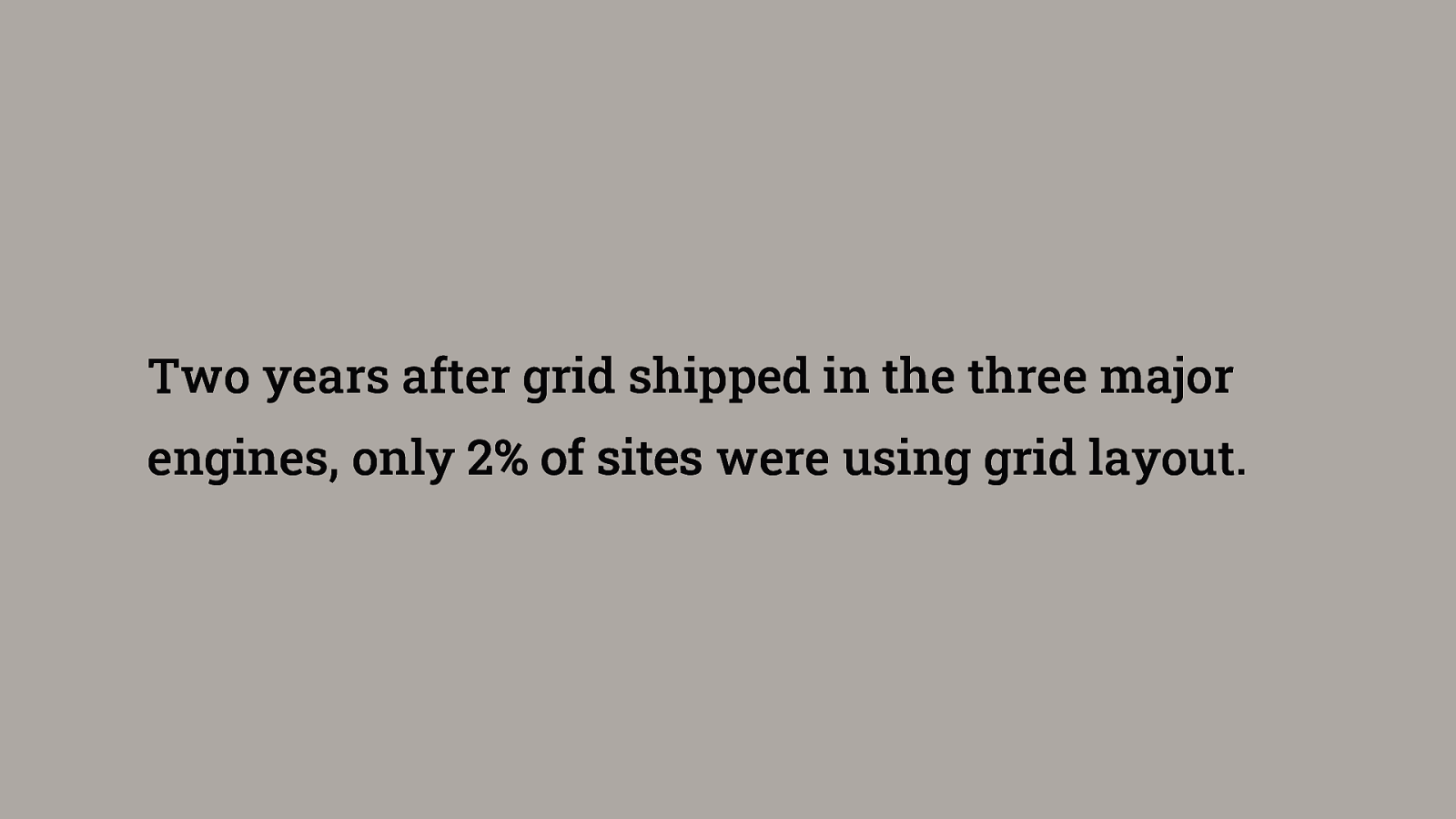
Two years after grid shipped in the three major engines, only 2% of sites were using grid layout.
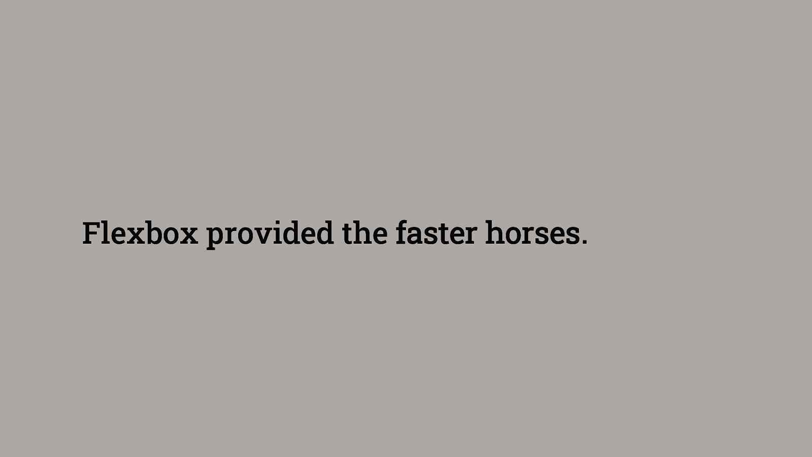
Flexbox provided the faster horses.
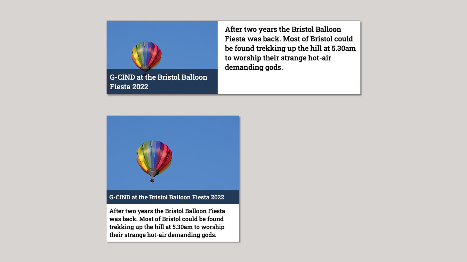
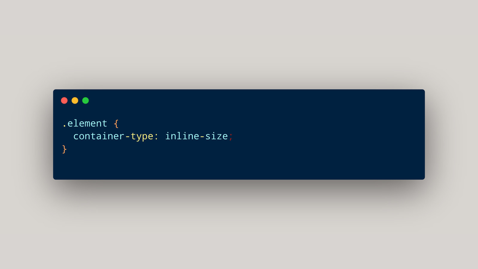
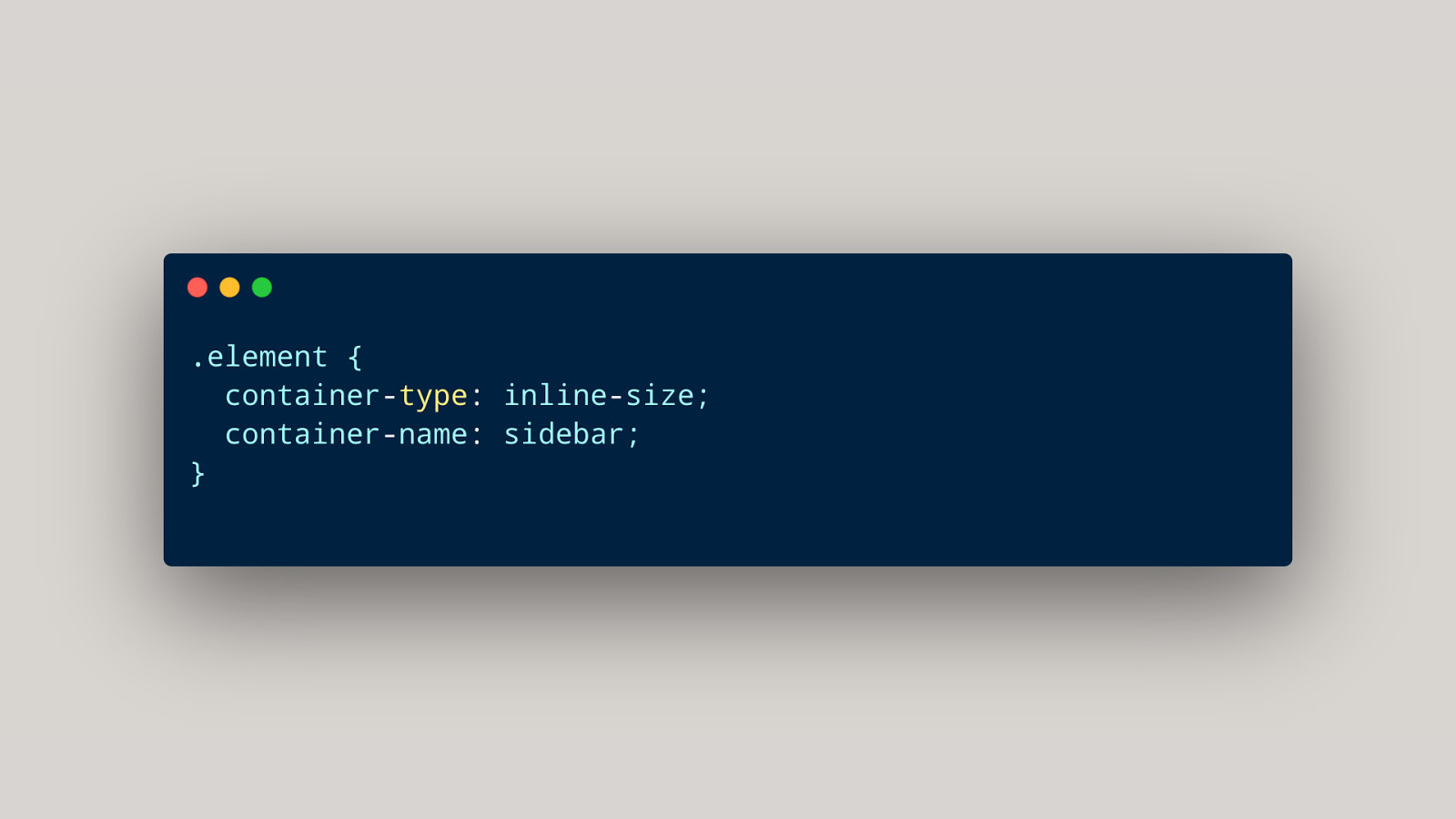
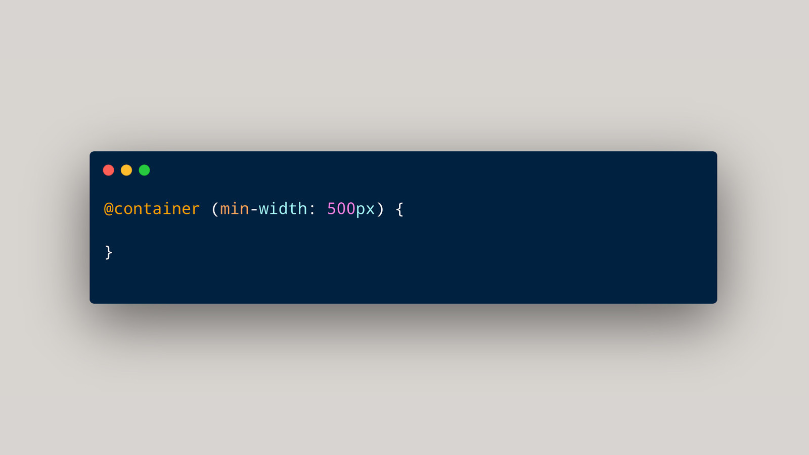
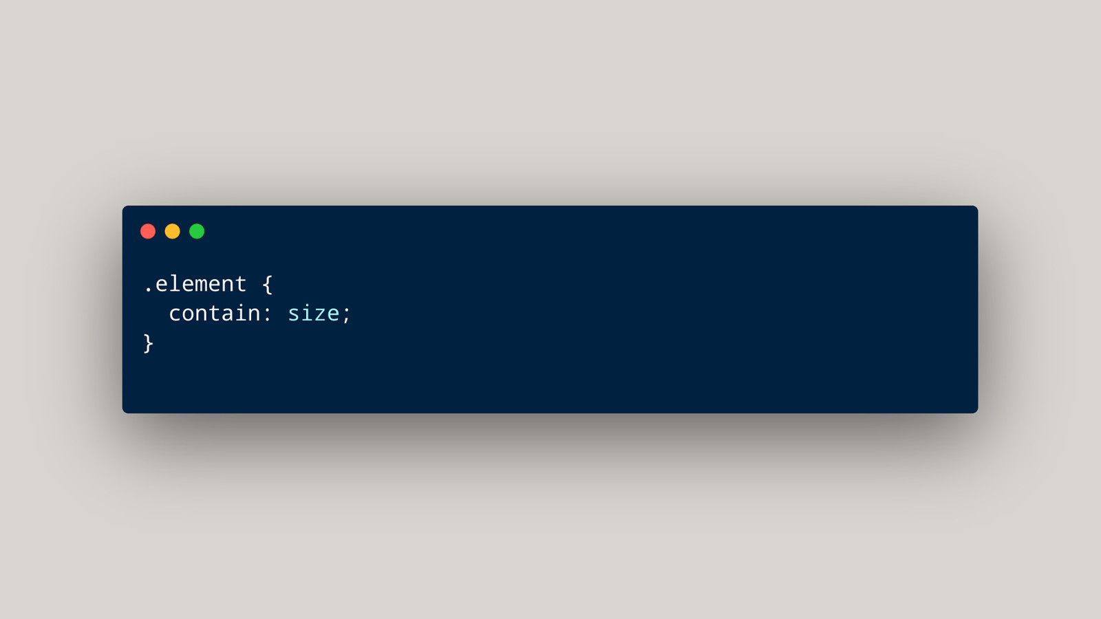
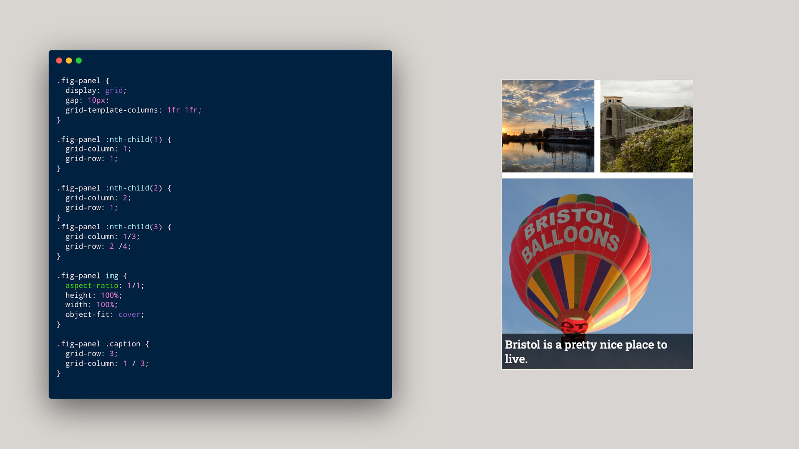
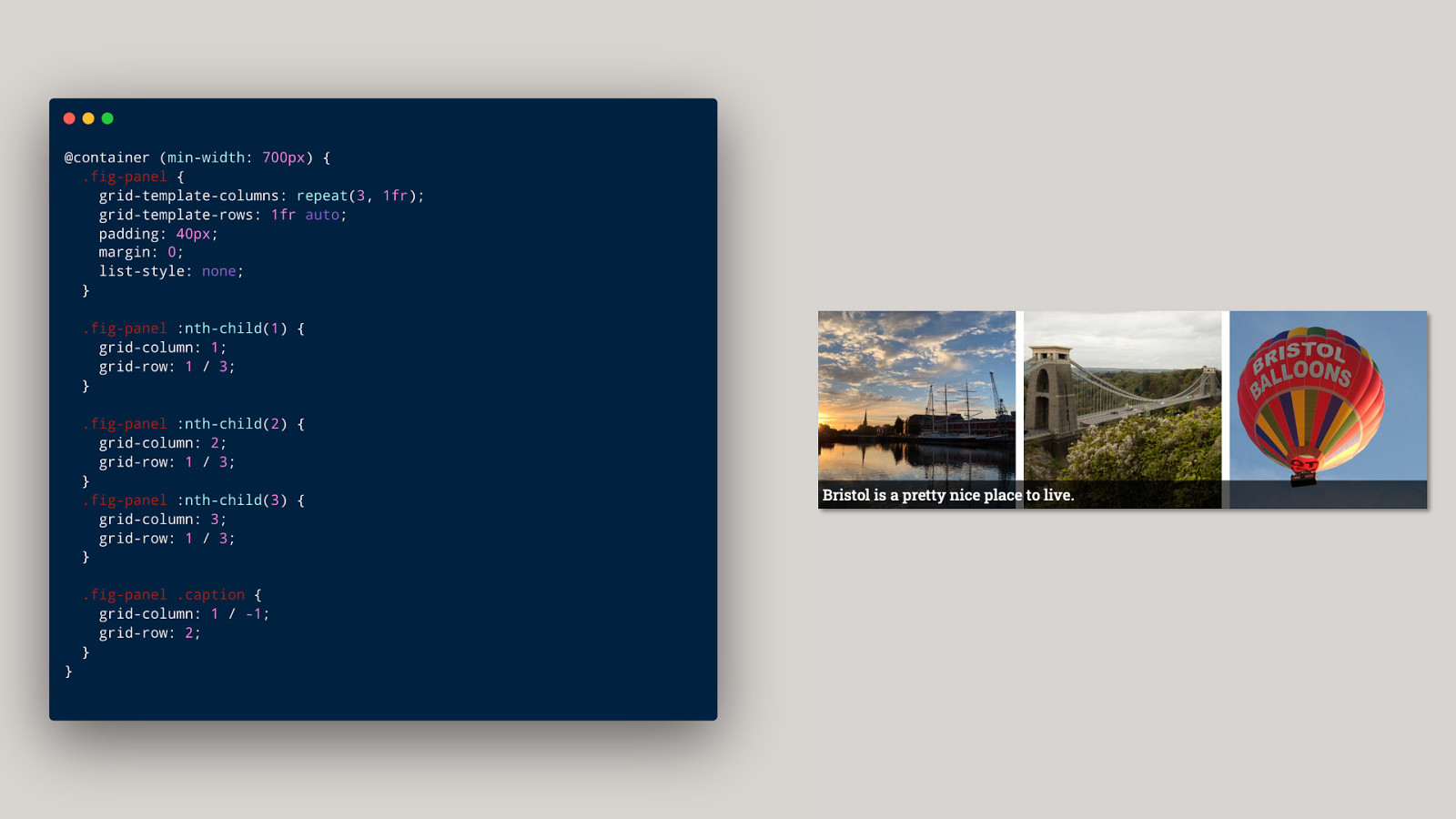
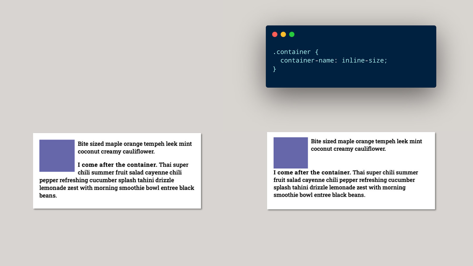
Container Queries Querying against properties of the container, rather than the viewport.
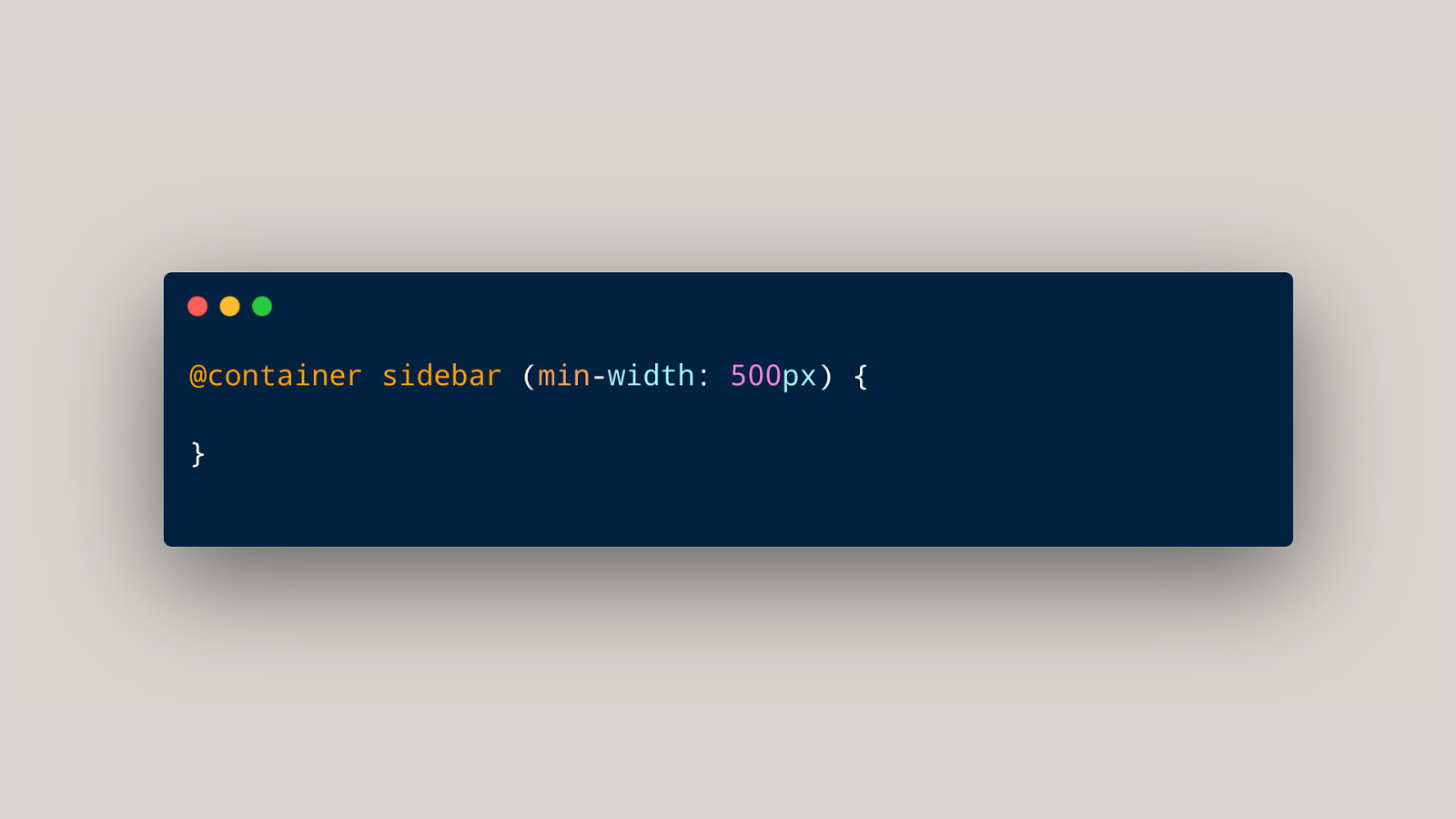
Why did this take so long? It seems really simple!
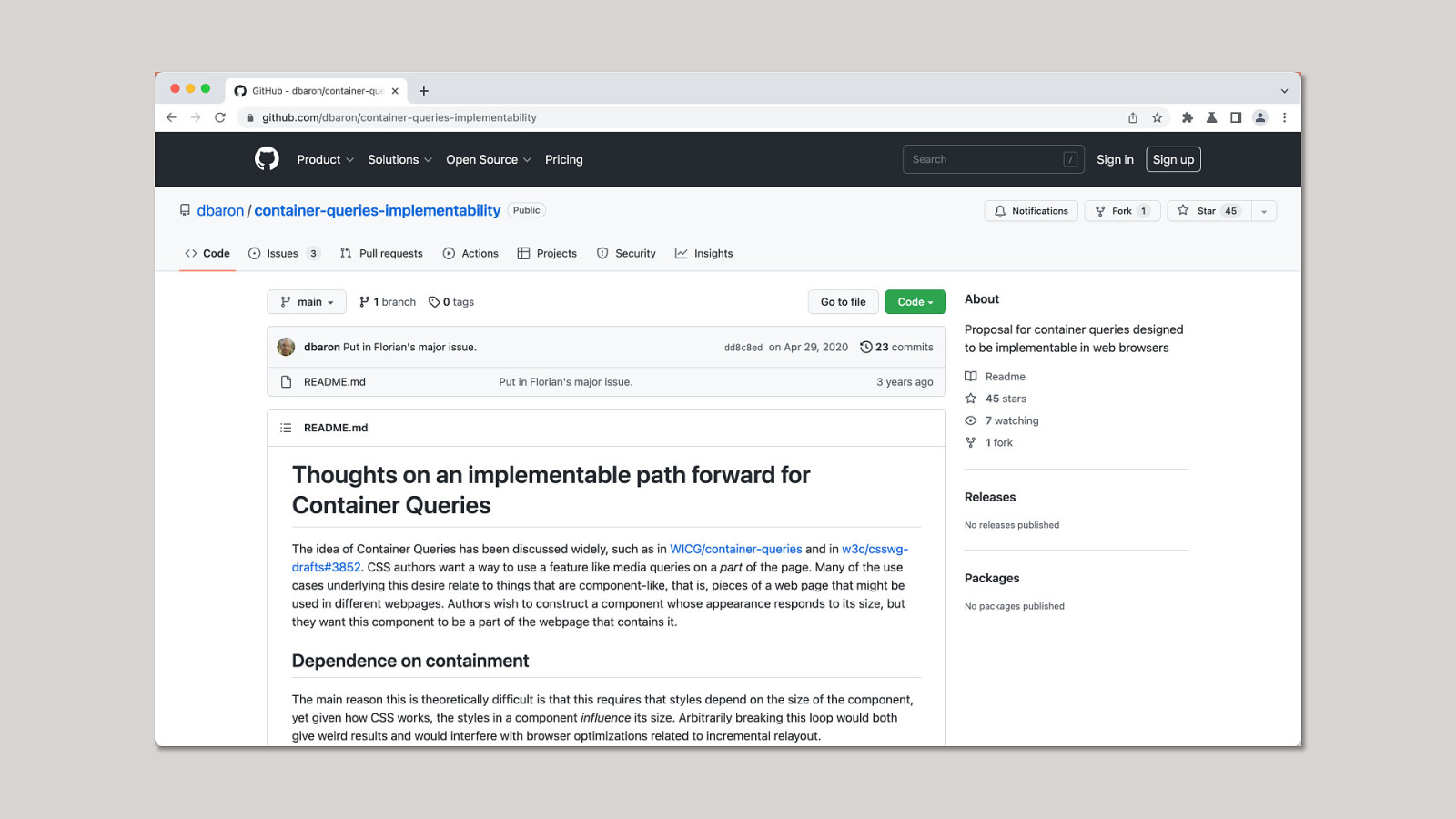
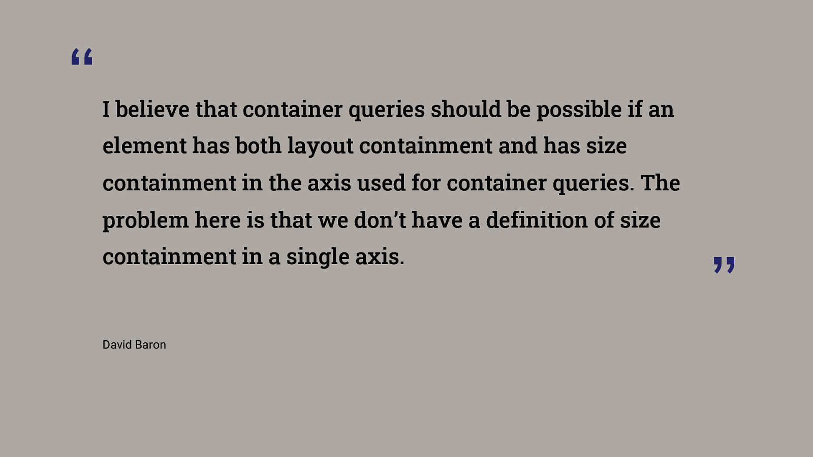
“ I believe that container queries should be possible if an element has both layout containment and has size containment in the axis used for container queries. The problem here is that we don’t have a definition of size containment in a single axis. David Baron ”
Container queries + aspect-ratio

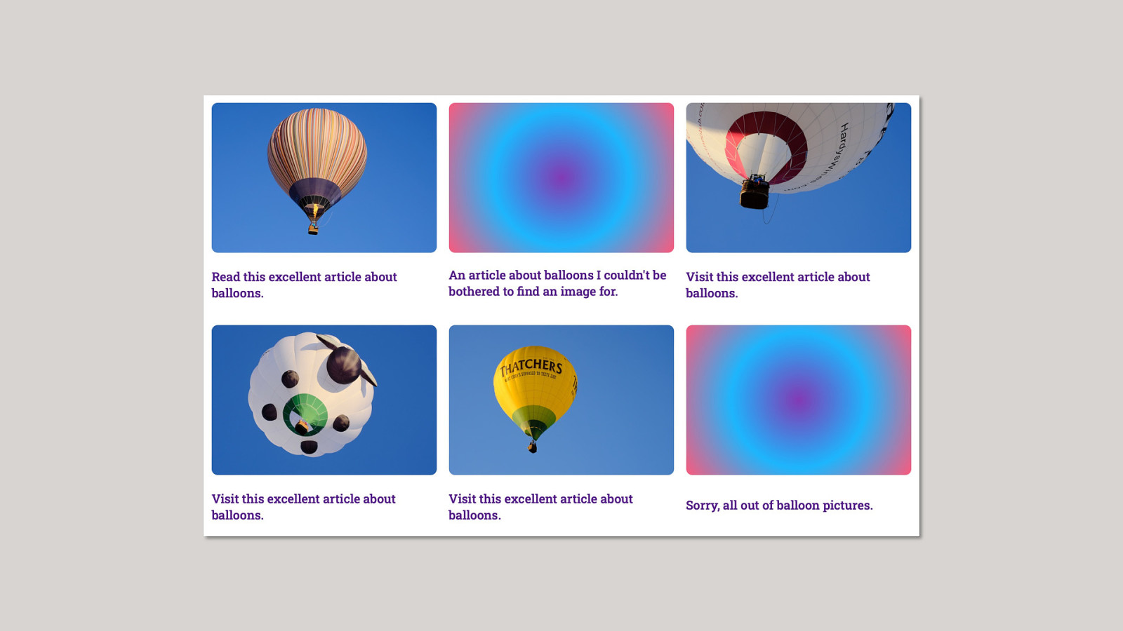
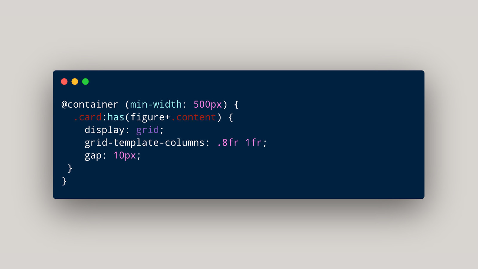
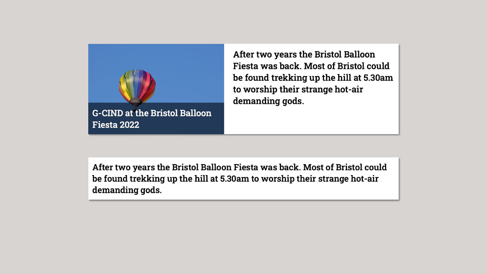
A parent selector has()

has() + container queries What’s inside the component + how much space there is to play with.
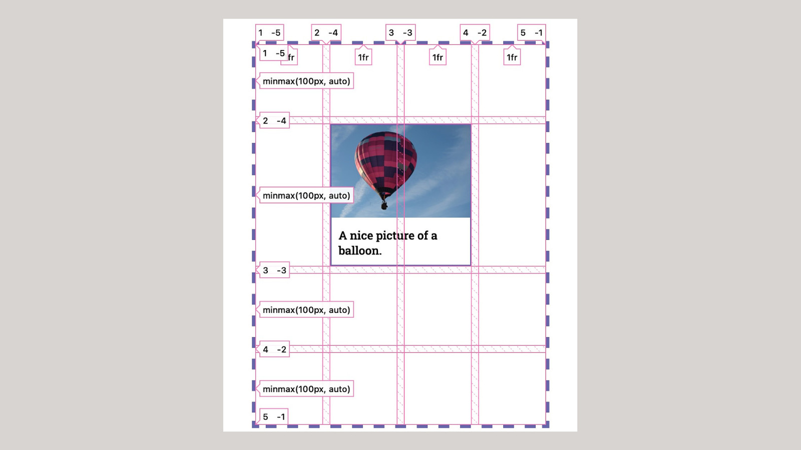
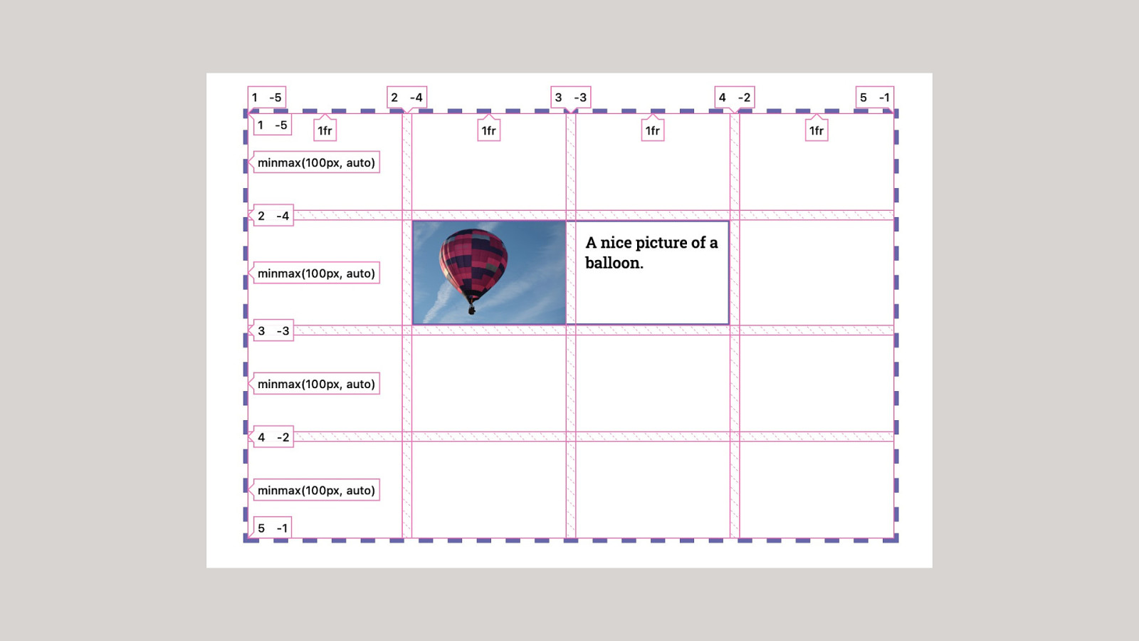
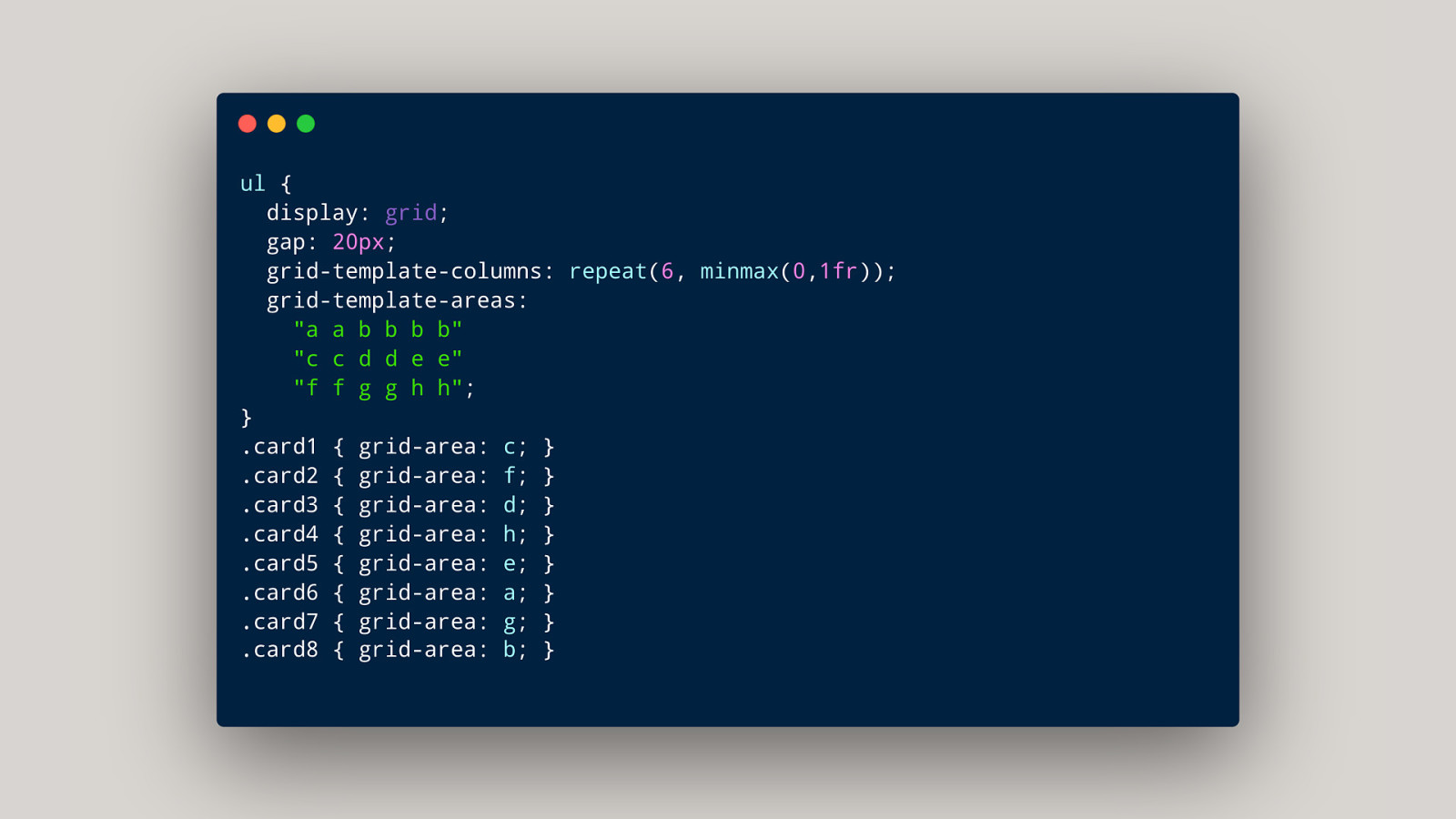
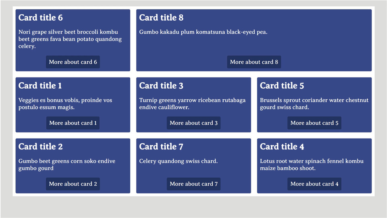
subgrid Inherit the size and number of tracks from a parent into a child grid.
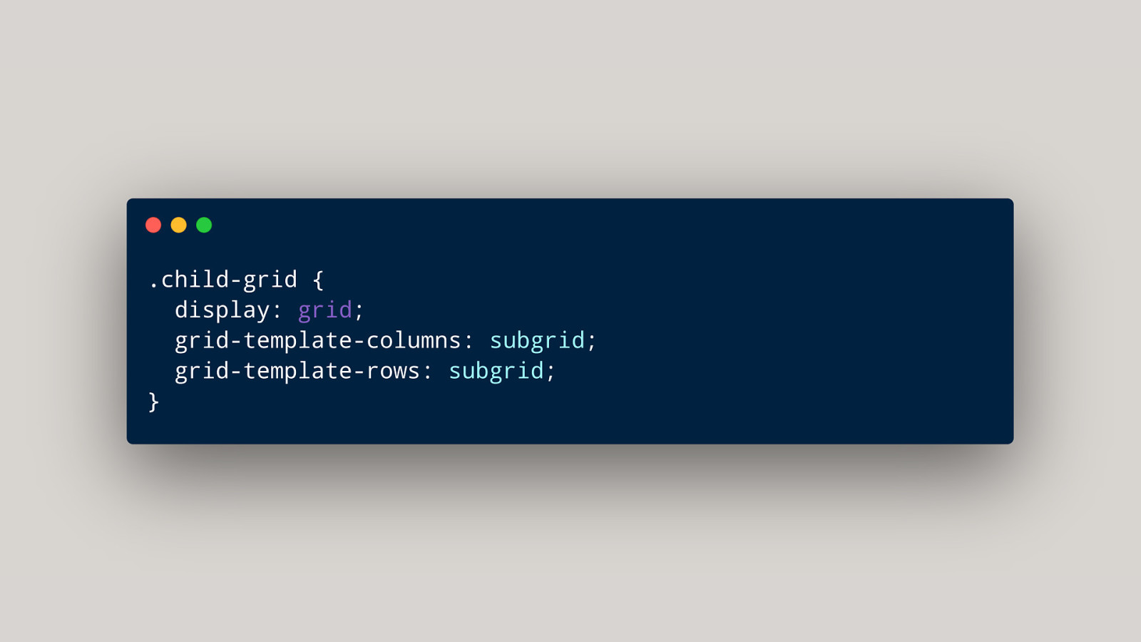
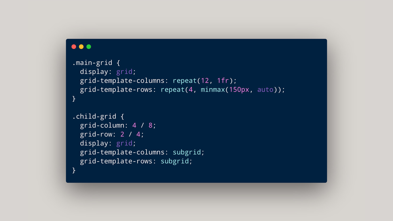
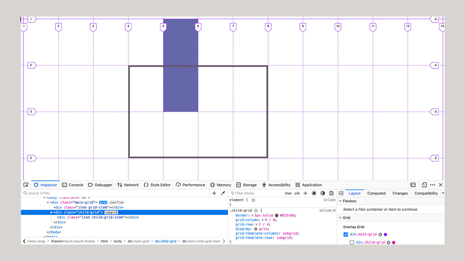
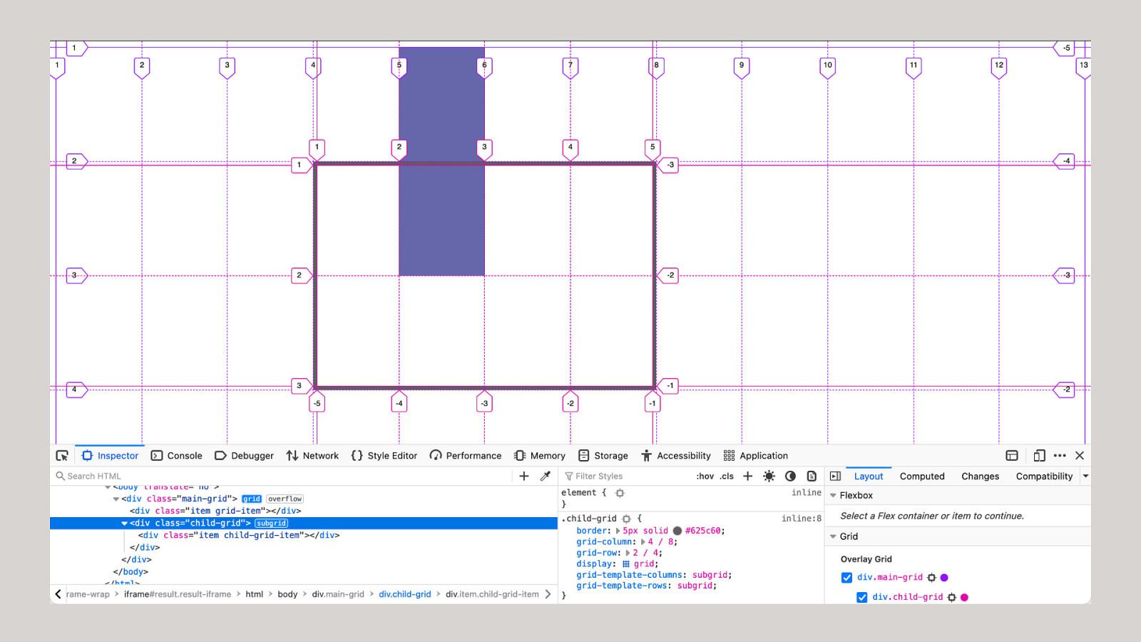
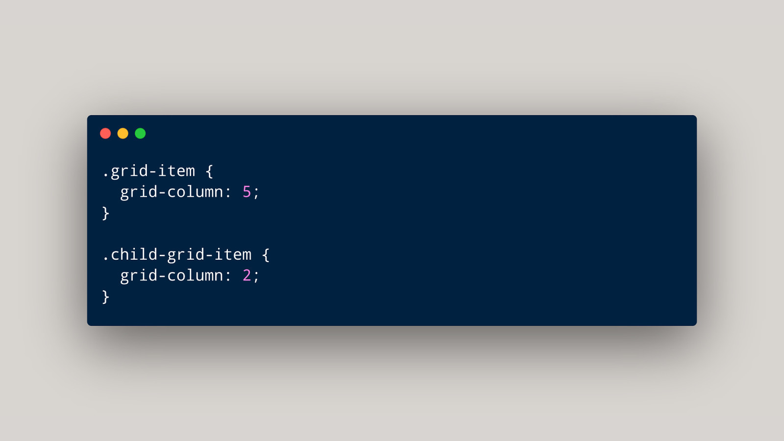
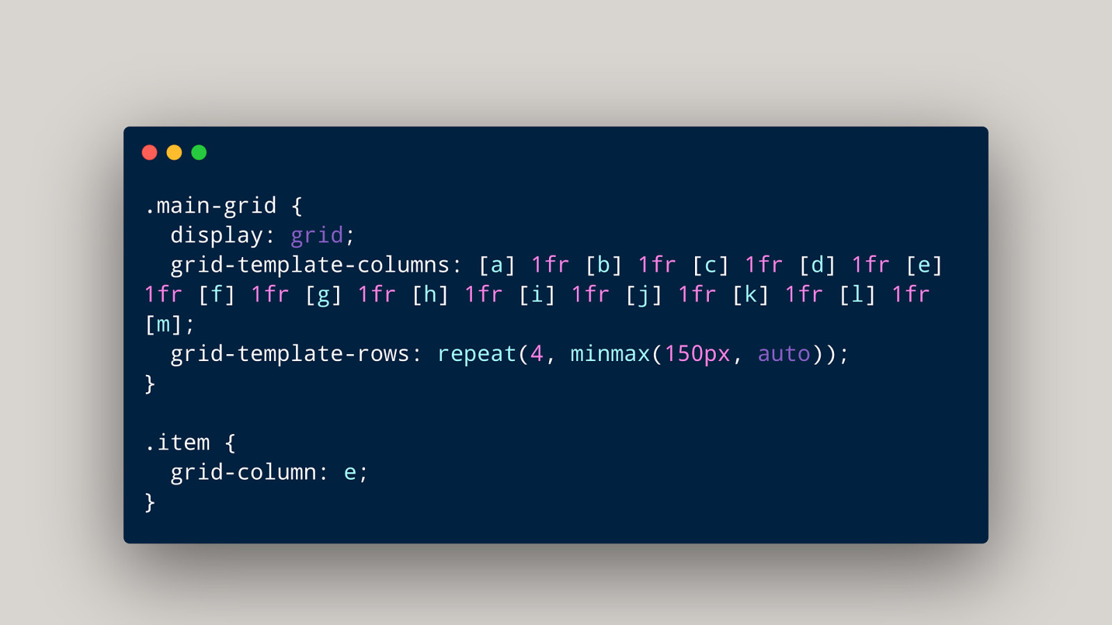
The value of subgrid replaces the track listing You can subgrid in one dimension or both.
One proposal was to simplify subgrid by locking it to both dimensions. This would mean there was no implicit grid, no way to subgrid columns but have as many rows as required for the content.
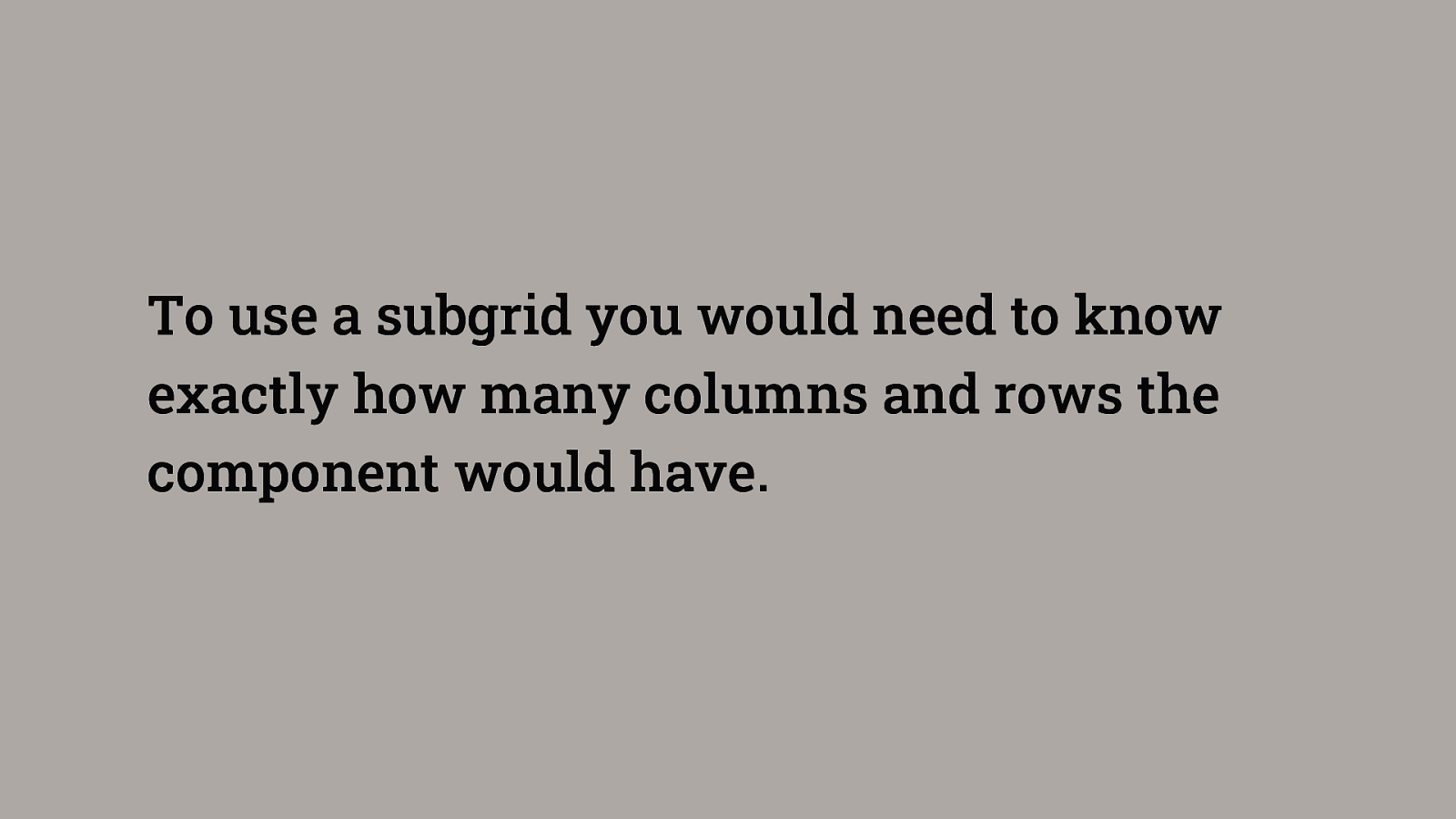
To use a subgrid you would need to know exactly how many columns and rows the component would have.
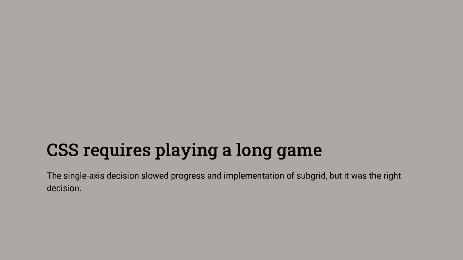
CSS requires playing a long game The single-axis decision slowed progress and implementation of subgrid, but it was the right decision.
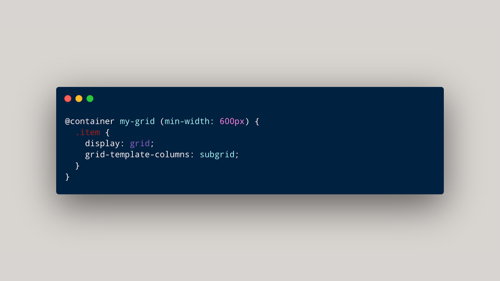
subgrid + container queries Creating subgrids or using tracks based on available space.
So many possibilities
Complexity Each new feature is relatively simple to use, however each brings new interactions, and the potential of unexpected behavior.
It’s a good time to really learn CSS It will help you to take advantage of all of this new greatness.
The problem with new layout
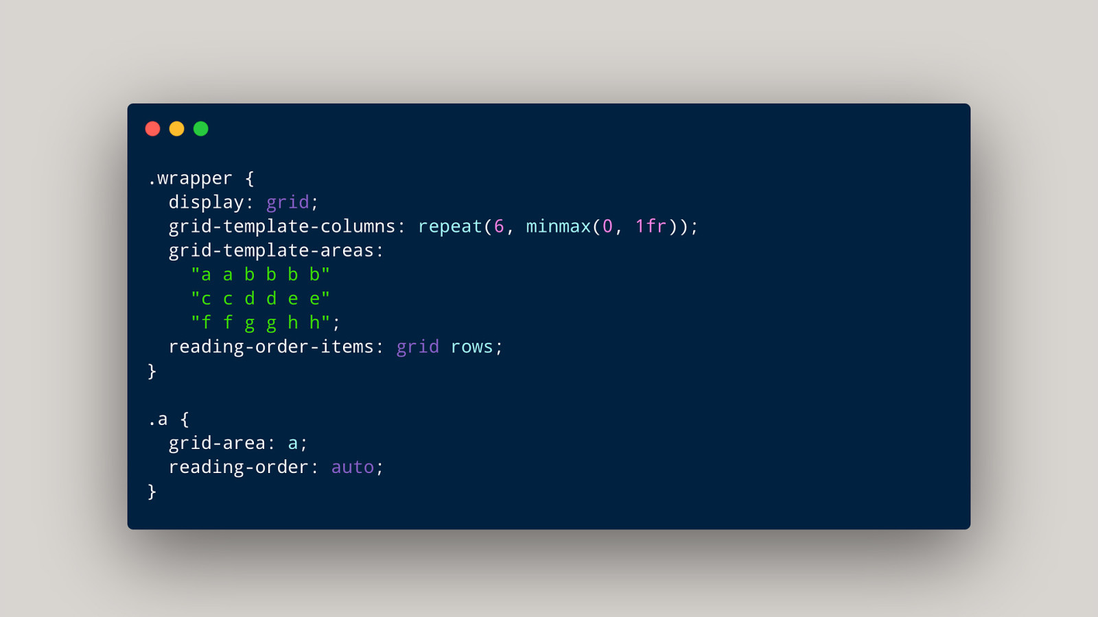
The ability to disconnect the source and focus order from the display.

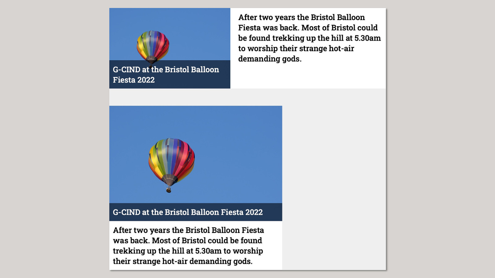
Here’s a really cool thing! Please don’t use it.
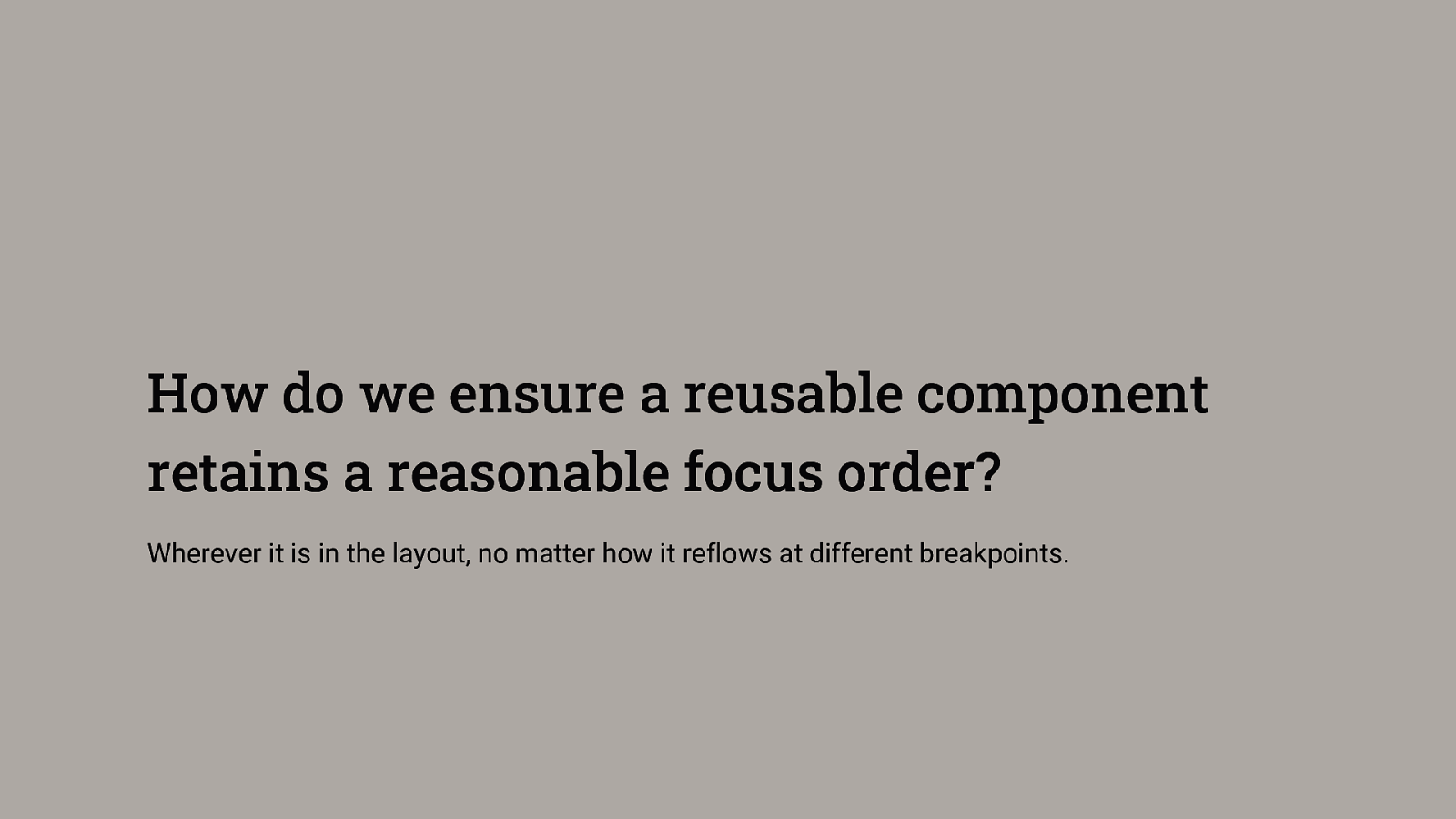
How do we ensure a reusable component retains a reasonable focus order? Wherever it is in the layout, no matter how it reflows at different breakpoints.
reading-order and reading-order-items https://developer.chrome.com/blog/reading-order/
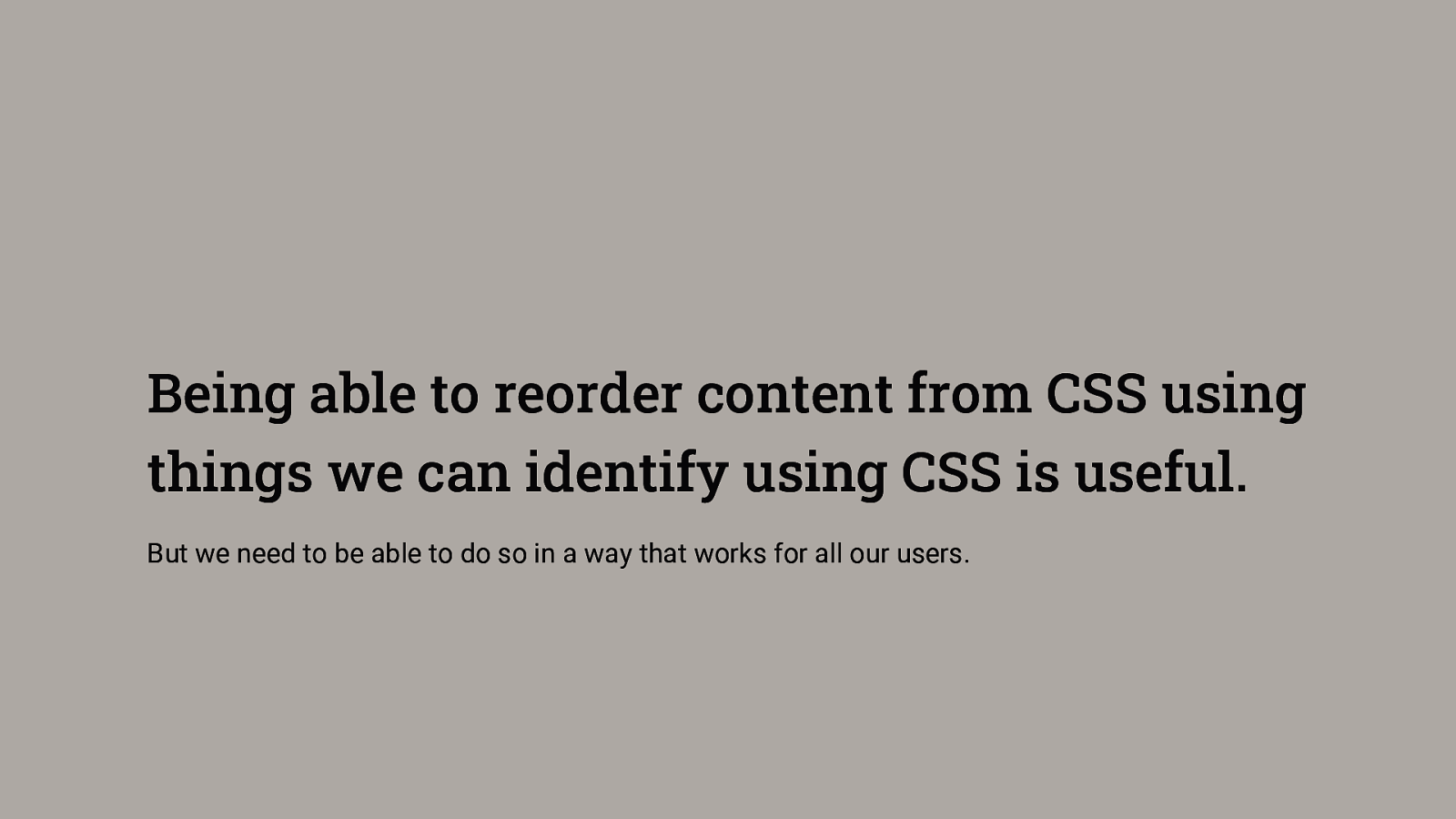
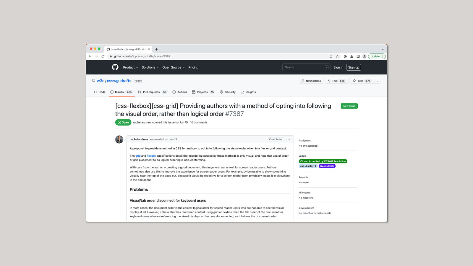
Being able to reorder content from CSS using things we can identify using CSS is useful. But we need to be able to do so in a way that works for all our users.
Focus is hard If you have examples and use cases for this feature, talk to me!

Thank you! @rachelandrew | https://noti.st/rachelandrew/yG39OE/