Golden Rules for Typography on the Web Richard Rutter, Clearleft tga

A presentation at Typographische Gesellschaft Austria in February 2019 in Vienna, Austria by Richard Rutter
Golden Rules for Typography on the Web Richard Rutter, Clearleft tga

Photo: Marc Norman Francis

Golden Rules for Typography on the Web Richard Rutter, Clearleft tga

Photo: Marc Thiele
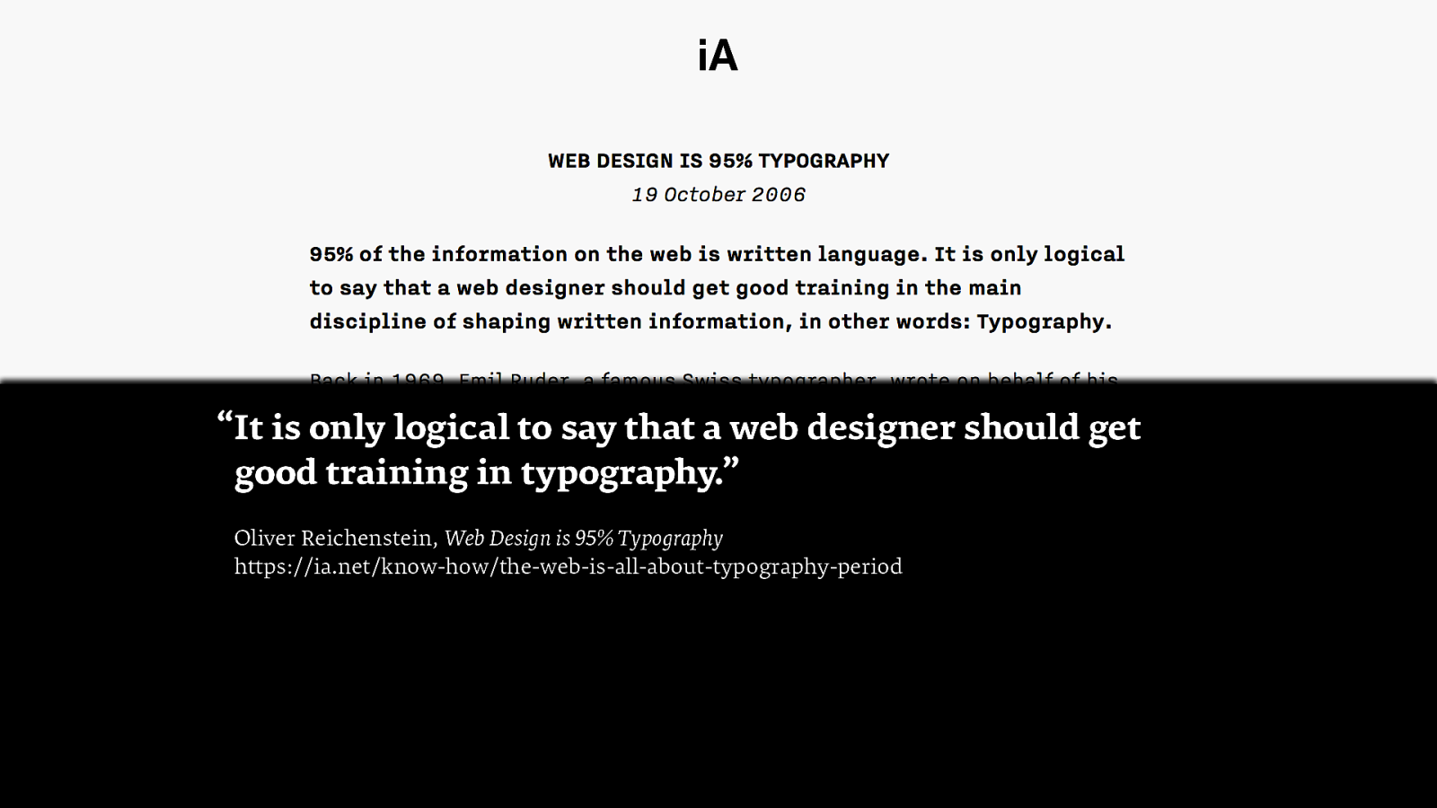
“It is only logical to say that a web designer should get good training in typography.” Oliver Reichenstein, Web Design is 95% Typography https://ia.net/know-how/the-web-is-all-about-typography-period
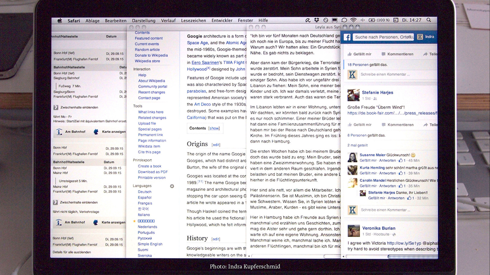
image of bad sameness Photo: Indra Kupferschmid
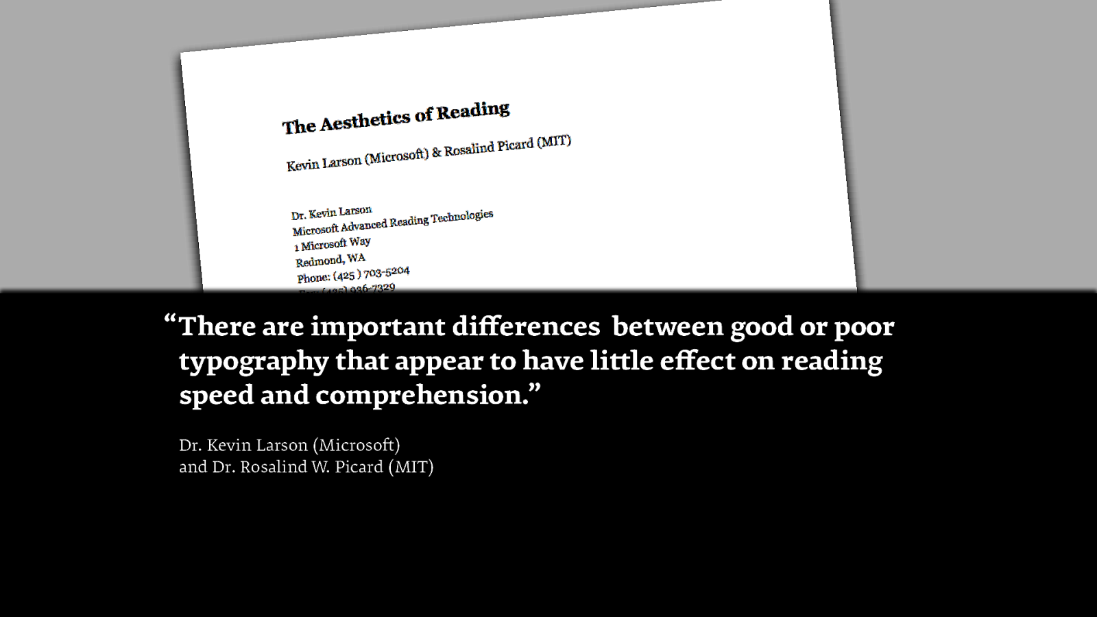
“ There are important differences between good or poor typography that appear to have little effect on reading speed and comprehension.” Dr. Kevin Larson (Microsoft) and Dr. Rosalind W. Picard (MIT)
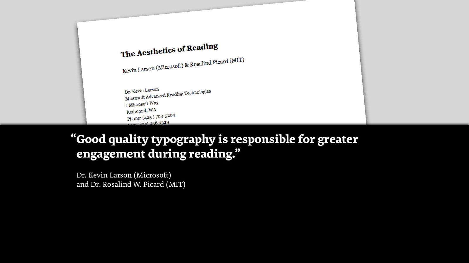
“Good quality typography is responsible for greater engagement during reading.” Dr. Kevin Larson (Microsoft) and Dr. Rosalind W. Picard (MIT)
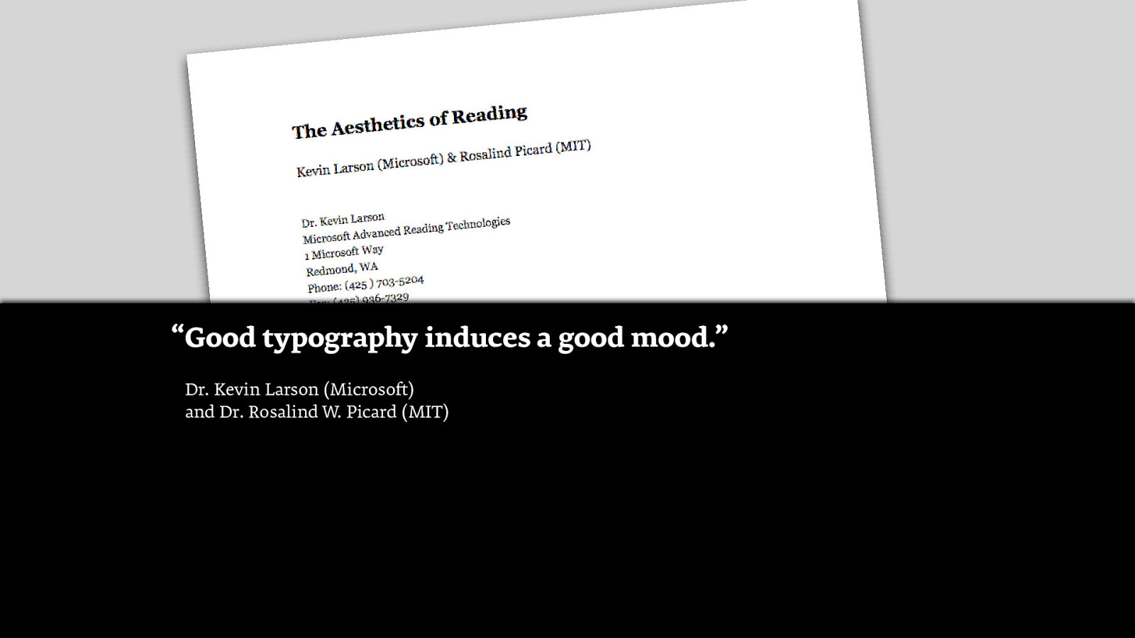
“Good typography induces a good mood.” Dr. Kevin Larson (Microsoft) and Dr. Rosalind W. Picard (MIT)
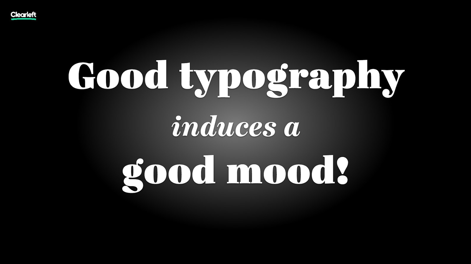
Good typography induces a good mood!

№1 Don’t trust computers tga

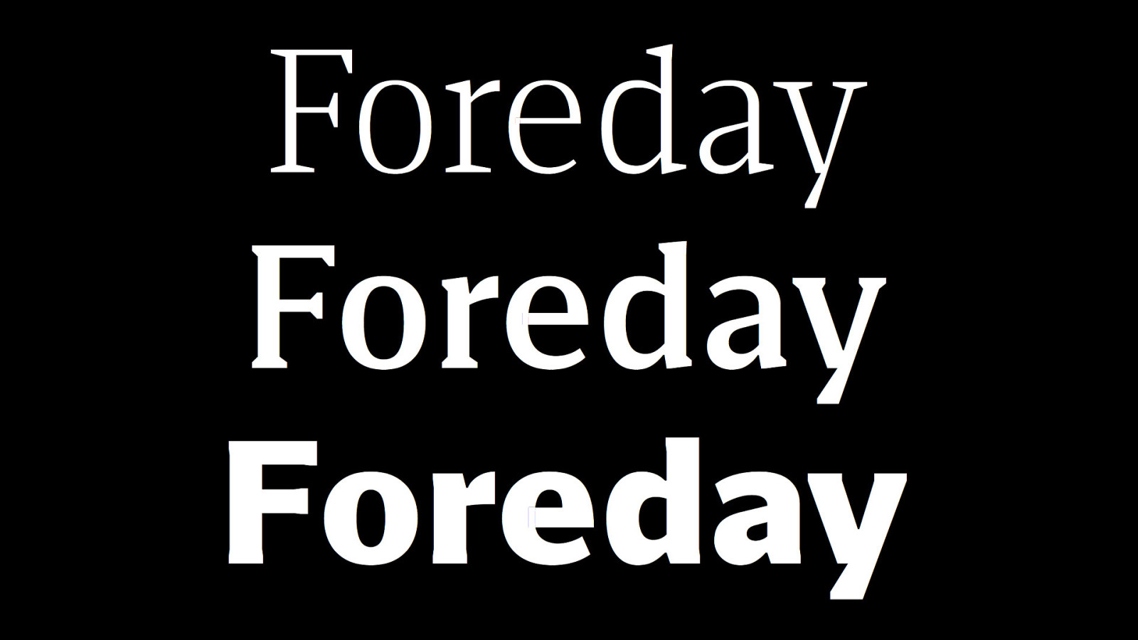
№2 Use the default font size for paragraph text tga
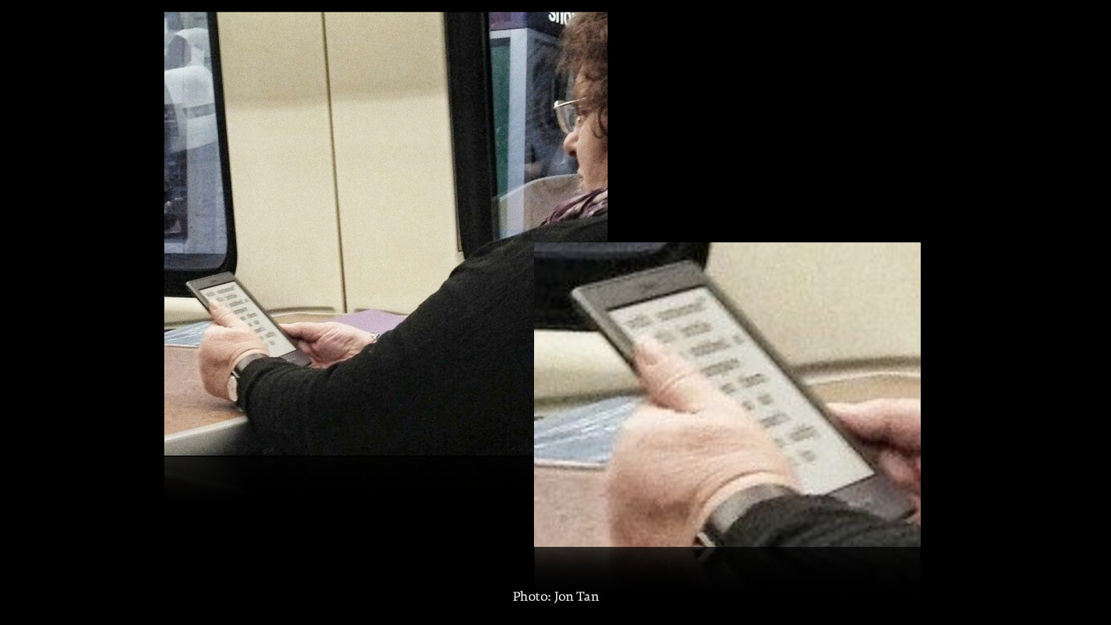
Photo: Jon Tan

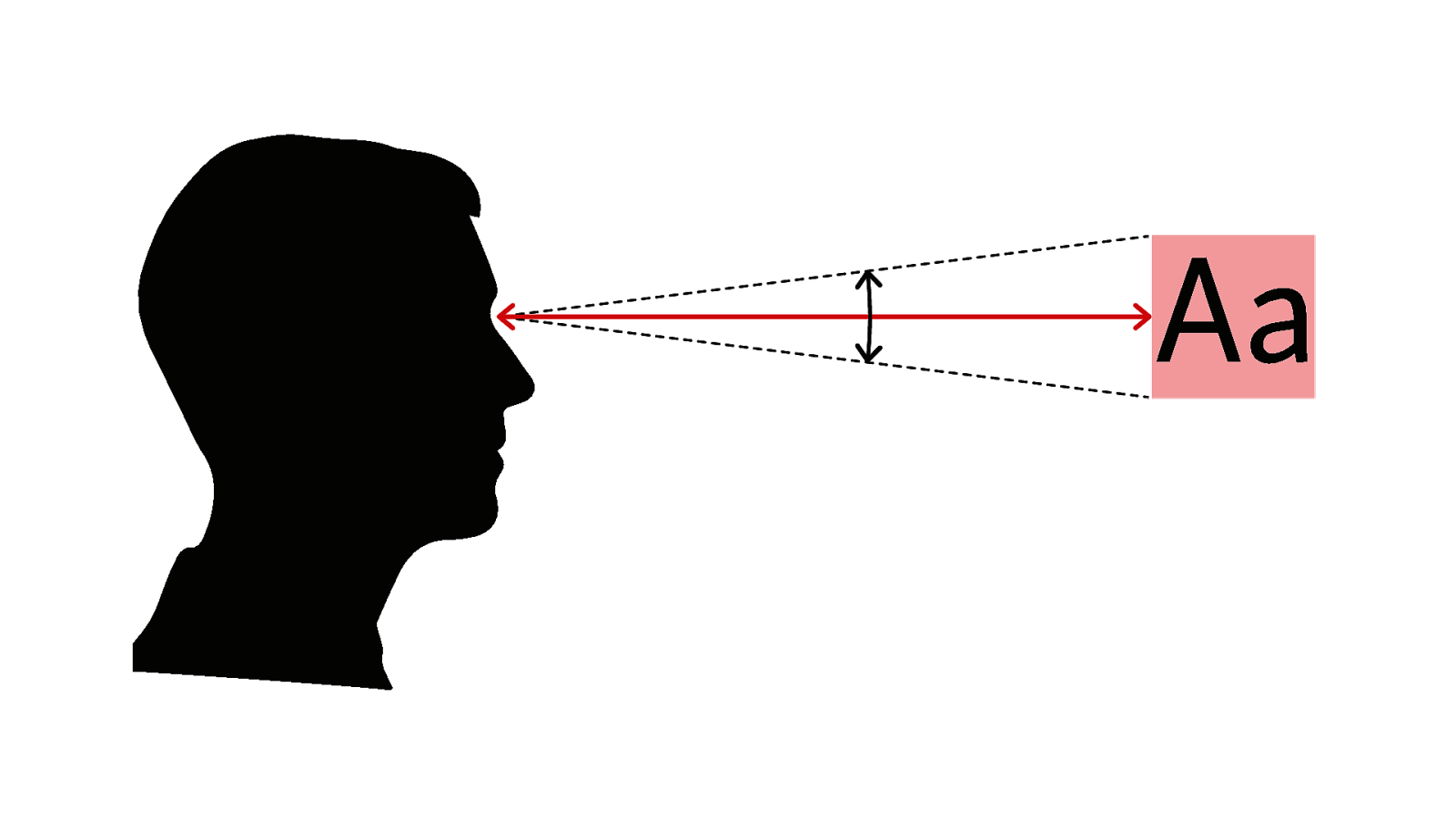
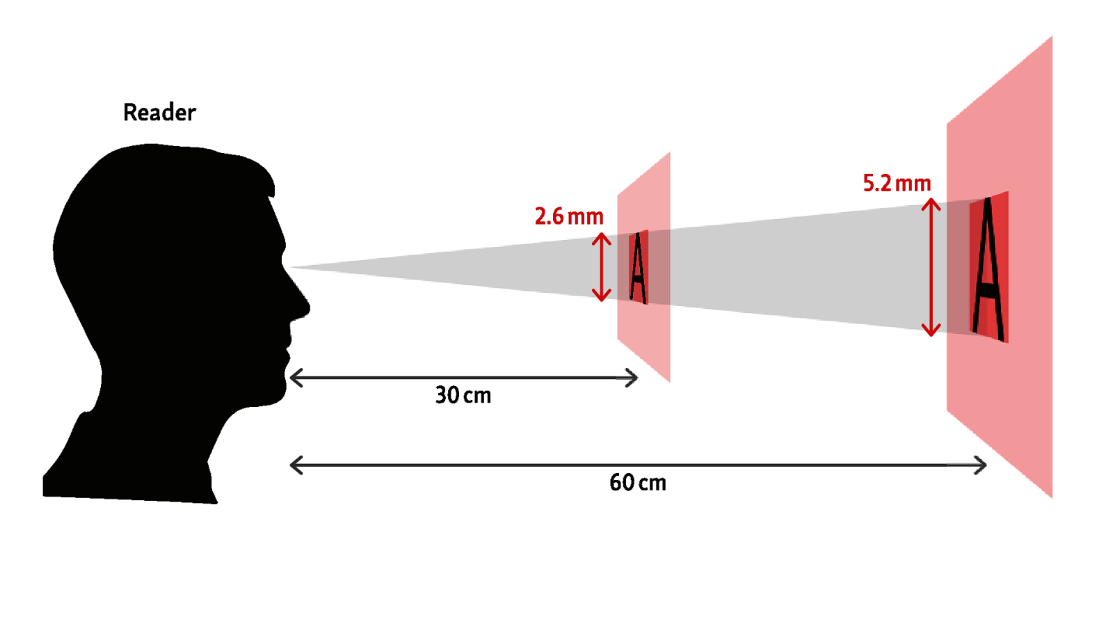
№3 Adjust type size according to reading distance tga

channel4.com/programmes/father-ted/
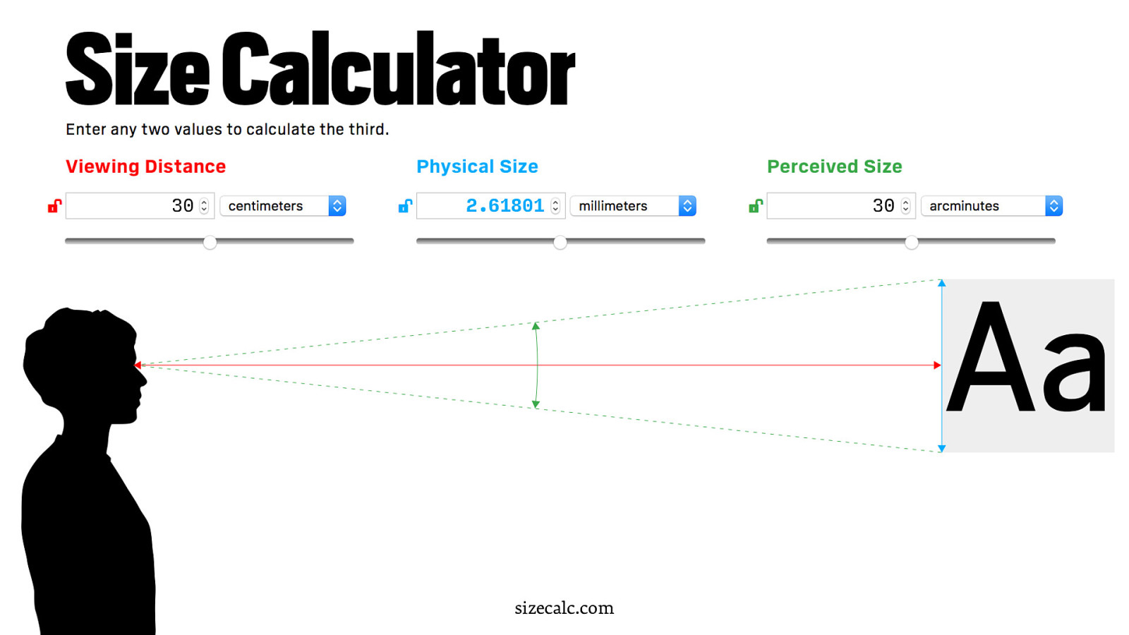
30 2.61801 sizecalc.com 30

60 5.236021 sizecalc.com 30

45 3.927016 sizecalc.com 30
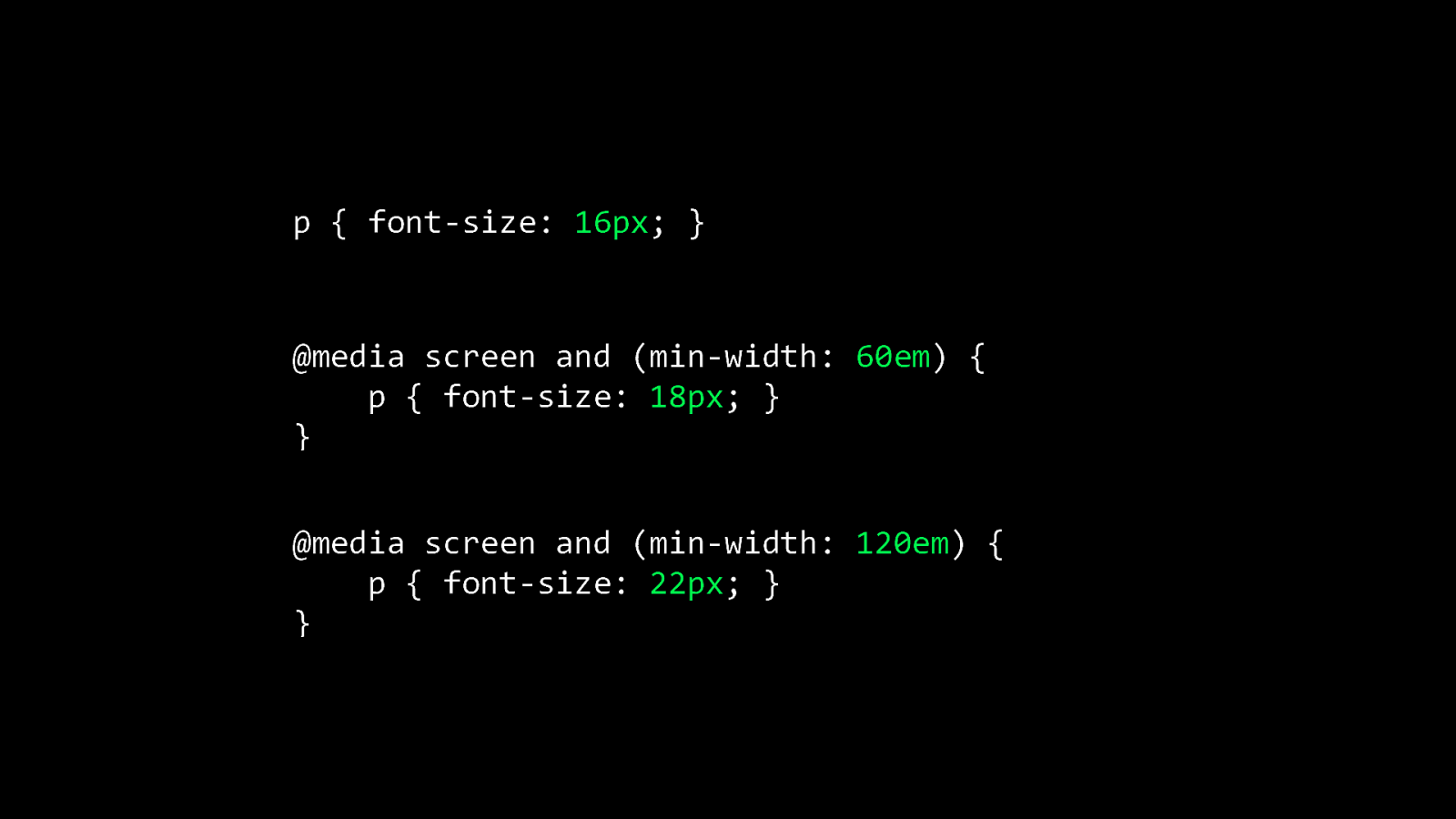
p { font-size: 16px; } @media screen and (min-width: 60em) { p { font-size: 18px; } } @media screen and (min-width: 120em) { p { font-size: 22px; } }
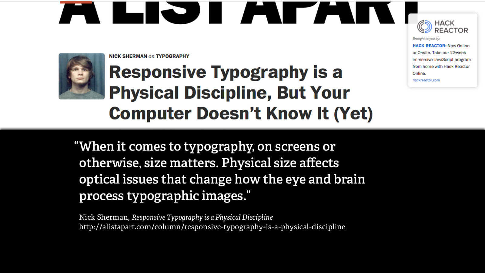
“ When it comes to typography, on screens or otherwise, size matters. Physical size affects optical issues that change how the eye and brain process typographic images.” Nick Sherman, Responsive Typography is a Physical Discipline http://alistapart.com/column/responsive-typography-is-a-physical-discipline
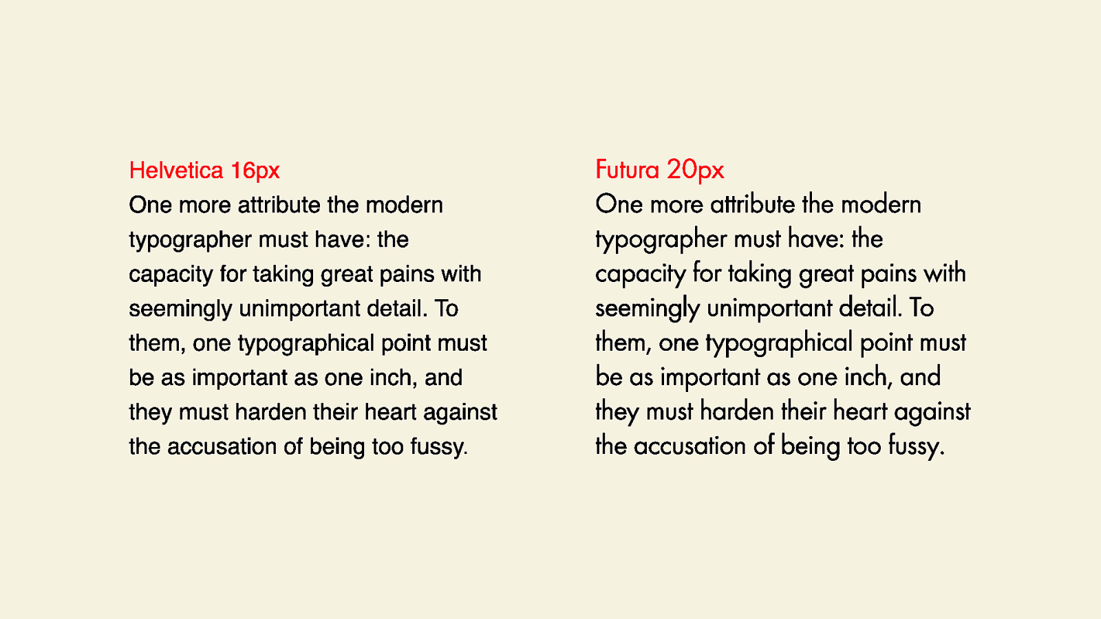
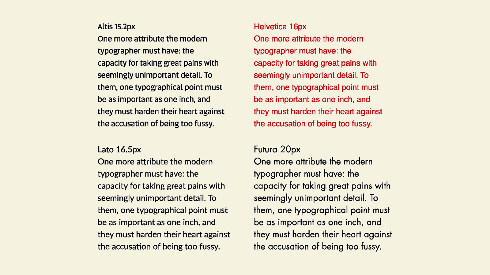
№4 Adjust the font size if the typeface requires it tga
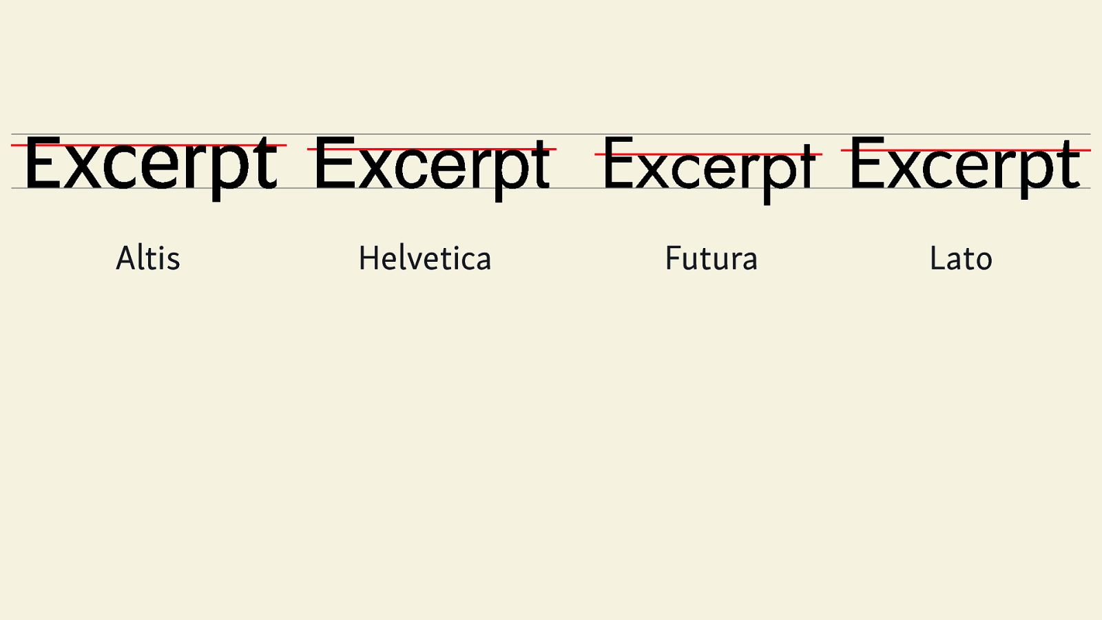
Altis Helvetica Futura Lato
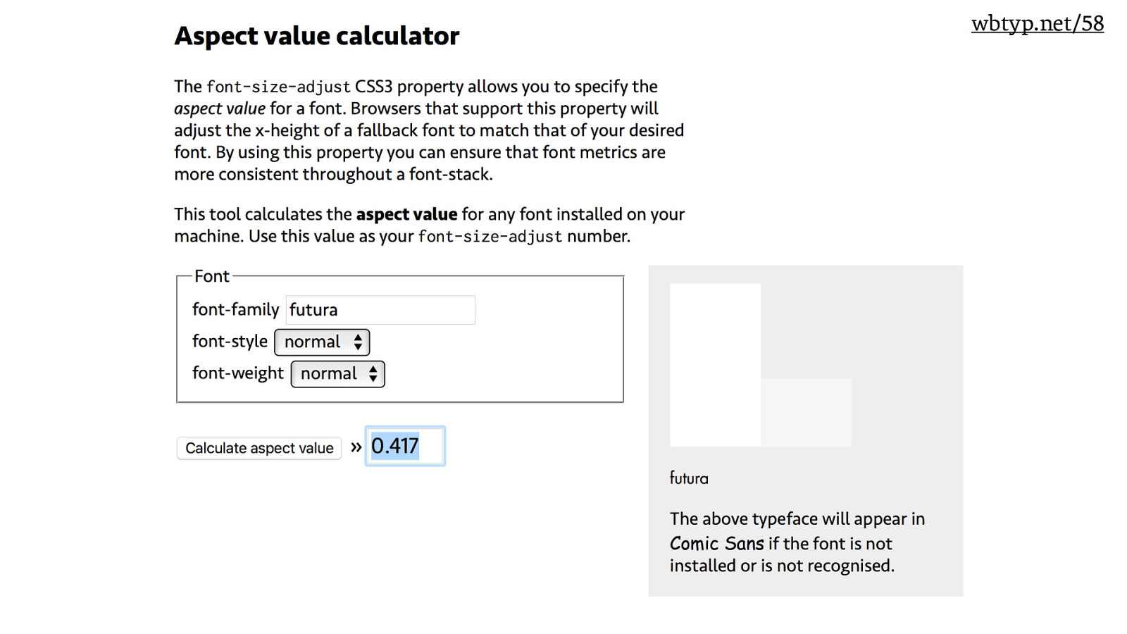
wbtyp.net/58
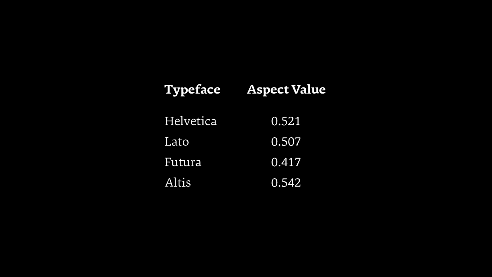
Typeface Aspect Value Helvetica 0.521 Lato 0.507 Futura 0.417 Altis 0.542
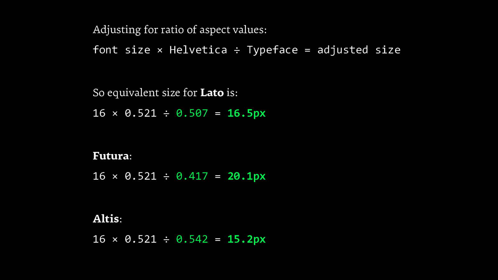
Adjusting for ratio of aspect values: font size × Helvetica ÷ Typeface = adjusted size So equivalent size for Lato is: 16 × 0.521 ÷ 0.507 = 16.5px Futura: 16 × 0.521 ÷ 0.417 = 20.1px Altis: 16 × 0.521 ÷ 0.542 = 15.2px
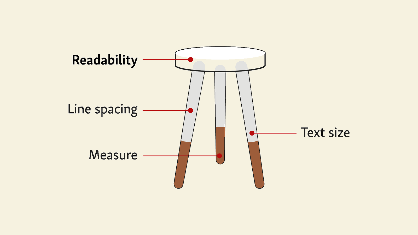
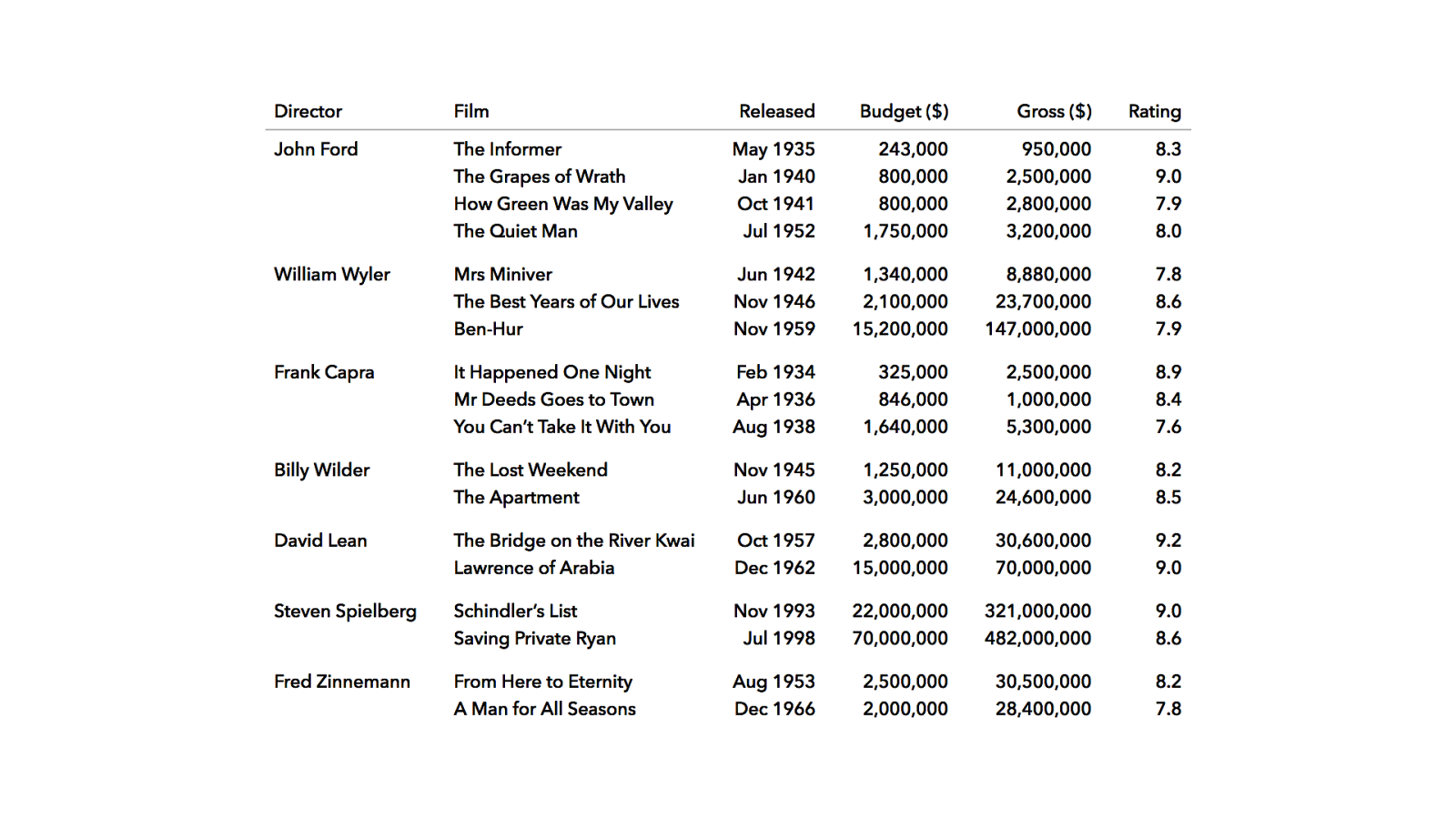
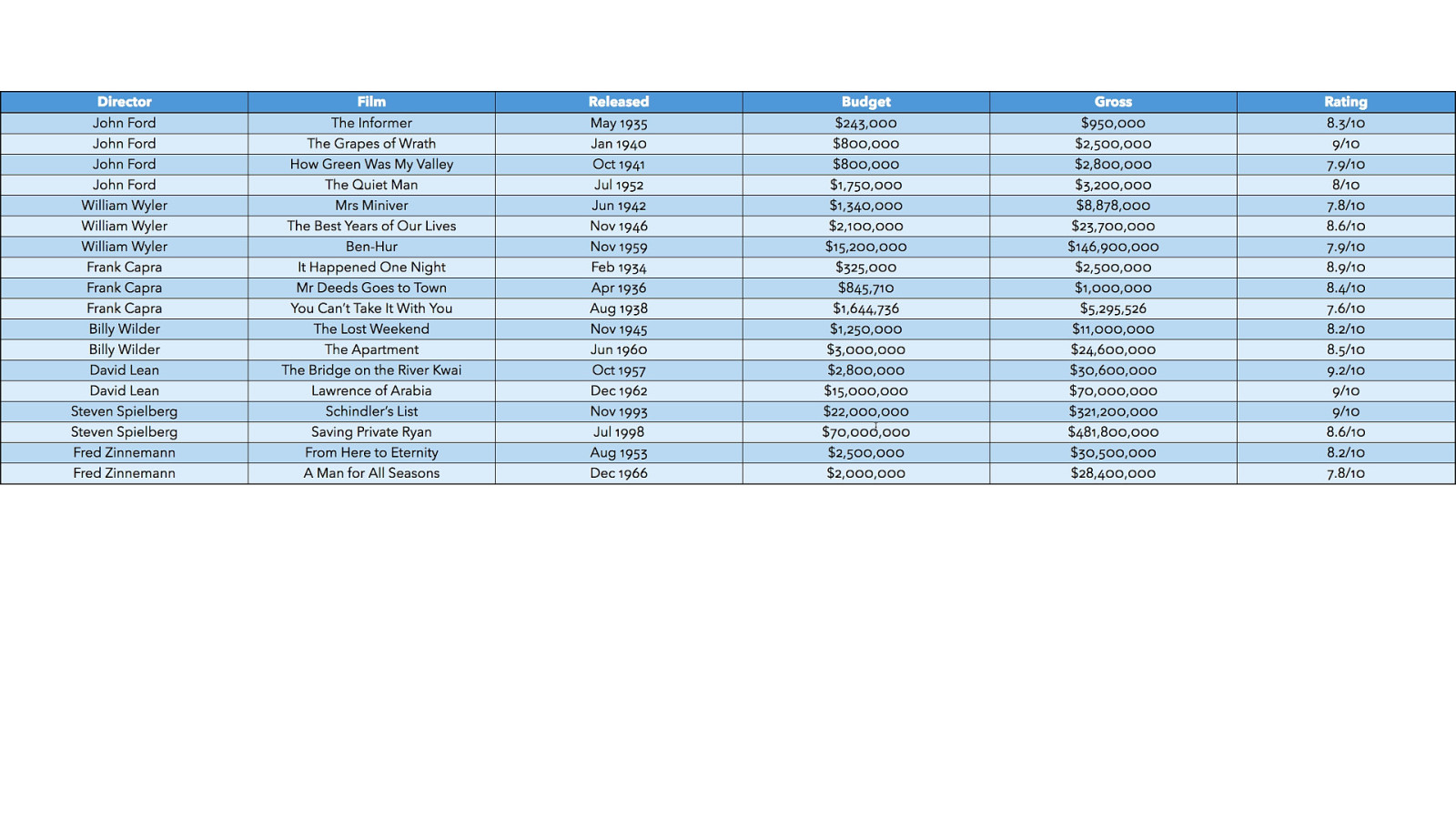
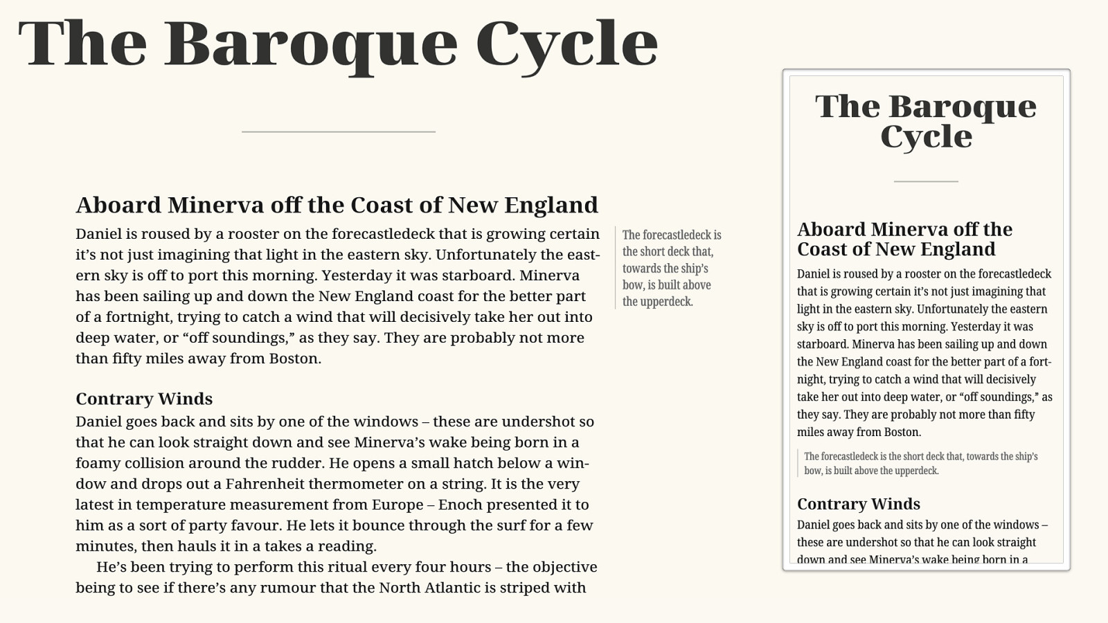
№5 Set tables to be read tga
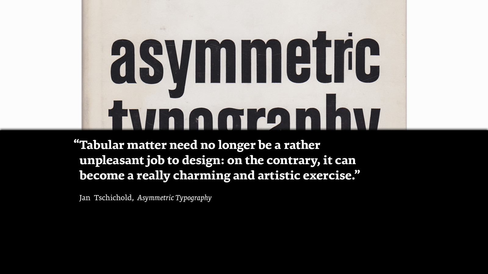
“Tabular matter need no longer be a rather unpleasant job to design: on the contrary, it can become a really charming and artistic exercise.” Jan Tschichold, Asymmetric Typography
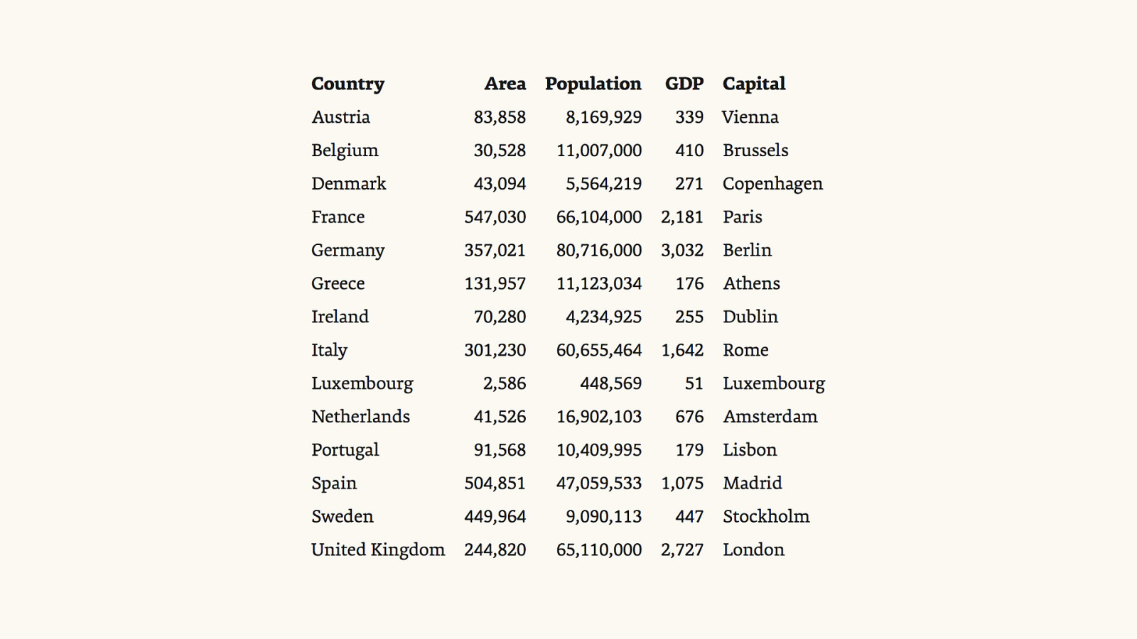
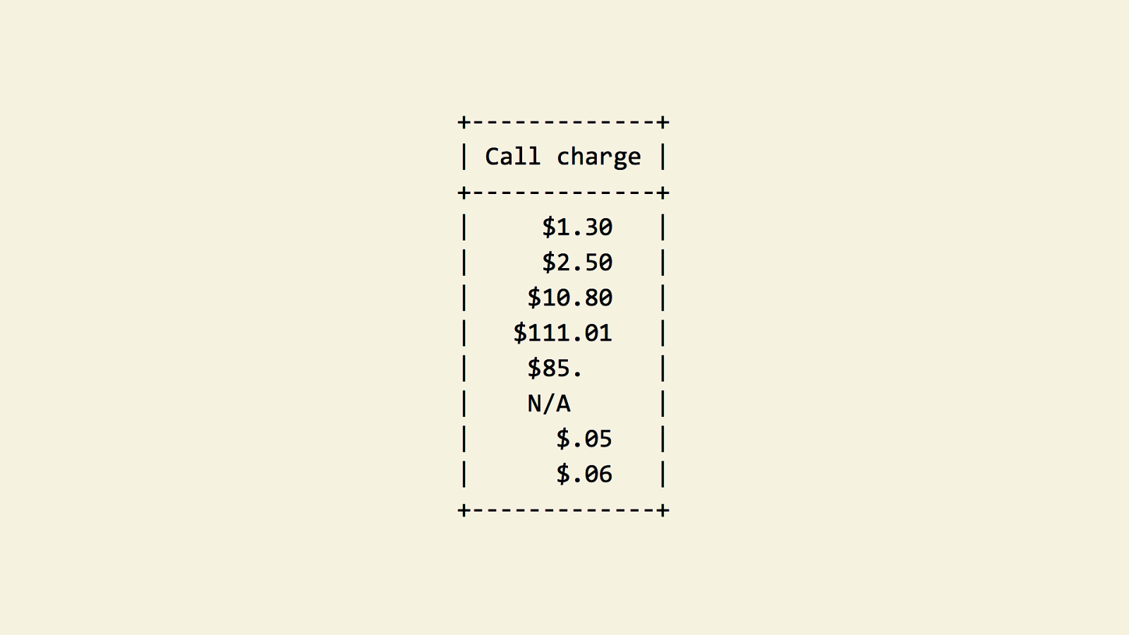
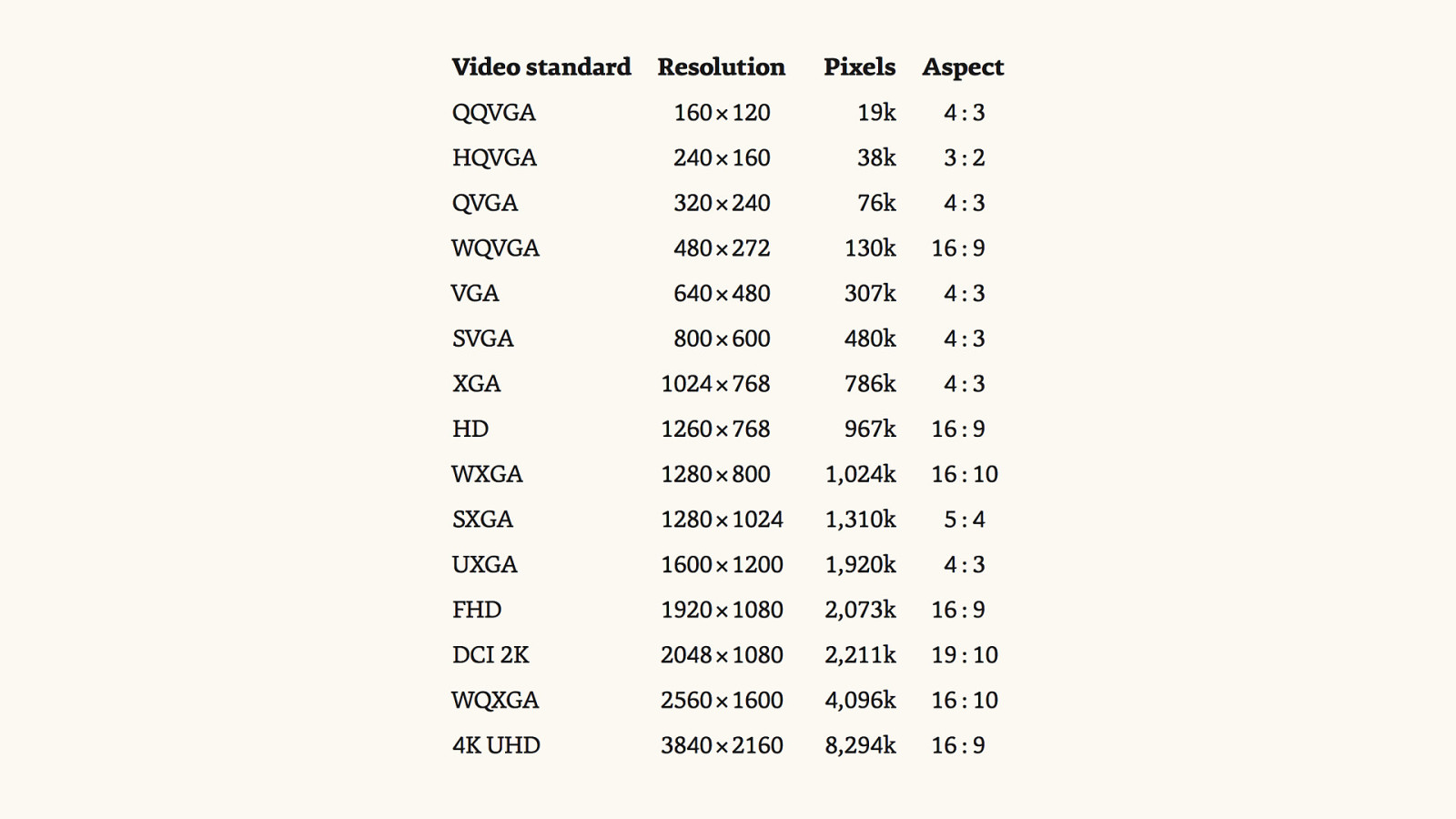
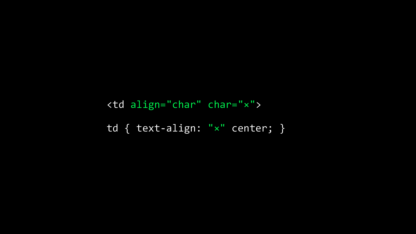
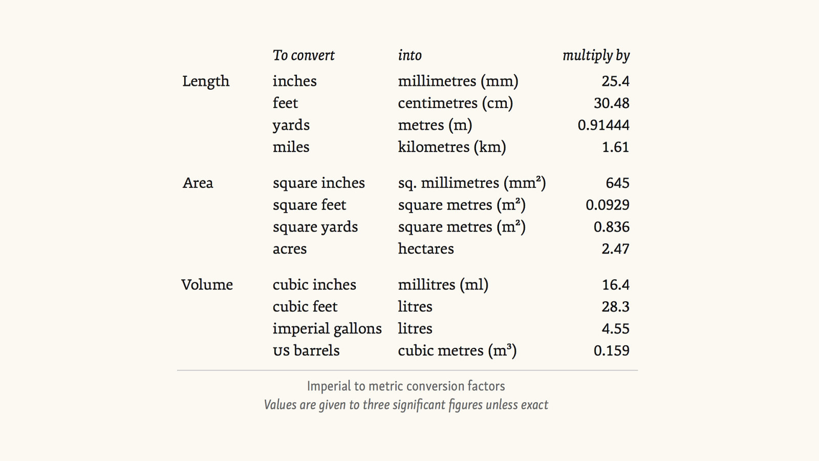

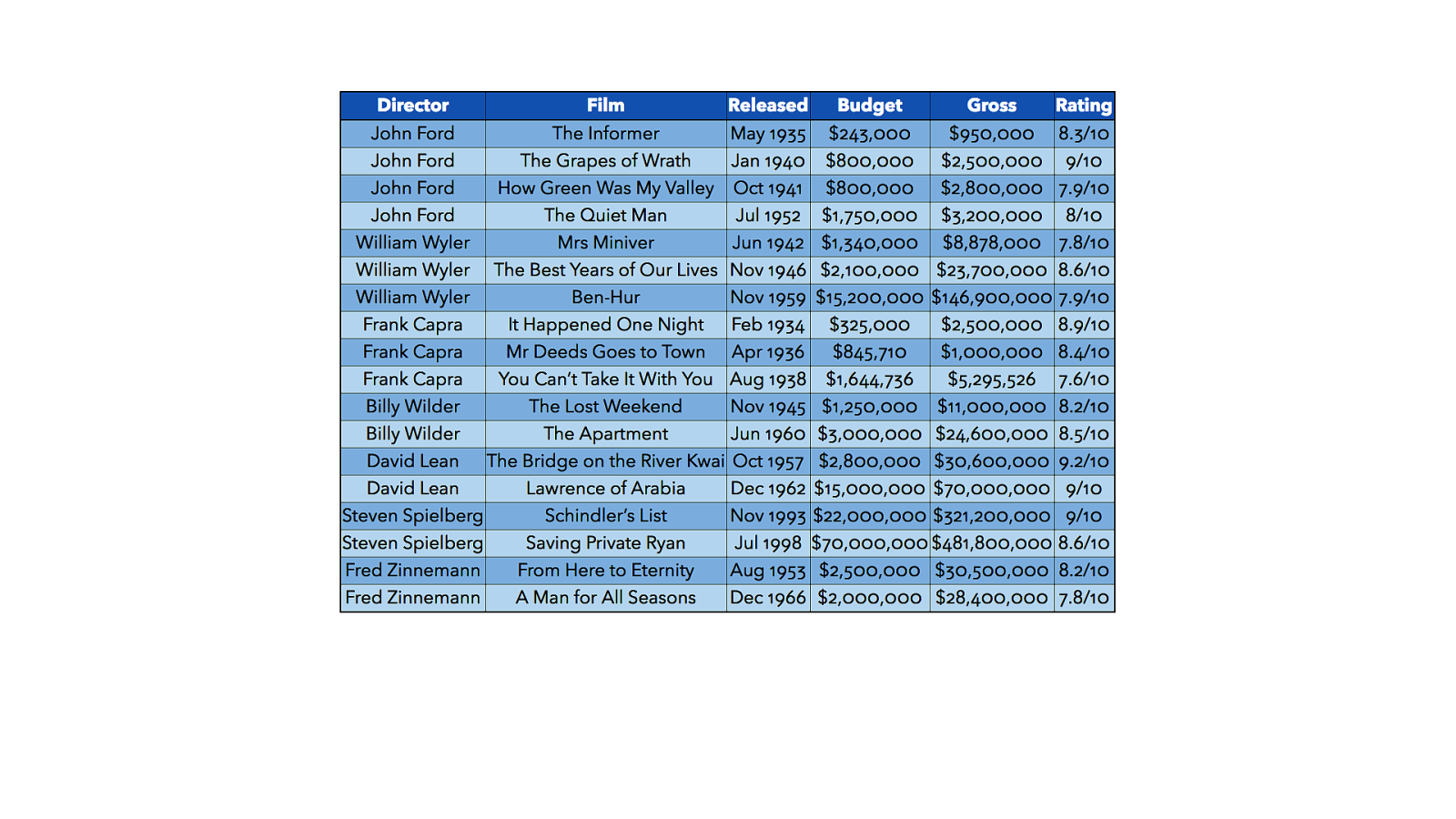
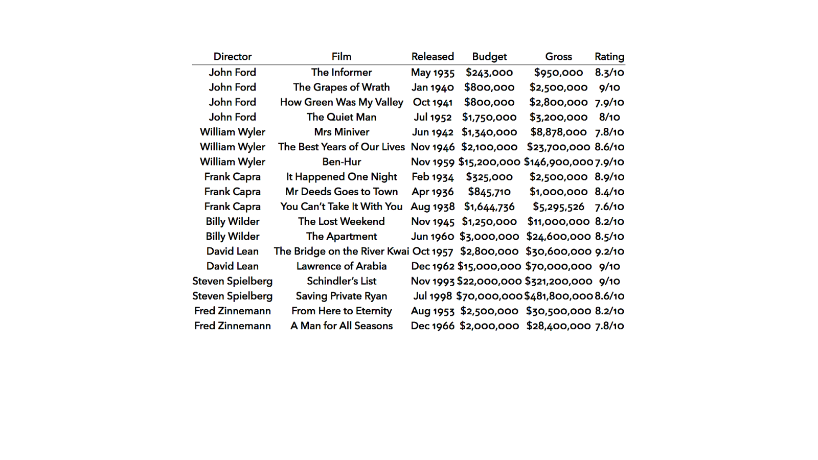
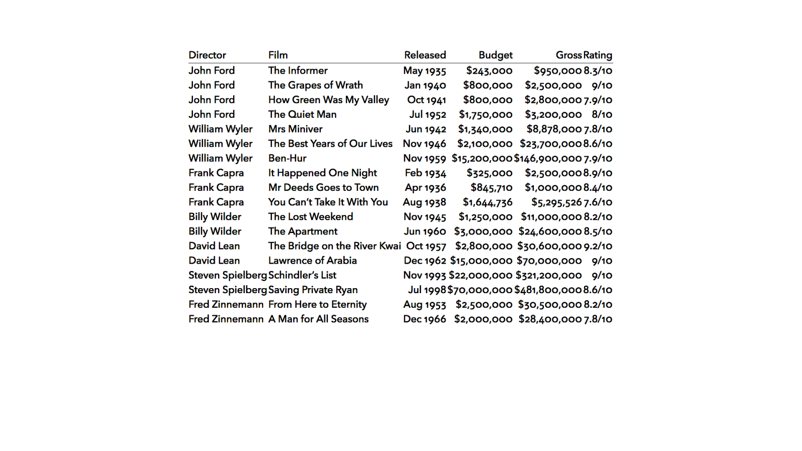
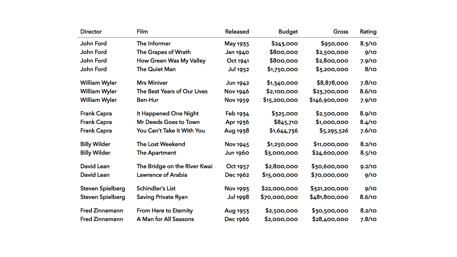

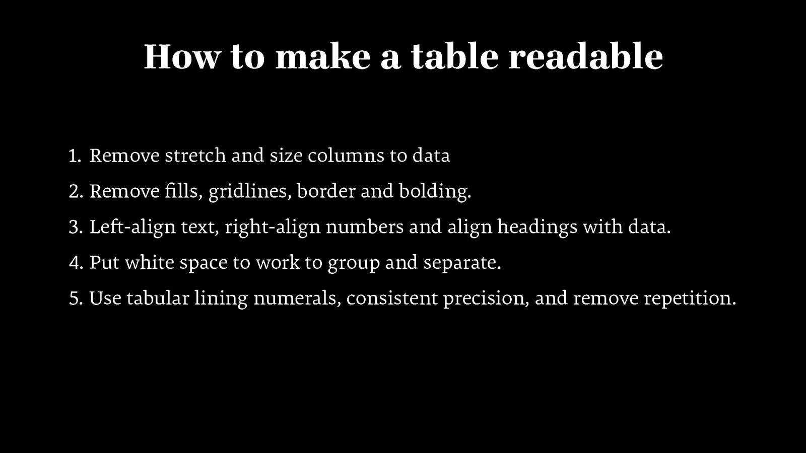
How to make a table readable 1. Remove stretch and size columns to data 2. Remove fills, gridlines, border and bolding. 3. Left-align text, right-align numbers and align headings with data. 4. Put white space to work to group and separate. 5. Use tabular lining numerals, consistent precision, and remove repetition.
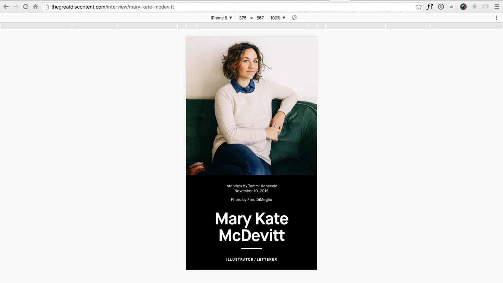
№6 Set text at display sizes, even on small screens tga

Billboard


thegreatdiscontent.com


thegreatdiscontent.com
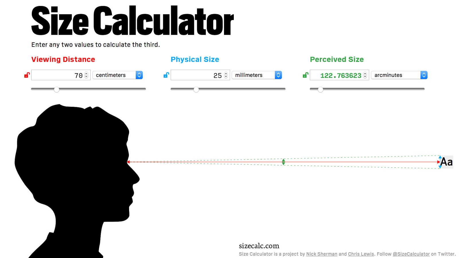
70 25 sizecalc.com sizecalc.com 122.763623
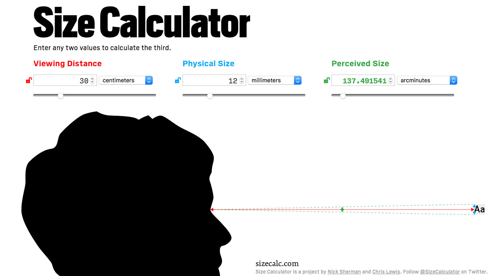
30 12 sizecalc.com sizecalc.com 137.491541
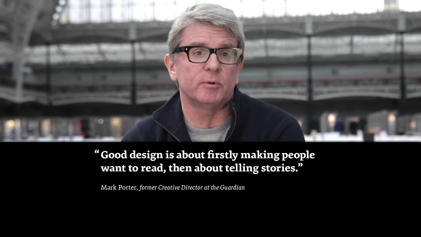
“ Good design is about firstly making people want to read, then about telling stories.” Mark Porter, former Creative Director at the Guardian

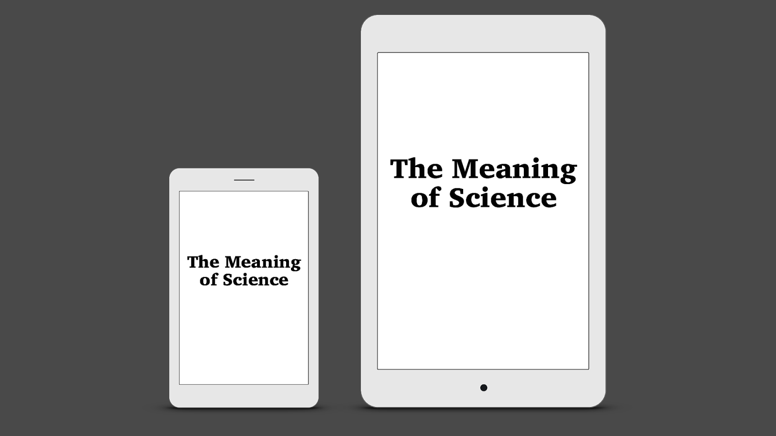
№7 Resize display text as you would an image tga
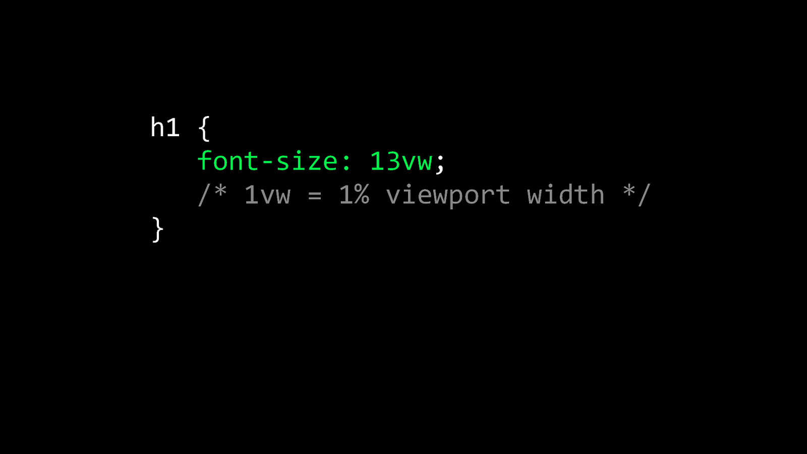
h1 { font-size: 13vw; /* 1vw = 1% viewport width */ }
The Meaning of Science The Meaning of Science

The Meaning of Science The Meaning of Science

The Meaning of Science The Meaning of Science

The Meaning of Science The Meaning of Science
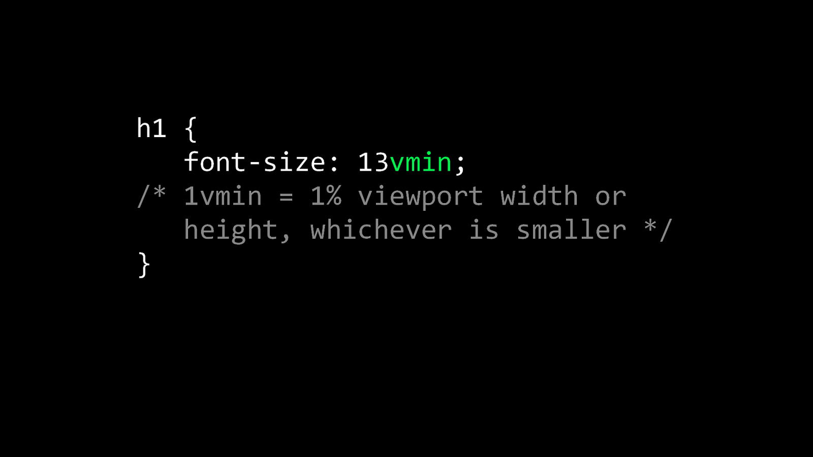
h1 { font-size: 13vmin; /* 1vmin = 1% viewport width or height, whichever is smaller */ }
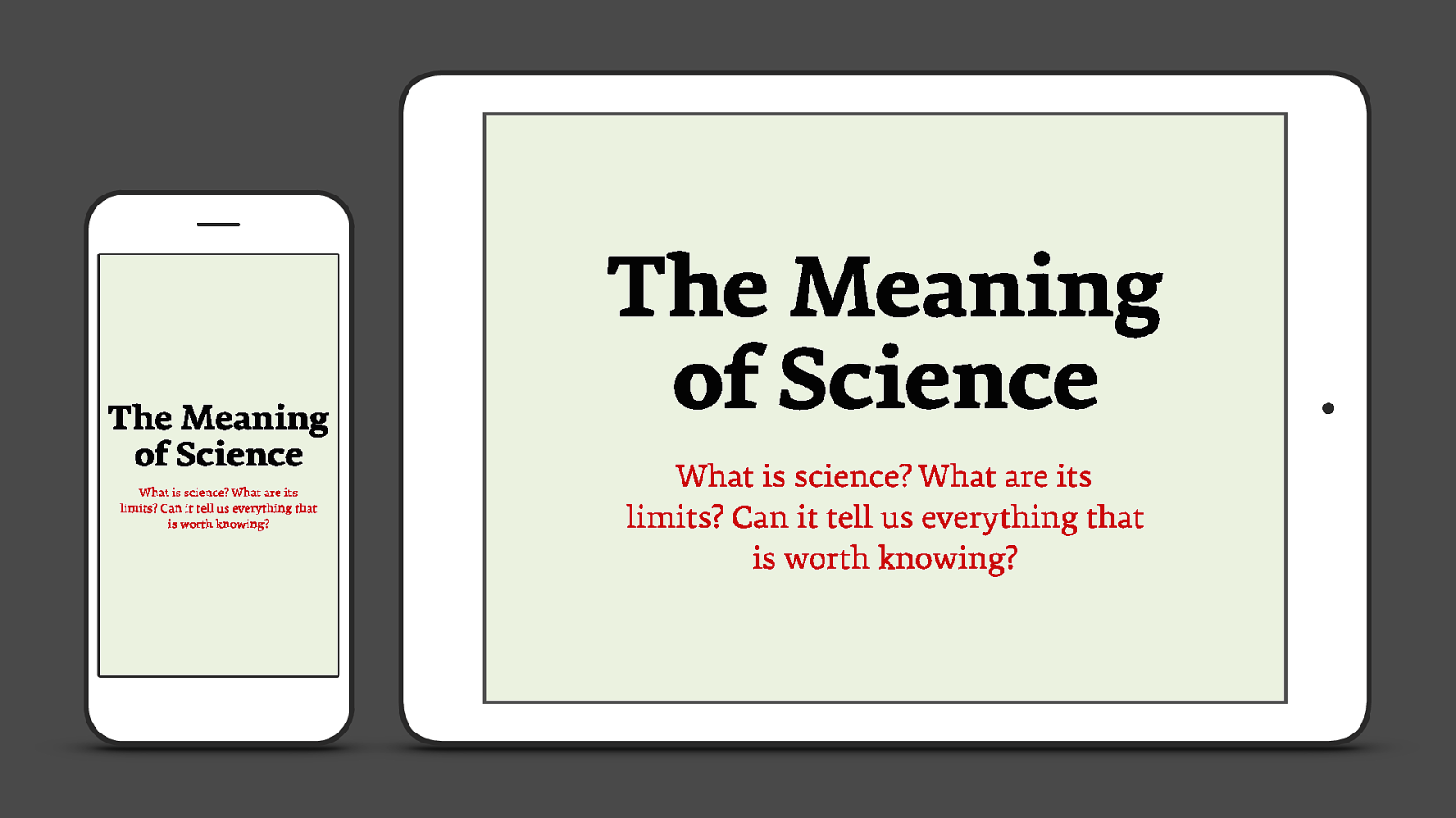
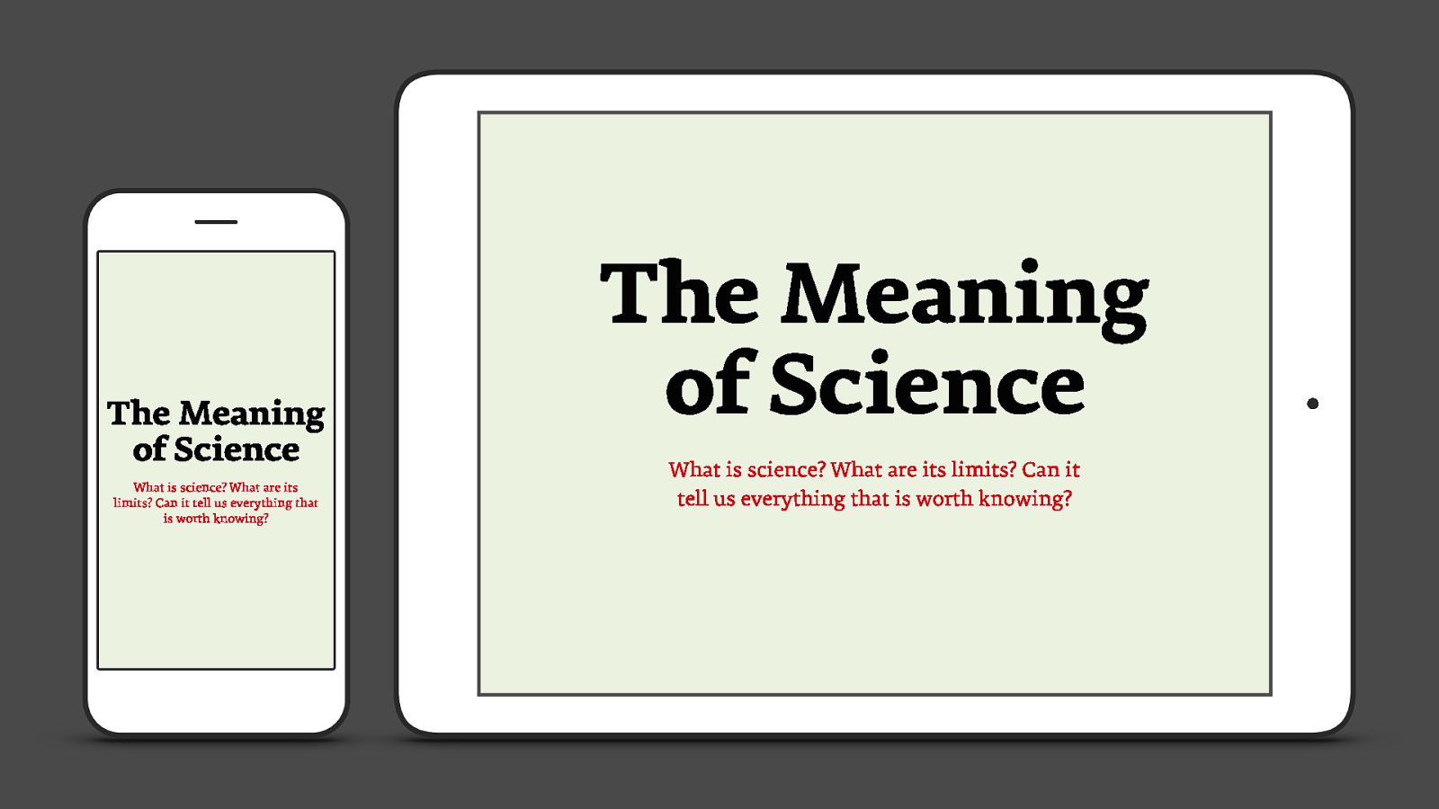
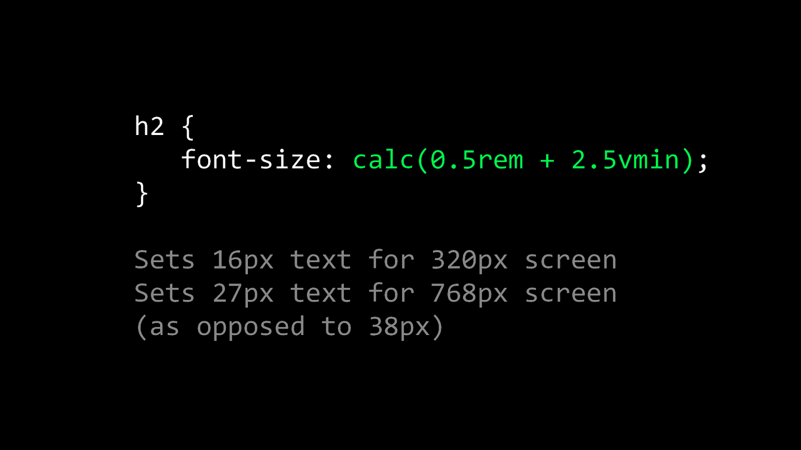
h2 { font-size: calc(0.5rem + 2.5vmin); } Sets 16px text for 320px screen Sets 27px text for 768px screen (as opposed to 38px)
№8 Influence the way people feel through type #summit17
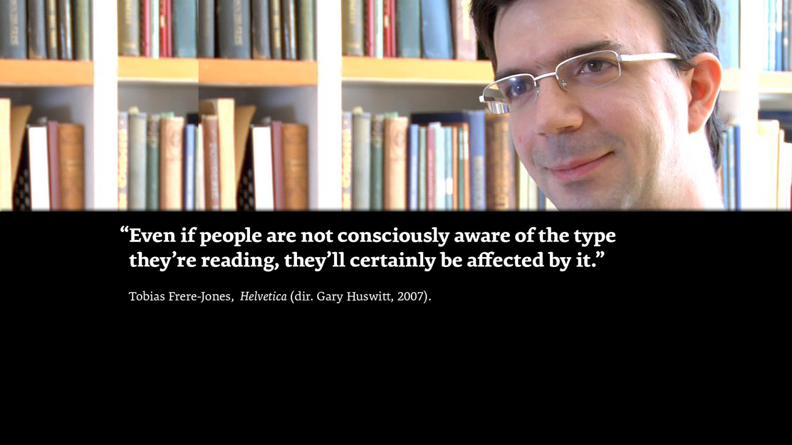
“Even if people are not consciously aware of the type they’re reading, they’ll certainly be affected by it.” Tobias Frere-Jones, Helvetica (dir. Gary Huswitt, 2007).

TEDxBedford

You can influence the way people feel
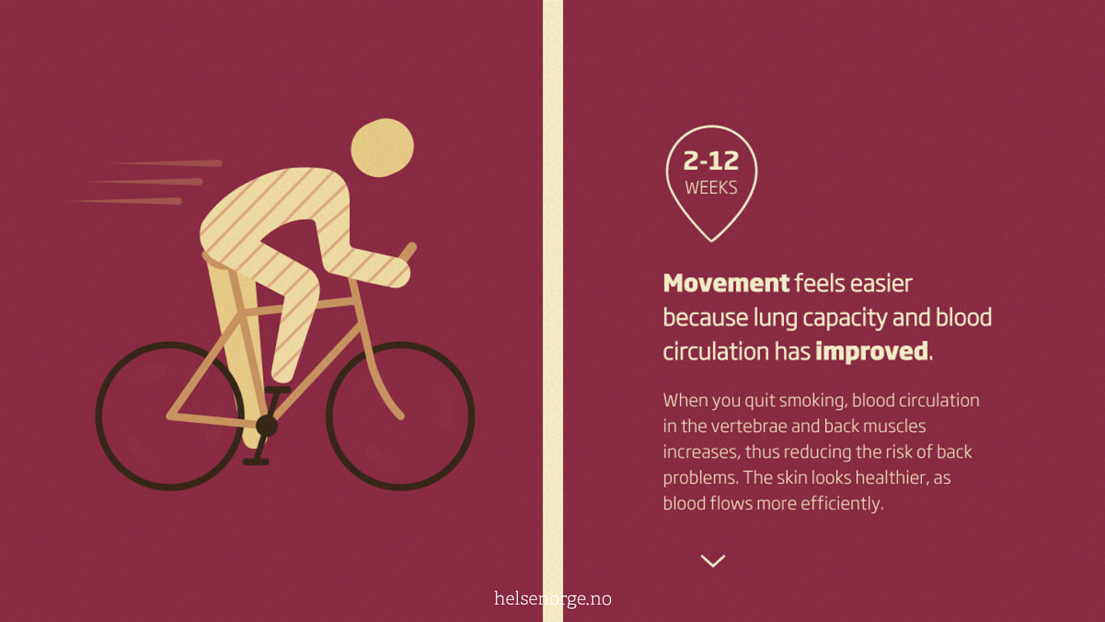
helsenorge.no

mkshft.org

www.cleopatra-marina.gr

№9 Optimise page render timing tga


Aventurier
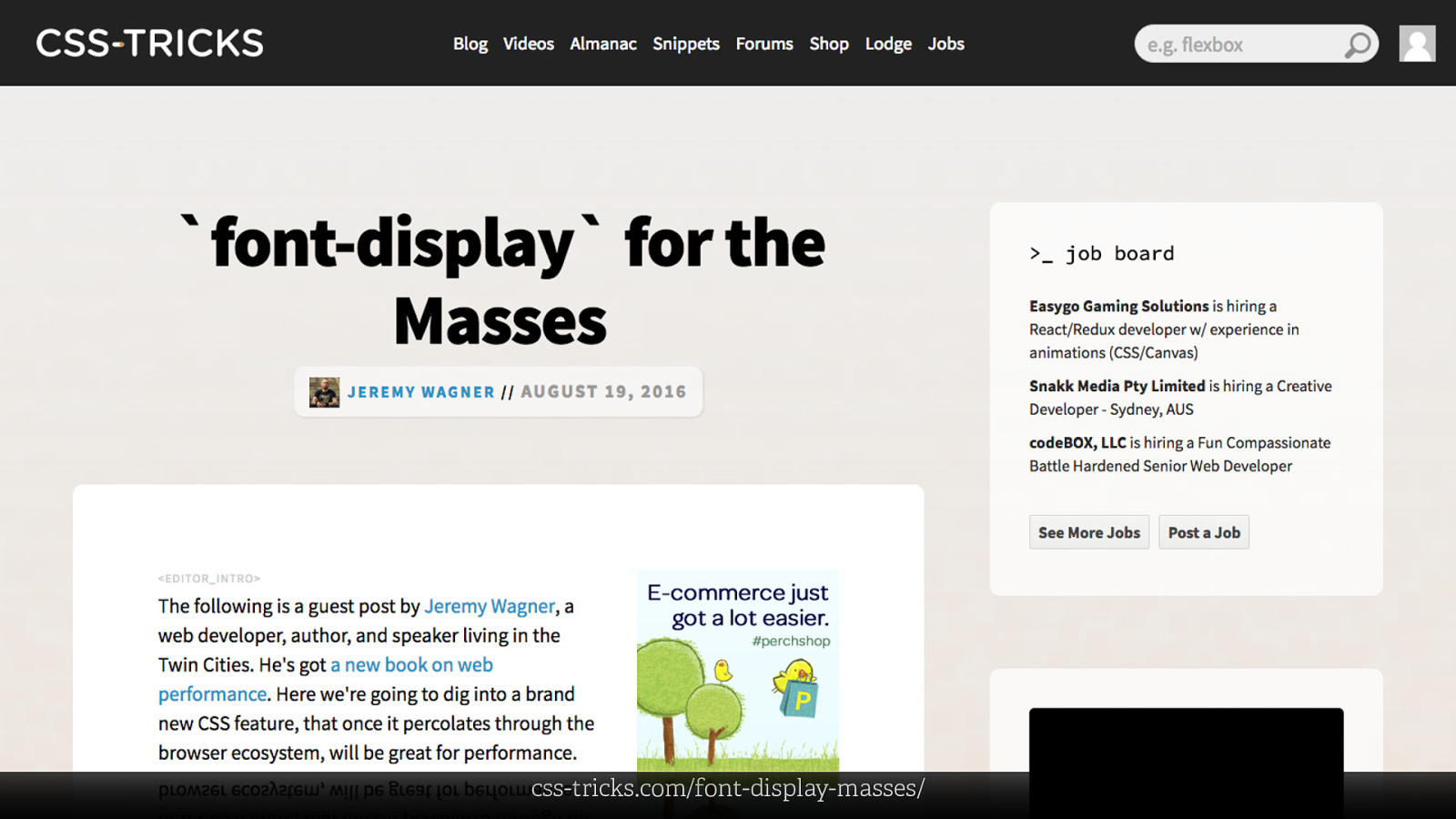
css-tricks.com/font-display-masses/
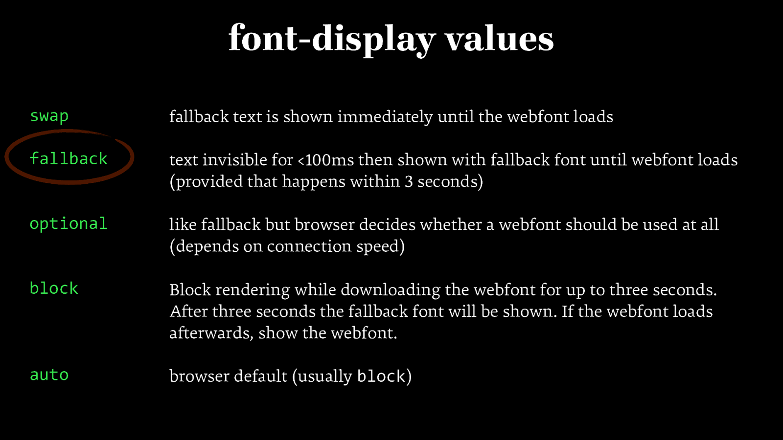
font-display values swap fallback text is shown immediately until the webfont loads fallback text invisible for <100ms then shown with fallback font until webfont loads (provided that happens within 3 seconds) optional like fallback but browser decides whether a webfont should be used at all (depends on connection speed) block Block rendering while downloading the webfont for up to three seconds. After three seconds the fallback font will be shown. If the webfont loads afterwards, show the webfont. auto browser default (usually block)
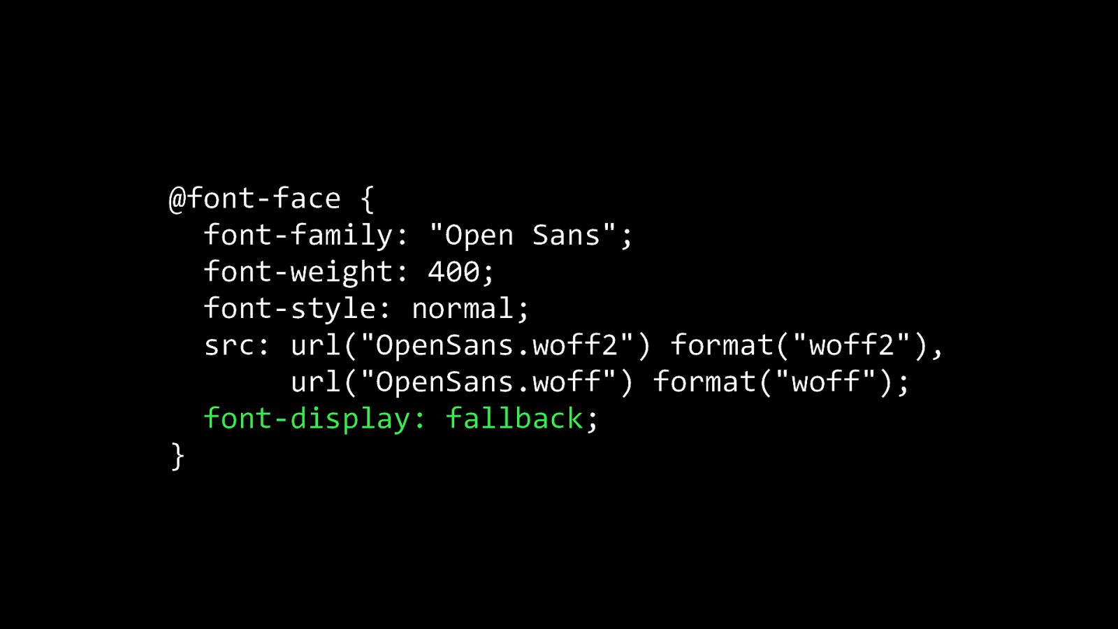
@font-face { font-family: “Open Sans”; font-weight: 400; font-style: normal; src: url(“OpenSans.woff2”) format(“woff2”), url(“OpenSans.woff”) format(“woff”); font-display: fallback; }
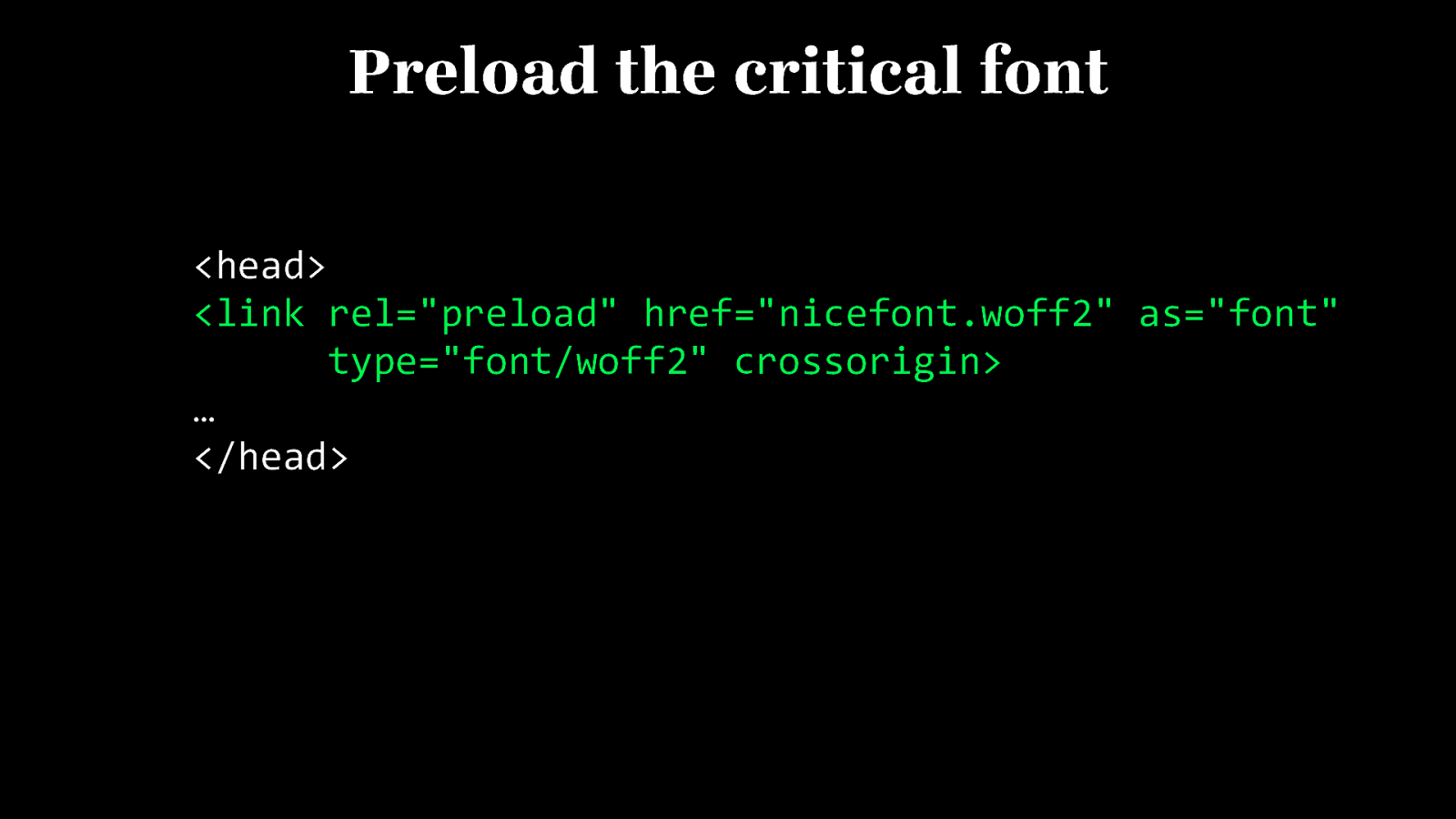
Preload the critical font <head> <link rel=”preload” href=”nicefont.woff2” as=”font” type=”font/woff2” crossorigin> … </head>
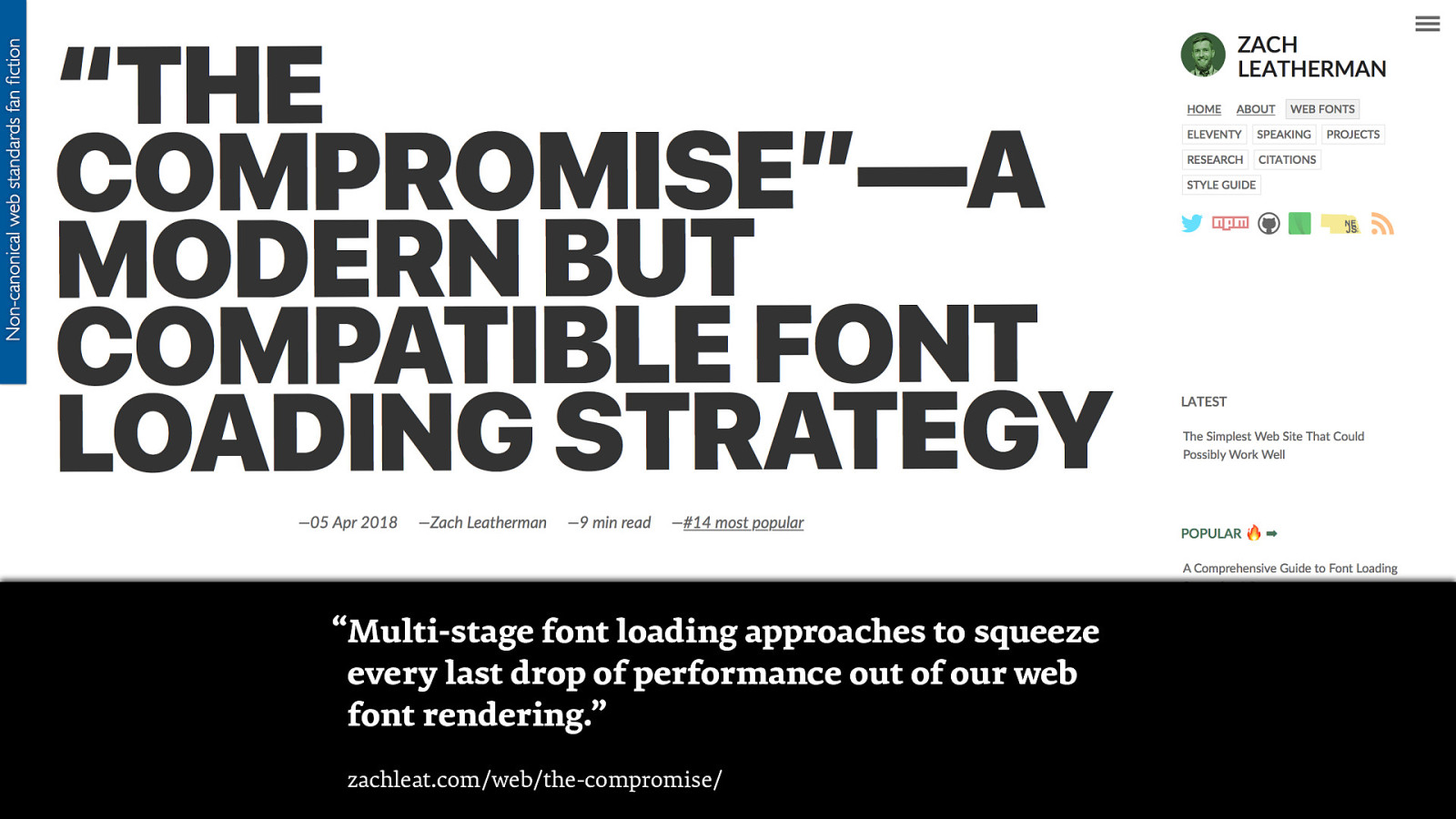
“Multi-stage font loading approaches to squeeze every last drop of performance out of our web font rendering.” zachleat.com/web/the-compromise/
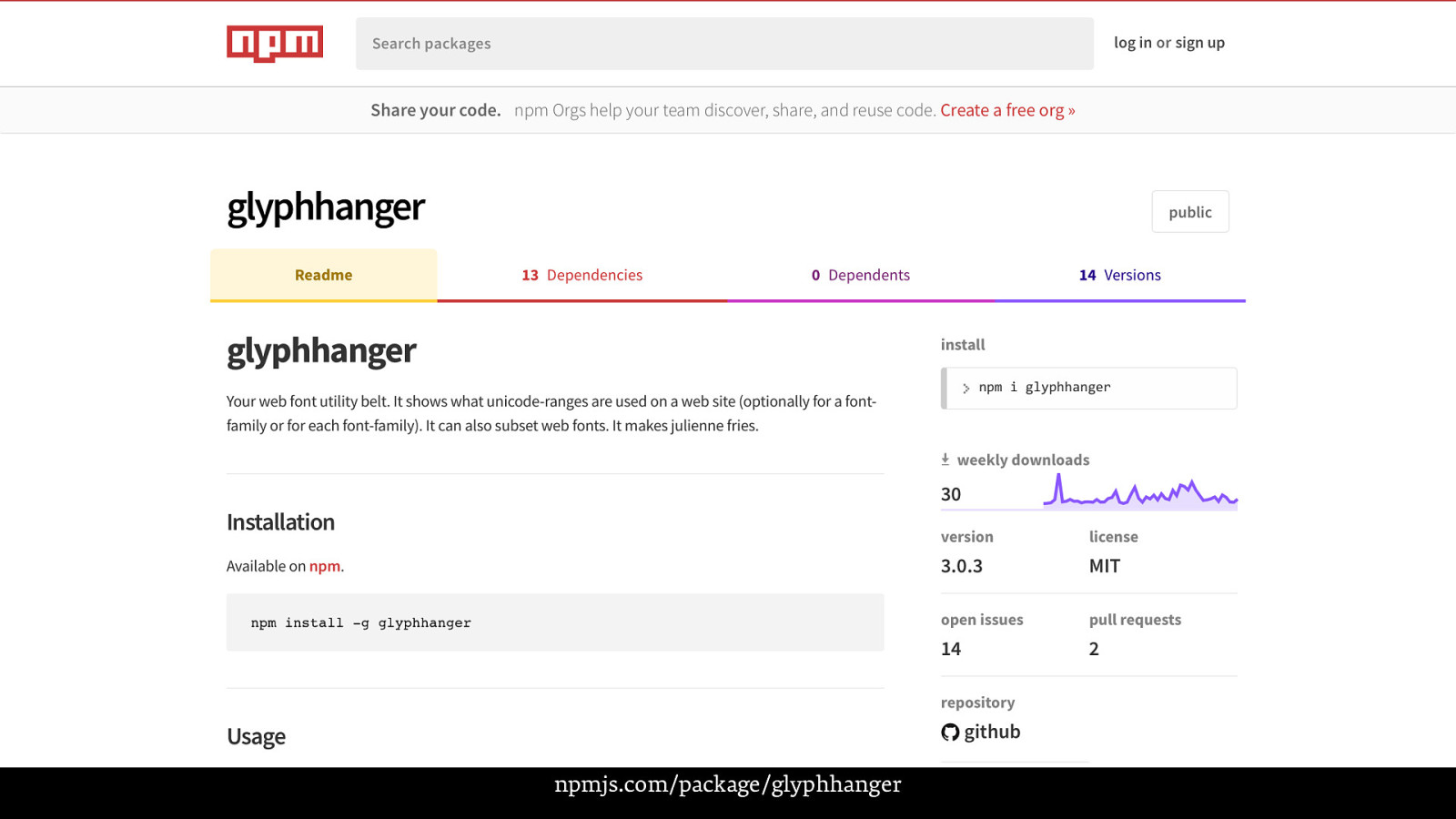
npmjs.com/package/glyphhanger
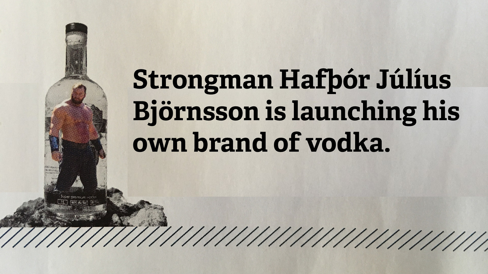
Strongman Hafþór Júlíus Björnsson is launching his own brand of vodka.
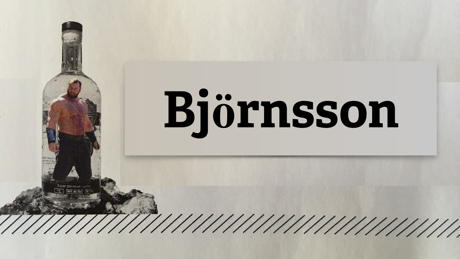
Strongman Hafþór Júlíus Björnsson is launching his own brand of vodka. Björnsson
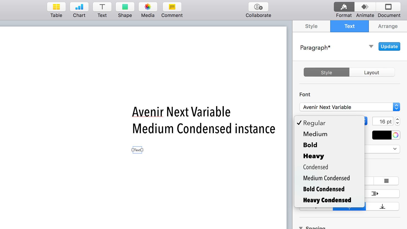
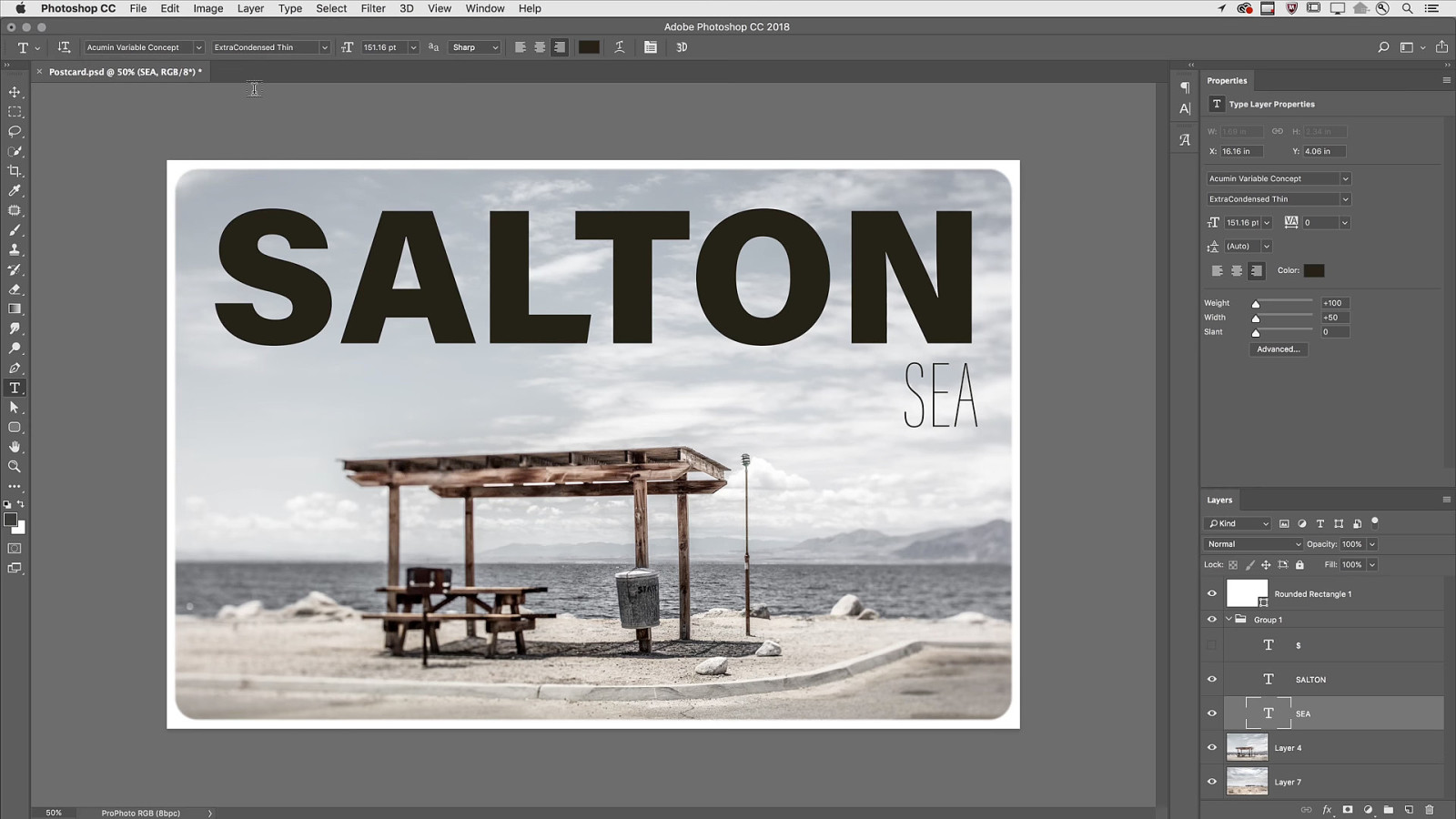
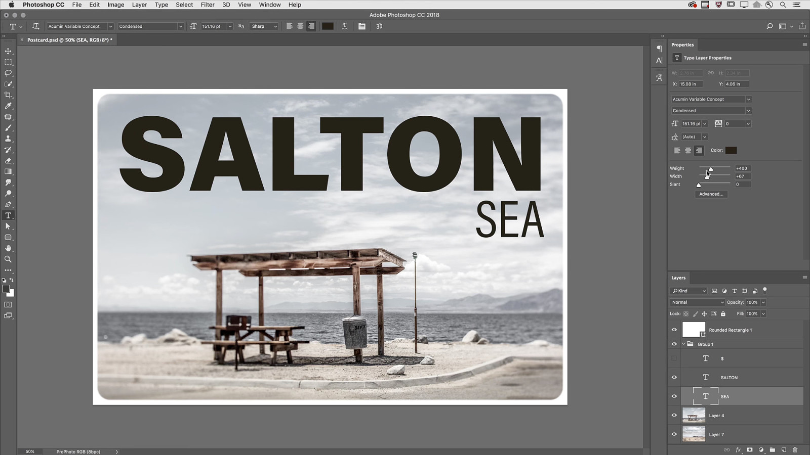
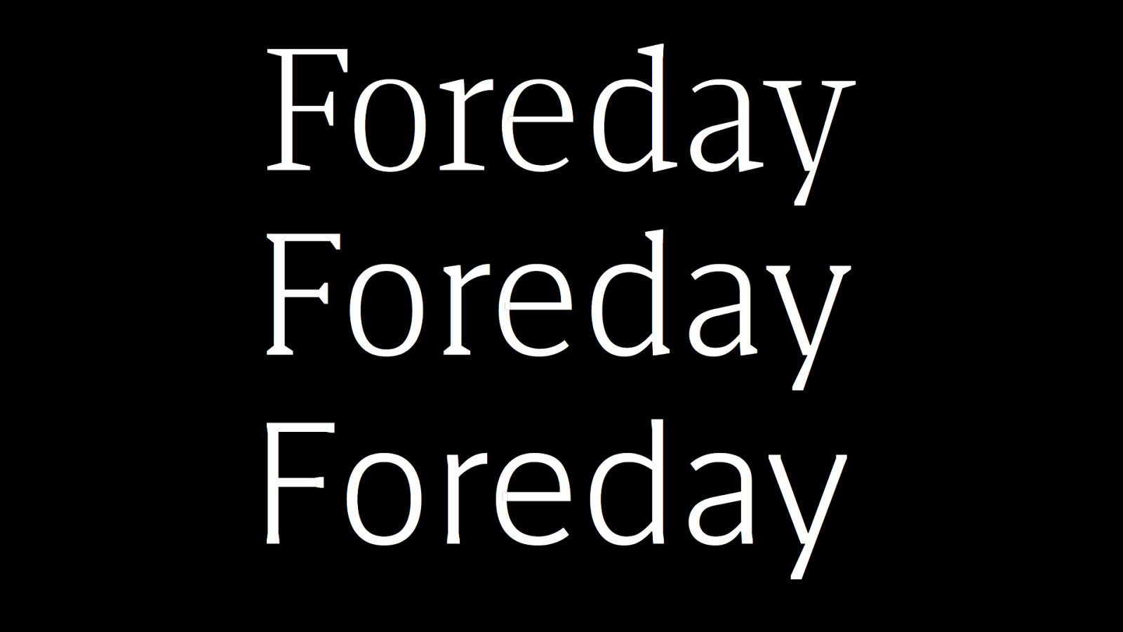
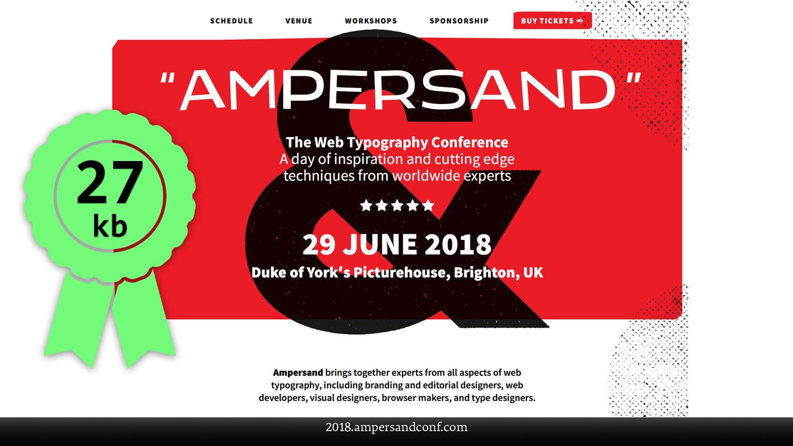
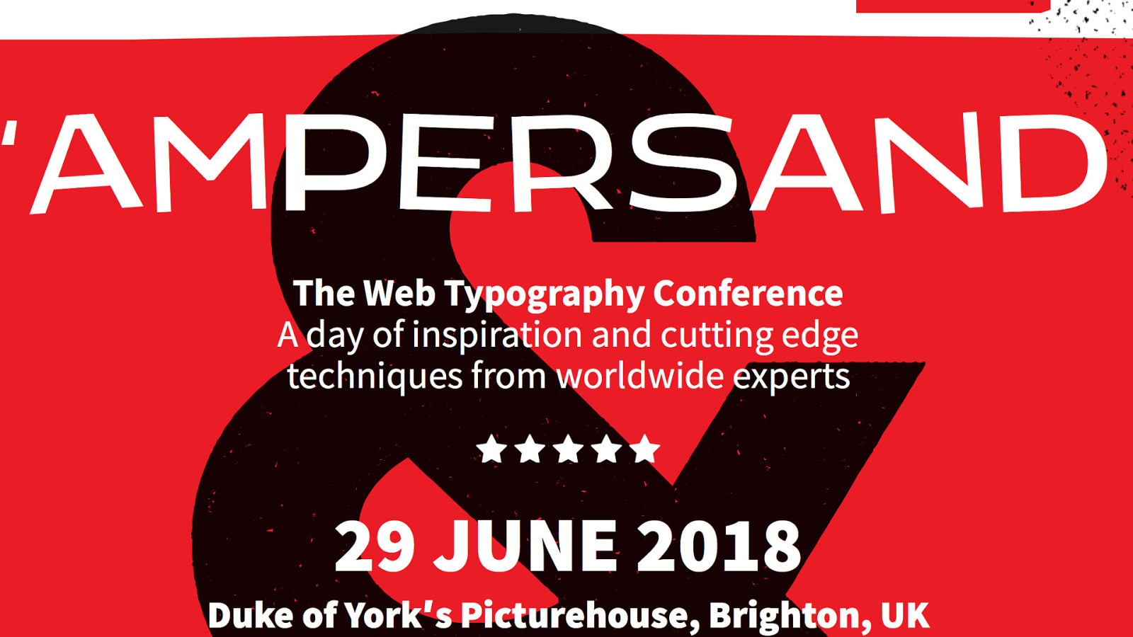
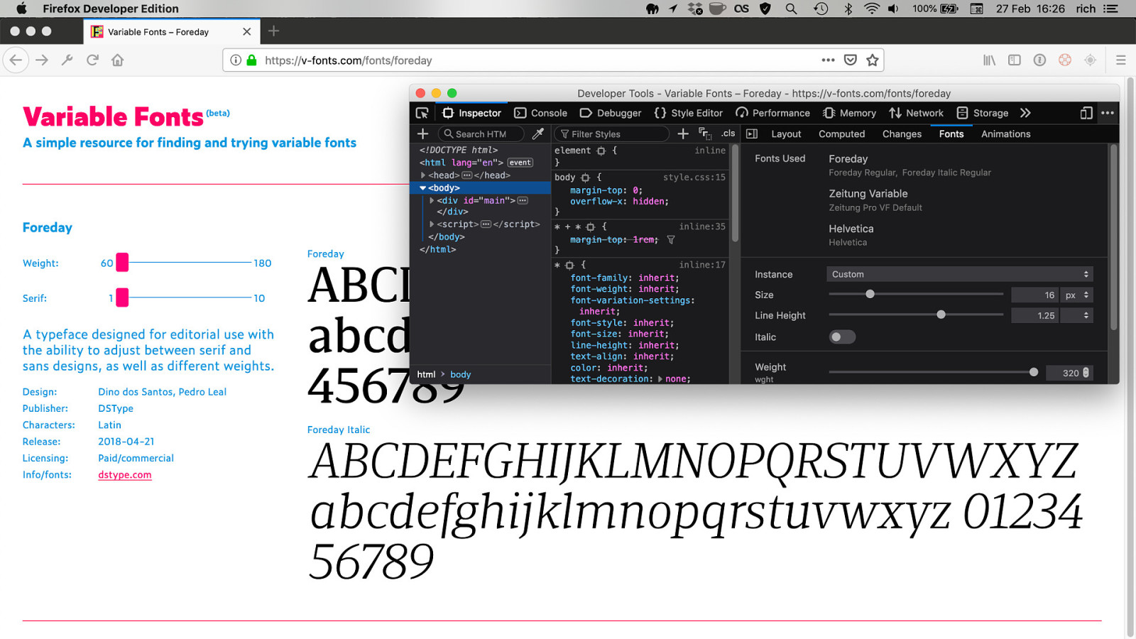
№10 Learn to use variable fonts tga

Venn by Dalton Maag daltonmaag.com/library/venn
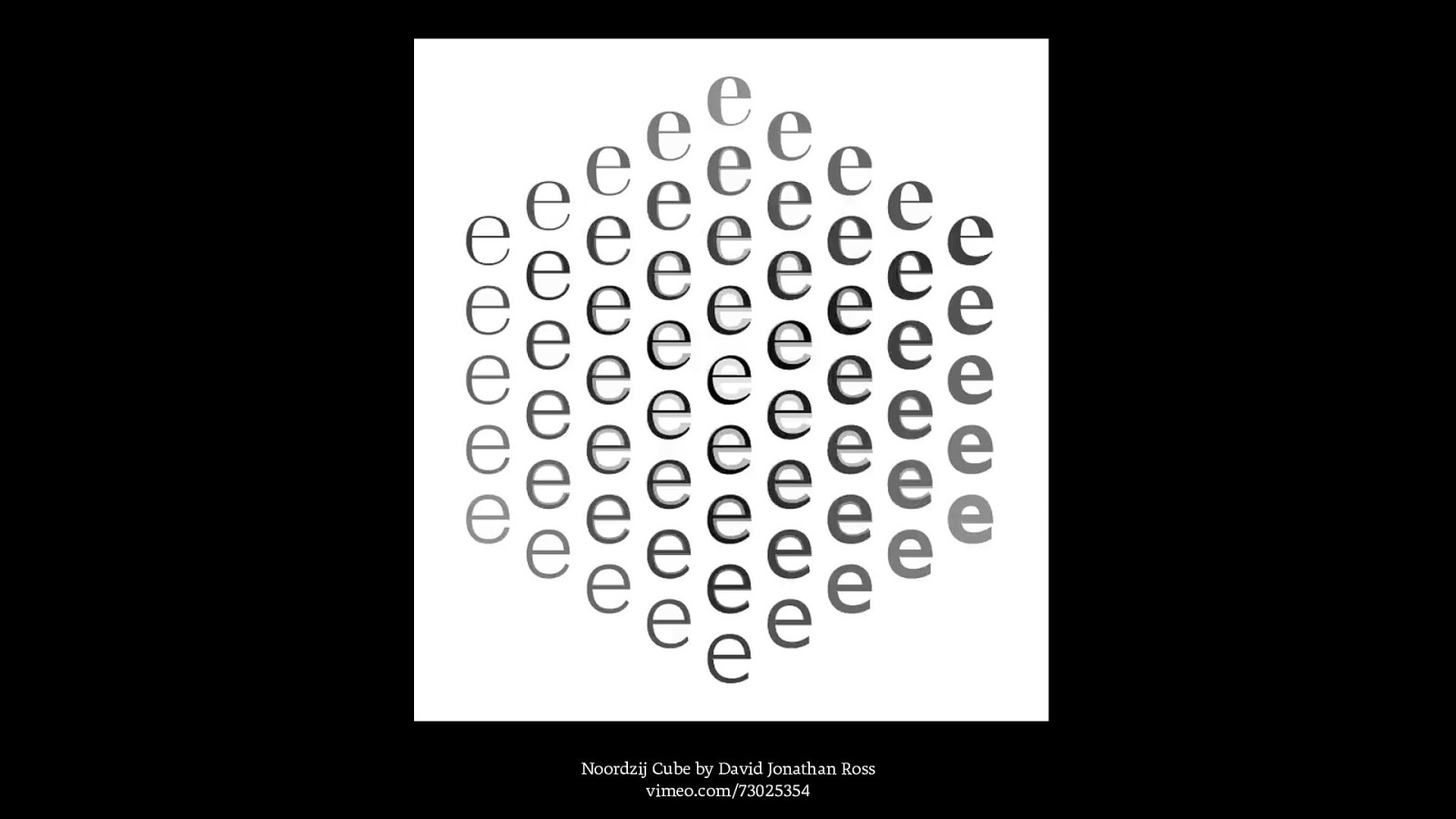
Noordzij Cube by David Jonathan Ross vimeo.com/73025354
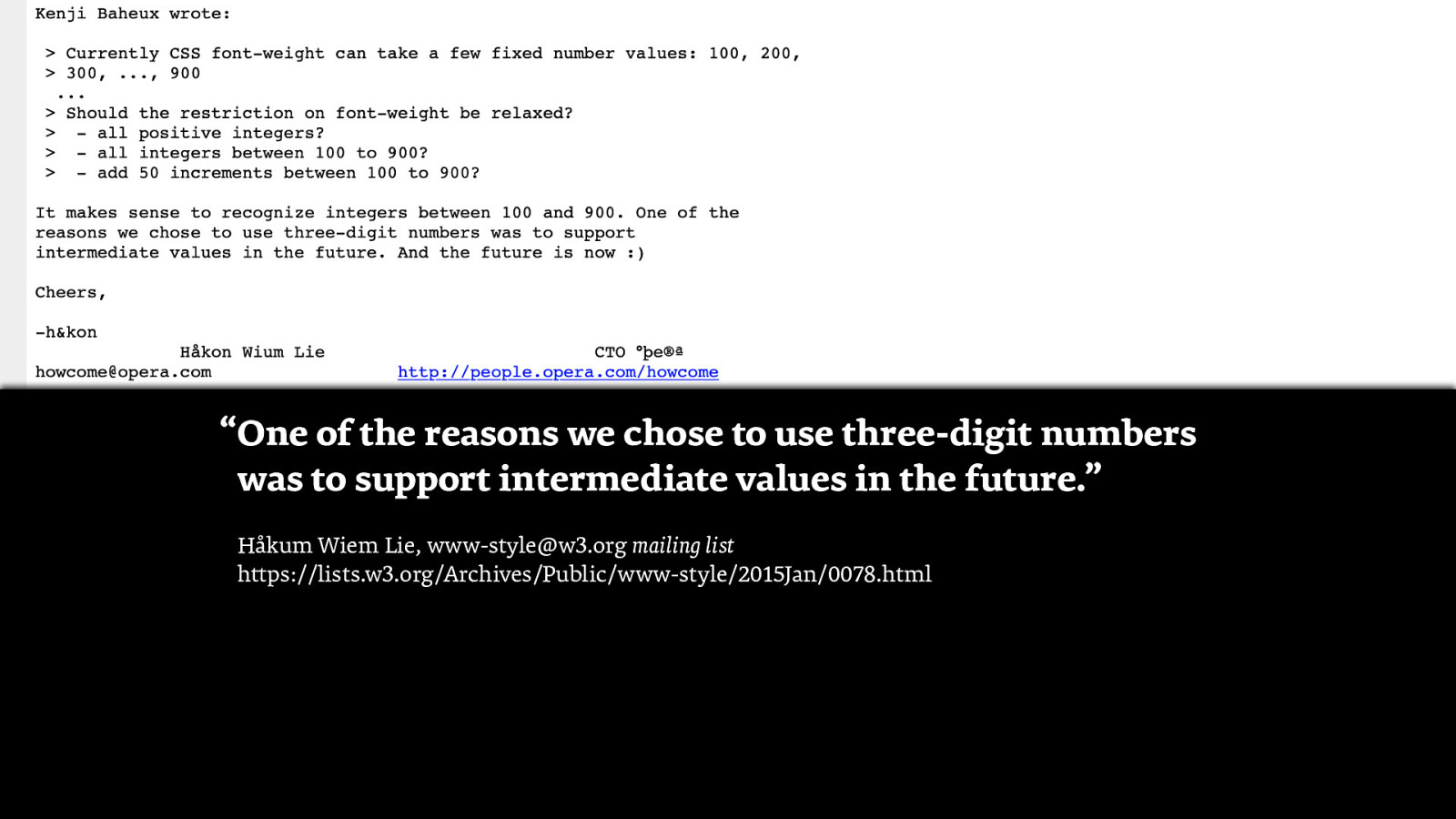
“One of the reasons we chose to use three-digit numbers was to support intermediate values in the future.” Håkum Wiem Lie, www-style@w3.org mailing list https://lists.w3.org/Archives/Public/www-style/2015Jan/0078.html
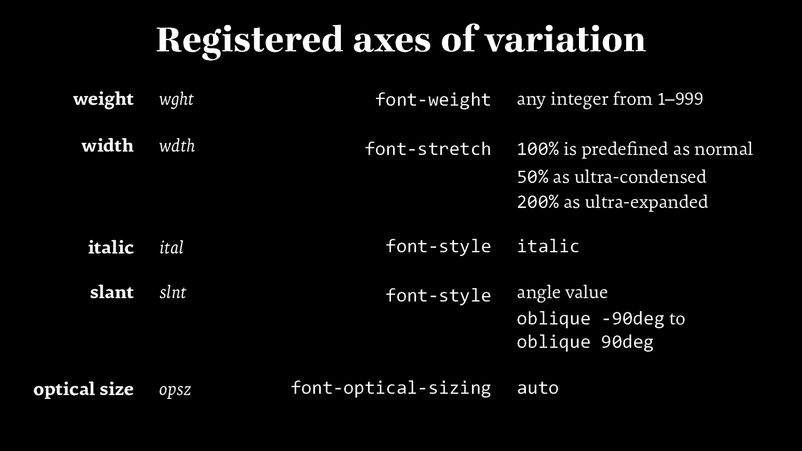
Registered axes of variation weight wght font-weight width wdth font-stretch any integer from 1–999 100% is predefined as normal 50% as ultra-condensed 200% as ultra-expanded italic ital font-style italic slant slnt font-style angle value oblique -90deg to oblique 90deg optical size opsz font-optical-sizing auto


27 kb 2018.ampersandconf.com
2018.ampersandconf.com
clearleft.com/posts/how-to-use-variable-fonts-in-the-real-world
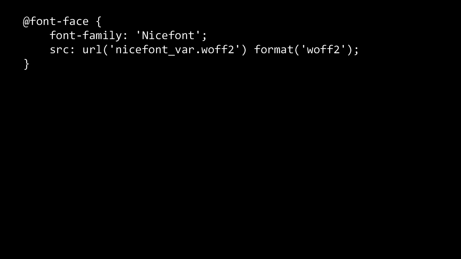
@font-face { font-family: ‘Nicefont’; src: url(‘nicefont_var.woff2’) format(‘woff2’); }
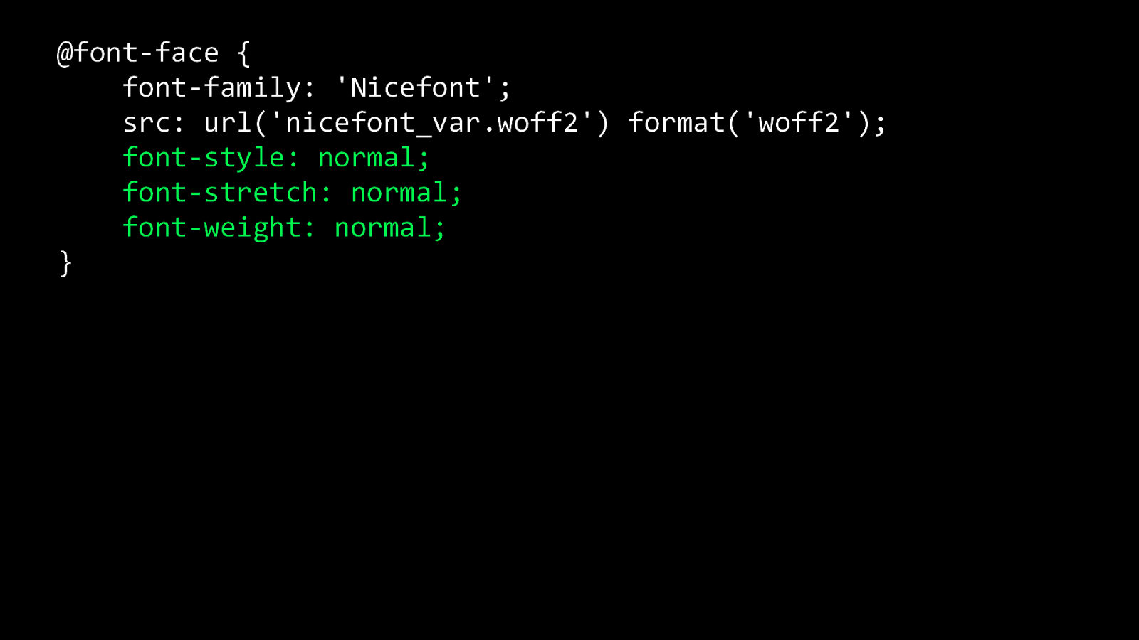
@font-face { font-family: ‘Nicefont’; src: url(‘nicefont_var.woff2’) format(‘woff2’); font-style: normal; font-stretch: normal; font-weight: normal; }
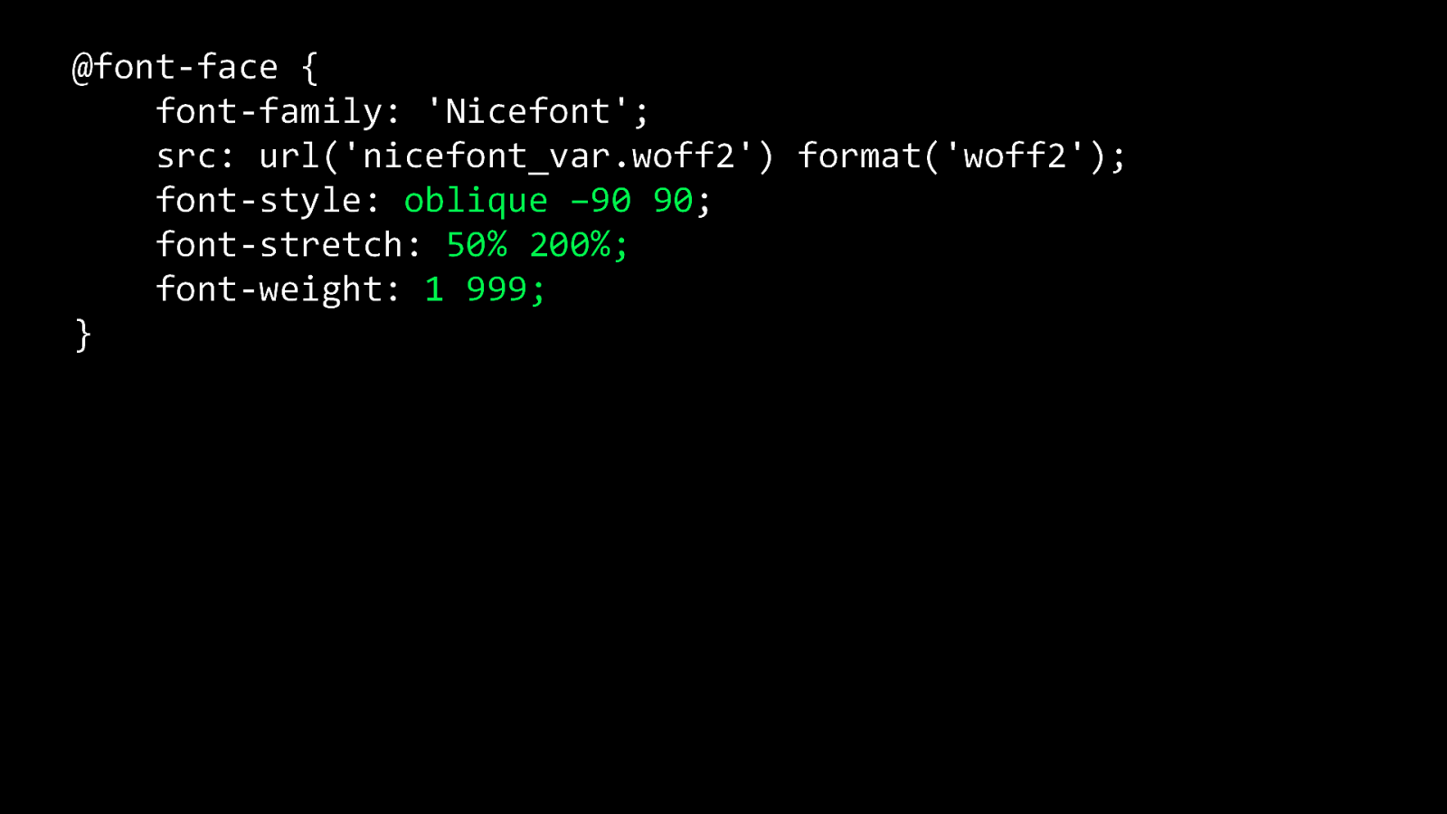
@font-face { font-family: ‘Nicefont’; src: url(‘nicefont_var.woff2’) format(‘woff2’); font-style: oblique –90 90; font-stretch: 50% 200%; font-weight: 1 999; }
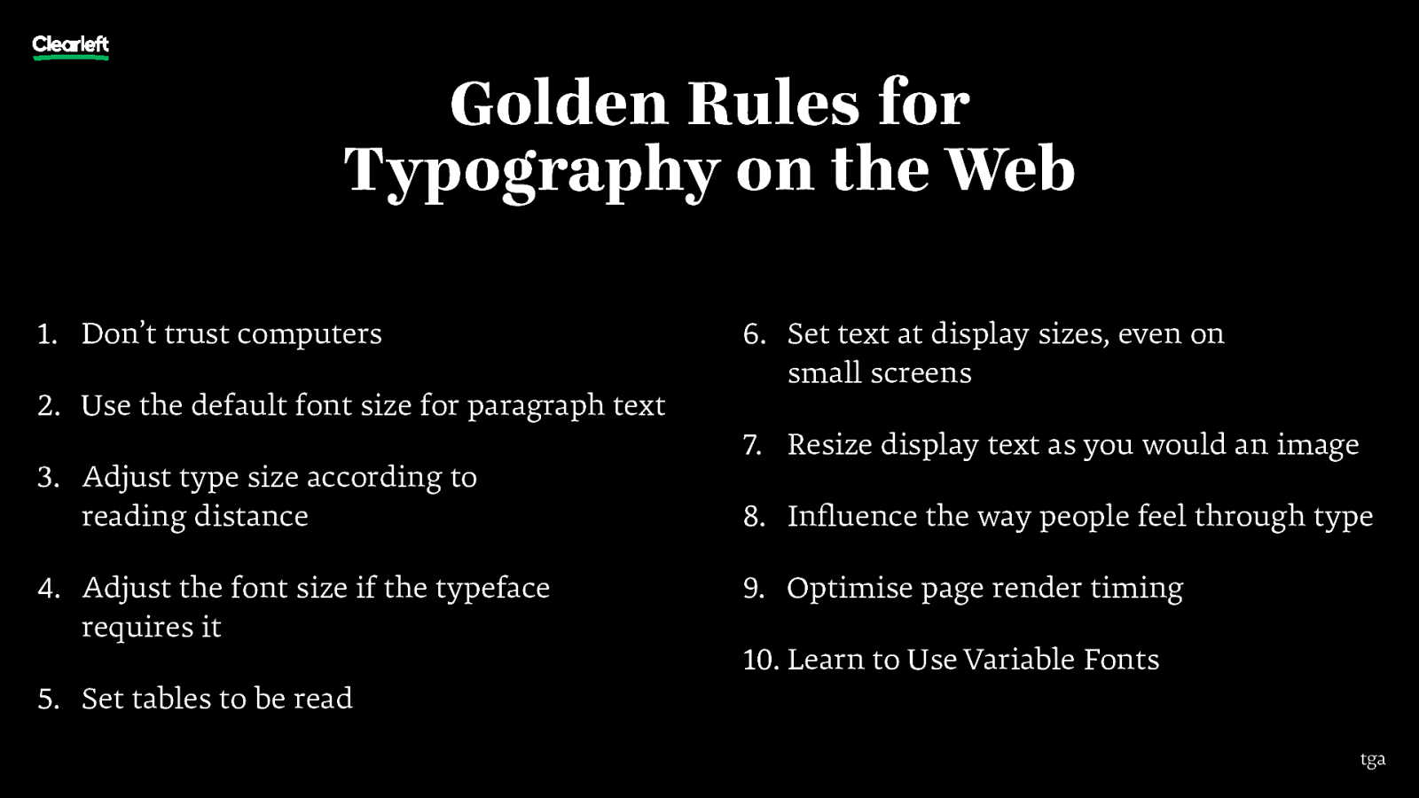
Golden Rules for Typography on the Web 1. Don’t trust computers 2. Use the default font size for paragraph text 3. Adjust type size according to reading distance 4. Adjust the font size if the typeface requires it 6. Set text at display sizes, even on small screens 7. Resize display text as you would an image 8. Influence the way people feel through type 9. Optimise page render timing 10. Learn to Use Variable Fonts 5. Set tables to be read tga

Richard Rutter, Clearleft @clagnut @webtypography https://noti.st/rar tga