Accessibility-flavored React components make your design system delicious!

A presentation at axe-con 2021 in March 2021 in by Kathleen McMahon

Slide 1

Slide 1

Accessibility-flavored React components make your design system delicious!

Welcome, everyone! I’m Kathleen McMahon and I’m here today to show how Accessibility-flavored React components make your design system delicious!

Before we begin, let’s get some details out of the way.

Slide 2

Slide 2

My slide deck will be posted on Notist, that’s https://noti.st/resource11, including links to resources I briefly touch upon. The full URL will be available later today on Twitter.

Slide 3

Slide 3

You can follow me at. Resource11 on Twitter, Instagram, and GitHub.

Now… here’s an outline of what we’ll be covering today.

Slide 4

Slide 4

Good grief, there’s an agenda...

Why accessibility first? Design systems are a cookbook. Design systems and React Icons, Buttons, Inputs, disclosure patterns Documentation

Slide 5

Slide 5

Who are you, again?

Let’s back up so I can introduce myself better…

Slide 6

Slide 6

So I’m an engineer and a designer and I like to speak about things…

Slide 7

Slide 7

[image] Me on a cyclocross bike, hopping over barriers and riding through mud.

And… I race bikes. Very badly.

Slide 8

Slide 8

[image] Me on a cyclocross bike, in Spam, Ninja Turtle, Nerds candy box, Medusa costumes

Mostly you’ll see me in costume, racing two laps to your six, at the back of the pack, on a singlespeed, — with a bunch of onlookers in the crowd laughing at me, toasting with their beverages.

Mostly. Unless something happens

Slide 9

Slide 9

[image] Big Bird kicks open the apartment door

Like… a pandemic kicking in our doors like a dude wearing a big bird costume. Then your racing season is postponed.

Slide 10

Slide 10

[image] Pictures of me on a cyclocross bike, in costume

So while I’m an engineer, and a super slow bike racer…

Slide 11

Slide 11

[image] A group of dinousaurs grazing, lift their heads up in unison

I’m also a dev dinosaur. And I find it fascinating to see…

Slide 12

Slide 12

[image] Amiga computer from the 1990s

…how far we’ve come from the tools we had for computing like the Amiga 2000…

Slide 13

Slide 13

[image] Photoshop 3 user interface featuring an image of a tiny baby monkey!

And software like Photoshop 3… Anyone remember that?

Slide 14

Slide 14

[image] Macromind Director user interface

What about Director?

Slide 15

Slide 15

[image] box of older storage tech, including 3.5" floppy disks, Zip disks, Bernoulli disks, SyQuest disks

This is storage we used, 3 1/2” storage drives, Bernoulli drives, Syquest drives, Zip drives I still have my Zip drive. It’s pretty awesome.

Slide 16

Slide 16

[image] Arrangement of all my software reference books from the 1990s through early 2000s

We also used a lot of books for reference. We were not using Google. So this is my library of books, including hits by O’Reilly, DeBabelizer, Director, Flash, CSS, Infini-D…

Slide 17

Slide 17

[image] Netscape logo

While our browser choices were minimal… Netscape, anyone?

Slide 18

Slide 18

HTML + CSS + JS

…our stack has stood the test of time. HTML, CSS, and JavaScript

Slide 19

Slide 19

JavaScript Framework of the week

Fast forward to now and the industry is moving at a really fast pace and it feels like there is a JavaScript framework released every week.

Slide 20

Slide 20

[image] Stanley Spadowski shouts "OPEN WIDE!" and douses boy with a fire hose

…and it can feel overwhelming to keep up, much less find the place where you can thrive.

Especially if you have both design and engineering skills, and love that fundamental stack.

But fear not!

Slide 21

Slide 21

[image] Person in inflatable dinosaur costume flips into a raft floating on a pond and claps with glee

Dinosaurs are always the hotness. I have to describe the image because it makes me laugh so many times every time I see it. This is a person in an inflatable dinosaur suit jumping off appear doing a backflip into a floaty raft into a lily pad-filled pond. Enjoy. It’s a joyful dinosaur and that is who I am. And that is why dinosaurs are always the hotness.

Anyhow… those old-school HTML/CSS/JavaScript skills are highly valuable and transferrable — no matter which framework you use — and they will give you an edge in the industry where the div has become the reluctant king.

Slide 22

Slide 22

So before COVID flattened pretty much everything… I was the Tech Lead for O’Reilly Media’s design system.

I learned a lot about streamlining component libraries during my time there.

Slide 23

Slide 23

If you’ve ever worked on a design system, you know there are a lot of things to consider.

Slide 24

Slide 24

And great design systems combine two key factors: user experience, and END user experience.

Slide 25

Slide 25

[image] woman attempting to arrange 10 squirming kittens in a straight line, with varied success

However. Similar to herding cats, creating a great design system can be tough with so many moving parts.

If you are rebooting a design system, will have to choose what to tackle first.

If your design system team is small, you have to be very strategic. For example…

Slide 26

Slide 26

If any business logic in the components, your first priority should be to extract that out, and build with accessibility in mind.

Fix your colors, your components, then reboot your docs.

Slide 27

Slide 27

You may ask, why accessibility first?

Slide 28

Slide 28

Well, our users have varied needs, and… because so often, that’s what is handled last.

Which sends a poor message to our users.

Slide 29

Slide 29

If you’ve read the WebAIM Million report, the results are depressing

Slide 30

Slide 30

With the amount of errors found on pages, 97.8%…

Slide 31

Slide 31

…Unlabeled inputs, 59%

Slide 32

Slide 32

…and 60.1% unnecessary ARIA attributes, we’re making the web worse in the name of good intentions.

Slide 33

Slide 33

While we have things like the Web Content Accessibility Guidelines to follow which is a really low bar, we’ve been missing the mark in the industry when it comes to making sure all our users can use our apps.

Slide 34

Slide 34

Imagine, though, if you had accessibility baked into some commonly-used components.
A design system is the perfect place for this.

Slide 35

Slide 35

I like to say your design system is a cookbook

Slide 36

Slide 36

And cookbooks have personality.

My Mom is a serious fan of cooking, and lately, I’ve been enjoying digging through the cookbooks she’s collected over the years to read how recipes evolved over time.

If you take a look at some of the cookbooks published in the 1940s-60s…

Slide 37

Slide 37

[image] Betty Crocker cookbook from the mid 20th century, "Why nearly 9 million women cherish this cookbook" prominently featured as a callout

And look past the outdated views…

Slide 38

Slide 38

[image] Betty Crocker cookbook from the mid 20th century displaying various dishes

You’ll find interesting recipes…

Slide 39

Slide 39

[image] Shrimp and lime jello mold, plated with apple slices

Questionable food combinations that included Jello and shellfish.

Slide 40

Slide 40

[image] Meats and poultry cookbook reference page

…and an impressive level of…

Slide 41

Slide 41

[image] Soups and sauces reference page

…detail paid to the structure of…

Slide 42

Slide 42

[image] Vegetables reference page

…every single part…

Slide 43

Slide 43

[image] Desserts reference page

…of the cooking process.

Slide 44

Slide 44

[image] Table settings and enertaining reference page

There’s even a section on table settings and entertaining!

This is very similar to how a design system works.

Slide 45

Slide 45

Design Systems and React

Now, what does that have to do with React?

Slide 46

Slide 46

There’s always some debate about how using a Javascript library or framework creates inaccessible apps

Slide 47

Slide 47

Yet… React fully supports building accessible websites, by using standard HTML/CSS techniques.

Slide 48

Slide 48

React is a kitchen utensil

A better way to think of React is to consider it a kitchen utensil. It’s not the only utensil in your kitchen.

Slide 49

Slide 49

You are the cook

In my opinion, It’s up to the developer to have that standard HTML/CSS/JavaScript and accessibility knowledge to be able to leverage a utensil correctly.

And that includes React.

Slide 50

Slide 50

That said, if your developers are unsure how to start building inclusive apps,

Empower with your design system.

Build some features into your components to help them along.

Slide 51

Slide 51

Then you can start celebrating when your co-workers make those apps accessible without you having to ask for it

Slide 52

Slide 52

Components are your tried and true recipes

Slide 53

Slide 53

WCAG is Your reference material

Slide 54

Slide 54

And creating a component is like following a recipe

Slide 55

Slide 55

First, you start with high-quality ingredients (semantic HMTL)

Slide 56

Slide 56

Mix in seasonings (just a touch of ARIA)

Slide 57

Slide 57

Follow the directions in your documentation

Slide 58

Slide 58

And provide helpful hints as best practices Let’s take those principles…

<Thor, cat of mystery, starts meowing insistently> Hi, Thor … that is my cat Thor…

and apply them to some components.

Slide 59

Slide 59

Let’s talk Icons.

Slide 60

Slide 60

Icons can be informative or decorative

Informative icons need to be paired with descriptive text to be perceivable by screen readers

Decorative icons need to be hidden from screen readers, because they don’t add significant value to your app

Slide 61

Slide 61

What does an icon mean, anyway?

But wait! Icons can be interpreted in so many different ways!


True.

Slide 62

Slide 62

For example, you may see the heart symbol used to favorite something in an app

Slide 63

Slide 63

Other apps may use a star. This leaves way too much up to interpretation by the user.

Slide 64

Slide 64

Pair icons with text …when possible

Ideally, you should be pairing any icons you use with visible text.

Slide 65

Slide 65

This way, users will have a clear context on its purpose.

Of course, there is a big BUT in here, and depends on the buy-in you get for icon usage in your designs. And whether you can get a design approved that uses a label paired with an icon like this.

That said, in general terms…

Slide 66

Slide 66

There is more than one way to create an accessible icon. Two of the most recent ways are… SVGs and icon fonts.

At O’Reilly, we initially used SVG icons in our design system combined into a sprite sheet, yet we ran into some problems when we started testing.

Slide 67

Slide 67

[image] Natalie Portman, weeping in the corner

We discovered a bug in Safari on High Sierra, where VoiceOver would announce every single one of those 100 or so icons in that sprite sheet.

It made me sad. So…we had to think fast to find a different solution.

Slide 68

Slide 68

Icon fonts to the rescue

We converted all our icons into a font set for the time being, and chose to revisit SVG icons later, since that HighSierra bug has now been fixed.

Let’s go over an example of how we make an accessible icon component using semantic HTML and the icon font technique.

Slide 69

Slide 69

Icon font pattern

This is what you typically see as an icon font pattern in the wild, a span with a class, but it’s not accessible.

[code] <span class=”icon icon-email”></span>

Slide 70

Slide 70

Accessible icon pattern

This is an accessible icon pattern. Let’s break it down.

[code] <span class=”root”> <span class=”icon icon-email” aria-hidden=”true”></span> <span class=”visuallyHidden”>email</span> </span>

Slide 71

Slide 71

Icon font

The span containing our icon font

[html code] <span class=”root”> <span class=”icon icon-email” aria-hidden=”true”></span>

[css code] .icon { color: currentColor; font-family: “ORM Icons”; } .icon-email::before { <span </span> content: “\f12f”; class=”visuallyHidden”>email</span> }

Slide 72

Slide 72

Hide icon font from screen readers

Has been sprinkled with a pinch of aria-hidden=”true”, to hide the icon font from screen readers

Slide 73

Slide 73

Descriptive icon name

This second span contains the descriptive name for our icon

[code] <span class=”visuallyHidden”>email</span>

Slide 74

Slide 74

Visually-hidden text

And has a visuallyHidden class added to it. This removes the visual presentation of that text, yet keeps that text available to screen readers.

[html code] <span class=”visuallyHidden”>email</span

[css code] .visuallyHidden { position: absolute; overflow: hidden; clip: rect(0 0 0 0); height: 1px; width: 1px; margin: -1px; padding: 0; border: 0; }

Slide 75

Slide 75

Margin/padding support

In the wrapping span, we use a CSS class to convert the span’s native display property from inline to inline-block.

This allows us to support margin/padding customization on all four sides of the element

[html code] <span class=”root”></span>

[css code] .root { display: inline-block; }

Slide 76

Slide 76

Spans all the way down

Notice that spans are being used for all three elements. This is on purpose for when we pair this component with a button

[html code] <span class=”root”> <span class=”icon icon-email” aria-hidden=”true”></span> <span class=”visuallyHidden”>email</span> </span>

Slide 77

Slide 77

Informative or decorative?

Now before we refactor this pattern into React, let’s consider whether this icon is informative or decorative?

Slide 78

Slide 78

Informative icons should announce

If our icon is informative, we keep this markup as is, because informative icons should announce

Slide 79

Slide 79

Hide decorative icons from screen readers

If our icon is decorative, we’d add this aria-hidden attribute to the wrapping span to ensure the entire group is not announced to a screen reader.

Slide 80

Slide 80

Now that we have an accessible icon pattern, let’s pop this into a functional component and convert this to JSX

[html code]

<span class=”root”> <span class=”icon icon-email” aria-hidden=”true” /> <span class=”visuallyHidden”>email</span> </span>

Slide 81

Slide 81

Change class to className, convert that “true” string to a boolean value, and self close that empty span element

Slide 82

Slide 82

Now this is a static icon component in JSX. Let’s make this component more flexible

[code] const Icon = props => { return ( <span className=”root”> <span className=”icon icon-email” aria-hidden={true} /> <span className=”visuallyHidden”>email</span> </span> ); } export default Icon;

Slide 83

Slide 83

…and expand that syntax to support three incoming props: iconHidden, iconName, iconTitle and add some guardrails

Slide 84

Slide 84

Guardrails

It’s important to create ‘guardrails’ for your components so you can be sure that devs are always using the accessibility features you’ve mixed in.

For our icon component, we added three guardrails.

Slide 85

Slide 85

The first guardrail we’ve set up is a check if the iconName the dev passes in to the component is in our icon library.

If the icon doesn’t exist in the library, the component doesn’t render in the app.

[code] if (!icon) return null;

Slide 86

Slide 86

The second guardrail we’ve set here is to ensure if the dev doesn’t pass in descriptive text to that iconTitle prop, the icon’s default name is always exposed a fallback

[code] <span className=”visuallyHidden”> {iconTitle || iconName} </span>

Slide 87

Slide 87

The last guardrail is the iconHidden prop.

If the dev passes in iconHidden true, the containing span’s will render in the DOM with an aria-hidden=”true” attribute.

If no iconHidden prop is passed in, the aria-hidden attribute isn’t attached to the wrapping span at all.

[code] <span className=”root” aria-hidden={iconHidden ? true : null}>

Slide 88

Slide 88

We’re guaranteeing that the icon will read out to screen readers no matter what unless the dev purposely specifies otherwise by passing in iconHidden value.

This true or null pattern works well with HTML attributes that only need to be added if the value exists. aria-hidden is one of those

Slide 89

Slide 89

…but SVGs!

You may still be saying… what about SVGs? What if I haven’t rolled my own icon set?

There are great options out there to do this with SVGs as well.

Like…

Slide 90

Slide 90

Fontawesome is still a great option for this.

Slide 91

Slide 91

In fact, Fontawesome now has an official React component you can use.

Slide 92

Slide 92

And it has been built with accessibility in mind.

Slide 93

Slide 93

It’s pretty straightforward to use this component…

[code] <FontAwesomeIcon icon=“coffee” />

Slide 94

Slide 94

…and it adds the right properties for you under the hood by default. There is a slight bug if you want to use the component as a standalone informative icon.

[code] <svg data-icon=“coffee” aria-hidden=“true” focusable=“false” /> <path>…</path> </svg>

Slide 95

Slide 95

Say you want the icon to announce as a beverage in this case…

[code] <FontAwesomeIcon icon=“coffee” ariaLabel=“beverage” />

Slide 96

Slide 96

…and you pass in an ariaLabel prop

[code] ariaLabel=“beverage”

Slide 97

Slide 97

Yes that aria-label will render. But!

Slide 98

Slide 98

Because the SVG element already has an aria-hidden attribute attached, that aria label will do nothing here.

[code] <svg data-icon=“coffee” aria-hidden=“true” focusable=“false” aria-label=“beverage” /> <path>…</path> </svg>

Slide 99

Slide 99

However. You can get around this by using the Icon component we built and swapping out that span using the CSS class…

[code] <span className={icon icon-${iconName}} aria-hidden={true} />

Slide 100

Slide 100

Then you can remove the unnecessary aria-hidden from the wrapping span. <Thor meows another protest> Thor! It is my kitty.

[code] <span className=“root”> <span className={icon icon-${iconName}} aria-hidden={true} /> <span className=”visuallyHidden”> {iconTitle || iconName} </span> </span>

Slide 101

Slide 101

…and swapping in the FontAwesome component

[code] <FontAwesomeIcon icon={iconName} />

Slide 102

Slide 102

…then you can leverage that visually-hidden span to make your icon informative.

[code] <span className=”visuallyHidden”> {iconTitle || iconName} </span>

Slide 103

Slide 103

Buttons

Slide 104

Slide 104

Buttons

Buttons perform an action on the page

Buttons should look and act like a button

Buttons get screen reader and keyboard functionality for free

Slide 105

Slide 105

Button

Our high quality ingredient here is the button element.

[code] <button class=”root”> Send an email </button>

Slide 106

Slide 106

Button

We sprinkle in an aria-label to support instances where we have multiple buttons with the same name on the page to give context to screen reader users. Like those times when you have 10 ‘read more’ buttons on the page. With this label, you know that this button allows you to read more about dinosaurs.

[code] <button class=”root” aria-label=”Read more about Dinosaurs”> Read more </button>

Slide 107

Slide 107

Button

It’s important when using an aria-label like this to match the first words in the aria-label with the button text to support voice recognition software

[code] <button class=”root” aria-label=“Read more about dinosaurs”> Read more </button>

Slide 108

Slide 108

Button

If your app needs to support localization, Adrian Roselli just wrote a great article with a different pattern that uses the aria-describedby attribute. That article will be shared in the resources later.

Slide 109

Slide 109

Button

This is an accessible button in JSX syntax

[code] <button className=”root” aria-label=“Read more about Dinosaurs”> Read more </button>

Slide 110

Slide 110

If we want to support button text with icons, we mix in our Icon component

[code] <button className=”root” aria-label=”Read more about Dinosaurs> Read more <Icon iconName={iconName} iconHidden={true} /> </button>

Slide 111

Slide 111

And we wrap button contents in a span for positioning Note: we’re using inline level elements inside buttons No nesting buttons or other controls inside a button’s children That’s not valid HTML

[code] <button className=”root” aria-label=”Read about Dinosaurs> <span className=”btnContentWrap”> Read more <Icon iconName={iconName} iconHidden={true} /> </span> </button>

Slide 112

Slide 112

The JSX is popped into the Component’s render method…

[code] export const Button = props => { const { ariaLabel, buttonRef, children, disabled, iconName, onClick, size, type } = this.props; return ( <button className=”root” aria-label={ariaLabel} ref={buttonRef} size={size} onClick={onClick} disabled={disabled ? true : null} type={type}> <span className=”btnContentWrap”> {children} <Icon iconName={iconName} iconHidden={true} /> </span> </button> ); }

Slide 113

Slide 113

and we add props for flexibility, including…

[code] const { ariaLabel, buttonRef, children, disabled, iconName, onClick, size, type } = this.props;

Slide 114

Slide 114

ariaLabel, and the children prop to support custom aria-label and button text

Slide 115

Slide 115

A buttonRef to support focus management use cases.

The iconName for whichever icon we want to use in our Icon component.

Slide 116

Slide 116

An onClick handler to call when the button is clicked, and disabled button support using the true or null method

Slide 117

Slide 117

And support for button size and type

Slide 118

Slide 118

The one guardrail we add ensures if no iconName is passed in, no icon will render in the button

[code] {iconName && ( <Icon iconName={iconName} iconHidden={true} /> )}

Slide 119

Slide 119

Inputs

Slide 120

Slide 120

Inputs need labels and error messages

Labeled inputs give all users more context

Slide 121

Slide 121

Placeholders are NOT labels

Placeholders are NOT labels

Avoid using placeholders instead of labels, users will lose context

Hard to style across browsers

Placeholders aren’t auto translated

Slide 122

Slide 122

Avoid Horizontal Scrolling

We’ve built our input components to minimize horizontal scrolling, and stack our labels above the input, error messages below the input to support screen magnification users.

You can also place the error message right below the label for even better discoverability. Adam Silver has a really great pattern for that in an article on pairing labels and error messages right above the input.

Slide 123

Slide 123

This is an accessible input pattern. It’s a bit hard to read so let’s zoom in.

[code]

<div className=”root”> {label && ( <label htmlFor={id} className=”inputLabel”>{label}</label> {iconName && ( <Icon iconName={iconName} iconHidden={true} /> )} <input className={inputClasses} id={id} name={id} type={type} value={value} disabled={disabled ? true : null} onChange={onChange} onKeyPress={onKeyPress} aria-describedby={invalid && error ? `error-${id}` : null} aria-invalid={invalid ? true : null} aria-required={required ? true : null} /> } {invalid && error && ( <div className=”errorWrapper”> <Icon iconName=”warning-fill” iconHidden={true} /> <span id={`error-${id}`} className=”errorTxt” aria-live=”polite” > {error} </span> </div> } </div>

Slide 124

Slide 124

We start with our high-quality ingredients…

<Thor meowing> I’m going to back up for a second I’m distracted by a cat meowing…

[code]

<div class=“root”> <label for=”inputFoo” class=”inputLabel”> First name </label> <input class=”inputClasses” id=“inputFoo” name=”inputFoo” type=”text” /> <span id=“errorFoo” class=”errorTxt”> Whoops! Error. </span> </div>

Slide 125

Slide 125

…Pairing labels and error messages to the input

[code] <label for=”inputFoo” class=”inputLabel”> First name </label> <input class=”inputClasses” id=“inputFoo” name=”inputFoo” type=”text” /> <span id=“errorFoo” class=”errorTxt”> Whoops! Error. </span>

Slide 126

Slide 126

And in JSX we associate the label with the input by pairing the label’s htmlFor prop value with the input id value

Slide 127

Slide 127

Mix in key ARIA spices for validation.

Aria-invalid, aria-required, and the pair the aria-describedby and error text id values

Slide 128

Slide 128

We also add an aria-live=“polite” prop to the error message span to announce errors to screen readers

Slide 129

Slide 129

To make this more flexible… mix in disabled attribute support.

onChange and OnKeypress synthetic events to capture keyboard actions.

Add true/null handling for the boolean props.

Slide 130

Slide 130

Add your guardrails. If the dev doesn’t pass in a label, the whole input won’t render. Neither will the icon.

This will help guide the developer to follow best practices when implementing a component, and it will become second nature

Slide 131

Slide 131

Same goes for the error handling, if the developer doesn’t pass in both the invalid prop and the error message prop to the component, it won’t render.

Slide 132

Slide 132

Disclosure Widgets

Disclosure widgets. A disclosure widget is an interactive pattern that uses a button to control the visibility of a section of content.

Slide 133

Slide 133

Disclosure Widgets

This pattern is great, because it’s flexible, keyboard/mouse operable, and its base functionality is very similar for more than one type of interactive component.

Slide 134

Slide 134

Menus & Toggle Tips

Some common patterns are nav menus, toggle tips, and settings disclosures.

Other types of widget patterns are custom select menus and autocompletes. We won’t be talking about those today because — in addition to enter/spacebar/escape keys — these two patterns also need up/down arrow keys and the home/end key support.

Slide 135

Slide 135

Tooltips are NOT Toggle Tips

One important thing to note. A tooltip is NOT a toggle tip, the interactions are different.

A tooltip’s interactivity revolves around hovering over the tool tip and maybe focusing on it with a keyboard.

Slide 136

Slide 136

Tooltips can be problematic

This can be problematic for any sort of touch device which doesn’t support hover, like a non-mouse pointer or eye tracker.

Also, anyone using a screen magnifier may accidentally dismiss a tooltip by moving their field of view and hovering away.

Sarah Higley has lots of articles on why tooltips are problematic and I will share those resources later on.

Slide 137

Slide 137

Primary keyboard interactions

The three primary interactions we will focus on are the space bar/Enter key — which comes natively when you use a button to open the disclosure — the ESC key, and mouse clicks.

Slide 138

Slide 138

Targeted focus management

For special cases, like a search menu that toggles into view, you can optionally send focus to the first item in the open container.

Slide 139

Slide 139

This is an accessible disclosure widget pattern. I’m going to zoom in and break it down piece by piece and then we will go into demo.

[code] export const DisclosureWidget = ({ buttonAriaLabel, buttonClasses, buttonIcon, buttonSize, buttonText, children, defaultExpanded, firstItemRef, iconClasses, iconOnlyBtn }) => { const [isOpen, setIsOpen] = useState(false); const buttonRef = useRef(null); const contentRef = useRef(null); onKeyUpHandler = (e) => { if ((e.key === “Escape” || e.keyCode === 27) && isOpen) { setIsOpen(false); buttonRef.current.focus(); } }; const clickOutsideHandler = (e) => { if ( contentRef.current.contains(e.target) || buttonRef.current.contains(e.target) ) { return; } setIsOpen(false); }; useEffect(() => { if (isOpen) { document.addEventListener(“mouseup”, clickOutsideHandler); document.addEventListener(“keyup”, clickOutsideHandler); const buttonClassNames = clsx( styles.button, buttonClasses ); if (firstItemRef) { firstItemRef.current.focus(); } } else { document.removeEventListener(“mouseup”, clickOutsideHandler); document.removeEventListener(“keyup”, clickOutsideHandler); } return ( <div onKeyUp={onKeyUpHandler} className={styles.dwWrapper}> <Button ariaExpanded={isOpen} ariaHasPopup={true} ariaLabel={buttonAriaLabel} buttonClasses={buttonClassNames} buttonRef={buttonRef} icon={buttonIcon} iconClasses={iconClassNames} iconOnlyBtn={iconOnlyBtn} onClick={toggleOpen} size={buttonSize} type=“button > {buttonText} </Button> <div ref={contentRef} hidden={isOpen ? null : true}> {isOpen && children} </div> </div> ); return () => { document.removeEventListener(“mouseup”, clickOutsideHandler); document.removeEventListener(“keyup”, clickOutsideHandler); }; }, [isOpen, firstItemRef]); const toggleOpen = () => { setIsOpen(!isOpen); }; }; export default DisclosureWidget;

Slide 140

Slide 140

First, we want to support the following passing in an ariaLabel, button classes, an Icon, Size, and text to the button.

We also want to pass in, children to the widget, classes to the icon, whether the button will be an icon only button, and a ref for focus management.

Slide 141

Slide 141

…and apply the props to a Button component, sibling div, and wrapping div.

Slide 142

Slide 142

The button needs to control the visibility of the sibling container, so we’ll pass in the aria-expanded attribute and an ariaHasPopup prop through to the Button component.

Slide 143

Slide 143

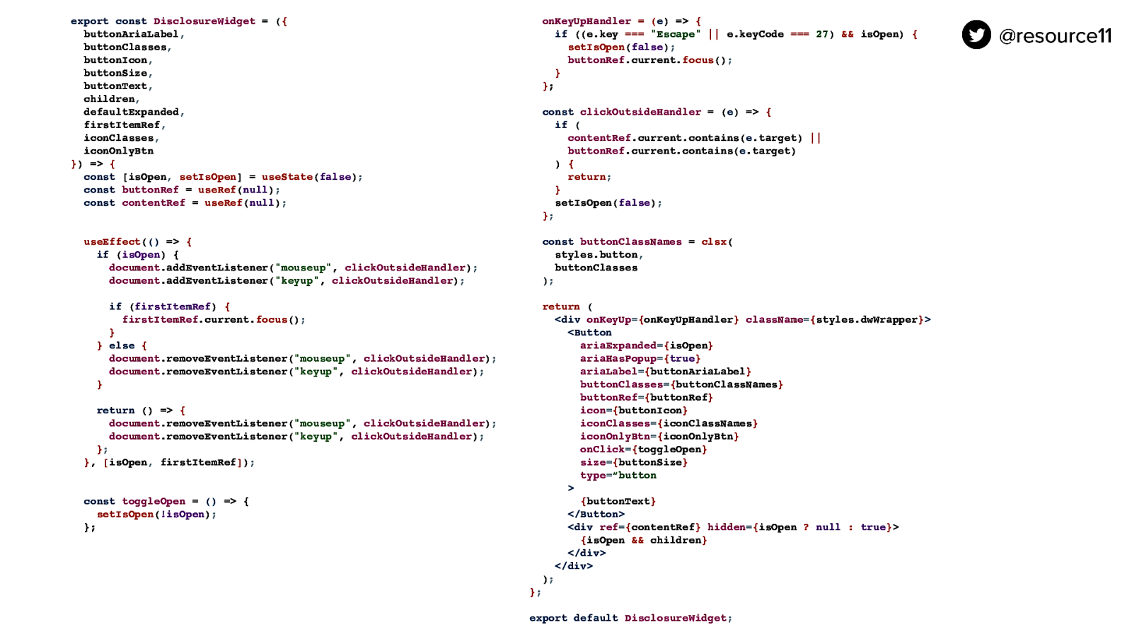
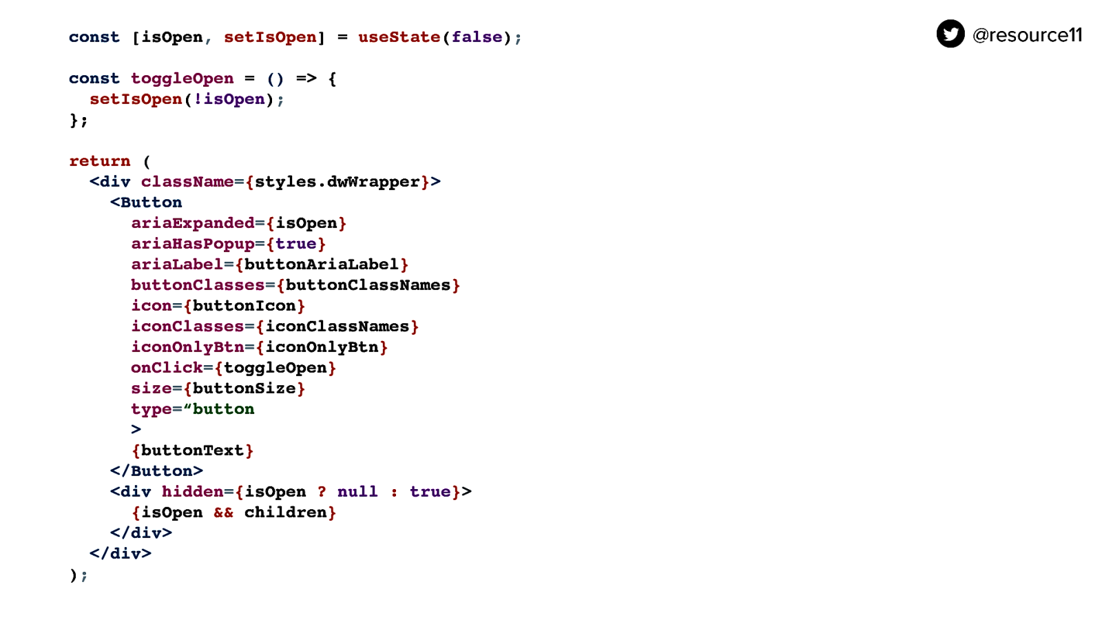
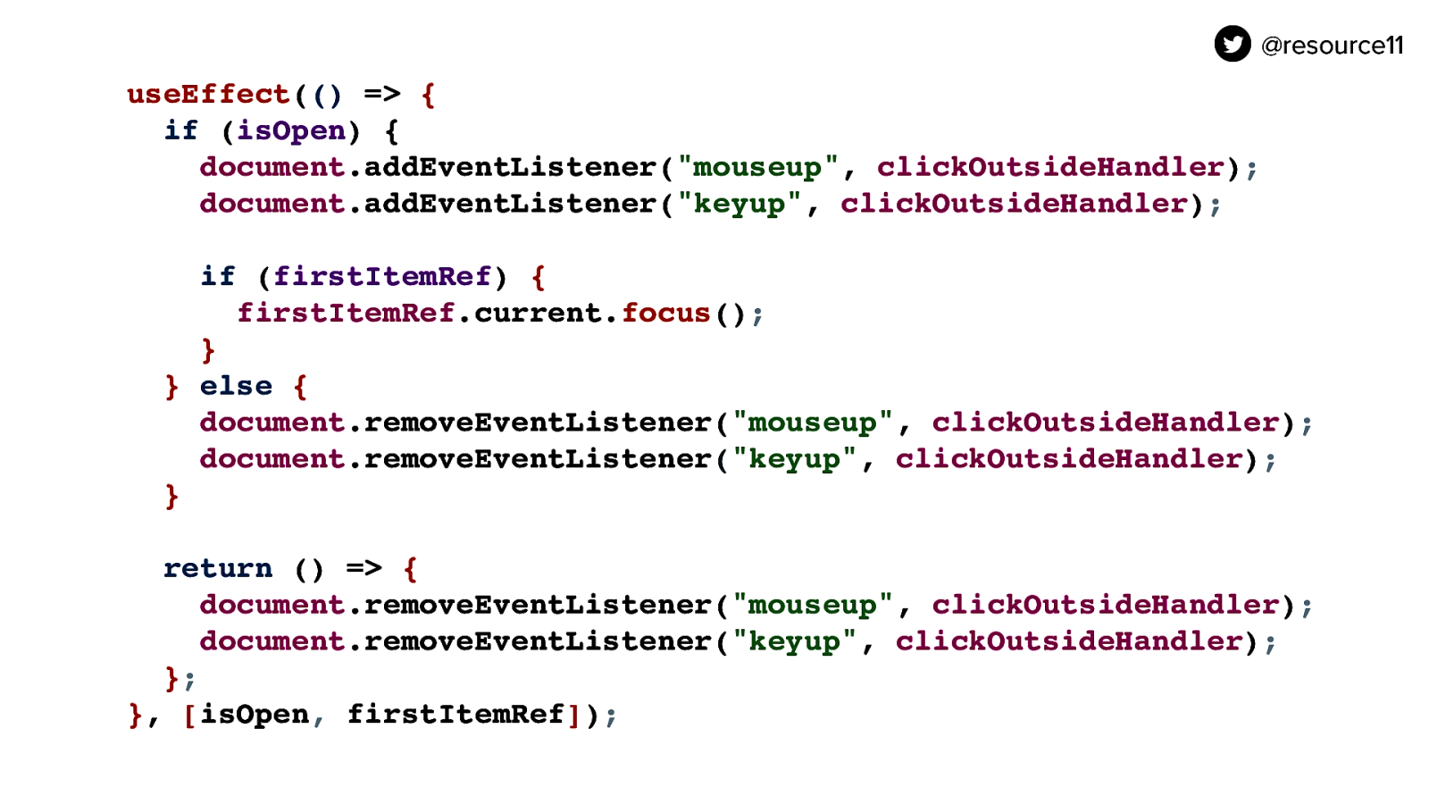
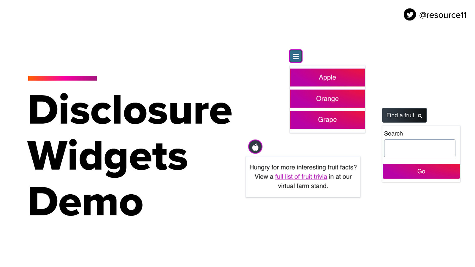
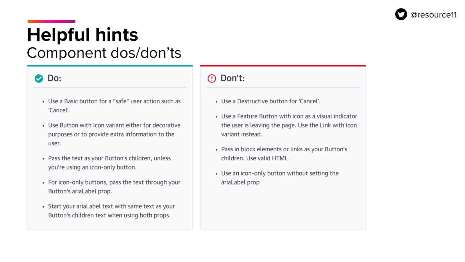
Now, leverage React’s useState hook to control the visibility of the sibling contains passing an isOpen state variable and the setIsOpen method to the useState hook, setting isOpen to false as an initial value.

Then, create a toggleOpen method to use the setIsOpen motion to toggle isOpen between true and false. This will control two things.

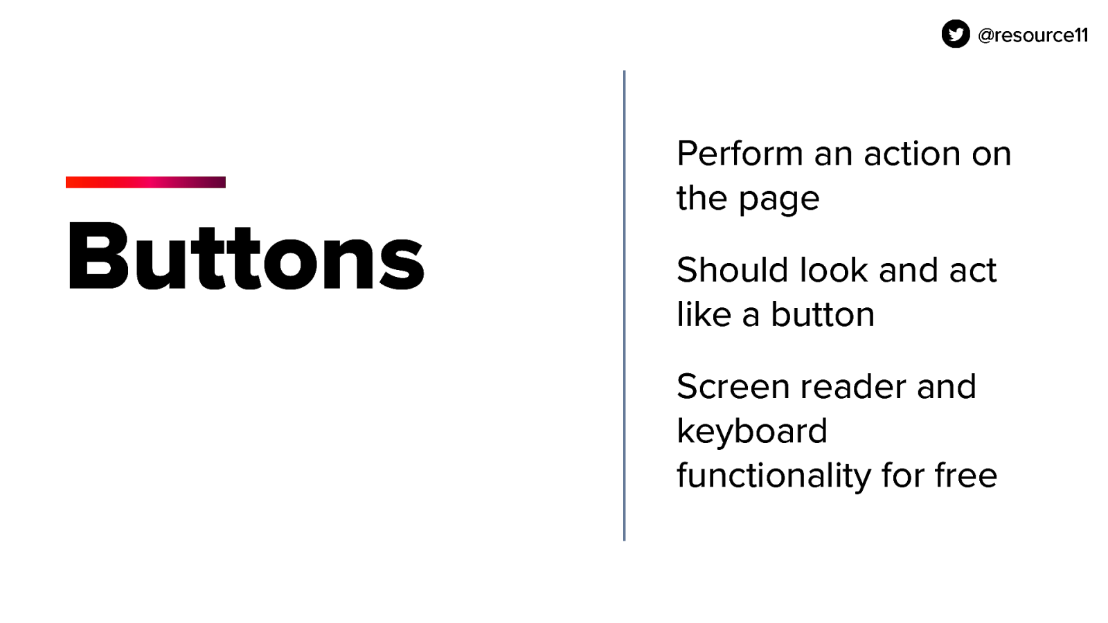
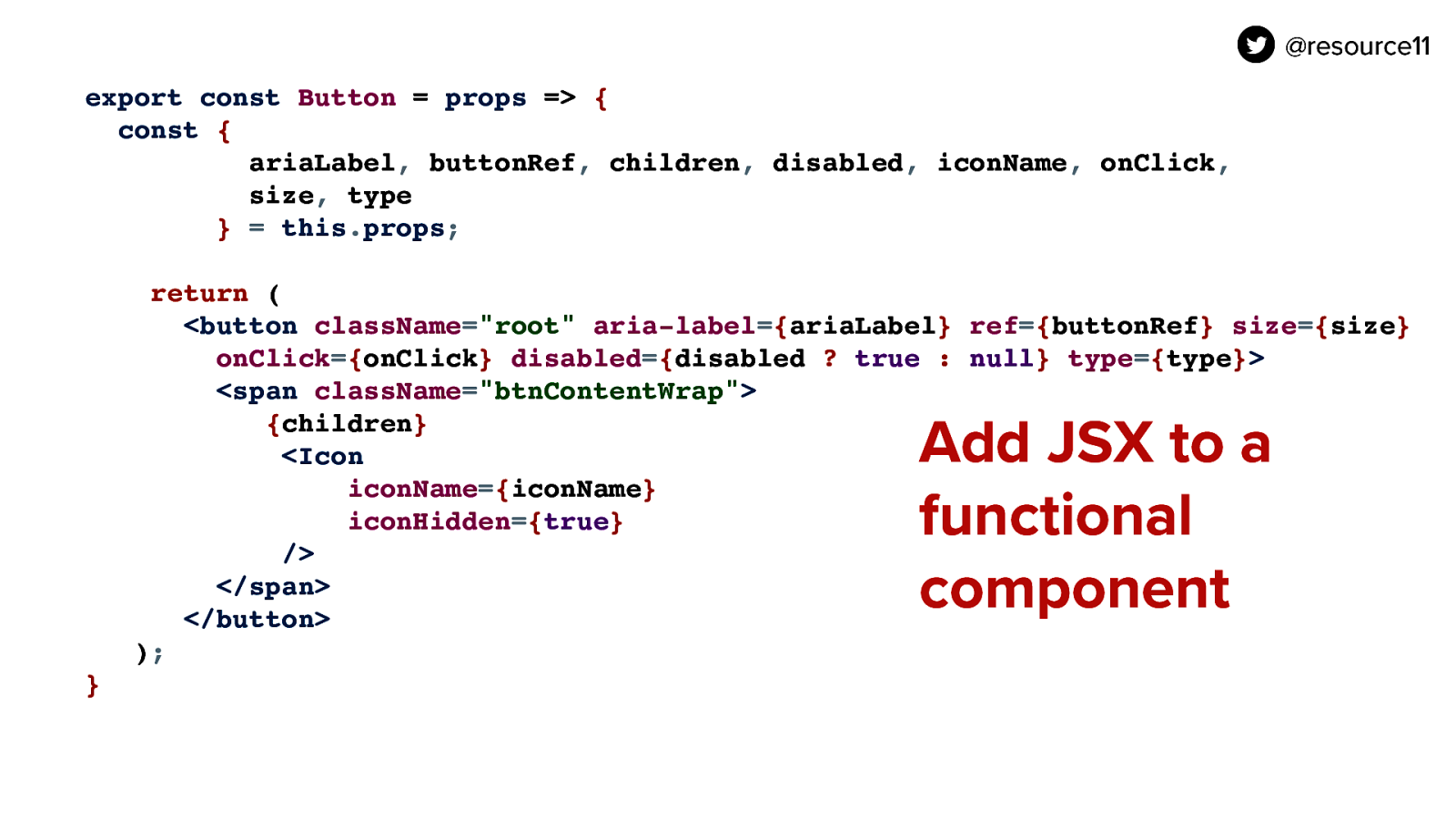
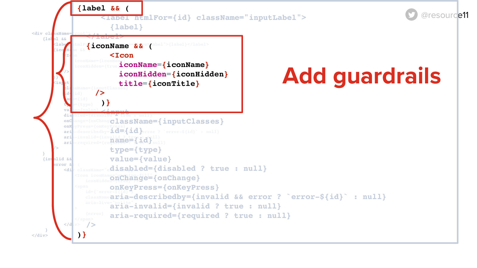
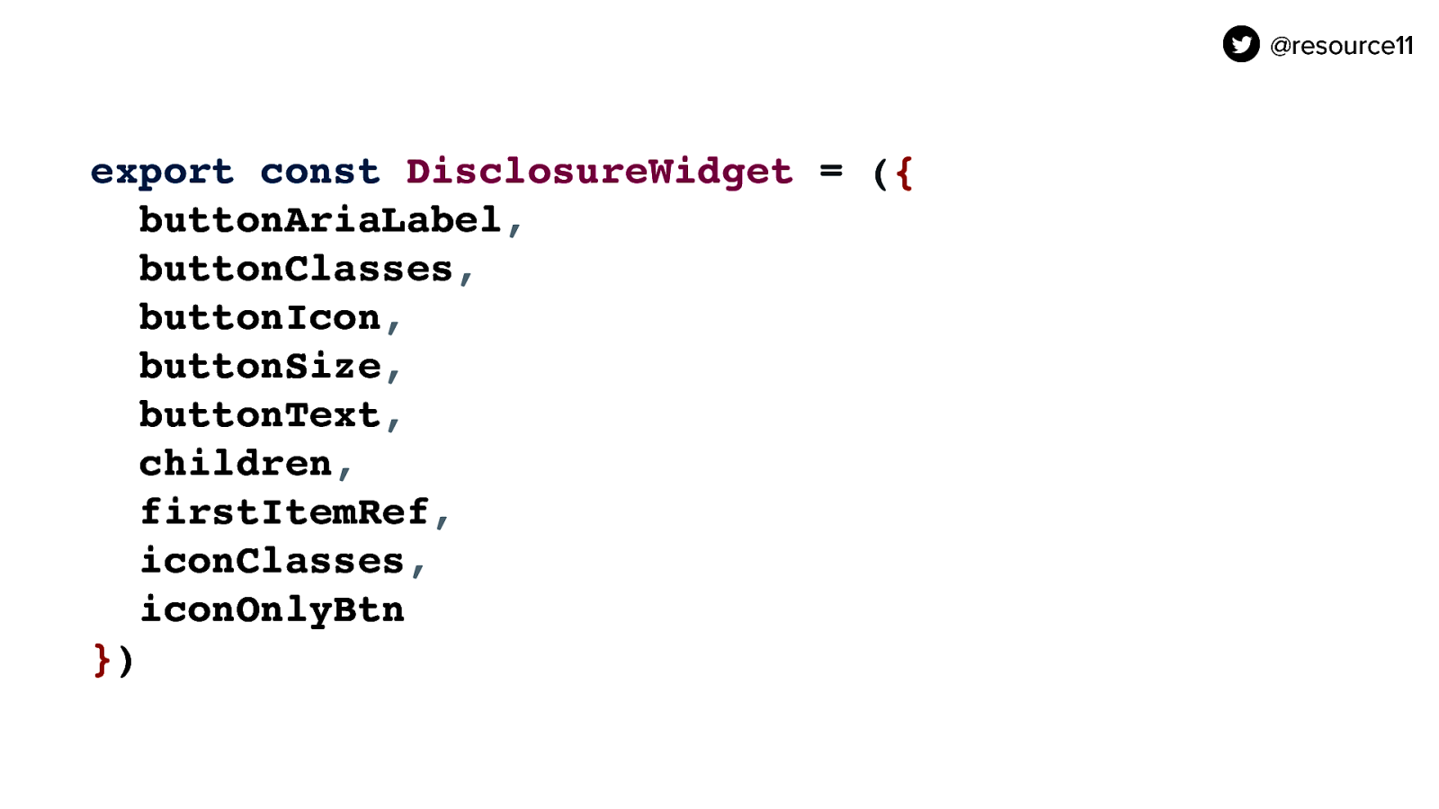
The button needs to control the visibility of the sibling container so what we are going to do here is use the React useState hook and use it to set an isOpen variable and declare a setIsOpen function to control the visibility of the DIV’s state.

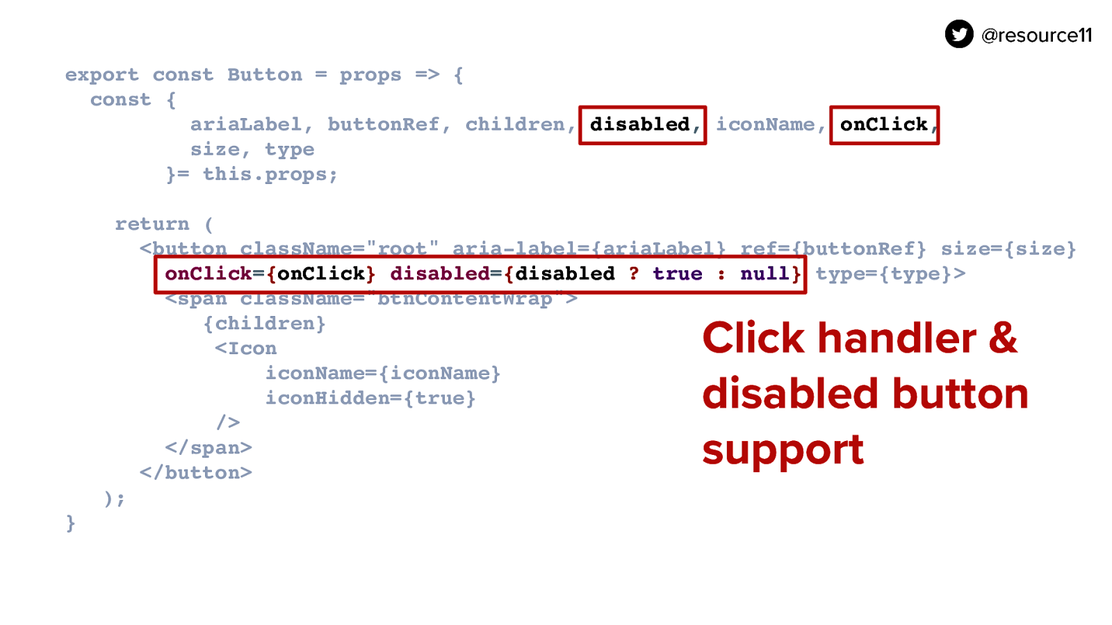
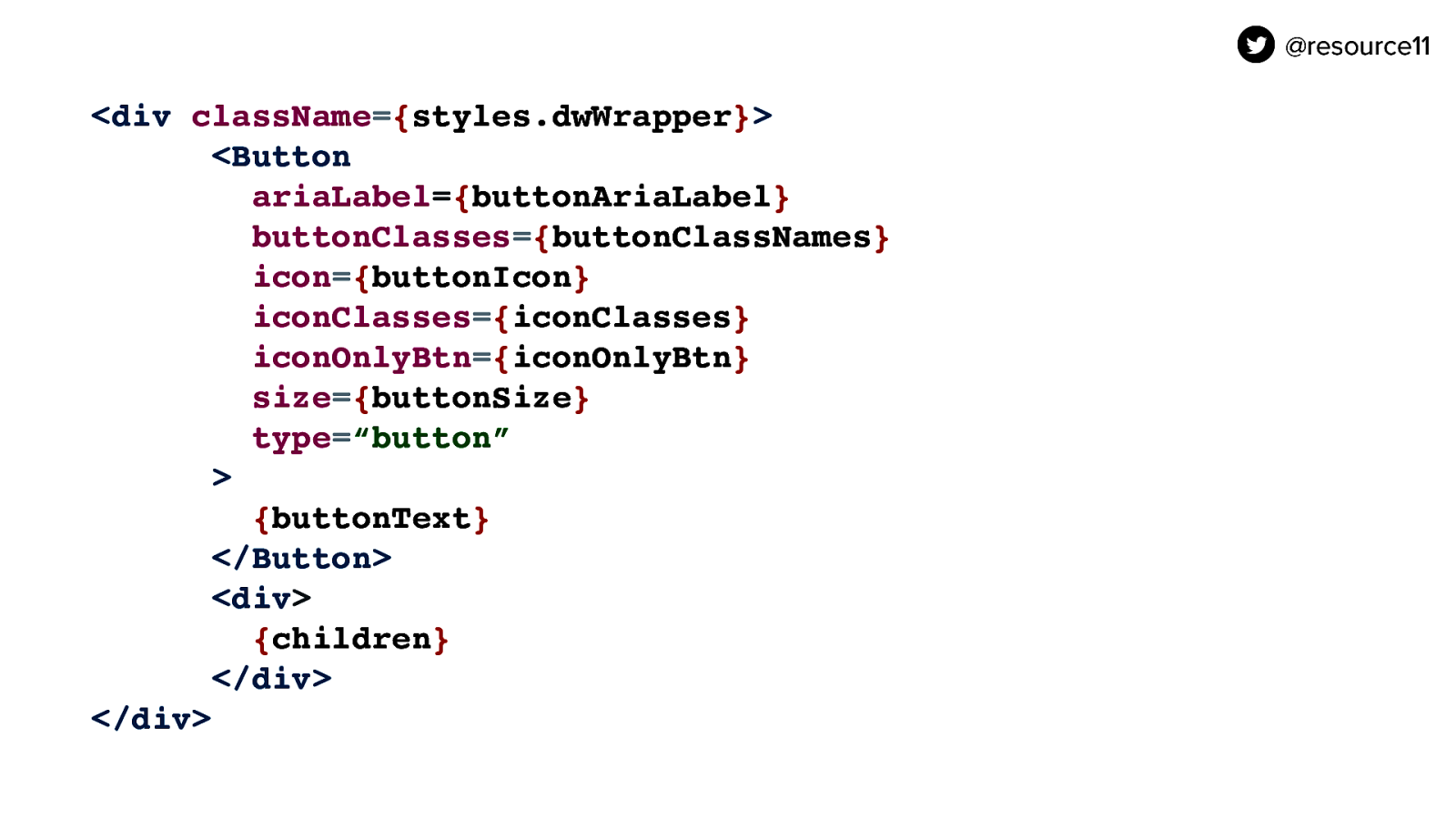
First we are going to declare a toggleOpen function and in the function whenever the function is activated we are going to toggle the state of isOpen from true to false and back using the setIsOpen function. And we’re going to take the toggleOpen function and pass it into our Button’s onClick prop.

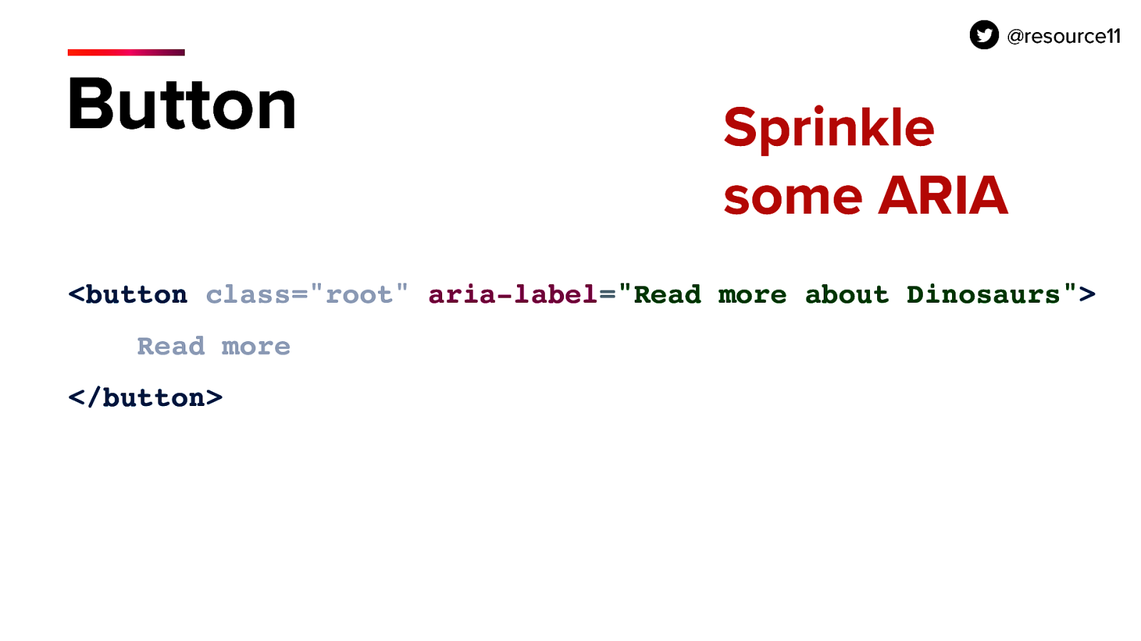
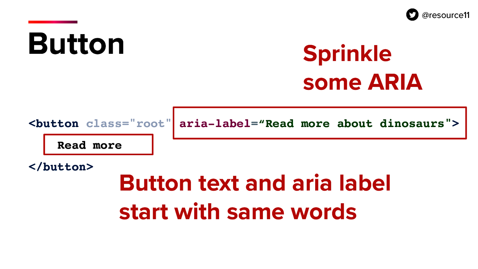
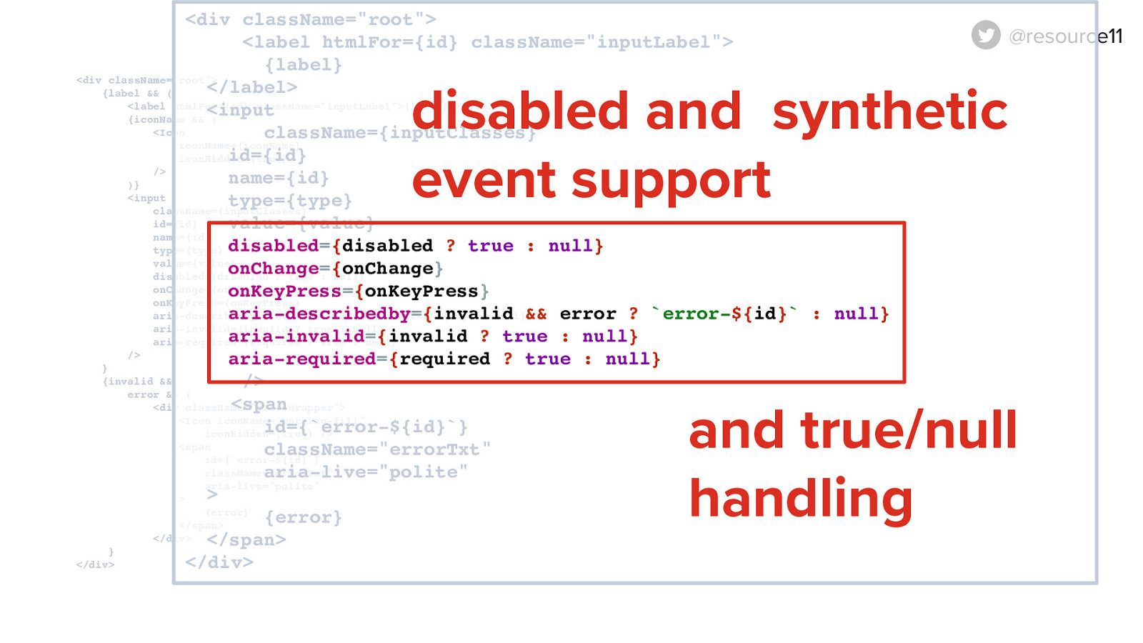
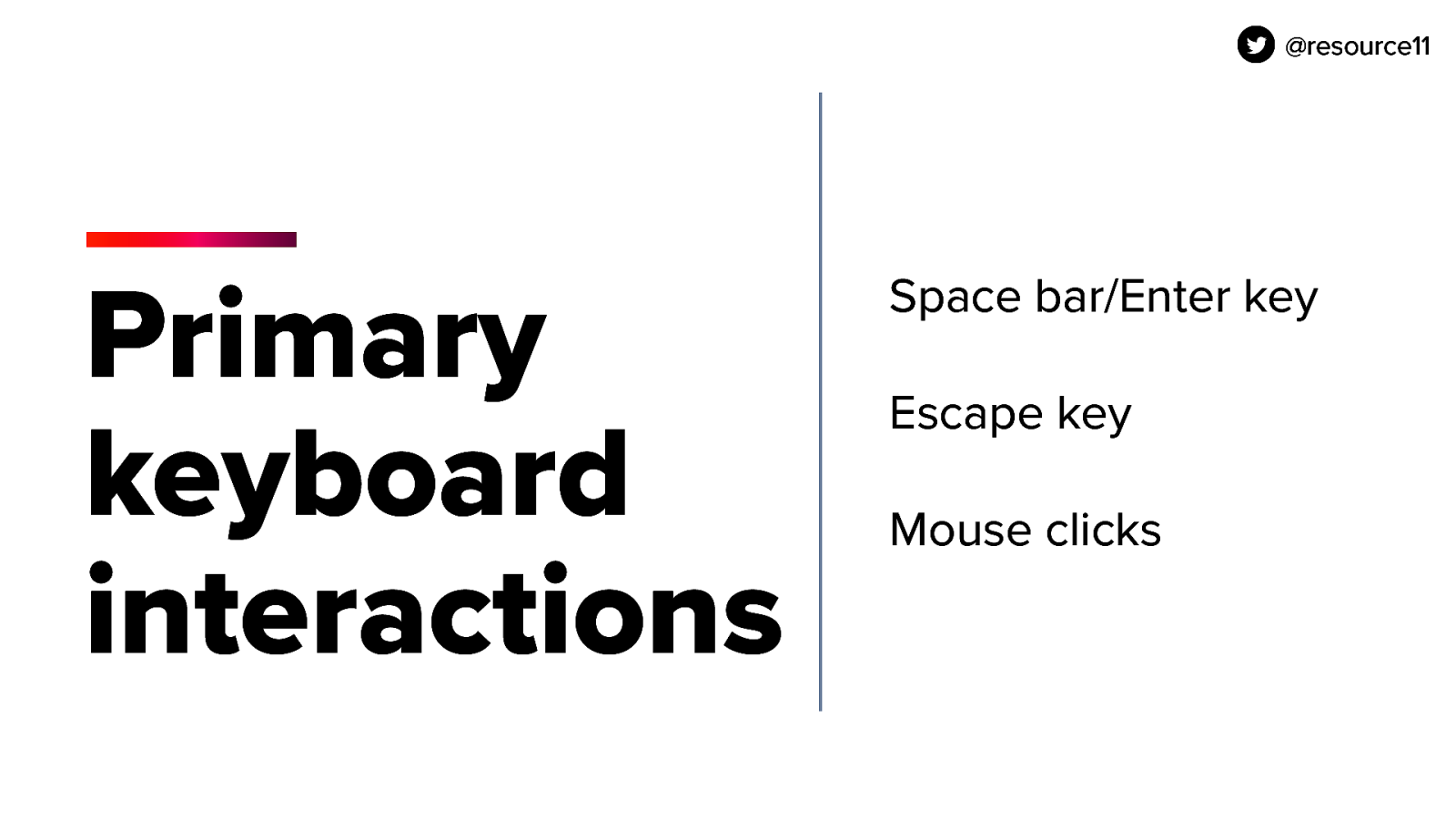
We are also going to pass the isOpen state to the ariaExpanded prop because we need screen reader users to understand that the button, that the aria, we have these two… sorry my cat is distracting me we have these two attributes here that we are going to add to the Button component. AriaExpanded and ariaHasPopup.

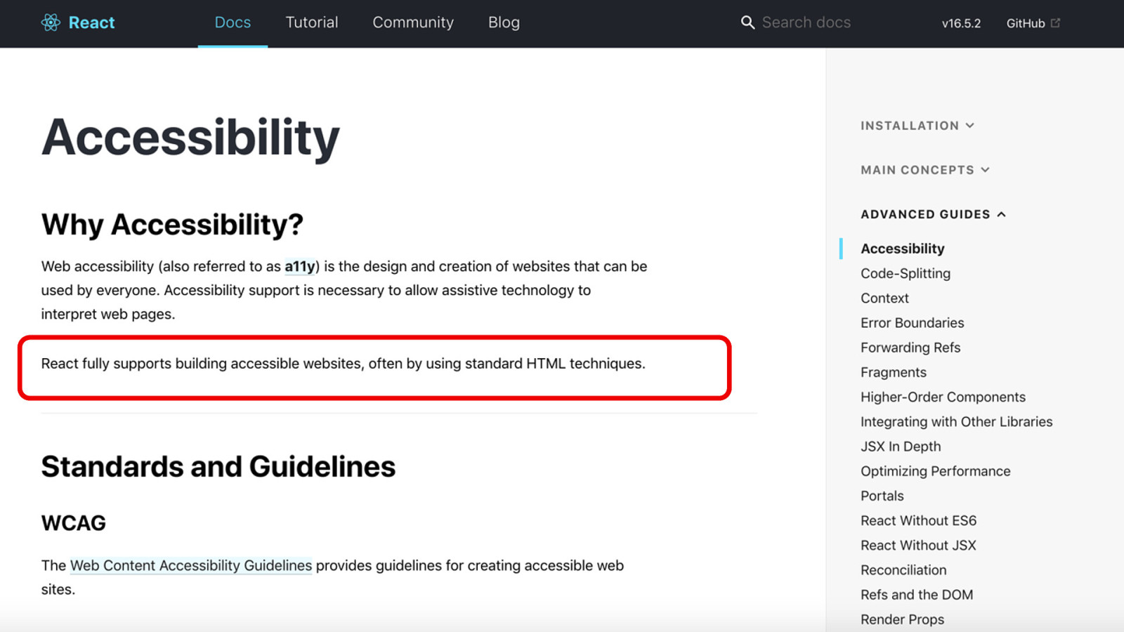
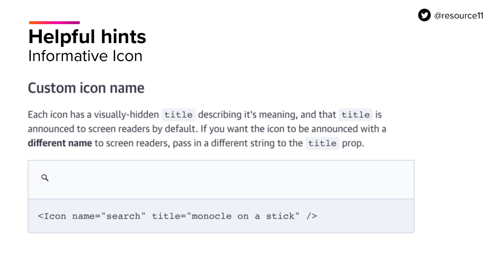
The ariaExpanded attribute added to the button allows the button to announce to screen readers whether it is controlling a sibling container and whether the container is expanded. Or not.

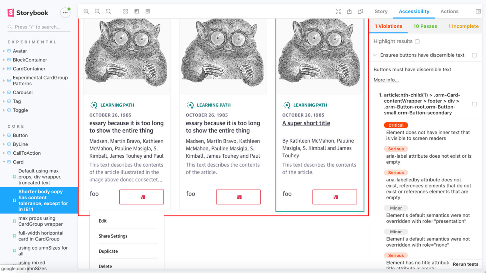
If that ariaExpanded is paired with the ariaHasPopup prop and the ariaHasPopup prop is set to true here. Those two props are very important to have in our but component to have a disclosure widget pattern.

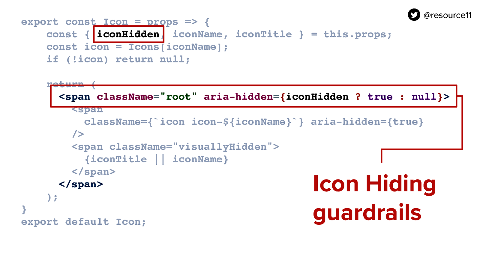
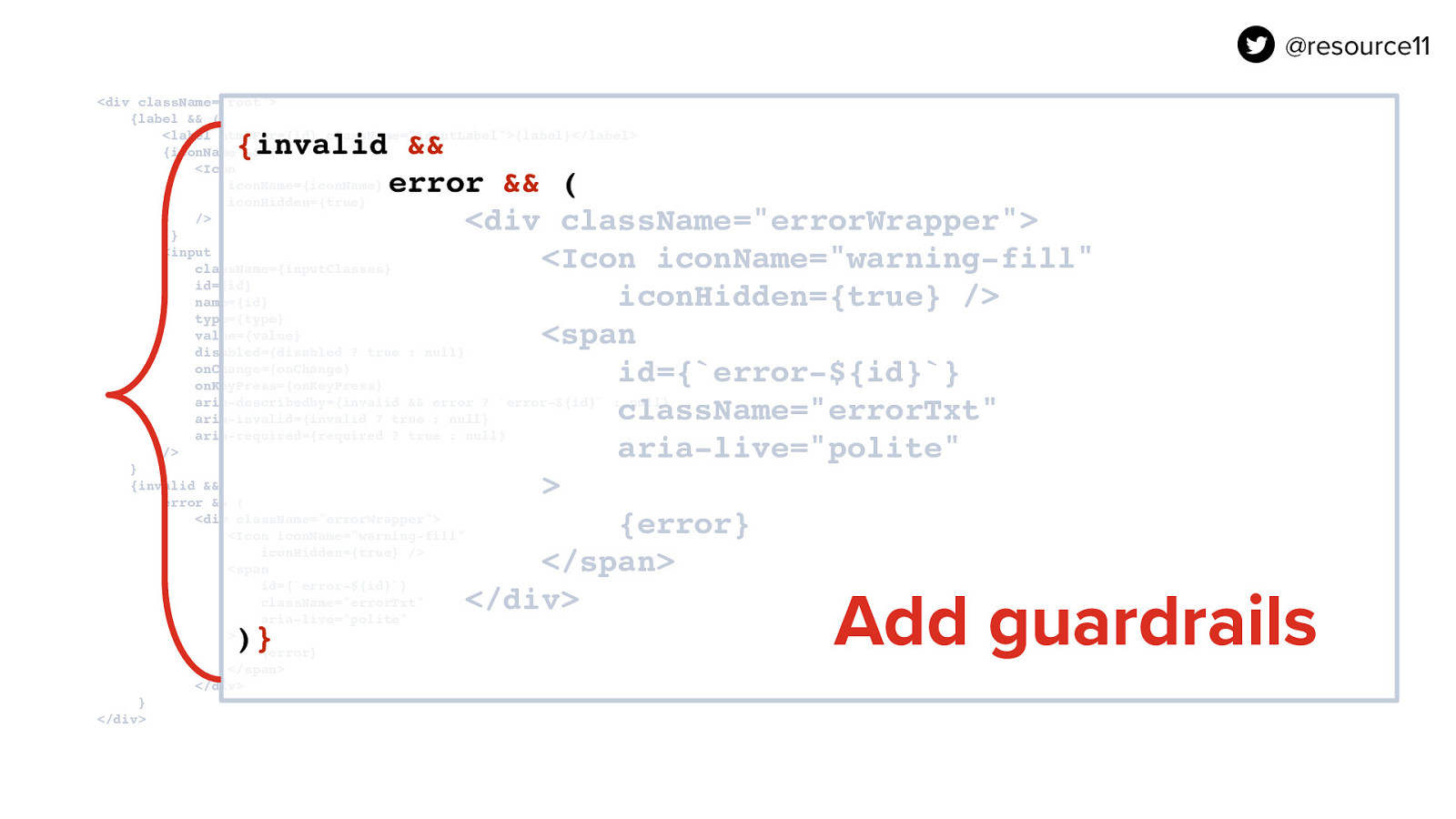
If you notice with our is open state is passed into the aria-expanded prop so whenever is open is true aria-expanded is true. Also in our DIV the children in our DIV basically the content of our but container that is opening and closing for our disclosure only shows if the isOpen state is true. We are also adding this hidden attribute to the disclosure widgets container DIV that will only toggle on if the state of is open is set to true. Otherwise the hidden attribute will not attach to the DIV at all.

Slide 144

Slide 144

Next is focus management. React’s useRef is used here to initialize a reference to pass into the button.

Then we declare onKeyUp handler function to check if the escape key is pressed. If it is, the handler will close the widget and return focus to the activator button.

Slide 145

Slide 145

Mouse clicks outside of the widget need consideration as well. React’s useRef is used here to initialize a reference to pass into the button.

Then we declare onKeyUp handler function to check if the escape key is pressed. If it is, the handler will close the widget and return focus to the activator button.

Slide 146

Slide 146

Add use Effect for component mount. If open, added event listener,

Remove event listeners for any other widgets on the page, and only re-render if isOpen changes,

If component is unmounted, remove listeners

Slide 147

Slide 147

If open and firstItemRef passed in to a focusable element in the widget, focus that item.

Slide 148

Slide 148

Disclosure WIdgets Demo

Let’s take a look at some examples of this disclosure widget pattern in this Codesandbox

Slide 149

Slide 149

Document, document, document

Documentation. Those massive design systems out there definitely have some drool-worthy patterns for us to dream about. If your team is small, showing examples of the many ways your component can be used is a good first step.

Slide 150

Slide 150

When we were rebooting the docs, we used Gatsby for our style guide to leverage the power of MDX, and Storybook to document our component playground.

Slide 151

Slide 151

and deployed static instances of our docs using Zeit’s Now…

Slide 152

Slide 152

…otherwise known as Vercel these days.

Slide 153

Slide 153

I want to touch upon Storybook for a moment.

It’s a great way to Sandbox your components in isolation, and play with UI logic without the complexities of business logic.

Storybook supports MDX as well. The Accessibility addon is a must here.

Slide 154

Slide 154

The accessibility add-on uses axe-core engine, does a quick audit of your components Identifies errors, tells you how serious they are, and gives you steps to fix them before you start your manual accessibility testing.

Slide 155

Slide 155

When documenting components, you should add helpful hints to help developers choose how to implement your components. For example, how to make an informative icon.

Slide 156

Slide 156

Or a decorative icon


Slide 157

Slide 157

Be sure to add prop tables for your components, so your developers know which prop does what, and whether it’s required.

Slide 158

Slide 158

Component dos and don’ts are essential.

Slide 159

Slide 159

Dedicate a page to accessibility resources and links. The WCAG success criteria is really intense to parse.

If you have curated any articles that help explain how to implement common accessibility patterns, add those to your docs.

Slide 160

Slide 160

So to wrap up…

Slide 161

Slide 161

Our users are diverse

Slide 162

Slide 162

Your Design system is a cookbook

Slide 163

Slide 163

Cookbooks have Personality

Slide 164

Slide 164

React is a kitchen utensil

Slide 165

Slide 165

You are the cook

Slide 166

Slide 166

Components are your tried and true recipes

Slide 167

Slide 167

WCAG is Your reference material

Slide 168

Slide 168

Document, document, document. And remember…

Slide 169

Slide 169

Dinosaurs are always the hotness.

Slide 170

Slide 170

Thank you.

Slide 171

Slide 171

https://noti.st/resource11 Slide deck posted after the talk @resource11 Twitter | Instagram | GitHub