Accessibility-flavored React components make your design system delicious!

A presentation at Design Systems London in November 2019 in London, UK by Kathleen McMahon

Slide 1

Slide 1

React components Accessibility-flavored make your design system delicious

Kathleen McMahon @resource11

Welcome everyone! I’m Kathleen McMahon and I’m here today to show how Accessibility-flavored React components make your design system delicious!

Before we begin, let’s get some details out of the way.

Slide 2

Slide 2

Since time is compressed, and I’d love to talk at a reasonable pace for our live captioner….

My slide deck will be posted on Notist at https://noti.st/resource11/1ecxhG, including links to resources I briefly touch upon.

The full URL will be available later today on Twitter.

Slide 3

Slide 3

And here are my social links.

You can follow me at:
@resource11 Twitter | Instagram | GitHub

Now… here’s an outline of what we’ll be covering today.

Slide 4

Slide 4

Good grief, there’s an agenda…

Topics covered • Why accessibility first? • Design systems are a cookbook. • Design systems and React • Icons, Buttons, Inputs • Documentation

Slide 5

Slide 5

Let’s back up so I can introduce myself better…

Slide 6

Slide 6

I’m the Tech Lead for O’Reilly Media’s Design System

Slide 7

Slide 7

And I race bikes… very badly.

Slide 8

Slide 8

Mostly, you’ll find me at the back of the pack

Racing 2 laps to your 6 on a singlespeed…

Wearing a costume!

Because who doesn’t love a clown?

Slide 9

Slide 9

Well maybe not this clown

Slide 10

Slide 10

One thing I almost forgot to mention…

Slide 11

Slide 11

I’m a dev dinosaur. And I find it fascinating see…

Slide 12

Slide 12

…how far we’ve come from the tools we had for computing…

Slide 13

Slide 13

And software…

Slide 14

Slide 14

And software.

Slide 15

Slide 15

Storage…

Slide 16

Slide 16

…and reference.

[alt] Collection of 1990s era software design and development books stacked on the floor.

Slide 17

Slide 17

While our browser choices were minimal… Netscape, anyone?

Slide 18

Slide 18

…our stack has stood the test of time. HTML + CSS + JS

Slide 19

Slide 19

Fast forward to now and the industry is moving at a really fast pace…

Slide 20

Slide 20

…and it can feel overwhelming to keep up, much less find the place where you can thrive if you have both design and engineering skills, and love that fundamental stack.

Slide 21

Slide 21

Imagine my excitement when I joined O’Reilly, and discovered we had a design system, and we were just starting work on streamlining the codebase in our component library.

Slide 22

Slide 22

My inner dinosaur literally did a backflip.

Now this was a place where that trusty stack is needed.

Especially an industry where the div has become the reluctant king.

Slide 23

Slide 23

Admittedly, this was my first time working on an official design systems team, so there was a bit of a learning curve of what goes into a design system

Slide 24

Slide 24

And our team is small.

We had the benefit of two contractors pitching in for the first few months, but in essence, our core team has mostly been about 3-4 people.

We’ve had to choose what to tackle first in our reboot, which is tough with so many moving parts.

Slide 25

Slide 25

Our first priority?

Extracting out any business logic in the components, while at the same time building with accessibility in mind.

Fix our colors, our components, our patterns, reboot our docs, and improve our tooling.

Slide 26

Slide 26

You may ask, why accessibility first?

Slide 27

Slide 27

Well, our users have varied needs, and… because so often, that’s what is handled last. Which sends a poor message to our users.

Slide 28

Slide 28

If you’ve read the WebAIM Million report, the results are depressing.

Slide 29

Slide 29

With the amount of errors found on pages…

Slide 30

Slide 30

…Unlabeled inputs

Slide 31

Slide 31

…and unnecessary ARIA attributes, we’re making the web worse in the name of good intentions.

Slide 32

Slide 32

While we have things like the Web Content Accessibility Guidelines to follow which is a really low bar, we’ve been missing the mark in the industry when it comes to making sure all our users can use our apps.

Slide 33

Slide 33

Imagine, though, if you had accessibility baked into some commonly-used components.

A design system is the perfect place for this.

Slide 34

Slide 34

I like to say your design system is a cookbook

Slide 35

Slide 35

And cookbooks have personality.

My Mom is a serious fan of cooking, and lately I’ve been enjoying digging through the cookbooks she’s collected over the years to read how recipes evolved over time.

If you’ take a look at some of the cookbooks published in the 1940s-60s…

Slide 36

Slide 36

And look past the outdated views…

Slide 37

Slide 37

You’ll find interesting recipes…

Slide 38

Slide 38

Questionable food combinations that included Jello and meat…

Slide 39

Slide 39

…and an impressive level of detail paid to the structure of every single part of the cooking process.

Slide 40

Slide 40

…and an impressive level of detail paid to the structure of every single part of the cooking process.

Slide 41

Slide 41

…and an impressive level of detail paid to the structure of every single part of the cooking process.

Slide 42

Slide 42

…and an impressive level of detail paid to the structure of every single part of the cooking process.

Slide 43

Slide 43

There’s even a section on table settings and entertaining!

This is very similar to how a design system works.

Slide 44

Slide 44

Now what does that have to do with React?

Slide 45

Slide 45

There’s always some debate about how using a Javascript framework creates inaccessible apps.

Slide 46

Slide 46

Yet… React fully supports building accessible websites, by using standard HTML/CSS techniques.

Slide 47

Slide 47

A better way to think of React is to consider it a kitchen utensil. It’s not the only utensil in your kitchen.

Slide 48

Slide 48

You are the cook.

In my opinion, It’s up to the developer to have that standard HTML/CSS/JavaScript and accessibility knowledge to be able to leverage a utensil correctly.

And that includes React.

Slide 49

Slide 49

That said, if your developers are unsure how to start building inclusive apps, empower with your design system.

Build some features into your components to help them along.

Slide 50

Slide 50

Then you can start celebrating when your co-workers make those apps accessible without you having to ask for it.

Slide 51

Slide 51

Your components are your tried and true recipes

Slide 52

Slide 52

And WCAG is your reference material

Slide 53

Slide 53

Creating a component is like following a recipe

Slide 54

Slide 54

First, you Start with high-quality ingredients (semantic HMTL)

Slide 55

Slide 55

Mix in seasonings (just a touch of ARIA)

Slide 56

Slide 56

Follow the directions

Slide 57

Slide 57

And provide helpful hints as best practices.

Let’s take those principles and apply them to some components.

Slide 58

Slide 58

Let’s talk Icons.

Slide 59

Slide 59

Icons can be informative or decorative

Informative icons need to be paired with descriptive text to be perceivable by screen readers.

Decorative icons need to be hidden from screen readers, because they don’t add significant value to your app to be announced.

Slide 60

Slide 60

There is more than one way to create an accessible icon.

Two of the most recent ways are… SVGs and icon fonts.

We initially used SVG icons in our design system combined into a sprite sheet, yet we ran into some problems when we started testing.

Slide 61

Slide 61

We discovered a bug in Safari on High Sierra, where VoiceOver would announce every single one of those 100 or so icons in that sprite sheet.

It made me sad.

So…we had to think fast to find a different solution.

Slide 62

Slide 62

Icon fonts to the rescue

We converted all our icons into a font set for the time being, and chose to revisit SVG icons later, since that HighSierra bug has now been fixed.

Let’s go over an example of how we make an accessible icon component using semantic HTML and the icon font technique.

Slide 63

Slide 63

This is what you typically see as an icon font pattern in the wild, but it’s not accessible.

Slide 64

Slide 64

This is an accessible icon pattern. Let’s break it down.

Slide 65

Slide 65

The span containing our icon font…

Slide 66

Slide 66

…has been sprinkled with a pinch of aria-hidden=”true”, to hide the icon font from screen readers.

Slide 67

Slide 67

This second span contains the descriptive name for our icon.

Slide 68

Slide 68

…and has a visuallyHidden class added to it.

This removes the visual presentation of that text, yet keeps that text available to screen readers.

Slide 69

Slide 69

In the wrapping span, we use a CSS class to convert the span’s native display property from inline to inline-block.

This allows us to support margin/padding customization on all four sides of the element.

Slide 70

Slide 70

Notice that spans are being used for all three elements.

This is on purpose for when we pair this component with a button.

Slide 71

Slide 71

Now before we refactor this pattern into React, let’s consider whether this icon is informative or decorative?

Slide 72

Slide 72

If our icon is informative, we keep this markup as is, because informative icons should announce.

Slide 73

Slide 73

If our icon is decorative, we’d add this aria-hidden attribute to the wrapping span to ensure the entire group is not announced to a screen reader.

Slide 74

Slide 74

Now that we have an accessible icon pattern, let’s pop this into a functional component and convert this to JSX.

Slide 75

Slide 75

Change class to className, convert that aria-hidden “true” string to a boolean value, and self close that empty span element.

Slide 76

Slide 76

Now this is a static icon component in JSX.

Let’s make this component more flexible

Slide 77

Slide 77

…and expand that syntax to support three incoming props: iconHidden, iconName, iconTitle and add some guardrails.

Slide 78

Slide 78

It’s important to create ‘guardrails’ for your components so you can be sure that devs are always using the accessibility features you’ve mixed in.

For our icon component, we added three guardrails.

Slide 79

Slide 79

The first guardrail we’ve set up is a check if the iconName the dev passes in to the component is in our icon library.

If the icon doesn’t exist in the library, the component doesn’t render in the app.

Slide 80

Slide 80

The second guardrail we’ve set here is to ensure if the dev doesn’t pass in descriptive text to that iconTitle prop, the icon’s default name is always exposed a fallback

Slide 81

Slide 81

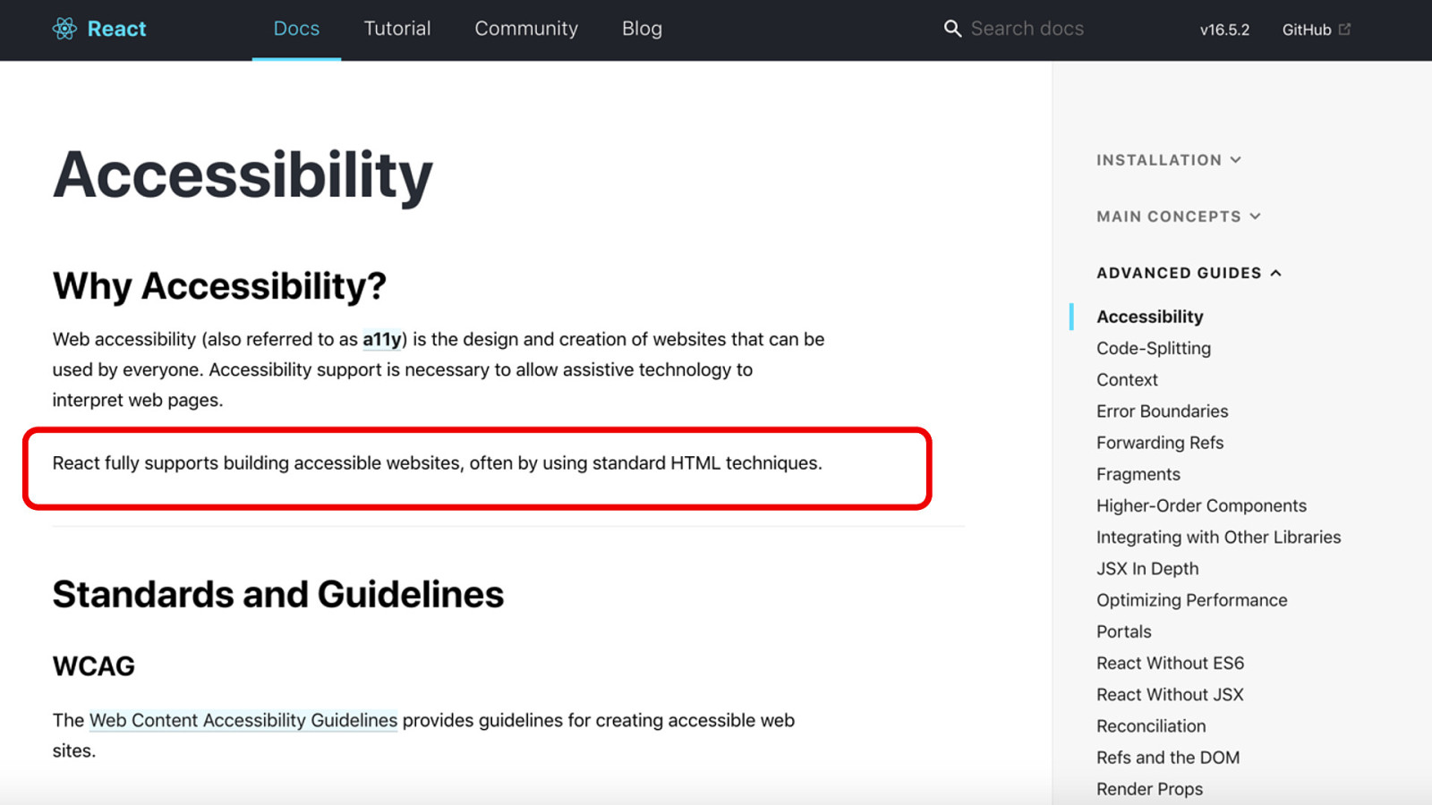
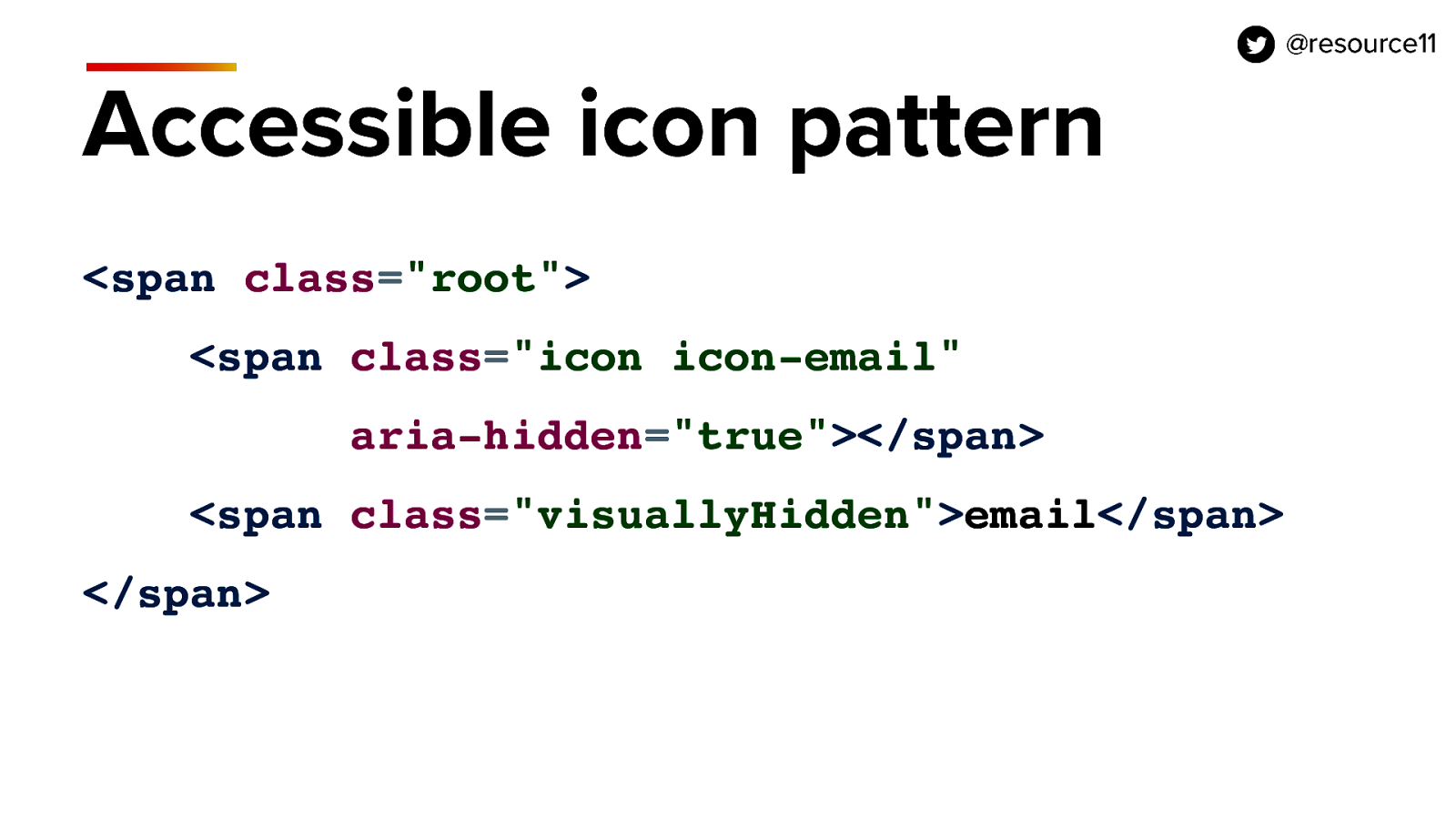
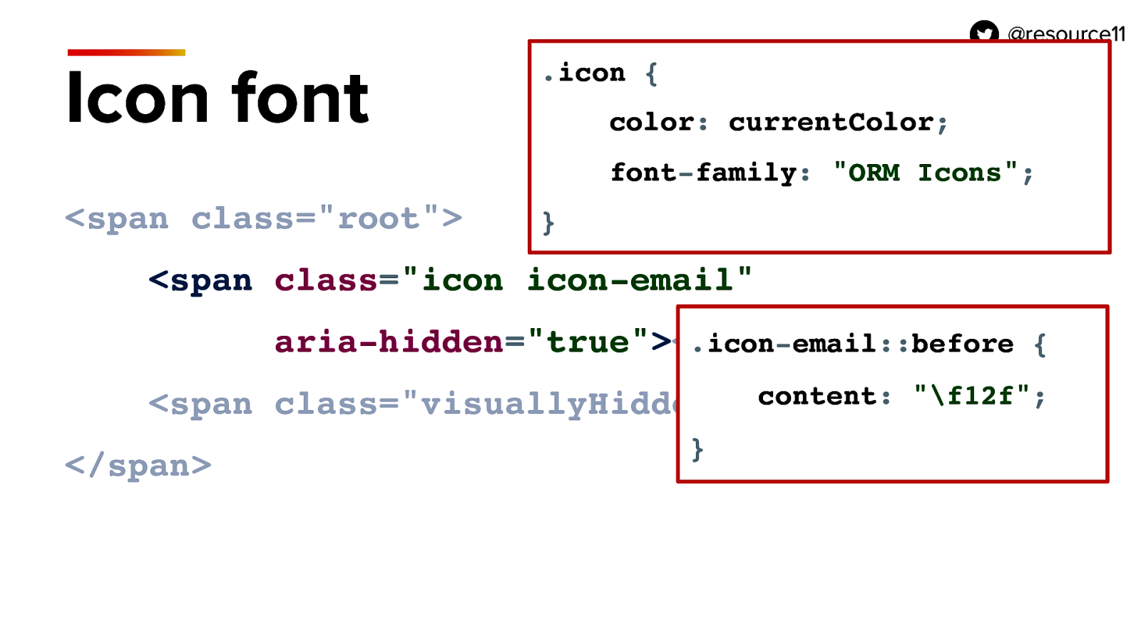
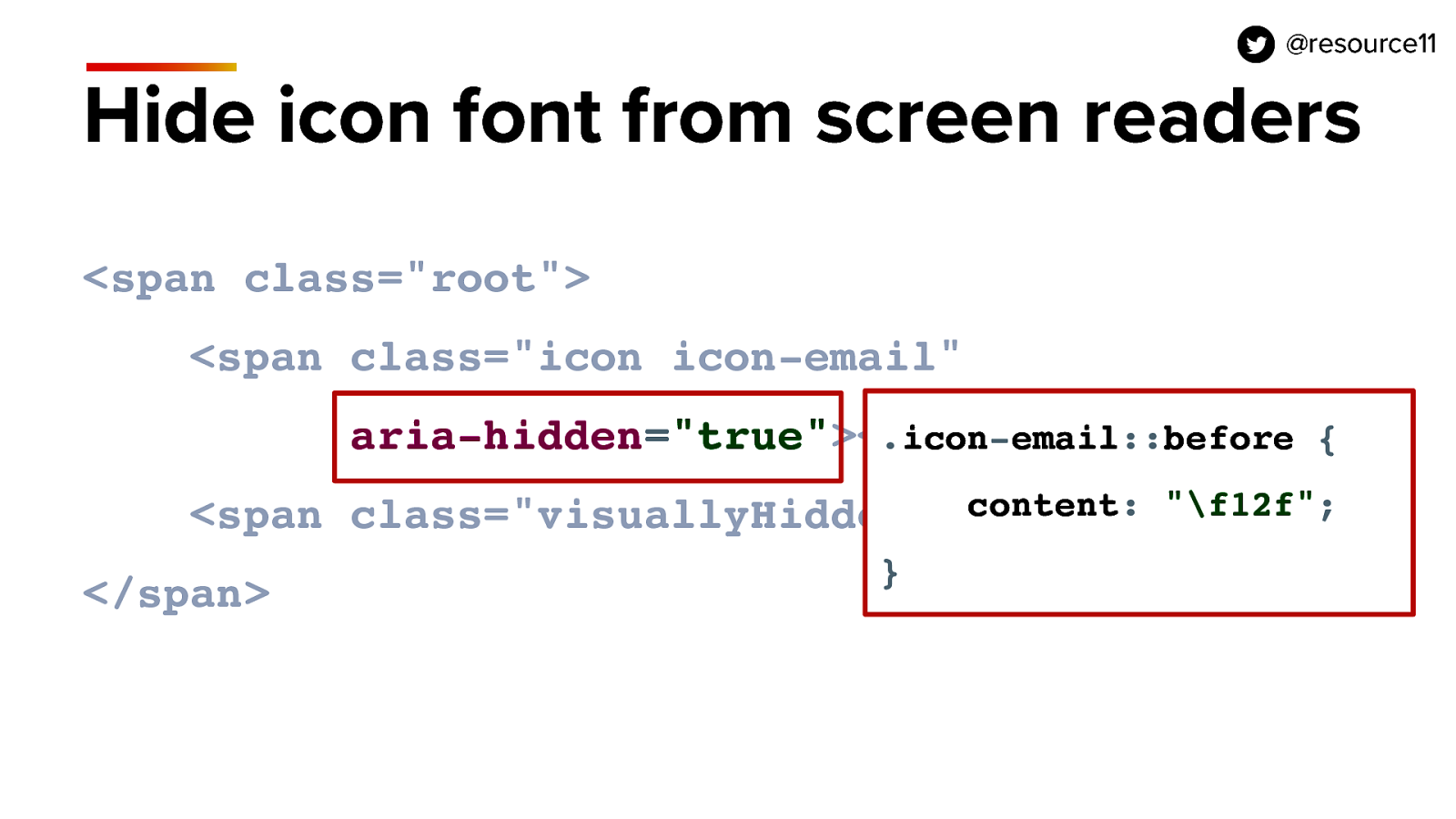
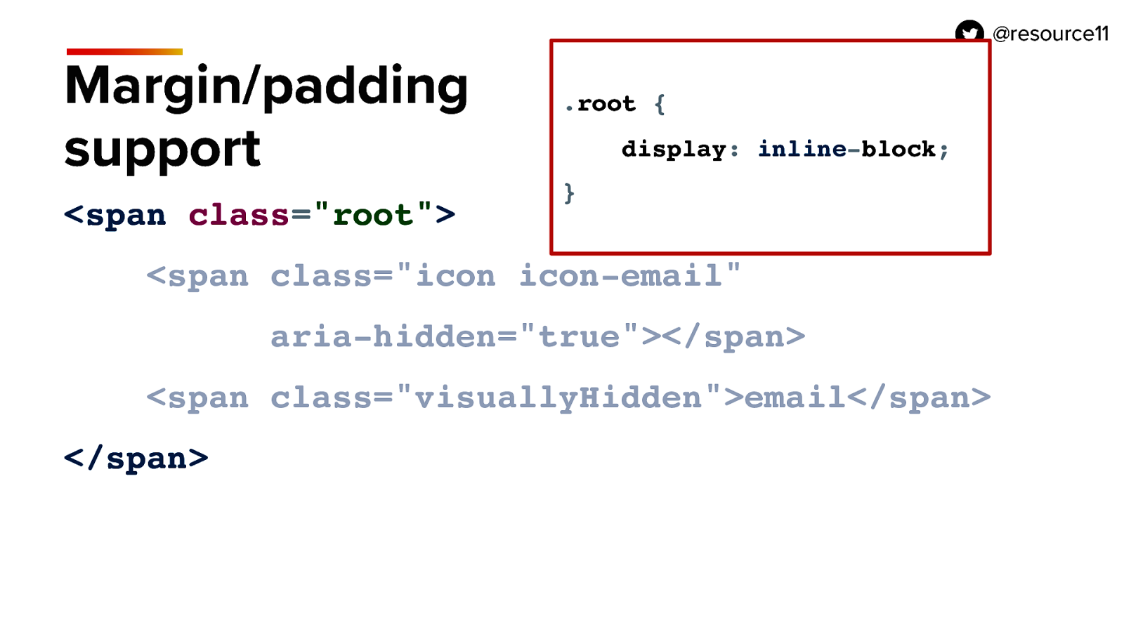
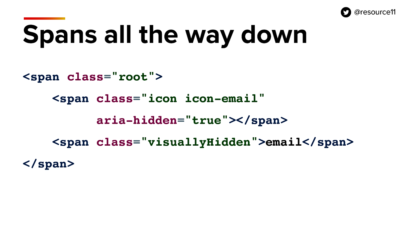
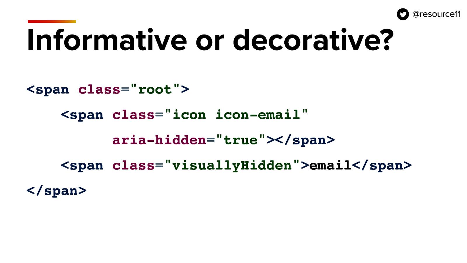
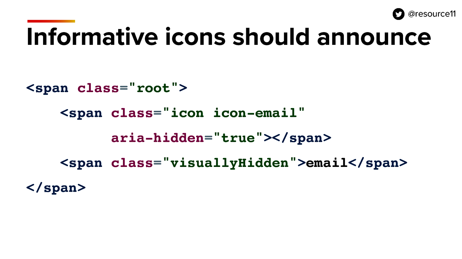
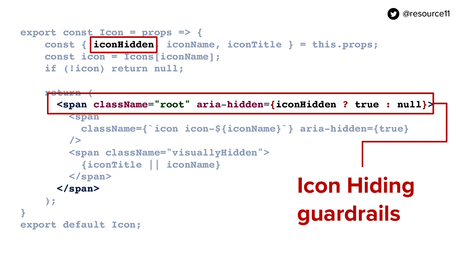
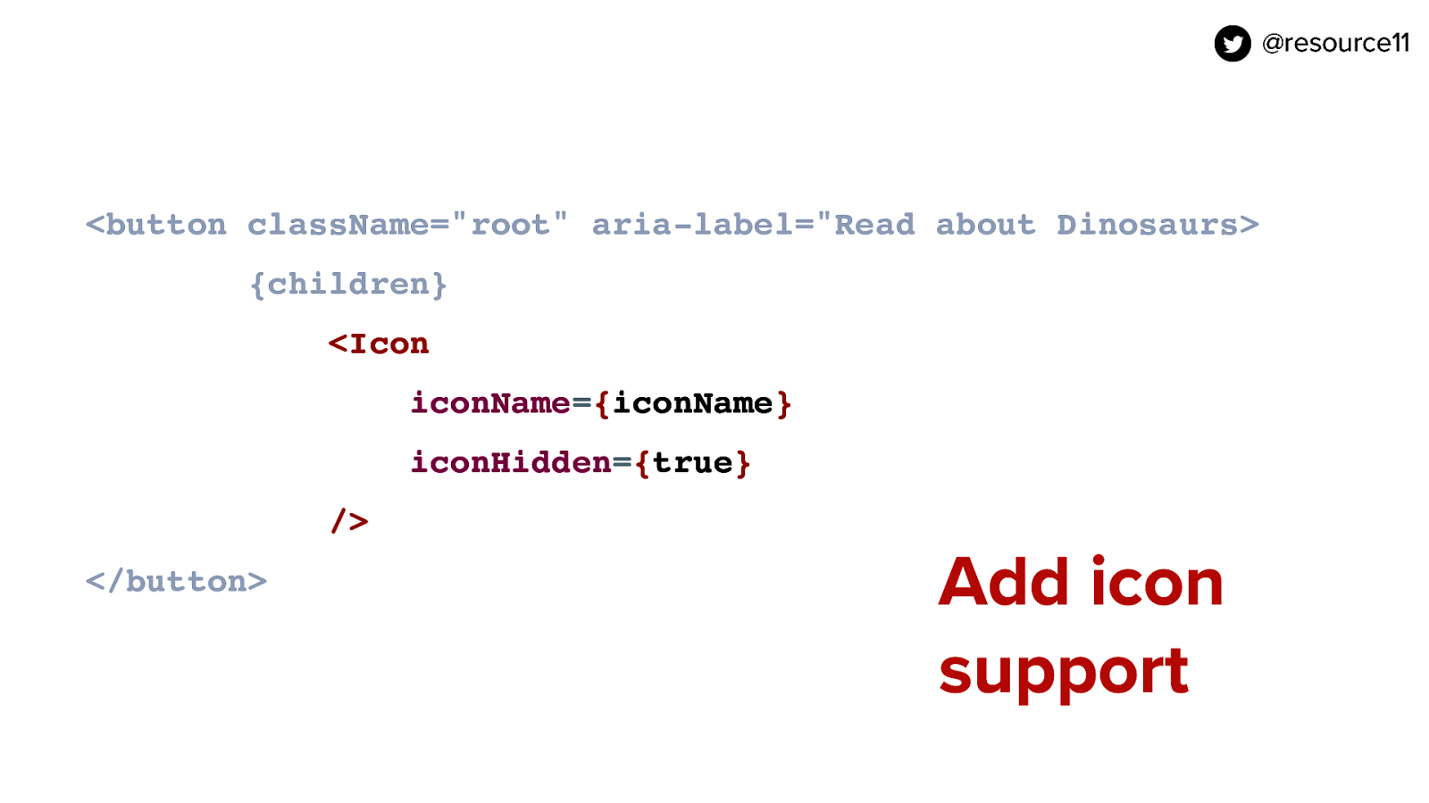
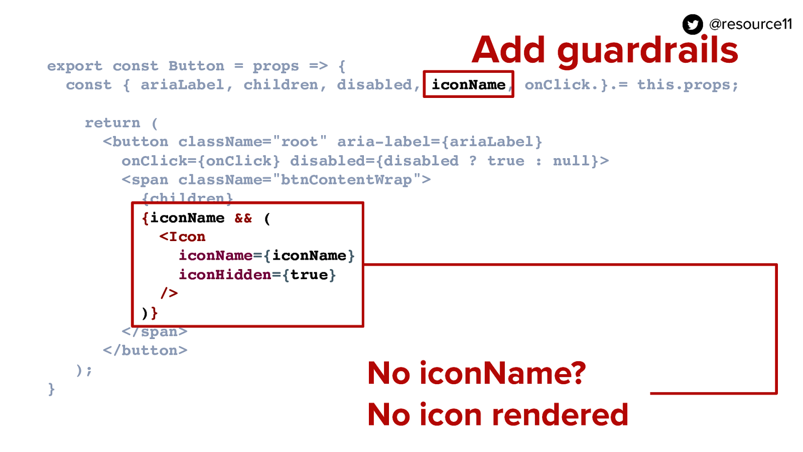
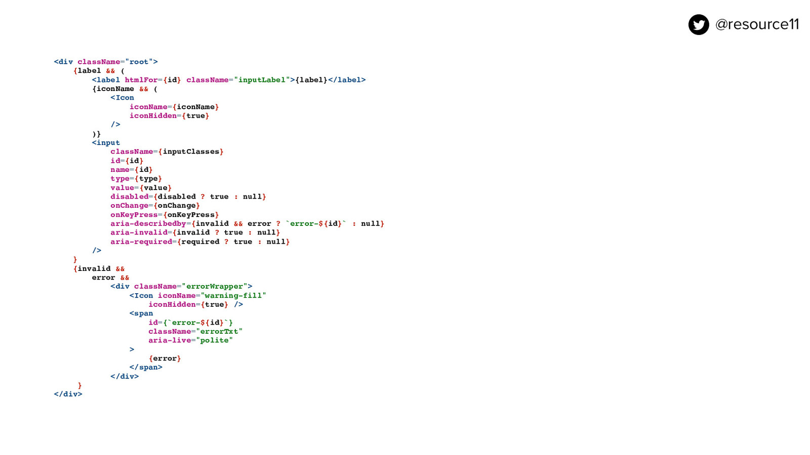
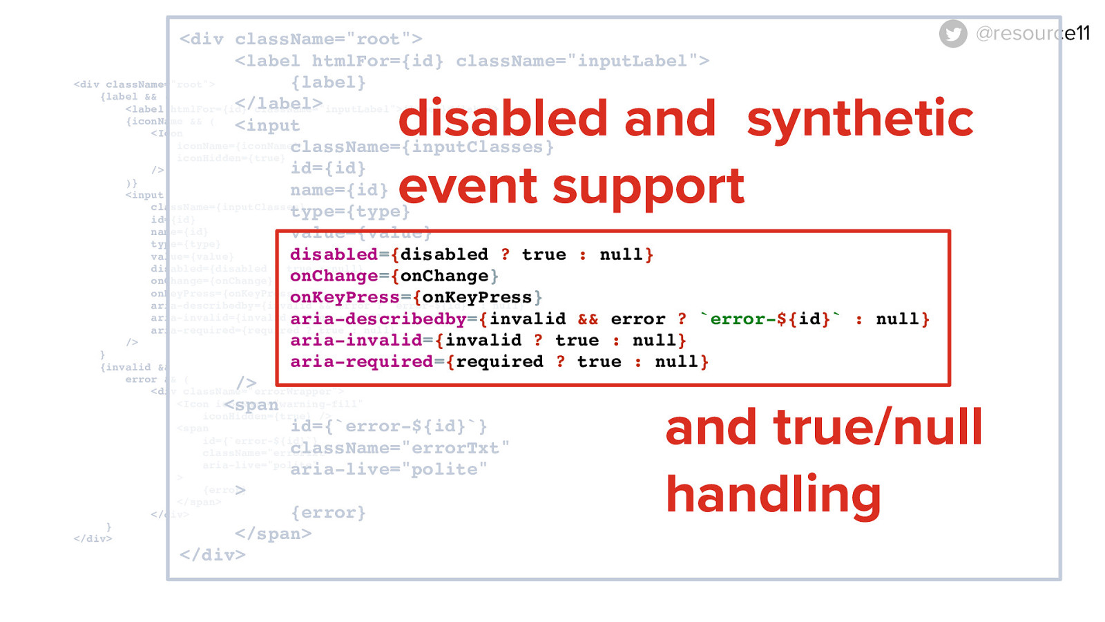
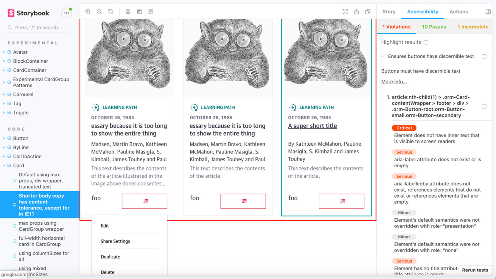
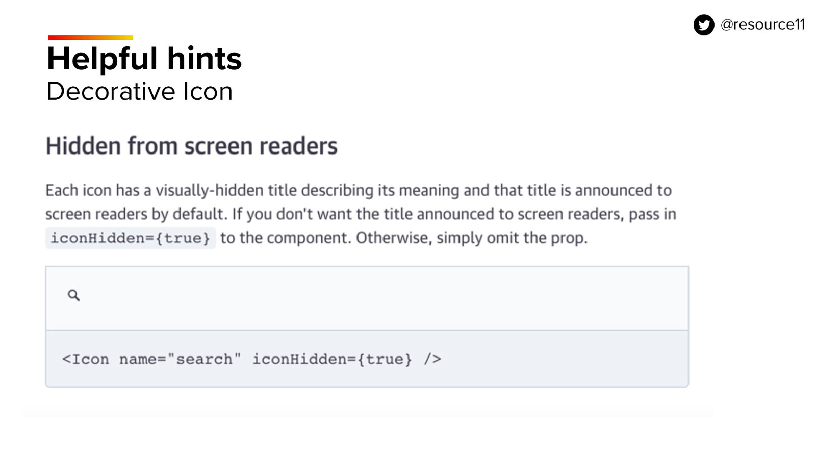
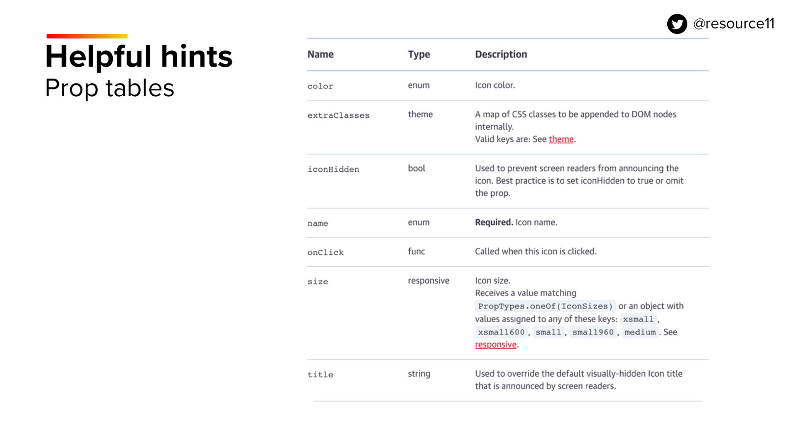
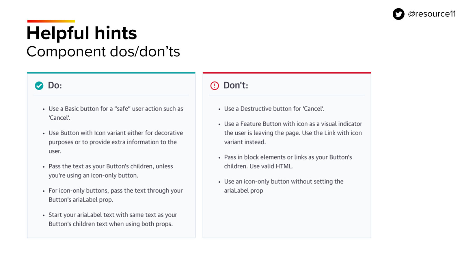
The last guardrail is the iconHidden prop, which is the most important pattern.

If the dev passes in iconHidden true, the containing span’s will render in the DOM with an aria-hidden=”true” attribute.

If no iconHidden prop is passed in, the aria-hidden attribute isn’t attached to the wrapping span at all.

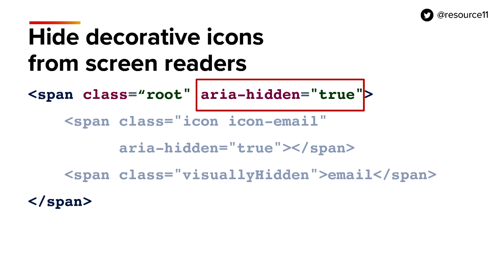
This way, we’re guaranteeing that the icon will read out to screen readers no matter what, unless the dev purposely specifies otherwise by passing in iconHidden value.

This true or null pattern works well with HTML attributes that only need to be added in DOM if the value exists.

aria-hidden is one of those.

Slide 82

Slide 82

Buttons.

Slide 83

Slide 83

Buttons perform an action on the page…

…should look and act like a button…

…and get screen reader and keyboard functionality for free.

Slide 84

Slide 84

Our high quality ingredient here is the button element.

Slide 85

Slide 85

We sprinkle in an aria-label to support instances where we have multiple buttons with the same name on the page to give context to screen reader users. Like those “Read more…” buttons.

This way, a user that’s scanning all the links at once on the page with a screen reader will be able to know . they’re reading more about dinosaurs.

There is a caveat here…

If your app needs to support localization, Adrian Roselli just wrote a great article with a different pattern that uses the aria-describedby attribute.

That resource will be shared in Notist later for those interested.

Slide 86

Slide 86

This is an accessible button in JSX.

Slide 87

Slide 87

If we want to support button text with icons, we mix in our Icon component.

Slide 88

Slide 88

We wrap button contents in a span for positioning.

Note: we’re using inline level elements only inside buttons.

This is because you can only pass in inline content as button children. A div is not inline, it’s a block level element and renders implicitly as a p element in the DOM. P is a block level element.

You also shouldn’t nest buttons or other controls like links inside a button’s children

That’s not valid HTML.

Slide 89

Slide 89

The JSX is popped into the Component’s render method, and we add props, onClick handler and disabled button support

Slide 90

Slide 90

The one guardrail we add ensures if no iconName is passed in, no icon will render in the button.

Slide 91

Slide 91

Inputs.

Slide 92

Slide 92

Inputs need labels and error messages.

Labeled inputs give all users more context.

Slide 93

Slide 93

Placeholders are NOT labels.

Avoid using placeholders instead of labels, users will lose context.

They’re hard to style across browsers, and placeholders aren’t auto translated.

Slide 94

Slide 94

Be kind to your screen magnification users, and don’t force them to scroll horizontally to read your content.

Make sure your inputs are no wider than 80 characters.

Keep labels and error messages stacked vertically in close proximity

Labels above input, errors below input, so users that are using Picture-in-picture screen zoom feature have all the information in a small window of space, so they’re not hunting around for the purpose of an input, and steps to correct an error if something needs fixing.

Slide 95

Slide 95

This is an accessible input pattern. It’s a bit hard to read so let’s zoom in.

Slide 96

Slide 96

We start with our high-quality ingredients.

Slide 97

Slide 97

Pairing labels and error messages to the input…

Slide 98

Slide 98

…and in JSX we associate the label with the input by pairing the label’s htmlFor prop value with the input id value.

Slide 99

Slide 99

Mix in key ARIA spices for validation.

Aria-invalid, aria-required, and the pair the aria-describedby and error text id values

Slide 100

Slide 100

We also add an aria-live=“polite” to error message text to announce any errors for screen readers

Slide 101

Slide 101

To make this more flexible… mix in disabled attribute support onChange and OnKeypress synthetic events. to capture keyboard actions.

Add true/null handling for the boolean props.

Slide 102

Slide 102

Add your guardrails.

If the dev doesn’t pass in a label, the whole input won’t render. Neither will the icon.

This will help guide the developer to follow best practices when implementing a component, and it will become second nature.

Slide 103

Slide 103

Same goes for the error handling.

If the developer doesn’t pass in both the invalid prop and the error message prop to the component, it won’t render.

Slide 104

Slide 104

Documentation.

Those massive design systems out there definitely have some drool-worthy patterns for us to dream about.

If your team is small, showing examples of the many ways your component can be used is a good first step.

Slide 105

Slide 105

Since we’re still exploring how to scale our system, our docs use Gatsby for our style guide and Storybook to document our components. We host static instances of these sites on Now.

Slide 106

Slide 106

I want to touch upon Storybook for a moment.

Storybook is a great way to Sandbox your components in isolation.

You can play with UI logic without the complexities of business logic.

The accessibility add-on is a must.

Slide 107

Slide 107

That add-on uses Deque’s axe-core engine, and does the heavy lifting for you, by performing quick audits on your components and testing then against WCAG success criteria.

The add-on is great because it Identifies errors, tells you how serious they are, and gives you steps to fix them before you continue doing your manual testing.

Slide 108

Slide 108

Add helpful hints to help developers choose how to implement your components.

For example, how to give use an informative icon.

Slide 109

Slide 109

Or a implement a decorative icon.

Slide 110

Slide 110

Be sure to add prop tables for your components, so your developers know which prop does what, and whether it’s required.

Slide 111

Slide 111

Component dos and don’ts are essential.

Slide 112

Slide 112

Also, dedicate a page to accessibility resources and links.

The WCAG success criteria is really intense to parse.

If you have curated any articles that help explain how to implement common accessibility patterns, add those to your docs.

Slide 113

Slide 113

So to wrap up…

Slide 114

Slide 114

Our users are diverse.

Slide 115

Slide 115

Your design system is a cookbook.

Slide 116

Slide 116

Cookbooks have personality.

Slide 117

Slide 117

React is a kitchen utensil.

Slide 118

Slide 118

You are the cook.

Slide 119

Slide 119

Components are your tried and true recipes.

Slide 120

Slide 120

WCAG is your reference material.

Slide 121

Slide 121

…and Document, document, document.

And remember…

Slide 122

Slide 122

Dinosaurs are always the hotness.

Slide 123

Slide 123

Thank you.

Slide 124

Slide 124

https://noti.st/resource11/1ecxhG

Slide deck posted after the talk.

@resource11 Twitter | Instagram | GitHub