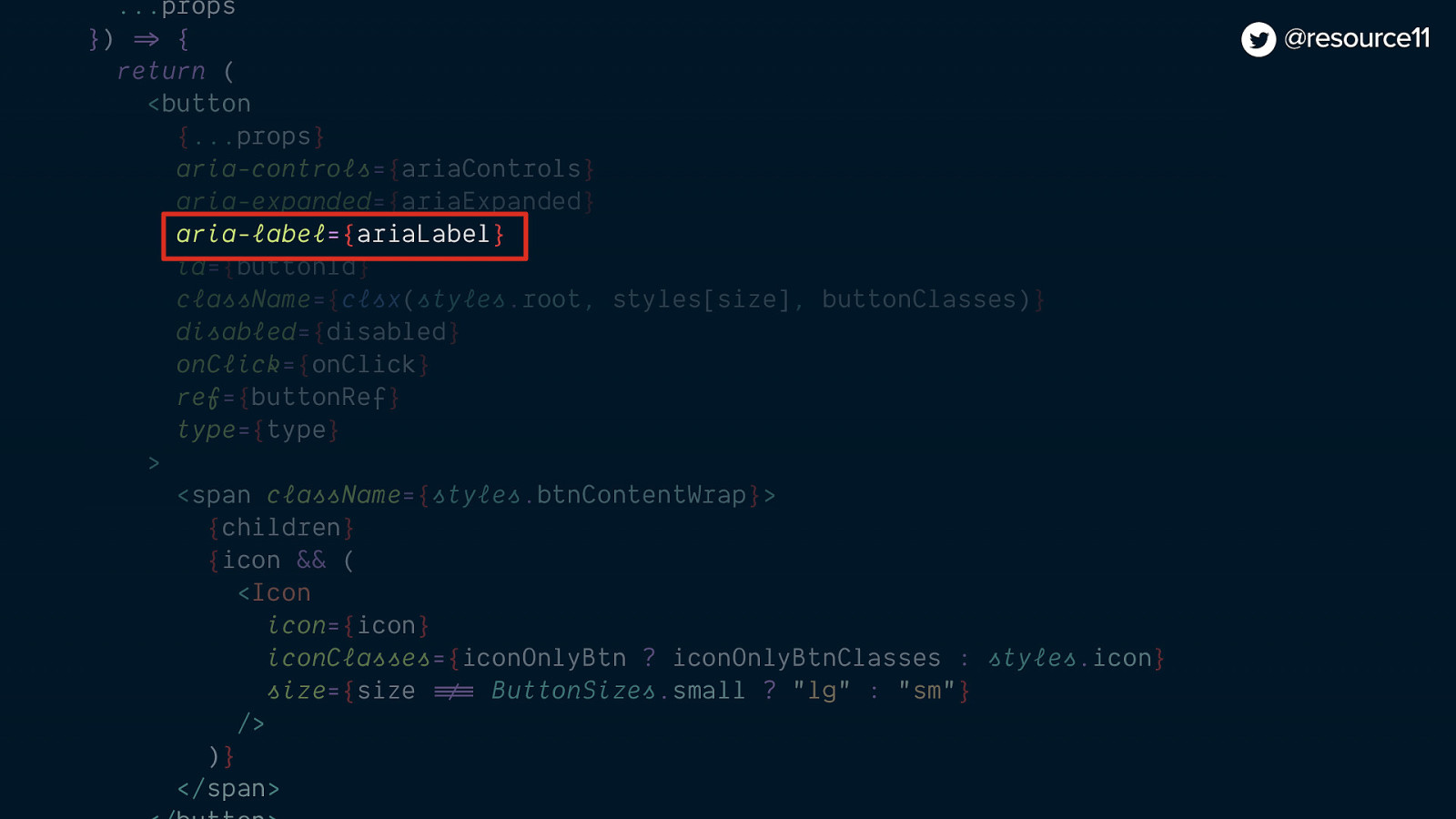
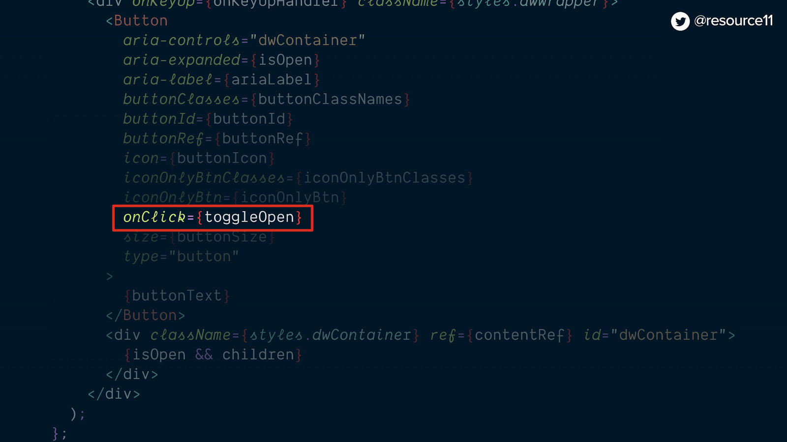
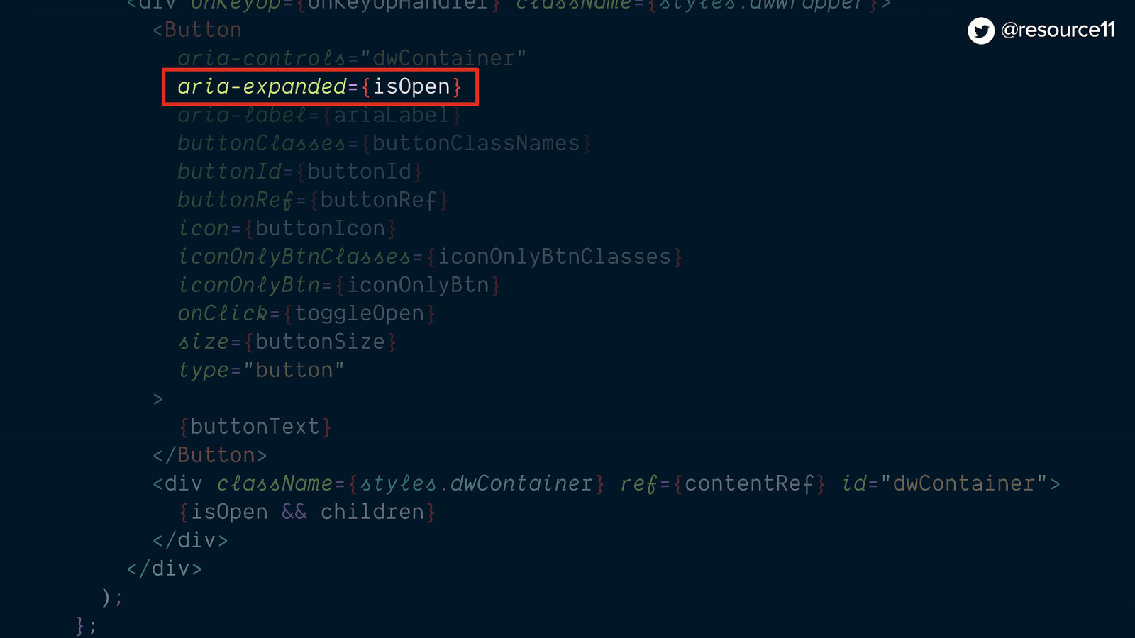
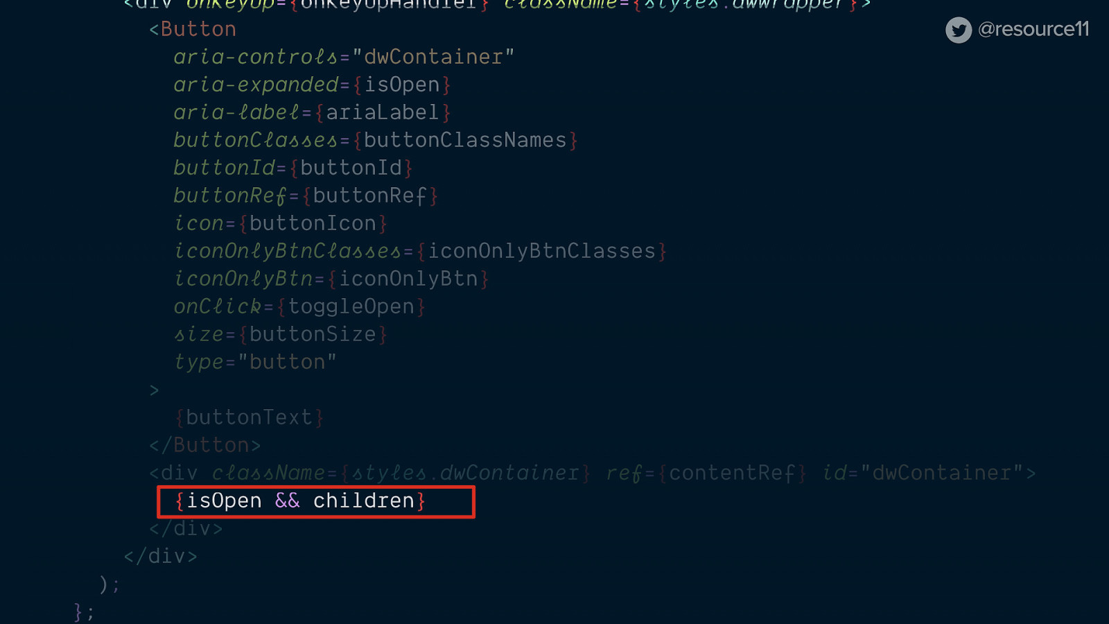
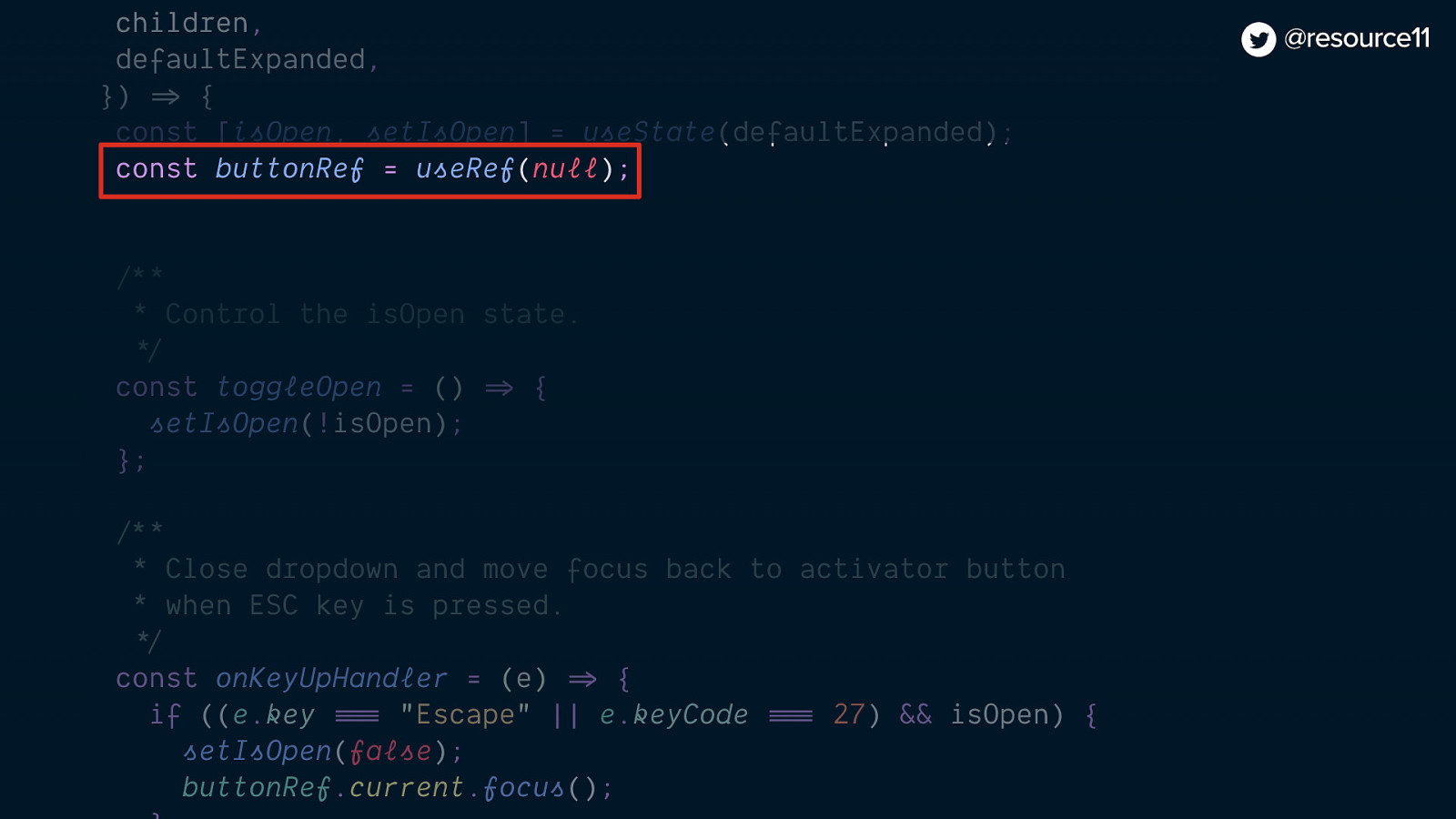
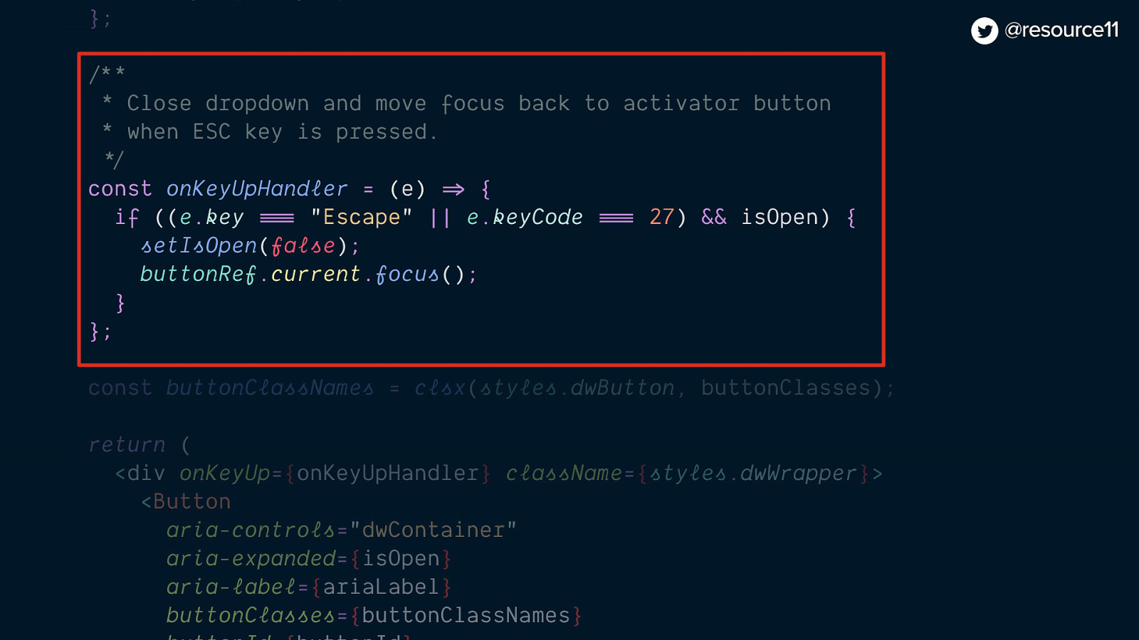
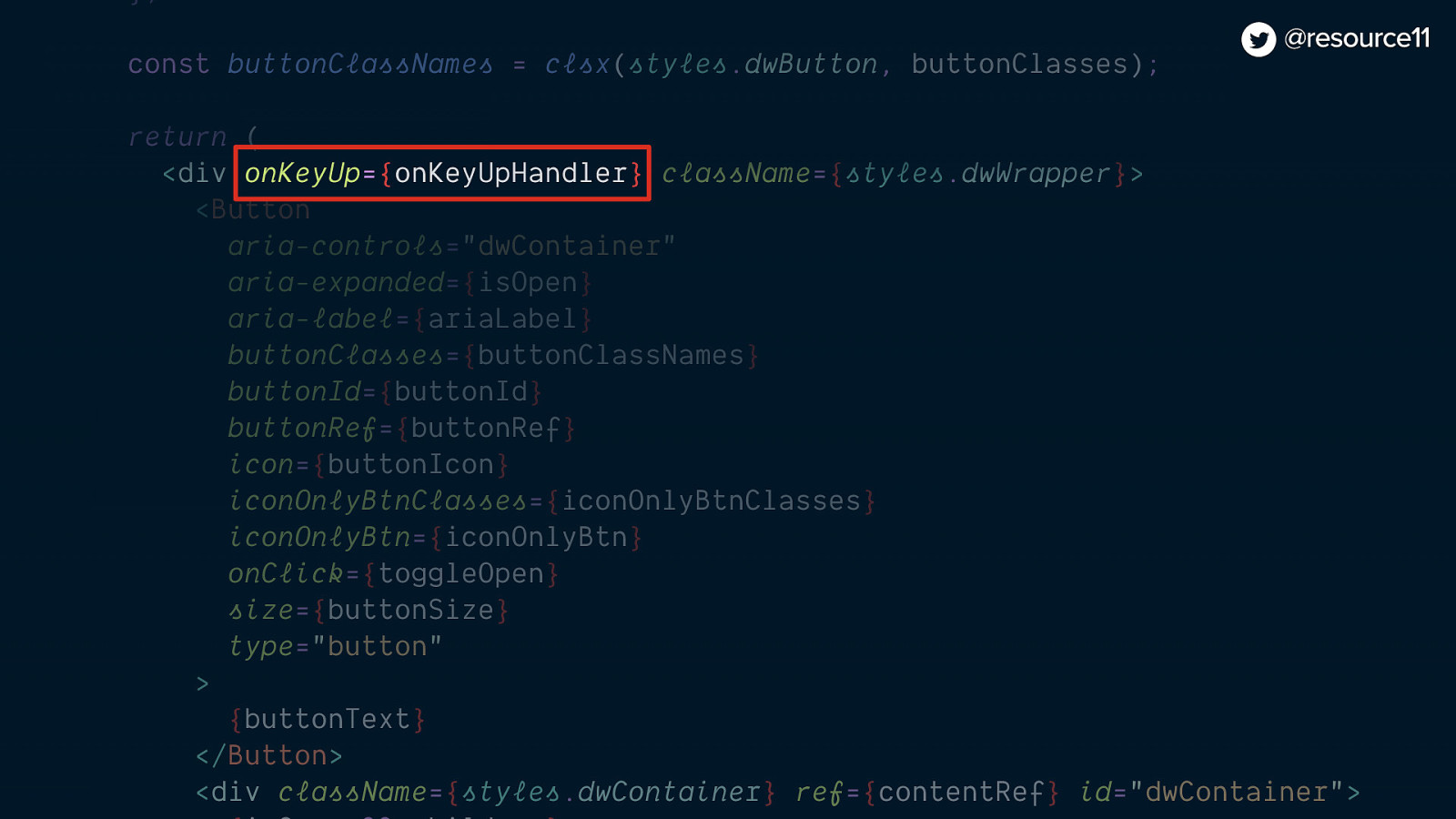
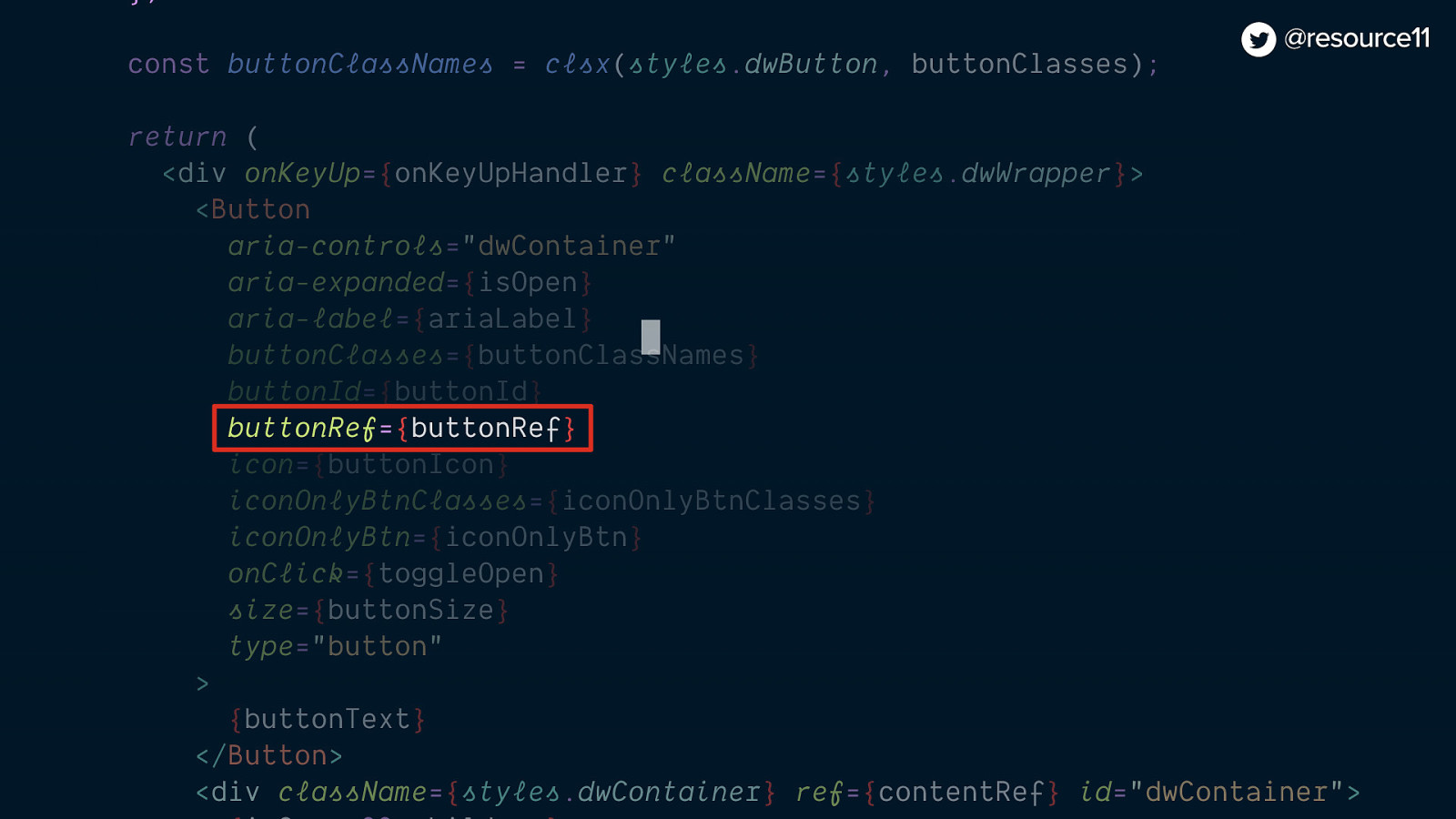
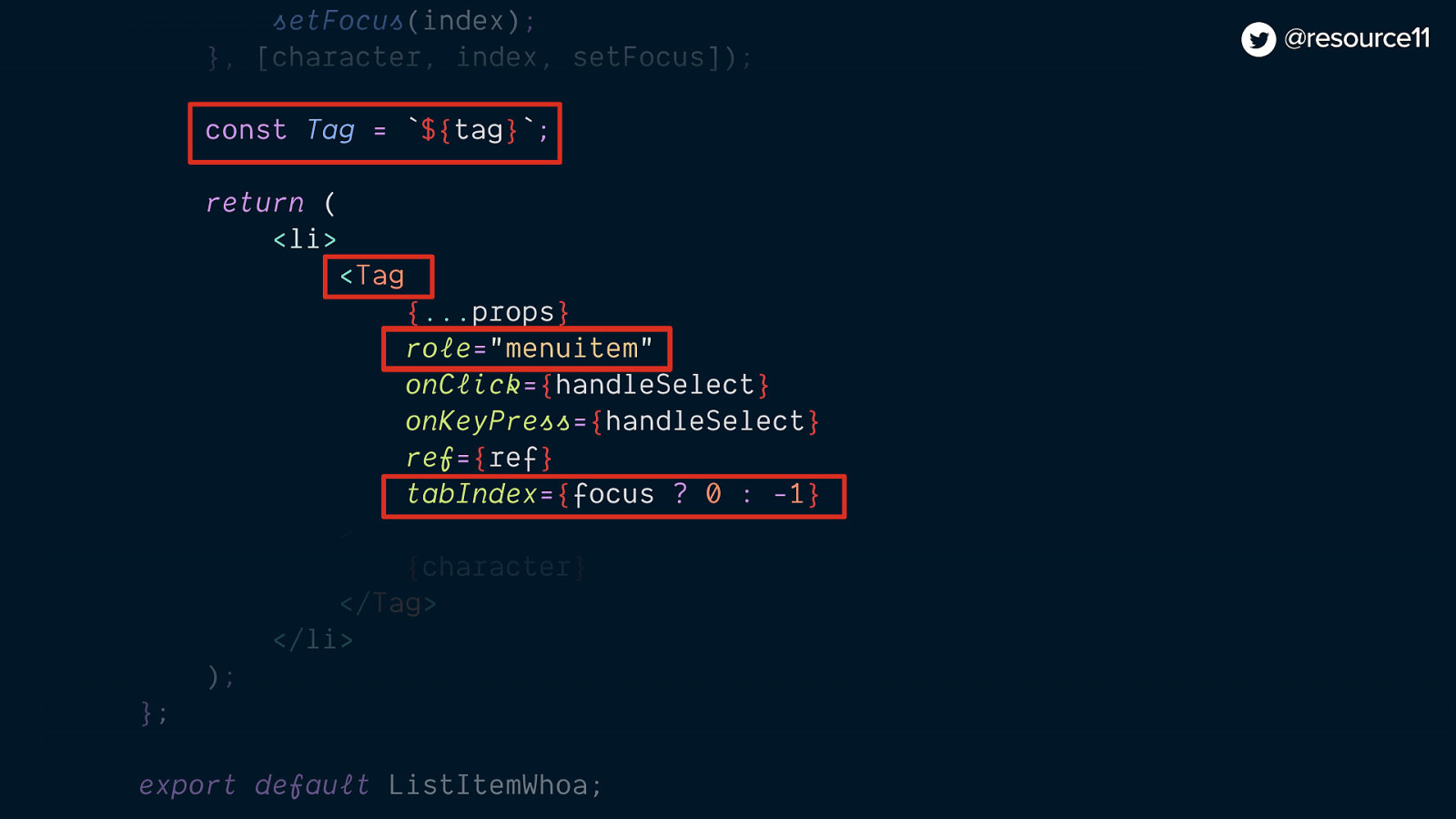
image: code snipped of unordered list of links
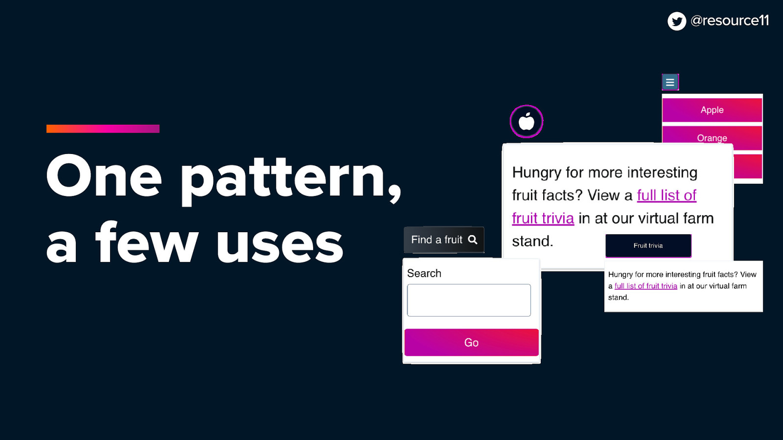
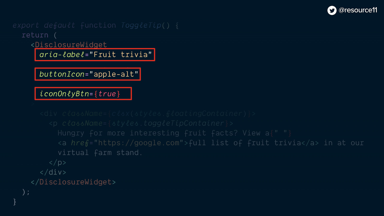
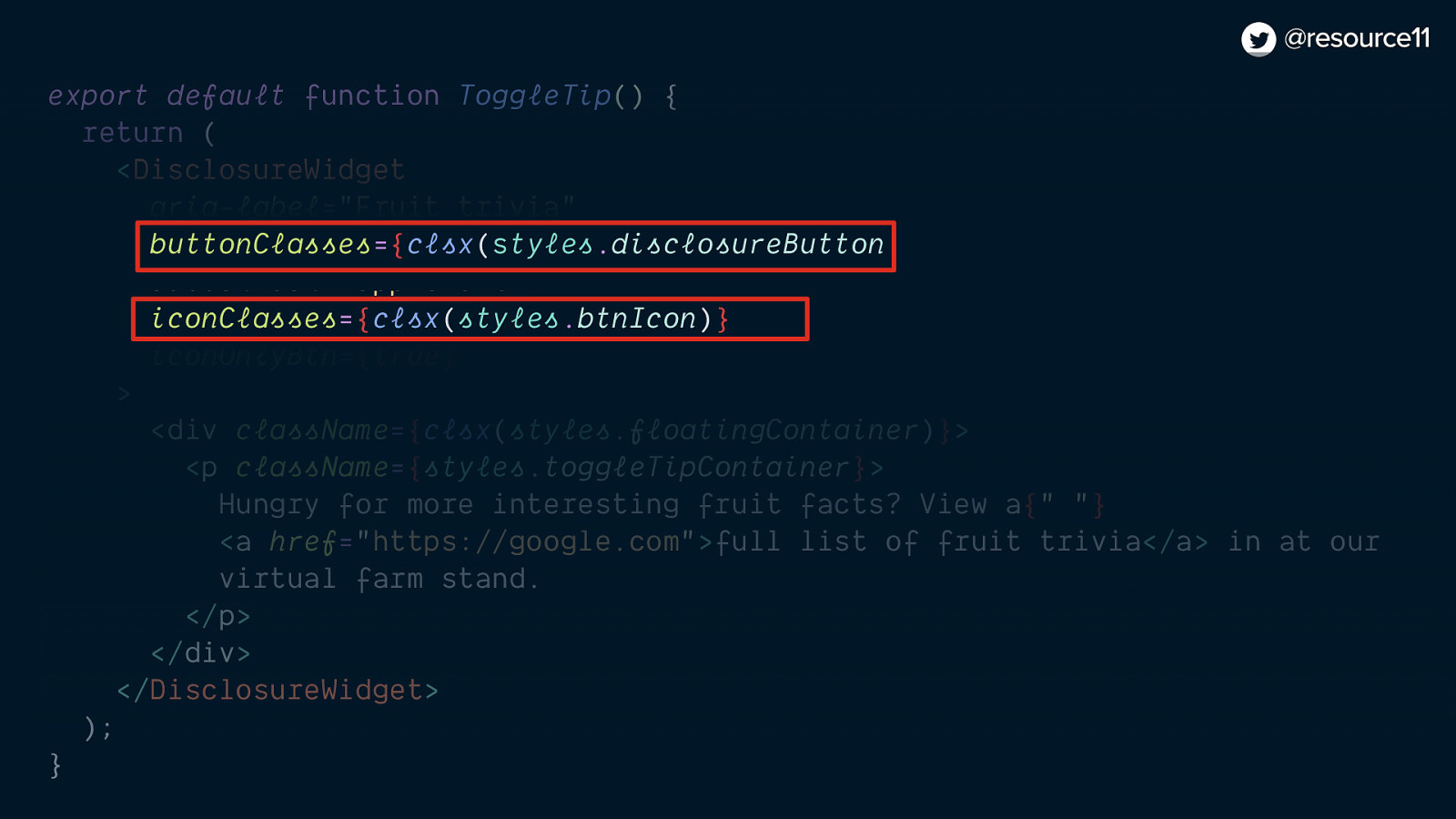
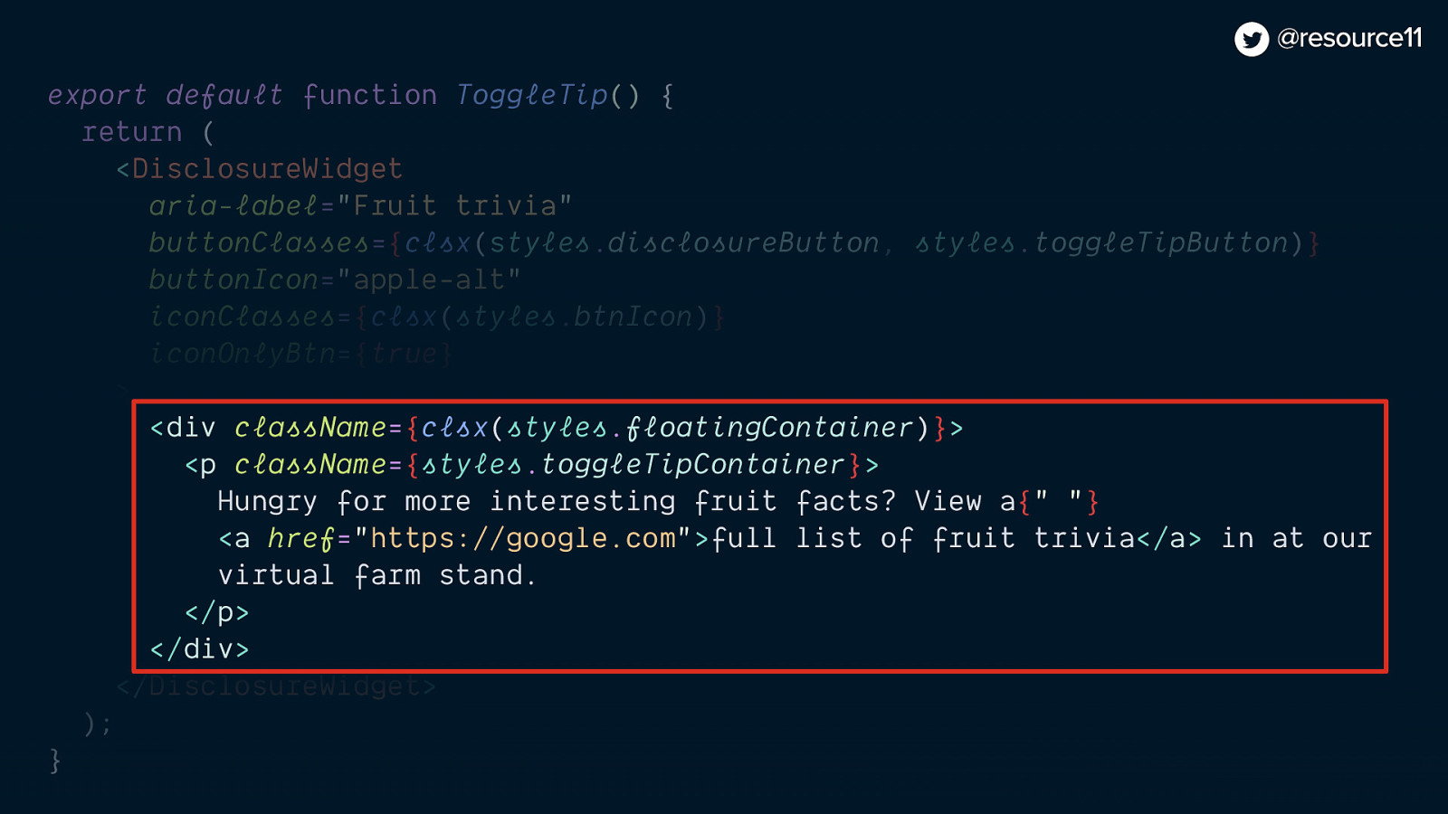
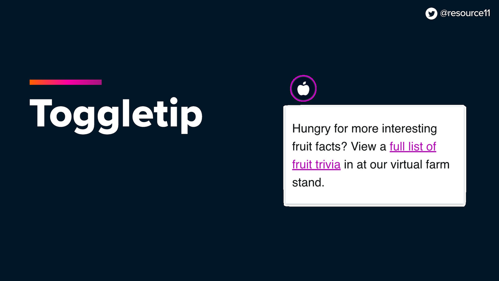
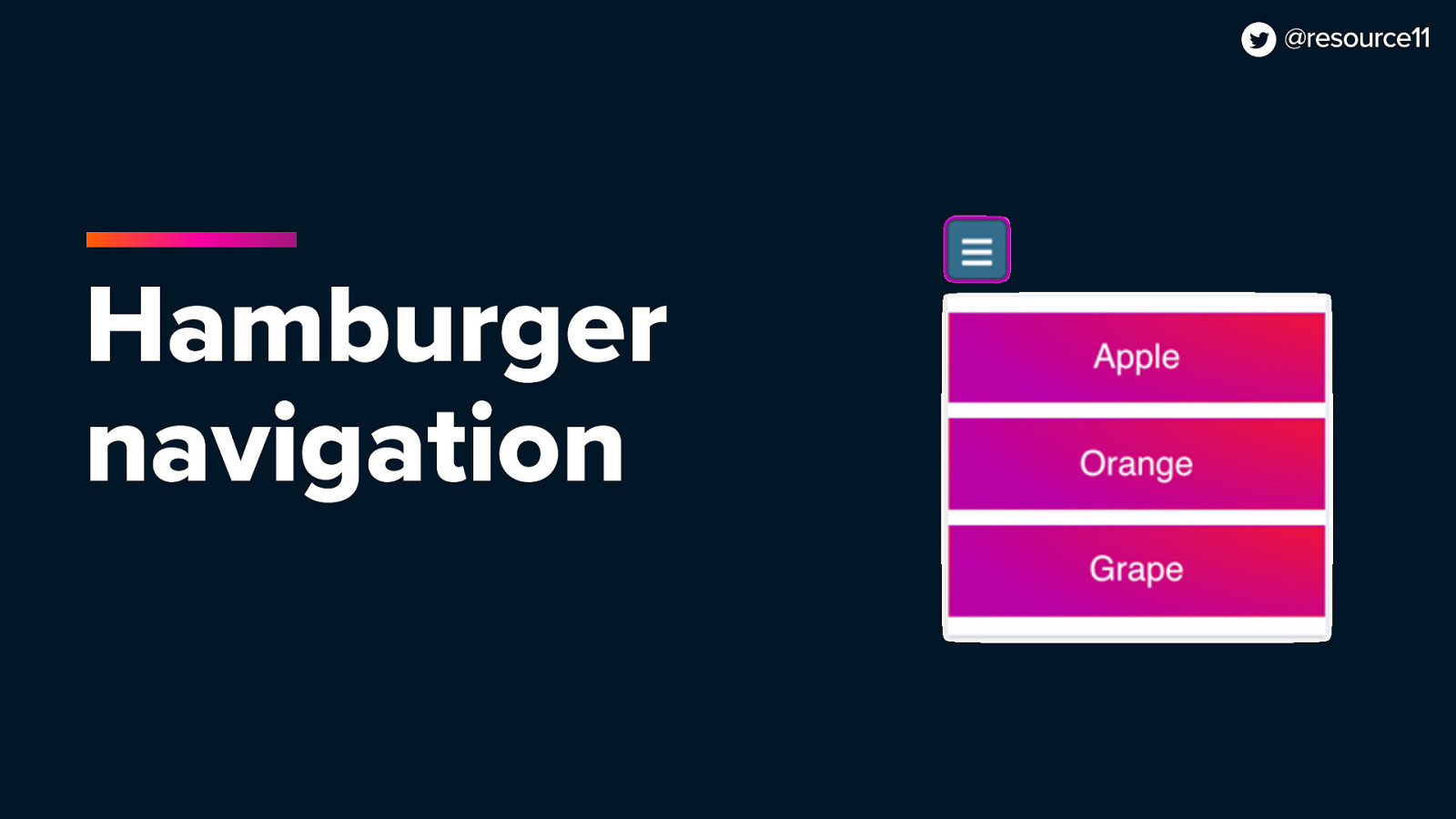
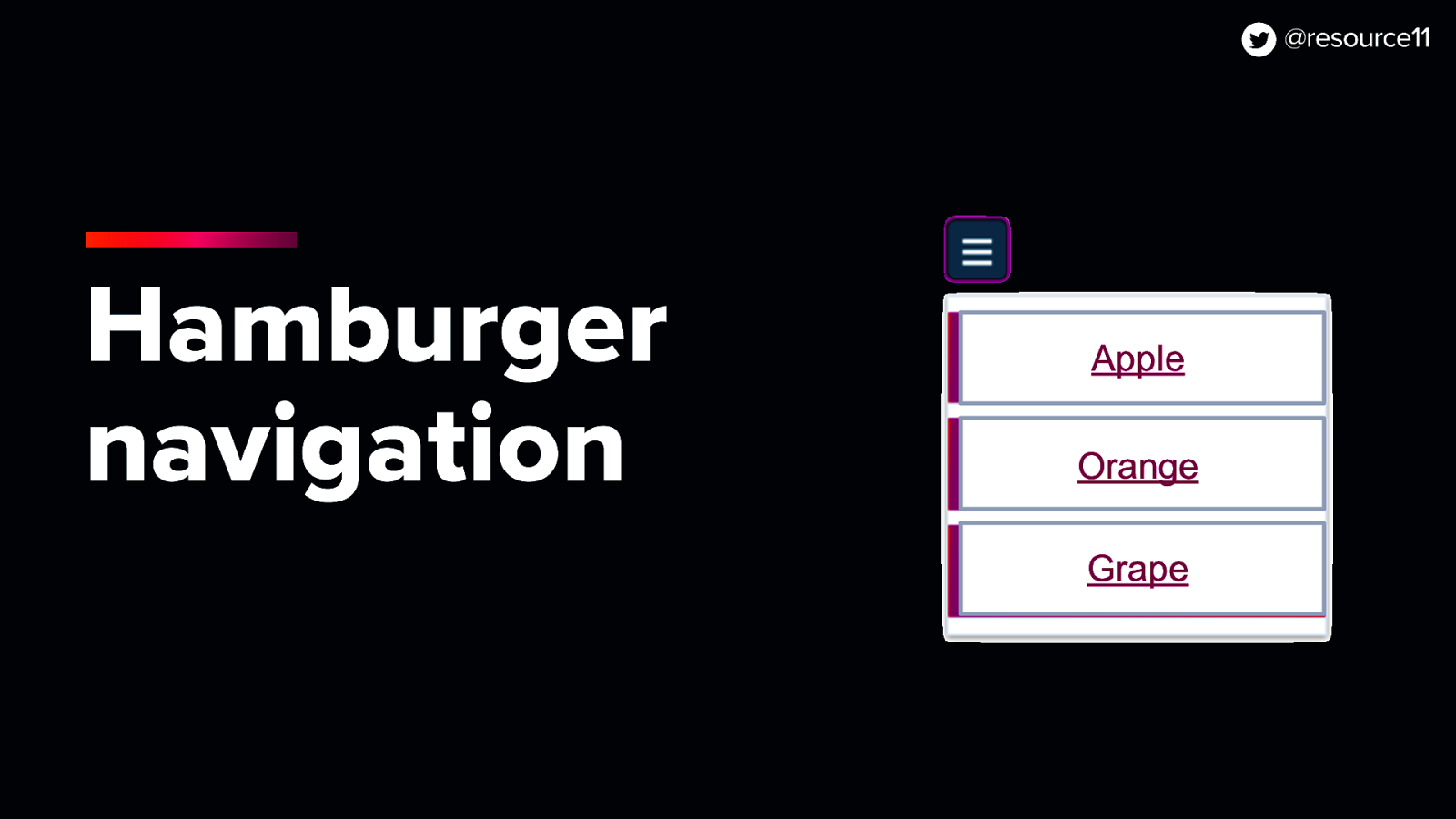
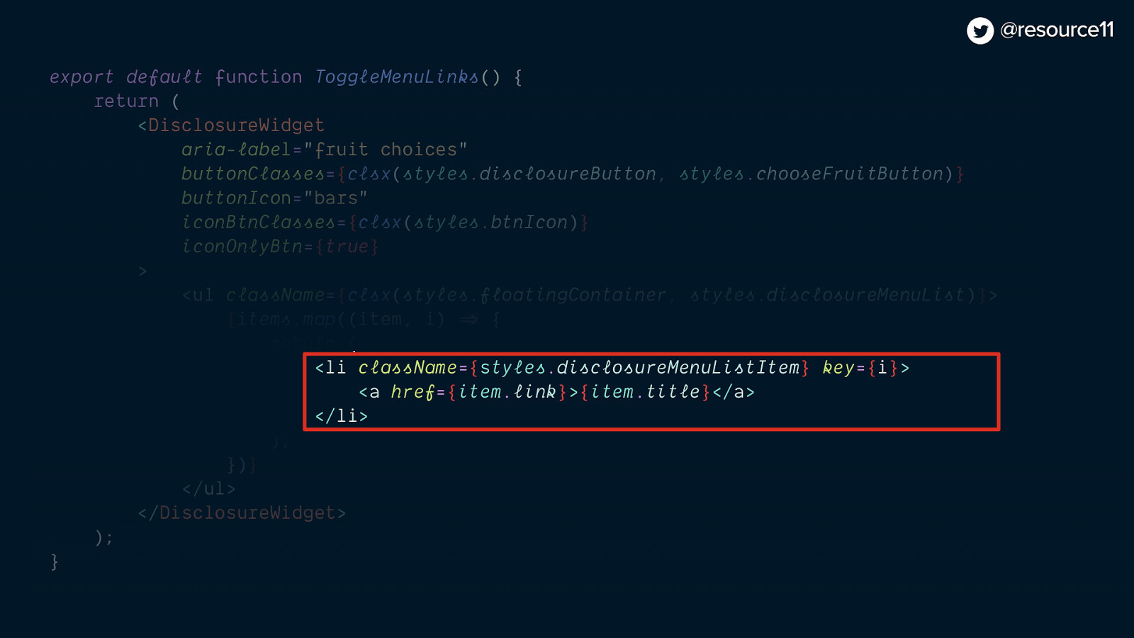
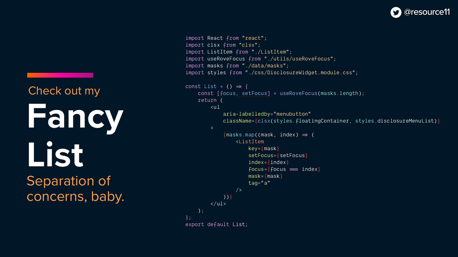
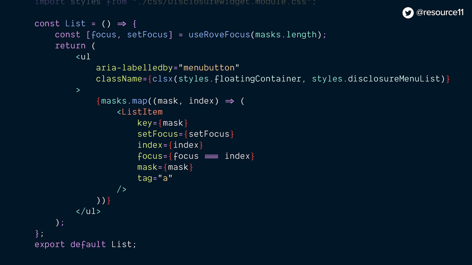
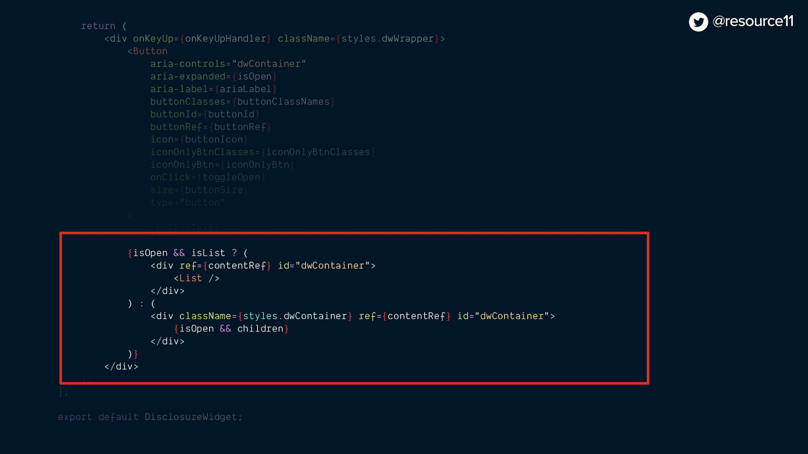
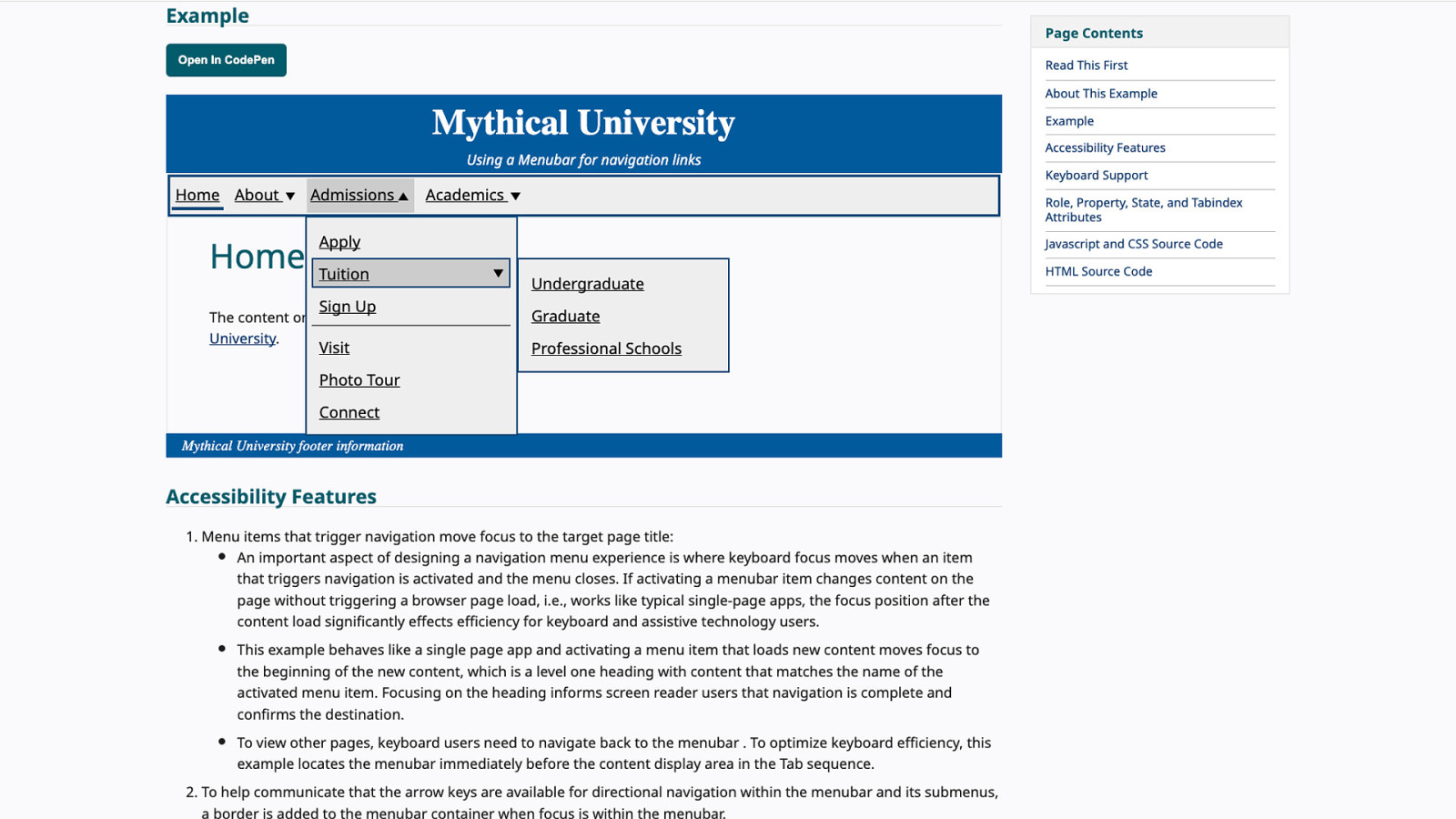
Cool. Let’s add some links into our disclosure widget now. We’ll find a quick way of doing this, like, passing an unordered list.
And mapping those links. Yeah, this is cool. We could just… map in some links.
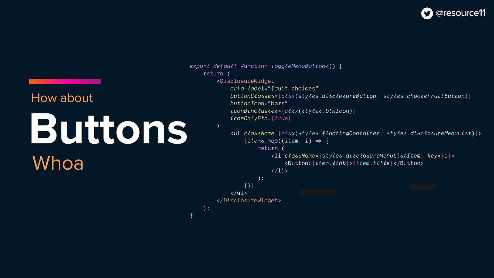
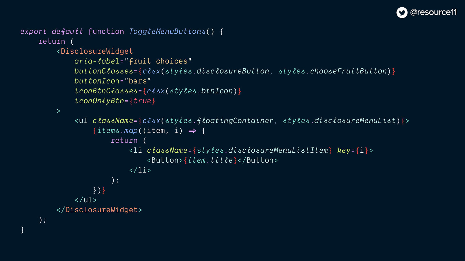
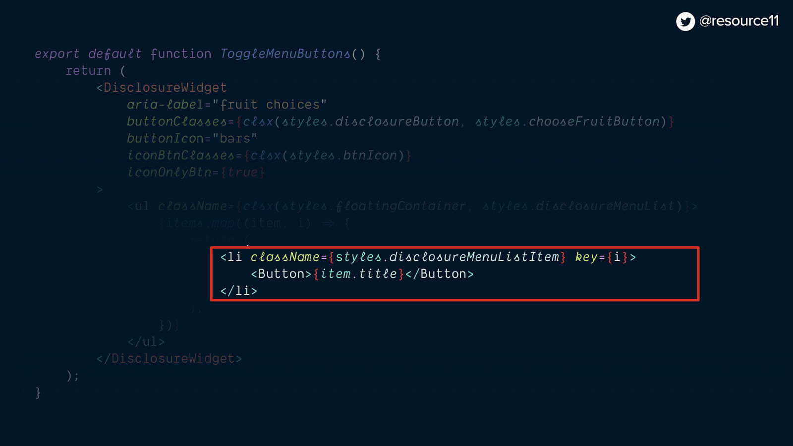
And hey! We can have a widget with a hamburger menu, and make this toggle menu links just to have a quick thing without even making it a new component. That could be fun.
[jsx code]
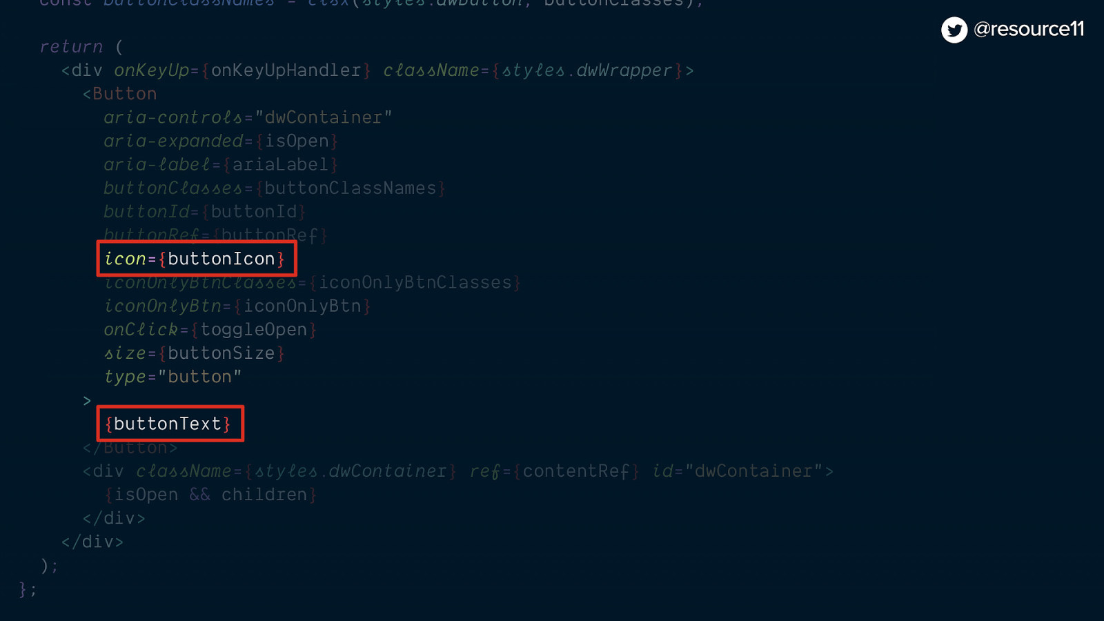
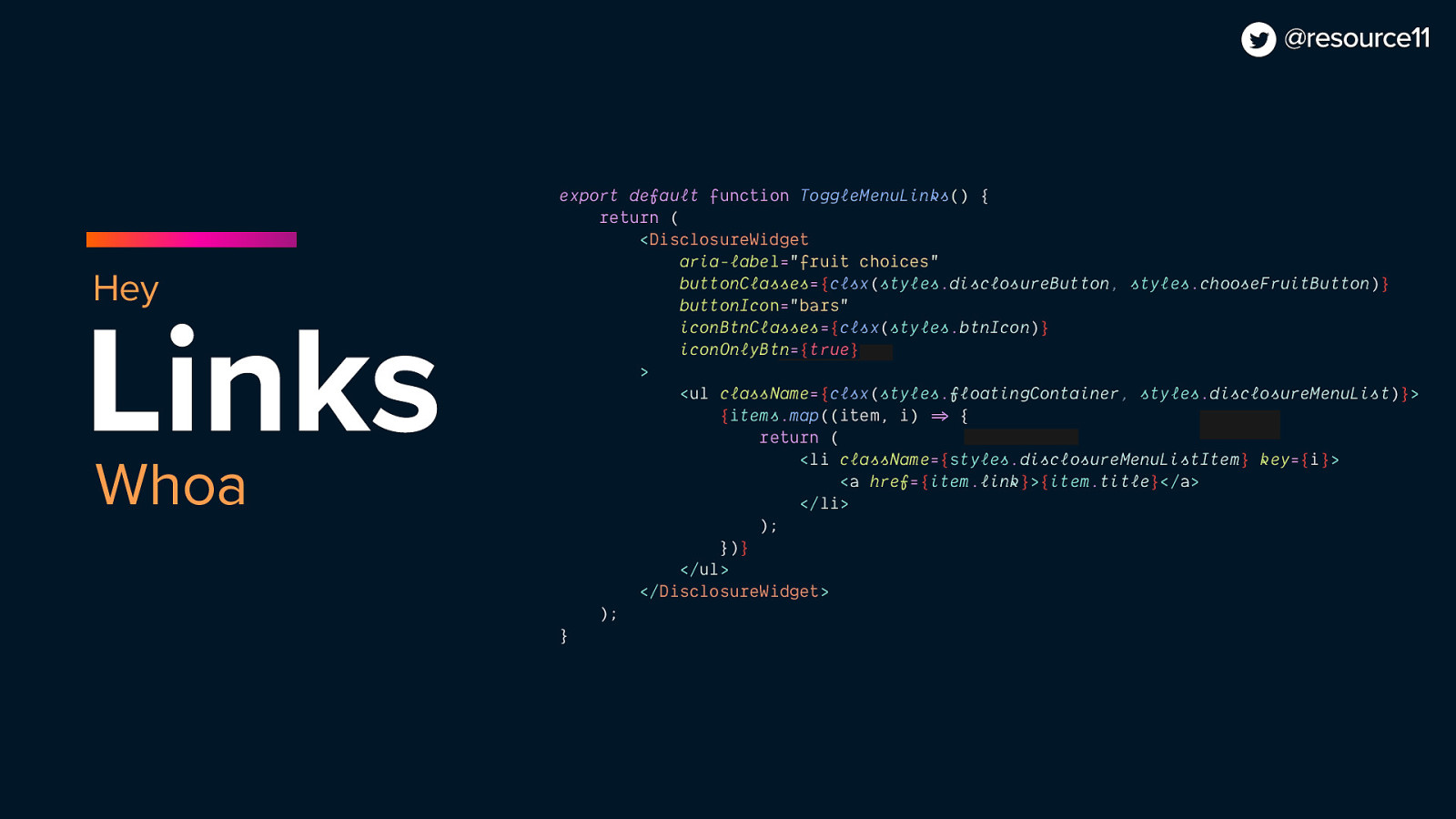
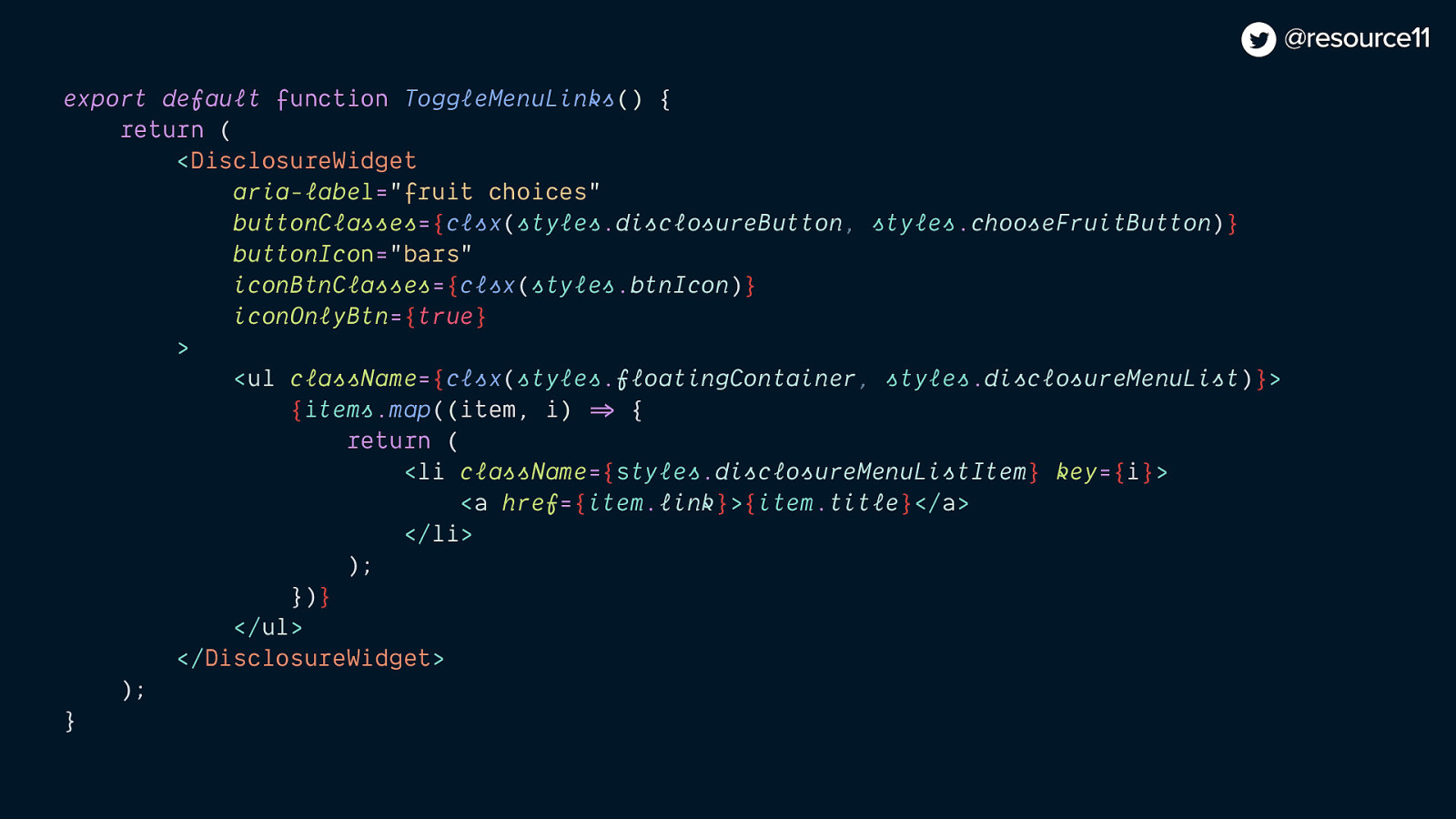
export default function ToggleMenuLinks() { return ( <DisclosureWidget aria-label=”fruit choices” buttonClasses={clsx(styles.disclosureButton, styles.chooseFruitButton)} buttonIcon=”bars” iconBtnClasses={clsx(styles.btnIcon)} iconOnlyBtn={true} > <ul className={clsx(styles.floatingContainer, styles.disclosureMenuList)}> {items.map((item, i) => { return ( <li className={styles.disclosureMenuListItem} key={i}> <a href={item.link}>{item.title}</a> </li> ); } )} </ul> </DisclosureWidget> ); }


