
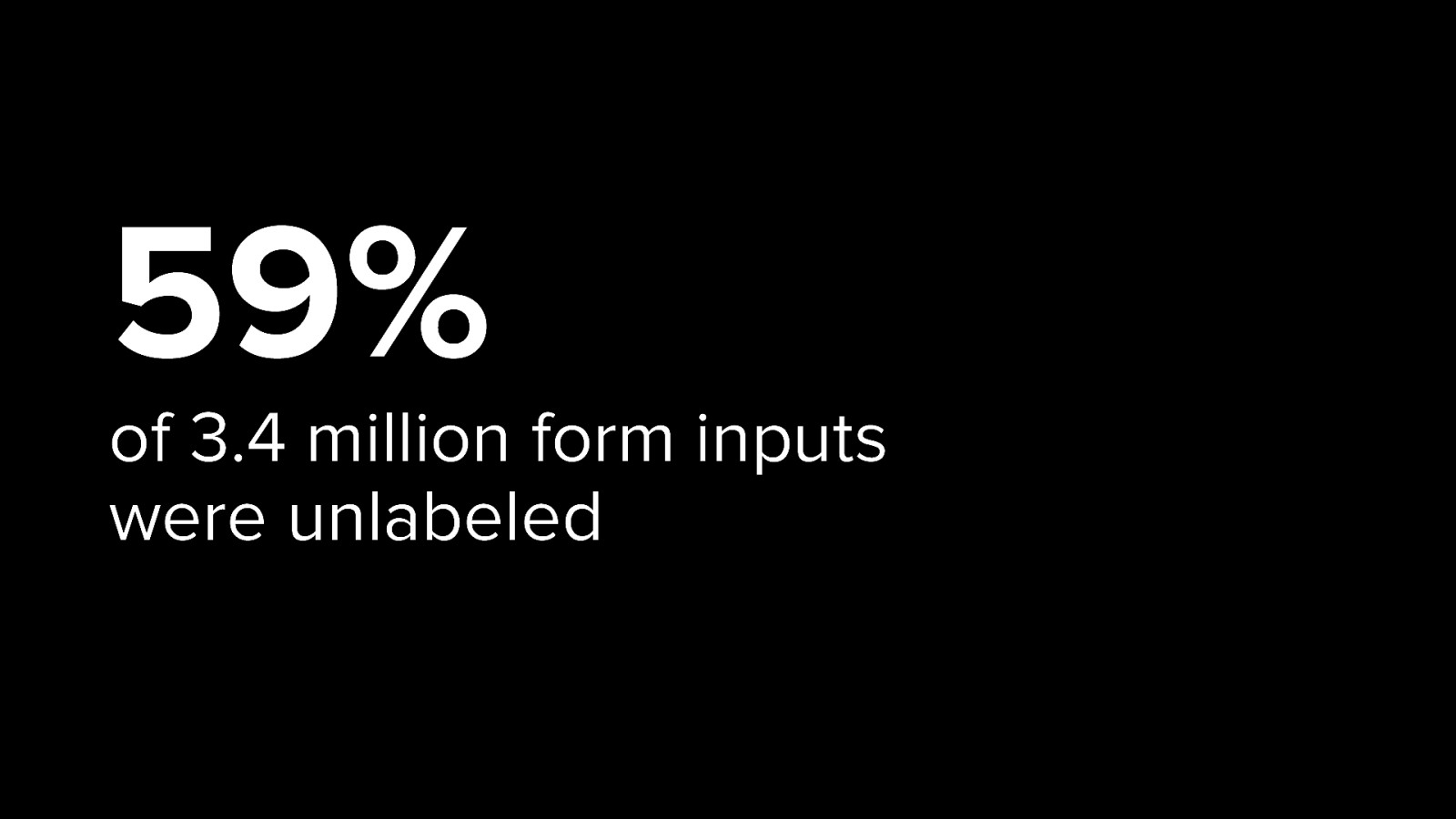
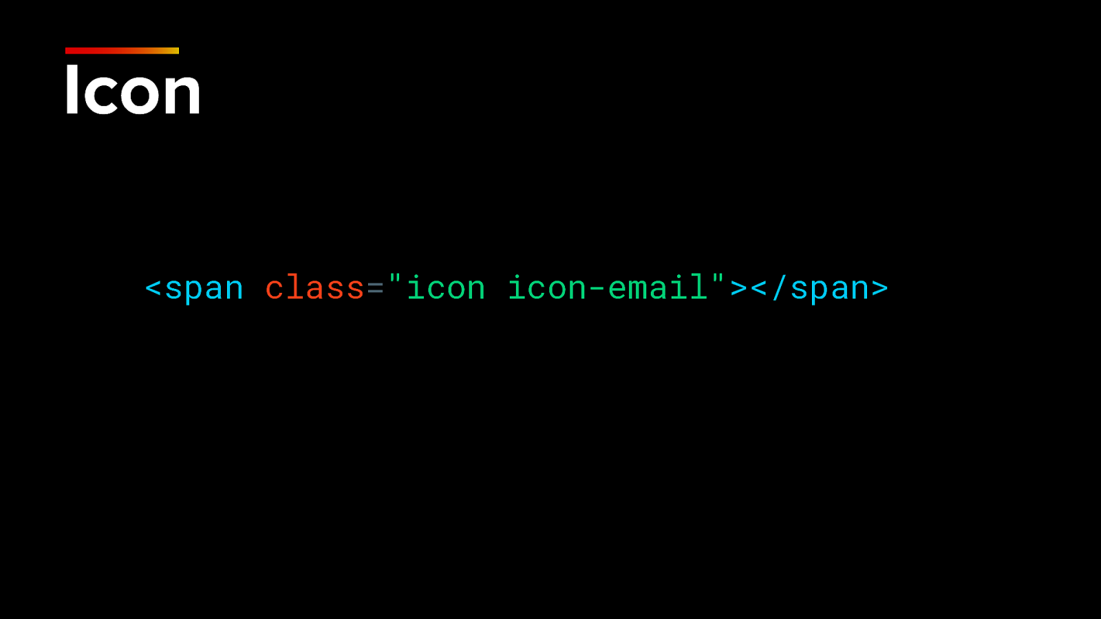
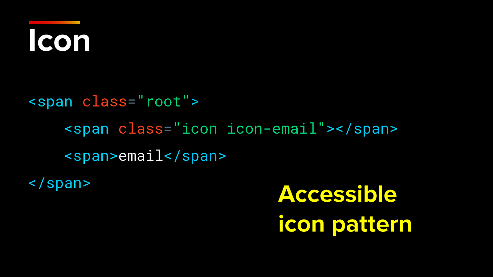
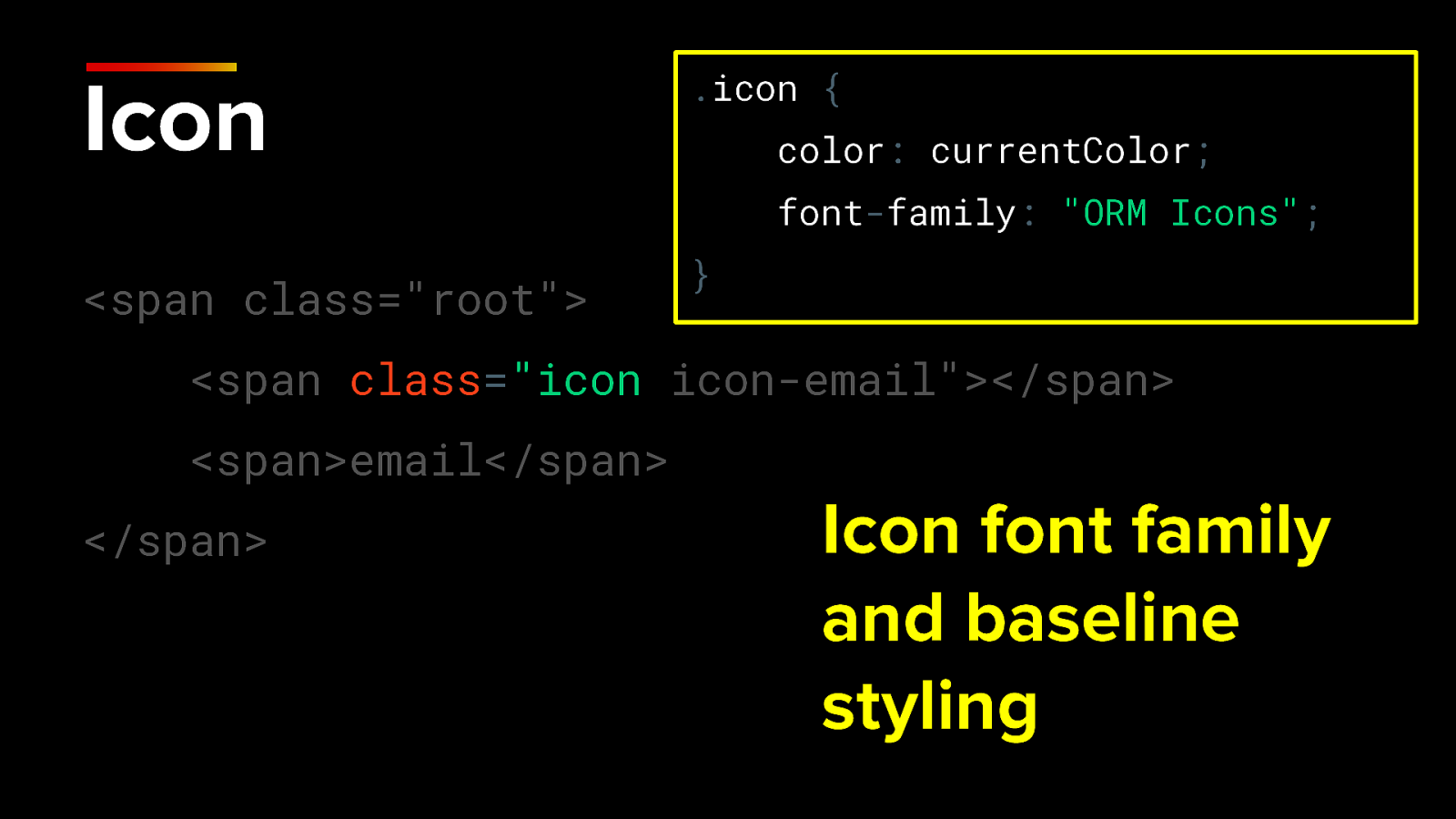
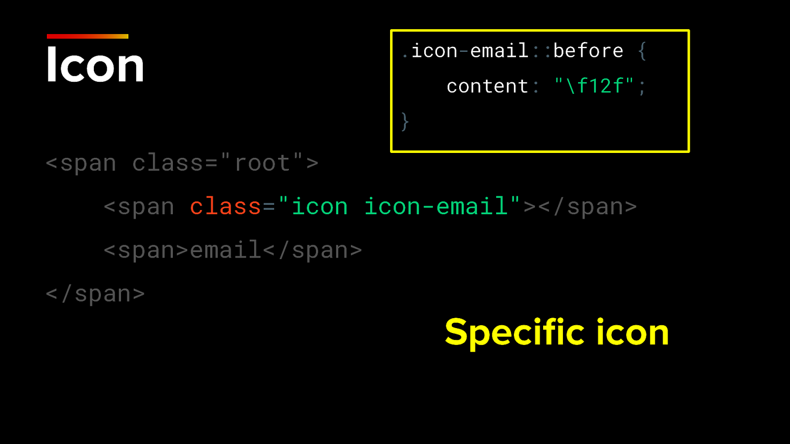
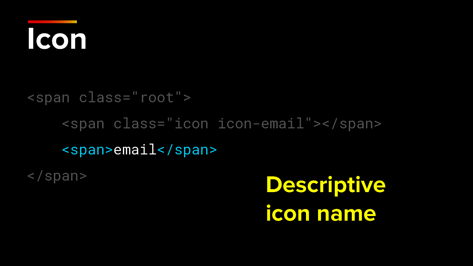
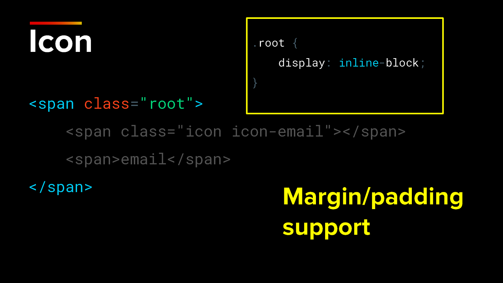
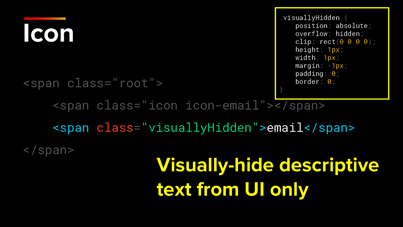
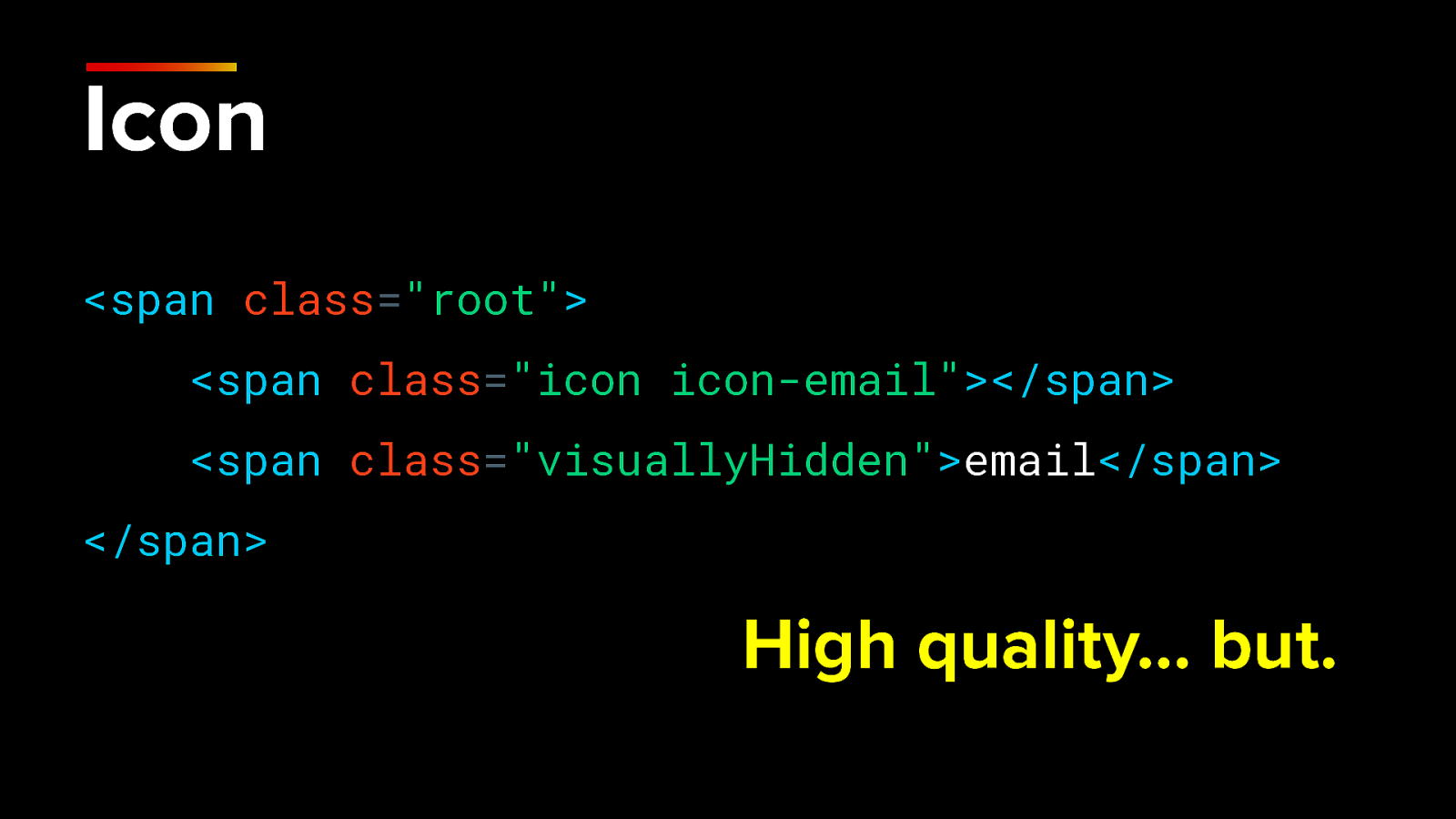
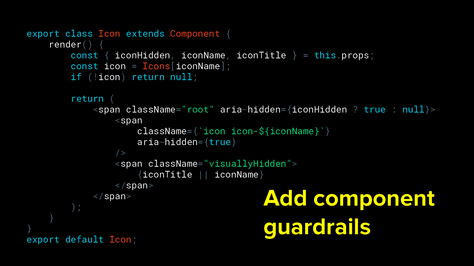
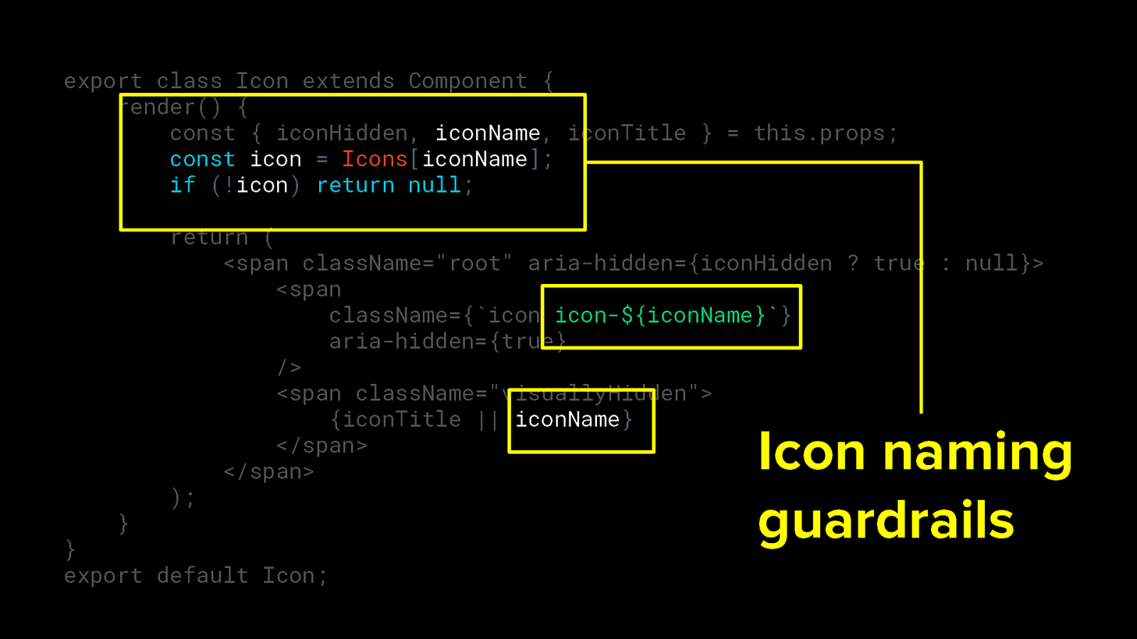
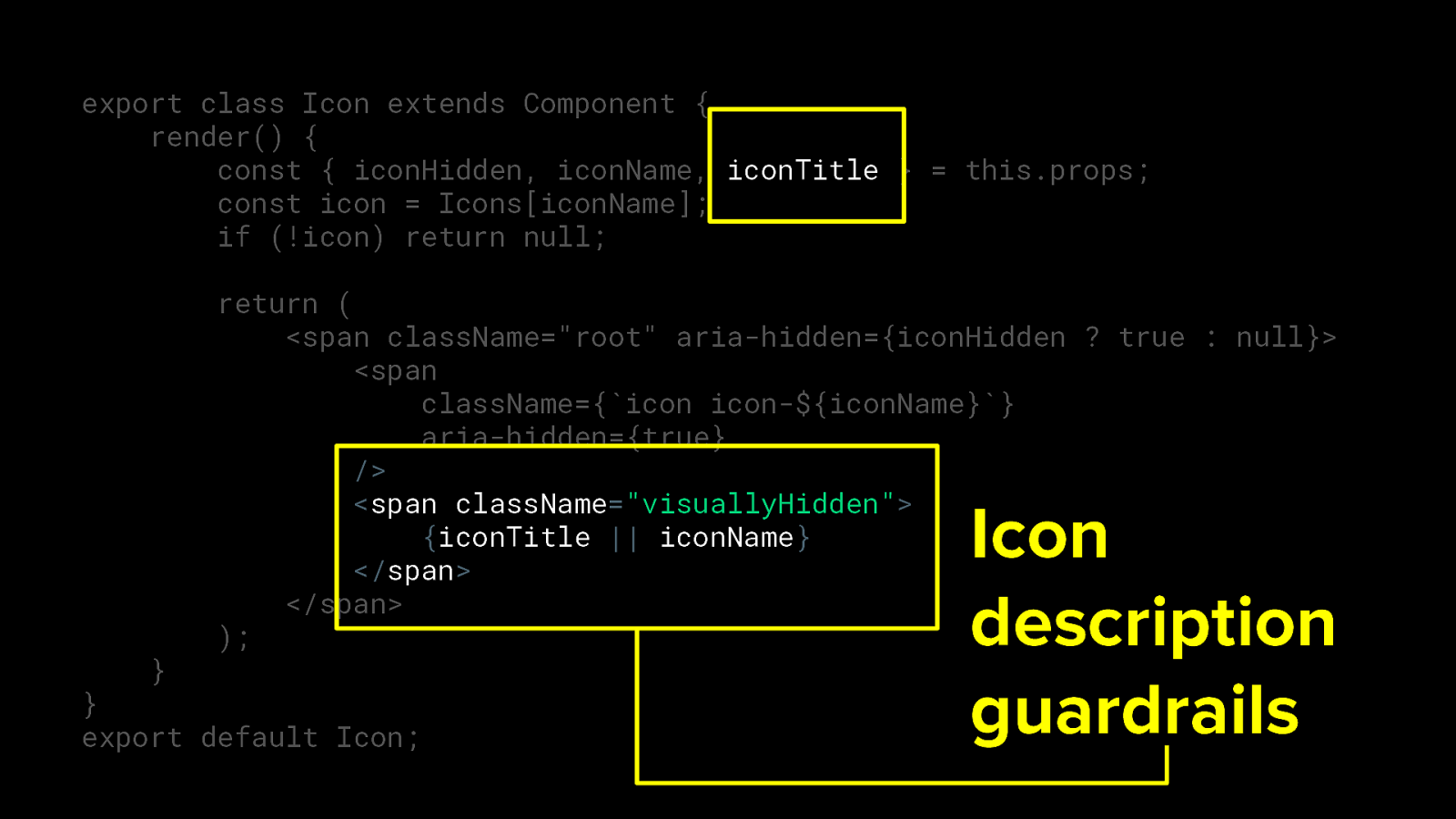
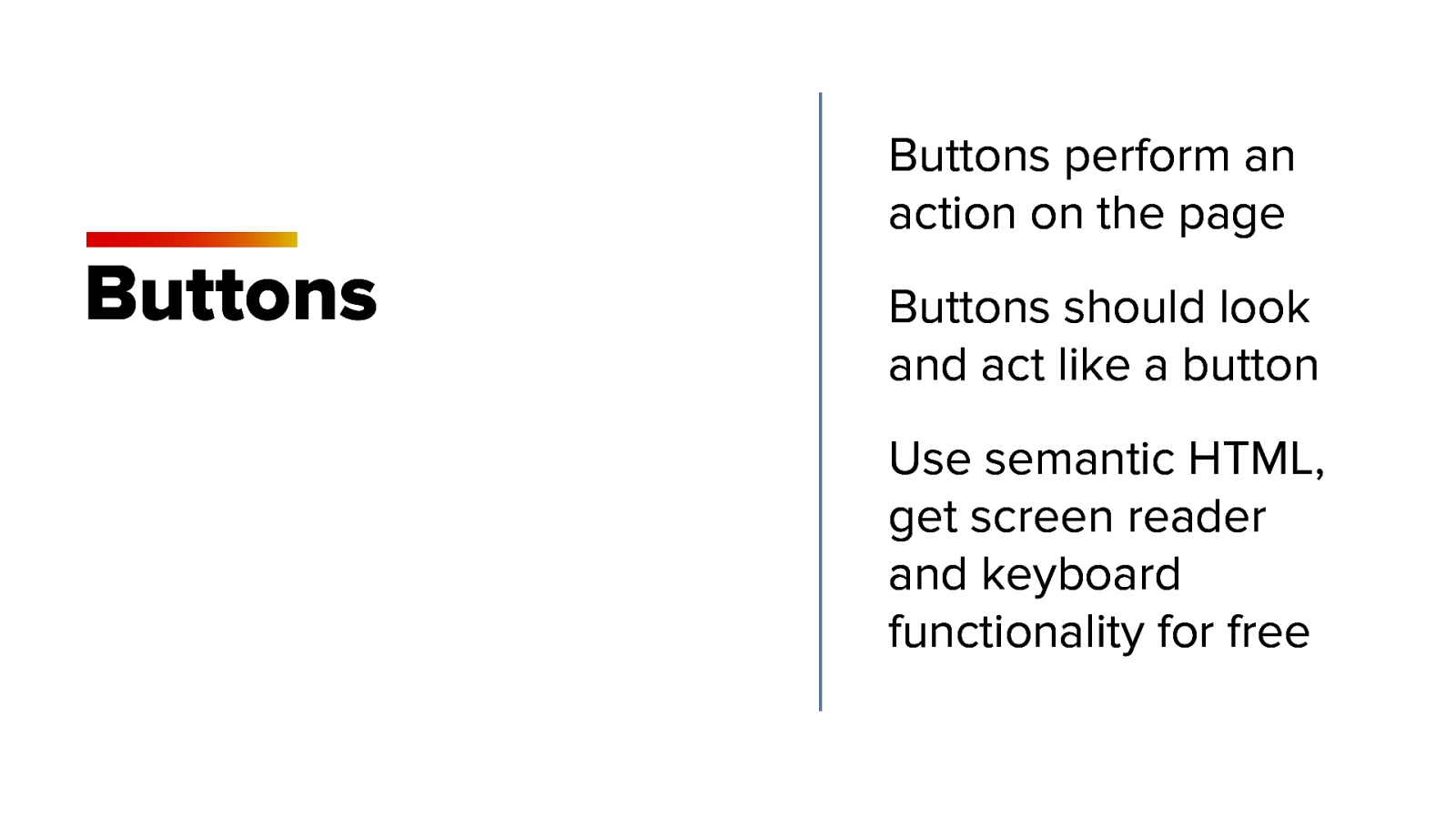
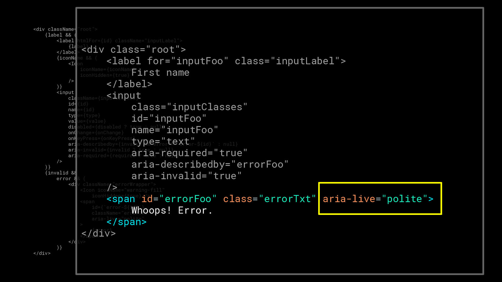
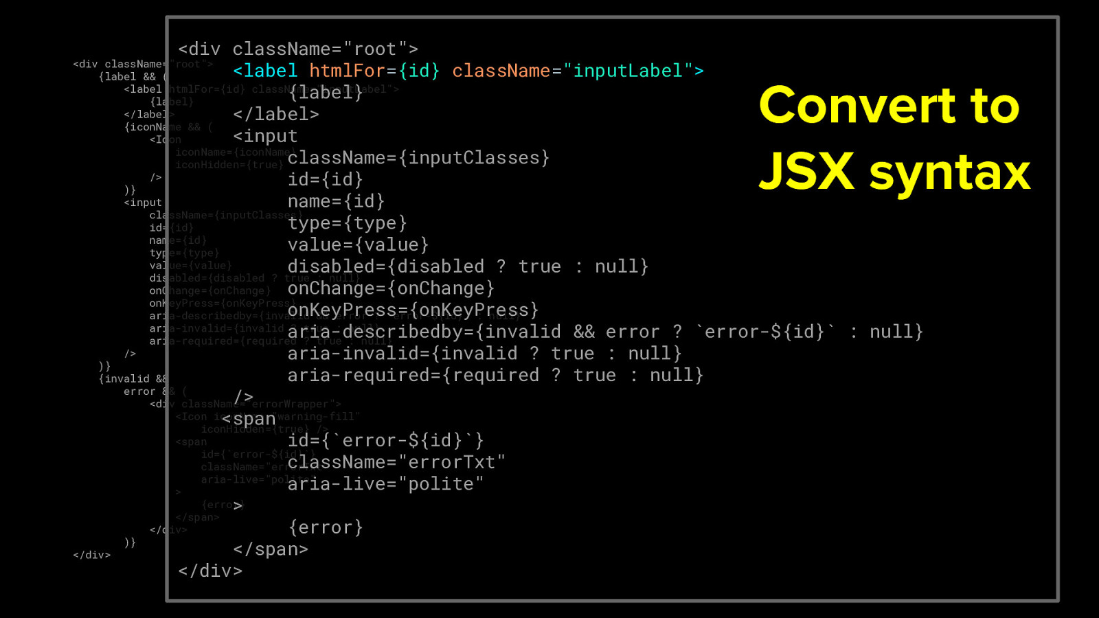
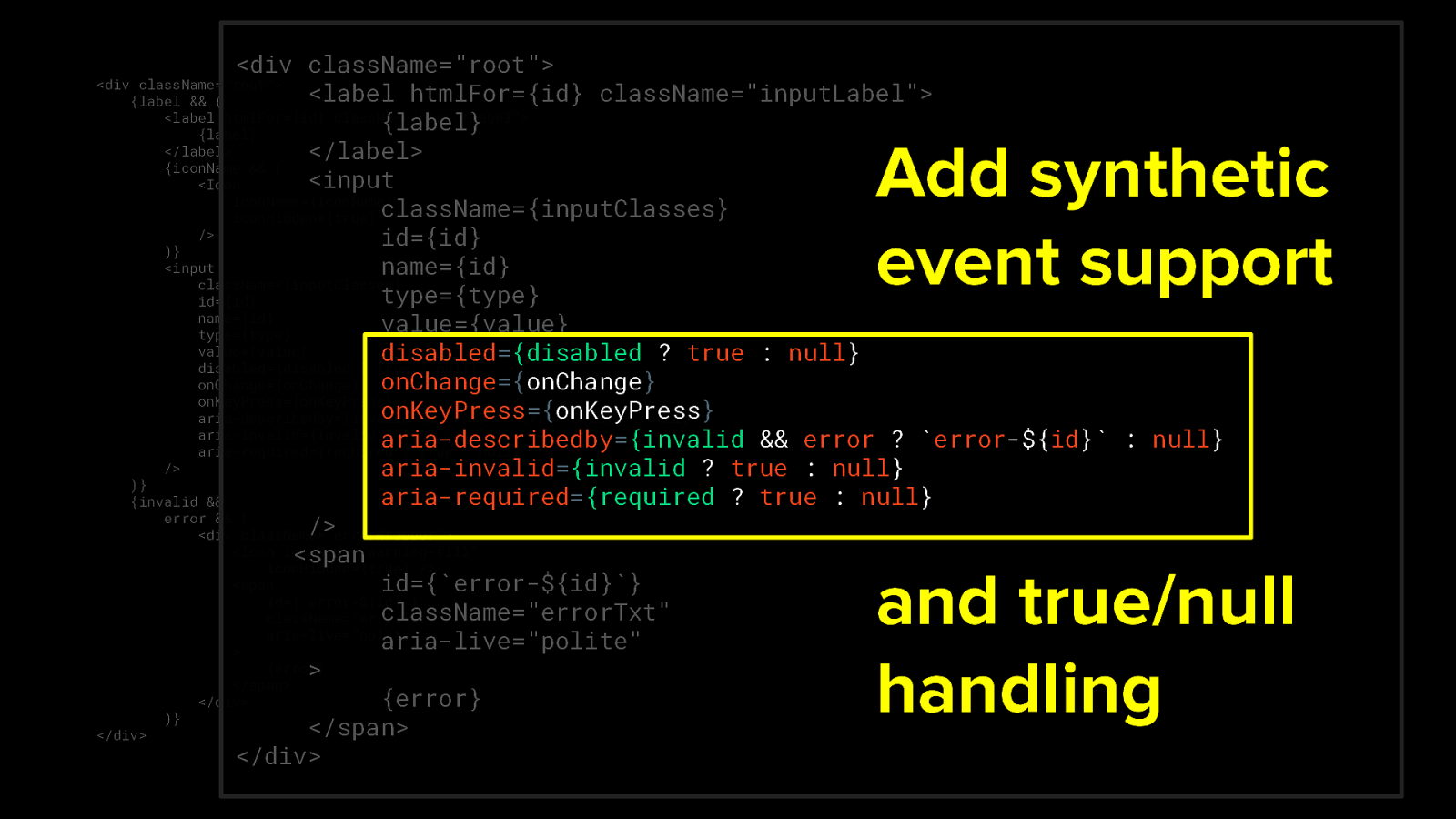
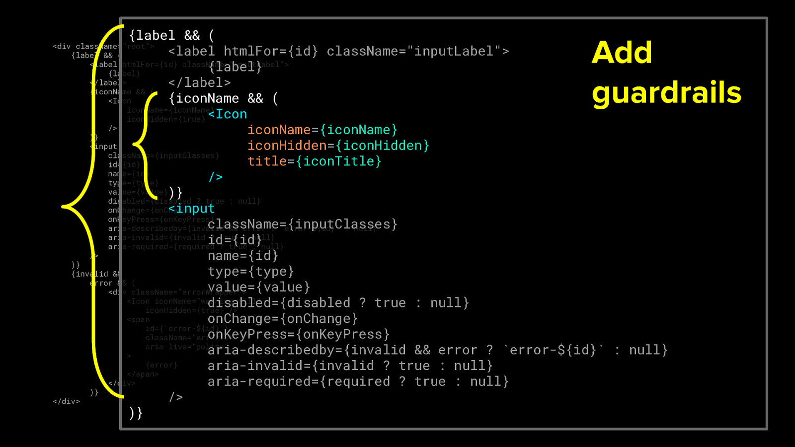
Accessibility-flavored React components make your design system delicious!
Kathleen McMahon @resource11
Welcome everyone! I’m Kathleen McMahon and I’m here today to talk about how you can flavor your React components with accessibility seasonings to make your design system delicious!
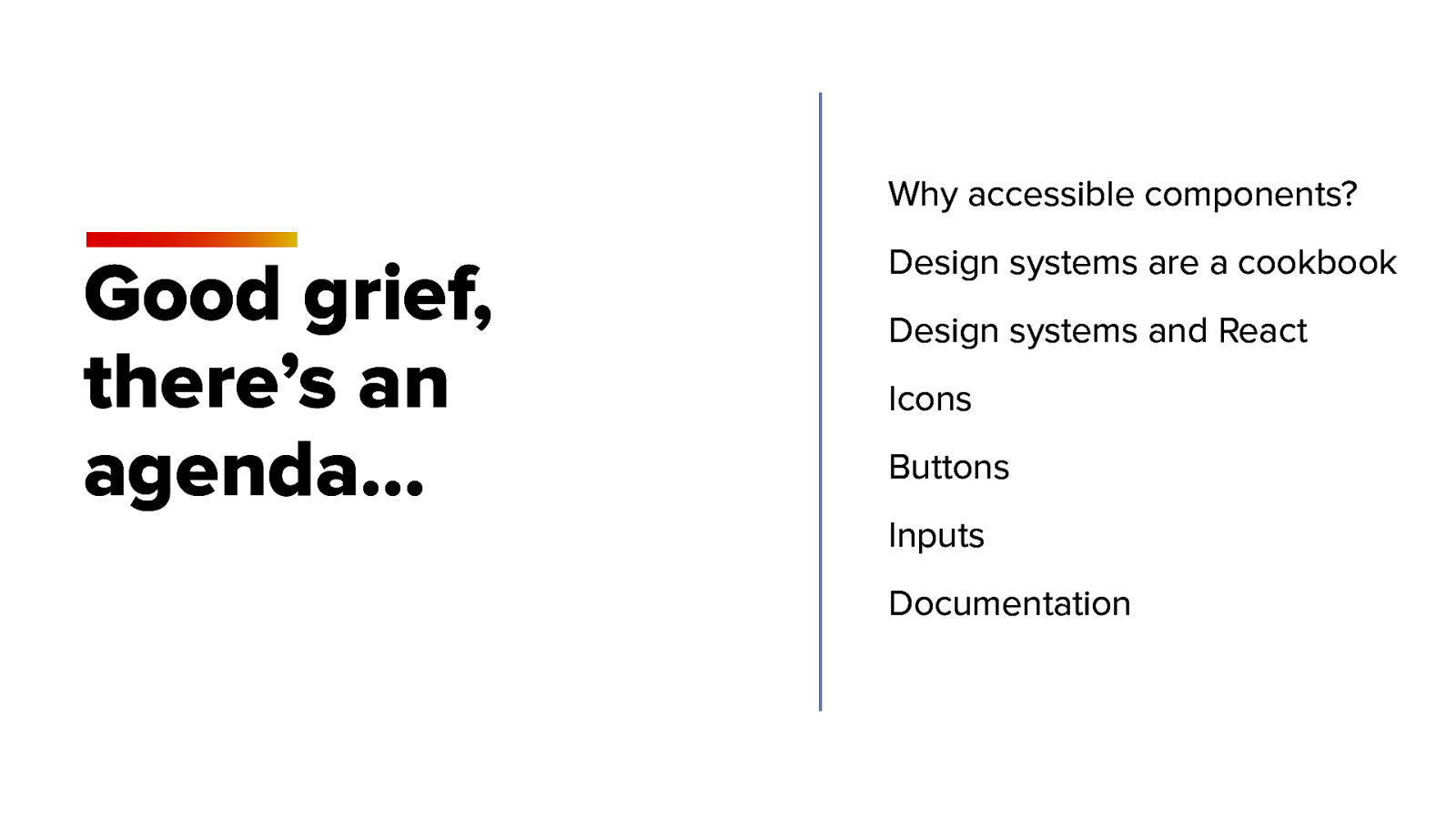
Here’s an outline of what we’ll be covering today.


