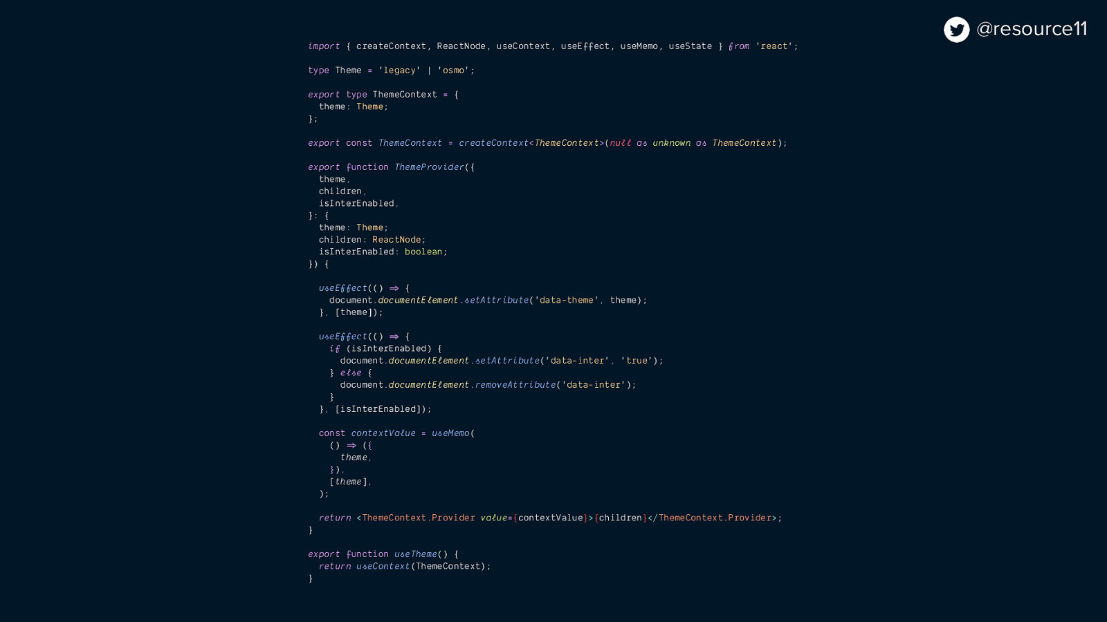
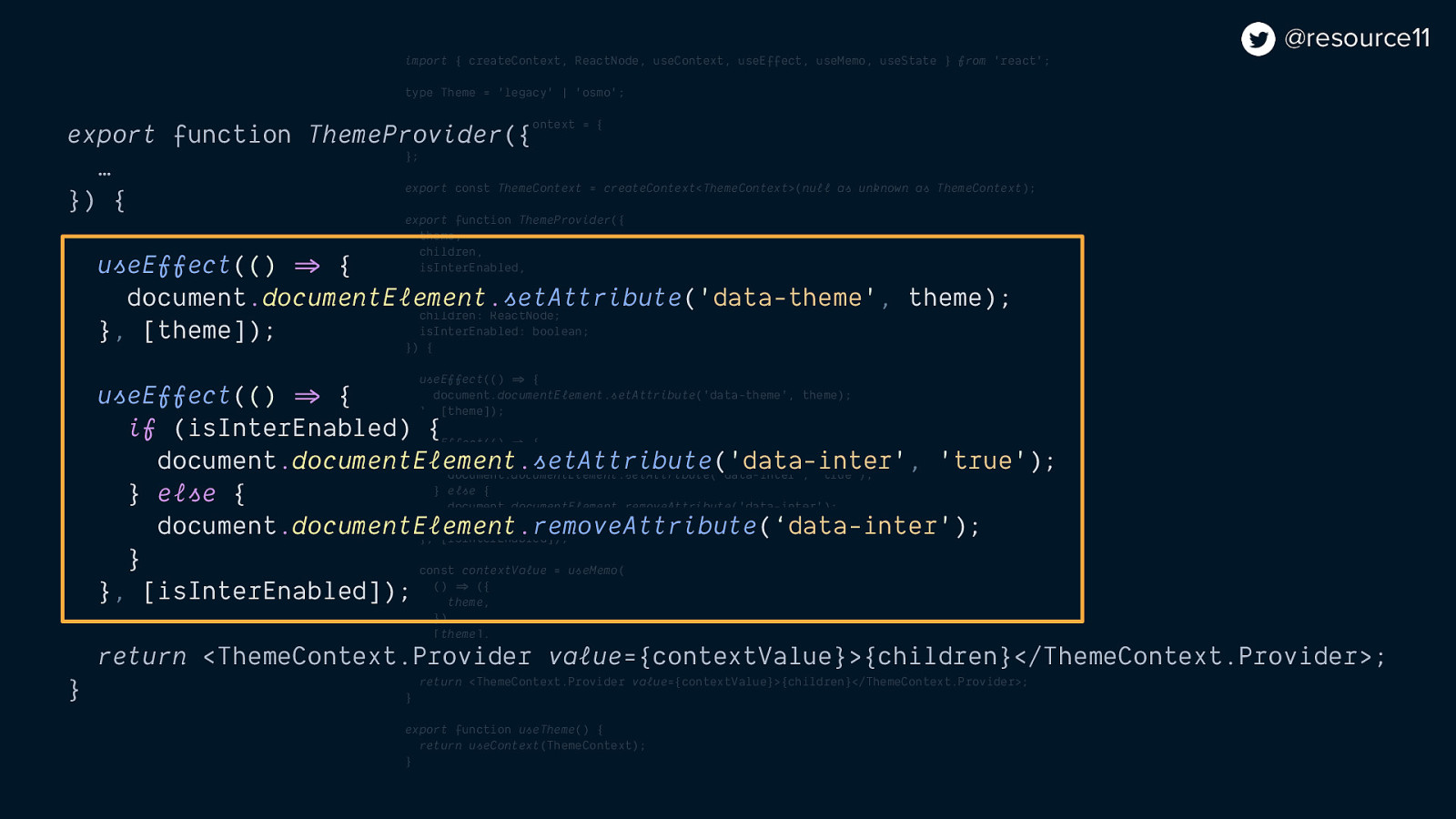
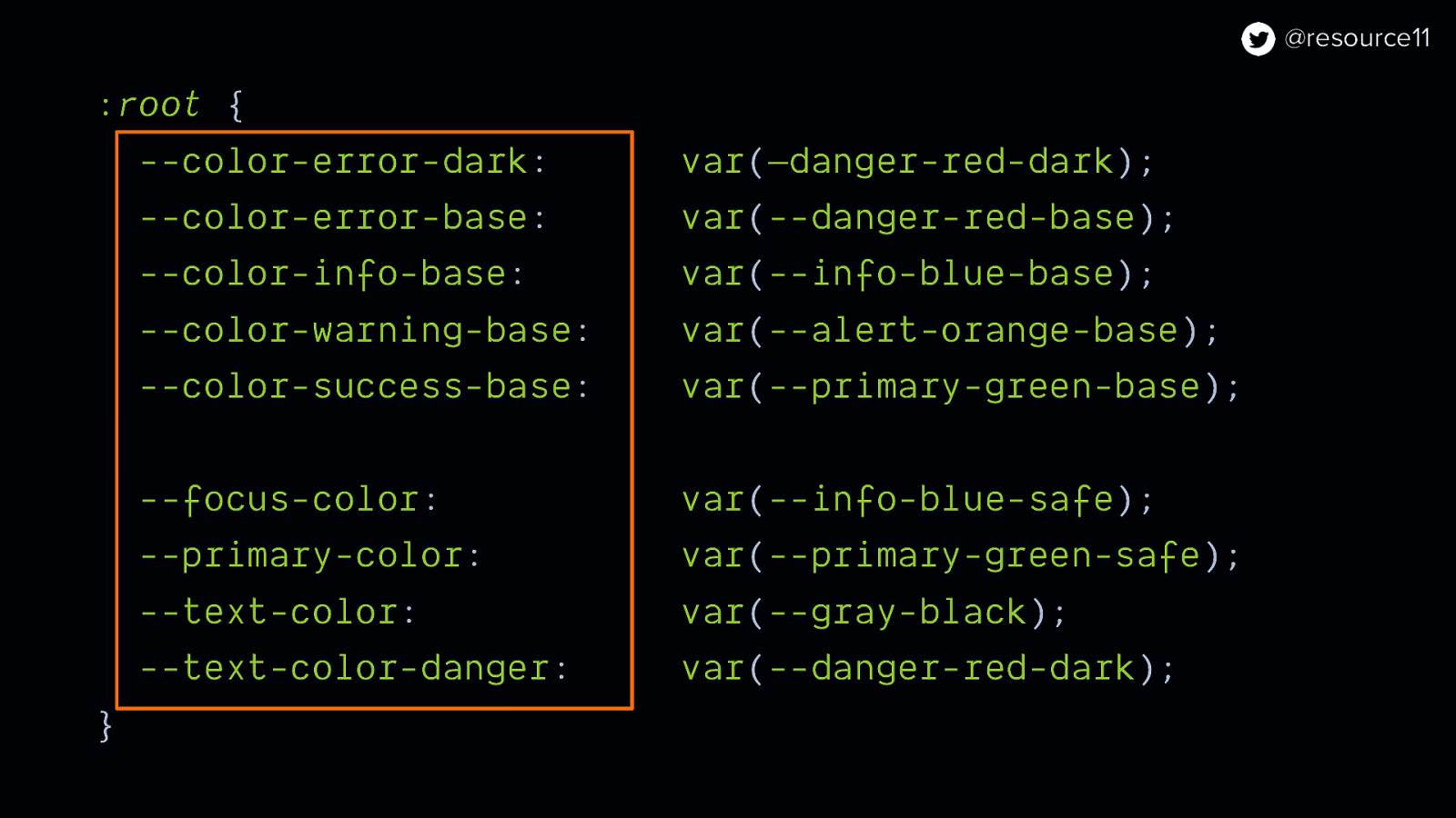
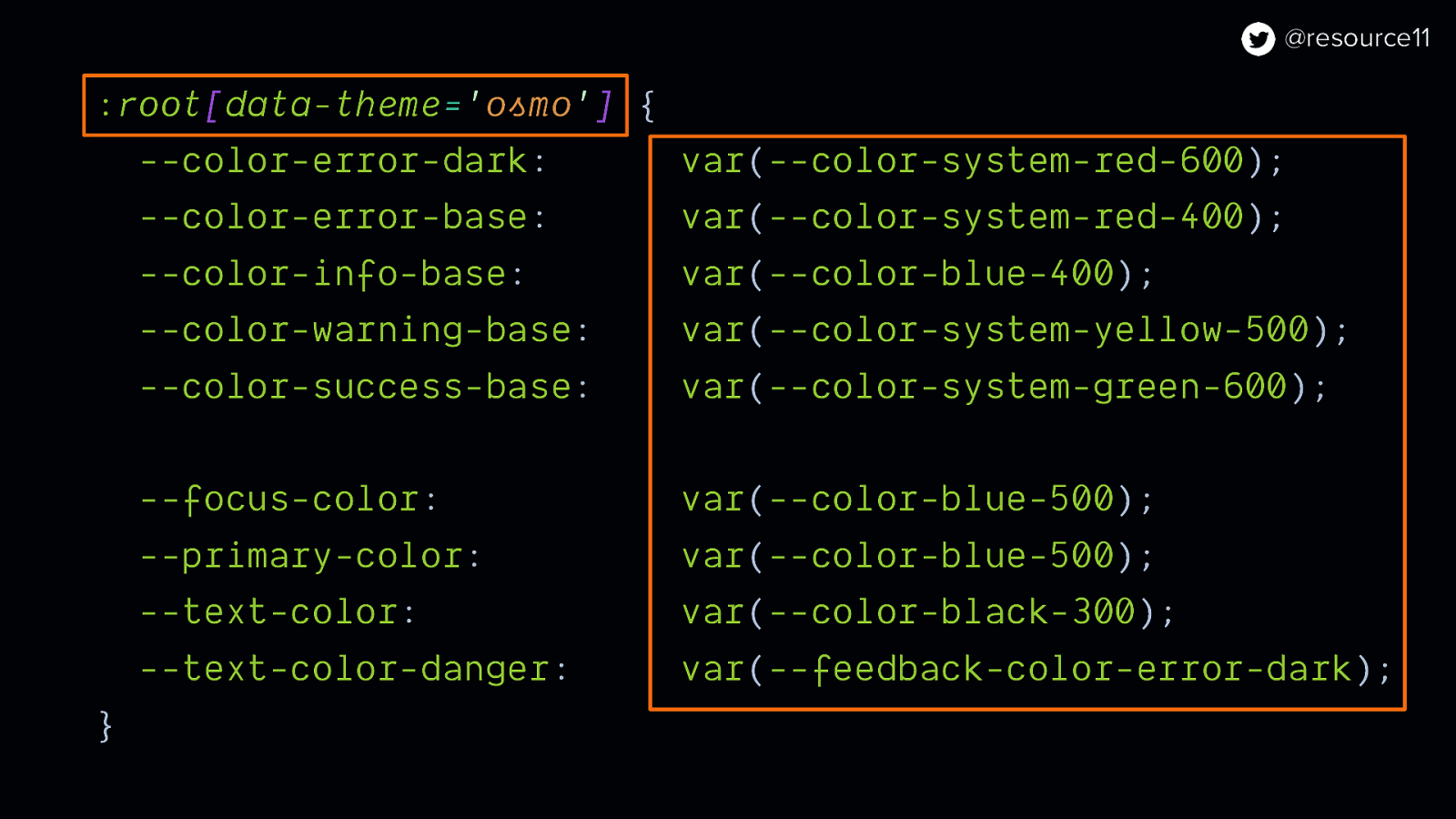
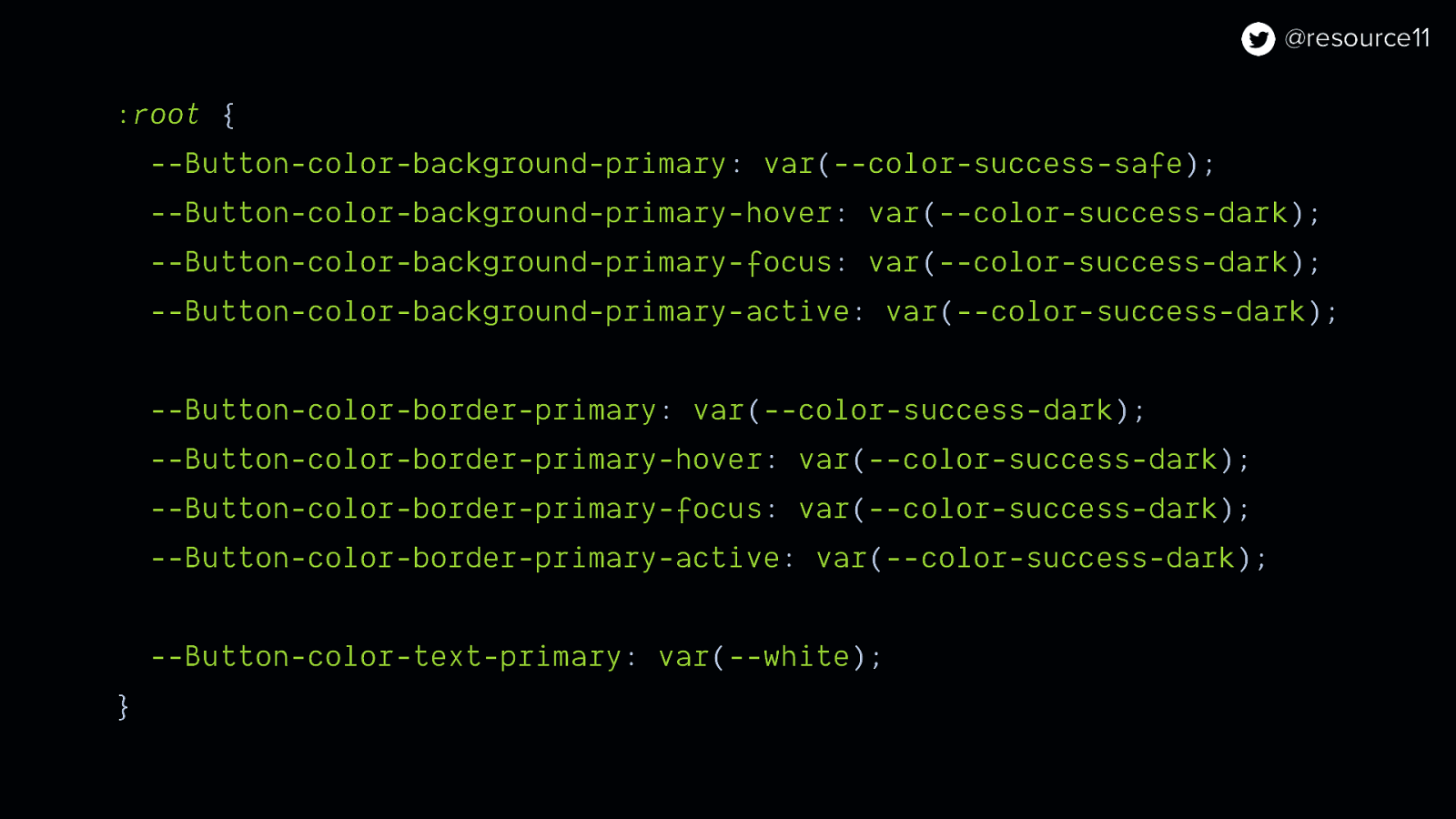
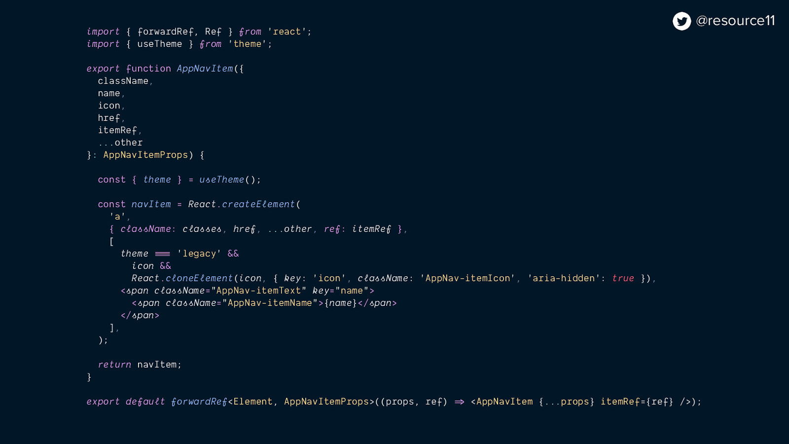
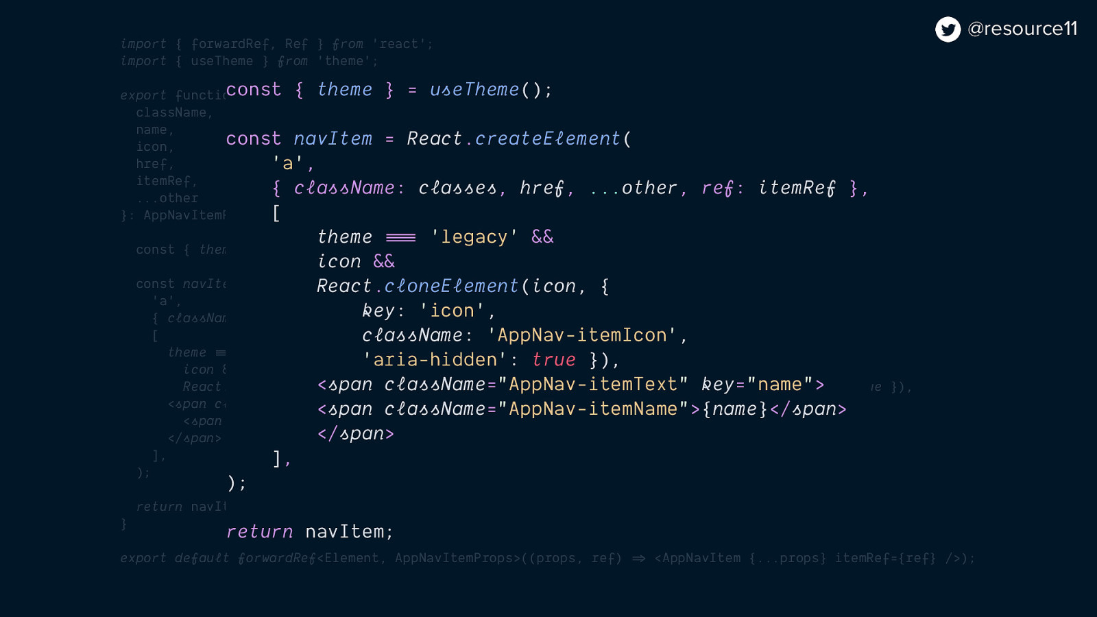
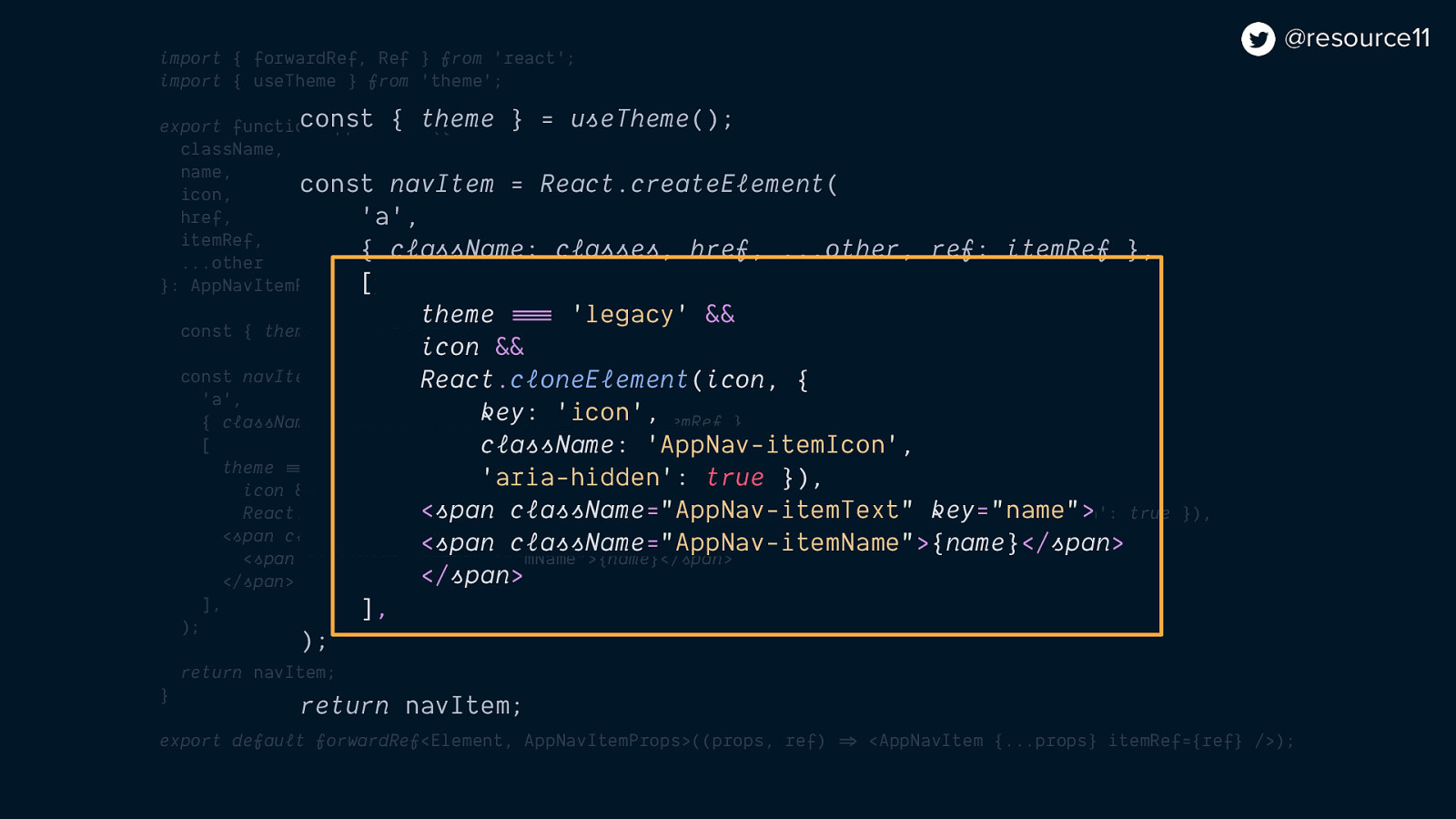
And hooks…
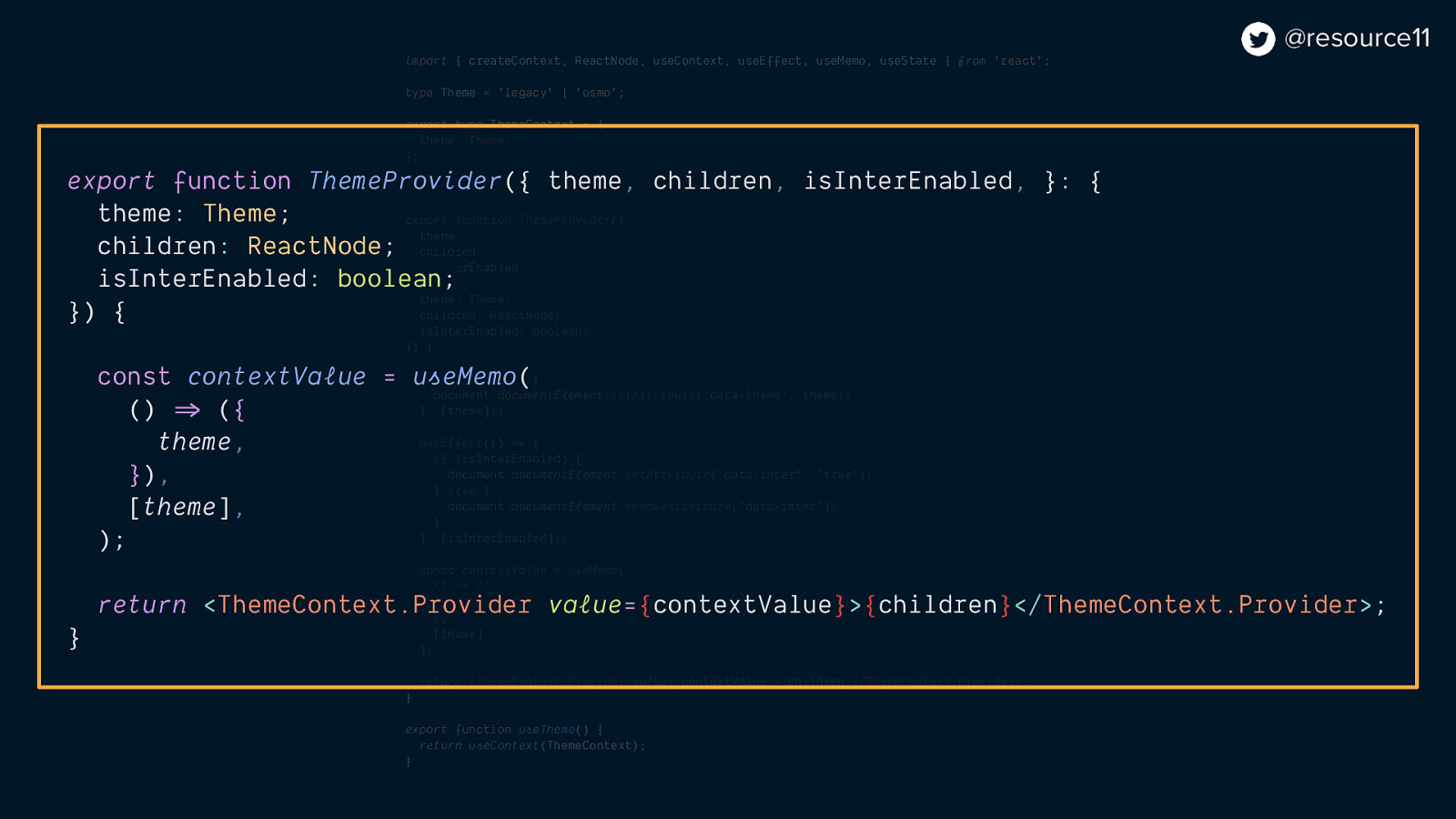
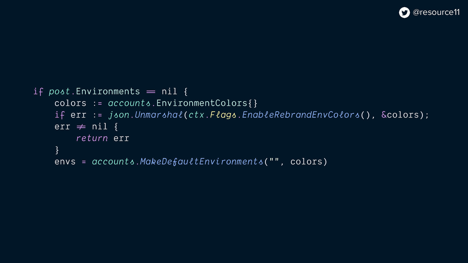
import { createContext, ReactNode, useContext, useEffect, useMemo } from ‘react’;
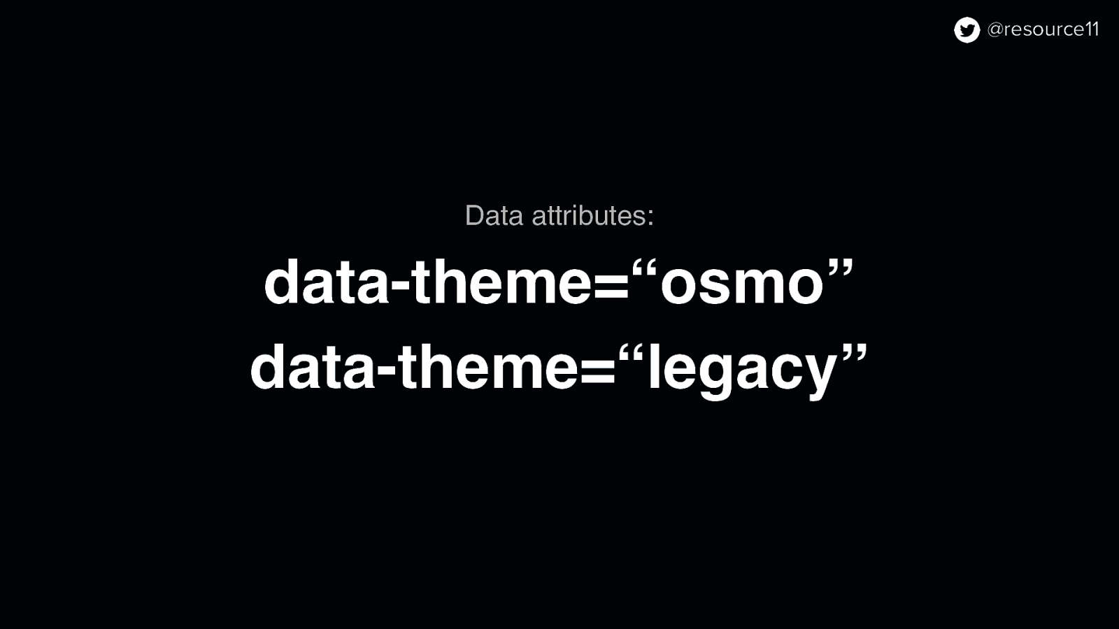
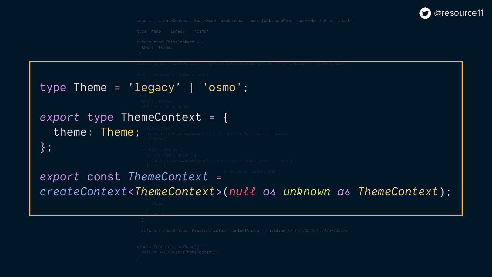
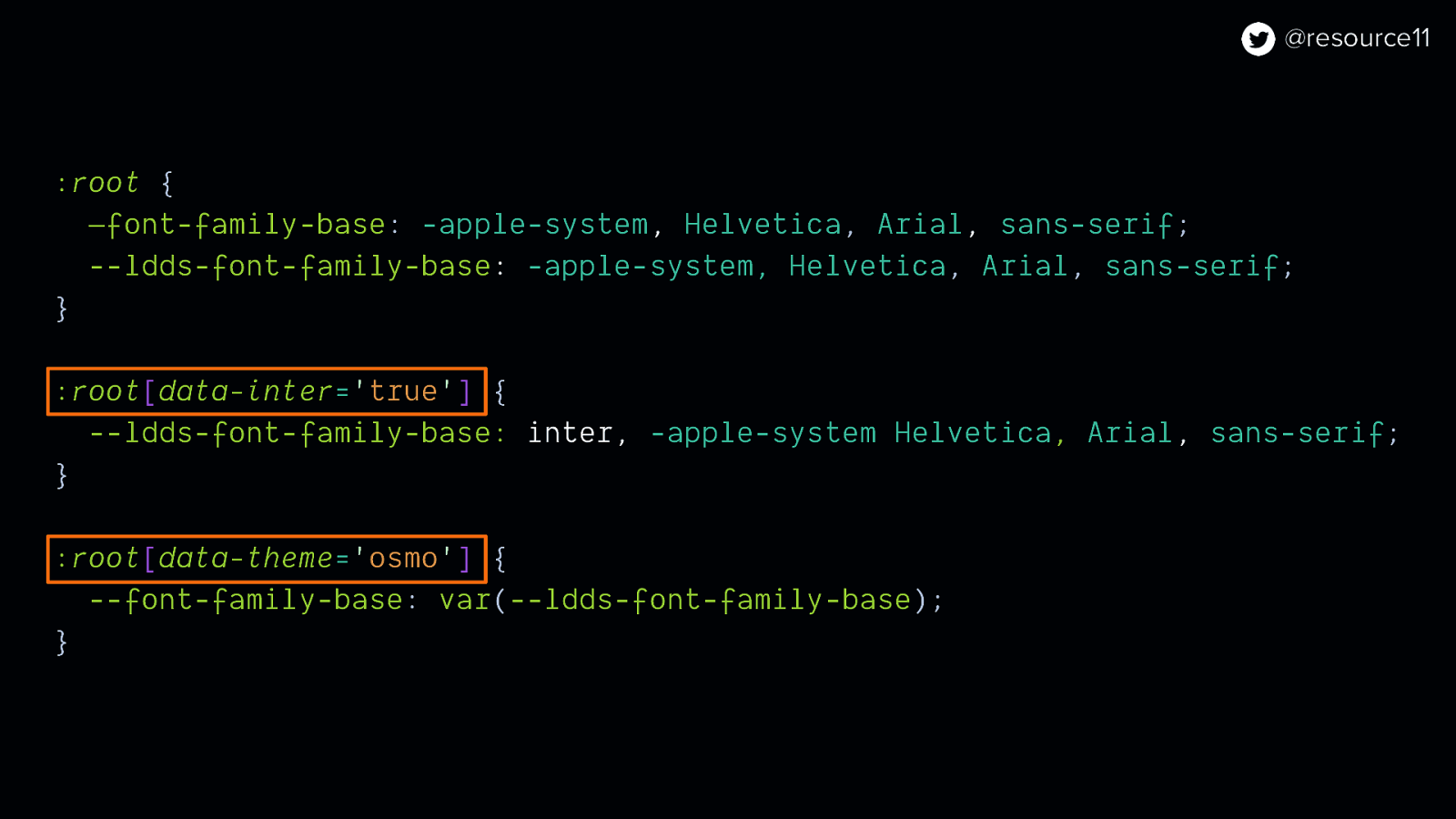
type Theme = ‘legacy’ | ‘osmo’;
export type ThemeContext = { theme: Theme; };
export const ThemeContext = createContext<ThemeContext>(null as unknown as ThemeContext);
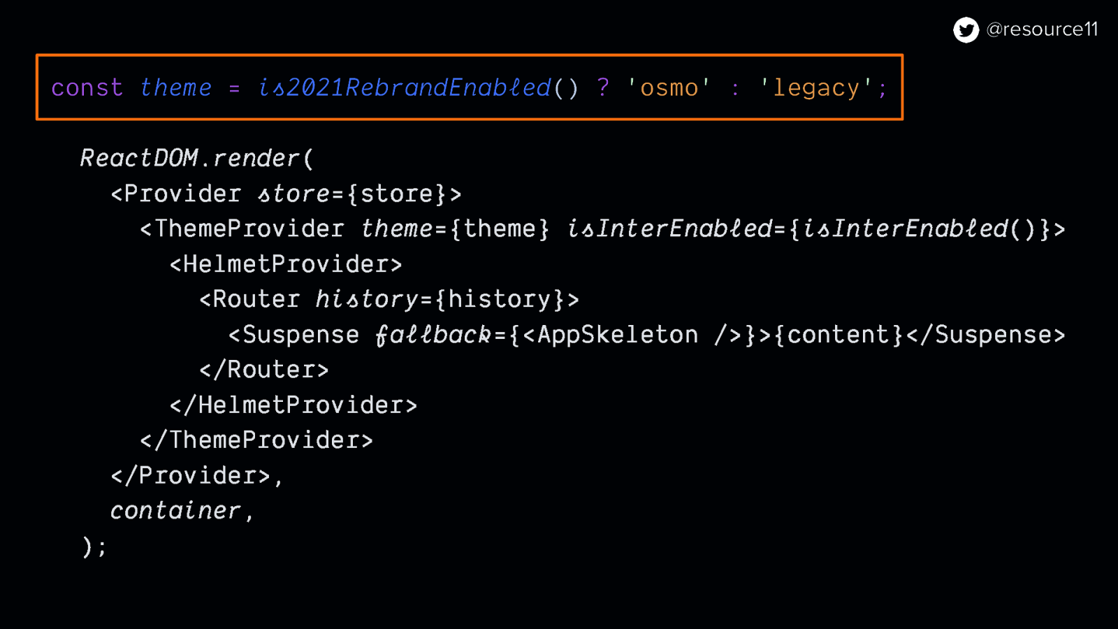
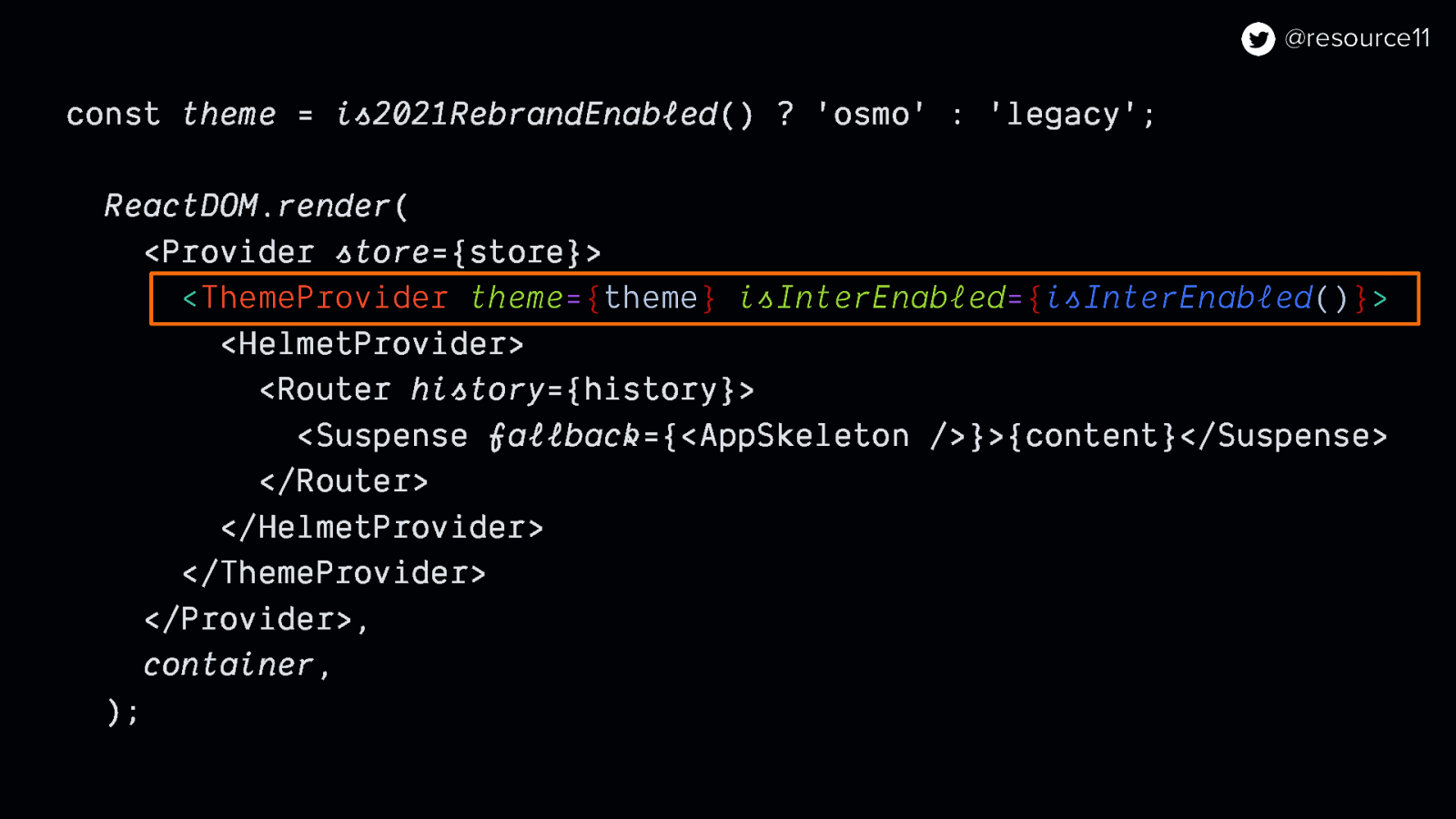
export function ThemeProvider({ isInterEnabled, theme, children, }: { isInterEnabled: boolean; theme: Theme; children: ReactNode; }) {
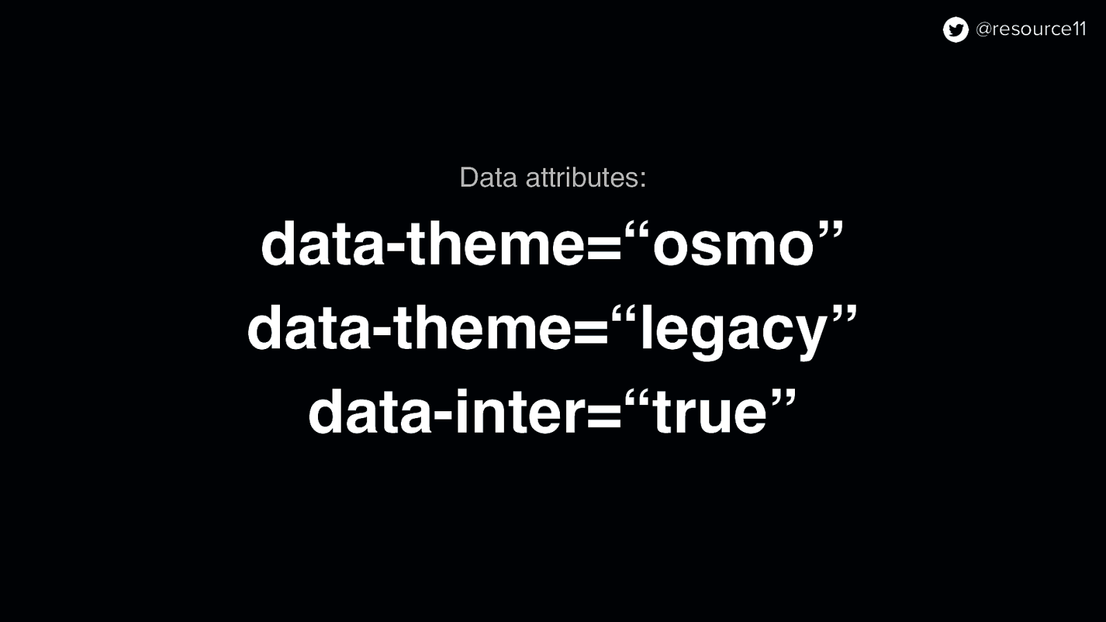
useEffect(() => { document.documentElement.setAttribute(‘data-theme’, theme); }, [theme]);
useEffect(() => { if (isInterEnabled) { document.documentElement.setAttribute(‘data-inter’, ‘true’); } else { document.documentElement.removeAttribute(‘data-inter’); } }, [isInterEnabled]);
const contextValue = useMemo( () => ({ theme, }), [theme], );
return <ThemeContext.Provider value={contextValue}>{children}</ThemeContext.Provider>; }
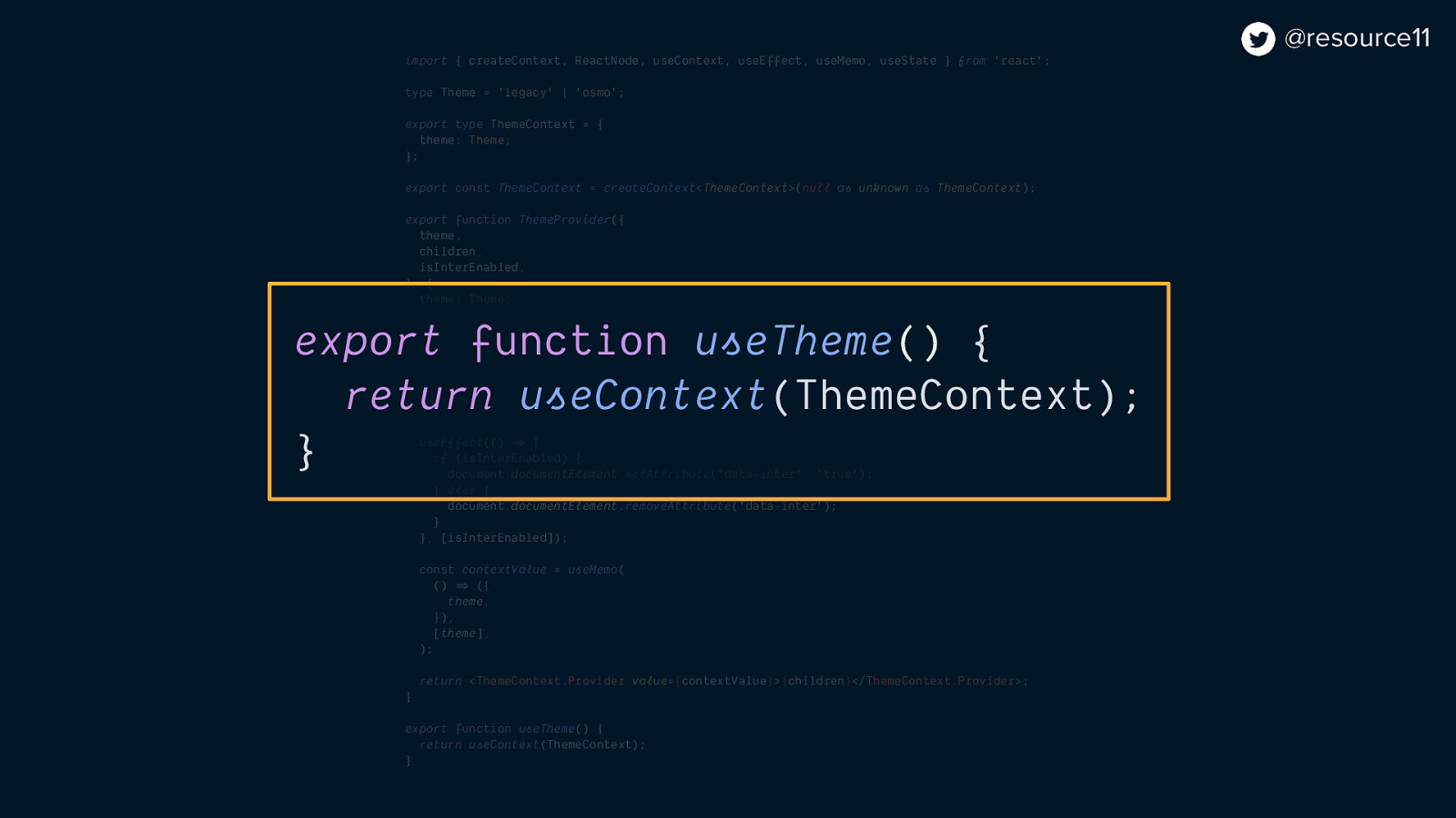
export function useTheme() { return useContext(ThemeContext); }


