Accessibility-flavored React components make your design system delicious!

A presentation at React Edinburgh Meetup in October 2019 in Edinburgh, UK by Kathleen McMahon

Slide 1

Slide 1

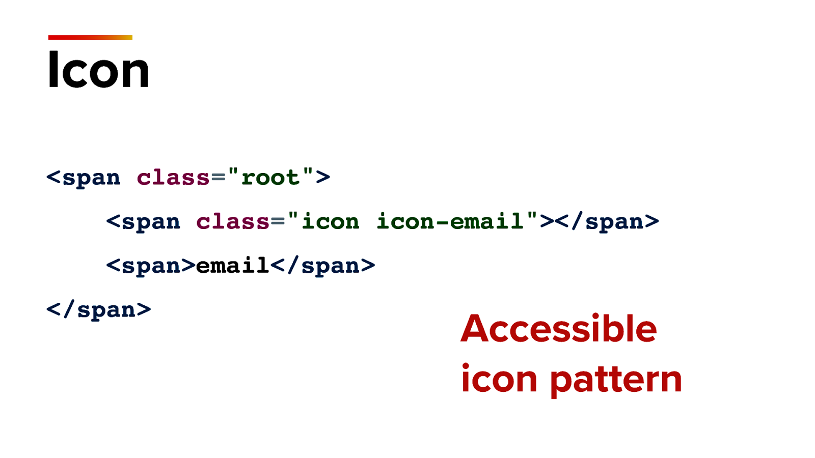
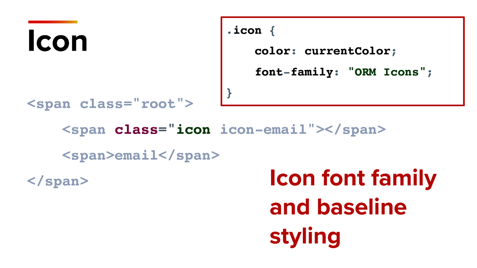
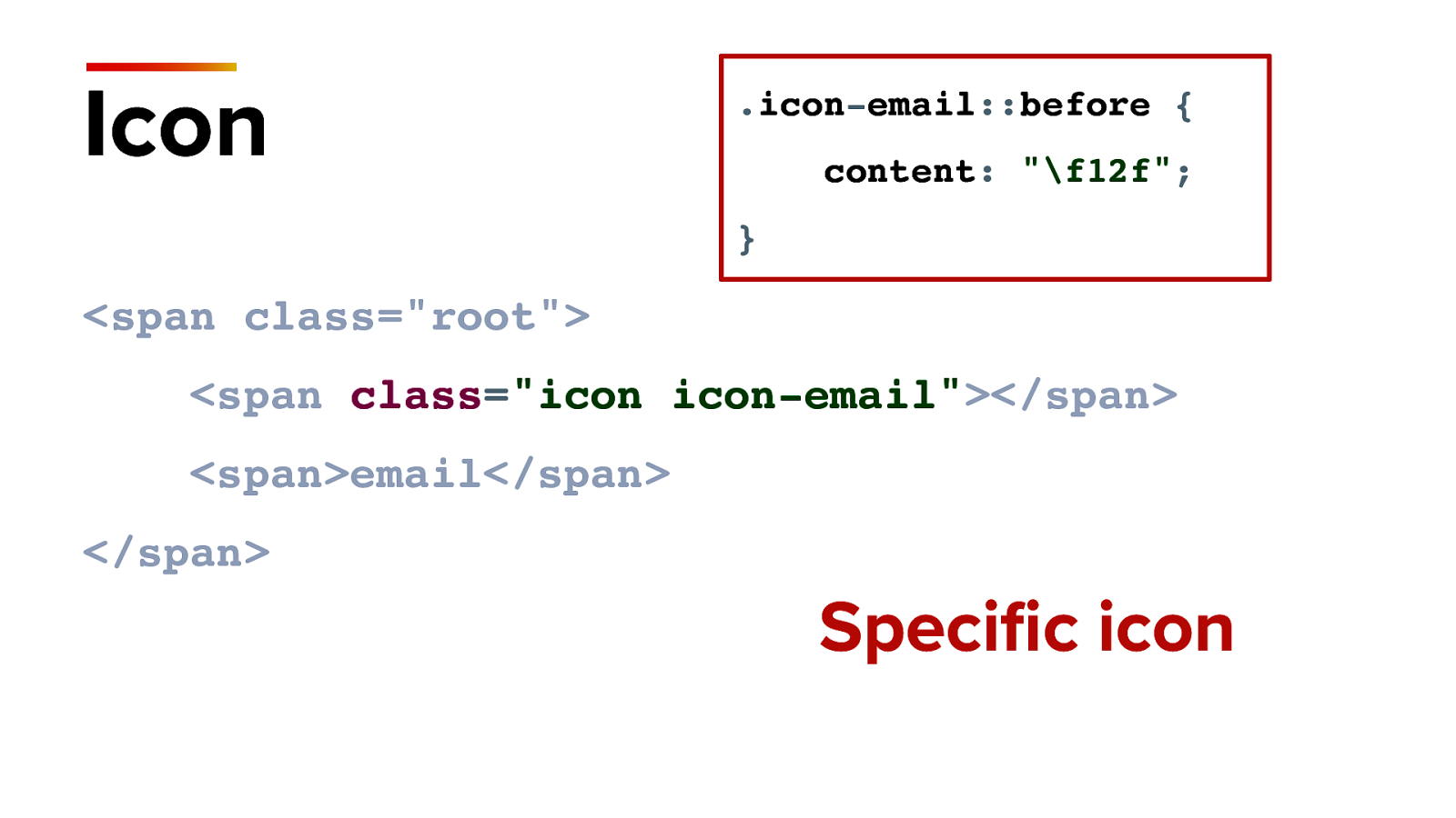
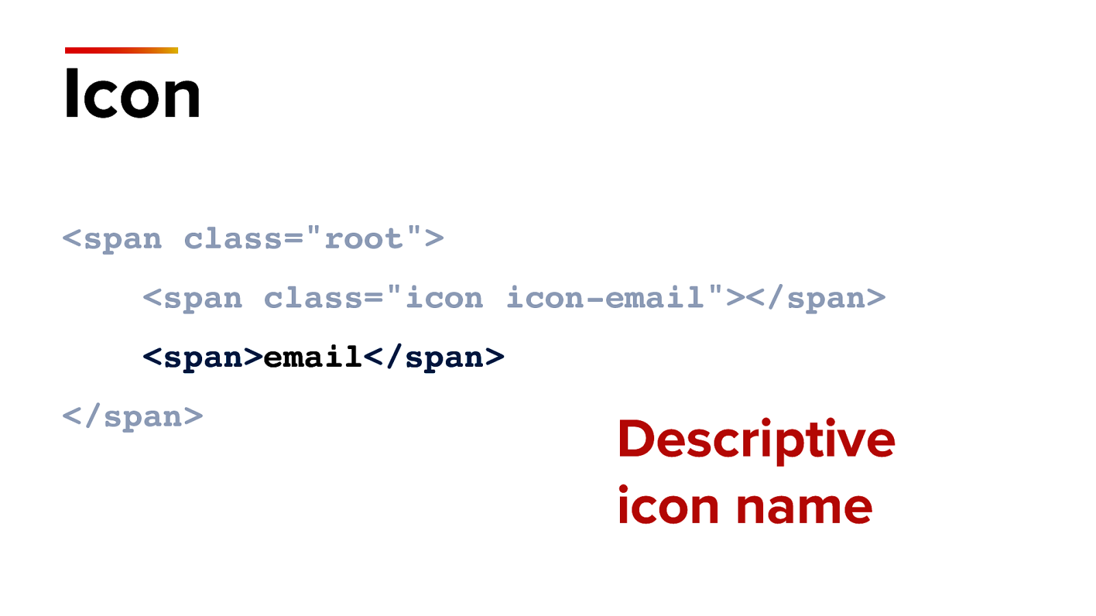
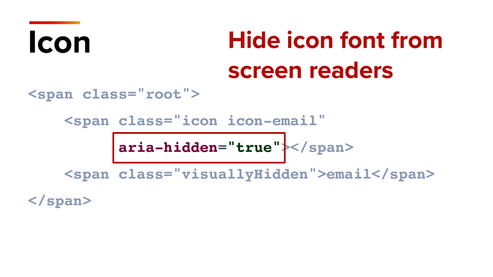
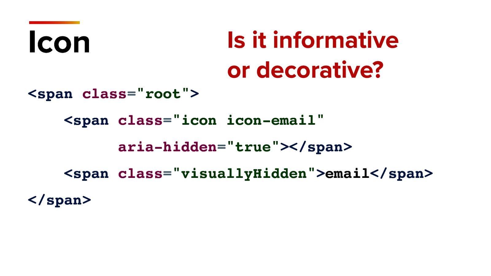
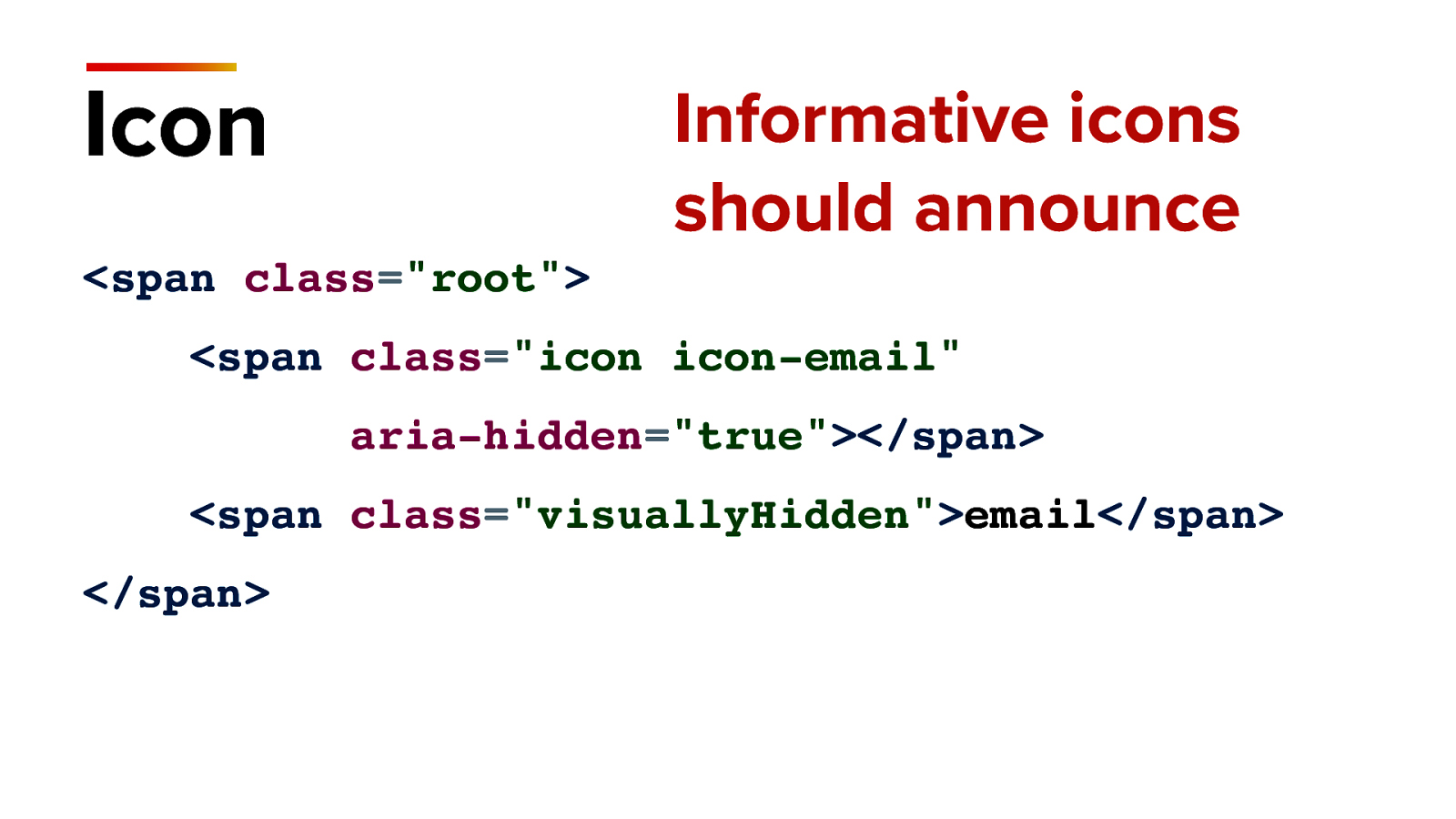
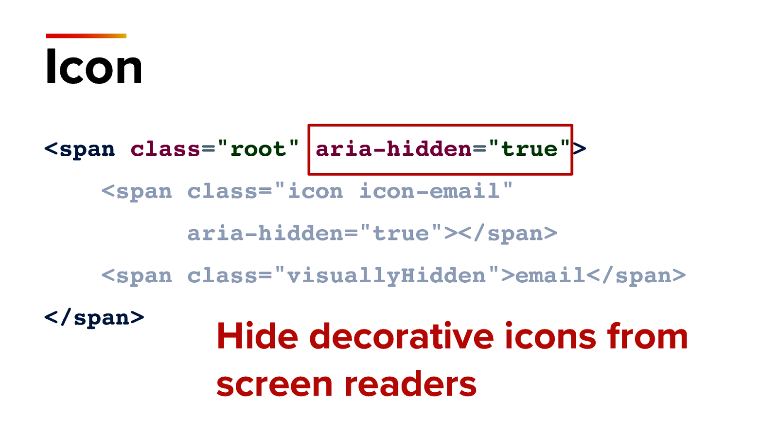
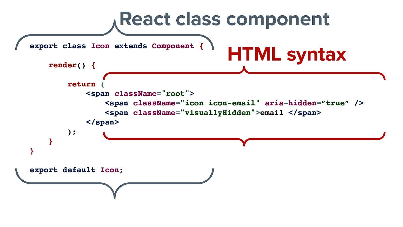
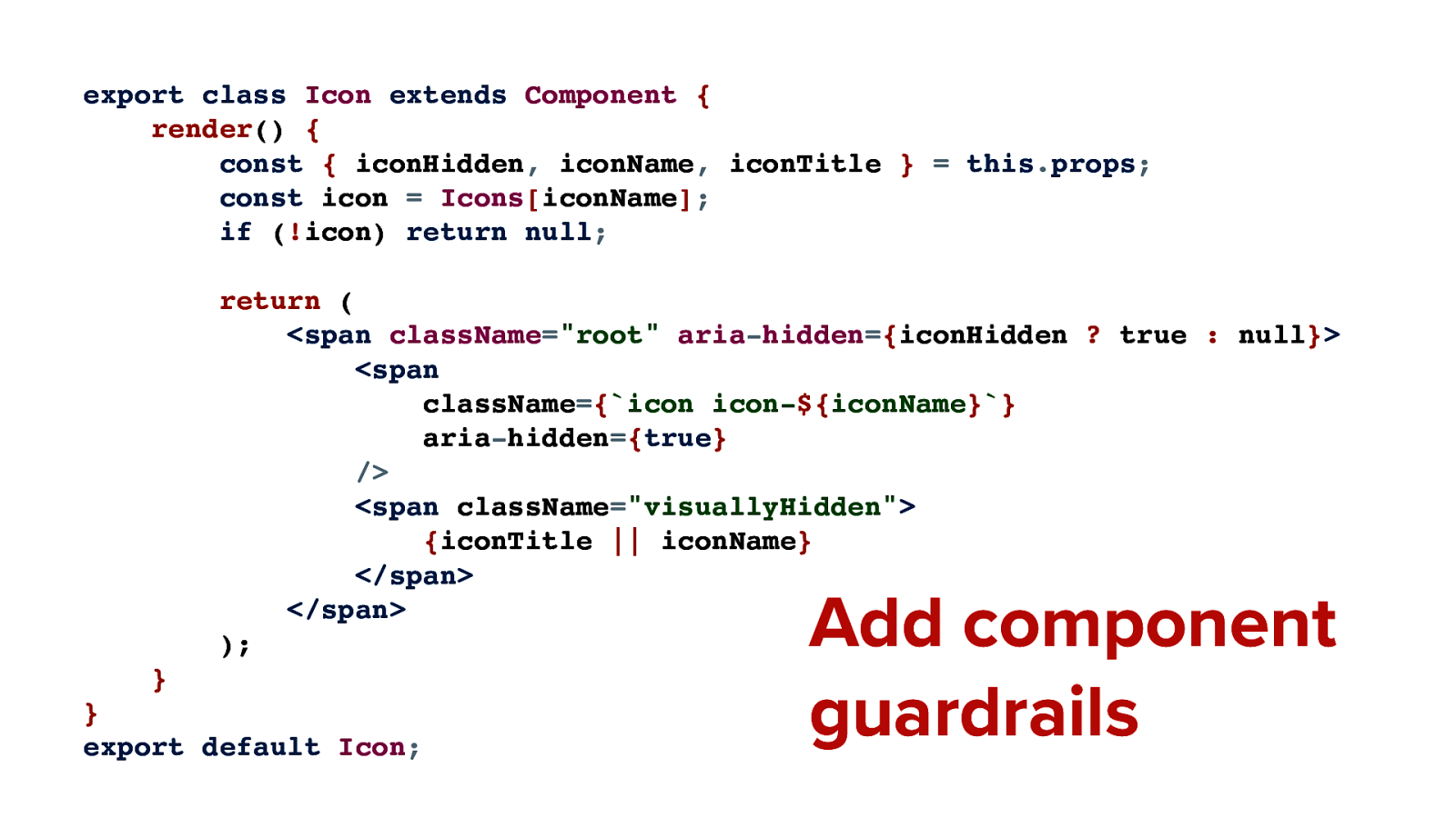
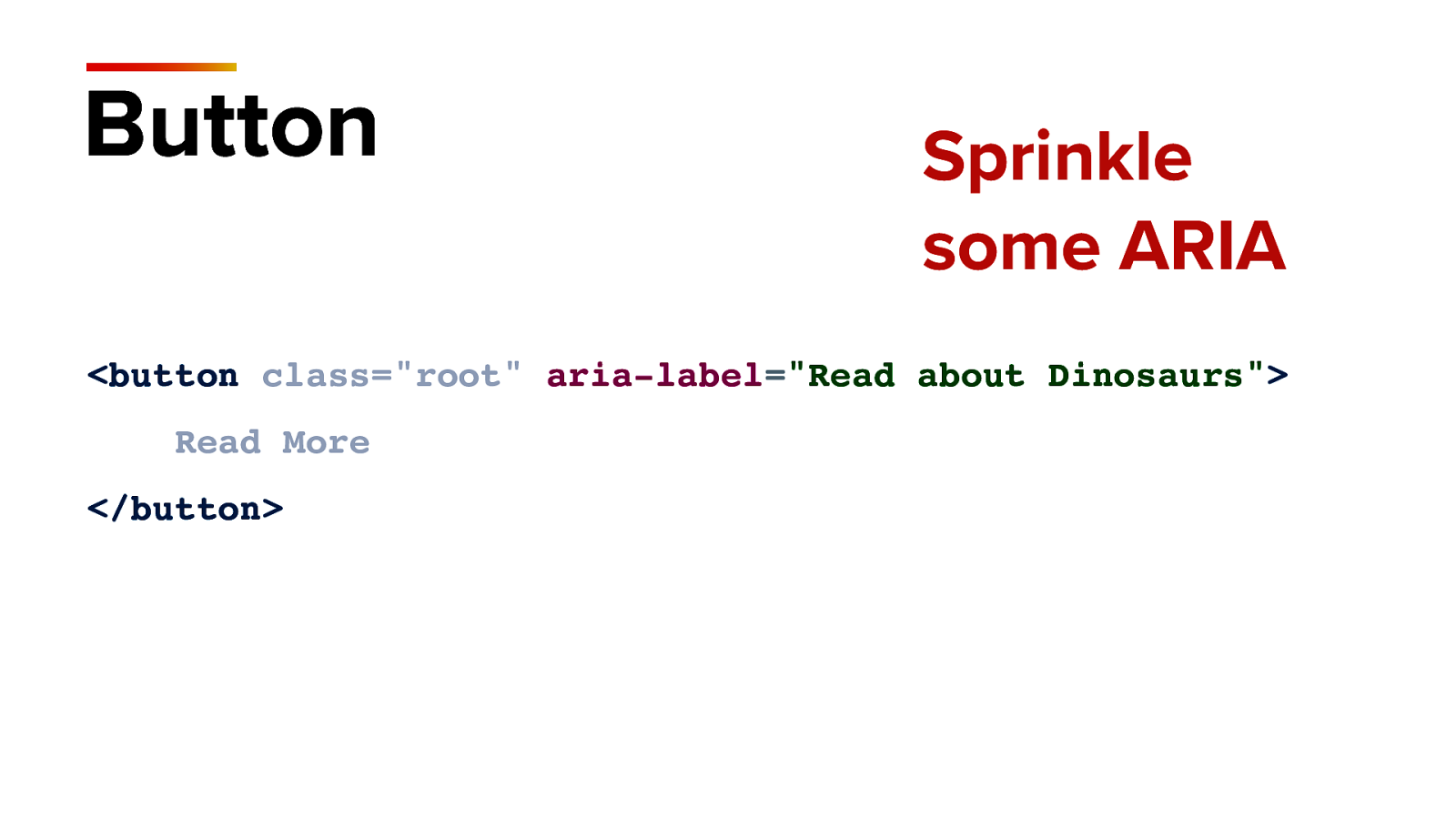
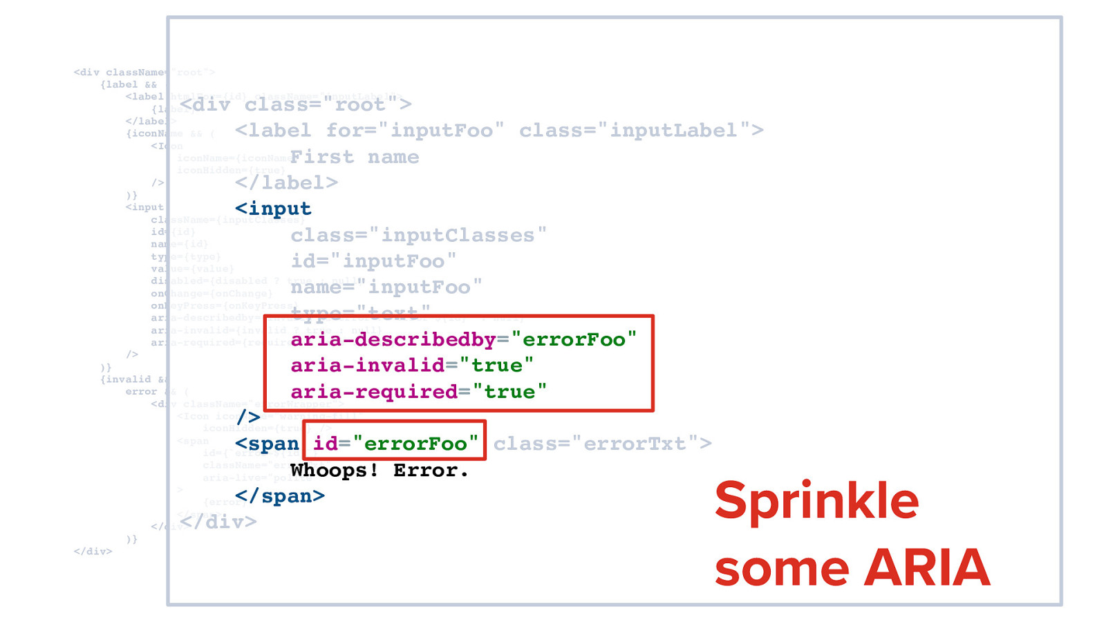
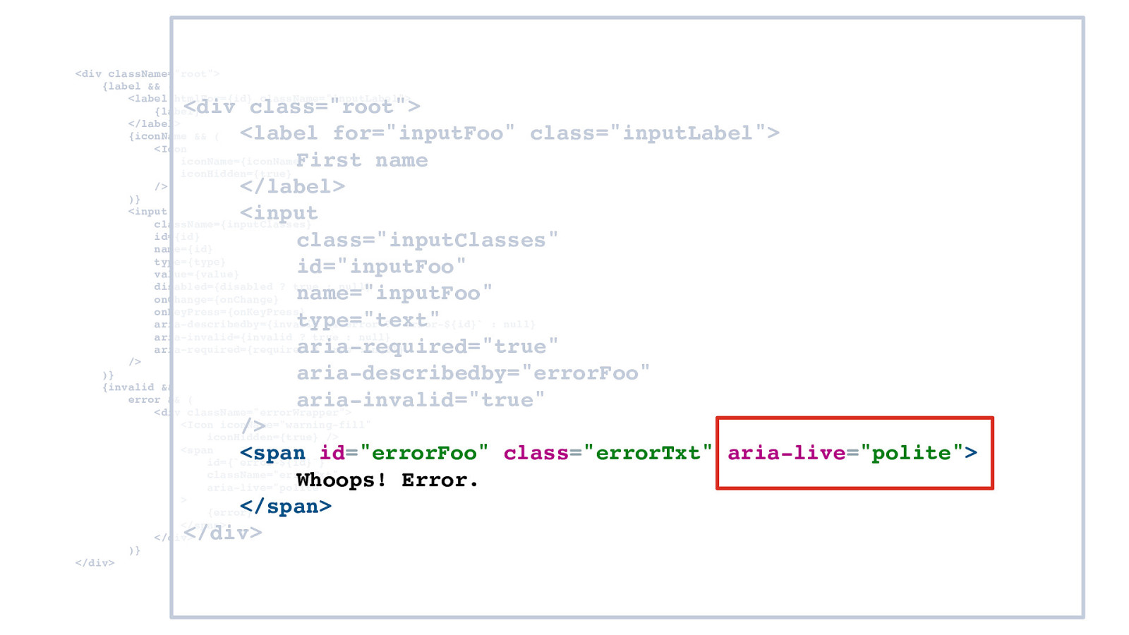
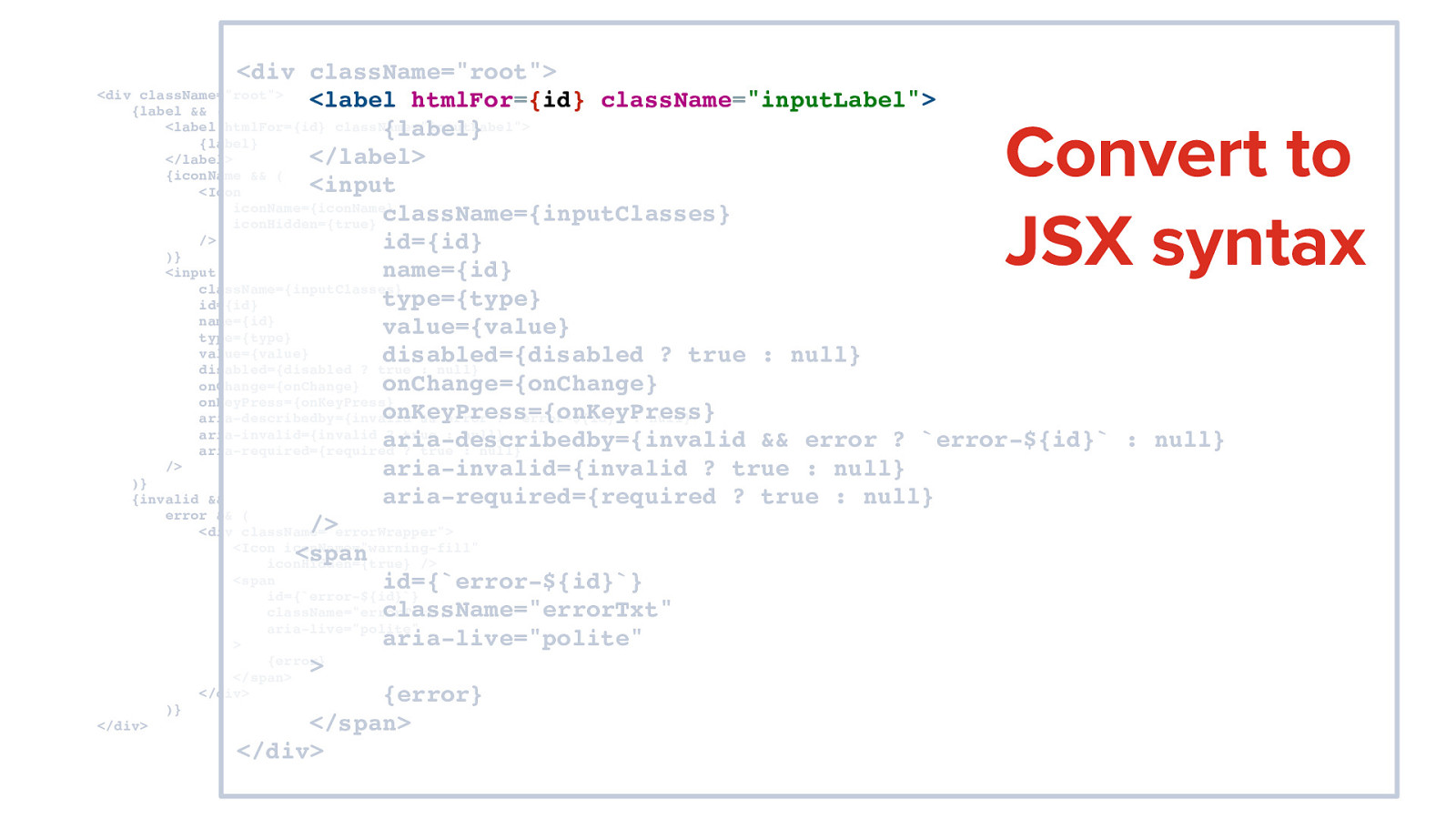
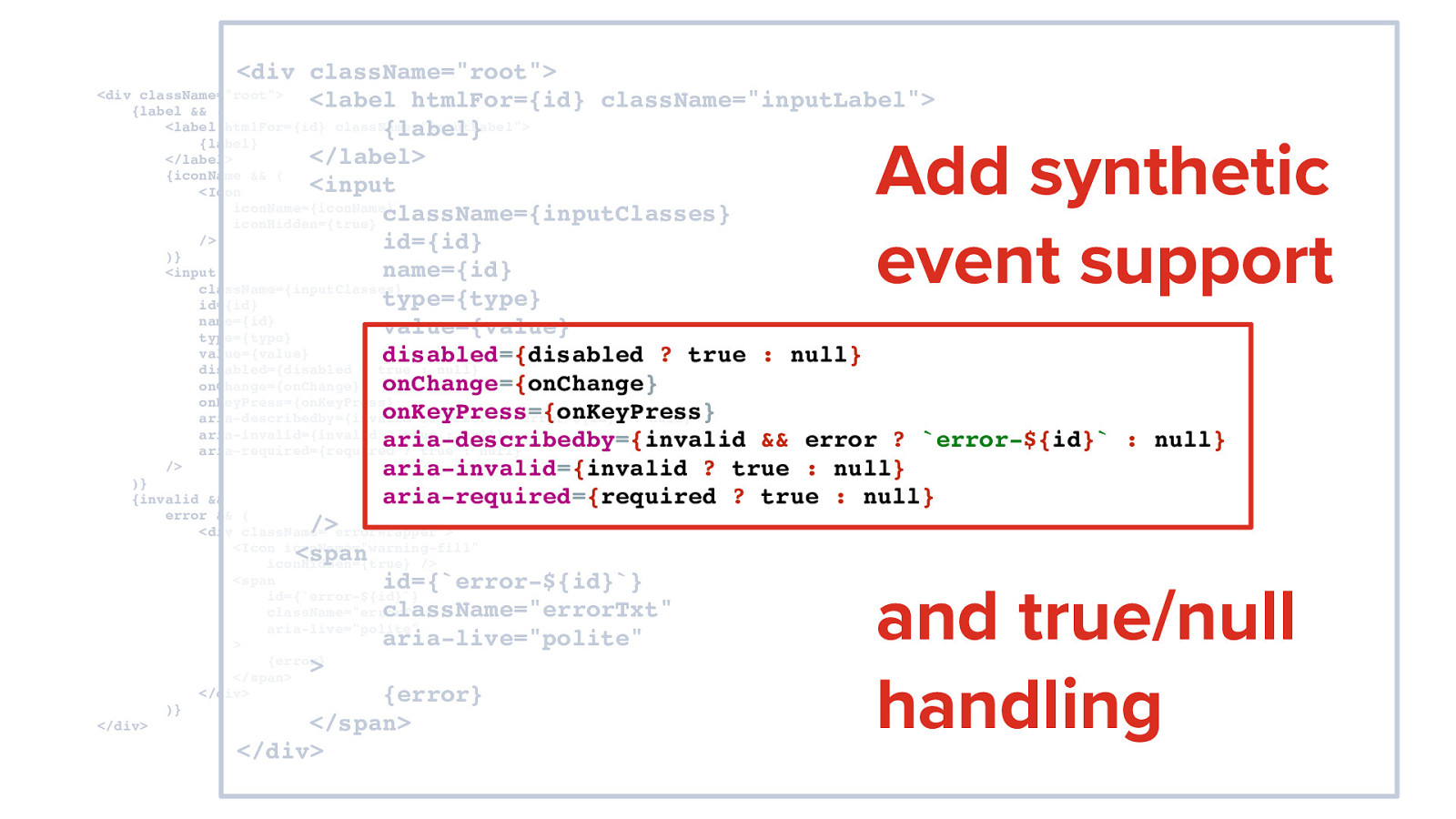
Accessibility-flavored React components make your design system delicious! Kathleen McMahon @resource11 @resource11

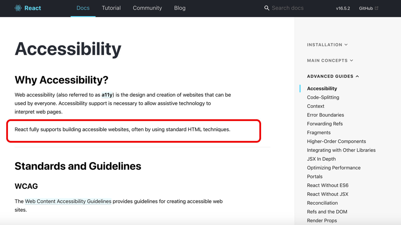
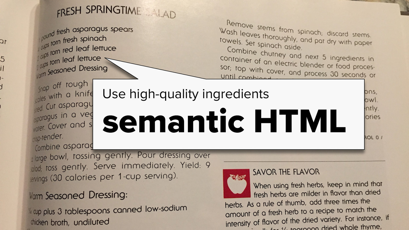
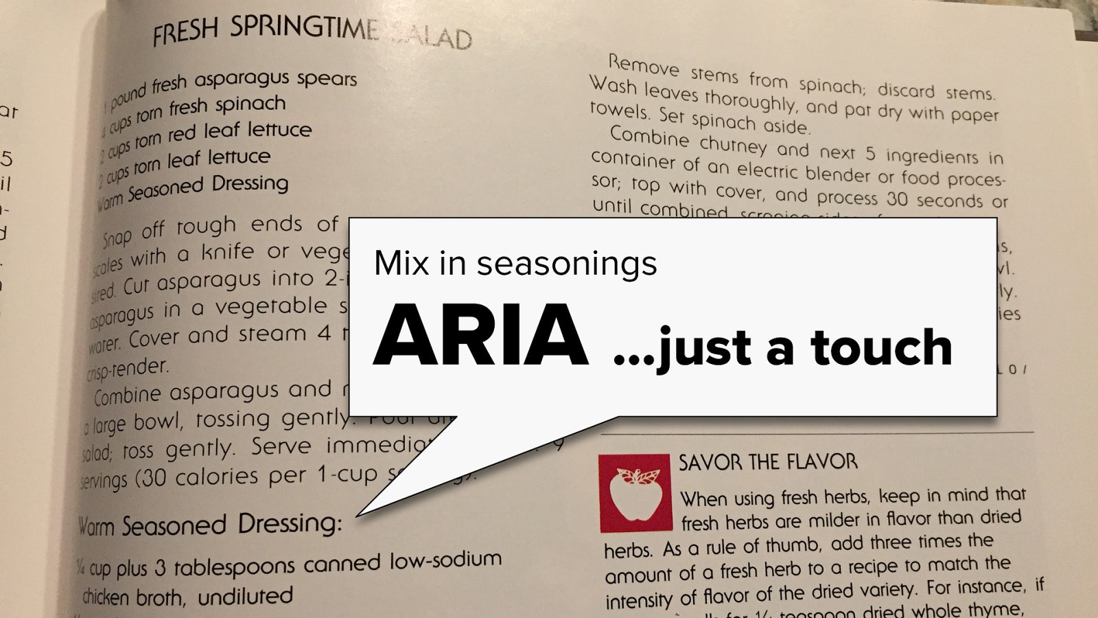
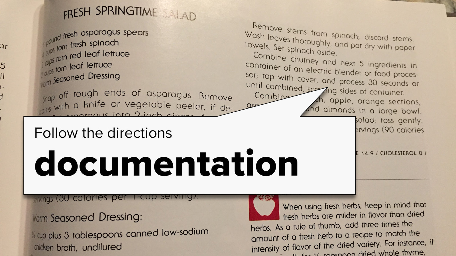
Welcome everyone! I’m Kathleen McMahon and I’m here today to talk about how you can flavor your React components with accessibility seasonings to make your design system delicious!

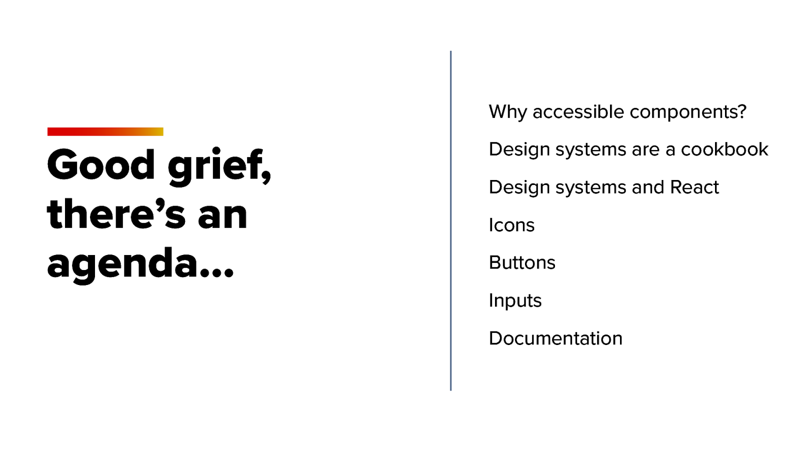
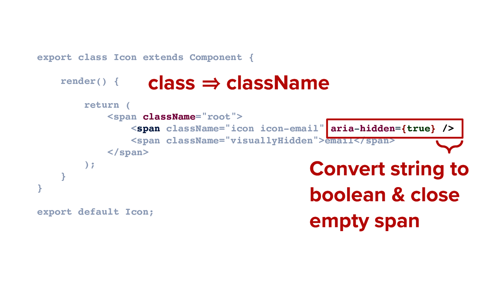
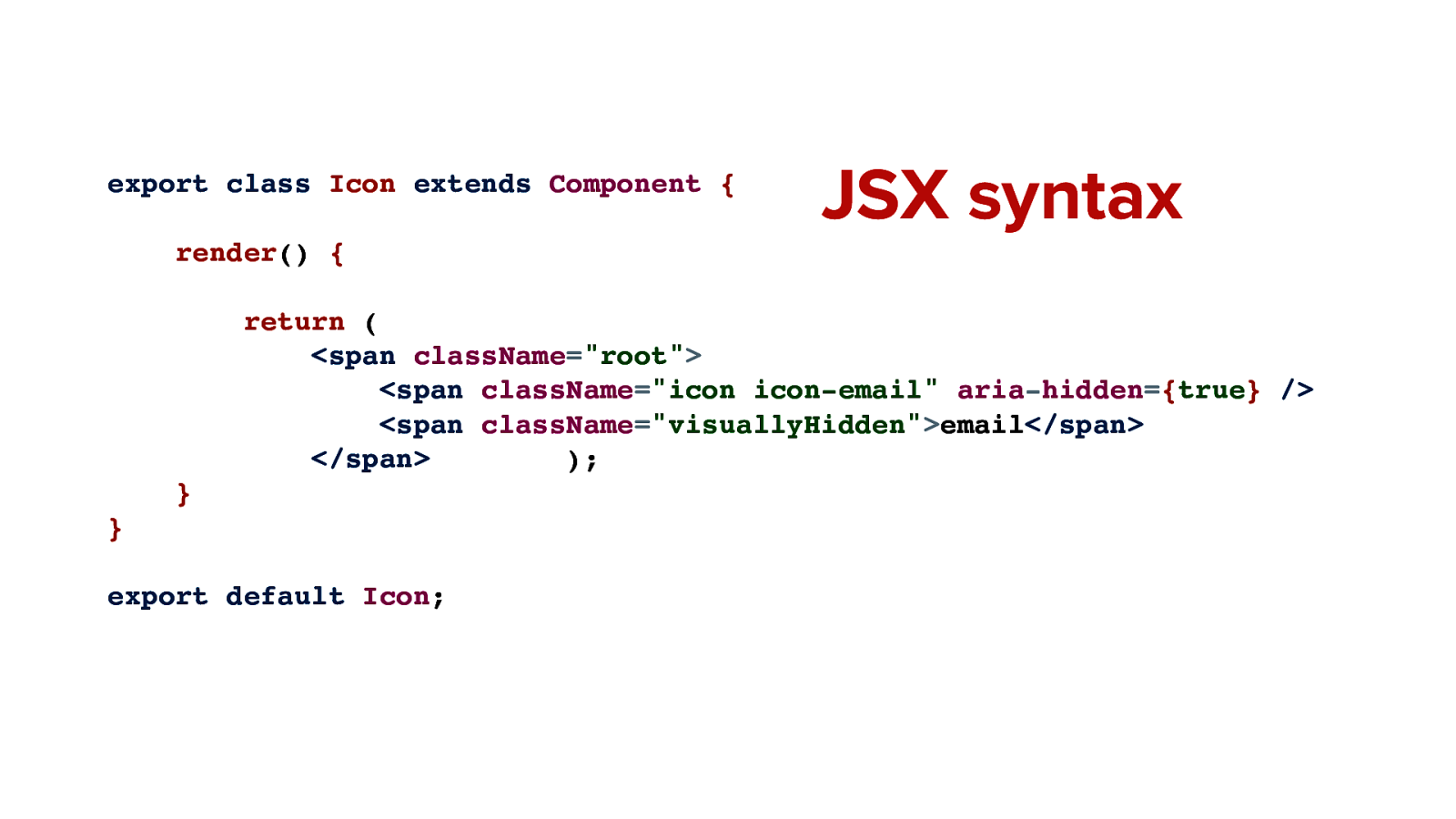
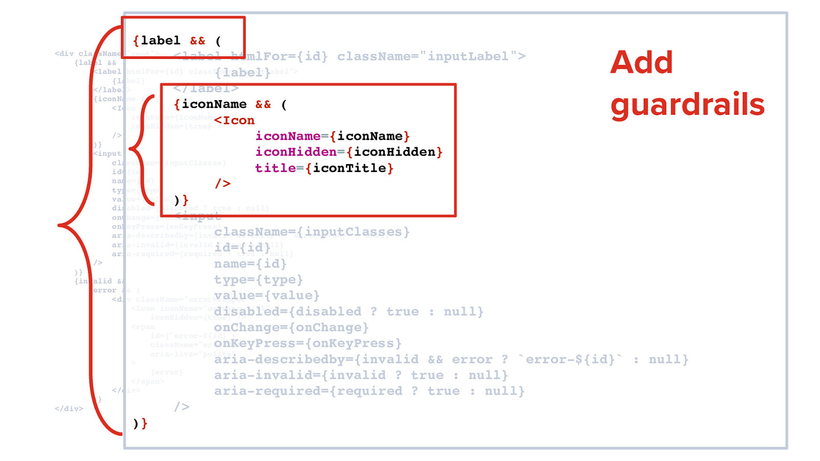
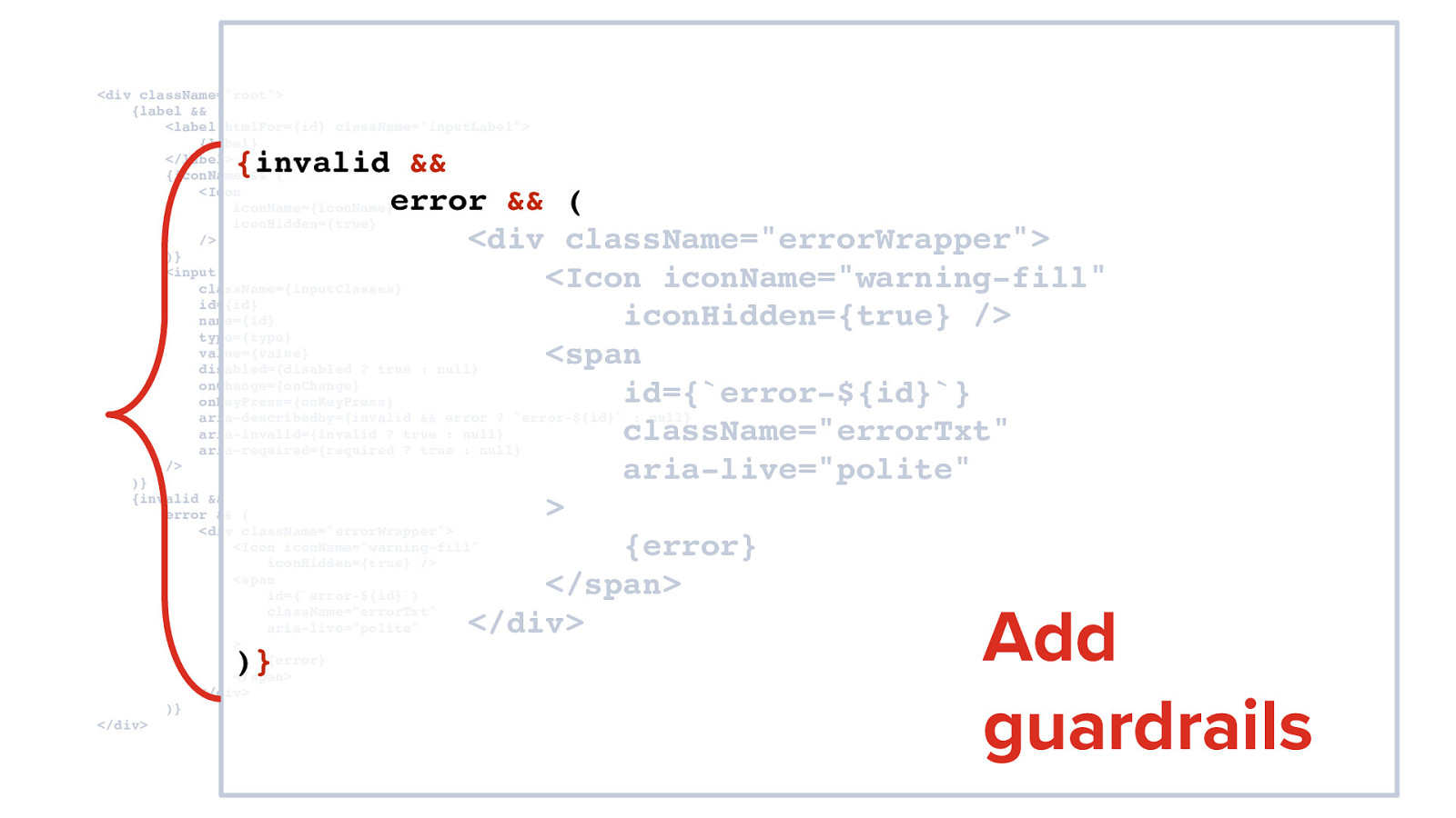
I’m going to cover this a bit quickly, so let’s get some details out of the way

Slide 2

Slide 2

My slide deck will be posted here after my talk https://noti.st/resource11/Ylc3TW

Slide 3

Slide 3

And here are my social links

@resource11 Twitter | Instagram | GitHub @cxsisters Instagram

Now… here’s an outline of what we’ll be covering today.

Slide 4

Slide 4

Good grief, there’s an agenda…

• Why accessible components?

• Design systems are a cookbook

• Design systems and React

• Icons

• Buttons

• Inputs

• Documentation

Slide 5

Slide 5

Let’s back up so I can introduce myself better…

Slide 6

Slide 6

I’m the Tech Lead for O’Reilly Media’s Design System

Slide 7

Slide 7

And I race bikes… very badly.

Slide 8

Slide 8

I try to get more women racing bikes and run the CXsisters social media campaign

Slide 9

Slide 9

But mostly, you’ll find me at the back of the pack, racing 2 laps to your 6 on a singlespeed, wearing a costume!

Because who doesn’t love a clown?

Slide 10

Slide 10

Well maybe not this clown…

Slide 11

Slide 11

One thing I almost forgot to mention…

Slide 12

Slide 12

I’m a dev dinosaur. I remember when…

Slide 13

Slide 13

…computers looked like this and…

Slide 14

Slide 14

…software looked…

Slide 15

Slide 15

…like this.

Slide 16

Slide 16

And we stored stuff on this…

Slide 17

Slide 17

…and looked things up like this.

Slide 18

Slide 18

This browser was the newest hotness…

Slide 19

Slide 19

…and this was our stack. HTML, CSS, and JavaScript.

Slide 20

Slide 20

Fast forward to now and the industry is moving at a really fast pace and…

Slide 21

Slide 21

…you need to adapt quickly to keep up. That can get a bit overwhelming, and you can start feeling…

Slide 22

Slide 22

…like panicky Natalie Portman sobbing in the corner. And that’s natural. Because we all want to stay relevant. But fear not!

Slide 23

Slide 23

Dinosaurs are always the hotness.

Those old-school HTML/CSS/JavaScript skills are highly valuable and transferrable, no matter which framework you use.

They give you an edge in the industry where the div has become the reluctant king.

Thank you for coming to my talk. Kidding. Let’s dig in further.

Slide 24

Slide 24

Why accessible components? And also…

Slide 25

Slide 25

Why should we care?

Slide 26

Slide 26

Our users are varied and they access our pages in many ways.

Slide 27

Slide 27

…depending on ability, preference, and the circumstance.

Here’s a short list of technologies • Desktop, Mobile device, Trackpad, Mouse • Keyboards: standard, braille, morse code • Straw device, switch control • Screen readers, Magnification software, voice assistants

Slide 28

Slide 28

The W3 has developed a set of guidelines to help us make our apps accessible: they’re called the Web Content Accessibility Guidelines or WCAG for short.

There are three levels of conformance. A, AA, AAA, and, WCAG 2.1 level AA is the gold standard for inclusive apps, AAA is the holy grail

Slide 29

Slide 29

There are four principles of accessibility to follow. Those are:

Perceivable Information and UI components must be presentable to users in ways they can perceive.

Operable UI components and navigation must be operable.

Understandable Information and the operation of user interface must be understandable.

Robust Content must be robust enough that it can be interpreted reliably by a wide variety of user agents, including assistive technologies.

Slide 30

Slide 30

The easiest way to remember these principles is to POUR yourself some coffee.

Slide 31

Slide 31

Or perhaps some whiskey? Because we’re in Scotland, and single malt is delicious…

Slide 32

Slide 32

Now we have the standards and principles to follow

We don’t want to leave users behind, and yet…

Slide 33

Slide 33

In February 2019, WebAIM conducted an accessibility analysis top 1,000,000 home pages and the results were pretty depressing.

Slide 34

Slide 34

97.8% of home pages had detectable WCAG 2 failures.

Slide 35

Slide 35

59% of 3.4 million form inputs were unlabeled

Slide 36

Slide 36

60.1% of the 1 million pages had unnecessary ARIA attributes present

Slide 37

Slide 37

Of those pages, there were 26.7 more detectable errors on average than home pages without ARIA.

Slide 38

Slide 38

6 months later…

Slide 39

Slide 39

In August 2019, WebAIM conducted a re-analysis of those same 1,000,000 home pages. Think things got better? Well…

Slide 40

Slide 40

The amount of ARIA on the pages…

Slide 41

Slide 41

…increased, from 60.1% to 64.5%.

Slide 42

Slide 42

Yikes. While developers had good intentions, they actually made the accessibility of those pages worse because they’re implementing things incorrectly.

Slide 43

Slide 43

Imagine, though, if you had accessibility baked into some commonly-used components.

Wouldn’t that be cool? What if that was in your design system?

Slide 44

Slide 44

What is a design system, anyway?

Slide 45

Slide 45

There’s a great inVision blog post that I’ll paraphrase: A design system is a collection of reusable components, guided by clear standards, that can be assembled together to build any number of applications.

Slide 46

Slide 46

An now for the hot take of the day:

Great design systems combine team AND consumer experience.

So often you hear about focusing on developer experience when creating a tool.

More often than not, the most important goal of the design system gets lost in that process: the end user experience.

We need to remember the original purpose of the system: to create a great consumer experience. I mean, what good is it if your system is great for developers. yet the end product isn’t usable?

Slide 47

Slide 47

I like to say your design system is a cookbook.

Slide 48

Slide 48

And cookbooks have personality. My Mom is a serious fan of cooking, and lately I’ve been enjoying digging through the cookbooks she’s collected over the years to read how recipes evolved over time.

If you’ take a look at some of the cookbooks published in the 1940s-60s…

Slide 49

Slide 49

…and look past the outdated views…

Slide 50

Slide 50

…you’ll find interesting recipes…

Slide 51

Slide 51

…questionable food combinations that included Jello and meat…

Slide 52

Slide 52

…and an impressive level of detail paid to the structure of every single part of the cooking process. This is very similar to how a design system works.

Slide 53

Slide 53

Now what does that have to do with React?

Slide 54

Slide 54

There’s always some debate about how using a Javascript framework creates inaccessible apps

Slide 55

Slide 55

Yet… React fully supports building accessible websites, by using standard HTML/CSS techniques.

Slide 56

Slide 56

A better way to think of React is to consider it a kitchen utensil. It’s not the only utensil in your kitchen.

Slide 57

Slide 57

You are the cook. In my opinion, It’s up to the developer to have that standard HTML/CSS/JavaScript and accessibility knowledge to be able to leverage a utensil correctly. And that includes React.

Slide 58

Slide 58

That said, if your developers are unsure how to start building inclusive apps, empower with your design system. Build some features into your components to help them along.

Slide 59

Slide 59

Components are your tried and true recipes

Slide 60

Slide 60

WCAG is Your reference material

Slide 61

Slide 61

Creating a component is like following a recipe.

Slide 62

Slide 62

First, you start off with high-quality ingredients, semantic HTML…

Slide 63

Slide 63

…mix in seasonings, just a touch of ARIA…

Slide 64

Slide 64

…follow the directions, your documentation…

Slide 65

Slide 65

…and provide helpful hints as best practices.

Slide 66

Slide 66

Let’s talk icons. Icons are a great way to add a bit of flourish to your product. They’re used to supplement key messaging and call attention to areas of importance.

Slide 67

Slide 67

Icons can be informative or decorative. Informative icons need alternative text to be perceivable by assistive technology. Decorative icons don’t add significant value, need to be hidden from assistive technology.

Slide 68

Slide 68

There is more than one way to create an accessible icon. Two of the most recent are… SVGs and icon fonts. You’ll hear that SVGs are the new hotness for accessible icons, and it’s true! In fact, we initially used SVG icons combined into a sprite sheet until…

Slide 69

Slide 69

…we discovered a VoiceOver bug when testing on High Sierra, which brought out my Natalie Portman sobbing in the corner. As a temporary solution…

Slide 70

Slide 70

We converted all our icons into a font set and use that instead. Let’s go over an example of how we make an accessible icon component using semantic HTML and the icon font technique.

Slide 71

Slide 71

This is what you typically see as an icon font element in the wild, but it’s not accessible.

Slide 72

Slide 72

This is an accessible icon pattern. Let’s break it down.

Slide 73

Slide 73

We begin with a span element and use a CSS class to attach our icon font family with some baseline styling.

Slide 74

Slide 74

Then, we apply a separate class to the span and assign the icon we want to use as a pseudo-element. In this case, that’s the email icon.

Slide 75

Slide 75

Next, we add a second span with descriptive name for our icon.

Slide 76

Slide 76

Then, we’ll add a wrapping span around the spans and use CSS class to convert the span’s native display property from inline to inline-block. This supports margin/padding customization on all four sides of the element.

Slide 77

Slide 77

Next, we’ll add the visuallyHidden class to the span containing descriptive text. This will remove the visual presentation of that text, yet keep that text available to screen readers.

Slide 78

Slide 78

This is a high quality component… but.

Slide 79

Slide 79

Even though this markup uses high-quality ingredients, when read by a screen reader, this will announce: “\f12f email”. That’s not an ideal situation. It’s time to mix in some key accessibility spices.

Slide 80

Slide 80

We’ll sprinkle a pinch of aria-hidden=”true” to the span containing the icon font

makes sure the unicode characters won’t read out to a screen reader.

Slide 81

Slide 81

Before we refactor this pattern into a React component, let’s consider whether this component is informative or decorative?

Slide 82

Slide 82

If our icon is informative, we keep this markup as is, because informative icons should announce.

Slide 83

Slide 83

If our icon is decorative, we’d add this aria-hidden attribute to the wrapping span to ensure the entire group is not announced to a screen reader.

Slide 84

Slide 84

Now that we have an accessible icon pattern, let’s convert this to JSX.

Slide 85

Slide 85

The class is now changed to className, we convert the aira-hidden prop from a string to a boolean, and because there’s no text inside that first span, we close the JSX element.

Slide 86

Slide 86

Let’s make this component more flexible.

Slide 87

Slide 87

Since our components handle presentational logic only, we’ll expand that syntax to support incoming props, such as:

• iconHidden for controlling how icon announces

• iconName for passing in the icon we want to use

• iconTitle for passing in descriptive text for the icon

Slide 88

Slide 88

Guardrails

Slide 89

Slide 89

It’s important to create ‘guardrails’ for your components so you can be sure that devs are always using the accessibility features you’ve mixed in.

Slide 90

Slide 90

The first guardrail we’ve set up is a check if the iconName the dev passes in to the component is in our icon library. If the icon doesn’t exist in the library, the component doesn’t render in the app.

Slide 91

Slide 91

The second guardrail we’ve set here is to ensure the icon’s default name is always exposed, unless the dev passes in a custom text value.

Slide 92

Slide 92

The last guardrail is the iconHidden prop. If the dev passes in iconHidden true, the containing span’s will render with an aria-hidden=”true” attribute.

If no iconHidden prop is passed in, the aria-hidden attribute isn’t added to the wrapping span at all.

This way, we’re guaranteeing that the icon will read out to screen readers no matter what, unless the dev purposely specifies otherwise by passing in iconHidden value

We’re also ensuring that this boolean attribute is attached to the component only if it’s true. There are certain boolean attributes in HTML that need a true or null pattern, and aria-hidden is one of them.

Slide 93

Slide 93

Let’s talk buttons

Slide 94

Slide 94

• Buttons perform an action on the page.

• Buttons should look and act like a button.

• Use semantic HTML, get screen reader and keyboard functionality for free.

Slide 95

Slide 95

First, we start with the high quality ingredient: the button element.

Slide 96

Slide 96

Our designer has provided a button look and feel that has proper color contrast of text and button borders against the background.

Slide 97

Slide 97

We’ve made sure that we’re leveraging the hover, focus, active and disabled pseudo classes to inform users when they can interact or not with this button.

Slide 98

Slide 98

We also have an aria-label added here to support instances where we have multiple buttons with the same name on the page, as a result of data we’re receiving from an API that didn’t provide distinct button test. This way, we can give context to screen reader users who otherwise wouldn’t know the purpose of that button.

Slide 99

Slide 99

This is an accessible button in HTML.

Slide 100

Slide 100

Let’s convert this button syntax to JSX.

Slide 101

Slide 101

If we want to support button text with icons, we mix in our Icon component.

Slide 102

Slide 102

A span element wraps the Icon and the button contents to leverage flexbox display properties. This is needed to properly position text and icon in cross-browser applications.

Also, use inline not block elements inside buttons, and no nesting buttons or other controls inside a button’s children. That’s not valid HTML.

Slide 103

Slide 103

The JSX is popped into the Component’s render method, and we add props support.

Slide 104

Slide 104

We also need to add onClick handler support, and a prop to set the button’s attribute to disabled if needed is sprinkled in as well.

Slide 105

Slide 105

Lastly, we add a guardrail to ensure if no iconName is passed in, no icon will render in the button.

Slide 106

Slide 106

Inputs

Slide 107

Slide 107

Inputs need labels and error messages. Labeled inputs give all users more context.

Slide 108

Slide 108

• Placeholders are NOT labels.

• Avoid using placeholders instead of labels, users will lose context.

• They’re hard to style across browsers.

• Placeholders aren’t auto translated.

Smashing Magazine published a great article about this written by Eric Bailey.

Slide 109

Slide 109

We’ve built our input components to minimize horizontal scrolling.

• Max input width: 80 characters.

• Keep labels stacked vertically.

• Labels above input, errors below input.

Slide 110

Slide 110

This is an accessible Input component in JSX. This is a bit hard to read on the screen, so let’s zoom in a bit.

Slide 111

Slide 111

Start with high-quality ingredients, semantic HTML.

Slide 112

Slide 112

Inputs need labels and error messages.

Slide 113

Slide 113

For and id to associate label with input.

Slide 114

Slide 114

Mix in key spices (ARIA … not too much) for validation. Add aria-required, aria-describedby, aria-invalid, and error id.

Slide 115

Slide 115

Allow screen readers to receive the input’s error context by adding aria-live attribute of polite.

Slide 116

Slide 116

Convert syntax to JSX.

Slide 117

Slide 117

Sprinkle on the onChange and OnKeypress synthetic event support to capture keyboard actions. Add true/null handling for the boolean props.

Slide 118

Slide 118

Add your guardrails. If the dev doesn’t pass in a label, the whole input won’t render. Neither will the icon. This will help guide the developer to follow best practices when implementing a component.

Slide 119

Slide 119

Same goes for the error handling, if the developer doesn’t pass in both the invalid prop and the error message prop to the component, it won’t render.

Slide 120

Slide 120

Document, document, document

• Make your documentation expansive.

• Be sure to add examples of the many ways a component can be used.

• Also, make it straightforward to contribute to your codebase.

Slide 121

Slide 121

Our Design System uses Gatsby and Storybook to document our components and we host static instances on Zeit’s Now.

Slide 122

Slide 122

[demo of Gatsby site]

Slide 123

Slide 123

I want to touch upon Storybook for a moment.

• Storybook is a great way to Sandbox your components in isolation.

• Play with UI logic without the nonsense of business logic.

• Accessibility addon is a must.

Slide 124

Slide 124

Accessibility addon uses axe-core engine, does the heavy lifting. Identifies low-hanging fruit errors to fix.

Slide 125

Slide 125

Add helpful hints.

Slide 126

Slide 126

Helpful hints Decorative Icon.

Slide 127

Slide 127

Prop tables.

Slide 128

Slide 128

Provide component dos and don’ts.

Slide 129

Slide 129

Also, dedicate a page to accessibility resources and links.

Slide 130

Slide 130

Wrap-up

Slide 131

Slide 131

Our users are diverse

Slide 132

Slide 132

Your Design system is a cookbook

Slide 133

Slide 133

Cookbooks have Personality

Slide 134

Slide 134

React is a kitchen utensil

Slide 135

Slide 135

You are the cook

Slide 136

Slide 136

Components are your tried and true recipes

Slide 137

Slide 137

Helpful hints in every recipe

Slide 138

Slide 138

WCAG is Your reference material

Slide 139

Slide 139

Document, document, document. And…

Slide 140

Slide 140

…Dinosaurs are ALWAYS the hotness

Slide 141

Slide 141

Thank you.

Slide 142

Slide 142

@resource11 Twitter | Instagram | GitHub @cxsisters Instagram