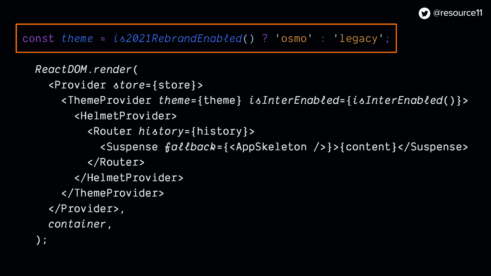
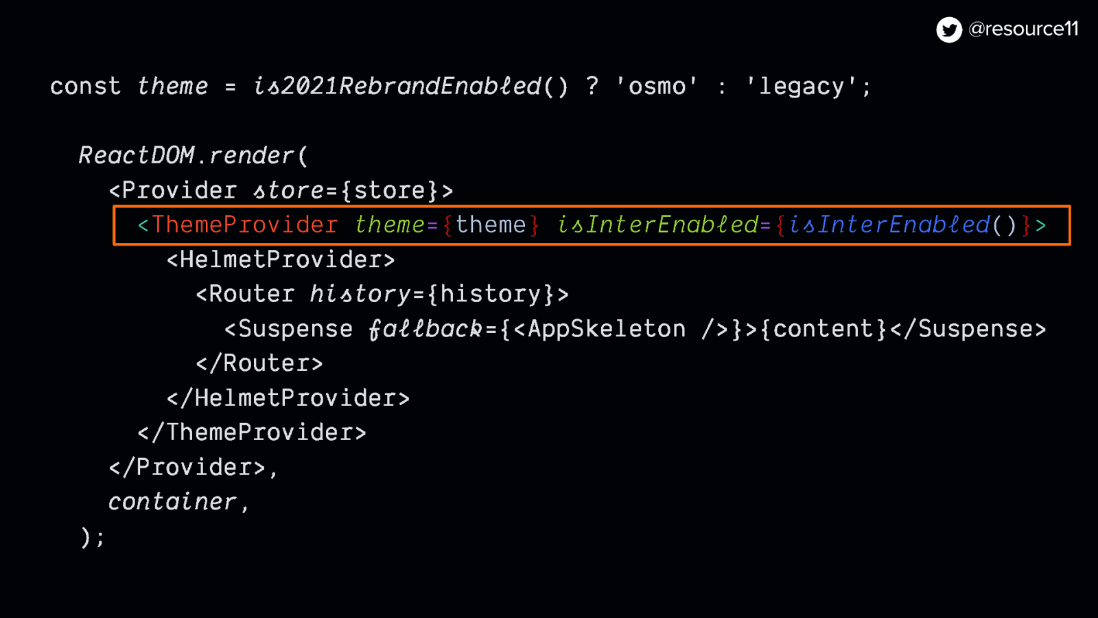
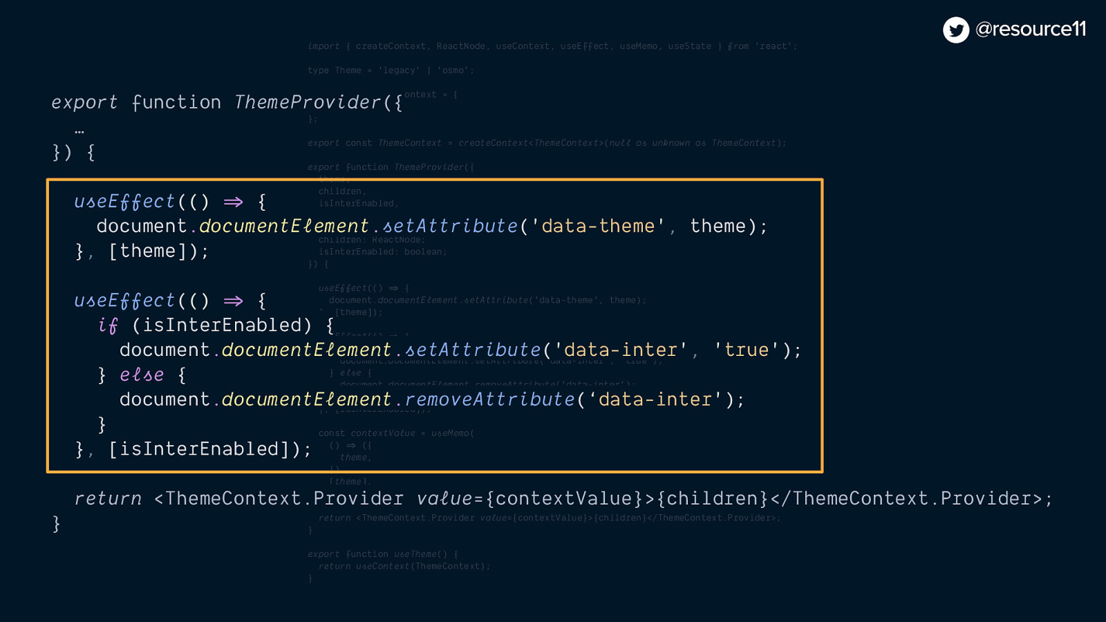
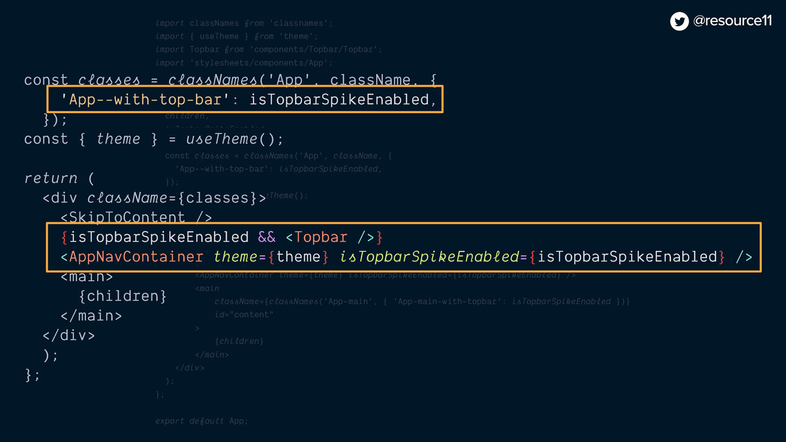
And hooks…
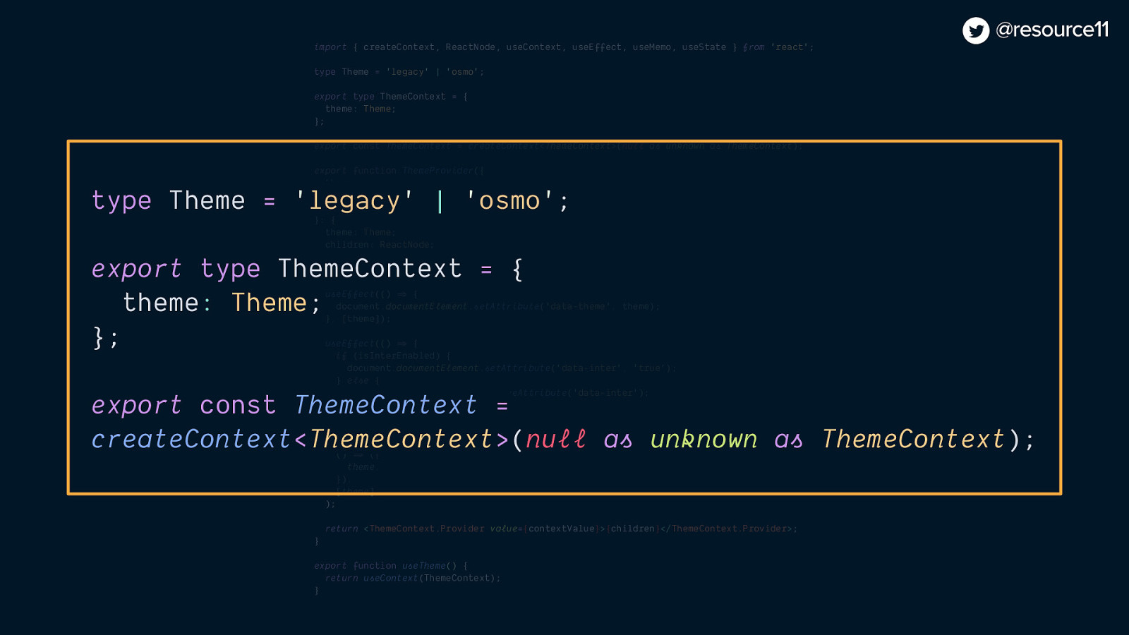
import { createContext, ReactNode, useContext, useEffect, useMemo, useState } from ‘react’;
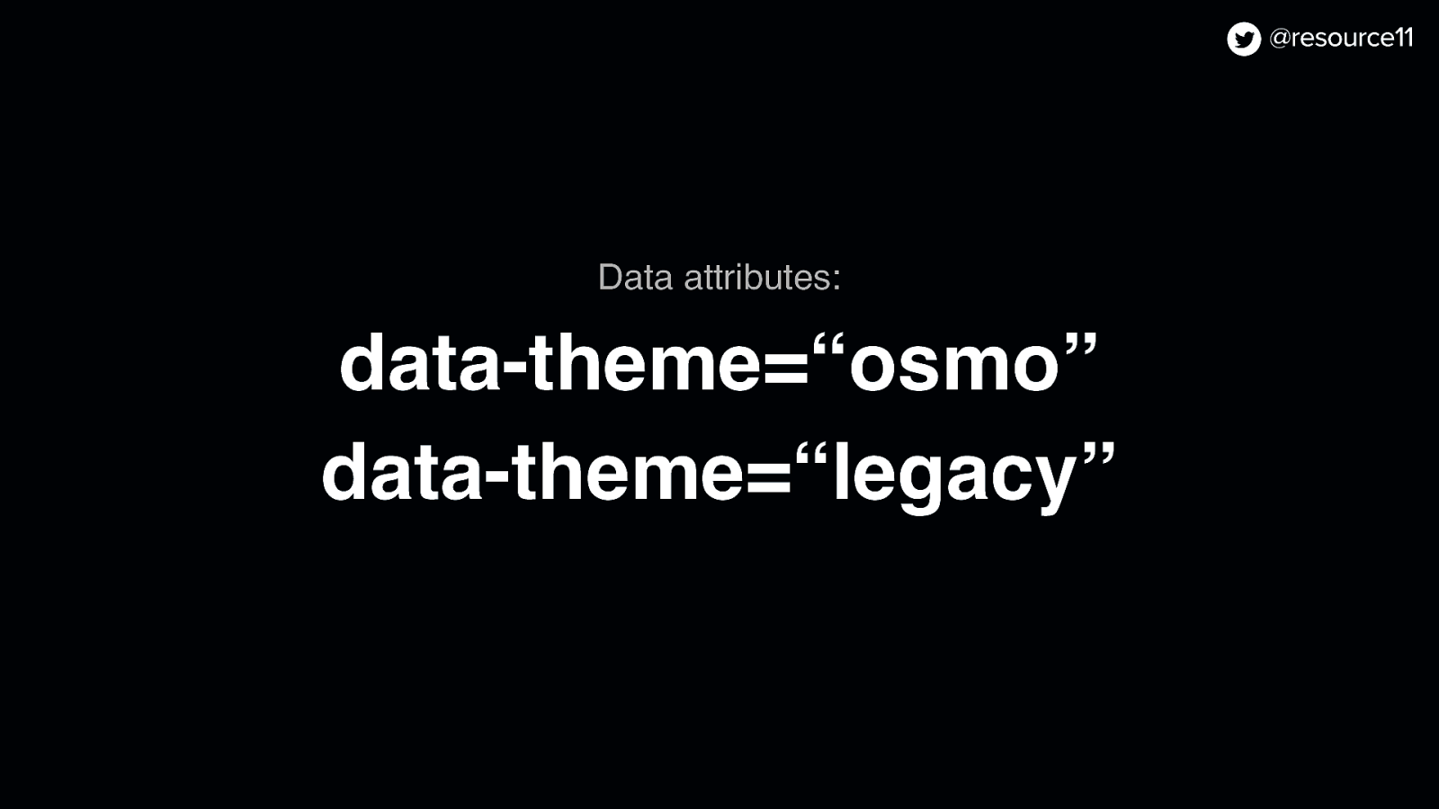
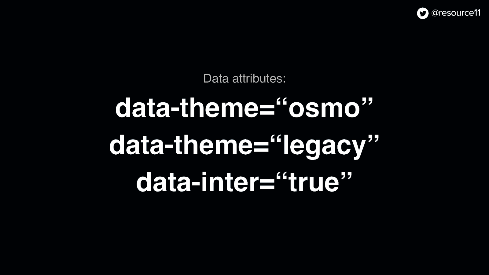
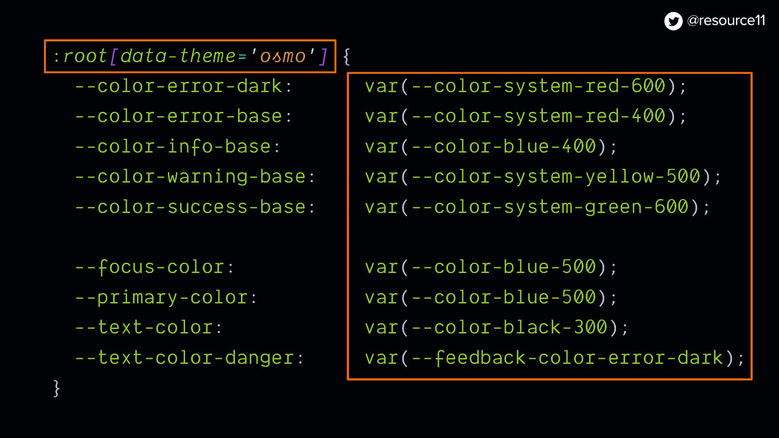
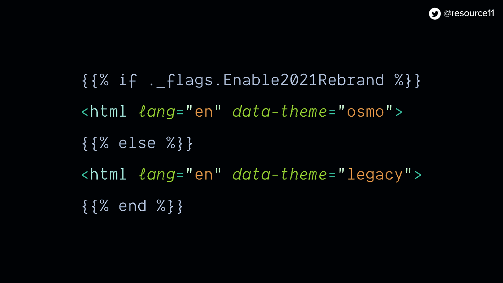
type Theme = ‘legacy’ | ‘osmo’;
export type ThemeContext = {
theme: Theme;
};
export const ThemeContext = createContext<ThemeContext>(null as unknown as ThemeContext);
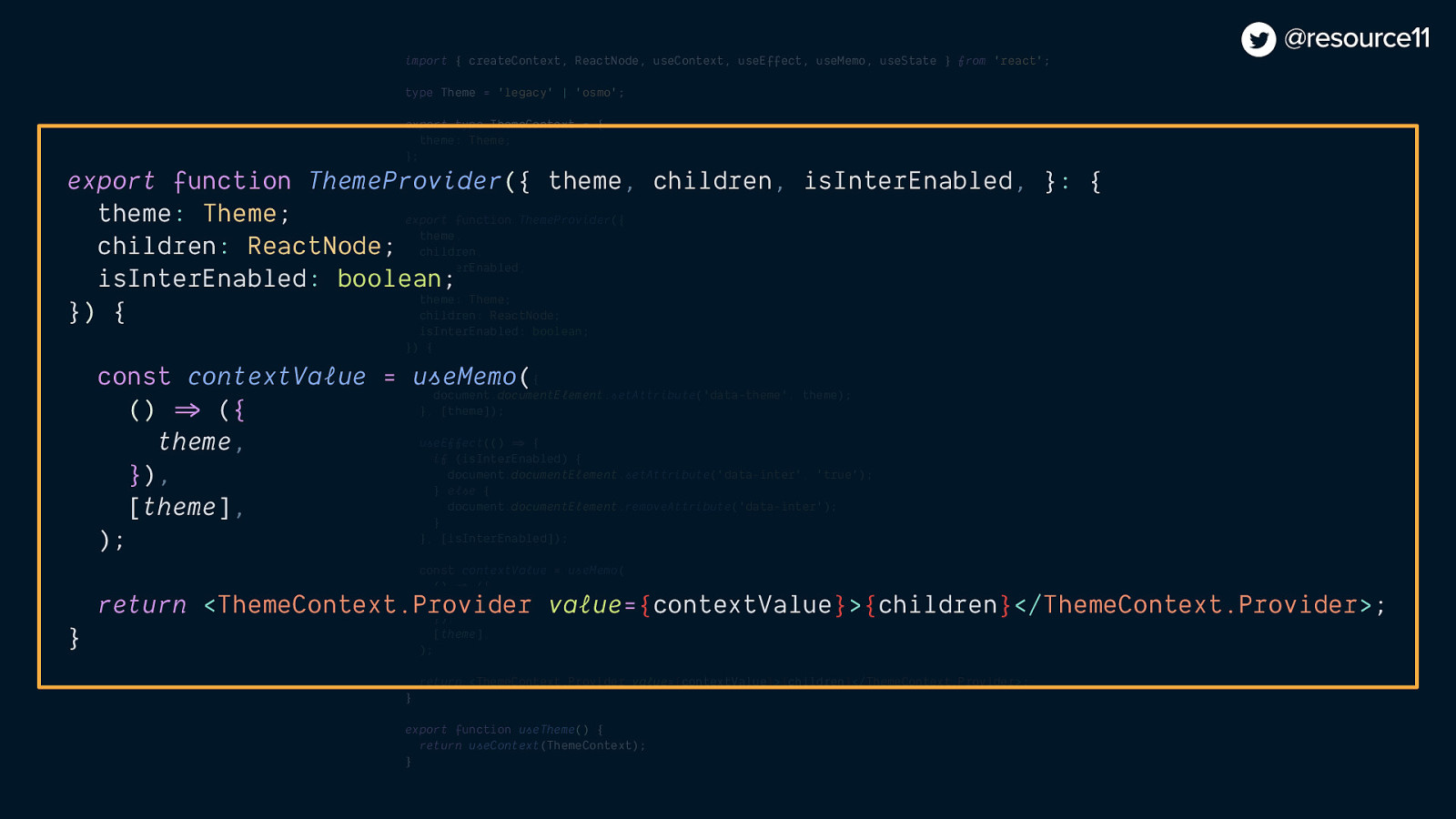
export function ThemeProvider({
theme,
children,
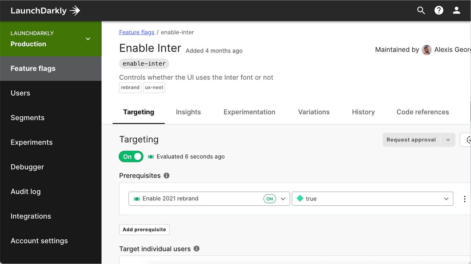
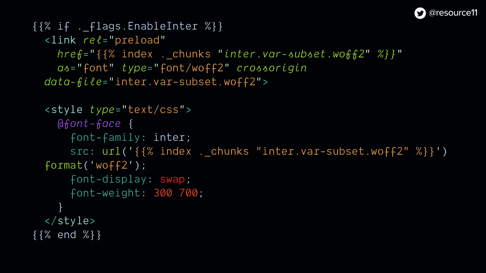
isInterEnabled,
}: {
theme: Theme;
children: ReactNode;
isInterEnabled: boolean;
}) {
useEffect(() => {
document.documentElement.setAttribute(‘data-theme’, theme);
}, [theme]);
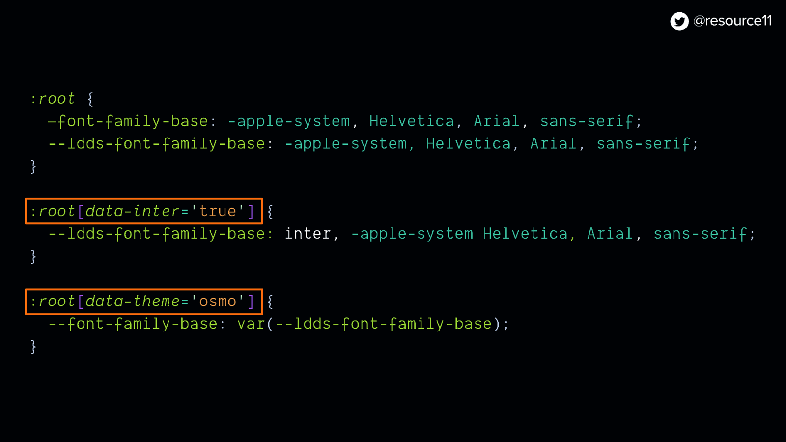
useEffect(() => {
if (isInterEnabled) {
document.documentElement.setAttribute(‘data-inter’, ‘true’);
} else {
document.documentElement.removeAttribute(‘data-inter’);
}
}, [isInterEnabled]);
const contextValue = useMemo(
() => ({
theme,
}),
[theme],
);
return <ThemeContext.Provider value={contextValue}>{children}</ThemeContext.Provider>;
}
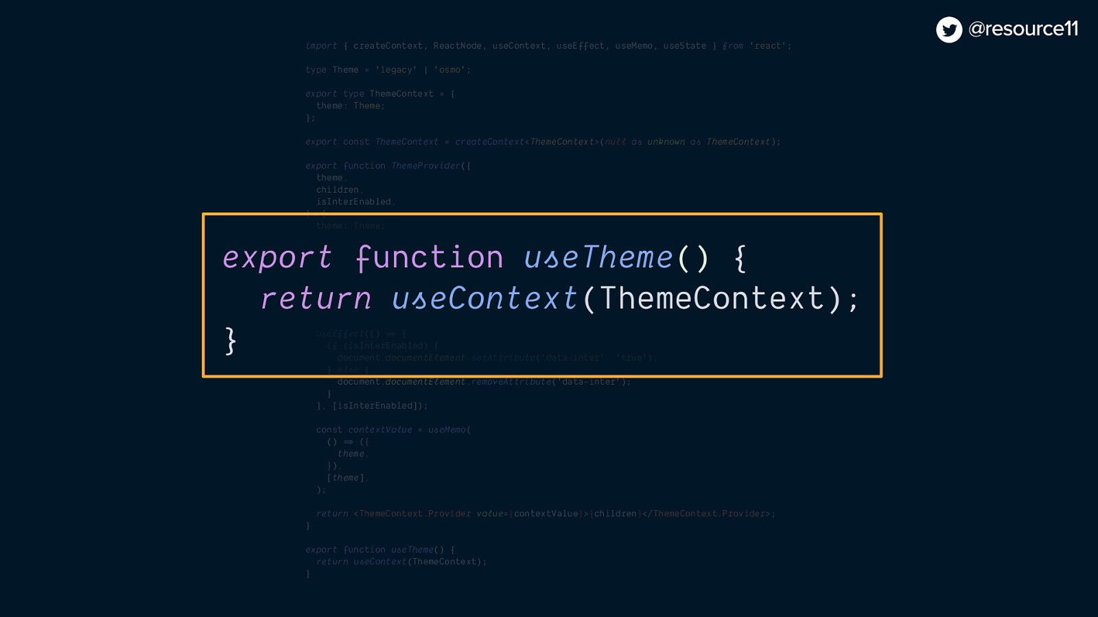
export function useTheme() {
return useContext(ThemeContext);
}


