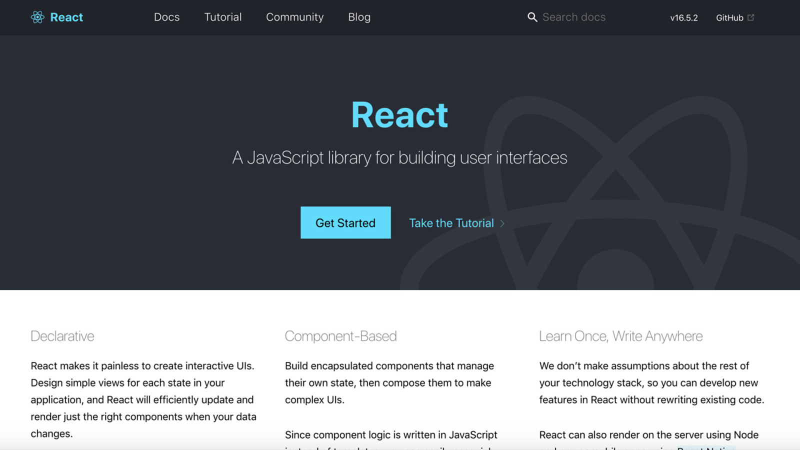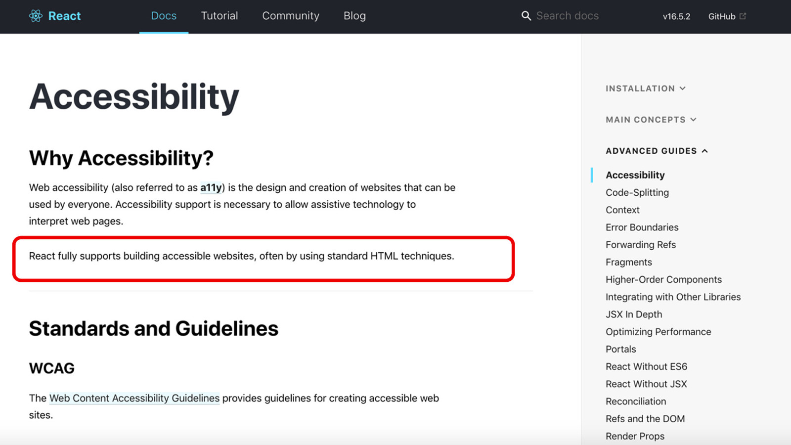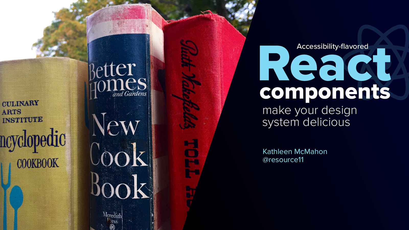
Accessibility-flavored React components make your design system delicious!
Welcome everyone! I’m Kathleen McMahon and I’m here today to show how Accessibility-flavored React components make your design system delicious!
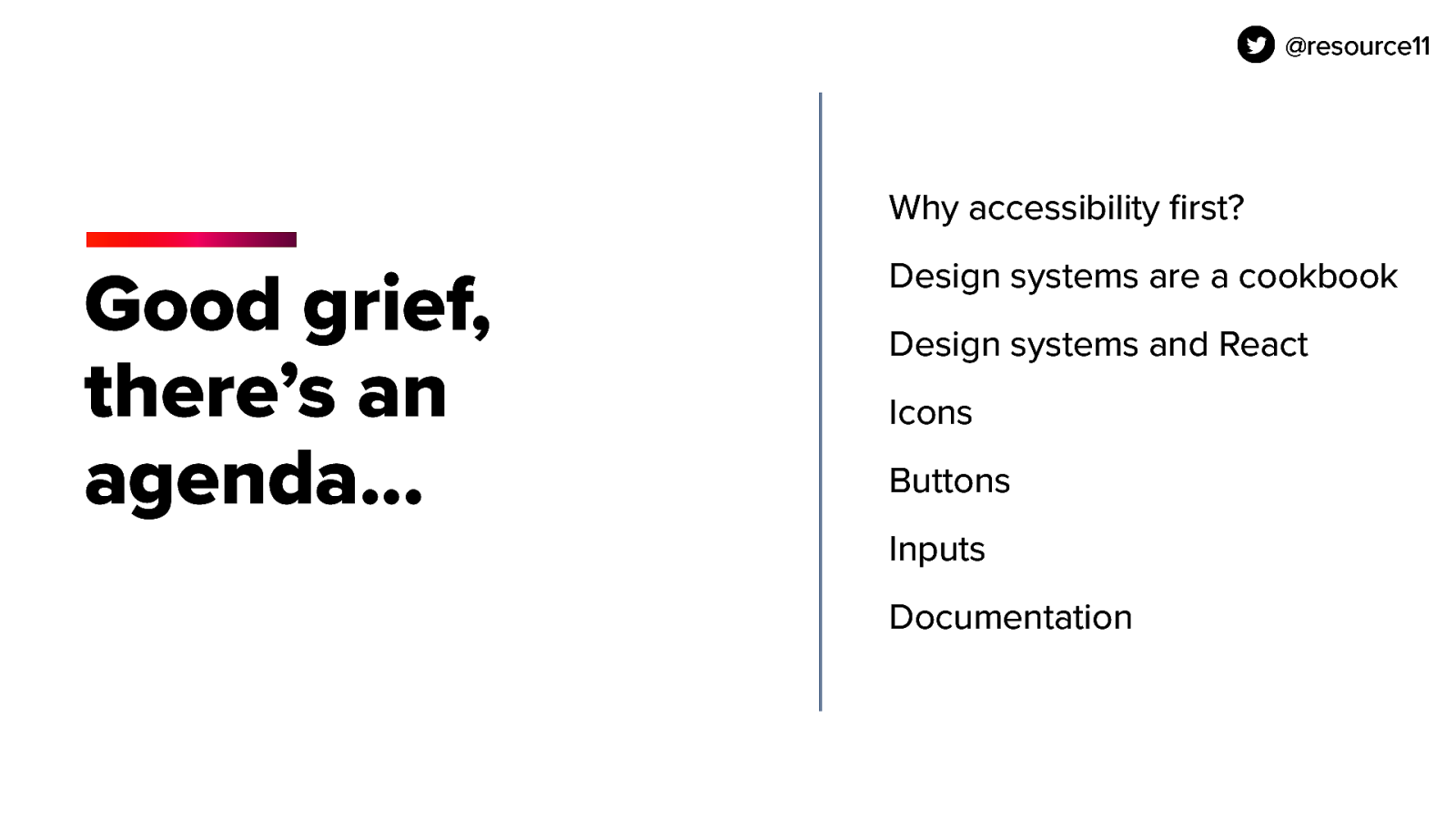
Before we begin, let’s get some details out of the way.