Design System Carnival! One accessible component, many pretty masks.

A presentation at React Miami in April 2023 in Miami, FL, USA by Kathleen McMahon

Slide 1

Slide 1

Design-systems are a Carnival! One accessible component Many pretty masks | Kathleen McMahon @resource11

Welcome everyone! I’m Kathleen McMahon and I’m here today to talk about a Design System Carnival! One accessible component, many pretty masks. Before we begin, let’s get some details out of the way.

Slide 2

Slide 2

https://noti.st/resource11

My presentation will be posted on Notist, that’s https://noti.st/resource11 — including links to resources — after my talk. I’ll also post the full URL on Twitter after my presentation.

Slide 3

Slide 3

@resource11 Twitter | Instagram | GitHub

You can follow me at resource11 on Twitter, Instagram, and GitHub.

Slide 4

Slide 4

Who are you, again?

Let’s back up so I can introduce myself better…

Slide 5

Slide 5

Kathleen McMahon | Engineer • Designer • Speaker

So I’m an engineer and a designer and I like to speak about things…

Slide 6

Slide 6

image: Me on a cyclocross bike, in Spam, Ninja Turtle, Nerds candy box, Medusa costumes

Occasional cyclocross racer. In costume, of course.

Slide 7

Slide 7

image: a wide-screen view of the colorful lamps and lighting strips adorning my home office desk and bookcases

Lover of lights

Slide 8

Slide 8

image: A wide-planked boardwalk — with soft sand and sea grass surrounding its weathered wooden railing — leads toward the calm ocean during a cloudy afternoon low tide

Beach goer.

Slide 9

Slide 9

image: A montage of sand dollars of various sizes and colors, next to a tiny and medium sand dollar in the palm of my hand.

Sand dollar collector

Slide 10

Slide 10

image: Thor, resting on the windowsill of my kitchen window, enjoying the warm summer breeze and sunshine on his soft beige fur and dreamy blue eyes.

Lover of my cats Thor

Slide 11

Slide 11

image: Otis — my silky black haus panther — nestled between my purple bed pillows, gazing at me with calm golden eyes.

…and Otis.

Slide 12

Slide 12

image: A gathering of green aventurine, sodalite, rose quarts towers, and quarts diamond on the kitchen table

I’m a Crystal collector

Slide 13

Slide 13

image: Otis, the black wonder cat, steps into the frame of my crystal collection

And I try to get good photos but Otis…

Slide 14

Slide 14

image: Otis' paws walk through my crystal arrangement on the kitchen table

…interferes often

Slide 15

Slide 15

image: grouping of citrine, amethyst, and celestite glowing in the sun-washed windowsill

…and has…

Slide 16

Slide 16

image: Otis — sassy black cat — sits exactly on top of all my windowsill crystals, seeking attention.

…none of it. Thanks, Otis

Slide 17

Slide 17

image: In pure art director fashion, Thor sits distinctly on one windowsill sand dollar. Ready to provide his ultimate design judgement..

Thor does the same…

Slide 18

Slide 18

image: Thor looks up from the windowsill to the camera with a very satisfied look. His blue eyes gaze hypnotically my way as his pink nose points upward, whiskers pridefully twitching.

He looks pretty satisfied.

Slide 19

Slide 19

image: Otis looking very cute as he lays upside down on my bed, gazing at me.

Who could resist them, though?

Slide 20

Slide 20

Northwestern Mutual

I’m also a Senior Design Systems Engineer at Northwestern Mutual, working on the Luna Design System. I love my team; they are pretty rad.

Slide 21

Slide 21

Design Systems are ALWAYS the hotness image: Person in inflatable dinosaur costume flips into a raft floating on a pond and claps with glee.

I love design systems; it’s exciting! Especially if you like…

Slide 22

Slide 22

image: Woman attempting to arrange 10 squirming kittens in a straight line, with varied success

…herding kittens. Always fun, lots of moving parts.

Slide 23

Slide 23

Design-systems are a Carnival!

I think Design Systems are like a Carnival! What do I mean by that?

Slide 24

Slide 24

image: Mannequin wearing Bauta mask adorned with navy Tabarro

Well… I visited Venice last fall and was fascinated by the masks. I loved their beauty…

Slide 25

Slide 25

image: Mannequin wearing plague doctor mask in muted purple costume

their variety…

Slide 26

Slide 26

image: A crowd of Jester masks hanging in a Venetian vendor's market

And… they’re everywhere.

Slide 27

Slide 27

image: Rows of brightly-colored porcelain masks handing on a Venetian market wall

Everywhere you look in Venice.

Slide 28

Slide 28

image: A group of very elaborate and detailed bespoke masquerade art pieces in a Venetian gallery

In the shops.

Slide 29

Slide 29

image: Four tiny jester mask magnets hanging in a Venetian shop doorway

…the souvenirs.

Slide 30

Slide 30

image: a white red and orange painted paper mache mask with ribbon ties on a paint-spattered newspapered table

I even made my own mask

Slide 31

Slide 31

image: a person wearing a Jester mask smiling

And I learned the masks have a rich history of providing access. And helping a person blend in…

Slide 32

Slide 32

image: A gathering of people in 18th century costume dancing at the Giacoma Casanova Carnival

…to hide their gender, identity, social class…

Slide 33

Slide 33

image: man walking through a corridor wearing a Baùta and Tabarro

Some of the well-known masks are the Bauta… This mask was great because it had this big jaw so you could go eat and drink and do the things you want to do and not be noticed.

Slide 34

Slide 34

image: red-haired woman wearing a small oval mask, made of Velvet, which is held with the mouth thanks to a button.

There’s the Moretta…

Slide 35

Slide 35

image: man and woman in 18th-century costume wearing cat masks

The Gagna… meow!

Slide 36

Slide 36

image: A man in a Harlequin mask surrounded by two surprised woman and an amused man in 19th-century clothing

The Harlequin..

Slide 37

Slide 37

image: Venetians row during the Carnival masquerade parade on the Venetian Grand Canal.

…and wearing these masks gave you access to places with more freedom — like this parade of gondolas during Venice’s Carnival Similar to a design system. When well-crafted, masks create consistency of experience.

Slide 38

Slide 38

Is it consistent for everyone?

So, is the experience consistent for everyone though? Let’s talk Accessibility.

Slide 39

Slide 39

Our users have different needs at different times

Slide 40

Slide 40

Vision Sensory Hearing Language Motor Cognitive Low bandwidth

From vision hearing, motor skills, cognitive, sensory, language needs, bandwidth, speed, and more. Our users have so many needs, and so often, accessibility is what is handled last. We don’t want to leave our users behind

Slide 41

Slide 41

Why accessible components?

Now what does this mean in terms of accessible design system components?

Slide 42

Slide 42

February 2023 — WebAIM Million — An accessibility analysis of the top 1,000,000 home pages

Well, there is this report called the WebAIM Million report and it’s been released for the past five years now. If you’ve read the results, they’re a bit concerning. It’s an accessibility analysis of the top 1000 homepages. And I’m going to focus on the amount of ARIA present on the homepage.

Slide 43

Slide 43

February 2019 — 60.1% of the 1 million pages had ARIA present

There has been up to a 29% increase the past year, and the amount of ARIA attributes has nearly quadrupled since 2019. So that means that our developers are making the web worse in the spirit of best intentions.

Slide 44

Slide 44

February 2020 — 64.6% of the 1 million pages had ARIA present

There has been up to a 29% increase the past year, and the amount of ARIA attributes has nearly quadrupled since 2019. So that means that our developers are making the web worse in the spirit of best intentions.

Slide 45

Slide 45

February 2021 — 68.1% of the 1 million pages had ARIA present

There has been up to a 29% increase the past year, and the amount of ARIA attributes has nearly quadrupled since 2019. So that means that our developers are making the web worse in the spirit of best intentions.

Slide 46

Slide 46

February 2022 — 74.6% of the 1 million pages had ARIA present

There has been up to a 29% increase the past year, and the amount of ARIA attributes has nearly quadrupled since 2019. So that means that our developers are making the web worse in the spirit of best intentions.

Slide 47

Slide 47

February 2023 — 80% of the 1 million pages had ARIA present

There has been up to a 29% increase the past year, and the amount of ARIA attributes has nearly quadrupled since 2019. So that means that our developers are making the web worse in the spirit of best intentions.

Slide 48

Slide 48

What can we do about this?

So what can we do about this?

Slide 49

Slide 49

This is the W3C’s Web Accessibility Initiative page, and it has some fantastic guidelines for us to follow. Especially for ARIA authoring practices, design patterns, and examples.

Slide 50

Slide 50

image: thumbnails of "accessibility-flavored react components make your design system delicious" talk

Now, I generally with all my talks will give you examples and how-tos on how to make a component accessible, This is not that type of talk. However. I will be providing code examples and resources at the end of the talk. So don’t worry, you will not miss anything. I will have the code examples. I will have the notes. And I always provide notes with my deck so you can sit back, relax, and enjoy the storytelling instead… and the masks.

Slide 51

Slide 51

Disclosure widget

We have this one pattern in a design system that is the basis for things like popups, toggleTips, toggleSearch, and you can see them used in things like a terms of service widget.

Slide 52

Slide 52

One pattern, a few uses

This one pattern has a few uses, and if it’s built correctly, it can have a few uses in your design system. It’s called the Disclosure Widget.

Slide 53

Slide 53

Anatomy of a disclosure widget

The anatomy of a disclosure widget is…

Slide 54

Slide 54

A button that opens & closes a container, then returns focus to the button

A button that opens and closes a container And returns focus to the button.

Slide 55

Slide 55

image: WAI site card view of various design patterns, highlighting the disclosure pattern

And the WAI site has a documented pattern for this basic disclosure widget

Slide 56

Slide 56

Primary keyboard interactions | Space bar/Enter key Escape key Mouse clicks

This pattern has three primary keyboard interactions: • Space bar/Enter key — which comes natively when you use a button to open the disclosure — • Mouse clicks, and • And the ESC key, which is part of the extended disclosure pattern

Slide 57

Slide 57

<button />

So when you build a disclosure pattern you begin with a button JSX button because..

Slide 58

Slide 58

<button> | Supports Mouse clicks Enter keypress Spacebar keypress

…you natively get under the hood: mouse clicks, enter keypress and spacebar keypresses by default. This is just built in. Yay HTML. We love HTML. I love HTML.

Slide 59

Slide 59

ARIA support

And… we’ll use just enough ARIA attributes to let screen readers know when the container is being opened and closed — or in the case of if you have many widgets on the page — which container is being opened or closed.

Slide 60

Slide 60

On the button, the three ARIA attributes we’re adding are

Aria-controls to tell assistive technology the id of the associated element the button’s controlling. In this case it would be the name of the container’s id.

[jsx code] aria-controls={ariaControls}

Slide 61

Slide 61

aria-expanded, which conveys whether the widget is expanded or not

[jsx code]

aria-expanded={ariaExpanded}

Slide 62

Slide 62

And aria-label for cases where we need a more accurate button label, especially if we are doing icon buttons

[jsx code]

aria-label={ariaLabel}

Slide 63

Slide 63

State & click handlers

We also need state and click handlers to toggle the container open and closed

Slide 64

Slide 64

We’ll use React’s useState hook to define the isOpen state variable and setIsOpen function, initializing isOpen to false.

[jsx code]

const [isOpen, setIsOpen] = useState(false);

Slide 65

Slide 65

Optionally, we could pass in a boolean defaultExpanded prop, for those cases when we need a widget to be open when a view is loaded.

Like a Terms of Service toggle tip, for example.

[jsx code]

const [isOpen, setIsOpen] = useState(defaultExpanded);

Slide 66

Slide 66

We then make a toggleOpen function that uses setIsOpen to toggle the state between true and false

[jsx code]

const toggleOpen = () => { setIsOpen(!isOpen); };

Slide 67

Slide 67

In the Button, we pass the toggleOpen function into the onClick event

[jsx code]

onClick={toggleOpen}

Slide 68

Slide 68

…the isOpen value into the ariaExpanded prop

[jsx code]

aria-expanded={isOpen}

Slide 69

Slide 69

And add isOpen to the children JSX expression so the children only render in the div if isOpen is true

[jsx code]

<div> {isOpen && children} </div>

Slide 70

Slide 70

Focus management

Focus management. Let’s set our widget up to listen for ESC key presses and return focus to the button when the widget closes

**Focus management is a nice UX enhancement and is an extended disclosure pattern, so you should test this with your users.

Slide 71

Slide 71

We’ll start by creating a buttonRef using React’s useRef hook, initializing to null

[jsx code]

const buttonRef = useRef(null);

Slide 72

Slide 72

…make an onKeyUpHandler function, listening for ESC key presses while the widget isOpen, And if the widget is open, we’ll set IsOpen to false and send focus to the buttonRef

[jsx code]

const onKeyUpHandler = (e) => { if ((e.key === “Escape” || e.keyCode === 27) && isOpen) { setIsOpen(false); buttonRef.current.focus(); } };

Slide 73

Slide 73

Next, we pass in the onKeyUpHandler function to the onKeyUp synthetic event on the DisclosureWidget’s wrapper div, and

[jsx code]

return ( <div onKeyUp={onKeyUpHandler} className=”dwWrapper”> <Button aria-controls={ariaControls} aria-expanded={ariaExpanded} aria-label={ariaLabel} id={buttonId} buttonRef={buttonRef} buttonClasses={buttonClassNames} icon={buttonIcon} iconOnlyBtn={iconOnlyBtn} onClick={toggleOpen} size={buttonSize} > {buttonText} </Button> <div> {isOpen && children} </div>

Slide 74

Slide 74

Pass in the buttonRef to the Button’s buttonRef prop (say that three times fast) Your Widget will now close on ESC keypress and return focus to the Button

This is the extended disclosure pattern. You should test with users

[jsx code]

buttonRef={buttonRef}

Slide 75

Slide 75

CSS focus states

CSS focus states. Now that we have focus management done, let’s get our CSS focus states normalized

Slide 76

Slide 76

Since browsers don’t give a consistent look for focus states, we should make it clearly visible for our users when our interactive controls receive focus.

Let’s add some default styling for our :focus pseudo selector throughout our app, and pick a color with at least a 3:1 contrast ratio or greater.

[css code]

*:focus { outline: 0; outline-offset: var(—s-5); box-shadow: 0 0 0 var(—s-5) var(—purple-orchid); }

Slide 77

Slide 77

We can always override focus styles in our individual CSS files to customize them even more, yet it’s always important to show them.

[css code]

.button { font-weight: var(—font-weight-bold); border: 0; border-radius: var(—border-radius); cursor: pointer; display: inline-block; line-height: 1; transition: background-color 0.2s ease;

:hover { background-color: var(—color-primary); border: 1px solid var(—color-primary); }

:focus { outline: 0.1em solid var(—color-primary-reverse); outline-offset: -2px; box-shadow: 0 0 0 0.2rem var(—color-focus); }

:active { outline: 0.1em solid var(—color-aquamarine-500); }

Slide 78

Slide 78

Mouse click management

Mouse click management. If you have many widgets on the page, you’ll only want to have one widget open at a time, so let’s set up a handler to make that happen

Slide 79

Slide 79

Like our buttonRef, we’ll create a contentRef with useRef, initializing to null

[jsx code]

const contentRef = useRef(null);

Slide 80

Slide 80

Like our buttonRef, we’ll create a contentRef with useRef, initializing to null

[jsx code]

const contentRef = useRef(null);

Slide 81

Slide 81

Create an onClickOutside event Handler function. This will check if the buttonRef or contentRef contains the event target, keep the widget open, otherwise, set IsOpen to false to close the widget

[jsx code]

const clickOutsideHandler = (e) => { if ( contentRef.current.contains(e.target) || buttonRef.current.contains(e.target) ) { return; } setIsOpen(false); };

Slide 82

Slide 82

Now that we have that clickOutsideHandler set up, we can user React’s useEffect hook and some if statements For example, If isOpen is true, we’ll add some document.addEventListener functions for mouseup and keyup and call the clickOutsideHandler for each.

[jsx code]

if (isOpen) { document.addEventListener(“mouseup”, clickOutsideHandler); document.addEventListener(“keyup”, clickOutsideHandler); }

Slide 83

Slide 83

If isOpen is false, we’ll remove those event listeners.

[jsx code]

} else { document.removeEventListener(“mouseup”, clickOutsideHandler); document.removeEventListener(“keyup”, clickOutsideHandler); };

Slide 84

Slide 84

We’ll also do a cleanup function to remove any stray event listeners from running

[jsx code]

return () => { document.removeEventListener(“mouseup”, clickOutsideHandler); document.removeEventListener(“keyup”, clickOutsideHandler); };

Slide 85

Slide 85

Lastly, we’ll pass in isOpen as the second array argument in our hook to be sure useEffect only runs if the isOpen state changes value

[jsx code]

[isOpen]

Slide 86

Slide 86

image: Arrangement of handcrafted Venetian masks displayed in a shop window

Now we can start using this pattern to making many pretty masks… so let’s make a toggle tip.

Slide 87

Slide 87

Toggle tips

Slide 88

Slide 88

Toggle tips are NOT Tooltips

One important thing to note. A tooltip is NOT a toggle tip, the interactions are different.

A tooltip’s interactivity revolves around hovering over the tool tip and maybe focusing on it with a keyboard.

Slide 89

Slide 89

Toggletips

Toggletips contain interactive content,are supported by touch devices, non-mouse pointers, and eye trackers, where tooltips are not

Slide 90

Slide 90

Toggle tips

But technically, what we’ve already built, will support what we need with a little styling, and I know you’re going to go back to your work and do something like this instead

Slide 91

Slide 91

Toggle tips

Mmm hmm. OK y’all. Fine! We’ll make a Toggle tip with an icon-only version.

But let’s talk about icons for a minute

Slide 92

Slide 92

Icons — Informative or decorative

Icons can be informative or decorative

Informative icons need to be paired with descriptive text to be perceivable by screen readers.

Decorative icons need to be hidden from screen readers, because they don’t add significant value to your app

Slide 93

Slide 93

image: code snippet of our button

Since we want to support icons in our Button component, we’ll add in a new component to the mix

Slide 94

Slide 94

The FontAwesomeIcon React component. What I like about the ReactFontAwesome icon under the hood, it uses an SVG. Their team preps their SVG in a way where they set it to be focusable=false so they hide it as a decorative icon already. So it’s up to you to use the ARIA labels/everything else to make it informative, if you want. It’s a nice way to use a decorative icon, then pair it with children into a span and use CSS for positioning. We’ll gate them behind the icon prop to render them only when we need them.

[jsx code]

{icon && ( <FontAwesomeIcon icon={icon} className={iconOnlyBtn ? iconBtnClasses : iconClasses} size={size !== ButtonSizes.small ? “lg” : “sm”} /> )}

Slide 95

Slide 95

We can pair an icon with visible button text

[jsx code]

<Button icon={buttonIcon}> {buttonText} </Button>

Slide 96

Slide 96

And since we added that aria-label support in earlier, we can pair an icon with an aria-label here and support screen readers

[jsx code]

<Button aria-label={buttonAriaLabel} icon={buttonIcon} iconOnlyBtn={true}

{buttonText} </Button>

Slide 97

Slide 97

And we have a way to add extra CSS to override Button styles in icon-only scenarios

[jsx code]

<Button iconOnlyBtnClasses={styles.btnIcon} > {buttonText} </Button>

Slide 98

Slide 98

Now that we have the button adjusted, we can use our DisclosureWidget and build our ToggleTip

[jsx code]

export default function ToggleTip() { return ( <DisclosureWidget aria-label=“Fruit trivia” buttonClasses={styles.toggleTipButton)} buttonIcon=”apple-alt” iconOnlyBtnClasses={styles.btnIcon} iconOnlyBtn={true} > <div className={styles.floatingContainer)}> <p className={styles.toggleTipContainer}> Hungry for more interesting fruit facts? View a{” “} <a href=”https://google.com”>full list of fruit trivia</a> in at our virtual farm stand. </p> </div> </DisclosureWidget> ); }

Slide 99

Slide 99

First we’ll pass in the buttonIcon, set iconOnlyBtn to true and pass in an aria-label

[jsx code]

<Button aria-label={buttonAriaLabel} icon={buttonIcon} iconOnlyBtn={true}

{buttonText} </Button>

Slide 100

Slide 100

export default function ToggleTip() { return ( <DisclosureWidget aria-label=“Fruit trivia” buttonClasses={styles.toggleTipButton)} buttonIcon=”apple-alt” iconOnlyBtnClasses={styles.btnIcon} iconOnlyBtn={true} > <div className={styles.floatingContainer)}> <p className={styles.toggleTipContainer}> Hungry for more interesting fruit facts? View a{” “} <a href=”https://google.com”>full list of fruit trivia</a> in at our virtual farm stand. </p> </div> </DisclosureWidget> ); } Then, we’ll add some styling to the button and the icon

Slide 101

Slide 101

Then, we’ll pass in a div with a paragraph and a link to our widget.

[jsx code]

<div className={styles.floatingContainer)}> <p className={styles.toggleTipContainer}> Hungry for more interesting fruit facts? View a{” “} <a href=”https://google.com”>full list of fruit trivia</a> in at our virtual farm stand. </p> </div>

Slide 102

Slide 102

Toggle tip

Boom. ToggleTip

Slide 103

Slide 103

ToggleSearch

Let’s make a Disclosure with an embedded search form

Slide 104

Slide 104

First…

[jsx code]

export default function ToggleSearch() { return ( <DisclosureWidget buttonClasses={clsx(styles.searchMenuButton)} buttonText=”Find a fruit” buttonIcon=”search” > <form onSubmit={(e) => e.preventDefault()} > <Input label=”Search” name=”value” type=”search” /> <Button>Go</Button> </form> </DisclosureWidget> ); }

Slide 105

Slide 105

We’ll pass in some buttonText and an icon to our disclosureWidget button For the purposes of this prototype, we’ll pass in a form and prevent the default onSubmit action

[jsx code]

aria-label=“Fruit trivia”

buttonIcon=”apple-alt”

iconOnlyBtn={true}

Slide 106

Slide 106

Add an Input component with a label, name attribute and a input type of search, and a Button component. We don’t need to specify a submit type for the button, since it’s embedded in a form and we get that attribute for free.

[jsx code]

buttonClasses={styles.toggleTipButton)}

iconOnlyBtnClasses={styles.btnIcon}

Slide 107

Slide 107

Targeted focus management

An embedded search widget is the perfect use case for some enhanced UX… like targeted focus management.

In other words, when we open the widget, we’ll send focus right to the search input.

Slide 108

Slide 108

To do that, we’ll use the useRef hook to create the DOM reference to our input, create a variable called firstItemRef, and assign useRef to null

[jsx code]

const firstItemRef = useRef(null);

Slide 109

Slide 109

We’ll pass firstItemRef into the DisclosureWidget prop …and our Input component’s inputRef prop

[jsx code]

<DisclosureWidget firstItemRef={firstItemRef} buttonClasses={clsx(styles.searchMenuButton)} buttonText=”Find a fruit” buttonIcon=”search”

<form onSubmit={(e) => e.preventDefault()} > <Input inputRef={firstItemRef} label=”Search” name=”value” type=”search” /> <Button>Go</Button> </form> </DisclosureWidget>

Slide 110

Slide 110

In our DisclosureWidget useEffect’s first if statement, we’ll add a nested if statement checking if the firstItemRef is defined,

And if so, send focus to that firstItemref

We’ll also pass in firstItemRef as second argument to the useEffect function array to prevent component re-renders

[jsx code]

if (firstItemRef) { firstItemRef.current.focus(); }

Slide 111

Slide 111

Embedded search widget

And now we have an embedded search widget. These are some really great patterns based on the enhanced disclosure widget.

Slide 112

Slide 112

This is where it gets tricky

This is where it gets tricky, because this is the point where things get tempting for a developer.

Slide 113

Slide 113

Hamburger navigation [image: navigation with apple, orange, grape link that visually present as buttons

What if your designer comes up with this hamburger navigation pattern? Hmm. Looks like a good case for a disclosure pattern, right?

Well, if it’s navigation, those items should look like links not buttons, so we should adjust them…

Slide 114

Slide 114

Hamburger navigation

…to have underlines and less of a button-y look to communicate intent. Because cognitive accessibility is important too. Now let’s get back to the building it.

Slide 115

Slide 115

Hey Links Whoa

Let’s add some links in there.

Slide 116

Slide 116

Cool. Let’s add some links into our disclosure widget now. We’ll find a quick way of doing this, like, passing an unordered list.

And mapping those links. Yeah, this is cool. We could just… map in some links.

And hey! We can have a widget with a hamburger menu, and make this toggle menu links just to have a quick thing without even making it a new component. That could be fun.

[jsx code]

export default function ToggleMenuLinks() { return ( <DisclosureWidget aria-label=”fruit choices” buttonClasses={clsx(styles.disclosureButton, styles.chooseFruitButton)} buttonIcon=”bars” iconBtnClasses={clsx(styles.btnIcon)} iconOnlyBtn={true} > <ul className={clsx(styles.floatingContainer, styles.disclosureMenuList)}> {items.map((item, i) => { return ( <li className={styles.disclosureMenuListItem} key={i}> <a href={item.link}>{item.title}</a> </li> ); })} </ul> </DisclosureWidget> ); }

Slide 117

Slide 117

How about Buttons Whoa

How about buttons?

Slide 118

Slide 118

We could pop in buttons in this list as well… What else could we do with this?

[jsx code]

export default function ToggleMenuButtons() { return ( <DisclosureWidget aria-label=”fruit choices” buttonClasses={clsx(styles.disclosureButton, styles.chooseFruitButton)} buttonIcon=”bars” iconBtnClasses={clsx(styles.btnIcon)} iconOnlyBtn={true} > <ul className={clsx(styles.floatingContainer, styles.disclosureMenuList)}> {items.map((item, i) => { return ( <li className={styles.disclosureMenuListItem} key={i} <Button>{item.title}</Button> </li> ); })} </ul> </DisclosureWidget> ); }

Slide 119

Slide 119

Yes… Roving Focus Whoa

How about roving focus?

Slide 120

Slide 120

image: code snipped of roving focus

We could add up and down arrow key support and optional home and end key support, because you see some of those patterns.

You see that on components sometimes and even on the WAI site, so that’s nice. We’ll add that to our component. That’ll be fun.

Slide 121

Slide 121

Yo TagPalooza I’m clever

Oh wait!

Slide 122

Slide 122

We’re doing a list, but inside this list… how about — instead of passing in a link or button — let’s like make this funky Tag component.

And then, we can pass in whatever element we want into the tag prop, and the component will render that element.

We could pass in an “a” and render a link.

Pass in a “button” and render a button.

Pass in an “input” and render an input.

This could be really cool. This could be really powerful!

[jsx code]

return ( <li> <Tag {…props} onClick={handleSelect} onKeyPress={handleSelect} ref={ref} tabIndex={focus ? 0 : -1} > {character} </Tag> </li> );

Slide 123

Slide 123

Check out my Fancy List Separation of concerns, baby.

Check out my fancy list, separation of concerns, baby.

Slide 124

Slide 124

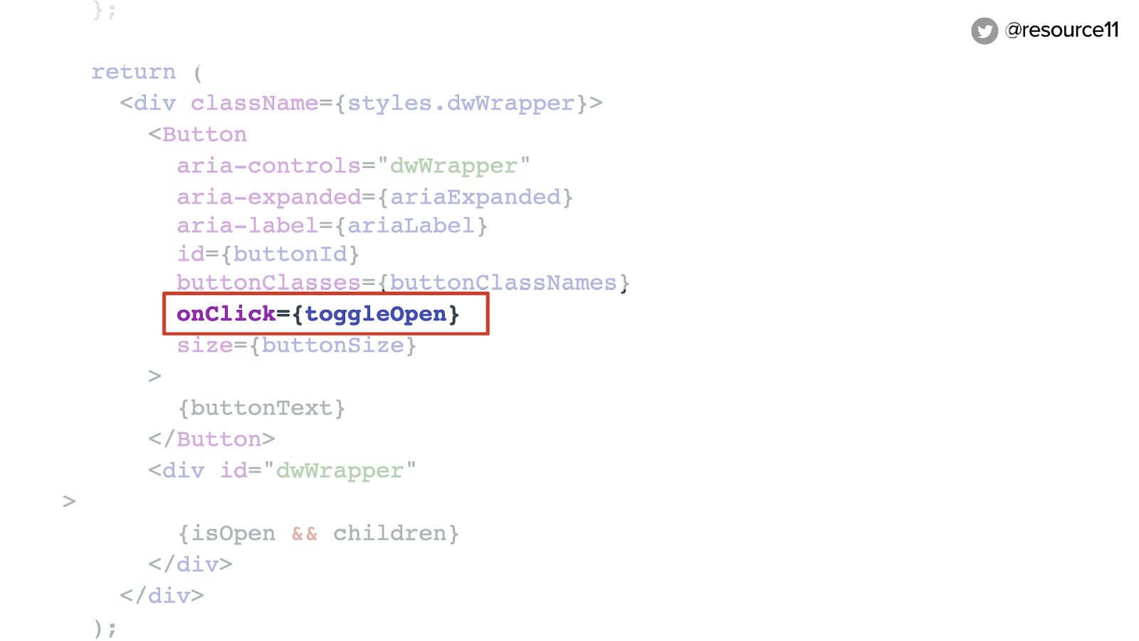
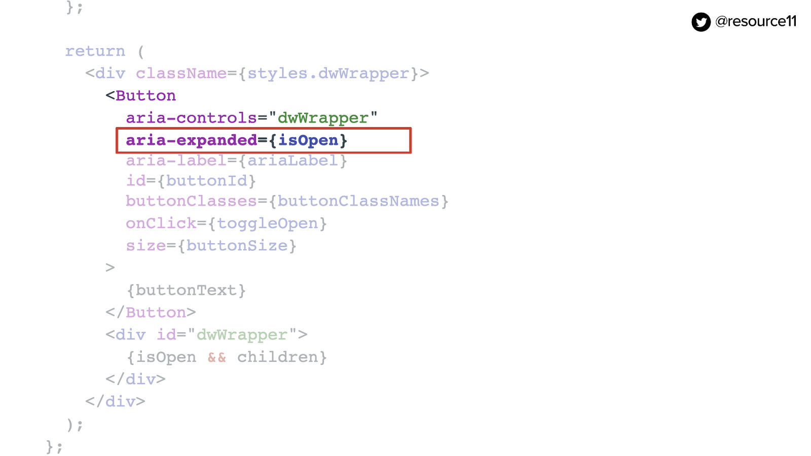
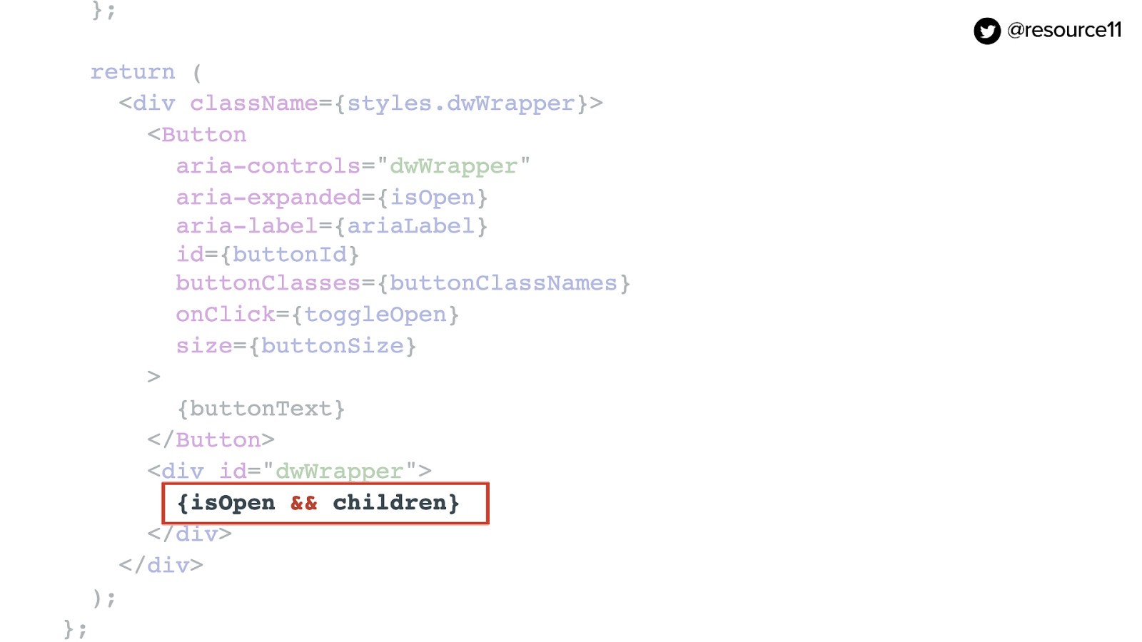
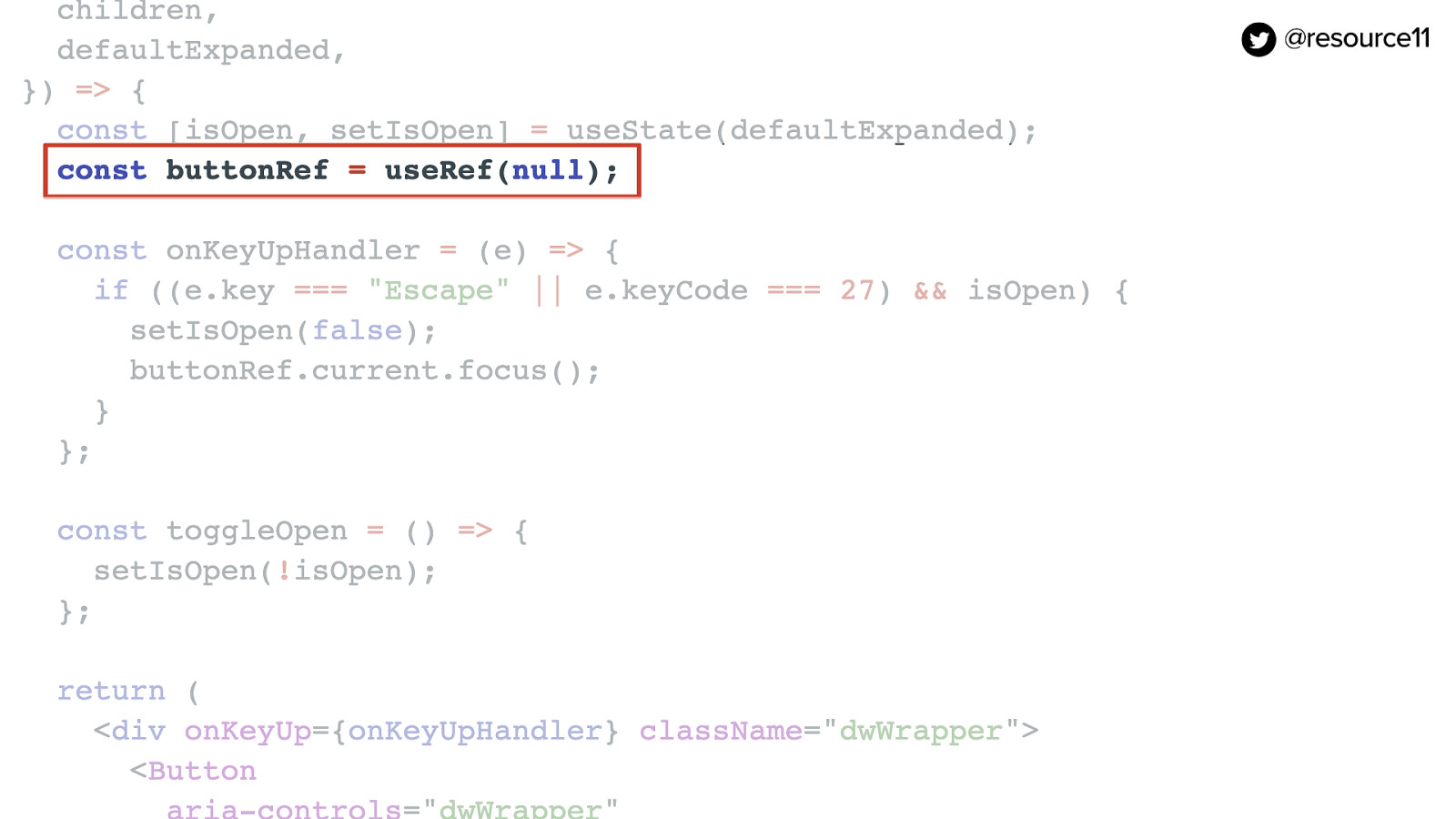
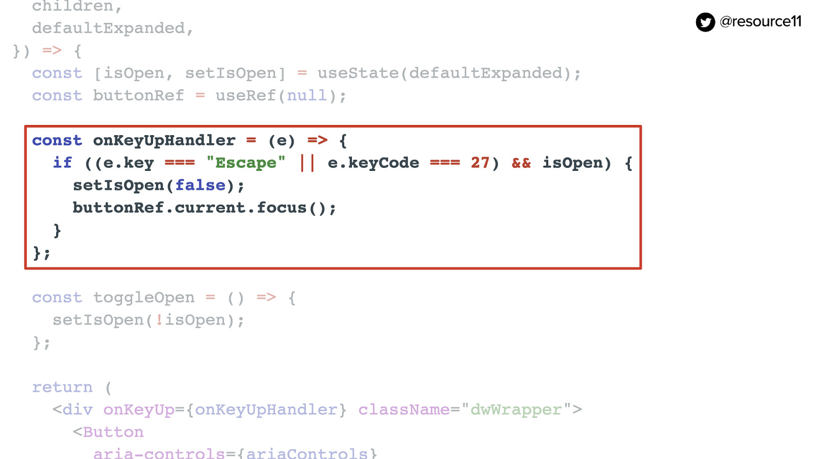
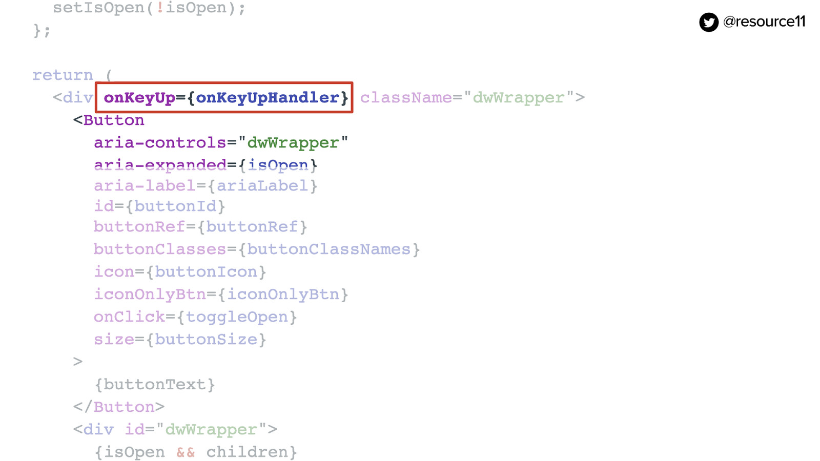
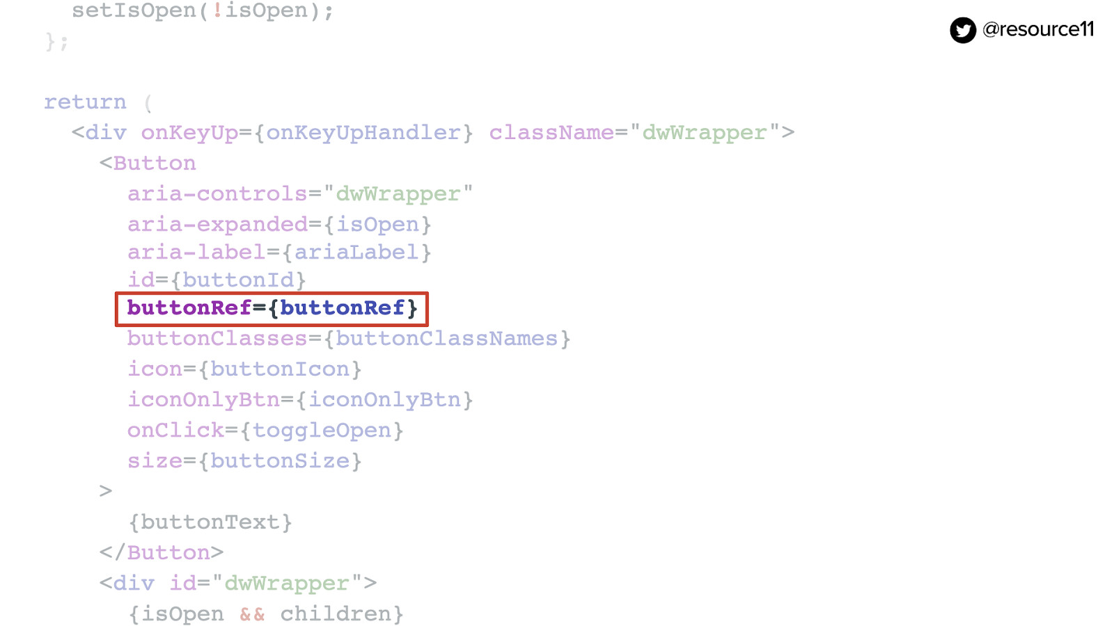
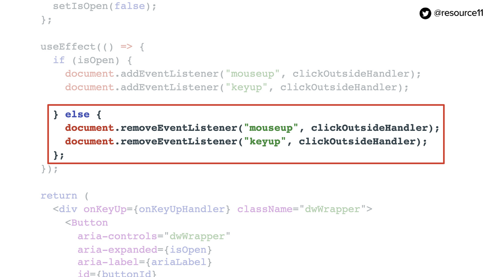
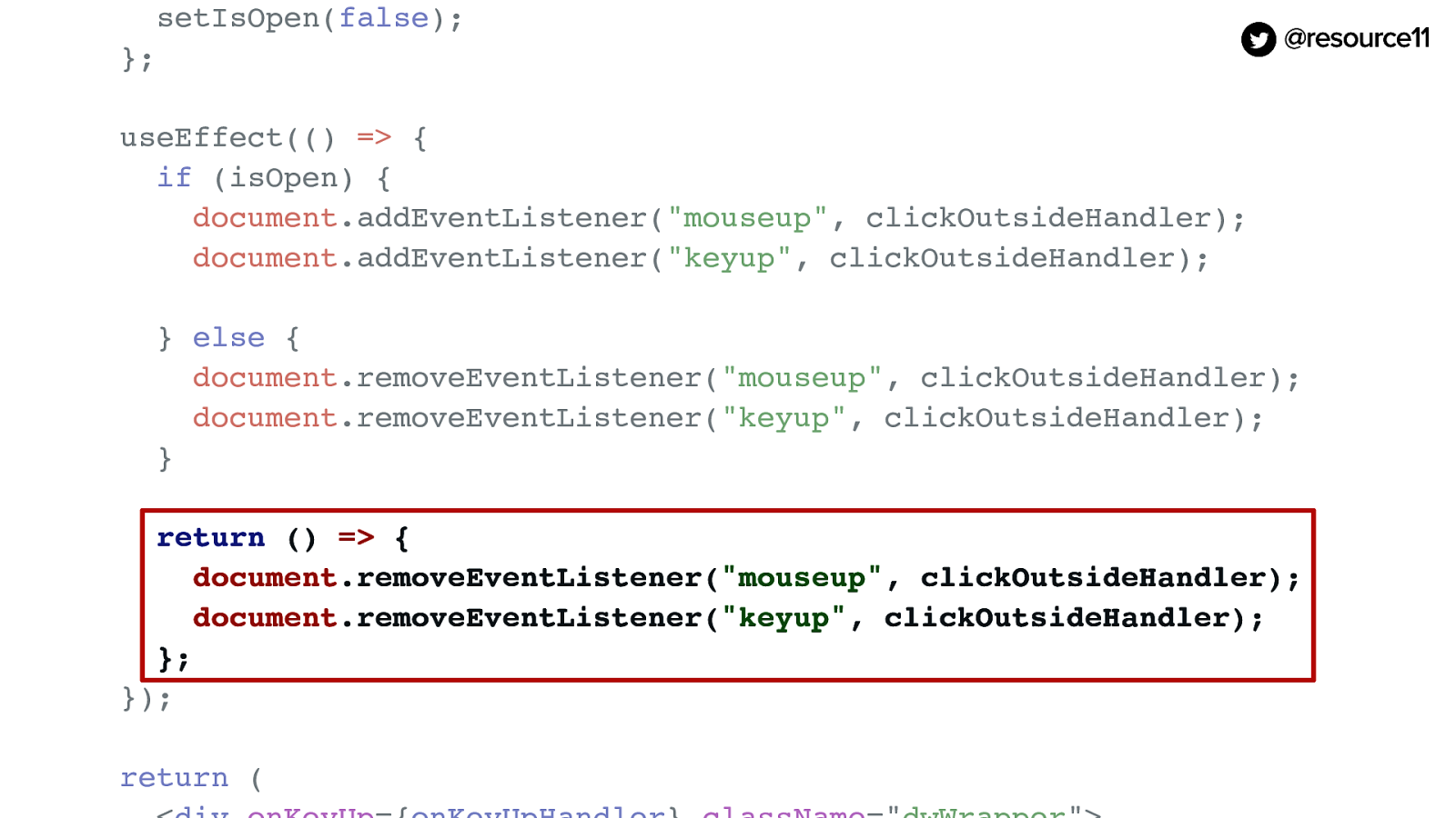
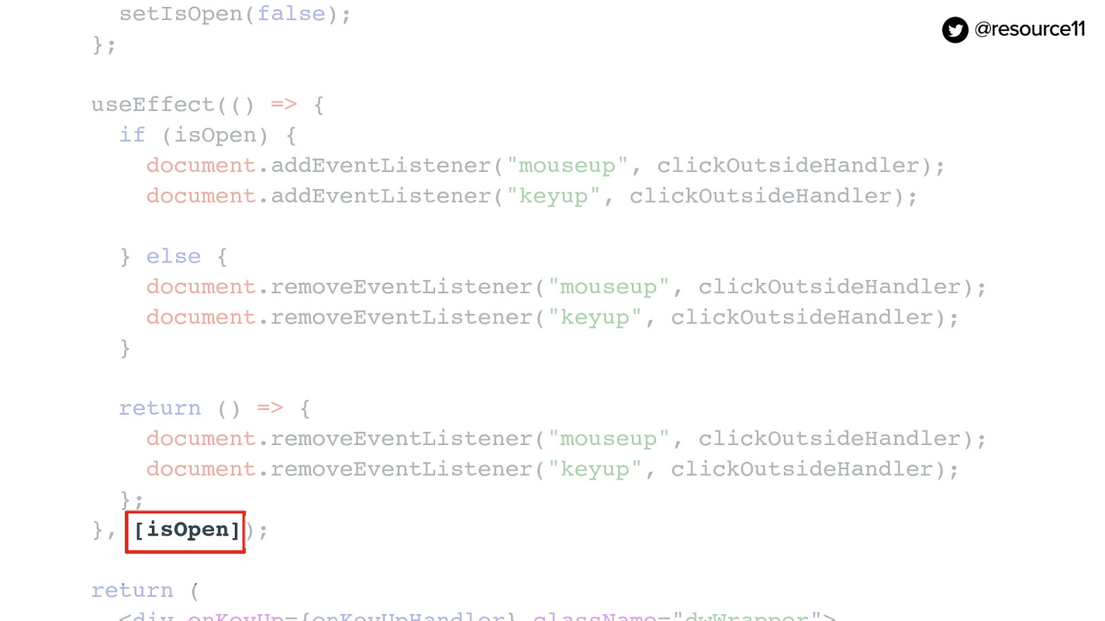
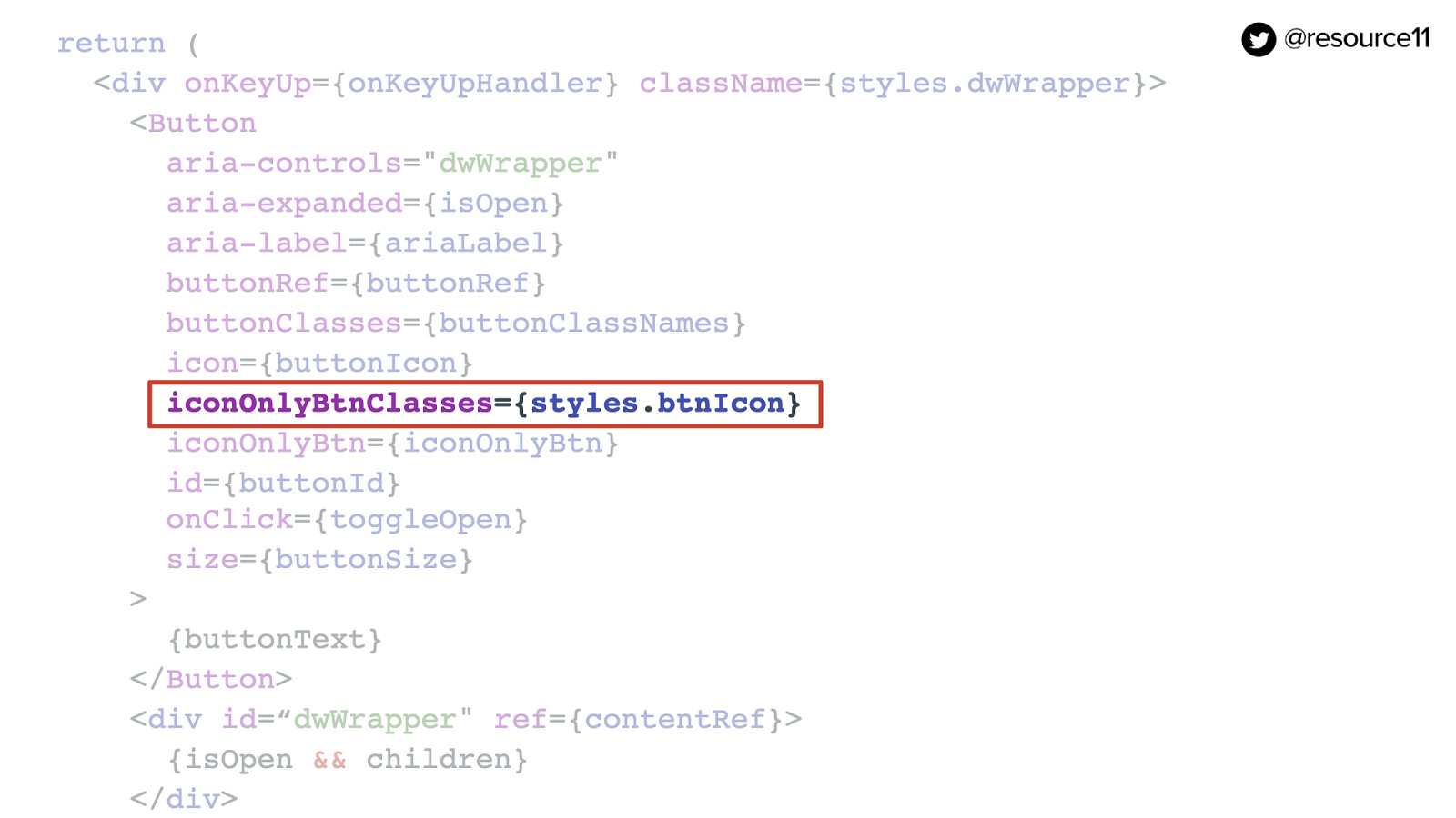
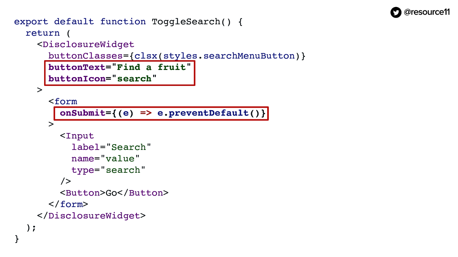
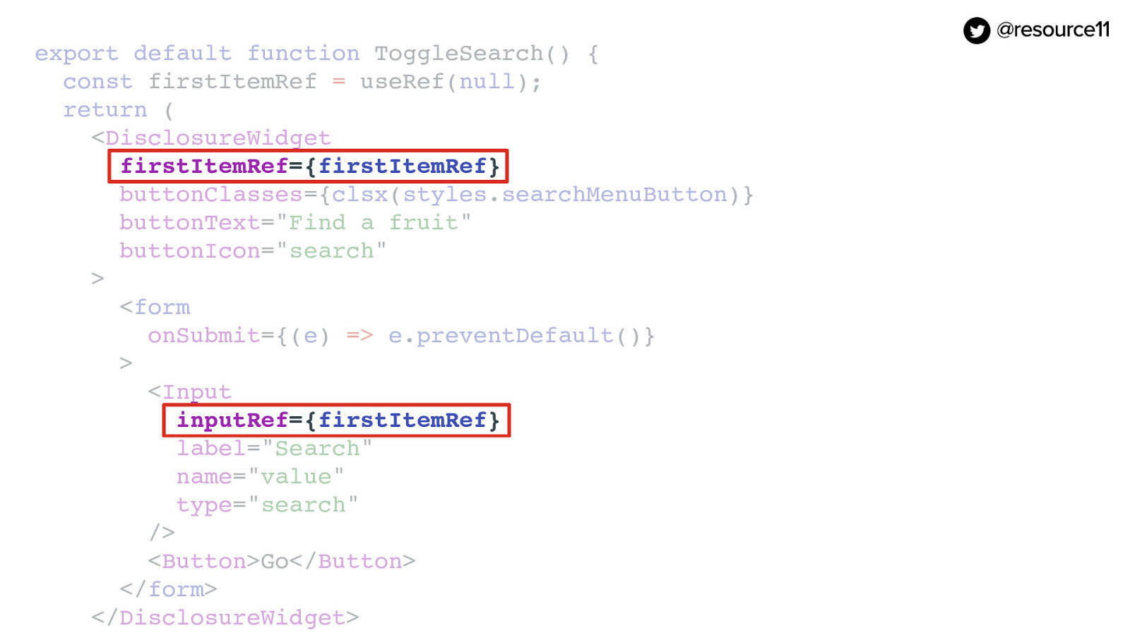
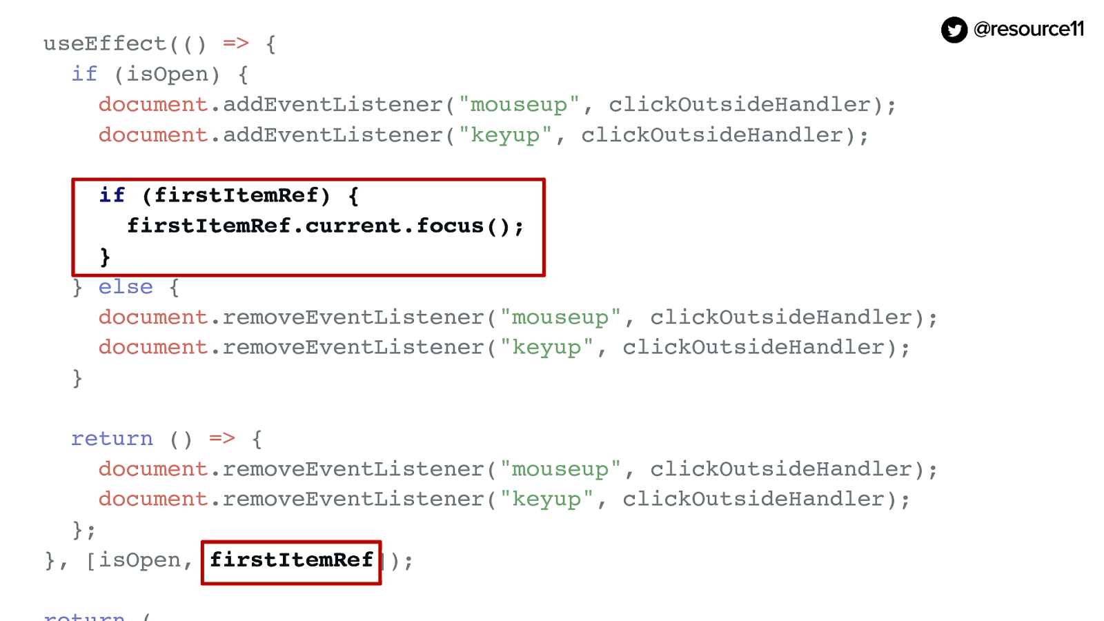
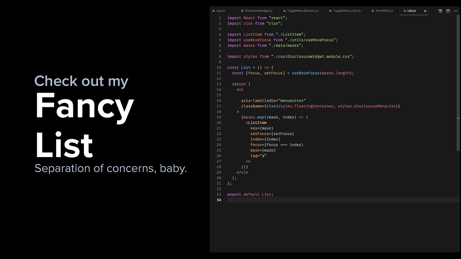
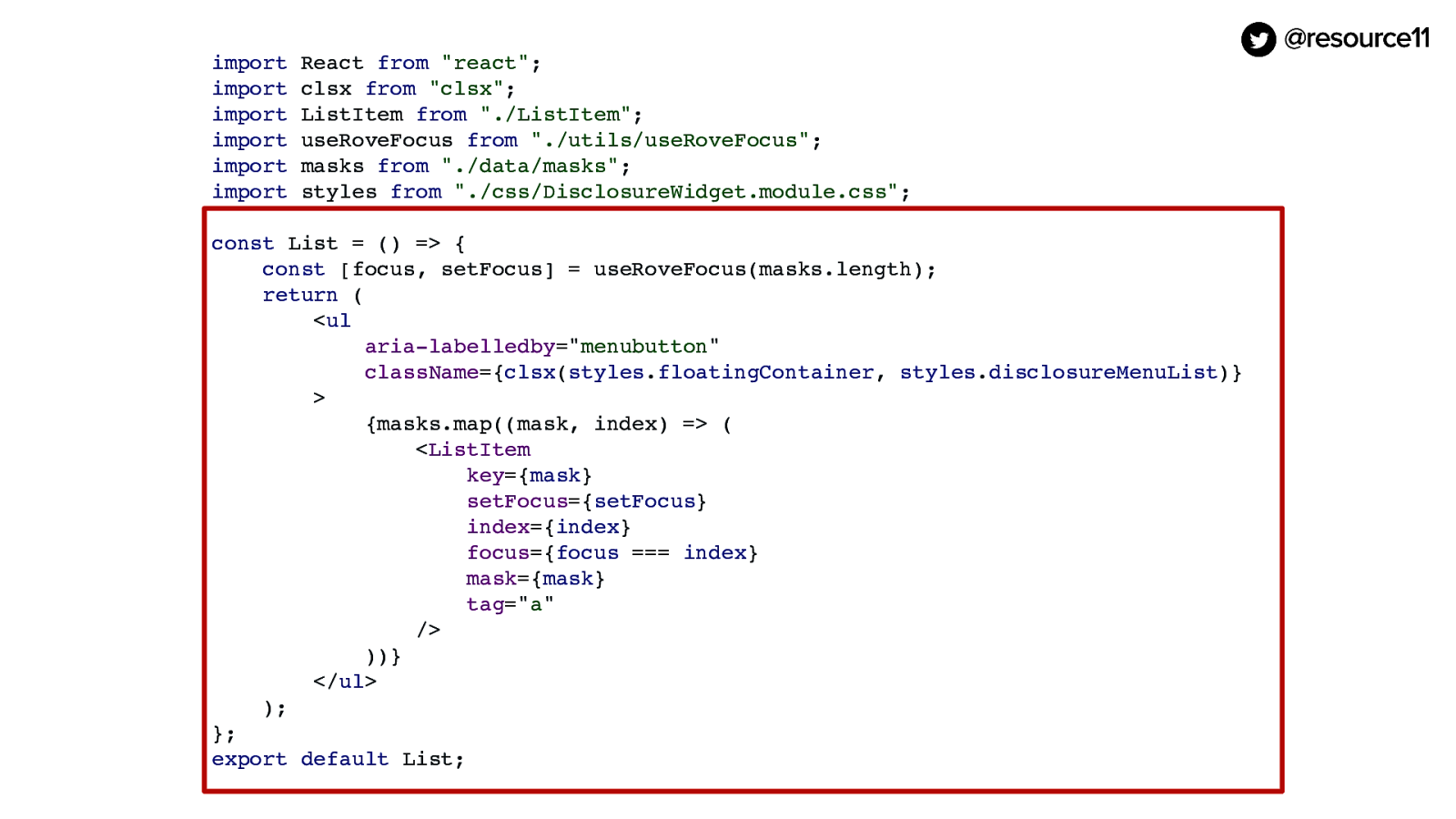
And while we’re here, we can start working on some separation of concerns.

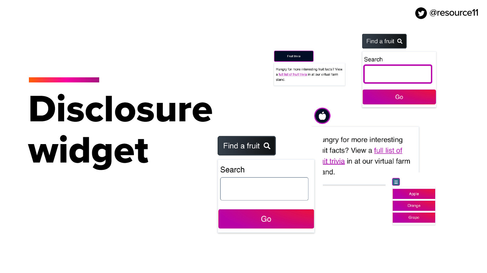
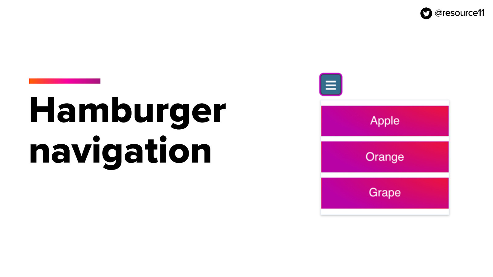
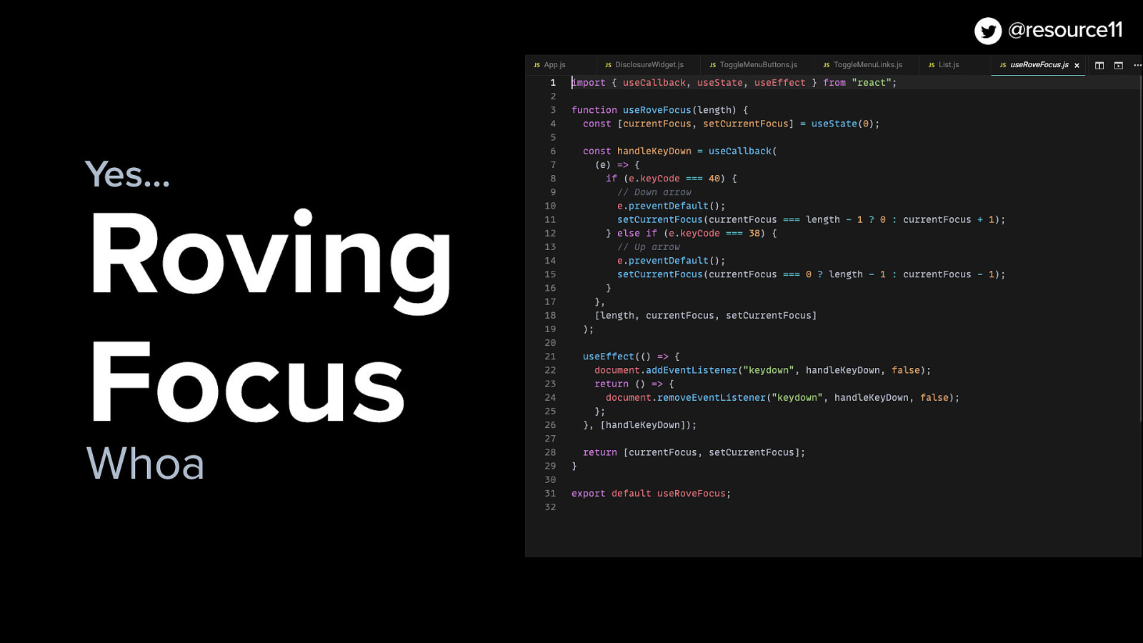
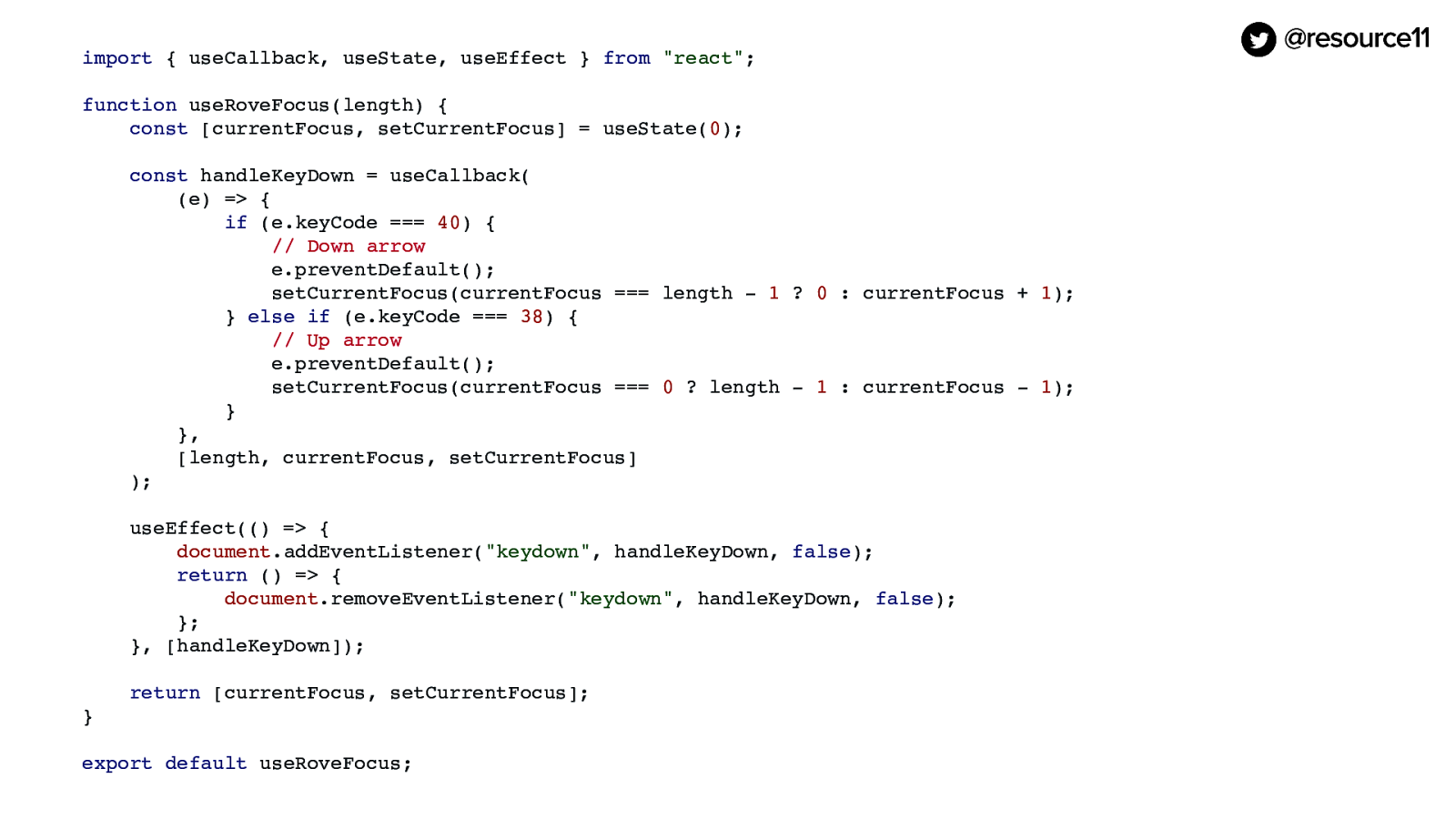
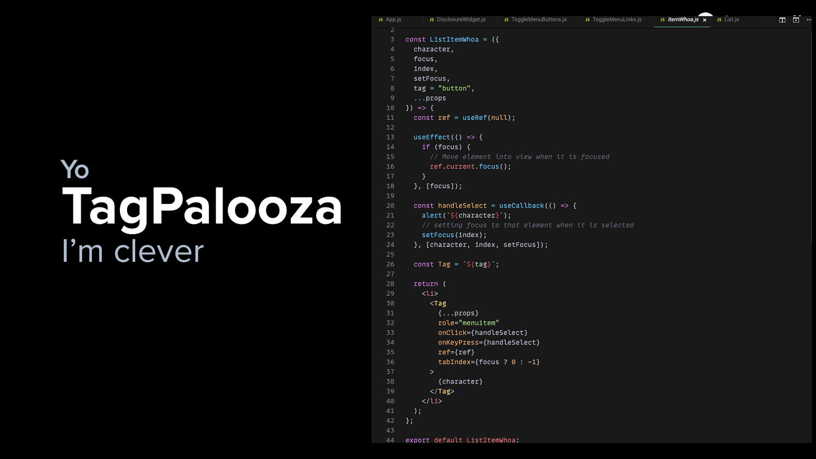
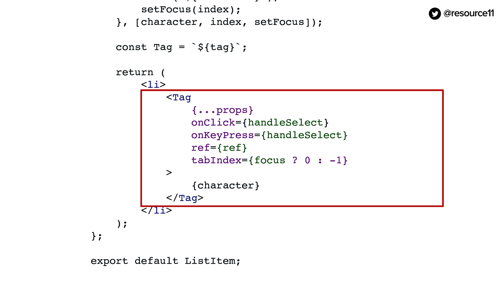
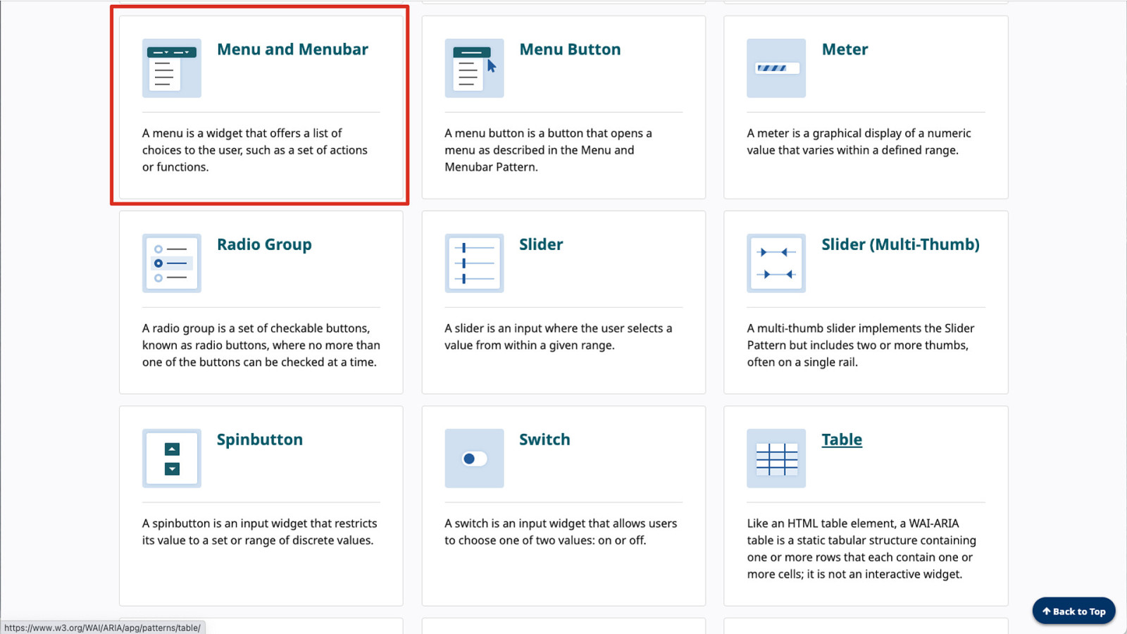
So now that we have this fancy Tag component, we can make a list item. We can make a list, have this roving focus, and start building this pattern.

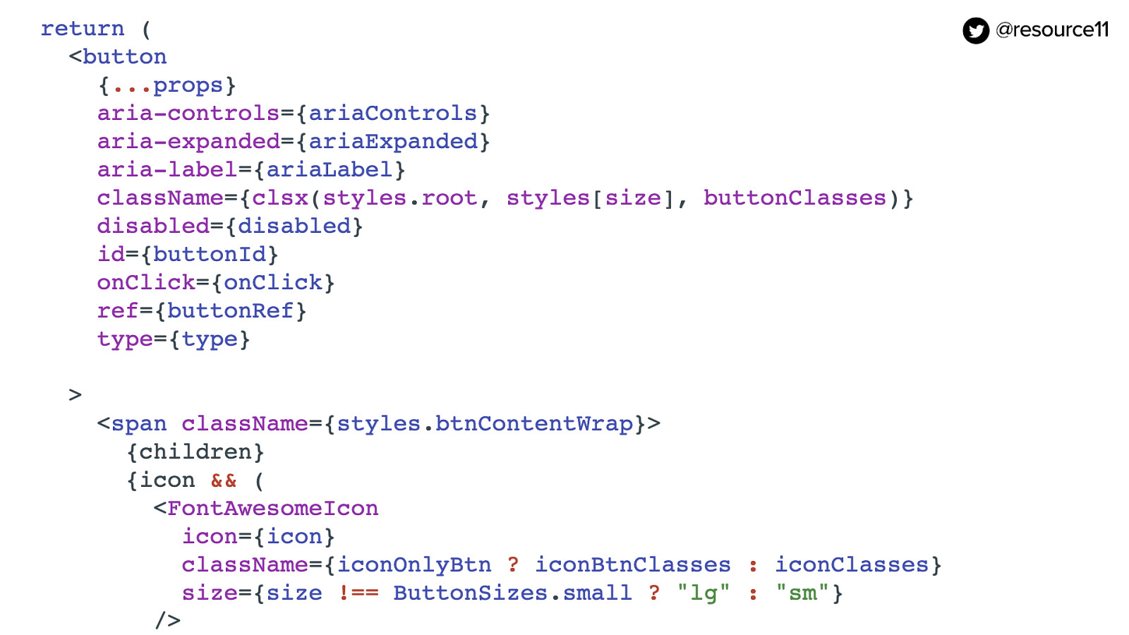
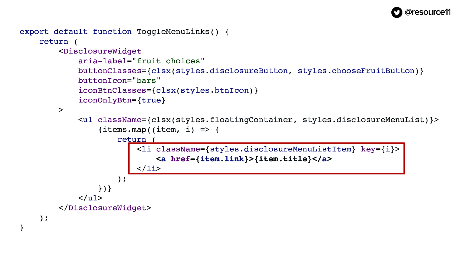
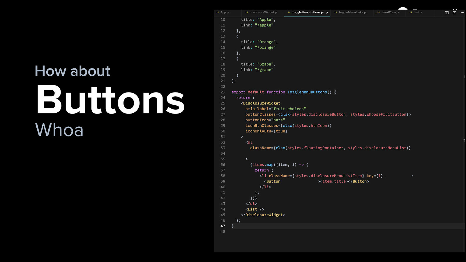
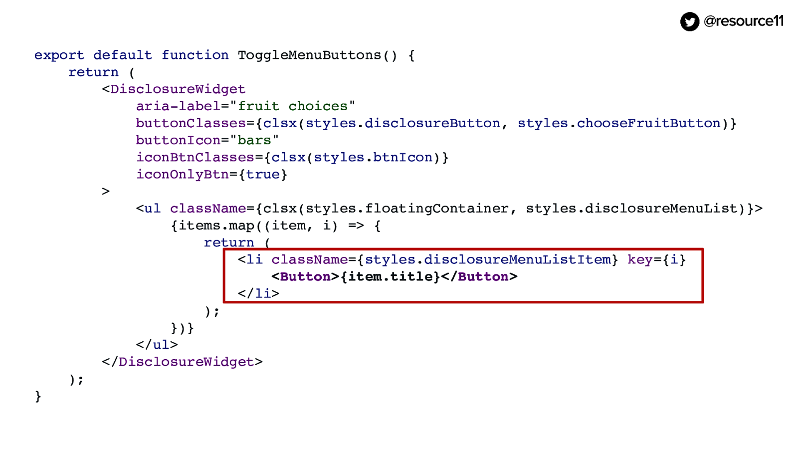
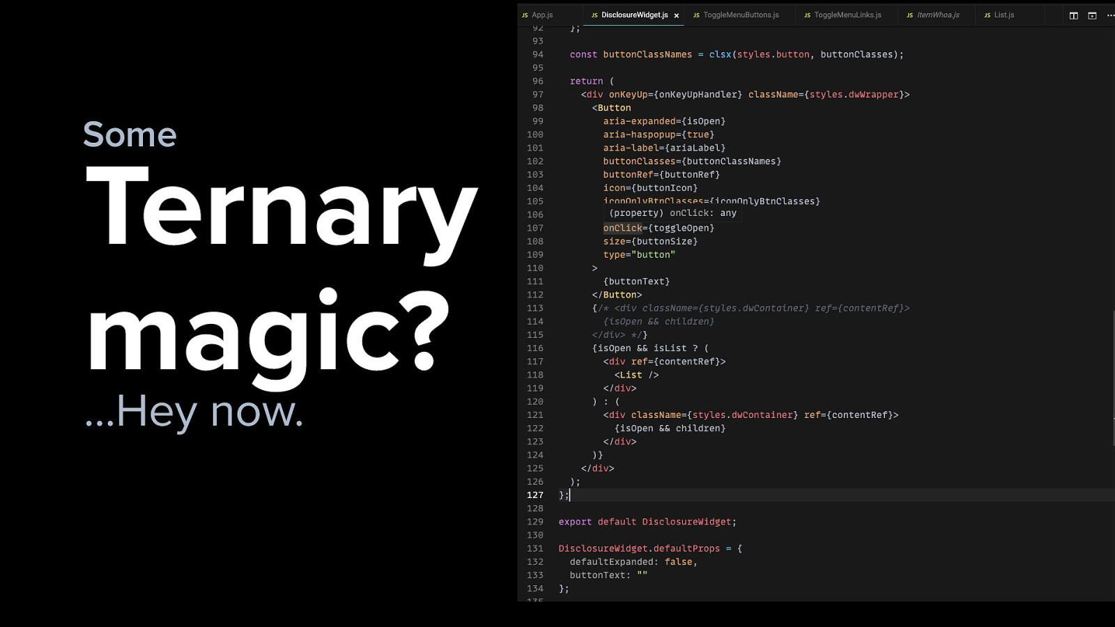
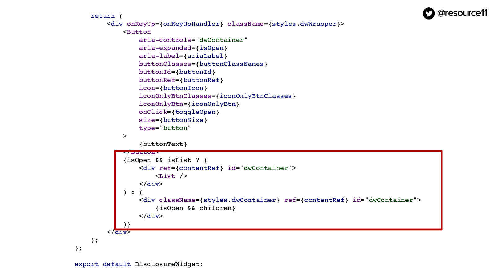
Oh, this is getting fun. Now the component’s getting kind of big.
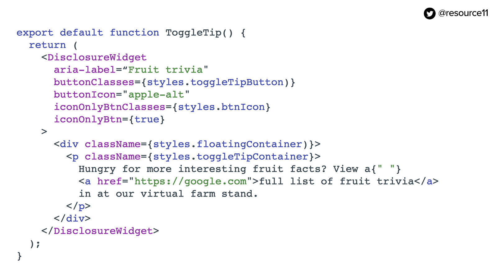
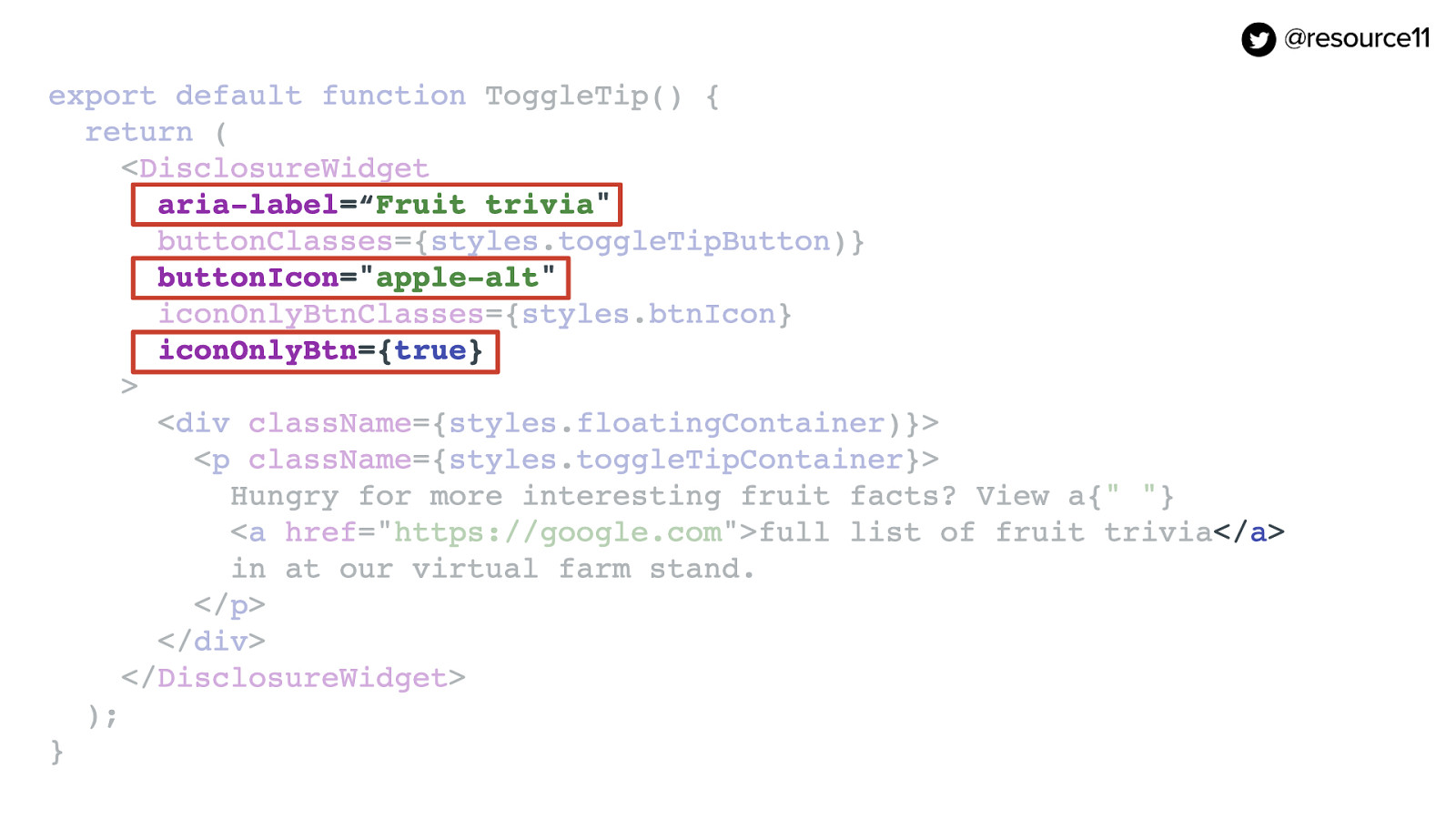
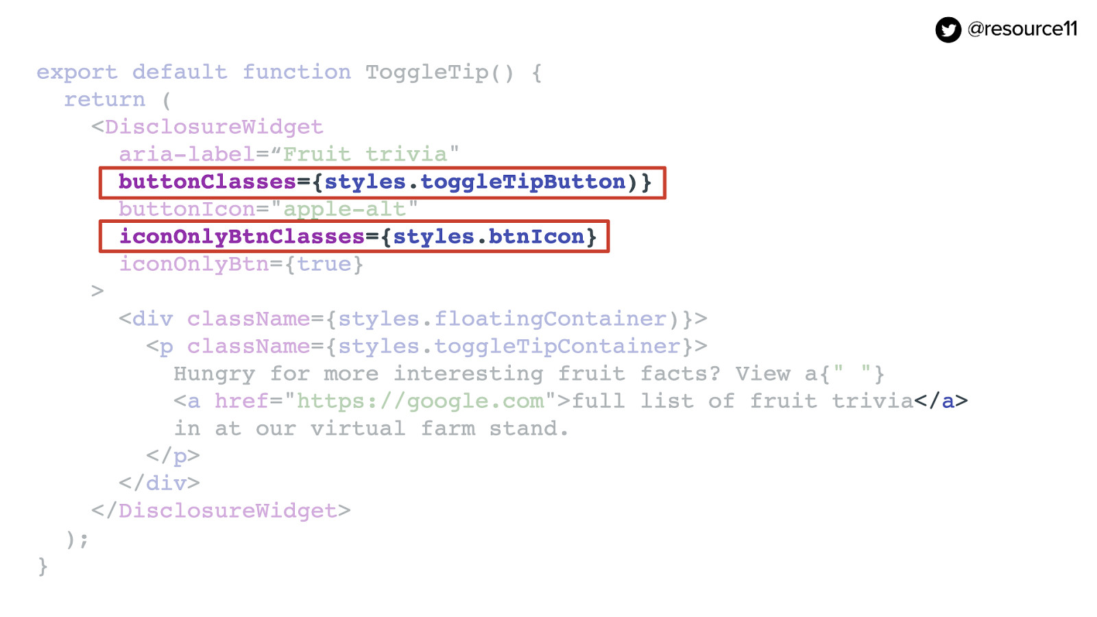
[jsx code]

import React from “react”; import clsx from “clsx”; import ListItem from “./ListItem”; import useRoveFocus from “./utils/useRoveFocus”; import masks from “./data/masks”; styles from “./css/DisclosureWidget.module.css”;

const List = () => { const [focus, setFocus] = useRoveFocus(masks.length); return ( <ul aria-labelledby=”menubutton” className={clsx(styles.floatingContainer, styles.disclosureMenuList)} > {masks.map((mask, index) => ( <ListItem key={mask} setFocus={setFocus} index={index} focus={focus === index} mask={mask} tag=”a” /> ))} </ul> ); }; export default List;

Slide 125

Slide 125

Some Ternary magic? …Hey now. Maybe some ternary magic? Hey now…

Slide 126

Slide 126

Oh! And then… in our uber disclosure widget… we could have our enhanced widget, but then if it’s a list, we could pass it a list prop, …and we could render a List, …and we’d have ListItems where we could pass in a tag prop. …and render whatever element we want.

What could go wrong?

[jsx code]

{isOpen && isList ? ( <div ref={contentRef} id=”dwContainer”> <List /> </div> ) : ( <div className={styles.dwContainer} ref={contentRef} id=”dwContainer”> {isOpen && children} </div> )}

Slide 127

Slide 127

image: Jim Halpert slowly reclines in the car passenger seat, hiding in embarrassment

Maybe this is a bad idea.

Slide 128

Slide 128

What pattern is this?

Because at this point, what pattern is this? Now we’re starting to dip into different patterns. We went from a Disclosure pattern…

Slide 129

Slide 129

image: Menu and Menubar pattern highlighted on WAI page

…into a Menu and Menubar pattern.

Slide 130

Slide 130

image: WAI-ARIA Roles, States, and Properties – WAI page

…and the menubar pattern has menuitem roles, and menuitem checkbox, and menuitem radio roles, and all these different states that are needed for unordered lists and their respective children.

A hamburger navigation, however, is technically part of the disclosure widget implementation.

Therefore, in a disclosure navigation pattern, no ARIA menu roles should be added to any unordered lists in a component implementation.

Because it’s a different use case. This is where devs incorrectly mix WAI patterns.

Slide 131

Slide 131

image: Menu and Menubar Pattern – WAI page

But when you start thinking about those mega menus at the top of a nav that have those fly outs that go to the right that’s simulating those desktop menus like Electron or anything else.

That’s what those mega menus are trying to simulate, with nav and the checkboxes and the radios.

Slide 132

Slide 132

image: Mythical University mega menu example – WAI page

That is what a mega menu pattern is, and there’s this confusion when a designer comes in with a pattern. They see this beautiful pattern, and they don’t understand the logic behind these two patterns that are being coded versus what you see in a design.

Slide 133

Slide 133

image: Menu button pattern highlighted – WAI page

And then it gets mixed into your disclosure widget, and it doesn’t get documented.

And then you get this mega component.

And then people start using it.

And then you get into accessibility audit.

And then there’s this mess.

And so you have these components with this pattern.

Slide 134

Slide 134

image: Menu Button Pattern – WAI page

That mix one pattern.

Slide 135

Slide 135

image: Disclosure (Show/Hide) Pattern – WAI page

With another pattern.

Slide 136

Slide 136

image: brown squirrel sitting on a picnic table, shouting with outstretched paws

Whoa, Nellie… Even though the one pattern can have many uses, it’s important to keep your pattern uses separate.

Slide 137

Slide 137

image: Shrimp and lime jello mold, plated with apple slices

And you begin to make unwise decisions… like creating dishes with jello and shellfish. And things can go wrong very quickly.

Slide 138

Slide 138

Don’t mix the masks. [image]: Red squirrel with one paw outstretched in a "please stop!" gesture

SO… You shouldn’t be mixing your masks. And breaking the rules of ARIA.

You should be separating your components out into their purposeful intents.

You may think that your magical mask will give you access to that very exclusive Carnival masquerade, but instead you may end up at a completely different Carnival…

Slide 139

Slide 139

image: vibrant Carnival, with sweeping bright lights of chaos and a clown, Paolo Nicolello — Unsplash

Like this… and then things can go wrong very quickly.

Slide 140

Slide 140

image: Carousel illuminated at night, Lorenzo Dominici — Unsplash

And then it can go even more wrong and…oh god. And here comes the carousel.

Slide 141

Slide 141

image: Open UI homepage

I do have to say, though, the Open UI W3C Community group is working on a solution for native components for this. Una Kravets will touch upon this briefly in her talk tomorrow.

Slide 142

Slide 142

A solution is coming

I am very happy a solution is coming. So definitely check out her talk tomorrow.

Slide 143

Slide 143

image: 60-foot inflatable viking monster float lurks over a crowd

Avoid chaotic carnivals like this one. The Viareggio Carnival with some extremely large floats in Italy.

Slide 144

Slide 144

image: 60-foot inflatable viking monster float holding a beheaded Caesar

…and a completely different experience than you wanted. Don’t mix your masks.

Slide 145

Slide 145

Wrap-up

So to wrap up…

Slide 146

Slide 146

Design-systems are a Carnival!

Design Systems are a Carnival!

Slide 147

Slide 147

Our users are diverse

Our users are diverse

Slide 148

Slide 148

image: Red squirrel with one paw outstretched in a "please stop!" gesture

Don’t mix your masks

Slide 149

Slide 149

image: Shrimp and lime jello mold, plated with apple slices

Or you’ll make bad choices

Slide 150

Slide 150

image: 60-foot inflatable viking monster float lurks over a crowd

Or you may end up at a completely different Carnival…

Slide 151

Slide 151

image: 60-foot inflatable viking monster float holding a beheaded Caesar

…with a completely different experience than you wanted.

Slide 152

Slide 152

image: Person in inflatable dinosaur costume flips into a raft floating on a pond and claps with glee.

And Design Systems are always the hotness.

Slide 153

Slide 153

Thank you.

Slide 154

Slide 154

https://noti.st/resource11/

Slide deck posted after the talk

@resource11 Twitter | Instagram | GitHub